Blog : Row House

Bao Long Office: An Old Shophouse Beautifully Renovated

Bao Long Office: An Old Shophouse Beautifully Renovated

/ Ho Chi Minh City, Vietnam /

/ Story: Monosoda, Kor Lordkam / English version: Bob Pitakwong /

/ Photographs: Quang Dam /

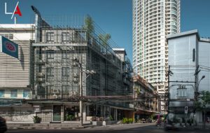
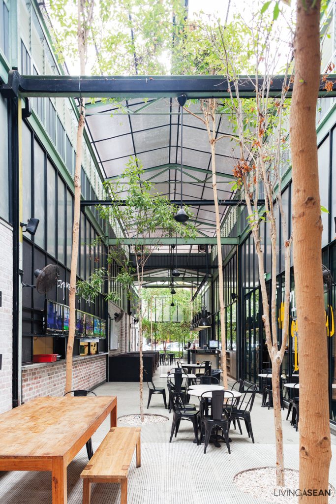
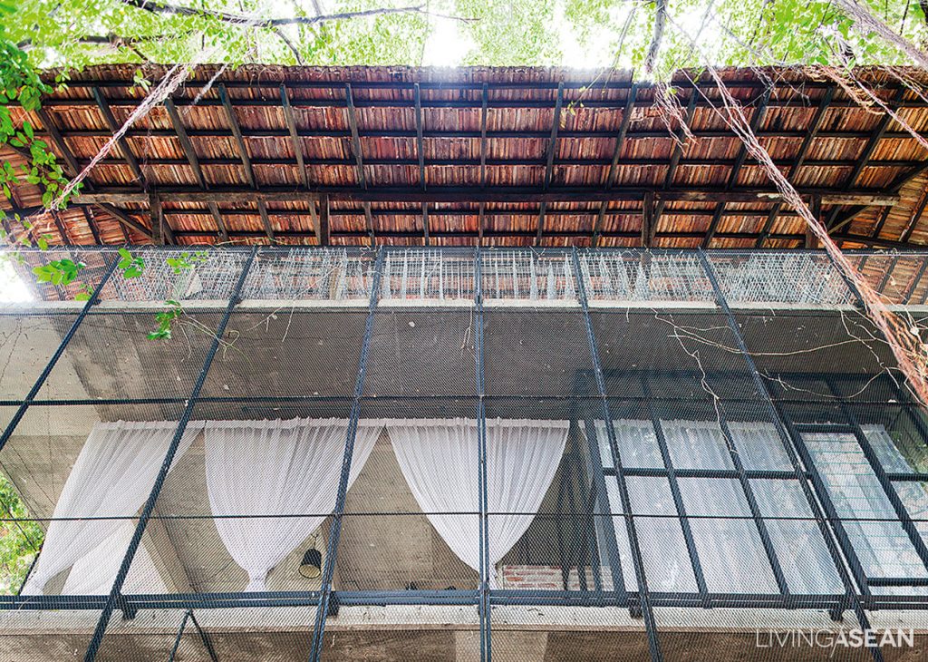
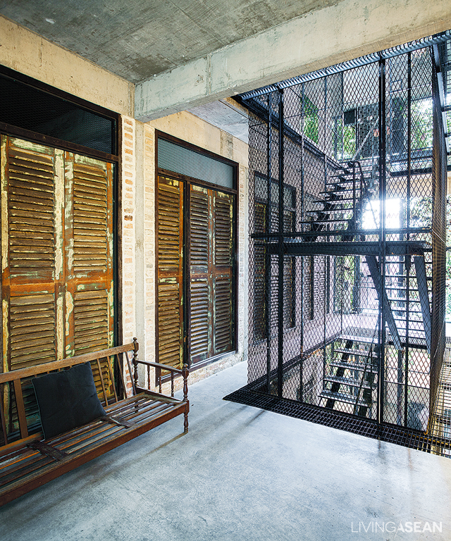
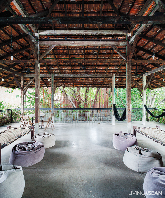
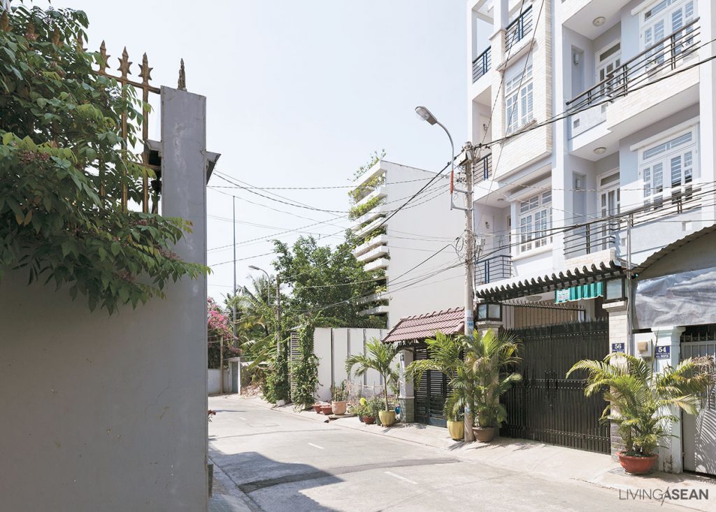
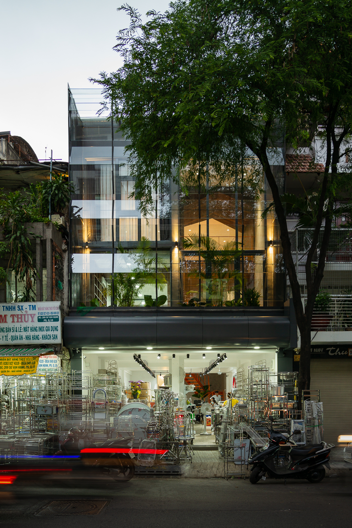
Major renovations have given a drafty old shophouse a new lease on life. Thanks to great remodeling ideas, the tired-looking two-unit shophouse on Su Van Hanh Street, Ho Chi Minh City, transformed into a beautiful place that struck the right balance between a business and a private residence. Designed by the architecture firm H.a + NQN, the completely refurbished premises are home to a private enterprise named Bao Long Office.
Bao Long Office

As is often the case with shophouses in Vietnam, each of the two units has a frontage of 3 meters. It’s in the shape of an elongated rectangle with a whopping 20-meter length sandwiched between adjacent units.

To create ample, well-ventilated interior space, the wall separating the two units was torn down and replaced with a newer, more modern version.
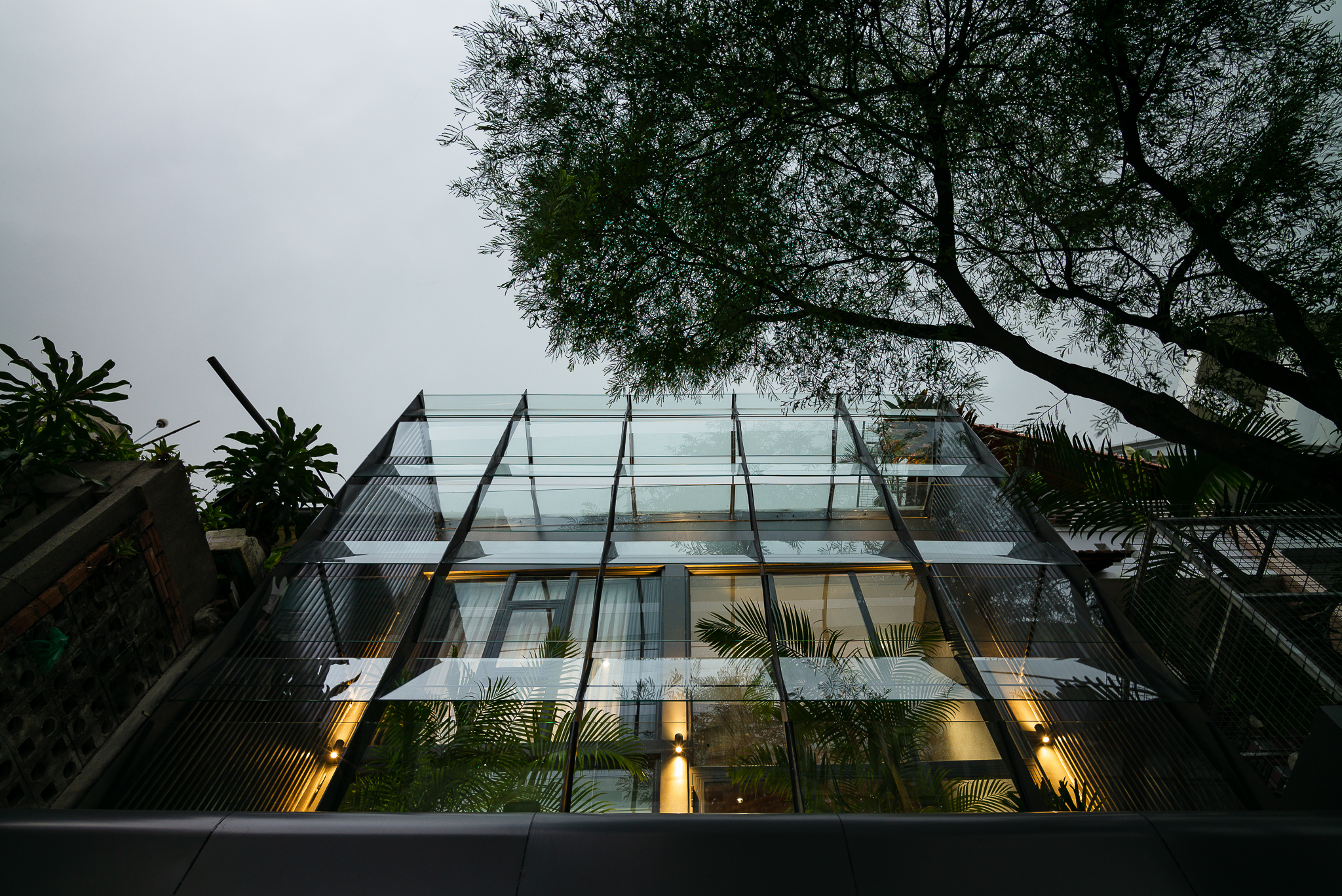
Bao Long Office’s plan was redesigned to accommodate new business concepts as well as residential and lifestyle needs. To protect the building’s structural integrity, the internal framework remained intact.

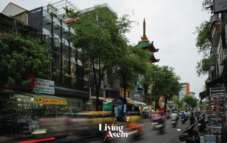
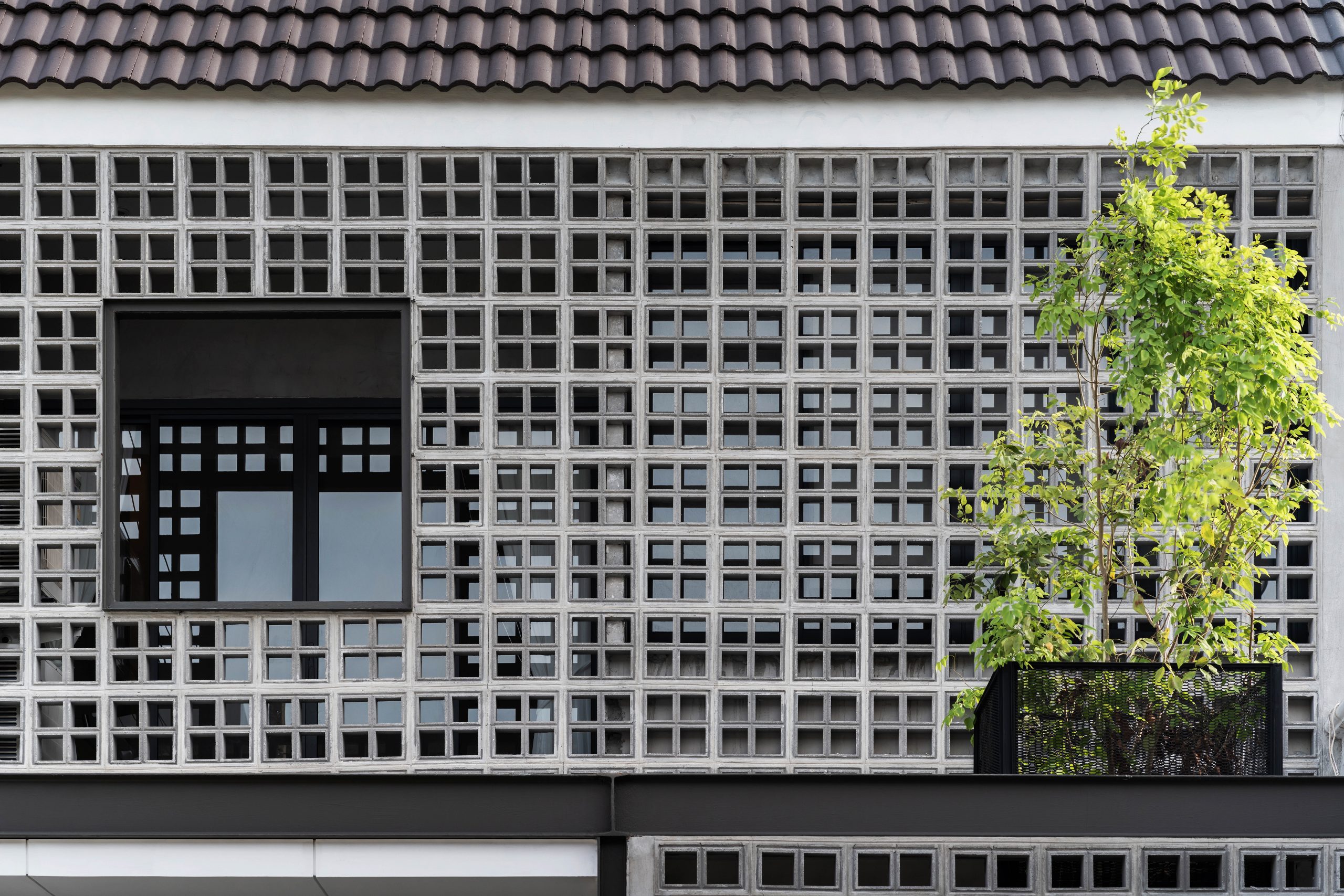
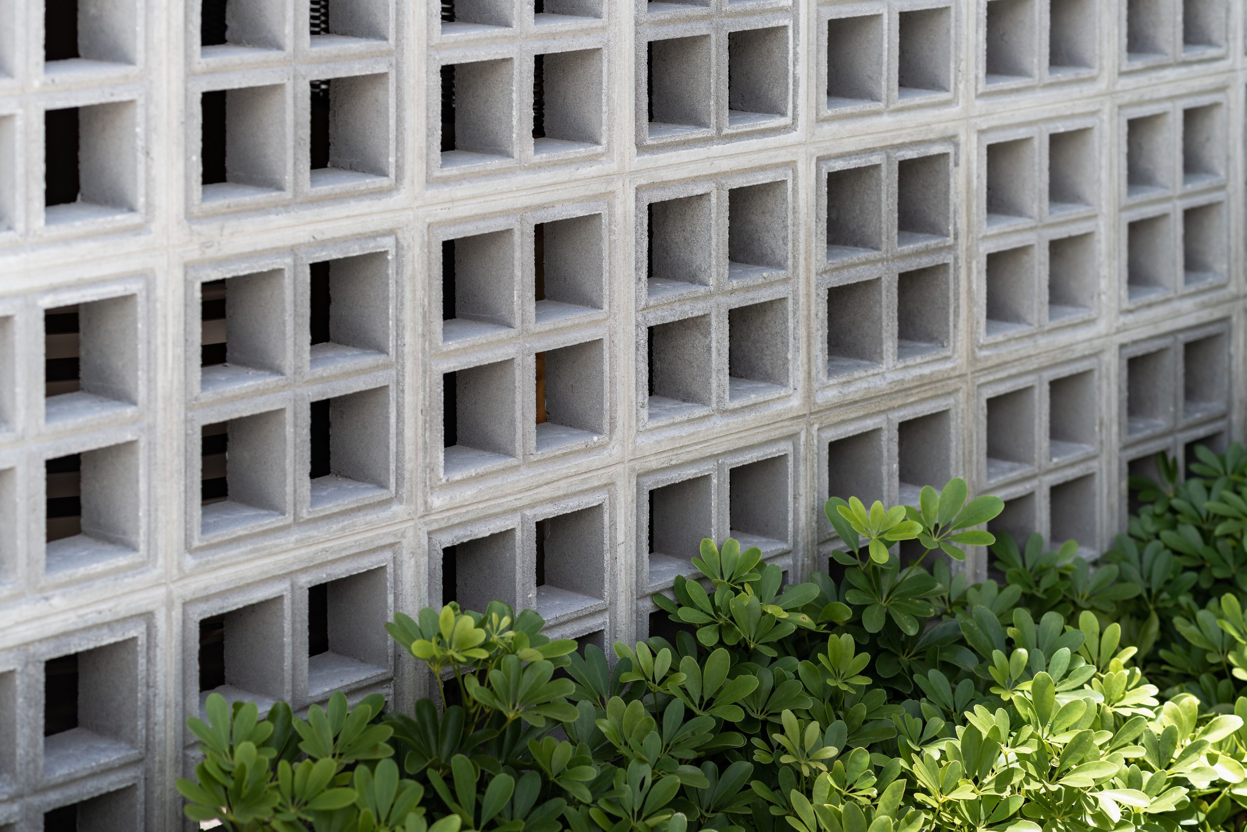
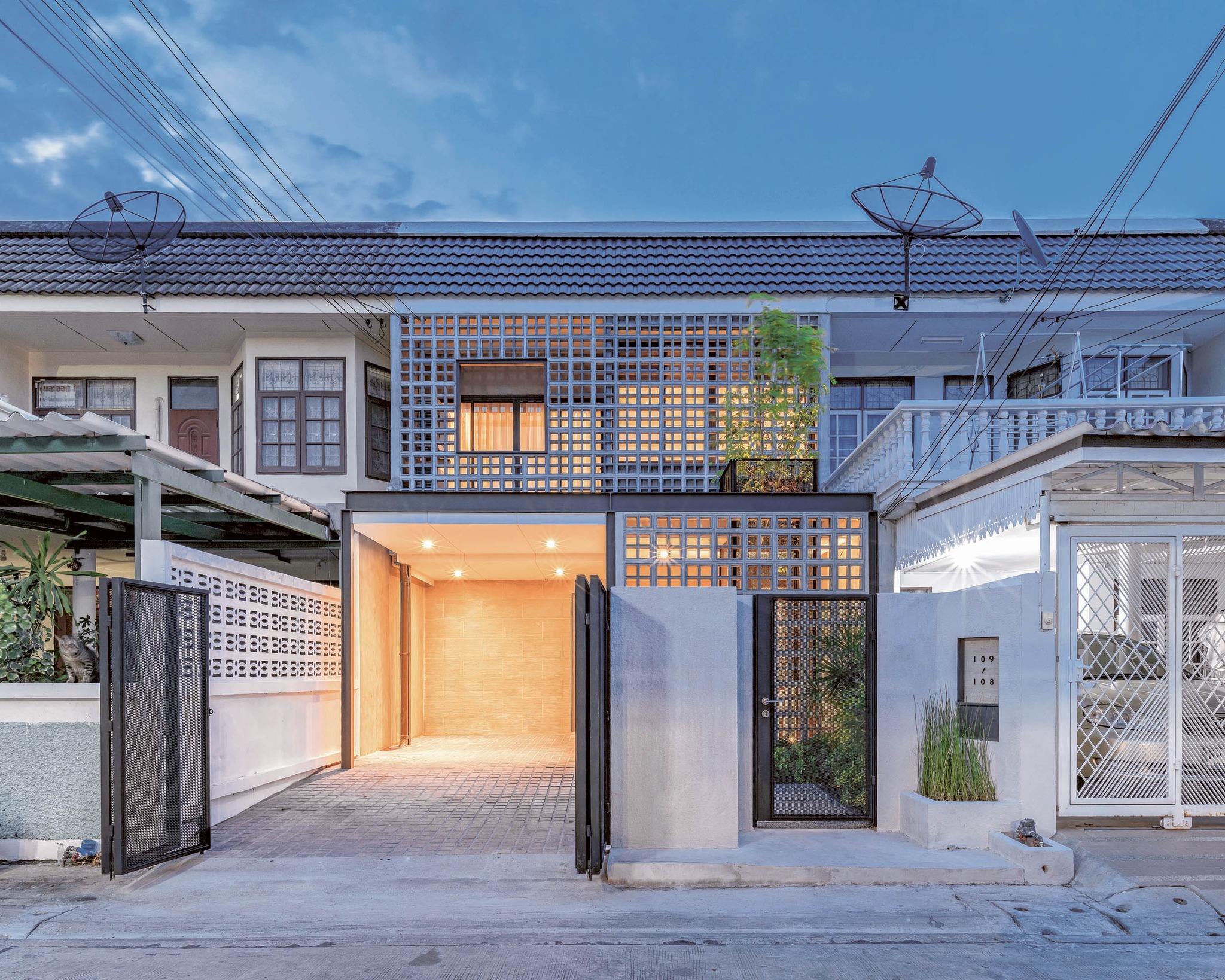
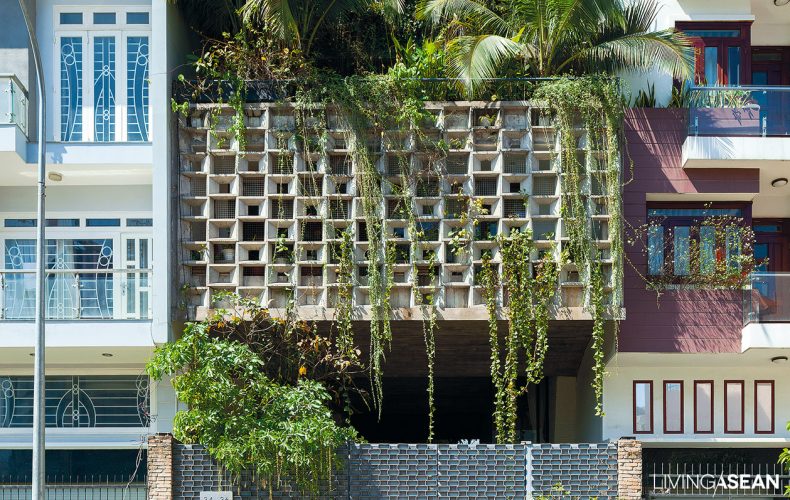
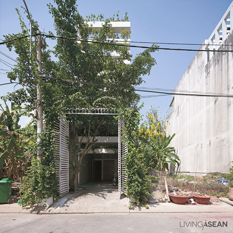
The same applied to the ground floor that housed a business selling stainless steel products. For a neat appearance, the entire front façade was glazed in, giving it charms and good looks that set it apart from others in the neighborhood. By night the face of the building is aglow under the lights.
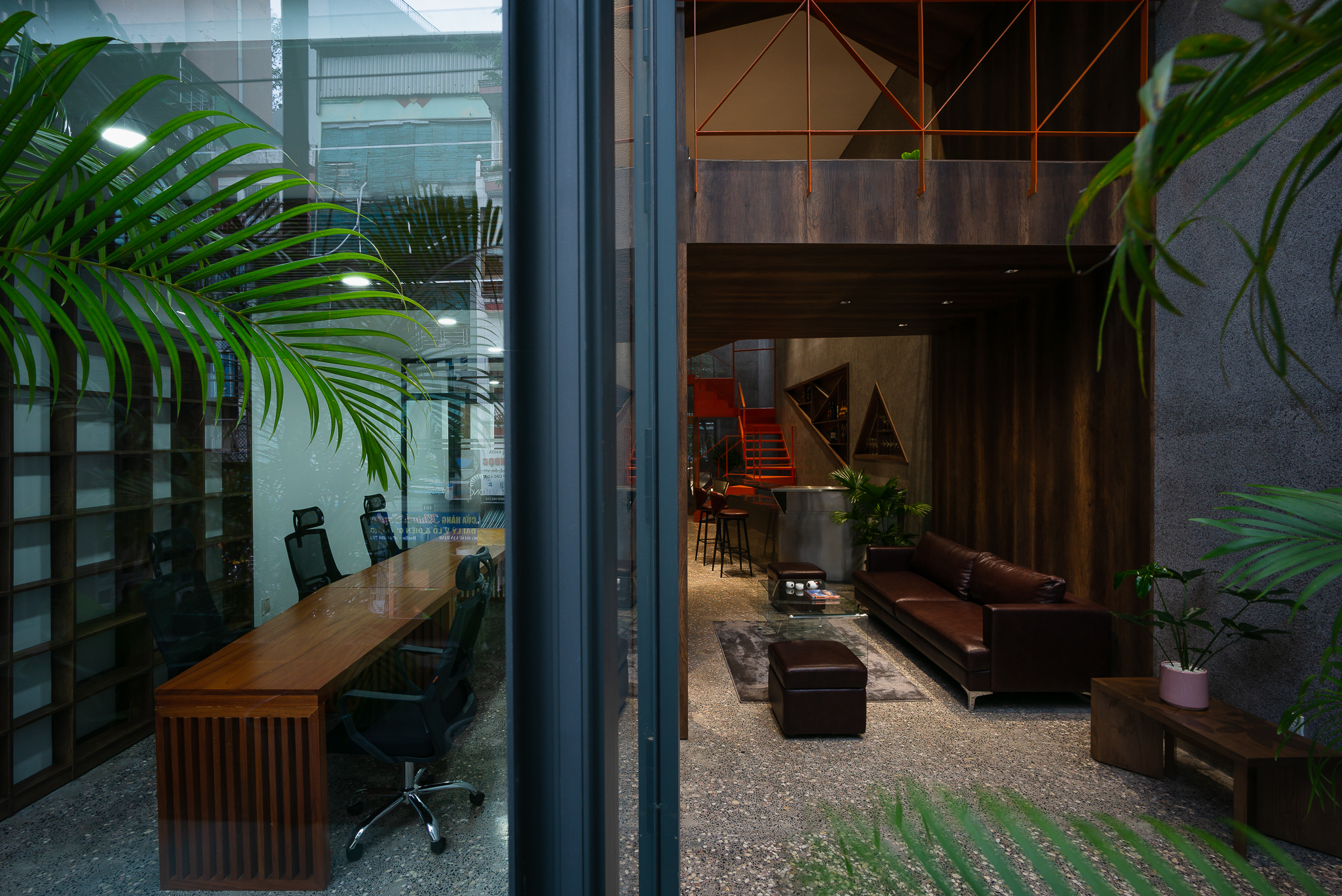
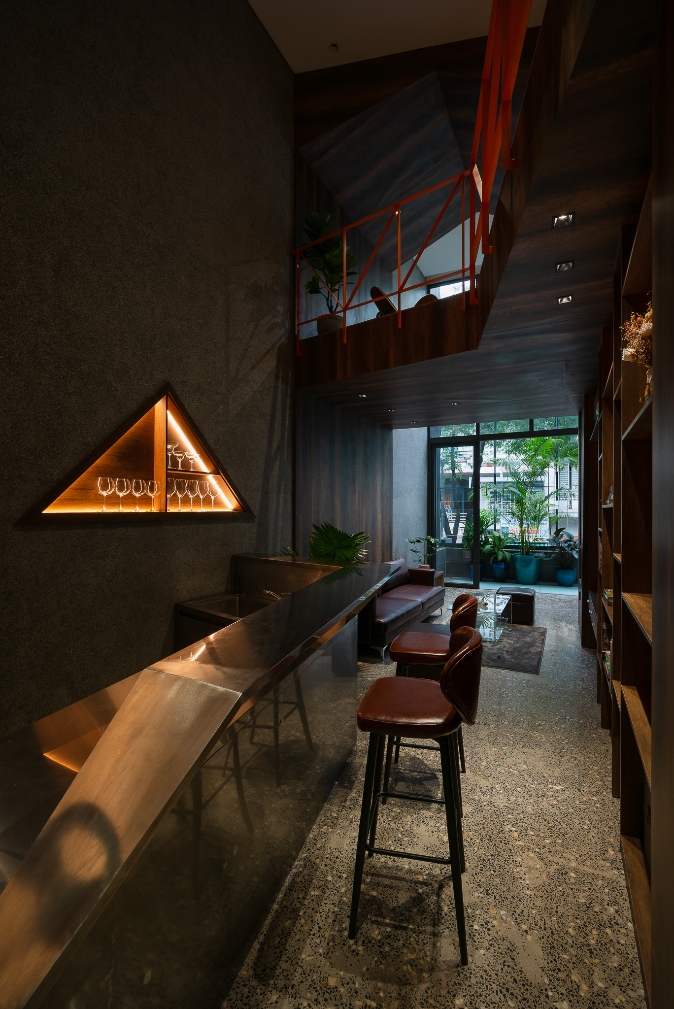
Bao Long Office
Second-floor workspace and private living quarters are clearly separated from each other.

Bao Long Office

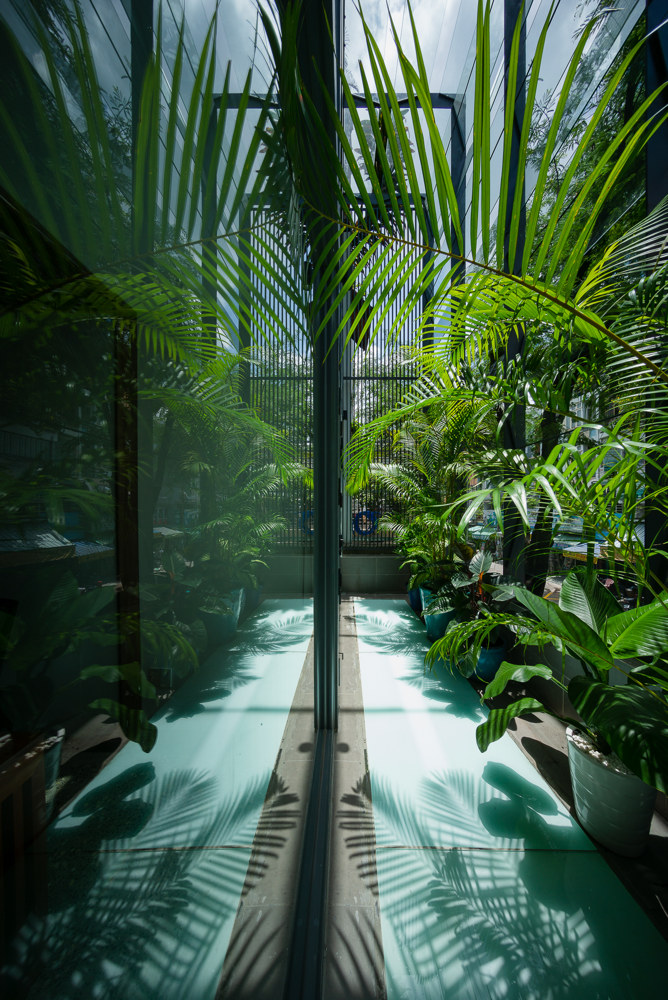
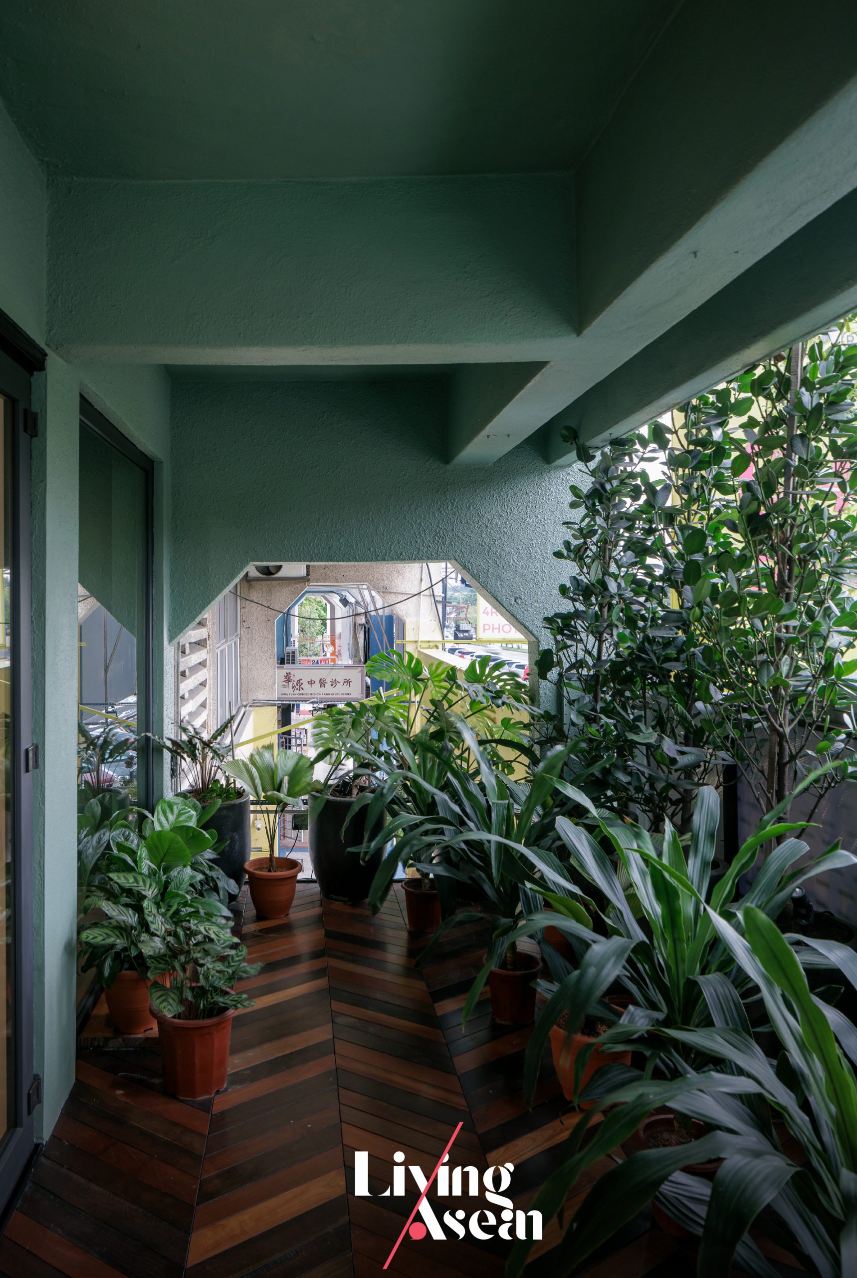
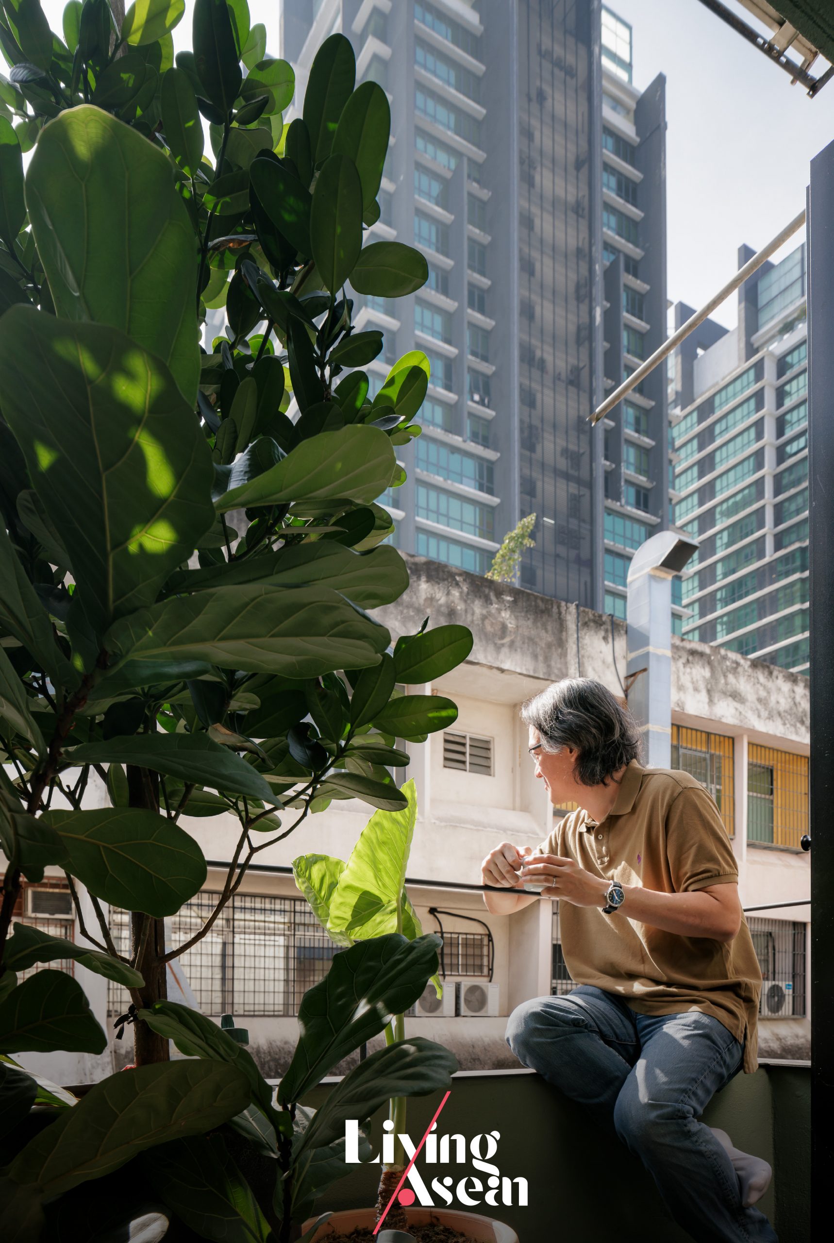
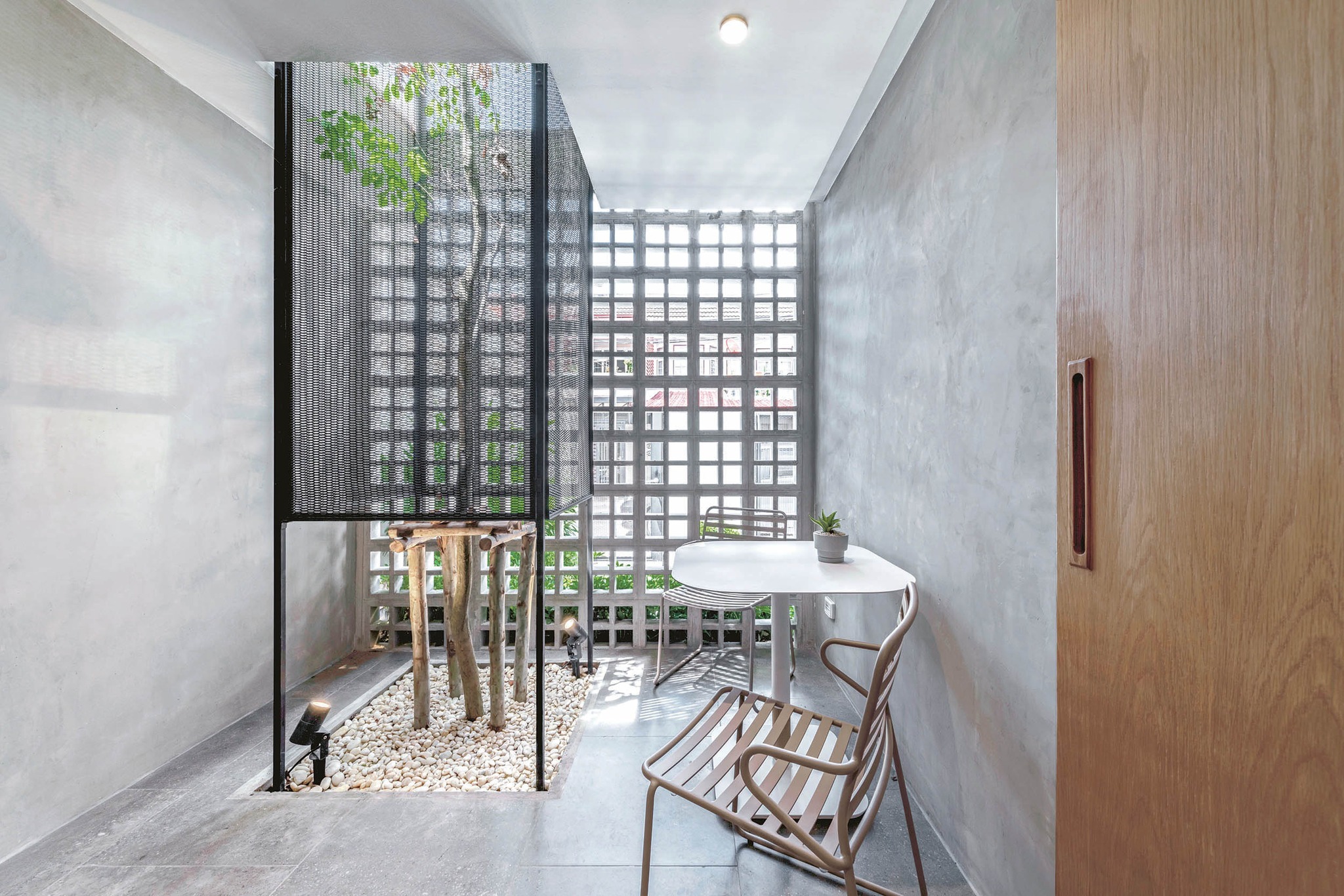
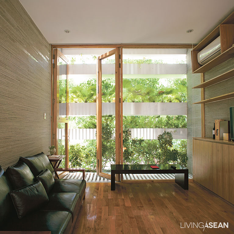
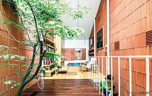
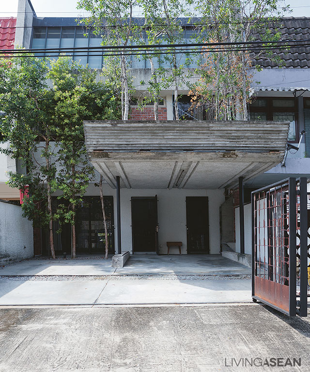
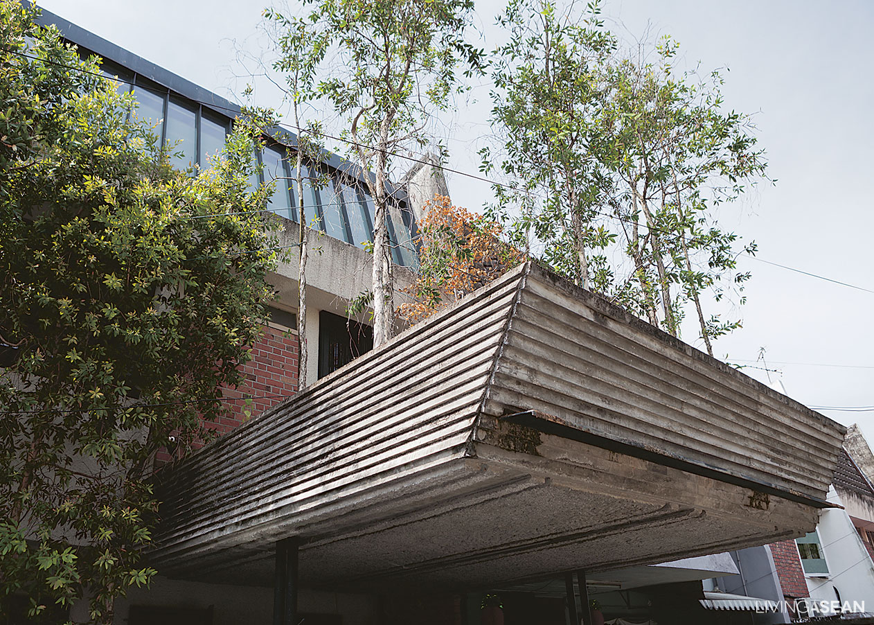
Decorated with healthy green foliage, the second-floor balcony provides a relaxed outdoor room and protects the home from the hustle and bustle of the big city.

Located in a commercial zone, the store at ground level is understandably busy and the crowded street bustling with activity.

Climb a flight of stairs to the second floor, and you come to an impressive office space. The area on this level of Bao Long Office is divided into two parts. There’s a warm and welcoming workspace at the office on one side that’s clearly separated from private living quarters on the other.

Both parts are conveniently accessible via the balcony connected to the front façade. The second-floor outdoor platform is decorated with an oasis of calm that’s very pleasant to look at.
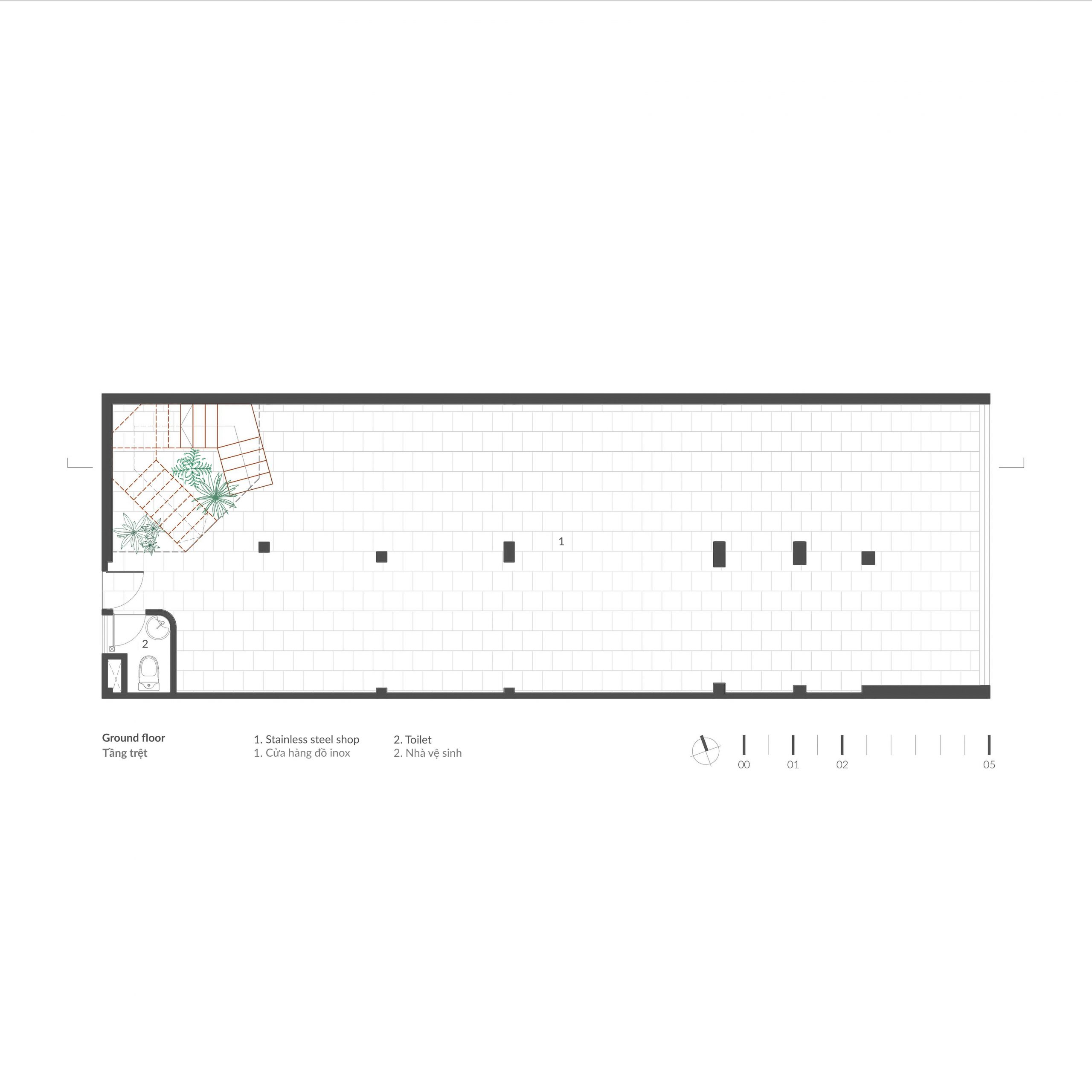
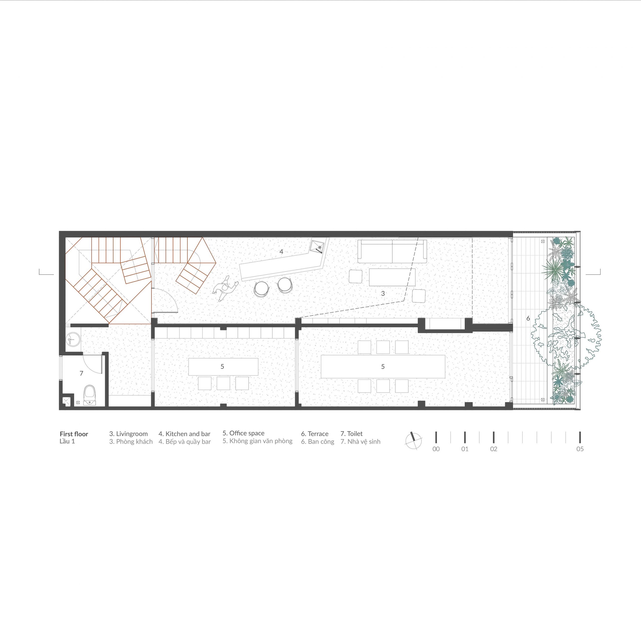
Ground Floor Plan Courtesy of H.a
First Floor Plan Courtesy of H.a
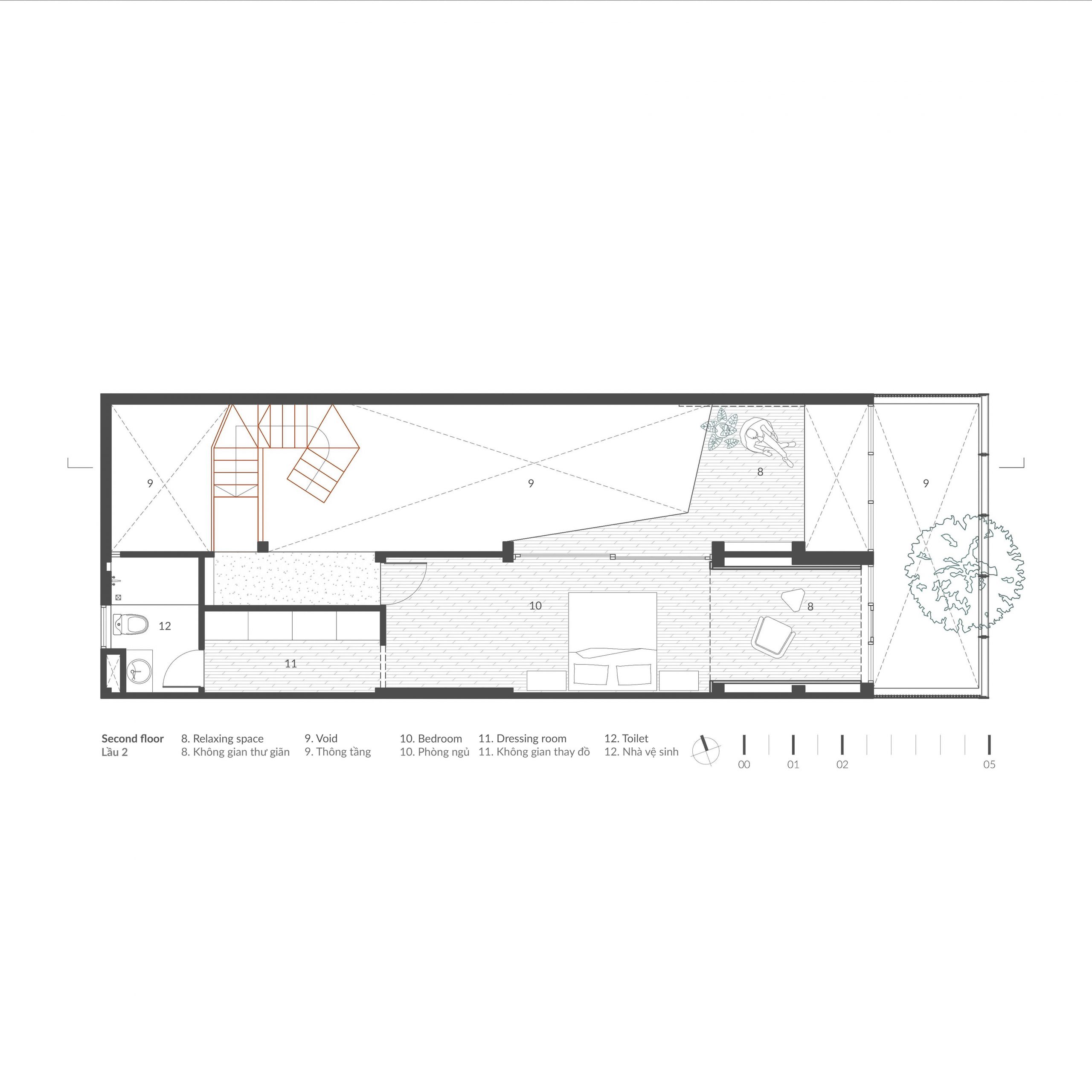
Second Floor Plan Courtesy of H.a


Bao Long Office
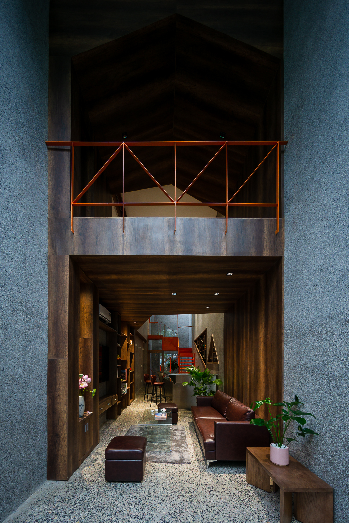
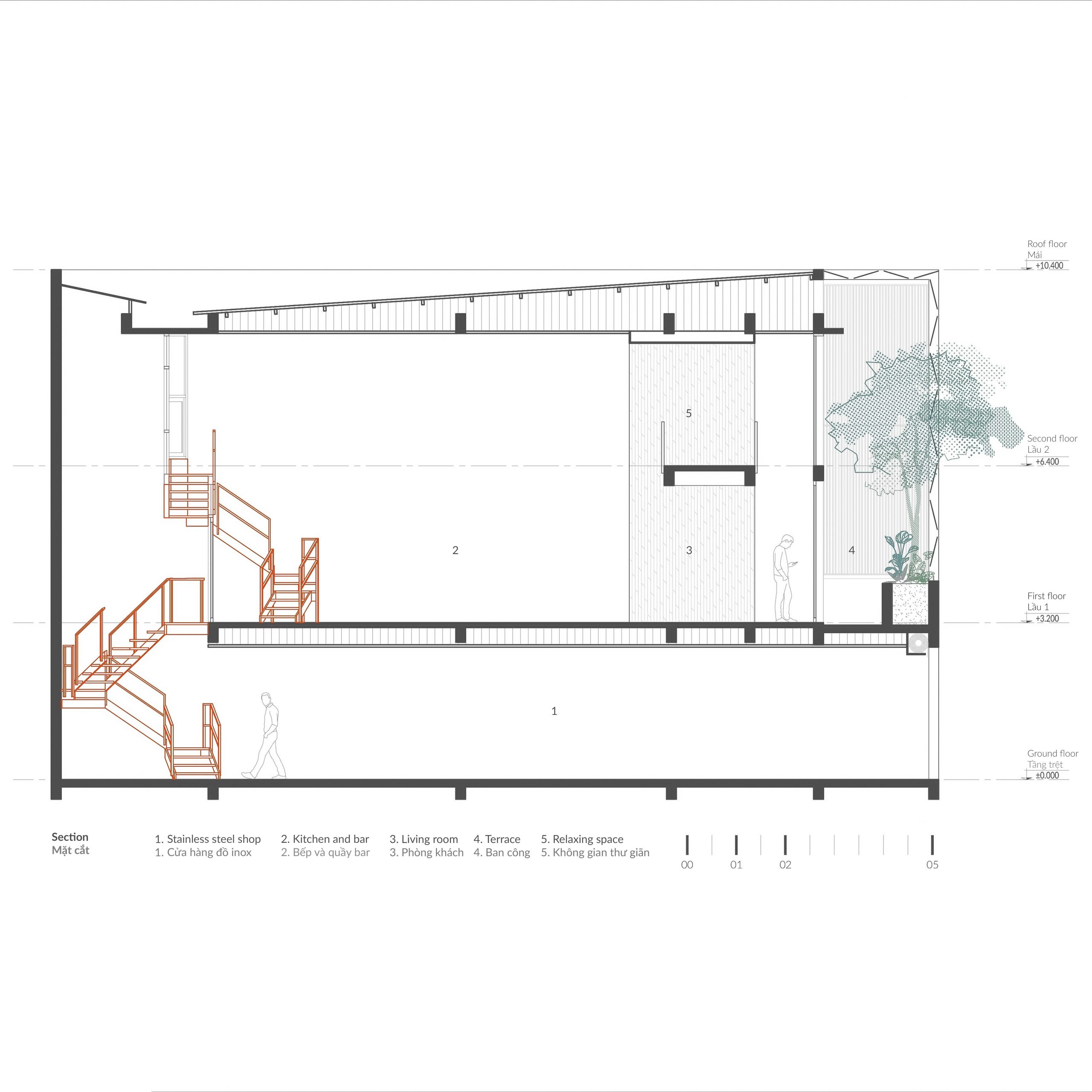
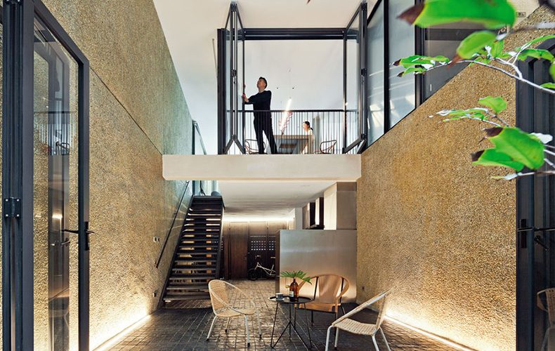
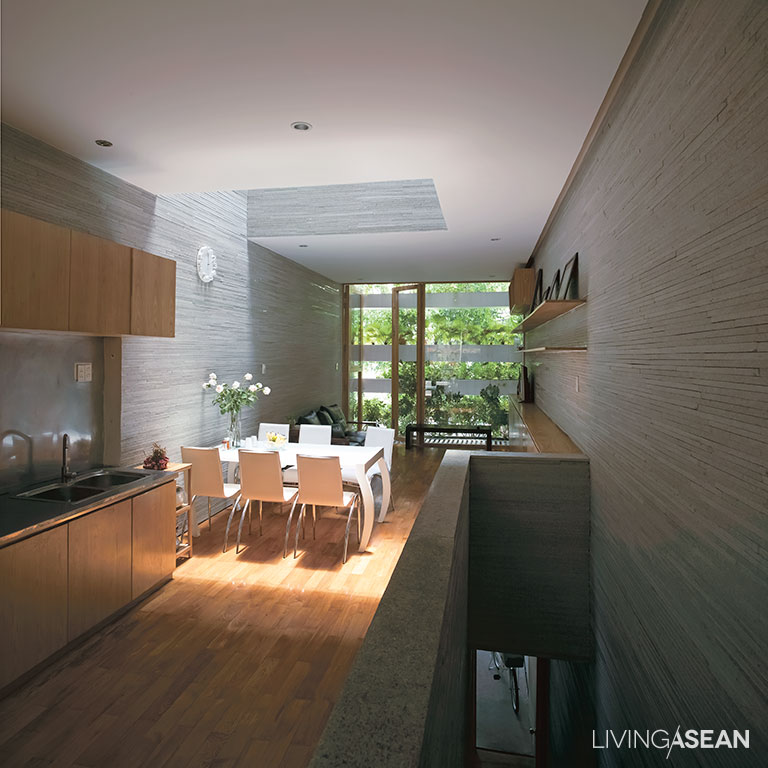
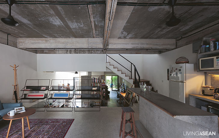
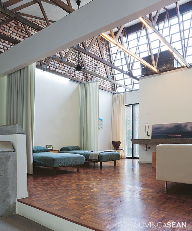
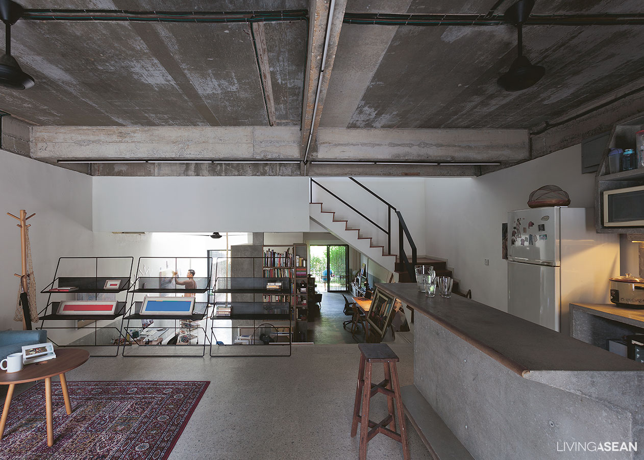
Double-height ceiling design offers open and pleasing tranquility to a long and narrow living room.

Bao Long Office

Section Drawing Courtesy of H.a

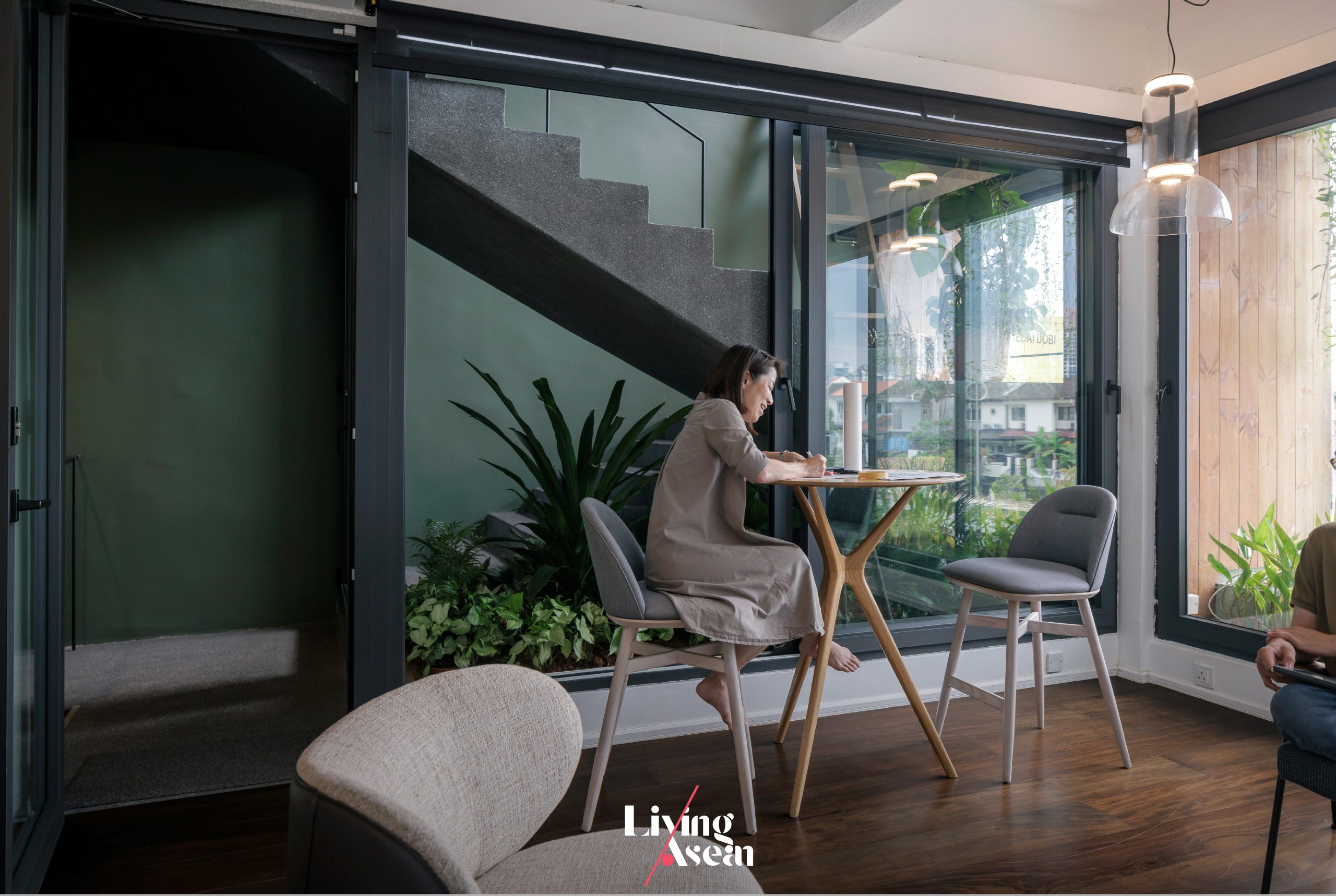
The office consists of a workroom and meeting room with simple interior décor. The walls are painted white symbolizing a new beginning and the floors covered in terrazzo.

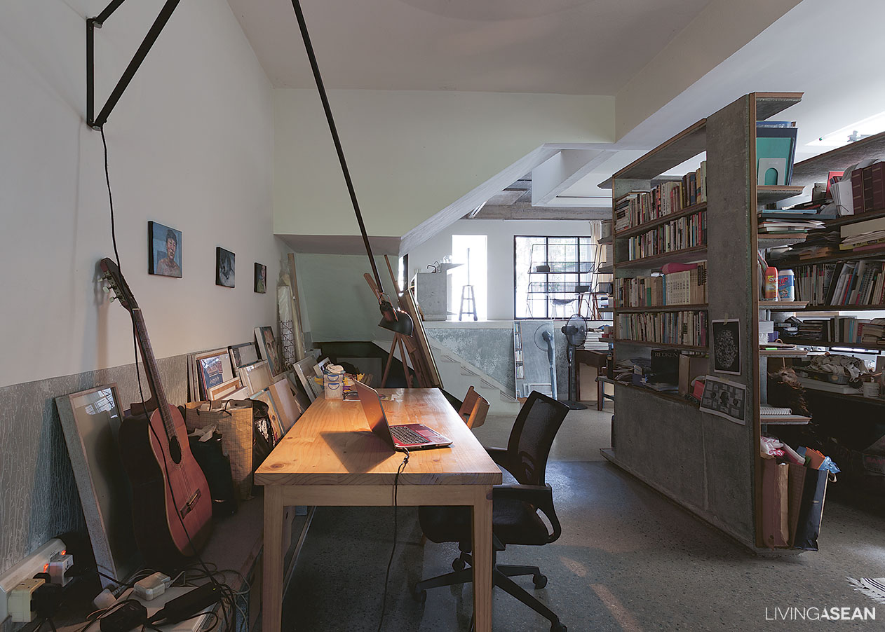
There’s a custom work table with drafting stools that runs parallel to the wall and stretches the entire length of the room.

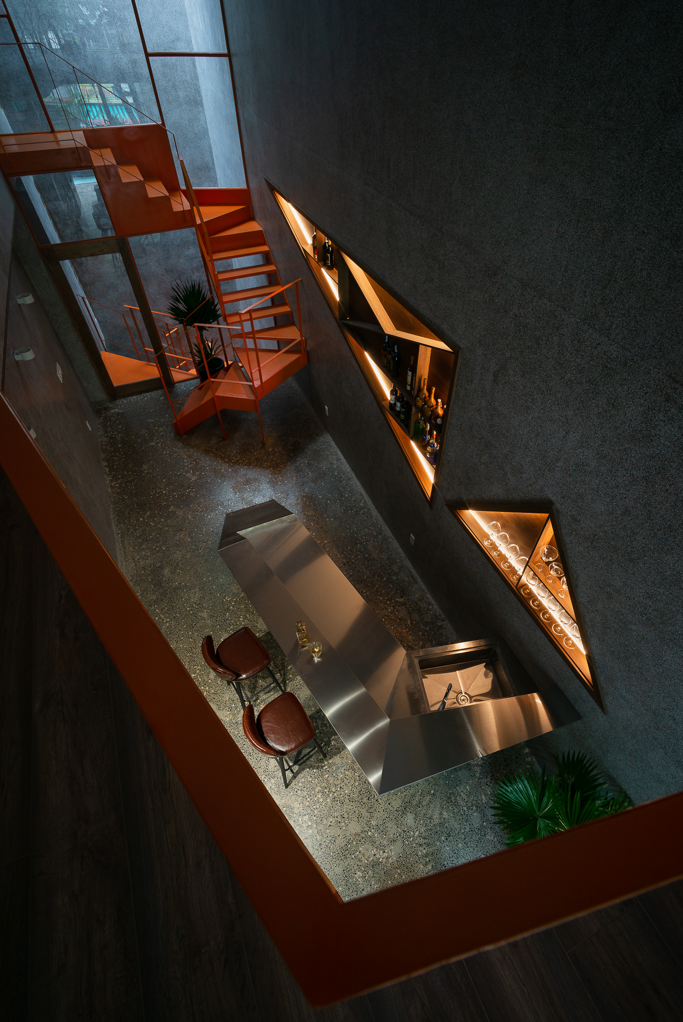
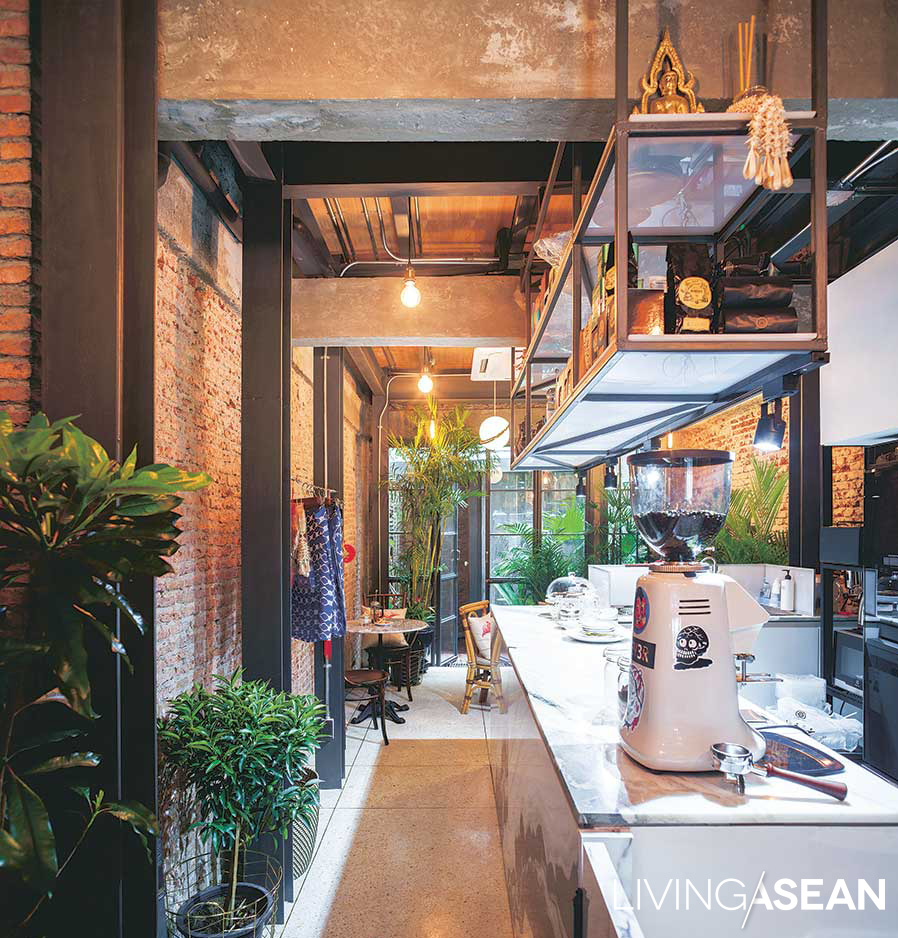
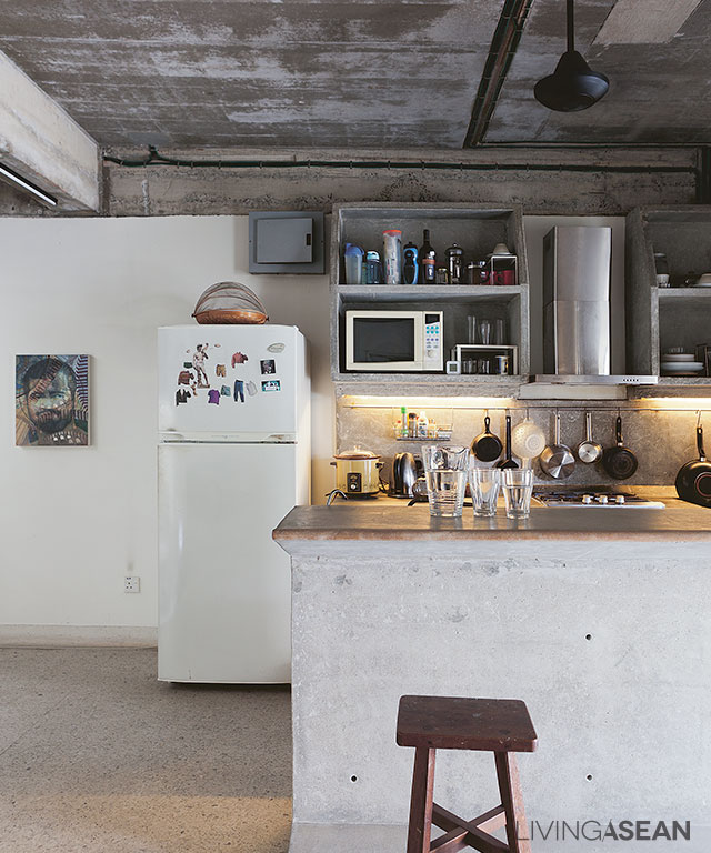
The atmosphere is strikingly different from the calming space of nearby private living quarters. To create a homely atmosphere, the living room has a small beverage bar with pantries customized to the homeowner’s hosting style.

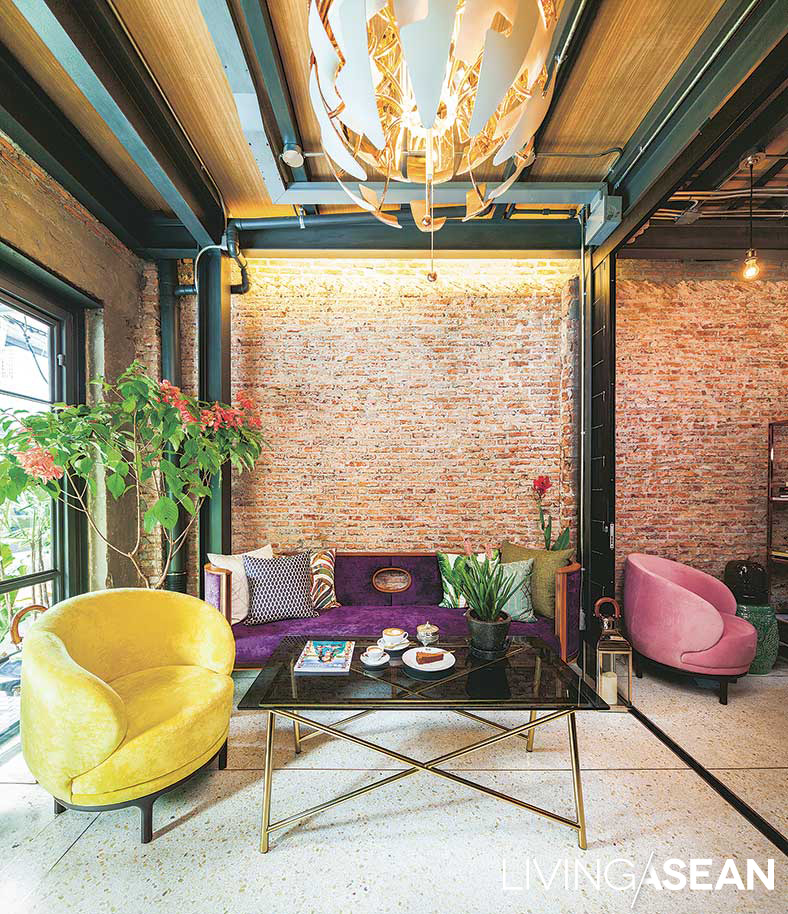
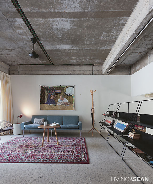
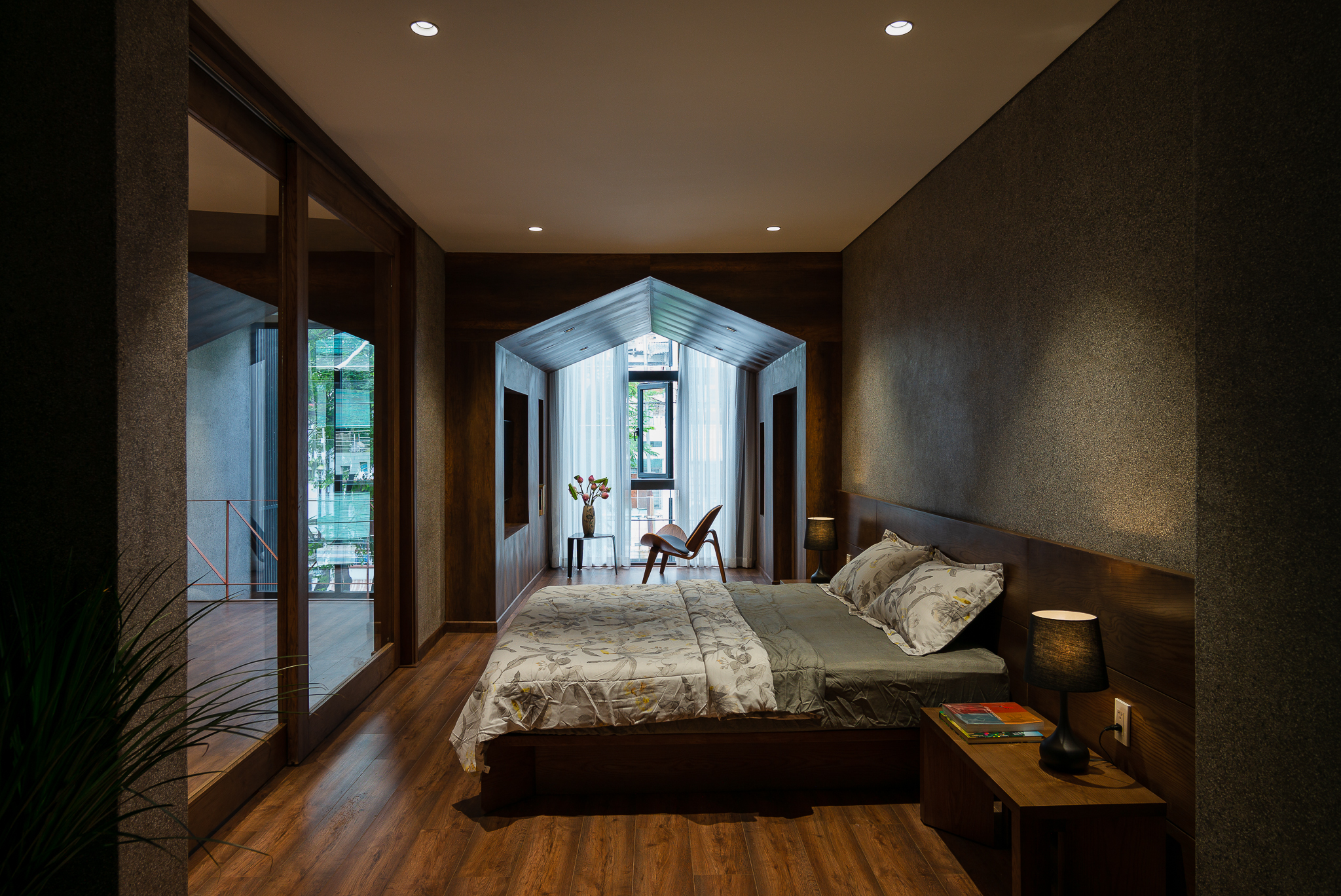
At the farthest end lies a peaceful sitting area decorated with deep colors that match the dark surfaces of terrazzo floors, concrete walls, and rustic walnut furniture.

Softened by the dim light, it’s a relaxation technique to create warmth and reduce stress in the home.
Bao Long Office
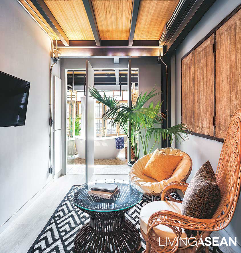
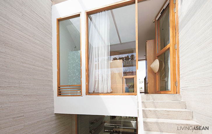
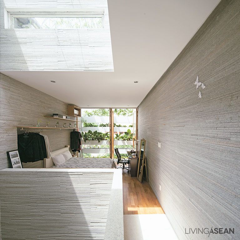
The homeowner’s sitting room on the third floor is quiet and secluded.

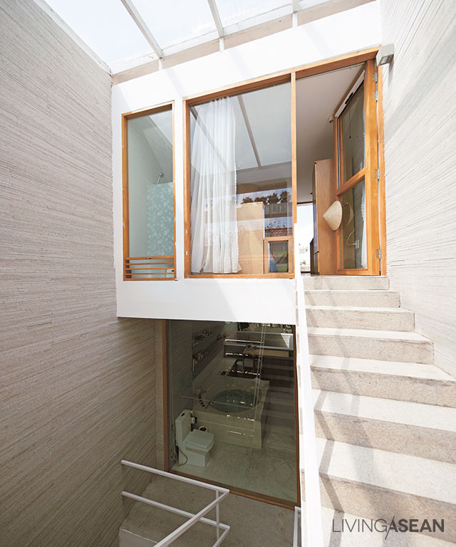
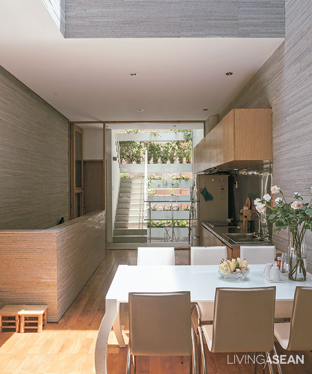
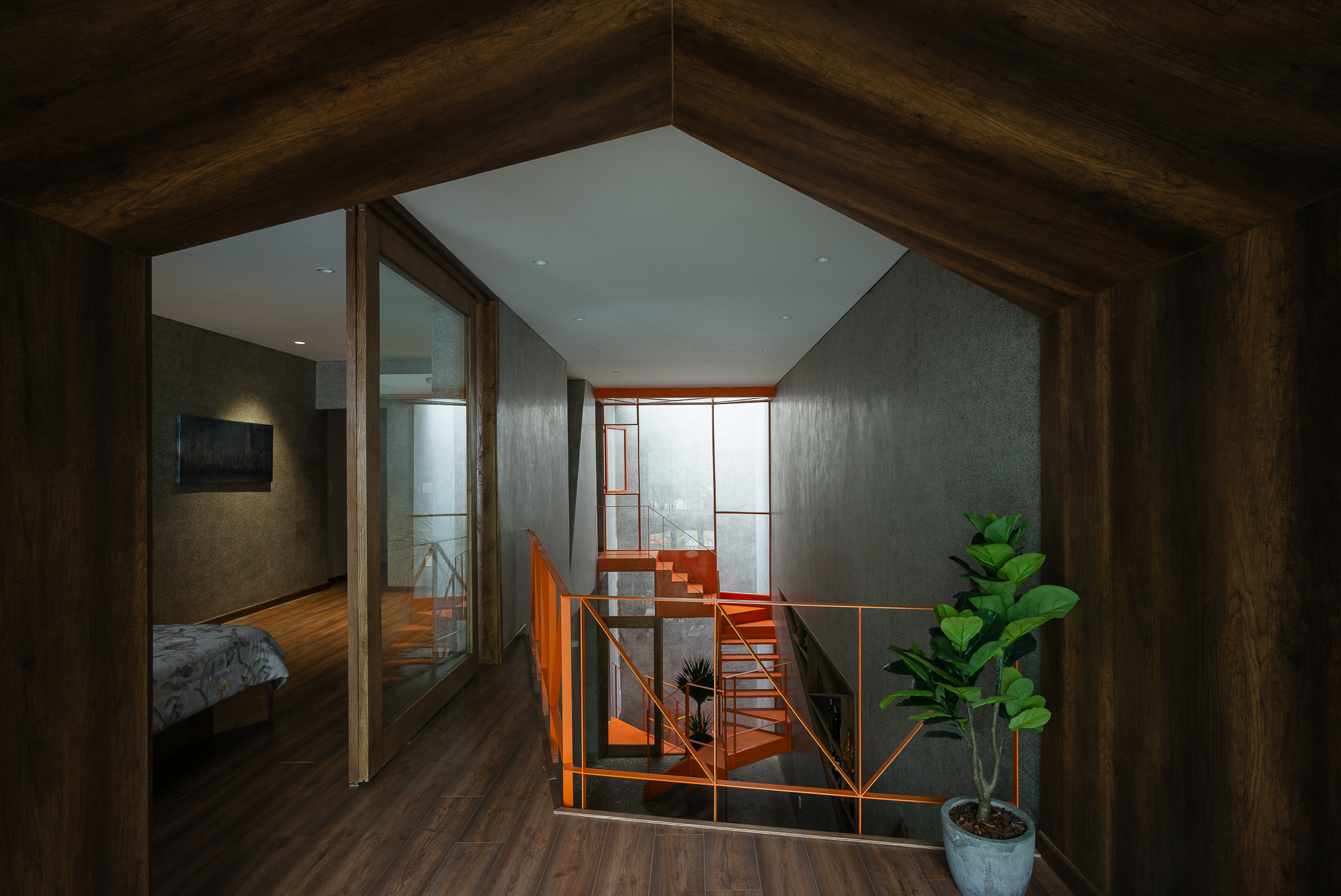
At the same time, a section of the upper floor was taken out to make room for an entrance hall with double-height ceiling design. Not far away, a set of stairs was installed to connect to the homeowner’s secluded living quarters on the top floor.

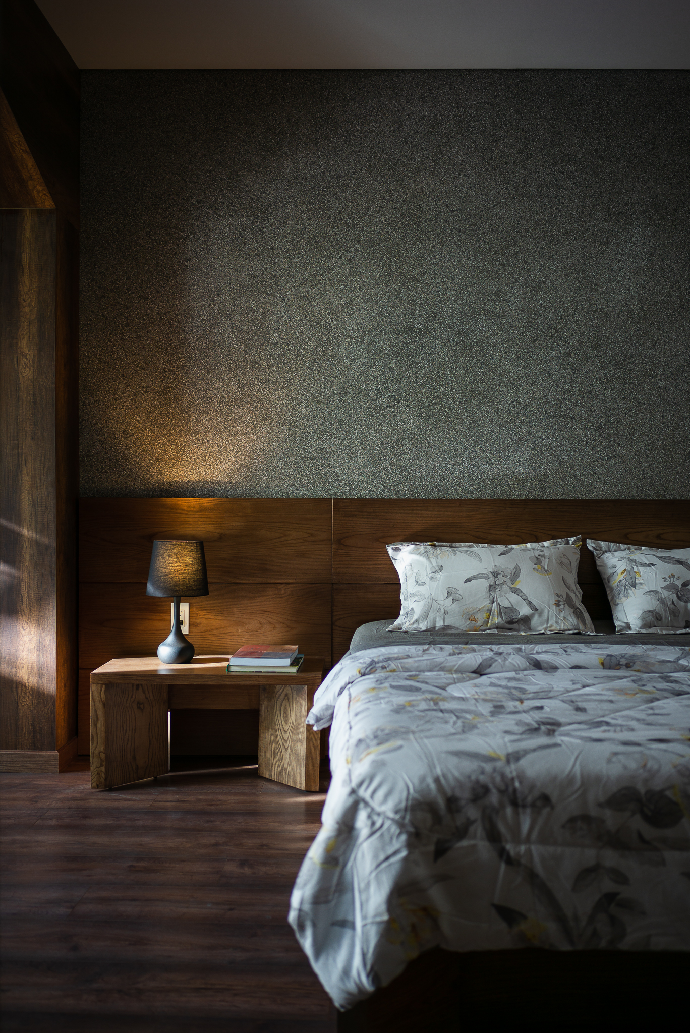
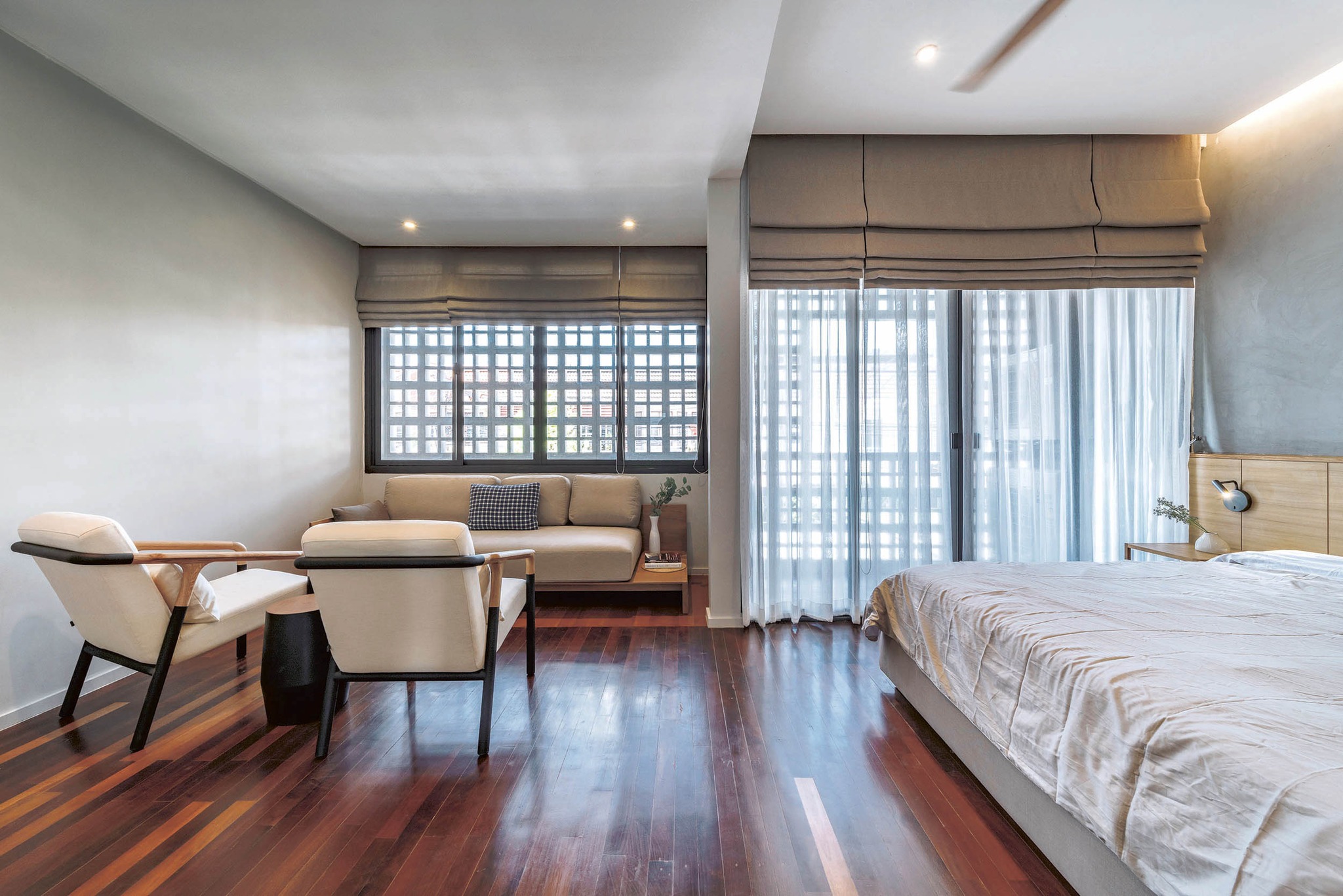
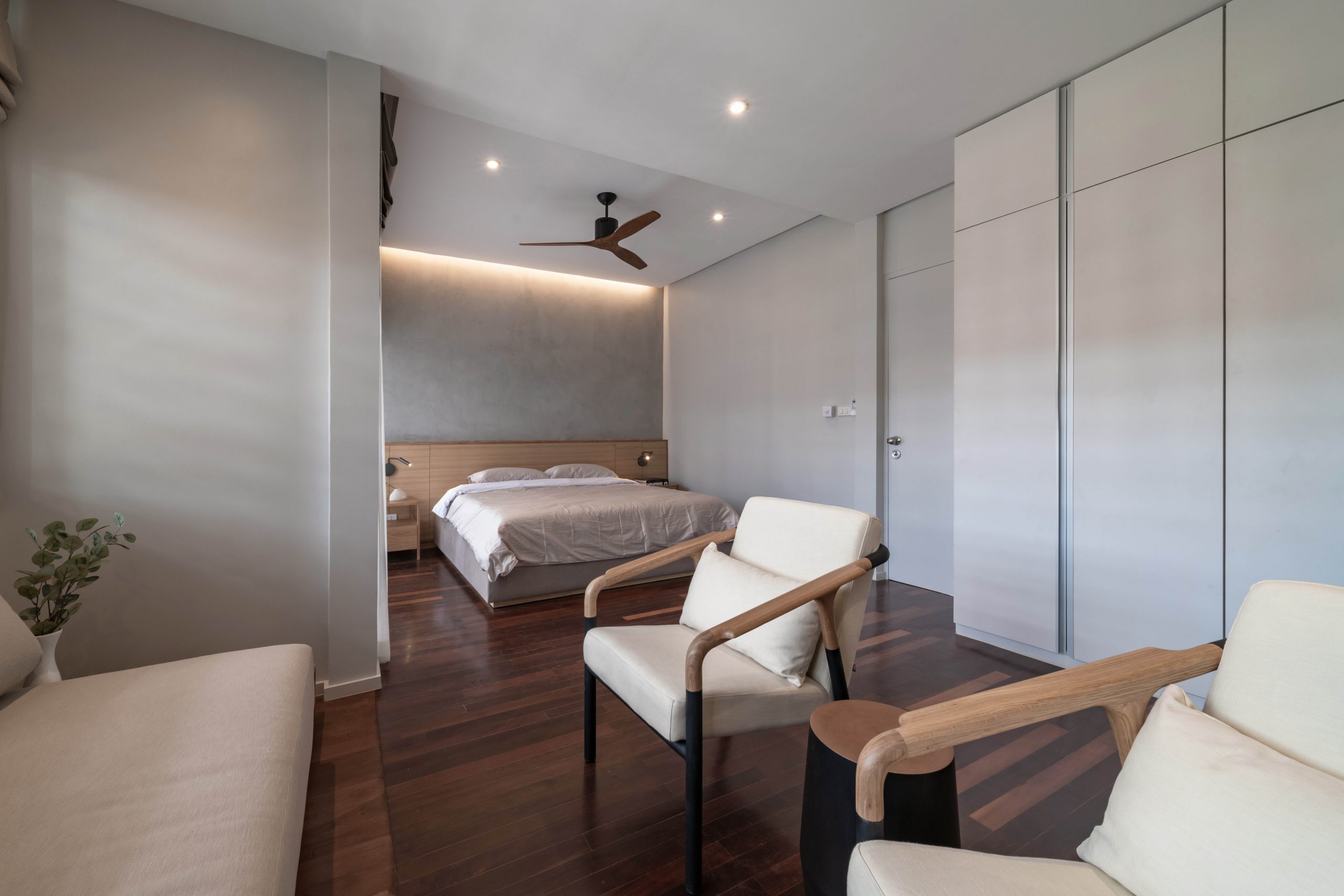
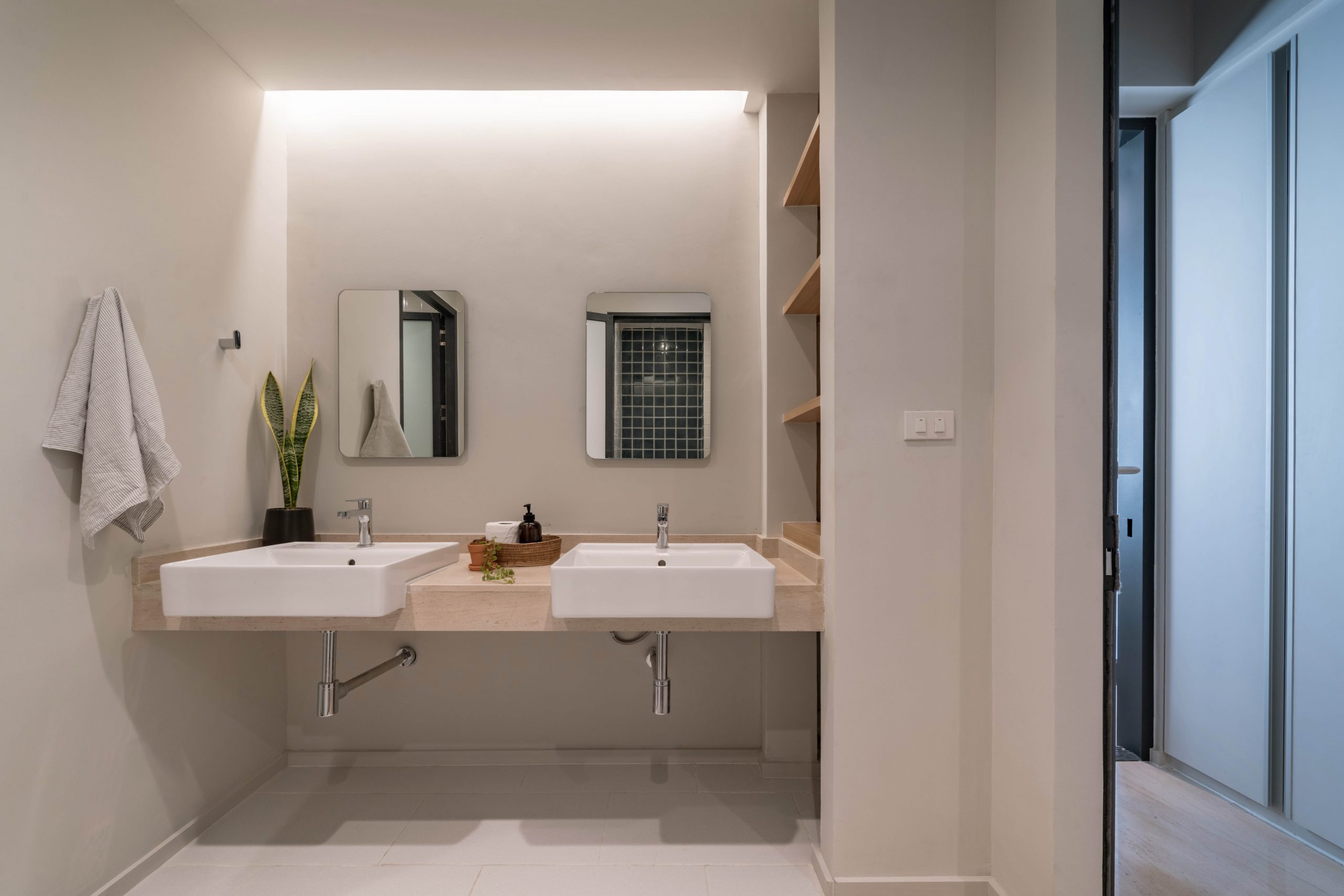
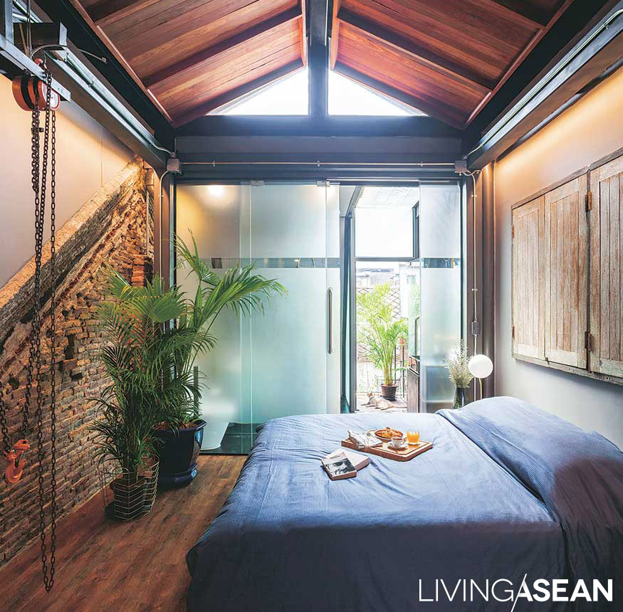
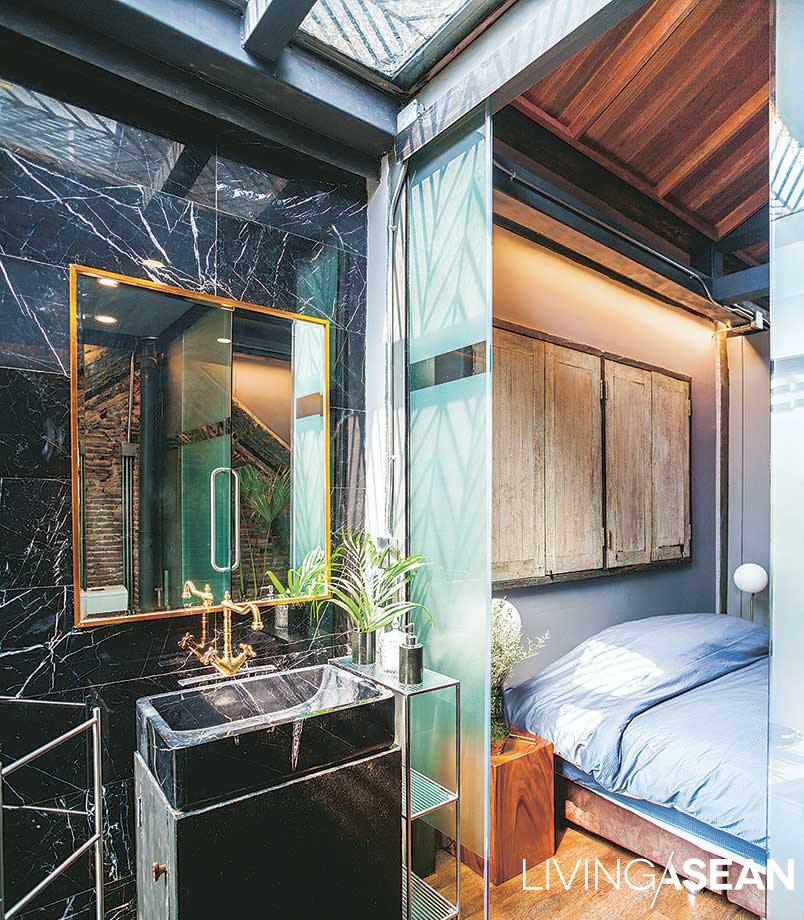
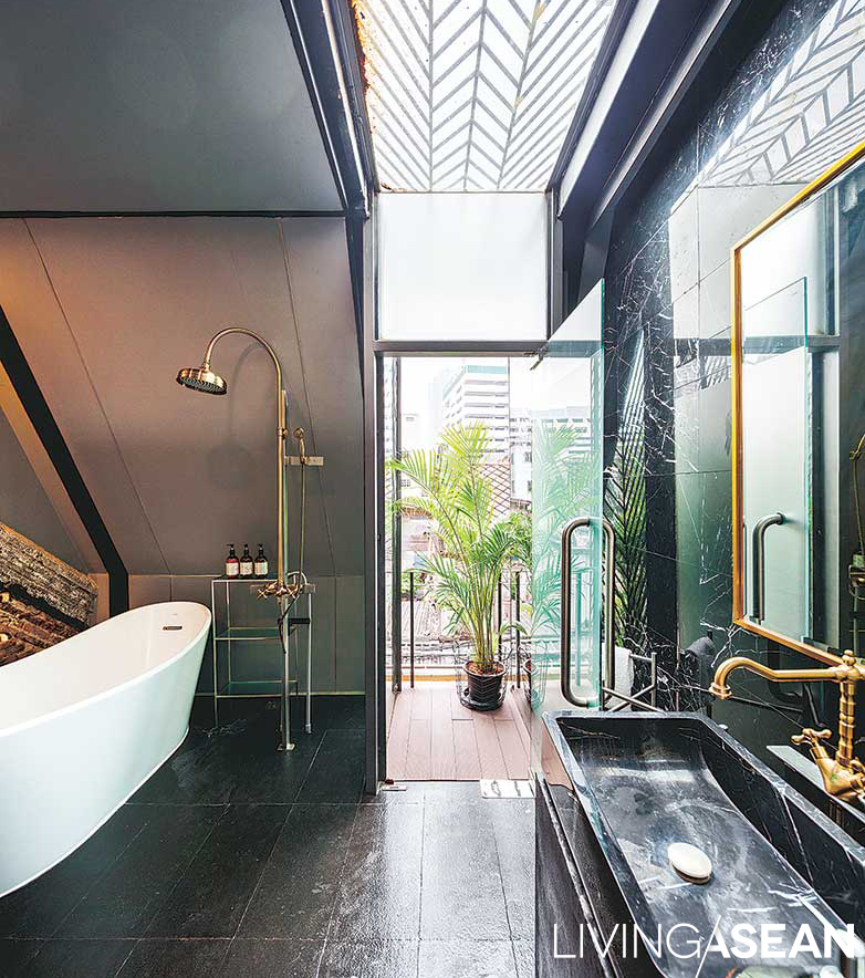
The private residential zone comes complete with a bedroom with en suite bath, sitting room, and dressing room.
Bao Long Office

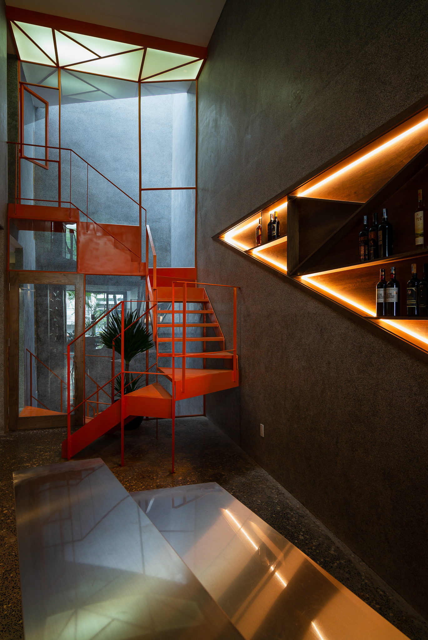
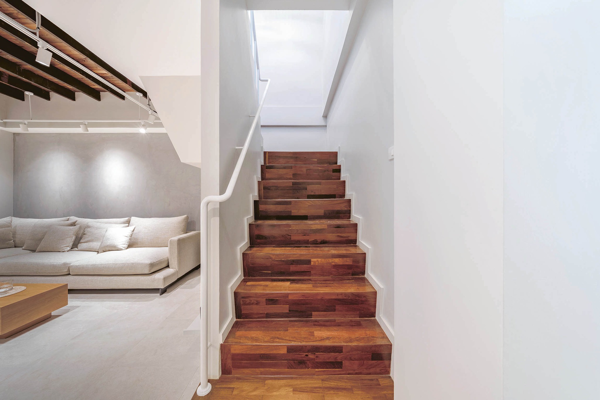
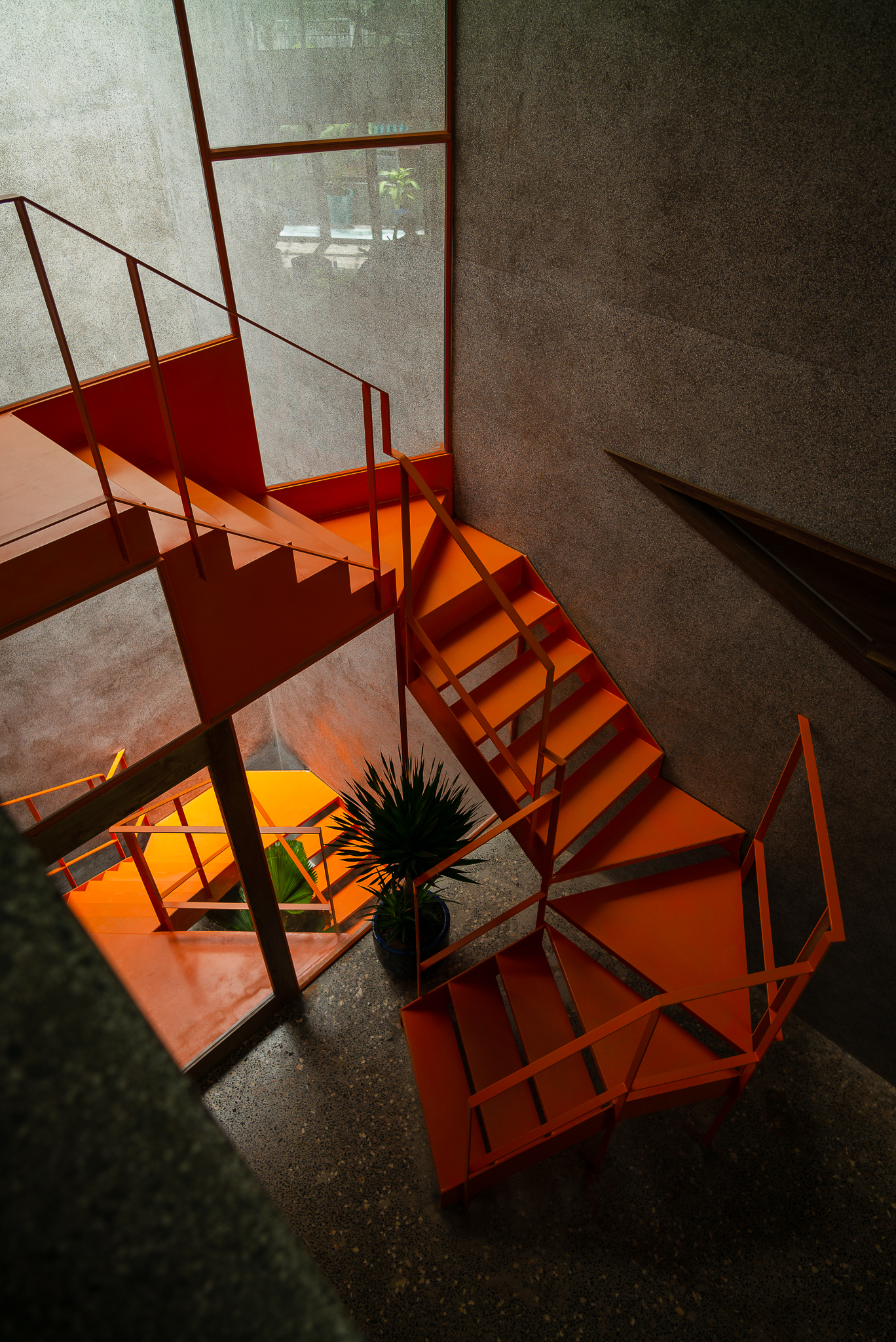
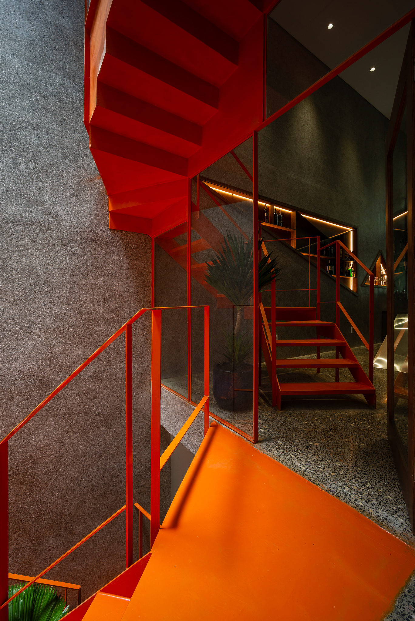
A staircase painted orange creates an unexpected playful contrast with the calmness of a small interior space.

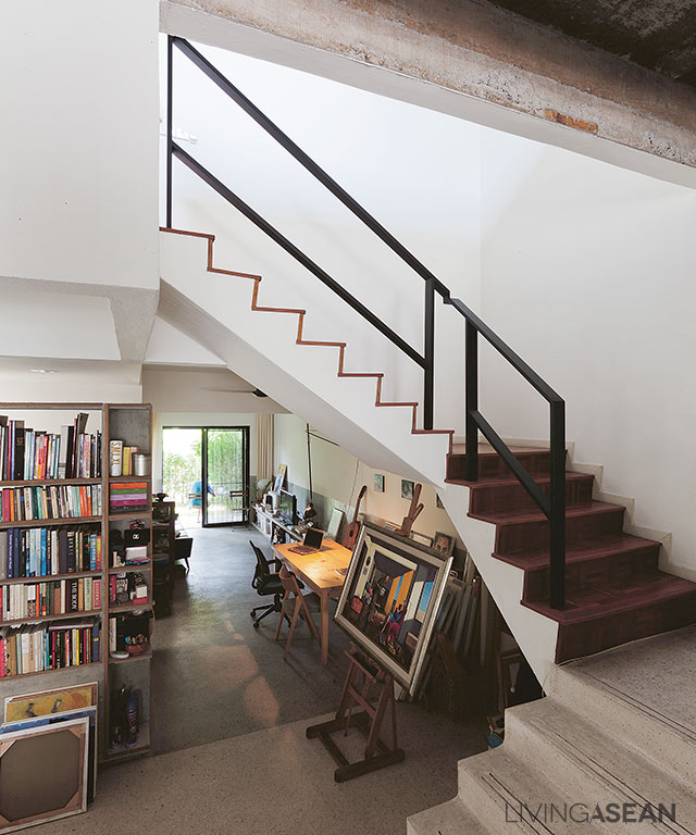
Painted a shade of orange color, the steel staircase leads from the ground level, where the retail store is located, all the way to the private residential zone on the top floor of Bao Long Office. Its playful design is intended to express pleasure and joy in everyday life.

You got that right! It’s part of a home improvement project designed to make life more fun. It serves the primary purpose of getting house occupants from one floor to the next, and it’s done in a unique, stylish way.


Architect: H.a (www.facebook.com/workshopha) + NQN. (www.facebook.com/nqn.architects)


The article is an excerpt from “Home Office / Home Studio,” a book that compiles ideas on integrating “home” with “workspace” to create a comfortable and suitable environment for small companies, startups, and creative individuals.
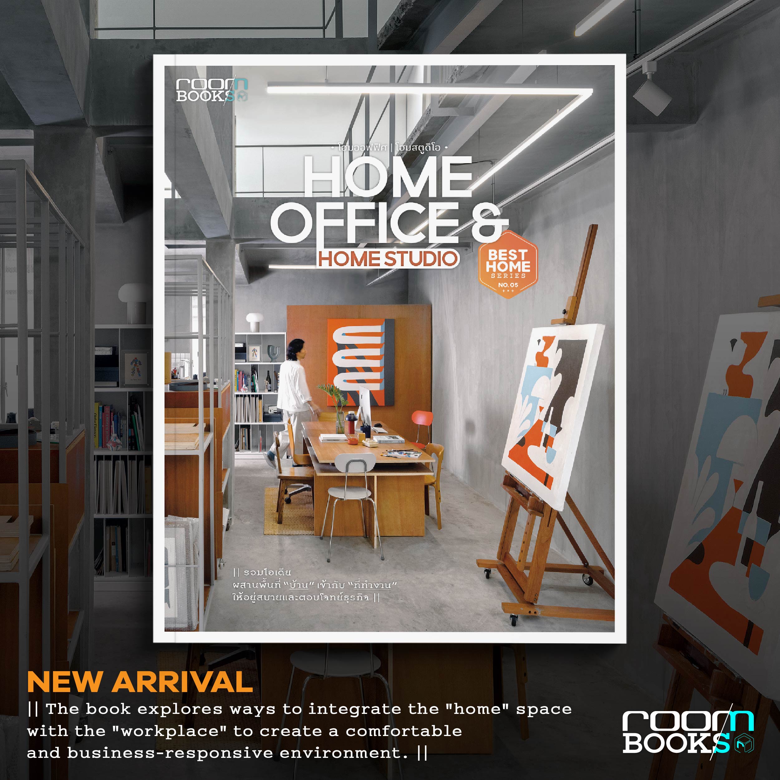
You can find it at leading bookstores throughout Thailand or order it through various online channels.

INBOX: m.me/roomfan
NAIIN: https://www.naiin.com/product/detail/582920
SHOPEE: https://shp.ee/uirj9q5
LAZADA: https://s.lazada.co.th/s.9V0vz


You may also like…
A Renovation in Sync with the Times: Beautiful Mixed-Use Home Office in Petaling Jaya

3 x 9 House: A Compact Renovated Row House in HCMC

A Renovation in Sync with the Times: Beautiful Mixed-Use Home Office in Petaling Jaya

A Renovation in Sync with the Times: Beautiful Mixed-Use Home Office in Petaling Jaya

/ Petaling Jaya, Malaysia /

/ Story: Samutcha Viraporn / English version: Bob Pitakwong /

/ Photographs: Soopakorn Srisakul /

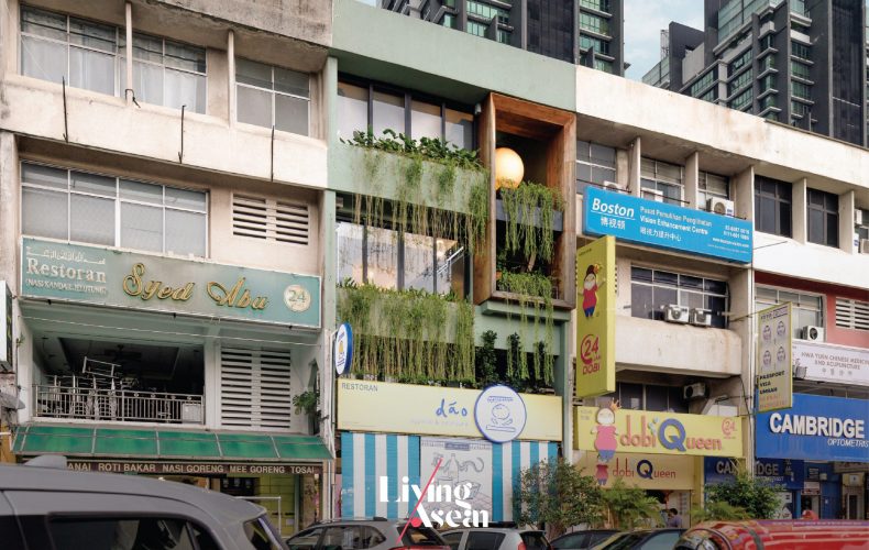
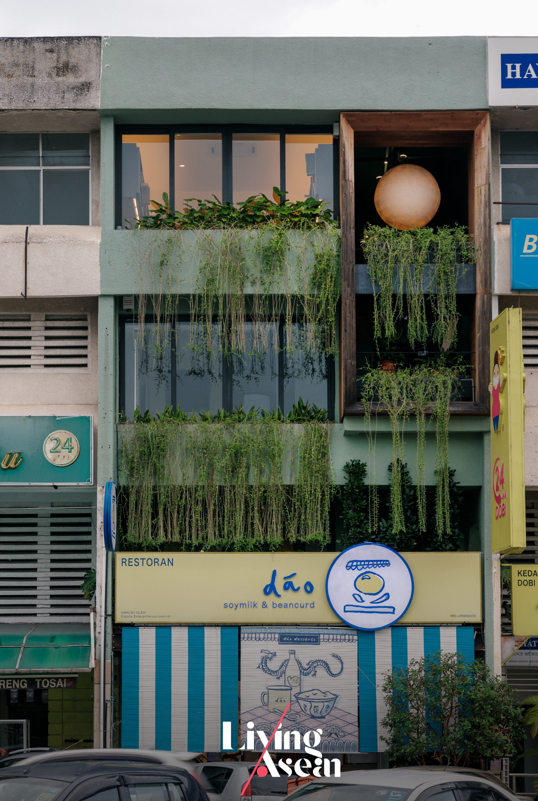
Working from home has become one of the various alternative methods of doing business in the aftermath of a Coronavirus pandemic that took the world by surprise in 2019. Adapting to change, the architecture firm Essential Design Integrated (EDI) interestingly transformed its office in Petaling Jaya into a multi-use space that blended with its downtown business communities. The updated package put a home office and living quarters on the upper floors, while the floor at ground level was rented out to a business selling soy milk pudding.

Home Office in Petaling Jaya
A Renovation Improves Light and Ventilation

Facing the New Normal, the property owner thought it was time to renovate to serve a new purpose. To begin with, there were two main problems in the original design that had to be resolved – light and ventilation.

The single-unit home plan was an elongated rectangle set along the east-west axis. It was 21 meters long with the usual narrow frontage to the street. As to be expected, the interior living spaces were dimly lit during daylight hours and ventilation was poor.

So, to create a bright and airy open-concept house plan, most of the room dividers had to be torn down. In no time, a restoration of the shop house that was part of a 40-year-old traditional building block was completed in a way that fitted beautifully into the bustling commercial neighborhood.

Home Office in Petaling Jaya
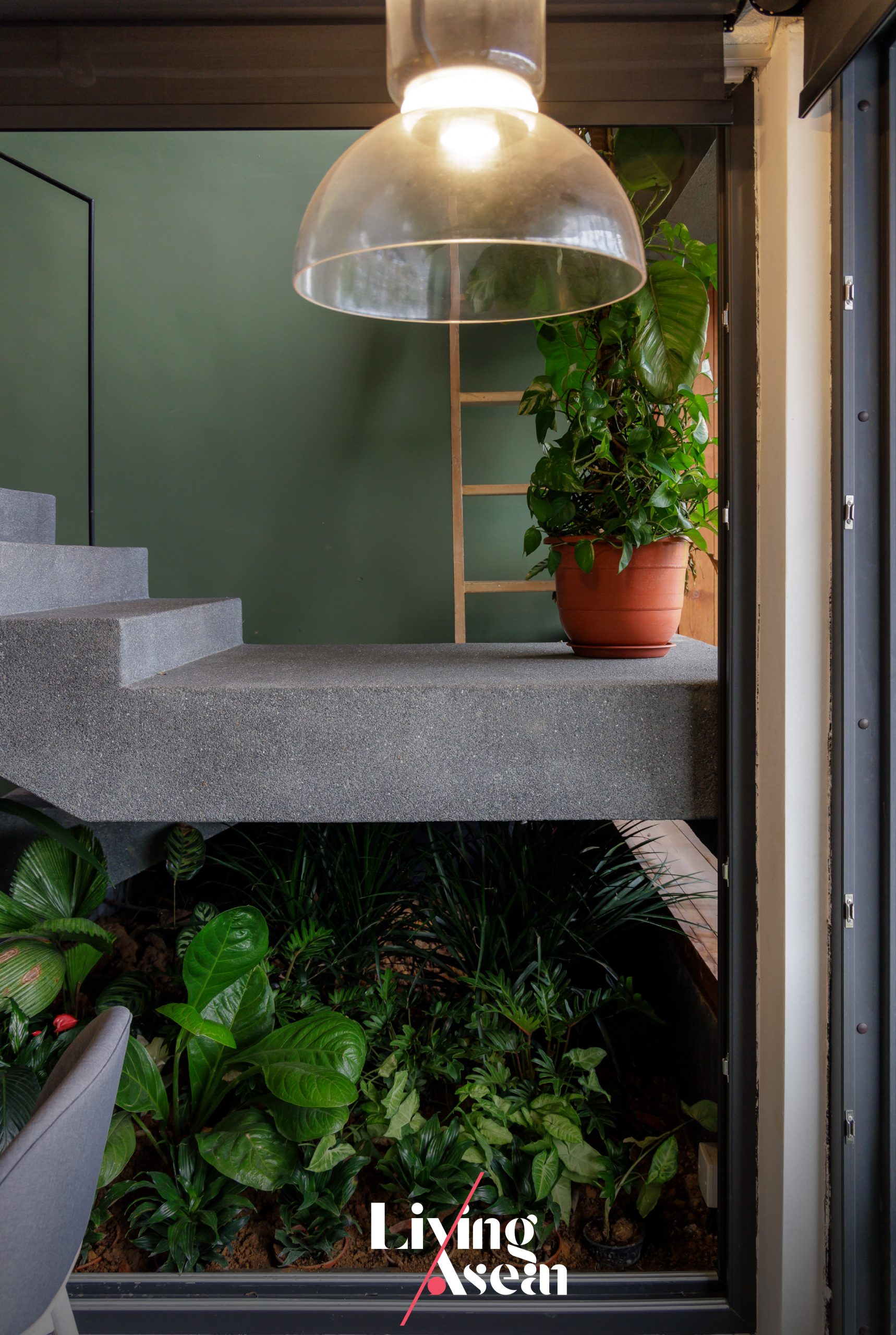
Home Office in Petaling Jaya
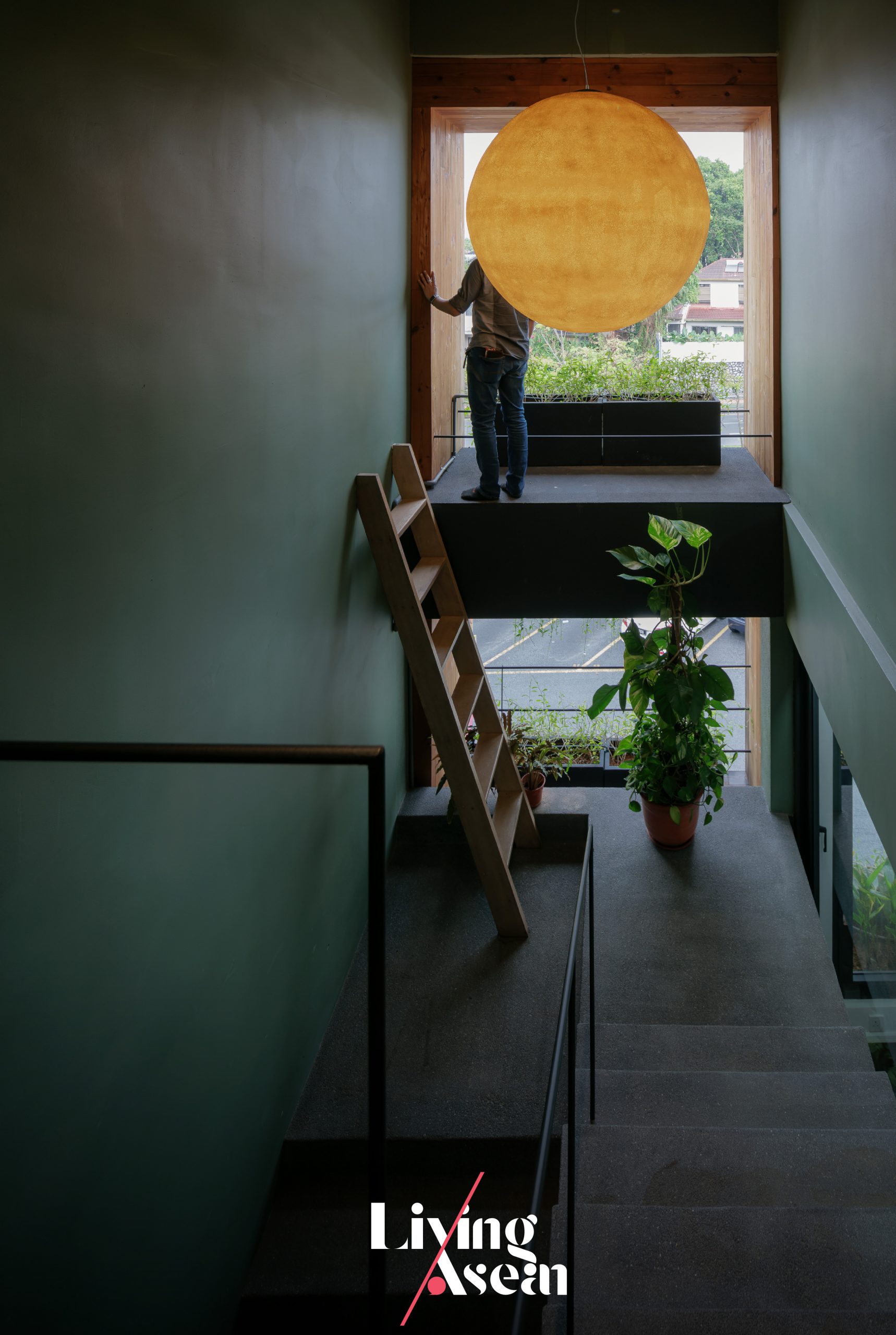
Home Office in Petaling Jaya
An Open Glass Façade Decorated with Plants

Chan Mun Inn and Wong Pei San, the two architects who designed it, said that initially the renovation project was completed a few months prior to the outbreak of Covid-19. At the time the interior was decorated with the lush greenery of a vertical garden on every floor.

Suddenly the Coronavirus disease came and social distancing became the norm. Everyone was keeping to himself. Soon the gorgeous gardens withered away and died due to lack of care.

The job of remodeling the home had to be done again differently. In so doing, the green spaces were revived to create positive energy and relaxation. This is evident in beautiful balcony garden ideas both in front and at the rear, plus the redesigned open glass façade that takes in natural daylight, fresh outdoor air and views of the city landscape.

Home Office in Petaling Jaya
Urban balcony gardens serve multiple purposes. Besides taking in the view, they double as privacy screens, filter out the sun’s harsh glare, admit natural daylight into the home and control ventilation, to name but a few.

To capitalize on vertical space, climbers and hanging plants are grown alongside an array of foliage plants that thrive in containers. Not long ago herbs, including mint and basil, were added to the mix.

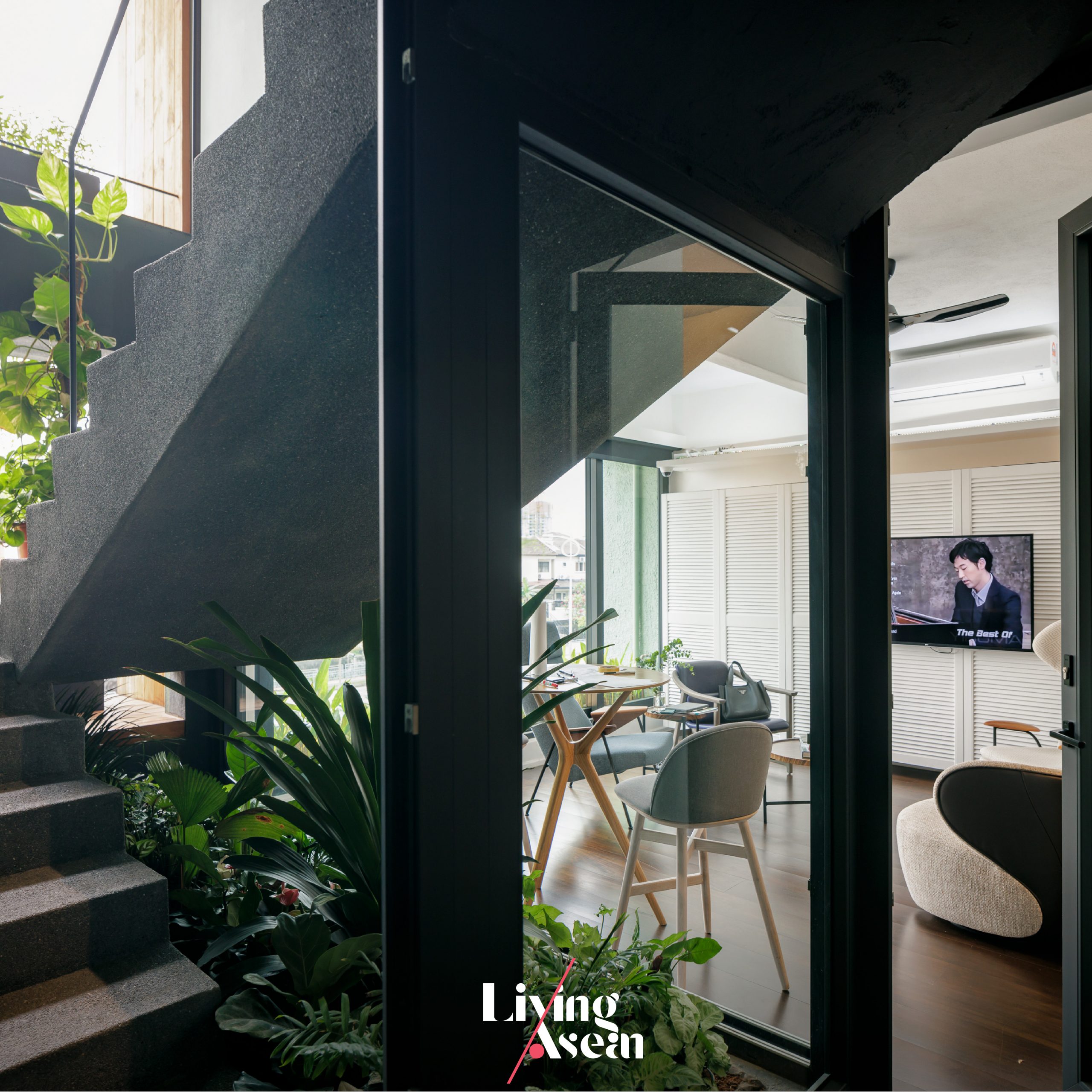
The path along the front staircase is marked with container gardens at intervals. There are openings in the wall to let natural daylight shine through. To create a positive atmosphere, the entrance hall is illuminated by a moon-shaped chandelier, which can be seen from the outside.

Home Office in Petaling Jaya
Home Office in Petaling Jaya
Serving a Dual Purpose as a Home and an Office

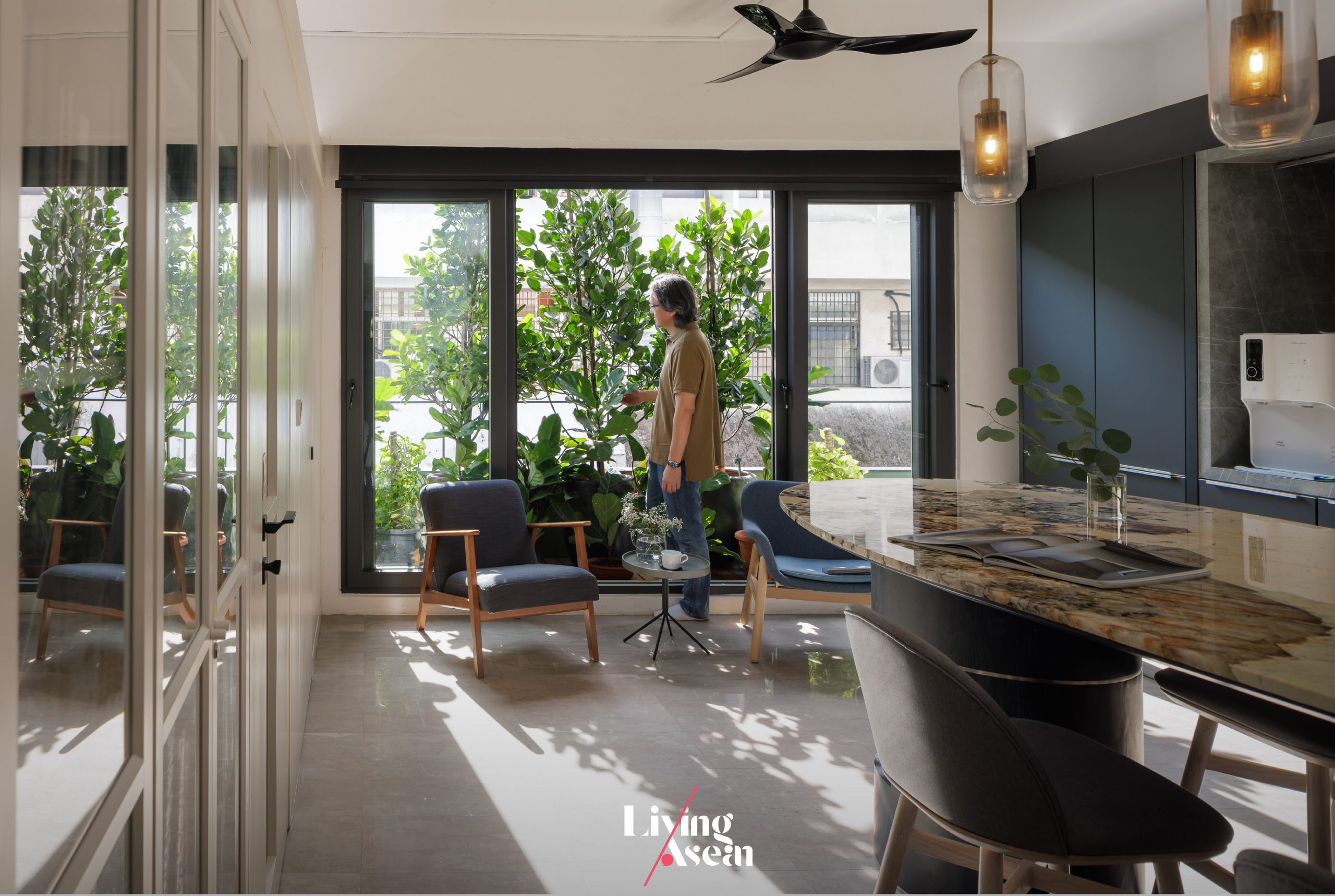
Mimicking an open-concept home plan, the third floor comprises a sitting room, eating room and kitchen arranged in a way that improves traffic flows. Its space within a space design allows each area to easily change to respond to altered circumstances.

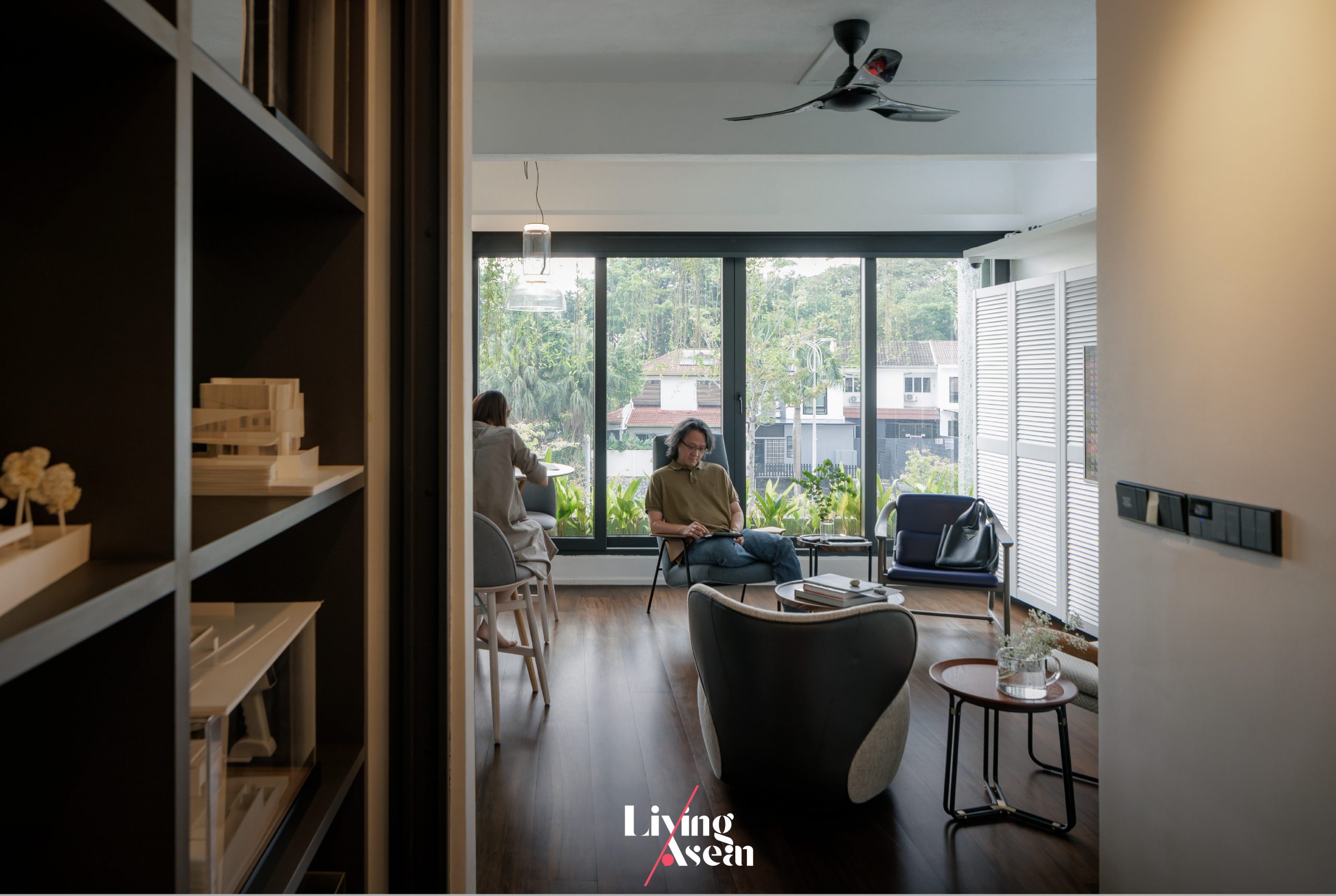
Take for example, the sitting room can transform into a workspace with coffee readily available. The meeting room can change into an eating room when not in use.

Home Office in Petaling Jaya
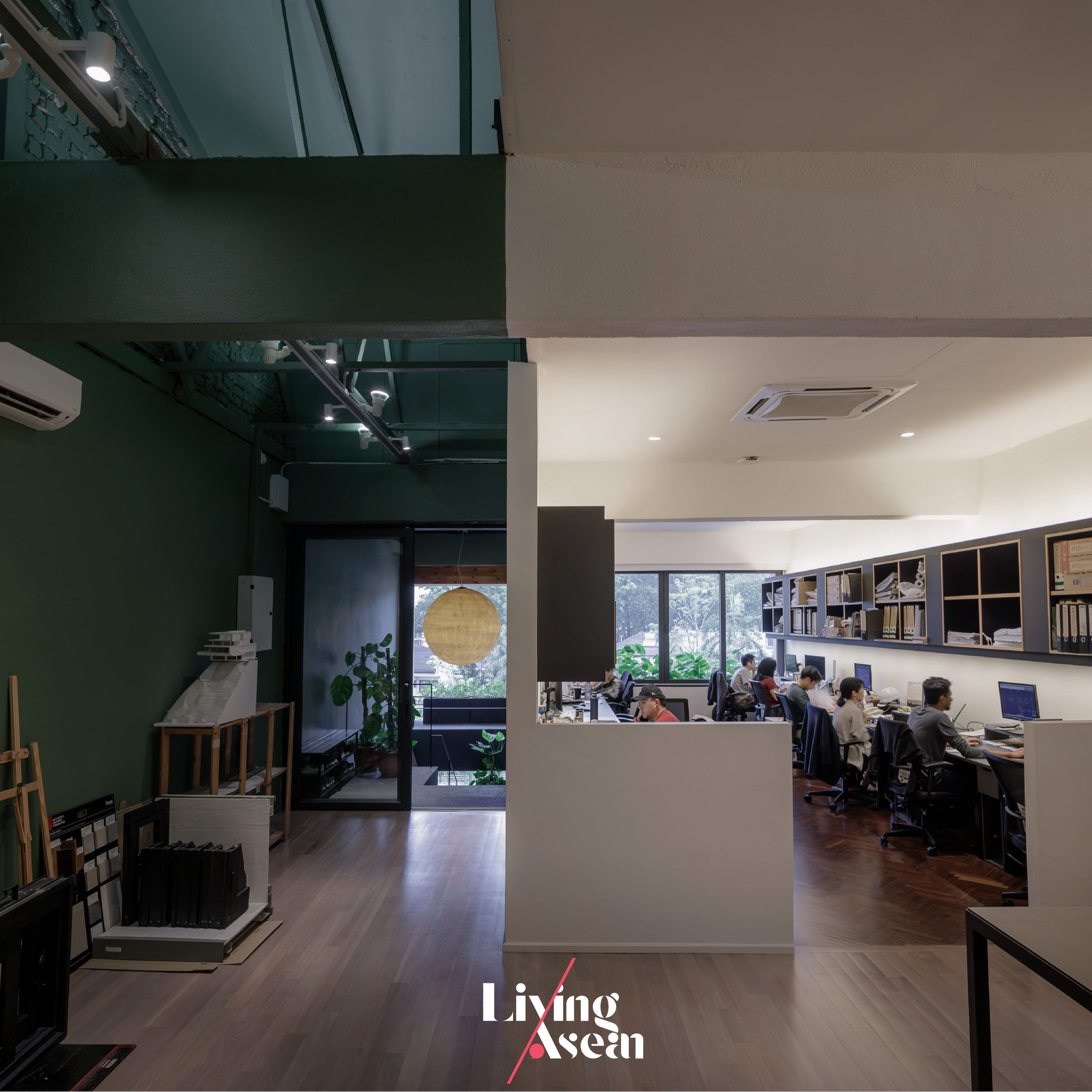
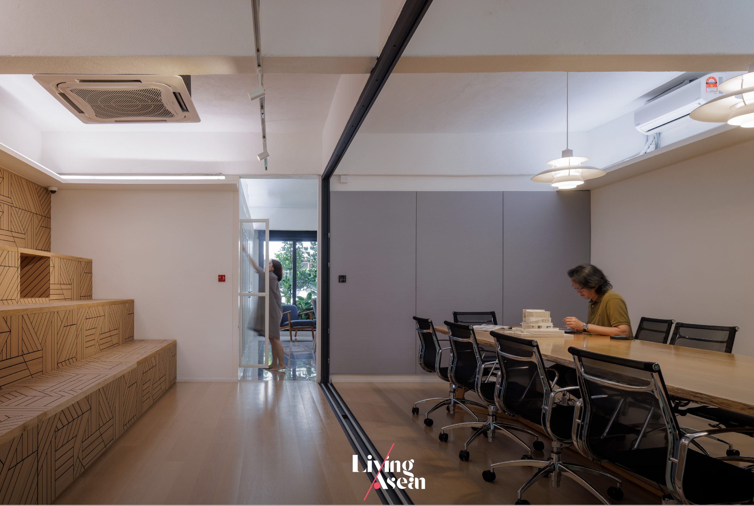
Like home, the office on the third floor is simple but cozy and comfortable.
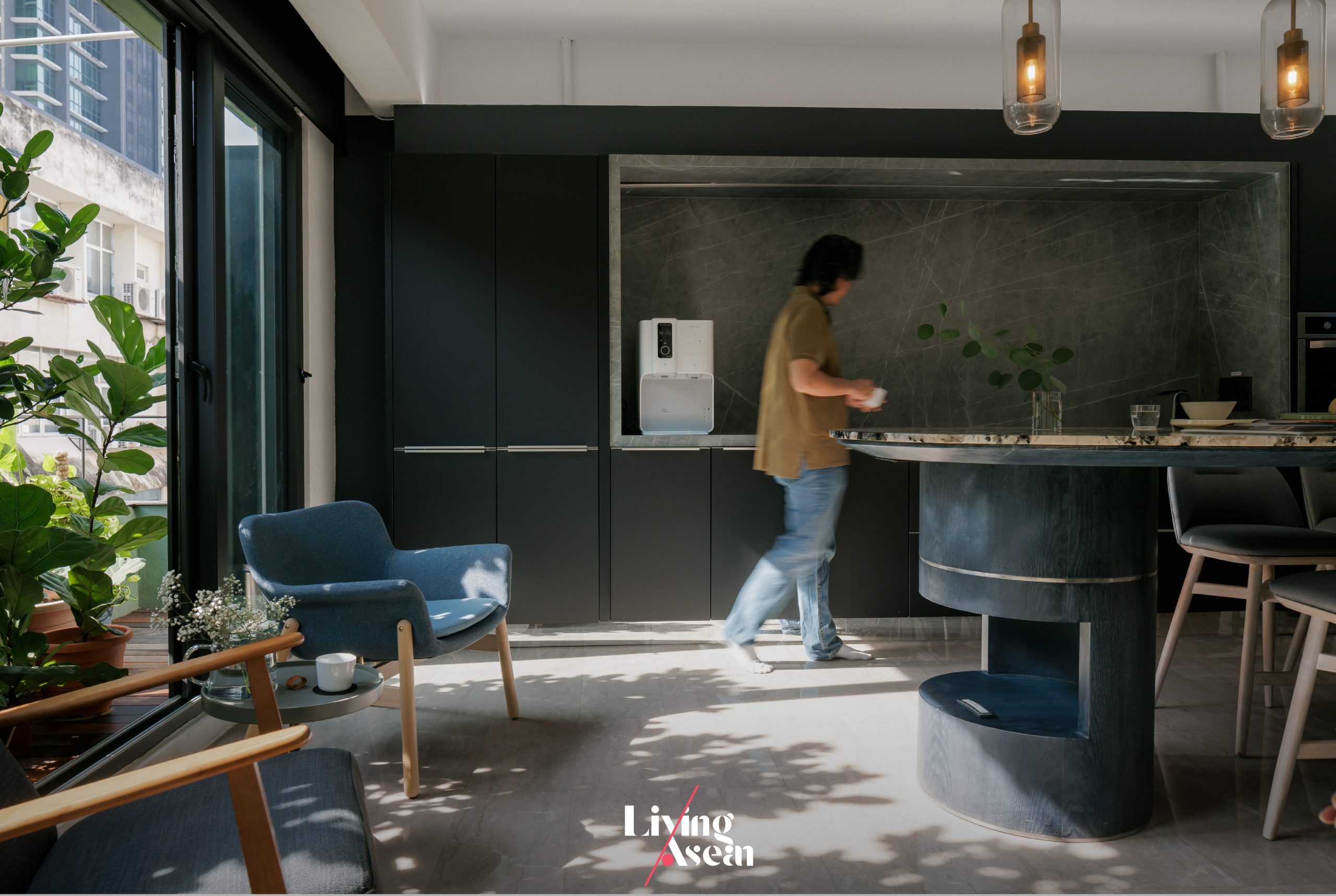
A living room-style kitchen island can easily change into a workspace if need be.

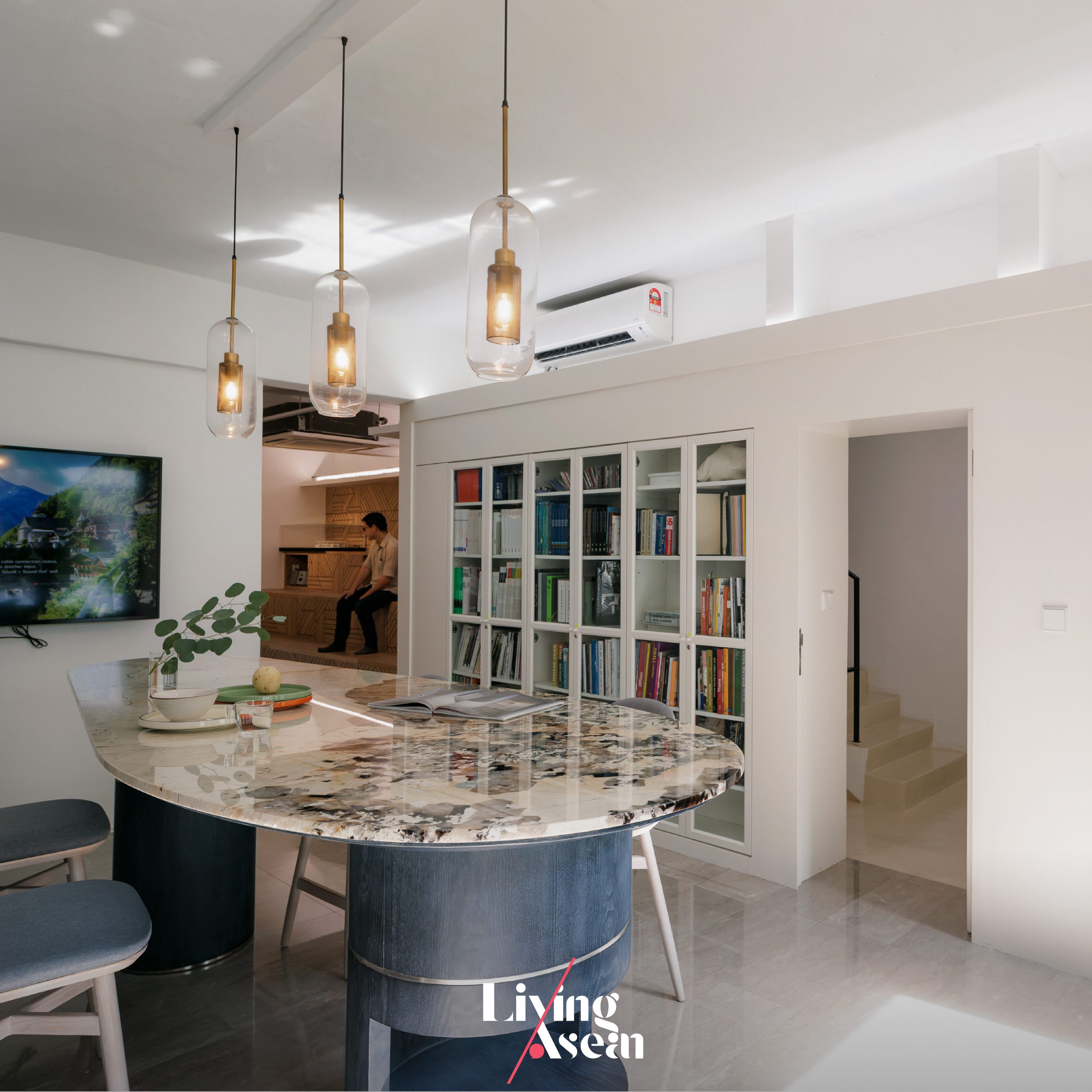
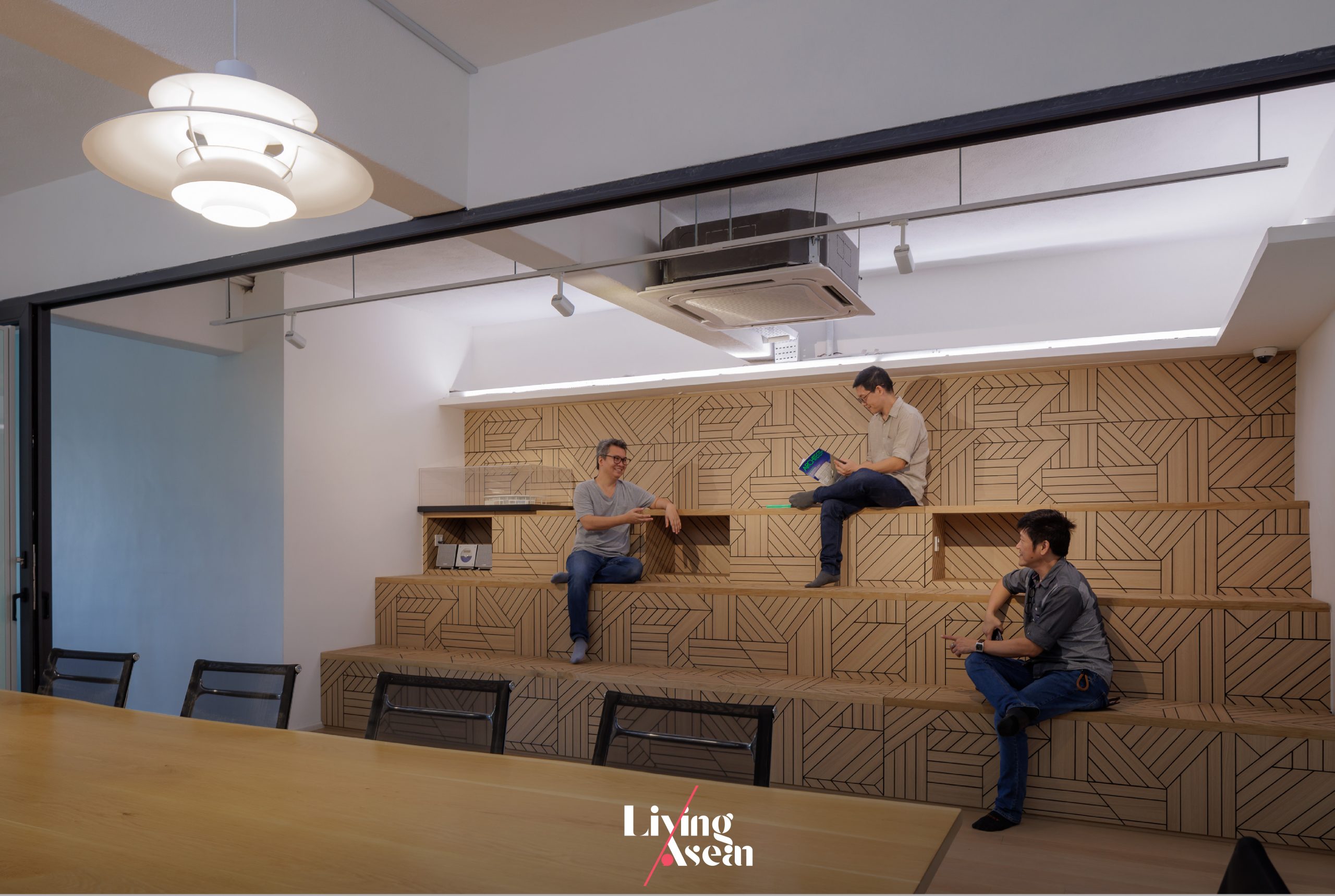
Across from the extra-long conference table there are storage shelves that double as stadium seating for fun team meeting ideas. There’s a floor-to-ceiling foldable partition that separates and protect the conference room from noises when a meeting is in progress.

The fully functional kitchen that lies at the farthest end can change into a venue for social gathering or a workspace if need be. The kitchen island is also good for work or spend time solo.

The third-floor meeting room becomes a dining room when not in use.

On the layout of the third floor, Chan Mun Inn said:

“The chief architect likes it here better than other places because it’s a flexible workspace. Come by and settle into a quiet corner, bring out a notebook and enjoy the peace and quiet.

“If there’s a meeting going on, simply escape to the nearby coffee shop. People can work at any place and from anywhere.”

Home Office in Petaling Jaya
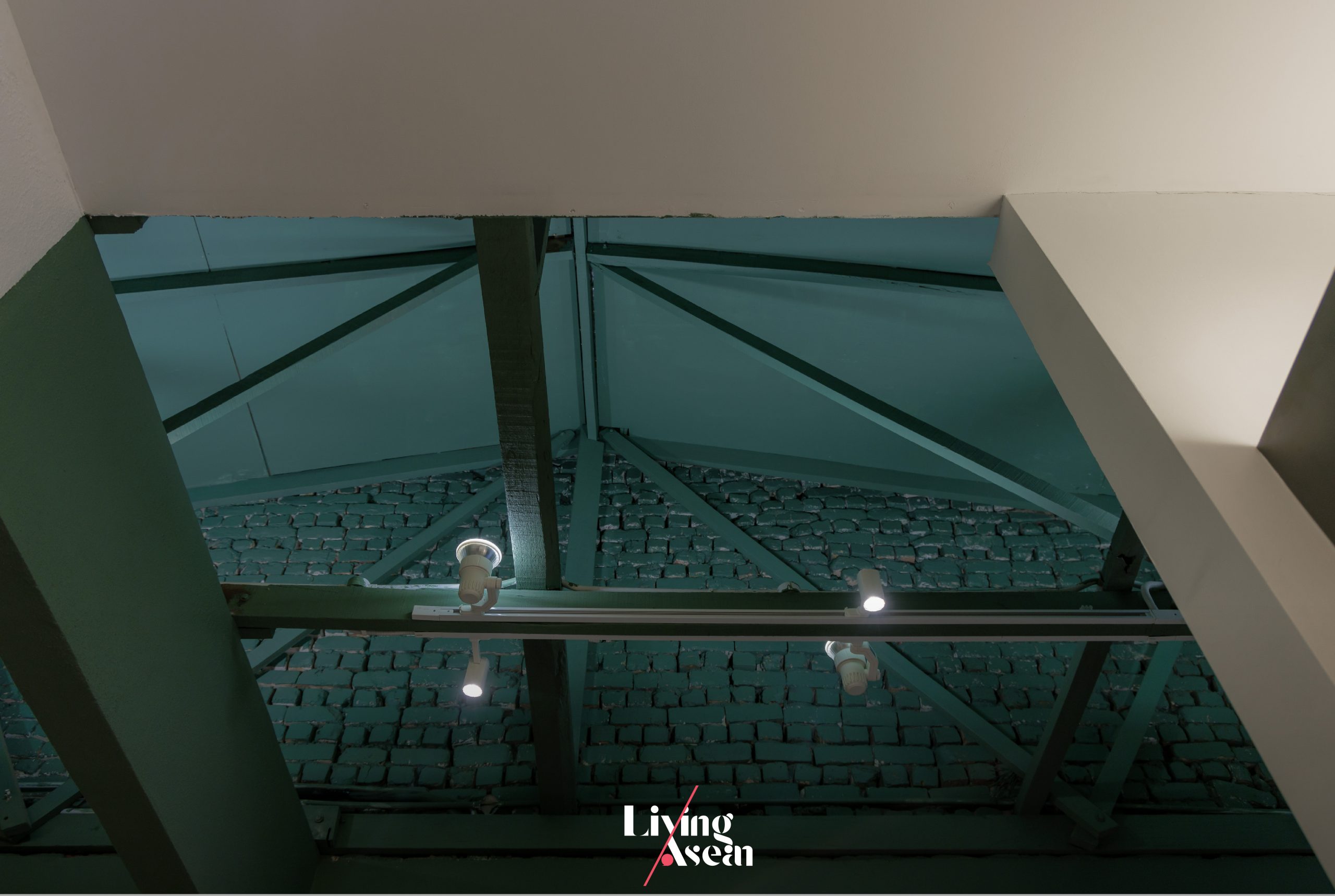
The top floor is home to the perfect office space.

For the sake of convenience, there is another set of stairs at the rear that connects to lavatories on every floor. The second, third and fourth floors contain workspaces dedicated to teams of architects and interior designers, while the ground floor is rented out to a business selling soy milk pudding.
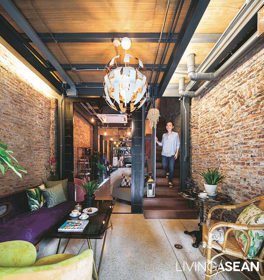
All things considered, it’s a renovation carefully planned to blend seamlessly into the surrounding downtown business landscape. The architecture firm that starts from the second floor is easily accessible via the front staircase.

Architect Wong Pei San wrapped it up nicely. He said that essentially the renovation package was about “bringing home to the office”.

It represented a complete rethink of the firm’s strategies to do what was right and appropriate under the present circumstances. The results were gratifying, which earned the architecture firm a Gold Medal award from the Malaysian Institute of Interior Designers in 2021. Congratulations on a job well done!


Architect: EDI (Essential Design Integrated) (https://www.edi.com.my)

You may also like…

Goose Living From Row Houses to Charming Boutique Hotel

Incredible Small Townhouse Renovation in Selangor

Never Too Small: Renovation Gives a Townhouse the Atmosphere of Home

Never Too Small: Renovation Gives a Townhouse the Atmosphere of Home

/ Bangkok, Thailand /

/ Story: Wuthikorn Sut / English version: Bob Pitakwong /

/ Photographs: Nattakit Jeerapatmitee /

An old townhouse in the heart of Bangkok’s downtown has been lovingly restored in ways that adapt to changing lifestyle needs. No longer is it a stuffy, overcrowded space lacking fresh air and ventilation. A redesigned open floor plan has given it the feeling of home, a sense of belonging and purpose. Incredibly light and airy, it feels like anything but a townhouse, so to speak.

Inheriting the townhouse from his parents, the new owner has made a firm decision to renovate it to a good state of repair.

It’s the place where he lives when traveling to the city for business. Or it can be available to be rented if need be.

The task of refurbishment was given to a team of architects from the design firm OAAS. Central to their work was the creation of an open concept home plan that’s flexible for multiple uses.

townhouse

townhouse

Accordingly, the old second-floor balcony was knocked down and replaced by steel framing for a light and spacious façade.

Upstairs, the entire floor plan was revised, while the ground floor platform was raised slightly to keep it above the edge of the water during a flood.

townhouse

Never too small to make a difference, the newly refurbished townhouse stands out from the rest in that its building shell is made of air bricks that are great for natural ventilation.

The perforated bricks double as a decorative privacy screen that protects the home from prying eyes. It’s a surefire way to improve air circulation and get rid of stuffy smells, a common problem of townhouse living.

townhouse

The wooden door opens into a surprisingly peaceful semi-outdoor room aptly named “Sala”, which is Thai for garden pavilion. Albeit situated at the front of the house, it’s a private living space that conveniently connects to the sitting room and dining area lying further inside.

Beautifully designed, it calls to mind an image of a garden sitting area with a side passage for walking along.

townhouse

The overall effect is impressive. The side passage sets this townhouse apart from the others.

Since it’s often impossible to build a walkway around a townhouse, it makes perfect sense to build one on the inside that connects the garden pavilion at the front with the living room and other functions at the rear.

townhouse

There is a challenge to overcome. Because the side passage takes away a large chunk of the square footage of the house, the designers have to make a choice from a range of possibilities.

Among them, an open concept floor plan is useful in making the home feel more spacious. There’s no need for room dividers for a home theater or TV lounge since it’s never a desirable lifestyle here.

Plus, by floating furniture, the owner is free to create a more intimate atmosphere and a layout that’s capable of multiple uses.


Owner: Jiramate Chanaturakarnnon

Architect: OAAS

Design team: Sineenart Suptanon, Sirakit Charoenkitpisut, Nattakit Jeerapatmitee, Jiramate Chanaturakarnnon


The article is an excerpt from “Shophouse & Townhome”, a proudly presented publication from the “Best Home Series” under “room Books Publishing.
Available in paperback (Thai Edition) at: https://www.naiin.com/product/detail/532110
Here’s how to order online. https://www.naiin.com/how-to-buy/read/1125


You may also like…

Incredible Small Townhouse Renovation in Selangor

303 House: A Modern Narrow Townhouse on a Narrow Lot

Chez Mou: A Home Hidden In the Frame of an Old House

Chez Mou: A Home Hidden In the Frame of an Old House

/ Bangkok, Thailand /

/ Story: Sarayut Sreetip-ard / English version: Peter Montalbano /

/ Photographs: Sitthisak Namkham / Styling: Jeedwonder /

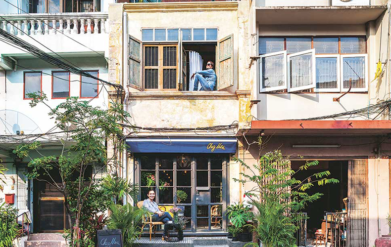
The renovation of this hundred-plus-year-old rowhouse in Charoen Krung Soi 44 is more than a home improvement: for Mou Lumwatananont, it’s a homecoming she’d never imagined.

Chez Mou: A Home Hidden In the Frame of an Old House

“My mother was born here, but we moved out before I was two. After building it up from 2 storeys to 2½ storeys, my aunt continued to use it as an office,” the owner began to tell the house’s story.

“However, that business ended many years ago, and it has been only two years since we began making plans for renovation and conversion to fulfill our long-time dream of a guest house and a café.”

This area’s former prosperity is apparent in traces of European colonial-style architecture and bustling alleys that now welcome international tourists and backpackers to the charm of its storied history.

Mou and architect Pok (Wachirasak Maneewatanaperk) from sea.monkey.coconut share views on the value of preserving history through architecture.

Chez Mou: A Home Hidden In the Frame of an Old House


The architect explained, “Renovating this great old building, I didn’t want to change a lot. But I discovered it had already changed.”

“An upper floor had been added, and it had been expanded outback as far as it could go. The entire second-storey wooden floor had been covered with another material.”

In line with building preservation guidelines, the architect decided to make clear distinctions between old and new.

They kept intact the front wall and brick walls all around, chiseling off interior mortar to show weight-bearing structures, including wood wall beams fitted into brick arches, and keeping the charming mortared patterns of the original roof.


Chez Mou: A Home Hidden In the Frame of an Old House

The lower floor is chic travelers’ café, a wooden stairway stretching up to guest rooms above. Visitors might wonder about the functionality of the steel poles they see set at intervals throughout. It is the by-product of the makeover process, as the architect told:

“This area is a walled-in rectangle, and without changing outer walls and structure at all, we’ve created a new house within the frame of the old one, sinking micro pilings into the root foundation and installing all new support pillars.

“It was important to keep the new structure separate. Concrete flooring was poured on the ground level and separated by a foam at the joints where it meets the original walls.

“These “expansion joints” keep outer and inner structures from being attached, so if the floor subsides, it won’t pull a wall down with it. On the second level, we’d intended to keep the original wood flooring, but found irreparable termite damage, so we had to replace it.”

Chez Mou: A Home Hidden In the Frame of an Old House

Chez Mou: A Home Hidden In the Frame of an Old House

Explaining the challenges of the construction process, the architect added, “At the back of the house, we changed to steel and drywall construction to install walls and latticework.

“Building here was difficult because of the limited space. Fronting on a narrow street made delivery difficult. There was nowhere to stack and store materials, so all work had to begin inside.

“When the inside was done, we brought in the materials stored outside and switched to working on the front. There was a lot of planning involved to make it possible for the craftsmen to be able to work at all.”

Chez Mou: A Home Hidden In the Frame of an Old House

Chez Mou: A Home Hidden In the Frame of an Old House

Row houses lasting more than a hundred years naturally tell stories with marks from sun and wind, just as with marks left on our lives by travel.

Leaving to study and live in England for more than twenty years, Mou could never have expected the winds would slowly blow her back to her origins with a new feeling, one born of love and dreams.

The word “Chez” is French, meaning “at,” or “at the home of,” hence the name: Mou has opened her home to welcome friends at “Chez Mou,” where stories are told by marks on bricks and sweet smiles.

Here is a place full of feeling of release from travel, and full of a bittersweet, gentle fragrance.


Architect: Wachirasak Maneewatanaperk of sea.monkey.coconut (www.facebook.com/sea.monkey.coconut)


You may also like…

The Perfect Size Townhouse

Modern Tropical House in Ho Chi Minh City

Sekeping Kong Heng: A Boutique Hotel Treasures the Charm of Ipoh

Sekeping Kong Heng: A Boutique Hotel Treasures the Charm of Ipoh

/ Ipoh,  Malaysia /

/ Story: Wuthikorn Suthiapa / English version: Bob Pitakwong /

/ Photographs: Sitthisak Namkham /

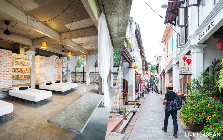
In the old town of Ipoh, a stylish boutique hotel named Sekeping Kong Heng not only blends into its historical surroundings, but also contributes to restoring all its former glory.

boutique hotel

boutique hotel

ibh13

The history of Ipoh dates back to 1880 when Hakka immigrants arrived for work in tin mines and made a permanent home here. As mining industries continued on the decline, the once exuberant town was losing its luster.

A pleasant twist of fate, the waning days of Ipoh attracted the attention of many designers, who banded together to keep the old-world charm from disappearing. Giving it their best shot, they succeeded in bringing Ipoh back in the limelight.

Among the projects aimed at restoring glory to Ipoh was Sekeping Kong Heng, a small boutique hotel designed by Ng Sek San, an internationally renowned Ipoh-born architect.

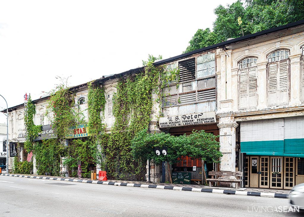
The charming small hotel is tucked away on the upper floors of a three-story Colonial-era shop-house complex in the old town. The first floor is reserved for a famous local coffee shop known for a variety of Chinese-style coffees and Ipoh’s favorite dishes.

Its food menu includes the noodle dish called Hokkien Mee, satay, and spring rolls. Its existence guarantees that hotel guests will never run short of delicious foods and beverages.

ibh12

boutique hotel

boutique hotel

boutique hotel

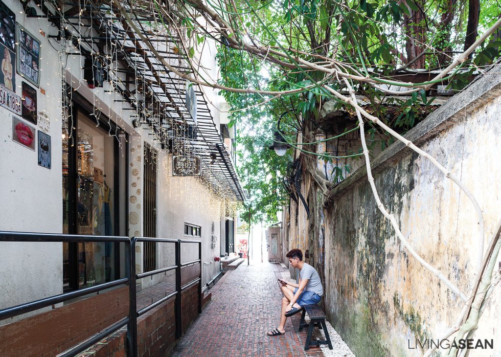
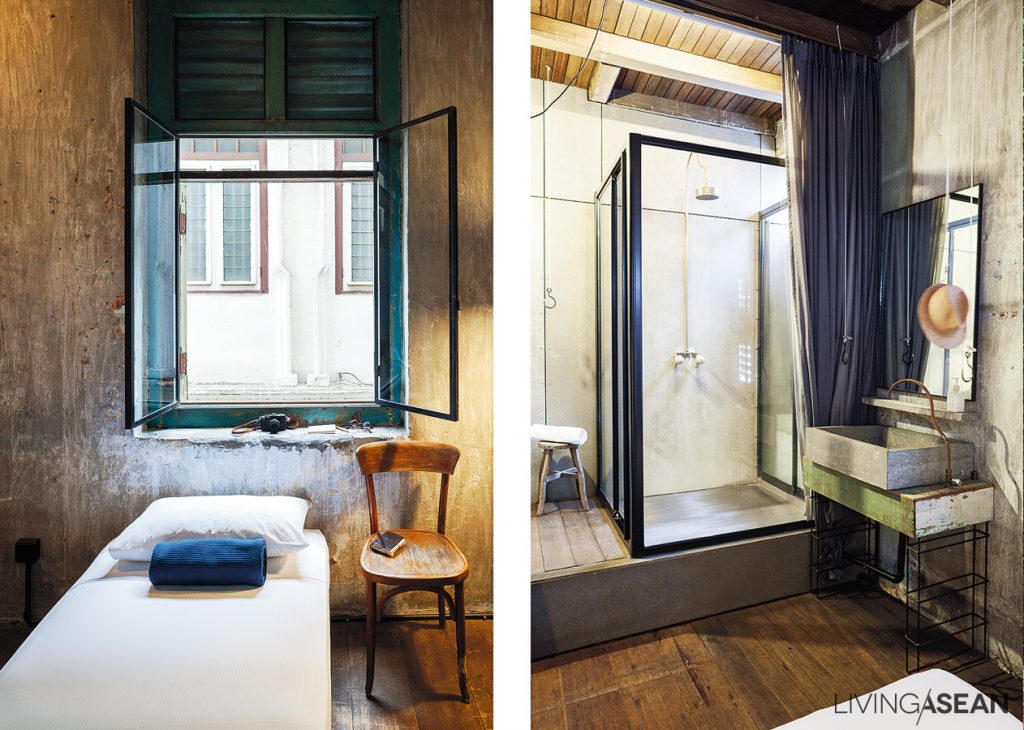
To check-in, know that the entrance to the hotel lobby is located on a small alleyway. Sekeping Kong Heng offers three types of accommodation — standard rooms, a family room and glass boxes.

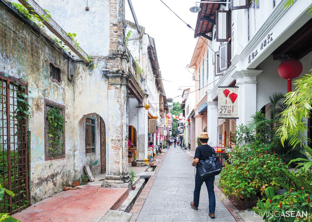
With its location, hotel guests can expect the authentic Ipoh experience. They wake up each morning to the heavenly smell of coffee being brewed fresh in the shop below. When in Rome, do as the Romans do. The same applies here. Come breakfast time, expect to eat with locals and like locals do. Time well spent is time spent exploring this and other alleyways a stone’s throw away.

The boutique hotel’s time-honored appeal blends seamlessly with Ipoh’s old-world ambience. It’s obvious the Ipoh-born architect has intended to keep this part of town like it has always been.

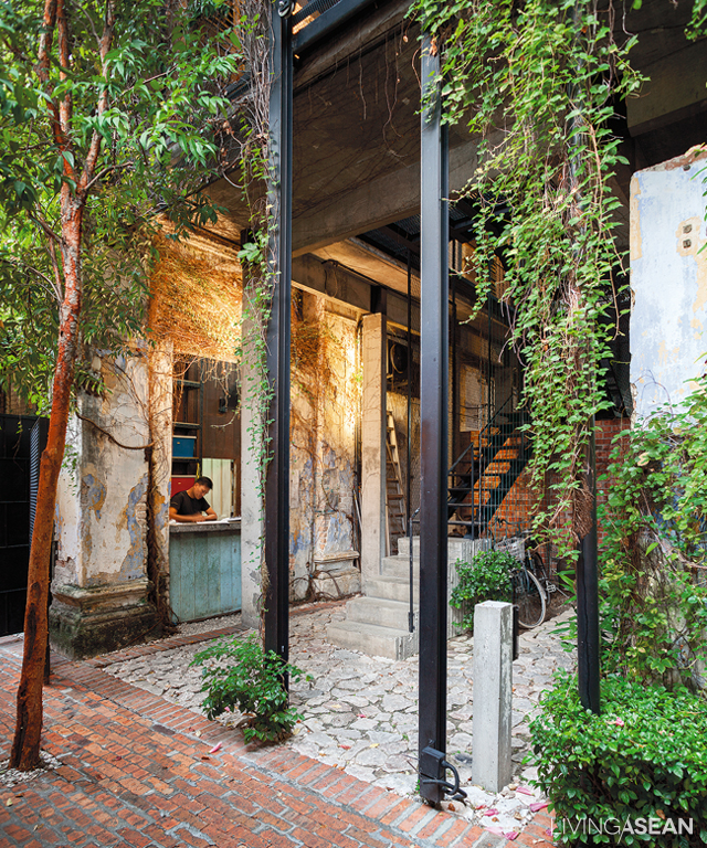
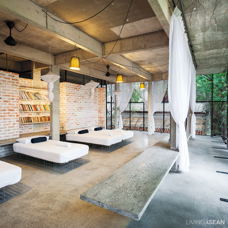
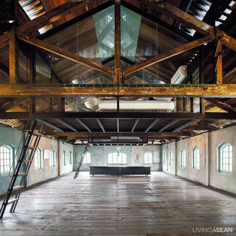
In the process, the hotel’s existing structure is left intact. A loft-style twist adds contemporary feel to the hotel’s interior, while patches of greenery adorn the exterior walls keeping the building cool.

The open-concept design provides easy access connecting the café to retail shops and a flea market nearby. The architect’s thorough understanding of Ipoh’s lifestyle is manifested in the way the boutique hotel is neatly restored. Sekeping Kong Heng now contributes in its small way to breathing new life into the old city.

boutique hotel

boutique hotel

ibh04

boutique hotel

ibh02

ibh06


Architect: Ng Sek San of Seksan Design Landscape Architecture and Planning


You may also like…

Ipoh: A Journey Back In Time

Sekeping Sin Chew Kee: A Raw Chic Hotel in Kuala Lumpur 

Stacking Green: Integrating Nature-Inspired Design in a Row House

Stacking Green: Integrating Nature-Inspired Design in a Row House

/ Ho Chi Minh City, Vietnam /

/ Story: Ekkarach Laksanasamrith / English version: Peter Montalbano /

/ Photographs: Soopakon Srisakul /

This residence in Ho Chi Minh City has an interesting form and exterior that has drawn us to see with our own eyes. Named “Stacking Green”, this row house design received an award for outstanding design and architectural works at the 2012 World Architecture Festival in Singapore. It’s not surprising that it received a citation for architectural excellence in the residential building category. The way that it dealt with complex urban problems in a simple way yielded an array of fascinating outcomes.

row house
The stairway reaches the top floor of the house that holds a guest bedroom with a sundeck.

The four-story townhouse offers a total of 250 square meters of usable space. The frontage abutting on the street is 4 meters wide with a whopping 20-meter depth. The interior is especially designed for the three people who live here, one of whom is an old person. Hence, one bedroom is placed on the lowest floor, so there’s no need to climb the stairs.

3
Since the house plan is long and narrow, bringing sunlight into the interior living space is a very good idea.

The second floor consists of a dining room, kitchen and living room, while the third holds the master bedroom with an open floor plan bathroom. The guest bedroom is located on the fourth floor.

row house

It’s a well-known fact that people’s homes in Vietnam are often compactly built in townhouse form to use as little property space as possible, often resulting in cramped residences and unattractive-looking building fronts.

Here, the architects have incorporated privacy in the design so that no one can look in from outside. At the same time, it gives the homeowners a sense of peace and contentment. Overall, it’s a design thoughtfully devised to reduce pollution from the street.

row house
This row house may not have any eye-catching features from the outside, yet its half-open, half-opaque design allows natural light to enter through the rooftop, creating a cozy home ambience within.
As the leafy plants reach their full size, the level of privacy correspondingly increases.

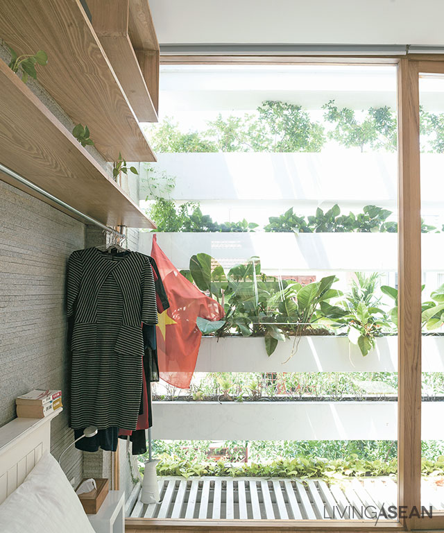
Additionally, both the front and the back of the house feature rows of containers stacked one on top of the others with open air spaces at intervals. In all of them, lush green plants thrive luxuriantly screening the view inwards and creating attractive façades.

The house also has open ports which run up and down through all the floors. This kind of stack ventilation effect allows for hot air from below to rise and vent out through the rooftop. And by the same token, fresh cooler air is drawn inside keeping the heat down even at high noon.

row house
Sunlight through a glass skylight in the roof shines down into the dining room on the second floor.

5

In the front yard, a leafy shade tree improves air quality, while vertical gardening on the front and back facades has spaces between stacking containers that allow plants to grow. The open spaces between planter boxes are determined by the types of vegetation planted. The full height of a plant is used to fix the spacing between planters on each floor.

Step inside, and you find there are hardly any walls separating the home into different rooms, except for bathrooms. This creates efficient ventilation throughout the home, at the same time giving it an open, uncluttered feel.

Besides giving privacy and cooling shade to the house, the planter boxes and leafy vegetation also act as a safety feature.

In this way, when container plants reach their full heights, they become the outer envelope of the building. Together they go to work all day and every day filtering out harsh UV rays from the sun, at the same time letting the cool breezes flow through.

The architects picked only the trees and plants with fine and delicate foliage so as not to block the wind, and for ease of use, they installed pipes for an automatic watering system.

row house

Concrete planter boxes holding plants on the front and back facades have the added convenience of an automatic watering system.

Architect: Vo Trong Nghia Architects


You may also like…

M11 House: A Comfy Minimalist House in HCMC

3 x 9 House: A Compact Renovated Row House in HCMC

An Open Concept Urban Home with a Minimalist Flair in Kuala Lumpur

An Open Concept Urban Home with a Minimalist Flair in Kuala Lumpur

/ Kuala Lumpur, Malaysia /

/ Story: Ekkarach Laksanasamrith / English version: Bob Pitakwong /

/ Photographs: Soopakorn Srisakul /

With the creative use of design elements, this Minimalist house in Kuala Lumpur feels bright, airy and comfortable, albeit having only a small number of windows. The open concept urban home with a stylish flair was designed and built by Tony Heneberry of 2’s Company, formerly JTJ Design, under the concept of a great place to live in.

Minimalist urban home
Growing trees add some freshness and makes the house more of a great place to live in.

As simple as that, here’s the story of a metamorphosis of purpose, in which a duo of unexciting shophouses transformed into an incredibly warm and roomy living space in the heart of town. After he had bought the two units attached to each other, Heneberry gave them a complete makeover, tearing down the dividing walls and combining them into one coherent whole with increased usable spaces inside.

Minimalist urban home
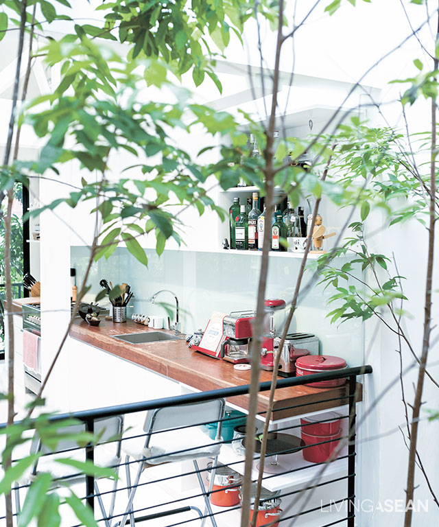
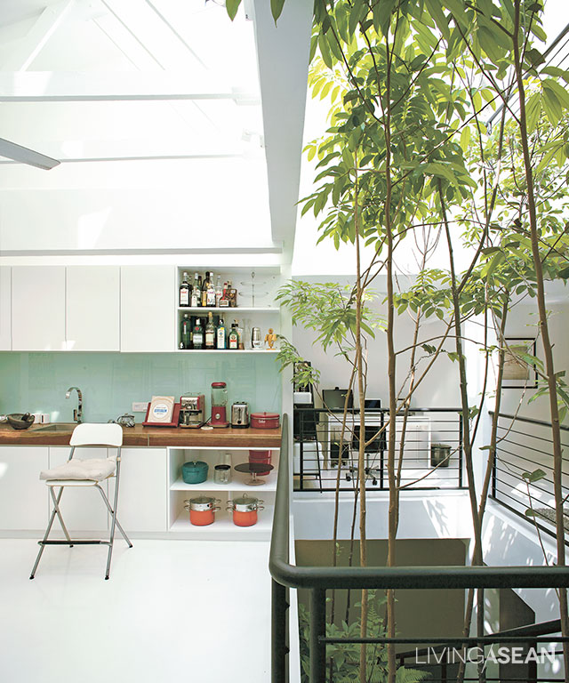
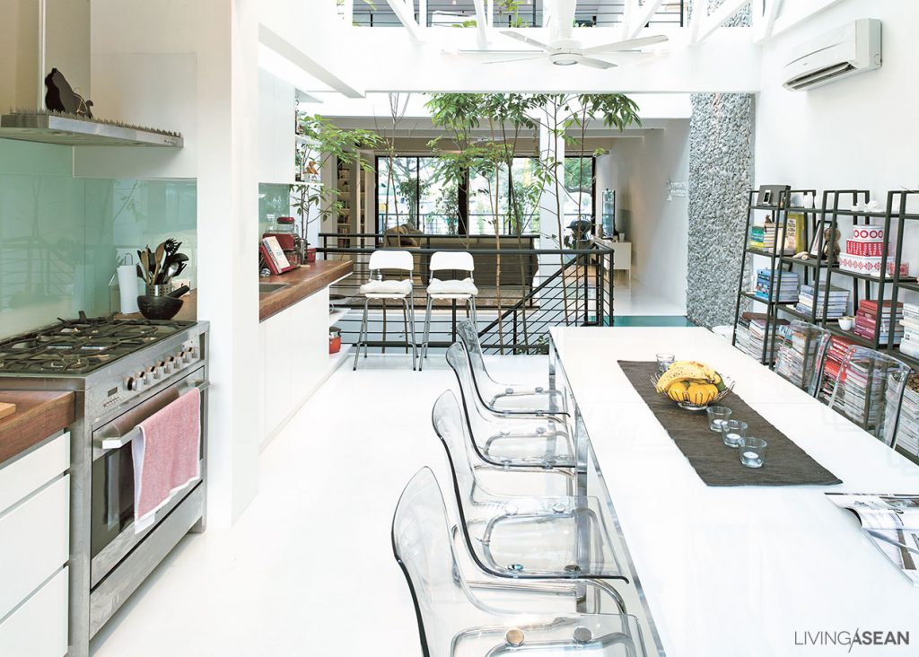
Green foliage adds joy to cooking, making it feel like living out in nature.

The result is a 7-meter-wide façade looking much better than when Henebery found it. He removed the existing solid walls between them and assigned new functions to the interior spaces. The living room with dining area on the second floor is spacious, with a lot of open areas in accordance with the “open plan” concept.

Minimalist urban home
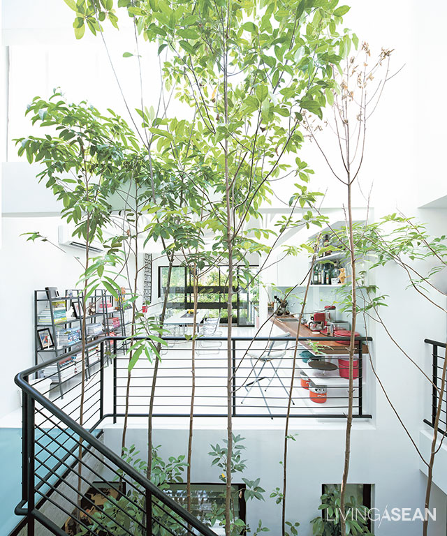
Trees chosen for the center courtyard have medium-sized leaves to keep the house airy and not too dense.
Minimalist urban home
Using an “open plan” design means the interior is all connected, which avoids a cluttered look.
The new set of stairs illuminated by a rooftop skylight is one of the spots everyone likes the most.

For practical reasons, the old staircases were torn down and replaced by new ones built in a better, more convenient location. The new sets of stairs crafted of steel sit in a hallway next to the center courtyard, leading the way to the second floor.

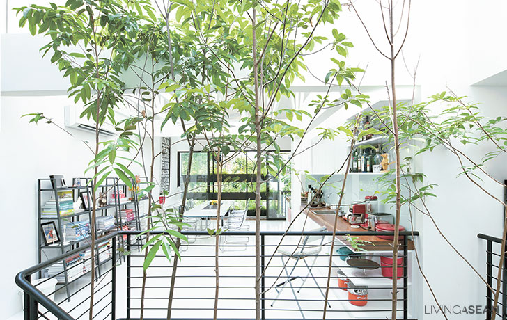
The courtyard is filled with trees, as a main relaxation area of the house, where a glimpse of outdoor experience is brought inside in harmony. The trees also create visual continuity by naturally drawing the eyes towards the interior.

The stair to the third floor is set in another location. It sits against the outer wall, to preserve the space inside, which is an area for work and rest.

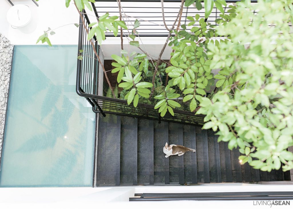
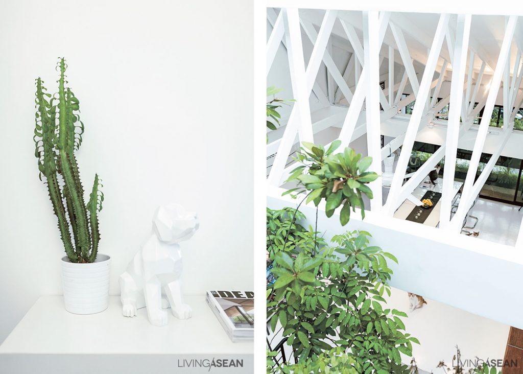
[Above] The wooden roof truss painted all white makes the overhead space look taller and more spacious. / [Below] The new metal staircase is aesthetically pleasing, thanks to the absence of solid risers between the treads. For good ventilation, expanded metal grating is used instead.
[Above] The wooden roof truss painted all white makes the overhead space look taller and more spacious. / [Below] The new metal staircase is aesthetically pleasing, thanks to the absence of solid risers between the treads. For good ventilation, expanded metal grating is used instead.
Minimalist urban home
Natural light turns second-floor living and work spaces into a well-lighted place, plus high ceilings add an airy feel to it. The disadvantage that comes with having only a few windows is nicely compensated for by the creative use of design elements, rooftop skylights among them.

As for the ventilation system, hot air is able to float up through the hallway and then flows out through window louvers and vents on the rooftop.

Another plus is, this Minimalist urban home faces south. So, by putting planter boxes on window frames, a simple vertical garden is added to filter sunlight and enhance privacy for the people living inside. The bottom line. This newly renovated home is truly a breath of fresh air.

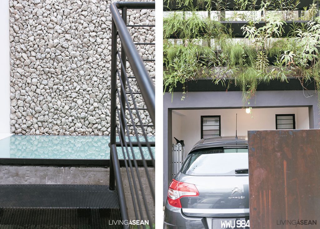
[Left] The hallway wall surface is covered with crushed concrete recycled from the old shophouses. / [Right] Lush green vertical gardening adds a refreshing change to the front façade rising above the carport.

Architect: 2’s Company (www.facebook.com/JtjDesign)


You may also like…

A Modern Home That is Quintessentially Thai

303 House: A Modern Narrow Townhouse on a Narrow Lot

A Trendsetting Row House Renovation in Chiang Mai

A Trendsetting Row House Renovation in Chiang Mai

/ Chiang Mai, Thailand /

/ Story: Atta Otto / English version: Bob Pitakwong /

/ Photographs: Sungwan Phratem /

The Plankrich Co., Ltd, led by Kwanchai Suthamsao, is known for being at the forefront of trends in row house design and renovation. Only recently when the firm undertook the restoration of a row house trio in Chiang Mai, many design aficionados were expecting to see exciting new innovations and exquisite materials. As it turns out, the redesigned homes boast a beautiful mix of simplicity and vintage charm with design for practical modern living. Especially for his own end unit, Kwanchai’s main goal is to create a place of abode that best answers his urban lifestyle. The three-unit row house block is conveniently located in a central neighborhood of Chiang Mai.

1
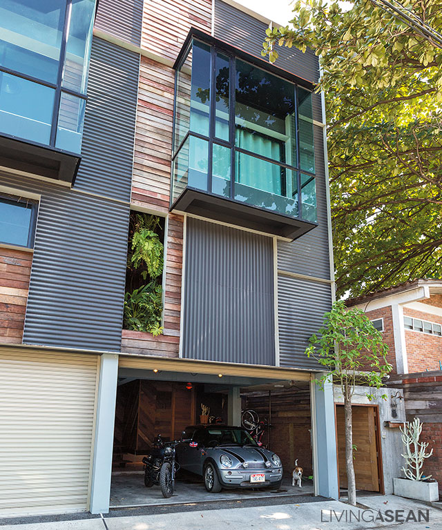
The newly designed front façade boasts an interesting mix of lightweight materials. Weathered boards in varying shades complement the pastel gray of fine-ribbed, corrugated sheet metal.

On reasons to invest in a row house, Kwanchai said: “A single, detached home is out of the question; land has become very expensive. The only option is a row house. After a survey, I chose this three-unit shophouse block. The size is about right; the price is fair and not too high. This way I am able to give it a complete makeover.”

2
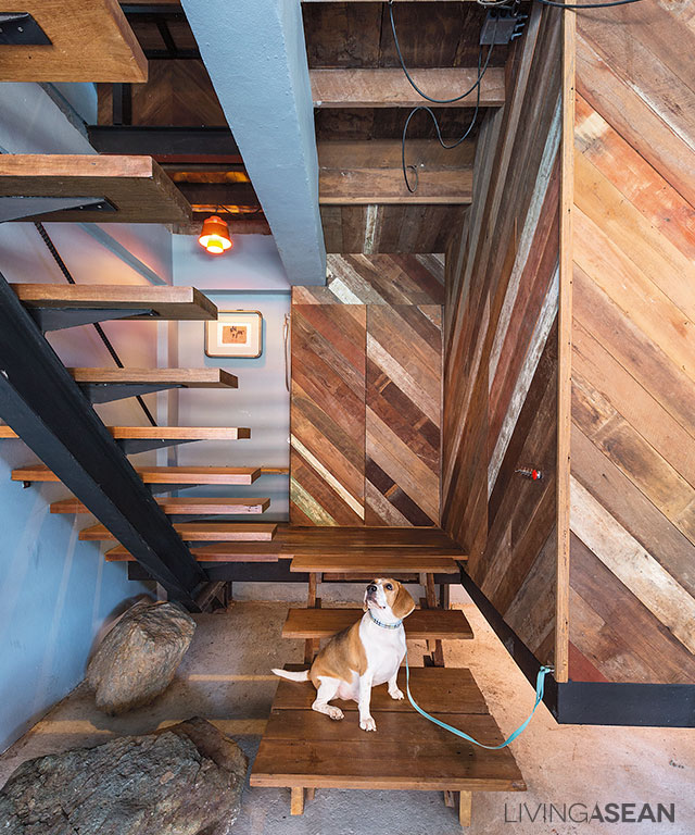
For good ventilation, the old staircase was removed to make room for a new set of stairs without risers between the treads. It’s supported by an I-shaped steel beam.

Kwanchai had practically everything inside removed, including the old bulky staircase so as to make room for a new flight of stairs without risers between the treads for better ventilation. The only things remaining were pillars and beams.

The floor plans for all three units were completely redesigned. He wanted each one of them to have its own unique character, but space was limited. So, he only focused on making his end unit look different instead, at least for the time being.

3
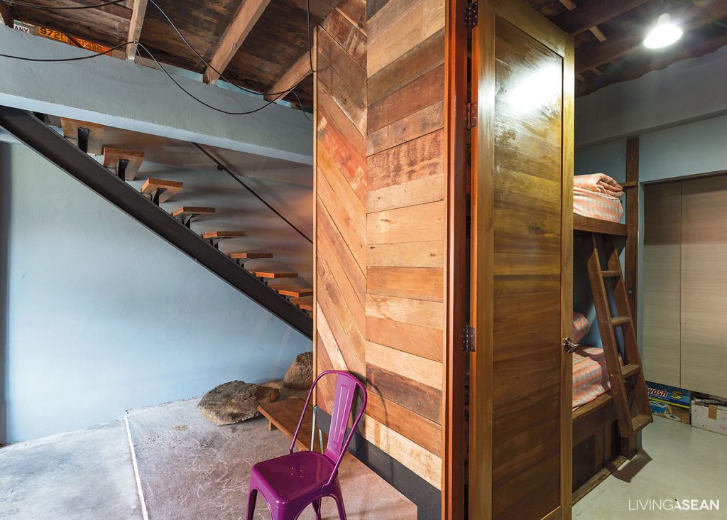
A small guest room with a shelf-like bunk is tucked away at the rear of the first floor.

To accommodate visitors from time to time, there’s a compact guest room at the far end of the first floor. Custom-designed double bunks make it suitable for sleeping two guests. In all three units the mezzanines were taken out, while the omnipresence of reclaimed timber beams and long planks making up parts of the wooden floors brings back vintage charms.

4
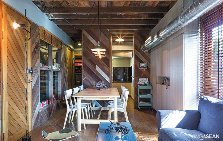
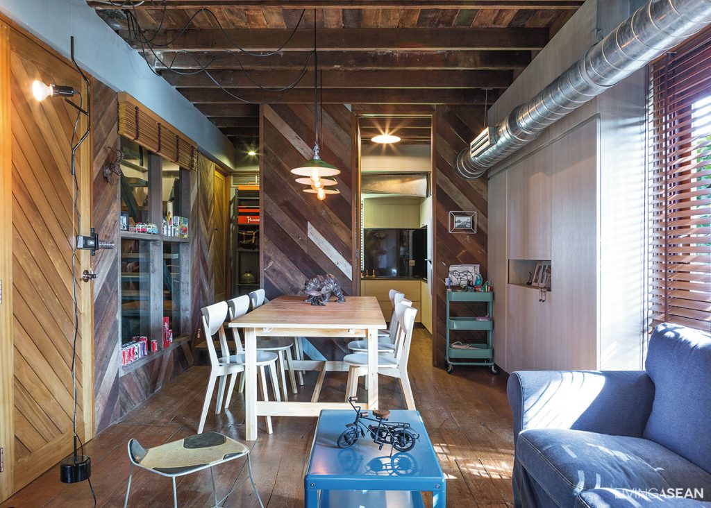
A bulky upholstered sofa adds warm, cozy feelings to the interior. Window treatment ideas with wooden slat blinds allow natural light into the home.

The second floor is neatly planned for multiple uses. There’s a sitting room in the front section, dining space in the middle, and the kitchen and bathroom at the rear of the building. The dining area is made a bit small to make room for the stairway.

Overall, the furnishing and decoration of the interior conveys a great deal about the owner’s love for vintage collectables. Oblique-aligned wooden walls and floorboards give a warm, homey feeling.

5
The second floor holds a dining room. The floorboard and walls are covered in reclaimed wood from the homeowner’s collection.
8
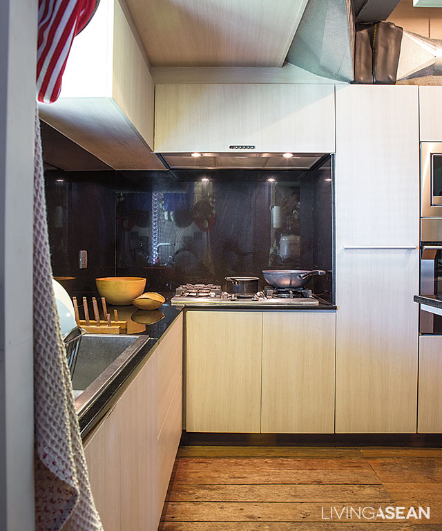
An L-shaped kitchen counter creates an easy flow workspace. Cabinet doors in light shades of beige make the room look clean and bright.
10
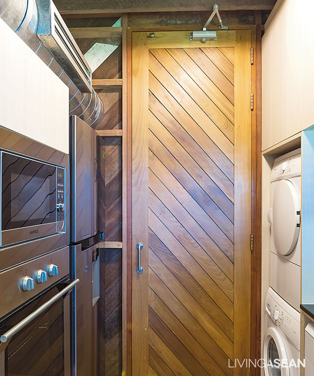
Microwave and convection ovens are on one side of the aisle, with the washer and dryer on the other. The door at the end opens to the dining room.

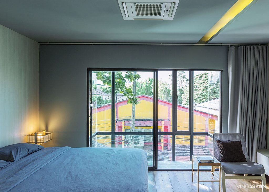
The third floor holds a bedroom in the front section that’s kept clean and uncluttered, with the wardrobe and bathroom nearby separated by a sliding door. The overall effect is impressive; the interior boasts a clean neutral shade for relaxation. There’s a minimal amount of decoration while furniture is reduced to bare essentials.

7
The bedroom is kept clean and uncluttered to provide a balance for limited spaces. The walls are covered in beech boards. Large sliding doors open to the cube-shaped glass enclosure that adorns the front façade.
9
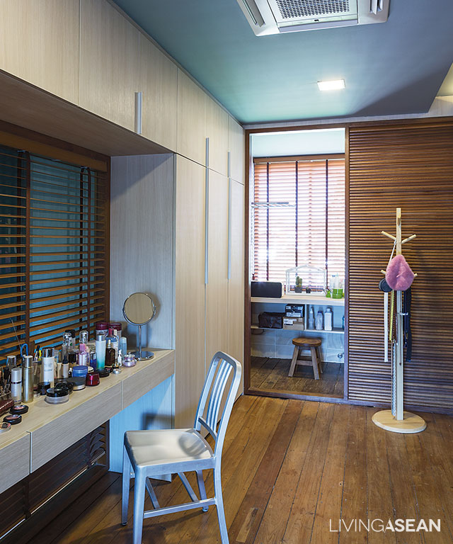
The changing room-cum-walk-in closet offers wardrobes on both sides of the aisle, which connects to the bathroom at the far end.

Taken as a whole, the secret to success lies in constancy of purpose and using reclaimed wood as the material of choice. The interior living space is cozy and comfortable, thanks to large windows that allow plenty of natural daylight. The result is a bright and breezy place of abode that’s small but has everything for a vibrant city lifestyle.

6
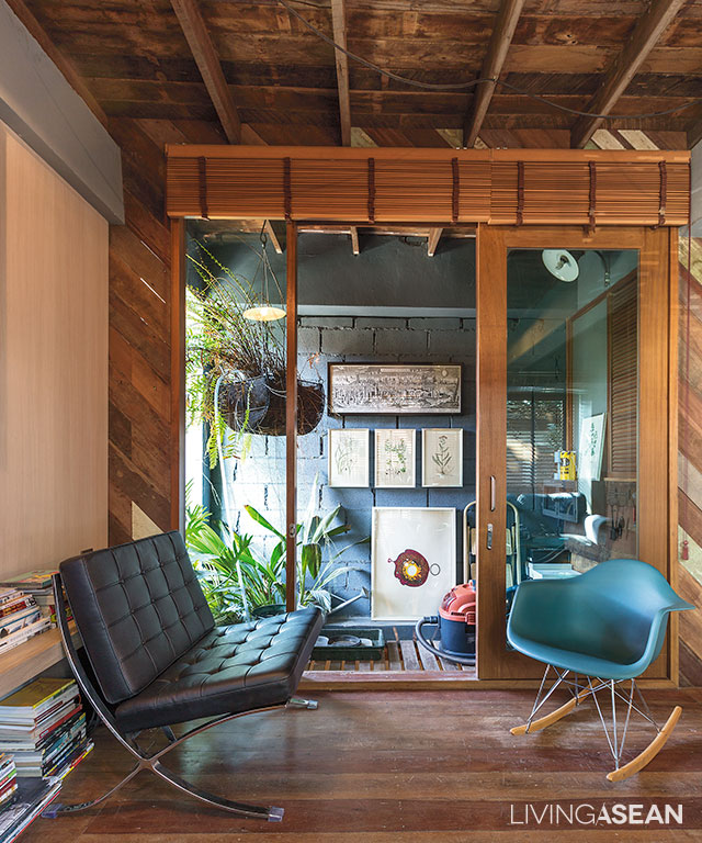
A glass wall with sliding door allows diffuse light into the sitting room at the rear of the house.

11
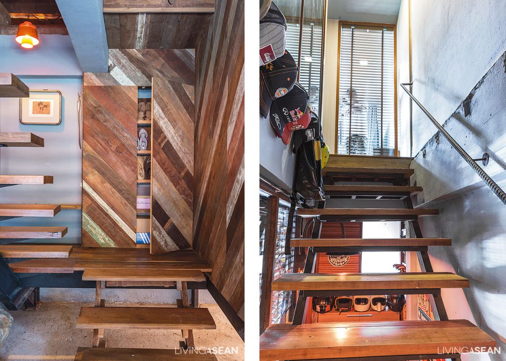
The staircase landing [left] provides access to a neat built-in cabinet made of reclaimed wood. The staircase without risers between the treads [right] offers niches for shoe storage.
12
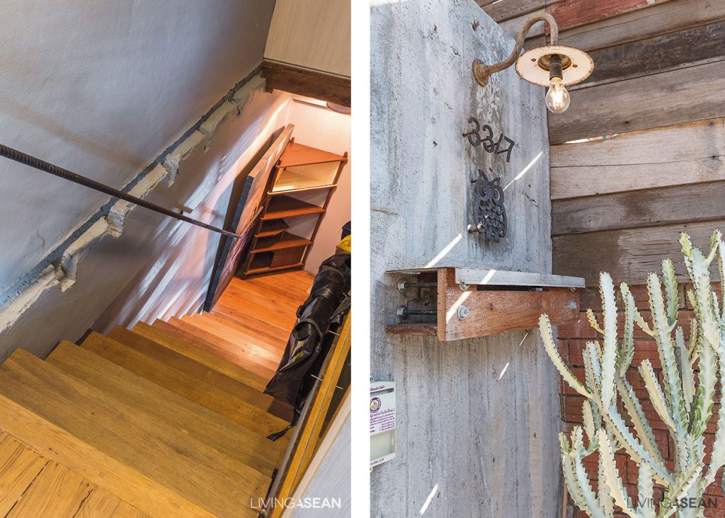
Marks on the wall and concrete structural framing tell stories of a recent home makeover. The homeowner intentionally left them as a personal reminder. [right] A rusty sconce attached to the wall adds rustic charm to a bare concrete wall. Beneath it is a wood box storage for home improvement tools.


Owner/Architect: Kwanchai Suthamsao of Plankrich Co.,Ltd. (www.plankrich.com)


Visit the original Thai article…

Chiang Mai City วิถีชน (ใน) เมือง


You may also like…

Termitary House: Good Sunshine, Fresh Air, and Brick Walls

3 x 9 House: A Compact Renovated Row House in HCMC

3×9 House: A Compact Row House Renovation in Vietnam

3×9 House: A Compact Row House Renovation in Vietnam

/ Ho Chi Minh City, Vietnam /

/ Story: Ekkarach Laksanasamrith / English version: Peter Montalbano /

/ Photographs: Soopakorn Srisakul /

A lot of work and research was invested in this row house renovation project. The big question is: how to make the compact house look wider?

Home renovation: The project is accomplished without any concrete construction. The new second floor rests on cylindrical steel posts instead of big cement pillars.

Like most urban residential buildings in Vietnam, “3×9 House” was formerly a shophouse built a long time ago. Only recently it was restored to a good state of repair. Looking back over the years, the old place lacking fresh air and ventilation had only a few windows and lots of solid brick walls, which made the building look dim.

A bold move was needed to rejuvenate it. The result is a modern living space that looks and feels fresher, younger and more lively, plus it helps to lift up the mood of the residents.

Renovated Row House vietnam
The 3-by-9-meter house has become a point of interest by integrating natural features in the design.

As land prices in Vietnam continued to rise rapidly and steeply every year, buying a new house seemed like a formidable task. So the owner thought it wise to invest in renovating his existing home.

He reached out to A21 Studio for their good reputations in the building industry, especially when it came to turning small, stuffy old houses into nice, uncluttered and environment-friendly homes.

Renovated Row House vietnam

Renovated Row House vietnam
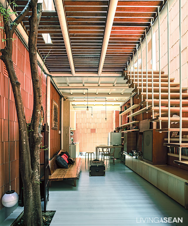
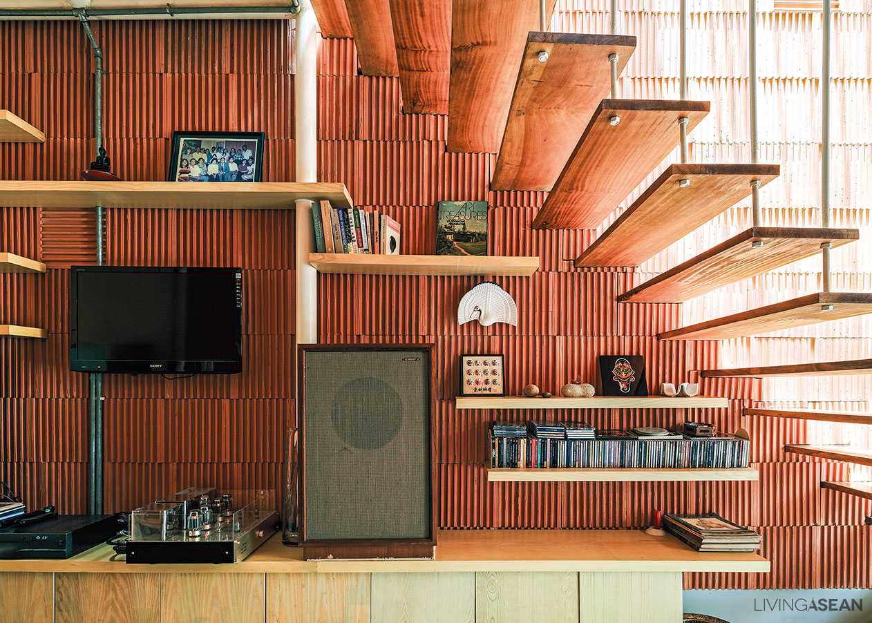
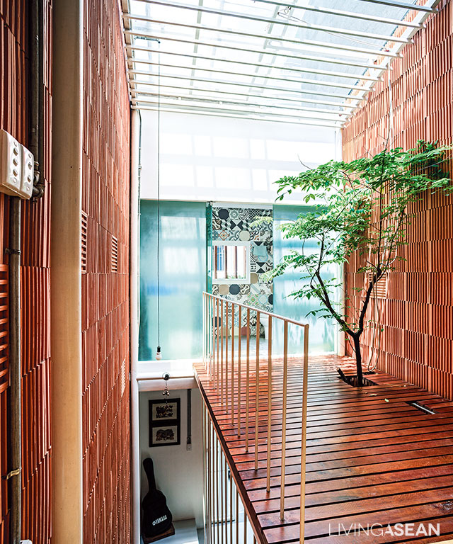
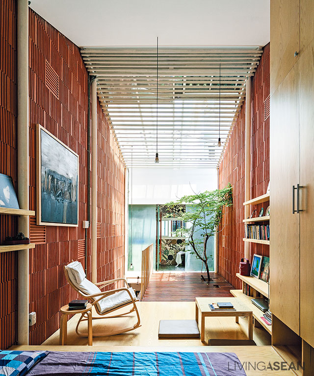
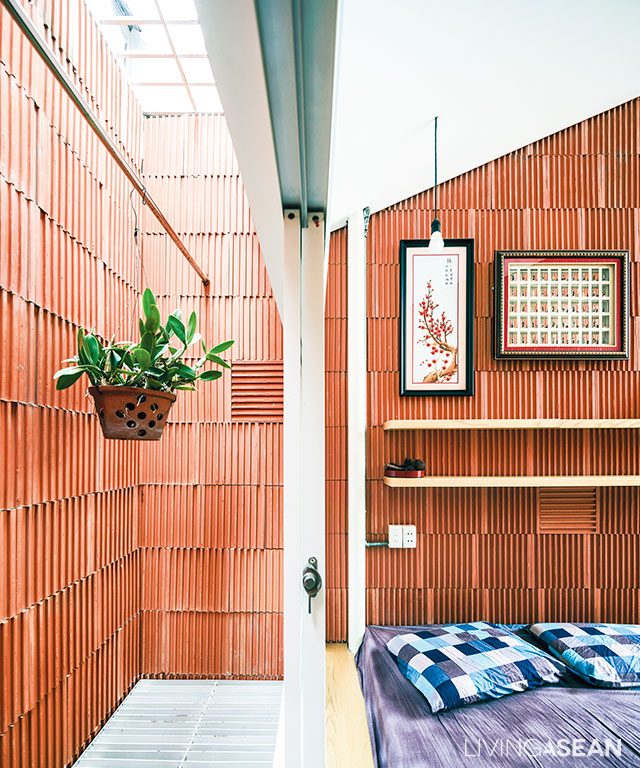
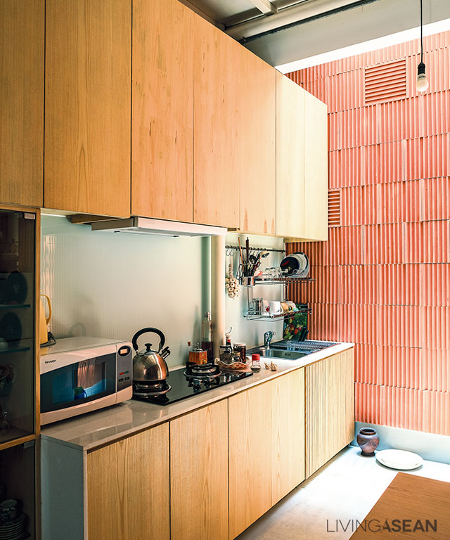
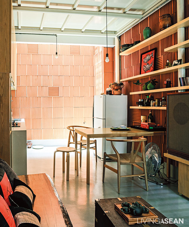
Clay tiles are placed inversely on the entire interior walls to create a stripe pattern and unique touch.

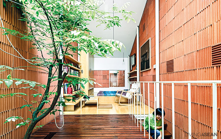
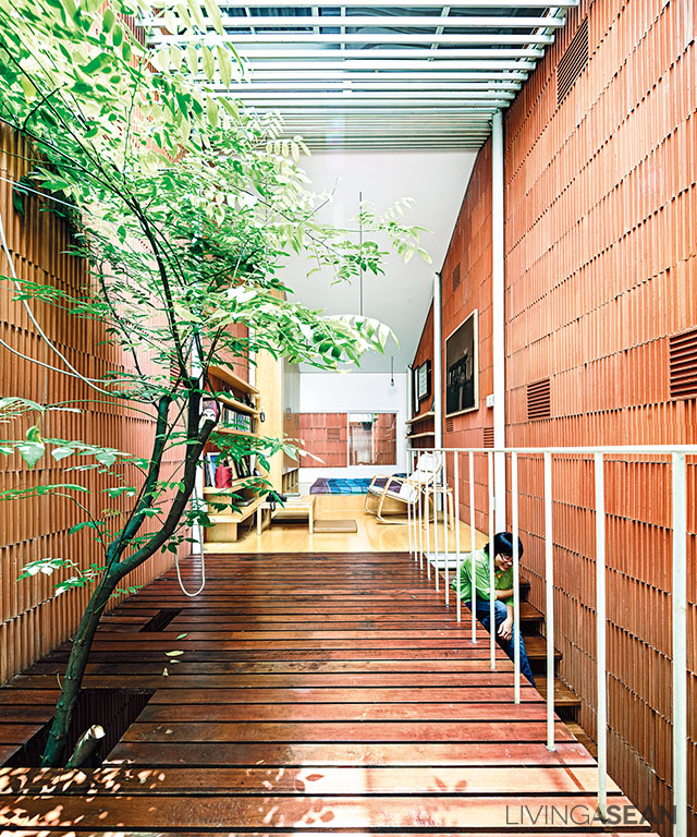
Walk in the door, and the first thing that catches our eyes is a tree growing up through an opening in the footbridge set against the wall. It’s a sign of welcome warmly greeting visitors coming into the entryway. The overall effect is bright and airy, thanks in part to a rooftop skylight illuminating the interior living spaces and letting sunlight shine on the tree.

For indoor thermal comfort, openings in the walls let breezy wind enter through the front door and circulate inside the home. As a result of this, the entire interior feels fresh and full of life all the way to the rear section, the second floor and the room under translucent sliding panels on the rooftop.

Flanked by three-story row houses on both sides, “3×9 House” is exposed to direct sunlight only in the middle of the day. For the rest of the time, the home is full of nice cool shade, making it feel very comfortable, warm and cozy, so there’s no need for air-conditioning.

Renovated Row House vietnam
The steel framework supporting the roof is equipped with a sliding skylight. This effectively illuminates interior spaces and allows the tree to keep on thriving.
Renovated Row House vietnam
For the health benefits of a well-lit home, the bedroom space connects to the footbridge with an opening for a tree to thrive under the rooftop skylight.
Renovated Row House vietnam
Loft style ideas paired with earth-tone color make the simple bedroom feel open, airy and uncluttered, thanks in part to the absence of solid room dividers.
A modern kitchen setup gets rid of smoke and smell fast, as a result of a range hood blower and openings in the rooftop.

For a bigger, more open vibe in the interior, solid room dividers are avoided, with the exception of the bathroom. The ground floor consists of a living room, dining area and kitchen; all connected.

The bedroom and leisure areas are upstairs. Since the homeowner lives alone, solid room dividers are of no use. In a nutshell, it’s about integrating natural features, openings in the walls and a good ventilation system in the overall design. That’s what makes it a good place to live.

Renovated Row House vietnam

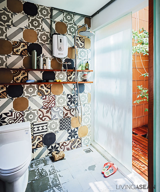
A colorful mix of tiles are reminiscent of vernacular architecture.

Architect: A21 Studio (www.a21studio.com.vn)


You may also like…

Nha Be House: A Brick Home Infused with Memories of the Good Old Days

Termitary House: Good Sunshine, Fresh Air, and Brick Walls

Desa House: The Renovated Artist House in Kuala Lumpur

Desa House: The Renovated Artist House in Kuala Lumpur

/ Kuala Lumpur, Malaysia /

/ Story: Panchat Changchan / English version: Bob Pitakwong /

/ Photographs: Rithirong Chanthongsuk /

The place called “Desa House” belongs to 49-year-old artist Leon Leong. Located in the Malaysian capital Kuala Lumpur, the artist house clearly stands out from the rest in a neighborhood characterized by ubiquitous townhomes.

1
Newly added is the sky garden that extends outward from the second-floor façade. 

The most eye-catching feature is the lush sky garden that extends outward from the second floor. The structure also doubles as a carport roof. Green foliage adorns the front façade and functions as a privacy curtain.

The striking features remind us that we have reached our destination.

2
The sky garden platform, which doubles as a carport roof, is accessible from the second floor.

The bedroom and the studio are lit by natural light through a sliding glass that slides open to access the greenery. The same applies to the rear portion of the house, which opens to a backyard.

In the front and back, green foliage forms privacy curtains that effectively set the interior spaces apart from the hustle and bustle of city life.

artist house
Roof beams are clearly visible after ceilings are removed to make way for the new add-on.
artist house
There is no need for electric lights as the interior is sufficiently illuminated by natural energy via the second-floor skylight and the main entrance.
artist house
Lattice skylight crafted of concrete turns the second-floor living spaces into a well-lit place. /// Natural light illuminates the central court that the artist owner uses as his workstation.

The artist house’s aesthetic is achieved by putting in an add-on and other details to the existing structure.

Like other townhomes in the neighborhood, there is a central court that the occupants use for relaxation. But architect Wen Hsia of the WHBC Architects group has a better idea.

She transforms this centerpiece into something different. What used to be a seating area now becomes a lush landscape, where tall trees cast shadows on surrounding walls and much of the first floor.

It brings in the outdoor, and the atmosphere comes alive every time leaves blow in the wind. All day the light and sound show gives the artist homeowner the inspirations that he needs.

artist house
The interior spaces double as an art gallery, where Leon displays his beautiful works of art.
artist house
The artist’s favorite spot is the bookshelves composed of concrete and wood frames.
5
The perfect match for timeworn kitchen countertops and minimal raw wood furniture.

Leon needs plenty of light to create works of art, and he gets it all in the home studio.

To bring in natural light, the architect has tiled roofing replaced by lattice skylight, creating beautiful special effects. Concrete lattice casts striking shadow patterns everywhere.

It is cheaper, longer lasting, and easier to maintain than that made of wood. As night falls, the studio is aglow by electric light.

Interestingly the studio light alone is enough to illuminate the entire home.

artist house
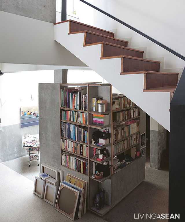
The artist’s workstation is nestled underneath the stairway and behind the bookshelves.
artist house
The living room shares space with the kitchen for added convenience.
10
Tall trees provide a crisp, cool canopy to the backyard. Beach pebbles, concrete slabs, and a patch of manicured grass fill up the garden floor.


Owner: Leon Leong

Architect: WHBC Architects


You may also like…

Never Too Small: Renovation Gives a Townhouse the Atmosphere of Home

MP House: A New State-of-The-Art Live/Work Design

X