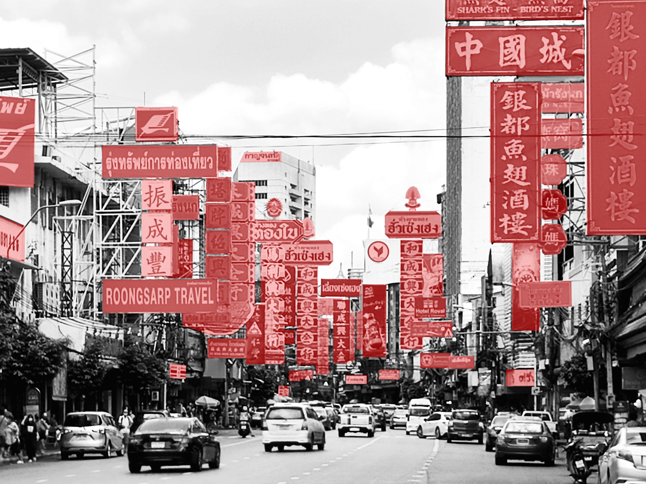
/ Bangkok, Thailand /
/ Story: MNSD, Kor Lordkam / English version: Bob Pitakwong /
/ Photographs: Nantiya /
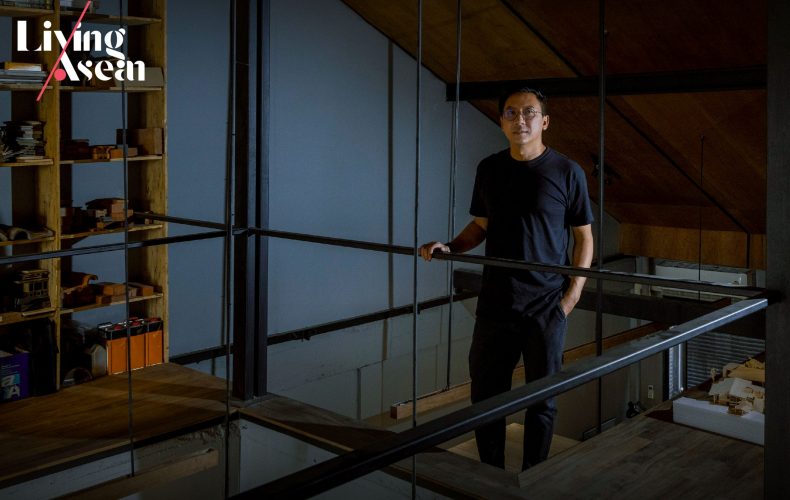
HAS Design and Research by Architects Jenchieh Hung and Kulthida Songkittipakdee likens their design work to running a marathon. From the starting line, they navigate a long and challenging path of research and experimentation before reaching the finish line, which represents the final outcome. The end result is always unpredictable, adding to the journey’s intrigue.
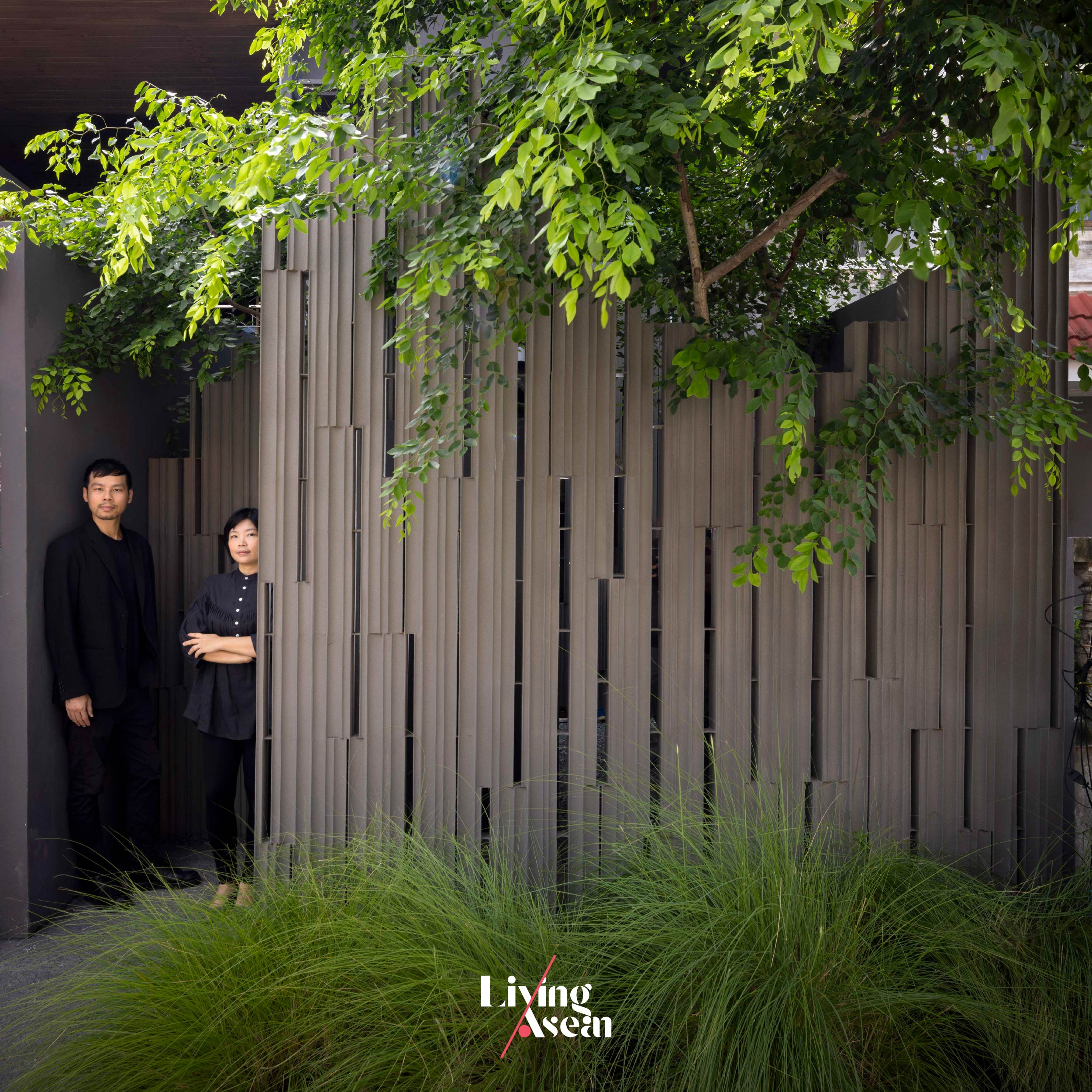
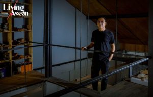
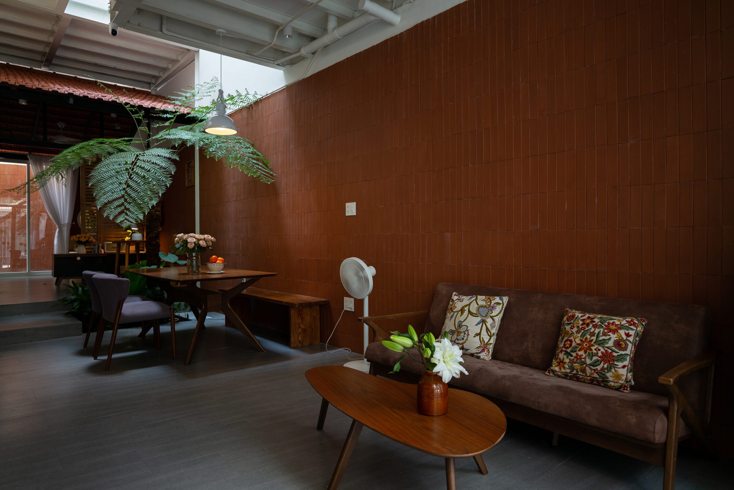
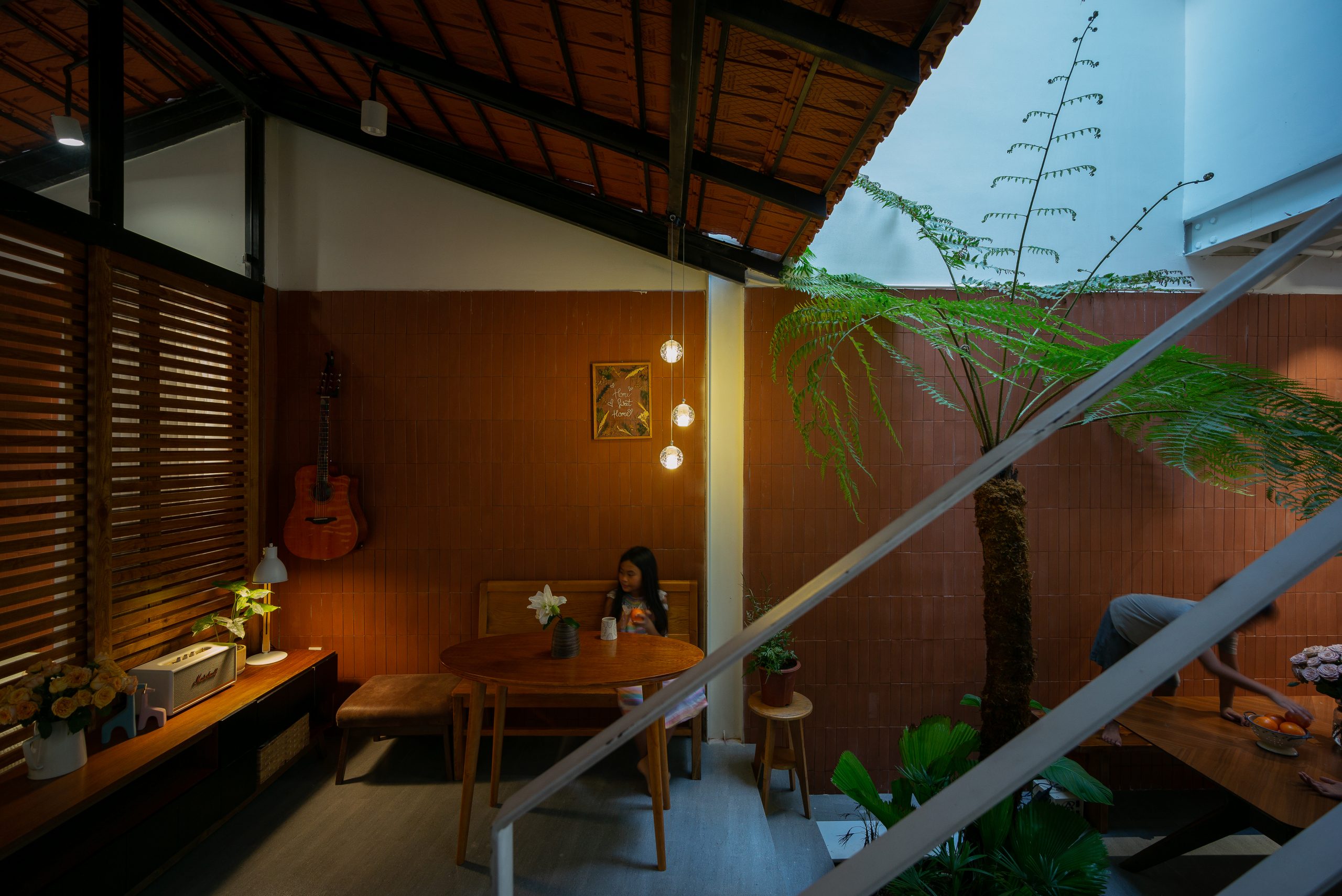
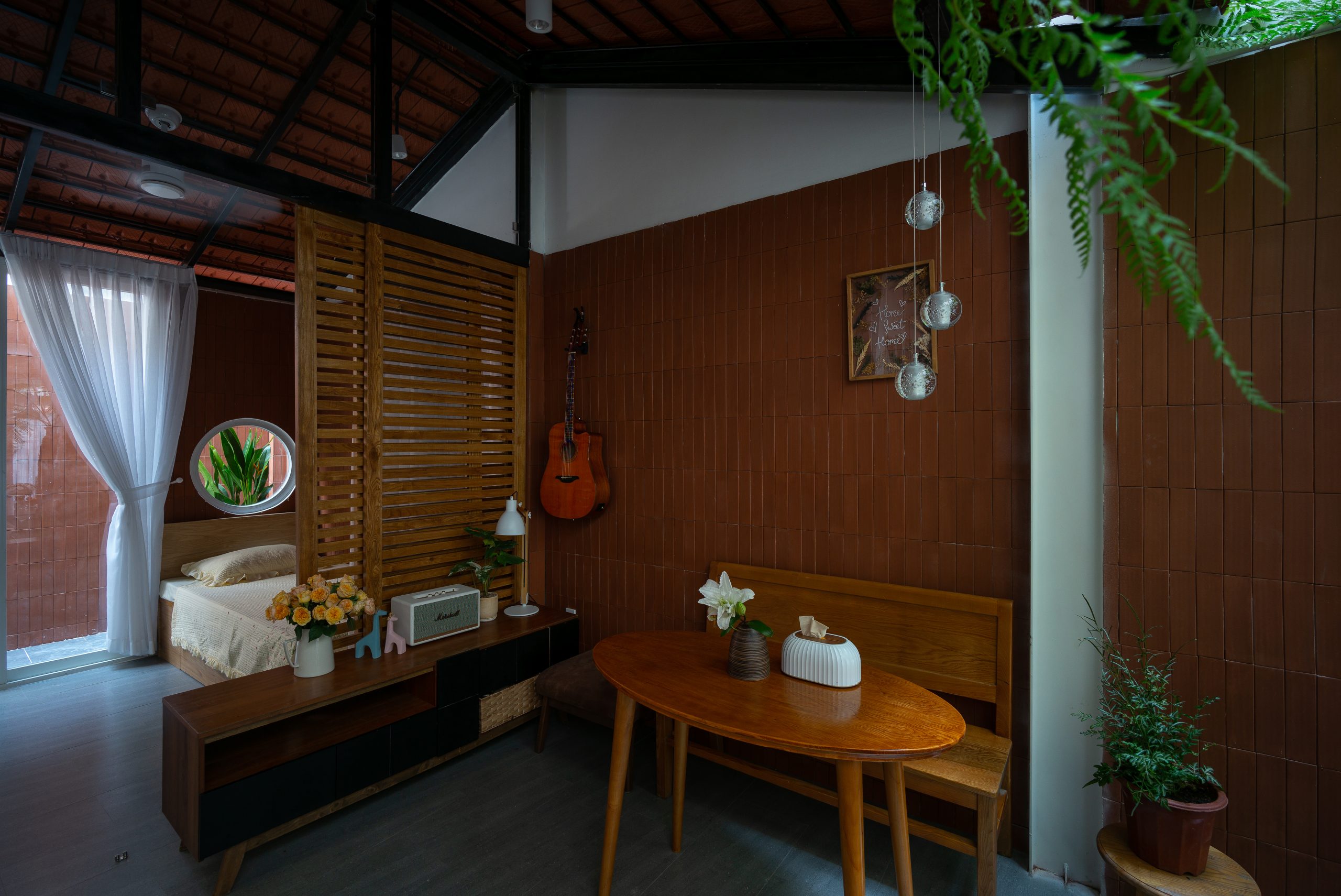
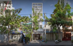
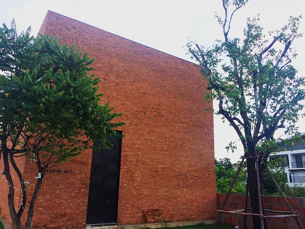
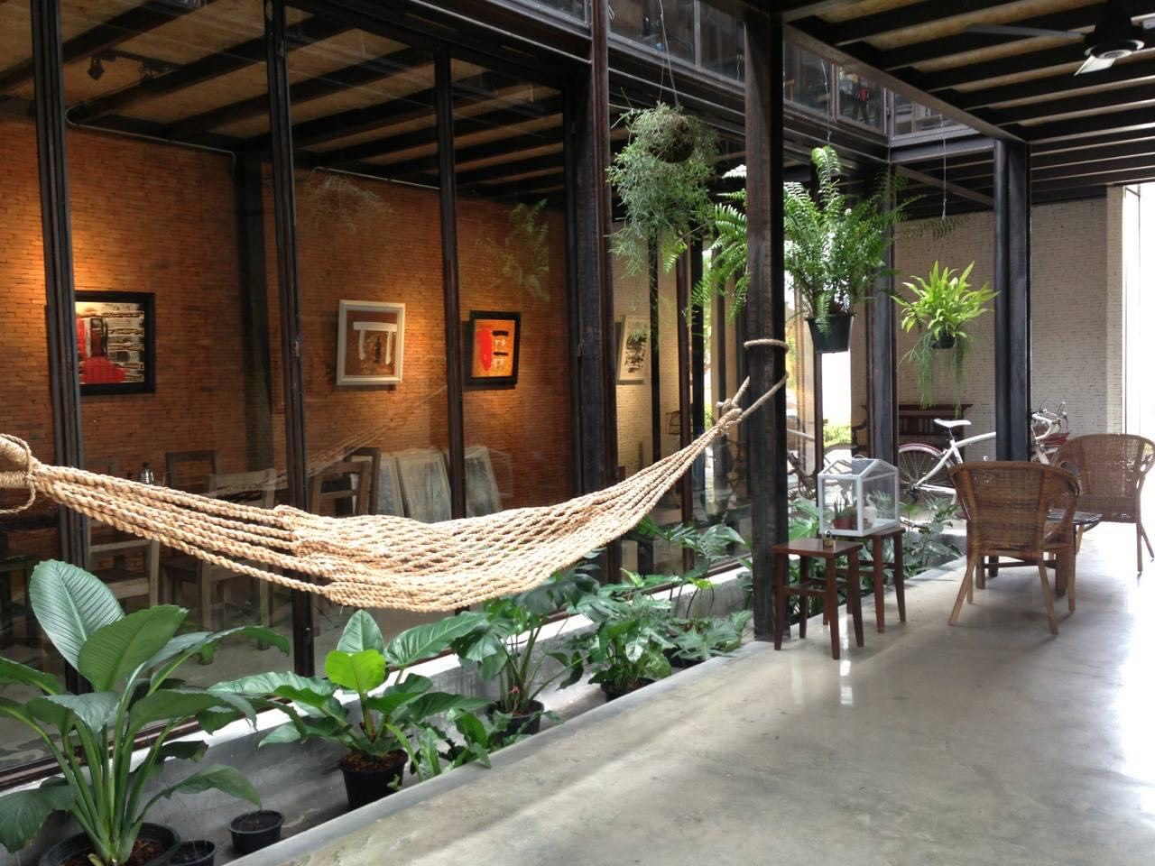
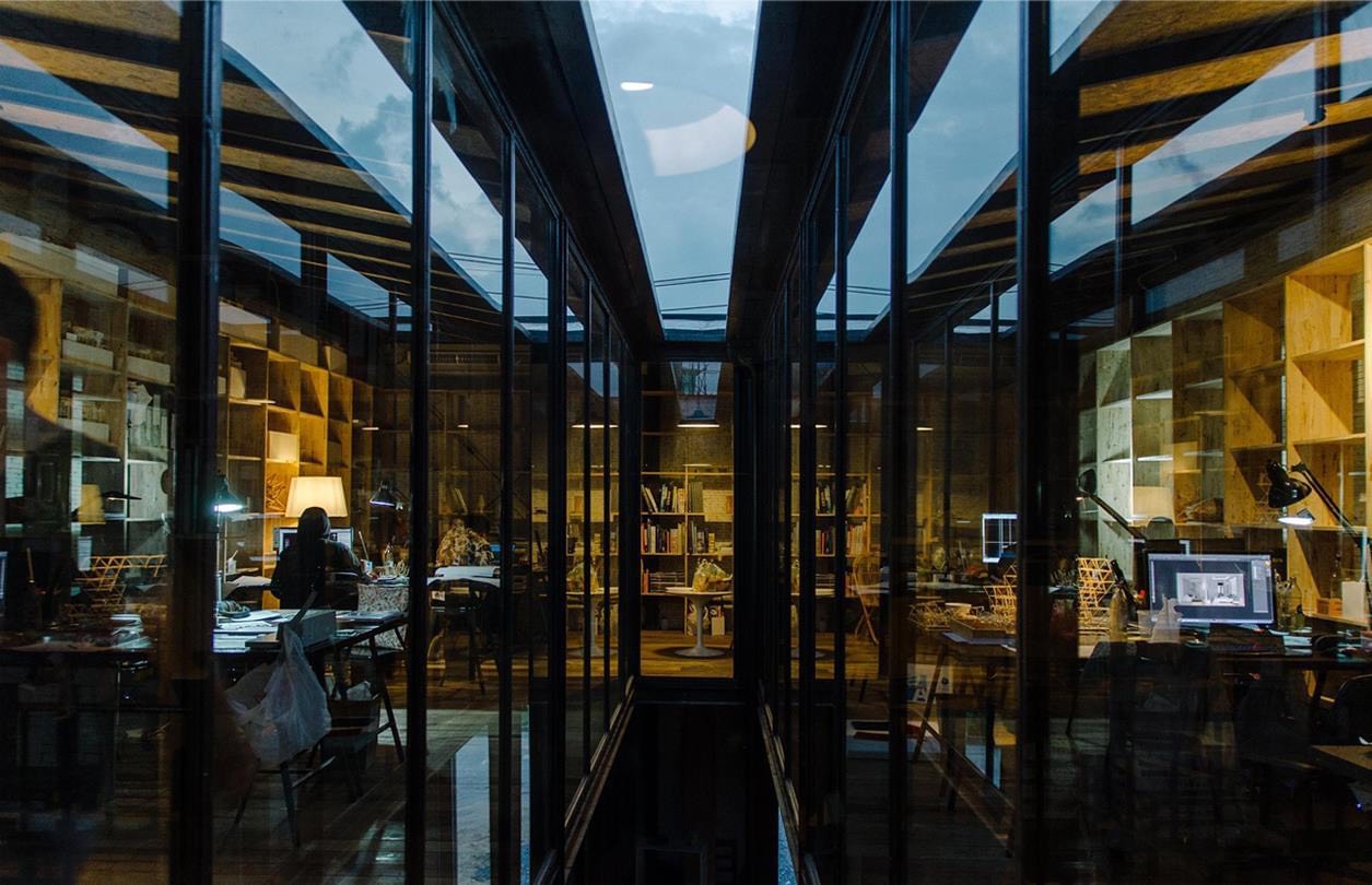
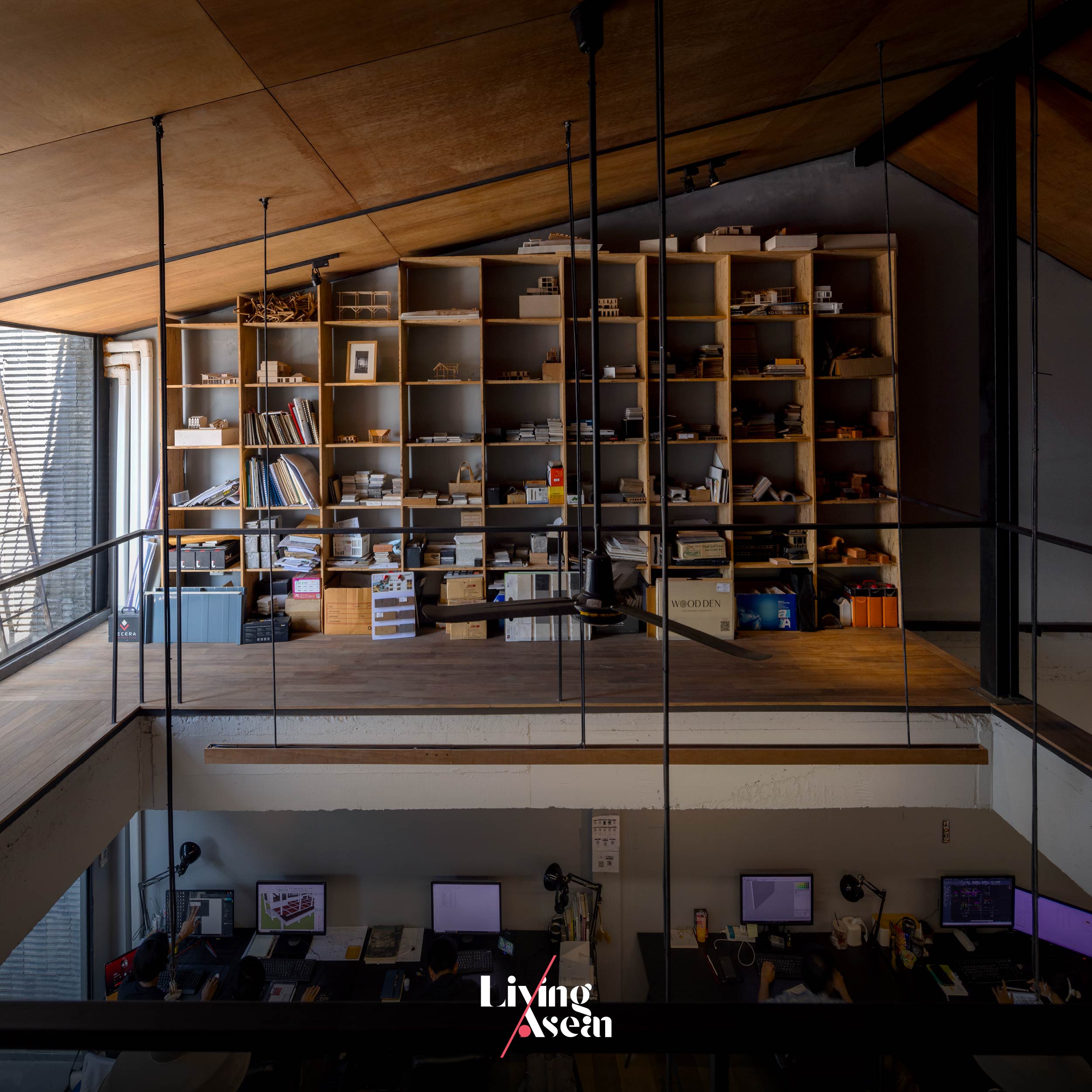
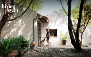
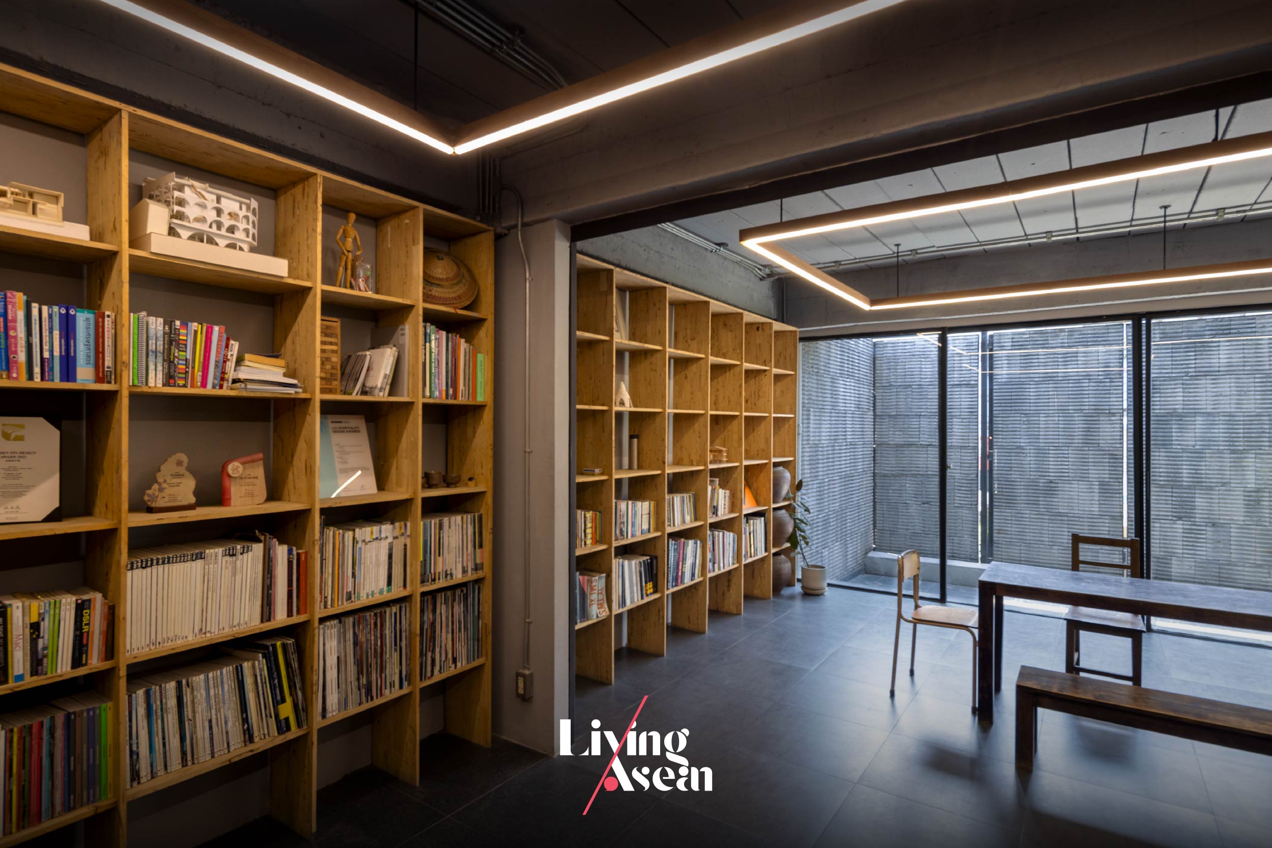
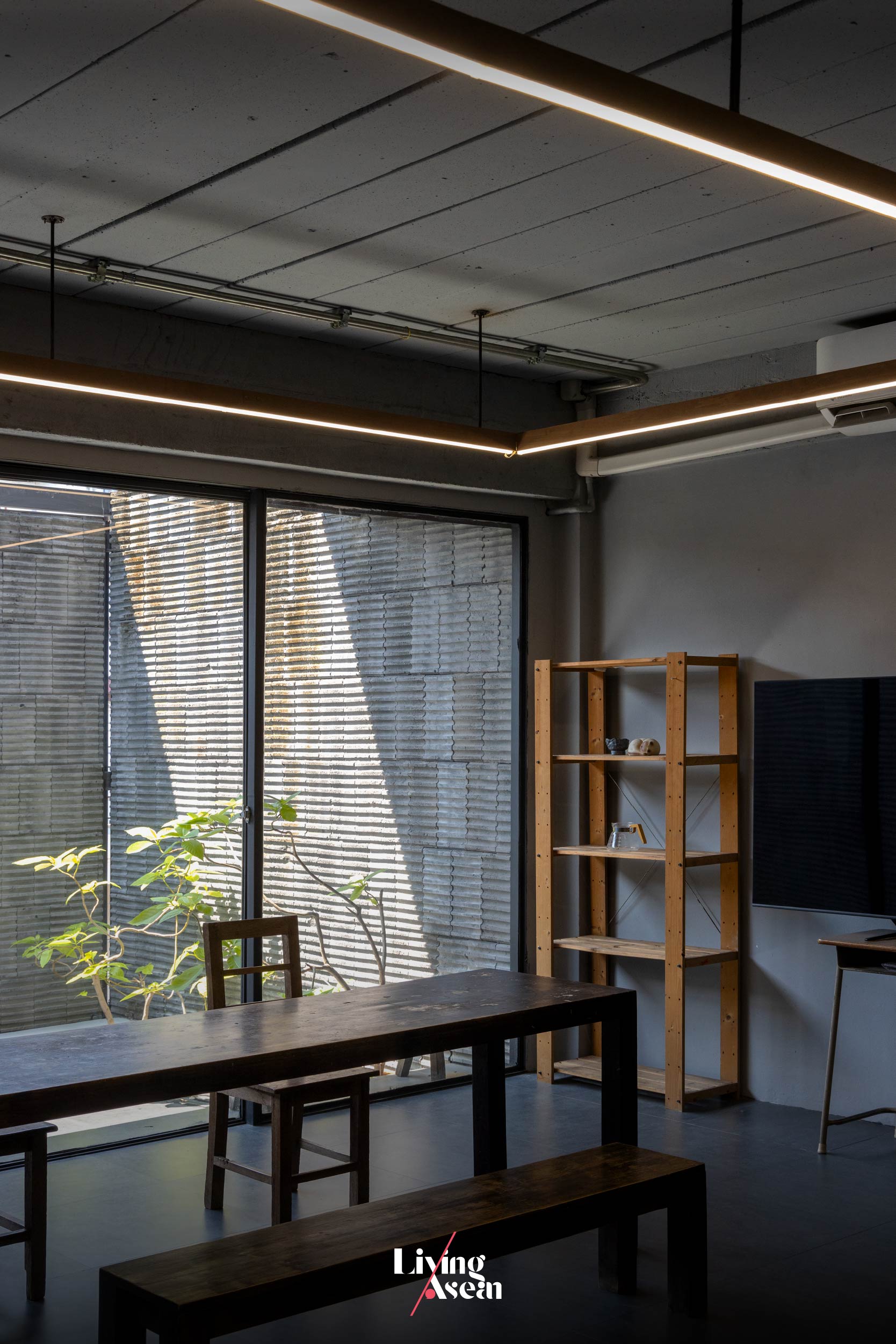
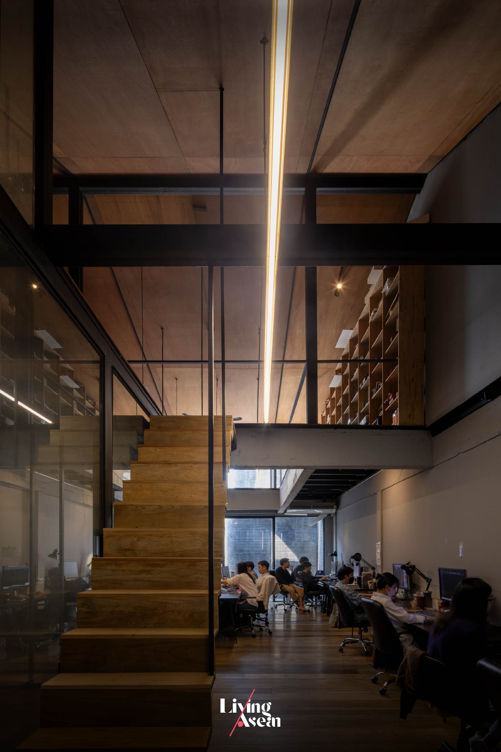
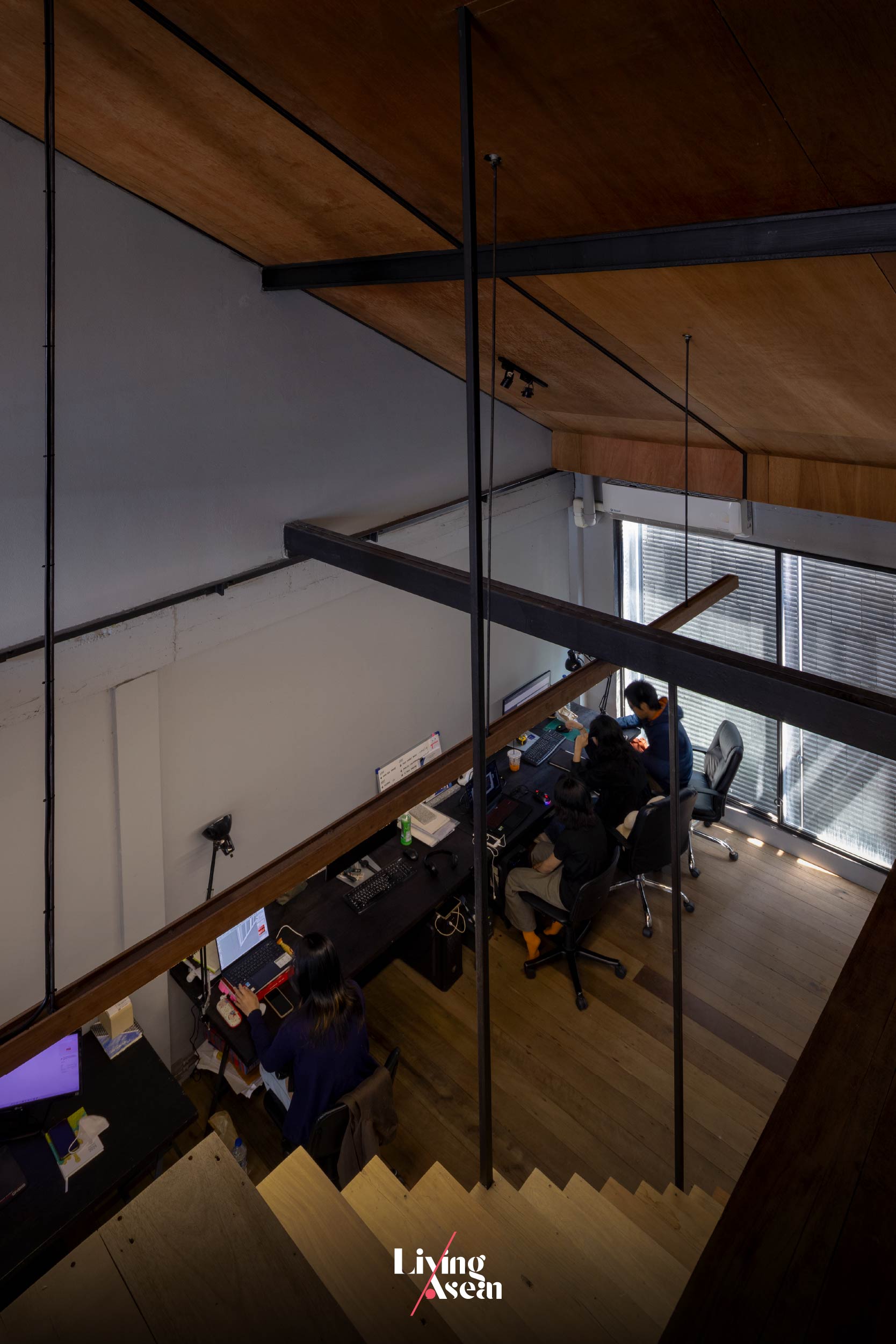
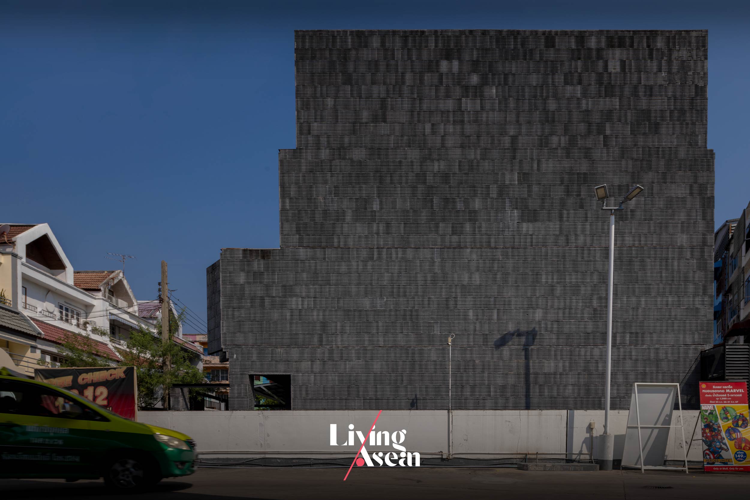
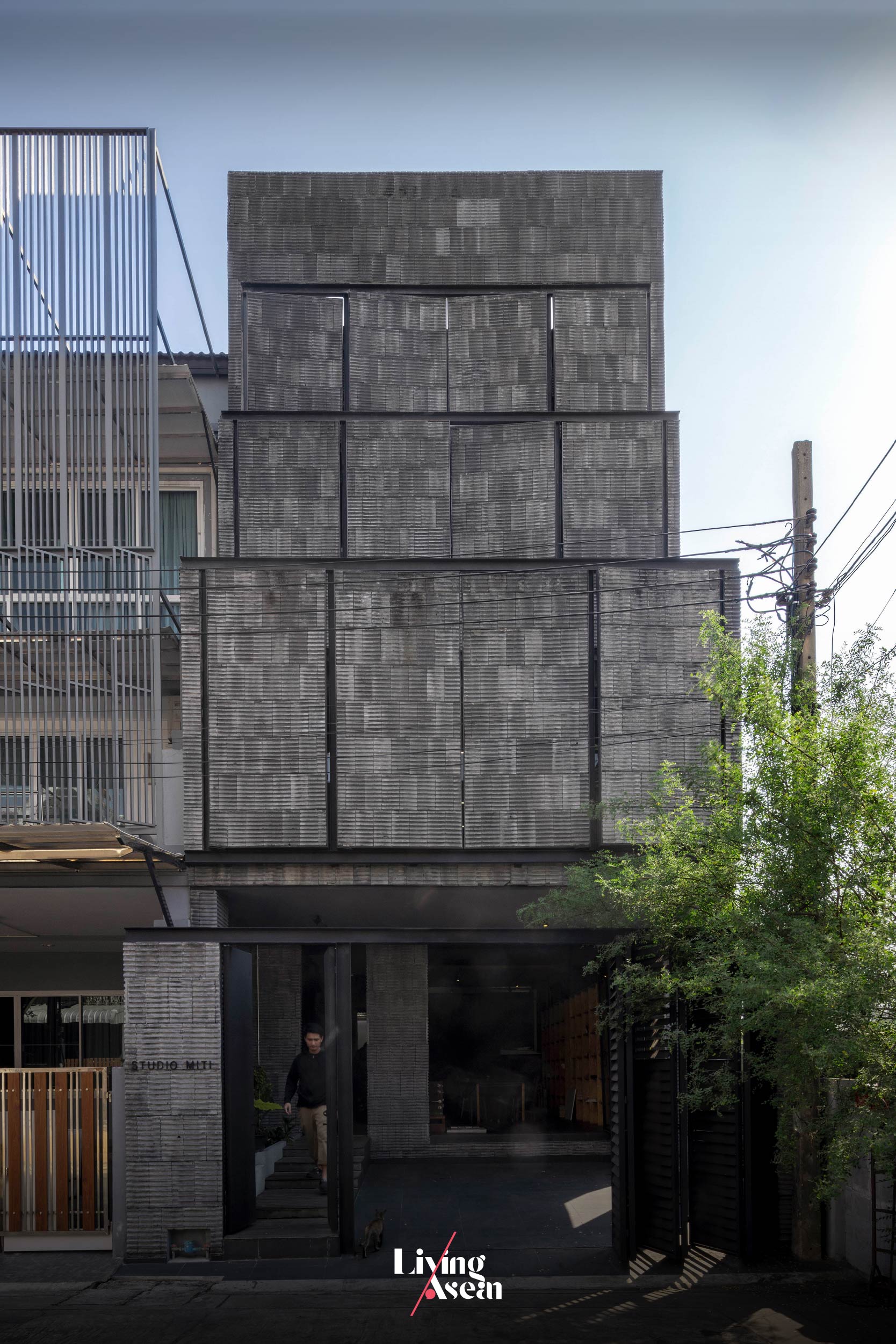
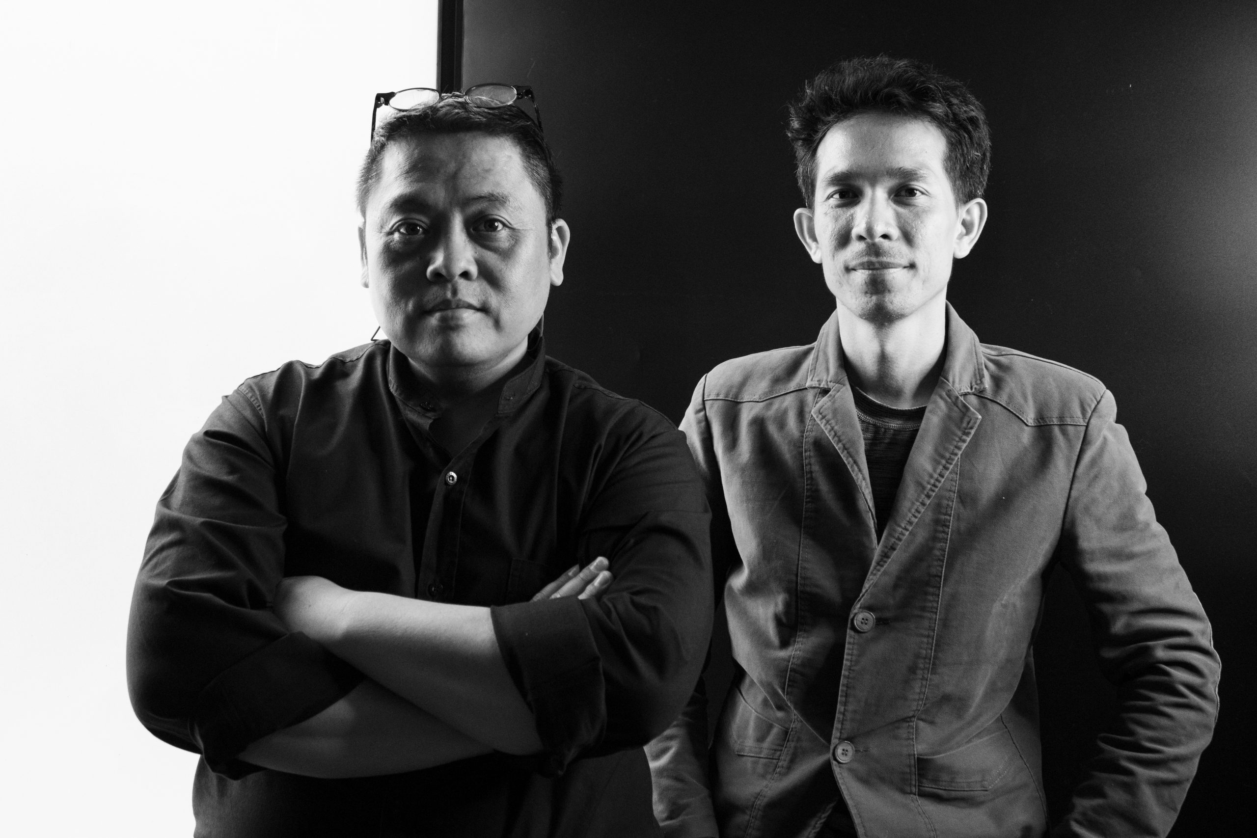
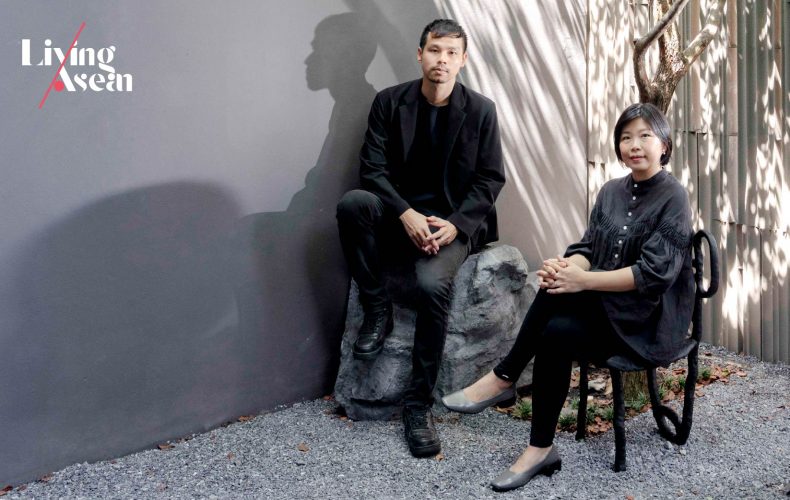
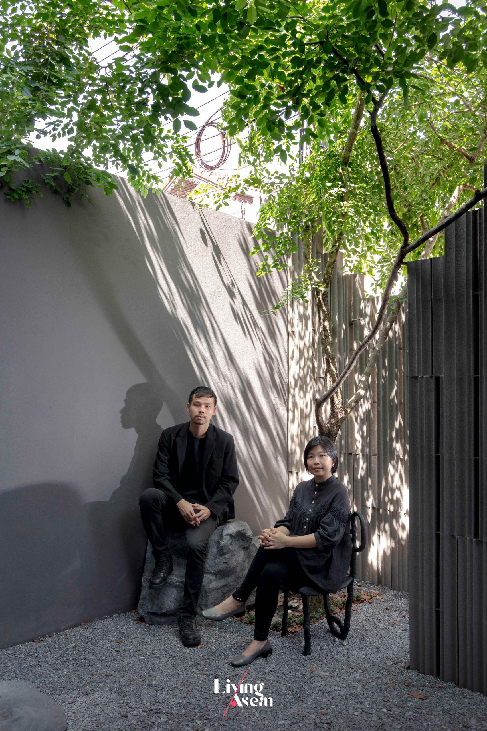
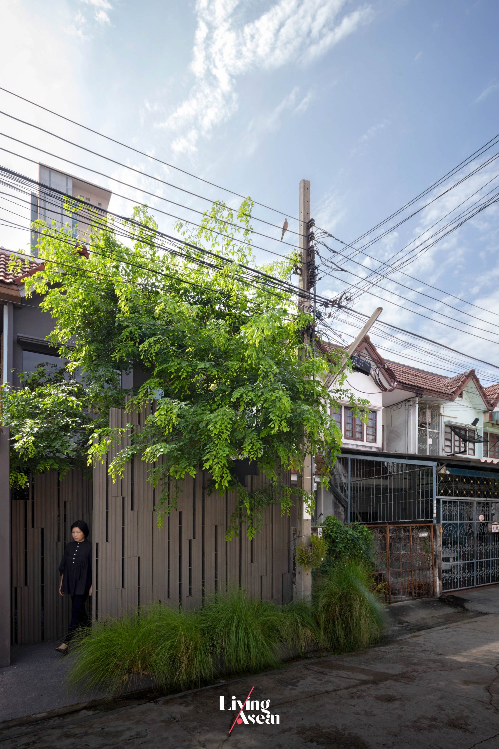
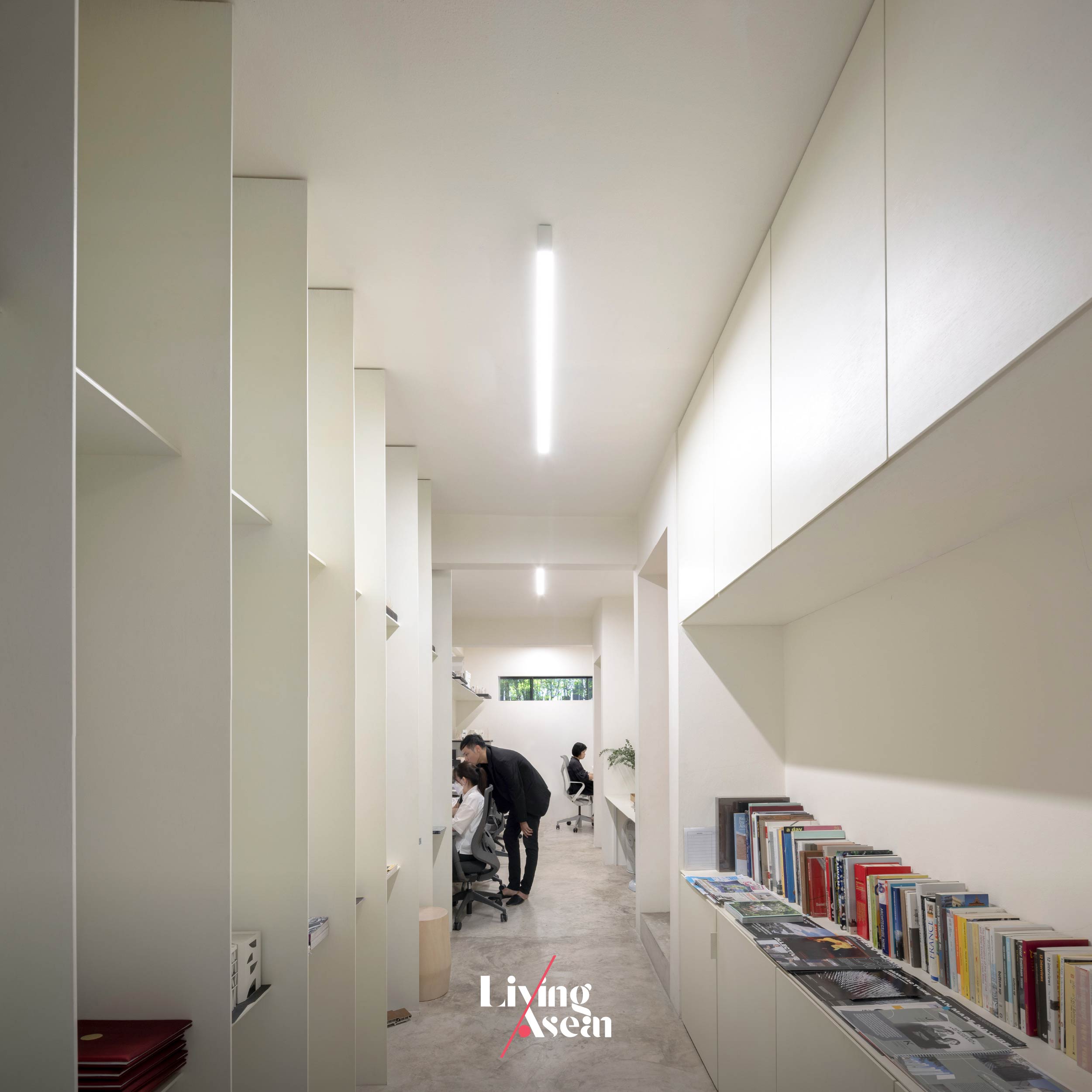
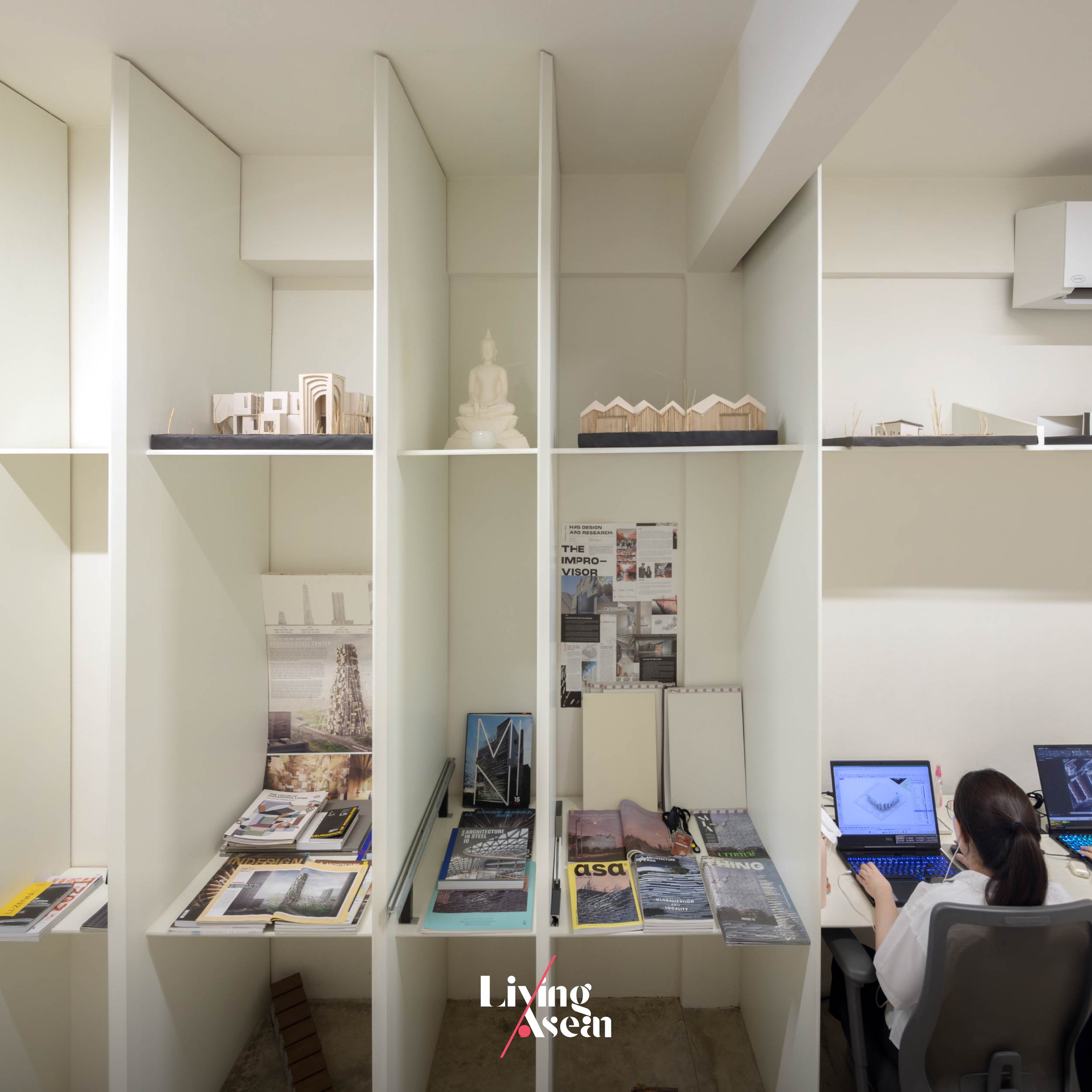
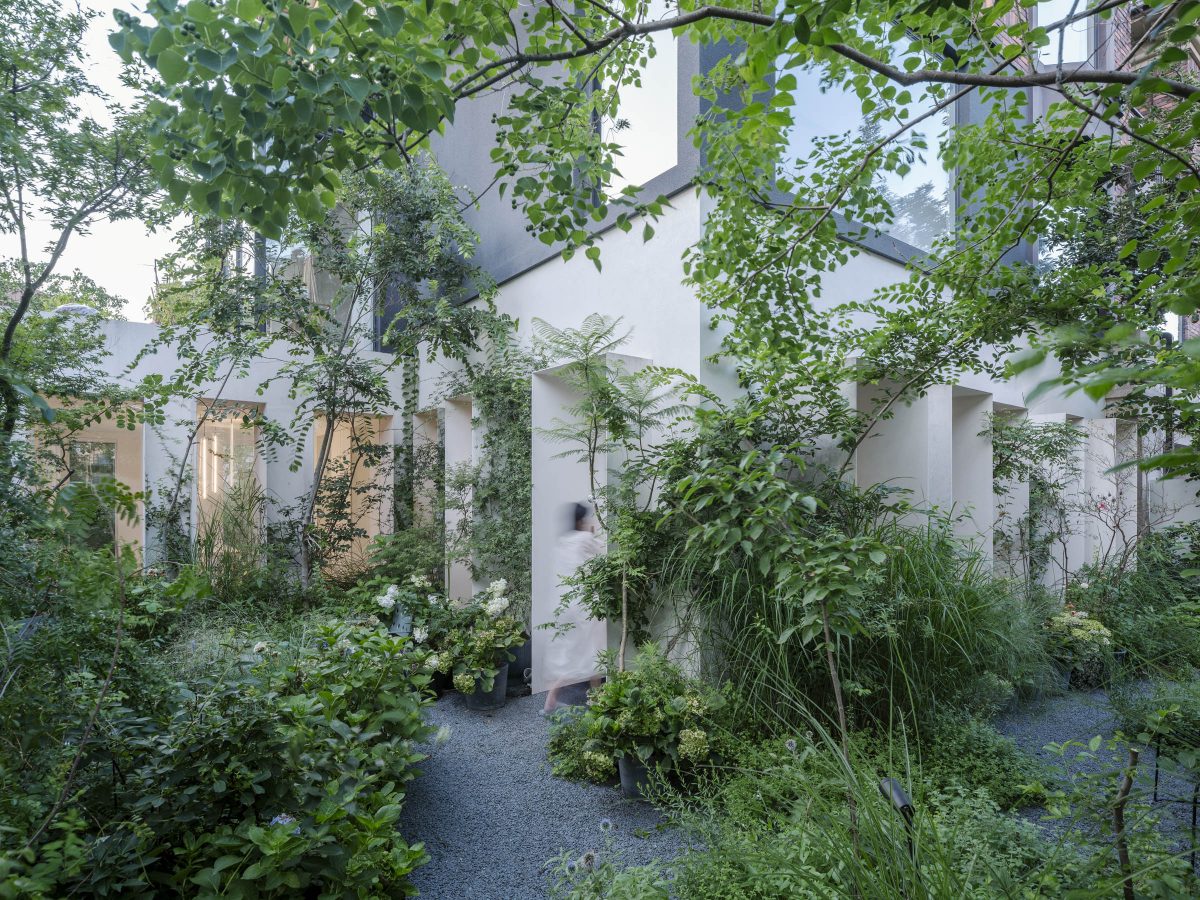
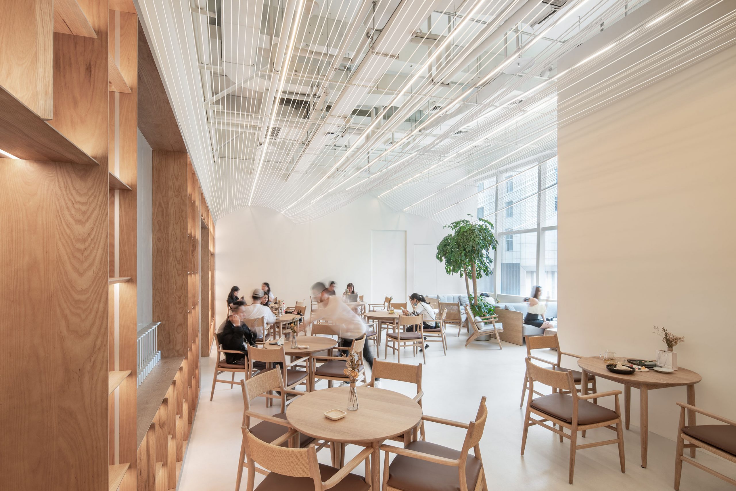
Living ASEAN takes you on a visit to their home studio located in a residential area on Phetkasem Road, Bangkok. Led by Kulthida Songkittipakdee (Poh) and Jenchieh Hung (Jerry), this small space is where they focus on architectural design.
They emphasize thorough research into the background of each project to gain a comprehensive understanding before beginning the design process.
Founded by a duo of architects
Poh – Kulthida: “HAS Design and Research. The office name is from the last name of Jenchieh Hung, and Kulthida Songkittipakdee. Combine H and S. You get HAS Design and Research. Our work emphasizes data research, conducting systematic investigations to produce the outcome needed to do design.”
Jerry – Jenchieh Hung: “The two of us lived outside of Thailand for over 10 years. We set up our first office in Shanghai. When we came back to Thailand, our first impression was we wanted this space to be different from Shanghai.
“If you look at this community, you’ll find the people are truly locals. They do many activities together as community. It’s the reason we combine home and office in one. In Phetkasem area.
“Home office offers many benefits because it’s a perfect balance between life and work. When our way of life become ONE with the surrounding community. I believe our work of architecture can provide pictures of life in the future. The same is true for Thai society.”
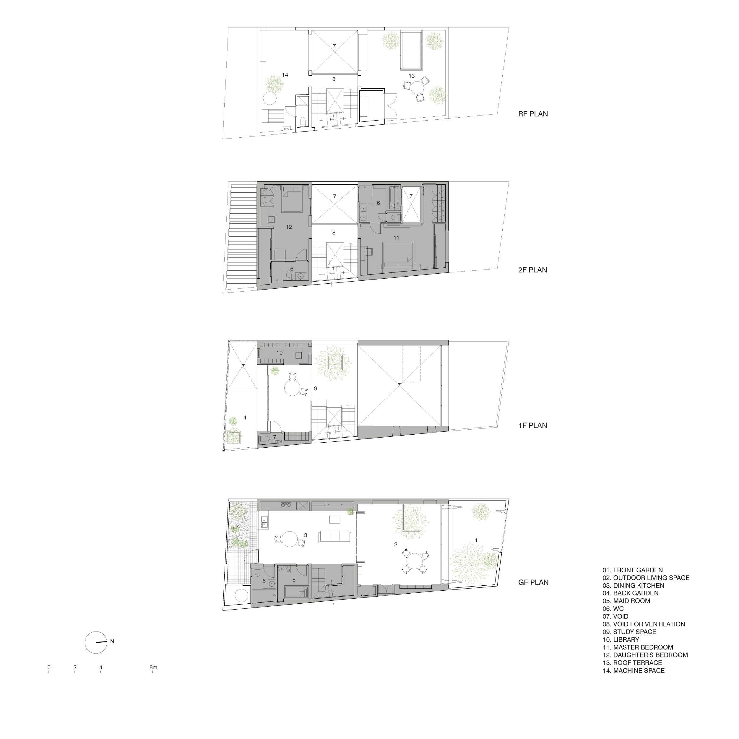
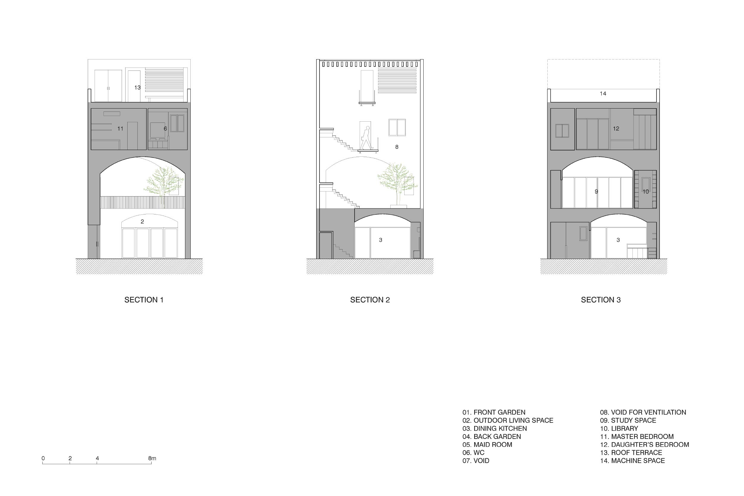
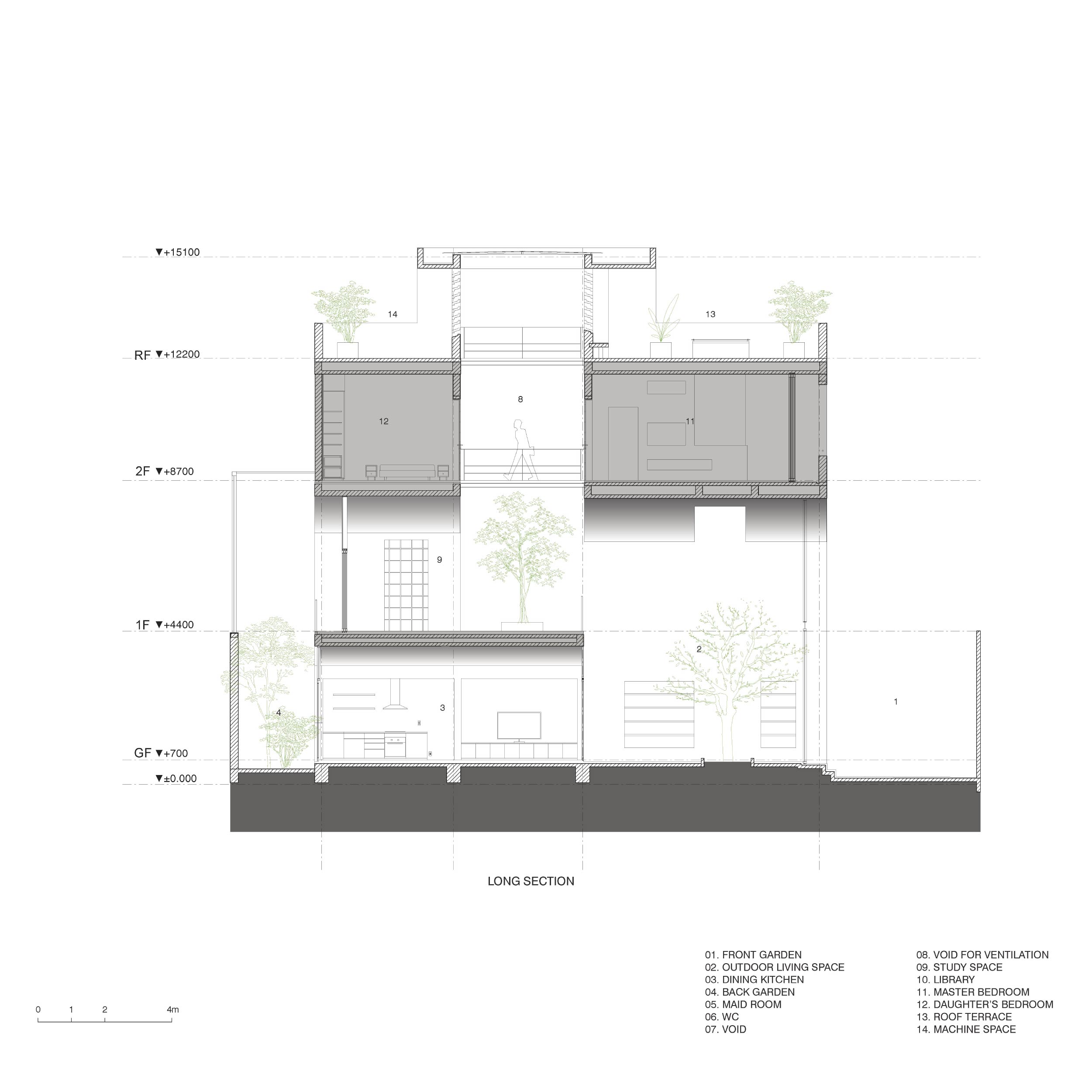
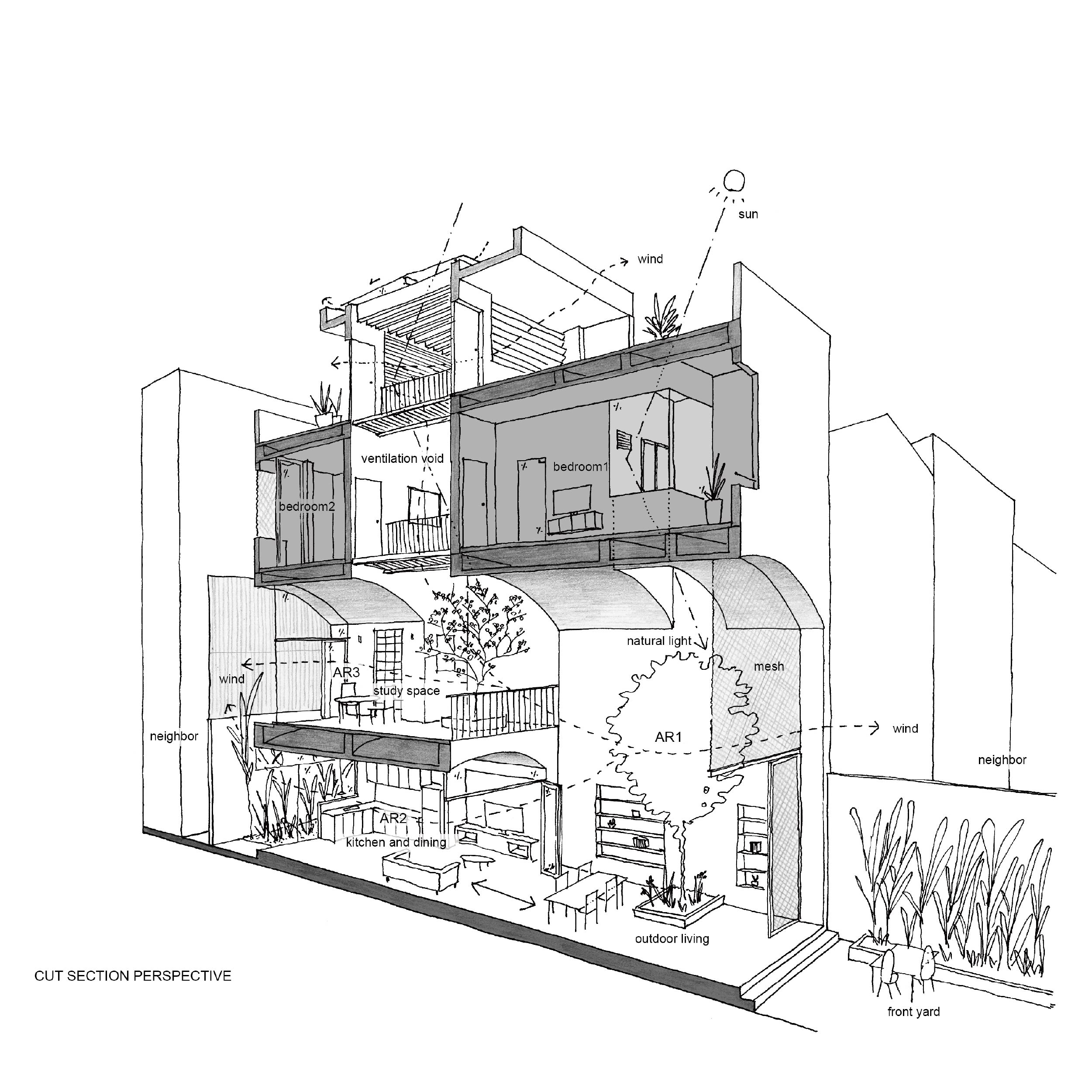
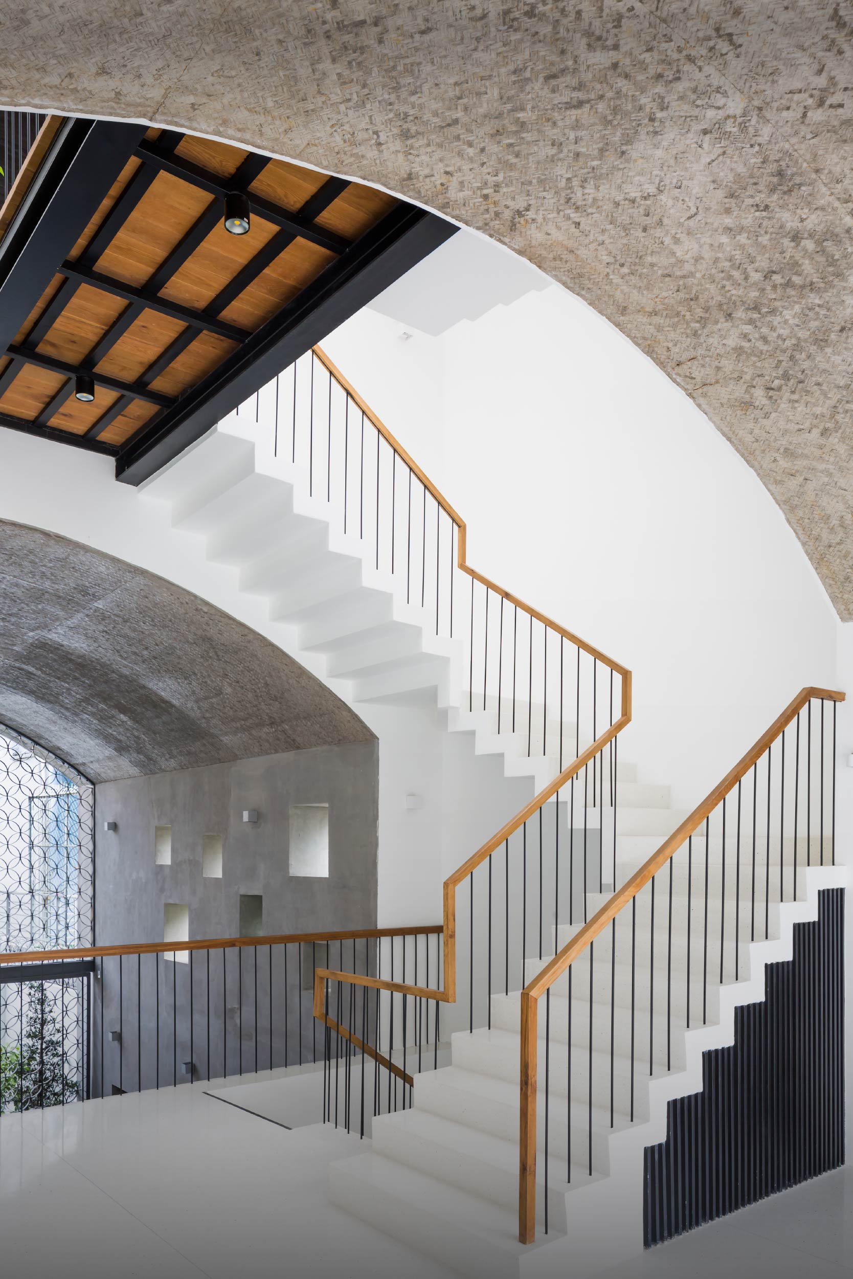
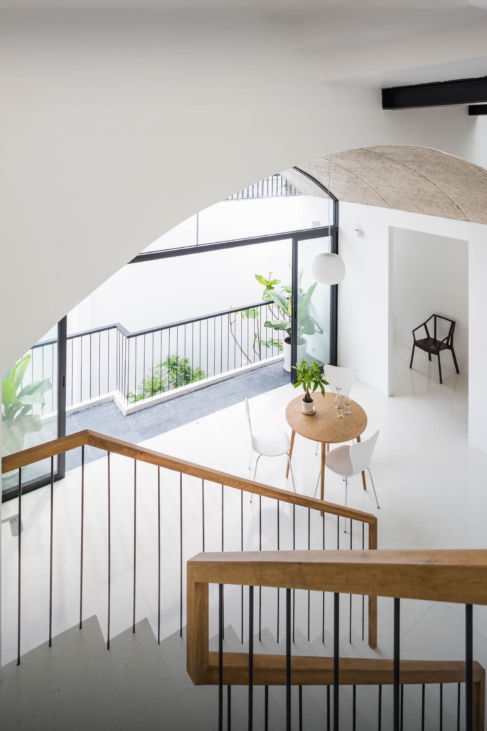
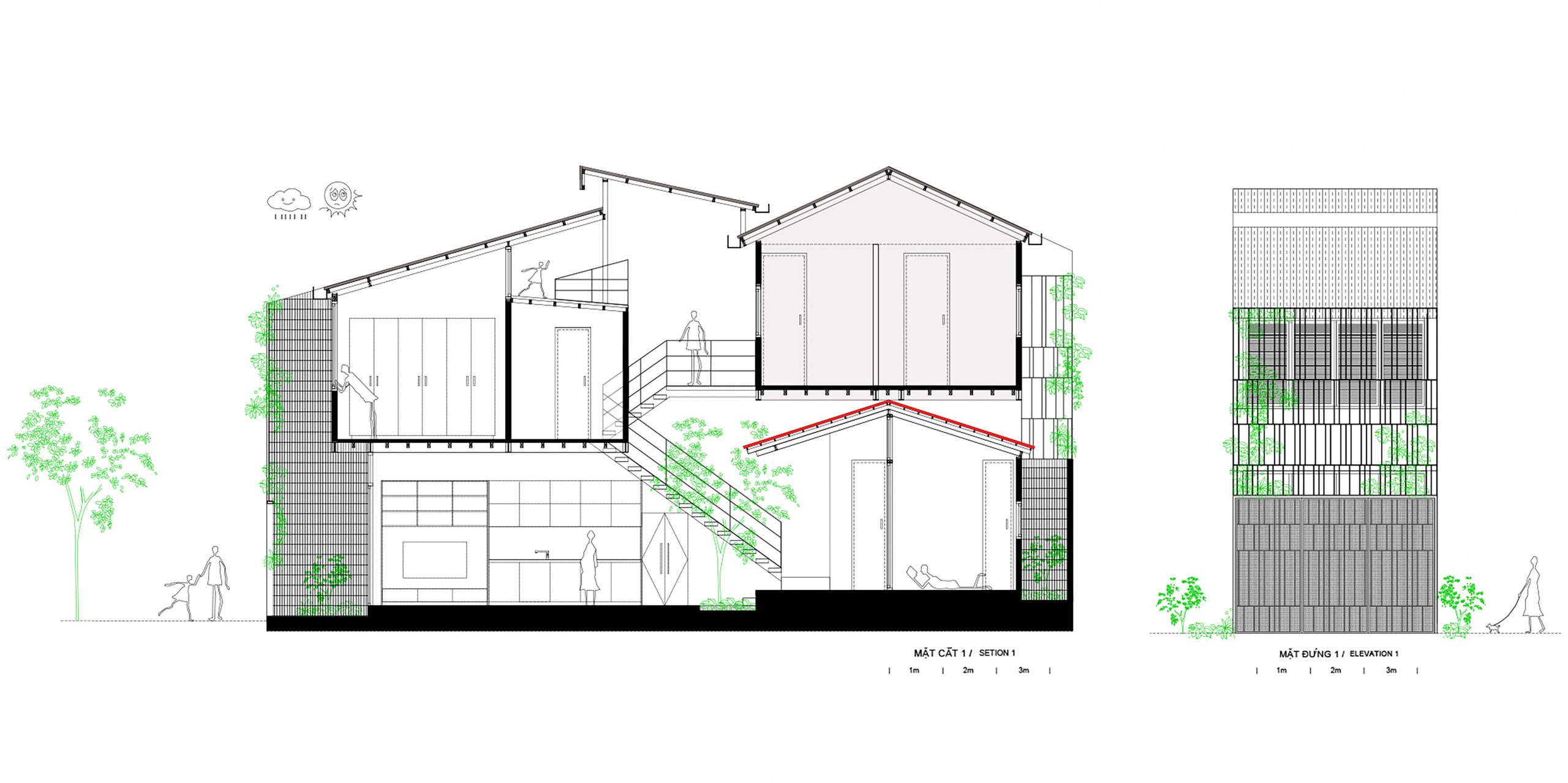
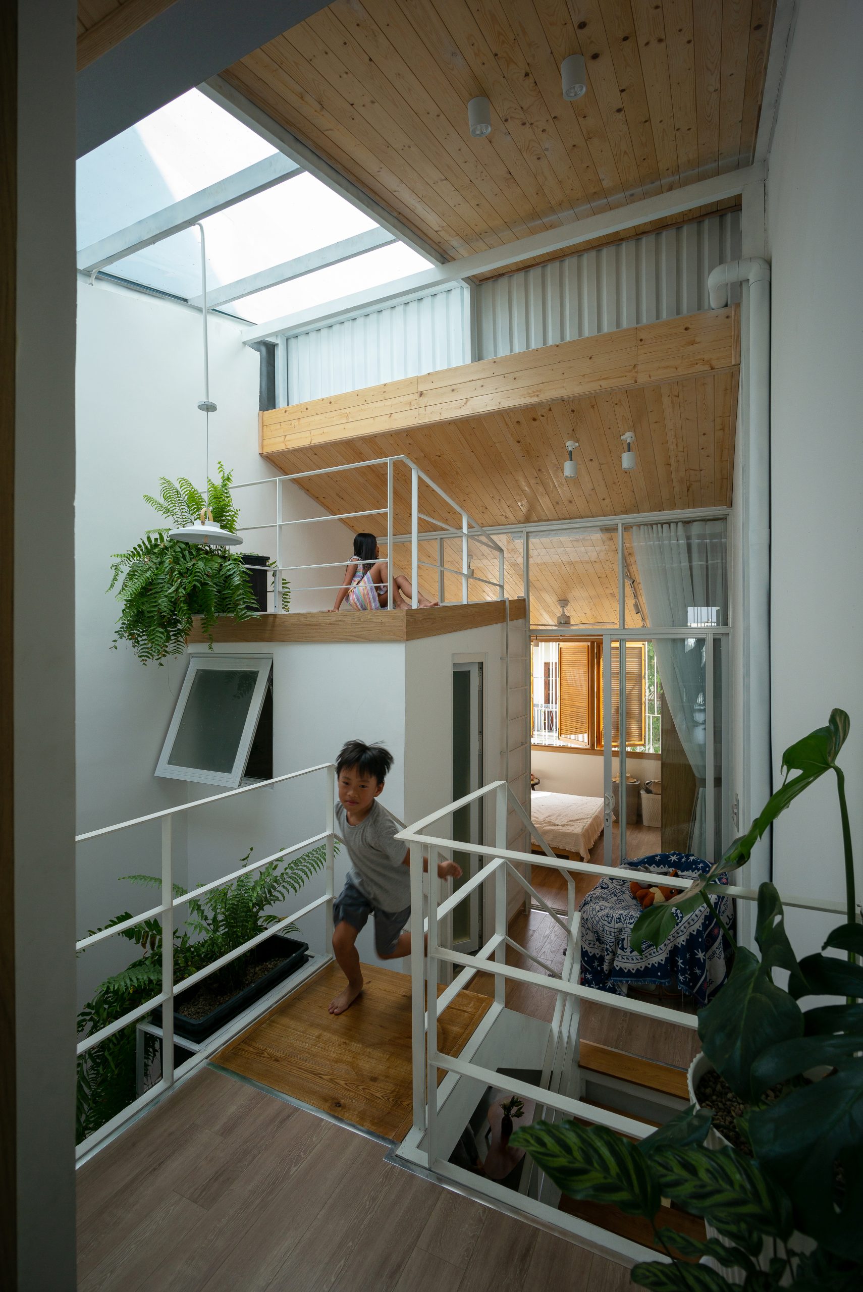
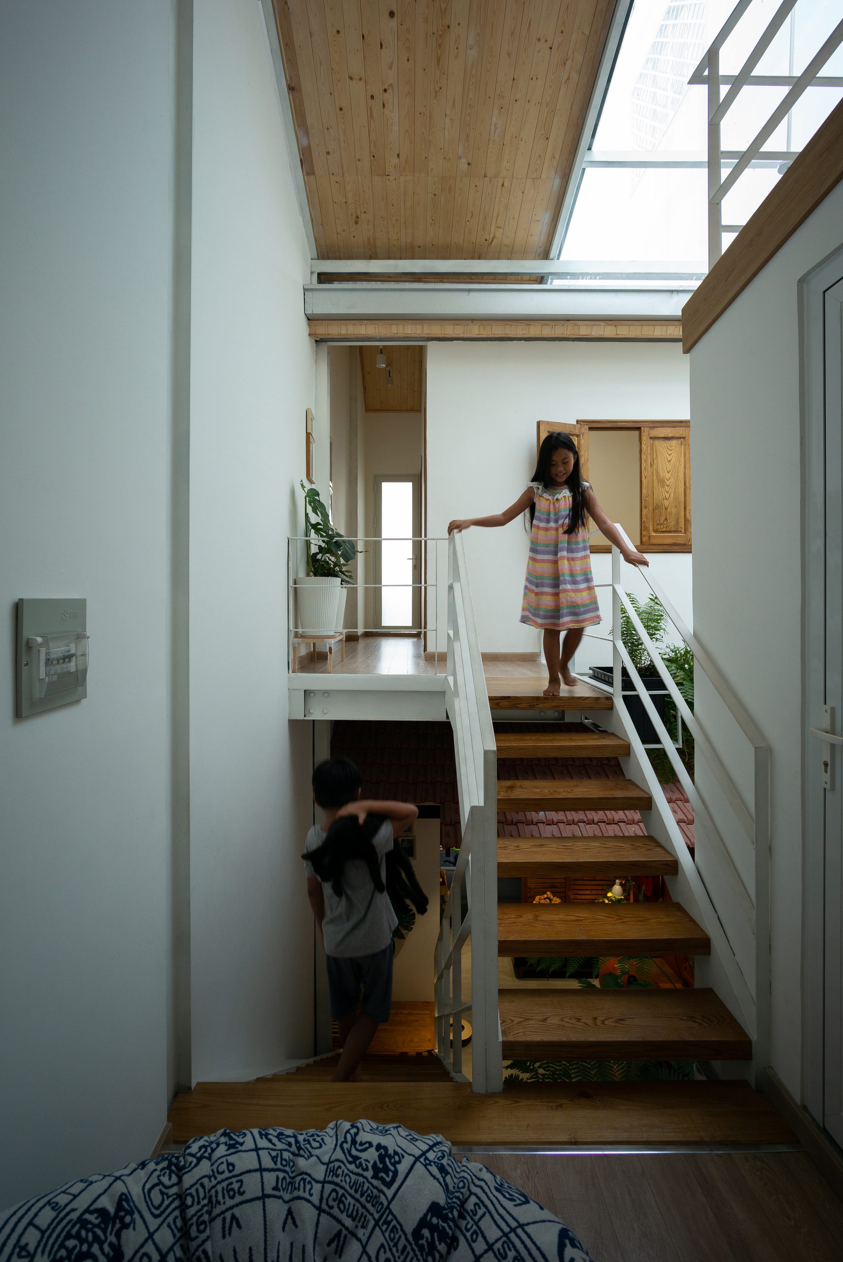
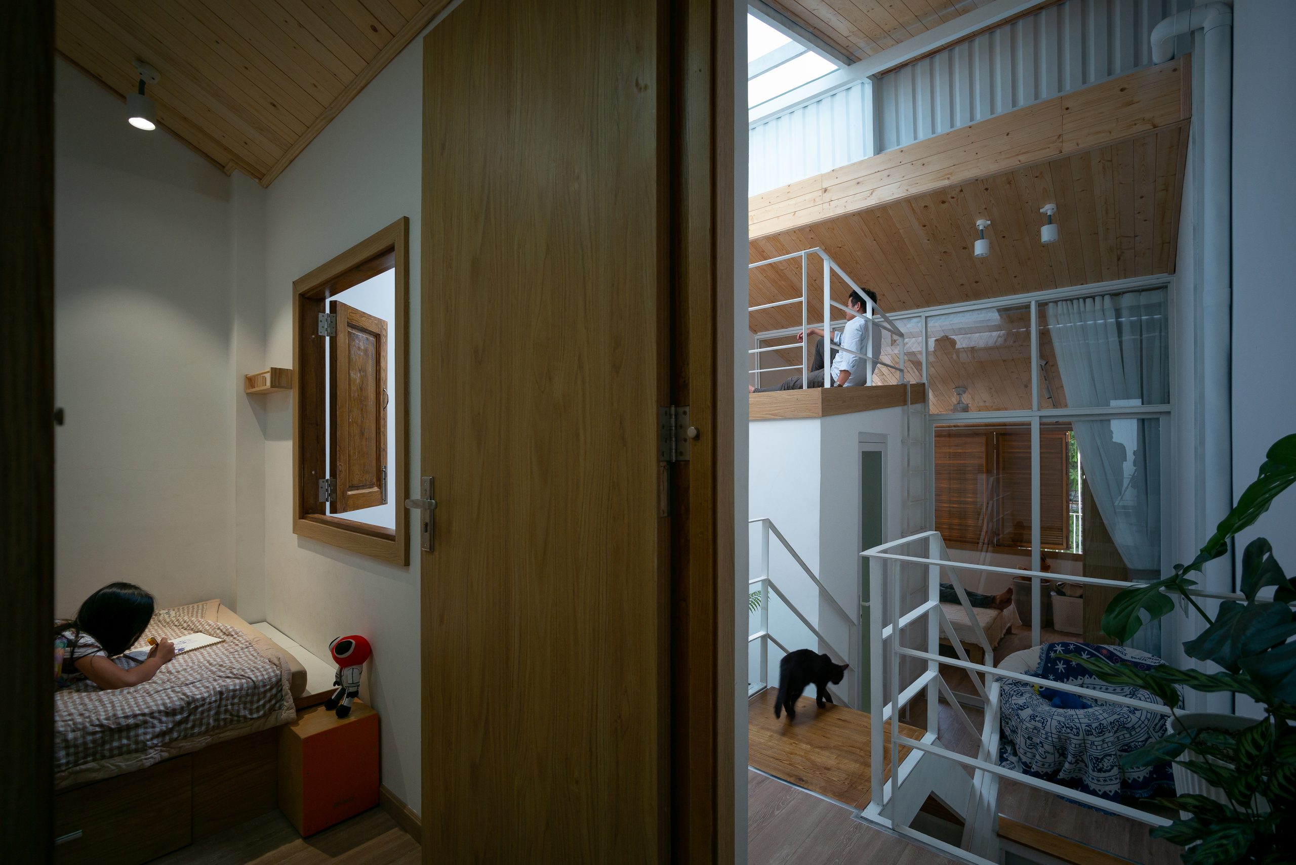
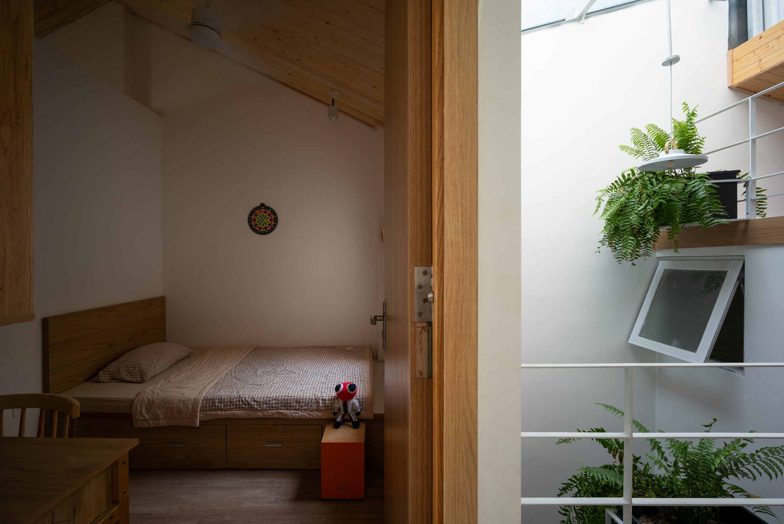
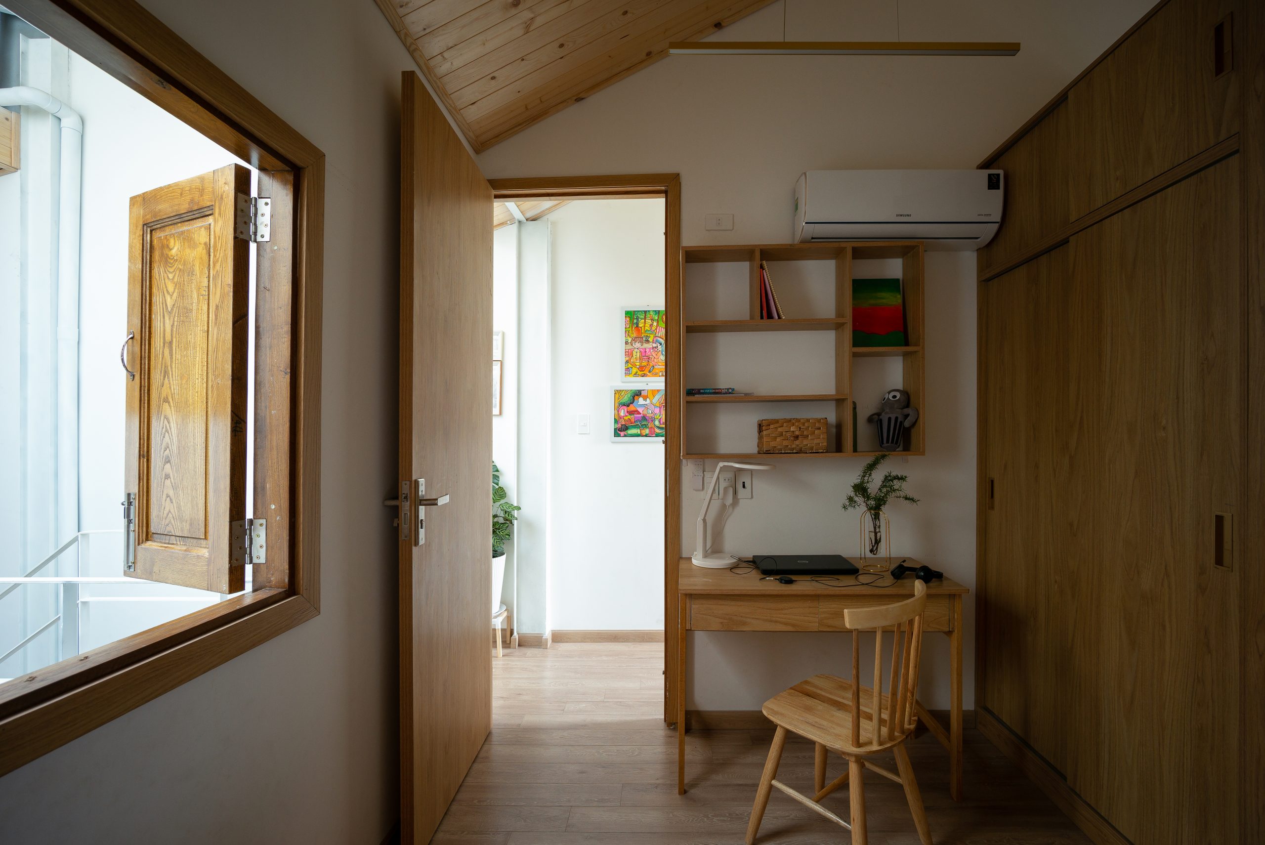
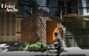
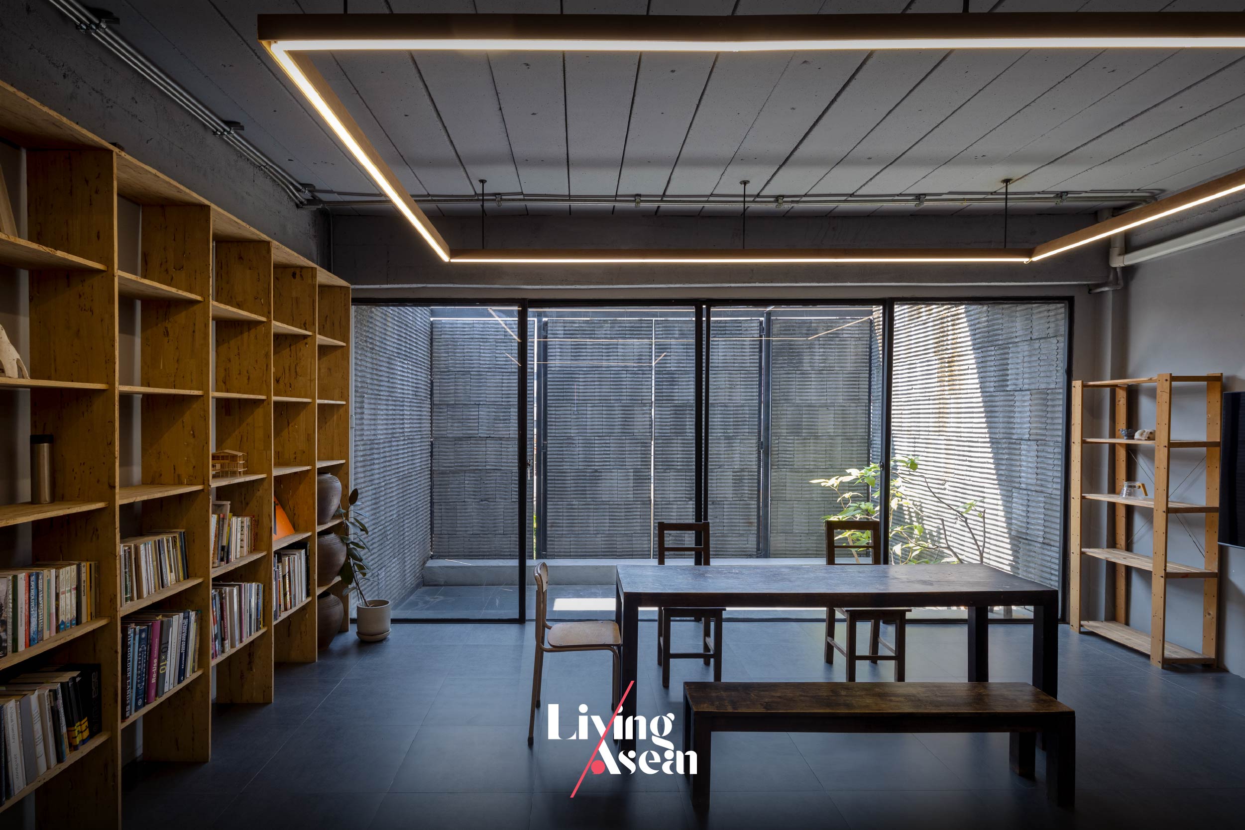
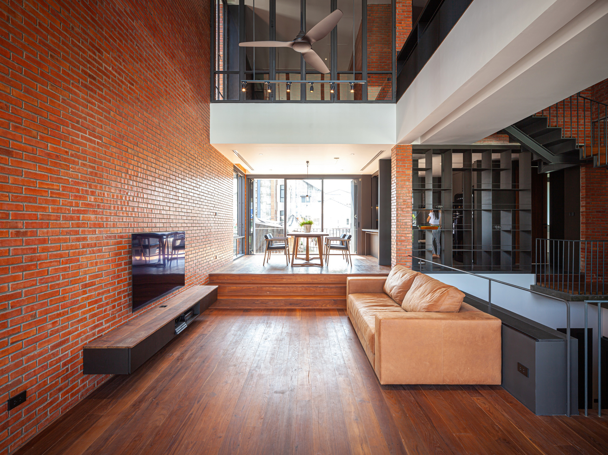
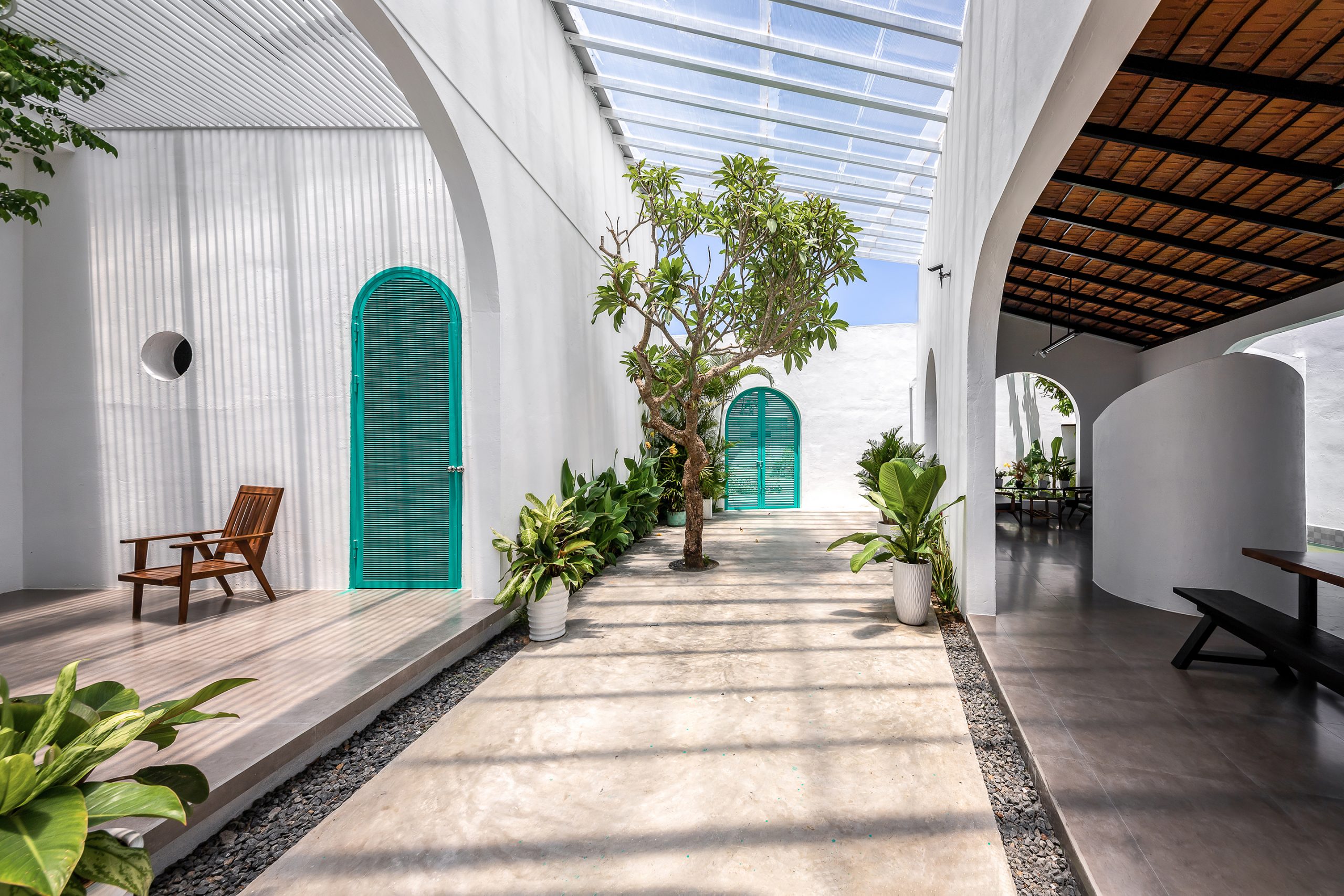
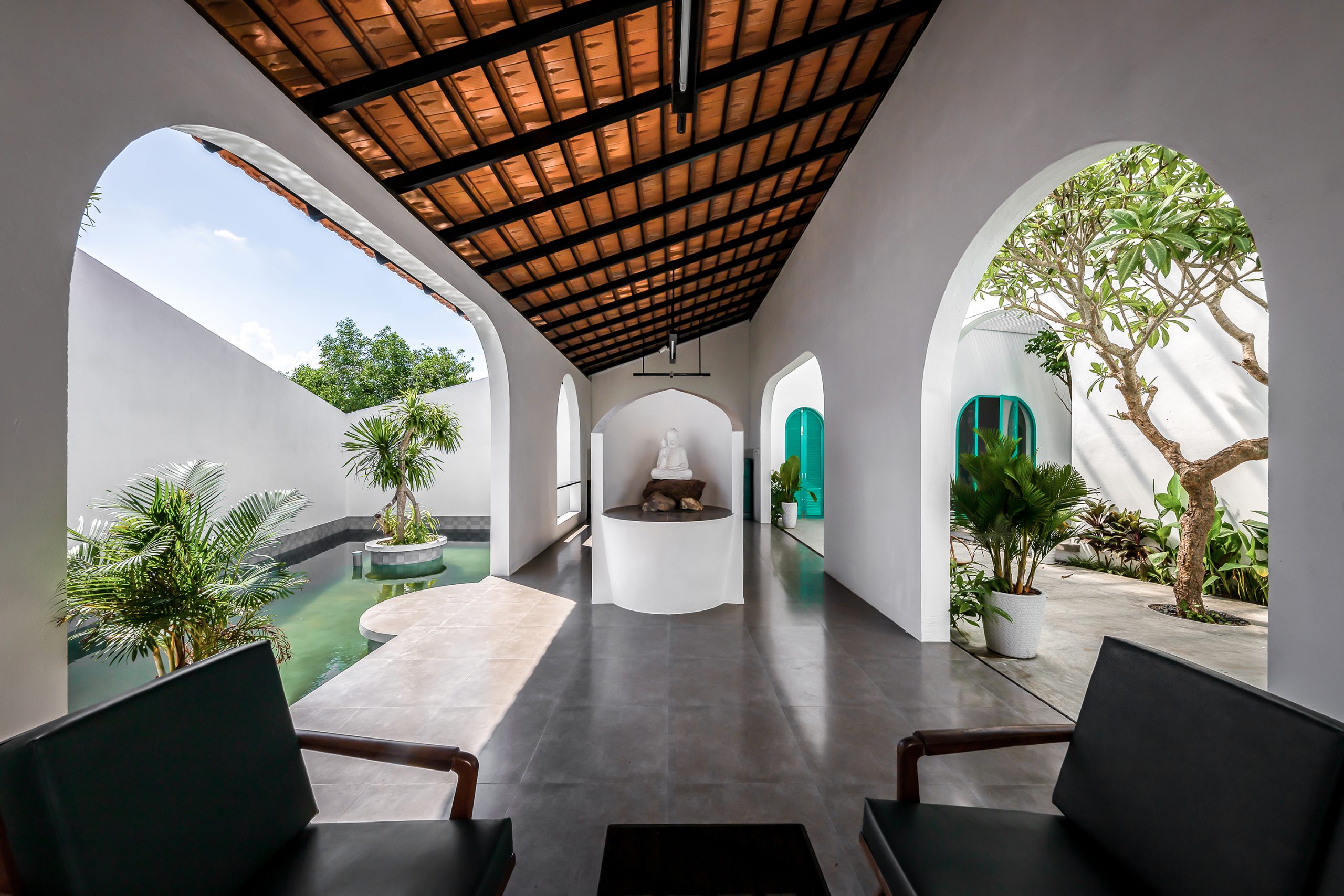
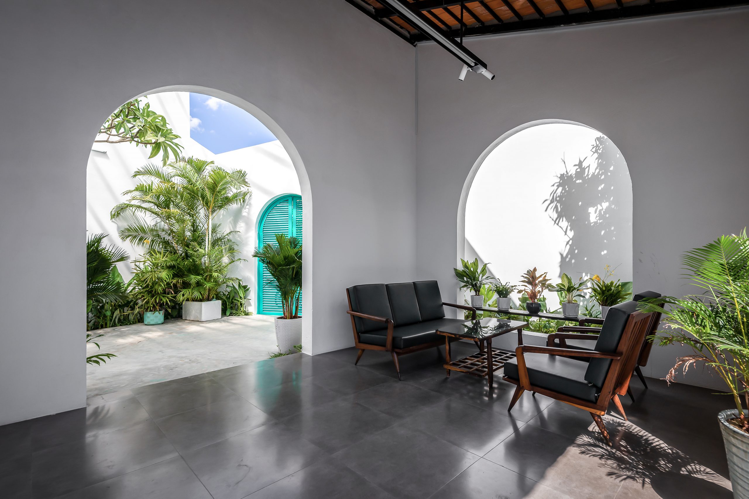
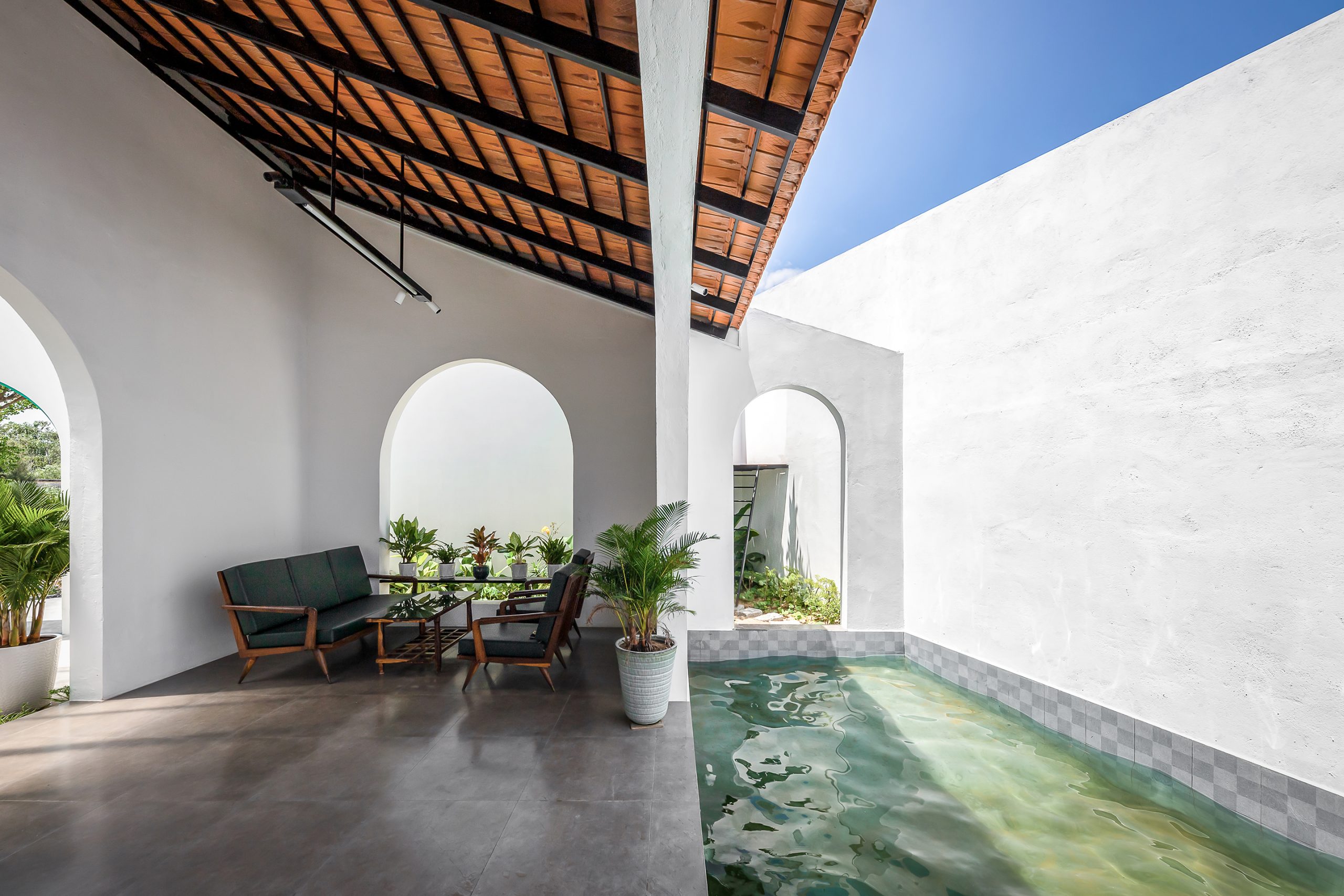
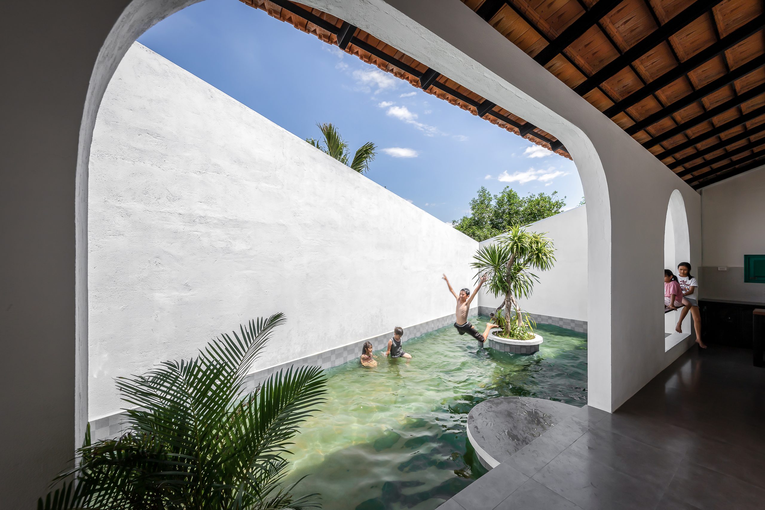
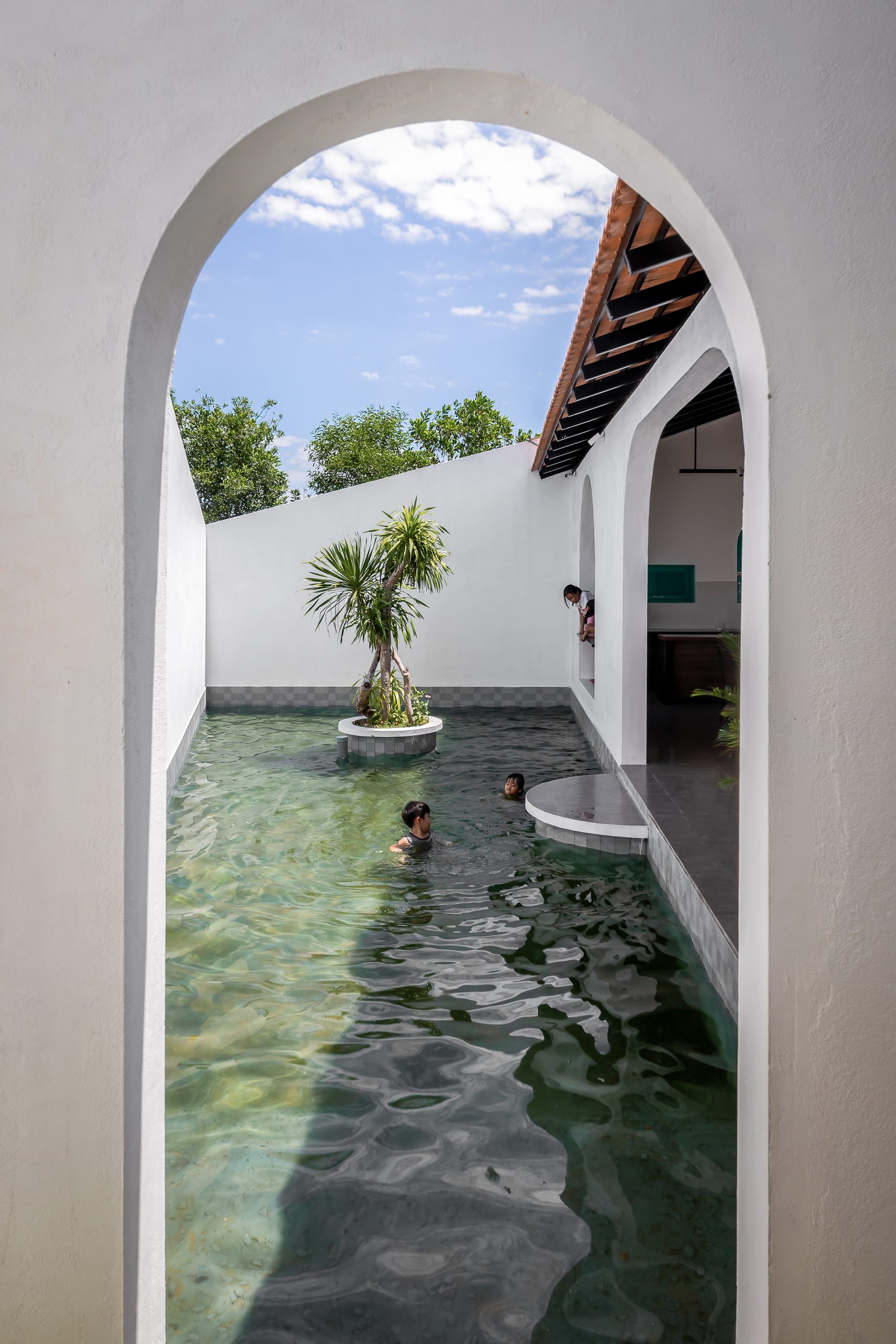
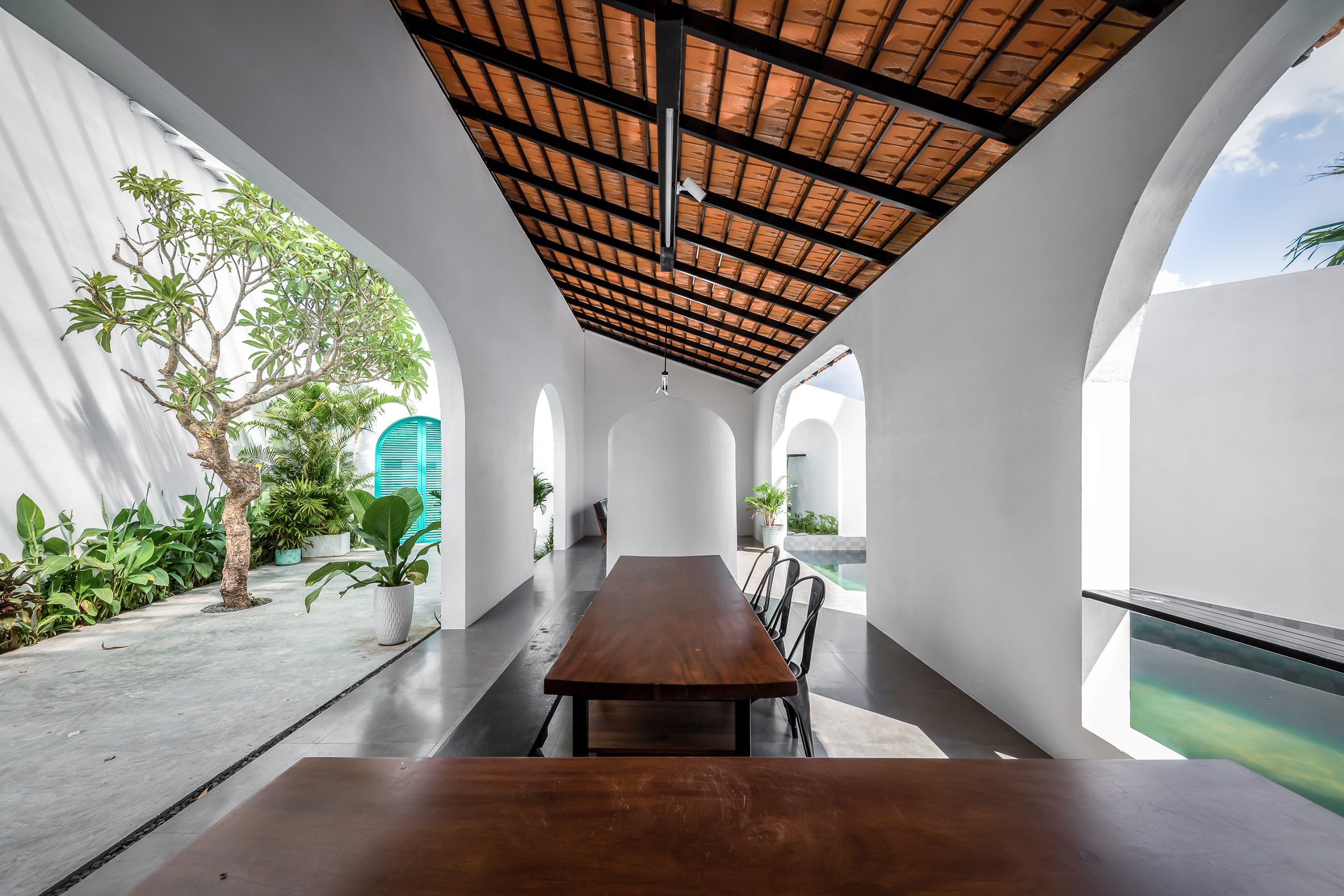
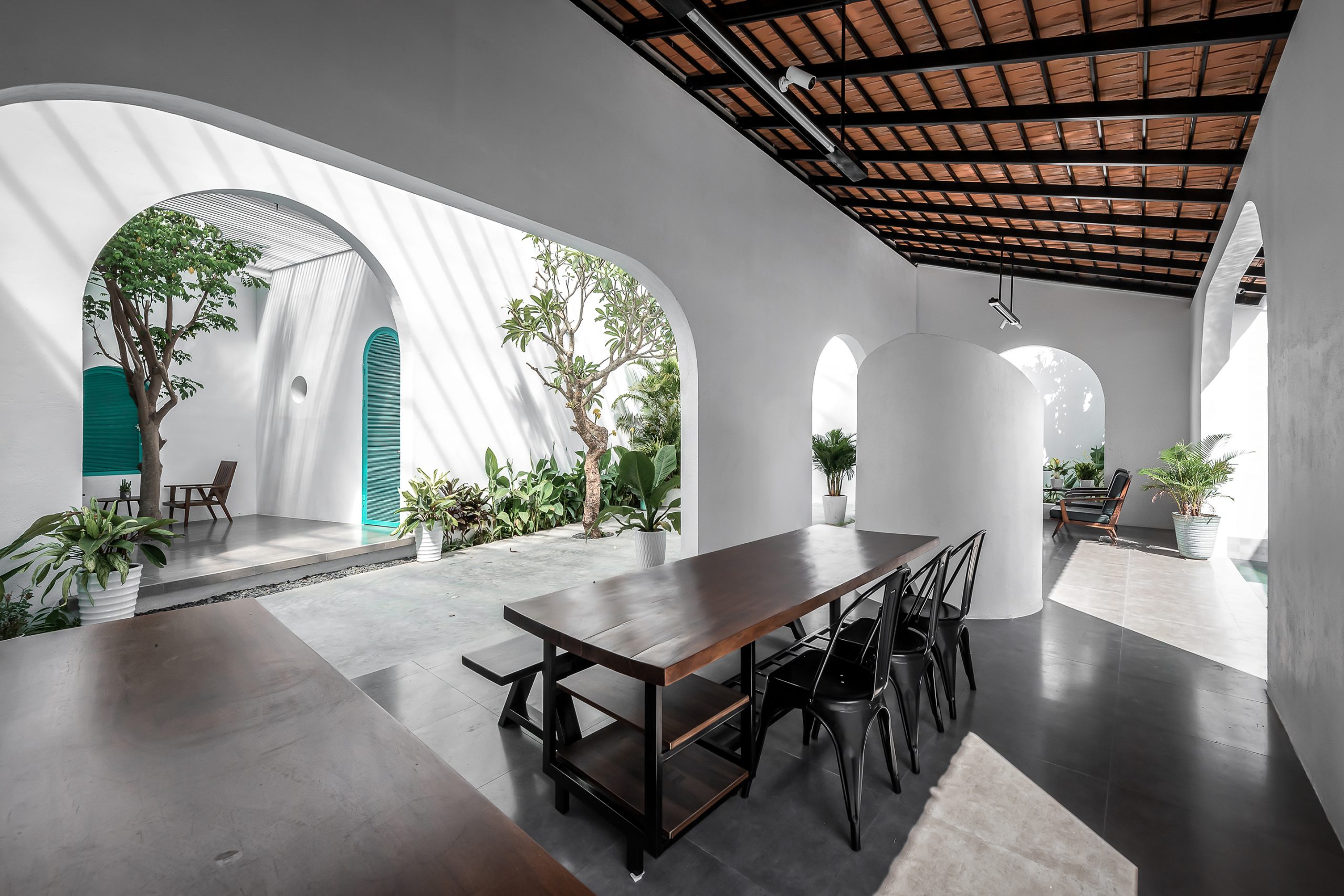
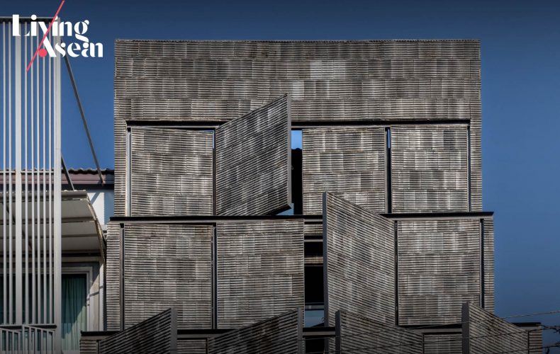
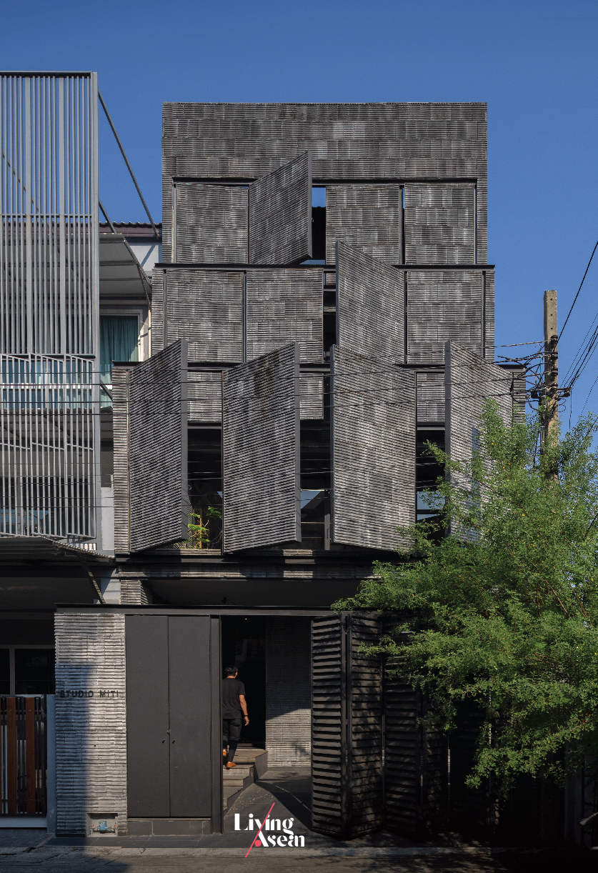
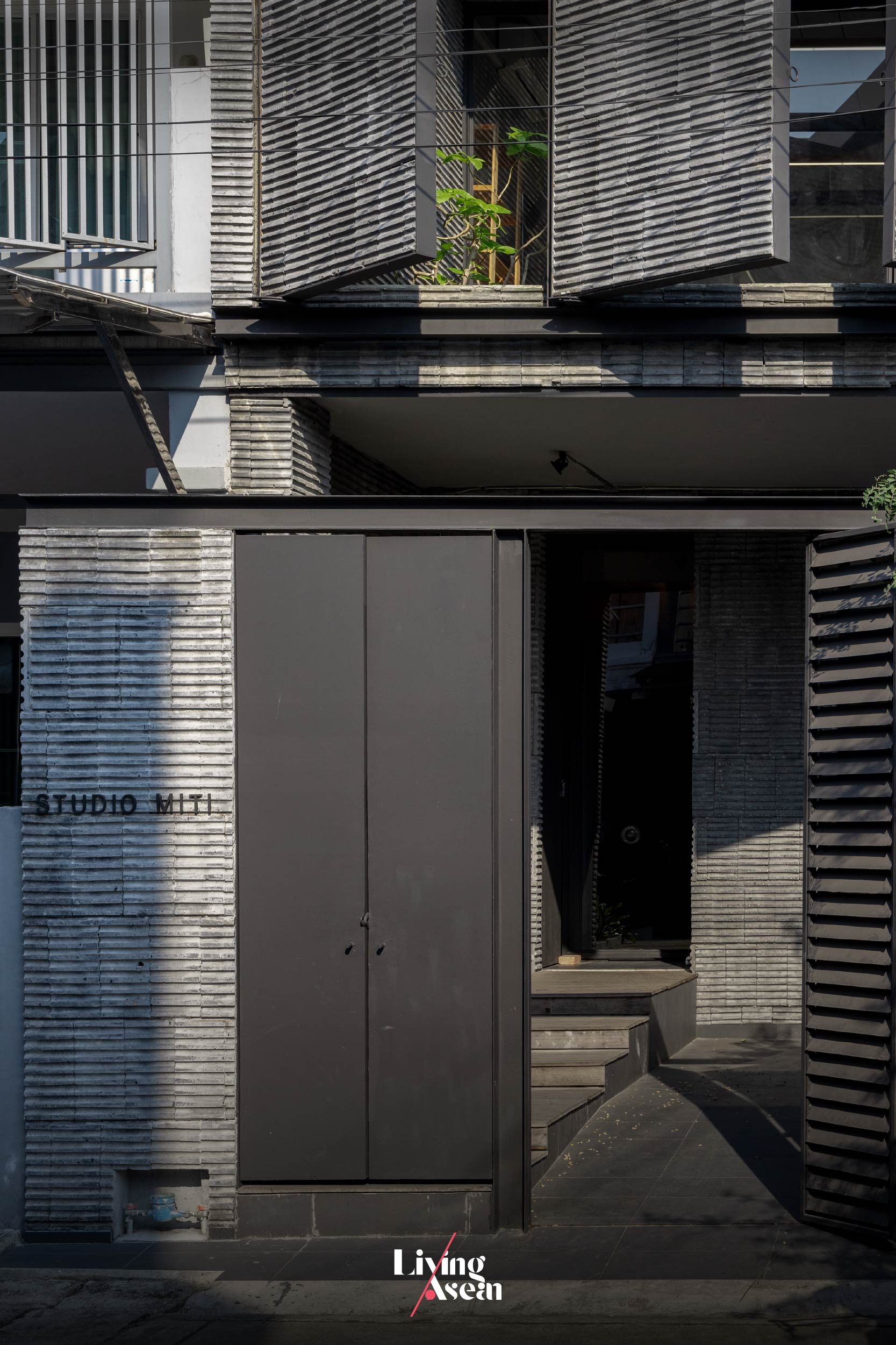
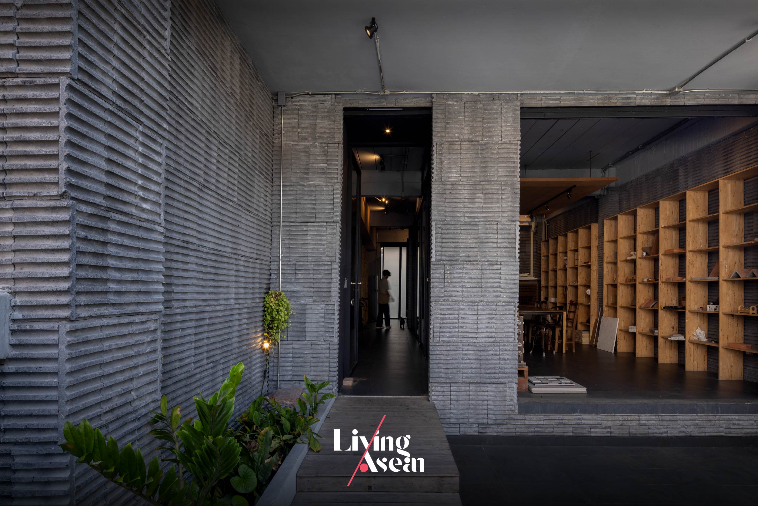
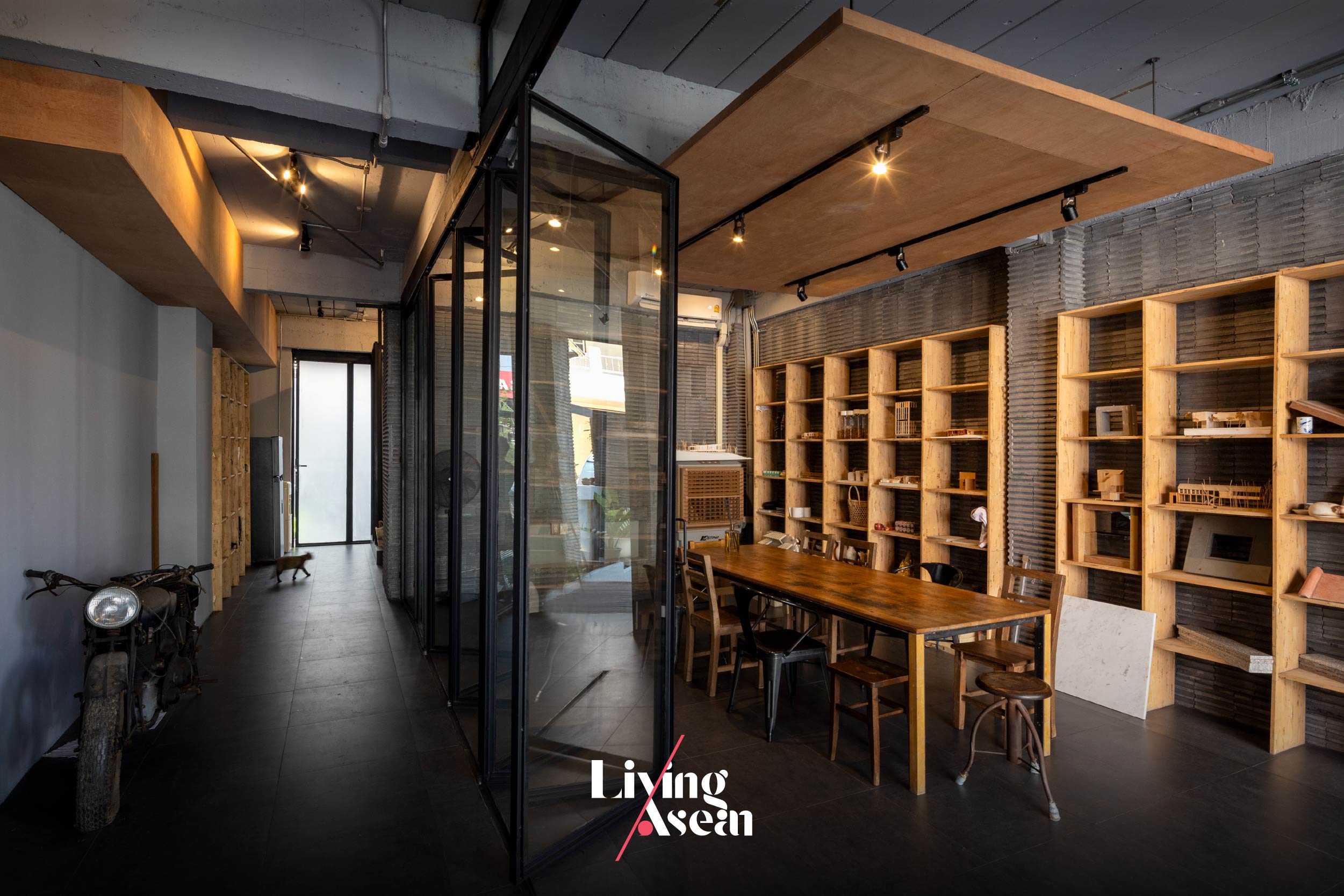
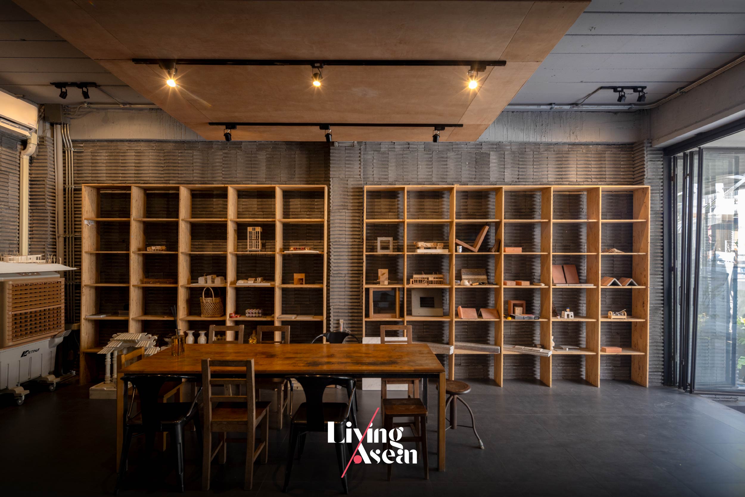
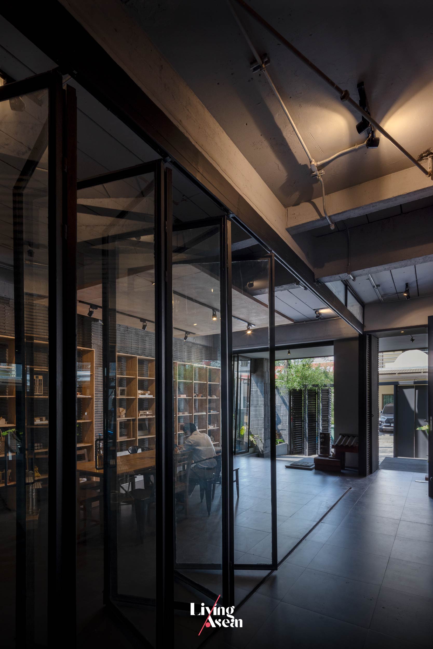
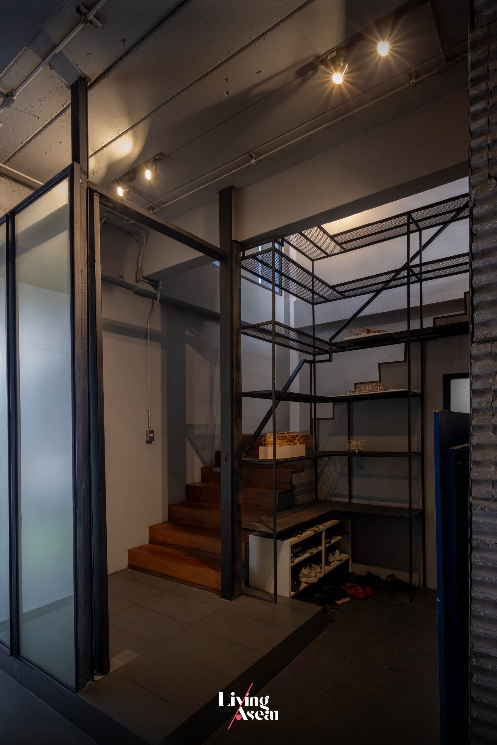
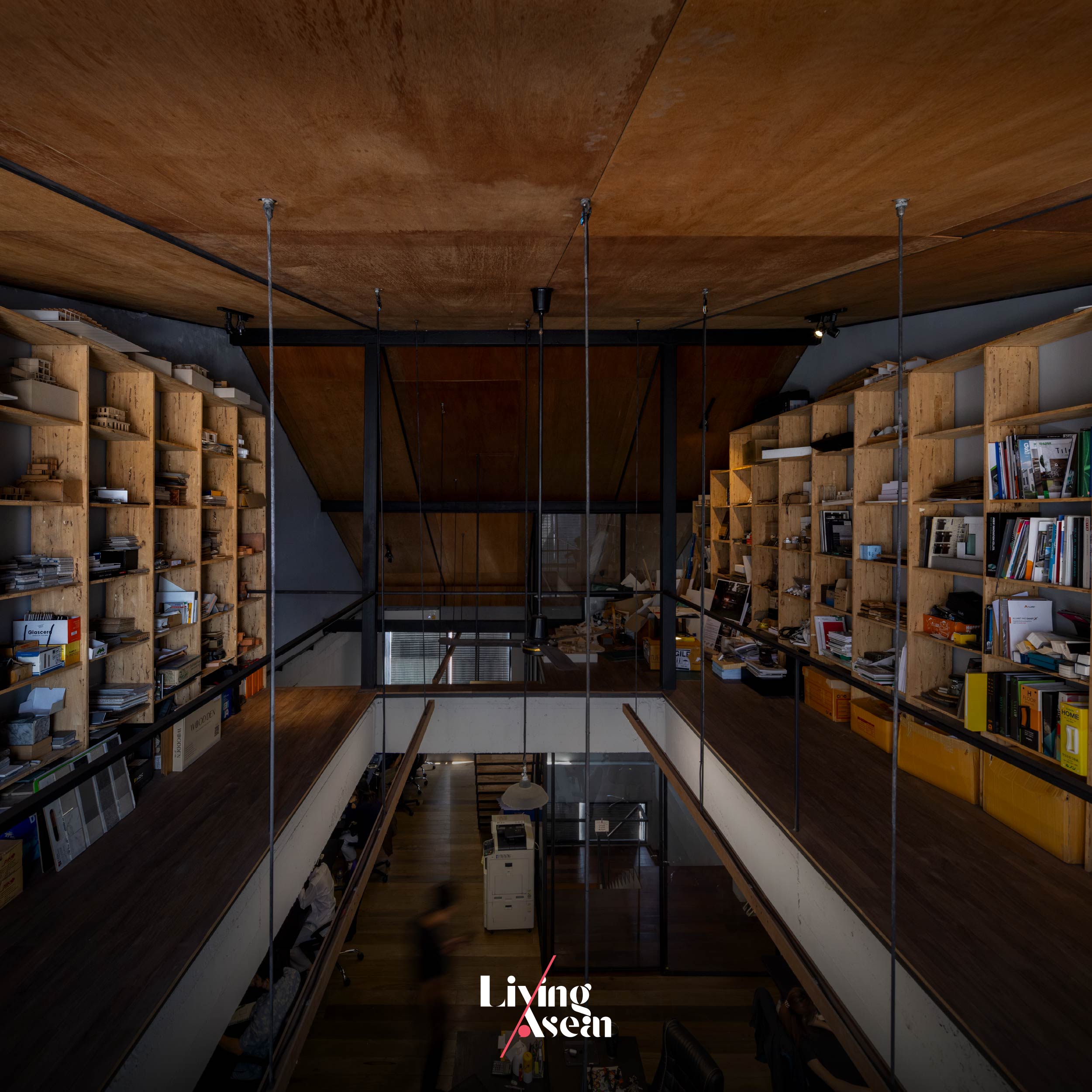
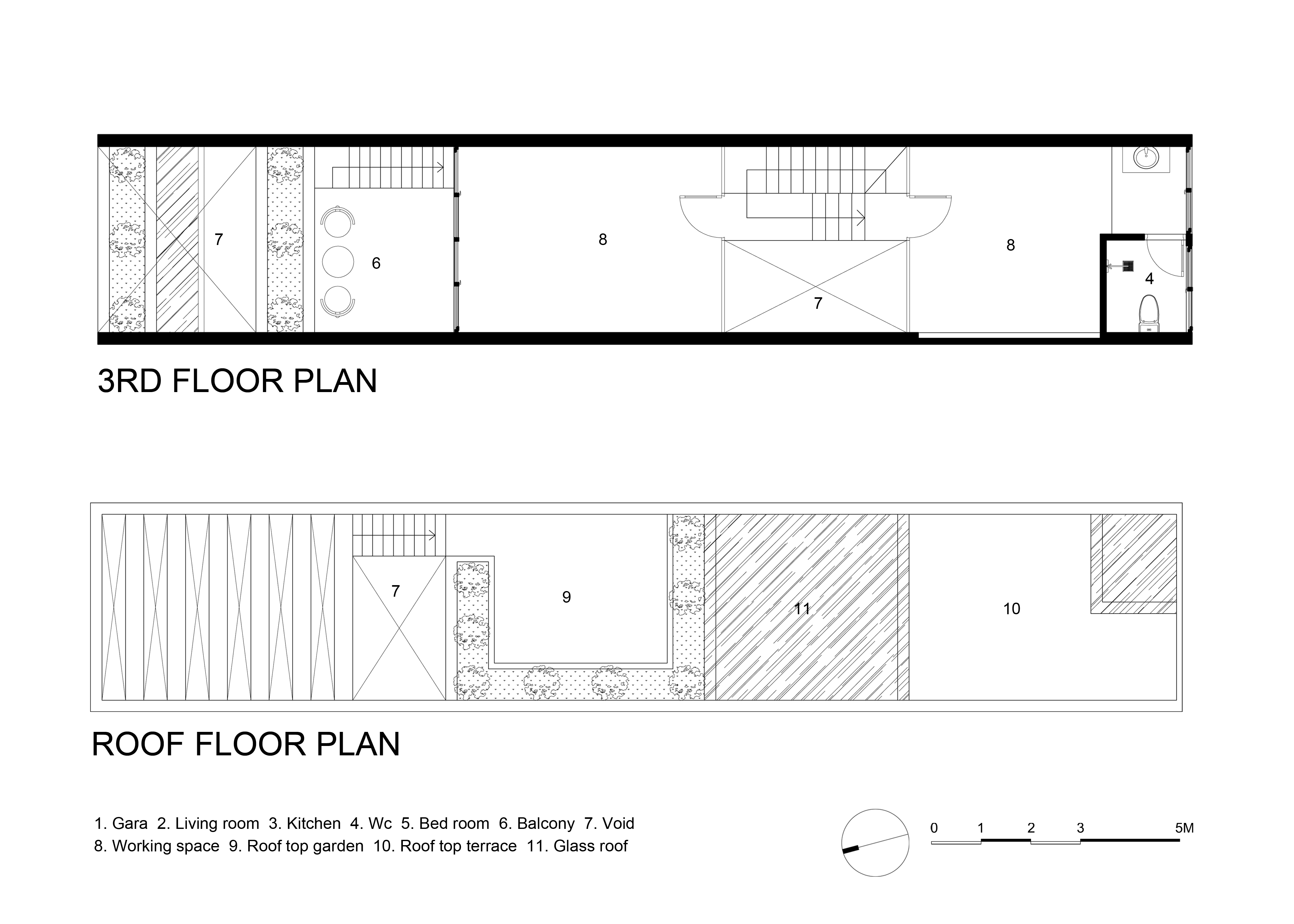
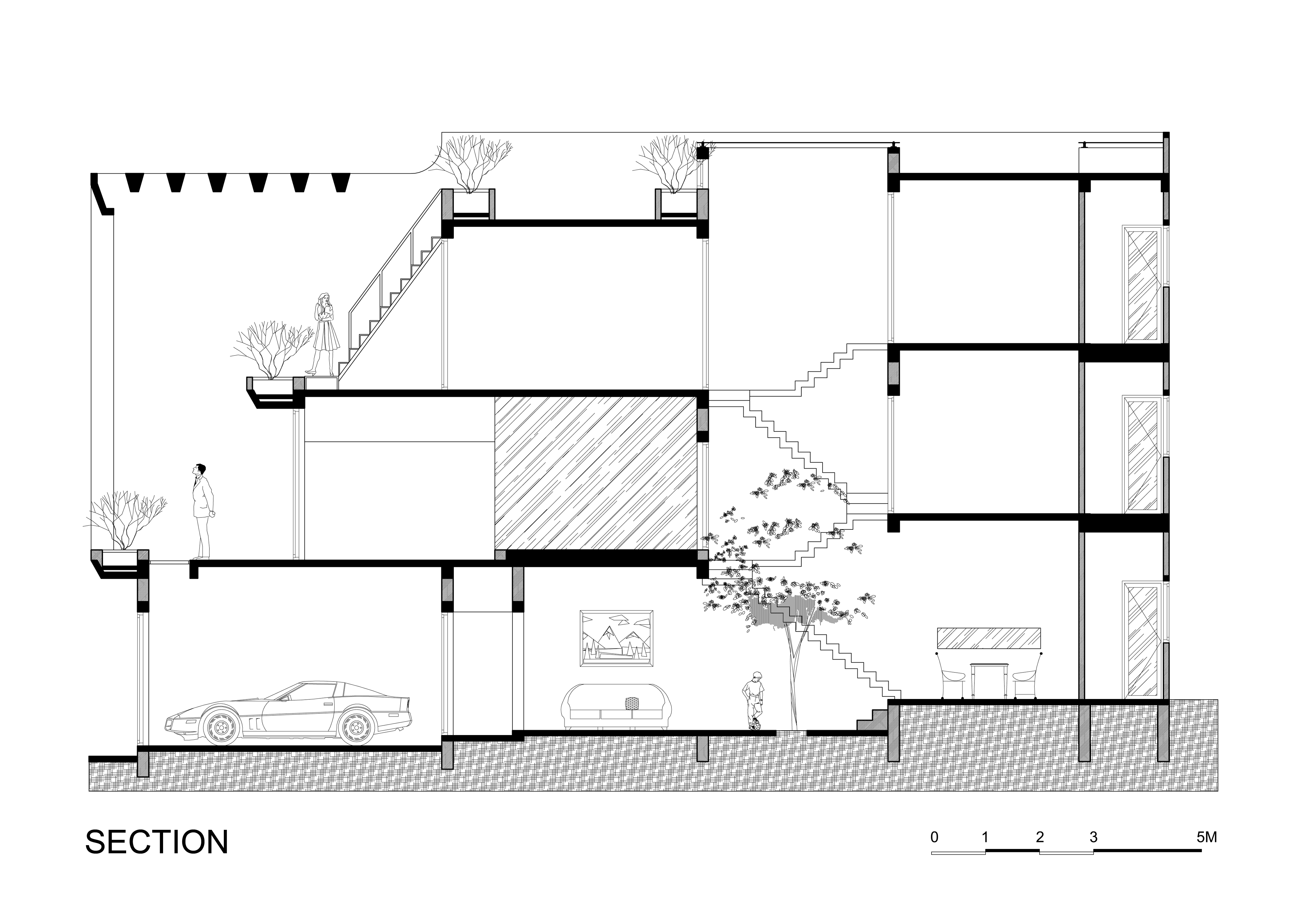
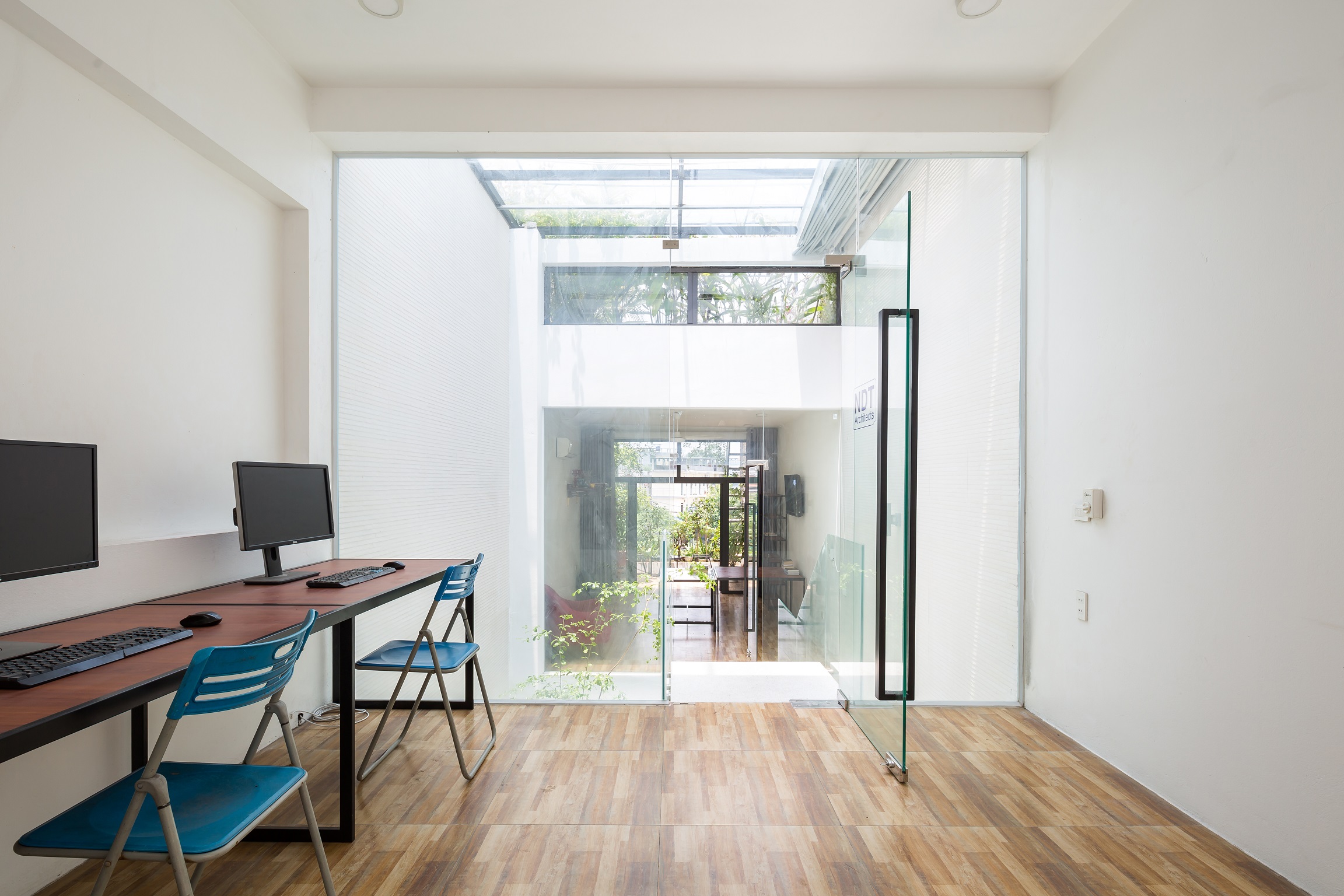
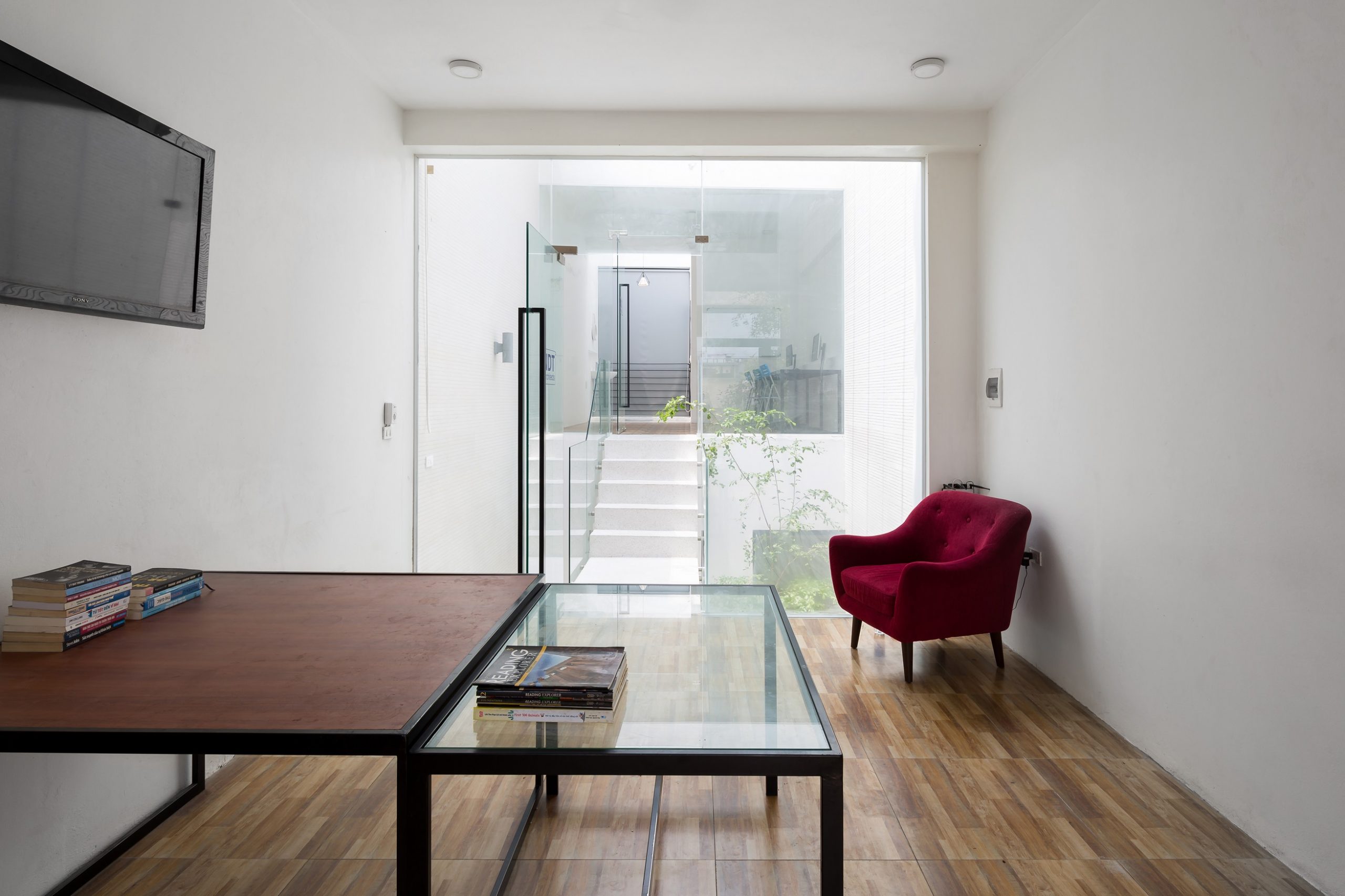
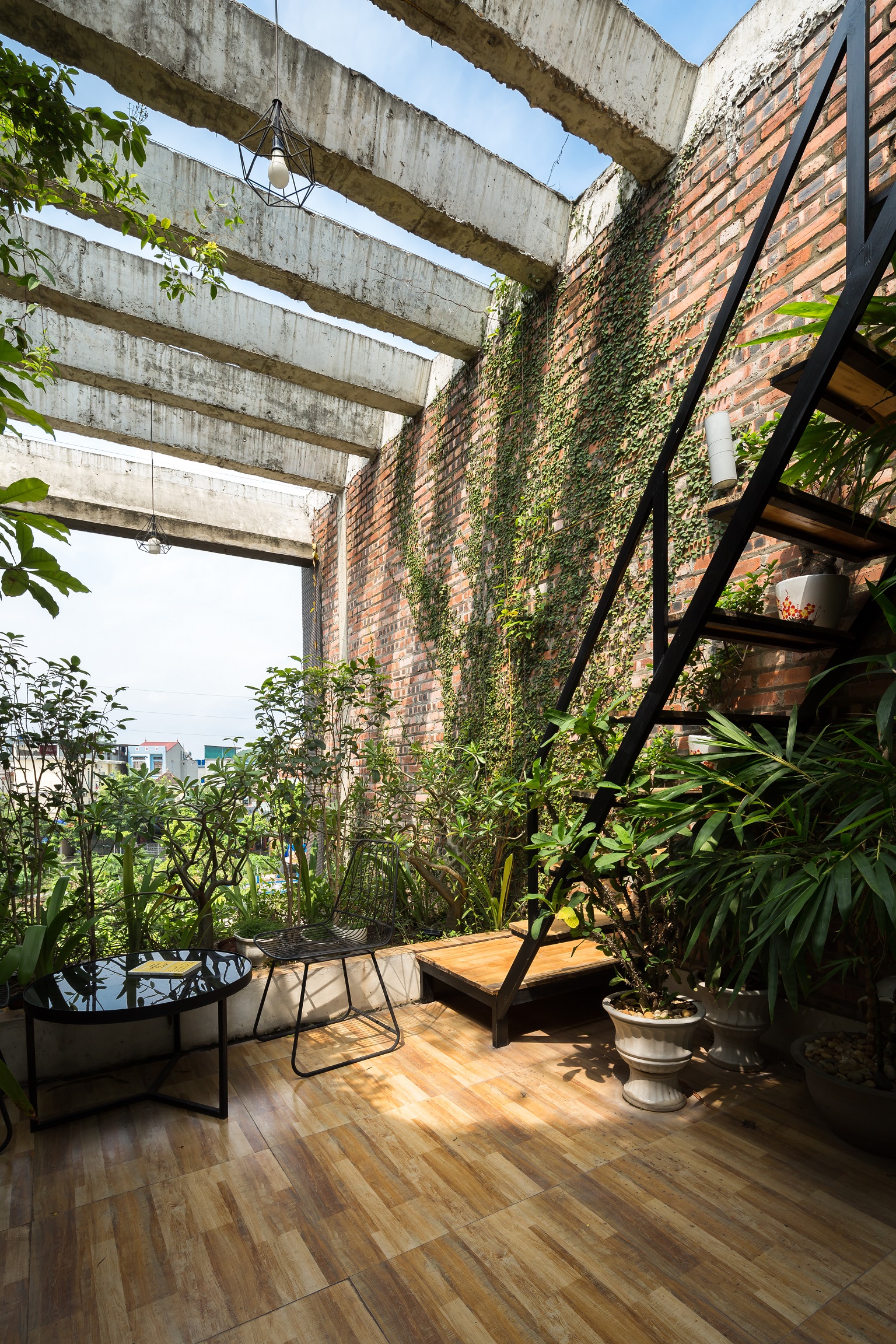
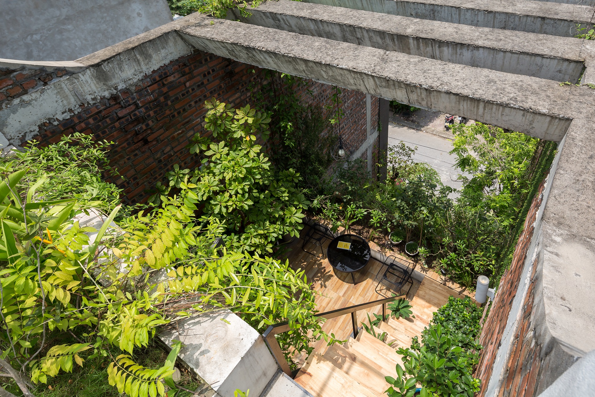
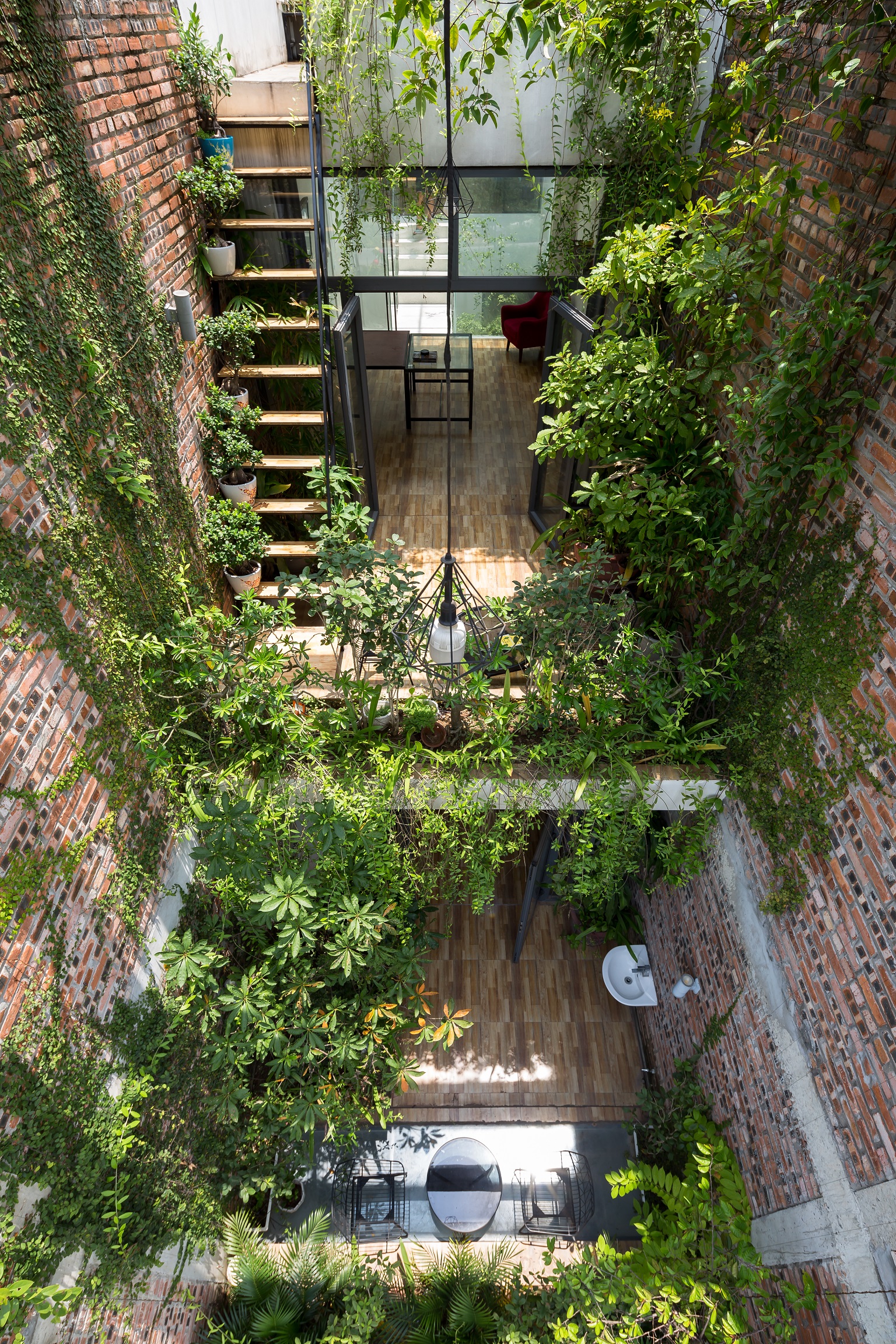
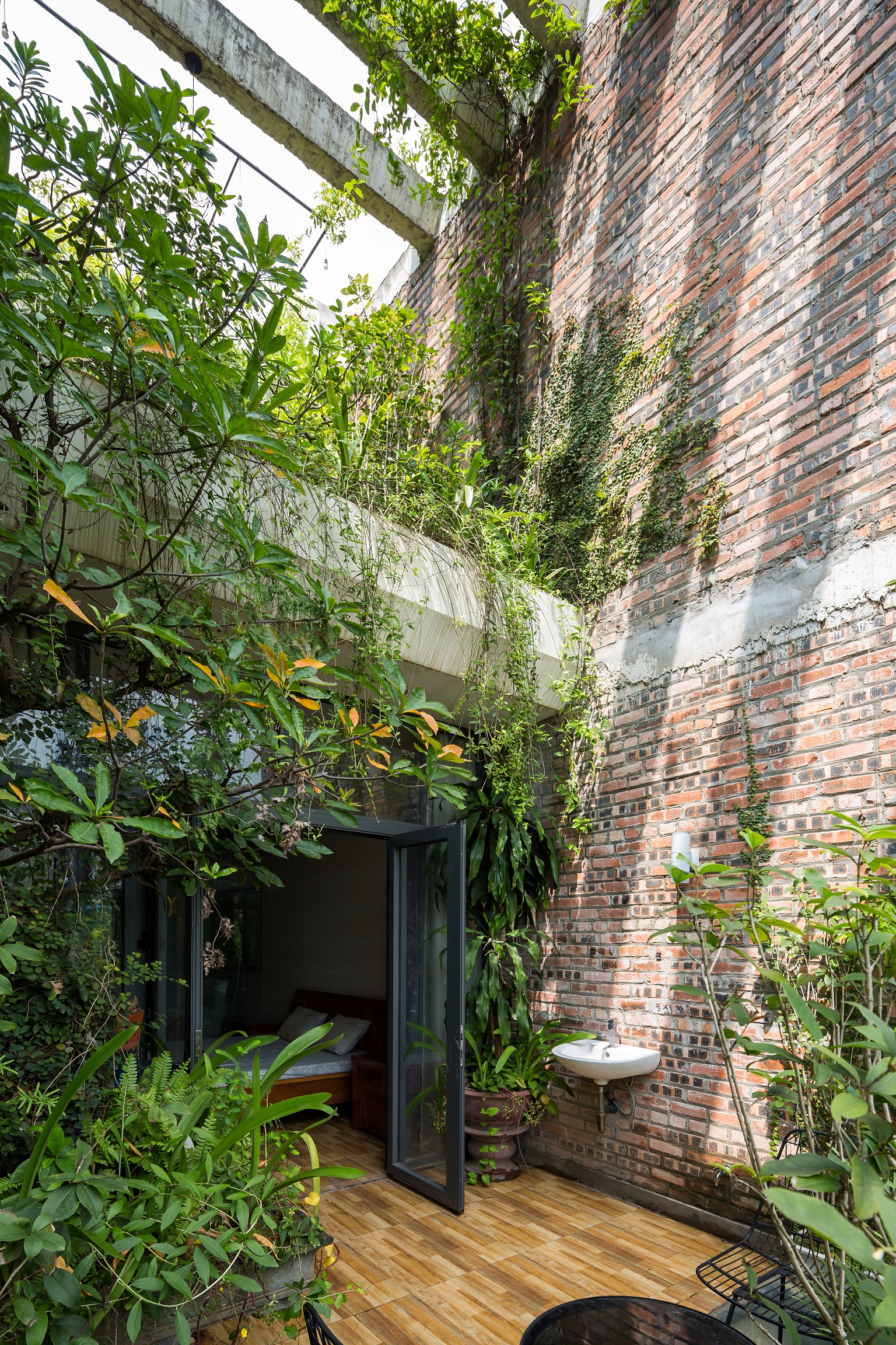
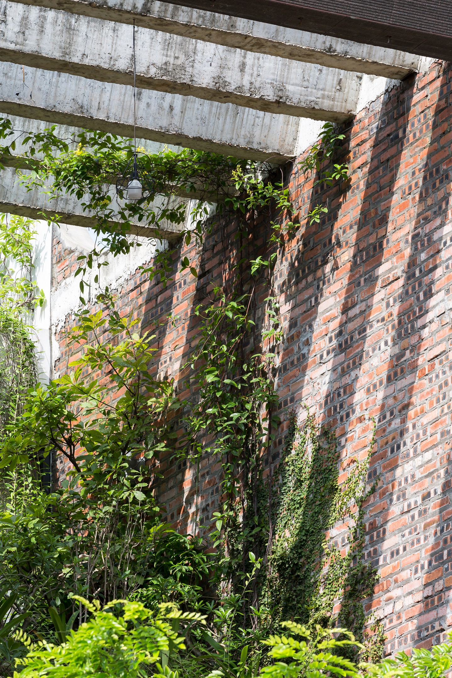
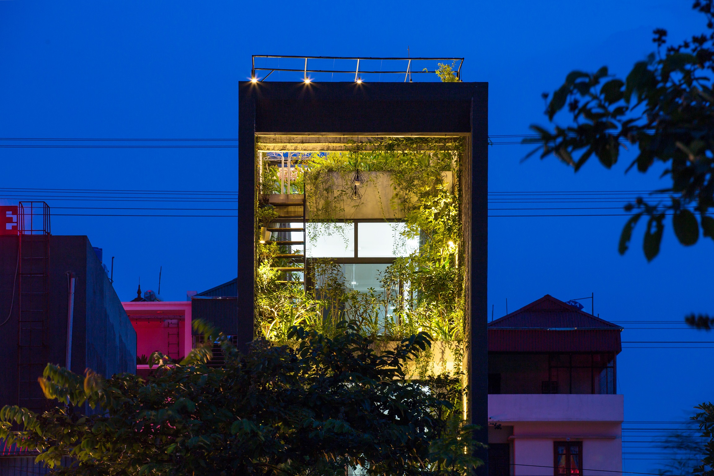
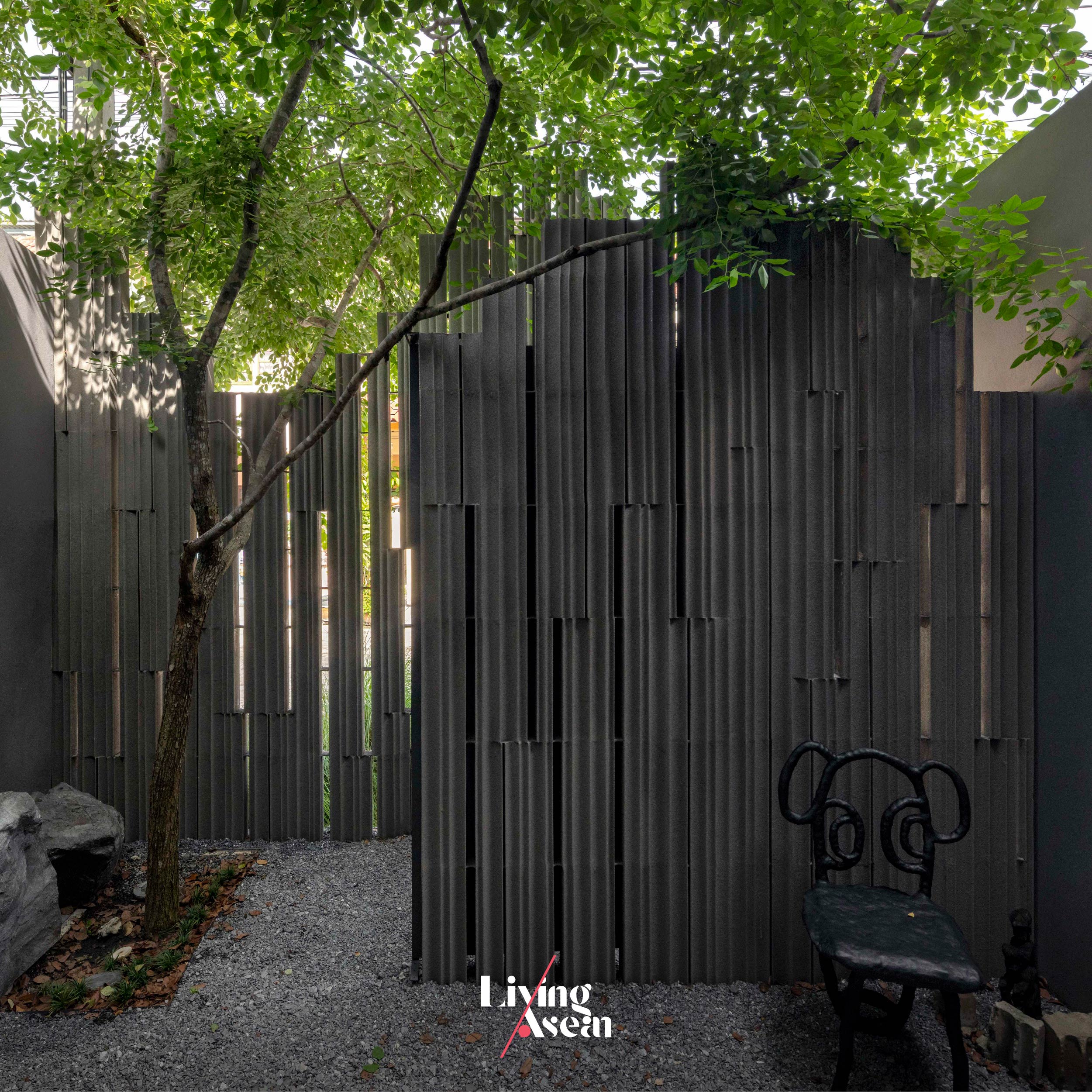
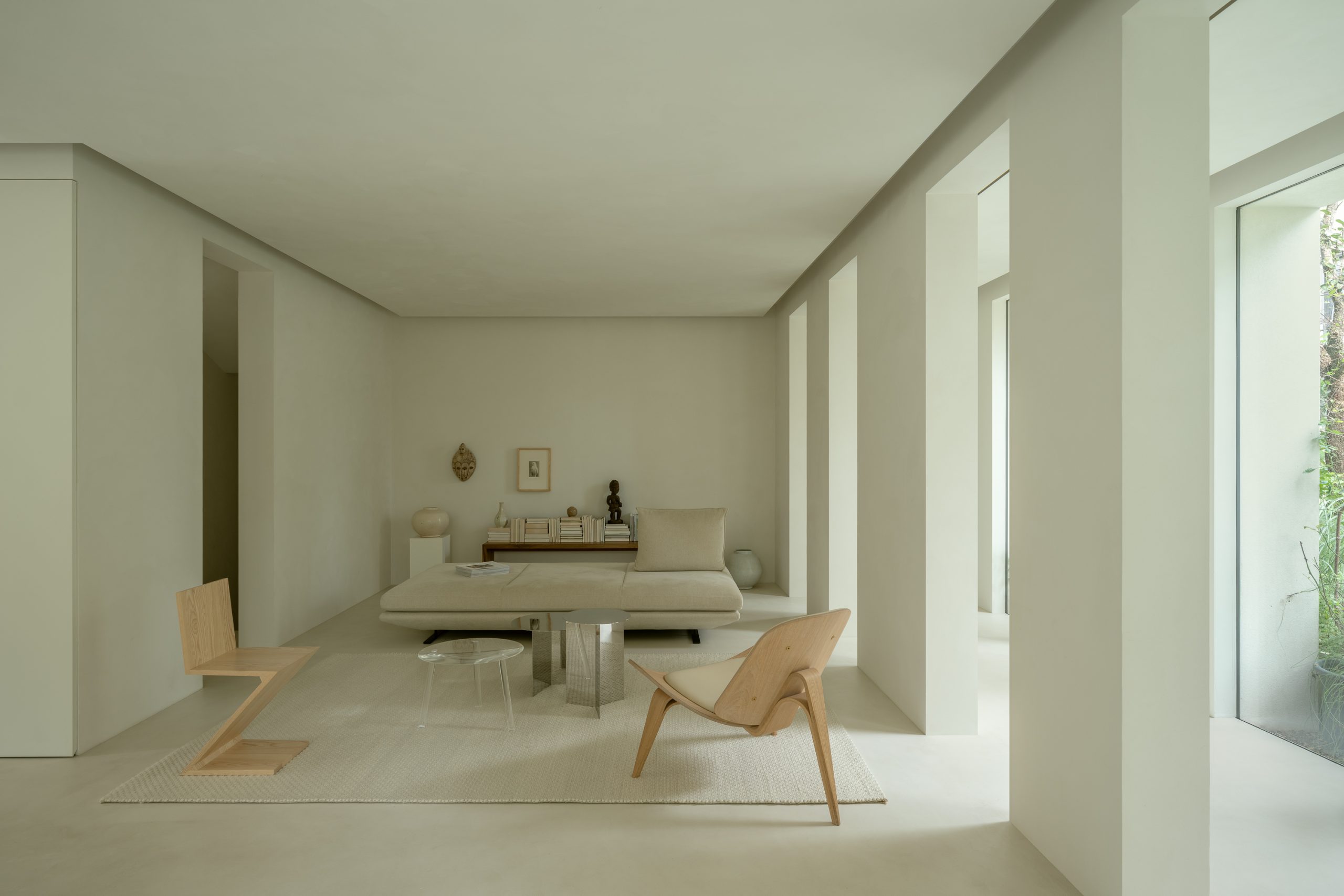
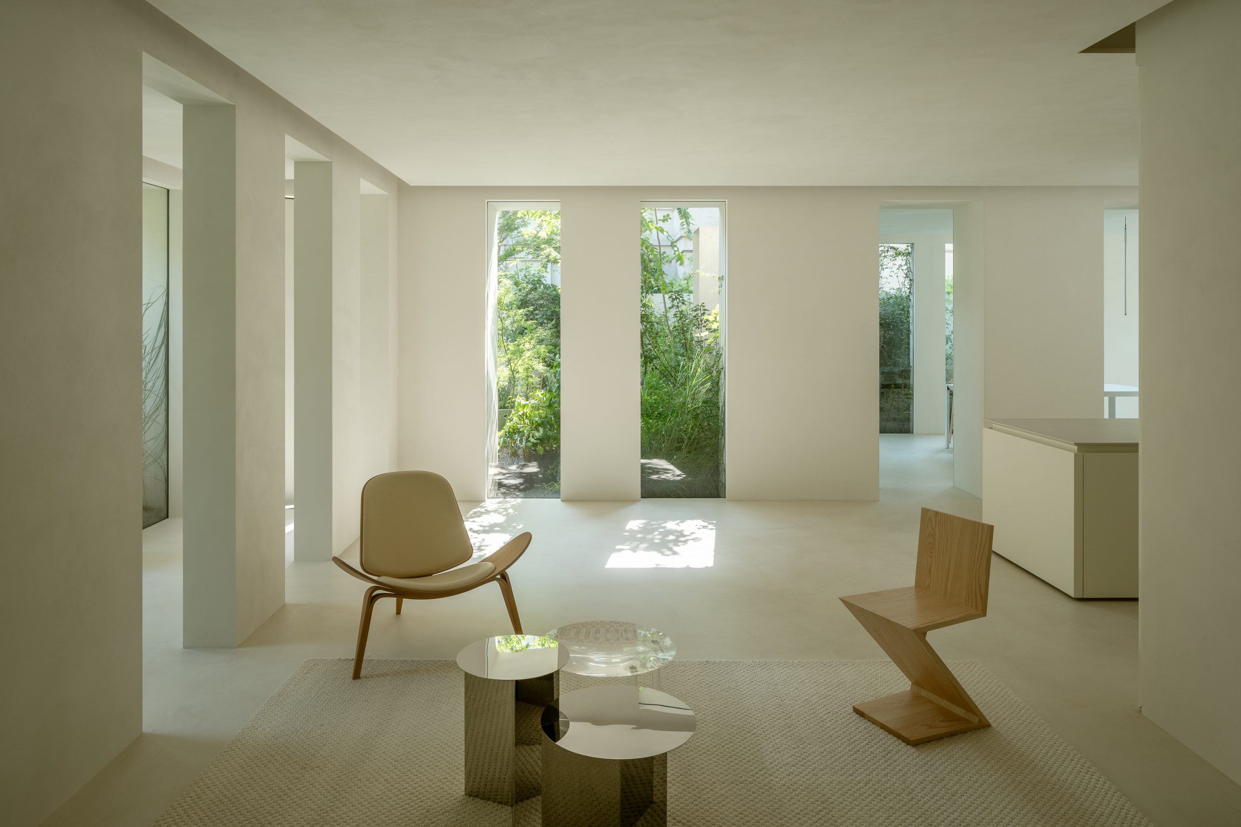
Integrating a workspace into a townhouse
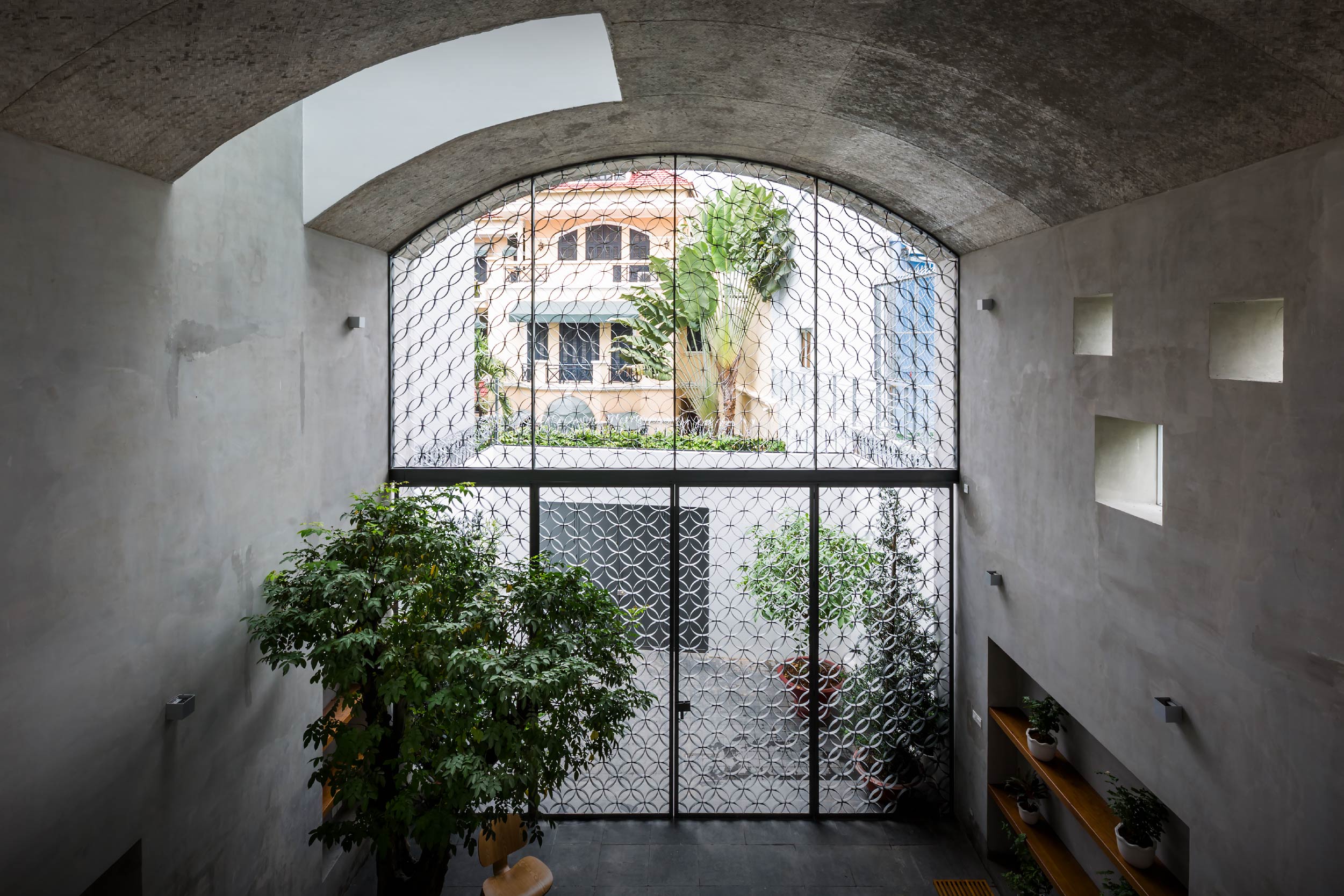
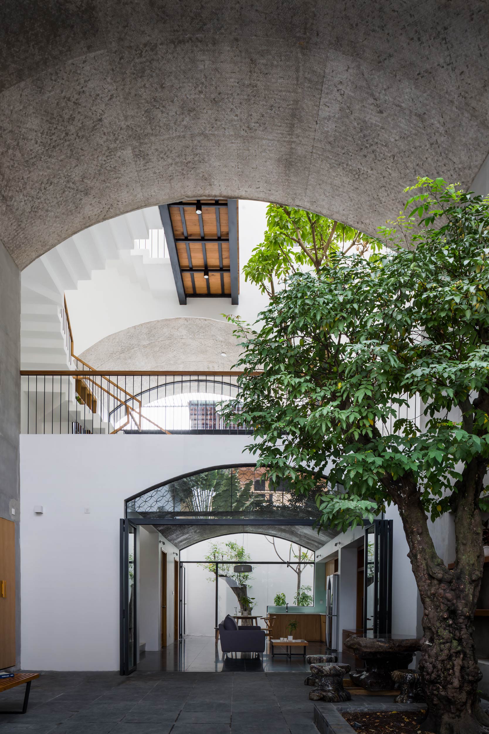
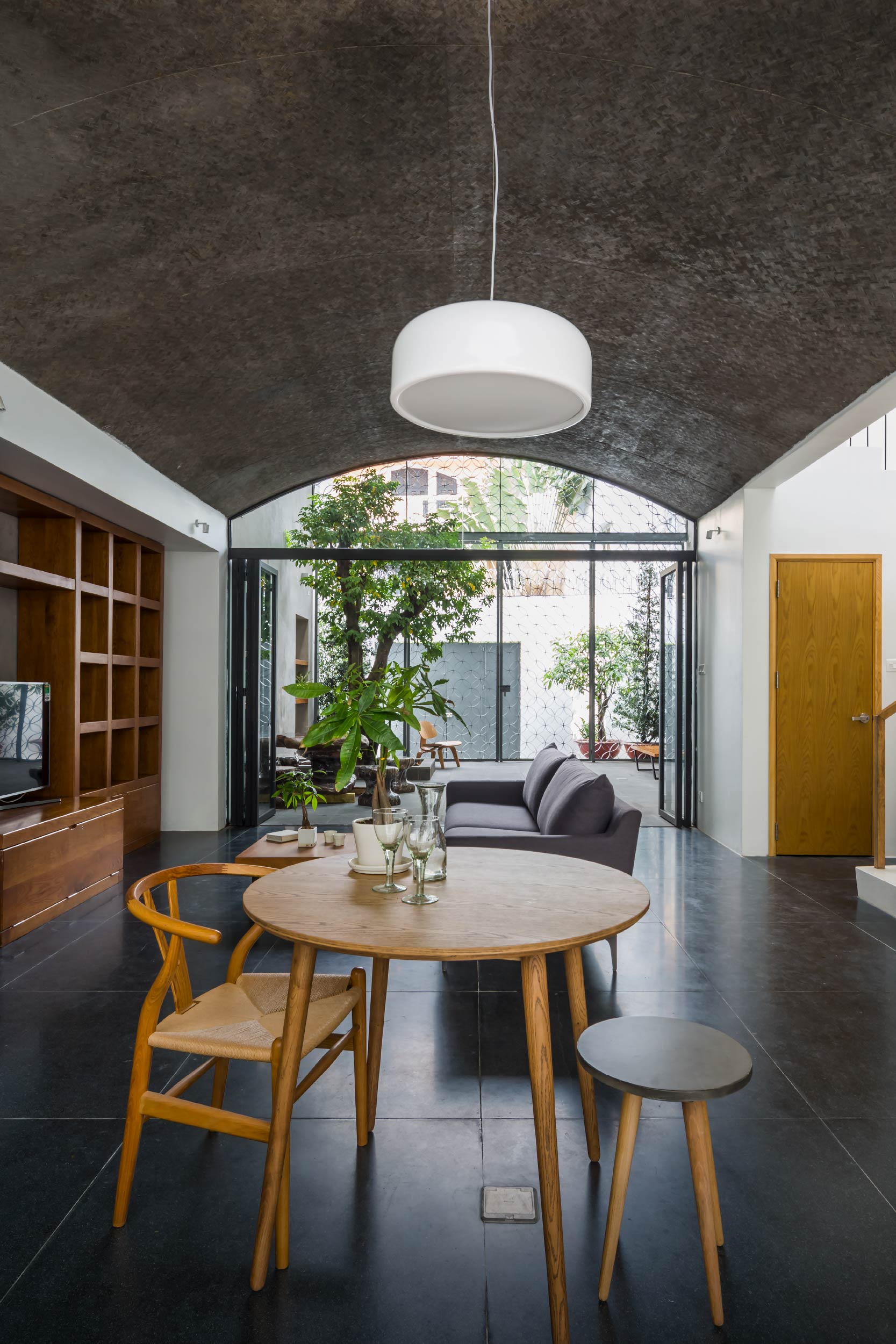
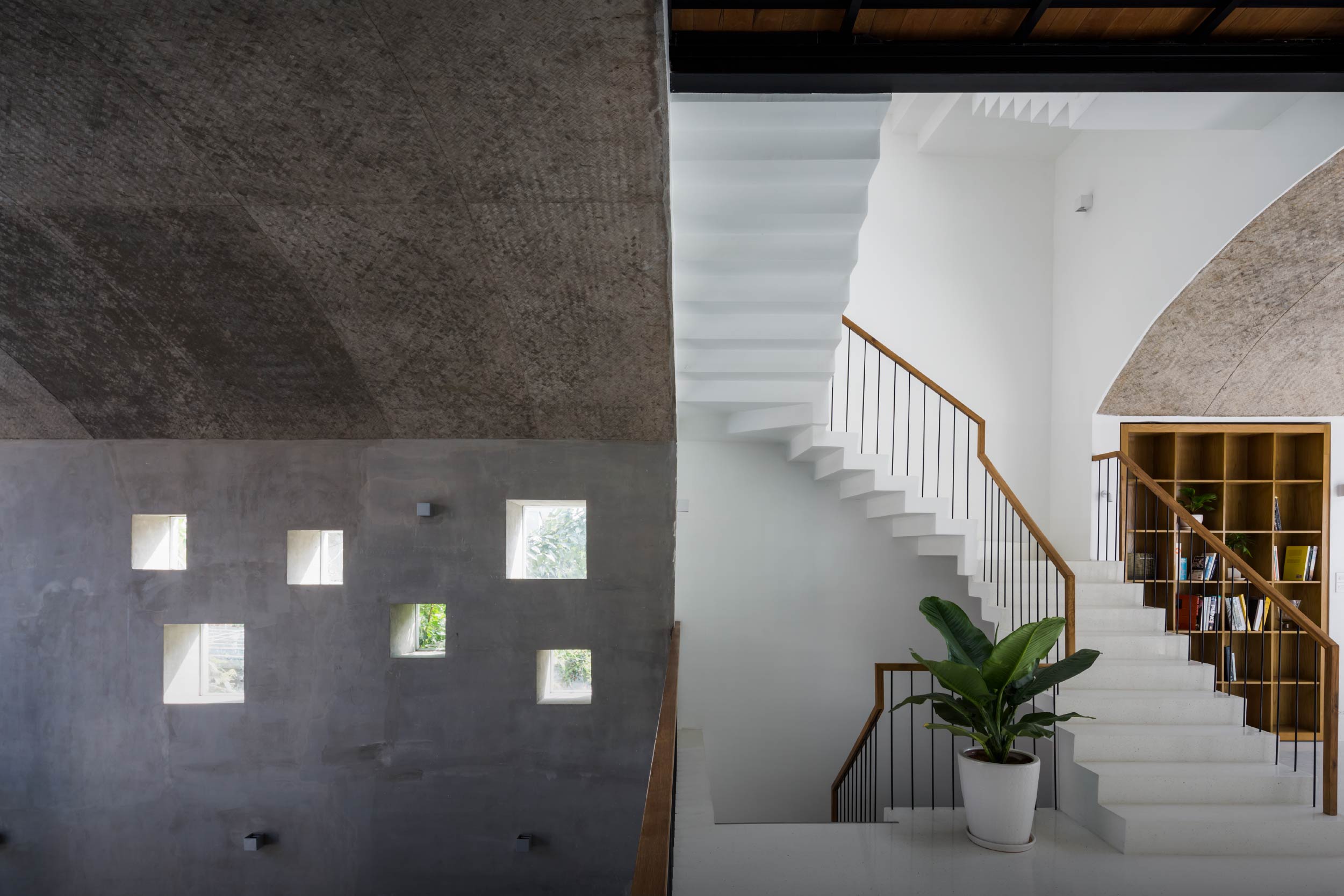
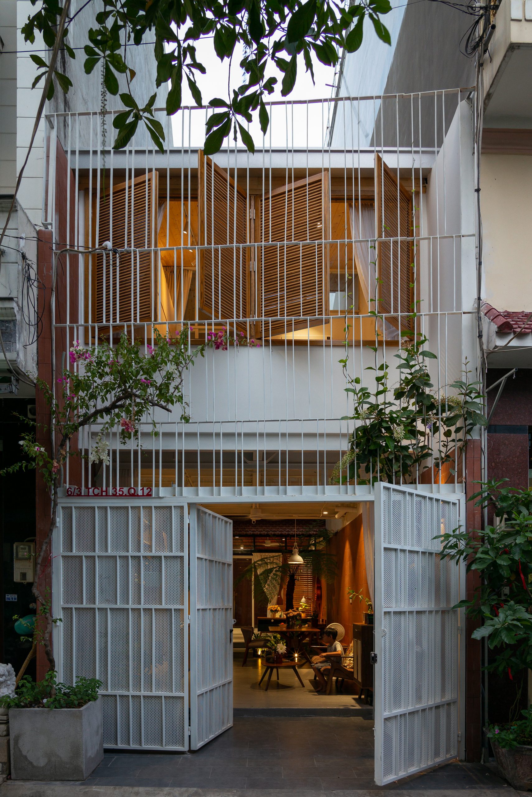
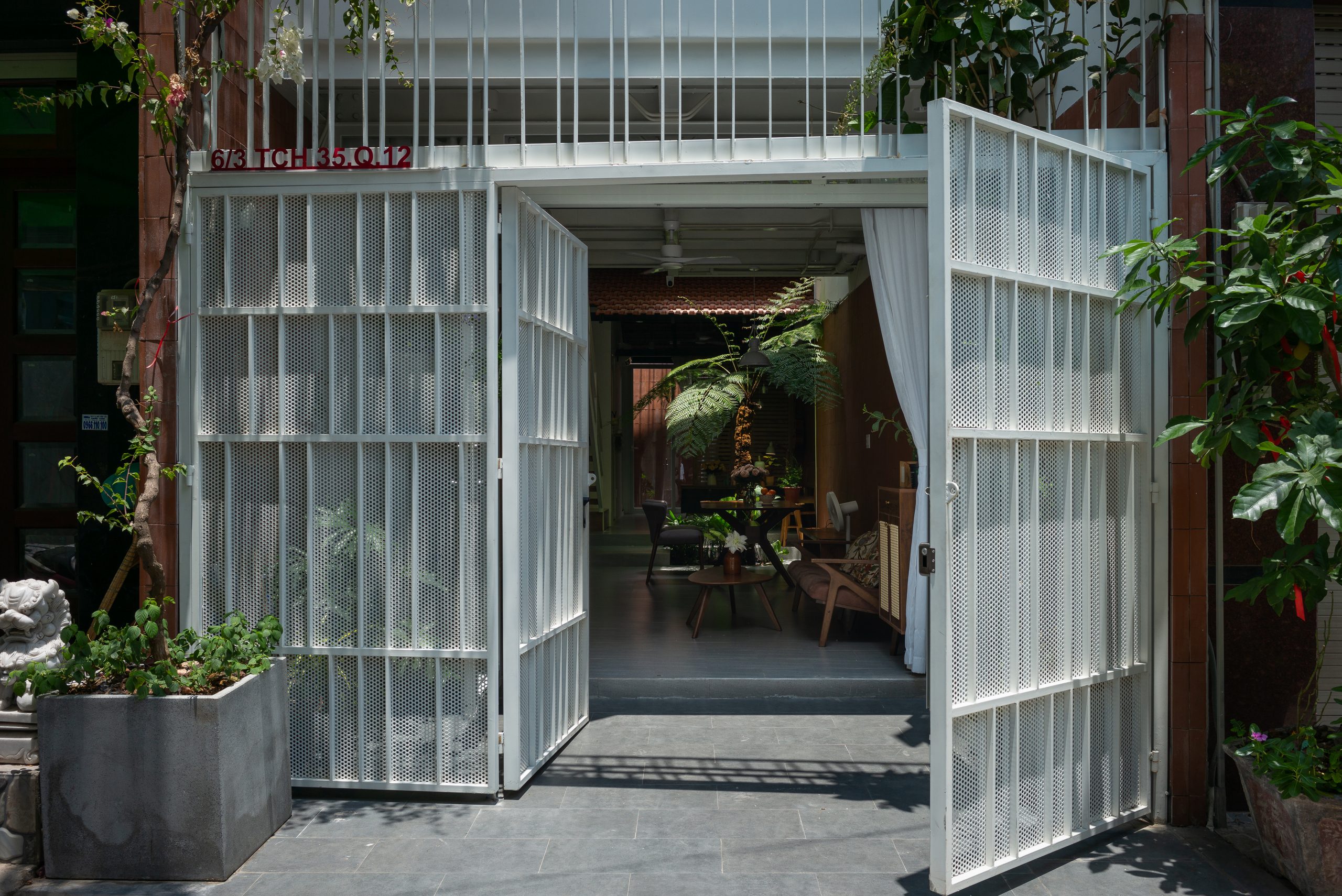
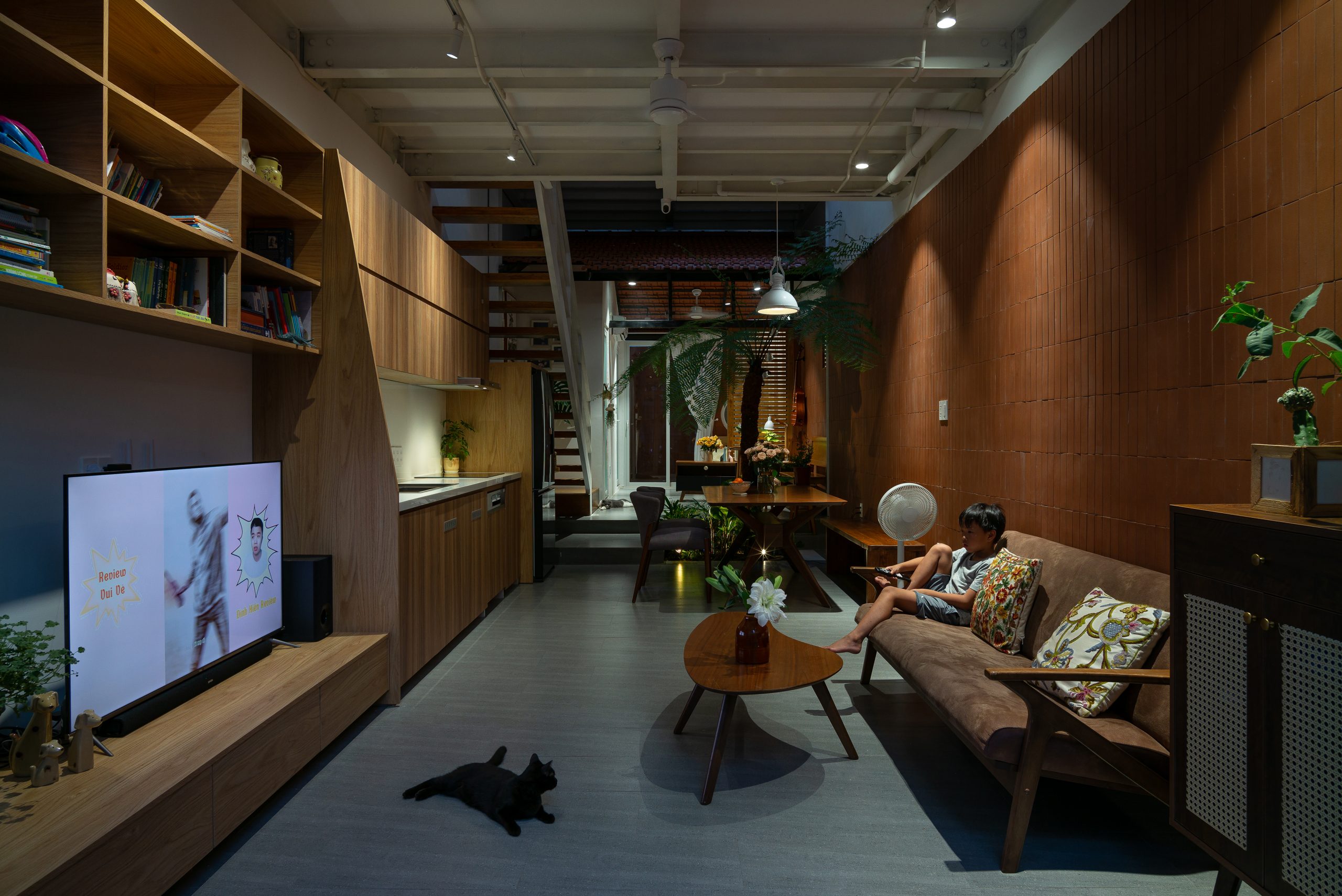
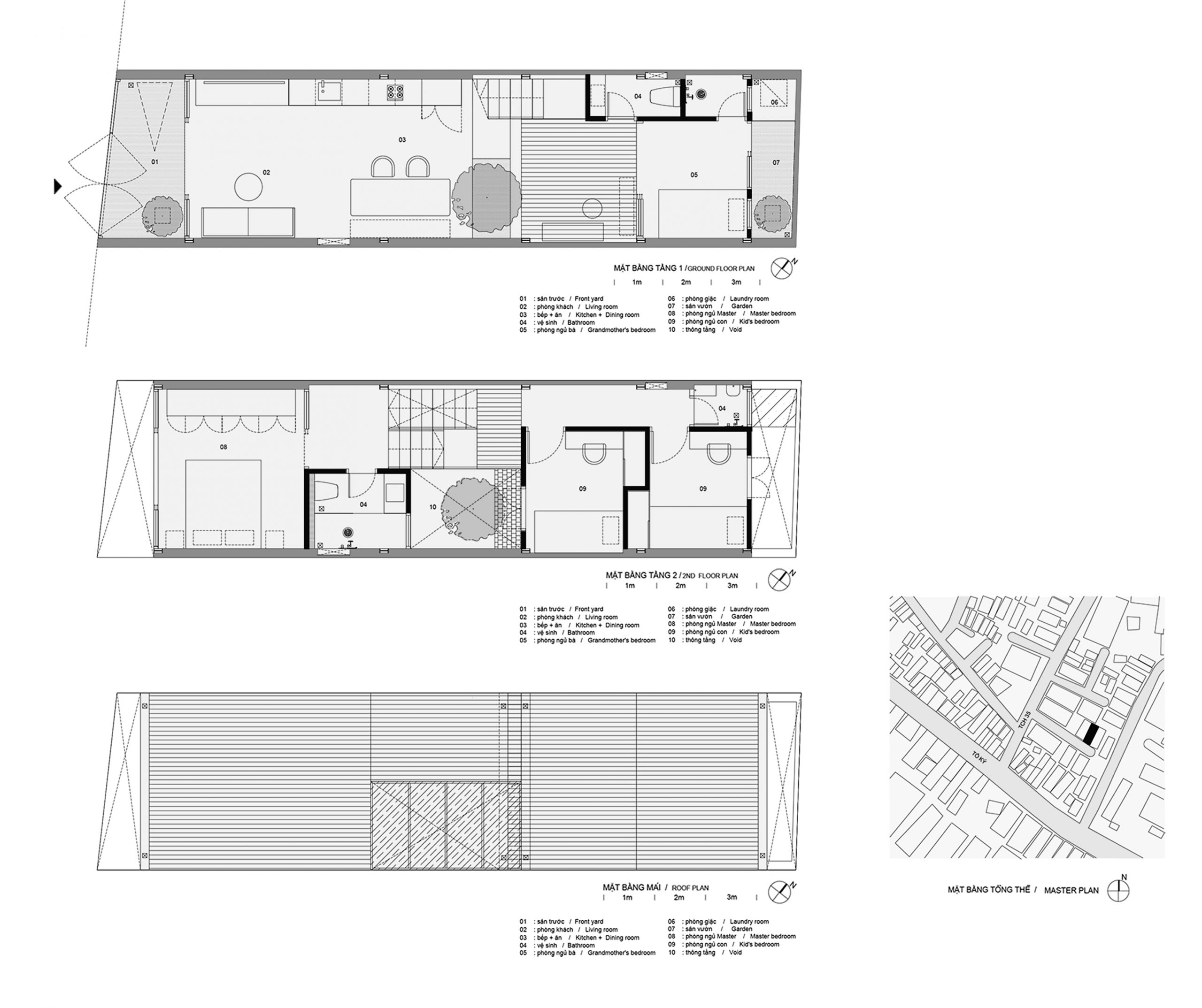
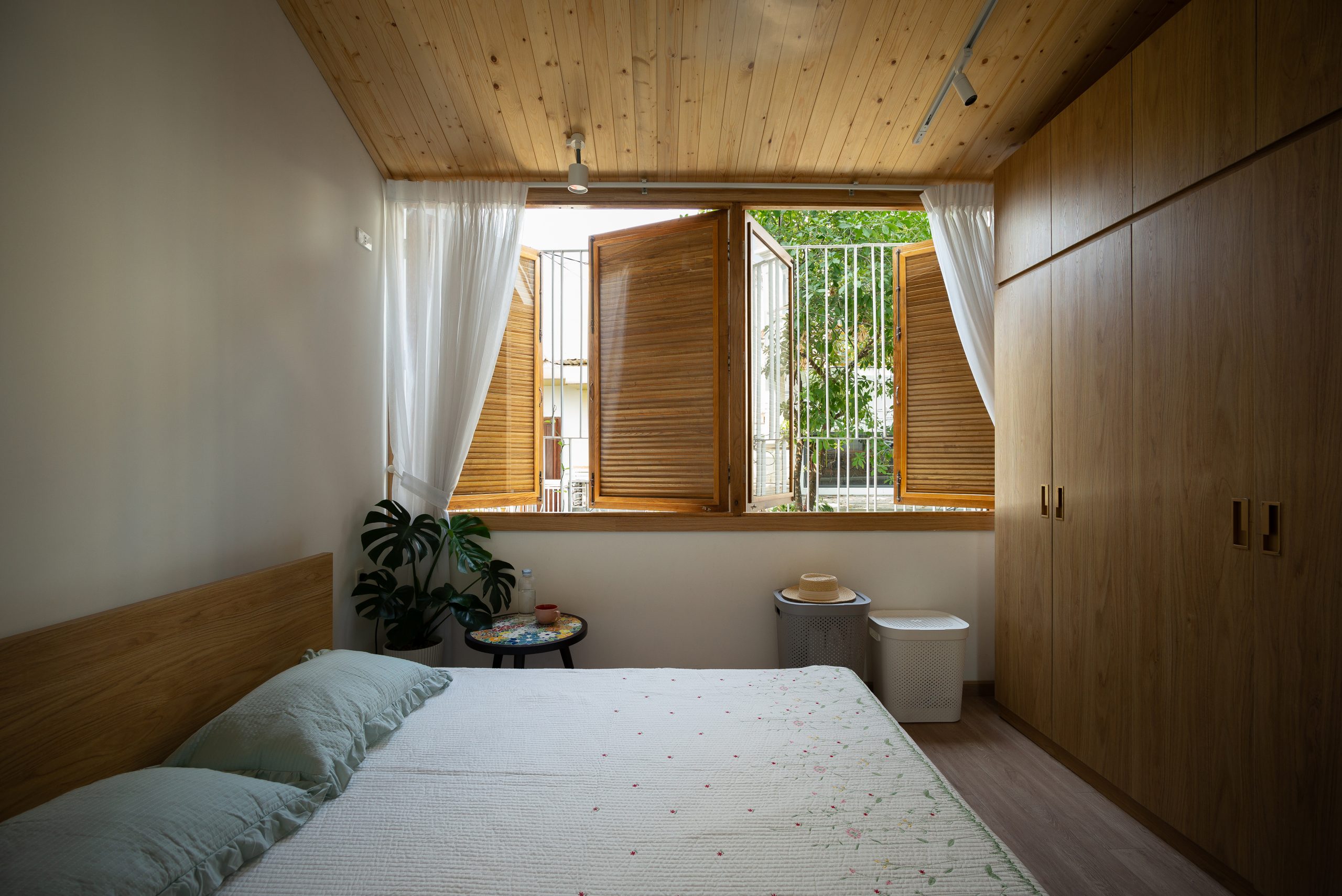
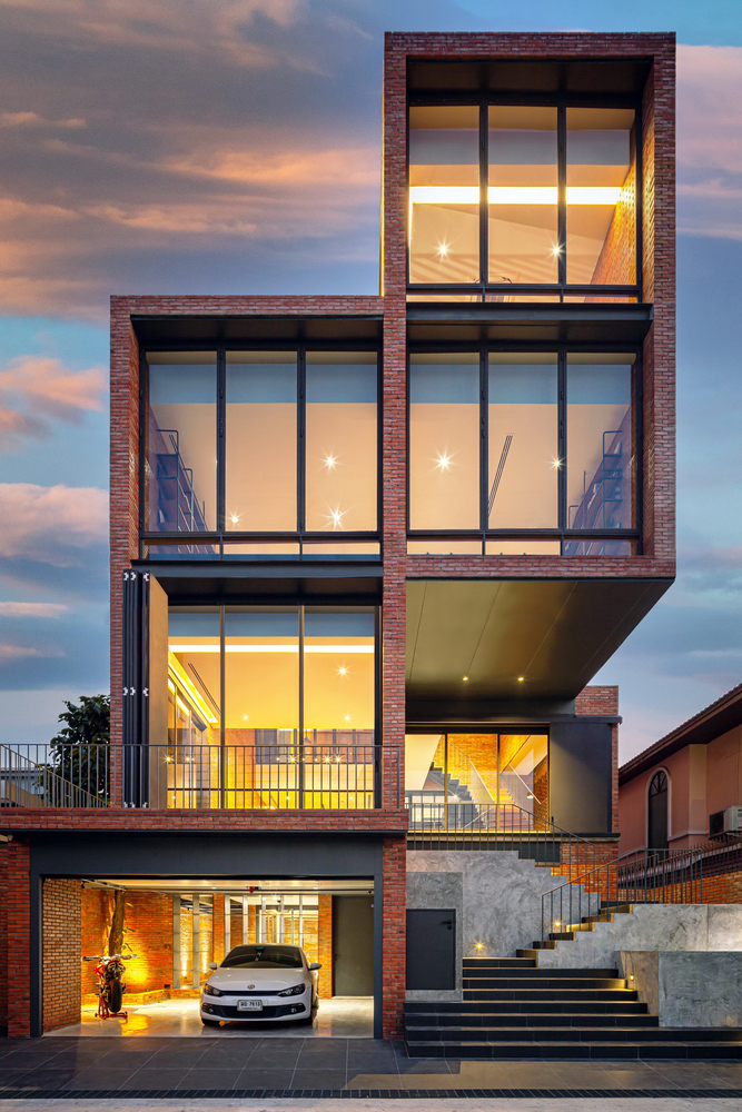
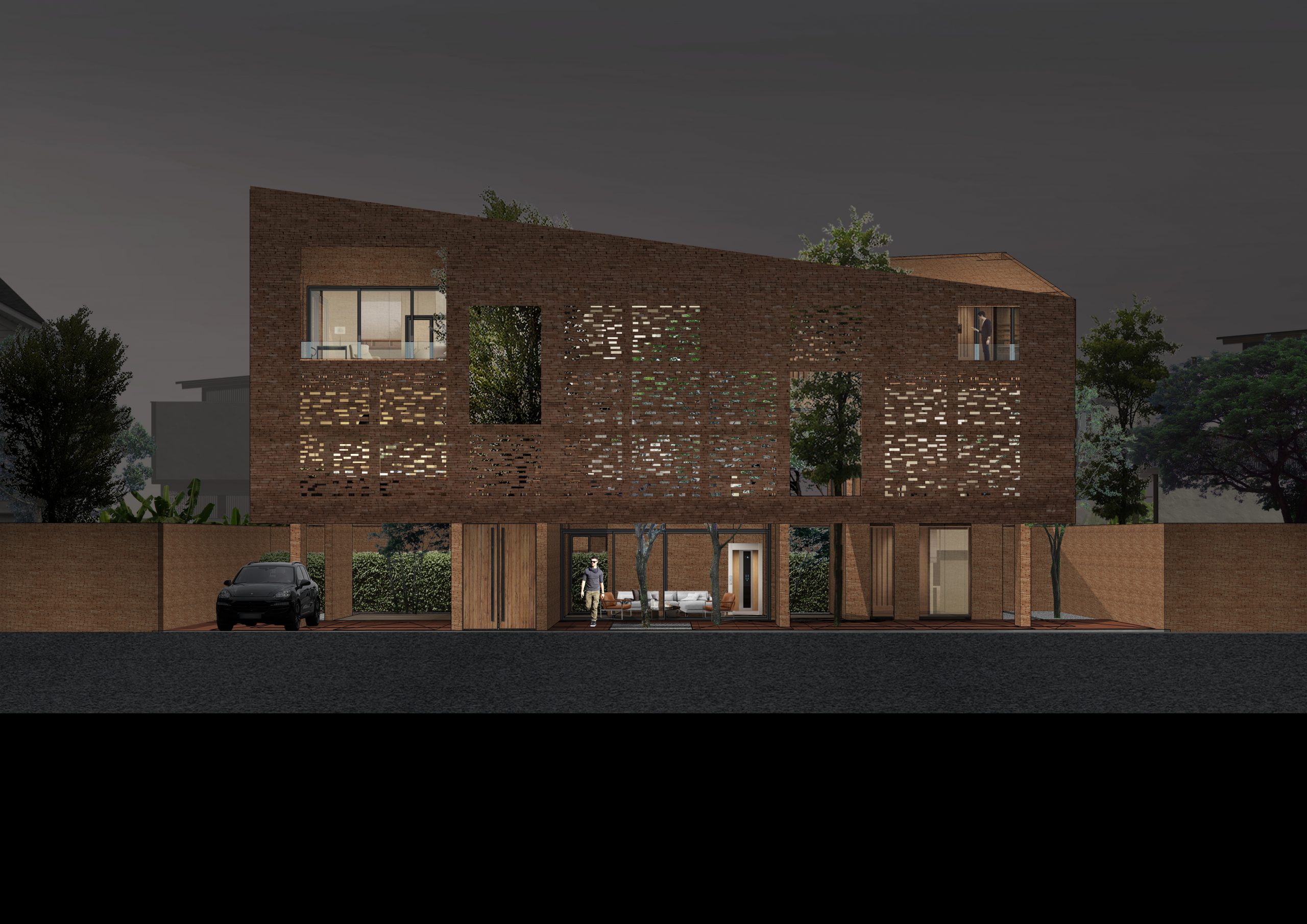
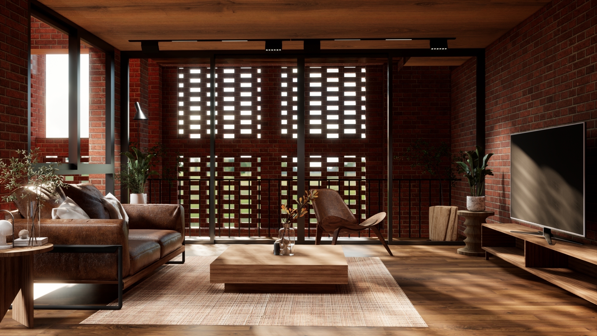
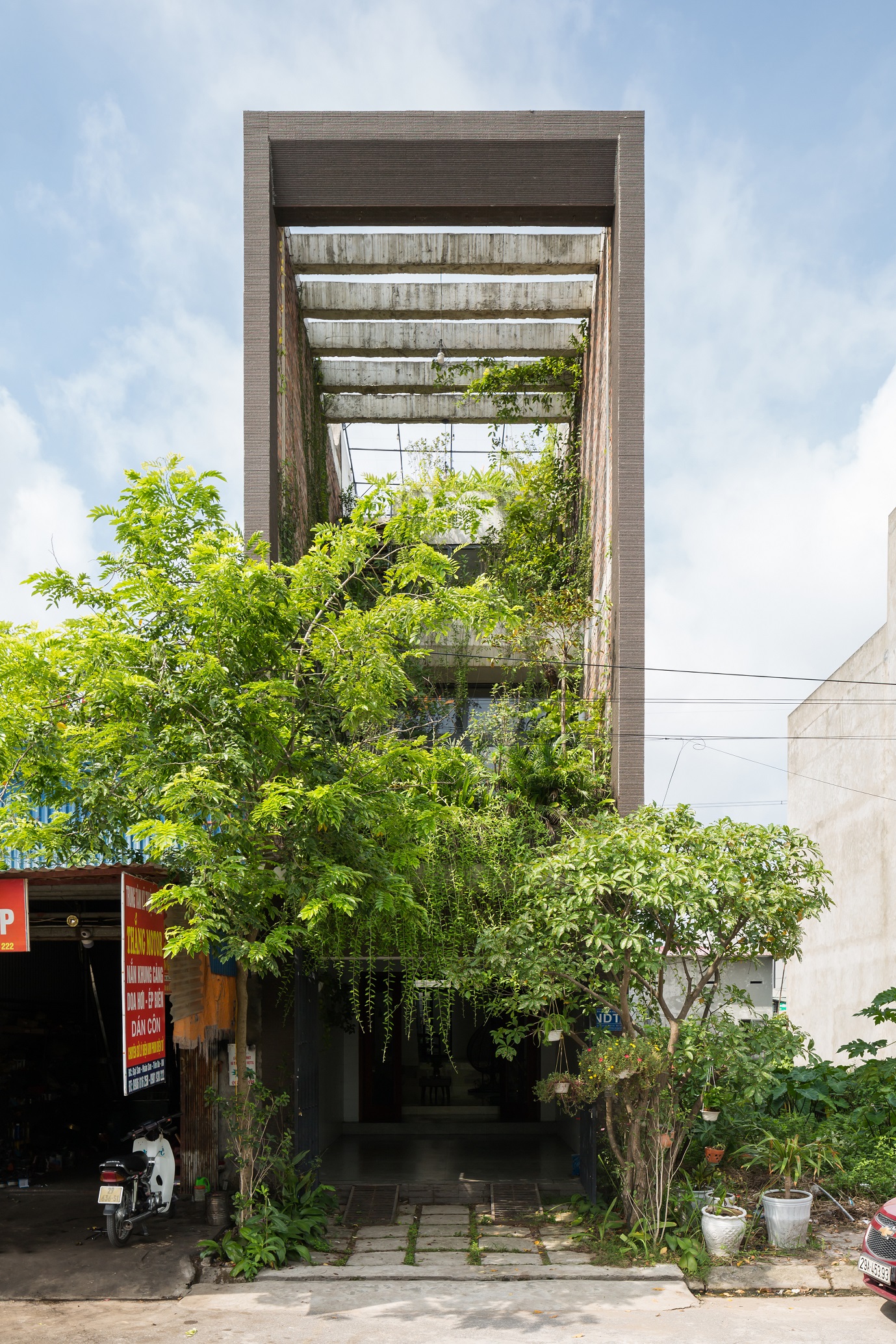
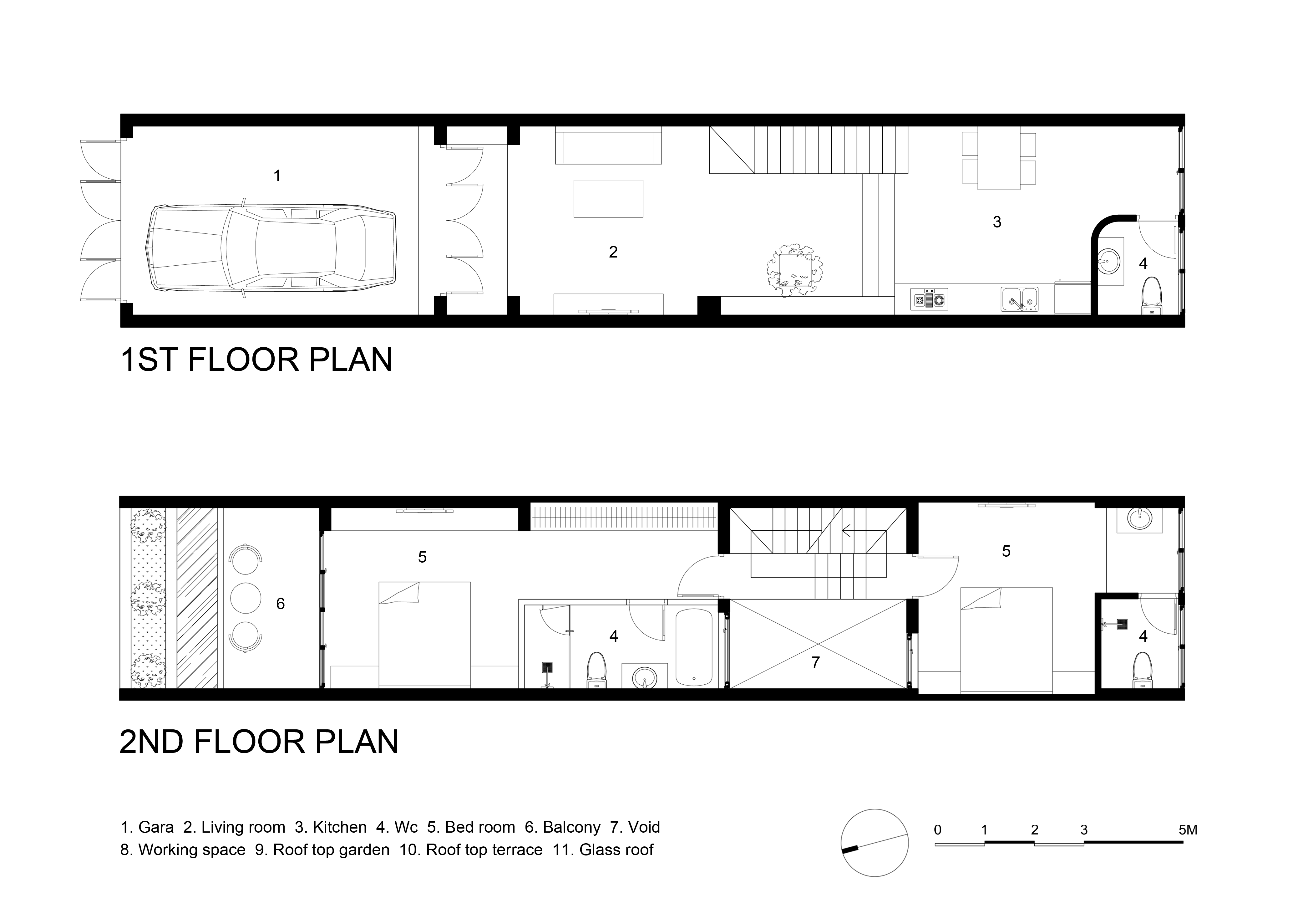
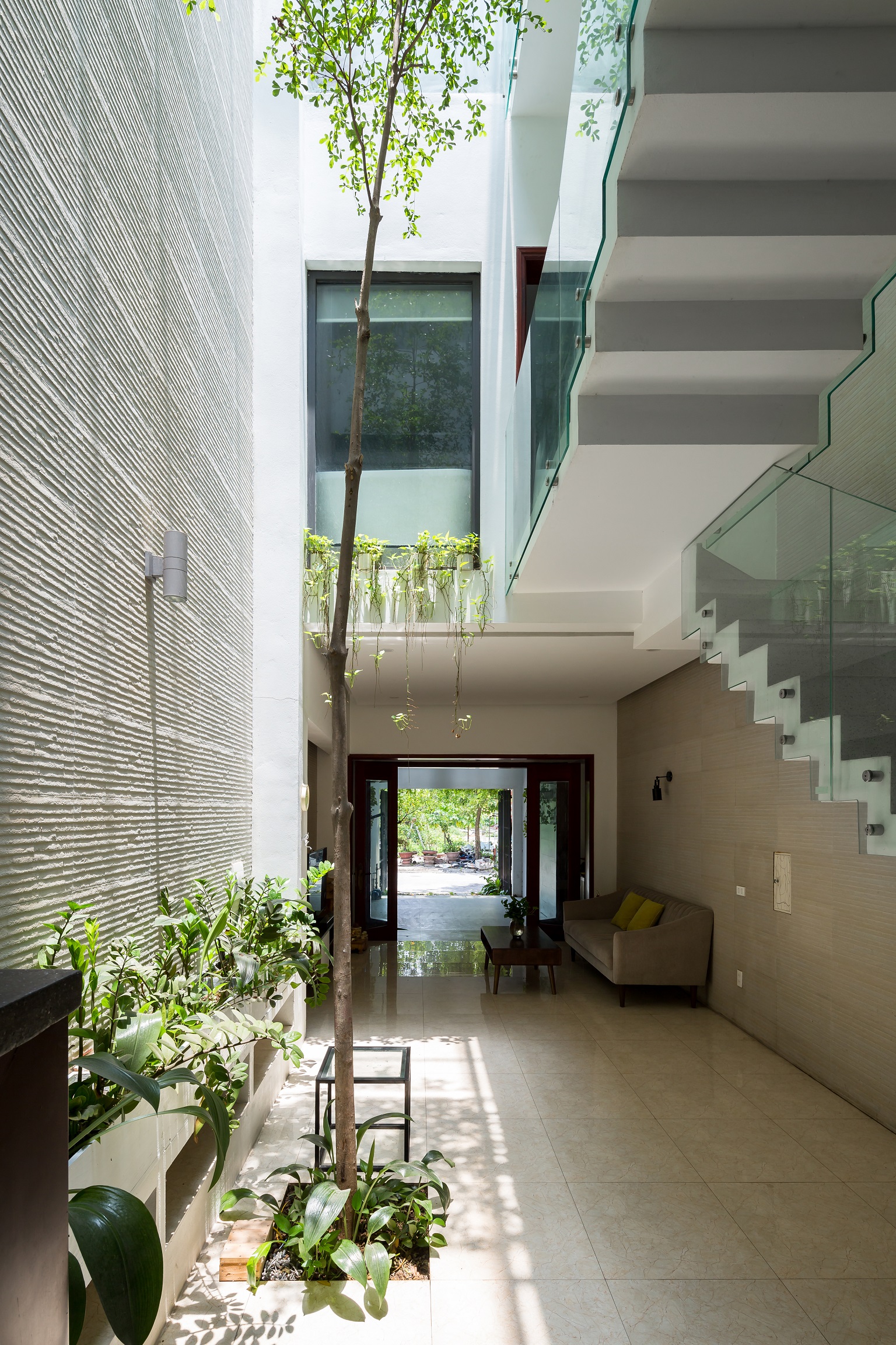
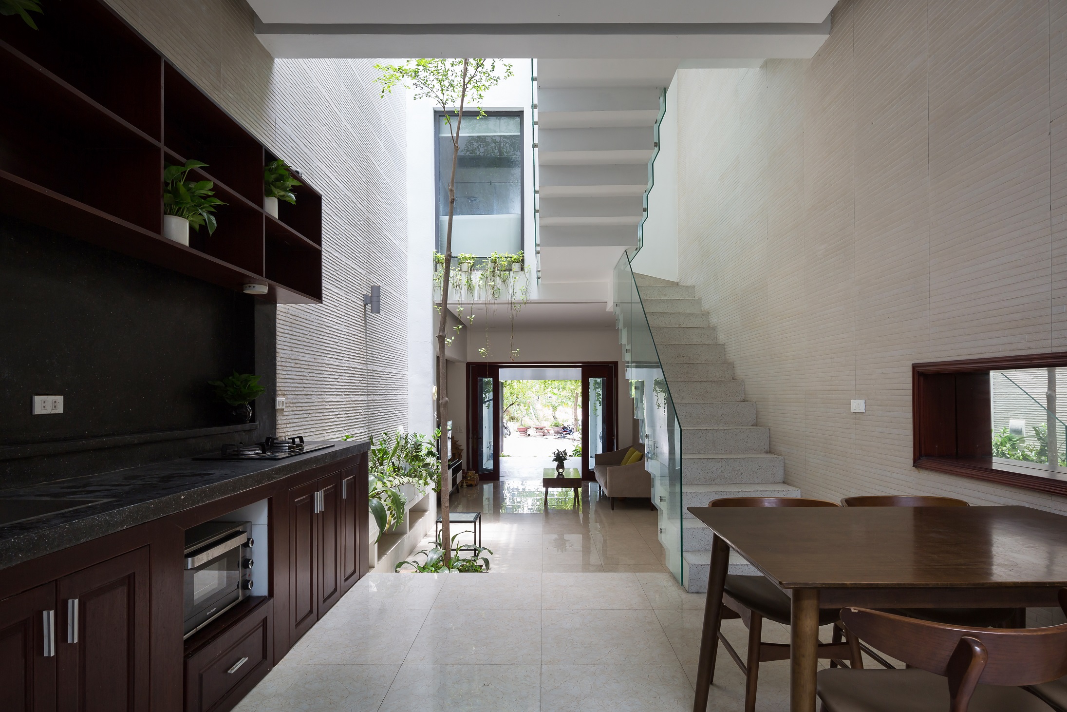
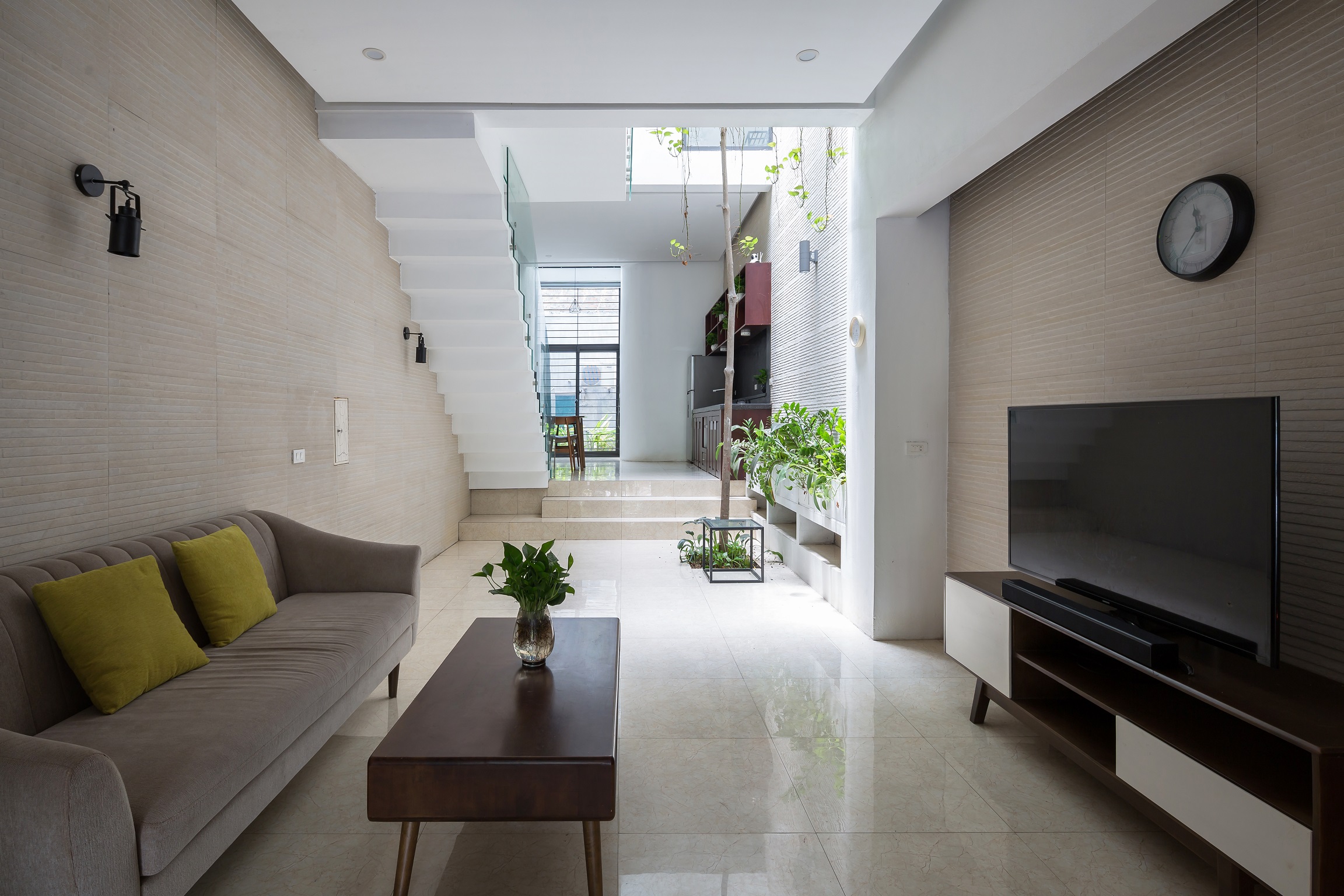
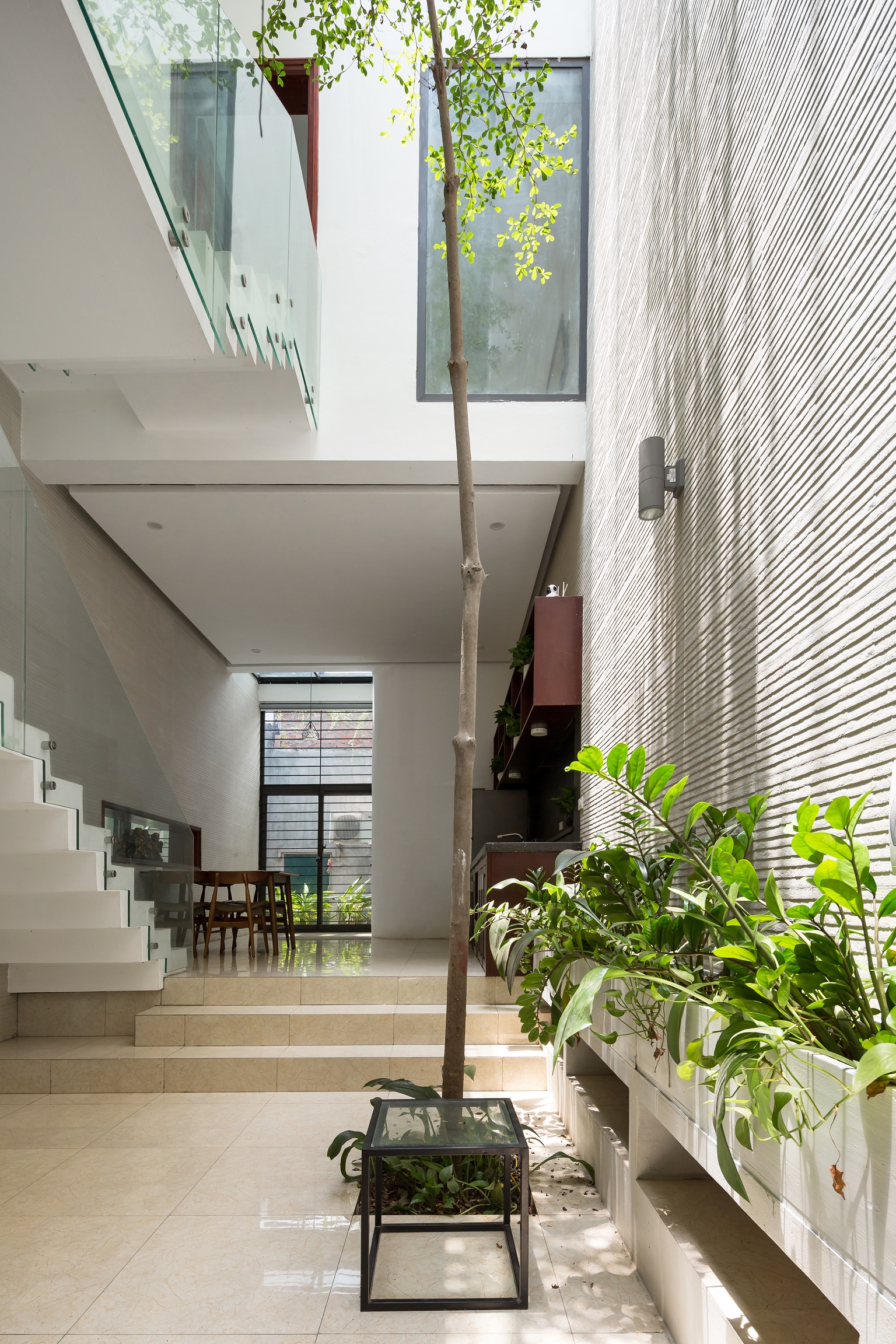
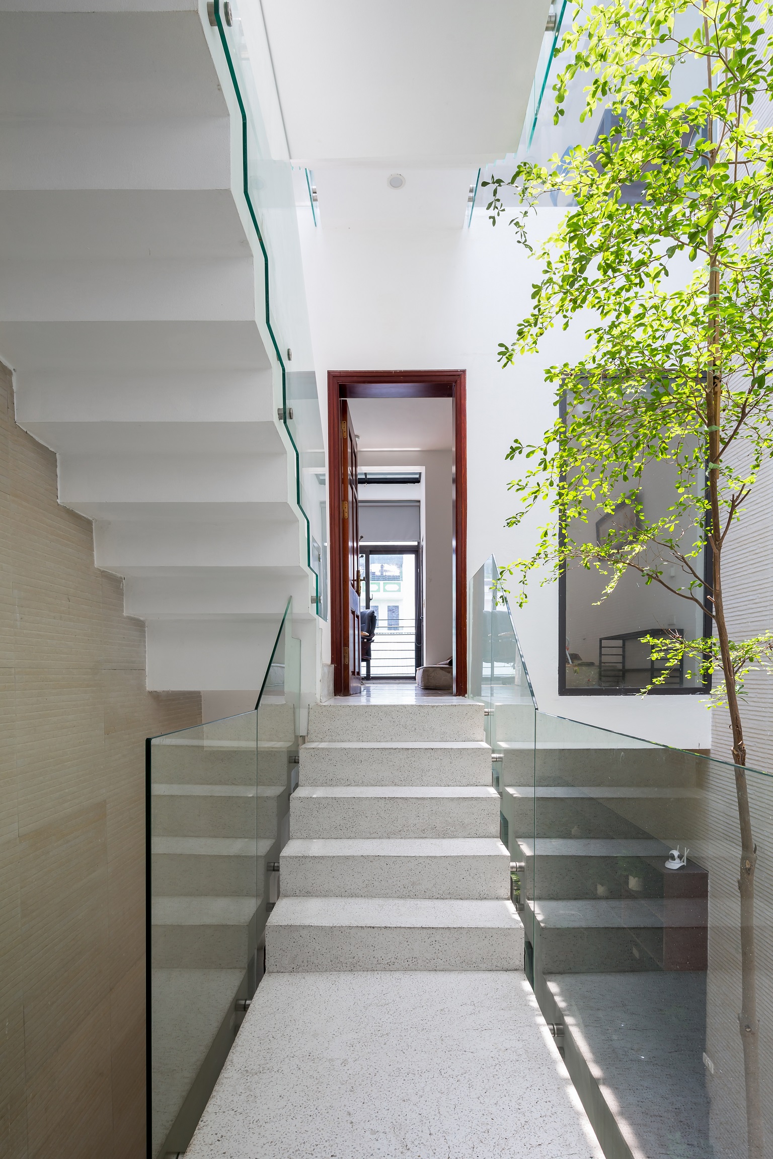
Poh – Kulthida: “I grew up in this kind of environment. After having lived abroad, we decided to return here. The question is: Where do we begin? We started with the place we’ve lived before. The challenge was if it was the old place, we would know what the problem was, especially if it was a townhouse.
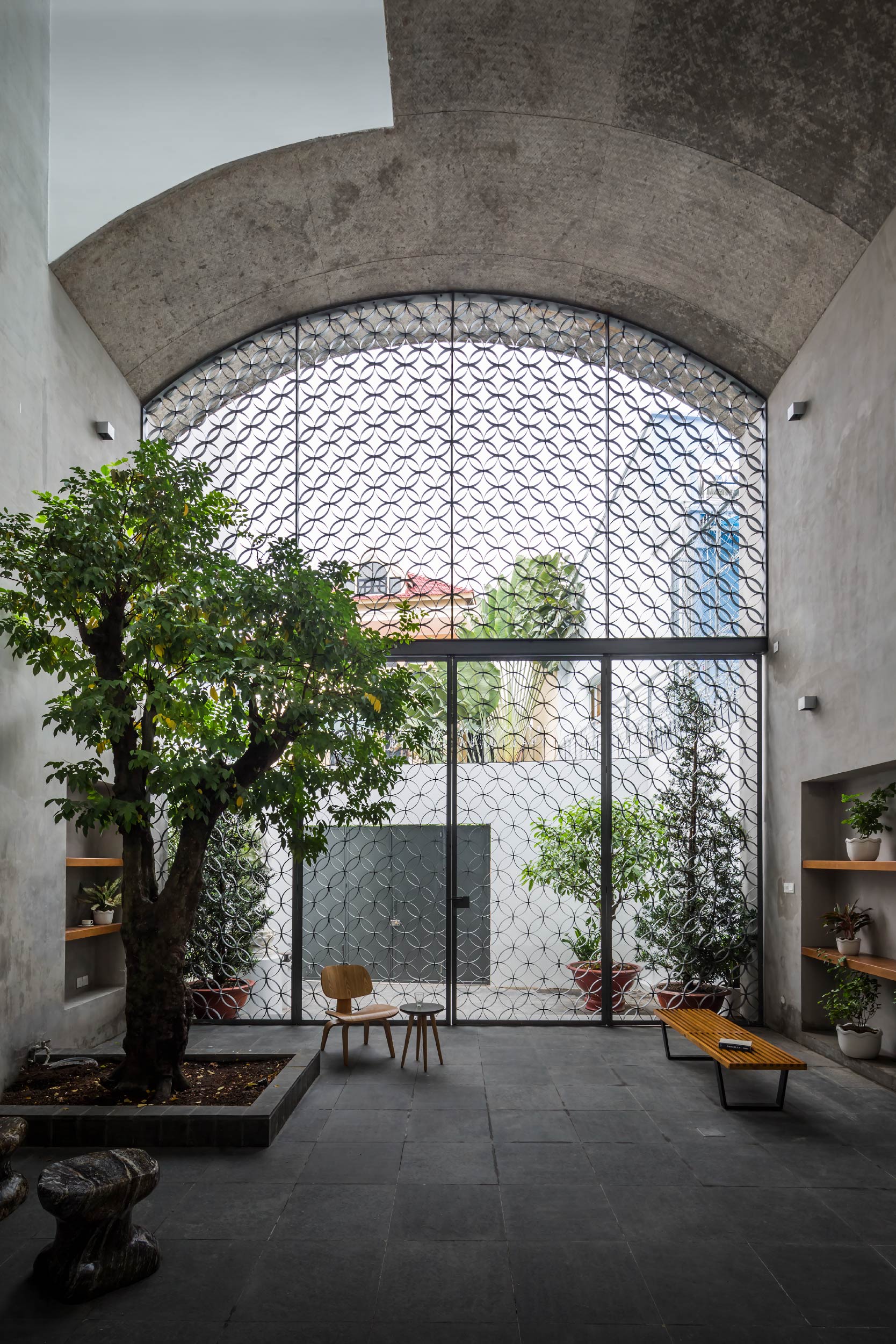
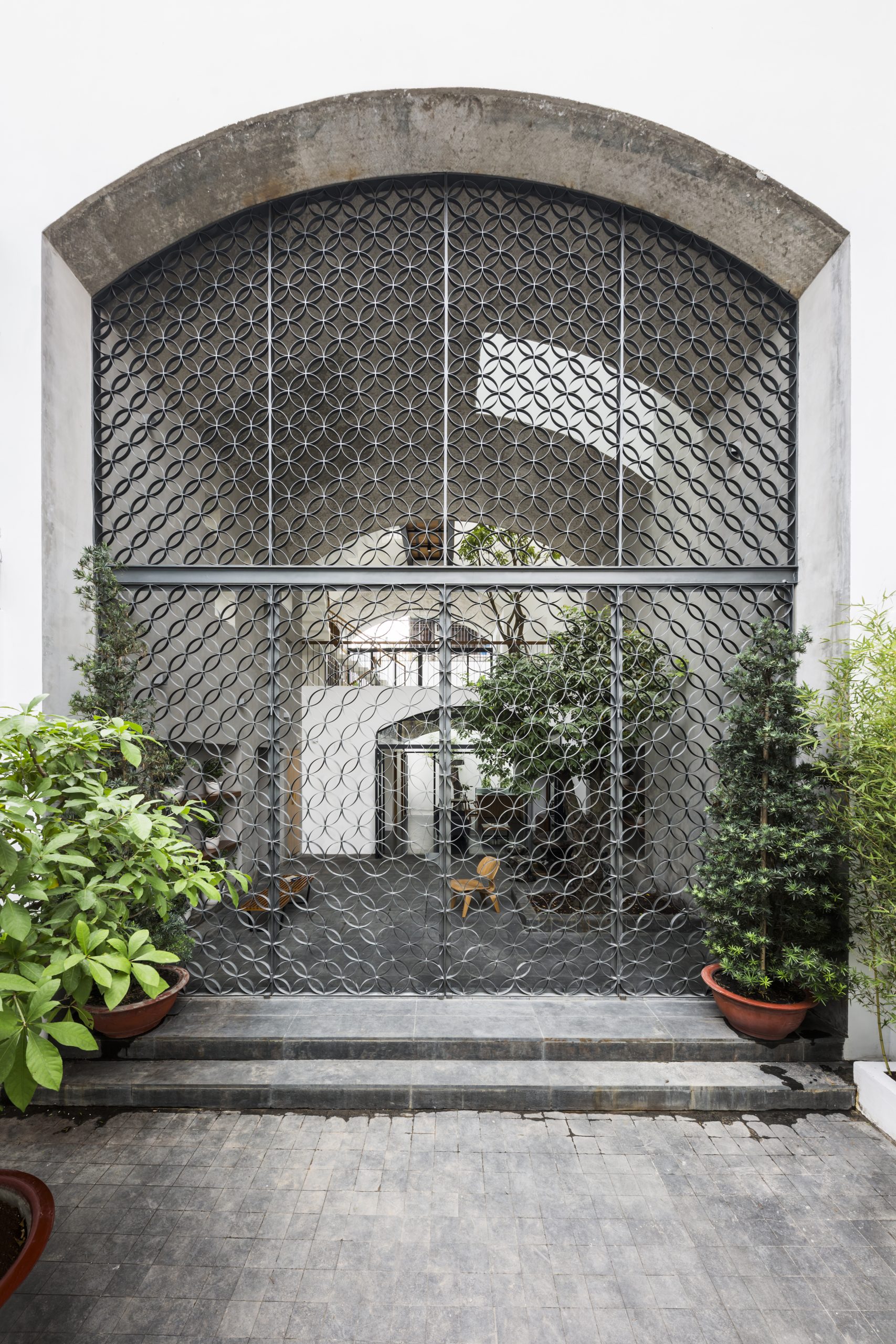
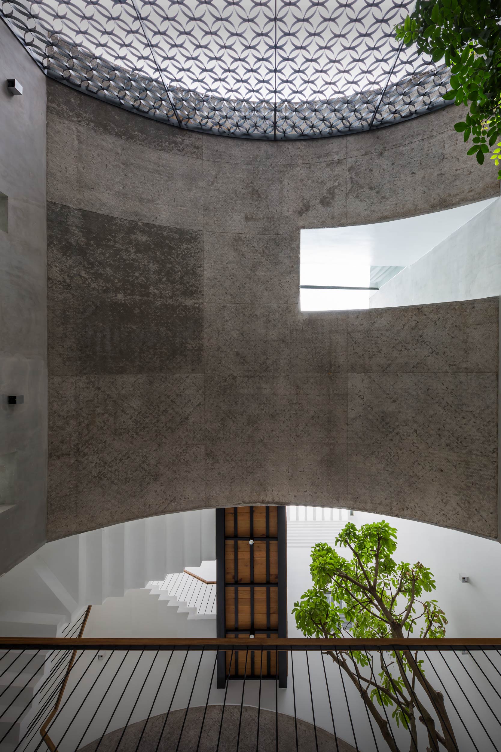
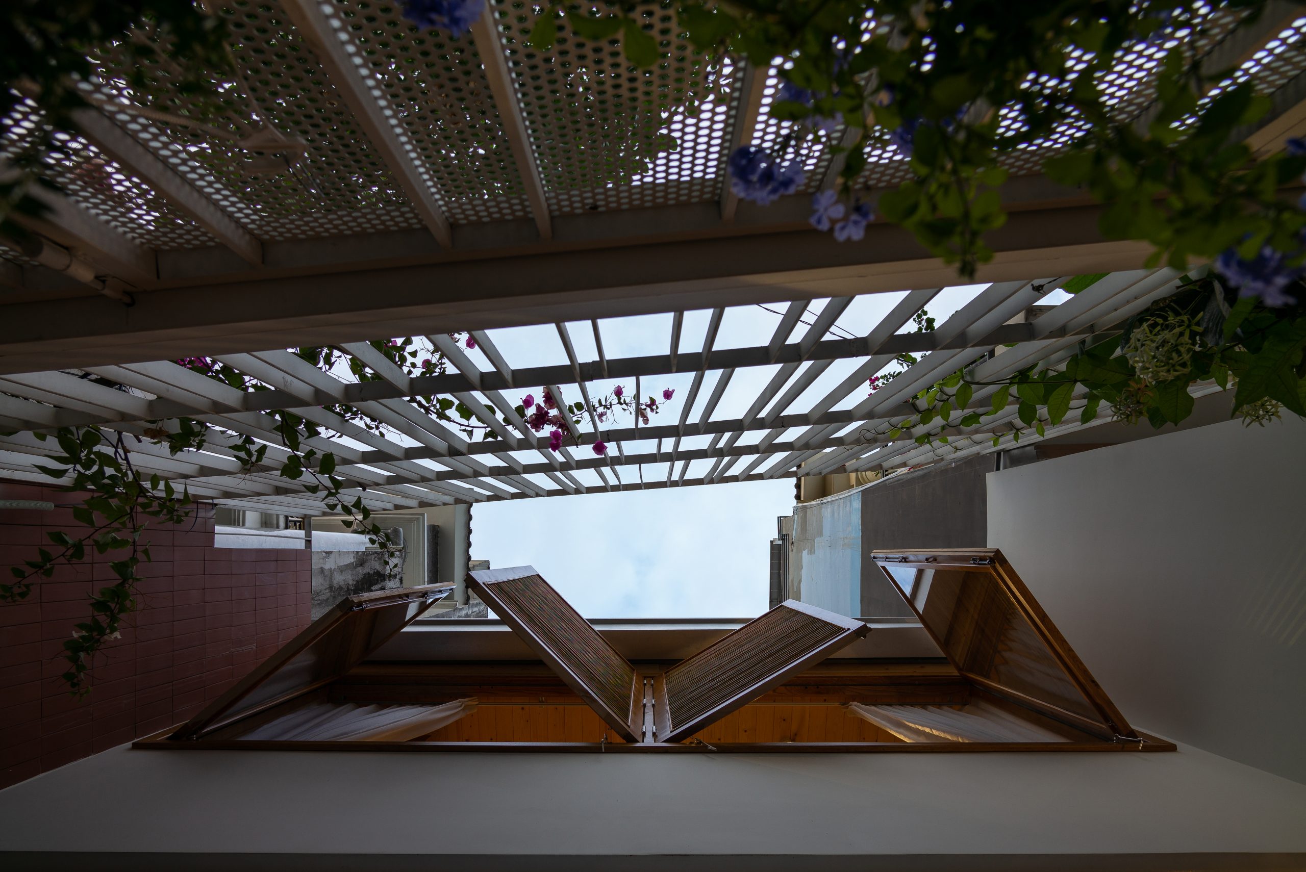
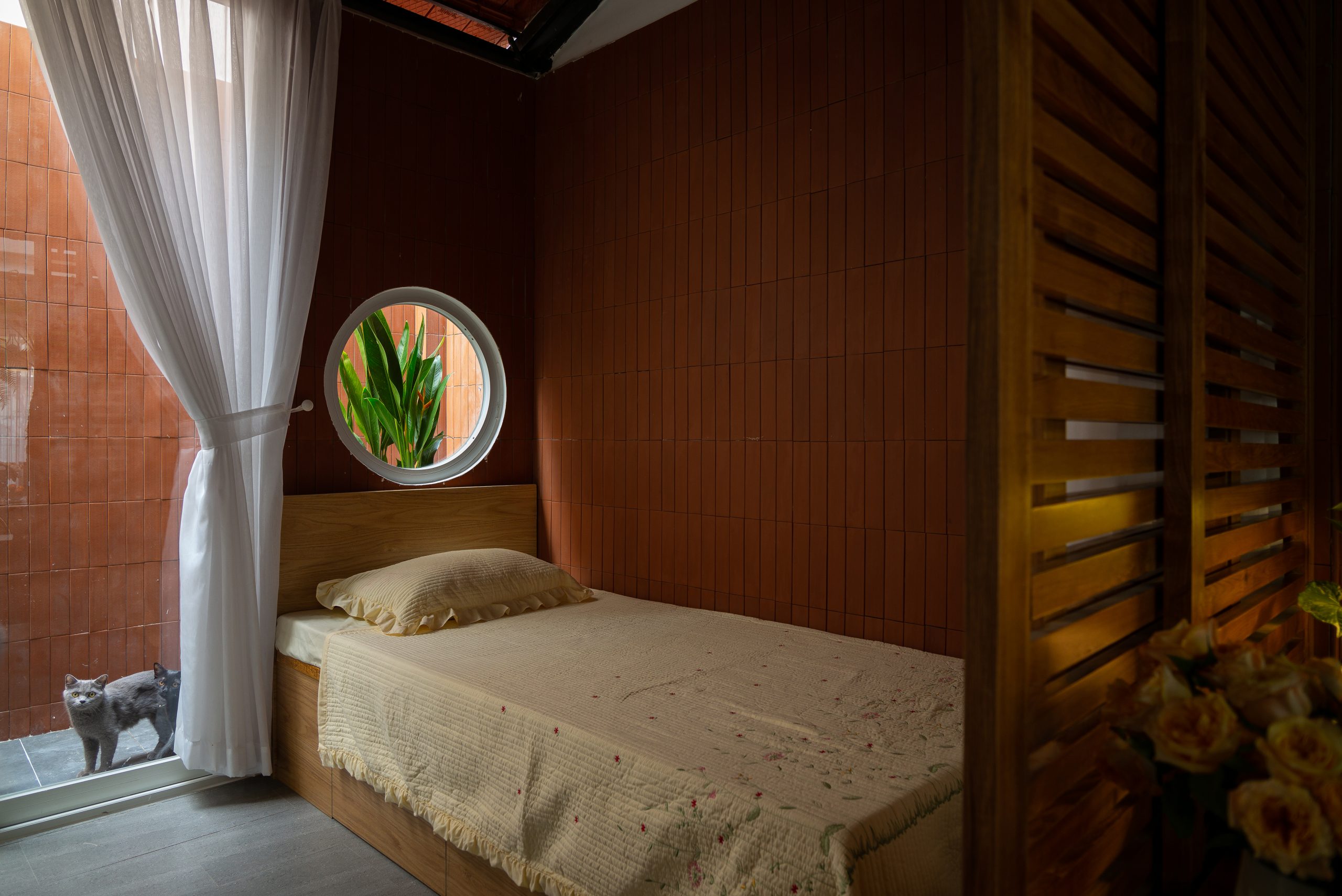
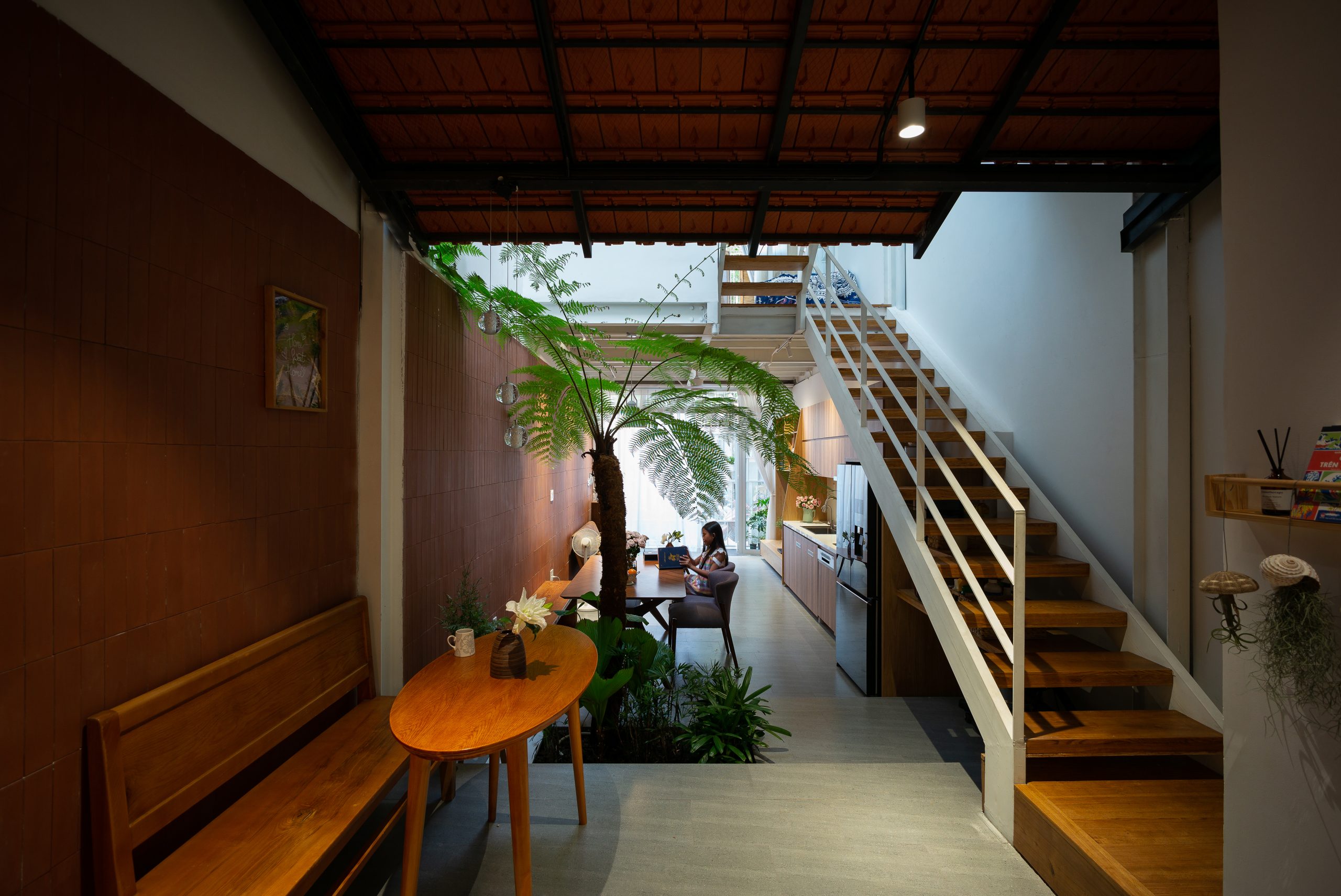
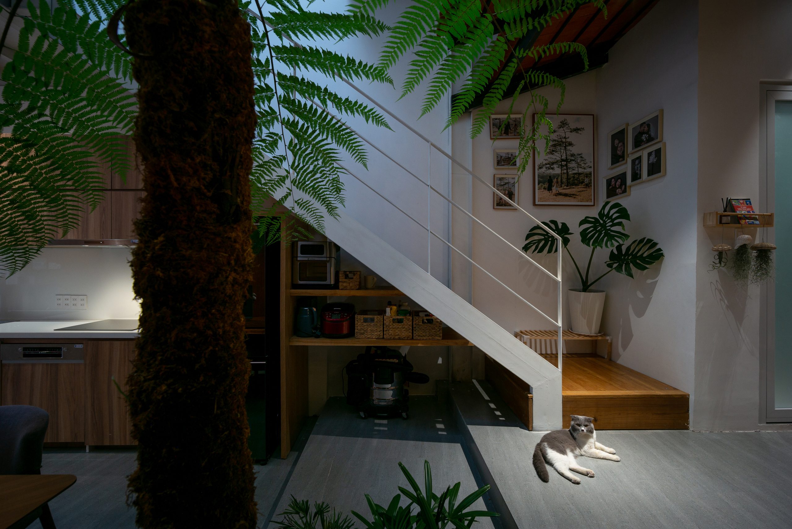
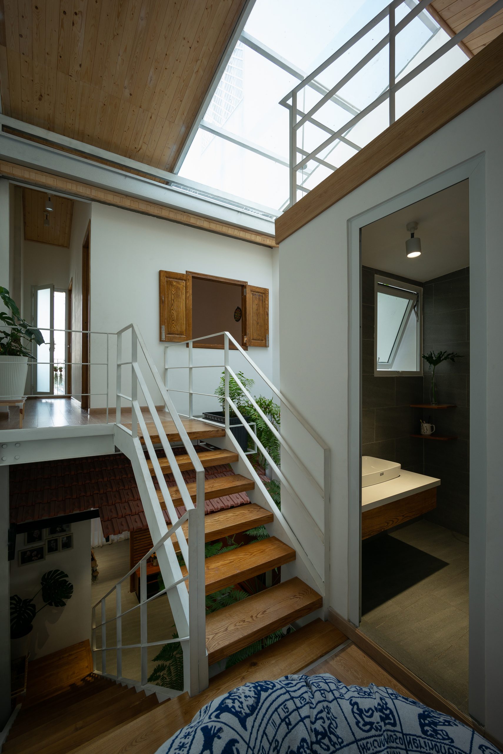
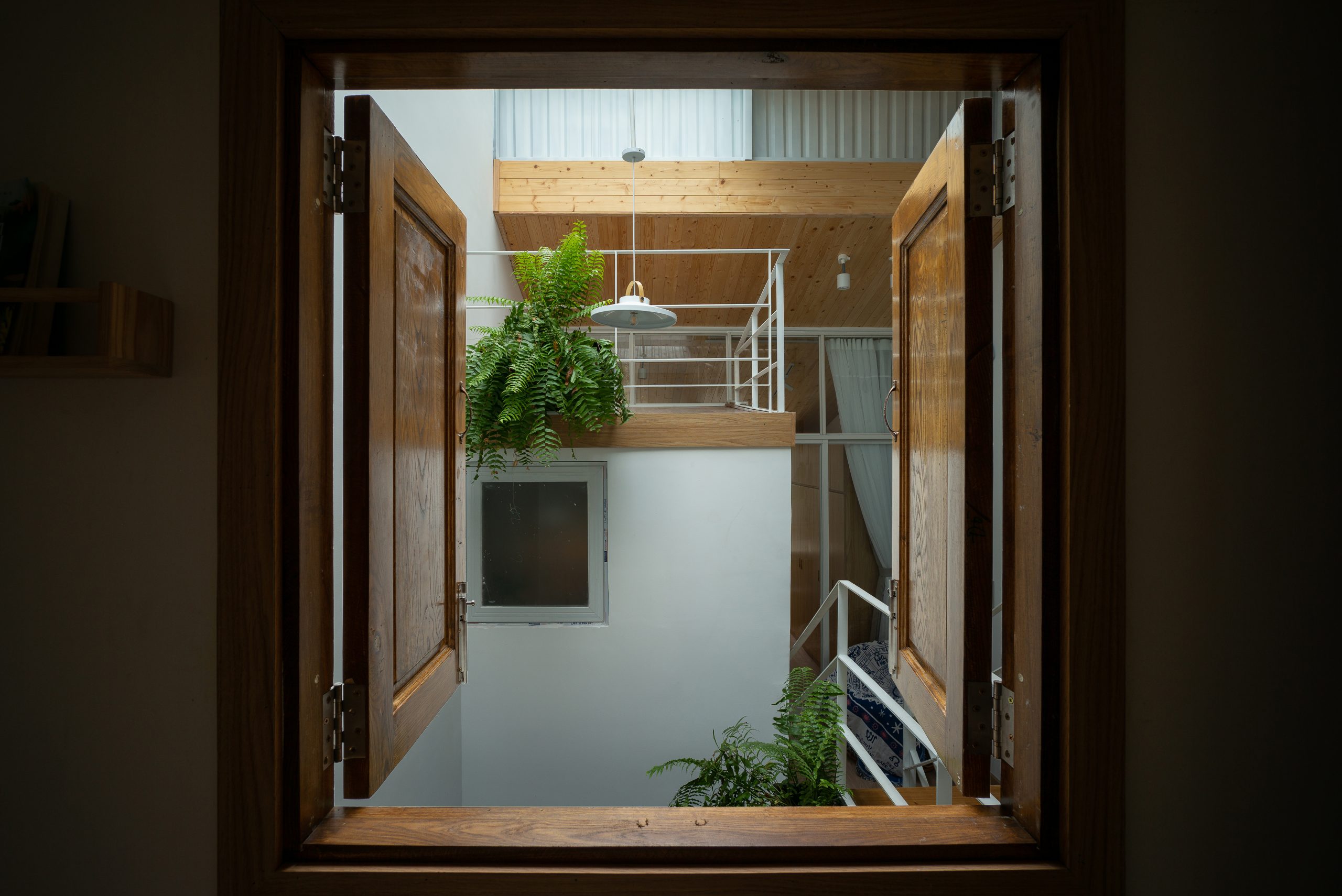
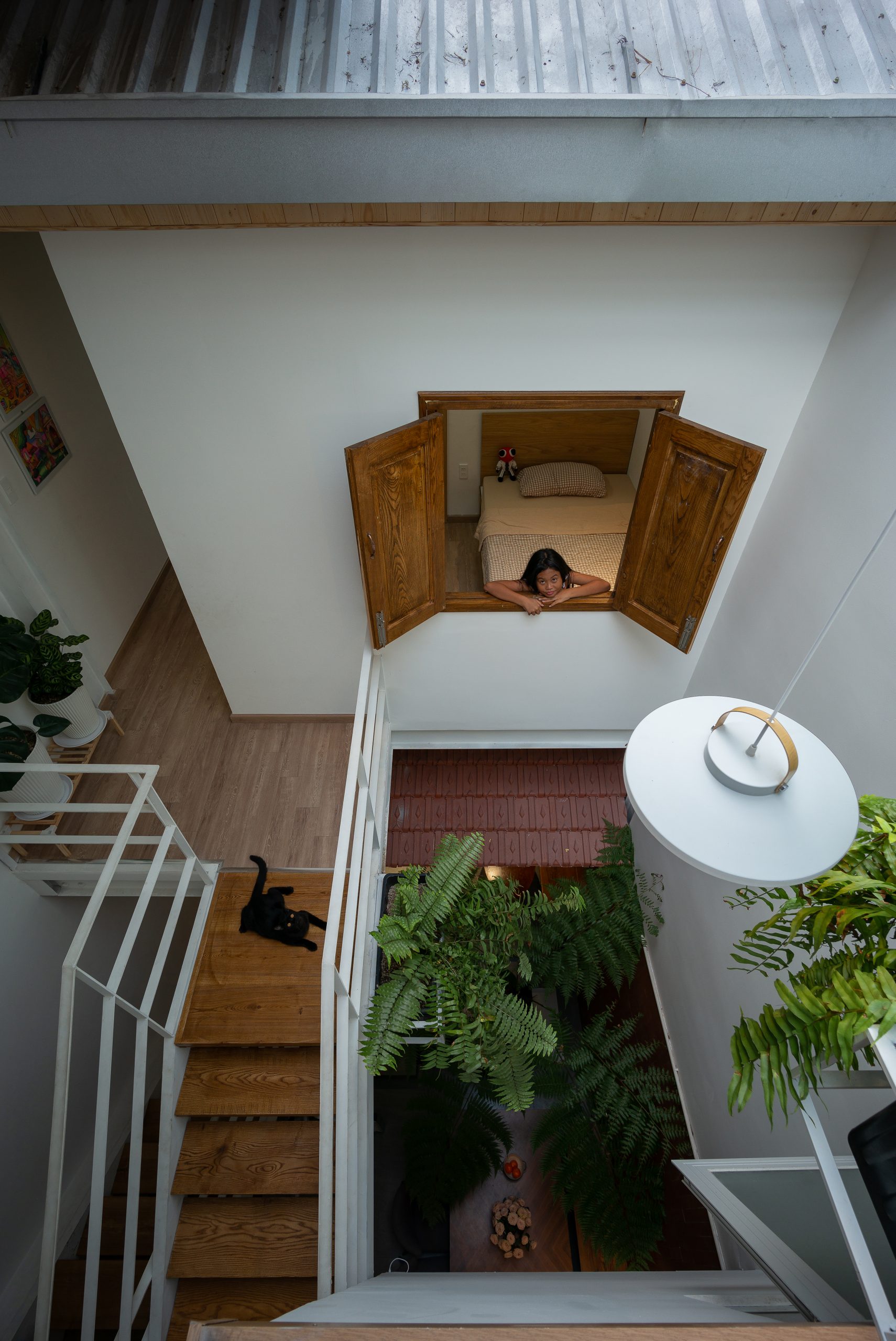
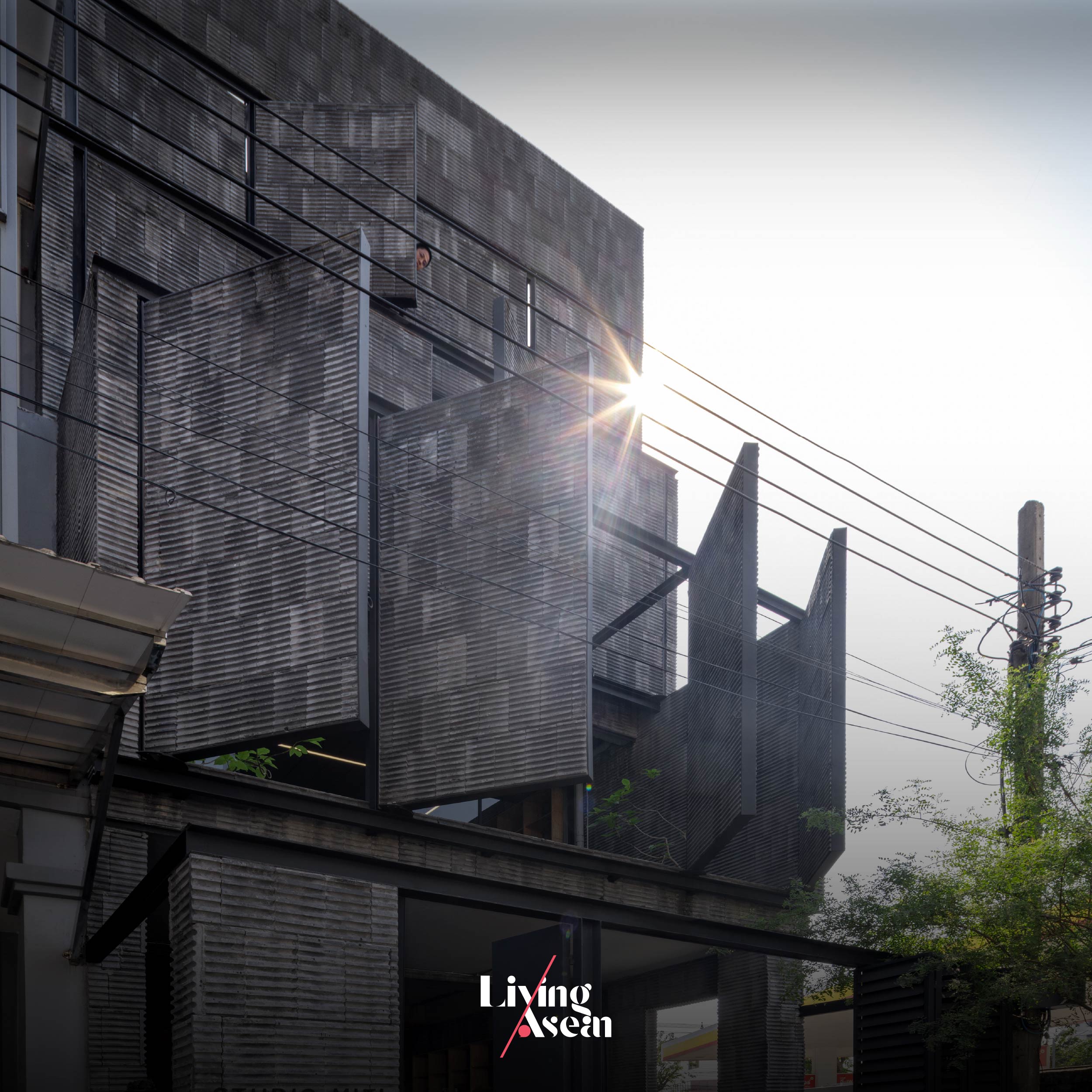
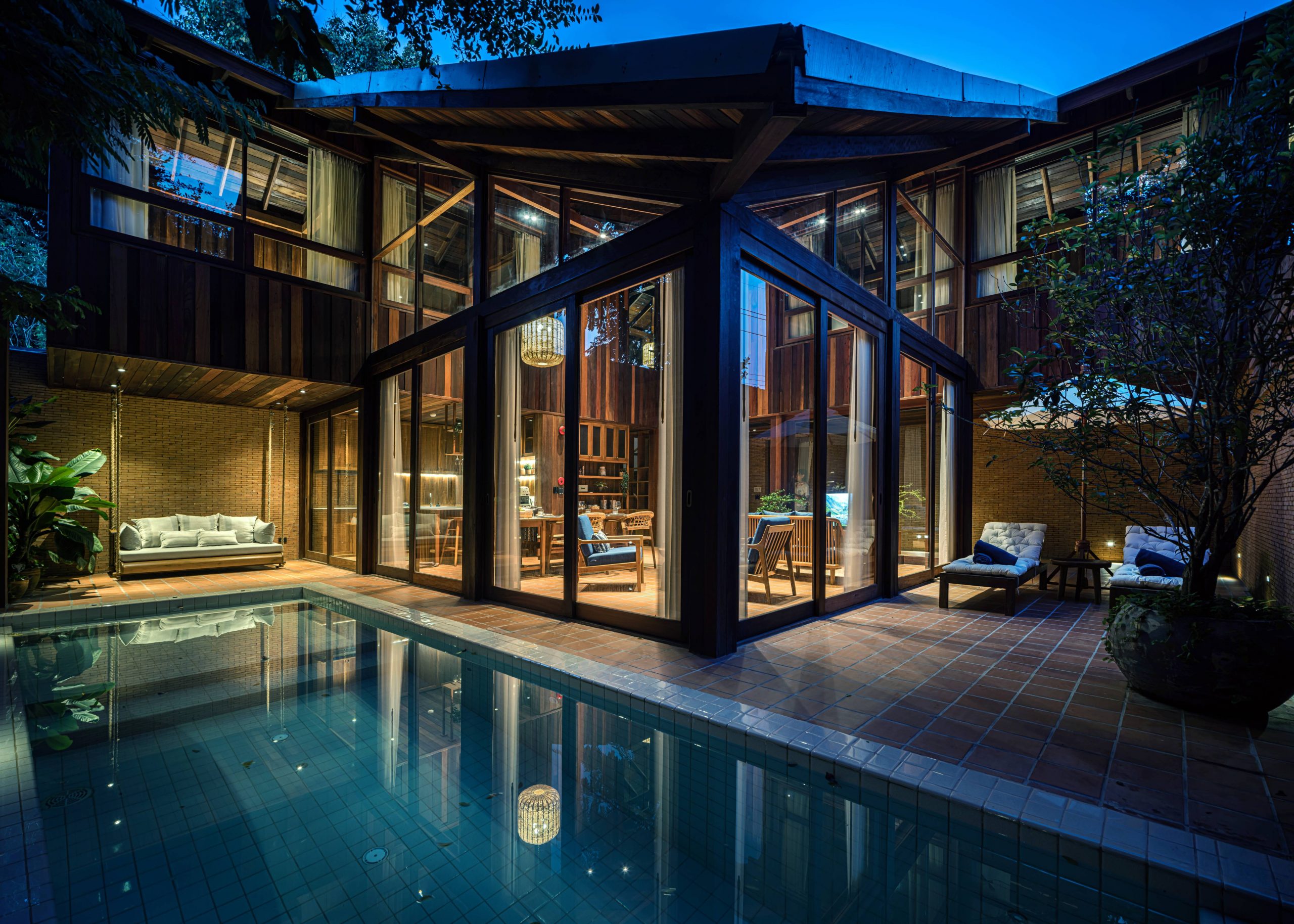
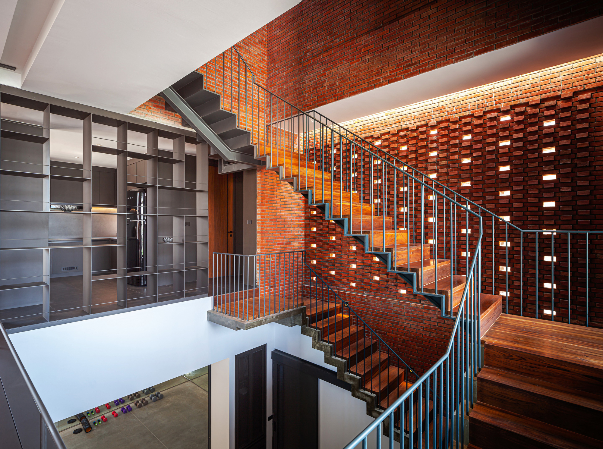
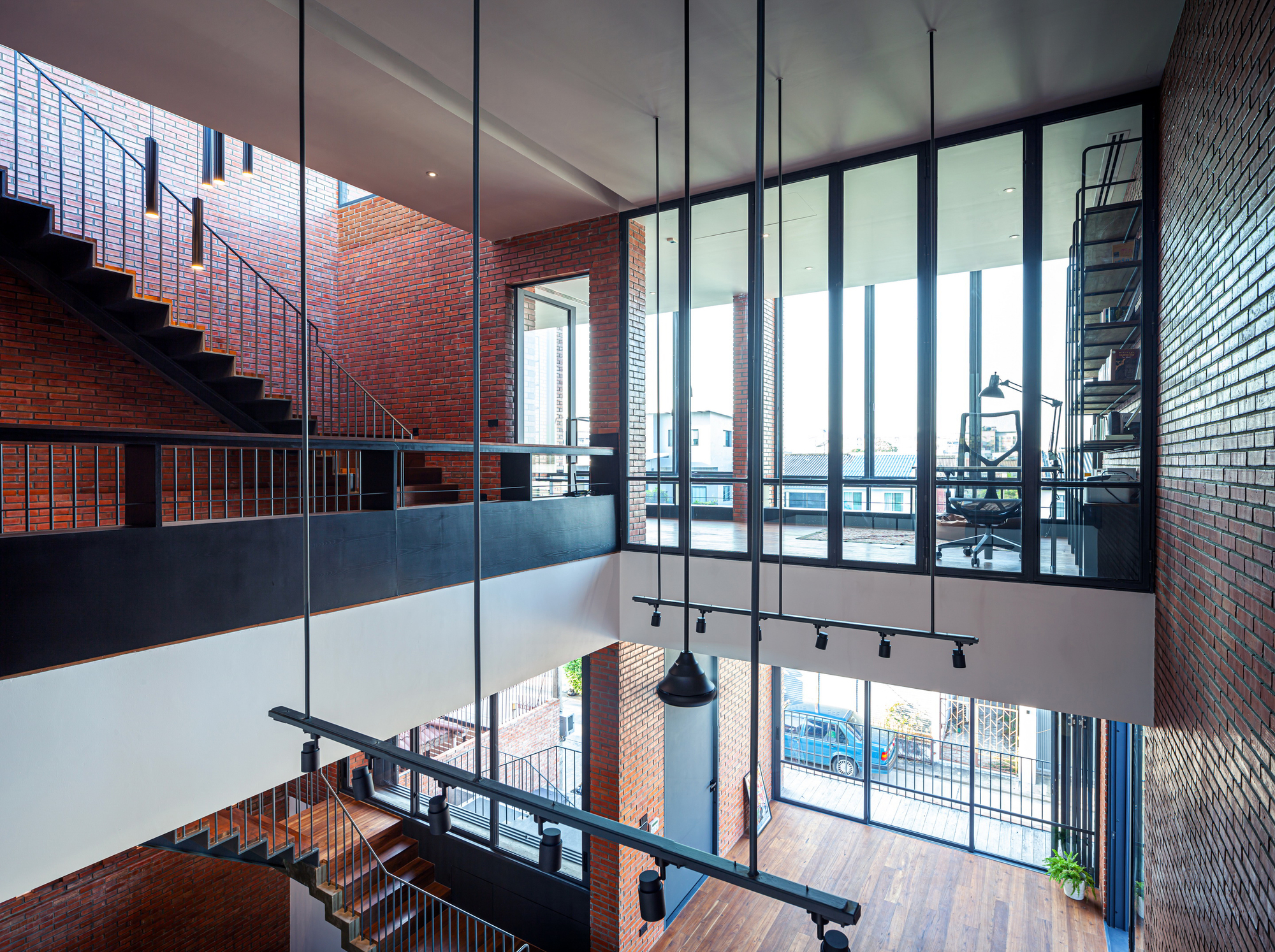
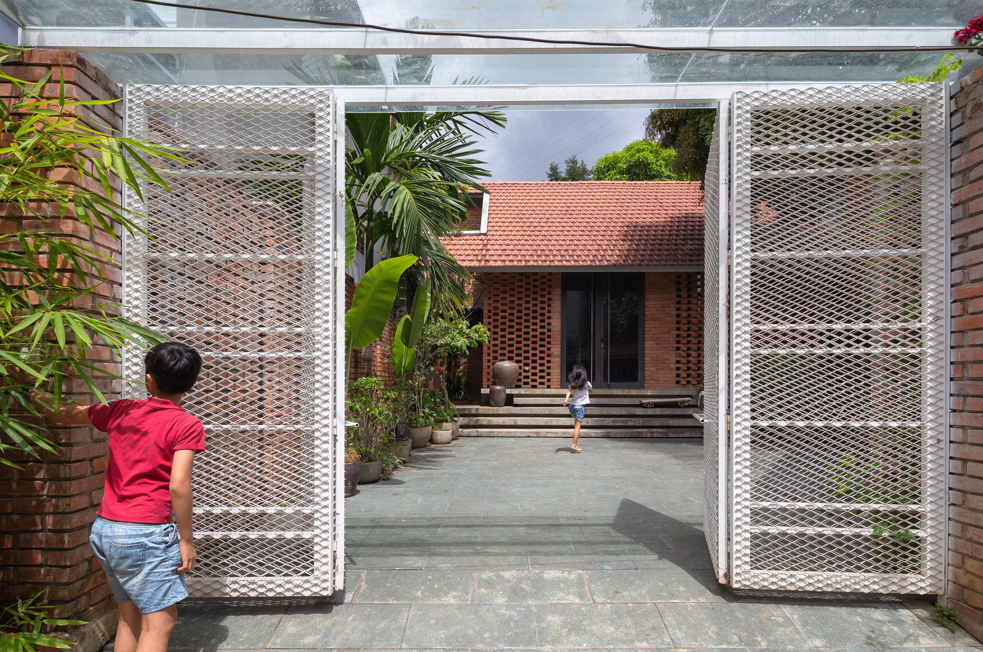
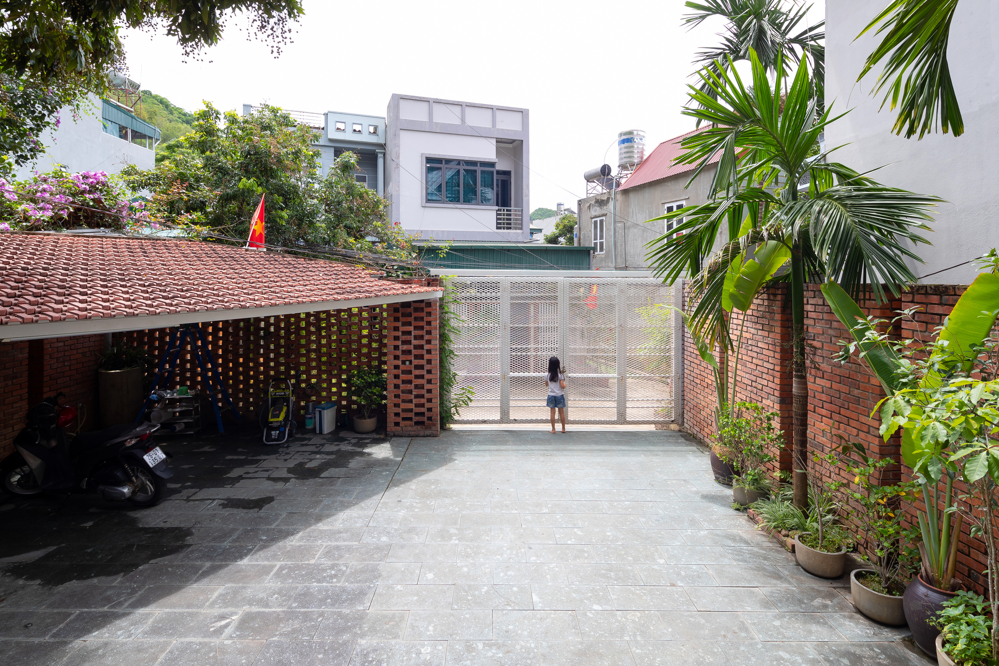
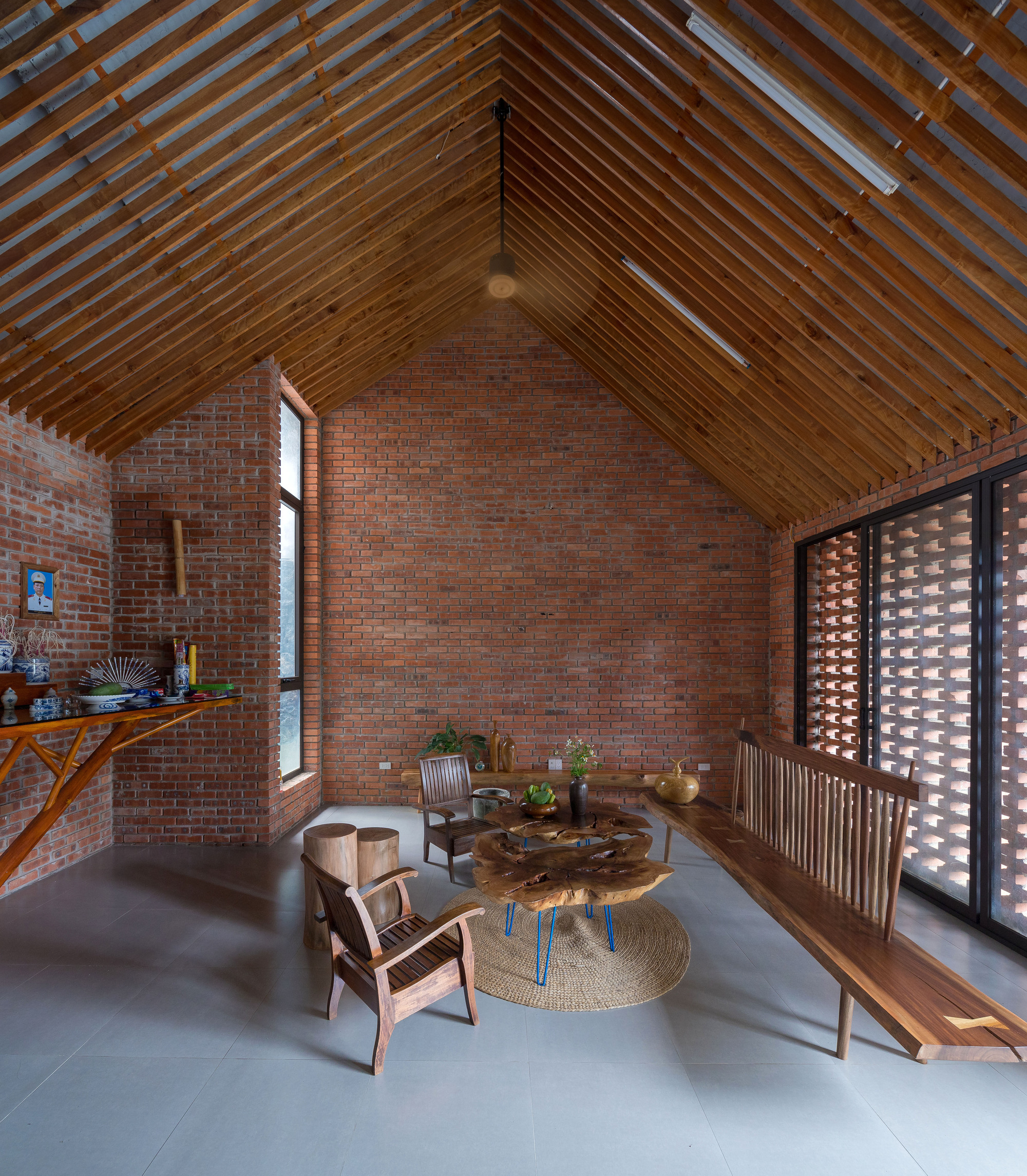
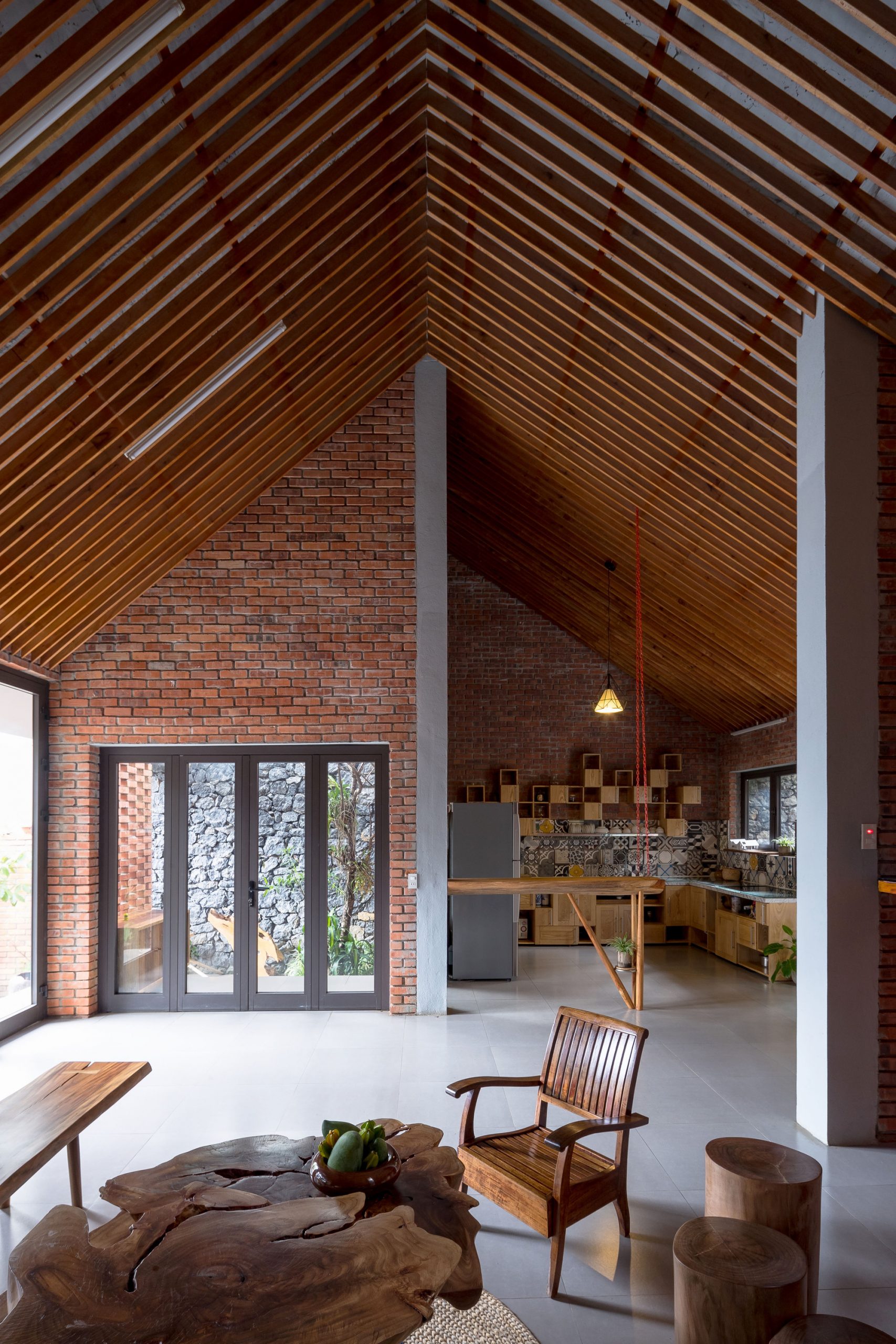
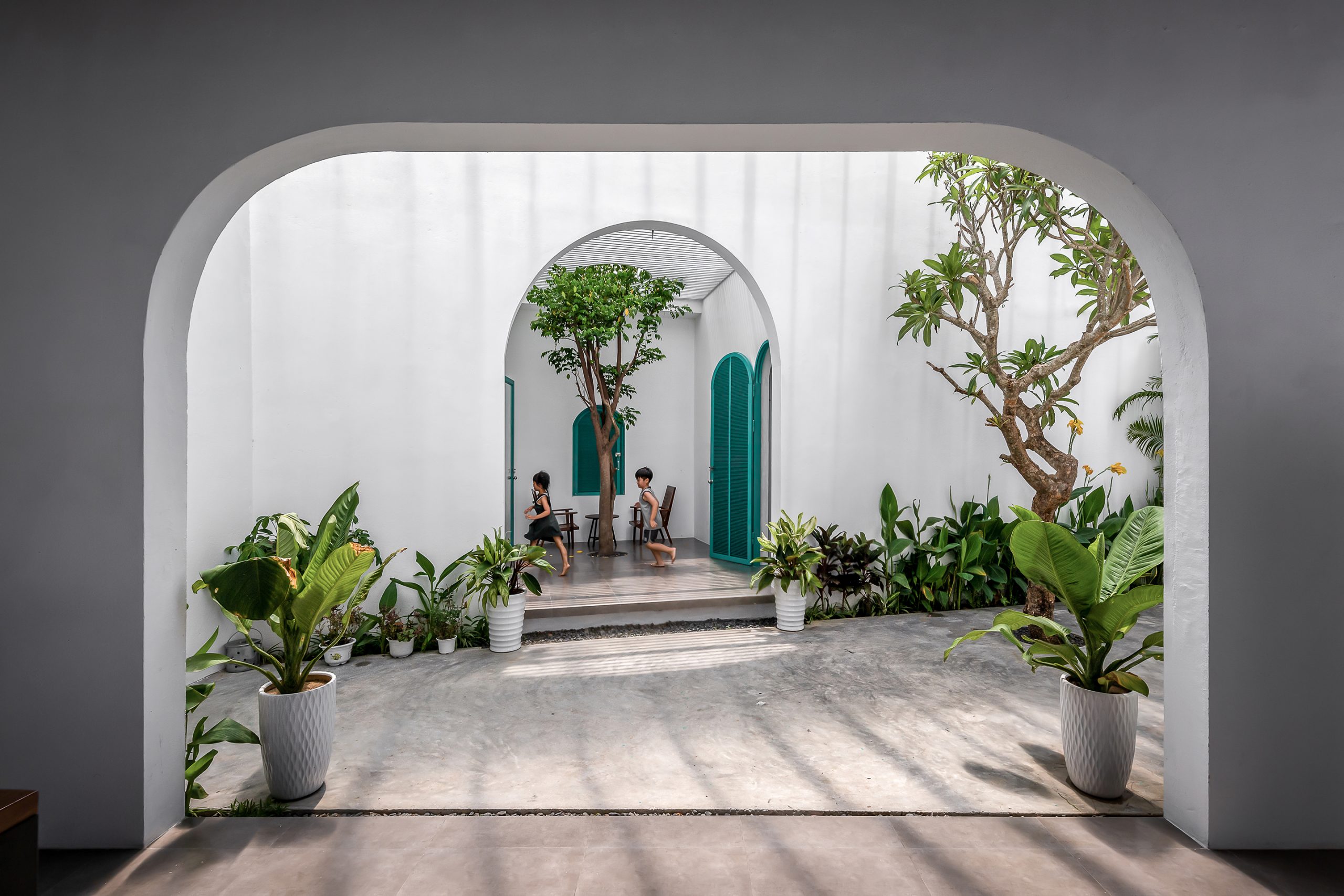
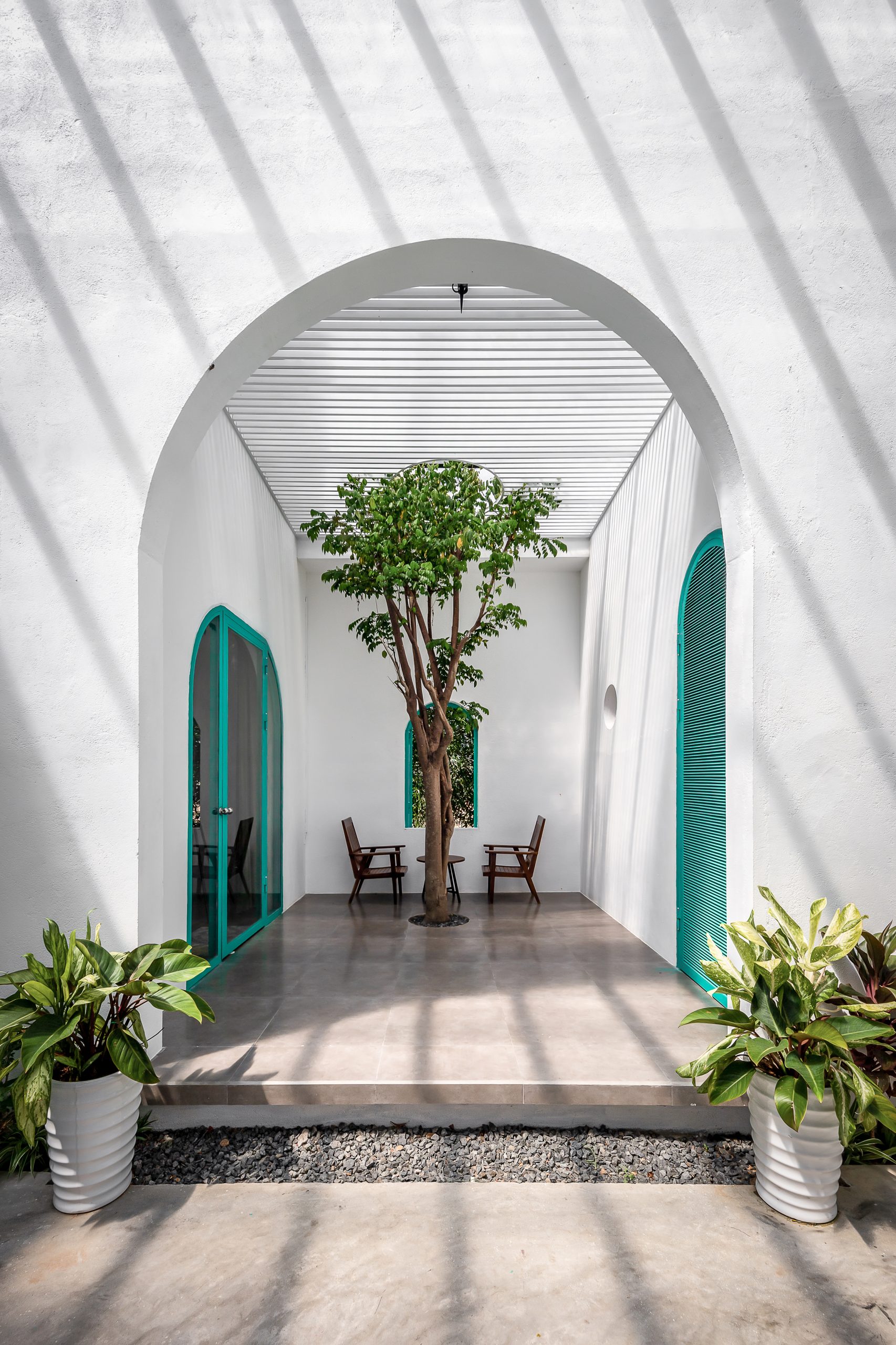
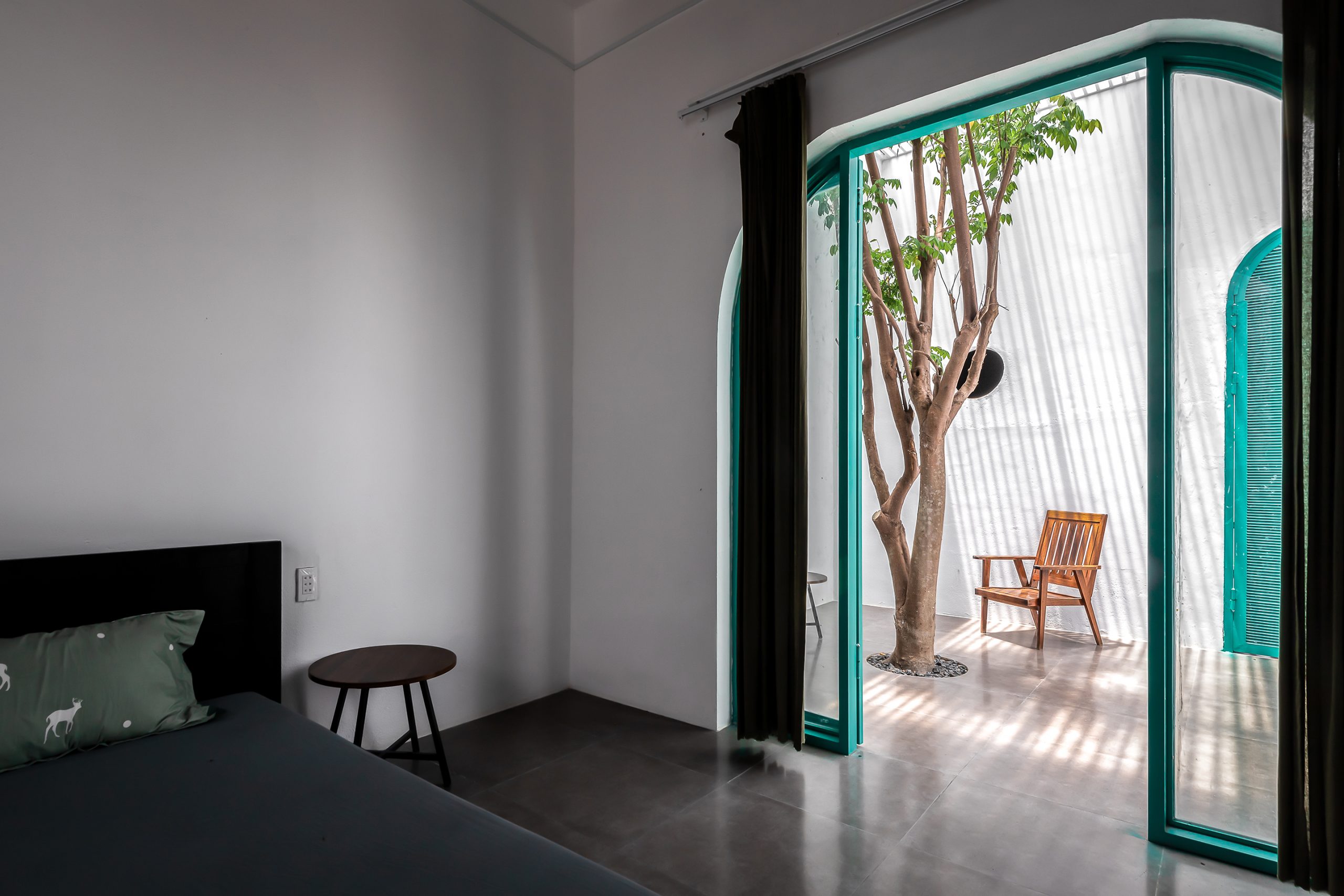
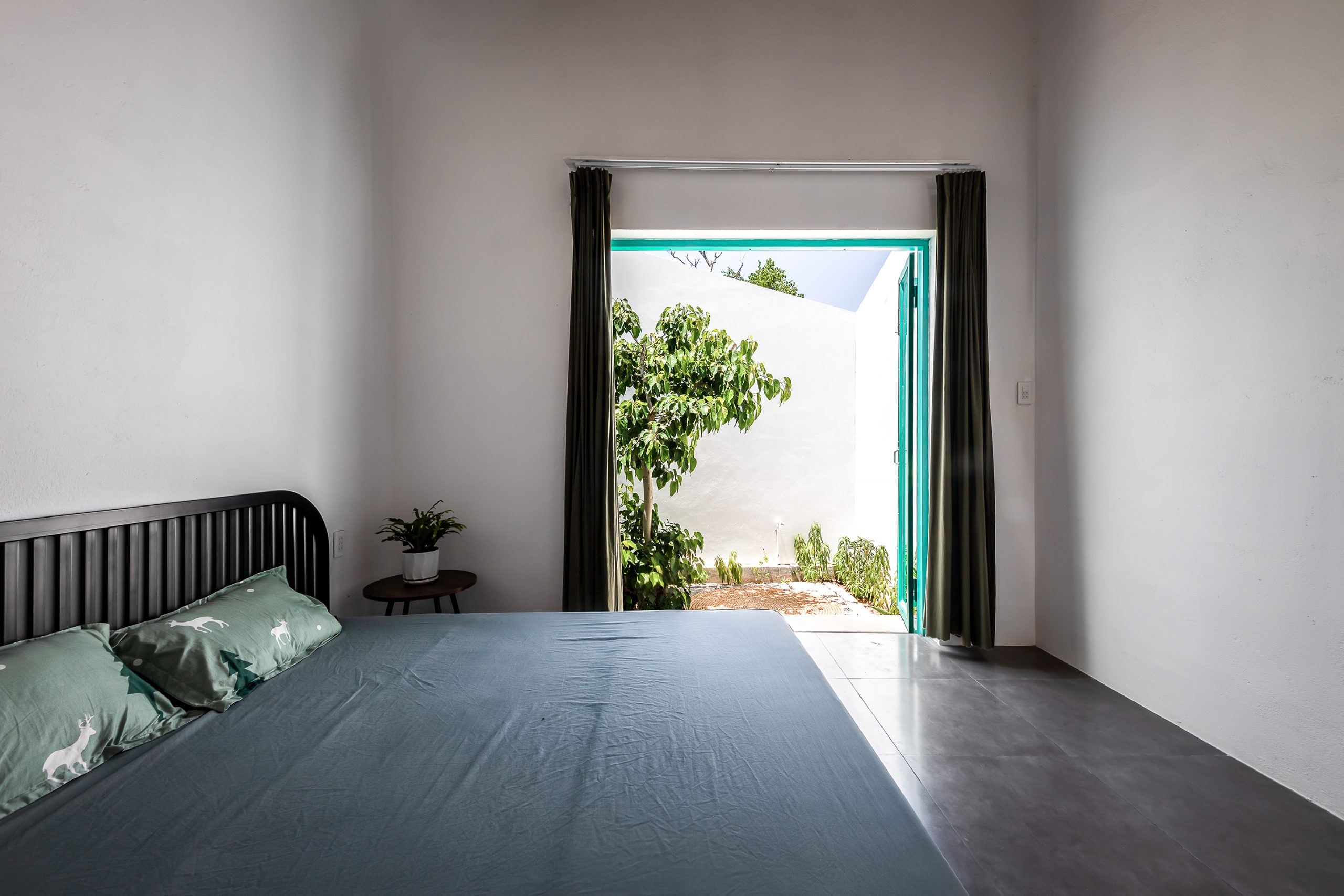
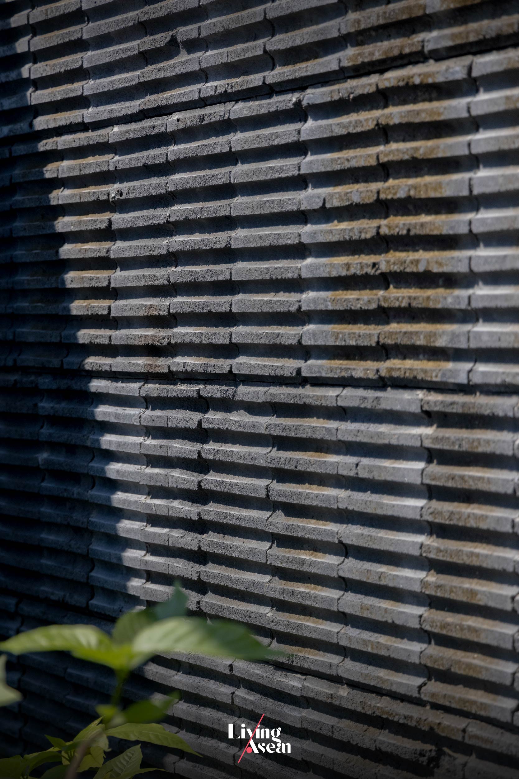
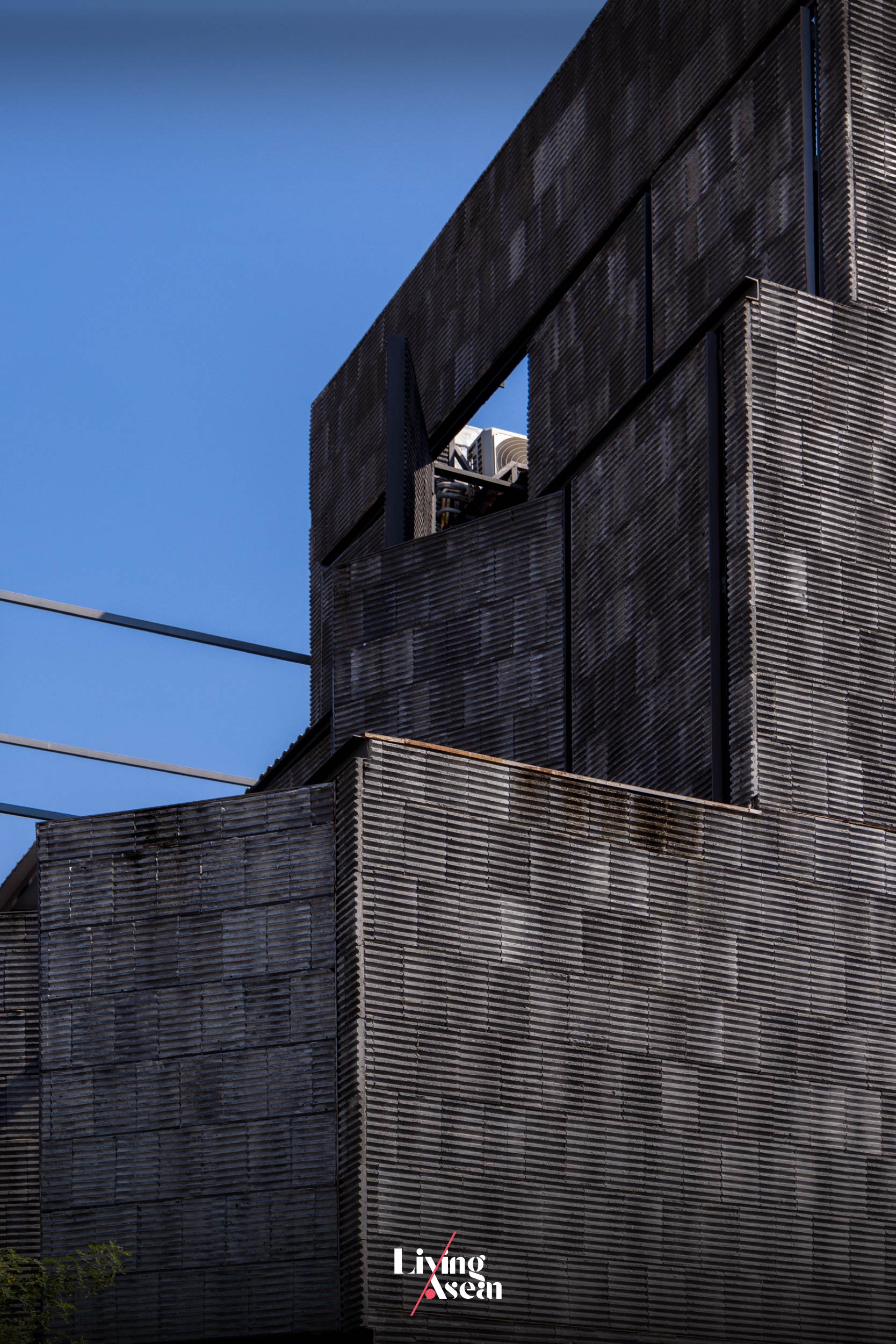
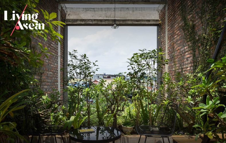
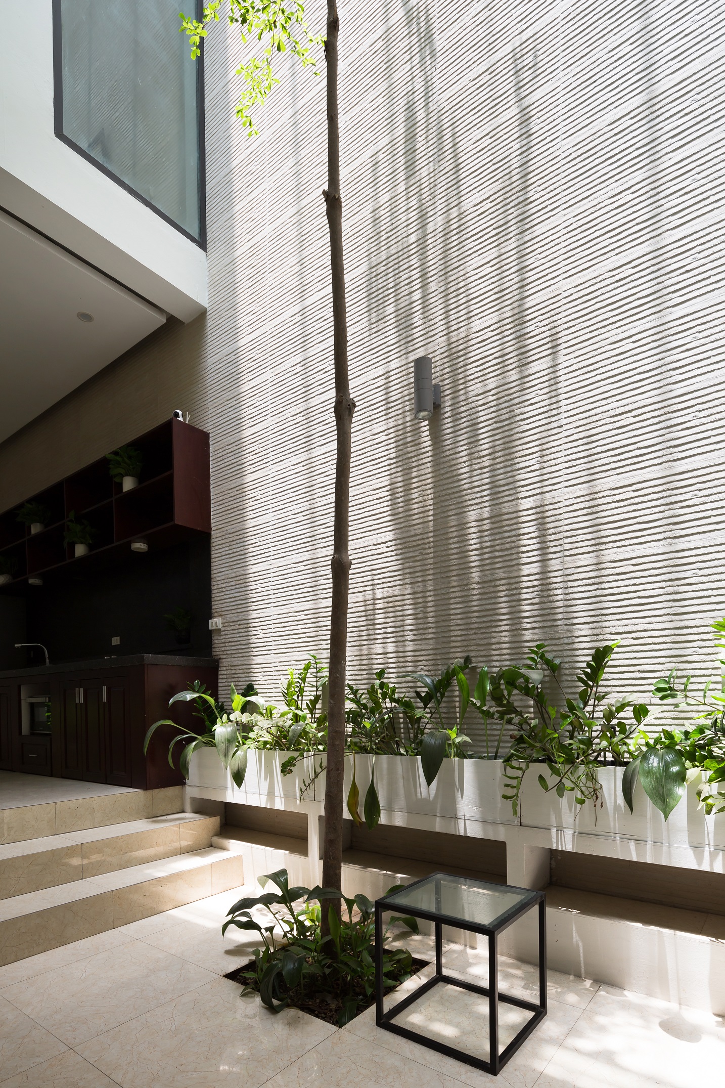
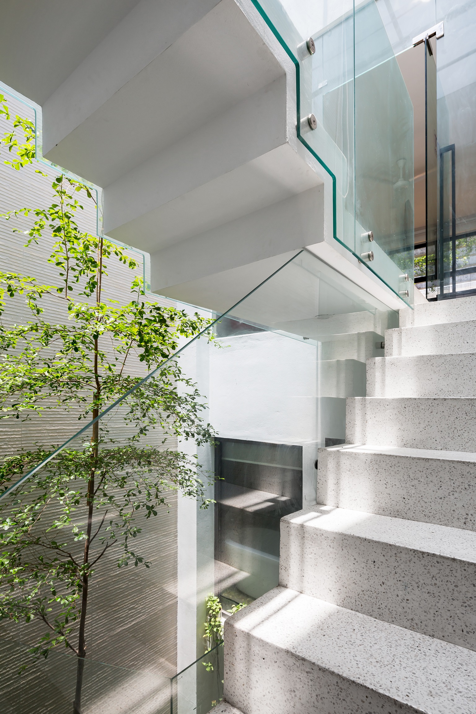
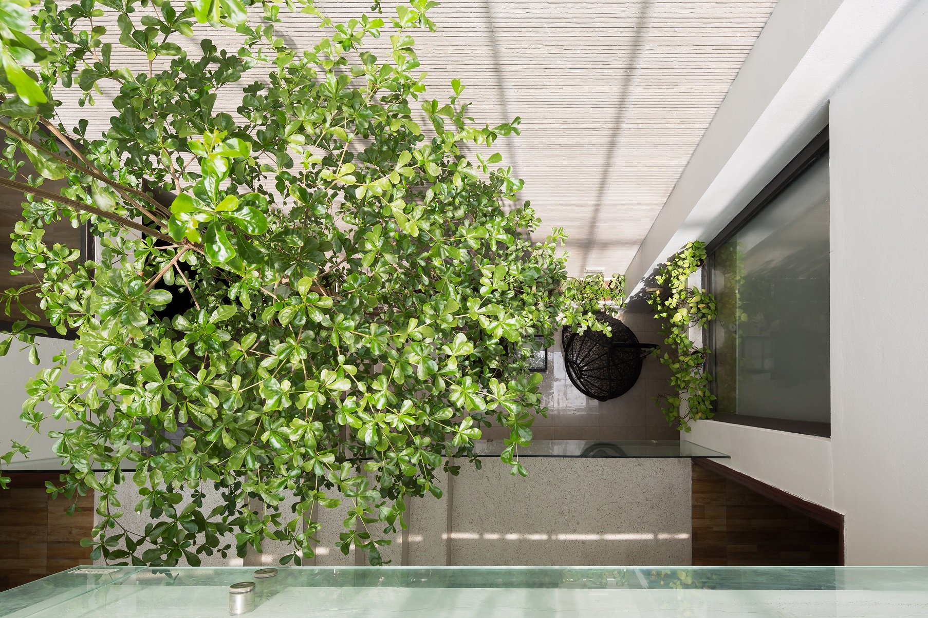
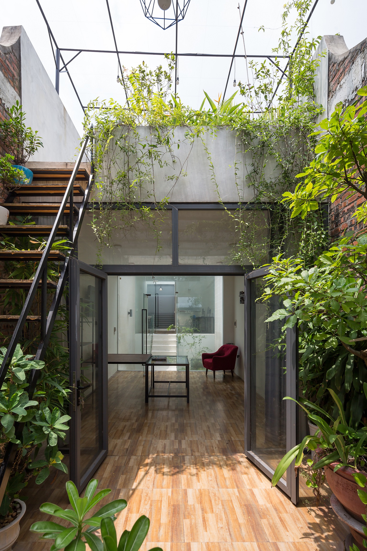
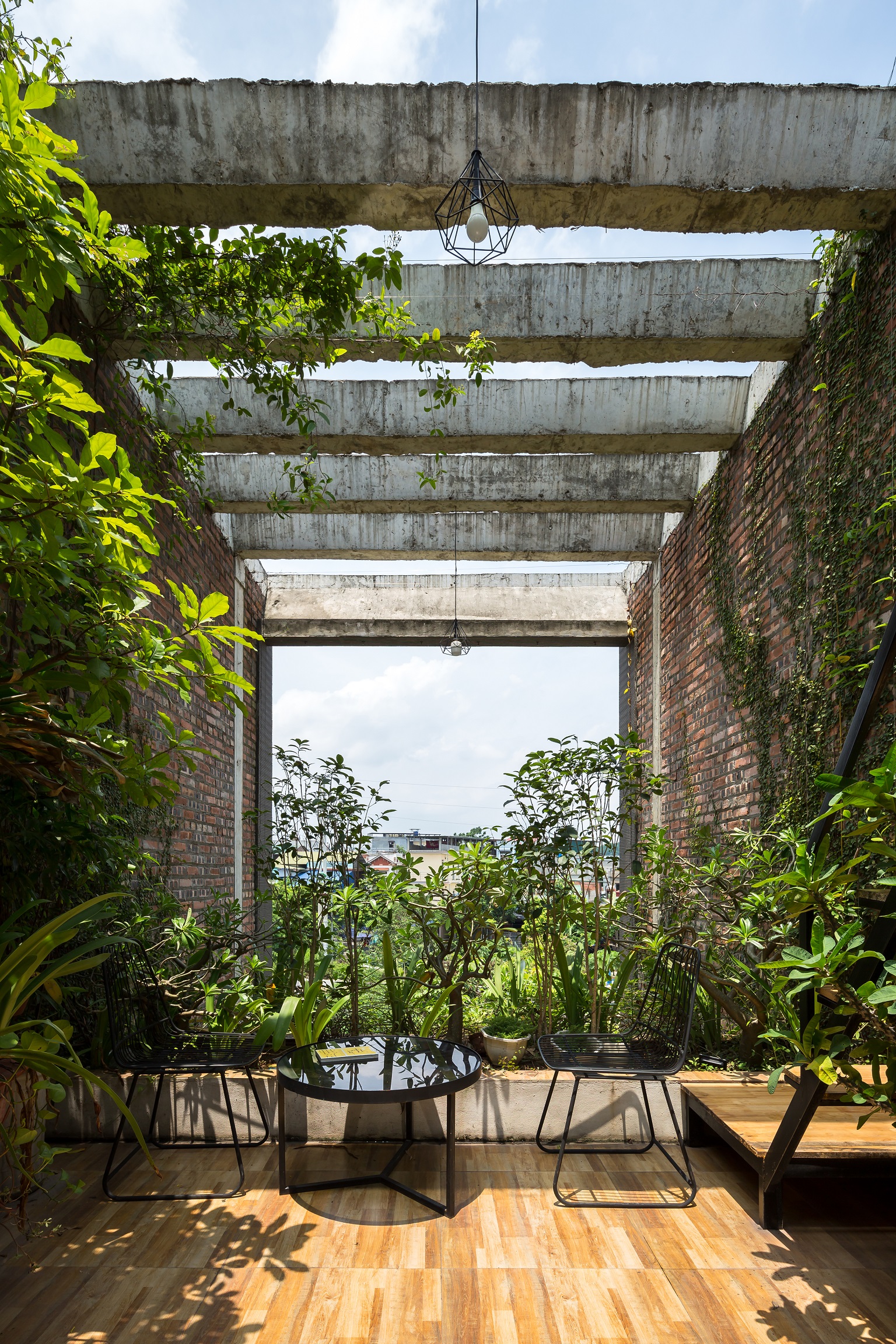
“It’s a narrow front building with an elongated shape. It doesn’t have much light. In any case, we wanted to use it as an office, and as a residence, too. The question is: Does the fence have to still be a fence when we can build it in another shape or form? Or can we make the fence a part of the space.
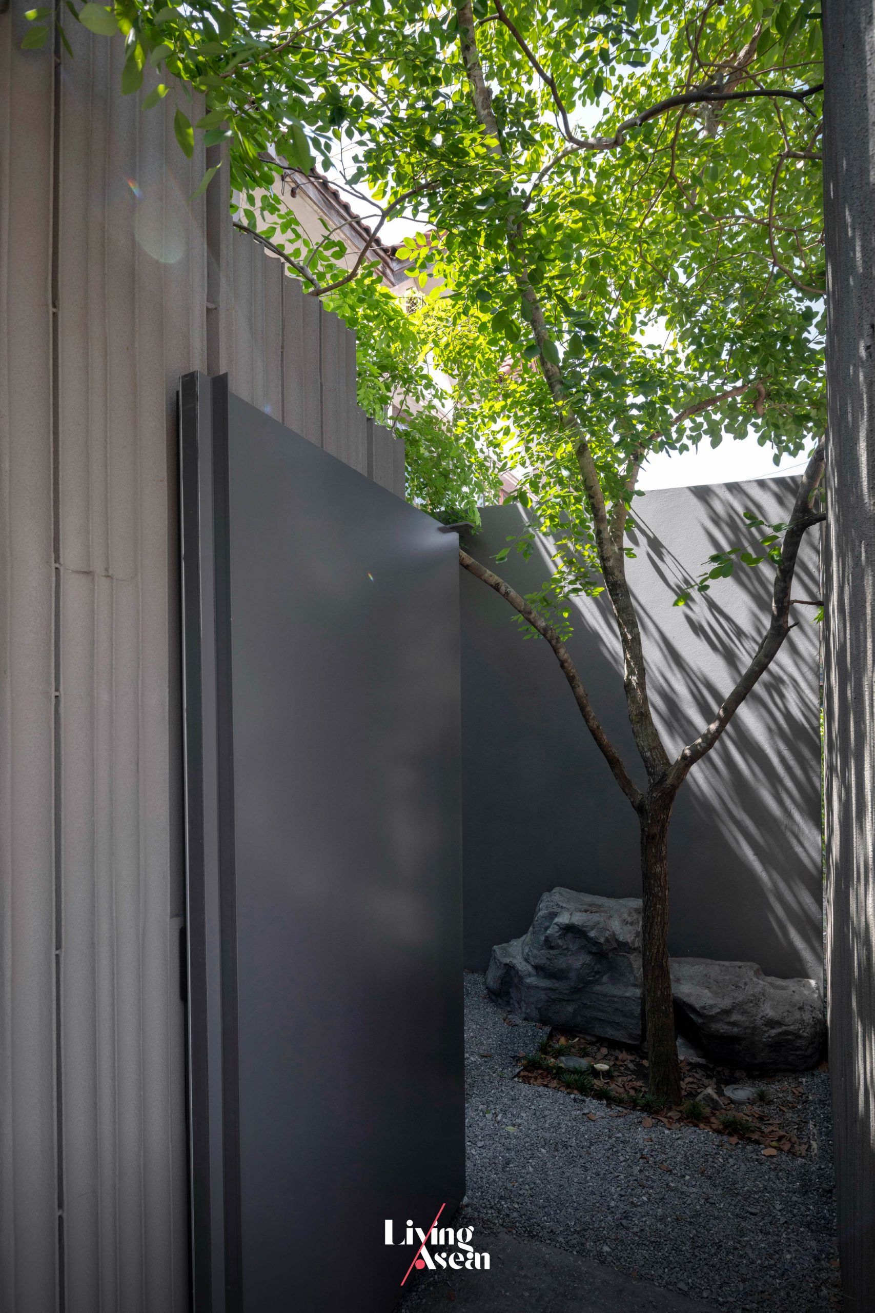
“Can it turn into an area that brings light and fresh air into the interior? The fence will no longer be a fence wall. It will transform into a space providing transition room for people arriving at the office. It’s like making their way through a garden first, and then gradually arrive at the office. Meanwhile, we had to find ways to bring light into the building as much as possible.”
Research is fundamental
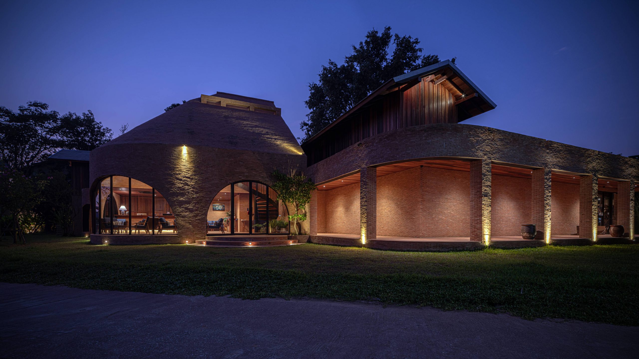
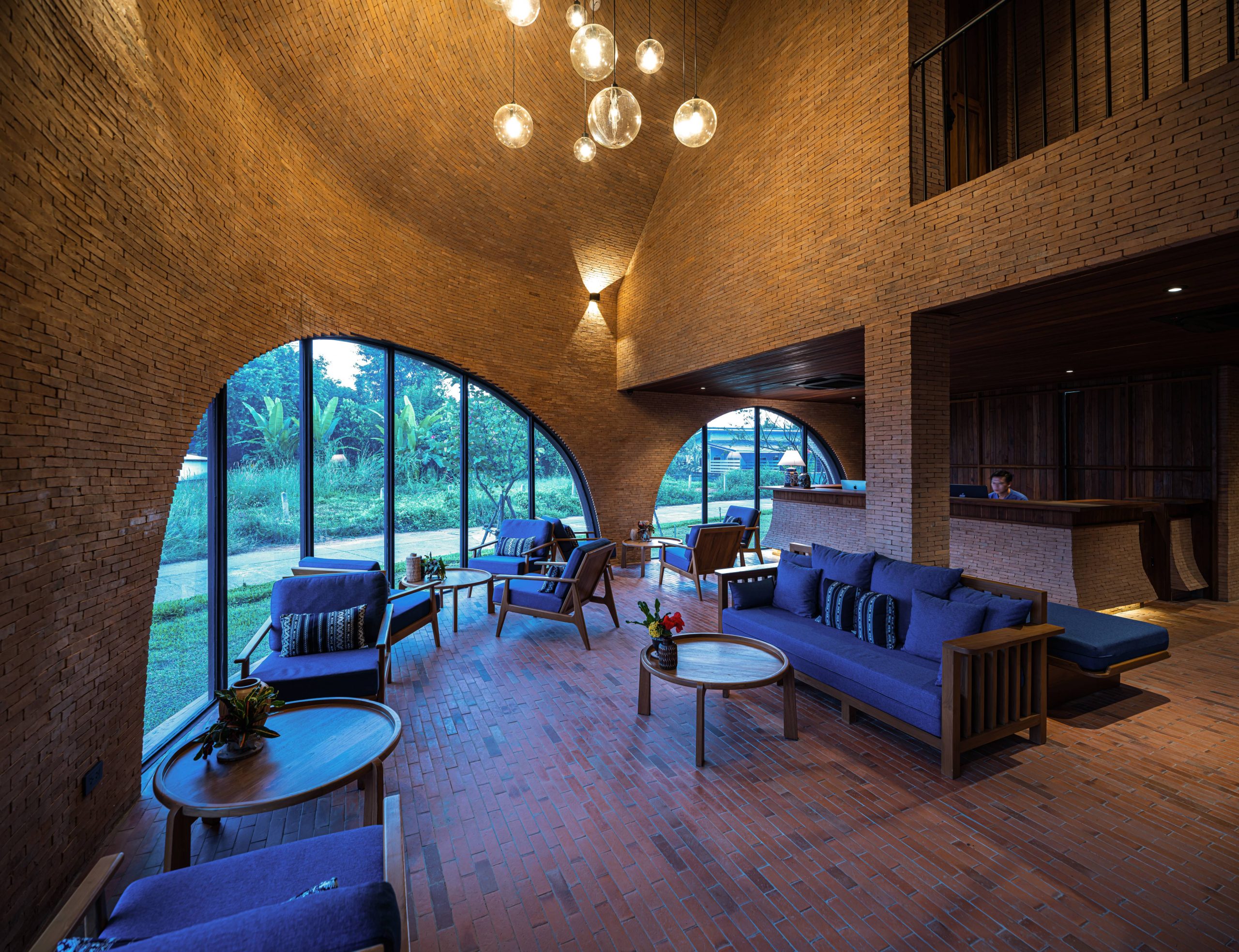
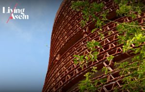
Poh – Kulthida: “As for the research process, we think it’s fundamental, very important to us. Take for example MoMA, the Museum of Modern Aluminum that we did. Initially, the clients came to us saying one sentence. They wanted us to design a building with a wow factor that creates an impact. That was it.
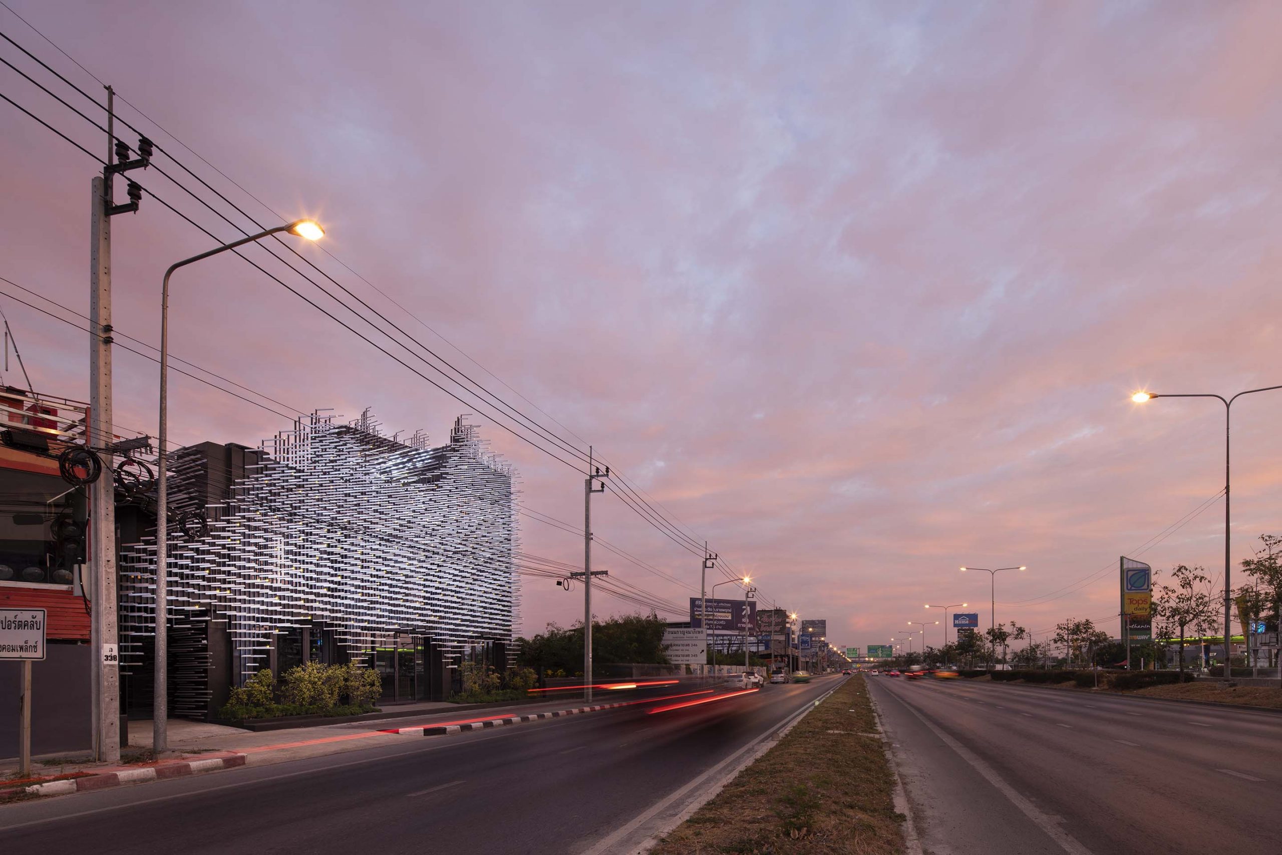
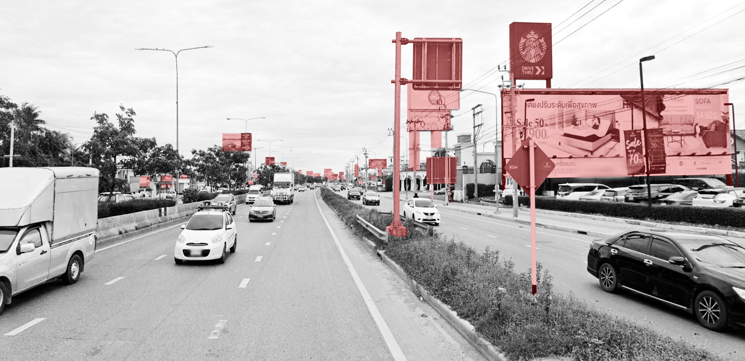
“We looked for the best way to go about it making it stand out from the crowd on Ratchaphruek Road. People driving by won’t take notice of the buildings. Interestingly, there are lots of posters and signboards.
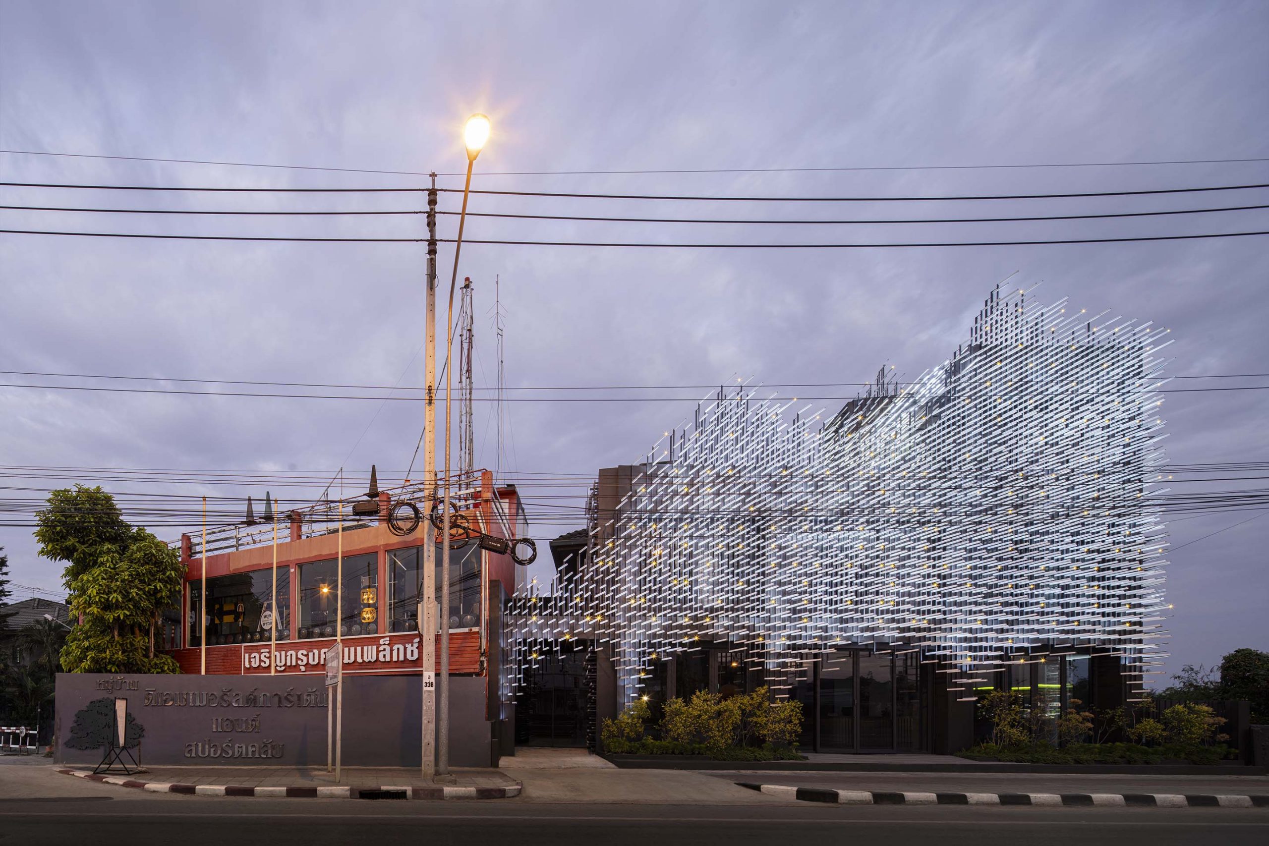
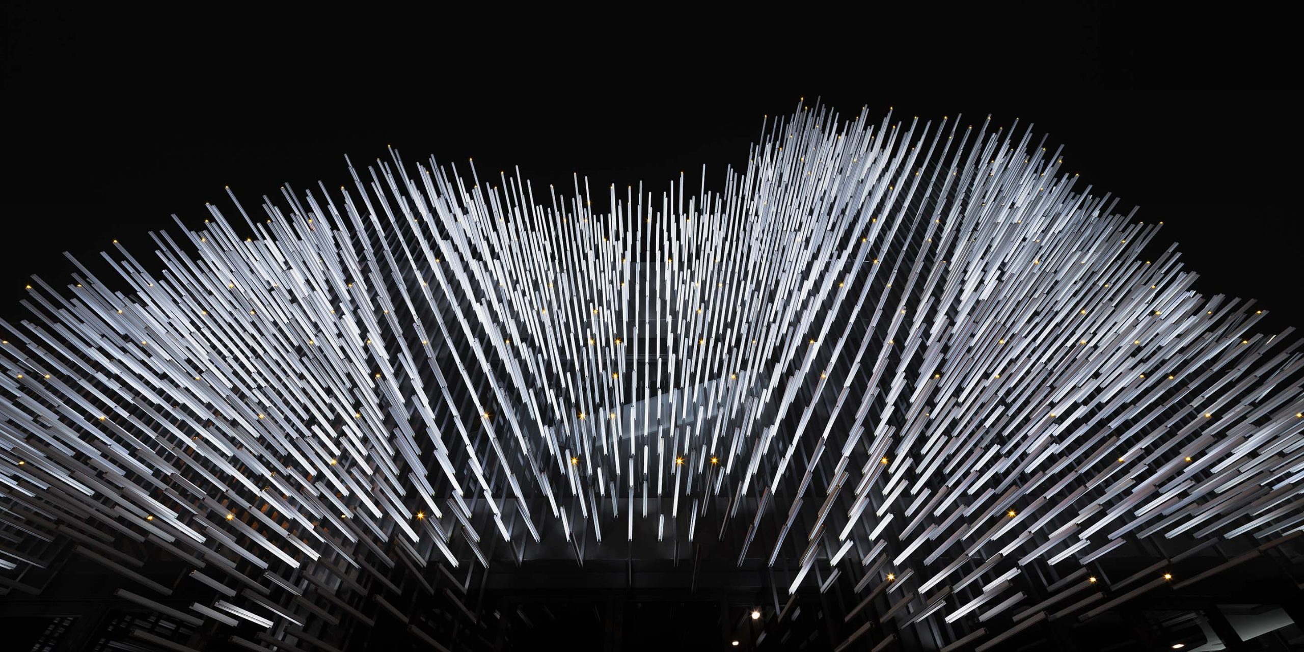
“Meanwhile, the daytime and the nighttime are different types of scenes, which gives us an idea of what to do. We integrated natural features in the surroundings in building design, which resulted in the building façade as you see.
“It makes the building stand out for people driving by. They feel this one is interesting. In the daytime, people will see an image of trees and leaves of grass rustling in the wind. In actual fact, it’s all aluminum. In the nighttime, it’s a light show. We worked with lighting designers to make it look like fireflies flashing on building walls.”
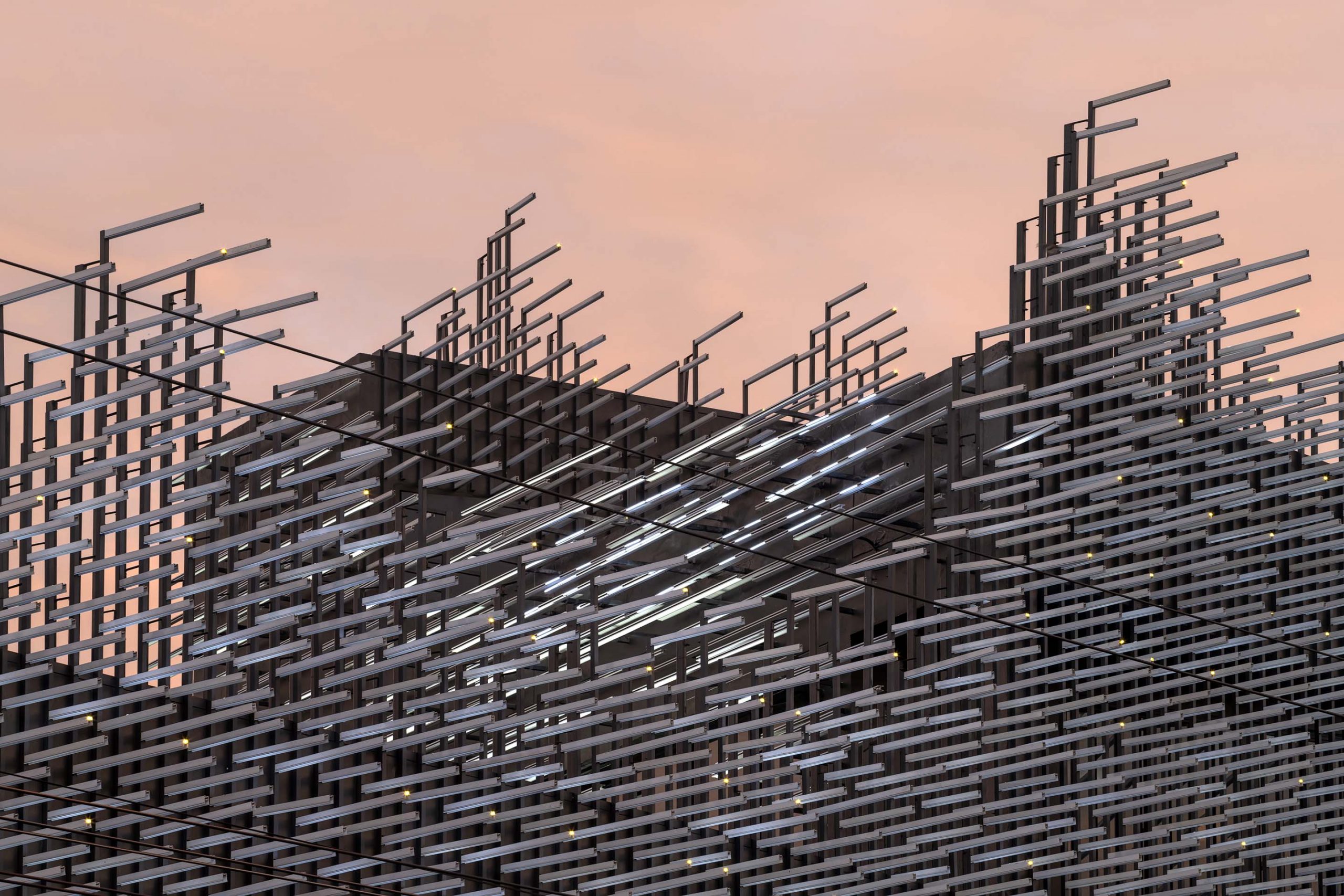
Jerry – Jenchieh Hung: “As for MoMA, the Museum of Modern Aluminum, actually, we want to show a dense urban space that blends into the natural environment. But our method is different. We used industrial building materials to create a result resembling a cave in nature or a forest in nature.
“Actually, it’s the story about the way people live in an urban context, but still keep in touch with nature. This is our main target. Nature and urban areas can coexist. I think our research and design are something that illustrates our imagination about the world. Think about the world we’re living in and our living behavior.
“Our design and research are the key to open up the road ahead. They open the way for our life, and for the world. And it allows for architecture and research to connect with each other.”
Poh – Kulthida: “Actually our work makes us feel like we are marathon runners because as we leave the start point, we don’t know where it will end.
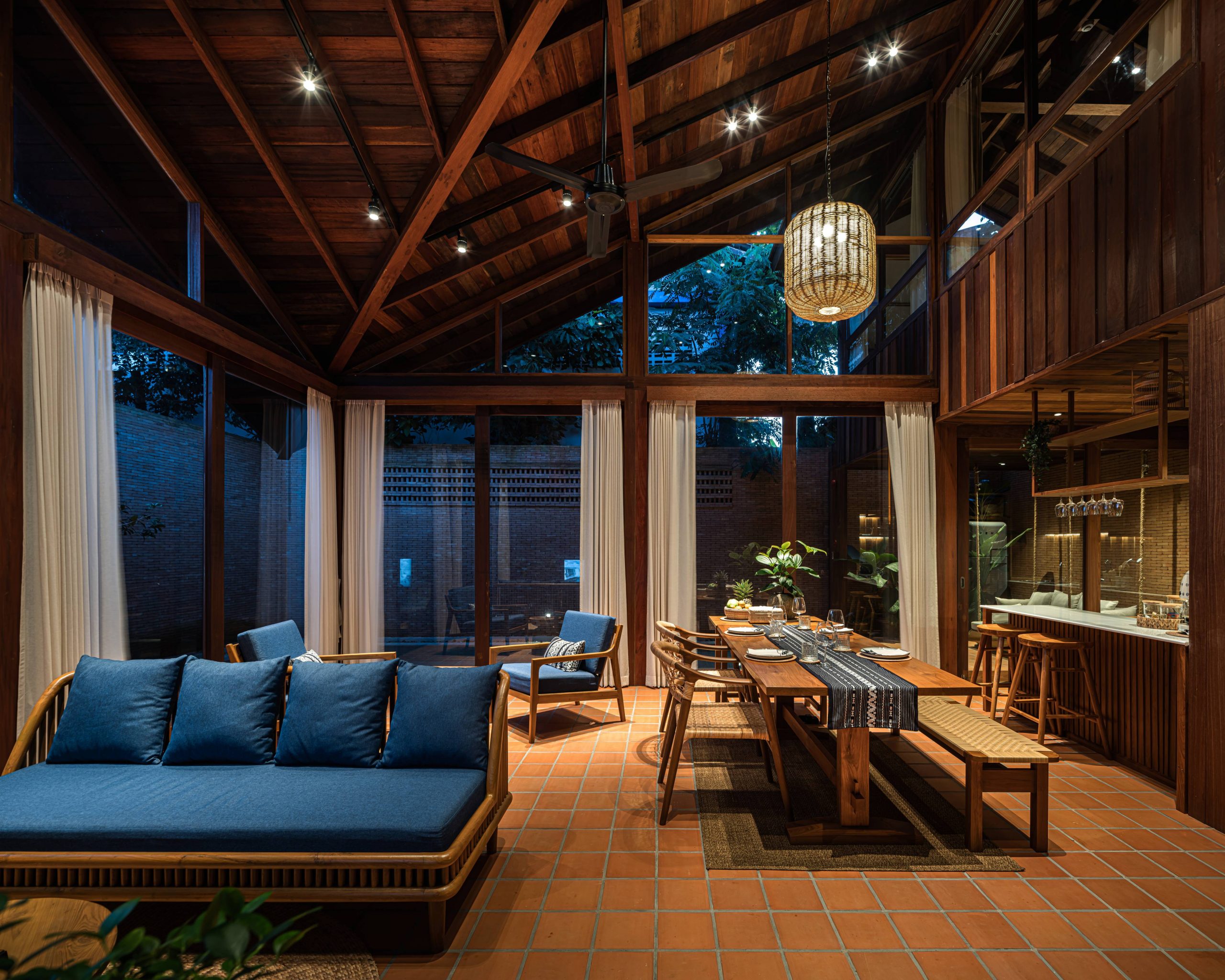
“In many projects, for example the Forest Villa, the clients told us they wanted a home, that’s fit for Modern Chinese Living Styles. In the past, people might think a Chinese style home must have the quality of being Chinese in it. When we knew what they wanted, plus, details of the project site and the homeowner’s vision, it helped to create the kind of home they wanted. It’s a picture that differs from the Chinese style home it used to be.
“Only then did we know we have arrived at the finish line. We started running, not knowing where it would take us. But in the end, the project was accomplished.
“Another example is The Glade Bookstore. After careful consideration, we succeeded in creating something that exceeded their expectations. It’s a bookstore with a cultural space in it. There are art activities on the premises. We succeeded in creating an image of The Glade Bookstore in a style that showcases Chinese architectural heritage in the interior.
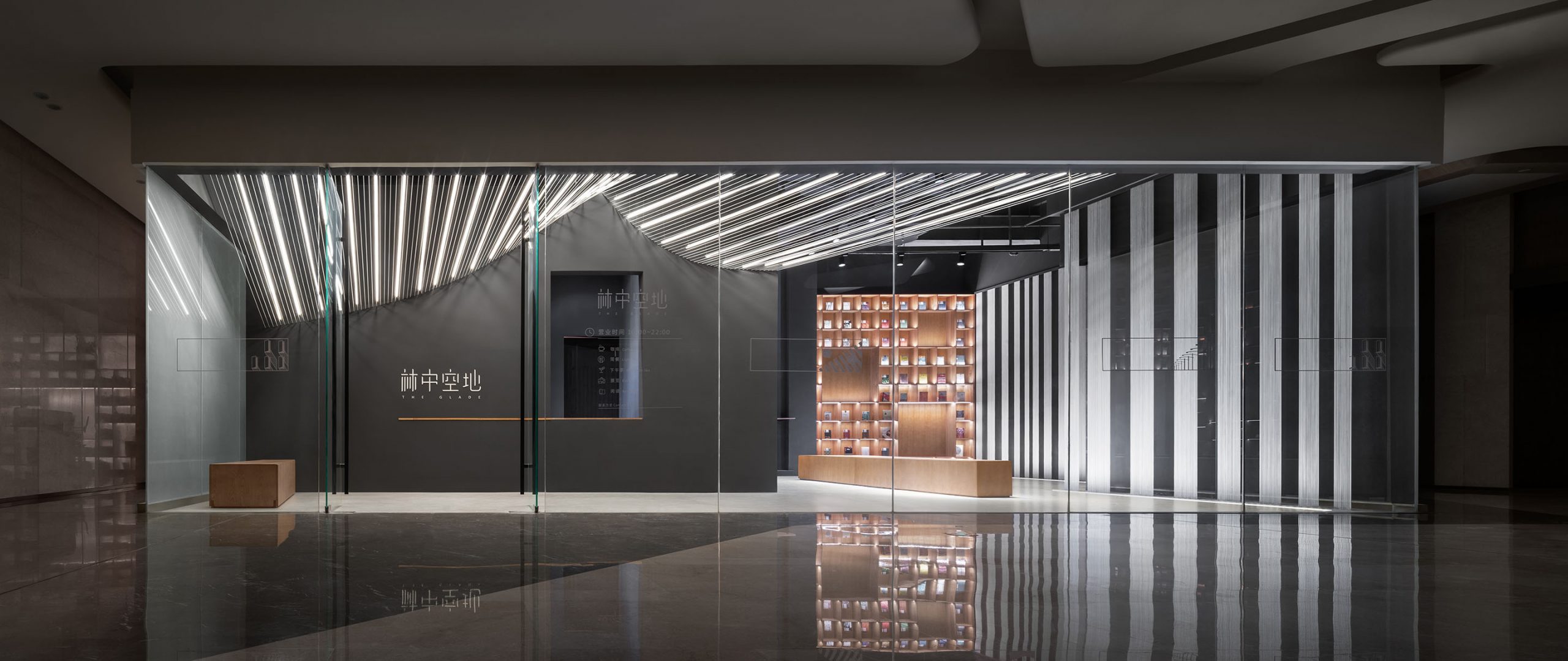
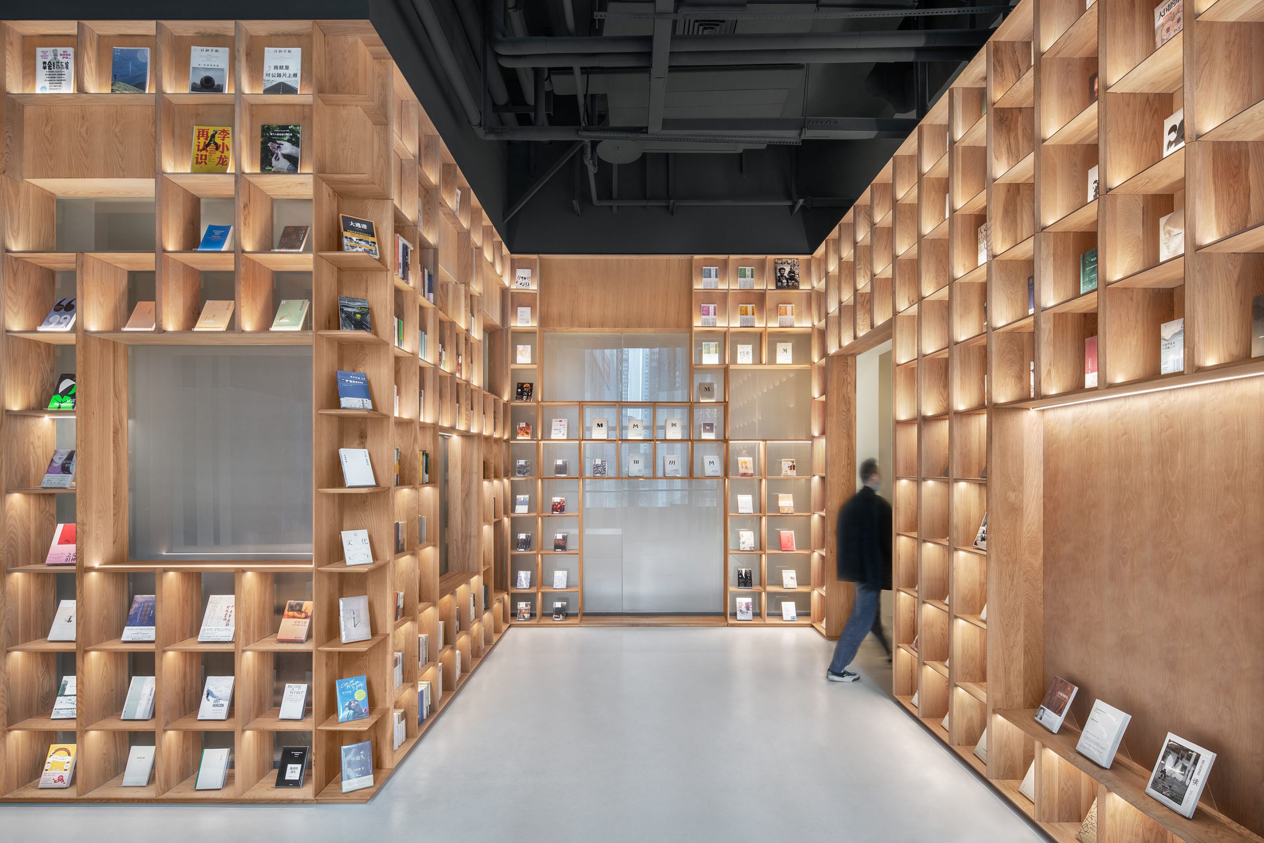
“We used materials that people didn’t expect. That is, for every project that we do, we think that our way of working is capable of producing an outstanding result for the project. And we did. Plus, it adds value to the design that we created in ways that exceed project owner expectations.”
Visit “Studio Visit” Content on Facebook…
You may also like…