Blog : Courtyard

Envelope House: Big Family Makes a Modern Space Feel Cozy

Envelope House: Big Family Makes a Modern Space Feel Cozy

/ Singapore /

/ Story: Phattaraphon / English version: Bob Pitakwong /

/ Photographs: KHOO Guo Jie /

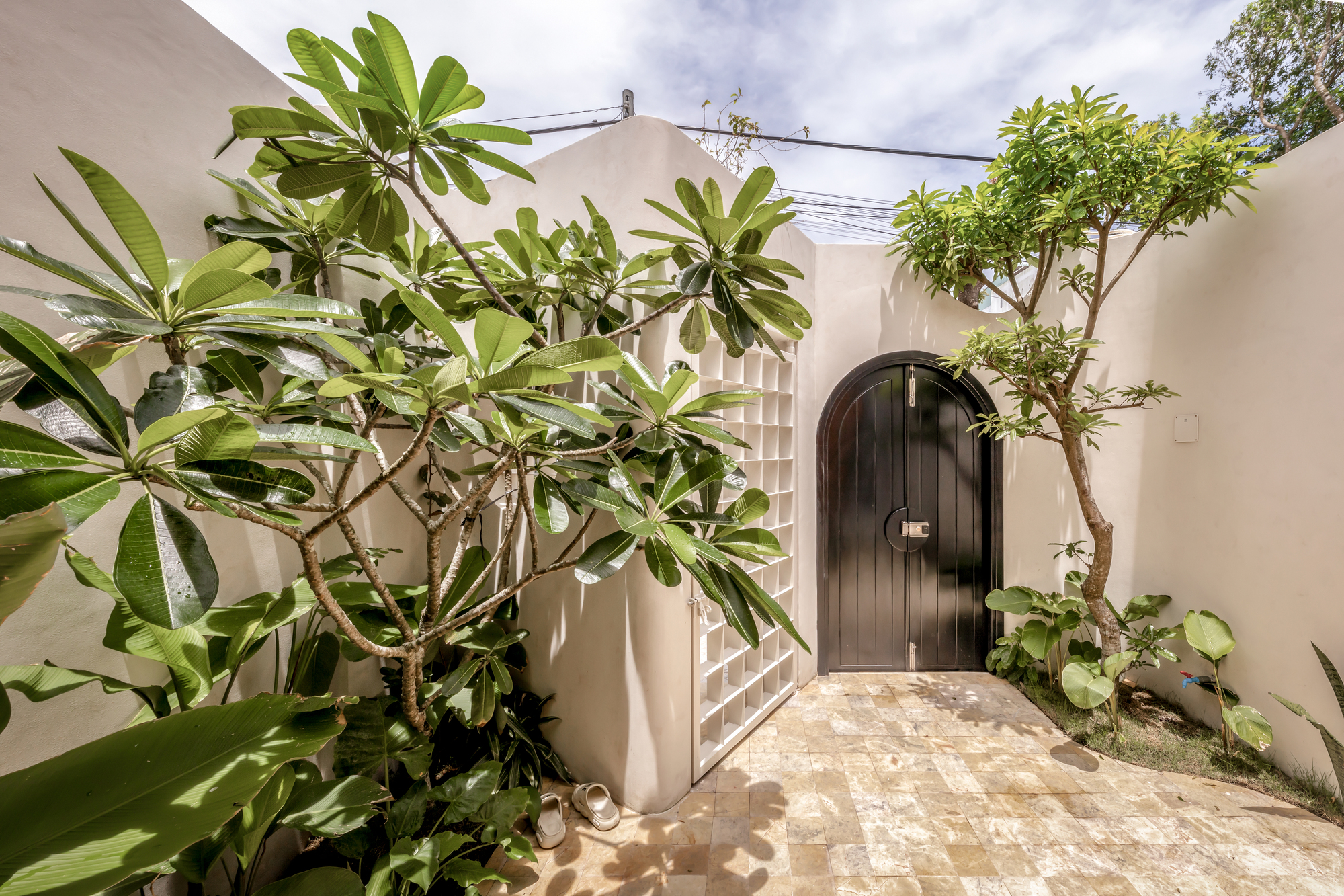
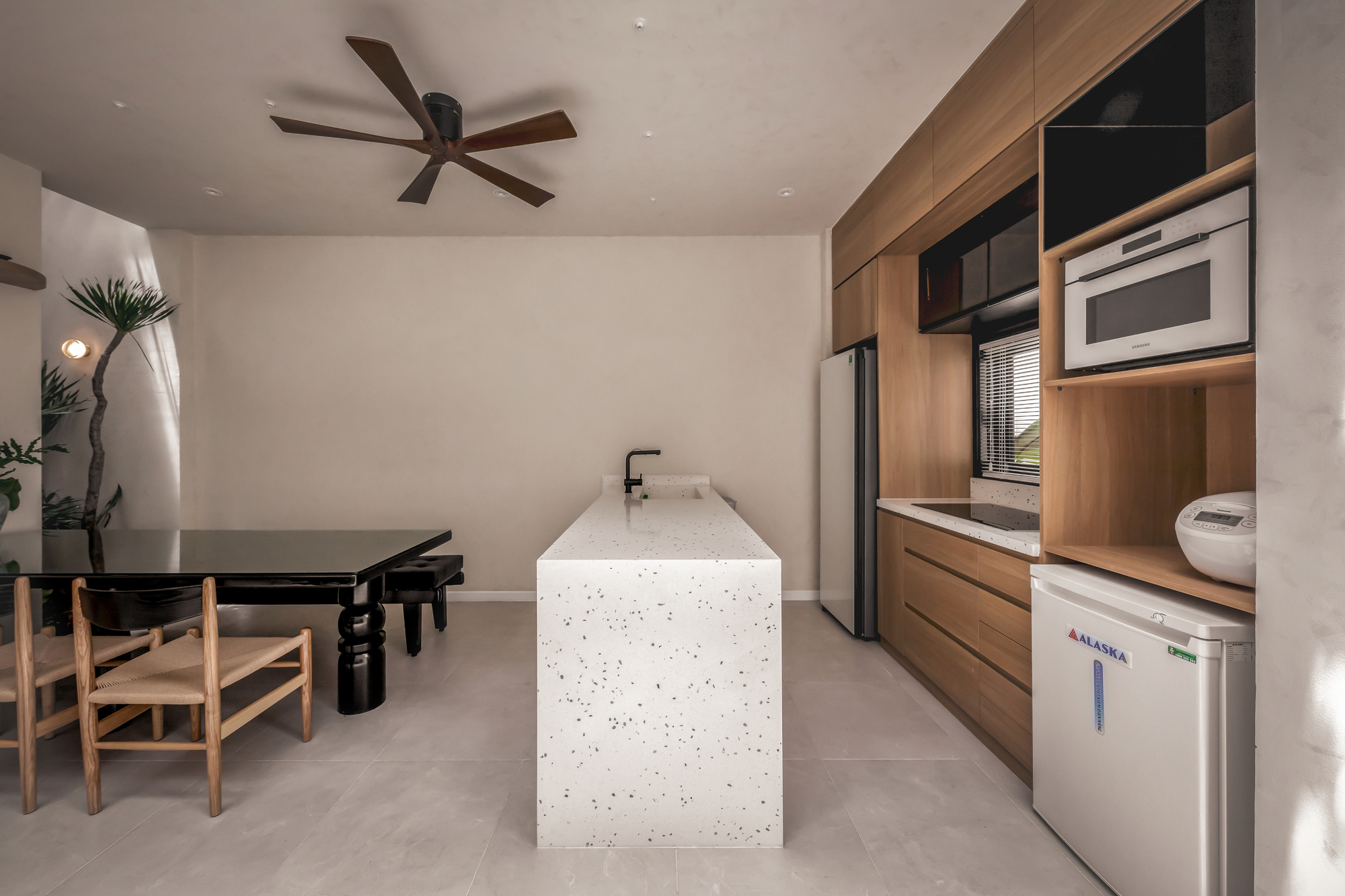
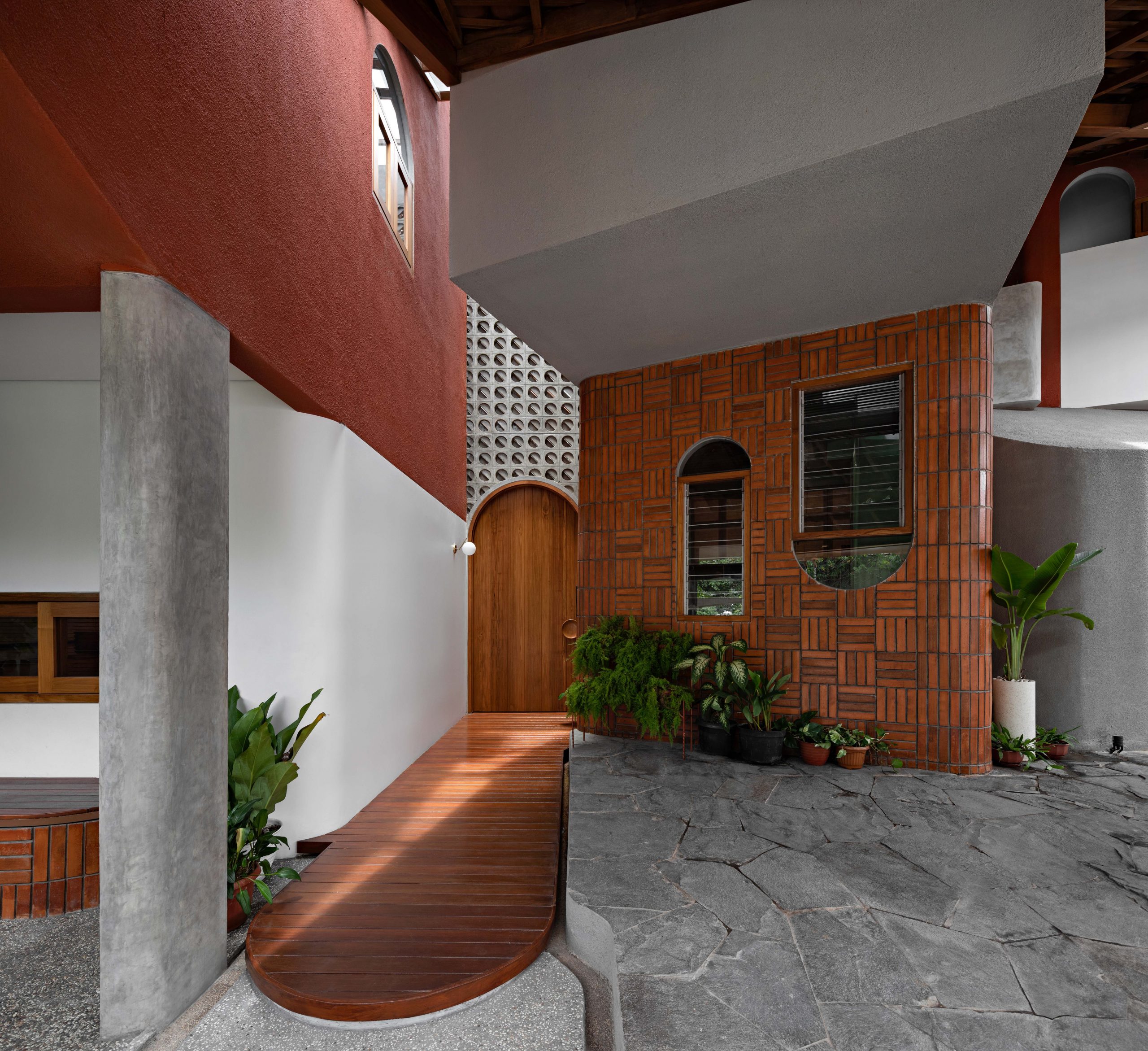
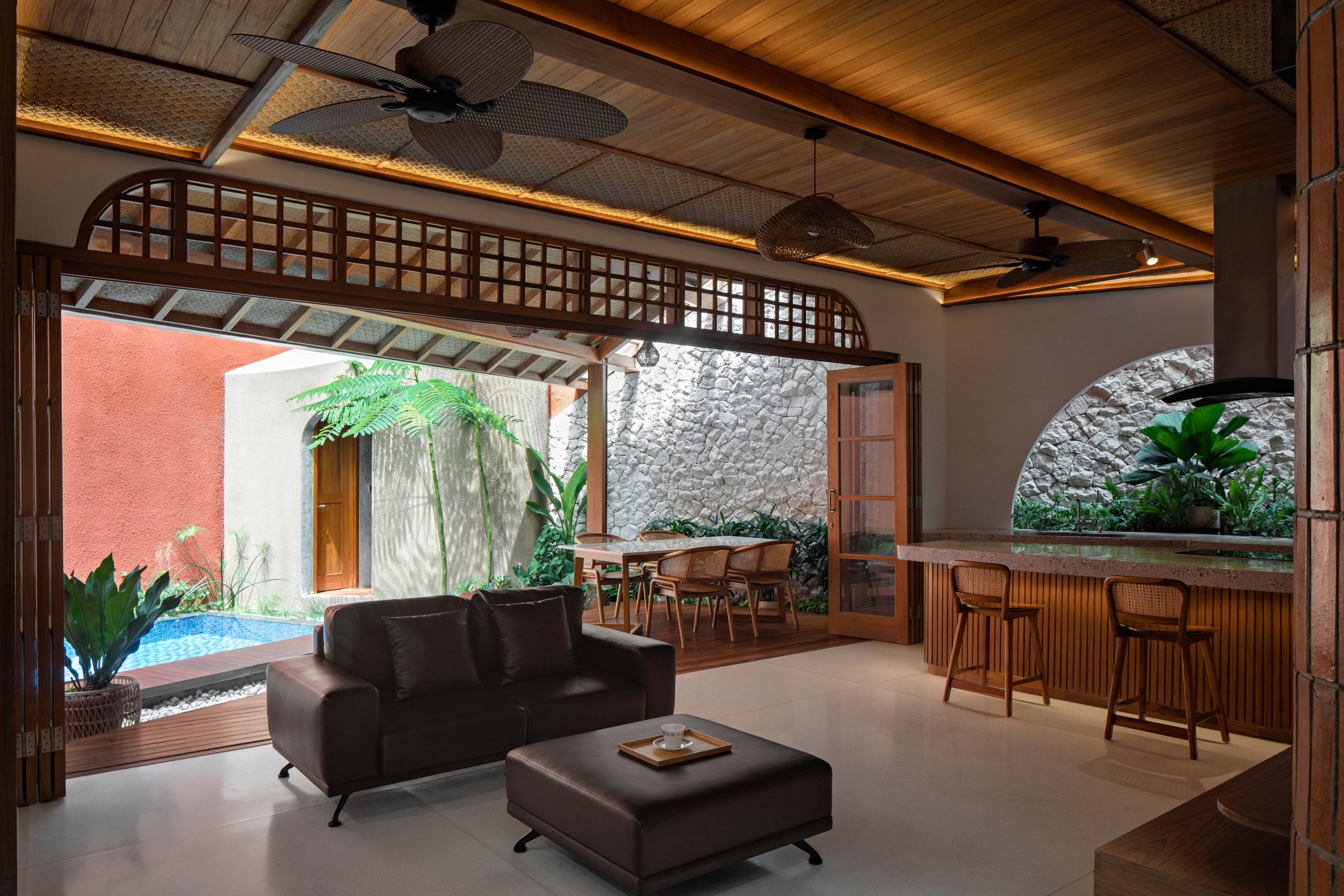
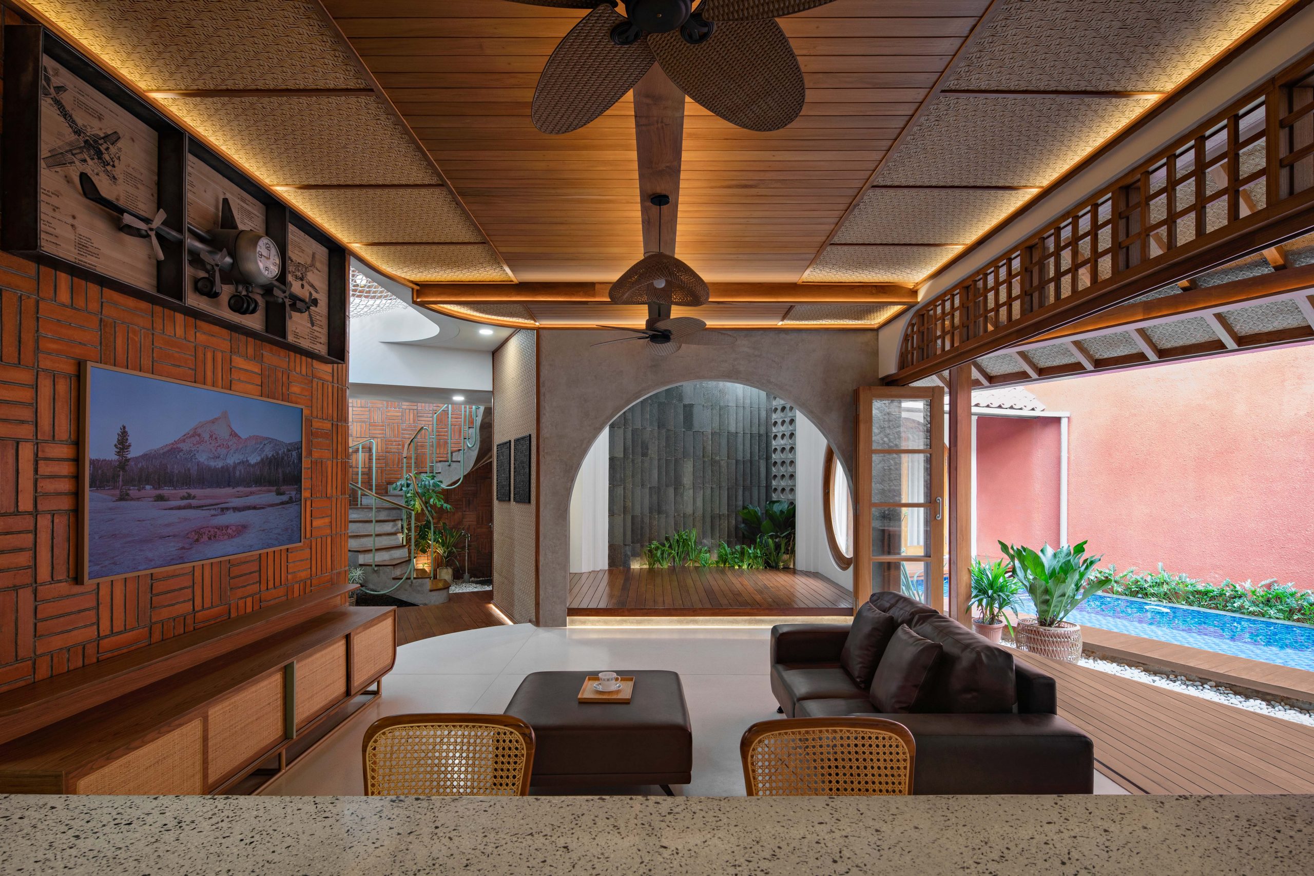
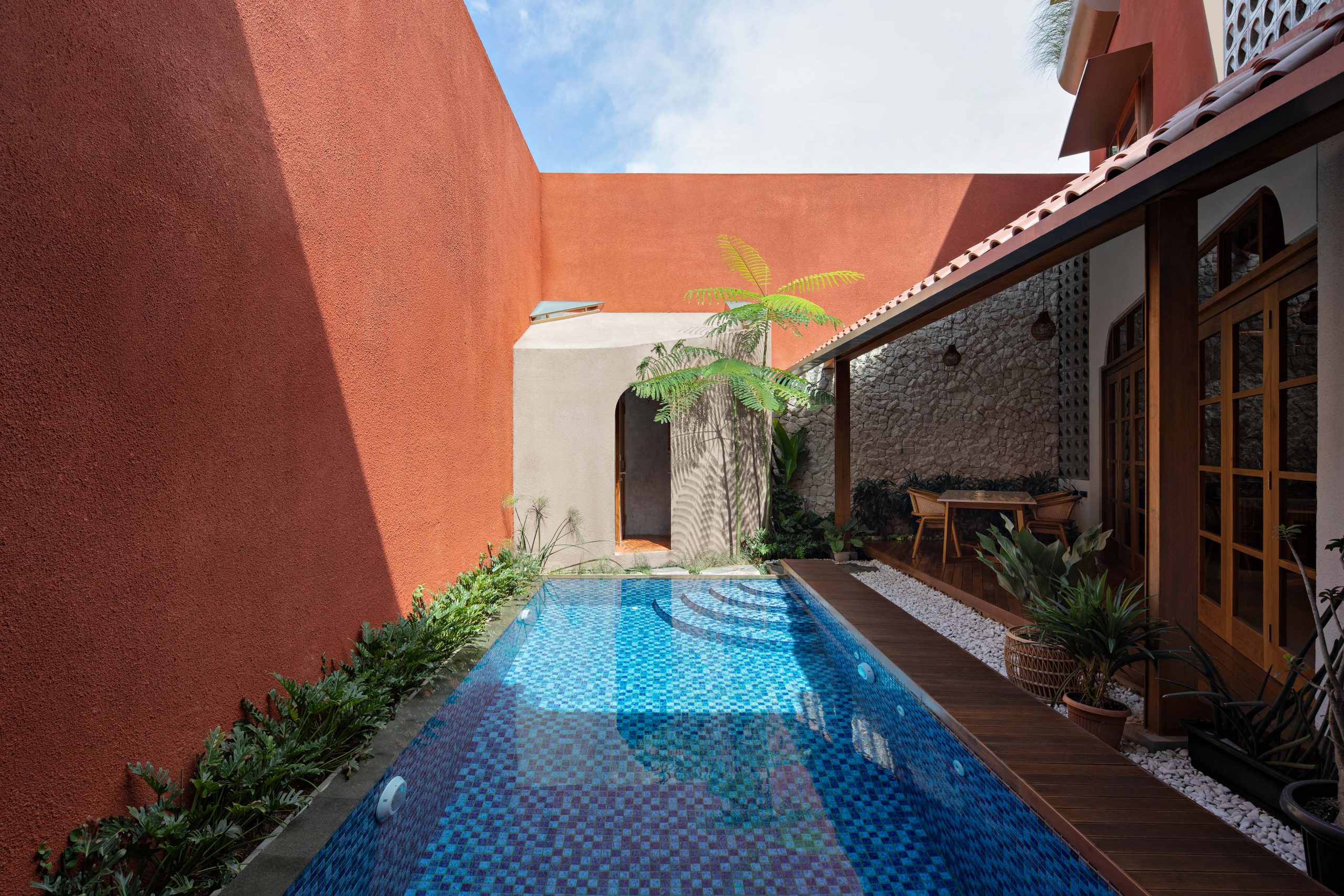
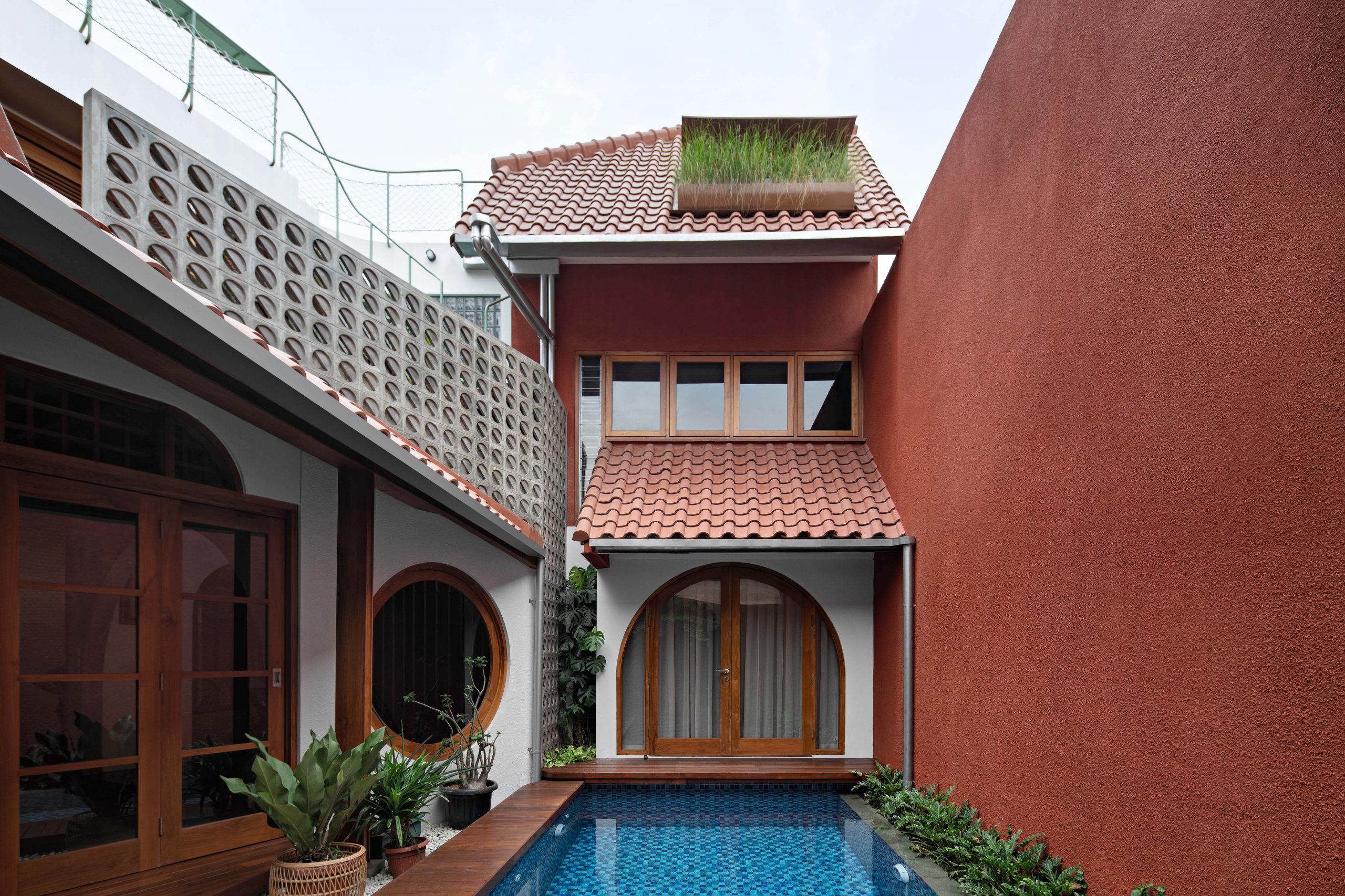
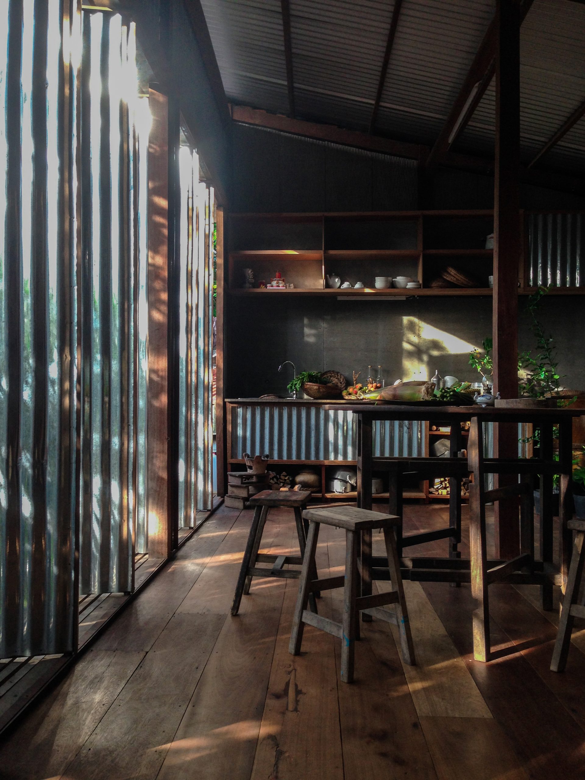
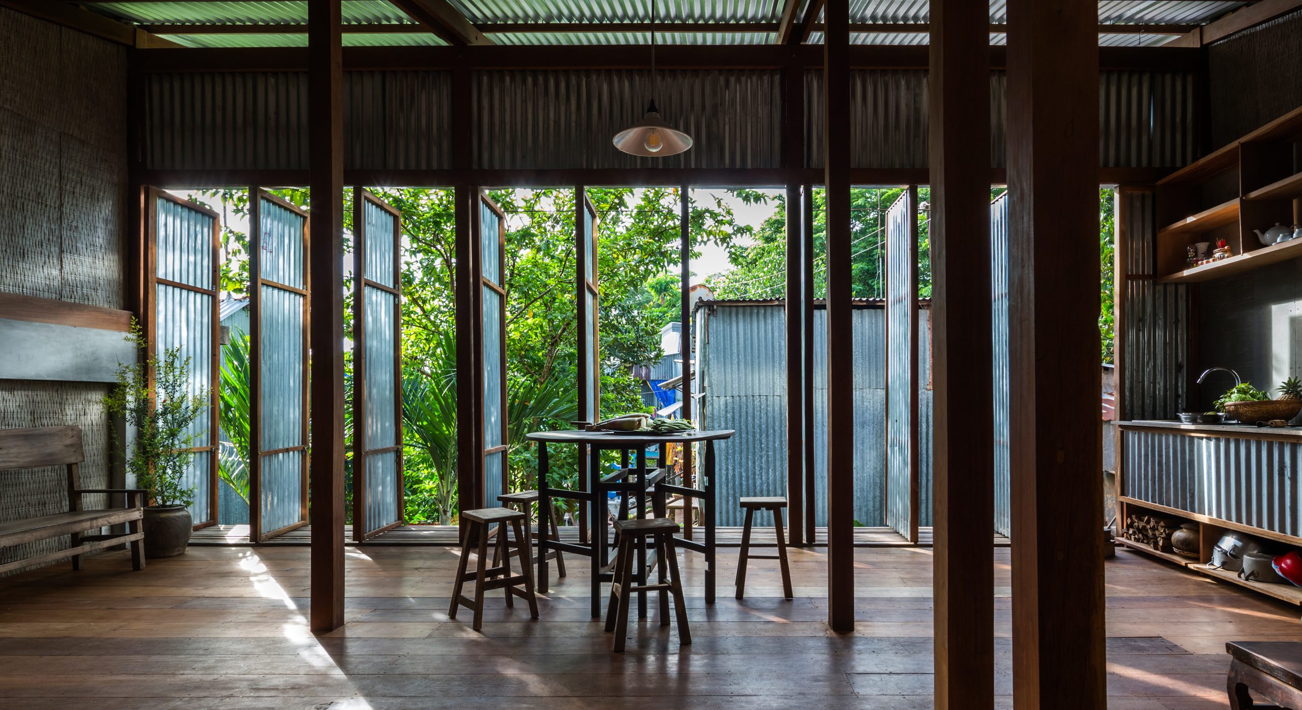
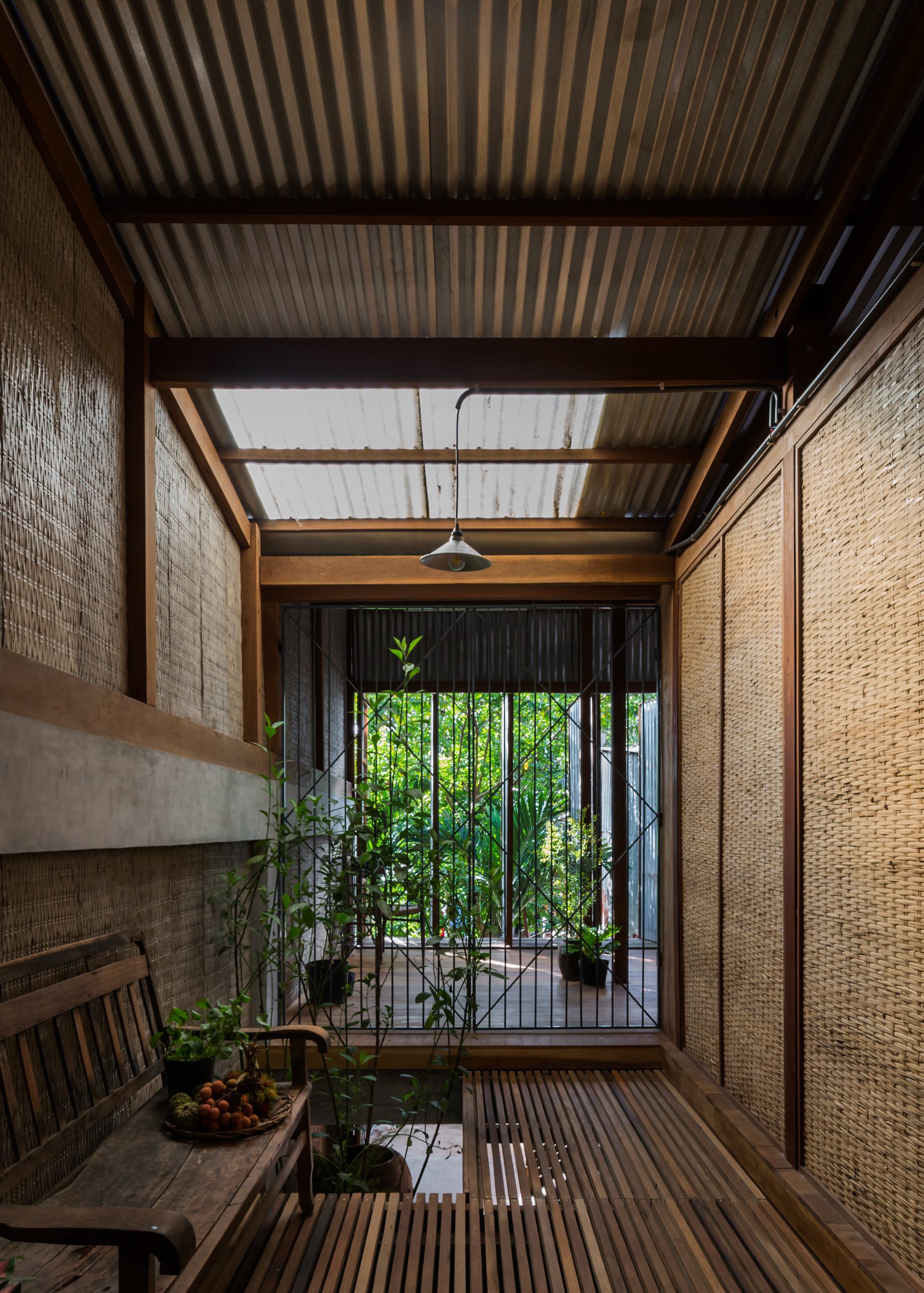
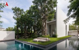
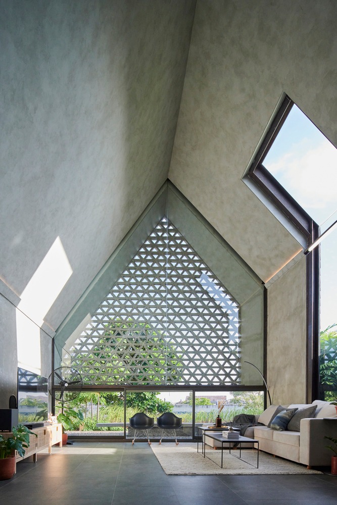
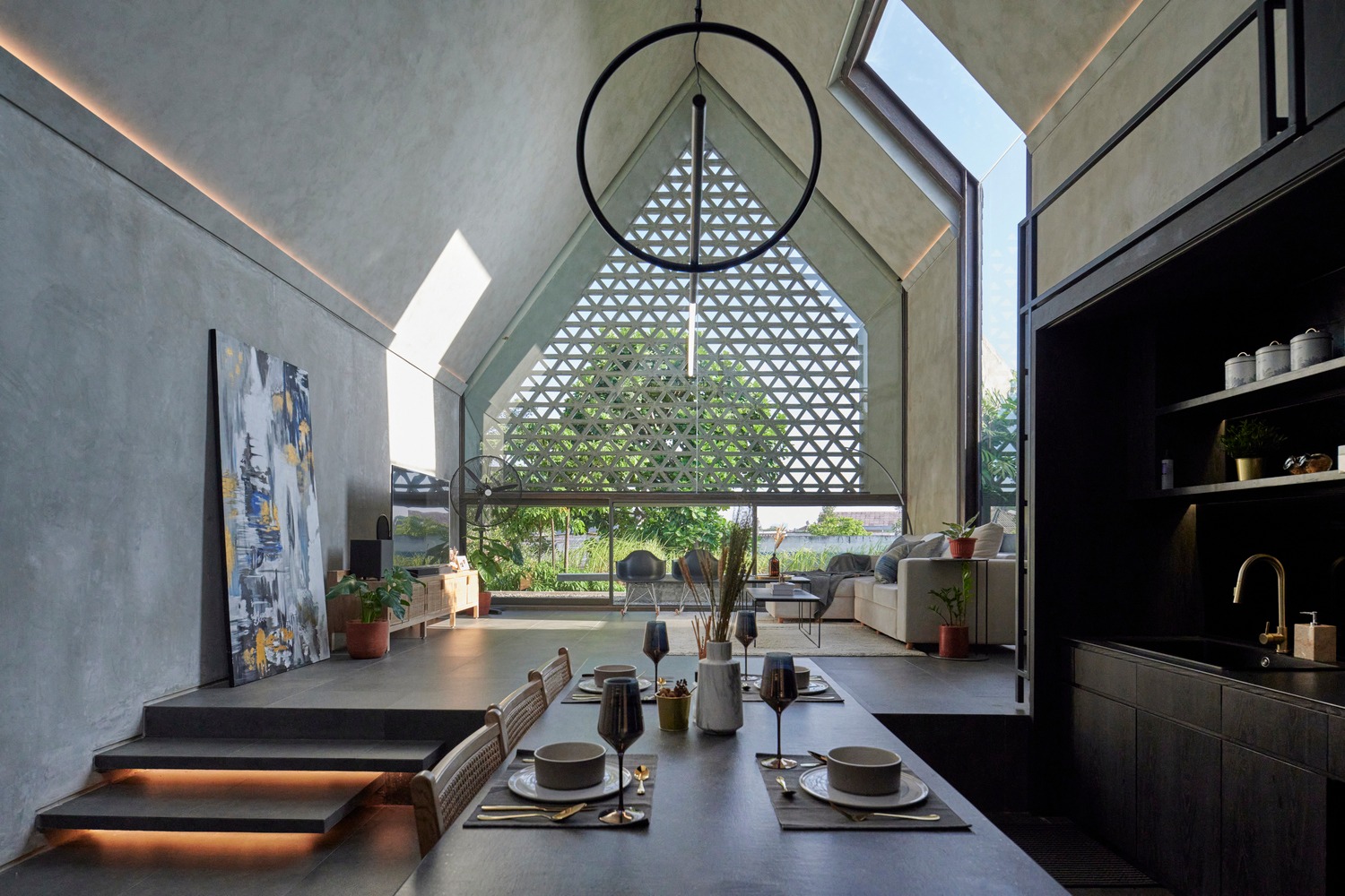
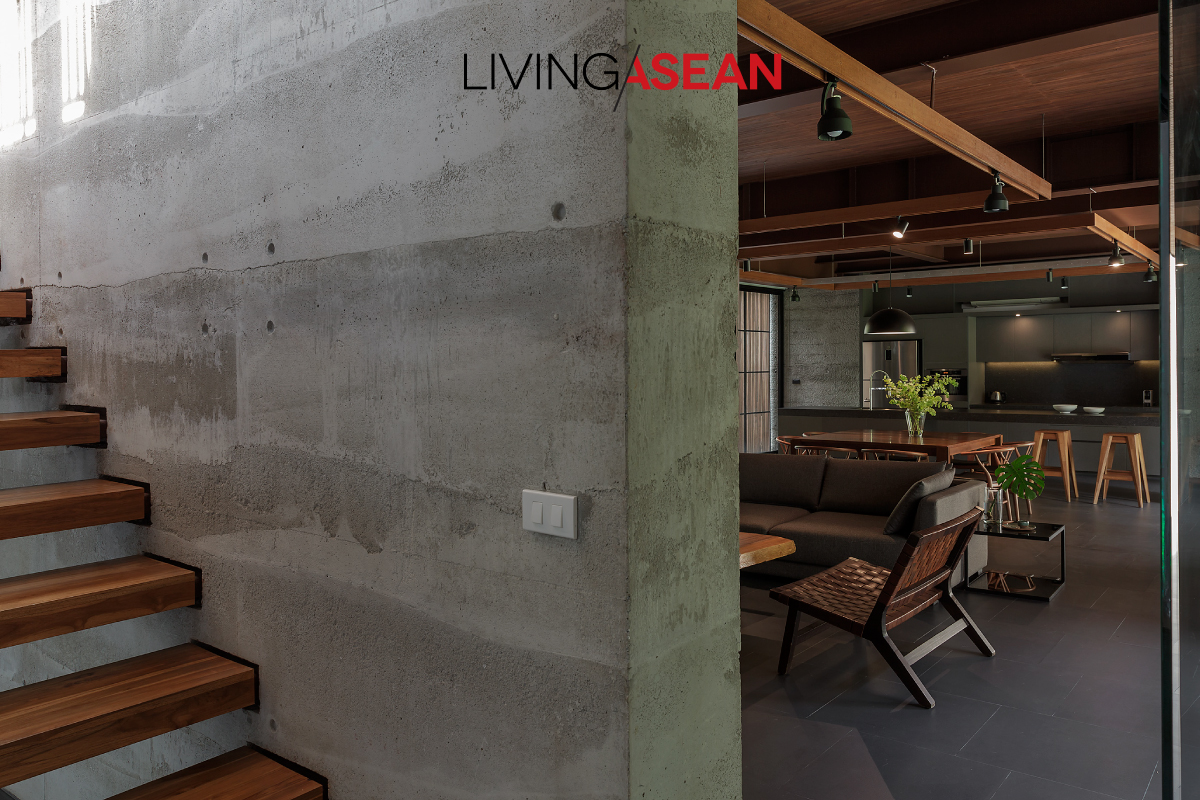
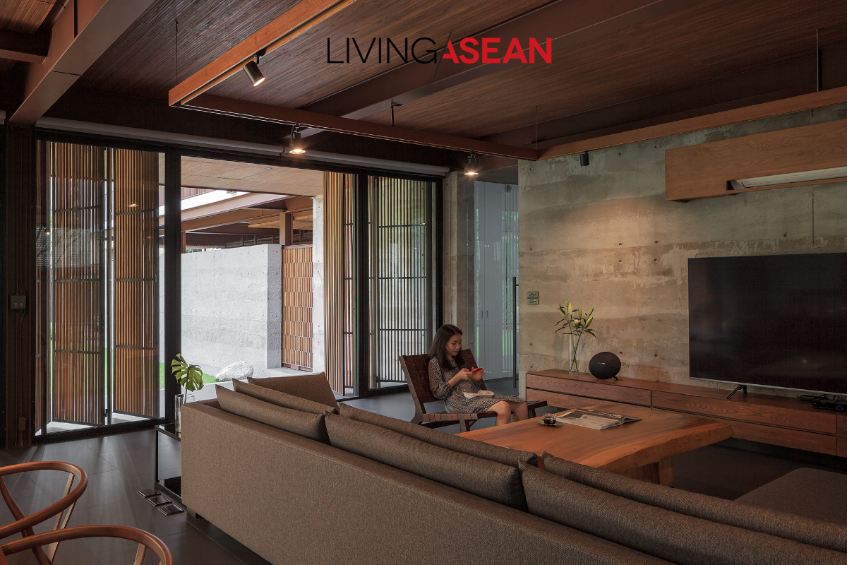
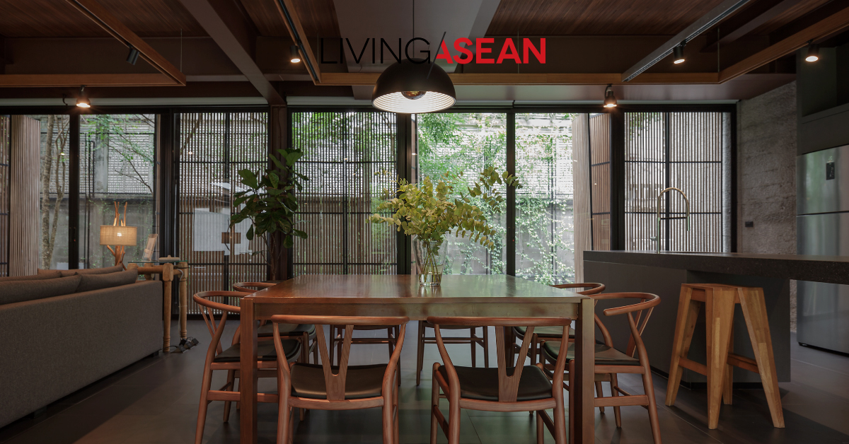
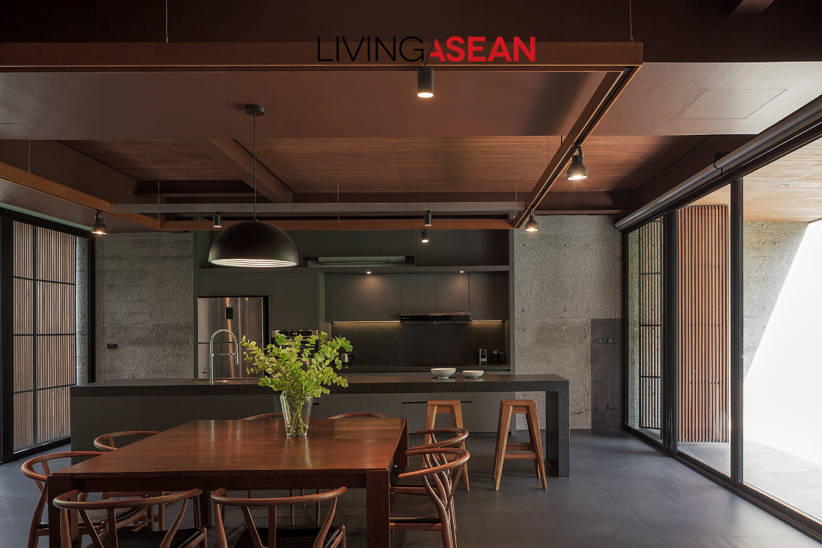
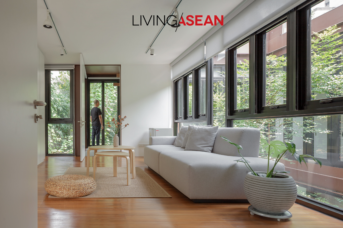
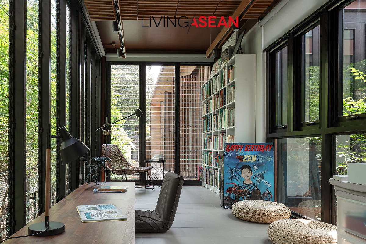
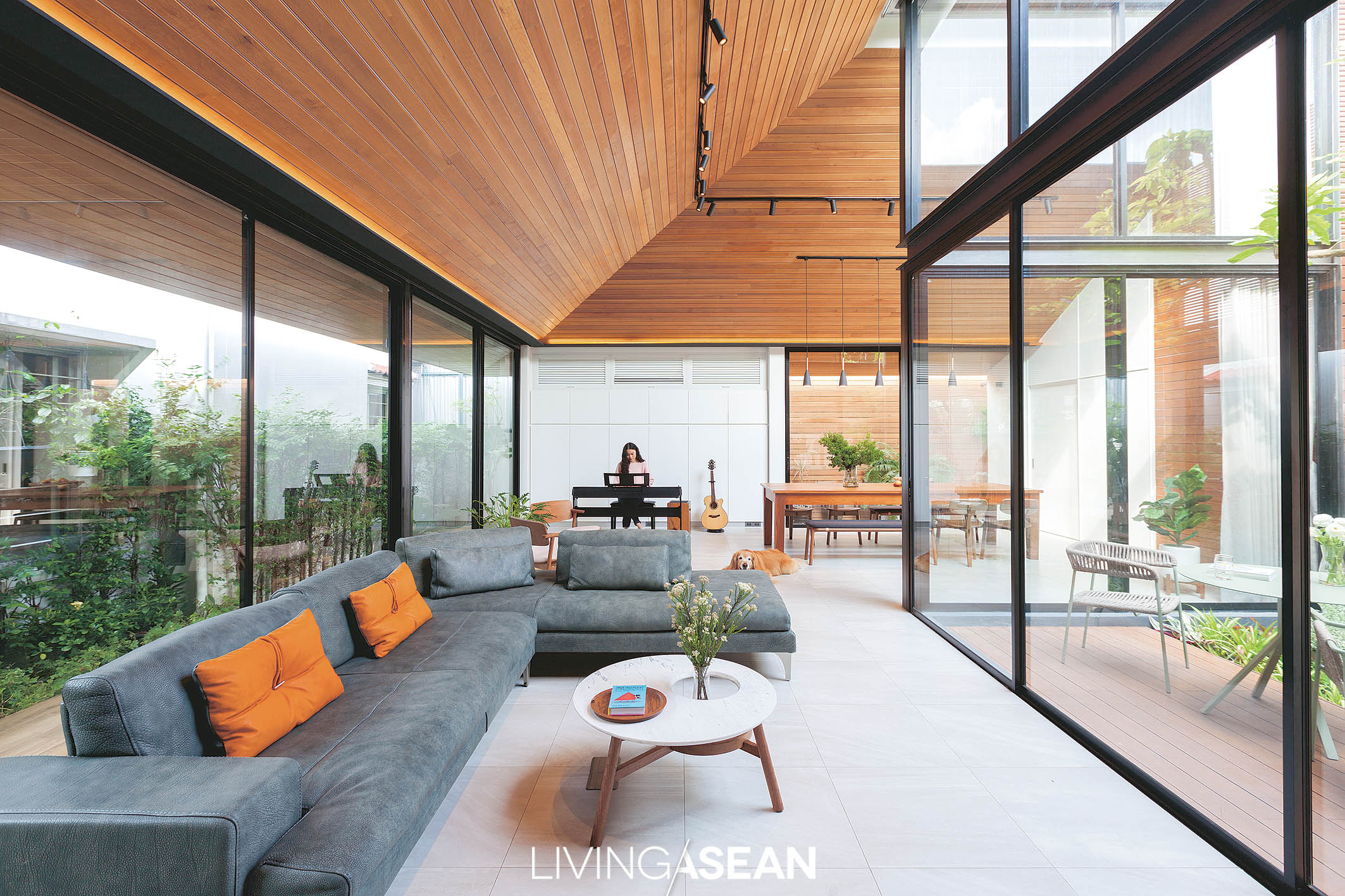
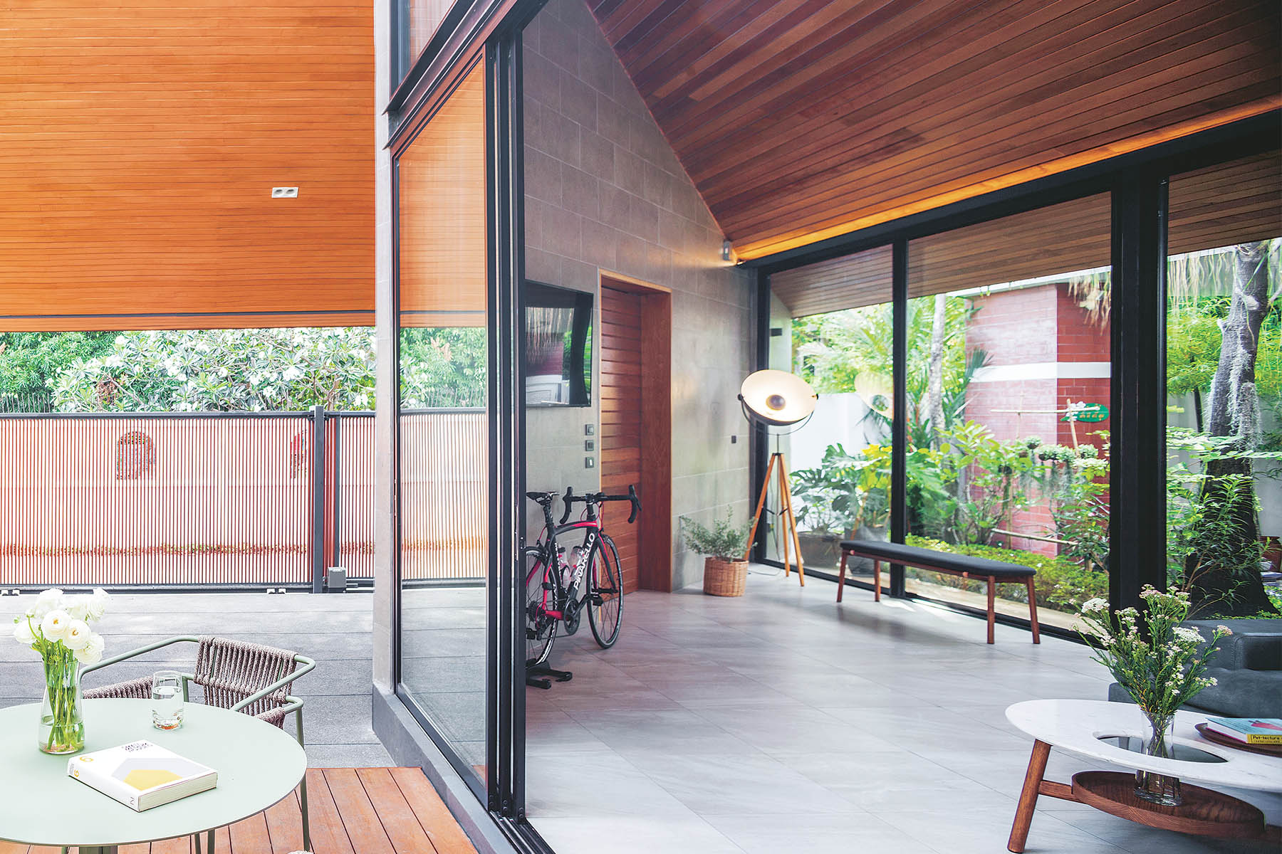
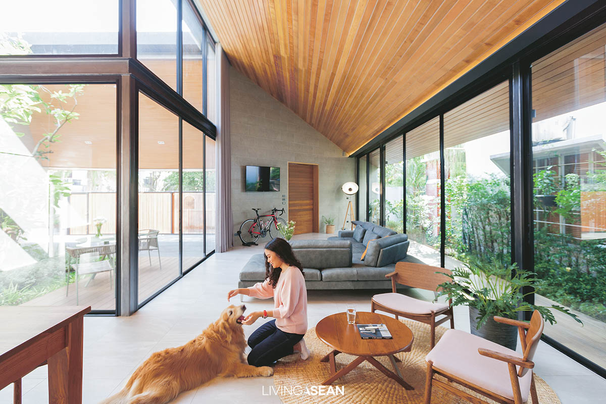
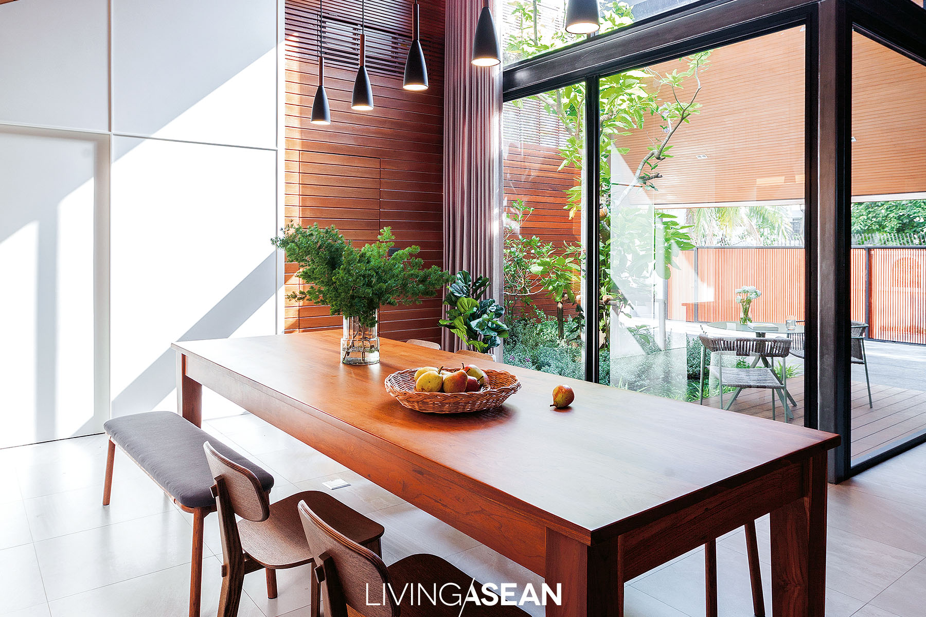
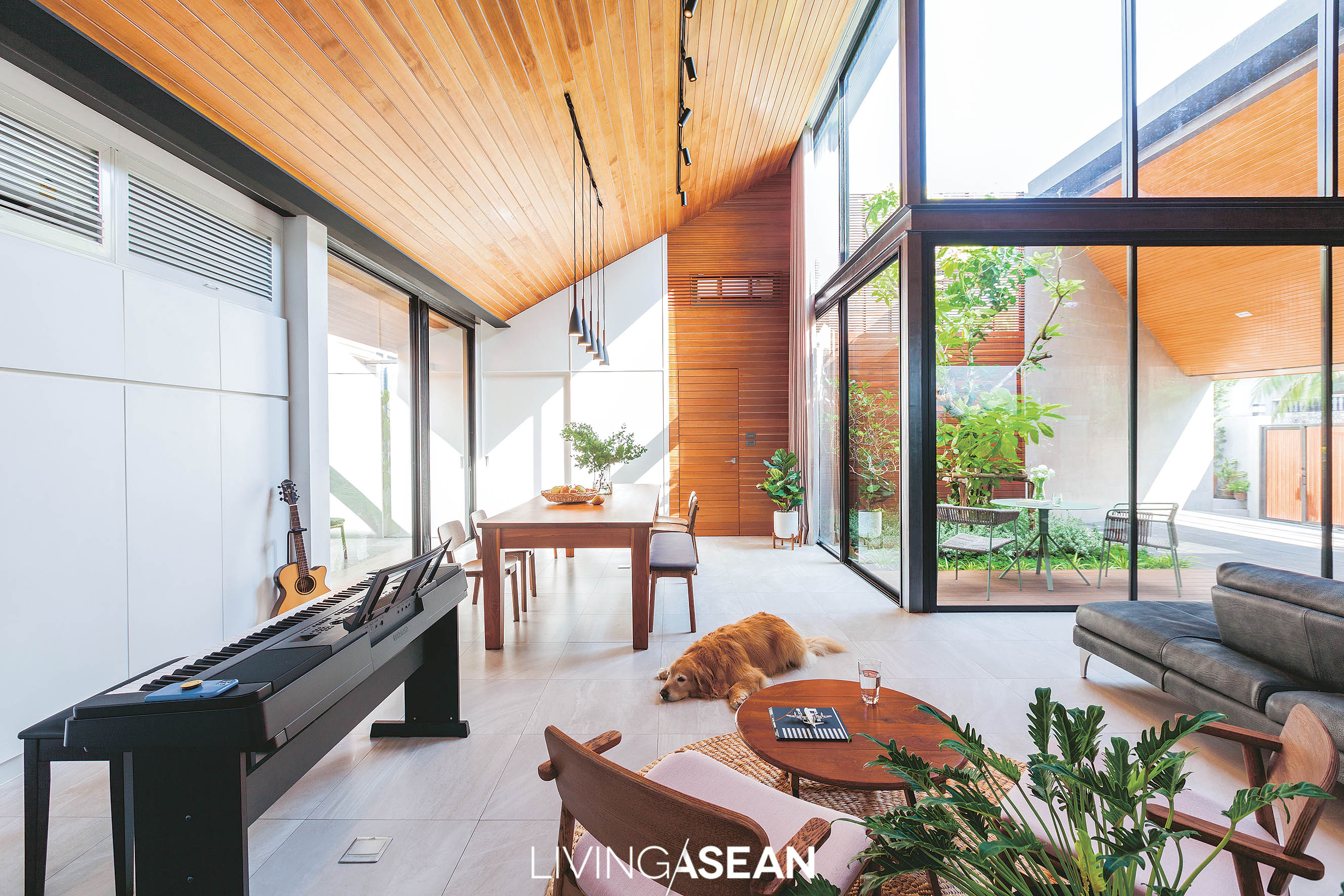
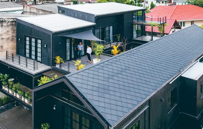
Here’s a home with a Modern space designed for a big family in Singapore. Its generous interior provides great sensory pleasure with fresh air and plenty of room where plants grow luxuriantly. Unique and neatly planned, it redefines the meaning of Tropical design, which in this instance is manifested in an intriguing combination that makes the home feel more comfortable.

Modern space

Because Singapore is an island, every square inch counts and it doesn’t come cheap.

To build a good home, one must ponder the question of what functions and useable spaces it offers, plus all the modern conveniences.

At the same time, it’s nice to bring nature inside to create powerful psychological effects. And from this point of view, this beautiful oasis with in the city is truly a gem.

Modern space

Modern space

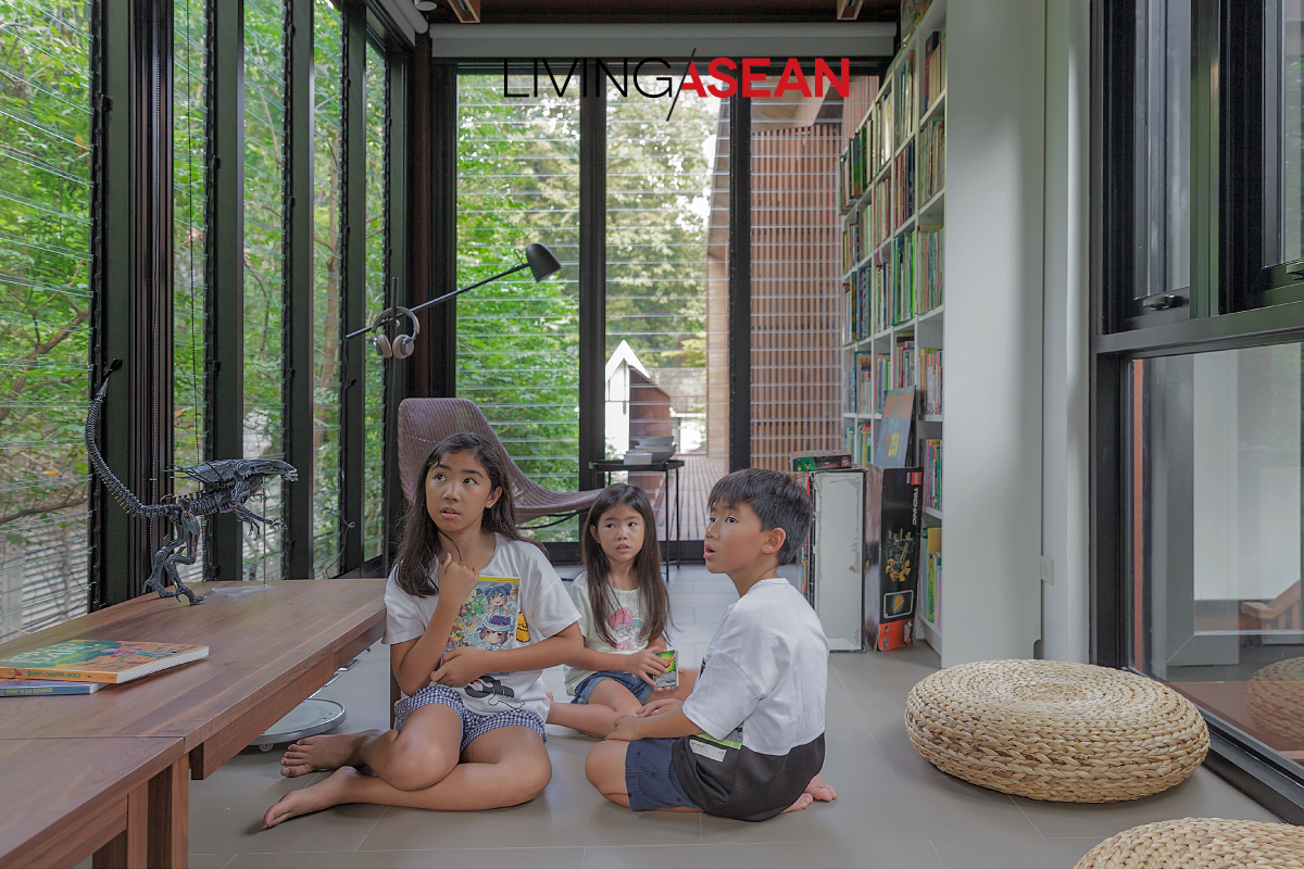
The multigenerational household comprises three families. Naturally, it makes sense to accommodate the needs of every age group without sacrificing the common area that’s available to everyone.

Done right, it allows interactions to take place in the family. To facilitate the socialization processes, greenery space is added to the mix to let house occupants reconnect with nature wherever they may be.

The well-planned common area gives the gift of healing and the human touch that everyone craves coming home at the end of the day.

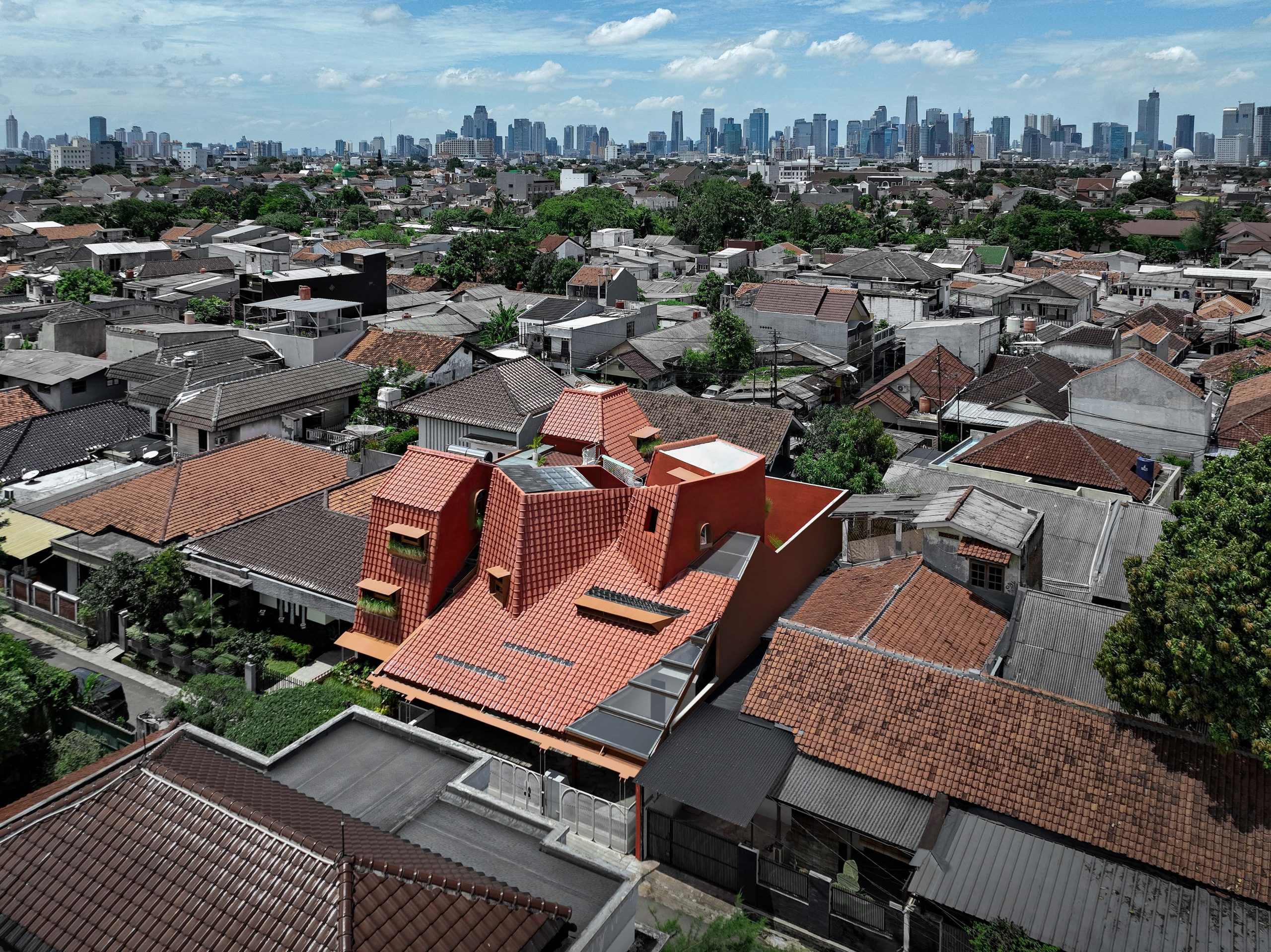
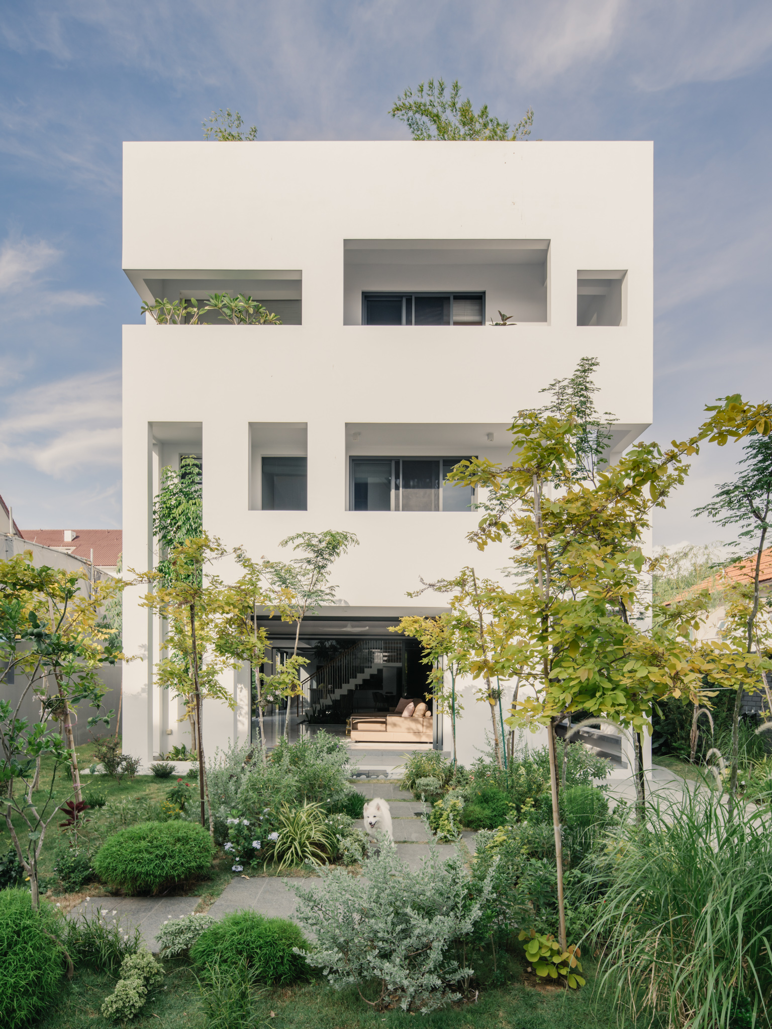
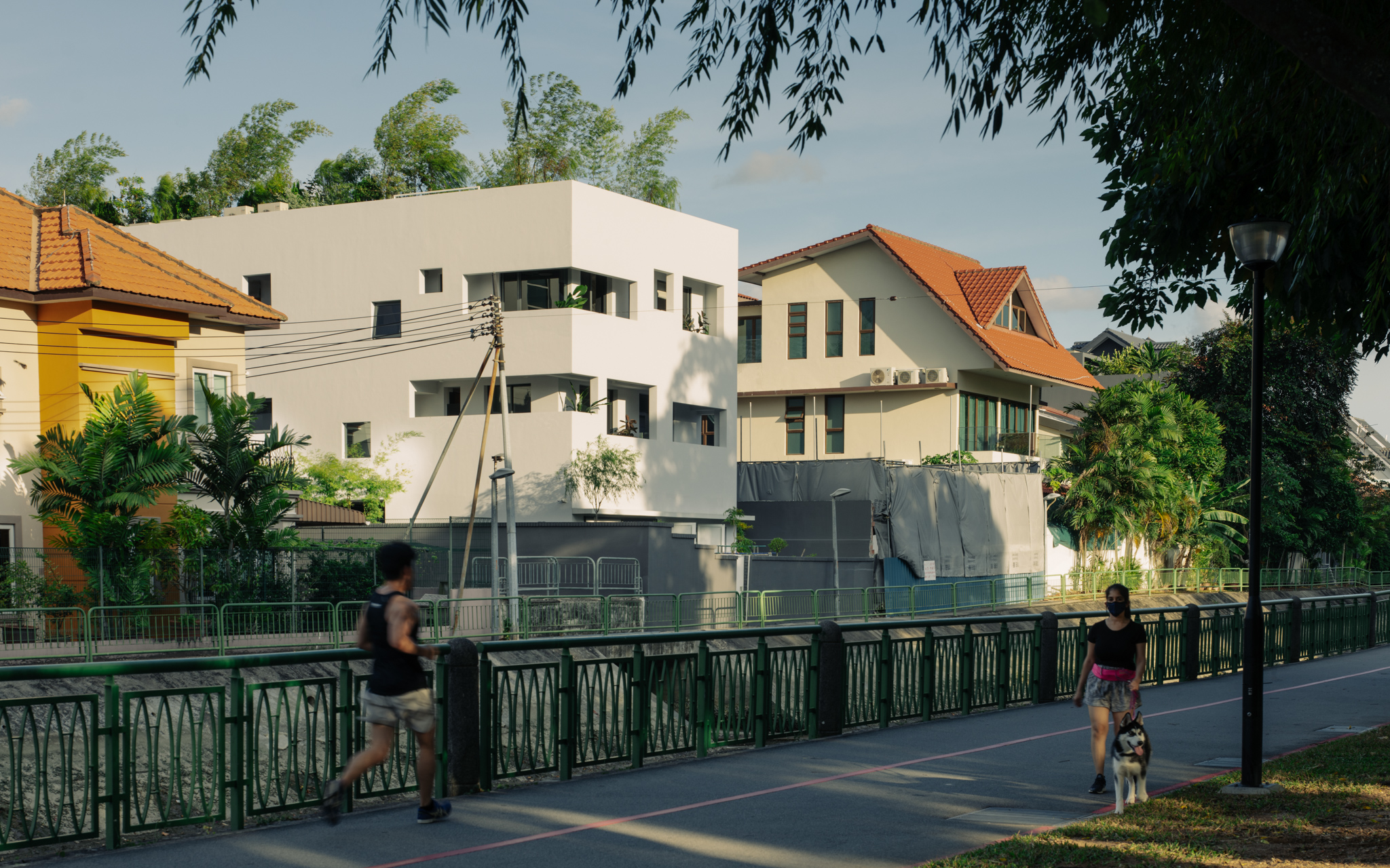
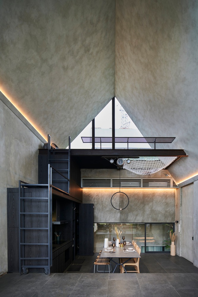
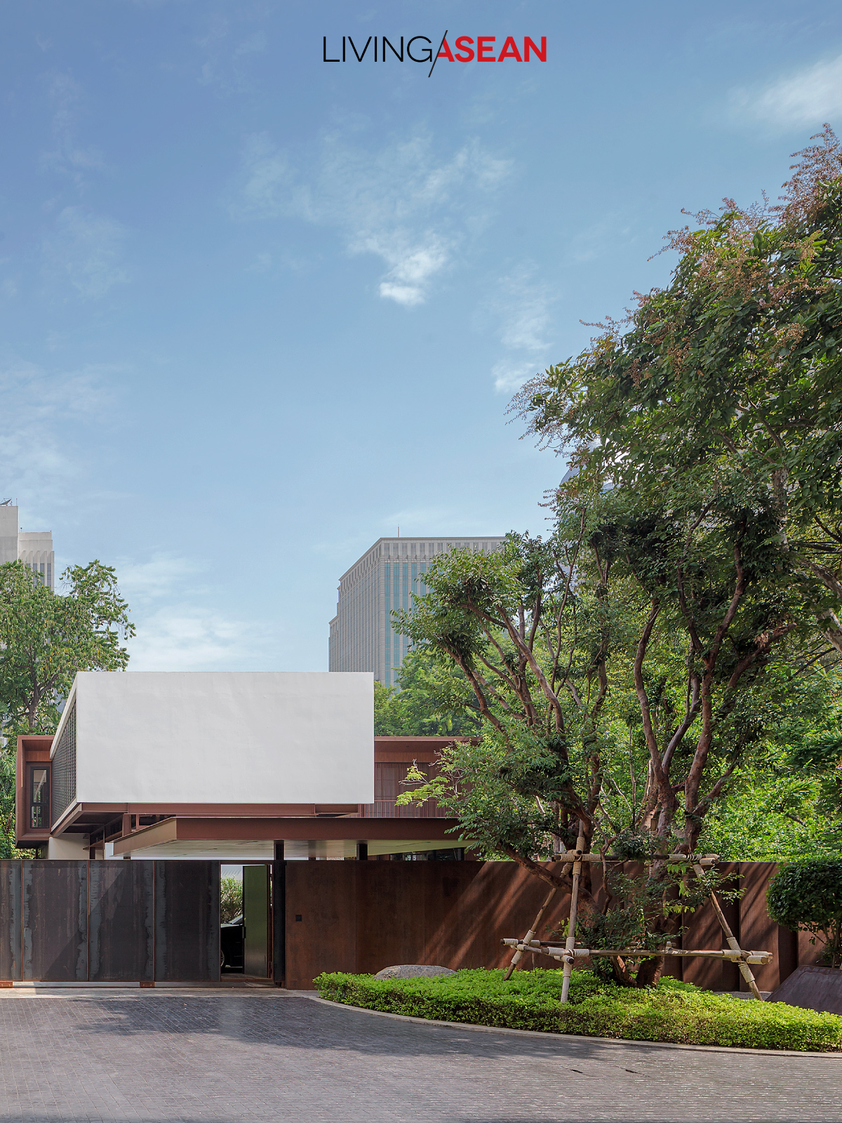
Taking everything into account, the contemporary cube-shaped house is in a league of its own. It celebrates the simplicity of open living spaces conceived and developed by the Singapore-based architectural practice ASOLIDPLAN.

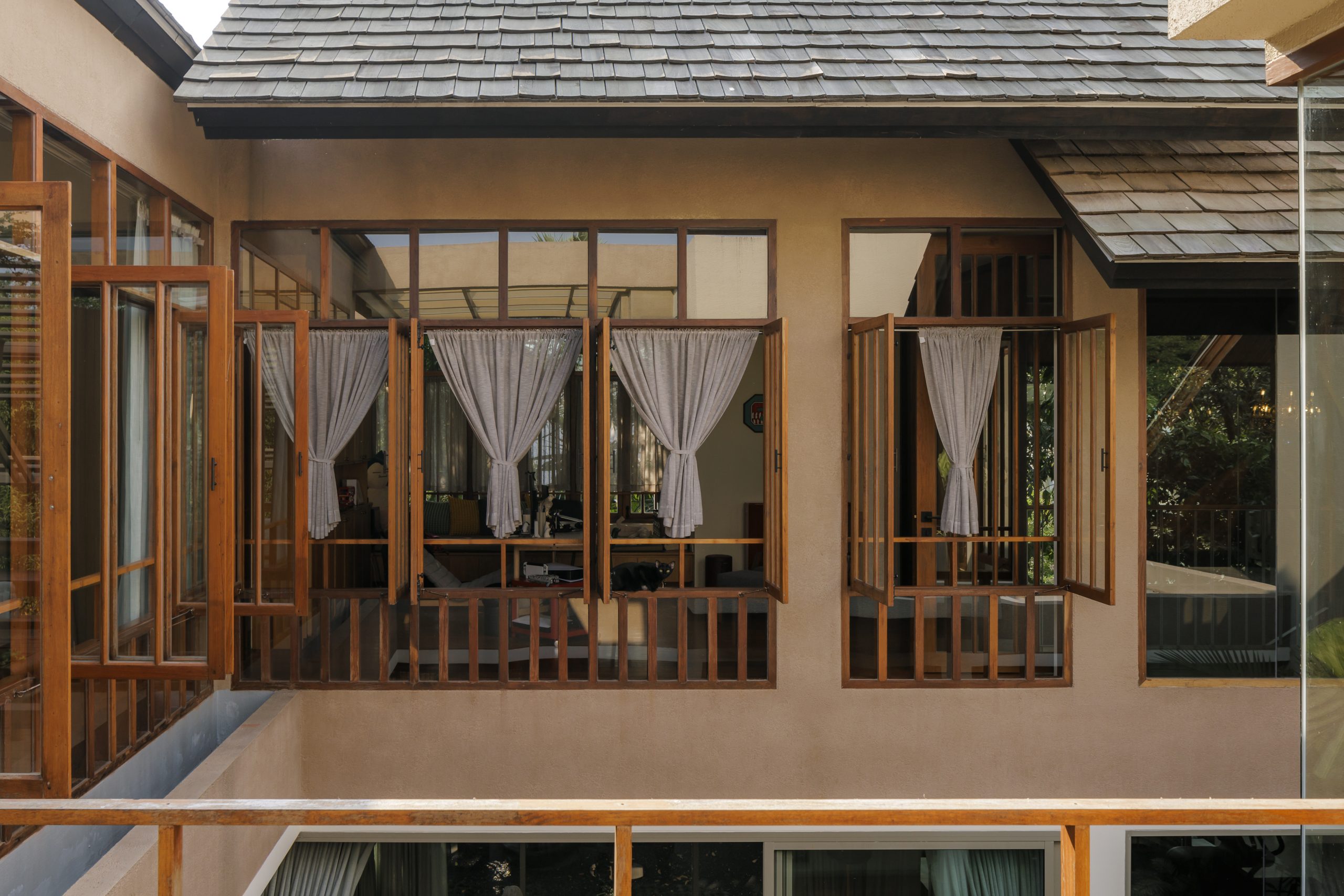
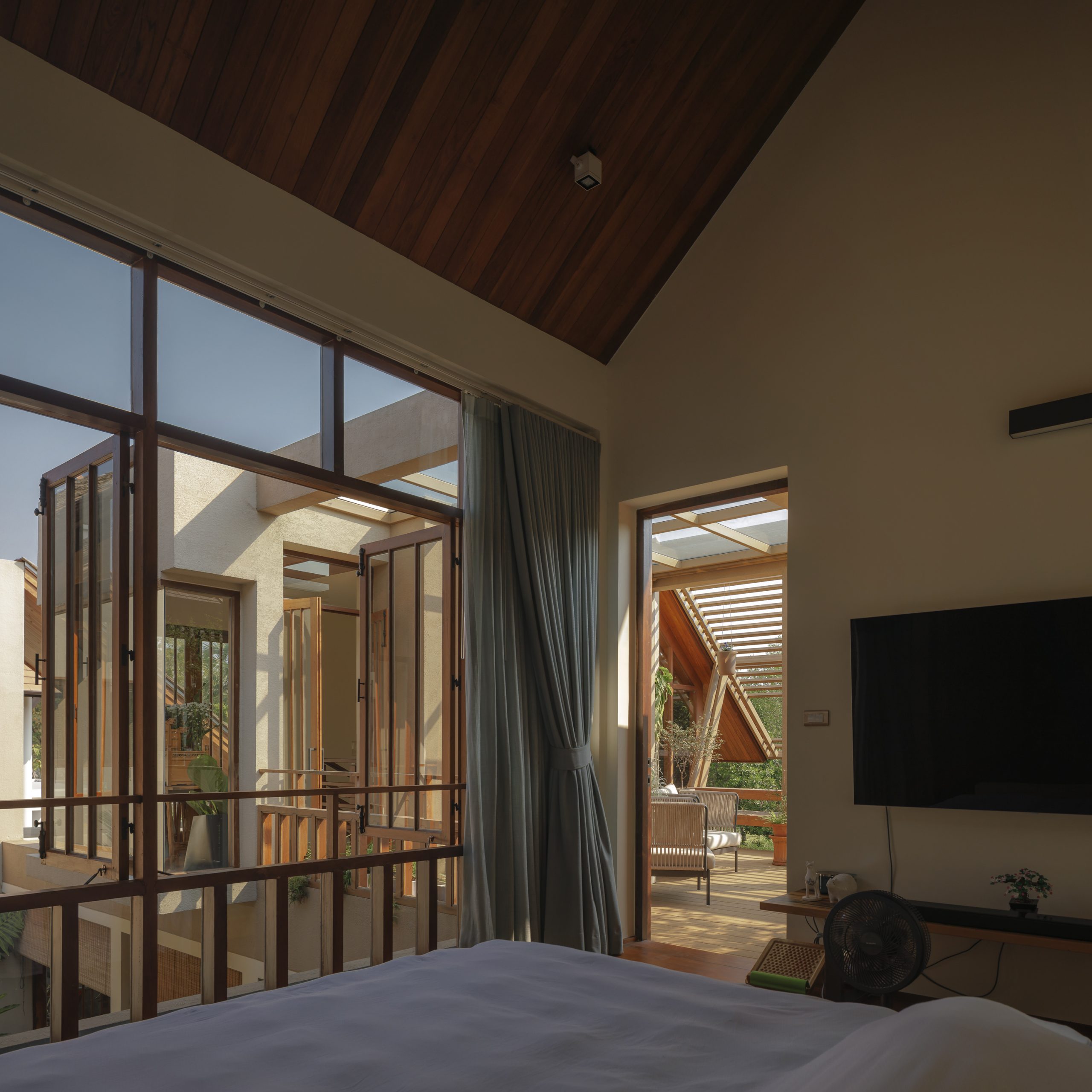
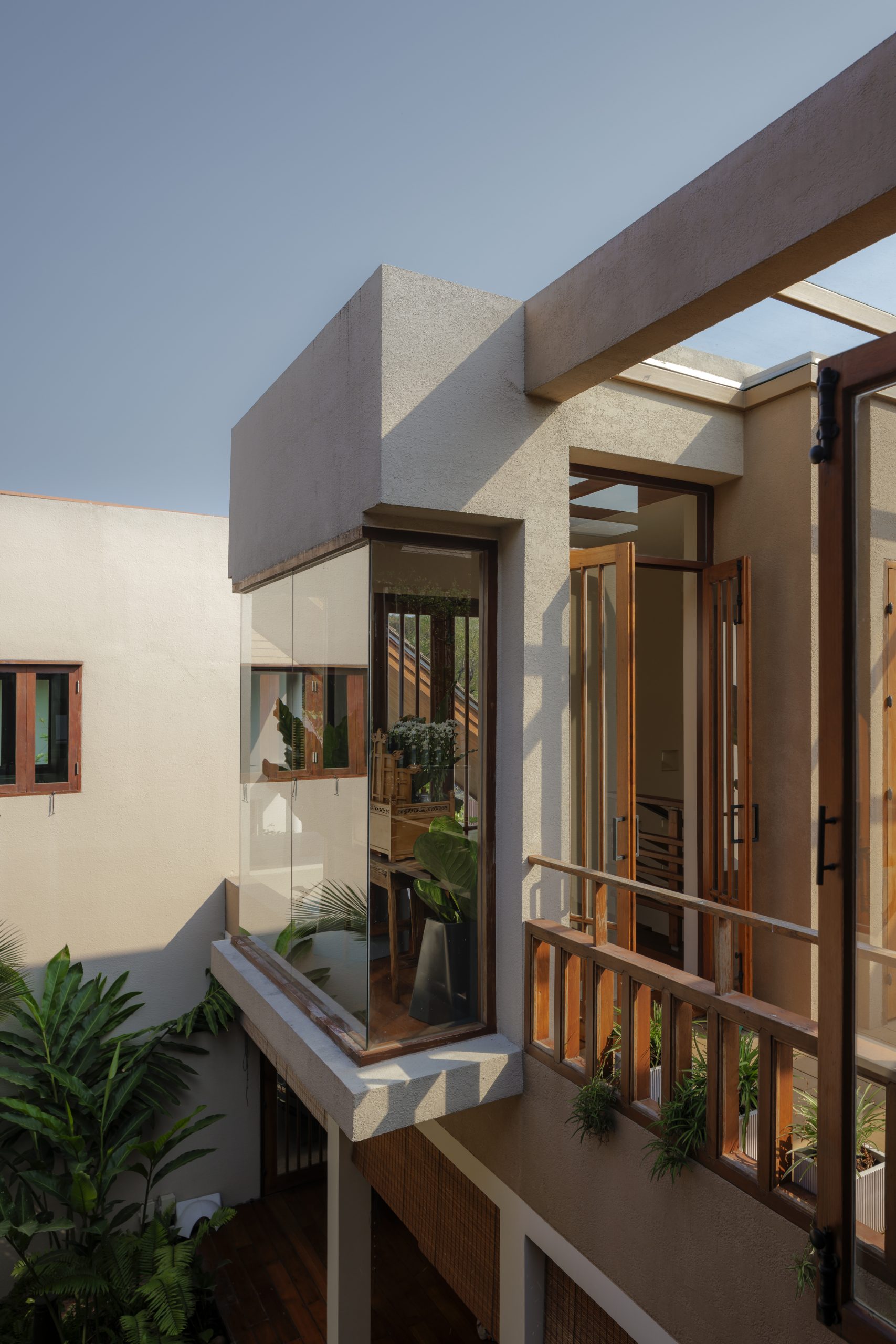
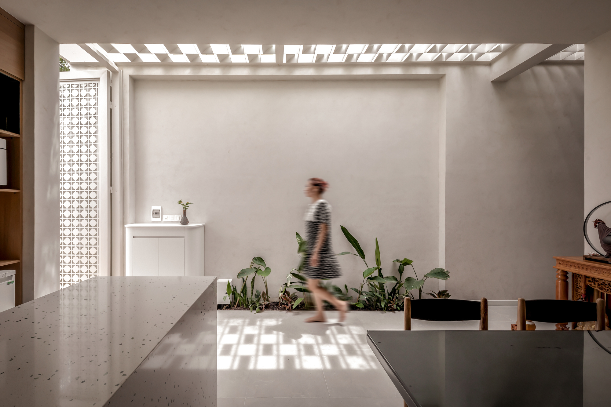
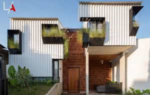
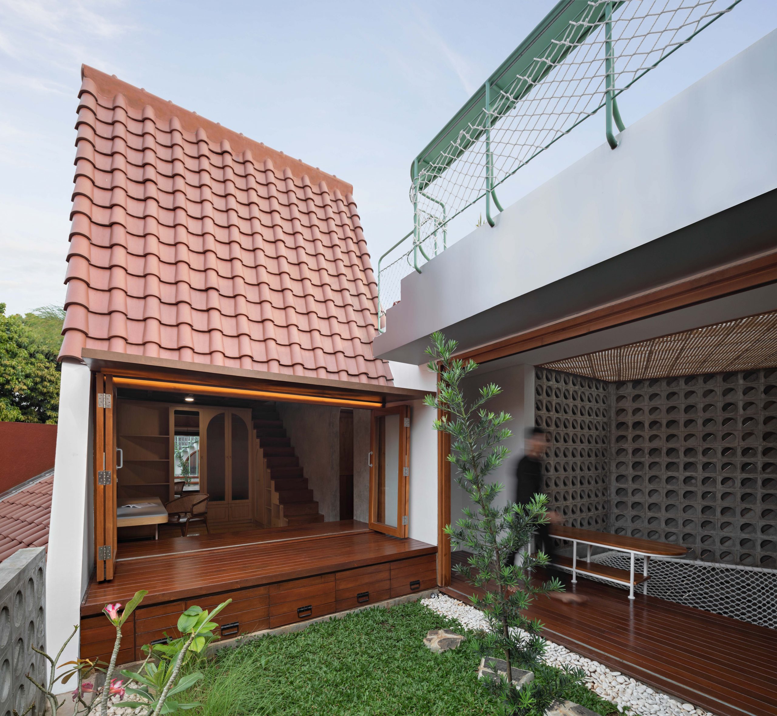
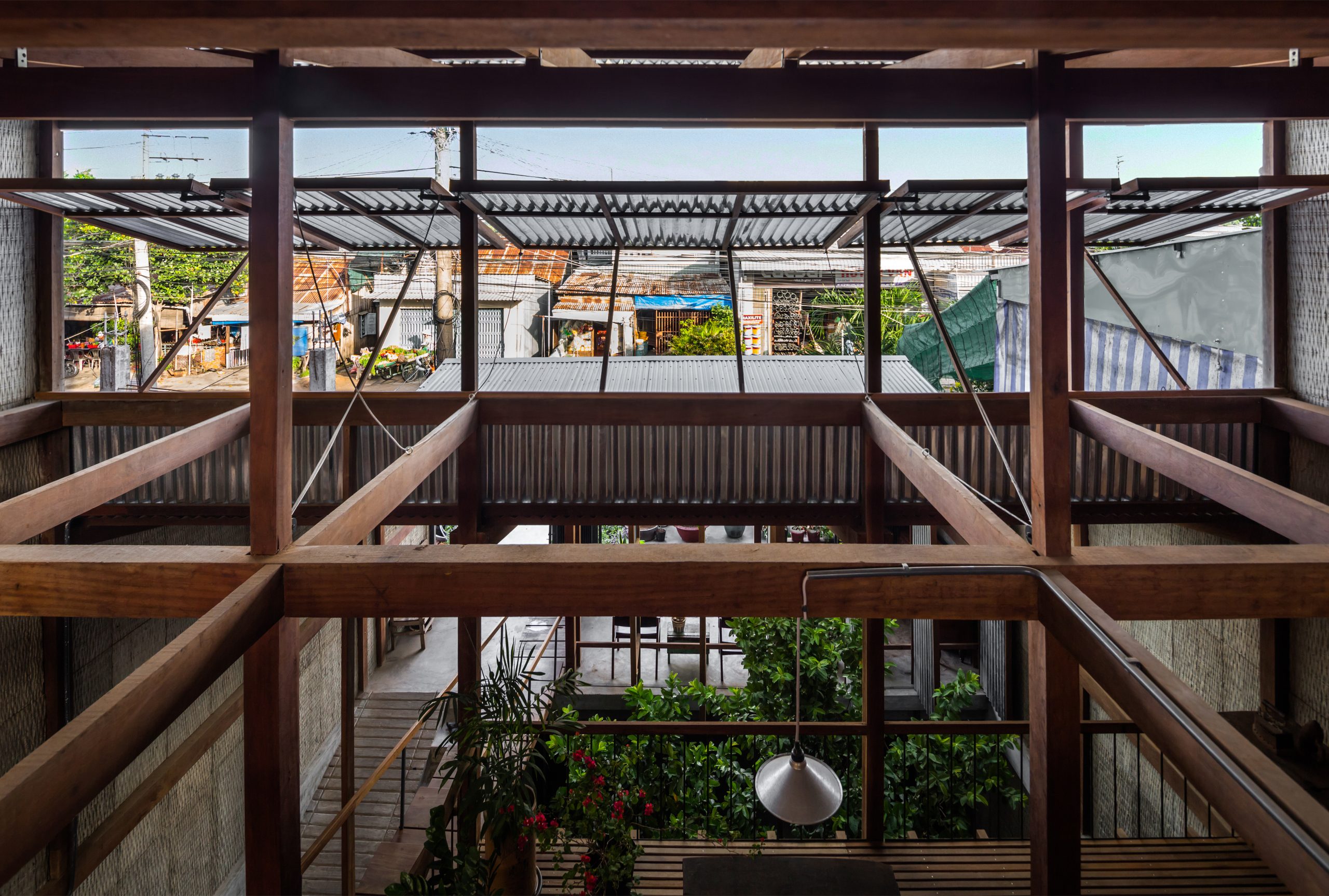
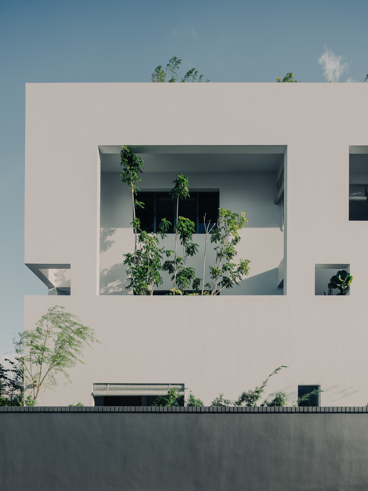
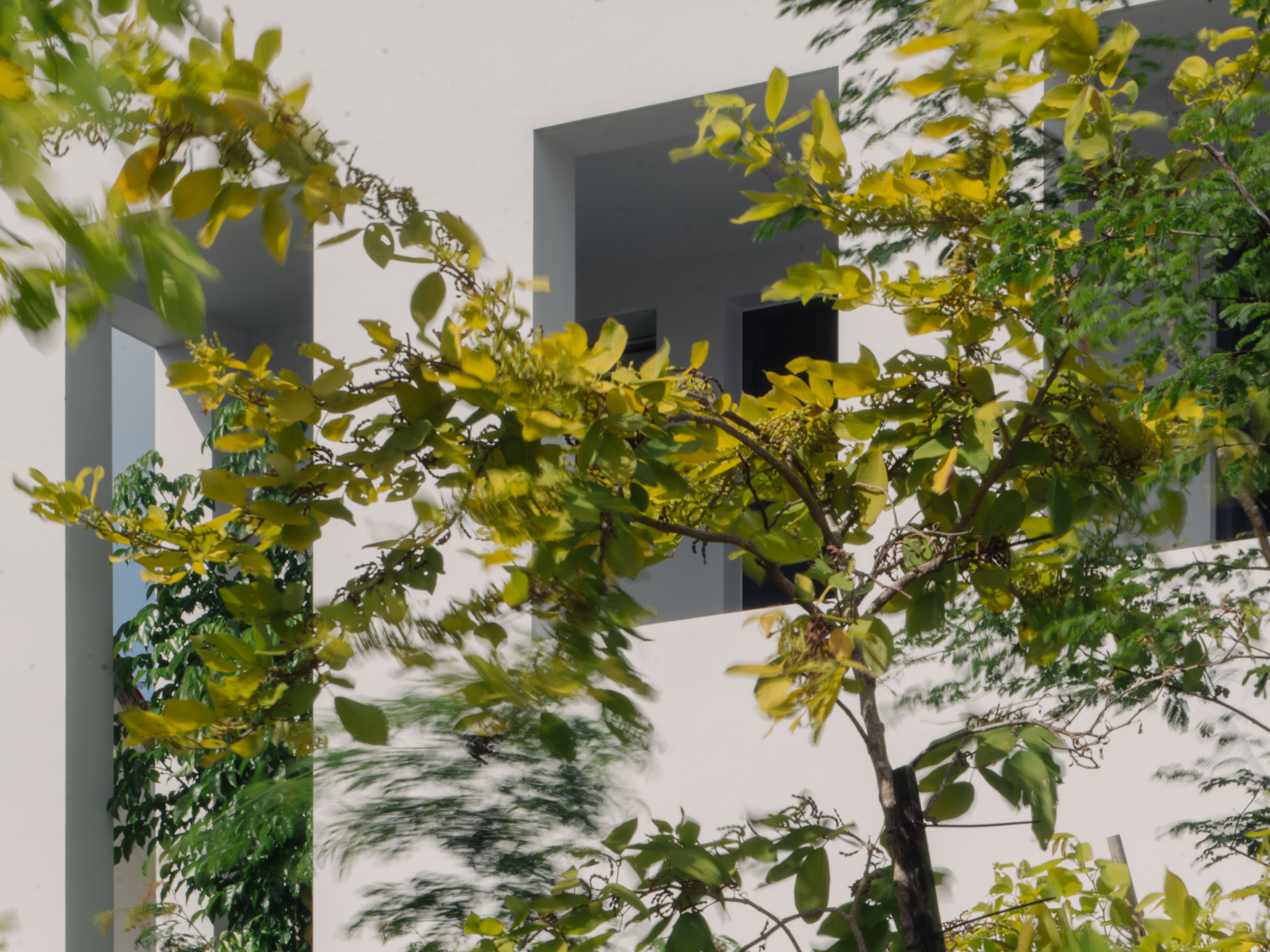
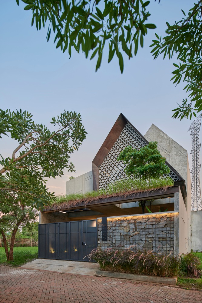
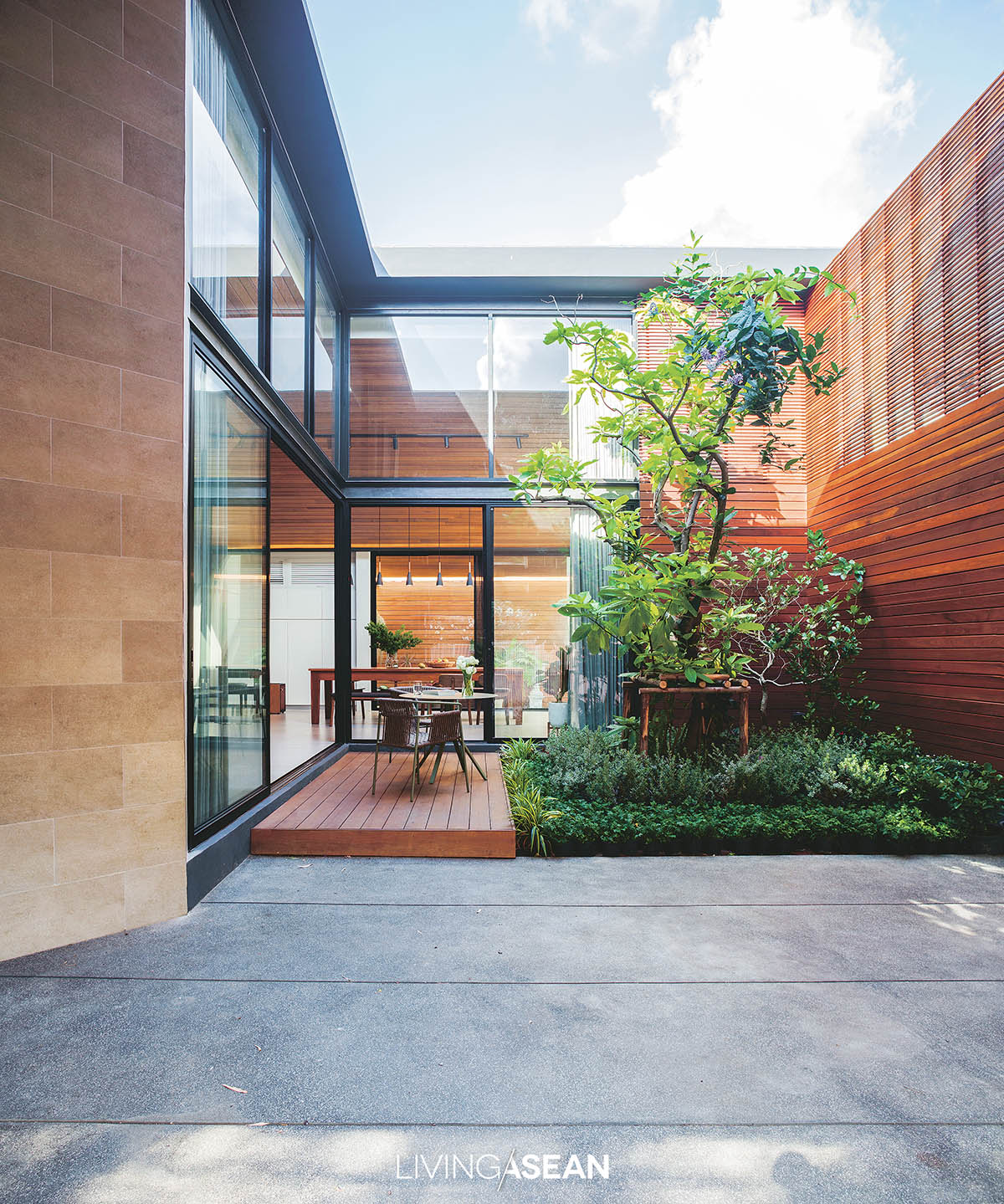
Among other things, what makes it unique is the use of rectangular openings in various dimensions to make the building façade aesthetically pleasing. Done right, the openings in the walls and rooftop admit light and air and allow people to see out.

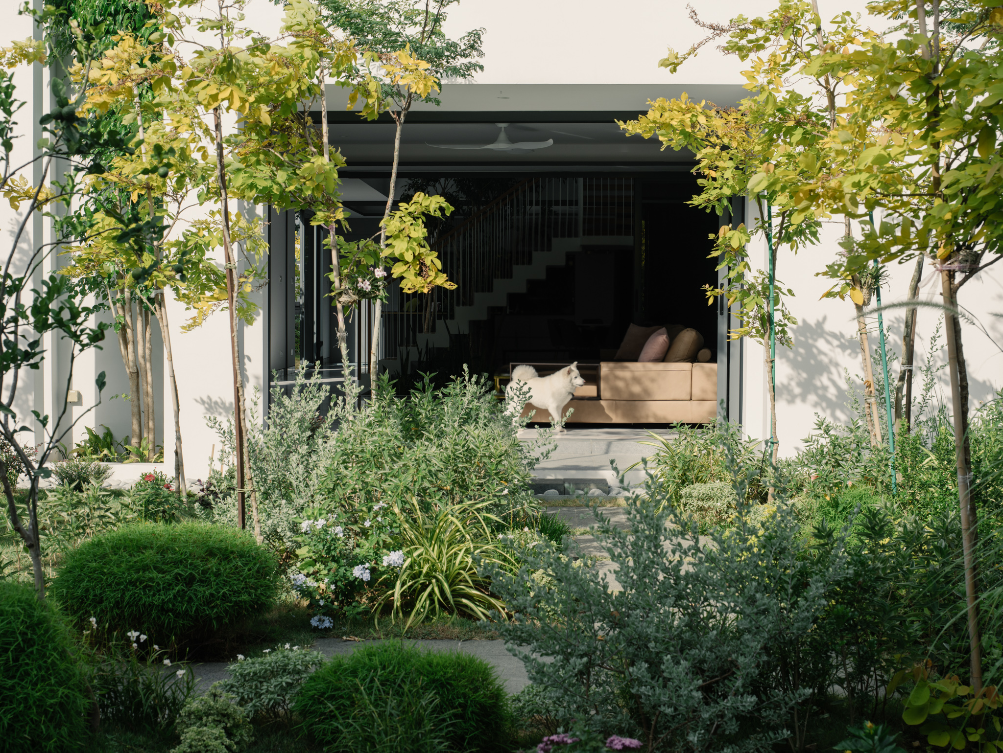
In this particular case, the building sits facing west, so every precaution is taken to protect the interior from the sun’s harsh glare keeping it nice and cool all day.

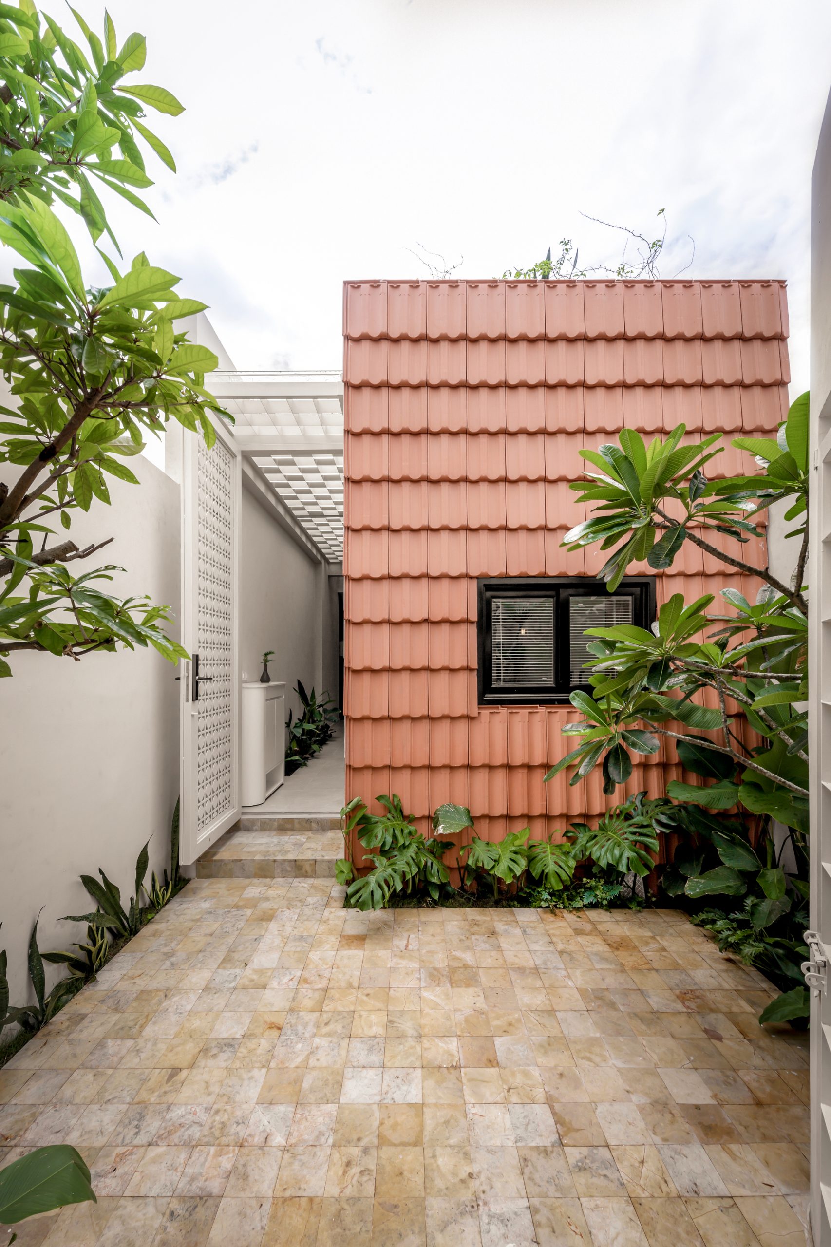
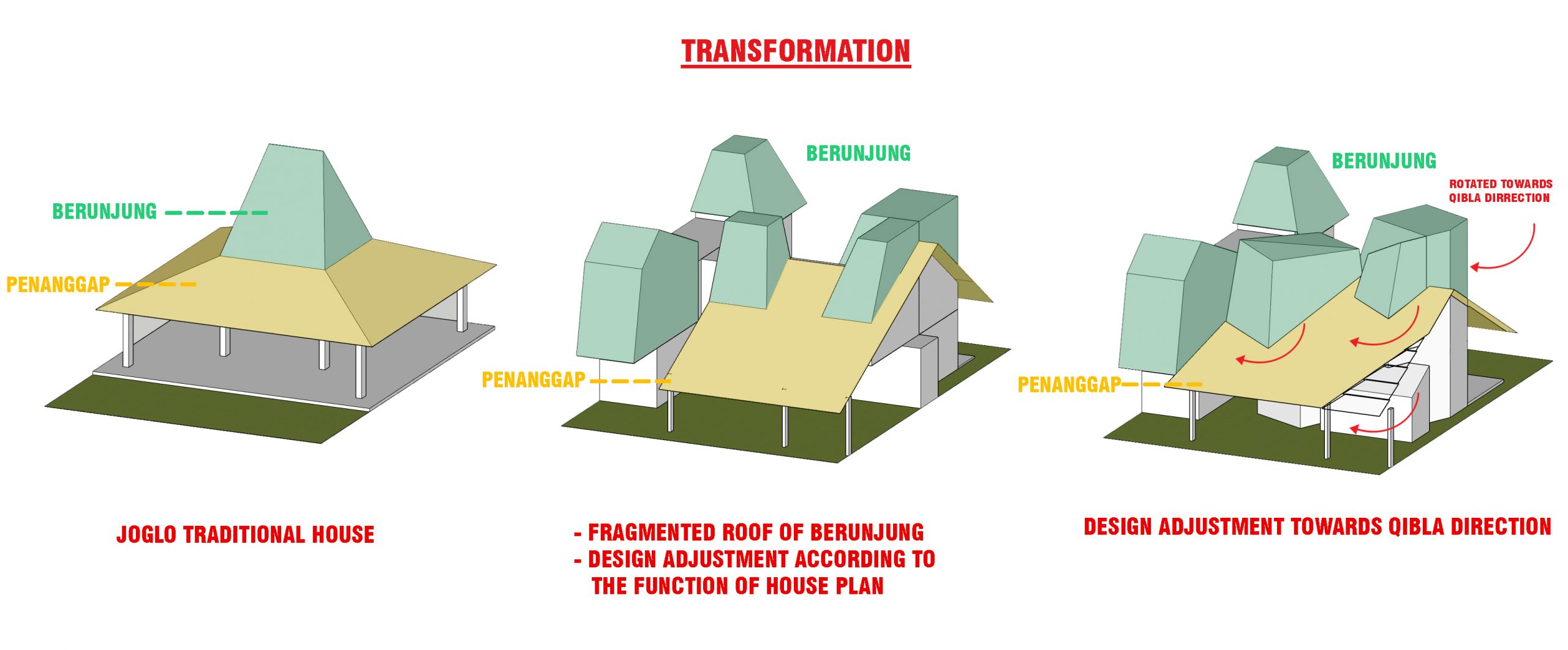
The answer lies in a complete rethink of the building shell design, hence the name “Envelope House.”

Modern space

Modern space

Modern space

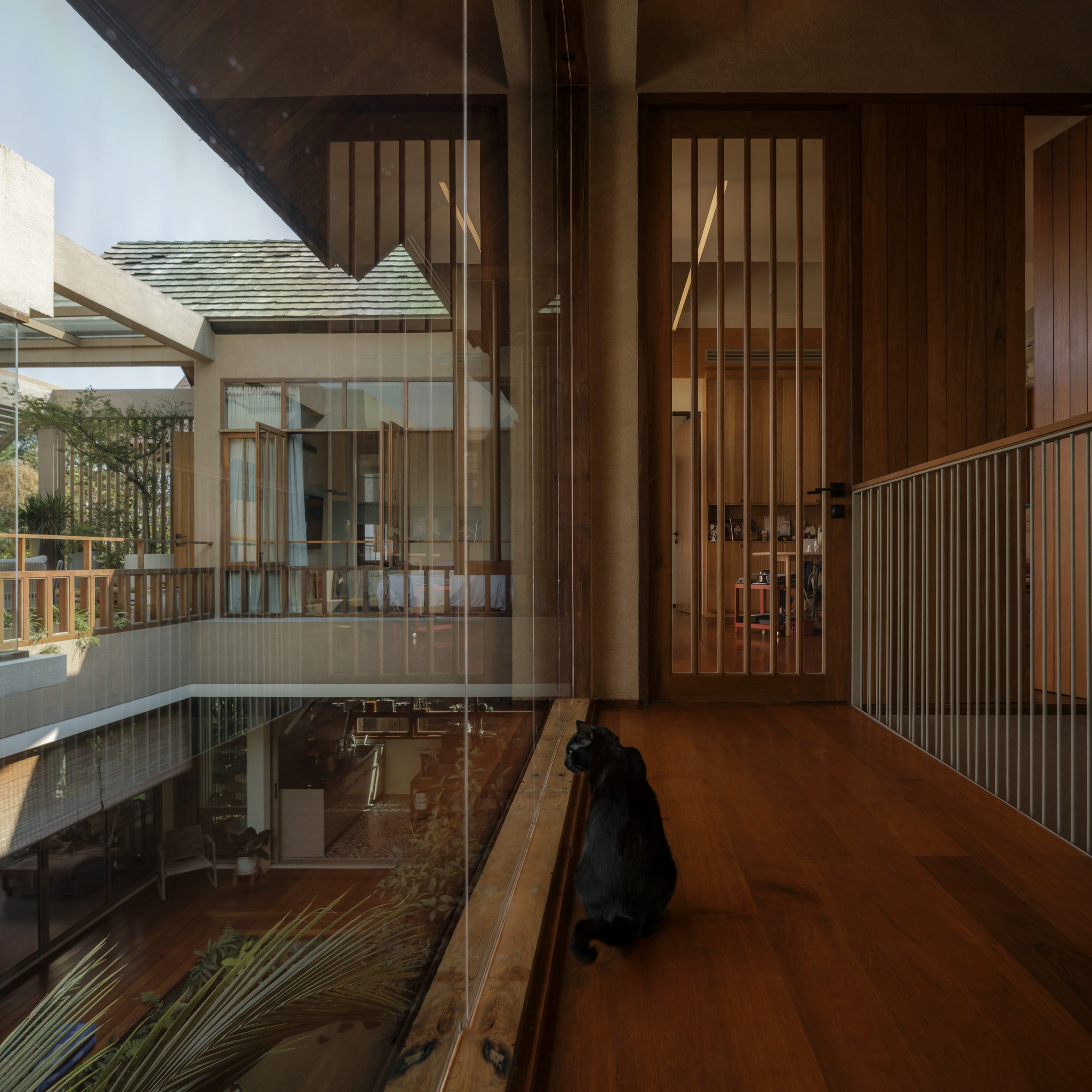
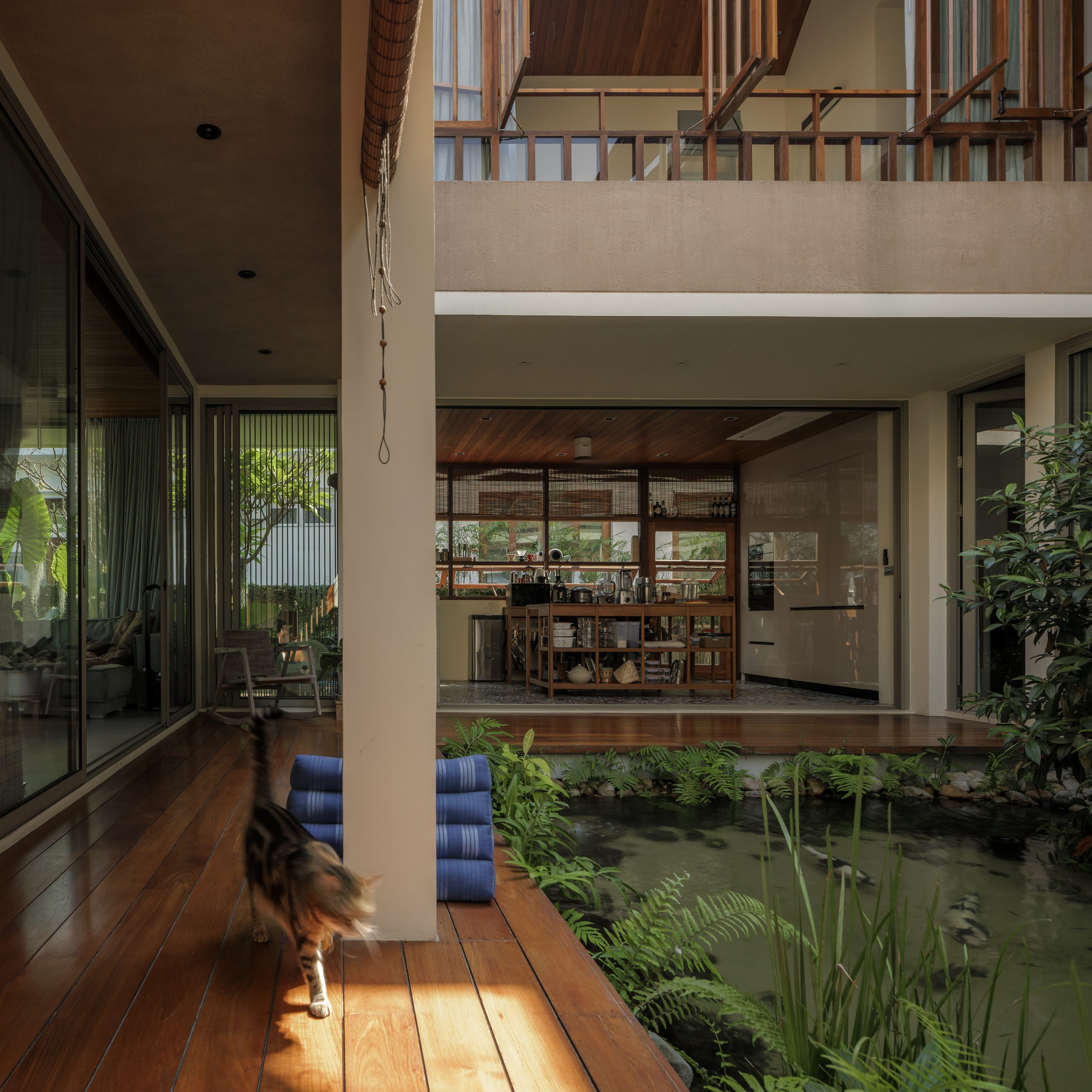
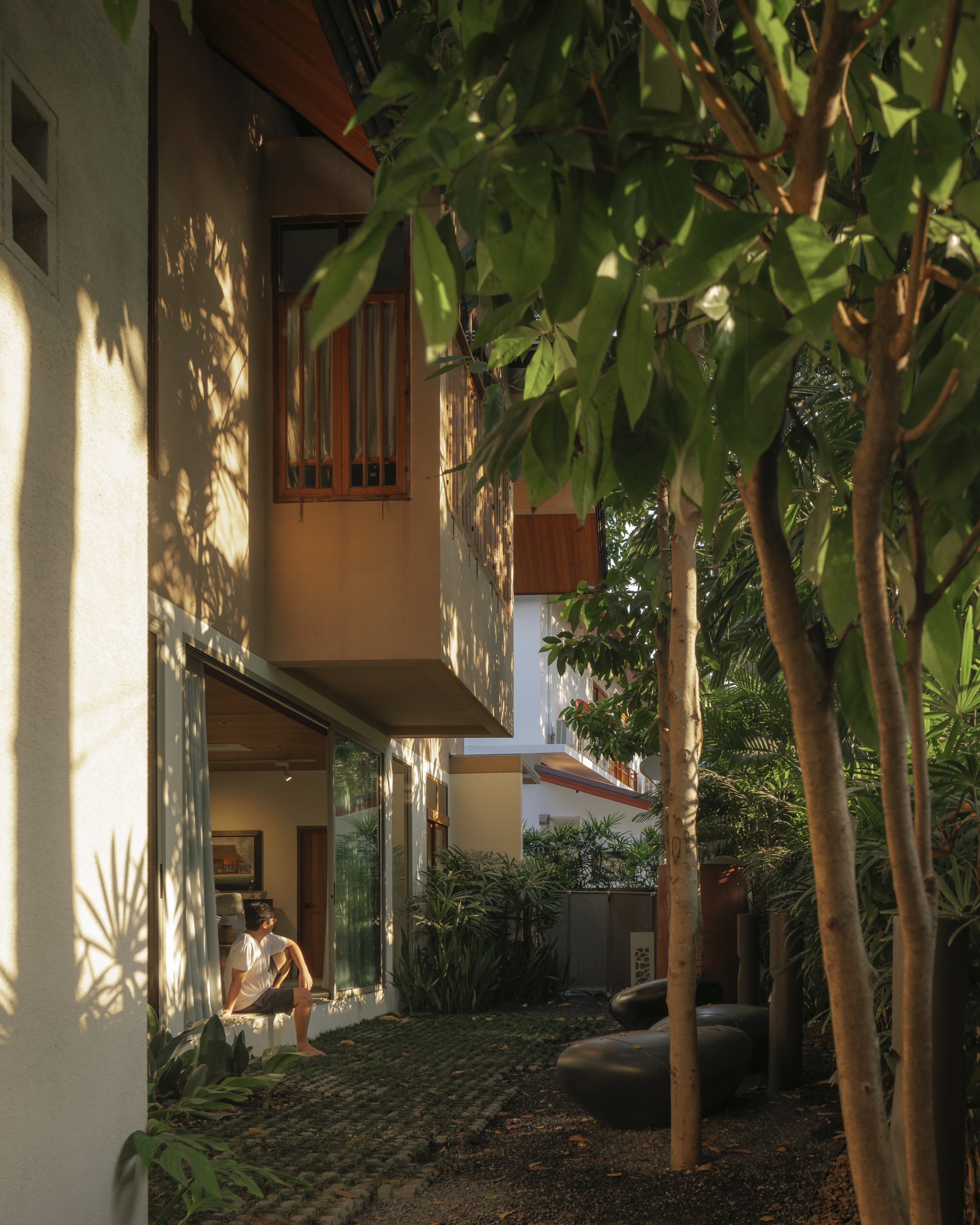
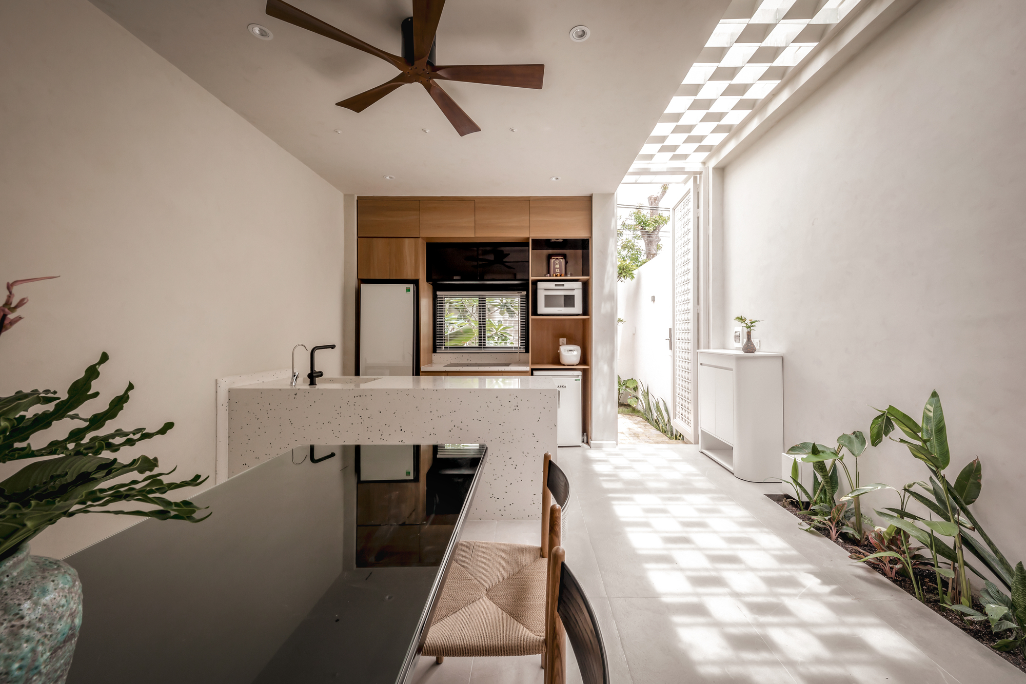
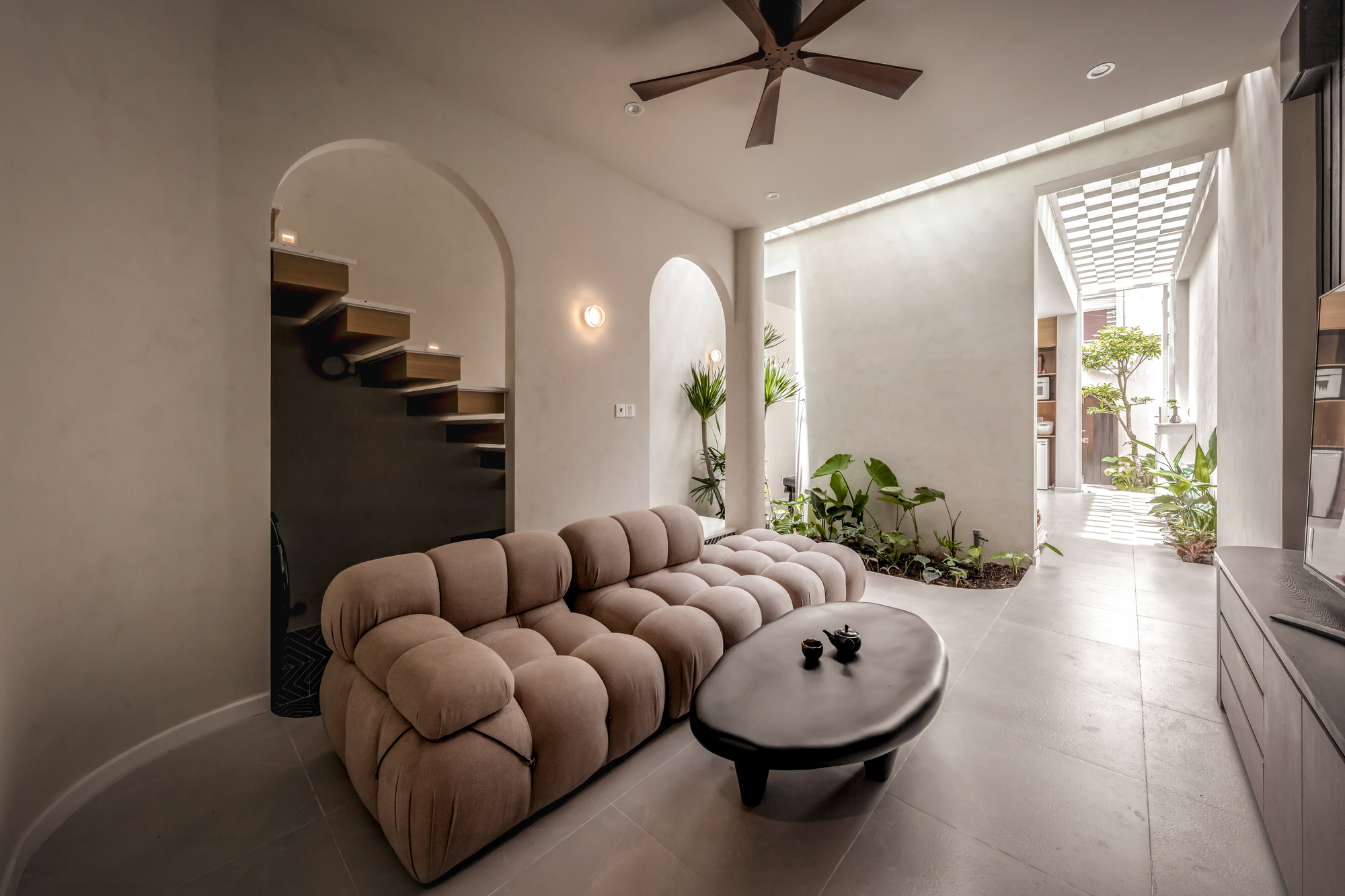
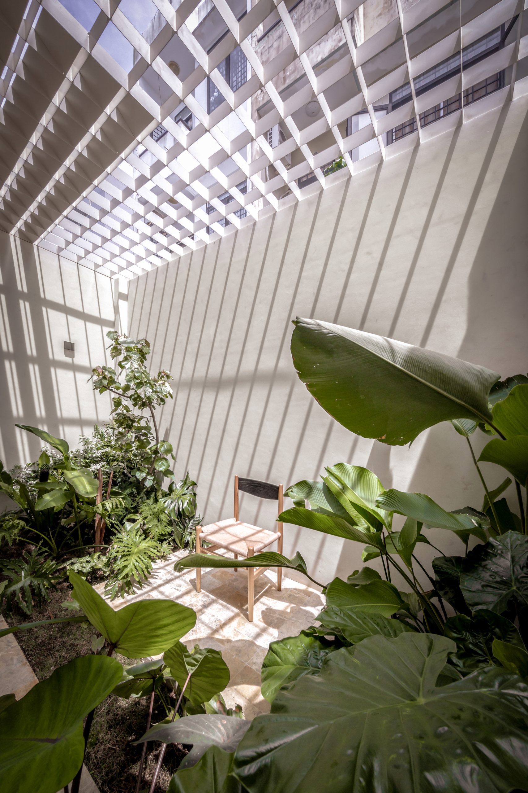
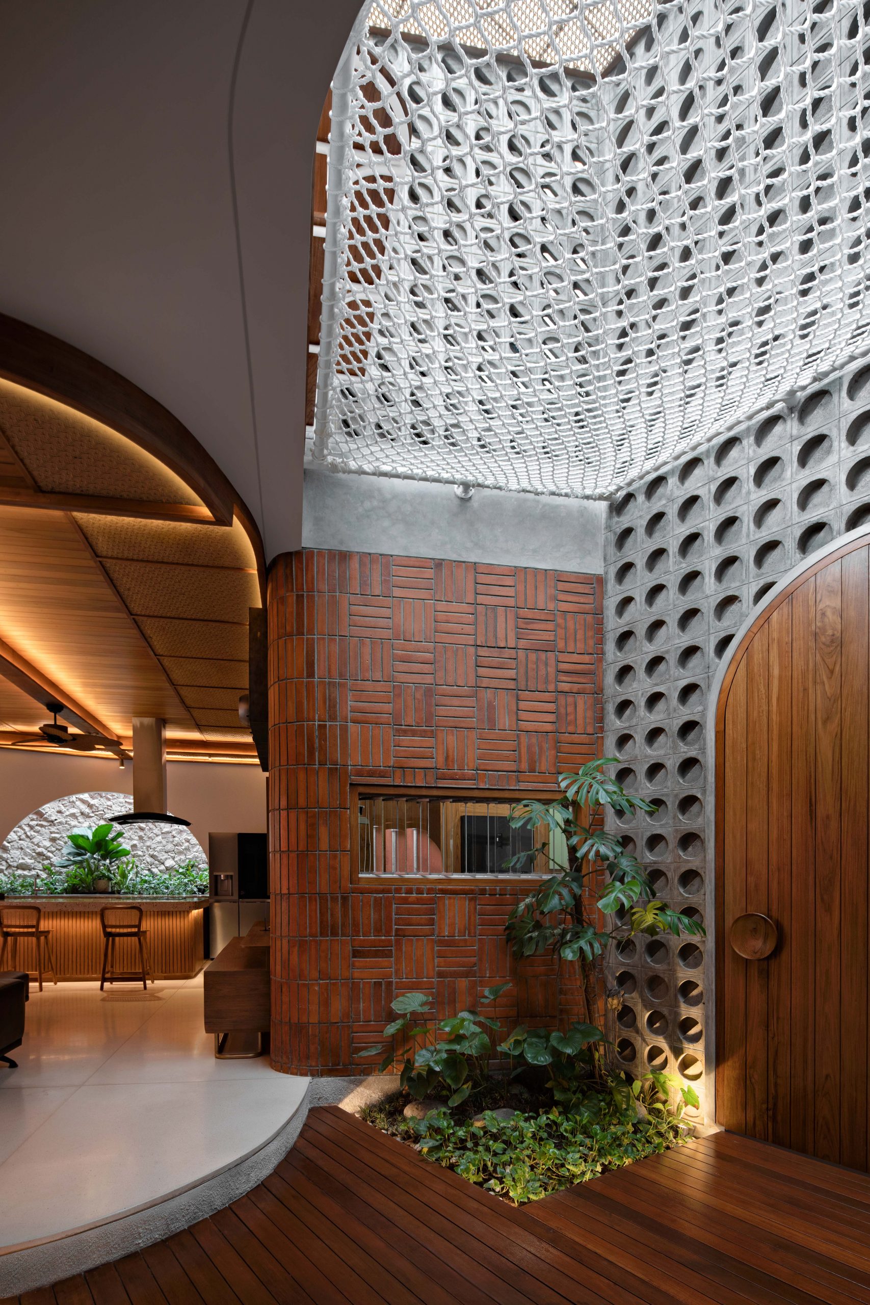
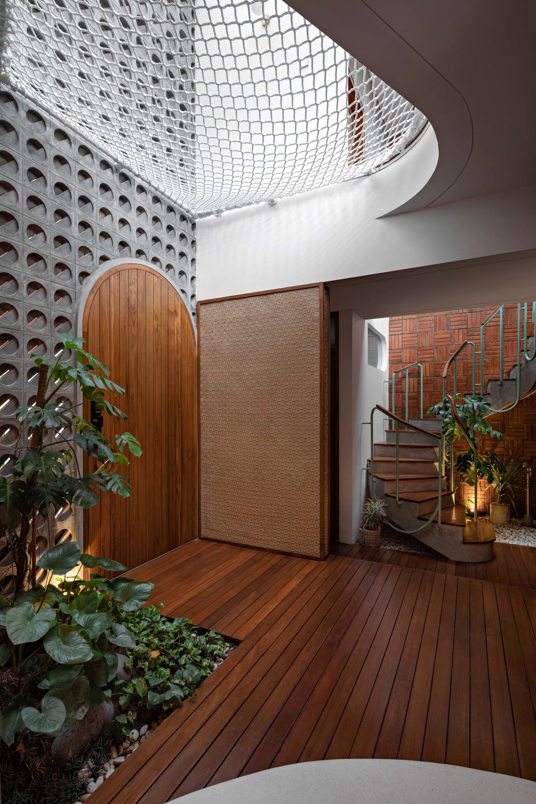
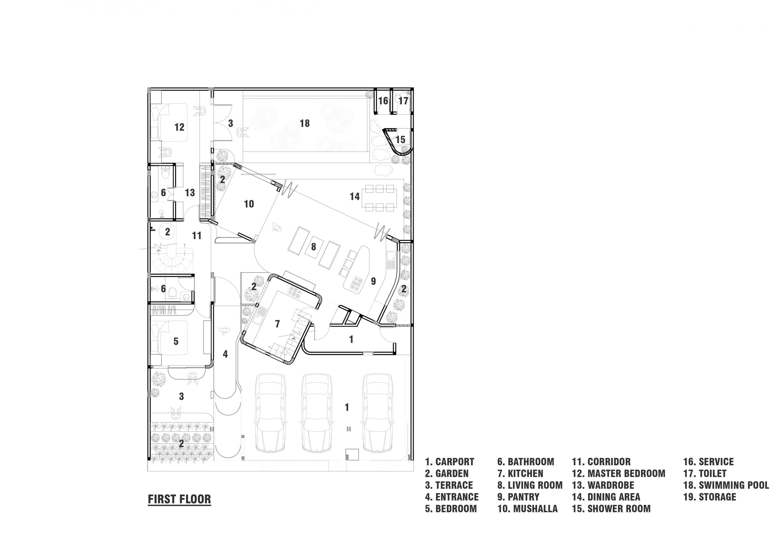
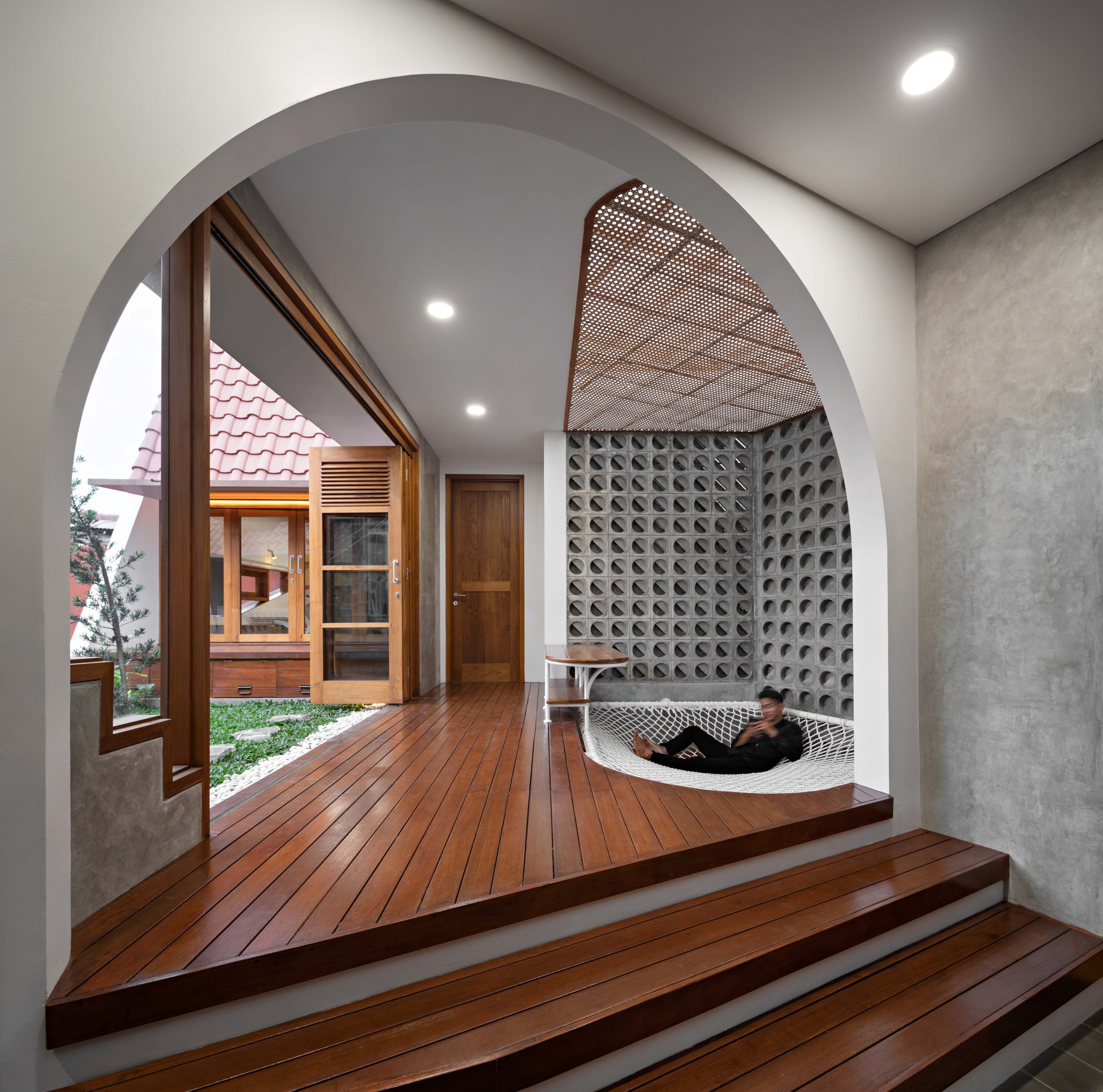
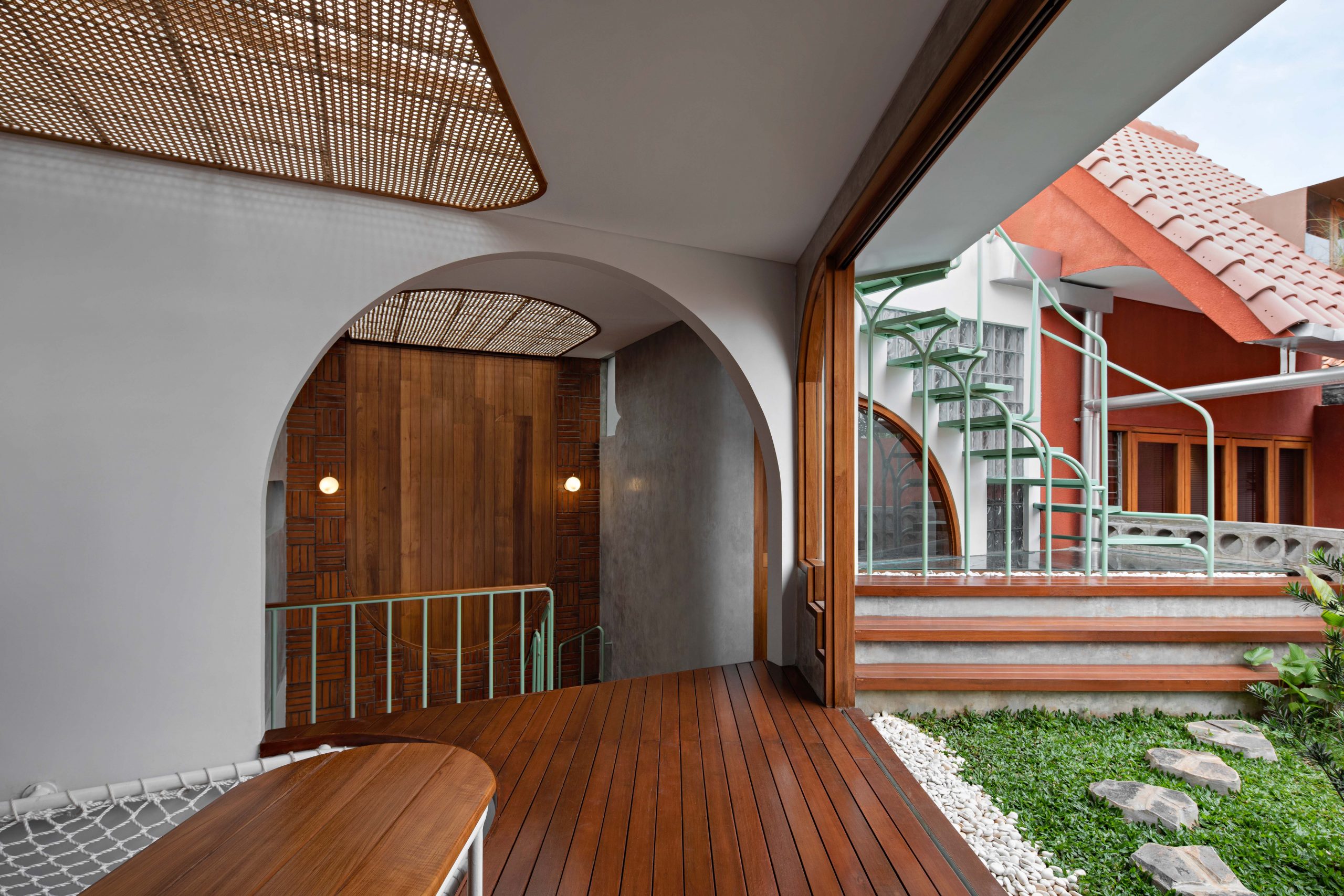
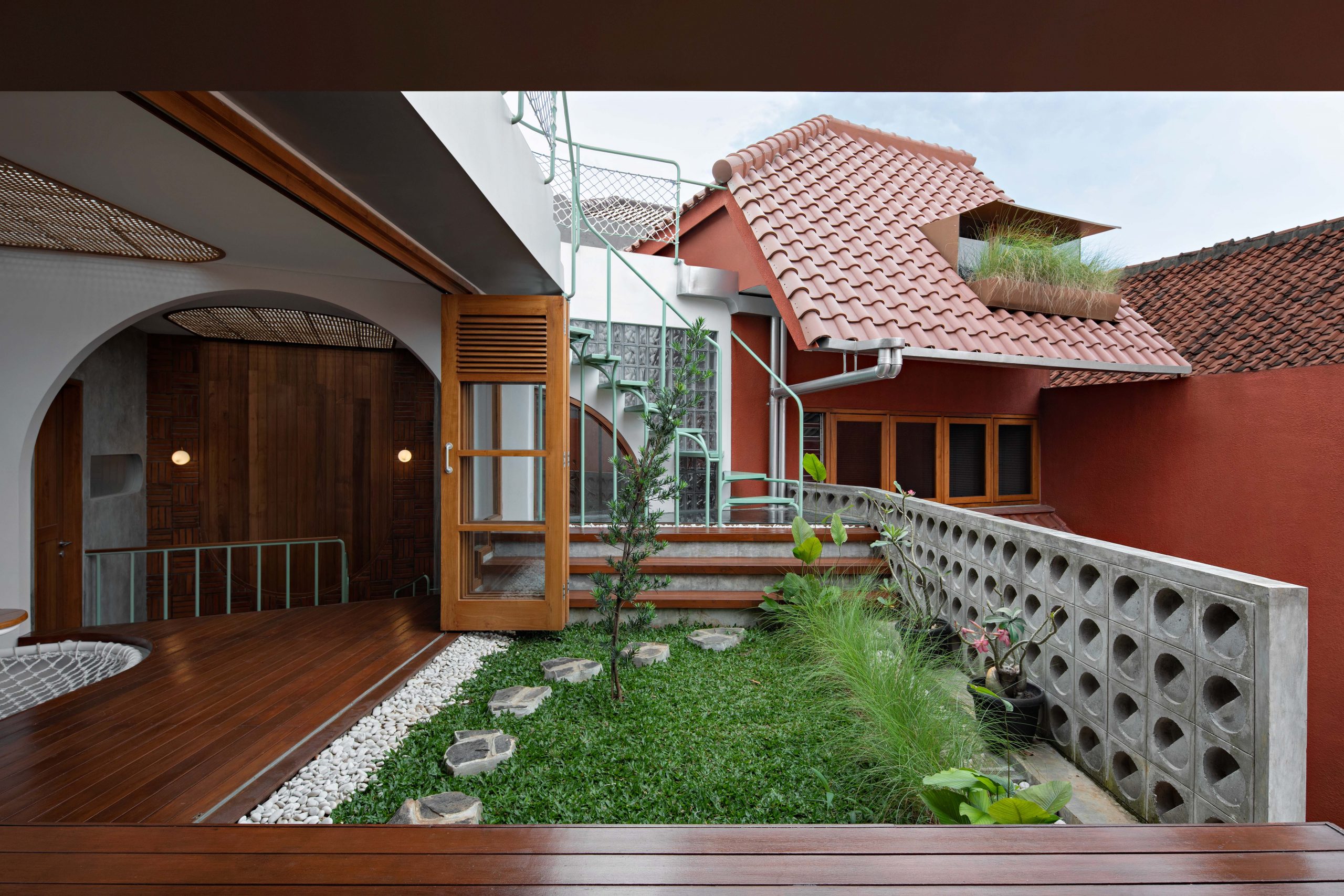
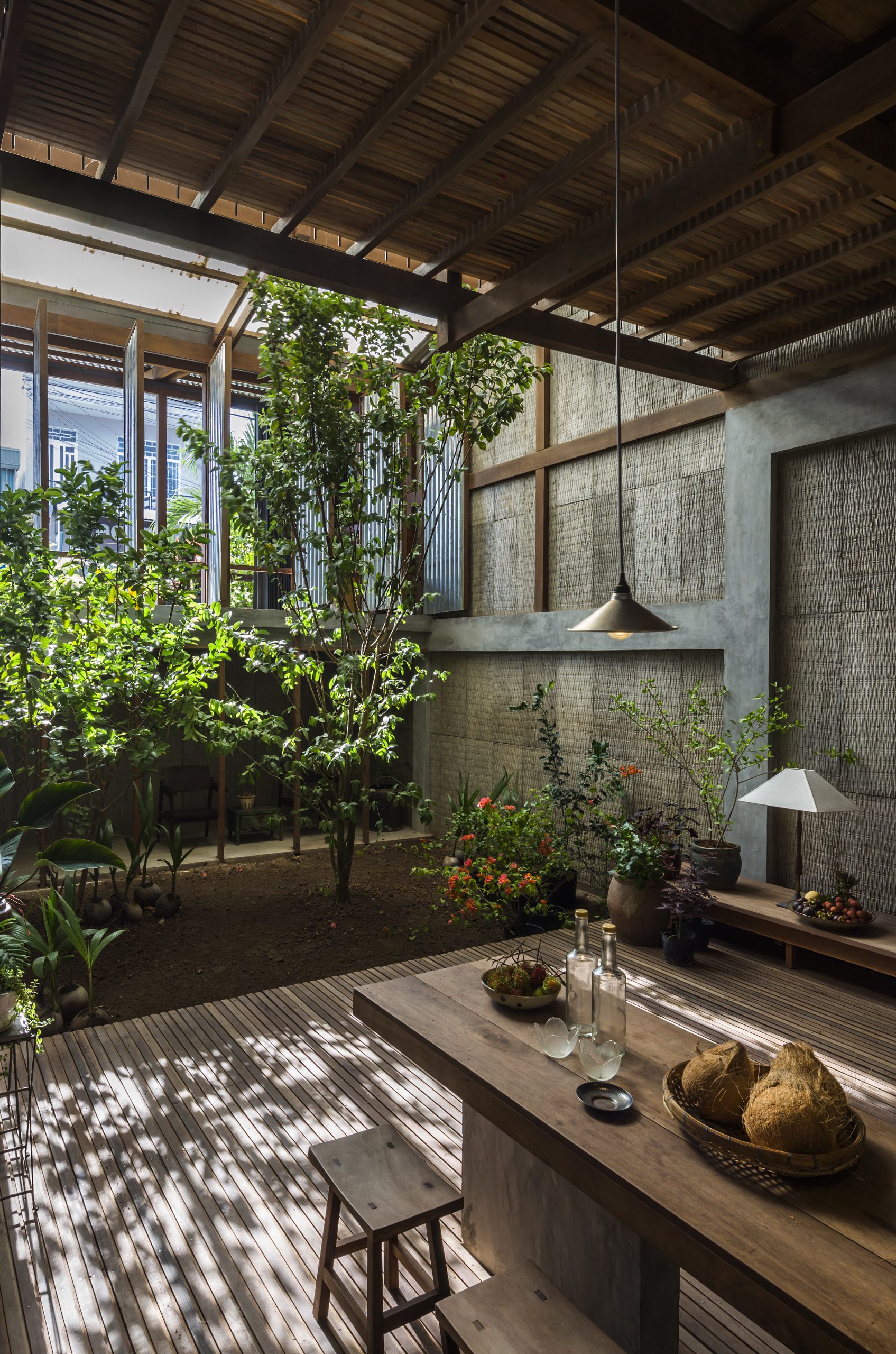
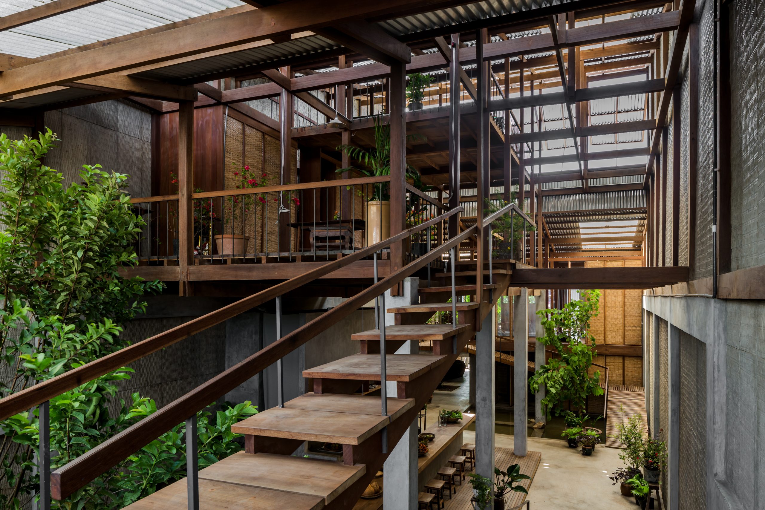
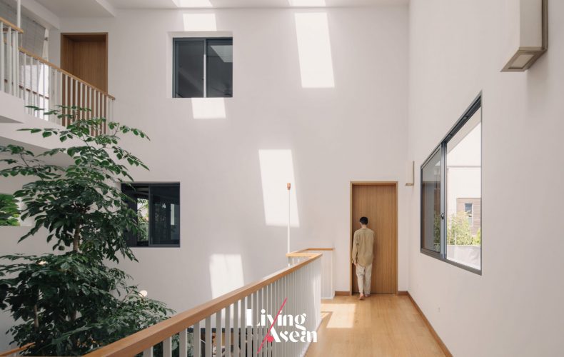
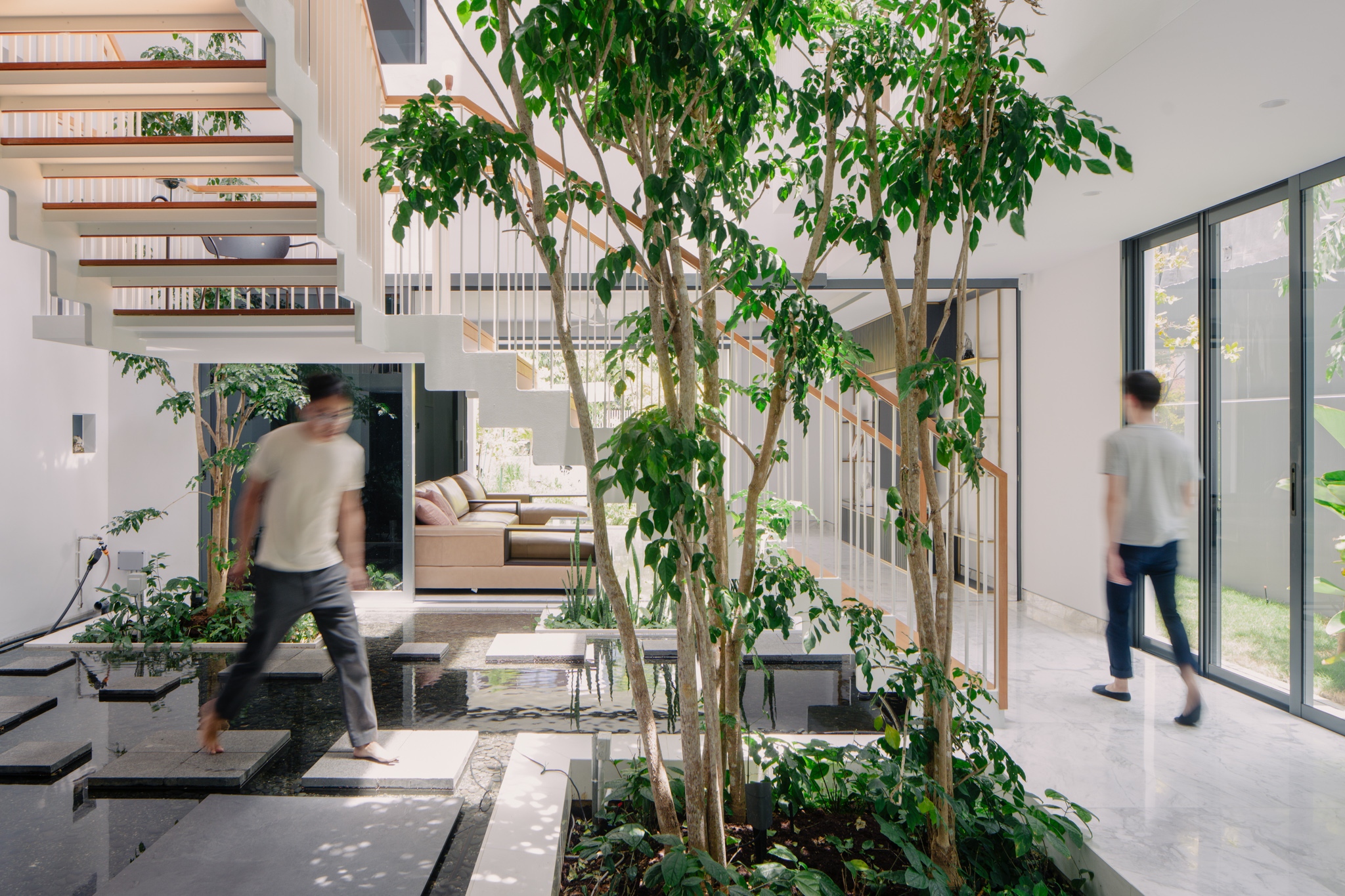
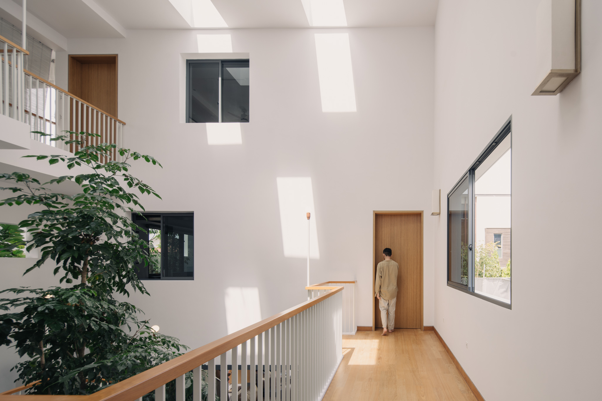
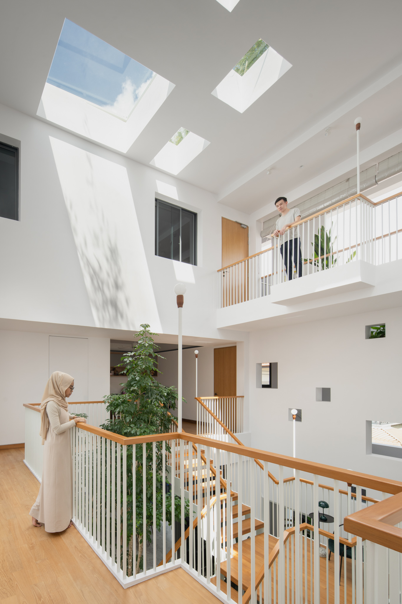
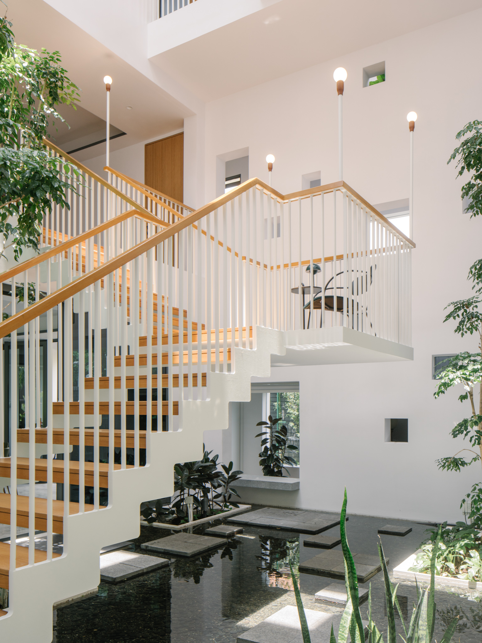
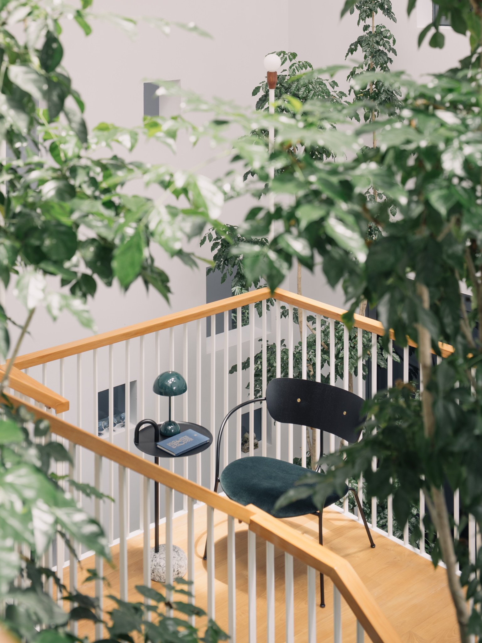
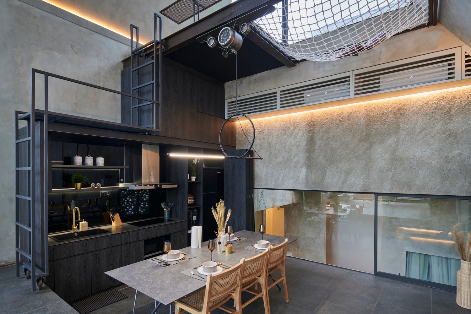
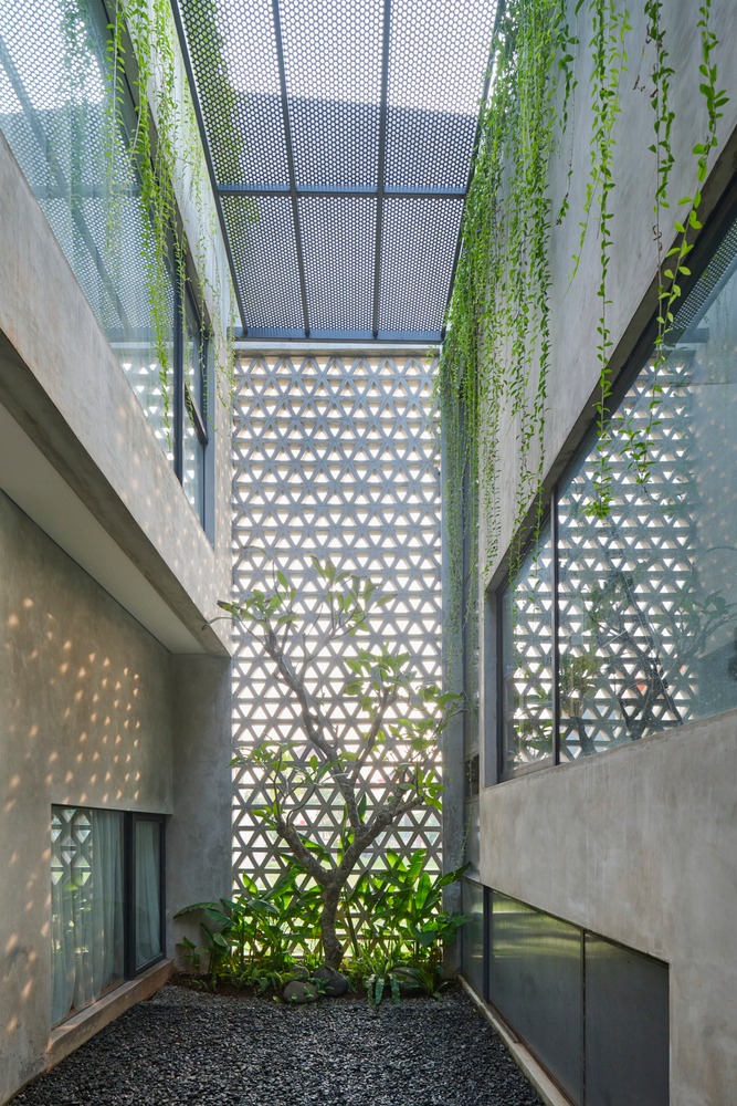
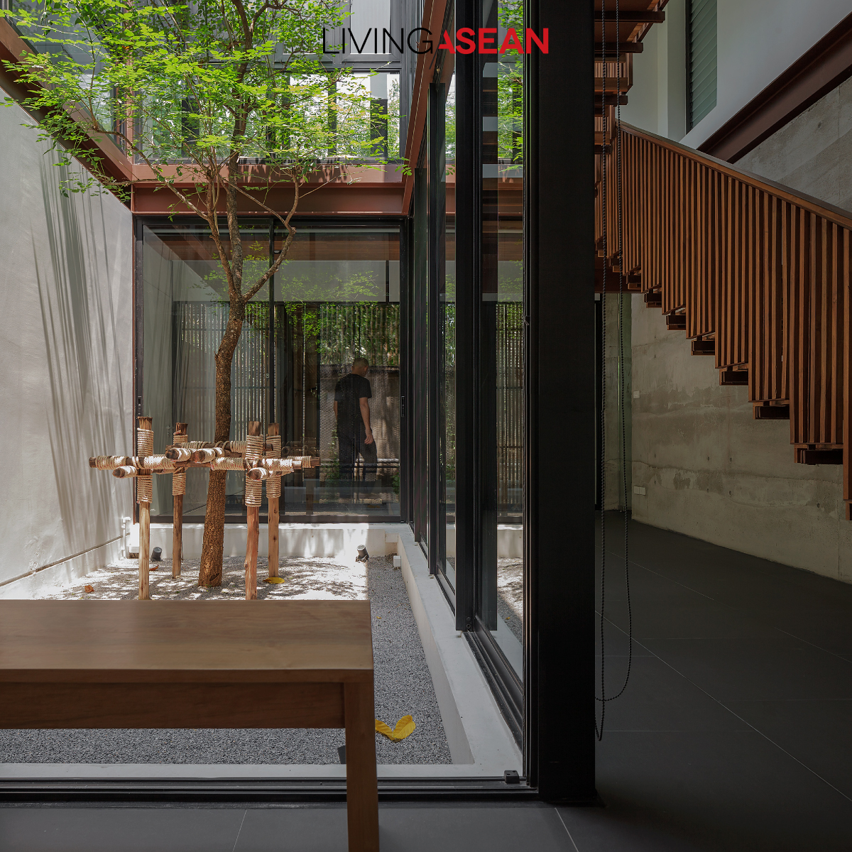
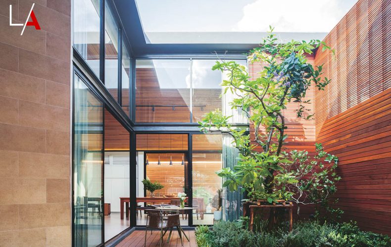
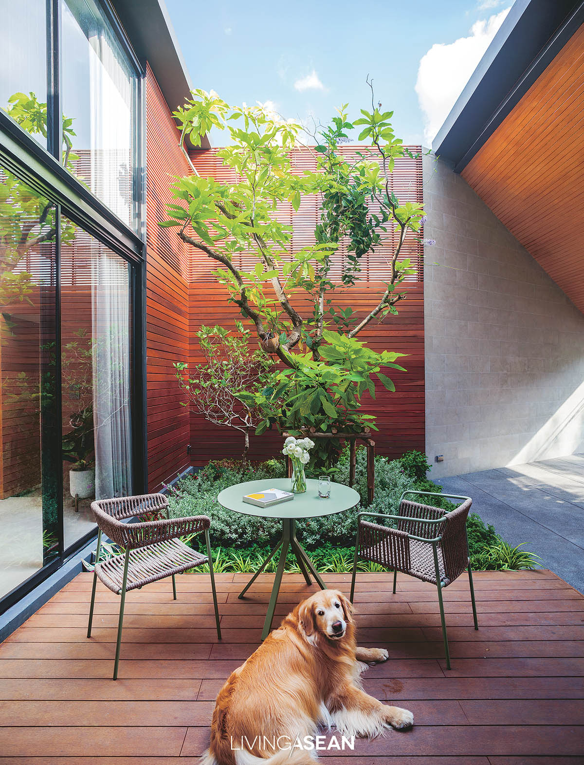
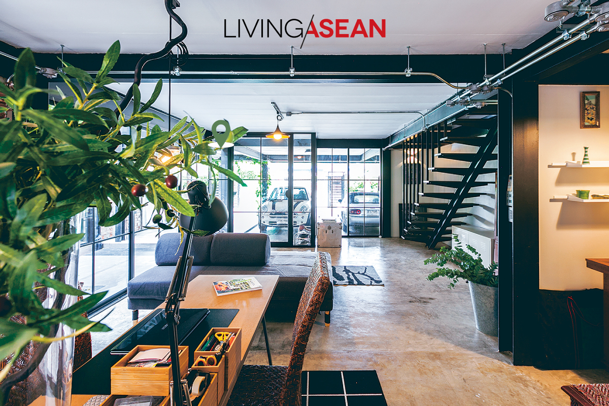
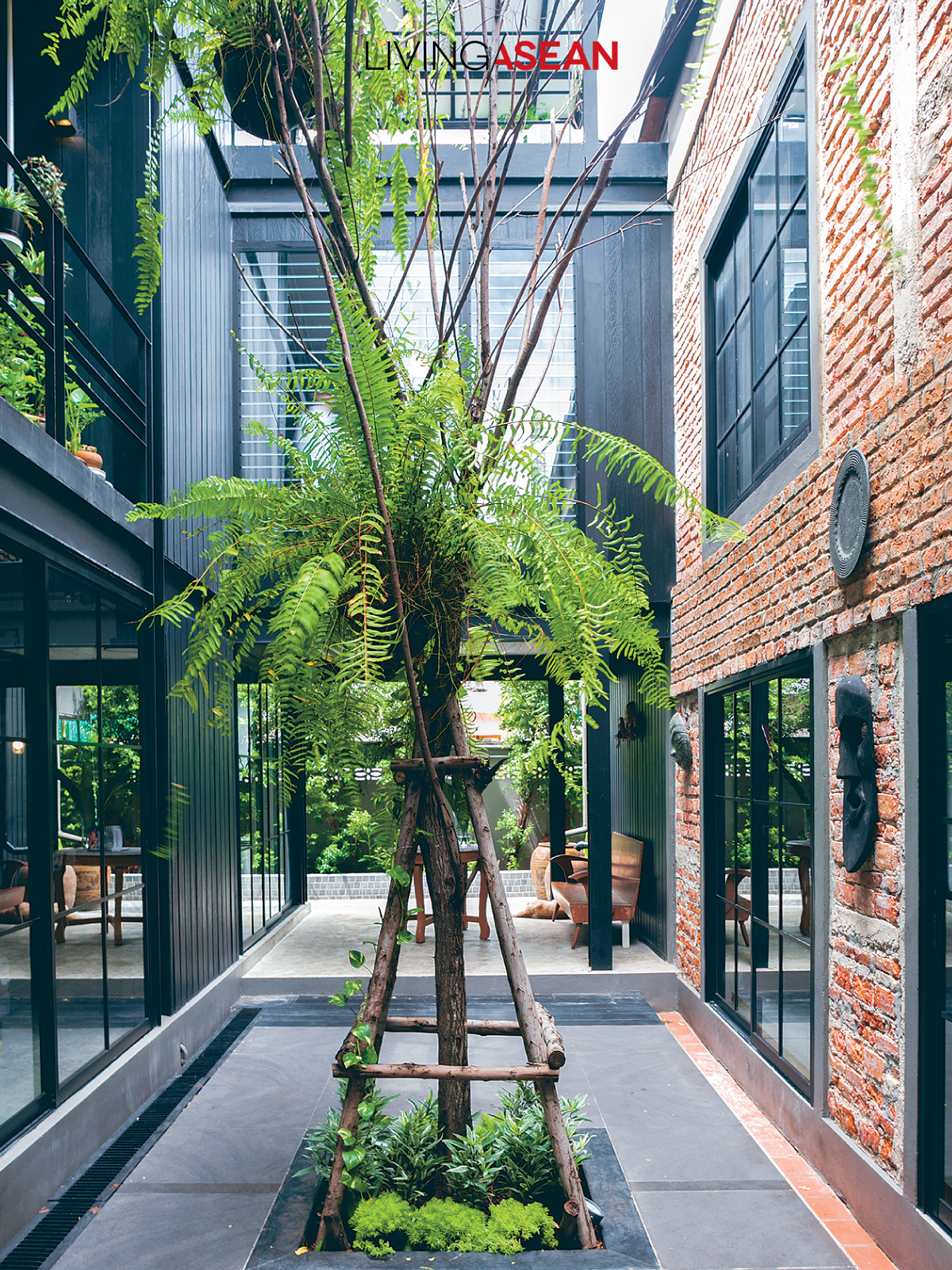
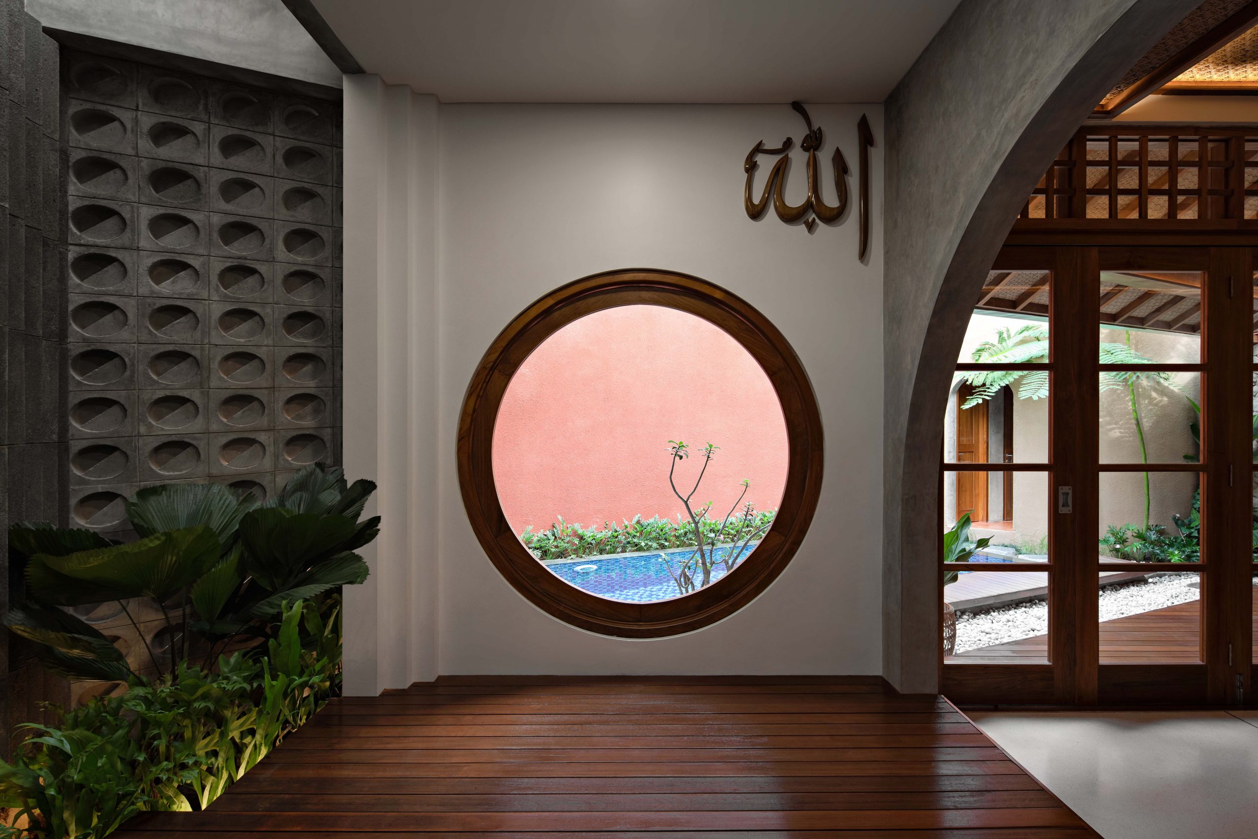
Step inside, and you come to a gorgeous center courtyard with triple-height ceilings and skylights on the rooftop. It’s a clever hack to reconnect with nature by bringing the outdoors into every nook and cranny of the interior.

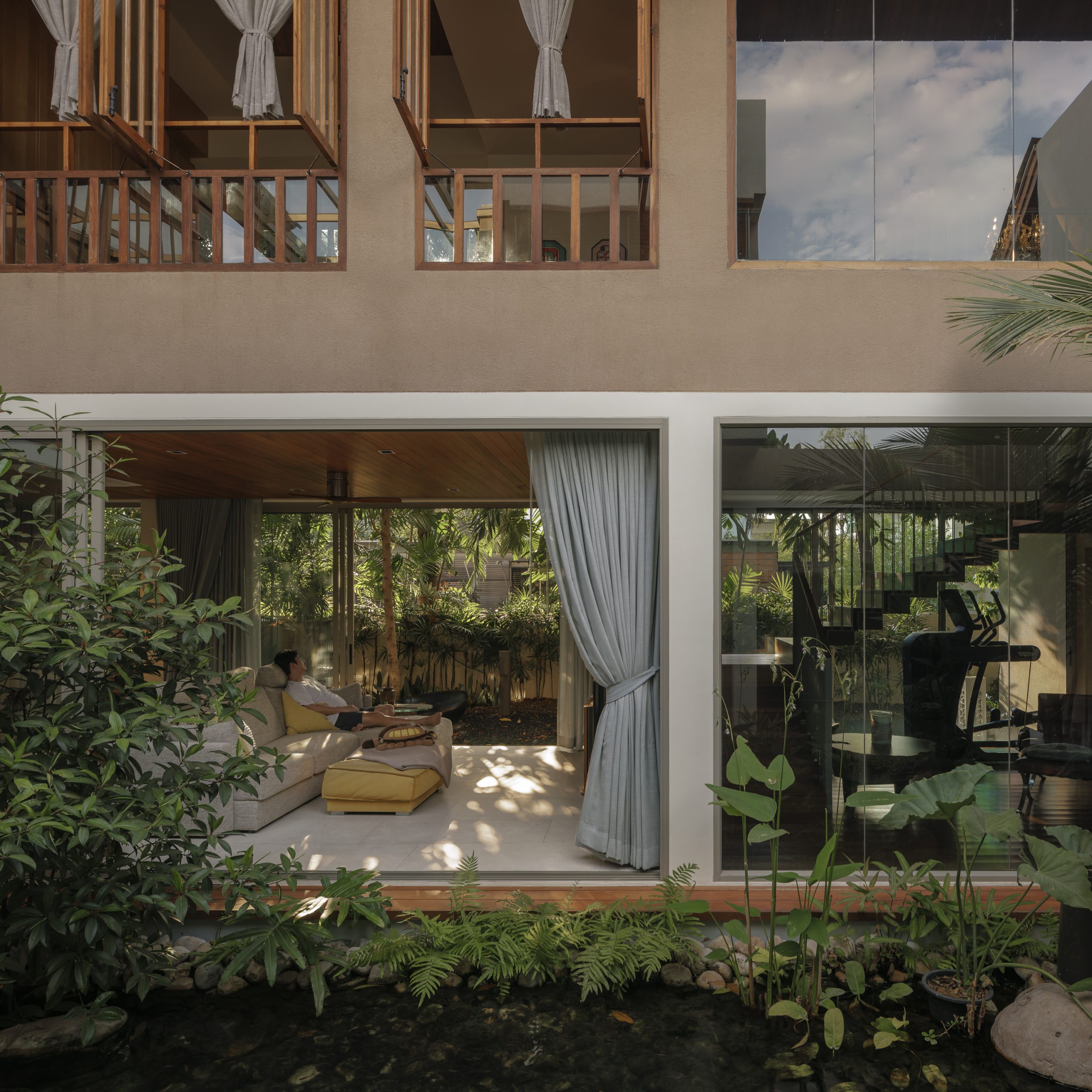
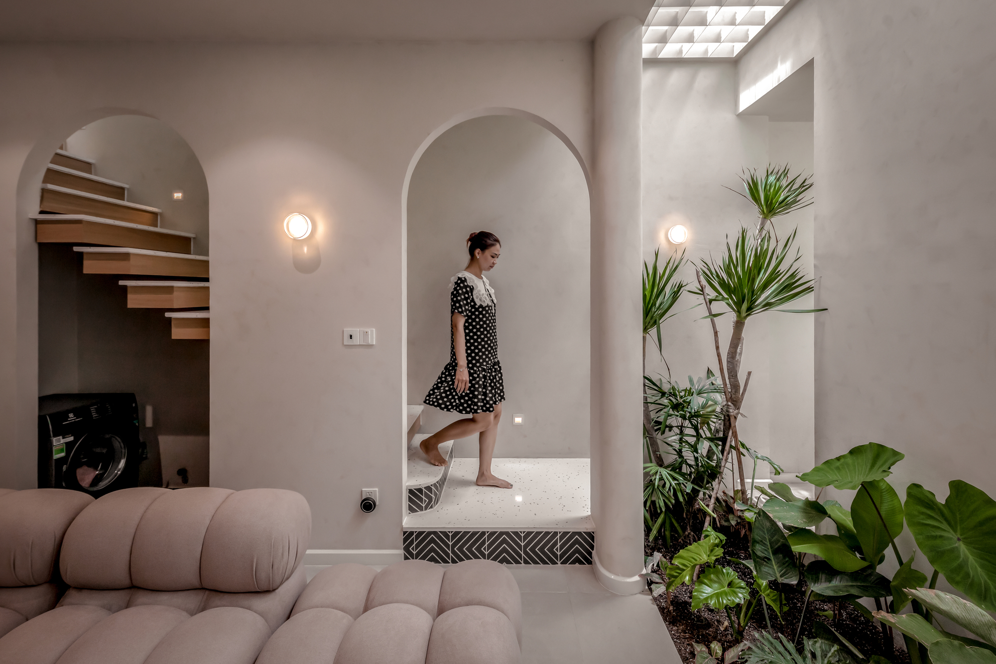
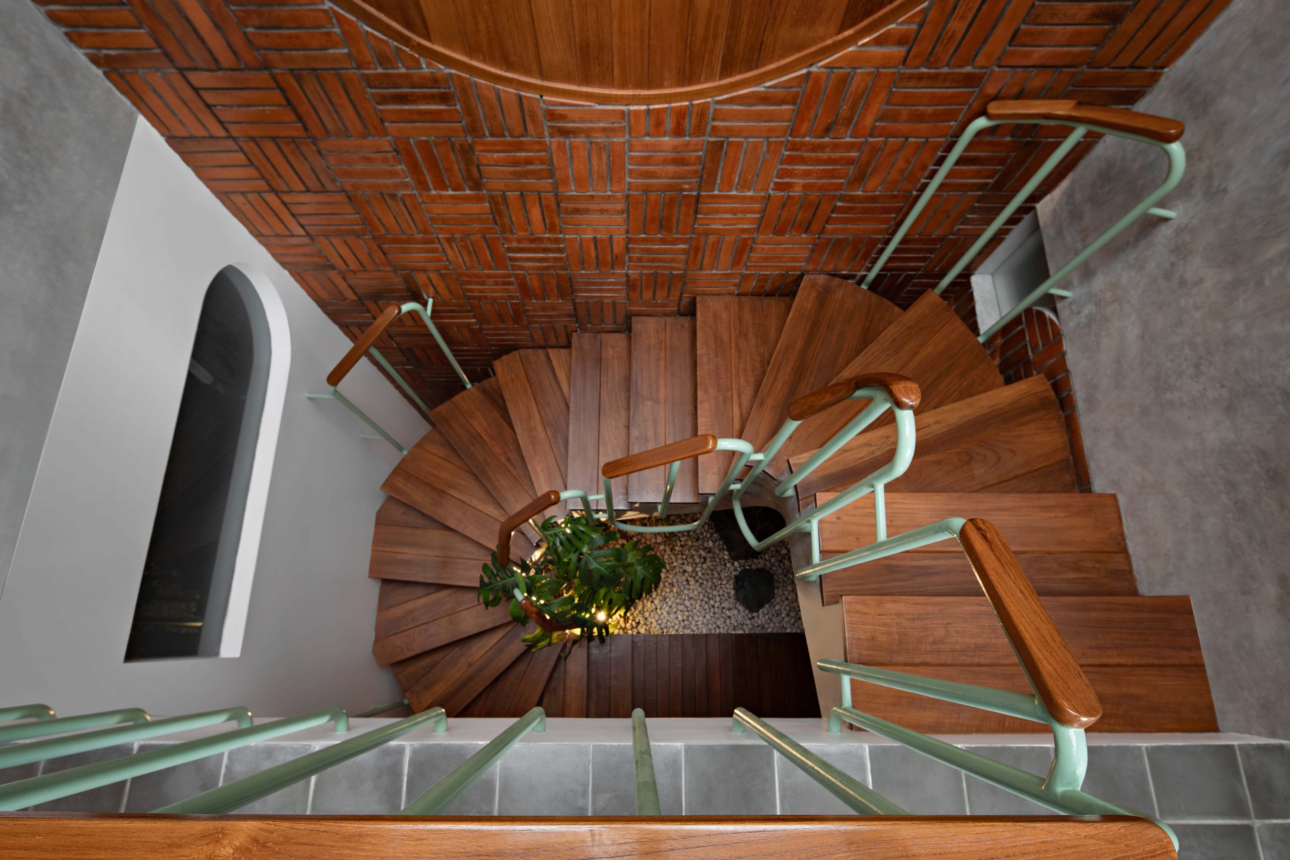
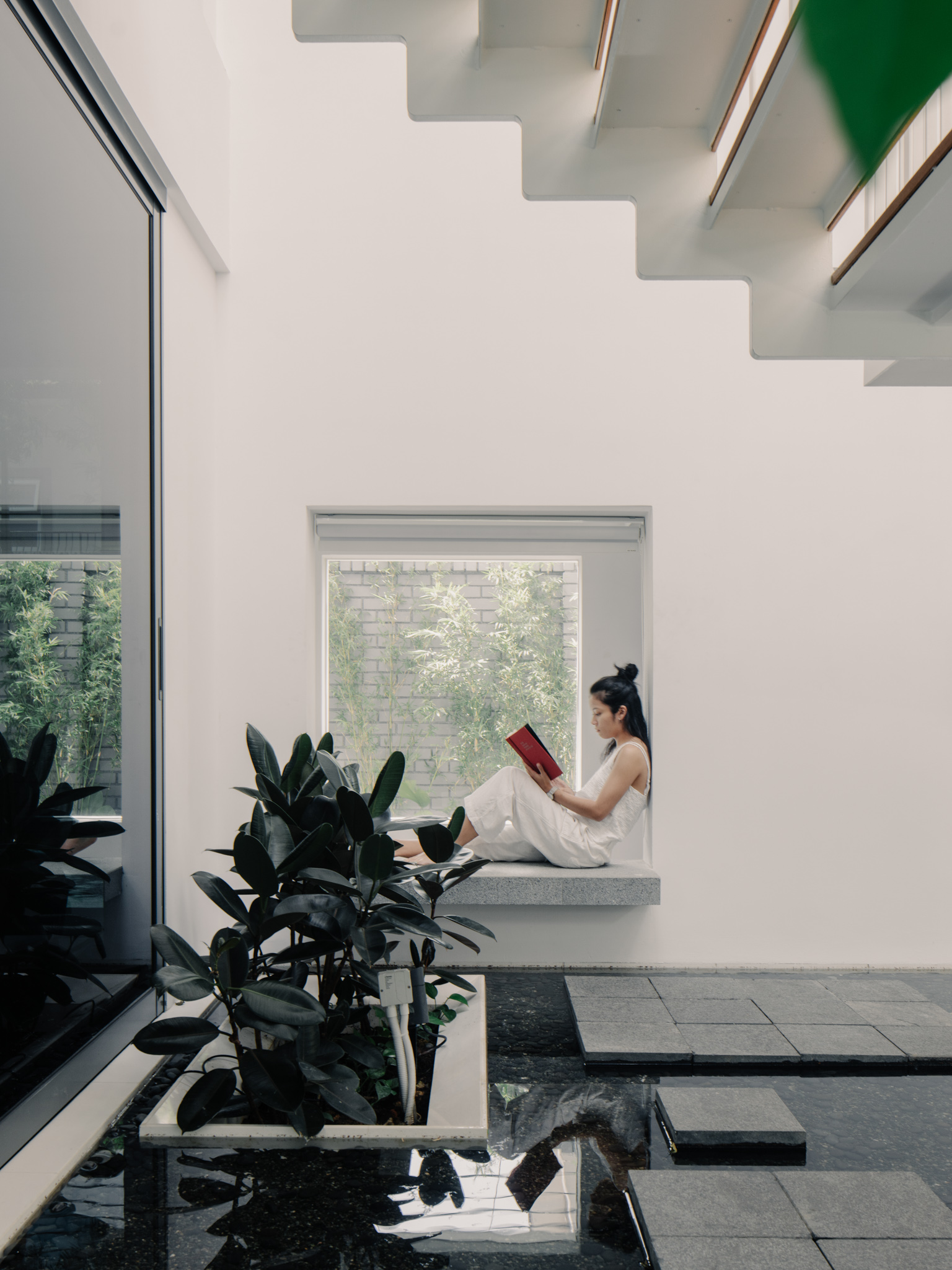
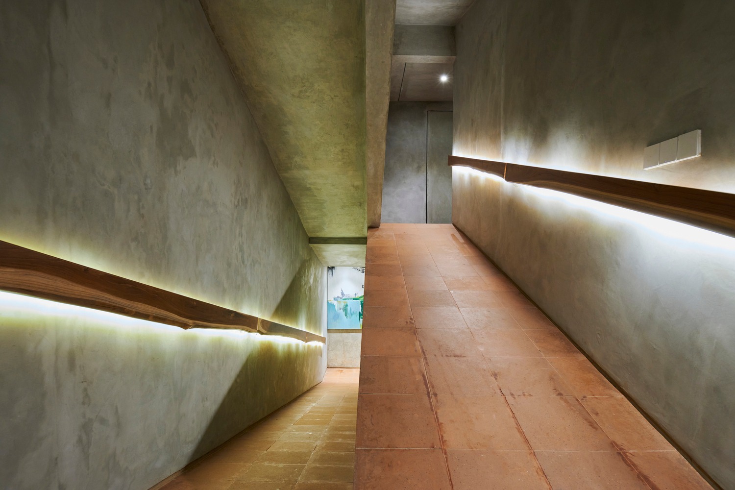
Houseplants perfect for miniature landscaping thrive everywhere, even under the staircase. Nearby, young trees with healthy lush foliage stand front and center next to a garden water feature with stepping stones that decorates and refreshes the room.

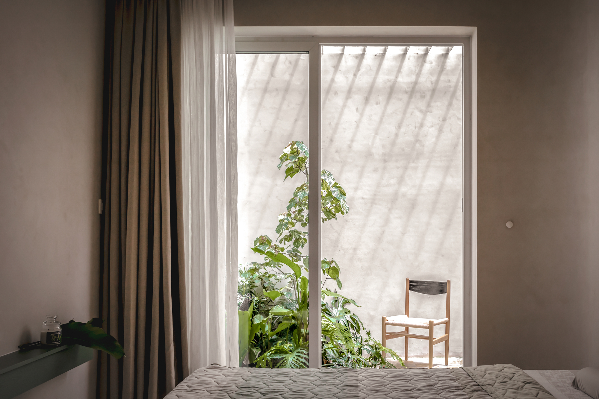
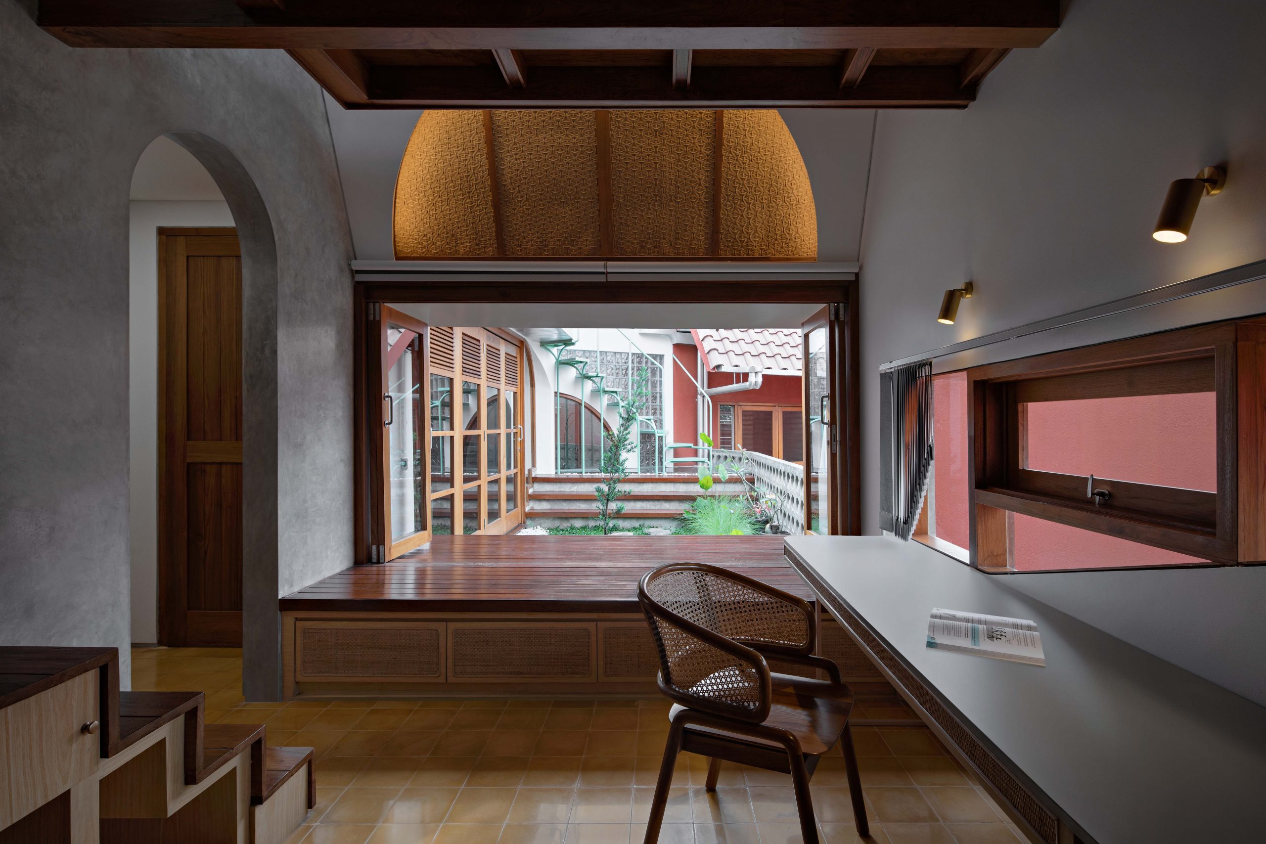
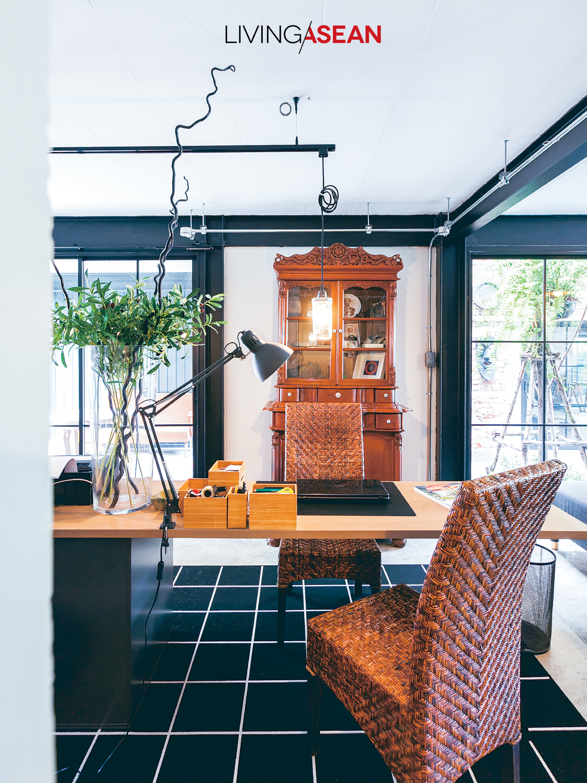
Looking for a quiet place to lean back and chill? There’s a nice sitting room with a garden view by the window.

Modern space

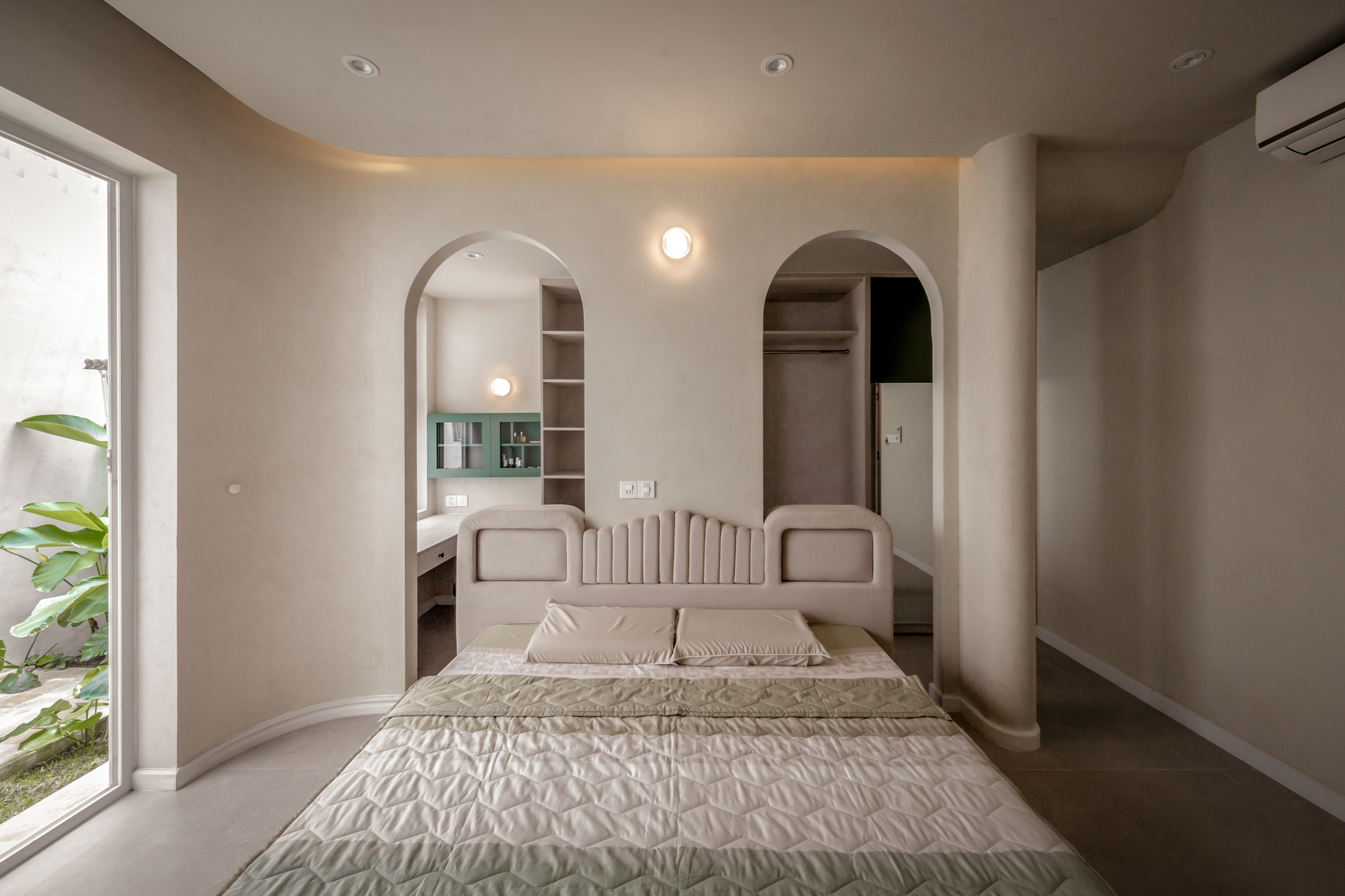
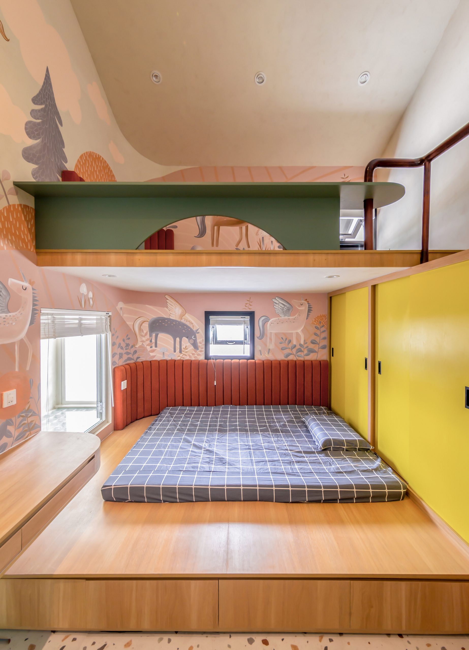
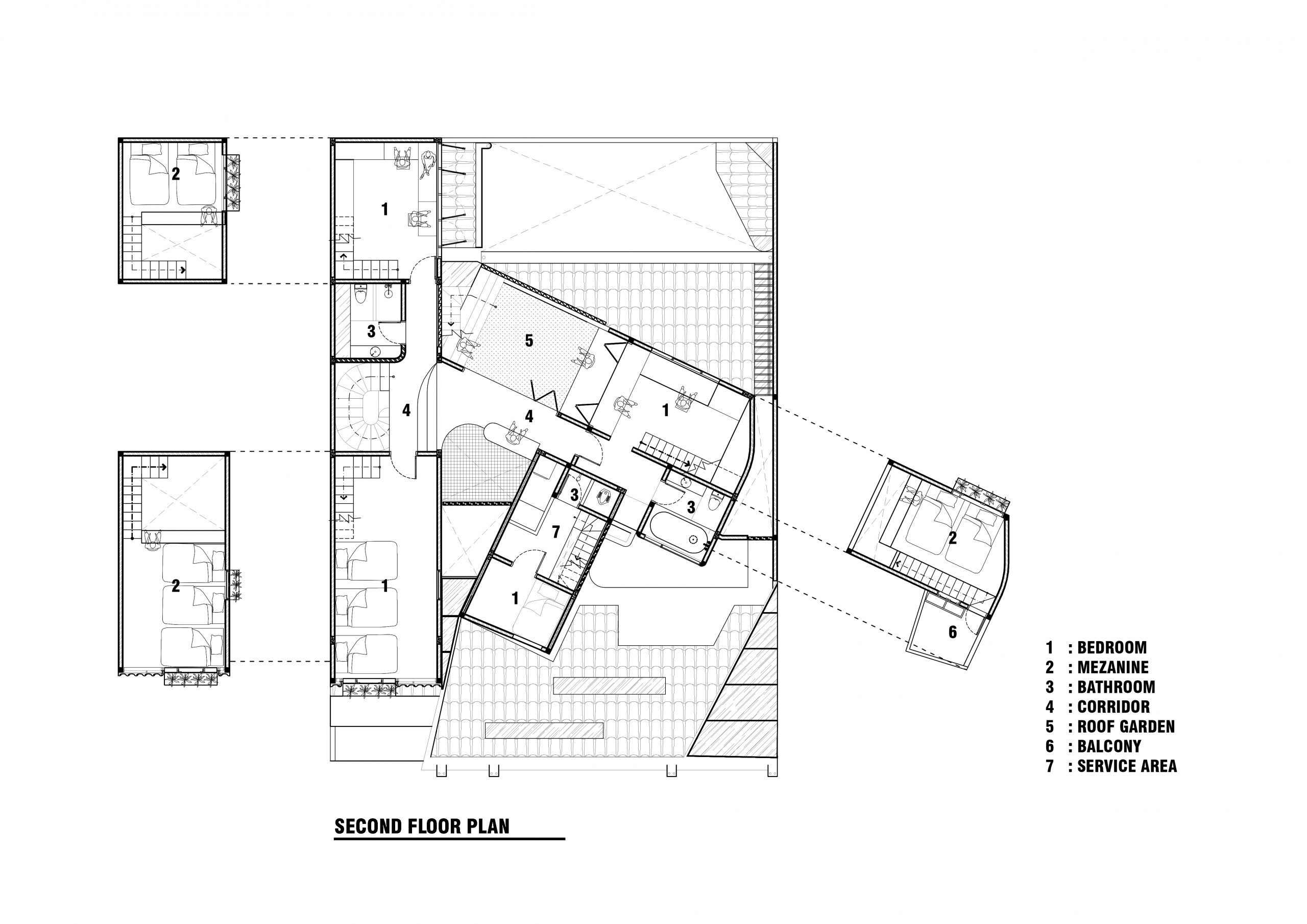
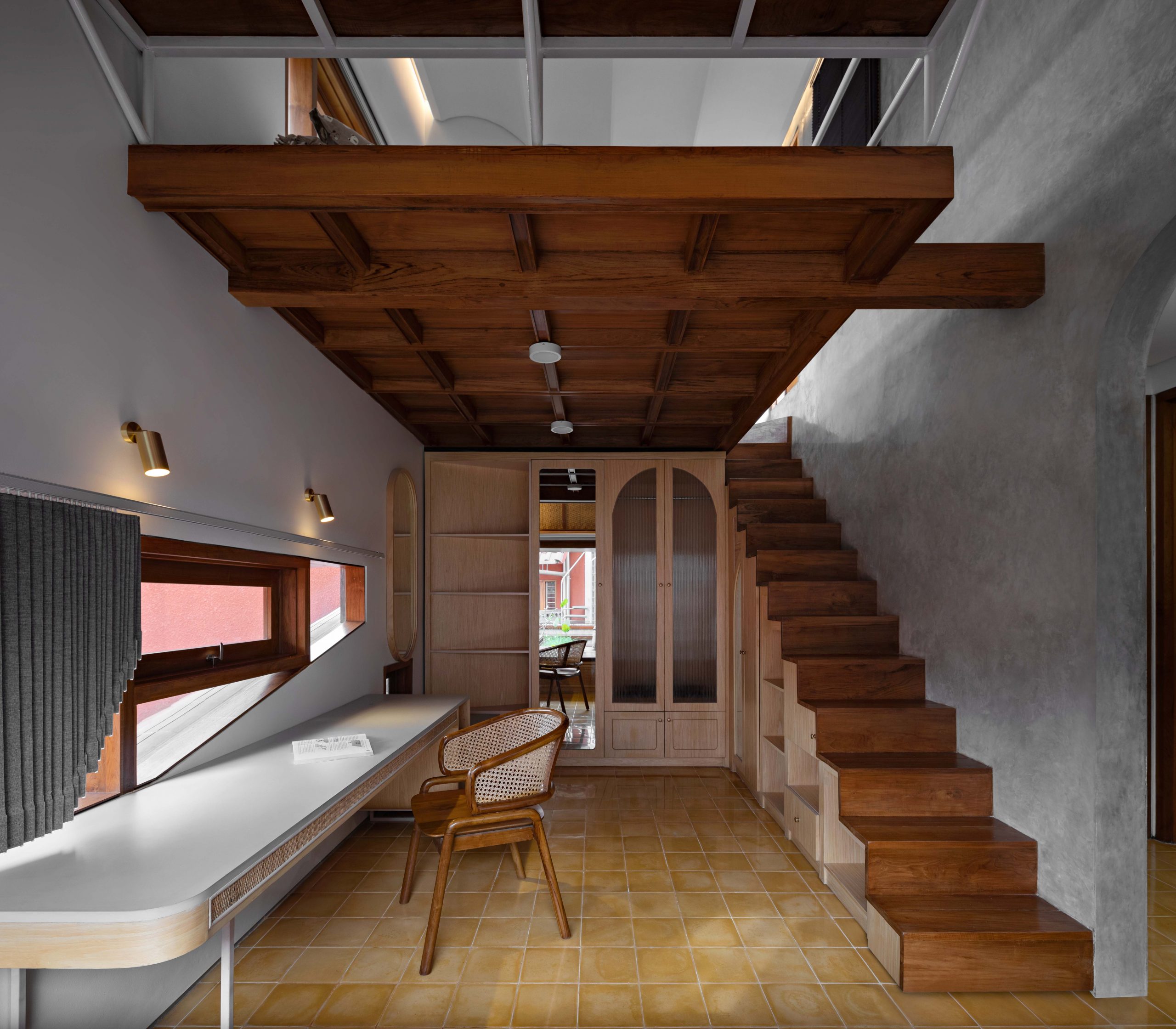
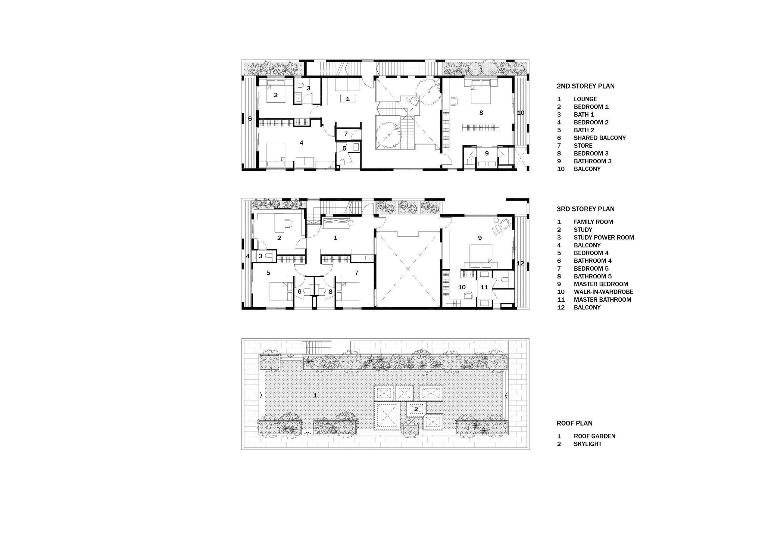
The second floor contains living quarters for elderly parents, while the third affords plenty of private residential spaces for grownup children and their families.

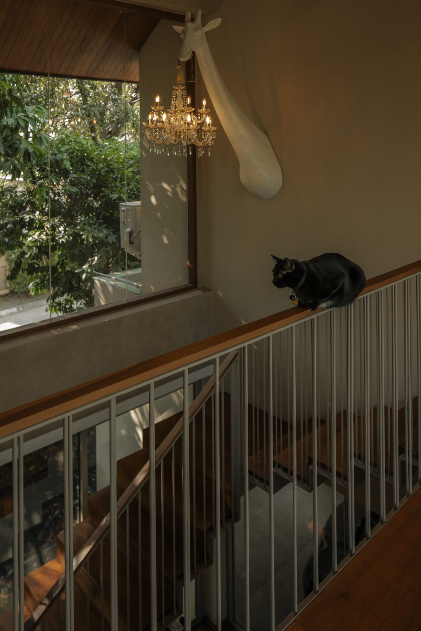
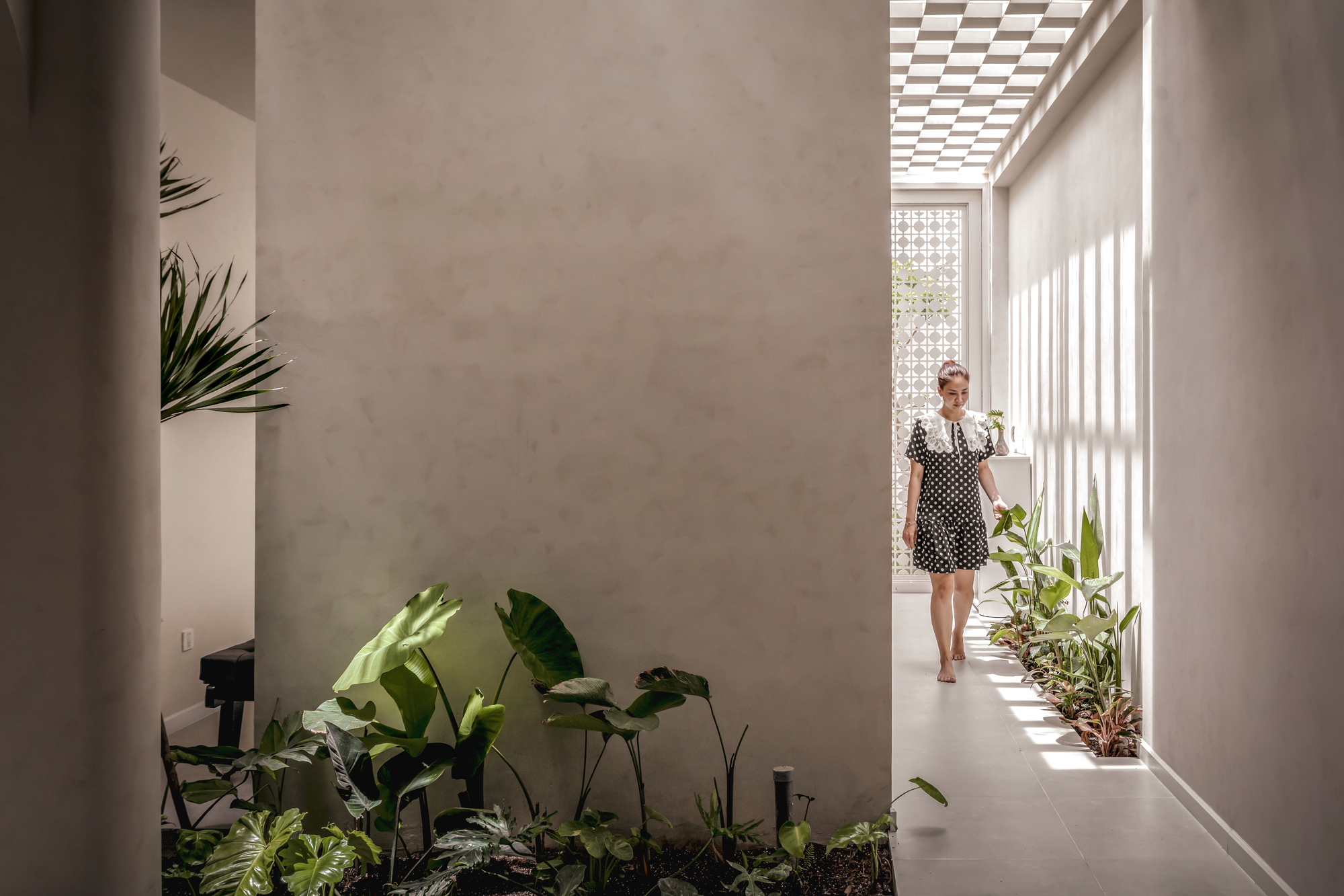
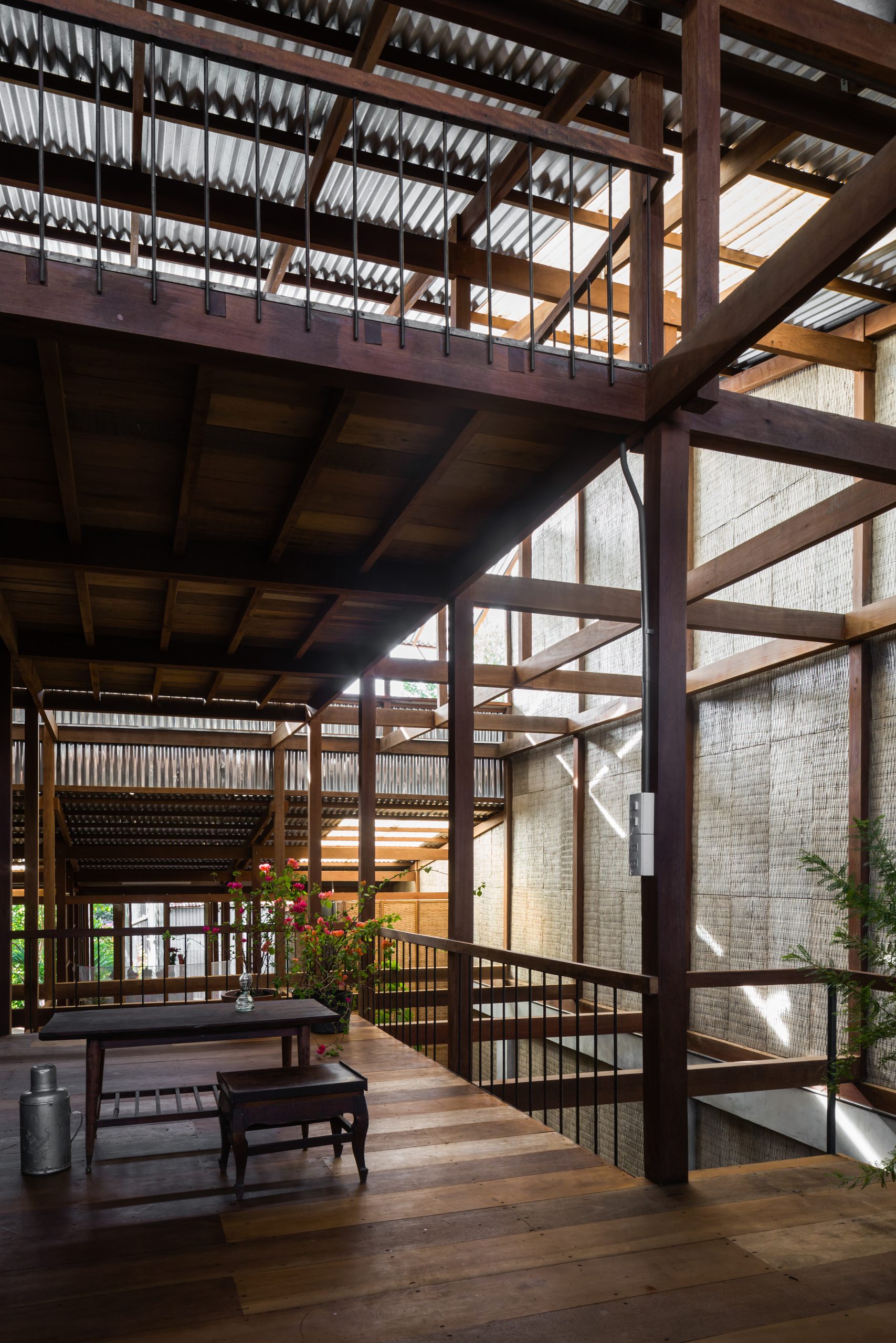
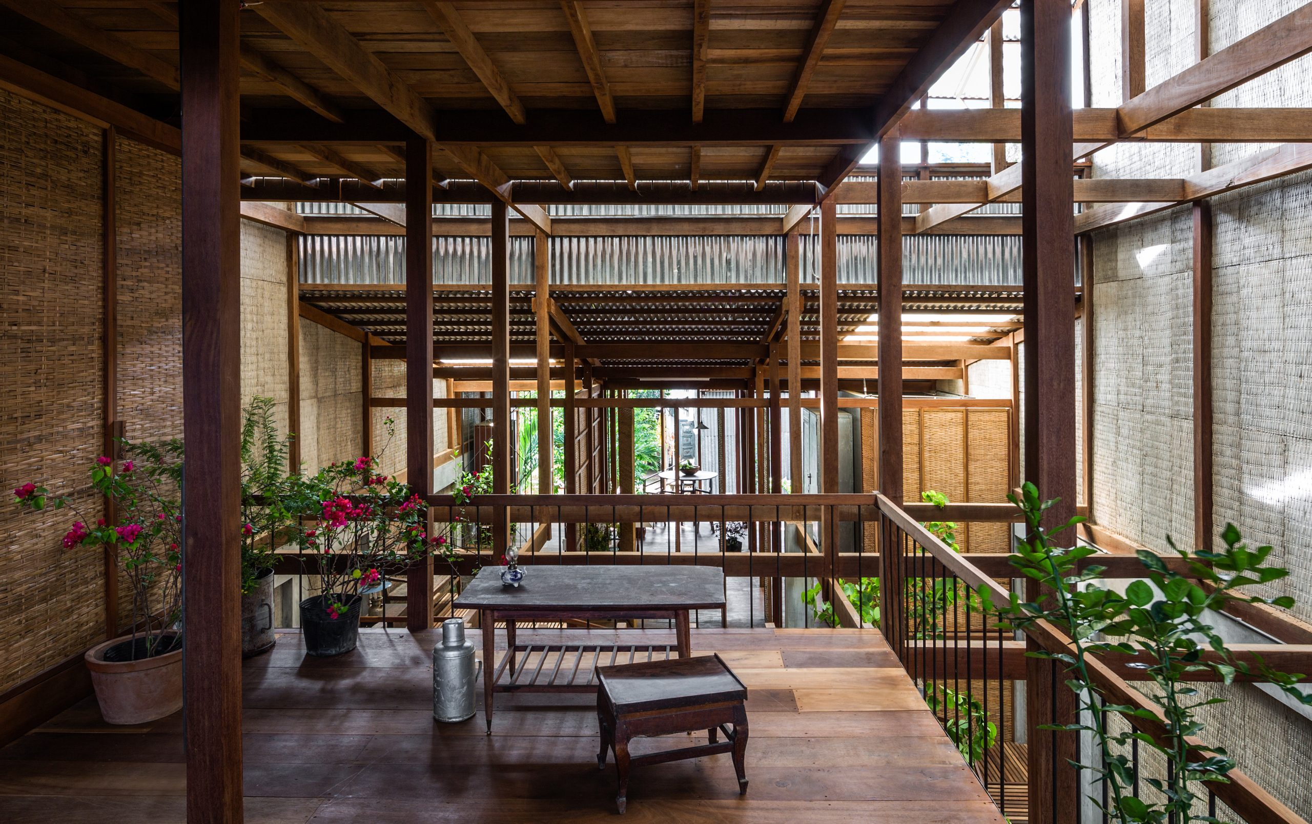
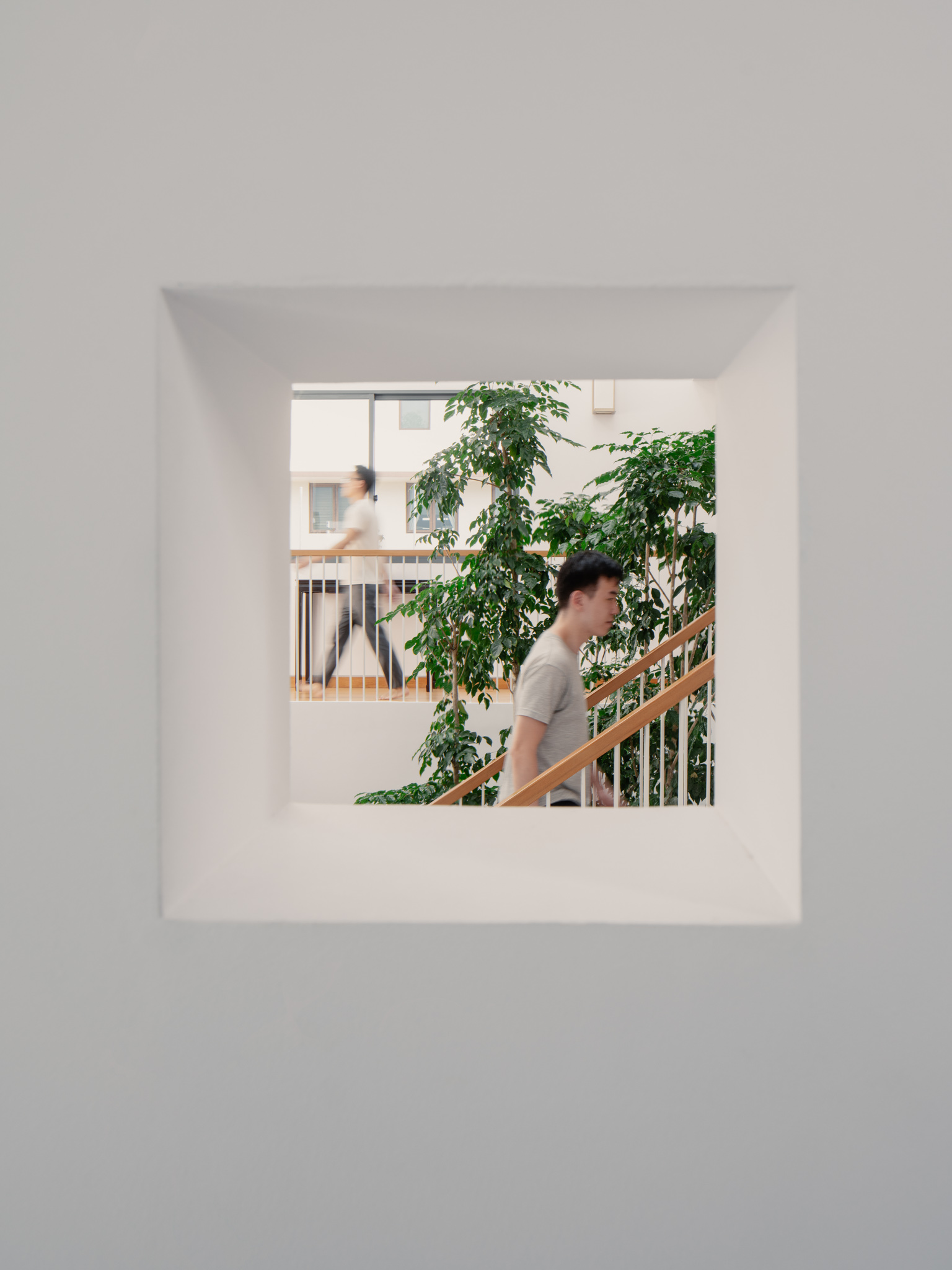
Here, fresh greenery is never out of style. It’s an awesomely cool Modern space, where the beauty of plants is present everywhere, whether it’s on the staircase or along the corridors.

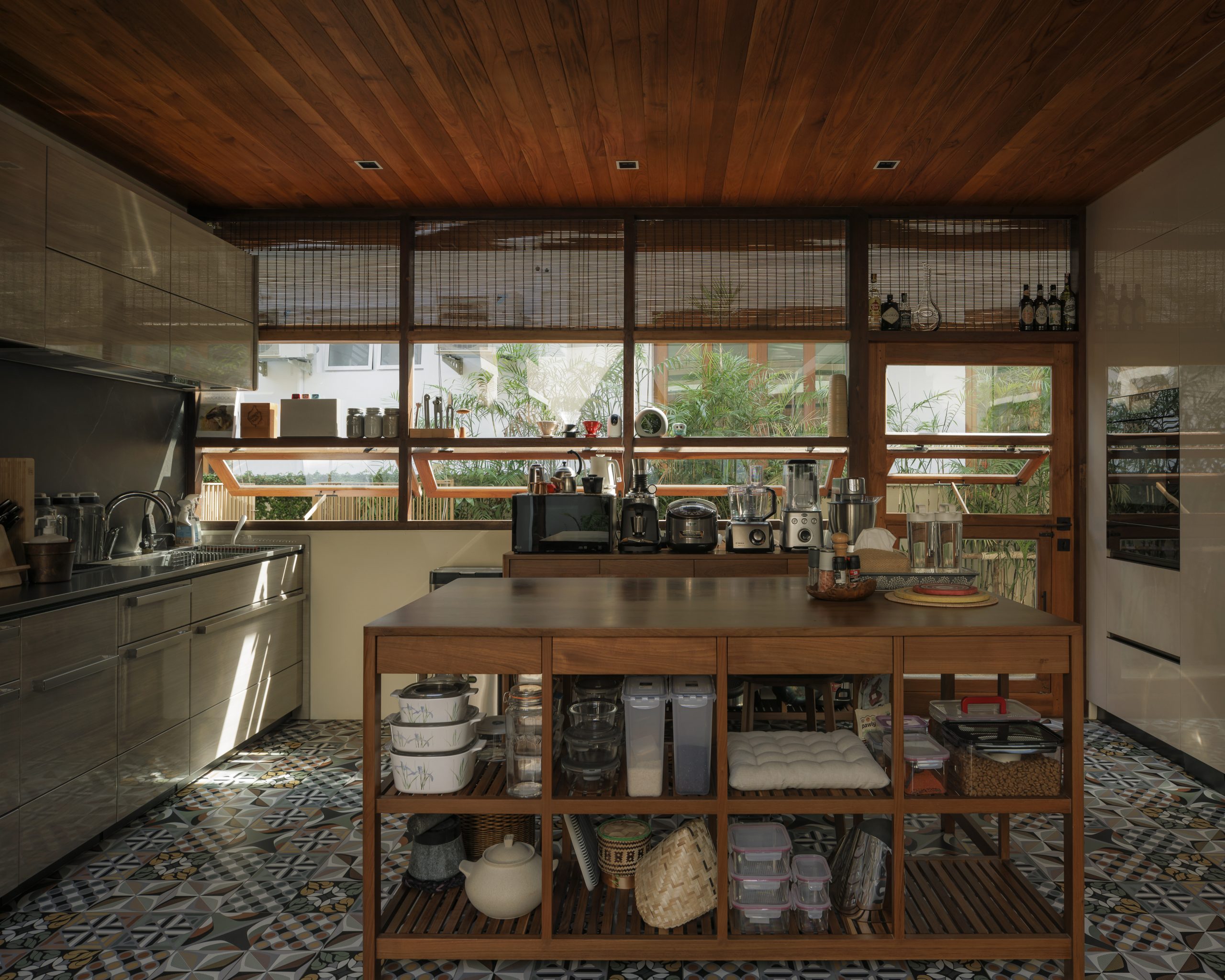
The entire interior is so well-lit by skylights that there’s no need for electric lights anywhere in the daytime. And the house plants benefit from it, too, no doubt.

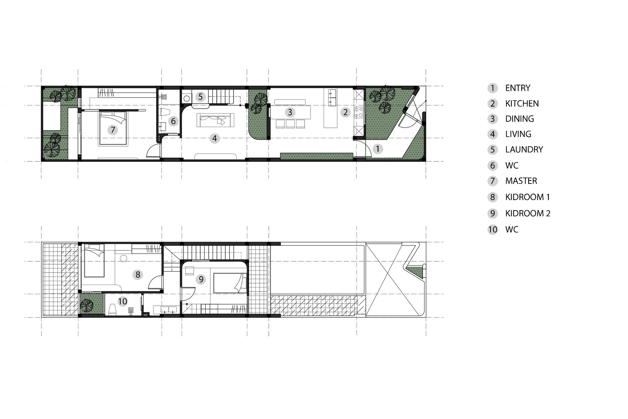
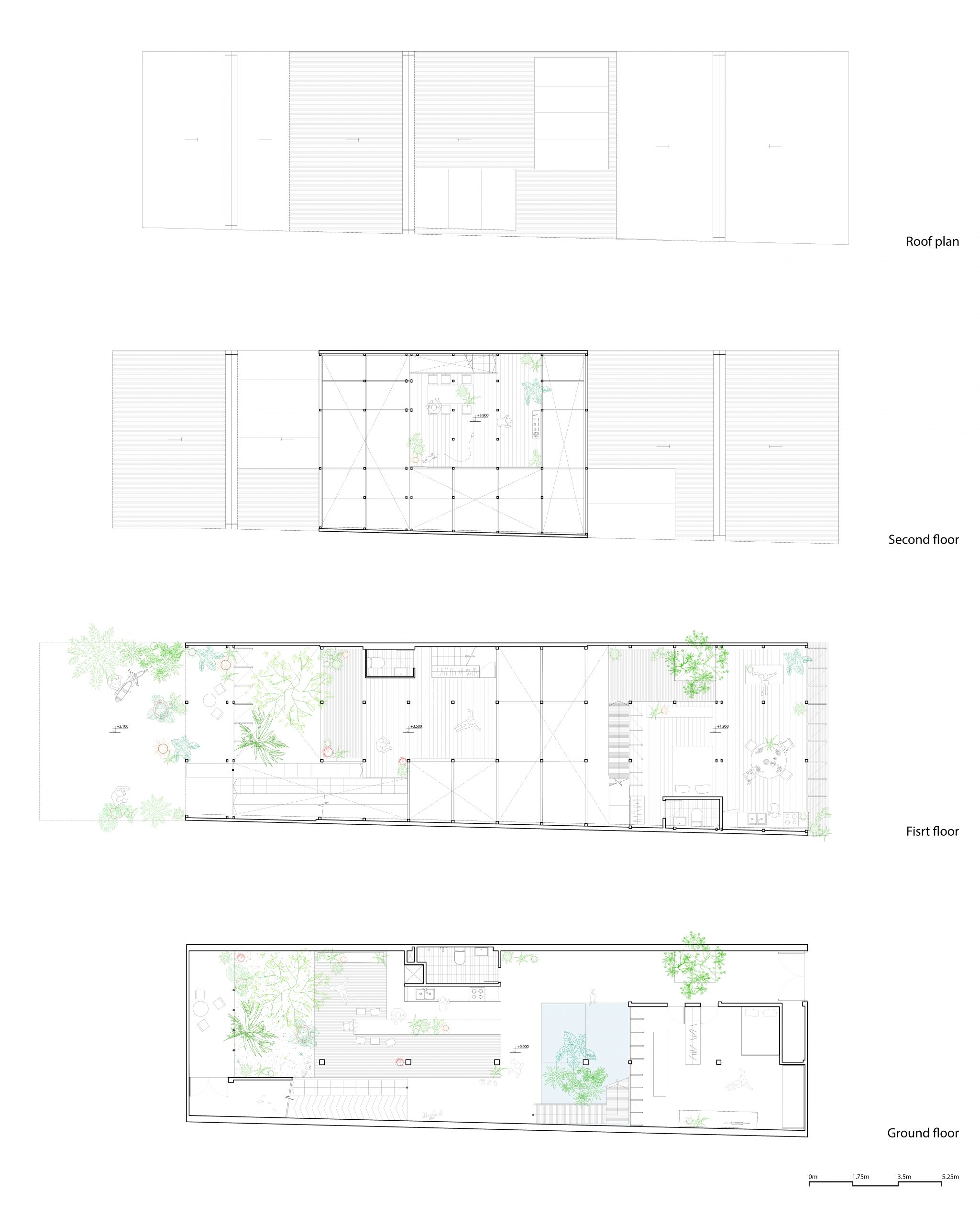
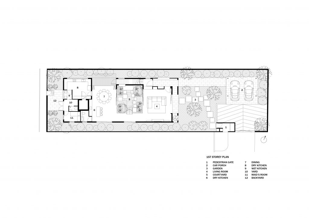
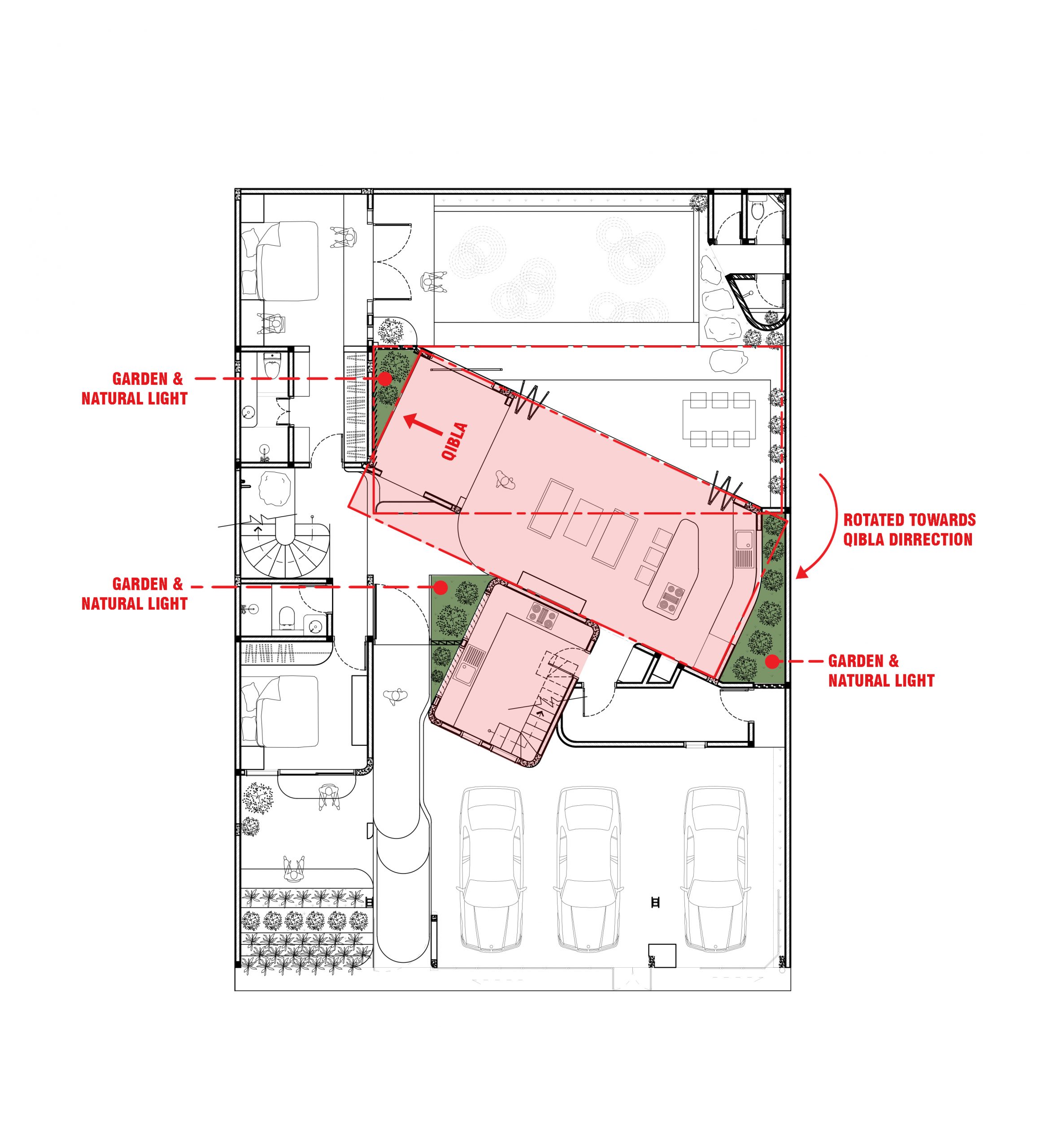
1st Floor Plan Courtesy of ASOLIDPLAN
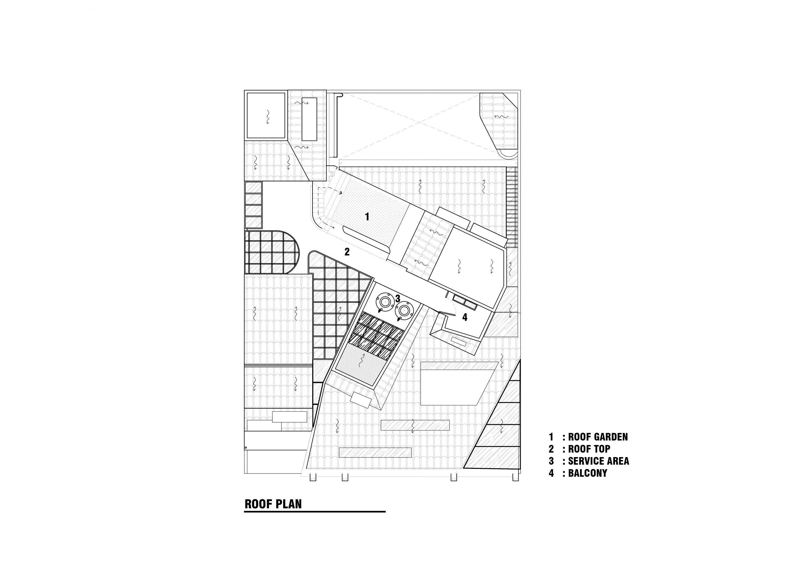
2nd, 3rd, and Roof Floor Plan Courtesy of ASOLIDPLAN

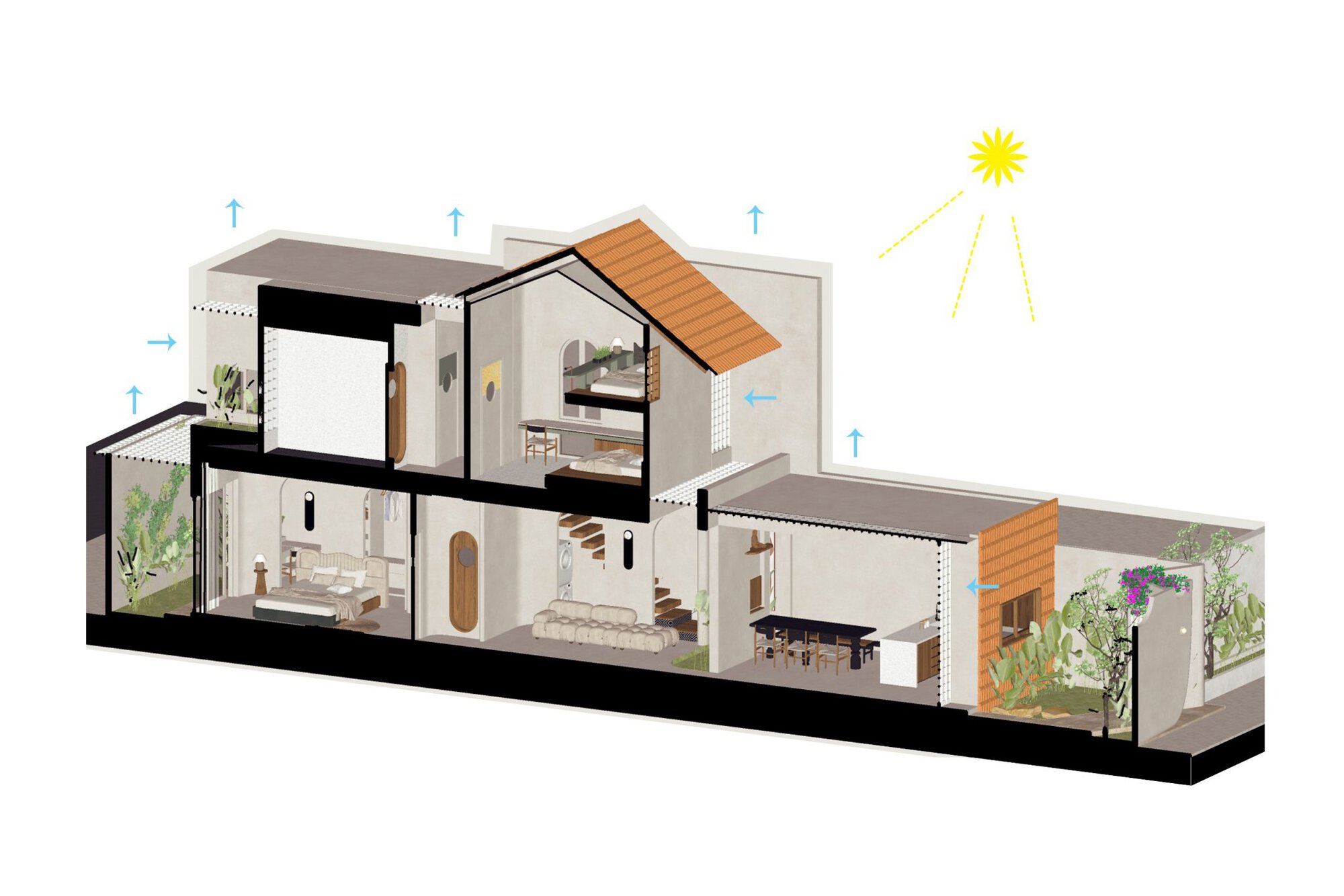
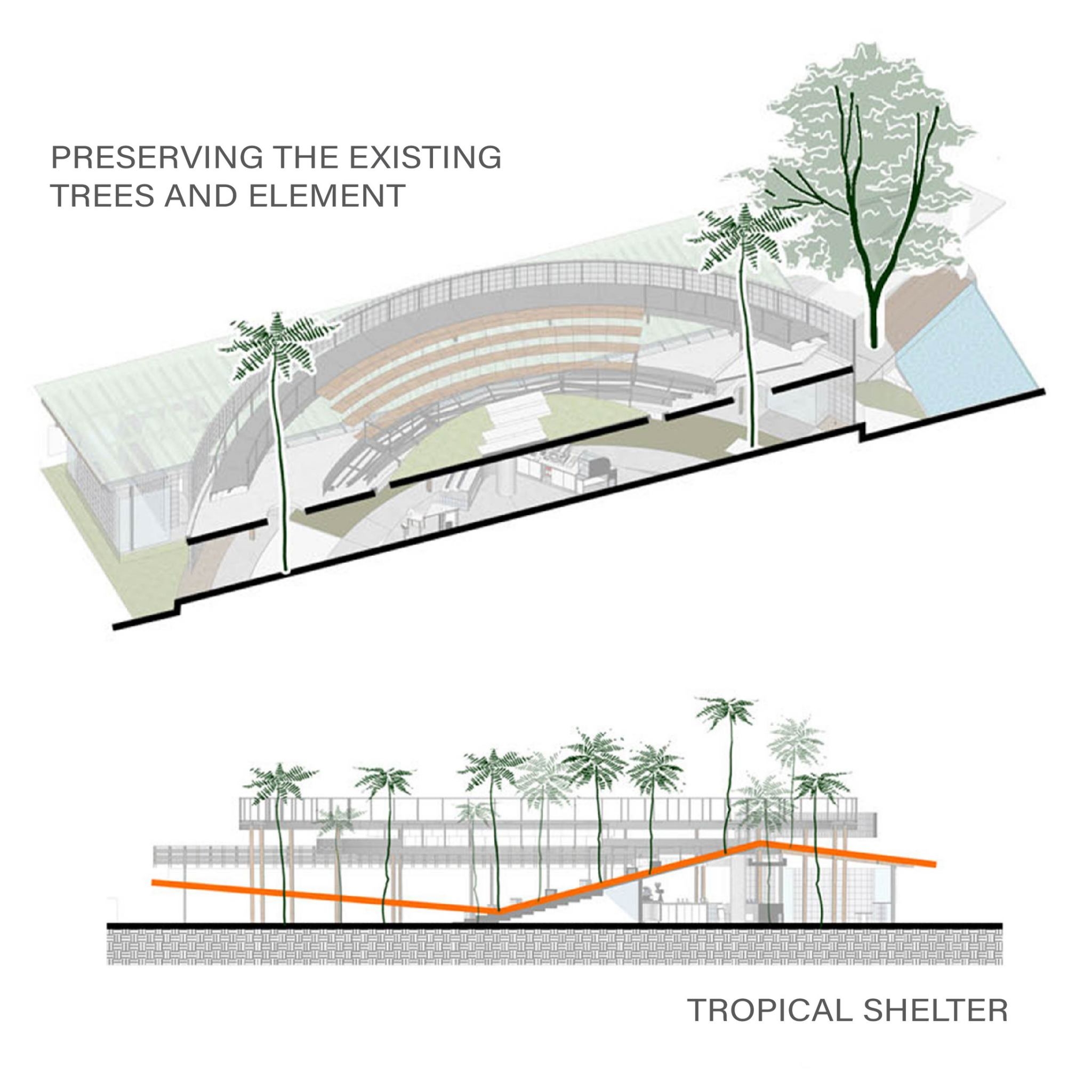
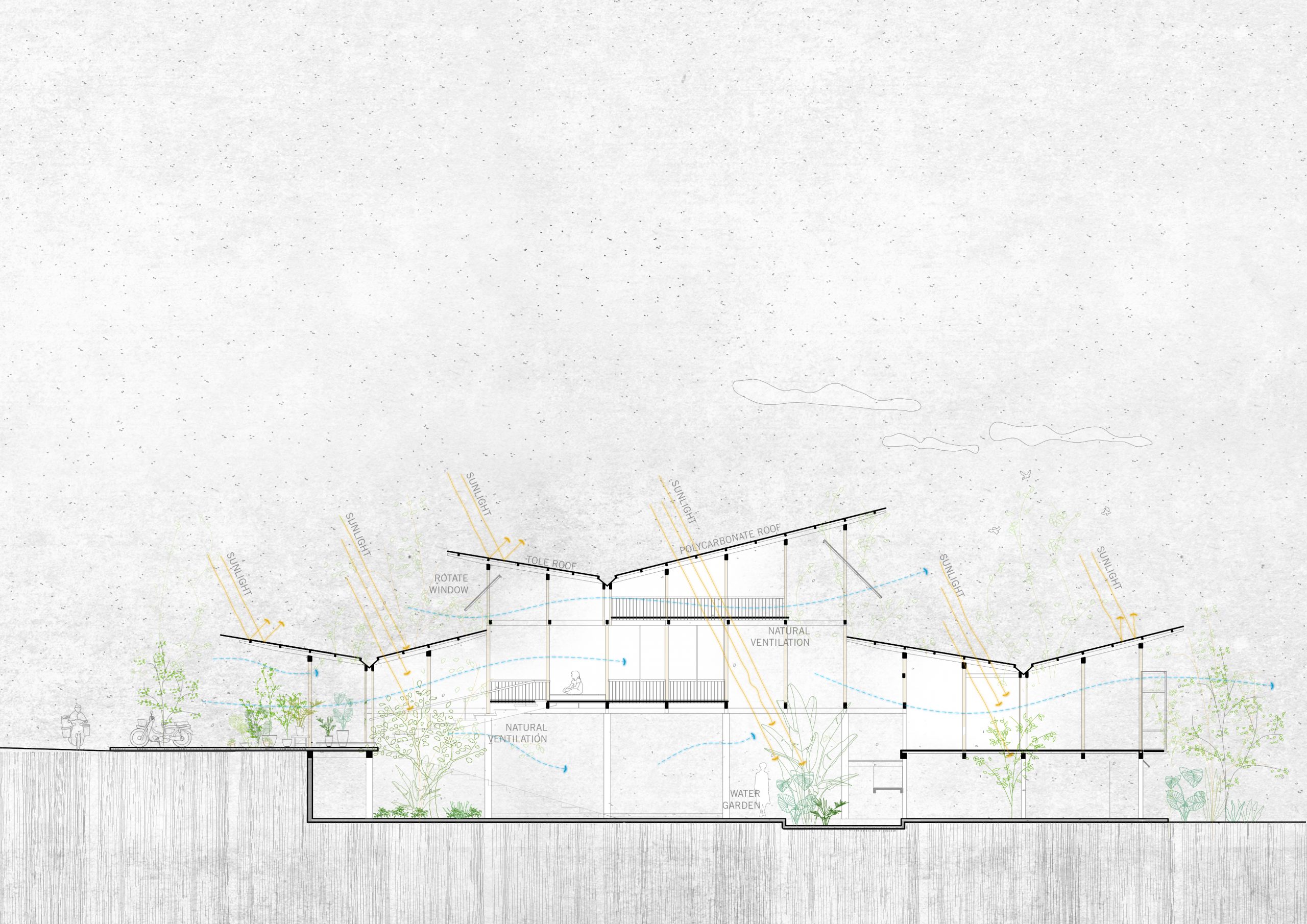
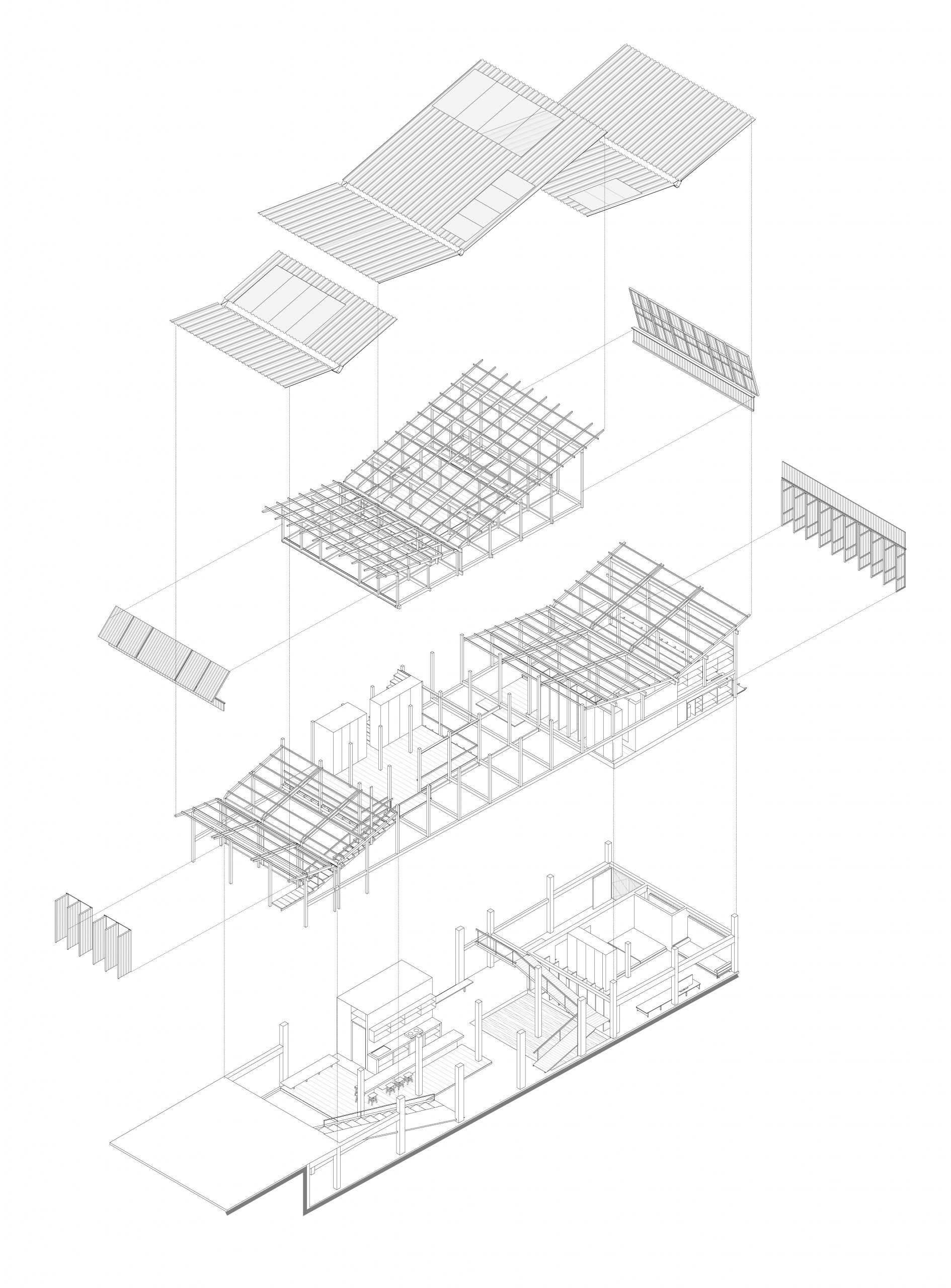
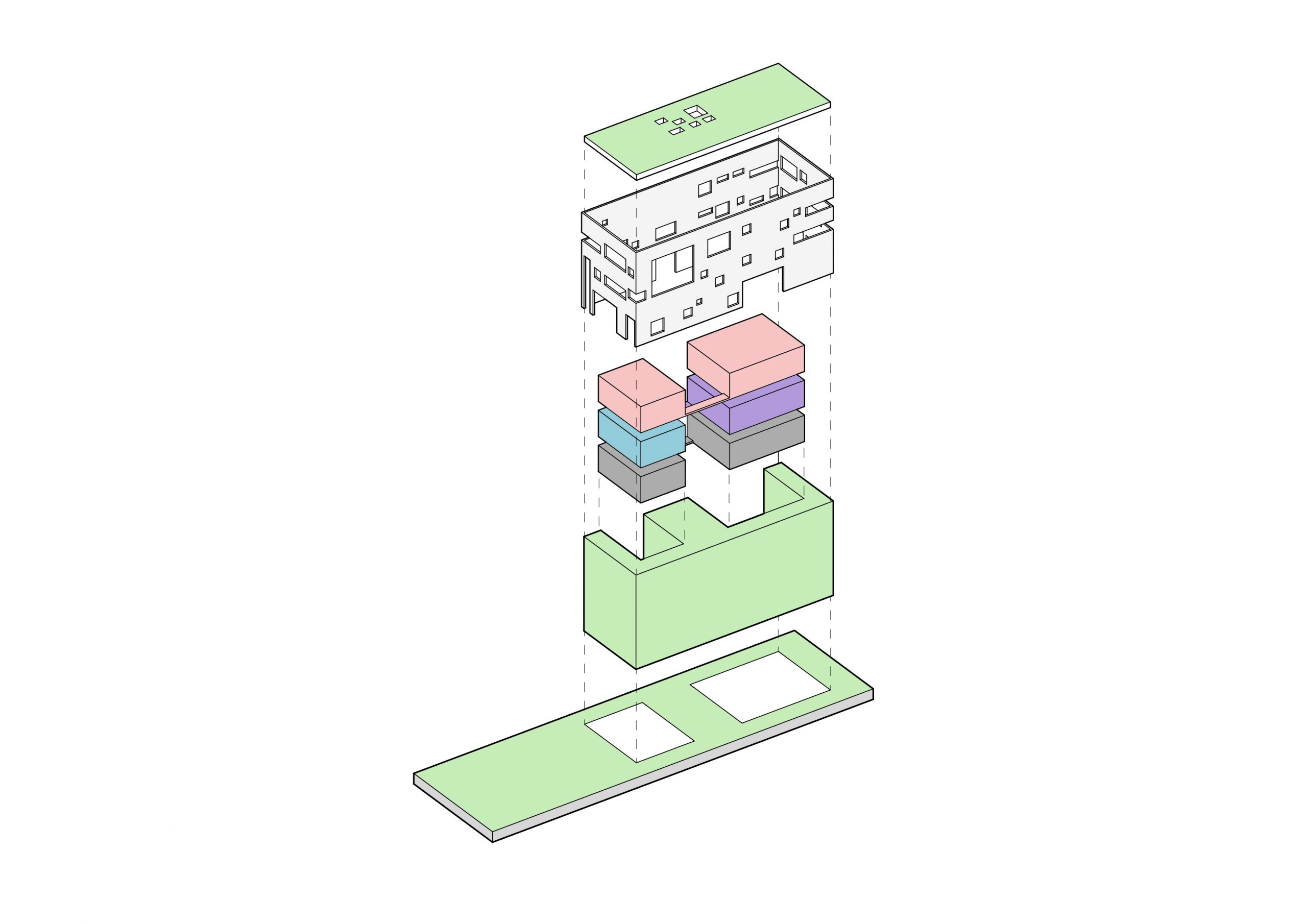
Speaking of design, there’s a special feature that makes the house with a Modern space feel more comfortable. Its thermal envelope is made of energy-saver double-layer walls that form the first line of defense against heat and the elements.

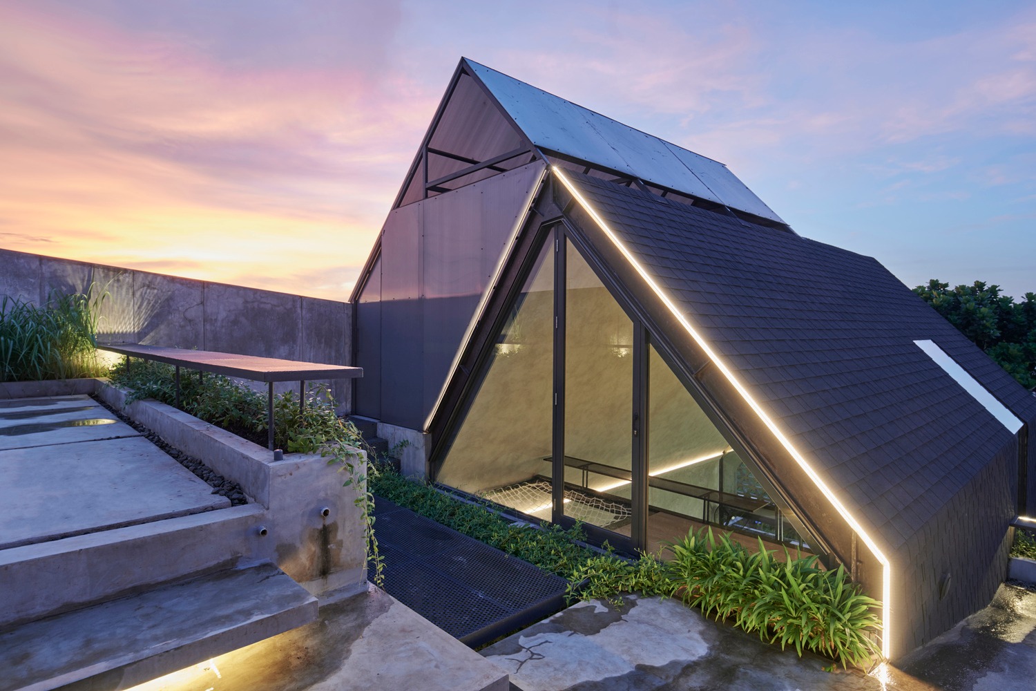
Where possible, landscaping plants thrive in between the two layers to protect the interior from the sun’s harsh UV rays. That’s not all. There’s also a rooftop deck with green grass lawns for outdoor relaxation in the cool of the evening.

Conceptual Diagram Courtesy of ASOLIDPLAN

Modern space

In the fewest possible words, it’s a perfect example of homes well suited to a Tropical climate — a complete rethink of strategies that doesn’t rely on adding or extending a roof overhang to protect from inclement weather.

Plus, double-layer wall construction makes this piece of architecture original and unique in itself simply by bringing the outdoors inside.

By integrating a green oasis into the design of the house’s Modern space, it succeeds in dealing with limitations that come with overcrowded urban spaces.


Architect: ASOLIDPLAN (asolidplan.sg)

Lead Architect: QUCK Zhong Yi


You may also like…

A Modern Home That is Quintessentially Thai Quiet Interaction of Landscape Design and Architecture

Turning a Cold 20-Year-Old House into a Bright and Airy Tropical Home

Turning a Cold 20-Year-Old House into a Bright and Airy Tropical Home

/ Bangkok, Thailand /

/ Story: Kor Lordkam / English version: Bob Pitakwong /

/ Photographs: Soopakorn Srisakul /

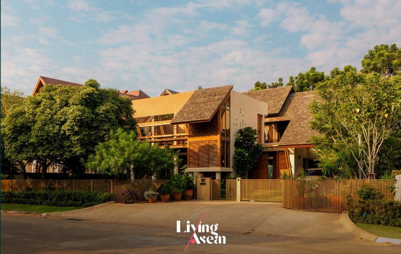
Every home tells a story. This good-sized two-story residence at “Mai Lom Ruen”, an upscale housing development near King Rama IX Memorial Park in Bangkok, is home to a couple and their six adorable pets (a dog and five cats). They moved to this outlying district of the city not that long ago. The 20-year-old house they bought needed improvements so as to answer their lifestyle needs. And a home renovation firm came in handy to do exactly that. The result is a light and airy tropical home with the warm sunshine, plus an image of the friendliness and youthful enthusiasm of the people living here.
The project architect, Tharit Tossanaitada, who is design director of the Design In Motion Co., Ltd, said that in the primary stage, he would have to redraw a new house plan within the confines of the existing home.

It was good that the homeowners already had an idea about what to do and had a blueprint for all the rooms. And with that, the project was off to a very good start.
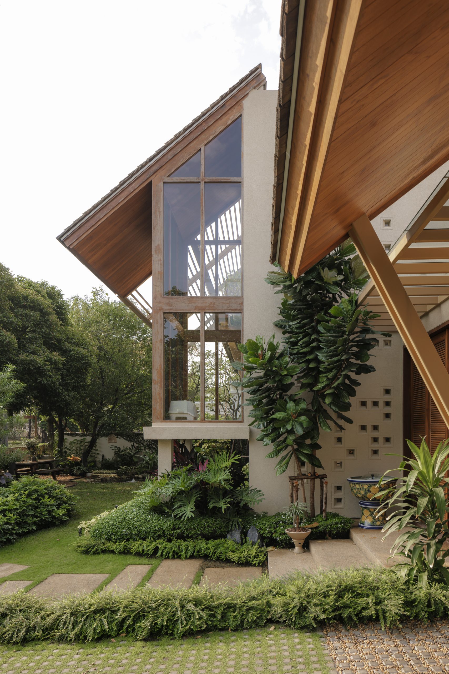
AIRY TROPICAL HOME

The 400-square-meter two-story home was ready for remodeling, starting with a teardown of most solid walls that divided the interior into different parts.

The building’s original frames and beams supporting the roof and floor above them remained intact. Thereafter new room dividers were put in place according to the activity and purpose intended for each space.
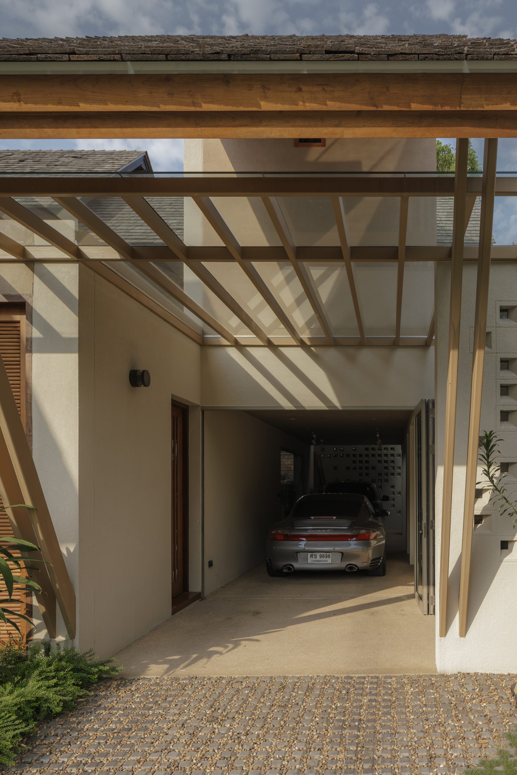
Meantime, the carport that originally stood front and center was moved to the right side of the house. Like so, side-by-side parking has now changed to parking in a column on the driveway.

The result was a house front design that’s wide open without vehicles cluttering up the passageway, creating the perfect front yard that’s easy on the eye.
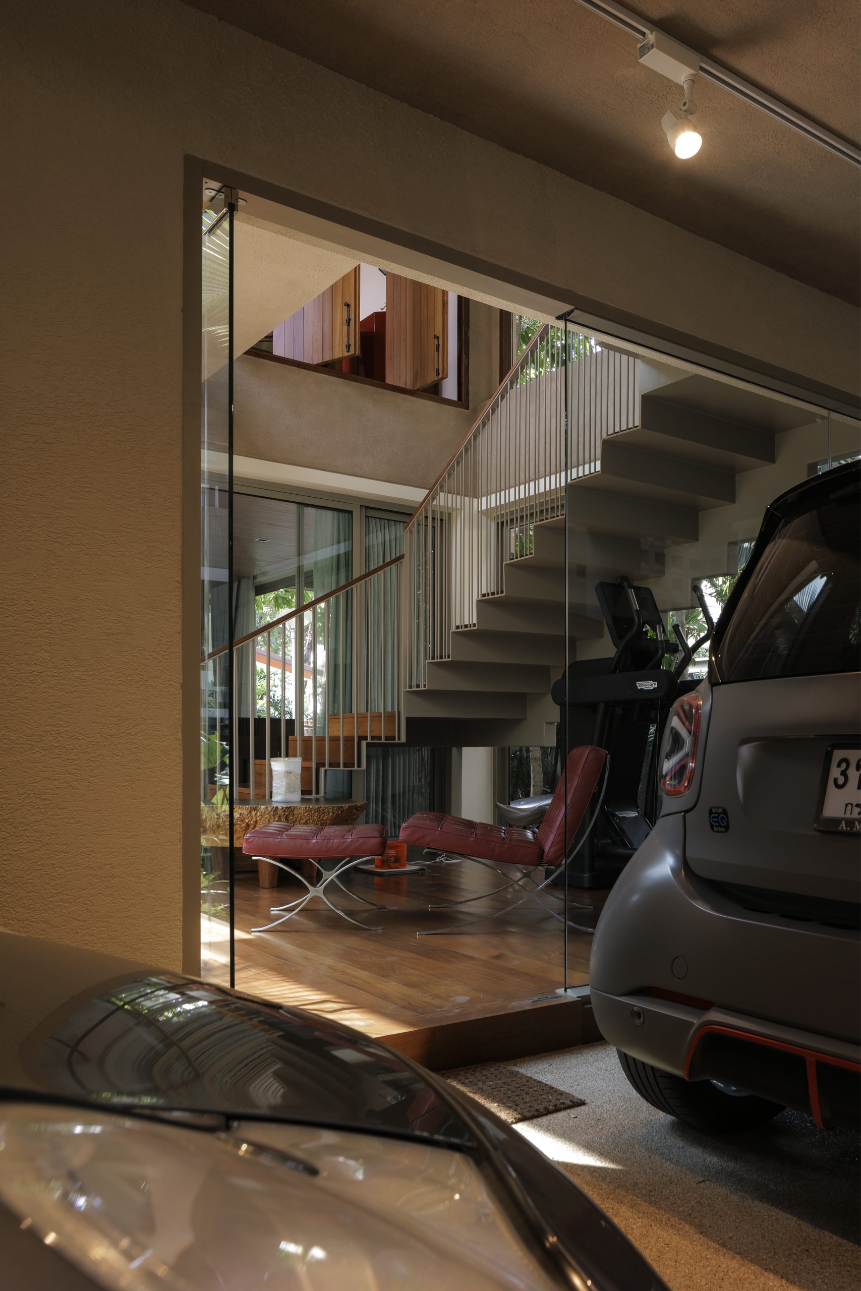
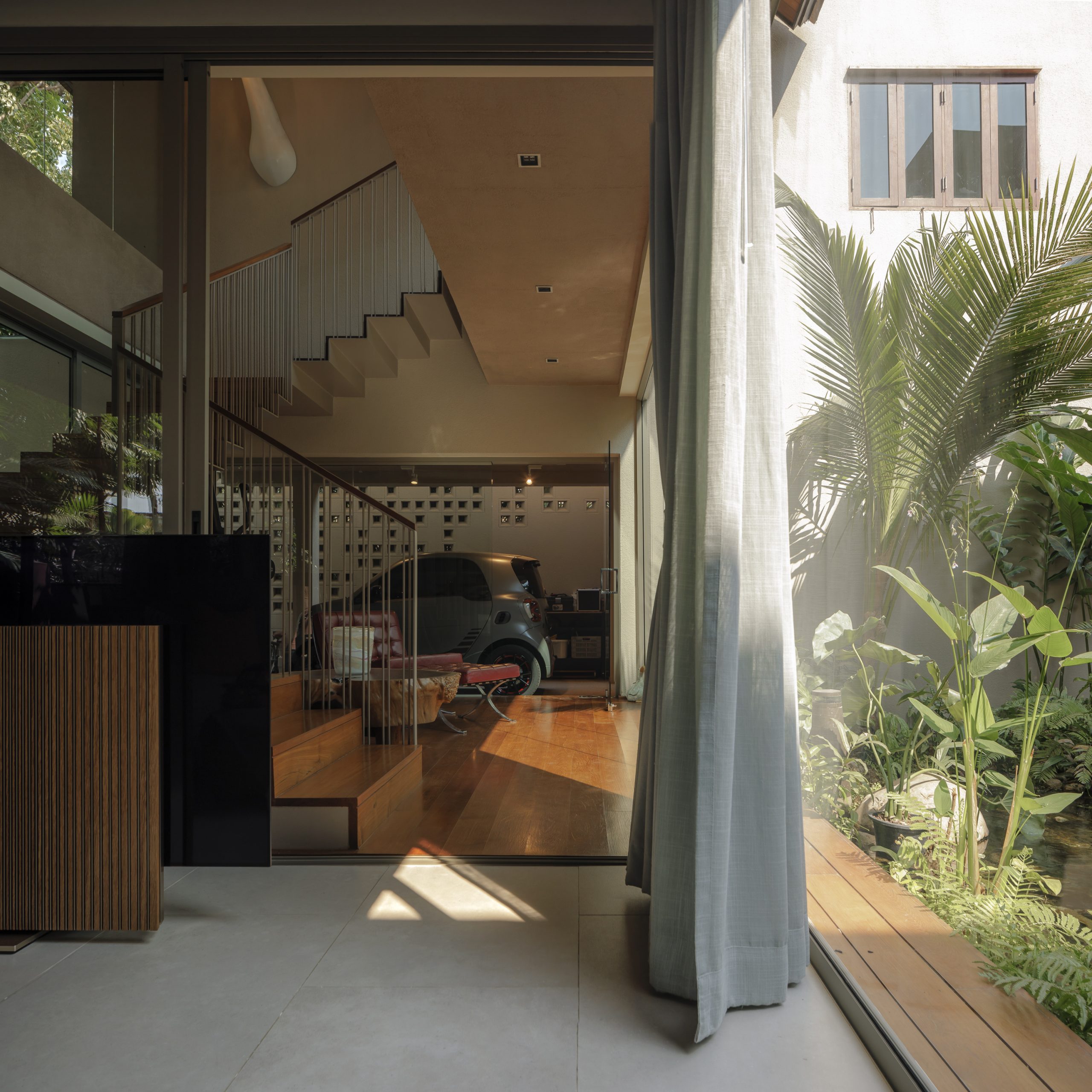
The house’s first floor that lies in open view consists of a nice little foyer at the front that connects to a home office, kitchen and delightful secluded sitting room at the farthest end. By design, the parlor room is conveniently linked up with the new car park at the right side of the house.

Precisely it’s the architect’s intention to keep this back door entrance strictly for family use and hence no need to enter and leave through the front door every time.
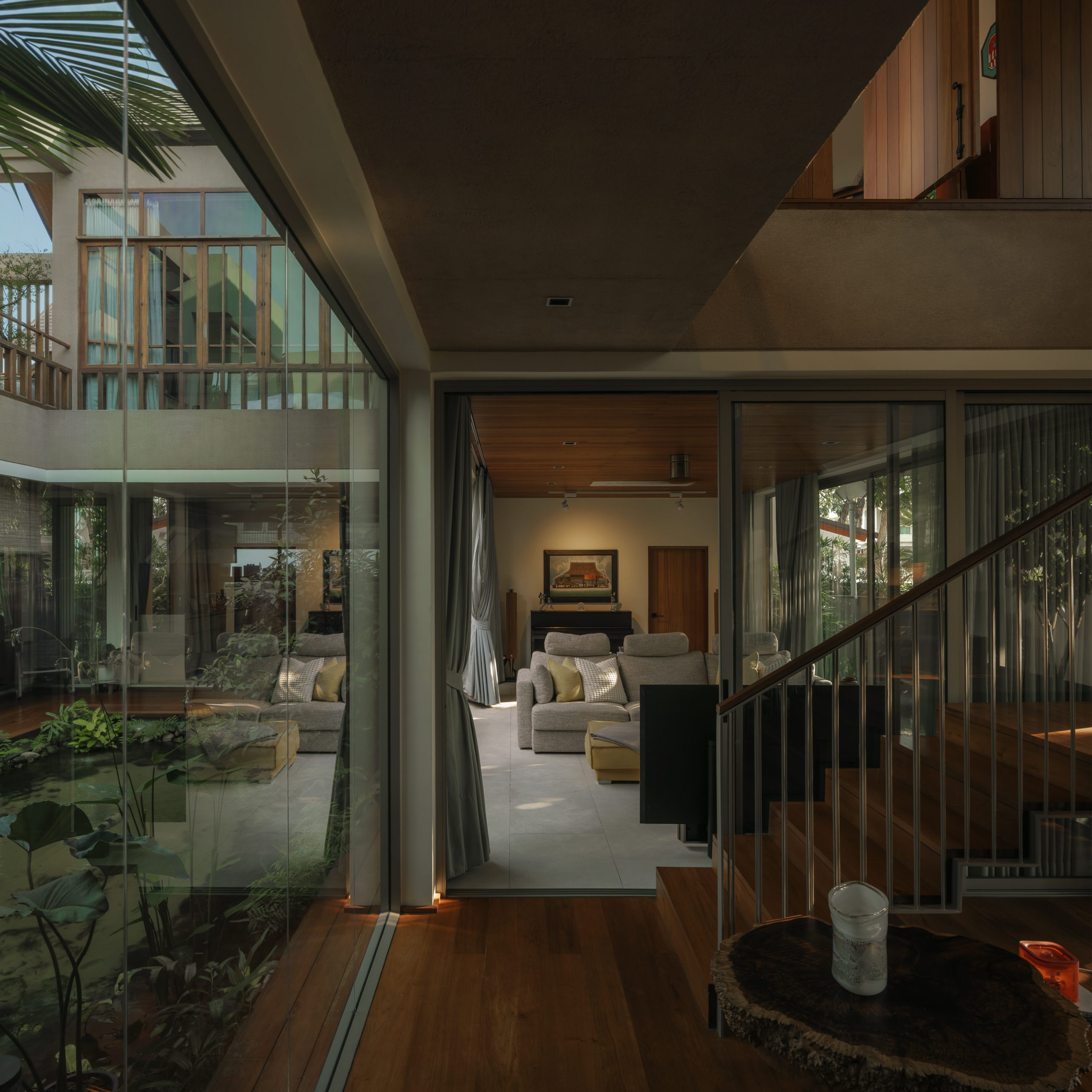
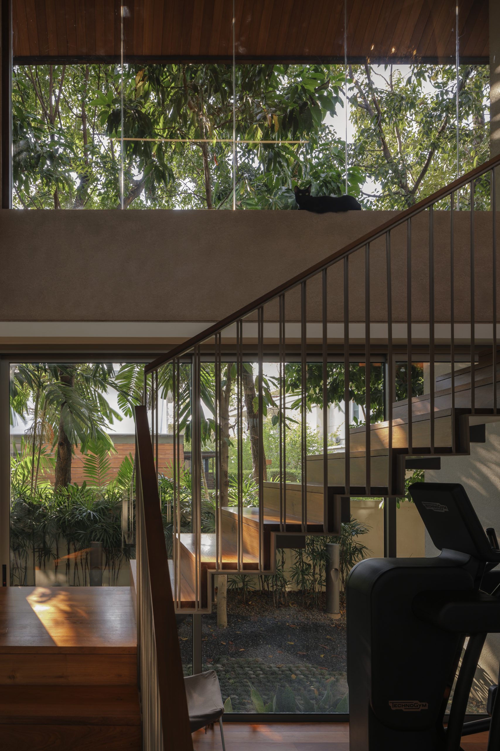
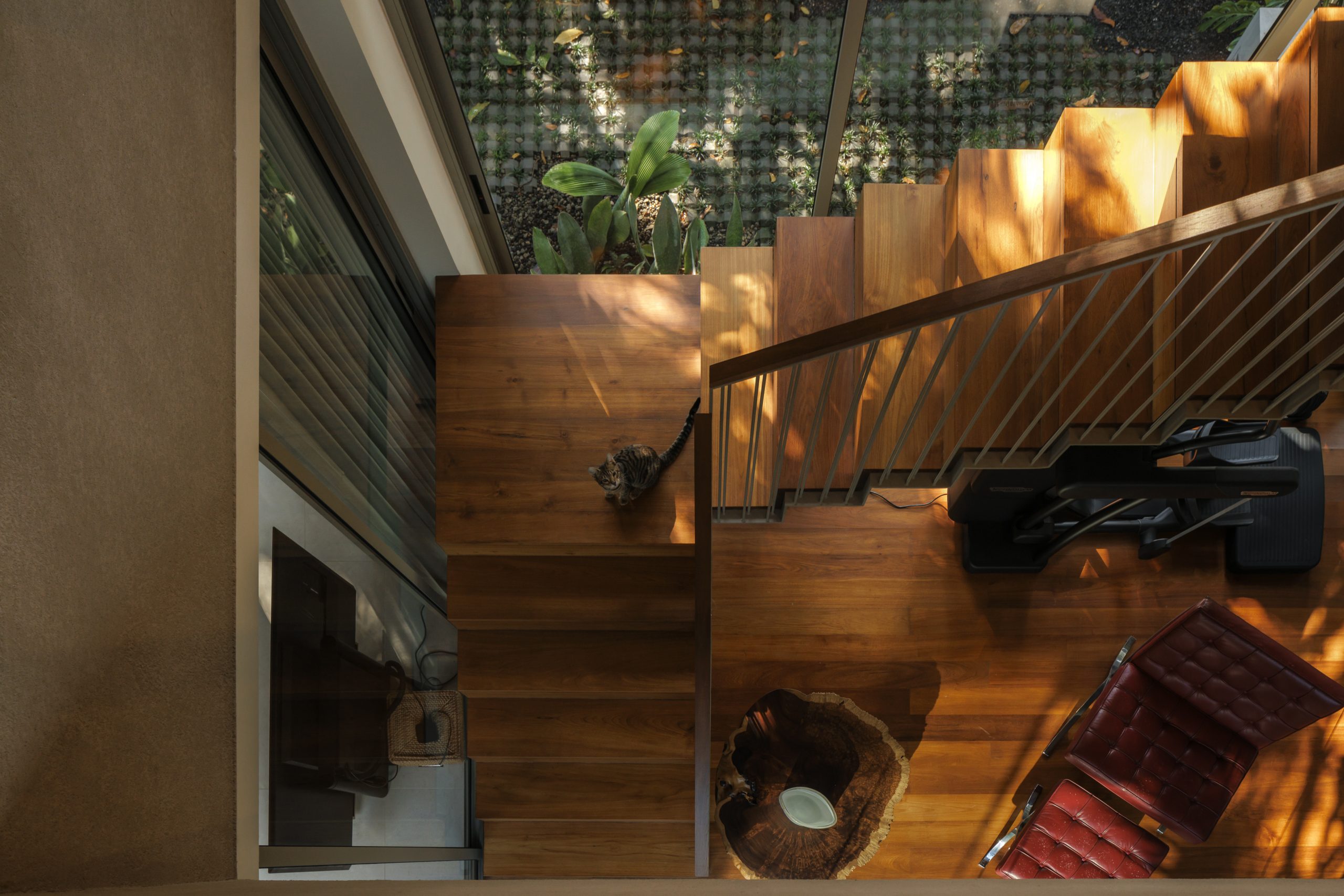
On top of that, the architect had the entrance hall ceiling torn down to make room for a new metal staircase leading to the second floor. The remodeled foyer performs its dual role.

On the one hand, it gives the family direct access to the second floor. On the other hand, it adds consummate elegance to the warm and welcoming antechamber.
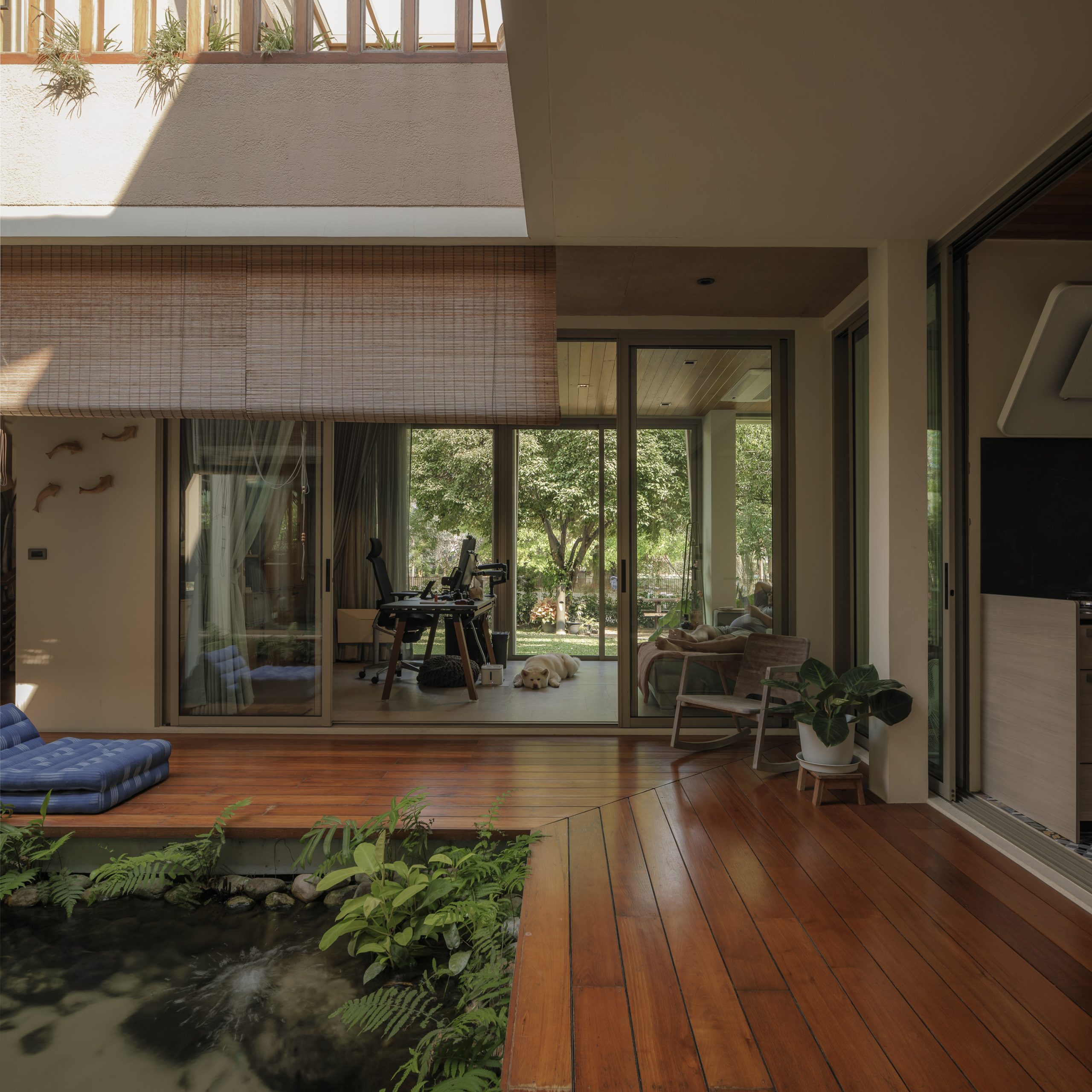
airy tropical home

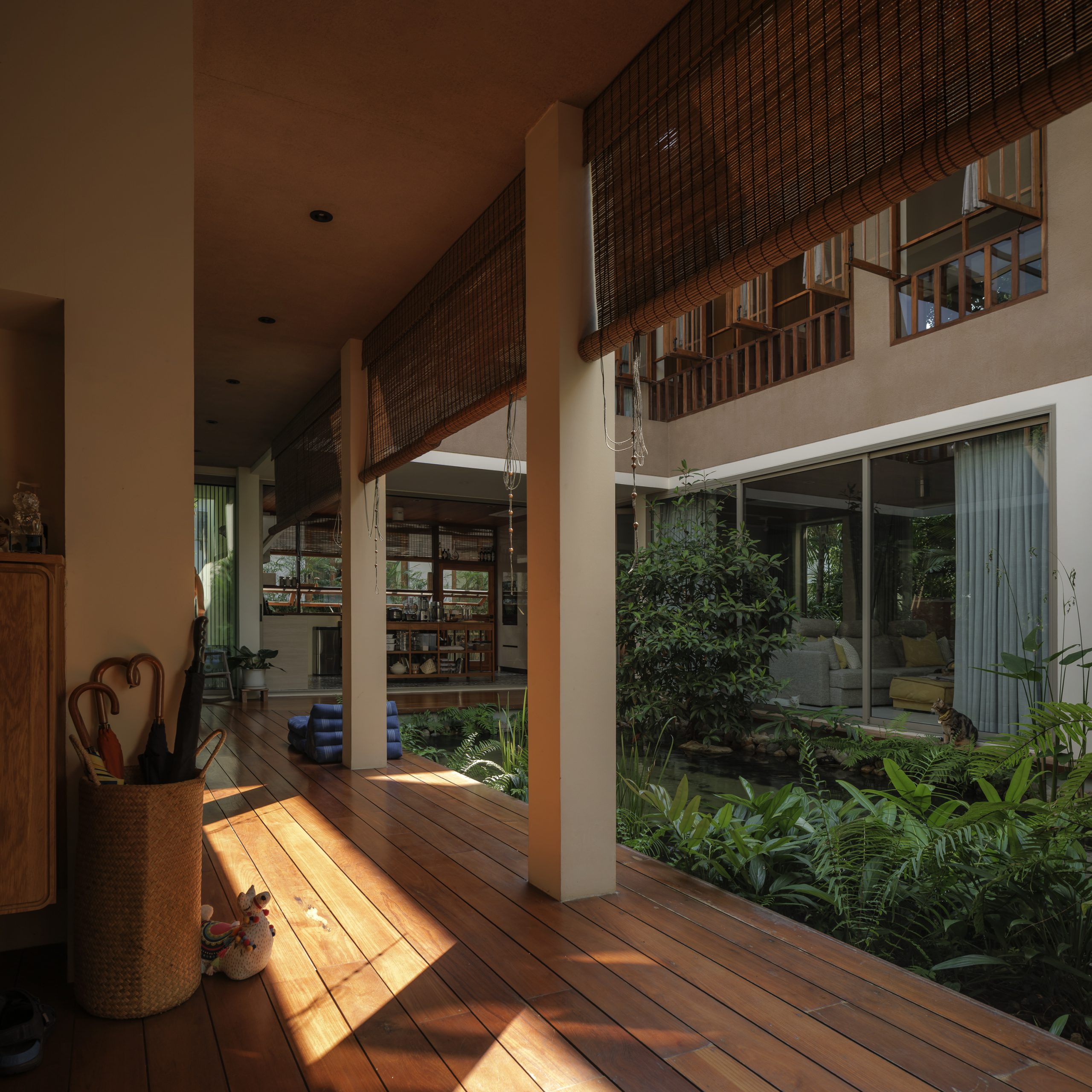
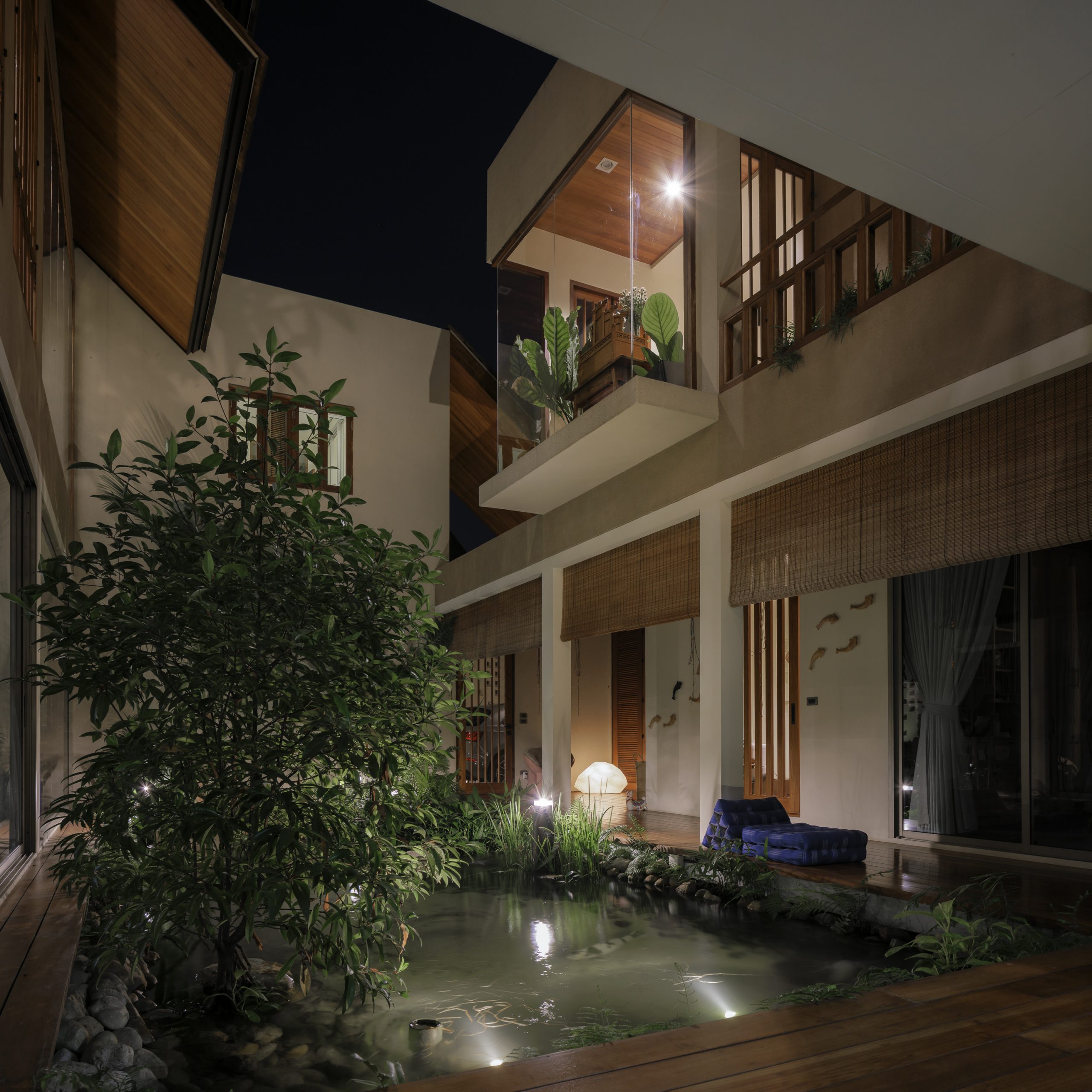
Step outside, and you come into a central courtyard enclosed by the house walls. This, too, has undergone a complete makeover.

The grass lawn that had been there originally was removed to make room for a carp pond decorated with aquatic plants, leafy bushes and shrubs, making the outdoor room more enjoyable.
airy tropical home

As to be expected, the second floor is a little more private. Several rooms that had been there from the beginning were torn down to provide sufficient space for an ample common area.

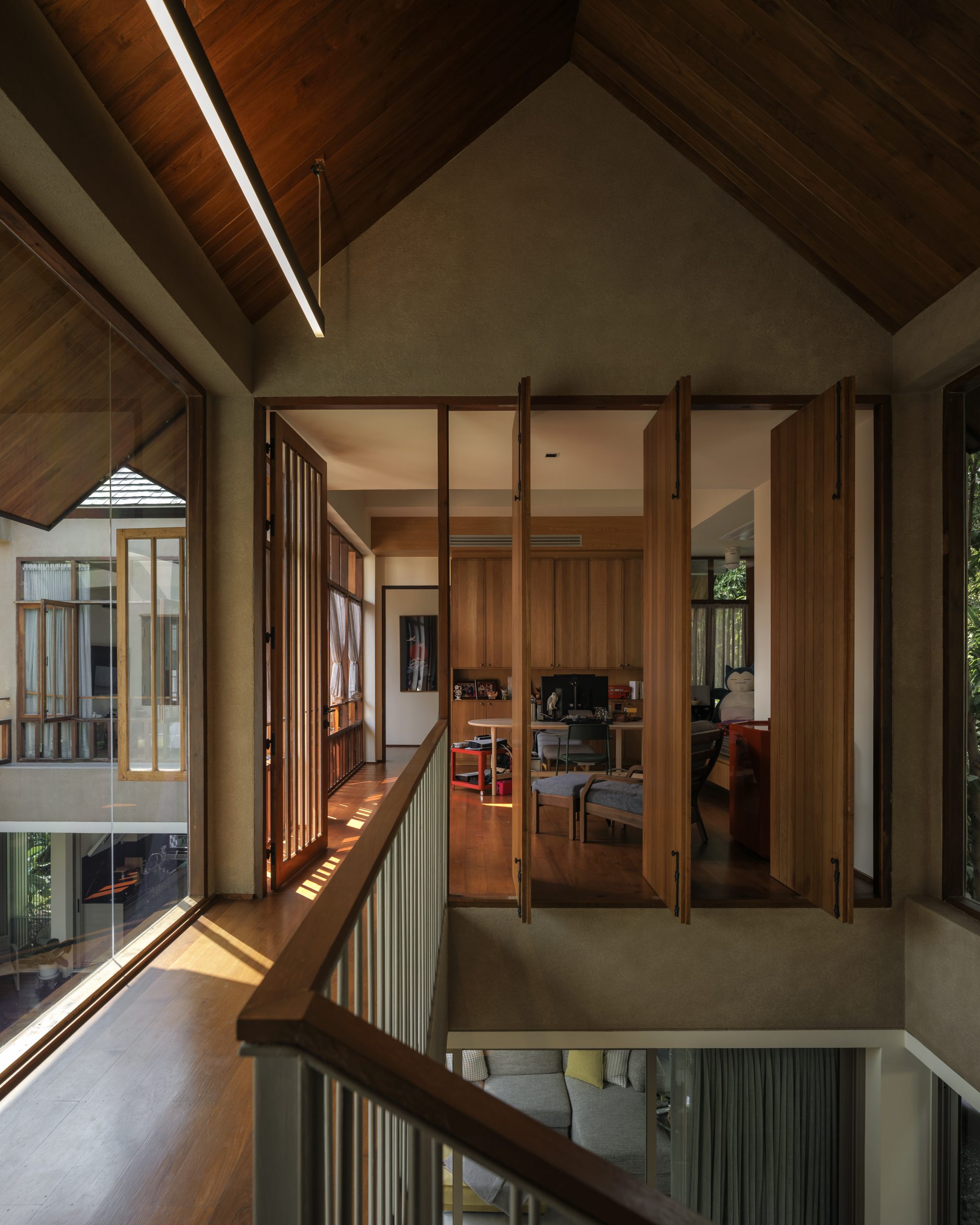
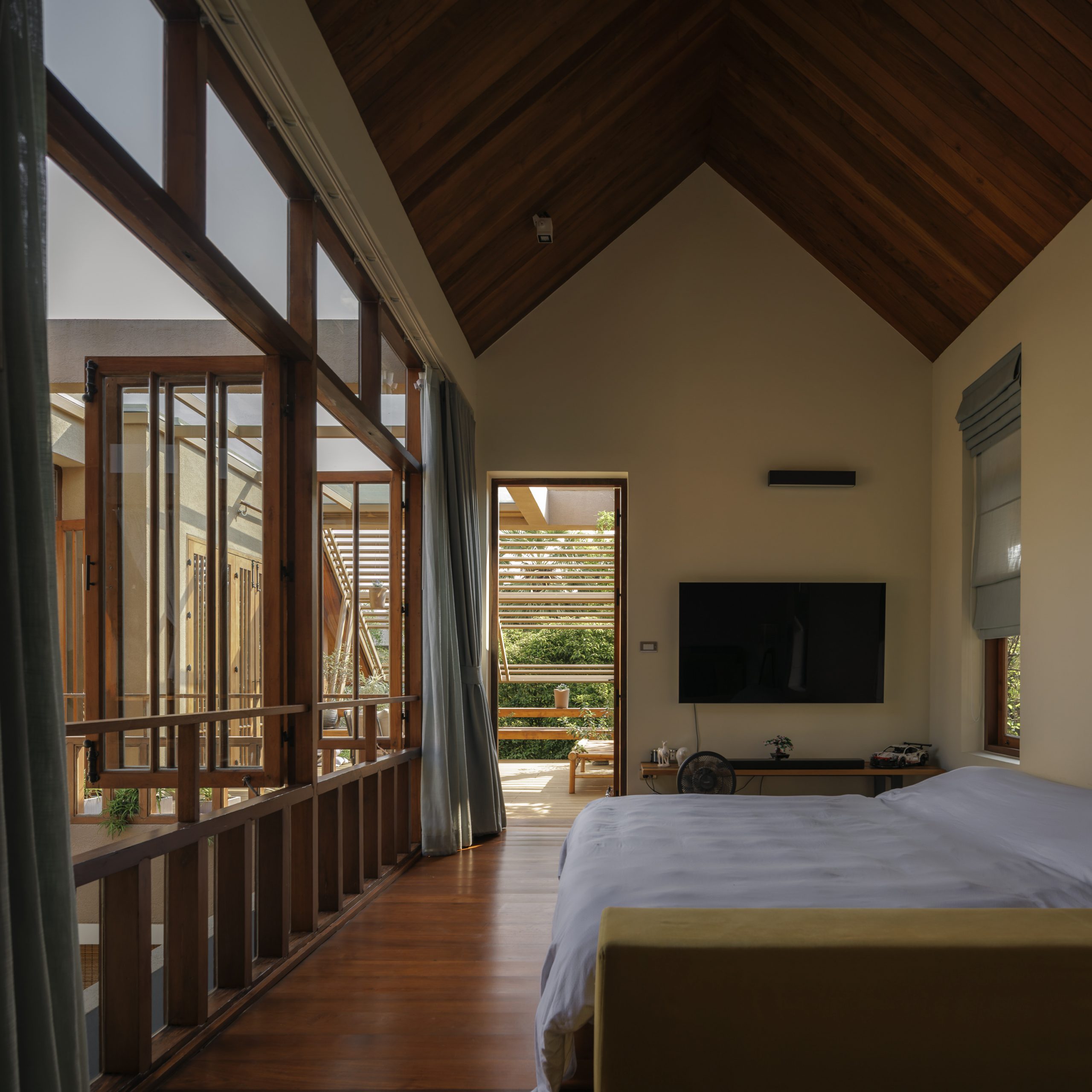
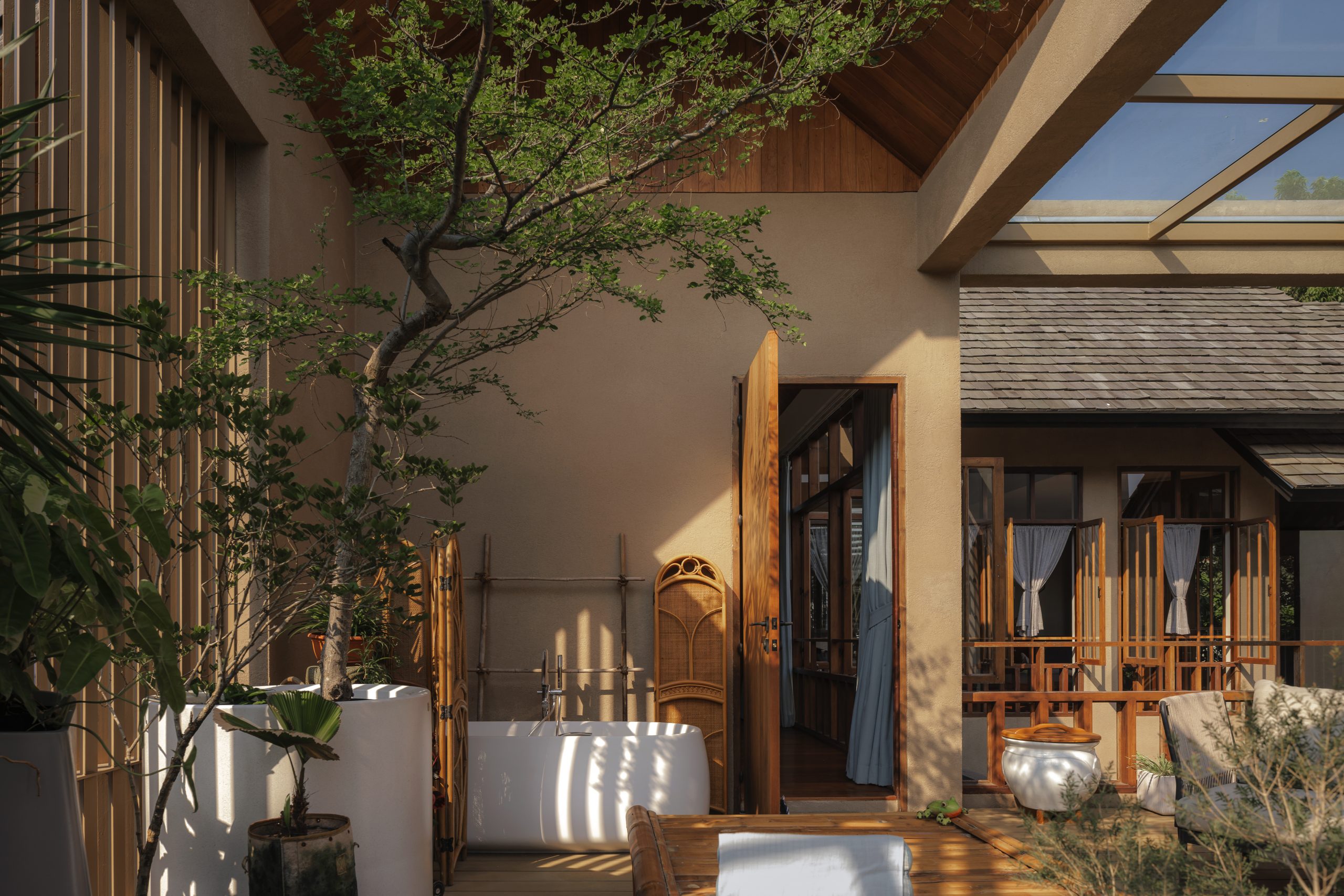
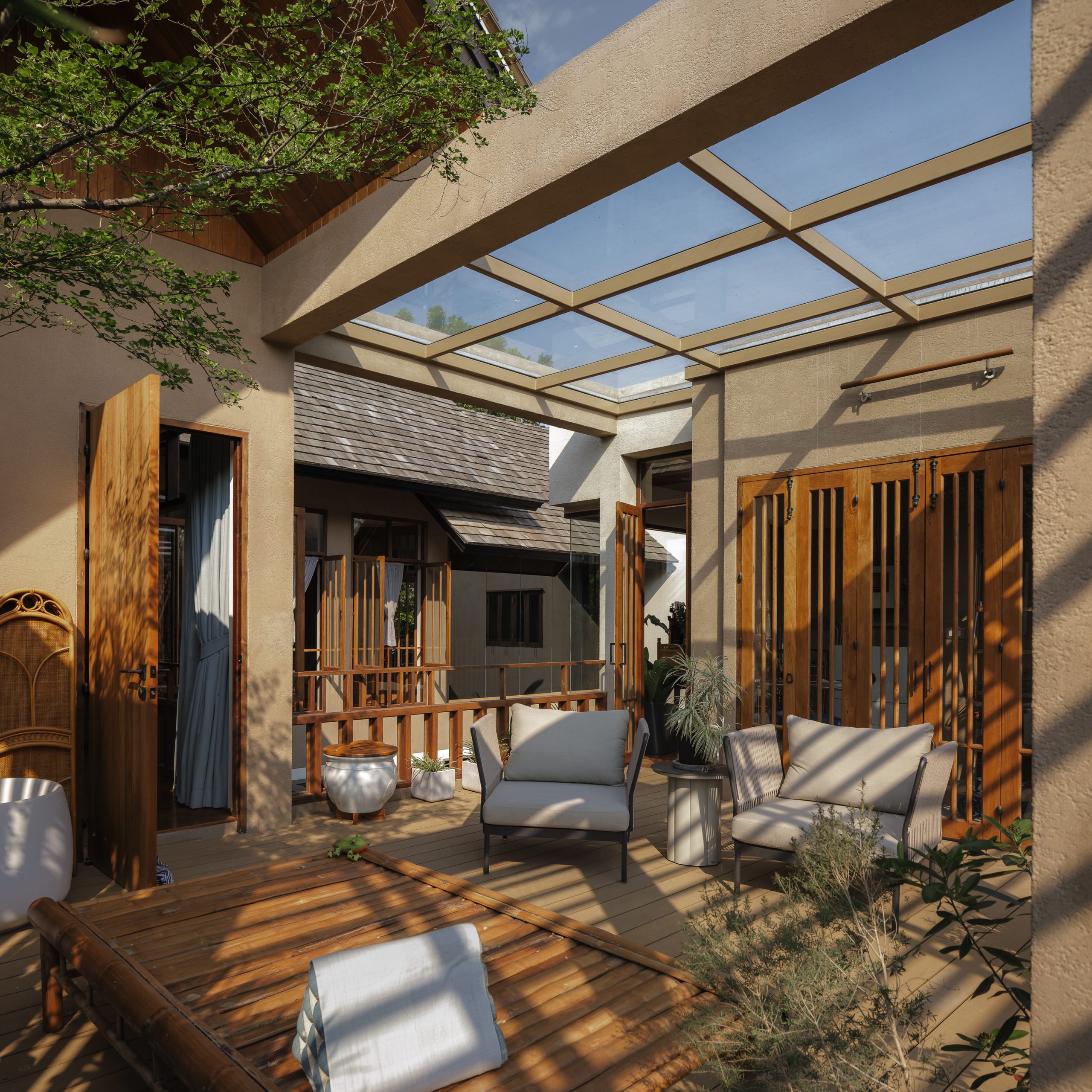
The master bedroom remained intact, while a second bedroom originally next to it has since been replaced by a semi-outdoor sitting room enclosed by a balustrade on the outside of the building.
airy tropical home

airy tropical home

From the looks of it, this represents the most obvious attempt by the architect to bring the outdoors into what was once an uncomfortable drafty old house.

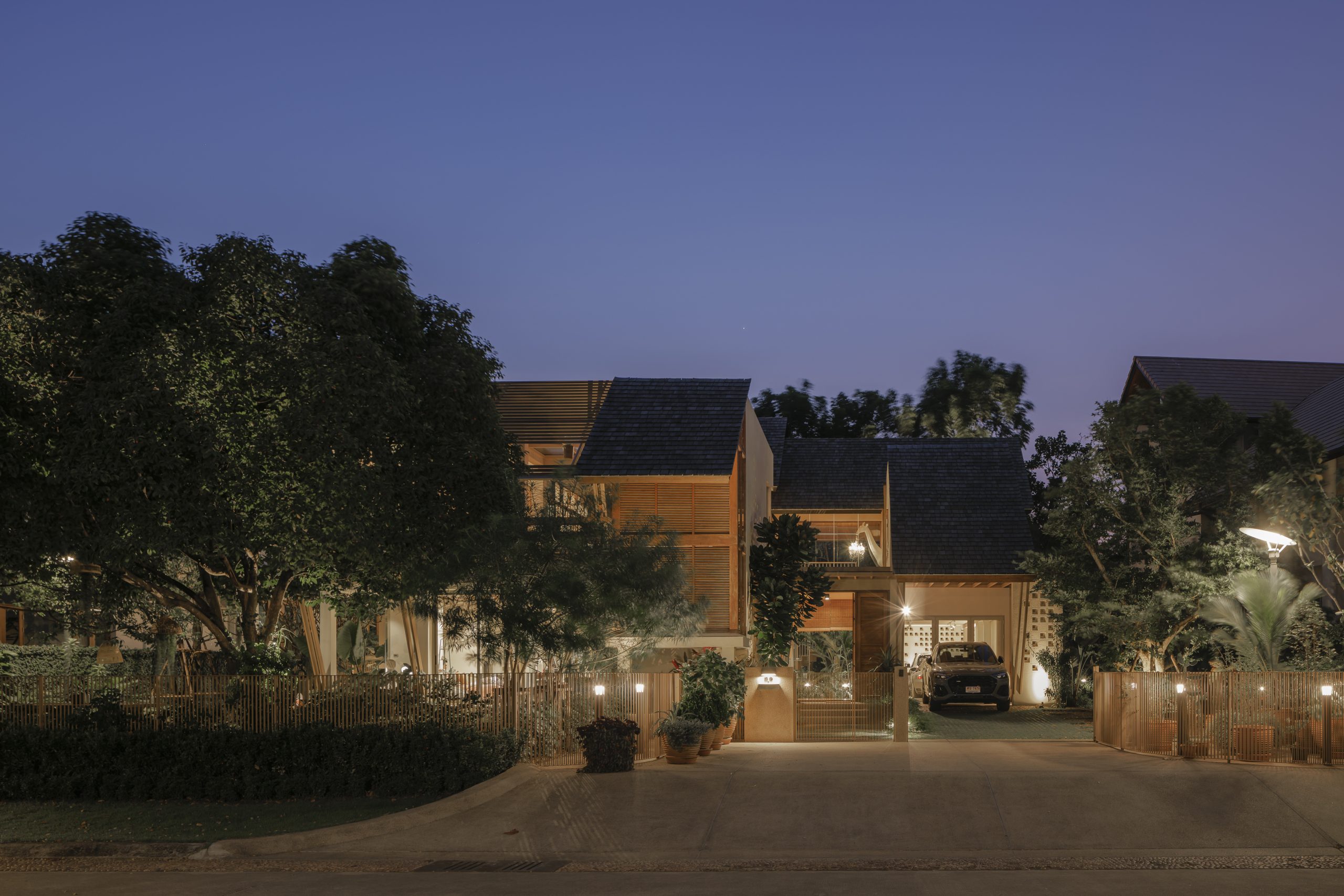
That being the case, the external envelope of the building was torn down to create a perfect outdoor room with bench seating that matches the house façade.

Consisting of strips of steel securely fastened together to form a privacy screen, the redesigned façade extends all the way to the translucent upper covering of the building that allows natural daylight into the home.

On the inside, the second floor also contains a family room and a third bedroom that has since been allocated to their beloved house pets.
airy tropical home

As Tharit put it, the most important part of the renovation project was the redesigned layout of the ground floor that made the traffic flow between major living areas easy and gave it ample space perfect for the family’s lifestyle needs.

He said: “What I was trying to achieve was a house plan with a good flow of traffic and carefully thought-out circulation patterns to create a well-lit and well-ventilated interior.

“So the first thing I did was dismantle all the rooms and rebuild them by setting the walls further back slightly to create more room for improved air circulation.

“Albeit viewed as separate units, all the rooms were connected to one another by natural air circulation.”

The architect reiterated that by setting the walls further back one meter, the interior rooms became smaller in size while the semi-outdoor veranda along the outside of the house overlooking the central courtyard gained more space.

This resulted in the good flow of traffic between major living areas.

Plus, there was natural circulation that came from using environmental-friendly systems such as walls fitted with large aluminum windows and roller blinds that open and shut to control the amounts of daylight and fresh, outdoor air coming into this airy tropical home.

These are among the features that help keep the interior cool without air conditioning.
airy tropical home

airy tropical home

airy tropical home

airy tropical home

Finally, materials matter. The products that the architect chose were all important to achieve a desirable outcome.

In this case, it was real timber used in the building that made this house stand out from the rest. Plus, the homeowners had a love for everything wood and took the time and effort to purchase the materials themselves.

They included the golden species of teakwood that’s ideal for building the veranda around the central courtyard, door and window casings, ceiling panels, and parts of walls.

The renovation process also saw the original ceramic roof tiles being replaced by cedar shingles that gave the house its inviting appeal.
airy tropical home

In summary, the relocation of functions represents a rethink of strategy and practical use in building design. The result is a renovation done right — a bright and airy tropical home that exudes peace and tranquility thanks to natural materials and environment-friendly systems.

As the architect puts it, “even one meter matters” when it comes to quality home improvements. It’s a metamorphosis of purpose that transforms the unpleasantly cold 20-year-old house into an airy tropical home with a sunny personality that gives a feeling of comfort, warmth, and relaxation.


Architect: Design In Motion Co., Ltd.


You may also like…
The Hiên House: A Wood and Concrete Home Full of Balcony and Terrace Ideas
PSA: A Lush Compact Tropical House in Chiang Mai
MP House: Striking the Right Balance between Jobs and Home

MP House: Striking the Right Balance between Jobs and Home

/ Tangerang, Indonesia /

/ Story: Phattaraphon / English Version: Bob Pitakwong /

/ Photographs: Arti Pictures /

A house plan that combines living spaces and a home office could be just what you’re looking for. Here’s the home of a designer couple in Tangerang, a city half-an-hour’s drive from central Jakarta, that illustrates this. Known as MP House, it marries work-from-home essentials with well-planned living spaces that come loaded with personality.

MP House TANGERANG

The secret to a productive daily routine, the house plan combines residential and home office functions into a uniform whole. The workspace occupies the first floor that also includes a split-level lower floor, while the quiet and peaceful residential area is placed on the level above it.

The ample living area in itself is divided into two parts. Semi‐private spaces such as the living room and dining room take up the front part of the house, whereas more secluded places and bedrooms are located at the rear designed for rest and relaxation.

MP House TANGERANG

MP House TANGERANG

The first floor has a dry courtyard garden that separates the home office area from guest and kids’ rooms tucked away at the rear of the house plan. Healthy green foliage in the yard doubles as engine that drives natural ventilation and provides a light and heat barrier. And the result of MP House is a calm and peaceful indoor environment that’s the key to a happy family life in Tangerang.

In a sensitive and practical way, an indoor ramp with handrail is put in as an alternative to a set of stairs to provide access between different levels. The inclined plane is particularly useful for the homeowner’s aging parents. Plus, it’s the split-level house plan that makes the most effective use of available space.

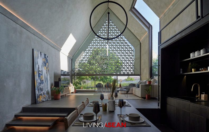
There is a real sense of achievement in the way the living room and dining room combine into one large lounge with comforting earth tones and double-height ceilings. It’s a place to eat home-cooked meals and enjoy family conversations that help keep everyone together. Semi-private by design, the ample social interaction space is well-lit and well-ventilated.

MP House TANGERANG
LIVE/WORK DESIGN
MP House TANGERANG

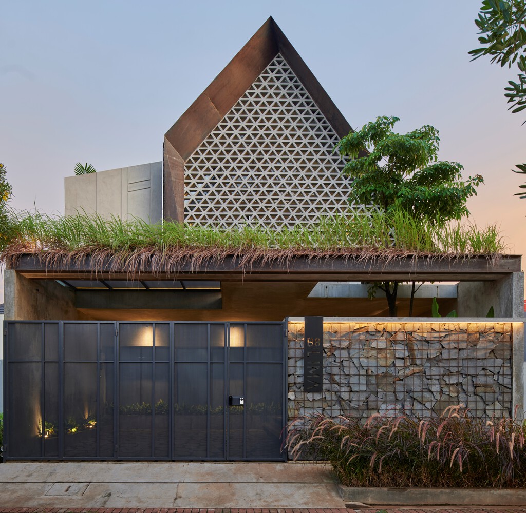
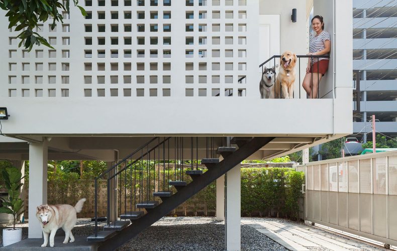
The house boasts a modern envelope and perforated brick façade overlooking a dry garden located just above the carport. The decorative breeze blocks are chosen for their ability to provide sun protection and maintain openness and airflow.

In the meantime, flat masonry textures that are repetitive and earthy in color provide a variety of light refraction that adds aesthetic pleasure to the interior living space.

MP House TANGERANG
A dry courtyard garden separates the home office from kids’ rooms tucked away at the rear.
MP House TANGERANG
The breeze block façade looks out over a dry garden above the carport.

Taking everything into account, the house under a gable roof provides plenty of ample spaces to serve functional and aesthetic purposes. MP House in Tangerang strikes the right balance between office work and home life, creating a perfect combination that feels cozy, comfortable and roomy.


Architect: TIES (www.ties-db.com)

Lead Architects: Sansan & Tritya


You may also like…
A Box-shaped House in A Mid-City Garden by Vin Varavarn Architects 

A Box-shaped House in A Mid-City Garden by Vin Varavarn Architects 

/ Bangkok, Thailand /

/ Story: Samutcha Viraporn / English version: Bob Pitakwong /

/ Photographs: Soopakorn Srisakul /

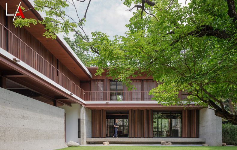
To have more space for his three children, M.L. Varudh Varavarn (Vin) of Vin Varavarn Architects built this modern house amid a garden on a quarter-acre property in the heart of Bangkok’s Chidlom District.

Box-shaped House Vin Varavarn Architects


“Children need a place with trees to run and play,” was Vin’s first thought in keeping all the original trees for the garden. Each room looks out on this great play area.

“When we built the place we’d just come back from living abroad in a town house. There wasn’t really enough space for the kids there, so we made this home more about the kids than ourselves,” he told LivingASEAN.


Box-shaped House Vin Varavarn Architects

Box-shaped House Vin Varavarn Architects
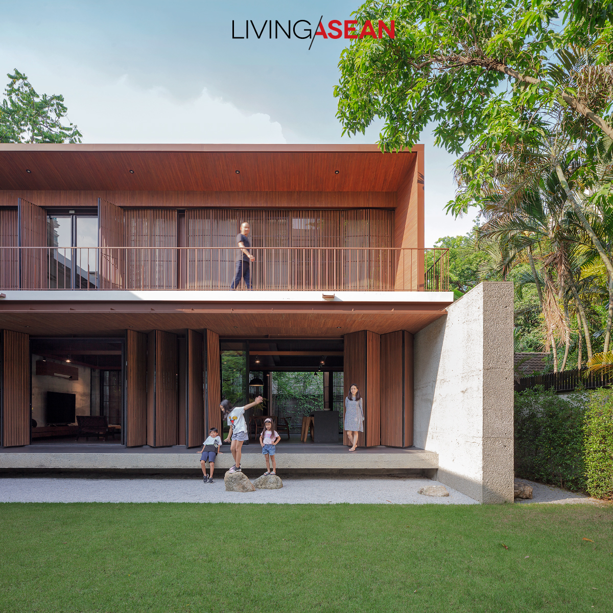
The house, the balcony, and the garden are simple components of a tropical house. Although porous from wood borer beetles, these folding doors are perfectly functional. The decorative garden stones were dug up from the property.


One primary building material was 20-year-old teakwood from Vin’s mother’s plantation in Kamphaeng Phet, much of which had been eaten hollow by wood boring beetles and couldn’t be sold to a lumber yard.

“We figured wood like this might give an interesting look. Talking with The Jam Factory contractor Subhashok gave us some ideas.

“We wanted something that didn’t look too slick, but had unique character and was durable. Wood, concrete, and steel were our main building materials.”

With porous teak, it’s best to cut the wood into narrow boards, sort out the more porous ones, then use the different types in different parts of the house.

Wood with no holes is used for flooring. Even though you can see into the sapwood on some, porous wood panels can be used for latticework, folding doors/windows, and ceilings, which are not usually touched by people, and they can be patched where called for.


Box-shaped House Vin Varavarn Architects
The wall separating the stairwell from the living room displays a rough concrete surface.
Box-shaped House Vin Varavarn Architects
By the stair to the 2nd floor, natural light shines into the front hall indoor courtyard. The living room is behind the wall on the right.


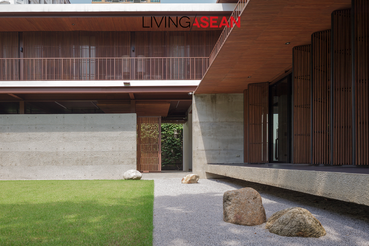
This steel-frame box-shaped house uses cement walls as artifice: for instance, the wall of rough concrete next to the parking area creates a vertical play of light and shadow on garden stone surfaces.

Meantime, the living room’s big brick walls are surfaced with concrete poured in different concentrations, creating gray stripes in gentle contrast to the rough harshness of the concrete itself.

The house plan visually connects interior and outdoor spaces in a number of places: coming in the door, we first encounter an interior court with a tree, then walk around into the living area, dining space, and large open-plan pantry flanked on both sides by gardens, seeming to switch character back and forth between being indoors and outdoors.

By the tree court is a latticed staircase of wood and steel leading to the 2nd floor, where we find a living area, children’s activity room, and all the bedrooms.


Box-shaped House Vin Varavarn Architects
The living room with a big sofa for family socializing. To save building expense the steel frame is light as possible, which also gives the house a light, open look.
Box-shaped House Vin Varavarn Architects
Folding doors filter light and give security and privacy. Adding to the green, plants grow along the wall by the neighboring house.
Box-shaped House Vin Varavarn Architects
Close by the open living area is a dining table where Vin does a little work most mornings. Furthest in is a long, narrow pantry-style kitchen also used for informal eating.
Box-shaped House Vin Varavarn Architects
On the 2nd floor is a children’s activity room, the surrounding glass adding openness and drawing natural light from both the interior court and the side facing the house next door.
Box-shaped House Vin Varavarn Architects
On the 2nd floor is a children’s activity room, the surrounding glass adding openness and drawing natural light from both the interior court and the side facing the house next door.

Box-shaped House Vin Varavarn Architects

“The kids have been happy here, and feel more like staying at home, so we’ve achieved a nice level of success,” added M.L. Varudh. Before the evening came we got to see all 3 of Vin’s children as they got back from school to run, play, climb, and have fun, laughing and smiling, sometimes in the children’s activity room.

Box-shaped House Vin Varavarn Architects


Architect: M.L. Varudh Varavarn of Vin Varavarn Architects


You may also like…

MODERN TROPICAL HOME IN INDONESIA

A Home with Hip Roof Design Where Every Day Is a Holiday

A Home with Hip Roof Design Where Every Day Is a Holiday

/ Bangkok, Thailand /

/ Story: Patsiri Chotpongsun / English version: Bob Pitakwong /

/ Photographs: Rithirong Chanthongsuk /

Here is a modern one-story house with a charming interior courtyard, plus ample and airy multipurpose spaces. The gentle slope of hip roof design shields it from too much sun and rain, the prevailing climate in Thailand.

hip roof design
Beyond the rolling gate stands a modern single-level home with a lush center courtyard. Hip roof design with long overhangs protects it from the elements.
hip roof design
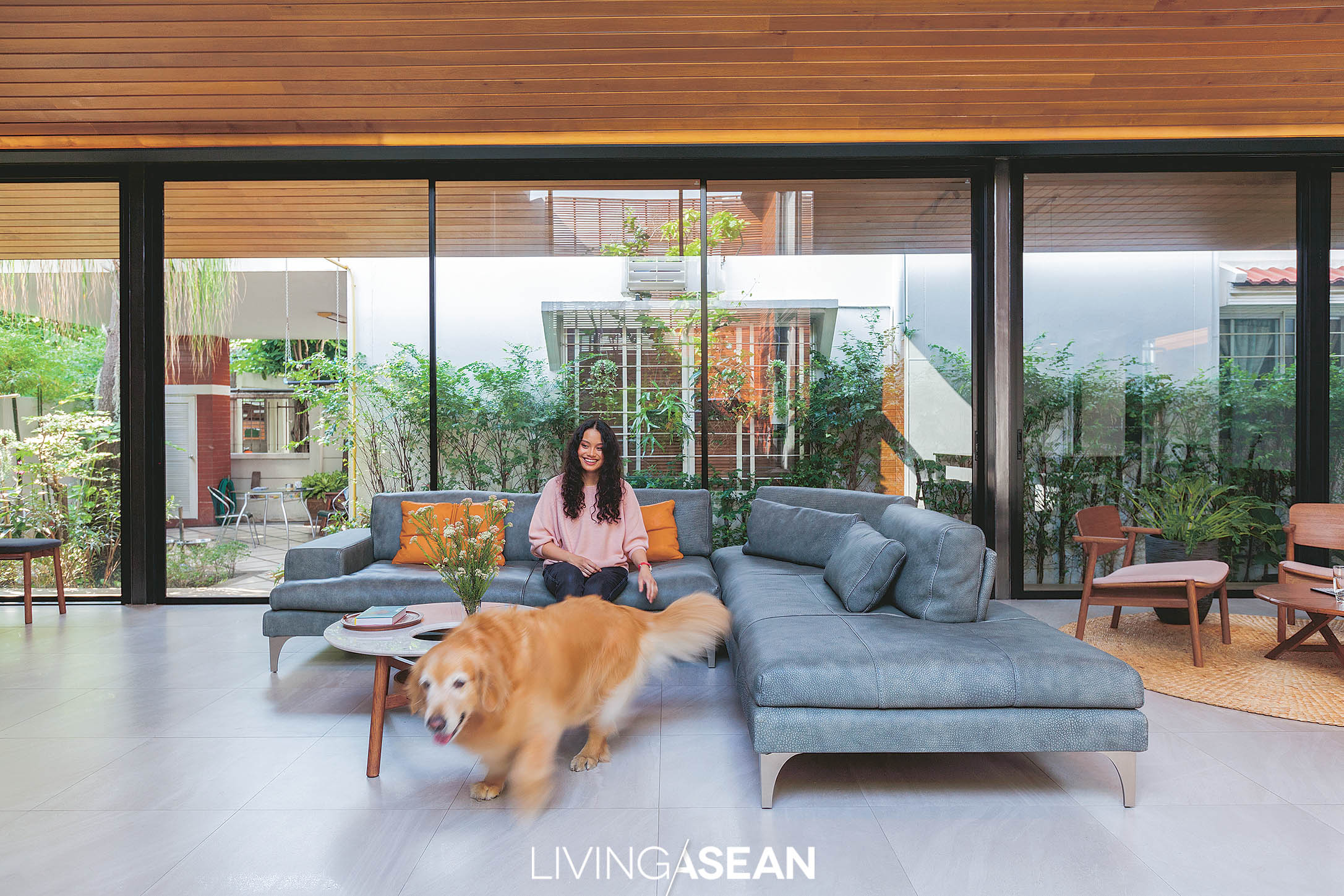
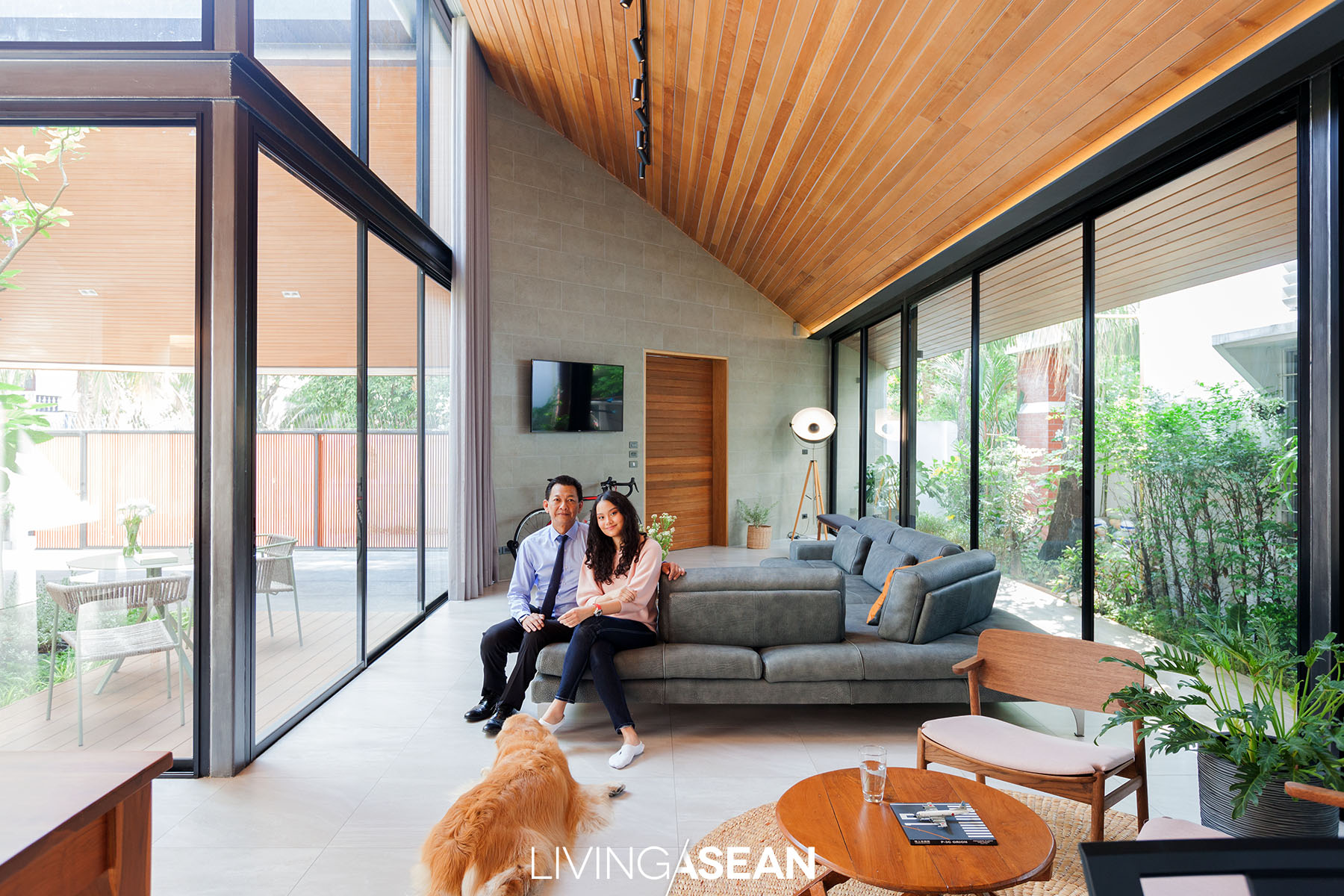
A sectional L-shaped sofa dominates the living room filled with natural light streaming through front and back glass-window walls. Slanted ceilings prove a perfect complement to the gentle slope of hip roof design.
hip roof design
The well-lit living rooms are easy on the eyes, thanks to front and back glass-window walls that give the impression of more space.

Small house, surprisingly spacious

The old house that had stood on this plot of land for 40 years was pulled down to make room for a new home. The new floor plan takes up almost the entire 64 square wahs (256 sq.m.) in extent.

Albeit small, it’s fully equipped to suit the lifestyle needs of Pacharanan Marittida and her lovely canine companion. Sharing his design inspiration, architect Nuttapol Techopitch said:

“In the beginning, the old wooden house belonged to Grandma and Grandpa. The time has come for a decision to be made, so we thought it wise to go for a bright and airy home plan.

“The owner had many relatives living nearby and needed extra room to get together with family. Plus, she wanted a studio to give piano lessons. As a music teacher, she played the piano at home a lot.”

After site inspections, Nuttapol proposed an interesting alternative – building a new home. It would save her money.

The reason was obvious. The old two-story house sat on low land that was prone to groundwater flooding. There were no easy solutions. If the ground floor was raised even slightly to protect against water damage, there wouldn’t be enough headroom.

The architect responded with light and airy designs for single-level, two-level, and split-level homes to choose from. The homeowner picked the one-story design raised above the flood level that measured 190 square meters.

The owner’s love of woodworking is evident in décor materials made mostly of wood. Among them, a custom-made dining table set proves a perfect complement to the modern style home.

The new house feels surprisingly spacious, bright and well-ventilated, while indoor and outdoor rooms are well-connected.

There’s an open-roofed area in the middle of the hip roof design that’s used for planting trees. It’s a layout that places great emphasis on having ample space.

High ceilings that are consistent with hip roof design make it suitable for hot and humid weather. The central courtyard that lies in the open air complements a look that’s stylish and very relaxed. Plus, it provides good air circulation.

On the north side, the open-roofed area is bordered by a wooden lattice that enables interior spaces to benefit from natural light, fresh air and sunshine. The interlaced structure also keeps the floor devoted for service spaces concealed from the view.

Beyond the carport, a courtyard lies mostly enclosed by glass walls that let natural light stream into the house’s interior. At the center, a thriving lettuce tree (Pisonia grandis R. Br.) adds a decorative touch to the home.
The owner’s love of woodworking is evident in décor materials made mostly of wood. Among them, a custom-made dining table set proves a perfect complement to the modern style home.
hip roof design
The open concept floor plan connects a sitting room to the piano room and dining area. Gorgeous L-shaped design allows the interior courtyard to be seen in full view from every direction.

The heart of a happy home

Roof overhangs offer many benefits. For this modern one-story home, they give protection against too much sun and prying eyes. A living room that’s the heart of a happy home lies hidden from view and can only be seen upon entering the carport. The interior is decorated with an L-shaped, charcoal gray sectional sofa.

The slanted ceilings are made of wood for its adaptability to a variety of designs while the rooms are surrounded by glass walls, thereby reducing the need for artificial lighting.

The open floor plan concept, also in the shape of the letter L, provides a way to move through space unhindered from the sitting room to the dining area.

Looking out the window, the center courtyard dominated by a lettuce tree (Pisonia grandis R. Br.) can be seen from every direction. The tree that has been in the family for a long time was dug up and replanted here to keep the yard lush green.

hip roof design
With plenty of room to run and play, the new home is a paradise for “Khamin”, the resident golden retriever.

As the architect put it:

“To make the atmosphere relaxed and airy, we avoid putting in too much furniture. Where appropriate, wood accents add warmth to the interior space and create dimension.

“Wood is also great for the piano room. At first, the homeowner intended to put a grand piano there, but later changed her mind and went for a digital piano to optimize small room acoustics. To give it a natural look, a mix of artificial and real Tabaek wood (Lagerstroemia floribunda) is used on parts of the exterior and wood lattice that borders the courtyard.

“Plus, color harmony between indoor and outdoor spaces makes the house even more appealing. Meanwhile, floor tiles in marble design give the impression of ample space.”

Built-in storage shelves provide a creative solution to dress up a blank wall. Each flat length of wood has enough room for a musical instrument and every conceivable gadget.
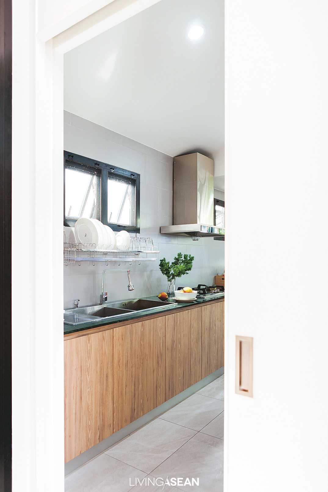
A solid wooden door separates the kitchen from family room. It’s one clever hack to banish the smoke and cooking orders, plus it’s easy to keep clean.

Warm, ingenious design for pure enjoyment every day

The interior is quite impressive. It even has a space devoted to “Khamin”, the beautiful golden retriever who comes and goes freely between this and the other house on the property.

There’s also a special doggie nook in the carport with a sloped floor. It’s pet friendly and ideal for hyper dogs, thanks to seamless wash pebble finishes.

Pacharanan said:

“The dog runs and plays everywhere inside and outside. We have to towel dry the hair and vacuum the floor often. Hence, non-carpeted floors make perfect sense, while special leather upholstery on the sofa is scratch resistant.

“This has made it possible for humans and dogs to share living spaces. Plus, there is plenty of room to lounge about when relatives visit. On the whole, the atmosphere is warm and welcoming, which makes every day feel like a vacation.

“The only thing missing is the seaside view. By night, it feels more like Khao Yai (The National Park) to sit in the living room and peer into the courtyard aglow under twinkle electric lights. The scenery is inspiring for songwriting.”

Taking everything into account, it’s well worth it. The house with an inner courtyard and hip roof design is small, yet beautifully organized and made for pure enjoyment every day.

12 15 modern one-story house


Owner: Pacharanan Marittida

Designer: Looklen Architects Co.,Ltd. by Nuttapol Techopitch


You may also like…

A Stunning Breeze Block House for Avid Dog Lovers

A Beautifully Renovated 60-year-old Mid-City House

A Beautifully Renovated 60-year-old Mid-City House

/ Bangkok,  Thailand

/ Story: Samutcha Viraporn / English version: Peter Montalbano /

/ Photographs: Rithirong Chanthongsuk /

A beautifully renovated 60-year-old mid-city house, with a startling black beauty: this contemporary mix of old and new flows together as a single unit.

Interior decorator Pauline and nationally known architect Somrit Soonthornrungsi have spent their lives in this mid-city house. Once, it had a flooding problem downstairs, which plus termites and general deterioration, meant it was continually under repair.

At first, they thought to build a completely new house, but out of nostalgia and time constraints decided to do a major renovation instead.

mid-city house

“Our daughter grew up here and was upset that we were going to demolish it, so I thought, ‘Why not combine old and new?’ The result was a balanced, harmonious creation with a courtyard for breezes to pass through,” said Somrit.   

mid-city house

As we look in from the front door, the original house is on the right, across an open courtyard with planted walkways, and the second-floor verandah connects to the new house on the left.

The old house is of wood and masonry, with mortar stripped to show the traditional brick. Downstairs is Somrit’s small workshop and a bike storage space, with the floor raised higher to avoid flooding from street level.

The new section of the house is connected, but quite different because of its steel-frame construction. On the ground floor, there is the company office.

The second floor is Pauline and Somrit’s main living area, connecting to the old house through the courtyard.

There is a living room on the right before the large indoor kitchen, which retains its original Makha wood flooring but was repainted black to match the black synthetic wood of the exterior, for an informal, natural feeling to complement the green view of plants and trees outside the glass walls.

Their daughter’s room, set up like a New York loft apartment, is on the third floor.

At two points, a mezzanine stairway connects the central porch to the rear verandah, from which you can clearly see the 2 floors of the old house.

They all lived in this mid-city house during the construction of a new, steel-framed gabled roof over the old one, which was finally torn out when construction was finished, leaving the kitchen ceiling to follow the new roof angles. 

mid-city house

“The roof is a special black version of Shera’s “U-Slate” line. I’ve loved black since childhood,” said Pauline.

“When I was a kid, I wanted to paint my bedroom black, but my parents wouldn’t let me!” The chic interior design work has black everywhere. The large kitchen is in tribute to both her mother-side relatives and her father, who loves to cook.

“Besides the big kitchen pantry counter being a great place to socialize, it’s also good for informal dining.

Pauline selected furniture and décor in a “mix and match” style controlled by color, some items primarily functional and others reflecting personal style, combining old and new, cheap and expensive.

“It’s comfortable because this really reflects our way of life: the house isn’t built for show,” said Pauline’s father, “and we don’t want to be climbing up and down a lot of stairs in the day.

“Since coming here, we’ve confined business matters to downstairs, and it’s a comfortable walk up to the second floor. The longer we’re here, the more we like it. Looking back, the old house seems stuffy, with not a lot of open windows. Our lives changed after the switch.

“At first, we thought the courtyard would be too small, but in the end, it worked out great!”

Once light and wind directions were figured in, design principles were applied to open the structure up, and this mid-city house clearly became more than brick, cement, wood, and steel, a happy combination of old and new narratives.

Somrit added, “It’s impressive. Once the rooms were finished, furniture in, lights and water on, our home came to life anew. It’s a great comfort.”

mid-city house


Owner: Pauline Soonthornrungsi and Somrit Soonthornrungsi

Designer: Design Com-bini by Pauline Soonthornrungsi and Somrit Soonthornrungsi


You may also like

Chez Mou: A Home Hidden In the Frame of an Old House
CHEZ MOU: A HOME HIDDEN IN THE FRAME OF AN OLD HOUSE


AN AMAZING BEFORE-AND-AFTER HOUSE RENOVATION
Three-Storey Townhouse That Makes Space for Nature

Three-Storey Townhouse That Makes Space for Nature

/ Bangkok, Thailand /

/ Story: Sarayut Sreetip-ard / English version: Bob Pitakwong /

/ Photographs: Sitthisak Namkham / Styling: Jeedwonder /

Before moving into this three-storey townhouse, architect and university instructor Bhradon Kukiatnun really put his heart into the design and décor to bring about a conversation among people, animals, and things, partly intentional, partly by impulse. Here are imperfections that are either blemishes or beauty marks, depending on our viewpoint.

townhouse Architect Bhradon Kukiatnun

Bhradon’s business is booming, but designing his own house raised a tremendous number of new questions, not the least of which was how the new living space of a three-storey townhouse would accommodate his eleven cats!

“Three years ago, I bought this place new, and it took two years to fix up,” explained Bradon.

“First problem: organize storage space to hold the tremendous amount of personal stuff needed in my life while still keeping the house orderly. Then, I didn’t want a typical townhouse atmosphere, but neither should it be jarringly different.

“Part of the answer is this new façade, using a type of latticework found elsewhere in the project that fits my personal lifestyle.”

three-storey townhouse

As most townhouses add a roofed-over carport in front, Bhradon also applied his design idea to this requirement.

“There’s more than meets the eye in that front view: a lot of the functions are hidden,” said the architect.

“To really express myself, I had to go back and look at fundamentals with flexibility and an open mind.

“The space in front is limited. Would I rather have a carport there, or a garden? OK, garden: so I designed a garden where I could park the car! Quite different from having a carport decorated with plants.”

three-storey townhouse

three-storey townhouse

The design of this three-storey townhouse called for no structural alterations, but space was apportioned differently. The ground floor holds the living room, dining area, and pantry; second floor, a small bedroom and a workroom; third floor, the master bedroom.

“Inside, you might mistake a door for a wall, or vice versa: my overall concept was to focus on highlighting specific points, making them fit in by hiding some element,” Bhradon explained.

“In the living room, the TV wall is highlighted by hiding its functionality in a wall; the use of covering elements gives the feeling of being in a cave.”

three-storey townhouse

During our conversation Ando, Bhradon’s first adopted cat snuggled up as if to join the group.

“I learned a lot from raising cats,” he said blissfully.

“They don’t think like people. Sometimes our human knowledge drowns out our instincts. But a cat! It wants to sit, lie wherever, just does what it wants.

“This allows single things to have more than one function: TV cabinet or sitting place? Or, for us, a storage spot. Think outside the box.”

three-storey townhouse

three-storey townhouse

three-storey townhouse

We urban dwellers all long for nature. Bhradon answered this with a garden area in the rear of this three-storey townhouse, as he put it: “I think gardens nourish the psyche, so I put a little green in the house, along with a small guppy pond, and it’s a perfect spirit-refresher.

“I like the ‘wabi-sabi’ way of design; the beauty of imperfection, of real life,” he implied. “Real life involves rust; it involves injuries. Can’t eliminate these, right?”

As Bhradon’s speaking voice gradually softened, an unspoken conversation brought into focus the future of the house, the man, the cats, and whatever might lie ahead for them.

“Recently, my cat Kuma died, and I miss her every day. But through the sorrow of loss we see the beauty of living. Being natural is to be incomplete, and we have to live with the things that happen.”


Owner/Architect: Bhradon Kukiatnun


You may also like…

The Perfect Townhouse Makeover in Bangkok

Mash-up: Industrial Design and Green Space of Walllasia

A Modern Home Where Traditions Make Comfortable

A Modern Home Where Traditions Make Comfortable

/ Bangkok, Thailand /

/ Story: Patsiri Chotpongsun / English version: Bob Pitakwong /

/ Photographs: Anupong Chaisukkasem /

This contemporary Thai house is hemmed in by factories, but its clever design leaves one feeling unconfined, almost as if outdoors, with landscaping inserted right into the house interior and its sporty swimming pool. Mitigation of unpleasant outside sounds and scents is an even higher priority than the outward appearance of the house.

Contemporary Thai House Enhanced with Local Tradition

Advanced ideas and innovations from the West work best in Asian countries when adapted to localities and geographic conditions, so those innovations take on unique personalities of their own.

Vernacular architecture usually speaks directly to comfort and realities of local ways of life. In a traditional Thai house, for instance, one central concept is to have an open interior space, often with a high-ceilinged open thai thun area below the house that blocks the sun and catches the seasonal breeze.

Contemporary Thai House Enhanced with Local Tradition

Speaking to architect Surat Pongsupan of Greenbox Design, Ms. Aim, the owner of this house said:

“I want comfortable living Thai-style, with an open tai thun and such good ventilation that air conditioning is hardly needed.”

Contemporary Thai House Enhanced with Local Tradition

The owner’s close connection to the factory business and her desire for a short commute resulted in this closed-in location, where the architect’s ingenuity resulted in a truly striking design.

To counter the closed-in feeling, the house has entryways on two sides, one the drive into the front from the factory buildings, the second a walkway across the canal in back.

Just strolling through the house is pleasant. The architect explained:

“I designed a semi-open space where the landscaping actually reaches into the pool and the house itself. Bedrooms, closets, and service areas, generally not use in the middle of the day, are positioned to block the house’s common areas from the factory environment.

“This was a first priority, and the appearance of the house followed from that.”

Contemporary Thai House Enhanced with Local Tradition

House orientation takes into consideration the directions and force of sun and wind in the humid tropical climate.

Walls to the west and south are opaque; There are two levels of roofing with a gap between facilitating heat insulation and ventilation. The four-sided, gable-free roof is lighter, slighter, and more open than usual, and skylights are used to bring morning light into bedrooms, a nod to the early-rise lifestyle of the owner.

“The general house plan puts the living room in front, with a high ceiling. I placed the living room next to the garden and pool, with a full sliding glass wall opening up a horizontal view and drawing fresh air in,” the architect continued.

“Ceilings in the kitchen and dining room are high and open, giving the feeling of the traditional tai thun, as these rooms are used for every meal and common family activities. These rooms also open out onto the garden and swimming pool.”

Contemporary Thai House Enhanced with Local Tradition

Contemporary Thai House Enhanced with Local Tradition

Contemporary Thai House Enhanced with Local Tradition

Upstairs, a clear glass wall offers a view all around the house. The corridor connecting bedrooms shades the pool below, making for comfortable midday swimming.

There is an overall impression of harmony. Primary colors are gray-white and a soft, warm natural wood color. Indoors get a lot of sunlight, but trees give it a fresh green tint, especially the brush cherry tree planted in the middle of the house.

Contemporary Thai House Enhanced with Local Tradition

Contemporary Thai House Enhanced with Local Tradition

=

The owner concluded, “We like being contemporary, but also being Thai. The openness of kitchen and pool is great. The soft sound of running water is sweet.

“My husband likes to listen to songs, and has speakers all over the house, making for a relaxing atmosphere. It’s good for the kids to become accustomed to living with nature, which is why we emphasize the value of these common areas so much .”

We call our home “Viva House,” with the hope that all living here will have long and happy lives.


Architect: Surat Pongsupan of Greenbox Design (www.facebook.com/greenboxdesignbkk)


You may also like…

Modern Thai House Adapts to the New EraModern Thai House Adapts to the New Era

In Nature’s Peaceful EmbraceIn Nature’s Peaceful Embrace

A Container Home Adapted to Meet Individual Requirements

A Container Home Adapted to Meet Individual Requirements

/ Khon Kaen, Thailand /

/ Story: Samutcha Viraporn / English version: Peter Montalbano /

/ Photographs: Sitthisak Namkham /

Starting with the idea of building a temporary residence from commercial containers, Charnwit Ananwattanakul of Wish Architect Design Studio had to analyze the different characters of the family members who would live there. In the end, this temporary project became a permanent home made from 15 containers where all family members reside happily together.

Container House

The container house has two wings, one used for the living area. The master bedroom is on the second floor. An open wood-floored multipurpose space runs longitudinally through the house as a sort of inner courtyard, enabling family interaction and serving as a channel for heat release and air circulation from front to back.

Similar decks in front and back follow the width of the house that’s set back a distance to reduce heat entering the container elements of the home. Trees planted in front add another level of protection from the western sun.

Container House

Container House

Container House
A partition at the far end creates a wind channel for air circulation, reducing any late-morning heat gain from the east side of the house.

To minimize heat and humidity, bathrooms are placed on the south side, some containing plants suggestive of old-time country houses where bathing was done outside, pouring from water jars. Another important feature is the sprayed-in roof insulation.

Container House

Container House

The living room is done in a spacious “open plan” style, connecting to the large food preparation area/pantry with facilities such as a coffee brewer, an island with a gas range, and storage shelves for kitchenware with a large protective screen to keep the space more orderly.

The second-floor verandah has a gap cut where netting is placed for people to sit, lie back, and chill; this also helps release heat and brings natural light into the central area, as well as giving it depth.

Container House

Container House

Container House

Container House
To avoid a fussy look, white was chosen as the primary color for interior décor of this container house.

Due to limitations on utility system installation, some metal posts had to be added to container walls and ceilings to accommodate electrical systems without further lowering the already rather low container ceilings.

Where appropriate, a framework of steel was constructed to meet the proportions of container walls. At the same time, wood paneling in shades of earth-toned brown was added to give the interior living space a warm feeling.

Container House

In front of the house, real stone is used in the staircase area to give the atmosphere of a modern-design garden, playing off the boxlike shape of the container house.

The fence also features a play of vertical and horizontal lines, using the language of design to simultaneously create a look of transparency and a sense of privacy. Each area is designed to suit the behavior of the family members living there, and this links the family and strengthens relationships all the more.

Container House


Owner: Non and Chutiporn Som Chobkhai

Architect: Charnwit Ananwattanakul of Wish Architect Design Studio


You may also like…

Shipping Container House amid an Enchanted Forest Garden

Brilliant Home Office Combination of Studiomake

A Modern House in Sync with the Rhythm of Nature

A Modern House in Sync with the Rhythm of Nature

/ Bangkok, Thailand /

/ Story: Patsiri Chot / English version: Bob Pitakwong /

/ Photographs: Soopakorn Srisakul /

Building a sustainable home involves a great deal of knowledge of the surroundings and relationships with nature. In the hot and humid climate of Thailand, it’s useful to have a good grasp of the sun, the wind, and seasonal thundershowers in designing a home that’s livable and aesthetically pleasing. This modern house is built around that concept – one that promotes well-being and the comfort of the indoor environment.
modern house
The architect uses metal folding or forming techniques to make informed design decisions. The angle of the bend in the roof and the exterior walls is determined by the need to protect the interior living spaces from the elements.

In this particular case, architect Nantapon Junngurn used the folding process common in metalworking to translate multiple planes into three-dimensional interior living spaces. Then, vertical surfaces were incorporated in the plan and appropriate wall openings installed to enable the home to effectively connect and interact with its natural surroundings.
Obviously, he took the most sensible course of action by positioning the building in relation to seasonal variations. By this is meant that all aspects of the sun, the wind, and weather patterns were taken into account.

modern house
The far end of the sitting room is built of concrete that runs the entire length of the wall. It’s slanted to diverge from the vertical line designed to get rid of rainwater fast. As a byproduct, extra floor space is achieved by simply doing away with bulky support poles.

The architect then put the idea to the test to determine what architectural form and space would best fit in with the environment.

The result is a modern house plan where all the rooms are disposed around a center courtyard to create indoor thermal comfort. To bring eye soothing nature inside, large openings in the external envelope are added, further enhancing the relationships between the home and surrounding lush green landscapes.
The living room is elegantly decorated with dining area at the far end and a small library on the mezzanine. It is bordered by glass walls on two sides; one overlooking lush lawns upfront, the other connecting to the inner courtyard that serves as engine driving air circulation.
modern house
Large glass walls on both sides of the room are there for obvious reason — bring the outdoors in.

As the architect puts it, “The U-shaped home plan is preferred over other styles. The front entrance sits facing north, which is good since it is considered to be less sun-intrusive.

“The rear of the house faces due south and stays shut most of the time because it’s located close to neighboring houses. The west side is reserved for service areas with a music room and kitchenette, which confirms that home cooking is not a big part of the family lifestyle.

“For indoor thermal comfort, double brick construction is chosen to reduce heat transmission and protect the interior living spaces from hot sun. Well-thought-out planning ensures the back area is in shade for much of the day, thanks to the canopy of a mature tree courtesy of next door neighbors.”

modern house
The living room and dining area feels bright and airy, thanks to the glass wall overlooking the center courtyard on one side. In the opposite direction, the big open sky can be seen in full view from inside the modern house.
modern house
Located at the center of a U-shaped house plan, the dining room takes in the view of the courtyard garden and spacious sitting room on the right edge of the field.

The U-shaped floor plan has a small body of low ground that transforms into an inner courtyard with lush lawns and greenery. There is an Indian oak, or freshwater mangrove tree (scientific name: Barringtonia acutangula) that is now in top form providing a continuous layer of beautiful foliage.

Nearby a Spanish cherry, or bullet wood tree (scientific name: Mimusops elengi Linn) grows into a full crown. It was a house-warming present from Dad. At the center, a small pond adds a touch of nature to the courtyard garden. It’s the natural focal point that connects to practically every part of this modern house.

The living room and dining area is enlivened by tall glass walls and sliding doors designed to promote natural air circulation in the home. Plus, they create visual continuity that makes the idyllic inner courtyard very much a part of the interior living spaces.

Sharing his little slice of paradise, homeowner Kongyot Kunjak said: “I like to spend more time in the courtyard. In the morning, I would sit down for coffee at the table here looking out the window enjoying the garden view.

“The courtyard with a water pond surrounded by trees and shrubbery provides a place to relax and unwind. It’s refreshing to reconnect with nature and be able to bring the outdoors into the home. In the evening, the very pleasant garden ambience can be seen from inside the living room.

“Whether for work or for social gatherings, it’s wonderful to be here and experience nature every day, albeit from an indoor perspective.”

A flight of stairs leading to the upper floor is cantilevered out from the wall. With one end anchored securely in the stone wall, the steel treads appear to hover in midair. For strength and durability, each support plate is 20 millimeters thick. Nearby, glass walls standing tall from floor to ceiling ensure a good view of the garden.

As might be expected, the house plan best suited for the hot and humid climate is one that’s spacious, well-lit and well-ventilated. In this particular case, indoor thermal comfort is achieved by shielding all the areas exposed to danger of too much sun.

In the meantime, it’s a good idea to open up the part that connects to the natural surroundings. In essence, it’s about creating design capable of interacting with nature. In the fewest words possible, when the home breathes easily, every day is a breath of fresh air for the house occupants. Innit?

modern house
An Indian oak, or freshwater mangrove tree (Scientific name: Barringtonia acutangula) develops well to keep the inner courtyard in shade for much of the day. Its lush green crown adds rejuvenating effects to the garden landscape.

Owner: Kongyot Kunjak

Architect: Nantapon Junngurn


Visit the original Thai article…

อยู่ร่วมกับธรรมชาติในแบบบ้านสไตล์โมเดิร์น


You may also like…

The Beauty of Simplicity in a Single-Story Home

Box-Shaped House with a Tropical Style GardenBox-Shaped House with a Tropical Style Garden

X