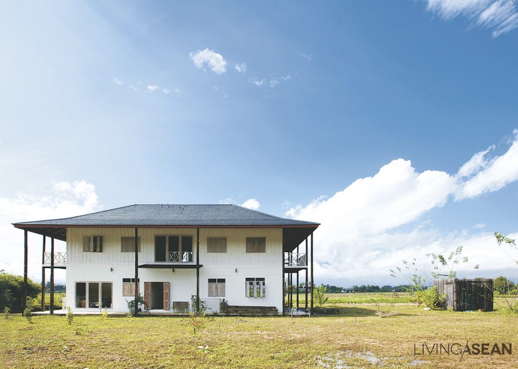
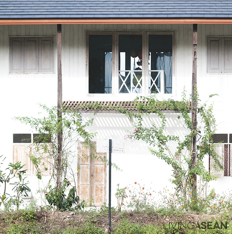
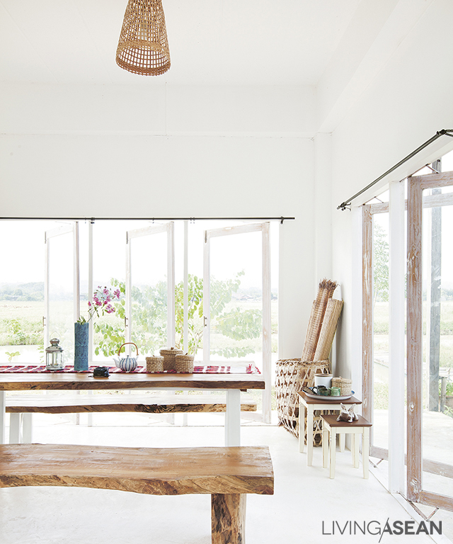
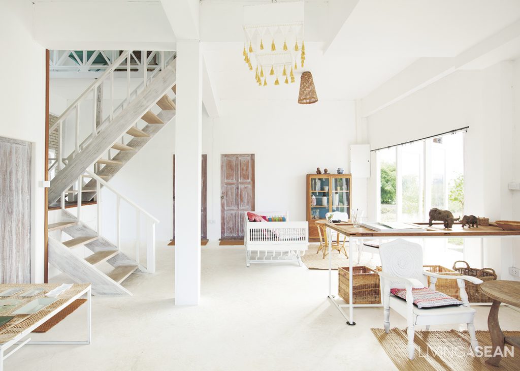
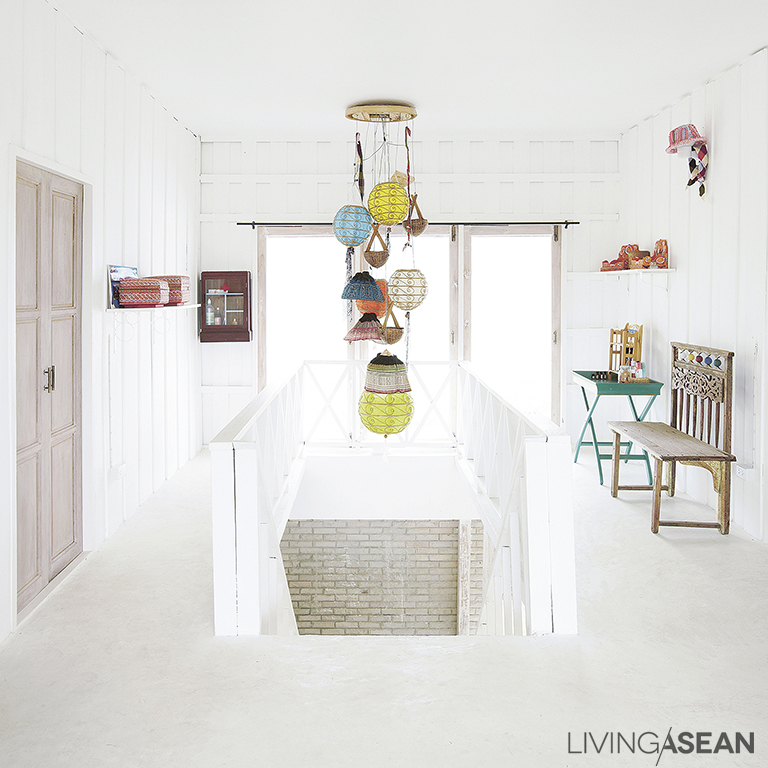
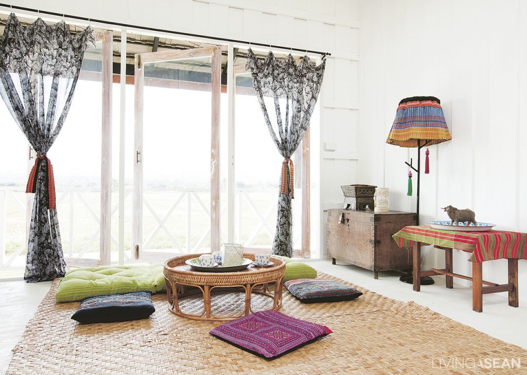
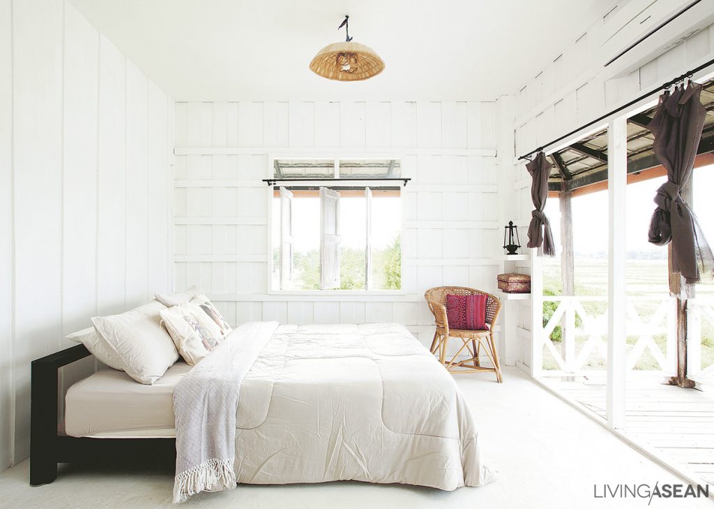
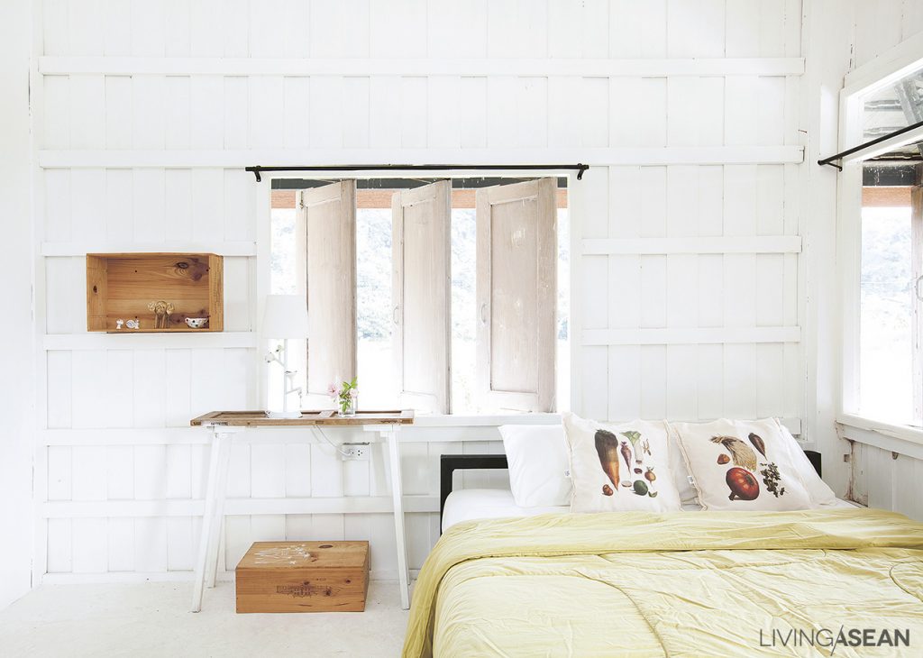
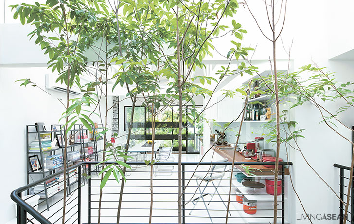
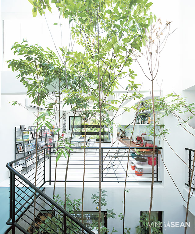
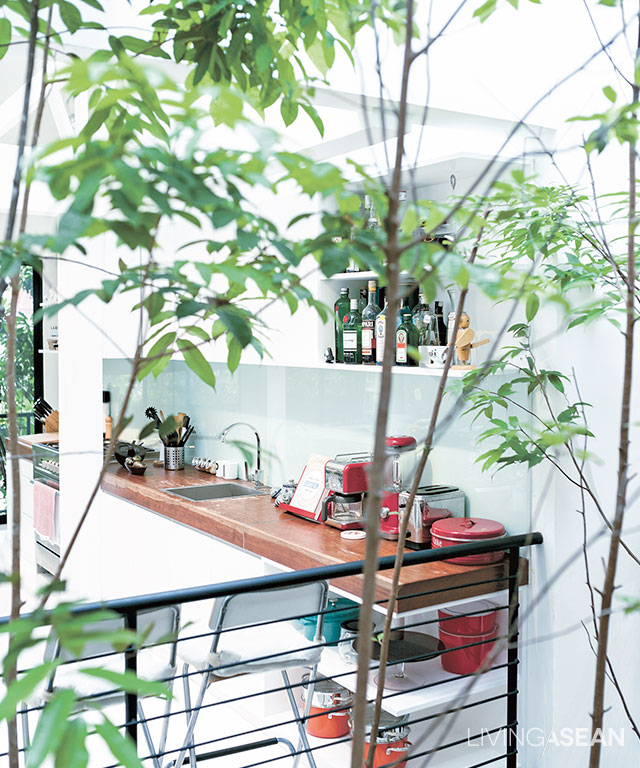
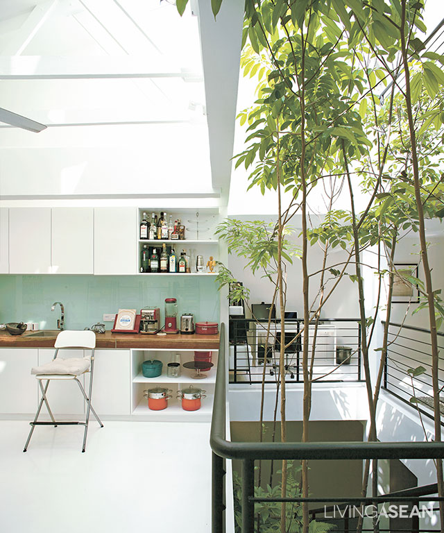
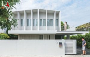
Blog : white house

Stacking Green: Integrating Nature-Inspired Design in a Row House

Stacking Green: Integrating Nature-Inspired Design in a Row House

/ Ho Chi Minh City, Vietnam /

/ Story: Ekkarach Laksanasamrith / English version: Peter Montalbano /

/ Photographs: Soopakon Srisakul /

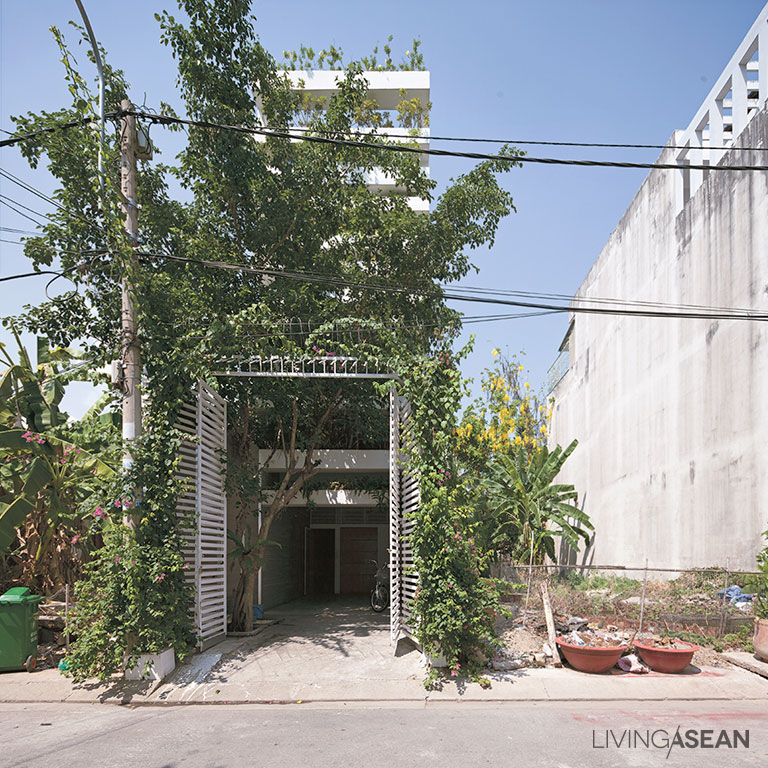
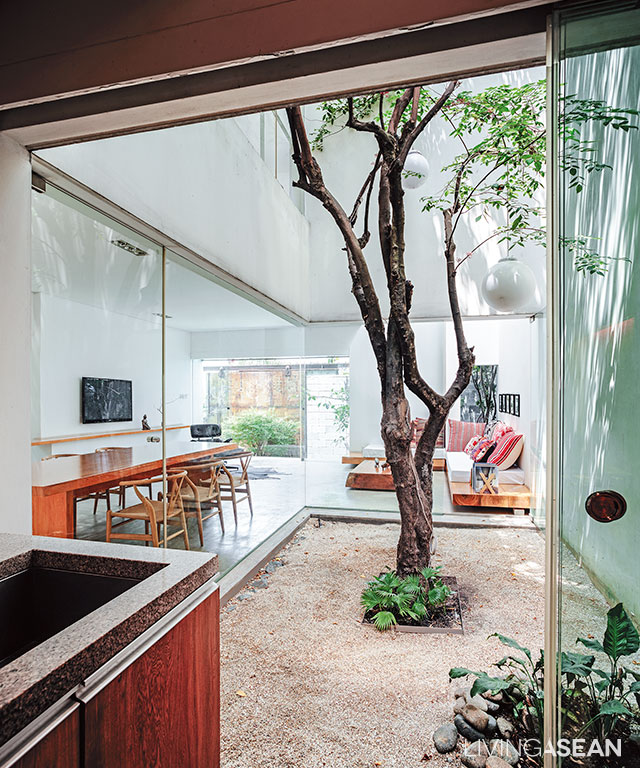
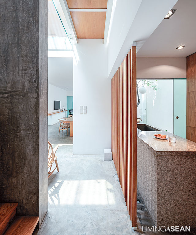
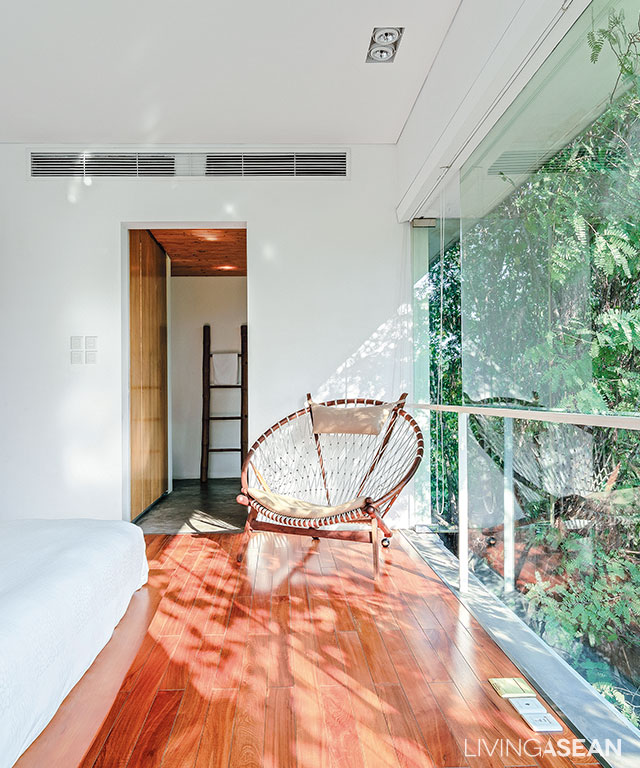
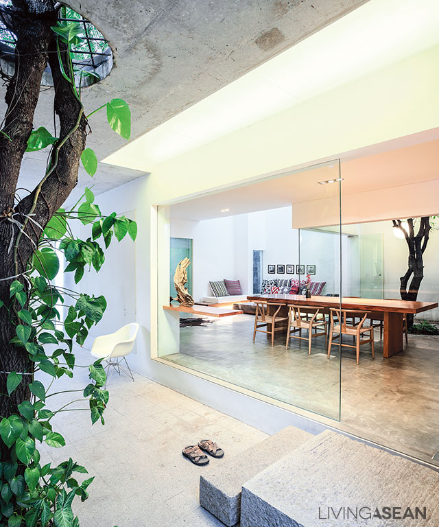
This residence in Ho Chi Minh City has an interesting form and exterior that has drawn us to see with our own eyes. Named “Stacking Green”, this row house design received an award for outstanding design and architectural works at the 2012 World Architecture Festival in Singapore. It’s not surprising that it received a citation for architectural excellence in the residential building category. The way that it dealt with complex urban problems in a simple way yielded an array of fascinating outcomes.

row house
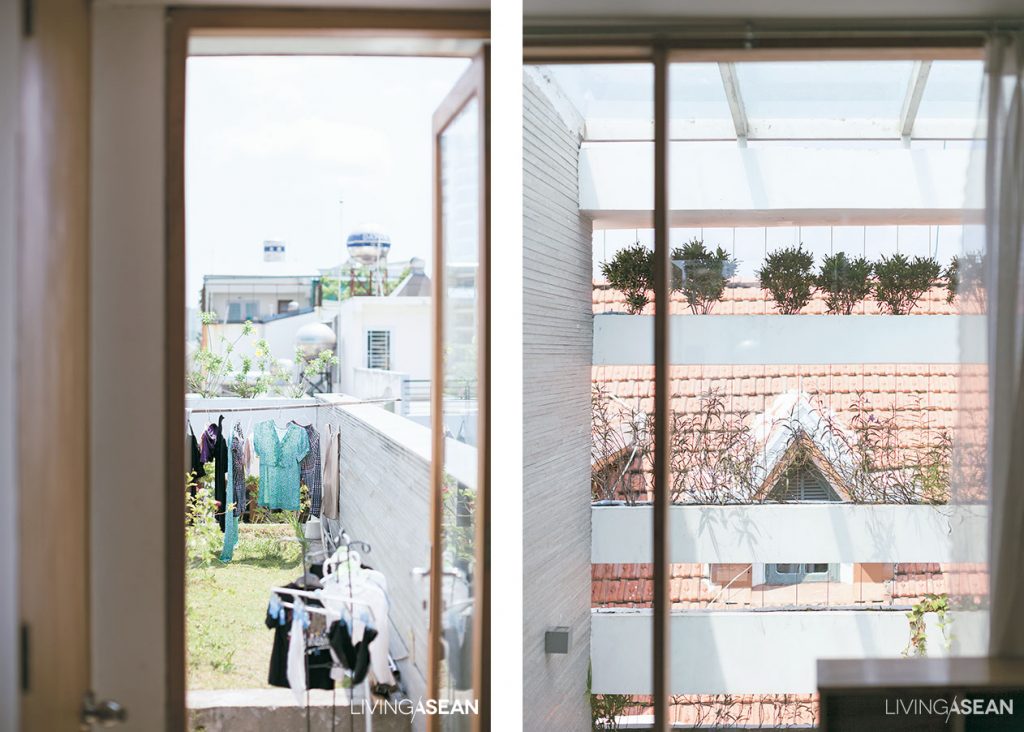
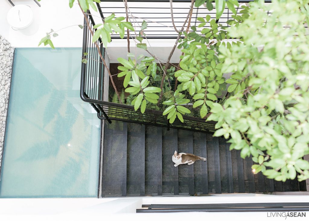
The stairway reaches the top floor of the house that holds a guest bedroom with a sundeck.

The four-story townhouse offers a total of 250 square meters of usable space. The frontage abutting on the street is 4 meters wide with a whopping 20-meter depth. The interior is especially designed for the three people who live here, one of whom is an old person. Hence, one bedroom is placed on the lowest floor, so there’s no need to climb the stairs.

3
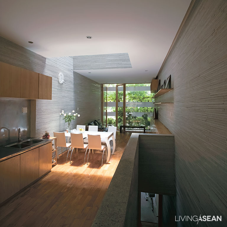
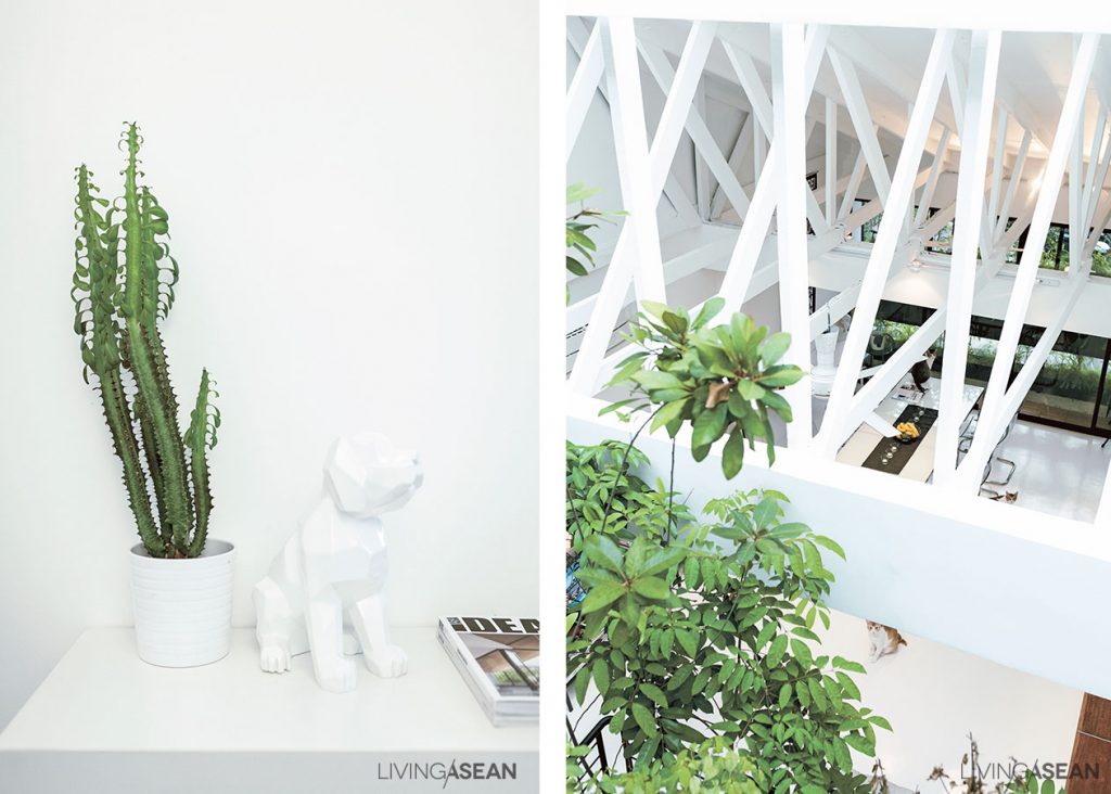
Since the house plan is long and narrow, bringing sunlight into the interior living space is a very good idea.

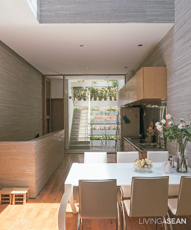
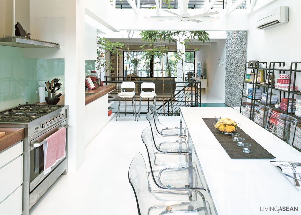
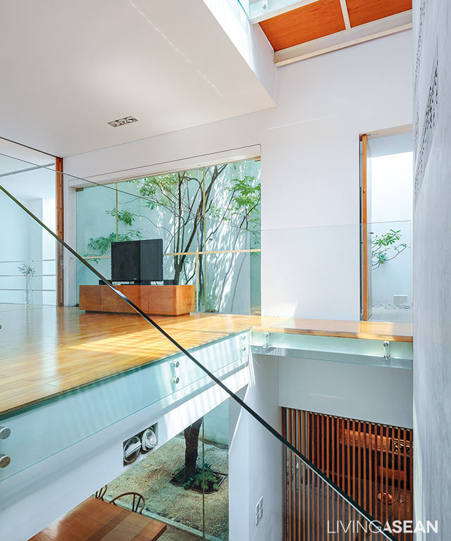
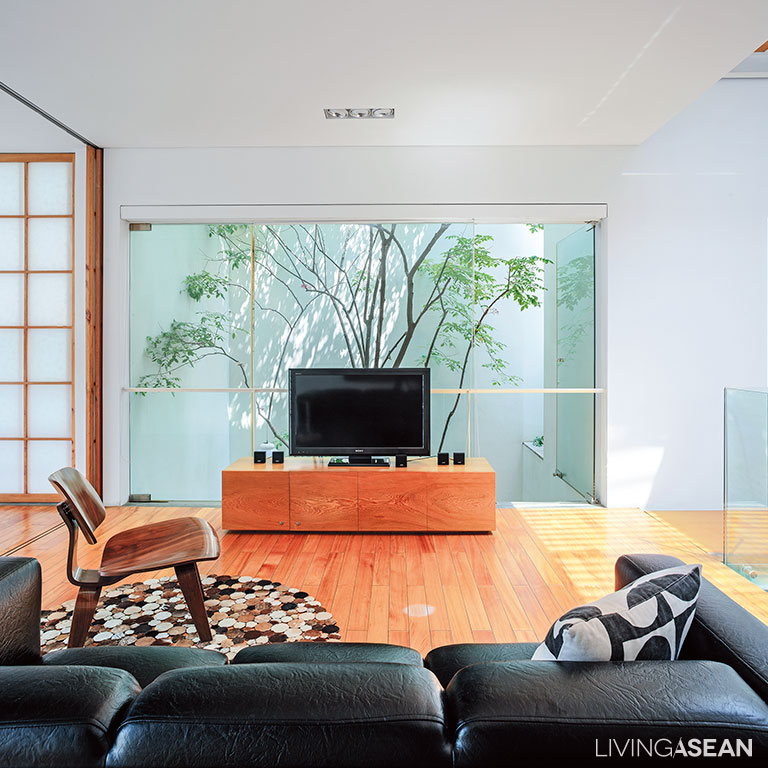
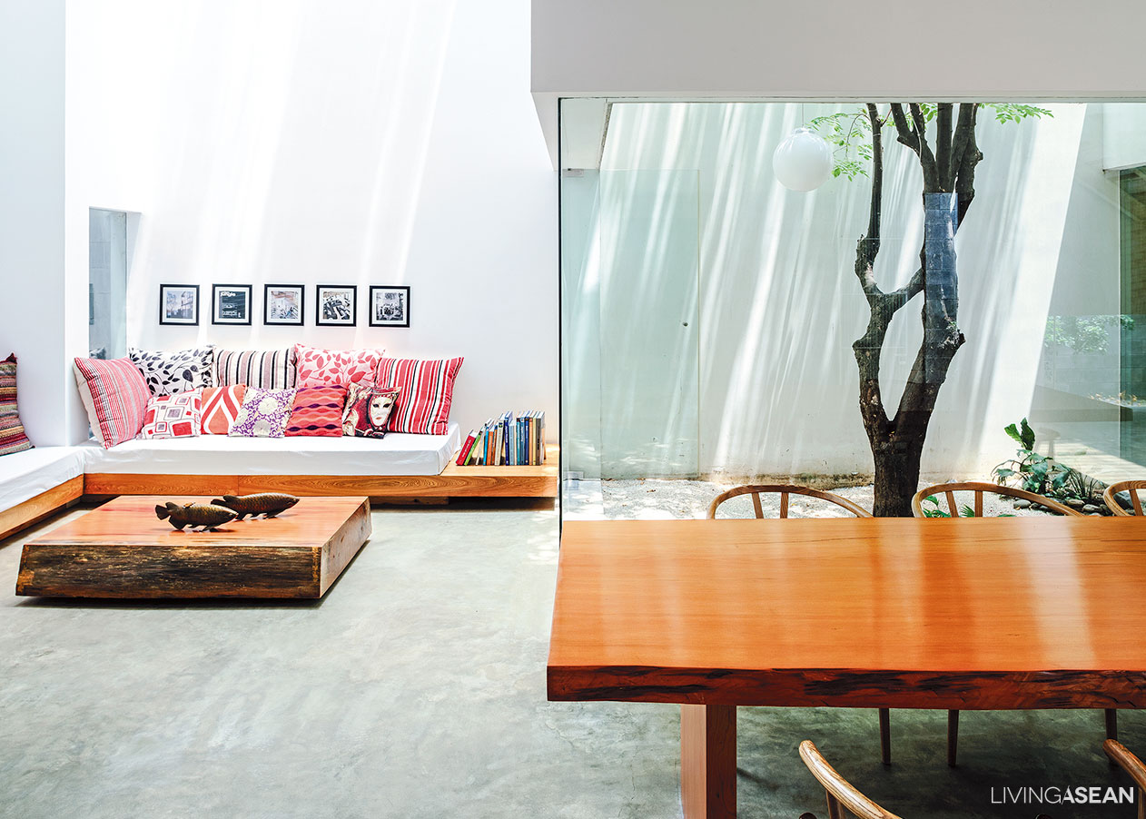
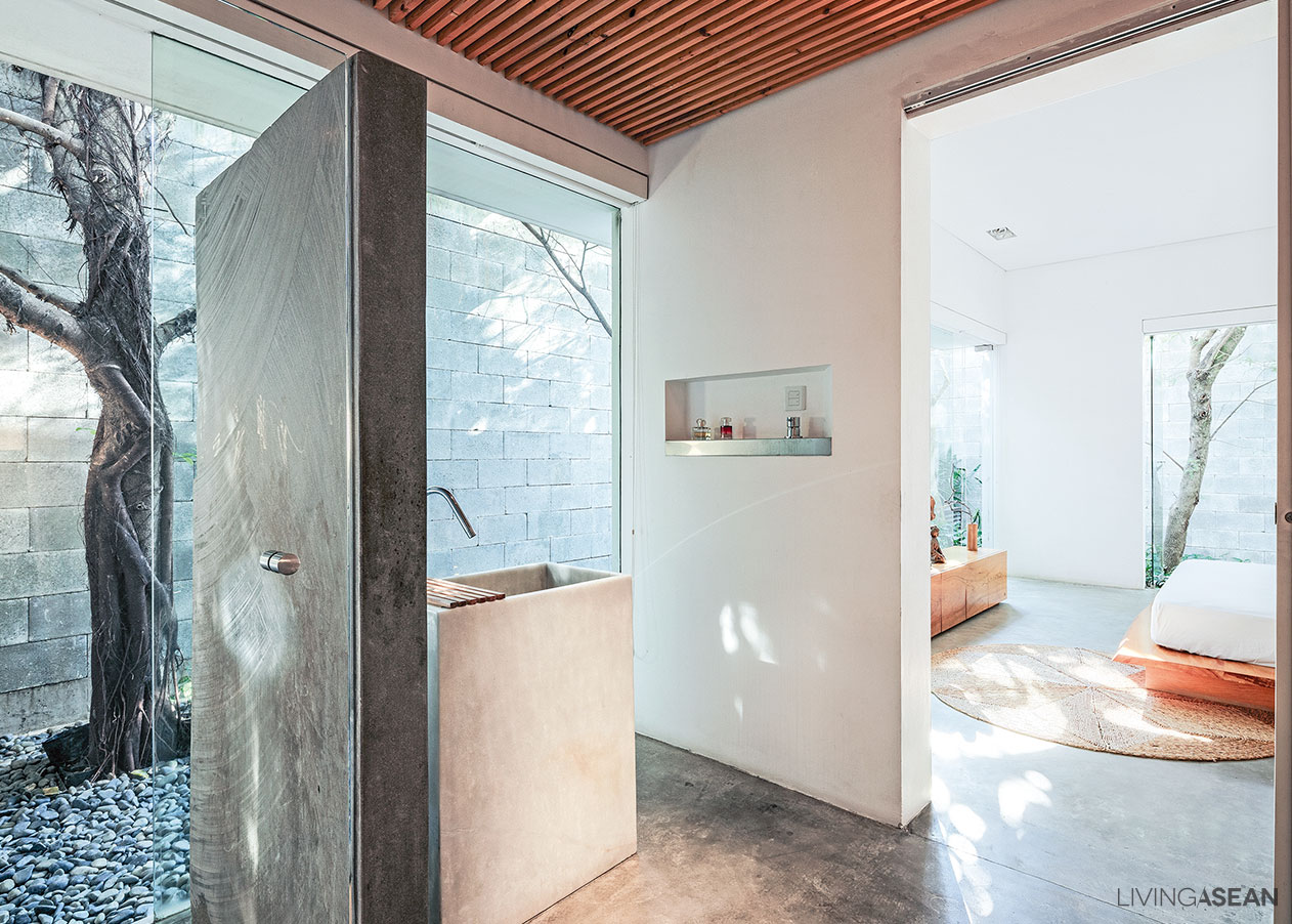
The second floor consists of a dining room, kitchen and living room, while the third holds the master bedroom with an open floor plan bathroom. The guest bedroom is located on the fourth floor.

row house

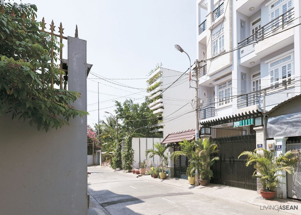
It’s a well-known fact that people’s homes in Vietnam are often compactly built in townhouse form to use as little property space as possible, often resulting in cramped residences and unattractive-looking building fronts.

Here, the architects have incorporated privacy in the design so that no one can look in from outside. At the same time, it gives the homeowners a sense of peace and contentment. Overall, it’s a design thoughtfully devised to reduce pollution from the street.

row house
This row house may not have any eye-catching features from the outside, yet its half-open, half-opaque design allows natural light to enter through the rooftop, creating a cozy home ambience within.
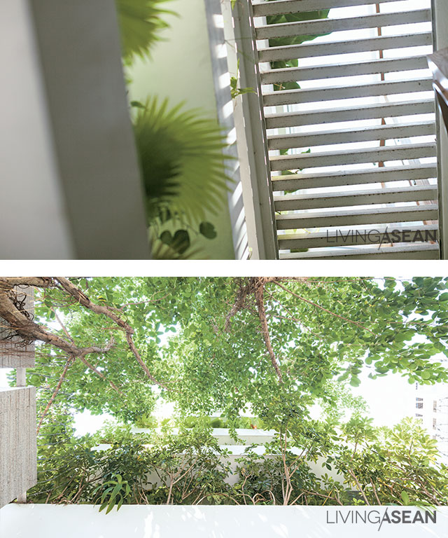
As the leafy plants reach their full size, the level of privacy correspondingly increases.

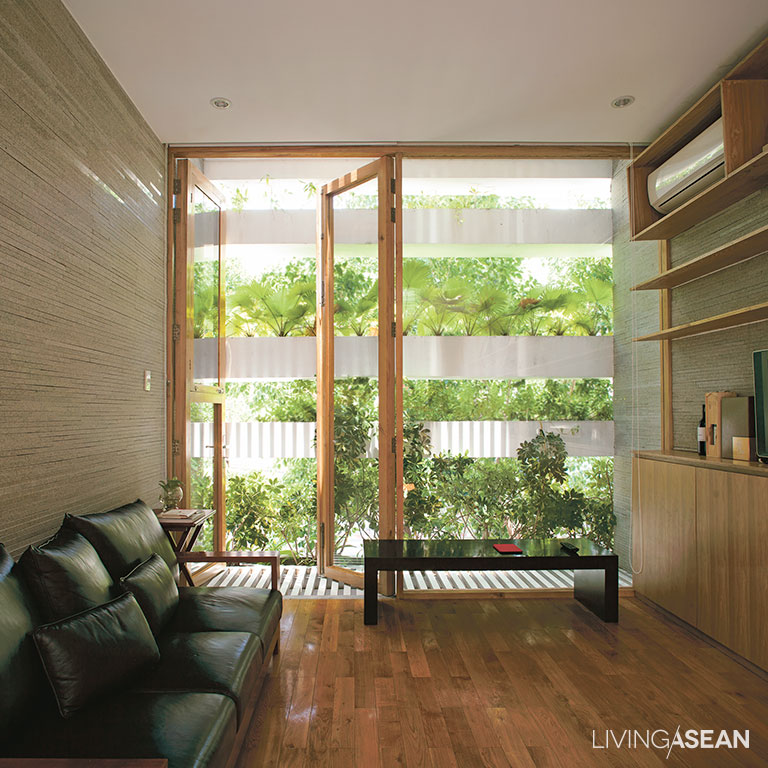
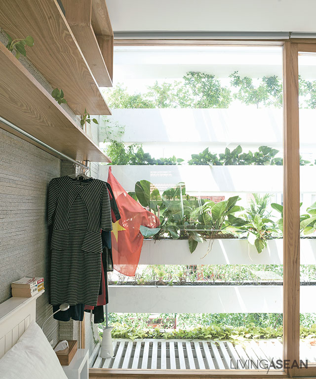
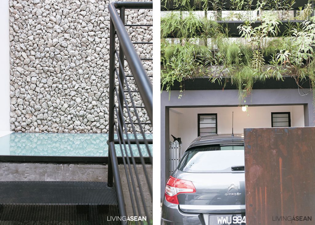
Additionally, both the front and the back of the house feature rows of containers stacked one on top of the others with open air spaces at intervals. In all of them, lush green plants thrive luxuriantly screening the view inwards and creating attractive façades.

The house also has open ports which run up and down through all the floors. This kind of stack ventilation effect allows for hot air from below to rise and vent out through the rooftop. And by the same token, fresh cooler air is drawn inside keeping the heat down even at high noon.

row house
Sunlight through a glass skylight in the roof shines down into the dining room on the second floor.

5

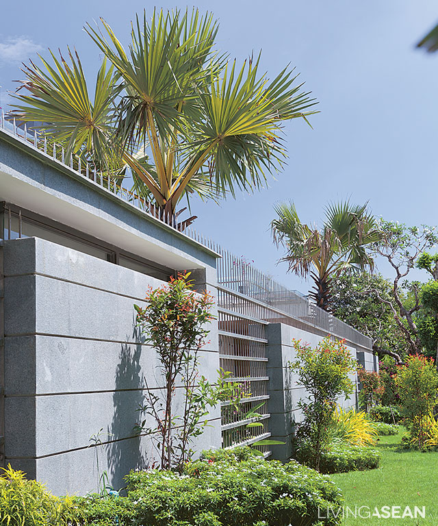
In the front yard, a leafy shade tree improves air quality, while vertical gardening on the front and back facades has spaces between stacking containers that allow plants to grow. The open spaces between planter boxes are determined by the types of vegetation planted. The full height of a plant is used to fix the spacing between planters on each floor.

Step inside, and you find there are hardly any walls separating the home into different rooms, except for bathrooms. This creates efficient ventilation throughout the home, at the same time giving it an open, uncluttered feel.

Besides giving privacy and cooling shade to the house, the planter boxes and leafy vegetation also act as a safety feature.

In this way, when container plants reach their full heights, they become the outer envelope of the building. Together they go to work all day and every day filtering out harsh UV rays from the sun, at the same time letting the cool breezes flow through.

The architects picked only the trees and plants with fine and delicate foliage so as not to block the wind, and for ease of use, they installed pipes for an automatic watering system.

row house

Concrete planter boxes holding plants on the front and back facades have the added convenience of an automatic watering system.

Architect: Vo Trong Nghia Architects


You may also like…

M11 House: A Comfy Minimalist House in HCMC

3 x 9 House: A Compact Renovated Row House in HCMC

Brilliant Home Office Combination of Studiomake

Brilliant Home Office Combination of Studiomake

/ Bangkok, Thailand /

/ Story: Ekkarach Laksanasamrith / English version: Peter Montalbano /

/ Photographs: Ritthirong Janthongsuk / Styling: Pakawadee Pahulo /

Despite the building being long and narrow, a team of architects at Studiomake managed to turn it into a perfect home office integration that would inspire productivity. The Bangkok-based team of designers, architects and educators is known for its specialized skills and experience in various types of architecture.

Home Office

When it came to designing their own home office, Orapan Sarasalin Schafer and David Schafer opted for an architectural steel design for its lightweight look that’s right for the prevailing climate in Thailand. It’s a layout that emphasizes an open, uncluttered living space with plenty of wall openings, windows and doors for good ventilation and heat dissipation.

Home Office
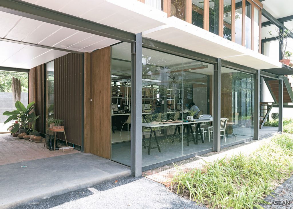
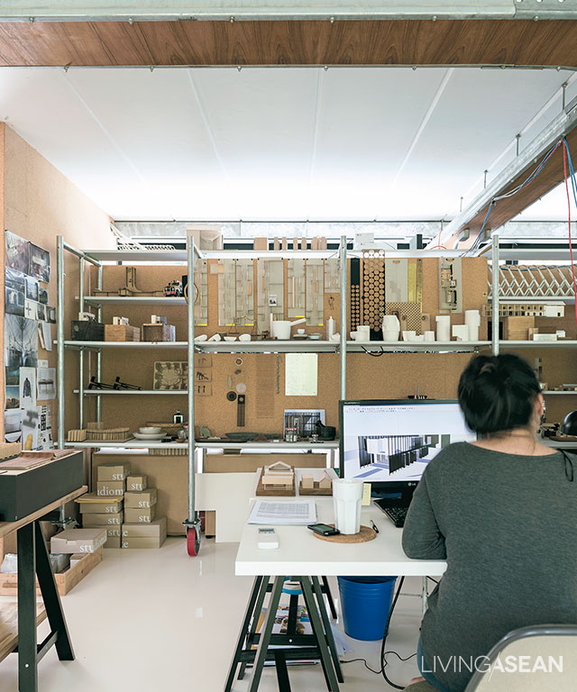
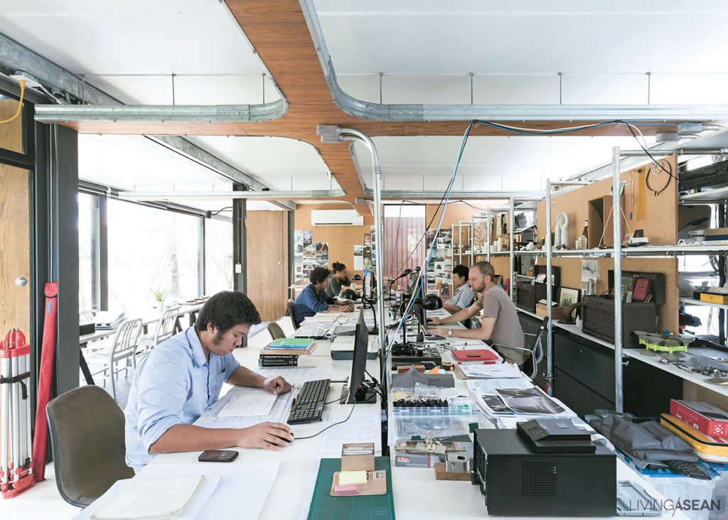
Furniture in the workspace is movable. It can be easily arranged to avoid visual clutter and improve traffic flow, lighting and air quality.

By design, the building performs a dual role. The first floor holds a fully equipped office space, while the second floor is used as a residence. Overall, it’s thoughtfully devised planning made easily adjustable for future updates. The crossbeams resting across the tops of columns support weigh over an extra long span, five meters to be exact.

Home office design offers many benefits, among them the freedom to create the ideal work space like the owners intended, plus the peace and quiet that suits their lifestyle needs.

Home Office
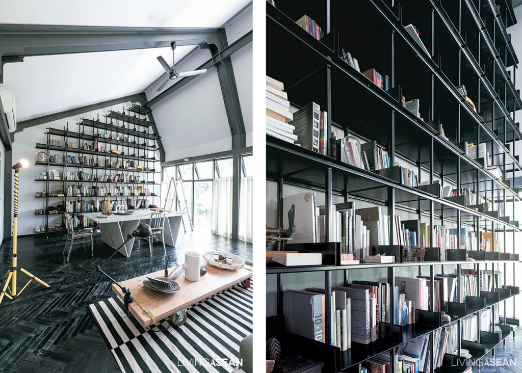
[Left] The work space is well lighted thanks to generous wall openings that let natural daylight stream into the interior. / [Right] A floor standing wall-mounted bookcase made of steel is designed by the homeowners. For practical purposes, the bookends are adjustable.
Home Office

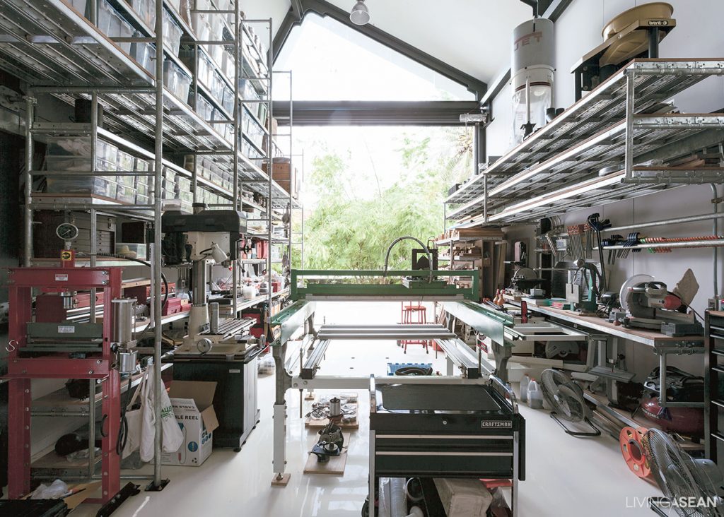
The workshop boasts high ceilings for better ventilation, plus it has ample space for equipment and tools needed to perform various tasks.

Home Office

There is attention to detail in all parts, especially the integration of natural elements like plants and light into the built environment, making the interior work space feel light, airy and conducive to creativity. And they don’t come by accident. Rather, every building strategy and material is tested first to see if it’s suitable for a particular application.

This helps to understand whether a specific material is right for the task, plus it narrows down the choices to the best selection. And the same careful consideration applies to both upstairs and downstairs. Examples of this include high ceilings and a wall of bookshelves designed to maximize work space utilization.

Taken as a whole, the lower floor contains a fully functional work space and offices, while the upper floor in and of itself is a complete home, consisting of two bedrooms with a bathroom en suite, a relaxing living room, kitchen and dining room.

Home Office
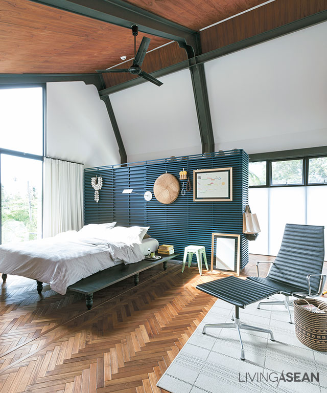
The headboard in subdued bluish gray color separates the main bedroom area from the dressing room. High ceiling design creates a sense of space making the room feel light and airy.
Home Office
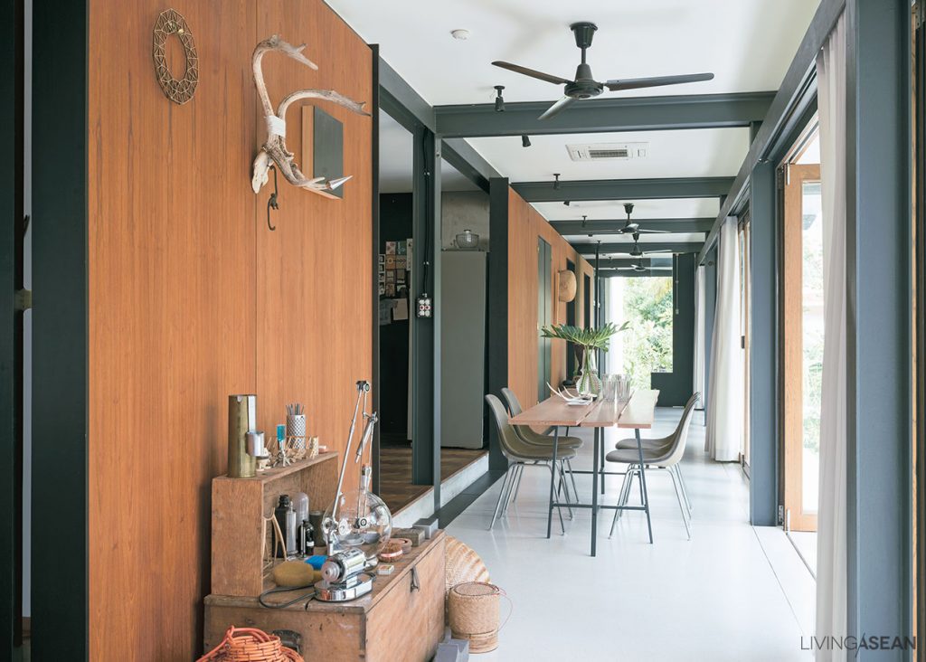
Rooms on the second floor are accessed via a wide corridor with room for a small dining space and a nook beside the wall offering peace and seclusion.
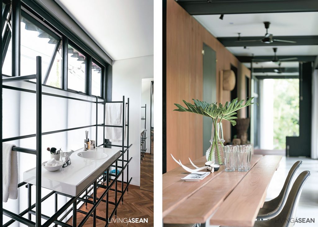
The translucent sheet seen here is of polycarbonate, which allows light to pass through, but not exposed to the outside.

With respect to the office area, the floor plan is simple and straightforward. Electrical wiring is neatly installed and piped to various locations hidden from view. The pillars supporting the tall vertical structure of steel are evenly spaced for proper load bearing, while the building façades are made attractive by crisp clean lines.

For indoor thermal comfort, important aspects such as heat insulation, soundproofing, and ventilation are carefully thought out and incorporated in the design. In the fewest possible words, it’s all about attention to detail that makes this modern home office a perfect place to be. Brilliant!

Home Office
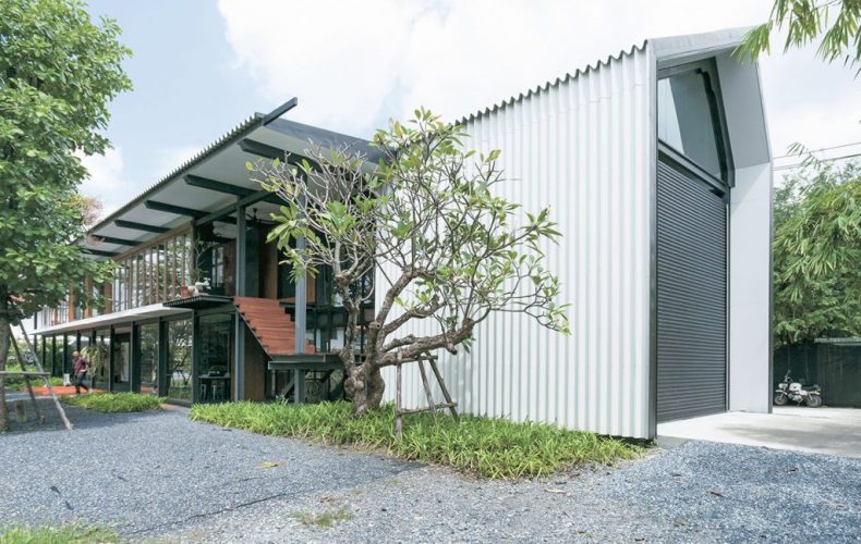
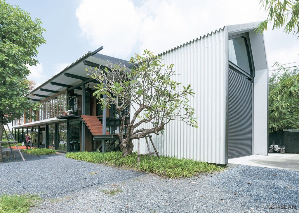
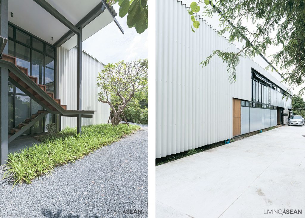
The steel building looks lightweight. It’s made strong and durable using semi-industrial materials, an interesting way to refresh the home’s curb appeal.

Owner/Architect: Studiomake (www.studiomake.com)


You may also like…

MP House: A New State-of-the-Art Live/Work Design

From Typical Shophouse to Stylish Home Office in HCMC

An Open Concept Urban Home with a Minimalist Flair in Kuala Lumpur

An Open Concept Urban Home with a Minimalist Flair in Kuala Lumpur

/ Kuala Lumpur, Malaysia /

/ Story: Ekkarach Laksanasamrith / English version: Bob Pitakwong /

/ Photographs: Soopakorn Srisakul /

With the creative use of design elements, this Minimalist house in Kuala Lumpur feels bright, airy and comfortable, albeit having only a small number of windows. The open concept urban home with a stylish flair was designed and built by Tony Heneberry of 2’s Company, formerly JTJ Design, under the concept of a great place to live in.

Minimalist urban home
Growing trees add some freshness and makes the house more of a great place to live in.

As simple as that, here’s the story of a metamorphosis of purpose, in which a duo of unexciting shophouses transformed into an incredibly warm and roomy living space in the heart of town. After he had bought the two units attached to each other, Heneberry gave them a complete makeover, tearing down the dividing walls and combining them into one coherent whole with increased usable spaces inside.

Minimalist urban home
Green foliage adds joy to cooking, making it feel like living out in nature.

The result is a 7-meter-wide façade looking much better than when Henebery found it. He removed the existing solid walls between them and assigned new functions to the interior spaces. The living room with dining area on the second floor is spacious, with a lot of open areas in accordance with the “open plan” concept.

Minimalist urban home
Trees chosen for the center courtyard have medium-sized leaves to keep the house airy and not too dense.
Minimalist urban home
Using an “open plan” design means the interior is all connected, which avoids a cluttered look.
The new set of stairs illuminated by a rooftop skylight is one of the spots everyone likes the most.

For practical reasons, the old staircases were torn down and replaced by new ones built in a better, more convenient location. The new sets of stairs crafted of steel sit in a hallway next to the center courtyard, leading the way to the second floor.

The courtyard is filled with trees, as a main relaxation area of the house, where a glimpse of outdoor experience is brought inside in harmony. The trees also create visual continuity by naturally drawing the eyes towards the interior.

The stair to the third floor is set in another location. It sits against the outer wall, to preserve the space inside, which is an area for work and rest.

[Above] The wooden roof truss painted all white makes the overhead space look taller and more spacious. / [Below] The new metal staircase is aesthetically pleasing, thanks to the absence of solid risers between the treads. For good ventilation, expanded metal grating is used instead.
[Above] The wooden roof truss painted all white makes the overhead space look taller and more spacious. / [Below] The new metal staircase is aesthetically pleasing, thanks to the absence of solid risers between the treads. For good ventilation, expanded metal grating is used instead.
Minimalist urban home
Natural light turns second-floor living and work spaces into a well-lighted place, plus high ceilings add an airy feel to it. The disadvantage that comes with having only a few windows is nicely compensated for by the creative use of design elements, rooftop skylights among them.

As for the ventilation system, hot air is able to float up through the hallway and then flows out through window louvers and vents on the rooftop.

Another plus is, this Minimalist urban home faces south. So, by putting planter boxes on window frames, a simple vertical garden is added to filter sunlight and enhance privacy for the people living inside. The bottom line. This newly renovated home is truly a breath of fresh air.

[Left] The hallway wall surface is covered with crushed concrete recycled from the old shophouses. / [Right] Lush green vertical gardening adds a refreshing change to the front façade rising above the carport.

Architect: 2’s Company (www.facebook.com/JtjDesign)


You may also like…

A Modern Home That is Quintessentially Thai

303 House: A Modern Narrow Townhouse on a Narrow Lot

L2 Residence: House on the Rock with Spectacular Ocean Views in Samui

L2 Residence: House on the Rock with Spectacular Ocean Views in Samui

/ Surat Thani, Thailand /

/ Story: Ottomaan / English version: Bob Pitakwong /

/ Photographs: Sungwan Phratem /

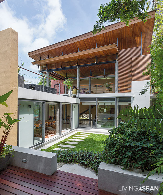
If relaxing on the seafront is your idea of paradise, here’s a house overlooking a quiet stretch of sand away from the crowds. It is not often that we come across a home perched on a pristine hillside. This captivating house on the rock stands out amid lush greenery in Samui, a popular resort island in the Gulf of Thailand.

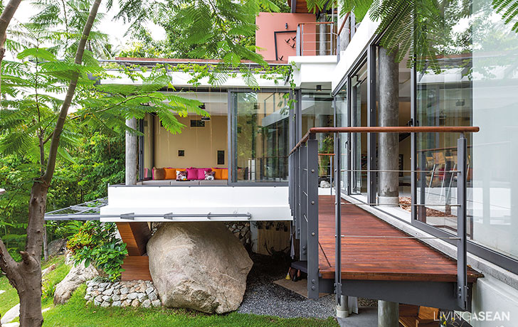
A well-rounded balcony juts out from the master bedroom and comes to rest on a big boulder in complementary shape.

The house sits tight on a slope just shy of an acre in extent, hemmed by huge rock faces and views of exuberant vegetation. From afar, it’s hard to tell the shape of the building as it’s situated at a lower level than the road in front of it.

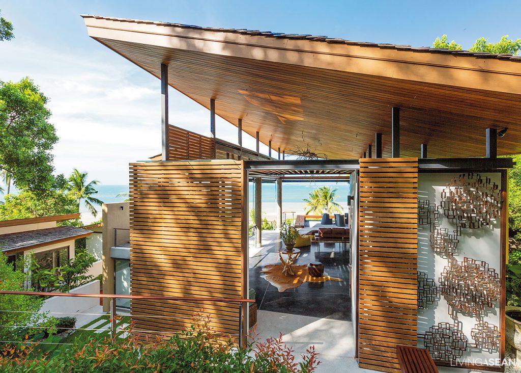
The landscape strewn with large boulders forces the home to be built in multiple separate units, each anchored to a rock face to secure its place. Overall, it’s a crisp, clean and modern design, with neat exteriors under a shed roof.

Because of conditions that cannot be changed, asymmetrical shapes are used, while the typical rectangular shapes are avoided so as to achieve the form, color and texture that blend well with the natural surroundings.

2
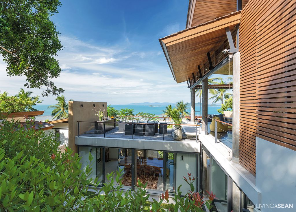
The second floor connects to a sundeck with al fresco dining room and panoramic ocean views.
3
The main entryway appears light and airy. Where appropriate, the walls are made of strips of timber evenly spaced to allow light and ventilation.

The separate units of construction are set at slightly different levels depending on ground conditions. The shed roof above the main villa creates a wide open façade looking out over the ocean. To arouse visual interest, diagonal lines are applied to the exteriors, a clever hack that gives the home a friendly, warm and welcoming appeal.

5
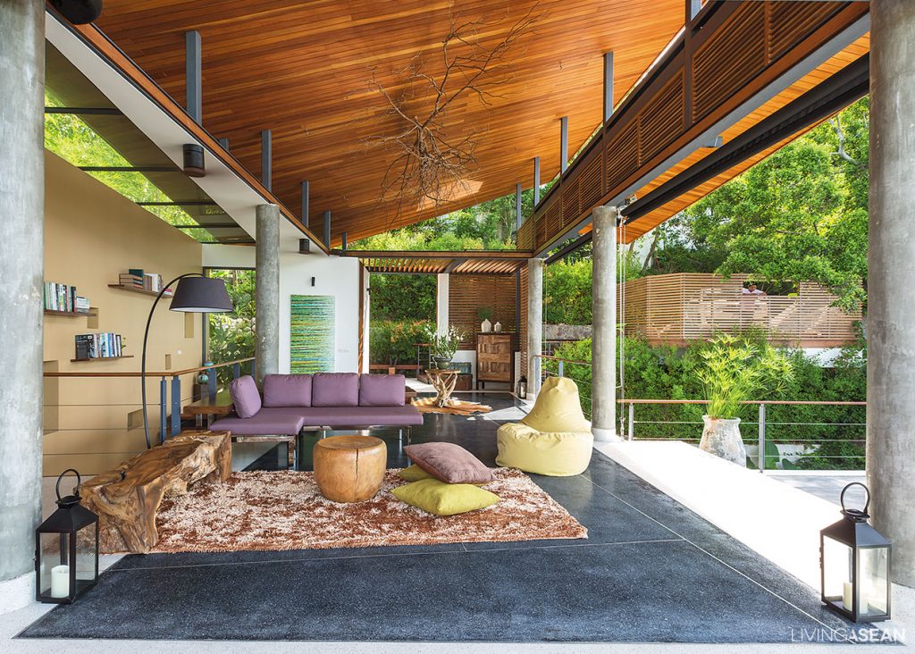
The semi-outdoor sitting room holds a modern sectional sofa with wood and upholstered furniture in complementary colors.
6
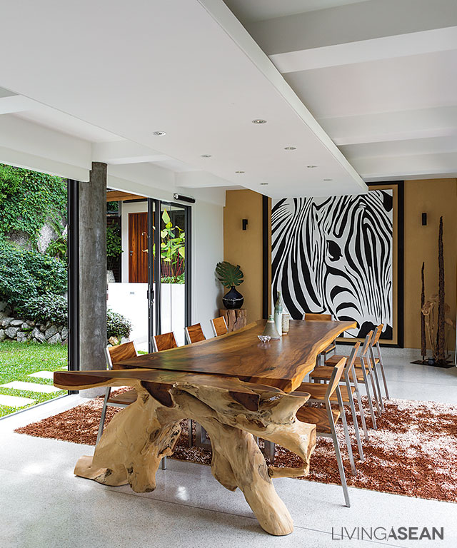
The dining room boasts the beauty of a long dining table crafted of slab timber resting on tree stumps. A zebra graphic pattern at the far end adds a touch of nature to the interior.

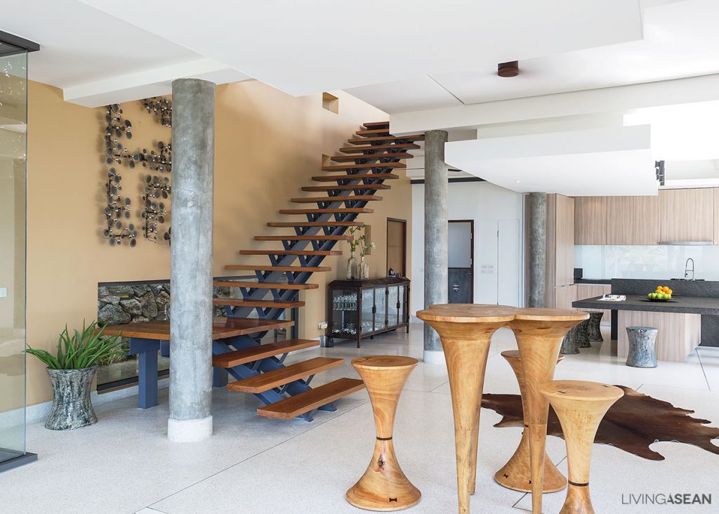
The main villa has two levels. The upstairs living room is bright and breezy with panoramic ocean views. For indoor thermal comfort, the exterior walls are covered in timber strips evenly spaced to create gaps in between for air passing through.

Where appropriate, parts of the building envelope are built of bricks covered with plaster for a neat appearance, while windows are glazed using transparent glass to get a better view. The upper floor also extends to connect with a spacious sundeck used as al fresco dining room.

7
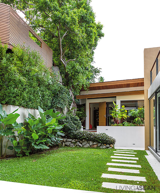
A manicured garden with stepping-stone pathway connects three buildings. To the left, patches of greenery paired with a building façade made of timber strips in earth-toned color help soften the harsh appearance of nearby cliff faces.

The ground floor connects to a lush lawn, with trees and foliage plants growing luxuriantly on one side. Nearby, floor-to-ceiling windows fill the home with light and remove anything standing in the way between indoors and outdoors. There’s also a lounge where people can sit and relax a short distance away from a semi-formal dining room and contemporary-style pantry.

8
Viewed from the opposite side of the lawn, the main villa boasts the beauty of striking trapezoidal roof design.

Opposite from the main villa stand two outbuildings accessible via a stepping-stone garden pathway. One is a single-story unit holding a bedroom with a semi-outdoor bathroom en suite, while the other sits slightly lower than the rest. At a glance, the floor plans and general appearances are reminiscent of sundecks on a cruise ship.

4
An open-concept floor plan gives more natural light, better traffic flow and flexible use of space.
10
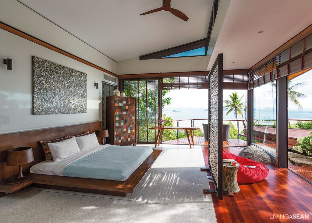
The master bedroom lies in a smaller building, separated from the main villa.

The master bedroom is comfortably ensconced in the smaller building anchored to a huge boulder. The edge of the building can be seen projecting outward to soak up the sea view.

For safe walking from one building to the other, areas with uneven ground are smoothed out to make room for a lawn with garden pathway. With the passage of time, nature gives the large boulder and nearby rocks the perfect weather-beaten faces that blend with the house and surrounding landscapes.

9
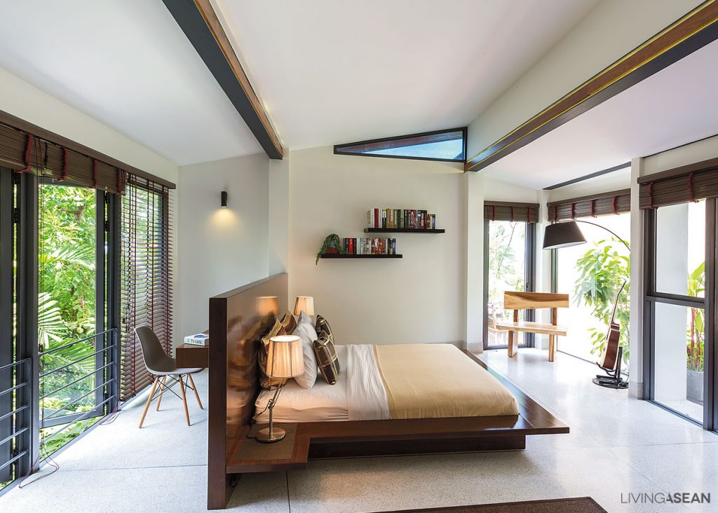
In another building, another bedroom quietly enjoys the soothing glow of soft, natural light.

Taken as a whole, it’s an intriguing amalgam of natural touches and well-thought-out planning that makes this house on the rock a perfect place to be.

12
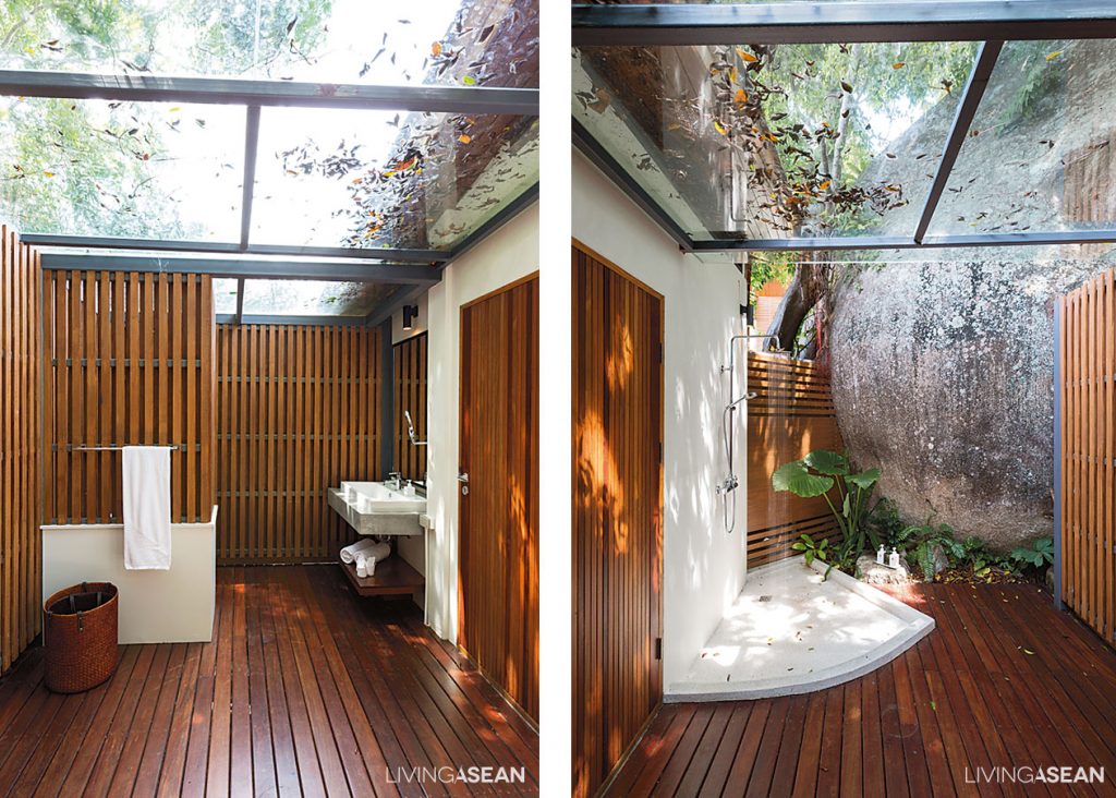
Lacy shades provided by overhanging trees keep the open-plan bathroom and shower room nice and dry all day long.

Architect: Kusol Im Erbsin


Visit the original Thai article…

บ้านโมเดิร์น ทรงเหลี่ยมๆ บนหินทรงกลม ๆ


You may also like…

Baan Somjai: Where Time Seems to Stand Still on Pha-Ngan Island

modern house cha-amT House: A Stylish Home in Cha-Am at the Cutting Edge of Modern Design

3×9 House: A Compact Row House Renovation in Vietnam

3×9 House: A Compact Row House Renovation in Vietnam

/ Ho Chi Minh City, Vietnam /

/ Story: Ekkarach Laksanasamrith / English version: Peter Montalbano /

/ Photographs: Soopakorn Srisakul /

A lot of work and research was invested in this row house renovation project. The big question is: how to make the compact house look wider?

Home renovation: The project is accomplished without any concrete construction. The new second floor rests on cylindrical steel posts instead of big cement pillars.

Like most urban residential buildings in Vietnam, “3×9 House” was formerly a shophouse built a long time ago. Only recently it was restored to a good state of repair. Looking back over the years, the old place lacking fresh air and ventilation had only a few windows and lots of solid brick walls, which made the building look dim.

A bold move was needed to rejuvenate it. The result is a modern living space that looks and feels fresher, younger and more lively, plus it helps to lift up the mood of the residents.

Renovated Row House vietnam
The 3-by-9-meter house has become a point of interest by integrating natural features in the design.

As land prices in Vietnam continued to rise rapidly and steeply every year, buying a new house seemed like a formidable task. So the owner thought it wise to invest in renovating his existing home.

He reached out to A21 Studio for their good reputations in the building industry, especially when it came to turning small, stuffy old houses into nice, uncluttered and environment-friendly homes.

Renovated Row House vietnam

Renovated Row House vietnam
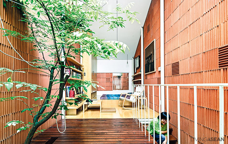
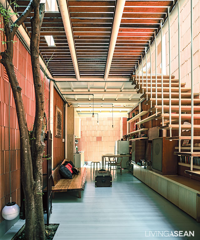
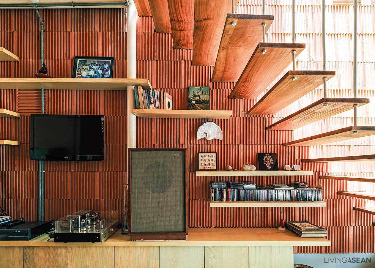
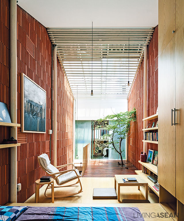
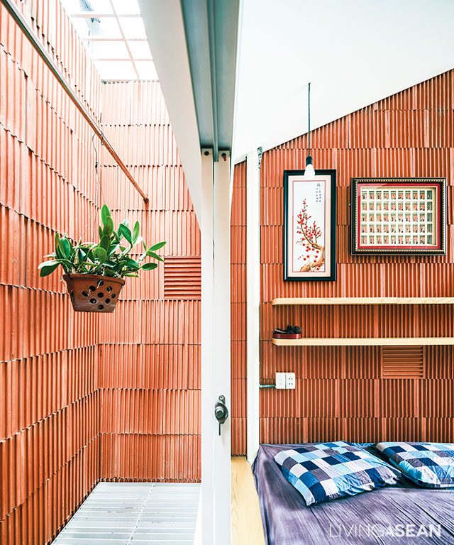
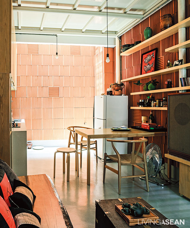
Clay tiles are placed inversely on the entire interior walls to create a stripe pattern and unique touch.

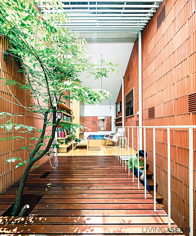
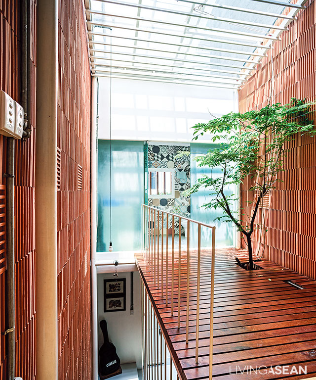
Walk in the door, and the first thing that catches our eyes is a tree growing up through an opening in the footbridge set against the wall. It’s a sign of welcome warmly greeting visitors coming into the entryway. The overall effect is bright and airy, thanks in part to a rooftop skylight illuminating the interior living spaces and letting sunlight shine on the tree.

For indoor thermal comfort, openings in the walls let breezy wind enter through the front door and circulate inside the home. As a result of this, the entire interior feels fresh and full of life all the way to the rear section, the second floor and the room under translucent sliding panels on the rooftop.

Flanked by three-story row houses on both sides, “3×9 House” is exposed to direct sunlight only in the middle of the day. For the rest of the time, the home is full of nice cool shade, making it feel very comfortable, warm and cozy, so there’s no need for air-conditioning.

Renovated Row House vietnam
The steel framework supporting the roof is equipped with a sliding skylight. This effectively illuminates interior spaces and allows the tree to keep on thriving.
Renovated Row House vietnam
For the health benefits of a well-lit home, the bedroom space connects to the footbridge with an opening for a tree to thrive under the rooftop skylight.
Renovated Row House vietnam
Loft style ideas paired with earth-tone color make the simple bedroom feel open, airy and uncluttered, thanks in part to the absence of solid room dividers.
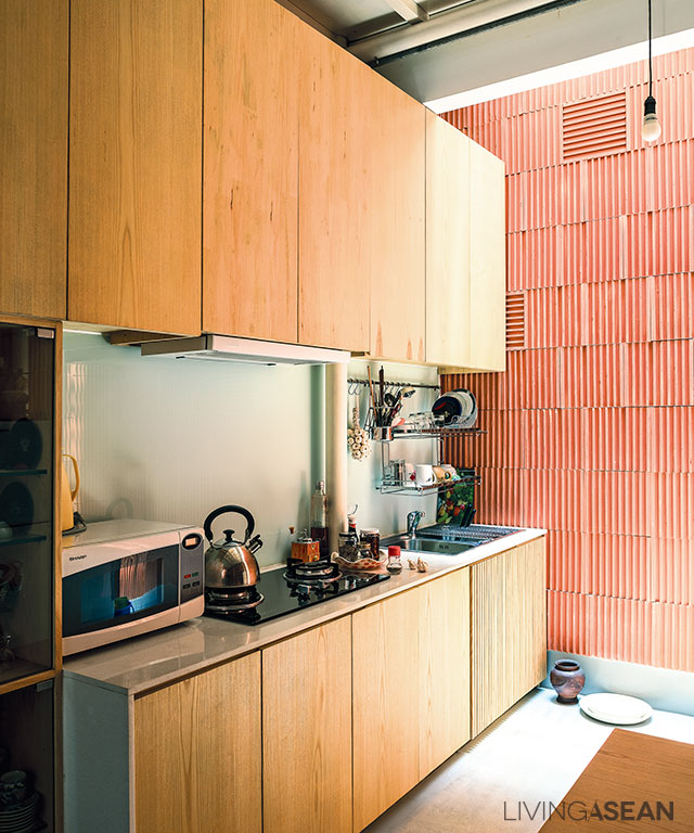
A modern kitchen setup gets rid of smoke and smell fast, as a result of a range hood blower and openings in the rooftop.

For a bigger, more open vibe in the interior, solid room dividers are avoided, with the exception of the bathroom. The ground floor consists of a living room, dining area and kitchen; all connected.

The bedroom and leisure areas are upstairs. Since the homeowner lives alone, solid room dividers are of no use. In a nutshell, it’s about integrating natural features, openings in the walls and a good ventilation system in the overall design. That’s what makes it a good place to live.

Renovated Row House vietnam

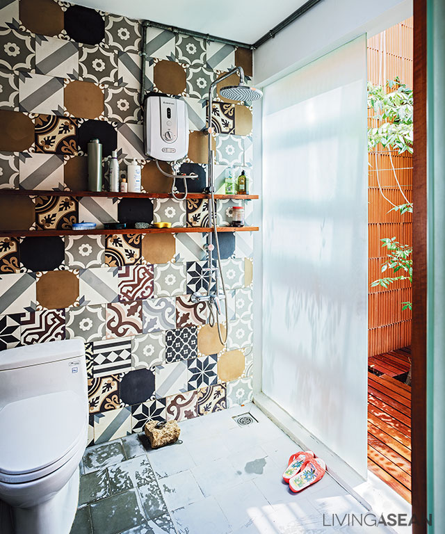
A colorful mix of tiles are reminiscent of vernacular architecture.

Architect: A21 Studio (www.a21studio.com.vn)


You may also like…

Nha Be House: A Brick Home Infused with Memories of the Good Old Days

Termitary House: Good Sunshine, Fresh Air, and Brick Walls

M11 House: A Calm and Restful Minimalist Design in Ho Chi Minh City

M11 House: A Calm and Restful Minimalist Design in Ho Chi Minh City

/ Ho Chi Minh City, Vietnam /

/ Story: Skiixy / English version: Bob Pitakwong /

/ Photographs: Soopakorn Srisakul /

Located in a suburb of Ho Chi Minh City, this minimalist-style house has plenty of ample space for a family. It’s the brainchild of A21 Studio, a homegrown architectural firm renowned for its creative designs in residential, public, hospitality and cultural categories.

Minimalist House
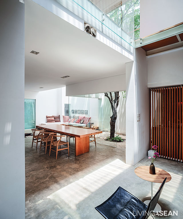
Double-height space design makes the interior feel open and airy, allowing plenty of natural daylight and fresh outdoor air into the home

From a design perspective, the suburban residence codenamed “M11 House” boasts the simplicity of clean lines typical of a modern home, with many natural elements beautifully integrated into the plan.

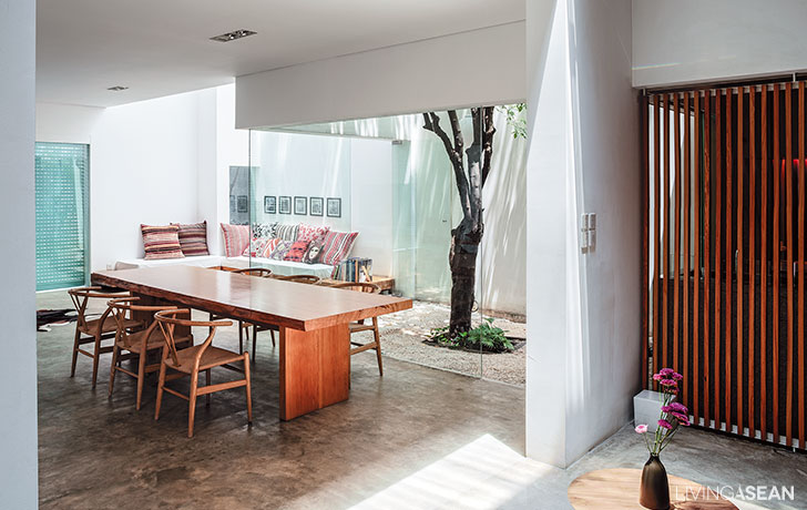
The uncluttered ground-floor interior appears light and airy, thanks to glass partition walls that make a small space feel big. Nearby, a center courtyard offering an oasis of calm can be seen in full view from anywhere in the home. A work of outstanding design is the innermost section of the house that’s spacious and cozy, thoughtfully devised to promote soothing relaxation.

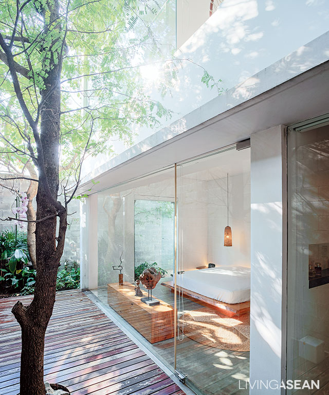
The bedroom on the ground floor is located in the cozy innermost section of the house, separated from the rest by outdoors privacy screens.
Minimalist House
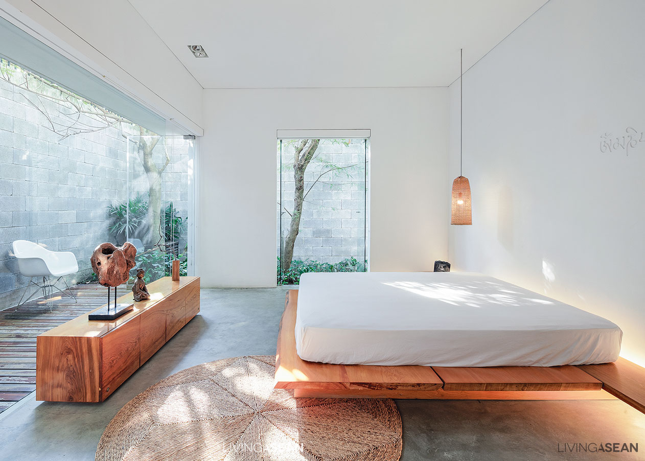
Tall glass-wall systems separate the bedroom from the terrace along the outside of the building. There’s a platform bed with an oversized mattress and soft white lights emitting a warm and cozy light for deep relaxation.

Double-height space design offers many benefits. Among others, it creates a connected home by providing visual continuity between the first and the second floor, not to mention there is flexibility in design, too.

Here, the kid’s study room and sitting room on the second floor can be connected or separated as needed. The third floor is a different story. It contains a home gym with a bathtub, and room offering seclusion for a good rest after a long day at work.

Sunlight streams through the windows turning the stairwell into well-lit place.
The second-floor living room is plain and uncluttered. A tree in the center courtyard blocks the sun’s rays from penetrating into the home.

Worthy of attention is the clean-cut edges between indoors and outdoors. The interior in general is an interesting amalgam of the bright shiny concrete floor, glass room dividers, and solid walls painted a cool-toned white, while streamlined furniture makes for comfortable living in a Minimalist style.

Minimalist House
A minimalist-style built-in sofa with throw pillows in bright colors grace the living room. Simple design results in the least amount of disruption.
The bathroom is enclosed in clear glass for visual continuity with the rest of the private room.

Overall, well-thought-out design ensures there’s the least disruption of airflow making it possible to do without air conditioning. That translates into big savings on electricity and other energy-related expenses.

The center courtyard is visible from every point of view in the home.
A slat wood panel effectively separates the kitchen from the corridor without disrupting air circulation in the interior.

In the fewest possible words, it’s a well-made home tailored to answer the homeowner’s specific needs, one that bespeaks his passion for minimalist design and environmental awareness. At the end of the day, a good life can only be built with good relationships between man and nature.

Minimalist House
The bedroom with an abundance of natural light and a garden view is in the snug innermost part of the house.
An extra parking area under a shade tree is ready for future use.

Architect: A21 Studio


You may also like…

A Minimalist Home in Bangkok Oozing with Charm

A House in Quang Yen: Massive Roof Design Celebrates Vietnam’s Climate and Culture

An Energy Efficient White Home in Bangkok

An Energy Efficient White Home in Bangkok

/ Bangkok, Thailand /

/ Story: Ekkarach Laksanasamrit / English version: Bob Pitakwong /

/ Photographs: Sungwan Phratep /

The hot and humid climate in Thailand is inevitable. But where there’s a will there’s always a way. This energy efficient home clearly illustrates that. The old house belonging to Assoc. Prof. Tonkao Panin Ph.D., of the Faculty of Architecture, Silpakorn University was lovingly restored to its former glory. The result is a place of residence that’s very pleasant, airy and well-lighted.

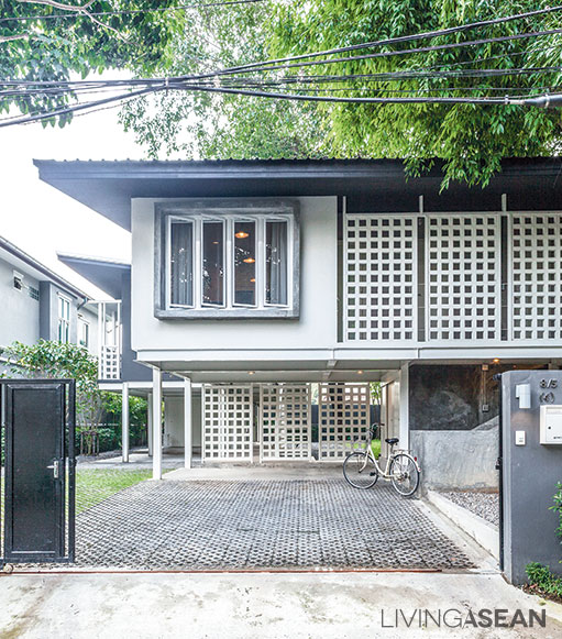
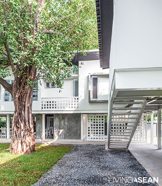
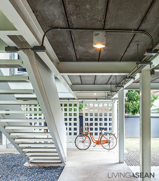
The house floor consists of prefab concrete slabs raised on a solid framework of steel. The lower floor right underneath it is covered with concrete in glossy finishes.

Located on the bank of a canal, the property faced a long-term problem. Flooding tended to happen often. This eventually necessitated a complete teardown to make room for a new home.

A short driveway covered in concrete pavers leads to the car park beneath the house.
Well-thought-out design leaves plenty of room for air circulation, a nice way to create a comfortable home.

“We had full-grown trees on the land, which we intended to keep. So, the architects designed the building around them. Due to some limitations, parts of the old home remained intact. The space where the trees are standing now has since transformed into an atrium,” Tonkao said.

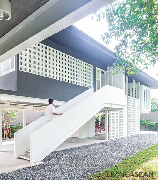
The staircase leading to the second floor has simple looking handrails that match the style of the house.
Semi-outdoor passageways increase exposure to the sun and the wind.

“I want a home that’s open and airy – a house that breathes, so to speak. The new design calls for a system of wide corridors and ample spaces underneath it. The low land is now filled up to bring it to street level and create semi-outdoor multipurpose room.”

The energy-savvy double-wall corridor connects all interior spaces.

Tonkao chose steel for the main structure because it reduced construction time and enables a flexible construction schedule.

The two-story, L-shaped home splits into two wings located on either side of the warm and pleasant center courtyard. The canopy of tall trees keeps the entire living spaces cool and comfortable all day long.

For indoor thermal comfort, the exterior walls are made of hollow bricks to block the sun while allowing the wind to pass through. Plus, long eaves overhanging the outside walls protect the home from heat waves, while house-on-stilts design improves ventilation.

A sliding door separates the home office and sitting area on the second floor. The two rooms become one when the door is opened.

“We sleep soundly in a compact bedroom. A wide corridor helps when we walk pass each other. Semi-outdoor walkways enable us to keep abreast of current weather conditions and we don’t need air-conditioning,” said Tonkao apparently content with the design.

All things considered, it’s an energy efficient home, one that embraces natural light, increases airflow and makes daily living not only comfortable, but also enriching.

Louvered windows are ideal for increased air circulation. Clear glass alternates with translucent panels add curb appeal.
[Left] An array of tall windows maximizes natural light, makes the home seem more inviting and accentuates the vertical design. / [Right] An all-white bathroom next to the bedroom is handy for everyday use and easy to keep clean.
[Left] An array of tall windows maximizes natural light, makes the home seem more inviting and accentuates the vertical design. / [Right] An all-white bathroom next to the bedroom is handy for everyday use and easy to keep clean.

Architect: Assoc.Prof.Tonkao Panin, Ph.D., and Tanakarn Mokkhasmita of Research Studio Panin (www.researchstudiopanin.com)


Visit the original Thai article…

บ้านโมเดิร์นวิถีไทย ออกแบบเพื่อรับการเปลี่ยนแปลง


You may also like…
White Box-shaped HouseA Beautiful White Cube-Shaped Home Made for the Good Life

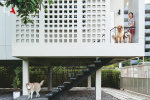
A Stunning Breeze Block House for Avid Dog Lovers

Little Joys in the Small Garden

Little Joys in the Small Garden

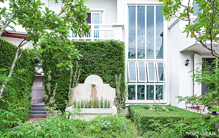
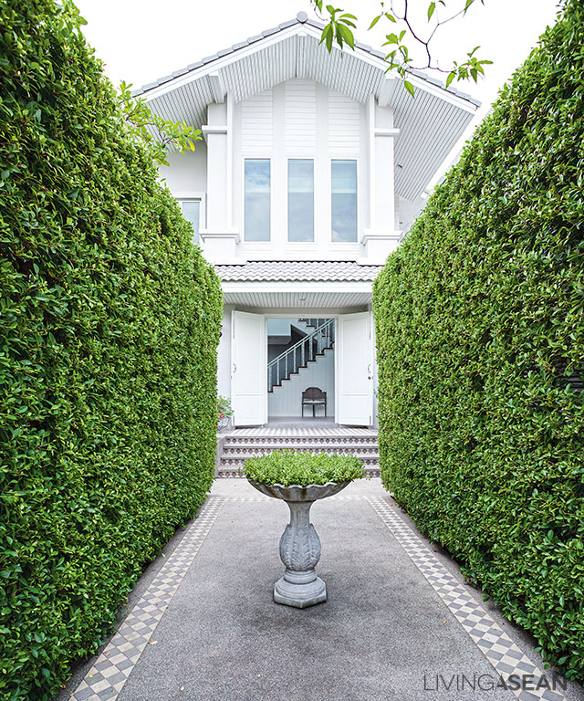
Little joy with a cool lush green small garden in front of a pretty white house protected in front by a hedge of English banyan. Sukanda and Chaiyanon Mimarayat were inspired to create this beautiful place by the book cover of Small Garden from Baanlaesuan Publishing. 

/// Thailand /// 

Story : Warapsorn Akkhaneeyut /// Photos : Sitthisak Namkham /// Landscape : Little Tree

1

Seeking out the garden designer, Siriwit  Riubamrung of Little Tree, they had to wait two and a half years to enlist his help. “When we first went to Little Tree the Designer needed to see the actual site, but the big floods came and we couldn’t continue for another year. Then prices were higher, so we had to wait even longer.”

2

In the meantime Sukanda redecorated, the space adding on a small cottage in a mixed French country and vintage style and a relaxation room with a porch, walkway, and lawn, all while waiting for the garden to arrive.

3
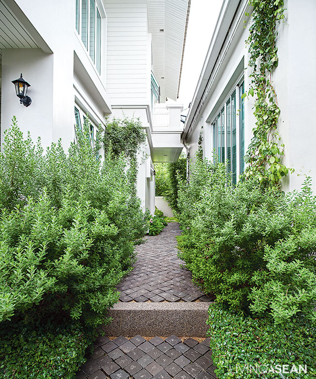
English banyan line two sides of the walkway entering the house
5
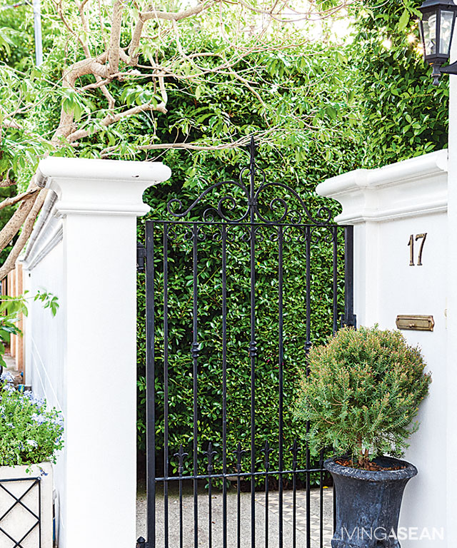
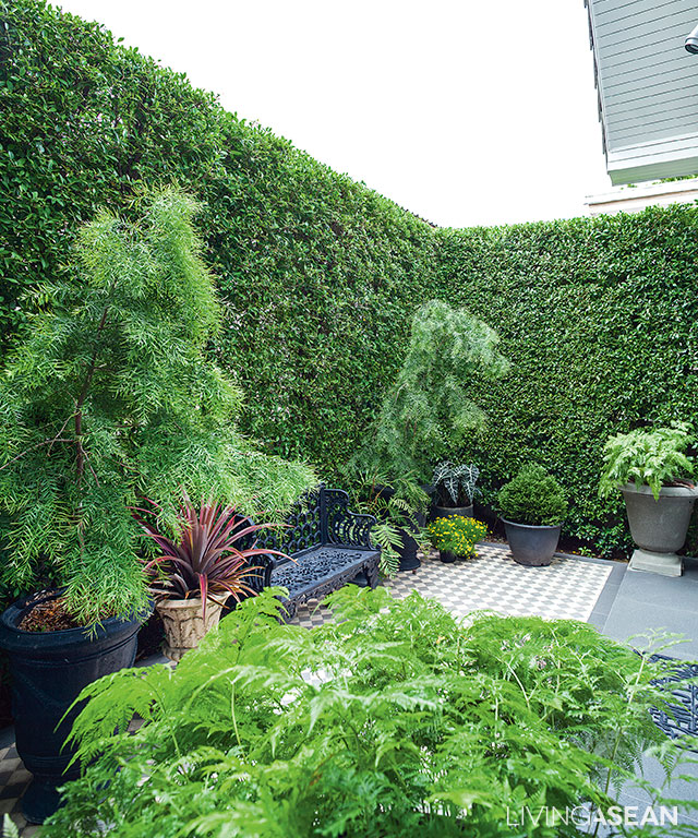
Inside the little gate is a comfortable space to sit, but the tall hedge keeps it private.

“Our old place was a townhouse with retro façade, not like this at all. Then we started getting out more, and thought about copying the look of restaurants and coffee shops we liked, such as Agalico, which Little Tree designed. We gave Siriwit a free hand because we liked his concepts, but of course he discussed everything with us in advance. He made adaptations from the original work plan such as increasing the height of the hedge barrier in front for more privacy.”

7
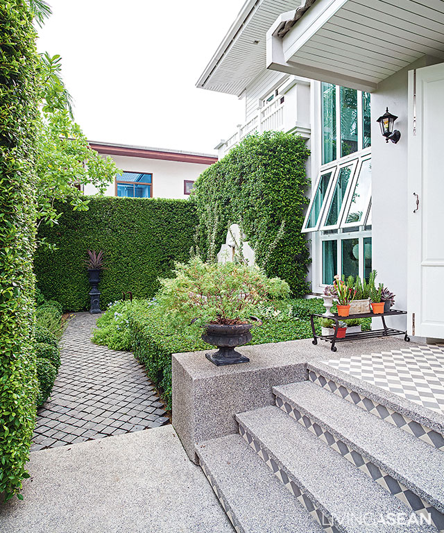
A checkerboard tile pattern fronts the house, and cobblestones set diagonally on the washed sand walkway

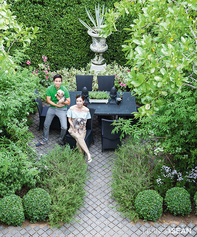
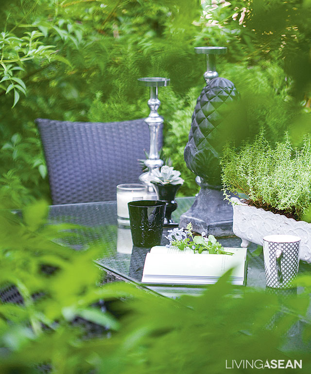
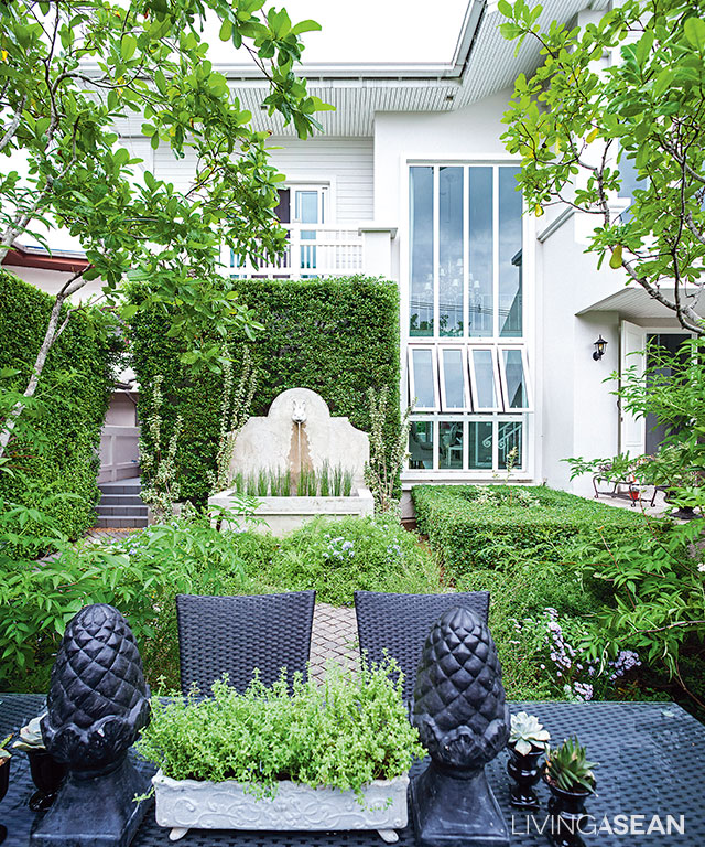
Inside the garden is a very private enclosed space, with a chic black lawn table on top of cobblestones set in diagonal lines, fragrant yellow gardenias, and bright flowers scattered here and there for a relaxing, casual mood.

4
These gorgeous rectangular English banyan hedges took 2 years to reach their 2-meter height
8
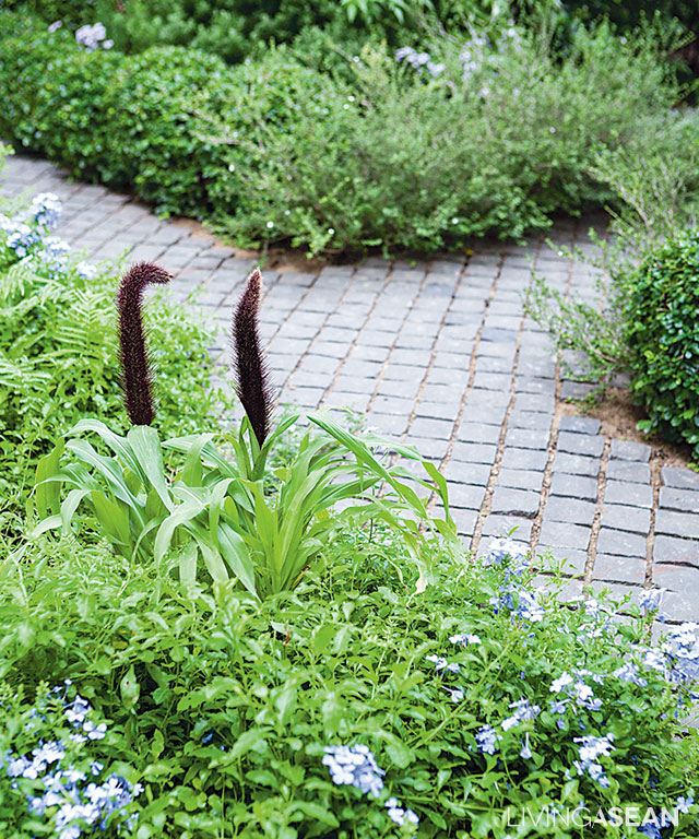
Near the pond, detail-textured cape plumbago encroaches on the walkway, with knot root foxtail adding a striking look.

Siriwit helps with color coordination as well as prices and brands. In the mix of plants he inserted Fukien tea and English banyan hedges trimmed into geometric shapes to relieve harshness so the garden looks orderly, but not too formal. He adds, “I played with shapes and forms, the diamond-shaped walkway and yard with checkerboard lines of tile in the front. The central court is trapezoidal, so I took away the unevenness with two lines of banyan plants.

11
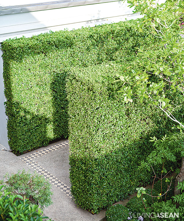
Hedge plants mixed in with free-form: semi-formal, easy maintenance; trim hedges every 2-3 weeks, or once a month if strapped for time.

“We used medium-sized plants with beautiful forms placed symmetrically. Golden gardenias. Leafy plants with different shades: neons, silvers, spotted coralberry, evergreen spindle, lime. Put in a pond with a cute rabbit-head fountain.”

9
View from the lawn table into the house takes in a precise organization of plants and decorative components

A beautiful verdant garden with a vintage feel. A place to walk in and relax with a cup of your favorite coffee. Peaceful, relaxing.Once you’re here, where else would you want to go?

6
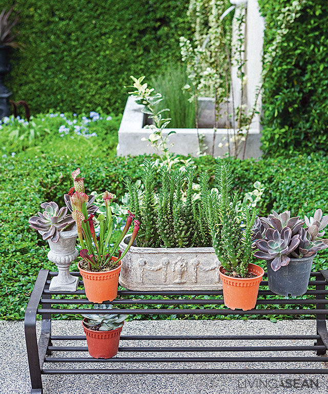
By the owners’ design, attractive flowerpots adorn a shoe-placement shelf.
13
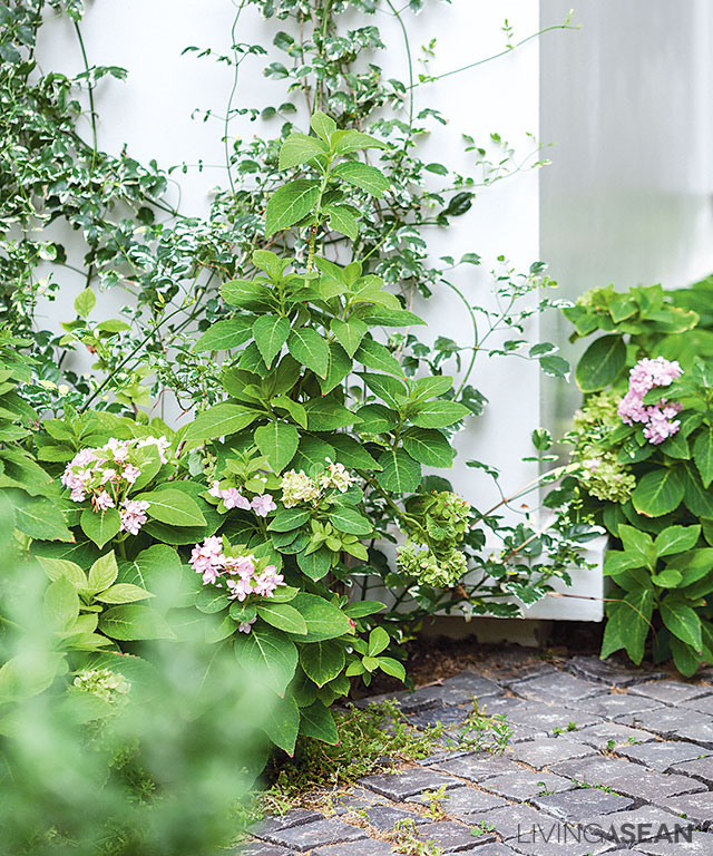
Between the house and relaxation room the indirect light calls for shade-tolerant plants like the dwarf neon hydrangea along the path.
12
Pink-flowered hydrangea contrasts with vines of spotted jasmine climbing the house.

link: http://www.littletreegarden.com/

A Simple Yet Elegant Cube-Shaped Home in Yangon

A Simple Yet Elegant Cube-Shaped Home in Yangon

/ Yangon, Myanmar /

/ Story: Supachart Boontang / English version: Bob Pitakwong /

/ Photographs: Rithirong Chanthongsuk /

From the outside, this cube-shaped home with a swimming pool as the centerpiece looks like a combination of three overlapping boxes. Distinctive simple line design sets it apart from the rest in the neighborhood. The hall just inside the front entrance is well connected to all living spaces around it. Based on the form-follows-function principle, it’s thoughtfully devised to create a seamless transition from room to room, plus easy access to all intended functions and amenities.

Cube-Shaped Home in Yangon

The three-story white home with a cool undertone stands at the center of the property. Homeowner Thin Thin Lwin was on hand to show around. Asked about her thoughts on inspiration, she said:

“Just the two of us, my husband and I, live here. The home was built on what used to be a vacant lot. To begin with, we didn’t want a place that was going to be too big for our needs. We wanted just enough functional areas with easy access to other parts of the house, kind of like keeping with long established traditions from the past.

“By happy chance, I have a friend who is an architect, and the rest is history. Stephen Zawmoe Shwe and I have been good friends since we were kids. So we asked him to design it.”

Cube-Shaped Home in Yangon
The boundary fence made of concrete features large openings at intervals to improve the flow of air in and out of the property.
Cube-Shaped Home in Yangon
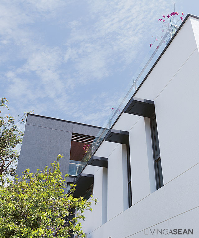
An array of window awnings protruding from the exterior wall protect the interior from heavy rain and increase its energy efficiency.

Have a look around the first floor. The overall effect is impressive. The house with a subtle shade of white looks like three dimensional shapes coming together neat and clean. The interior at the front of the house is light and airy thanks to double height ceilings.

It’s two stories tall to be exact. There is a sense of interior elegance. The spacious, well-ventilated hall is well connected to other rooms around it. One of them, a living room, is clearly separated from the dining area and kitchen.

Cube-Shaped Home in Yangon
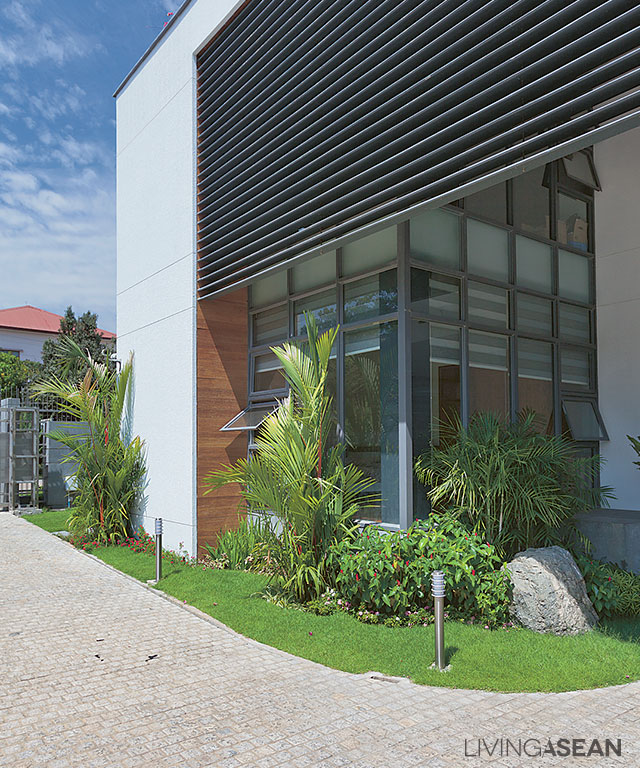
An outdoor louvered awning on the front façade protects the interior spaces from scorching sunlight and improves the home’s general appearance. The exterior is kept simple, modern, and fuss free.
Cube-Shaped Home in Yangon
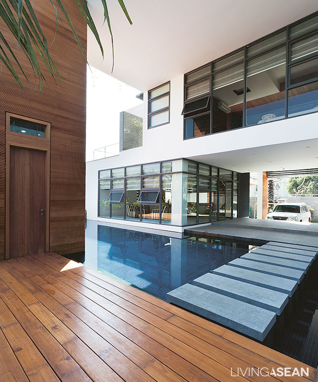
Just inside the front entrance, a stepping-stone pathway stretches across the pool. Double height ceilings and transparent partition walls make the atmosphere bright and lively.
simple white house
There is visual and spatial continuity from the cozy dining area all the way to the pool and beyond.

The second floor has two spacious bedrooms, each with a private balcony to take in the view and cool breezes. The swimming pool below is clearly visible from here.

Other than that, interior design emphasizes crisp, clean lines and white tones that go together well with shades of gray. Furniture comes in warm earth tones that enhance the charm of natural wood flooring.

simple white house
Transparent glass walls create a warm, welcoming atmosphere in the bedroom. There are windows that open to improve air circulation and bring in cool breezes.

simple white house
[Left] Louvered awnings under the roofline provide added privacy and protect the second-floor bedrooms from intense heat during the daytime. / [Right] Venetian blinds behind glass walls provide privacy in the bathroom and control natural light.
The third floor is a penthouse with a panorama of the city landscape. A peaceful place for relaxation with family, it’s great for stargazing in the dark of night. There is a large Buddha room on one side, where the homeowners come to pray and perform religious rites.

Cube-Shaped Home in Yangon
A corner of the penthouse has been remodeled into a reception area with marble countertops and matching bar stools.

All things considered, it’s simple clean line design that makes this Cube-Shaped Home in Yangon stand out in the rustic old town neighborhood. Well-thought-out planning ensures there are plenty of functional areas and modern amenities for comfortable living. Plus, it’s energy efficient thanks to passive cooling strategies, such as large windows that open to bring in cool breezes and natural light.

Where appropriate, louvered awnings are installed to minimize the amount of sun on the exterior wall. They reduce the workload on air conditioning and make the home perform as intended amid the hot and humid climate.


Architect: Spine Architects Co., Ltd


Visit the original Thai article…

ร่วมสมัย เรียบง่าย ได้ใจ


You may also like…
Baan Hing Hoi: A Modern House Exudes Old World Charm

White House: A Bright, Seemingly Hovering House by Saola Architects

Mandalay Beach Villas / A Three-Unit Beachfront Home

Mandalay Beach Villas / A Three-Unit Beachfront Home

A beachfront home is built based on a simple exterior design, yet it is a perfect hideaway to relax in a tranquil environment.

/// Thailand /// 

Story : Atla Otto /// Photos : Sungwan Phratem

1
The seaside landscape features a wood pergola with white drapes and a canopy. Lush sun-loving shrubs provide a pop of color to the beachfront.

Here is a simple home designed for easy coastal living. It is nestled on the peaceful western shore of Samui Island. The neighborhood is known for envy-inducing outdoor spaces and stunning sea views.

6
The space between buildings allows for ventilation and abundant natural light, keeping the entire home clean and cool.
2
Outdoor tiles in complementing tones line the walkway between buildings. Grass growing in between pea gravel tiles help reduce the effects of sun glare on eyes.

The waterfront home sits on a rectangular plot of land large enough for building a good-sized house. But the property owner is not looking for a design that is twice longer than wide. Because a rectangular floor plan may be lacking in variety, he opts for something else more interesting. The result is a neatly planned vacation home comprising three detached units. All of their front rooms are positioned to take advantage of the waterfront’s views and breezes.

12
The sundeck extends from the multiple function building to connect with the infinity pool.
11
Because the property ascends slightly from the beach, a retaining wall is built to mark the perimeter. The sun deck featuring a concrete vessel is crafted of pea gravel concrete. Behind it, a set of stairs leads to the beach below.

The three shed-roof buildings sit facing one another and come in different sizes. Their floors are raised 50 cm above the ground. The largest unit features a semi-open design to serve multiple purposes, incorporating a seating area, dining room and pantry. Next to it stands the second building with master bedroom with ocean views. An infinity pool, lush greenery and the beach lie between the two buildings and the open sea. The third building, which is set further back, features two en suite bedrooms. It is the first to be accessible from the street. The three-unit home boasts clean line exterior design with an emphasis on relaxing hues, such as white, gray and beige. Wood accents come in natural color and finish design to never go out of style.

3
The multiple-purpose unit, which is the largest of the three, features generous seating spaces and a pantry. Open design ensures the rooms get abundant natural light and fresh air.
4
For a vacation home, the pantry comes in handy for quick meal preparations.
5
The dining area next to the pantry boasts a set of teakwood table and clear chairs. Rock wall adds texture and an intimate feel to space.
7
The master bedroom boasts sweeping sea views, thanks to large glass paneling on two sides. Wood flooring adds a pop of color and warmth to the intimate space.
8
The dual-sink countertop in the master bathroom features polished stone finishes in soft white.
9
Translucent laminated glass siding separates the bathroom from the master bedroom. Plenty of natural light ensures the bathroom is well lit despite its dark color effects.

Open design allows an abundance of natural light and breezes to flow easily through the three buildings. Genius landscaping ideas help keep the interior spaces cool naturally, while lush foliage provides for comfortable outdoor rooms just steps away from the sparkling blue waters.

13
The passageway separates the fishpond from the two-bedroom unit in the rear of the property.
10
The house is accessible from the parking area via a revolving door. Sounds of water circulating in the fishpond communicate a warm welcome.

link: http://mandalaybeachvillas.com/

X