Blog : narrow house

Three-Storey Townhouse That Makes Space for Nature

Three-Storey Townhouse That Makes Space for Nature

/ Bangkok, Thailand /

/ Story: Sarayut Sreetip-ard / English version: Bob Pitakwong /

/ Photographs: Sitthisak Namkham / Styling: Jeedwonder /

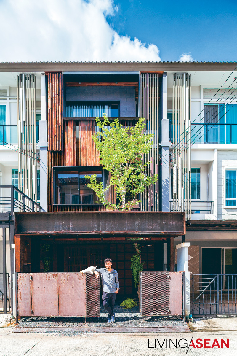
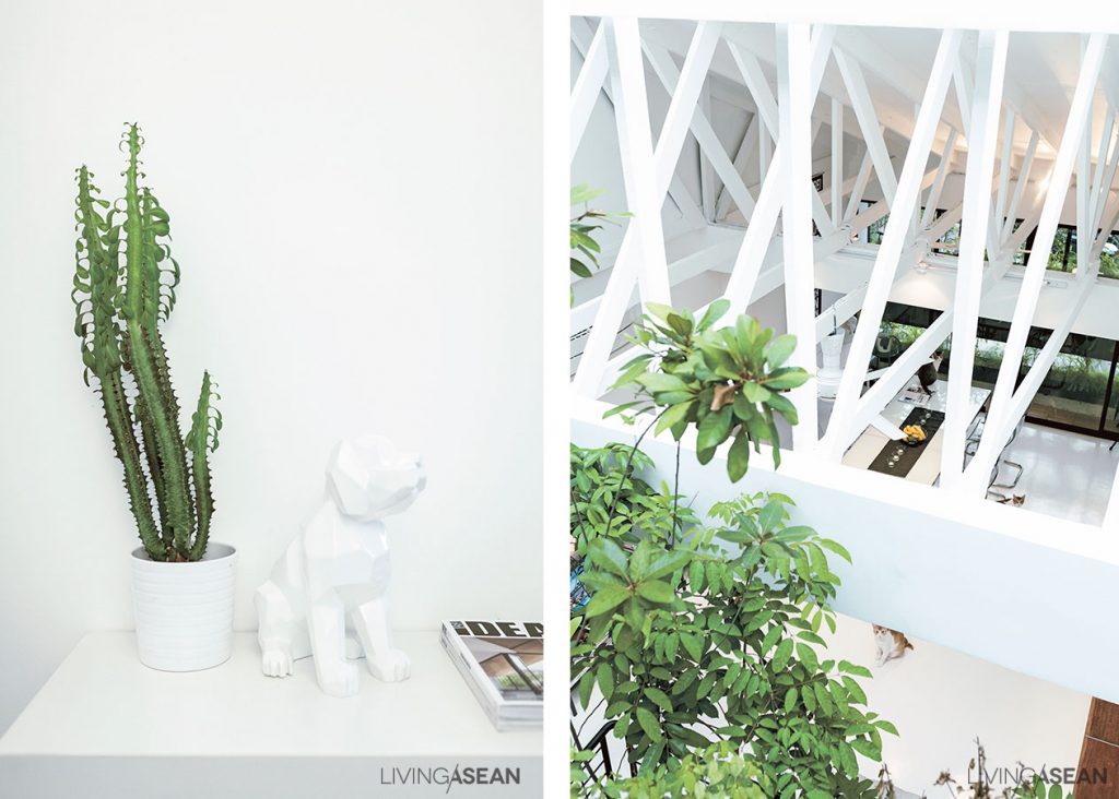
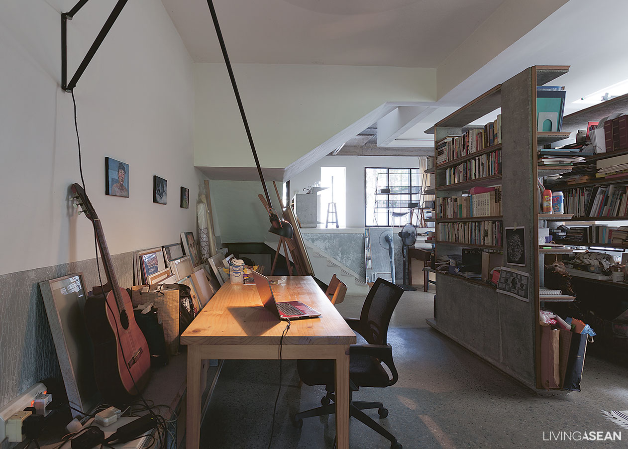
Before moving into this three-storey townhouse, architect and university instructor Bhradon Kukiatnun really put his heart into the design and décor to bring about a conversation among people, animals, and things, partly intentional, partly by impulse. Here are imperfections that are either blemishes or beauty marks, depending on our viewpoint.

townhouse Architect Bhradon Kukiatnun

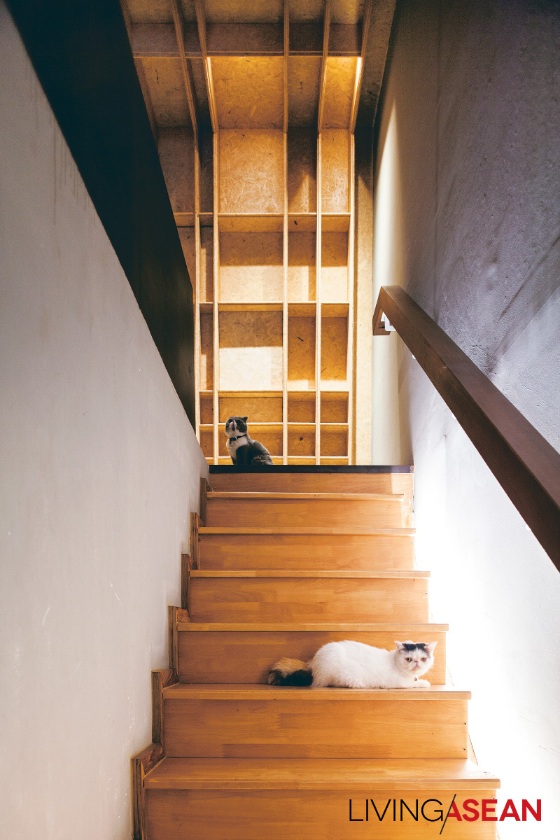
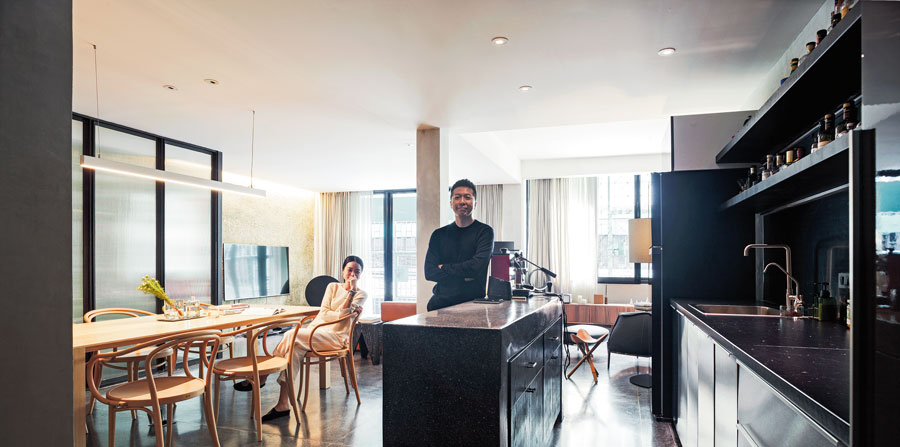
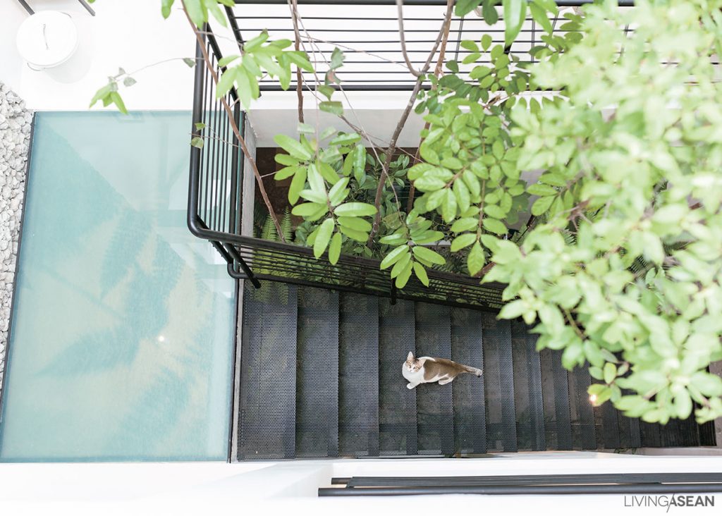
Bhradon’s business is booming, but designing his own house raised a tremendous number of new questions, not the least of which was how the new living space of a three-storey townhouse would accommodate his eleven cats!

“Three years ago, I bought this place new, and it took two years to fix up,” explained Bradon.

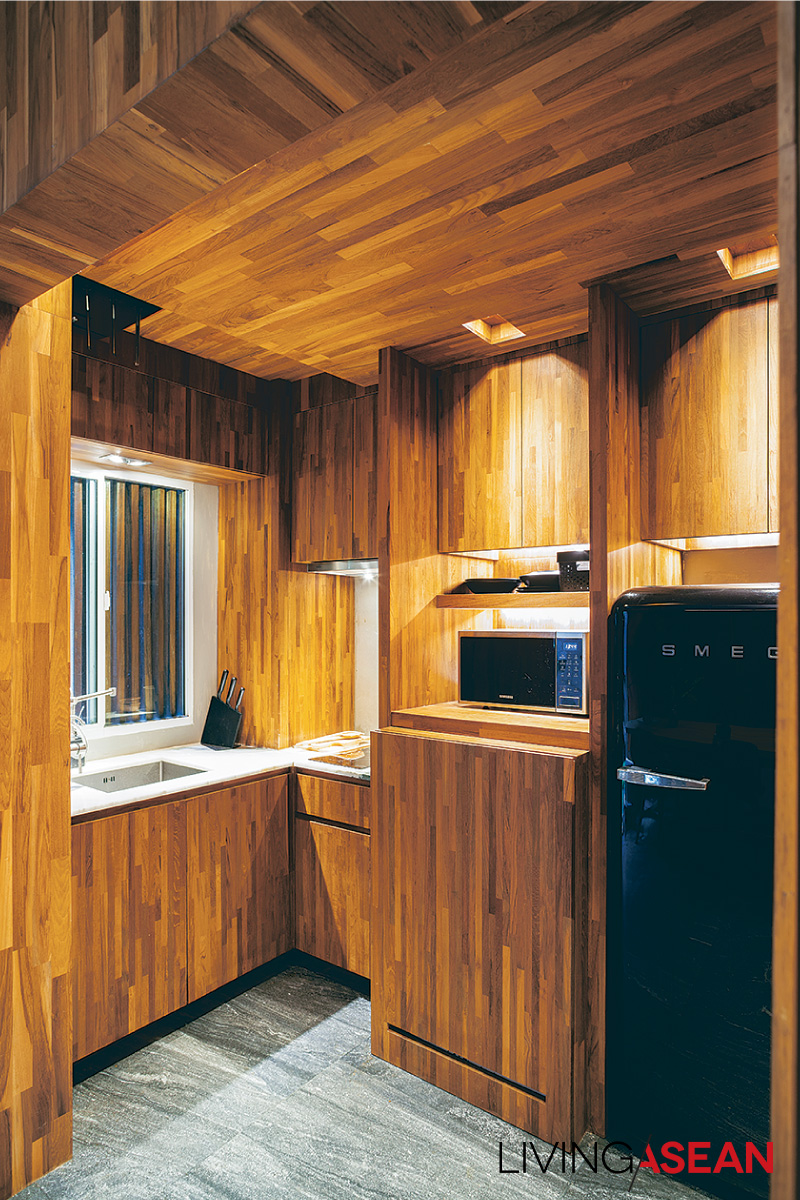
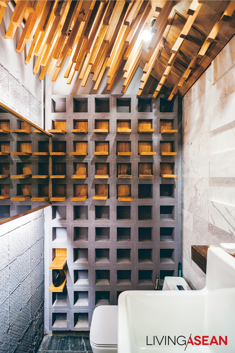
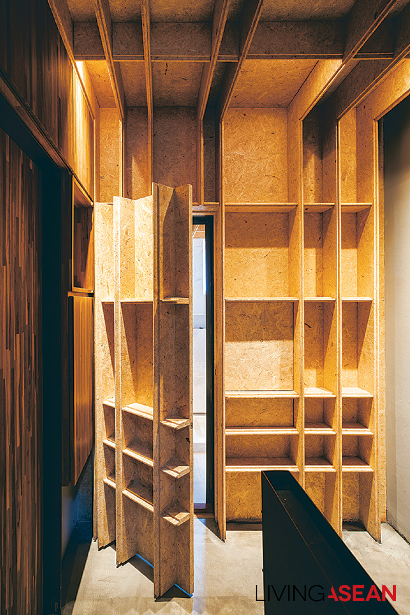
“First problem: organize storage space to hold the tremendous amount of personal stuff needed in my life while still keeping the house orderly. Then, I didn’t want a typical townhouse atmosphere, but neither should it be jarringly different.

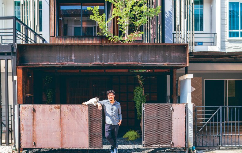
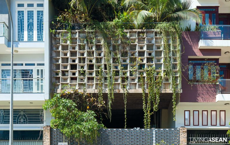
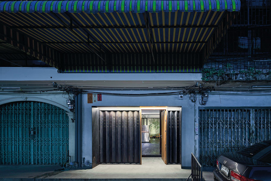
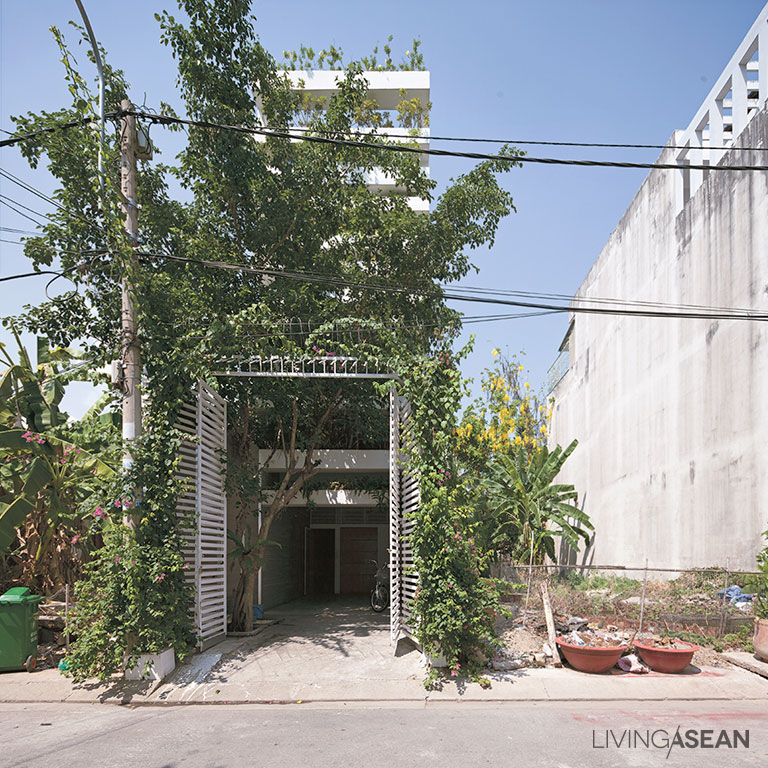
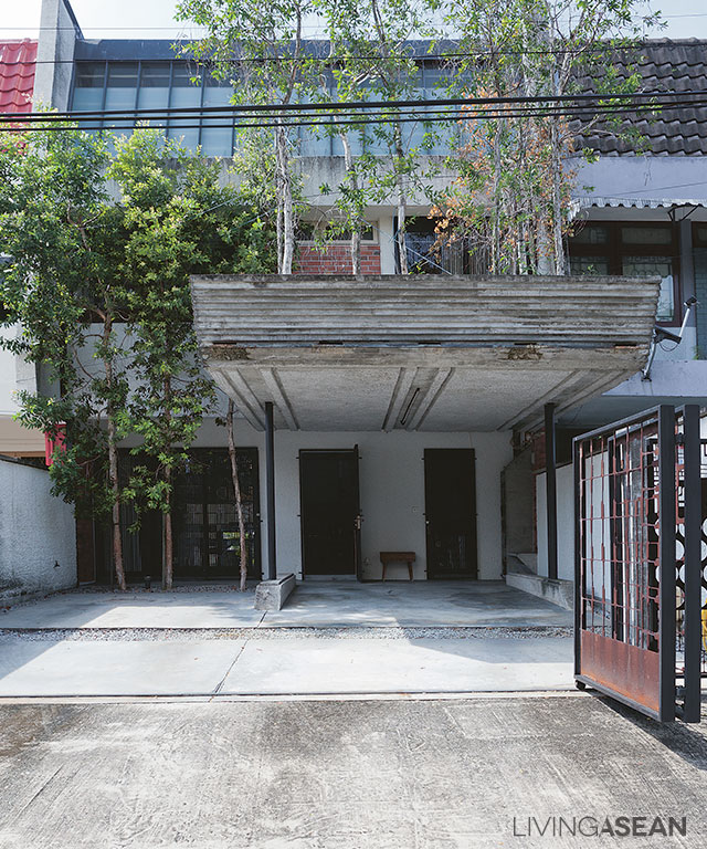
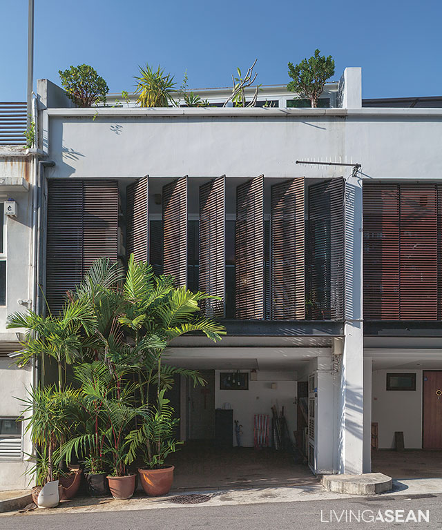
“Part of the answer is this new façade, using a type of latticework found elsewhere in the project that fits my personal lifestyle.”

three-storey townhouse

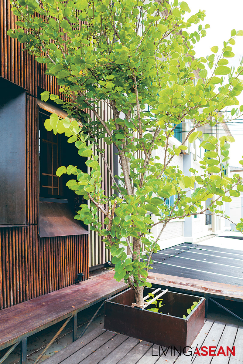
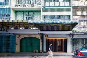
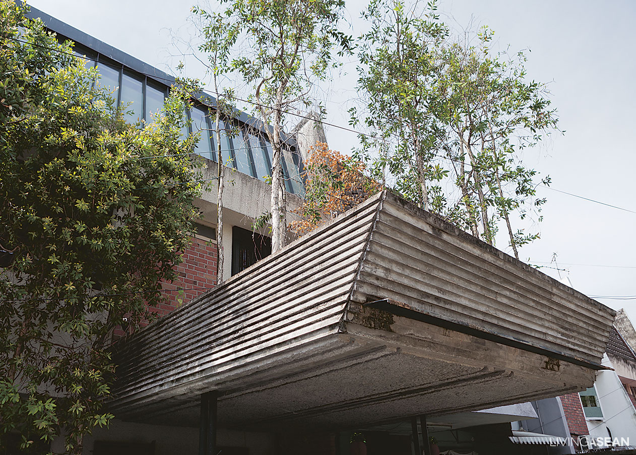
As most townhouses add a roofed-over carport in front, Bhradon also applied his design idea to this requirement.

“There’s more than meets the eye in that front view: a lot of the functions are hidden,” said the architect.

“To really express myself, I had to go back and look at fundamentals with flexibility and an open mind.

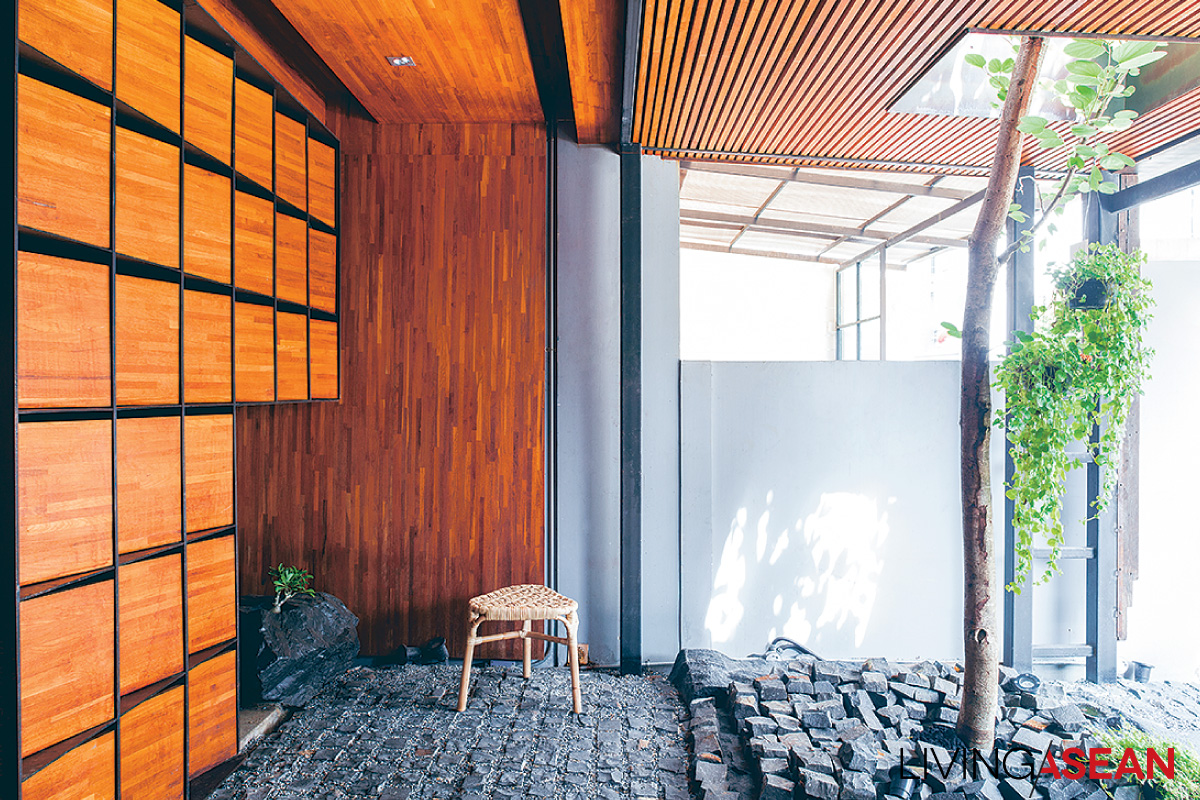
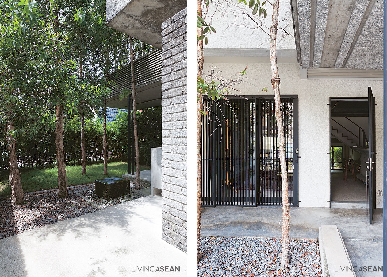
“The space in front is limited. Would I rather have a carport there, or a garden? OK, garden: so I designed a garden where I could park the car! Quite different from having a carport decorated with plants.”

three-storey townhouse

three-storey townhouse

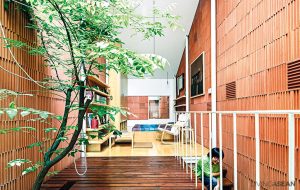
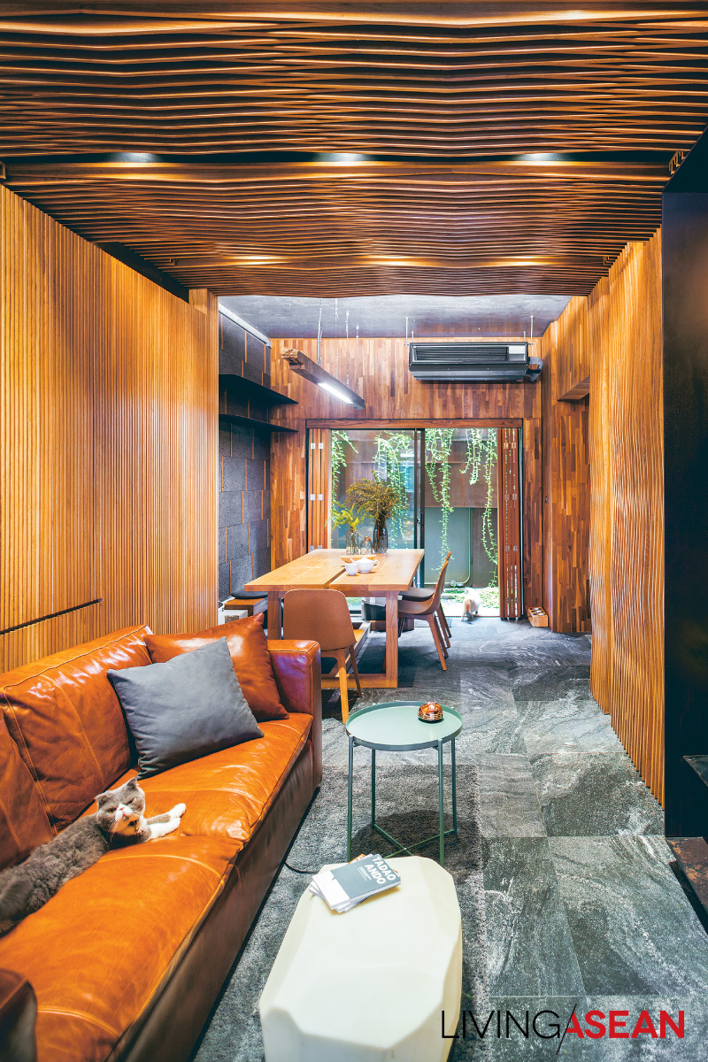
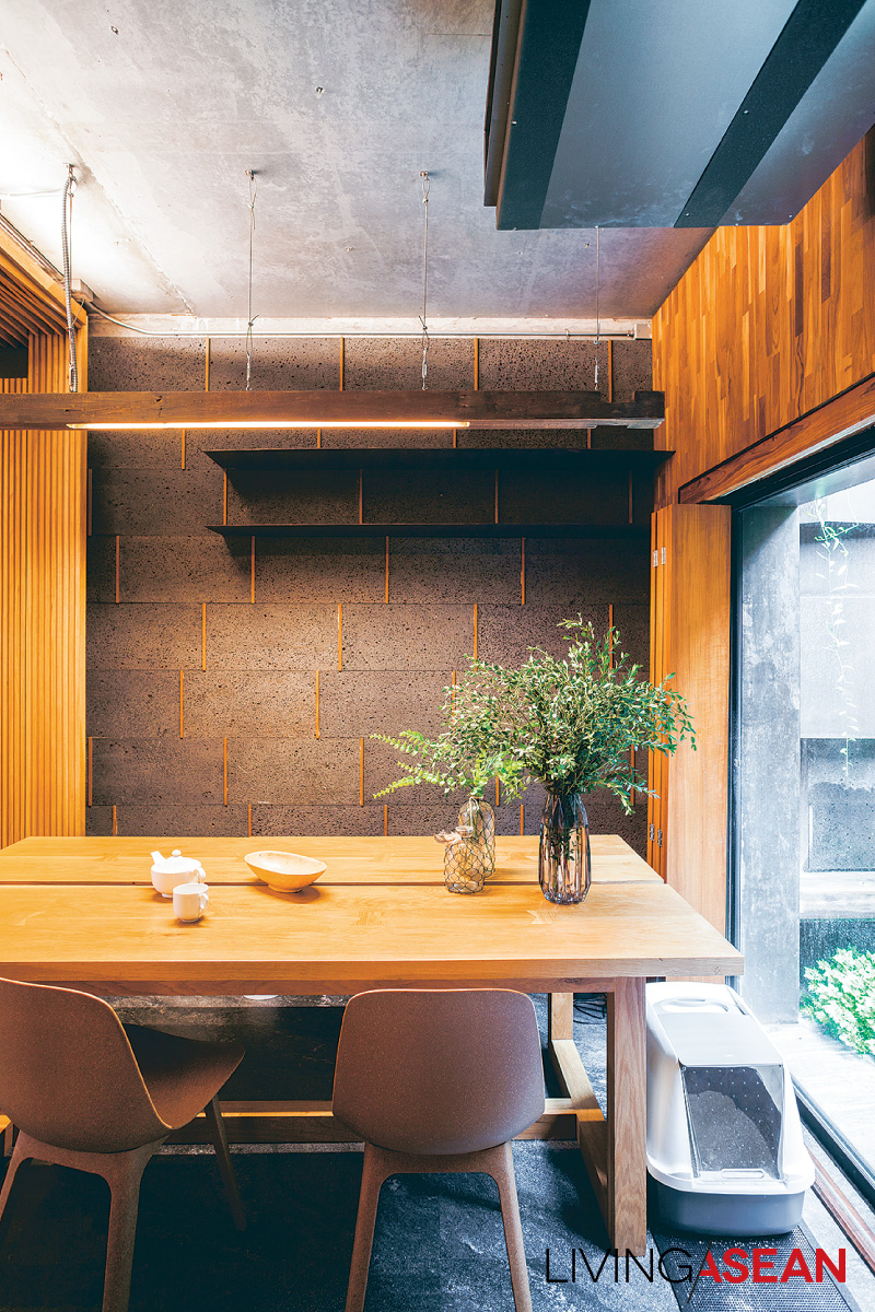
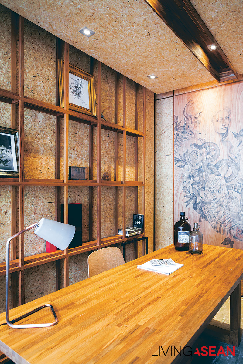
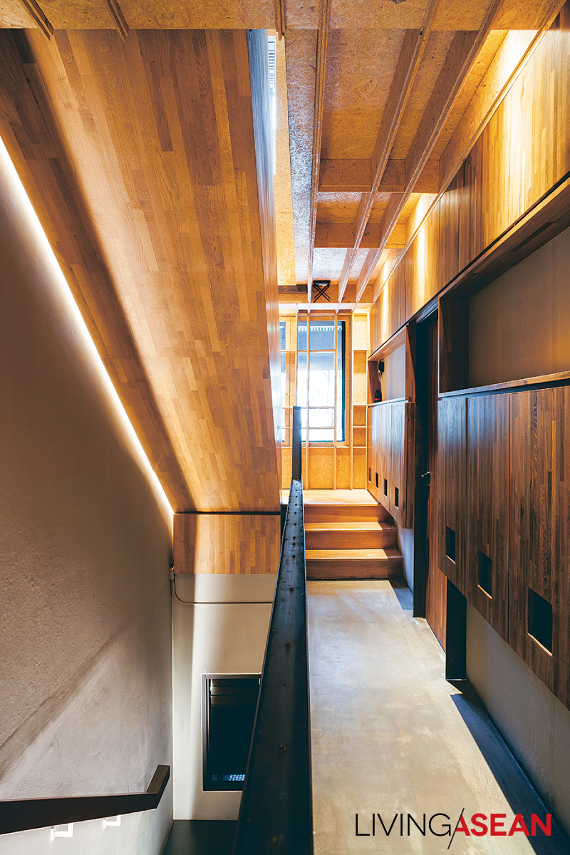
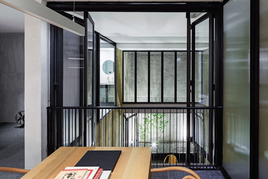
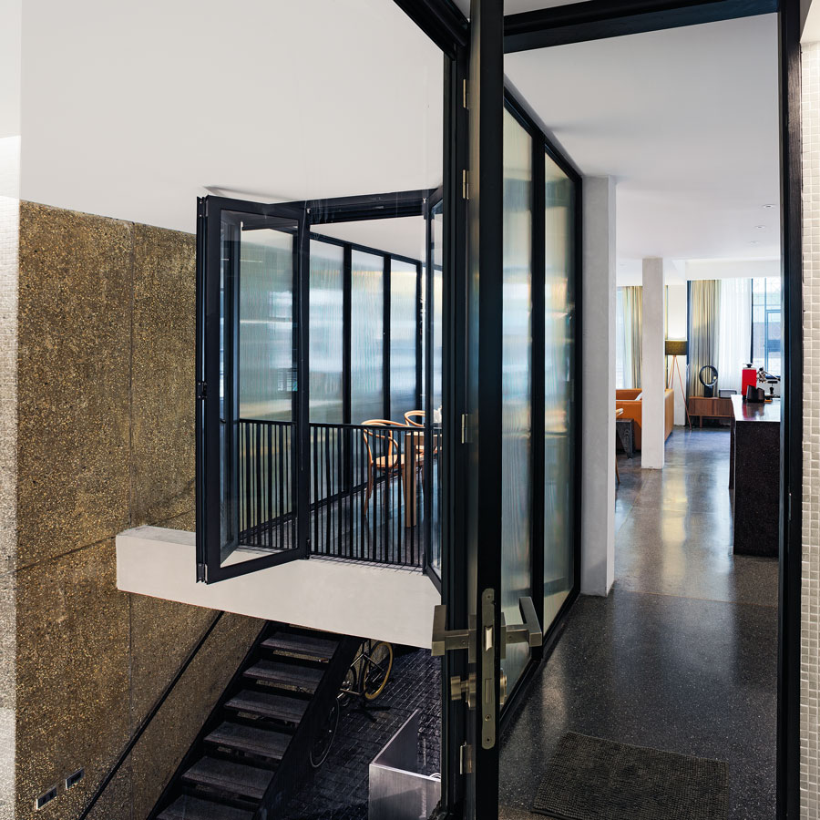
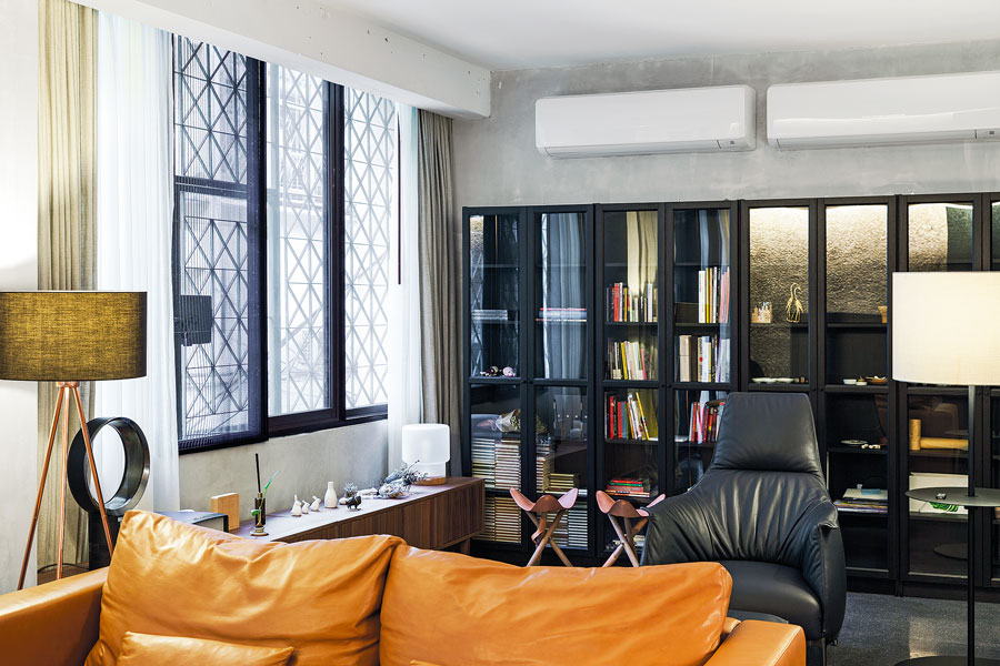
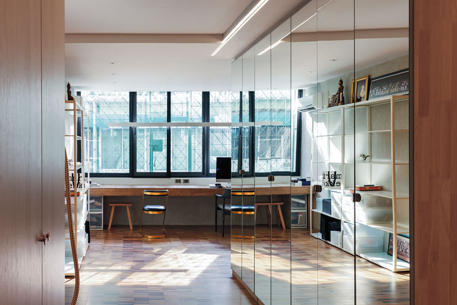
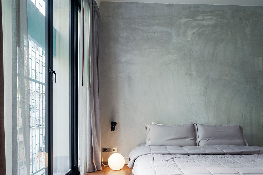
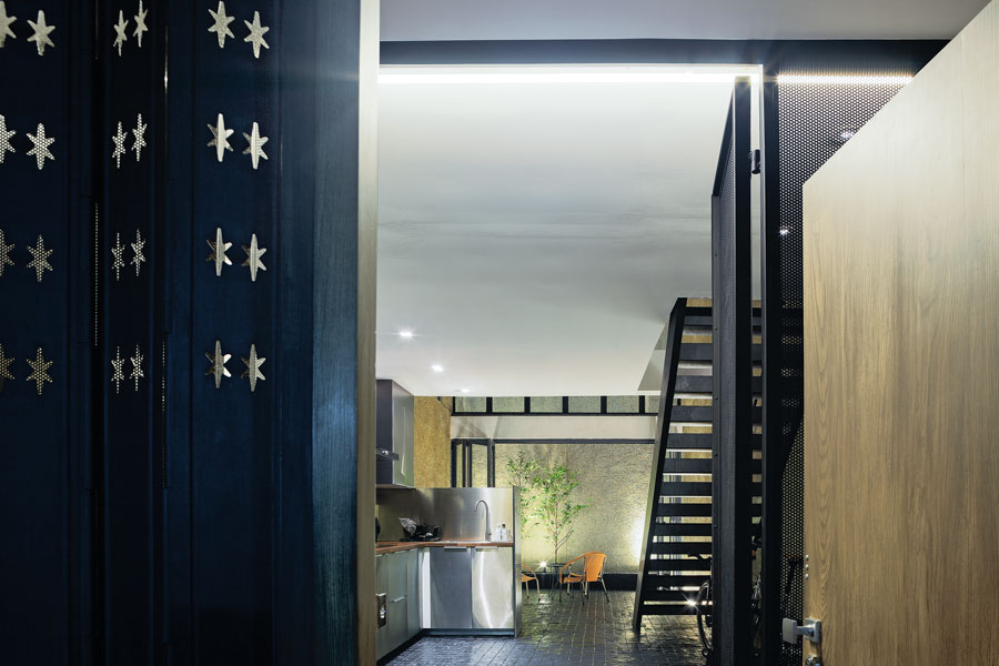
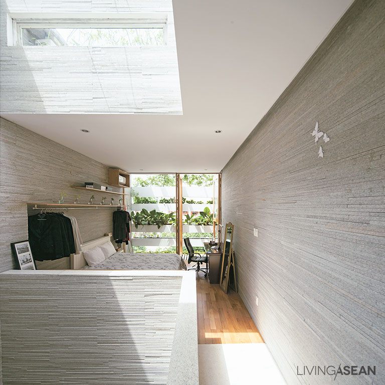
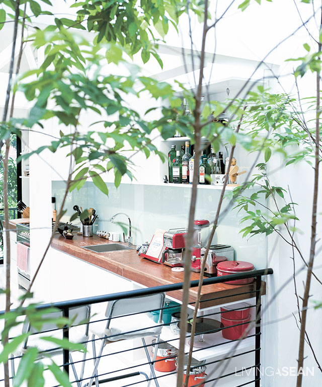
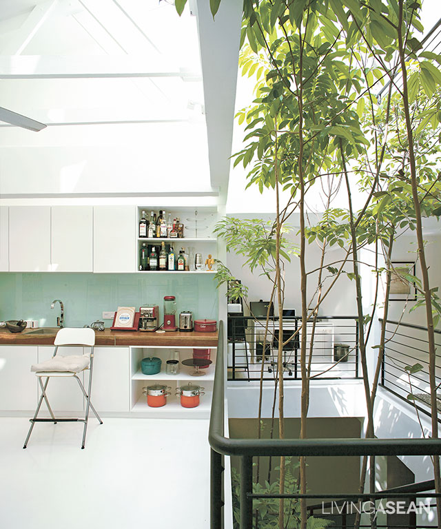
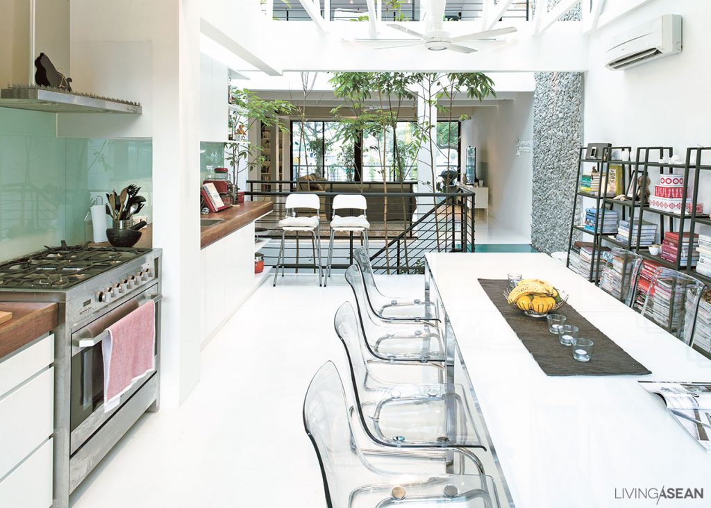
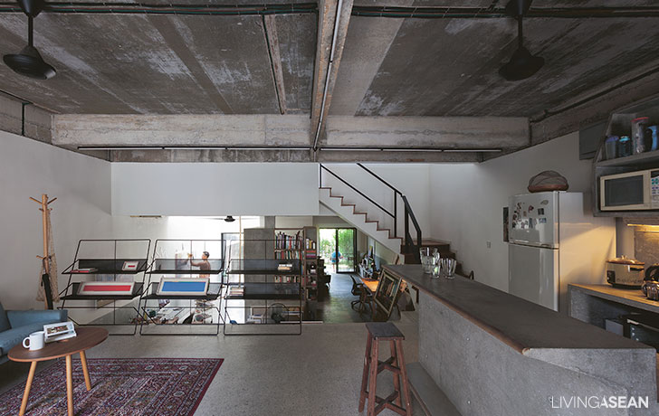
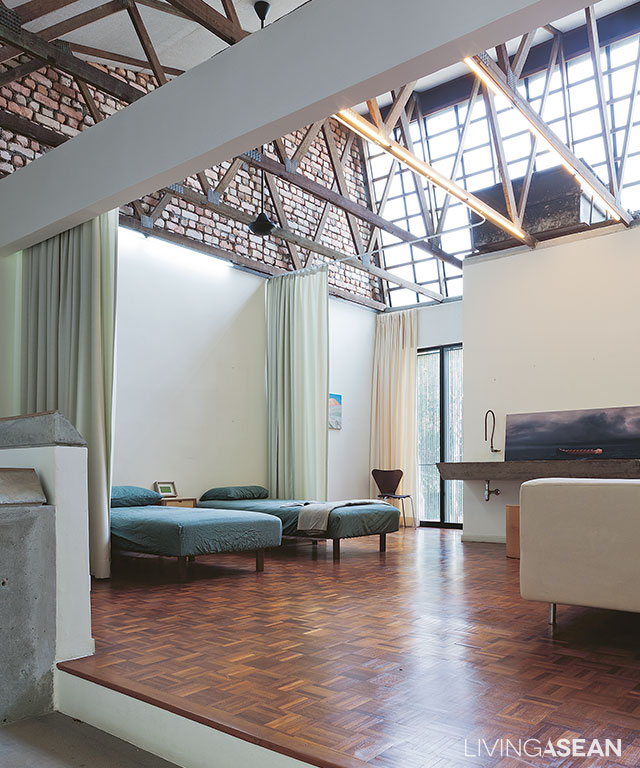
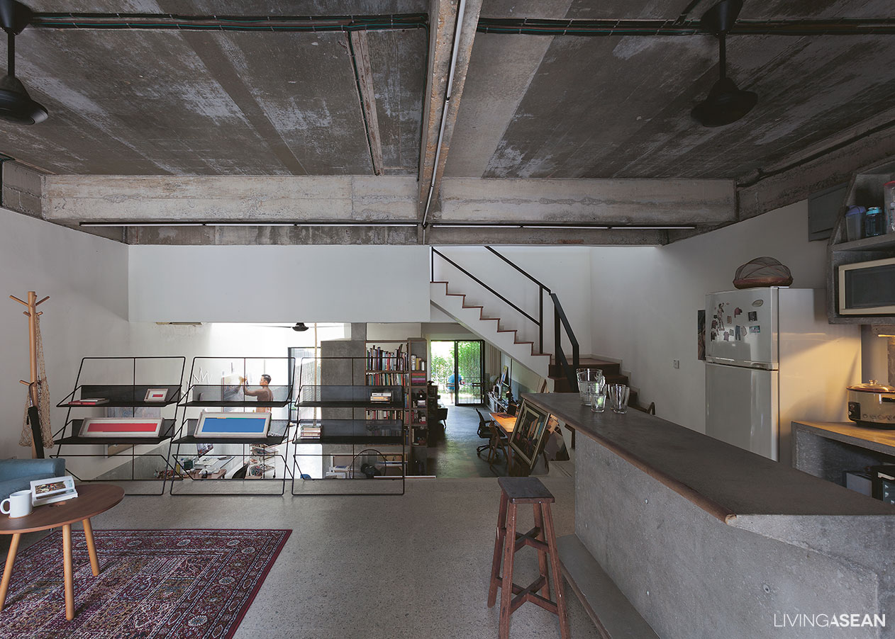
The design of this three-storey townhouse called for no structural alterations, but space was apportioned differently. The ground floor holds the living room, dining area, and pantry; second floor, a small bedroom and a workroom; third floor, the master bedroom.

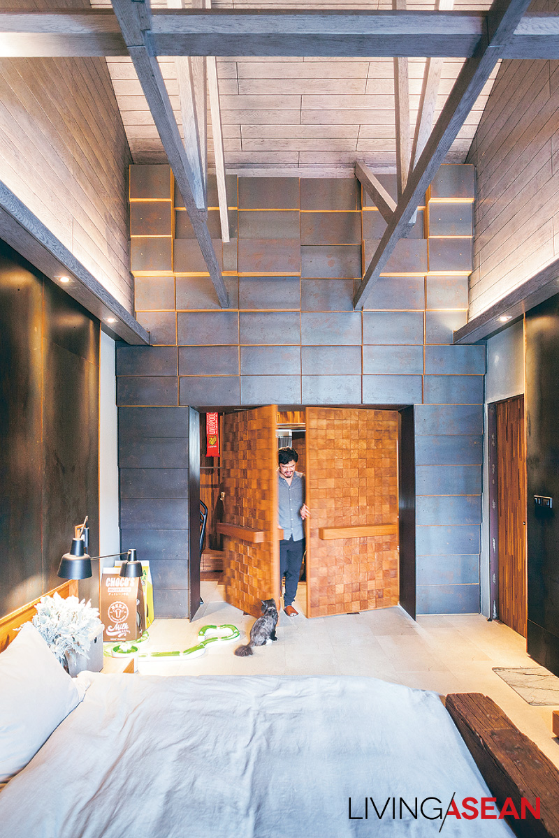
“Inside, you might mistake a door for a wall, or vice versa: my overall concept was to focus on highlighting specific points, making them fit in by hiding some element,” Bhradon explained.

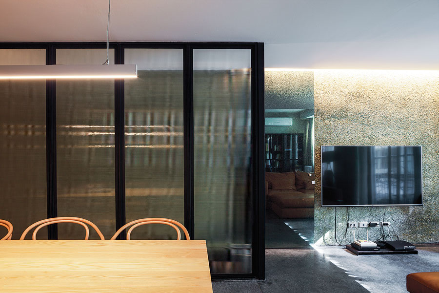
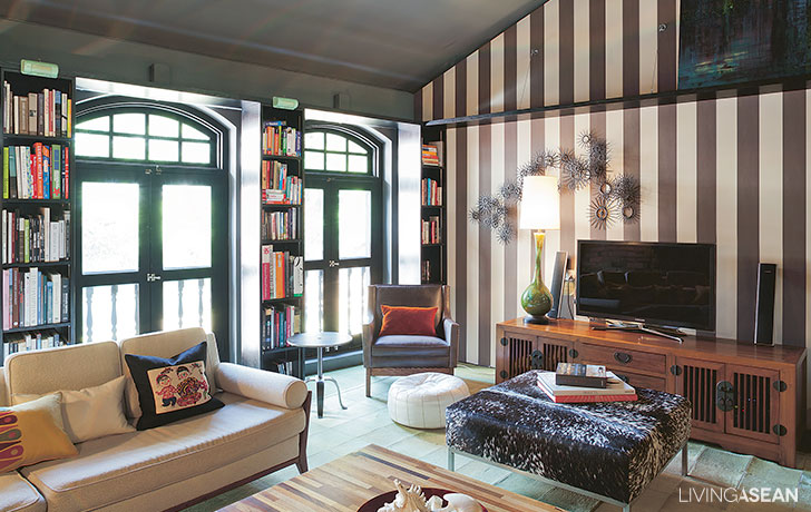
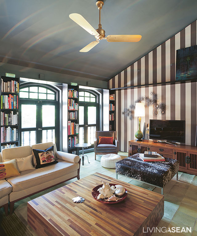
“In the living room, the TV wall is highlighted by hiding its functionality in a wall; the use of covering elements gives the feeling of being in a cave.”

three-storey townhouse

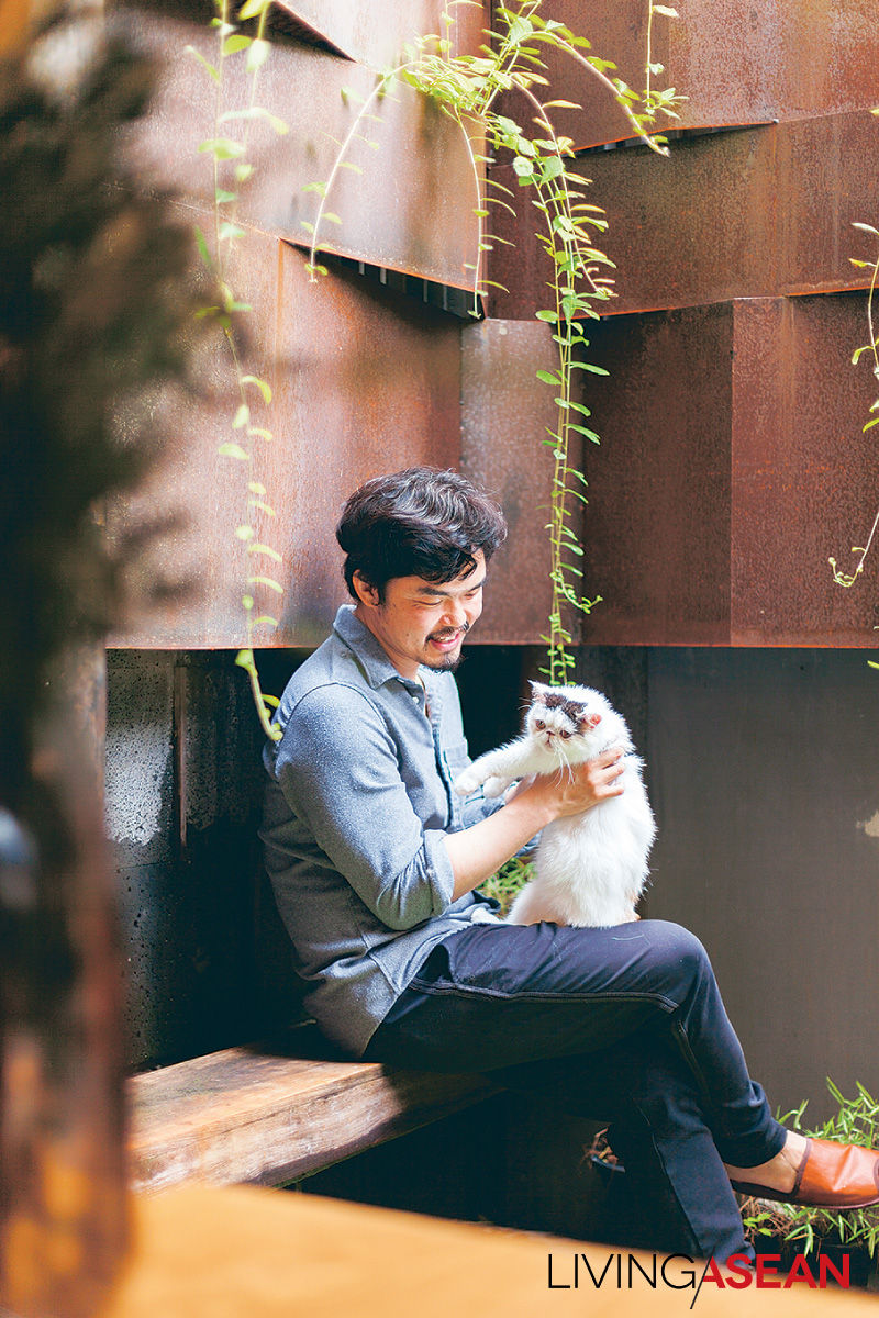
During our conversation Ando, Bhradon’s first adopted cat snuggled up as if to join the group.

“I learned a lot from raising cats,” he said blissfully.

“They don’t think like people. Sometimes our human knowledge drowns out our instincts. But a cat! It wants to sit, lie wherever, just does what it wants.

“This allows single things to have more than one function: TV cabinet or sitting place? Or, for us, a storage spot. Think outside the box.”

three-storey townhouse

three-storey townhouse

three-storey townhouse

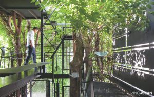
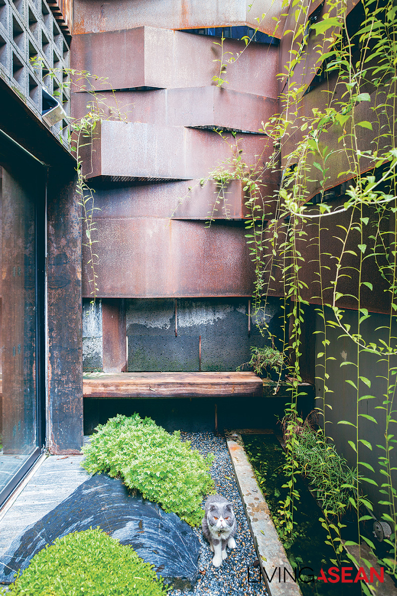
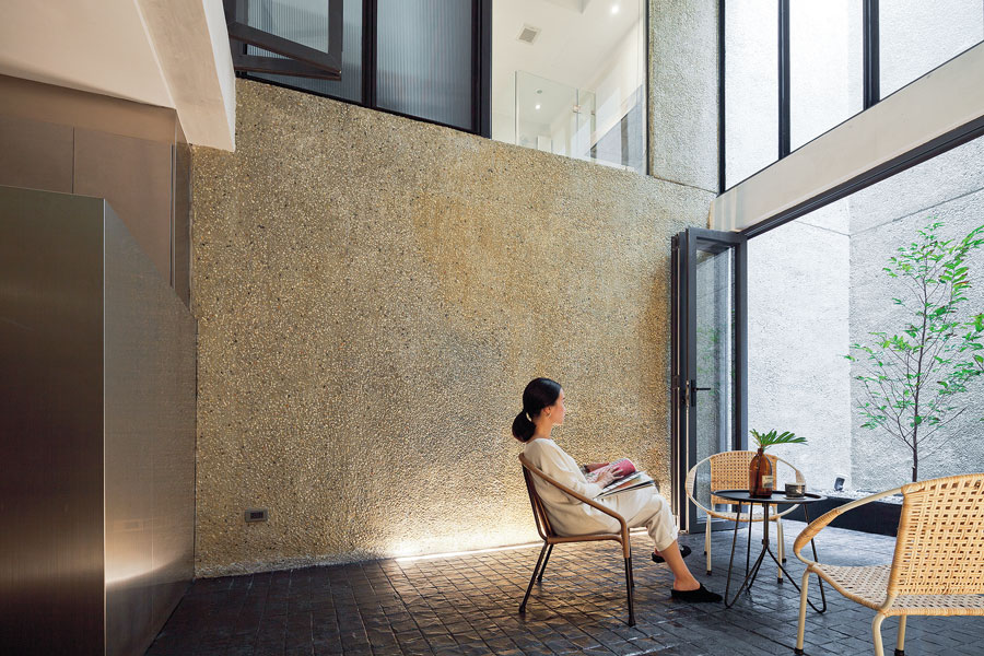
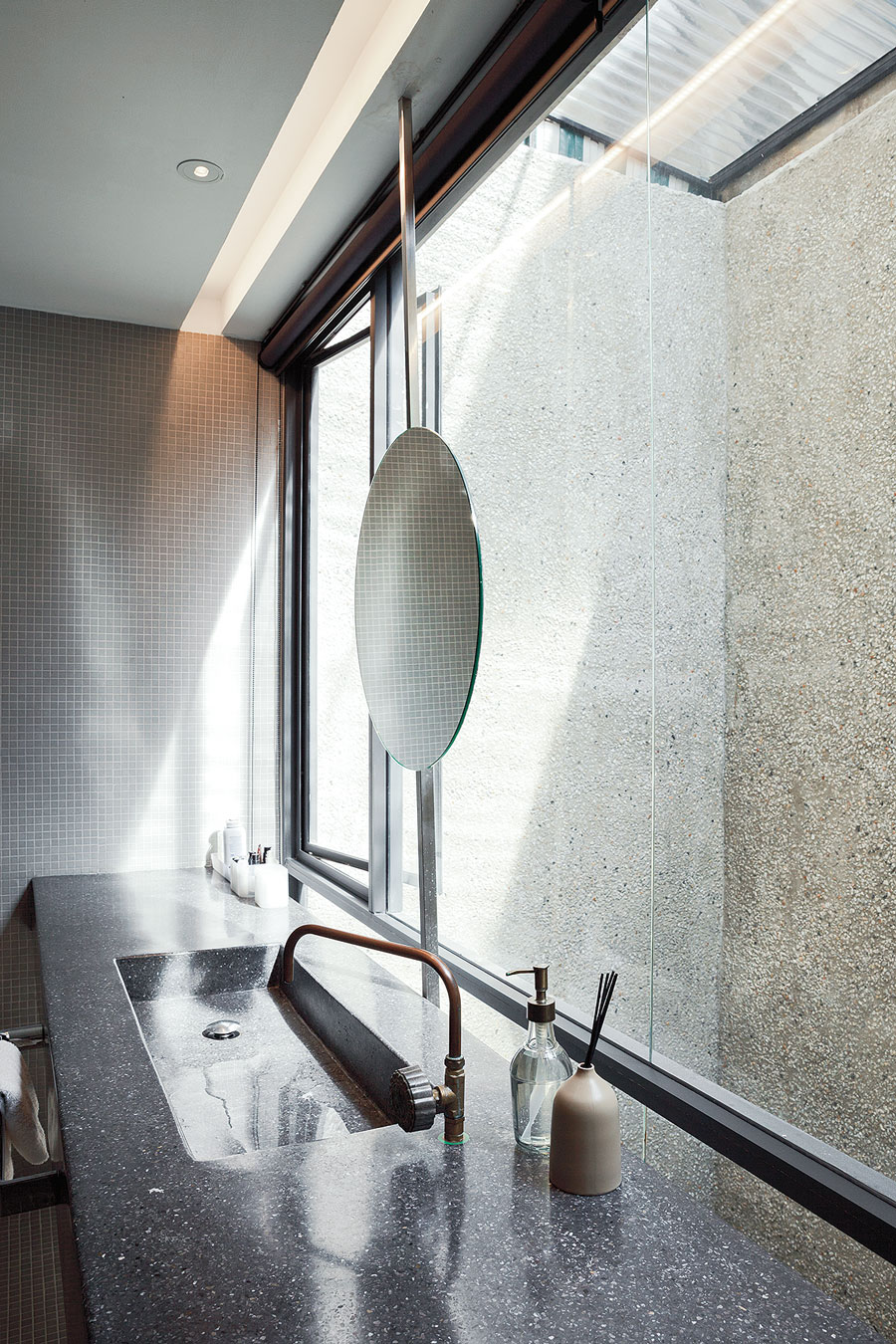
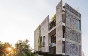
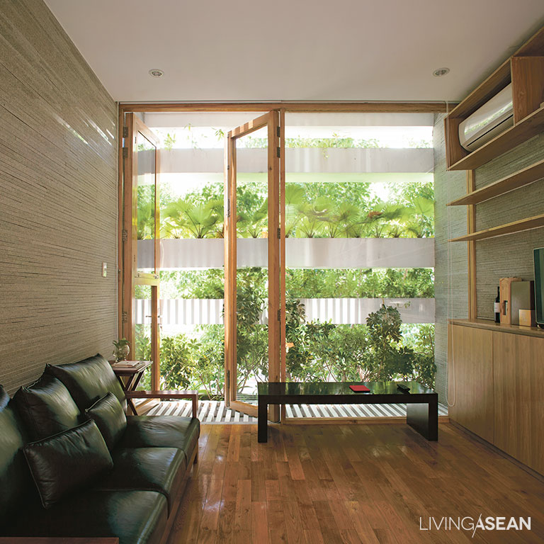
We urban dwellers all long for nature. Bhradon answered this with a garden area in the rear of this three-storey townhouse, as he put it: “I think gardens nourish the psyche, so I put a little green in the house, along with a small guppy pond, and it’s a perfect spirit-refresher.

“I like the ‘wabi-sabi’ way of design; the beauty of imperfection, of real life,” he implied. “Real life involves rust; it involves injuries. Can’t eliminate these, right?”

As Bhradon’s speaking voice gradually softened, an unspoken conversation brought into focus the future of the house, the man, the cats, and whatever might lie ahead for them.

“Recently, my cat Kuma died, and I miss her every day. But through the sorrow of loss we see the beauty of living. Being natural is to be incomplete, and we have to live with the things that happen.”


Owner/Architect: Bhradon Kukiatnun


You may also like…
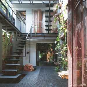
The Perfect Townhouse Makeover in Bangkok

Mash-up: Industrial Design and Green Space of Walllasia

Chez Mou: A Home Hidden In the Frame of an Old House

Chez Mou: A Home Hidden In the Frame of an Old House

/ Bangkok, Thailand /

/ Story: Sarayut Sreetip-ard / English version: Peter Montalbano /

/ Photographs: Sitthisak Namkham / Styling: Jeedwonder /

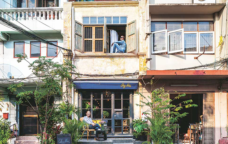
The renovation of this hundred-plus-year-old rowhouse in Charoen Krung Soi 44 is more than a home improvement: for Mou Lumwatananont, it’s a homecoming she’d never imagined.

Chez Mou: A Home Hidden In the Frame of an Old House

“My mother was born here, but we moved out before I was two. After building it up from 2 storeys to 2½ storeys, my aunt continued to use it as an office,” the owner began to tell the house’s story.

“However, that business ended many years ago, and it has been only two years since we began making plans for renovation and conversion to fulfill our long-time dream of a guest house and a café.”

This area’s former prosperity is apparent in traces of European colonial-style architecture and bustling alleys that now welcome international tourists and backpackers to the charm of its storied history.

Mou and architect Pok (Wachirasak Maneewatanaperk) from sea.monkey.coconut share views on the value of preserving history through architecture.

Chez Mou: A Home Hidden In the Frame of an Old House


The architect explained, “Renovating this great old building, I didn’t want to change a lot. But I discovered it had already changed.”

“An upper floor had been added, and it had been expanded outback as far as it could go. The entire second-storey wooden floor had been covered with another material.”

In line with building preservation guidelines, the architect decided to make clear distinctions between old and new.

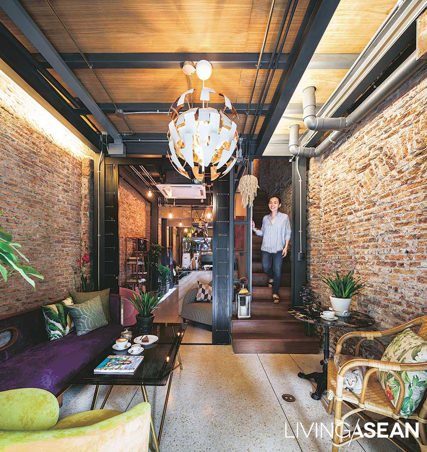
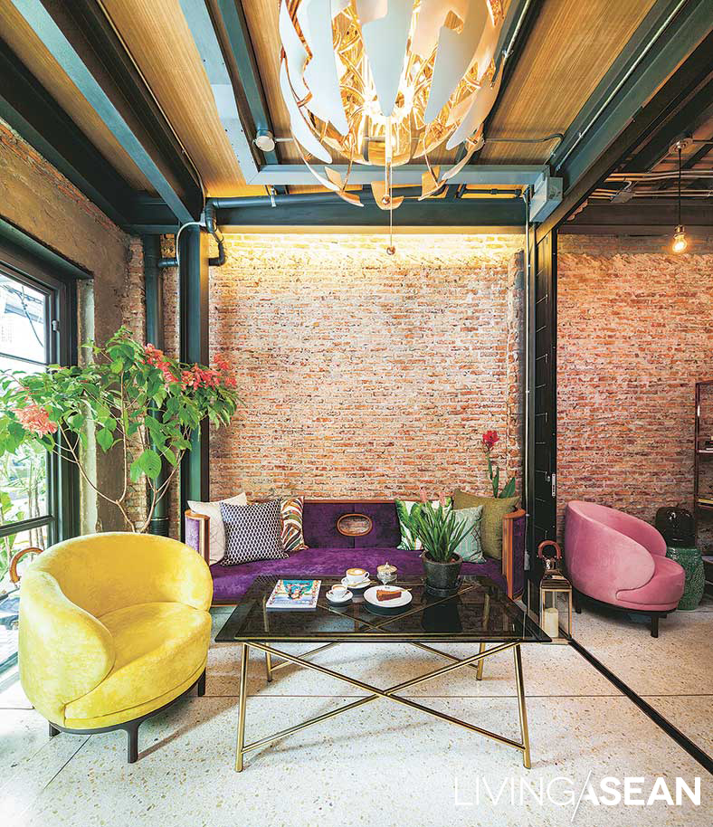
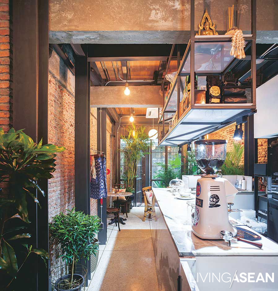
They kept intact the front wall and brick walls all around, chiseling off interior mortar to show weight-bearing structures, including wood wall beams fitted into brick arches, and keeping the charming mortared patterns of the original roof.


Chez Mou: A Home Hidden In the Frame of an Old House

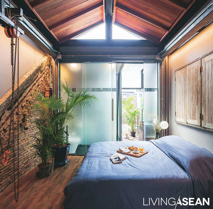
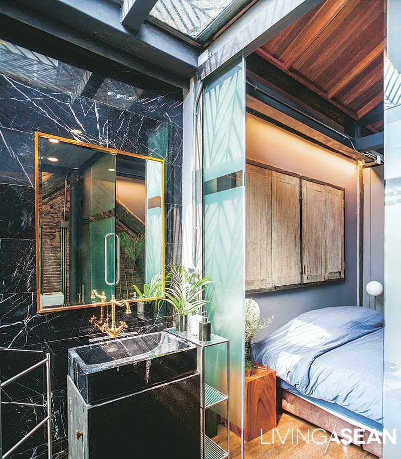
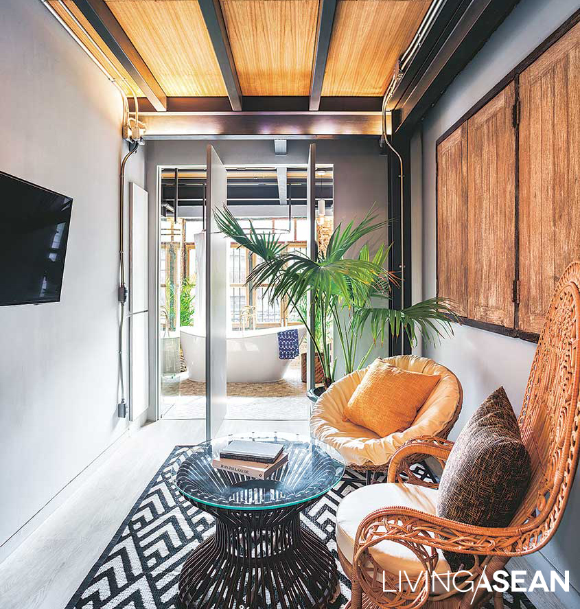
The lower floor is chic travelers’ café, a wooden stairway stretching up to guest rooms above. Visitors might wonder about the functionality of the steel poles they see set at intervals throughout. It is the by-product of the makeover process, as the architect told:

“This area is a walled-in rectangle, and without changing outer walls and structure at all, we’ve created a new house within the frame of the old one, sinking micro pilings into the root foundation and installing all new support pillars.

“It was important to keep the new structure separate. Concrete flooring was poured on the ground level and separated by a foam at the joints where it meets the original walls.

“These “expansion joints” keep outer and inner structures from being attached, so if the floor subsides, it won’t pull a wall down with it. On the second level, we’d intended to keep the original wood flooring, but found irreparable termite damage, so we had to replace it.”

Chez Mou: A Home Hidden In the Frame of an Old House

Chez Mou: A Home Hidden In the Frame of an Old House

Explaining the challenges of the construction process, the architect added, “At the back of the house, we changed to steel and drywall construction to install walls and latticework.

“Building here was difficult because of the limited space. Fronting on a narrow street made delivery difficult. There was nowhere to stack and store materials, so all work had to begin inside.

“When the inside was done, we brought in the materials stored outside and switched to working on the front. There was a lot of planning involved to make it possible for the craftsmen to be able to work at all.”

Chez Mou: A Home Hidden In the Frame of an Old House

Chez Mou: A Home Hidden In the Frame of an Old House

Row houses lasting more than a hundred years naturally tell stories with marks from sun and wind, just as with marks left on our lives by travel.

Leaving to study and live in England for more than twenty years, Mou could never have expected the winds would slowly blow her back to her origins with a new feeling, one born of love and dreams.

The word “Chez” is French, meaning “at,” or “at the home of,” hence the name: Mou has opened her home to welcome friends at “Chez Mou,” where stories are told by marks on bricks and sweet smiles.

Here is a place full of feeling of release from travel, and full of a bittersweet, gentle fragrance.


Architect: Wachirasak Maneewatanaperk of sea.monkey.coconut (www.facebook.com/sea.monkey.coconut)


You may also like…
The Perfect Size Townhouse

Modern Tropical House in Ho Chi Minh City

The Perfect Townhouse Makeover in Bangkok

The Perfect Townhouse Makeover in Bangkok

/ Bangkok, Thailand /

/ Story: Wuthikorn Sut / English version: Peter Montalbano /

/ Photographs: Soopakorn Srisakul /

The townhouse is a common type of building in Thailand, especially in Bangkok. Homeowner and architect Narong Othavorn grew up in one, always thinking of ways it could be better designed. Eventually, he and his wife Pim Achariyasilpa chose a 30-year-old townhouse in Si Phraya, a downtown neighborhood, and turned it into one of the most excellent townhouse makeover projects in the city.

townhouse makeover
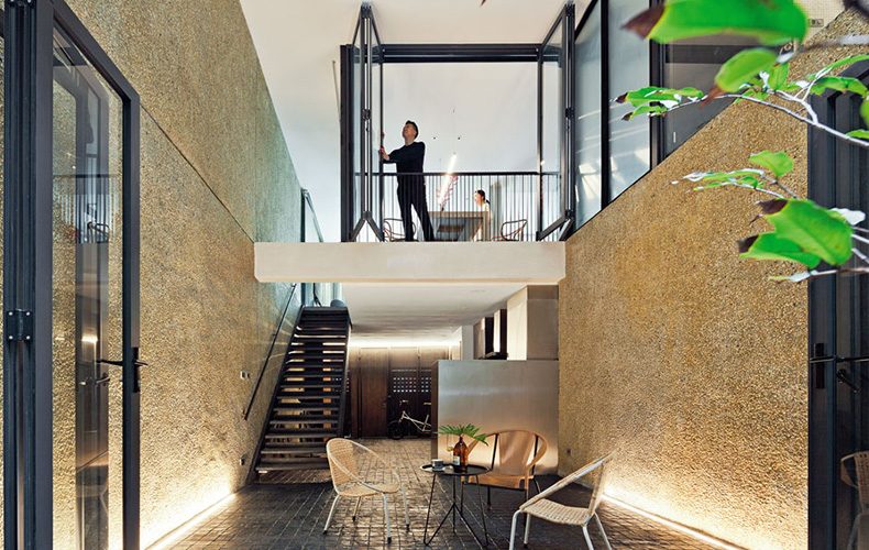
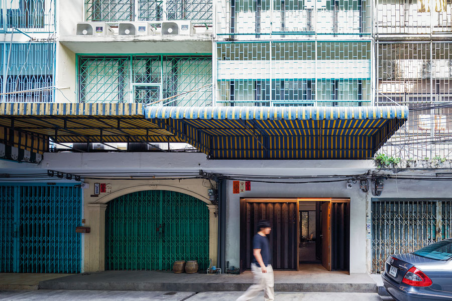
Overall, the final building is a combination of the adjacent townhouses. Narong kept the original wrought-metal façade, modifying the original metal entrance door with a mixed frame of wood and steel, leaving the next-door side the entrance to a fourth-floor warehouse.

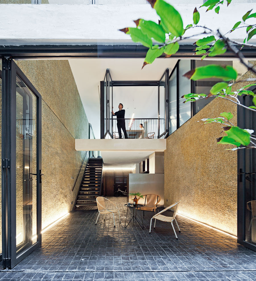
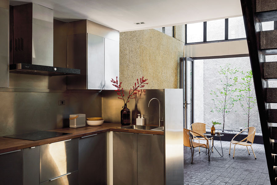
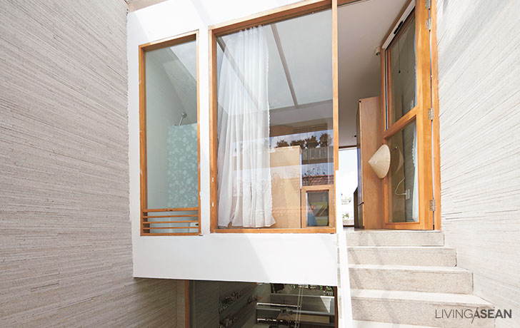
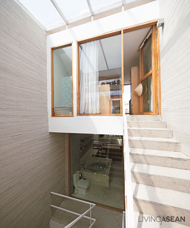
A picture window in the living room brings in natural light onto washed gravel walls that lead down to a small garden behind the house, inspiration for the “double space” mezzanine.


townhouse makeover

The double-space ceiling isn’t only about making the lower level look good: it supports the open-plan design.

Glass panels in the dining nook of the mezzanine above extend a feeling of comfort to every space in the house. From the mezzanine there’s a continuous view through glass partitions out to the garden behind the house, and there’s steady circulation of air from front to back.

Townhouses are apt to feel cramped, but not this one! The light is different in each area, but the light is what connects everything.

townhouse makeover

townhouse makeover

townhouse makeover

“These things came from our own personal tastes. Pim likes well-lit spaces. Me, I like indirect light,” explained Narong.

“So with a house for the two of us, we had to get the division of space just right, using the light available in each area. The lower floor is bathed in subdued natural light; upstairs, the living room is brightly lit through the front window.

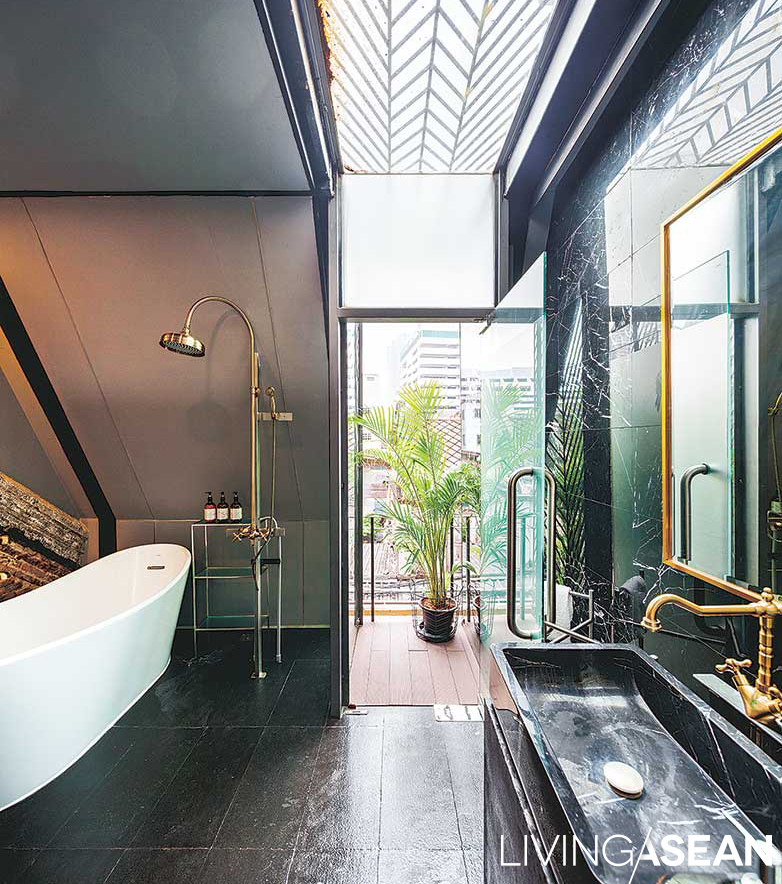
“Moving back to the dining area and bar, the light is dimmer. Go upstairs to the bathroom and dressing areas and it’s lighter again, suiting the specific limitations and characteristics of each space.”

townhouse makeover

“Small, but spacious” is how both owners refer to this house: better than adequate, the size is really perfect.

Not so small as to be cramped. Everywhere some things catch your eyes up close and others at a distance. The home offers a master class on how townhouse renovation can work with limited areas to create special, interesting spaces.

Even though adjoining buildings make side windows impossible, careful arrangement of space and windows on higher levels give this house a beauty that is anything but ordinary.

townhouse makeover

townhouse makeover

townhouse makeover

townhouse makeover

townhouse makeover


Owner/Architect: Narong Othavorn of SO (www.soarchitects.space)


You may also like…
Siri House Family Co-living space / Home Renovation

SIRI HOUSE FAMILY CO-LIVING SPACE / HOME RENOVATION

From Shophouse to Stylish Home Office

FROM SHOPHOUSE TO STYLISH HOME OFFICE

House in Trees: Well-made Home on a Narrow Lot

House in Trees: Well-made Home on a Narrow Lot

/ Bac Ninh, Vietnam /

/ Story: Samutcha Viraporn / English version: Bob Pitakwong /

/ Photographs: Trieu Chien /

Having to build on a narrow piece of land, an architect creates an urban home ingeniously designed to utilize the space in imaginative ways. Relevantly called “House in Trees,” the slim plan makes the best of circumstances by letting nature permeate.

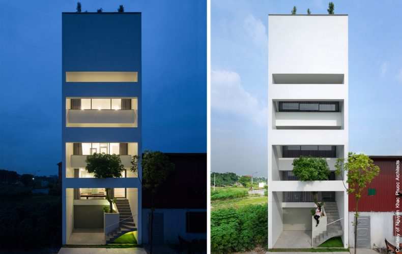
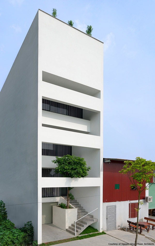
The so-called “House in Trees” sits on a narrow lot measuring 5 by 15 meters in Tu Son, a county town in Bac Ninh Province, Vietnam.

The area is fast becoming industrialized as the city grows. Putting it mildly, the impacts of urban growth are already being felt, from noise to traffic fumes and other negative effects that come with industrialization.

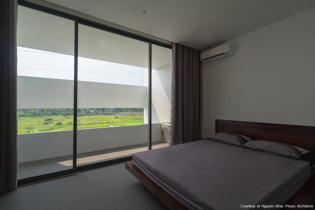
On top of that, the location dictates that the house be built facing west.

Be that as it may, the design team at Nguyen Khac Phuoc Architects succeeds in creating an uncluttered, incredibly relaxed home for a family with two teenage children.

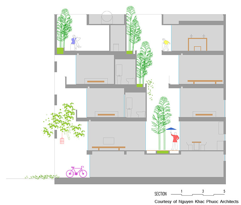
Where the land is so narrow, the only way to go is up. The slim floor plans afford three bedrooms with baths, living room, kitchen, carport and storage, as well as an entertainment center, worship room, laundry.

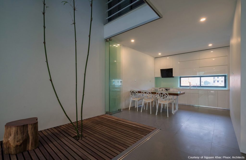
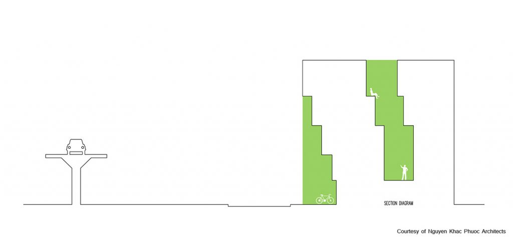
The five-story home makes good use of two void spaces, one in front, the other in the center court.

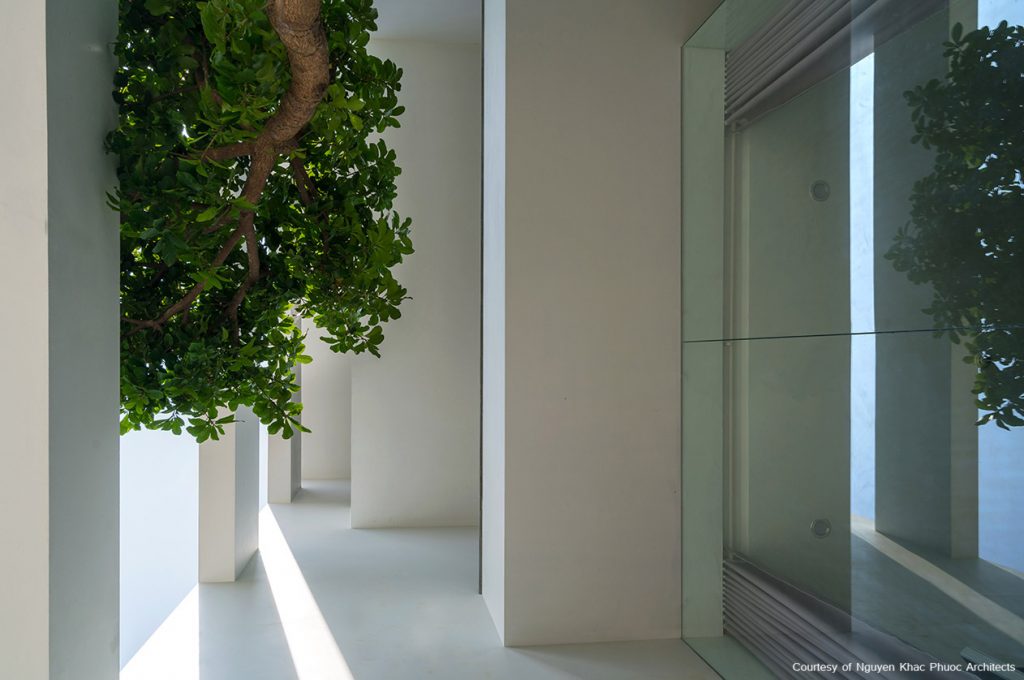
Because the front façade is facing west, the architects fill the front void space with a leafy tree to protect the interior living spaces from hot afternoon sun and traffic fumes.

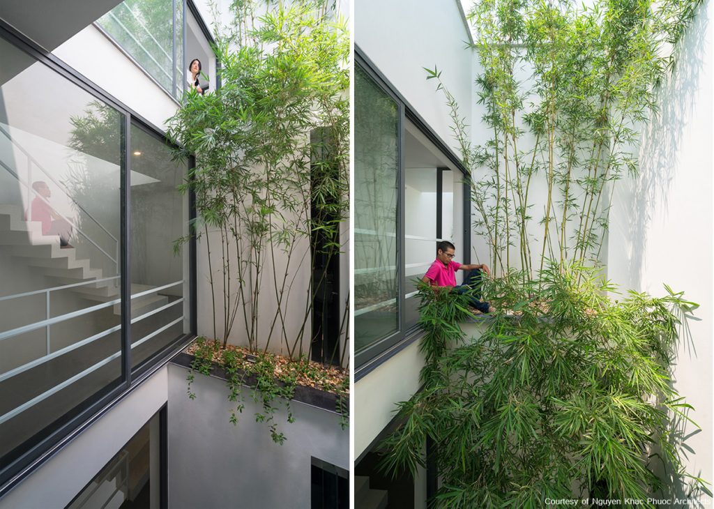
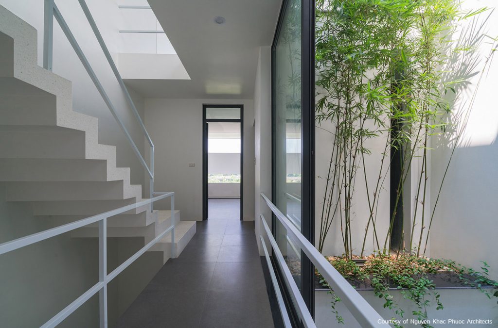
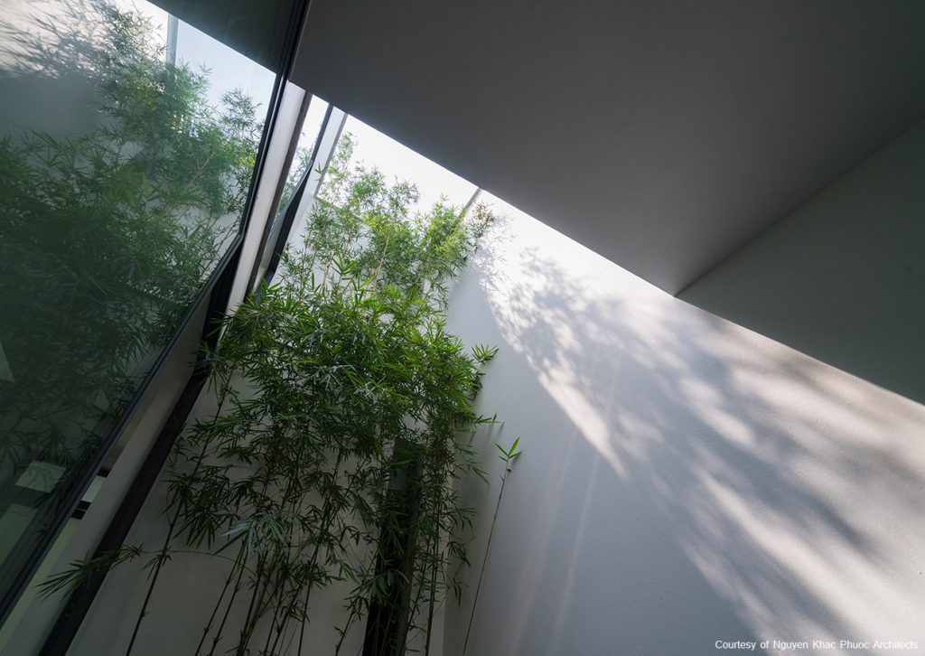
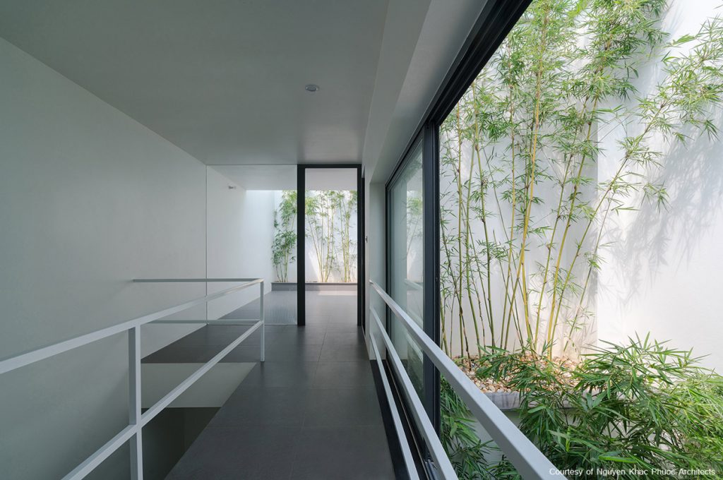
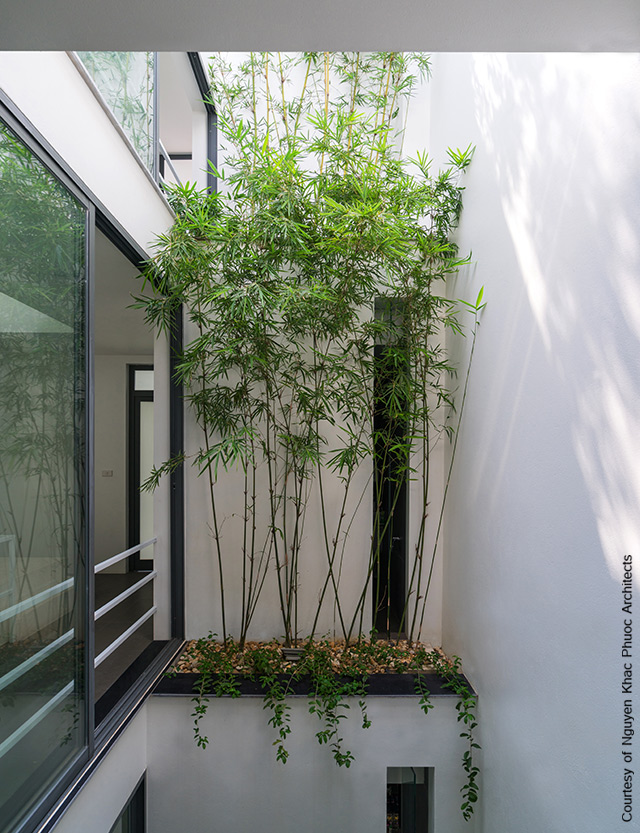
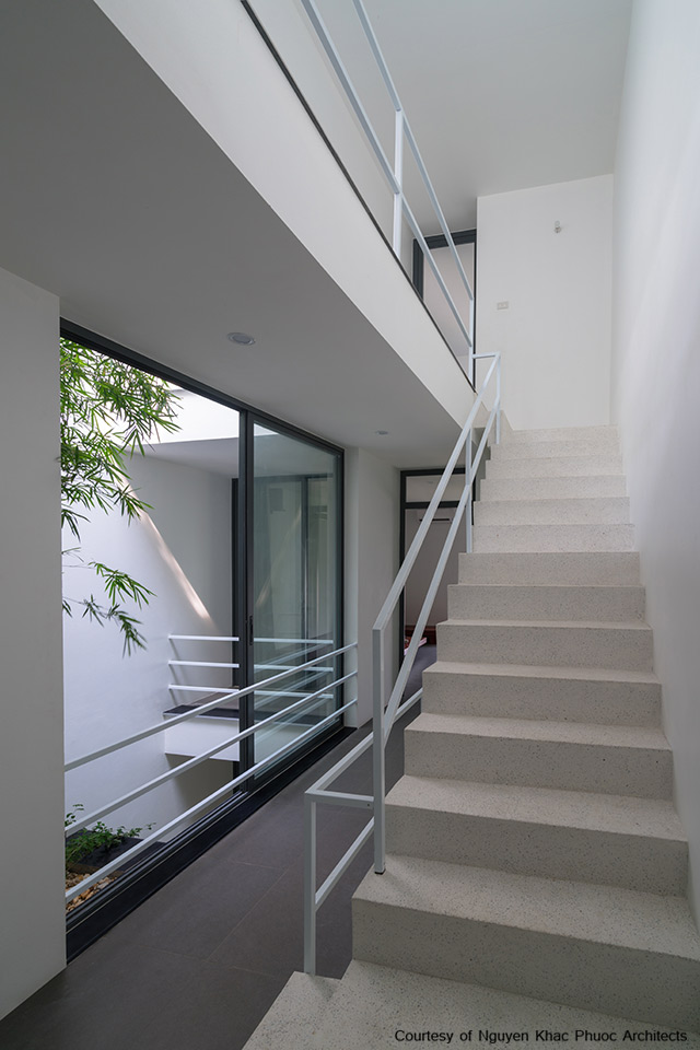
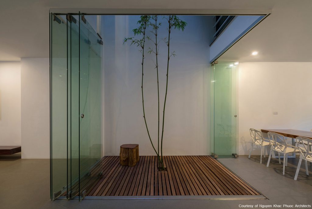
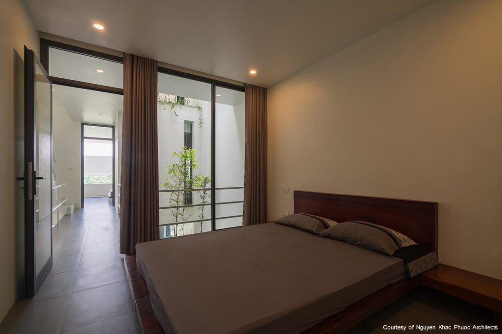
The second void space at the center is filled with greenery while lush shade keeps the homeowners naturally cool all year round. The idea is to let nature permeate as much as can be.

Tall bamboo and leafy trees diffuse natural light during daytime hours and protect the interior from gusty winds and rain.

The greenery-filled center court not only evokes a walk in the park, but also provides privacy for all the rooms that are set at tree-top levels.
A patch of greenery lines the corridor connecting the living room, kitchen and dining room.

One of the unexpected ways to decorate with plants. Greenery brings good energy, textures, and character into every space.

“The design is done within the context of the home’s unique surroundings,” explained the architects.

“We incorporate nature in the floor plan to promote better living condition for people living in it. Urban growth and industrialization are fast happening and they no doubt have impacts on the environment.”


Architect: Nguyen Khac Phuoc Architects


From Unexciting Shophouse to Smart Home Office in HCMC

From Unexciting Shophouse to Smart Home Office in HCMC

/ Ho Chi Minh City, Vietnam /

/ Story: Samutcha Viraporn / English version: Bob Pitakwong /

/ Photographs: Quang Dam /

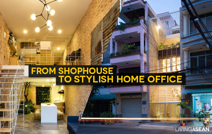
Home offices are trendy nowadays. Given thoughtful planning, a dull shophouse can transform into a fashionable dwelling and place of business. The results are illustrated in this home office that looks to be one of the trendiest in Ho Chi Minh City.

home office in HCMC

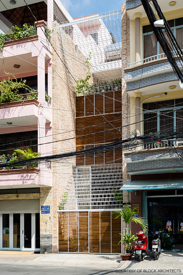
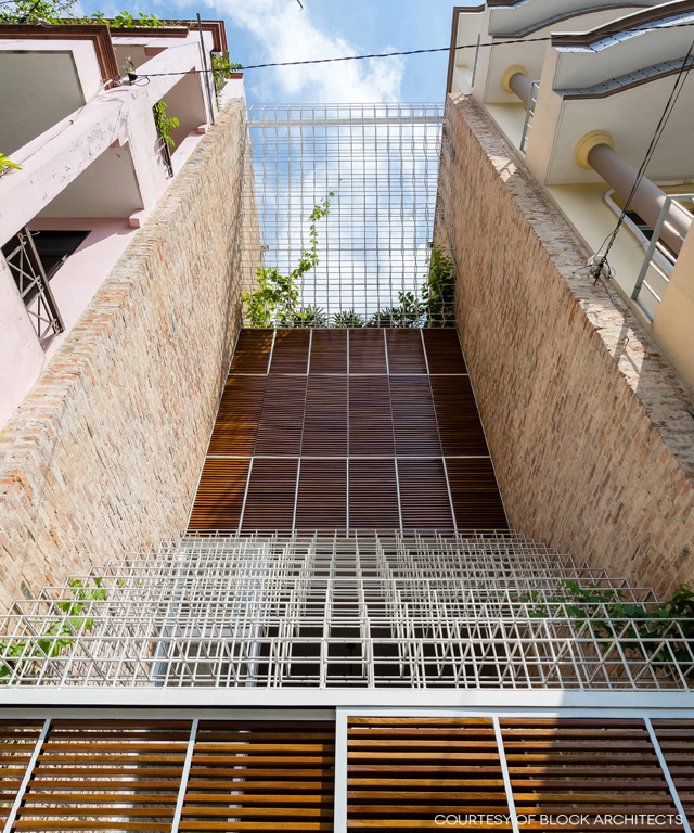
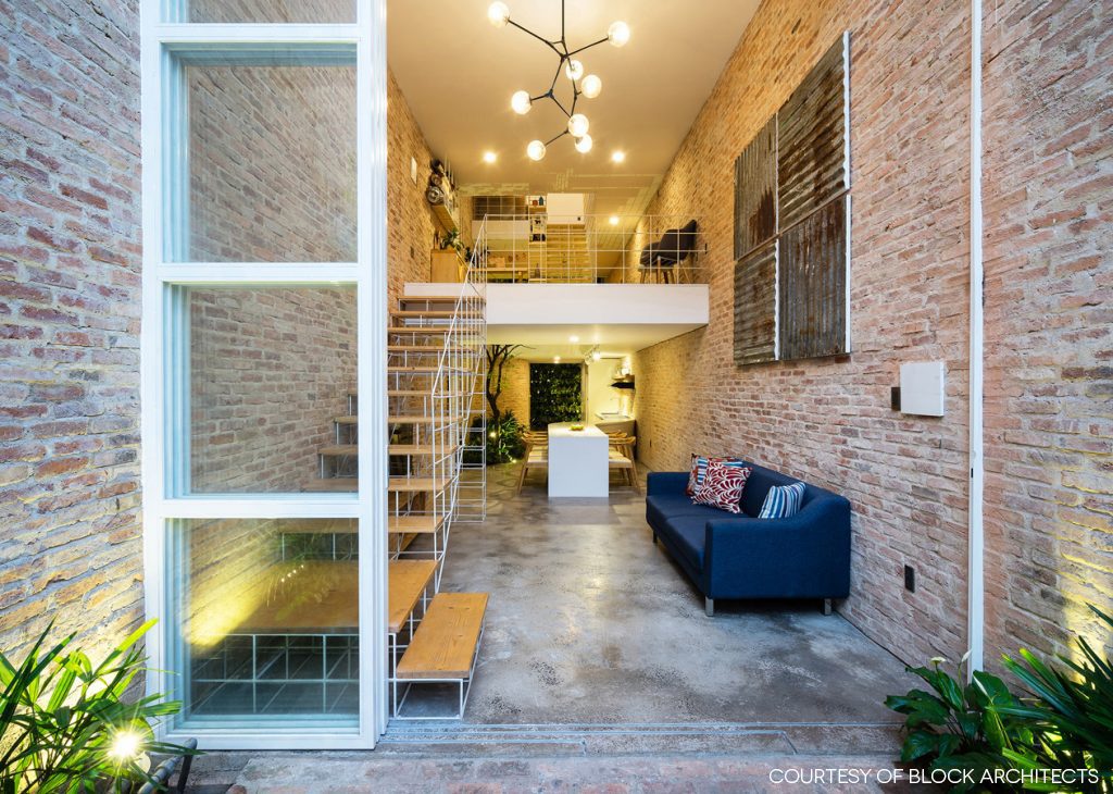
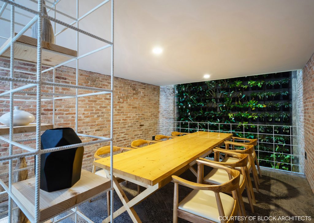
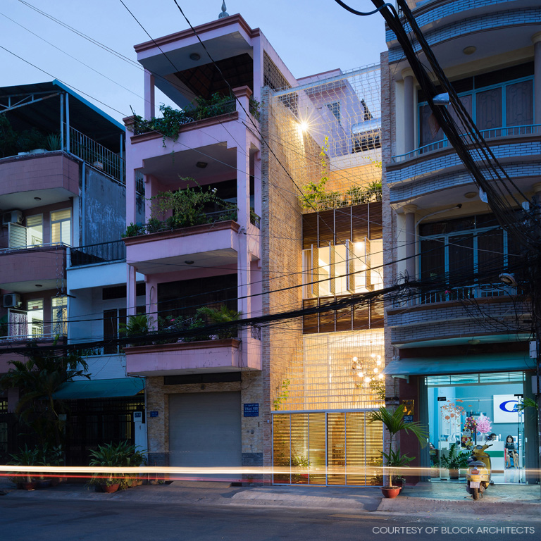
The new design integrates a modern living space and a home office with a factory producing handcrafted leather goods. The house’s front façade is filled up with elaborate structural rod systems reminiscent of a giant labyrinth of beautiful needlework, albeit built of brick and steel.

It’s only recently that a homeowner couple acquired this downtown retail space and later decided to give it a complete makeover. “This house means everything to us because it’s the fruit of constant efforts to pursue our dreams,” said the young couple with an active lifestyle.

home office in HCMC


home office in HCMC

“For a product to be successful, say a handbag, it takes many processes involving fastidious needlework,” said the owners comparing their manufacturing job to that of the architect.

“Like meticulous craftsmen, the architect carefully puts together different parts to make a home, mixing old pieces with new ones, replacing unneeded features with practical strategies, and relying on well-thought-out plans to use every ingredient effectively, be it wood, brick, concrete, metal or even trees.”


home office in HCMC

home office in HCMC

In a way, this pretty much explains the elaborate structural rod systems that fill up the redesigned front façade. Elsewhere, parts of the walls and flooring deemed to be unnecessary were removed to make room for new ideas.

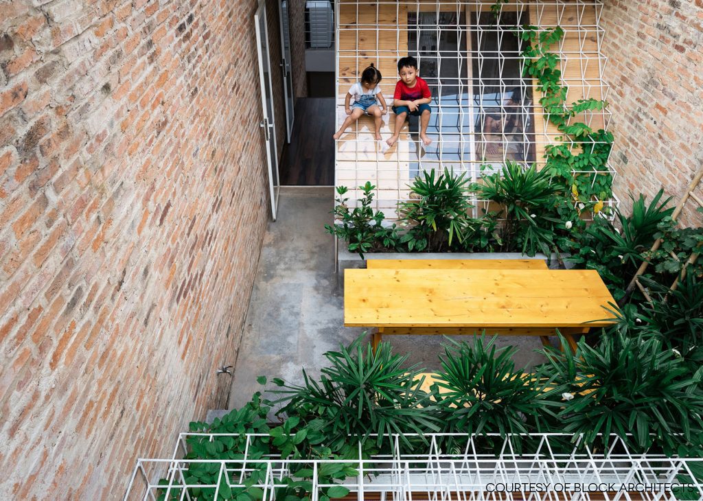
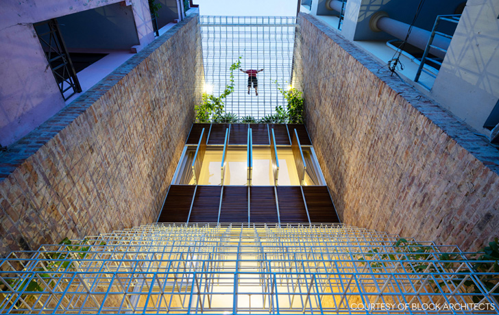
The remodeled front and rear facades showcase a multitude of steel cube frames welded together to look like a web of fine threads being “sewn” together to fill the void between two side walls.

The welded steel rod paneling is painted white and decorated with climbing plants thriving in full sun. Despite its slender appearance, the design is strong enough for home protection, at the same time creating a light and airy ambience for both indoors and outdoors.

home office in HCMC

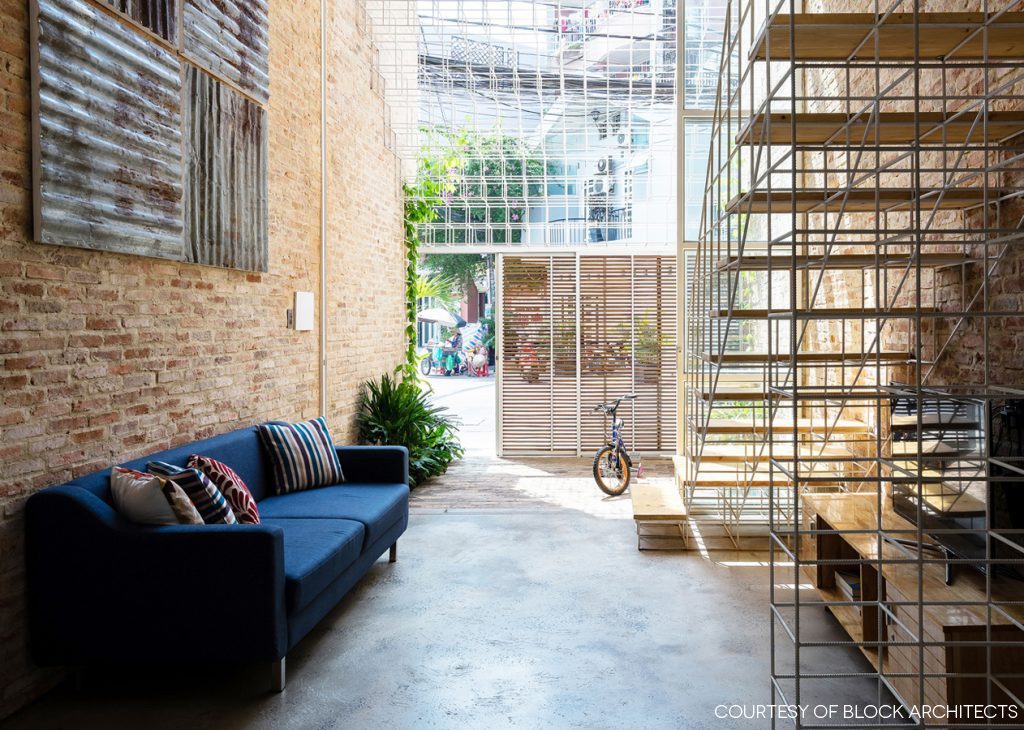
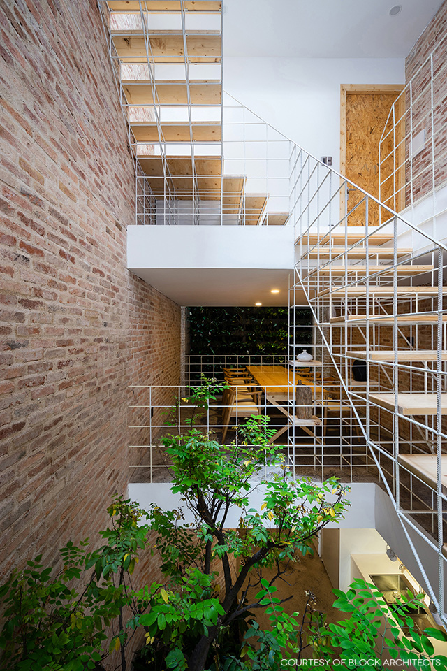
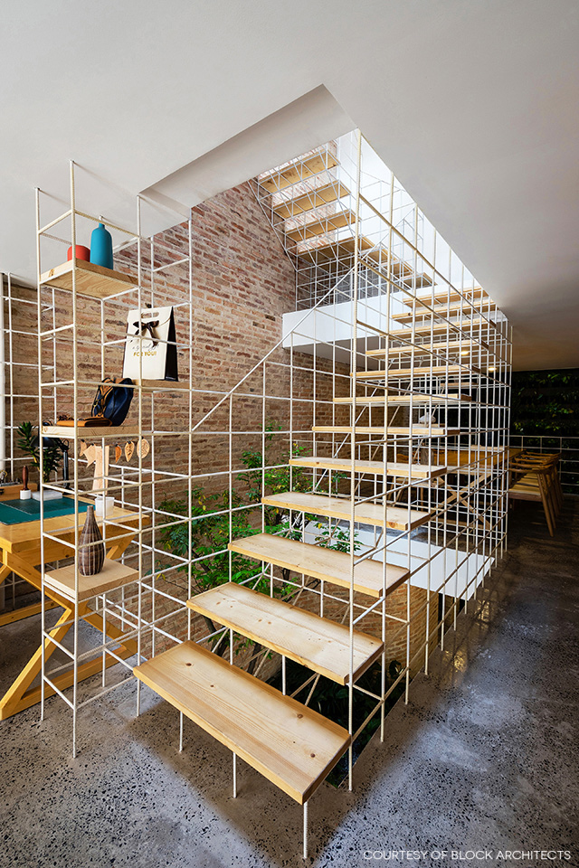
Among other things, the old concrete stairway was removed to prevent the indoors from feeling stale and stifling. Then, a new set of airy stairs with no risers between the treads was put in place instead.

For a lightweight look, stair railings were crafted of steel rods painted white with wood treads in complementing shades. The uplifting design rendered the staircase looking as if it were hovering above the floor.

shvf01

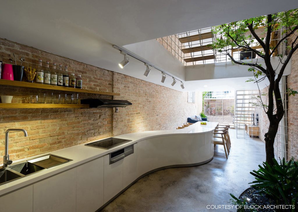
In the kitchen and dining area, a long curvy counter stands in contrast to the stillness of rough brick texture on the wall. All in all, clever design has transformed an unexciting shophouse interior into a home office that looks to be one of the trendiest in Ho Chi Minh City.

home office in HCMC


Architect: Block Architects (www.blockarchitects.com.vn)


You may also like…
The Perfect Townhouse Makeover in Bangkok HUAMARK 09: An Architect’s Charming Concrete Block House

Stacking Green: Integrating Nature-Inspired Design in a Row House

Stacking Green: Integrating Nature-Inspired Design in a Row House

/ Ho Chi Minh City, Vietnam /

/ Story: Ekkarach Laksanasamrith / English version: Peter Montalbano /

/ Photographs: Soopakon Srisakul /

This residence in Ho Chi Minh City has an interesting form and exterior that has drawn us to see with our own eyes. Named “Stacking Green”, this row house design received an award for outstanding design and architectural works at the 2012 World Architecture Festival in Singapore. It’s not surprising that it received a citation for architectural excellence in the residential building category. The way that it dealt with complex urban problems in a simple way yielded an array of fascinating outcomes.

row house
The stairway reaches the top floor of the house that holds a guest bedroom with a sundeck.

The four-story townhouse offers a total of 250 square meters of usable space. The frontage abutting on the street is 4 meters wide with a whopping 20-meter depth. The interior is especially designed for the three people who live here, one of whom is an old person. Hence, one bedroom is placed on the lowest floor, so there’s no need to climb the stairs.

3
Since the house plan is long and narrow, bringing sunlight into the interior living space is a very good idea.

The second floor consists of a dining room, kitchen and living room, while the third holds the master bedroom with an open floor plan bathroom. The guest bedroom is located on the fourth floor.

row house

It’s a well-known fact that people’s homes in Vietnam are often compactly built in townhouse form to use as little property space as possible, often resulting in cramped residences and unattractive-looking building fronts.

Here, the architects have incorporated privacy in the design so that no one can look in from outside. At the same time, it gives the homeowners a sense of peace and contentment. Overall, it’s a design thoughtfully devised to reduce pollution from the street.

row house
This row house may not have any eye-catching features from the outside, yet its half-open, half-opaque design allows natural light to enter through the rooftop, creating a cozy home ambience within.
As the leafy plants reach their full size, the level of privacy correspondingly increases.

Additionally, both the front and the back of the house feature rows of containers stacked one on top of the others with open air spaces at intervals. In all of them, lush green plants thrive luxuriantly screening the view inwards and creating attractive façades.

The house also has open ports which run up and down through all the floors. This kind of stack ventilation effect allows for hot air from below to rise and vent out through the rooftop. And by the same token, fresh cooler air is drawn inside keeping the heat down even at high noon.

row house
Sunlight through a glass skylight in the roof shines down into the dining room on the second floor.

5

In the front yard, a leafy shade tree improves air quality, while vertical gardening on the front and back facades has spaces between stacking containers that allow plants to grow. The open spaces between planter boxes are determined by the types of vegetation planted. The full height of a plant is used to fix the spacing between planters on each floor.

Step inside, and you find there are hardly any walls separating the home into different rooms, except for bathrooms. This creates efficient ventilation throughout the home, at the same time giving it an open, uncluttered feel.

Besides giving privacy and cooling shade to the house, the planter boxes and leafy vegetation also act as a safety feature.

In this way, when container plants reach their full heights, they become the outer envelope of the building. Together they go to work all day and every day filtering out harsh UV rays from the sun, at the same time letting the cool breezes flow through.

The architects picked only the trees and plants with fine and delicate foliage so as not to block the wind, and for ease of use, they installed pipes for an automatic watering system.

row house

Concrete planter boxes holding plants on the front and back facades have the added convenience of an automatic watering system.

Architect: Vo Trong Nghia Architects


You may also like…
M11 House: A Comfy Minimalist House in HCMC

3 x 9 House: A Compact Renovated Row House in HCMC

An Open Concept Urban Home with a Minimalist Flair in Kuala Lumpur

An Open Concept Urban Home with a Minimalist Flair in Kuala Lumpur

/ Kuala Lumpur, Malaysia /

/ Story: Ekkarach Laksanasamrith / English version: Bob Pitakwong /

/ Photographs: Soopakorn Srisakul /

With the creative use of design elements, this Minimalist house in Kuala Lumpur feels bright, airy and comfortable, albeit having only a small number of windows. The open concept urban home with a stylish flair was designed and built by Tony Heneberry of 2’s Company, formerly JTJ Design, under the concept of a great place to live in.

Minimalist urban home
Growing trees add some freshness and makes the house more of a great place to live in.

As simple as that, here’s the story of a metamorphosis of purpose, in which a duo of unexciting shophouses transformed into an incredibly warm and roomy living space in the heart of town. After he had bought the two units attached to each other, Heneberry gave them a complete makeover, tearing down the dividing walls and combining them into one coherent whole with increased usable spaces inside.

Minimalist urban home
Green foliage adds joy to cooking, making it feel like living out in nature.

The result is a 7-meter-wide façade looking much better than when Henebery found it. He removed the existing solid walls between them and assigned new functions to the interior spaces. The living room with dining area on the second floor is spacious, with a lot of open areas in accordance with the “open plan” concept.

Minimalist urban home
Trees chosen for the center courtyard have medium-sized leaves to keep the house airy and not too dense.
Minimalist urban home
Using an “open plan” design means the interior is all connected, which avoids a cluttered look.
The new set of stairs illuminated by a rooftop skylight is one of the spots everyone likes the most.

For practical reasons, the old staircases were torn down and replaced by new ones built in a better, more convenient location. The new sets of stairs crafted of steel sit in a hallway next to the center courtyard, leading the way to the second floor.

The courtyard is filled with trees, as a main relaxation area of the house, where a glimpse of outdoor experience is brought inside in harmony. The trees also create visual continuity by naturally drawing the eyes towards the interior.

The stair to the third floor is set in another location. It sits against the outer wall, to preserve the space inside, which is an area for work and rest.

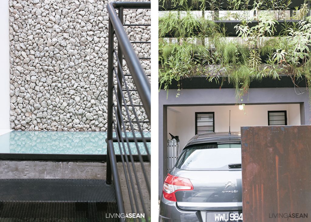
[Above] The wooden roof truss painted all white makes the overhead space look taller and more spacious. / [Below] The new metal staircase is aesthetically pleasing, thanks to the absence of solid risers between the treads. For good ventilation, expanded metal grating is used instead.
[Above] The wooden roof truss painted all white makes the overhead space look taller and more spacious. / [Below] The new metal staircase is aesthetically pleasing, thanks to the absence of solid risers between the treads. For good ventilation, expanded metal grating is used instead.
Minimalist urban home
Natural light turns second-floor living and work spaces into a well-lighted place, plus high ceilings add an airy feel to it. The disadvantage that comes with having only a few windows is nicely compensated for by the creative use of design elements, rooftop skylights among them.

As for the ventilation system, hot air is able to float up through the hallway and then flows out through window louvers and vents on the rooftop.

Another plus is, this Minimalist urban home faces south. So, by putting planter boxes on window frames, a simple vertical garden is added to filter sunlight and enhance privacy for the people living inside. The bottom line. This newly renovated home is truly a breath of fresh air.

[Left] The hallway wall surface is covered with crushed concrete recycled from the old shophouses. / [Right] Lush green vertical gardening adds a refreshing change to the front façade rising above the carport.

Architect: 2’s Company (www.facebook.com/JtjDesign)


You may also like…
A Modern Home That is Quintessentially Thai

303 House: A Modern Narrow Townhouse on a Narrow Lot

Desa House: The Renovated Artist House in Kuala Lumpur

Desa House: The Renovated Artist House in Kuala Lumpur

/ Kuala Lumpur, Malaysia /

/ Story: Panchat Changchan / English version: Bob Pitakwong /

/ Photographs: Rithirong Chanthongsuk /

The place called “Desa House” belongs to 49-year-old artist Leon Leong. Located in the Malaysian capital Kuala Lumpur, the artist house clearly stands out from the rest in a neighborhood characterized by ubiquitous townhomes.

1
Newly added is the sky garden that extends outward from the second-floor façade. 

The most eye-catching feature is the lush sky garden that extends outward from the second floor. The structure also doubles as a carport roof. Green foliage adorns the front façade and functions as a privacy curtain.

The striking features remind us that we have reached our destination.

2
The sky garden platform, which doubles as a carport roof, is accessible from the second floor.

The bedroom and the studio are lit by natural light through a sliding glass that slides open to access the greenery. The same applies to the rear portion of the house, which opens to a backyard.

In the front and back, green foliage forms privacy curtains that effectively set the interior spaces apart from the hustle and bustle of city life.

artist house
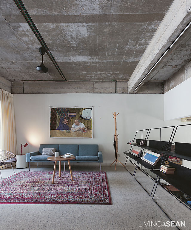
Roof beams are clearly visible after ceilings are removed to make way for the new add-on.
artist house
There is no need for electric lights as the interior is sufficiently illuminated by natural energy via the second-floor skylight and the main entrance.
artist house
Lattice skylight crafted of concrete turns the second-floor living spaces into a well-lit place. /// Natural light illuminates the central court that the artist owner uses as his workstation.

The artist house’s aesthetic is achieved by putting in an add-on and other details to the existing structure.

Like other townhomes in the neighborhood, there is a central court that the occupants use for relaxation. But architect Wen Hsia of the WHBC Architects group has a better idea.

She transforms this centerpiece into something different. What used to be a seating area now becomes a lush landscape, where tall trees cast shadows on surrounding walls and much of the first floor.

It brings in the outdoor, and the atmosphere comes alive every time leaves blow in the wind. All day the light and sound show gives the artist homeowner the inspirations that he needs.

artist house
The interior spaces double as an art gallery, where Leon displays his beautiful works of art.
artist house
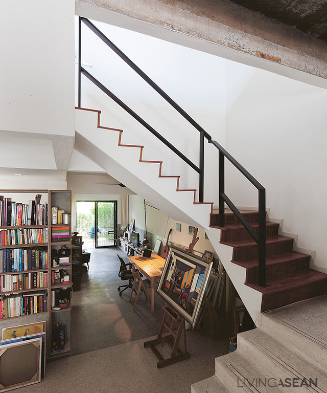
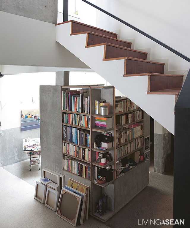
The artist’s favorite spot is the bookshelves composed of concrete and wood frames.
5
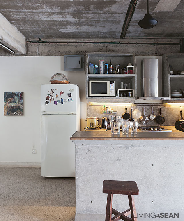
The perfect match for timeworn kitchen countertops and minimal raw wood furniture.

Leon needs plenty of light to create works of art, and he gets it all in the home studio.

To bring in natural light, the architect has tiled roofing replaced by lattice skylight, creating beautiful special effects. Concrete lattice casts striking shadow patterns everywhere.

It is cheaper, longer lasting, and easier to maintain than that made of wood. As night falls, the studio is aglow by electric light.

Interestingly the studio light alone is enough to illuminate the entire home.

artist house
The artist’s workstation is nestled underneath the stairway and behind the bookshelves.
artist house
The living room shares space with the kitchen for added convenience.
10
Tall trees provide a crisp, cool canopy to the backyard. Beach pebbles, concrete slabs, and a patch of manicured grass fill up the garden floor.


Owner: Leon Leong

Architect: WHBC Architects


You may also like…
Never Too Small: Renovation Gives a Townhouse the Atmosphere of Home

MP House: A New State-of-The-Art Live/Work Design

Wonderful Terraced House Renovation in Singapore

Wonderful Terraced House Renovation in Singapore

/ Singapore /

/ Story: Warapsorn Akkhaneeyut / English version: Bob Pitakwong /

/ Photographs: Sitthisak Namkham /

Terraced houses are ubiquitous throughout Singapore, many of which are well preserved to showcase the country’s rich architectural heritage and history of British Colonial rule. Many of them have changed to better serve commercial and residential needs of the modern world. This handsome terraced house is no exception.

Terraced House
Part of the top floor becomes a small sky garden.

This terraced house belongs to Alan Barr and Phaswan Promphat, both of whom interior designers.

Alan has had experience living in big cities, such as New York, before the job sent him across the globe to settle in Singapore nine years ago. He didn’t arrive empty-handed, but with furniture and other prized possessions.

Over time Alan transformed the old townhouse into a trendy residential unit, incorporating a touch of New York in the prevailing climatic conditions of Singapore.

Terraced House
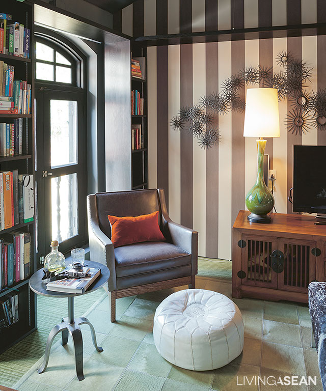
The spaces between Colonial-style arch windows are filled with bookshelves that stand tall from floor to ceiling.
8
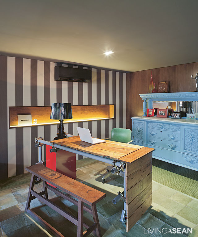
Part of the living room is remodeled into a workplace. The table is custom-made from discarded materials.

The home has a narrow front façade, but the narrow width is compensated by depth, a design feature typical of Sino-Portuguese architecture.

The front part has since been remade to accommodate lattice awnings from floor to ceilings. They serve as privacy curtains while shielding the interior from direct sunlight without limiting air circulation.

From the outside in, it looks like any two-story home. Step in, and you will find it is actually a three-story design.

The ground floor now serves as a carport and storage facility. A set of stairs takes us to the second floor, which is the living room and kitchen with a spacious dining area.

The home office is here, too. From the living room, there is another set of stairs leading to the bedroom on the third floor.

2
An armchair and a round coffee table adorn the relaxed living room in chocolate and cream tones.
4
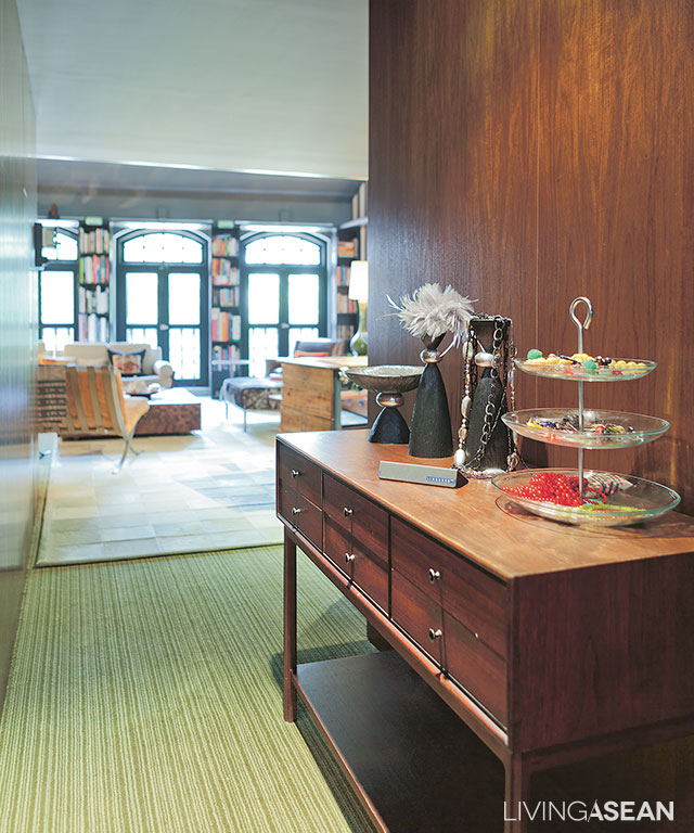
Antique-inspired décor items line the hallway leading to a relaxed living space in the rear of the building.
6
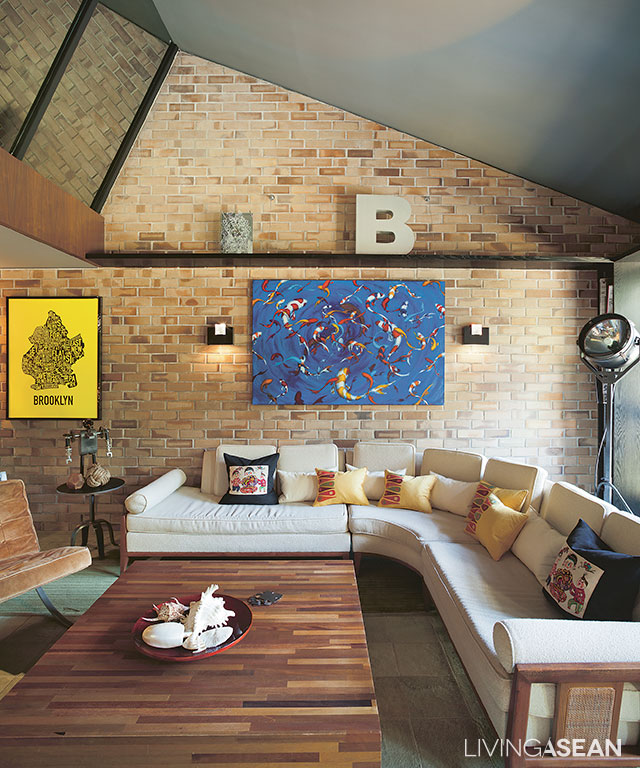
A room with a corner sofa and a large coffee table has enough space to entertain a circle of friends. The backsplash is covered in ceramic tiles made to look like bricks.
5
[left] The living room floor is covered in a patchwork of carpets crafted of donkey hide that is soft to the touch. [right] A niche under the staircase has enough room for a mini-bar.

Alan said, “This home used to be a design studio. The interior was just about right. It looked like a home, but it was not.

“At the time, it was an office and it had no kitchen. So when we got it, we had to put in one. I like the layout of this home very much. I divide it into two simple zones – general, and privacy.

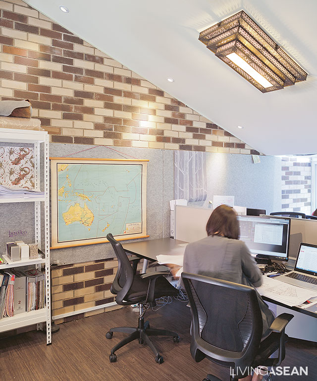
“The top floor is served by two separate sets of stairs. The attic has since become an office. Space is divided to store decorative works on one side and use as a workstation on the other.”

9
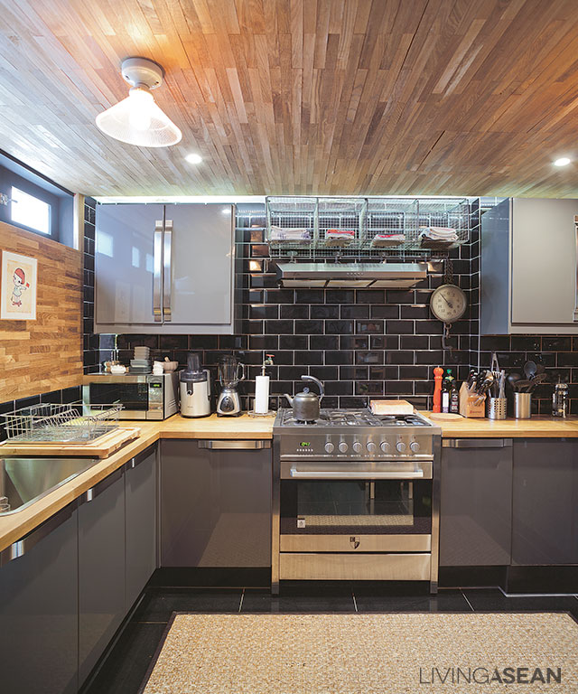
Set in gray and black tones, the kitchen comes fully equipped with stainless steel fixtures. Dark colored backsplash adds a nostalgic vibe to the atmosphere.
11
The stairway leads to the snug bedroom on one side of the upper floor.
12
The staff’s office is located on the opposite side of the upper floor to ensure the residential area is not disturbed.

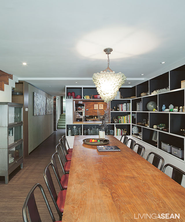
“The second-floor dining room serves multiple purposes, from eating and entertaining customers, to meetings and project presentations,” he continued.

“Personally, I don’t like an office hemmed in by glass walls supported by steel or other metal frames. Offices in much of Singapore are like that.

“I want a different kind of workplace, in which to impress the customers with different experiences. Most of them like it here, whether it is furniture or decorative items that we have on hand.”

10
The conference table and chairs are placed closer to the wall, lined with storage shelves.

As a whole, the interior spaces are neatly designed and well-appointed.

Décor items from various places are placed in perfect harmony with one another. As he puts it, good furnishings don’t always have to be expensive if you know how.

Alan has given this old terraced house a chic modern makeover with a hint of interest and personality.

3


Owner/Interior Designer: Alan Barr and Phaswan Promphat (www.grey-matters.com)


You may also like…
Desa House: The Renovated Artist House in Kuala Lumpur

Never Too Small: Renovation Gives a Townhouse the Atmosphere of Home

X