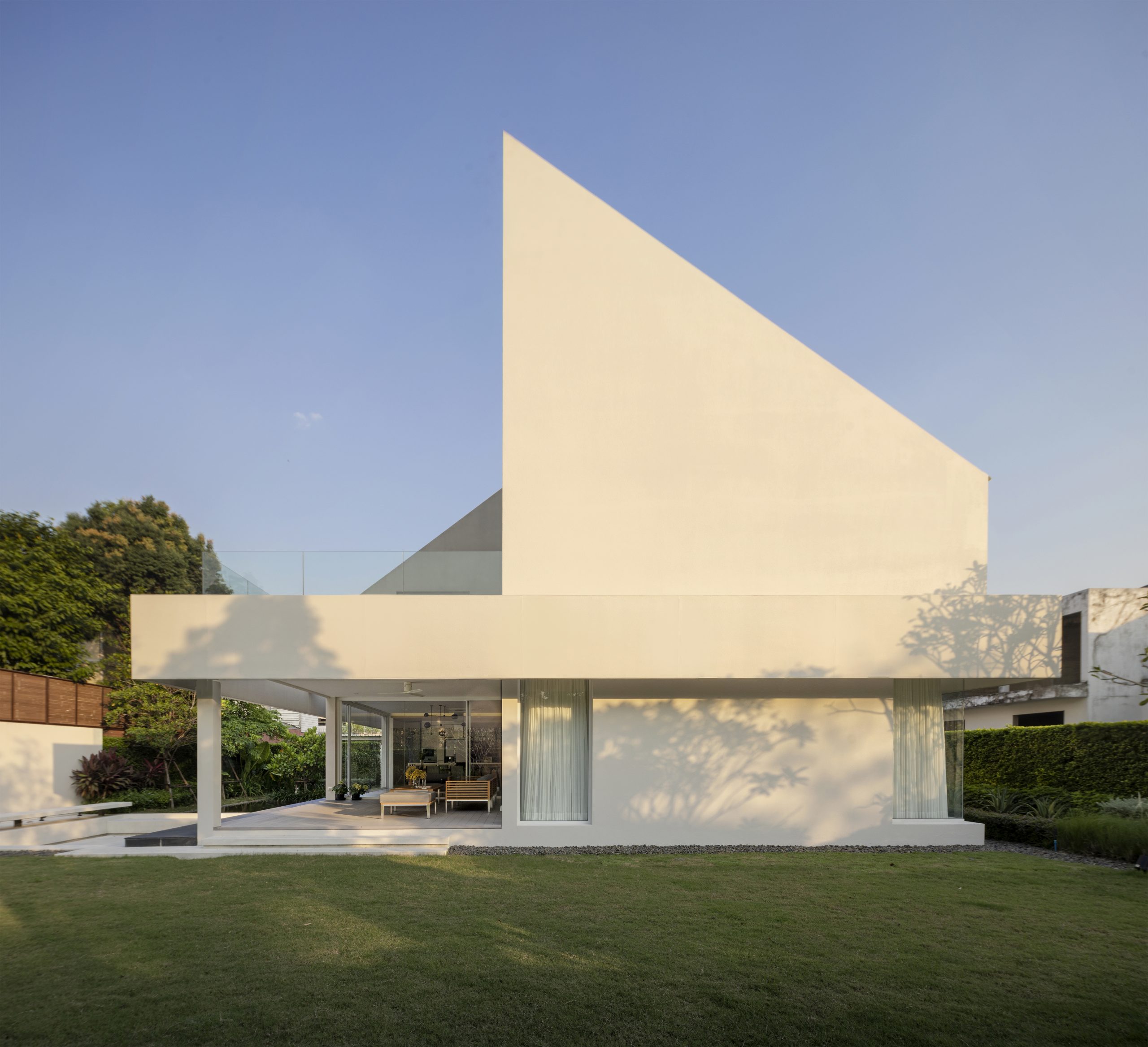
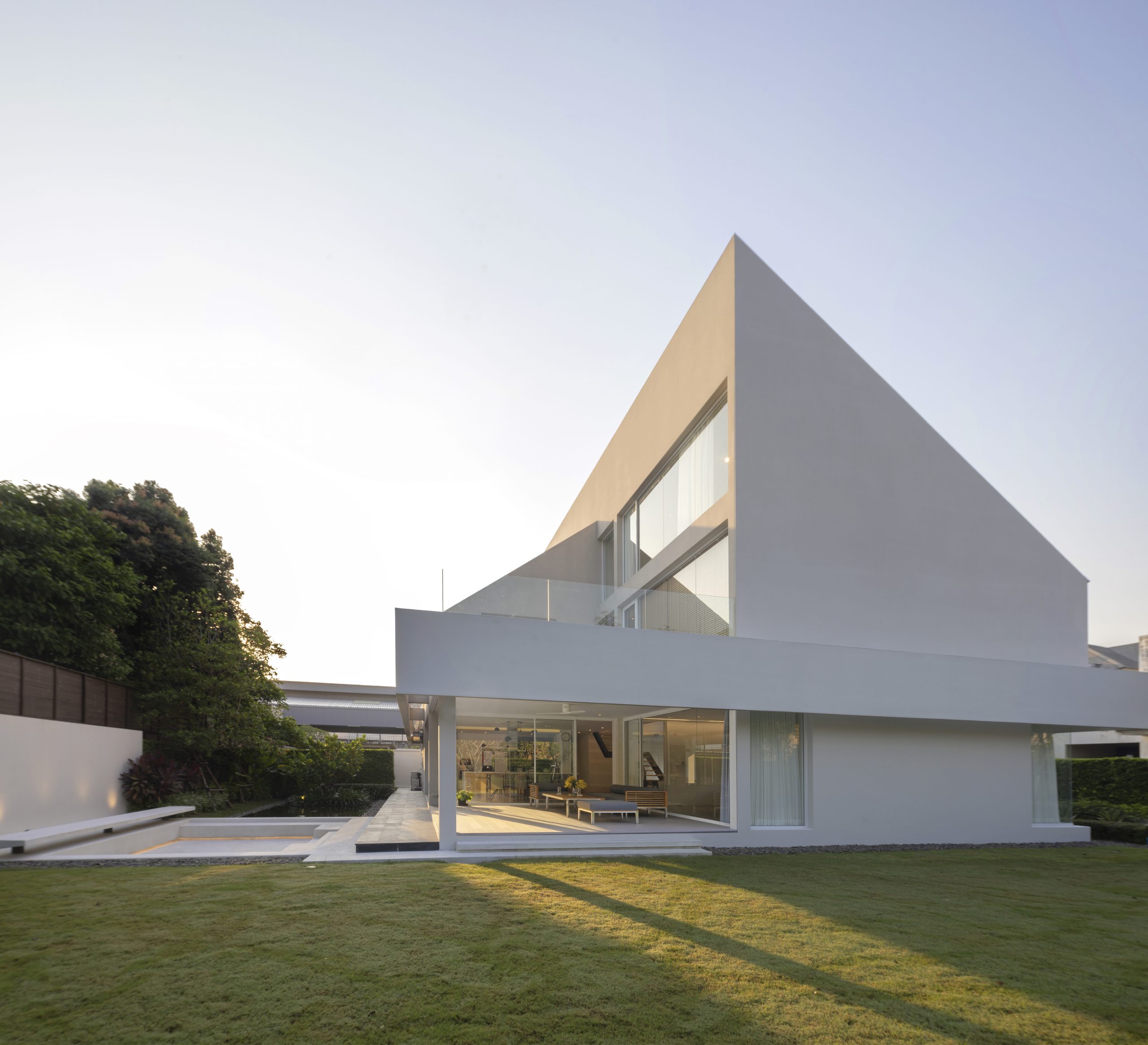
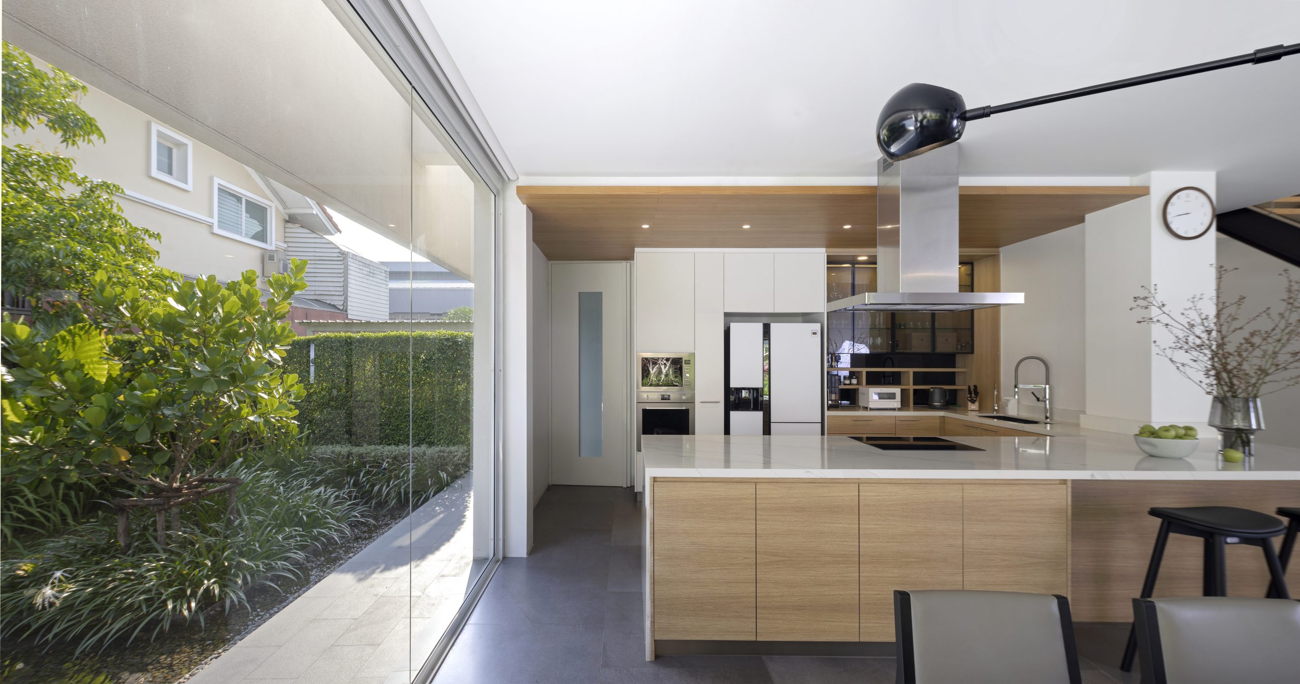
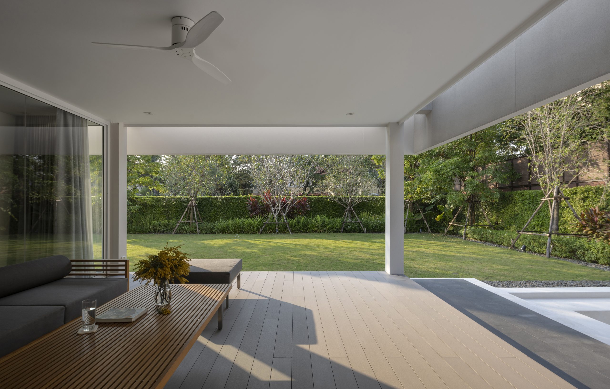
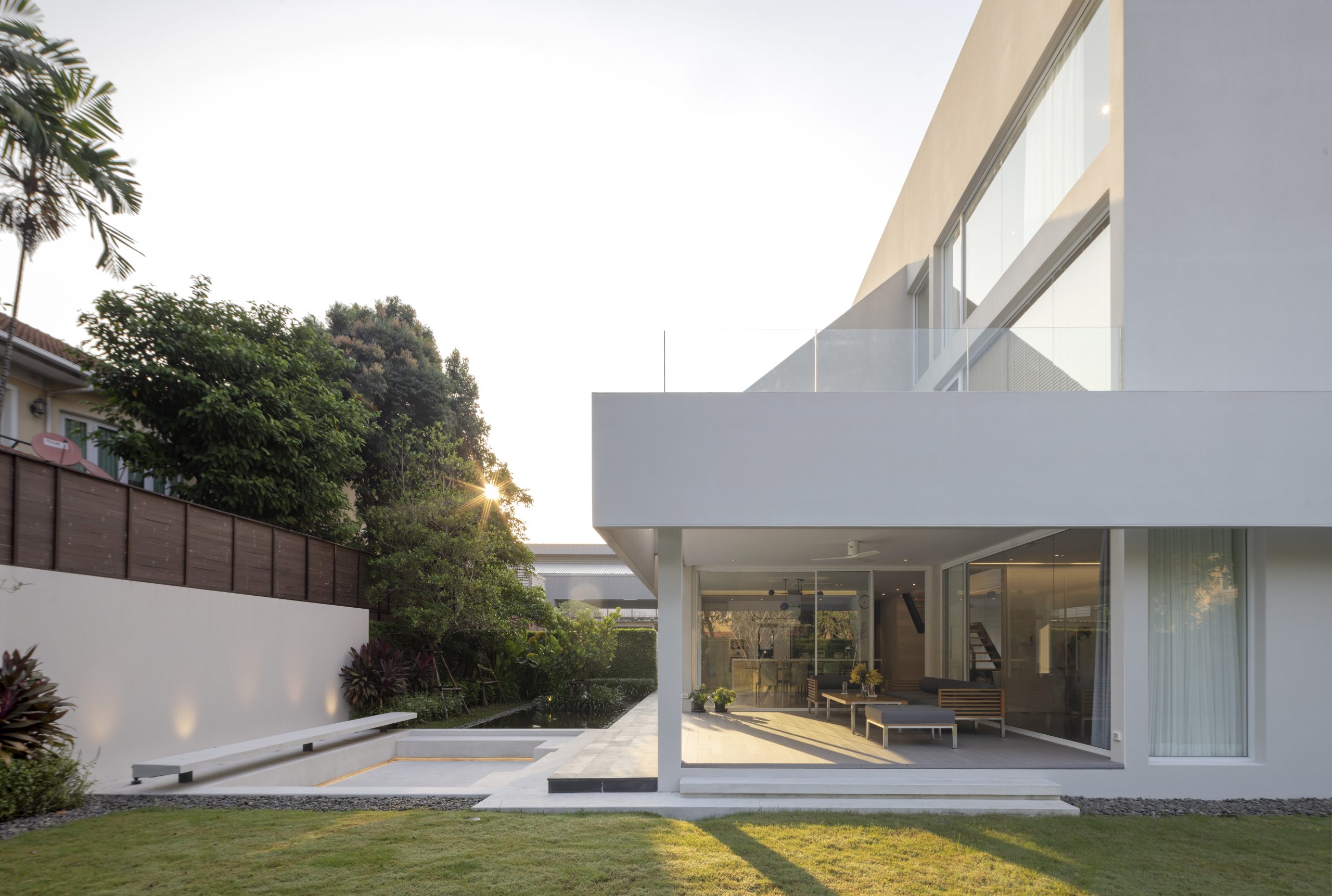
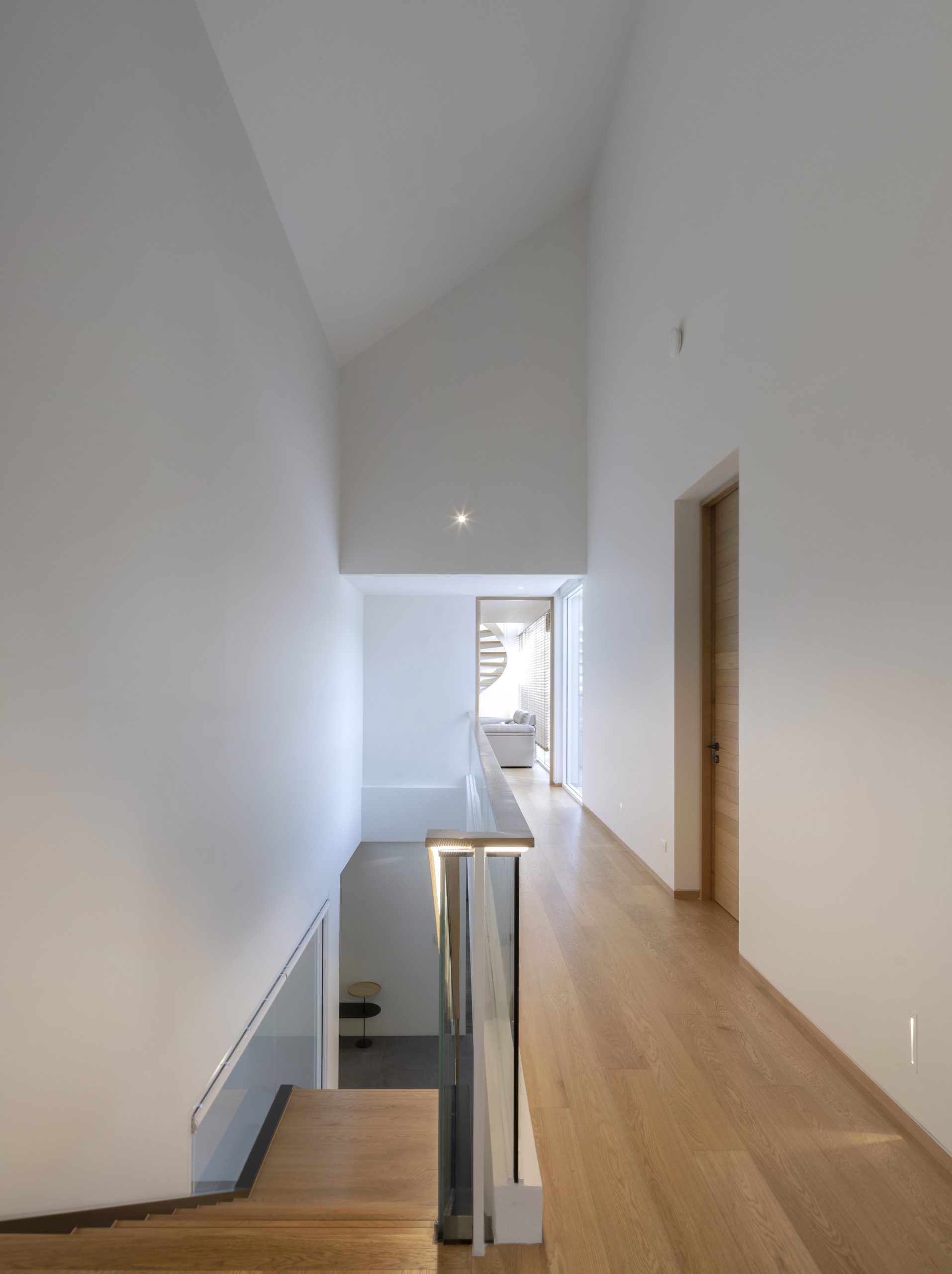
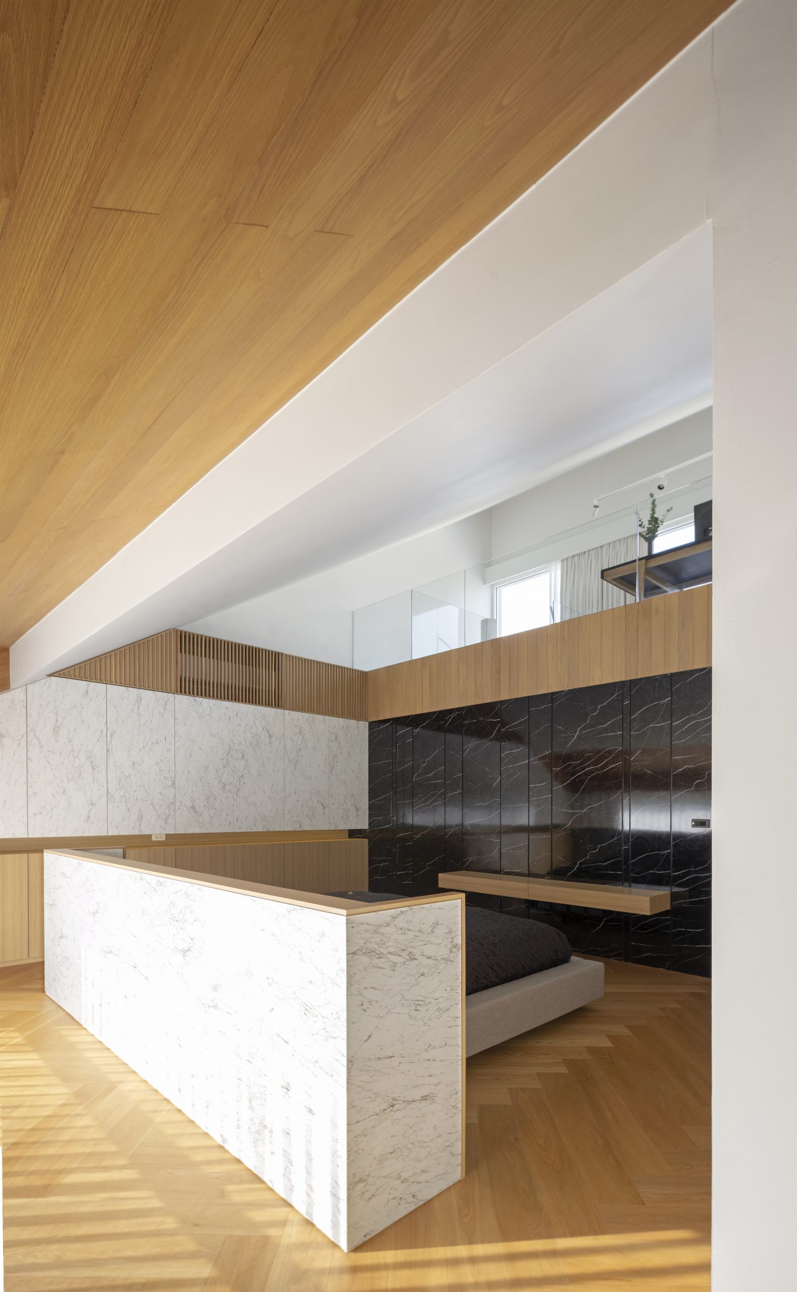
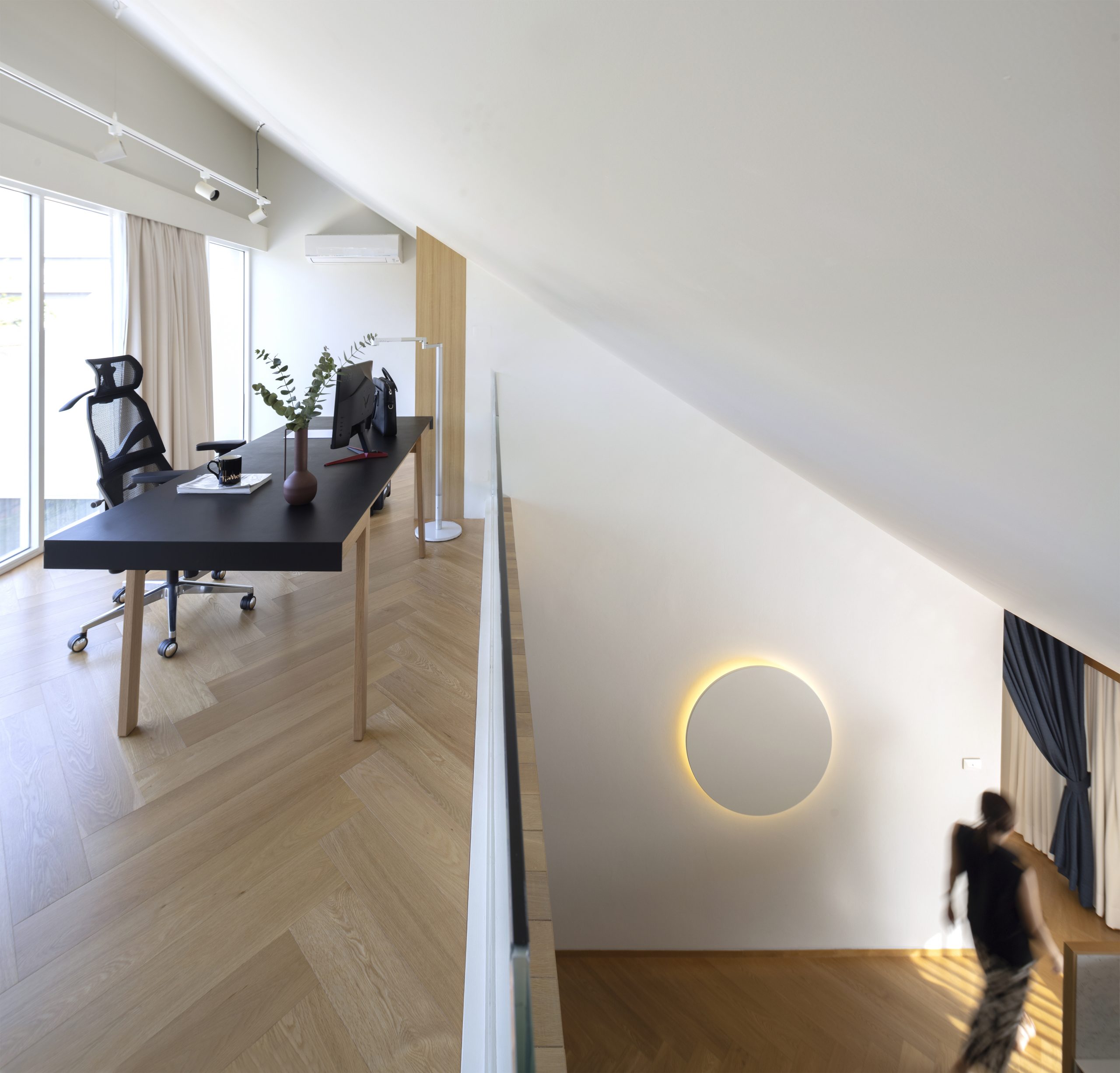
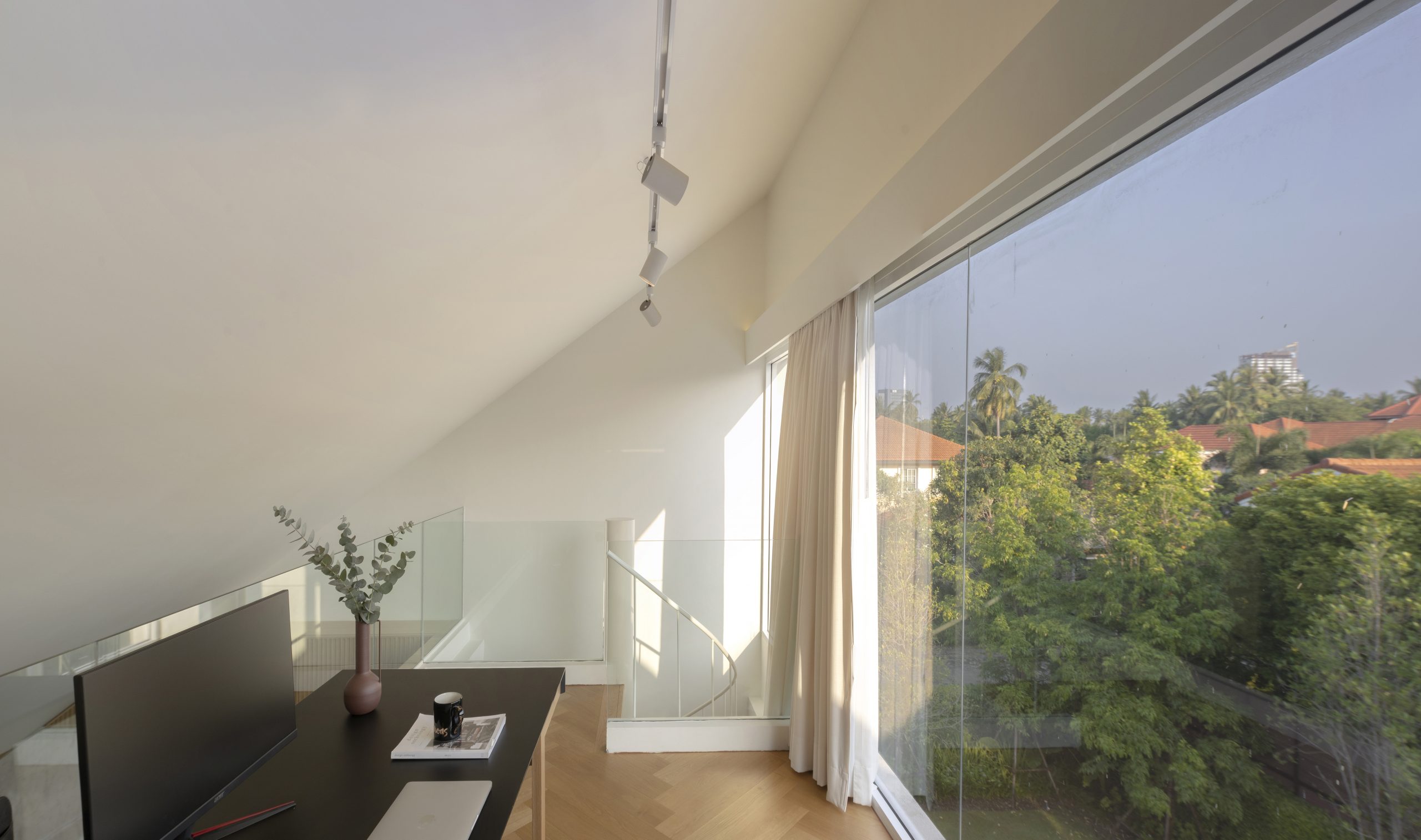
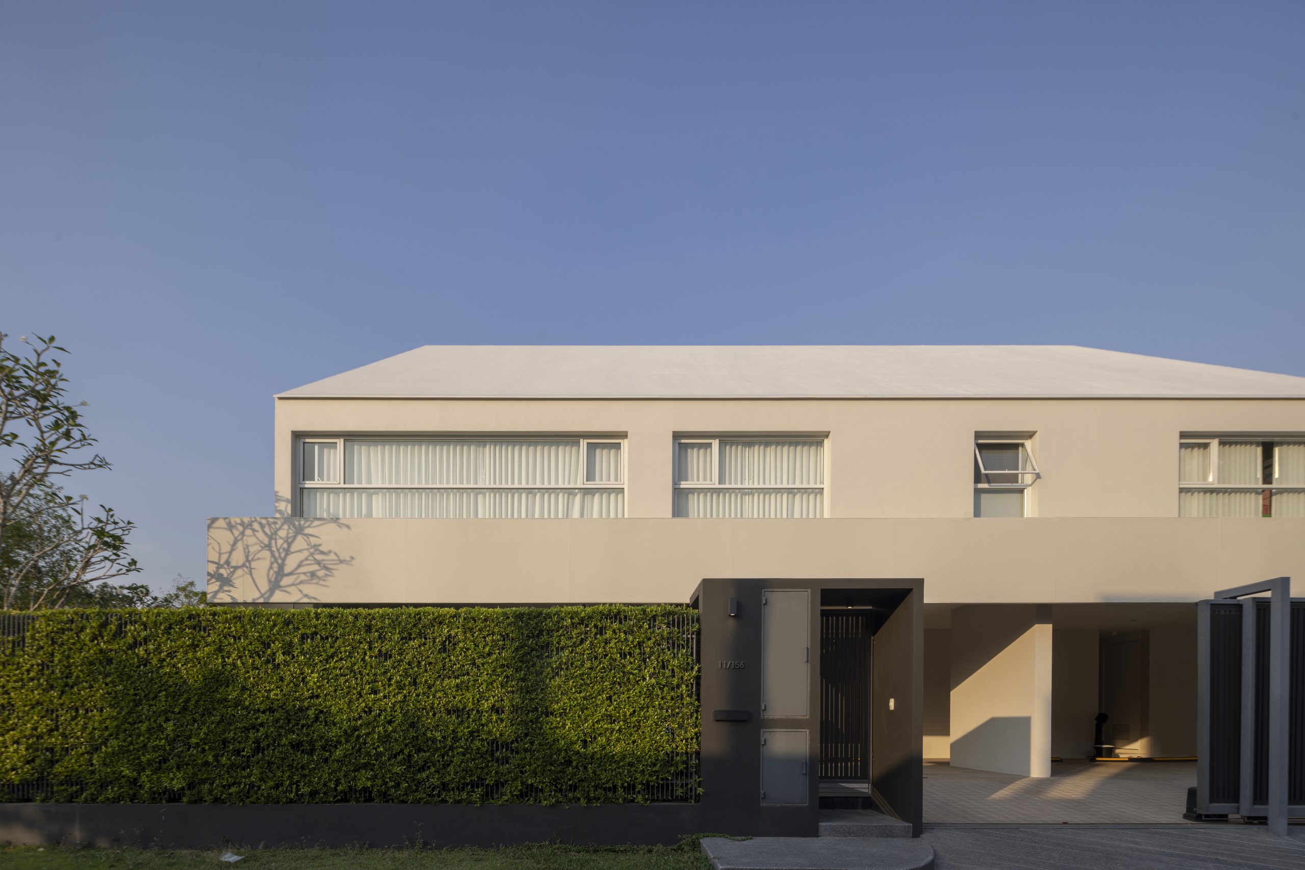
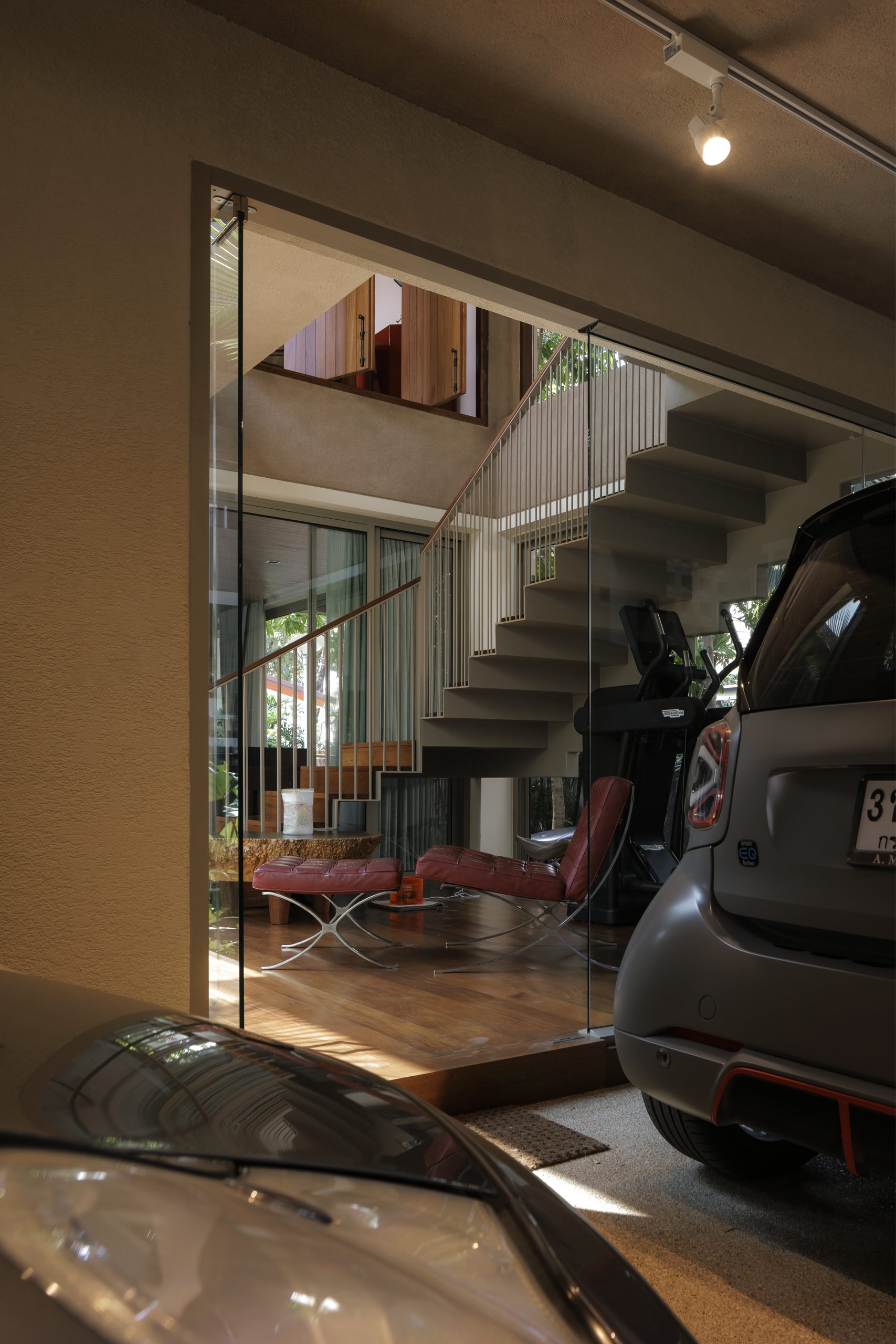
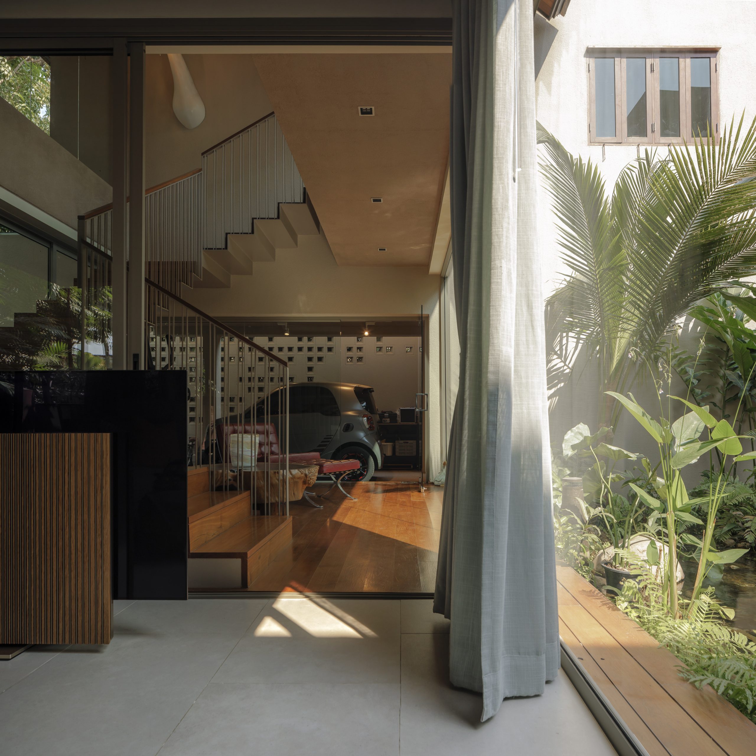
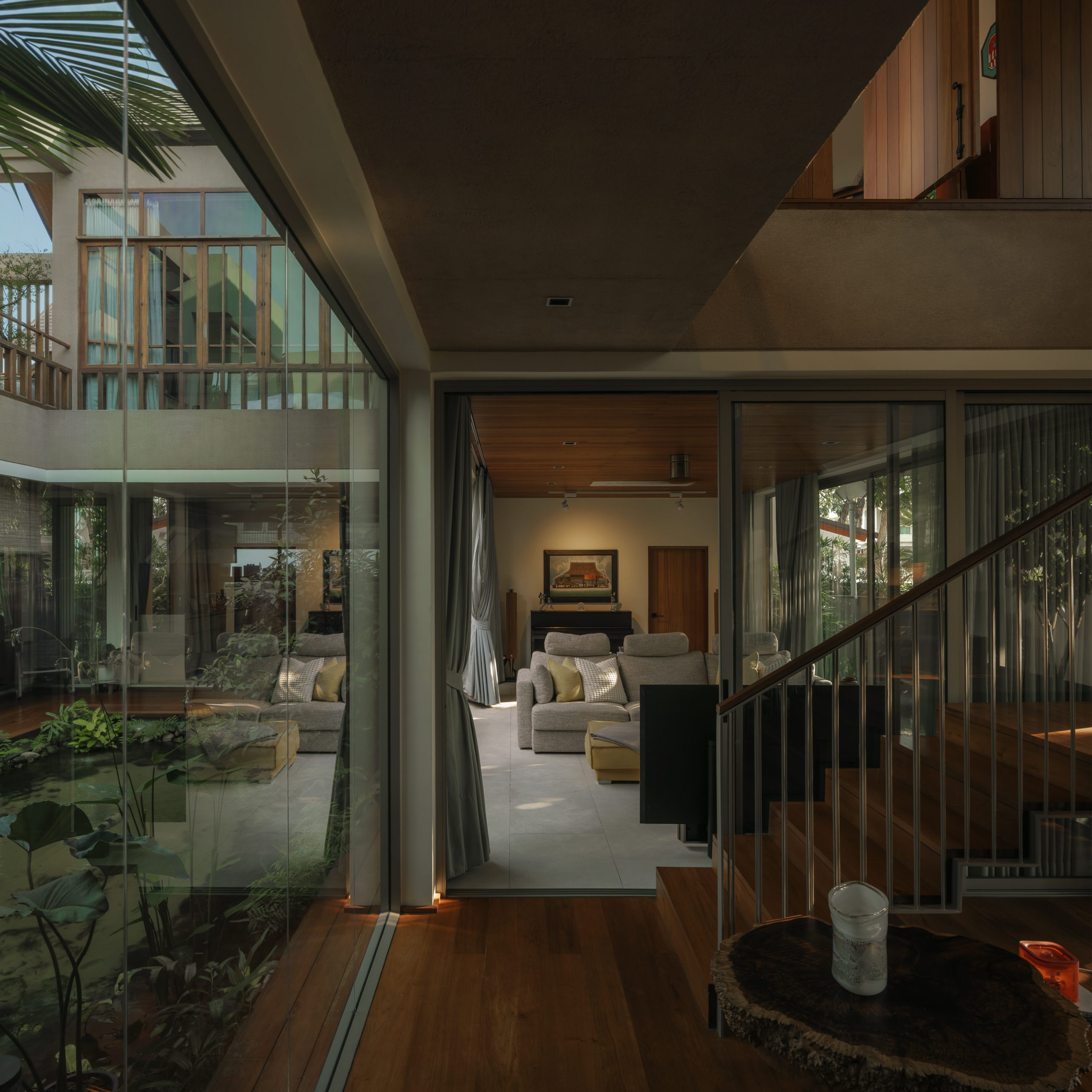
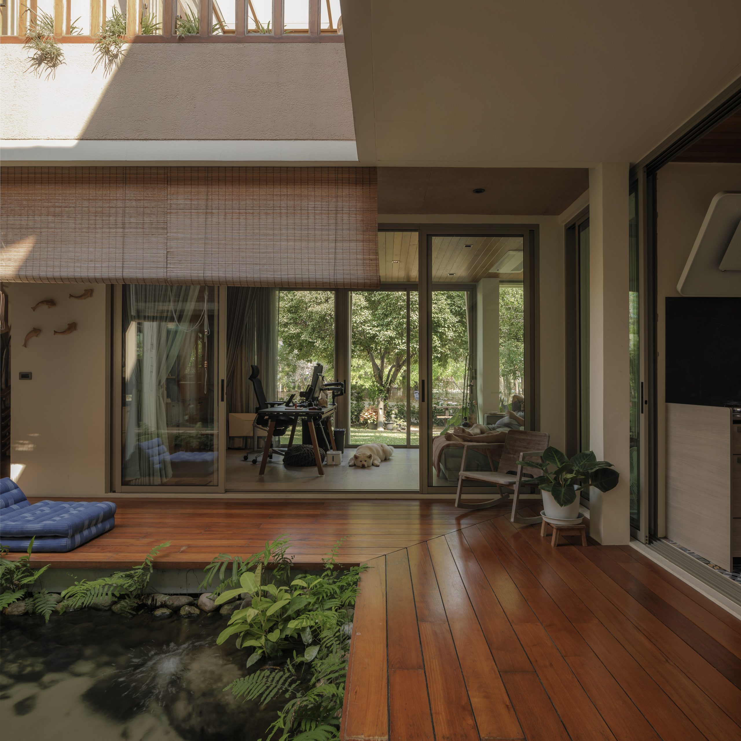
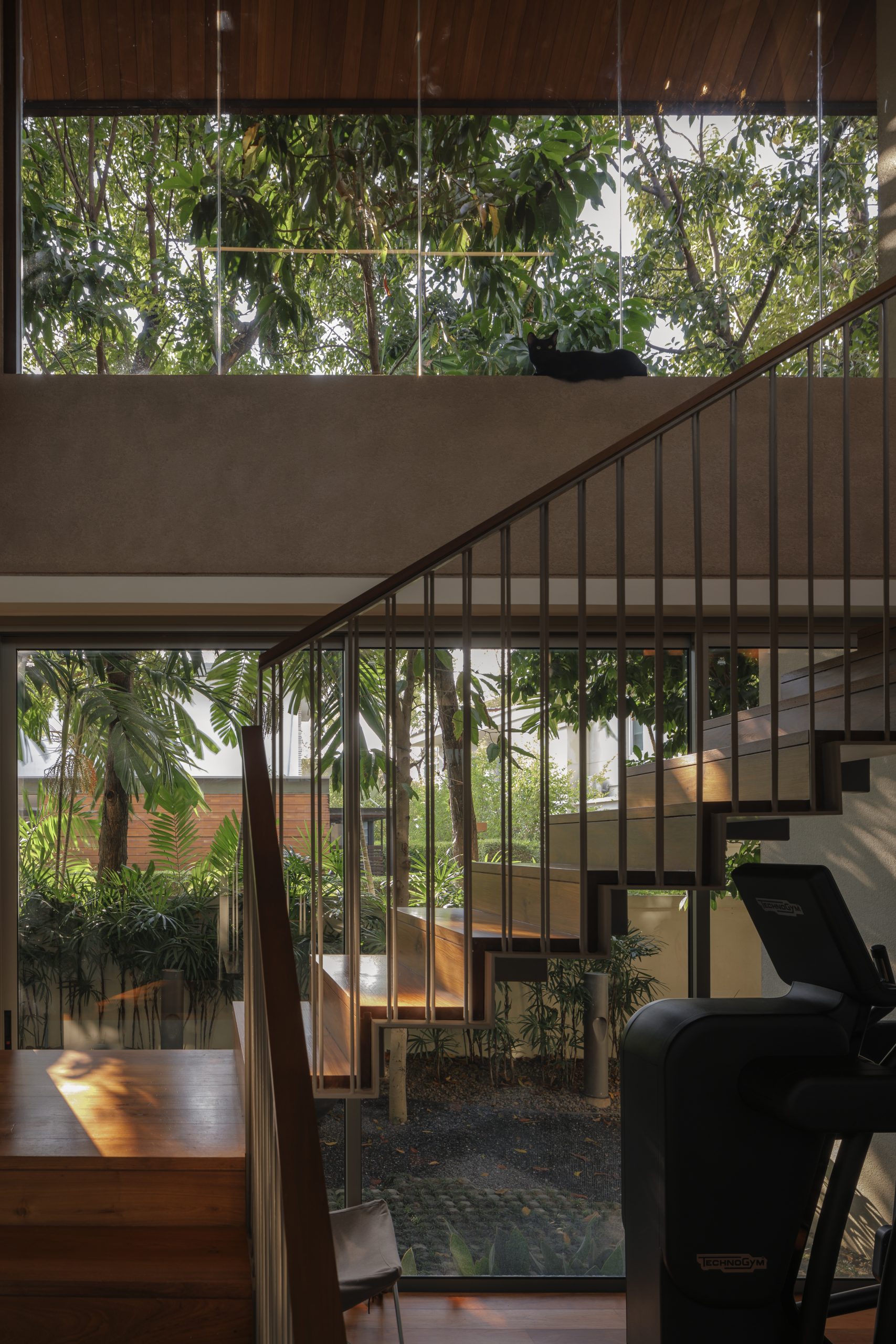
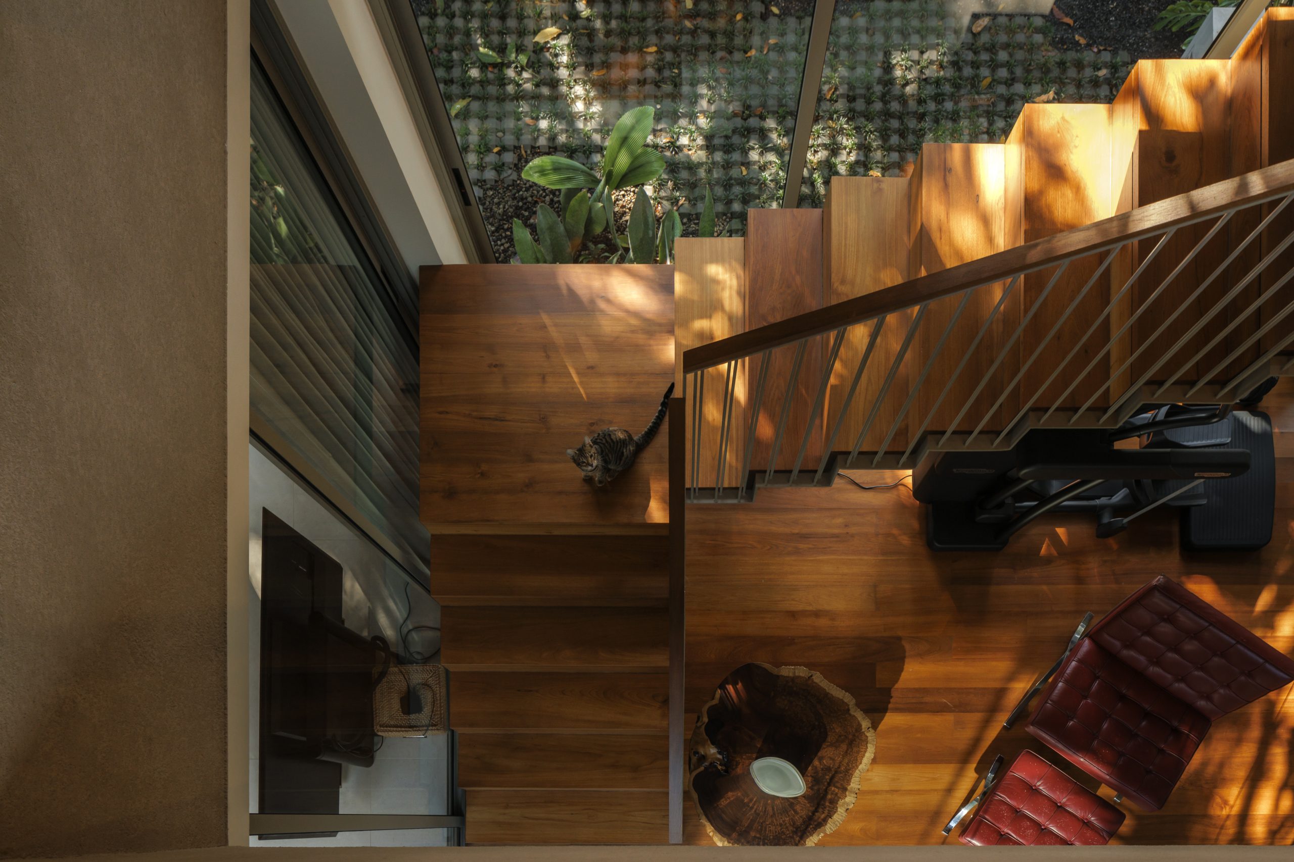
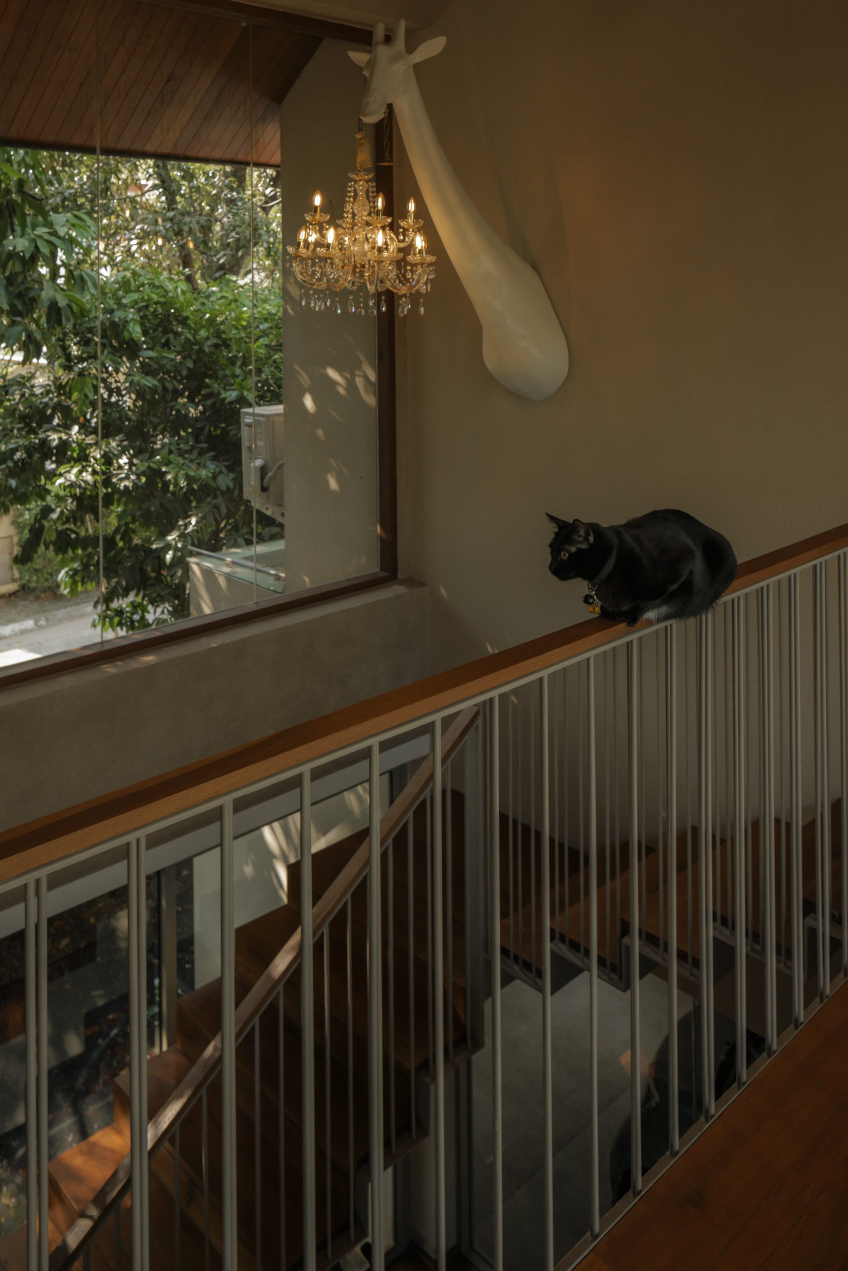
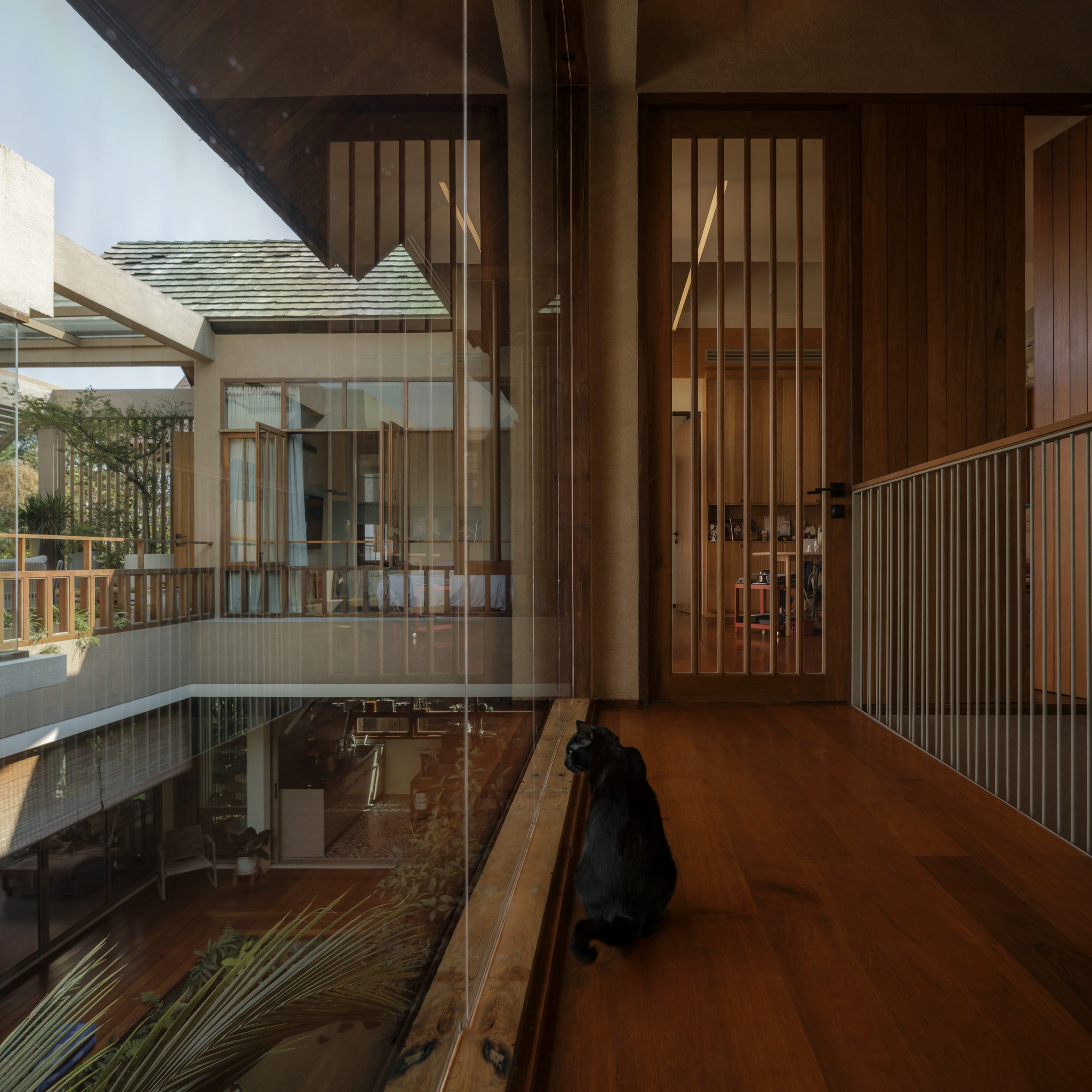
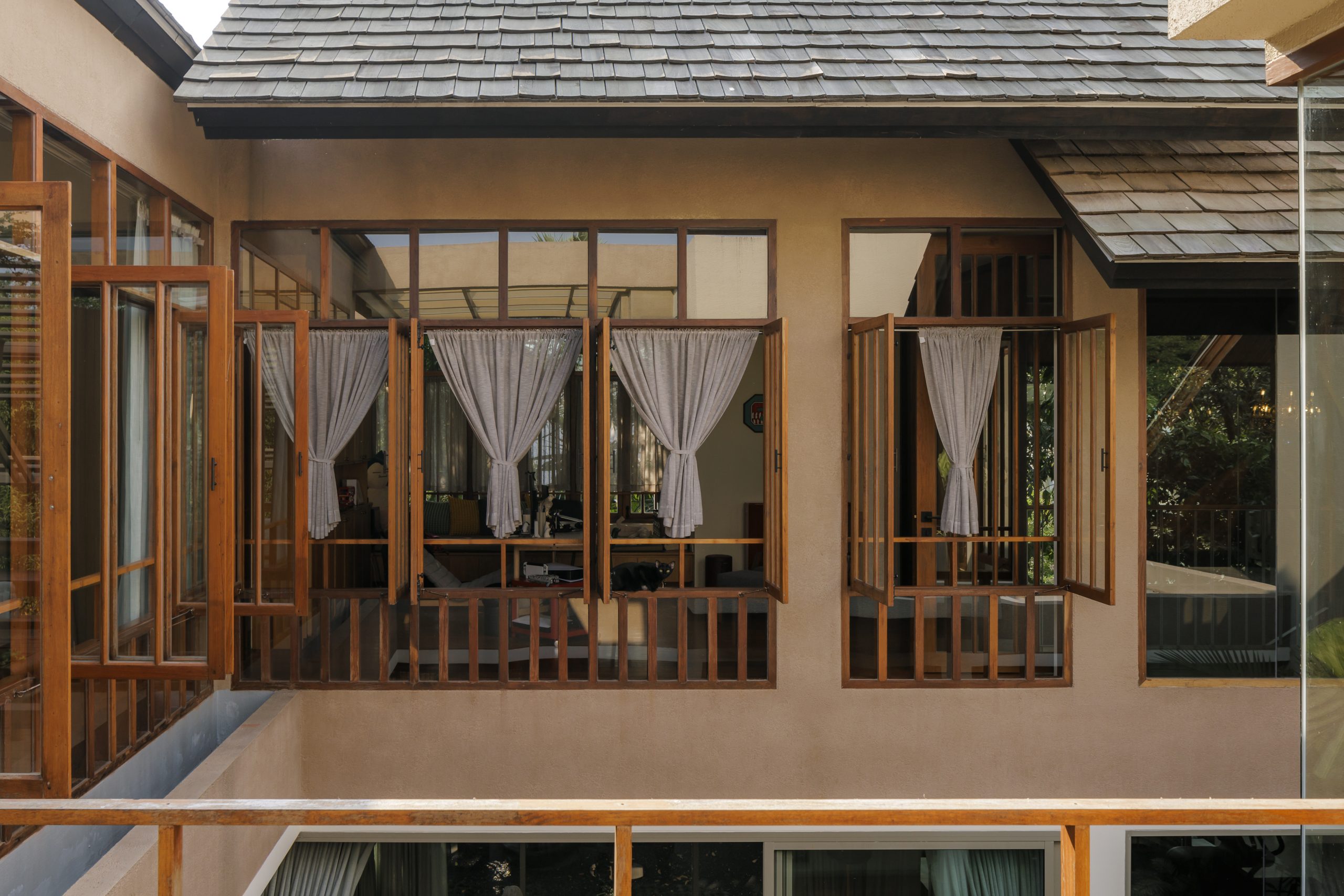
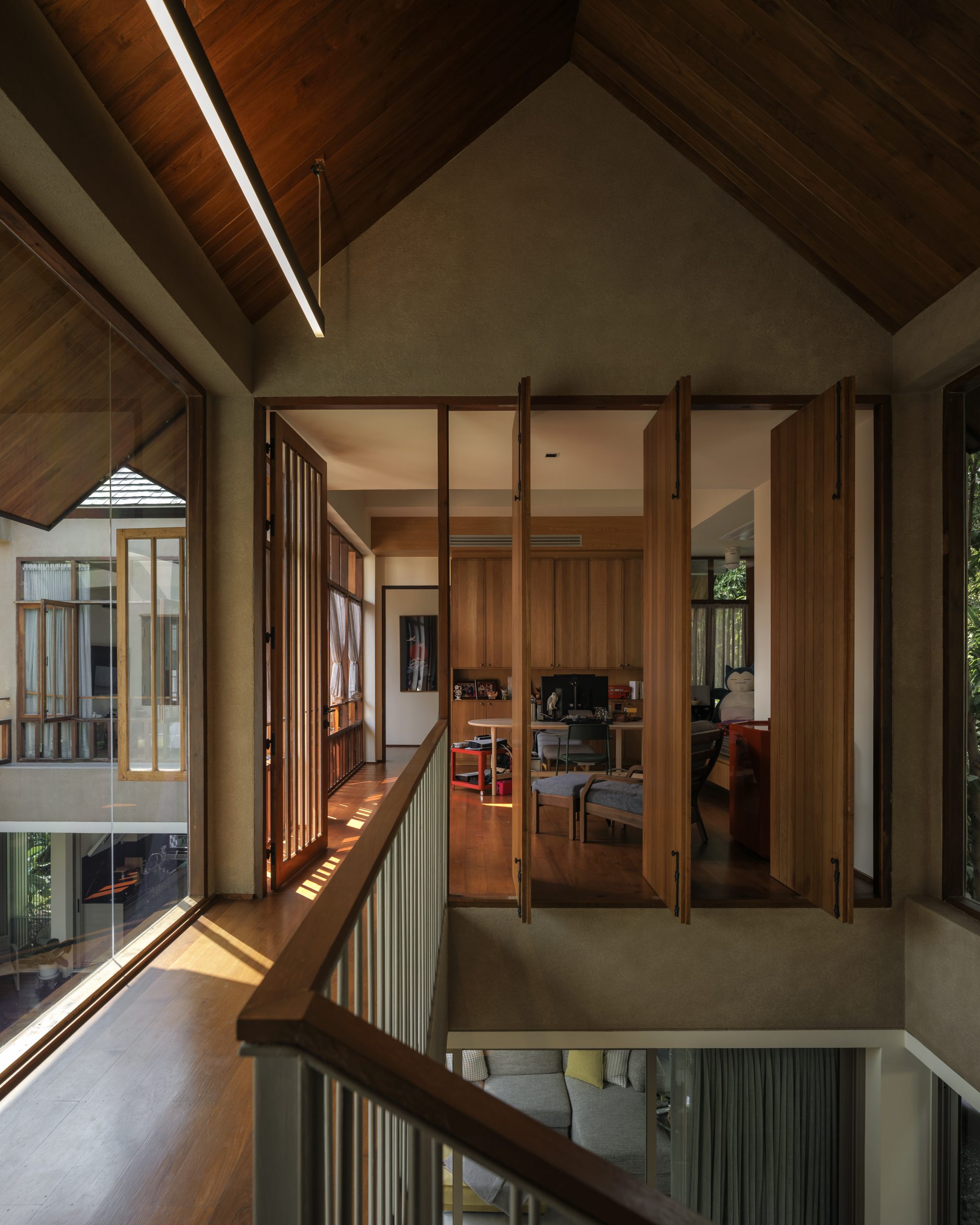
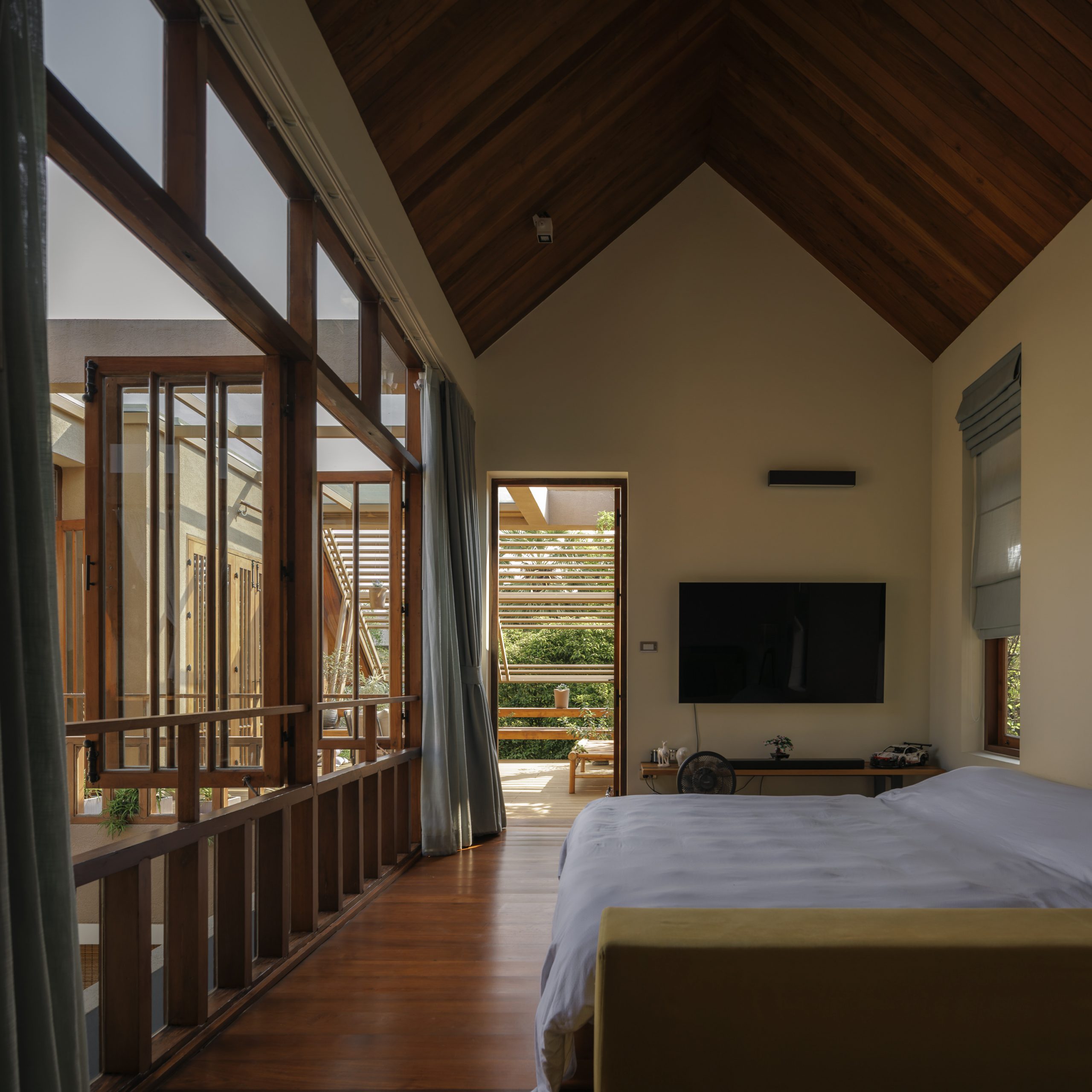
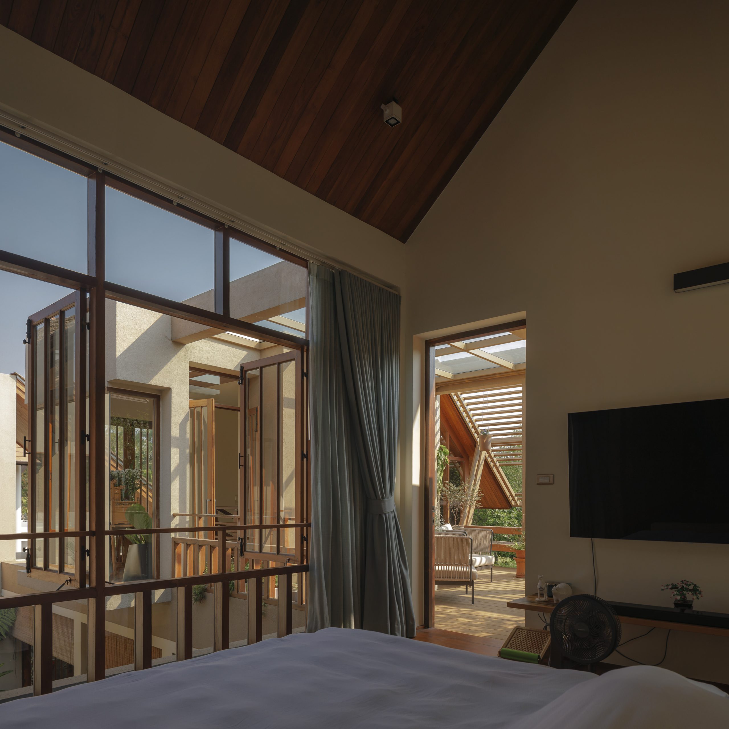
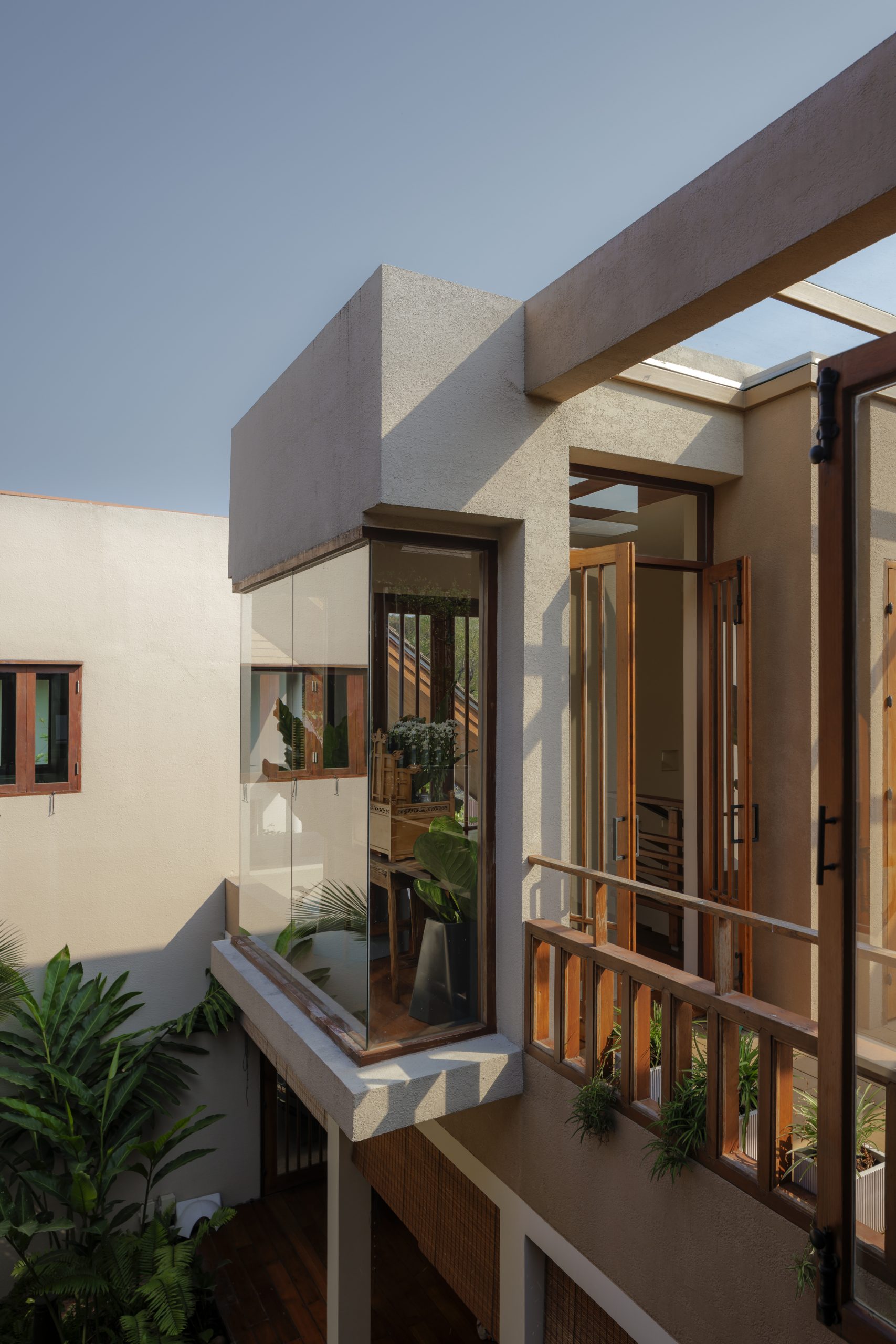
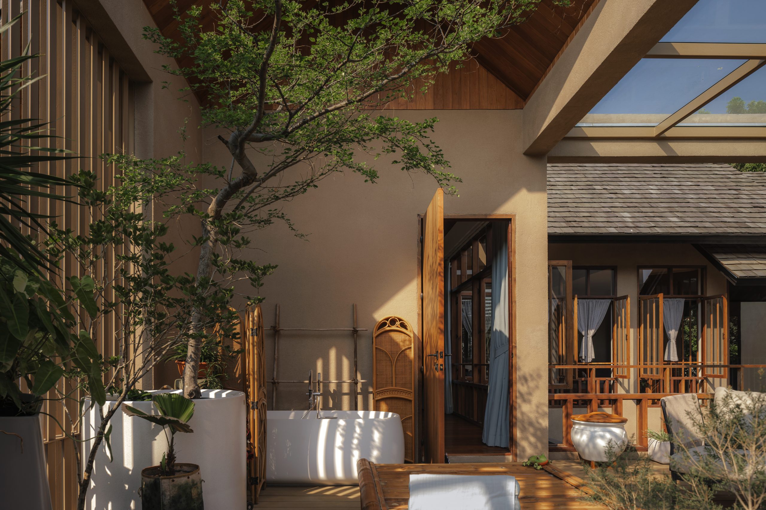
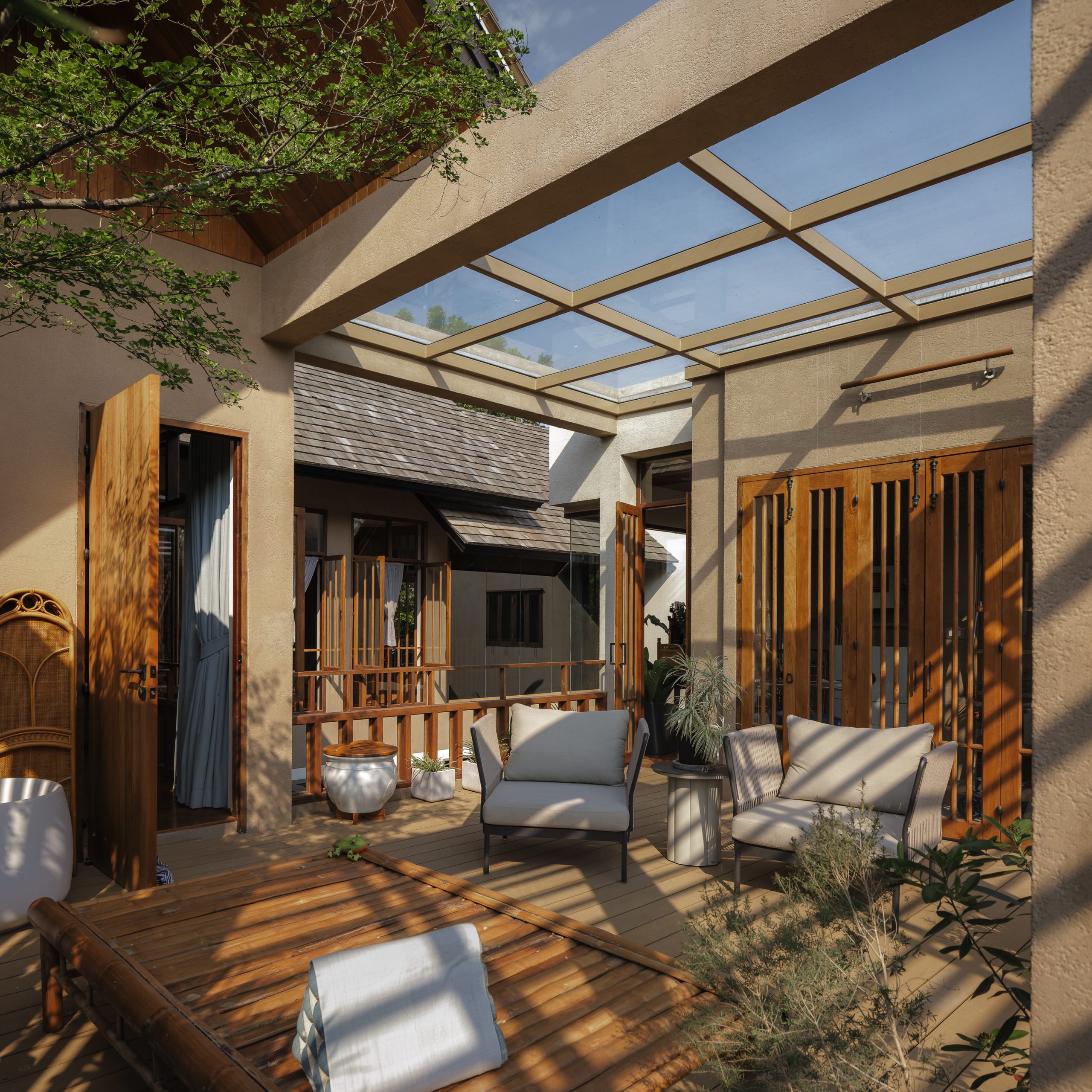
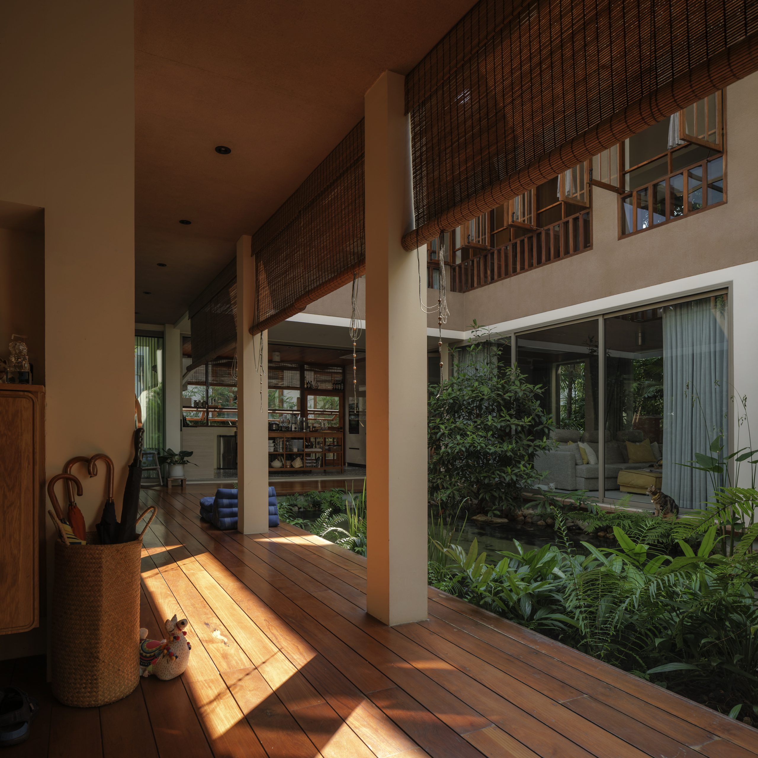
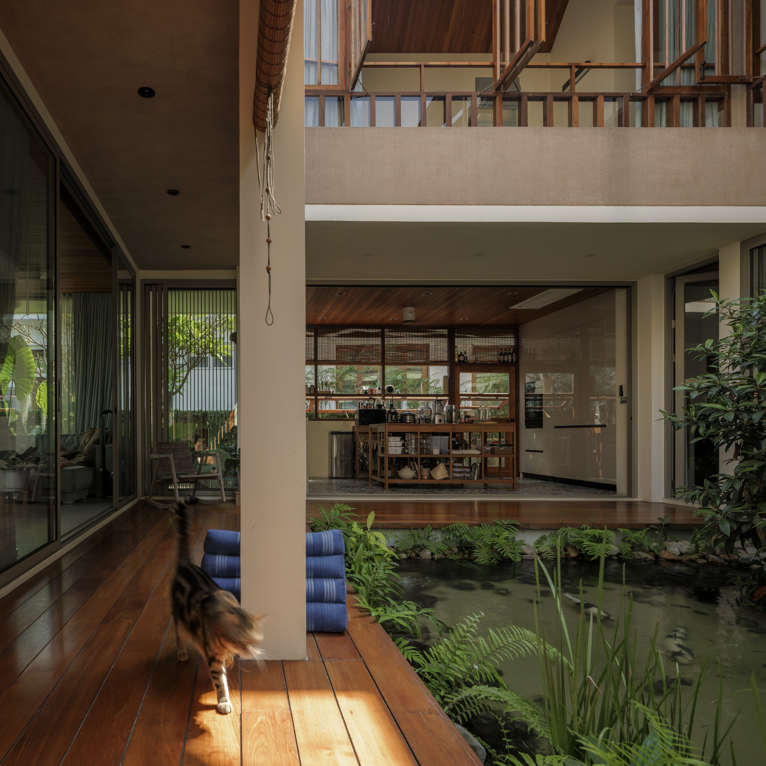
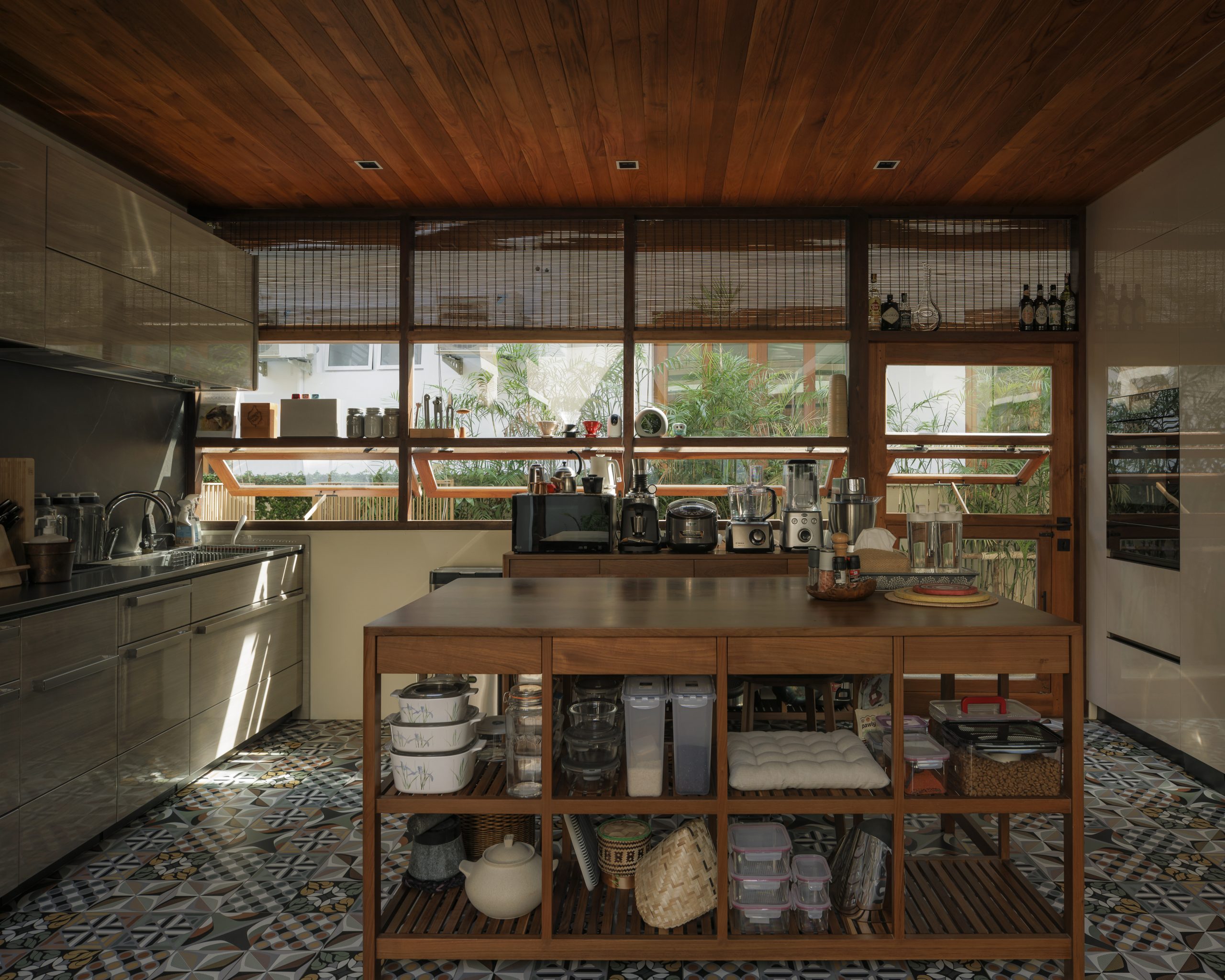
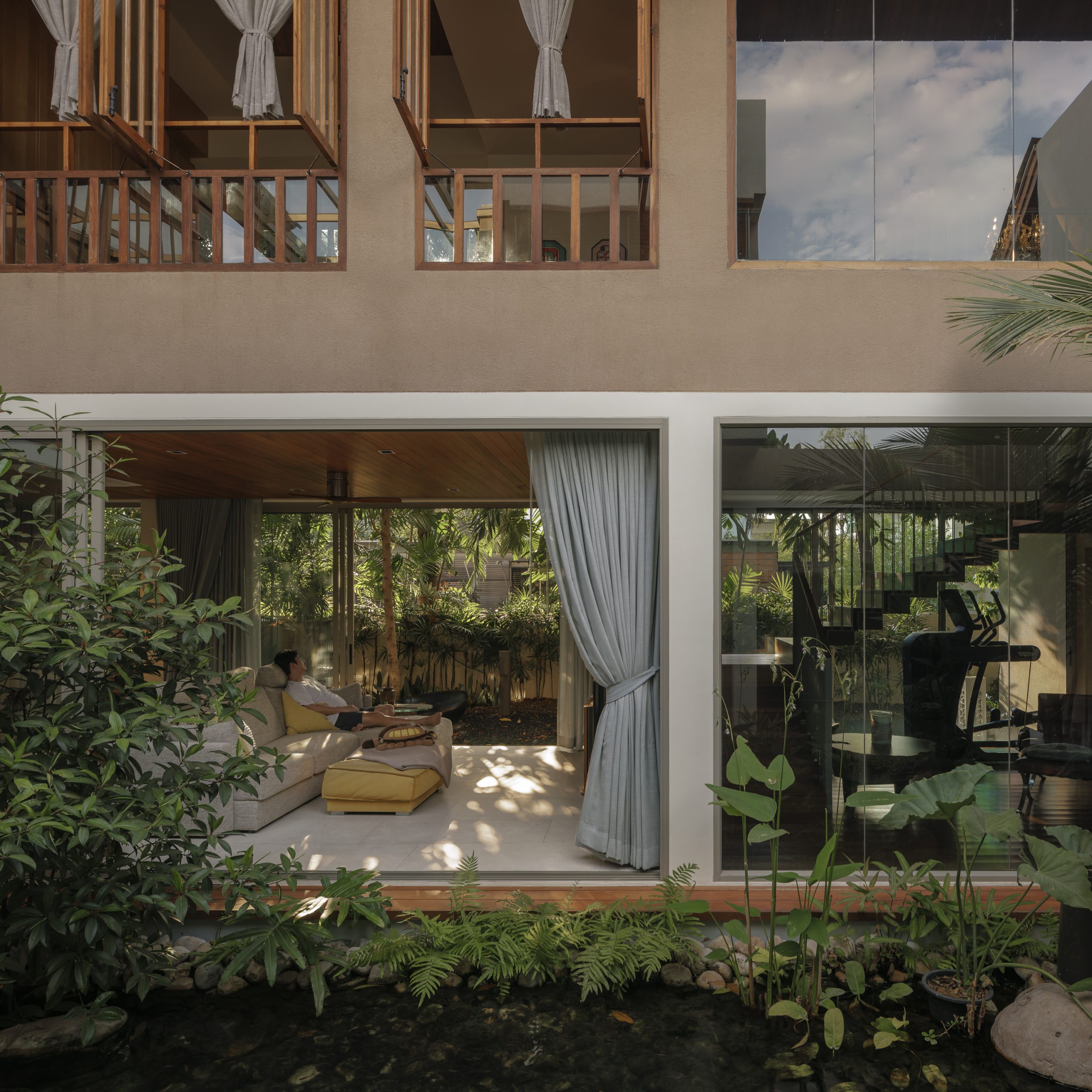
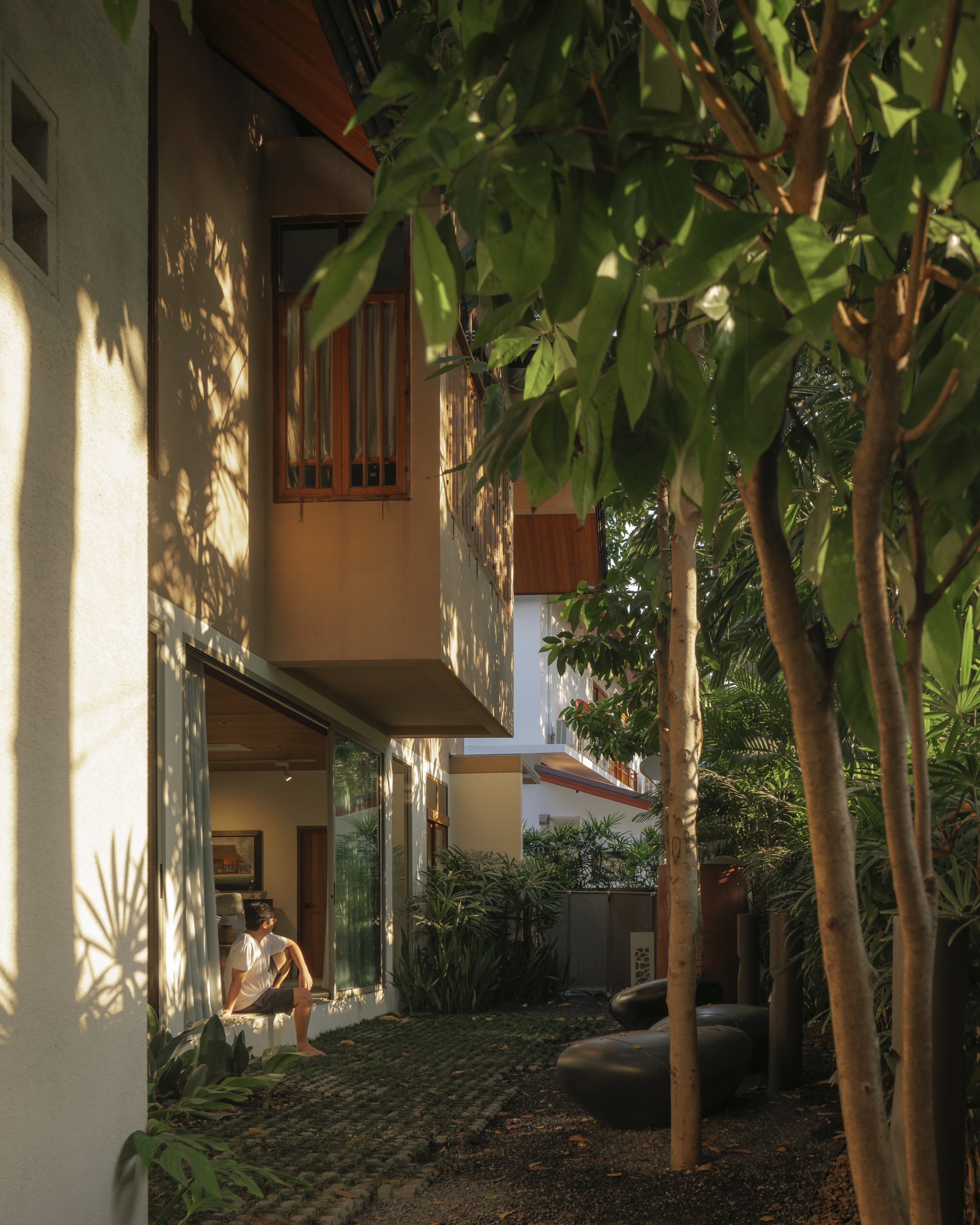
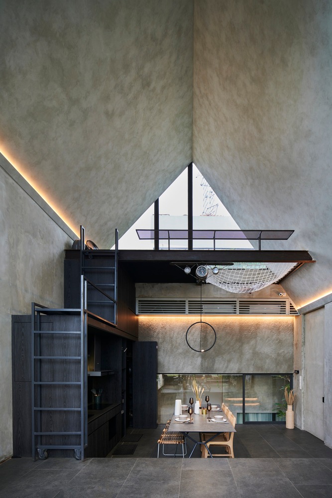
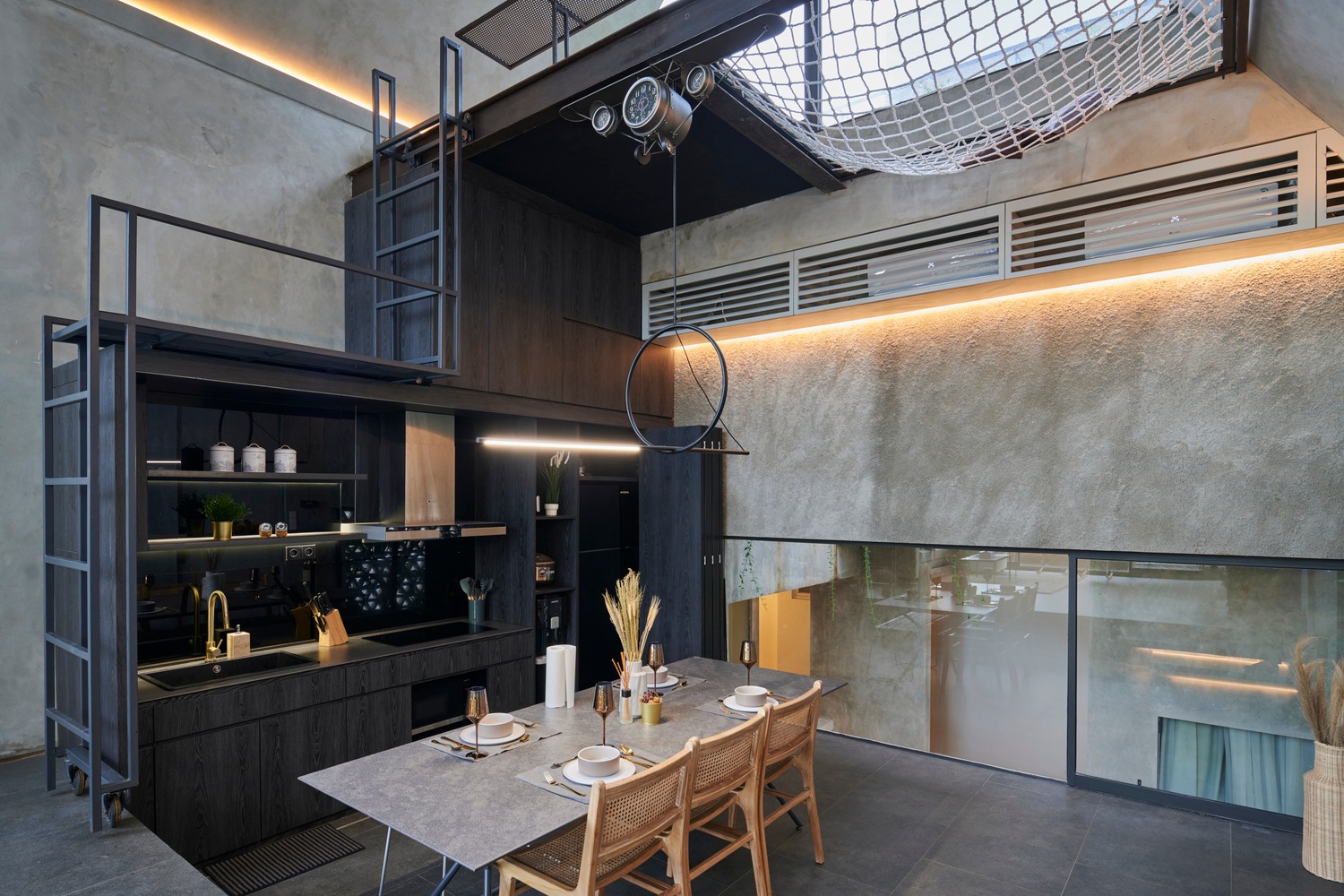
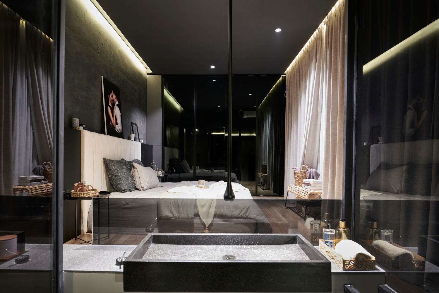
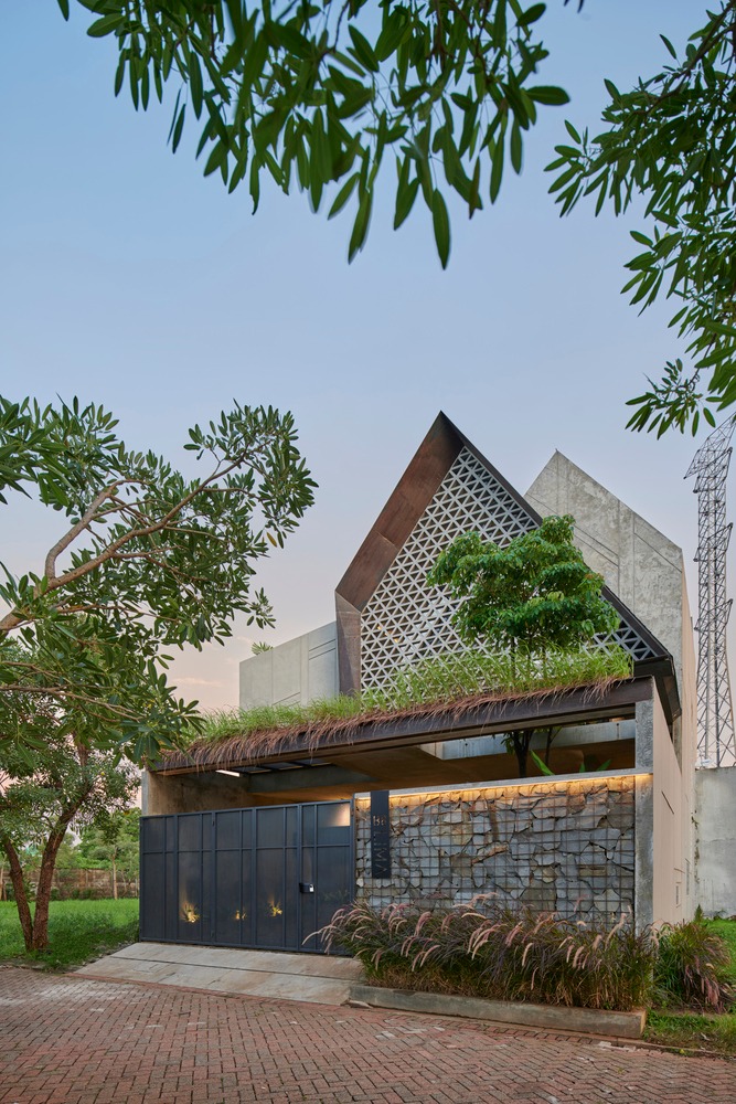
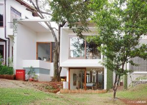
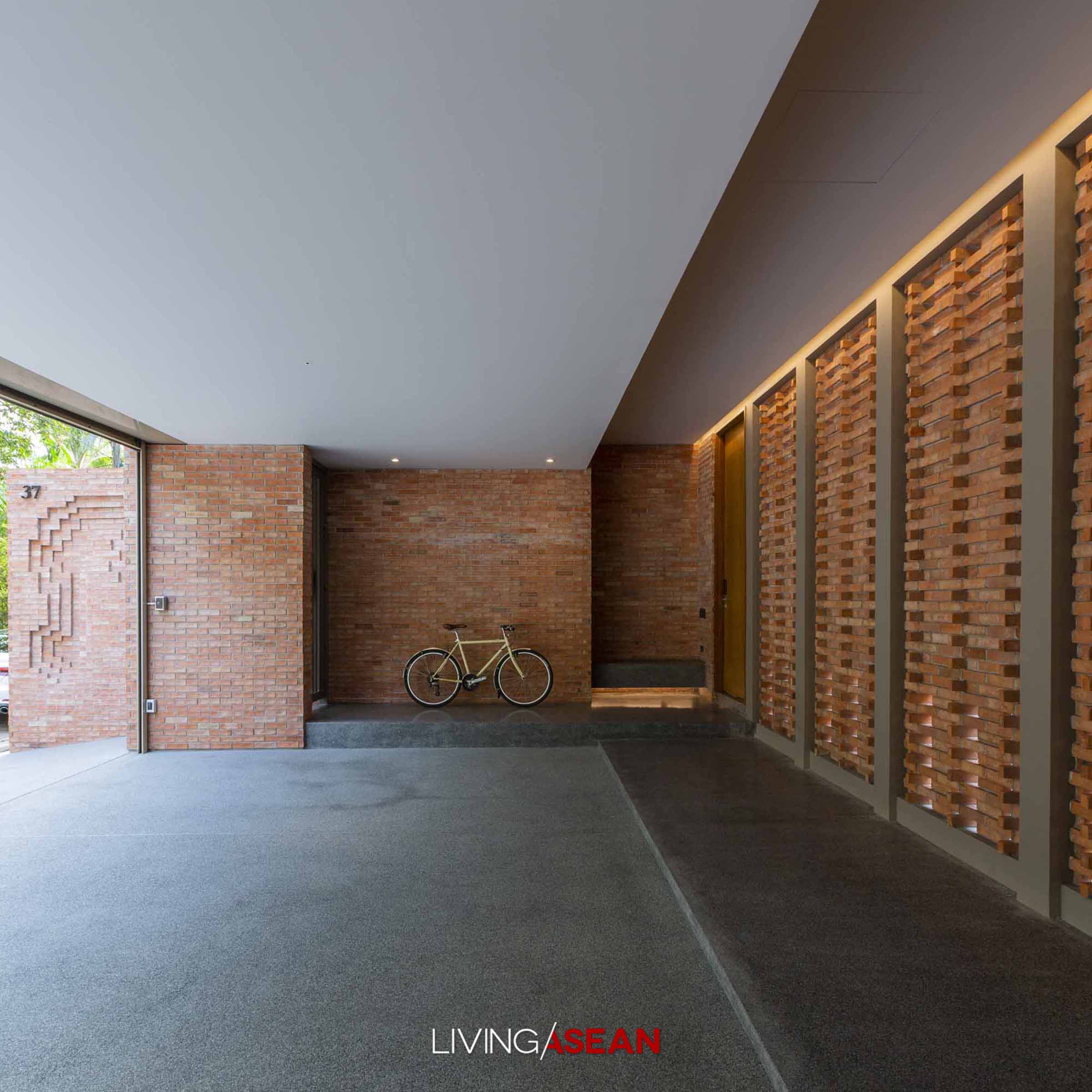
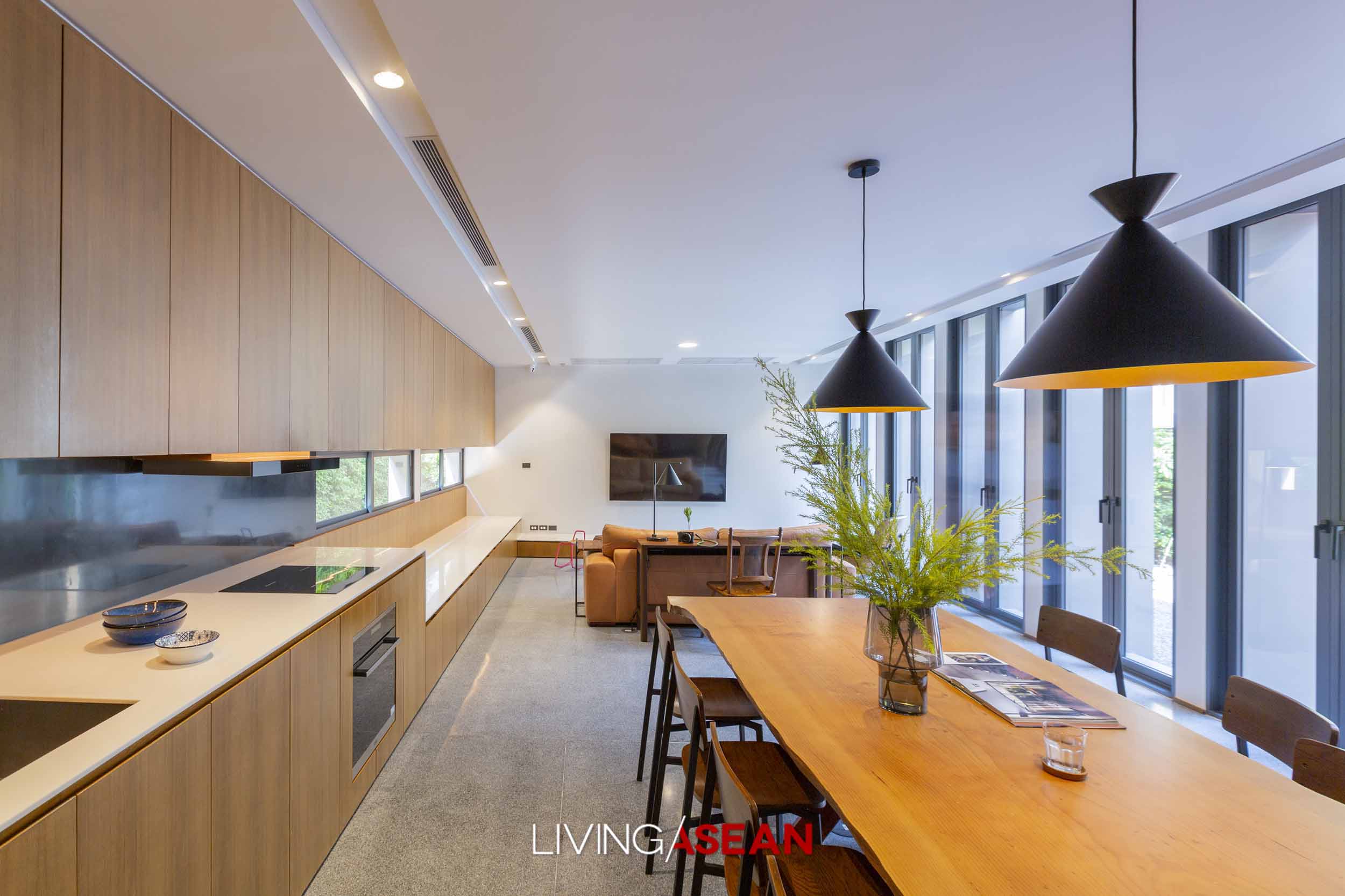
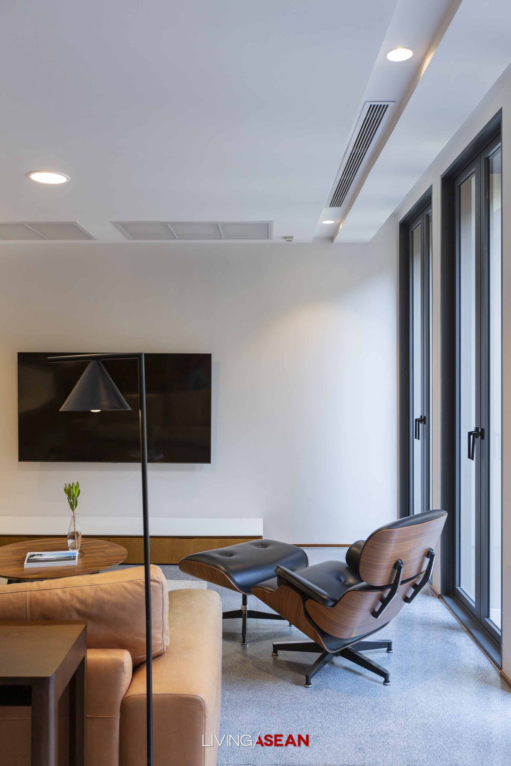
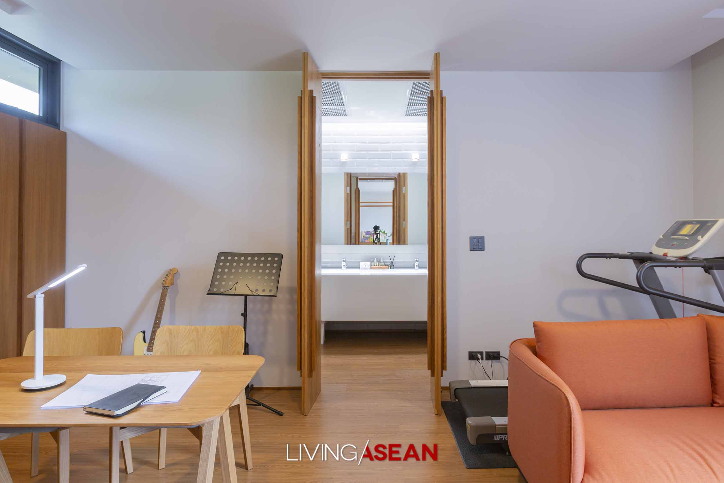
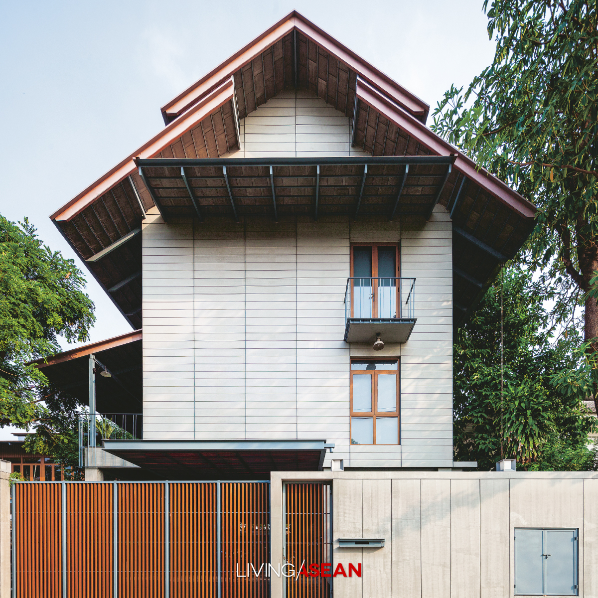
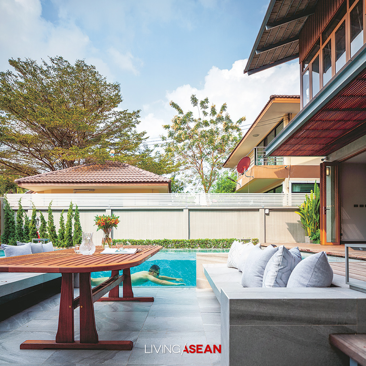
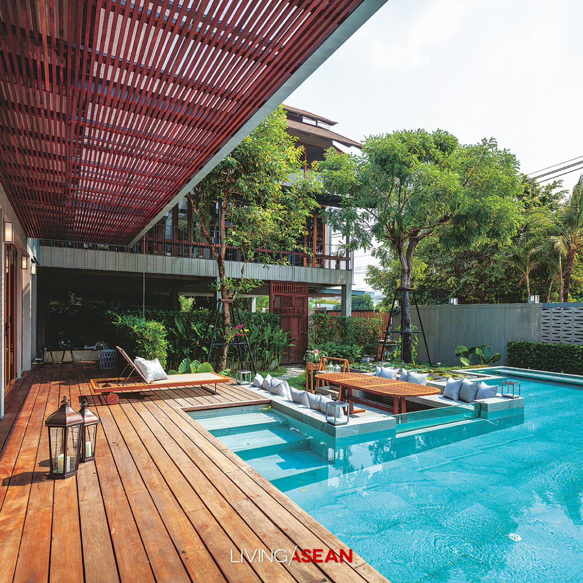
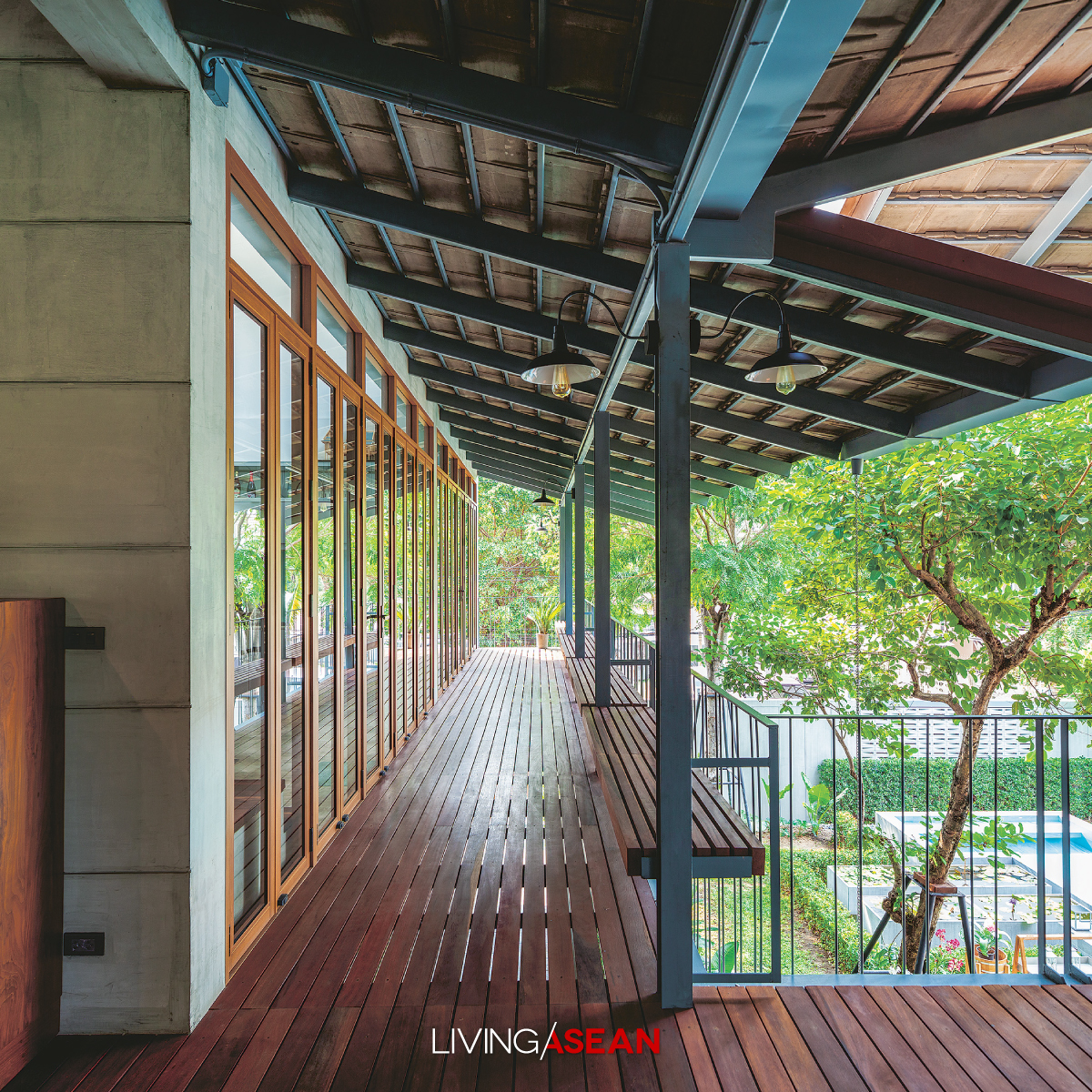
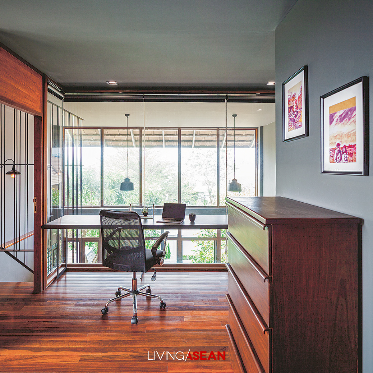
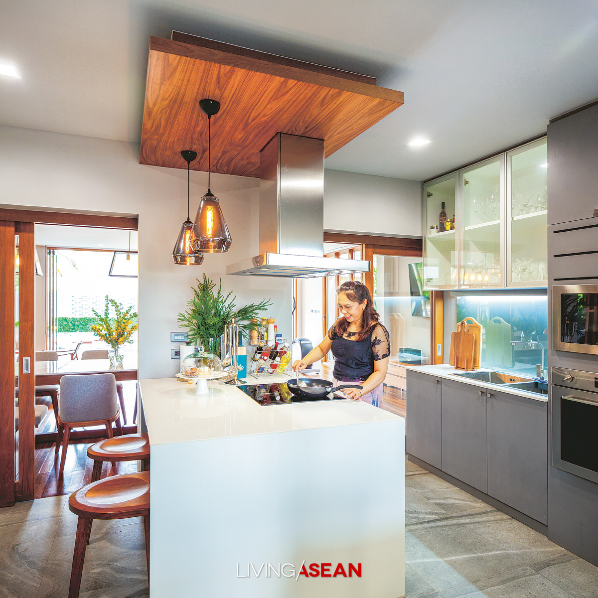
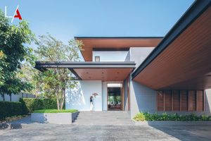
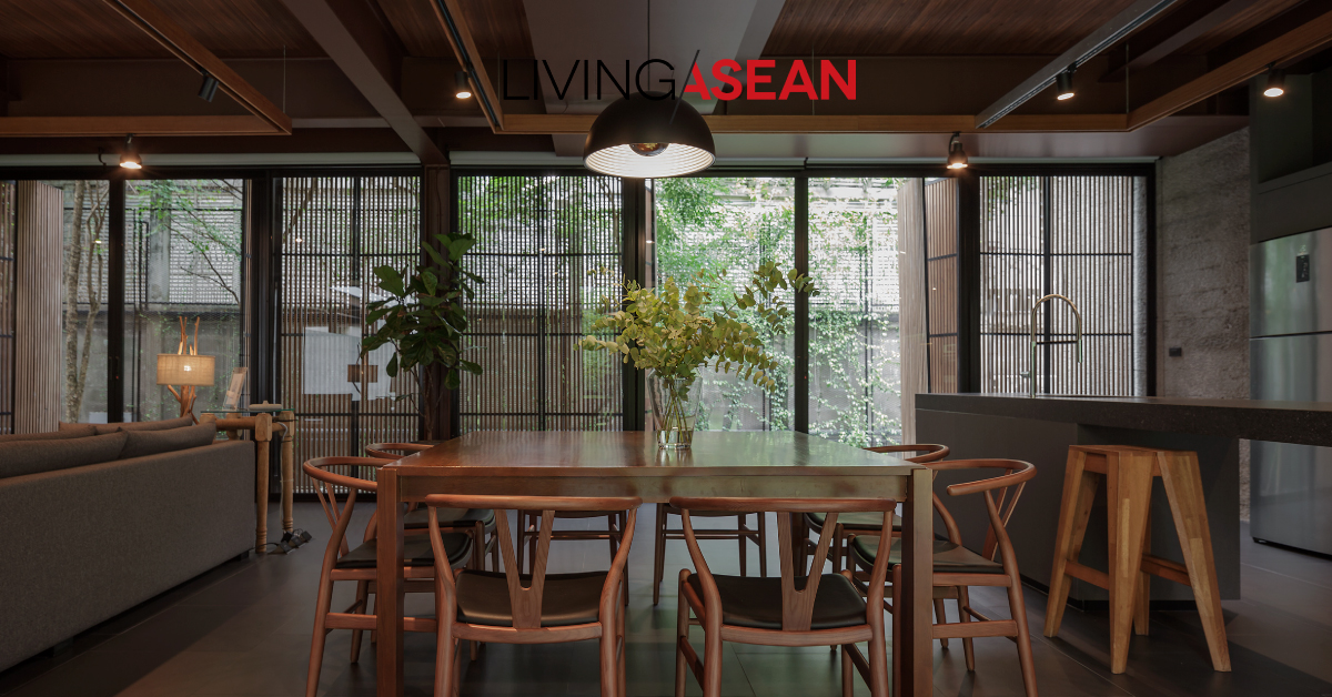
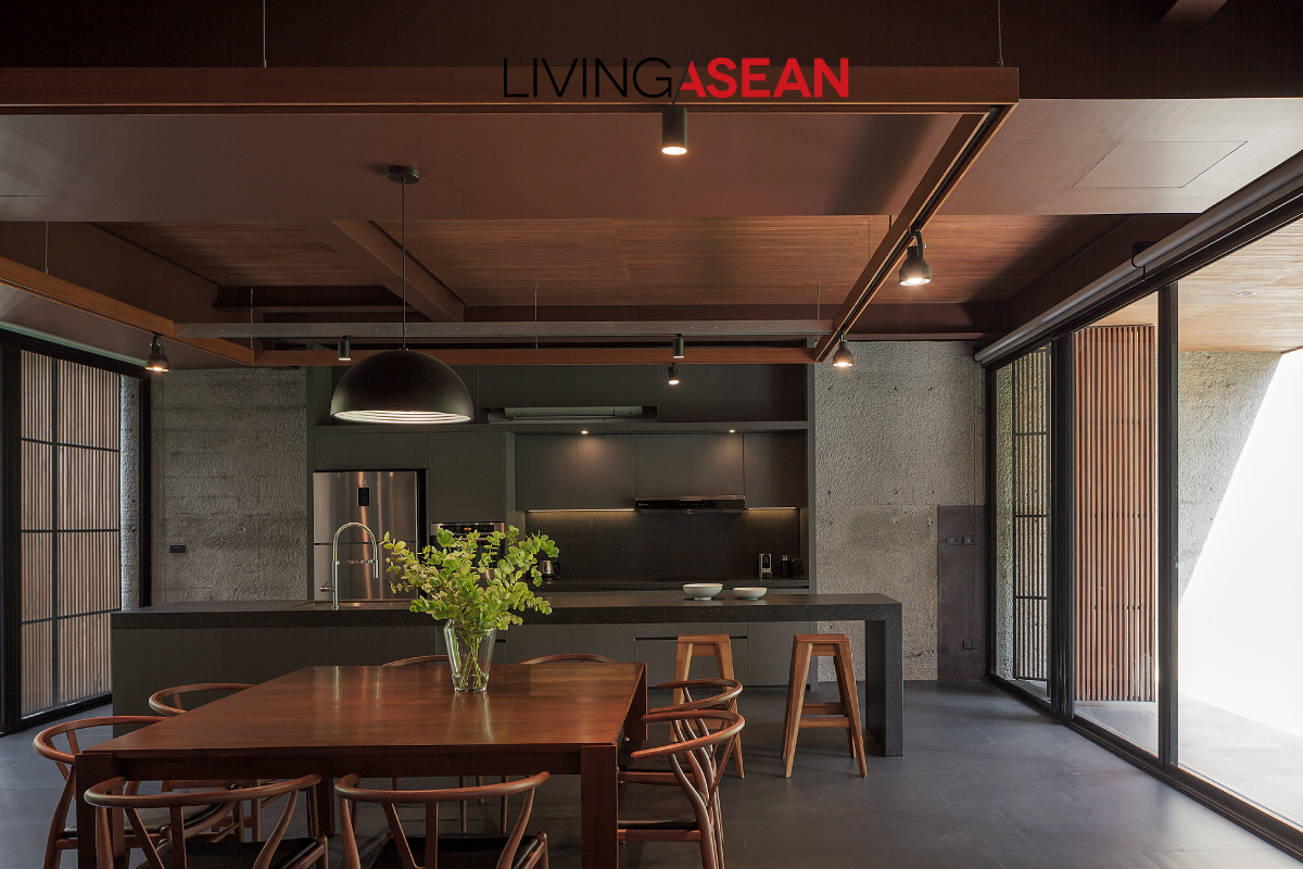
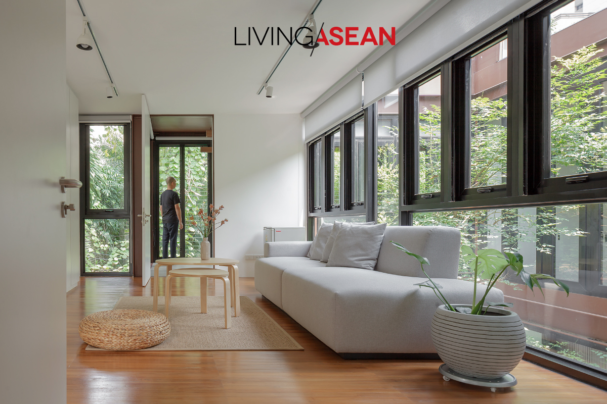
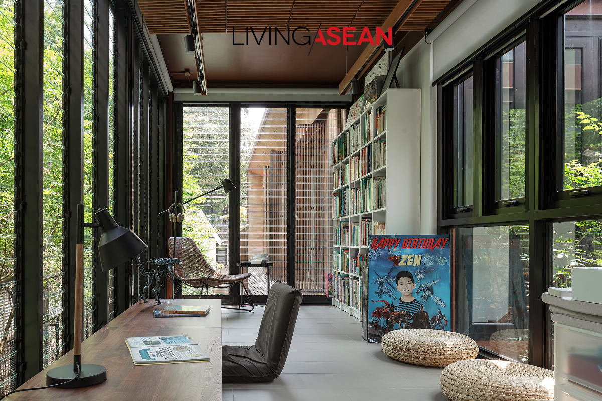
Here’s a home with a Modern space designed for a big family in Singapore. Its generous interior provides great sensory pleasure with fresh air and plenty of room where plants grow luxuriantly. Unique and neatly planned, it redefines the meaning of Tropical design, which in this instance is manifested in an intriguing combination that makes the home feel more comfortable.
Because Singapore is an island, every square inch counts and it doesn’t come cheap.
To build a good home, one must ponder the question of what functions and useable spaces it offers, plus all the modern conveniences.
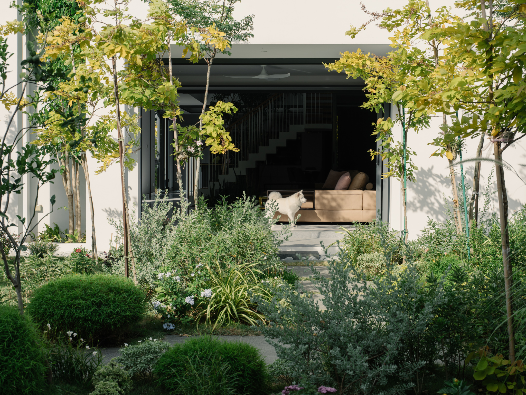
At the same time, it’s nice to bring nature inside to create powerful psychological effects. And from this point of view, this beautiful oasis with in the city is truly a gem.
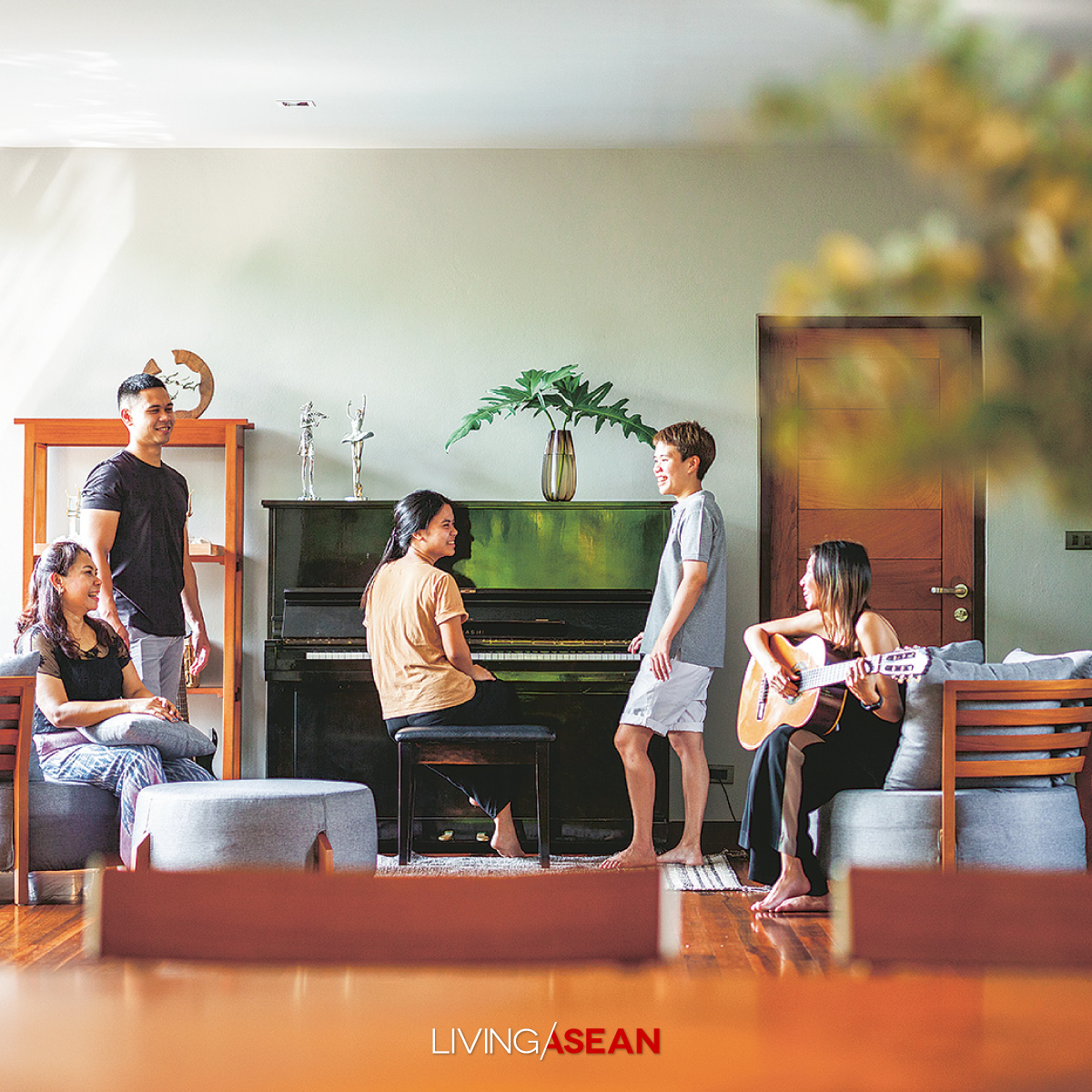
The multigenerational household comprises three families. Naturally, it makes sense to accommodate the needs of every age group without sacrificing the common area that’s available to everyone.
Done right, it allows interactions to take place in the family. To facilitate the socialization processes, greenery space is added to the mix to let house occupants reconnect with nature wherever they may be.
The well-planned common area gives the gift of healing and the human touch that everyone craves coming home at the end of the day.
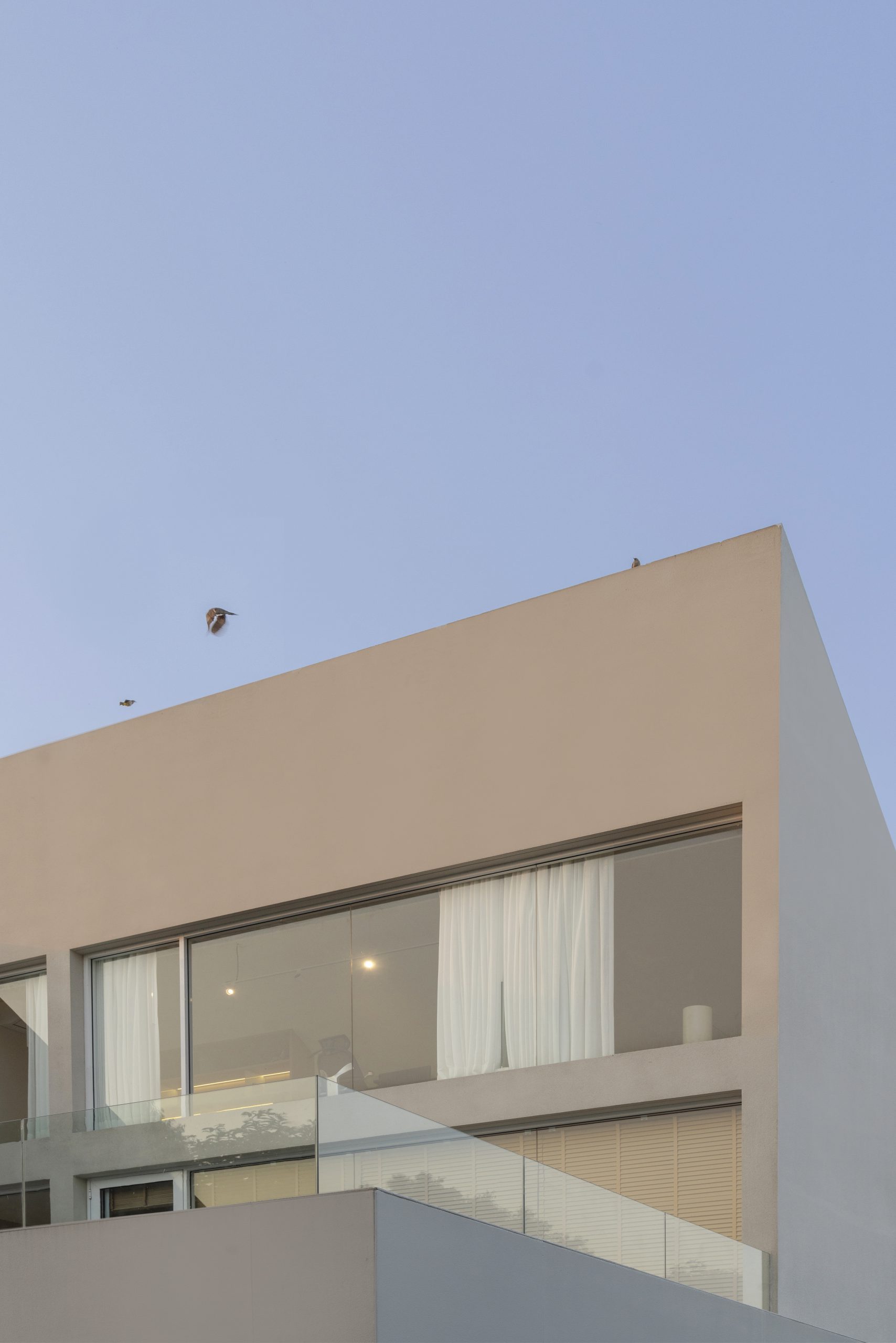
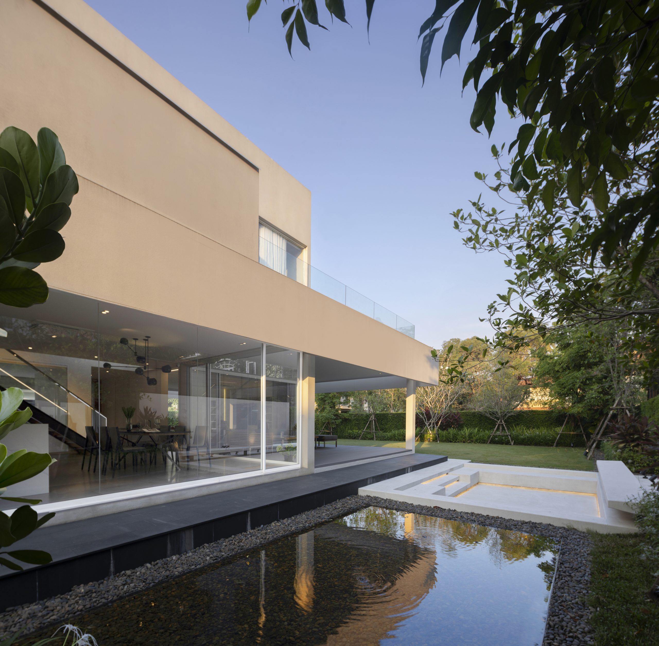
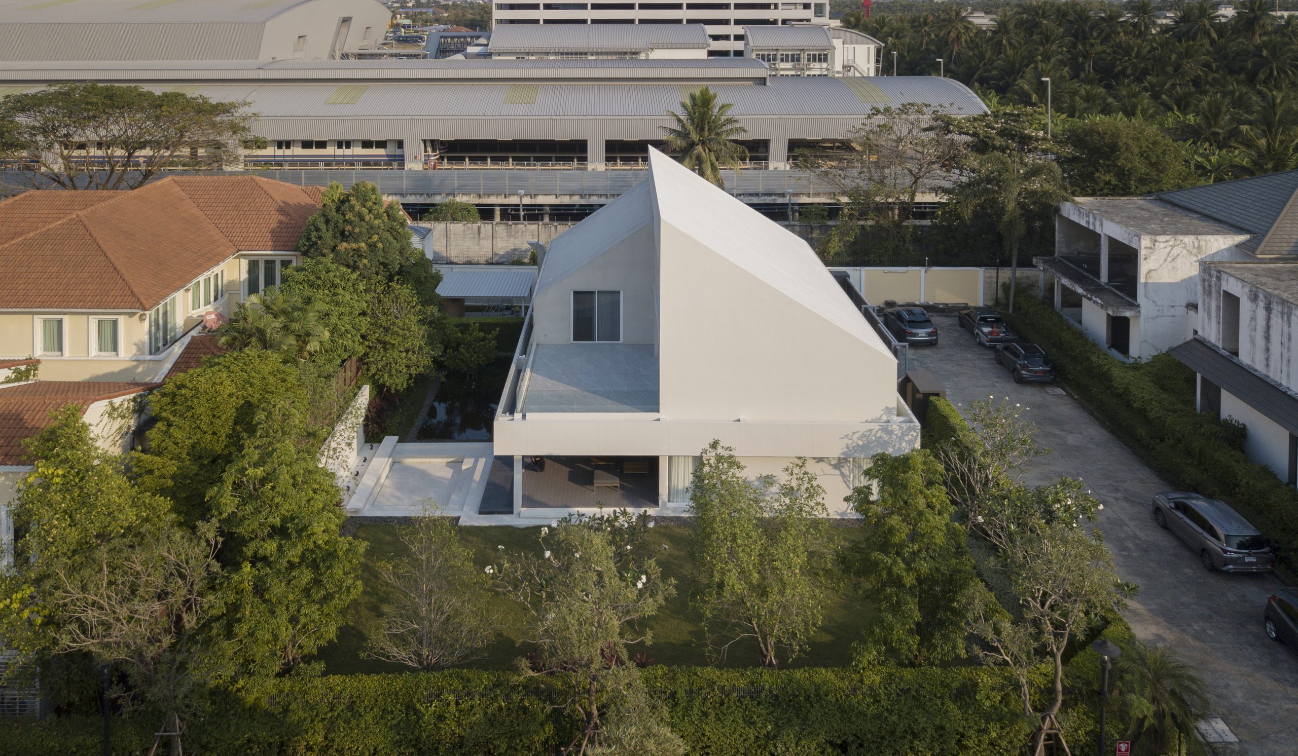
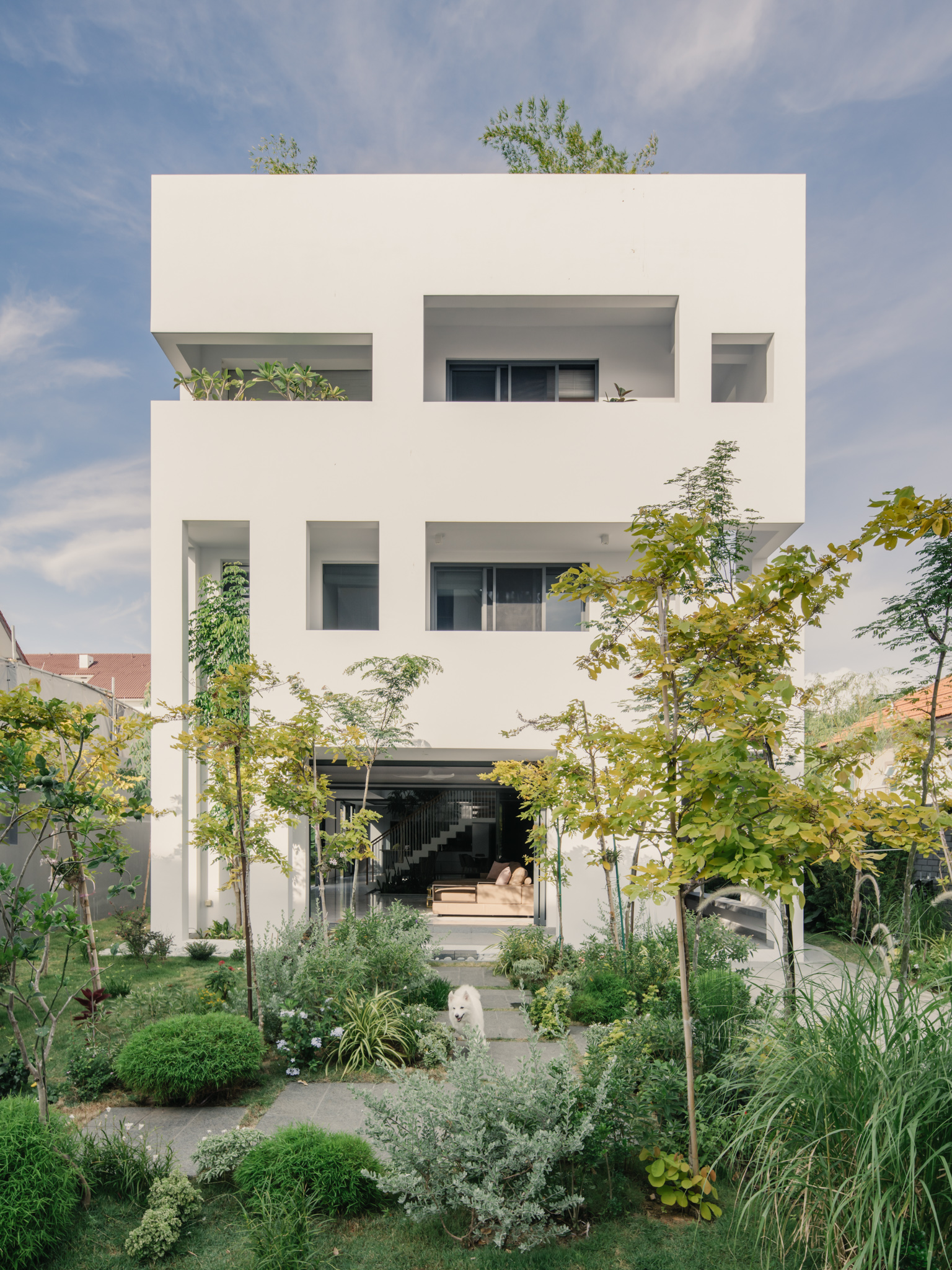
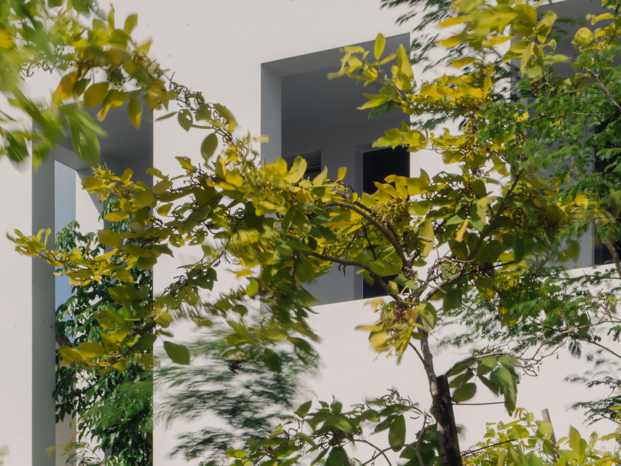
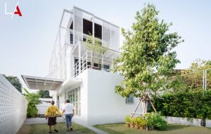
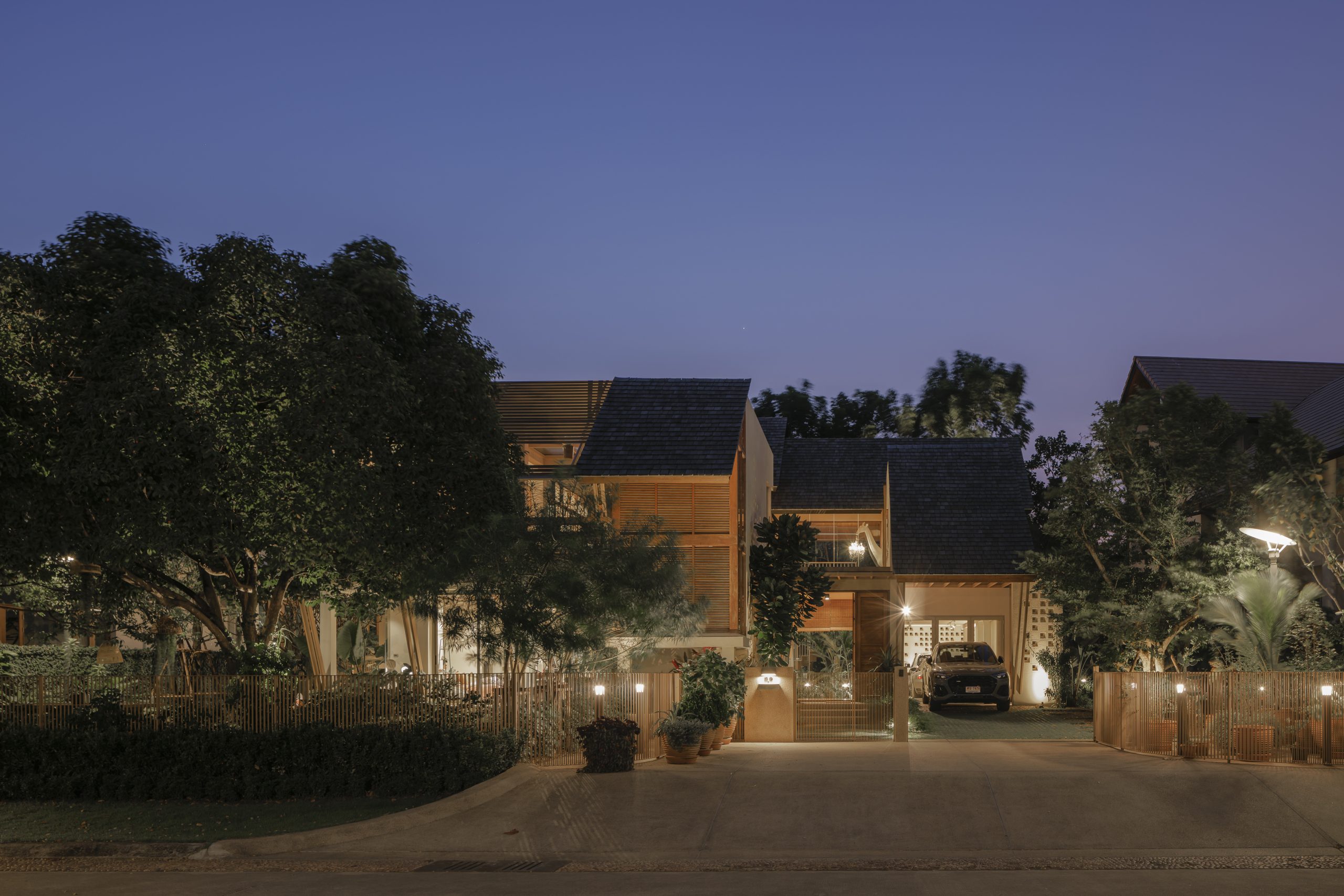
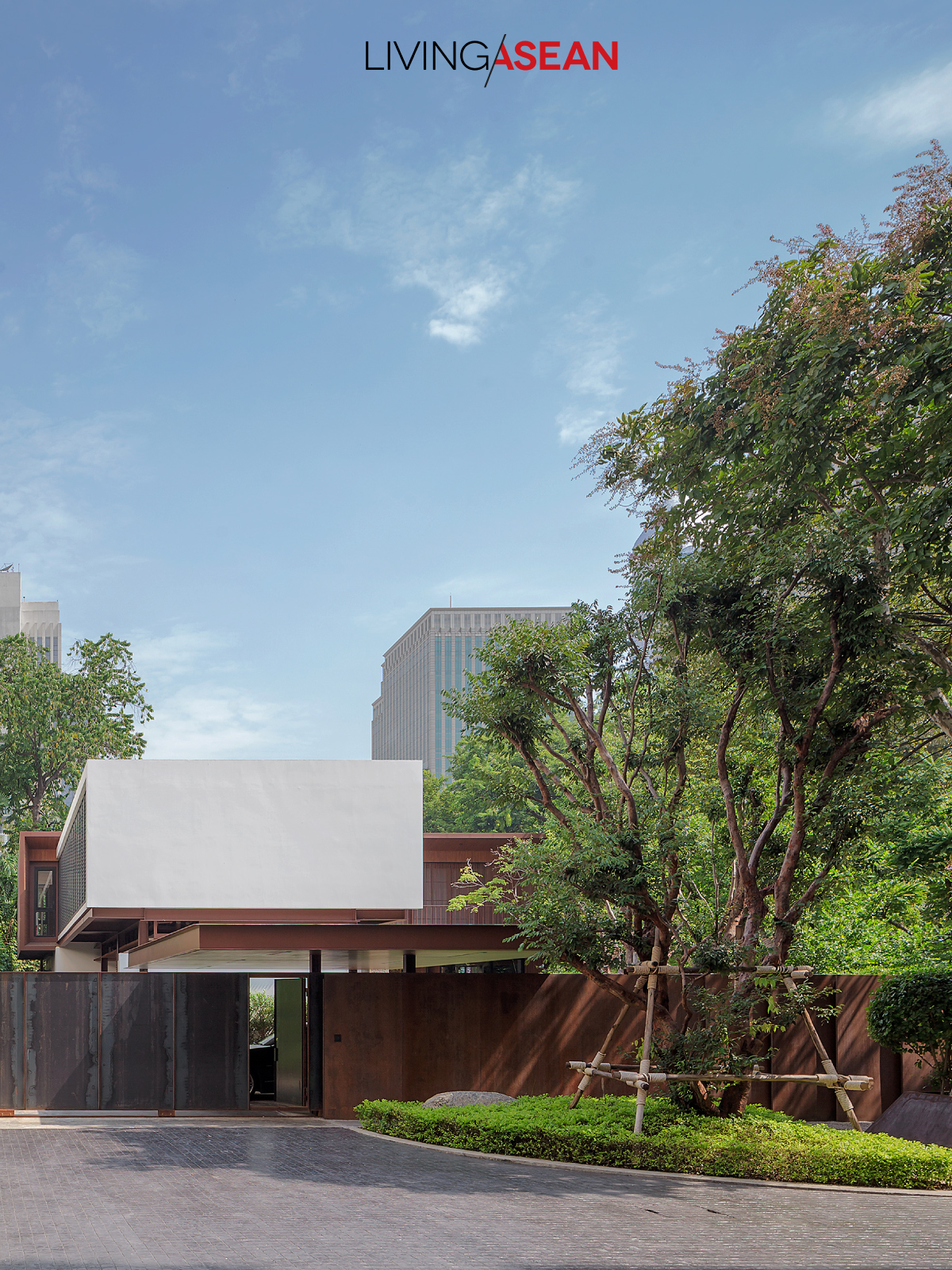
Taking everything into account, the contemporary cube-shaped house is in a league of its own. It celebrates the simplicity of open living spaces conceived and developed by the Singapore-based architectural practice ASOLIDPLAN.
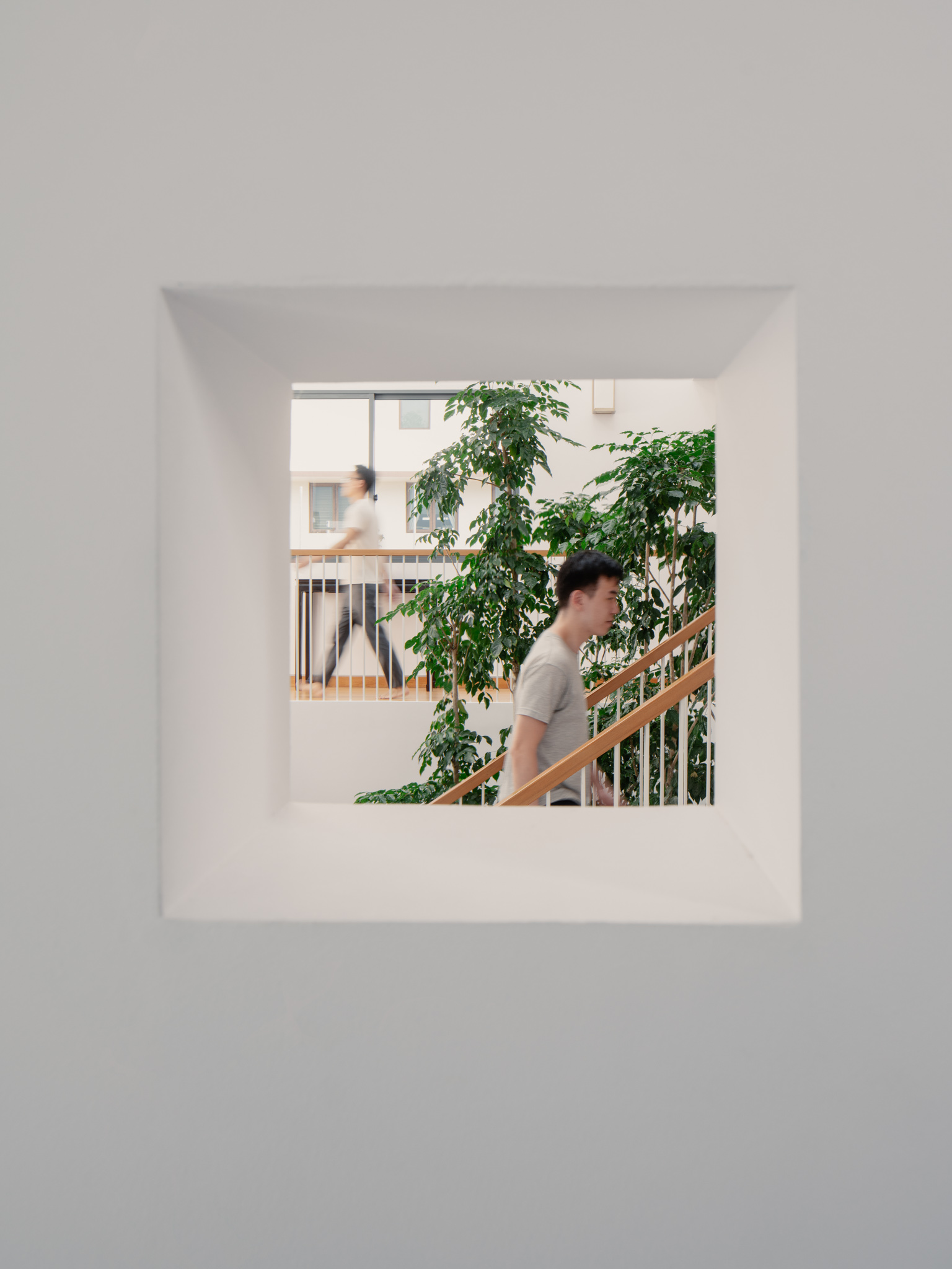
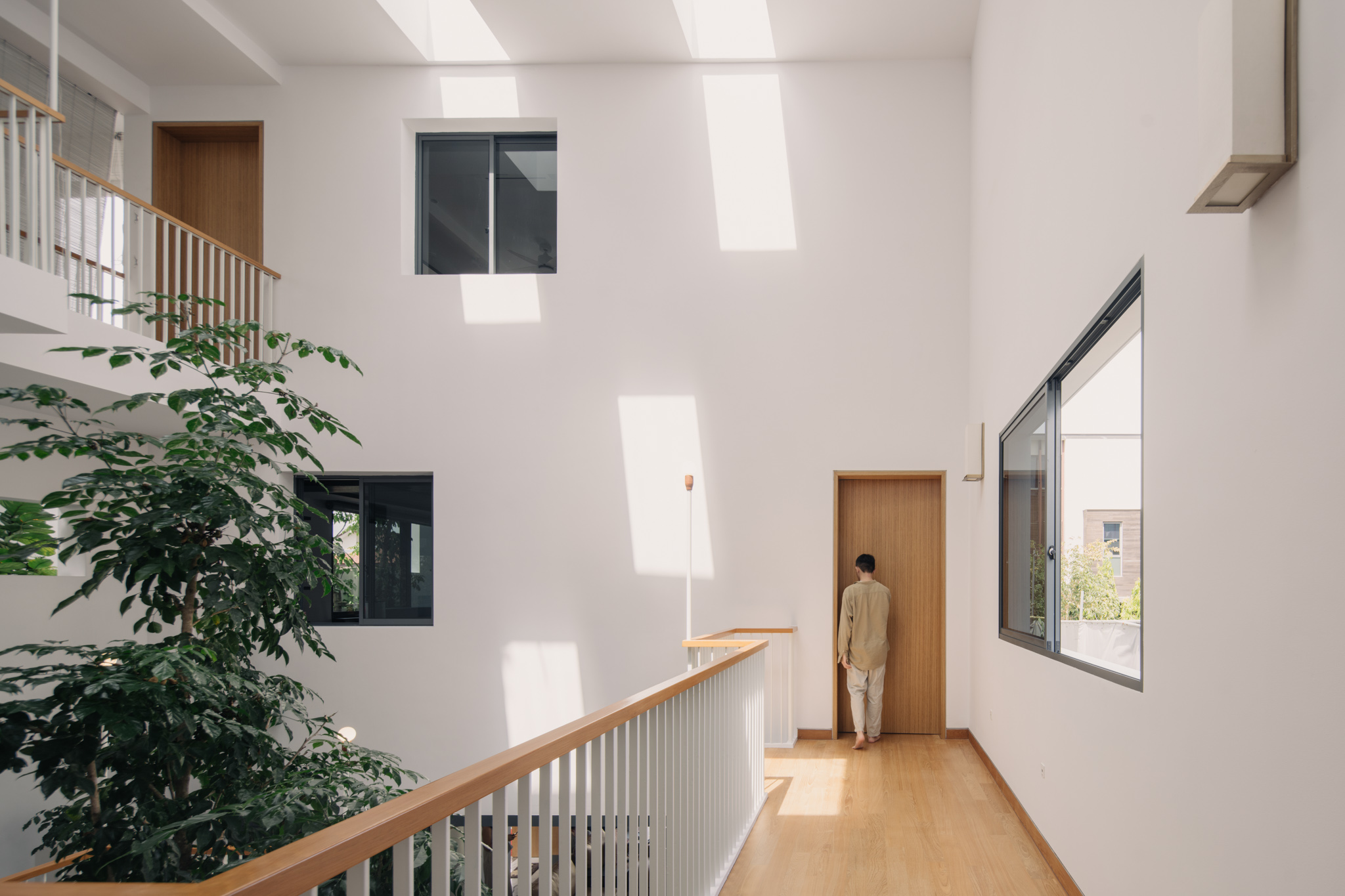
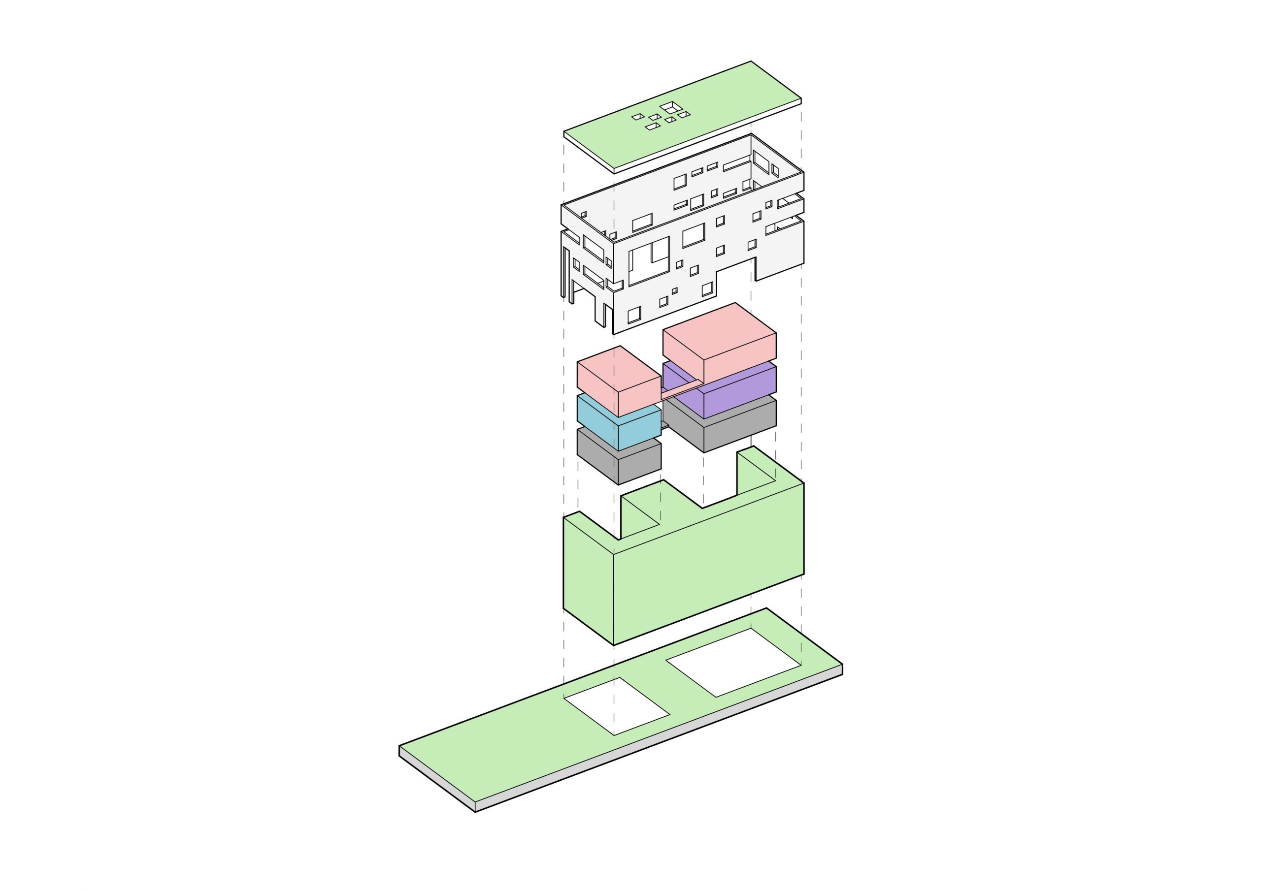
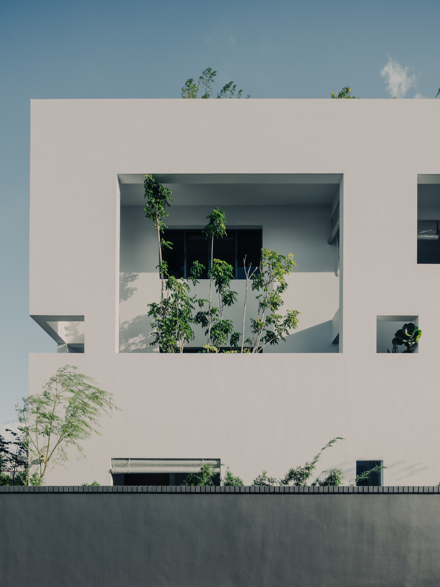
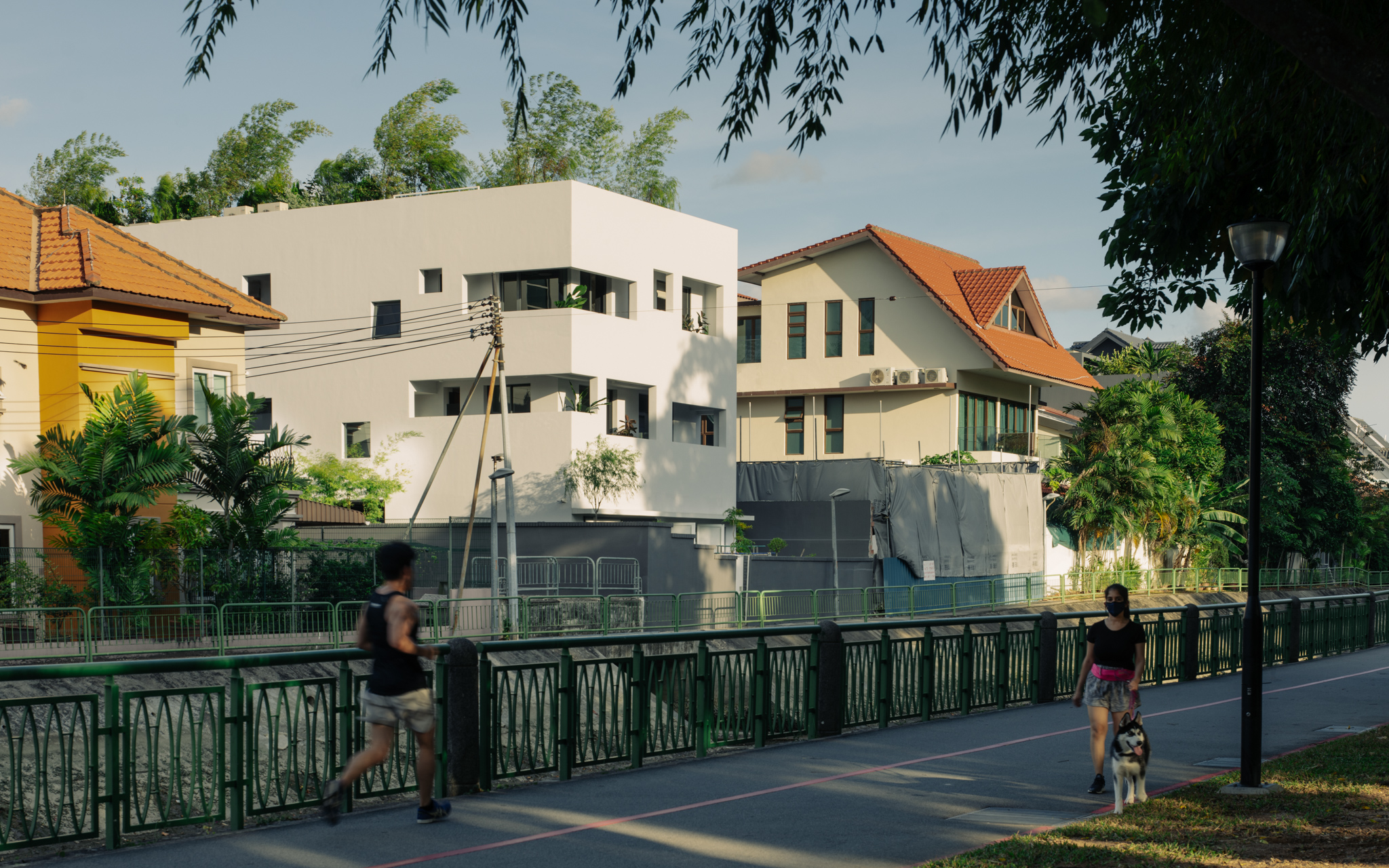
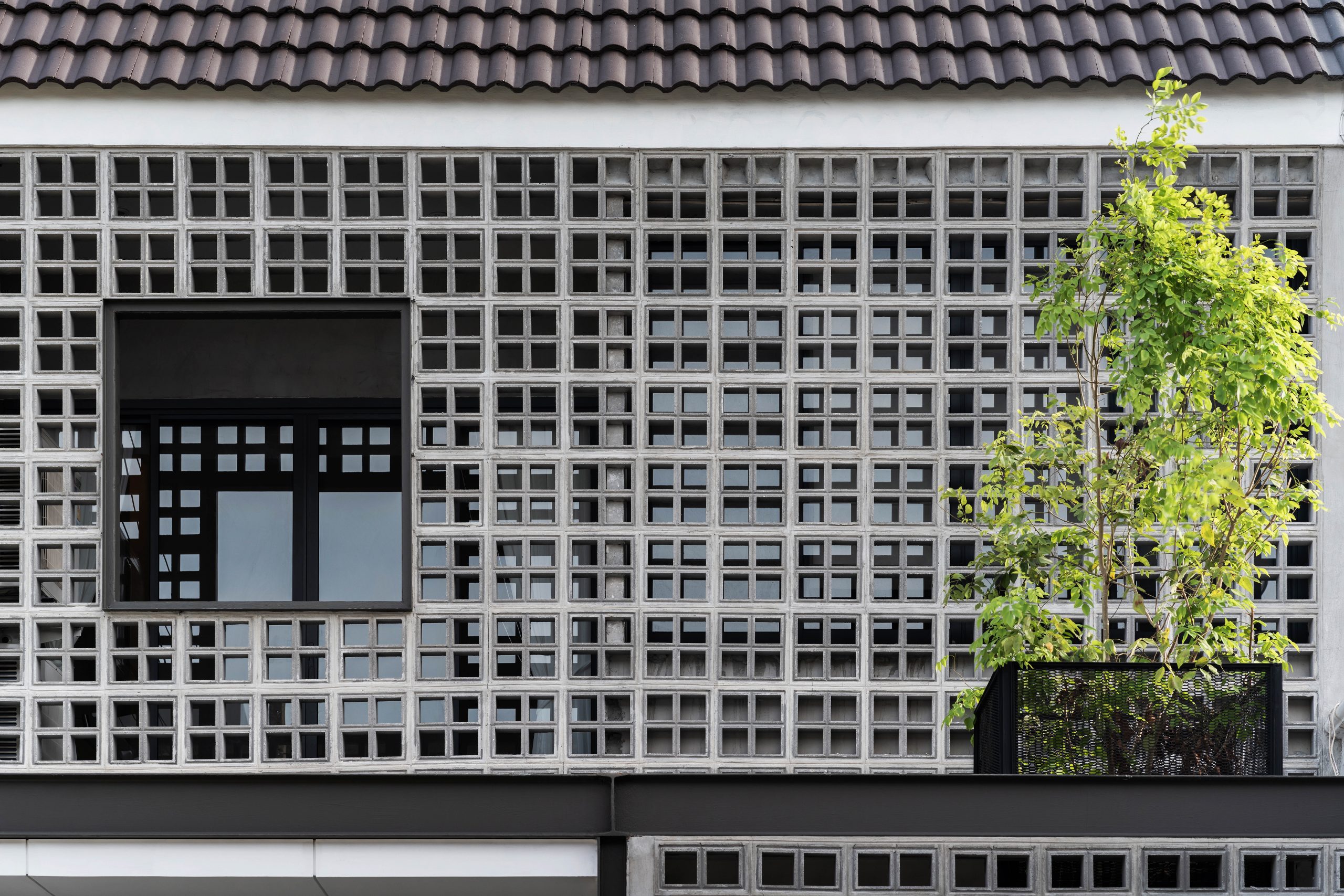
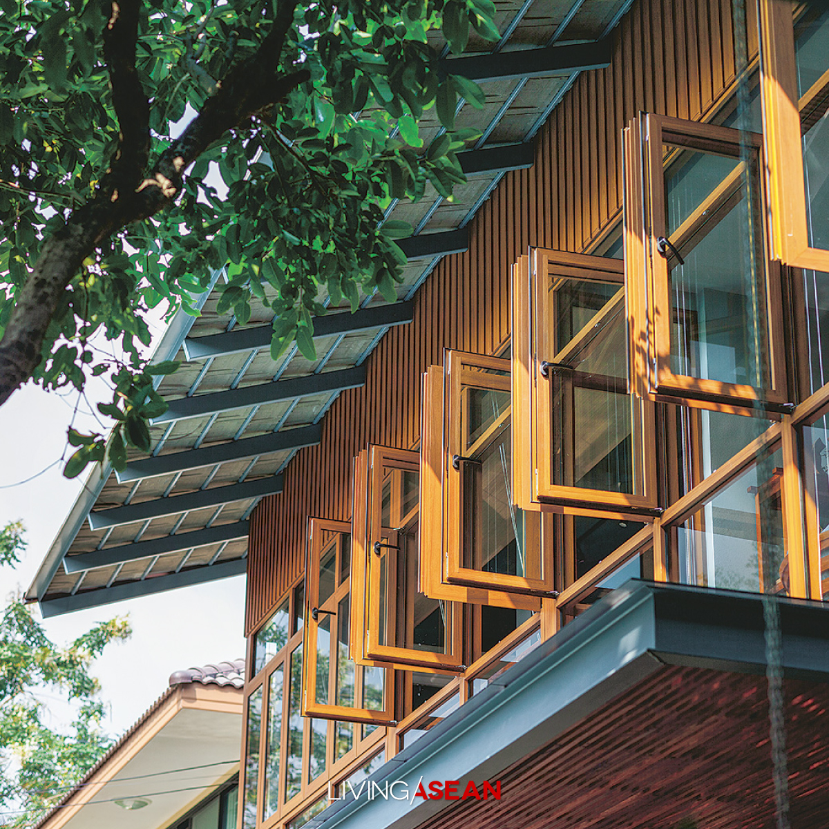
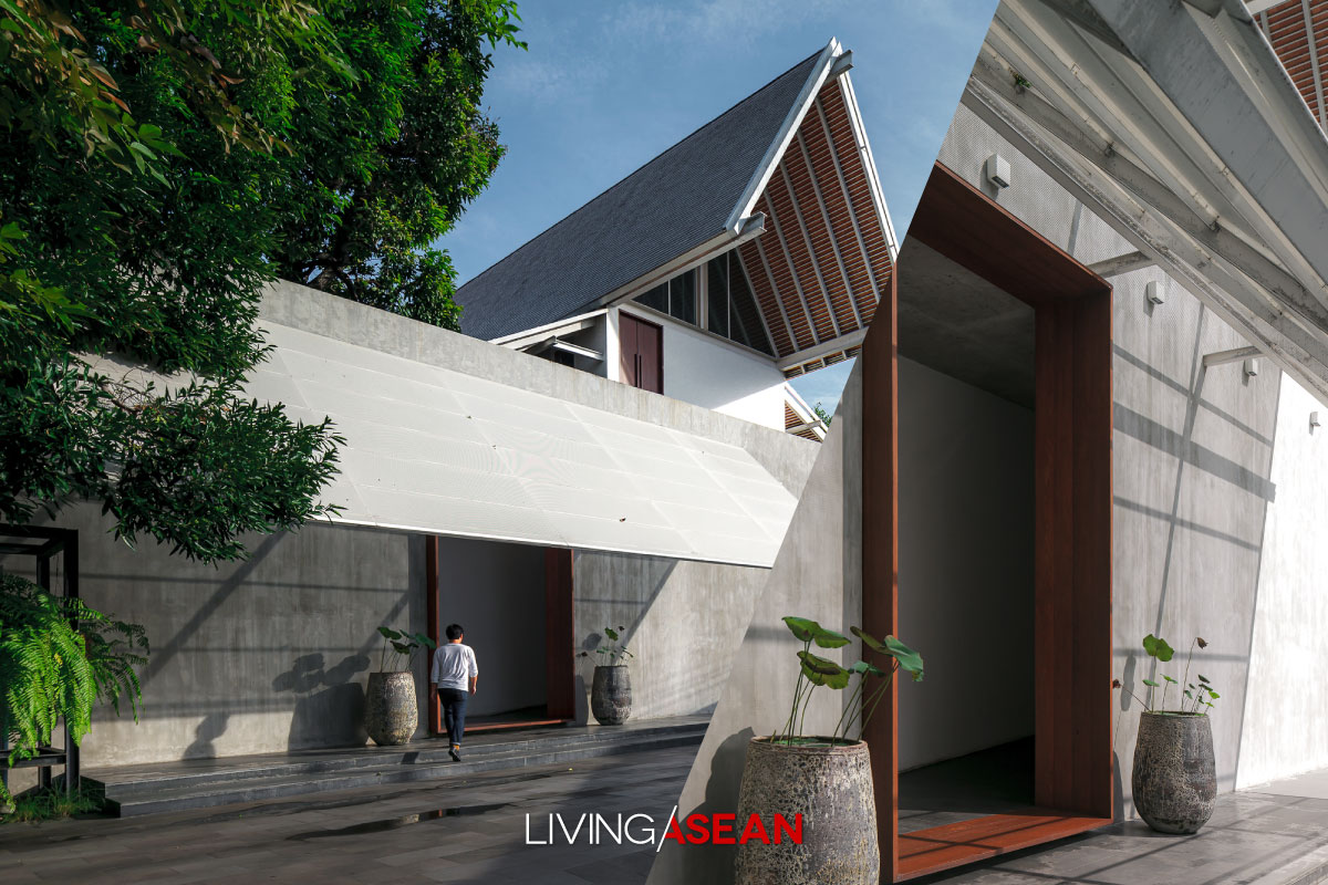
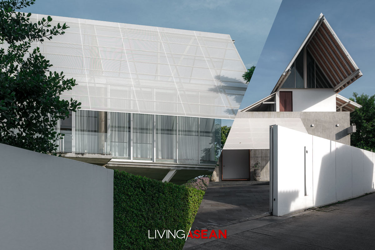
Among other things, what makes it unique is the use of rectangular openings in various dimensions to make the building façade aesthetically pleasing. Done right, the openings in the walls and rooftop admit light and air and allow people to see out.
In this particular case, the building sits facing west, so every precaution is taken to protect the interior from the sun’s harsh glare keeping it nice and cool all day.
The answer lies in a complete rethink of the building shell design, hence the name “Envelope House.”
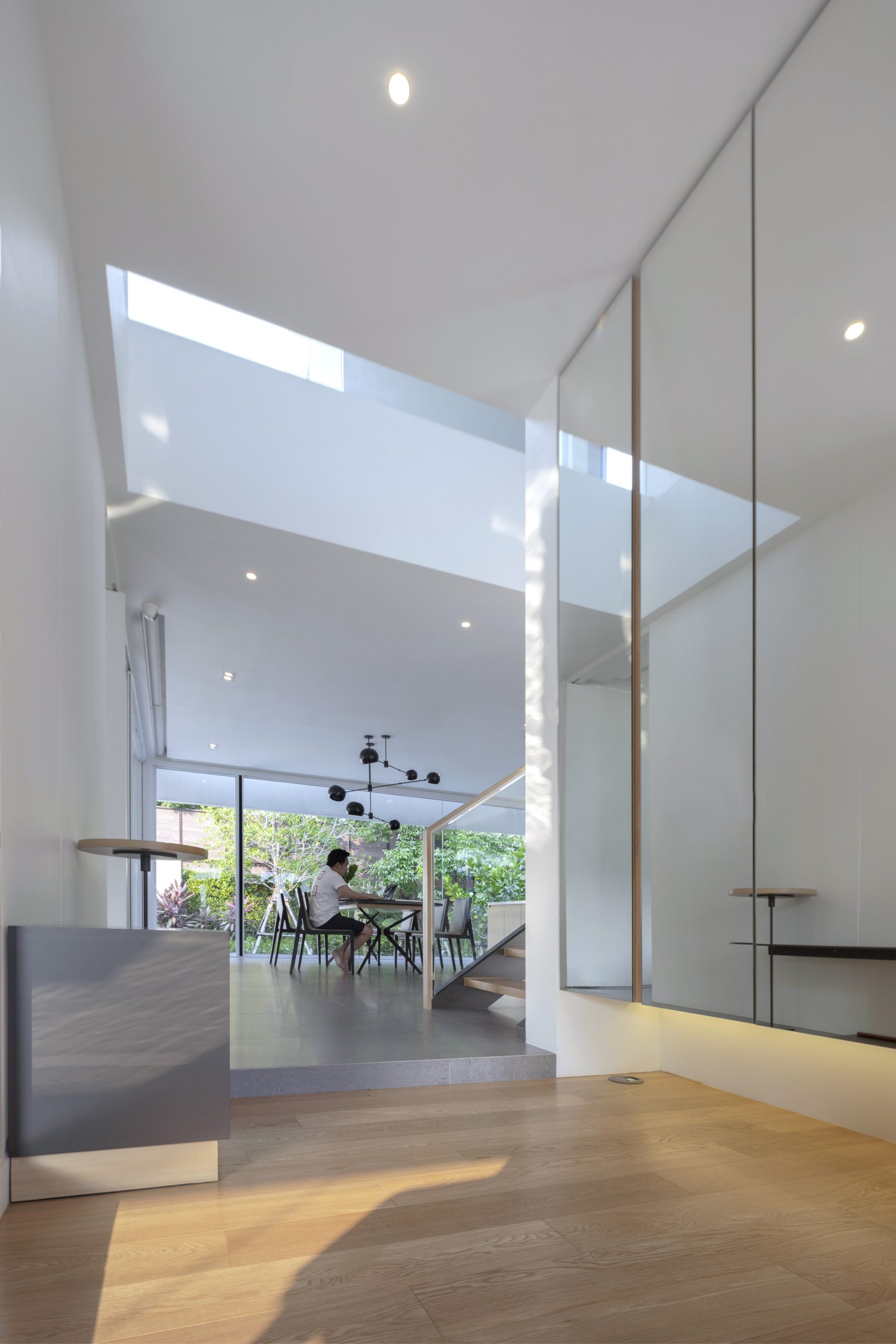
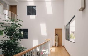
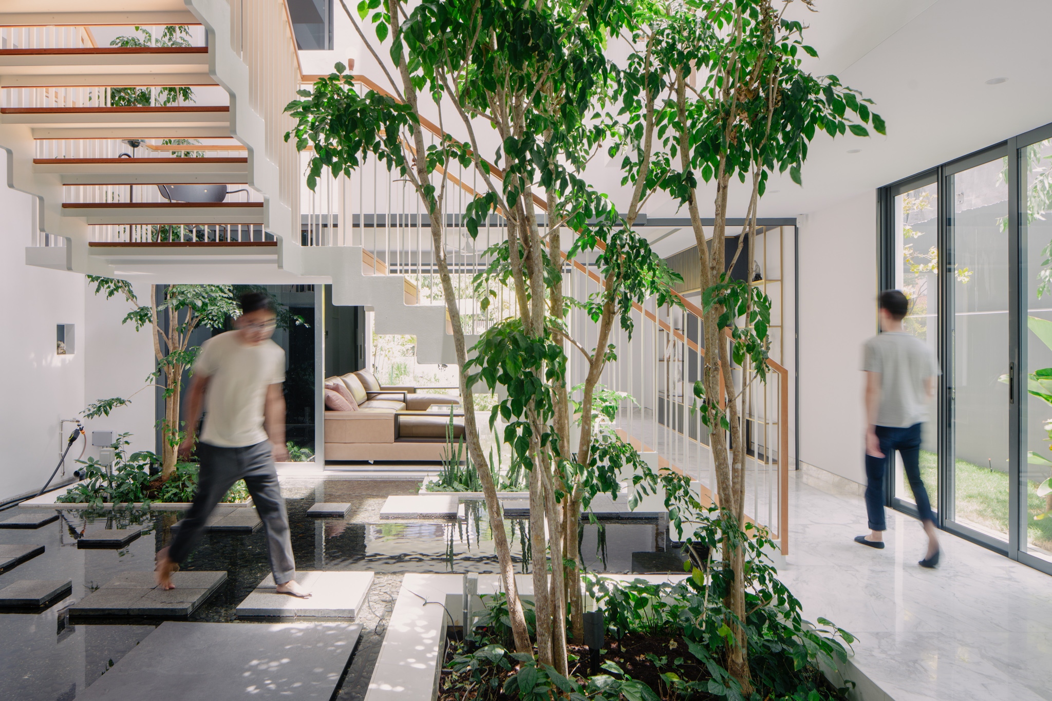
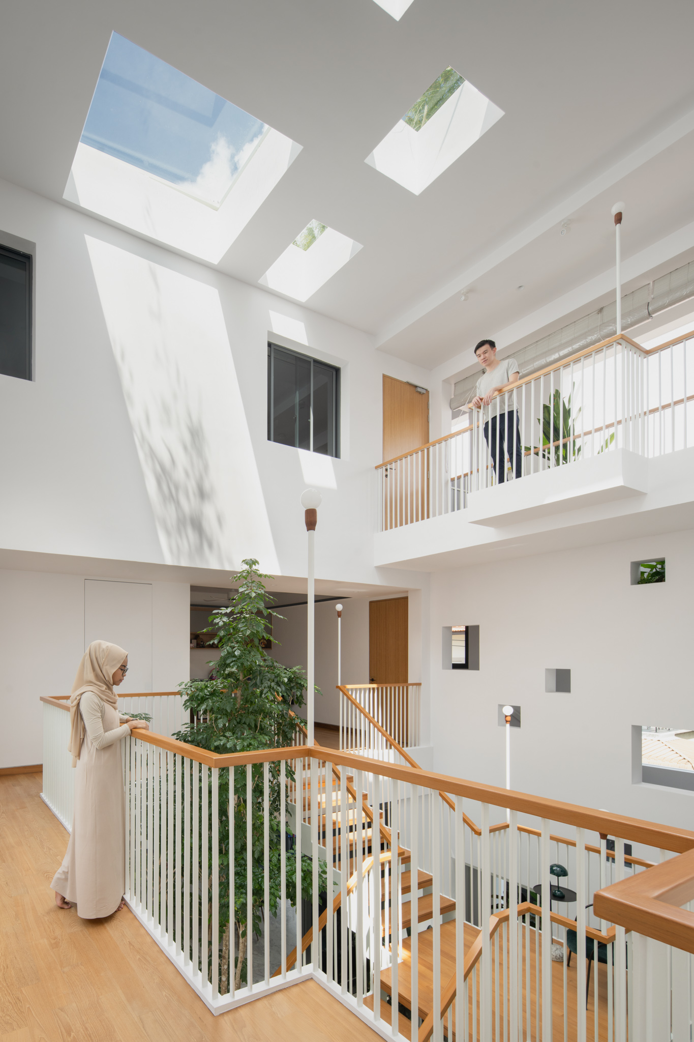
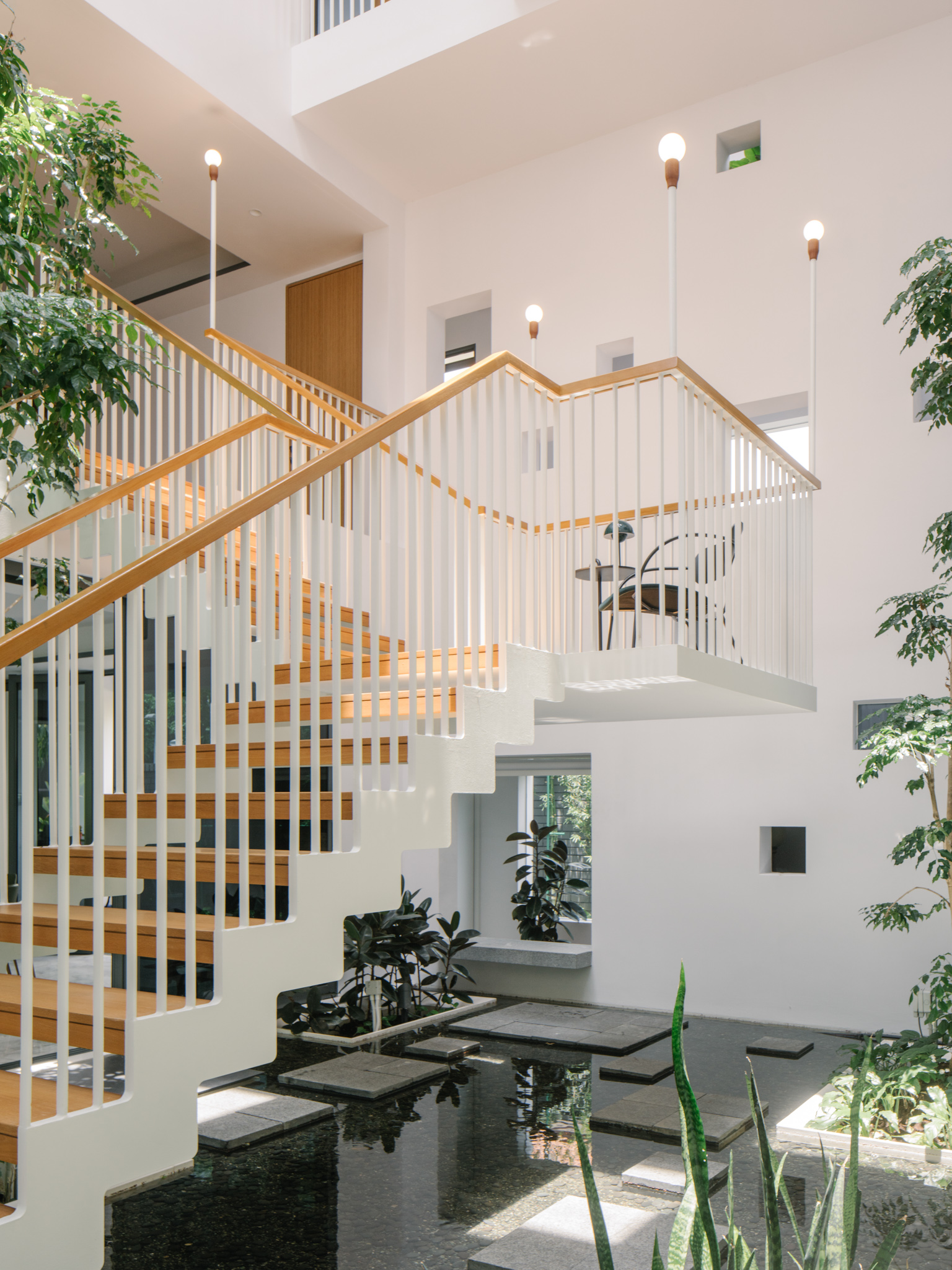
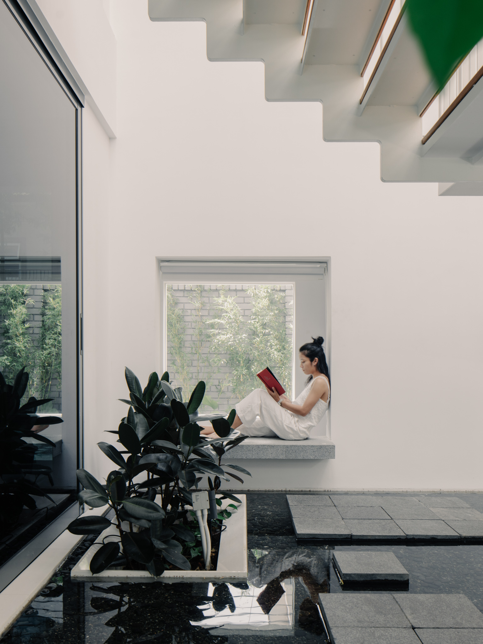
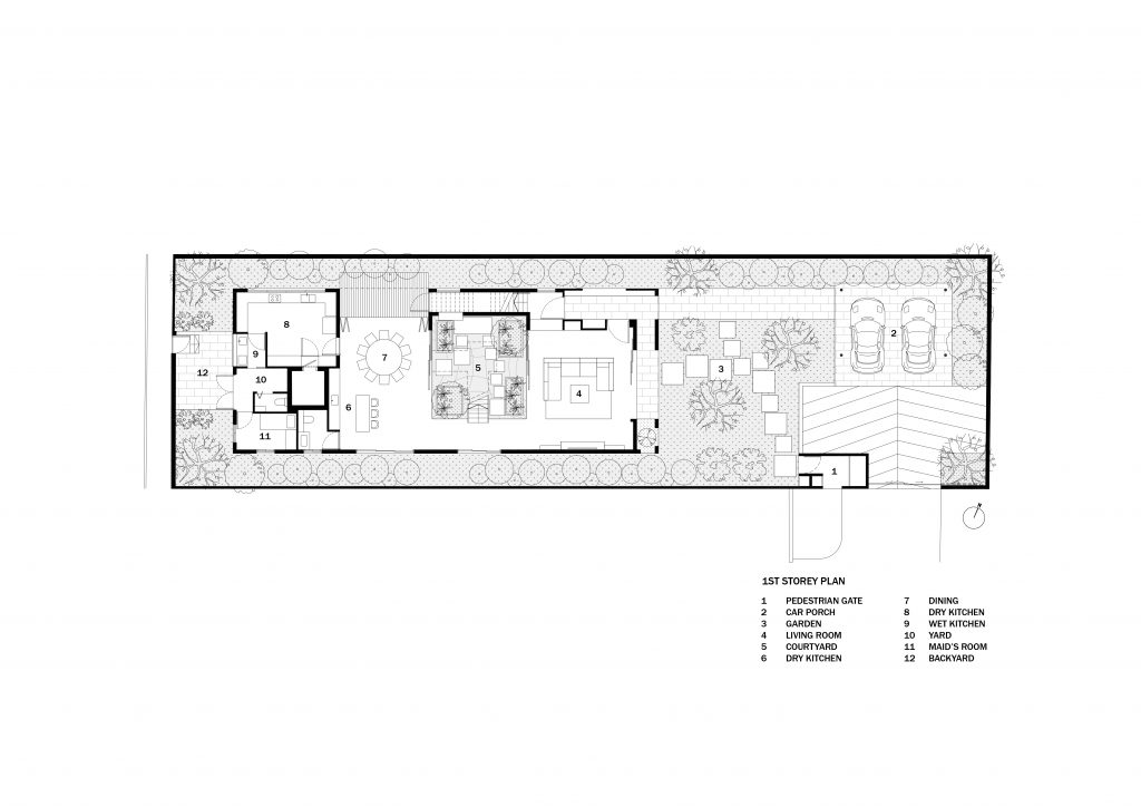
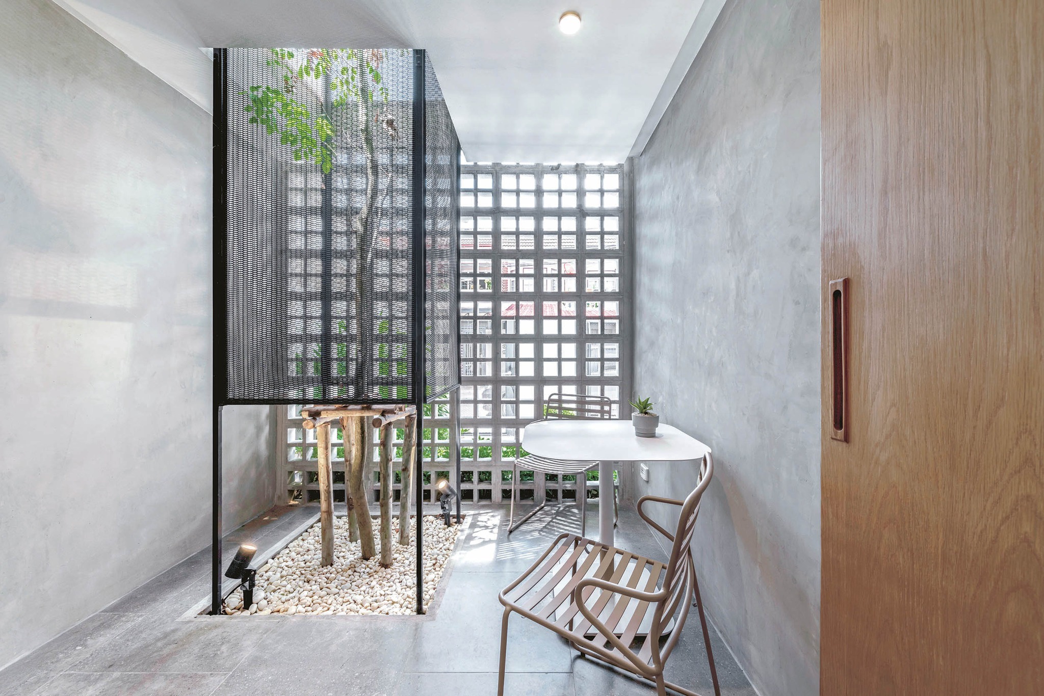
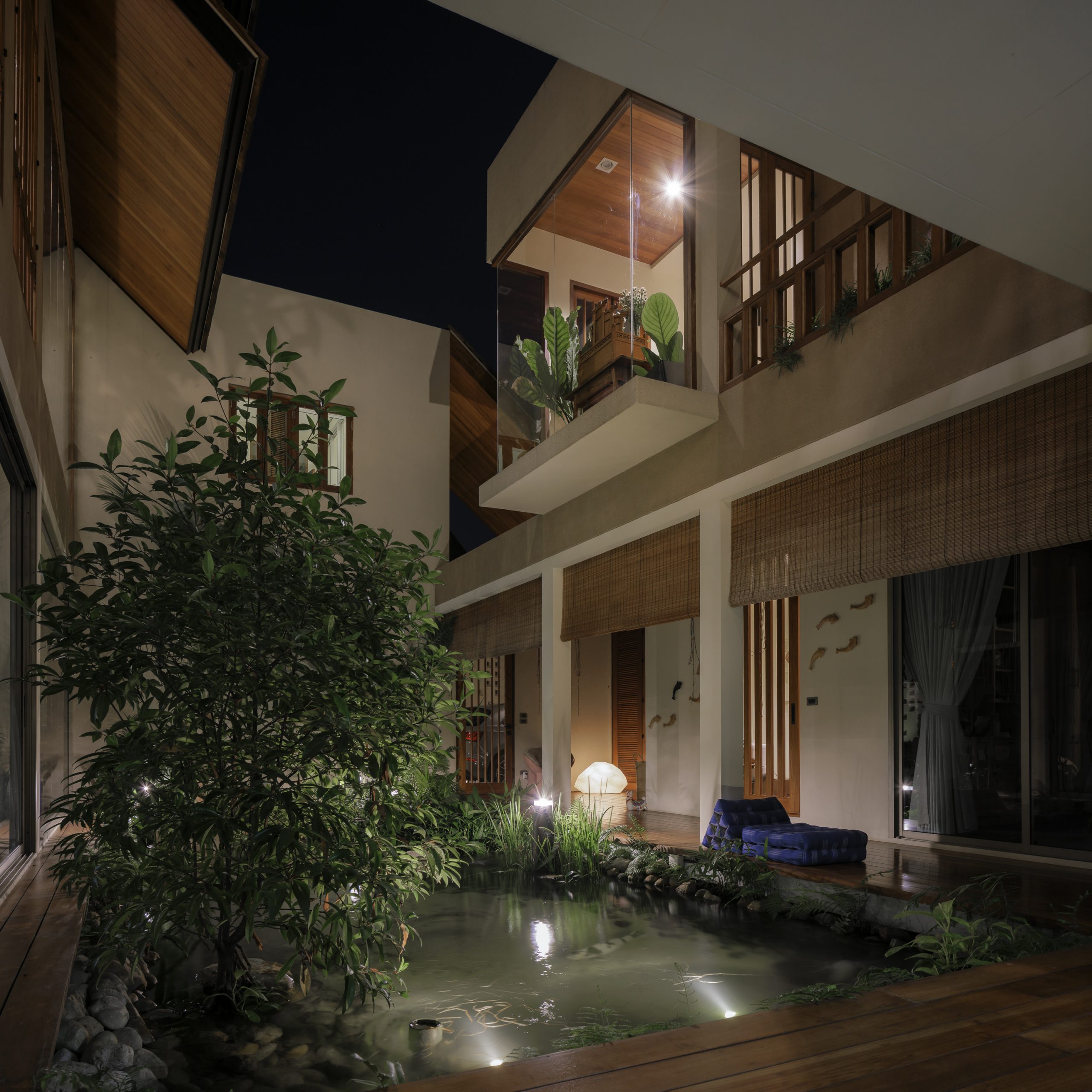
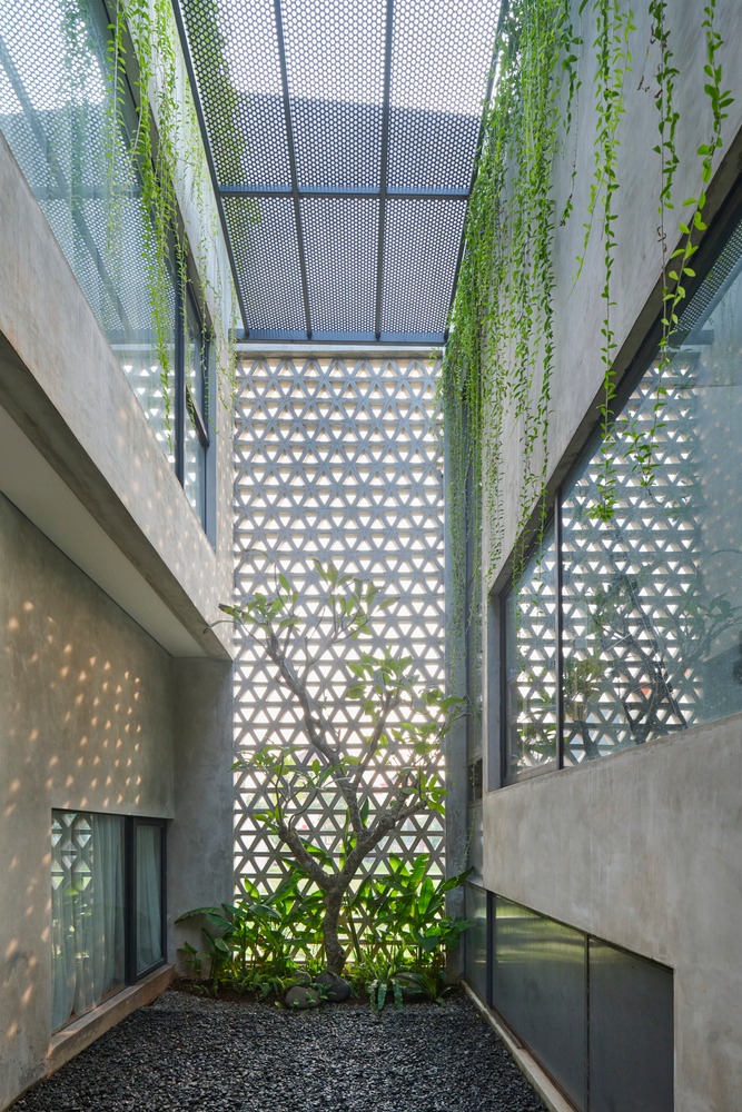
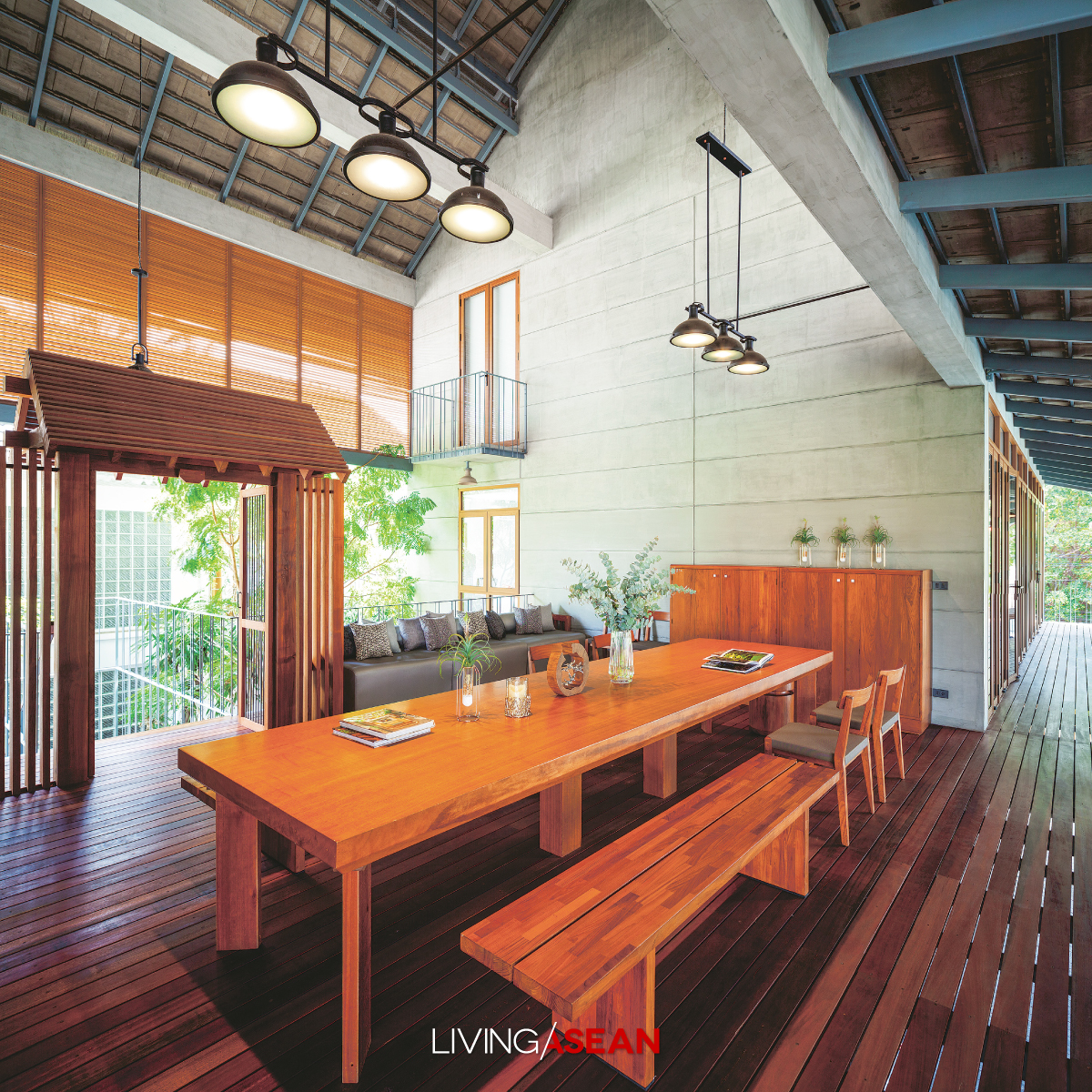
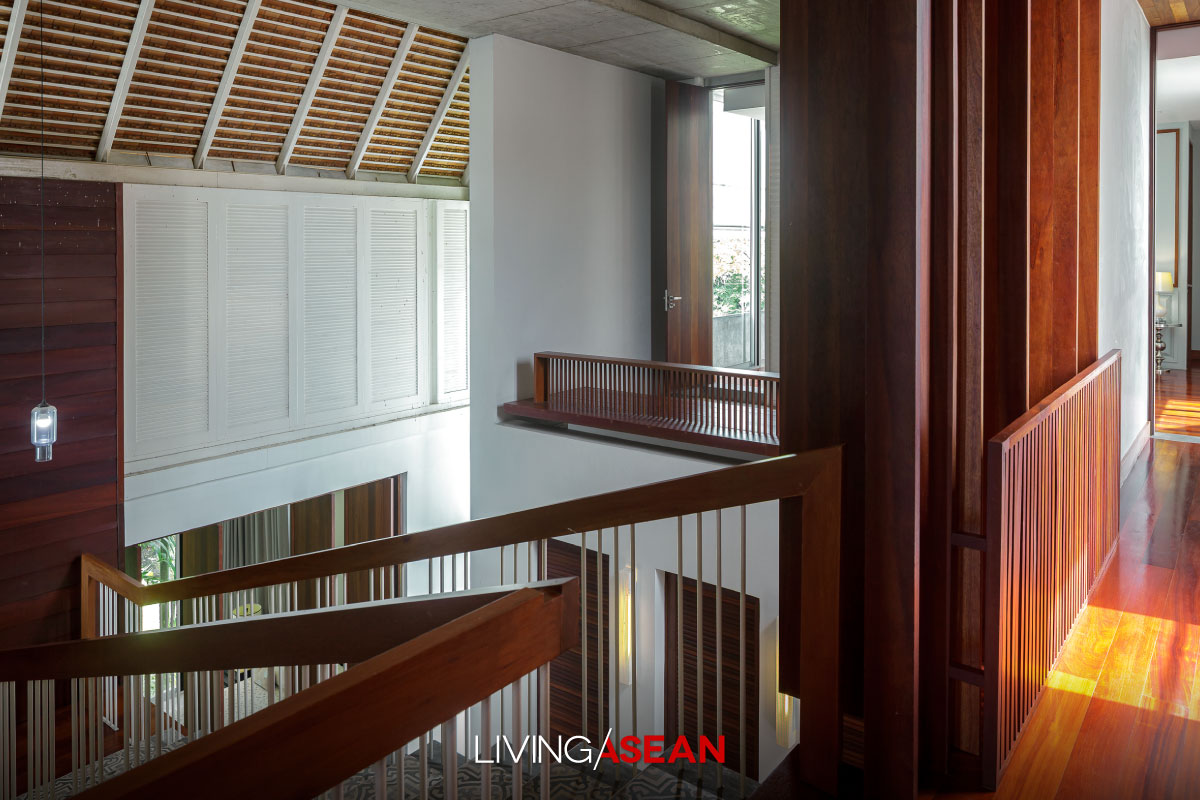
Step inside, and you come to a gorgeous center courtyard with triple-height ceilings and skylights on the rooftop. It’s a clever hack to reconnect with nature by bringing the outdoors into every nook and cranny of the interior.
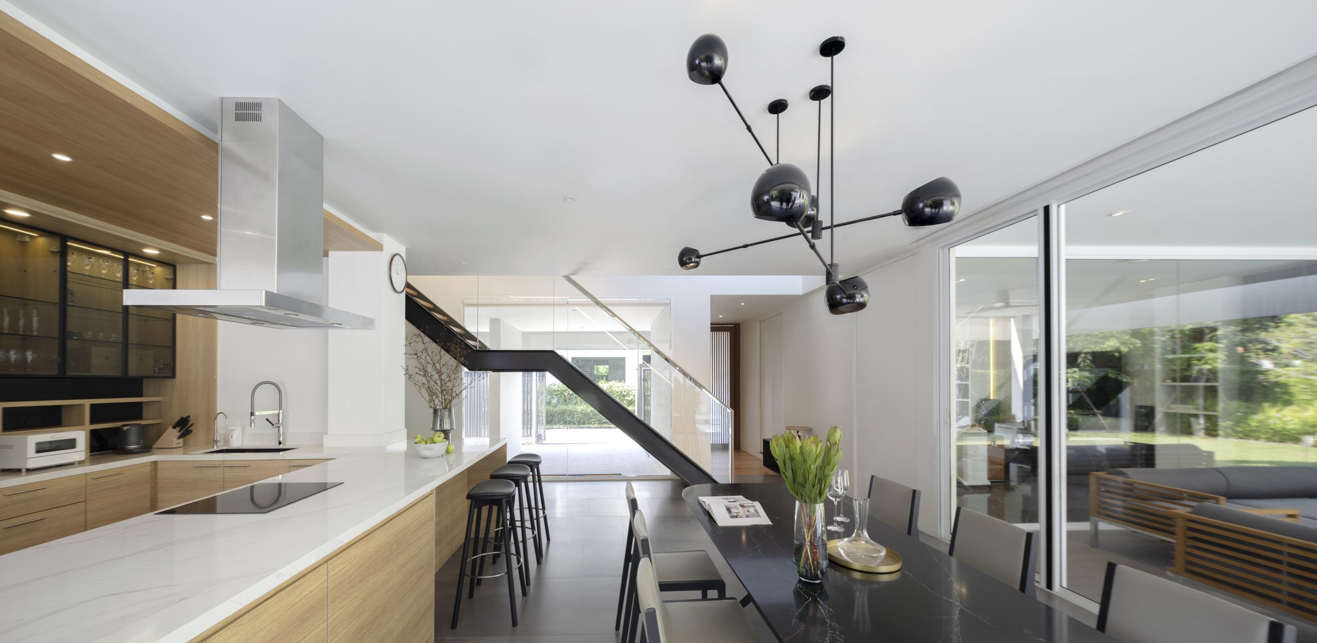
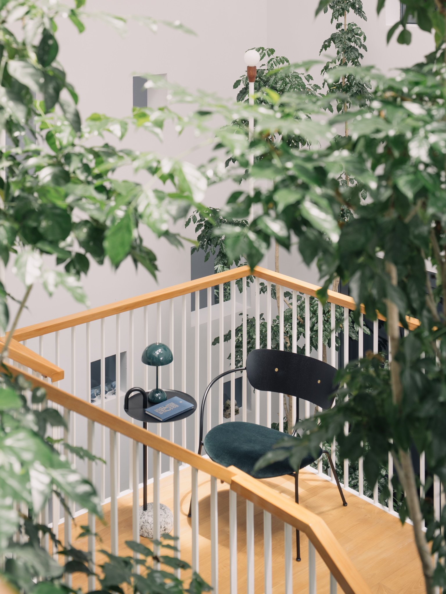
Houseplants perfect for miniature landscaping thrive everywhere, even under the staircase. Nearby, young trees with healthy lush foliage stand front and center next to a garden water feature with stepping stones that decorates and refreshes the room.
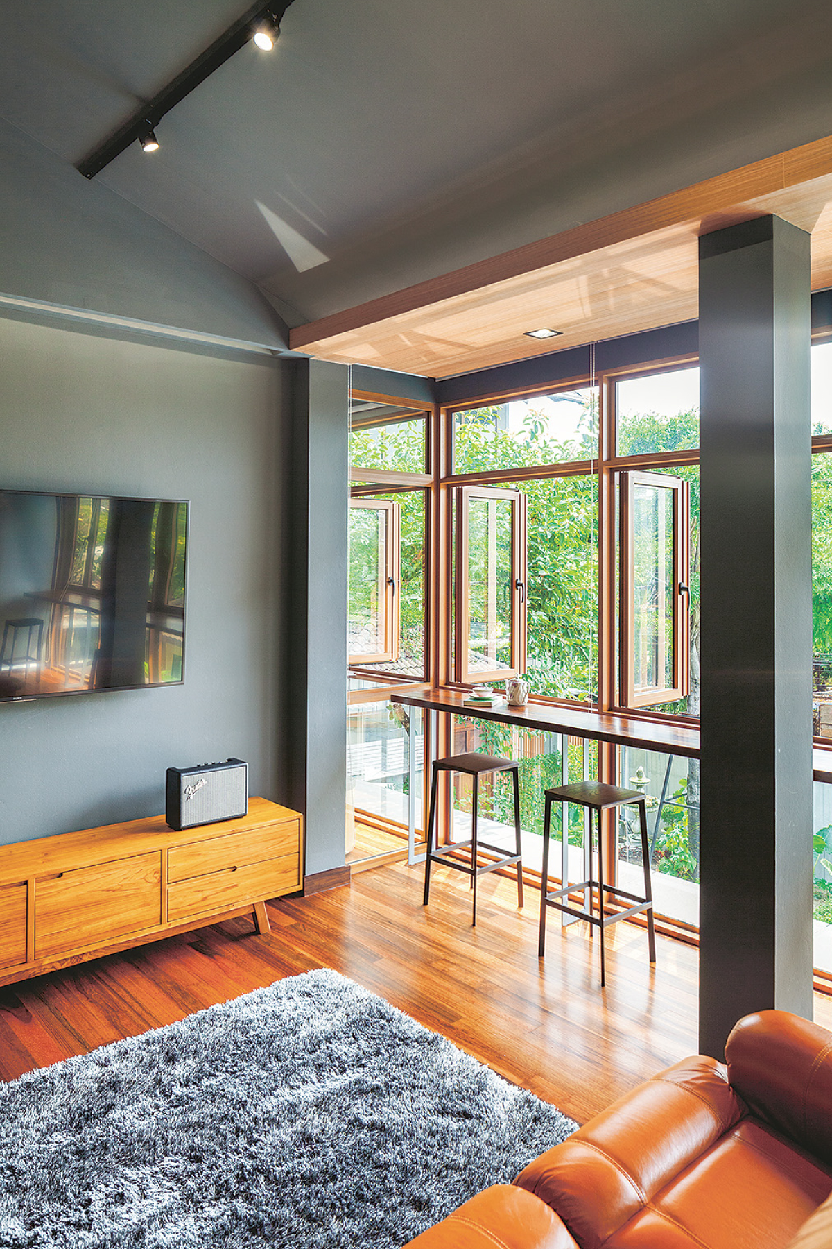
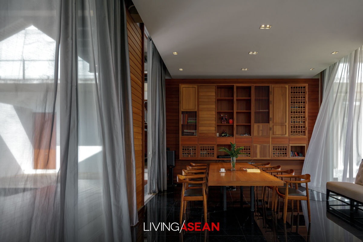
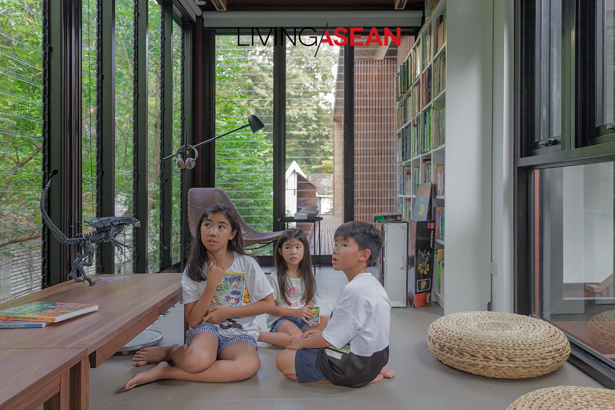
Looking for a quiet place to lean back and chill? There’s a nice sitting room with a garden view by the window.
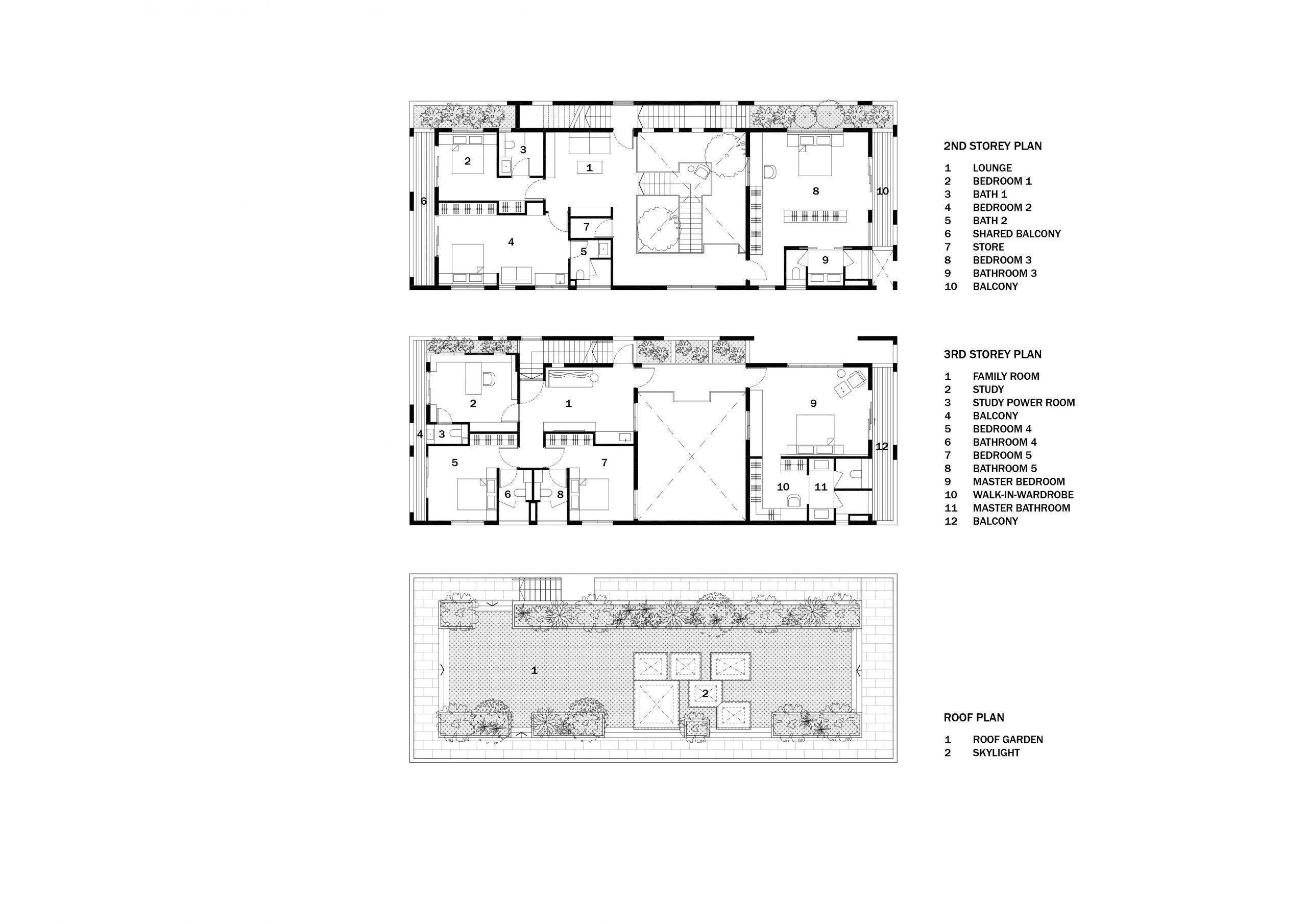
The second floor contains living quarters for elderly parents, while the third affords plenty of private residential spaces for grownup children and their families.
Here, fresh greenery is never out of style. It’s an awesomely cool Modern space, where the beauty of plants is present everywhere, whether it’s on the staircase or along the corridors.
The entire interior is so well-lit by skylights that there’s no need for electric lights anywhere in the daytime. And the house plants benefit from it, too, no doubt.
Speaking of design, there’s a special feature that makes the house with a Modern space feel more comfortable. Its thermal envelope is made of energy-saver double-layer walls that form the first line of defense against heat and the elements.
Where possible, landscaping plants thrive in between the two layers to protect the interior from the sun’s harsh UV rays. That’s not all. There’s also a rooftop deck with green grass lawns for outdoor relaxation in the cool of the evening.
In the fewest possible words, it’s a perfect example of homes well suited to a Tropical climate — a complete rethink of strategies that doesn’t rely on adding or extending a roof overhang to protect from inclement weather.
Plus, double-layer wall construction makes this piece of architecture original and unique in itself simply by bringing the outdoors inside.
By integrating a green oasis into the design of the house’s Modern space, it succeeds in dealing with limitations that come with overcrowded urban spaces.
/ Story: Wuthikorn Sut / English version: Bob Pitakwong /
/ Photographs: Nattakit Jeerapatmitee /
An old townhouse in the heart of Bangkok’s downtown has been lovingly restored in ways that adapt to changing lifestyle needs. No longer is it a stuffy, overcrowded space lacking fresh air and ventilation. A redesigned open floor plan has given it the feeling of home, a sense of belonging and purpose. Incredibly light and airy, it feels like anything but a townhouse, so to speak.
Inheriting the townhouse from his parents, the new owner has made a firm decision to renovate it to a good state of repair.
It’s the place where he lives when traveling to the city for business. Or it can be available to be rented if need be.
The task of refurbishment was given to a team of architects from the design firm OAAS. Central to their work was the creation of an open concept home plan that’s flexible for multiple uses.
Accordingly, the old second-floor balcony was knocked down and replaced by steel framing for a light and spacious façade.
Upstairs, the entire floor plan was revised, while the ground floor platform was raised slightly to keep it above the edge of the water during a flood.
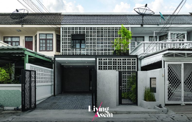
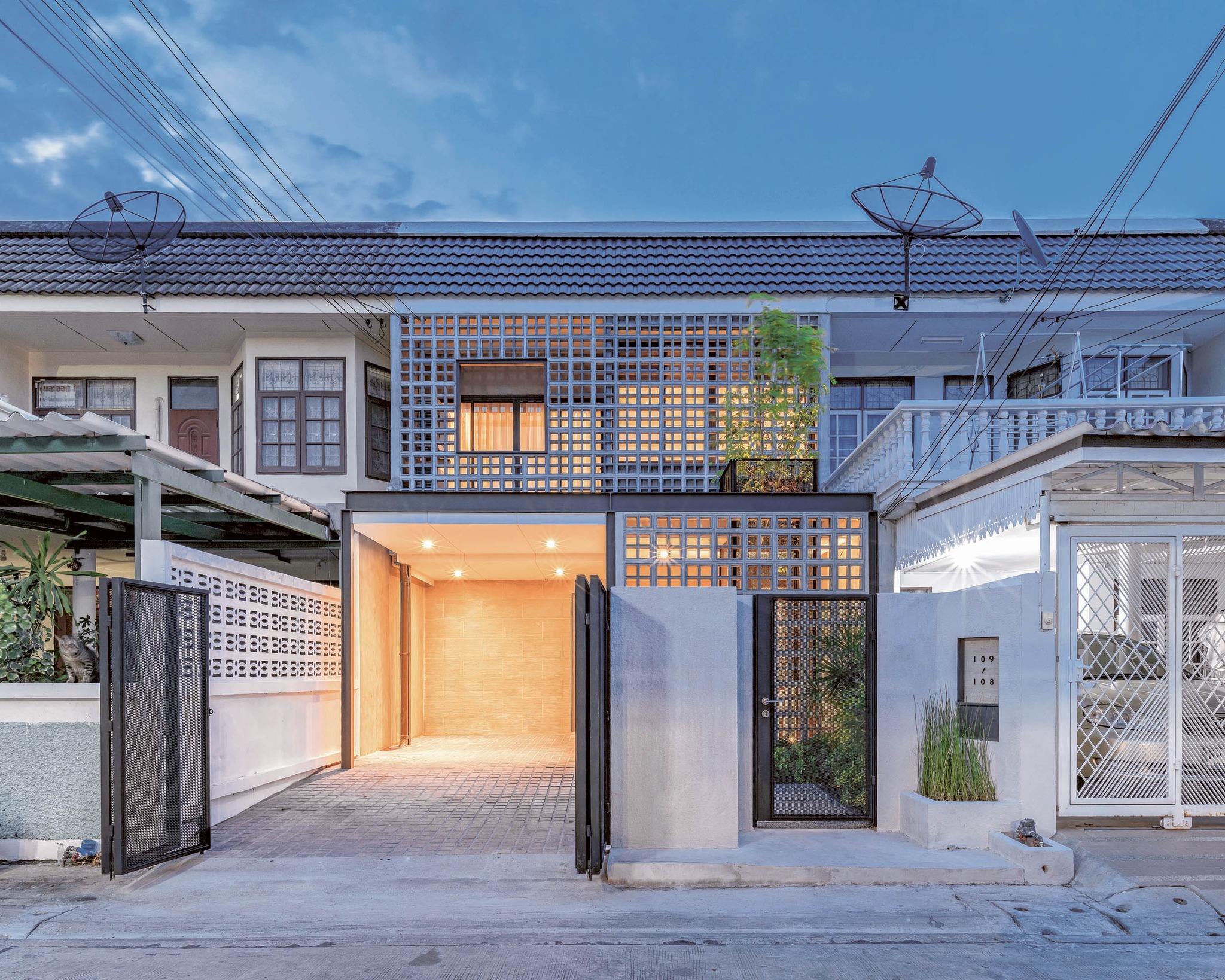
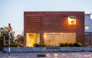
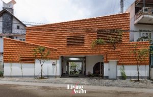
Never too small to make a difference, the newly refurbished townhouse stands out from the rest in that its building shell is made of air bricks that are great for natural ventilation.
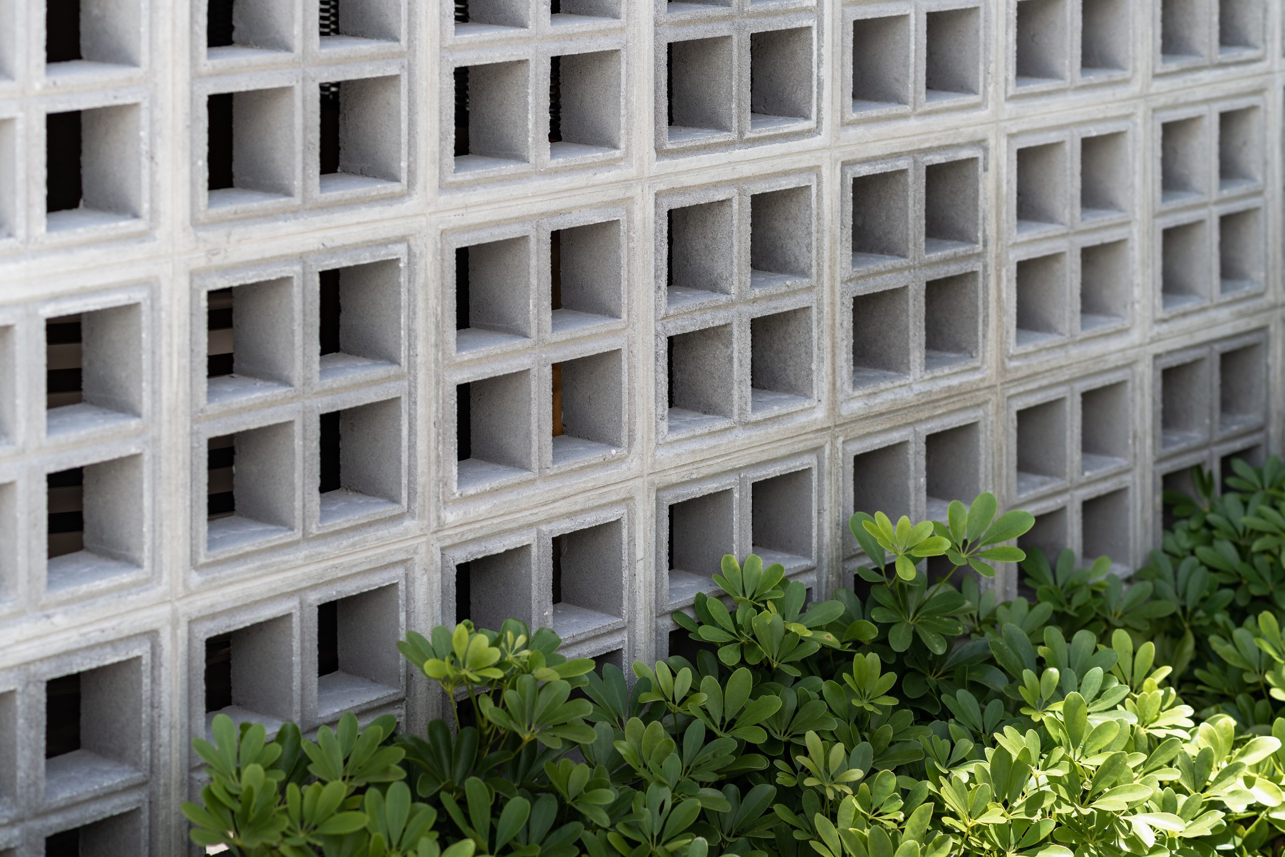
The perforated bricks double as a decorative privacy screen that protects the home from prying eyes. It’s a surefire way to improve air circulation and get rid of stuffy smells, a common problem of townhouse living.
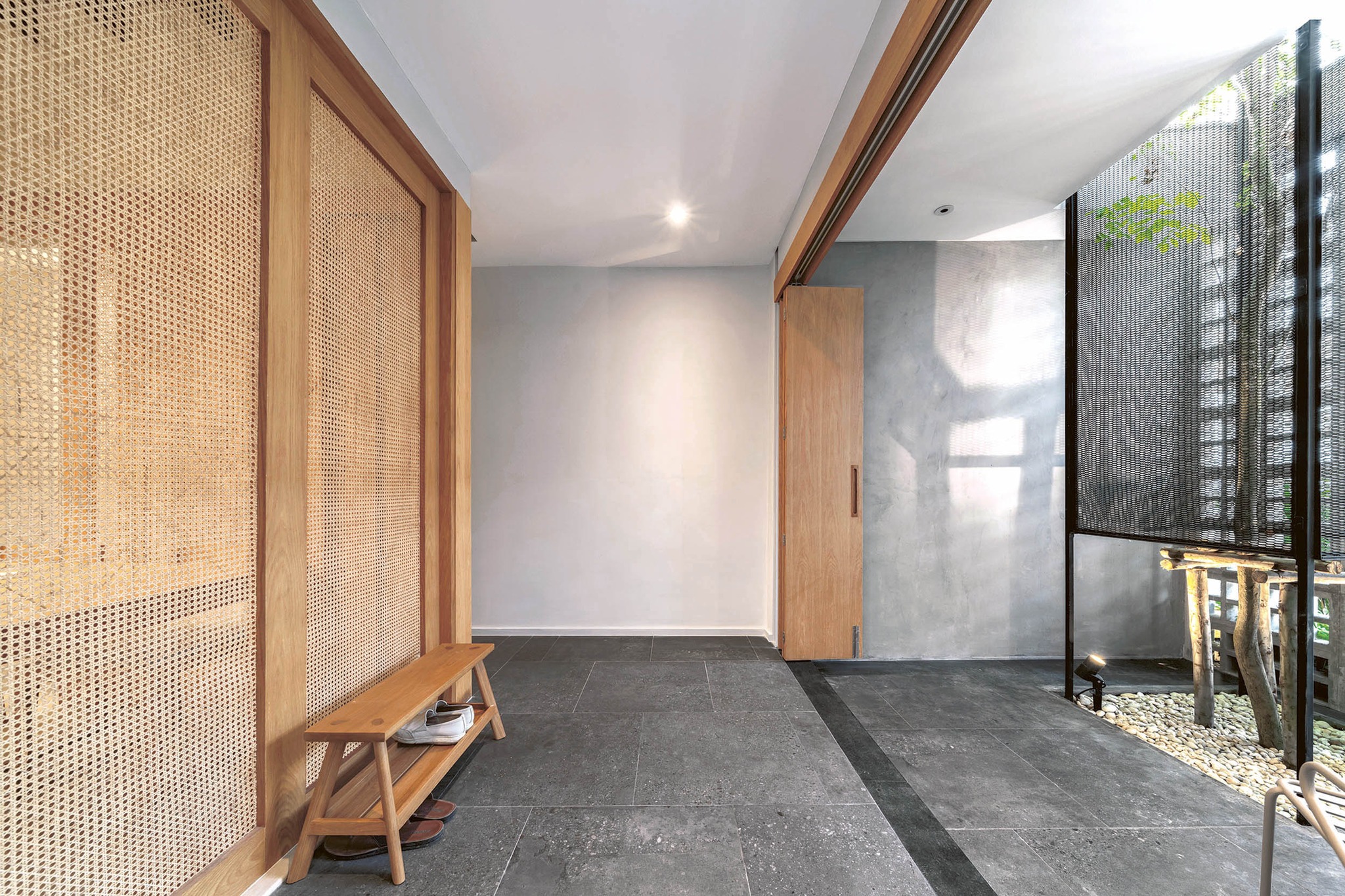
The wooden door opens into a surprisingly peaceful semi-outdoor room aptly named “Sala”, which is Thai for garden pavilion. Albeit situated at the front of the house, it’s a private living space that conveniently connects to the sitting room and dining area lying further inside.
Beautifully designed, it calls to mind an image of a garden sitting area with a side passage for walking along.
The overall effect is impressive. The side passage sets this townhouse apart from the others.
Since it’s often impossible to build a walkway around a townhouse, it makes perfect sense to build one on the inside that connects the garden pavilion at the front with the living room and other functions at the rear.
There is a challenge to overcome. Because the side passage takes away a large chunk of the square footage of the house, the designers have to make a choice from a range of possibilities.
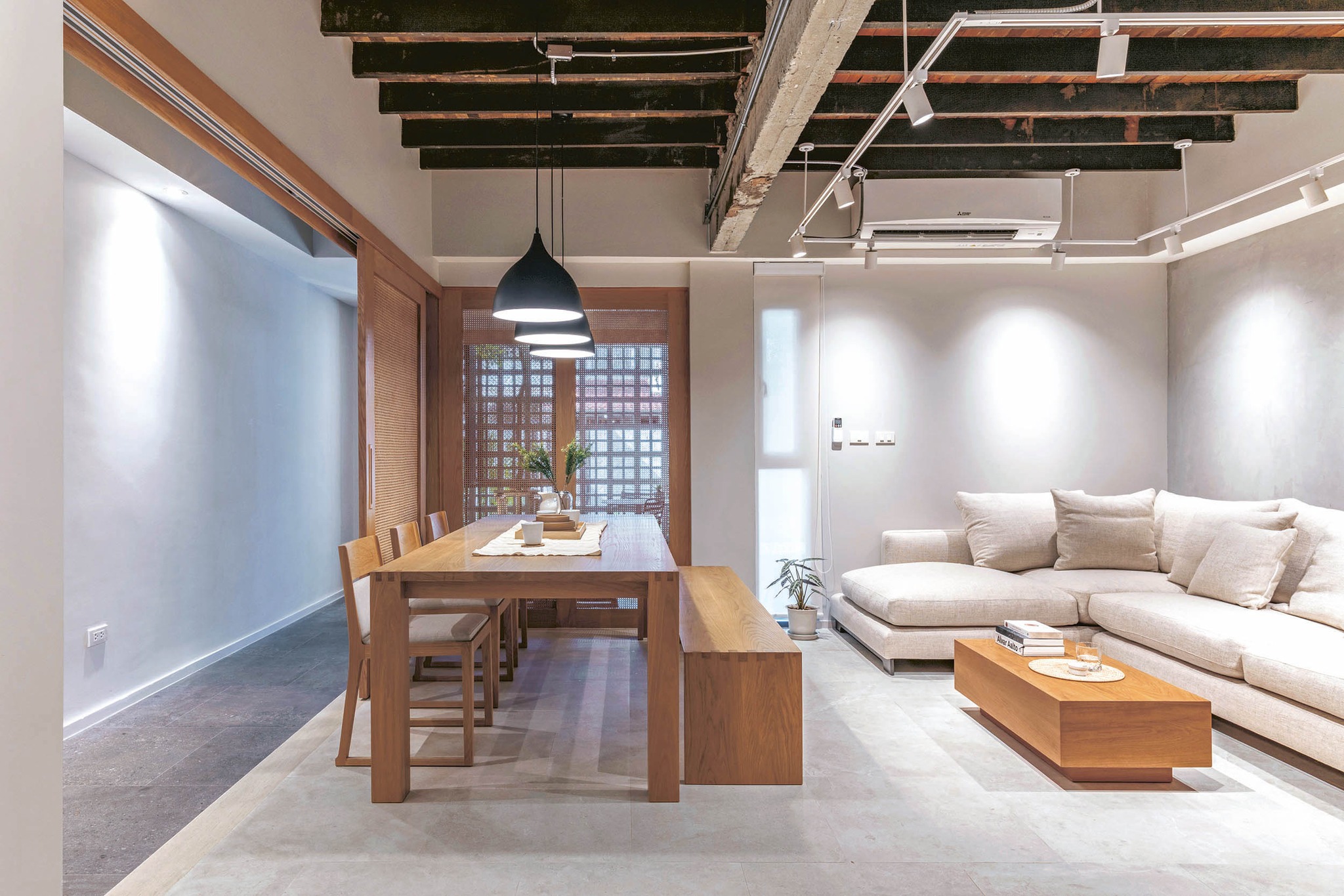
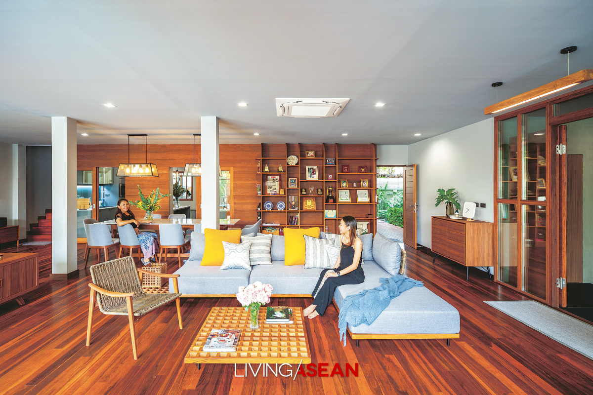
Among them, an open concept floor plan is useful in making the home feel more spacious. There’s no need for room dividers for a home theater or TV lounge since it’s never a desirable lifestyle here.
Plus, by floating furniture, the owner is free to create a more intimate atmosphere and a layout that’s capable of multiple uses.
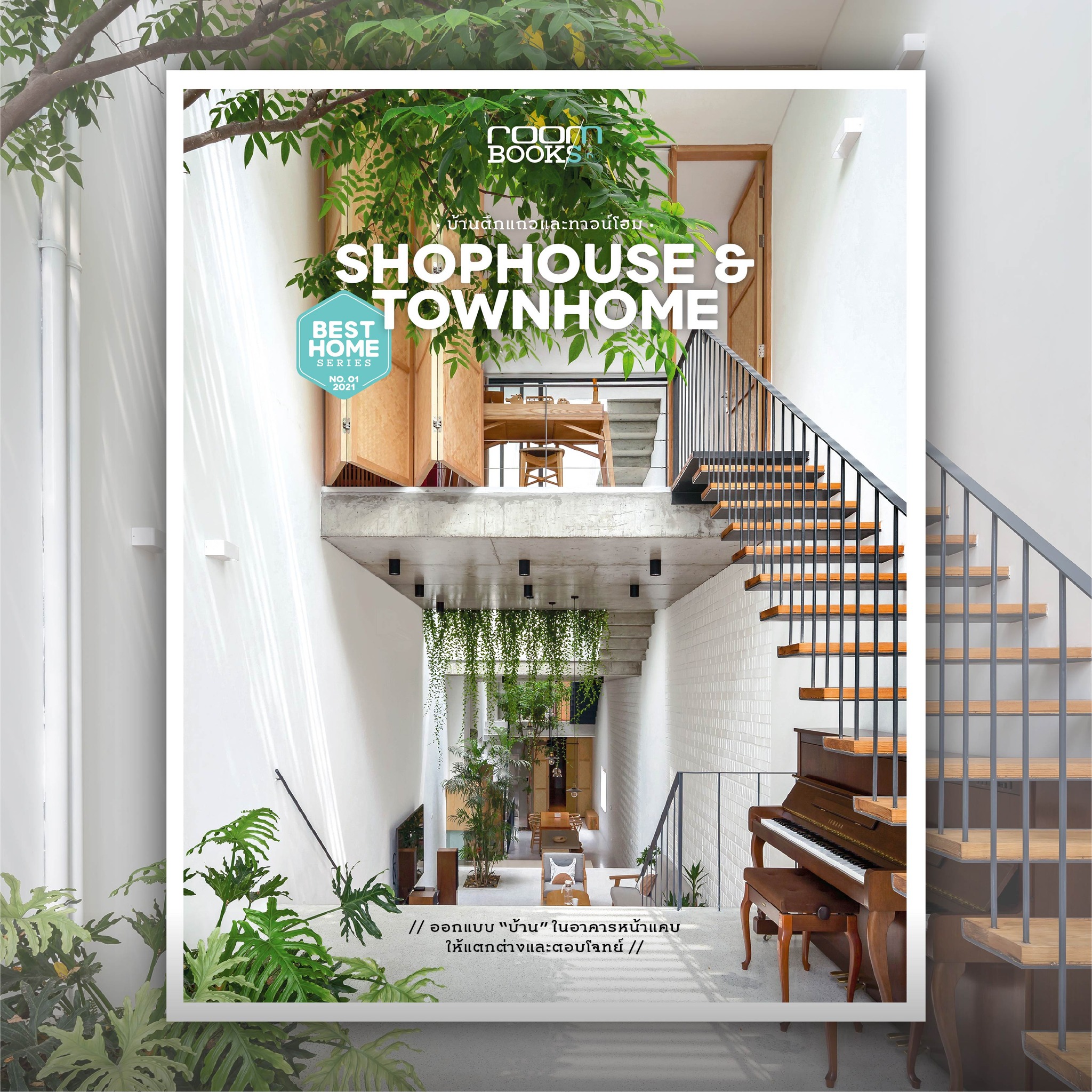
The article is an excerpt from “Shophouse & Townhome”, a proudly presented publication from the “Best Home Series” under “room Books Publishing.”
Available in paperback (Thai Edition) at: https://www.naiin.com/product/detail/532110
Here’s how to order online. https://www.naiin.com/how-to-buy/read/1125
/ Story: Kor Lordkam / English version: Bob Pitakwong /
/ Photographs: Soopakorn Srisakul /
Every home tells a story. This good-sized two-story residence at “Mai Lom Ruen”, an upscale housing development near King Rama IX Memorial Park in Bangkok, is home to a couple and their six adorable pets (a dog and five cats). They moved to this outlying district of the city not that long ago. The 20-year-old house they bought needed improvements so as to answer their lifestyle needs. And a home renovation firm came in handy to do exactly that. The result is a light and airy tropical home with the warm sunshine, plus an image of the friendliness and youthful enthusiasm of the people living here.
The project architect, Tharit Tossanaitada, who is design director of the Design In Motion Co., Ltd, said that in the primary stage, he would have to redraw a new house plan within the confines of the existing home.
It was good that the homeowners already had an idea about what to do and had a blueprint for all the rooms. And with that, the project was off to a very good start.
The 400-square-meter two-story home was ready for remodeling, starting with a teardown of most solid walls that divided the interior into different parts.
The building’s original frames and beams supporting the roof and floor above them remained intact. Thereafter new room dividers were put in place according to the activity and purpose intended for each space.
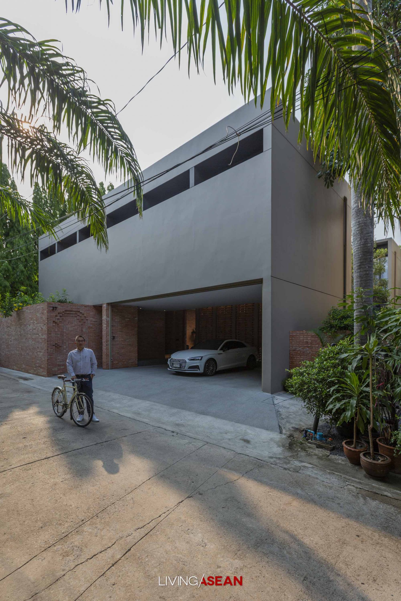
Meantime, the carport that originally stood front and center was moved to the right side of the house. Like so, side-by-side parking has now changed to parking in a column on the driveway.
The result was a house front design that’s wide open without vehicles cluttering up the passageway, creating the perfect front yard that’s easy on the eye.
The house’s first floor that lies in open view consists of a nice little foyer at the front that connects to a home office, kitchen and delightful secluded sitting room at the farthest end. By design, the parlor room is conveniently linked up with the new car park at the right side of the house.
Precisely it’s the architect’s intention to keep this back door entrance strictly for family use and hence no need to enter and leave through the front door every time.
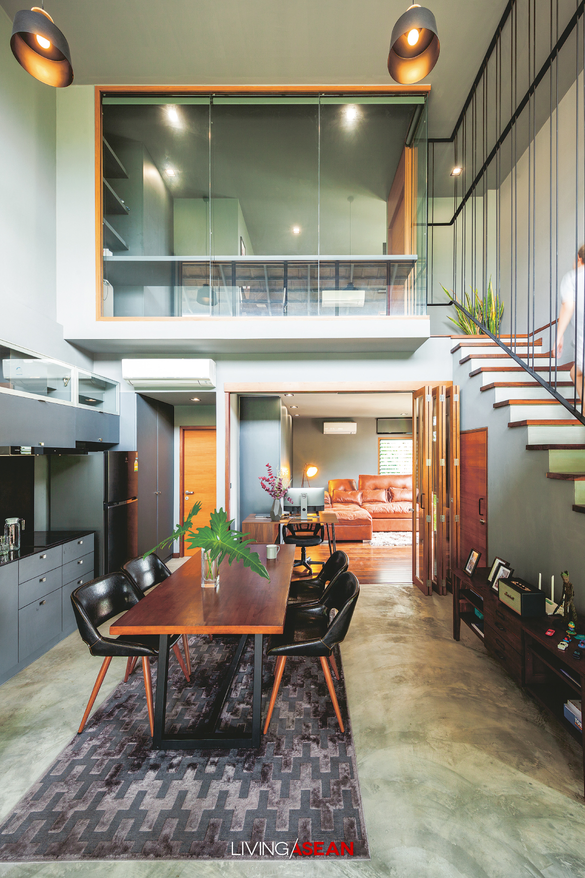
On top of that, the architect had the entrance hall ceiling torn down to make room for a new metal staircase leading to the second floor. The remodeled foyer performs its dual role.
On the one hand, it gives the family direct access to the second floor. On the other hand, it adds consummate elegance to the warm and welcoming antechamber.
Step outside, and you come into a central courtyard enclosed by the house walls. This, too, has undergone a complete makeover.
The grass lawn that had been there originally was removed to make room for a carp pond decorated with aquatic plants, leafy bushes and shrubs, making the outdoor room more enjoyable.
As to be expected, the second floor is a little more private. Several rooms that had been there from the beginning were torn down to provide sufficient space for an ample common area.
The master bedroom remained intact, while a second bedroom originally next to it has since been replaced by a semi-outdoor sitting room enclosed by a balustrade on the outside of the building.
From the looks of it, this represents the most obvious attempt by the architect to bring the outdoors into what was once an uncomfortable drafty old house.
That being the case, the external envelope of the building was torn down to create a perfect outdoor room with bench seating that matches the house façade.
Consisting of strips of steel securely fastened together to form a privacy screen, the redesigned façade extends all the way to the translucent upper covering of the building that allows natural daylight into the home.
On the inside, the second floor also contains a family room and a third bedroom that has since been allocated to their beloved house pets.
As Tharit put it, the most important part of the renovation project was the redesigned layout of the ground floor that made the traffic flow between major living areas easy and gave it ample space perfect for the family’s lifestyle needs.
He said: “What I was trying to achieve was a house plan with a good flow of traffic and carefully thought-out circulation patterns to create a well-lit and well-ventilated interior.
“So the first thing I did was dismantle all the rooms and rebuild them by setting the walls further back slightly to create more room for improved air circulation.
“Albeit viewed as separate units, all the rooms were connected to one another by natural air circulation.”
The architect reiterated that by setting the walls further back one meter, the interior rooms became smaller in size while the semi-outdoor veranda along the outside of the house overlooking the central courtyard gained more space.
This resulted in the good flow of traffic between major living areas.
Plus, there was natural circulation that came from using environmental-friendly systems such as walls fitted with large aluminum windows and roller blinds that open and shut to control the amounts of daylight and fresh, outdoor air coming into this airy tropical home.
These are among the features that help keep the interior cool without air conditioning.
Finally, materials matter. The products that the architect chose were all important to achieve a desirable outcome.
In this case, it was real timber used in the building that made this house stand out from the rest. Plus, the homeowners had a love for everything wood and took the time and effort to purchase the materials themselves.
They included the golden species of teakwood that’s ideal for building the veranda around the central courtyard, door and window casings, ceiling panels, and parts of walls.
The renovation process also saw the original ceramic roof tiles being replaced by cedar shingles that gave the house its inviting appeal.
In summary, the relocation of functions represents a rethink of strategy and practical use in building design. The result is a renovation done right — a bright and airy tropical home that exudes peace and tranquility thanks to natural materials and environment-friendly systems.
As the architect puts it, “even one meter matters” when it comes to quality home improvements. It’s a metamorphosis of purpose that transforms the unpleasantly cold 20-year-old house into an airy tropical home with a sunny personality that gives a feeling of comfort, warmth, and relaxation.
/ Story: Phattaraphon / English Version: Bob Pitakwong /
/ Photographs: Arti Pictures /
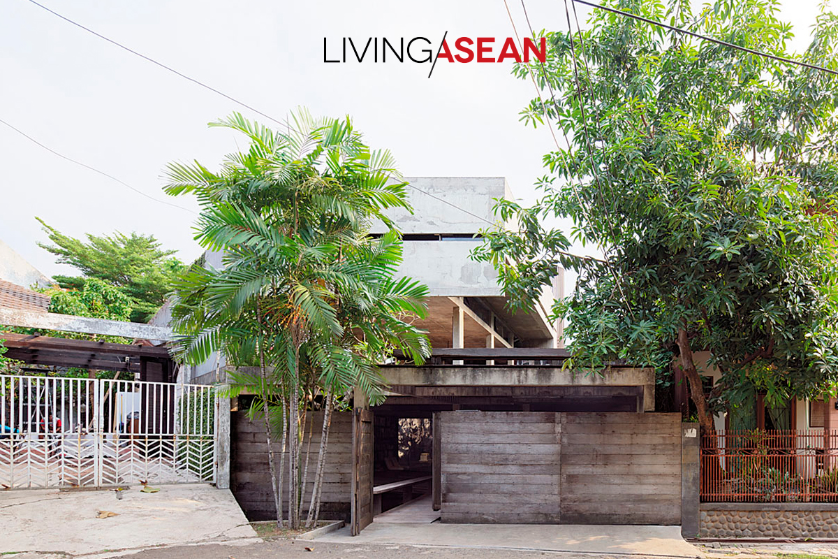
A house plan that combines living spaces and a home office could be just what you’re looking for. Here’s the home of a designer couple in Tangerang, a city half-an-hour’s drive from central Jakarta, that illustrates this. Known as MP House, it marries work-from-home essentials with well-planned living spaces that come loaded with personality.
The secret to a productive daily routine, the house plan combines residential and home office functions into a uniform whole. The workspace occupies the first floor that also includes a split-level lower floor, while the quiet and peaceful residential area is placed on the level above it.
The ample living area in itself is divided into two parts. Semi‐private spaces such as the living room and dining room take up the front part of the house, whereas more secluded places and bedrooms are located at the rear designed for rest and relaxation.
The first floor has a dry courtyard garden that separates the home office area from guest and kids’ rooms tucked away at the rear of the house plan. Healthy green foliage in the yard doubles as engine that drives natural ventilation and provides a light and heat barrier. And the result of MP House is a calm and peaceful indoor environment that’s the key to a happy family life in Tangerang.
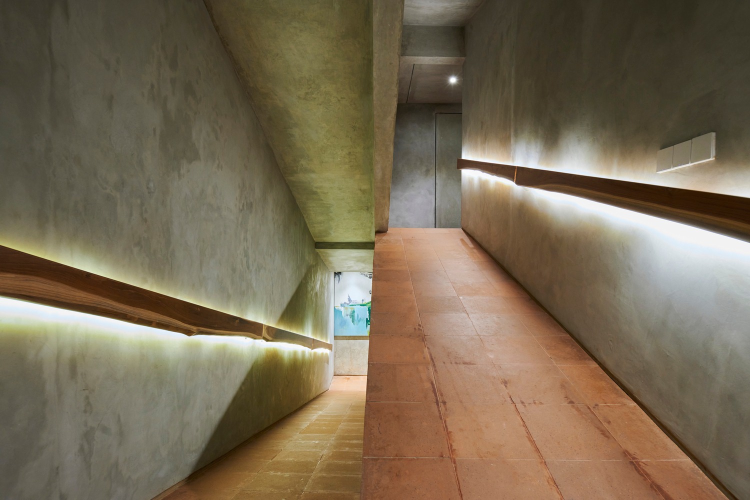
In a sensitive and practical way, an indoor ramp with handrail is put in as an alternative to a set of stairs to provide access between different levels. The inclined plane is particularly useful for the homeowner’s aging parents. Plus, it’s the split-level house plan that makes the most effective use of available space.
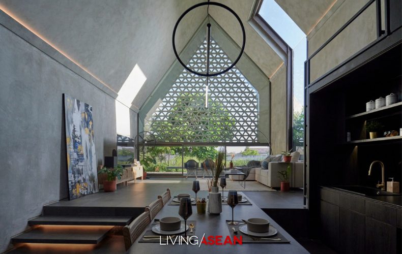
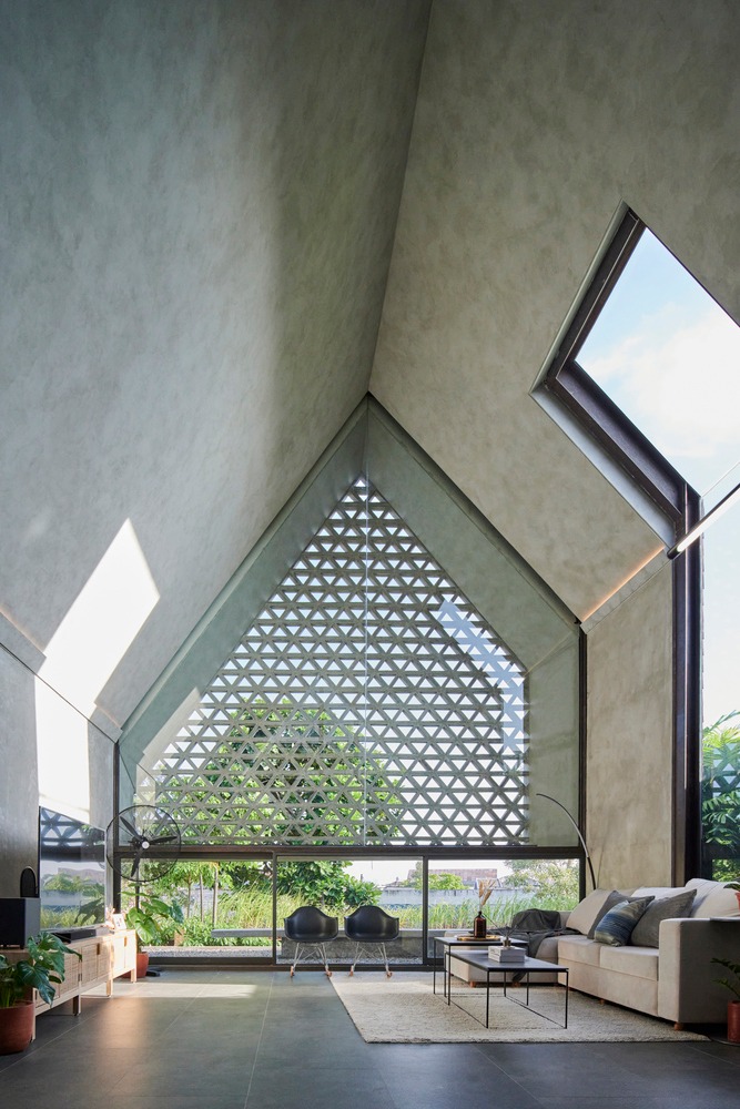
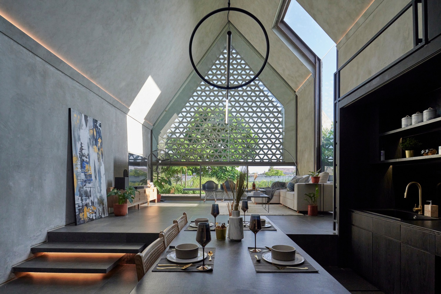
There is a real sense of achievement in the way the living room and dining room combine into one large lounge with comforting earth tones and double-height ceilings. It’s a place to eat home-cooked meals and enjoy family conversations that help keep everyone together. Semi-private by design, the ample social interaction space is well-lit and well-ventilated.
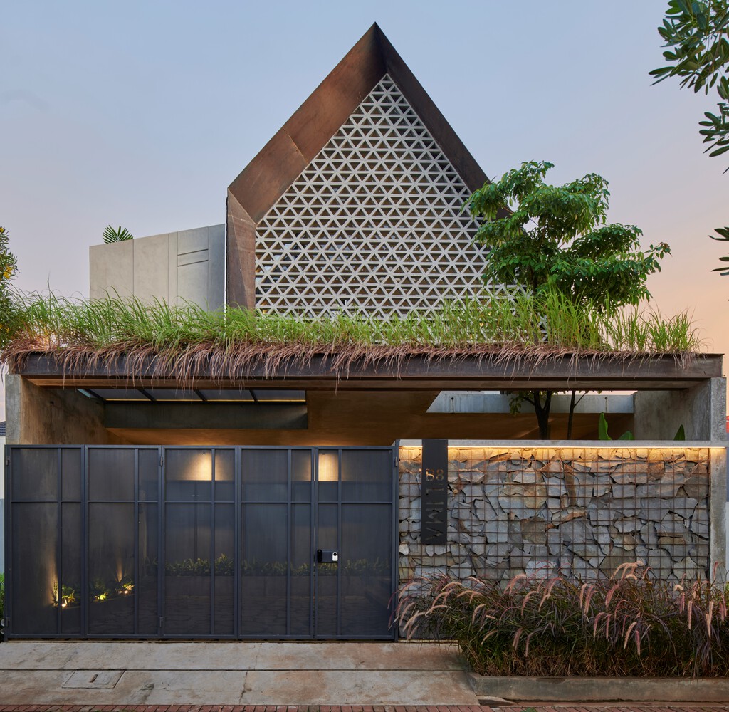
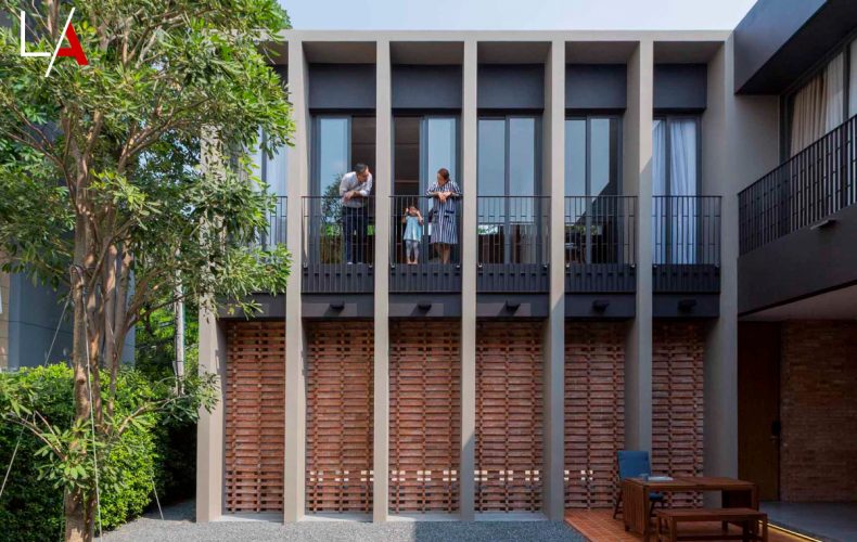
The house boasts a modern envelope and perforated brick façade overlooking a dry garden located just above the carport. The decorative breeze blocks are chosen for their ability to provide sun protection and maintain openness and airflow.
In the meantime, flat masonry textures that are repetitive and earthy in color provide a variety of light refraction that adds aesthetic pleasure to the interior living space.
Taking everything into account, the house under a gable roof provides plenty of ample spaces to serve functional and aesthetic purposes. MP House in Tangerang strikes the right balance between office work and home life, creating a perfect combination that feels cozy, comfortable and roomy.
/ Story: Sarayut / English version: Bob Pitakwong /
/ Photographs: Ritthirong /
Let’s say you’re looking for a modern courtyard house plan to get inspired. Here’s one nestled in the heart of Bangkok’s downtown that’s built to accommodate three generations living in one household. Thoughtfully designed, it’s capable of answering the family’s lifestyle needs, plus it’s easy to maintain thanks to an uncomplicated layout. What looks opaque from the outside is compensated by a bright and airy center courtyard that’s the heart of family life. Its story is inscribed as part of the building’s decorative features.
When a design team from the Atelier of Architects Co., Ltd. was tasked with creating a new home for eight people including not just parents and their children, but also grandparents, the first things they thought of were safety features, comfortable living spaces, privacy protection, and a peaceful environment for all family members. Yes. That’s exactly what they had in mind.
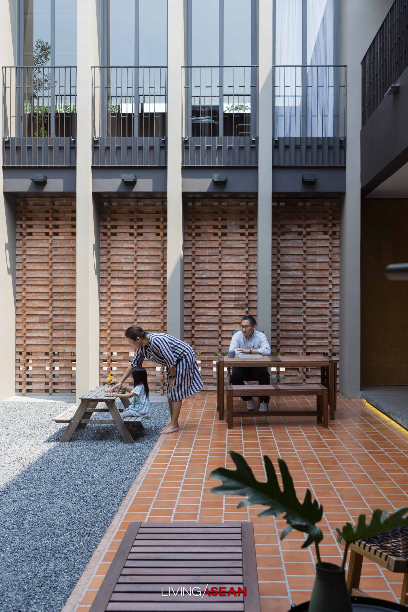
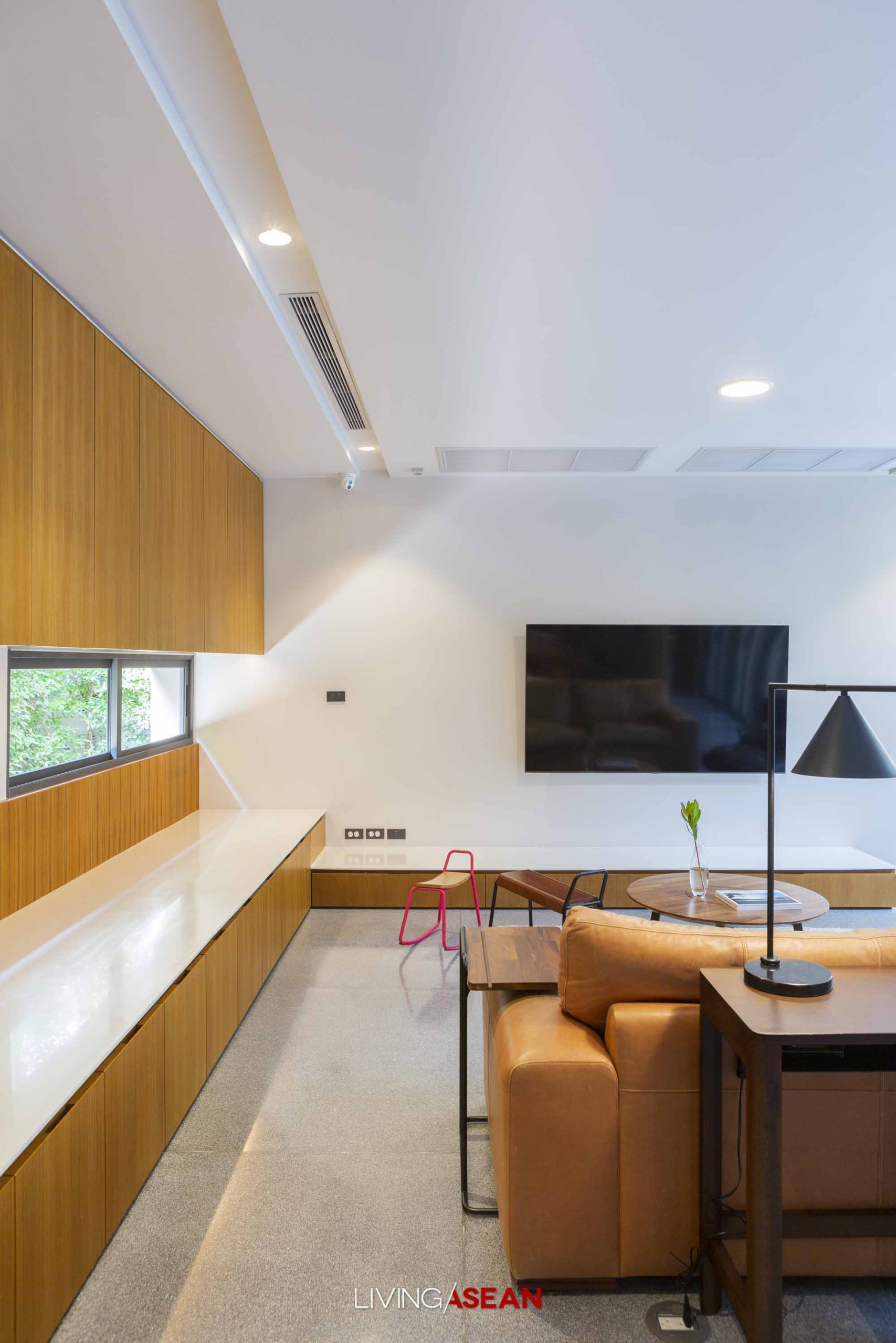
The two-story, six-bedroom house plan may seem a bit crowded for 130 square wa of land (520 sq. m.), but the overall effect is delightful. It’s neatly planned to ensure the proper space utilization; every available space is used in an effective way.
Homeowner Salyawate Prasertwitayakarn, himself an architect, put it this way:
“If the house was positioned at the center as is usually the case, then there wouldn’t be any room left for a yard, let alone a small piece of ground for trees.
“The house is adjacent to vacant lots that will see large construction projects coming up before long. So the only way forward is to build a U-shaped courtyard home enclosed by the solid external envelope. The center courtyard has a view of the apartment building that’s the family’s business.
“Although the courtyard lies facing west, it’s protected from the sun and heat by the adjacent five-story apartment building. The result is a cool, small outdoor room for little children to run and play.
“To protect family privacy, vertical concrete fins and a full array of plantation blinds are installed along the façade facing the apartment building.”
Taken as a whole, it’s simple clean design that gives this new courtyard house its character.
Among other things, its distinctive features include an array of transom windows that add more natural light to the home. Its modern and fresh interior with shades of gray bespeaks a clean, clear and uncluttered layout, while exposed brick walls add timeless elegance to the peaceful ambience.
The patio adjoining the house is covered in gray pea gravel that’s comfortable underfoot and easy to maintain. It’s a simple hardscaping material that expresses rich and subtle meanings. On this matter, Salyawate explained:
“I want to get the message across, something that internalizes values and what’s important in life for everyone in the family.
“The meaning of life is expressed through the work of art executed directly on the brick wall by the entryway. It takes the form of the Thai letter “p” that’s the initial of the family’s three sons — Pahda, Pheem, and Pinyada.
“Precisely, it’s a reminder that this place is made for them.”
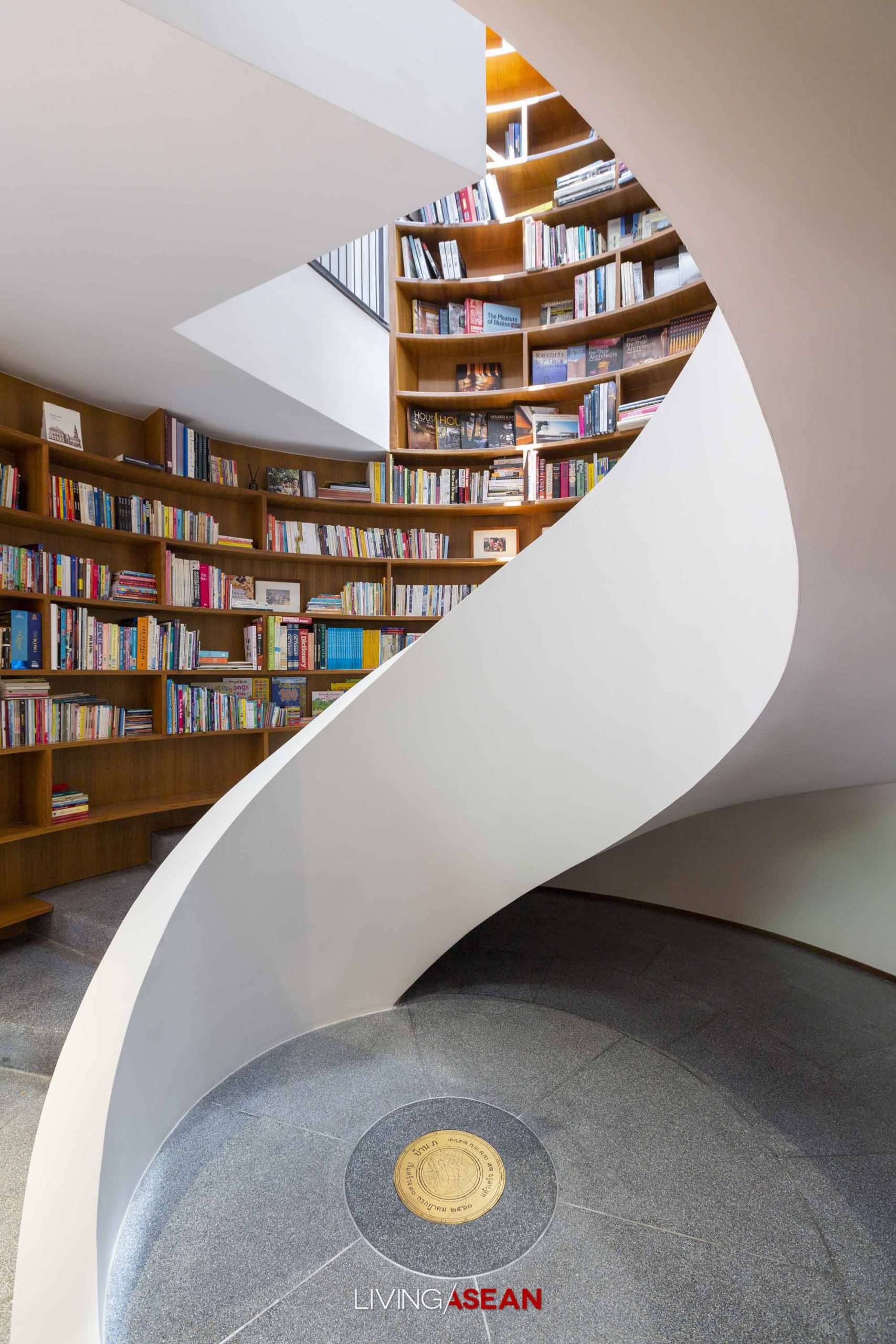
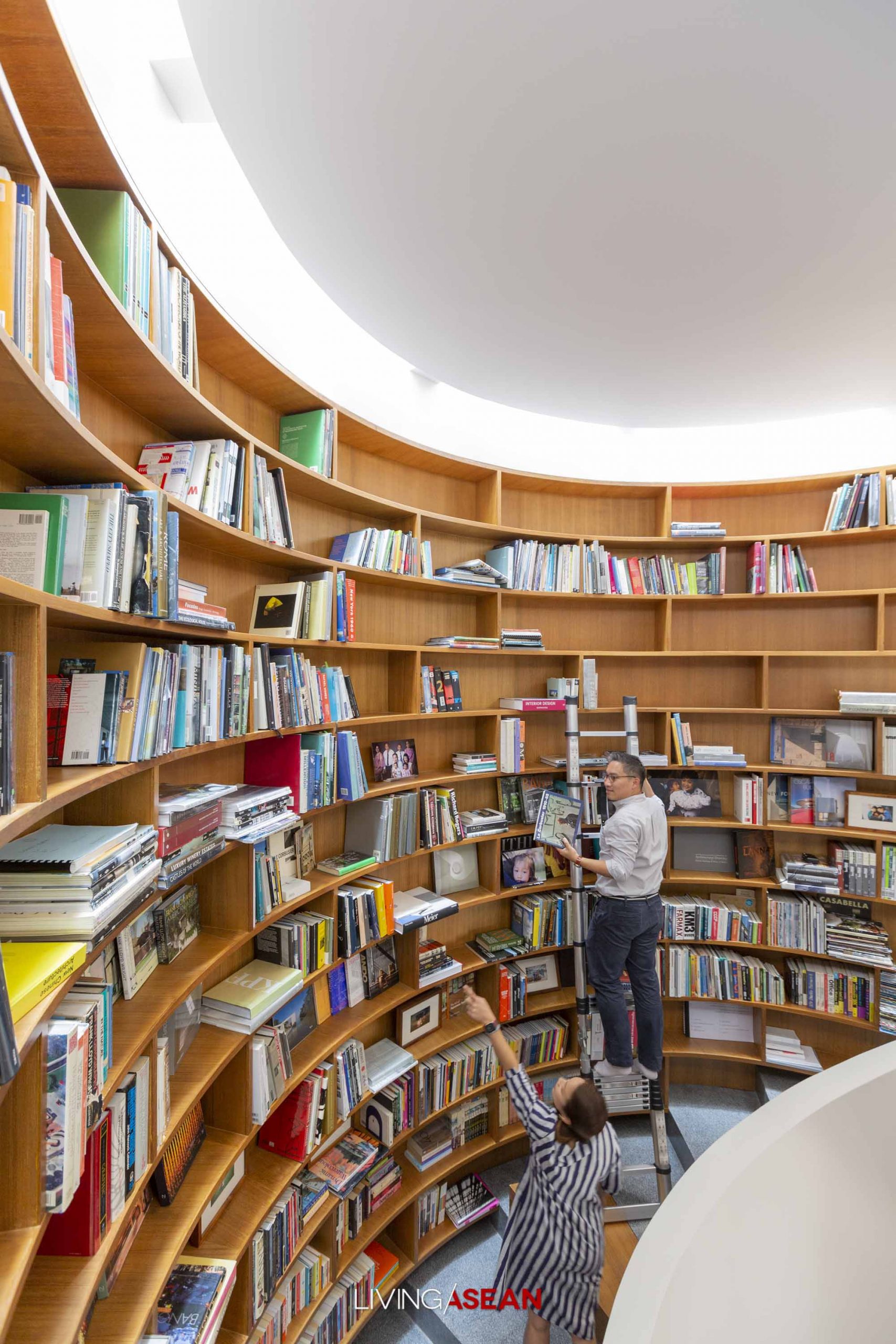
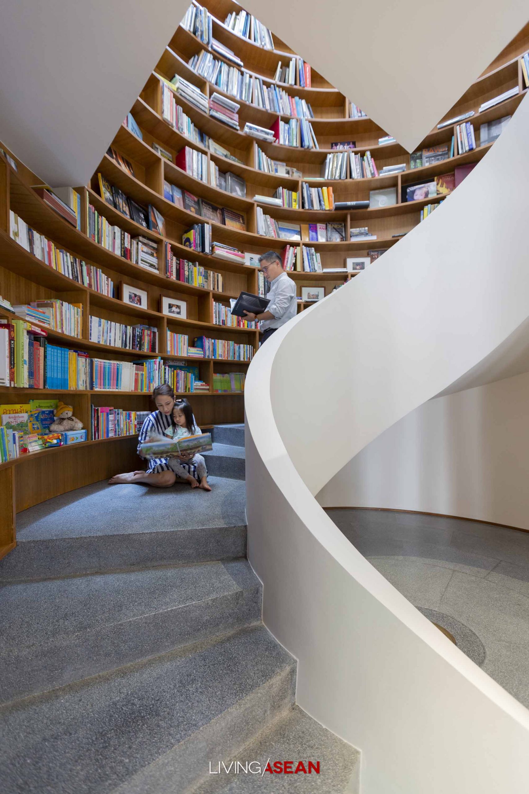
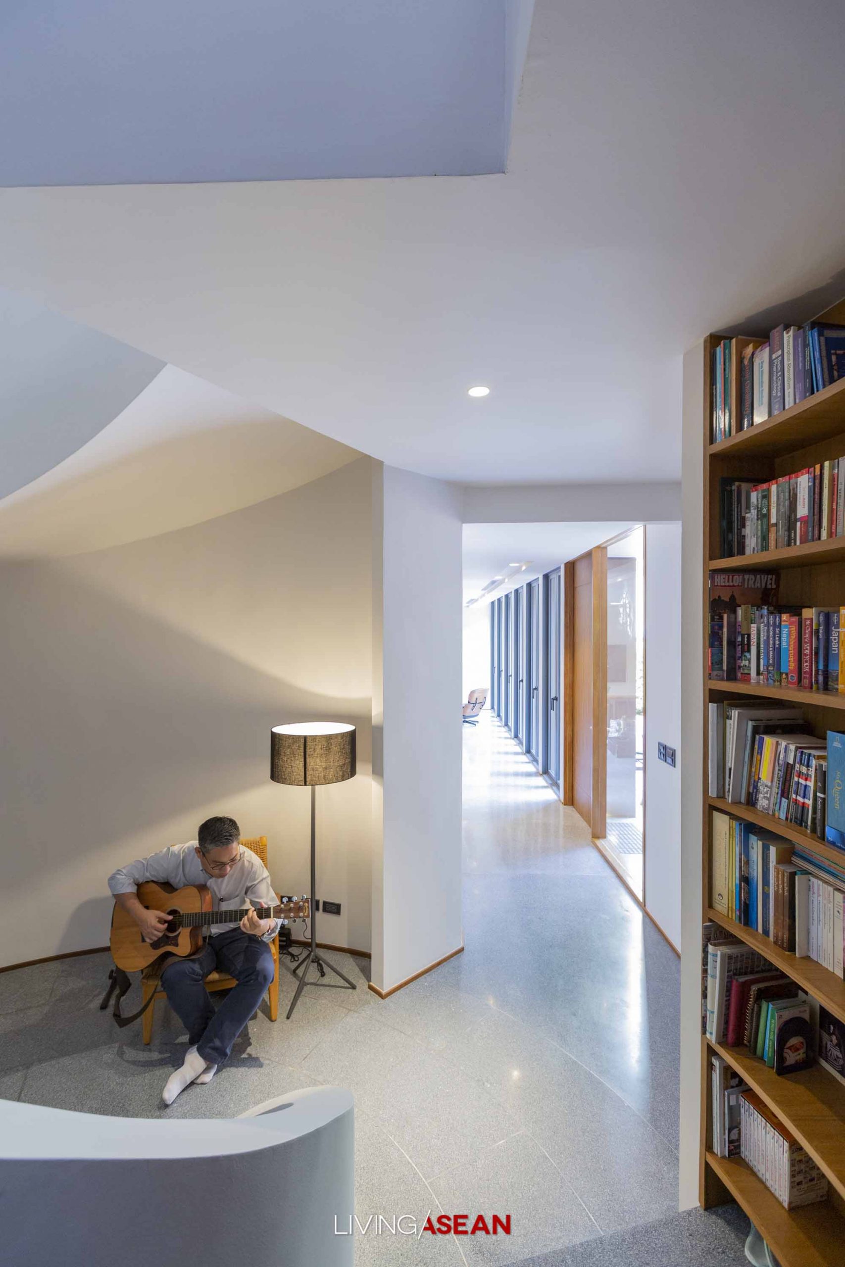
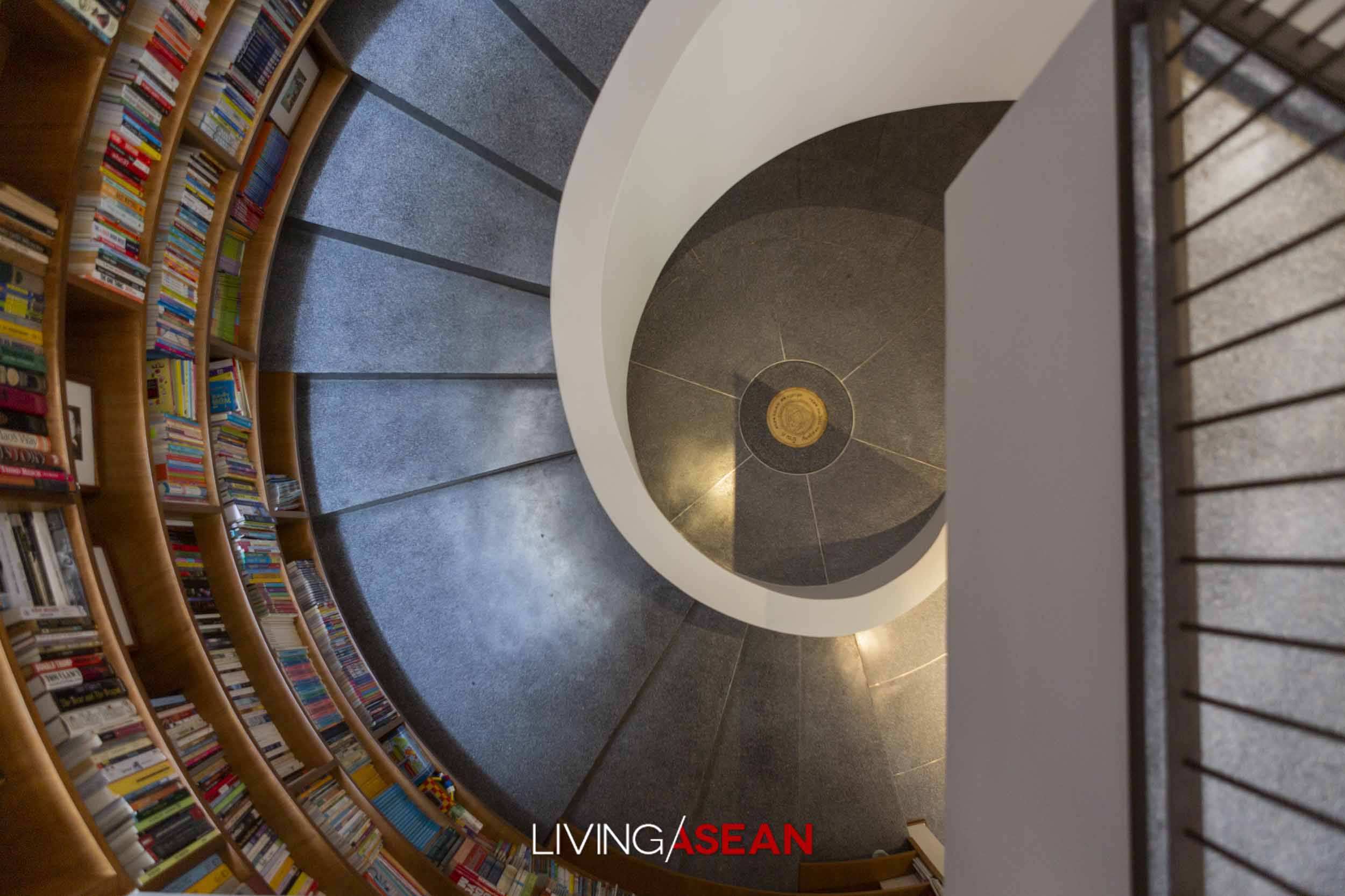
To get people from one floor to the next, a spiral staircase stands surrounded by creative bookshelf design. It’s one of the most frequented area of the house where a bronze plaque is fixed to the floor as a reminder of when the house was built and completed.
The outlines of the couple’s hands and those of their children are inscribed on it. Small hand images indicate the family moved in when the kids were little.
Visiting house guests can tell right away the home is perfectly cozy without elaborate décor. But for the eight people who live here, it’s a special place made for living a simple life, one full of rest and room to pursue their dreams.
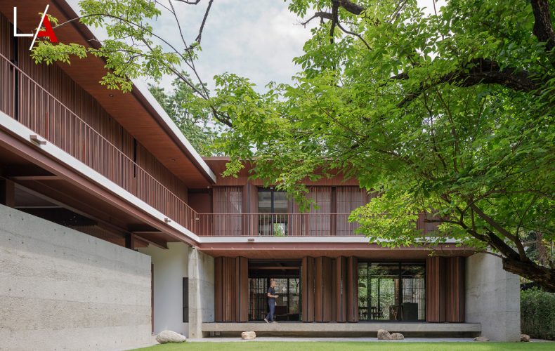
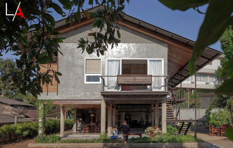
Like a journey back in time, here’s a modern Tropical house with the charm of bygone years. It’s a complete renovation project inspired by the cluster homes characteristic of traditional Thai ways of life. Built with the future in mind, the old family home is lovingly restored to answer the lifestyle needs of the three generations who live here. Plus, it blends into a beautiful lush green landscape.
Extended families have long been a pillar of Thai culture. Back in the day, when a couple joined in matrimony, traditionally it was the groom who moved into the home of the bride. As the family grew, it was time to build a new home nearby, usually on the same property.
Likewise, this add-on unit of construction is well suited to the purpose. The result is a building complex that contains separate houses where extended families live together independently of one another.
Prior to being renovated, the two-story home had stood on this 200-square-wah (800 sq. m.) plot of land for almost two decades. Rated structurally sound, it was capable of accomplishing further improvements. Hence, a complete remodeling project was undertaken so that three generations could live together and yet enjoy the privacy and comfort of home.
Extended family living offers several advantages, among them a close support structure and care for the wellbeing of all family members.
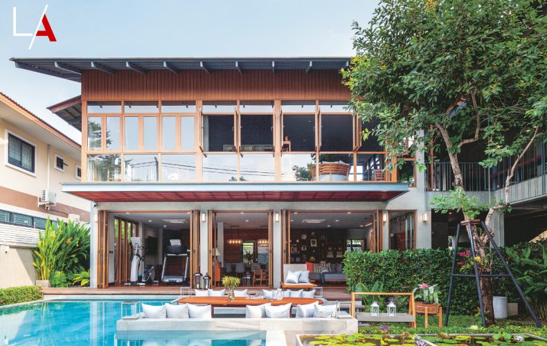
The redesigned home plan boasts a peaceful courtyard with swimming pool enclosed by the walls of a large L-shaped building. There’s a passageway that allows access between the two residential units on either side, while parts of the upper floors are reserved for future use.
The connected wings are interactive communities. In fact, they physically exist as two separate houses ready to change hands at some future time, which explains an empty space lying in between.
The ground floor of what was once the original family home now houses a reception area with a gym, dining room and small kitchen. The second floor is a private residential home with Mom and Dad’s bedroom and a sitting area conveniently linked with the other building.
The newly added extension comprises three all-inclusive residential units. Clearly separated from one another, they are accessible by a roofed platform along the outside of the house.
Although the homeowners have a deep affection for cluster homes built the old-fashioned way, it makes perfect sense to opt for new construction materials that are long-lasting and suitable for modern applications. They include building walls with aluminum stud framing and faux wood siding panels, which are more appropriate than real wood for air conditioning.
To protect the home from the dangers of extreme heat, exterior brick walls are decorated with engineered wood cladding products. And for a more natural look, clear protective finishes are preferred over paints, while aluminum trim provides additional decoration along the edges.
In the same way, doors and windows are made of aluminum that looks and feels like wood. Together they bring a beautiful design element to the project. Plus, aluminum is more durable and functional than real wood.
Overall, it’s an intriguing combination of the modern and the traditional – a modern Tropical house built of steel frames, timber and concrete construction. Together they enhance the home’s contemporary appeal, while the finishing and decoration is typical of Thai residential architecture.
More than anything else, it’s design that promotes social interactions among family members. While the children enjoy privacy in the comfort of their home, they have places to hang out together, shoot the breeze, exercise and share meals with Mom and Dad.
Plus, open concept floor plans offer many benefits. They keep the house well ventilated, help beat daily stress, and eliminate the need for air conditioning.
To get rid of food smells fast, the kitchen is at the furthest end, where Mom prepares both international dishes and authentic Thai recipes, especially the southern kind that only Mom knows best. All things considered, it’s mealtime socializing that’s the center of family life. It’s something they do together to stay connected.
Architect: Pipol Likanapaisal and Apichart Rojthoranin (Space Story Studio)
A modern duplex house by EAST Architects makes use of natural light, sun and airflow to provide indoor thermal comfort that’s the hallmark of the ultimate Tropical design.
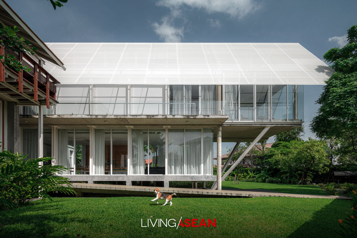
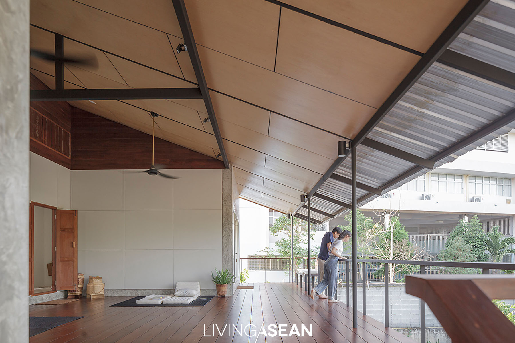
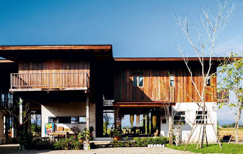
One wing holds a semi-outdoor living space roofed over with flat terracotta tiles in a timeless shade of gray. It’s built almost entirely of wood with a balcony and a “tai thun”, or the underfloor space high enough for many different uses.
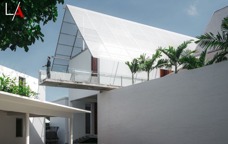
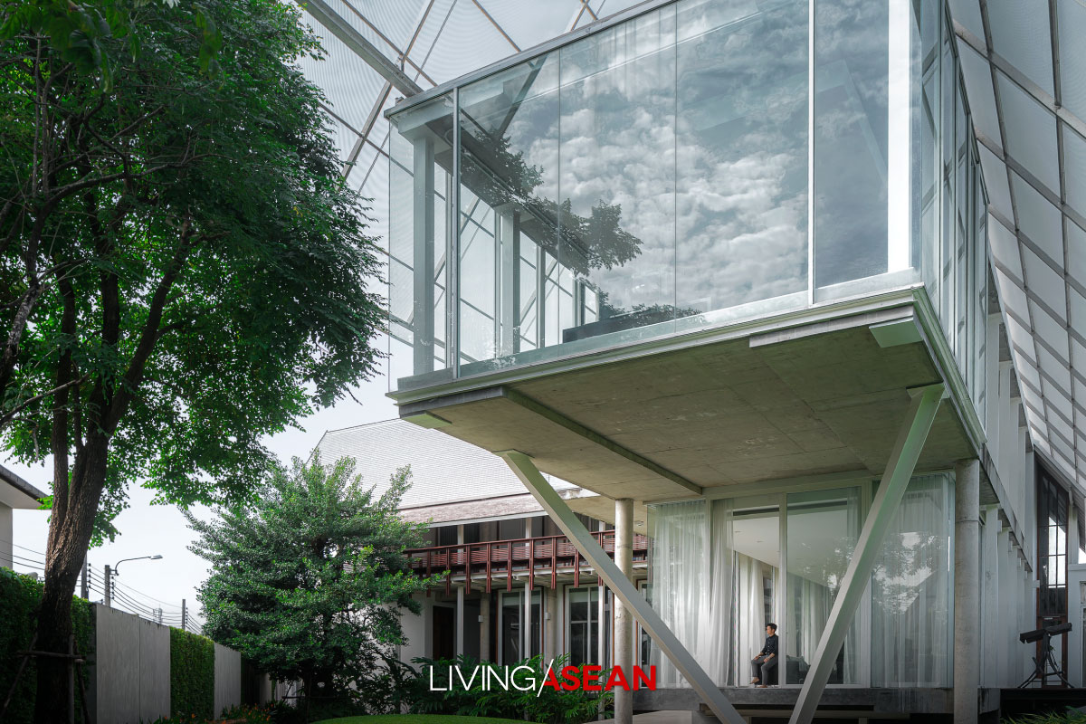
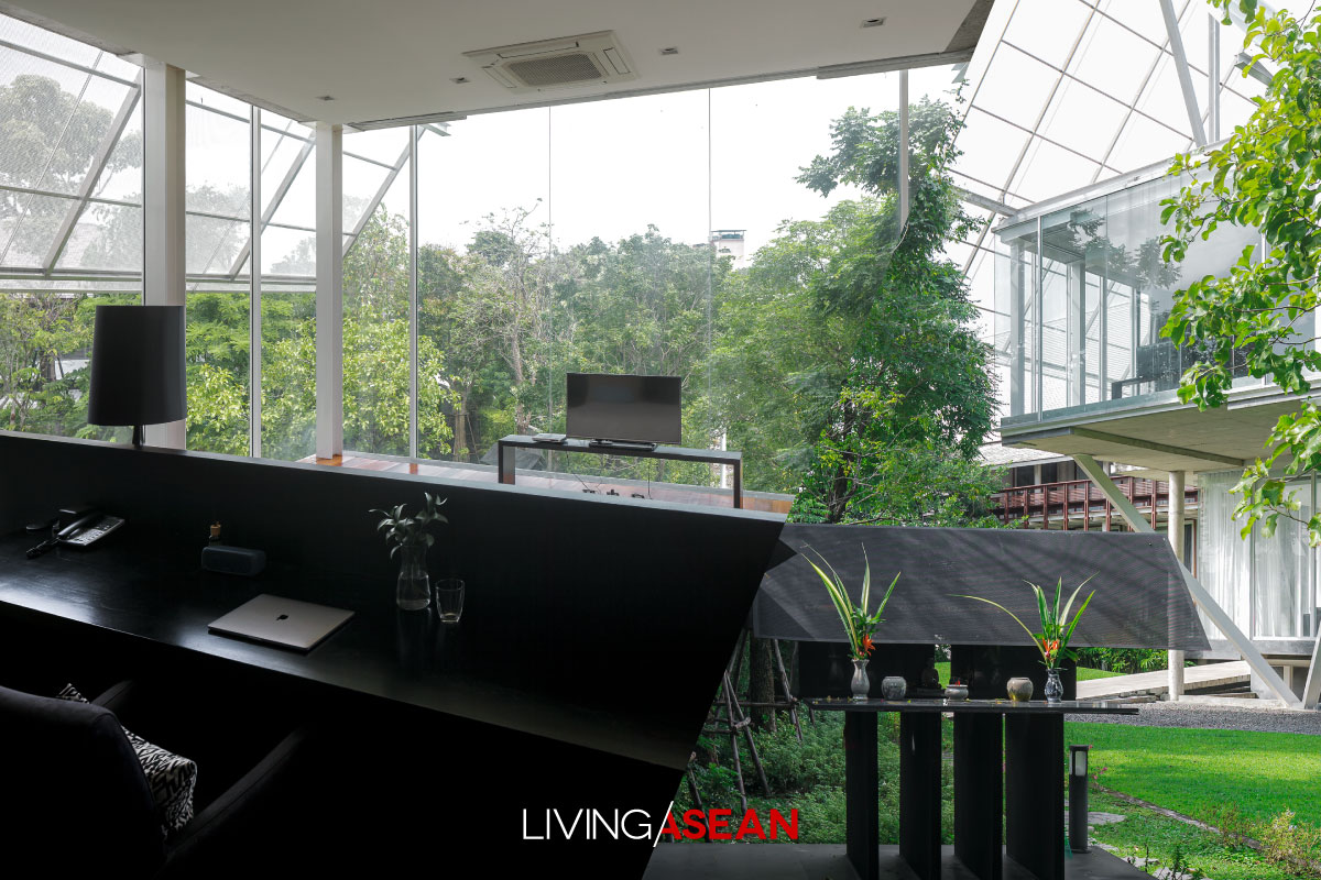
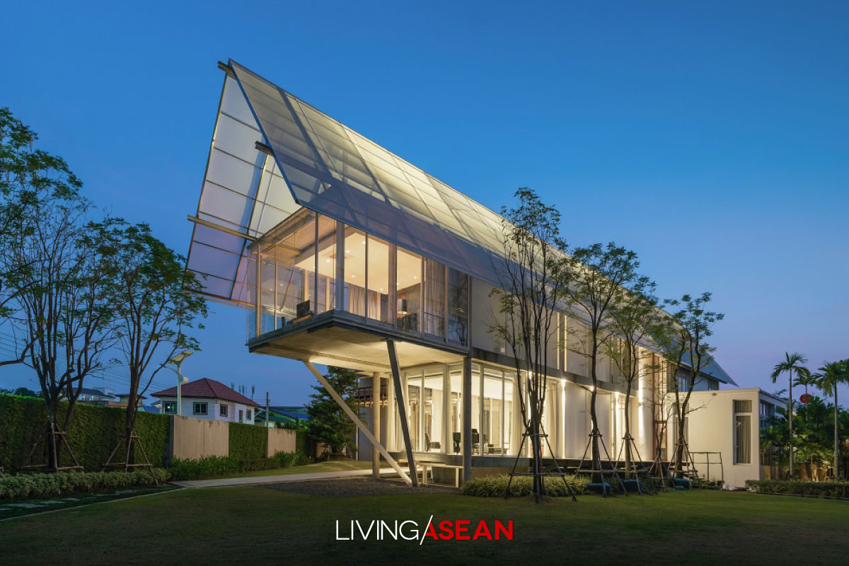
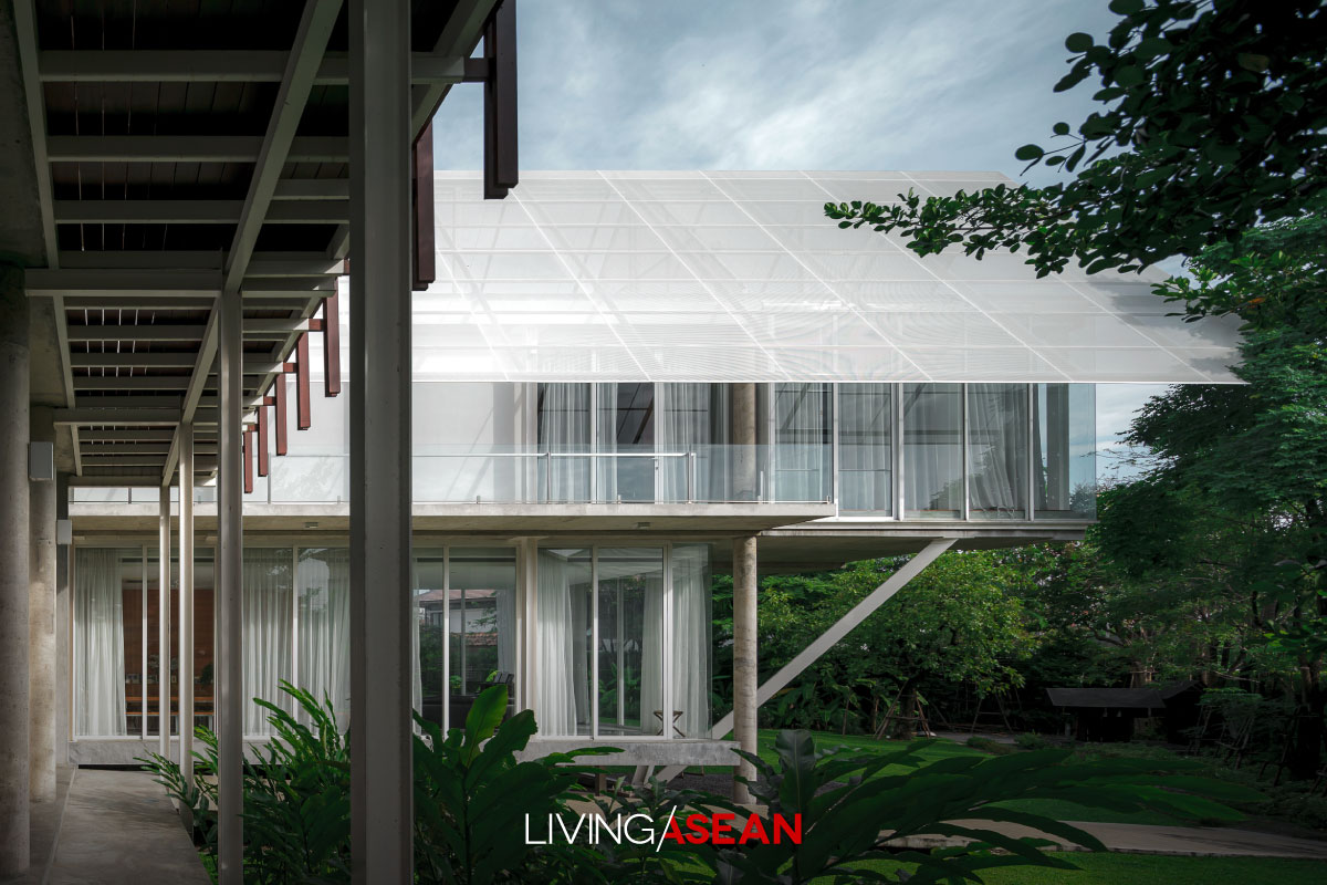
The other wing boasts the style, experience and flexible realities characteristic of postmodernism. To get enough natural light, the building is enclosed by exterior glass wall systems. Upstairs, a straight passageway connecting individual spaces leads to a cantilevered room that extends 6 meters supported by a rigid V-shaped steel frame – an unusual approach to lightweight modern house design.
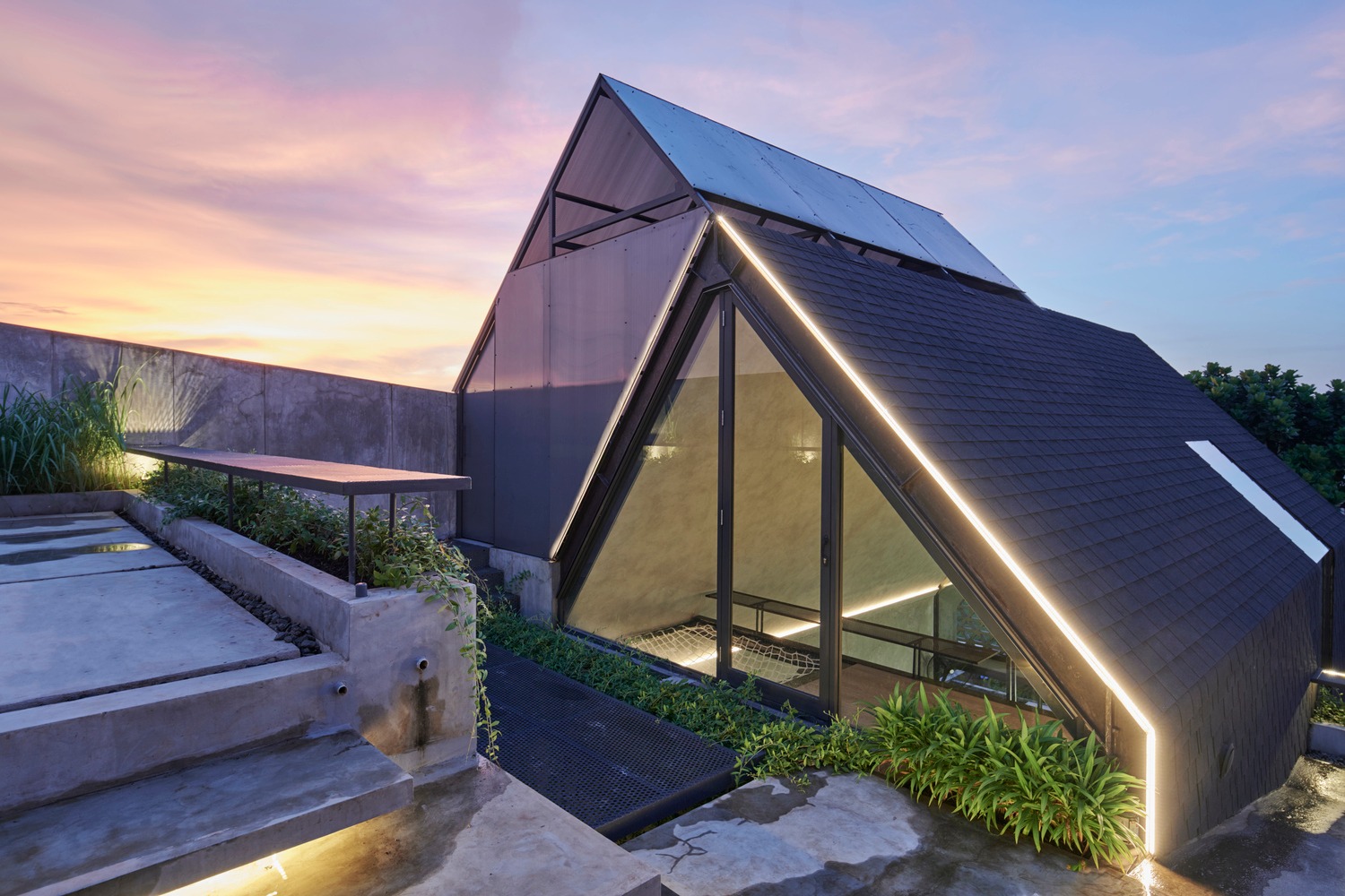
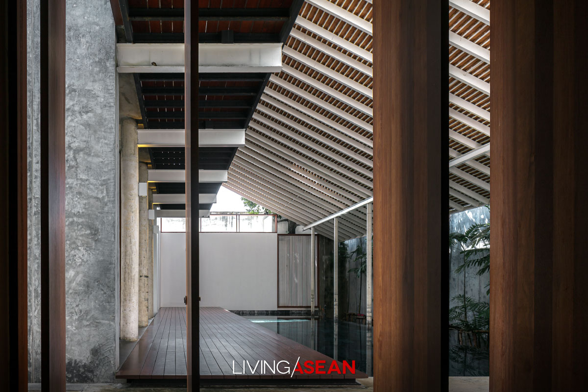
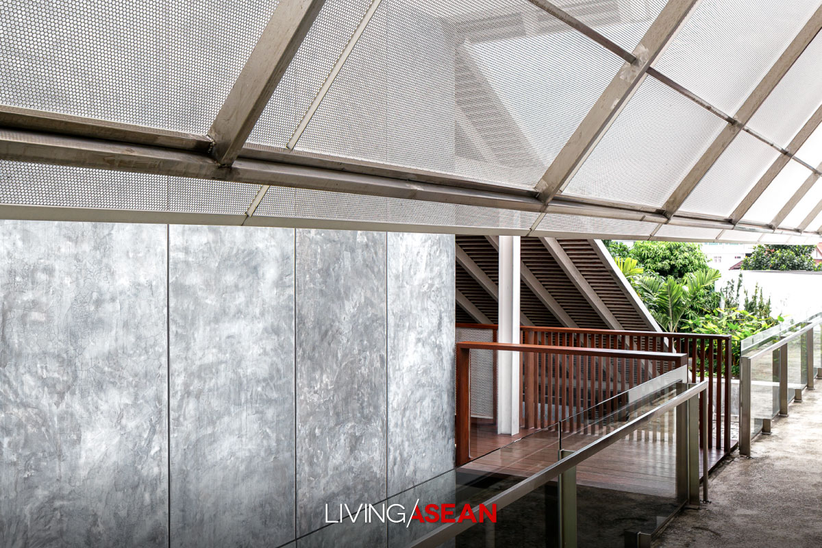
The upper covering of the ultramodern wing is a steel-reinforced concrete slab. The high pitched gable roof that rises above it is topped with corrugated aluminum panels to allow light to pass through. This keeps the home well-lit by day and glowing with light and color by night, which explains why it’s named “Baan Hing Hoi”, literally translated as “Fireflies House”.
A piece of architecture representing the nexus between Eastern and Western ideas, the Fireflies House is a design that merges Modern and Traditional values into one Tropical-style home. The house plan doesn’t sit parallel to the road in front of it. Neither does it align with property boundary lines. Rather, it’s designed to respond to wind direction and the sun’s path across the sky for the perfect indoor thermal comfort.
That pretty much summarizes the design concept embraced by two assistant professors, Pirast Pacharaswate and Sayanee Virochrut, of EAST Architects. The design duo prides themselves on being the “architects of Tropical rainforests”.
Together they turned a family’s wish into reality. The homeowner, Thanawat Yongsanguanchai, wanted a modern, warm and welcoming place where his family could spend more time together outdoors.
He was looking for a bright and breezy design, one that’s comfortable without air conditioning. And the architect duo was on hand to deliver exactly that by making natural ingredients pretty much an integral part of the plan.
The result was a well-thought-out modern house that included a part intended be perceived as if it were a tunnel leading to another world beautifully ensconced in the rear of the property.
“In essence, it’s a design takes into account basic human needs for relaxation and the culture in which people live. Simply put, the relationship between culture and climate is one of the inevitabilities of life. It’s for this reason that the house is built with knowledge of the climate in mind,” said architect Pirast Pacharaswate.
“We think up contradictory thoughts when designing the duplex house plan. The kids belong to a new generation, but their living wing boasts certain features and comforts that are symbolic of Thai-style houses in former times. In juxtaposition, it’s strikingly different from the design of the parents wing, which is evidence of a new language of architecture.
“The parents wing sits under a high pitched gable roof that glows with light and color, which conveys a great deal about the postmodern school of thought. The real upper covering that functions as the roof in a practical sense is a steel-reinforced concrete slab that lies underneath it. In other words, the gable is there to make a statement about postmodern philosophy.”
Pirast explained: “It’s our intention to present a feature characteristic of traditional gable roof houses, something considered old-fashioned. And to create a welcome contrast, we roof it over with modern building materials instead.
“The result is a modern house topped with a gable that shimmers in the sunlight. It’s covered with corrugated aluminum panels that’s lightweight and very noticeable, creating an entirely new perception.”
“We found out that the homeowner preferred white to other colors, so we responded with a choice of cool-toned whites for the parents wing. For contrast and comparison, the children’s wing gives a powerful impression of being Thai. It’s roofed over with flat terracotta tiles in a nice shade gray.
“Wood is the main building material here. For strength and durability, the truss or framework supporting the roof is made of metal, but the skill and craftsmanship are Thai style. The two wings are linked by a roofed platform along the outside of the house.”
The children’s wing is semi-outdoor by design, thanks to the veranda and spacious traditional-style underfloor spaces. It differs greatly from the parents wing that’s enclosed by exterior glass wall systems, a great way to bring the beauty of the outdoors inside. Go straight down the corridor, and you come to individual rooms and functional areas with modern conveniences.
The ground floor holds a pantry and dining area with a sitting room nearby. It’s dominated by a long dining table that’s custom-made. The upper floor contains Mom and Dad’s bedroom that projects horizontally into space.
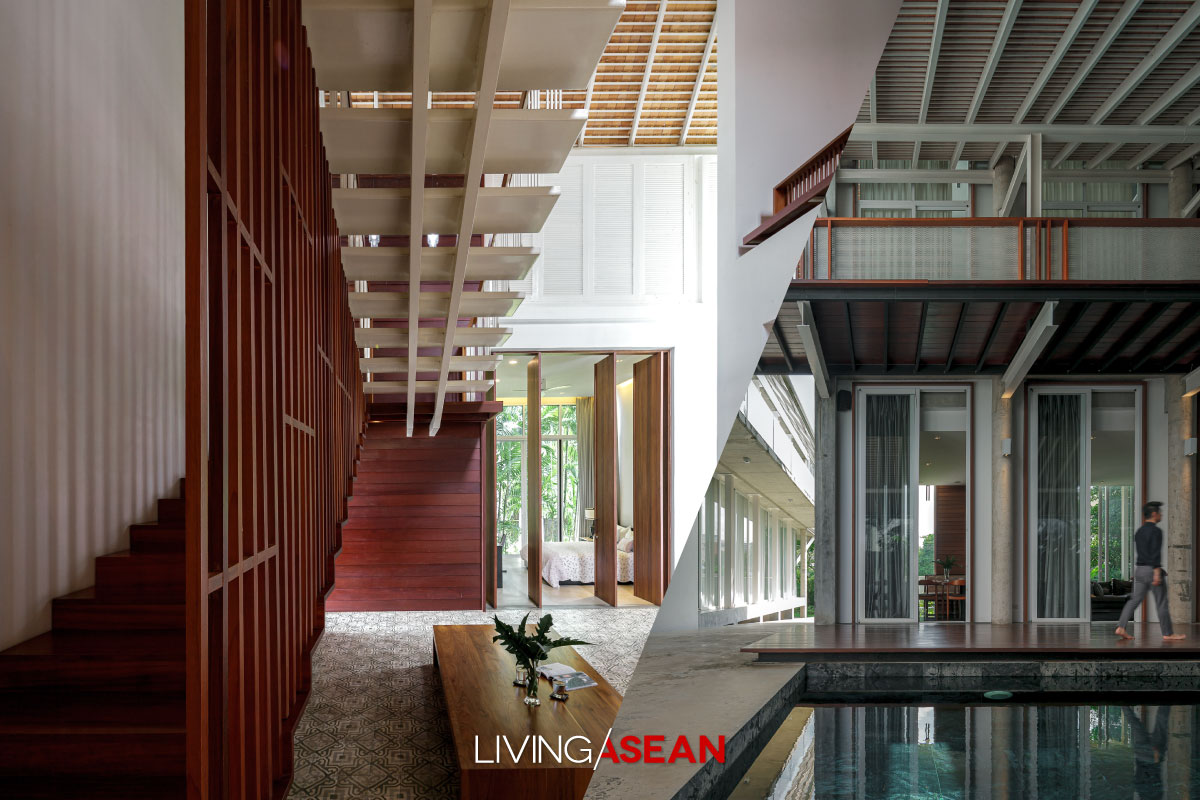
Glass walls pour natural light into the room that’s embraced by nature. There’s a multi-purpose room with wood décor ideas. An array of alternating plain and hand-carved wood cabinets ooze the charm and poise of Thai-style residential architecture.
Upstairs, the bedroom projects 6 meters into space supported by a rigid V-shaped steel frame for a lightweight look. Floor-to-ceiling glass wall systems afford views of the landscape.
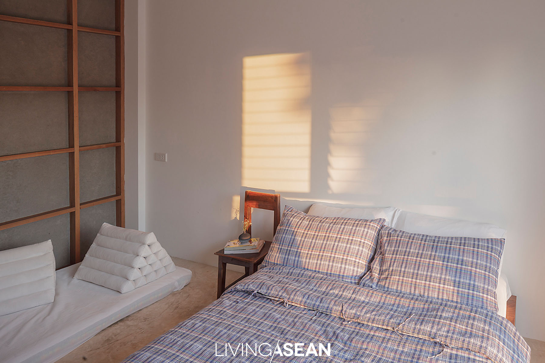
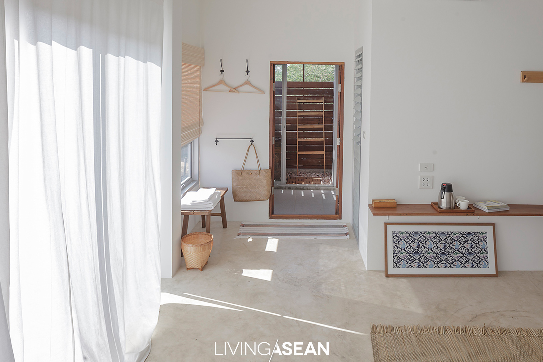
Proceed to the children’s wing, and you discover not all ceilings are horizontal. Their bedrooms boast beautiful ceilings that slope in agreement with the gable roof. The vertical siding under the gable is open to bring natural brightness inside, while accent wall ideas behind the headboard fill the room in style.
There’s something quintessentially Thai in the bedroom where the platform bed frame is wider than the mattress, an easy hack to create space for wedge pillows and the triangle pillow that’s unique to Thai culture.
The architect said: “To make a positive first impression, it’s good to be a noticeable new phenomenon. Like so, the garden pathway is strategically built in such a way that people recognize the unique roof design as they approach the house from various distances and directions, each resulting in a different point of view.
“Psychologically, humans and architecture interact with each other all the time. Circulation, or human movement in and around a piece of architecture, constitutes an interaction. It’s an experience that creates an awareness and evokes admiration of architectural beauty,” Pirast wrapped it up nicely.
All told, the gable roof duplex evokes respect and warm approval through outstanding design and the power of storytelling that combines traditional values, longing for nature, and great aesthetic pleasure into one coherent whole.
/ Story: Samutcha Viraporn / English version: Bob Pitakwong /
/ Photographs: Soopakorn Srisakul /
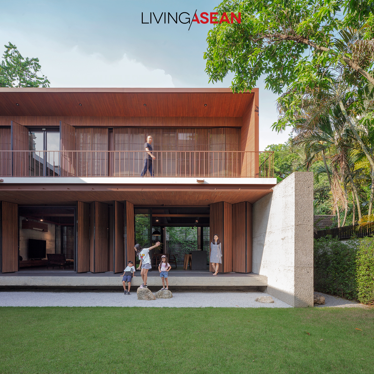
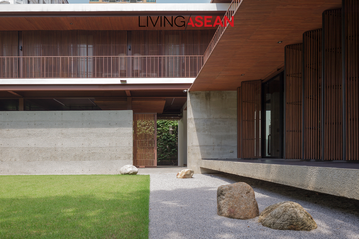
To have more space for his three children, M.L. Varudh Varavarn (Vin) of Vin Varavarn Architectsbuilt this modern house amid a garden on a quarter-acre property in the heart of Bangkok’s ChidlomDistrict.
“Children need a place with trees to run and play,” was Vin’s first thought in keeping all the original trees for the garden. Each room looks out on this great play area.
“When we built the place we’d just come back from living abroad in a town house. There wasn’t really enough space for the kids there, so we made this home more about the kids than ourselves,” he told LivingASEAN.
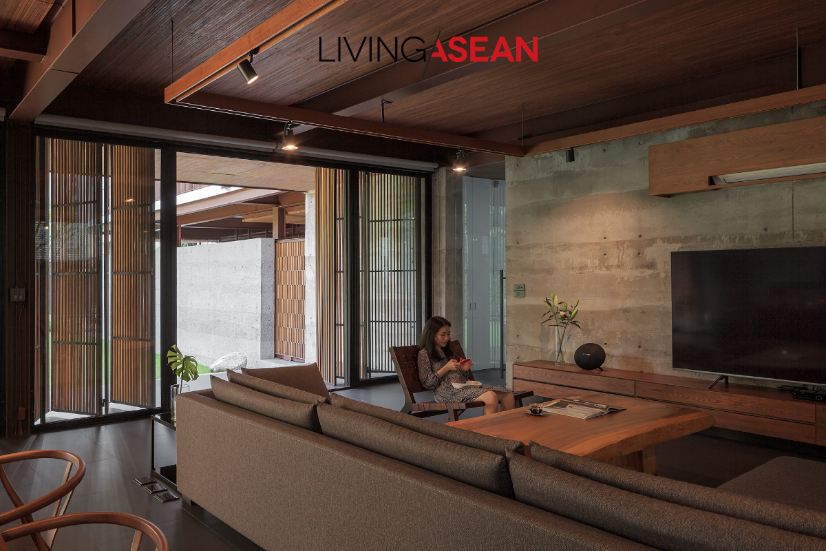
One primary building material was 20-year-old teakwood from Vin’s mother’s plantation in Kamphaeng Phet, much of which had been eaten hollow by wood boring beetles and couldn’t be sold to a lumber yard.
“We figured wood like this might give an interesting look. Talking with The Jam Factory contractor Subhashok gave us some ideas.
“We wanted something that didn’t look too slick, but had unique character and was durable. Wood, concrete, and steel were our main building materials.”
With porous teak, it’s best to cut the wood into narrow boards, sort out the more porous ones, then use the different types in different parts of the house.
Wood with no holes is used for flooring. Even though you can see into the sapwood on some, porous wood panels can be used for latticework, folding doors/windows, and ceilings, which are not usually touched by people, and they can be patched where called for.
This steel-frame box-shaped house uses cement walls as artifice: for instance, the wall of rough concrete next to the parking area creates a vertical play of light and shadow on garden stone surfaces.
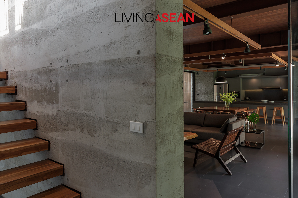
Meantime, the living room’s big brick walls are surfaced with concrete poured in different concentrations, creating gray stripes in gentle contrast to the rough harshness of the concrete itself.
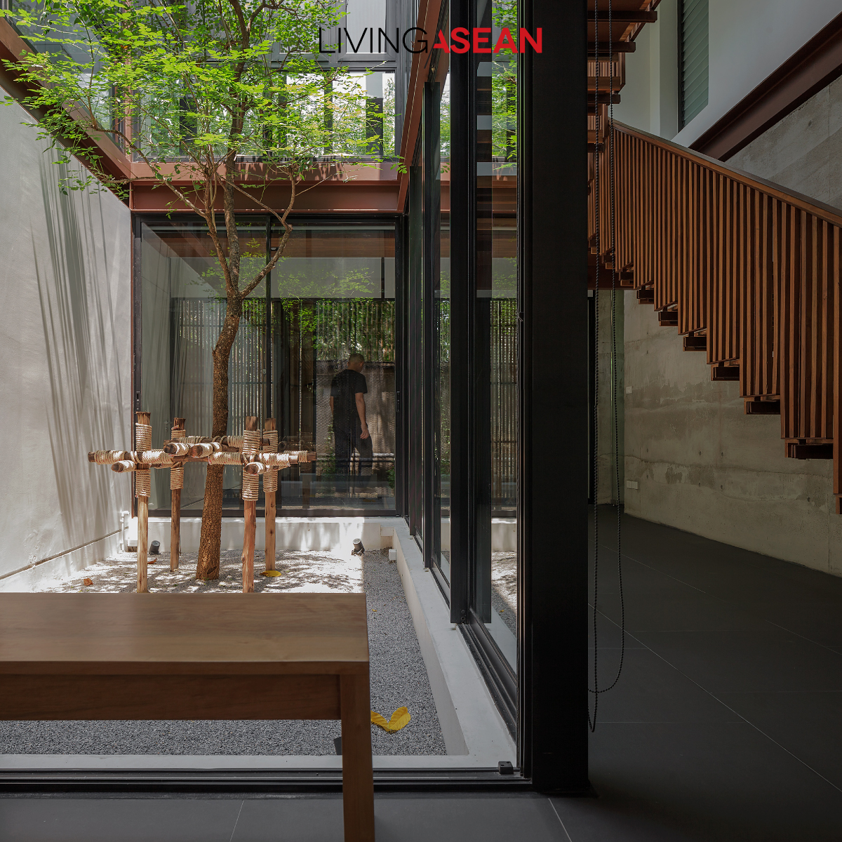
The house plan visually connects interior and outdoor spaces in a number of places: coming in the door, we first encounter an interior court with a tree, then walk around into the living area, dining space, and large open-plan pantry flanked on both sides by gardens, seeming to switch character back and forth between being indoors and outdoors.
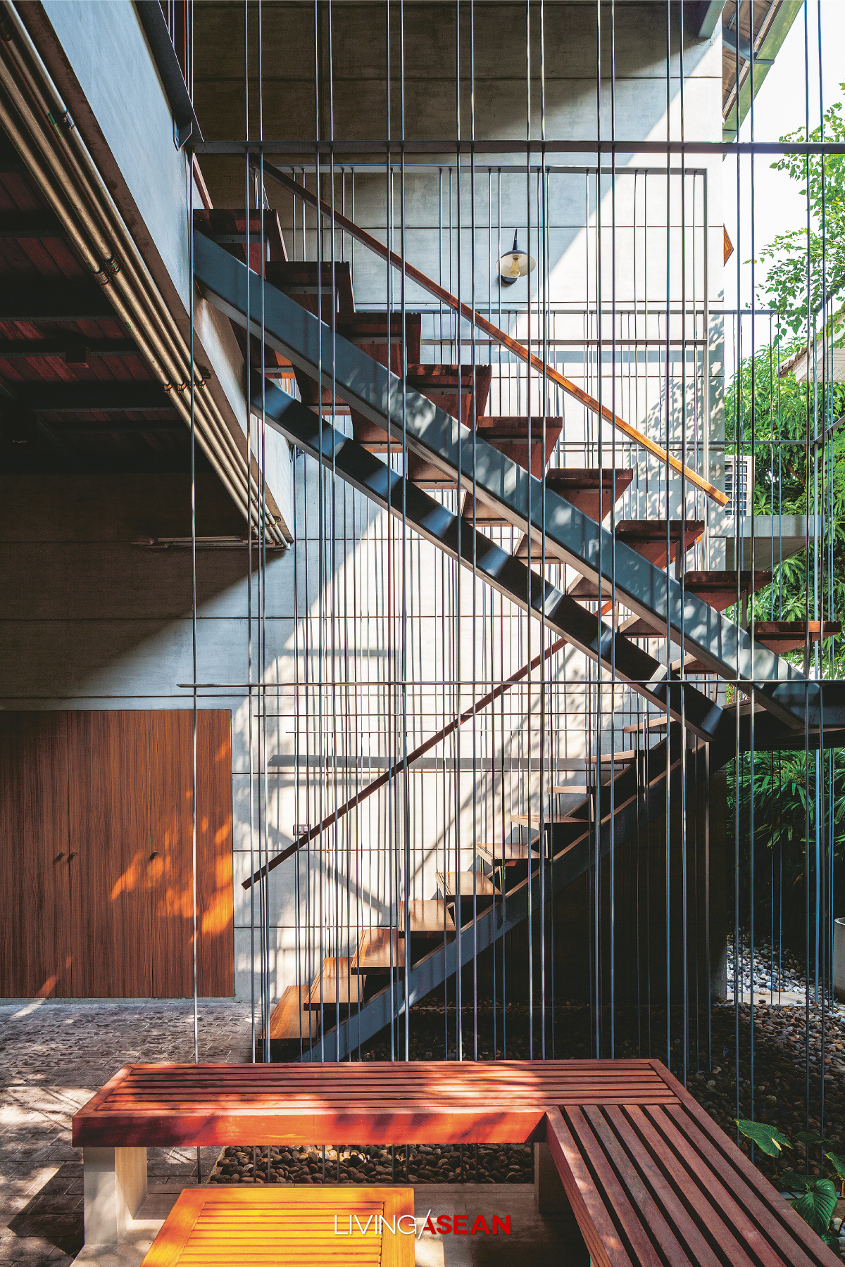
By the tree court is a latticed staircase of wood and steel leading to the 2nd floor, where we find a living area, children’s activity room, and all the bedrooms.
“The kids have been happy here, and feel more like staying at home, so we’ve achieved a nice level of success,” added M.L. Varudh. Before the evening came we got to see all 3 of Vin’s children as they got back from school to run, play, climb, and have fun, laughing and smiling, sometimes in the children’s activity room.
/ Story: Wuthikorn Sut / English version: Bob Pitakwong /
/ Photographs: Soopakorn Srisakul /
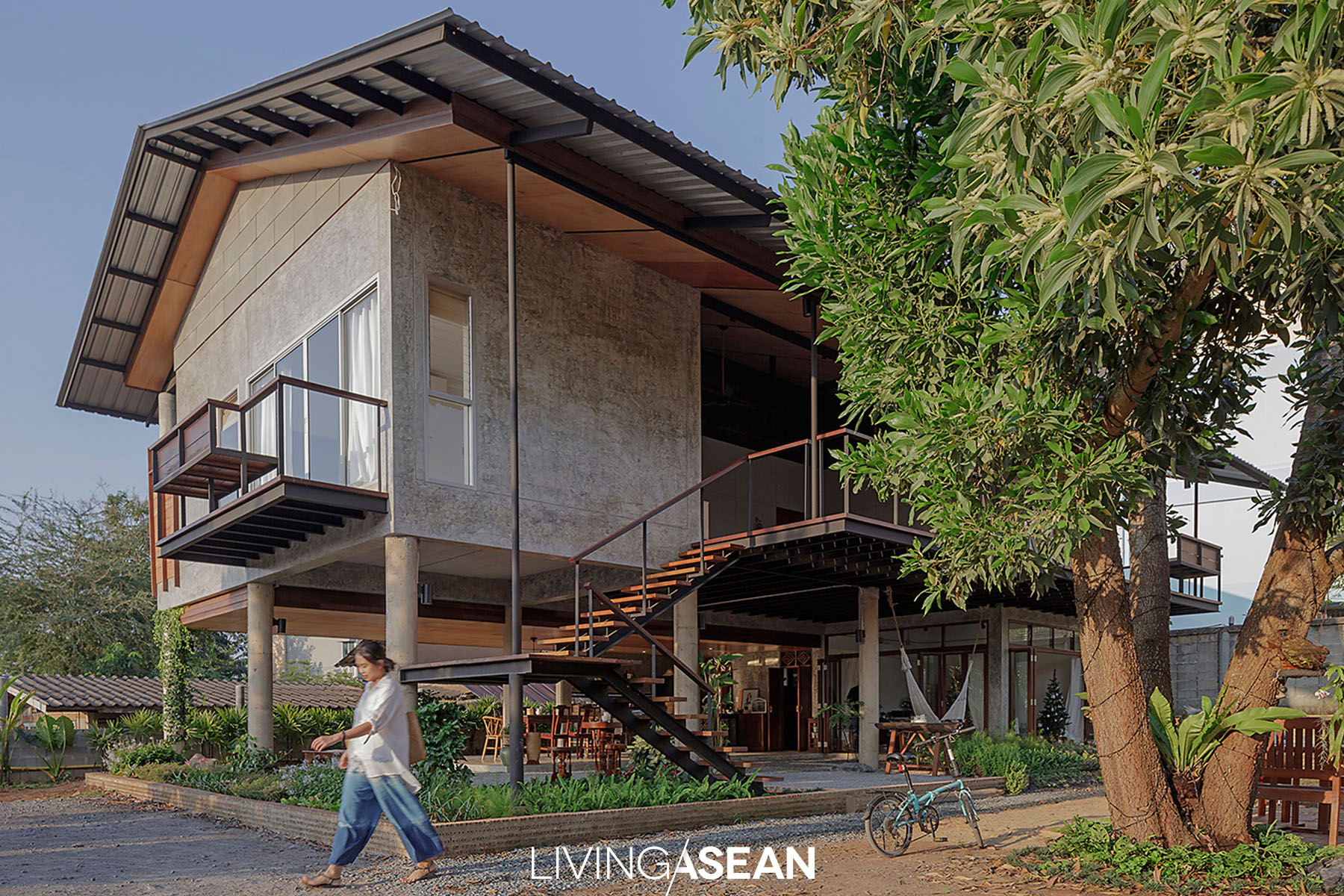
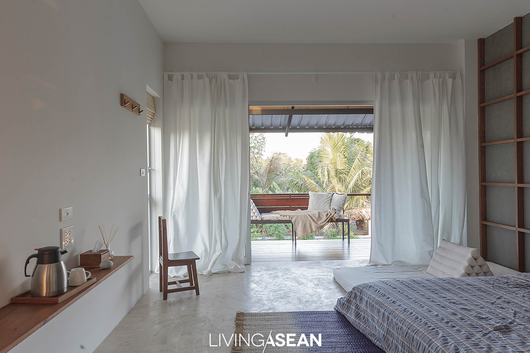
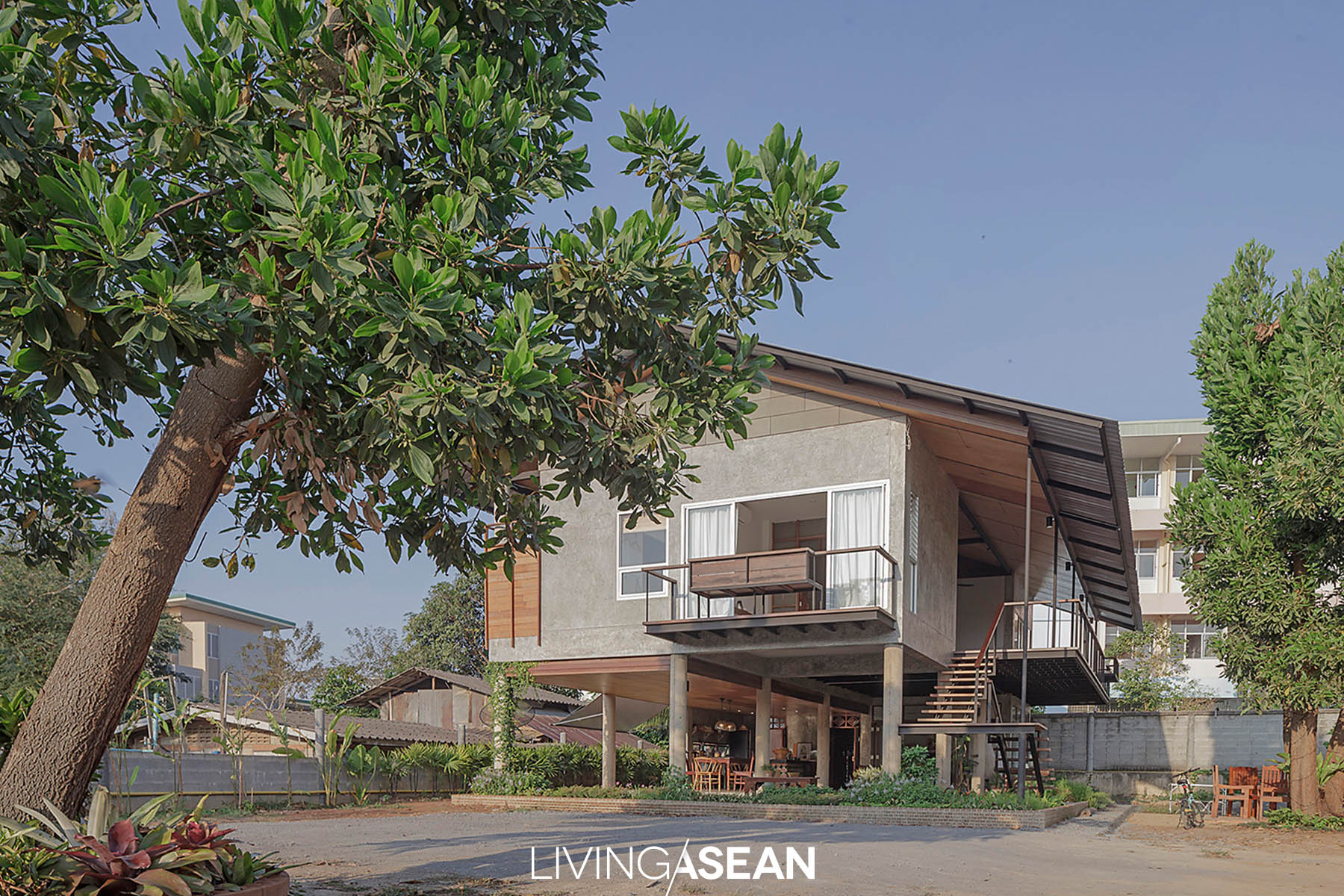
This is a stilt house design where the contemporary style merges with rural vernacular in Chanthaburi. It’s built on the concept of home with a dual nature – a villa-cum-homestay. The design pays particular attention to the simple life and harmony with the surroundings, plus good positioning in relation to light and wind patterns makes it more comfortable to live.
Baan Lek Villa is the work of “Kaew” Rinrada Nirote, homeowner and architect at GLA DESIGN STUDIO, in collaboration with designer Pitch Nimchinda. It’s intended to accommodate her family, house guests and friends of her mother (“Lek” Kuna Nirote).
Rinrada came to Bangkok to further her studies and has worked there since graduation. Little by little it dawned on her that building a new house in her native Chanthaburi would be a good idea.
It would give her a place to stay and a small office away from the city. She wanted a design that looked simple yet attractive, kept within the budget, and blended into the community.
The result is a home that merges with the surrounding countryside. Simple house design offers two distinctly different zones – private and public areas.
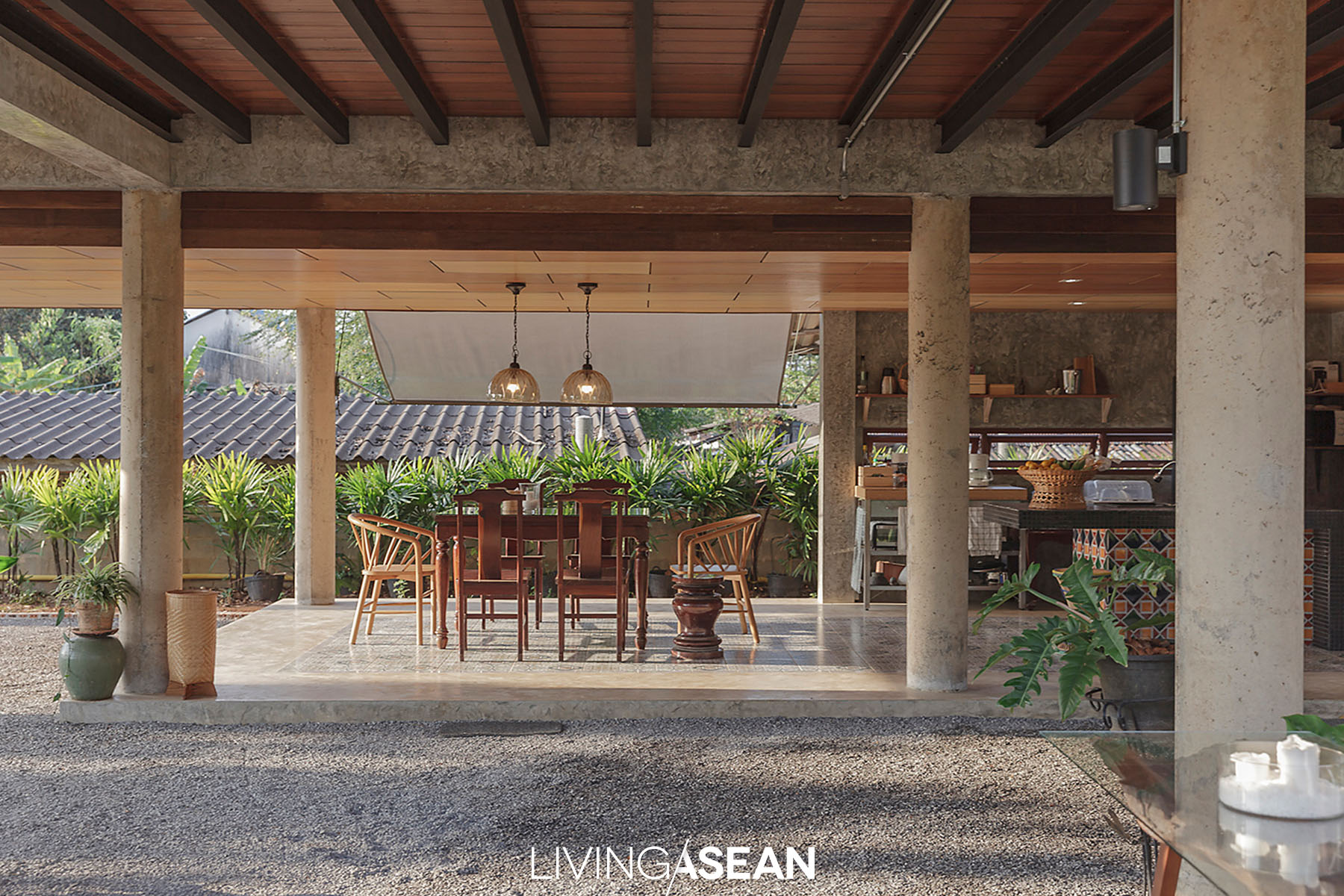
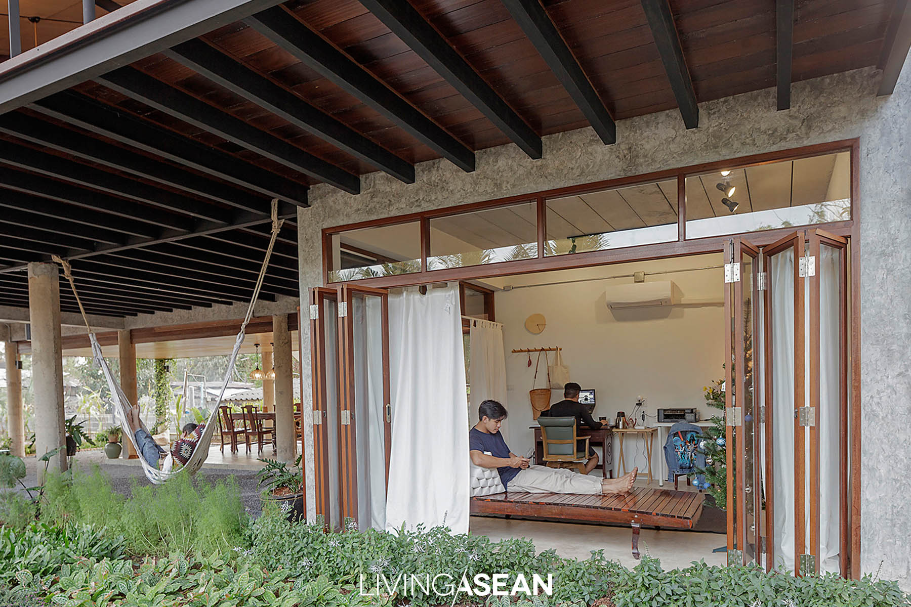
The living space is raised up on piles, while the ample multi-use area underneath it is meant for dining and receiving guests.
Sharing her slice of paradise, Rinrada says that nowadays more people are yearning for a simple way of living. Advances in technology have made it possible for us live anywhere and still be able to work. What we need is a case for carrying clothes and a few personal belongings, plus a portable computer.
Even better if you have a place of your choice that helps you relax in nature. Intended to make our breaks truly refreshing in the countryside, this house was complete only recently. So far it has received many guests and friends of her mother and brother.
“We didn’t intend to make it a family business. I was into hotel designing to begin with. Now that I have a house of my own, Mom has invited her friends over. They loved it and spread the good word. So we thought the time was ripe to provide the accommodation of guests. It’s important that they get to experience the relaxing side of Chantaburi town,” she said.
What makes this house unique is the architectural detail that’s right for the climate of Thailand.
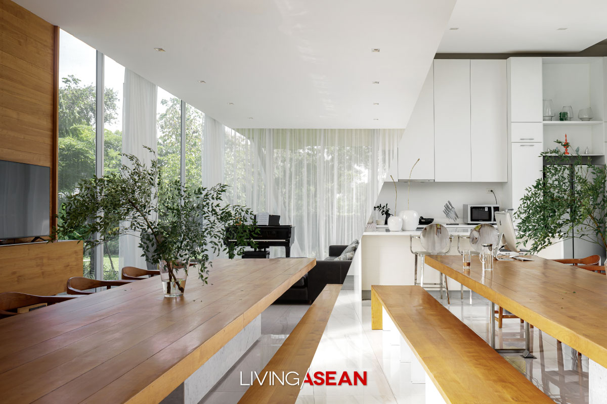
The design takes into account seasonal variations, such as sunlight and wind patterns, to create a comfortable environment. Rinrada got the inspiration for the multi-use ground floor from “Have you eaten yet?” a traditional expression of goodwill that Thais say as a sign of welcome.
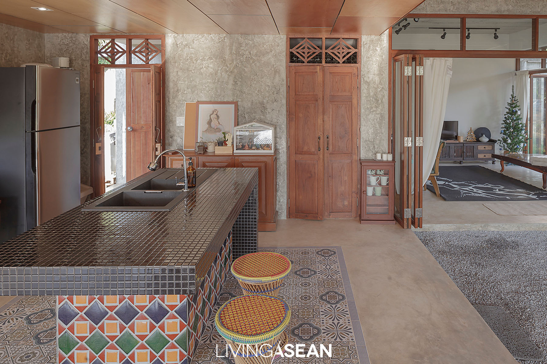
This explains why a dining table set and kitchen counter are there. The area doubles as waiting room for people who drop by for a visit just like old times.
Walk up the stairs and you come to a more private area of the house, which consists of a large balcony and main living quarters.
Overall, the building is made of concrete that works well with beautiful wood accents. To make the building appear lightweight, the entire floor of the overhanging balcony is made of steel framework.
Taken as a whole, it’s a perfect mix of concrete, steel and clever design that lets the beauty of natural wood stand out.
For an aesthetic appeal, the ground floor is covered to some extent by eggshell pebble pavers that seamlessly connect with the surrounding landscape. The garden sits in the shade for much of the day thanks to the house being positioned on the western side of land.
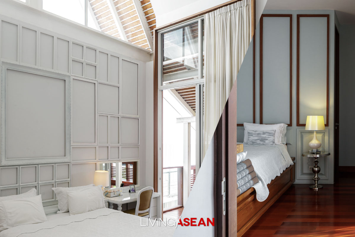
The fact that it’s located in the further reach also leaves plenty of extra room available for future projects. For the time being, Rinrada intends to turn the front yard into an ample garden filled with large trees, shrubs and natural light.
Most importantly, Rinrada says it’s the understanding of the context that sets the main idea about good house design. Appropriate orientation involves more than just the sun’s path or seasonal wind patterns. Every little detail must be taken into account.
This modest home is designed to blend with the environment and other key attributes that have made Chanthaburi town famous. It merges with rural vernacular and sprawling fruit orchards. It’s built of material that’s available locally, reclaimed lumber included.
All told, it’s one that stands in perfect harmony with the community.
/ Story: Patsiri Chotpongsun / English version: Bob Pitakwong /
/ Photographs: Rithirong Chanthongsuk /
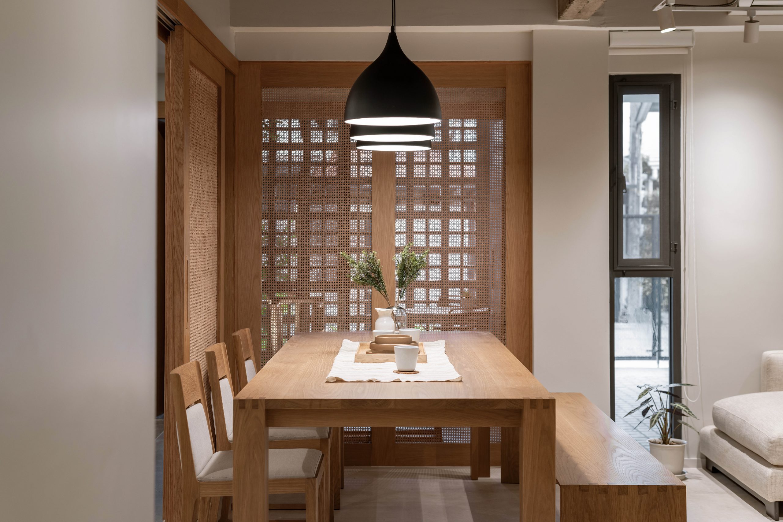
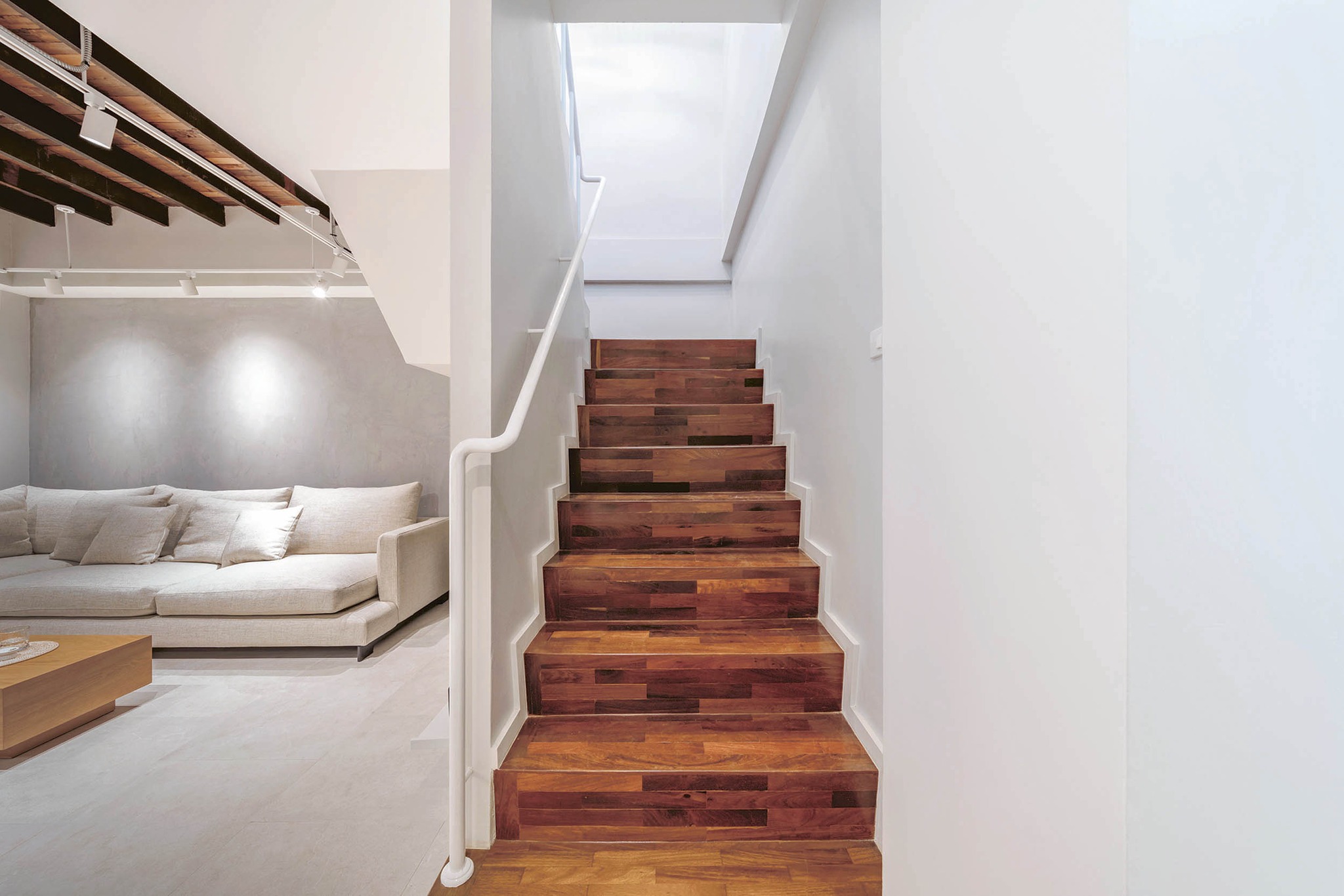
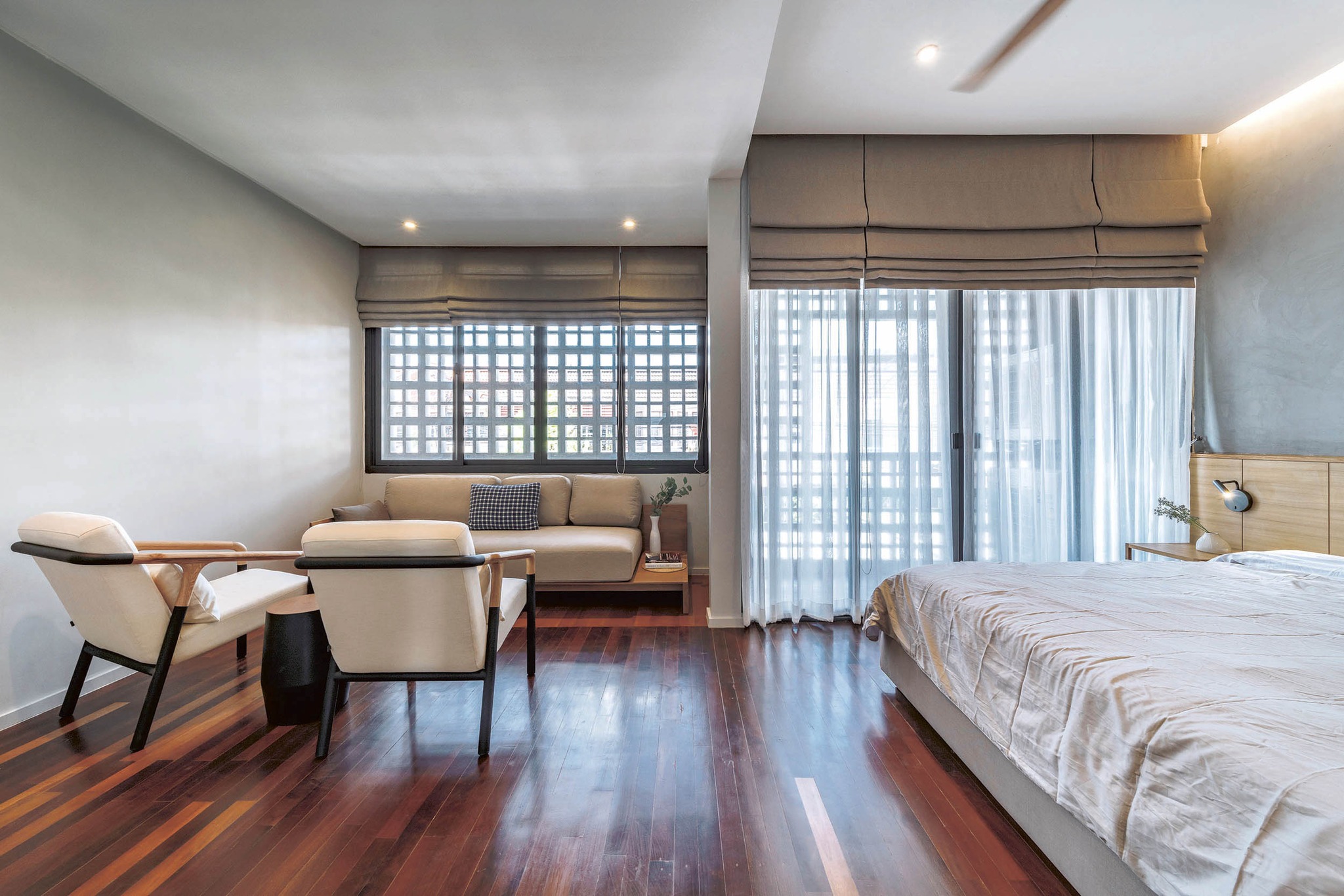
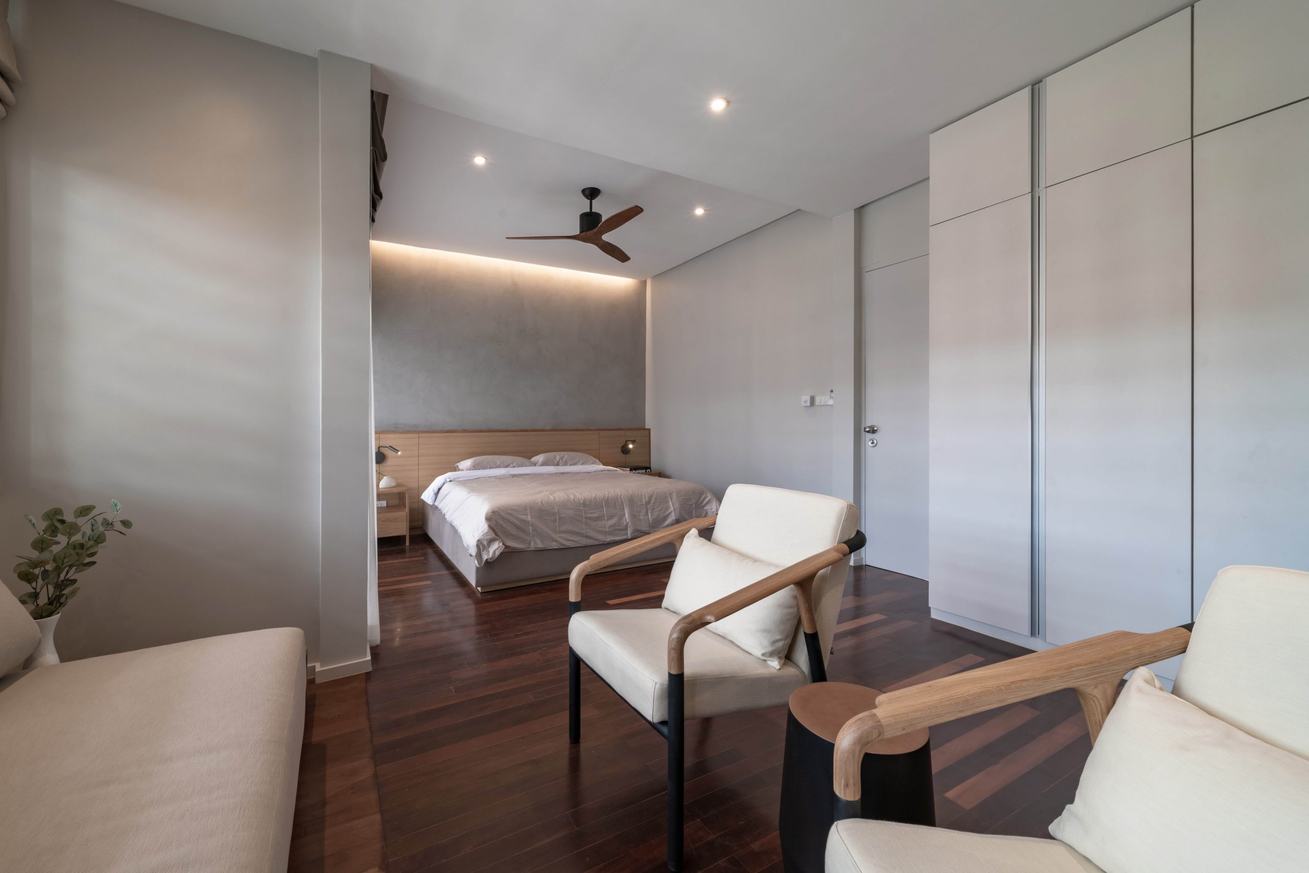
A renovation done right turns this 40-year-old house into a minimalist home that oozes charm and character. It’s spacious with all mod cons. The original frame of the house is retained, but important interventions are added to improve structural integrity, enhance indoor comfort and boost curb appeal. Among them, an array of vertical blades provides vital sun shading integrated into the façade.
Condominium living is awesome for young adults and families without kids. But as their family grew, Prem and Wasinee Chatmanop soon found it unfit to answer their lifestyle needs.
That was reason enough to go searching for a house to buy starting from their familiar neighborhood. Call it serendipity. It wasn’t long before the couple found a fixer-upper located on a 40-year-old housing development in Choke Chai 4 area.
The house was in poor condition and had to be completely renovated. A lot had to be demolished, from the floors to walls to ceilings that had fallen into decay. Only the beams, poles and gable roof trusses that were part of the original load-bearing structure were preserved.
Out with the old, in with the new
“I went out and looked at several houses. In the end, I was really pleased that I chose this one.
“The old house sat on nice square shape land 100 square wah in extent that was characteristic of housing estates in the past. I had a team of building engineers do a structural integrity assessment to determine it was good to buy.
“The house’s interior was old and in disrepair. So we left the renovation project in the good hands of architect Sitthichai Chompooh of the Perspective design studio. We specifically chose to have him do it after having seen his work in ‘The Renovation’, a BaanLaeSuan TV program. It happened to be the style that I liked,” said Prem.
At first, the architect was a bit concerned since the old house was built on a slope below the street level. In spite of that, he was attracted by the gable roof that was the popular appeal in the old days. This made it possible to create an open concept floor plan that seamlessly merged with a lush green side garden. The result was a complete transformation that offered 287 square meters of living spaces.
Sharing his experience, Sitthichai said: “The ground floor was further elevated by 30 centimeters to prevent groundwater flooding. Then, the old false ceiling suspended from the structure above was removed to create more headroom. Next, everything that had been added to the existing construction was demolished to make room for a new open floor plan.
“This included taking out the old floors, walls and extensions that were damaged over a long period of time.”
Higher floor, more windows, and continuous flow
The renovation project started with further elevating the ground floor to put it higher than street level. Then, the entire floor plan was reorganized and the exterior redesigned. This results in bigger windows that allow for natural daylighting and the interconnectedness between spaces.
The highlight of his design is a spacious interior that brings indoor and outdoor rooms together to form a larger whole. Plus, the atmosphere is relaxing, thanks to side garden ideas that bring the benefits of natural light into the interior.
All of this is achieved without making changes to the original framework of the house. Where appropriate, unnecessary details are reduced and important units of construction added to enhance structural integrity. In the meantime, green spaces are integrated in the design for indoor thermal comfort, while simple clean lines create a warm and inviting place to unwind after a long day at work.
Taking everything into account, it’s an amazing house makeover, one that transforms an old-fashioned fixer-upper into a modern minimalist home that reflects the personality of the people living in it.
A cool and restful home close to nature
Slightly off-white walls go best with wood accents. The gray tinge is a winner with soft, weathered wood trim. It’s a contemporary calming color scheme just right for an open floor plan that extends from the living room to dining room to pantry.
That way a feeling of continuous flow is created, and it makes perfect sense to float a sofa in the middle of a large room. From the inside, the living room is enclosed by glass window walls that look out over a lush green side garden, a visual of the design that makes the homeowner couple very happy.
Sharing her experience, Wasinee said: “We spend the most time here in this area, unlike at the condo where the kitchen was isolated from the rest of the interior. The floor plan layout contains a variety of functions separated from one another by furniture rather than being enclosed by walls.
“It’s an open concept design that promotes social interactions. Prem sits here at his desk. I can see the kid playing on the sofa while preparing a meal in the kitchen nearby. It’s a flexible layout that’s easy to update. For the time being, the more space, the better. The child is growing up fast, and more furniture will be added in future.”
The renovation project benefits from large openings in the wall that let natural light stream into the interior living spaces. In the meantime, privacy is very important and needs to be protected. This explains why only the side of the house facing the solid wall of an adjacent townhouse is open for daylighting and connecting seamlessly with a side garden.
Commenting on the renovation plan, the architect said:
“We put in a sundeck patio that’s easily accessible from the dining room. It serves multiple purposes. Where appropriate, vertical fin facades are erected to shield the house from the sun while allowing natural ventilation and daylight. The upright structure also doubles as outdoor privacy wall.”
Taken as a whole, the ground floor is very well thought out. To prevent the living room from smelling like food, an enclosed kitchen is built at the rear of the house that’s devoted to Thai cooking.
The back of the house also has a bedroom kept out of sight in one of the quietest locations. The second floor has three bedrooms, the largest of which affords a garden view from above.
In a few words, the renovation project brings new ideas and energy to an old house after it was vacant for many years. Done right, the old-fashioned gable roof house completely transforms into an awesome minimalist home oozing with charm.
Simple, clean lines give the house its character as well as beauty. Above all, it’s a piece of architecture that connects past, present, and future.
Marketing/Advertising Cookies – used to remember and process the relevance to your website visit in order to personalize contents shown including optimization of commercial advertising placements. For instances, we use this type of cookies to display commercial advertisements related to user’s attributes and interests as well as to limit how many times should a user see repeated advertisement in order to optimize and measure marketing activities.  อ่านเพิ่มเติม