Blog : HOUSE

A Naturally Peaceful Single-Storey Home

A Naturally Peaceful Single-Storey Home

/ Bangkok, Thailand /

/ Story: Patsiri Chot / English version: Bob Pitakwong /

/ Photographs: Anupong Chaisukkasem /

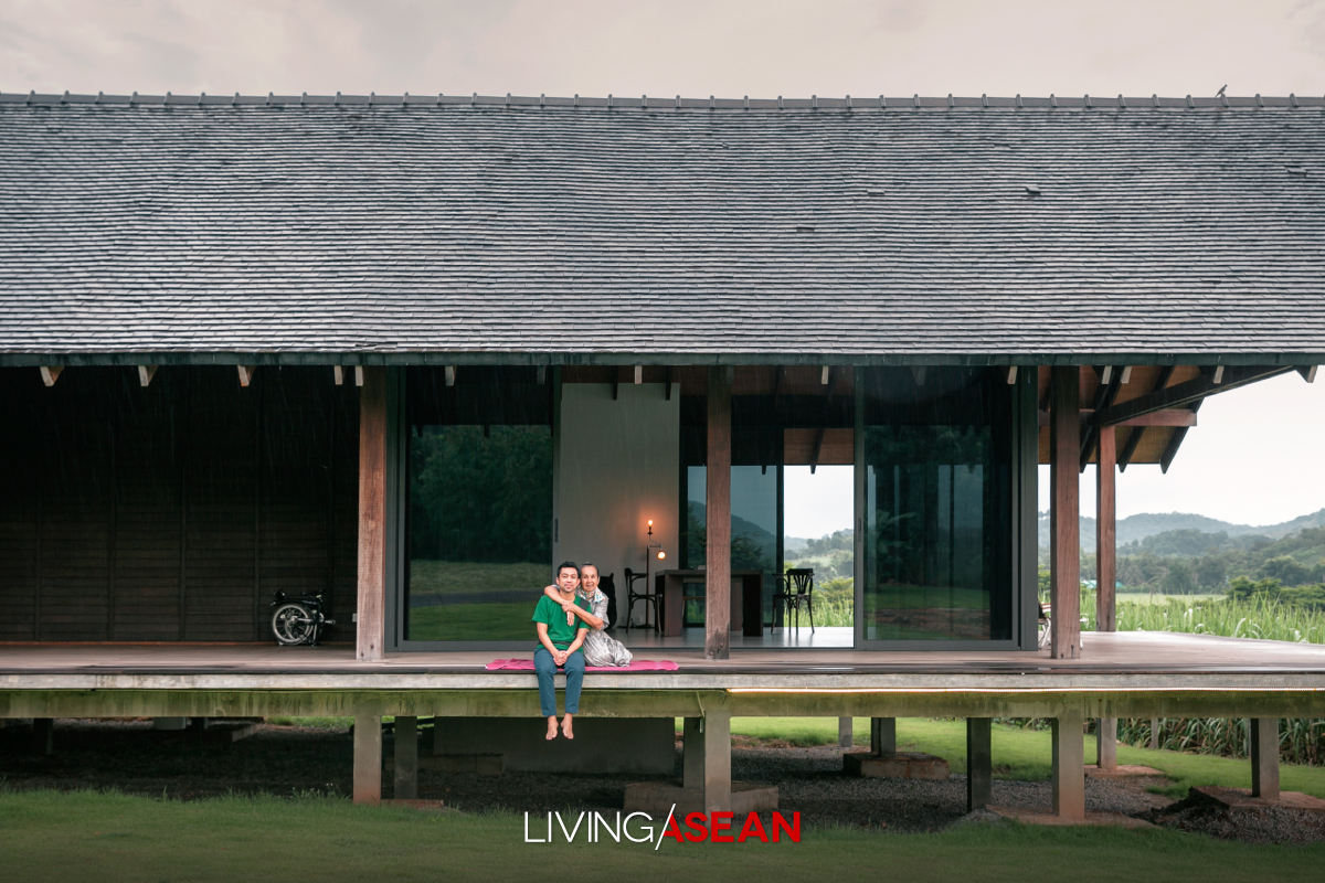
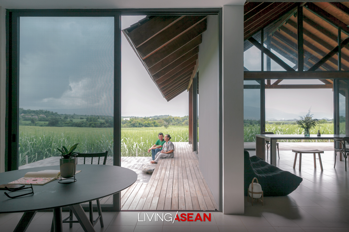
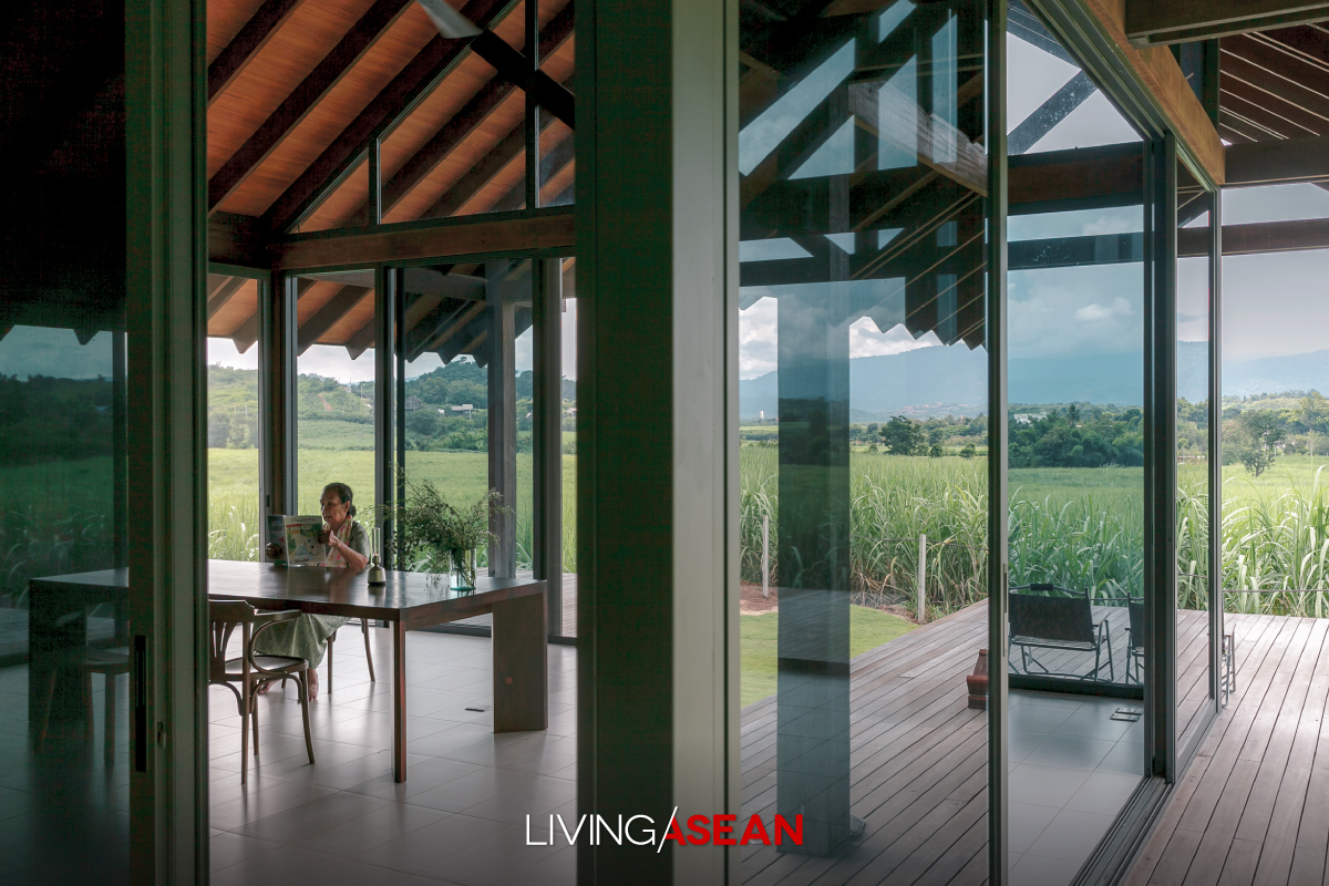
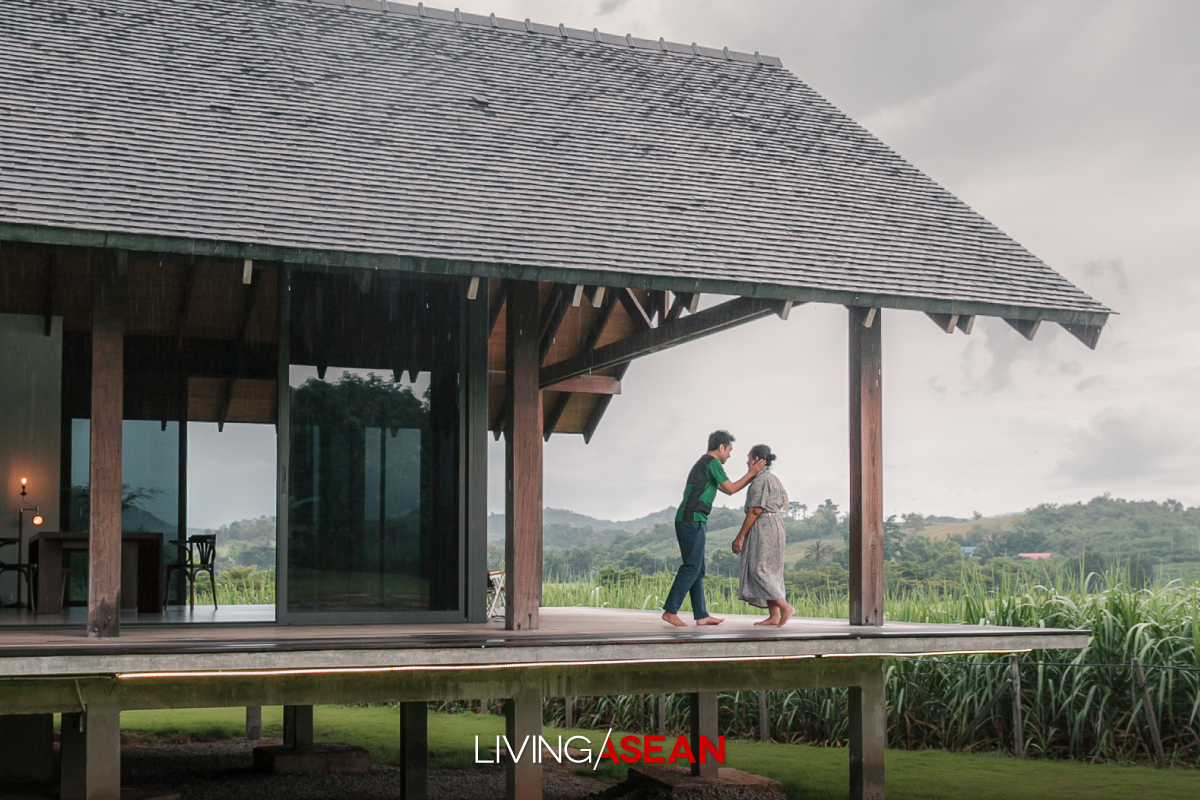
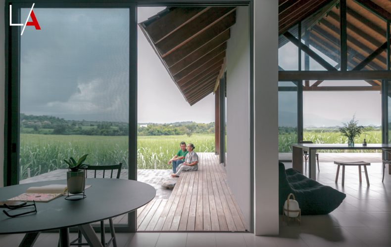
Here’s a single-storey home built on a naturally peaceful plot of land. Blending in with the lovely surroundings, it makes simple living easy. The simplicity of design affords plenty of room to take a walk around or sit on the porch and enjoy the beautiful landscape. Inspired by the restful view of a Buddhist temple in Tokyo, it’s a perfect example of happiness at the deepest level. 

Architects Phongphat Ueasagkhomset and Parnduangjai Roojnawate of the Anonym design studio said the house plan was based on the experience of the homeowner, who recently visited Tokyo and came away impressed by the pleasant, soothing ambience of Japanese traditional architecture.

A detailed investigation of the work gave them the design inspiration that culminated in this single-storey home’s uncomplicated atmosphere.

Although the homeowner had a relatively large piece of land — roughly half an acre, he didn’t want a big house.

What he has wanted all along was a single level home without an ostentatious display but had all the necessary conveniences for simple living.

His dream home was an intimate hideaway that merged into a lush green oasis – a salubrious place to heal and recharge reminiscent of the Tokyo temple he visited.

Single-Storey Home
The single-storey home sits on the transverse plane that runs parallel to the front yard. Floor-to-ceiling window design lets natural daylight and fresh air into the central living room and a courtyard that lies furthest in. The garden path that gets the most traffic is covered in artificial grass that doesn’t become soggy after it rains.
A few steps separate the natural level of the site from the house floor set at plinth height. The finished floor is the same level all the way through, which affords layout flexibility and the impression of a bigger space.
Single-Storey Home
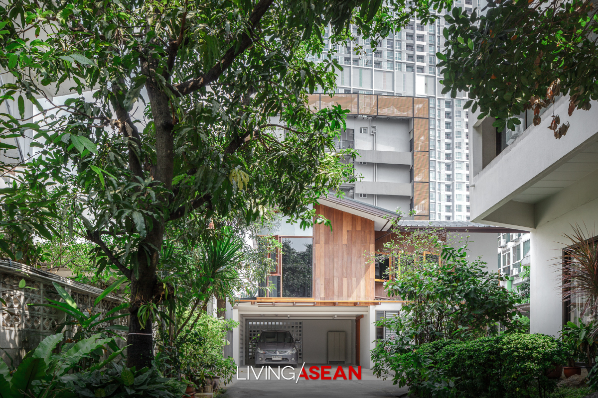
A driveway runs past the front yard and ends at the carport beside the house.
Single-Storey Home
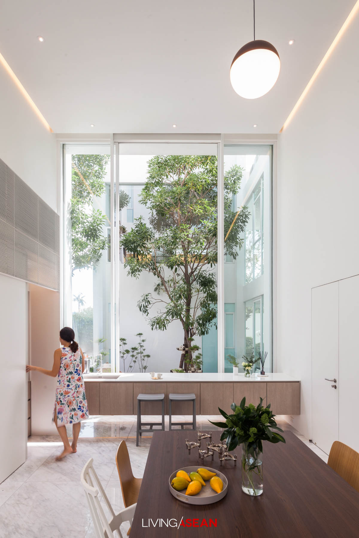
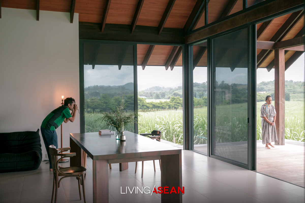
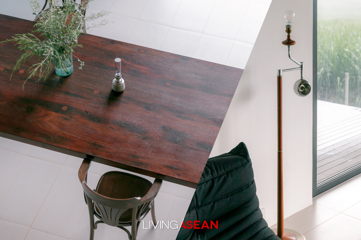
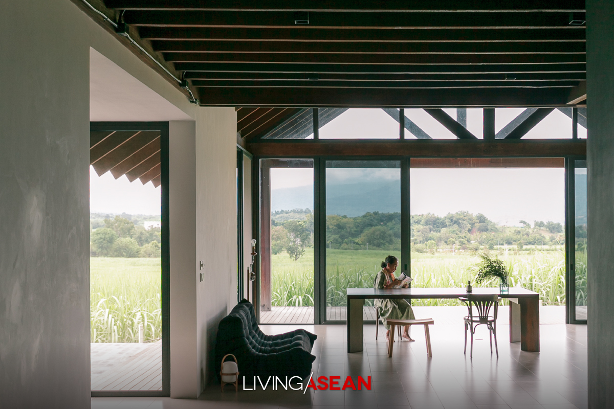
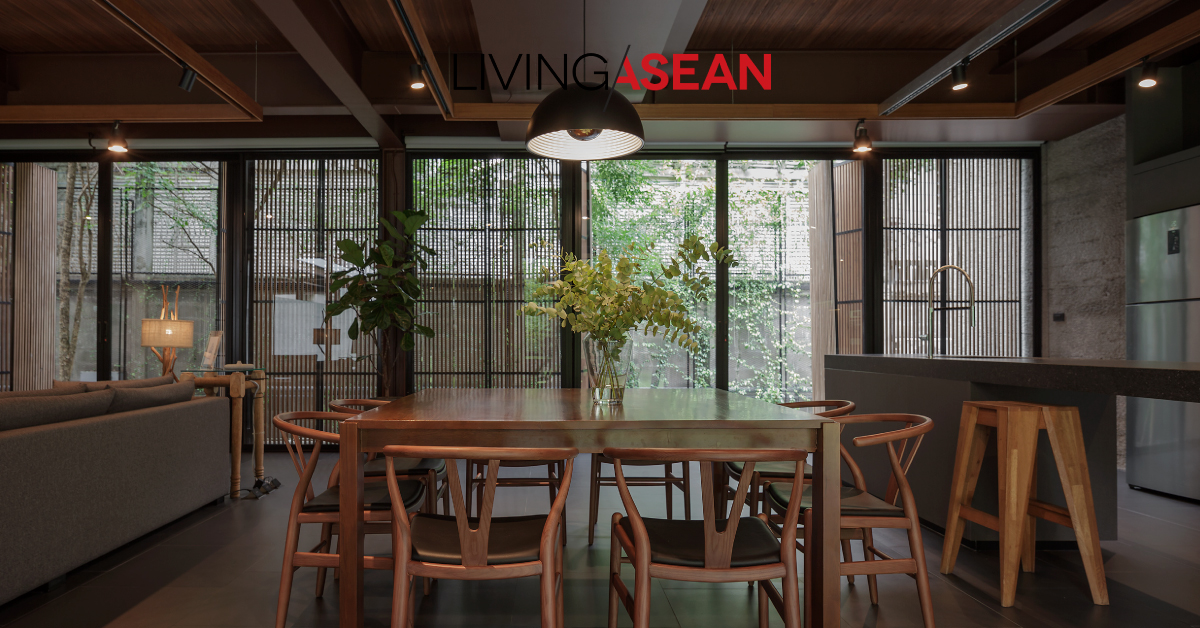
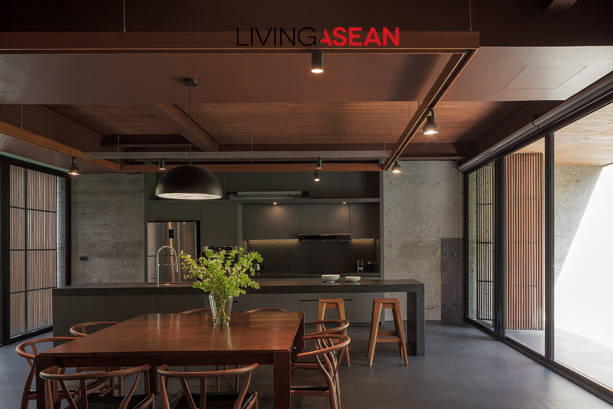
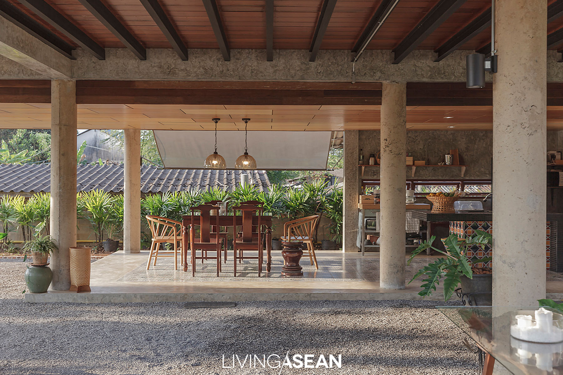
A wood table and chairs from the old house perfectly complement dining room interior design. The open floor plan connects indoor and outdoor spaces in the central courtyard.
Single-Storey Home
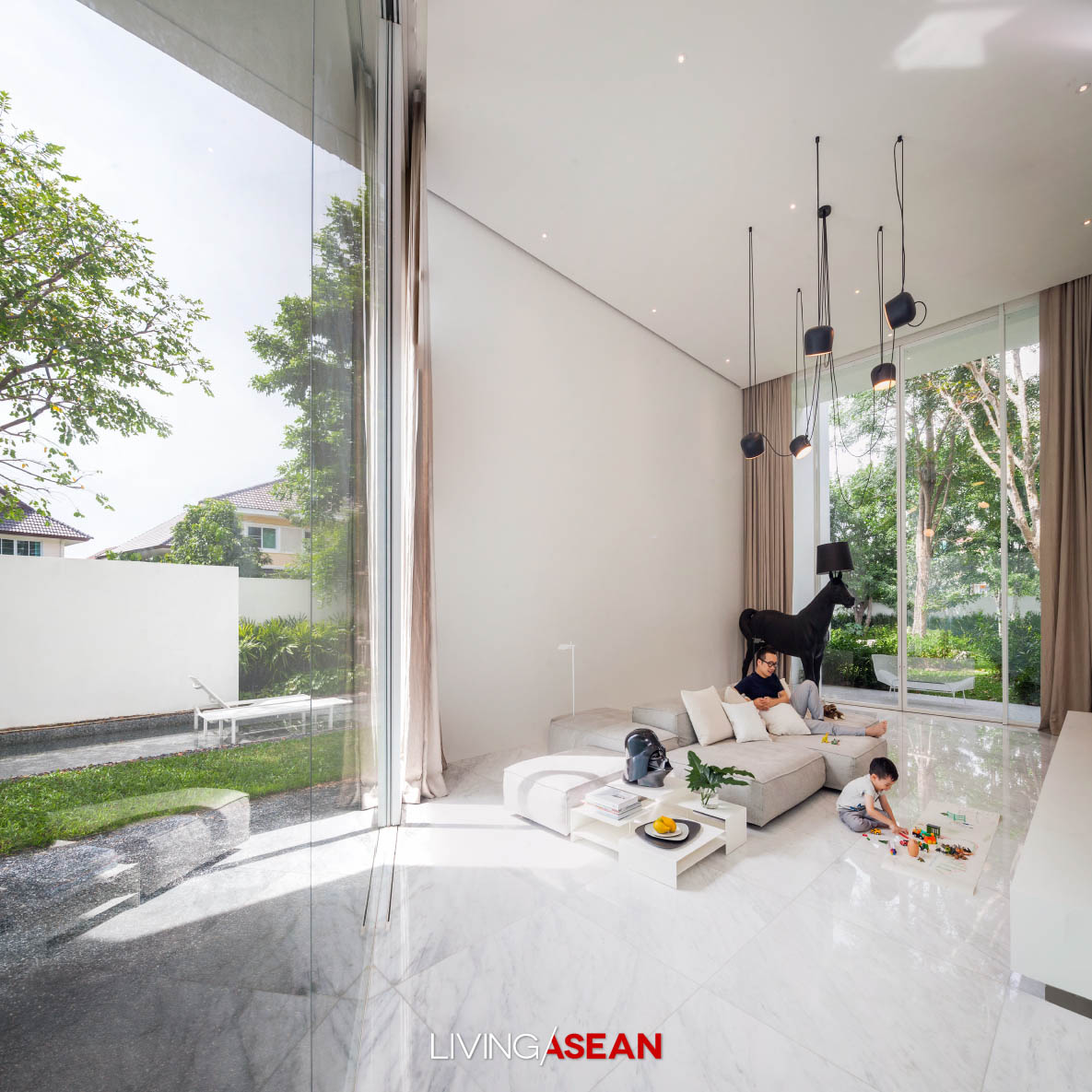
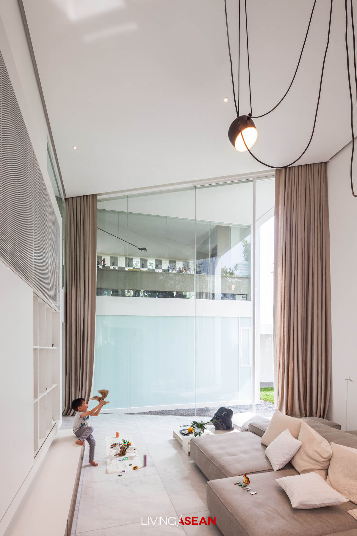
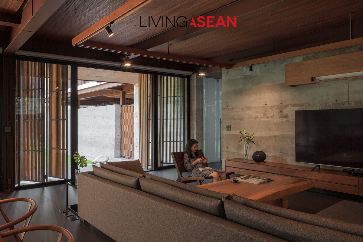
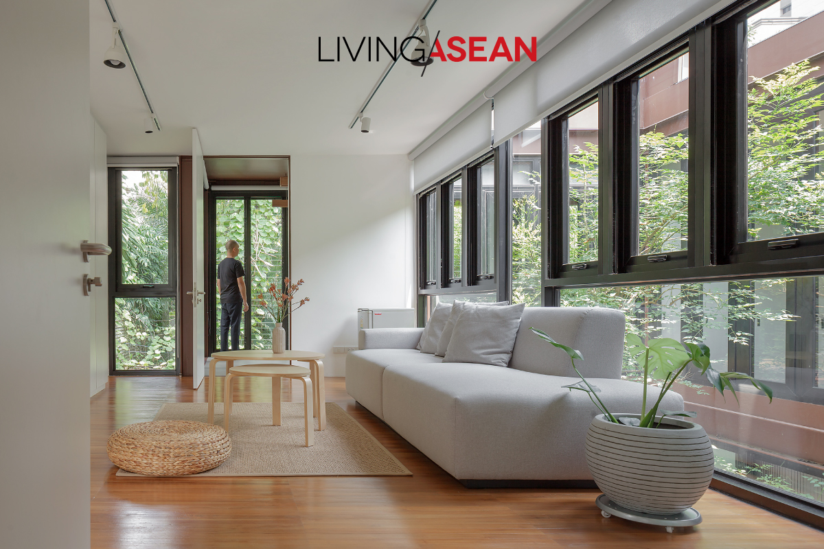
Household furniture consists of what is necessary to create a comfortable home – a large sofa set and a pair of low wood chairs from the old house. The mantra of interior décor is simplicity in every aspect.
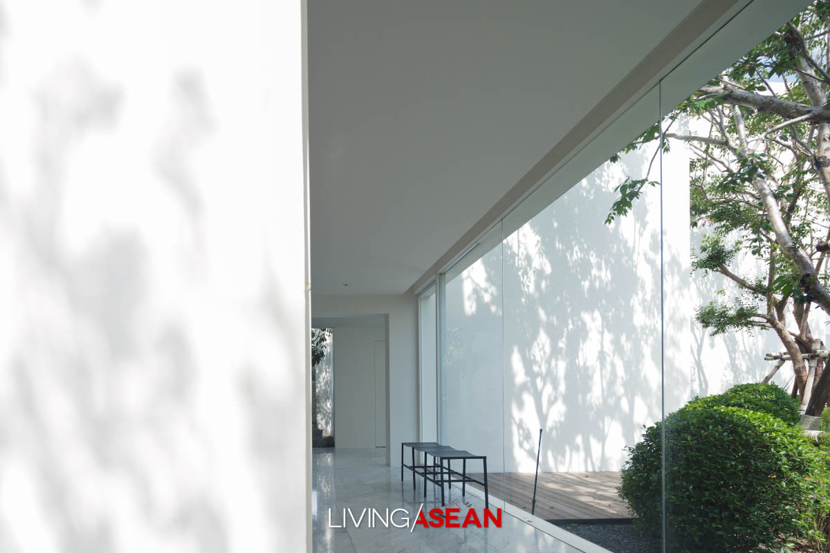
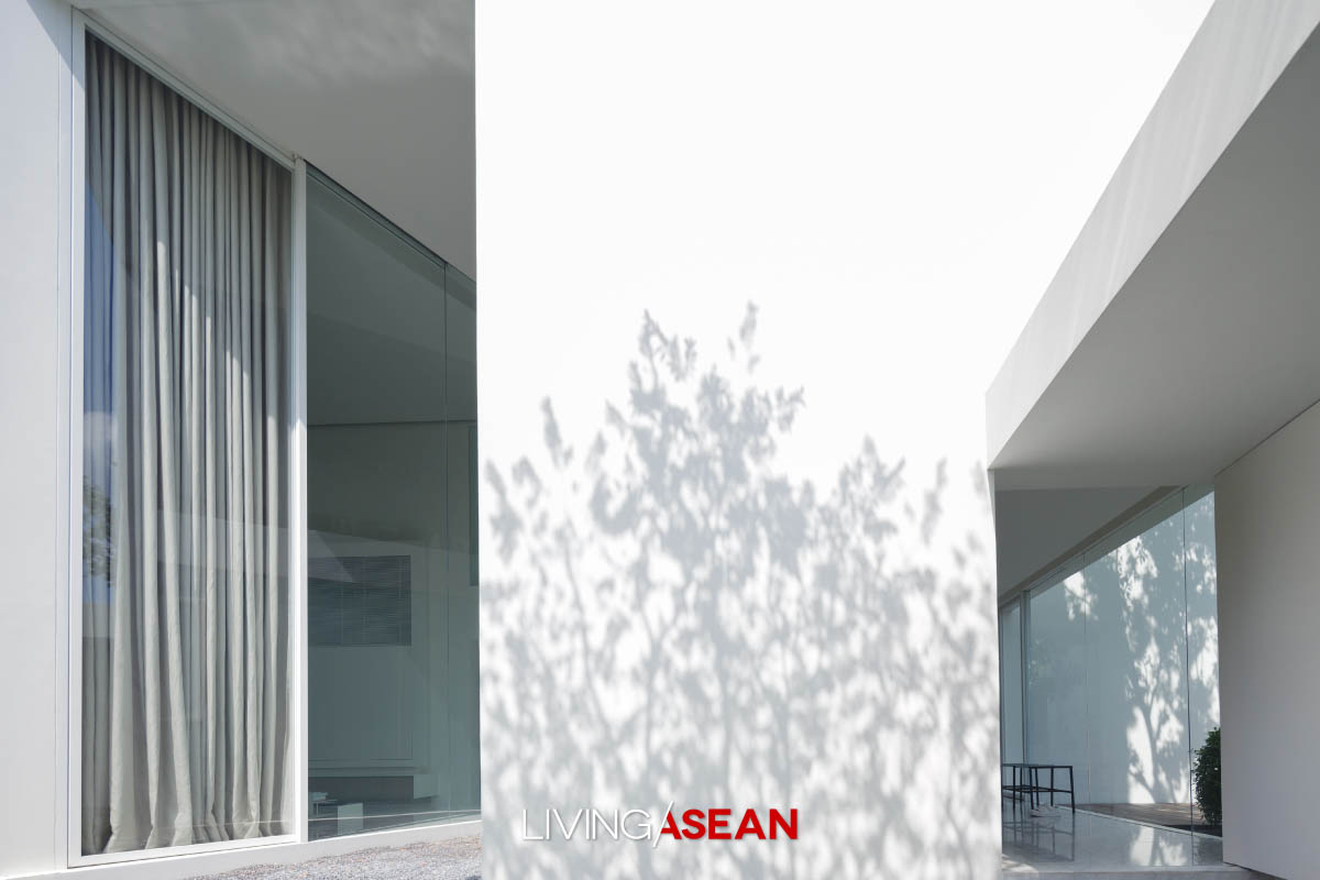
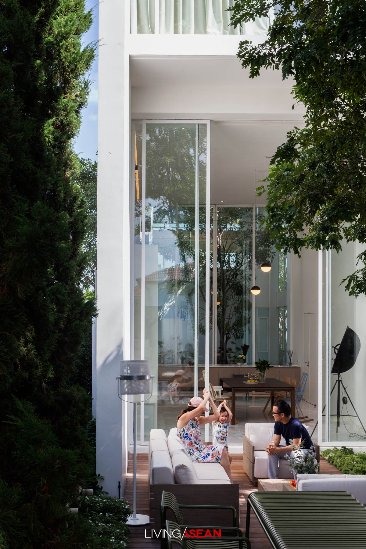
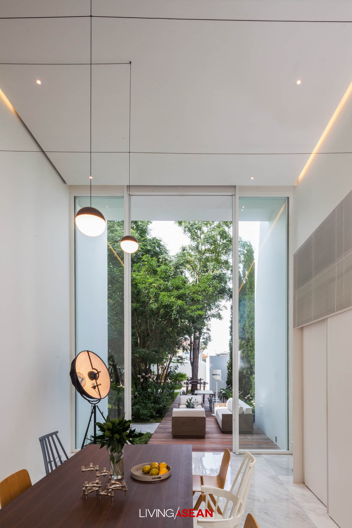
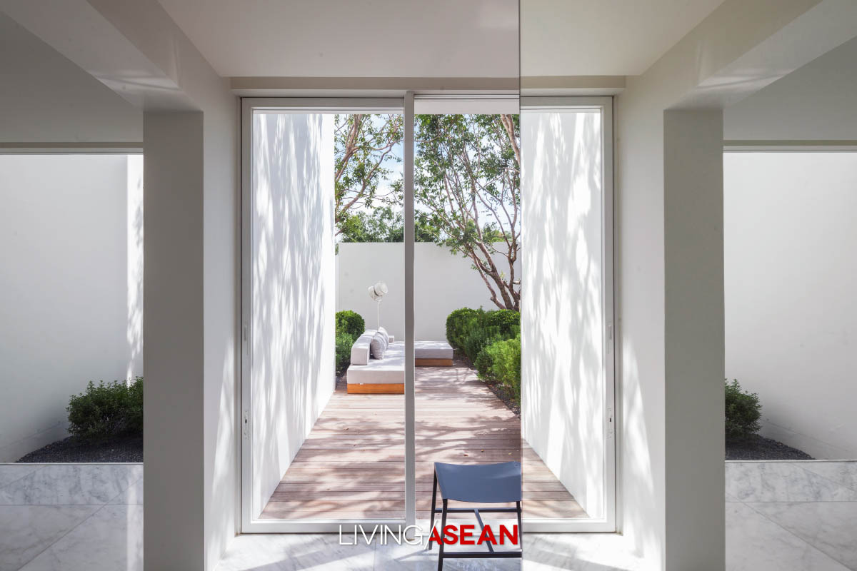
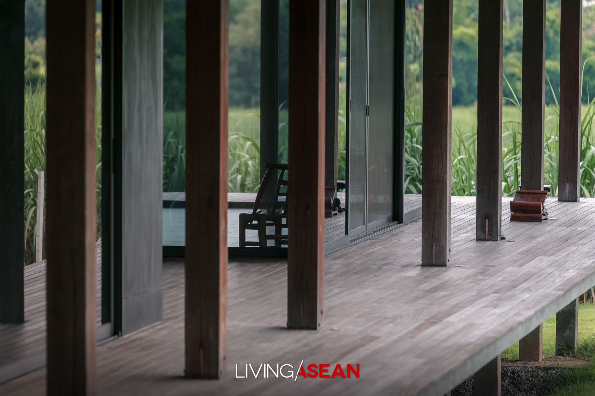
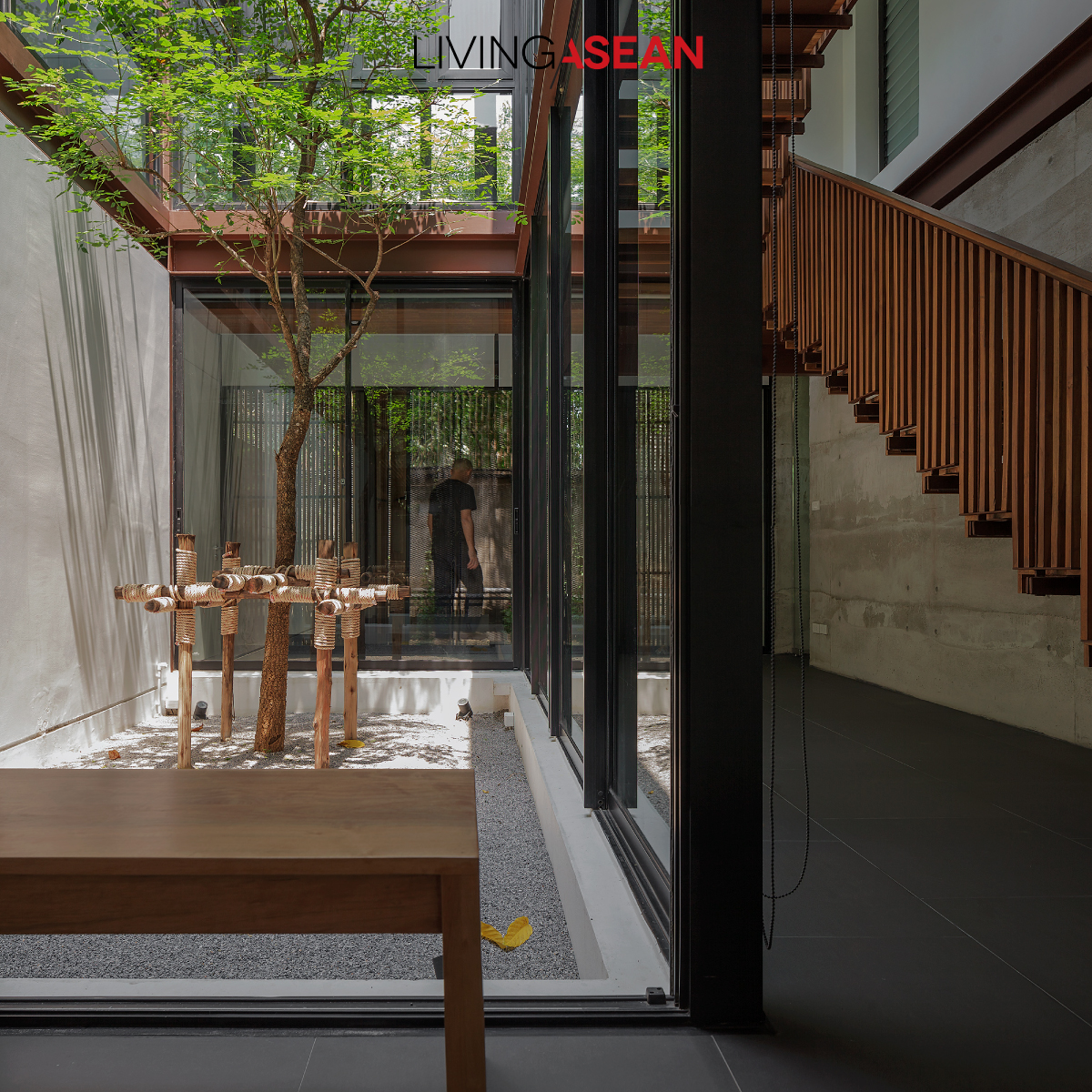
Running parallel to the central courtyard, the lovely enclosed corridor with glass walls creates visual continuity from the interior to the outdoor living spaces.
Single-Storey Home
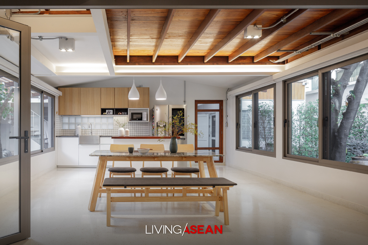
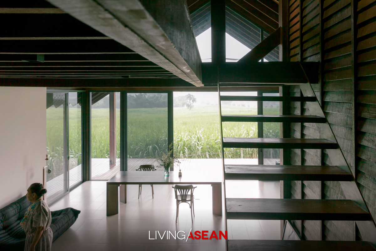
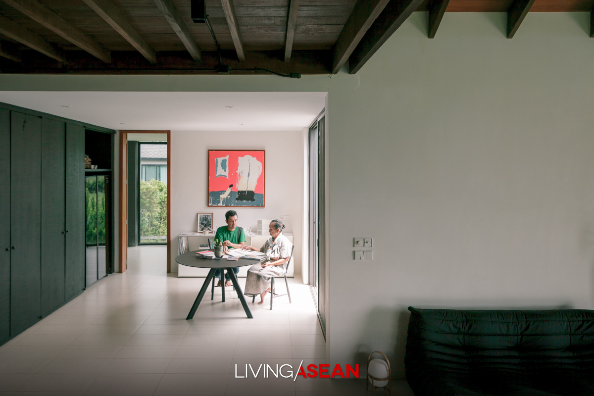
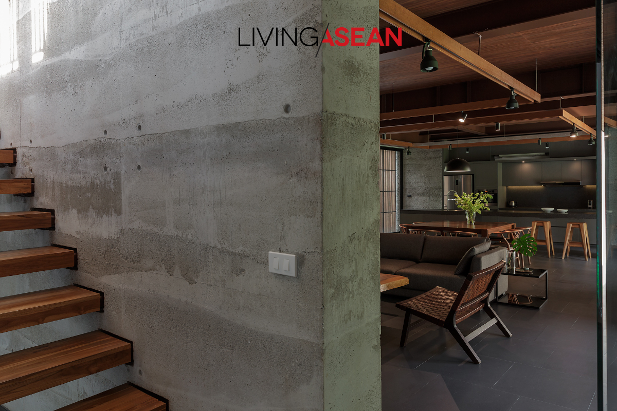
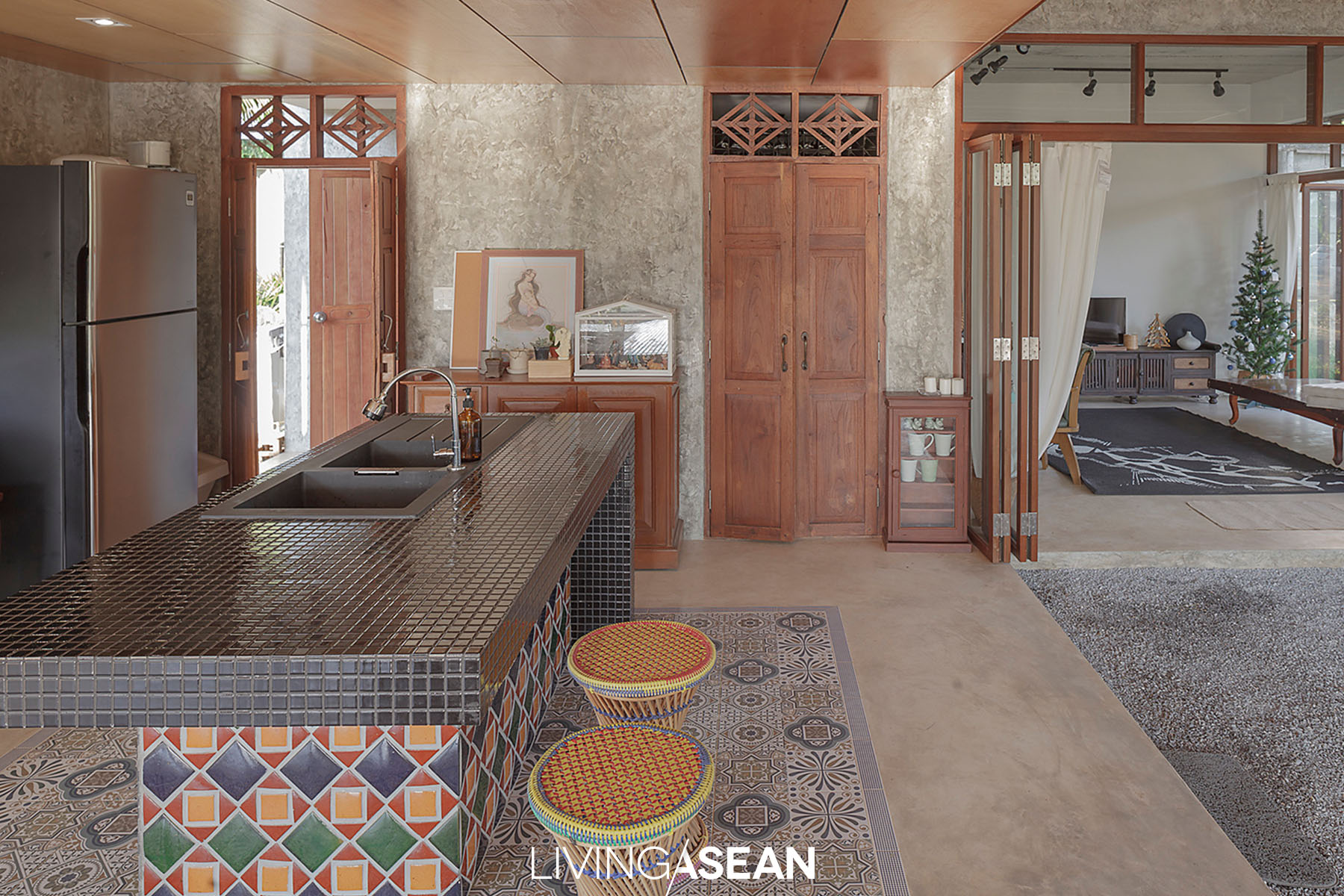
A gorgeous open floor plan promotes connectedness from the living room to dining room and kitchen. Different house functions are identified by furniture, while steel beams incorporated in the ceiling are reminiscent of the simplicity of a Japanese home.

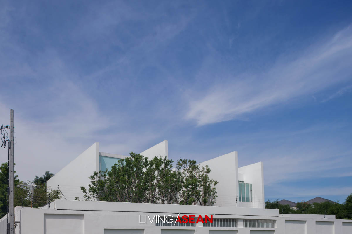
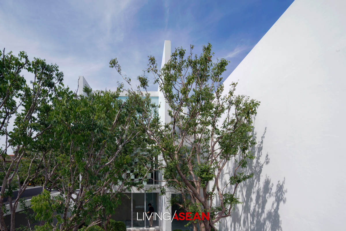
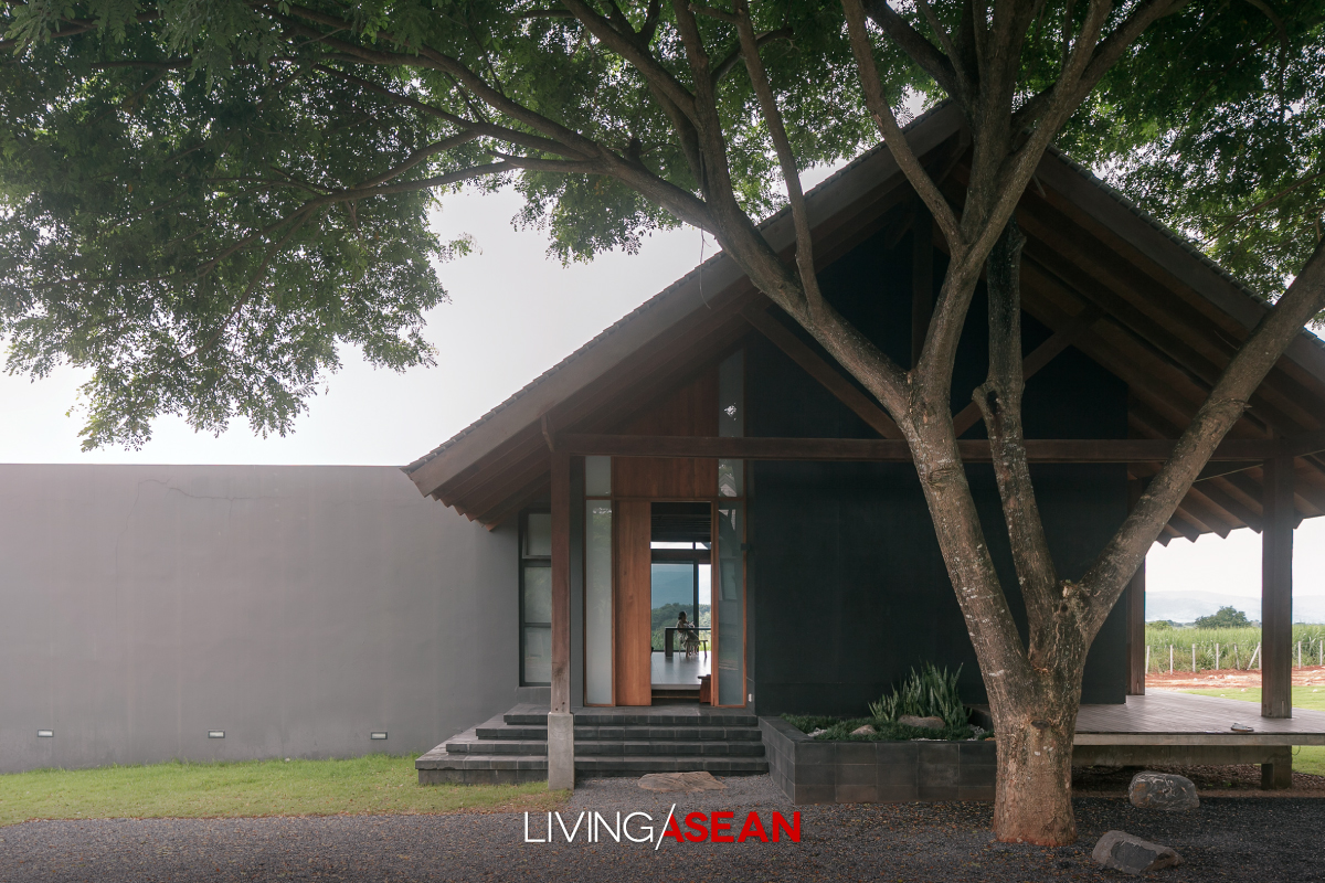
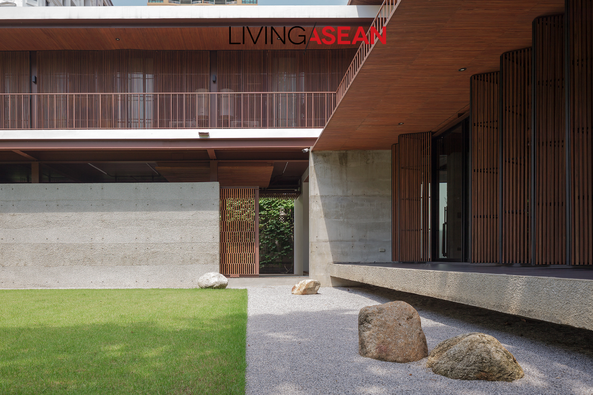
From the outside looking in, the single-storey home sits hidden from view until the main gate swings open. On entering the compound, we come before a sloped garden that dominates the landscape.

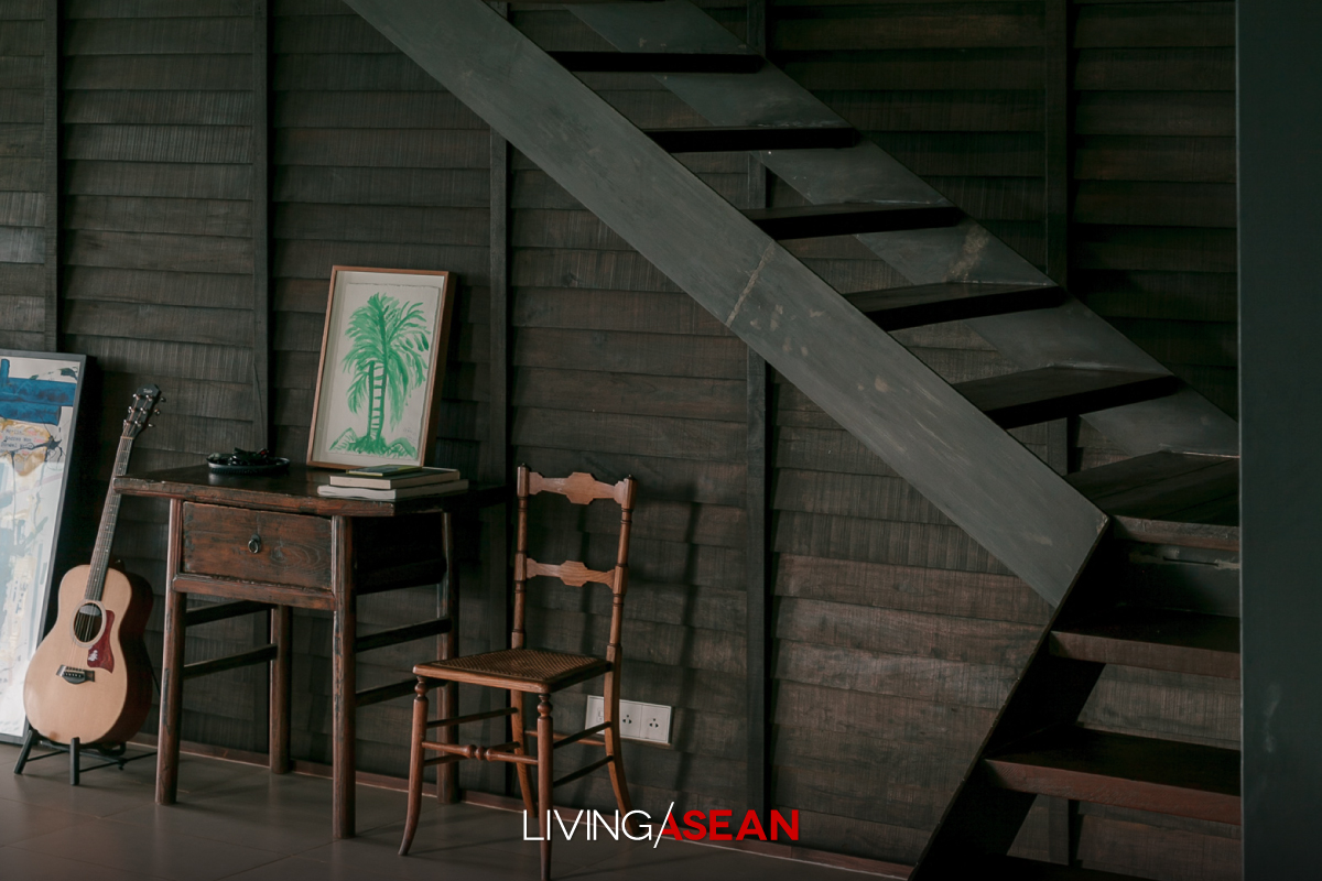
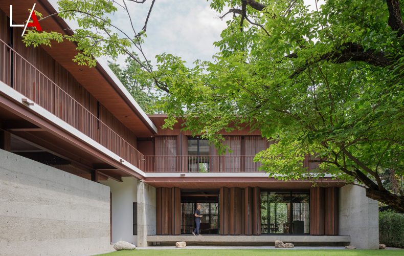
The peaceful abode is built parallel to the spacious front yard. The architect said that much of it was made from reclaimed lumber from the old house. This way, old wood is beautiful again after it’s polished and covered with a new coat of paint.

Sharing his story, the homeowner said:

“This was our family home where Mom and Dad had lived for 40 years previously.

“The old house later turned out to be bigger than necessary after Mom and Dad had moved into a nearby home that the family purchased not long ago.

“After the ground floor was damaged during a recent flood, we thought it was time to tear it down to make room for a new one.

“The new single-storey home was made for living until retirement age, so design should be light and airy, clean and simple with no steps, plus all the rooms have access to garden views.”

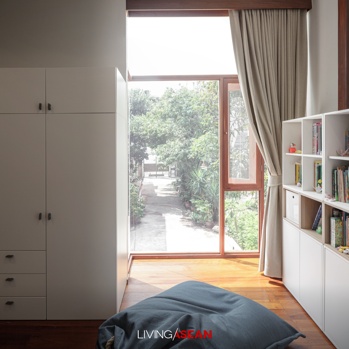
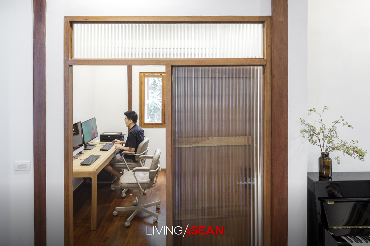
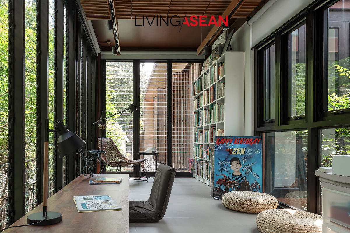
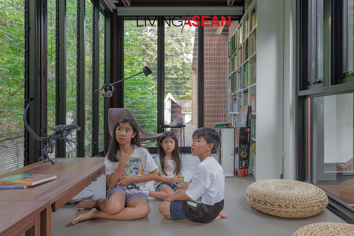
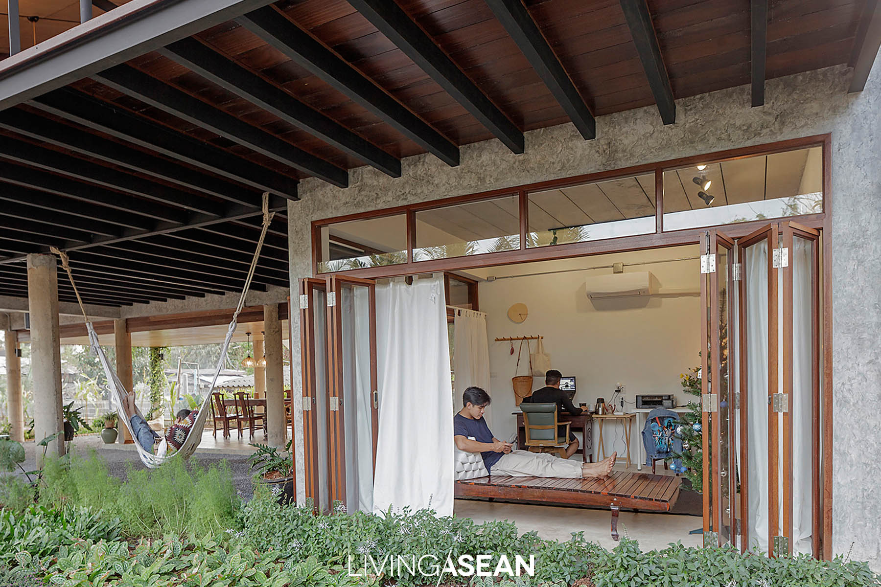
Creative design makes the built-in bookshelf and office desk beautifully blend in like they are a part of the house. Louver glass windows allow in natural light and fresh air from the tree-shaded garden.
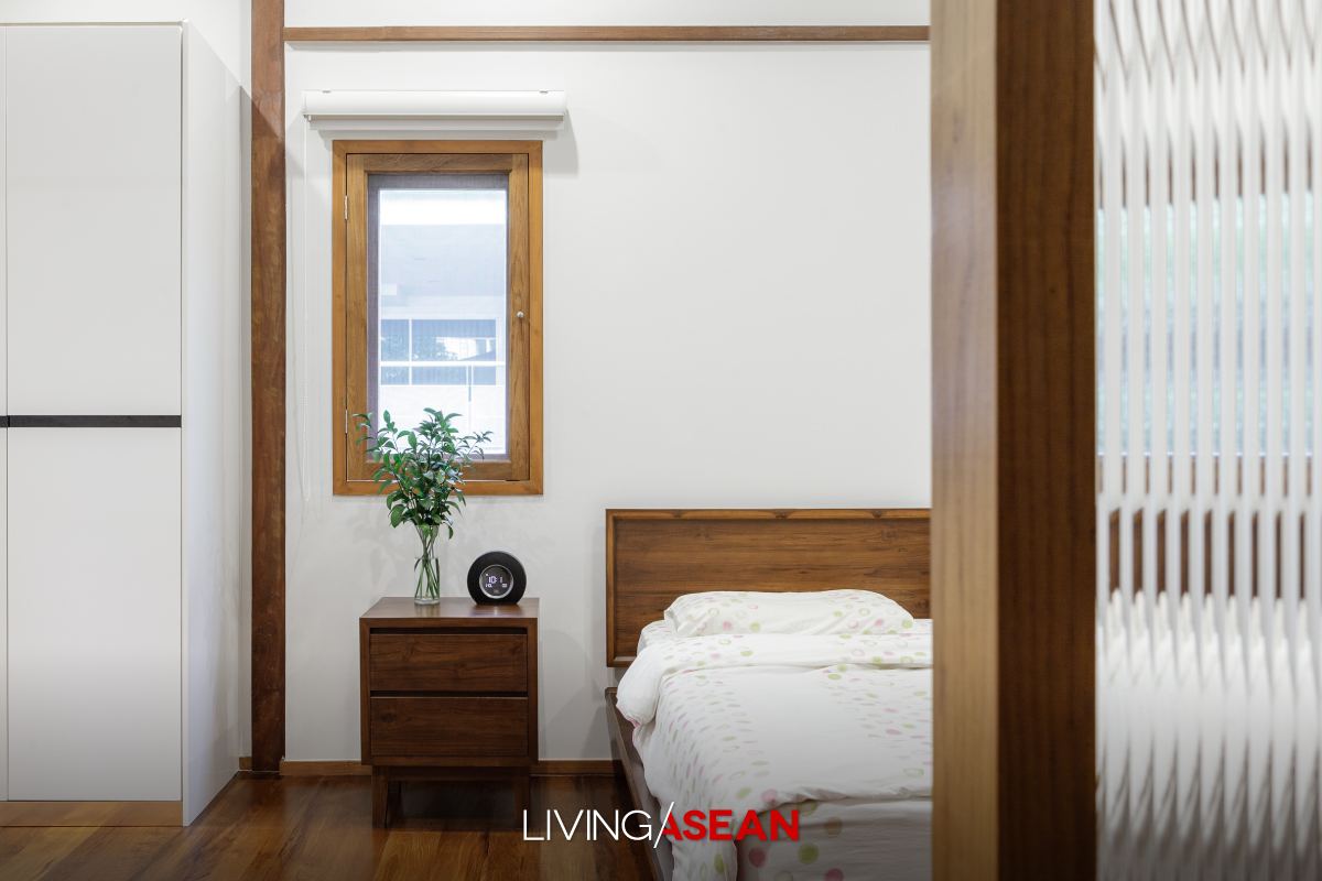
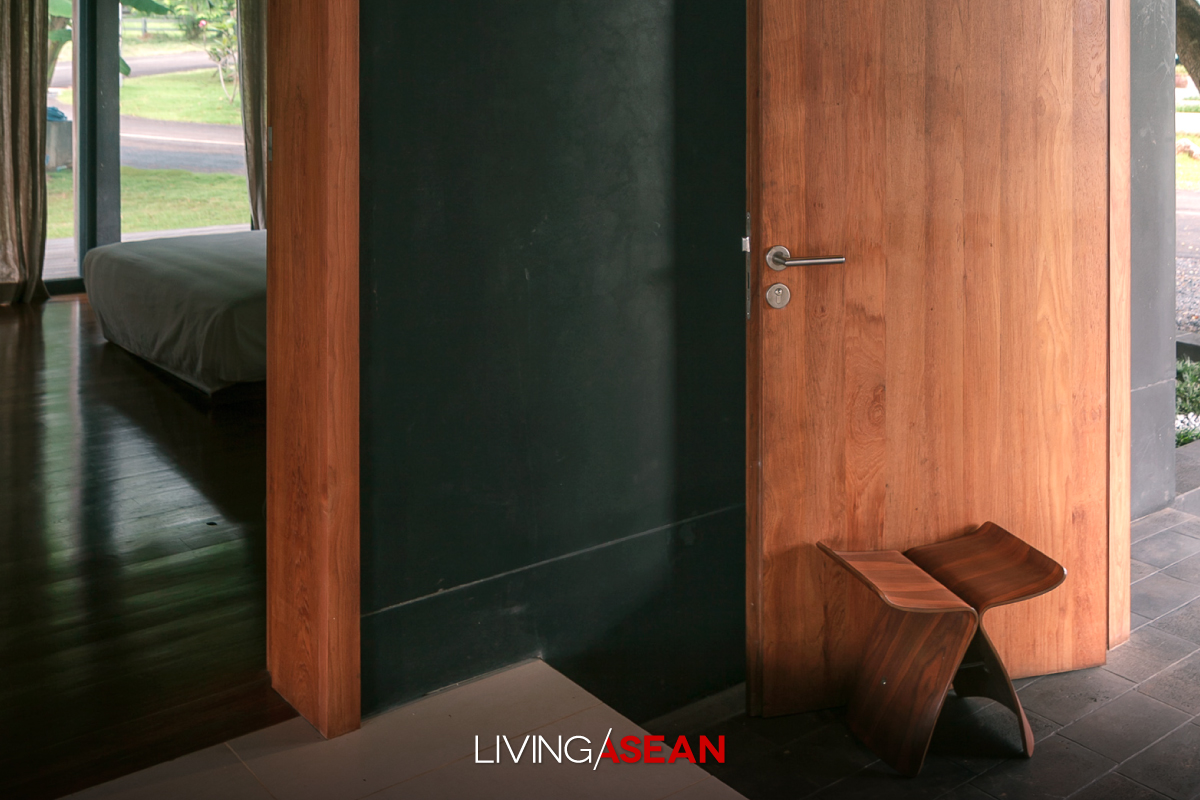
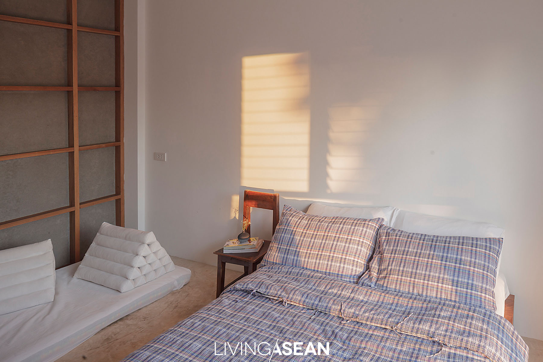
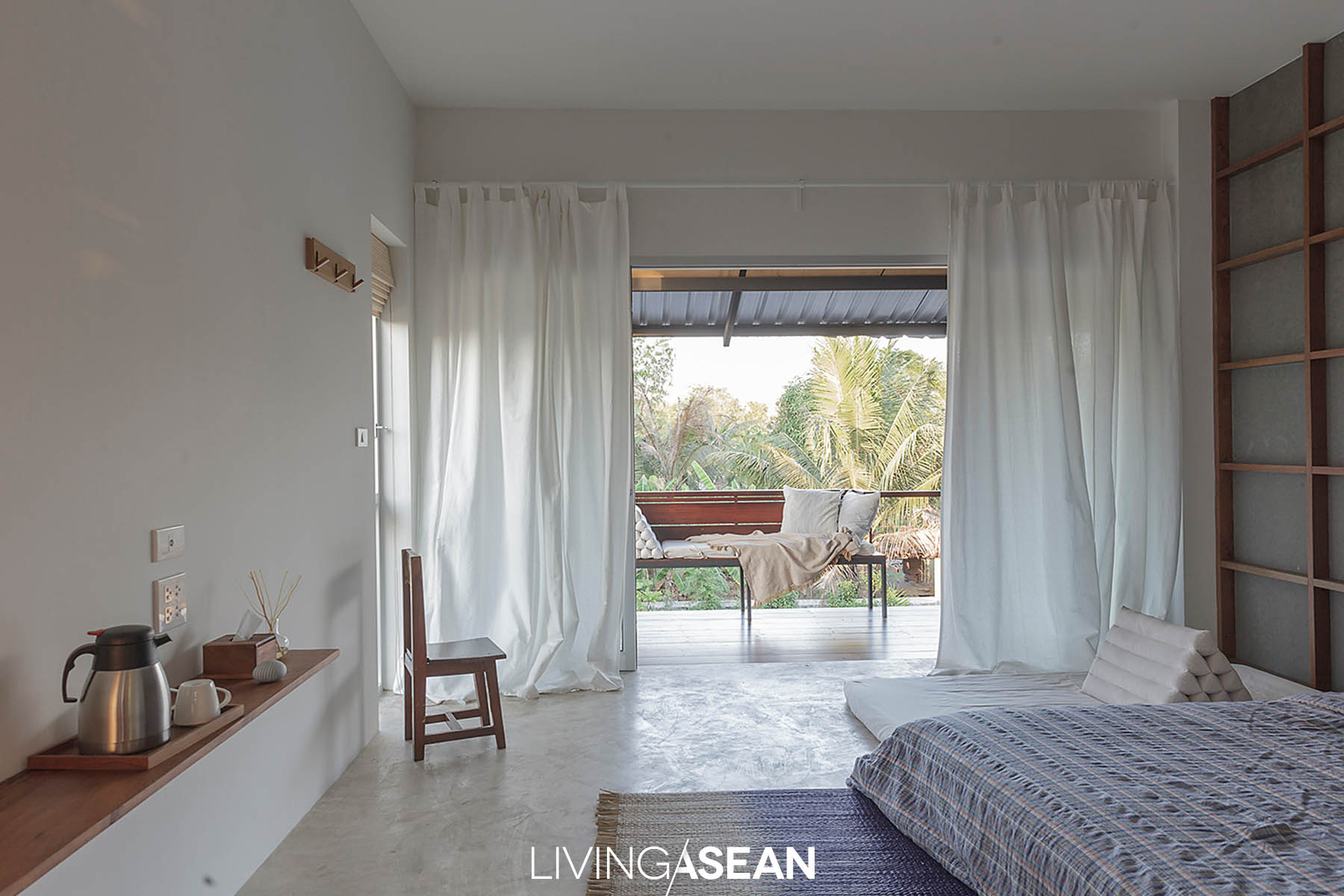
Minimalist simplicity has pride of place in the master bedroom belonging to Mom and Dad. An old bed and a few important things dominate the room with a beautiful courtyard view.
A well-ventilated bedroom viewed from the central courtyard.

Putting pen to paper, the architect soon came up with a U-shaped house plan with a courtyard at the center.

“By design, it’s positioned to reap the benefits of seasonal variations and prevailing wind patterns. This makes it comfortable to live, plus it’s cheaper to run without relying on air conditioning all the time.

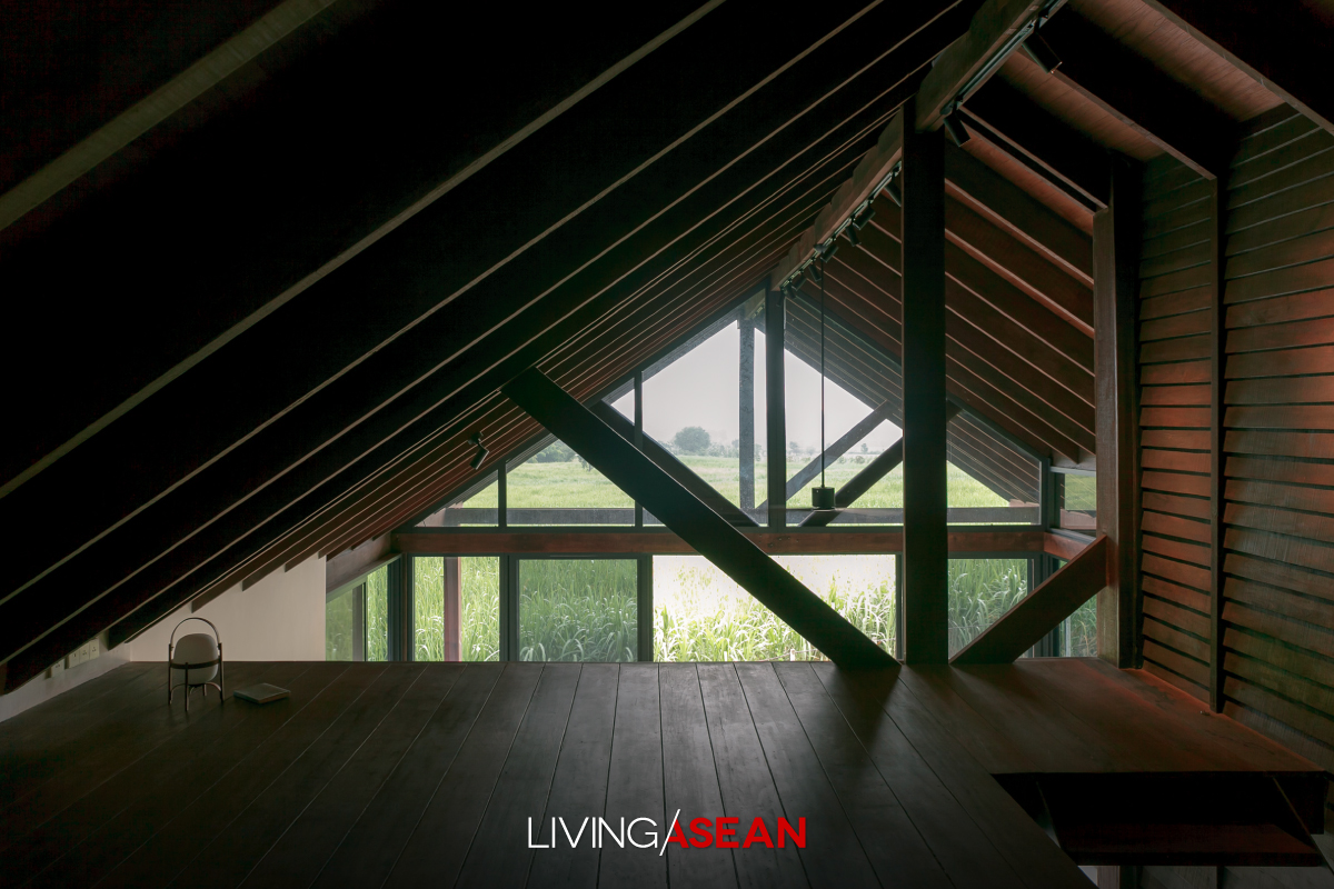
“Like so, thermal comfort is achieved by raising the ceiling 4 meters high with insulation to keep the interior cool. Steel roof frames give it a lightweight feel and reduces the fear of confined spaces.

“Overall, it’s the Japanese-style roof frames that make the single-storey home look simple yet very attractive both inside and outside.”

There is uniform connectedness in design from the sitting parlor to dining room to kitchen, plus the Buddha room, bedrooms and home office. Every room boasts floor-to-ceiling glass doors that connect with the courtyard garden.

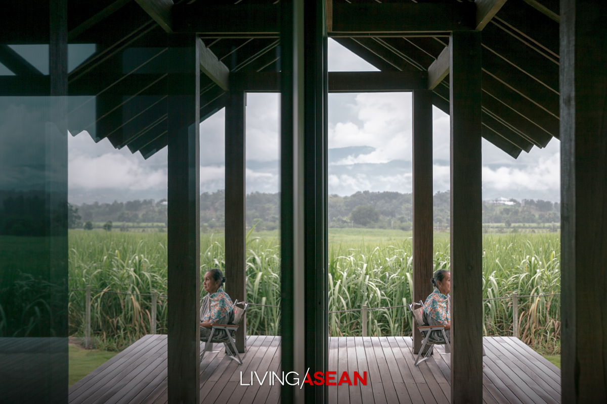
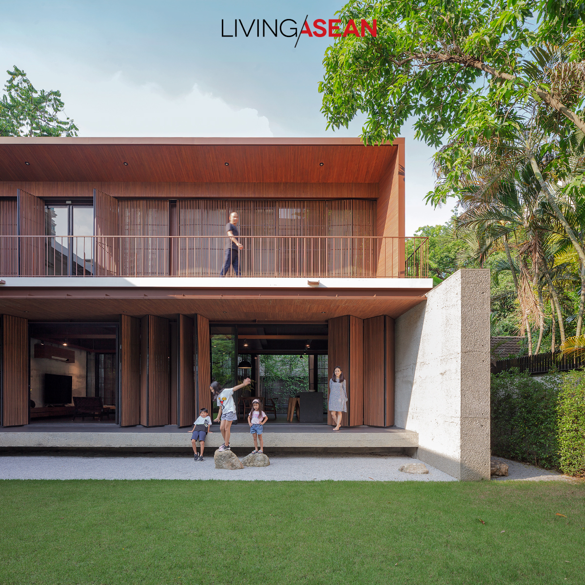
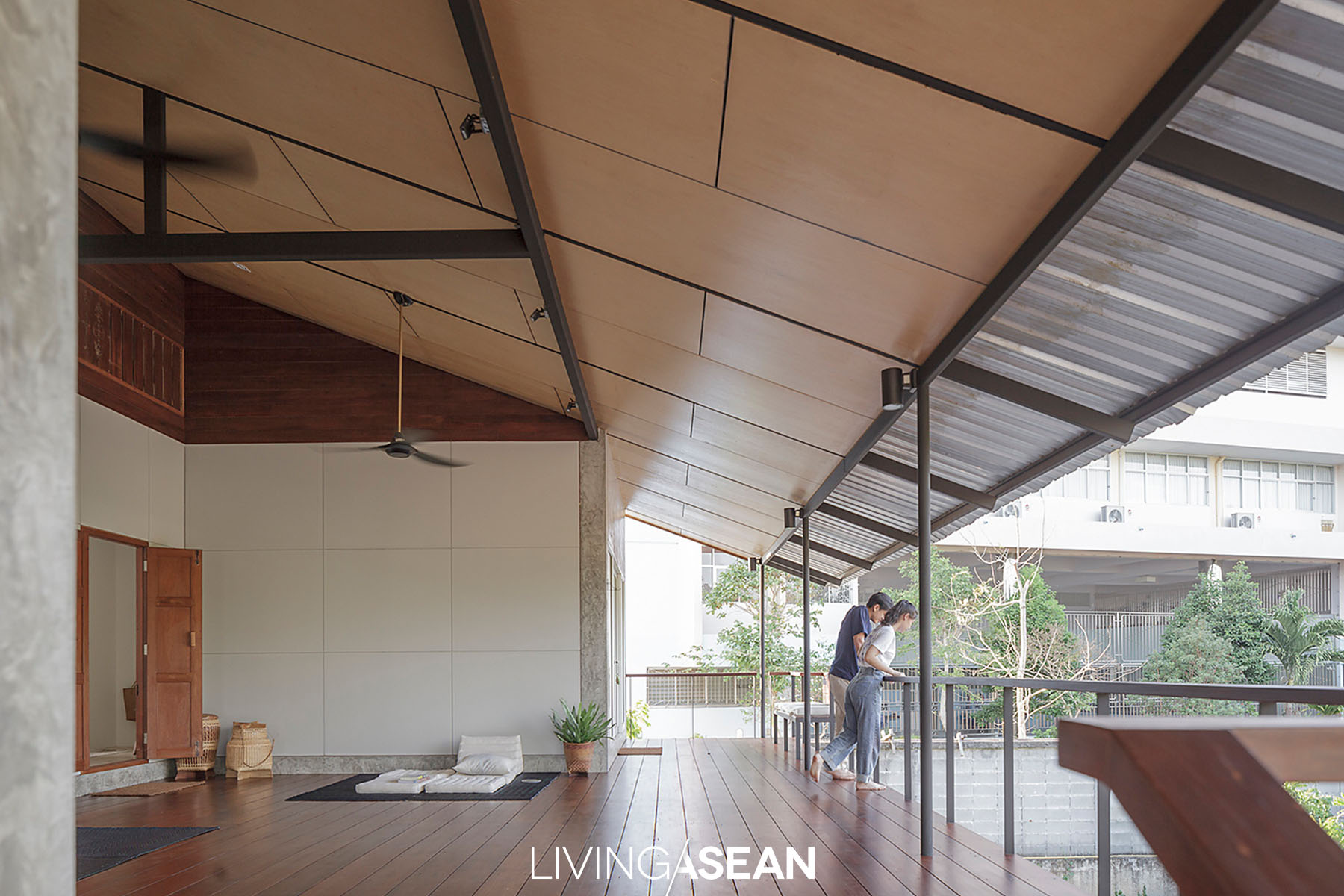
Both the front porch and the veranda that connects to the courtyard garden are made especially large for increased relaxing spaces.

All things considered, it’s design that lets nature spread throughout the entire property.

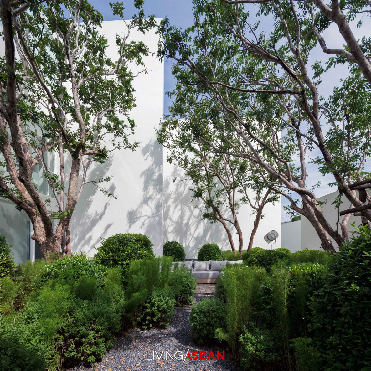
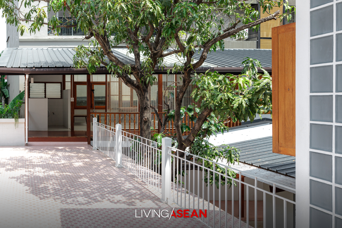
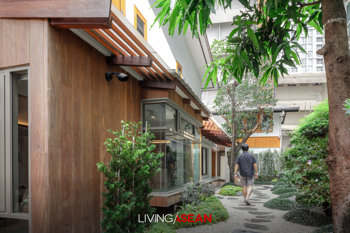
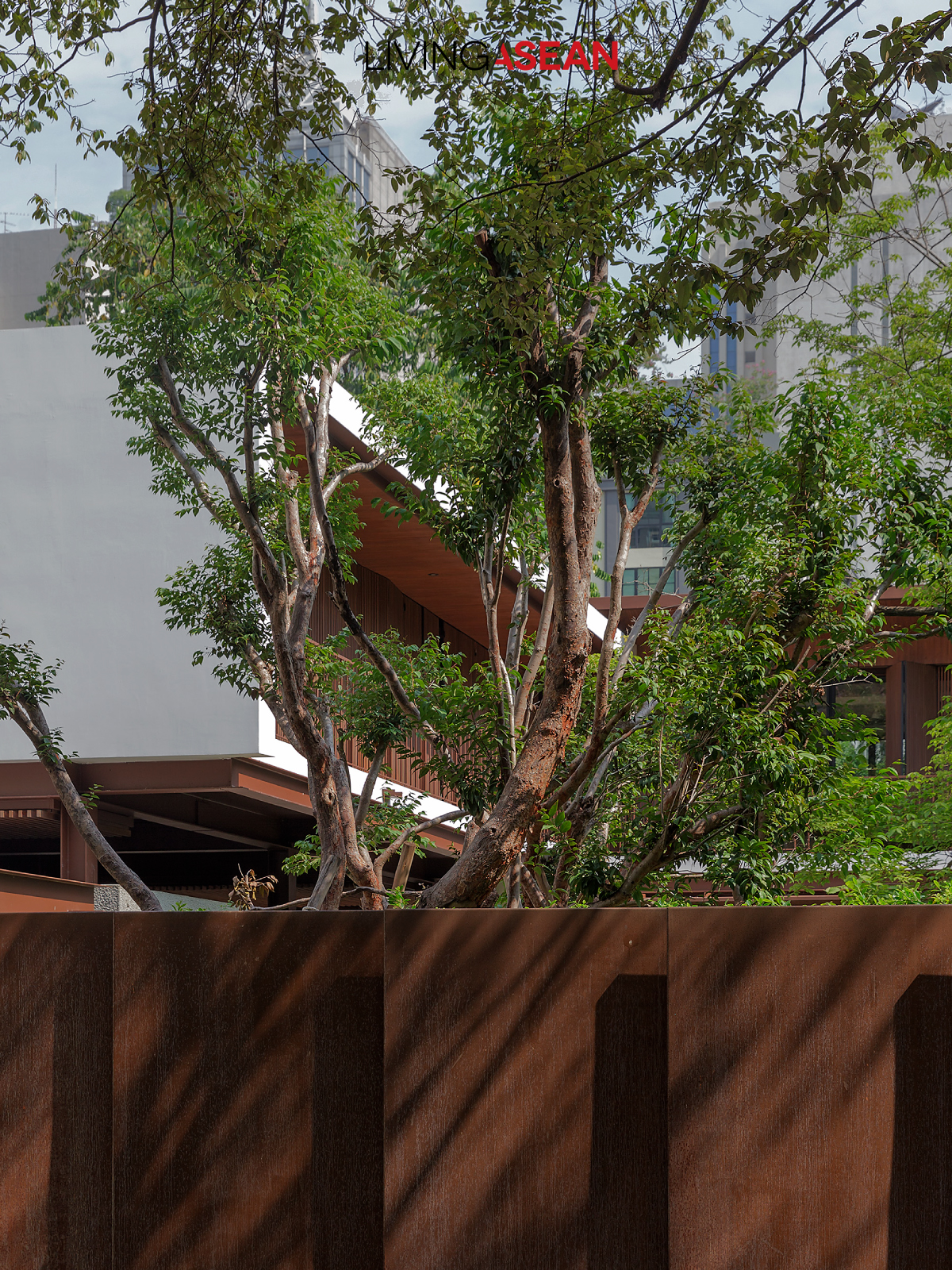
Clearly visible from every direction, the courtyard garden serves as lungs for the house. Shade trees are trimmed down to an ideal height so that they don’t block the view, while the understory is filled with ferns and mosses that thrive on large sponge rocks.
The service area wall has windows that blend in with other parts of the house.
A well-kept garden and courtyard space is designed to be seen from different angles.

The courtyard garden serves the purpose for which it’s intended. As heart and lungs of the house, it drives natural ventilation that keeps the air fresh and healthy indoors.

The garden of luxuriant foliage can be seen in full view from inside every room. On the whole, it’s a place to live in close touch with nature. Or just sit back, relax on the spacious front porch, and watch the garden grow.

For the homeowner, his idea of paradise is to enjoy simple living and indulge in peaceful recollection of his visit to that temple in Tokyo.


Architect: Anonym

Landscape Design: P do Landscape Studio


A Beautifully Renovated 60-year-old Mid-City House

A Beautifully Renovated 60-year-old Mid-City House

/ Bangkok,  Thailand

/ Story: Samutcha Viraporn / English version: Peter Montalbano /

/ Photographs: Rithirong Chanthongsuk /

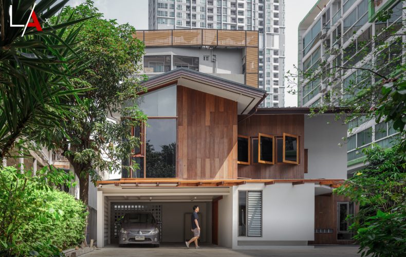
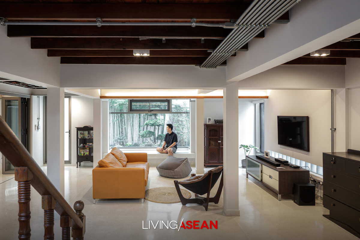
A beautifully renovated 60-year-old mid-city house, with a startling black beauty: this contemporary mix of old and new flows together as a single unit.

Interior decorator Pauline and nationally known architect Somrit Soonthornrungsi have spent their lives in this mid-city house. Once, it had a flooding problem downstairs, which plus termites and general deterioration, meant it was continually under repair.

At first, they thought to build a completely new house, but out of nostalgia and time constraints decided to do a major renovation instead.

mid-city house

“Our daughter grew up here and was upset that we were going to demolish it, so I thought, ‘Why not combine old and new?’ The result was a balanced, harmonious creation with a courtyard for breezes to pass through,” said Somrit.   

mid-city house

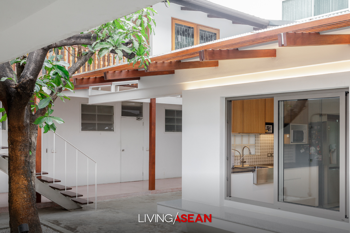
As we look in from the front door, the original house is on the right, across an open courtyard with planted walkways, and the second-floor verandah connects to the new house on the left.

The old house is of wood and masonry, with mortar stripped to show the traditional brick. Downstairs is Somrit’s small workshop and a bike storage space, with the floor raised higher to avoid flooding from street level.

The new section of the house is connected, but quite different because of its steel-frame construction. On the ground floor, there is the company office.

The second floor is Pauline and Somrit’s main living area, connecting to the old house through the courtyard.

There is a living room on the right before the large indoor kitchen, which retains its original Makha wood flooring but was repainted black to match the black synthetic wood of the exterior, for an informal, natural feeling to complement the green view of plants and trees outside the glass walls.

Their daughter’s room, set up like a New York loft apartment, is on the third floor.

At two points, a mezzanine stairway connects the central porch to the rear verandah, from which you can clearly see the 2 floors of the old house.

They all lived in this mid-city house during the construction of a new, steel-framed gabled roof over the old one, which was finally torn out when construction was finished, leaving the kitchen ceiling to follow the new roof angles. 

mid-city house

“The roof is a special black version of Shera’s “U-Slate” line. I’ve loved black since childhood,” said Pauline.

“When I was a kid, I wanted to paint my bedroom black, but my parents wouldn’t let me!” The chic interior design work has black everywhere. The large kitchen is in tribute to both her mother-side relatives and her father, who loves to cook.

“Besides the big kitchen pantry counter being a great place to socialize, it’s also good for informal dining.

Pauline selected furniture and décor in a “mix and match” style controlled by color, some items primarily functional and others reflecting personal style, combining old and new, cheap and expensive.

“It’s comfortable because this really reflects our way of life: the house isn’t built for show,” said Pauline’s father, “and we don’t want to be climbing up and down a lot of stairs in the day.

“Since coming here, we’ve confined business matters to downstairs, and it’s a comfortable walk up to the second floor. The longer we’re here, the more we like it. Looking back, the old house seems stuffy, with not a lot of open windows. Our lives changed after the switch.

“At first, we thought the courtyard would be too small, but in the end, it worked out great!”

Once light and wind directions were figured in, design principles were applied to open the structure up, and this mid-city house clearly became more than brick, cement, wood, and steel, a happy combination of old and new narratives.

Somrit added, “It’s impressive. Once the rooms were finished, furniture in, lights and water on, our home came to life anew. It’s a great comfort.”

mid-city house


Owner: Pauline Soonthornrungsi and Somrit Soonthornrungsi

Designer: Design Com-bini by Pauline Soonthornrungsi and Somrit Soonthornrungsi


You may also like

Chez Mou: A Home Hidden In the Frame of an Old House
CHEZ MOU: A HOME HIDDEN IN THE FRAME OF AN OLD HOUSE


AN AMAZING BEFORE-AND-AFTER HOUSE RENOVATION
A Harmonious Mix of Industrial Style and Joglo Architecture

A Harmonious Mix of Industrial Style and Joglo Architecture

/ Bali, Indonesia /

/ Story: Patsiri Chotpongsun / English version: Bob Pitakwong /

/ Photographs: Sitthisak Namkham /

Alexis Dornier is a German architect who nearly ten years ago moved to the village of Mas in Bali to build a vacation home. To properly house his furniture and artworks gathered from all over the world, he combined modern building techniques with an ancient Javanese architectural style known as joglo. Based around four pillars supporting a tall roof, in olden times joglo architecture indicated the owner’s social status.

Vacation House in Bali

“This house was primarily designed to showcase the ancient art of joglo wood construction. Functionality was figured in afterwards,” said Alexis.

“A modern steel support framework in the middle of the house adds a new element to the architectural tone, providing added support and making the house unique, but the essential artistry of the joglo structure was unaffected and remains essentially unchanged.”

Joglo

Vacation House in Bali

Joglo architecture lends its character to two prominent spots in the house while also supporting well-defined modern functionality.

The first is where the multipurpose room connects to the living room, showing off the joglo high ceiling. Next to that is a display spot for outstanding works of art, where a grand piano is set.

Both spots are bordered by clear glass walls looking out on the incomparable verdant green of the surrounding jungle vegetation.

Joglo

Joglo

As it opens into the spacious, high-ceilinged dining room, the kitchen also shows off the joglo architecture. Above is a unique and exciting mezzanine walkway of clear glass where skylights allow natural light to shine below.

A person walking here gets a close-up look at details of artistic work carved into the joglo wood, perhaps experiencing something of the past joy archaeologists have felt in making new and priceless discoveries.

Joglo

Vacation House in Bali

Vacation House in Bali

“Hidden beneath this spacious living room, connected to it by a three-dimensional walkway with views in all directions (a spiral staircase reaching down from the mezzanine), you will find two large bedrooms with ensuite bathrooms, as well as another living room.

“On your journey up or down, you’ll see beautiful artworks and striking views inside and out.”

Vacation House in Bali

Vacation House in Bali

Joglo


Architect: Alexis Dornier (www.alexisdornier.com)


Three-Storey Townhouse That Makes Space for Nature

Three-Storey Townhouse That Makes Space for Nature

/ Bangkok, Thailand /

/ Story: Sarayut Sreetip-ard / English version: Bob Pitakwong /

/ Photographs: Sitthisak Namkham / Styling: Jeedwonder /

Before moving into this three-storey townhouse, architect and university instructor Bhradon Kukiatnun really put his heart into the design and décor to bring about a conversation among people, animals, and things, partly intentional, partly by impulse. Here are imperfections that are either blemishes or beauty marks, depending on our viewpoint.

townhouse Architect Bhradon Kukiatnun

Bhradon’s business is booming, but designing his own house raised a tremendous number of new questions, not the least of which was how the new living space of a three-storey townhouse would accommodate his eleven cats!

“Three years ago, I bought this place new, and it took two years to fix up,” explained Bradon.

“First problem: organize storage space to hold the tremendous amount of personal stuff needed in my life while still keeping the house orderly. Then, I didn’t want a typical townhouse atmosphere, but neither should it be jarringly different.

“Part of the answer is this new façade, using a type of latticework found elsewhere in the project that fits my personal lifestyle.”

three-storey townhouse

As most townhouses add a roofed-over carport in front, Bhradon also applied his design idea to this requirement.

“There’s more than meets the eye in that front view: a lot of the functions are hidden,” said the architect.

“To really express myself, I had to go back and look at fundamentals with flexibility and an open mind.

“The space in front is limited. Would I rather have a carport there, or a garden? OK, garden: so I designed a garden where I could park the car! Quite different from having a carport decorated with plants.”

three-storey townhouse

three-storey townhouse

The design of this three-storey townhouse called for no structural alterations, but space was apportioned differently. The ground floor holds the living room, dining area, and pantry; second floor, a small bedroom and a workroom; third floor, the master bedroom.

“Inside, you might mistake a door for a wall, or vice versa: my overall concept was to focus on highlighting specific points, making them fit in by hiding some element,” Bhradon explained.

“In the living room, the TV wall is highlighted by hiding its functionality in a wall; the use of covering elements gives the feeling of being in a cave.”

three-storey townhouse

During our conversation Ando, Bhradon’s first adopted cat snuggled up as if to join the group.

“I learned a lot from raising cats,” he said blissfully.

“They don’t think like people. Sometimes our human knowledge drowns out our instincts. But a cat! It wants to sit, lie wherever, just does what it wants.

“This allows single things to have more than one function: TV cabinet or sitting place? Or, for us, a storage spot. Think outside the box.”

three-storey townhouse

three-storey townhouse

three-storey townhouse

We urban dwellers all long for nature. Bhradon answered this with a garden area in the rear of this three-storey townhouse, as he put it: “I think gardens nourish the psyche, so I put a little green in the house, along with a small guppy pond, and it’s a perfect spirit-refresher.

“I like the ‘wabi-sabi’ way of design; the beauty of imperfection, of real life,” he implied. “Real life involves rust; it involves injuries. Can’t eliminate these, right?”

As Bhradon’s speaking voice gradually softened, an unspoken conversation brought into focus the future of the house, the man, the cats, and whatever might lie ahead for them.

“Recently, my cat Kuma died, and I miss her every day. But through the sorrow of loss we see the beauty of living. Being natural is to be incomplete, and we have to live with the things that happen.”


Owner/Architect: Bhradon Kukiatnun


You may also like…

The Perfect Townhouse Makeover in Bangkok

Mash-up: Industrial Design and Green Space of Walllasia
A Modern Home Where Traditions Make Comfortable

A Modern Home Where Traditions Make Comfortable

/ Bangkok, Thailand /

/ Story: Patsiri Chotpongsun / English version: Bob Pitakwong /

/ Photographs: Anupong Chaisukkasem /

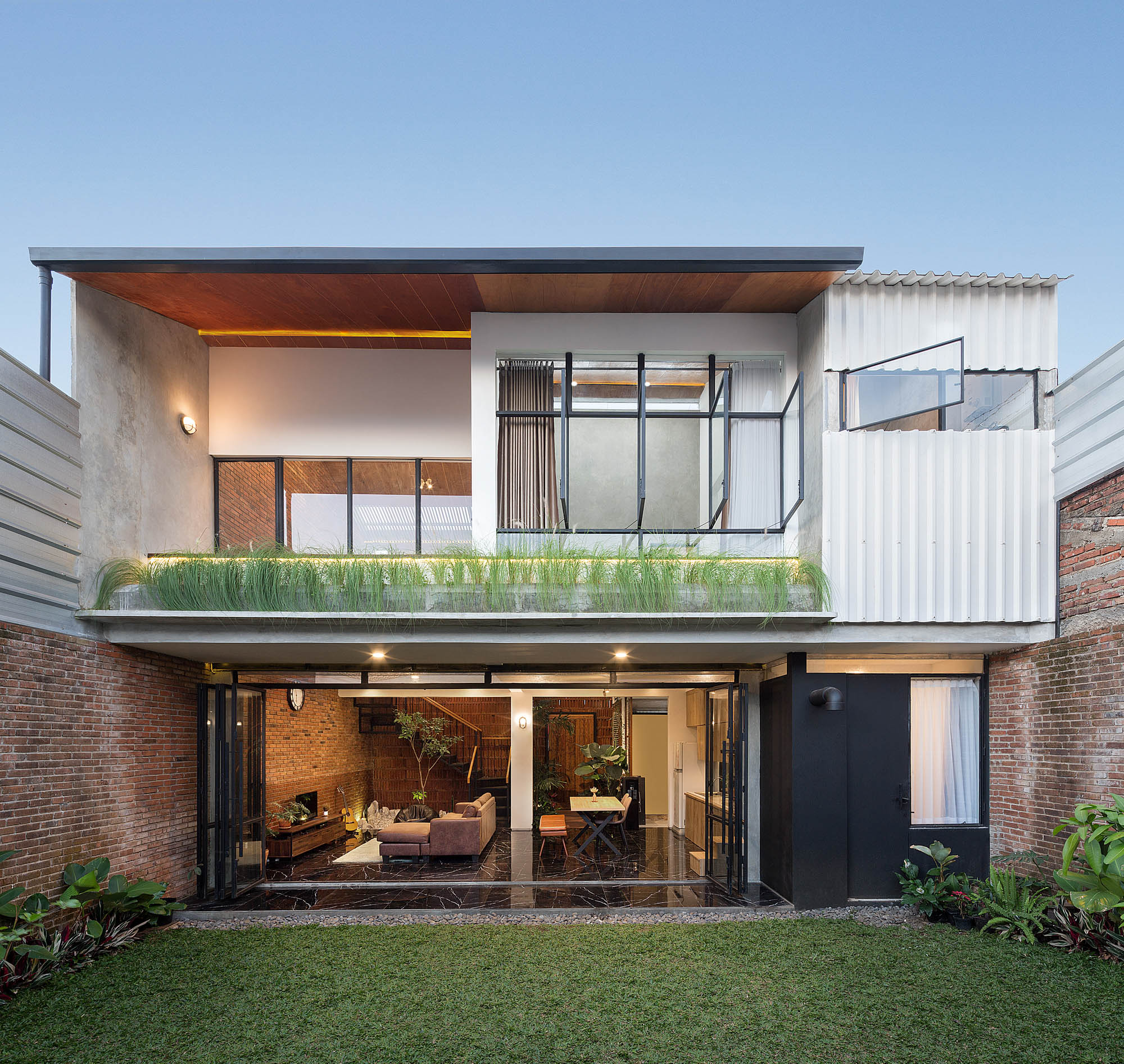
This contemporary Thai house is hemmed in by factories, but its clever design leaves one feeling unconfined, almost as if outdoors, with landscaping inserted right into the house interior and its sporty swimming pool. Mitigation of unpleasant outside sounds and scents is an even higher priority than the outward appearance of the house.

Contemporary Thai House Enhanced with Local Tradition

Advanced ideas and innovations from the West work best in Asian countries when adapted to localities and geographic conditions, so those innovations take on unique personalities of their own.

Vernacular architecture usually speaks directly to comfort and realities of local ways of life. In a traditional Thai house, for instance, one central concept is to have an open interior space, often with a high-ceilinged open thai thun area below the house that blocks the sun and catches the seasonal breeze.

Contemporary Thai House Enhanced with Local Tradition

Speaking to architect Surat Pongsupan of Greenbox Design, Ms. Aim, the owner of this house said:

“I want comfortable living Thai-style, with an open tai thun and such good ventilation that air conditioning is hardly needed.”

Contemporary Thai House Enhanced with Local Tradition

The owner’s close connection to the factory business and her desire for a short commute resulted in this closed-in location, where the architect’s ingenuity resulted in a truly striking design.

To counter the closed-in feeling, the house has entryways on two sides, one the drive into the front from the factory buildings, the second a walkway across the canal in back.

Just strolling through the house is pleasant. The architect explained:

“I designed a semi-open space where the landscaping actually reaches into the pool and the house itself. Bedrooms, closets, and service areas, generally not use in the middle of the day, are positioned to block the house’s common areas from the factory environment.

“This was a first priority, and the appearance of the house followed from that.”

Contemporary Thai House Enhanced with Local Tradition

House orientation takes into consideration the directions and force of sun and wind in the humid tropical climate.

Walls to the west and south are opaque; There are two levels of roofing with a gap between facilitating heat insulation and ventilation. The four-sided, gable-free roof is lighter, slighter, and more open than usual, and skylights are used to bring morning light into bedrooms, a nod to the early-rise lifestyle of the owner.

“The general house plan puts the living room in front, with a high ceiling. I placed the living room next to the garden and pool, with a full sliding glass wall opening up a horizontal view and drawing fresh air in,” the architect continued.

“Ceilings in the kitchen and dining room are high and open, giving the feeling of the traditional tai thun, as these rooms are used for every meal and common family activities. These rooms also open out onto the garden and swimming pool.”

Contemporary Thai House Enhanced with Local Tradition

Contemporary Thai House Enhanced with Local Tradition

Contemporary Thai House Enhanced with Local Tradition

Upstairs, a clear glass wall offers a view all around the house. The corridor connecting bedrooms shades the pool below, making for comfortable midday swimming.

There is an overall impression of harmony. Primary colors are gray-white and a soft, warm natural wood color. Indoors get a lot of sunlight, but trees give it a fresh green tint, especially the brush cherry tree planted in the middle of the house.

Contemporary Thai House Enhanced with Local Tradition

Contemporary Thai House Enhanced with Local Tradition

=

The owner concluded, “We like being contemporary, but also being Thai. The openness of kitchen and pool is great. The soft sound of running water is sweet.

“My husband likes to listen to songs, and has speakers all over the house, making for a relaxing atmosphere. It’s good for the kids to become accustomed to living with nature, which is why we emphasize the value of these common areas so much .”

We call our home “Viva House,” with the hope that all living here will have long and happy lives.


Architect: Surat Pongsupan of Greenbox Design (www.facebook.com/greenboxdesignbkk)


You may also like…

Modern Thai House Adapts to the New EraModern Thai House Adapts to the New Era

In Nature’s Peaceful EmbraceIn Nature’s Peaceful Embrace

Modern Thai House Adapts to the New Era

Modern Thai House Adapts to the New Era

/ Lopburi, Thailand /

/ Story: Patsiri Chotpongsun, Sarayut Sreetip-ard / English version: Peter Montalbano /

/ Photographs: Soopakorn Srisakul / Styling: Jeedwonder /

Deep study of local architectural lore and analysis of locale-specific environmental and climatic conditions combined to create this house of fluid chic modern lines mixed into a look that clearly suggests the traditional Thai house.

Modern Thai House Adapts to the New Era
Thick walls around the house match the design of the building itself. Note the fine interplay of diagonals between the wall and roof.

The owner wanted to provide his parents with a home where they could enjoy the ways of life of a new era. His first thought was to create a modern-style house with all customary functionality.

Combining the good points of old and new, the result is a single-story resort-style house with a contemporary look and a relaxed atmosphere reinforced by a swimming pool.

With a usable area of 700 square meters, the house takes the shape of the letter “U,” filling a wide space the architect tightened up for the sake of intimacy: family members feel in closer touch with each other.

The openness makes for good air circulation, yet acts as a divider between common areas of the living and dining room and a more private side. The roof reminds us of a traditional gabled Thai house, but the gable is clearly steeper and higher.

Modern Thai House Adapts to the New Era

“Thai gabled roofs come in many forms,” said the architect, “but if the gable faced any way but front it wouldn’t be pretty, since it would make roof look unbalanced. From the side the sharply-sloping “lean-to roof” offers a rectangle.

“The house faces south to catch the wind, but also gets sun there, so the gable has to provide shade, and the eaves extend further out. Especially at the end the roof rises even higher, providing more welcoming open space in front of the house, an eye-catching feature with a contemporary look that also provides needed functionality.”

Modern Thai House Adapts to the New Era

The high gables not only help protect against southern exposure to sun, but also build a characteristic aesthetic of this home continuous with interior building design elements.

The “U” shape leaves a space in the middle used as an open courtyard that holds the swimming pool and a gorgeous tree. Every point in the house looks out on it through the surrounding glass walls, connecting everyone with the courtyard and with each other.

Modern Thai House Adapts to the New Era
A pattern on the glass door with black laser-cut MDF paneling that helps filter light adds an air of mystery to the house interior.

From the exterior, the architectural design flows inside into the interior in a play of shapes and lines.

The interior ceiling opens up into the gable-shaped steel frame where the hardness of the steel is reduced with the use of wood, again reminding us that this is a Thai home.

The furniture blends right in, shapes with modern simplicity and a lot of wood in the mix adding a sense of relaxation to this Modern Thai House.

Modern Thai House Adapts to the New Era
Dining corner and pantry with sliding walls that close or open wide to make the space one with the porch and swimming pool
Modern Thai House Adapts to the New Era
Open, airy walls framed with black aluminum and clear glass rising up to the ceiling, showcasing the continuity between the internal and external roof structure
Modern Thai House Adapts to the New Era
On the bedroom-side, rooms open to the east, onto the pool, nice catching the morning light. A walkway edging the pool shortcuts from the bedroom porch directly into the common area.

Modern Thai House Adapts to the New Era


Architect: NORMAL PRACTICE

Landscape Architect: Lana Studio


You may also like…

In Nature’s Peaceful Embrace

Surrounded by Warmth and Happiness

Termitary House: Good Sunshine, Fresh Air, and Brick Walls

Termitary House: Good Sunshine, Fresh Air, and Brick Walls

/ Da Nang, Vietnam /

/ Story: Patsiri Chotpongsun / English version: Bob Pitakwong /

/ Photographs: Hiroyuki Oki /

The fact that the house is made of clay has enabled brick buildings to make deep connections with the natural world in so many ways. More importantly, the structures built of small rectangular blocks derived from nature are endowed with the power of storytelling that provides a window on vernacular culture, the environment, and the way of life native to a locality. These qualities are manifested in outstanding works of architecture, the likes of which are obvious at this house in Da Nang, Vietnam that uses brick walls as the main building element.

Good Sunshine, Fresh Air, and Plenty of Room to Breathe
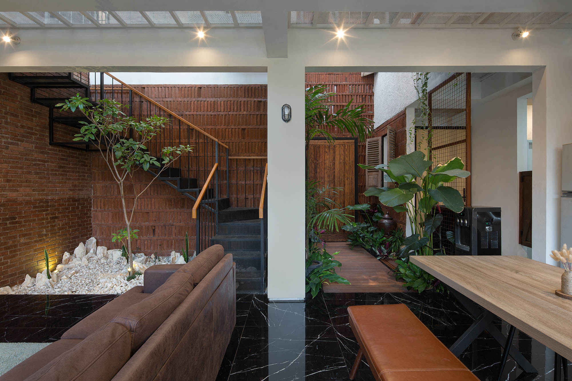
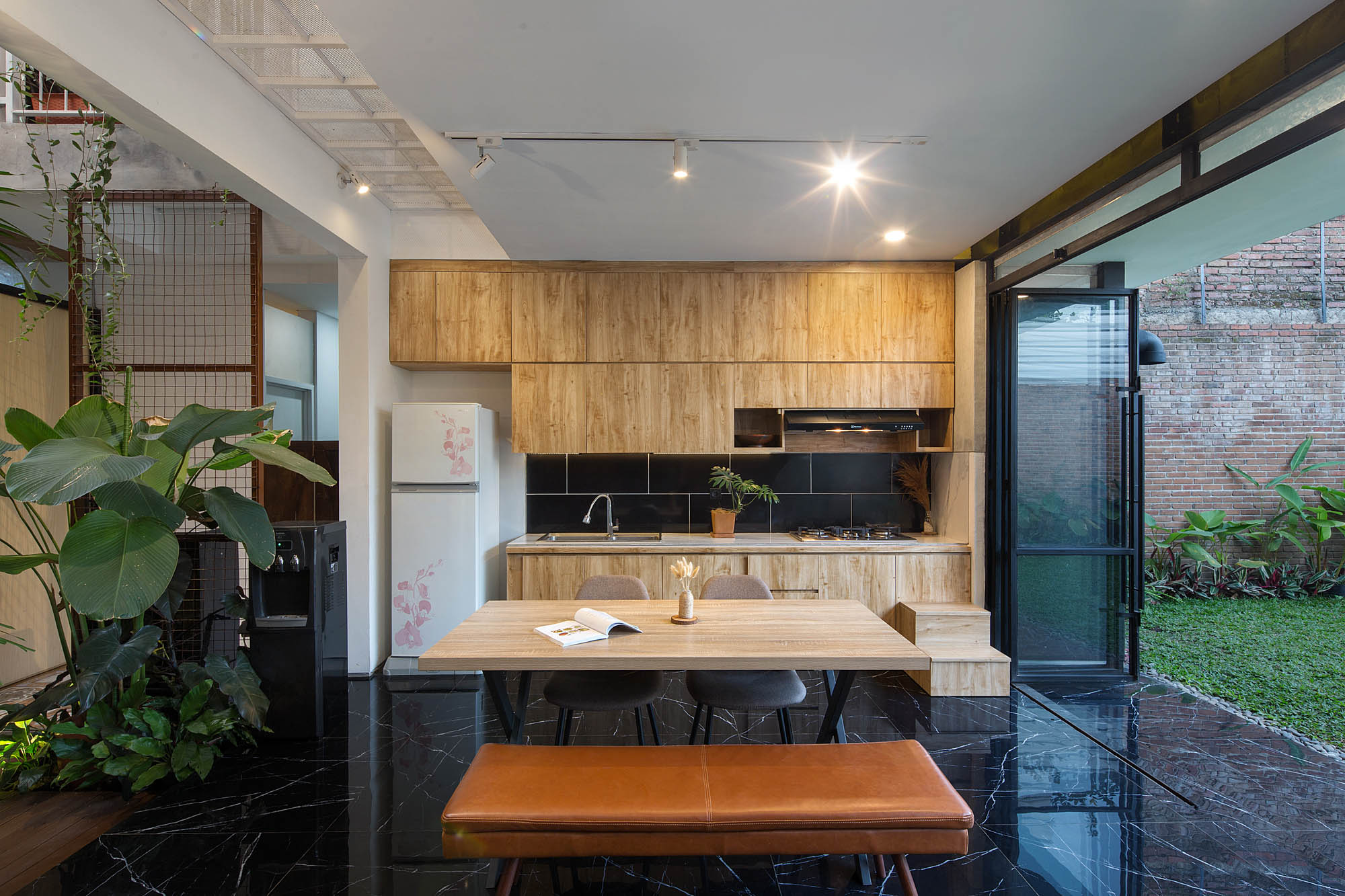
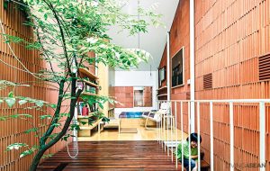
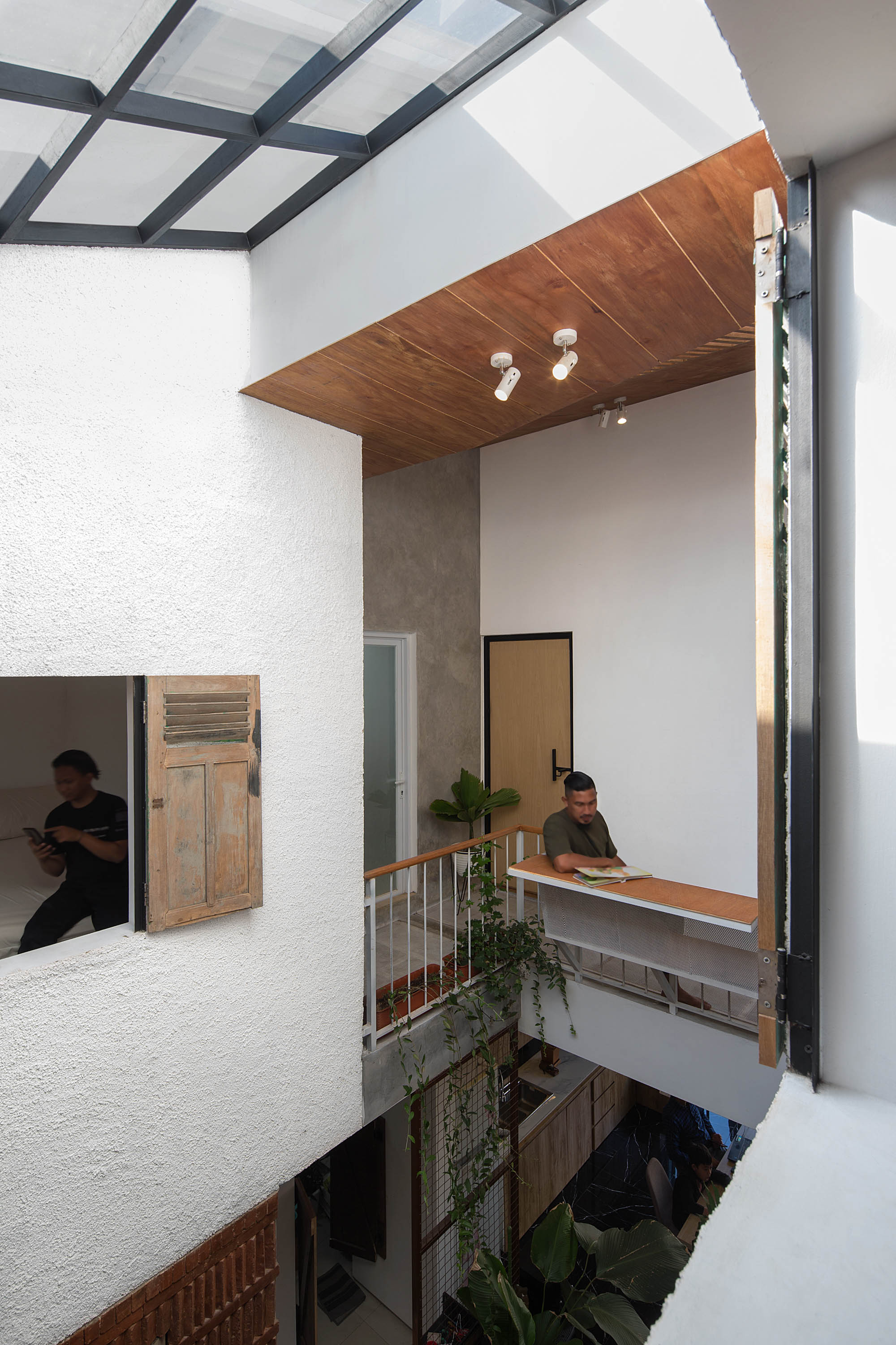
The hall at the center of the house plan is spacious and well-lit, thanks to the skylight positioned directly above it. It has room for plenty of functions ranging from a sitting parlor to dining room to pantry. The natural light cycle interacts with the interior spaces, resulting in different color renditions as day goes by.

It all started with a family’s desire to renovate their home on a budget. A team of architects from the design firm Tropical Space soon came up with an idea inspired by termite mounds.
They knew that the small soft-bodied insects built their homes by cementing masses of earth with saliva. Amazingly, they are quite capable of withstanding hot and humid climates for long stretches of time.

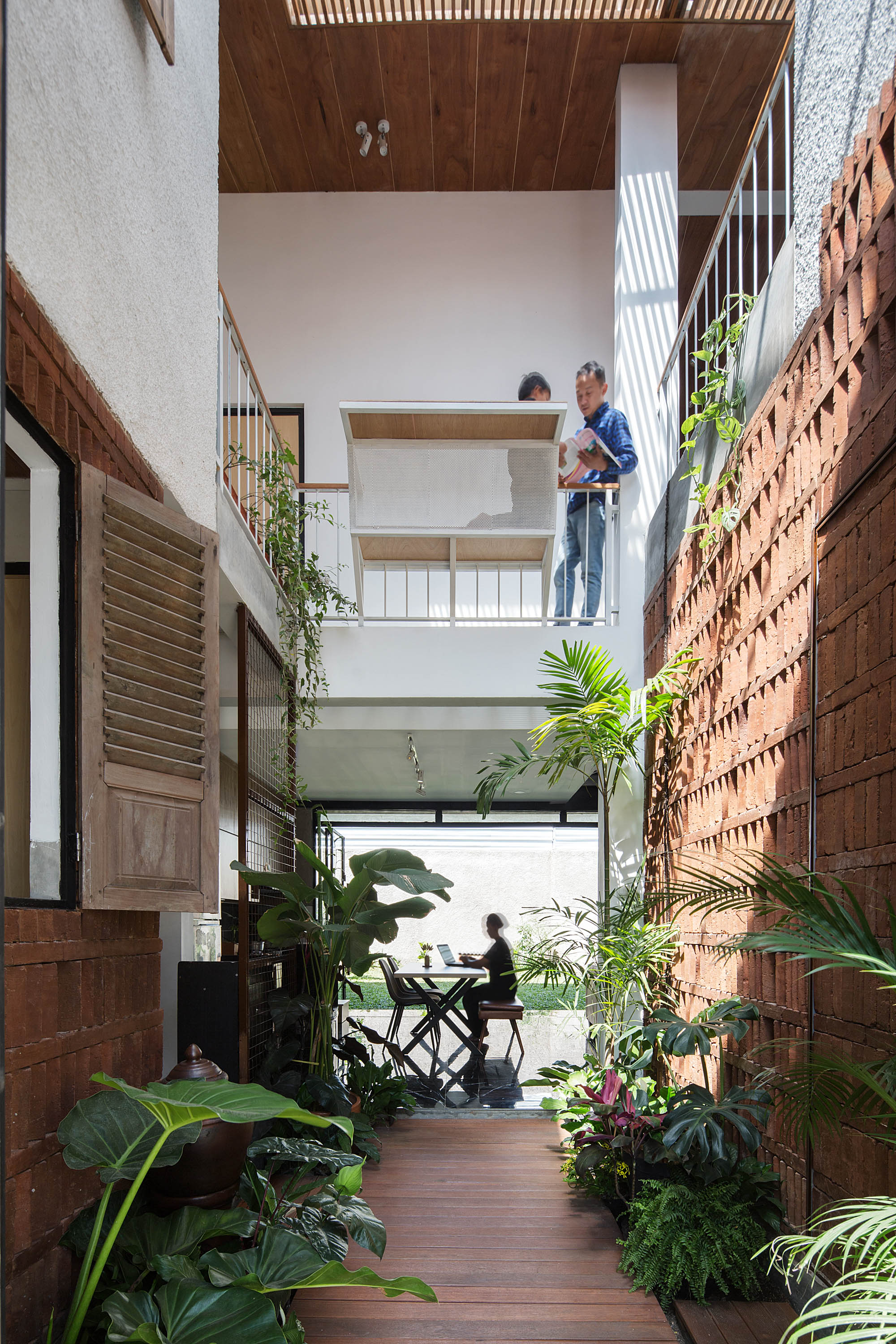
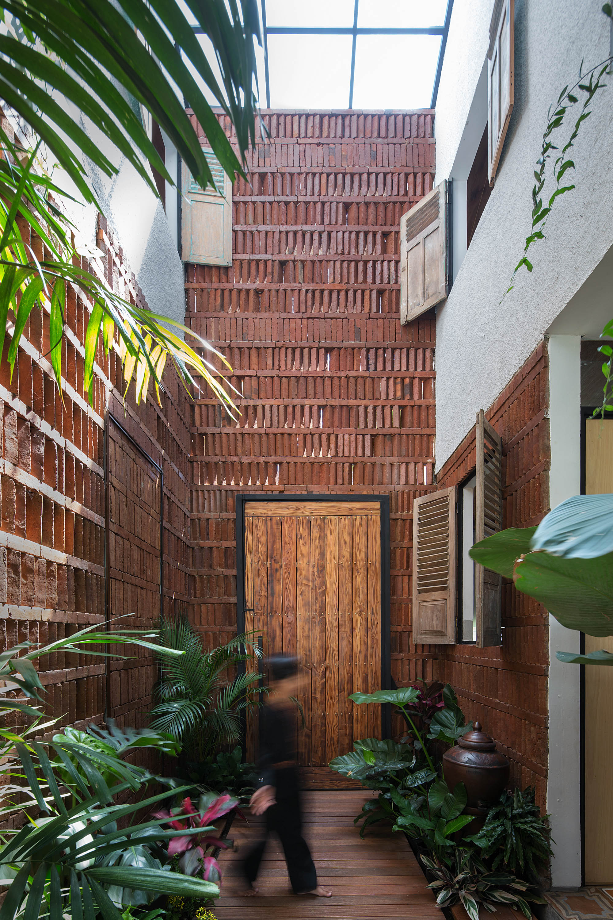
For this reason, the architects designed the house walls to be built of bricks placed on top of each other with a break between blocks to create little ventilation holes that allow in light and drive natural air circulation.

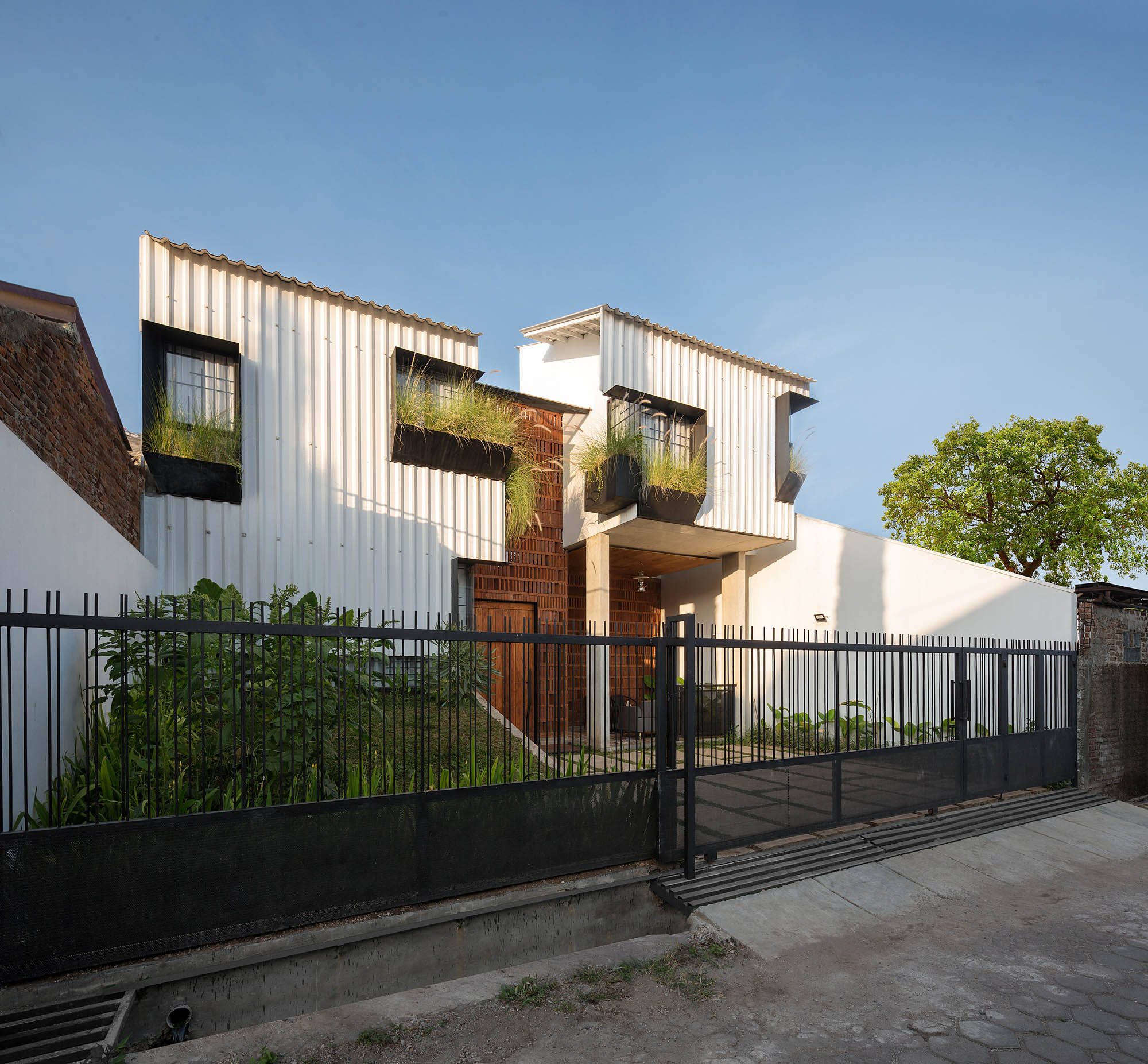
Designed for tropical living, the 140-square-meter box-shaped house wrapped in perforate brick walls is going by the name “Termitary House.

To protect from heat, the team of architects put in perfectly opaque walls on the sides exposed to intense sunlight.

Meantime, the sides with less exposure to bright light had small openings built into the walls to promote air circulation, resulting in thermal comfort in the interior living spaces year round.

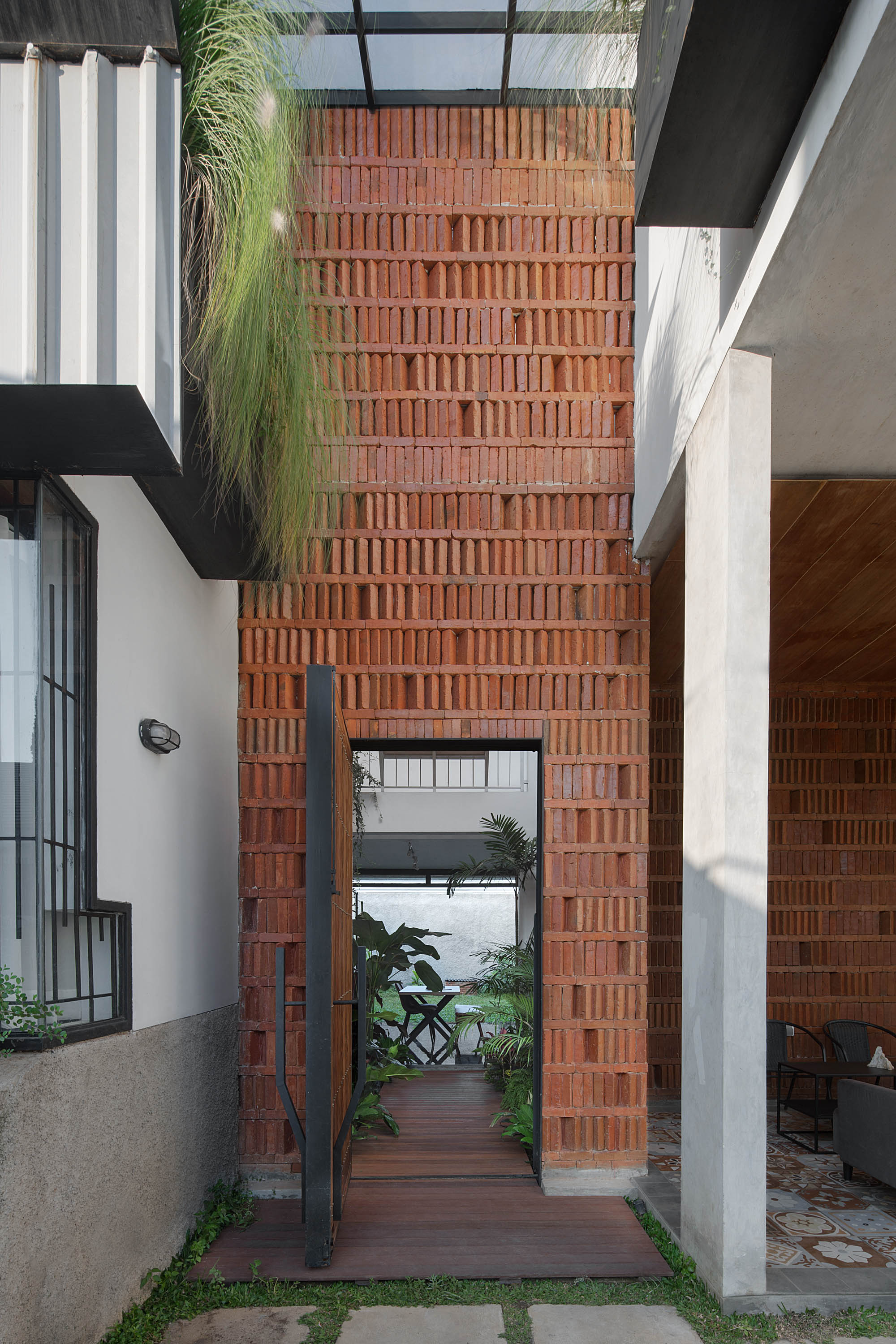
The same applied to the brick house façade that’s its most outstanding feature. The vertical flat structure was made of bricks fired the old-fashion way and laid with air holes at intervals all the way across.

The result is a breathing wall that allows in just enough light and a fresh supply of air. The light and spacious atmosphere lends a modern air to the home designed to be free from dust in summer and safe from inclement weather during the monsoon season.

More importantly, it’s about privacy that comes with unique design.

Situated on a rectangular plot with narrow frontage, this box shaped house is enclosed by brick walls with ventilation holes built into them. They serve multiple functions as privacy screens, breathing walls, and means of admitting daylight into the interior.

It’s a house plan that prioritizes thermal comfort as well as functions. The staircase, storage room and bath are strategically placed on the east and west sides.

During daytime hours they double as a layer of insulation to keep sunlight heat out. The hall at the center is spacious and well-lit, thanks to the skylight positioned directly above it.

The area offers plenty of space for a sitting parlor, pantry and dining area as well as easy access to the bedroom, bathroom and small reading room on the mezzanine.

Open concept design paired with perforated room dividers contributes to visual continuity that enables family to stay connected, happy and warm even on a busy day.

A small corridor lies between the outer brick wall and the inner wall decorated with transparent glass. Glass walls maximize natural light while protecting the interior living spaces from rain.

Well thought-out design adds privacy to the bedroom on the mezzanine. Opaque walls paired with perforated brick walls and skylight in the ceiling add a new dimension to design. Meantime, glass paneling for the wall is installed to protect the room from dust and inclement weather.

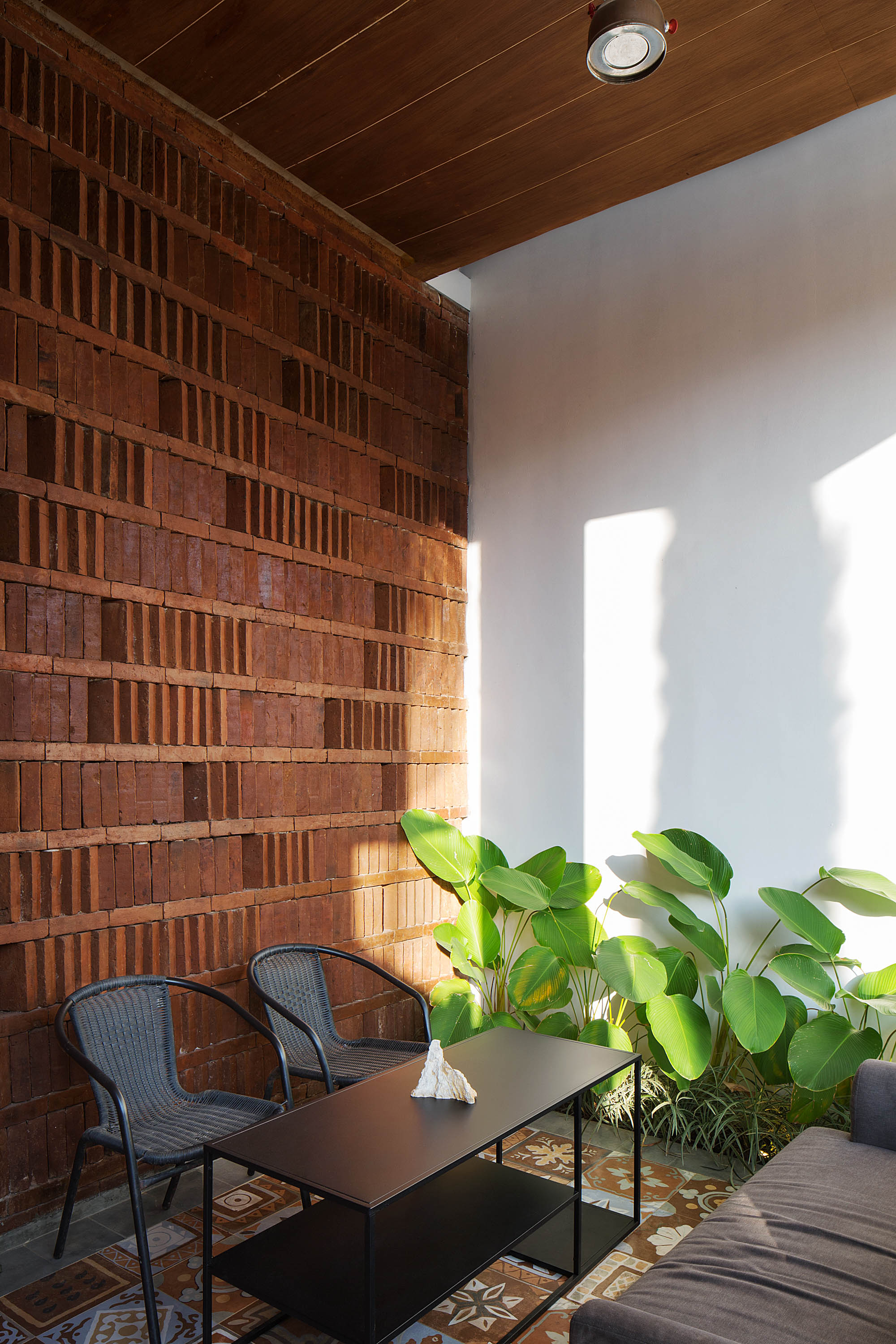
Breathing walls offer several advantages. By design, countless small holes in them let a moderate amount of light shine through, increase air circulation, and reduce interior temperatures to a comfortable level.

Upfront, the vertical brick structure provides an awesome privacy screen that’s energy efficient and allows people inside to see out. Made from inexpensive local materials, it comes alive when good sunshine creates movement and a shadow play on the surface.

And the show goes on day and night, thanks to the form, color and texture that give the brick wall its character.

The house walls are built of bricks placed on top of each other with a break between blocks to create countless small holes that allow light and air to enter and circulate freely. The resulting perforate shell contributes to physical ease and well-being in the tropical style home.

The night is aglow under the beams of electric light shining through the perforate shell. It’s a phenomenon that conjures up the image of a beautiful lantern symbolic of a joyful celebration.

This story is an excerpt from Modern Vernacular Homes Special Issue: Happiness Matters. (Available here in Thai and English)

Modern Vernacular Homes
This home is one of 13 Special Homes from the Modern Vernacular Homes: Happiness Matters, Thai and English by the Baan Lae Suan Team. The issue is available now! If you are interested, please contact us. >> www.facebook.com/messages/t/Baanlaesuanbooks

Architect: Tropical Space by Tran Thi Ngu Ngon and Nguyen Hai Long

Retirement Home Perfectly Serves a New Life in Ratchaburi

Retirement Home Perfectly Serves a New Life in Ratchaburi

/ Ratchaburi, Thailand /

/ Story: Nathanich Chaidee / English version: Peter Montalbano /

/ Photographs: Sittisak Namkham / Styling: Tippaya Tarichkul /

Their retirement home epitomizes the “new life” many dreams of. One such is Lisa Thomas, former manager of a famous hotel chain in Thailand who retired and moved with her mother to Ratchaburi.

“It was love at first sight. Our first arrival in Ratchaburi was, like this, in the rice growing season. I love the inexplicable green of rice paddies: somehow it always brings me a peaceful feeling.”

Lisa’s first impressions resulted in her choice of Ratchaburi Province as the site of this family home, but there were other reasons: convenience of being only two hours from Bangkok, good public utilities, and, importantly “the green horizon, without the view of skyscrapers from our old condo.”

Helping to bring Lisa’s dreams to reality were Research Studio Panin Architects Assistant Professor Dr Tonkao Panin and Tanakarn Mokkhasmita. Their design began with their listening intently and paying attention.

“We’re satisfied if we can manage to translate the everyday morning-to-evening life of a homeowner into each angle and corner of our house plan.

“Houses spring up gradually, resulting from our conversations with the owner. Solutions come from knowing how to step back and fully understand what we are listening to.”

retirement home

This design answered fundamental home needs including functionality of use; features gradually added to support the owner’s natural habits, and principles of comfortable living such as “cross ventilation,” which allows air to move freely through the building.

A half-outdoor deck set in the middle of the house greets entering visitors, also capturing breezes from all directions as they transit from outside to inside.

More than simply a stop on the way in, it’s a comfortable space for the owners to relax.
retirement home

The building of this retirement home is laid out to follow the contour of the property, along a natural irrigation canal. To echo this locational context, a swimming pool is set parallel to the canal.

The house faces west, but the problem of day-long heat is addressed with a basic structure of steel-reinforced concrete and an extended deck that widens to match the reach of the sun.

Eaves and verandahs have a steel framework that nicely frames the surrounding scenery.

retirement home

retirement home

retirement home

“Without Lisa’s daily life here, the house would have no meaning,” the architect added.

“It awoke different levels in this space both from the perspective of form and in the actual space itself.”
The location of this retirement home is in harmony with the nature of her life. In the everyday living areas – kitchen, dining room, living room – a high ceiling is called for.
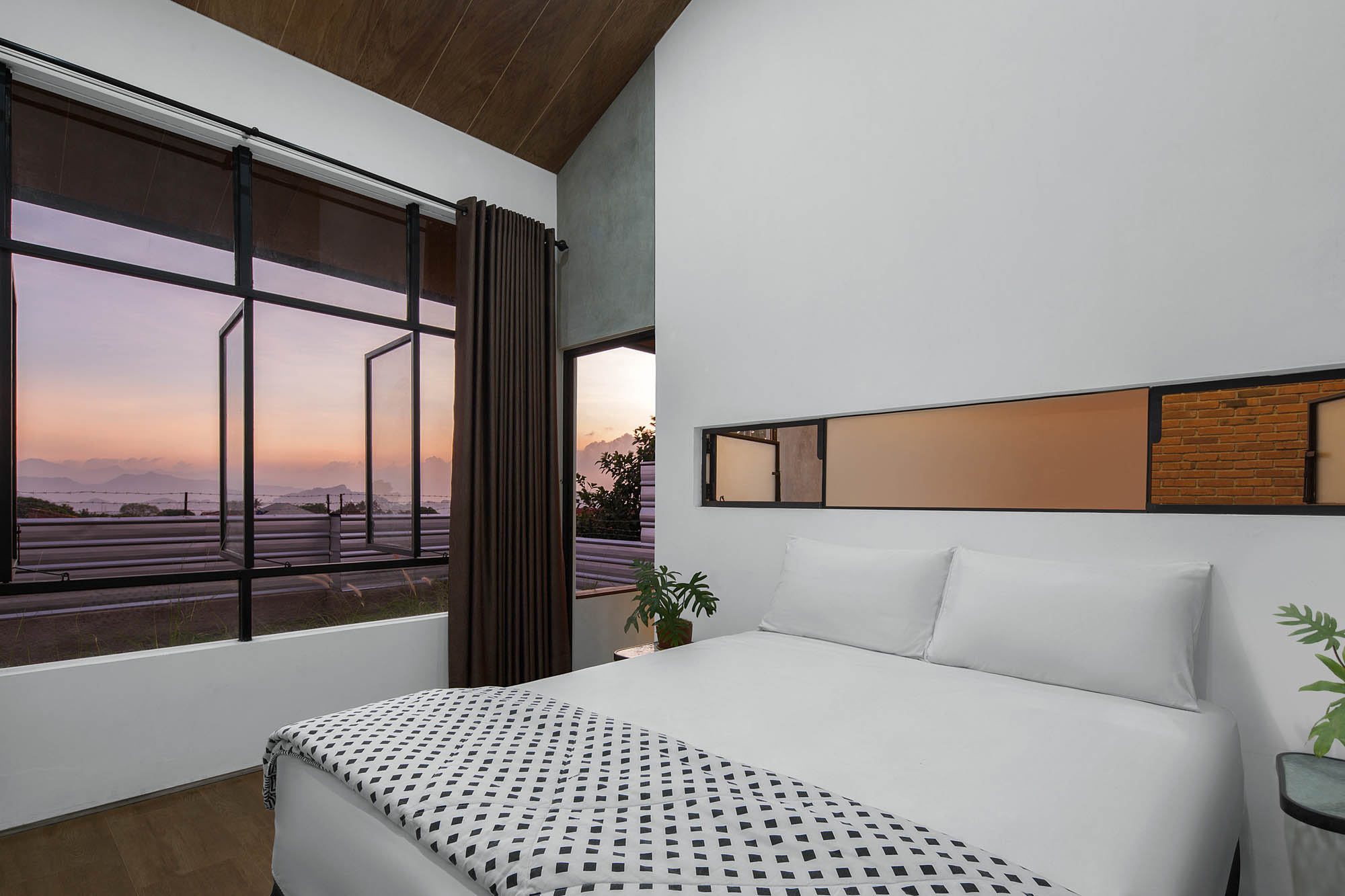
Louvers are set in narrow dividing panels between doors and windows for good ventilation throughout the day, bringing air into the central entrance hall and on into Lisa and her mother’s bedrooms in back, upstairs and downstairs.
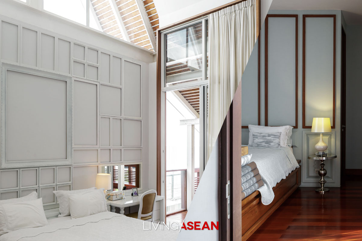
retirement home
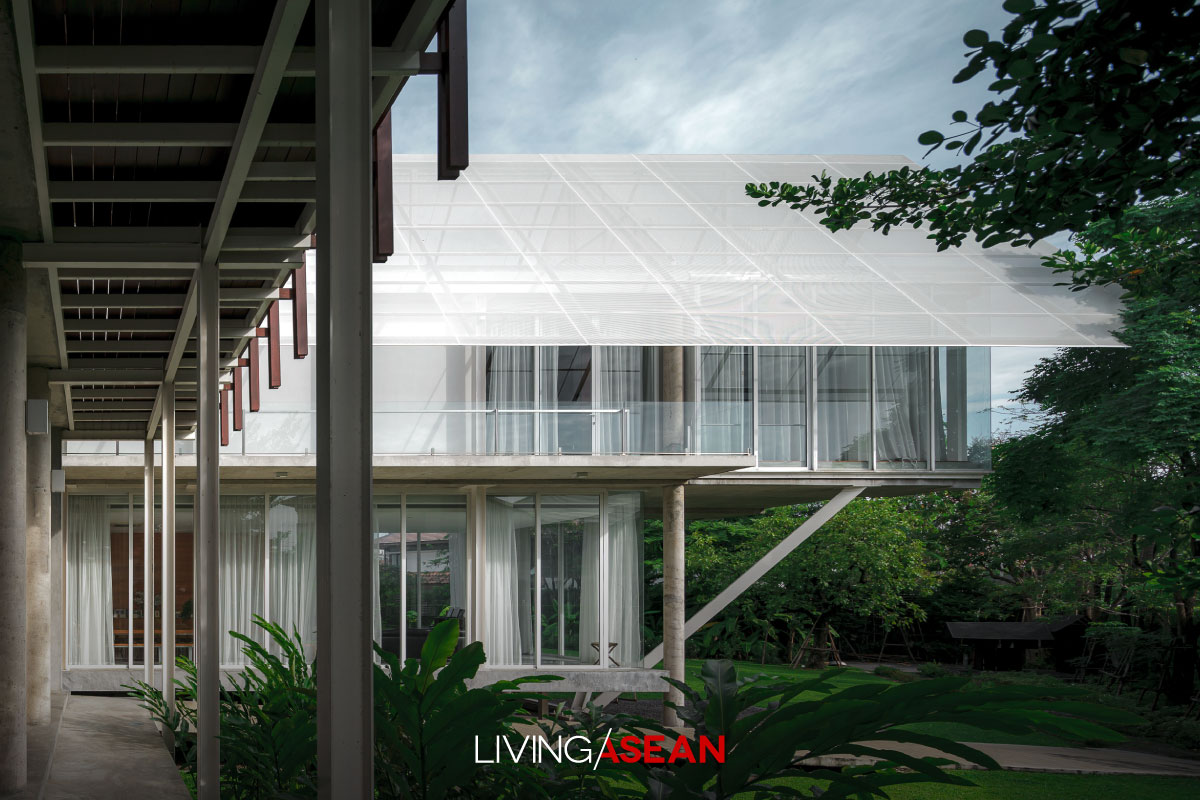
retirement home

“Time is the important thing now,” added Lisa.

“I just want to use my time in the right way, doing what makes me happy, and part of that is returning to live with my mother, bringing back the feeling of life as a kid. The house is a safe space, recalling things that are engraved in my heart forever.”

And it also memorializes the friendship felt by architects for the homeowner in a house that has created lasting happiness.


Owner: Lisa Thomas

Architect: Reserch Studio Panin by Associate Professor Dr Tonkao Panin & Thanakarn Mokkhasamit


You may also like…

Modern-Vernacular Design of a Thai-Isan Countryside Home in Udon Thani

Treehouse C: Stunning Treehouse Design Unveiled

Inspiring Container Home with a Tropical Garden View

Inspiring Container Home with a Tropical Garden View

/ Bali, Indonesia /

/ Story: Samutcha Viraporn / English version: Peter Montalbano /

/ Photographs: Sitthisak Namkham /

The owner of this container house in Canggu, a resort town on the Indonesian island of Bali, began trying out a design concept with the intention of building a temporary home but, as luck would have it, he ended with a permanent family residence.

Designer/architect Andika Japa Wibisana, of the Studio Tana’s said the homeowner wanted to build a house and small office here, but the owner of the land wouldn’t sell. So he decided to put in a container home in case he would have to move and build elsewhere. The designer envisioned the possibilities, and came up with a house plan that answered the needs of all family members.

Container House with a Tropical Garden View

The design places smaller boxes inside a large box, the larger one a steel and glass frame, enabling creation of double walls that reduce sunlight and outside heat. The interior is composed of eighteen shipping containers, some opened up for a spacious, L-shaped central living area with a high ceiling.

“Family members from Jakarta come to visit sometimes, so the living room opens out to connect with the garden, where some vegetable plots are set aside for children’s use,” said Andika.

The property is lower than the road in front, making this container house about a half-story lower than street level, with the garden behind it gradually sloping further down. Looking up from the garden, the house appears to be set on a hill of fresh green grass. This beautiful atmosphere is enhanced by the gurgling of a nearby small stream.

The building’s left section holds an office and stairway, with that spacious open-plan living room to the right and service areas behind it. Above, the shipping container near the garden projects outward for a better view of the green space: here is the master bedroom.

Another section divides containers into kitchen and dining room. Interior décor here has lost the industrial look: ceiling and walls are surfaced white, with real wood taking away the rawness of the steel.

Plants grow by the glass wall as protection against heat.

On the other wing, the second floor holds two more bedrooms, one container used for one room. The entire second story lies under a sharply sloping steel roof that forms an eave for protection against too much sun and rain. Beneath is a balcony with a long walkway connecting to the building’s outer porch, all of exmet (expanded metal grating) for an attractive play of light and shadow below.

Even though some steel houses have a harsh look, this one is designed in response to a Tropical lifestyle, with industrial materials combined in a way that gives an Oriental look to the big 18- container home. Together they create convenience and comfort, meshing perfectly with the beautiful garden.

The front door divides the house left and right. Right is the office section, blocked off by a ridged container wall.
Large, spacious living room within a steel and glass frame that lets the sun in only in the morning. The tall ceiling helps reduce the heat. Evenings here are great for socializing.
Another living room wall. On the ground floor is a washing area and bathroom. Clearly visible above is an arrangement of containers within the large steel frame.
Container House with a Tropical Garden View
Spacious interior open area. Upstairs is a kitchen/pantry, dining area, and living space. The interior décor is in earth tones.
In the bedroom where the designer’s intent is to reduce the harshness of the steel with woodwork the walls and ceiling are white, as in an ordinary house. Utility systems are hidden in the pipe-like ceiling divider: the entire ceiling is not lowered, because of the height limitation of shipping containers.
In the bedroom, where the designer’s intent is to reduce the harshness of the steel with woodwork, the walls and ceiling are white, as in an ordinary house. Utility systems are hidden in the pipe-like ceiling divider: the entire ceiling is not lowered, because of the height limitation of shipping containers.
The kitchen/pantry in a container on the second storey, with a structural dividing post in the middle.
The kitchen/pantry is in a container on the second floor, with a structural dividing post in the middle.

Architect: Studio Tana by Andika Japa Wibisana


You may also like…

Shipping Container House amid an Enchanted Forest Garden A Container House for a Family Full of Different Characters

Boy Pisanu Nimsakul’s Resort-Atmosphere House

Boy Pisanu Nimsakul’s Resort-Atmosphere House

This house, with its hidden Western flavor, calls out for us to relax and drink in its peaceful atmosphere. Its owner, singer and MC Boy (Pisanu Nimsakul), had it designed as an escape from urban confusion: the green of plants, brown pebbled walkways, and a connection between his and his mother’s sections of the house allowing for both familiarity and privacy.

/// THAILAND ///
Story: Samutcha Viraporn /// Photography: Sitthisak Namkham 

Boy Pisanu

Boy’s house is on a thousand square meters in the Soi Yothin Pattana area, not far his old neighborhood. For the design he took the advice of his friend Sena Ling (Somkiat Chanpram) and hired Neung (Phanuphol Sildanchang) of PAA, whose work really impressed him.

“Meeting Neung, at first he just asked if I thought I could live with his style (laughs) . . .  but of course, that’s exactly what I came for, didn’t even need to spend much time on the details.”

Neung added, “If the customer understands and trusts our best design work, it makes it easy.”

Boy Pisanu

Boy wanted to be able to live with his mother and still have privacy for socializing with friends, so the house stretches wide, lengthwise along the property as it faces south toward the road. Mother and son’s sections have separate entries from a long walkway in the center of the property that essentially divides it into two courtyards, one a green area shared by Boy and his mother, and the other featuring a swimming pool that parallels a long porch accessible only from Boy’s section. This includes a gravel path running in from the carport along the rim of the garden fence so friends can come in without disturbing his mom.

Boy Pisanu Boy Pisanu

Neung says “I wanted to have every room in the house able to open window and look out as if on a private courtyard, kind of exciting! So without a lot of artifice or excess playing around with materials I’ve created the sense that there are a lot of courtyards, as people enter at different levels.”

Boy Pisanu Boy Pisanu

The central walkway has latticework screening between the two courtyard sections which keeps the buildings from appearing too separate, at the same time allowing for good air circulation on both sides. Trees are planted along the side to block the view from any neighboring houses that might be built in the future. In back he house abuts against a 3-storey townhouse in back with a wooden fence that blocks the view, covered with climbing plants such as cat’s claw vine.

Boy Pisanu

Boy Pisanu

To give the house a relaxing warmth, natural wood is used as much as possible. The weight-bearing steel frame is mostly hidden: some of the support pillars are completely natural wood. For the residential sections the roof is gabled, with long eaves to quickly drain water and heat, while in certain sections there is a modern-style flat roof. Various Western formats, proportions, and components have been inserted in a simple, unpretentious style. Interior décor includes movable furniture and light-colored cloth drapes for a gentle look that Boy’s sweetheart brought in.

Boy Pisanu Boy Pisanu

“It came out just as designed! Coming into the house it feels relaxed, like being in a resort. It’s a pleasure just to look out the window. At the same time, it feels like I’ve come home,” added Boy, obviously a happy man.

X