Blog : CULTURE

Pavi Homestay: A House Renovated as Homestay Boasts Originality and Timeless Charm

Pavi Homestay: A House Renovated as Homestay Boasts Originality and Timeless Charm

/ Ha Giang, Vietnam /

/ Story: Kangsadan K. / English version: Bob Pitakwong /

/ Photographs: Trieu Chien /

Amid the ever-changing trends setting the stage for the future, there are people who feel a yearning to live a simpler, more traditional lifestyle. Their emotional attachment to family roots and cultural origins is set down in permanent forms. Here, the story of a Hmong family’s journey is manifested in a house that has since been renovated as a homestay in Ha Giang, a province in Vietnam’s Northeast renowned for its unspoiled countryside.

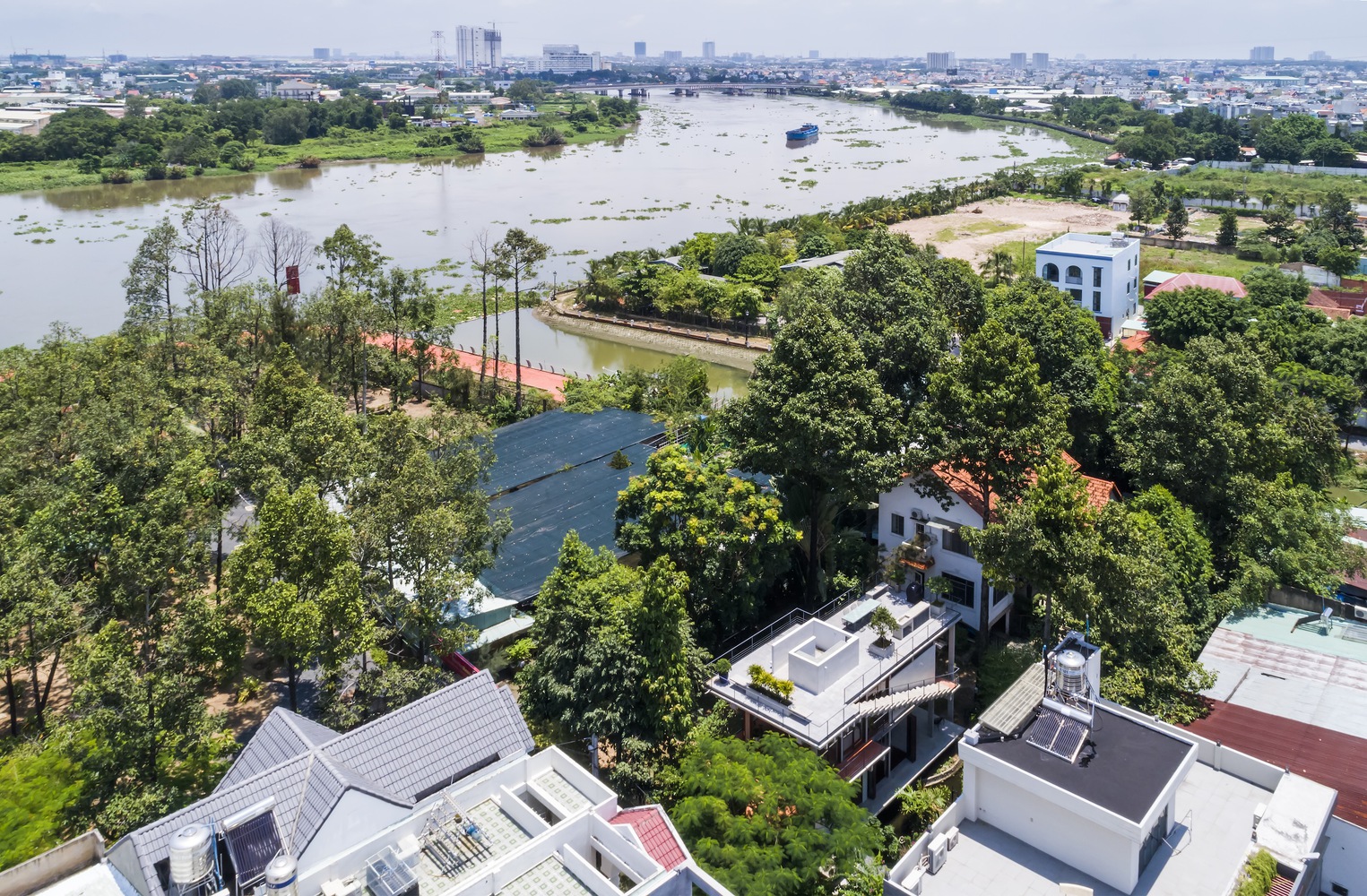
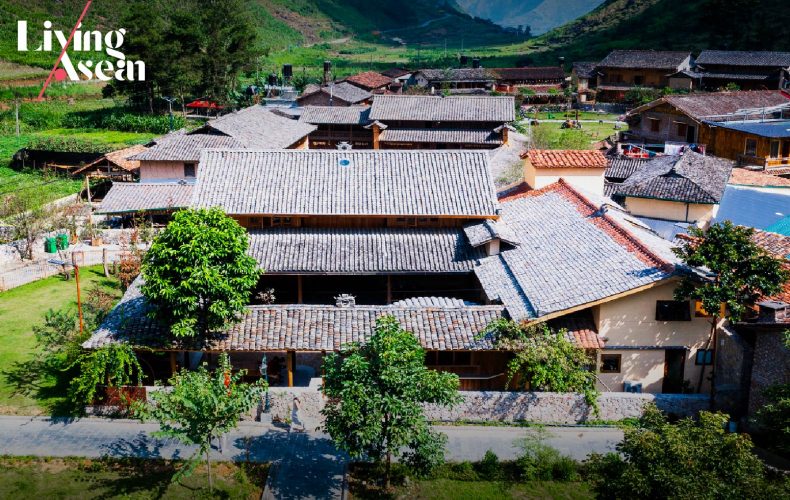
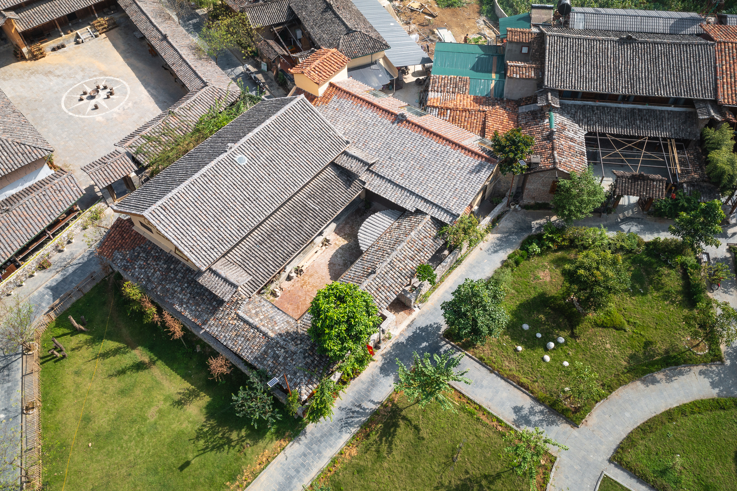
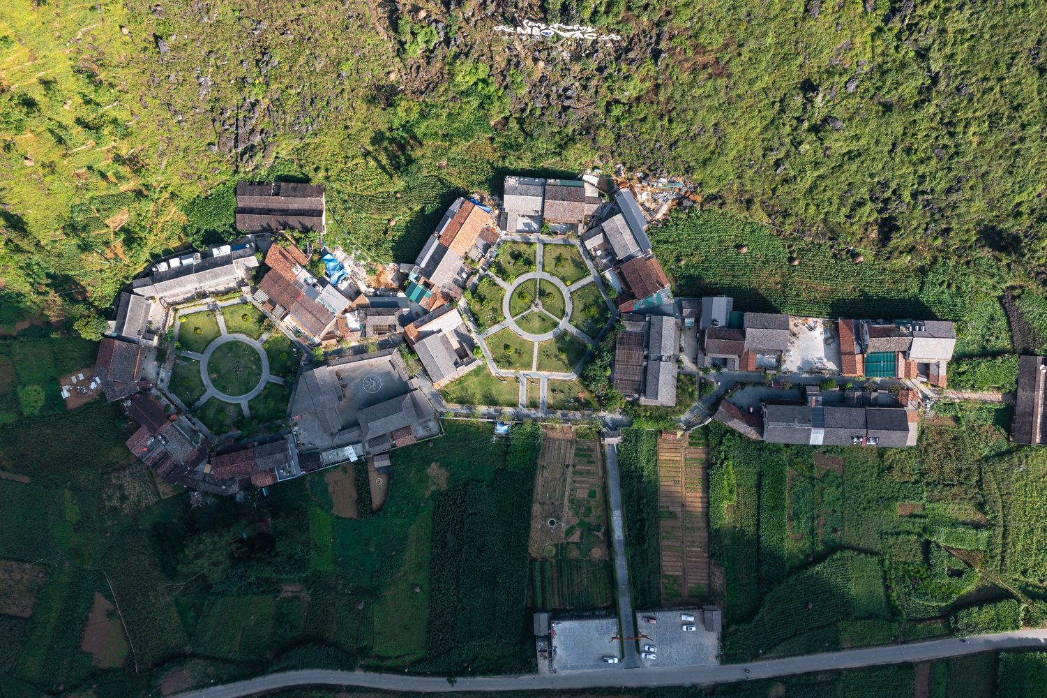
An aerial view of the old cluster house renovated as a homestay in relation to traditional-style homes in the neighborhood.

Beautifully restored to its former glory, Pavi Homestay offers 380 square meters of usable space ensconced in a region famous for its richness in long-standing traditions. In this remote corner of Vietnam bordering on China, misty blue mountains can be seen from miles around. It’s easy to get why every aspect of Hmong culture is jealous preserved, residential architecture included.

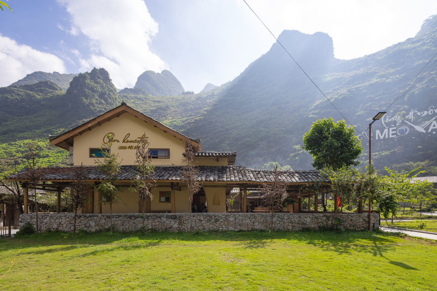
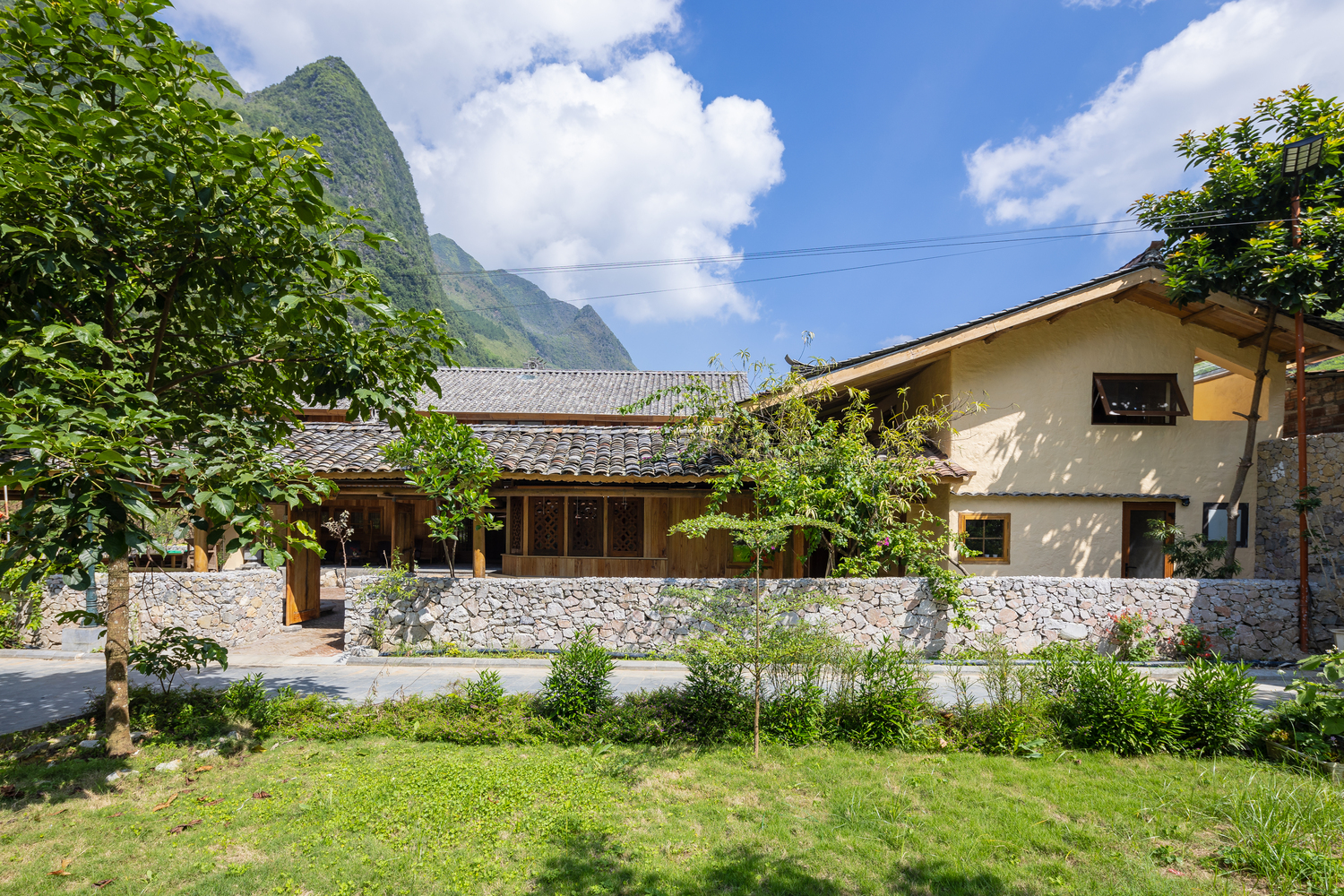
A side elevation view of Pavi Homestay silhouetted against the mountain peaks and wooded hillsides of Meo Vac, a rural district of Ha Giang Province.

As tourism grows, demands for accommodation increase. And that’s where the architectural firm Trung Tran Studio based in Son La is brought into play. It’s tasked with renovating this old house as a homestay and, at the same time, maintaining every distinctive feature in its original state. Before you know it, the old cluster house unique to Hmong culture transforms to take on a new role as homestay destinations.

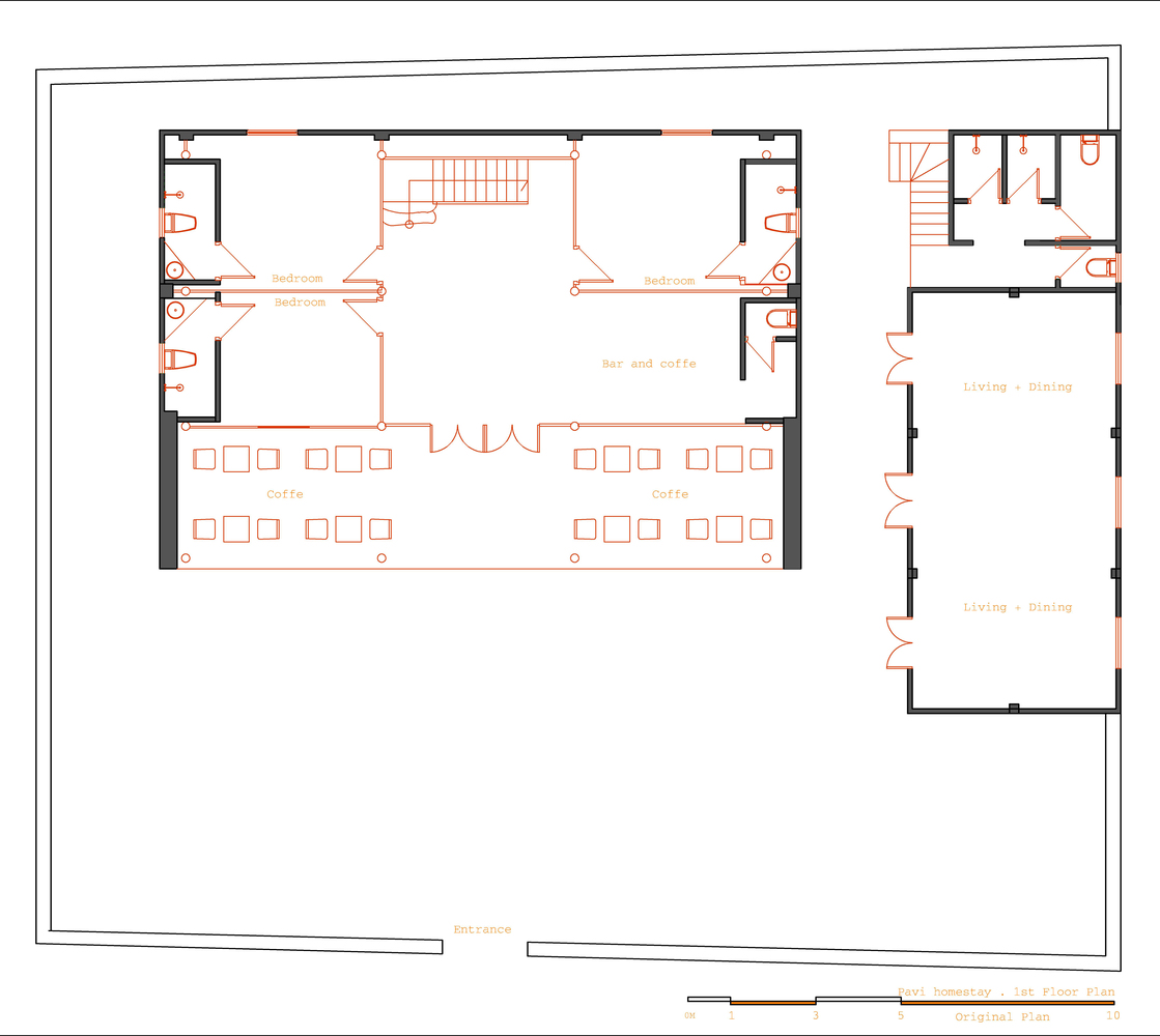
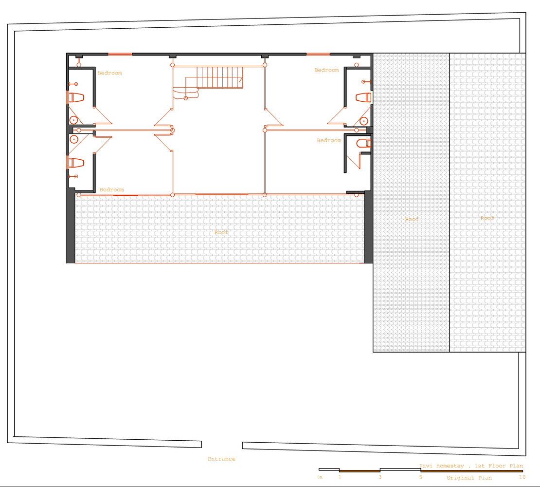
A diagram shows the ground floor of the old cluster house before renovation. / Courtesy of Trung Tran Studio
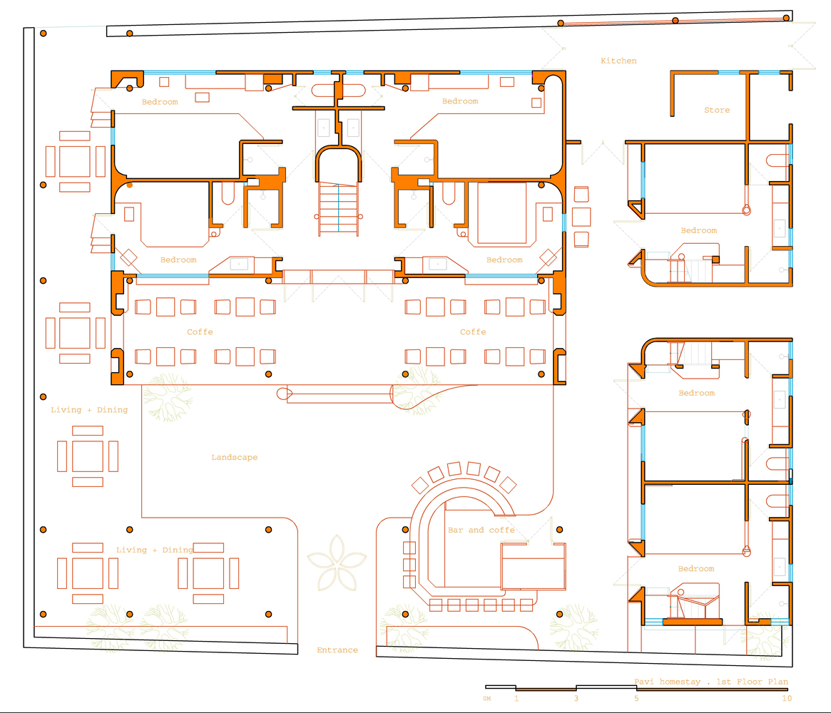
A drawing of the ground floor after renovation shows the positioning of rooms for guest accommodations in relation to a system of roofed corridors and support facilities, including a small restaurant and bar. / Courtesy of Trung Tran Studio
A diagram shows the second floor of the main house before renovation. / Courtesy of Trung Tran Studio
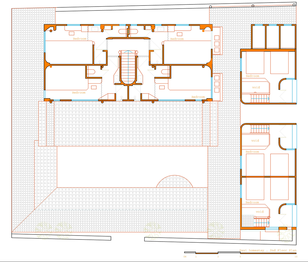
A drawing of the second floor of the homestay project shows details of space utilization in the main house, the side house and semi-outdoor rooms after renovation. / Courtesy of Trung Tran Studio

Pavi Homestay is located in Meo Vac, a rural district of Ha Giang Province. Beautifully handcrafted, the buildings and the land merge into the mountain valley environment where time goes by slowly. It consists of three parts; the main house, the side house, and a system of roofed corridors for walking along.

The old house nestles warmly in an area known for considerable diversity in cultures and lifestyles. Together they convey a great deal about the ethnic communities living in the region, which also includes Dong Van and the Dong Van Stone Plateau.

The newly renovated main house is a two-story building offering eight rooms for guest accommodation. Here, the details make all the difference in design. Each room boasts the quality of being individual in an interesting way. Each one of them gives a sense of being a small stand-alone home, although they are all in one place.

Unlike the main house, the side house is designed as a family lodging. It’s easy to get why age differences in consumer behavior are factored in the house plan. This is evidenced by the way a row of three rooms are separated for privacy, each one of them fully equipped with modern conveniences.

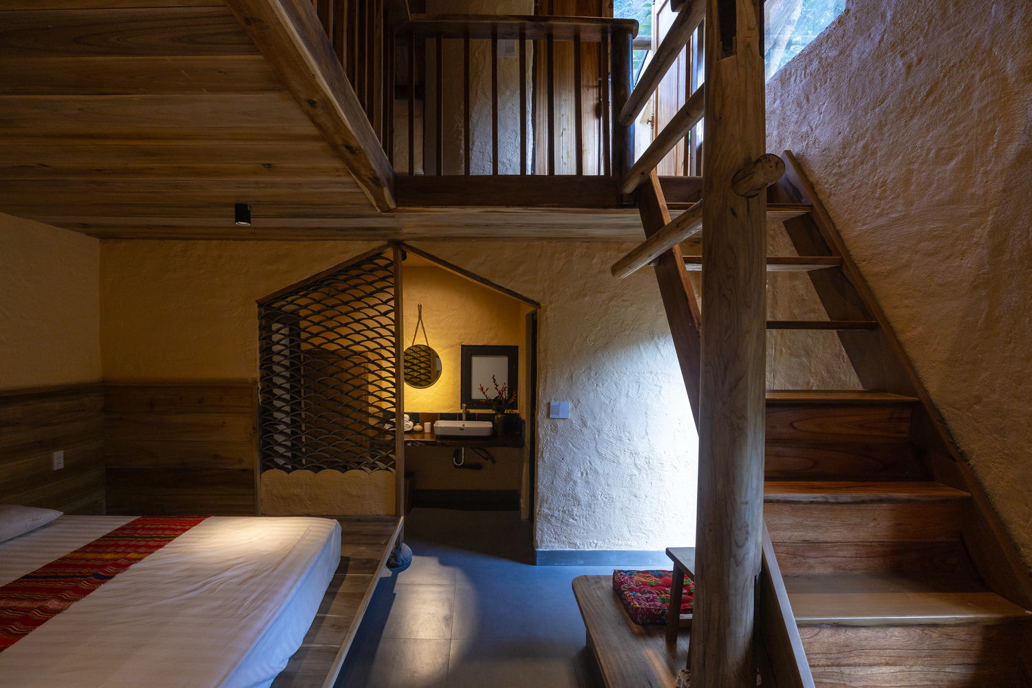
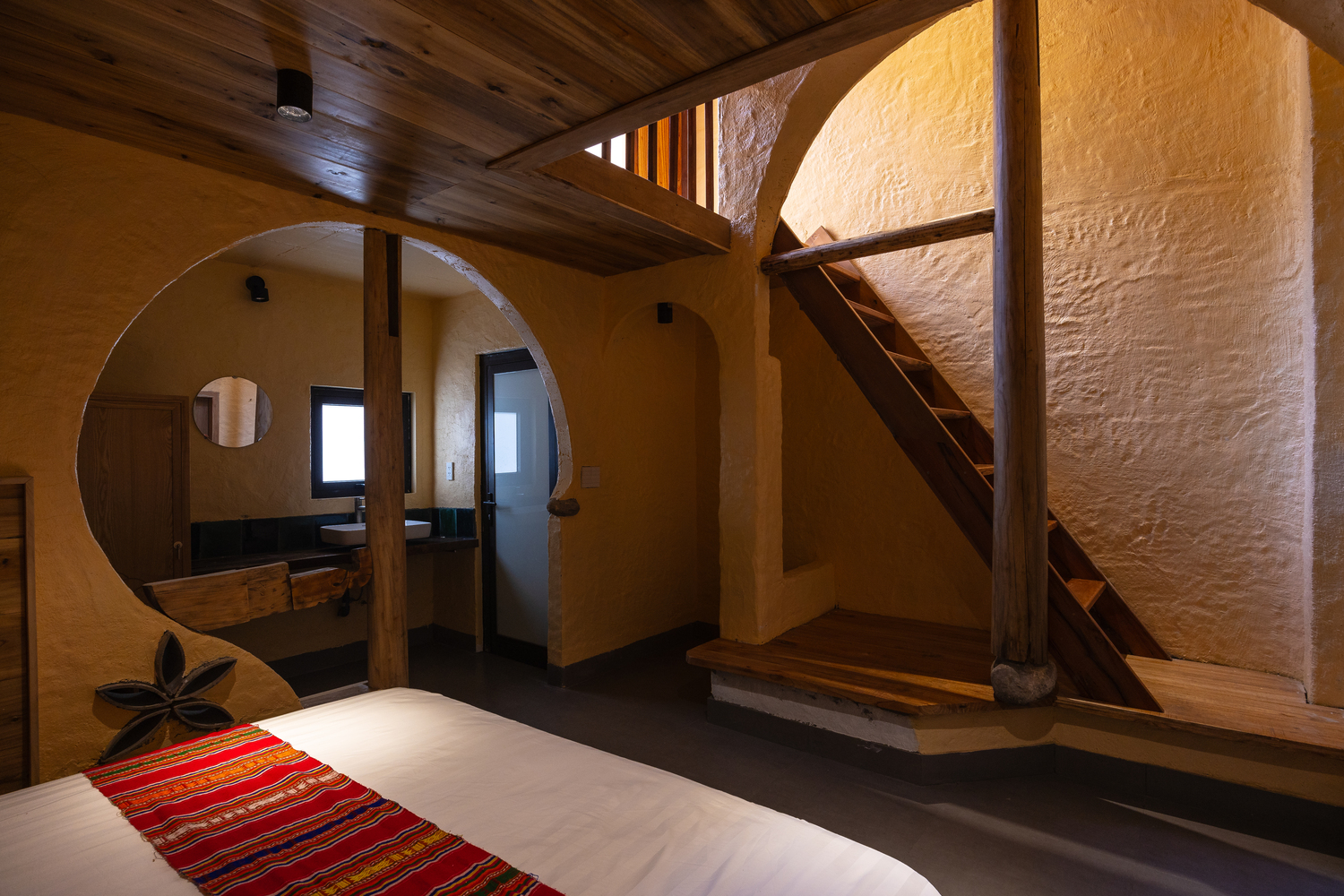
As to be expected, the bedroom for mom and dad is located downstairs, connected to the rooms for kids by a flight of stairs. The children’s rooms are decorated with curved designs giving off good vibes, plus they create a sense of space, privacy and deep relaxation.

A glimpse into the side house made for family accommodations. The parents’ bedroom is on the ground floor connected to kids’ rooms by a flight of stairs.

Step outside, and you come to a system of roofed corridors providing access to all the rooms and support facilities, including a small restaurant and bar. Overall, the outdoor ambience is peaceful with a wonderful panorama of the mountain peaks and wooded hillsides that have made Ha Giang Province a sought-after destination for travelers.

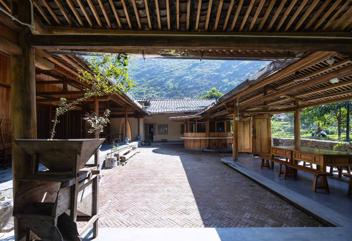
An atrium hemmed in by a system of roofed corridors offers plenty of ample space for an al fresco luncheon and dinner, or a rendezvous with nature.

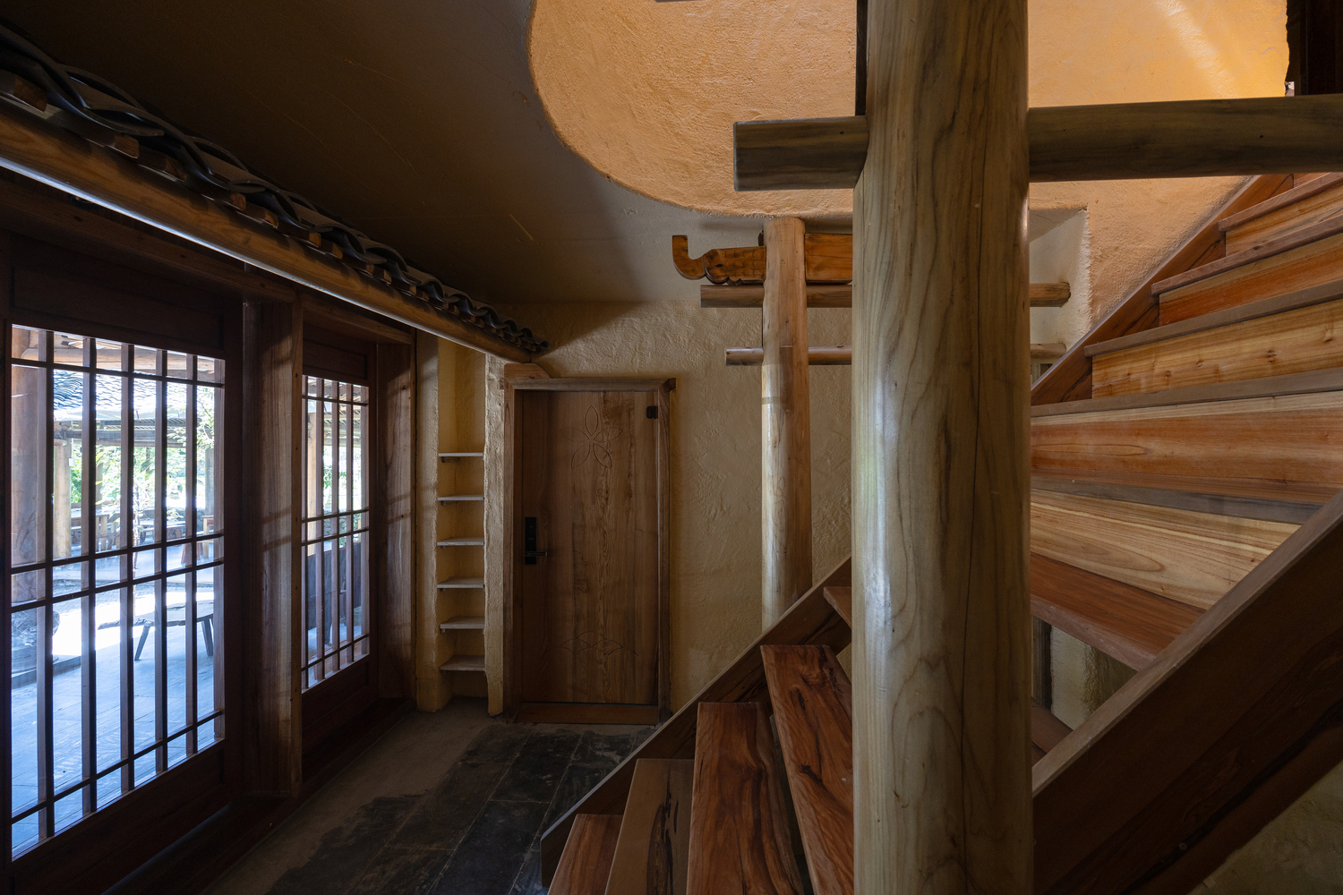
Inside and outside, Pavi Homestay is different from what is usual in that its physical appearance is pleasingly old-fashioned plus the quality of being local. For strength and durability, the original heavy timber framing, posts and beams remain very much intact. They were put together by traditional methods of construction.

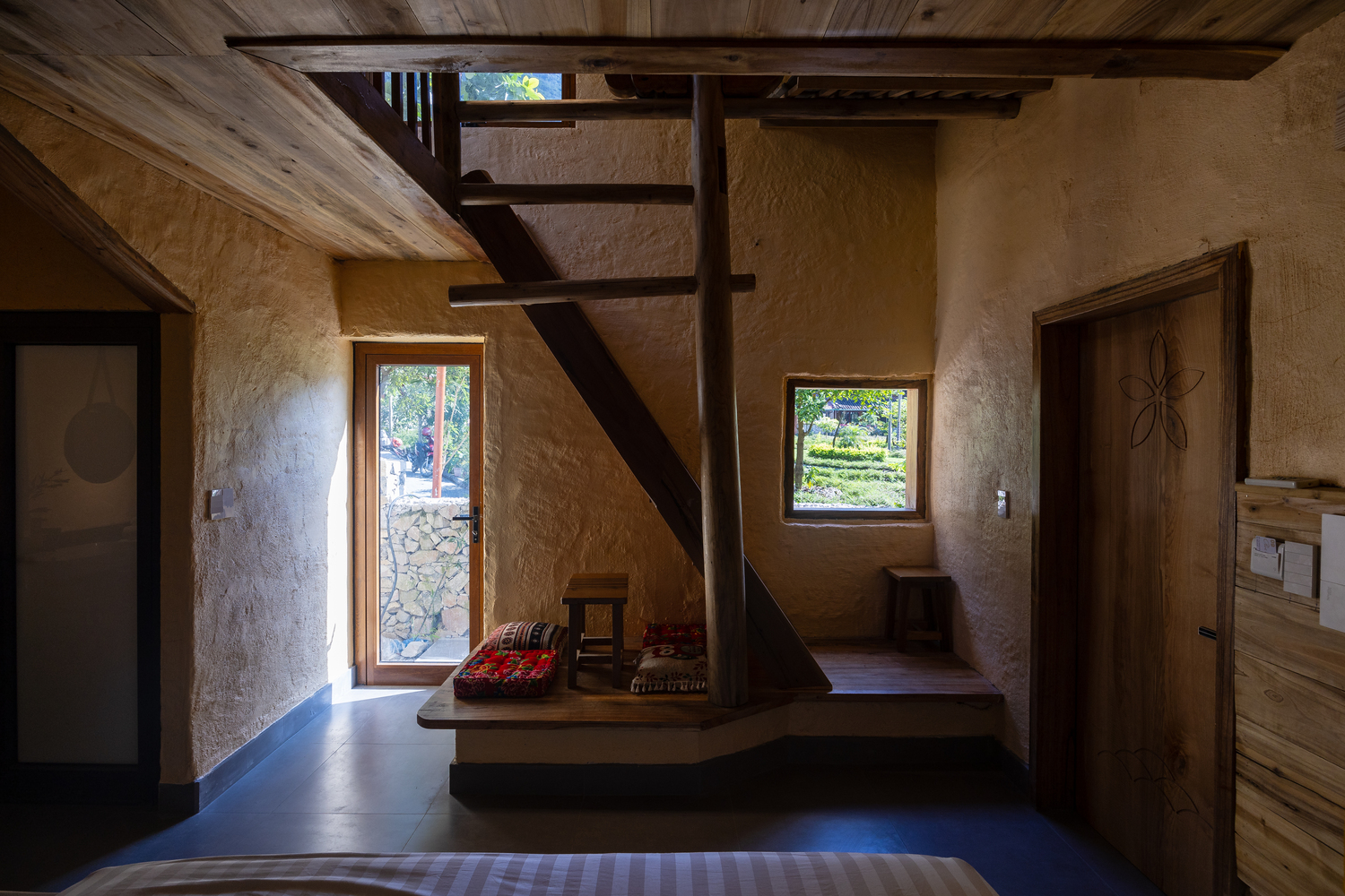
A room decorated with lots of wood makes the interior feel warm and welcoming.

The building exteriors have the appearance of rammed earth walls, roofed over with unglazed, brownish colored tiles like everything else in this part of Vietnam. Such is the elegance and standard practice since times past. Together they work in tandem to make Pavi Homestay attractive in its own special way, in the meantime providing a window into ethnic Hmong culture from past to present.

The rough texture of rammed earth walls boasts the beauty of vernacular homes unique to Hmong culture.
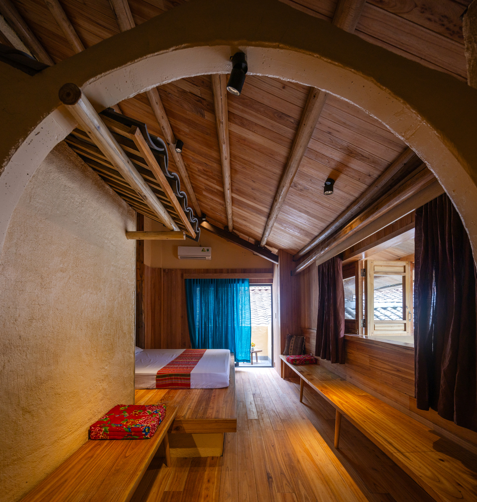
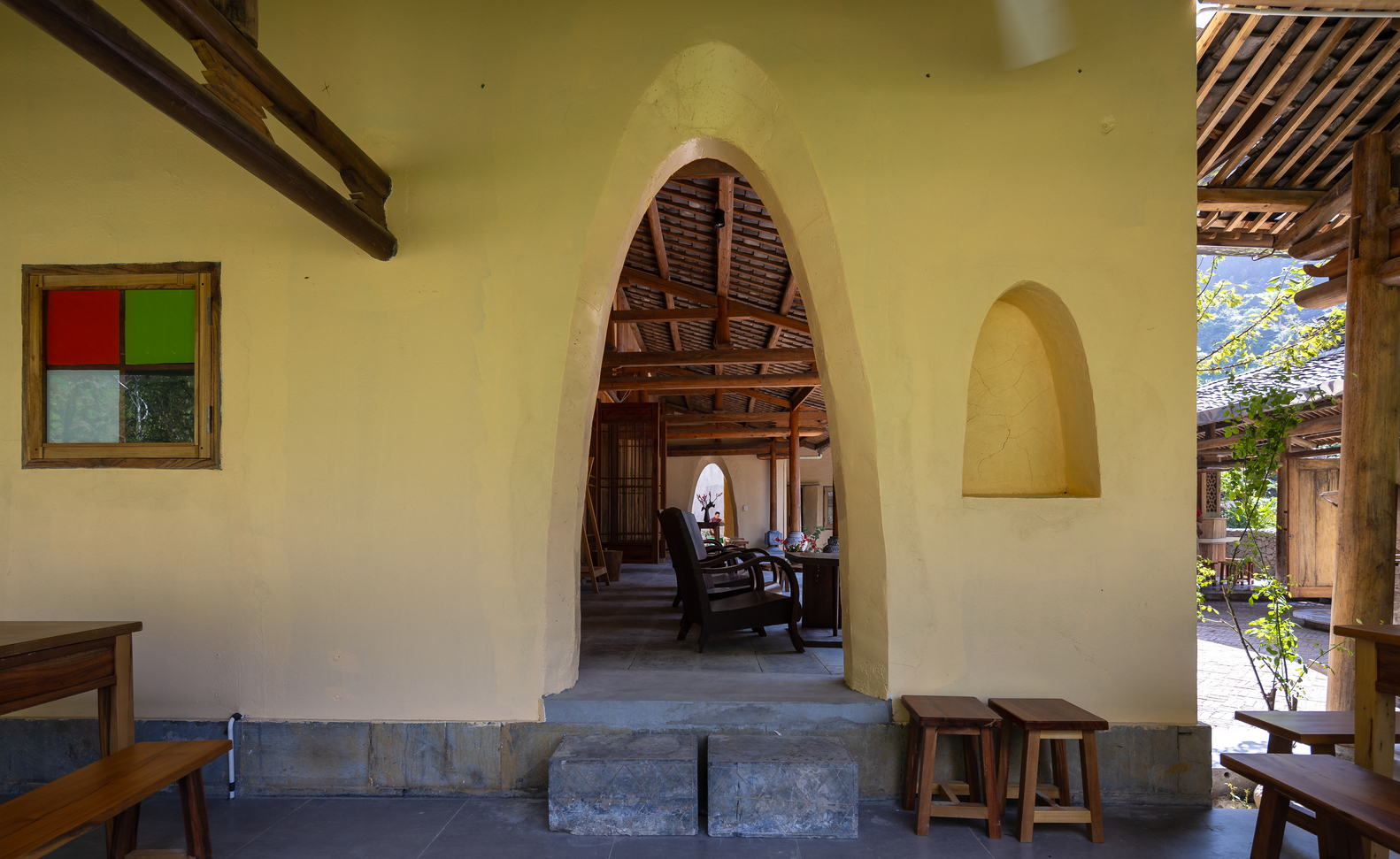
Arched doorway openings go hand in hand with open-concept floor plans, making a modest room feel spacious.

Archway forming passages between rooms create a harmonious fusion with the natural environment.
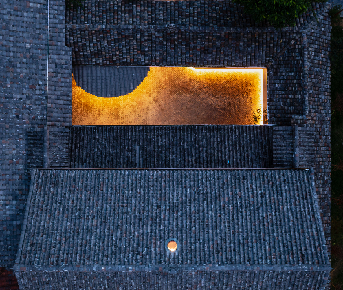
As the evening unfolds, the atrium is aglow under the lights in contrast to the dark gray of earthen roof tiles that form the upper covering of Pavi Homestay.

In a few words, Pavi Homestay is the story of rich and subtle meanings, a travel destination embraced by nature and time-honored human tradition unique to Vietnam’s Northeastern Region.

An aerial view shows a part of the verdant countryside that’s home to a Hmong community where Pavi Homestay is located.

Architect: Trung Tran Studio

Lead Architects: Tran Mạnh Trung


You may also like…

Baan Lek Villa: A House-Cum-Homestay in Chanthaburi

Proud Phu Fah Muang Chiang Mai

Proud Phu Fah Muang Chiang Mai: A Hotel at Nature’s Edge Embraces a Mix of Modern and Traditional

Ruen Lek: A Modern Cottage Café Celebrates the Enduring Allure of Chanthaburi

Ruen Lek: A Modern Cottage Café Celebrates the Enduring Allure of Chanthaburi

/ Chanthaburi, Thailand /

/ Story: Wuthikorn Sut, Kangsadan K. / English version: Bob Pitakwong /

/ Photographs: Soopakorn Srisakul /

A home and café combination merges into the countryside vernacular of Chanthaburi, a province in Thailand’s eastern corridor bestowed with pristine forests, mountains and sea breezes. Designed for the Tropical climate prevailing in the area, it boasts the simplicity of extended eaves overhanging the walls. Together they provide protection from the elements keeping the interior cozy and cool in summer, while the gable front glazed using clear glass affords the view of a beautiful garden landscape.

Named “Ruen Lek”, the small contemporary home consists of two parts; a semi-outdoor café located downstairs and a living space upstairs with wrap-around balconies made for coffee or just chilling out.

The brainchild of GLA Design Studio, a Bangkok-based architectural practice, the home and café combination offers 110 square meters of usable space. It stands parallel to a nearby homestay destination called “Baan Lek Villa”, separated only by a center courtyard lying in between.

The upstairs living space with a garden view is enclosed by a wrap-around balcony made for coffee and floor seating ideas.

By design, the yard filled with greenery and fresh air provides a respite from the hustle and bustle of daily life, while lush lawns hemmed in by healthy trees and shrubs create a cooling effect during warm weather.

A diagram of the first floor plan shows the positioning of the coffee shop, customer service areas and support facilities in relation to outdoor environments. / Courtesy of GLA Design Studio
A drawing of the second floor plan shows the living space with a home office enclosed by a wrap-around balcony made for relaxation. / Courtesy of GLA Design Studio
A front elevation view shows the small home and café combination on the right side of the property, separated from the main homestay villa on the left by a center courtyard filled with greenery. / Courtesy of GLA Design Studio

Thoughtfully devised to run cool in summer, the first floor is kept closer to the ground, slightly raised at plinth level. For good ventilation, the storefront and a side wall are fitted with bi-fold door systems that fully open from one end to the other, while the other side wall lined with a souvenir display shelf is glazed using clear glass paneling for visibility.

Awning windows at the top of the glass wall open to admit fresh outdoor air. Underneath them, glass paneling lined with a souvenir display shelf lets natural daylight shine through.

The coffee bar itself is set further towards the back with plenty of room behind it for cooking light meals. From here, the nearby “Baan Lek Villa” homestay can be seen across the center courtyard. Up front, a few sets of tables and shares are ready for customers who prefer relaxing and dining in the open air.

A place to hang out with friends, the coffee bar is set further towards the back, creating a sense of depth. There’s plenty of room behind the countertop for making drinks and cooking light meals.

Taken as a whole, the small café makes a good first impression as a peaceful place to enjoy a nice cup of bean juice, lean back and chill. Besides good local food, the atmosphere is warm and welcoming, thanks in part to the crisp cool canopy of overhanging trees, native shrubs and vines thriving luxuriantly. Together they bring back memories of Chanthaburi in times past like the architects at GLA Design Studio intended.

The second floor contains a humble abode and office space with a large drafting table. Simple, well-lit and well-ventilated, the room is enclosed by a wrap-around balcony designed for sitting on the floor with legs hanging. The side entrance at the top of the stairs affords views of green spaces and, beyond, the Baan Lek Villa homestay. For privacy, the second floor of Ruen Lek is set slightly lower than that of the main villa.

The upstairs living space with a garden view is enclosed by a wrap-around balcony made for coffee and floor seating ideas.

For privacy, the second floor of the home and café building is set slightly lower than that of the nearby main villa.

Except for the glass façades on two sides, the walls are built of handmade bricks and the floors covered in fireclay handmade tiles sourced locally. For charm, good looks that blend into the community and local traditions, door and window casings and decorative materials are made entirely of real wood.

Morning light creates a warm ambience, enhancing the brown of wooden balcony floors and the orange of fireclay tiles on the home office floor.

From a design point of view, it’s a home that speaks volumes for a desire to be close to nature and a love of the allure of Chanthaburi’s unspoiled countryside. And the team at GLA Design Studio has succeeded in doing exactly that. The result is a cozy dwelling that’s a little bit modern, a little bit country mixed in one place that’s simple yet attractive, inviting and warm.

A center courtyard filled with shade trees and lush foliage separates the home and café combination from the nearby Baan Lek Villa homestay.
A way to connect with nature, the center courtyard is kept cool by shade trees and lush vegetation. Nearby, a driveway surfaced with gravel gives access to the main villa raised on piles.


Architect: GLA Design Studio


You may also like…

Mitbury the Public House: A Café in Pastel Brown Humbly Camouflaged in Nature’s Embrace

BAAN LEK VILLABaan Lek Villa: A House-Cum-Homestay in Chanthaburi

The Spirits of Maritime Crossing: Discover How the Past Has Shaped the Present at Venice Biennale 2024

The Spirits of Maritime Crossing: Discover How the Past Has Shaped the Present at Venice Biennale 2024

/ Venice, Italy /

/ Story: MNSD, Wuthikorn / English version: Bob Pitakwong /

/ Photographs: Sitthisak Namkham /

The mere sight of a beautiful contemporary art exhibition fills the audience with awe. Named the Spirits of Maritime Crossing, the show evokes pleasant memories of interaction between two cultures in times past. Figuratively speaking, the Spirits of Maritime Crossing is a tale of two rivers – a confluence where the beautiful Chao Phraya River in Thailand meets the iconic Grand Canal, a major water traffic corridor in Venice, Italy.

venice biennale
Making his point, artist Pichet Klunchun expresses his idea during a performance art show that’s part of the Spirits of Maritime Crossing art exhibition at the 60th Venice Biennale.

Welcome to the show featuring masterpieces by artists from Thailand as well as their counterparts from across Southeast Asia. It’s a part of the main attractions at the 60th Venice Biennale happening now, from mid-April until November 24, 2024.

Curated by the Bangkok Art Biennale Foundation, the show tells the story a relationship between the world’s two major cities in an artistic manner. It sheds light on the ties between Bangkok, once upon a time nicknamed Venice of the East, and the original Venice, a city amid a lagoon in the Adriatic Sea more than 10,000 kilometers away by sea.

The official delegation gracing the opening ceremony in Venice includes, from left, – Ms. Kundhinee Aksornwong, Minister of the Royal Thai Embassy in Rome; – H.E. Mr. Paolo Dionisi, Italian Ambassador to Thailand; – Mr. Thapana Sirivadhanabhakdi, CEO of the Thai Beverage Public Company Limited (ThaiBev) as Chairman and Founder of the Bangkok Art Biennale Foundation; – Professor Dr. Apinan Poshyananda, the exhibition curator; – Ms. Kobkarn Wattanavrangkul, Chair of the Bangkok Art and Culture Center (BACC); and – Mr. Andrea Marcon, Consul of Thailand for the Venice Triveneto.

In central respects, the Spirits of Maritime Crossing helps to explain the annals of history from a different perspective. It revisits the events and experiences in times past, ranging from European discoveries, to the diaspora of people from their homelands, to colonialism and the assimilation of people into different societies across Southeast Asia. And the story is being told through visual arts, among them drawings and sculptures, multimedia and video installation art.

venice biennale
A Symphony Dyed Blue, 2024 4K video, 6:13 min . Artist: Kawita Vatanajyankur (Thailand)
Palazzo Smith Mangilli Valmarana (second from left) is the venue for the Spirits of Maritime Crossing art exhibition at Venice Biennale 2024. The Neoclassic style palace looks out over the iconic Grand Canal, the main water traffic corridor in Venice.
Terang Boelan (Moonshine), 2022 . Artist: Jompet Kuswidananto (Indonesia)
My Mother and I II: The Composers in the Machine, 2024 . Artist: Kawita Vatanajyankur

The Spirits of Maritime Crossing contemporary art exhibition is happening at Palazzo Smith Mangilli Valmarana, a Neoclassic style palace overlooking the Grand Canal in Venice. Already there’s an atmosphere of excitement, and a wealth of interest and intrigue among international audiences.

The exhibition curator, Professor Dr. Apinan Poshyananda, was on hand to deliver the keynote address at the opening ceremony in Venice, along with a troupe of modern and contemporary artists from Thailand and across Southeast Asia. They included artists Kawita Vatanajyankur and Jakkai Siributr of Thailand, Priyageetha Dia of Singapore, and Thai dancer Pichet Klunchun who gave a special performance at the gathering.

Calling for Rain, 2021 . Artist: Khvay Samnang (Cambodia)
The Sea is a Blue Memory, 2022 . Artist: Priyageetha Dia (Singapore)

The evening ceremony was graced by the screening of a short film starring Marina Abramovic, a Serbian American conceptual artist/performer and winner of the Golden Lion Award. The event took place at Generali’s Procuratie Vecchie located at the famed Piazza San Marco in Venice.

This slideshow requires JavaScript.

Aside from Marina Abramovic, the visiting troupe include 15 established artists as well as new, rising stars from Thailand and across the ASEAN Region. They include Pichet Klunchun (Thailand), Priyageetha Dia (Singapore), Jitti Kasemkitwattana (Thailand), Nakrob Moonmanas (Thailand), Jompet Kuswidanato (Indonesia), Bounpaul Phothyzan (Laos), Alwin Reamillo (the Philippines), Khvay Samnang (Cambodia), Moe Satt (Myanmar-the Netherlands), Jakkai Siributr (Thailand), Natee Utarit (Thailand), Kawita Vatanajyankur (Thailand), and Yee I-Lann (Malaysia), and Truong Cong Tung (Vietnam).

The Spirits of Maritime Crossing art exhibition at Venice Biennale 2024 is being sponsored by the Bangkok Art Biennale Foundation (BAB) in collaboration with the Thai Beverage Public Company Limited (ThaiBev) as well as public and private organizations, including:

This slideshow requires JavaScript.

This slideshow requires JavaScript.

The Tourism Authority of Thailand (TAT), the Bangkok Metropolitan Administration (BMA), the Thailand Convention and Exhibition Bureau (a public organization), the One Bangkok Holdings Company Limited, the Thai Airways International Public Company Limited, the Central Group, the 100 Tonson Foundation, the Fraser and Neave Holdings Bhd (F&NHB), the Fraser and Neave, Limited (F&NL), the Saigon Beer-Alcohol-Beverage Corporation (SABECO), plus:

venice biennale 2024

venice biennale

The Chang International Company Limited, the Sangsom Company Limited, the Ch Karnchang Public Company Limited, the Bangkok Expressway and Metro Transport Public Company Limited, the Tang Contemporary Art Company Limited, the Generali Life Assurance (Thailand) Public Company Limited, Richard Koh Fine Art (Singapore, Bangkok, Kuala Lumpur), Nova Contemporary, Warin Lab Contemporary, Silverlens Gallery, Flowers Gallery, and the Amarin Corporations Public Company Limited, and its business affiliations.

For the latest news on contemporary art events organized by the Bangkok Art Biennale Foundation, follow us on Facebook and Instagram at: BkkArtBiennale

This slideshow requires JavaScript.

A little bit about the venue:

Having been closed for more than 12 years for renovation, Palazzo Smith Mangilli Valmarana, a palace in Venice, Italy, opened its doors to visitors for the first time in mid-April 2024, performing a role as venue for the Spirits of Maritime Crossing art exhibition at the 60th Venice Biennale.

At one time, it was the residence of Joseph Smith, a British consul, art collector and connoisseur in Venice. Also called Consul Smith, he assisted many artists during his lifetime, acts of kindness that saw his home transform into a thriving art center and meeting place popular among artists. The palace later changed hands and the new owner, Count Giuseppe Mangilli, decided to hire Giannantonio Selva to renovate the interiors in the Neoclassic style, thereby restoring the home to its former glory as we see it today.


You may also like…

Bangkok Art Biennale 2018

Behind the Works at Bangkok Art Biennale 2018: Historic Images of an Important Time for the Art World

Bangkok Art Biennale 2018

Pictures that Tell Stories: Bangkok Art Biennale 2018 (Photo Essay)

Mitbury the Public House: A Café in Pastel Brown Humbly Camouflaged in Nature’s Embrace

Mitbury the Public House: A Café in Pastel Brown Humbly Camouflaged in Nature’s Embrace

/ Chiang Mai, Thailand /

/ Story: Kangsadan K. / English version: Bob Pitakwong /

/ Photographs: Prueksakun Kornudom, Ornpailin Leelasiriwong /

Tucked away amidst the crisp mountain air and dense green plants thriving under tree cover, a quaint country café takes center stage giving off friendly vibes. It’s enclosed by glass walls on three sides, while perimeter fence walls of large breeze blocks in pastel brown speak volumes for the humble origins of mankind.

Lying furthest from everything else, a lazy brook passes by reflecting sunlight glistening with sparkles in misty winds. Aptly named “Mitbury the Public House”, the café and nearby support buildings merge into the cool shade of wooded hills in the backdrop. It’s arguably the most exquisite kind of scenery. And it’s located right here in Mae Rim District, only a short ride from Chiang Mai’s city center.

At the risk of stating the obvious, the aroma of coffee beans being ground and roasted in the background smells like heaven. There’s nothing like chilling out, sipping one’s favorite Morning Brew on a quiet day at nature’s edge.

The project comprises three small buildings with a chic coffee bar located at the center of the property. The other two buildings lie hidden in plain sight behind the walls of perforate blocks in muted brown designed to promote ventilation and regulate sunlight. The coffee bar itself affords 140 square meters of restaurant space canopied by overhanging trees.

A charcoal sketch of the premises illustrates the positioning of the café and two support buildings enclosed by a perforate wall and surrounding terrain features. / Courtesy of WOS Architects
A side-elevation view of the café building in cross section, silhouetted against a breeze block wall lying under the canopy of overhanging trees / Courtesy of WOS Architects

The brainchild of WOS Architects, a Bangkok-based architectural practice, Mitburi the Public House is a design masterpiece that seeks reconnections with the natural world.

Walk in the door, and you find an ample space used for guests and seating. Interestingly, the rough textured wall in soft pastel beige at the back is the sight to behold. It stands overlooking the space used for preps, the coffee bar and kitchen.

From a distance, a paved passageway glides past lush lawns leading to first building that houses the café and kitchen. The second building holds storage space and staff quarters, while the third is a complete toilet building. By design, they lie hidden from view behind the perforate brick walls.

A footbridge gives access to nearby wooded hills. It’s built of structural I-beam framing, with wooden planks and railings of wire infill panels for protection against slip and fall accidents.

All of them are built of structural steel framing. Where appropriate, the exterior walls are crafted of natural building materials sourced from within the community. Immediately appealing among them is the floor tiled in grayish brown. It lies covered with thin slabs of baked clay from a local kiln, creating charm, good looks that embrace imperfect simplicity.

For visual continuity, the café building itself is enclosed by glass walls on three sides, with a pair of transom windows at the top of the front door. A clean, well-lighted place, the interior is warm and welcoming, thanks to pale soft lights that are less distracting, adding romantic appeal to the room.

From inside the café, glass walls provide undisrupted visual continuity between indoors and outdoors. The floor is tiled in reddish brown slabs fired the old-fashioned way by a local kiln, the beauty of imperfections that blends with the surroundings.
The café building stands among the trees, enclosed by glass walls on three sides. They open to admit natural daylight and fresh outdoor air into the room.

Out-of-doors, yard landscaping ideas are just impressive. Perforate blocks in reddish brown fill up the entire boundary fence, blending seamlessly into the dark green of the forest’s edge. Located furthest to the rear, a footbridge built of steel I-beams, wooden planks and wire infill railings provide access to nearby forested hills.

Attention to detail is evidenced by the breeze block fence in muted brown that separates the business premises into clearly defined zones depending on functionality.
The complete toilet building stands hidden from view, separated from nearby lush lawns and café space by a wall of perforate bricks for ventilation.

The I-beams are painted a grayish green hue that merges into large areas of old woodlands in the background. Underneath the footbridge, a babbling stream runs idly by meandering through the rock-covered forest floor. Above it, cool breezes and leaves rustling in the trees entice the imagination.

Overall, the business premises keep firmly to the owner’s initial resolve to leave every tree and the nearby brook where they have always been, giving rise to house-among-trees ideas. For a good reason, they are built small and disposed around the periphery of the project site. The building shell is topped with a simple gable roof made of natural materials that are friendly to the environment.

To live and let live, a native tree stands where it’s always been. Cutting it down is not a choice.

Nature lovers should find the small café in the woods a paradise, thanks to rocks being used to create a set of steps leading to the glass-glazed façade, a clever hack to create visual continuity between indoors and outdoors.

Surrounded by lush lawns and shade trees, a set of rock steps adds beauty and functionality to the building’s glass-glazed façade.

Thanks to thoughtful design, the trio of small buildings in earthy browns lies beautifully ensconced among the trees and wooded hills in the background. Day in, day out, the smell of coffee ground and roasted fresh on site induces a sense of warmth and comfort among people who feel a yearning for the mountains.

It comes as no surprise that they name it “Mitbury”, a Thai term literally translated as a place for friendly people, and in this particular case, a café built into nature that celebrates the easy, laidback lifestyles that have made Chiang Mai famous. Swing by next time you’re in town!


Architect: WOS Architects (https://wosarchitects.com/)

Interior Design: Estudio (https://www.facebook.com/Estu.interior/)


You may also like…

Home on the Hill fresh airMae Rim House: A Home on the Hill, Fresh Air and Memories of the Good Old Days
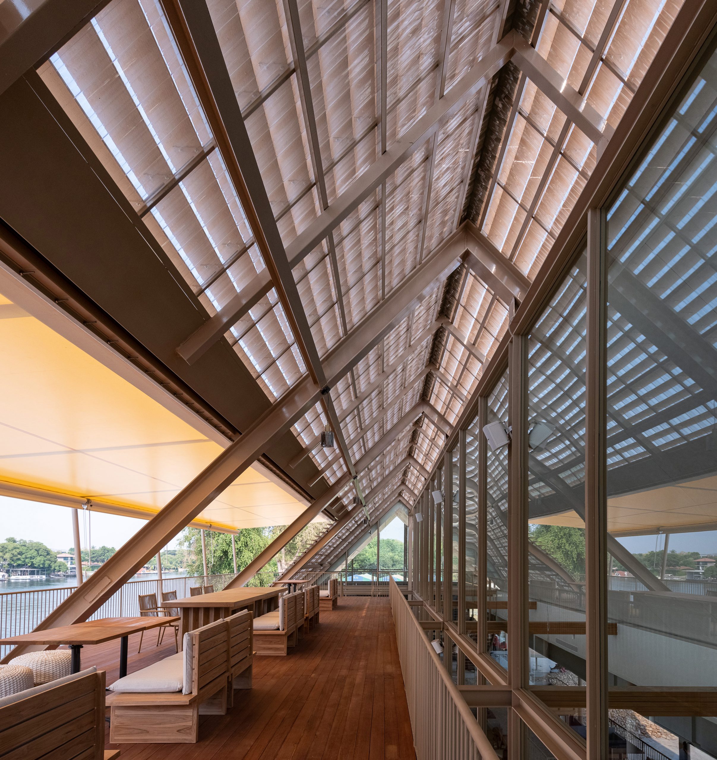
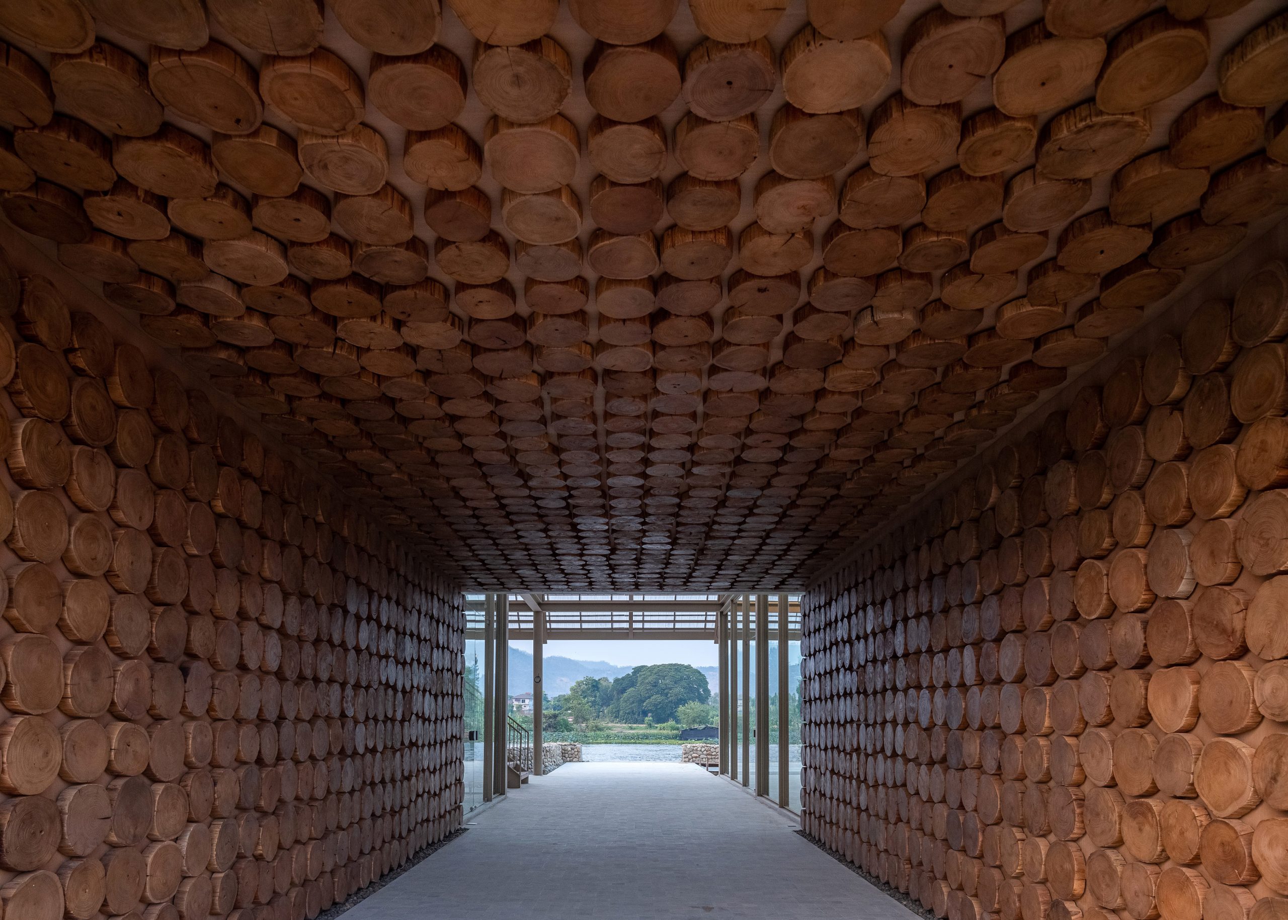
Tea Café, Choui Fong Plantation, Chiang Rai Province

Tanatap Wall Garden: A Restaurant-cum-Café and Bar among Lush Trees and Immaculate White Walls

Tanatap Wall Garden: A Restaurant-cum-Café and Bar among Lush Trees and Immaculate White Walls

/ Central Java, Indonesia /

/ Story: Kangsadan K. / English version: Bob Pitakwong /

/ Photographs: Mario Wibowo /

Central Java, Indonesia – Neat and clean walls rise above a reflecting pool and lush lawns brightened up by shimmering lights. They are made attractive by warm-toned whites and smooth curved lines twirling lightly around like poetry in motion. Shaped into alternate ridges and grooves, the concrete surfaces in zingy warm hues slant up to the skyline reminiscent of a graceful dance. It’s an amazing innovation thoughtfully devised to sync with rhythms in the urban landscape that gives it aesthetic appeal.

A welcoming reception area lies adjacent to the reflecting pool designed to blend with the rounded contour at the very top of a white wall separating the restaurant’s interior from the exterior.

The clean, well-lighted trio of restaurant, café and bar is located in Central Java, an Indonesian province that’s home to the famous Borobudur Temple, one of the greatest Buddhist monuments in the world. Named “Tanatap Wall Garden”, it’s a delightful business space in a class of itself, one that advocates for form and function being joined in a way that requires less energy to operate.
The restaurant-cum-café and bar, together with its land that forms a verdant oasis, affords 2,500 square meters of commercial space nestled among beautiful cityscapes. It’s an all-encompassing design that combines commercial real estate with elements of nature in close physical association to the advantage of both.

A charcoal sketch shows the positioning of functional spaces in relation to existing big trees, a relationship to the advantage of both. / Courtesy of RAD+ar
A side elevation view in perspective illustrates the positioning of restaurant, café and bar spaces under lush tree cover. / Courtesy of RAD+ar

The concept delineated above is the brainchild of a high performing team at RAD+ar, an architectural practice based in Jakarta, Indonesia. The team of architects was tasked with transforming what used to be a parking garage into a calm, secluded garden in which to wine and dine; meanwhile preserving the existing natural environment and the property’s significance as part of a central business district.

The result is a piece of architecture showcasing perfectly clean, white walls rising among very big lush trees, a beautiful sight unlike anything out there. Viewed from above, the floor plan consists of three straight lines on the ground moving centrifugally from the center. Along these lines, concrete walls rise to different heights forming gently curved lines at the very top as they traverse among stands of homogeneous trees.

Viewed from above, the restaurant-cum-café and bar merges into beautiful and cool landscapes so that they become an indivisible whole.
Apart from bringing shade and regulating temperatures, the trees growing wild in every direction give the business premises charm, good looks that please the senses and the mind.

It’s design that comes from understanding the warm, humid climate prevailing in Central Java, and the company’s principles advocating for simple and sustainable lifestyles. Together they are the key attributes that make Tanatap Wall Garden one of the most agreeable places to be.

For a good first impression, the welcoming entryway is adorned with green spaces that create positive moments in people’s lives. It’s connected to a pathway system leading to cool and restful places amid the beautiful backyard landscape.

Old trees and new walls become inextricable parts of the design advocating for sustainability.
On the way, an 800-square-meter reflecting pool provides a focal point in the scenery, bringing joy, pleasure and contentment in nature’s peaceful embrace. Interestingly enough, tiers of seats similar to a sports arena are added to the mix in a way that’s proper in the circumstances.

A reflecting pool under tree cover provides a focal point in the landscape. It works in tandem with other passive design strategies creating thermal comfort for both indoors and outdoors.
A lounge area offers wide seating space and flexibility seamlessly integrated into the building’s architectural styles.

In addition to being a rendezvous for good food and drinks, Tanatap Wall Garden offers an enormous richness of nature-inspired outdoor rooms for those who love spending time indulging in music and live stage performances.

Keeping to its original concept, an amphitheater is put in for customers who appreciate dramatic works as a genre of literature and expression of ideas encouraging participation in the discourses of society. All of these features are neatly integrated in one cohesive design aesthetic.

Tiers of seats similar to a sports area lie under a pedestrian bridge connecting different parts of the building. By design, it’s a work of art that keeps creative energy flowing.

In short, it’s a metamorphosis of purpose that results in neat and clean white walls transforming into a stunning commercial space, in this particular case, a trio of restaurant, café and bar set amidst a verdant oasis.

From inside looking out, a part of the white wall with ridges and grooves in it is visible through the doorway at the furthest end.
The restaurant has a lovely garden under tree cover for those who prefer to wine and dine alfresco.

Drop by Tanatap Wall Garden for a drink or two next time you sojourn in Central Java. It’s an opportunity to experience the beauty of architecture and nature coming together in one indivisible design.


Architect: RAD+ar

Principal Architect: Antonius Richard

Sculpture Artist: Wisnu Ajitama


You may also like…

Stalk Jakarta, the Tree-Hugger Bar: A Restaurant and Bar That Cares about the Environment

Tanatap Ring Garden Coffee Shop: A Design Experiment on the Interaction between Commercial Space and Nature

Studio Miti Office: A Townhouse Tastefully Renovated as Design Studio Showcasing Material Savvy

Studio Miti Office: A Townhouse Tastefully Renovated as Design Studio Showcasing Material Savvy

/ Bangkok, Thailand /

/ Story: Kor Lordkam / English version: Bob Pitakwong /

/ Photographs: Nantiya, Weerawat Sonriang /

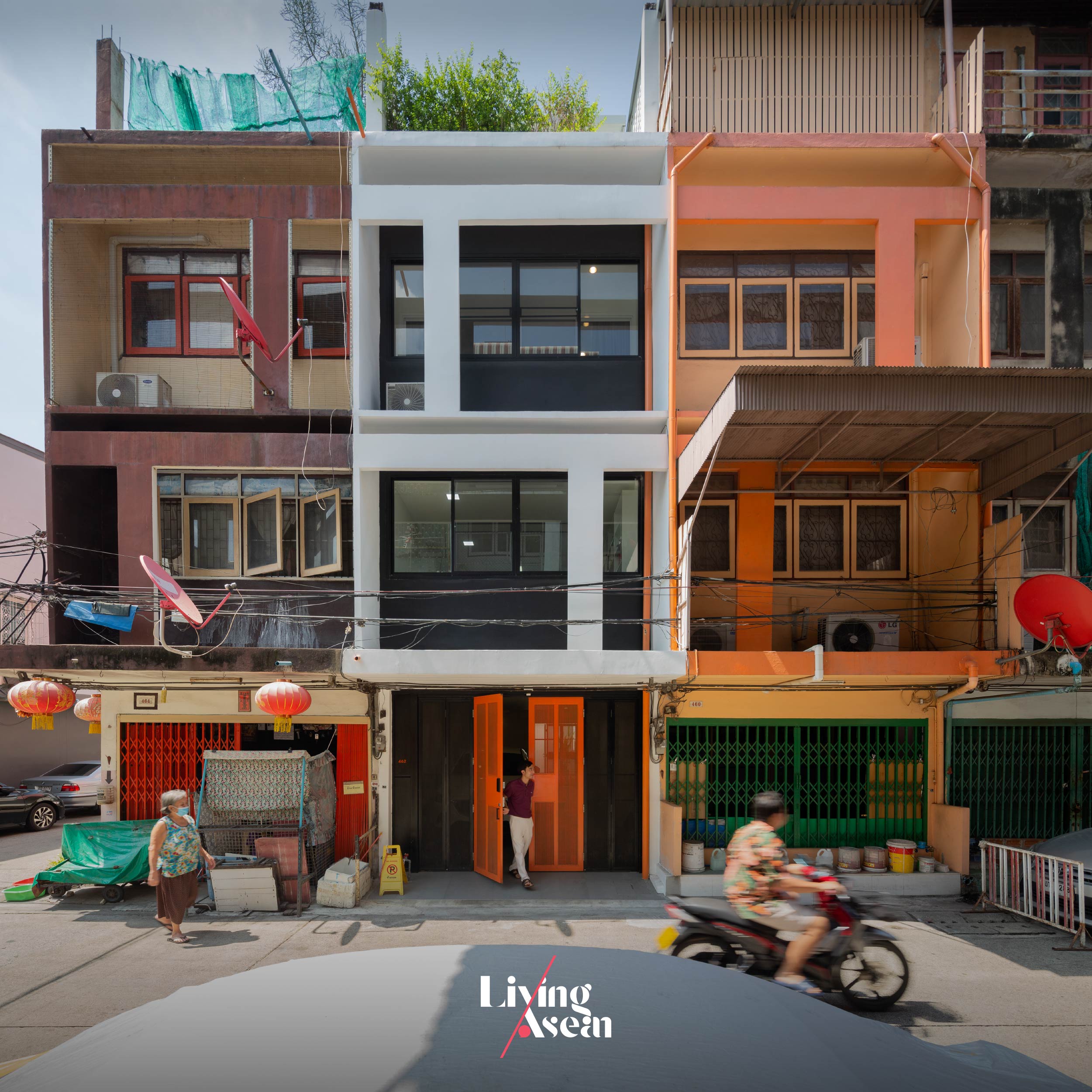
It all started with a 30-year-old, three-story townhouse and a company of architects Studio Miti in need of a new home. Like a fortunate stroke of serendipity, they found exactly what they had been searching for, a building with a wide, six-meter frontage abutting the street, an architectural quality attribute that gave it a decided plus.

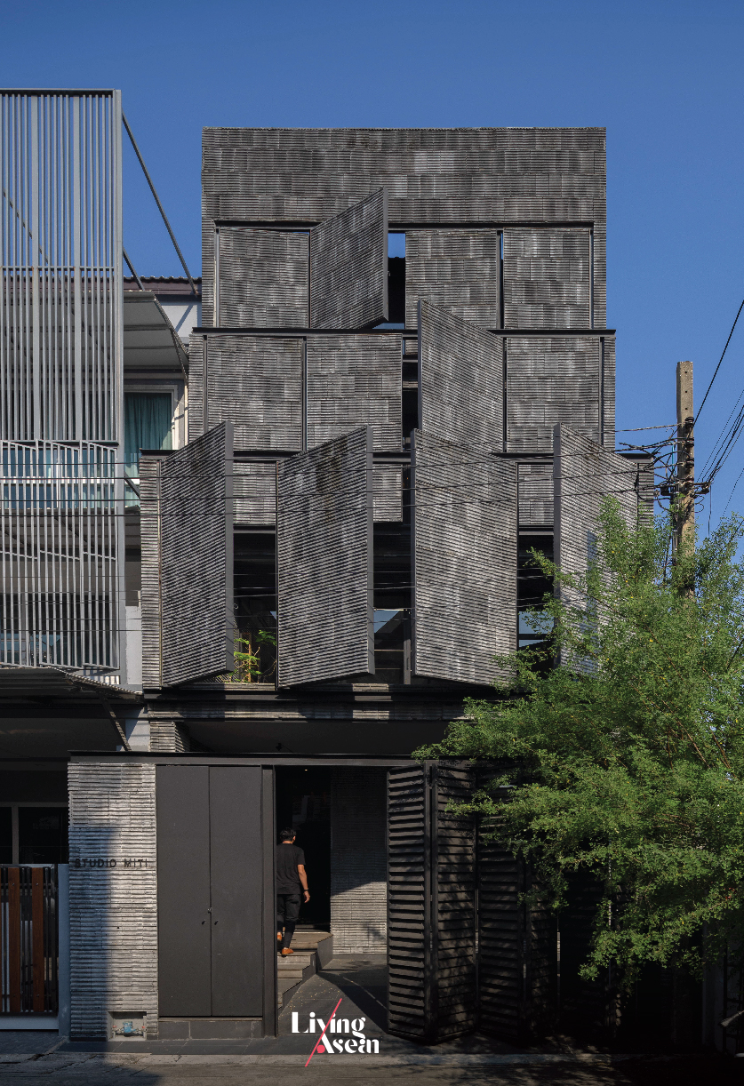
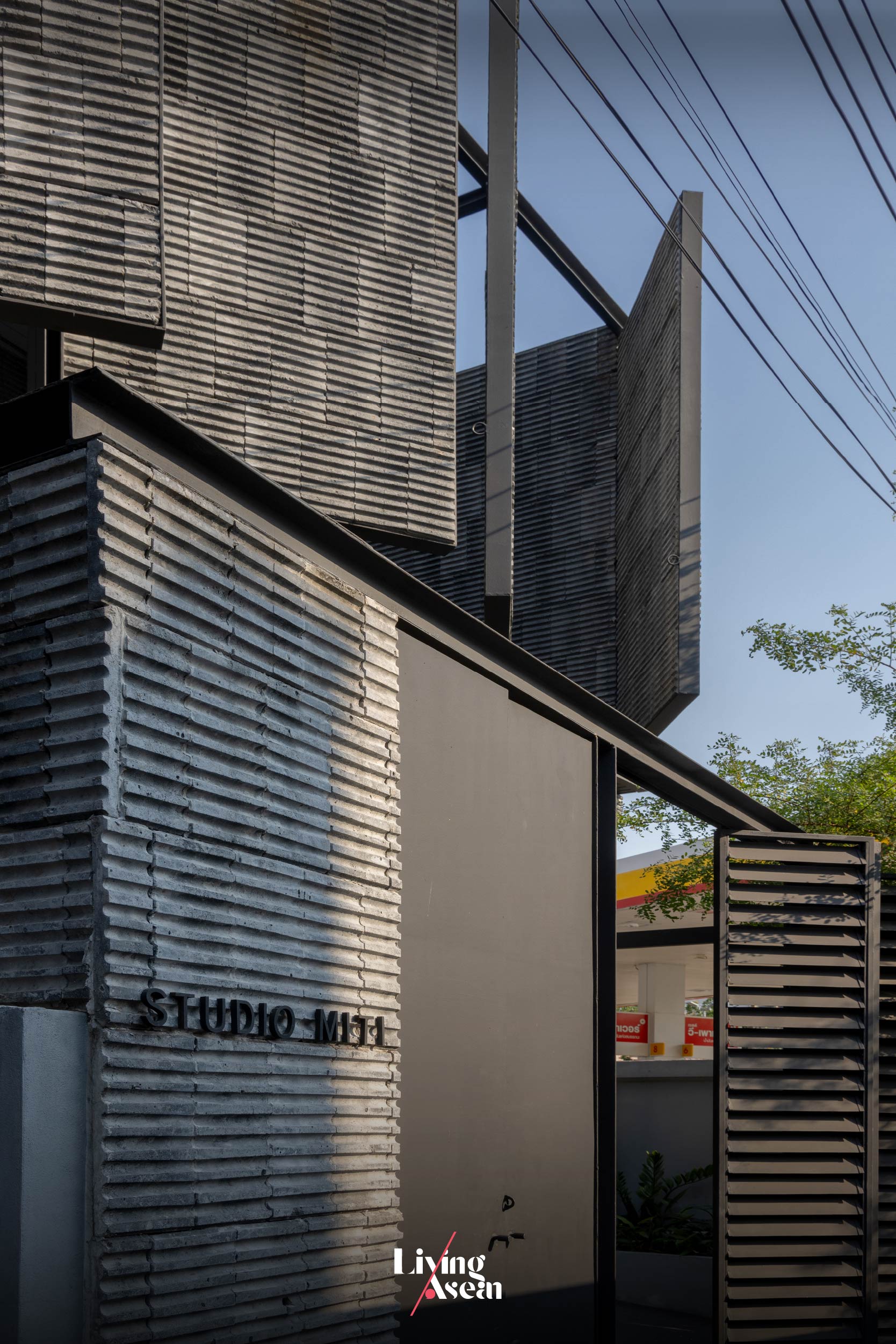
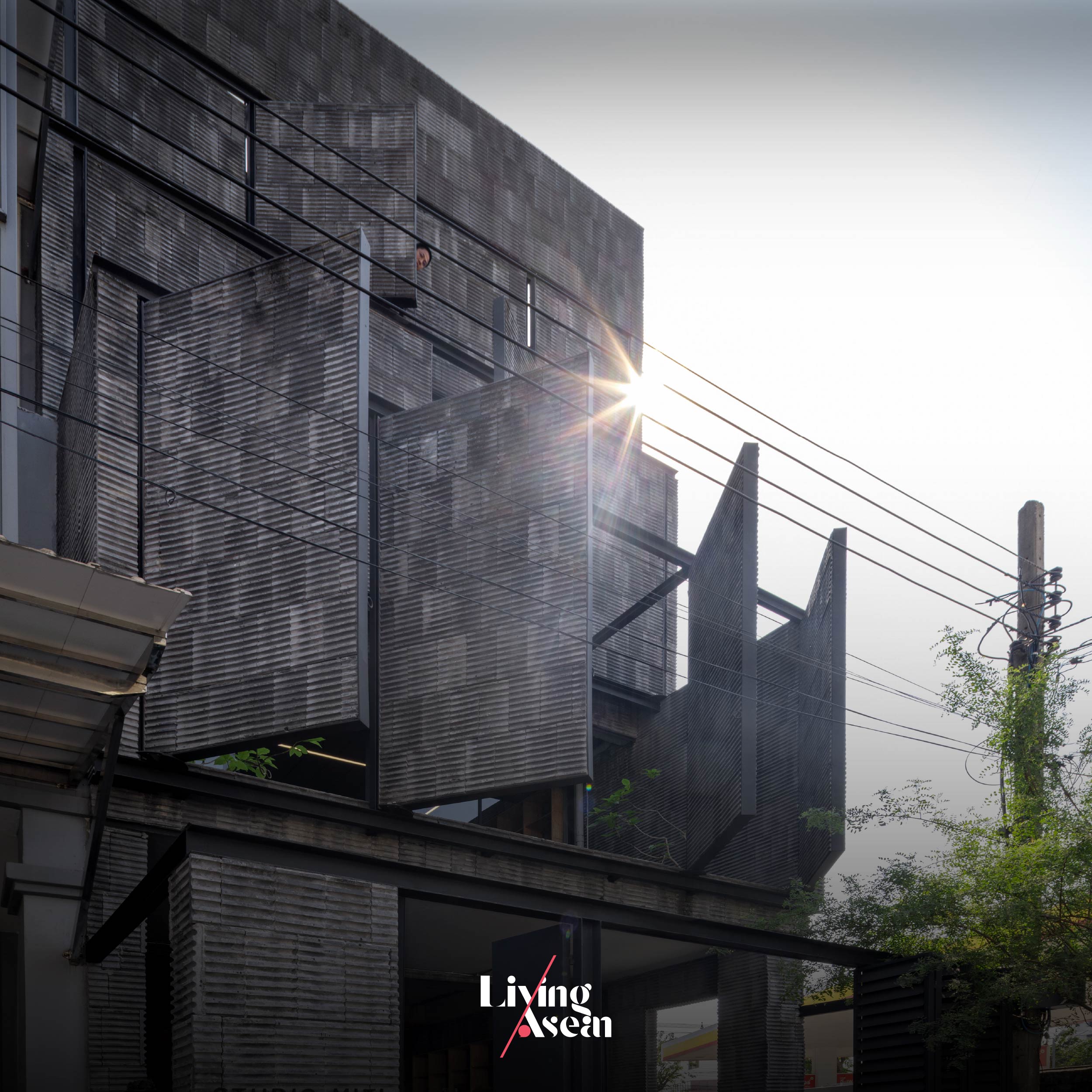
The new building facade consisting of lightweight concrete blocks in slate gray is built of a framework of iron securely anchored to the original supporting structure of concrete masonry construction. The building’s principal face can open and shut as needed to regulate the amounts of natural daylight and fresh outdoor air streaming into the rooms. More than anything else, it’s design that meets engineering standard requirements and specifications for safety and durability.

Needless to say, it’s hard to find anything like it nowadays. More importantly, it’s located in an easily accessible community area with a variety of amenities, eating places and businesses serving surrounding populations.

Studio Miti management obviously saw the potential of it developing to future success. And that’s what gave them the inspiration going forward. They set off without delay to breathe new life into the old townhouse, transforming it into a modern design atelier that’s the home of the company’s finest 20-strong staff.

Their secrets lay in creating an exciting new external envelope covered with lightweight concrete materials. And the result of all this is a pleasing visual appearance unlike anything out there. Architecturally speaking, it’s an interesting amalgam of color, texture and the perception of shape and size that inspires admiration.

studio miti office bangkok

studio miti office bangkok
A set of wooden steps rises past a trough where leafy plants grow leading to the reception room on the ground floor.

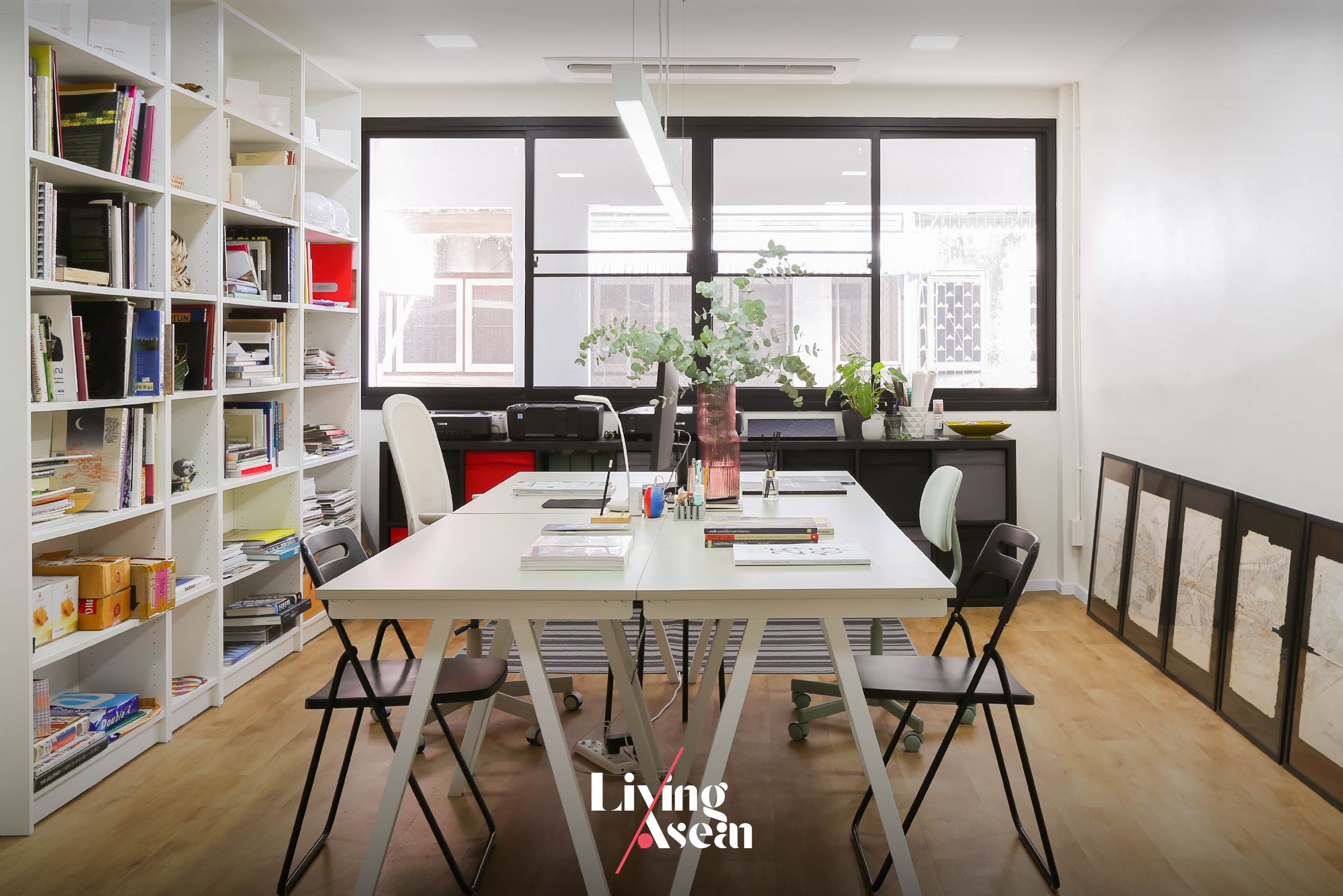
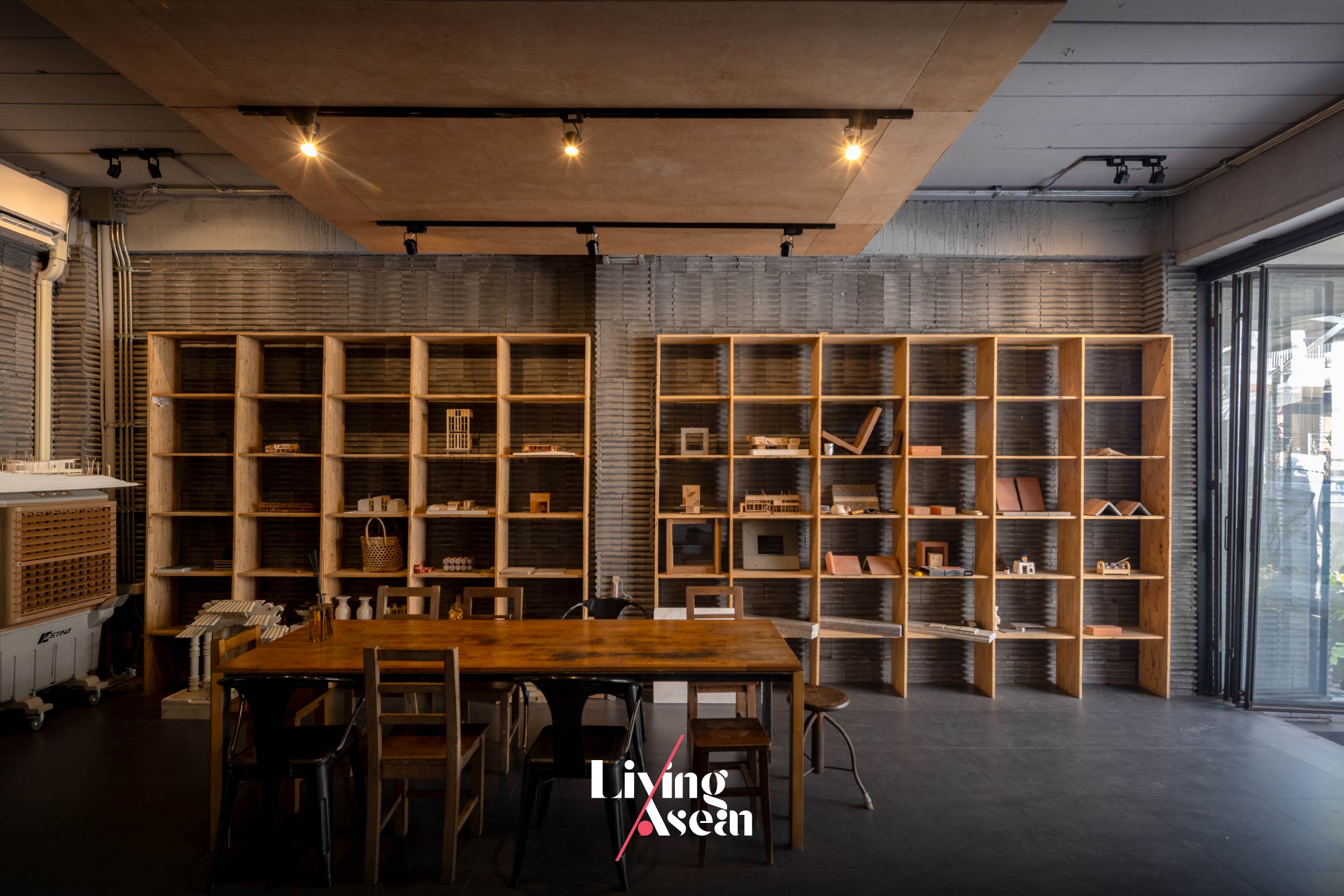
Ground floor interiors afford comfortable workspaces designed to boost productivity, with communal facilities such as small meeting rooms and client reception areas neatly arranged throughout the building. There’s also a casual dining area with a kitchen and pantry, not to mention recreational spaces with a ping-pong table and quiet nooks to chill out.

Taken as a whole, it’s design that speaks volumes for the company’s operating principles — investing in a conducive work environment so as to reduce stress and improve concentration. Likewise, it makes perfect sense to ensure its design team can stay focused on the task at hand.

studio miti office bangkok
The corridor is separated from a meeting room on the ground floor by a folding glass door system, a clever tool that defines boundaries in a way that’s easy to understand.

studio miti office bangkok

With the folding glass door system stowed away, the ground floor serving multiple functions as a meeting room, storage room and recreational area instantly transforms into one big open space.

Climb a flight of stairs, and you come to the main meeting room reserved for formal meetings or when work needs total concentration. There’s a customer reception area nearby that makes a great first impression, with facilities for online video conferencing, a dining room and areas used for recreation.

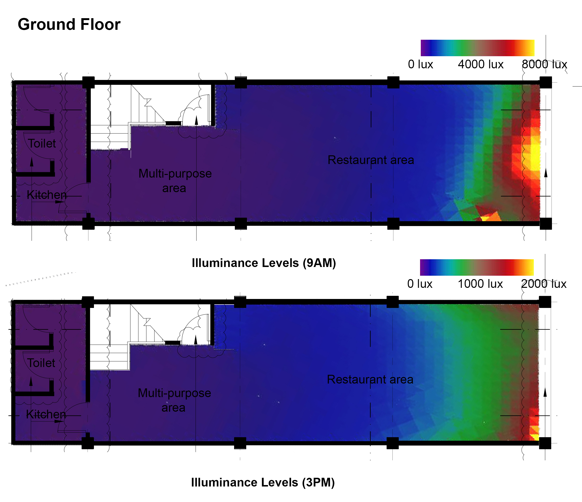
Different from what’s usual is the building façade that can open and shut as needed to regulate the amounts of natural light during the daytime or admit fresh outdoor air into the room in the late afternoon, a clever hack to save big on energy bills.

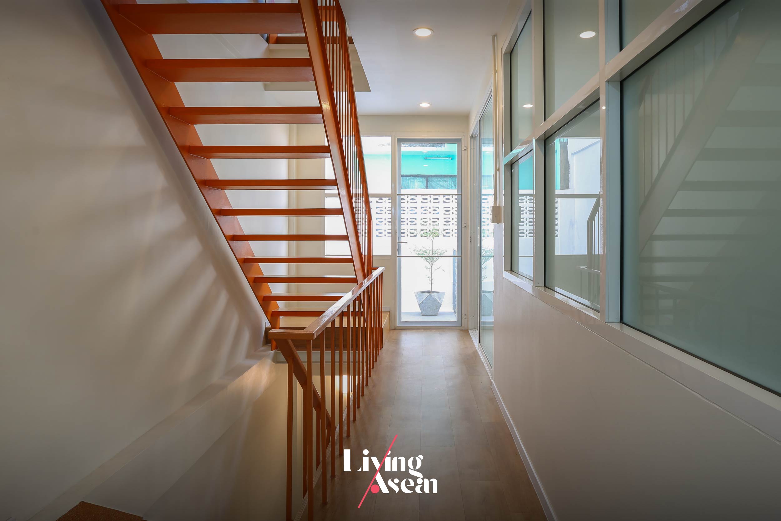
The stairway leading to workspaces on the upper floors remained where the old, tired looking stairs had been prior to renovation, only slightly altered to give it a look that belongs to the present.
studio miti office bangkok
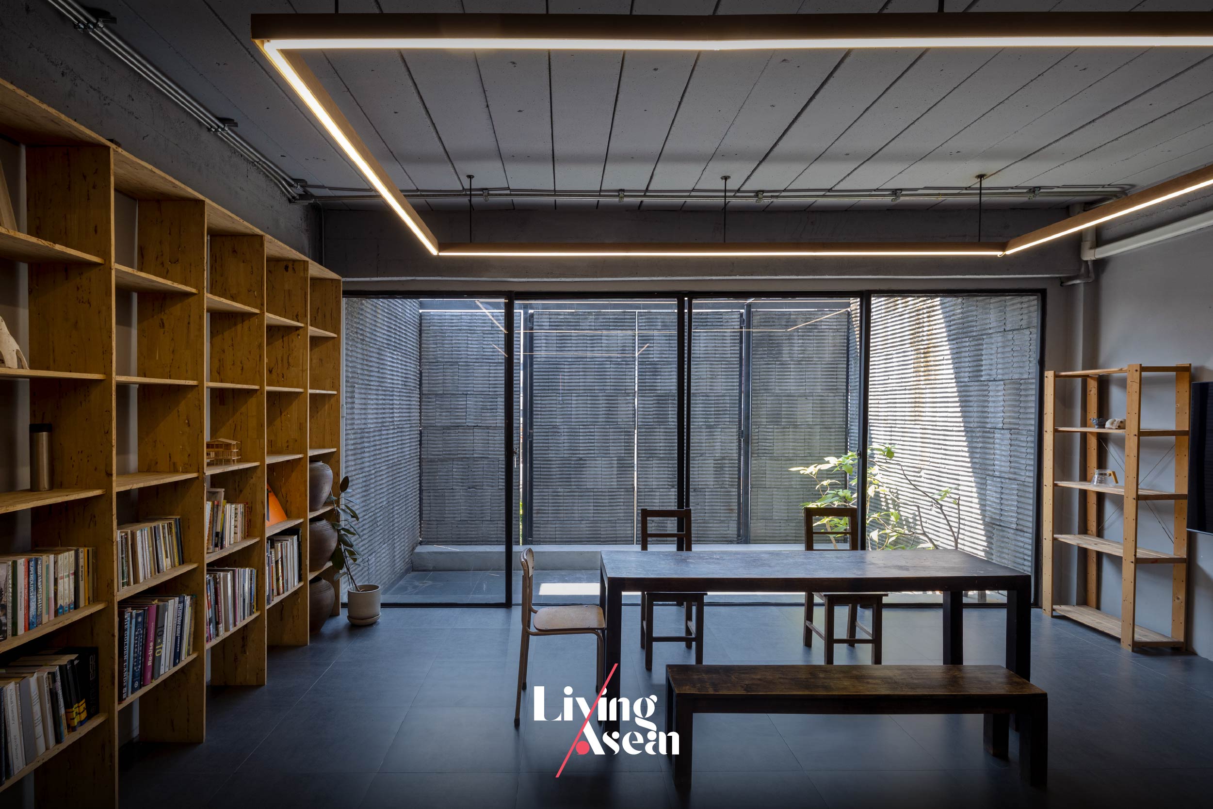
A glass-wall and sliding-door system provides visual continuity from inside the room to the balcony hemmed in by the front façade that can open and shut as needed for privacy, light and fresh air.
studio miti office bangkok
Wooden bookshelves of a modular nature are the epitome of imagination and resourcefulness. They stand ready to be taken apart and reassembled elsewhere if needs be.

studio miti office bangkok

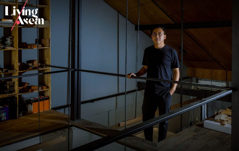
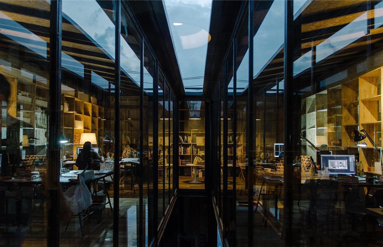
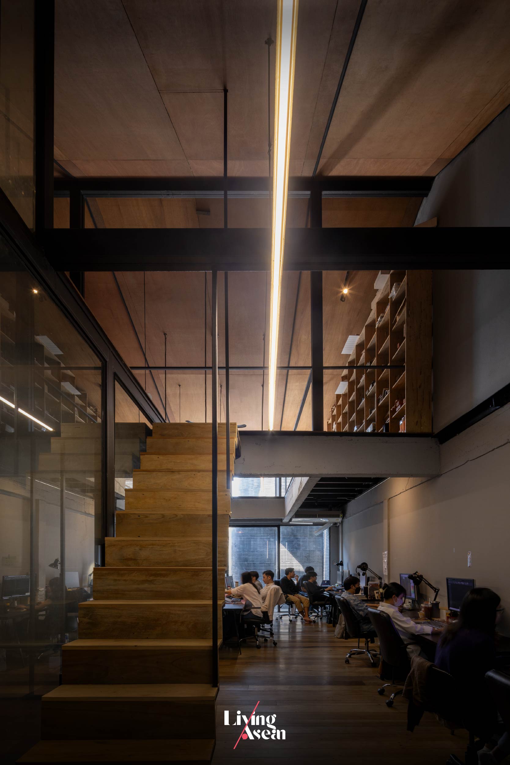
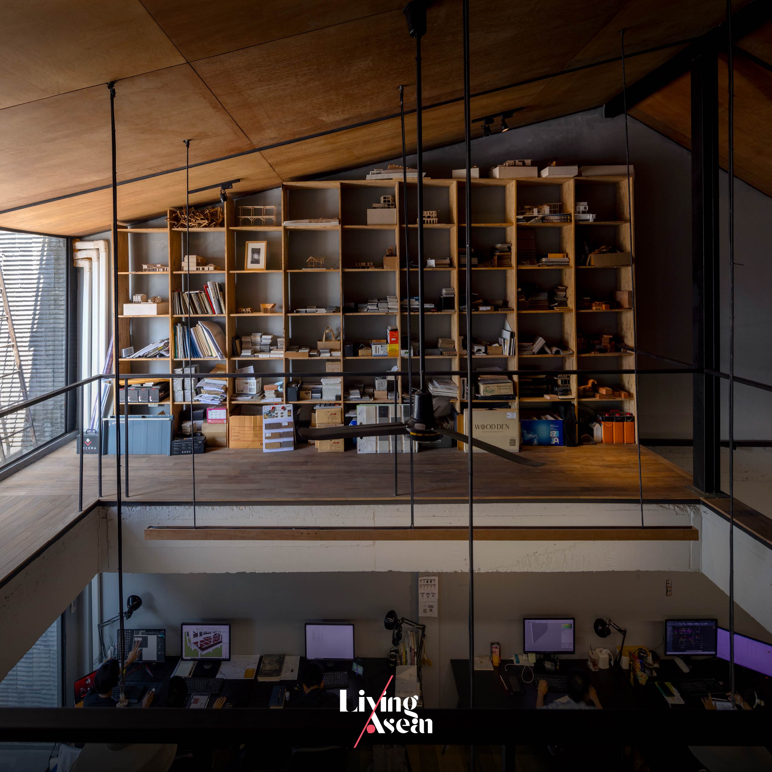
The third floor holds ample workspaces with a mezzanine just below the high-pitch roof. Together they boast the comfort of a high-ceilinged room made light and airy by design. For lack of a better word, it’s the pride and joy of some 20 staff members working here as a team.

Of all parts of the building, the roof received the most extensive renovation. To get where they wanted to be, the architects had the old roof torn down to make room for a new high-pitch upper covering.

This gave the interiors much more space overhead, more natural light and aesthetic appeal. Plus, new ceilings built flush with the underside of the roof add real character to the room, while the mezzanine provides extra storage space just below the roof.

studio miti office bangkok
Third-floor workspaces are light and airy by design, thanks to high ceilings aligned with the underside of a new high-pitch roof. Plus, there’s plenty of ample space providing neat storage solutions on the mezzanine just below the roof.

All things considered, it’s about creating a workspace that bodes well for the good health of all members on the team, while inspiring productivity and job satisfaction. These qualities can only come from having access to a conducive work environment, the ability to stay focused on work and freedom from noise and distractions.

To achieve the desired results, all the workspaces and functional areas are warmly cocooned inside a solid external envelope made of lightweight concrete materials. Yet they feel connected to the elements of nature, thanks in part to large openings in the front façade that let natural light and fresh air stream into the rooms on the second and third floors.

studio miti office bangkok

An opening in the mezzanine reinforced by a steel I-beam system provides visual continuity from above and below.

Not only that, all the arrangements in place also allow the architects to experiment with exciting ideas and innovative materials never before seen, among them a new kind of lightweight concrete materials for wall construction.

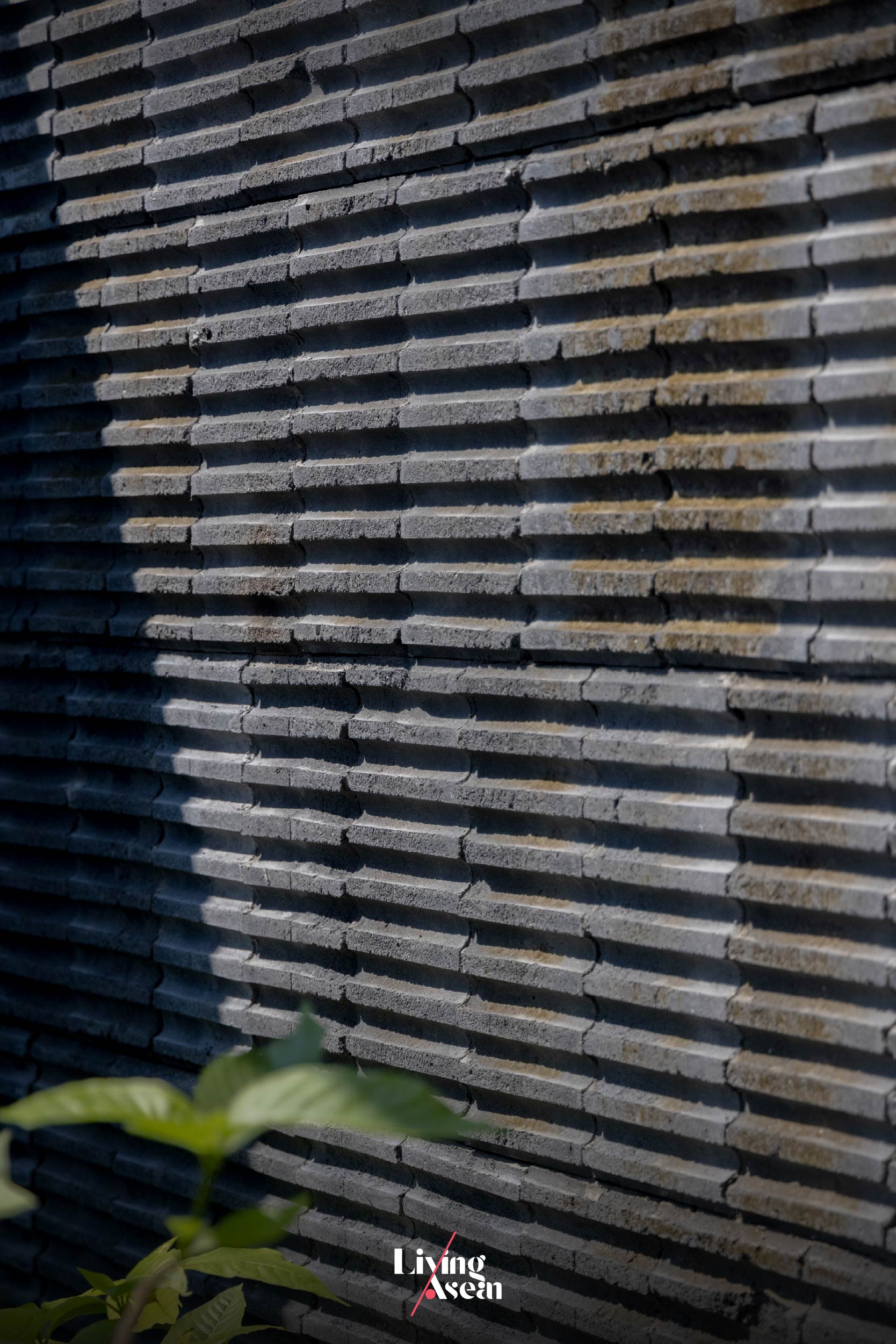
The building exterior showcases the ridges and grooves in concrete blocks cut open and left exposed to the weather, thereby allowing time to leave its imprint.

In Studio Miti ‘s most recent experiment, they decided out of curiosity to split an ultralight concrete block in half, only to discover that it contained ridges and grooves on the inside creating light and shadows. They then proceeded with installing the ultralight blocks inside out, thereby showcasing the beauty of imperfections of materials on the building’s exteriors.

It’s sort of going in the opposite way of what usually happens.

The result is charm, good looks without embellishments or decoration of any kind, one that creates an interesting light and shadow play when touched by light. Plus, it’s a spectacular sight that changes with the time of day.

In the fewest possible words, it’s a renovation that conveys a great deal about Studio Miti ’s belief, which says that, first and foremost, it makes a lot of sense to be material savvy. Better yet, it’s prudent to investigate the material before using it. Why? Because knowledge of materials and how they perform in real situations is essential to creating architecture.

A side-elevation view of Studio Miti’s new home shows the exteriors adorned with lightweight blocks in slate gray, a feature that gives it distinctive character.
Studio Miti Bangkok
With the façade closed, the building looks perfectly solid, transforming Studio Miti’s new home into a piece of architecture in a class of itself.


Architect: Studio Miti (www.studiomiti.com)


You may also like…

Ngói Space: A Community Center in Vibrant Orange Graces a Suburb of Hanoi

Urban Farming Office: VTN Architects’ Office Gives Back Lush Greenery

Tebet Eco Park: Ecosystem Restorations Breathe New Life into Jakarta’s Urban Parkland

Tebet Eco Park: Ecosystem Restorations Breathe New Life into Jakarta’s Urban Parkland

/ Jakarta, Indonesia /

/ Story: Kangsadan K. / English version: Bob Pitakwong /

/ Photographs: SIURA Studio /

Environmental degradation has had a wide-ranging impact on people’s lives and the general health of flora and fauna. But the natural world is far more resilient that we realize. Let’s take a look at the design of Tebet Eco Park in Jakarta that’s exemplary of efforts at repairing damage and the upkeep of the biological community, forestland and water sources.

Like everything else, it’s been through good times and bad times to get where it is today – a city park lovingly restored to its former glory.

The fields and streams, and wetland environments are full of life and energy while lush vegetation abounds, thriving luxuriantly under scattered groups of trees.

The secret to all of this lies in creative landscape design that bodes well for the future of the complex network of interacting organisms, and beautiful esplanades lined with greenery. It’s a rendezvous where humanity and nature come together in peaceful harmony.

The years of neglect are gone now, no more flooding or being isolated from the rest of the world. And, thanks to care and attention, the park’s ecosystems are saved from destruction by human activities.

The enclosure 73,000 square meters in extent has experienced the new birth as a result of ongoing efforts at preserving the city’s green spaces and preventing wasteful use of resources.

At the same time, recreation areas and playgrounds connected by a system of esplanades were added to the mix resulting in diversity in parkland ecosystems that augurs well for a good rapport with nature.

The Tebet Eco Park Restoration Project is the brainchild of SIURA Studio, an urban design and landscape architectural firm based in Singapore.

A drawing of the master plan shows the reintroduction of greenery, a system of esplanades on both sides of the waterway and ecosystem restorations in relation to surrounding residential neighborhoods. / Courtesy of SIURA Studio

The company has enjoyed a strong track record in innovative design that prioritizes the climatic context and ecological implications of a project site. In a nutshell, it’s about integrating sustainable goals in park design so as to answer the basic recreational needs of people in urban areas.

The project began in earnest some 15 months ago. At the time, the area with small streams and wetland habitats was clearly in a state of disrepair caused by periods of low rainfall alternating with deluges of heavy rain that resulted in flash floods.

To make matters worse, flooding also brought contaminated debris into the area, while a new road running through it disrupted an ecological corridor that’s the life line of woodland flora and fauna, eventually resulting in widespread destruction of the physical environment.

That’s exactly where an experienced landscape team at SIURA Studio came into play. They were tasked with breathing new life into the area, eventually returning the urban parkland to a good condition.

This was achieved by adding greenery suitable for this particular ecosystem, at the same time improving the quality of small waterways, wetland habitats and biodiversity in the area. And all of this is done corresponding to land use planning so that society, the environment and the city as a whole can benefit from it.

First and foremost, the two separate areas of the park were combined to form a single entity, while the 714-meter-long waterway that ran through it was rehabilitated to health.

A drone’s eye view of Tebet Eco Park shows a pedestrian overpass painted a shade of red twisting and turning on a spiral course, bringing the people of Jakarta and nature closer together.

Meanwhile, the concrete road was removed and replaced by garden pathways, creating a wetland environment capable of supporting aquatic life. The stream itself was made long and winding by design, a clever hack in the waste water treatment process.

Interesting before-and-after photos of Tebet Eco Park show the reintroduction of aquatic plant species and improvements in wetland habitats.

In this way, saturated conditions on both sides of the stream became conducive to the growth of wetland plants and other organisms, not to mention an increase in biodiversity and improvement in soil quality.

The long and winding stream inside Tebet Eco Park is lined with lush vegetation after concrete embankments had been removed and replaced by aquatic plants growing vigorously.

In a gradual way, the urban parkland that once fell into disrepair was brought back to life. The trees and shrubbery now grow and develop vigorously, thanks to the enthusiasm and work spirit that advocates reduce, reuse and recycle as a means of protecting the environment.

Just to give you an idea, some of the rocks and tree stumps unearthed during the excavating process were converted into reusable building supplies, while others found a new purpose as component parts in outdoor furniture, such as park benches and equipment in children’s playgrounds. In a nutshell, nothing goes to waste.

An aerial view of children’s playgrounds designed to answer the rest and recreation needs of the people of Jakarta.

Tebet Eco Park no doubt has transformed into delightfully warm and inviting recreation grounds for the people of Jakarta. If walking is your thing, perhaps you might like to check out the esplanades on both sides of the stream.

Whether it’s a quiet saunter down the garden pathway lined with greenery or fitness walking that quickens your breathing, Tebet Eco Park is the place to be.

A pavilion used as a shelter lies on the south side of the park.

There’s even an overpass painted a bright shade of red that will take you on a twisting and turning spiral course among the treetops. By the way, walking through a park is different from strolling on the street in front of your home. Physical activity in a green space provides multiple health benefits.

A pedestrian overpass in red intersects a system of esplanades on the surface combining two sides of the parkland into one single entity.

In the big picture, there’s more to a park than just restoring ecosystems to health. It involves taking the initiative to improve the quality of life for people in urban areas.

Citizens and investors can participate in city planning and making recreation grounds easily accessible to people in the community.

The bottom line is public green spaces matter. Although everything changes, the relationship between humanity and nature remains inextricable. A yearning to reconnect with the natural world never dies; it only gets stronger with time.

Because the people of Jakarta want a healthy physical environment for rest and recreation, Tebet Eco Park is there for them – an open public space that’s sustainable, creative and easily accessible to everyone.


Architect: SIURA Studio


You may also like…

the parkThe Park: A Grass-Roof Community Center Shimmers in the Night

Đạo Mẫu MuseumThe Đạo Mẫu Museum: A Window into Vietnam’s Folk Cultures in Times Past

ISAN Cubism: A Revival of Isan Folk Art through Exquisitely Beautiful Ceramic Buddha Images

ISAN Cubism: A Revival of Isan Folk Art through Exquisitely Beautiful Ceramic Buddha Images

/ Khon Kaen, Thailand /

/ Story: Natthawat Klaysuban / English version: Bob Pitakwong /

/ Photographs: Courtesy of ISAN Cubism /

An exquisitely beautiful collection of Buddha figurines reminiscent of stone Buddha images in earlier times has restored Isan vernacular art to life. Let’s go and check out some of the extraordinary works of art that take pride of place in the hearts and minds of the people of the Northeast of Thailand, aka the Isan Region. There is a difference though, as to what kind of material they are made of. One thing is for sure, the result is the beauties of Isan folk art that inspires delight and great admiration. The tranquil figurines are skillfully handcrafted of ceramics glazed in smooth, shiny cool-toned green and blue hues. Truly in a class of itself, the stunning product line is already very well received among aficionados of fine art and sculpture countrywide.

ISAN Cubism
A collection of ceramic Buddha figurines is a work of art in several cool-toned colors by Isan Cubism. It’s being very well received in the art scene.

The project is a collaboration between Dr. Kham Chaturongakul and Dr. Nuttapong Prompongsaton, associate professor — both of whom faculty members of the Department of Industrial Design at Khon Kaen University’s Faculty of Architecture.

Together they co-founded the brandISAN Cubism by integrating the elements of vernacular art indigenous of the Isan Region in exciting new designs, plus using materials and techniques that best fit in with the present time.

Dr. Kham Chaturongakul (left) and Dr. Nuttapong Prompongsaton, associate professor. Both are faculty members at the Industrial Design Department, Khon Kaen University’s School of Architecture.

The ceramic statuettes with a polychromatic overlay are admired for their powerful storytelling about the richness of Isan culture and traditions. For this reason, the brand ISAN Cubism comes in handy as a vehicle of ideas to showcase an intriguing combination between the traditional and the modern.

Cubism, created by Pablo Picasso, is a style in art using simple geometric forms as a means of expression, as opposed to traditional modes of representation and concerns.

ISAN Cubism

Precisely, ISAN Cubism is about the relationship between religion and humanity in the contemporary world. That being the case, the omnipresence of Siddhattha Gautama the Lord Buddha is constantly felt in society today, and hence the images of him are never far from our everyday lives.

Depending on our religiosity, the statuettes of the Buddha play multiple crucial roles in the current environment. For the followers of Buddhism, they are objects worshipped and treated with deep respects. For others, they can be anything from materials used in the furnishing and decoration of homes, to symbols of pleasure and calm rather than being treated with due seriousness. The list goes on.

That being said, the traditional lines, shapes and forms characteristic of Buddha images in former times are reduced in favor of a more streamlined design plain and obvious in this collection of modern-day statuettes. It’s a rethink that enables them to perfectly merge into the circumstances that form the setting of today’s events and ideas.

ISAN Cubism
A vase for displaying cut flowers is known as “Roop Taem” or “Hoop Taem” in the vernacular of the Northeastern Region, a term for color paint art and painting executed directly on a wall.

As the two professors see it, Isan vernacular is chosen as the vehicle of artistic expression in this collection because of its richness in folk elements of design, a genre of visual art and sculpture developed at the time the region was regarded as a remote frontier ungoverned by bigger, more powerful city states.

In exact terms, it’s this quality that makes Isan folk art original and unique in its own special way. Among others, there’s a sincere direct rawness to it that differs from the more refined profile typical of those of Lanna and Ayutthaya kingdoms in former times.

In a nutshell, Isan art is the works of traditional craftsmanship, made by villagers using materials and technique available within the locality, wood and clay included.

Their version of Buddha statuettes may be a far cry from awe-inspiring masterpieces intricately carved by royal court artisans highly skilled in a trade. But, unlike the elegance in appearance that we’ve all grown accustomed to, Isan folk art remains a medium of expression that’s easy to understand, one that’s created using simple clean lines and four-sided plain figures.

The two professors see a similarity of characteristics between Isan art and cubism ideas that originated in Europe. To them, the beauty of simplicity of Isan vernacular art is key to unlocking the door to endless possibilities.

Imagine what would happen if Isan folk art could transform into lifestyle products made easily accessible to today’s generation. Keep the vibrant colors that the villagers have long cherished, plus the rawness feel unique to each and every one of them. That’s what adds charm and character to folk art products.

ISAN Cubism

The brand ISAN Cubism started out with the manufacture of vases for displaying cut flowers. Gradually Nattapong developed an interest in Buddha statuettes, having been surrounded by religious populations. He soon came up with his first collection of Buddha figurines based on wooden models that people made and then donated to temples as the expression of reverence.

ISAN Cubism

Dr. Kham and Dr. Nuttapong said that other countries have their own versions of human figurines, too. The most famous among them are Daruma Dolls of Japan, and Matryoshka, aka Nesting Dolls, of Russia.

They opined that Isan folk art had the potential to develop into something in the future, which can be anything including materials for the furnishing and decoration of a room, or any place on earth.

And you don’t have to be Buddhist to do that, either. Buddhist art is a visual art. It’s the way of seeing things around us and interpreting them through an artistic perspective. And this exquisitely beautiful collection of ceramic figurines is designed to do exactly that.

ISAN Cubism


Artist: ISAN Cubism (www.facebook.com/Isancubism)


You may also like…

choei stool rumba borCHOEI: A Contemporary Round-Top Stool Revival by Rumbá Bor

Pitu Rooms: A tall and slender hotel adds new landmark to Indonesian paradise valley

Pitu Rooms: A tall and slender hotel adds new landmark to Indonesian paradise valley

/ Salatiga, Indonesia /

/ Story: Kor Lordkam / English version: Bob Pitakwong /

/ Photographs: David Permadi and Ernest Theophilus /

Standing tall and slender among quaint and inviting country homes, a unique seven-room hotel makes the most of even the smallest space. Named “Pitu Rooms,” it’s situated in Salatiga, a town in the valley of Central Java known for its relatively cool climate and authentic Indonesian lifestyle.

Pitu Rooms

The small hotel has a narrow frontage just shy of three meters, but that’s not a problem for architect Sahabat Selojene. The view of the cityscape is worth the climb, and that’s what gives him the inspiration going forward. The result is a thoughtfully devised skinny hotel that changes the town’s skyline, a design that’s exemplary of ideas in dealing with the challenges of limited space.

A street map shows the hotel’s location within the context of the city landscape. / Courtesy of Sahabat Selojene
The floor plan shows the corridor leading to a reception area on the ground floor. / Courtesy of Sahabat Selojene
Floor 2 holds a guest room at the rear and a staff room upfront. / Courtesy of Sahabat Selojene
Floors 3 to 5 each hold two guest rooms, separated only by a steel staircase. / Courtesy of Sahabat Selojene
The top floor of the building holds a dining room with a view of the cityscape. / Courtesy of Sahabat Selojene
The front elevation in cross section shows guest rooms on Floors 2 to 5 with a reception area on the ground floor and dining room with a view at the very top. / Courtesy of Sahabat Selojene
The side elevation in cross section shows guest rooms in the front and back accessed by a staircase in between. / Courtesy of Sahabat Selojene

Pitu Rooms
A remnant of old building walls is preserved for its great historic value and beautifully integrated into the hotel design.

More than anything else, it’s a clever way to make good use of land left over after the rest has been used. At the same time, it creates business opportunities and is helpful for urban planning and development in the area.

Part of a collection of artworks on display / Courtesy of Pitu Rooms

“Pitu Rooms” rises above what was once an unkempt piece of ground measuring 33.6 square meters in extent. The elongated rectangle is 12 meters long while the façade abutting on the street in front of it measures just 2.8 meters.

Everything changed after the experienced architect saw the potential and transformed it into a business space and, at the same time, took every precaution to avoid damaging or impairing old building walls nearby since their stories were unknown.

Pitu Rooms

Pitu Rooms
The bed is placed against the walls on three sides to make the most of even the smallest space.

The overall effect is impressive. The six-story tall and thin hotel offers quest rooms on Floors 2 to 5 with the lobby and dining room on the ground floor plus the other dining room with a view on the top floor. All the rooms are accessed by a steel staircase inside the building. Steel was chosen for its cost-effectiveness. Furthermore, it’s strong, durable and easy to handle.

Pitu Rooms
The top floor of the building holds a dining room with a view of the city landscape.
Pitu Rooms
An array of awning windows on the east-facing wall opens to admit light and promote good ventilation in the interior.

For good looks, the hotel’s external envelope is adorned with Agra red sandstone coverings indigenous to the area, while the east-facing wall is equipped with an array of awning windows to improve ventilation and lighting in the interior. Together they add character and interest to architectural design, providing a feature of the landscape that’s easily seen and recognized from a distance.

Pitu Rooms
The tall and slender hotel is adorned with red sandstone coverings that blend with existing homes in the neighborhood. The famous Mount Merbabu can be seen from miles around.

Architect: Sahabat Selojene

Structural Engineer: PT. Cipta Sukses

Construction: Eranto Prasetyadi


You may also like…

Proud Phu Fah Muang Chiang MaiProud Phu Fah Muang Chiang Mai: A Hotel at Nature’s Edge Embraces a Mix of Modern and Traditional

The Flying BlockThe Flying Block: A Midtown Hotel with the Relaxing Ambience of Sky Gardens

Ngói Space: A Community Center in Vibrant Orange Graces a Suburb of Hanoi

Ngói Space: A Community Center in Vibrant Orange Graces a Suburb of Hanoi

/ Hanoi, Vietnam /

/ Story: Phattaraphon / English version: Bob Pitakwong /

/ Photographs: Le Minh Hoang /

A good-sized community center is making its presence felt on the outskirts of Hanoi, Vietnam’s capital. The building stands enclosed in authentic Vietnamese fireclay roof tiles. The external envelope in exuberant shades of orange rises above a street corner surrounded by modern structures. It begs the question. Is this some kind of experiment being undertaken to test a point that has never been dealt with? “Your guess is right.”

Ngói Space Hanoi

Named “Ngói Space,” the community center building sends a strong message that exciting new architecture can be created using indigenous building materials. In this particular project, more than 20,000 thin rectangular slabs of baked clay are used to make the building facades. They are the same ubiquitous building materials as those used for covering roofs.

Ngói Space Hanoi

Ngói Space Hanoi
The immediate empty space between the perforate shell and the building wall offers semi-outdoor room for relaxation.

Ngói Space performs a dual role as recreation center promoting community wellbeing and reception area for both normal and important occasions. It’s open to everyone in the community who needs a place and time to unwind, not to mention empowering the people and strengthening the neighborhood.

Among others, it has coffee shops, multiple purpose rooms, conference venues and exhibition halls plus a rooftop garden for relaxation.

The interior space is light and airy, a peaceful place to escape the hustle and bustle of city life.

The unique outer surface of the building got its inspiration from trees thriving vigorously in the wild, while the interiors conjure up mental images of the atmosphere inside a prehistoric cave dwelling. The design thinking process started with interior planning. Once that’s done, the team at H&P Architects then proceeded to work on the building’s exteriors.

A pencil sketch illustrates steps in the thinking process culminating in the final design of the community center building named “Ngoi Space” / Courtesy of H&P Architects
A diagrammatic representation shows the coming together of support structures and building facades crafted of fireclay roof tiles. / Courtesy of H&P Architects
The floor plans in cross section / Courtesy of H&P Architects

To arouse people’s curiosity and interest, the facades are covered in roof tiles fired the old-fashioned way, an indigenous building material that the Vietnamese were most familiar with. In a way, it’s a design that takes people back in time by reintroducing traditional materials and techniques and putting them to good use in modern day applications.

A trio of images shows how the thin rectangular slabs of baked clay are put together creating the face of the building that houses the community center. / Courtesy of H&P Architects)

There is one incentive for doing so. As the country continues to advance, more and more old homes are torn down to make room for new ones. So now is the time to start thinking about the need to reuse and recycle as a means of preserving natural resources.

For this reason, the facades are built of fireclay roof tiles recycled from much older homes. In this way, nothing goes to waste plus it’s a creative and cost-effective way to build in this day and age.

Ngói Space Hanoi
Split level design makes for a pleasant and airy interior.

Ngói Space Hanoi

Here, the old roof tiles are put together diagonally to create one triangle after the other that in turn forms the perforate outer shell of the building. Together they go to work protecting the walls and windows behind them from severe weather.

Besides providing shade and more insulation for the interiors, the immediate cavity in between the two layers provides room for exhibitions and nooks along the walls to sit sipping coffee. That’s not all. There’s also a rooftop garden offering a wonderful panorama of the cityscape. Or just chill out and enjoy the view through wall openings anywhere in the building.

Ngói Space Hanoi

Ngói Space Hanoi
A custom loft net system offers visual continuity between upper and lower floors.
Ngói Space Hanoi
A multi-use space lies between the fireclay tile façade and the building wall fitted with panes of clear glass.
A meeting room set in theater style is illuminated by natural daylight.

Ngói Space Hanoi
Fireclay roof tiles fixed in position with abrupt alternate left and right turns add balance and harmony to interior design.

From the design perspective, “Ngói Space” takes pride of place in this part of suburban Hanoi, having occupied a prominent position among modern buildings in the area. What makes it stand out is the perforate shell made of old roof tiles in shades of orange, an intriguing combination that gives it character and the power of storytelling about the city’s past and present.

Ngói Space Hanoi
The rooftop garden affords a beautiful panorama of the city landscape.
Ngói Space Hanoi
A façade of fireclay tiles is beautifully handcrafted with wide openings for a better view of the great outdoors.
Ngói Space Hanoi
A simple opening in the building facade allows access to the building. The exterior wall covered in orange roof tiles fired the old-fashioned way provides a window into the community’s long-standing traditions.

All told, it’s a beautiful piece of modern architecture made possible by putting together little things to create a bigger thing. That being said, it takes courage and the ability to see things from a different perspective. Only then can one appreciate the value hidden inside little things and successfully turn them into a product that pleases the senses and the mind, much like an artist adeptly turning “objets trouves” into art.

Ngói Space Hanoi
The orange of the fireclay tile façade stands out from mostly white buildings in a suburban neighborhood of Hanoi.

Architect: H&P Architects (hpa.vn/en)


You may also like…

Urban Farming Office: VTN Architects’ Office Gives Back Lush Greenery

brick officePremier Office: A Nature-Inspired Brick Office Design Giving off Good Vibes


X