Blog : steel facade

Vom House: A Nature-Embracing Urban Home Made Attractive by Curved Design

Vom House: A Nature-Embracing Urban Home Made Attractive by Curved Design

/ Ho Chi Minh City, Vietnam /

/ Story: Lily J. / English Version: Bob Pitakwong /

/ Photographs: Hiroyuki Oki /

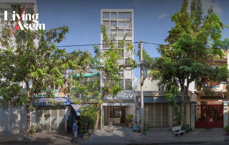
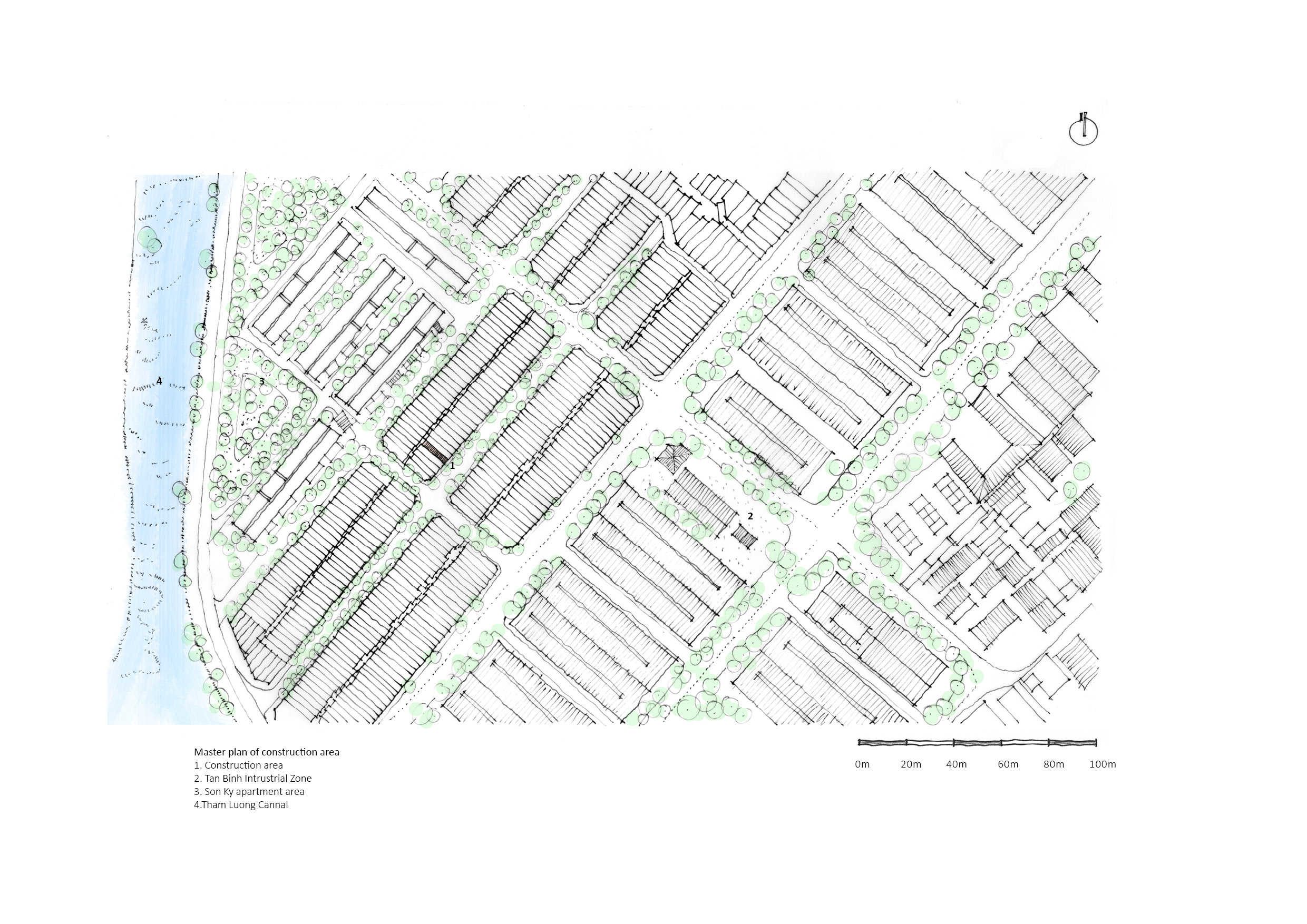
This three-story urban home belonging to a nuclear family is located in Binh Thanh, a district of Ho Chi Minh City, Vietnam. Needless to say, it’s an urban neighborhood characterized by overcrowding and lack of green spaces. That’s where architect Sanuki Daisuke comes into play and turns environmental challenges into a solution. The result is a home tailored to the small family’s specific needs, one that’s comfortable, well-lit and well-ventilated despite the problem of limited space.
urban home Ho Chi Minh City Vom House
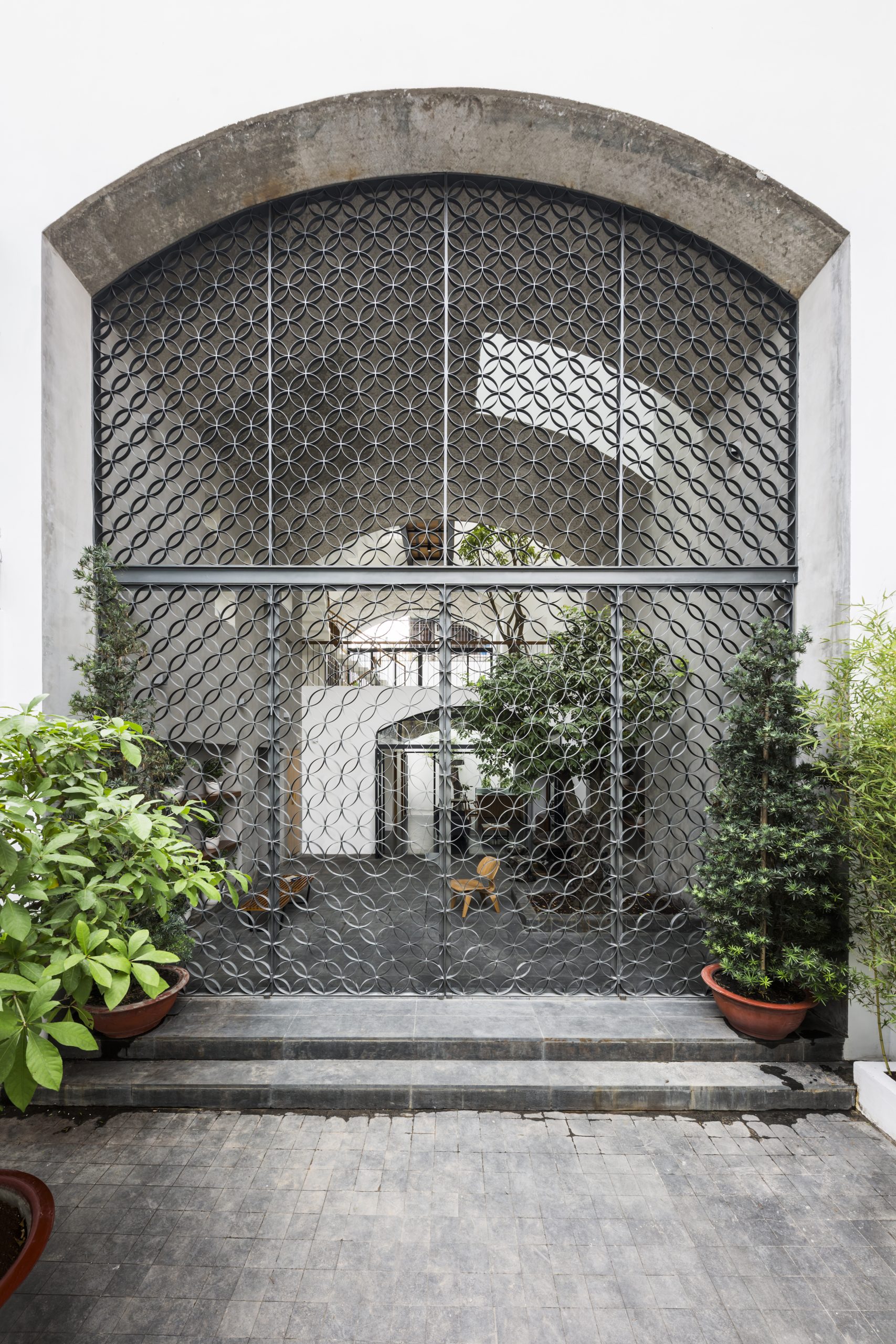
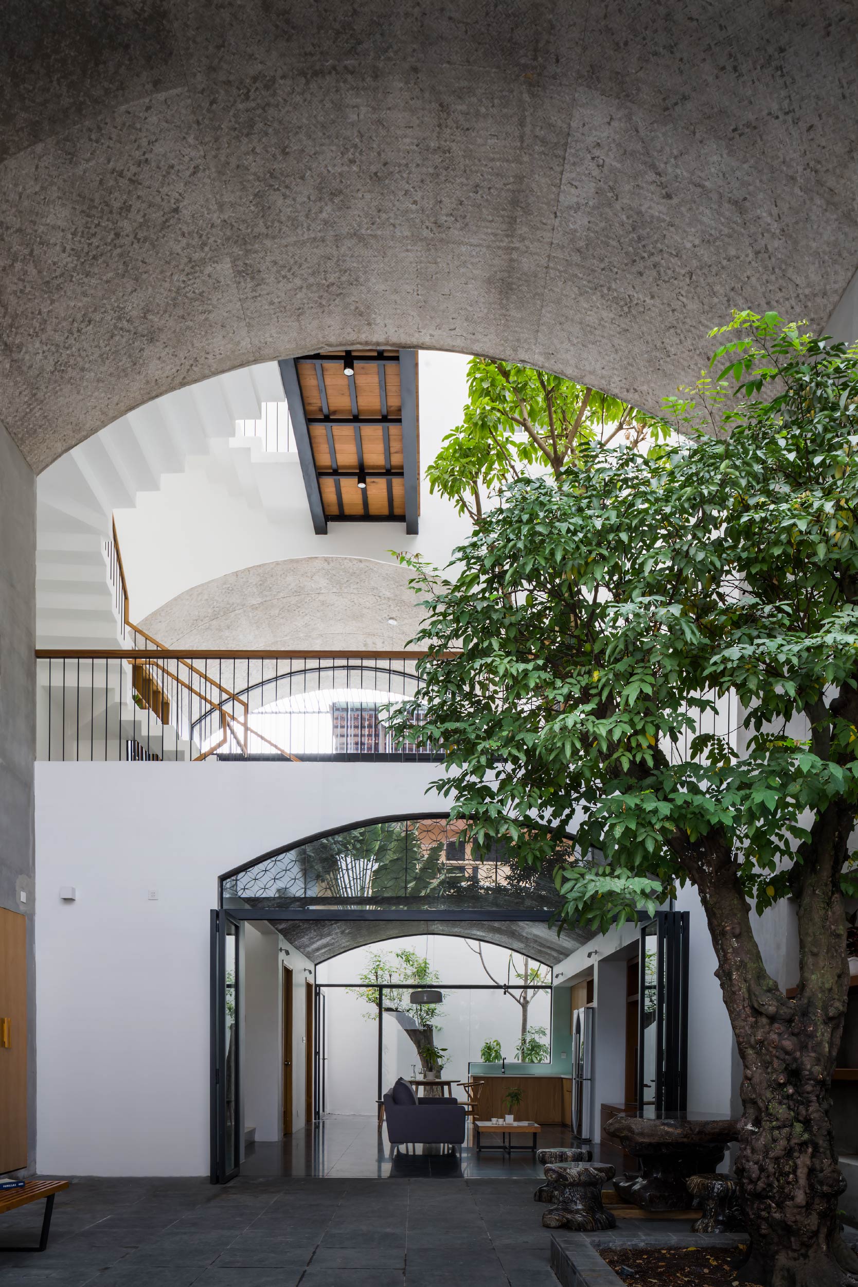
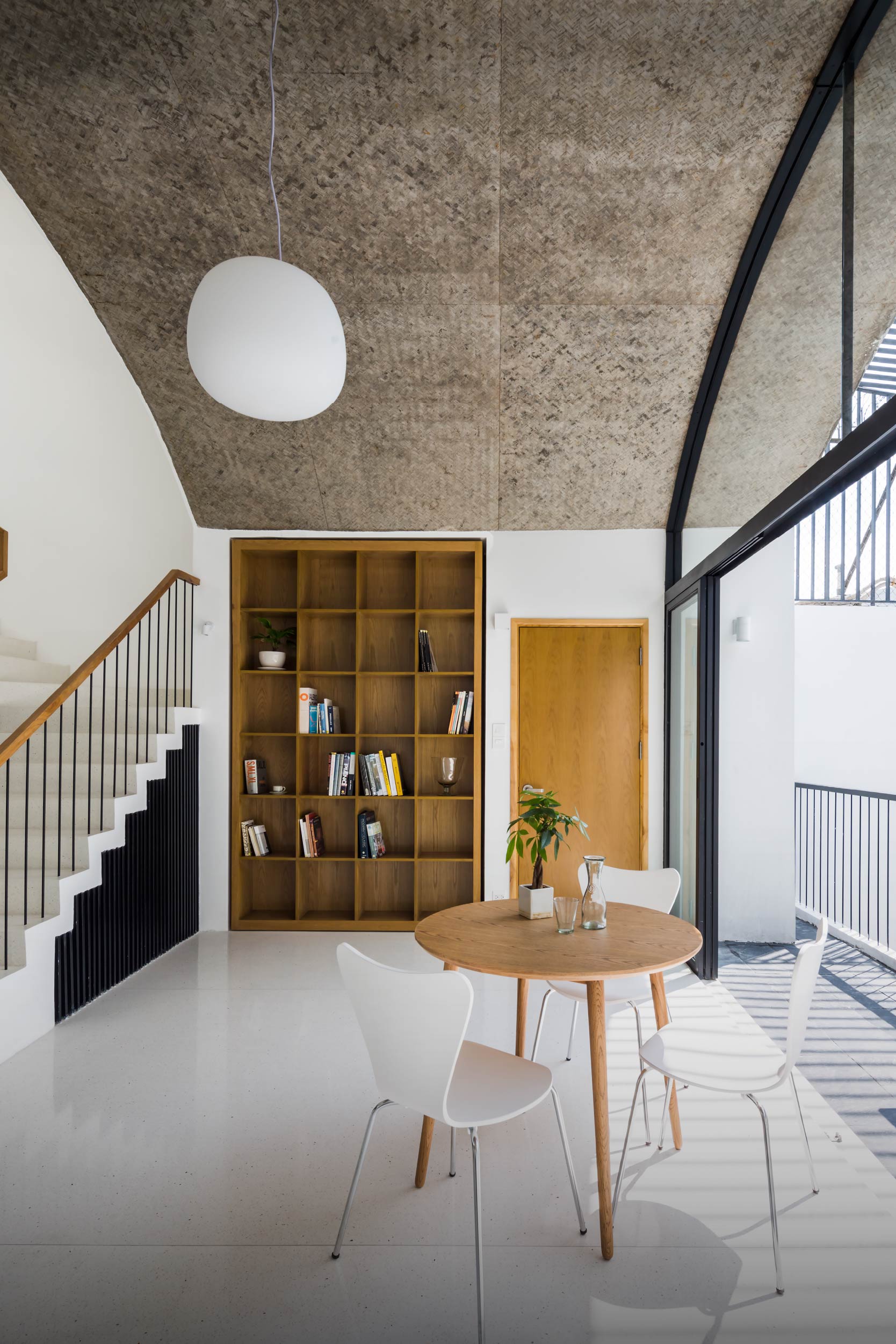
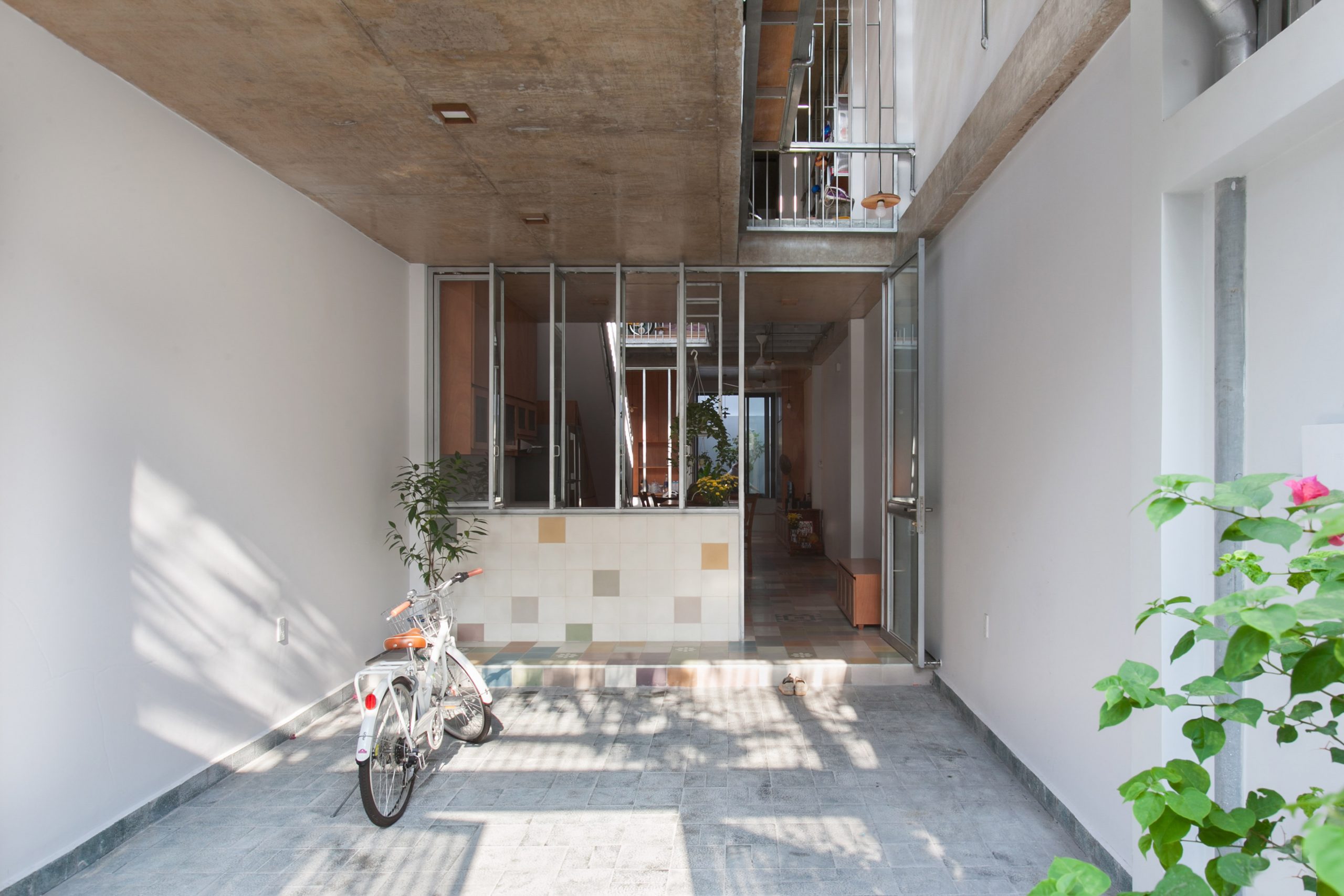
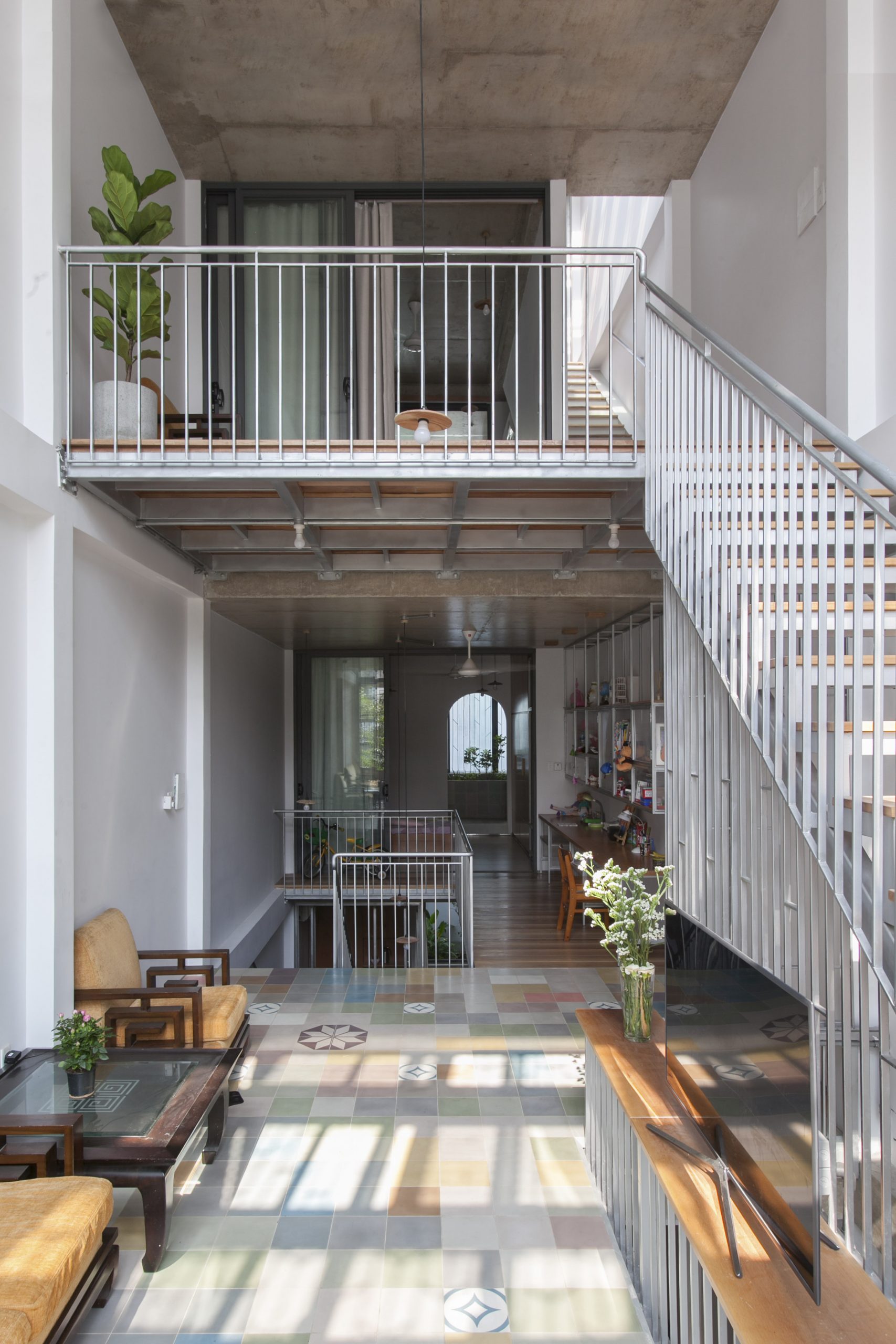
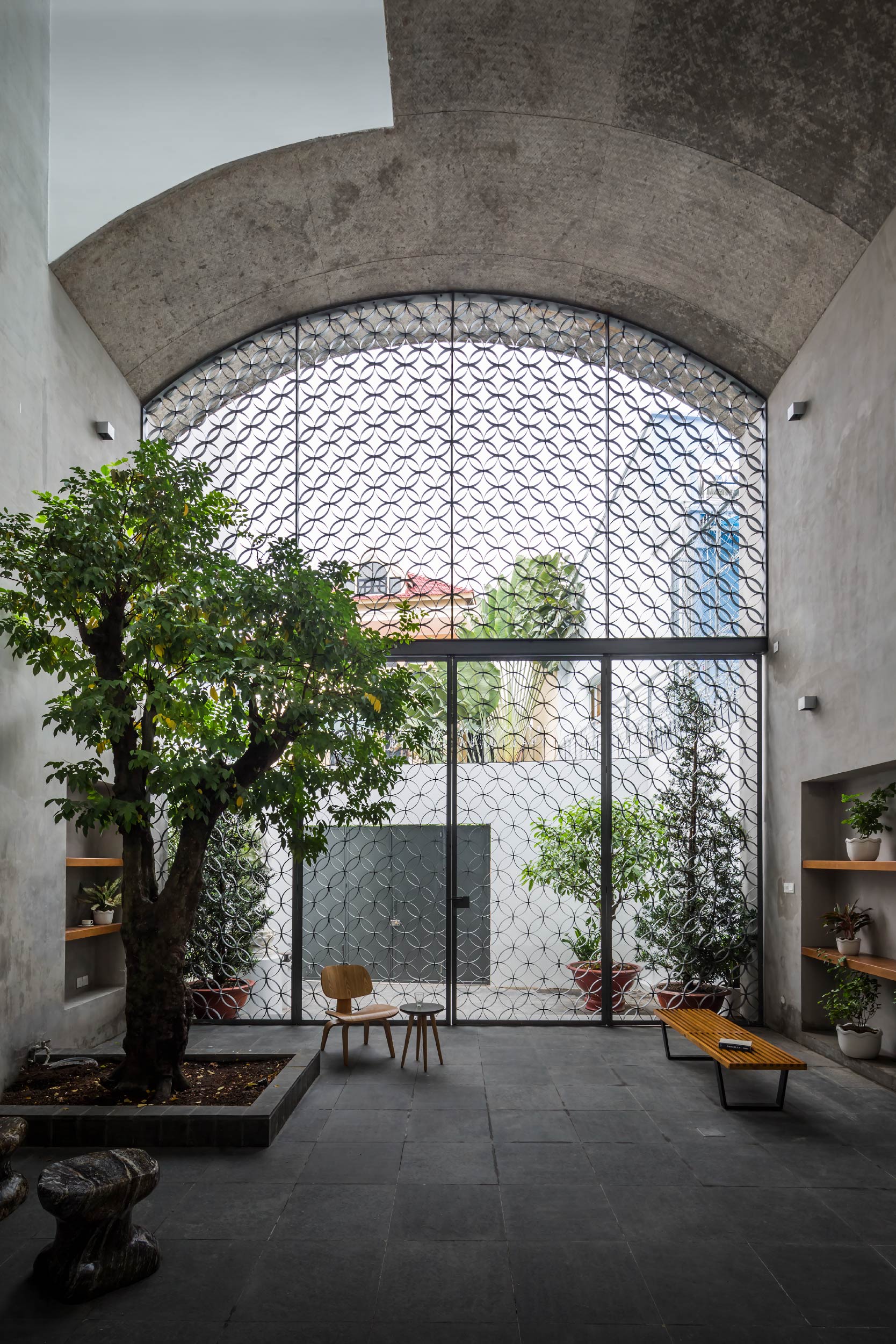
A massive curved ceiling of raw concrete has the most prominent position in the entryway holding a semi-outdoor sitting room. It’s separated from the front yard by a façade of decorative metalwork.

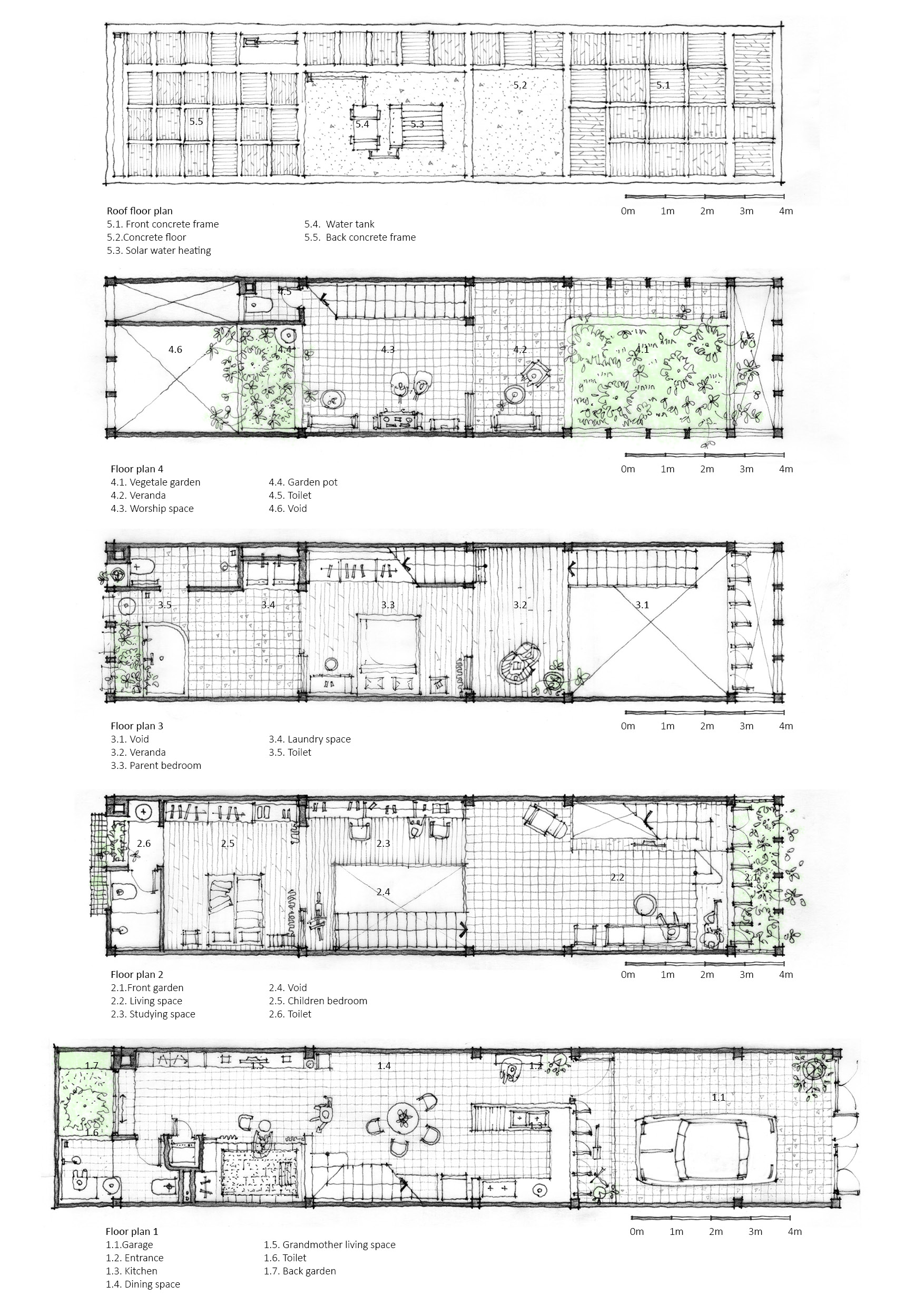
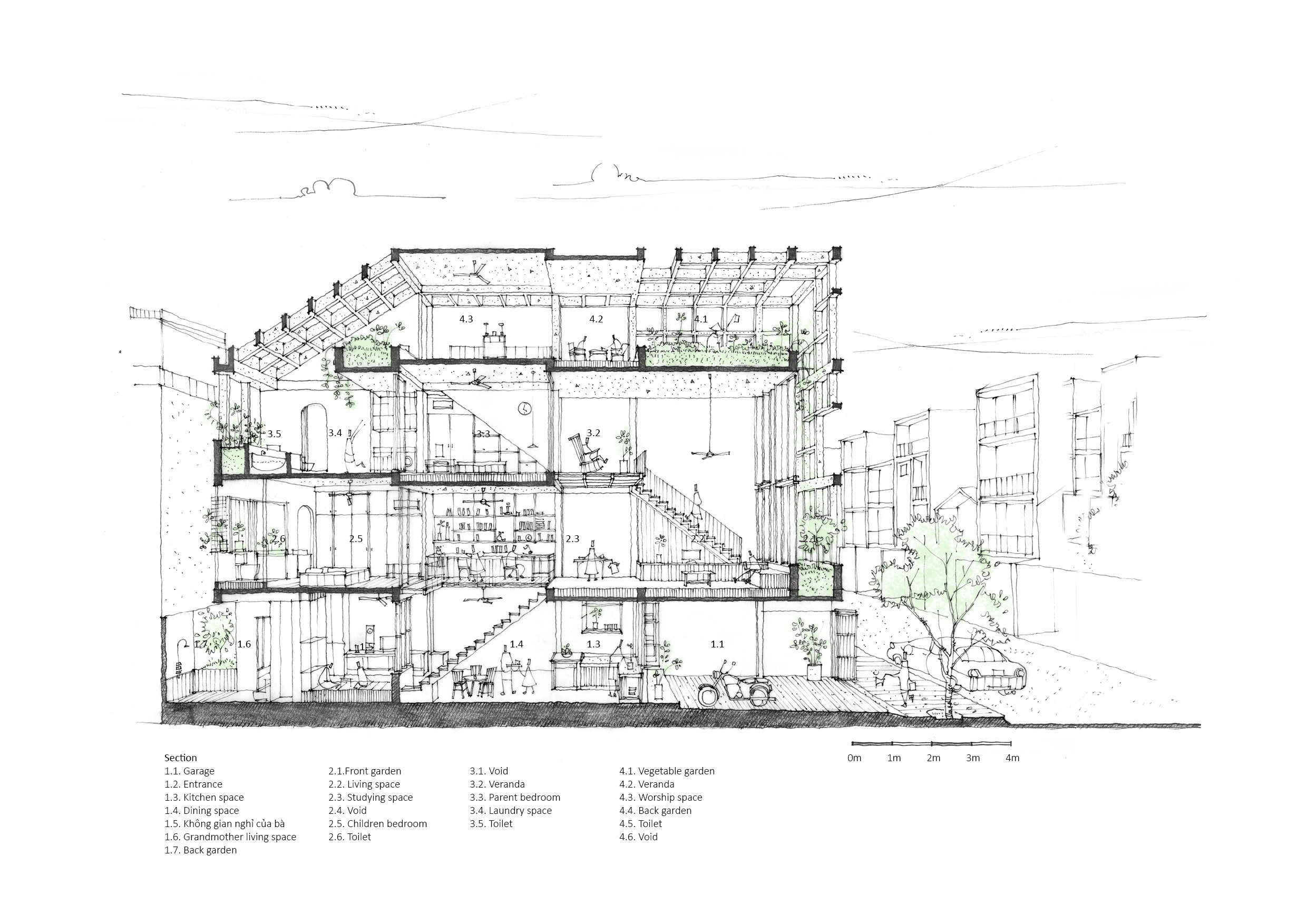
By design, the house’s public spaces are placed on the first and second floors. They consist of a semi-outdoor communal space that’s shared by all members of the family. There is a dining room, with reading nooks and green spaces nearby that open to bring natural daylight and fresh air into the home.

Meanwhile, the private spaces holding only two bedrooms are perfectly adequate for family needs. They are tucked away on the third floor that’s quiet and secluded. The rooms are made somewhat smaller than usual so as to increase the size of empty spaces in the home. For the most parts, Vietnamese homes tend to have more bedrooms as a way to accommodate visiting houseguests.
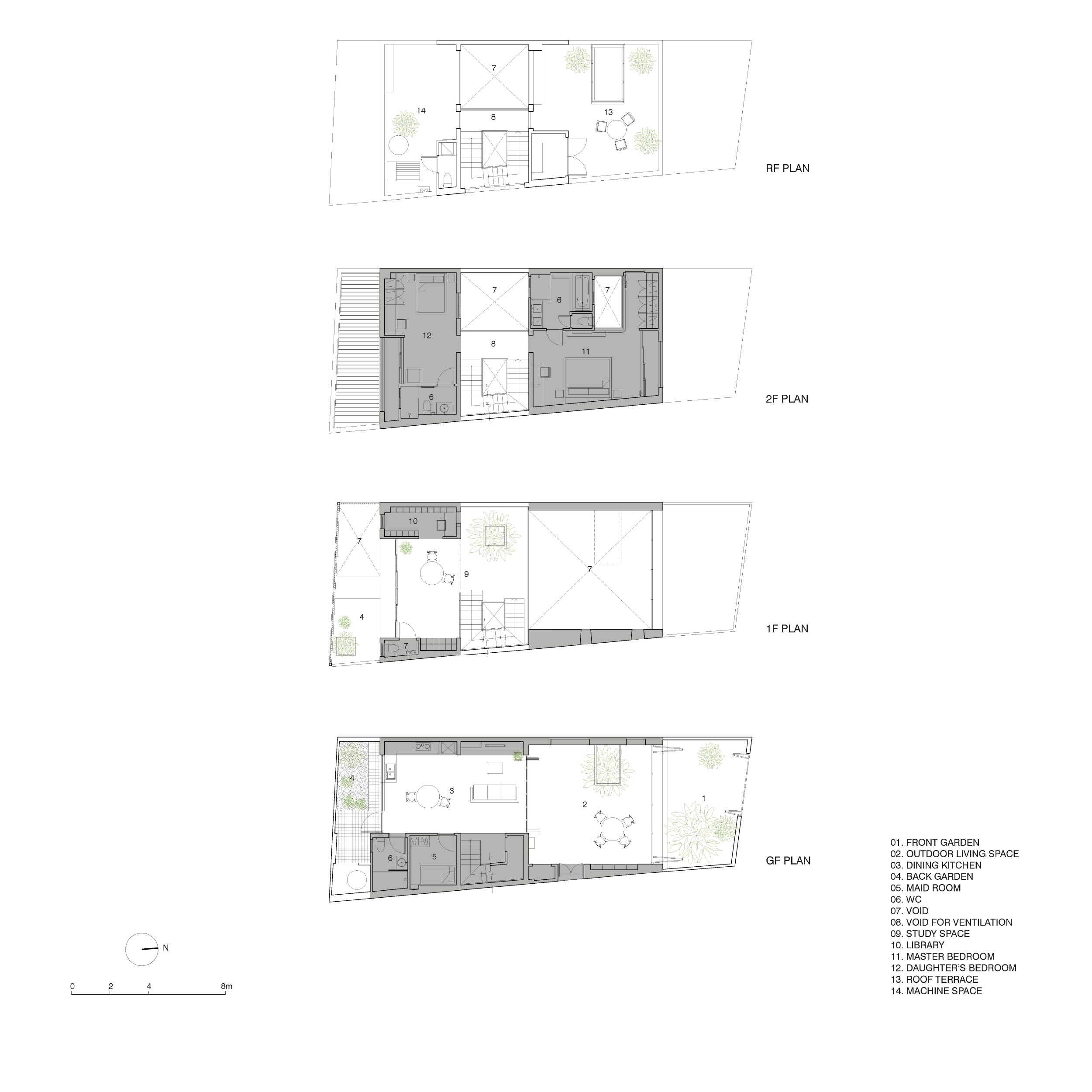
Drawings of the house plan illustrate space utilization ideas on every level, including the rooftop. / Courtesy of Sanuki Daisuke Architects


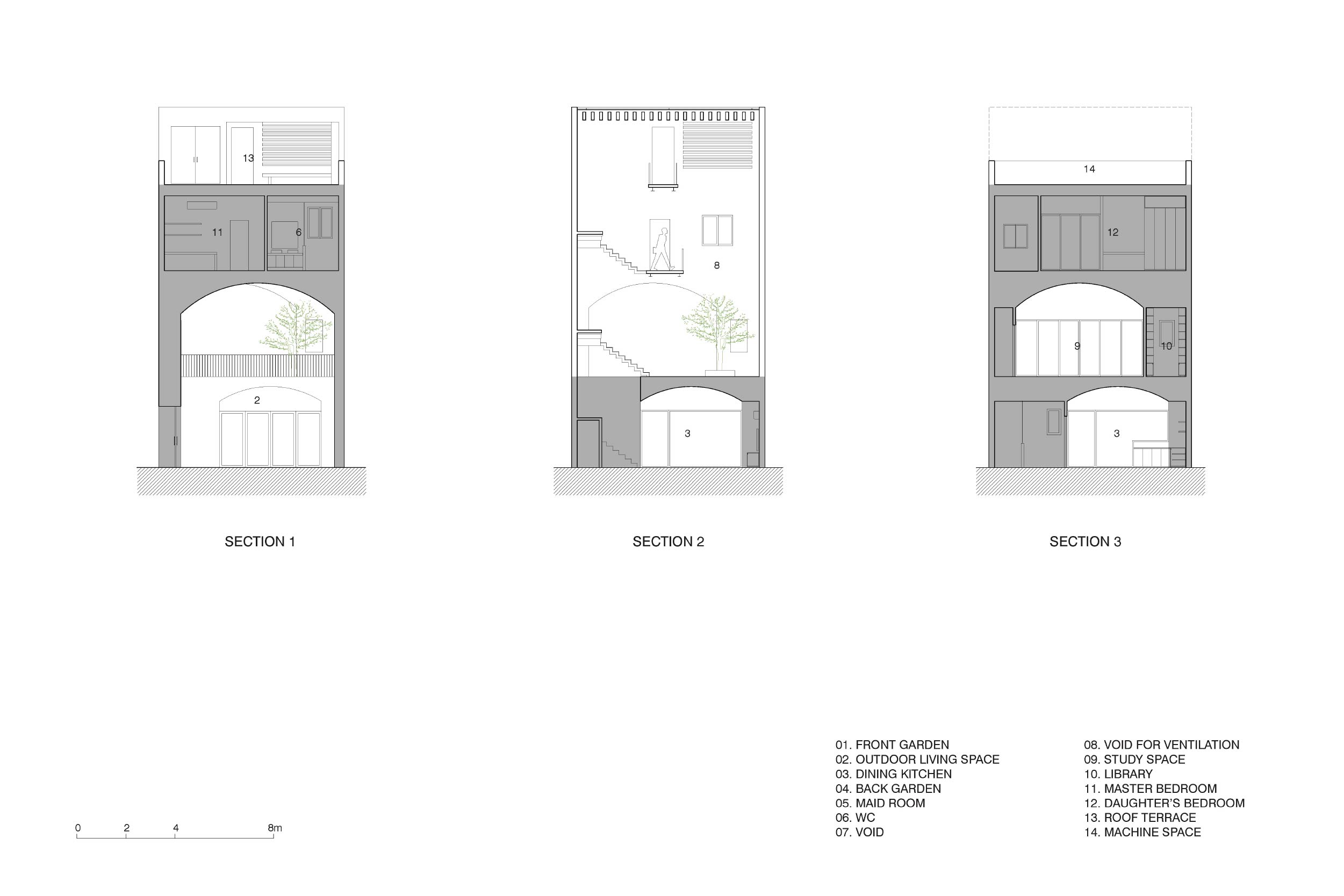
A trio of front elevation drawings shows how curved designs are integrated in different parts of the building. / Courtesy of Sanuki Daisuke Architects
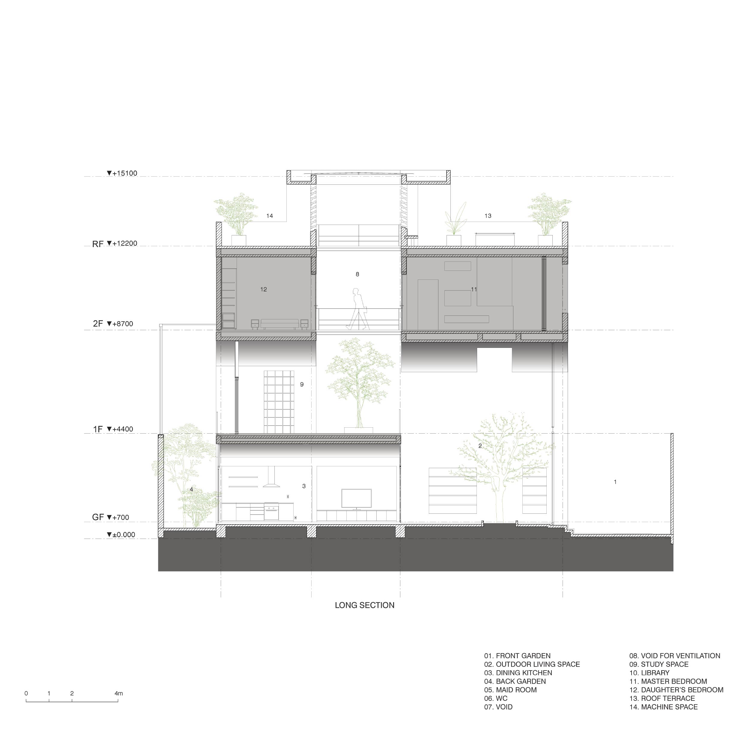
A side elevation drawing illustrates space utilization in relation to openings in the wall and rooftop designed to admit daylight and provide natural ventilation. / Courtesy of Sanuki Daisuke Architects
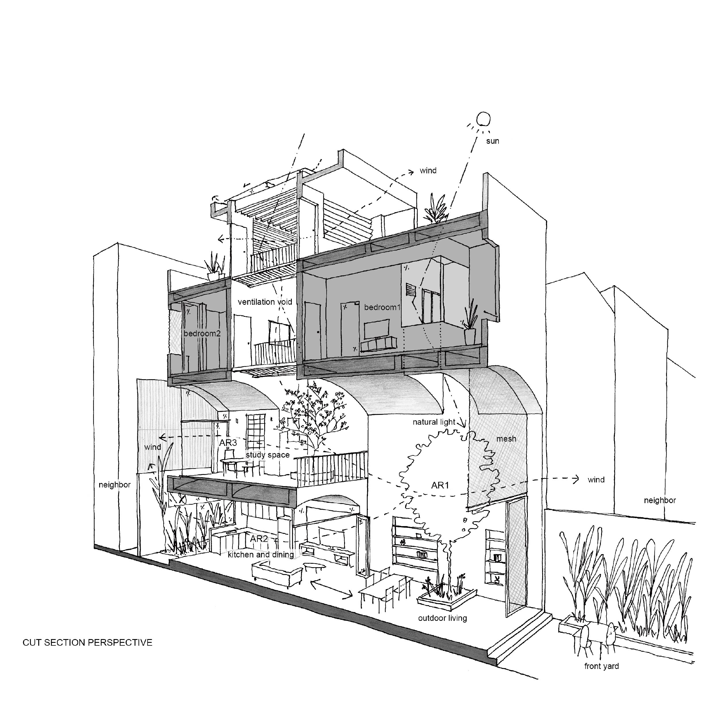
A perspective drawing in cross section shows the integration of curved ceilings in the design of the second floor. / Courtesy of Sanuki Daisuke Architects
urban home Ho Chi Minh City Vom House
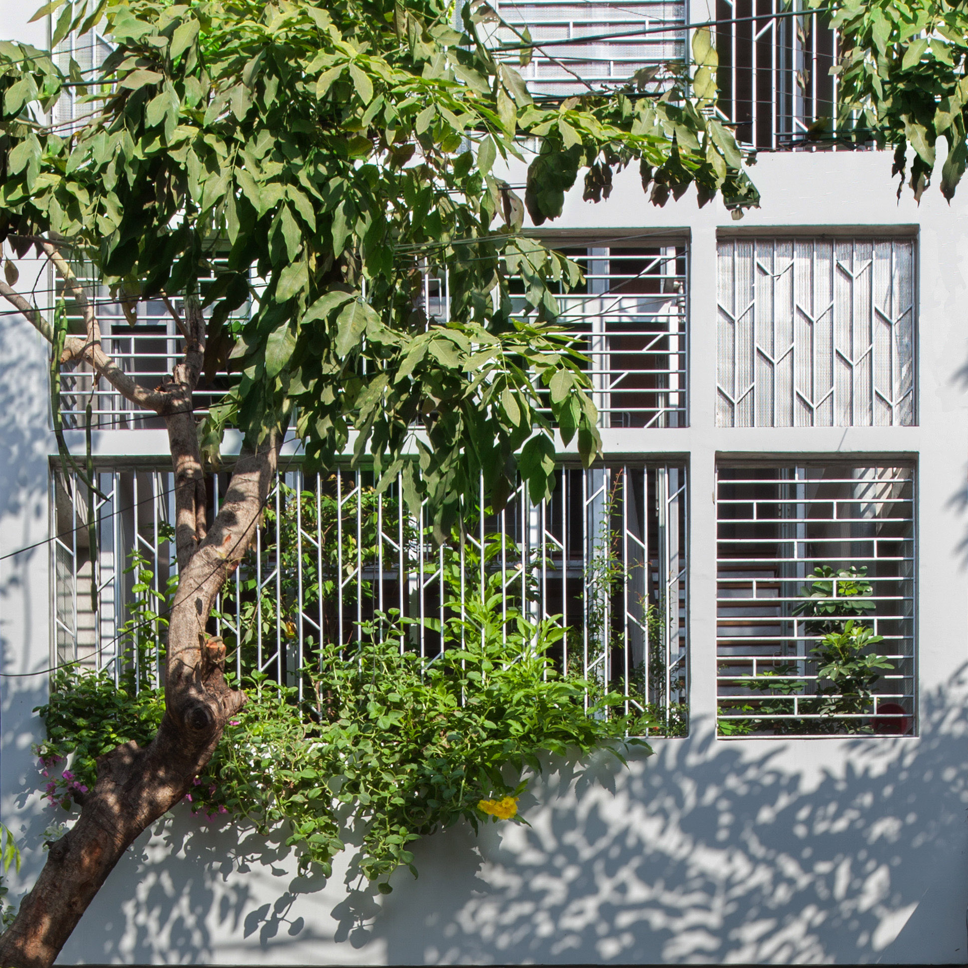
The front door and house façade of perforated metalwork beautifully merge to form a cohesive unit. In combination, they open to admit light and provide natural ventilation to the home.

urban home Ho Chi Minh City Vom House

urban home Ho Chi Minh City Vom House
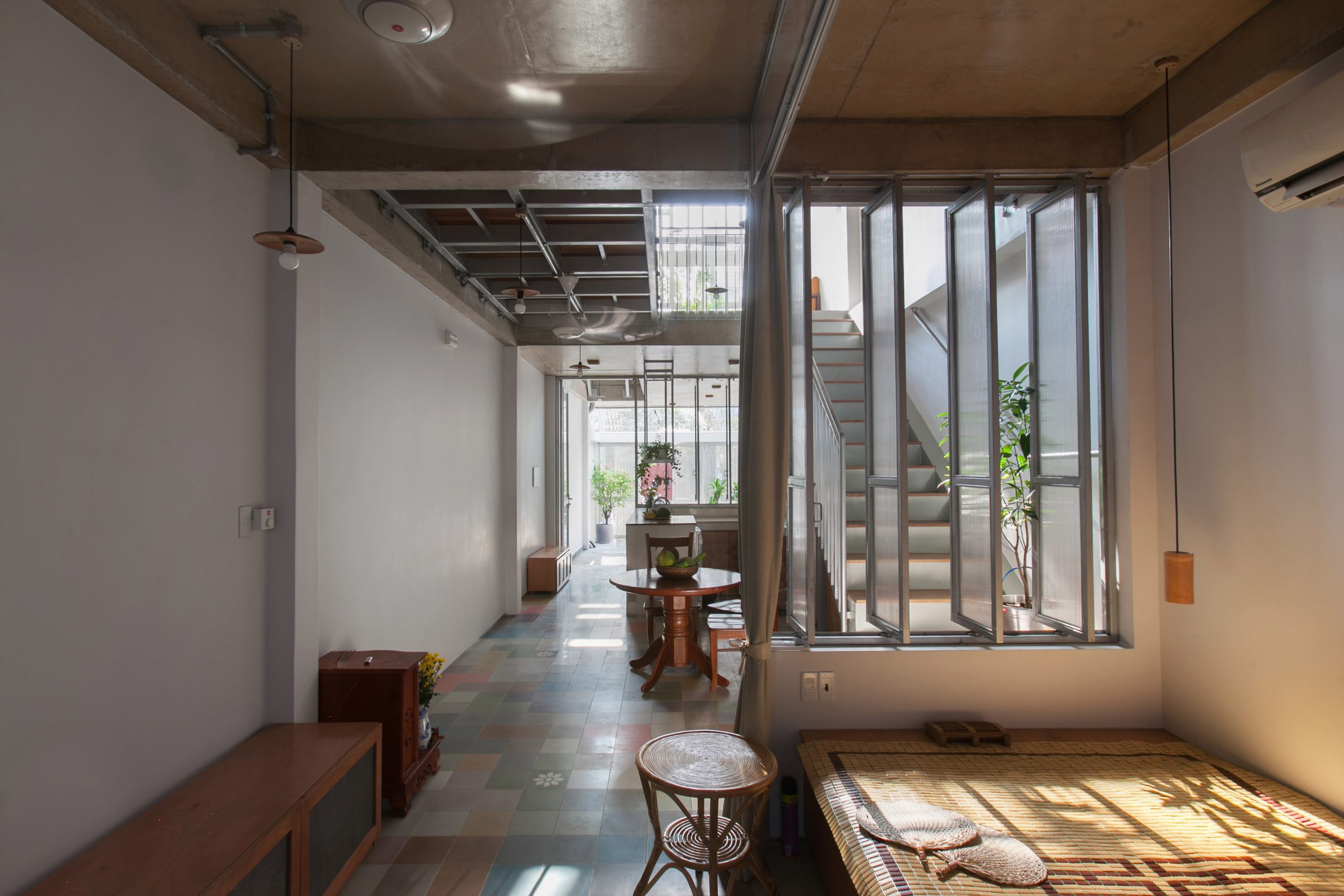
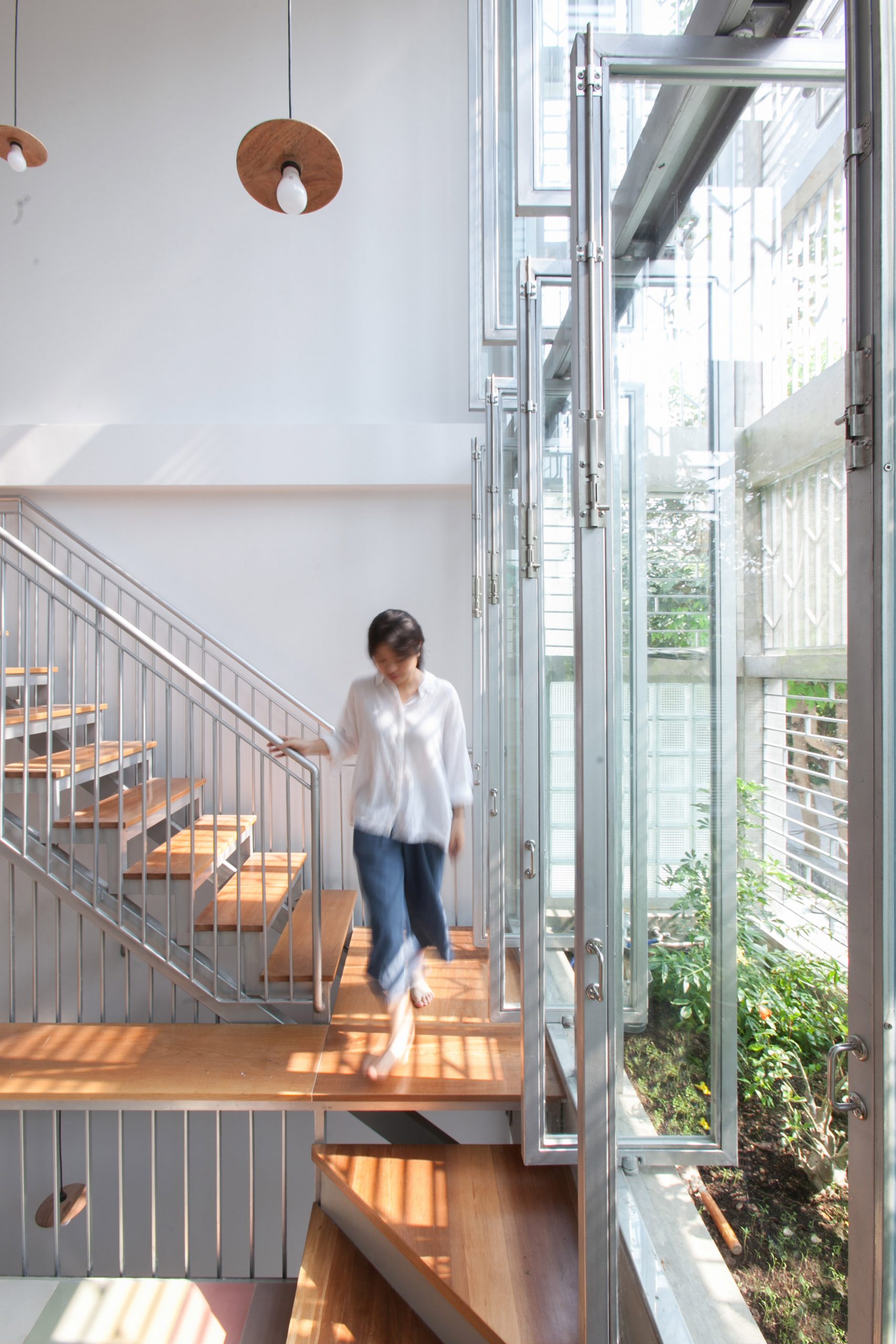
A folding door system opens wide from one end to the other admitting daylight and providing natural ventilation to keep the home cool.
urban home Ho Chi Minh City Vom House
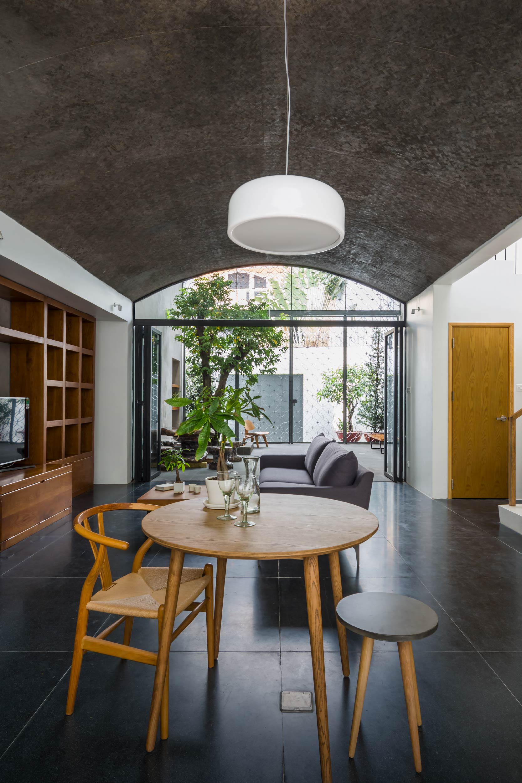
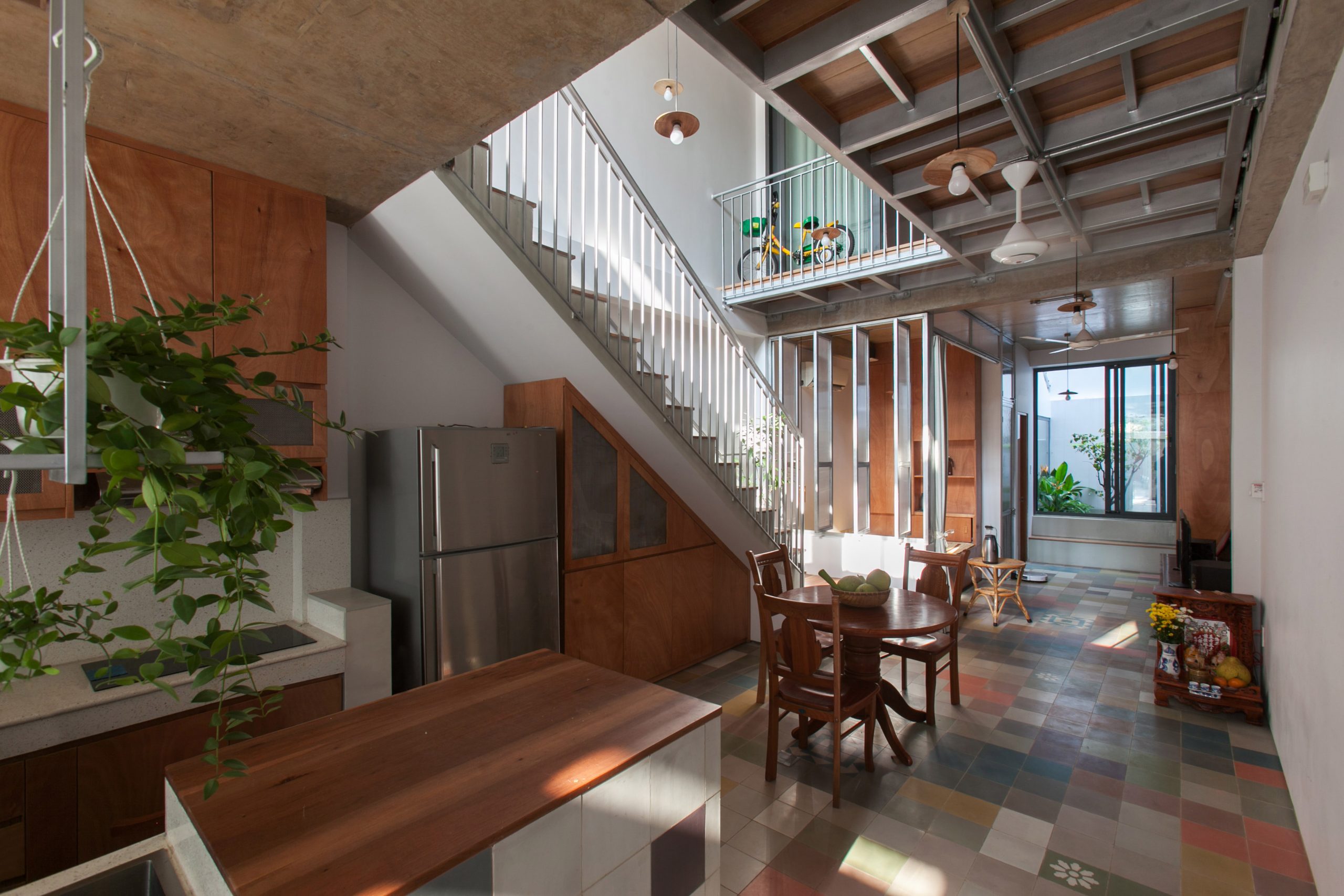
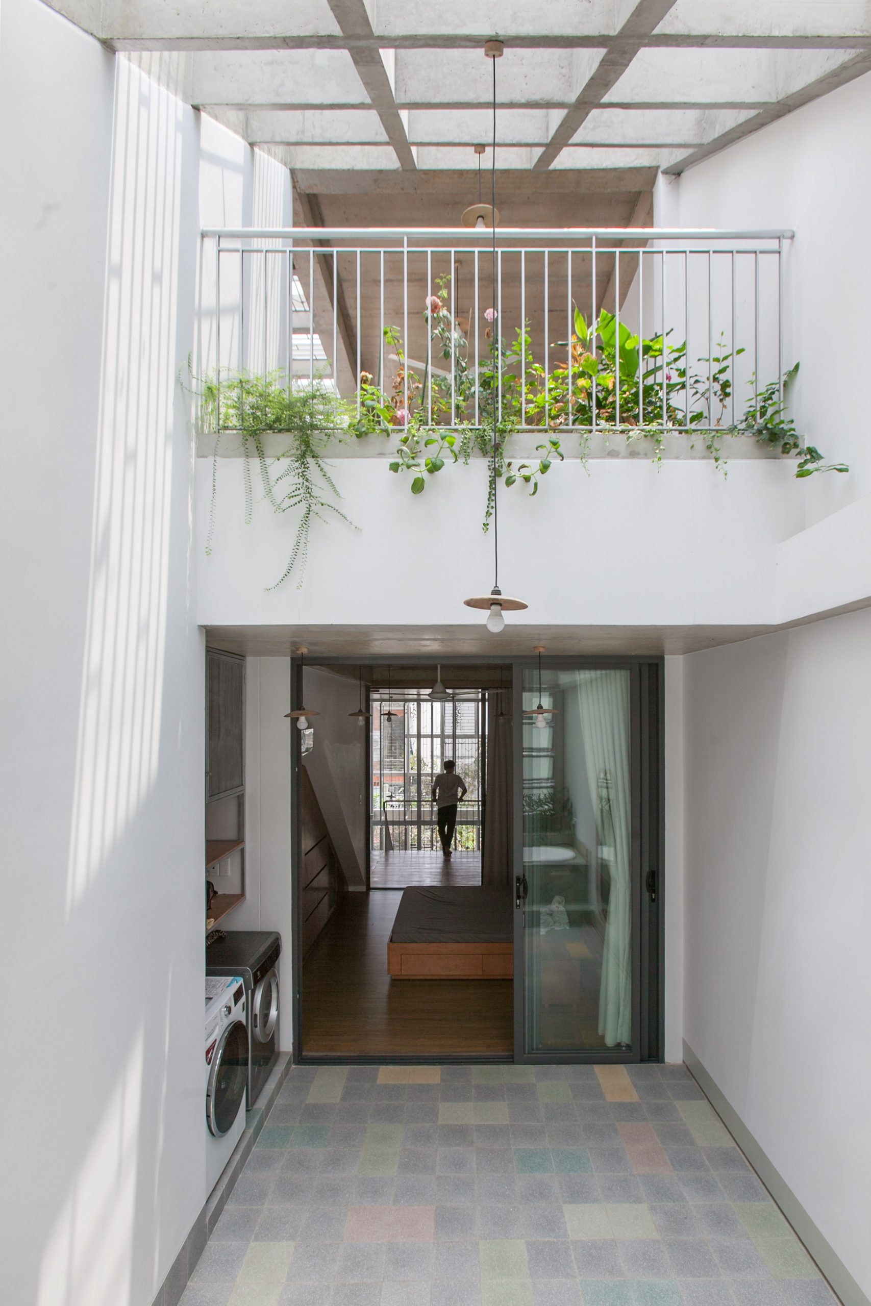
The entryway up front can be seen in full view from inside the dining room and sitting room at the rear.
An open floor plan makes the first floor feel larger, giving a feeling of comfort, warmth and relaxation.

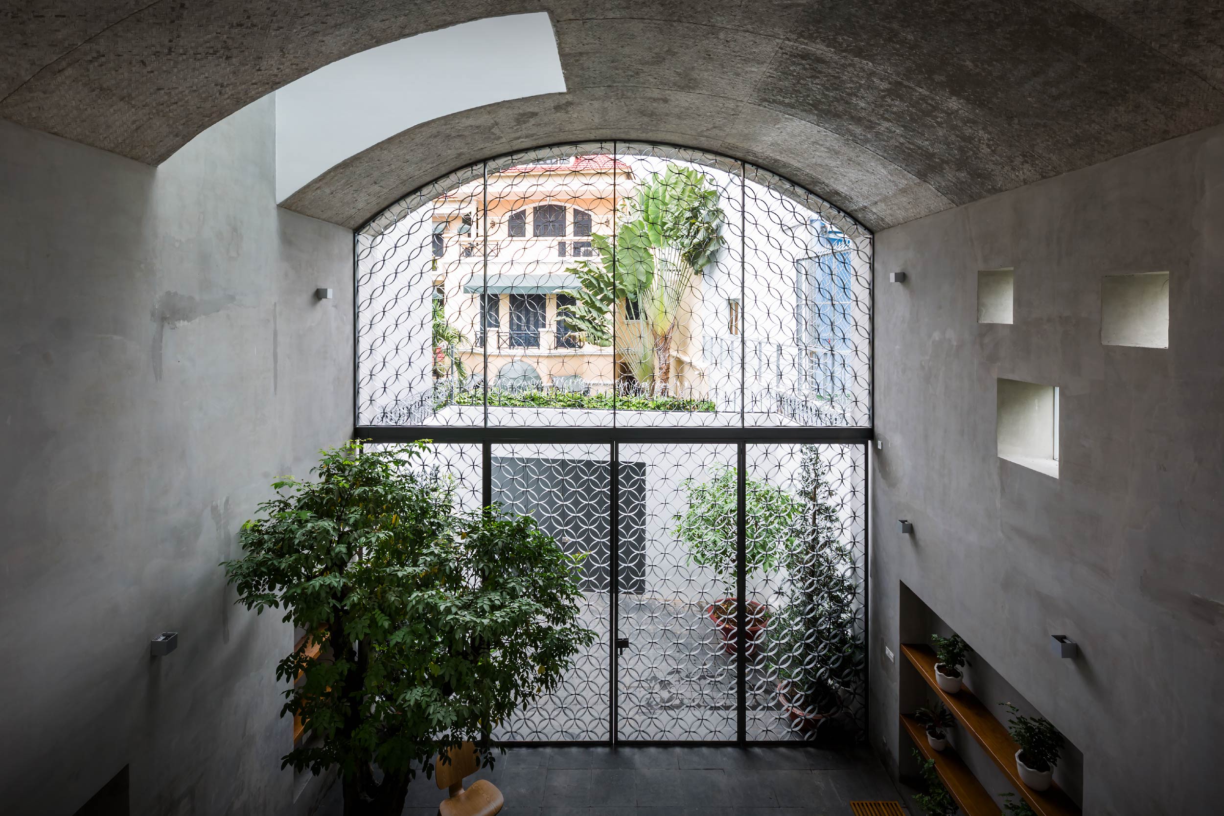
Up front, the first floor holds a sunlit courtyard beneath a distinct curvature that bears some resemblance to an underground chamber in a hillside. At the same time, high ceiling design makes the entry area look so inviting.

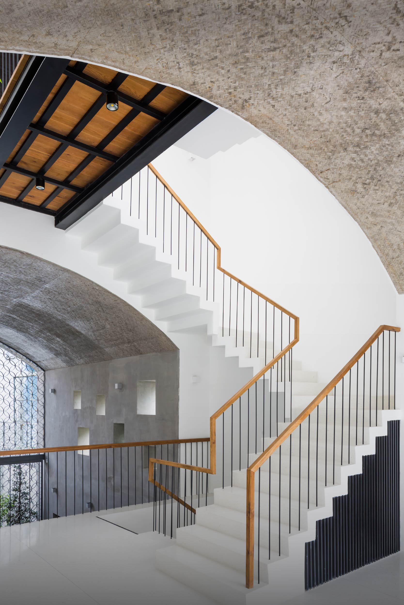
The rounded contour, also known as “vom” in Vietnamese, serves a dual purpose. It creates good visual flow between the first and second floors, while providing a passage leading to rooms and functional spaces in the home.
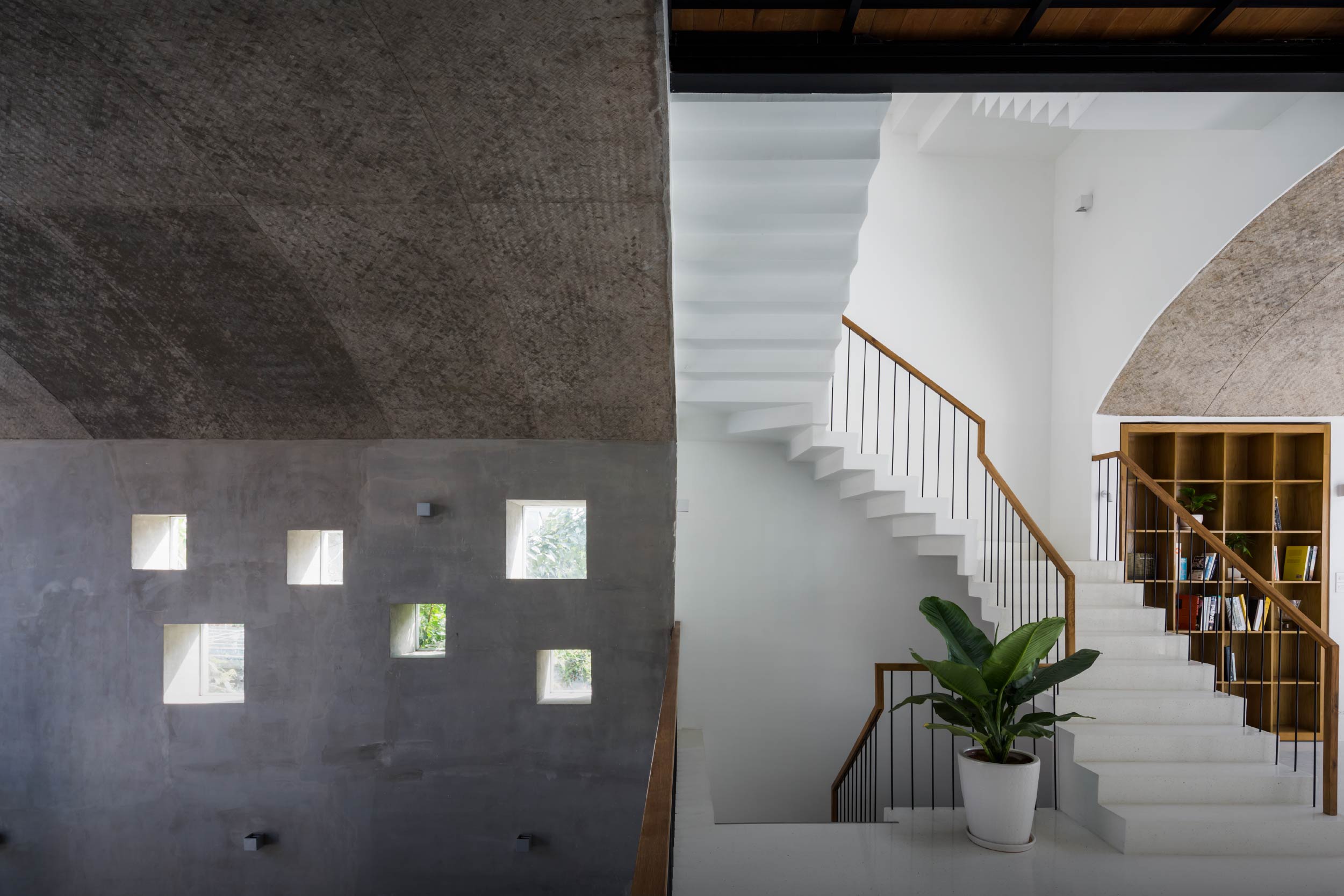
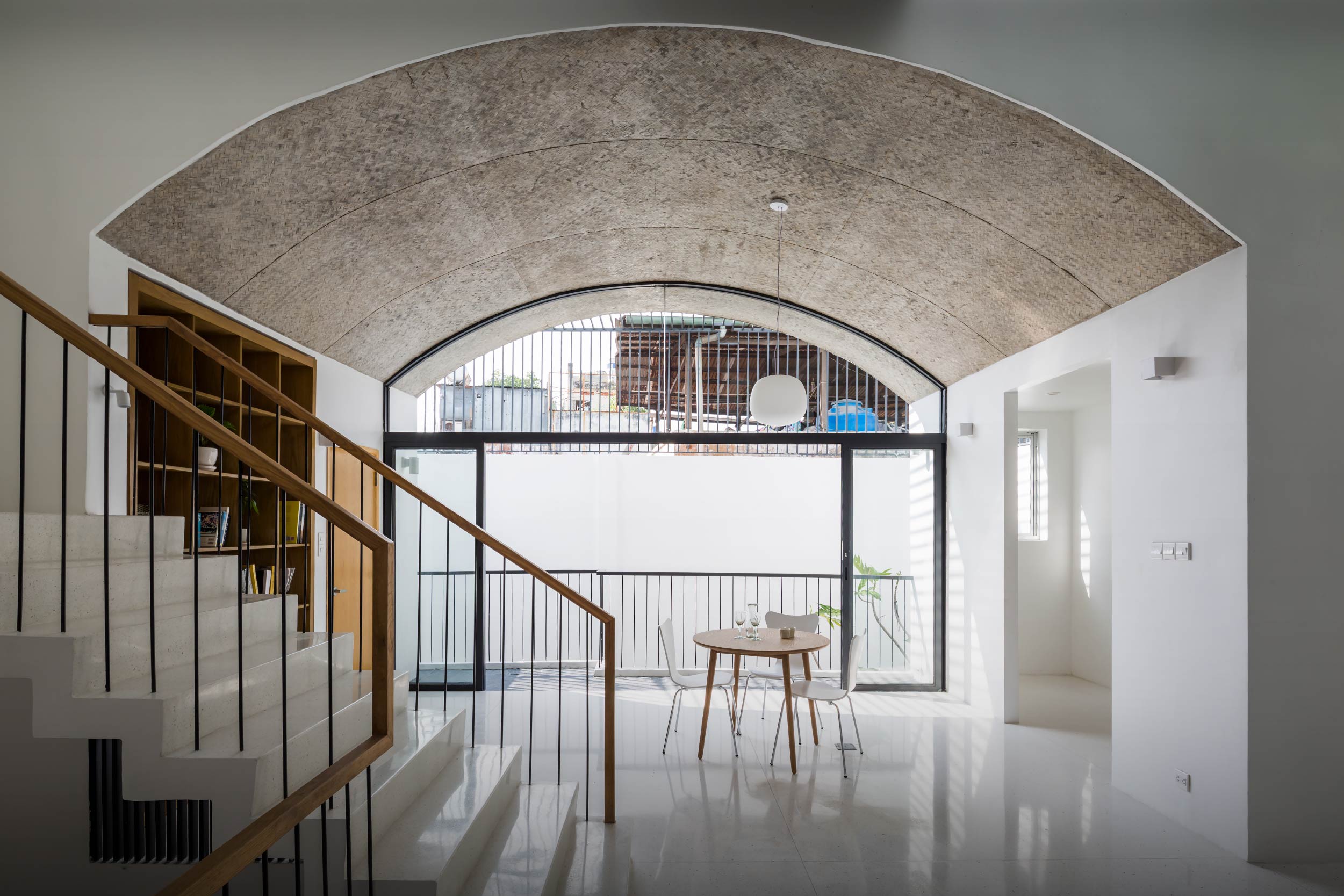
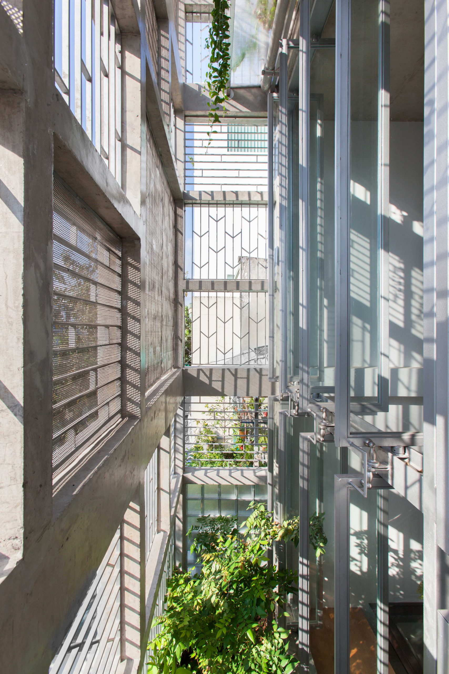
Small openings in various sizes at the top of a wall keep the second floor well-lit and well-ventilated.

urban home Ho Chi Minh City Vom House

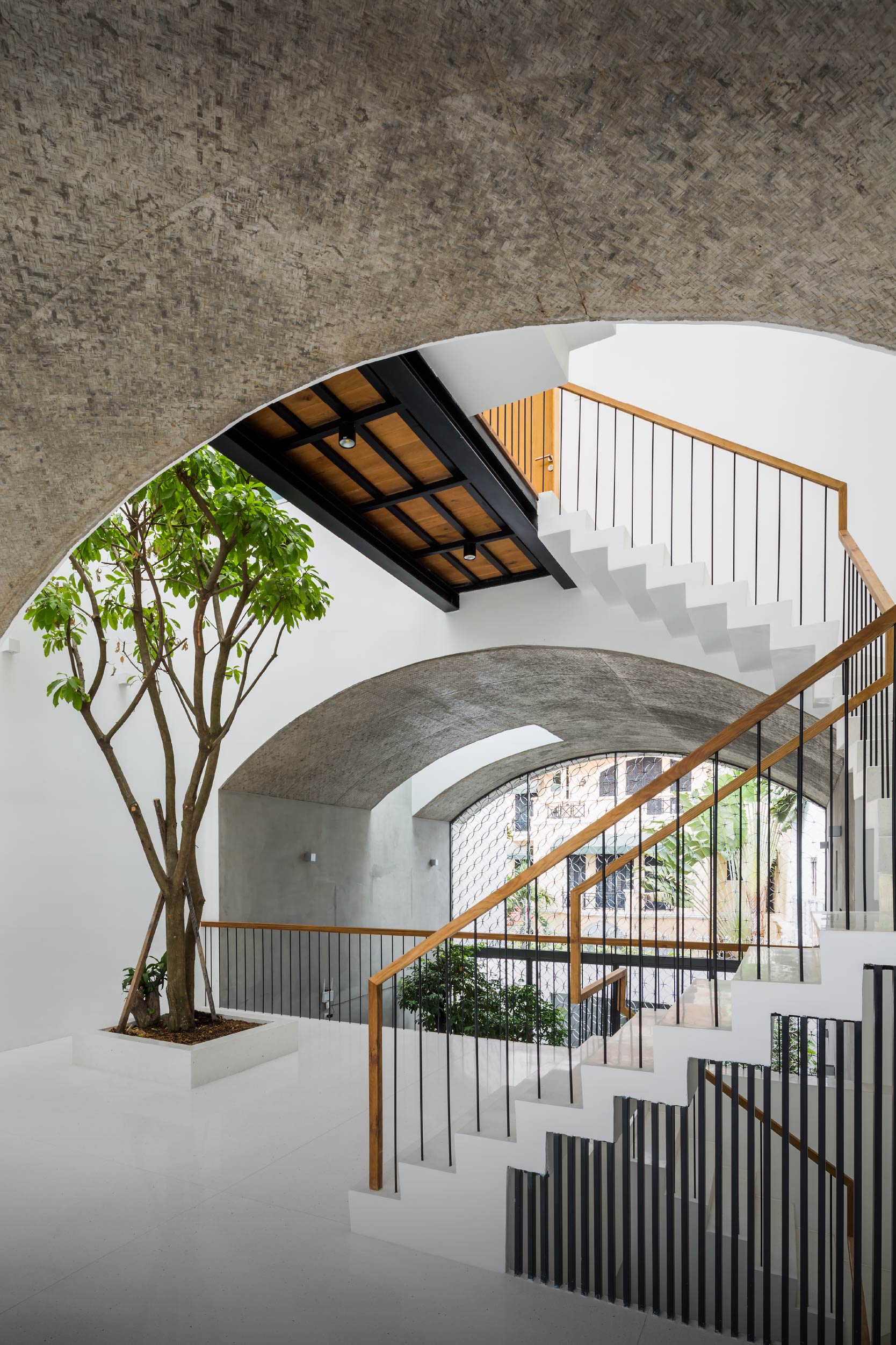
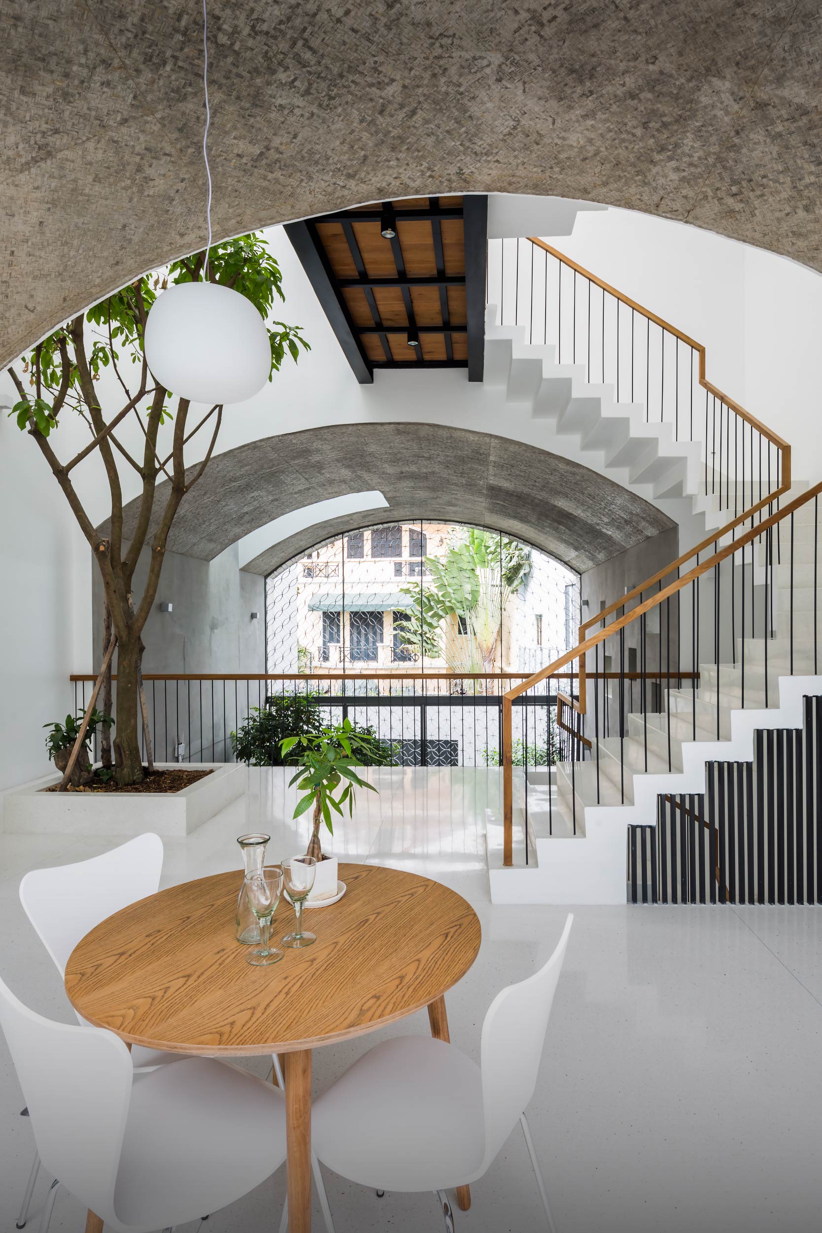
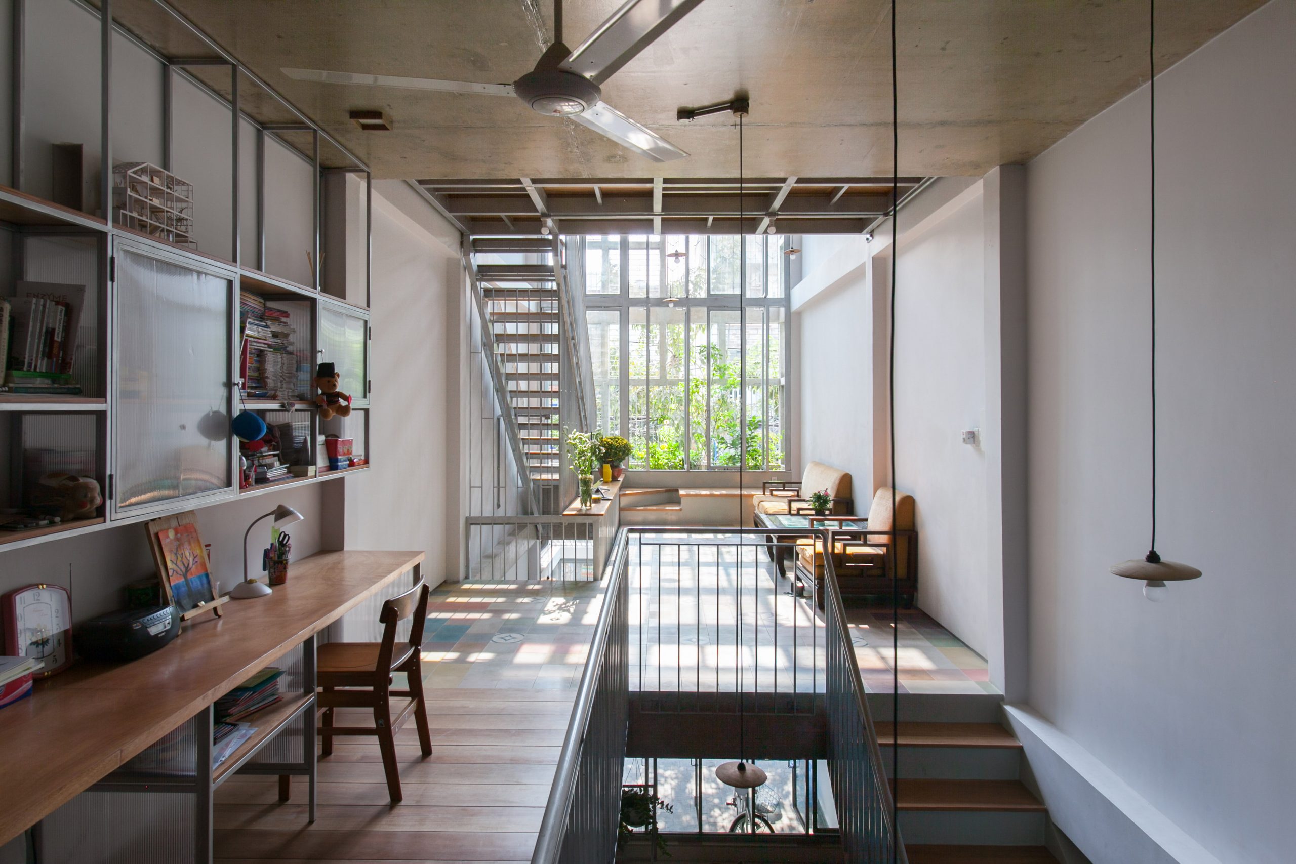
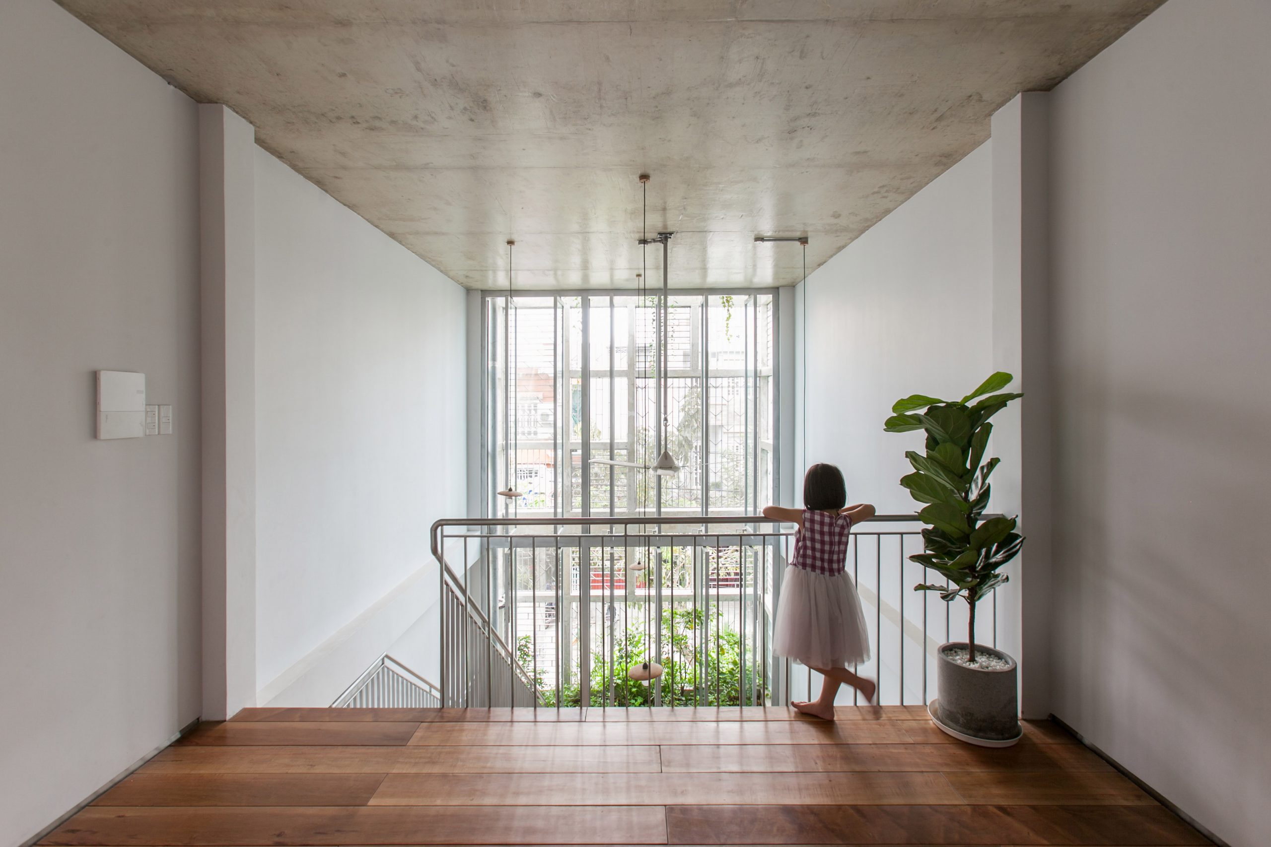
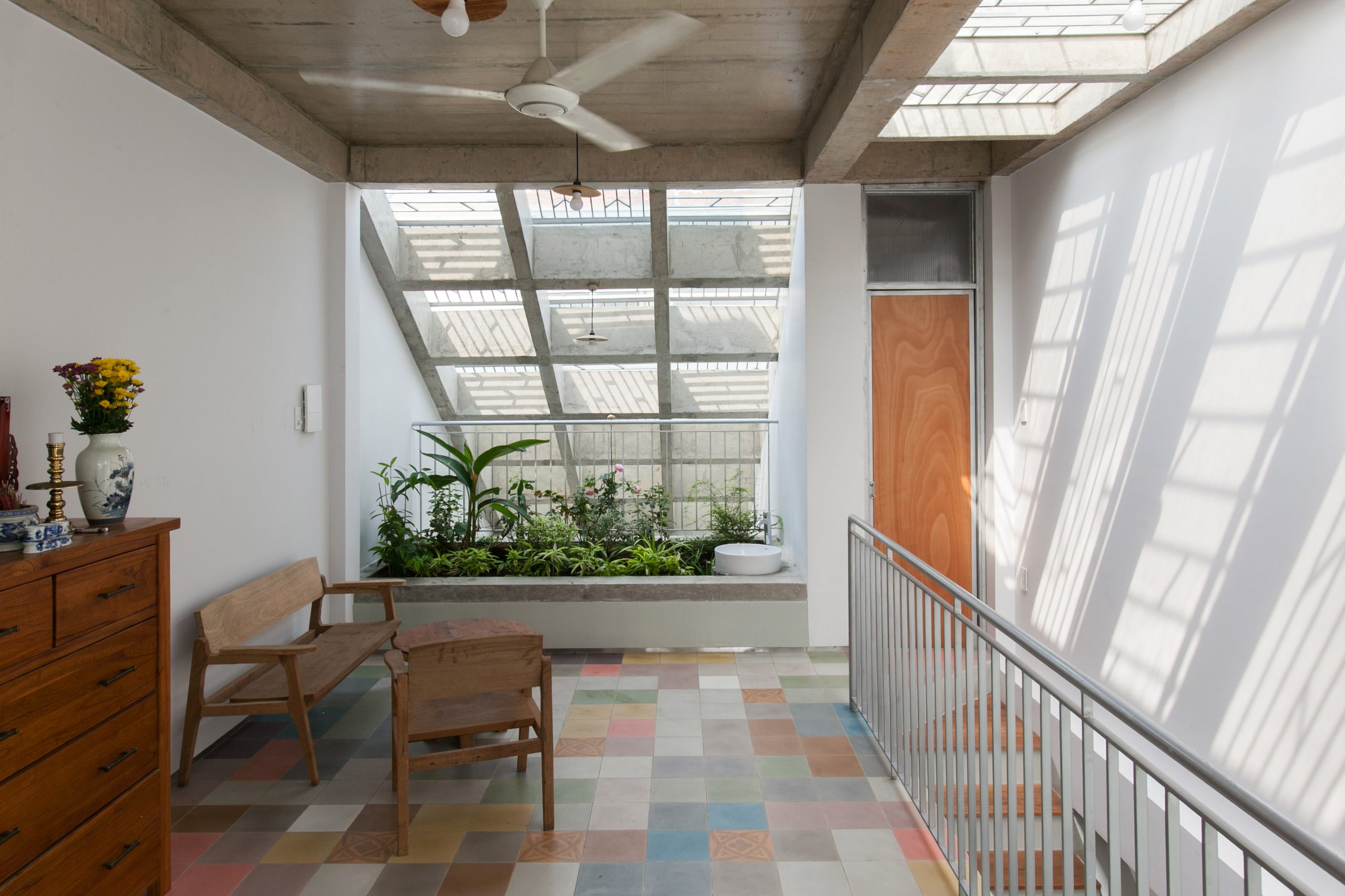
Curving contours, or “vom” in Vietnamese, take pride of place in the sitting room and reading nook on the second floor. Together they create good visual flow connecting all the rooms in the home.
urban home Ho Chi Minh City Vom House
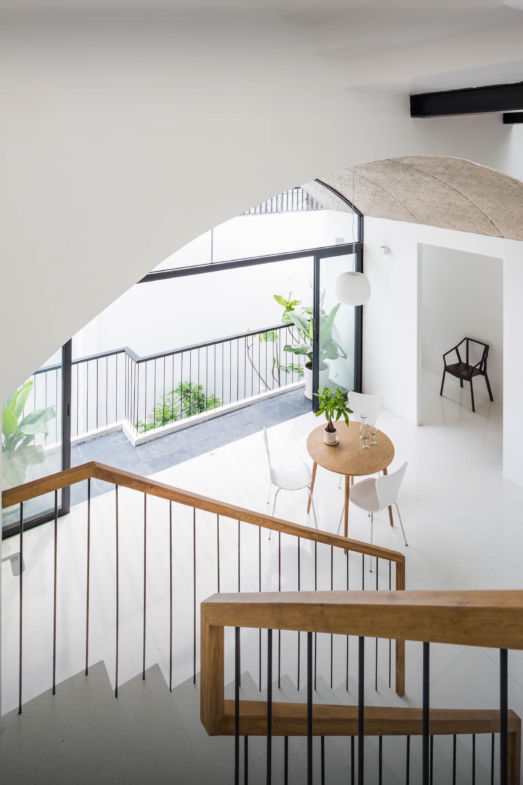
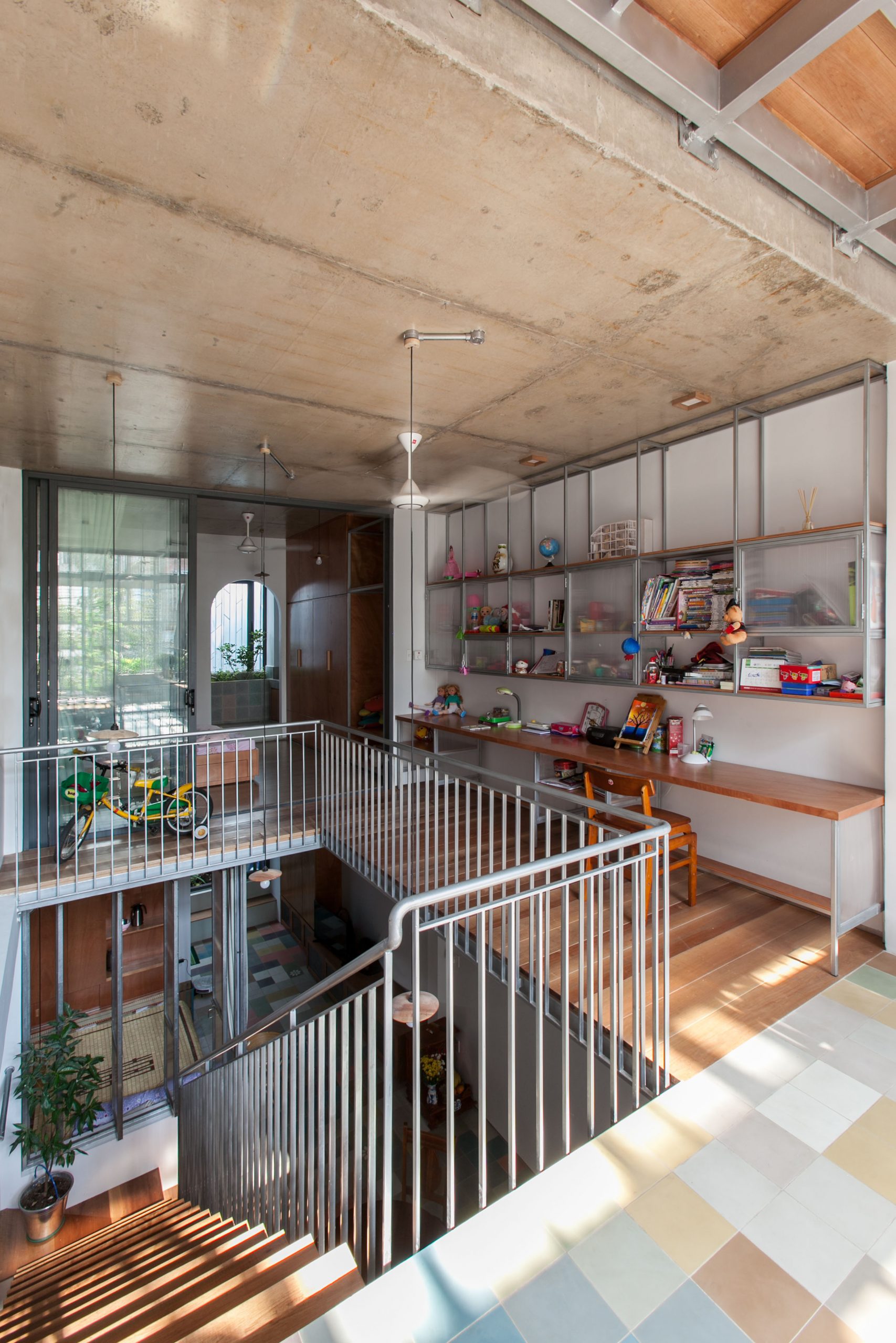
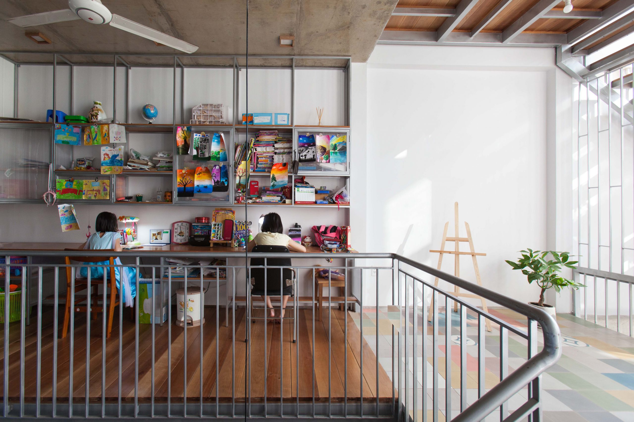
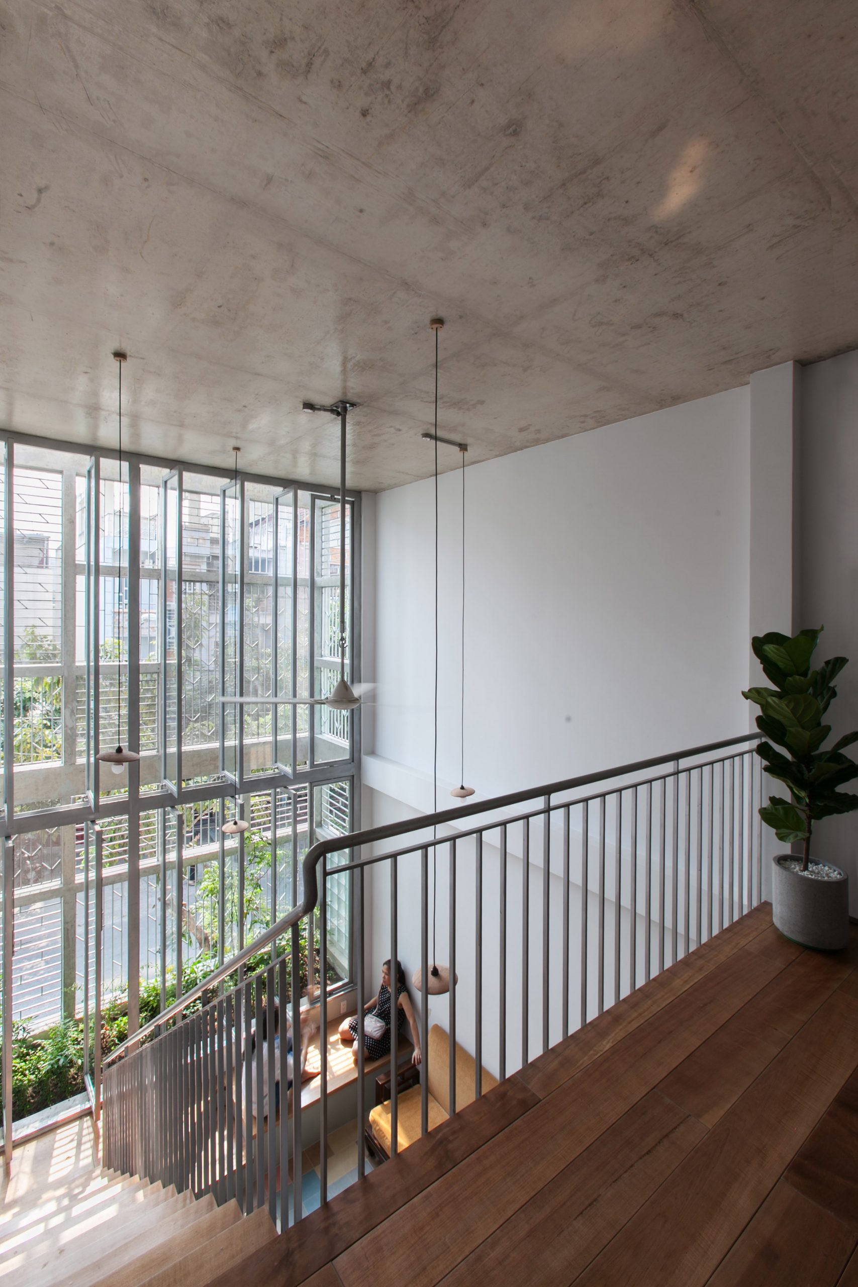
A relaxing reading nook on the second floor is illuminated by reflected sunlight, while natural ventilation keeps the interior cool and comfortable.
An ample amount of space on the second floor and nearby stairway promotes natural ventilation in the house.

Extending directly beneath the curving contour, the house façade of perforated metalwork separates the front yard from a sitting room at the front. It’s designed to admit daylight and provide controlled natural ventilation to the home.

The sitting room is connected to a kitchen and dining room nearby via a folding door system that opens wide from one end to the other. From here, the reading nook on the second floor is clearly visible under the double height curved ceiling. Taken as a whole, the interior is cool and comfortable thanks to fresh, outdoor air coming in through the front door.
urban home Ho Chi Minh City Vom House

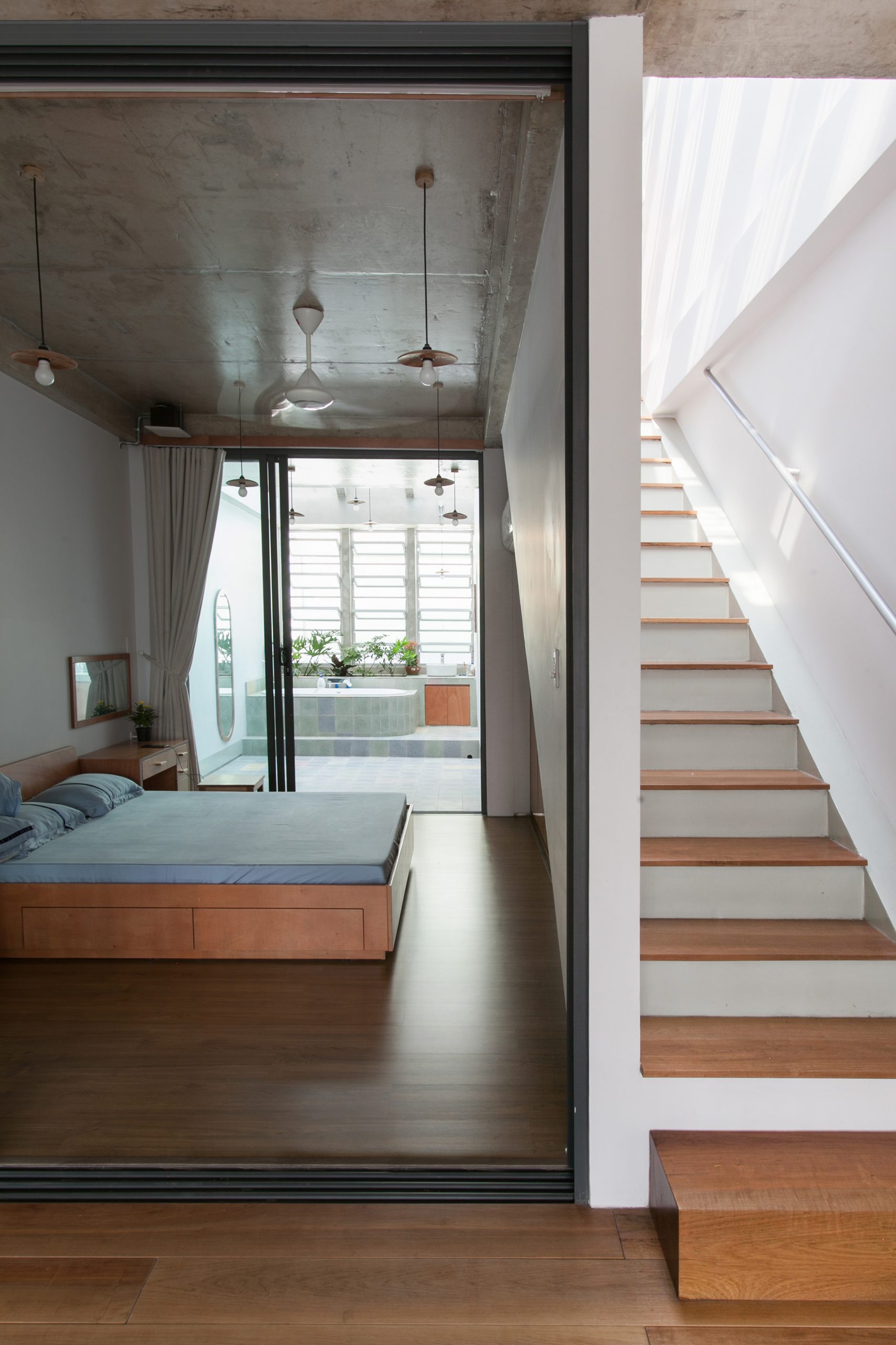
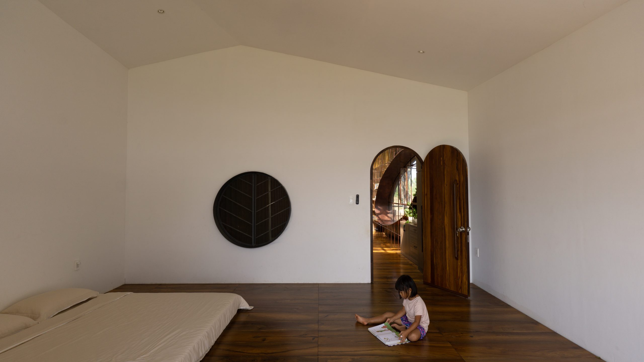
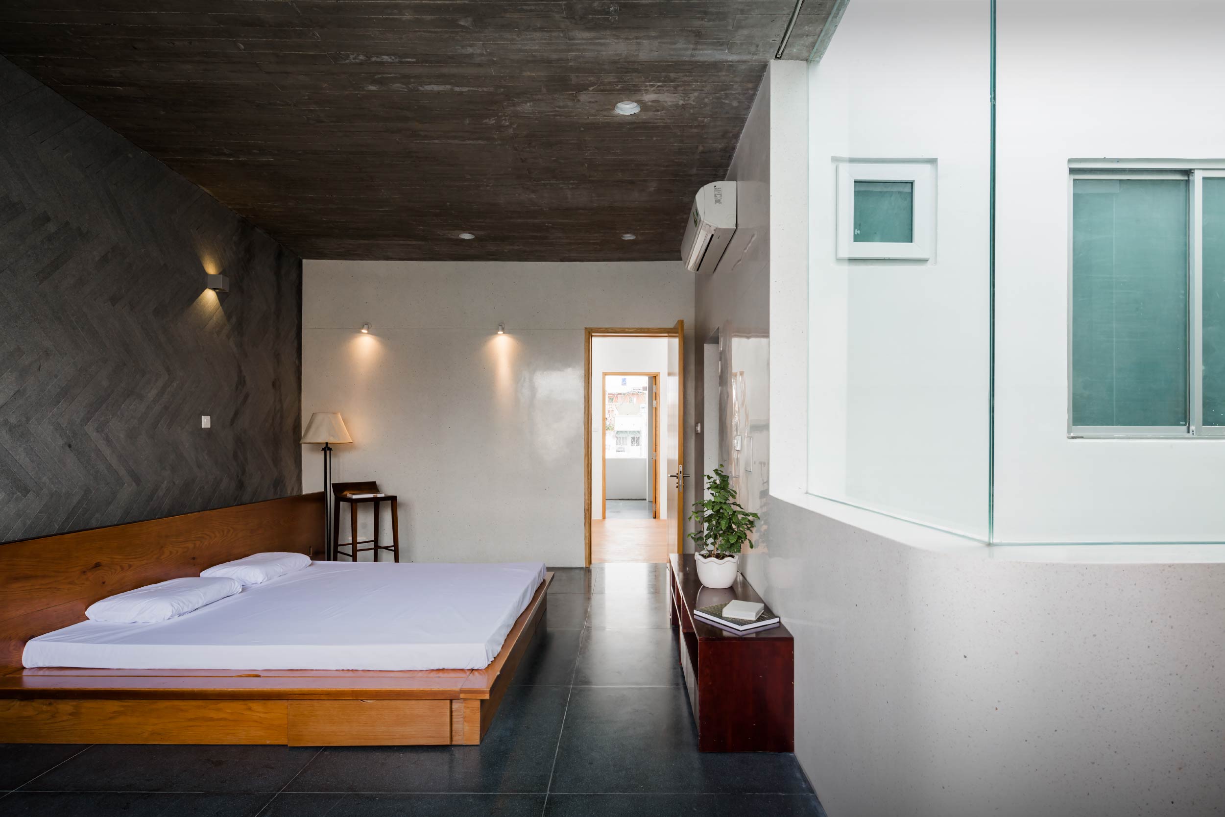
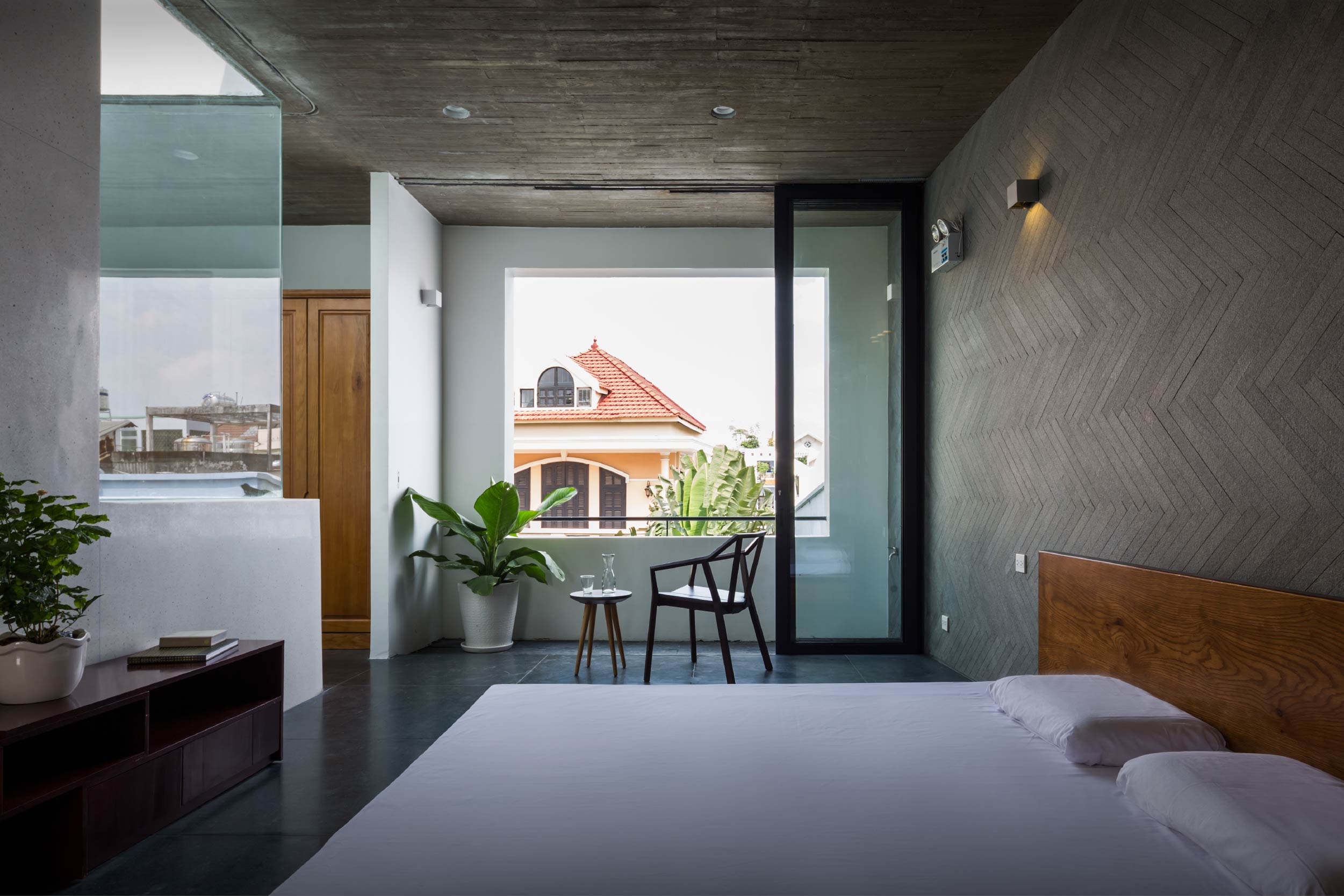
The bedroom on the third floor is breezy, uncluttered and illuminated by natural daylight.

Because it’s such a clean, well-lighted place, the homeowner couple sees potential in it developing into a house-cum-café in the future. The idea comes in handy since the family’s private living spaces are hidden away on the third floor. Plus, the open concept house plan provides many benefits, among them improved traffic flow, adequate daylight and good air circulation at every turn.
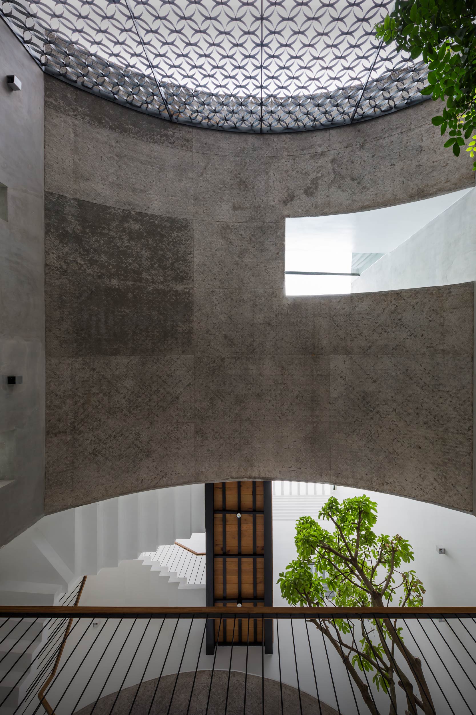
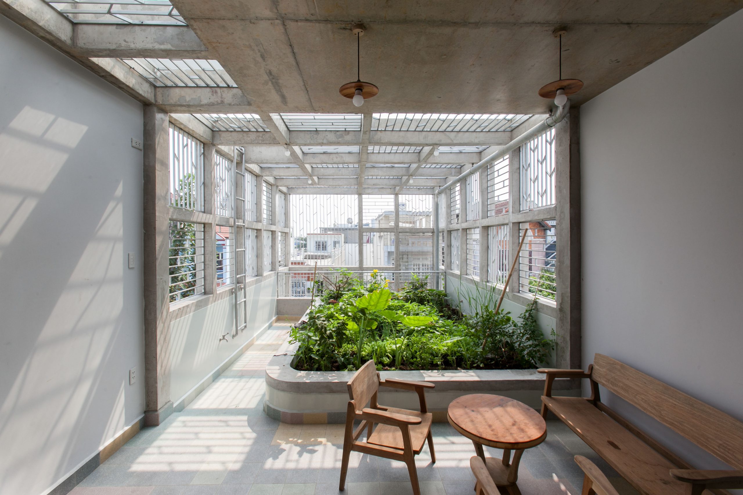
Concrete surfaces are left unfinished by design after being cast using bamboo strips, creating shadows that change throughout the day.

Amidst the hustle and bustle of life in Ho Chi Minh City, the house feels comfortable, light and airy thanks to great attention to detail. By design, it’s an urban living space that seeks reconnections with nature, a house made attractive by curved design just like the architect intended.


Join us for insights on creating urban homes that maximize quality of life. The room Books X Living ASEAN Design Talk 2024 on the theme of “(Re)Thinking inside the Box: Vol. 1 Living in Small Urban Spaces” is a discussion event in English focusing on urban living opportunities and design challenges that need to be resolved. It’s aimed at creating an awareness and knowledge among the general public about the importance of design in residential development within the context of city life across Southeast Asia.

The discussion will be in English. It’s open to everyone who is interested. There is no admission fee. Seats are limited. Please preregister at https://cooll.ink/DesigntalkLA/

Looking forward to seeing you all at Hall MR 214-216, Second Floor, BITEC Bang Na on August 4, 2024 from 1300 to 1530 hours. It’s happening as part of the Baan Lae Suan Fair Midyear 2024.


Architects: Sanuki Daisuke Architects


You may also like…
renovated shophouse VietnamA Renovated Shophouse with a Hidden Gem, Simply Delightful
Floating House in Thu DucFloating House in Thu Duc: A Home under the Canopy That Fits Right in Nature

Tan Phu House: From a Stuffy, Narrow Shophouse to a Multi-Floor Home with Rooftop Garden

Tan Phu House: From a Stuffy, Narrow Shophouse to a Multi-Floor Home with Rooftop Garden

/ Ho Chi Minh City, Vietnam /

/ Story: ND24 / English version: Bob Pitakwong /

/ Photographs: Courtesy of k59 ateliers /

Row houses sharing common sidewalls are a familiar sight across Vietnam. Here’s the story of a complete home transformation. A narrow shophouse lacking fresh air and ventilation in Ho Chi Minh City is tastefully renovated as a four-story home with ample space for gardening on the rooftop. Named Tan Phu House, it’s light, airy and looking really good in cool-toned whites.

Tan Phu House
Upfront, the parking garage is bright and breezy, thanks to the upper covering that opens on one side to let sunlight shine in, thereby improving air quality through greater ventilation.

There are pros and cons of living in the big city. And Ho Chi Minh City is no stranger to air and noise pollution plus overcrowding in the downtown area. Fully aware of all that, a design team at k59 atelier, a homegrown architectural practice, succeeded in breathing new life into the once stuffy old house, turning it into a modern living space with sunny personality and charms.

A diagrammatic representation shows the house location in a city neighborhood characterized by long and narrow row houses, a familiar sight seen everywhere across the country. / Courtesy of k59 Atelier
A diagrammatic representation shows space utilization and functionality on all four levels of the house. / Courtesy of k59 Atelier
A perspective side-elevation drawing illustrates in cross section the connectivity between living spaces, service areas and greenery on all four levels. / Courtesy of k59 Atelier

First things first, they started by observing the behavioral health of the three generations that live here – grandparents, mom and dad, and the children. Then, they looked at the state of the surroundings to see if natural features such as shade trees, air quality and sunshine can be incorporated in the new design.

It’s all about creating a health giving environment. Here, though, it’s accomplished by incorporating shade trees in front of the house in the new design. Together they provide a buffer protecting the front façade against too much sun, noise and air pollution.

As simple as that! The trees and the remodeled principal face of the building now work alongside each other sheltering the interior living spaces from the elements.

Tan Phu House

And it’s achieved without blocking the air flow and natural light streaming into the home. The architects did it by creating flow acceleration channels in the building design that act as engine driving natural air circulation into and out of the home.

The result is a refreshing change on all four levels of the home. At the same time, all the living spaces and service areas are arranged in a neat, required order.

Tan Phu House
Double-skin design. The greenery-filled front façade provides a buffer protecting the inner house wall against sun heat. Meantime, louvre windows offer protection from the elements.

Take a look inside. The ground floor holds a parking garage and entry area leading to interior living spaces, which include a sitting room where Grandma babysits little children during the daytime. It lies exposed to sunlight in the morning that proves beneficial for physical and mental health, among others.

Tan Phu House
On the ground floor, a kitchen and dining space next to the welcome area provides a refreshing change.
Tan Phu House
The ground floor holds a sitting room for relaxation at the rear of the house plan.

The second floor has a living room and study room with quiet reading nooks to kids. They are connected to children’s bedrooms located further inside.

The third floor that’s quiet and more secluded contains the principal bedroom with bathroom en suite and a laundry room at the far end.

The fourth floor has a Buddha room with the altar for the traditional veneration of family ancestry and a vegetable garden overlooking the street below.

Tan Phu House Ho Chi Minh City
A well-lit family living room lies in the forward area of the second floor.
A well-lit and airy staircase connects to the second floor holding a living room and study with quiet reading nooks for children’s schoolwork.

Tan Phu House Ho Chi Minh City

Tan Phu House Ho Chi Minh City
Double height space design turns a stuffy, narrow shophouse into a well-lighted place.

The architect explained: “In the new design, air flow acceleration channels are of the utmost importance. They are the game changer that improves the existing situation in a significant way, resulting in a relaxing atmosphere in the home.

“In the meantime, all the rooms and functions are conveniently linked while the floor plan is easy to understand and suitable for Asian culture and traditions.”

Tan Phu House Ho Chi Minh City

All told, it’s practical design that comes from paying attention to detail. Tan Phu House is completely renovated as residential community living model, one that’s tailored to suit specific family lifestyle needs.

Wood colors add feelings of peace and calm to the master bedroom on the third floor.
Tan Phu House Ho Chi Minh City
Double height space design makes the laundry area lit by skylights feel spacious and airy.
The third-floor bathroom at the rear of the house is well lit by skylights providing protection against humidity damage.
The top floor has an altar room for the traditional veneration of family ancestry in accordance with Asian culture.

In the end it boils down to, as the architect put it, “a design that provides all the desirable elements perfect for good living in this day and age, a living space that’s complete and integrated in one coherent whole from our perspectives.”

Tan Phu House Ho Chi Minh City
The rooftop sundeck on the fourth floor has ample space for vegetable gardening.

Owner: Le Ngoc Hoang, Bui Thu Thuy

Architect: k59 atelier (k59atelier.com)

Design Team: Phan Lam Nhat Nam, Tran Cam Linh

Structural Engineer: Phạm Dong Tâm


You may also like…

The Hiên House: A Wood and Concrete Home Full of Balcony and Terrace Ideas

The Secrets of a Quintessentially Thai Modern Home

My Montessori Garden: A Green School Advocating an Interest in Nature and the Environment
My Montessori Garden: A Green School Advocating an Interest in Nature and the Environment
/ Quang Ninh, Vietnam /

/ Story: Phattaraphon / English version: Bob Pitakwong /

/ Photographs: Duc Nguyen /

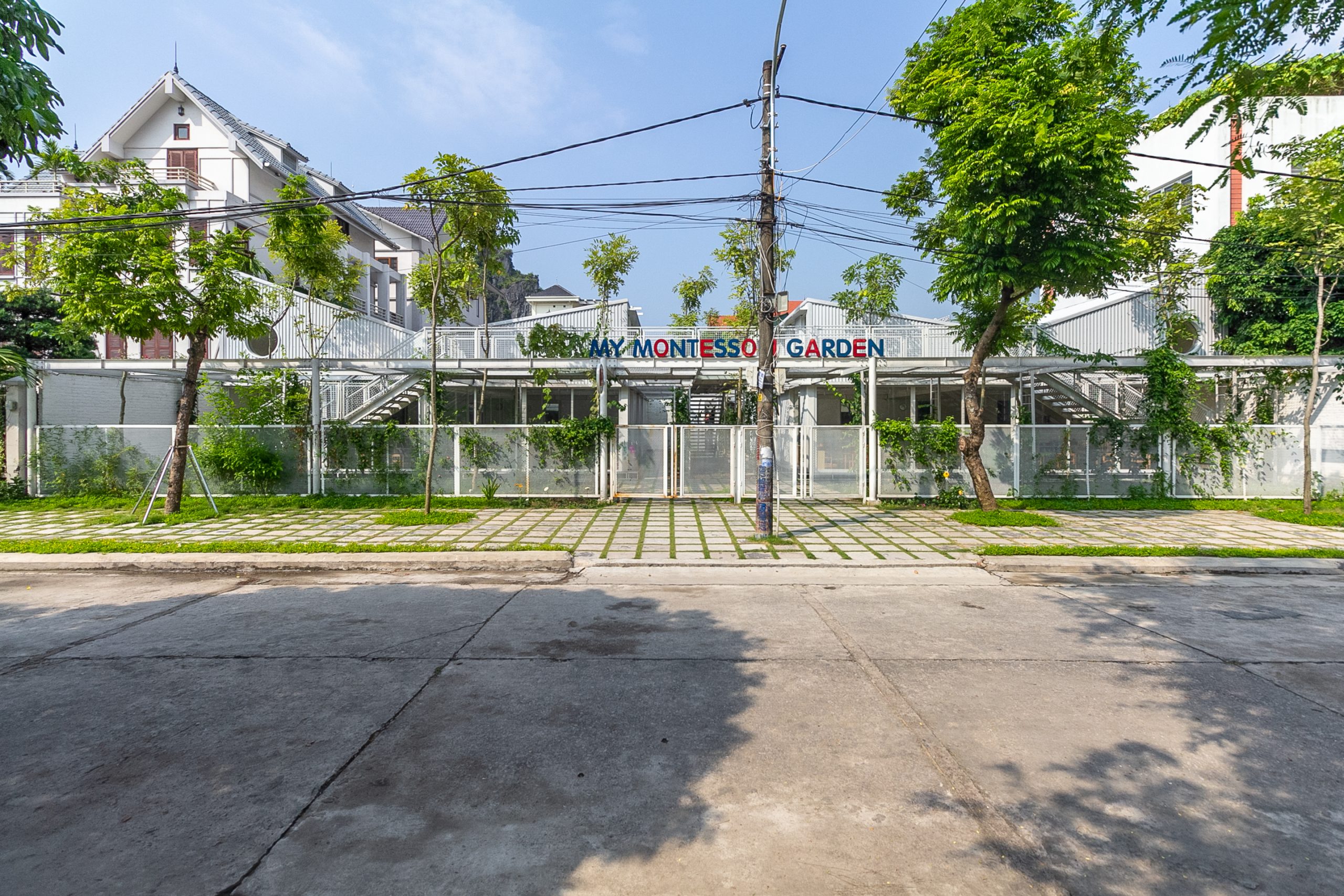
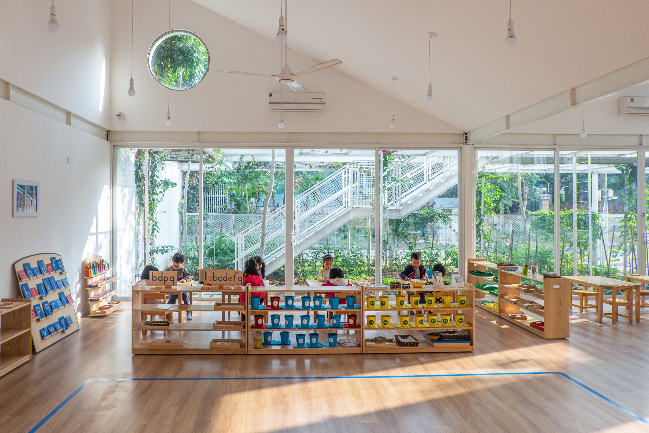
A green school that creates a healthy learning environment and advocates an interest in nature is making good progress in Vietnam. Here, a desire to connect with the natural world, hands-on experience growing up in the outdoors and nurturing a relationship with Mother Earth are of the utmost importance. It’s named My Montessori Garden in honor of Maria Montessori (1870-1952), an Italian educator who advocated a child-centered approach to education.

green school

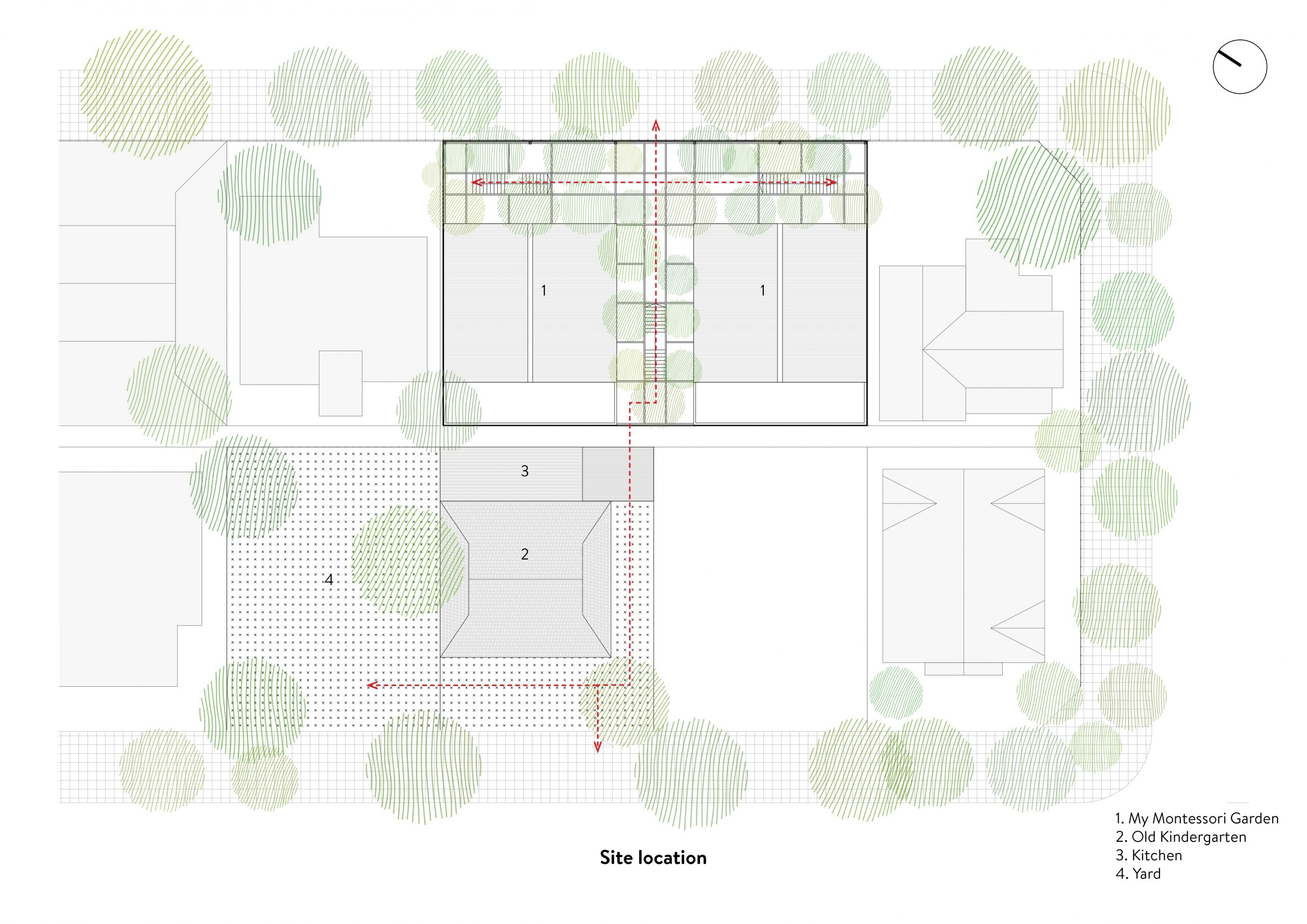
The green school is located at Ha Long, a coastal city that’s part of Quang Ninh Province about an hour’s drive from Hanoi. It embraces the Montessori Method of teaching and learning that has become popular in this region of Vietnam in recent years.

In essence, it’s about answering individual children’s learning needs and getting outside into nature, thereby developing a sense of responsible stewardship of the environment as they grow. And it’s a good idea to start early with kindergarten children, who are curious to learn and inquire about everything around them.

Needless to say spending time in nature offers lasting psychological benefits. It’s a way to build a good inner foundation for life in the process of growing up into responsible adulthood. More so than anything else, there is no forced learning taking place. It’s a curriculum by which no child is left behind, and no one is forced to learn anything regardless of his or her own wishes.

green school

The schoolhouse design is a creation by a team of architects at HGAA, a Hanoi architectural practice, who successfully translated the ideas about alternative approaches to education into a reality. It’s a work of architecture founded upon an understanding of child behavior and nature of human learning. The result is a healthy environment conducive to learning, one that’s tailored to the specific needs of individual children.

green school

green school

green school
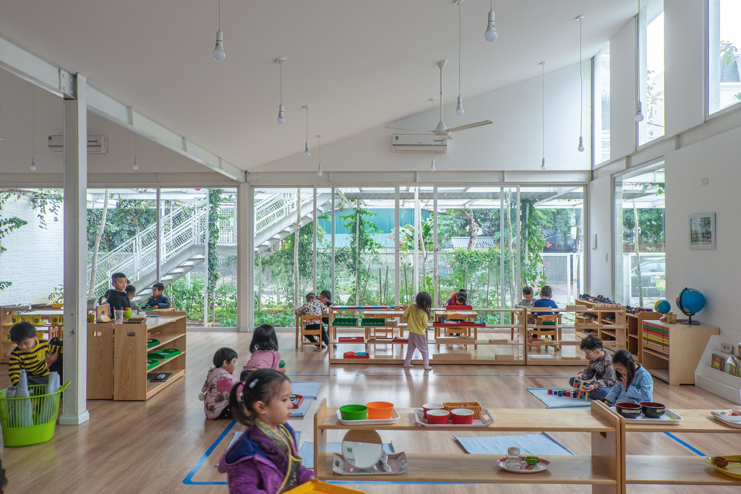
Although small in size, My Montessori Garden makes the most effective use of space, with easy traffic patterns designed with the little children in mind.

green school

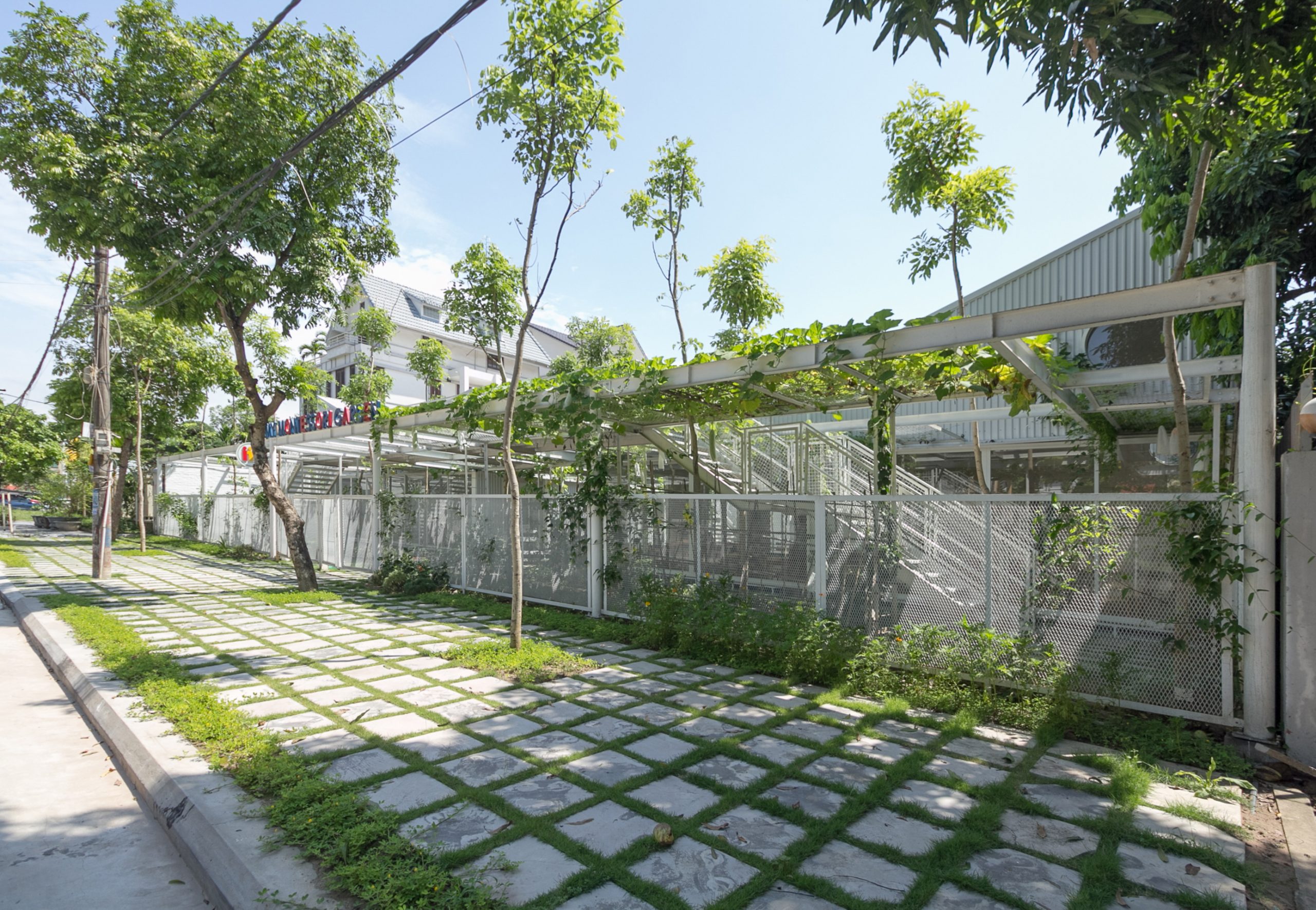
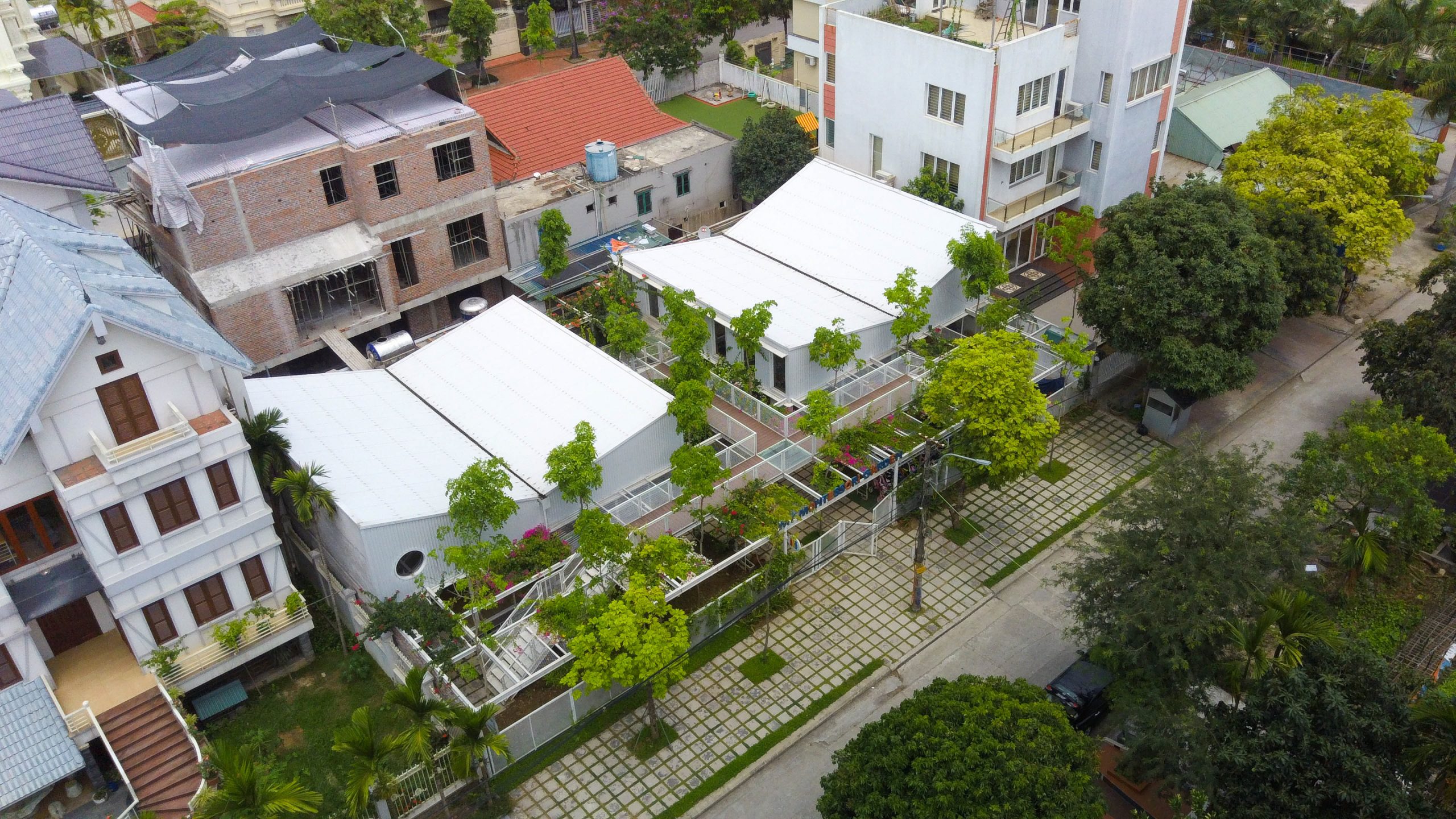
How did they do it? To begin with, a design that’s plain and simple takes precedence here. The schoolhouse is built of steel structural framing. Dry construction was cost effective and took less time to build without causing negative impacts on the environment or inconveniences to community

In future, when the land lease expires and cannot be renewed, the whole project can simply be taken apart and moved to a new location.

A diagrammatic representation shows the built environment in relation to the school yard filled with green foliage and a corridor system between buildings. / Courtesy of HGAA
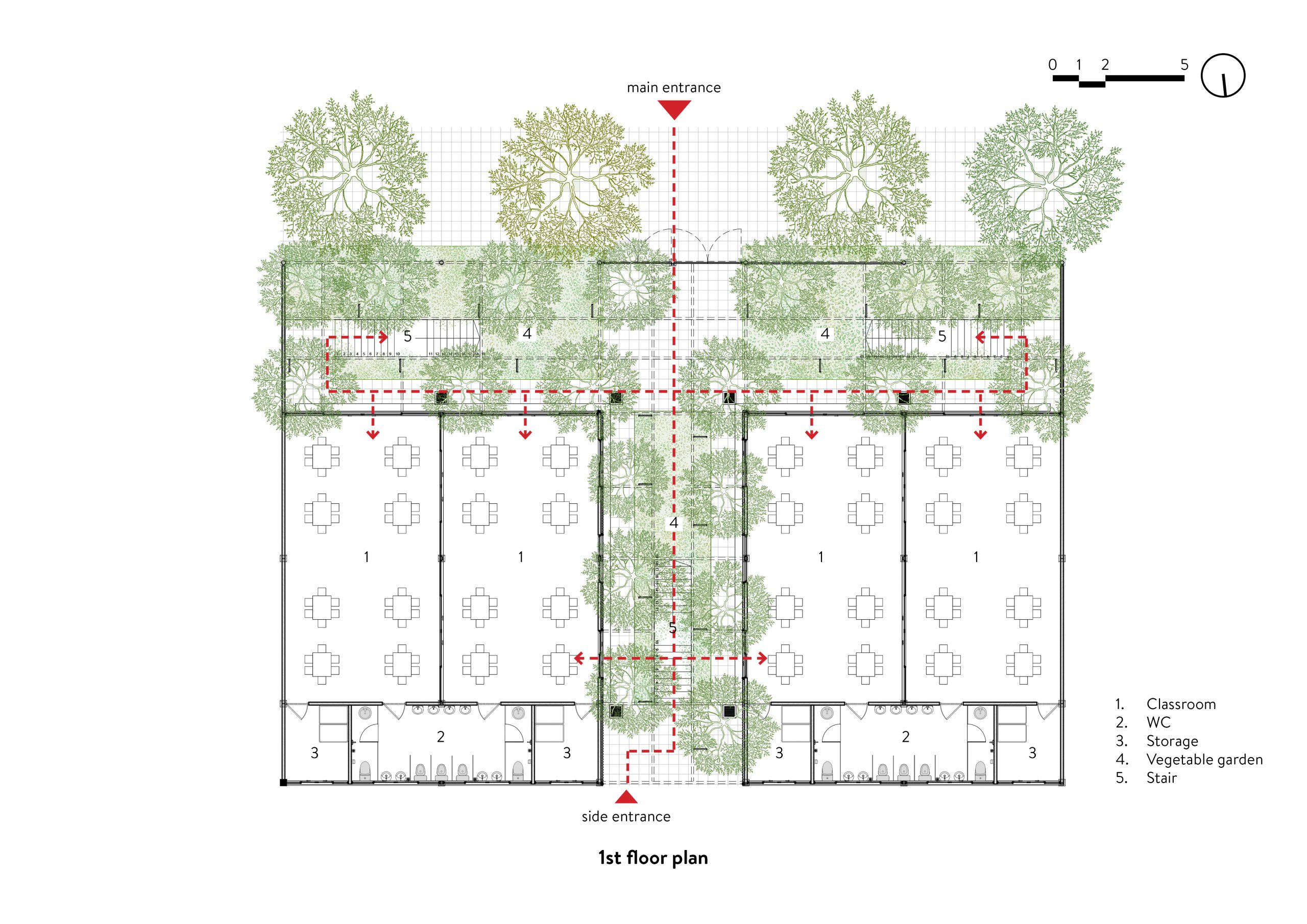
A diagrammatic drawing illustrates traffic patterns on the ground floor. / Courtesy of HGAA
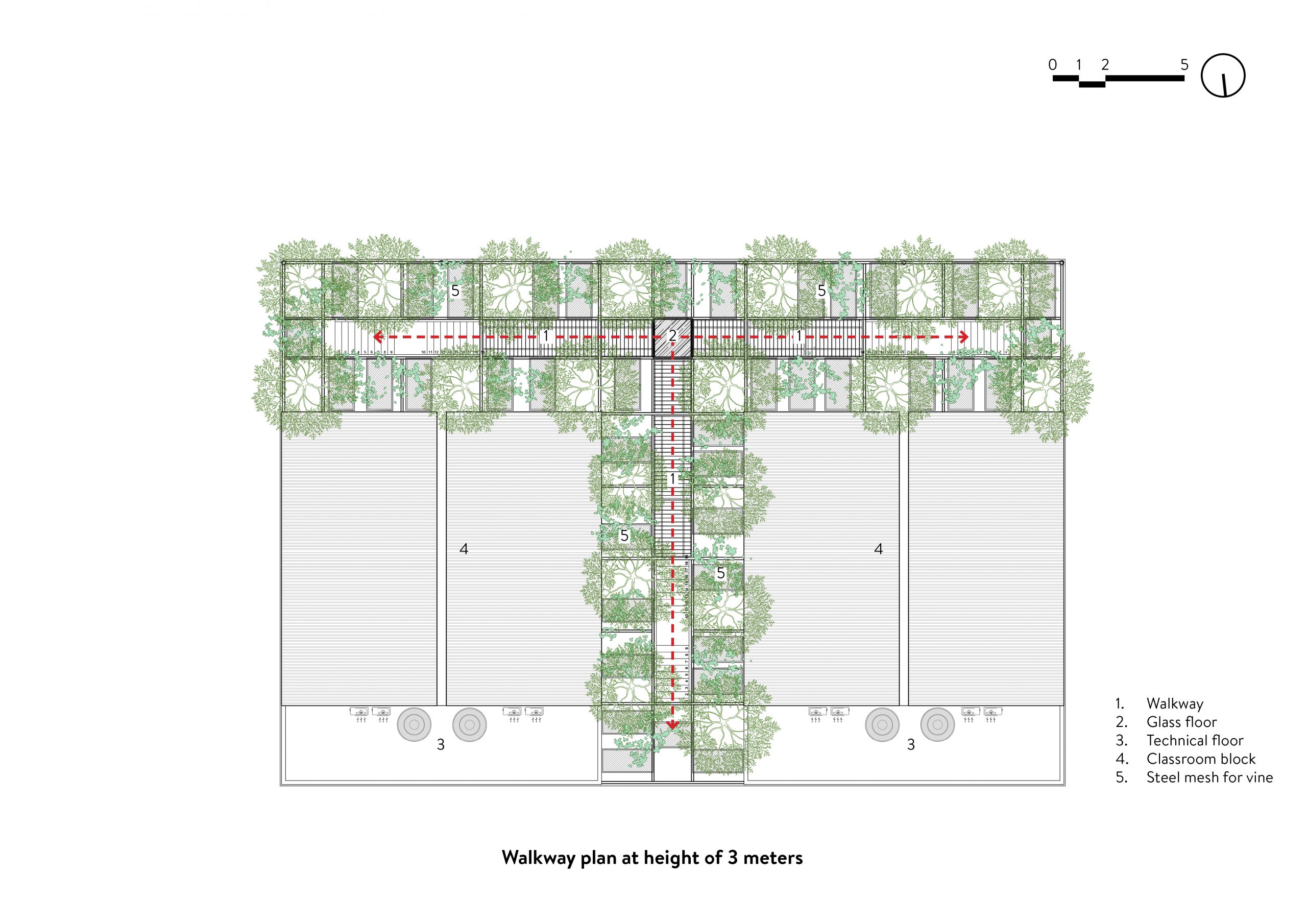
A diagrammatic representation illustrates traffic patterns on the footbridge system. / Courtesy of HGAA
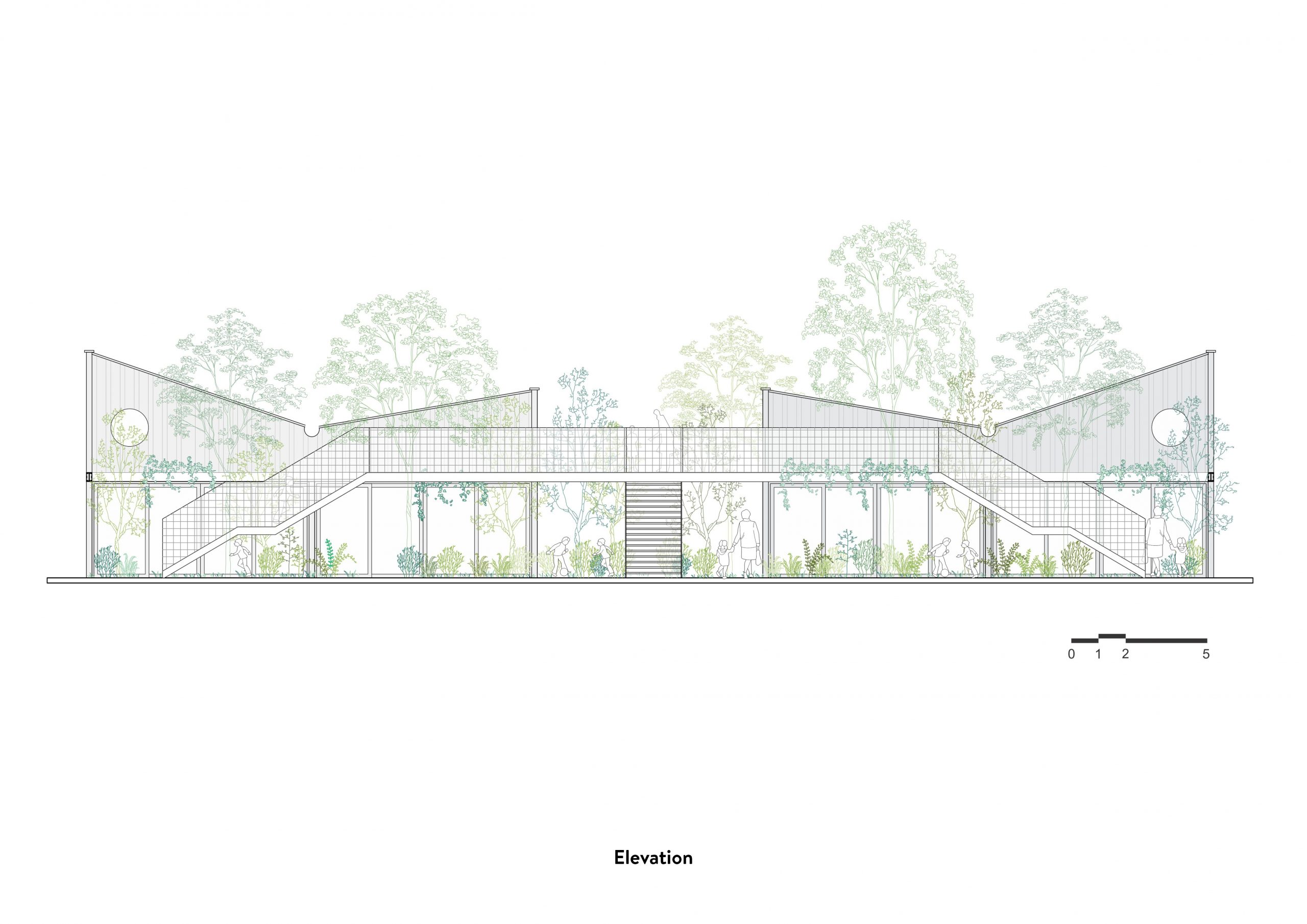
A side elevation drawing shows the trees, the footbridge system with mesh wire railing and, beyond, winged roofs with the center gutters for carrying off rainwater, a thoughtful design that prevents storm water from splashing onto neighboring homes. / Courtesy of HGAA
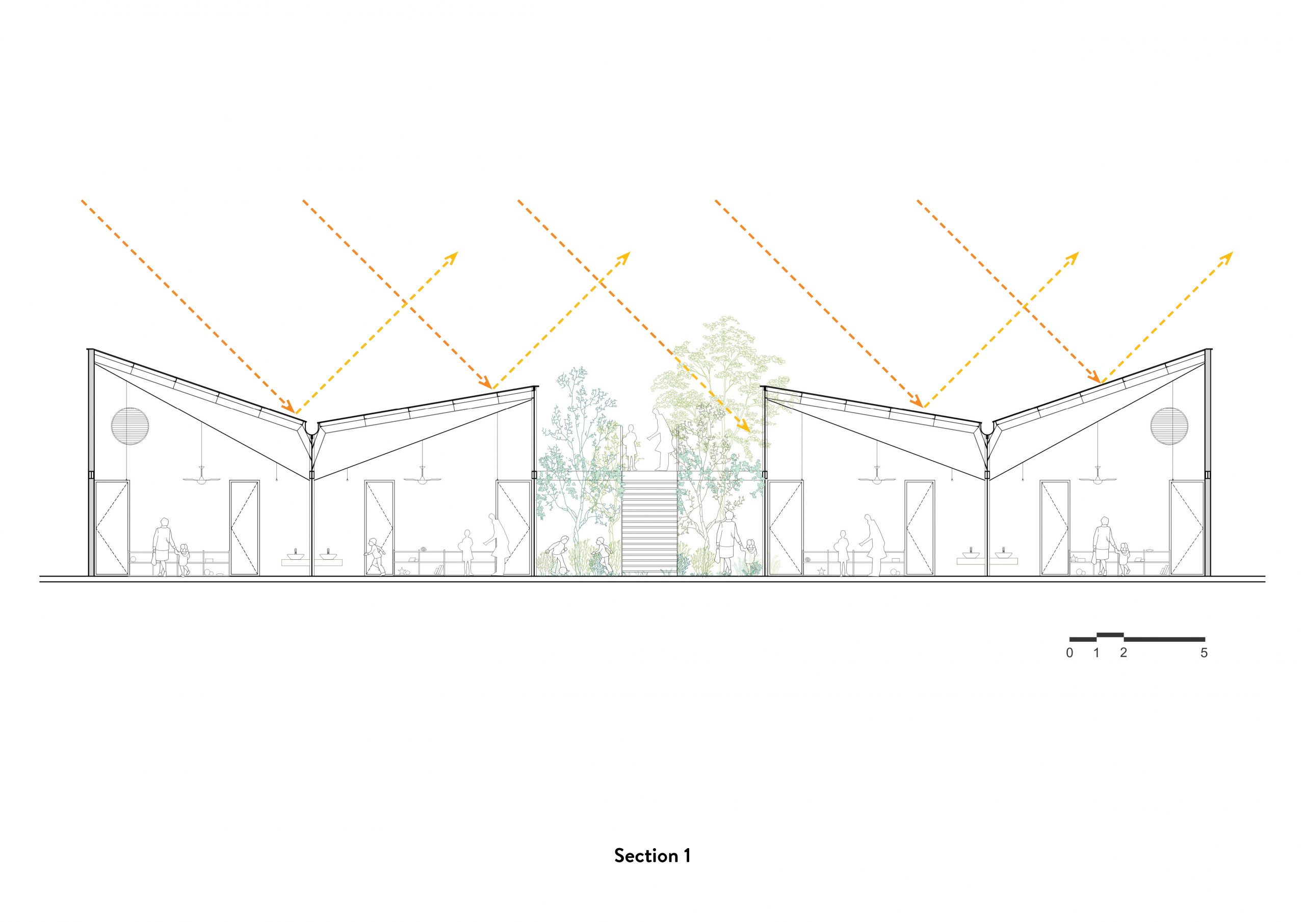
A cross section drawing shows winged roof ideas with the center channels for conveying rainwater away from the building. / Courtesy of HGAA
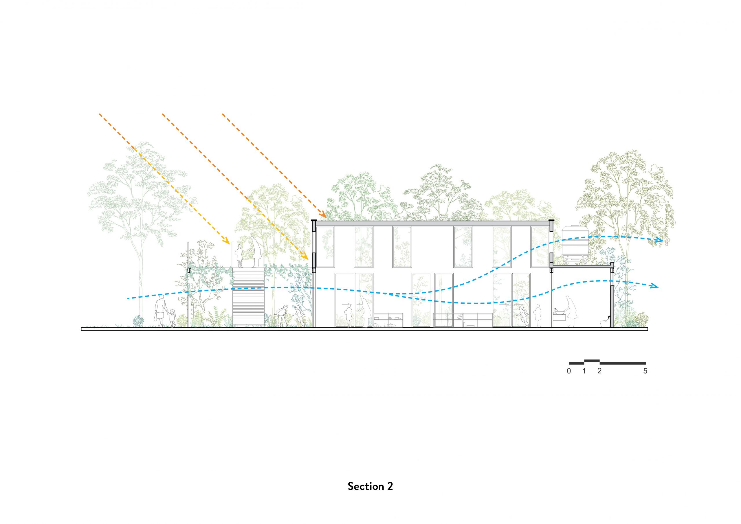
A simplified drawing illustrates the angle at which sunlight strikes, and the direction from which the wind enters and exits, creating indoor thermal comfort. / Courtesy of HGAA

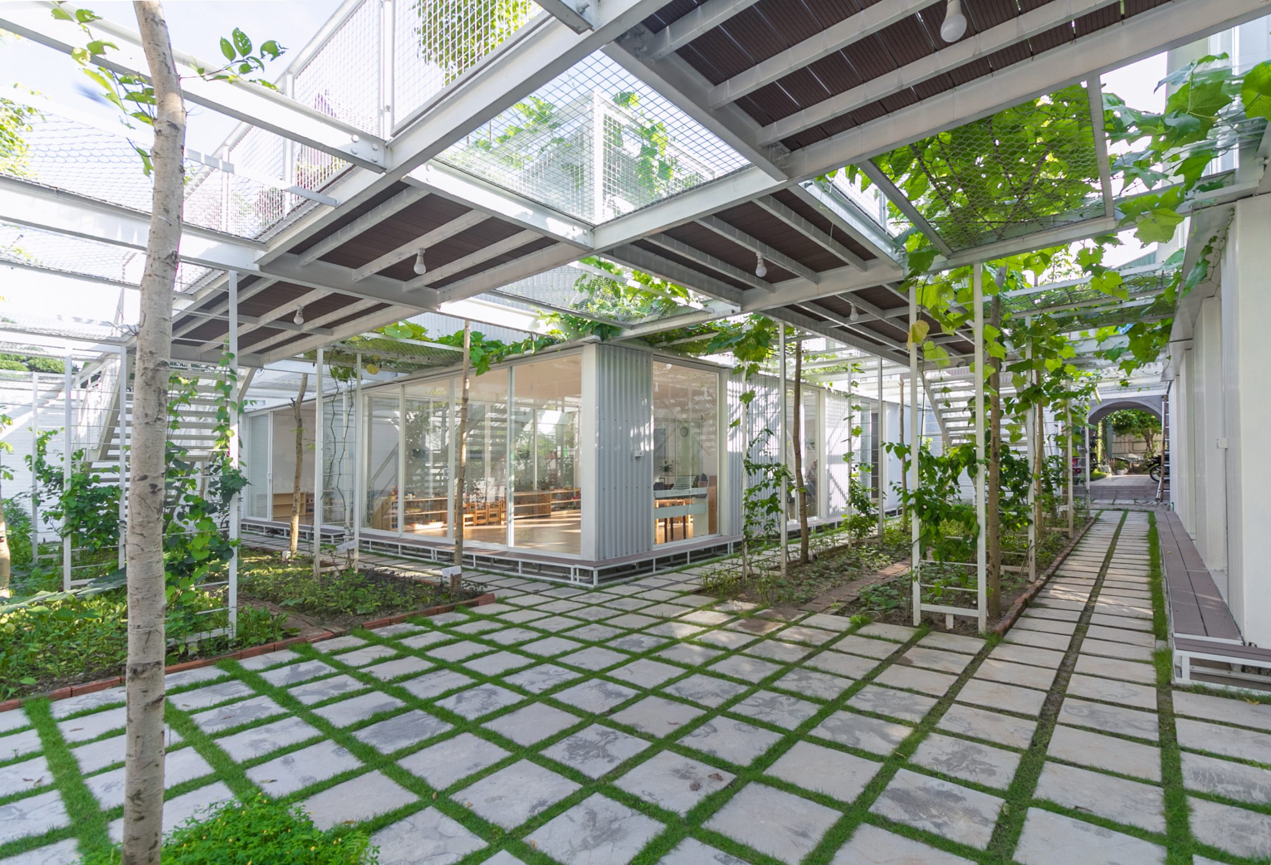
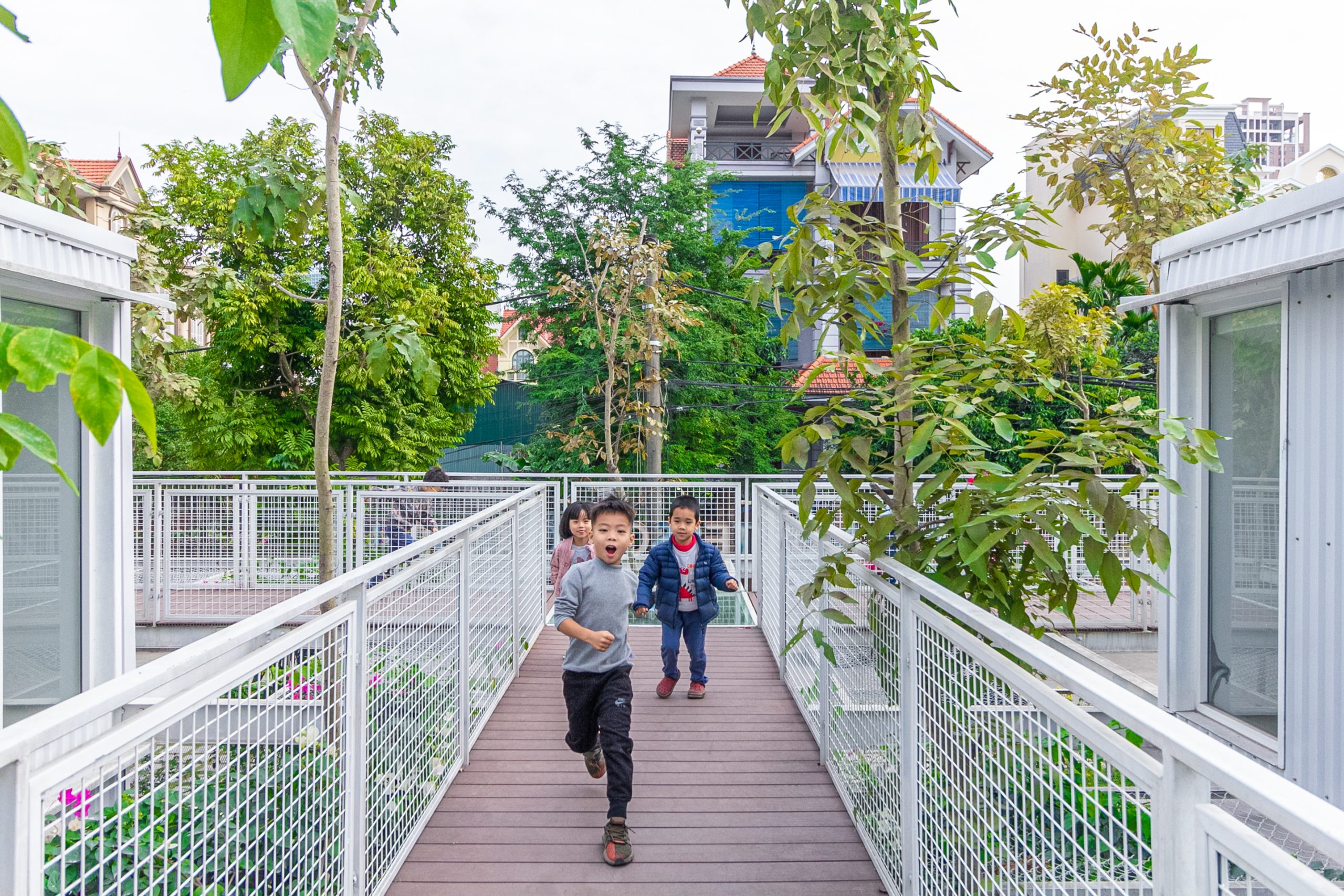
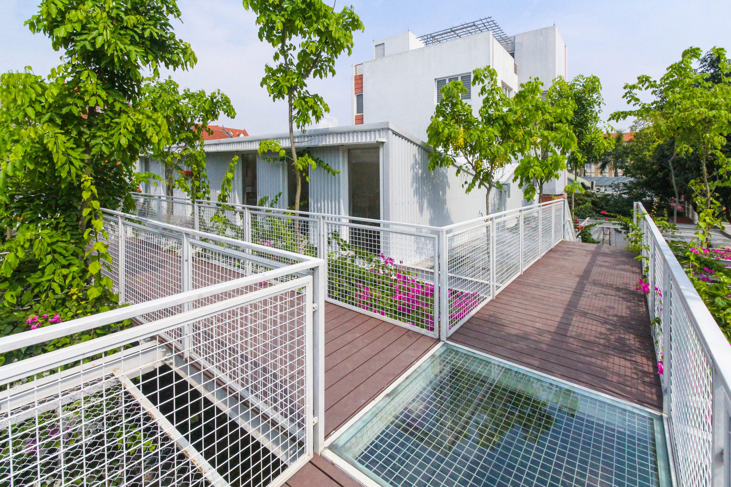
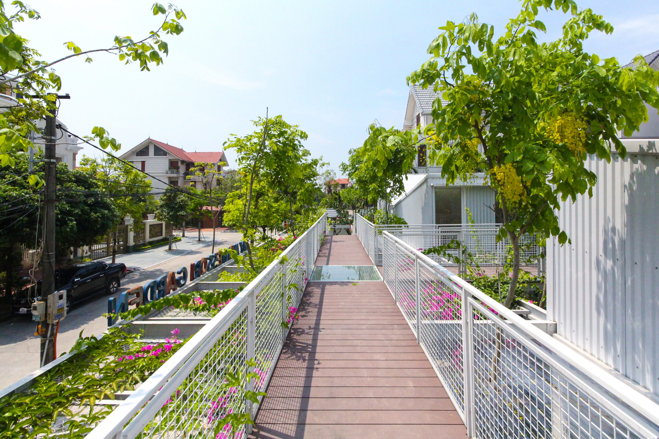
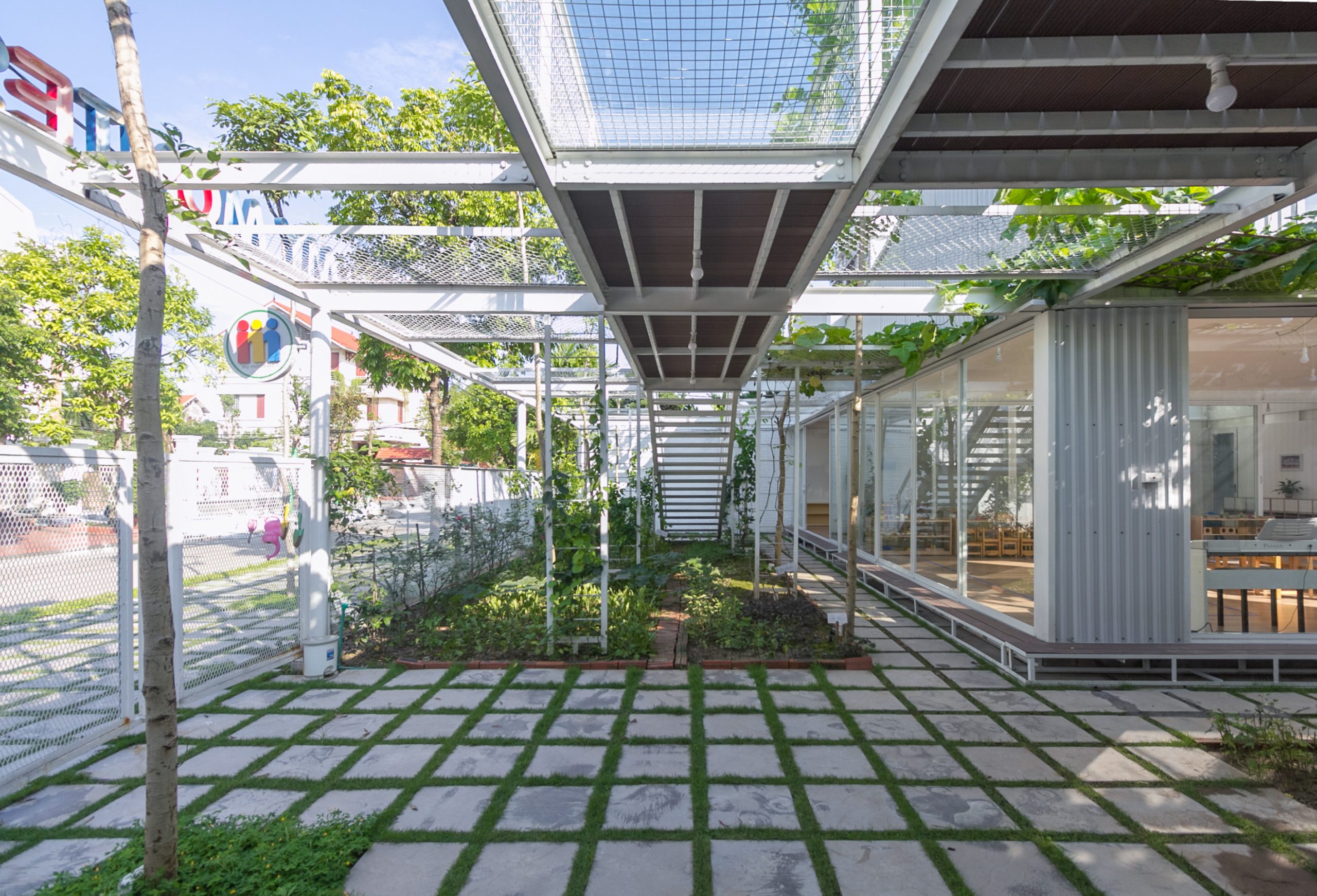
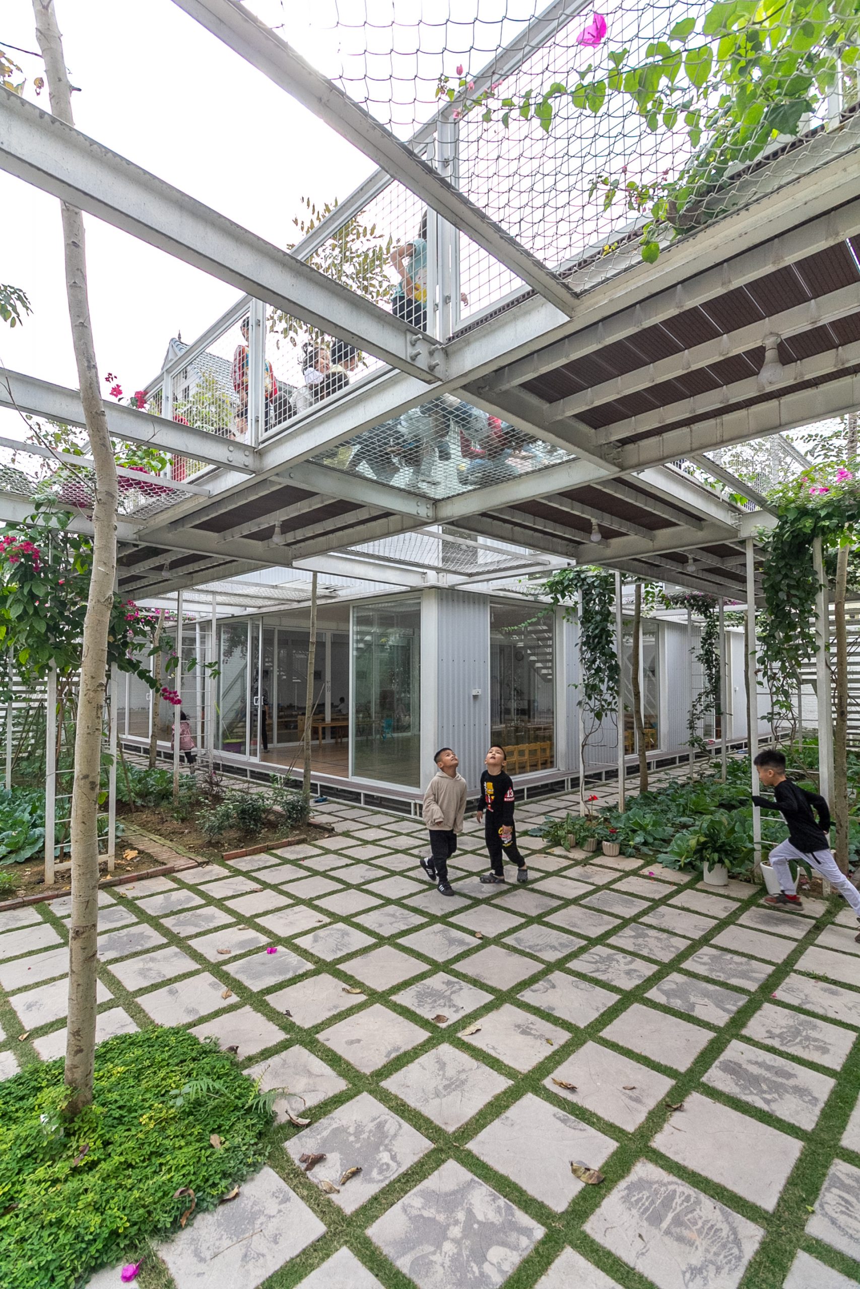
My Montessori Garden sits on a small area of ground, only 600 square meters in all. For child safety, the overhead footbridge among the trees has wire mesh railing infills designed to protect against slip and fall accidents.

green school
Surrounded by trees and shrubbery, a footbridge system has wire mesh railing infills that protect against slip and fall accidents. It’s also an extra outdoor room for children to play in.

green school

Although small in size, natural elements are generously integrated into the plan in a way that pleases the senses and the mind.

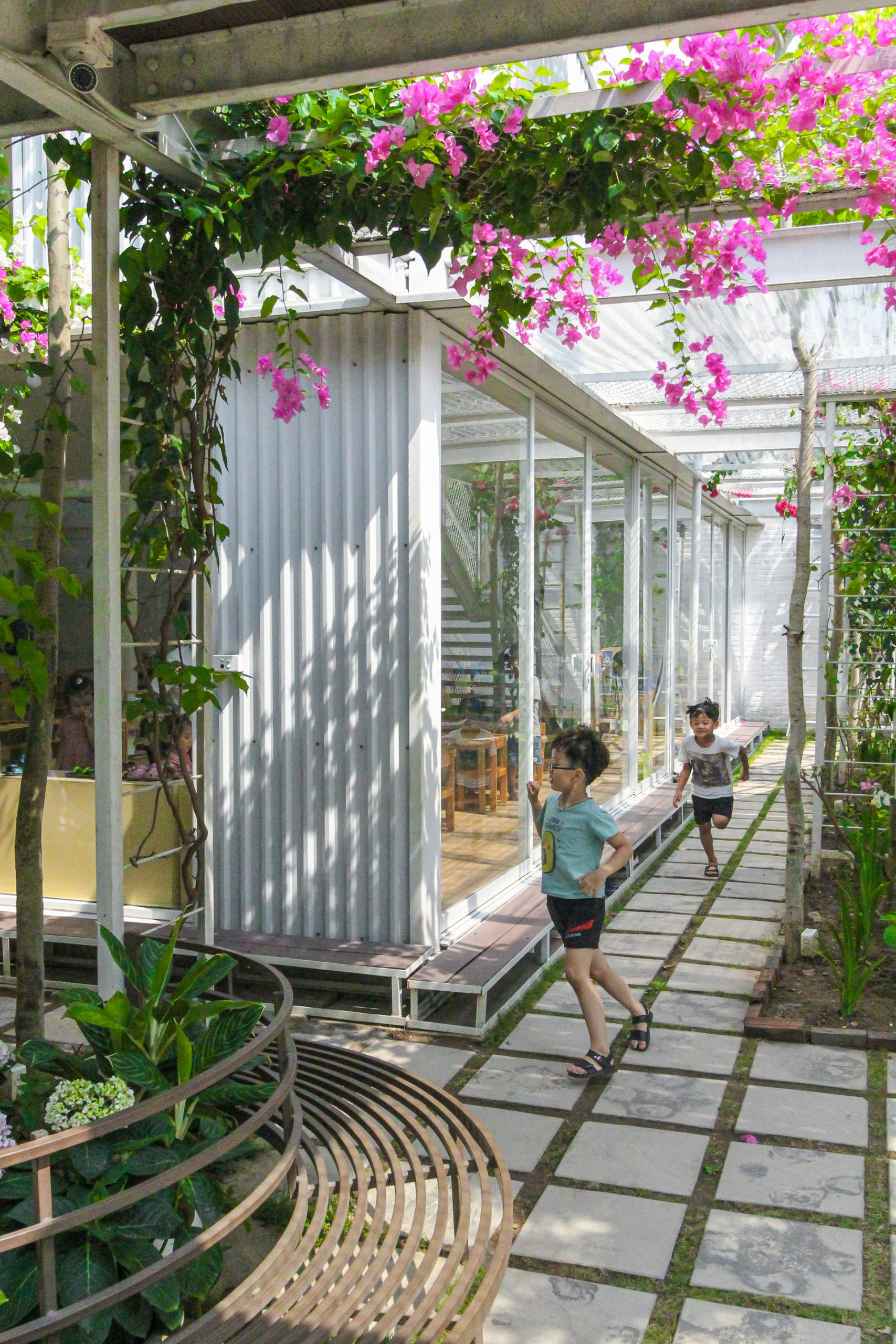
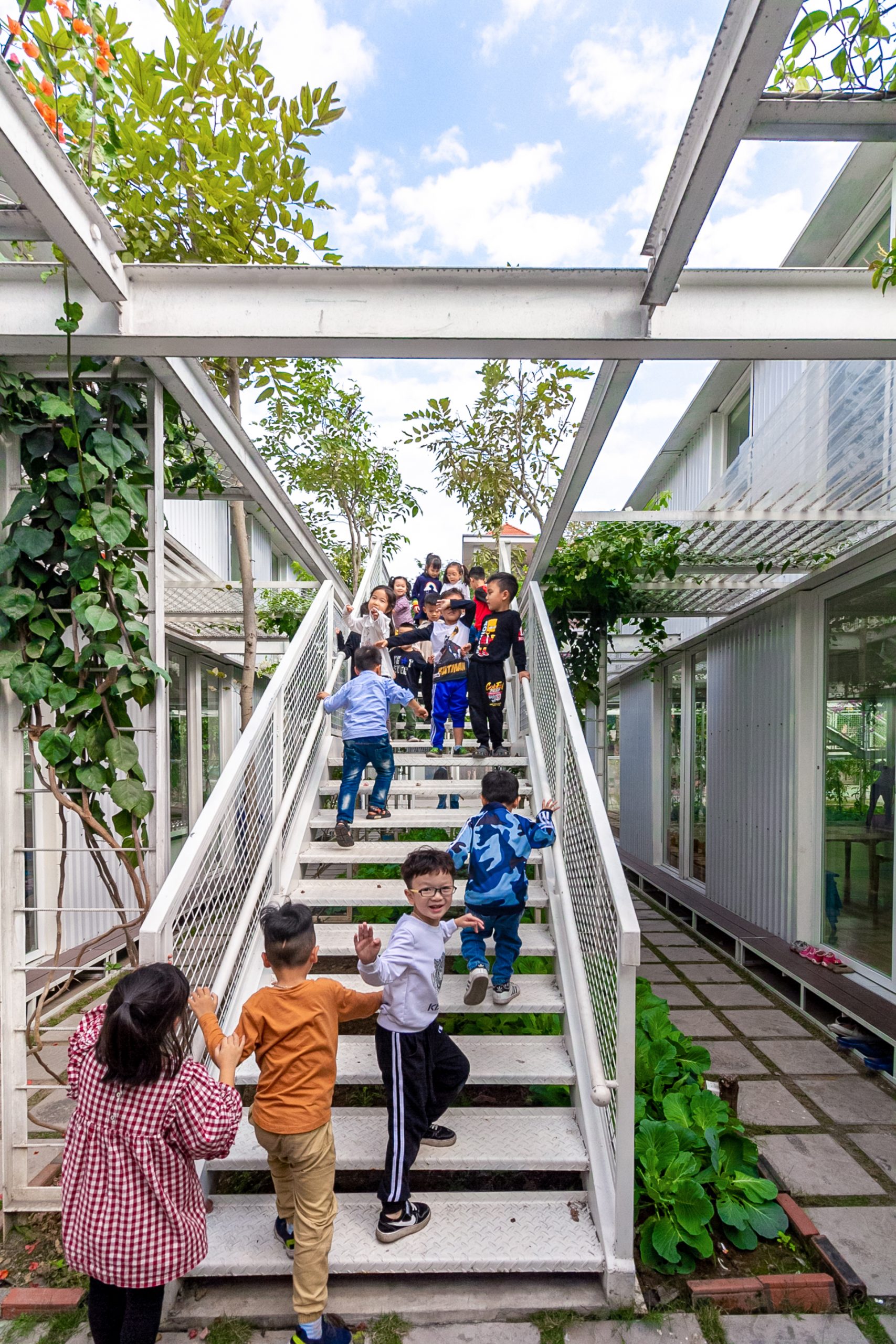
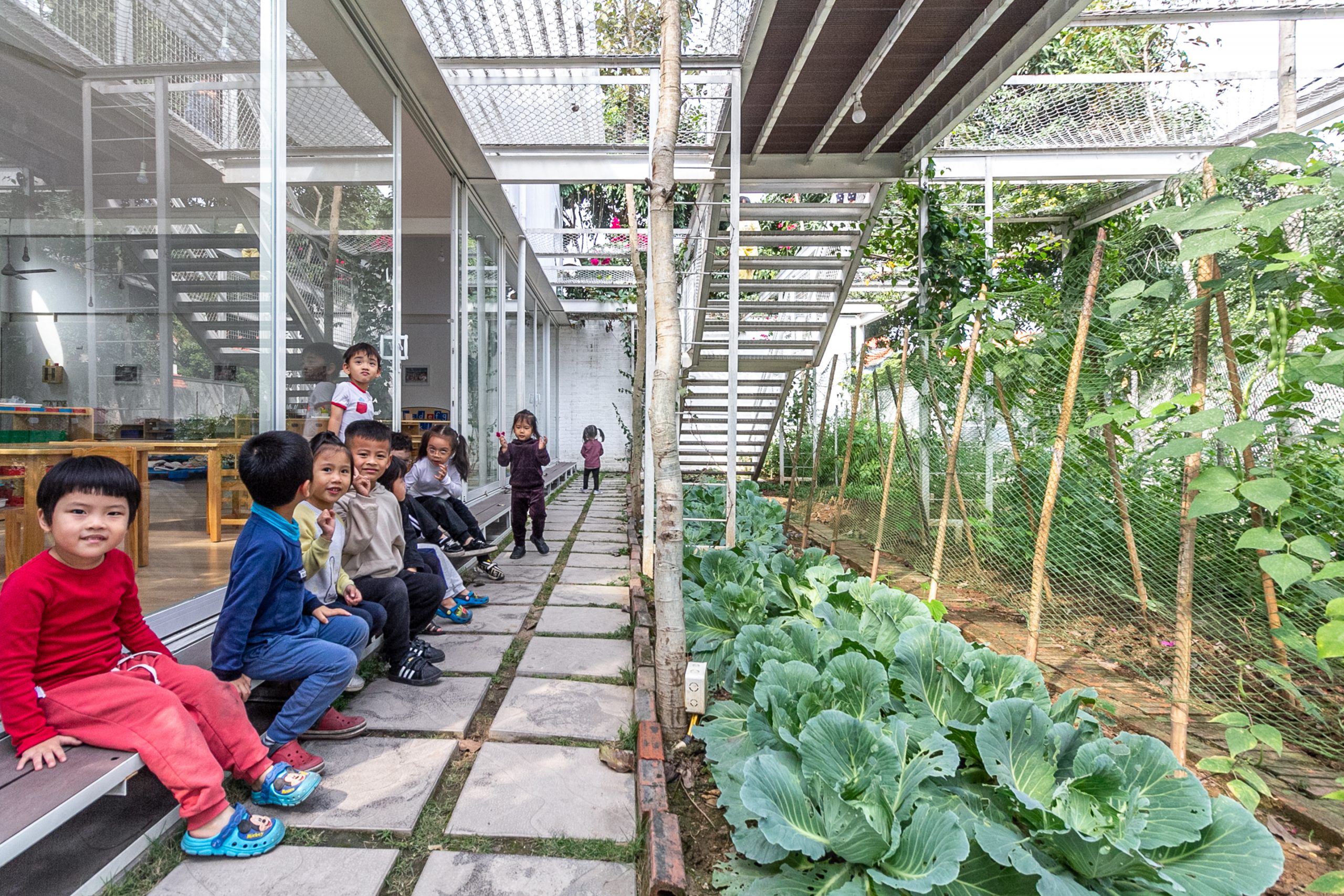
There are two kinds of green space on the premises. On the ground, the school yard provides ample room with raised beds for growing vegetables, in-ground plants and shade trees. Above the ground, climbing vines and edible vegetation thrive on trellises and walls producing colorful flowers that give off good vibes.

green school
Children chat with friends as they tend leafy vegetables in raised beds and climbing vines producing flowers and edible fruits.

For the architects, it’s about designing an environment conducive to learning and, at the same time, promoting positive thinking, interactions with nature and socialization processes among kids. And it’s happening all day and every day, indoors and outdoors.

green school
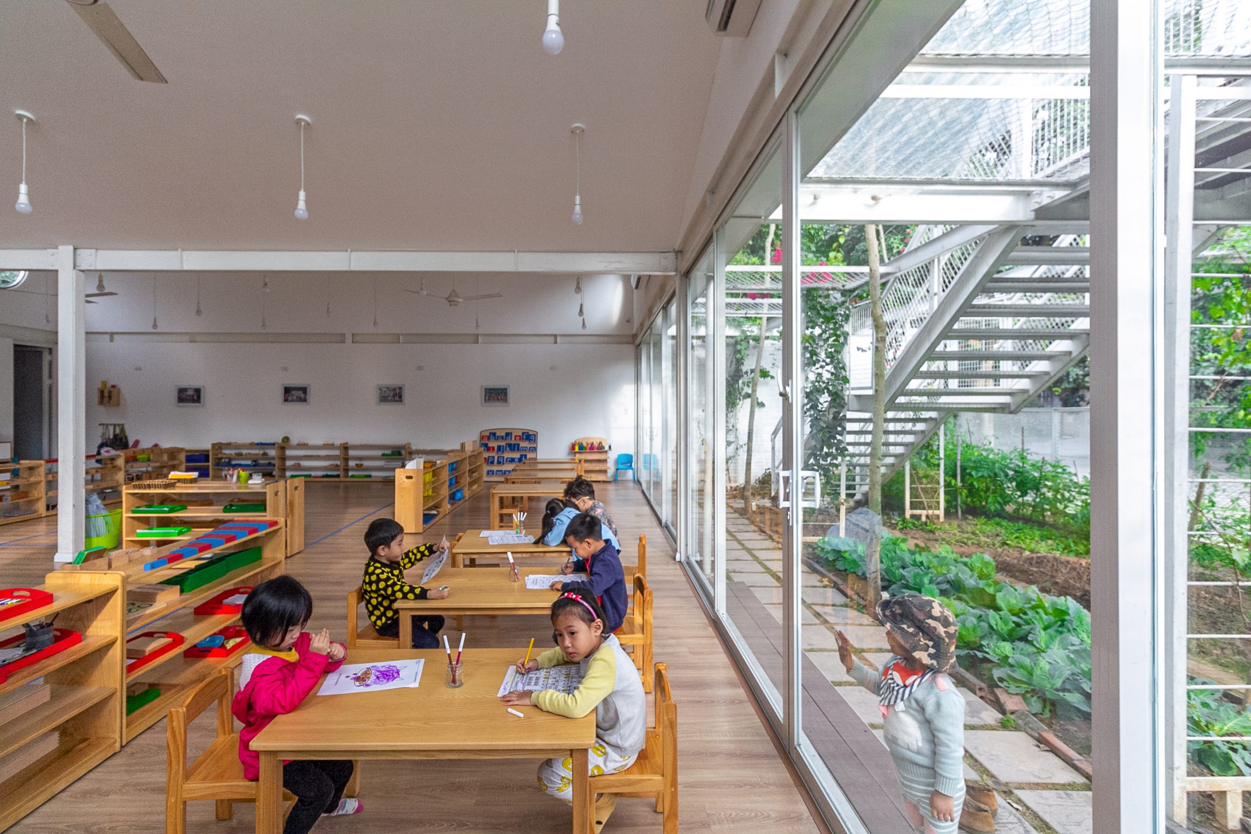
Nature is the best classroom. To protect the little children from the elements, the entire wall of the building is glazed using clear glass with sliding doors that separate indoors from outdoors.
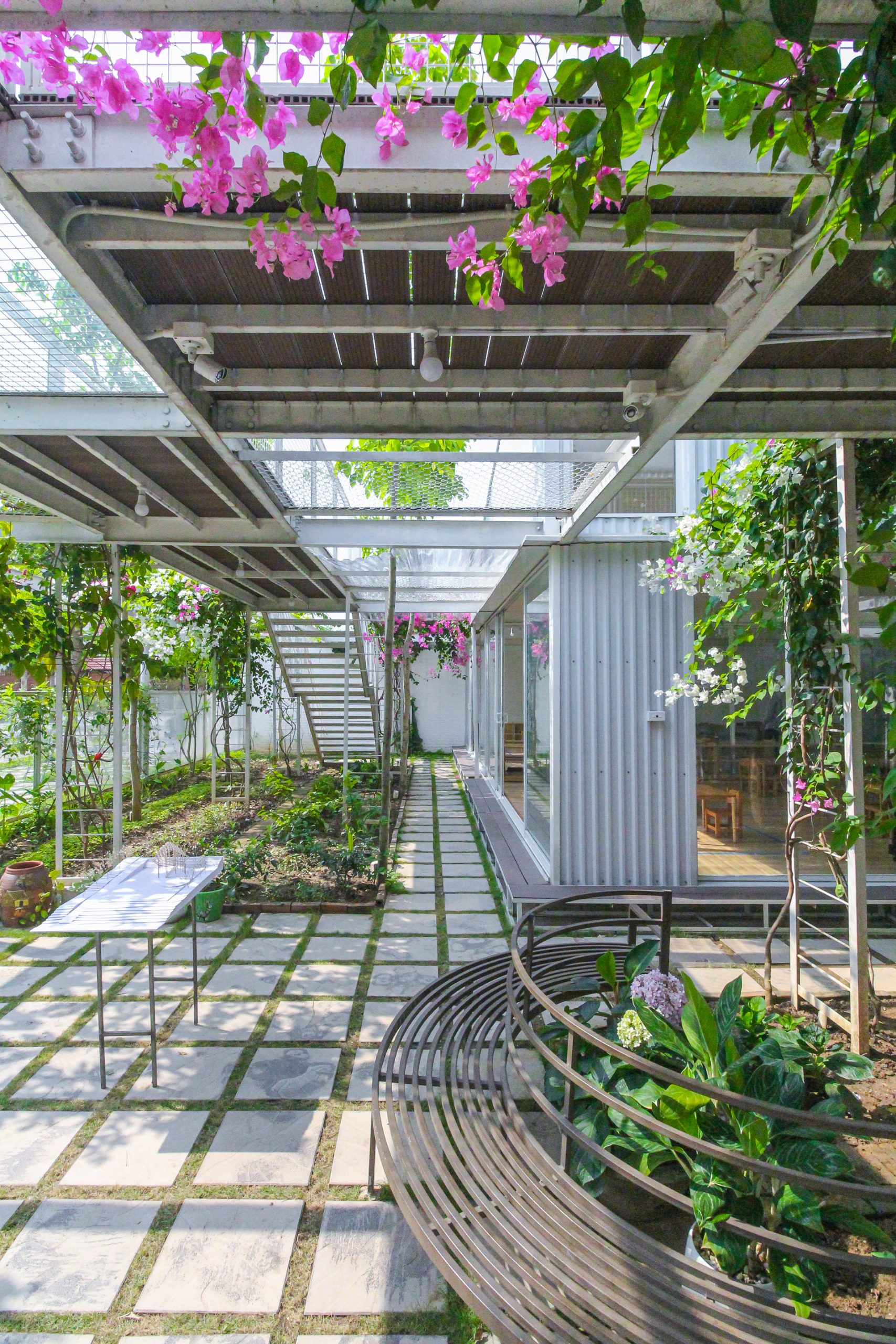
 

In a few words, well-thought-out design matters. For My Montessori Garden, it’s a design that fulfills the purpose for which it’s intended, one that’s easily to understand and presenting no difficulty. In the end, it boils down to one thing — nature is the best classroom.

green school


Architect: HGAA (https://hgaa.vn)


You may also like…

Lung Vai School: A Rammed Earth Schoolhouse Trio amid Mountains and Rice Terraces

MA Architects Office: Integrating Natural Features in Workspace Design

Treehouse by the Lake: A Nature-Loving Forest Home on the Lakeshore

Treehouse by the Lake: A Nature-Loving Forest Home on the Lakeshore

/ Ba Ria-Vung Tau, Vietnam /

/ Story: Phattaraphon / English version: Bob Pitakwong /

/ Photographs : Dũng Huỳnh /

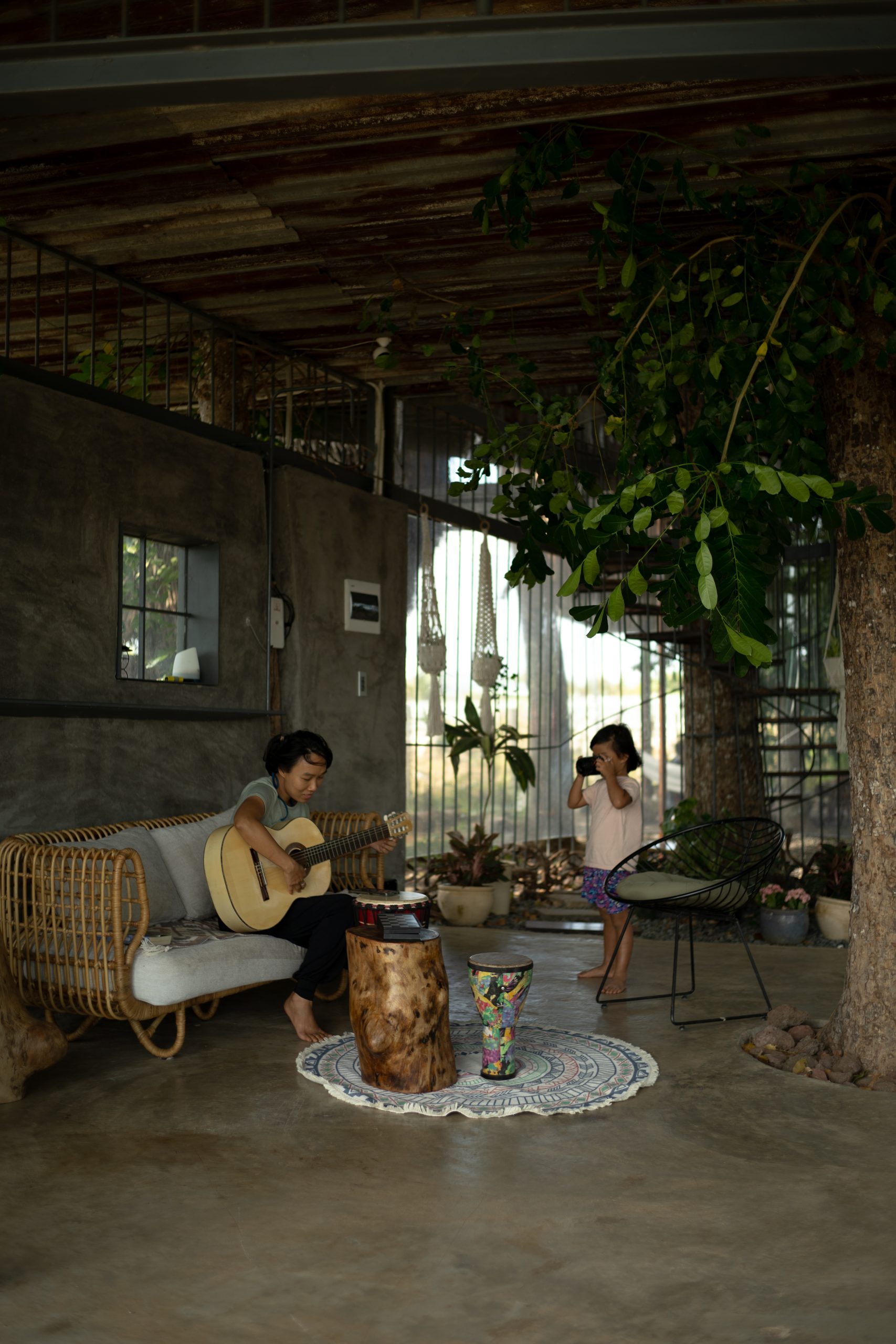
“There is something about this place that always brings back old memories,” said the owner of this lovely treehouse by the lake. “Several decades passed, but I still remember it as if it was yesterday. My family camped out here on a hot summer day. Our children gathered under the canopy of an old tree and set up a small tent together.”

treehouse by the lake

“We called it a ‘house’ because it protected us from the sun, and we had a lot of fun. Some children cut down a few trees to make tent poles while others gathered leaves to make the upper covering and decorations.

“It was beautiful and eye-catching. Completely finished, we went looking for things needed to ‘settle down’ in the leaf hut shelter. …”

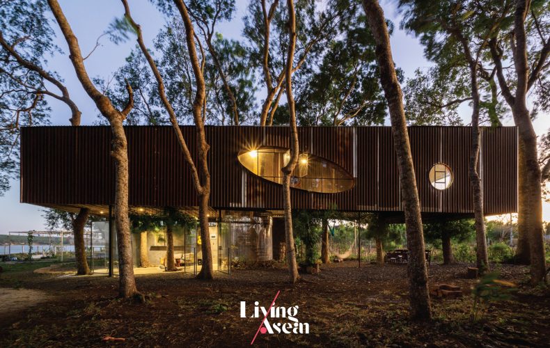
Obviously, his experience and memories provided the inspiration that culminated in the country home of his dreams. Built into nature, this treehouse by the lake was based on biophilic design conceived and developed by H.2, a homegrown architectural practice based in Ho Chi Minh City.

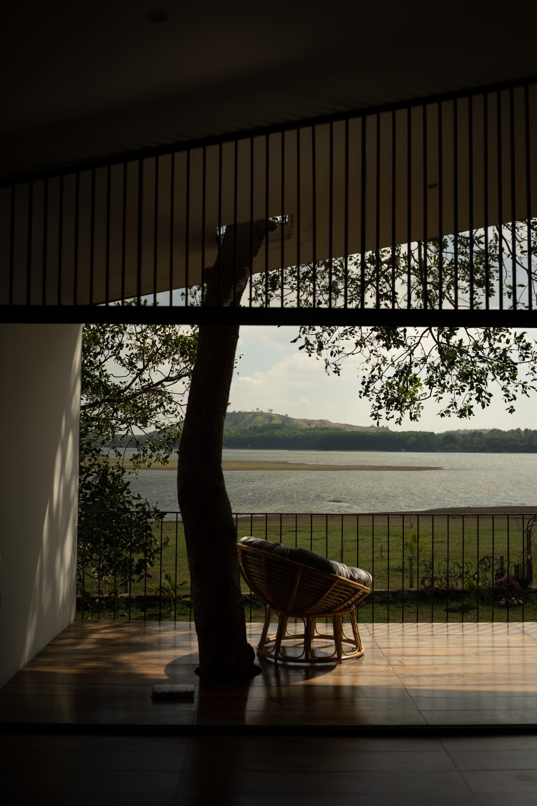
The house merges into the surrounding forest landscape on the bank of Da Bang Lake, a calm and peaceful body of water in Ba Ria-Vung Tau Province in Vietnam’s Southeast.

It all began with the homeowner’s desire to let his granddaughter connect with nature just like he and his kids did when they were young — an experience that, in his words, provided lasting psychological benefits. He could still recall having fun growing up in the countryside where life was simple.

Sharing a piece of his paradise, he said, “The leaf hut shelter that we built back in the day was a place to play games, do kid-friendly things and listen to music.”

“Memories were made here and the story is crystal clear like it all happened yesterday. The simple games we played nourished our souls and, especially for me, nurtured my love for life in the poor countryside. Those were the days.”

treehouse by the lake

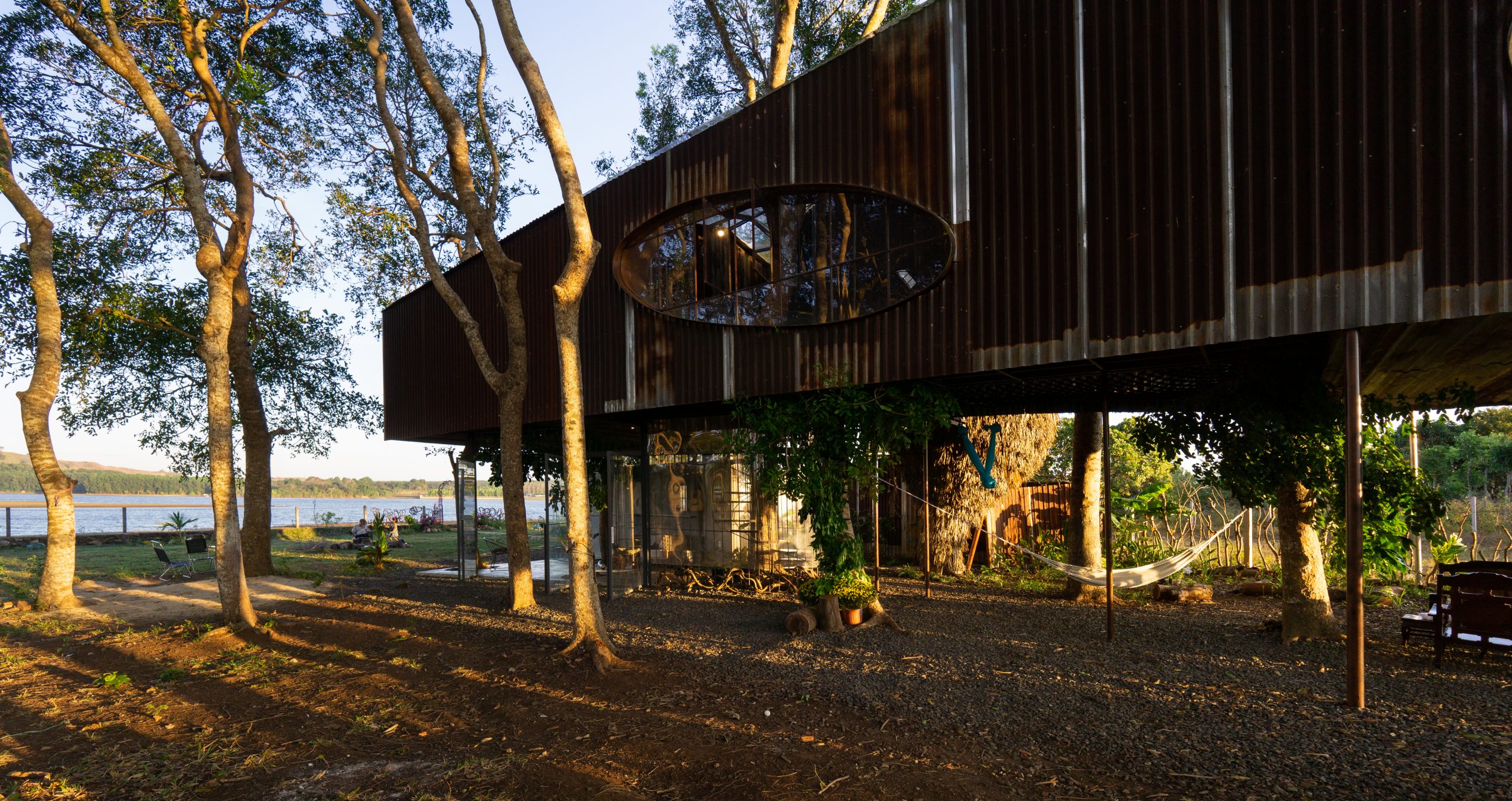
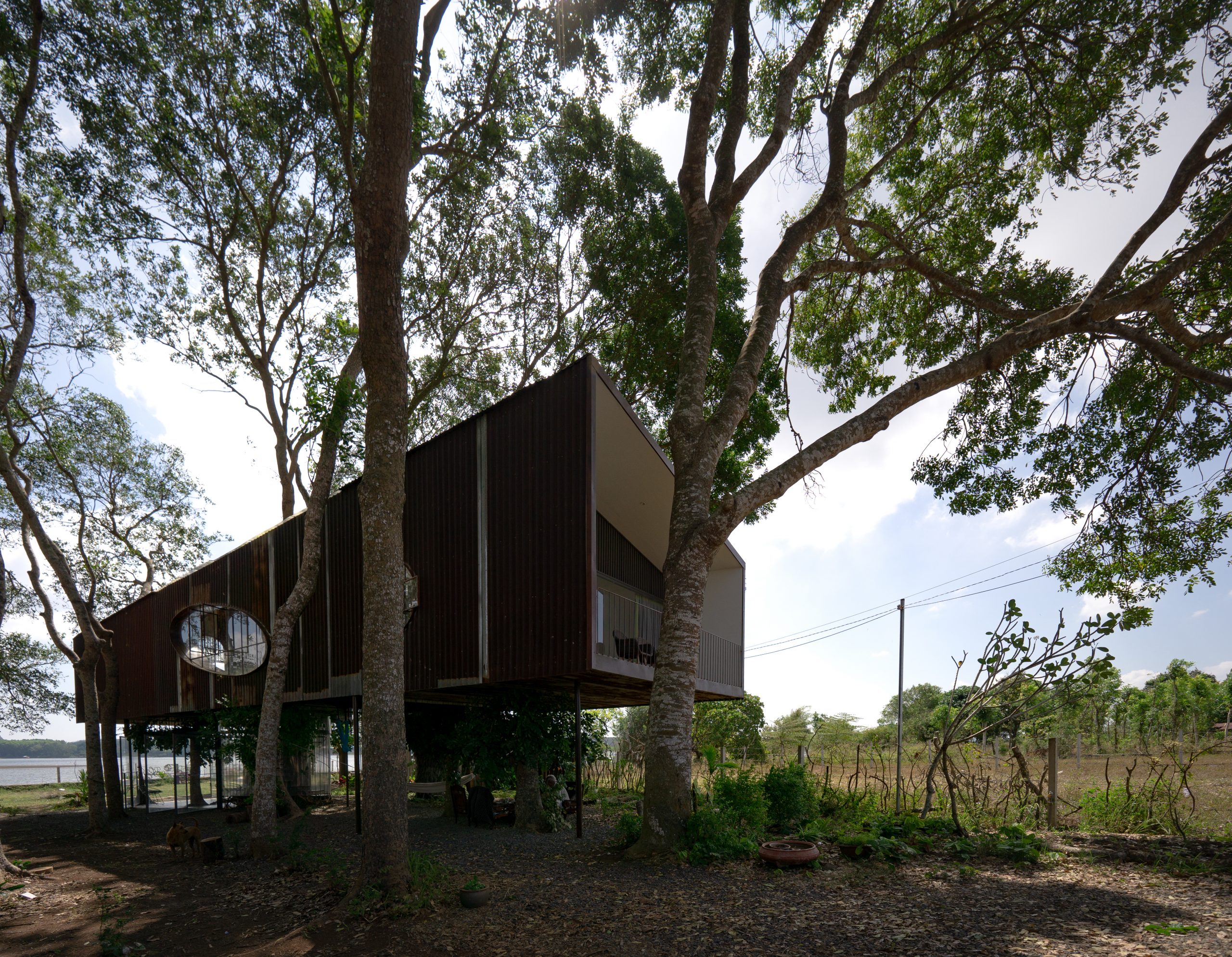
The 120-square-meter home sits in the shade under the canopy of tall trees near the lakeshore. It’s made attractive by ordinary materials sourced from within the neighborhood, a quality that gives it the unblemished charm of rustic rural life.

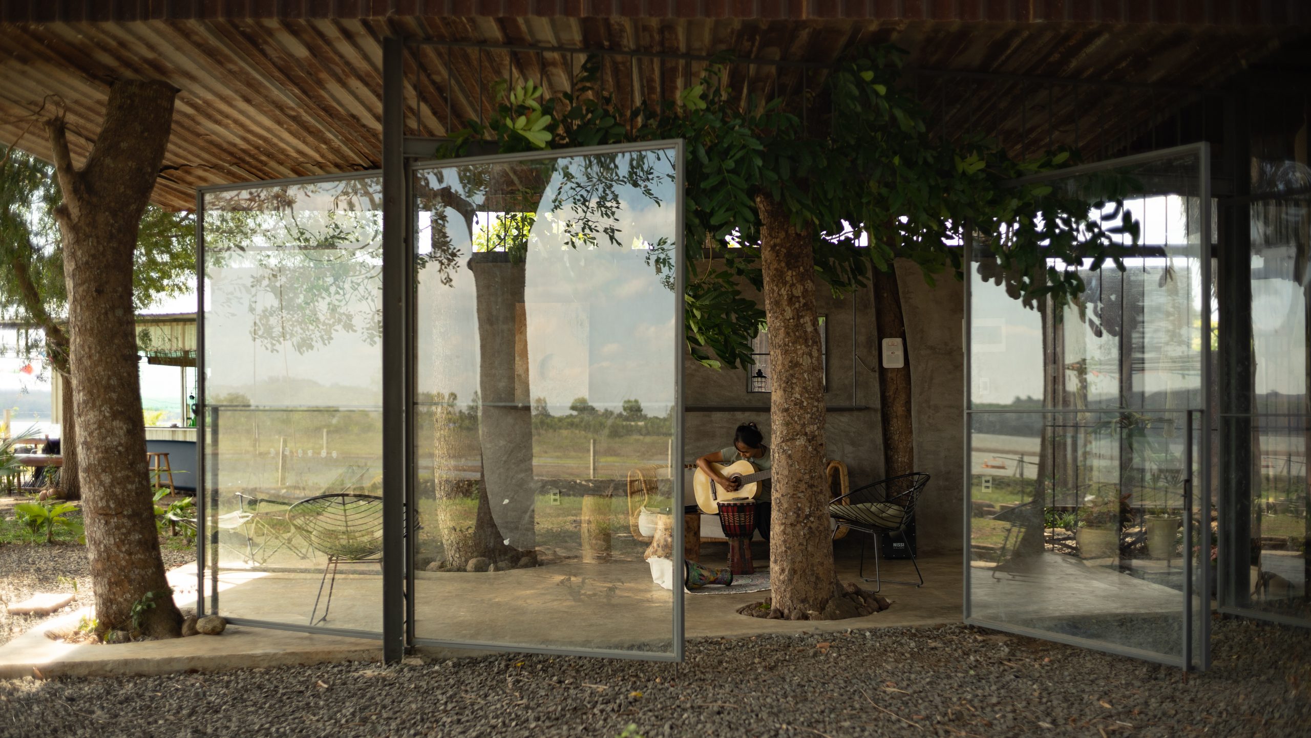
The stilt house supported by concrete structural framing offers plenty of under-floor spaces that allow natural daylight and gentle winds blowing in from the nearby lake.

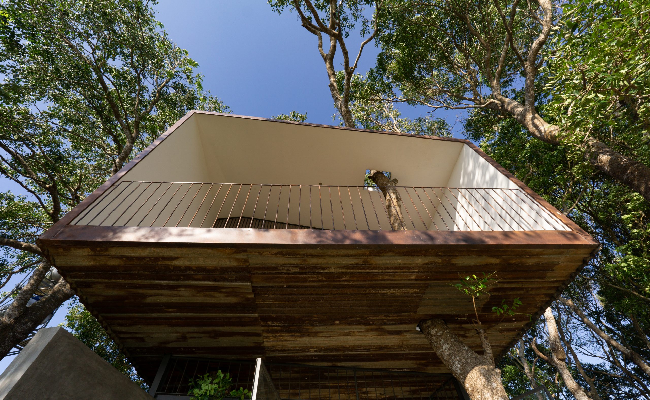
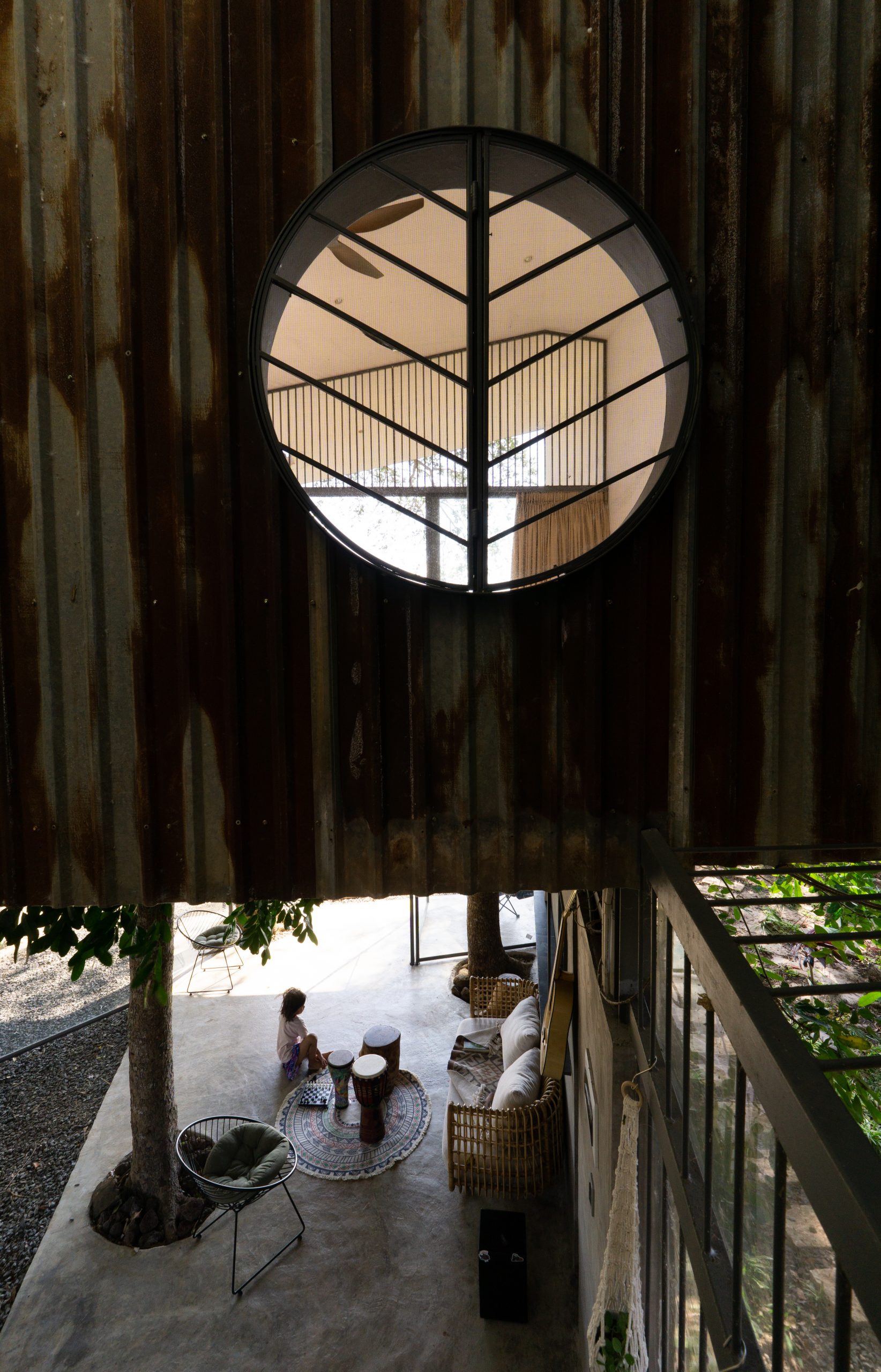
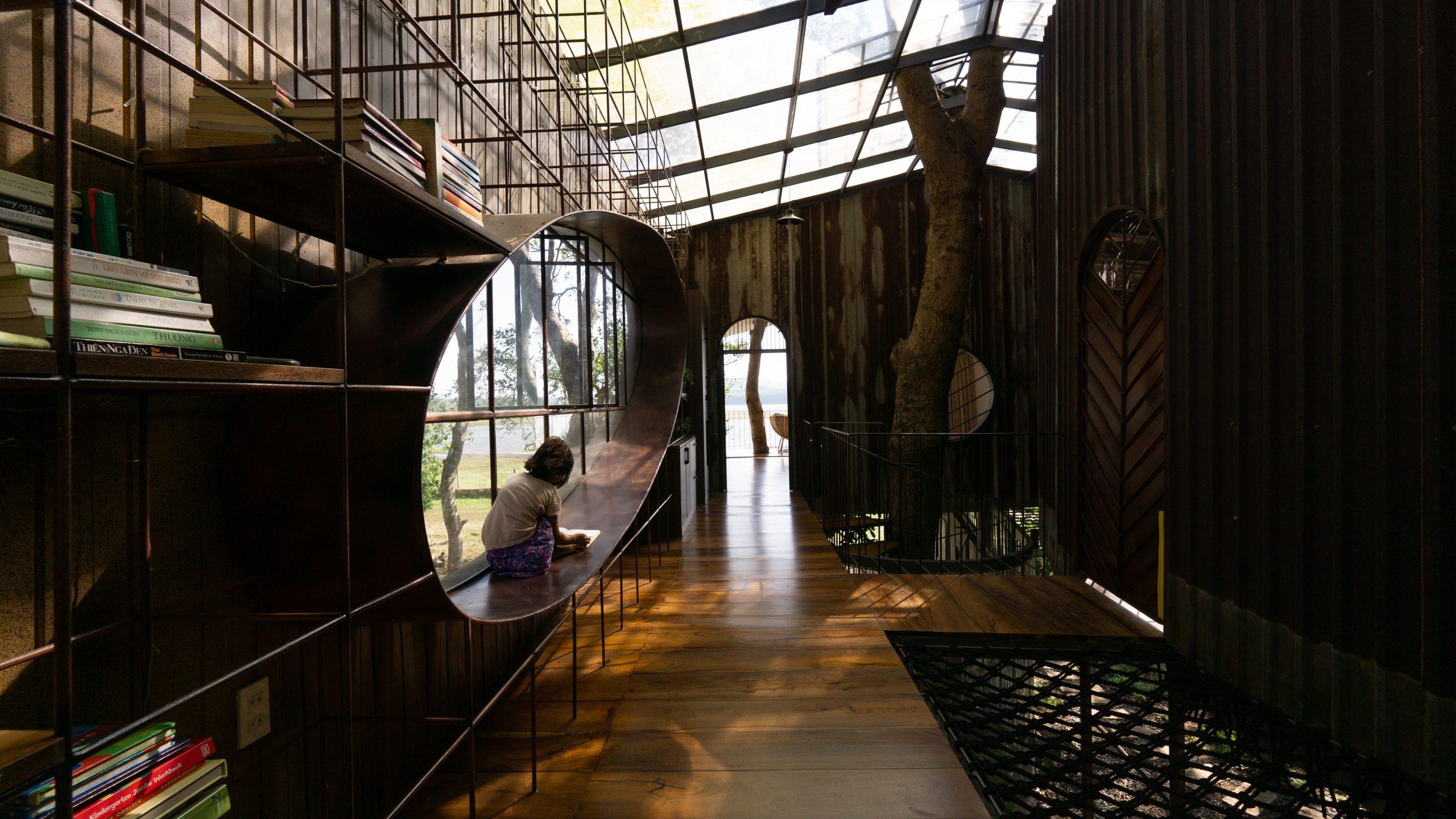
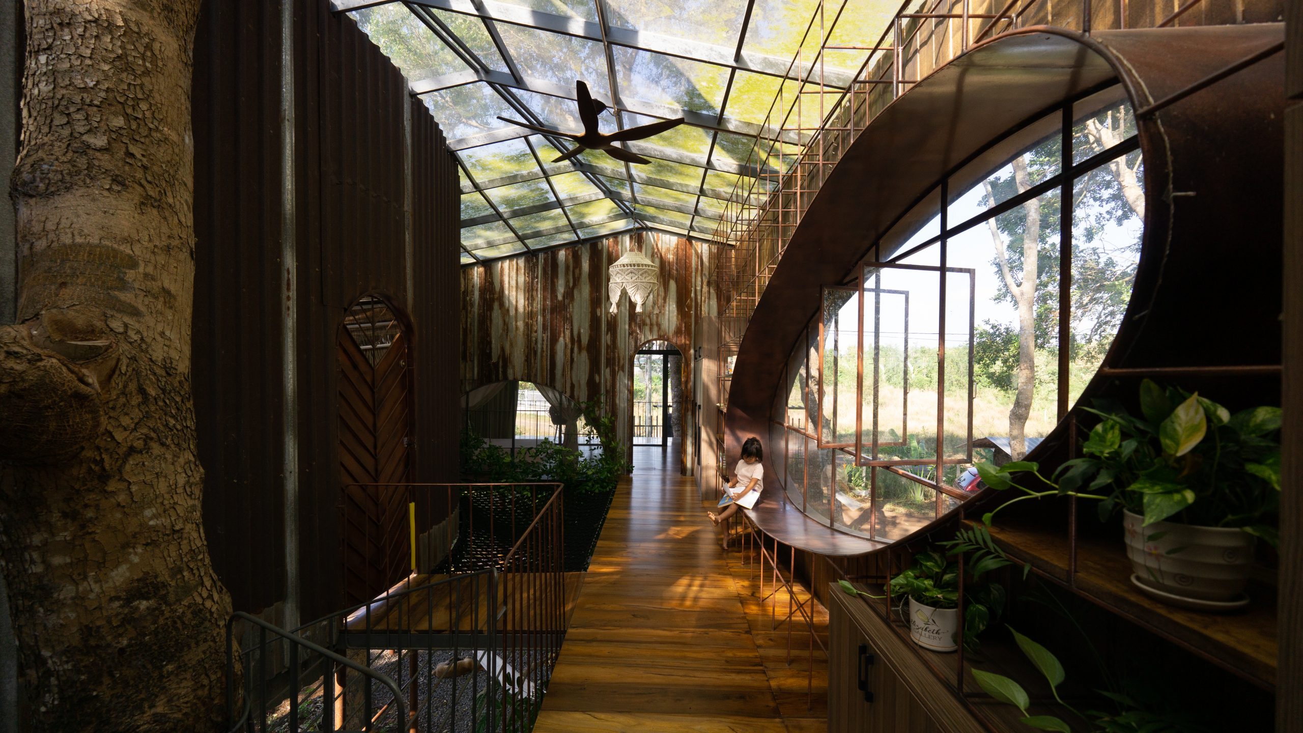
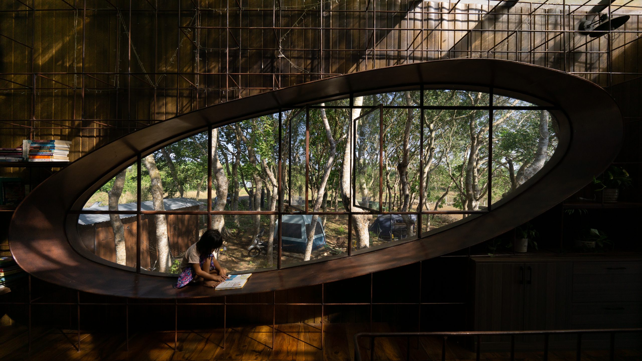
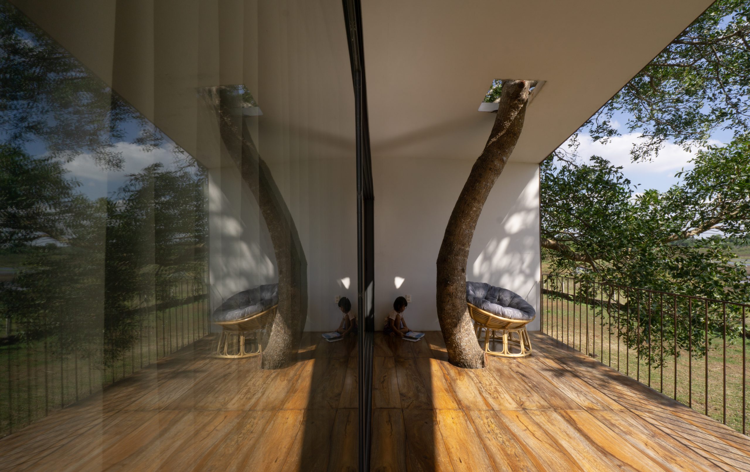
It’s called a treehouse for good reason. Instead of cutting down the existing trees, the new house is built around them, literally letting them grow through the roof.

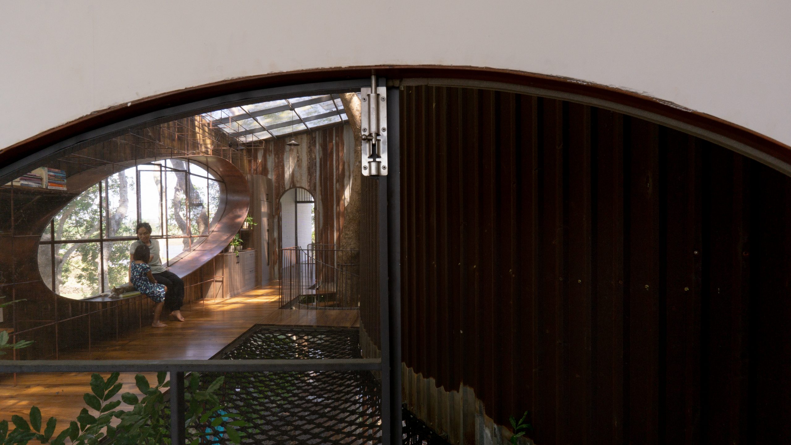
At the center, a spiral staircase winds around a tree trunk connecting the first floor to the second that serves as family living quarters.

treehouse by the lake

treehouse by the lake

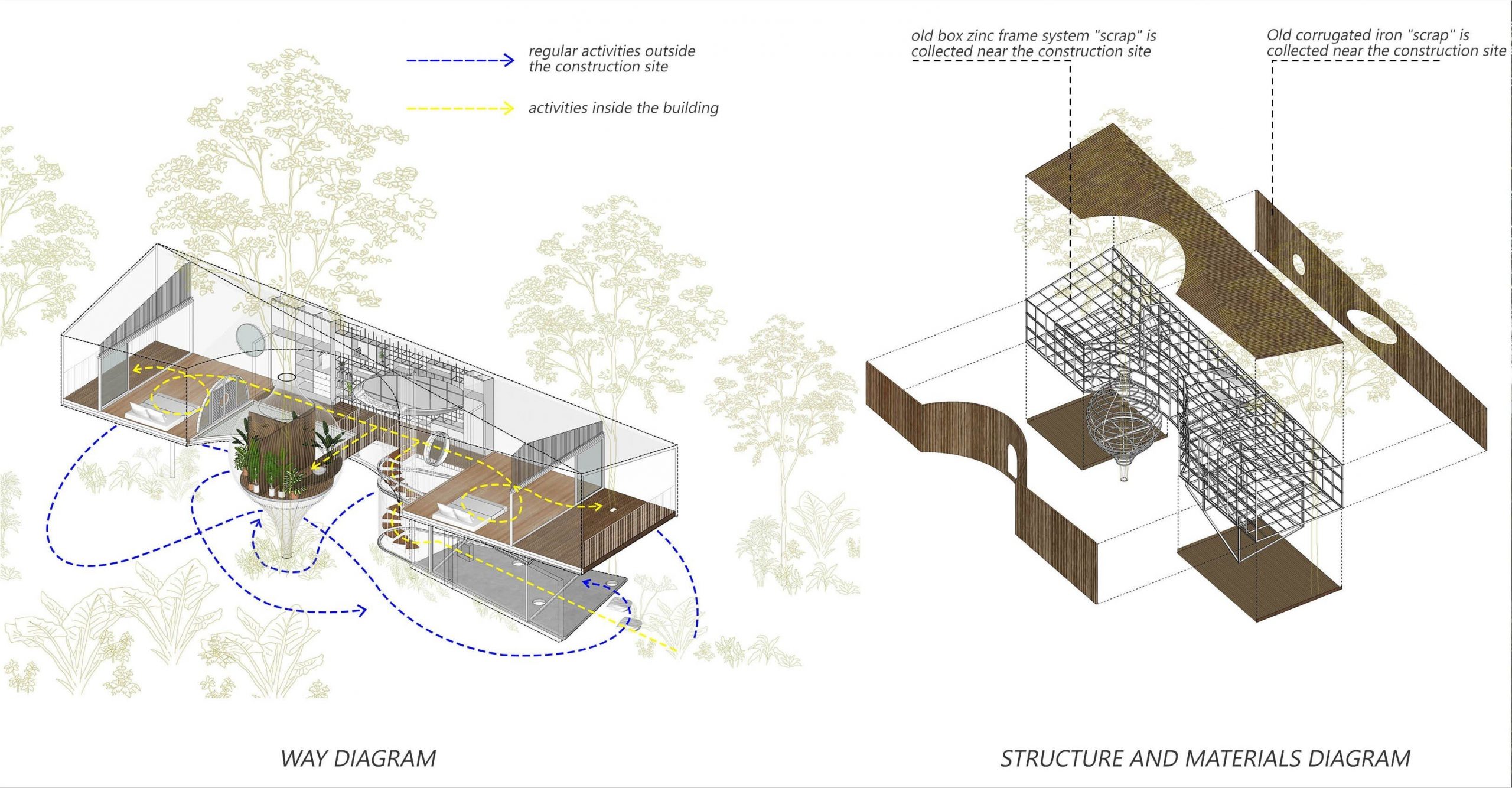
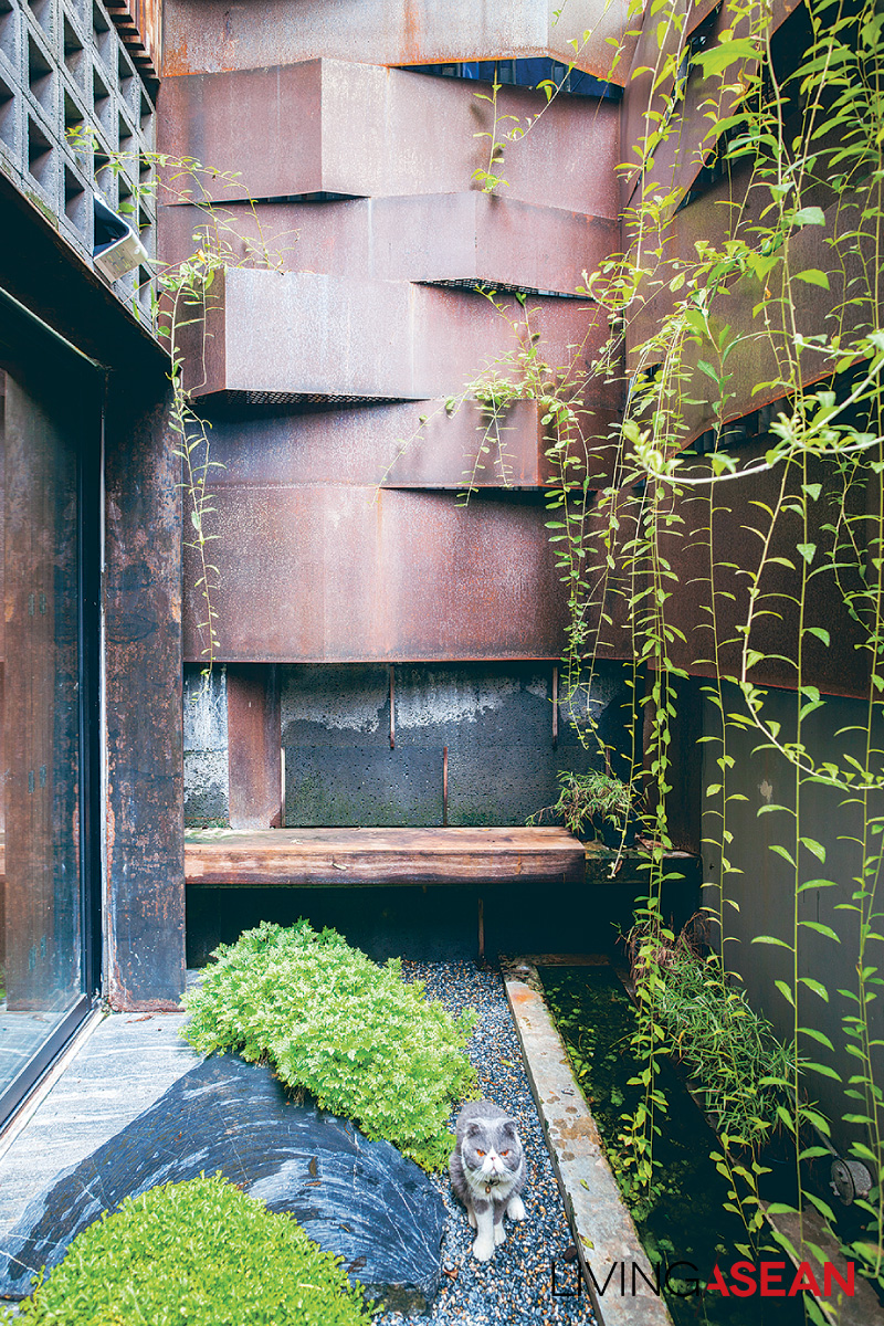
What makes it unique is the use of reclaimed steel with surface rust in a variety of colors and textures, an appearance that gives the house its vintage industrial appeal. Some of the pieces came from an old factory that had been torn down, while others were purchased from a local scrap yard.

In a way, it’s contributing towards a healthier planet by reducing waste, recycling and reusing discarded materials to suit a new purpose.

House Layout Courtesy of H.2
Conceptual Diagram Courtesy of H.2

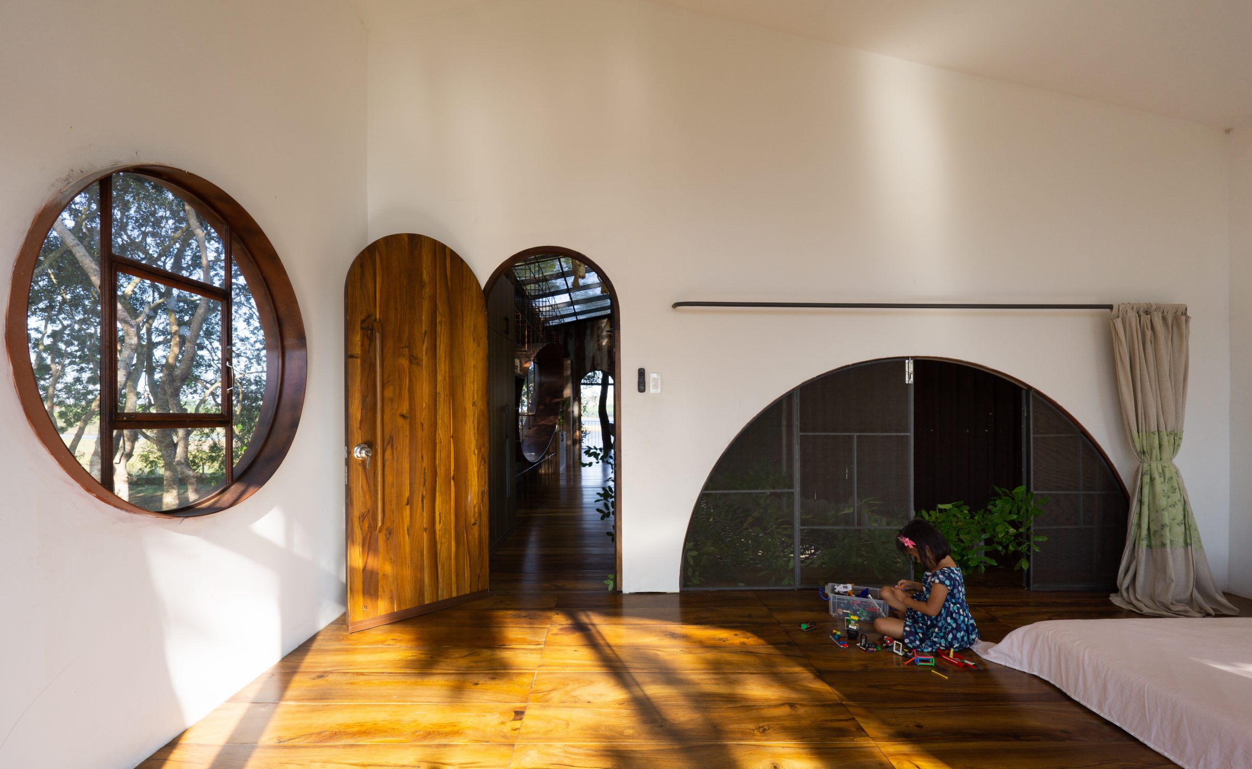
Simple yet attractive, it’s an eco-conscious home made possible by the honest use of natural materials. Here, the emphasis is on creating a light-filled, airy and comfortable interior, one that seeks reconnections with nature and, at the same time, brings the warmth of family joy.

The homeowner said that he could still recall the day his granddaughter arrived at the new home. She was obviously happy and excited.

The forest treehouse by the lake afforded a conducive learning environment with plenty of room to play, run, jump, and climb trees.

With respect to construction, it’s a very interesting project. The nature-loving house by the lake makes practical and effective use of discarded materials in a way that creates a home of higher quality and value.

Take for example the use of scrap metal and leftover materials including corrugated roof paneling that people tend to overlook. And by giving recyclable items a new purpose, it translates into big savings and, at the same time, reduces impacts on the environment.

treehouse by the lake

treehouse by the lake

Long story short, the outer appearance is immediately appealing. The interior living spaces are comfortable, peaceful and secluded to say the least.

Flexible floor plan design lets nature permeate making the home bright and airy. At the same time, it’s ingeniously devised to integrate the existing trees in the overall scheme of things.

That’s just one of several fascinating adaptations that make it original and unique – a forest home where all things eventually merge into one pleasing and consistent whole.

treehouse by the lake


Owner: Mr. Bảo & Ms. Lụa

Architects: H.2 (www.facebook.com/workshopH.2/)

Trần Văn Huynh, Nguyễn Đức Khánh, Nguyễn Duy Thế


You may also like…

Tita House: Redefining Vernacular Architecture in a Tropical Paradise

Beautiful Wooden House on Stilts in a Coconut Grove

Three-Storey Townhouse That Makes Space for Nature
Three-Storey Townhouse That Makes Space for Nature
/ Bangkok, Thailand /

/ Story: Sarayut Sreetip-ard / English version: Bob Pitakwong /

/ Photographs: Sitthisak Namkham / Styling: Jeedwonder /

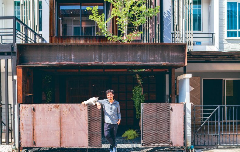
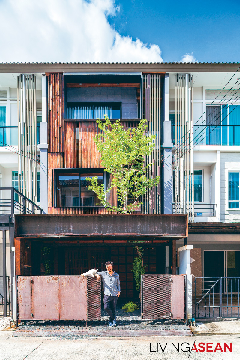
Before moving into this three-storey townhouse, architect and university instructor Bhradon Kukiatnun really put his heart into the design and décor to bring about a conversation among people, animals, and things, partly intentional, partly by impulse. Here are imperfections that are either blemishes or beauty marks, depending on our viewpoint.

townhouse Architect Bhradon Kukiatnun

Bhradon’s business is booming, but designing his own house raised a tremendous number of new questions, not the least of which was how the new living space of a three-storey townhouse would accommodate his eleven cats!

“Three years ago, I bought this place new, and it took two years to fix up,” explained Bradon.

“First problem: organize storage space to hold the tremendous amount of personal stuff needed in my life while still keeping the house orderly. Then, I didn’t want a typical townhouse atmosphere, but neither should it be jarringly different.

“Part of the answer is this new façade, using a type of latticework found elsewhere in the project that fits my personal lifestyle.”

three-storey townhouse

As most townhouses add a roofed-over carport in front, Bhradon also applied his design idea to this requirement.

“There’s more than meets the eye in that front view: a lot of the functions are hidden,” said the architect.

“To really express myself, I had to go back and look at fundamentals with flexibility and an open mind.

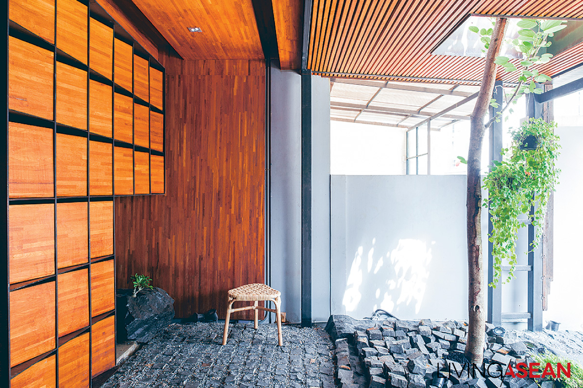
“The space in front is limited. Would I rather have a carport there, or a garden? OK, garden: so I designed a garden where I could park the car! Quite different from having a carport decorated with plants.”

three-storey townhouse

three-storey townhouse

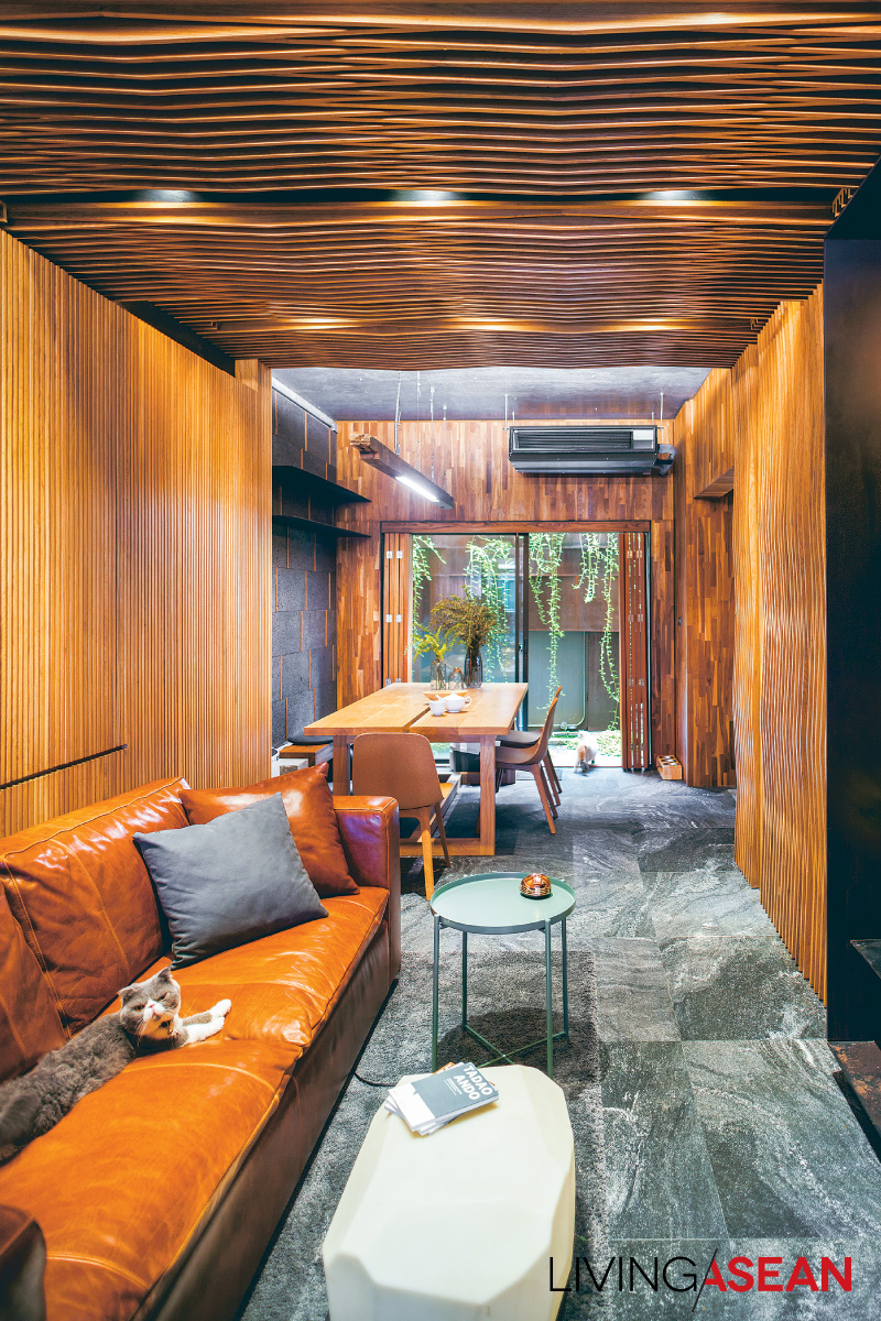
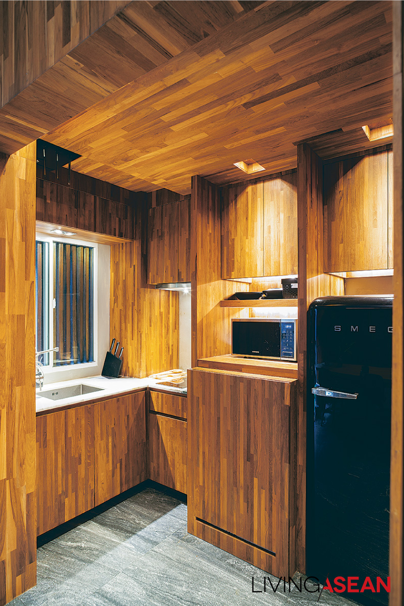
The design of this three-storey townhouse called for no structural alterations, but space was apportioned differently. The ground floor holds the living room, dining area, and pantry; second floor, a small bedroom and a workroom; third floor, the master bedroom.

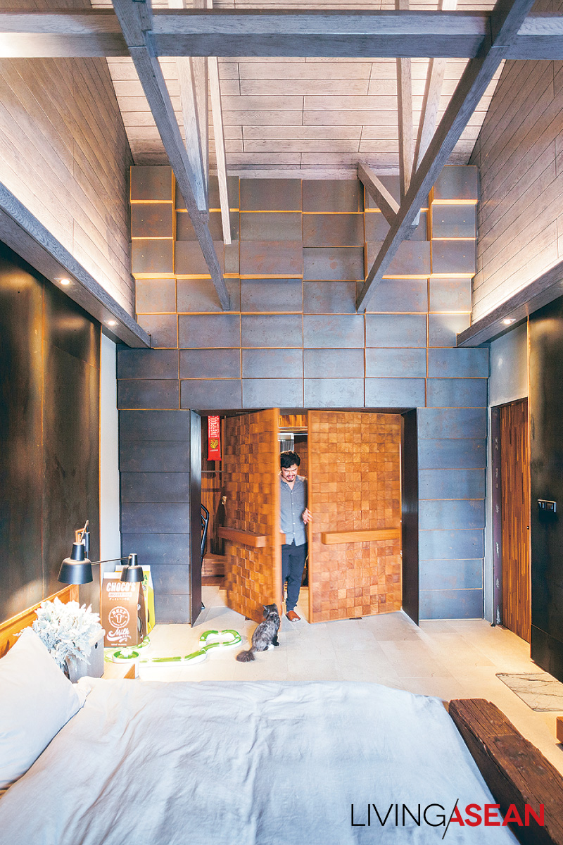
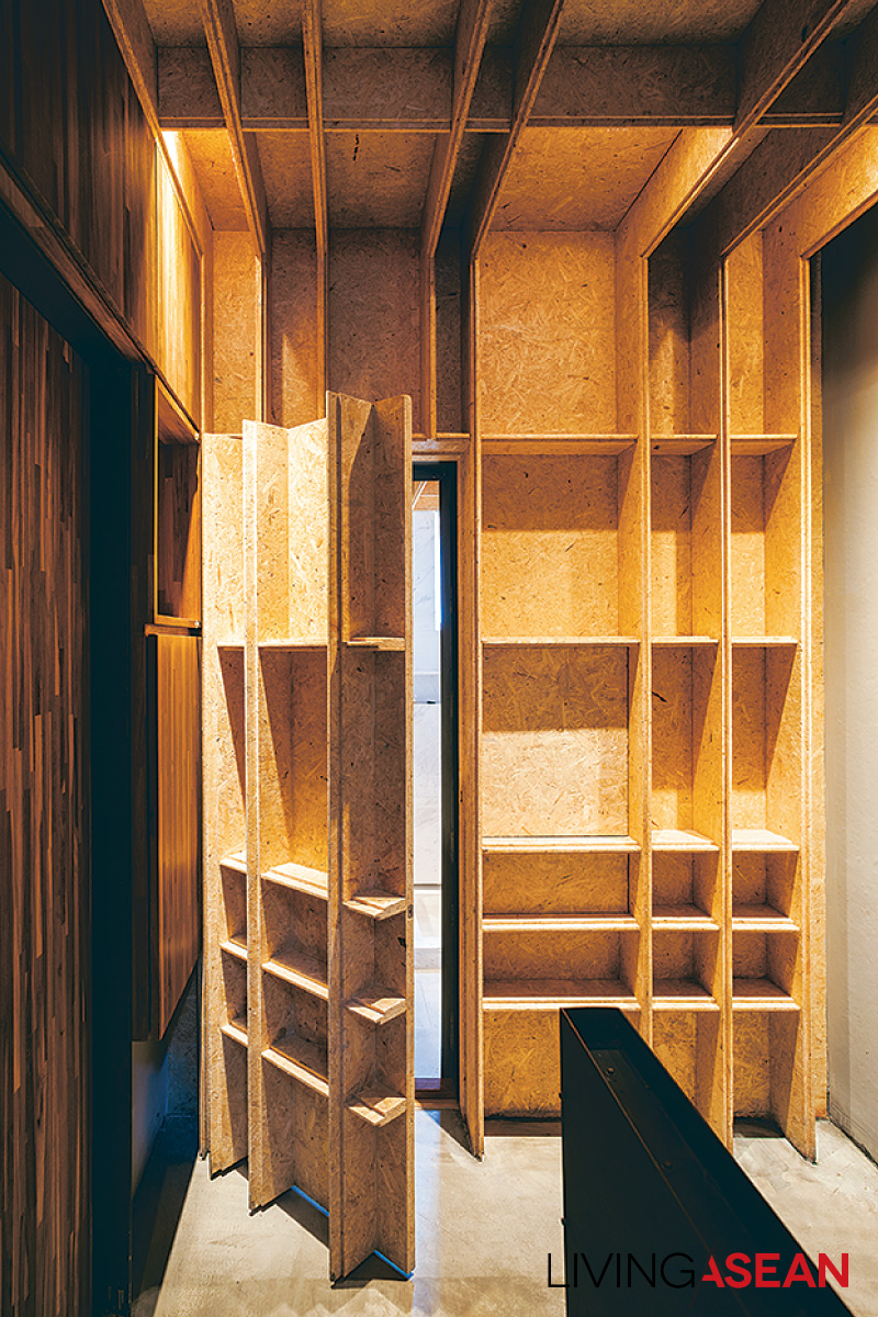
“Inside, you might mistake a door for a wall, or vice versa: my overall concept was to focus on highlighting specific points, making them fit in by hiding some element,” Bhradon explained.

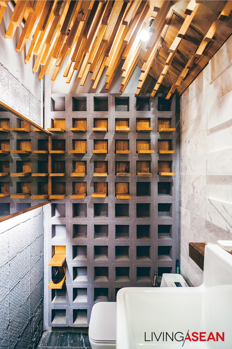
“In the living room, the TV wall is highlighted by hiding its functionality in a wall; the use of covering elements gives the feeling of being in a cave.”

three-storey townhouse

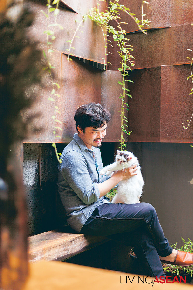
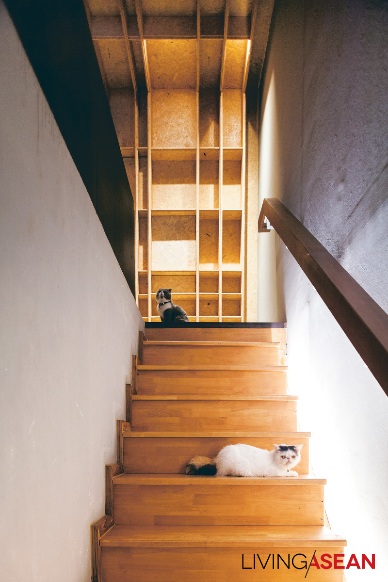
During our conversation Ando, Bhradon’s first adopted cat snuggled up as if to join the group.

“I learned a lot from raising cats,” he said blissfully.

“They don’t think like people. Sometimes our human knowledge drowns out our instincts. But a cat! It wants to sit, lie wherever, just does what it wants.

“This allows single things to have more than one function: TV cabinet or sitting place? Or, for us, a storage spot. Think outside the box.”

three-storey townhouse

three-storey townhouse

three-storey townhouse

We urban dwellers all long for nature. Bhradon answered this with a garden area in the rear of this three-storey townhouse, as he put it: “I think gardens nourish the psyche, so I put a little green in the house, along with a small guppy pond, and it’s a perfect spirit-refresher.

“I like the ‘wabi-sabi’ way of design; the beauty of imperfection, of real life,” he implied. “Real life involves rust; it involves injuries. Can’t eliminate these, right?”

As Bhradon’s speaking voice gradually softened, an unspoken conversation brought into focus the future of the house, the man, the cats, and whatever might lie ahead for them.
“Recently, my cat Kuma died, and I miss her every day. But through the sorrow of loss we see the beauty of living. Being natural is to be incomplete, and we have to live with the things that happen.”


Owner/Architect: Bhradon Kukiatnun


You may also like…

The Perfect Townhouse Makeover in Bangkok

Mash-up: Industrial Design and Green Space of Walllasia

From Unexciting Shophouse to Smart Home Office in HCMC

From Unexciting Shophouse to Smart Home Office in HCMC

/ Ho Chi Minh City, Vietnam /

/ Story: Samutcha Viraporn / English version: Bob Pitakwong /

/ Photographs: Quang Dam /

Home offices are trendy nowadays. Given thoughtful planning, a dull shophouse can transform into a fashionable dwelling and place of business. The results are illustrated in this home office that looks to be one of the trendiest in Ho Chi Minh City.

home office in HCMC

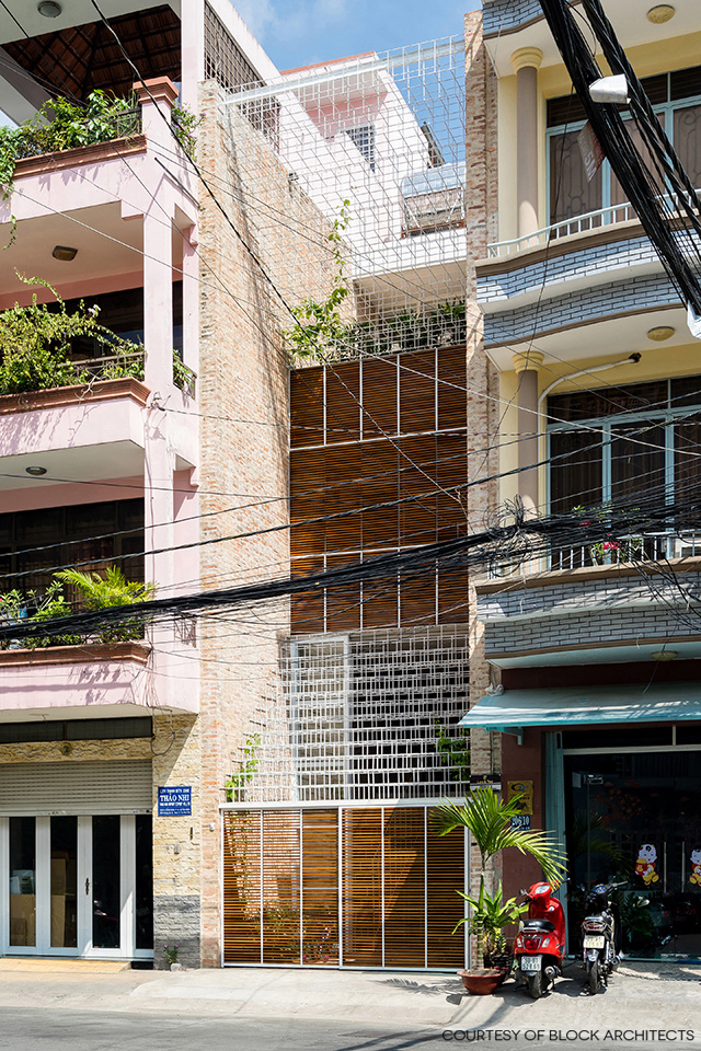
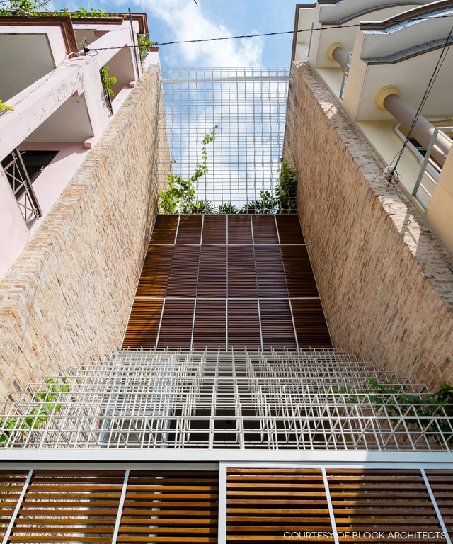
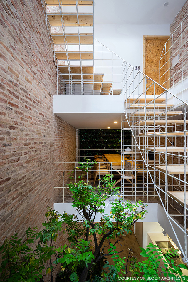
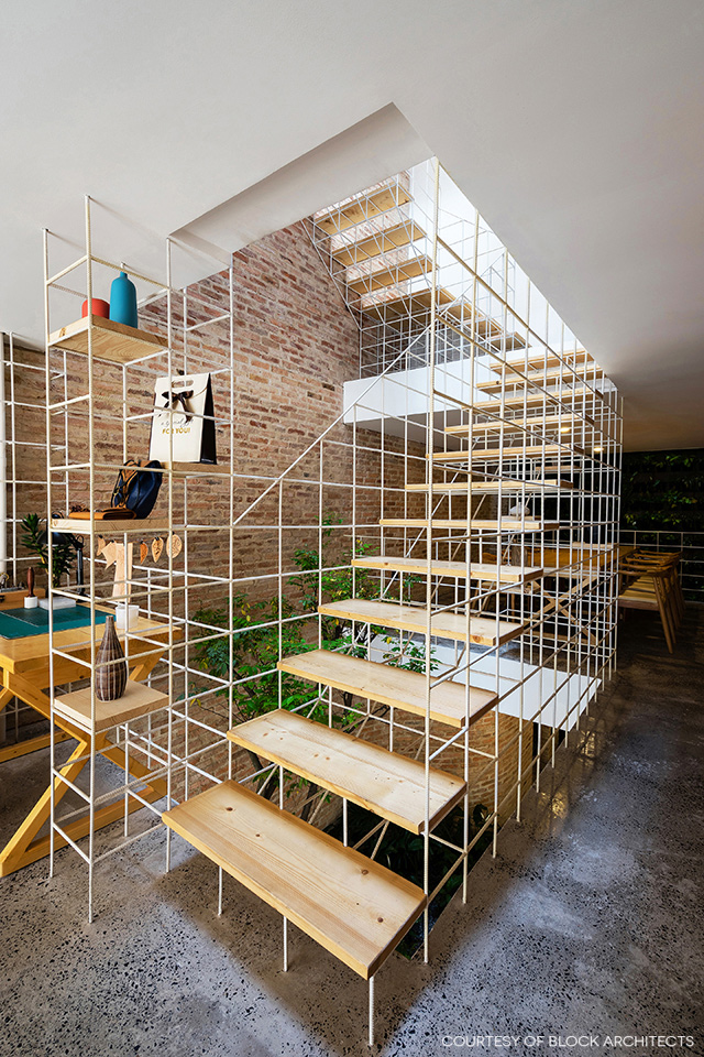
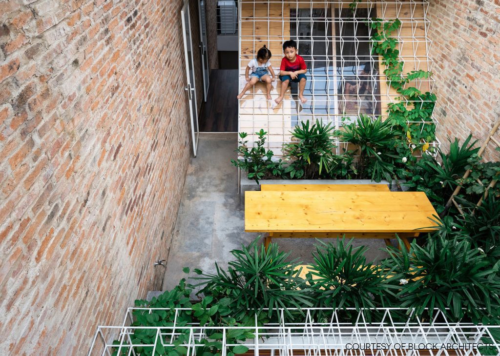
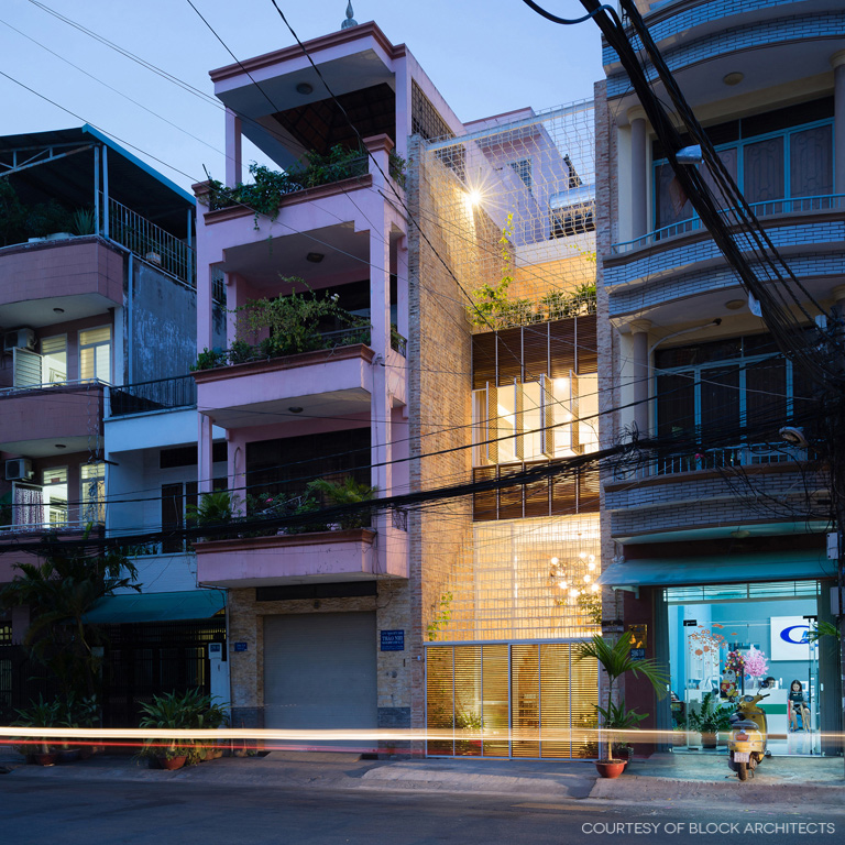
The new design integrates a modern living space and a home office with a factory producing handcrafted leather goods. The house’s front façade is filled up with elaborate structural rod systems reminiscent of a giant labyrinth of beautiful needlework, albeit built of brick and steel.

It’s only recently that a homeowner couple acquired this downtown retail space and later decided to give it a complete makeover. “This house means everything to us because it’s the fruit of constant efforts to pursue our dreams,” said the young couple with an active lifestyle.

home office in HCMC


home office in HCMC

“For a product to be successful, say a handbag, it takes many processes involving fastidious needlework,” said the owners comparing their manufacturing job to that of the architect.

“Like meticulous craftsmen, the architect carefully puts together different parts to make a home, mixing old pieces with new ones, replacing unneeded features with practical strategies, and relying on well-thought-out plans to use every ingredient effectively, be it wood, brick, concrete, metal or even trees.”


home office in HCMC

home office in HCMC

In a way, this pretty much explains the elaborate structural rod systems that fill up the redesigned front façade. Elsewhere, parts of the walls and flooring deemed to be unnecessary were removed to make room for new ideas.

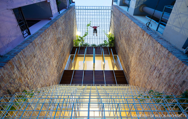
The remodeled front and rear facades showcase a multitude of steel cube frames welded together to look like a web of fine threads being “sewn” together to fill the void between two side walls.

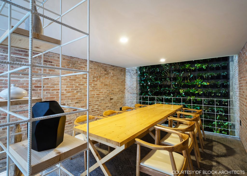
The welded steel rod paneling is painted white and decorated with climbing plants thriving in full sun. Despite its slender appearance, the design is strong enough for home protection, at the same time creating a light and airy ambience for both indoors and outdoors.

home office in HCMC

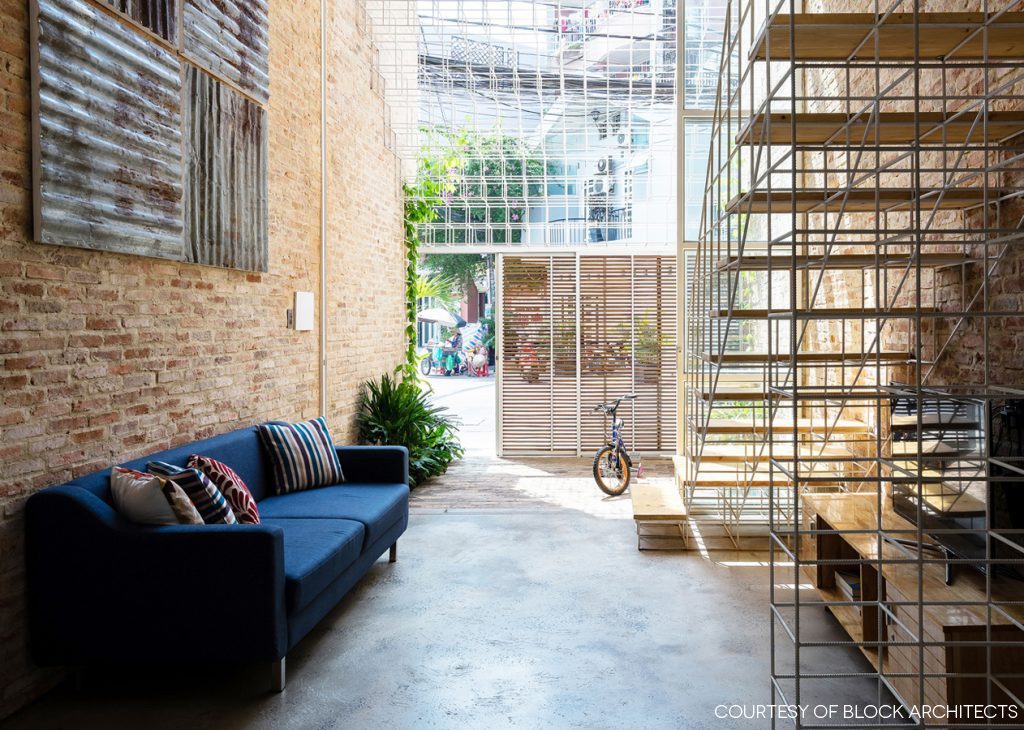
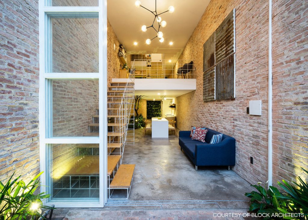
Among other things, the old concrete stairway was removed to prevent the indoors from feeling stale and stifling. Then, a new set of airy stairs with no risers between the treads was put in place instead.

For a lightweight look, stair railings were crafted of steel rods painted white with wood treads in complementing shades. The uplifting design rendered the staircase looking as if it were hovering above the floor.

shvf01

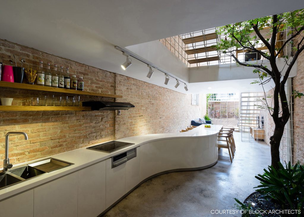
In the kitchen and dining area, a long curvy counter stands in contrast to the stillness of rough brick texture on the wall. All in all, clever design has transformed an unexciting shophouse interior into a home office that looks to be one of the trendiest in Ho Chi Minh City.
home office in HCMC


Architect: Block Architects (www.blockarchitects.com.vn)


You may also like…

The Perfect Townhouse Makeover in Bangkok HUAMARK 09: An Architect’s Charming Concrete Block House

X