Blog : double volume

Patchworks: A Dessert Café Looks Simple, Yet Stunning in Brutalist Architectural Style

Patchworks: A Dessert Café Looks Simple, Yet Stunning in Brutalist Architectural Style

/ Bangkok, Thailand /

/ Story: Phattaraphon / English version: Bob Pitakwong /

/ Photographs: Nantiya June, Kittiya Kularbrat /

If the sweet aroma of baked goods is really your thing, here’s a dessert café dubbed a “hidden gem” in Charansanitwong, a vibrant neighborhood on the Thonburi side of Bangkok. Aptly named “Patchworks”, the small restaurant is renowned for its fine pastries and delicious desserts. It’s owned and operated by four siblings who possess different talents and passions. Characterized by the functionalist approach to building design, the place is likened to needlework in which small items and different details are sewn together beautifully.

Embracing a mix of brutalism and modernism, the raw concrete building is home to a dessert café serving rich, fluffy pastries and delicious light meals. Its bold forms bear some resemblance to a massive piece of cake visible in every direction. Conveniently situated across from of the MRT Bang-O station, its dining room affords a beautiful panorama of Charansanitwong, a vibrant neighborhood on the Thonburi side of Bangkok

As the saying goes, all big things start small. “Patchworks” began as a small business selling an assortment of baked goods back in the day. It grew and matured over time into an established bakery café, ultimately changing its corporate image and creating a strong brand identity thanks to a collaboration with the design firm p/s/d, or “party / space / design”.

It all took shape when the four siblings and a design team from p/s/d got to know each other not long ago. Purposeful meetings in the ensuing days soon paved the way for a smooth project implementation. They allowed for information exchange, problem solving and decision making that led to the integration of their specialized skills and passions into the new business plan. The result is an architectural style and branding concepts that tell the story of its products and services.

The downstairs welcoming hall has a dark emperador marble counter across which pastries and desserts are served. The mouth-watering light meals are made fresh daily in the kitchen located nearby. Busy movement and activity inside it can be seen from here, thanks to a large window separating it from the hallway. Together they are viewed as the highlight of the first floor.
A forest of pendant lighting is suspended from the ceiling directly above a void of space by the glass wall. The shapes and sizes of lampshades get their inspiration from a variety of whisks used for whipping and mixing ingredients, ultimately creating a bright and airy restaurant décor that goes together well with double-height ceilings.

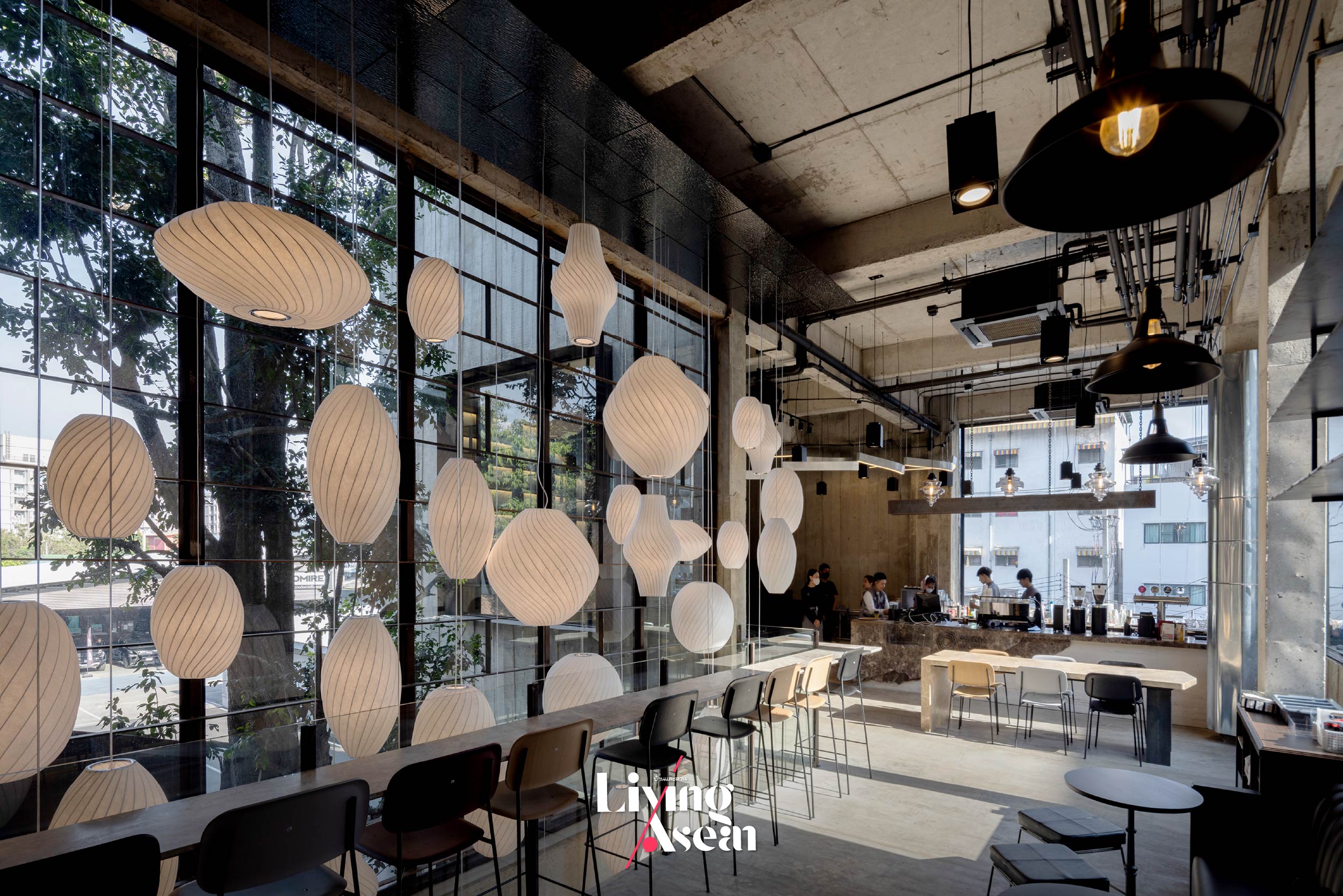
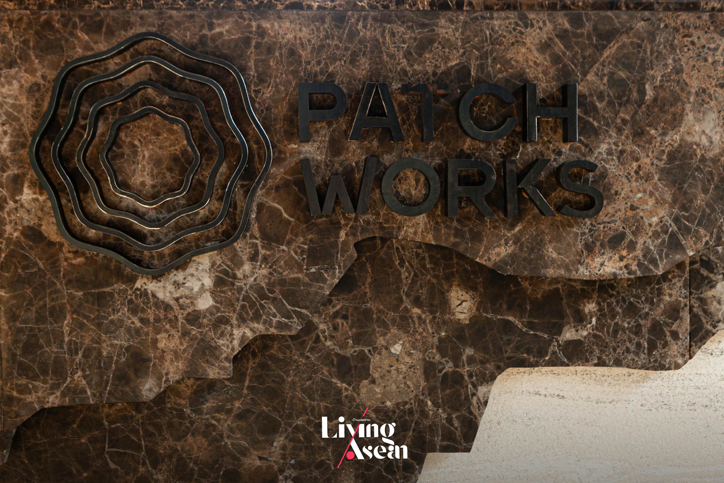
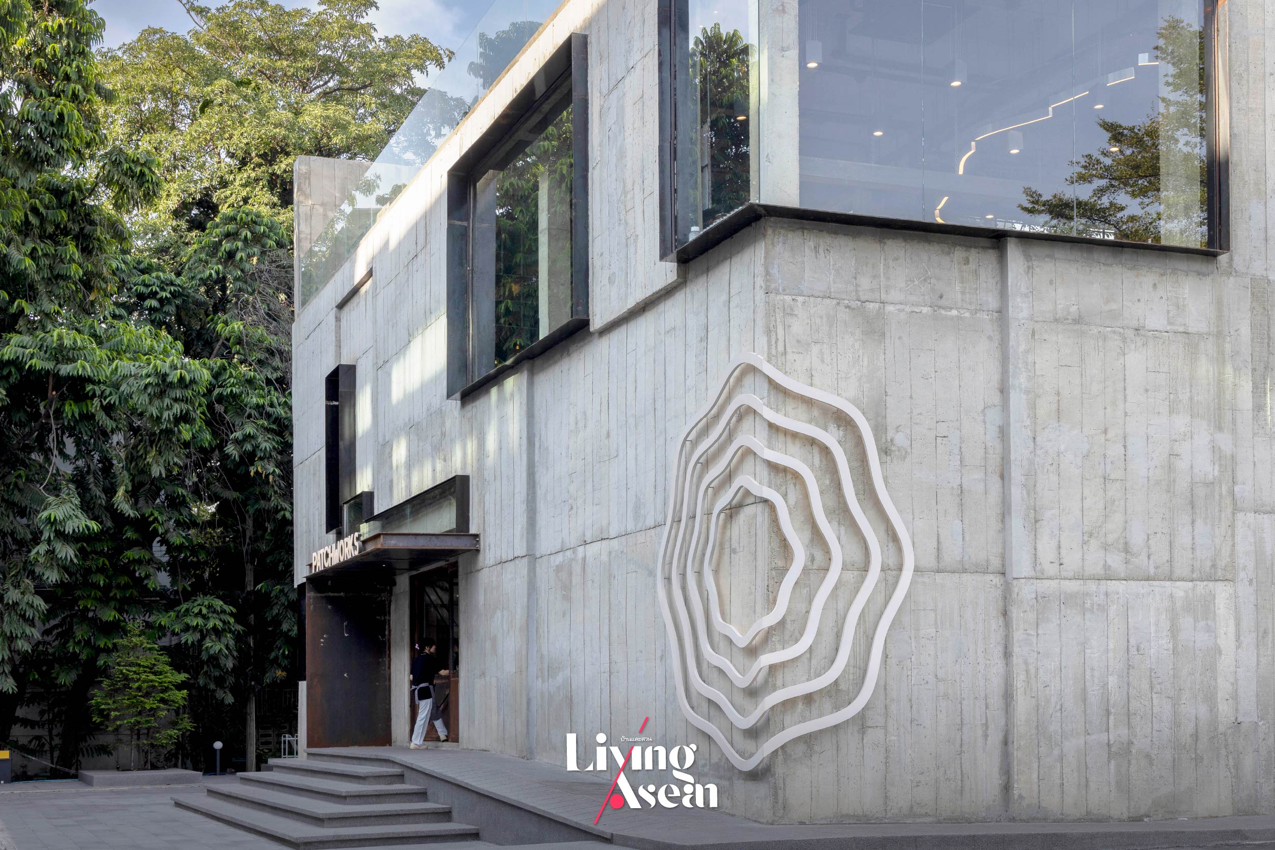
Among other things, visuals of a whisk which is a utensil for whipping eggs and cream are used as the company logo. They are placed in different locations both on the building envelope and as ornaments enhancing the interior. Because the font style matters, the business name is made using a typeface ideally suited to a place in which to enjoy fine pastries, delicious desserts and a good dining experience.

For strength and durability, the floor is built of a type of concrete used in waterborne environments. Also known as “marine concrete”, it’s commonplace in Japanese lofts and widely preferred for its beautiful visual effects when touched by light.

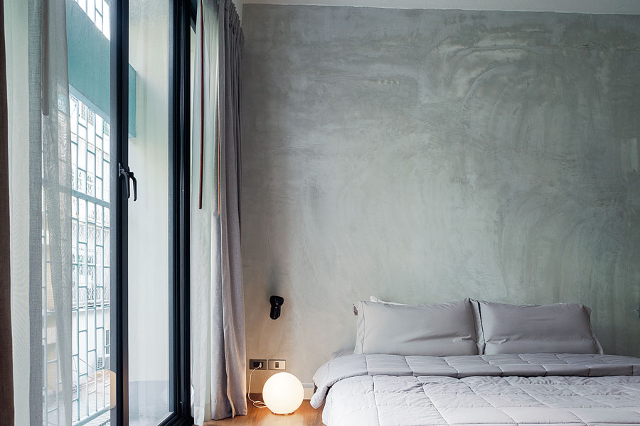
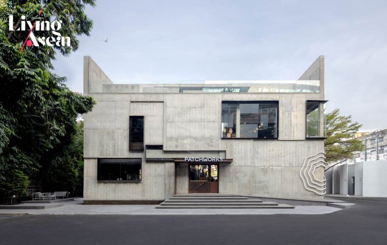
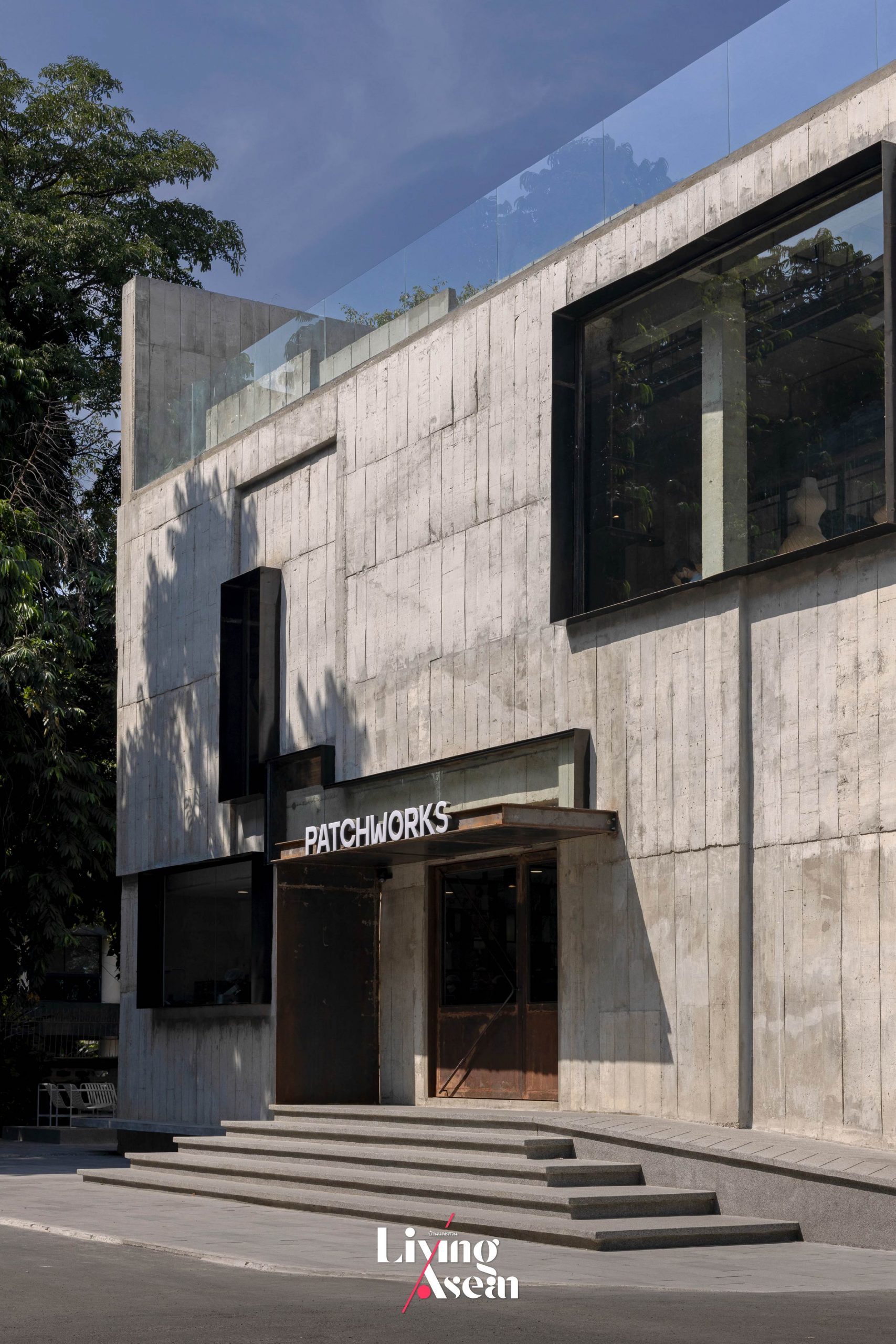
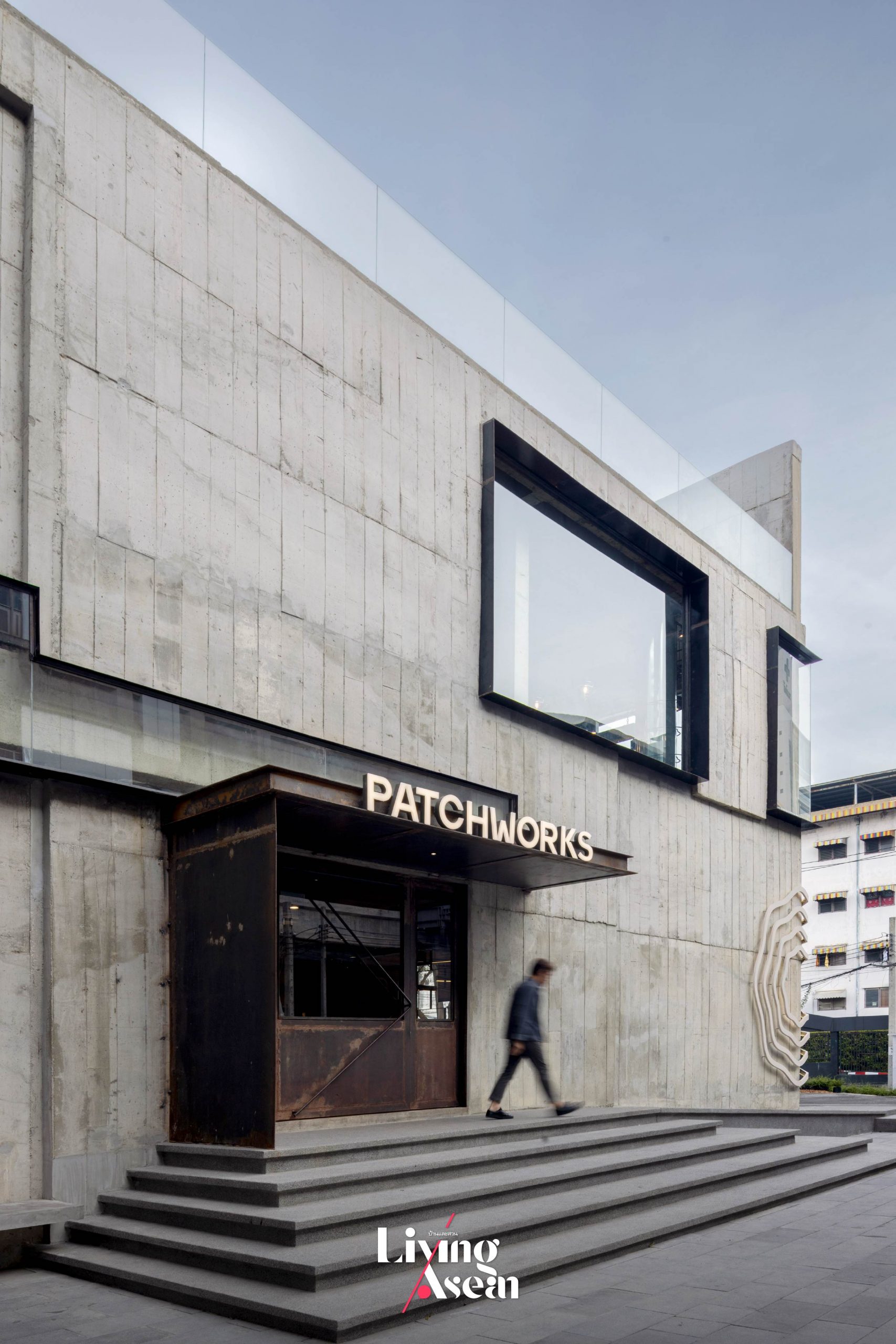
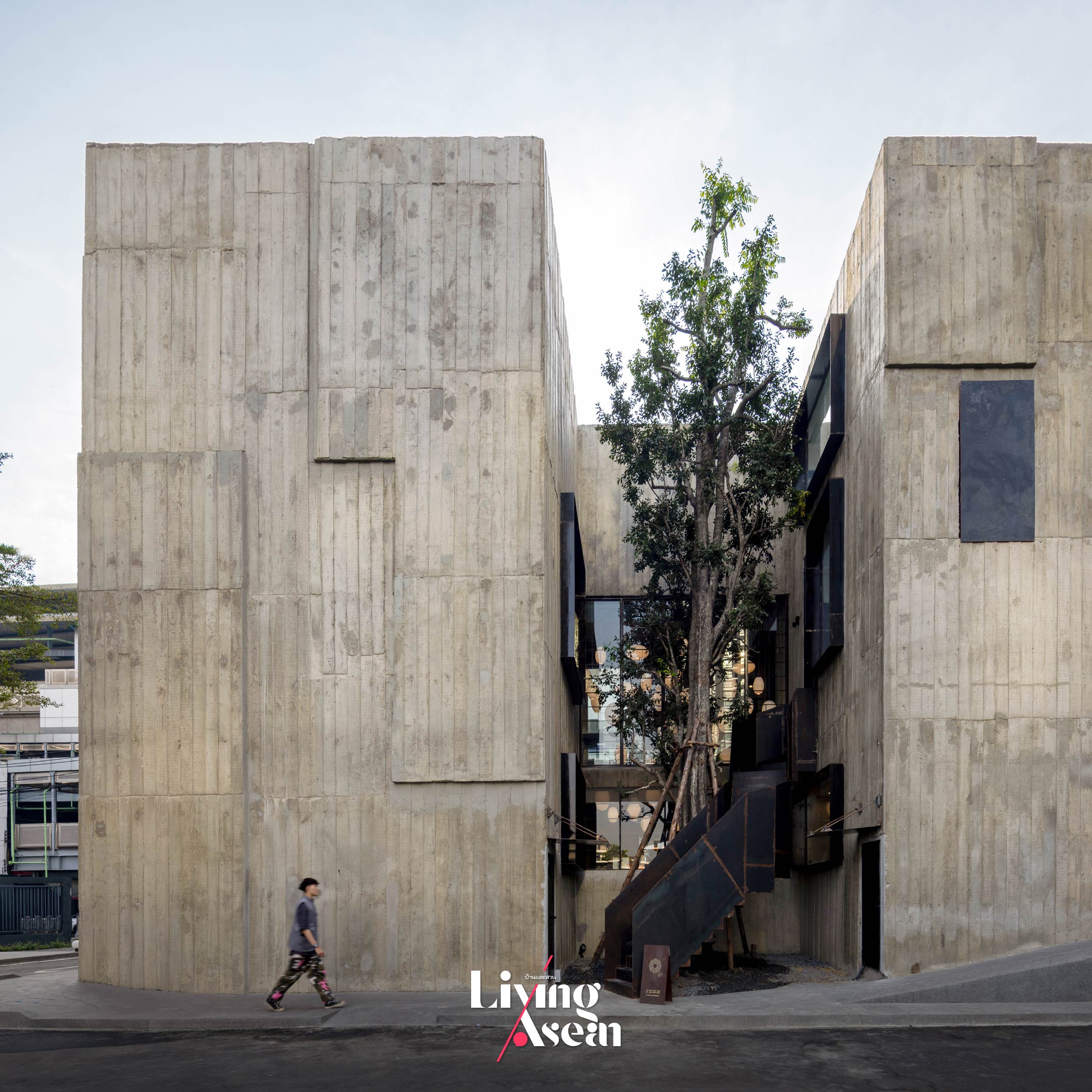
Architecturally speaking, “Patchworks” is an interesting mix of modernism and the brutalist style characterized by raw materials, bold geometric forms and functionality over ornamentation. Expressed in a different way, the use of raw concrete contrasts sharply with the alluring aromas of baked goods and delicious desserts that are its signature dishes. The café has a view of the Metropolitan Rapid Transit (MRT) Bang-O Station.

A metamorphosis of purpose. Visuals of the kitchen utensil used for whipping eggs, cream and mixing ingredients play a new role as the company logo and a forest of pendant lamps suspended from the ceiling. Together they tell the story of brand building, meantime, making the dessert café original and unique in its own special way.

From a distance, it has the appearance of a cube-shaped building, something resembling a giant piece of cake facing all directions. Its proximity to the light rail station makes “Patchworks” a convenient place to meet, relax and indulge in tasty, fluffy pastries and delicious desserts, not to mention fresh brewed coffee and other refreshments. Critics may find the brutalist architectural style unappealing. But inside it, pleasant surprises abound.

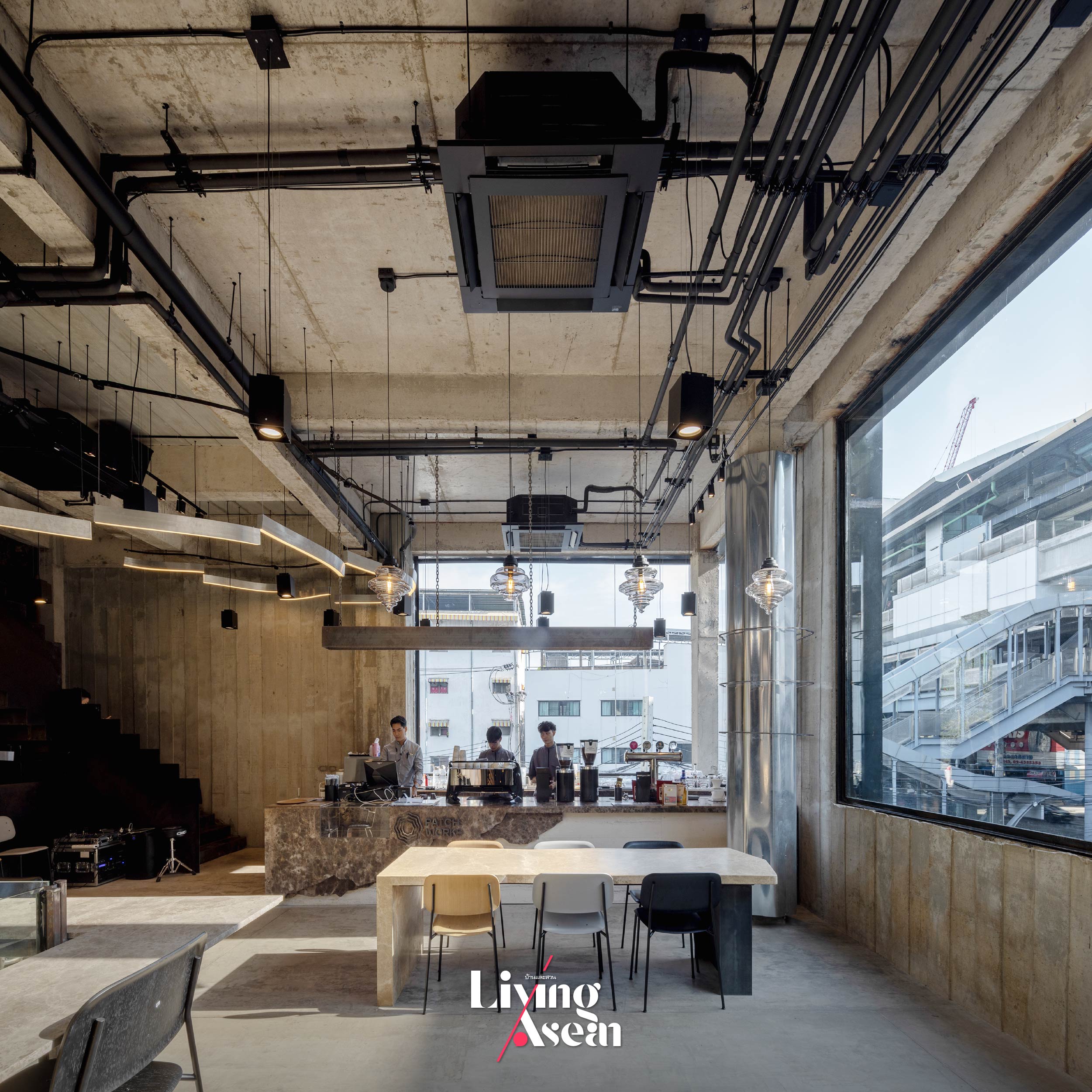
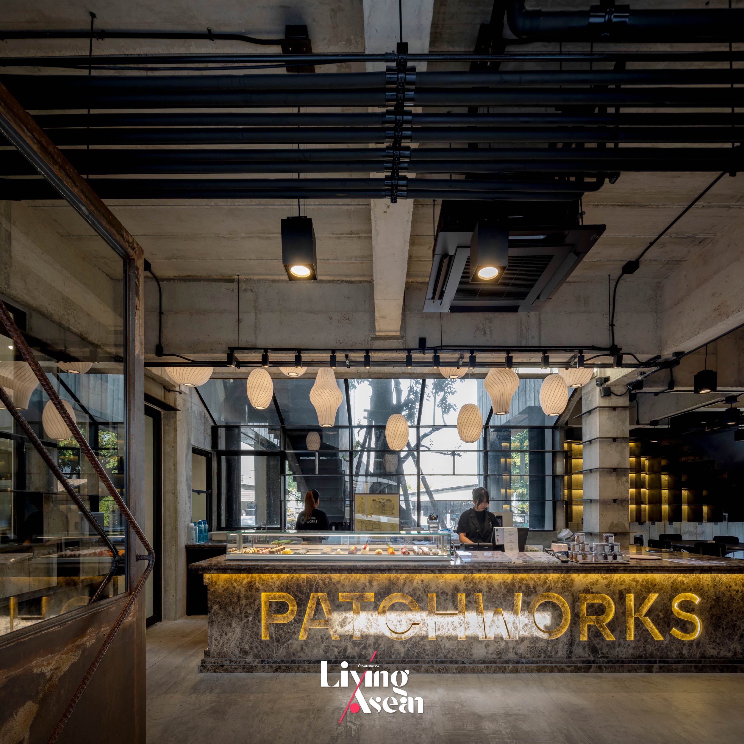
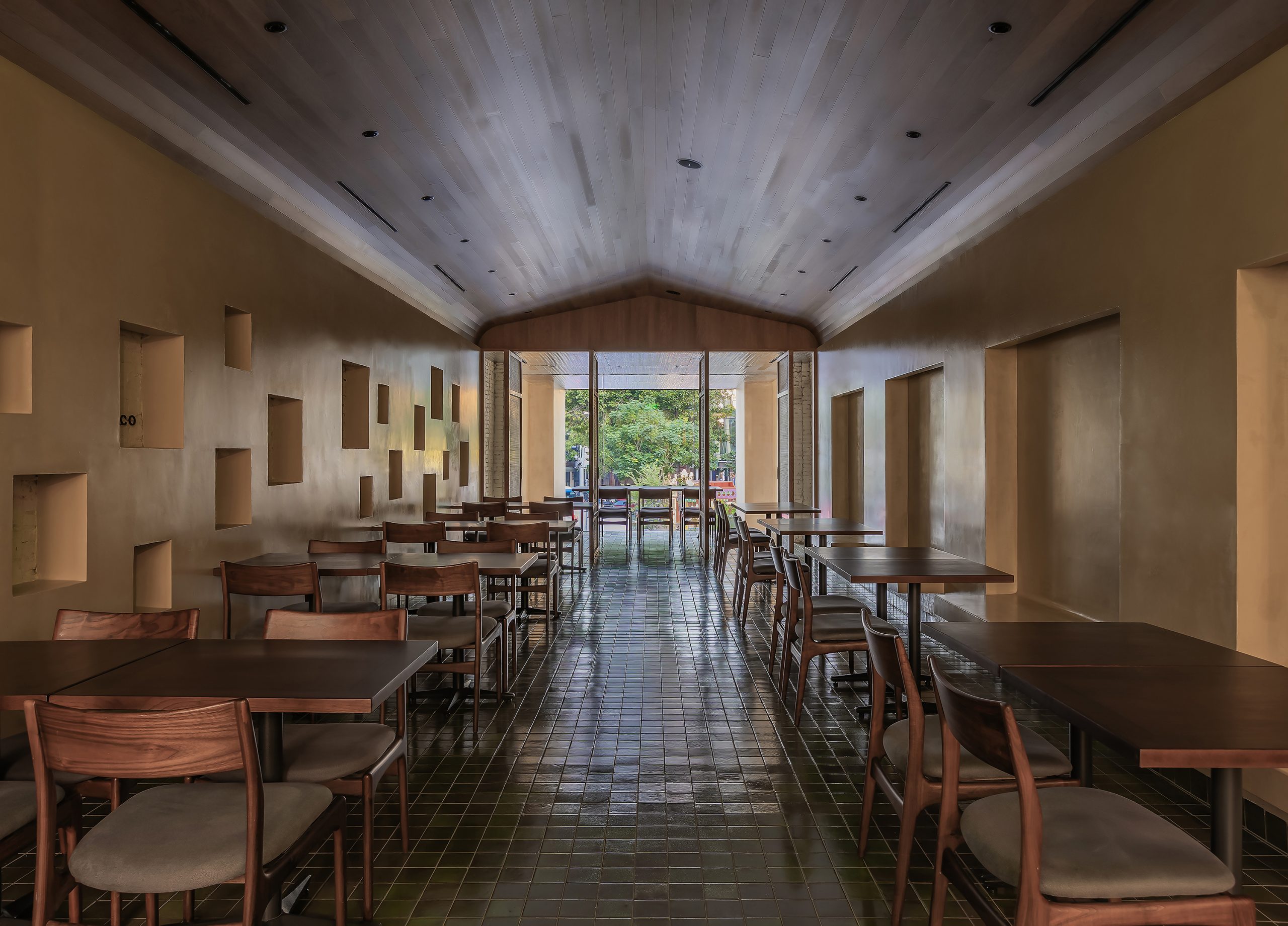
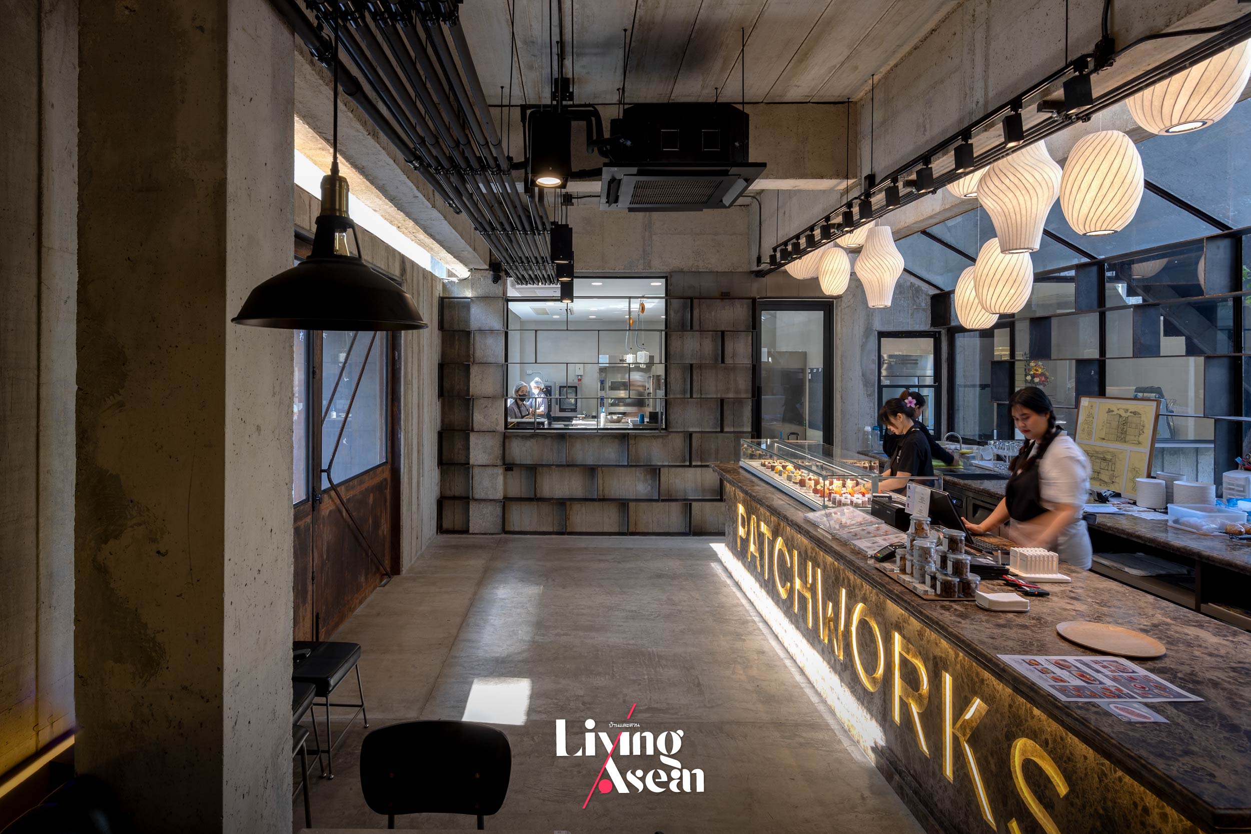
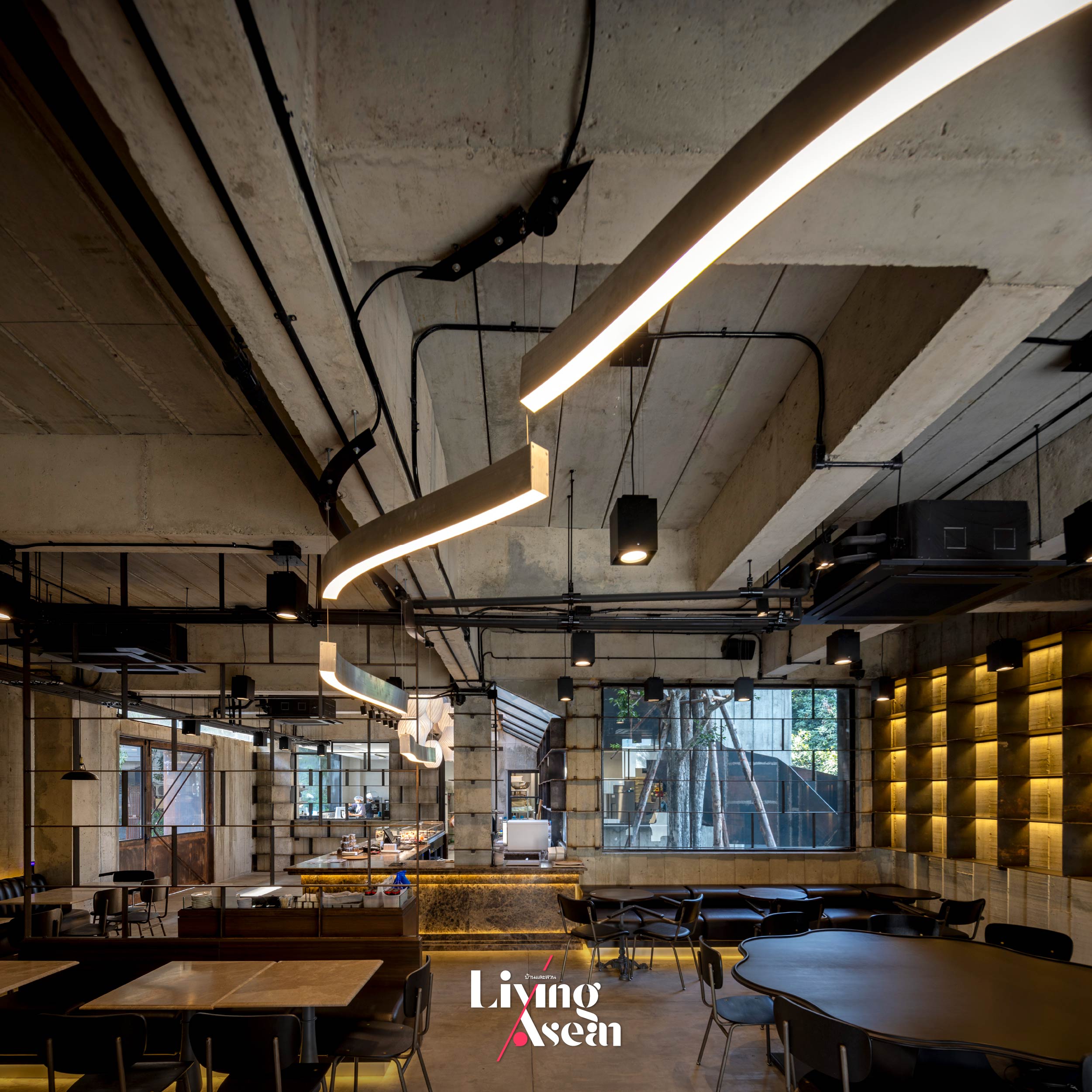
Walk in the door and be spoilt for choice. The first floor holds a welcoming hall with a dark emperador marble counter across which rich fluffy pastries, desserts and beverages are served. The mouth-watering light meals are made fresh daily in the kitchen located on one side of the room. Busy movement and activity inside it can be seen from here, thanks to a large window in the hallway. Across from it, restaurant tables and chairs come in a combination of different shapes and sizes designed to satisfy customer needs.

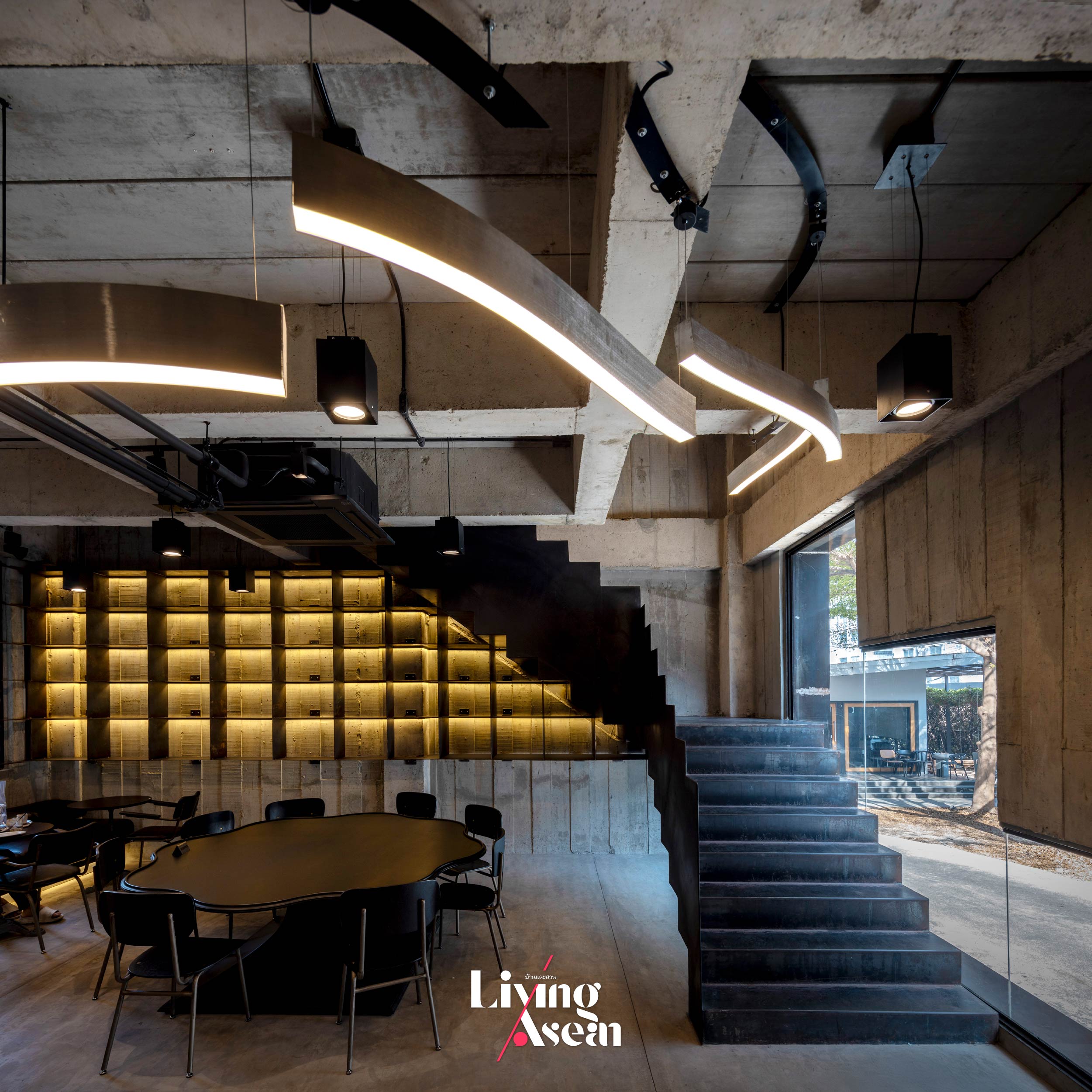
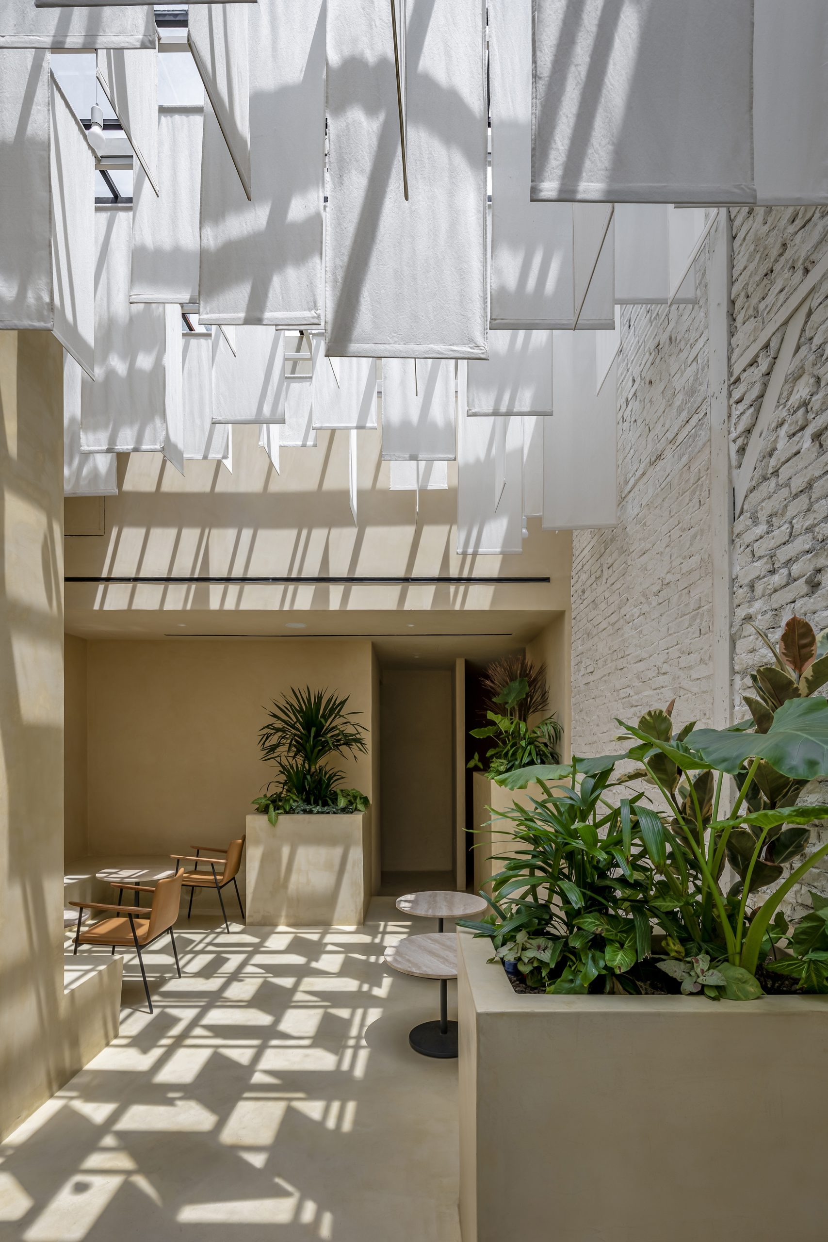
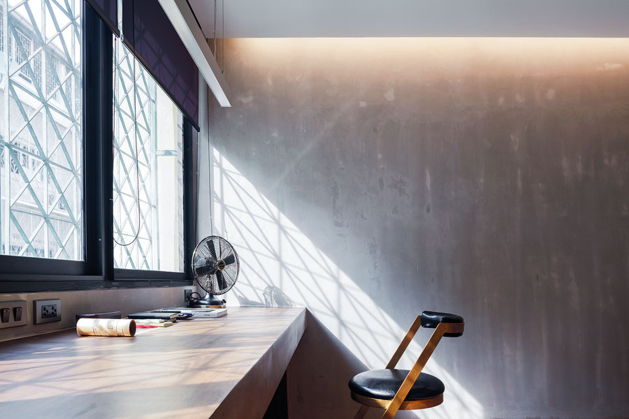
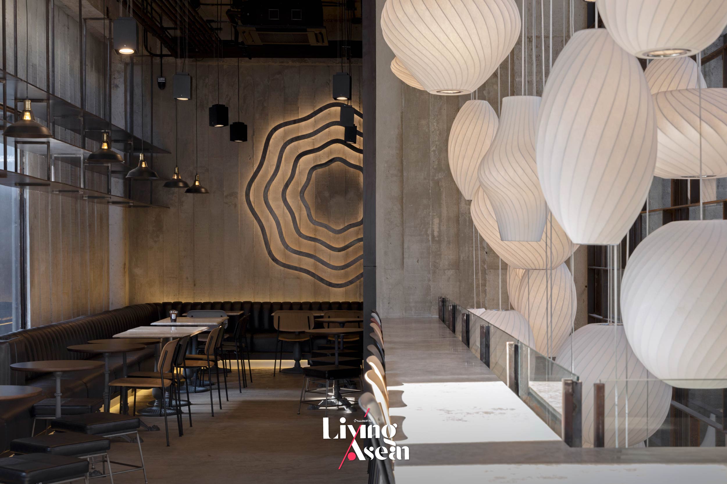
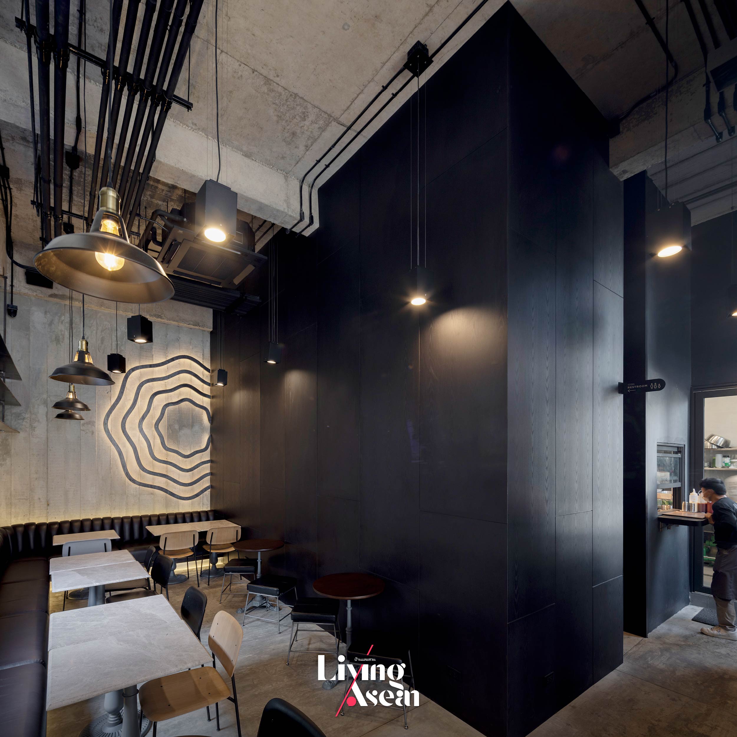
Behind the pastry and dessert counter, a void of space directly overhead serves as engine that drives ventilation supplying fresh air and keeping the interior cool. Not far away, rustic pendant lighting in a variety of shapes and sizes provides a focal point inviting customers to explore extra seating spaces available upstairs. By design, the downstairs seating space is built only three meters tall for good reason. It’s painted calming colors while recessed lighting fixtures behind the sofas help create a peaceful ambiance.

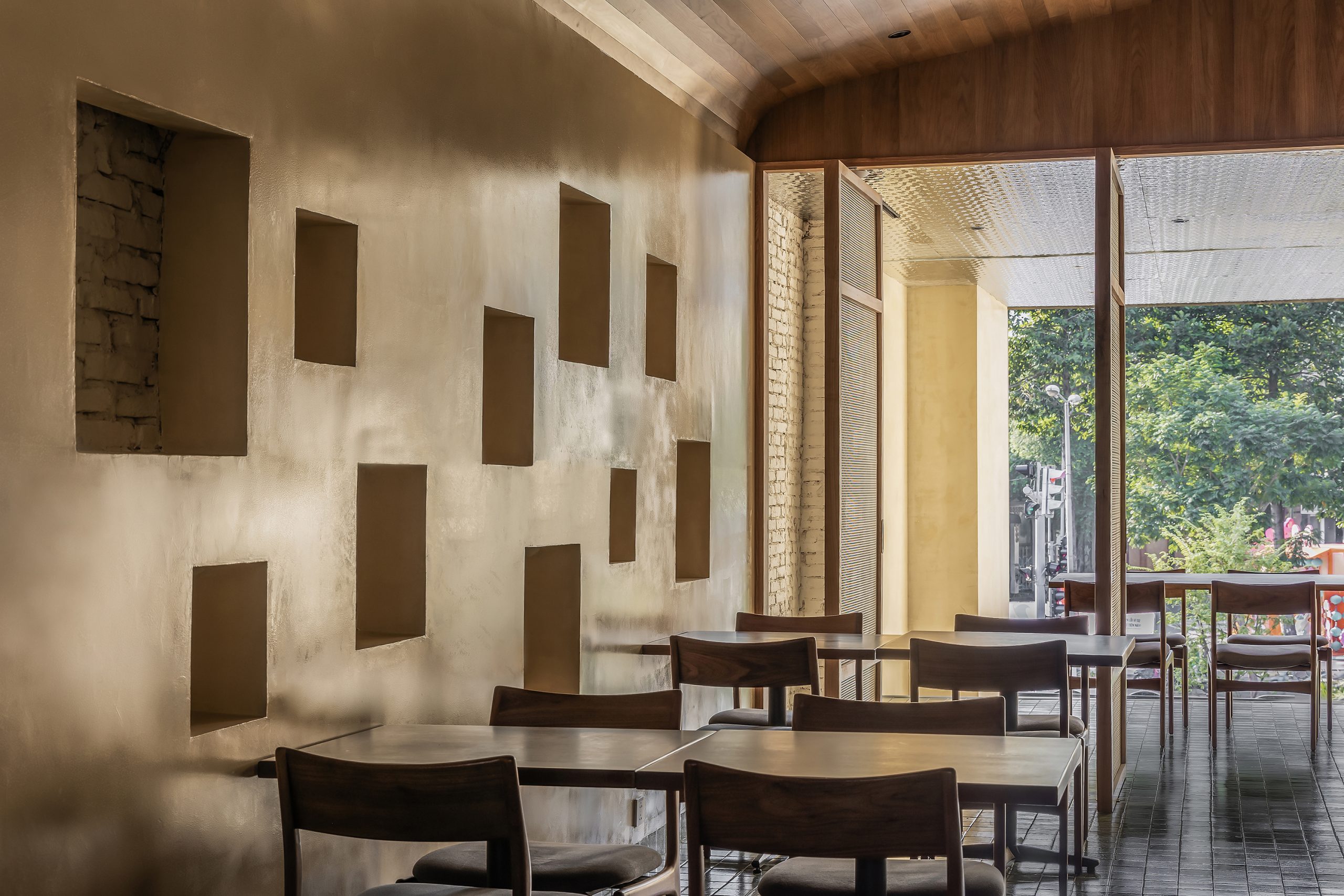
Worthy of note is the board-formed concrete walls that add intrigue and interest to the room as well as the exterior. They convey a great deal about brutalism, an architectural style defined by the plainness of building materials and raw wood grain patterns in cement surfaces. Obviously, they add character and personality to the project.

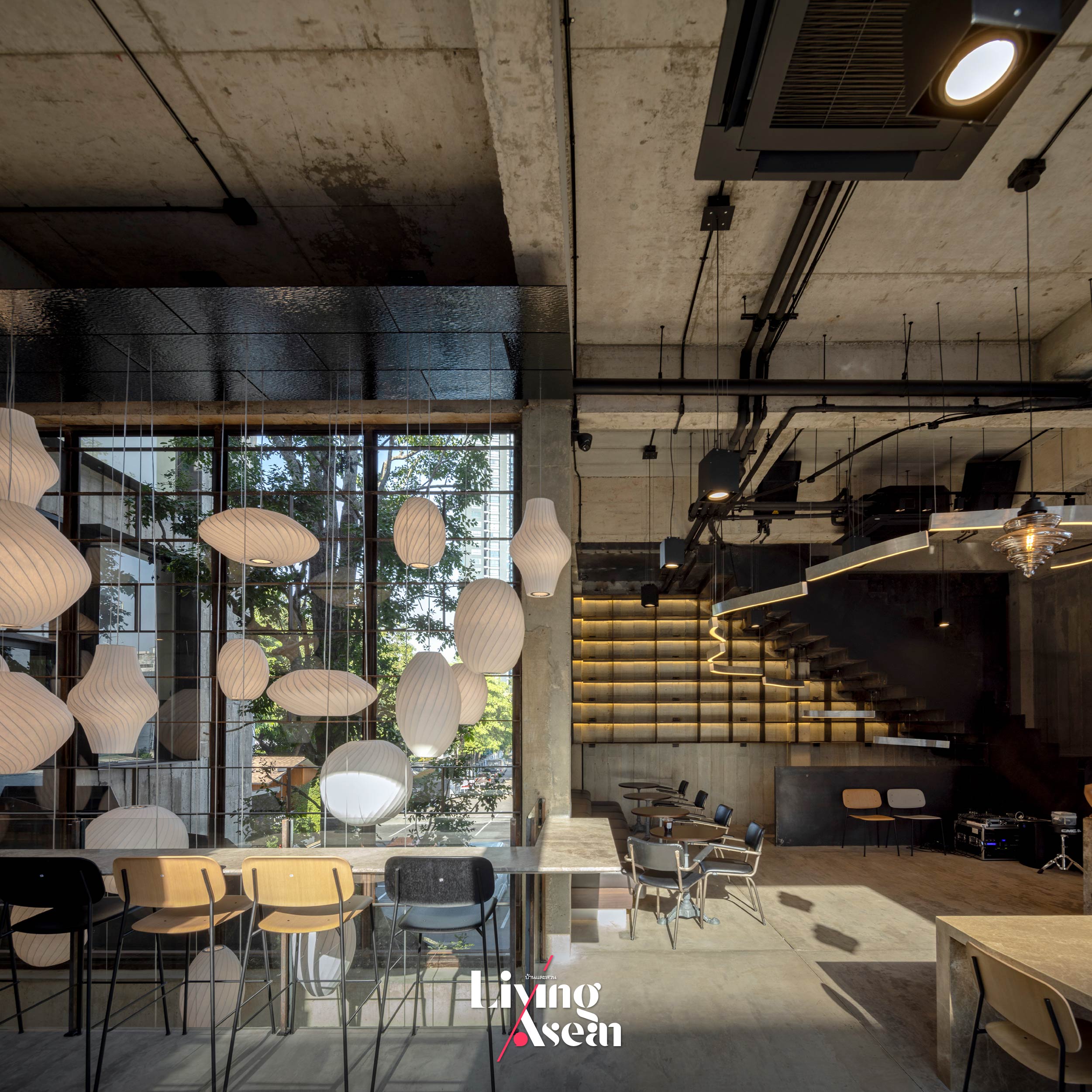
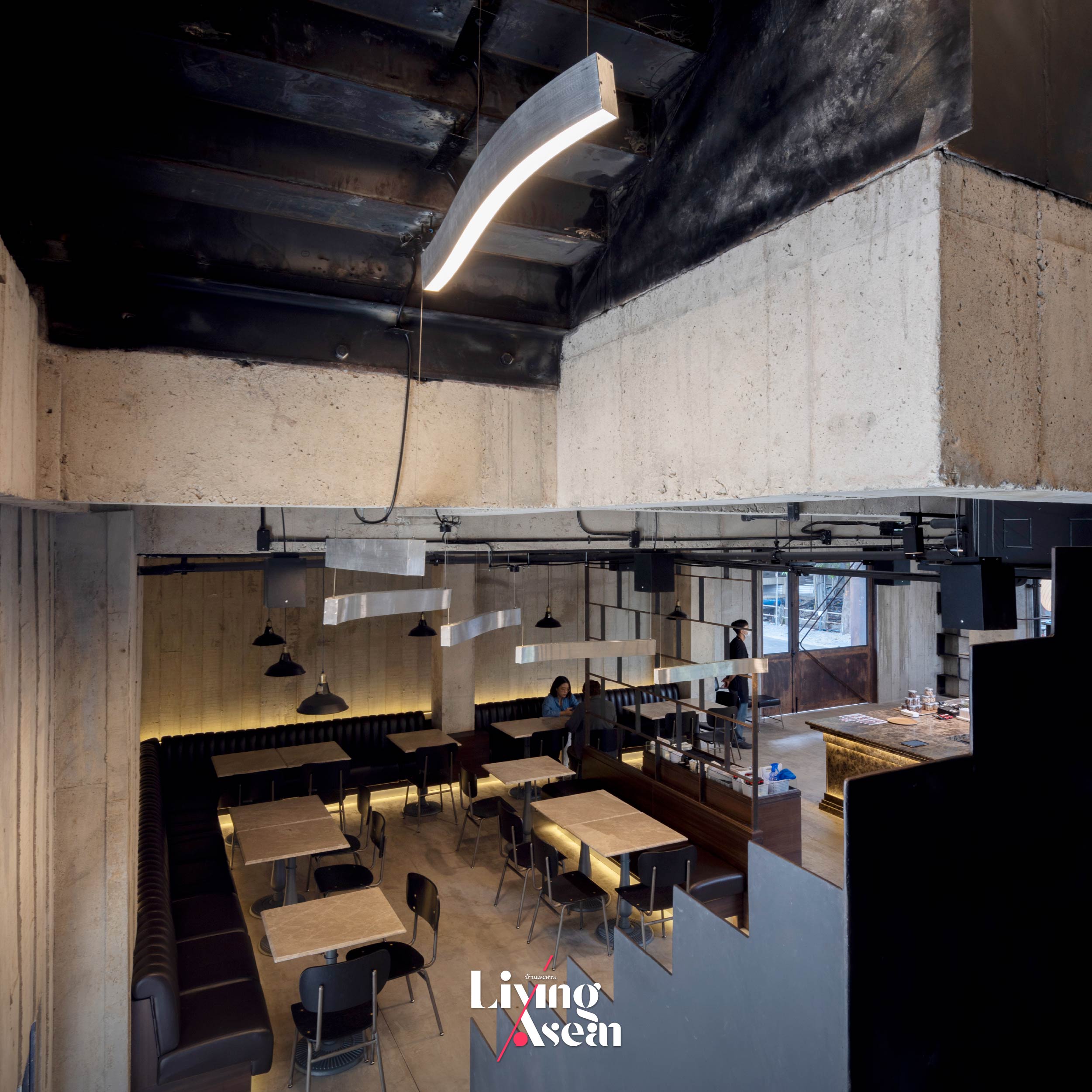
Climb a flight of stairs, and you come to a large room where salads, brunches, pasta meals, burgers, coffee drinks and refreshments are served. Large glass windows infuse the room with natural light, meantime, offering stunning panoramic views of the light rail station and the surrounding cityscape.

Double-height ceilings, five meters tall to be exact, create a visually striking, more expansive interior. The counter front is adorned with a beautiful mix of glossy and matte finish marble. Placing the counter on the right side of the room creates a positive work environment. It gives company employees and baristas a clear view of the dining area located on the left side, thereby ensuring good customer service at all times.

To integrate natural elements into the built environment, the design team chose not to open up the entire facade overlooking the nearby MRT station. Rather, they filled up the back of the building with a large glass window, thereby bringing in the view of an ebony tree that provides a lush green canopy at the center of the floor plan. As a result, the café is able to offer its customers a variety of dining spaces to suit their taste or wishes.

The seating area overlooking the ebony tree is adorned with pendant lamps that hang from the ceiling above a void of space along the wall. Their balloon-like shapes are inspired by different types of whisks for whipping eggs or cream and blending ingredients. Some of them even resemble the shapes of pastries. Overall, the effect is impressive and goes together well with high ceilings.

A flight of stairs built of steel gives direct access to a hot kitchen and staff workspace located at the rear of the second floor. It’s inspired by fire escape stairwells typically painted flat black. The staircase looks somewhat bent out of place as it takes a twisting course to avoid hitting an ebony tree standing in the way.

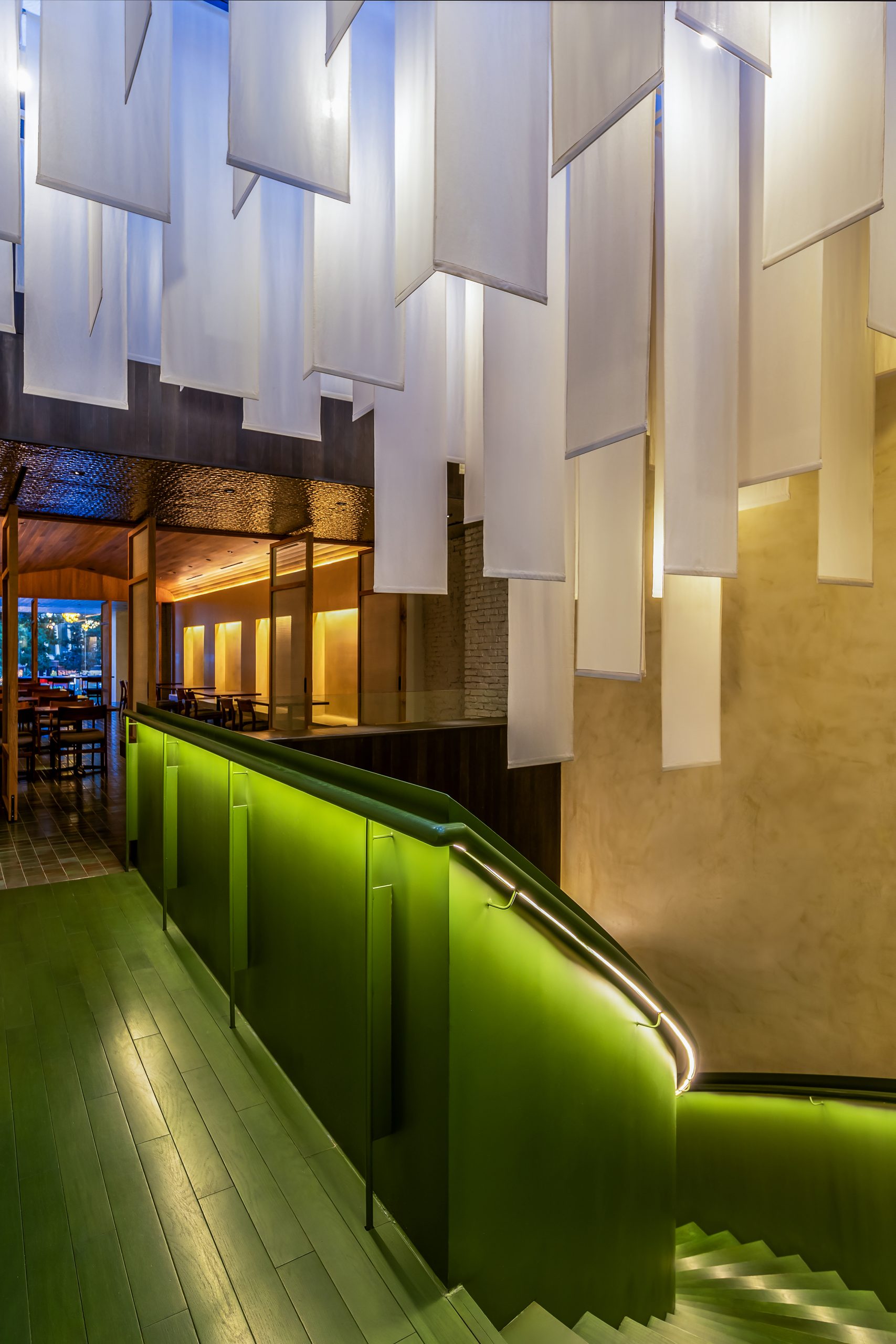
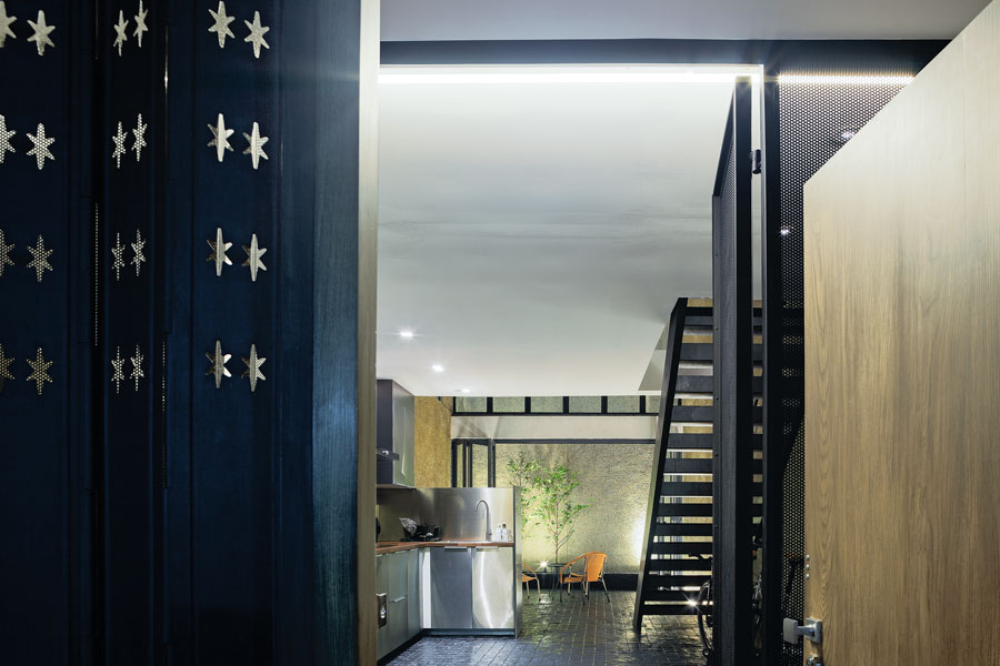
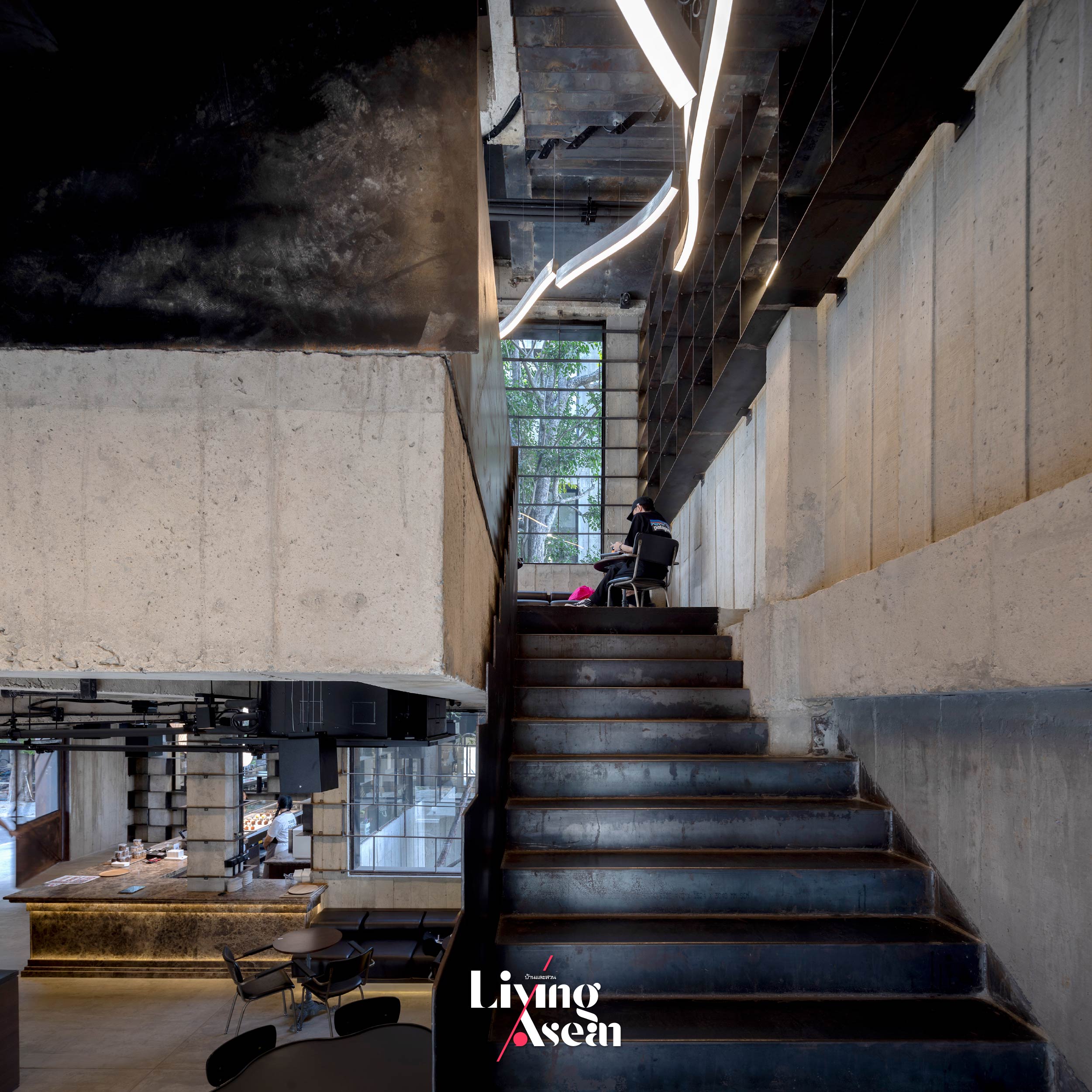
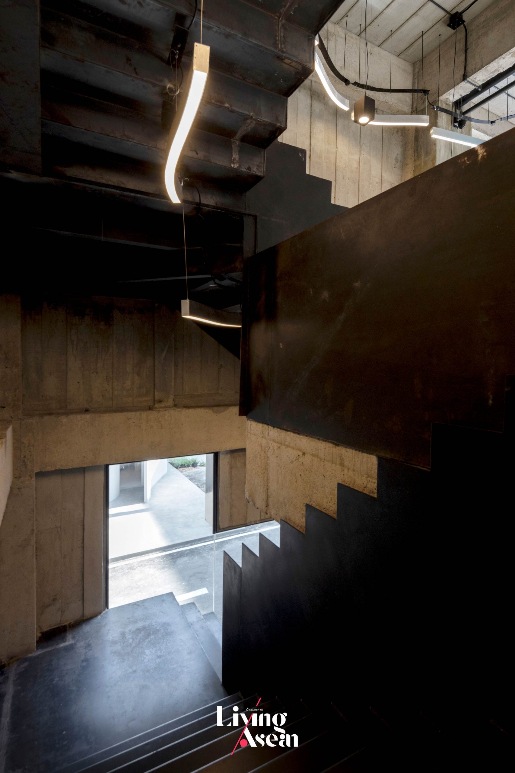
The back of the upstairs room holds a hot kitchen with staff workspace nearby. They are separately accessible via a flight of stairs made of steel that gets its inspiration from a fire escape plan. By design, the staircase looks a bit bent out of place as it takes a twisting course to avoid hitting an ebony tree standing in the way. The third floor contains the business owners’ office space that opens onto a rooftop deck.

Taken as a whole, it’s a project that strikes a balance between architecture and the fun. Among other things, the openings in the wall bear some resemblance to the influence of David Umemoto, a Canadian artist famous for creating concrete sculptures and other art objects. It’s the very concept that inspires the design team at p/s/d to try something new and different from the norm. This includes the openings in the wall that ignore a window’s primary function, such as allowing daylight and a view.

A glimpse of the interior shows the feel and functionality of the back room holding a hot kitchen with staff workspace close by. The area is accessible via a separate set of stairs.

As an alternative, they put in a new kind of window with curved lines and a series of sharp zigzags. The same revolutionary idea applies to staircase design that’s treated like a decorative item. The result is a building resembling a concrete maze of corridors through which one has to find a way. Viewed from a passing train, it’s hard to imagine what’s going on inside, except what is seen through the openings in the wall.

A strategically placed opening in the wall is obvious evidence of the influence of David Umemoto, a Canadian artist famous for creating concrete sculptures and other art objects. It’s an interesting alternative that disregards a window’s primary functions, preferring instead to use curved lines and a series of sharp zigzags. The same applies to staircase design that’s treated like a decorating item.

In a few words, “Patchworks” is an outcome of detailed examination of the elements of building design. It’s the story of a small dessert café that evolved over time, meanwhile enhancing its image and generating brand awareness through a well-thought-out plan. In this particular instance, it’s a nice little collab between the owners and the designers that culminates in the bold, raw and deliberate plainness of brutalism. This much is clear.

It’s an architectural style that prioritizes functionality over ornamentation, plus pastries taste like heaven. Drop in for an unforgettable experience and discover why rich, fluffy pastries and delicious desserts here are a top choice in town. It’s only a short train ride away.


Architects: party / space / design


You may also like…

you may also likeCasa Borbon: A Brutalist Style Retreat Blends Beautifully with Tropical Landscapes


Klang-Pa: A Cute Little Café in the Woods Celebrates Nature and Truth to Materials

Morico: A Japanese Concept Café and Restaurant Sparkles with the Refreshing Allure of Green

Morico: A Japanese Concept Café and Restaurant Sparkles with the Refreshing Allure of Green

/ Ho Chi Minh City, Vietnam /

/ Story: Phattaraphon / English version: Bob Pitakwong /

/ Photographs: Paul Phan /

The Morico Café and Restaurant is nestled in an impeccably restored shophouse in the heart of Ho Chi Minh City,  formerly Saigon. There’s more than it seems at first sight. A well-conceived renovation obviously plays a pivotal role in improving the functionality and value of the building. The narrow façade, typically 5 meters in width, opens onto the sidewalk and, beyond, a very busy street. The elongated building plan is 35 meters deep, making it adaptable and incredibly useful. From the architect’s point of view, it’s an opportunity to create a warm, inviting place that fosters positive connections between people and nature.

A design masterpiece by the Ho Chi Minh City-based company Inrestudio, the beautiful café and restaurant is thoughtfully devised in keeping with a contemporary Japanese concept that prioritizes the aesthetics and practicality of space. The secret lies in decorating with lush green plants, thereby creating an oasis of peace and quiet despite being in the city center.

The building facade facing the sidewalk welcomes customers to a semi-public area with a well-crafted set of concrete steps sprucing up the entryway. It balances greenery with minimalist hardscaping, creating a bright, airy transitional room radiating positive vibes. Against the walls, healthy green foliage is arranged in a zigzag order, alternating with semi-outdoor furniture designed to improve customers’ waiting experience.

The Morico Café and Restaurant blends inviting design and nature in a restored, elongated shophouse in Ho Chi Minh City.
The coffee bar boasts original and unique designs thanks to the counter frontages that vary in height from one barista station to another depending on the task being undertaken. Lower frontages open up windows for good customer interaction, while higher ones keep non-customer contact areas out of sight creating a neat appearance.

Walk past the entryway, and you come to a well-conceived the coffee bar in earthy brown tones that give it a professional, polished appearance. What makes it unique is the bar counter frontages that vary in height from one barista station to the next depending on the nature of work being carried out. The beautiful frontages are kept as waist height where customer service takes place and raised higher for jobs that require less to no human interaction.

At the farthest end, a part of the second floor is taken out to make room for a curved steel staircase painted dark forest green. The vertical shaft enclosing the stairs is brightened by a skylight system built into the rooftop, while the double-height ceiling is hung with a forest of white Noren curtains commonplace at restaurants, shops and homes across Japan. There are about 180 of them in all. Together they create light and shadow effects that change throughout the day due to the angle of the sun in the sky.

The glass ceiling is hung with a forest of white Noren curtains commonplace at homes and business spaces across Japan. There are 180 of them in all. Together they create light and shadow effects that change throughout the day.
A curved steel staircase painted dark forest green gives access to upstairs dining rooms. The shaft at the farthest end of the building is created by taking out a part of the second floor to make room for a new set of stairs illuminated by skylights built into the rooftop.

The overall effect is impressive. Precise floor plans and interior décor speak volumes for a philosophy of Japanese art and design that blends together beautifully with modern architecture. The downstairs is designed to please even the most avid coffee lover making the coffee easily accessible.

Earthy brown and deep forest green go well together on the stairs and the corridor enclosed by a balustrade giving access to dining rooms on the second floor. By nightfall, the restaurant is aglow under soft lights elevating dining experiences. Plus, there’s private and secluded space for large group dining nearby.

The upstairs room focuses on the good seating arrangements for comfort, the relaxed ambiance and a good dining experience. When evening comes, soft lights create a signature glow bringing depth and warmth to the cozy dining room. Plus, there’s private and secluded space for larger group dining, too.


Architect: Inrestudio


You may also like…

Ton Corner Coffee Shop: A Backstreet Café in Hue Embraces the Beauty of Ordinary Materials


CoCo Cha Taiwan Tea & Coffee: A Coffee Shop in Earth-Toned Green Where the Classic Meets the Modern

Rimkhobfa Bookstore & Black and Milk Café: Stunning Bookstore Café Renovation Fosters a Culture of Reading

Rimkhobfa Bookstore & Black and Milk Café: Stunning Bookstore Café Renovation Fosters a Culture of Reading

/ Bangkok, Thailand /

/ Story: Kangsadan K. / English version: Bob Pitakwong /

/ Photographs: Anupong Chaisukkasem, Phumpakorn Na Bangchang /

How would you like your coffee? Black or with cream? Welcome to Rimkhobfa Bookstore & Black and Milk Café, a stand-alone store and coffee shop snugly cocooned in a cozy neighborhood of Bangkok’s Bang Plat District. The name is a bit of a mouthful, but you get the idea. The cybercafé is thoughtfully devised to ignite the love of literacy and open new horizons among younger fans of books.

Aptly named “Rimkhobfa”, literally translated “horizons”, it’s home to a bewildering array of books about Thailand and classics that every bookworm should read. Originally located on Rajadamnoen Avenue, the store only recently moved across the Chao Phraya River to a new address in Bang Phlat District. And that’s where the design team at BodinChapa Architects came in play, transforming an old building that had fallen into disrepair into a new bookstore-cum-café rendezvous. There’s charm and the power of storytelling that captivates a thirst for knowledge. Plus, fresh brewed coffee smells like heaven and the atmosphere is pleasant.

The building that formerly housed offices is located on Charansanitwong Road, a main thoroughfare on the west bank of the Chao Phraya. There was a problem when an overpass was built nearby, making the structure less visible while the interior became dark, poorly lit by dim light. To breathe new life into the old building and make the dark rooms brighter, the architects added openings in the wall and painted the interior a light and airy color. Meanwhile, an open concept layout provides ample space for a café that’s part and parcel of the bookstore.

The first floor plan offers equal amounts of space for the café and the bookstore. / Courtesy of BodinChapa Architects
Drawings illustrate spatial arrangements on the second and third floor plans. The interior is made light and airy by taking away the ceiling and creating a void of space in the second floor. / Courtesy of BodinChapa Architects
A vantage point affords a view of areas on the first and second floors.
Stair railings provide visual transitions enhancing the flow of interior space that culminates in a massive wall called the “Tower”. In all places, the interior abounds with custom built-in shelves for storing books and product displays.

In renovating the old building, the architects had a part of the second floor removed to create a double height ceiling, resulting in a visually striking interior on the ground floor. After that the bookstore and café spaces were put in, each occupying roughly equal amounts of floor area.

Climb a flight of stairs, and you come to the second floor with plenty of space for organizing events and seminars. The low ceiling that was there originally is gone now. The room is cozy and comfortable thanks to a double height space. It also has abundant space for bookshelves. The third floor holds a conference room with large windows overlooking the second floor.

A product display paired with restaurant furniture in various styles creates a good bookstore café experience.
Low ceilings that were there originally have since been removed to add headroom to the retail space on the first floor. Plus, it makes the small area nice and tidy by hiding utility systems.

The first floor comprises two parts, the first being a bookstore and the second holding a small café. There’s a coffee bar up front for greeting customers arriving in the store. Go further inside, and you come to an area filled with bookshelves alternating with coffee shop seating. From here the aisle leads to a collection of books beautifully arranged for public viewing.

On the whole, the interior abounds with bookshelves and library furniture starting from the café zone all the way to the stairway giving access to the second floor. Together they provide the perfect ambience for coffee aficionados and book lovers.

There’s more. Filling the interior space with style is a massive wall called the “Tower” that rises from the bottom to the top of the building. It’s an element of design dividing the interior space into parts, meanwhile doubling as the focal point drawing customers to other attractions on the second floor. Plus, it’s thoughtfully devised to provide the visual connection linking the cashier zone with the stairway nearby.

The decoration of the “Tower” keeps firmly to the original Rimkhobfa bookstore concept, whereby the gradual change of color symbolizes the horizon.

Overall, the furnishing and decoration of the interior keeps firmly to the original “Rimkhobfa” bookstore concept, whereby an image of the horizon is represented by a wall of fired clay bricks that change colors from dark at the bottom to light at the top. At the same time, indoor lights and a quadrangular opening at the top of the Tower go to work alongside each other to create a clean, well-lighted place perfect for reading and displays of books.

The second floor is well-lit and filled with shelves on which books are stored. It’s illuminated by natural daylight shining in through an array of tall windows. To protect the interior from the sun, the windows are dressed with light filtering shades. Flex space ideas help create multipurpose rooms for meetings and other events.

Low profile shelving units can be stowed away in the back room when not required, while high profile ones are used to store books and display products. They are placed against the wall with spaces in between to avoid enclosed spaces that could be signs of claustrophobia. This makes it easy to browse around the bookstore, find a quiet place to sit and enjoy a good read.

A flexible space for seminars and events has low profile shelving units that can be stowed away when not required.

Slightly tucked away from the main, noisy thoroughfare, the bookstore café makes the most effective use of natural materials to attract passers-by. Like so, the raw brick façade in shades of orange performs dual functions; structural and aesthetic. Nearby, a small signboard displaying the business name and logo directs customers to the store.

The floor is covered with tiles in shades of dark gray alternating with orange hue with brownish tints. To make the building more visible from the street, the front façade protrudes slightly from the wall while light-colored wood paneling slants up to the window sills adding instant curb appeal.

Fired clay tiles in shades of orange contrast with a gray stone wall displaying the business name. Together they add instant curb appeal to the bookstore café.

The atmosphere inside and outside the bookstore café is pleasant thanks to the use of eco-friendly materials in all places. Needless to say, it’s design that respects nature and the importance of art and culture in our lives. The materials and color shades remind a crowd of onlookers of the humble origins of man. Together they create stunning color combinations blending with the circumstances that form the setting of the neighborhood.

The second floor contains bookshelves alternating with reading nook furniture.

As print media struggle to survive in the age of technology, Rimkhobfa Bookstore manages to stand its ground in the fight by incorporating Black and Milk Café in its business plan. The result is a forward-looking bookstore café that answers the lifestyle needs of the new generations. By design, it’s a flexible business space capable of performing many functions. It’s the story of a renovation done right, one that transforms an old building in need of repairs into an oasis of calm for book and coffee lovers. Swing by the café next time you’re in town.


Architects: BodinChapa Architects


You may also like…

BASIC SPACE COFFEE คาเฟ่อยุธยา

Basic Space Coffee: Old Shop Renovated as a Home Style Café

B2S Think Space / Hybird Lifestyle Book Store

Mae Rim House: A Home on the Hill, Fresh Air and Memories of the Good Old Days

Mae Rim House: A Home on the Hill, Fresh Air and Memories of the Good Old Days

/ Chiang Mai, Thailand /

/ Story: Wuthikorn Sut / English version: Bob Pitakwong /

/ Photographs: Add Peerapat Wimolrungkarat, Something Architecture /

This house on the hill is a refreshing change to be taken seriously. Designed for four people to fit in comfortably, it looks out over the Mae Sa River in Chiang Mai’s Mae Rim District. It all began with a family wanting to get away from Bangkok and live somewhere out there in the countryside. As luck would have it, they had an old vacation home that needed repairs, and the rest is history.

Home on the Hill fresh air

It wasn’t long before they decided to put in a new house set amid the landscape of undulating hillsides filled with fond memories of the good old days. From a distance, the new place named Mae Rim House is built into nature, the perfect place to get fresh air and sunshine. Can’t beat that!

Home on the Hill fresh air
The open concept first floor offers plenty of ample space under double height ceilings. It holds a living room, dining room and kitchen. Upstairs, a footbridge provides access to the bedroom at the rear of the house plan.

Upon completion, the family had most of their furniture and furnishings shipped up here when they left Bangkok. They included collectibles that had been in family possession for some time and personal effects shipped home after an extended stay overseas. Take a quick look, and it’s easy to get how they felt a sentimental attachment to their possessions.

The dinning room affords a peaceful vista of the family’s old vacation home at the rear of the property.

Overall, home decoration is inspired by fond memories for the past. Amenities and features of the house are mostly in taupe or light gray with a tinge of brown. And that’s especially true for the ceilings, interior walls, sofas and other furniture items.

It’s a mix of old and new that blends perfectly with the dense green color of the surrounding landscape. The same applies to the comparative coolness of the house exterior that’s in shade for much of the day, a rustic ambience that’s in perfect harmony with nature.

Home on the Hill fresh air

The two-story, 500-square-meter home boasts the beauty of a large living room in the middle of the first floor. Elsewhere, smaller sitting areas are placed at intervals across the house plan.

But what makes it an interesting place to live is the double height ceiling at the center that promotes cross ventilation, keeping the interior cool and comfortable especially during summer months. At the same time, open concept design encourages smooth flow around the interior, from the kitchen to dining room to living room.

A topographic map shows the house location on the hill in relation to green spaces, roadway and nearby structures.
A drawing of the downstairs floor plan.
A drawing of the upstairs floor plan.

The result is a bright and breezy atmosphere, thanks in part to an array of sliding glass doors on one side of the house that opens to let nature permeate the interior. There’s also a ceiling fan on standby, too. It’s so cozy that they hardly ever use air conditioning.

Home on the Hill fresh air


The first floor holds two bedrooms with a view of nature. Designed for senior family members, they are positioned at either end of the house plan for increased privacy. The second floor is an entirely different story.

There’s an attic-style bedroom at the south end of the house plan that has been adapted to avoid stuffiness and promote good air flow. For lighting and ventilation, a trio of awnings and skylight windows are built into the gable roof.

Home on the Hill fresh air
The upstairs bedroom at the rear is accessed via a footbridge overlooking the void of space above the first floor that holds a kitchen, dining room and living room.

Home on the Hill fresh air

Inside the house, slanted ceilings that run parallel to top chords create a bigger space overhead making the entire bedroom feel spacious and airy. On the outside, the underside of overhanging eaves is covered with soffit panels for a neat appearance.

Home on the Hill fresh air
Bedroom walls are glazed using clear glass to soak up the views of lush wooded hills.
Home on the Hill fresh air
A cozy semi-outdoor gallery adjoining the bedroom is brightened up with foliage plants.

For indoor thermal comfort, the box-shaped home lies protected by an expansive gable roof with long eaves overhanging the exterior walls. It stands hemmed in by tall trees that keep the new family home in shade for much of the day.


The awning and skylight window customized to match the roof reduces the harshness of materials, plus it facilitates cross ventilation in the interior, keeping the house cool in summer.

Home on the Hill fresh air

What makes it fascinating is the far ends of the gable roof that extends quite a distance from the walls of the building. The resulting triangular shape of the second level is designed to avoid making the house look too big or too tall, so as to blend with all that exists in the neighborhood. After all, it’s everlasting harmony that’s the foundation of good design.

Home on the Hill fresh air


Architect: WOSArchitects (wosarchitects.com)

Interior Designer: Estudio (www.facebook.com/Estu.interior)


You may also like…

Villa Sati: A Country Retreat Breathes in the Energy of Nature

ACH HOUSE airy indonesian homeACH House: An Airy, Bright and Well Composed Indonesian Home

The Perfect Townhouse Makeover in Bangkok

The Perfect Townhouse Makeover in Bangkok

/ Bangkok, Thailand /

/ Story: Wuthikorn Sut / English version: Peter Montalbano /

/ Photographs: Soopakorn Srisakul /

The townhouse is a common type of building in Thailand, especially in Bangkok. Homeowner and architect Narong Othavorn grew up in one, always thinking of ways it could be better designed. Eventually, he and his wife Pim Achariyasilpa chose a 30-year-old townhouse in Si Phraya, a downtown neighborhood, and turned it into one of the most excellent townhouse makeover projects in the city.

townhouse makeover
Overall, the final building is a combination of the adjacent townhouses. Narong kept the original wrought-metal façade, modifying the original metal entrance door with a mixed frame of wood and steel, leaving the next-door side the entrance to a fourth-floor warehouse.

A picture window in the living room brings in natural light onto washed gravel walls that lead down to a small garden behind the house, inspiration for the “double space” mezzanine.


townhouse makeover

The double-space ceiling isn’t only about making the lower level look good: it supports the open-plan design.

Glass panels in the dining nook of the mezzanine above extend a feeling of comfort to every space in the house. From the mezzanine there’s a continuous view through glass partitions out to the garden behind the house, and there’s steady circulation of air from front to back.

Townhouses are apt to feel cramped, but not this one! The light is different in each area, but the light is what connects everything.

townhouse makeover

townhouse makeover

townhouse makeover

“These things came from our own personal tastes. Pim likes well-lit spaces. Me, I like indirect light,” explained Narong.

“So with a house for the two of us, we had to get the division of space just right, using the light available in each area. The lower floor is bathed in subdued natural light; upstairs, the living room is brightly lit through the front window.

“Moving back to the dining area and bar, the light is dimmer. Go upstairs to the bathroom and dressing areas and it’s lighter again, suiting the specific limitations and characteristics of each space.”

townhouse makeover

“Small, but spacious” is how both owners refer to this house: better than adequate, the size is really perfect.

Not so small as to be cramped. Everywhere some things catch your eyes up close and others at a distance. The home offers a master class on how townhouse renovation can work with limited areas to create special, interesting spaces.

Even though adjoining buildings make side windows impossible, careful arrangement of space and windows on higher levels give this house a beauty that is anything but ordinary.

townhouse makeover

townhouse makeover

townhouse makeover

townhouse makeover

townhouse makeover


Owner/Architect: Narong Othavorn of SO (www.soarchitects.space)


You may also like…

Siri House Family Co-living space / Home Renovation

SIRI HOUSE FAMILY CO-LIVING SPACE / HOME RENOVATION

From Shophouse to Stylish Home Office

FROM SHOPHOUSE TO STYLISH HOME OFFICE

Box-Shaped Steel House Surrounded by Nature

Box-Shaped Steel House Surrounded by Nature

/ Bangkok, Thailand /

/ Story: Kor Lordkam / English version: Peter Montalbano /

/ Photographs: W Workspace /

This box-shaped steel house, hidden in shady green woods, has a cool, peaceful resort atmosphere. – hard to believe it’s right in the middle of a congested city!

Steel House
wide eaves, glass windows set 3 meters in for shade and rain protection
Steel House
paved driveway leading into the carport 5 meters from the street

Designing architect Boonlert Hemvijitraphan of Boon Design took up the challenge set by the owner: create a home on the limited plot that is neither cramped nor stuffy.

Boonlert said, “The challenge was to make that work within the urban context. Fortunately, the owner gave us a completely free hand; our job was simply to design a comfortable residence on a 360-square-meter (90-square-wah) property. The starting point was what we saw in the original landscaping here.”

Steel House
[left] The dark of the steel house and bamboo blinds contrasts with the surrounding greenery. [right]: Open space carport leads up into the house.
Steel House
The main door from the carport into the living room

Steel House

The property was not large, and its location right in the center of a capital city was seriously limiting

How to build a comfortable residence here? The garden/orchard greenery was used as a tool to create a sense of spaciousness.

Instead of the house spreading outwards toward the fence, it rose vertically as a 2½-storey home with open space beneath the house used as a carport and multipurpose area, the rest of the property becoming a relaxing, park-like space.

Steel House

High-ceilinged living room, naturally bright and airy, with a great view of outside greenery.

The large garden was set up to the south to get the best breeze and the best shade from plants and trees.

The garden is planted on soil raised 1.2 meters higher than before to be level with the 3-meter height of the living room.

The living room connects with the dining area beneath the mezzanine, with the kitchen behind the glass door
The metal bookshelf reaching almost to the mezzanine also acts as weight-bearing support for the staircase behind it.

The first floor has a high “double volume” ceiling for more natural light and ventilation. A steel staircase rises from the living room to the mezzanine, which holds a workroom and guest bedroom, and up to the second floor, the owner’s private space.

The single staircase up from the carport connects everything from the ground to the top floor.

Mezzanine walkway with banister and protective grating steel is the primary building material, but natural materials such as bamboo are also important.

Bamboo shades cover the house façade, filtering sunlight, protecting against rain, giving privacy from outside view, yet still allowing good ventilation.

“We used steel not because we especially wanted to use steel, but because it was light, and we wanted that quality,” explained Boonlert.

“Each material has its own particular value. Coming up with a principle means coming up with the quality we want. Design is a value in itself.”

The architecture of this house reflects modern times. It’s surrounded by the natural environment people long for, so no matter chaotic and confused the outside world, in this home there’s a mood of relaxation and contentment: it’s just a great place to live.

Elevated porch connecting to the garden.

Architect: Boonlert Hemvijitraphan of Boon Design (www.boondesign.co.th)


You may also like…

MODERN STYLE IN A NEWLY RENOVATED HOUSE
BRICK HOUSE FOR A TROPICAL CLIMATE
Box-Shaped House with the Texture of Memory

Box-Shaped House with the Texture of Memory

/ Petaling Jaya, Malaysia /

/ Story: Wuthikorn Sut / English version: Peter Montalbano /

/ Photographs: Sitthisak Namkham /

This box-shaped house uses architecture and coordinated interior design to tell stories of the present and the past.

box-shaped house

The house is located in the Petaling Jaya district of Selangor, Malaysia. This is a district of single homes, but with little space to put up a large house.

Still, architect Dr Tan Loke Mun rose to the challenge of house owner Kenneth Koh and tore down the former structure here to build a new 3-storey box-shaped house in its place.

box-shaped house

“Ground space was limited, so we built upward,” the architect told us. Building vertically involved careful division of space. The lower floors hold common areas: parlor/living room, dining area, kitchen, and conference/chat room. The 3rd floor is an attic, holding hidden utility systems next to a small living room.

The designers brought an “outdoors” mood to each part of this box-shaped house: there’s a “double volume” high, open space on the first floor; glass windows open to the garden atmosphere, and potted shade-loving plants bring it inside.

box-shaped house

Gentle sunlight shining into the living space combined with a light breeze from a ceiling fan gives the feeling of sitting in a garden.

An effective play of space combines with the interior décor to bring out a timeless feeling that reflects its Malaccan legacy. The Chinese-style furniture, both traditional and contemporary, was made by Malaccan artisans. Paintings tell of a land that lives on in the memory of the owner.

trc01

For architectural reasons, the stairway is in the middle of the house. The folded steel balusters look light, and the red banister is at once tremendously chic and reminiscent of the row houses of yesteryear.

Significantly, the prominent terra-cotta tile facade is remarkable.

“In tearing down the old house, we discovered that the roof tiles were handcrafted, imported from Calcutta, India, so we set them aside to use this way for privacy and heat insulation,” added the architect.

“Their texture connects nicely with the other materials used here. This original house tile is long-lasting, looks great, has a timeless quality, and is a good choice in combination with the other main structural components of brick, concrete, and steel.”

The decorative outer house wall uses a suspended steel framework to hold the terracotta roof tiles and red brick.

The outer surface of this box-shaped house structure shows a wall of terracotta roof tiles that open and close to catch the light. The metal support structures reach out from the main building to form a pleasing pattern of connections between the inside and outside.

trc05

box-shaped house

The look and ambience here remind us of a Malaccan row house, but in a modern context.

Effective combination of old materials and new in textures that suit its owner’s heritage gives this house a sense of being outside of time, and its memories will be passed on to the next generations who live here.

Ultimately, we don’t often find a big-city house that feels so bright, natural, and full of narrative.

box-shaped house


Owner: Kenneth Koh

Architect: Dr Tan Loke Mun


You may also like…

Designers’ Eco-friendly Dream Home in Vietnam

Termitary House: Good Sunshine, Fresh Air, and Brick Walls

X