Blog : Compact House

From Unexciting Shophouse to Smart Home Office in HCMC

From Unexciting Shophouse to Smart Home Office in HCMC

/ Ho Chi Minh City, Vietnam /

/ Story: Samutcha Viraporn / English version: Bob Pitakwong /

/ Photographs: Quang Dam /

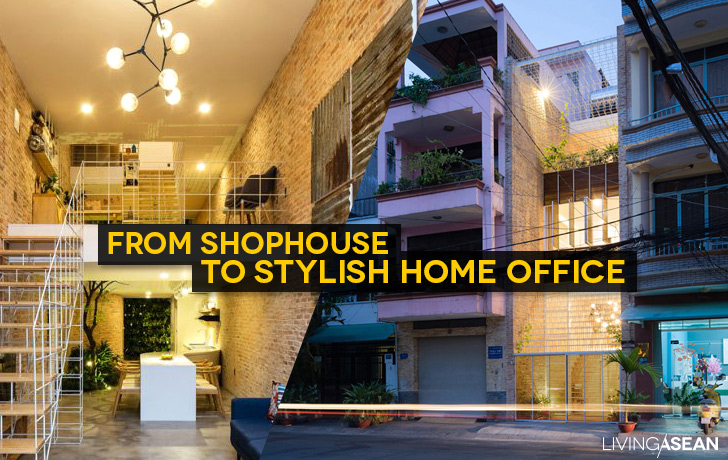
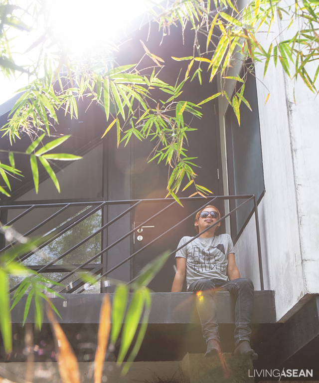
Home offices are trendy nowadays. Given thoughtful planning, a dull shophouse can transform into a fashionable dwelling and place of business. The results are illustrated in this home office that looks to be one of the trendiest in Ho Chi Minh City.
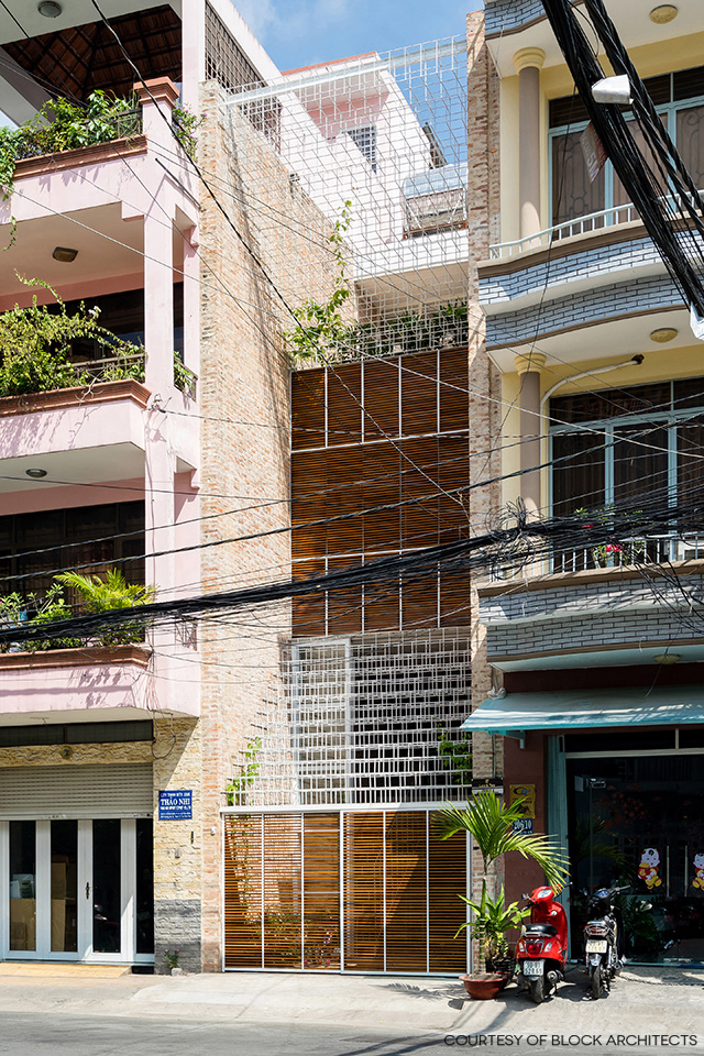
home office in HCMC

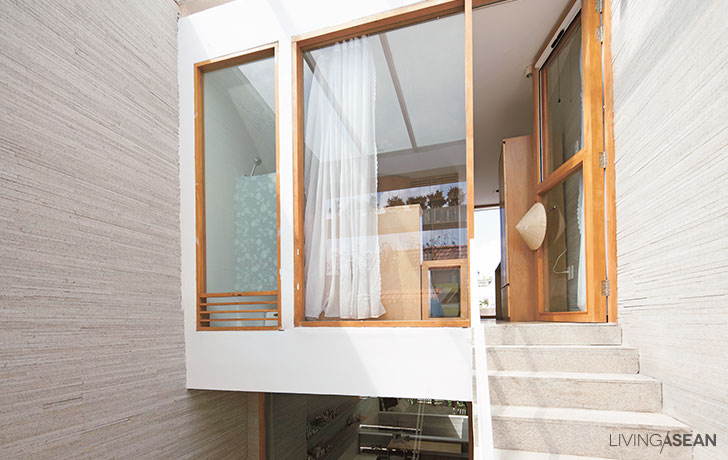
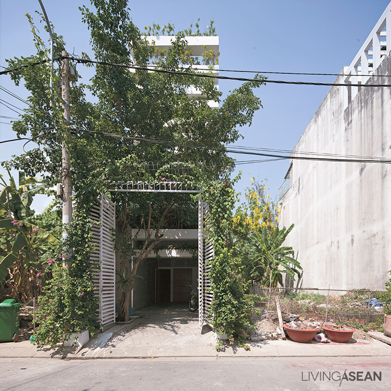
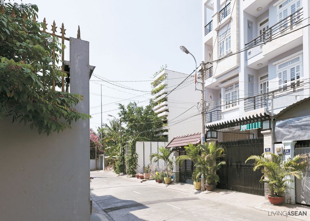
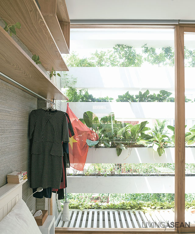
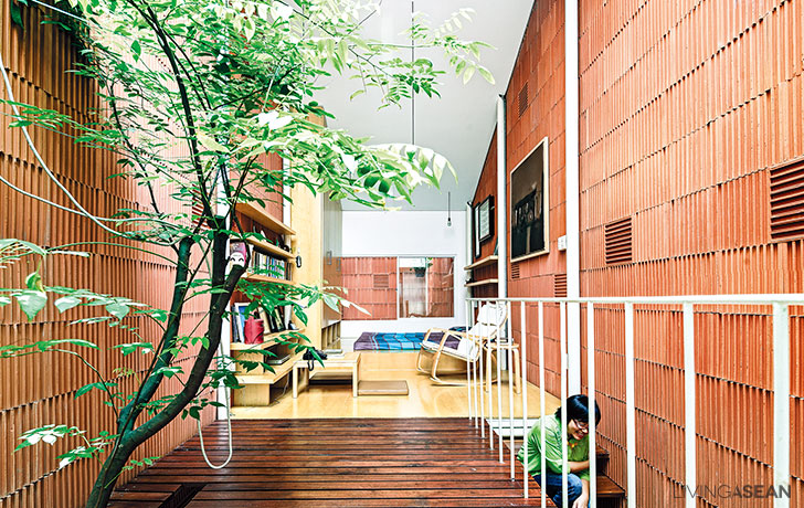
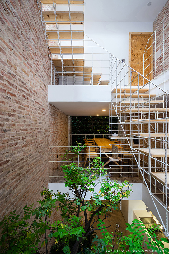
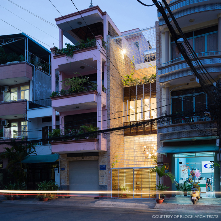
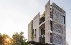
The new design integrates a modern living space and a home office with a factory producing handcrafted leather goods. The house’s front façade is filled up with elaborate structural rod systems reminiscent of a giant labyrinth of beautiful needlework, albeit built of brick and steel.
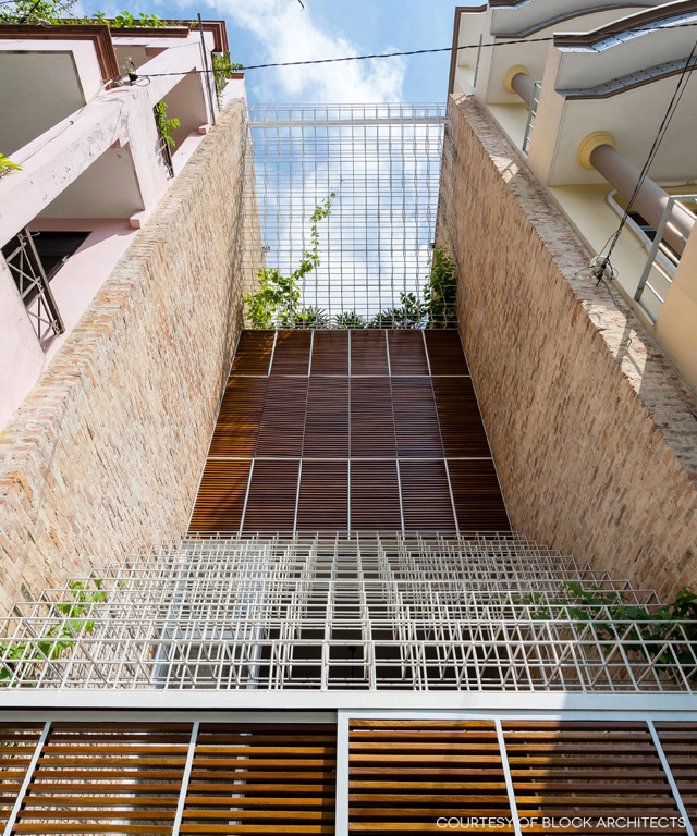
It’s only recently that a homeowner couple acquired this downtown retail space and later decided to give it a complete makeover. “This house means everything to us because it’s the fruit of constant efforts to pursue our dreams,” said the young couple with an active lifestyle.
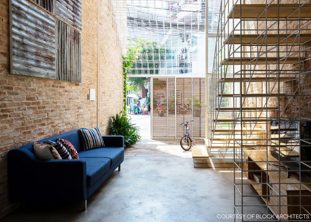
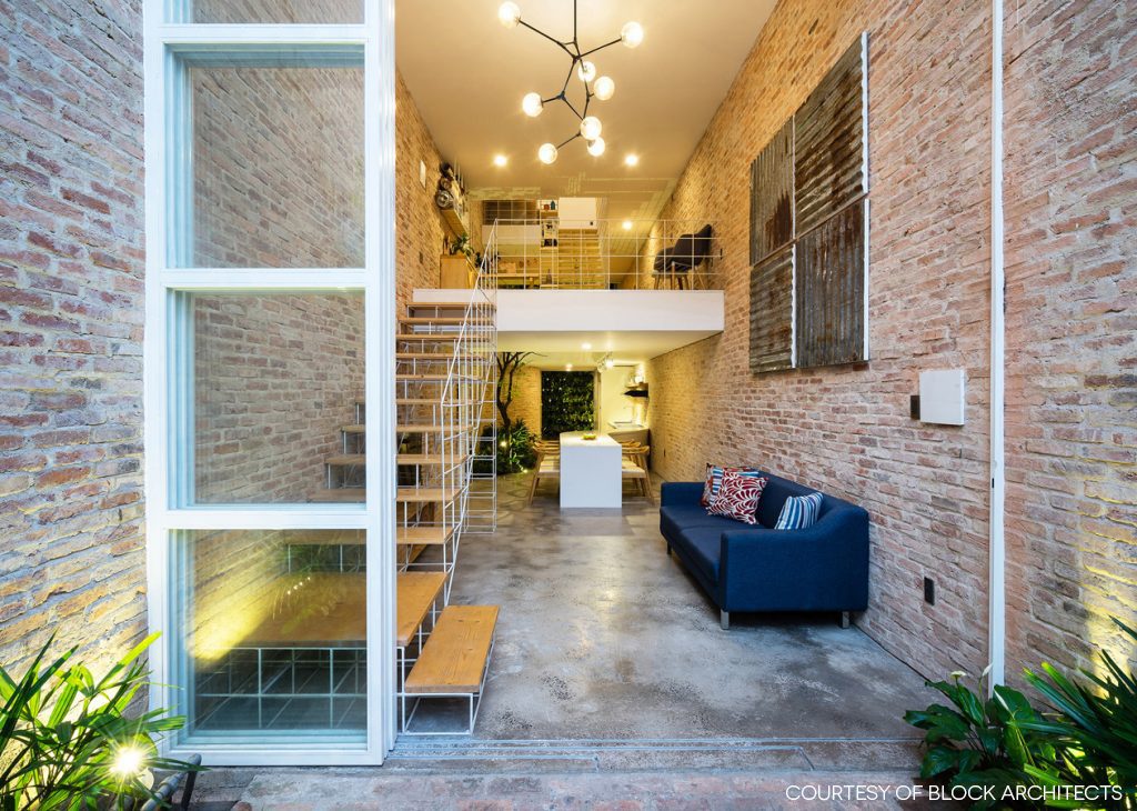
home office in HCMC


home office in HCMC

“For a product to be successful, say a handbag, it takes many processes involving fastidious needlework,” said the owners comparing their manufacturing job to that of the architect.

“Like meticulous craftsmen, the architect carefully puts together different parts to make a home, mixing old pieces with new ones, replacing unneeded features with practical strategies, and relying on well-thought-out plans to use every ingredient effectively, be it wood, brick, concrete, metal or even trees.”
 

home office in HCMC

home office in HCMC

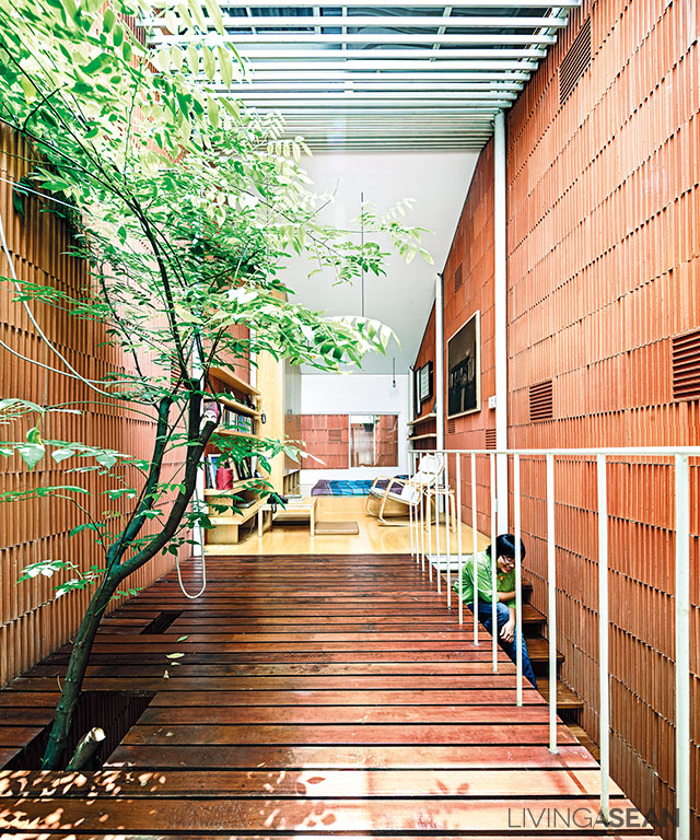
In a way, this pretty much explains the elaborate structural rod systems that fill up the redesigned front façade. Elsewhere, parts of the walls and flooring deemed to be unnecessary were removed to make room for new ideas.

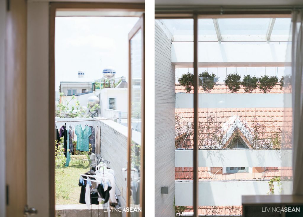
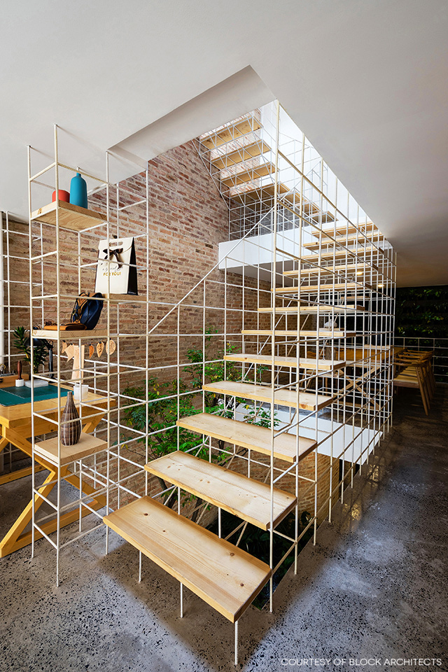
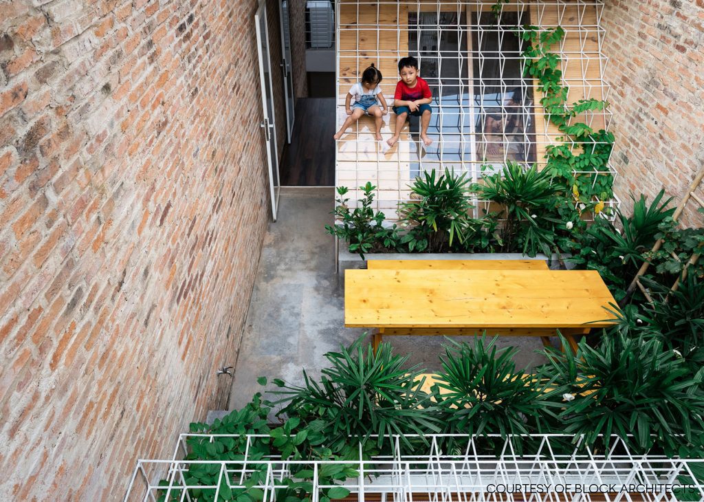
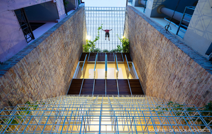
The remodeled front and rear facades showcase a multitude of steel cube frames welded together to look like a web of fine threads being “sewn” together to fill the void between two side walls.

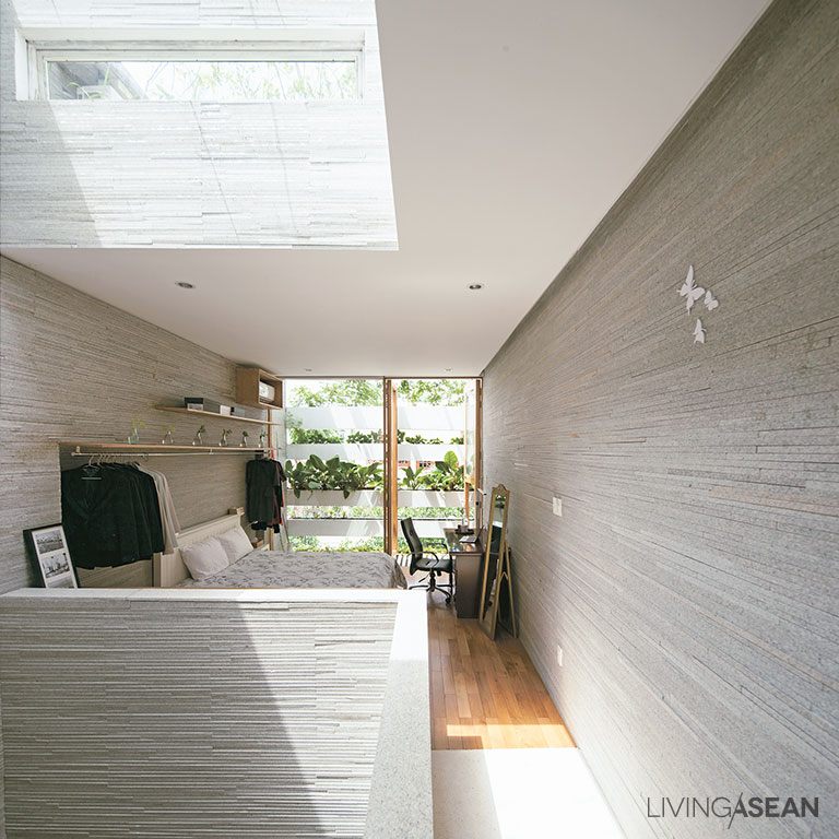
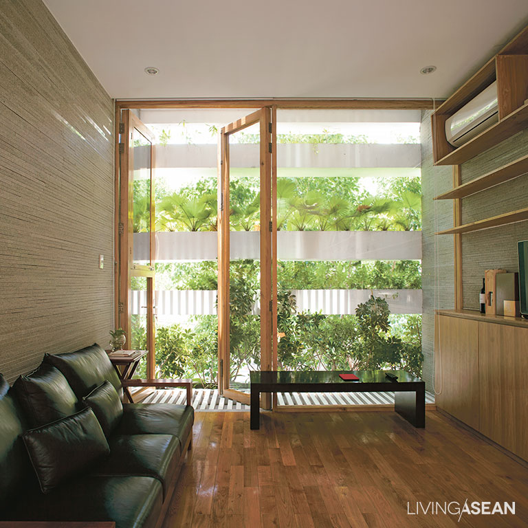
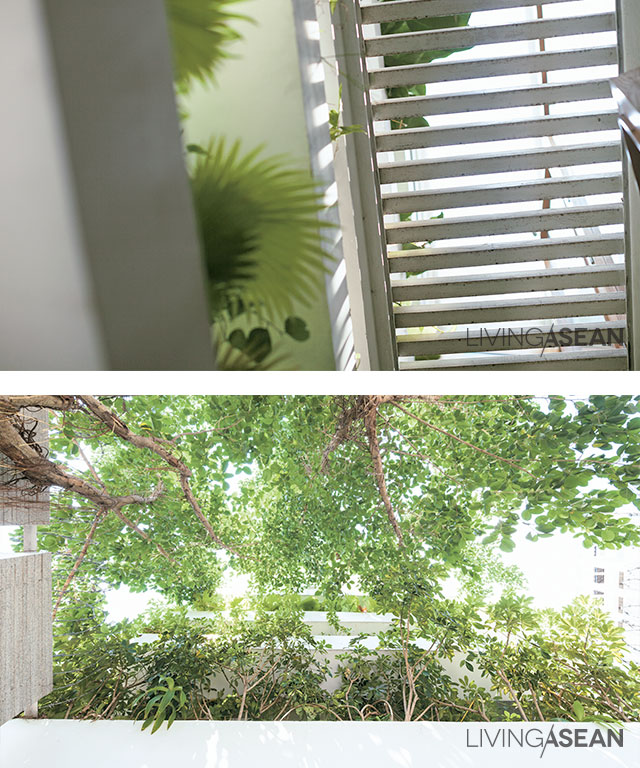
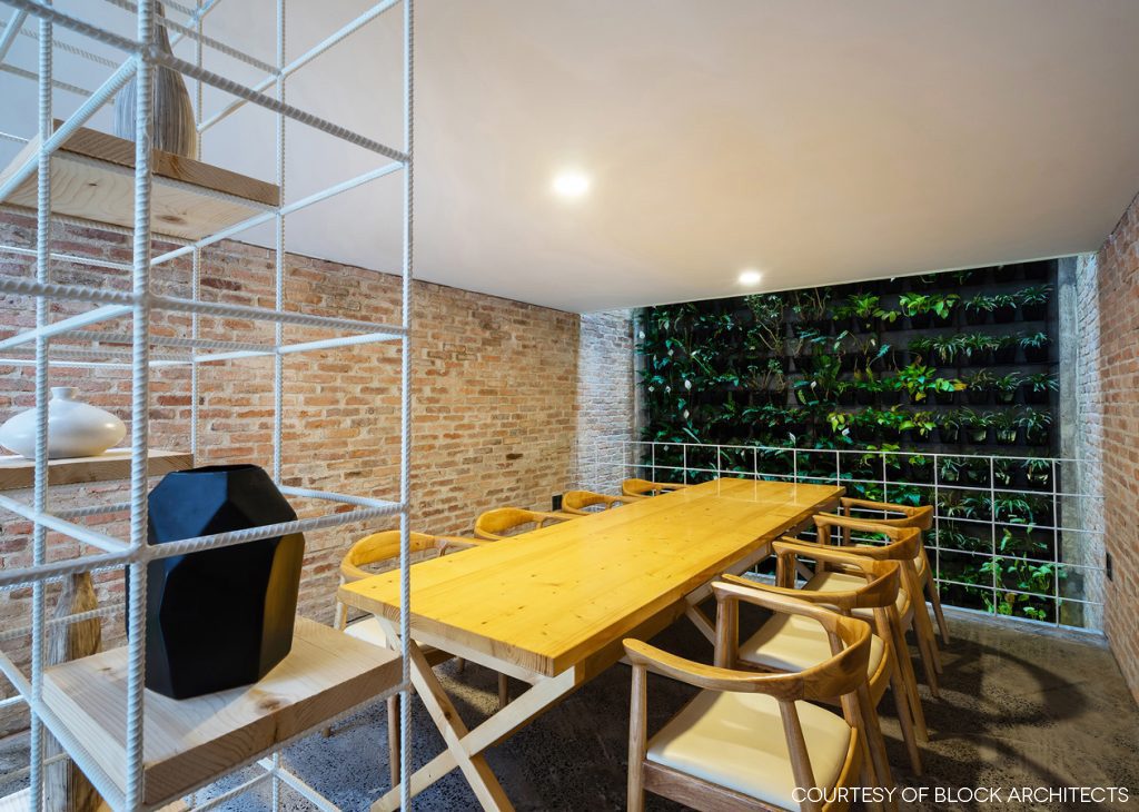
The welded steel rod paneling is painted white and decorated with climbing plants thriving in full sun. Despite its slender appearance, the design is strong enough for home protection, at the same time creating a light and airy ambience for both indoors and outdoors.
home office in HCMC

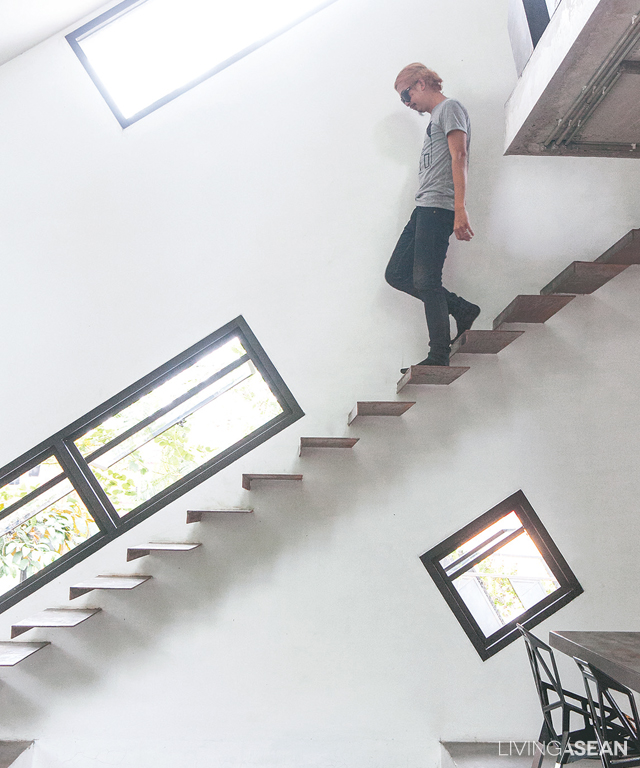
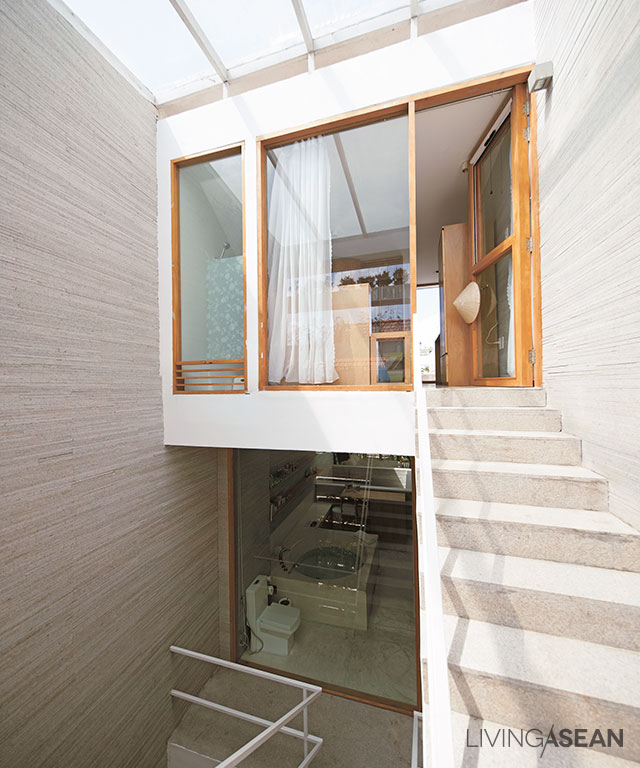
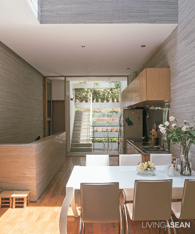
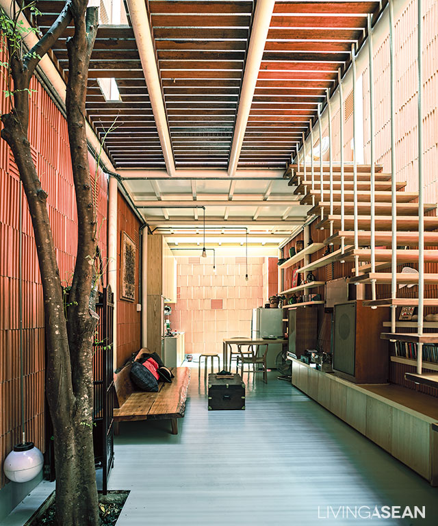
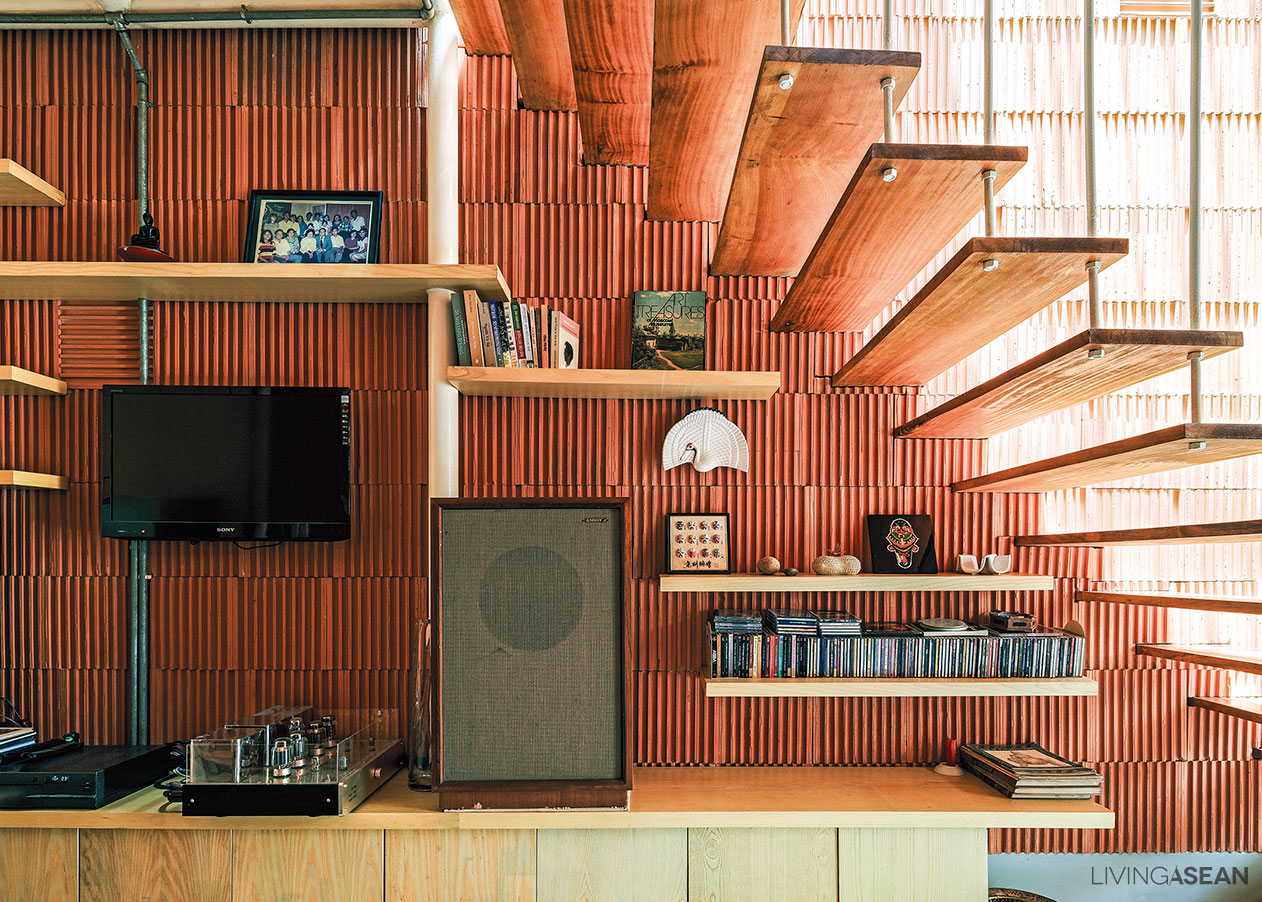
Among other things, the old concrete stairway was removed to prevent the indoors from feeling stale and stifling. Then, a new set of airy stairs with no risers between the treads was put in place instead.

For a lightweight look, stair railings were crafted of steel rods painted white with wood treads in complementing shades. The uplifting design rendered the staircase looking as if it were hovering above the floor.
shvf01

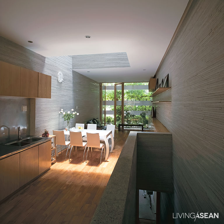
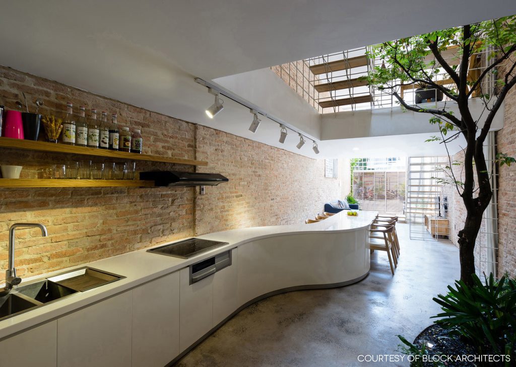
In the kitchen and dining area, a long curvy counter stands in contrast to the stillness of rough brick texture on the wall. All in all, clever design has transformed an unexciting shophouse interior into a home office that looks to be one of the trendiest in Ho Chi Minh City.
home office in HCMC


Architect: Block Architects (www.blockarchitects.com.vn)


You may also like…
The Perfect Townhouse Makeover in Bangkok HUAMARK 09: An Architect’s Charming Concrete Block House
Leaning House: An Out-of-the-Box House Design
Leaning House: An Out-of-the-Box House Design
/ Chiang Mai, Thailand /

/ Story: Nutt / English version: Bob Pitakwong /

/ Photographs: Nantiya, Jirasak / Styling: Praphaiwadee /

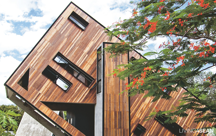
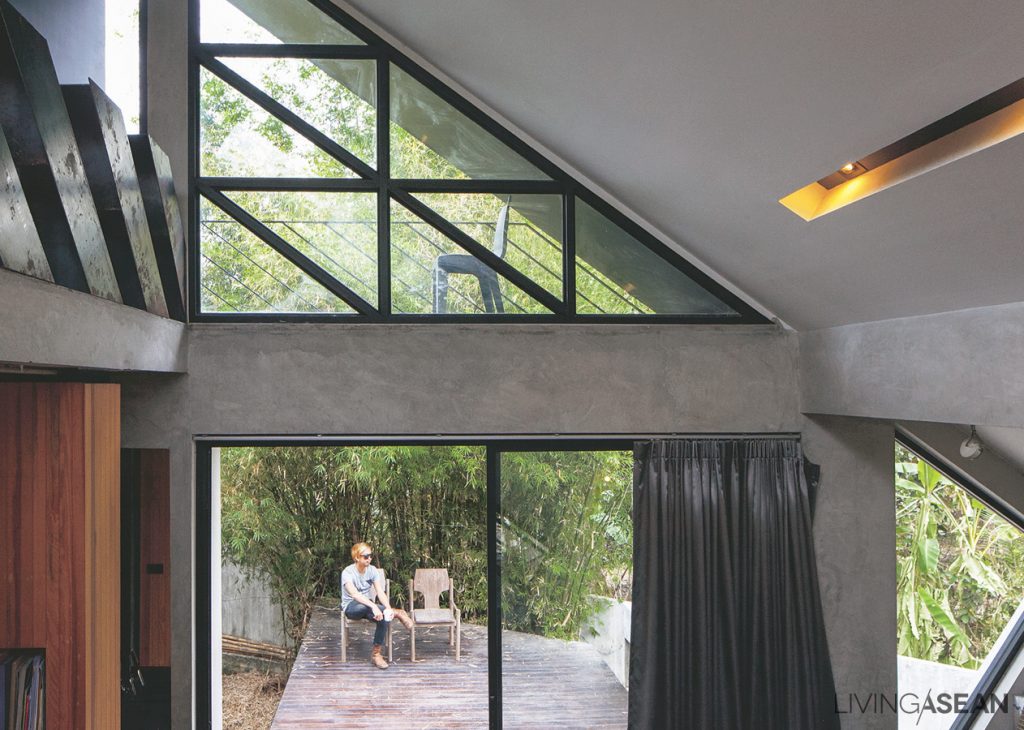
This leaning out-of-the-box house design may make you feel dizzy. But you will feel better if you see the inside and know the story behind it.
out-of-the-box house design
“The property itself was an odd shape, four sides, but not with equal lengths, so it wasn’t expensive,” said Sirisak Thammasiri, the owner and designer of this slanting house.

“But it had charm, a nice natural look, and I designed it with terrain features in mind.”

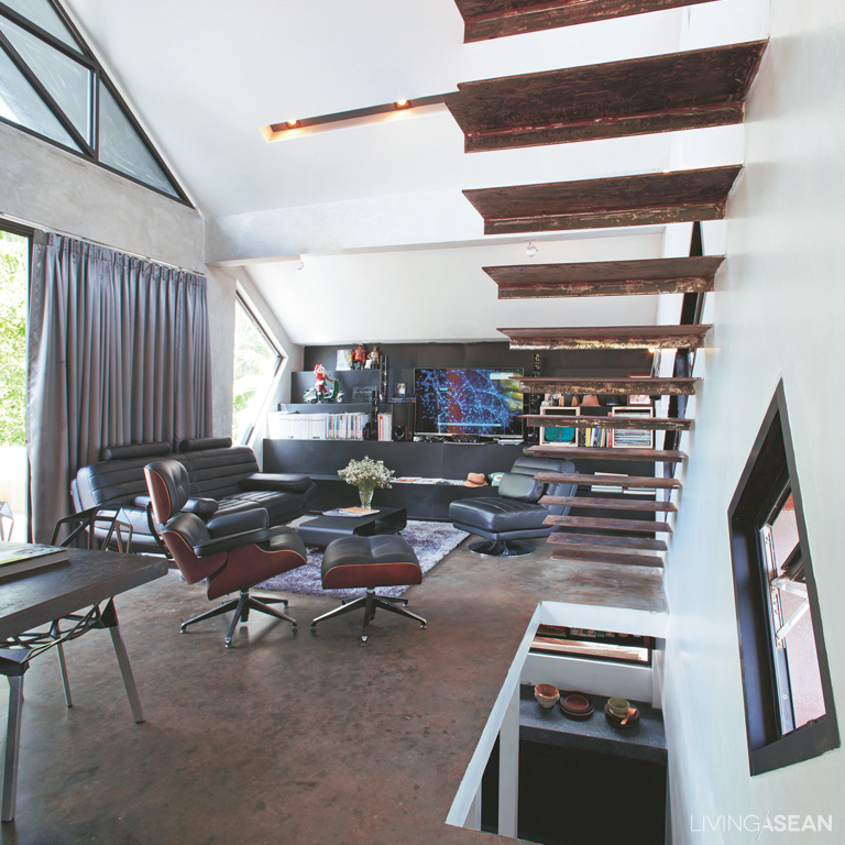
First floor: big open space with light and air. Cool metal stairway. Feeling free.
The image of the first floor presents big open space with a light and cool metal stairway.

When Sirisak was little, his run and play space was the dikes separating flooded rice paddies with mountains in the backdrop.

So he designed his house as one big box popping up out of the ground, bringing a feeling and memory of the mountains to mind.
There’s also a grass lawn in the front yard to remind him of the good old days running in the fields.

out-of-the-box house design

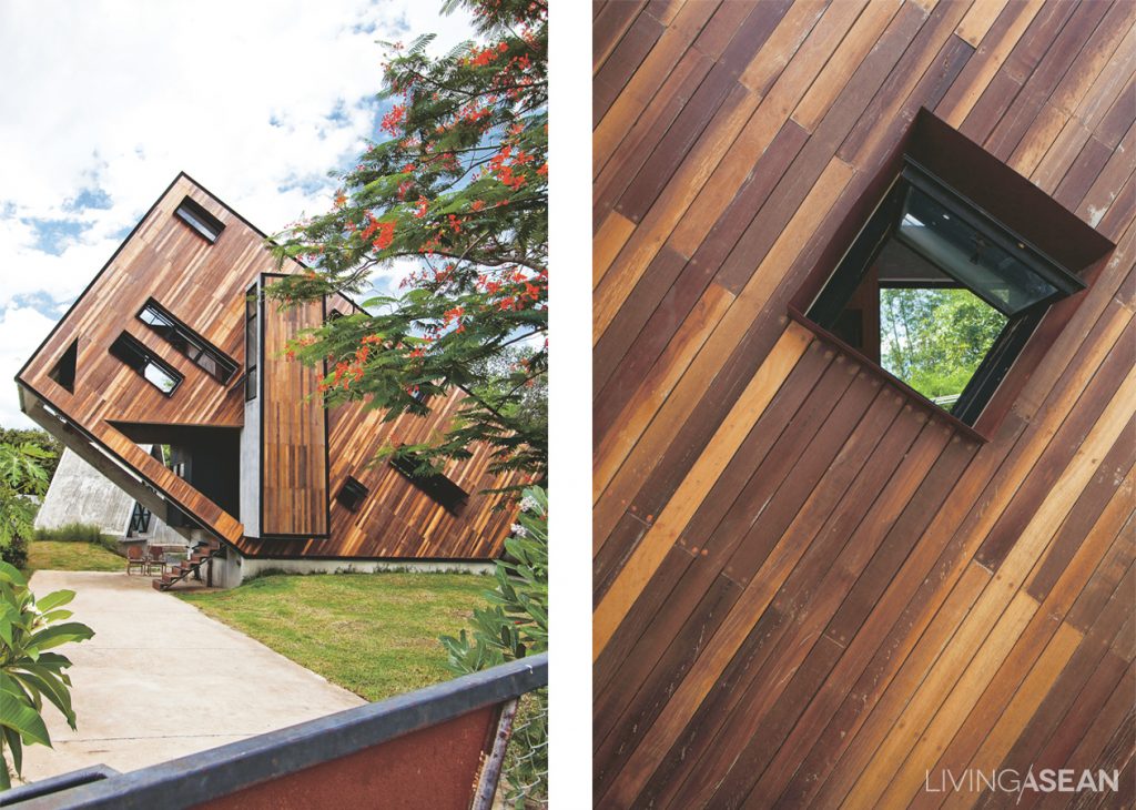
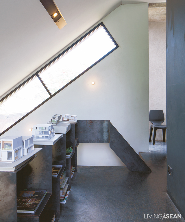
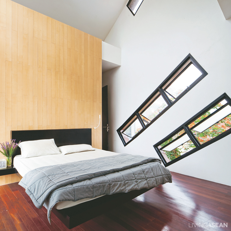
The stairs, walls, and roofing are designed with inclined surfaces and diagonal lines. He got the idea from the bicycle frame and was struck by the strength of diagonals.

Sirisak has found a challenge in designing unconventionally and drawing on concepts from the outside of textbook architecture.

LH03

Beams extend outwards seven meters at an angle to the ground. Clever design makes the drainage plane of the wall a part of the roof.

In the meantime, the roof also doubles as the exterior wall. The house sits facing south, so the front facade is surfaced with wood to protect the house from afternoon sun.

LH09

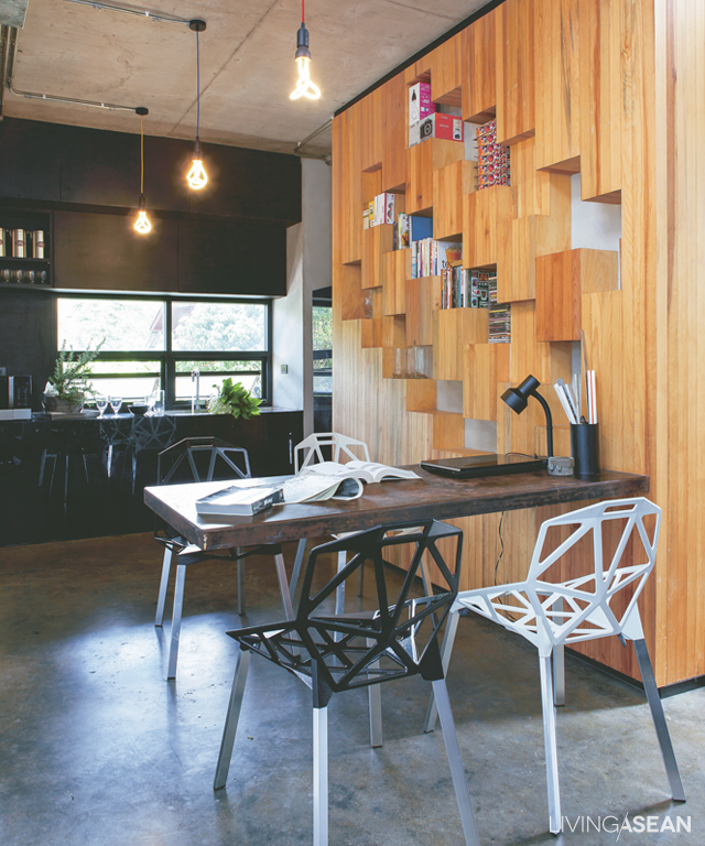
The interior living space gives the feeling of airy comfort. Windows abound, which helps with ventilation and openness. They allow natural light in and save electricity.

Downstairs, the living room connects seamlessly to the pantry, and through it to the split-level kitchen.

Not far, a set of stairs crafted of bent steel plates leads to bedrooms above. The second floor boasts beautiful glass paneling designed to take in panoramic views of the mountain landscape.

out-of-the-box house design

LH08
Sirisak takes in pure mountain air from the second floor balcony, his favorite hangout.

“For this odd shape, the folks around here have given it several names, including ‘the house with laid-back shape,’ ‘the slanting house,’ ‘the boat-shaped home,’ and even ‘that house that points towards the sky,’” he said jokingly.

“My neighbors were always asking things like: ‘Don’t you get dizzy inside that thing?’ Or ‘How can it possibly be comfortable in there?’ Sometimes I invited them in for a look-see.”

To achieve his goals, Sirisak needed a fair amount of confidence and courage to be different in a stylish way. That’s what it means to have a passion for this out-of-the-box house design.

out-of-the-box house design
“This house itself is like a teacher to me. It gets me running experiments all the time,” said the owner.

Owner/Designer: Sirisak Thammasiri of NOTDS Co., Ltd. (www.facebook.com/noneotherthandesignstudio)


You may also like…

A Modern Home That is Quintessentially Thai

303 House: A Modern Narrow Townhouse on a Narrow Lot

Stacking Green: Integrating Nature-Inspired Design in a Row House

Stacking Green: Integrating Nature-Inspired Design in a Row House

/ Ho Chi Minh City, Vietnam /

/ Story: Ekkarach Laksanasamrith / English version: Peter Montalbano /

/ Photographs: Soopakon Srisakul /

This residence in Ho Chi Minh City has an interesting form and exterior that has drawn us to see with our own eyes. Named “Stacking Green”, this row house design received an award for outstanding design and architectural works at the 2012 World Architecture Festival in Singapore. It’s not surprising that it received a citation for architectural excellence in the residential building category. The way that it dealt with complex urban problems in a simple way yielded an array of fascinating outcomes.

row house
The stairway reaches the top floor of the house that holds a guest bedroom with a sundeck.

The four-story townhouse offers a total of 250 square meters of usable space. The frontage abutting on the street is 4 meters wide with a whopping 20-meter depth. The interior is especially designed for the three people who live here, one of whom is an old person. Hence, one bedroom is placed on the lowest floor, so there’s no need to climb the stairs.

3
Since the house plan is long and narrow, bringing sunlight into the interior living space is a very good idea.

The second floor consists of a dining room, kitchen and living room, while the third holds the master bedroom with an open floor plan bathroom. The guest bedroom is located on the fourth floor.

row house

It’s a well-known fact that people’s homes in Vietnam are often compactly built in townhouse form to use as little property space as possible, often resulting in cramped residences and unattractive-looking building fronts.

Here, the architects have incorporated privacy in the design so that no one can look in from outside. At the same time, it gives the homeowners a sense of peace and contentment. Overall, it’s a design thoughtfully devised to reduce pollution from the street.

row house
This row house may not have any eye-catching features from the outside, yet its half-open, half-opaque design allows natural light to enter through the rooftop, creating a cozy home ambience within.
As the leafy plants reach their full size, the level of privacy correspondingly increases.

Additionally, both the front and the back of the house feature rows of containers stacked one on top of the others with open air spaces at intervals. In all of them, lush green plants thrive luxuriantly screening the view inwards and creating attractive façades.

The house also has open ports which run up and down through all the floors. This kind of stack ventilation effect allows for hot air from below to rise and vent out through the rooftop. And by the same token, fresh cooler air is drawn inside keeping the heat down even at high noon.

row house
Sunlight through a glass skylight in the roof shines down into the dining room on the second floor.

5

In the front yard, a leafy shade tree improves air quality, while vertical gardening on the front and back facades has spaces between stacking containers that allow plants to grow. The open spaces between planter boxes are determined by the types of vegetation planted. The full height of a plant is used to fix the spacing between planters on each floor.

Step inside, and you find there are hardly any walls separating the home into different rooms, except for bathrooms. This creates efficient ventilation throughout the home, at the same time giving it an open, uncluttered feel.

Besides giving privacy and cooling shade to the house, the planter boxes and leafy vegetation also act as a safety feature.

In this way, when container plants reach their full heights, they become the outer envelope of the building. Together they go to work all day and every day filtering out harsh UV rays from the sun, at the same time letting the cool breezes flow through.

The architects picked only the trees and plants with fine and delicate foliage so as not to block the wind, and for ease of use, they installed pipes for an automatic watering system.

row house

Concrete planter boxes holding plants on the front and back facades have the added convenience of an automatic watering system.

Architect: Vo Trong Nghia Architects


You may also like…

M11 House: A Comfy Minimalist House in HCMC

3 x 9 House: A Compact Renovated Row House in HCMC

3×9 House: A Compact Row House Renovation in Vietnam

3×9 House: A Compact Row House Renovation in Vietnam

/ Ho Chi Minh City, Vietnam /

/ Story: Ekkarach Laksanasamrith / English version: Peter Montalbano /

/ Photographs: Soopakorn Srisakul /

A lot of work and research was invested in this row house renovation project. The big question is: how to make the compact house look wider?

Home renovation: The project is accomplished without any concrete construction. The new second floor rests on cylindrical steel posts instead of big cement pillars.

Like most urban residential buildings in Vietnam, “3×9 House” was formerly a shophouse built a long time ago. Only recently it was restored to a good state of repair. Looking back over the years, the old place lacking fresh air and ventilation had only a few windows and lots of solid brick walls, which made the building look dim.

A bold move was needed to rejuvenate it. The result is a modern living space that looks and feels fresher, younger and more lively, plus it helps to lift up the mood of the residents.

Renovated Row House vietnam
The 3-by-9-meter house has become a point of interest by integrating natural features in the design.

As land prices in Vietnam continued to rise rapidly and steeply every year, buying a new house seemed like a formidable task. So the owner thought it wise to invest in renovating his existing home.

He reached out to A21 Studio for their good reputations in the building industry, especially when it came to turning small, stuffy old houses into nice, uncluttered and environment-friendly homes.

Renovated Row House vietnam

Renovated Row House vietnam
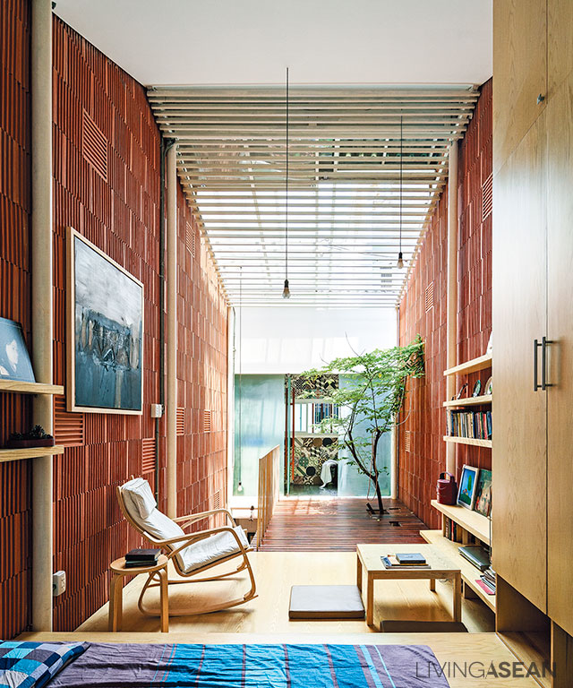
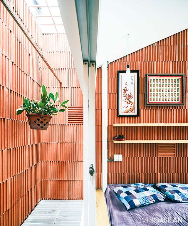
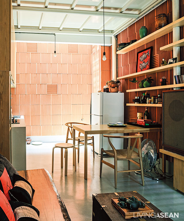
Clay tiles are placed inversely on the entire interior walls to create a stripe pattern and unique touch.

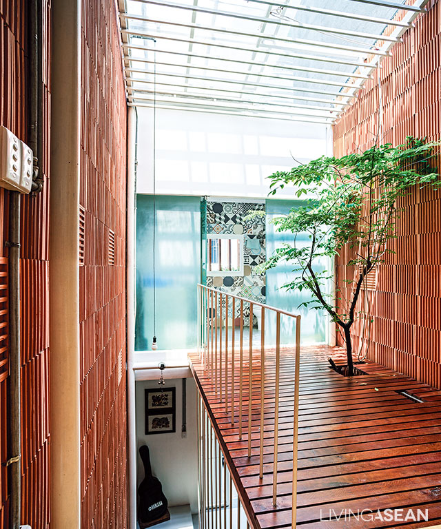
Walk in the door, and the first thing that catches our eyes is a tree growing up through an opening in the footbridge set against the wall. It’s a sign of welcome warmly greeting visitors coming into the entryway. The overall effect is bright and airy, thanks in part to a rooftop skylight illuminating the interior living spaces and letting sunlight shine on the tree.

For indoor thermal comfort, openings in the walls let breezy wind enter through the front door and circulate inside the home. As a result of this, the entire interior feels fresh and full of life all the way to the rear section, the second floor and the room under translucent sliding panels on the rooftop.

Flanked by three-story row houses on both sides, “3×9 House” is exposed to direct sunlight only in the middle of the day. For the rest of the time, the home is full of nice cool shade, making it feel very comfortable, warm and cozy, so there’s no need for air-conditioning.

Renovated Row House vietnam
The steel framework supporting the roof is equipped with a sliding skylight. This effectively illuminates interior spaces and allows the tree to keep on thriving.
Renovated Row House vietnam
For the health benefits of a well-lit home, the bedroom space connects to the footbridge with an opening for a tree to thrive under the rooftop skylight.
Renovated Row House vietnam
Loft style ideas paired with earth-tone color make the simple bedroom feel open, airy and uncluttered, thanks in part to the absence of solid room dividers.
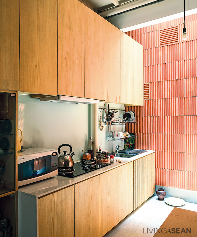
A modern kitchen setup gets rid of smoke and smell fast, as a result of a range hood blower and openings in the rooftop.

For a bigger, more open vibe in the interior, solid room dividers are avoided, with the exception of the bathroom. The ground floor consists of a living room, dining area and kitchen; all connected.

The bedroom and leisure areas are upstairs. Since the homeowner lives alone, solid room dividers are of no use. In a nutshell, it’s about integrating natural features, openings in the walls and a good ventilation system in the overall design. That’s what makes it a good place to live.

Renovated Row House vietnam

A colorful mix of tiles are reminiscent of vernacular architecture.

Architect: A21 Studio (www.a21studio.com.vn)


You may also like…

Nha Be House: A Brick Home Infused with Memories of the Good Old Days

Termitary House: Good Sunshine, Fresh Air, and Brick Walls

A Home with Unique Rooftop Design in Singapore

A Home with Unique Rooftop Design in Singapore

/ Singapore /

/ Story: Ronnapa Nit / English version: Bob Pitakwong /

/ Photographs: Sitthisak Namkham /

In Singapore, people look for creative ways to make the most of limited space, and that includes the rooftop design. A multiple-floor renovation by Formwerkz Architects clearly illustrates this. The Singapore-based architectural practice has succeeded in creating a unique living space on the rooftop tailored specifically to the homeowner’s lifestyle needs.

rooftop design
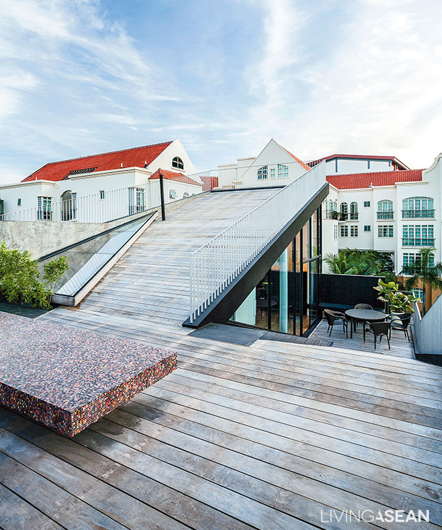
The rooftop deck is a vista point to capture amazing panoramic views.

From a distance, the place looks similar to other two-story homes in the neighborhood, except for the rooftop deck. The platform-like structure is unlike anything else, yet it fits right in the modern context that forms the setting of the area.

[Left] An open kitchenette connects with the dining room making the area look neat and uncluttered, while a warm shade of brown and burgundy on the wall contrasts with modern furniture. / [Right] A U-shaped sectional sofa is set against the wall to maximize space.
[Left] An open kitchenette connects with the dining room making the area look neat and uncluttered, while a warm shade of brown and burgundy on the wall contrasts with modern furniture. / [Right] A U-shaped sectional sofa is set against the wall to maximize space.

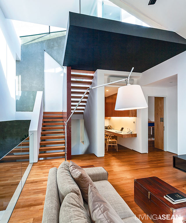
The designing process started out with the living room, dining room and kitchen before moving on to the upper floors that hold a sitting room, multipurpose area, bedrooms and a rooftop deck. It represents a line of thought that ensures all areas are easily accessed and connected.

The overall effect is very light and airy, thanks to natural light shining through a rooftop skylight and fixed windows in the sidewall.

Fundamentally, it’s about harnessing the power of nature to create good living conditions. This is evident in well-thought-out design that ensures no electric light is ever needed during the daytime, translating into big savings plus excellent indoor thermal comfort.

Earth-tone color adds a touch of warmth to the living room on the second floor.

Strictly speaking, the interior living space is an interesting amalgam of modern architecture and graphic design innovations. This is especially true of the living room, where Art Deco style meets modern materials, such as mosaic tiles, terrazzo walls, glass panels on wood, and metal frames.

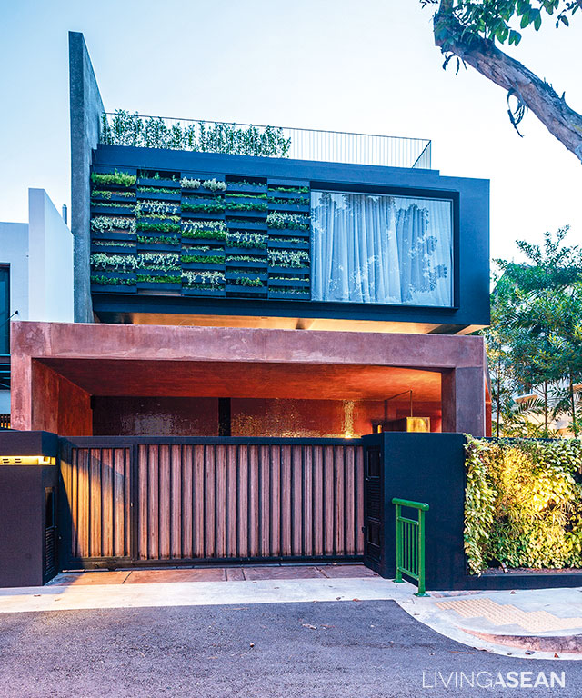
[Left] A nook beside the wall offers seclusion in the son’s bedroom. Louvered windows with wood slats alternating with glass panels are used to aid air circulation. [Right] The front facade bedecked with a vertical garden provides natural sunscreens protecting the master bedroom.
[Left] A nook beside the wall offers seclusion in the son’s bedroom. Louvered windows with wood slats alternating with glass panels are used to aid air circulation. / [Right] The front facade bedecked with a vertical garden provides natural sunscreens protecting the master bedroom.
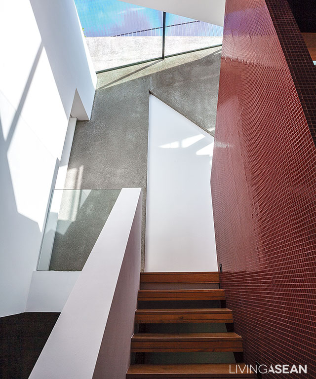
The stairwell connecting to the lower floor is illuminated by a rooftop skylight.
[Left] A bright and airy bathroom at the far end is visible from the stairway leading to the top deck. [Right] The bathroom in white comes with a wall-mounted countertop. The mirror with a rounded corner paired with soft pink recessed lighting creates a sense of spaciousness.
[Left] A bright and airy bathroom at the far end is visible from the stairway leading to the top deck. / [Right] The bathroom in white comes with a wall-mounted countertop. The mirror with a rounded corner paired with soft pink recessed lighting creates a sense of spaciousness.
rooftop design
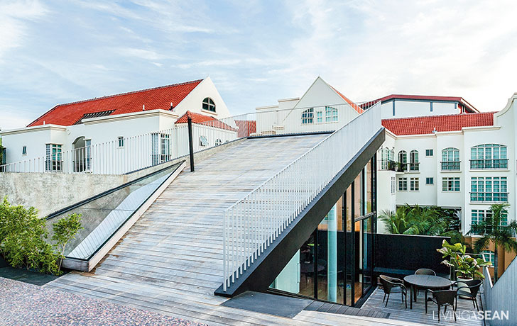
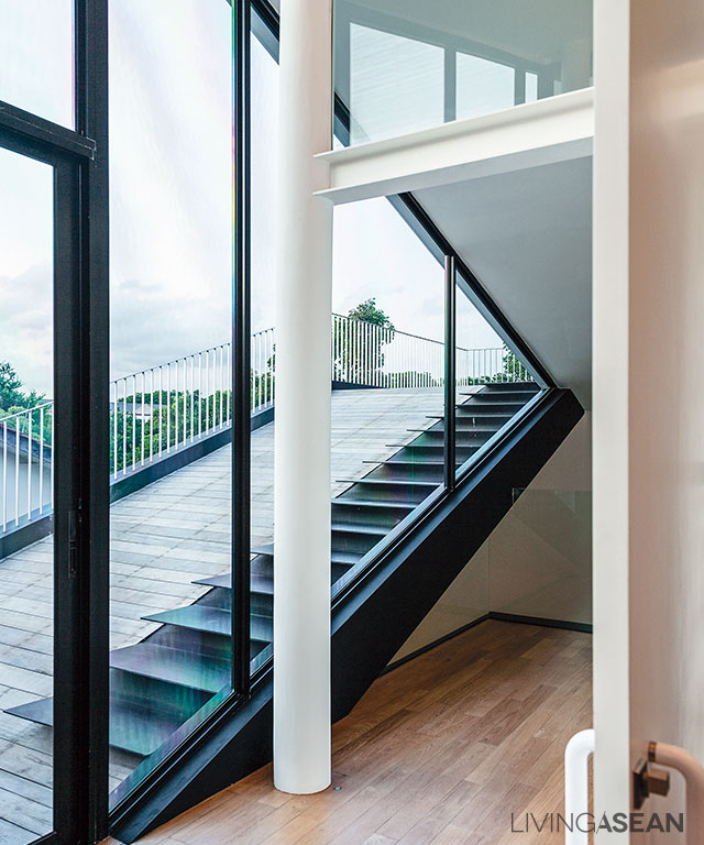
A ramp and a staircase provides access to the rooftop deck.

Among other things, the most eye-catching feature is the rooftop design that extends from the penthouse roof resembling a continuation of the indoor living space. The al fresco area is a perfect place to relax and unwind on a lazy afternoon, or to host an outdoor party.

From a distance, the newly remodeled house is thoughtfully devised to blend with the surroundings. It’s a way that forms a pleasing whole, where traditional and modern values peacefully coexist in this residential neighborhood of Singapore.

rooftop design
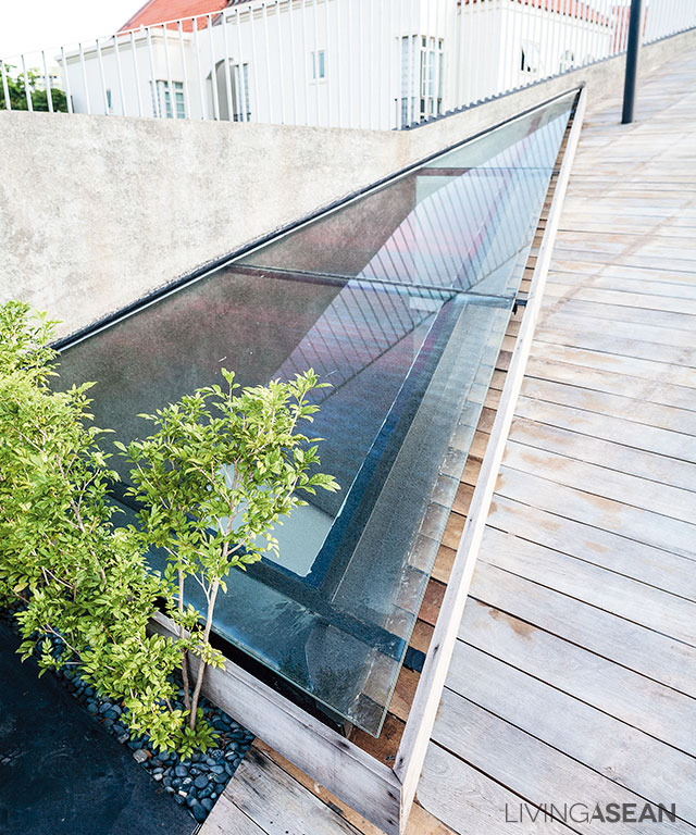
A skylight beside the rooftop deck allows plenty of sunshine to reach all the way to the lower floor.
The house’s four levels lie hidden from view, while its front facade fits right in with two-story homes in the neighborhood.

Owner: Dr Kelvin Lee

Architect: Formwerkz Architects (formwerkz.com)


You may also like…

MP House: A New State-of-the-Art Live/Work DesignA Modern Breeze Blocks Tropical House in Ho Chi Minh City

X