Blog :

Exploring the Advantages of Green Innovations in Home Goods and Design

Exploring the Advantages of Green Innovations in Home Goods and Design


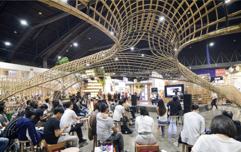
Following our report on 10 must-see highlights of the Architect ’19 “Living Green”, an expo of architectural technologies, building materials, smart innovations and home decorations, it’s time for a deeper glimpse into the world of sustainable developments to show why living a green lifestyle is so important to us and our future generations. The 33rd edition of the architectural expo is doing exactly that. It’s the ASEAN’s major confluence of interesting ideas, news and information on how to live sustainably with a focus on innovative products, advances in construction, repairs and decorations. There are even more exciting discoveries that we want to share with you. Take a look.

Architect ’19

Graphenstone Stuki Premium: Innovative ideas to make your house work like a tree with awesome design and colors

(See real products at Jorakay’s exhibit, Booth S211)

Do you know that using 15 liters of paint (roughly 3 buckets) can sequester as much as 10 kilograms of carbon-dioxide in the air; thereby helping to reduce the overall concentration of greenhouse gases in Earth’s atmosphere. That’s pretty much the amount work a tree does in one year. Introducing G Color Stuki Premium. The new paint product line represents a major breakthrough in research and development by the Jorakay Corporation Co, Ltd, a leader in the manufacture and distribution of products for construction, repairs and decorations. Its products are certified to international safety standards.

Architect ’19

Jorakay’s G Color Stuki Premium is a colored cement for decorative concrete surfaces. It’s made of a mixture of high-quality limestone that’s sourced directly from nature. Stuki Premium is the result of Graphen technology that’s eco-friendly and capable of producing a family of colored cements that’s durable and suitable for both indoor and outdoor situations. Beautiful design patterns can be easily made using a small handheld plaster trowel. Three are 322 color shades to choose from.

Architect ’19

dECOLeather® Recycled Leather Veneer, 5650 Shagreen: Reuse of leather shreds to minimize the killing of animals

(Get the feel of real products at Formica Thailand Booth F507)

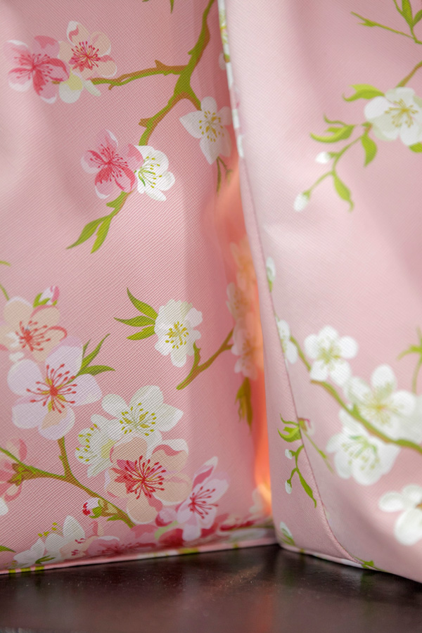
The dECOLeather® brand of recycled leather veneer is a composite of shredded leather scraps collected from leather goods manufacturers. An alternative product from the Formica Group, the durable laminate is beautifully crafted for decorative coverings, interior design and other surfaces. Ensuring that nothing goes to waste, dECOLeather® works by making good use of every small piece of leather destined to be discarded or destroyed as rubbish. In the recycling process, leather scraps from garment cuttings and other manufacturing activities are reduced to fine particles and then mixed with synthetic resin to form a hard, flat and flexible material for decorative coverings. After that, a variety of design patterns are printed on the composite material. For this exhibit, four design collections are on public display. They include whiptail stingray, buffalo hide, sea lion, and crocodile decorative patterns. You will love the stingray design. See it at the Formica booth.

dECOLeather® is a line of alternative products designed to be perceived as similar or comparable to genuine materials for which it is intended to substitute. The most important point at issue is about saving the environment. It comes in handy for the consumer who has a taste for leather goods but dislikes the killing or hunting of animals for their skins. Advances in the manufacturing process ensure that recycled leather veneer is more durable than leather in general, making it a material of choice for interior decoration, table top, and other surfaces to name a few. It’s water impermeable, easy to install, flexible and available in many colors.

Architect ’19

XPOSH Series: Luxury water-saving faucets and winners of the Red Dot Design Award 2019

(Get the feel of real products at COTTO Booth S308)

If you prefer a touch of luxury and save energy at the same time, look no further than an impressive line of water faucets for the bathroom sink from COTTO. The XPOSH Series features a single handle with one-hole mixer tap design that lets you use just the right amount of warm water when needed. It comes in a variety of colors and finishes that please and pleasure your senses, among them Starlight Silver, Matte Onyx, Midnight Silver and Starlight Gold. Each model features eye-catching design that has won the Red Dot Design Award for 2019.

Architect ’19 Architect ’19

Nicknamed “a jewel in the bathroom”, the XPOSH Series is considered not only a luxury, but also a perfect example of advances in technological innovations. That’s what COTTO is about; save the energy needed to make hot water. It’s easy to use simply by pushing the handle slightly to the side. The XPOSH Series has a smart mechanism hidden inside the cartridge that turns on and starts heating water after only 4 liters has passed instead of 6 liters that’s normally the case. In the process, this mechanism helps save both water and electricity at the same time. It’s an interesting development compared to the standard instant hot water faucet that consumes more energy.

Architect ’19
Reverie Rethinking Form
Architect ’19
Rivulet Rethinking Flow

For design aficionados, the COTTO exhibit also features showerheads in a variety of styles and finishes, among them the “Rivulet Rethinking Flow”, a three-dimensional abstract form designed to let you enjoy the delightful spray of water as if you were bathing in a stream. There’s also the “Reverie Rethinking Form” showerhead, which is a mix of metal casing and crystal parts. The design mimics a mass of small soap bubbles kissed by the morning sun, immediately appealing to say the least.

Architect ’19

DOS WaterPac Pro: A space saving water tank rich in functions; it’s more than a storage

(See the real product at DOS Life Booth S104)

DOS WaterPac Pro is a technological innovation under the brand name DOS Life. The water tank with pump has become an instant success story. It won a 2018 DEmark Award, an official accolade for design excellence in the Industrial Goods Category, and the Good Design Award, or Gmark for short, in 2018. The underlying logic and reasoning for the design is about saving space and maximizing the utilization of vertical space.

Designer Vichit Choopho obviously tries to make a connection between the lifestyle of the new generation and modern conveniences that contribute to an easy way of living. A water tank that’s rich in functions turns out to be one of the four must-haves in every home. For this reason, DOS WaterPac Pro is designed to be more than just a water storage. It’s a source, means and process of supplying water for the entire household, and in a succinct way reflects the taste of the homeowners.

Architect ’19

STOCK HOME BROWN: Wood-look porcelain tiles designed to reduce waste

(See the real product at Duragres Booth S305)

Stock Home Brown is a line of wood-look porcelain tiles that’s part of the Recycled Tiles series manufactured by Duragres. A metamorphosis of purpose, it’s made by converting waste into useable raw materials, including tiles that have been damaged in the manufacturing process. The result is an impressive array of 20×20 inch tiles for covering floors and other surfaces. In the end, the main concept is about ensuring nothing goes to waste and that every piece is made to the highest international standards.

Architect ’19

KENZAI x JUNSEKINO Architect + Design: Bricks designed to break the traditional rules

(See the real product at KENZAI Booth S212-1)

“I want a building material that allows light to pass through and provides protection from rain.” Jun Sekino of the architectural firm JUNSEKINO Architect + Design has carried out a thorough search for the ideal material. The answer is a line of translucent bricks made of various raw materials binding together to form a perfect building block.

The new kind of brick is made of a mixture of clay and polycarbonate, a synthetic resin that’s the strongest of all plastics. The part that’s translucent is only five millimeters thick. Because it’s so strong, the brick can be used to build a wall up to three meters tall with no need for a lintel across the top. It’s water impermeable and allows light to pass through the part that is polycarbonate. There is practically no limit when it comes to controlling the amounts of light shining through. In so doing, the architect can use any brick laying patterns to add a new dimension to the interior living space. More importantly, it translates into a big saving on electricity use.

Architect ’19

MO31 (ECO PLUS): One-piece toilet sanitary ware with washbasin and a water recycling system

(See the real product at MOGEN Booth S305-1)

Wouldn’t it be nice if wastewater from the washbasin can turn around and be used again to flush the toilet? That’s actually the case with M031 (Eco Plus), a revolutionary one-piece toilet sanitary ware that comes with a washbasin and a recycling system designed to cut down on water use.

Architect ’19

MO31(ECO PLUS) from MOGEN is the first water-saving sanitary ware system that uses Siphon Wash in coordination with Flush. Made using solid ceramic technology, the toilet bowl requires only 3 to 6 liters to flush. Innovative design ensures the toilet bowl and water reservoir is built tough, its surface smooth to the touch, and the toilet seat stable and easy to operate.

Every model in the MO31(ECO PLUS) series comes complete with an installation kit that includes hoses, clean water supply line, stop valve and rubber gasket that seals the junction between two surfaces.

The above-mentioned technological innovations, products and services are on view at the Architect ’19 Expo that’s happening from April 30 to May 5 at Challenger Halls 1-3, Impact Exhibition Center, Muang Thong Thani. There isn’t much time left, and we don’t want you to miss out on it.

For more information, please visit www.asa.or.th/architectexpo

10 Must-See Highlights at the Architect ’19, An Expo of Architectural Technologies, Building Materials, Smart Innovations and Home Decorations

10 Must-See Highlights at the Architect ’19, An Expo of Architectural Technologies, Building Materials, Smart Innovations and Home Decorations

The Architect ’19 is in full swing. The 33rd edition of the Architect’19 expo is on from April 30 to May 5. This year’s concept is Living Green, which is about the role of architecture in building a sustainable future. The event showcases the latest in technological innovations in architecture and building materials by manufacturers from 40 countries worldwide. Here are ten highlights of the show that we don’t want you to miss. It’s good to know something about them beforehand.
Architect ’19

  1. SCG

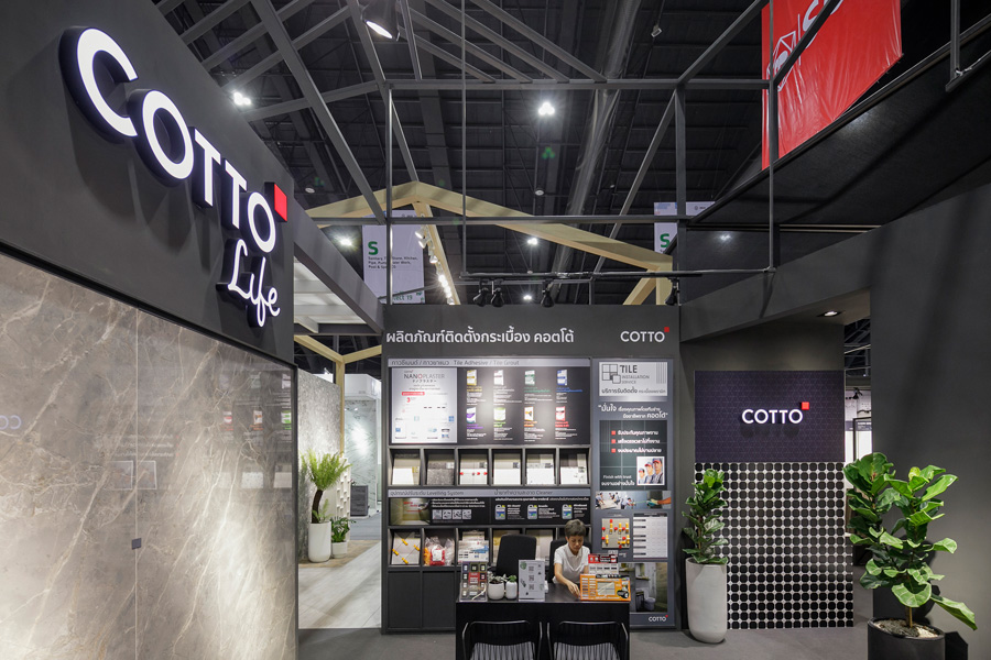
A leader in building materials and interior decorating, SCG never ceases to amaze us with new developments, products and services. One of the highlights of its exhibition this time is COTTO Life, a tile installation service designed to solve problems and deal with difficult situations. Once you have selected the perfect tiles for your home project, you can rest assured that they will be installed correctly by a team of experts. There are designers and skilled tile setters on hand to give options so that you are now making an informed choice.
Architect ’19 Architect ’19

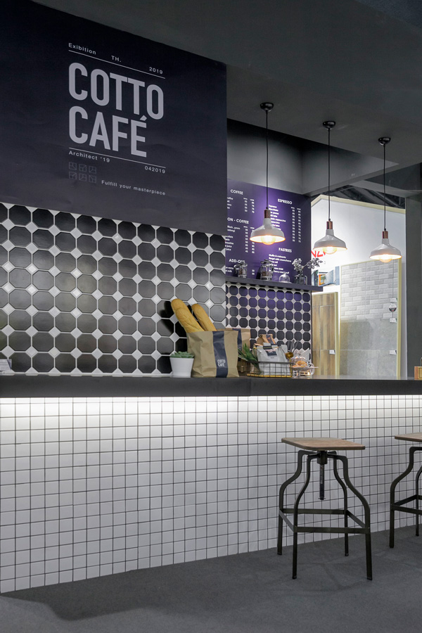
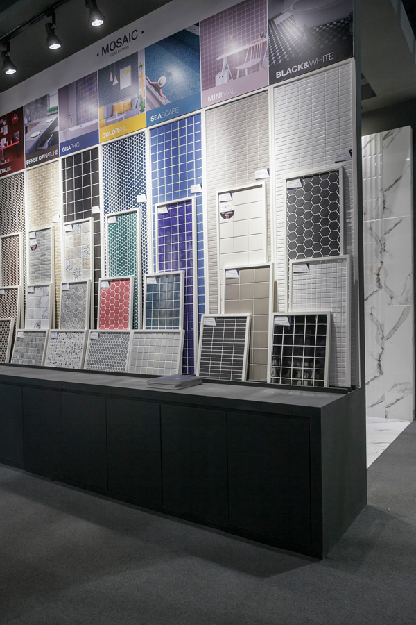
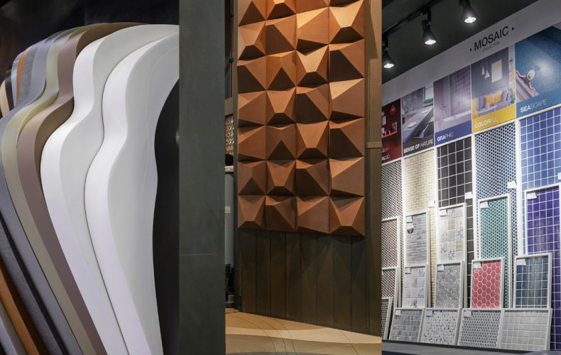
​Another outstanding show is the display of new mosaic tile collections that have become more than bathroom floor coverings. There are plenty of ways to decorate with a colorful and variegated pattern that looks simple and feels more fun and modern, yet classic in style and high quality standards. You can decorate the wall and the countertop with a mosaic, too. And, if you are planning on opening a restaurant or café, keep abreast of new trends in technology and design. Go for a mosaicked pattern.

(Booth S308)
Architect ’19

  1. Phitpaisarn

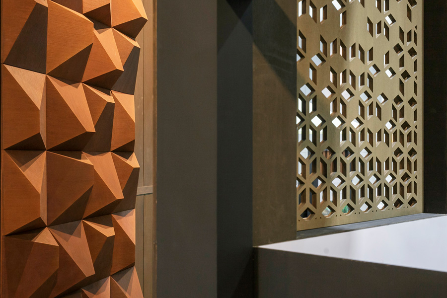
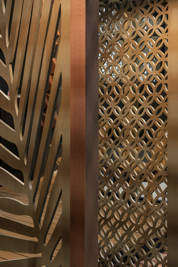
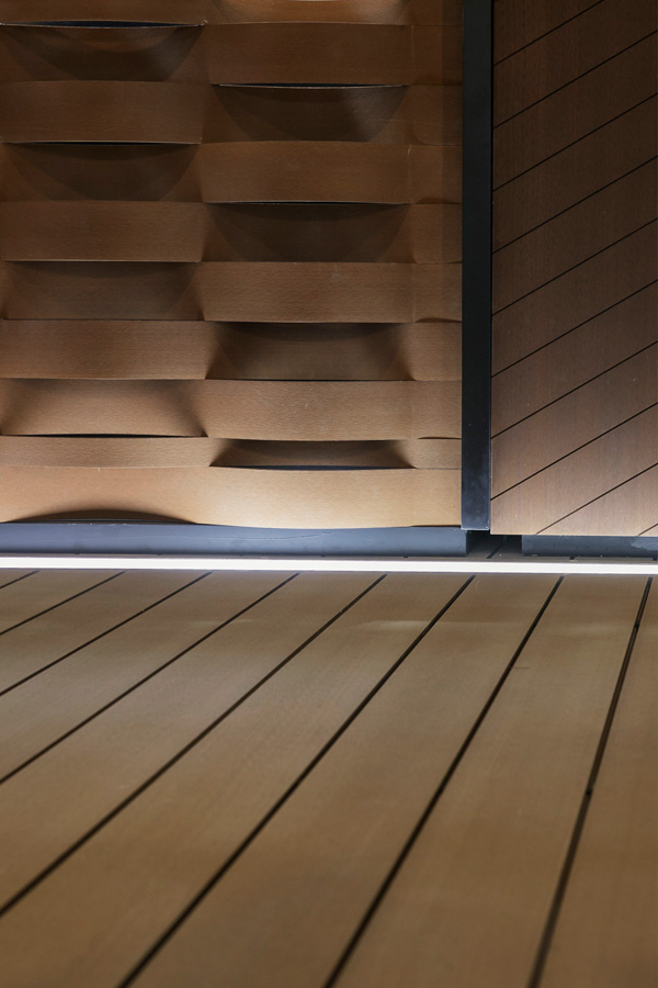
The Resysta brand of imitation wood from Germany is made of raw materials sourced directly from nature. It is composed of 60% rice husks, 22% rock salt, and 18% mineral oils. As the market price of genuine timber continues to rise, faux wood is on course to become the material of choice in future construction. It’s available in a variety of styles, each tailored to meet specific building needs ranging from flooring to wall coverings to decorating materials. Imitation wood comes in textures and finishes that resemble real timber. It’s capable of being used indoors and out of doors. Faux wood for outdoor applications is covered by a 15-year warranty. There’s no worry about peeling paint, either. Since it is water impermeable, faux wood isn’t prone to be affected by surface fungi, mold and mildew. Apart from flexibility, imitation wood is easy to drill holes, saw off, and rub to produce smooth, shiny finishes.
Architect ’19 Architect ’19

(Booth S113)

Architect ’19

  1. Hooth

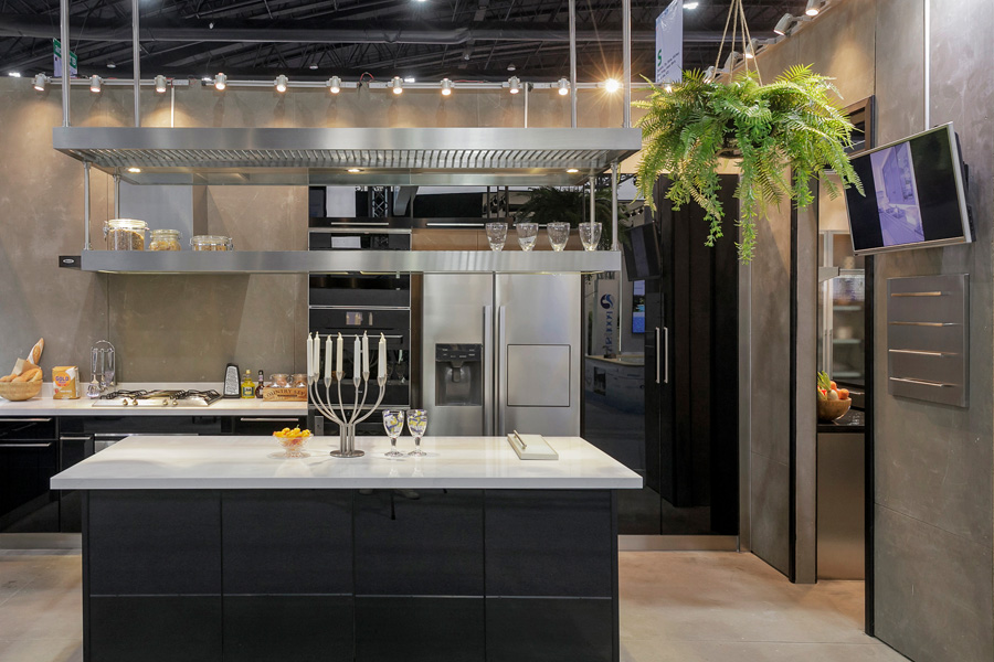
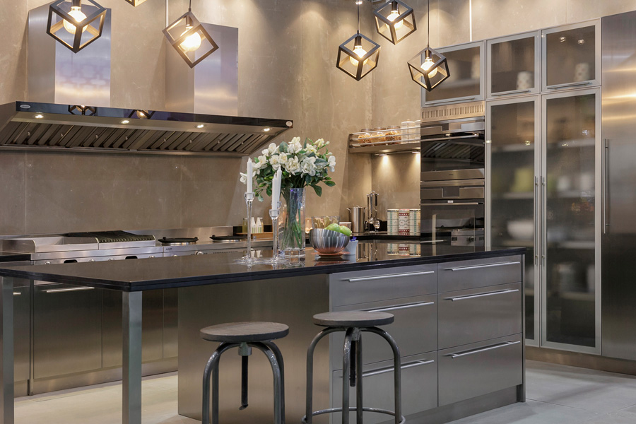
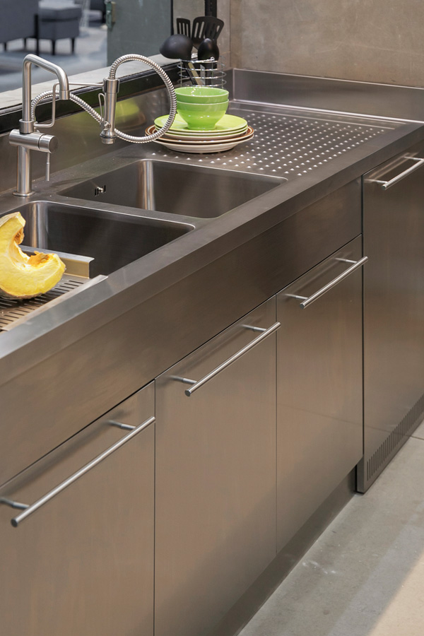
Made of high quality stainless steel, the Hooth brand of home kitchen systems is renowned for creativity and craftsmanship. What makes it special is that you have the option of designing a kitchen to fit in with your specific space and functions. Created with the Thai kitchen in mind, Hooth sets of fixtures, cabinets and appliances are made tough to withstand the stresses and heavy-duty use. The layout includes areas where materials are prepared and food is cooked as well as washbasins and neatly designed storage spaces. Stainless steel is unaffected by heat, easy to keep clean, durable, and scratch-resistant. You can add small tweaks to improve the look, such as cabinets with glass doors and the countertop made of natural stone slabs.
Architect ’19 Architect ’19

(Booth S502)

Architect ’19

  1. Kenkoon

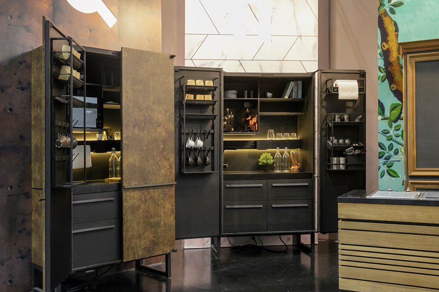
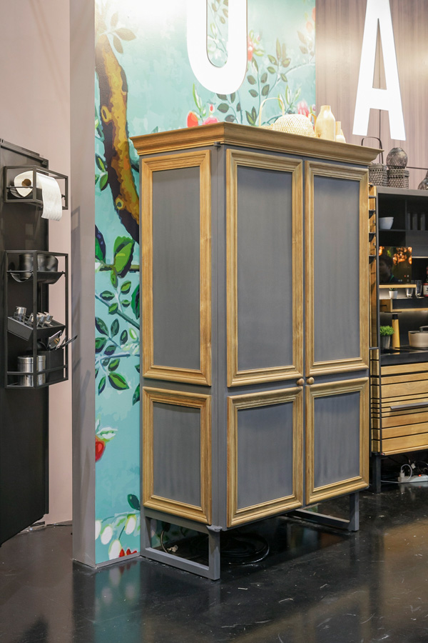
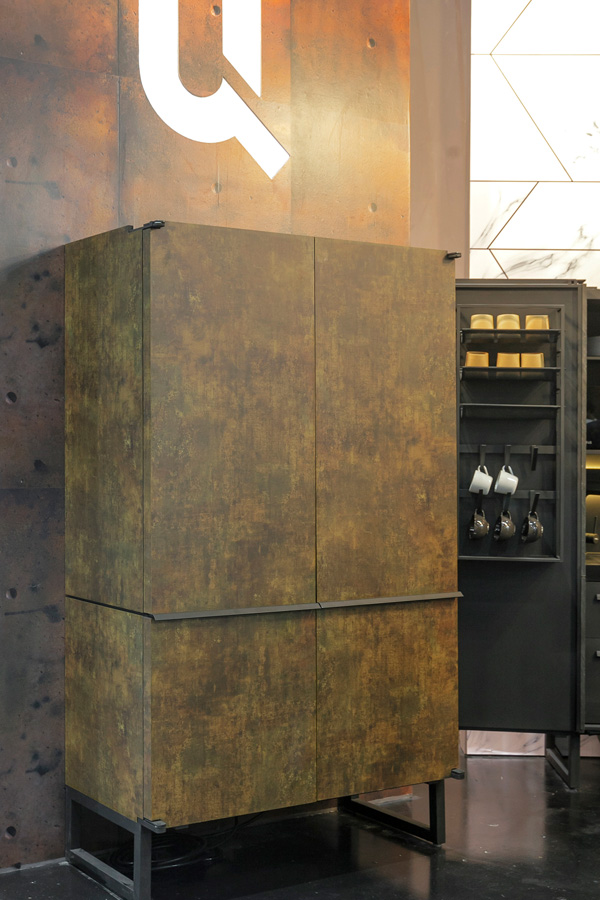
The Kenkoon brand of multipurpose kitchen cabinet is good news for small-space dwellers. Known as Q-Mini Compact, the cabinet measuring 120 x 205 x 60 centimeters is designed to make a small kitchen work best for you. Once opened, the cabinet transforms into a workable kitchen with a cooking range, washbasin, storage, and a shelf for the microwave oven. Shelving is fully adjustable to suit specific storage needs, while cabinet sides can be made of real wood, corrugated metal, stone veneer siding, or laminate boards.
Architect ’19 Architect ’19

(Booth F206-1)

Architect ’19

  1. 3M

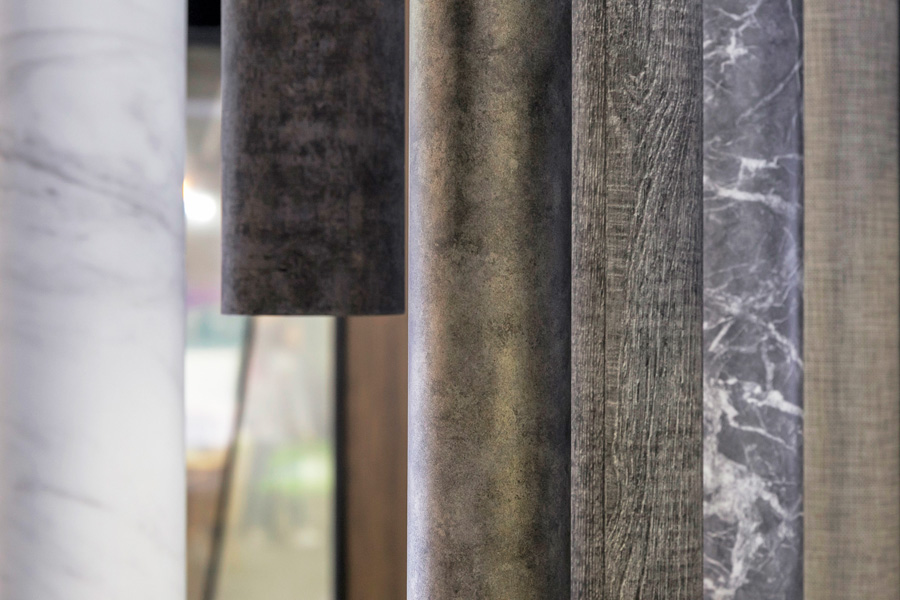
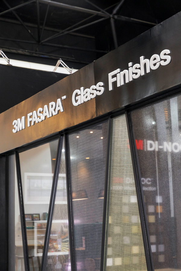
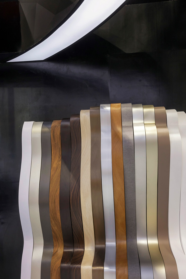
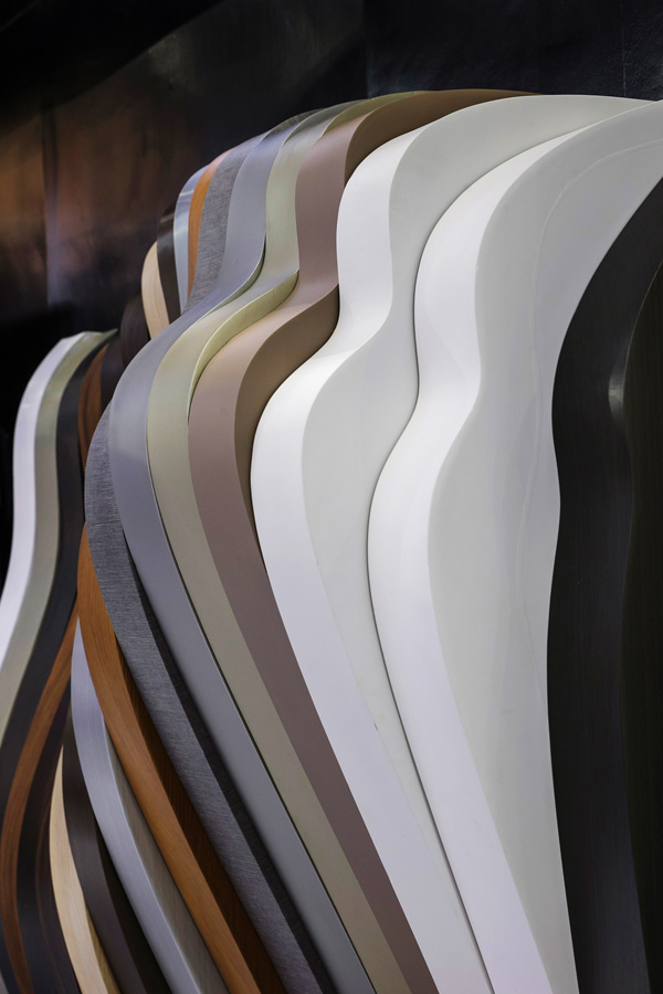
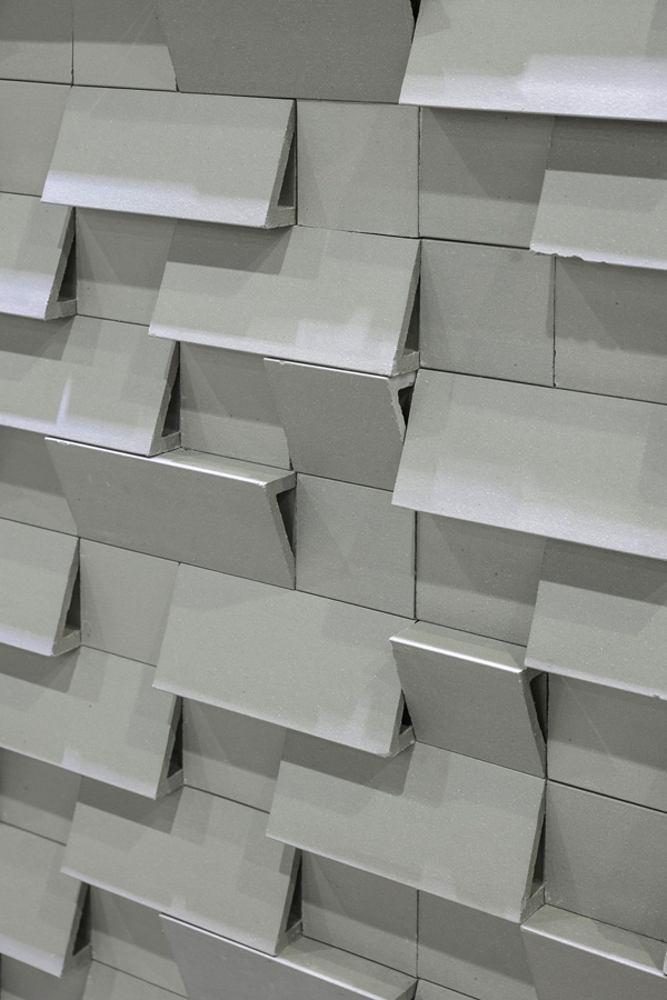
​Transcending the limits of thought, the 3M DI-NOC vinyl that’s only 200 microns is suitable for multiple uses and looks its best in many different situations. Your home exterior is just as important as its interior, and vinyl siding comes in handy for both. Installation is easy. Simply remove the outer covering and place the self-adhesive film over the existing surfaces. The decorative vinyl sticks to wood, sheet steel, aluminum, stainless steel, Plaswood PVC sheets, and MDF boards. DI-NOC vinyl offers many advantages, ranging from low maintenance to durability to enhancing curb appeal. There are more than 1,000 design patterns to choose from.
Architect ’19 Architect ’19 Architect ’19

​That’s not all. 3M is also showcasing Fasara, also known as PE Film, which is only 80 microns. Designed especially for car windows, the film is capable of blocking up to 99% of hazardous ultraviolet rays. It adds strength to glass windows and has more than 55 designs to choose from.

(Booth F104)
Architect ’19

  1. Kenzai

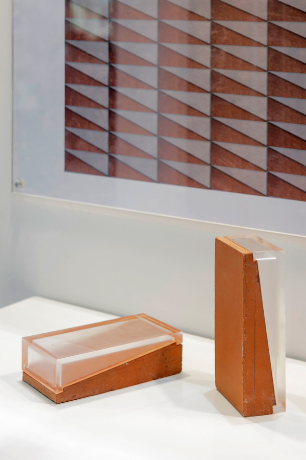
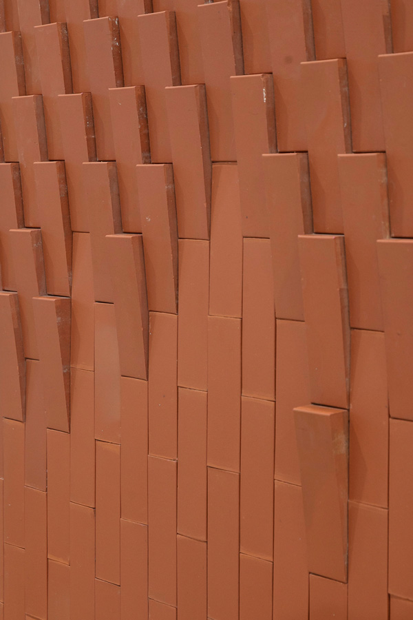
​​              Realizing the potentials of a hybrid of ceramics and synthetic resin, Kenzai has achieved a major breakthrough in manufacturing lightweight brick for construction. The important development is the result of a collaboration between Kenzai and Jun Sekino of the architectural firm JUNSEKINO Architect and Design. Resin, which is translucent, allows light to pass through the brick creating an interesting new dimension to the wall. Combine that quality with creative bricklaying patterns, and the result is amazing. The best part of the show is the Ombra brick collection that’s highly recommended as worth seeing.
Architect ’19Architect ’19

(Booth S212-1)

Architect ’19

  1. L&E

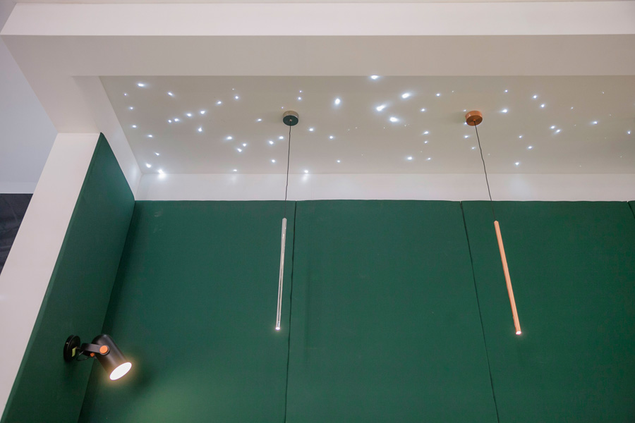
​              A leader in electric bulb manufacture and lighting technology, L&E showcases exciting new lamp collections with a focus on simple design that’s characteristic of the minimalist decorating style. The exhibit offers light fixtures designed for a variety of functions, ranging from floor standing lamps to hanging chandeliers to linear strips and studio rail systems. You will love the clear blinker light bulbs for ceiling decorations that mimic a night sky filled with stars. For the outdoors, there’s a beautiful collection of lamp fixtures that turn the garden and swimming pool into an enchanting place. All of them come equipped with LED bulbs that save you money on electricity while providing sufficient light that’s easy on the eyes.

Architect ’19 Architect ’19

(Booth S301)

Architect ’19

  1. Material World

​              For people who do occasional domestic repairs and minor renovations, Material World is one of the must-see events at this year’s expo. Handymen will find the exhibition useful in keeping abreast of the latest in tools and equipment for household maintenance. They include multipurpose tool boxes and bags that are lightweight, durable, and available in many colors and sizes. The kind designed for storing heavy-duty tools is capable of withstanding weight up to 150 kilograms. When not in use, they can be stacked up for space saving. If you use plastic bags in the kitchen, there are metal clips for a variety of purposes. Clips and sealable bags come in handy for storing things left over after other things have been used.


Architect ’19 Architect ’19

(Booth L104)

Architect ’19

  1. Ricoh

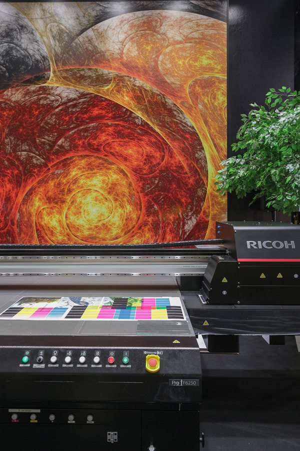
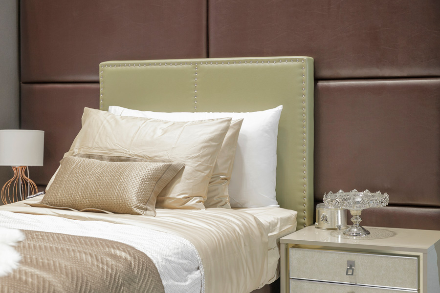
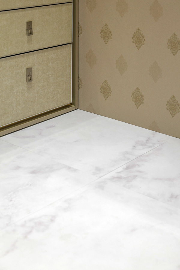
​              Development is a never-ending process at Ricoh, which is showcasing an exciting breakthrough in printing technology. Its new inkjet printers are capable of printing works on many surfaces other than paper, among them faux leather, wood and glass surfaces for interior decorating. Advanced technology ensures that the prints are UV and water resistant, which enables them to stay beautiful for a long time without cracking or peeling off. The new Ricoh inkjet printer is suitable for printing works under time pressure, such as promotional materials for event organizing or unique print jobs that are done in limited quantities. The printer is capable of printing 48 square meters per hour.
Architect ’19 Architect ’19 Architect ’19

(Booth L204)

Architect ’19

  1. Fineness

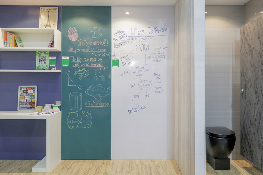
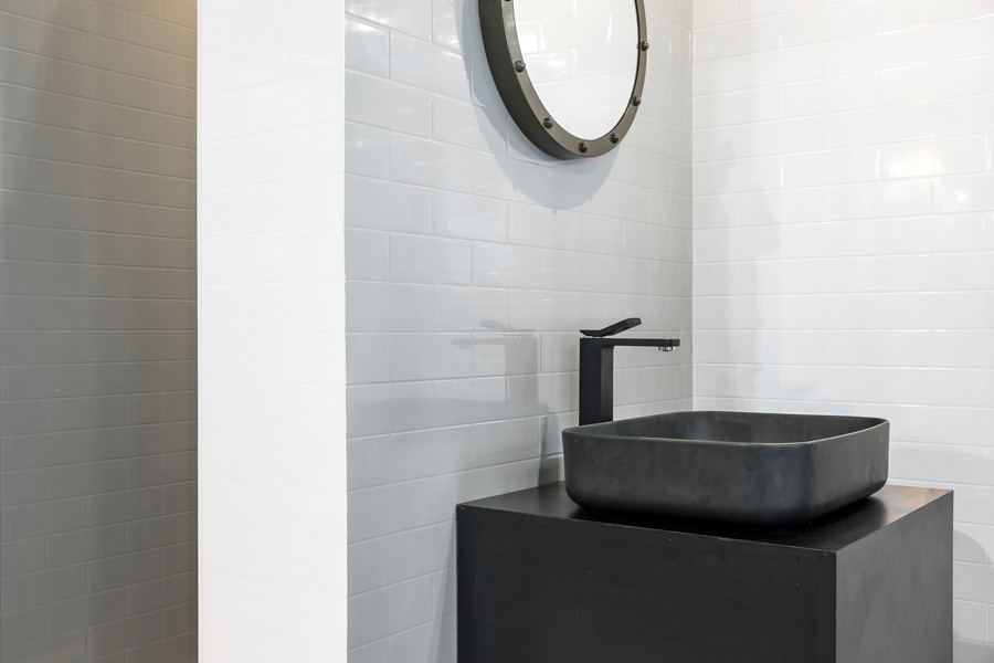
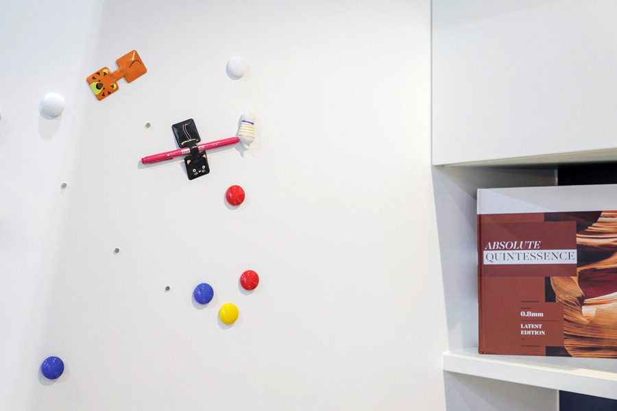
​              Laminate boards from Fineness are the real deal that can add value to your home project. Made of layers of protective material, they are durable and scratch resistant. The kind that’s 0.8 millimeters thick is the material of choice for making the white board that works well with erasable felt tip pens. It’s also available in flat black that’s suitable for making the blackboard to write on with white or colored chalk. The possibilities are endless. They include magnetic memo boards, glass laminate boards, and ceramic tile finishes for the wall to name a few. Manufactured by placing layer upon layer, laminate boards can protect against bacterial and fungal infestations while resisting moisture, wear and tear. More importantly, they are lightweight and easy to install.
Architect ’19

(Booth F421)

All things considered, the Architect ’19 provides an excellent opportunity for an update on the latest news, ideas and information on innovative design, products and services. The expo is highly recommended whether you are an interior designer, architect, service provider, or member of the general public. The expo is on from April 30 to May 5. More details about the exposition can be found at www.asa.or.th/architectexpo.

The 33rd Architect’19 Makes It Big Across the ASEAN

The 33rd Architect’19 Makes It Big Across the ASEAN

Determined to make it one of the top expos in architecture, building materials and construction with a focus on advances in Thai and international architecture, the Association of Siamese Architects under Royal Patronage and the N.C.C. Exhibition Organizer Co., Ltd. (NEO) are hosting the 33rd Architect’19 under the theme of “Living Green” during 30 April – 5 May, 2019. Thousands of brands will showcase the latest in technological innovations, products and services in architecture and building materials from 40 countries worldwide.

The NCC Exhibition Organizer Co., Ltd. is committed to further developing connections between exhibitors and potential buyers from architectural and construction industry especially those from neighboring countries such as CLMV through business matching program. So far the expo has drawn the biggest response from industries across the region. It is anticipated that more than 400 business meetings will take place this year. The expo is expected to generate more than 10 billion baht in total sales. Some of confirmed buyers include:

  • Cambodia: Heng Asia, one of the largest shopping centers for architectural and interior design products and services, Unisun Development Corp, which owns and operates office and residential complexes, warehouses and industrial plant renovation services, as well as leading companies such as Hatha Architects, Golden Axis Architecture and Decoration, and Marron Design Studio.
  • Myanmar: Pro1 Global Home Center, a major shopping center for building supplies and decorating materials.
  • India: Adroit Design India Pvt Ltd provides innovative solutions for architectural and interior design.
  • Indonesia: G-Architect and Asia Interior Design will also be meeting with local business participants during the show.

To promote a green experience, the organizer is providing free shuttle van service between BTS Mo Chit station (exit 2), MRT Chatuchak station (exit 4) and IMPACT Exhibition Center during the show, bring your own cup and receive free drinks at the rest area, And to cut down on plastic waste, shoppers are encouraged to bring their own reusable cloth bags. Ideas on reducing paper use is available when you download the ASA Application and get information updates on the show and get a chance to win prizes worth more than 500,000 Baht.

Register now for free to attend the show at https://eventinsight.co/el/to/F2CcfE

See you at the 33rd Architect’19 on the theme of “Living Green” during 30 April – 5 May, 2019 at Challenger 1-3, IMPACT Exhibition Center, Bangkok, Thailand.

For more information, get the latest news updates at www.asa.or.th/architectexpo or follow us on Facebook: ASA CREW.

Chez Mou: A Home Hidden In the Frame of an Old House

Chez Mou: A Home Hidden In the Frame of an Old House

/ Bangkok, Thailand /

/ Story: Sarayut Sreetip-ard / English version: Peter Montalbano /

/ Photographs: Sitthisak Namkham / Styling: Jeedwonder /

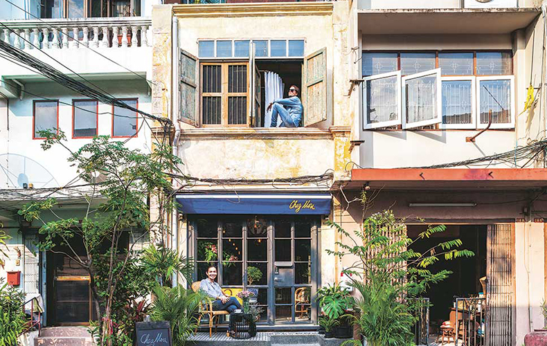
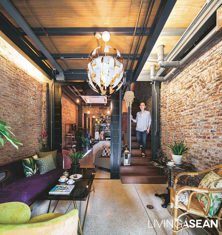
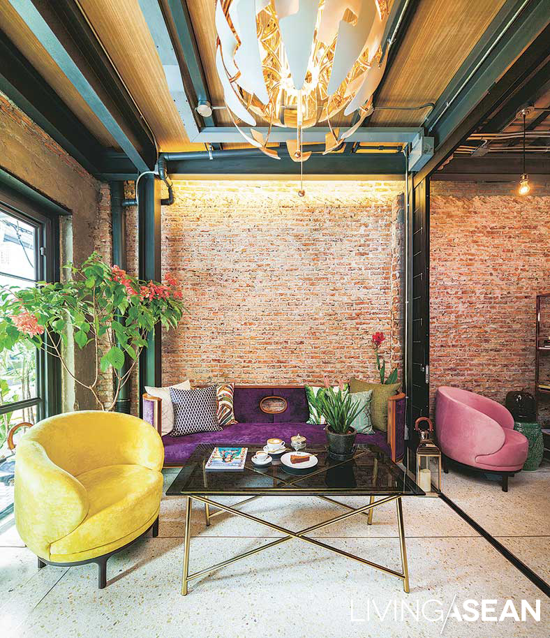
The renovation of this hundred-plus-year-old rowhouse in Charoen Krung Soi 44 is more than a home improvement: for Mou Lumwatananont, it’s a homecoming she’d never imagined.

Chez Mou: A Home Hidden In the Frame of an Old House

“My mother was born here, but we moved out before I was two. After building it up from 2 storeys to 2½ storeys, my aunt continued to use it as an office,” the owner began to tell the house’s story.
“However, that business ended many years ago, and it has been only two years since we began making plans for renovation and conversion to fulfill our long-time dream of a guest house and a café.”

This area’s former prosperity is apparent in traces of European colonial-style architecture and bustling alleys that now welcome international tourists and backpackers to the charm of its storied history.

Mou and architect Pok (Wachirasak Maneewatanaperk) from sea.monkey.coconut share views on the value of preserving history through architecture.

Chez Mou: A Home Hidden In the Frame of an Old House


The architect explained, “Renovating this great old building, I didn’t want to change a lot. But I discovered it had already changed.”

“An upper floor had been added, and it had been expanded outback as far as it could go. The entire second-storey wooden floor had been covered with another material.”

In line with building preservation guidelines, the architect decided to make clear distinctions between old and new.

They kept intact the front wall and brick walls all around, chiseling off interior mortar to show weight-bearing structures, including wood wall beams fitted into brick arches, and keeping the charming mortared patterns of the original roof.


Chez Mou: A Home Hidden In the Frame of an Old House

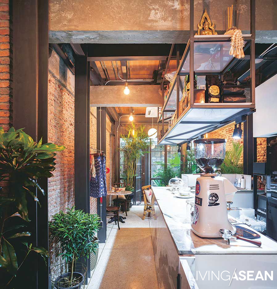
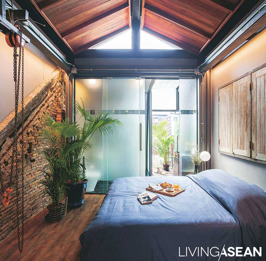
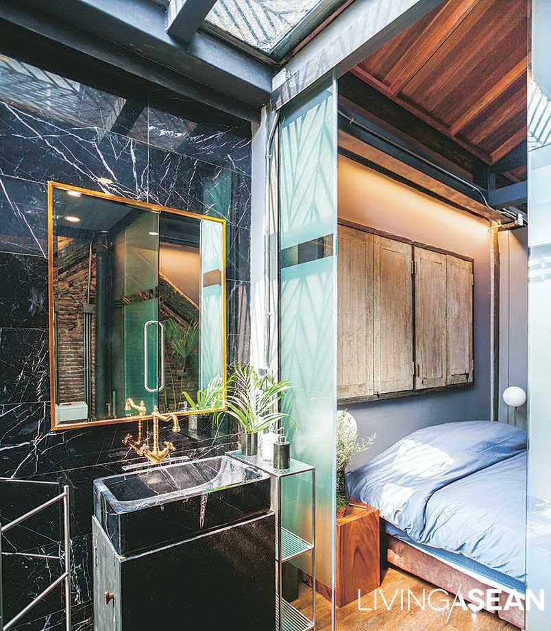
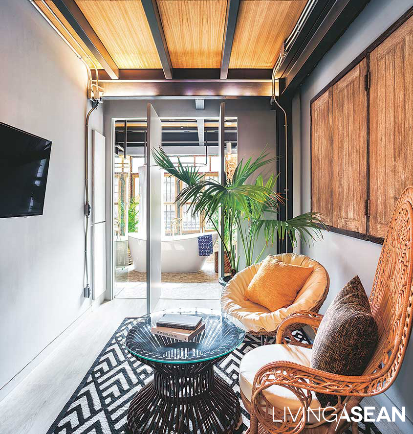
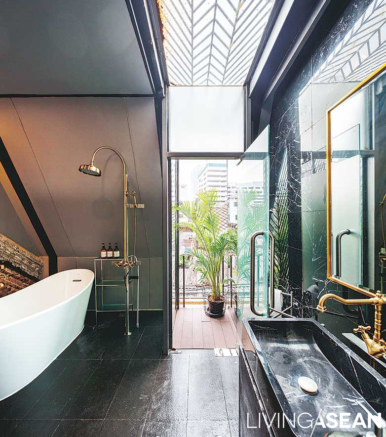
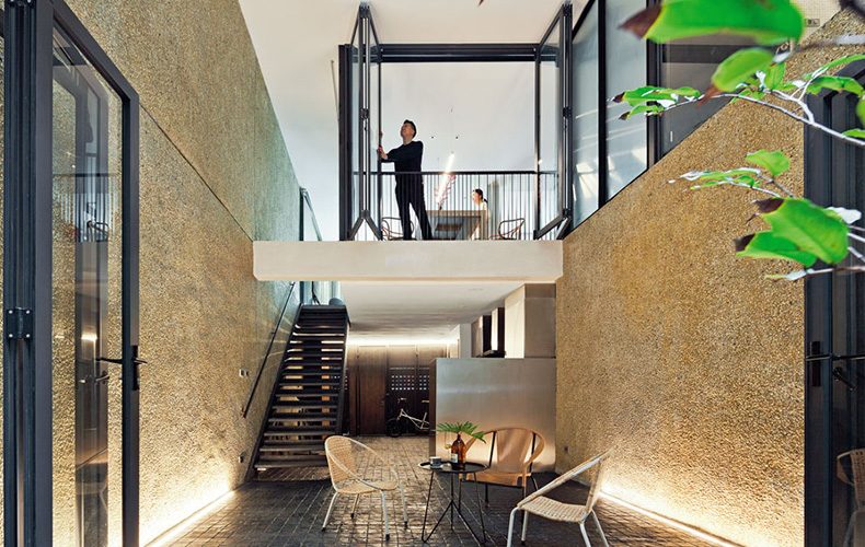
The lower floor is chic travelers’ café, a wooden stairway stretching up to guest rooms above. Visitors might wonder about the functionality of the steel poles they see set at intervals throughout. It is the by-product of the makeover process, as the architect told:

“This area is a walled-in rectangle, and without changing outer walls and structure at all, we’ve created a new house within the frame of the old one, sinking micro pilings into the root foundation and installing all new support pillars.

“It was important to keep the new structure separate. Concrete flooring was poured on the ground level and separated by a foam at the joints where it meets the original walls.

“These “expansion joints” keep outer and inner structures from being attached, so if the floor subsides, it won’t pull a wall down with it. On the second level, we’d intended to keep the original wood flooring, but found irreparable termite damage, so we had to replace it.”

Chez Mou: A Home Hidden In the Frame of an Old House

Chez Mou: A Home Hidden In the Frame of an Old House

Explaining the challenges of the construction process, the architect added, “At the back of the house, we changed to steel and drywall construction to install walls and latticework.

“Building here was difficult because of the limited space. Fronting on a narrow street made delivery difficult. There was nowhere to stack and store materials, so all work had to begin inside.

“When the inside was done, we brought in the materials stored outside and switched to working on the front. There was a lot of planning involved to make it possible for the craftsmen to be able to work at all.”

Chez Mou: A Home Hidden In the Frame of an Old House

Chez Mou: A Home Hidden In the Frame of an Old House

Row houses lasting more than a hundred years naturally tell stories with marks from sun and wind, just as with marks left on our lives by travel.

Leaving to study and live in England for more than twenty years, Mou could never have expected the winds would slowly blow her back to her origins with a new feeling, one born of love and dreams.

The word “Chez” is French, meaning “at,” or “at the home of,” hence the name: Mou has opened her home to welcome friends at “Chez Mou,” where stories are told by marks on bricks and sweet smiles.

Here is a place full of feeling of release from travel, and full of a bittersweet, gentle fragrance.


Architect: Wachirasak Maneewatanaperk of sea.monkey.coconut (www.facebook.com/sea.monkey.coconut)


You may also like…

The Perfect Size Townhouse

Modern Tropical House in Ho Chi Minh City

An Urban Natural Home Designed for Peace of Mind

An Urban Natural Home Designed for Peace of Mind

/ Bangkok, Thailand /

/ Story: Ajchara Jeen / English version: Bob Pitakwong /

/ Photographs: Sitthisak Namkham /

You don’t have to live in the middle of a forest to bring the outdoors inside. This beautiful house belongs to Bhalangtham Klomthongsuk, a well-known drama series organizer and television personality. The single-level urban residence takes up most of the 200-square-wah land space with modern living amenities and a private retreat amidst nature. The peaceful natural setting fits the lifestyle of the homeowner whose name translates as the power of dharma.

urban nature house
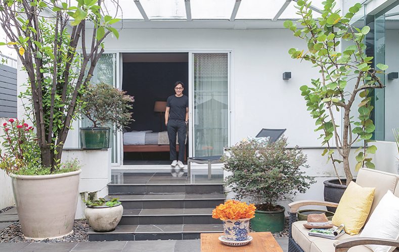
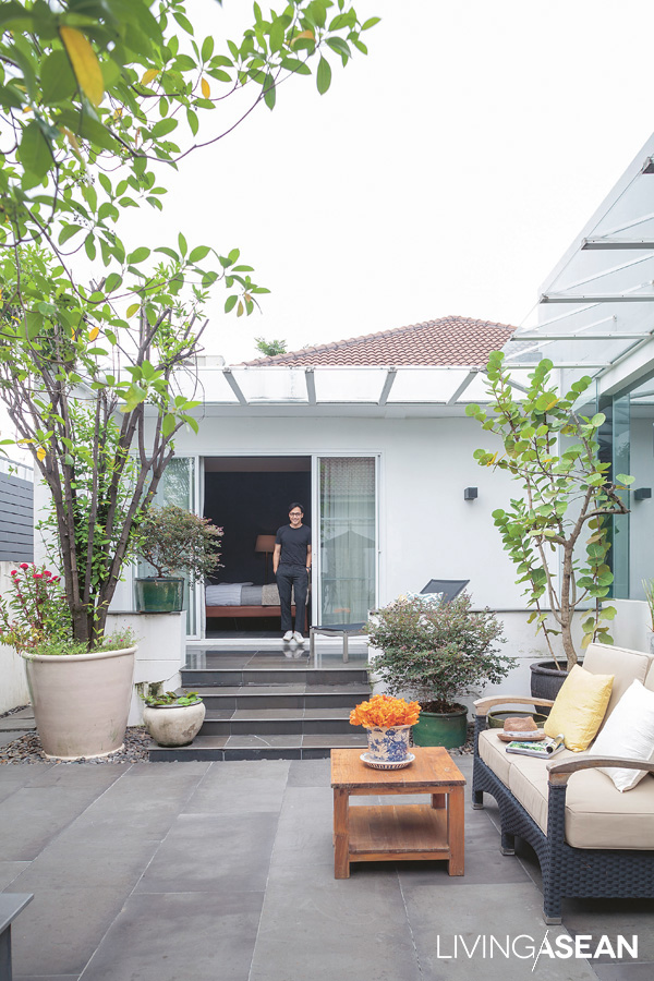
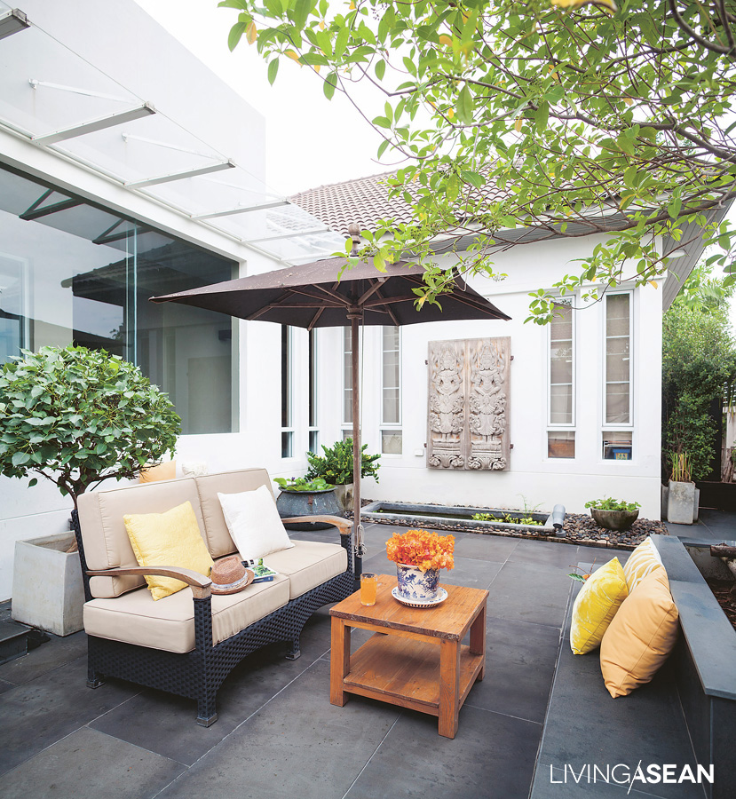
A sand colored sofa makes an attractive presence in the cozy outdoor room between Bhalangtham’s bedroom and a nearby compact garden.

Showing us around the home, Bhalangtham said: “On first seeing, I liked the way it differed from the style typical of modern-day housing developments where everything looked very similar. Besides, I’ve always preferred a single-level floor plan.

“Initially, I didn’t plan on doing any remodeling for five years, kind of waiting for my son to grow big enough to have his own room. But, I didn’t want my elderly Mom to climb up and down the stairs any more.

“So, here we are! This house offers many advantages. It’s fully functional for an old home. There wasn’t much damage to repair to begin with, except a few updates here and there to make home life easier. That was pretty much it.”

urban nature house
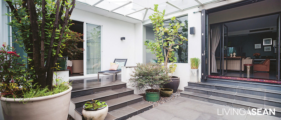
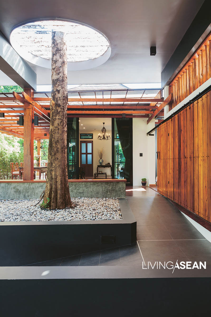
The courtyard connecting residential and functional wings of the house is bright, airy, and suitable for multiple purposes.

From the main entrance, a hallway provides access to the left and right wings of the house. The right wing contains a kitchen and dining room, while the left has a bedroom with private bath that has since been renovated as a multi-use space.

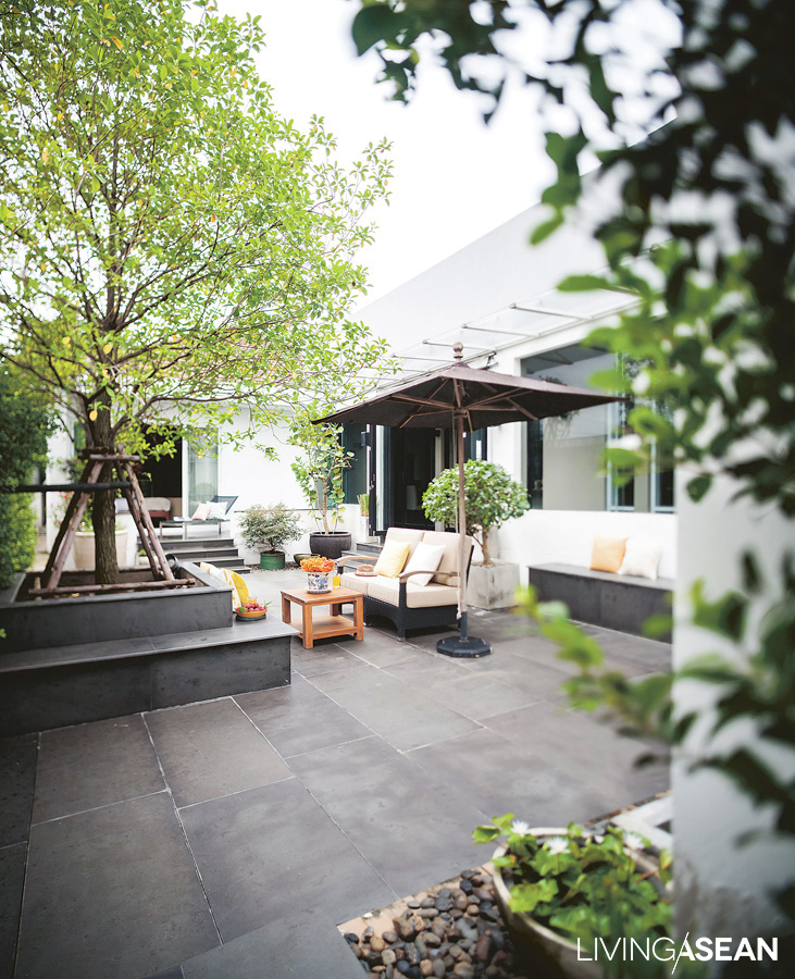
The clearly noticeable part of the home is a small courtyard garden at the center of the house plan where Bhalangtham’s bedroom is located. The open space offers a refreshing environment in the middle of lush foliage. There’s an outdoor sitting area with a private garden view.

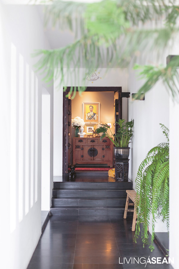
The house’s main entrance lined with friendly indoor plants feels warm and inviting. Creative ideas paired with floor-standing greenery add a relaxing tropical feel to the entryway.
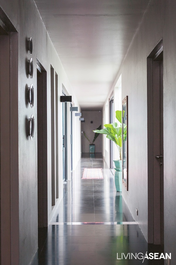
The hallway leading to the living room is illuminated by natural daylight streaming in from one side of the building. Everywhere indoor plants re-humidify the room preventing the interior from feeling too dry.

The furnishing and decoration are left in the good hands of interior designer and close friend Suranart Lerdkunakorn. Knowing the homeowner’s taste, Suranart creates a mix-and-match interior combining chic vintage ornamentation with newer furniture and decorations from different eras and styles.

On the whole, home décor and accents give a hint of Eastern culture that makes the interior warm and welcoming. Strong, deep colors make the interior room visually interesting.

Commenting on furnishing and decoration, Suranart said: “Bhalangtham likes the metallic duck-head green and navy blue; hence much of the interior is pained dark shades of color. Together, they bring renewal and nature to the indoor living spaces.

“As for furniture, a chinoiserie dining table that’s a gift from the previous homeowner comes in handy to reduce the stiffness of modern home design. Elsewhere, vintage décor ideas imported from Bhalantham’s old house complement a look that’s stylish and relaxing.”

An ethnic design carpet adds curious excitement to the room.

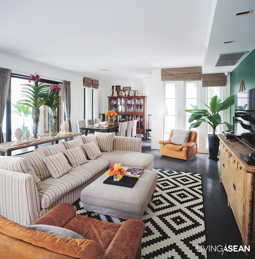
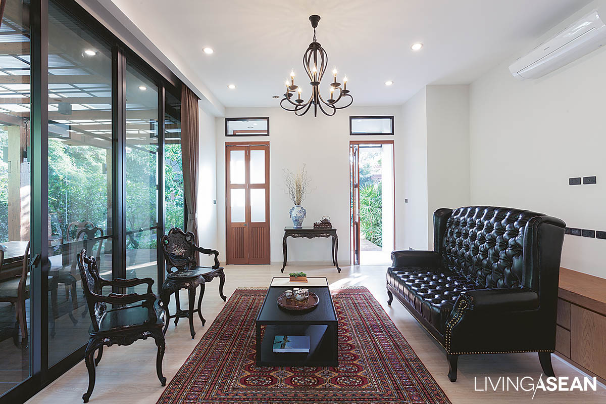
The duck-head green of the wall and the cream and beige of living room furniture provide an agreeable contrast. Green leaves freshen the atmosphere and make the room feel warmer and more inviting. The living room is part of the functional wing that’s designed to serve multiple purposes.

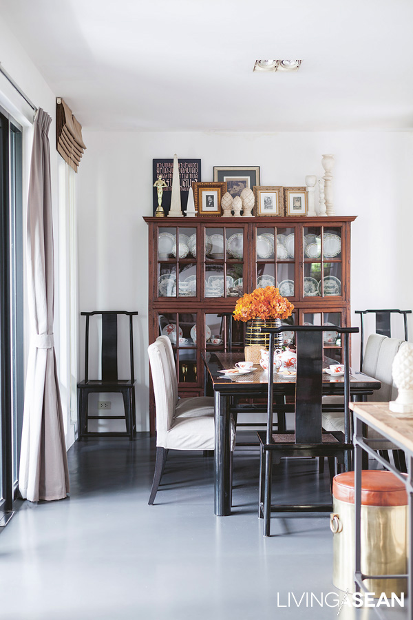
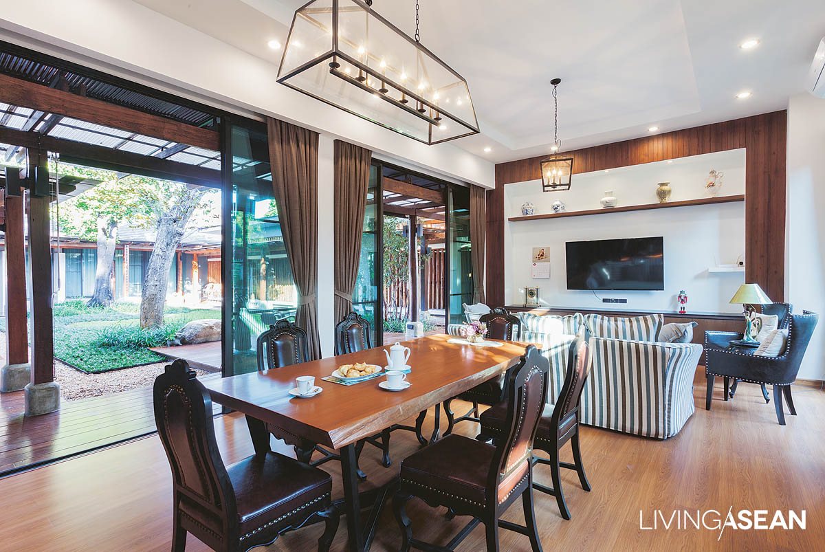
The small dining space adjoining the living room is flexible and party ready, thanks to a chinorserie table that was a gift from the previous homeowner.
Nature House
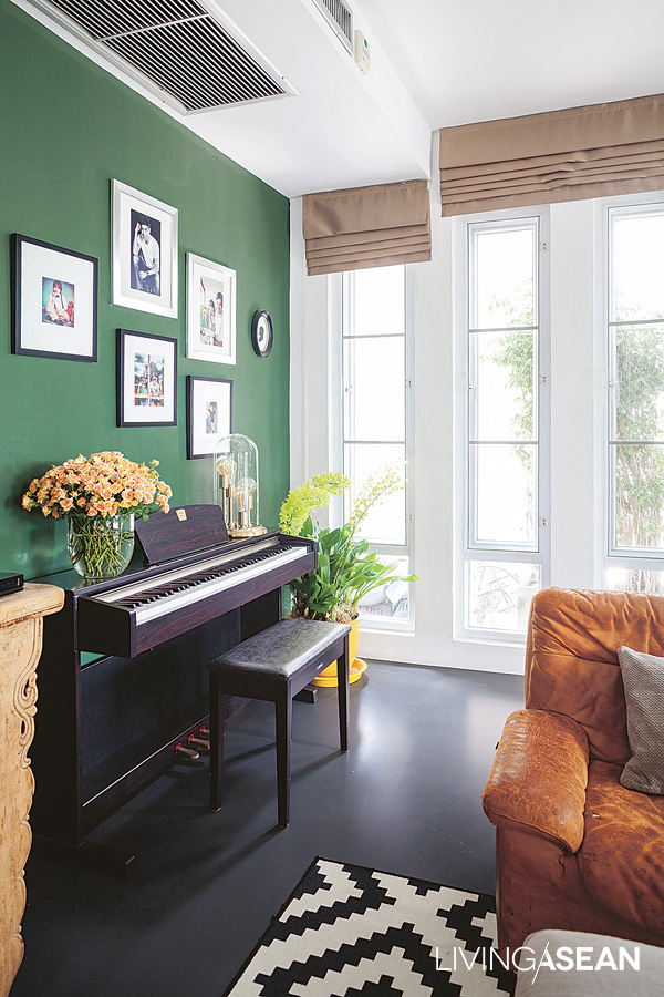
The metallic duck-head green dominates a corner where young Arty practices music. Like the homeowner intended, the green room serves to connect indoor spaces with the lush courtyard outside while the sound of music rejuvenates the atmosphere.
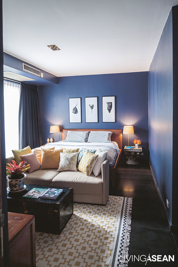
The dark shade of blue in Bhalangtham’s bedroom contrasts with the beige of leather upholstery on the furniture and the floor in natural wood stain. An area carpet in lighter shades brightens the room.

A perfect amalgam of chinoiserie, vintage, modern, and classic styles is a distinctive feature that gives the house meaning and character. Combine that with a courtyard filled with the lush foliage of container gardens, and the benefits are amazing. Despite its small size, the patch of greenery serves as the lungs of the house, a condition ensuring that every day is a breath of fresh air.

urban nature house
For the homeowner, nothing compares to his favorite hangout with a private garden view.
urban nature house
Besides the lone tree that’s the focal point of the yard, the outdoor room is adorned with potted houseplants, mostly tropical species. Plant containers in various shapes and sizes offer plenty of seats that make the area party ready.

Owners: Bhalangtham Klomthongsuk

Interior Designer: Suranart Lerdkunakorn


Visit the original Thai version…

บ้านโมเดิร์น แต่แตกต่าง


You may also like…

Right Renovation Leads to a Pleasing Hip, Modern Brick House
A Rectangular Brick Home For a Tropical Climate
A Modern House in Sync with the Rhythm of Nature

A Modern House in Sync with the Rhythm of Nature

/ Bangkok, Thailand /

/ Story: Patsiri Chot / English version: Bob Pitakwong /

/ Photographs: Soopakorn Srisakul /

Building a sustainable home involves a great deal of knowledge of the surroundings and relationships with nature. In the hot and humid climate of Thailand, it’s useful to have a good grasp of the sun, the wind, and seasonal thundershowers in designing a home that’s livable and aesthetically pleasing. This modern house is built around that concept – one that promotes well-being and the comfort of the indoor environment.

modern house
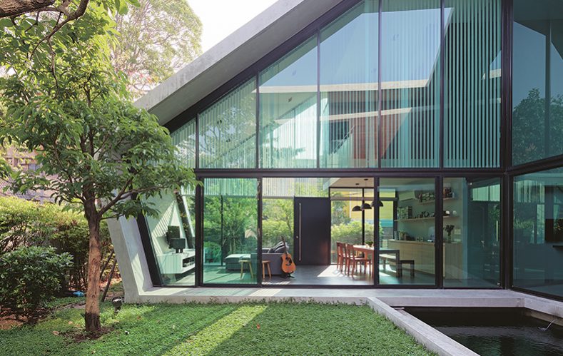
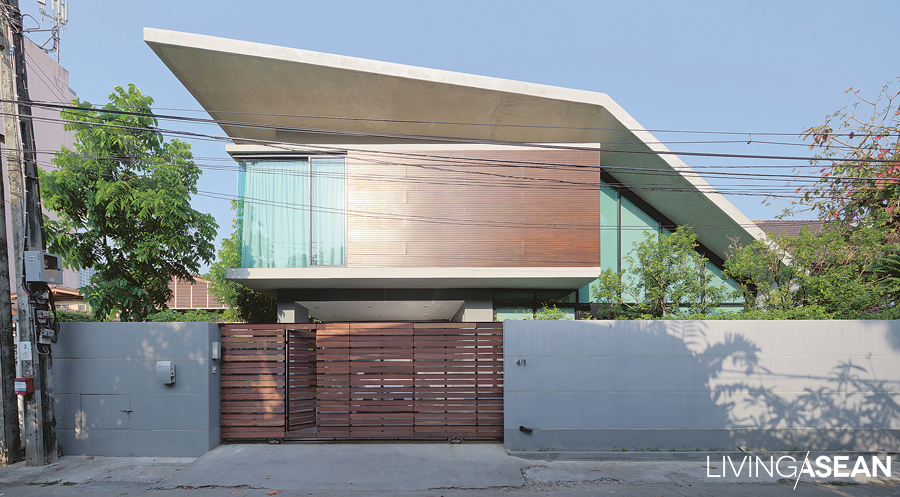
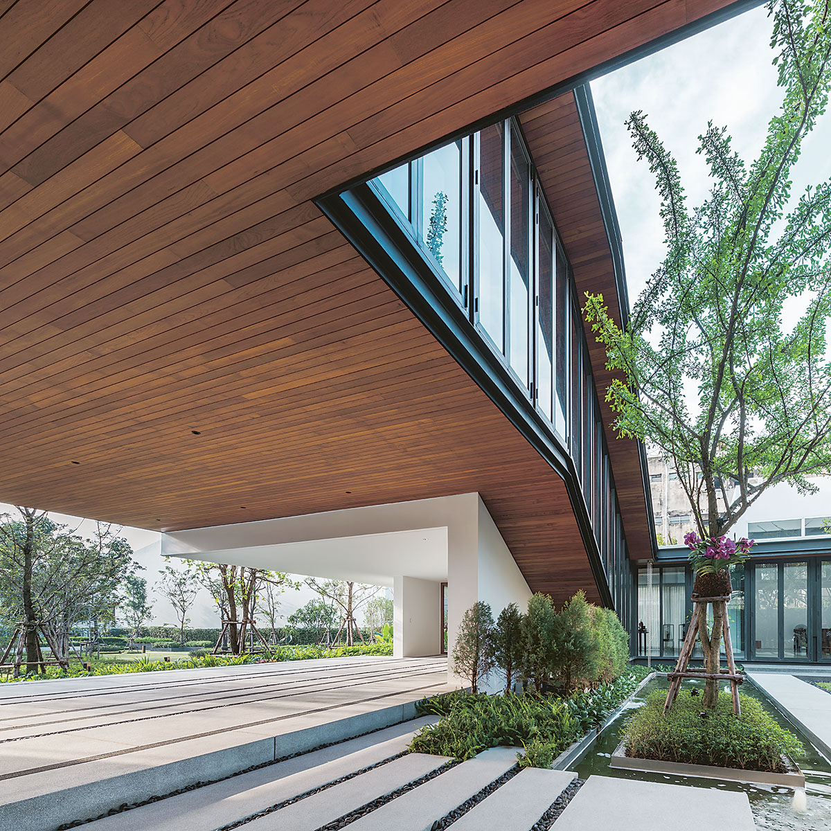
The architect uses metal folding or forming techniques to make informed design decisions. The angle of the bend in the roof and the exterior walls is determined by the need to protect the interior living spaces from the elements.

In this particular case, architect Nantapon Junngurn used the folding process common in metalworking to translate multiple planes into three-dimensional interior living spaces. Then, vertical surfaces were incorporated in the plan and appropriate wall openings installed to enable the home to effectively connect and interact with its natural surroundings.

Obviously, he took the most sensible course of action by positioning the building in relation to seasonal variations. By this is meant that all aspects of the sun, the wind, and weather patterns were taken into account.

modern house
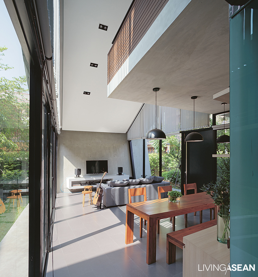
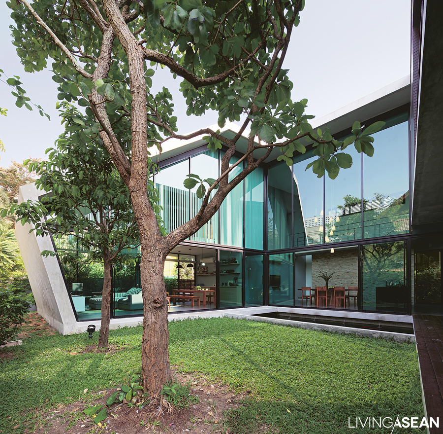
The far end of the sitting room is built of concrete that runs the entire length of the wall. It’s slanted to diverge from the vertical line designed to get rid of rainwater fast. As a byproduct, extra floor space is achieved by simply doing away with bulky support poles.

The architect then put the idea to the test to determine what architectural form and space would best fit in with the environment.

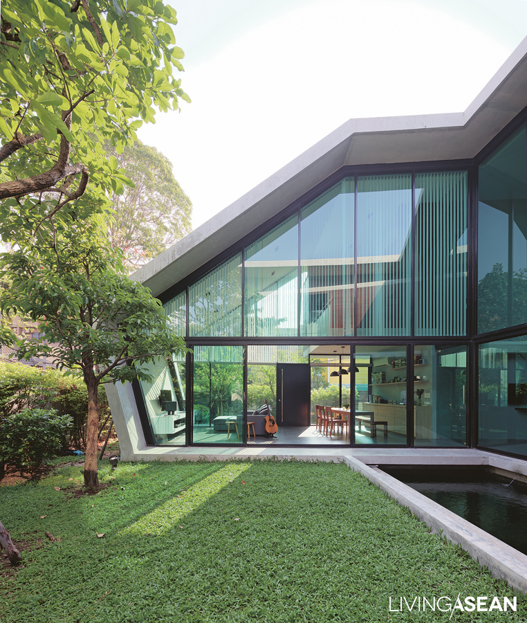
The result is a modern house plan where all the rooms are disposed around a center courtyard to create indoor thermal comfort. To bring eye soothing nature inside, large openings in the external envelope are added, further enhancing the relationships between the home and surrounding lush green landscapes.

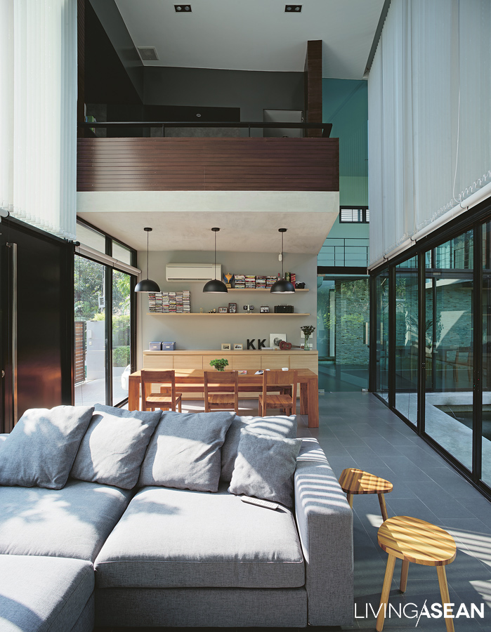
The living room is elegantly decorated with dining area at the far end and a small library on the mezzanine. It is bordered by glass walls on two sides; one overlooking lush lawns upfront, the other connecting to the inner courtyard that serves as engine driving air circulation.
modern house
Large glass walls on both sides of the room are there for obvious reason — bring the outdoors in.

As the architect puts it, “The U-shaped home plan is preferred over other styles. The front entrance sits facing north, which is good since it is considered to be less sun-intrusive.

“The rear of the house faces due south and stays shut most of the time because it’s located close to neighboring houses. The west side is reserved for service areas with a music room and kitchenette, which confirms that home cooking is not a big part of the family lifestyle.

“For indoor thermal comfort, double brick construction is chosen to reduce heat transmission and protect the interior living spaces from hot sun. Well-thought-out planning ensures the back area is in shade for much of the day, thanks to the canopy of a mature tree courtesy of next door neighbors.”

modern house
The living room and dining area feels bright and airy, thanks to the glass wall overlooking the center courtyard on one side. In the opposite direction, the big open sky can be seen in full view from inside the modern house.
modern house
Located at the center of a U-shaped house plan, the dining room takes in the view of the courtyard garden and spacious sitting room on the right edge of the field.

The U-shaped floor plan has a small body of low ground that transforms into an inner courtyard with lush lawns and greenery. There is an Indian oak, or freshwater mangrove tree (scientific name: Barringtonia acutangula) that is now in top form providing a continuous layer of beautiful foliage.

Nearby a Spanish cherry, or bullet wood tree (scientific name: Mimusops elengi Linn) grows into a full crown. It was a house-warming present from Dad. At the center, a small pond adds a touch of nature to the courtyard garden. It’s the natural focal point that connects to practically every part of this modern house.

The living room and dining area is enlivened by tall glass walls and sliding doors designed to promote natural air circulation in the home. Plus, they create visual continuity that makes the idyllic inner courtyard very much a part of the interior living spaces.

Sharing his little slice of paradise, homeowner Kongyot Kunjak said: “I like to spend more time in the courtyard. In the morning, I would sit down for coffee at the table here looking out the window enjoying the garden view.

“The courtyard with a water pond surrounded by trees and shrubbery provides a place to relax and unwind. It’s refreshing to reconnect with nature and be able to bring the outdoors into the home. In the evening, the very pleasant garden ambience can be seen from inside the living room.

“Whether for work or for social gatherings, it’s wonderful to be here and experience nature every day, albeit from an indoor perspective.”

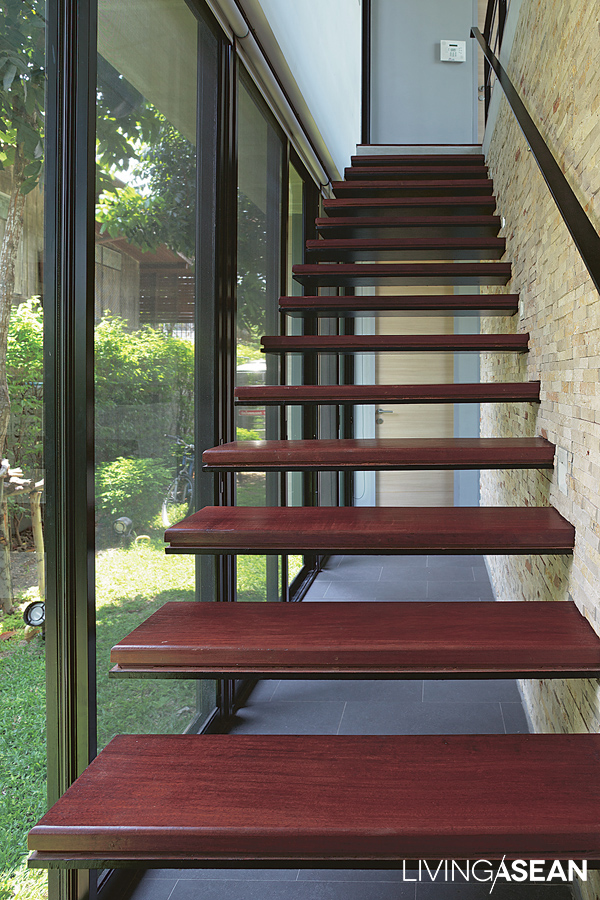
A flight of stairs leading to the upper floor is cantilevered out from the wall. With one end anchored securely in the stone wall, the steel treads appear to hover in midair. For strength and durability, each support plate is 20 millimeters thick. Nearby, glass walls standing tall from floor to ceiling ensure a good view of the garden.

As might be expected, the house plan best suited for the hot and humid climate is one that’s spacious, well-lit and well-ventilated. In this particular case, indoor thermal comfort is achieved by shielding all the areas exposed to danger of too much sun.

In the meantime, it’s a good idea to open up the part that connects to the natural surroundings. In essence, it’s about creating design capable of interacting with nature. In the fewest words possible, when the home breathes easily, every day is a breath of fresh air for the house occupants. Innit?

modern house
An Indian oak, or freshwater mangrove tree (Scientific name: Barringtonia acutangula) develops well to keep the inner courtyard in shade for much of the day. Its lush green crown adds rejuvenating effects to the garden landscape.

Owner: Kongyot Kunjak

Architect: Nantapon Junngurn


Visit the original Thai article…

อยู่ร่วมกับธรรมชาติในแบบบ้านสไตล์โมเดิร์น


You may also like…

The Beauty of Simplicity in a Single-Story Home

Box-Shaped House with a Tropical Style GardenBox-Shaped House with a Tropical Style Garden

A White House Made for Healthy, Happy Family Life

A White House Made for Healthy, Happy Family Life

/ Bangkok, Thailand /

/ Story: Patsiri Chot / English version: Bob Pitakwong /

/ Photographs: Sitthisak Namkham /

Because the house was left unoccupied for some time, naturally there were parts that had fallen into disrepair. Remaining intact were dull and uninteresting room dividers typical of housing developments that were built in times past. On their return after having been away, the homeowner couple made an exciting new discovery. Their neighborhood was also home to a school where they planned on sending their children. That was a big plus in terms of a good quality of life.

modern white house
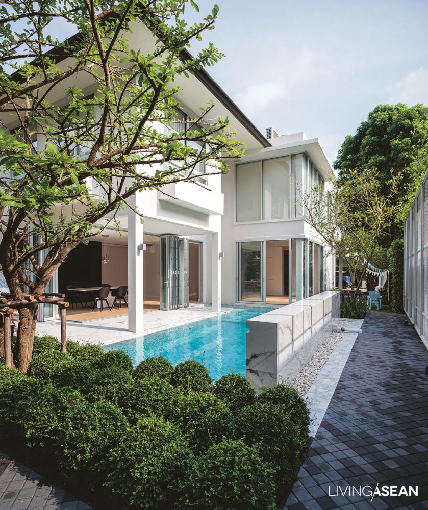
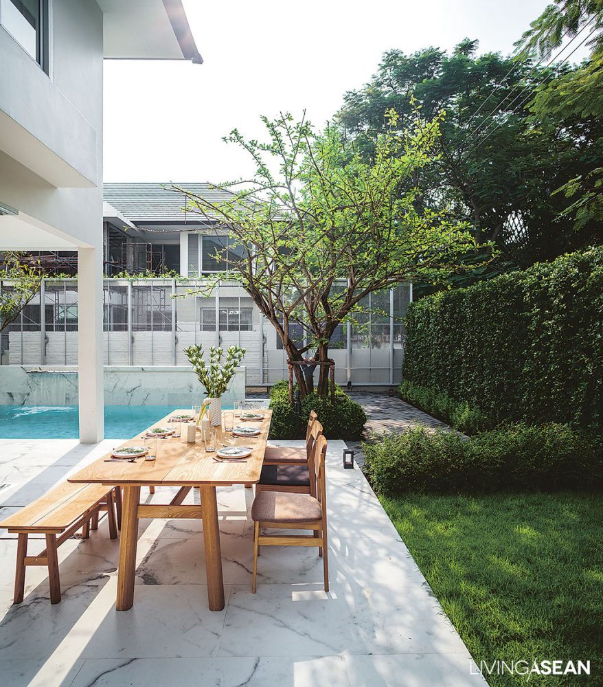
The courtyard of this white house consists of a garden and a swimming pool that lies at the far end to protect family privacy. Invisible from the street, it offers a pleasant outdoor space that connects the whole house with its natural surroundings.

To give this old house a complete makeover, Vasu Thongmeepetch and Panompon Ratanaprayook wasted no time to consult a team of experts in architecture, interior design, and landscaping.

Architect Praepailin Jantanachotiwong can still recall the day they met: “Besides replacing the old and worn-out doors and windows with new ones, the highest priority was to pick a design that would best fit the homeowner lifestyle needs and be adequate for the family size.

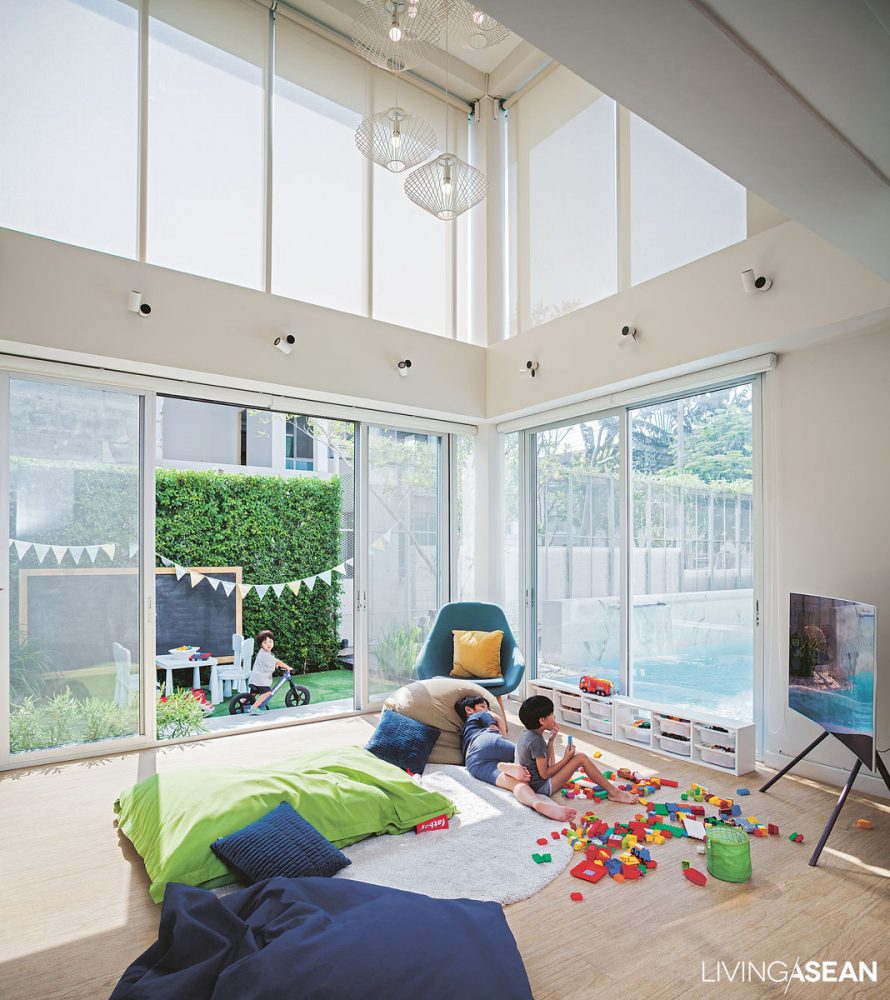
“Going through the house, I was attracted to the idea of tearing down the walls separating the interior and the swimming pool outside. That would translate into enlarging the interior space big time, kind of like bringing the outdoors into the living room.

“It was a perfect spot for a playroom, where the children remained visible in close proximity to a sitting parlor made for rest and relaxation. Eventually the whole area turned into a rendezvous point connecting people to people in a warm and welcoming family atmosphere.”

modern white house
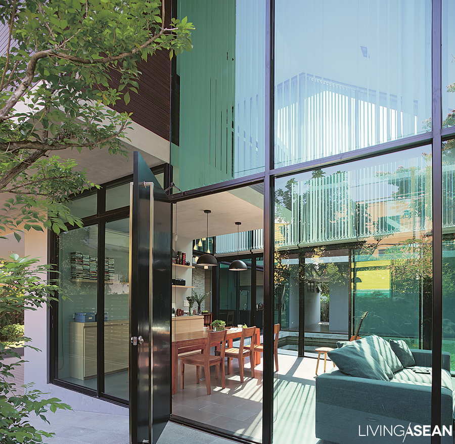
Double-height glass walls make the playroom for kids bright and airy. It’s a TV room and toy room in one. Bean bag furniture in lively colors fits in well with the fun atmosphere of the interior and adjoining outdoor playground.

She calls it “the life of gravity” concept, a whole new approach that gets its inspiration from an open space that attracts everyone in the family toward the center of the home, especially the dining area overlooking the courtyard.

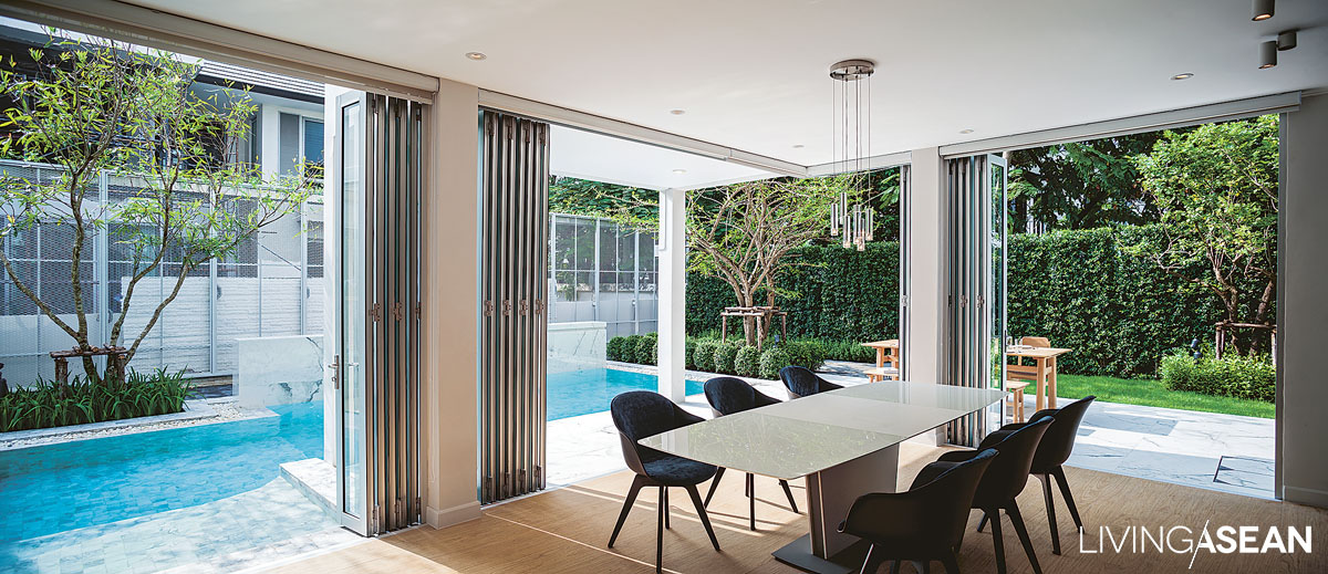
“The new design comes complete with an array of folding doors that open to connect with the garden, the swimming pool, and other outdoor facilities. There’s something for everyone, and that’s what makes people gravitate to an interconnected lifestyle,” said the architect.

modern white house
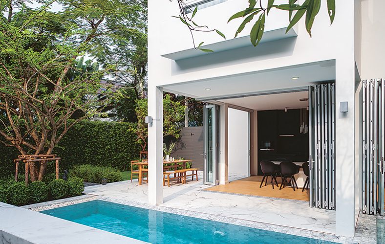
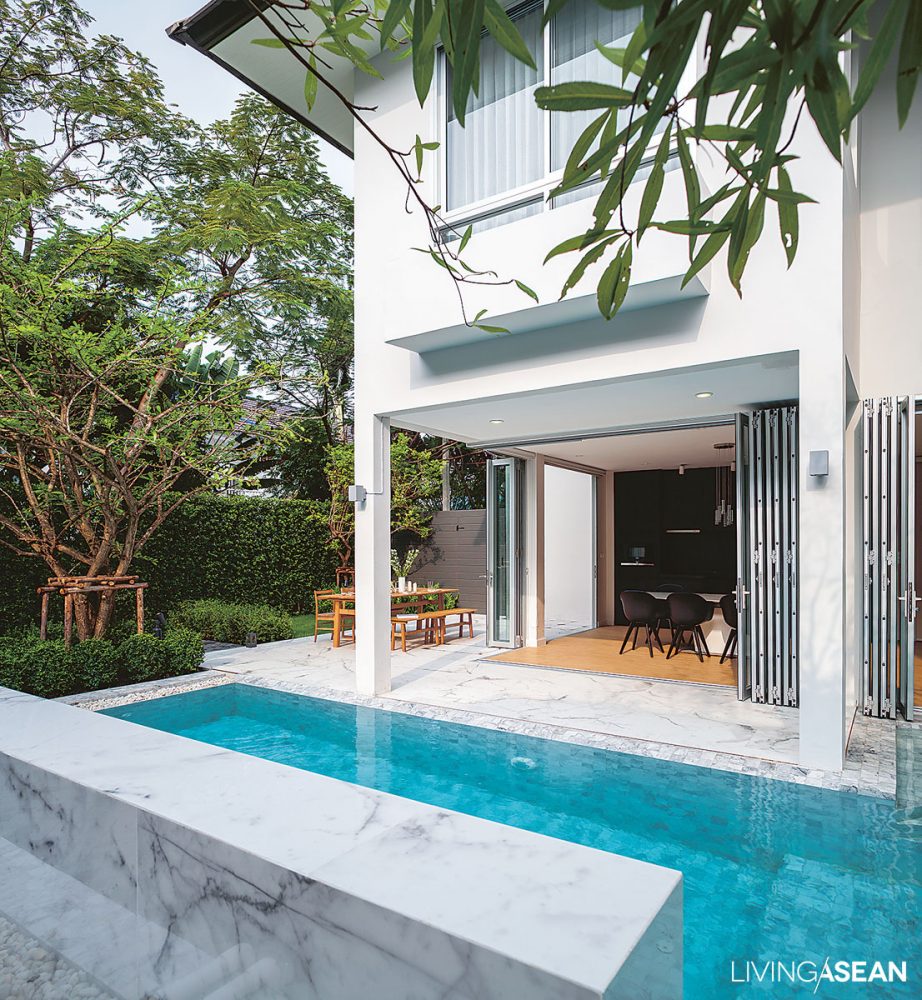
The dining room is bordered by folding glass doors that stack flush against one another as they open to connect with the garden outside. The lush courtyard can be seen in full view from inside the room, while a well-placed swimming pool provides passive cooling that reduces internal and external heat gains and brings in fresh air.

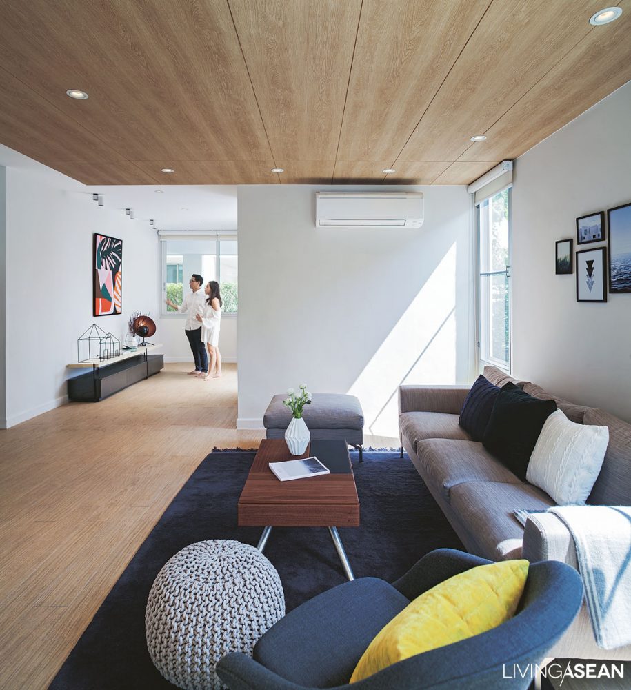
Interior designer Thaipan Nopladdarom also responded with a new home plan that subtly divided into three zones in accordance with family needs. He created a beautiful combination of reception room, playroom for kids and dining space set contiguously on one open floor plan. Clever screen ideas control natural light shining into the interior.

There is latticework design on the stairway wall that brings just enough light into the white house, thereby eliminating the need for electric light in the daytime. Elsewhere, open windows can benefit the indoor environment. They let fresh air in and improve the air quality in indoor spaces.

He said, “As for the furnishing and decoration of the room, the emphasis is on the minimalist style. Only a few pieces of furniture are there because they are needed. Where appropriate, built-in furniture is installed as permanent part of a larger construction.

“Lighting setups vary according to the specific needs of each location. To avoid illumination bouncing throughout the room, accent lights are installed to create interest at night.”

dining area
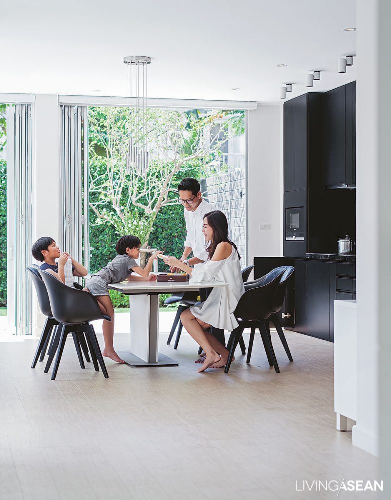
Good design judgements result in thermal comfort that transforms the dining area into the heart of family life.

The overall effect is very pleasant. For the children, it’s the playroom that has become their favorite hangout. For the mom and dad, the dining area has been an oasis of calm and relaxation. They can rest by the pool, or go for a quiet saunter around the yard, and wherever they may be, the family is never out of sight of one another.

minimalist style
Subtle, soft shades of colors that speak to the minimalist style keep the sitting parlor calm and spacious like the homeowners intended.

To make the courtyard lush and functional, landscape architect Tawatchai Sakdikul was instrumental in planting shade trees to avoid some of the heating effects and keep the home cool. Apart from being pleasant to look at, the yard is easy to keep clean with all features functioning as intended.

As for the highlights, he said: “We put in a waterfall that became a focal point in the swimming pool area. Then a walkway was built around the yard.

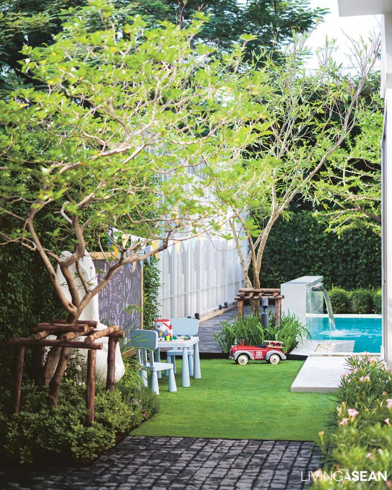
“For the outdoor playroom, we added an oversized rabbit head sculpture to arouse interest and curiosity, and a blackboard to scribble something on as they played. As for the plants, we avoided the dense thorny undergrowth that was the most common cause of injury. Rather, we focused on growing a variety of herbs that promoted learning about the natural world.”

modern white house
A level platform along the outside of the building is ready for al fresco dining when the weather is nice.

An open floor plan for this white house offers many benefits. In this particular case, it answers the lifestyle needs of the homeowners whose business has to do with manufacturing and selling items of clothing online.

The floor plan that minimizes the use of small, enclosed rooms means they can sit and work anywhere and still be visible. Here, happiness is being home with the children and getting work done at the same time.

outdoor playroom
A rabbit head sculpture adds interest to an outdoor playroom by the pool, while lush green lawns make it a nice place for kids to run around.

As the couple puts it: “We are thankful that the architect designs it in this way instead of separating adults and children occupants into different zones. The interconnected floor plan answers the borderless lifestyle that combines work life and family life in one.

“It’s designed for easy updates based on needs. That’s what makes living here fun. It’s easy to get why we love this white house so much.”

modern white house
Seen from across the swimming pool, the newly remodeled white house is peaceful, warm and welcoming.

Owner: Vasu Thongmeepetch and Panompon Ratanaprayook

Architect: Praepailin Jantanachotiwong

Interior Designer: Thaipan Nopladdarom

Landscape: Ginggaanbai Co., Ltd. by Tawatchai Sakdikul (www.ginggaanbai.com)


You may also like…

In Nature’s Peaceful Embrace

Surrounded by Warmth and Happiness

THE 2019 BAANLAESUAN FAIR SELECT AT A GLANCE

THE 2019 BAANLAESUAN FAIR SELECT AT A GLANCE

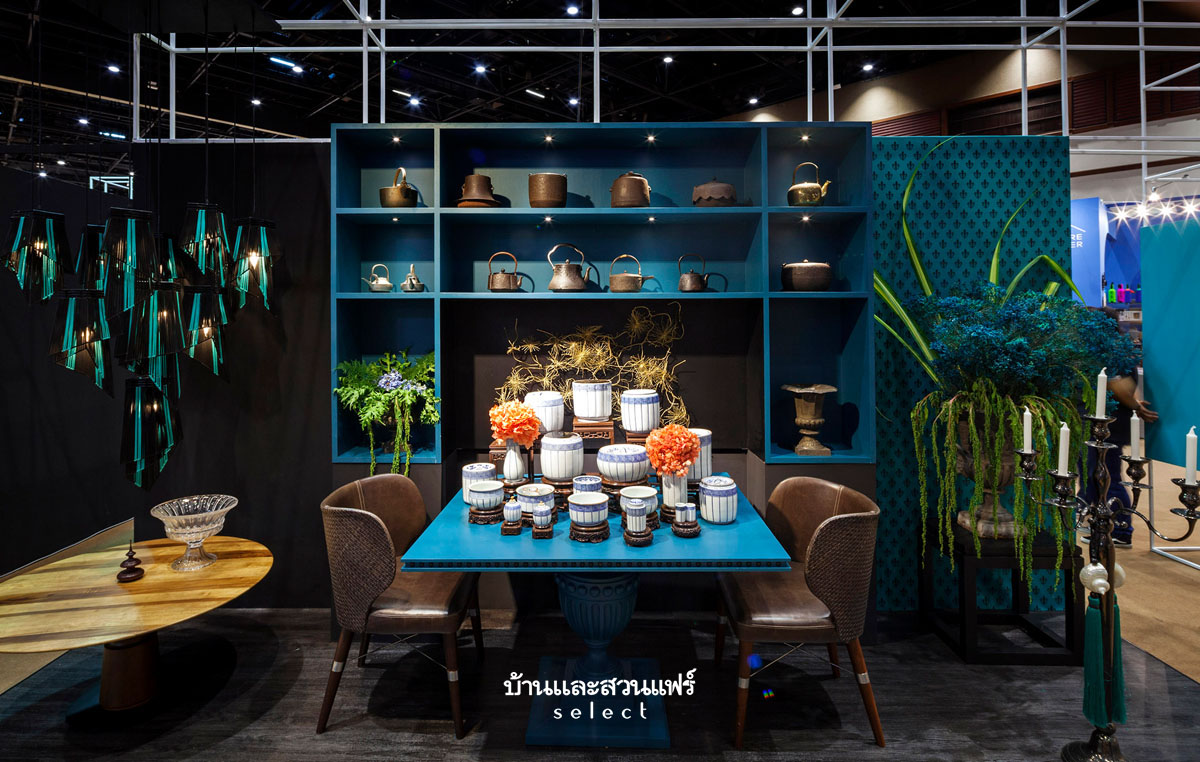
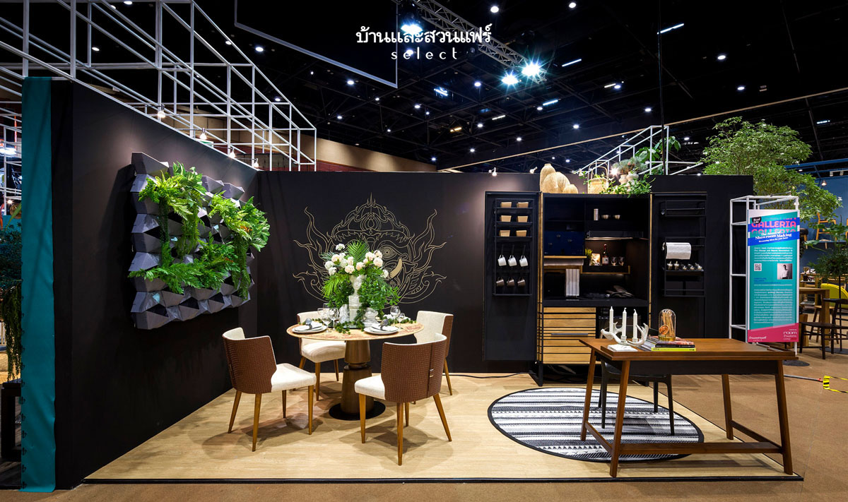
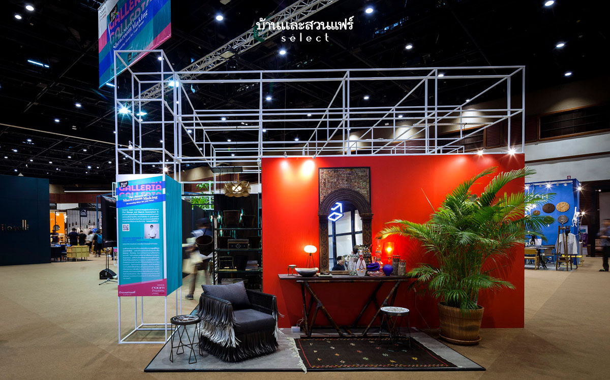
More than 19 years of event planning experience have prepared us at Baanlaesuan Magazine Group for the job of hosting the best home and garden fair in Thailand and the ASEAN region. “Real Life Galleria” is the theme of the 2019 Edition of Baanlaesuan Fair Select, which is now in its second year. The exhibition is brought to you by room Magazine. Look for room Showcase at the fair for imaginative designs and inspiration. Experience the excitement of modern design that comes with every showroom on display during the five-day event. Good design inspires the admiration of everyone, and it’s one that answers your specific lifestyle needs. For the 2019 Edition of Baalaesuan Fair Select, Room Magazine proudly presents a collection of masterpieces by some of Thailand’s distinguished designers.

Looking back, the furniture section’s friendly, welcoming atmosphere at the 2018 Baanlaesuan Fair Select.

If you are handicraft lovers, there’s a special zone for that. Look for My Craft Zone at the fair for new ideas and inspiration for your next project. Whilst there, drop into The Book House to browse and shop new books and other bestsellers on the topics of home and garden. For those who are enthusiastic about small garden ideas, Baanlaesuan Pocket Garden offers a wonderful richness of small garden ideas. Just a reminder, the home and garden fair is happening from 20 to 24 February 2019 at the Queen Sirikit National Convention Center.

The floor plan, 2019 Baanlaesuan Fair Select (Click here)

Entrance to the Galleria

THE 2019 BAANLAESUAN FAIR SELECT AT A GLANCETHE 2019 BAANLAESUAN FAIR SELECT AT A GLANCE

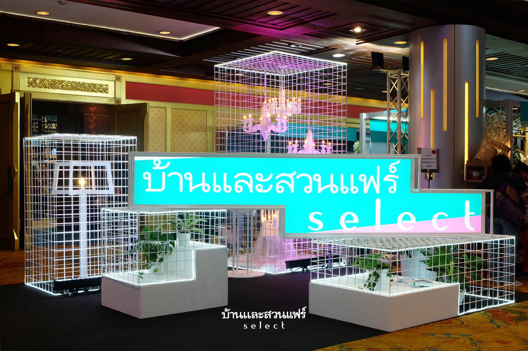
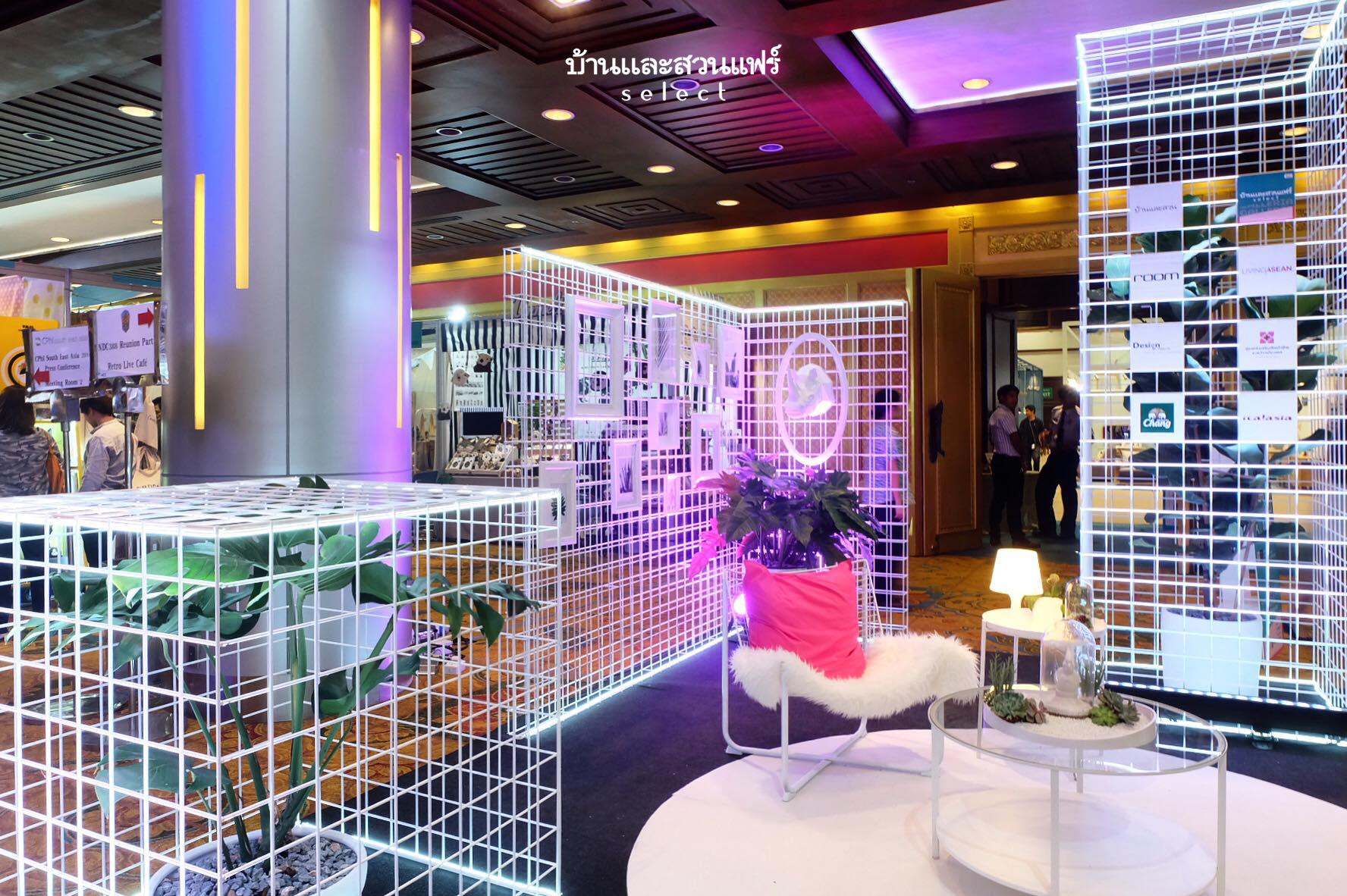
To create an inviting atmosphere, the entryway to the Galleria is decorated showroom style. Simple, clean designs paired with perforate metal patterns give handy hints about furniture, home goods and decorating ideas. The paint color, the furniture, the lighting combines to make the area awesome. Drop by for a photo opportunity. There’s something good in every show.

room Magazine Showcase
Real Life Galleria: The Secret of Showroom Making

Real Life Galleria by room Magazine at 2019 Baanlaesuan Fair Select

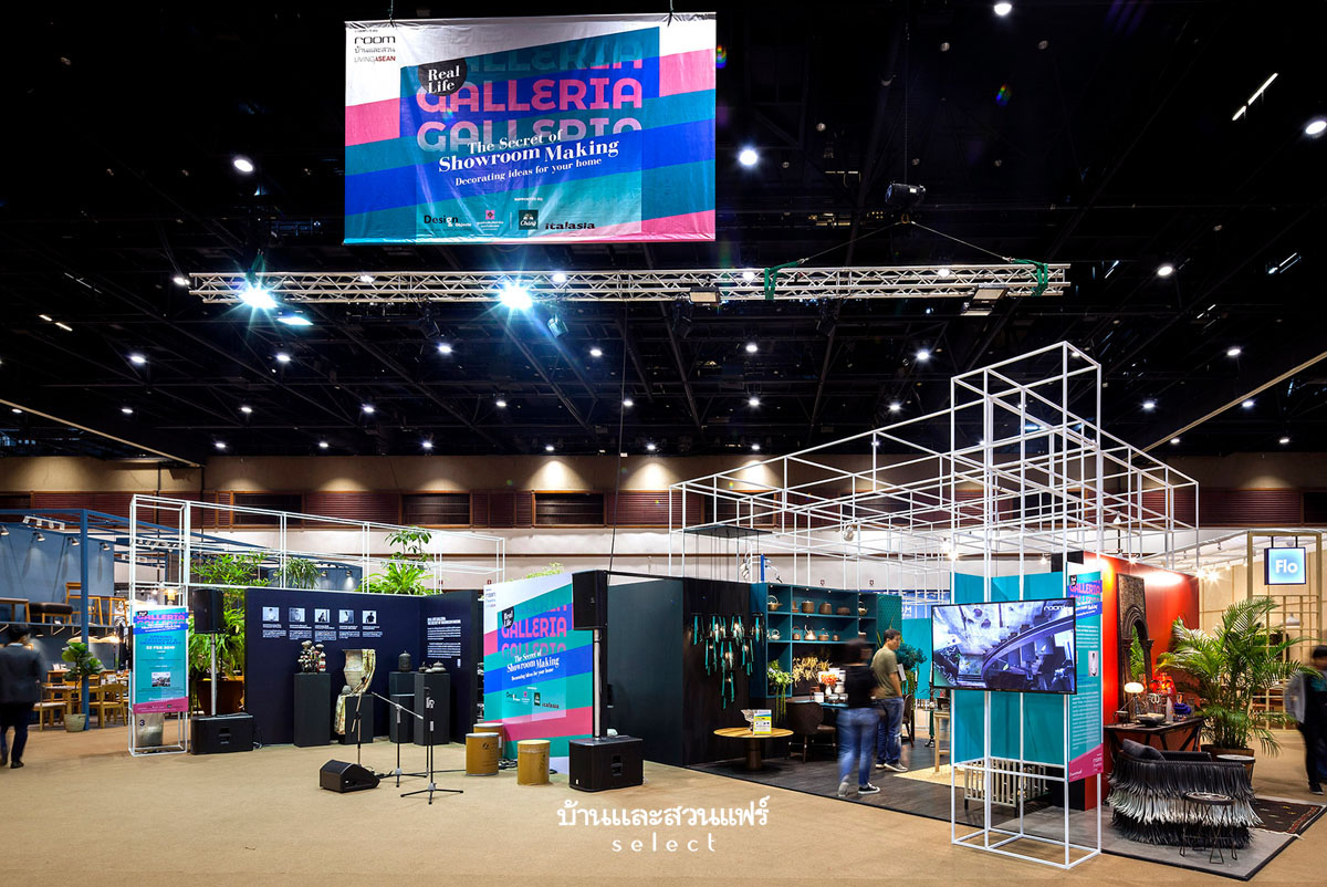
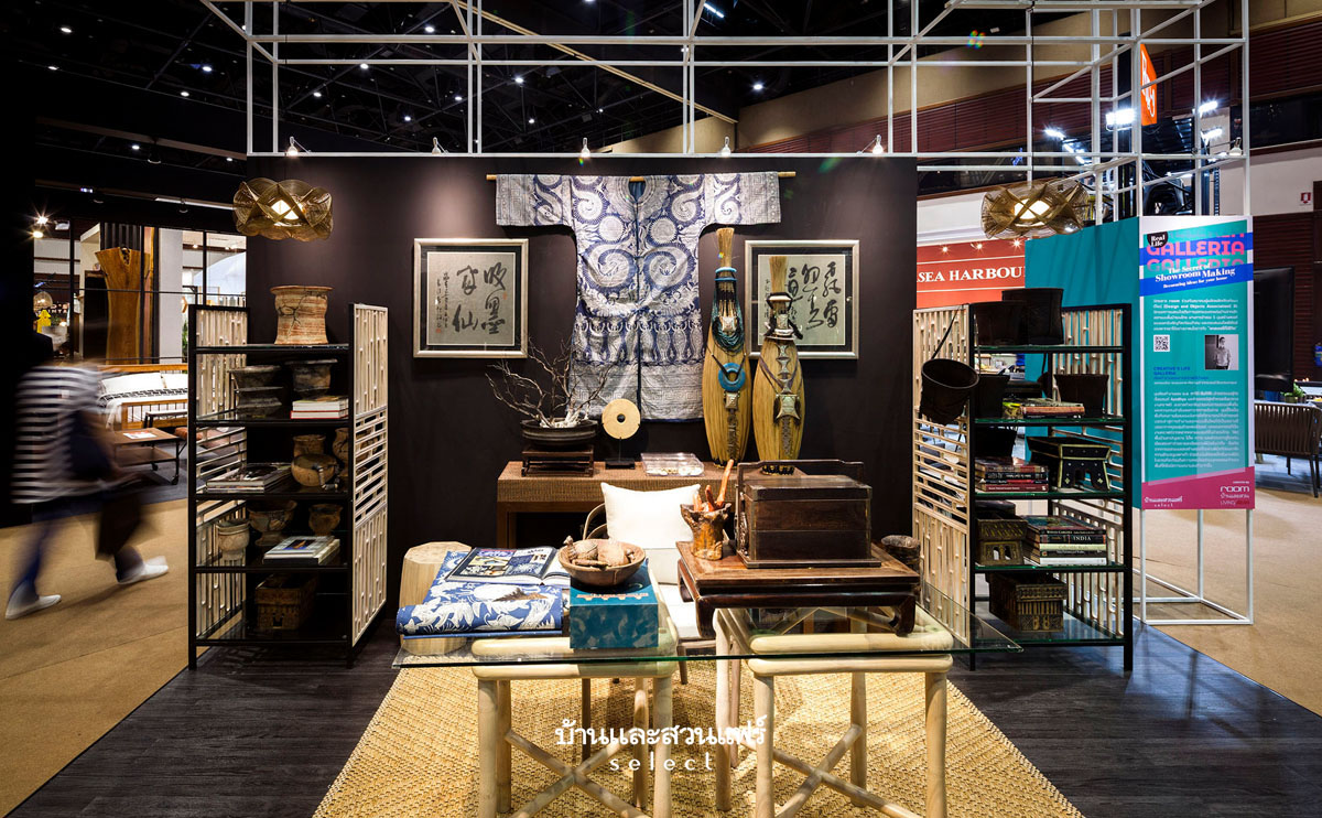
Real Life Galleria is a show about design masterpieces by some of the country’s top-notch designers. Organized on theme of “The Secret of Showroom Making”, the exhibition provides a conducive atmosphere for learning and exploring design possibilities. It’s the product of a collaboration between the Baanlaesuan Magazine Group and the Design and Objects Association. The 2019 Edition of Baanlaesuan Fair Select proudly presents five masterpieces by five leading homegrown designers. They include Suwan Kongkunthien, M. L. Pavinee Santisiri, Amornthep Kachanont, Jirapan Tokhiri, and Rangsan Narathasajan. Together, they let us in on their secrets in “giving a home the look and feel of a living art gallery”. Over time, our curators have worked jointly with diligent care and effort to choose five designs that answer different lifestyle needs. Not only are the showpieces fully functioning as expected, but they are awesome in ways that bespeak their unique style.

Real Life Galleria by room Magazine at 2019 Baanlaesuan Fair Select Real Life Galleria by room Magazine at 2019 Baanlaesuan Fair Select Real Life Galleria by room Magazine at 2019 Baanlaesuan Fair SelectReal Life Galleria by room Magazine at 2019 Baanlaesuan Fair SelectReal Life Galleria by room Magazine at 2019 Baanlaesuan Fair Select

The Book House at 2019 Baanlaesuan Fair Select

The Book House at 2019 Baanlaesuan Fair Select

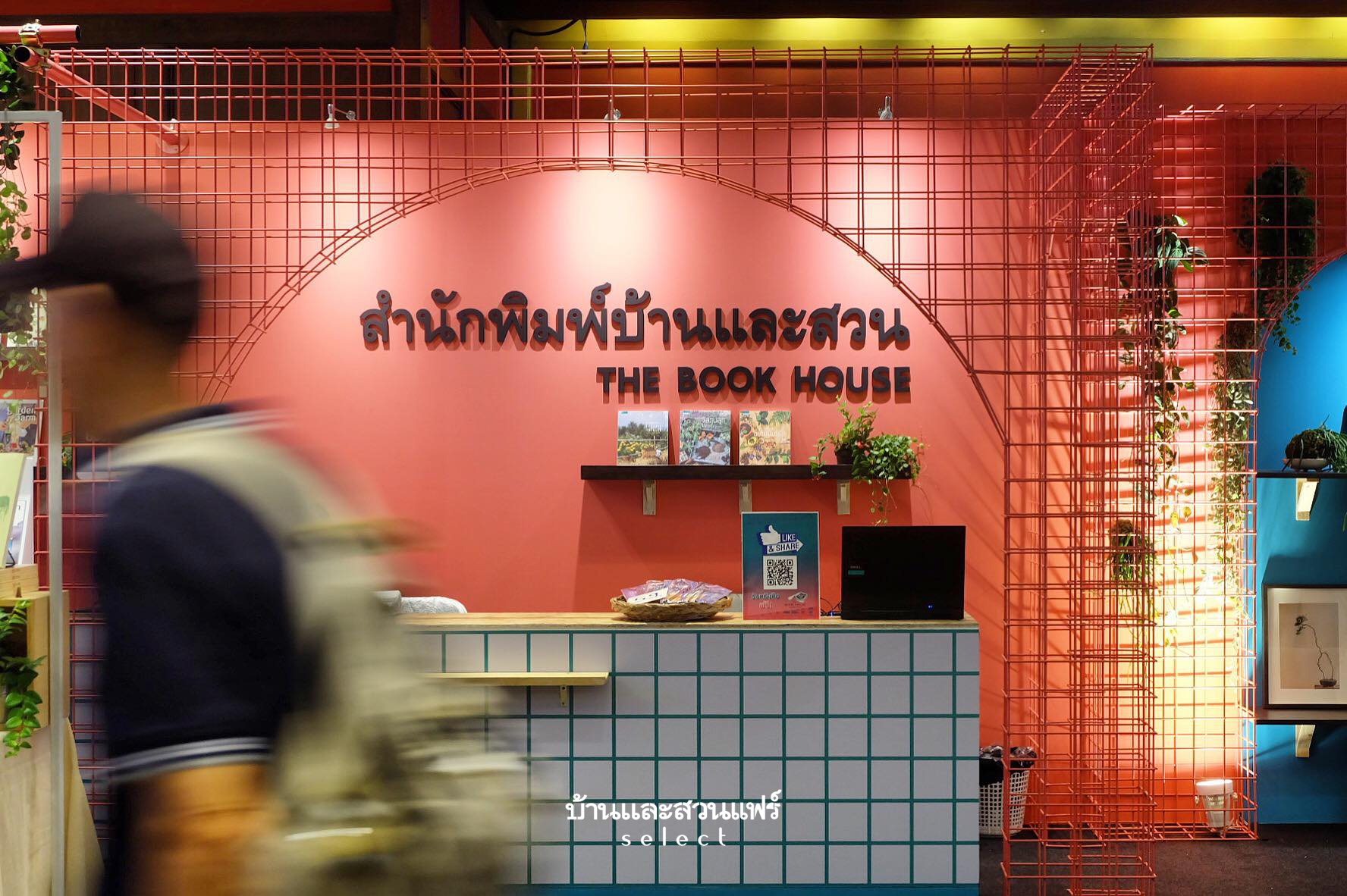
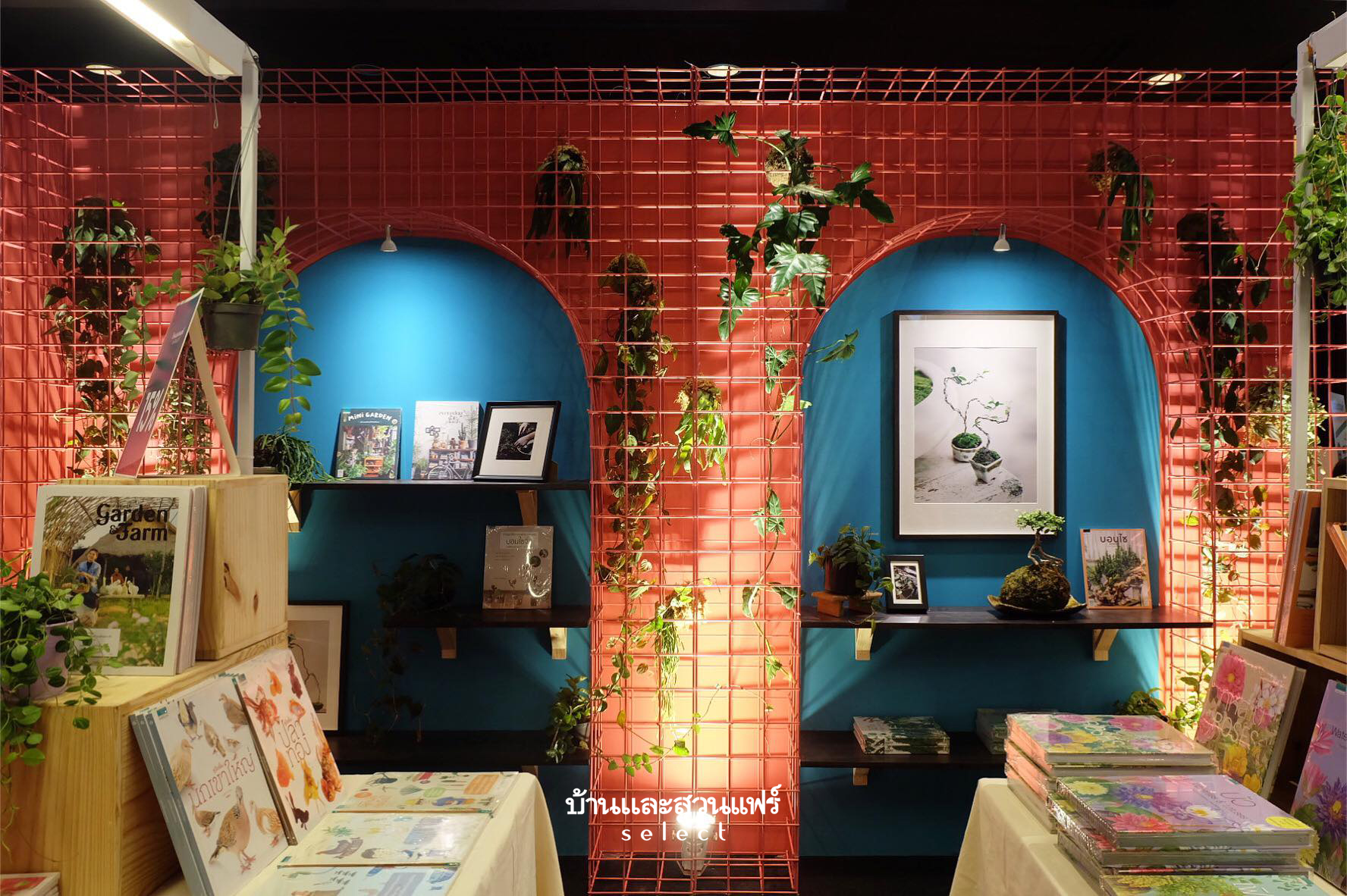
Real Life Galleria is also the theme of this exhibition booth. The relationship between color and texture in the room is defined by a gridiron design that sits atop a series of archways painted contrasting shades of red and green. Where appropriate, small green plants thrive from hanging containers creating a welcoming atmosphere. It’s designed to be an ideal place to browse, read and shop books specially screened and chosen by a team of editors at Baanlaesuan Printing.

The Book House at 2019 Baanlaesuan Fair Select

            Special Promotions! Buy books from Baanlaesuan Printing on this occasion only and get:

* 15% discounts when you buy 1 to 3 books.
* 20% discounts when you buy 4 books.

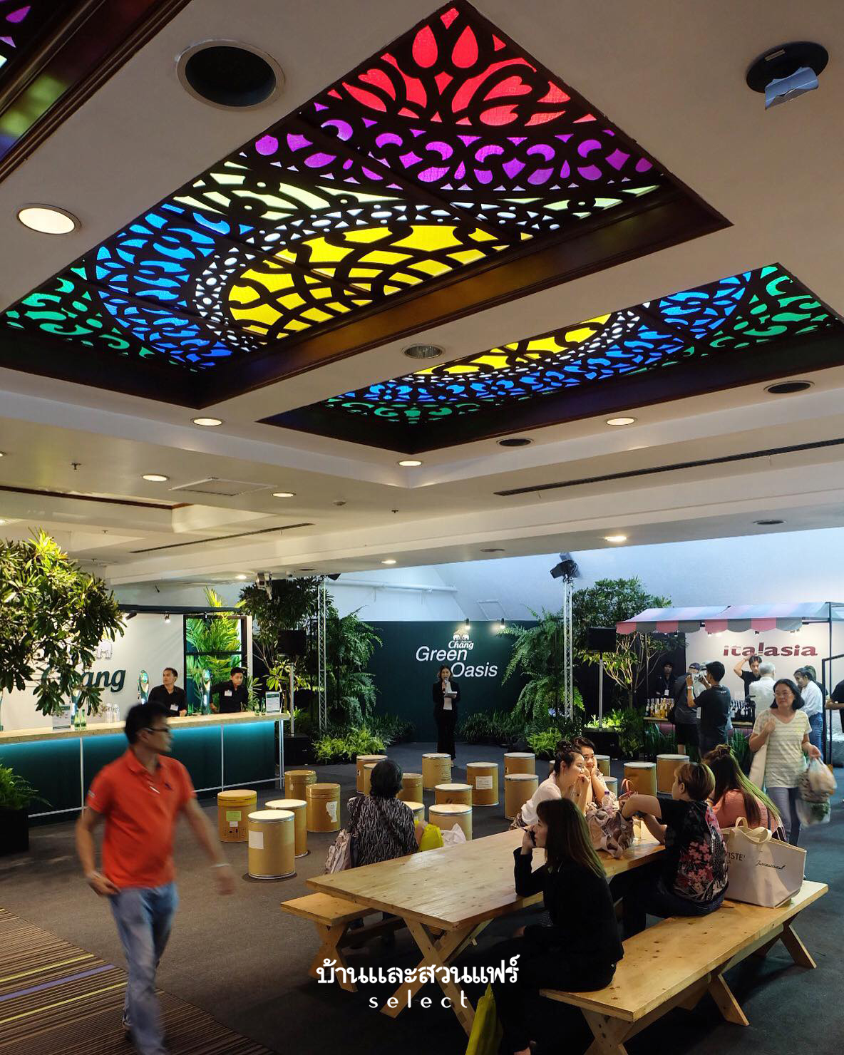
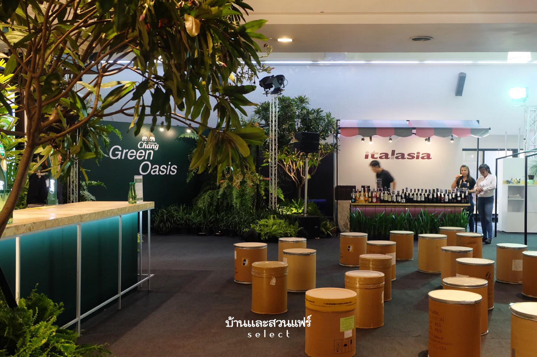
The Book House and Chang Green Oasis

 THE 2019 BAANLAESUAN FAIR SELECT AT A GLANCETHE 2019 BAANLAESUAN FAIR SELECT AT A GLANCETHE 2019 BAANLAESUAN FAIR SELECT AT A GLANCE THE 2019 BAANLAESUAN FAIR SELECT AT A GLANCE THE 2019 BAANLAESUAN FAIR SELECT AT A GLANCE

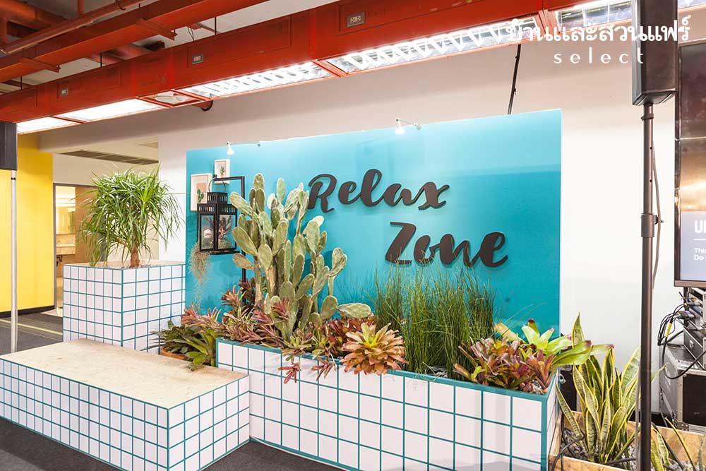
Relax Zone for Garden Lovers

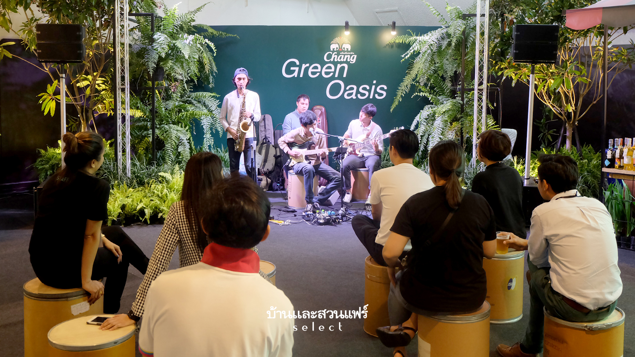
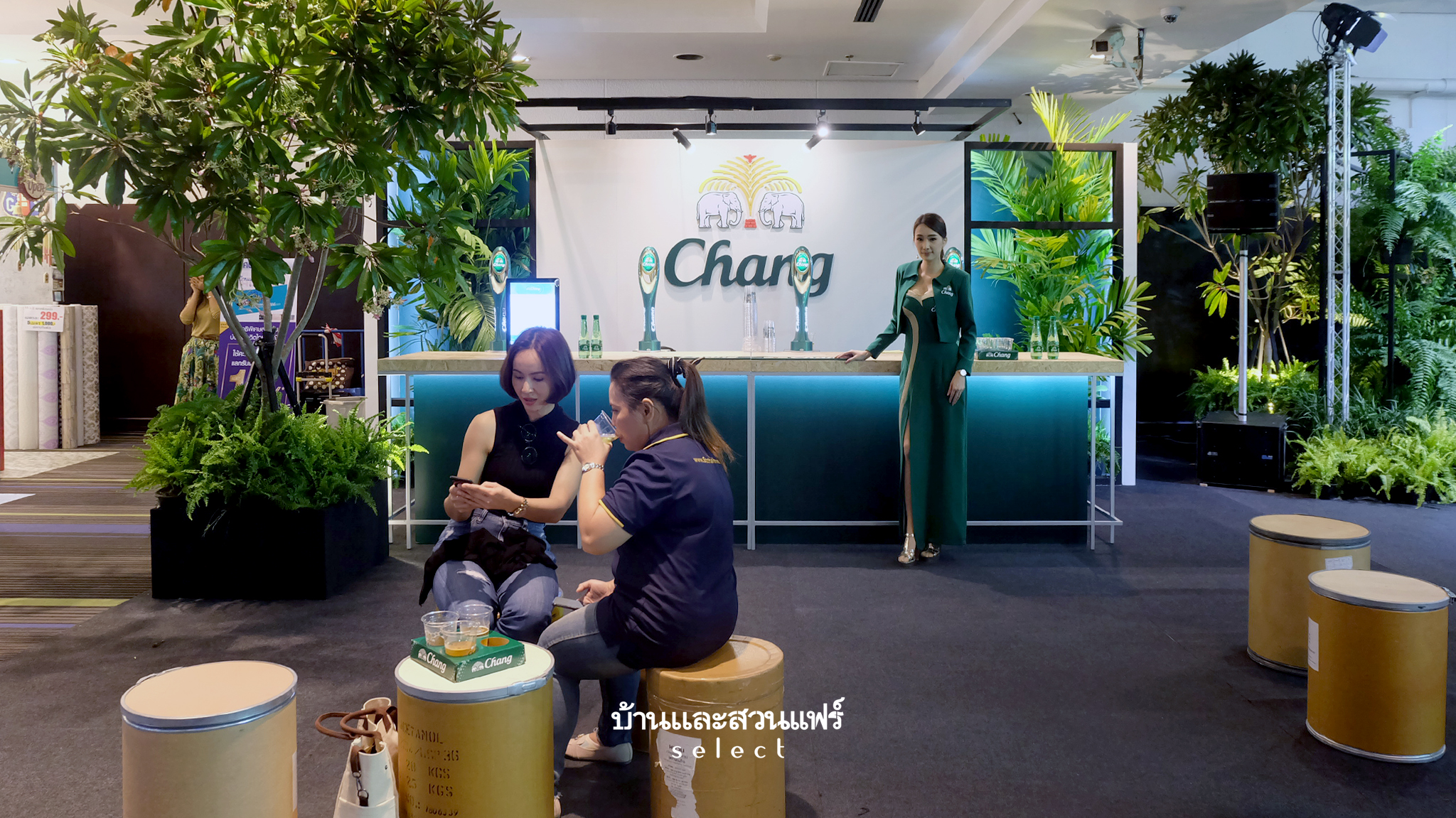
The Relax Zone is a stress free area for garden lovers. It’s pleasing to the mind to be able to sit down and do some reading after a long walk. And if you think it’s time to grab a bite to eat, there’s a very nice café for that. Plenty of food and drinks to enjoy in a relaxing environment! It’s also a center for home decorating demonstrations and workshops for those who are interested. Decorated urban café style in a garden setting, the Relax Zone makes a visit enjoyable thanks to live music courtesy of Chang brands.

THE 2019 BAANLAESUAN FAIR SELECT AT A GLANCE

Besides good food and a cup of coffee to replenish your energy and recharge your spirit, the Relax Zone will put a smile on your face. There are plenty of design ideas to take home to liven up your favorite family hangout.

Urban Pocket Garden Ideas

Explore new ways of planting your own small gardens at 2019 Baanlaesuan Fair Select.

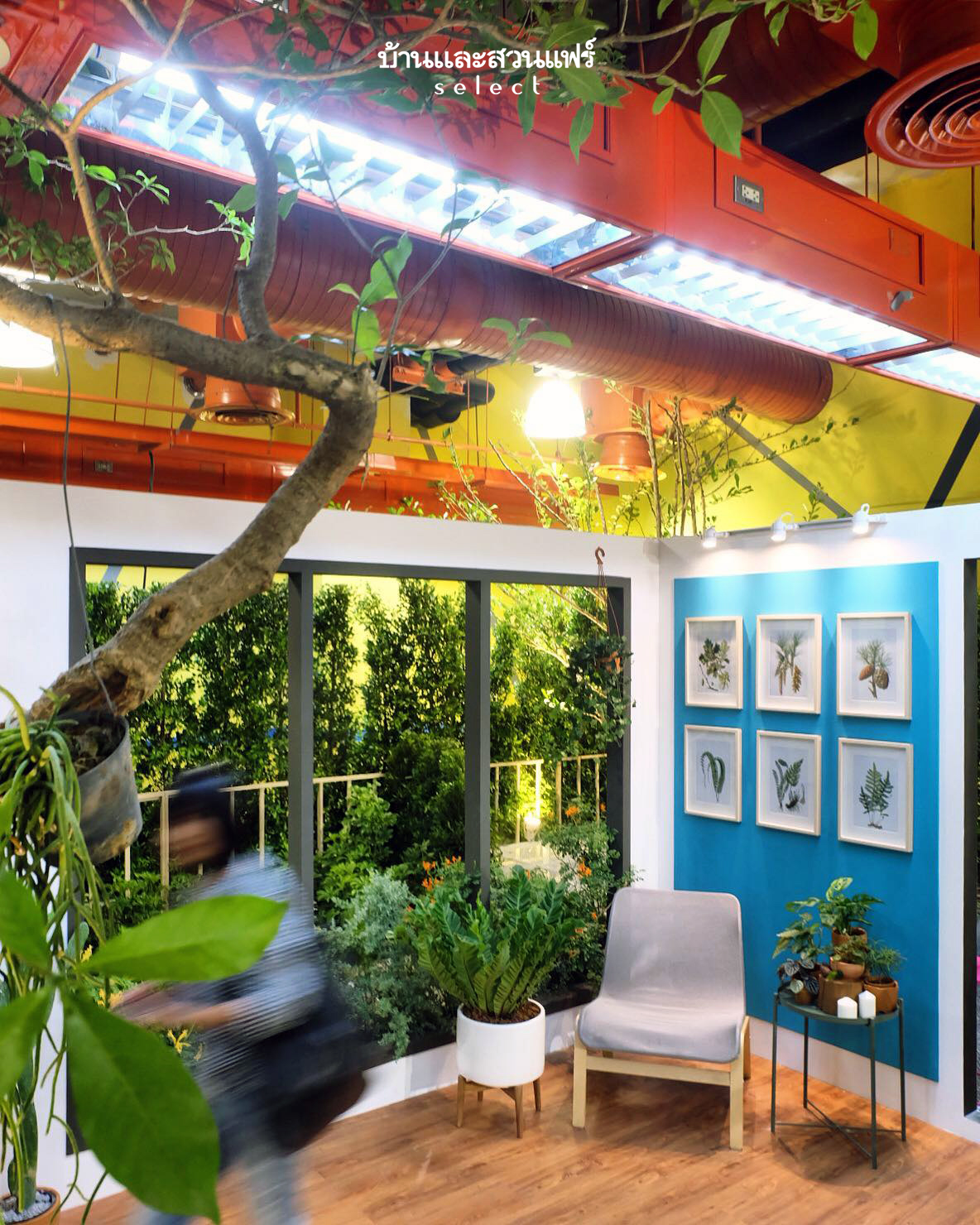
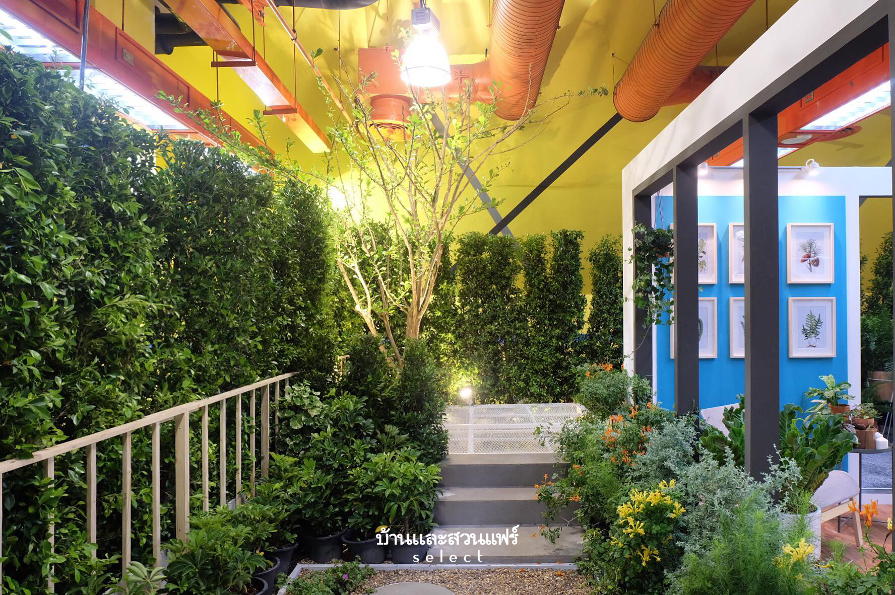
Urban Pocket Garden Ideas are the theme of a show for people living in small spaces. They come in handy to brighten the home with living plants, whether it be a backyard patio, small terrace or indoor space. Healthy green foliage provides unexpected pops of color and texture that can soften the harsh appearance of the built environment. The show garden offers clever tips for choosing plants and decorative containers suitable for small spaces. There are plenty of cool designs to transform a niche of space into a stunning garden that bespeaks your unique style. They include living green walls or vertical gardens, potted gardens, and urban green space ideas. Drop by for a good photo opportunity.

Explore new ways of planting your own small gardens at 2019 Baanlaesuan Fair Select.

Art and Craft Zone

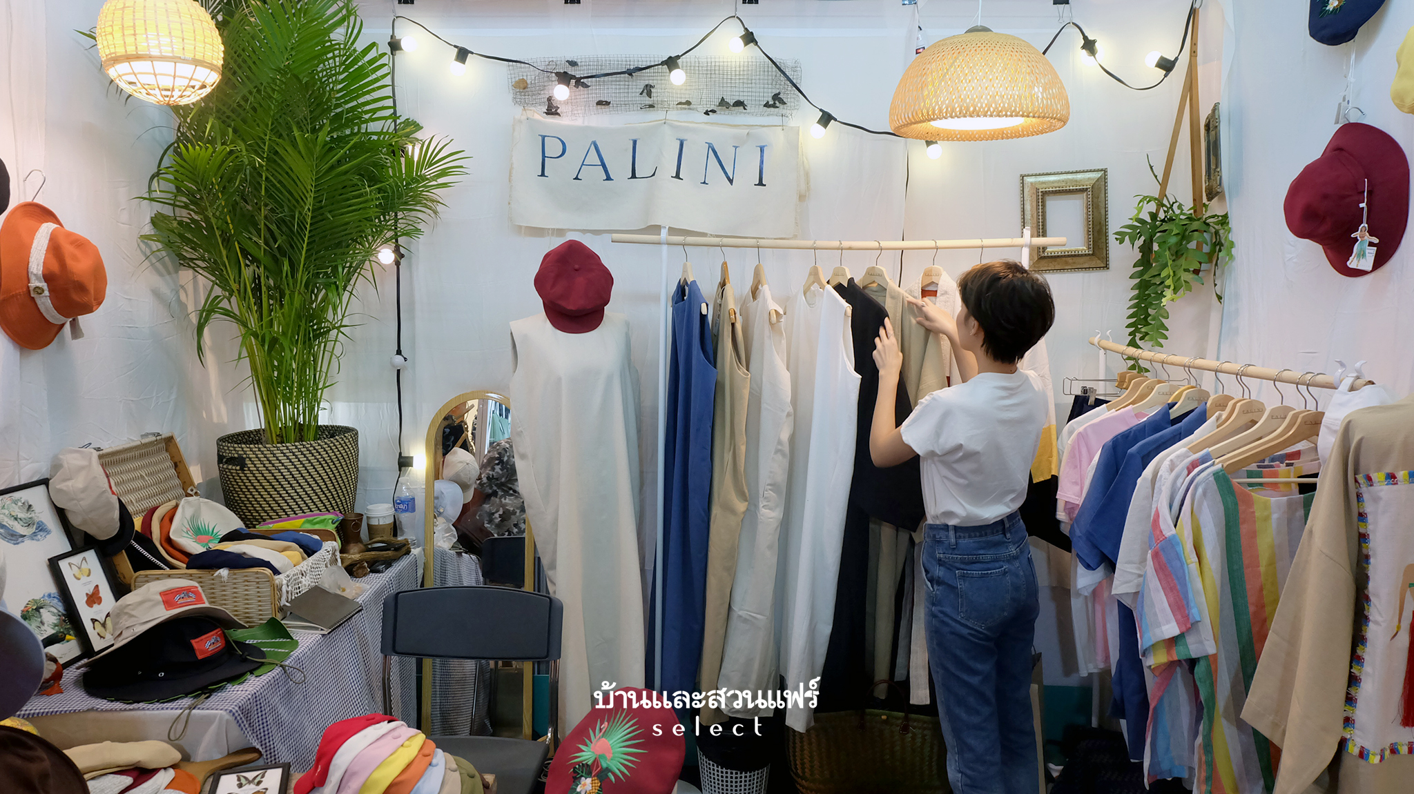
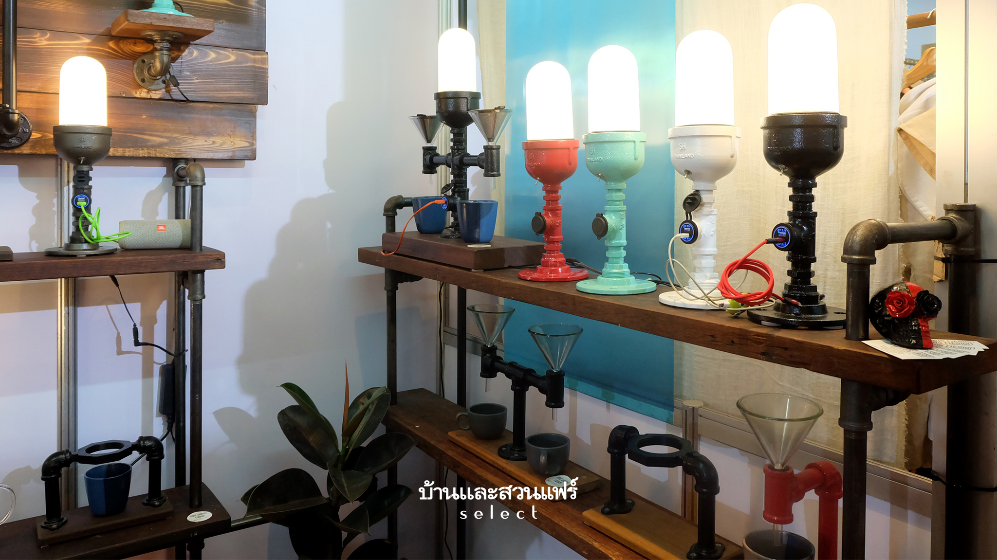
Looking for decorating ideas to create a personal oasis? Art and Craft is a zone for home goods, décor accents, even small ornaments for every room in the house. Save on home accessories from across the country, among them unique screen prints from “The Archivist”, cool items of clothing and nice looking hats for summer from “PALINI”, and more. There are plenty of handmade ceramics and imaginative décor materials to make your home awesome.

THE 2019 BAANLAESUAN FAIR SELECT AT A GLANCE THE 2019 BAANLAESUAN FAIR SELECT AT A GLANCE

Just a reminder: The 2019 Baanlaesuan Fair Select is happening from 20 to 24 February at the Queen Sirikit National Convention Center. It’s open from 9.30 to 21.00 hrs. See you there.


You may also like

The Chairmen of Thai Design, A Room Magazine Showcase at The BaanLaeSuan Select Fair
Looking back, the Chairmen of Thai Design, a Room Magazine showcase at the 2018 Baanlaesuan Select Fair

Renovation Brings Comfort into a Modern Home

Renovation Brings Comfort into a Modern Home

/ Bangkok, Thailand /

/ Story: Patsiri Chotpongsun / English version: Bob Pitakwong /

/ Photographs: Sitthisak Namkham /

The family’s firstborn son is married and household members have increased. For the past 40 years, the old house located on a residential estate has gone through various stages of repair and expansion. The time for further improvements has come, and the Sattayavinij family thought it wise to renovate the dated, tired-looking home, turning it into a modern home that’s warm, livable, and in sync with the present time.

Woranol Sattayavinij, the firstborn, is an architect at the reputable company Architects 49 Limited. And the responsibility to remake this modern home rested with him.

Earlier on, the family had entertained the idea of tearing down the old house to make room for a new one set on 96 square wahs (384 square meters) of land.

Fully aware of the family’s lifestyle needs, the kind of place they wanted, and the limited budget they had, he had a change of mind and went for a renovation project instead.

Modern Home
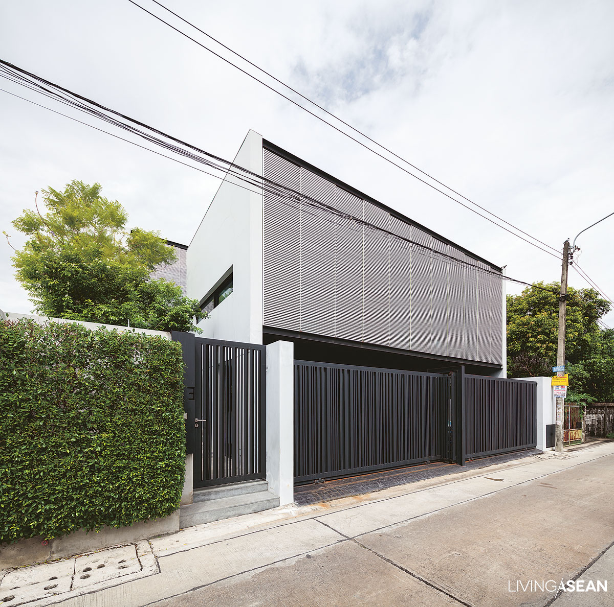
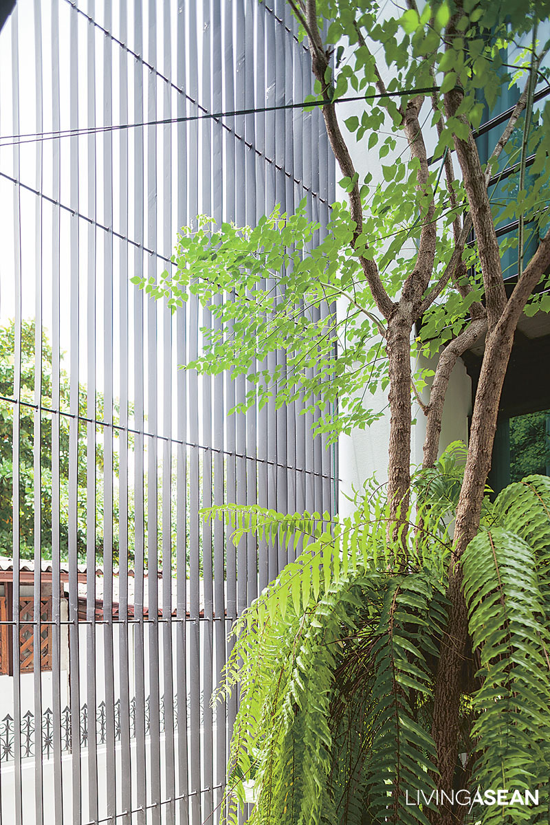
Tall aluminum latticework that makes the front façade protects the west-facing home from harsh sunlight. It provides a buffer against solar heat gain building up in the interior. On the street, black iron lattice fencing promotes natural air circulation and doubles as a privacy screen.

“I made a walkway connecting to the courtyard that has become our sitting room.  Using my stock of lumber and wood recycled from the old house, I mixed teak with Makha wood (Afzelia xylocarpa), and gave it a fresh layer of paint,” explained Woranol.

“It was a mix-match since the boards came in different sizes, but nothing serious.  Now mom and her sister seem really pleased  that it’s a nice spot to sit and catch the cool breezes.”

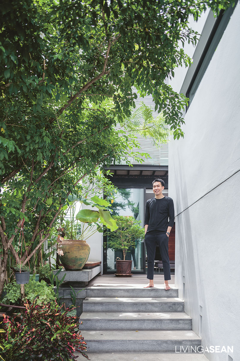
A flight of garden steps leading to the house interior is canopied by overhanging trees thriving along the fence line. The corridor offers enough room to stroll around in the privacy of home.

The question is: How can I go about it coming up with design that’s open, bright and well-ventilated?” he added.

“First, the land itself isn’t oriented in a direction that can avoid getting direct sunlight or minimize solar heat gain. Besides, it’s a modest home. There isn’t much room for the long roof overhangs needed to protect it from the elements.

“So I solve the problem by putting a courtyard at the center of the home plan to make the interior light, airy and very comfortable.”

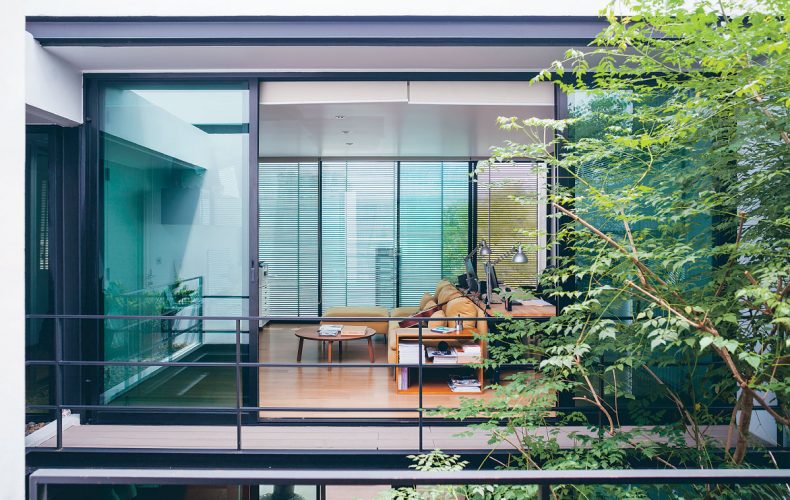
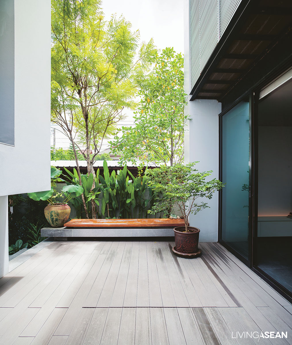
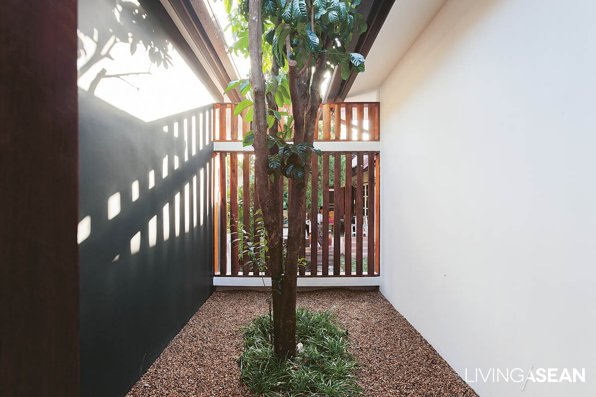
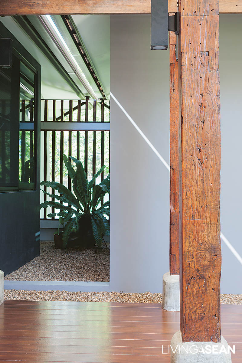
The unroofed area between the buildings becomes a small courtyard garden. At the further end, the architect puts in a long seat for people to relax under the shade.
An empty space between buildings looks stunning from the architectural perspective.

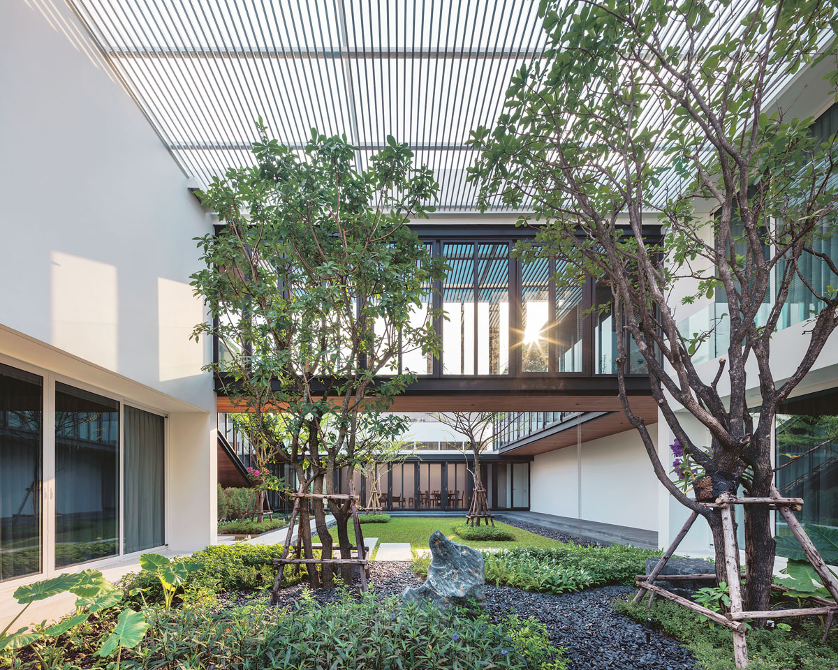
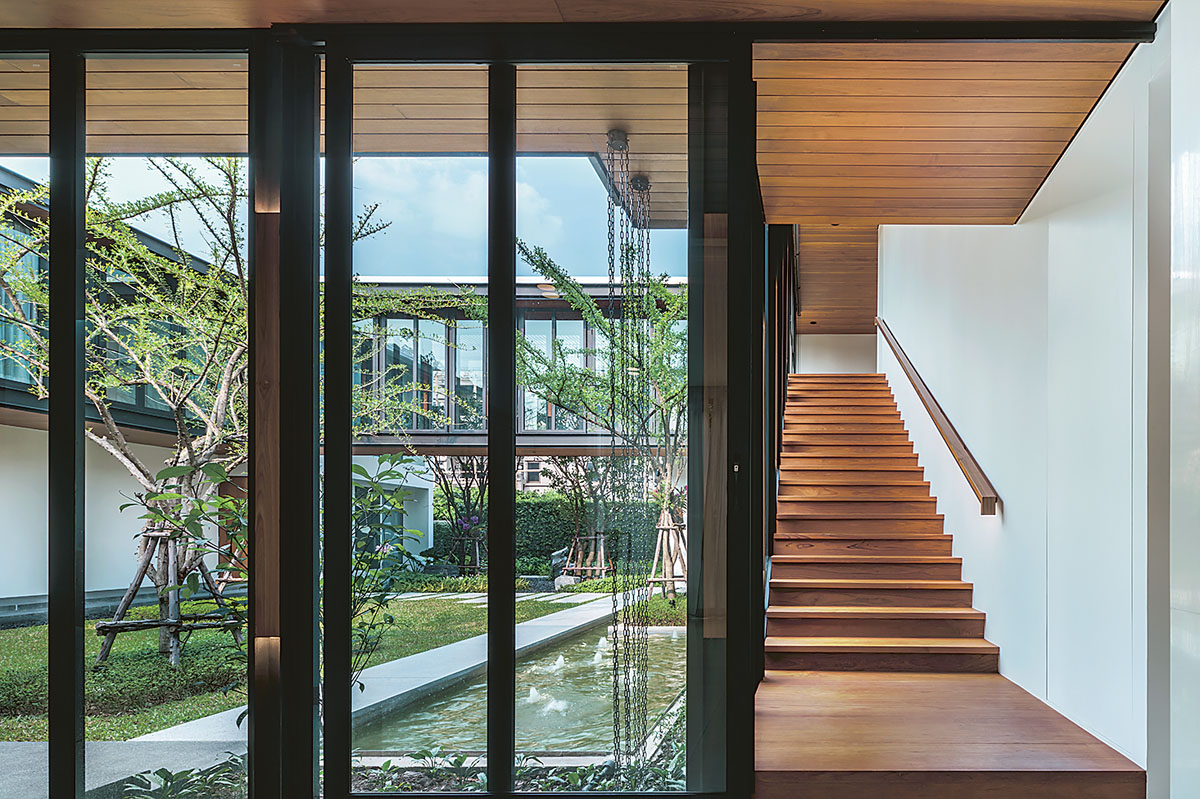
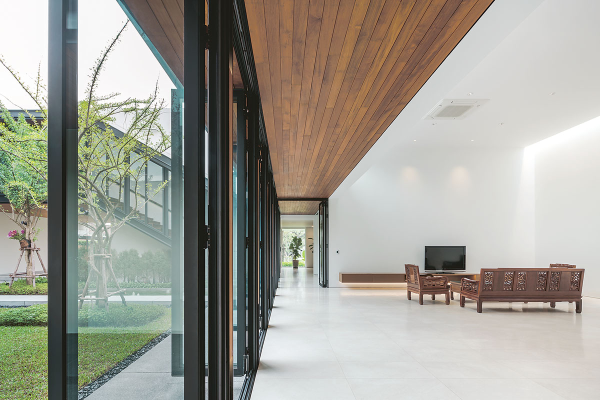
That said, Woranol chose box-shaped design featuring twin rectangular buildings that run parallel to each other with a courtyard in between.

The little oasis that’s open to the sky contains a small garden with a wood deck made for sitting and catching some fresh air. It serves as engine that drives natural air circulation all day. This creates a comfortable atmosphere in the entrance hall.

As for the A/C, who needs it anyway?

Modern Home
While lattice screens go to work protecting the home from the outside world, large opening glass walls connect the interior room to a lush courtyard garden thrown in between buildings. Diffused light and winds passing through the permeable shell keep the entrance hall cool all day without the A/C. No wonder it’s the family’s favorite hangout.

The forward part of this modern home has a carport that’s separated from the street by wrought iron fencing. The black on the fence contrasts with the silver on aluminum latticework protecting the building.

From the outside looking in, it’s clear that privacy protection is high on the list of priorities. It’s achievable without sacrificing the desire to live in close touch with nature.

Modern Home
Adjacent to the sofa set, the dining room is well lit and made comfortable by fresh air blowing in from the nearby courtyard garden.
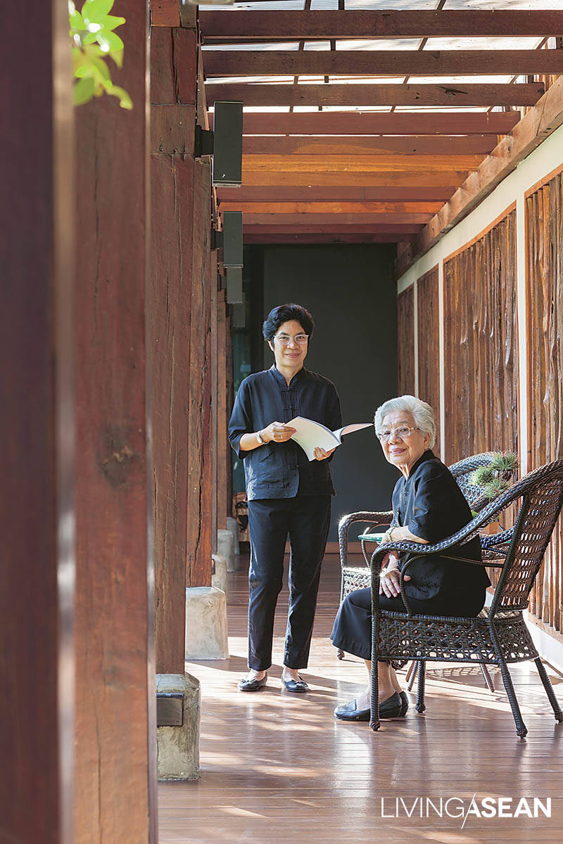
The raised passageway around the courtyard is built of old wood worn by long exposure to the weather. Concrete steps provide easy access to the garden floor. It’s a place to sit with your legs hanging down, enjoy a patch of greenery, and shoot the breeze on a lazy afternoon.

Evergreen Korean banyan trees (Ficus annulata) lining the fence and the house exterior reduce the harshness of concrete construction and make the home appear more environmentally friendly.

The modern home with 450 square meters of usable space boasts a bright and airy interior, thanks to open floor plans that emphasize interconnectedness throughout.

Modern glass room dividers promote visibility and warm social interactions within the family. Steel construction saves time and makes the interior living space appear spacious and lightweight.

In the end it’s all about feeling good and living better.

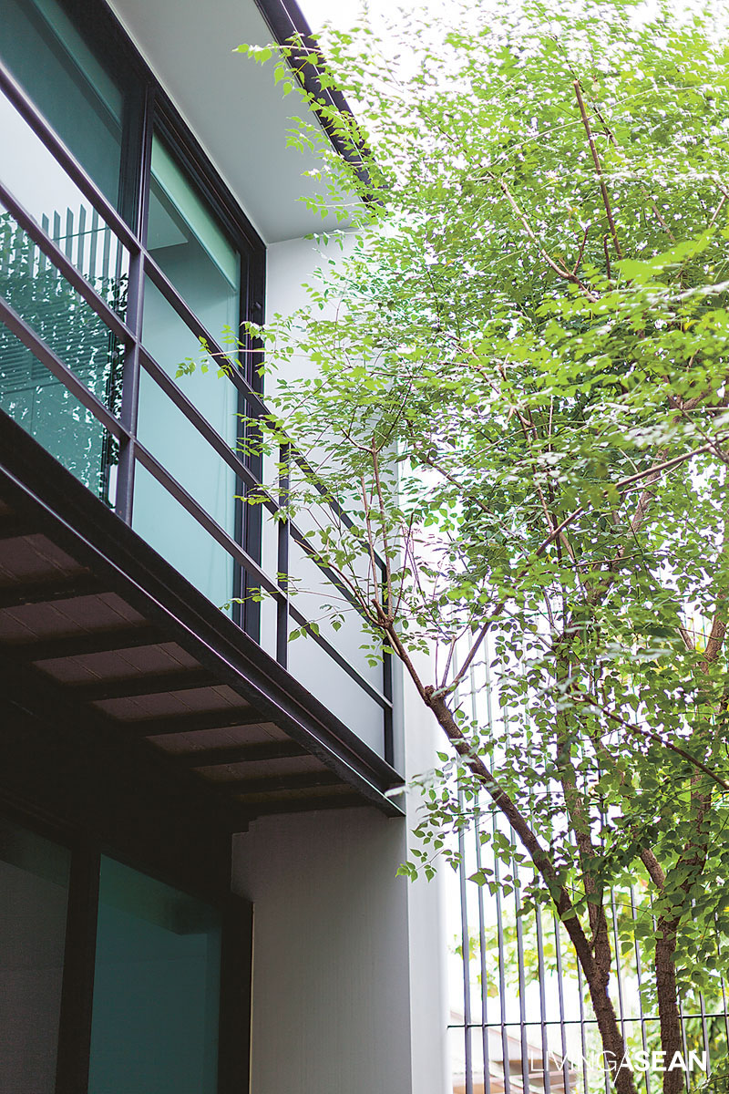
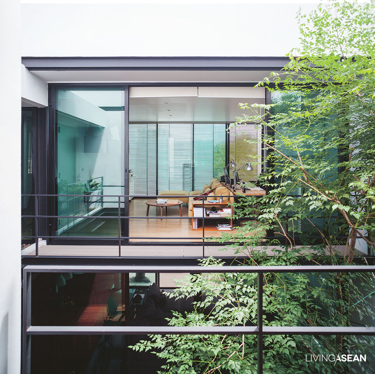
An Indian cork tree (Millingtonia hortensis), the courtyard’s main attraction, develops a healthy crown near the studio and the bedroom on the upper floor.
While they allow natural light and fresh air to pass into the courtyard, metal lattice panels also double as privacy screens and safety precautions against intruders.

Woranol further explained, “I made a walkway connecting to the courtyard that has become our sitting room.”

“Using my stock of lumber and wood recycled from the old house, I mixed teak with Makha wood (Afzelia xylocarpa), and gave it a fresh layer of paint.

“It was a mix-match since the boards came in different sizes, but nothing serious. Now mom and her sister seem really pleased that it’s a nice spot to sit and catch the cool breezes.”

Modern Home
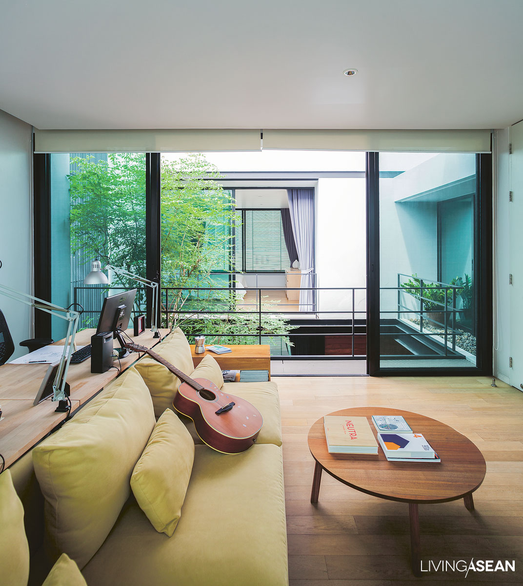
The room upstairs can be used for work or pleasure. Open the door to see what happens below, and take in the view of the lush courtyard garden. Some fresh air really will do you good. After all, it’s about bringing nature into the home.

“For security purposes, iron latticework is preferred over solid walls. To keep the sun out, the perforate shell is lined with trees. There is an Indian cork tree (Millingtonia hortensis) that has grown tall to shade the interior and give sweet-smelling white flower,” added Woranol.

“We also put in a Common Tembusa tree (Fagraea fragrans) which grows slowly, and a Brazilian rosewood (Jacaranda obtusifolia) which is loved for its beautiful purple flowers.

“The courtyard floor is covered by a container garden intended to make cleaning easy after seasonal heavy rains. It’s OK to get wet sometimes, but it’s better than being enclosed by solid walls.”

Modern Home
Rustling leaves in the Indian cork tree make a sound that has a relaxing effect, especially for the home office and the bedroom located across the yard.

His choice of furniture speaks to the minimalist style of interior design. The idea of less-is-more translates into an interior living space that’s open, easy on the eye, and conducive to natural ventilation.

It’s easy to get why everyone likes to hang out together in the hallway downstairs that connects to the lush courtyard garden. The natural environment helps them feel relaxed all day every day in this modern home.


Owner/Architect: Woranol Sattayavinij


You may also like…

In Nature’s Peaceful Embrace

Surrounded by Warmth and Happiness

Behind the Works at Bangkok Art Biennale 2018: Historic Images of an Important Time for the Art World

Behind the Works at Bangkok Art Biennale 2018: Historic Images of an Important Time for the Art World

Bangkok Art Biennale 2018 has now finished up. Here we’ll look back at some historic images illustrating what was behind the scenes of this important page of Thailand’s contemporary art world, which brought many world-class artists – Marina Abramović,  Yayoi Kusama, Choi Jeong Hwa, Jean-Michel Basquiat, and many others – to exhibit at 20 landmark locations in Bangkok.

Bangkok Art Biennale 2018

This is Tape Bangkok 2018, or “Adhesive Tape Tunnel,” by Numen/For Use Collective Design. The artists had a foreign team work closely with the Thai team to teach installation methodology during setup on the 7 th floor of the Bangkok Art and Culture Centre.


Zero, an 8.2-meter-tall installation art sculpture by Elmgreen & Dragset, required skilled Thai workmen using a crane to lift it into position in front of the East Asiatic Building.

Bangkok Art Biennale 2018
Our team found that three pieces especially grabbed the public eye at Bangkok Art Biennale 2018. The “mother goddess of polka dots,” Artist Yayoi Kusama, sent a foreign work team to closely supervise the highly complex installation of her pieces after their arrival from Japan. The FAVForward/Lifestyle website in the Amarin Group, which monitored the installation, said, “The 14 Pumpkin balloons took a lot of days to set up, with meticulous attention to every detail by the Japanese team. Setting up “Inflatable Pumpkins Balloons” wasn’t simple: it required stringing electric lines and constructing beams and internal
supports to get the pumpkins to float high above.

I Carry On Living With The Pumpkins (Silver Pumpkin and Red Pumpkin), two large and heavy works composed of inflexible pieces with lots of angles, had a hard time making it through the door. It took the staff a big chunk of time, and they told us that putting it all together was no easy thing.

Your Dog, the work of Yoshitomo Nara, another Japanese artist, at BAB Box @One Bangkok, was in a single piece and didn’t involve difficult transportation or setup. The installation team simply lifted the 4.5-meter puppy, and in the clip below you can see the setup procedure.

Bangkok Art Biennale 2018
Turkish female artist Canan’s Animal Kingdom involved installation of dozens of animals, large and small, at BAB Box @ One Bangkok. This animal kingdom took up nearly 10 square meters and was as tall as the 2-storey building itself. Installation required a work team to build scaffolding to fit.

Bangkok Art Biennale 2018The work 2562++, by Tay (Patipat Chaiwitesh), was exhibited at the East Asiatic Building. It’s full of fun, but that is blended with biting satire. The backstory here, Patipat tells us, is that the animals displayed here were all stuffed. He himself found them all in the market (not alive at that point, of course), and worked with lab experts at the Veterinary Department of Chiang Mai University to stuff them, preserving shapes and eliminating decay. After that procedure, Patipat left the lab and continued working on them in ways you can see in the video below.

X