Blog : Row House

Wonderful Terraced House Renovation in Singapore

Wonderful Terraced House Renovation in Singapore

/ Singapore /

/ Story: Warapsorn Akkhaneeyut / English version: Bob Pitakwong /

/ Photographs: Sitthisak Namkham /

Terraced houses are ubiquitous throughout Singapore, many of which are well preserved to showcase the country’s rich architectural heritage and history of British Colonial rule. Many of them have changed to better serve commercial and residential needs of the modern world. This handsome terraced house is no exception.
Terraced House
Part of the top floor becomes a small sky garden.

This terraced house belongs to Alan Barr and Phaswan Promphat, both of whom interior designers.

Alan has had experience living in big cities, such as New York, before the job sent him across the globe to settle in Singapore nine years ago. He didn’t arrive empty-handed, but with furniture and other prized possessions.

Over time Alan transformed the old townhouse into a trendy residential unit, incorporating a touch of New York in the prevailing climatic conditions of Singapore.
Terraced House
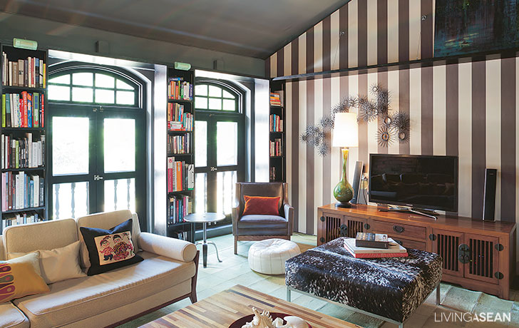
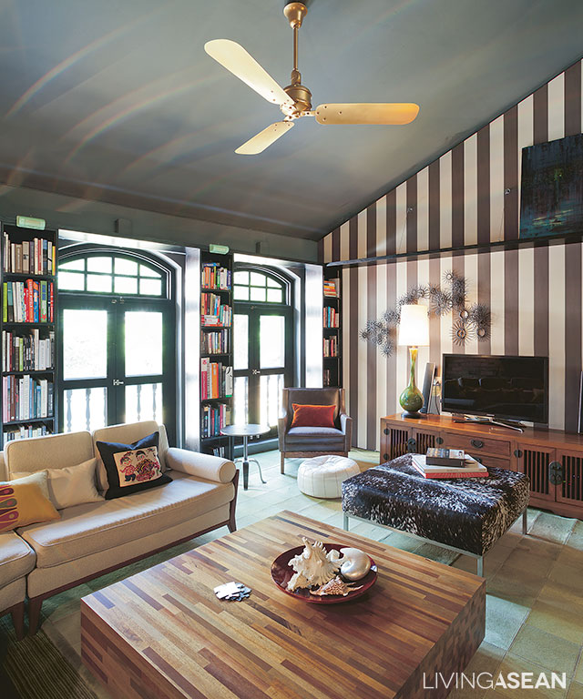
The spaces between Colonial-style arch windows are filled with bookshelves that stand tall from floor to ceiling.
8
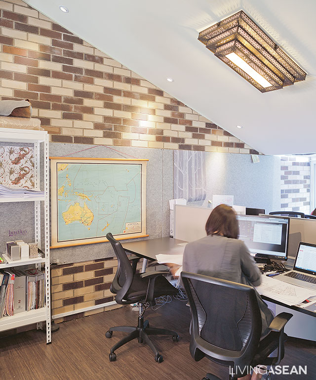
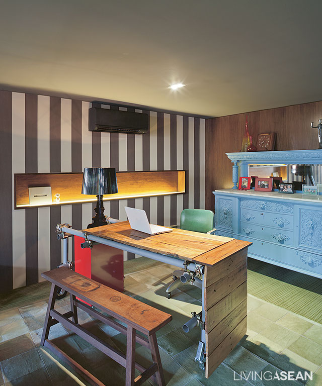
Part of the living room is remodeled into a workplace. The table is custom-made from discarded materials.

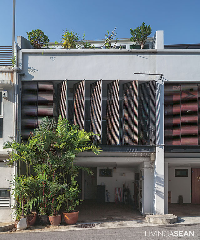
The home has a narrow front façade, but the narrow width is compensated by depth, a design feature typical of Sino-Portuguese architecture.

The front part has since been remade to accommodate lattice awnings from floor to ceilings. They serve as privacy curtains while shielding the interior from direct sunlight without limiting air circulation.

From the outside in, it looks like any two-story home. Step in, and you will find it is actually a three-story design.

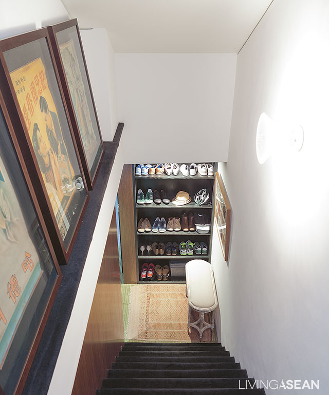
The ground floor now serves as a carport and storage facility. A set of stairs takes us to the second floor, which is the living room and kitchen with a spacious dining area.

The home office is here, too. From the living room, there is another set of stairs leading to the bedroom on the third floor.
2
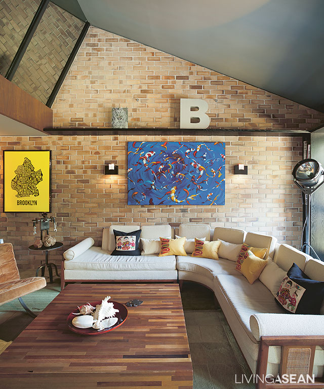
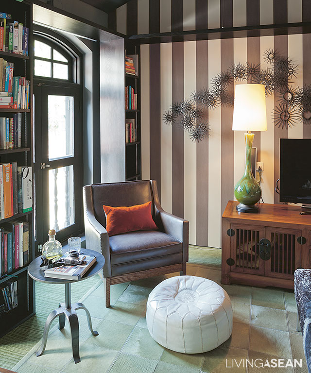
An armchair and a round coffee table adorn the relaxed living room in chocolate and cream tones.
4
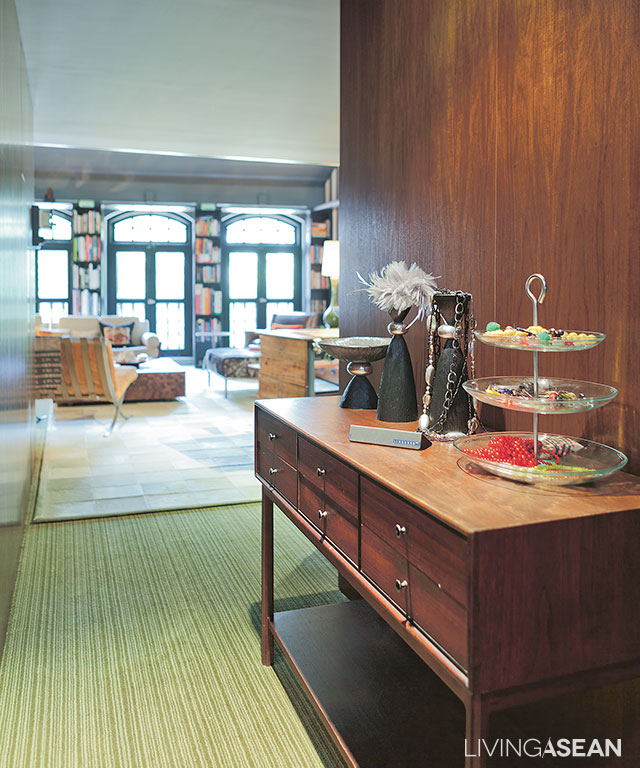
Antique-inspired décor items line the hallway leading to a relaxed living space in the rear of the building.
6
A room with a corner sofa and a large coffee table has enough space to entertain a circle of friends. The backsplash is covered in ceramic tiles made to look like bricks.
5
[left] The living room floor is covered in a patchwork of carpets crafted of donkey hide that is soft to the touch. [right] A niche under the staircase has enough room for a mini-bar.

Alan said, “This home used to be a design studio. The interior was just about right. It looked like a home, but it was not.

“At the time, it was an office and it had no kitchen. So when we got it, we had to put in one. I like the layout of this home very much. I divide it into two simple zones – general, and privacy.

“The top floor is served by two separate sets of stairs. The attic has since become an office. Space is divided to store decorative works on one side and use as a workstation on the other.”
9
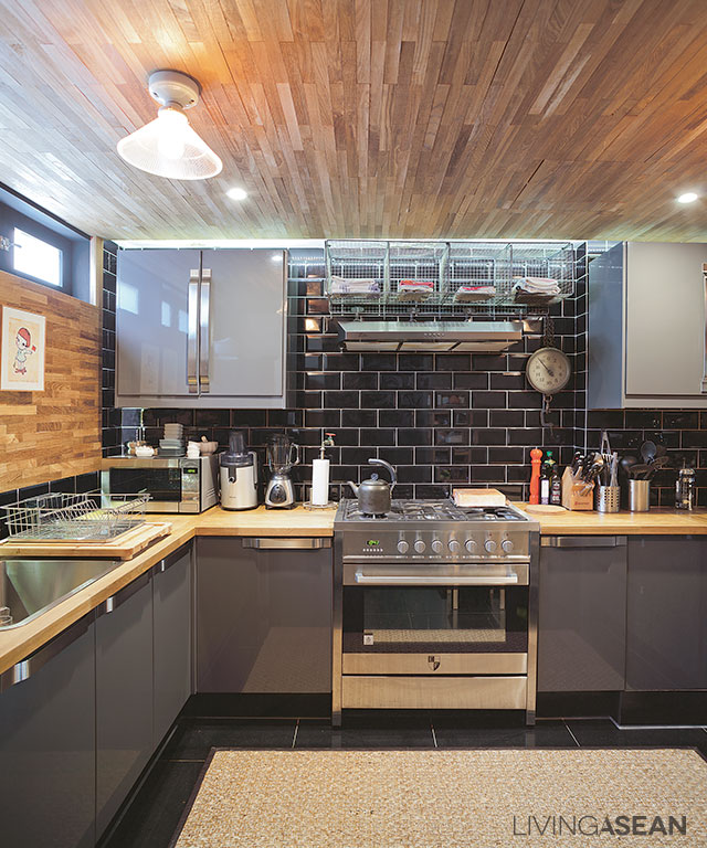
Set in gray and black tones, the kitchen comes fully equipped with stainless steel fixtures. Dark colored backsplash adds a nostalgic vibe to the atmosphere.
11
The stairway leads to the snug bedroom on one side of the upper floor.
12
The staff’s office is located on the opposite side of the upper floor to ensure the residential area is not disturbed.

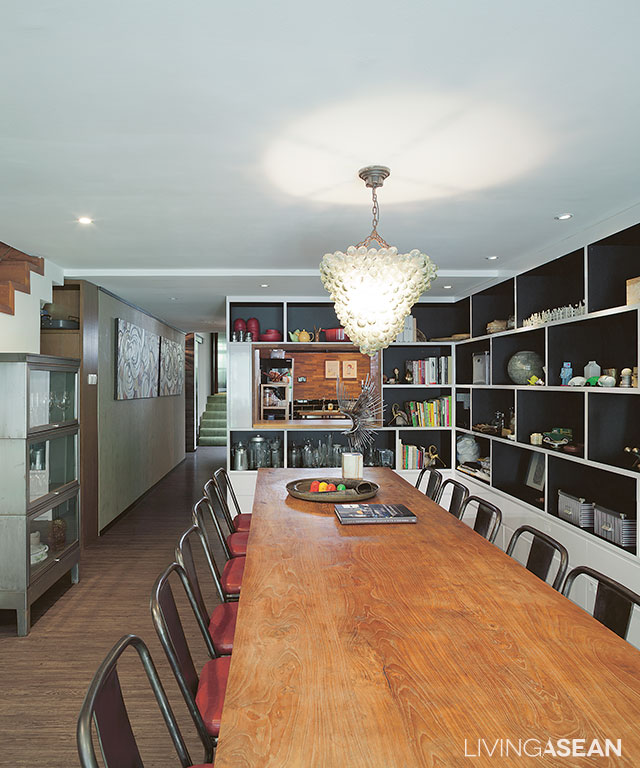
“The second-floor dining room serves multiple purposes, from eating and entertaining customers, to meetings and project presentations,” he continued.

“Personally, I don’t like an office hemmed in by glass walls supported by steel or other metal frames. Offices in much of Singapore are like that.

“I want a different kind of workplace, in which to impress the customers with different experiences. Most of them like it here, whether it is furniture or decorative items that we have on hand.”
10
The conference table and chairs are placed closer to the wall, lined with storage shelves.

As a whole, the interior spaces are neatly designed and well-appointed.

Décor items from various places are placed in perfect harmony with one another. As he puts it, good furnishings don’t always have to be expensive if you know how.

Alan has given this old terraced house a chic modern makeover with a hint of interest and personality.

3


Owner/Interior Designer: Alan Barr and Phaswan Promphat (www.grey-matters.com)


You may also like…
Desa House: The Renovated Artist House in Kuala Lumpur
Never Too Small: Renovation Gives a Townhouse the Atmosphere of Home

Sekeping Sin Chew Kee: A Raw Chic Hotel in Kuala Lumpur

Sekeping Sin Chew Kee: A Raw Chic Hotel in Kuala Lumpur

/ Kuala Lumpur, Malaysia /

/ Story: Ekkarach Laksanasamlich / English version: Bob Pitakwong /

/ Photographs: Rithirong Chanthongsuk, Soopakorn Srisakul /

Crafted in a plain and simple fashion, the Sekeping Sin Chew Kee is a raw beauty and a way of life in Kuala Lumpur. The rustic chic hotel is part of the Sekeping chain, which is owned by Ng Sek San, of Seksan Design Landscape Architecture and Planning. See beauty in simplicity! Check this out.

 5

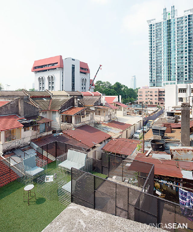
The hotel is located within a converted “shophouse,” the terms for vernacular architecture commonly seen in KL. The well-kept, two-story reinforced concrete structure has a rooftop deck.

The owner/designer, Ng Sek San, took every precaution to avoid increasing building weights. The only add-on is a mezzanine on the second floor. Both the mezzanine and the upper floor are reserved for guest accommodations. The coffee shop sits on the ground floor.

8

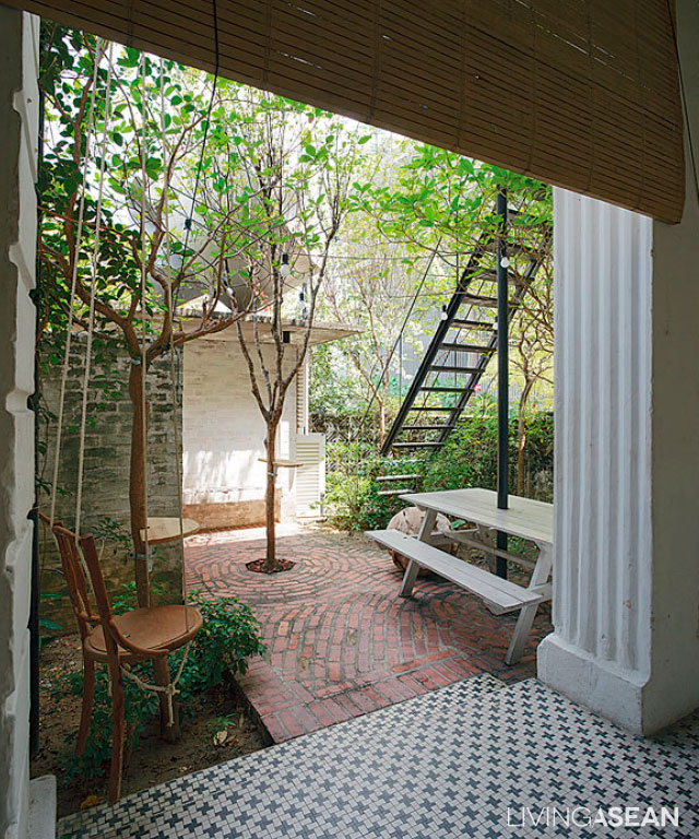
The shophouse-style building has access to the street in front and back. The front entrance features a small garden, enclosed for privacy by a wall of medium height.

Inside the hotel, a steel stairway gives access to a lounge with a warm, welcoming atmosphere on the second floor. A bit further inside lies a kitchenette with a bathroom and two guest rooms.

2

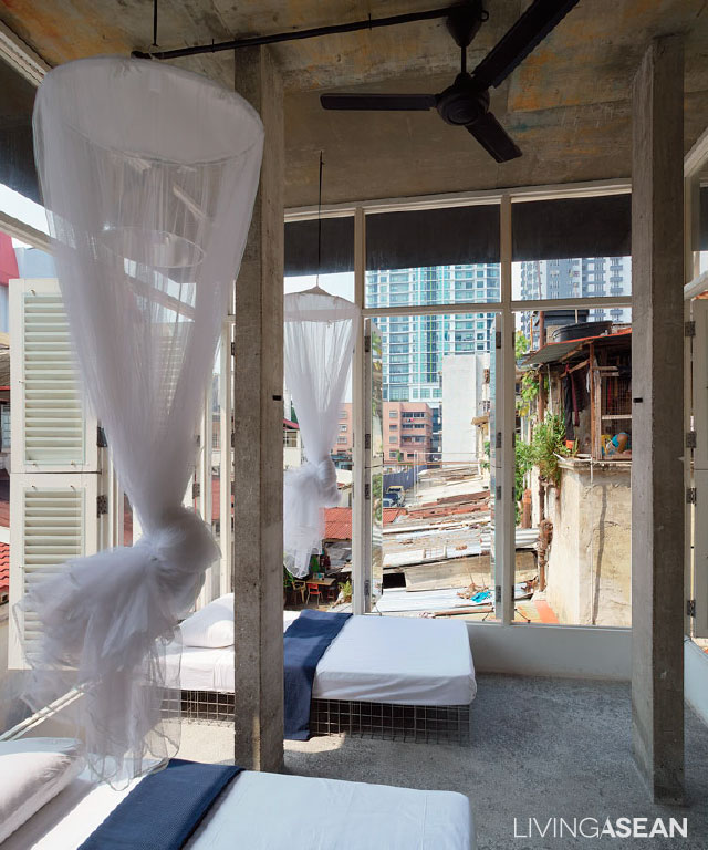
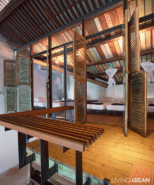
There is another set of stairs that connects the second-floor lounge to the mezzanine and on to rooftop deck. The newly added mezzanine was once an open space. Later, a wood plank ceiling was put in to give the area an elegant touch and turn it into a usable room.

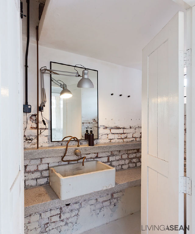
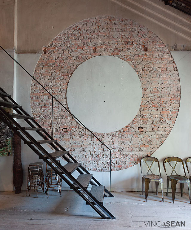
Elsewhere, custom plasterworks and exposed brick walls in a circular shape contrast with real wood flooring in shades of white. The newly painted surfaces and simple décor make for easy maintenance and an atmosphere that is environmentally friendly.

4

3

The choice of contemporary furniture and ornamentation conveys a refreshing change. There is a curious mixture of the traditional and the modern.

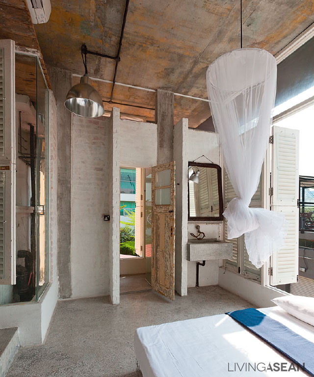
Steel-frame beds and sofas, comfortable mattresses and cushions blend well with old-fashioned items, ranging from water kettles to wire mesh lounge chairs to antique-style cups and tableware.

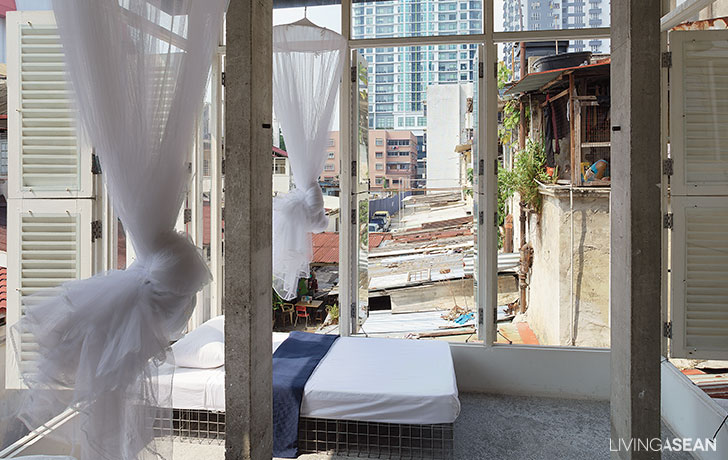
The most memorable sight is the simple white mosquito nets that unfurl at bedtime.

7

9

In remodeling an old building, it’s important to consider structural integrity, which refers to the building’s ability to hold together under a load without breaking or deforming.

As the designer puts it, renovation work differs greatly from building anything from scratch. It goes through various processes of evaluation, demolition, and pounding to make room for new ideas to take shape.

“Our experience here has meant the opportunity to try out new architectural features and interior decorating techniques in order to give the hotel a raw beauty, one that’s rich in rustic appeal.”, explained Mr Ng.

“The design of Sekeping Sin Chew Kee is about creating an intentional lack of orderliness and opposites to the ordinary. This is manifested in industrial-style electrical conduits throughout the building.

“Instead of concealing them behind walls, the conduits, mountings, and hanging lights are installed in ways that are clearly visible and easy to maintain.”

His well-thought-out design results in a chic interior that focuses on truth to materials and a style that reflects well on this part of town.

1


Owner/Architect: Ng Sek San of Seksan Design Landscape Architecture and Planning


You may also like…


Sekeping Kong Heng: A Boutique Hotel Treasures the Charm of Ipoh

Ipoh: A Journey Back In Time

Perfect Combination of a Classic and Retro Style House Makeover

Perfect Combination of a Classic and Retro Style House Makeover

/ Thailand /

The classic and retro style of the three-story, 750-square-meter rowhouse is an awesome makeover from what was once a printing facility owned by the family.

classic and retro style
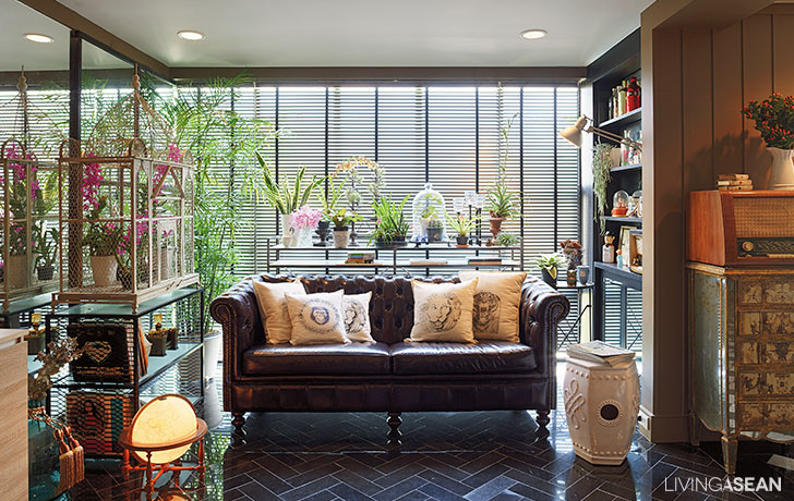
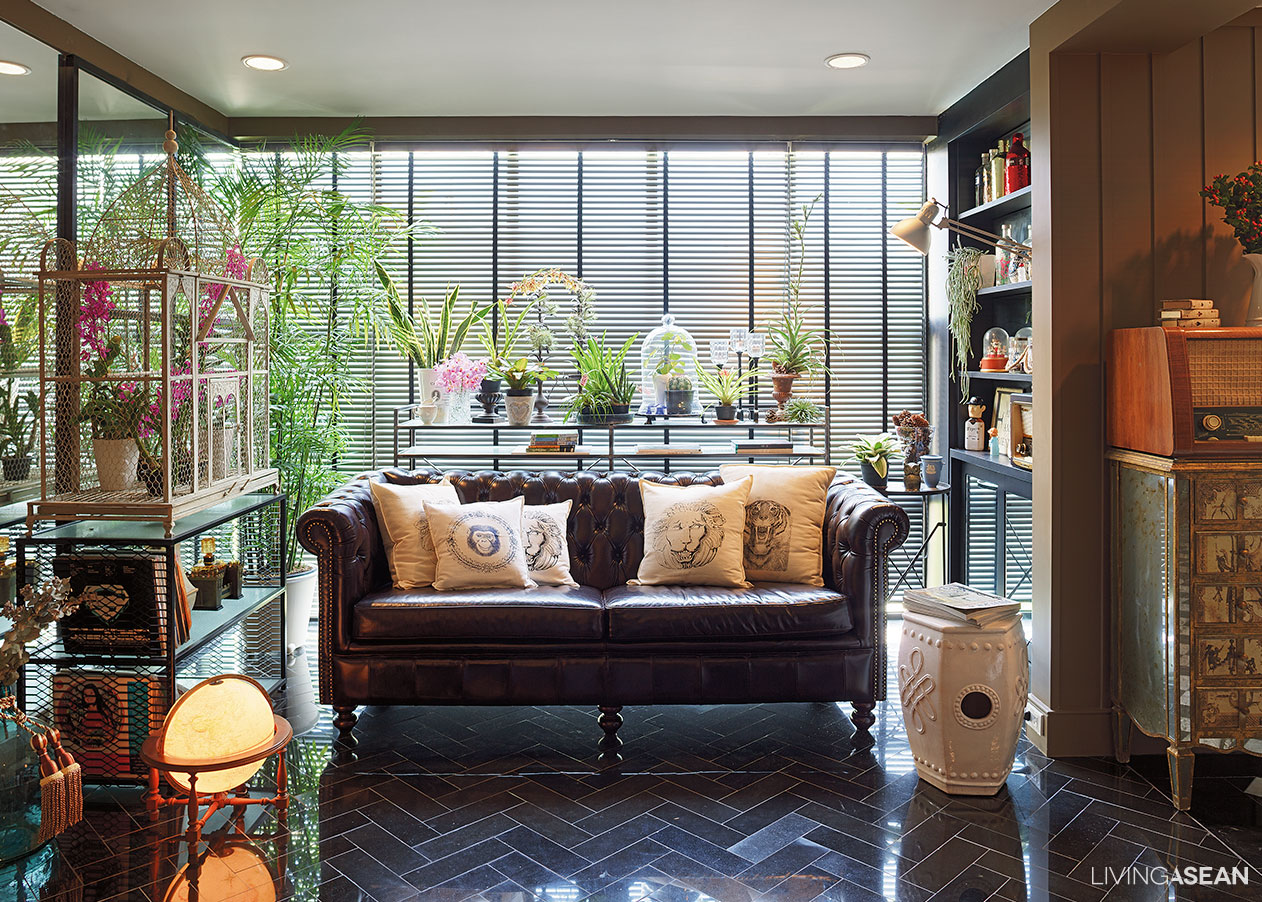
Mirrors are used on one side to make the interior seating space seem larger. A plush leather upholstered sofa in dark hues contrasts with an aerial white cutout ceramic stool in Oriental style. The floor is covered with alternating gray and black granite tiles in the herringbone pattern. A rich array of terrarium adds life to the ambiance.

Much of the structure of this classic and retro style house is kept intact, except some parts of the wall that are removed to make way for optimal space utilization. In the process, the main entryway is relocated for added convenience. As the owners, Worapong and Sukanya Suwatpim put it:

“We built this row house duplex ourselves. The design is based on slightly different dimensions compared to those standard-sized row buildings. Our rectangular-shaped plot happens to be much longer than it is wide. In remodeling the living spaces, the main entrance that used to be on the front is relocated to the long side. It is more convenient that way.”

classic and retro style
The second-floor living spaces feature open studio design with all amenities for comfortable living. Glass siding on the exterior walls lets natural light pour into space during daytime.

The ground floor offers parking spaces for classic cars that make parts of his collections. There are areas for hobbies and creative workspace surrounded by unadorned concrete finishes and hand-hewn, bare brick walls. Metal detailing is painted black, paired with cool retro-style furniture. The well-conceived combination adorns the interior spaces that obviously speak to retro-Industrial style.

The second floor features ample seating spaces, dining area, kitchen and a bedroom, which comes in cool classic style, and yet not too sweet.

Plans are afoot to turn the third-floor spaces into a gallery of many antique clocks that the homeowners have collected over many years.

classic and retro style
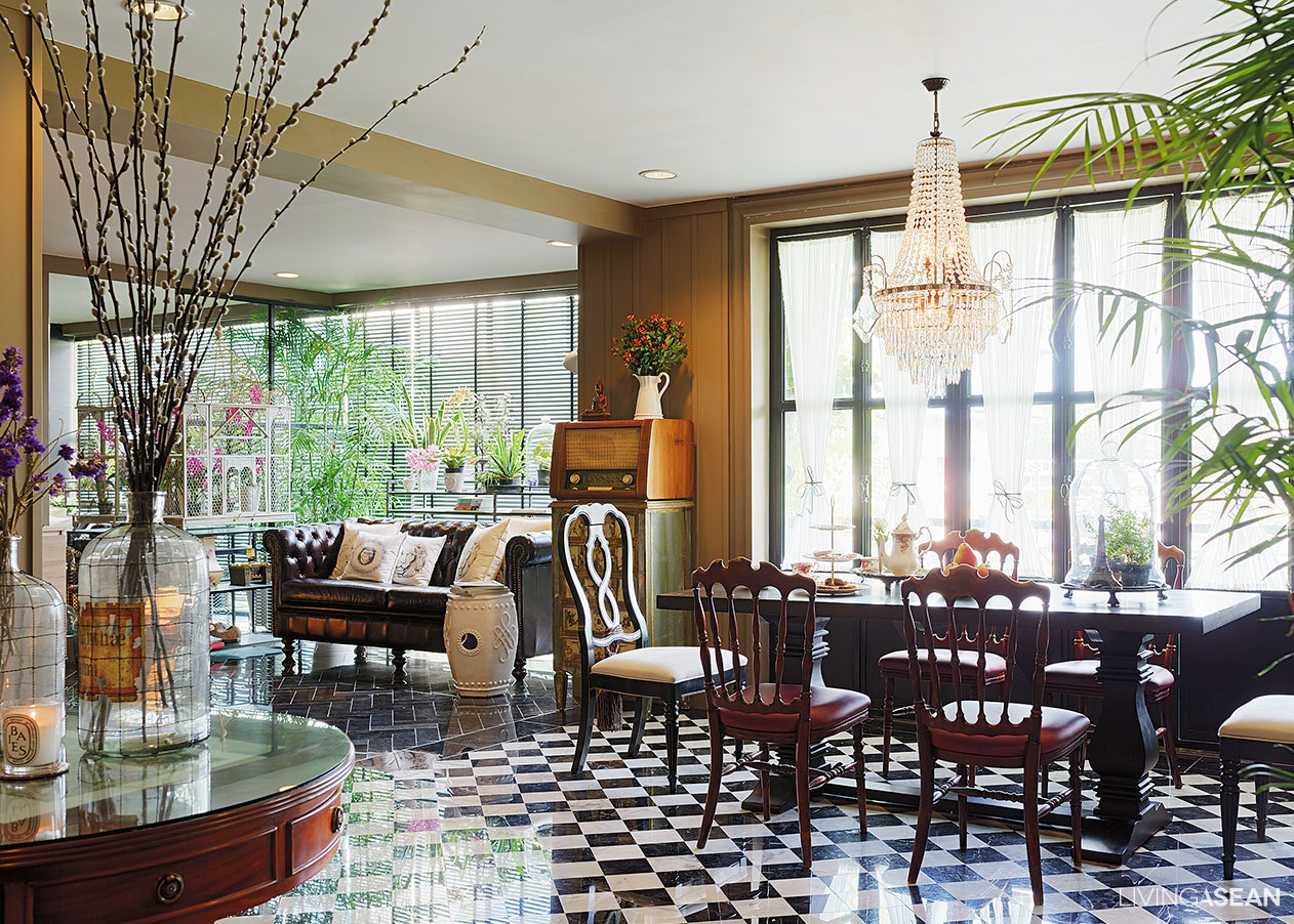
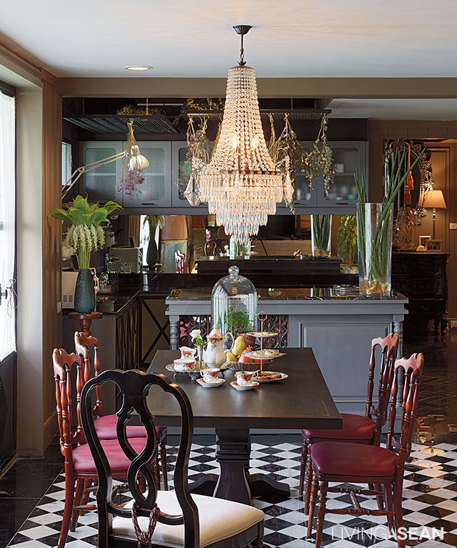
The dining space and adjoining pantry boast Classic appeal with a mix-and-match approach to interior decoration. Victorian wood chairs and a crystal chandelier contrast with the black and white tile floor in a diamond pattern, adding even more interest to the room.

The couple has preferences for different interior decorating in classic and retro styles. This is where the designer, Paisal Chongprasobtham, comes in to create a welcome contrast in the interior living spaces, ones that are aesthetically pleasing despite different natures, luminance and color.

Sharing his thoughts, Paisal said:

classic and retro style
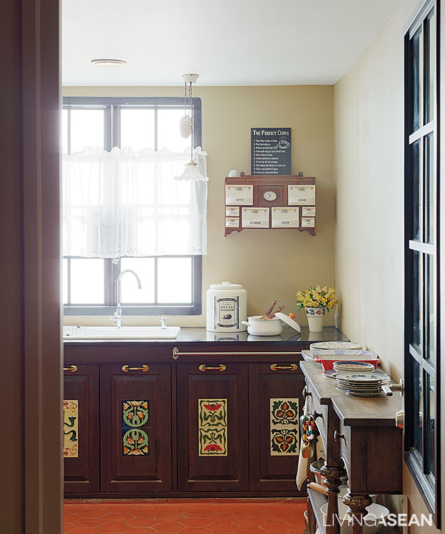
The real kitchen that gets used every day comes with beautiful tile in-laid kitchen cabinets. Antique tile patterns add a unique touch to the atmosphere.
classic and retro style
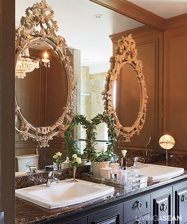
The bathroom is perfectly adequate for two users at the same time. Double vanities beneath the granite countertop provide plenty of storage for bathroom supplies. The entire backsplash is covered in glass-bedecked with a pair of exquisite, jewel-like French mirrors

“Worapong prefers the raw rustic look that is the way of men, while Sukanya wants her design simple, and yet appealing by its very nature. So I give the ground floor unsophisticated look by incorporating features that are attractive, and yet unrefined. The interior walls show steel and bare bricks after plaster covering has been removed.

“I try to make the two interior styles of the classic and retro style go hand in hand by using dark shades like black and gray as connecting agents. Meantime, wood furniture comes in natural tones with an emphasis on simplicity, and yet cool. The kitchen counter is adorned with classic woodcarving patterns, making the atmosphere highly agreeable. The bedroom is given to luxury, no doubt the most comfortable and relaxing in every sense of the word.”

classic and retro style
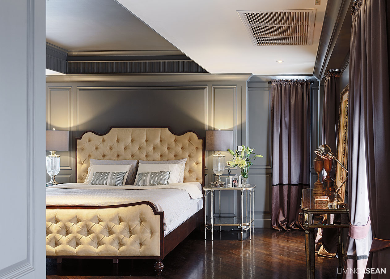
Leather-upholstered headboard and footboard in soft hues serve as statement pieces inside the master bedroom. Adorned with antique brass nail heads, they contrast with the bluish gray tone of decorative beading on the wall.

Being a much-traveled person, Sukanya is the one who chooses all of the decorating items. The job as a flight attendant has taken her to Europe often. And she particularly likes going to the flea market, out outdoor events selling secondhand goods.

classic and retro style
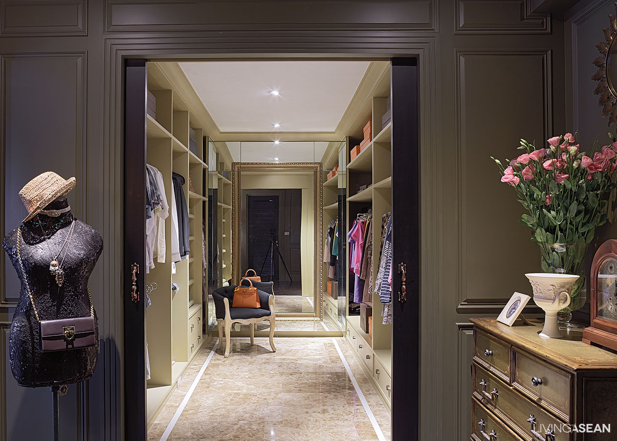
A walk-in closet offers overhead shelves for rarely used accessories. A full-size mirror at the far end adds depth to the well-styled personal space.

“Both of us want a home with the Western appeal, but not to the extent of Louis style. And it must not be too sweet. With this job, I get to see and stay in nice hotels. I collect décor items that I like and adapt them to best suit our home.

classic and retro style
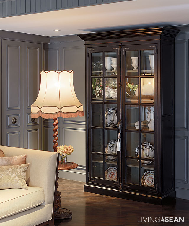
A glass front armory features private collections including Fornasetti graphic plates.
classic and retro style
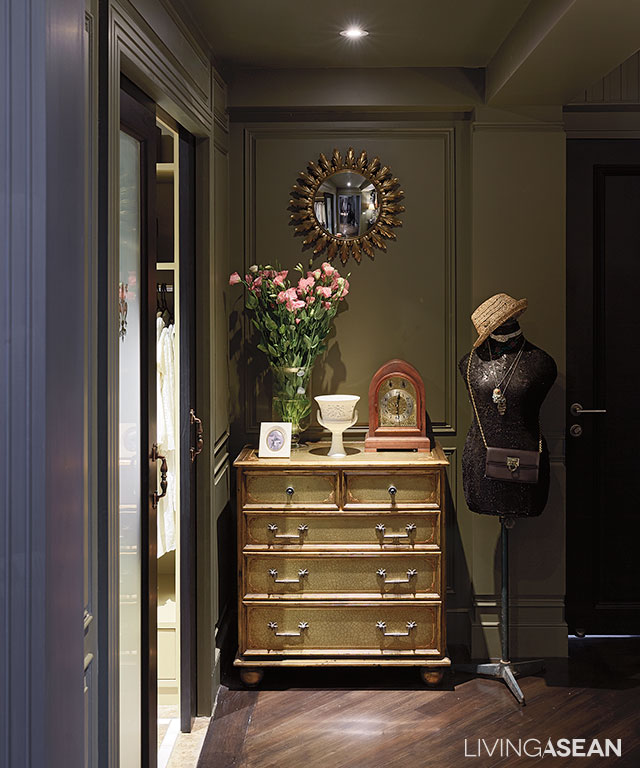
A handcrafted dresser and rustic mirror find their perfect spots in the space between the bathroom and walk-in closet.

Story: Ajchara Jeenkram

Photograph: Soopakorn Srisakul

Interior Designer: Paisal Chongprasobtham


X