Blog : Home Renovation

A Renovation Project Adds Sunny Personality to “Nobita House”

A Renovation Project Adds Sunny Personality to “Nobita House”

/ Bangkok, Thailand /

/ Story: Samutcha Viraporn / English version: Bob Pitakwong /

/ Photographs: Soopakorn Srisakul / Styling: Suanpuk Stylist /

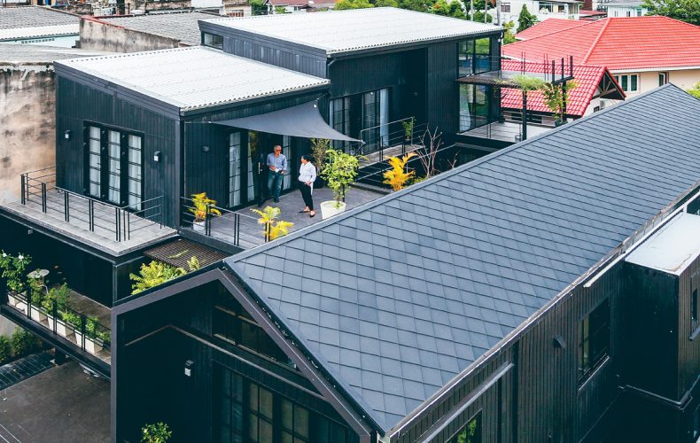
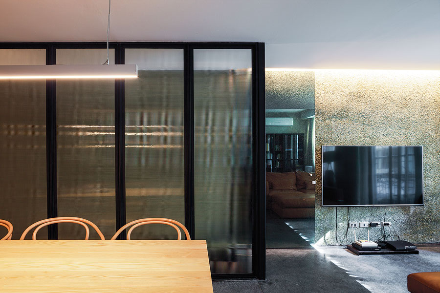
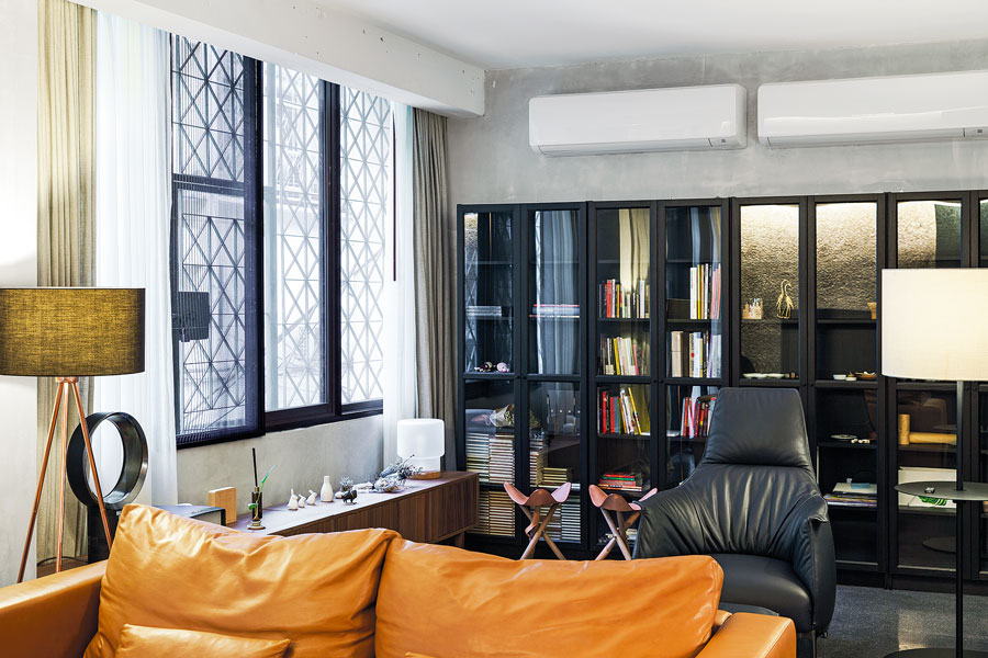
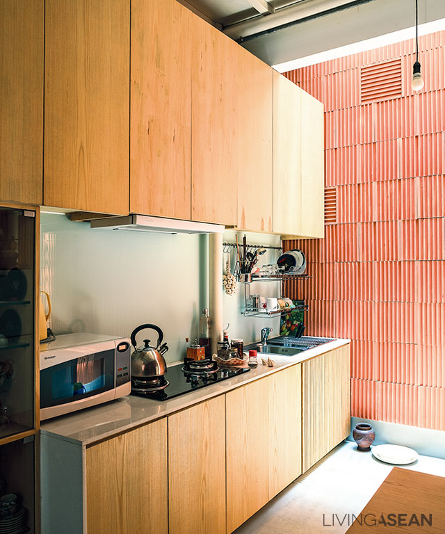
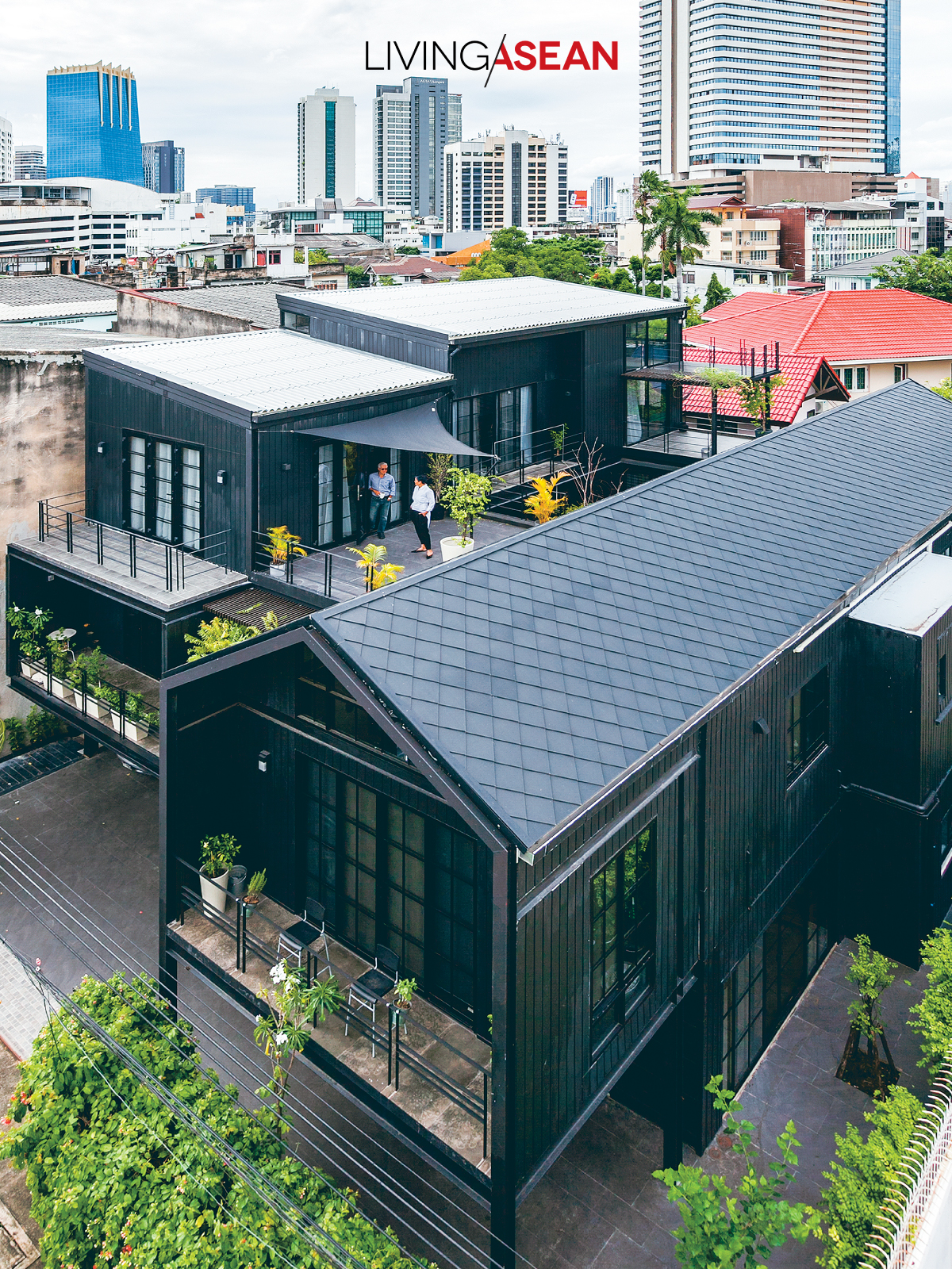
Cherishing fond memories of the good old days, Chatchawan and Punjama Lertbutsayanukul recently had their grandma and grandpa’s house restored to its former glory. They sought advice from Jun Sekino of Jun Sekino A+D, who turned it into a beautifully crafted home with added personality and character known as “Nobita House.”

Jun Sekino, sharing his renovation ideas, said: “After having talked with the homeowners, we were determined to keep the front-gable house plan very much intact. Several inspection visits in the ensuing days also gave me some ideas to do it right. It was like a journey back in time to preserve all its 1940’s splendor.”
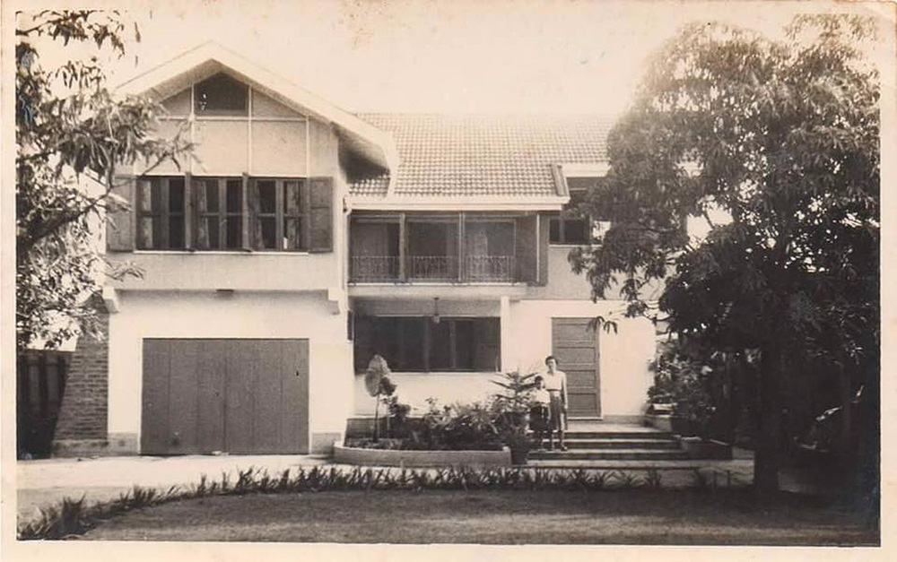
Here’s the story of a home renovation done right. Cherishing memories of the good old days, Chatchawan and Punjama Lertbutsayanukul recently had grandma and grandpa’s house restored to its former glory. They sought advice from Jun Sekino of Jun Sekino A+D, who turned it into a beautifully crafted home with added personality and character.Here’s the story of a home renovation done right. Cherishing memories of the good old days, Chatchawan and Punjama Lertbutsayanukul recently had grandma and grandpa’s house restored to its former glory. They sought advice from Jun Sekino of Jun Sekino A+D, who turned it into a beautifully crafted home with added personality and character.
Flashback: The picture of the old house before renovation. / Courtesy Jun Sekino A+D

The 80-year-old house soon transformed into a new home that’s more warm and inviting. It’s aptly named “Nobita House” after the much-loved, fictional boy character in the 1970’s cartoon series “Doraemon”. In the fewest possible words, it’s about rebuilding for a better future.

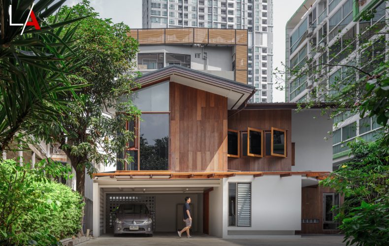
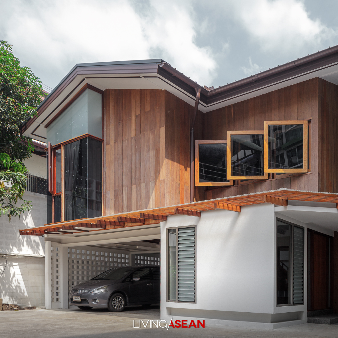
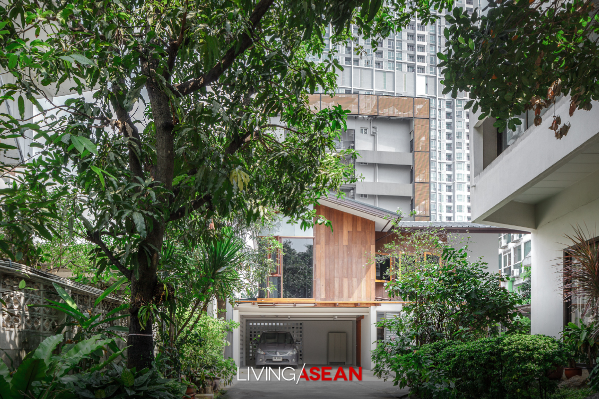
Restoring the old house to a good state of repair, the architect made sure the original framework was not damaged or impaired in any way. Thanks to collaboration with a team of structural engineers, the carport was reinforced to make it capable of accommodating two vehicles side by side.

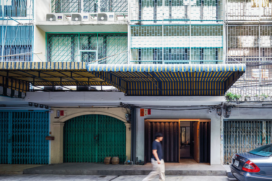
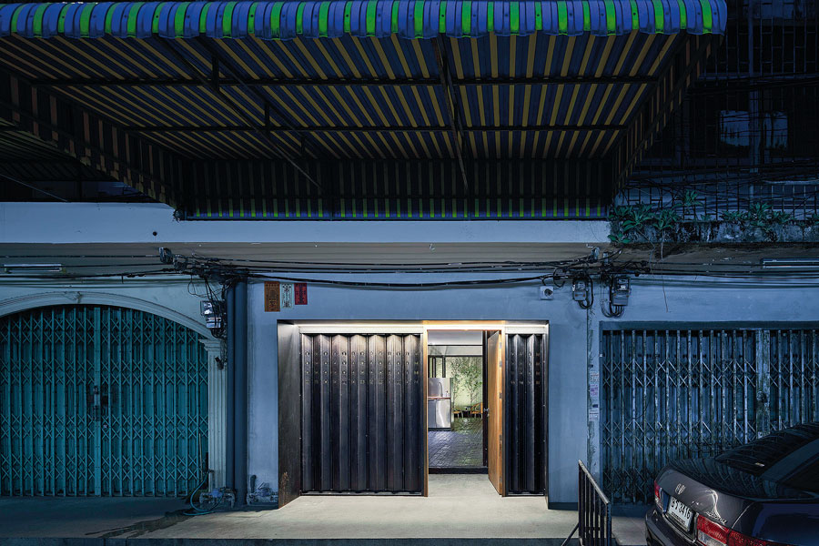
The front façade was built of reclaimed timber from the old house installed vertically with protective finishes over the top to protect it from the elements.

The gable roof was improved using new material and sloping at an angle that’s proper under the weather conditions prevailing in this region. To make room for a higher ceiling, the second floor was built 1.50 meters taller than the original plan.

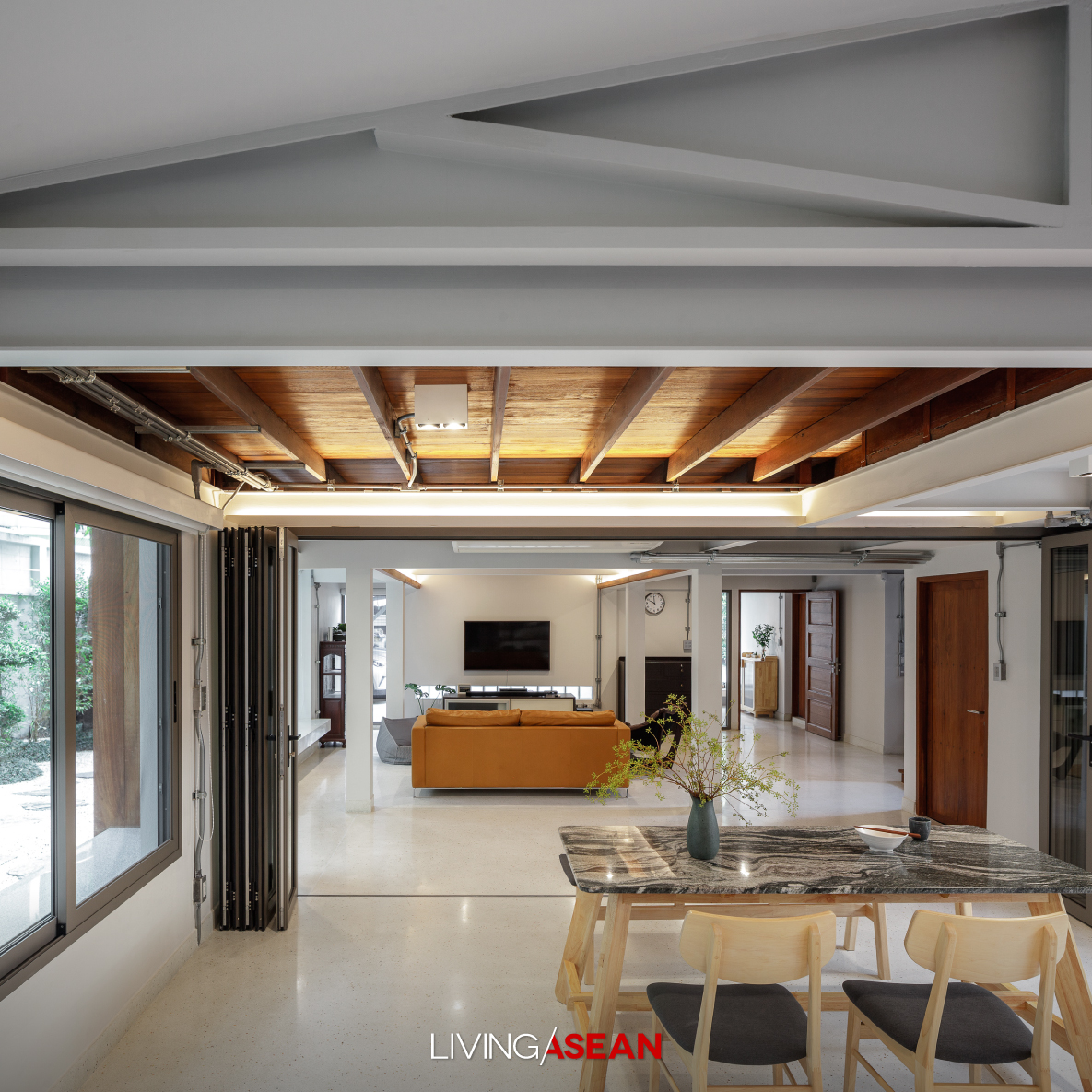
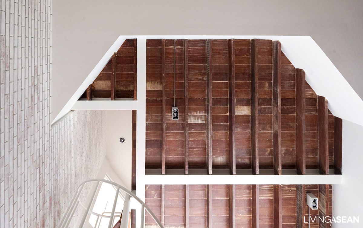
On the ground floor, suspended panels were removed to reveal awesome ceilings with exposed wood beams. At the same time, wood windows and extra units of construction were added on to increase the floor space from 100 to 300 square meters.

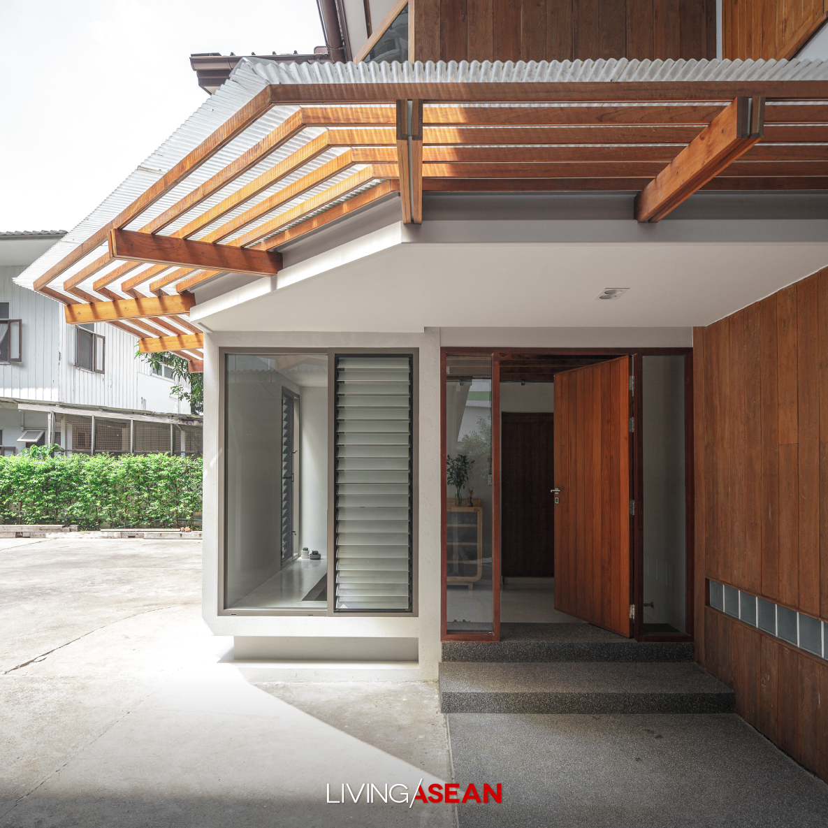
Where appropriate a system of micro-piles, aka root piles, was installed to carry an additional load. The covered shelter in front of the entrance was enlarged, while the side of the house reserved for shoe storage now connected conveniently to the carport.

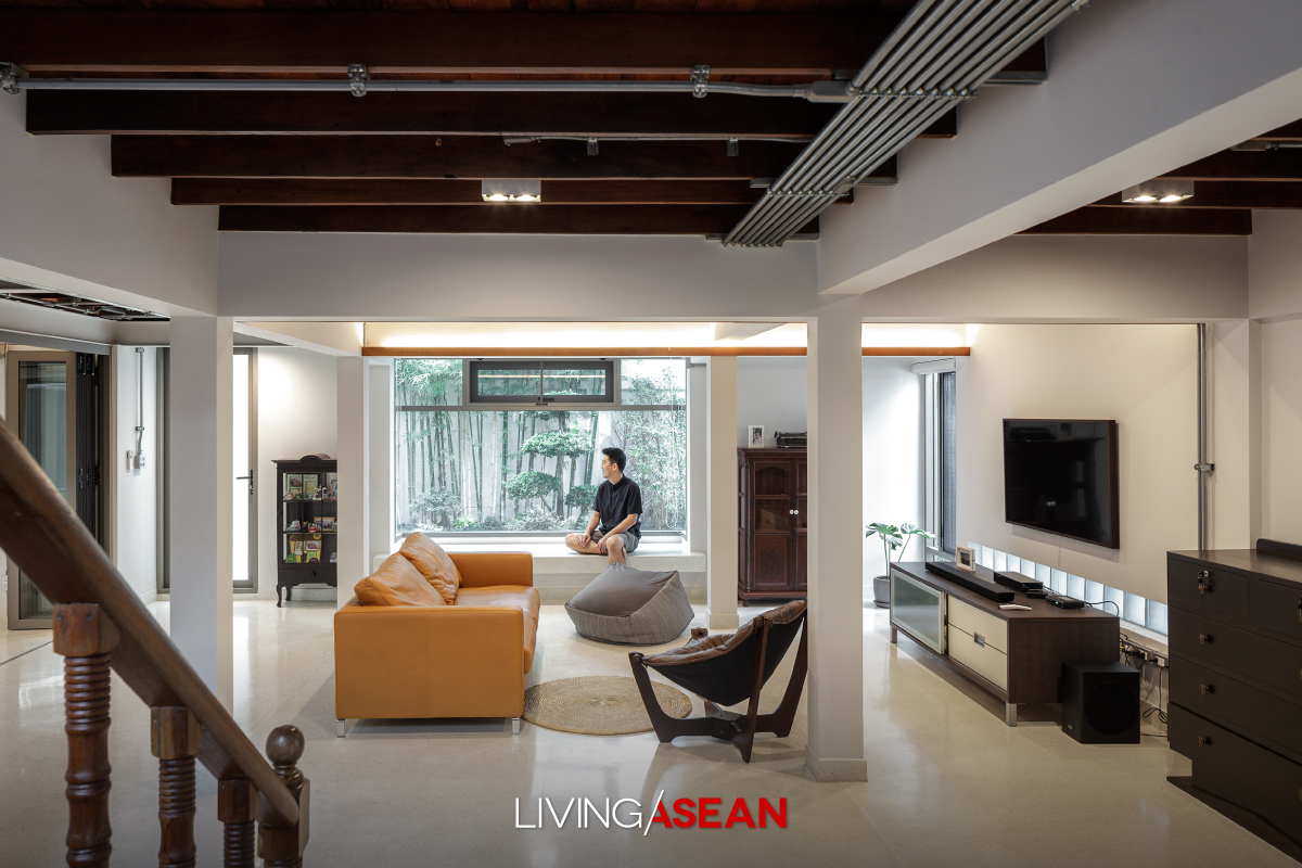
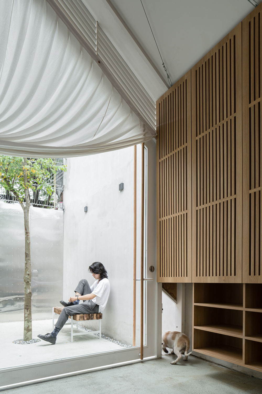
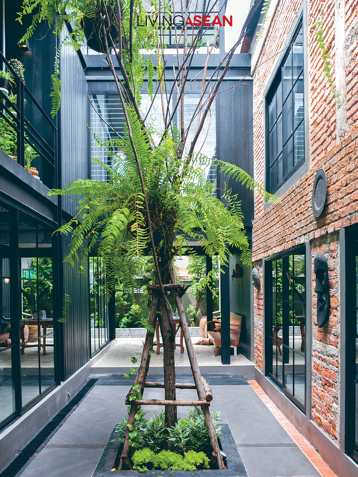
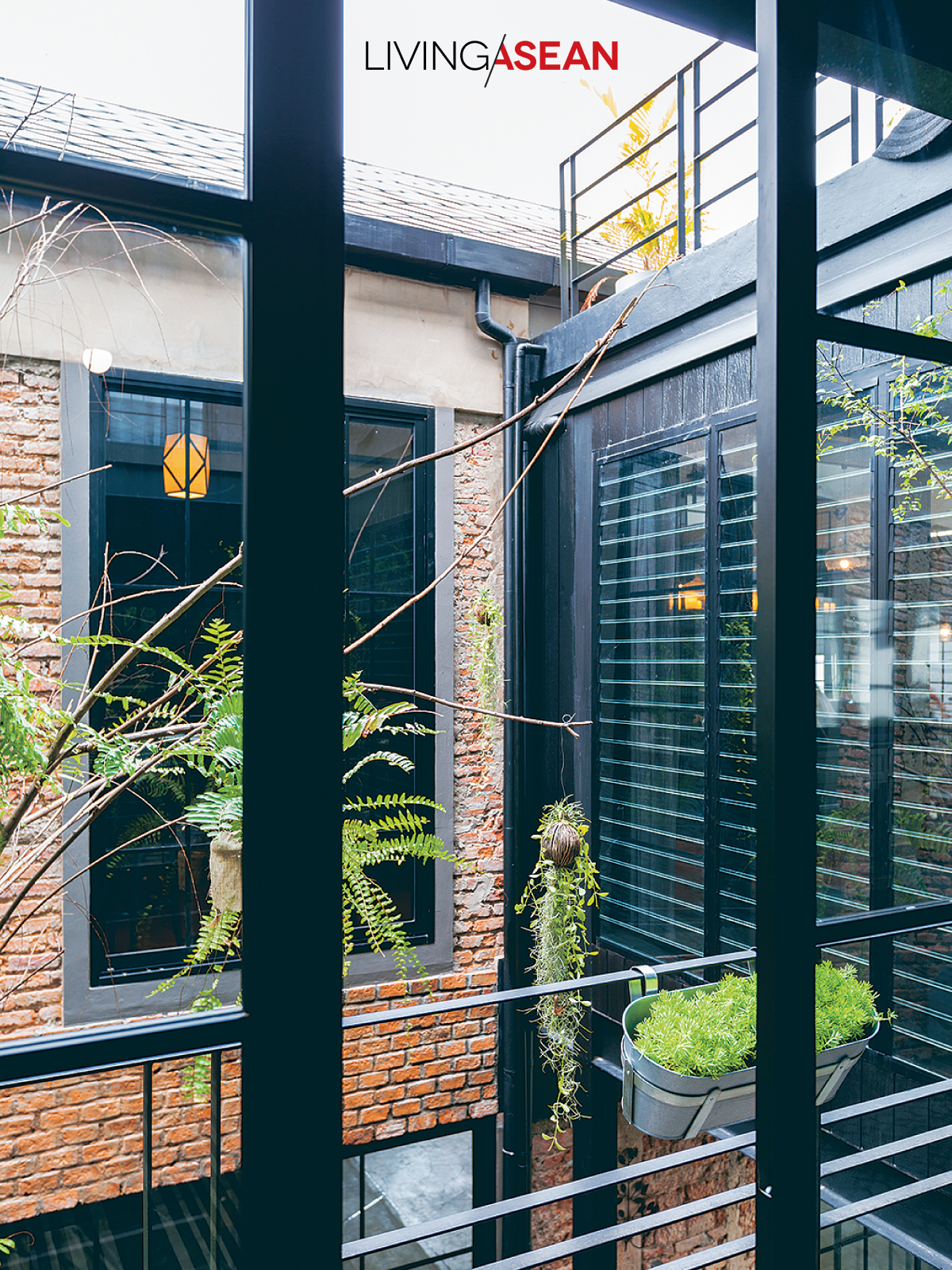
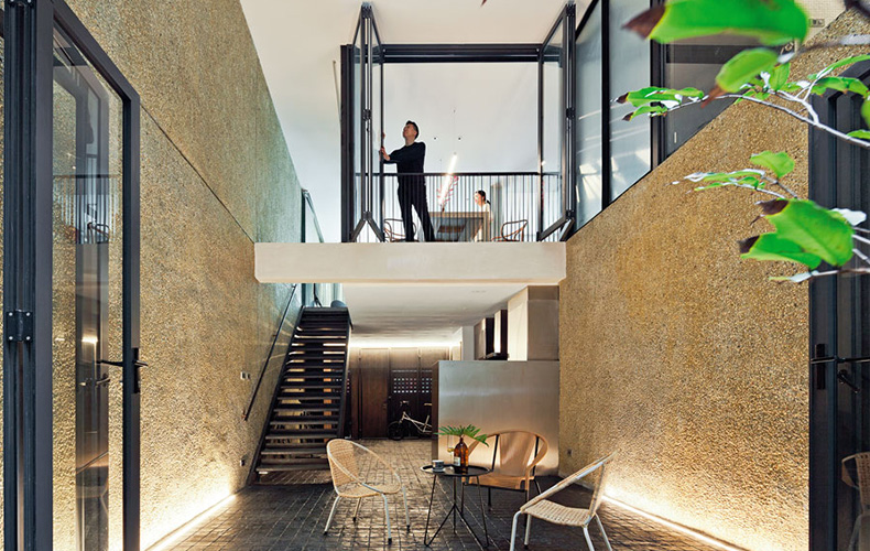
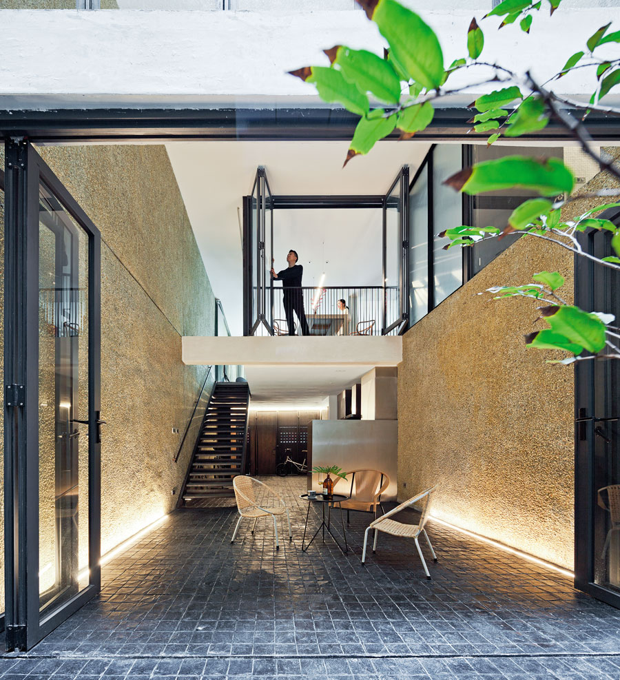
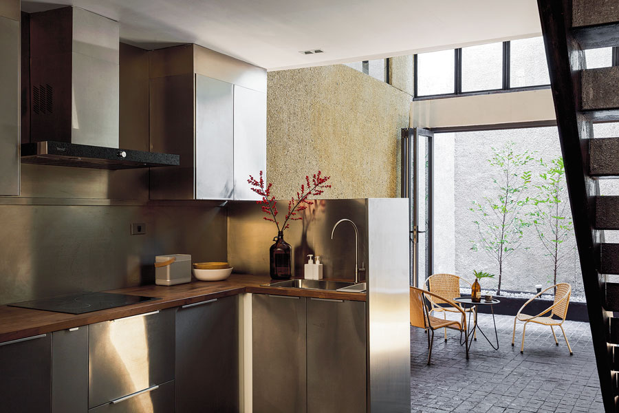
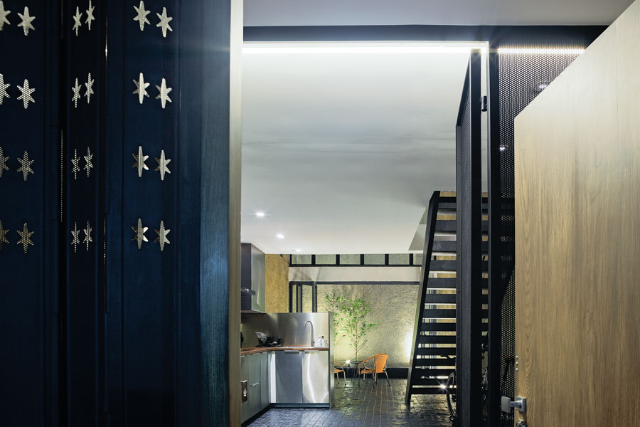
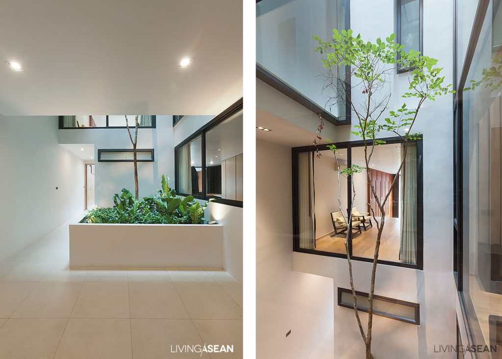
Meantime, fully open layouts translated into better natural light and ample space for social cohesiveness. On one side, the exterior glass wall looks out over a backyard garden. On another lies a corridor leading to a small courtyard at the rear.
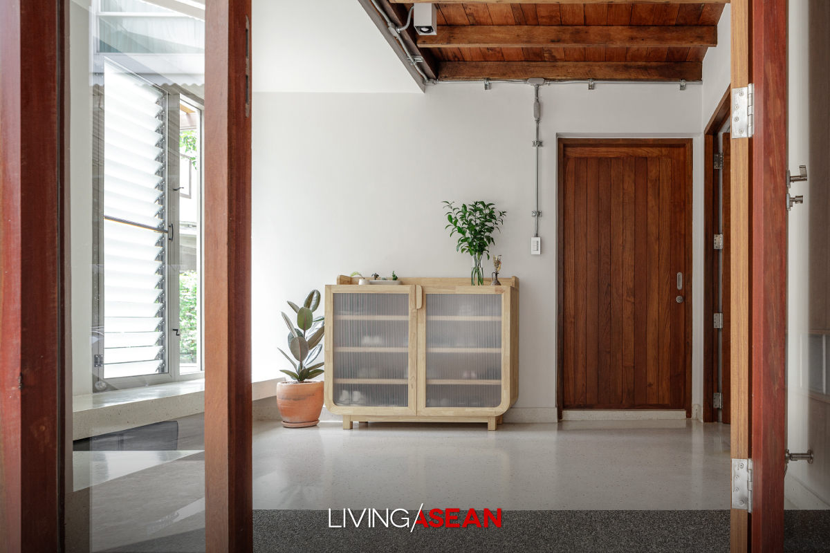
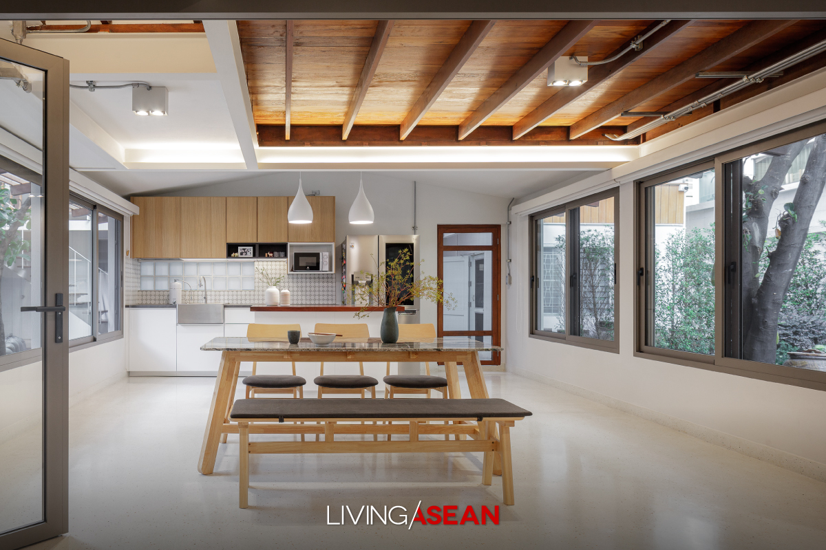
Here’s the story of a home renovation done right. Cherishing memories of the good old days, Chatchawan and Punjama Lertbutsayanukul recently had grandma and grandpa’s house restored to its former glory. They sought advice from Jun Sekino of Jun Sekino A+D, who turned it into a beautifully crafted home with added personality and character. Here’s the story of a home renovation done right. Cherishing memories of the good old days, Chatchawan and Punjama Lertbutsayanukul recently had grandma and grandpa’s house restored to its former glory. They sought advice from Jun Sekino of Jun Sekino A+D, who turned it into a beautifully crafted home with added personality and character. Here’s the story of a home renovation done right. Cherishing memories of the good old days, Chatchawan and Punjama Lertbutsayanukul recently had grandma and grandpa’s house restored to its former glory. They sought advice from Jun Sekino of Jun Sekino A+D, who turned it into a beautifully crafted home with added personality and character.

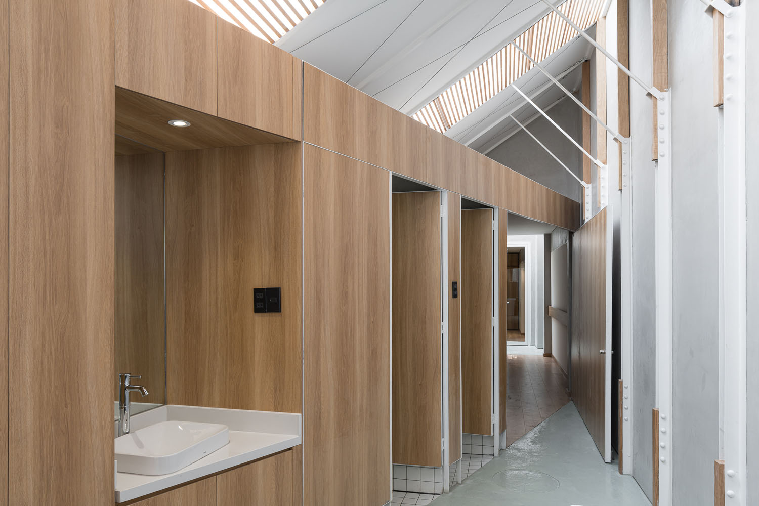
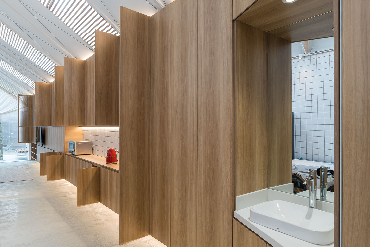
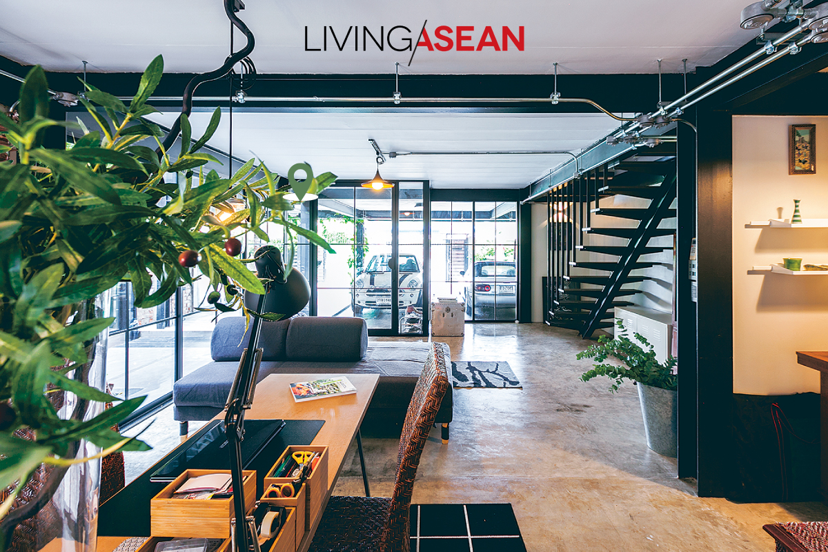
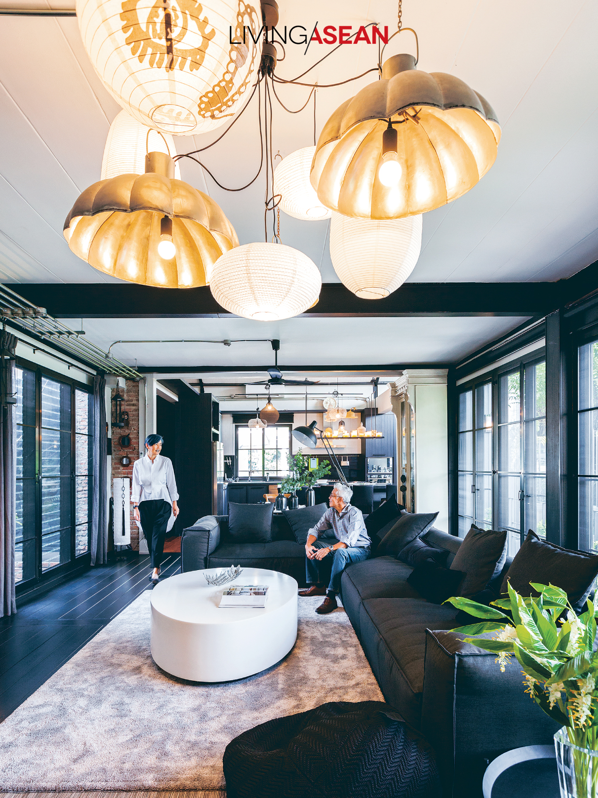
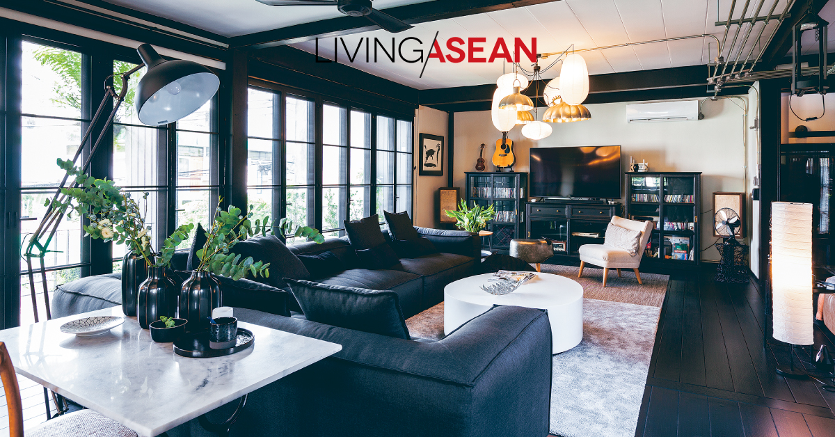
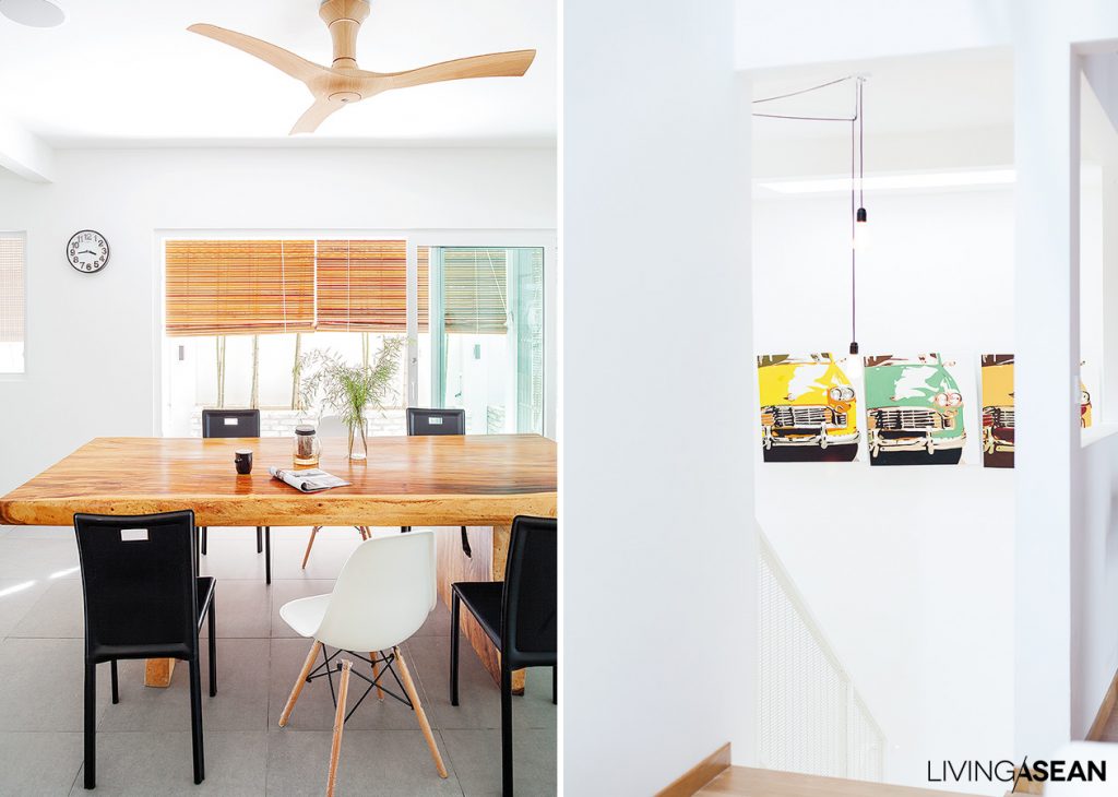
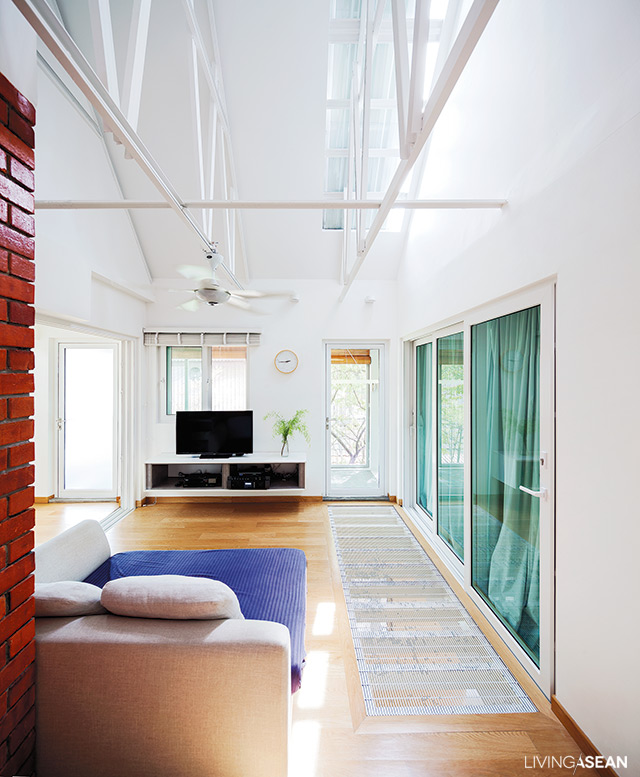
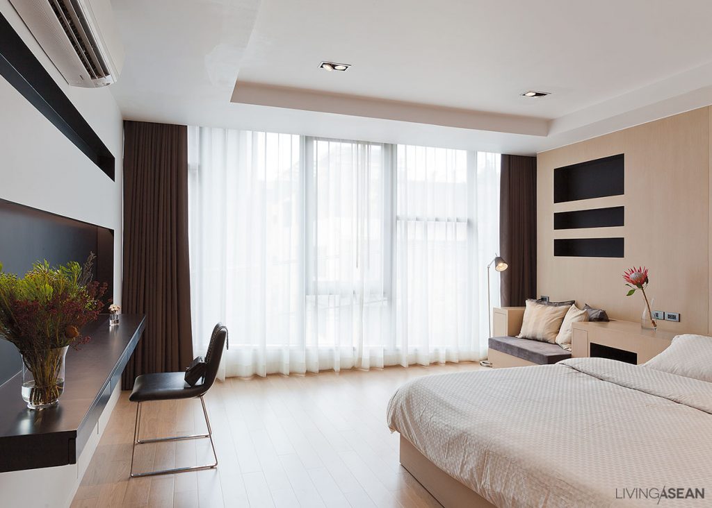
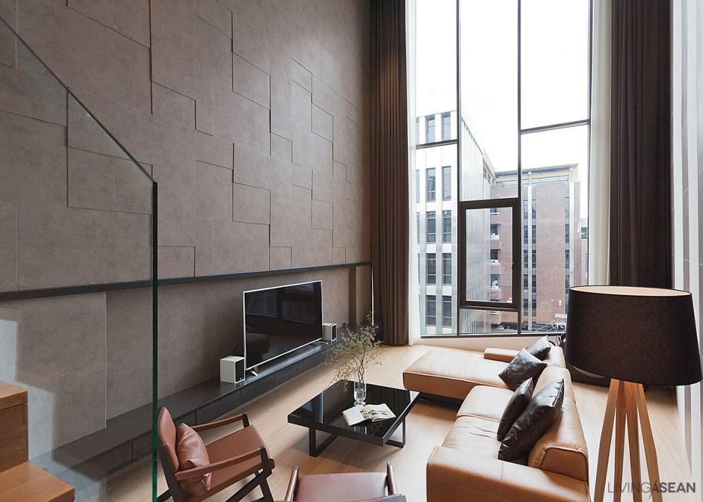
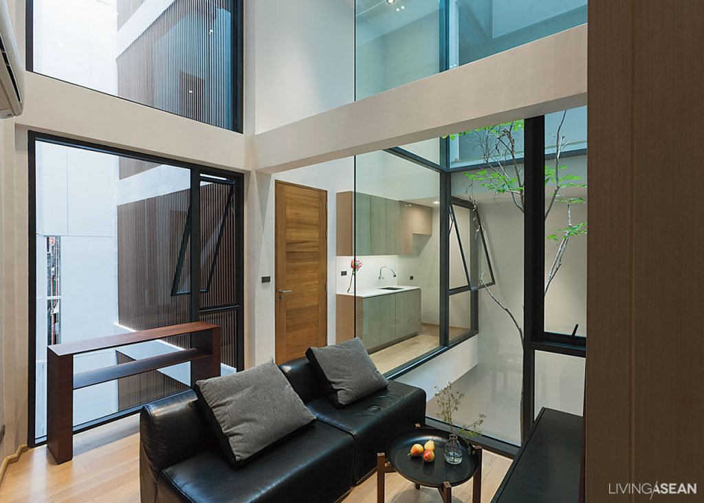
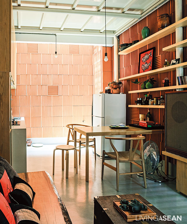
Thanks to open floor plans, the interior living spaces are easy on the eye. White walls with stained wood trim paired with natural light streaming in through the overhead transom create the illusion of a larger space.

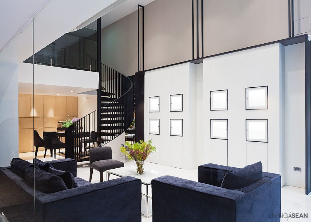
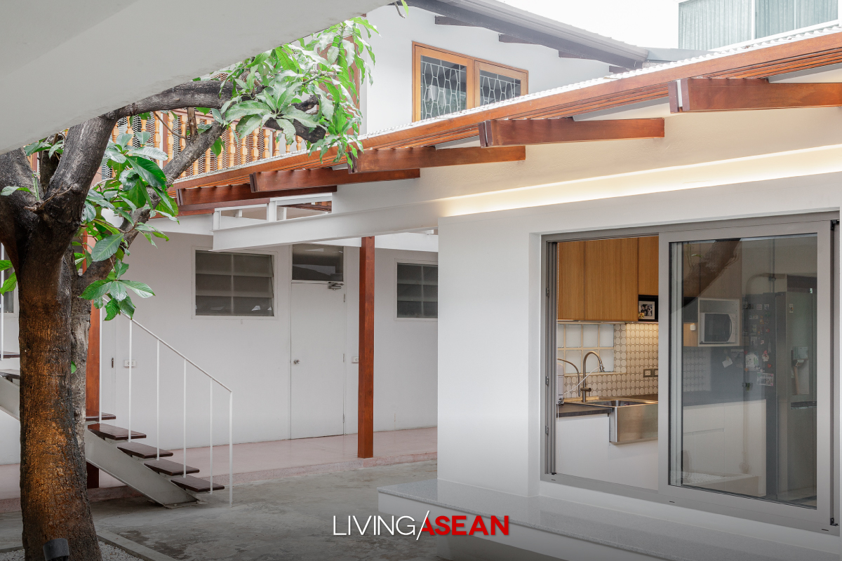
Nearby, white screens and Terrazzo floors combine to add vintage touches to home décor. At the same time, structural components made of steel, if any, are painted white to blend harmoniously with light backgrounds.
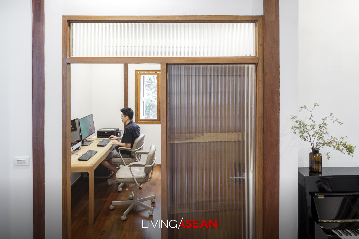
Here’s the story of a home renovation done right. Cherishing memories of the good old days, Chatchawan and Punjama Lertbutsayanukul recently had grandma and grandpa’s house restored to its former glory. They sought advice from Jun Sekino of Jun Sekino A+D, who turned it into a beautifully crafted home with added personality and character. Here’s the story of a home renovation done right. Cherishing memories of the good old days, Chatchawan and Punjama Lertbutsayanukul recently had grandma and grandpa’s house restored to its former glory. They sought advice from Jun Sekino of Jun Sekino A+D, who turned it into a beautifully crafted home with added personality and character.

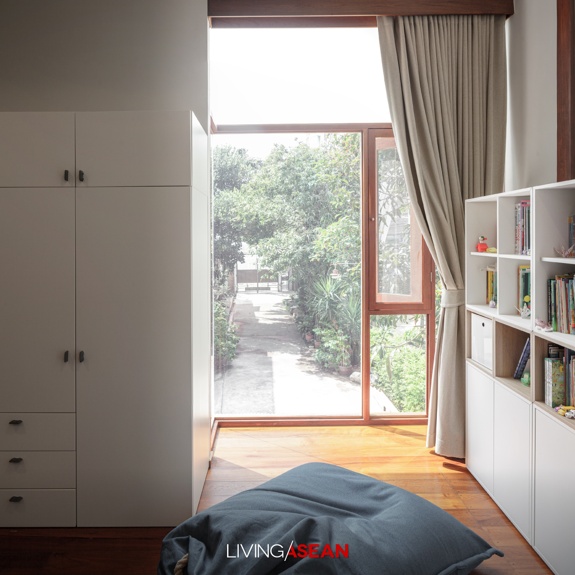
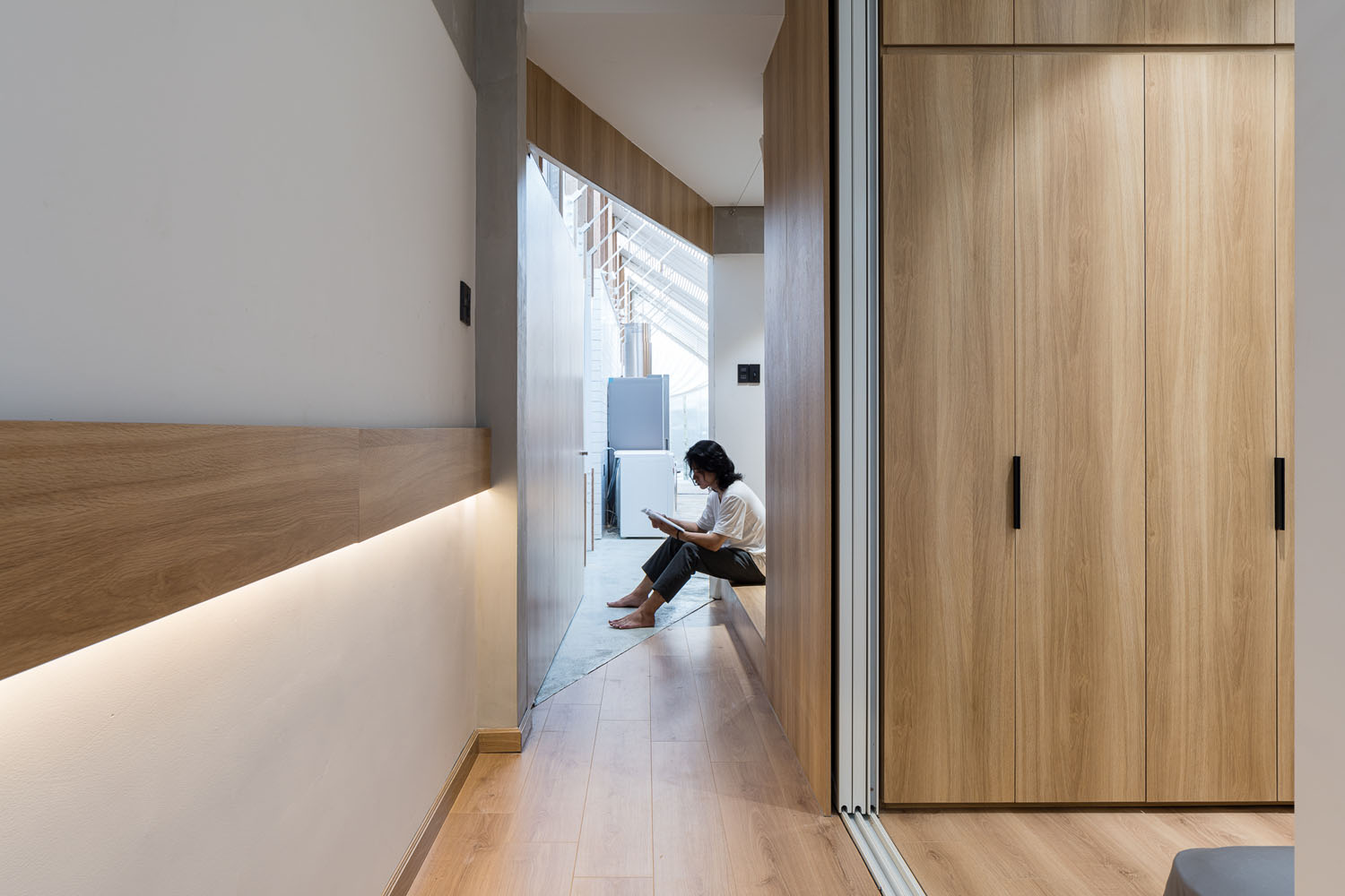
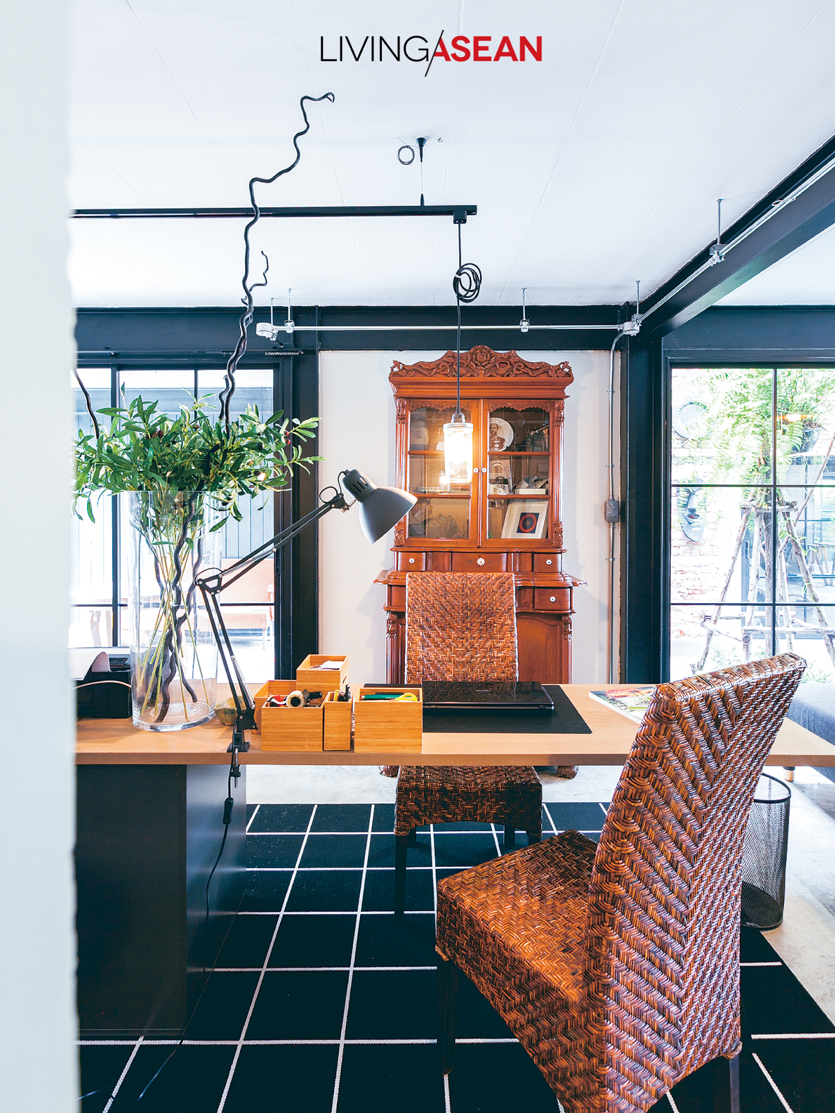
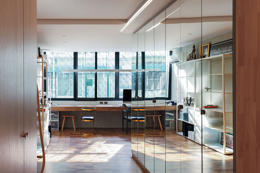
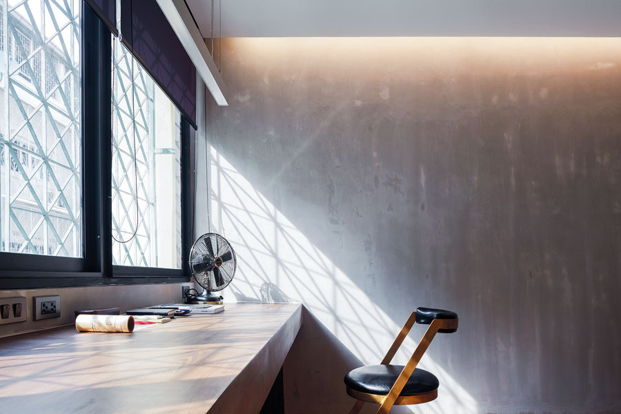
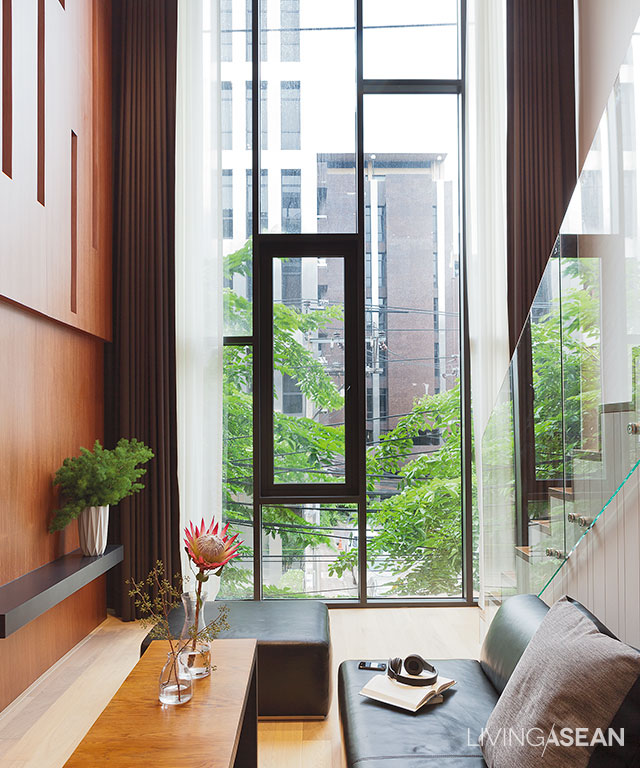
Climb a flight of stairs, and you come to the second floor containing workspace with wood windows that evoke pleasant memories of years past. Wall paneling is flush with adjoining post and beam construction.

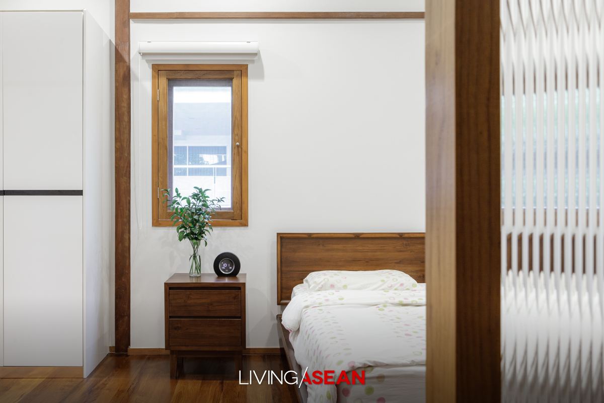
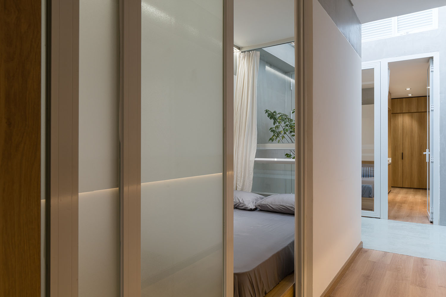
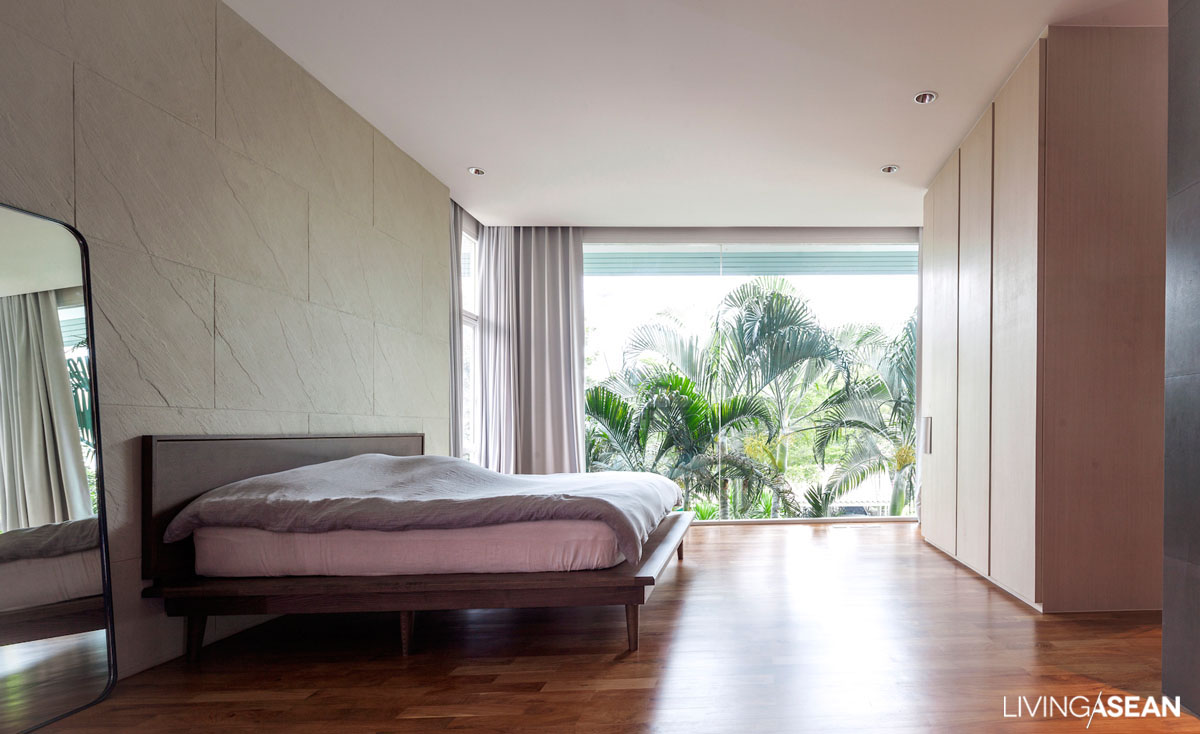
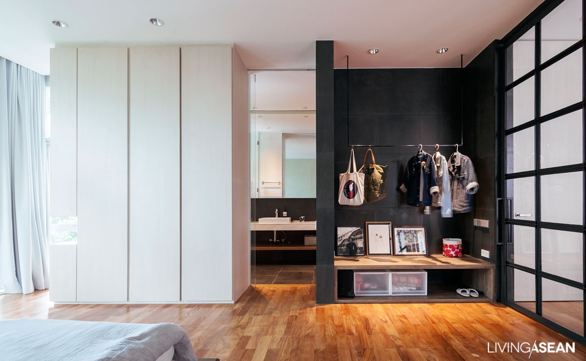
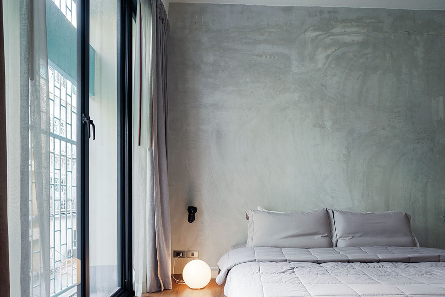
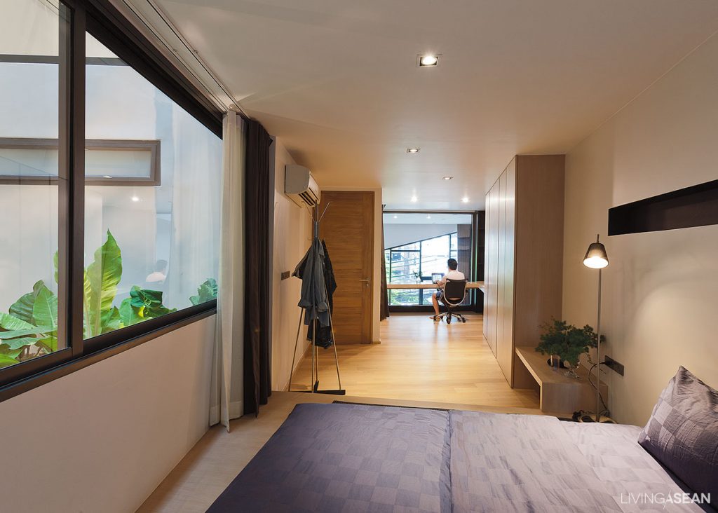
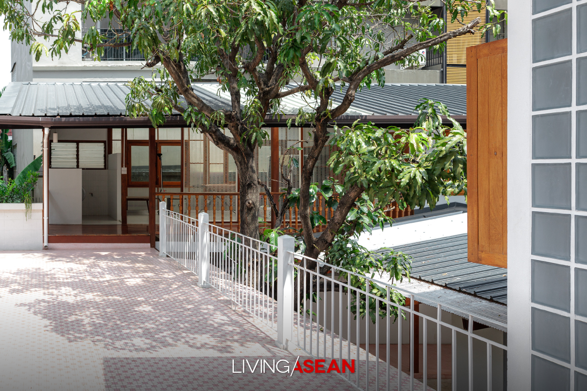
The door frame with overhead transom is glazed using patterned glass. Not far away lies the restful master bedroom that’s furnished in a simple style. The old living quarters for house workers accessible by a mosaic walkway remain intact. It’s separated from a nearby outdoor laundry room by steel railing along the edge.
Here’s the story of a home renovation done right. Cherishing memories of the good old days, Chatchawan and Punjama Lertbutsayanukul recently had grandma and grandpa’s house restored to its former glory. They sought advice from Jun Sekino of Jun Sekino A+D, who turned it into a beautifully crafted home with added personality and character.Here’s the story of a home renovation done right. Cherishing memories of the good old days, Chatchawan and Punjama Lertbutsayanukul recently had grandma and grandpa’s house restored to its former glory. They sought advice from Jun Sekino of Jun Sekino A+D, who turned it into a beautifully crafted home with added personality and character.Here’s the story of a home renovation done right. Cherishing memories of the good old days, Chatchawan and Punjama Lertbutsayanukul recently had grandma and grandpa’s house restored to its former glory. They sought advice from Jun Sekino of Jun Sekino A+D, who turned it into a beautifully crafted home with added personality and character.

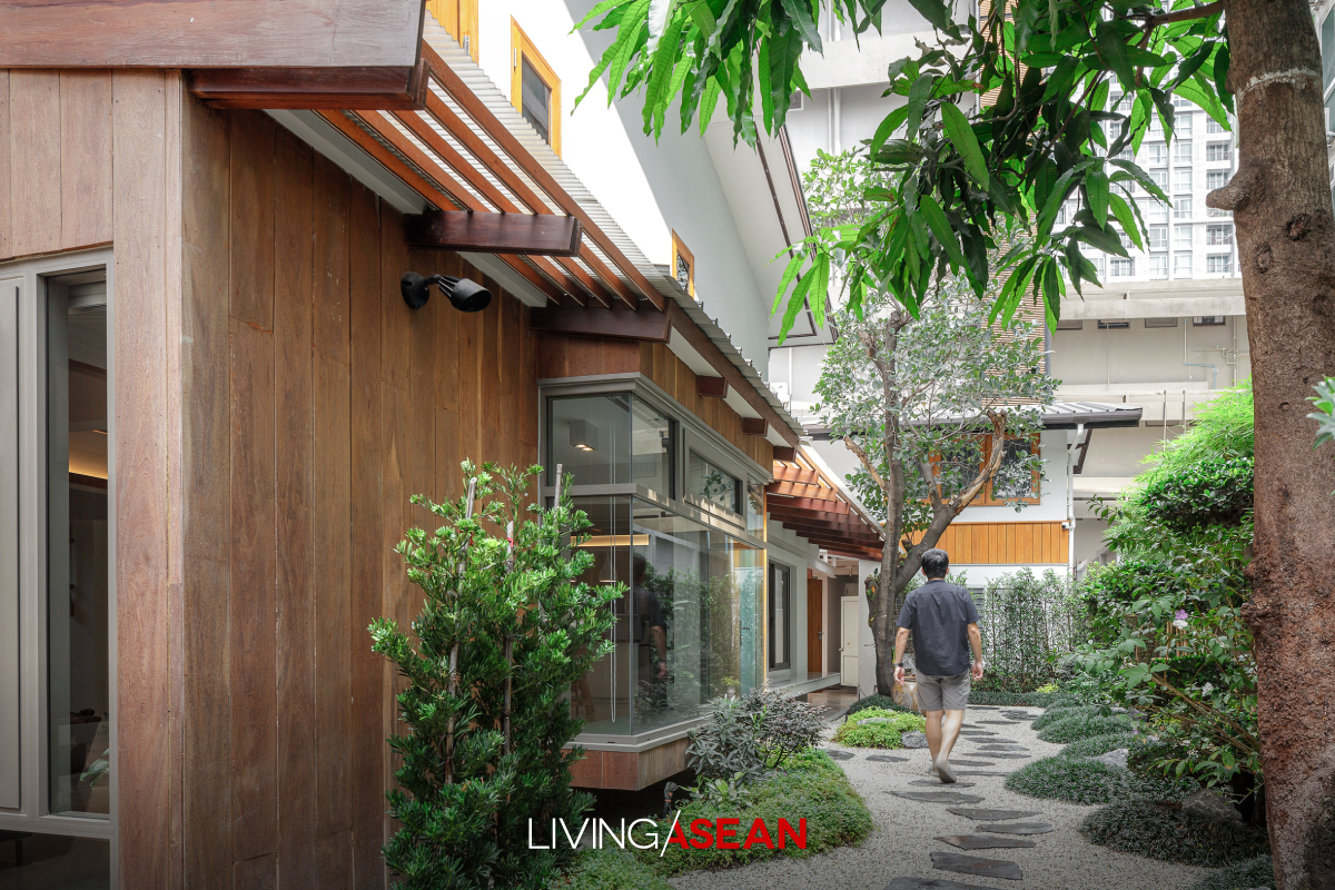
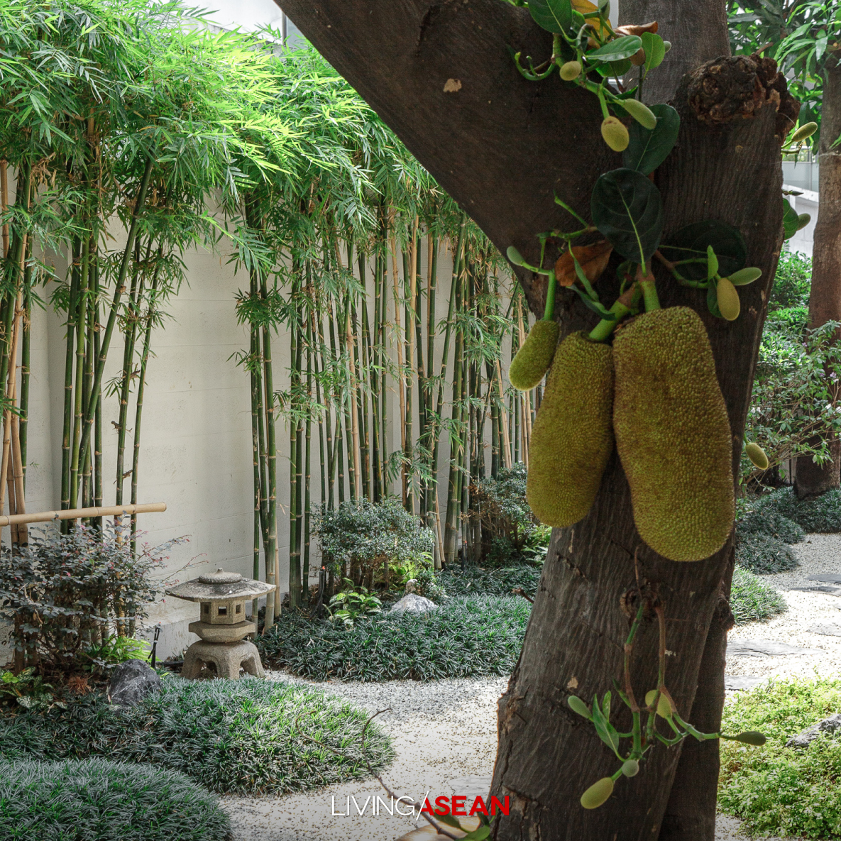
There is a challenge to overcome though. Tall buildings rise nearby, while the house ground level is lower than the street. To effectively drain rainwater from the yard, decorative landscaping gravel is used. This is where garden designer Premrudee Cheewakoseth comes into play and turns the ground into beautiful Japanese rock gardens.
Here’s the story of a home renovation done right. Cherishing memories of the good old days, Chatchawan and Punjama Lertbutsayanukul recently had grandma and grandpa’s house restored to its former glory. They sought advice from Jun Sekino of Jun Sekino A+D, who turned it into a beautifully crafted home with added personality and character.

Trees that are planted for shade include Jackfruit and bamboo, while Mini Mondo Grass or Sneak Beard provides a lush ground covering. To avoid looking too Japanese, small terraces with a garden path are put in. Overall, the house boasts certain appeal similar to that of the house of “Nobita”, the much-loved, fictional boy character in the famous cartoon series “Doraemon”.
Here’s the story of a home renovation done right. Cherishing memories of the good old days, Chatchawan and Punjama Lertbutsayanukul recently had grandma and grandpa’s house restored to its former glory. They sought advice from Jun Sekino of Jun Sekino A+D, who turned it into a beautifully crafted home with added personality and character.


Owner: Chatchawan and Punjama Lertbutsayanukul

Architect: Jun Sekino A+D

Landscape Designer: D.garden design by Premrudee Cheewakoseth


Visit the original Thai version…
รีโนเวตบ้านเก่า 80 ปี มาเป็น บ้านโนบิตะ แสนอบอุ่น


You may also like…
ACH HOUSE airy indonesian homeACH House: An Airy, Bright and Well Composed Indonesian Home
Turning a Cold 20-Year-Old House into a Bright and Airy Tropical Home

303 House: A Narrow Townhome Inspired by Aircraft Interior

303 House: A Narrow Townhome Inspired by Aircraft Interior

/ Ho Chi Minh City, Vietnam /

/ Story: Nawapat Dusdul / English version: Bob Pitakwong /

/ Photographs: Quang Tran /

An architectural practice called “Sawadeesign Studio” has applied innovative aircraft cabin ideas to give this narrow townhome a complete makeover. The small family home sits sandwiched between two low-rise buildings in the heart of Tan Binh, an urban district of Ho Chi Minh City. They named the project “303 House.”

Modern House / Modern Skinny House on a Narrow Lot in Ho Chi Minh City

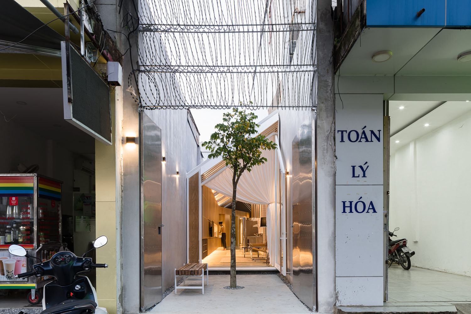
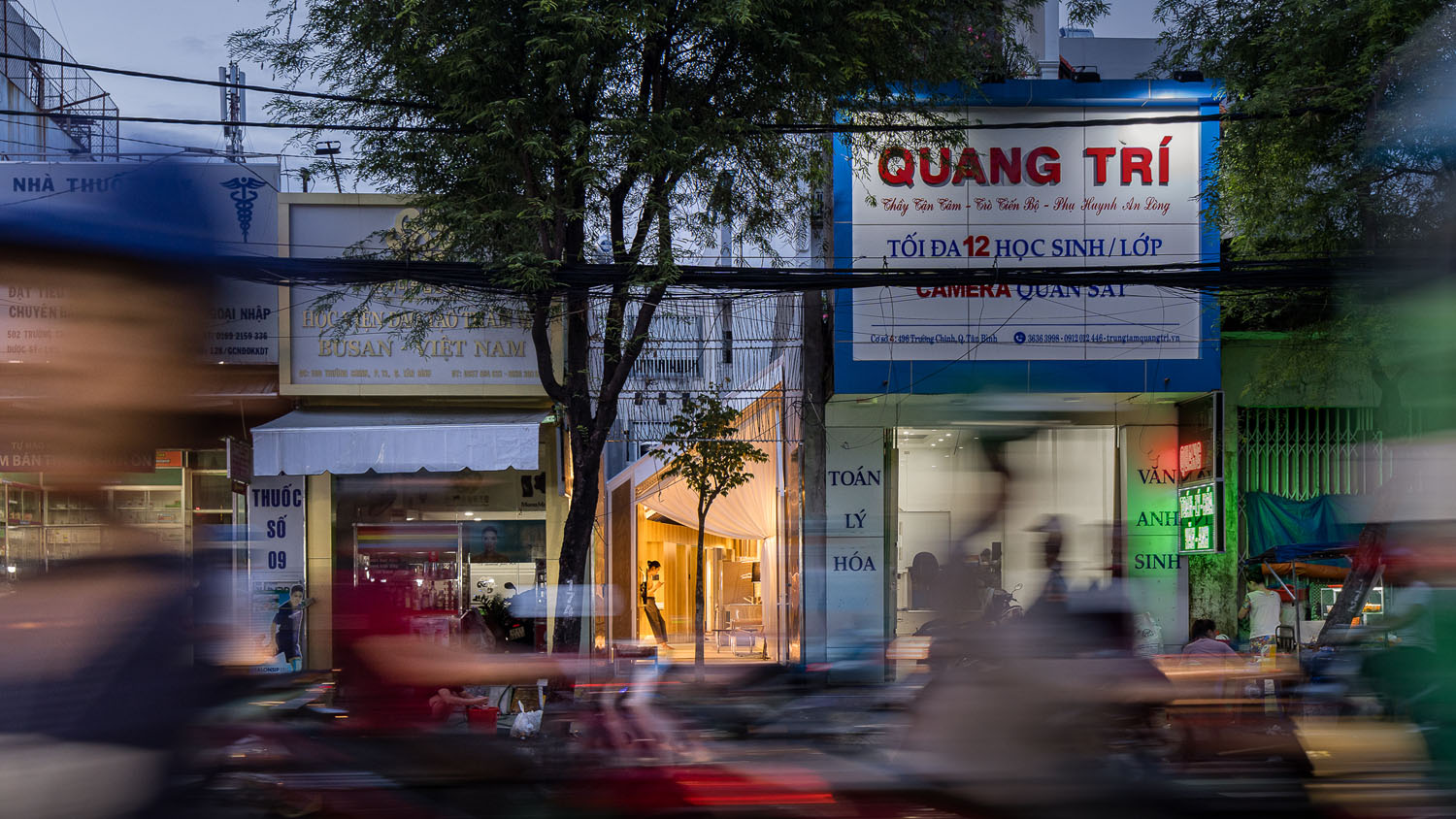
Narrow townhomes are a typical housing type omnipresent throughout central Ho Chi Minh City, formerly Saigon. By law, places of residence with a narrow frontage to the street (smaller than 3 meters across, to be exact) are not permitted to have more than one level.

In this particular case, the only way to build is arrange all the usable spaces and functions on the same horizontal plane. And the result is a renovation done right in every sense of the word.

Modern House / Modern Skinny House on a Narrow Lot in Ho Chi Minh City

From the outside looking in, the entire width of the house is only 2.9 meters. With the exterior walls installed, the inside space comes to just 2.7 meters wide.

Interestingly enough, well-thought-out design turns an awkward narrow plot into a single-story home that’s simple with all useable spaces giving off good vibes. The bright and airy home occupies less than 90 square meters of land.

Modern House / Modern Skinny House on a Narrow Lot in Ho Chi Minh City

The design duo, Doan Si Nguyen and Vo Thanh Phat, decided against the most commonly used construction technique. They proposed an alternative method aimed at reducing the amount of concrete used, an option that risked being rejected by investors from the get-go.

For indoor thermal comfort, the ceilings are made of Rockwool tole about 150 mm thick. The coated sheet metal is widely used in the storage industry and large warehouses for its excellent thermal insulation. Here, it’s used to make the interior living spaces comfortable day and night.

Modern House / Modern Skinny House on a Narrow Lot in Ho Chi Minh City

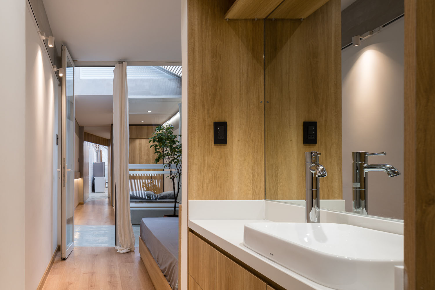
The contemporary home interior features mixed materials. Among them, grey plaster on the wall proves a perfect complement to gray epoxy paint on the floor. Together, they provide desirable elements for a calm, peaceful home. Everywhere, furniture made of plywood is a great way to add natural touches to the interior.

Modern House / Modern Skinny House on a Narrow Lot in Ho Chi Minh City

As the architects put it, the secret to creating a healthy indoor environment lies in putting multiple layers of functional spaces in neat order to shield the home from the busy street outside. This is especially true in HCMC, where many homes are prone to suffer from the negative effects of outside noise and unrestricted growth of housing areas and commercial development.

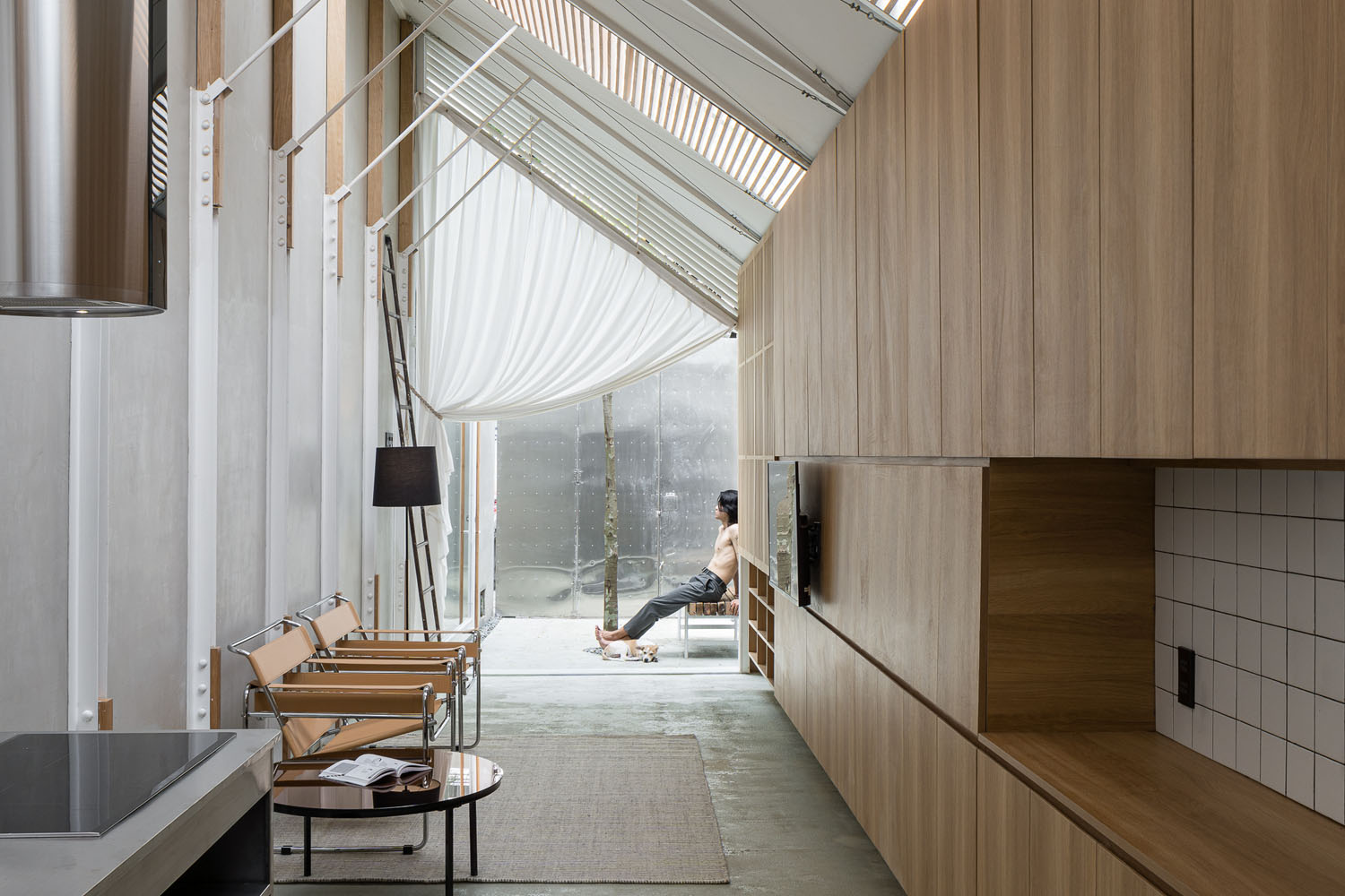
Fascinatingly, aircraft cabin ideas came in handy for the townhome built on an extremely long and narrow plot of land. It’s reminiscent to walking along an aisle between rows of seats on an aircraft.

Modern House / Modern Skinny House on a Narrow Lot in Ho Chi Minh City Modern House / Modern Skinny House on a Narrow Lot in Ho Chi Minh City

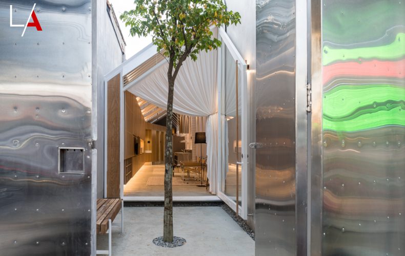
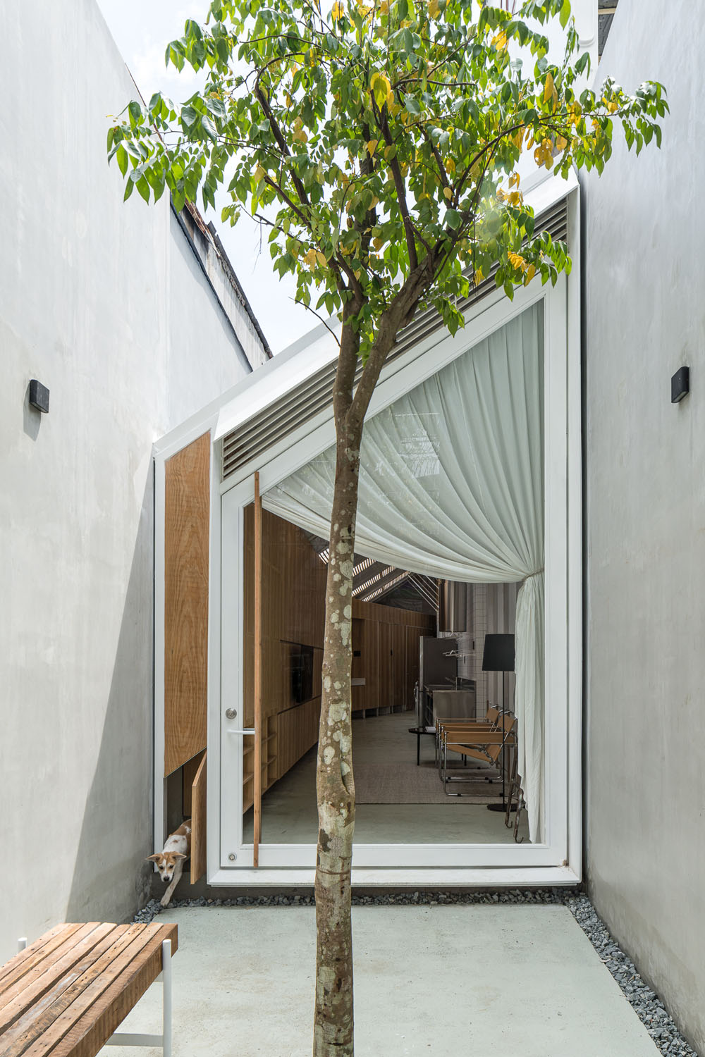
There’s a paved outdoor area in front of the house entrance that provides a place to socialize. Step inside, and you come into a corridor connecting to a living area, kitchen, and laundry room. Wall-mounted storage cabinets line one side of the aisle, with beautifully organized functional spaces on the other.

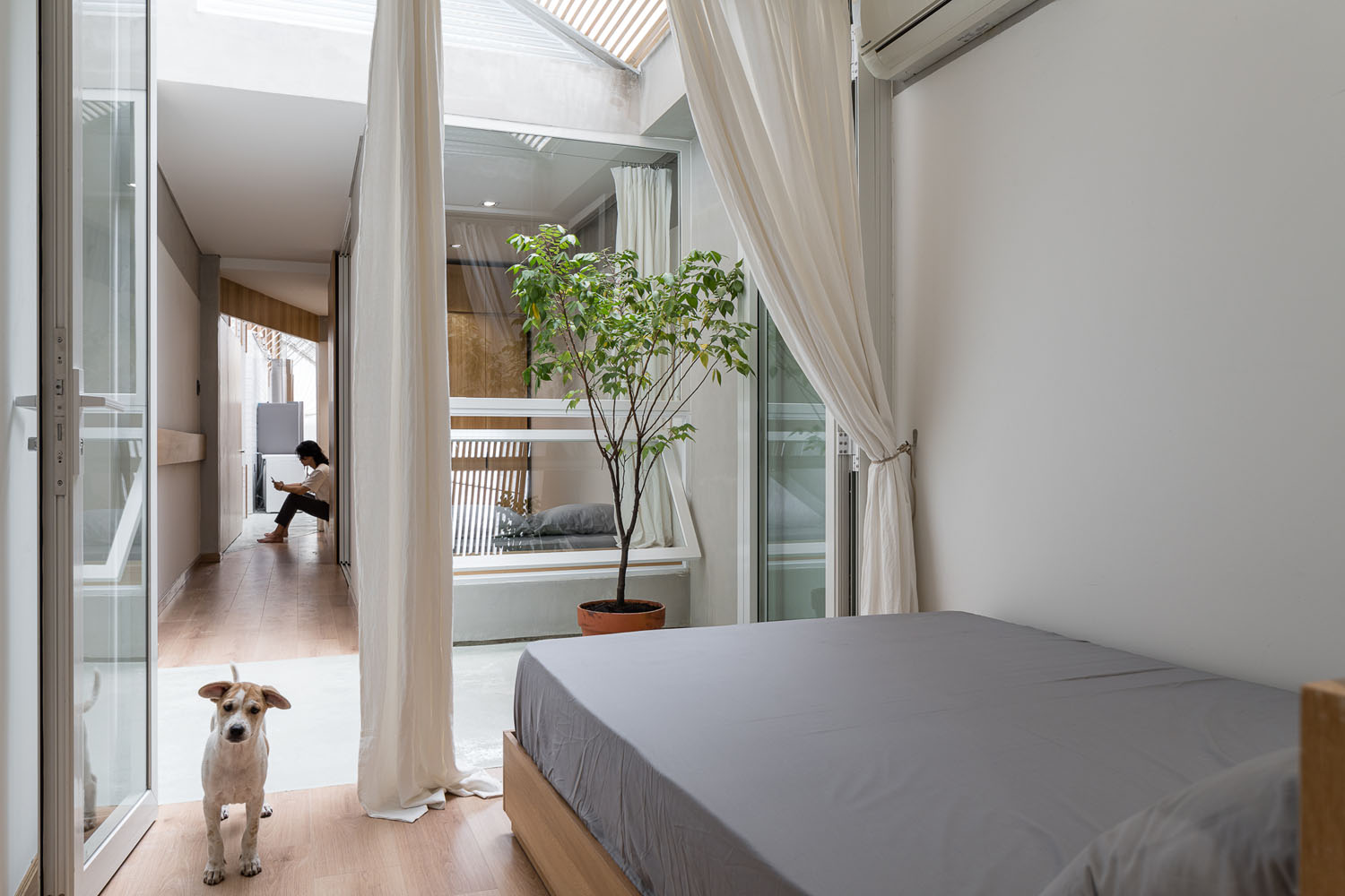
There are two bedrooms with a bathroom attached tucked away in a quiet place half way down, plus a third bedroom at the rear of the house accessible by a small corridor. Where appropriate, clear roofing materials provide light for houseplants, while openings in the rooftop drive air circulation keeping the interior cool and comfortable without air conditioning.

Modern House / Modern Skinny House on a Narrow Lot in Ho Chi Minh City Modern House / Modern Skinny House on a Narrow Lot in Ho Chi Minh CityModern House / Modern Skinny House on a Narrow Lot in Ho Chi Minh City

The house plan is not only tailored to the specific needs of a family of three, but it’s also a well-thought-out place of abode amid the hustle and bustle of the city.

As is often the case with most urban areas, for homeowners there’s a tendency to rent out the space in front of their houses to small retailers and businesses. But the family living at 303 House doesn’t need that kind of income. They prefer to keep the door closed and enjoy privacy in the comfort of their home. Albeit small, it’s an oasis of calm — a home sweet home no doubt.

Modern House / Modern Skinny House on a Narrow Lot in Ho Chi Minh City Modern House / Modern Skinny House on a Narrow Lot in Ho Chi Minh City


Architect: Sawadeesign Studio (www.sawadeesign.net)

Lead Architects: Doan Si Nguyen and Vo Thanh Phat


You may also like…

Mash-up: Industrial Design and Green Space of Walllasia

3 x 9 House: A Compact Renovated Row House in HCMC

A Beautifully Renovated 60-year-old Mid-City House

A Beautifully Renovated 60-year-old Mid-City House

/ Bangkok,  Thailand

/ Story: Samutcha Viraporn / English version: Peter Montalbano /

/ Photographs: Rithirong Chanthongsuk /

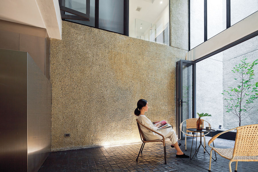
A beautifully renovated 60-year-old mid-city house, with a startling black beauty: this contemporary mix of old and new flows together as a single unit.

Interior decorator Pauline and nationally known architect Somrit Soonthornrungsi have spent their lives in this mid-city house. Once, it had a flooding problem downstairs, which plus termites and general deterioration, meant it was continually under repair.

At first, they thought to build a completely new house, but out of nostalgia and time constraints decided to do a major renovation instead.

mid-city house

“Our daughter grew up here and was upset that we were going to demolish it, so I thought, ‘Why not combine old and new?’ The result was a balanced, harmonious creation with a courtyard for breezes to pass through,” said Somrit.   

mid-city house

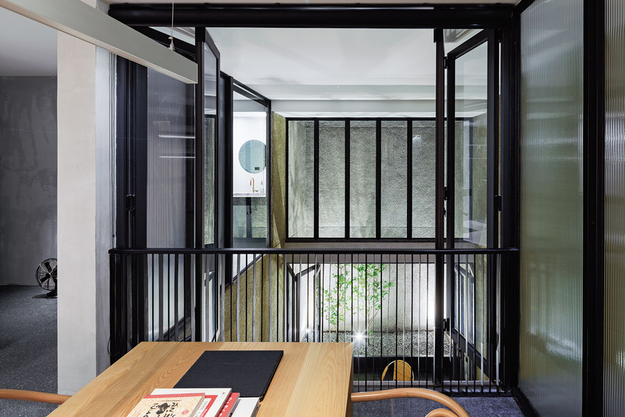
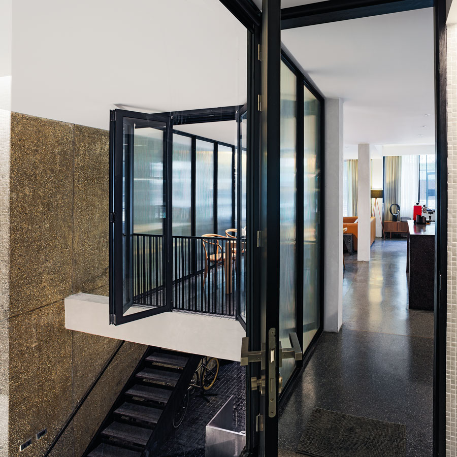
As we look in from the front door, the original house is on the right, across an open courtyard with planted walkways, and the second-floor verandah connects to the new house on the left.

The old house is of wood and masonry, with mortar stripped to show the traditional brick. Downstairs is Somrit’s small workshop and a bike storage space, with the floor raised higher to avoid flooding from street level.

The new section of the house is connected, but quite different because of its steel-frame construction. On the ground floor, there is the company office.

The second floor is Pauline and Somrit’s main living area, connecting to the old house through the courtyard.

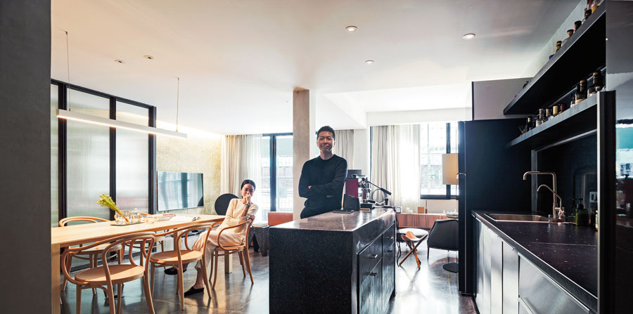
There is a living room on the right before the large indoor kitchen, which retains its original Makha wood flooring but was repainted black to match the black synthetic wood of the exterior, for an informal, natural feeling to complement the green view of plants and trees outside the glass walls.

Their daughter’s room, set up like a New York loft apartment, is on the third floor.

At two points, a mezzanine stairway connects the central porch to the rear verandah, from which you can clearly see the 2 floors of the old house.

They all lived in this mid-city house during the construction of a new, steel-framed gabled roof over the old one, which was finally torn out when construction was finished, leaving the kitchen ceiling to follow the new roof angles. 

mid-city house

“The roof is a special black version of Shera’s “U-Slate” line. I’ve loved black since childhood,” said Pauline.

“When I was a kid, I wanted to paint my bedroom black, but my parents wouldn’t let me!” The chic interior design work has black everywhere. The large kitchen is in tribute to both her mother-side relatives and her father, who loves to cook.

“Besides the big kitchen pantry counter being a great place to socialize, it’s also good for informal dining.

Pauline selected furniture and décor in a “mix and match” style controlled by color, some items primarily functional and others reflecting personal style, combining old and new, cheap and expensive.

“It’s comfortable because this really reflects our way of life: the house isn’t built for show,” said Pauline’s father, “and we don’t want to be climbing up and down a lot of stairs in the day.

“Since coming here, we’ve confined business matters to downstairs, and it’s a comfortable walk up to the second floor. The longer we’re here, the more we like it. Looking back, the old house seems stuffy, with not a lot of open windows. Our lives changed after the switch.

“At first, we thought the courtyard would be too small, but in the end, it worked out great!”

Once light and wind directions were figured in, design principles were applied to open the structure up, and this mid-city house clearly became more than brick, cement, wood, and steel, a happy combination of old and new narratives.

Somrit added, “It’s impressive. Once the rooms were finished, furniture in, lights and water on, our home came to life anew. It’s a great comfort.”

mid-city house


Owner: Pauline Soonthornrungsi and Somrit Soonthornrungsi

Designer: Design Com-bini by Pauline Soonthornrungsi and Somrit Soonthornrungsi


You may also like

Chez Mou: A Home Hidden In the Frame of an Old House
CHEZ MOU: A HOME HIDDEN IN THE FRAME OF AN OLD HOUSE


AN AMAZING BEFORE-AND-AFTER HOUSE RENOVATION
Renovating an Old Bedroom to be a Bridal Home
Renovating an Old Bedroom to be a Bridal Home
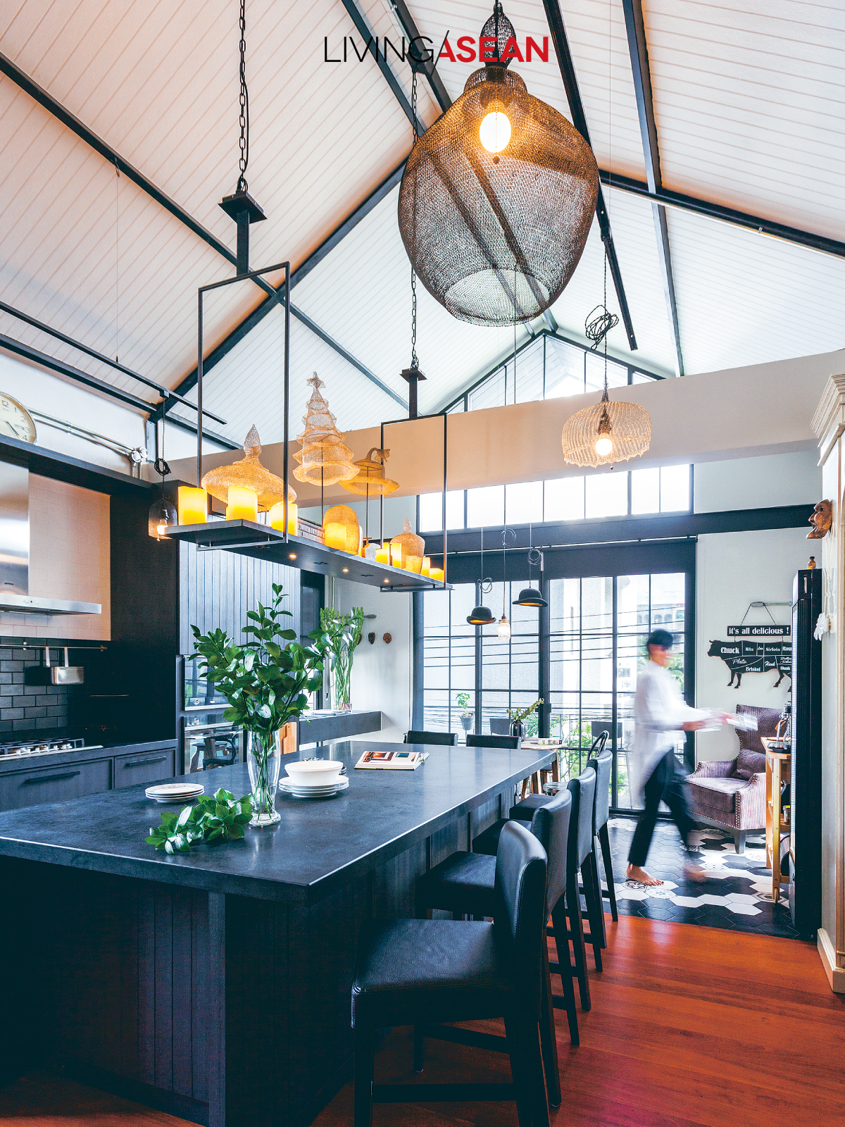
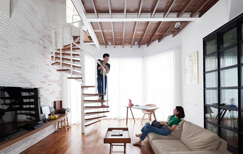
These rooms are like a house within a house: they were once just a 90-square-meter bedroom on the second floor.

/// THAILAND ///
Story: Nawapat Dusdul /// Photography: Nantiya Busabong /// Design: Fatt! Studio
 

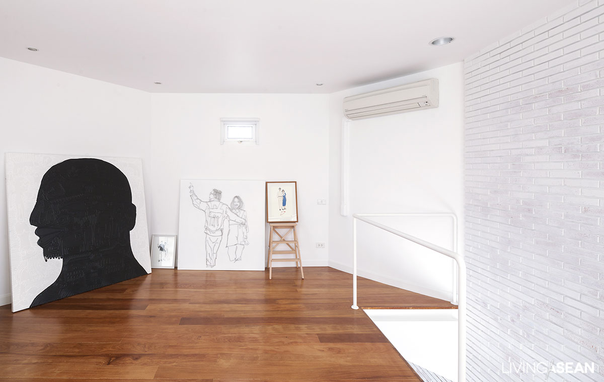
Starting life as a married couple, lovebirds Sitthidej Chirapanda and Nicha Pongstaporn took on the challenge of renovating Sitthidej’s sister’s old bedroom. After dividing a second-floor usable space of 70 square meters into living room and bedroom, they added in the 20-square-meter octagonal loft to create an art gallery.

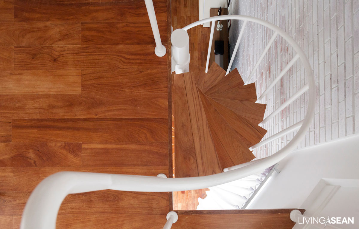
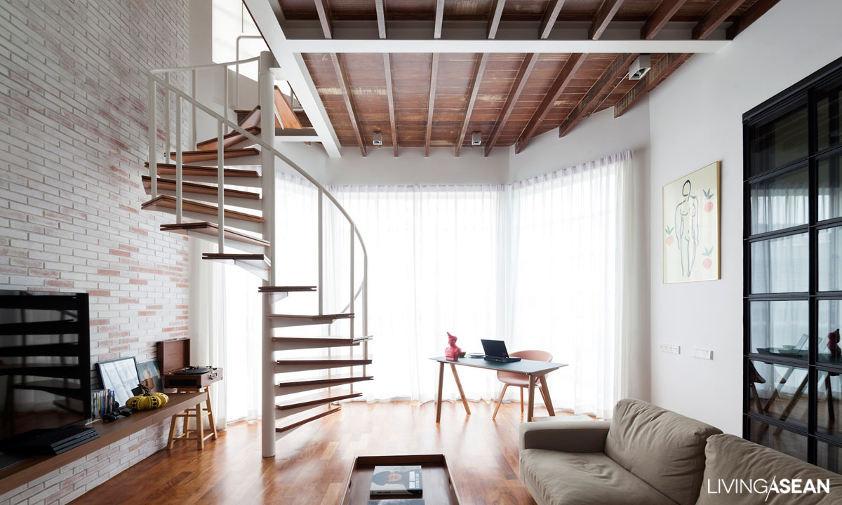
Architects from Fatt! Studio took on the job, and kept the original structure almost intact, but did save space by changing the floating staircase from its original design to a helical (spiral) one, adding an implicit eye-catching point of interest to the space. This required careful measurement to get the proportions right, so tall people wouldn’t hit the ceiling going up. Here, too, the meticulous, painstaking work of master craftsmen was employed in creating a finely detailed brick wall. After a first coat of plain white paint they daubed, trimmed, and polished the bricks in different spots piece by piece to create the sort of unique patterning the residents were looking for.

The architects retained the original makha wood floor, carefully abrading the wood to soften it, then surfacing it with a round of oil-based finisher. It was decided to completely remove the original living room ceiling so as to open the space up much more. A ceiling-specific demolition method was used, enabling display of the bare surface of the red wood above, which was polished, softening colors until the unique grains of each panel showed clearly.

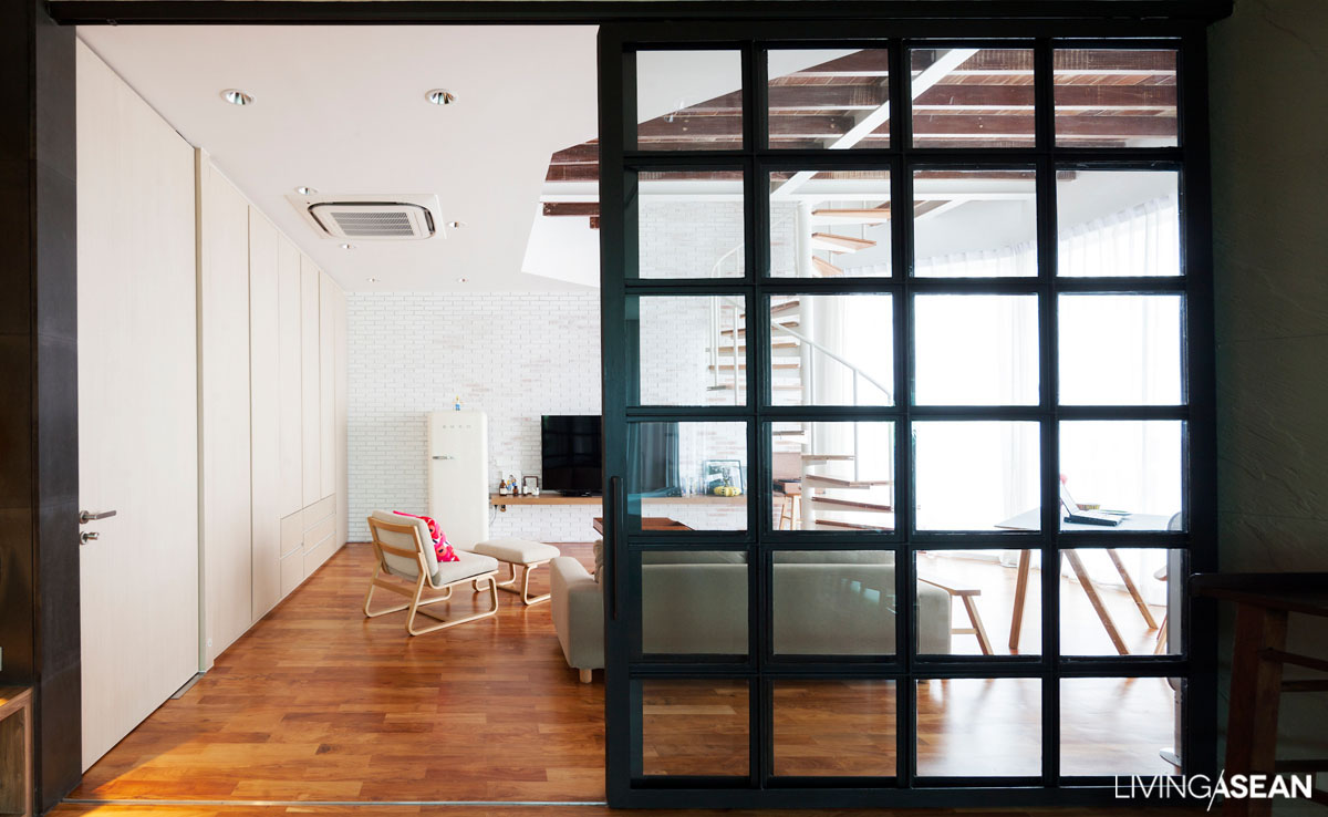
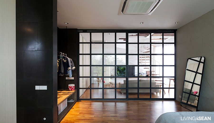
In the octagonal gallery the original window was replaced with a one set with square panes painted white, offsetting the black-paned sliding steel door between living room and bedroom. The division of the main floor is quite noticeable, as the colors split it off into two sections:  the living room is mainly white, while the bedroom is defined by darker, more austere tones, giving it a quieter, more restful mood.


Even on a day when the weather is not all that favorable, the overcast, sunless firmament shading the wall surfaces, the room we’re standing in exudes warmth of other kinds: it’s warm in color and style, and warmed by the smiles of this lovable couple who get to live on and on within this private space they themselves once called the stuff of dreams.

Link : www.facebook.com/fattstudioarchitect/

The Perfect Townhouse Makeover in Bangkok

The Perfect Townhouse Makeover in Bangkok

/ Bangkok, Thailand /

/ Story: Wuthikorn Sut / English version: Peter Montalbano /

/ Photographs: Soopakorn Srisakul /

The townhouse is a common type of building in Thailand, especially in Bangkok. Homeowner and architect Narong Othavorn grew up in one, always thinking of ways it could be better designed. Eventually, he and his wife Pim Achariyasilpa chose a 30-year-old townhouse in Si Phraya, a downtown neighborhood, and turned it into one of the most excellent townhouse makeover projects in the city.

townhouse makeover
Overall, the final building is a combination of the adjacent townhouses. Narong kept the original wrought-metal façade, modifying the original metal entrance door with a mixed frame of wood and steel, leaving the next-door side the entrance to a fourth-floor warehouse.

A picture window in the living room brings in natural light onto washed gravel walls that lead down to a small garden behind the house, inspiration for the “double space” mezzanine.


townhouse makeover

The double-space ceiling isn’t only about making the lower level look good: it supports the open-plan design.

Glass panels in the dining nook of the mezzanine above extend a feeling of comfort to every space in the house. From the mezzanine there’s a continuous view through glass partitions out to the garden behind the house, and there’s steady circulation of air from front to back.

Townhouses are apt to feel cramped, but not this one! The light is different in each area, but the light is what connects everything.

townhouse makeover

townhouse makeover

townhouse makeover

“These things came from our own personal tastes. Pim likes well-lit spaces. Me, I like indirect light,” explained Narong.

“So with a house for the two of us, we had to get the division of space just right, using the light available in each area. The lower floor is bathed in subdued natural light; upstairs, the living room is brightly lit through the front window.

“Moving back to the dining area and bar, the light is dimmer. Go upstairs to the bathroom and dressing areas and it’s lighter again, suiting the specific limitations and characteristics of each space.”

townhouse makeover

“Small, but spacious” is how both owners refer to this house: better than adequate, the size is really perfect.

Not so small as to be cramped. Everywhere some things catch your eyes up close and others at a distance. The home offers a master class on how townhouse renovation can work with limited areas to create special, interesting spaces.

Even though adjoining buildings make side windows impossible, careful arrangement of space and windows on higher levels give this house a beauty that is anything but ordinary.

townhouse makeover

townhouse makeover

townhouse makeover

townhouse makeover

townhouse makeover


Owner/Architect: Narong Othavorn of SO (www.soarchitects.space)


You may also like…

Siri House Family Co-living space / Home Renovation

SIRI HOUSE FAMILY CO-LIVING SPACE / HOME RENOVATION

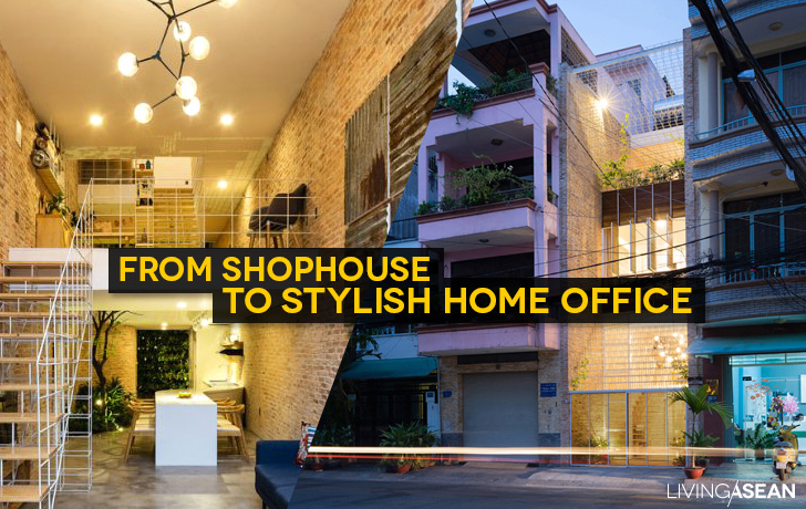
From Shophouse to Stylish Home Office

FROM SHOPHOUSE TO STYLISH HOME OFFICE

Small House Renovation : a Family Solution

Small House Renovation : a Family Solution

Living ASEAN takes you to a house that looks small, but was remodeled to answer the needs of all family members. From the front it has a straightforward, contemporary look. Inside it has great ventilation.

/// Thailand ///
Story: Ajchara Jeenkram, Wuthikorn Suthiapa /// Photography: Sitthisak Namkham /// Owner & Designer: Mr.David Chan

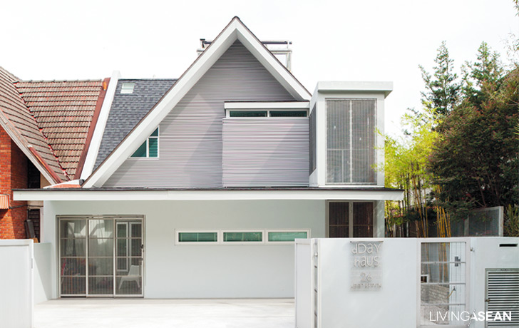
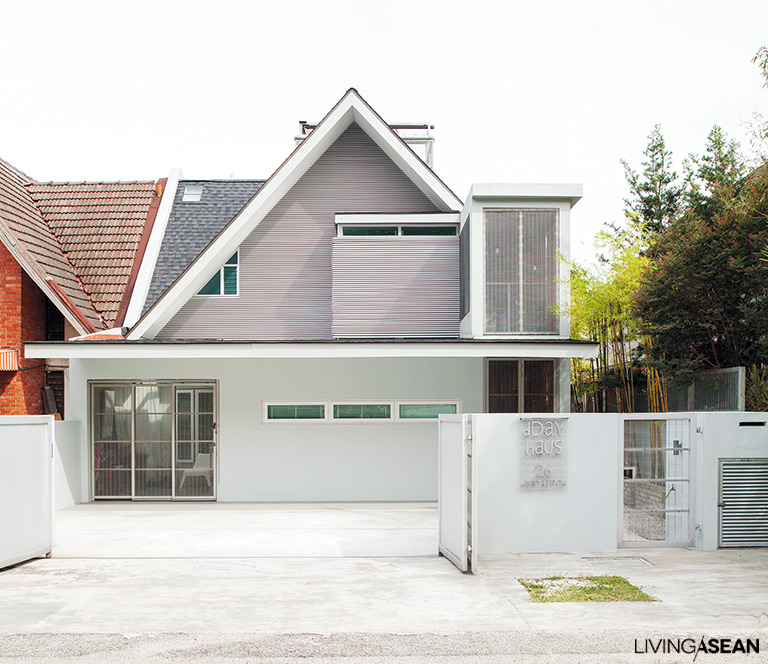
Here we are in Selangor State, Malaysia, where a sign in front proclaiming “Dday Haus” informs us we’ve arrived at Mr. David Chan’s residence. The unusual name comes from the first initials of his and his sons Daniel  and Delan’s first names, even though the architect responsible for the house design, though, is actually more his wife, June Lim Sue May. You could say this is a continuation of David’s old house, which he uses as a home office and is tucked away right across a tiny village street.
This town house from the 90s retains its original façade but has been redone with better materials, giving it a contemporary flavor so that it stands out from its neighbors. Though the outward appearance hasn’t changed much, the interior is another story, featuring a full complement of conveniences, everything needed for comfortable modern living.

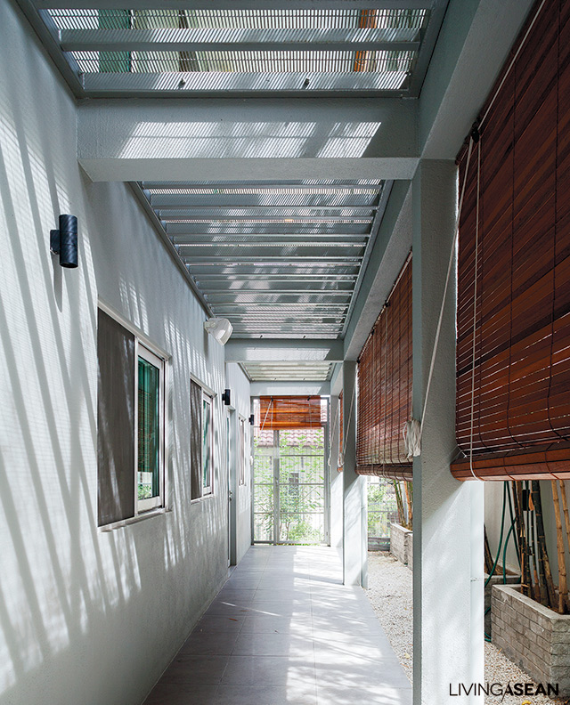
Perforated metal ceiling looks down from the balcony above – this is also a popular material for fences in Malaysia.
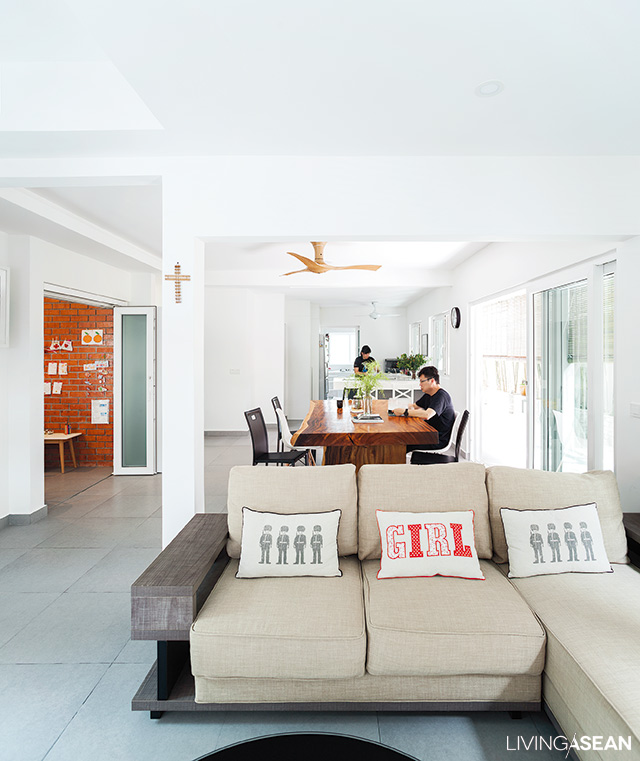
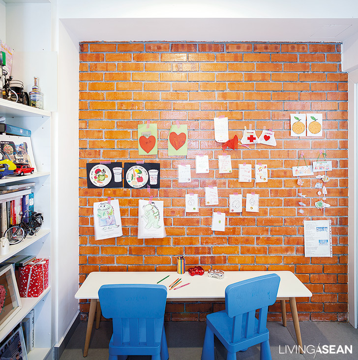
Next to the parlor is the kids’ homework room, and their work adorns the brick wall.

Downstairs, the children’s homework room adjoins the parlor, with the . kitchen and dining nook behind. Second floor splits left into a family room and children’s bedrooms, and to the right is the master bedroom with a mezzanine. David tells that the other house is used for an office and receiving guests, while this one is just for family life.

“We started out thinking this would be an office, but after more research we leaned more towards what we needed in this stage of our lives.” As a result, there are now more rooms, and more opportunity for family togetherness and comfortable living.

David spent many of his earlier years living in apartments, and enjoyed it, and the house is designed to reflect that. For instance there’s a section reaching up the entire four storeys which he calls “the tower.” A staircase winds upstairs from the kitchen on the first floor to a laundry/drying room on the second, and at the very top, a private living room with a mini swimming pool for the kids.

The family room has perforated metal floor panels, allowing a view of the children in the homework room below.

Twist and turn up the stairs to a compact bedroom.

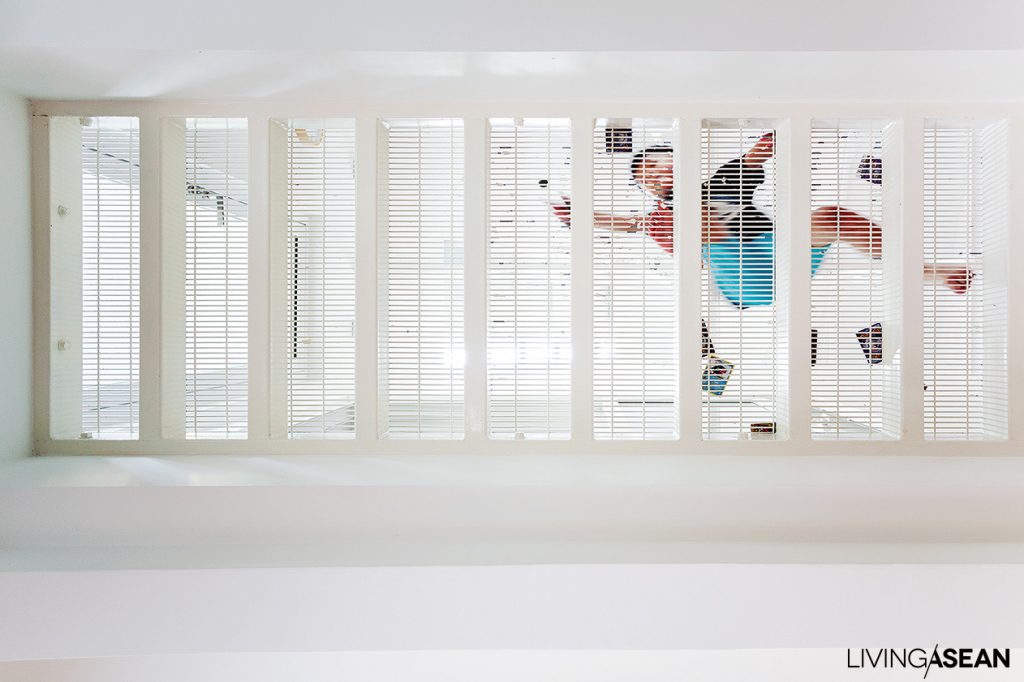
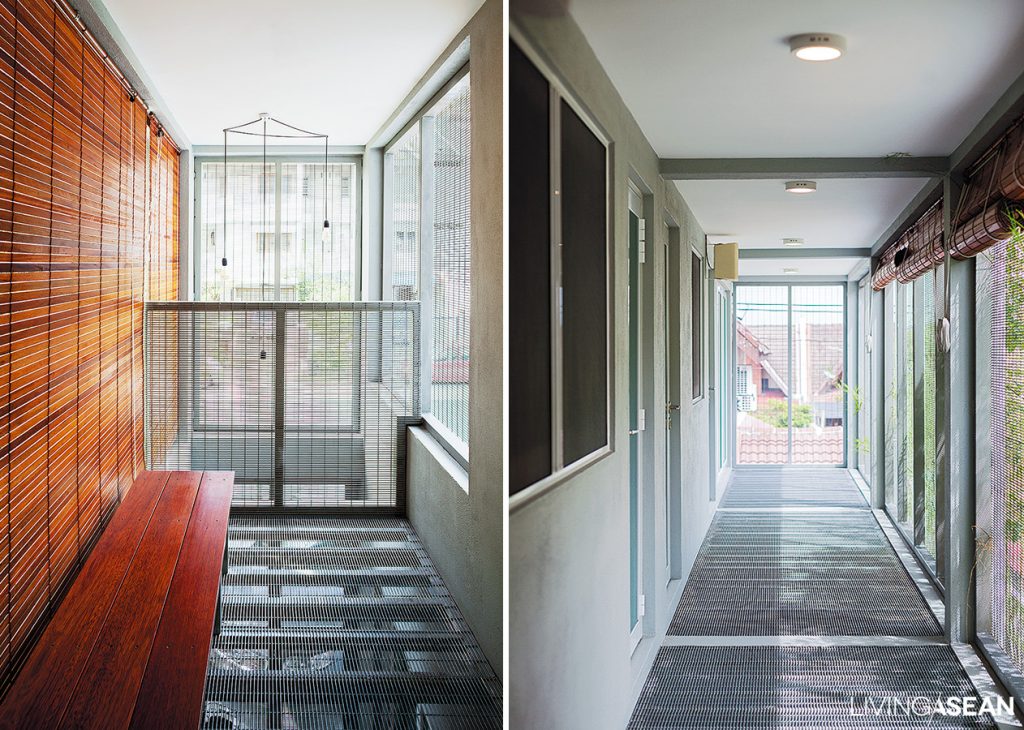
The house is designed to meet the challenge of balancing close family connections with the need for privacy. A unique solution here is in the see-through metal gratings found here and there in walls and floor, which build a feeling of lightness into the house and give it personality.

David places high value on interior ventilation as needed for comfort: wind direction and flow were important design considerations. The air flow comes straight in through the long front balcony out to the back, then up through a service opening placed above to allow the release of hot air as the cooler breeze blowing in below keeps the house cool all day.

Link : https://www.dca.com.my/

The Clever Home Office Restoration of Studio Bikin
The Clever Home Office Restoration of Studio Bikin
/ Kuala Lumpur, Malaysia /

/ Story: Supachart Boontang / English version: Bob Pitakwong /

/ Photographs: Rithirong Chanthongsuk /

Every teardown has an impact on the look and feel of the environment in which you live. If you find your suburban home outdated, perhaps this renovation of Studio Bikin’s home office is an inspiring way to breathe new life into it.

Studio Bikin

Studio Bikin

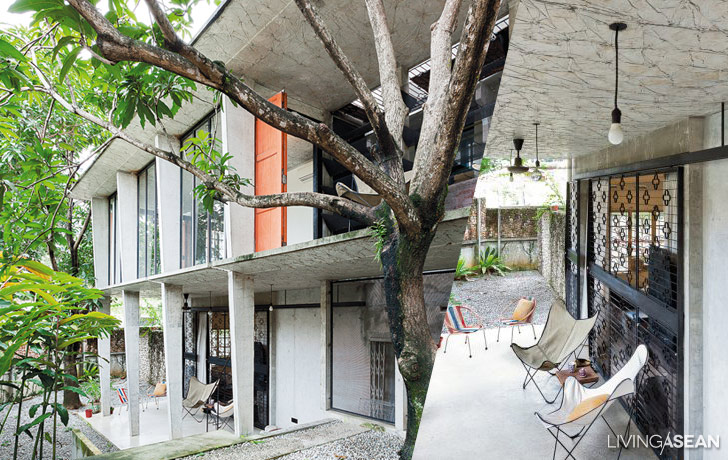
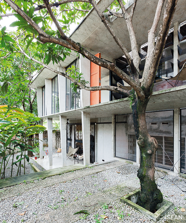
This two-story house is the home office of Farah Azizan, co-founder of Studio Bikin. It is located in Bangsar, a residential suburb on the outskirts of Kuala Lumpur.

“The house was built in 1950, almost seventy years ago. The structure is solid, and everything else is in good shape,” said Azizan.

“There is a simple, timeless elegance to it. So, I decided to do a complete renovation, combining a home and an office in one.”

Studio Bikin


Studio Bikin

MH12

Azizan tried to keep all existing elements and structural integrity intact, making the house capable of withstanding the desired loads for long life.

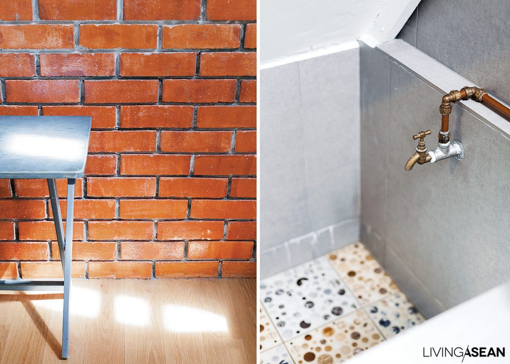
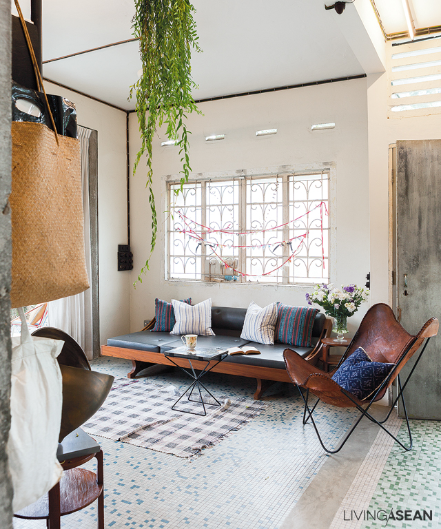
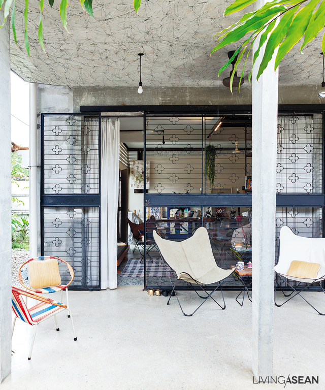
Metal grilles on the windows and doors and floor tiles were left the way they have always been. To create an airy interior living space, parts of the walls on the first floor were removed.

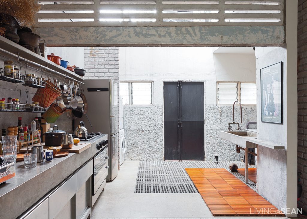
Meantime, glass louvers were retained to aid in heat dissipation, improve air circulation, and allow plenty of natural daylight.


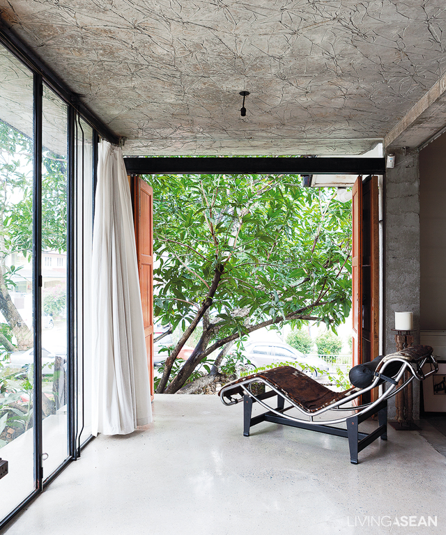
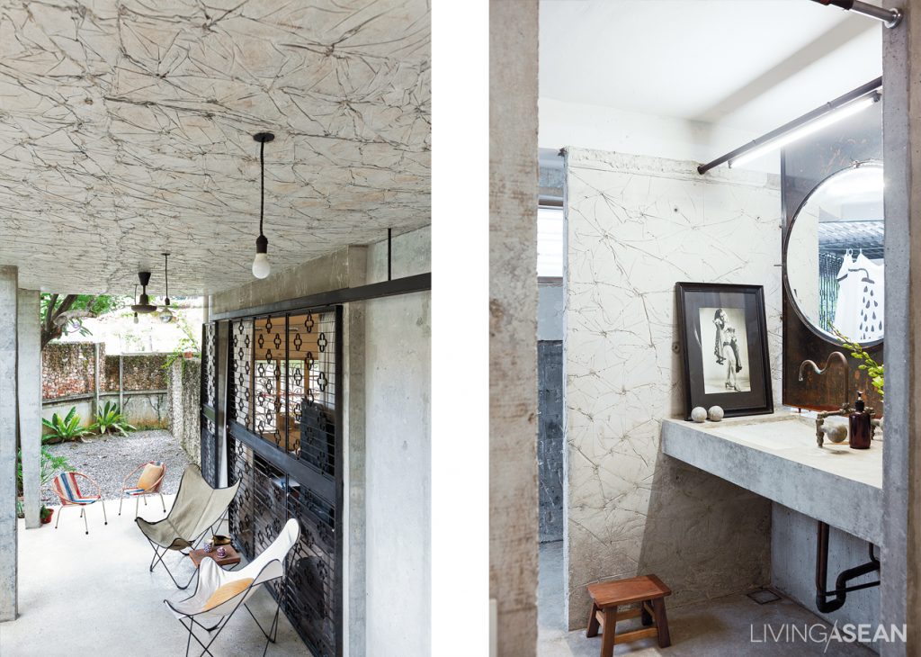
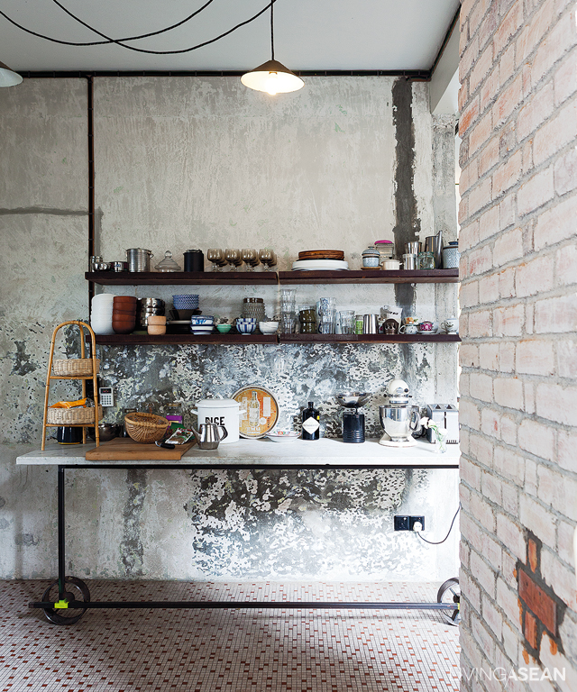
The owner added the loft style to the design by putting in cracked concrete wall textures for a little bit of a grungy, urban feel. Special techniques helped make the ceilings and walls look interesting.

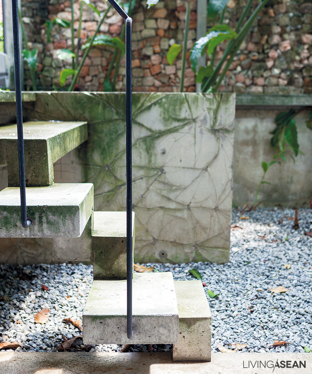
This was achieved by lining the mold with plastic wraps before concrete was poured. Wrinkles in plastic sheets left their marks on concrete surfaces resulting in aesthetically pleasing textures.

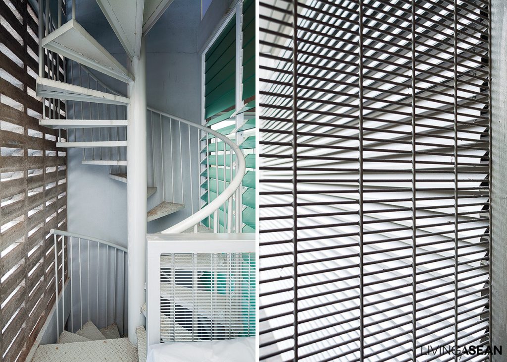
Tricky space staircase: The treads may differ in shapes and sizes from one step to the other, but the stairs are safe to use.
Tricky space staircase: The treads may differ in shape and size from one step to the other, but the stairs are safe to use.

Studio Bikin

Studio Bikin

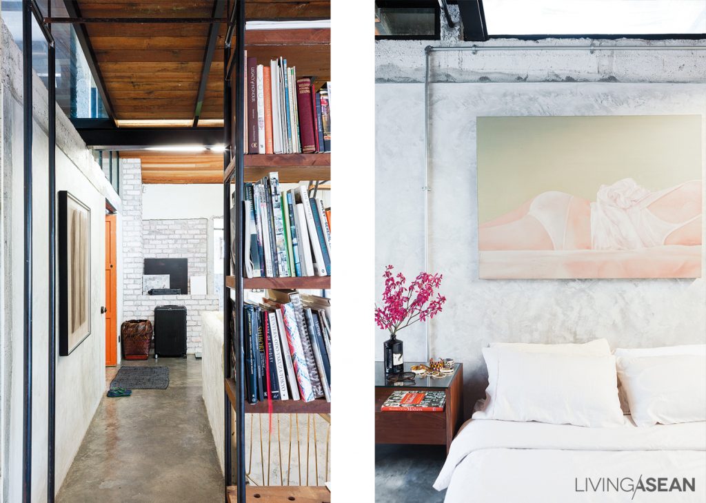
The decorating style is anything but obvious. The interior space of Studio Bikin’s home office boasts a mix-and-match style that goes together well with a modern loft ambience.

This is evident in a set of a teakwood sofa and leather butterfly chairs, and shelving filled with glistening utensils silhouetted against a textured concrete wall.


The handsome abode has been home to more than one generation, yet there is a timeless elegance to it. The house of Studio Bikin has undergone complete renovation for comfortable living with modern amenities. Clever home improvement hacks have made it unique, trendy and cool in its own special way.

Studio Bikin

MH11


Owner/Designer: Farah Azizan of Studio Bikin (www.studiobikin.com)


Siri House: From Ordinary Shophouses to a Charming Family Co-living Space

Siri House: From Ordinary Shophouses to a Charming Family Co-living Space

/ Bangkok, Thailand

/ Story: Wuthikorn Sut / English version: Bob Pitakwong /

/ Photographs: Rithirong Chanthongsuk /

Who would have thought a pair of shophouses lacking interest and imagination could turn into a pleasant family co-living home? Only recently the shophouse duo located on Surawong Road in the heart of Bangkok’s downtown was tastefully renovated as a shared residential community model. The result is a co-living space and place of business integration that’s well designed, full of life and energy.

Co-living space

The place of residence aptly named “Siri House” is the brainchild of the Bangkok-based architectural firm IDIN Architects Co., Ltd. Architect Jeravej Hongsakul is the driving force behind the design and renovation project. He attributed the firm’s success to its ability to reinterpret co-living spaces from entirely different perspectives.

Co-living space
The building’s diamond-shape façade bears the distinctive hallmarks of the family’s jewelry business. Plus, it highlights the three design considerations that create an effective and attractive composition – the qualities of being direct, clean and outstanding.
16
Flashback. The early stage before the renovation project takes physical form.

There’s a solution to every challenge,” said Jiravej. When horizontal living is no longer the suitable choice in an urban setting, the idea of vertical living comes in handy so as to combine residential and social areas in one coherent whole. And in this particular case, the only way to build is upwards.

In essence, it’s about creating a happy, healthy and thriving home, and hence the name “Siri House” meaning the place of prosperity.

Co-living space

2

3
The family living space on the top floor consists of a dining room and nearby sitting area holding a home theater and spaces for relaxation.

Co-living space

A new landmark on Surawong, the building with a distinctive facade belongs to Suree Sirivatjanangkun who shares the co-living space with her siblings.

On the emotional bonds between the people and the place, she said, “We figured it should also be an office for our family business. It’s better to live and work together as one extended family, a big family in the business neighborhood.

Co-living space
The house has four private residential units accessible via the entrance hall illuminated by natural light.

6

“We wanted a living space that is warm and welcoming, the kind that provides a modern living atmosphere in which family members interact and socialize with one another. Everyone needs a place and time to unwind and still wants to see and care for each other. To me, that’s co-living.” Suree continued.

“Precisely, we wanted a design that’s inclusive, in which every one live together sharing a co-living space, not the type that’s divided into different floors, one floor per person. That would be no different than living separately.”

Co-living space

With this in mind, Jeravej came up with a solution. “I designed each residential unit to be able to stand alone and is fully functional. I paid attention to detail in each component, from the living room, bedroom and workspace, to the double volume leisure room, bathroom and kitchen, and made sure they fitted together in an effective and practical way.

“Because it’s a good-sized place with lots of functions, I needed to manage them very carefully. To improve traffic flow in the home, each residential unit is accessible via the main hallway that allows plenty of natural light into the interior. And by design, each unit is unique in its own special way.”

Co-living space
Bedroom windows at the rear of the building open to relaxing greenery. Nearby, a clean, uncluttered workspace is peacefully ensconced behind the diamond-shaped façade overlooking the street in front, a scene reminiscent of a cafe-esque view.
Co-living space
The family business operation on the first floor offers customer reception seating in deep blue that calls to the mind feelings of calmness and stability. Nearby, a lightweight spiral staircase leads to meeting rooms on the mezzanine.

13

The homeowner wrapped it up nicely. Siri House will always be home to the close-knit siblings who live and work here. To them, it doesn’t matter it’s built for horizontal or vertical living arrangements. More so than anything else, it’s about living a lifestyle centered around family relationship, a good quality of life, and being in a location that’s great for doing business.

Bottom line, the mid-city co-living space is named “Siri House” for obvious reasons. To do business, you need Siri. It’s a word meaning prosperity and the quality conducive to success. You get the idea.

Co-living space

Co-living space


Architect: IDIN Architects Co.,Ltd. (www.idinarchitects.com)


You may also like…

303 House: A Narrow Townhome Inspired by Aircraft Interior

Box-Shaped Steel House Surrounded by Nature

A Trendsetting Row House Renovation in Chiang Mai

A Trendsetting Row House Renovation in Chiang Mai

/ Chiang Mai, Thailand /

/ Story: Atta Otto / English version: Bob Pitakwong /

/ Photographs: Sungwan Phratem /

The Plankrich Co., Ltd, led by Kwanchai Suthamsao, is known for being at the forefront of trends in row house design and renovation. Only recently when the firm undertook the restoration of a row house trio in Chiang Mai, many design aficionados were expecting to see exciting new innovations and exquisite materials. As it turns out, the redesigned homes boast a beautiful mix of simplicity and vintage charm with design for practical modern living. Especially for his own end unit, Kwanchai’s main goal is to create a place of abode that best answers his urban lifestyle. The three-unit row house block is conveniently located in a central neighborhood of Chiang Mai.

1
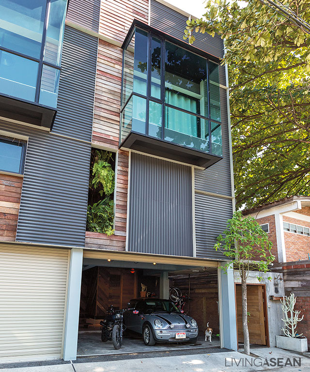
The newly designed front façade boasts an interesting mix of lightweight materials. Weathered boards in varying shades complement the pastel gray of fine-ribbed, corrugated sheet metal.

On reasons to invest in a row house, Kwanchai said: “A single, detached home is out of the question; land has become very expensive. The only option is a row house. After a survey, I chose this three-unit shophouse block. The size is about right; the price is fair and not too high. This way I am able to give it a complete makeover.”

2
For good ventilation, the old staircase was removed to make room for a new set of stairs without risers between the treads. It’s supported by an I-shaped steel beam.

Kwanchai had practically everything inside removed, including the old bulky staircase so as to make room for a new flight of stairs without risers between the treads for better ventilation. The only things remaining were pillars and beams.

The floor plans for all three units were completely redesigned. He wanted each one of them to have its own unique character, but space was limited. So, he only focused on making his end unit look different instead, at least for the time being.

3
A small guest room with a shelf-like bunk is tucked away at the rear of the first floor.

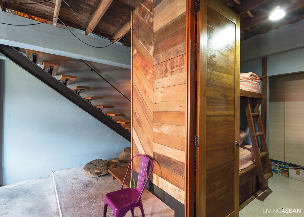
To accommodate visitors from time to time, there’s a compact guest room at the far end of the first floor. Custom-designed double bunks make it suitable for sleeping two guests. In all three units the mezzanines were taken out, while the omnipresence of reclaimed timber beams and long planks making up parts of the wooden floors brings back vintage charms.

4
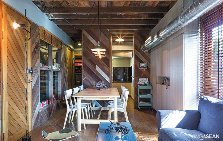
A bulky upholstered sofa adds warm, cozy feelings to the interior. Window treatment ideas with wooden slat blinds allow natural light into the home.

The second floor is neatly planned for multiple uses. There’s a sitting room in the front section, dining space in the middle, and the kitchen and bathroom at the rear of the building. The dining area is made a bit small to make room for the stairway.

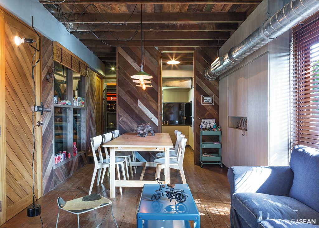
Overall, the furnishing and decoration of the interior conveys a great deal about the owner’s love for vintage collectables. Oblique-aligned wooden walls and floorboards give a warm, homey feeling.

5
The second floor holds a dining room. The floorboard and walls are covered in reclaimed wood from the homeowner’s collection.
8
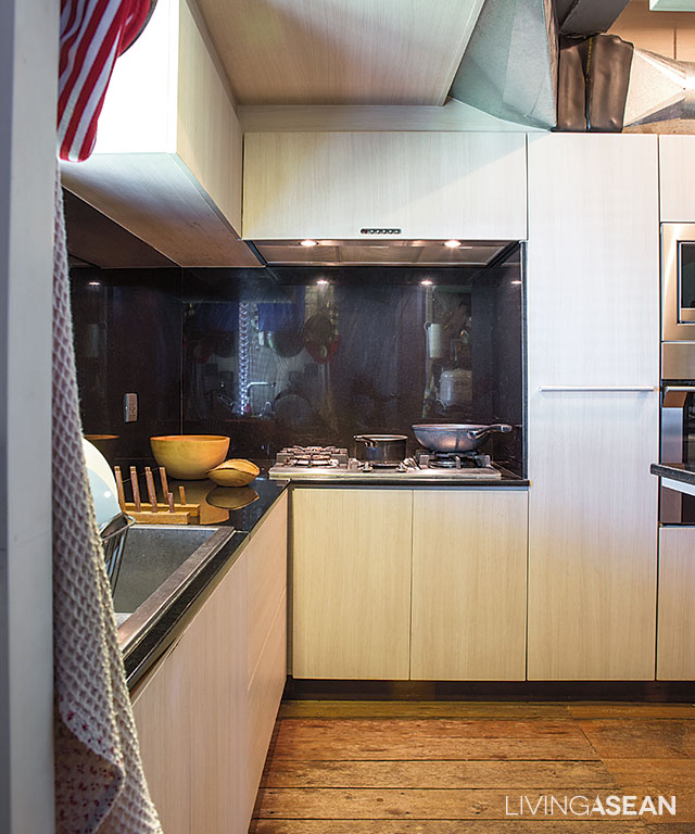
An L-shaped kitchen counter creates an easy flow workspace. Cabinet doors in light shades of beige make the room look clean and bright.
10
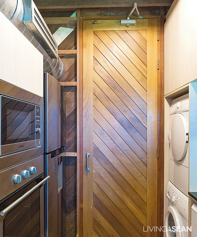
Microwave and convection ovens are on one side of the aisle, with the washer and dryer on the other. The door at the end opens to the dining room.

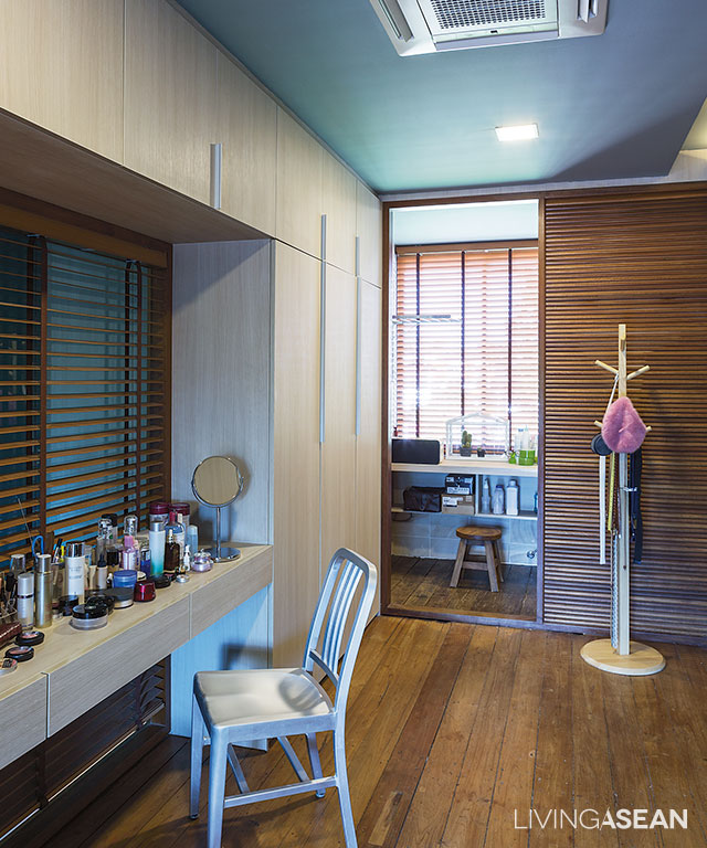
The third floor holds a bedroom in the front section that’s kept clean and uncluttered, with the wardrobe and bathroom nearby separated by a sliding door. The overall effect is impressive; the interior boasts a clean neutral shade for relaxation. There’s a minimal amount of decoration while furniture is reduced to bare essentials.

7
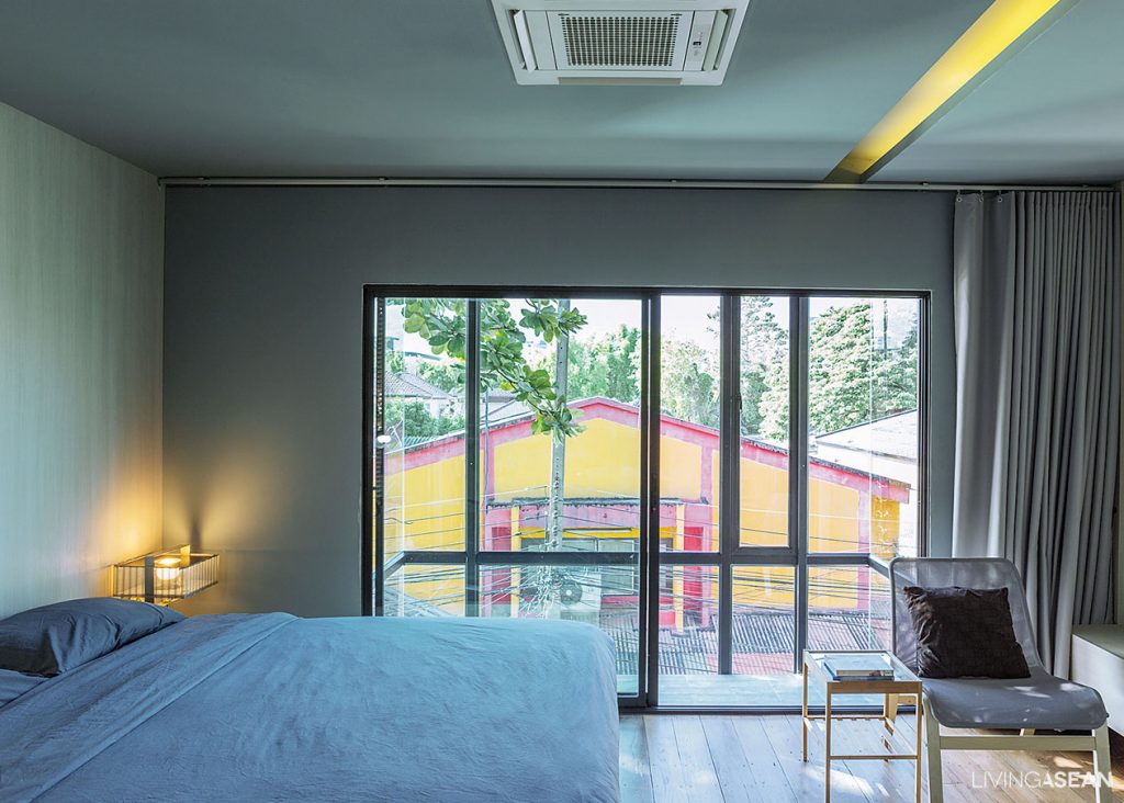
The bedroom is kept clean and uncluttered to provide a balance for limited spaces. The walls are covered in beech boards. Large sliding doors open to the cube-shaped glass enclosure that adorns the front façade.
9
The changing room-cum-walk-in closet offers wardrobes on both sides of the aisle, which connects to the bathroom at the far end.

Taken as a whole, the secret to success lies in constancy of purpose and using reclaimed wood as the material of choice. The interior living space is cozy and comfortable, thanks to large windows that allow plenty of natural daylight. The result is a bright and breezy place of abode that’s small but has everything for a vibrant city lifestyle.

6
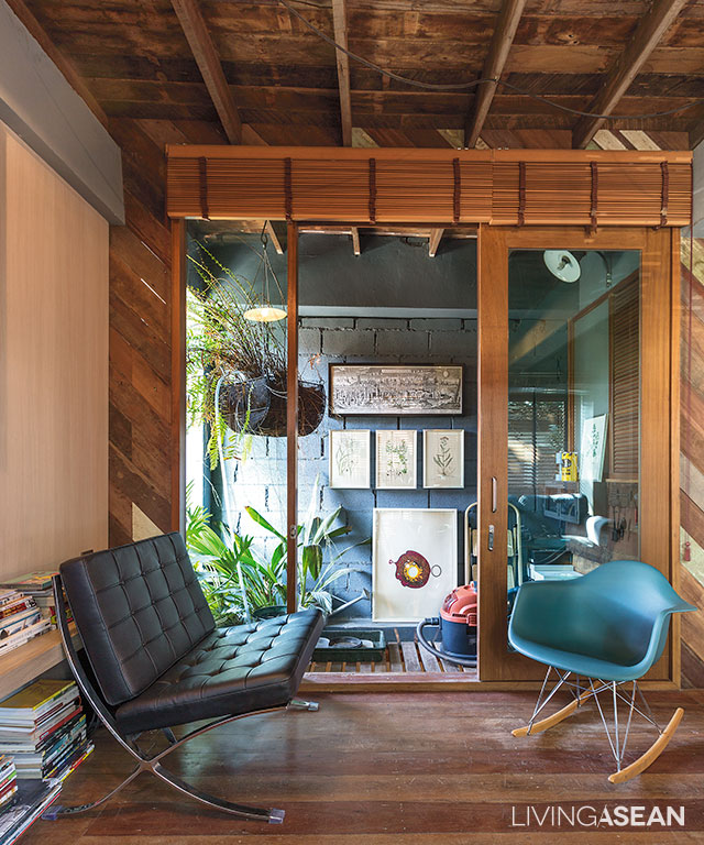
A glass wall with sliding door allows diffuse light into the sitting room at the rear of the house.

11
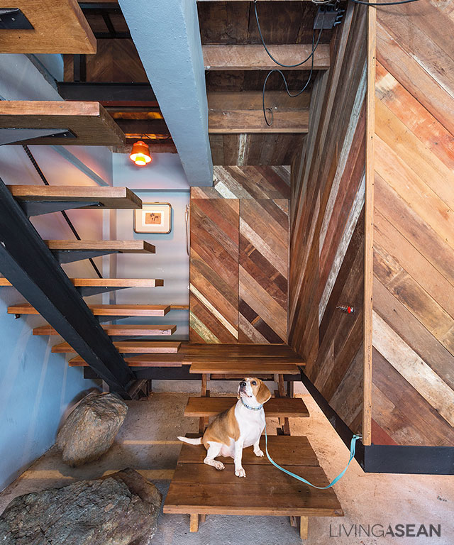
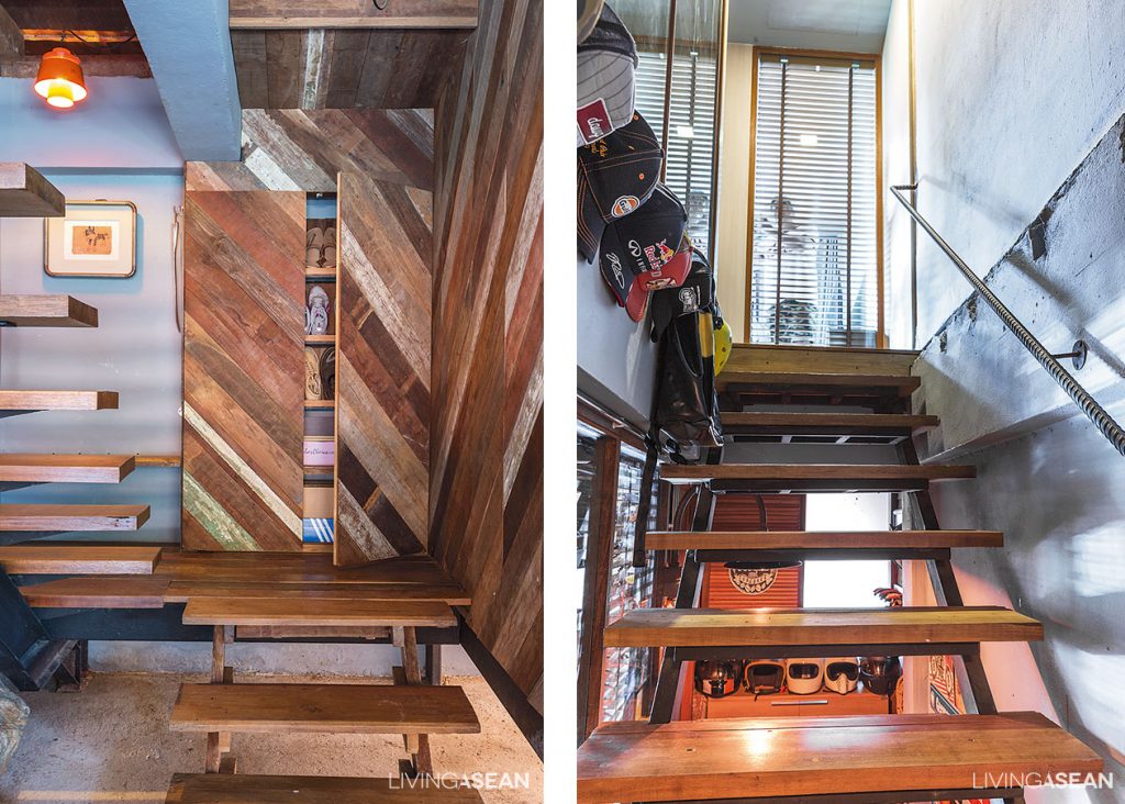
The staircase landing [left] provides access to a neat built-in cabinet made of reclaimed wood. The staircase without risers between the treads [right] offers niches for shoe storage.
12
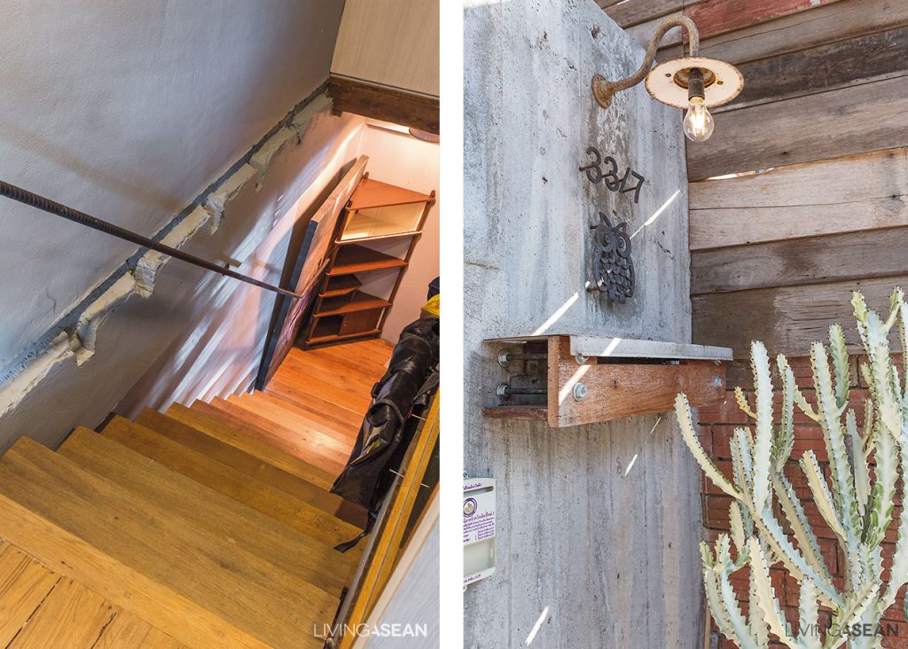
Marks on the wall and concrete structural framing tell stories of a recent home makeover. The homeowner intentionally left them as a personal reminder. [right] A rusty sconce attached to the wall adds rustic charm to a bare concrete wall. Beneath it is a wood box storage for home improvement tools.


Owner/Architect: Kwanchai Suthamsao of Plankrich Co.,Ltd. (www.plankrich.com)


Visit the original Thai article…

Chiang Mai City วิถีชน (ใน) เมือง


You may also like…

Termitary House: Good Sunshine, Fresh Air, and Brick Walls

3 x 9 House: A Compact Renovated Row House in HCMC

3×9 House: A Compact Row House Renovation in Vietnam

3×9 House: A Compact Row House Renovation in Vietnam

/ Ho Chi Minh City, Vietnam /

/ Story: Ekkarach Laksanasamrith / English version: Peter Montalbano /

/ Photographs: Soopakorn Srisakul /

A lot of work and research was invested in this row house renovation project. The big question is: how to make the compact house look wider?

Home renovation: The project is accomplished without any concrete construction. The new second floor rests on cylindrical steel posts instead of big cement pillars.
Like most urban residential buildings in Vietnam, “3×9 House” was formerly a shophouse built a long time ago. Only recently it was restored to a good state of repair. Looking back over the years, the old place lacking fresh air and ventilation had only a few windows and lots of solid brick walls, which made the building look dim.
A bold move was needed to rejuvenate it. The result is a modern living space that looks and feels fresher, younger and more lively, plus it helps to lift up the mood of the residents.

Renovated Row House vietnam
The 3-by-9-meter house has become a point of interest by integrating natural features in the design.

As land prices in Vietnam continued to rise rapidly and steeply every year, buying a new house seemed like a formidable task. So the owner thought it wise to invest in renovating his existing home.

He reached out to A21 Studio for their good reputations in the building industry, especially when it came to turning small, stuffy old houses into nice, uncluttered and environment-friendly homes.

Renovated Row House vietnam

Renovated Row House vietnam
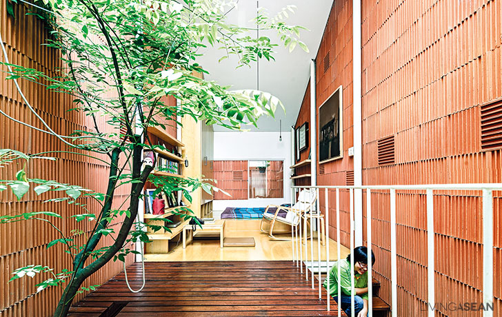
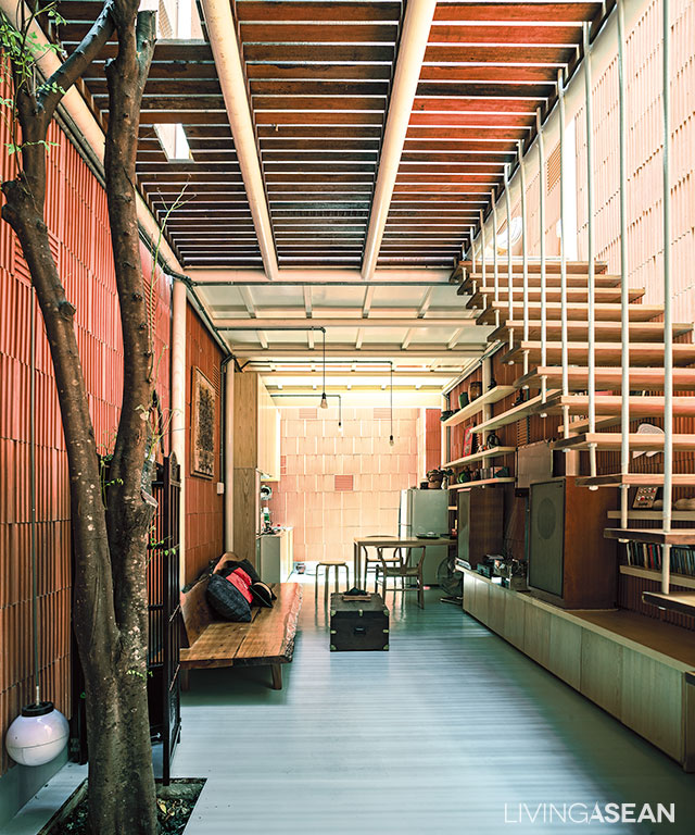
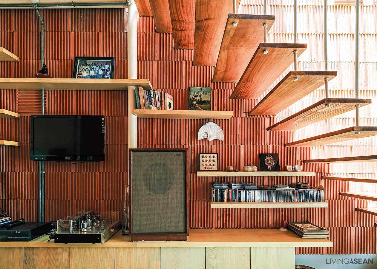
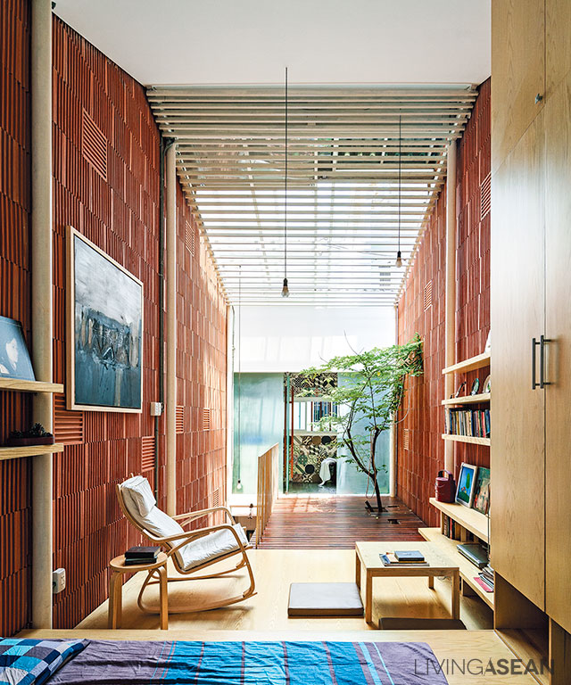
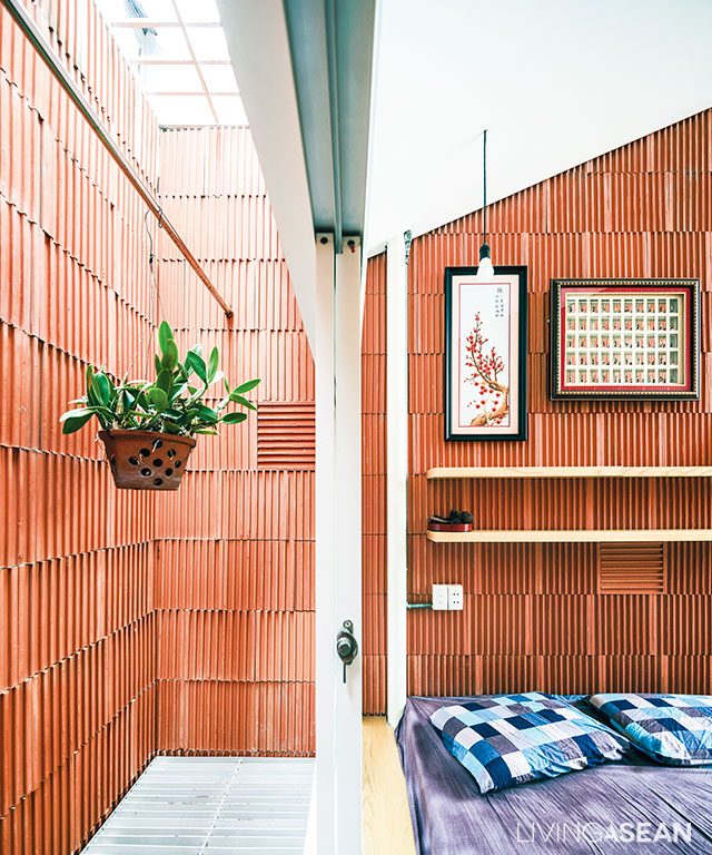
Clay tiles are placed inversely on the entire interior walls to create a stripe pattern and unique touch.

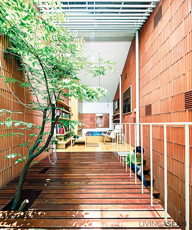
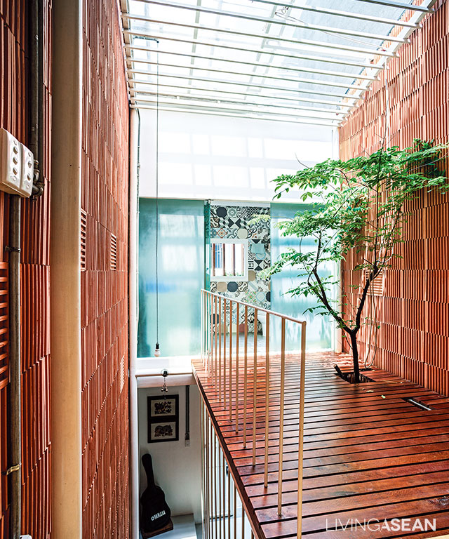
Walk in the door, and the first thing that catches our eyes is a tree growing up through an opening in the footbridge set against the wall. It’s a sign of welcome warmly greeting visitors coming into the entryway. The overall effect is bright and airy, thanks in part to a rooftop skylight illuminating the interior living spaces and letting sunlight shine on the tree.

For indoor thermal comfort, openings in the walls let breezy wind enter through the front door and circulate inside the home. As a result of this, the entire interior feels fresh and full of life all the way to the rear section, the second floor and the room under translucent sliding panels on the rooftop.

Flanked by three-story row houses on both sides, “3×9 House” is exposed to direct sunlight only in the middle of the day. For the rest of the time, the home is full of nice cool shade, making it feel very comfortable, warm and cozy, so there’s no need for air-conditioning.

Renovated Row House vietnam
The steel framework supporting the roof is equipped with a sliding skylight. This effectively illuminates interior spaces and allows the tree to keep on thriving.
Renovated Row House vietnam
For the health benefits of a well-lit home, the bedroom space connects to the footbridge with an opening for a tree to thrive under the rooftop skylight.
Renovated Row House vietnam
Loft style ideas paired with earth-tone color make the simple bedroom feel open, airy and uncluttered, thanks in part to the absence of solid room dividers.
A modern kitchen setup gets rid of smoke and smell fast, as a result of a range hood blower and openings in the rooftop.

For a bigger, more open vibe in the interior, solid room dividers are avoided, with the exception of the bathroom. The ground floor consists of a living room, dining area and kitchen; all connected.

The bedroom and leisure areas are upstairs. Since the homeowner lives alone, solid room dividers are of no use. In a nutshell, it’s about integrating natural features, openings in the walls and a good ventilation system in the overall design. That’s what makes it a good place to live.

Renovated Row House vietnam

A colorful mix of tiles are reminiscent of vernacular architecture.

Architect: A21 Studio (www.a21studio.com.vn)


You may also like…

Nha Be House: A Brick Home Infused with Memories of the Good Old Days

Termitary House: Good Sunshine, Fresh Air, and Brick Walls

X