/ Story: Natthawat Klaysuban, Kangsadan K. / English version: Bob Pitakwong /
/ Photographs: Nantiya June /
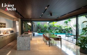
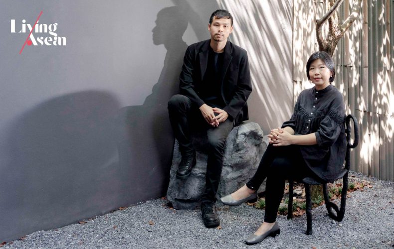
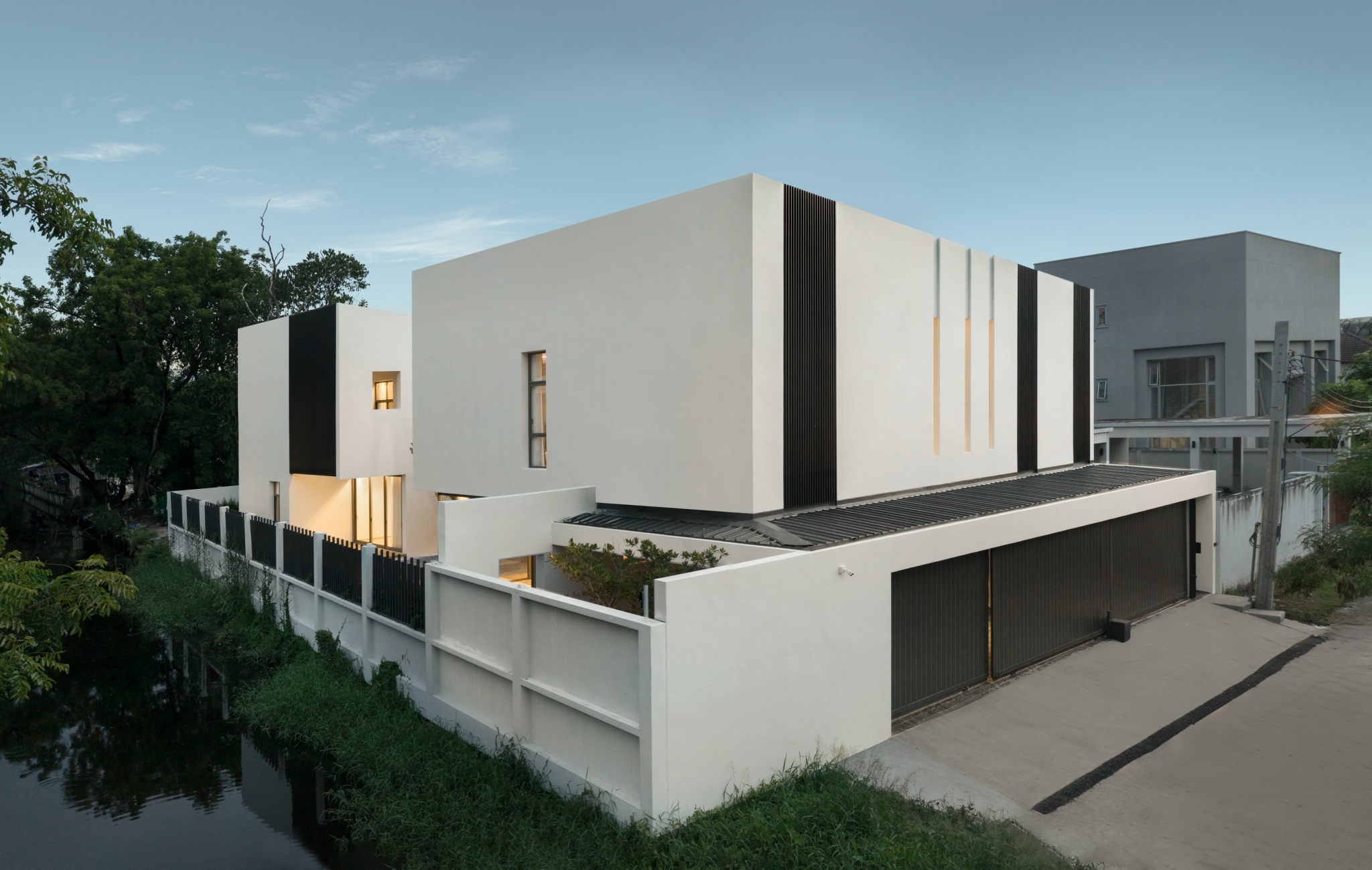
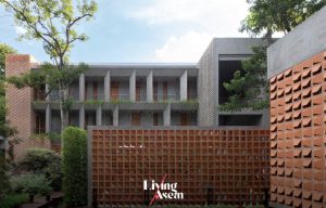
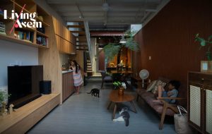
A house that’s right for the size of the land is just what this homeowner has been looking for, one that can satisfy his passion for living in close touch with nature in Bangkok.
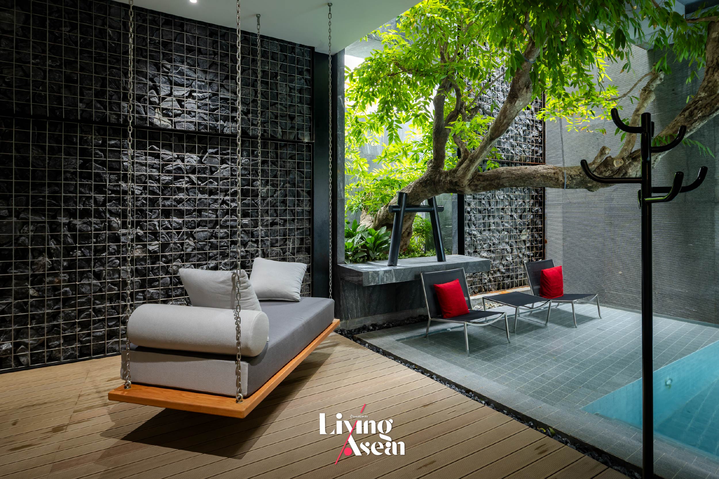
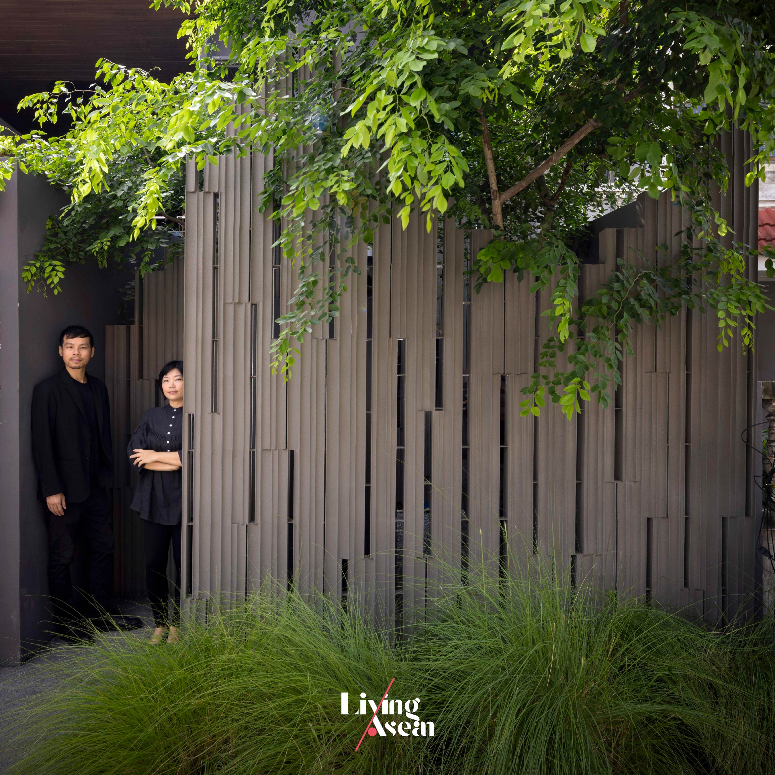
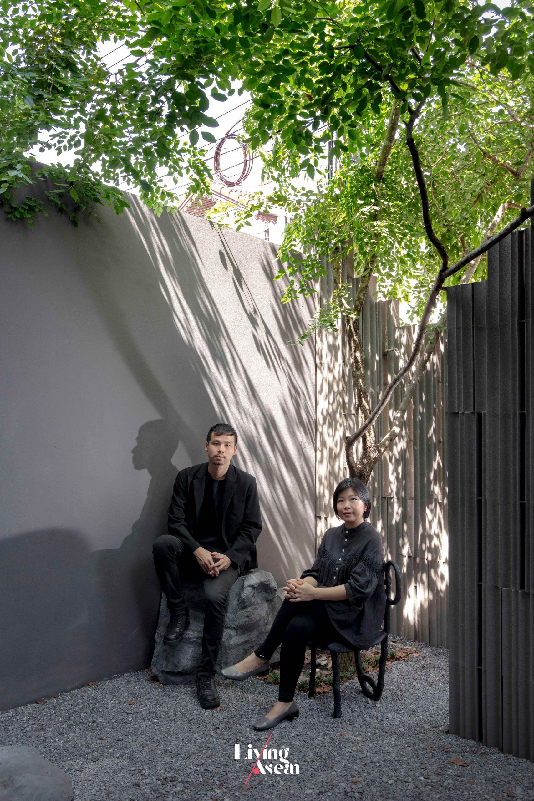
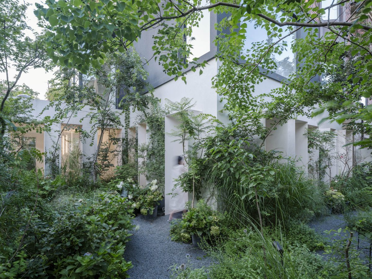
Lush foliage and overhanging tree branches welcome visitors to nature’s warm embrace.The homeowner’s passion for plants is evidenced by an abundance of green spaces in the house plan. / Courtesy of Studio BewellA drawing of the front elevation view of the house in cross section. / Courtesy of Studio Bewell
Wind back the clock. The existing family home where he had previously lived was decorated mostly with potted plants. And when it came time to put in another house on the premises, he thought it wise to leave it in the good hands of professionals, at the same time working closely with them to create a home that would reveal his true self and his love for gardening.
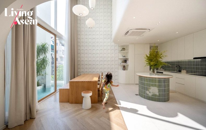
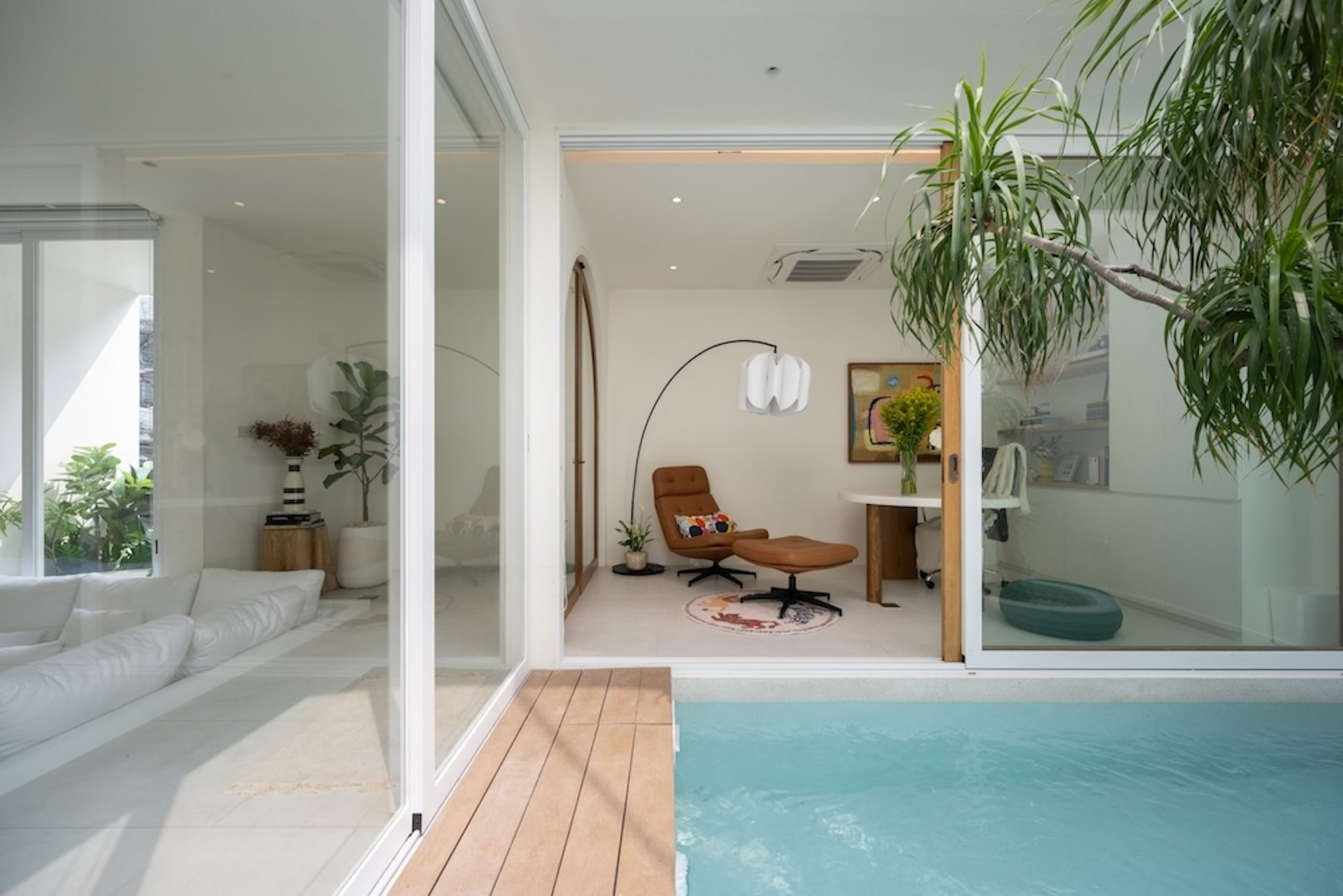
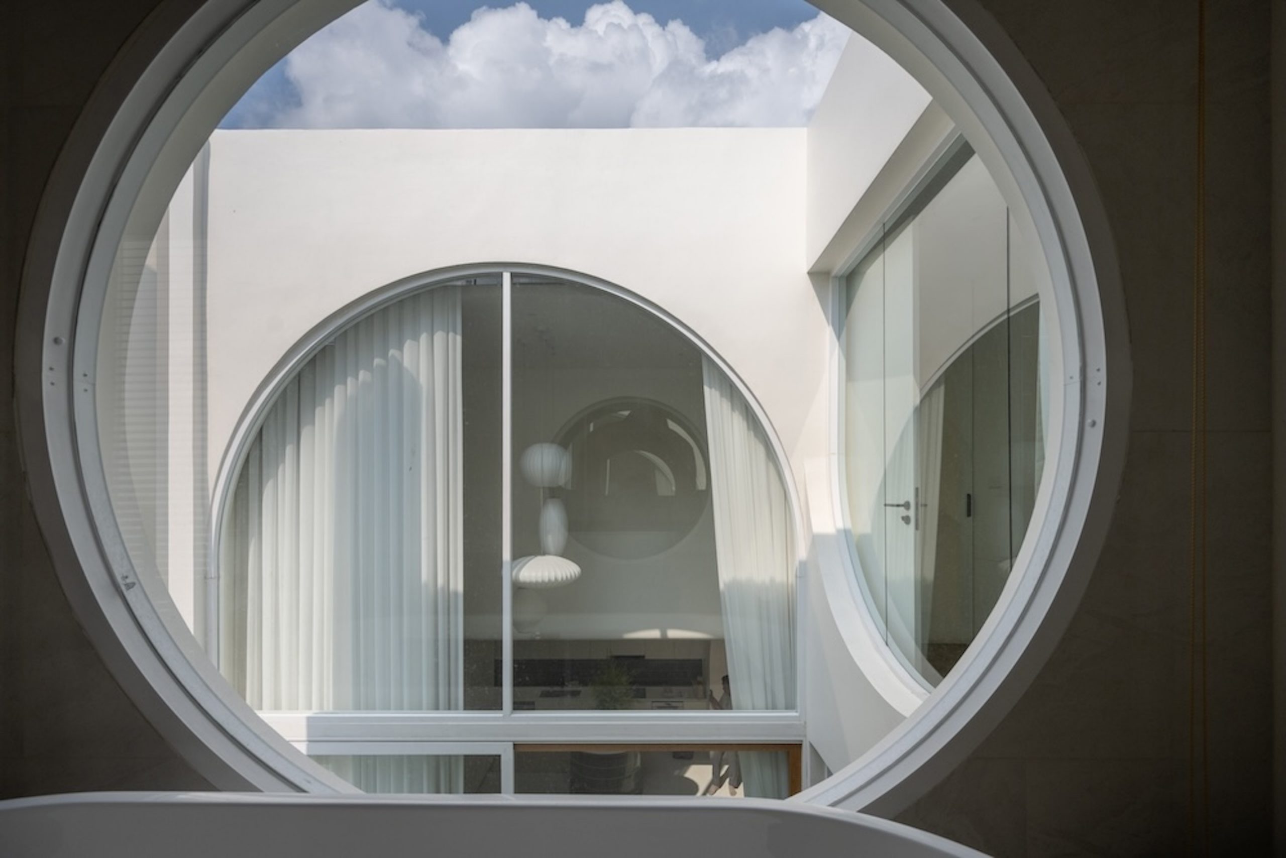
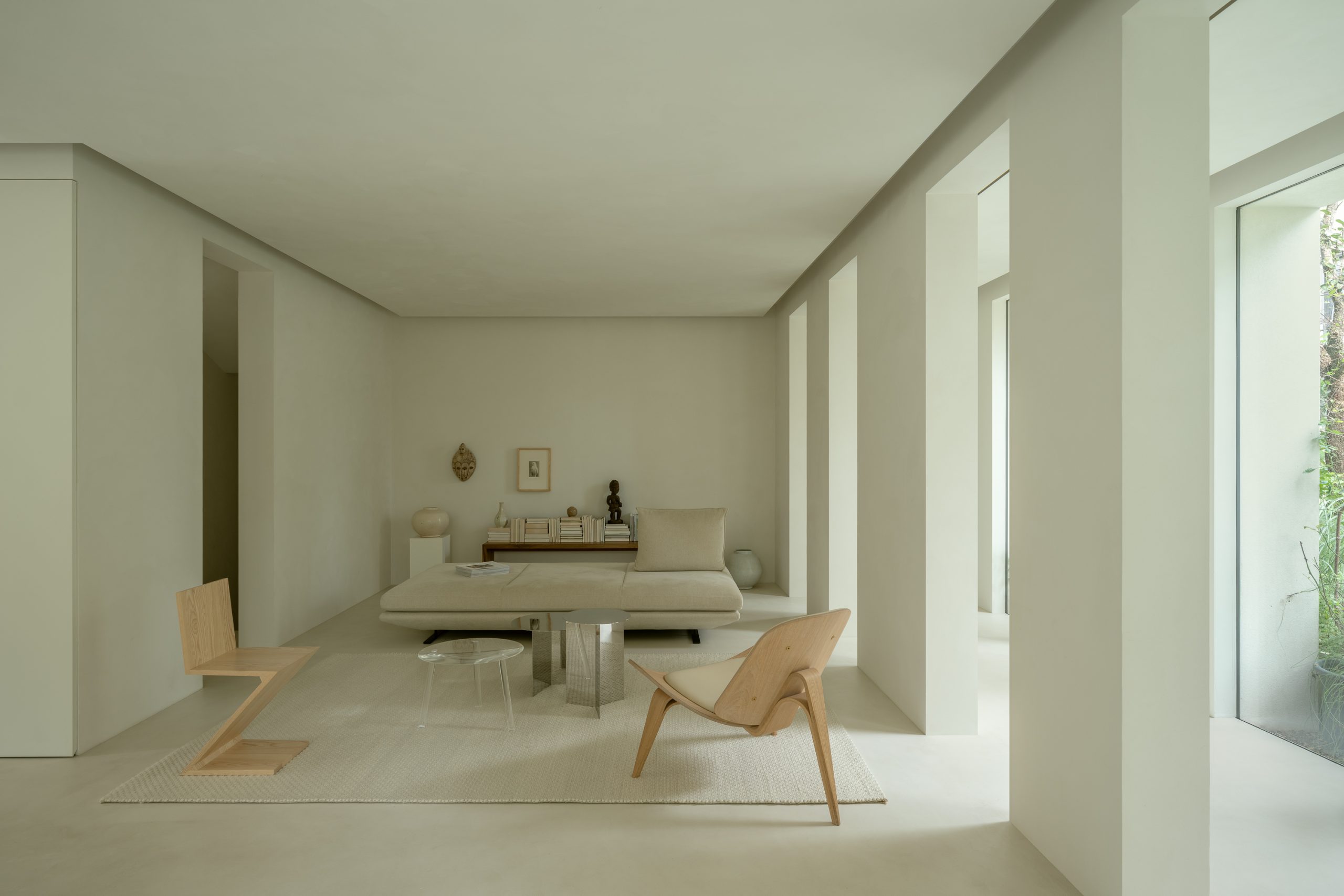
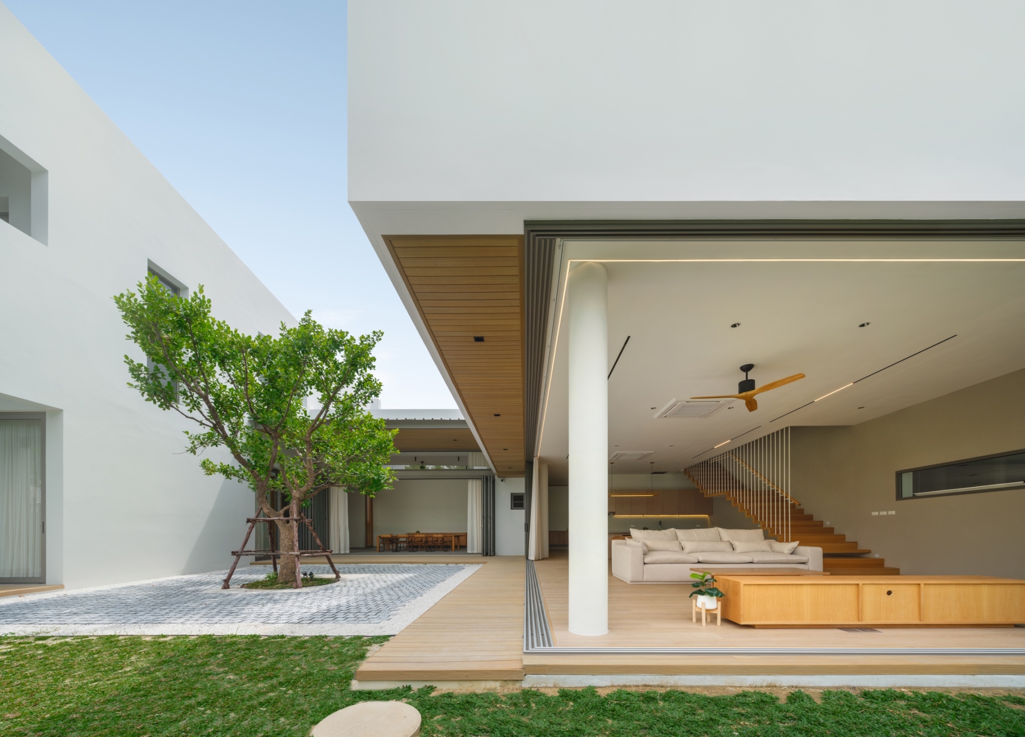
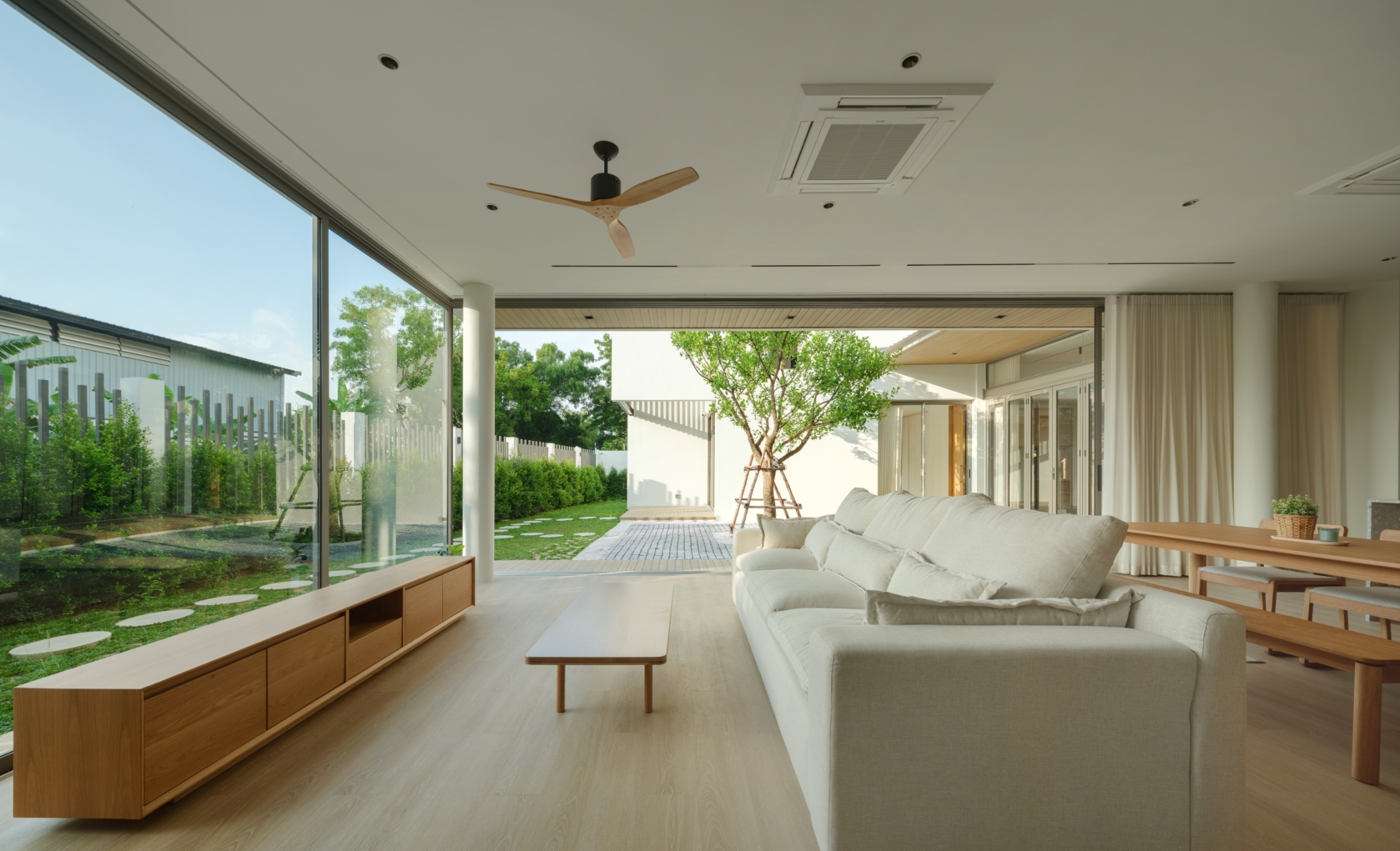
Open plan design gets rid of stuffy room, a way to overcome the problem of limited space.A skylight on top of a vaulted ceiling creates a volume of space overhead, making the living room feel bright and airy, at the same time allowing plants to capture the energy of the sun.
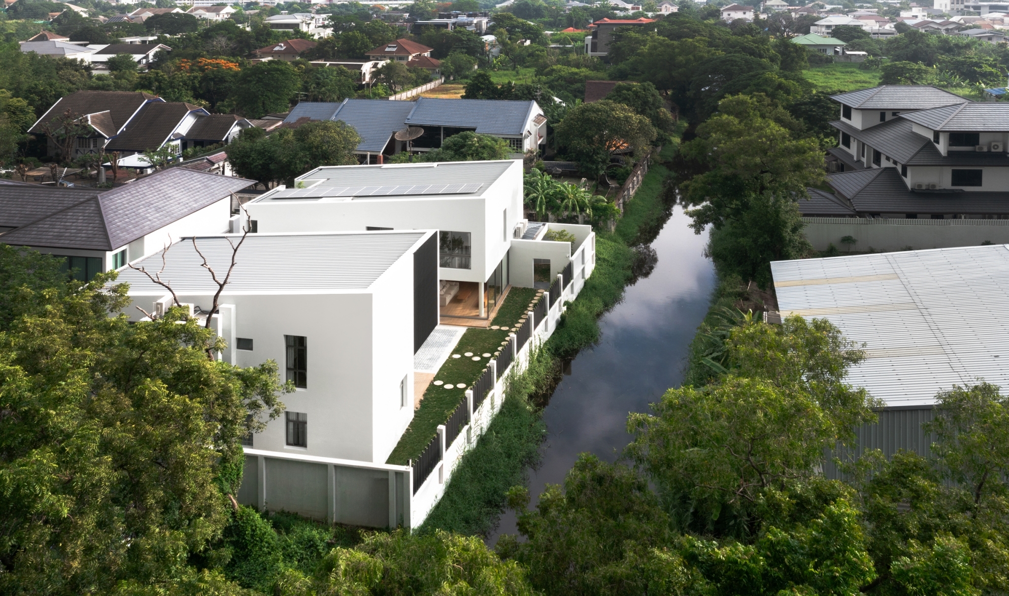
The result is a home among trees that boasts the beauty of living spaces cocooned by the warmth of luxuriant foliage. He started planting trees while construction was underway, content to watch them grow from the very first day the new house rose from the ground in a designated area.
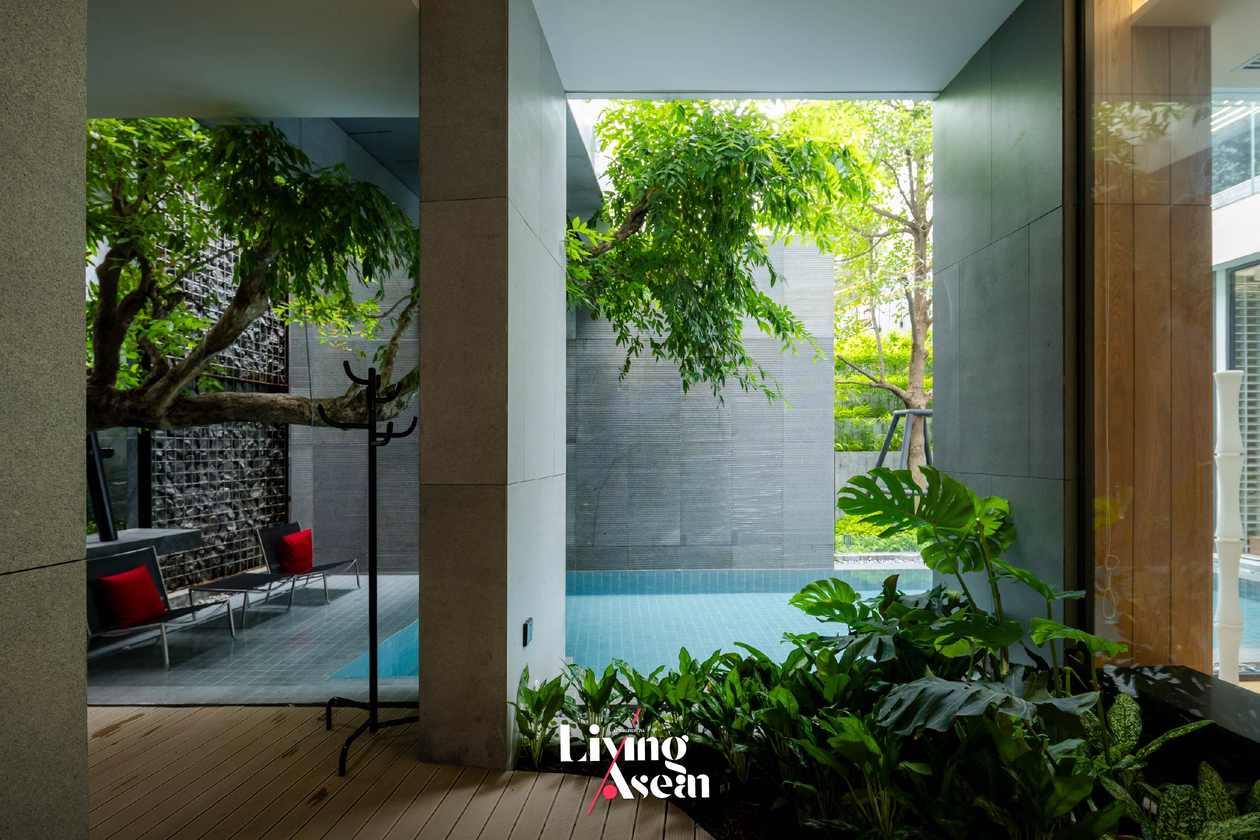
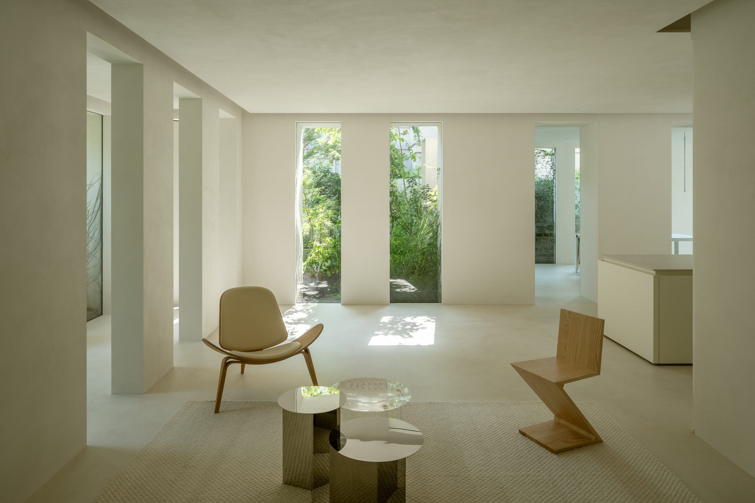
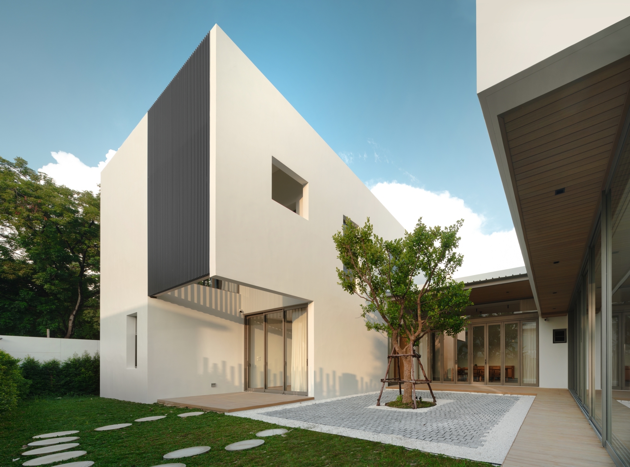
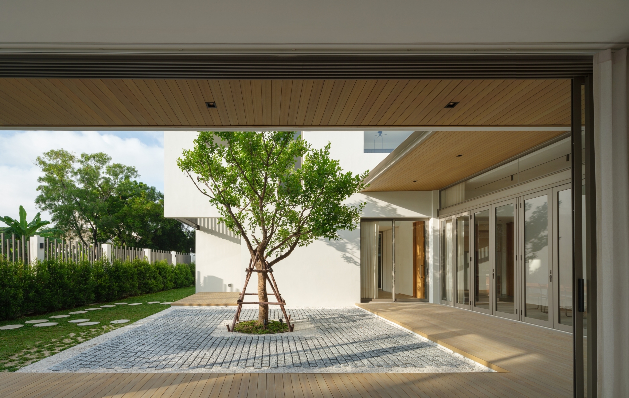
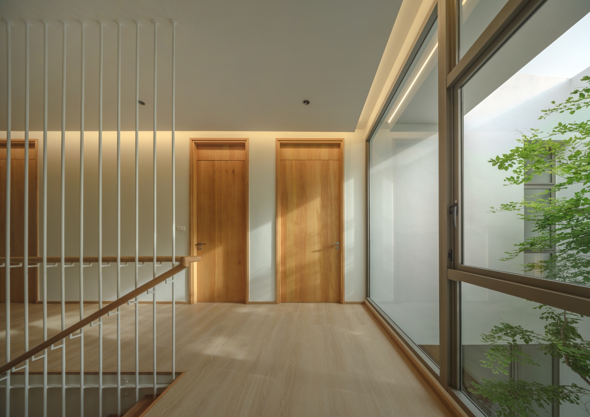
The center courtyard provides fresh air for people and plants, meanwhile keeping the house in shade for cool and comfortable living.Sliding doors glazed using clear glass afford a view of the center courtyard and bring fresh outdoor air into the home.
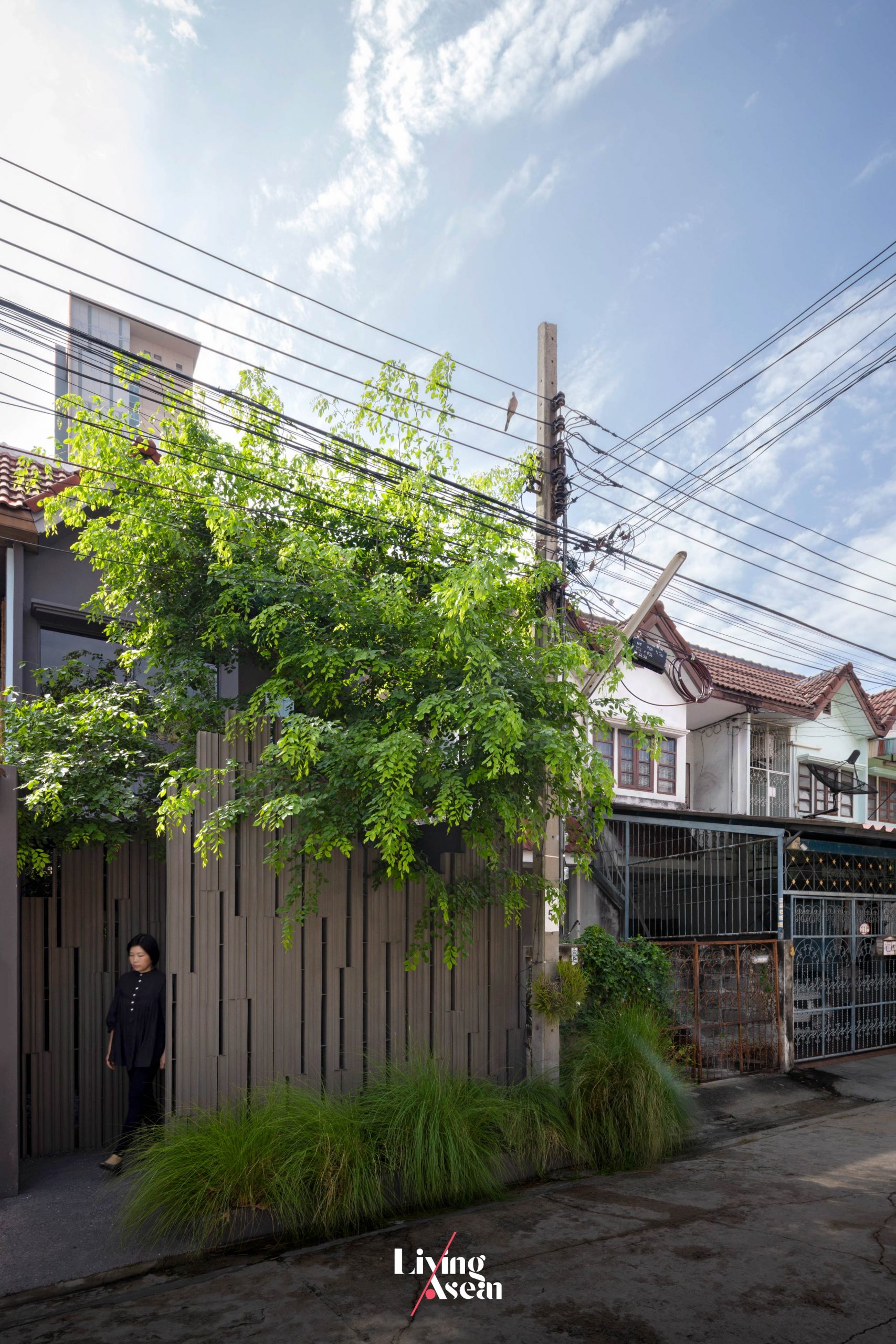
From a distance, the perimeter fence merges into lush vegetation, conveying a great deal about design thinking that integrates natural elements into design in ways that arouse intrigue and interest. It’s a layout that speaks volumes for a relationship between the homeowner and various plant species in the yard. The trees and understory plants take prominent positions in and around the well-planned single-story home.
A pleasing vista of the courtyard designed with overhanging tree branches in mind.
From inside every room, a bright interior courtyard filled with greenery and garden pathways can be seen in full view, effectively blurring the boundaries between indoors and outdoors. The center courtyard performs a dual role. It creates visual continuity between the home and the landscape.
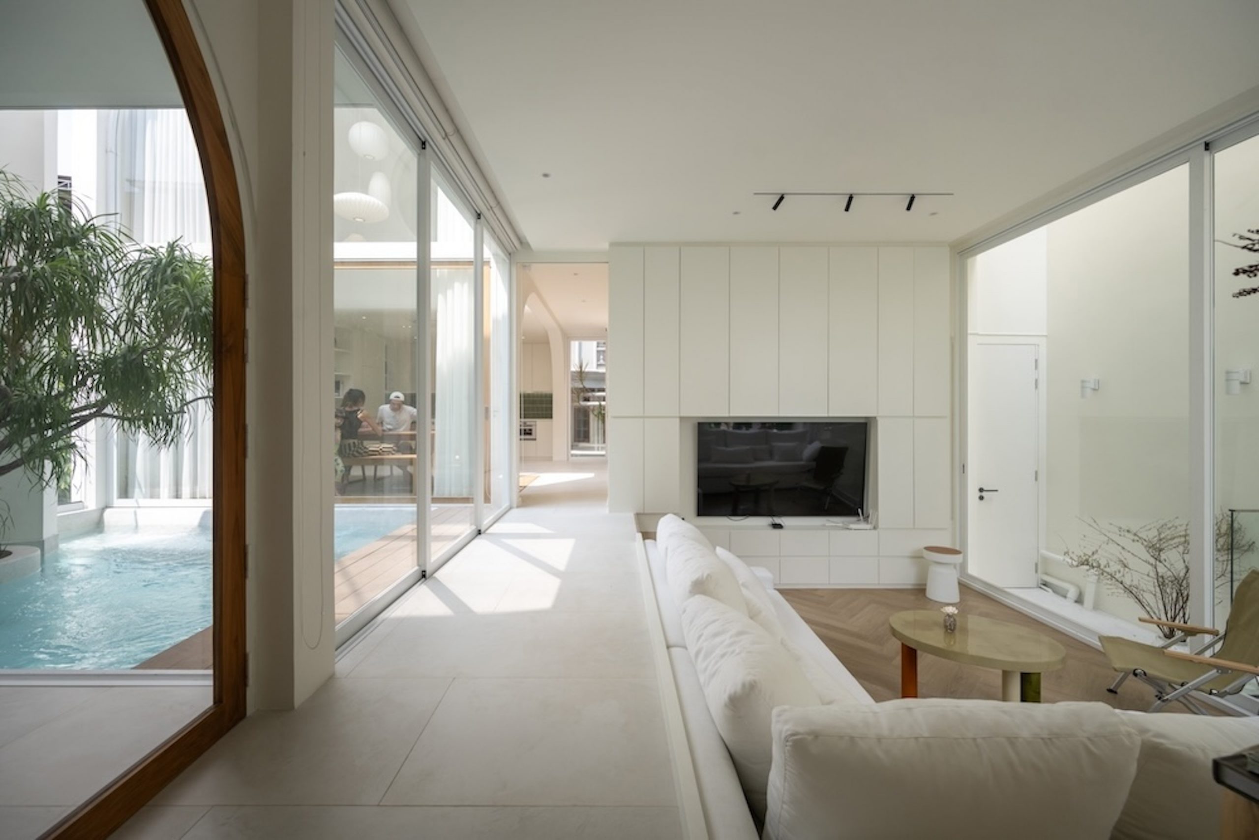
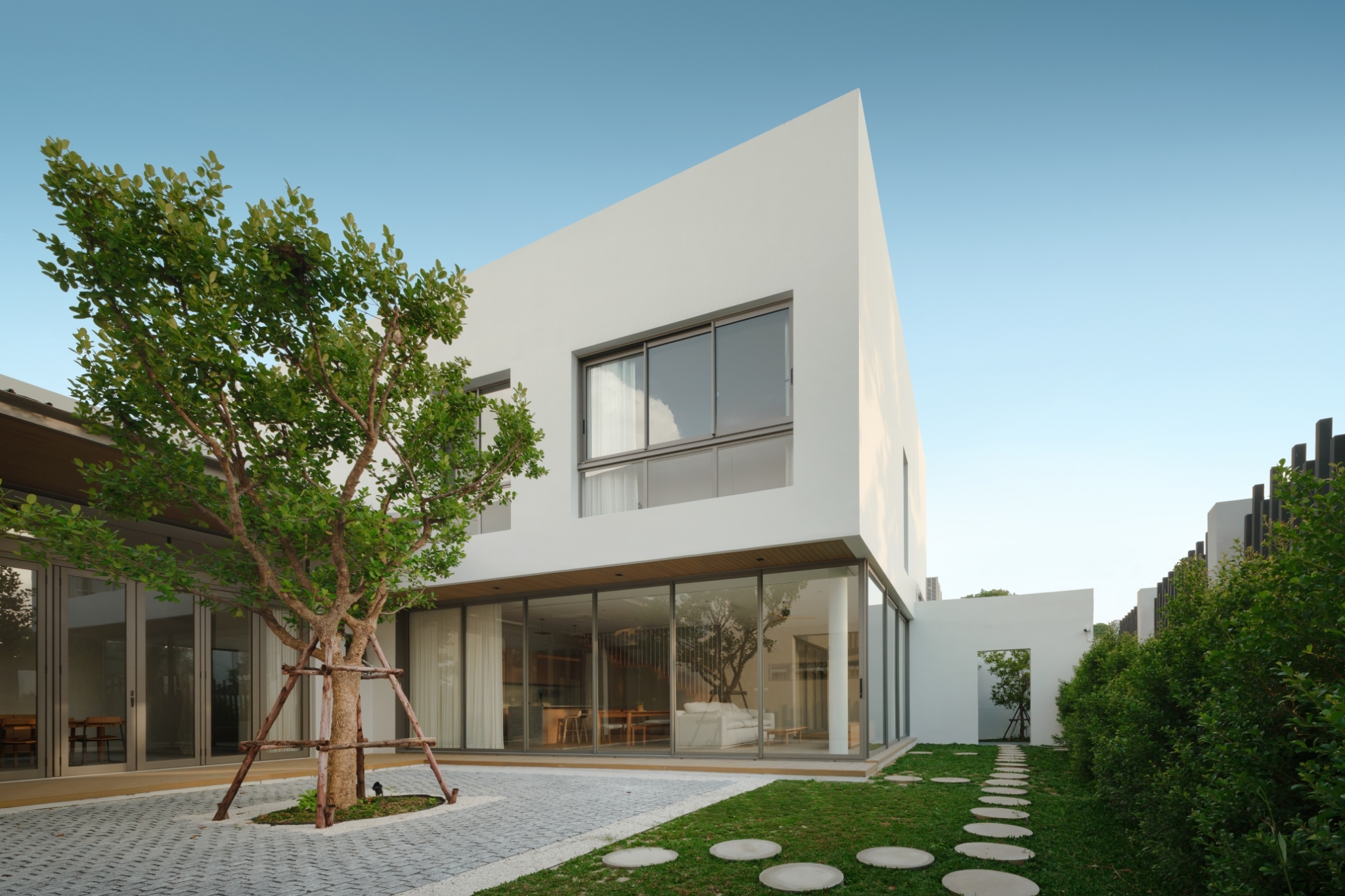
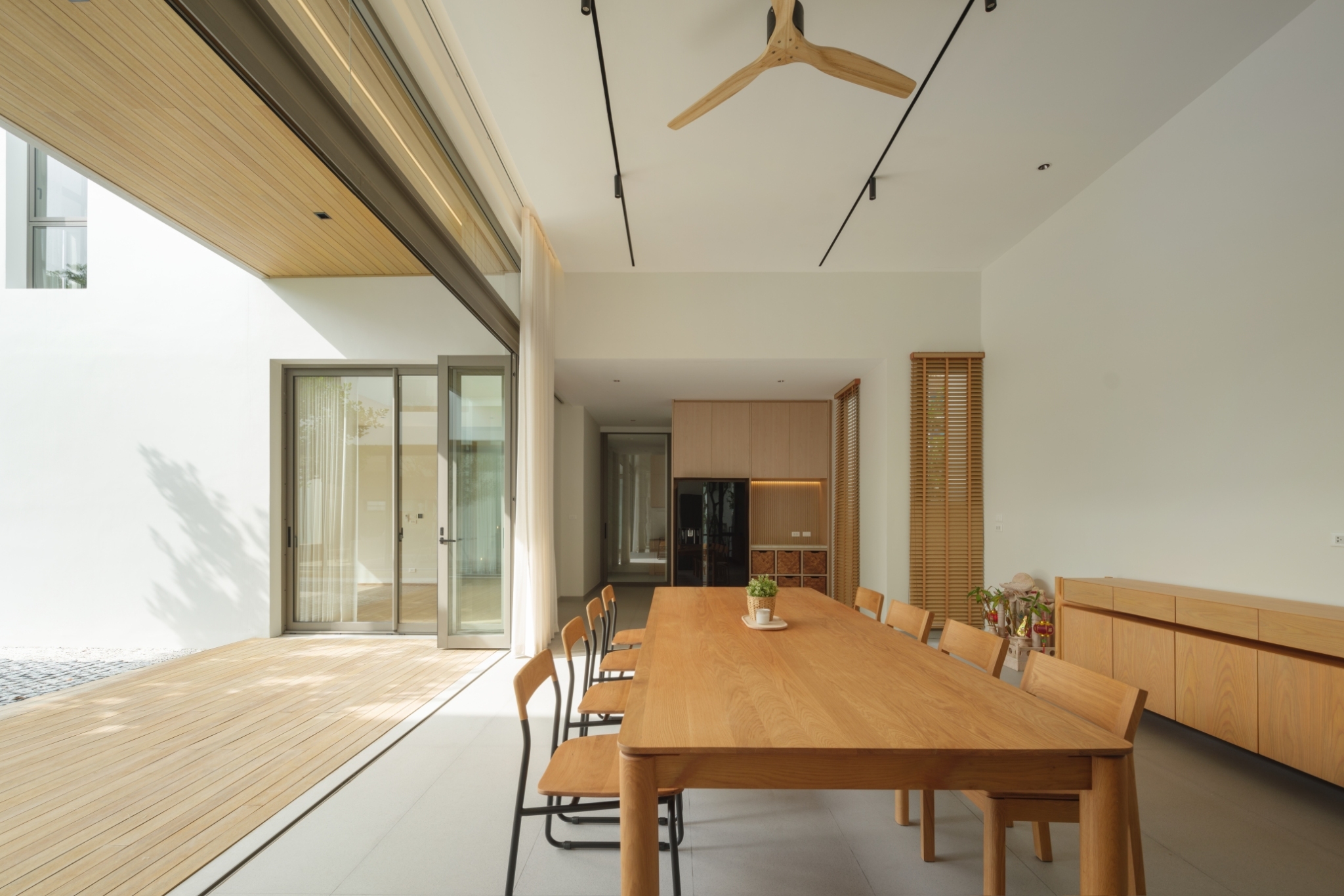
At the same time, moisture in the atmosphere transforms the entire premises into a peaceful, refreshing garden oasis. By design, the green courtyard splits the house into two separate wings. A corridor adjacent to the living room and dining room gives access to private living spaces tucked away in quiet corners. Along the way, a bare brick wall in grayish hues keeps the two wings apart, simultaneously serving as part of interior decoration.
The laundry room located at the far end is fully equipped to perform everyday functions.A sitting nook at the rear of the house has quite a charm to it. The room is well-lit by natural light, featuring the simplicity of bare brick walls in shades of gray and a small tree.
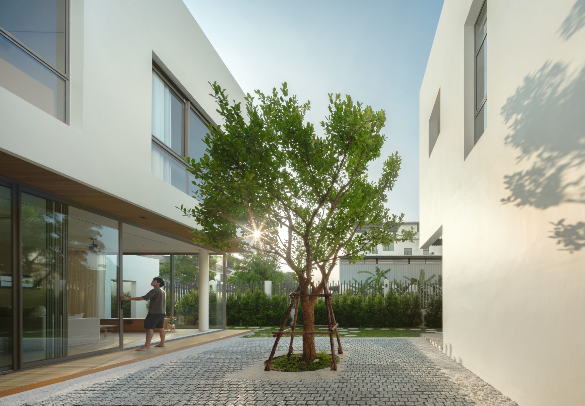
The concept is clear. When the trees are regarded as part of family, design must ensure that they are treated right like house occupants behave toward one another. This is evidenced by the way skylights are installed at the top of vaulted ceilings to allow indoor plants to capture the energy from the sun.
At the same time, the living room floor is set lower than ground level creating a volume of space overhead. Nearby, the trees and plants thriving in the courtyard get full sun that enables them to grow vigorously, providing a nice cool place to relax and unwind. In terms of the feel and functionality, the house boasts modern conveniences that fit together well with the layout forming a cohesive whole.
The materials and finishes are mostly wood, white walls and concrete blocks in shades of gray that merge with the color of the real wood floor. More than anything else, it’s sunlight working in tandem with texture on the walls that adds dimension and much-needed depth to the room, a perfect integration of nature in living space design and people’s lifestyle.
In a nutshell, the homeowner’s passion for nature is translated into a single-story house appropriate for the size of the landscape. Surrounded by an expanse of trees big and small, it feels calm and peaceful, thanks to passive design making space available for all things to go to work as nature intended. The result is a well-lit, well-ventilated place made for a healthy lifestyle and desire to be eco-friendly taking it one step at a time.
This house appears in the special Baan Lae Suan issue on the theme of “Cozy Living in Urban Homes” is out now. Design lovers, this one is for you. It’s the latest in the ongoing “ASEAN Tropical House Series”.
The exciting new bilingual edition (Thai-English) is a nice little collab between the Baan Lae Suan Press and its English language media arm Living ASEAN. It’s the coming together of ideas for dealing with the problem of limited space, turning site constraints into solutions. Precisely, it looks at problem solving techniques, ultimately creating small urban homes that are right within the context of Southeast Asia. In this issue, ten houses are chosen for their exemplary designs that inspire. It’s meant for architects, designers, and homeowners searching out new ideas for creating a living space that’s cozy and comfortable plus it blends in beautifully with the environment.
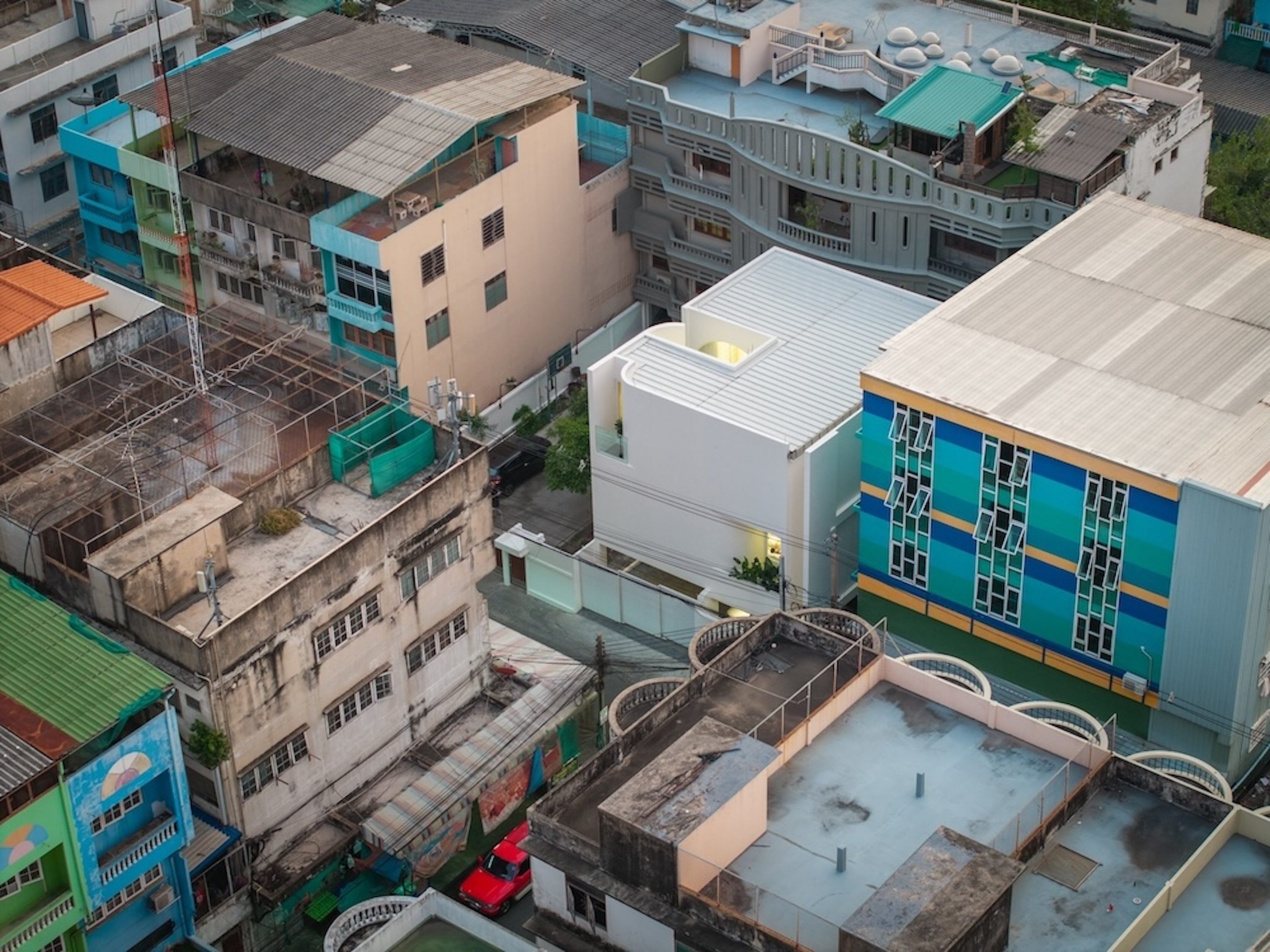
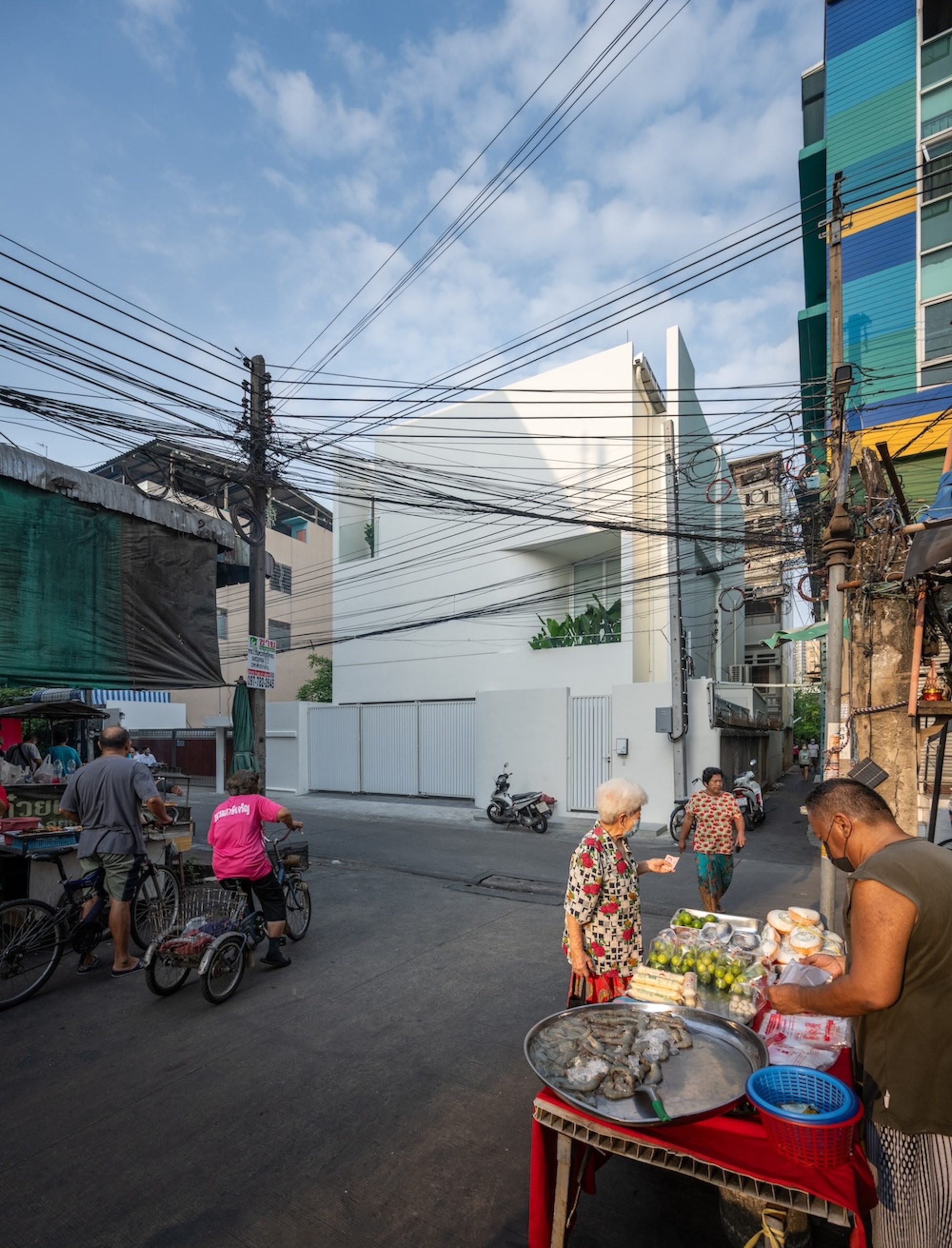
Bangkok, the capital of Thailand, is a densely populated, diverse metropolis renowned for being active and bustling with energy happening around the clock. Residential areas within the city itself are experiencing challenges including heavy traffic, the heat and noise, and increased air pollution to name a few. Many people are caught off guard by new construction projects and high-rise buildings mushrooming in their neighborhood.
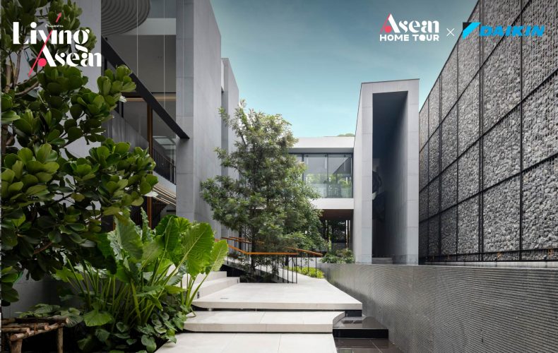
The “Earth and Sky House” is a thoughtfully designed, beautifully built family home offering an escape from the hustle and bustle of the city. It’s energy efficient and has access to outdoor space and recreational facilities to enhance comfort and convenience. Thanks to its relaxed atmosphere, the house becomes a favorite hangout for friends and family. Plus, there is a dedicated space within the property for the owner to operate a business from home.
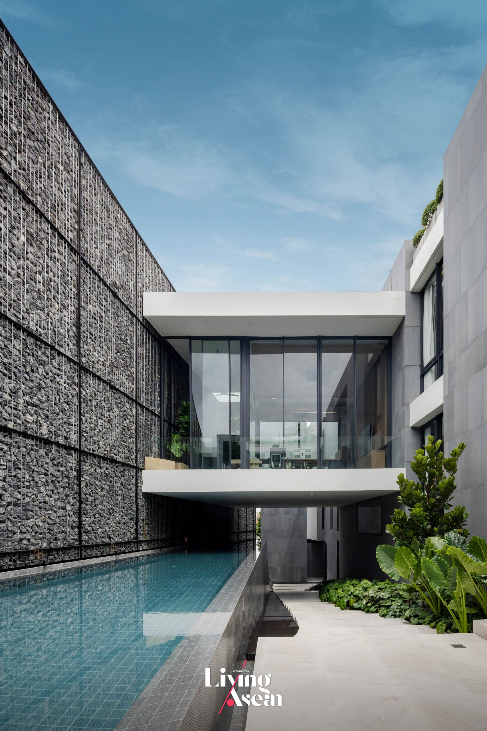
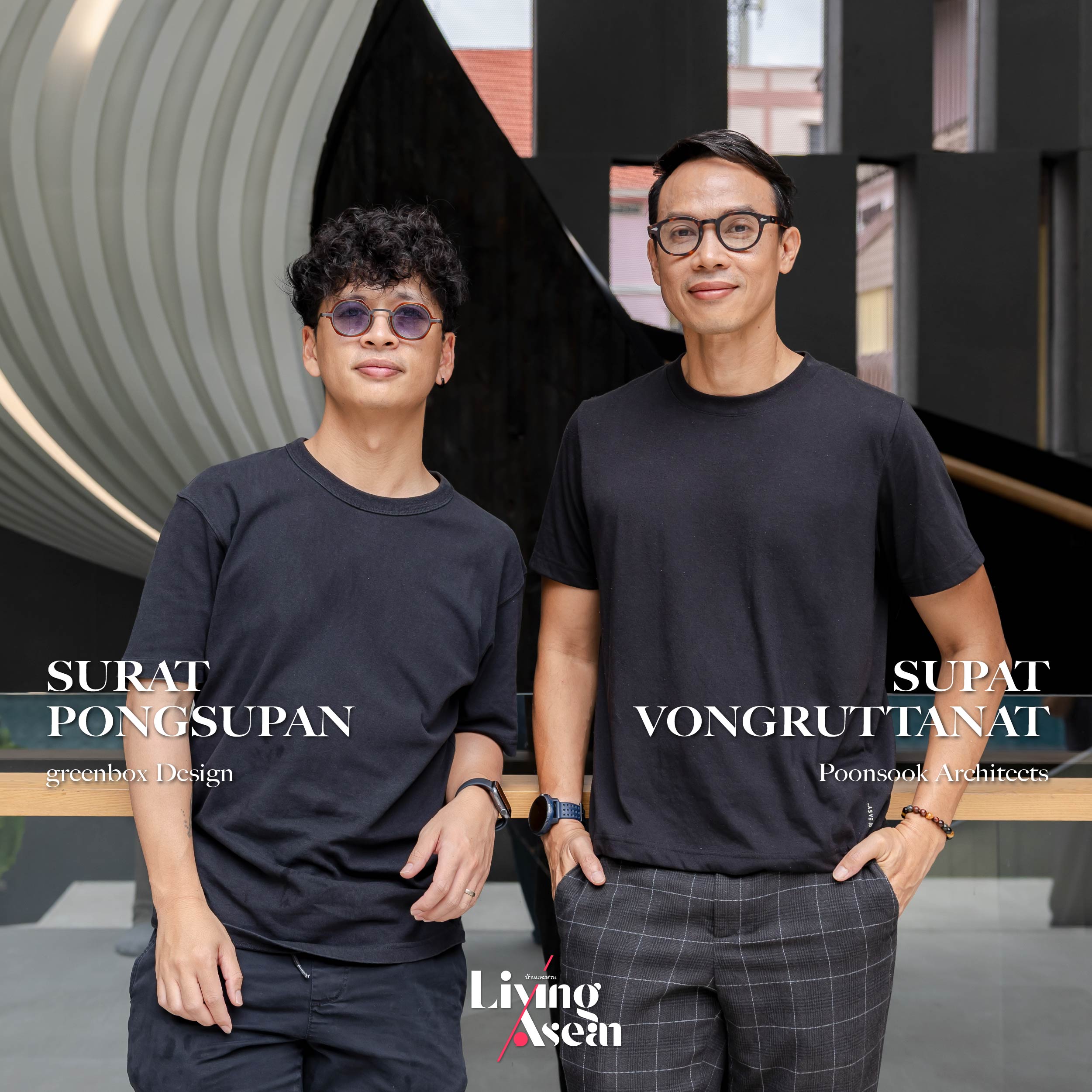
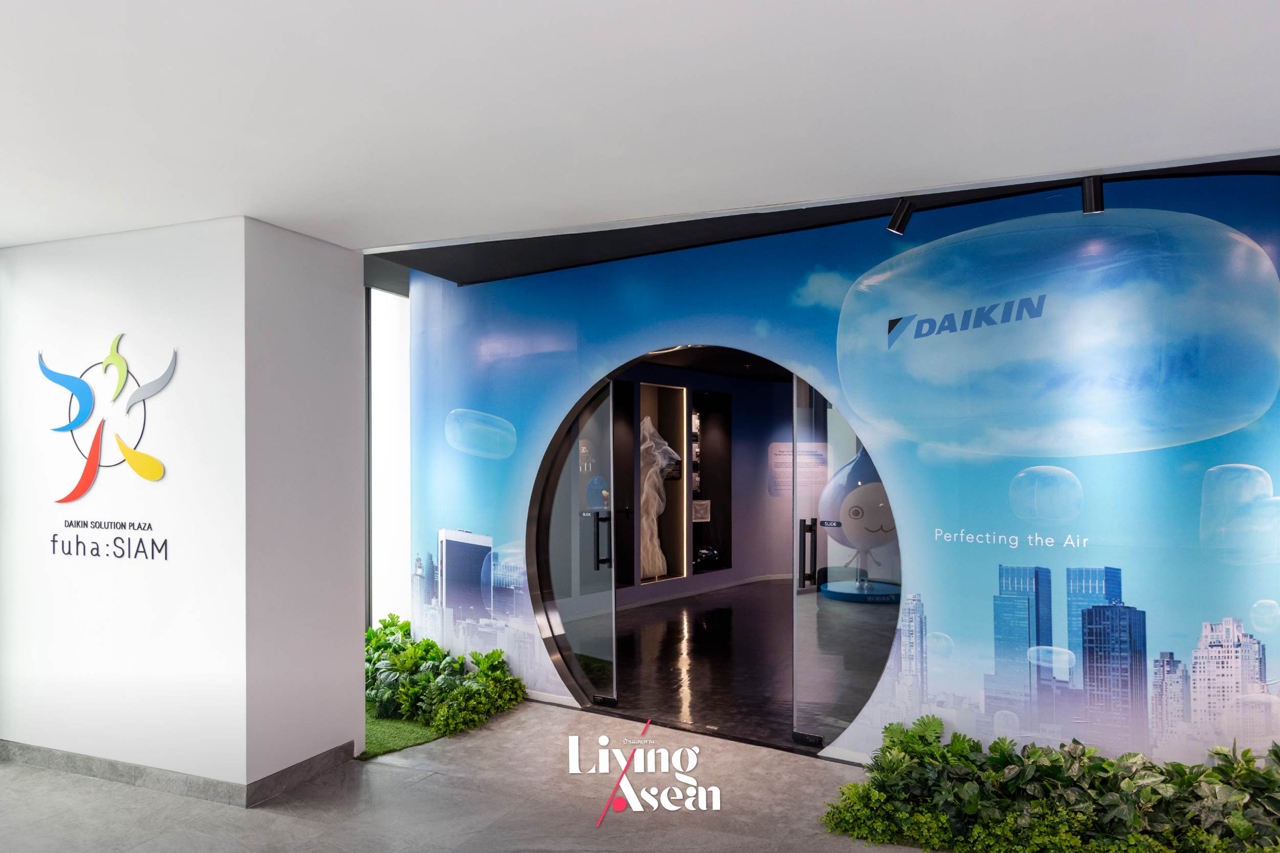
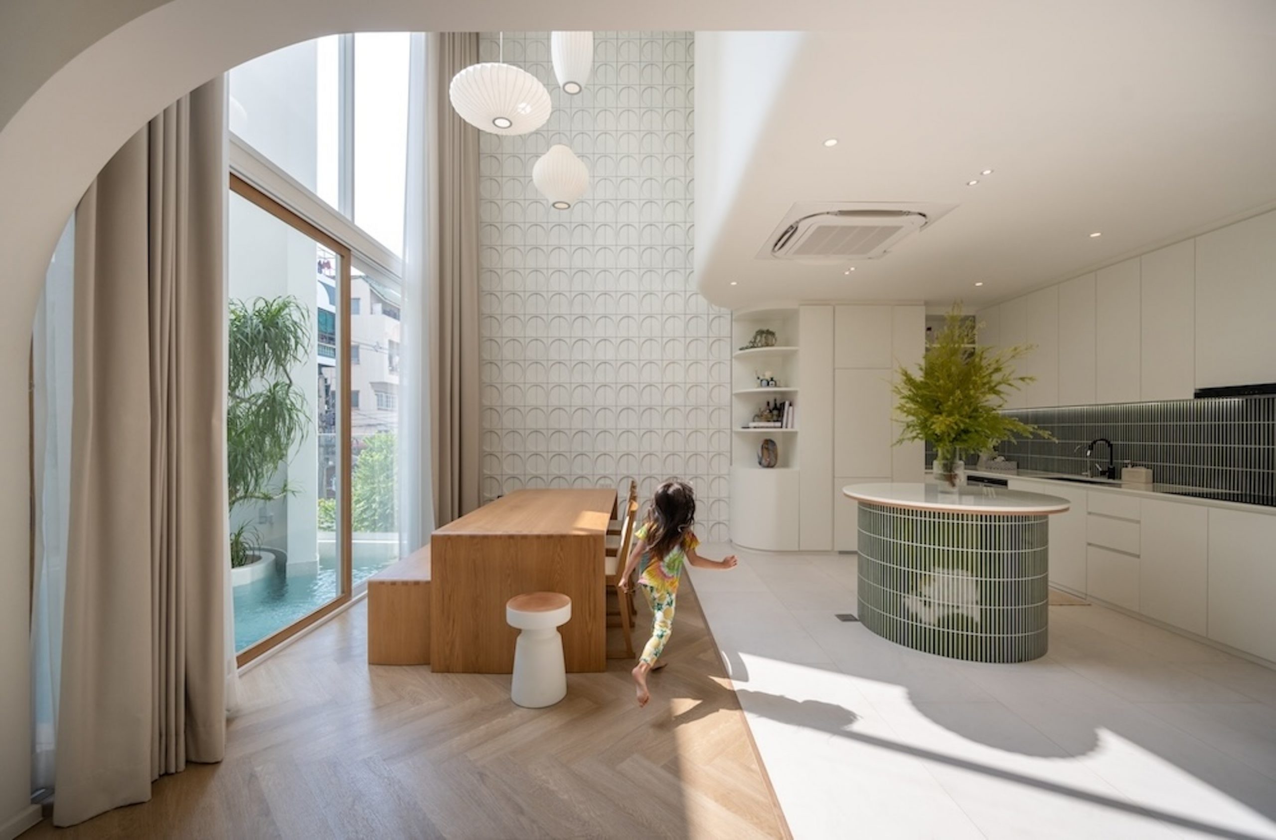
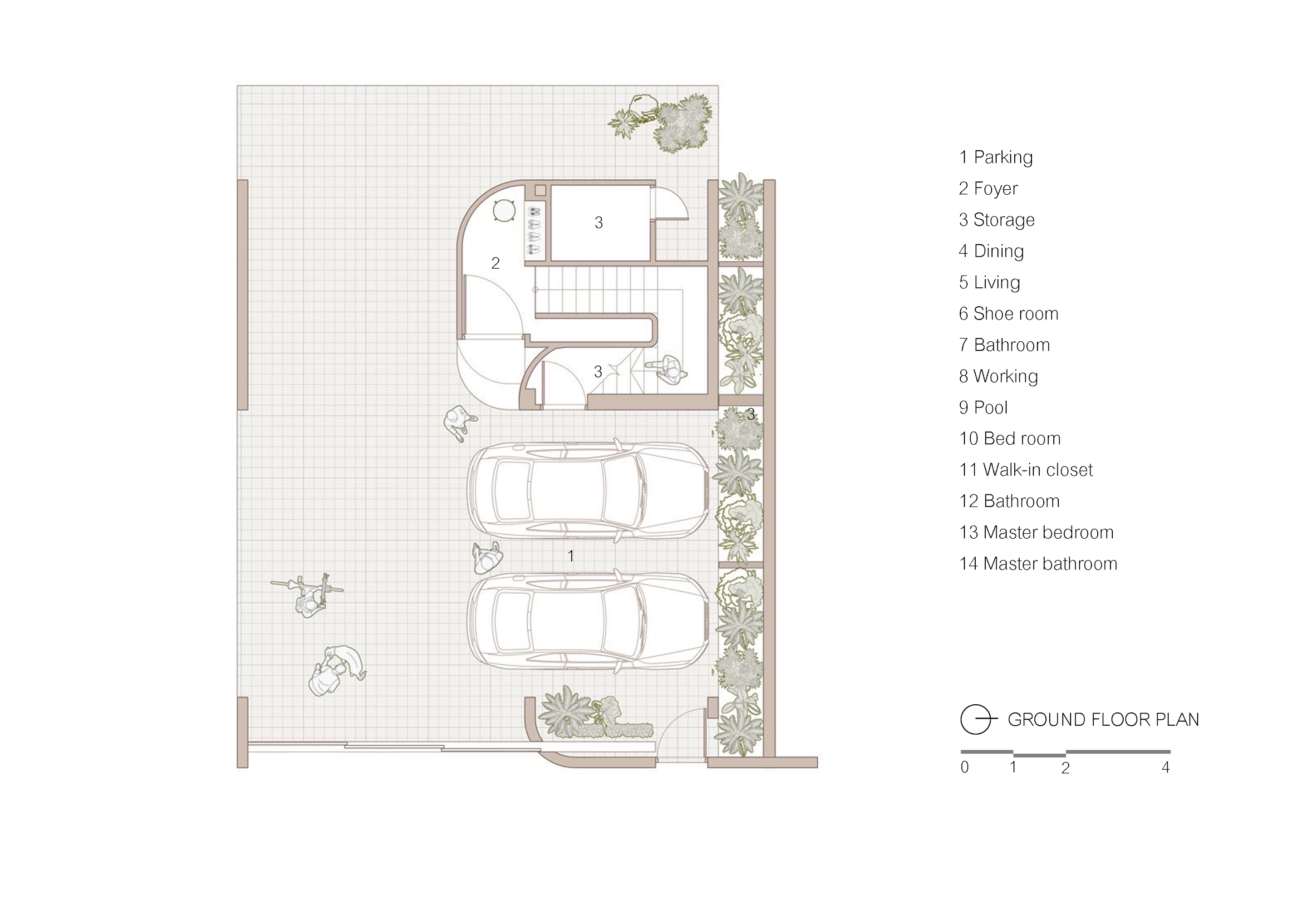
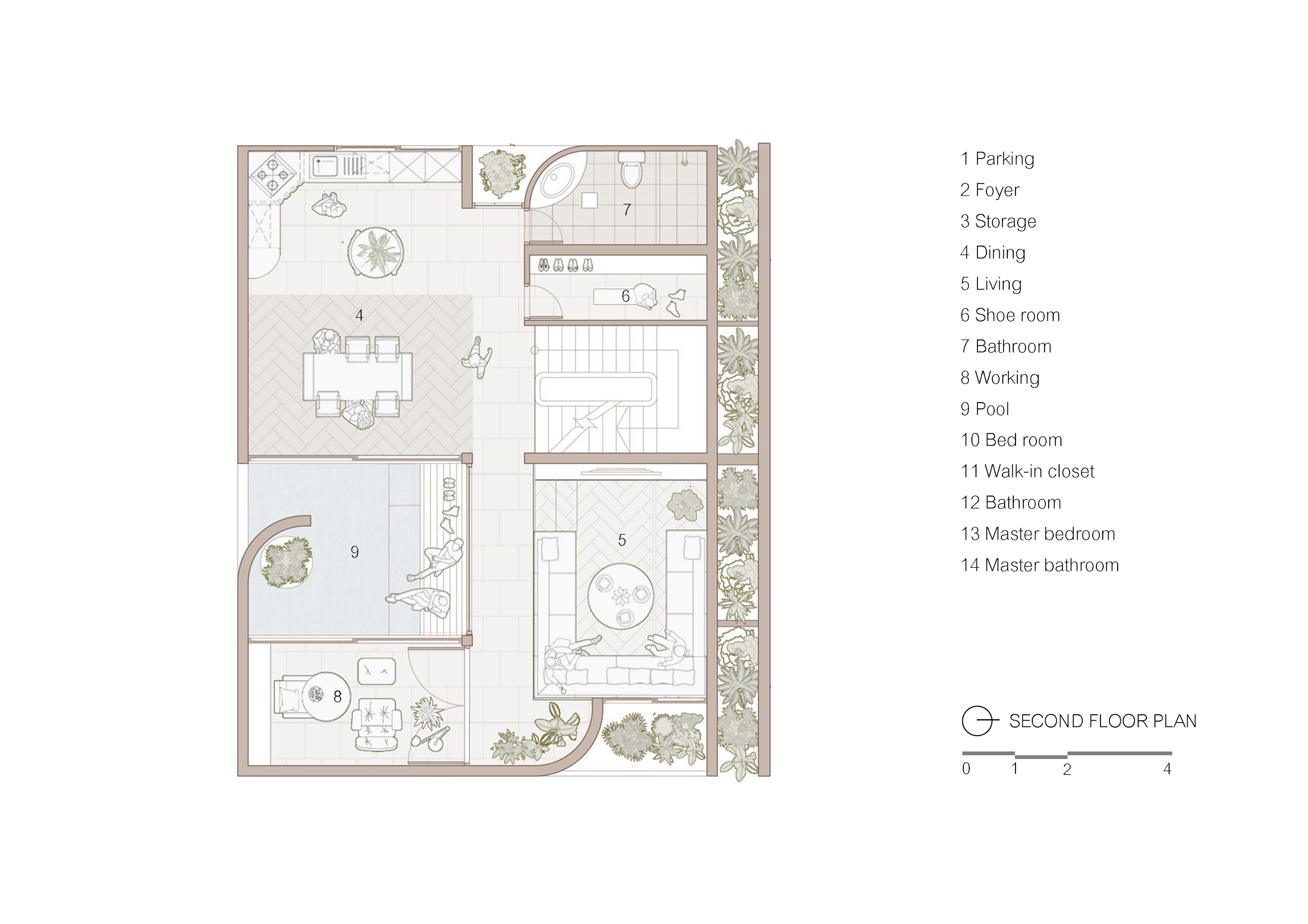
It all started with the owner wanting a home with a view of the landscape and sky. At the same time, he wanted a design that prioritized privacy without closing off his space. The architects responded with a three-story house plan, a single detached home built on 1 Rai of land. It offers 3,000 square meters of usable space. Aptly named “Earth and Sky House”, it’s a work of outstanding artistry by greenbox Design in collaboration with Poonsook Architects. Interior design is done by EKAR Architects. Together they succeeded in overcoming site constraints, framing them as opportunities for innovative design solutions. The result is a family home that is physically and psychologically relaxing, achieved by combining a natural ventilation system and advances in air conditioning technologies from DAIKIN, the world’s largest air conditioner manufacturer.
Come join us as we explore cutting-edge innovations shaping our world at DAIKIN Solution Plaza fuha: Siam. This experience allows a profound understanding of air, discovering every detail with true expertise and moving toward perfecting the air beyond what you’ve ever known.The show is part of the ASEAN HOME TOUR series, a weekly program on Baan Lae Suan TV.
Earth and Sky Home
The house with three levels of living space and an office is built on 1 Rai of land, offering a 3,000-square-meter total usable area. Nestled in a busy neighborhood of Bangkok, it offers a sense of privacy, a peaceful place to live, work and meet up with friends. The name “Earth and Sky House” conveys a great deal about the homeowner’s belief that human lives are enriched by relationships with the environment. It’s a concept he learned from experience working as a photographer. From his perspective, “a home doesn’t have to look like a home in the traditional sense”. Instead, it can be an expression of personal taste and value and, in this particular instance, a private world that has something for everyone in his family.
The above concept provides a seed from which new ideas grow, giving the architects means to translate creative thoughts into tangible results. In this case, the construction site has limitations that affect planning and execution. To build on a trapezoidal piece of land, first they assess the relationships between the physical location and its immediate environment. Only then can they start work on spatial planning, distributing people and activities to see how well it serves daily needs. Take for example the private office and a cozy space where family members can relax and enjoy quiet time together are secluded in a quiet, isolated spot away from the high-traffic zone that include guest reception areas. The overall effect is impressive with an emphasis on clearly defined open spaces that are visually pleasing, well ventilated and well lit by natural daylight.
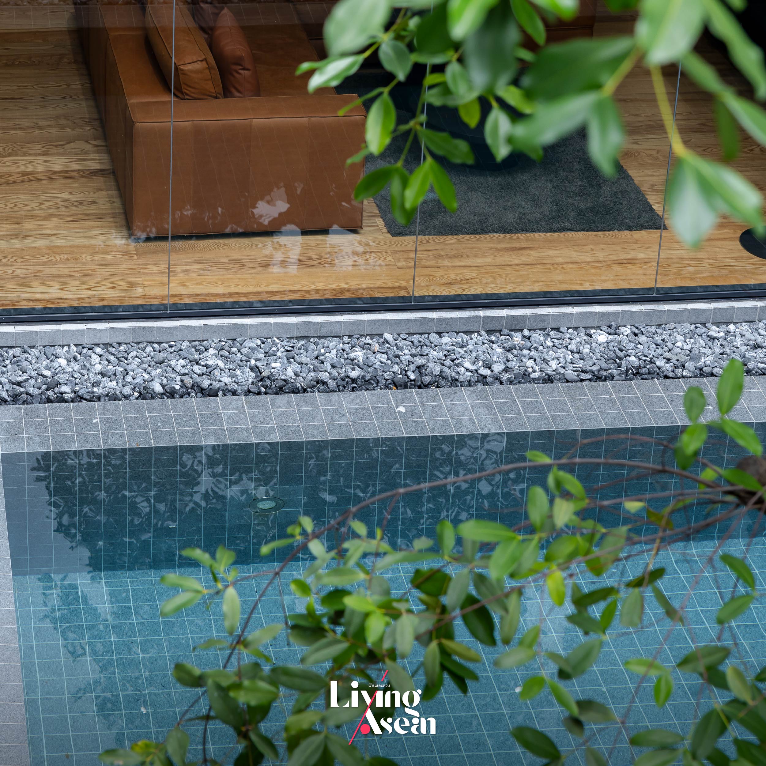
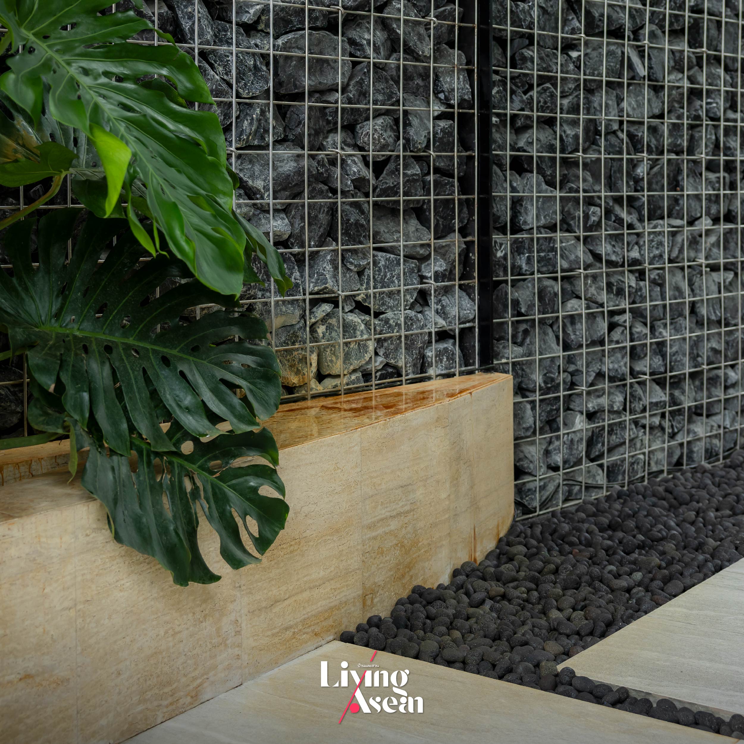
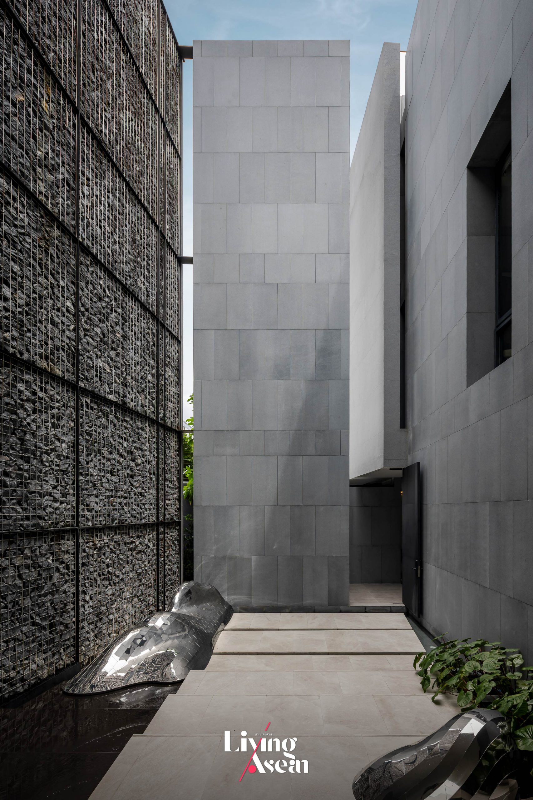
The earth is portrayed through various elements, such as the choice of building materials, colors and textures that connect with nature. Seen here, volcanic rocks adorn a stone wall while the bathroom floor is covered in pebbles juxtaposed with smooth pavers in natural sandstone. Vertically stacked lava rock creates an atmosphere of harmony with the physical world. It makes unique outdoor decorations and doubles as a privacy screen for the home.
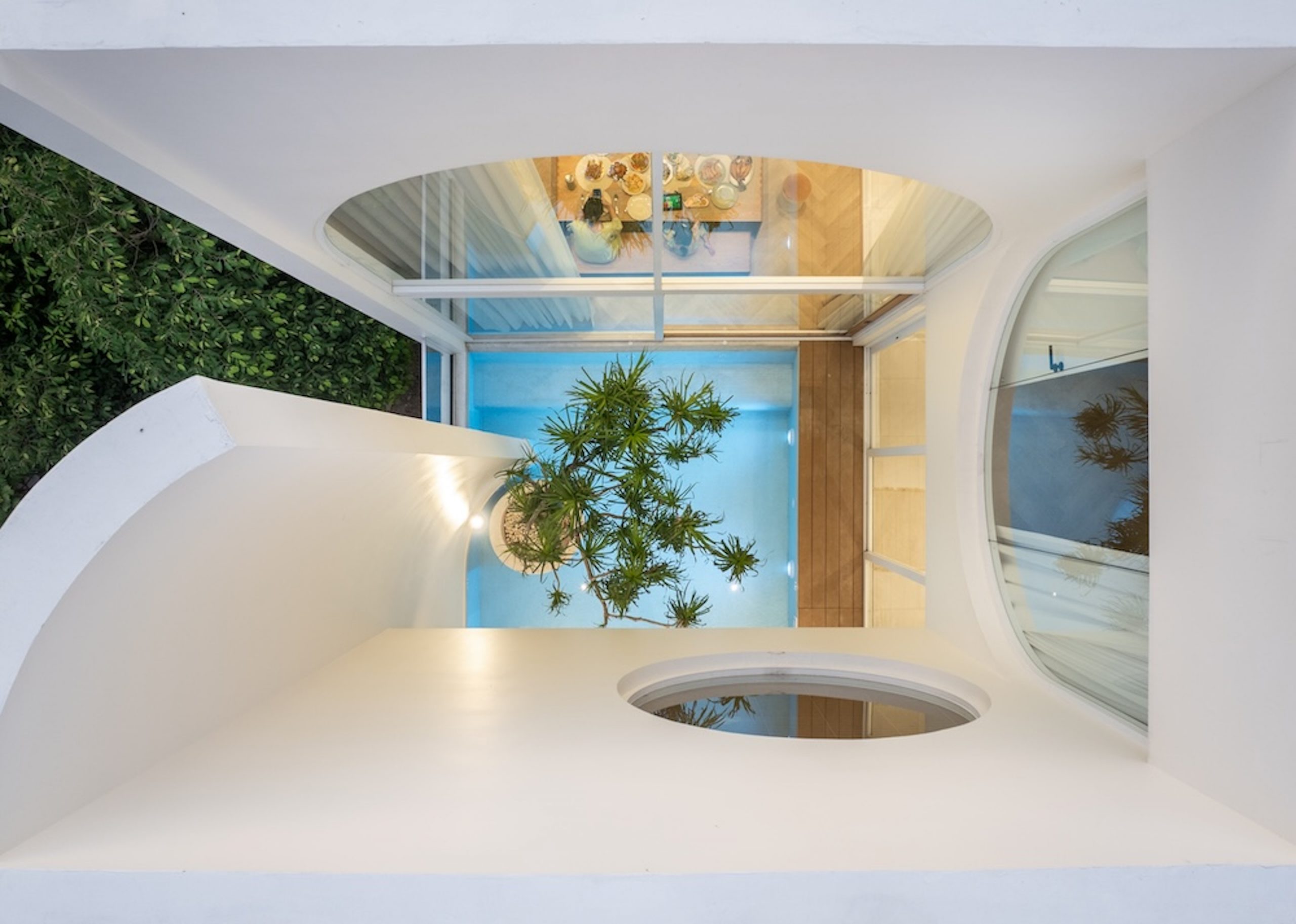
The sky is represented by open concept design that gives the home a more spacious feel and a sense of tranquility. The center courtyard under blue skies brings more natural light, fresh air and views inside, meantime, providing a dynamic connection to the outdoors.
The design duo who created the Earth and Sky House, from left, architects Surat Pongsupan of greenbox Design and Supat Vongruttana of Poonsook Architects. Sharing the vision that guided this project, they said:
Surat Pongsupan of greenbox Design (left) and Supat Vongruttana of Poonsook Architects, the two architects who make the homeowner’s wish come true.
“The idea of the earth is portrayed through stone surfaces and the use of vertically stacked lava rocks and travertine, which is a type of limestone, in various parts of the building. They include stone wall cladding that protects home privacy and fosters a sense of connections with nature.”
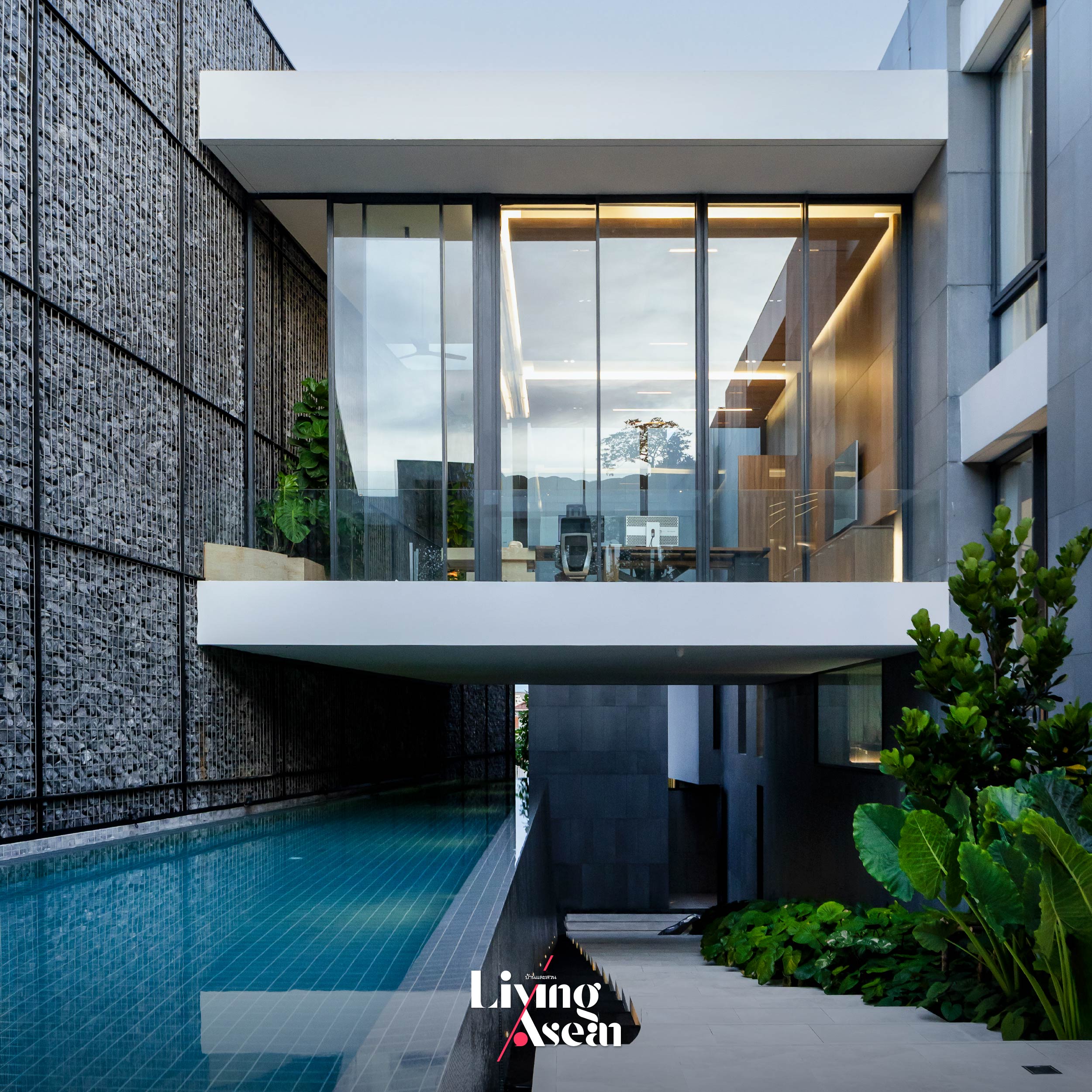
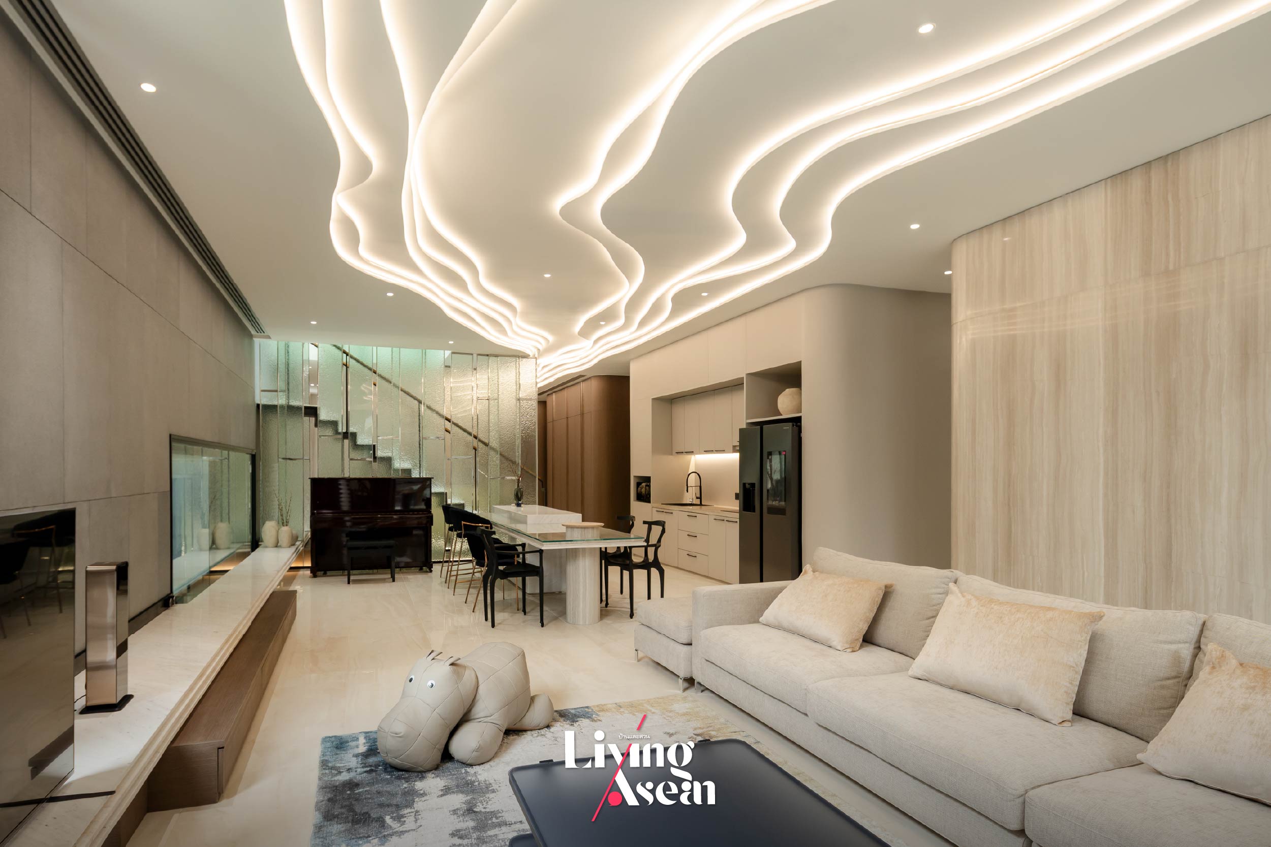
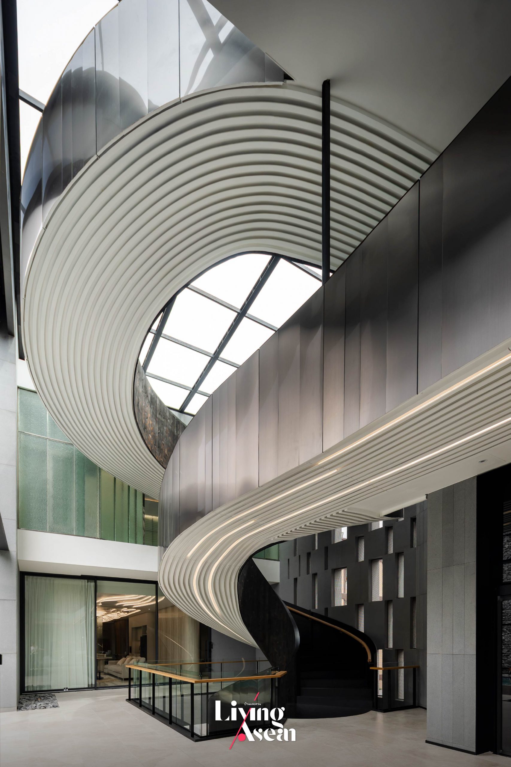
“The concept of the sky is integrated into the design through openings in walls, connecting interior and exterior spaces and creating visual flow. Like so, the wild blue yonder can be seen from every living space in the house. Take for example the living room enclosed by an eight-meter high glass wall and a spiral staircase that gives the feeling of walking to the sky.”
“The most outstanding feature is the center courtyard adorned with a well-tended small garden nicknamed the Pocket Park. Healthy foliage seems to come up at every turn, evoking a sense of a vibrant environment. There’s a lap pool nearby that’s built flush with the house wall. Windows fitted with glass in the rooftop allows light and fresh air in, turning the courtyard into a private outdoor space that opens to the sky.”
Making a good first impression with private living space design
Because the house is in a busy area where new high-rise buildings are expected to increase in the near future, the architects responded with an effective layout that prioritizes privacy. From a distance, the house facade built of stacked stone enhances privacy and curb appeal while reducing noise and protecting from the elements. Step inside, and you come to an impressive entrance hall providing access to various parts of the home.
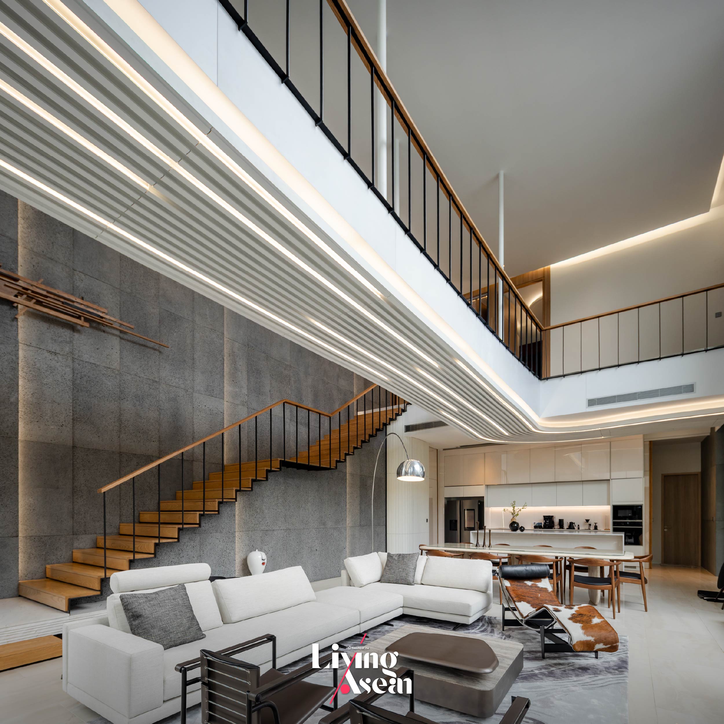
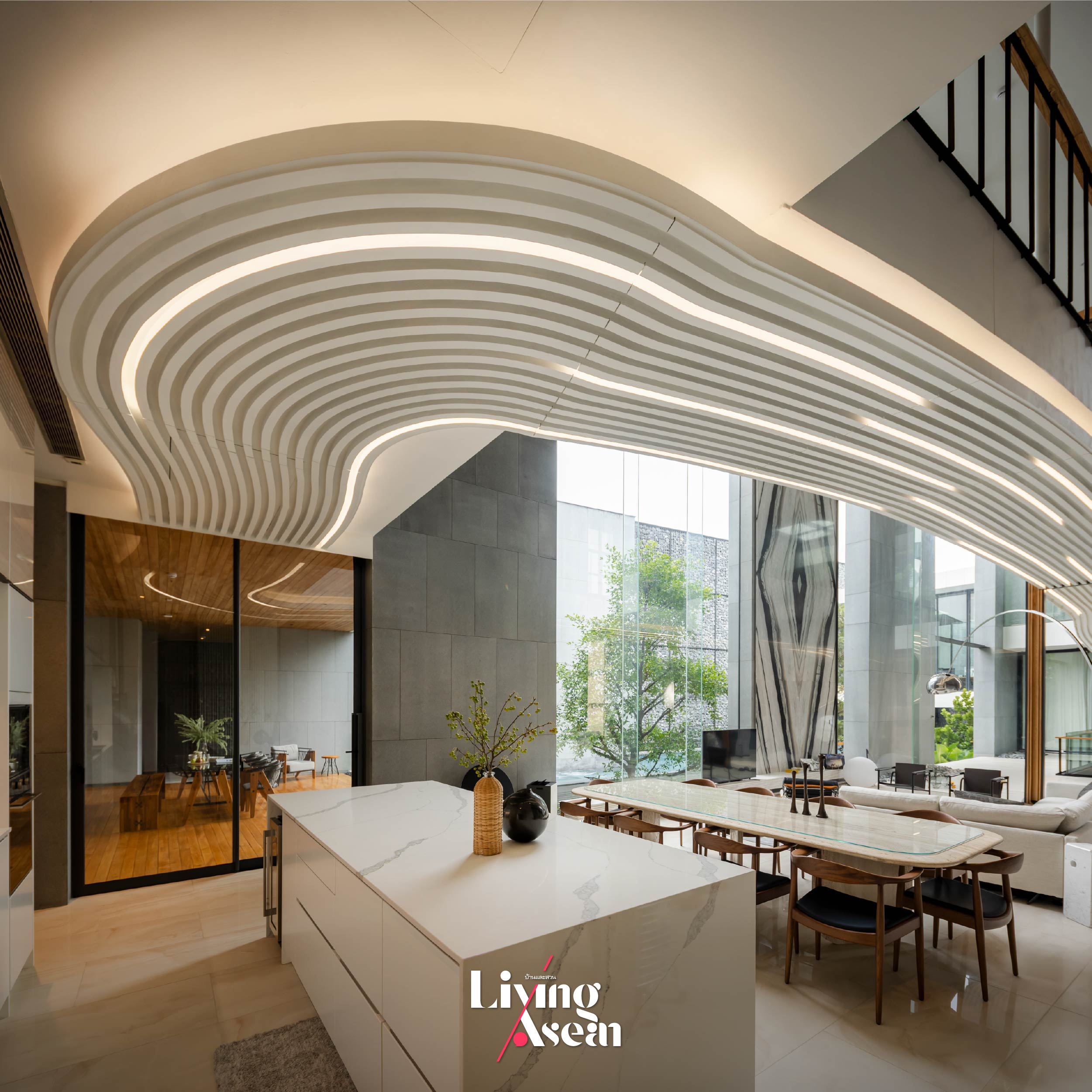
The three-story house is divided into two wings to create distinct zones, typically separating private living spaces and areas for hosting guests. By design, the reception hall is brilliant with a modern touch to it, offering a relaxed, social environment. The net result is remarkable, thanks to natural stone wall cladding on one side of the room and the eight-meter high glass wall on the other. At the center of the room, light colored furniture paired with double-height ceilings creates a sense of spaciousness and opens the room to garden views, fresh air and sunshine.
A double-height ceiling paired with bookmatched marble wall coverings make the reception room feel bright and airy. Not far away, a pedestrian bridge flies overhead connecting two wings on the second floor. Graphic design using light effects on the underside of the footbridge, adding a curvy touch to interior decor. Furniture is neatly arranged to achieve a sense of balance, harmony and order. There is a long rectangular table that can seat ten people, flanked by a large sofa set on one side and a pantry table with a marble top on the other. Open concept design eliminates interior walls to create one large, unified space connecting different areas and improving natural light and air flow. In the fewest possible words, the room is party ready.
Taken as a whole, it’s a specially large house with many outstanding features for comfortable living. It’s evident that the team of architects has succeeded in creating a home that’s functional and aesthetically pleasing both inside and outside, yet there’s no compromise on privacy. A design with an enormous richness of light and airy spaces is a good case in point. As architects Surat and Supat put it, integrating nature into house design is just the right move that brings many benefits. In their words:
“The most fundamental idea that we further developed has led to a perfect fusion of natural materials and architecture, plus it’s about maximizing natural daylight indoors, letting it bounce back from surfaces, ultimately creating a tropical feel in the home.”
“The parts of the house dedicated to living are protected by walls made of vertically stacked rocks that double as privacy screens preventing outsiders from seeing in. Meanwhile, the west-facing wall is a different story. It’s intentionally constructed with gaps to allow air and moisture to pass through, a clever hack to keep the home cool and comfortable year-round. At sunset, rays of light shine through gaps in the wall, creating visual effects that enhance the home’s aesthetics.”
Interior decorating focuses on original and unique styles
Apart from the areas for receiving guests, the house also has ample relaxing spaces set aside for the family, including a sitting room that balances aesthetic appeal with comfortable furniture and modern amenities enhancing quality of life. As might be expected, the atmosphere is warm and welcoming thanks to a thoughtful layout that evokes a sense of ease and tranquility.
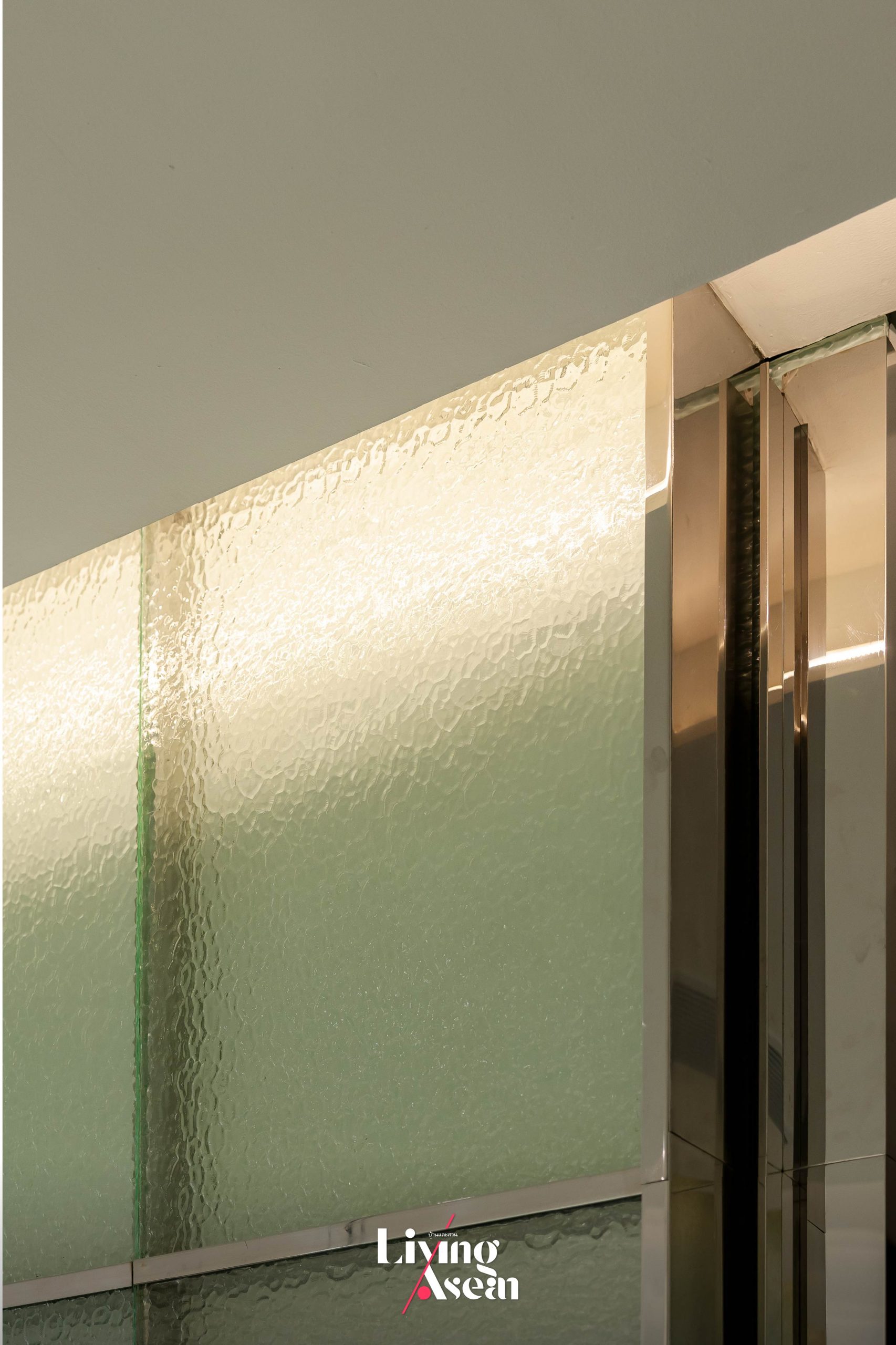
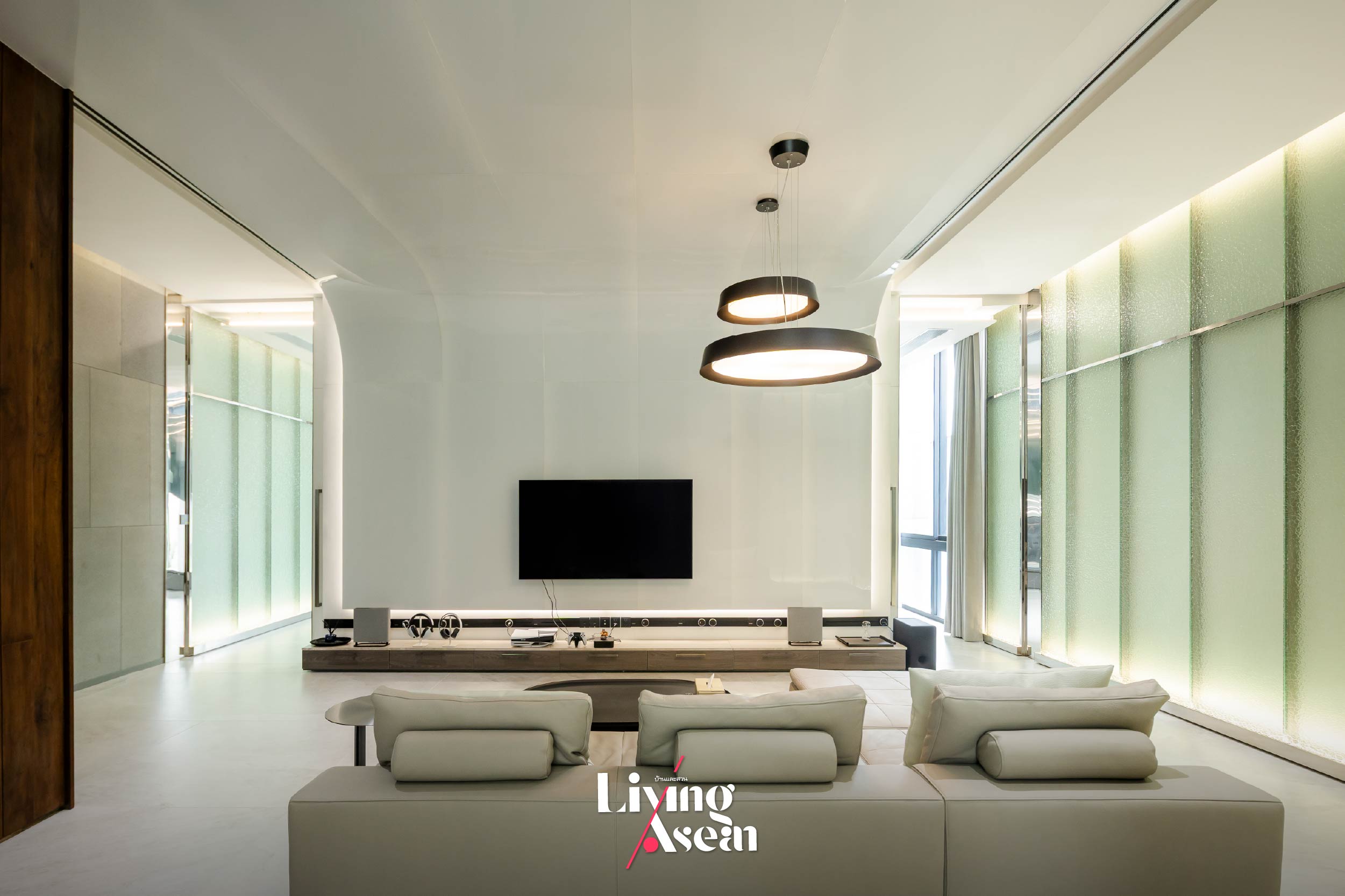
To be more specific, the sitting room is elegantly furnished and rich with warm tones creating a positive home atmosphere. It’s enclosed by the house walls glazed with wave textured glass that gleams when touched by light. Look up, and you find the ceiling with a wavy graphic pattern that evokes pleasant visual movement from one end of the room to the other. Needless to say, the extra long deep sofa is soft and cozy, flanked by a dining table set and a dream kitchen pantry that comes complete with modern conveniences.
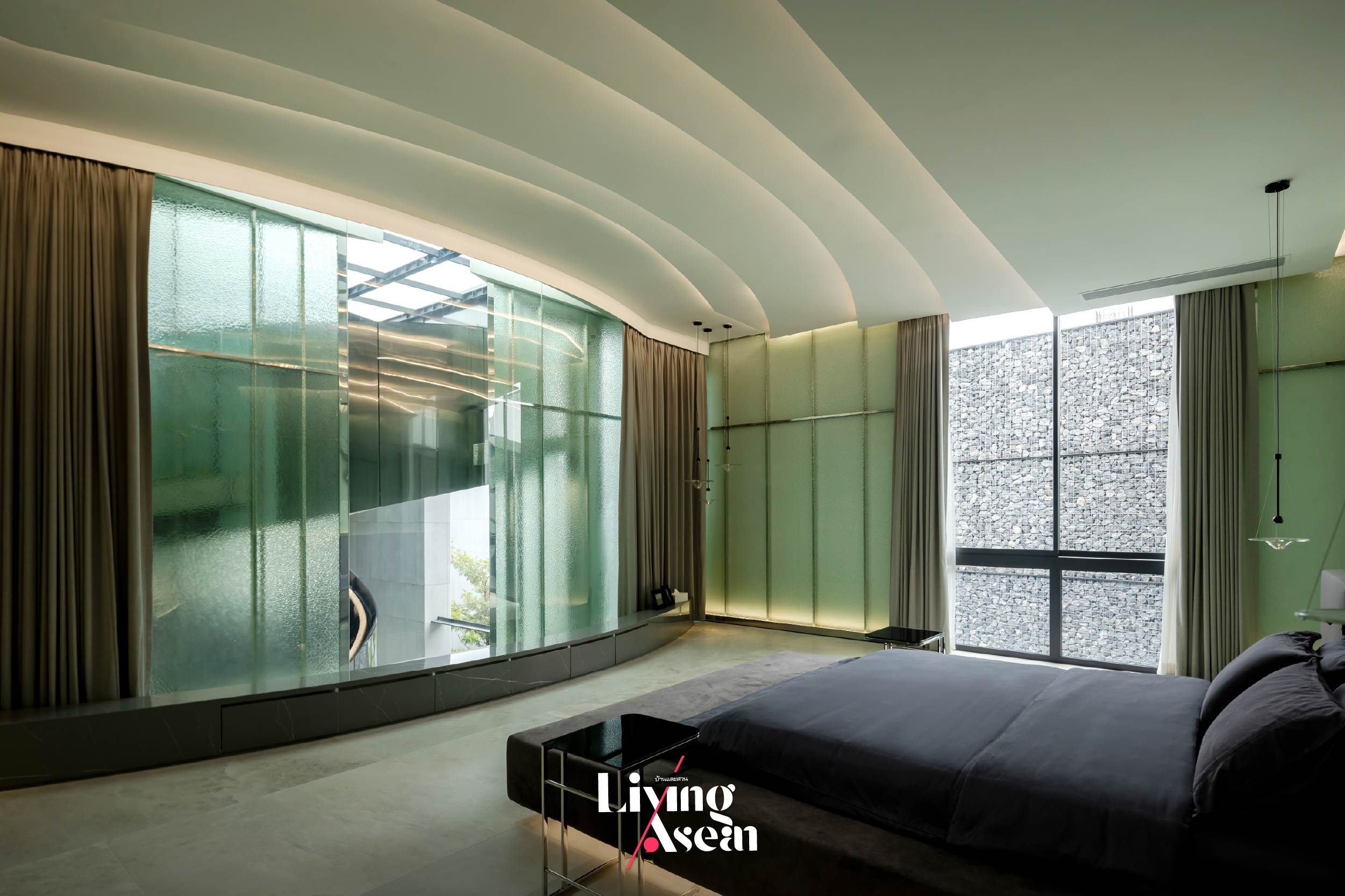
The principal bedroom embraces a minimalist design approach, emphasizing the beauty of simplicity and uncluttered space with only a few pieces of furniture. A calming atmosphere is created by removing distractions in the bedroom. The only focal point is a platform bed with its low profile that gives the room a sleek and modern look. On one side of the room, window coverings improve comfort by regulating temperature, while a pair of bedside table lamps provides the ideal soft lighting. On the ceiling, curved design incorporating arched elements add a gentle touch to bedroom vibes.
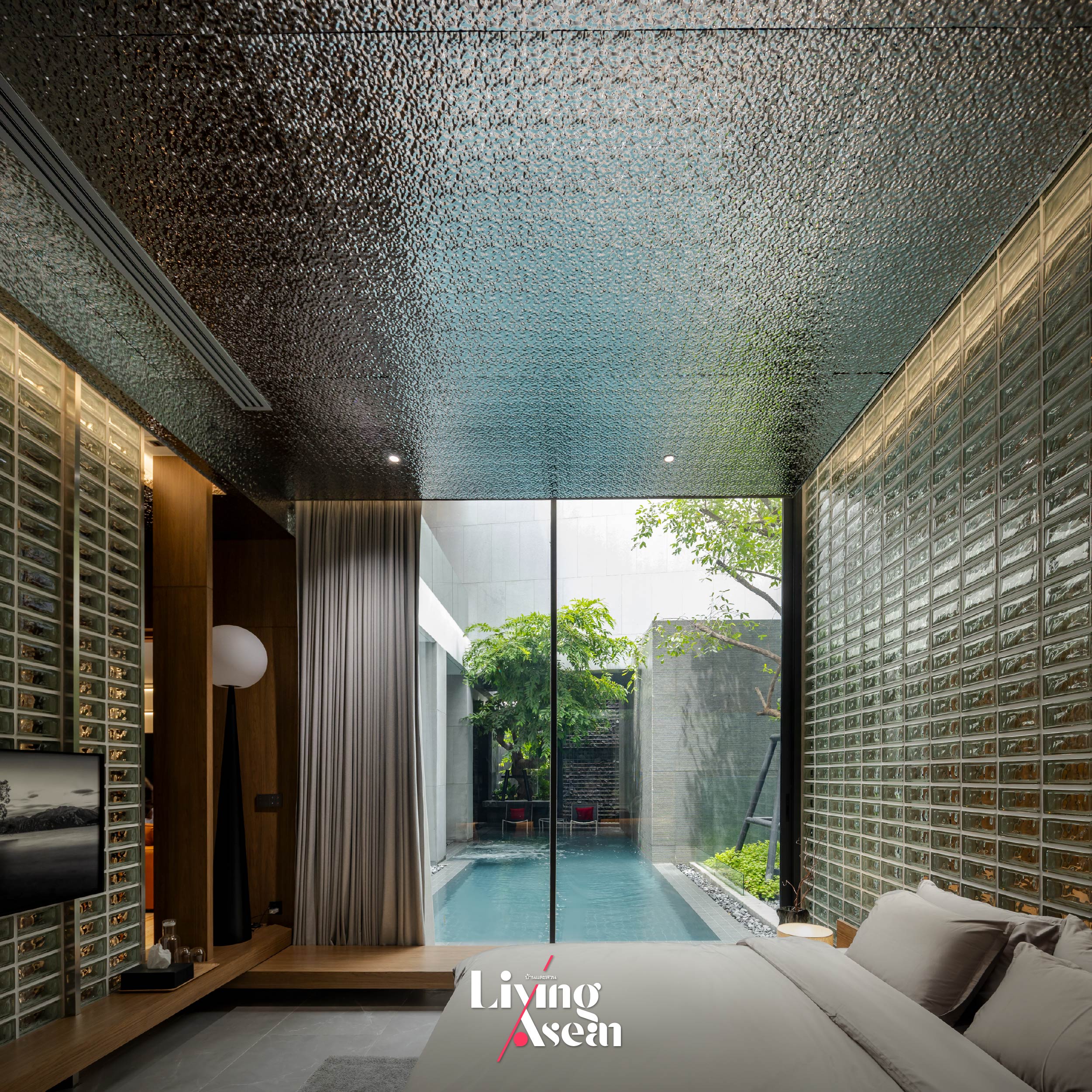
Wave textured translucent glass creates a relaxing atmosphere, evoking the feeling of walking underwater. Other than that, the room is well-lit, spacious and cooled by an air conditioning system that blends with interior design.
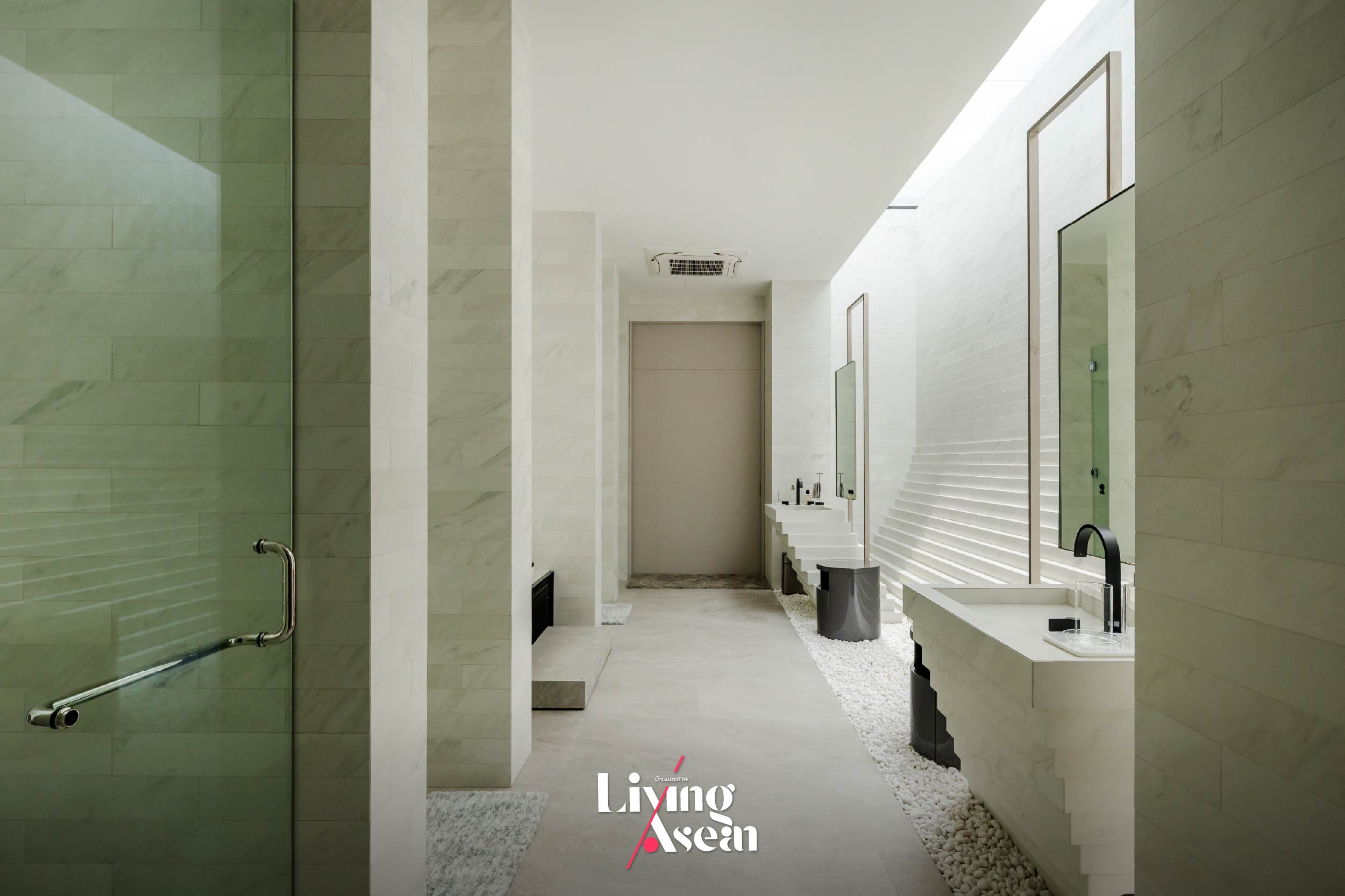
Equally impressive is the principal bedroom that has an ensuite bathroom with a Jacuzzi and an oversized bathroom sink. As expected, the bathroom comes in a cool white shade that’s associated with cleanliness, clarity and calm plus it makes the room appear larger and brighter. On one side of the room, the wall curves upward for aesthetic reasons, creating a sense of fluidity and dynamism. A window installed in the roof increases natural daylight and improves ventilation. As time passes, changing light creates a wide range of visual effects in the room. Interestingly, the floor with smooth tiles and natural pebble stones speaks volumes for a connection with the earth and sky.
Every corner of the house is a journey, a living space full of memories
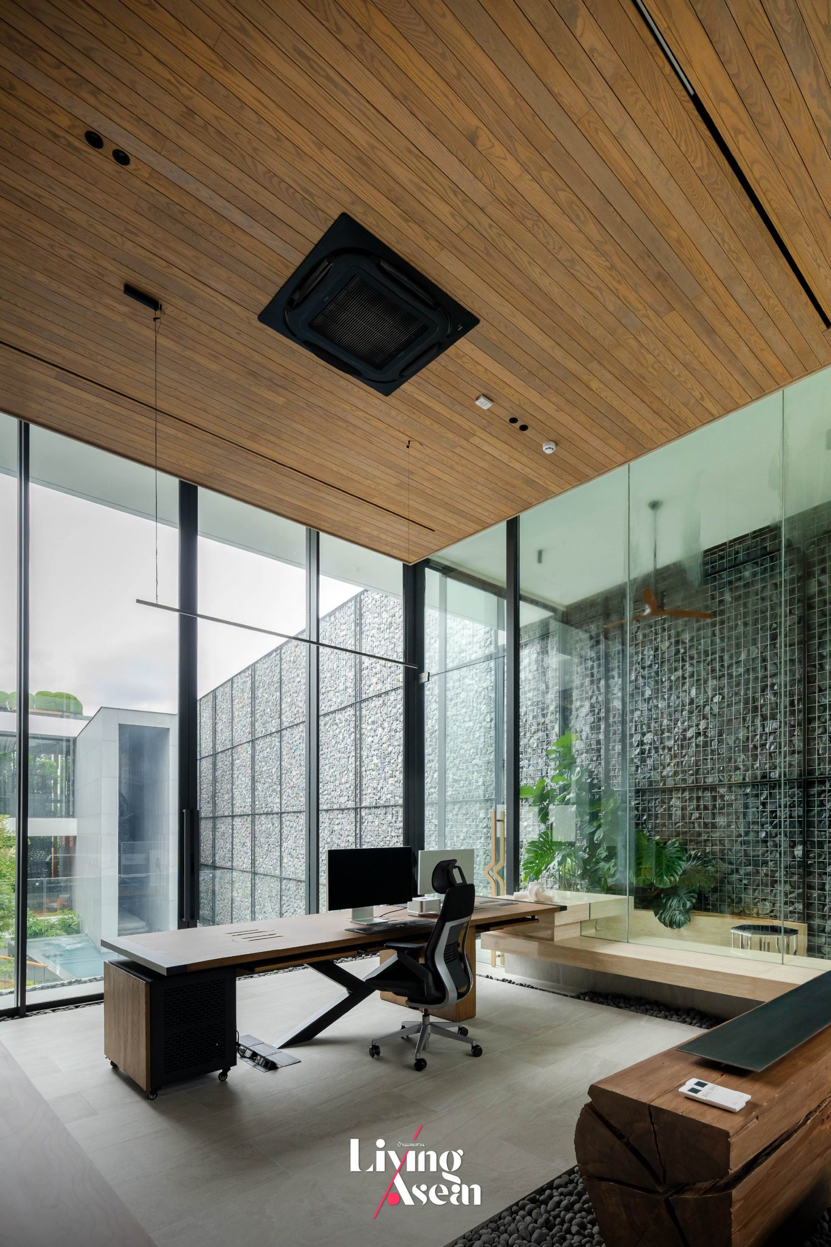
Apart from the two distinct zones for family living and receiving visitors, the house also has an office that the owner uses for work. For this reason, it makes perfect sense to establish a dedicated workspace with good lighting and a comfortable atmosphere. In this particular instance, a raised office space with large windows comes in handy to minimize distractions and set clear boundaries between life and work.
By design, other parts of the home can be seen in full view. From his vantage point the owner can see into the courtyard adorned with a pocket park, the guest reception area and the swimming pool nearby. For easy access, the home office has doors on both sides, a clever hack to improve natural ventilation, plus a paved outdoor area to take a break, prevent burnout and improve productivity.
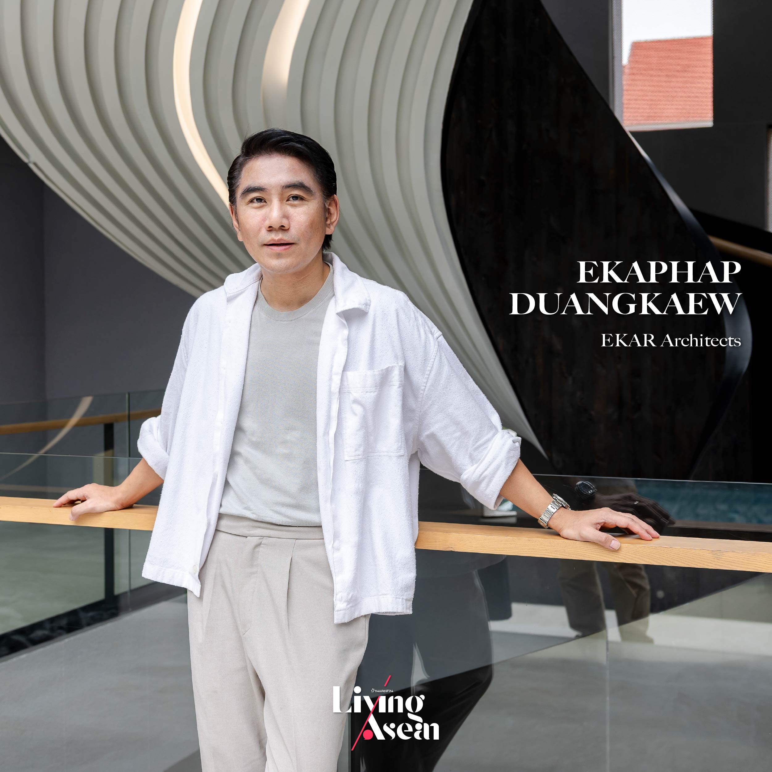
Ekaphap Duangkaew of EKAR Architects
Ekaphap Duangkaew ofEKAR Architects is responsible for creating and overseeing the implementation of interior design plans. Sharing his ideal and perfect place of joy with us, he said the house design got its inspiration from a diverse range of the homeowner’s experience as a photographer and globetrotter. Precisely, it conveys a great deal about the concept that home is always a journey. It’s about creating dynamic spatial sequences showcasing elements marking the passage of time. Yet it never digresses from the original notion about human relationships with the earth and sky. This is evident in the design of a spiral staircase that’s in and of itself an architectural sculpture. Illuminated by a rooftop skylight system, the staircase and its surrounding walls evoke a feeling as if one is walking up toward the sky, a journey of aspiration so to speak.
“A work of interior design must have a definite wow factor. In this particular case, it’s about creating funky, futuristic looks that speak volumes for the homeowner’s experience as a photographer who has traveled the world. Every part of the house has a story to tell. And the designer is obliged to do exactly that – telling stories of journeys to new places across the globe. It’s quite a challenge for large house plans.”
“The architects and interior designers must stay focused on reducing overall energy consumption. They have to determine which part of the house can open to fresh air and sunshine and which part will require an air conditioning system to keep the interior cool and comfortable year-round. In the meantime, lighting is important. Sustainable design can be achieved by finding balance between natural light and the amount of sun’s heat passing through openings in walls. This is especially true in homes with double-height ceilings such as this one. There are parts of the house that will require air conditioning to create indoor thermal comfort. Plus, it’s reasonable to make sure an air conditioning system can be integrated with interior design, thereby becoming a perfect complement to the existing decor.”
A cozy living design thanks to good ventilation and knowledge of a tropical climate
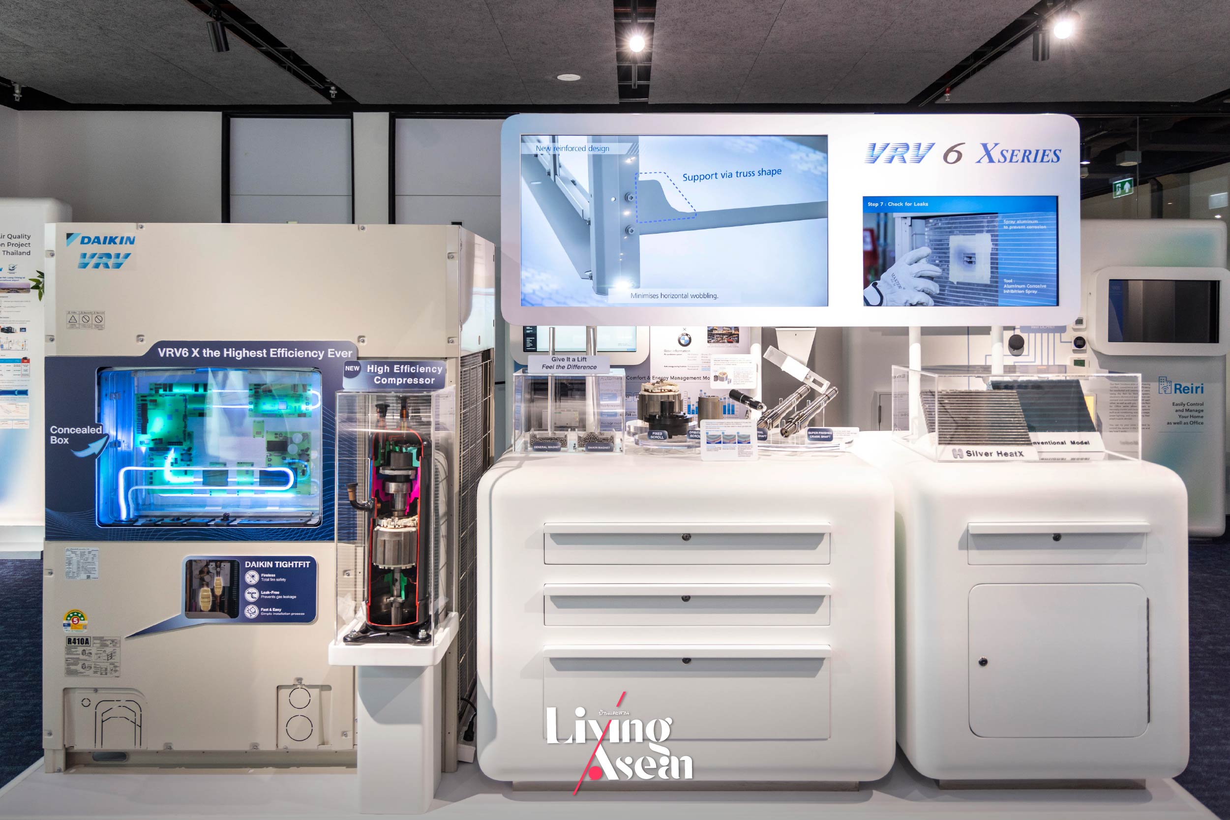
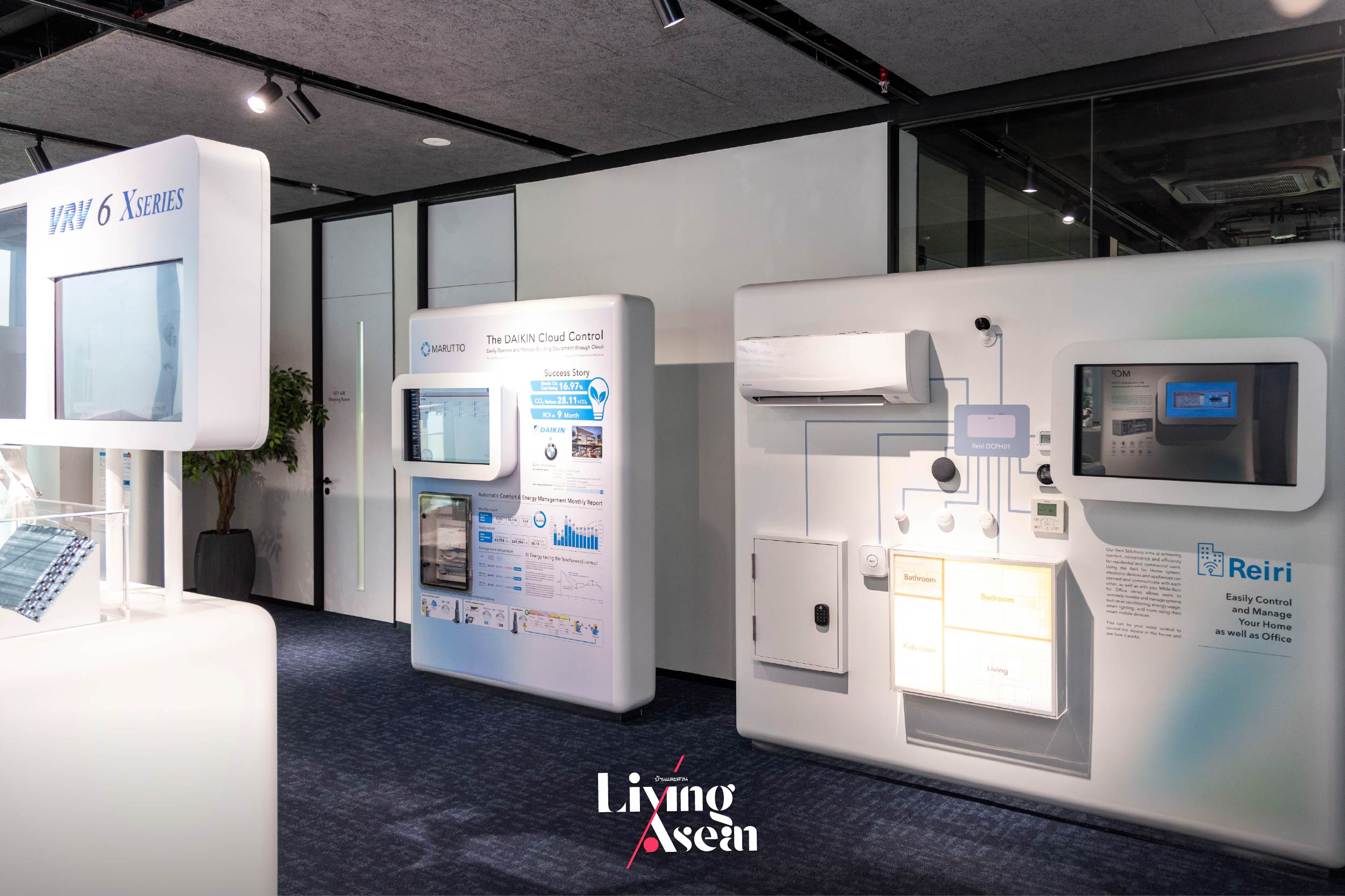
The interior living space is cozy and comfortably cool thanks to a large air conditioning system known as VRV, or Variable Refrigerant Volume. It’s an advanced innovation developed by DAIKIN, the world’s largest air conditioner manufacturer. The VRV system connects outdoor and indoor units through a smart refrigerant network, supporting up to 64 indoor units within a single system.
The evaporator coil and blower fan are discreetly hidden, circulating cool air throughout the home’s ductwork. Daikin offers a variety of indoor unit designs to complement any interior style, and this home beautifully features two of them: the Duct Type, which delivers air through concealed vents, and the Cassette Type, which integrates seamlessly into the ceiling to create a refined, harmonious look.
According to Ekaphap Duangkaew ofEKAR Architects, “The VRV system provides benefits beyond just cooling. It operates quietly to create thermal comfort throughout the entire house, plus there’s nothing unsightly or visually jarring that can create an eyesore. The secret lies in concealing the home’s ductwork, indoor evaporator units and blower fans behind walls and ceilings, leaving only wall vent covers and ceiling cassettes visible to the naked eye. In this way, it’s possible to create large windows and doors to let natural daylight in, giving the home a bright and airy feel.”
There is much more to new air conditioning technologies than smart design integration. Rather, it’s about enhancing comfort and well-being by improving indoor air quality. Above all, it has to do with removing allergens and dust, especially PM 2.5 or inhalable particulate matter that’s considered a serious health threat. Because homes can easily become contaminated with dust, pollen and unpleasant odors, the design team chose to give the Earth and Sky House an extra layer of protection by installing the DAIKIN Streamer, an air purifying system that helps filter out allergens and keeping indoor air clean and safe from pollution.
Large by any standard, the Earth and Sky House looks the epitome of architectural design best fit for a tropical climate. It offers a whopping 3,000 square meters of usable space distributed across the three floors. A fully functional home, it’s clean and fresh thanks to correct building orientation that optimizes passive ventilation in response to wind direction, shade, and sunshine.
It proves that privacy can be achieved despite being in a busy urban neighborhood. The key is to create buffer zones, such as green space in a center courtyard that increases natural light and air circulation in the interior. In a few words, it’s an improvement in physical and mental well-being that comes from using architectural strategies in combination with modern technology.
Learn more about air quality and technology at DAIKIN Solution Plaza fuha: SIAM.
After touring the Earth and Sky House, it’s time to visit another interesting place in the heart of Bangkok to explore the essence of air quality and stay informed about the latest advances in air conditioning technology. Let’s stop by an ongoing exhibition that offers a deeper insight into the world of air — an experience that allows a profound understanding of every detail, moving toward perfecting the air beyond what you’ve ever known.
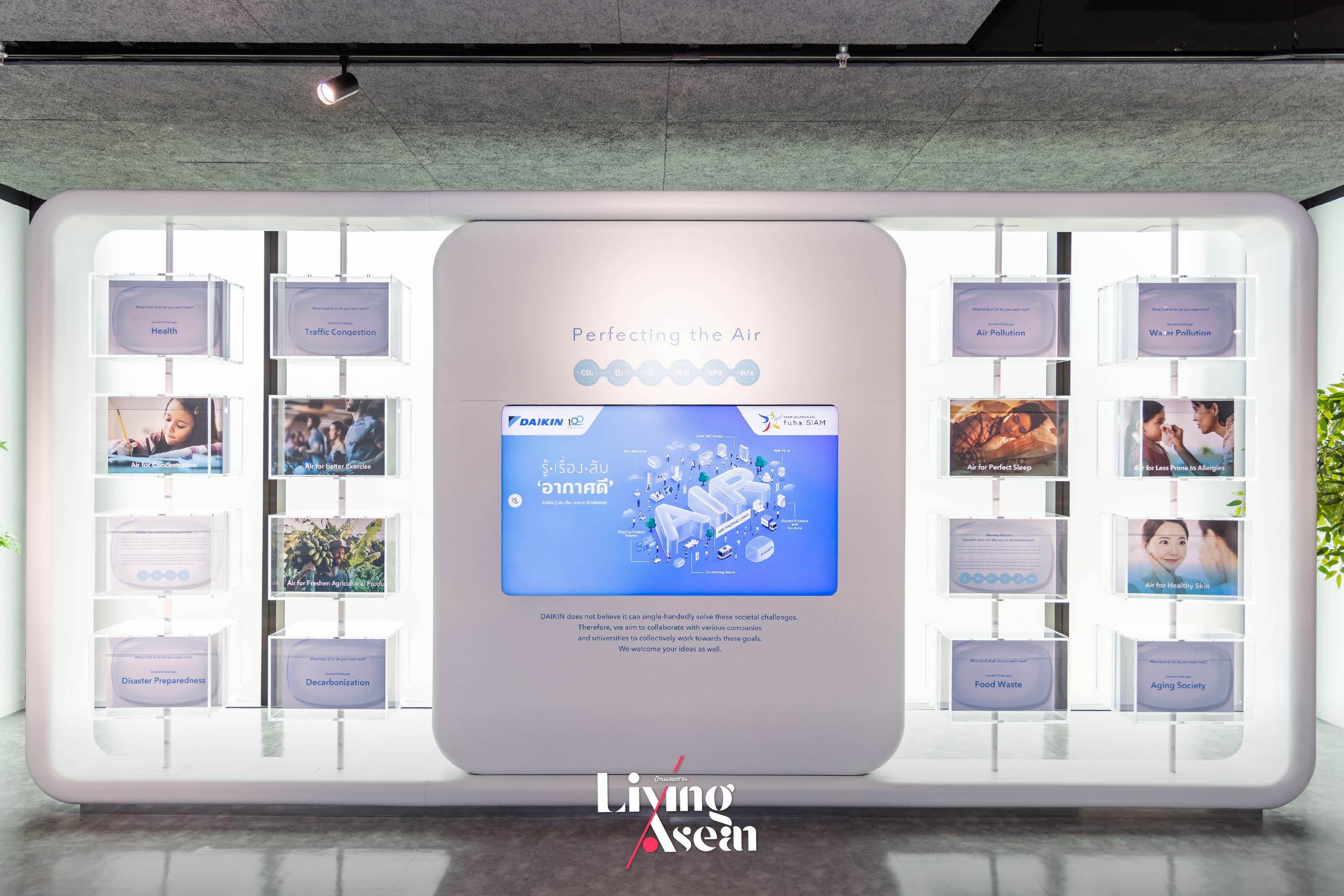
This is DAIKIN Solution Plaza fuha: SIAM, located on the fifth floor of Siam Pathuwan House. Stop by an exhibition to learn more about the “secret to clean air”. Admission is free. The exhibition showcasing new innovations in air conditioning technology is presented by DAIKIN, the world’s largest air conditioner manufacturer. The show titled “Perfecting the Air for All” is about keeping the air fresh and clean for everyone.
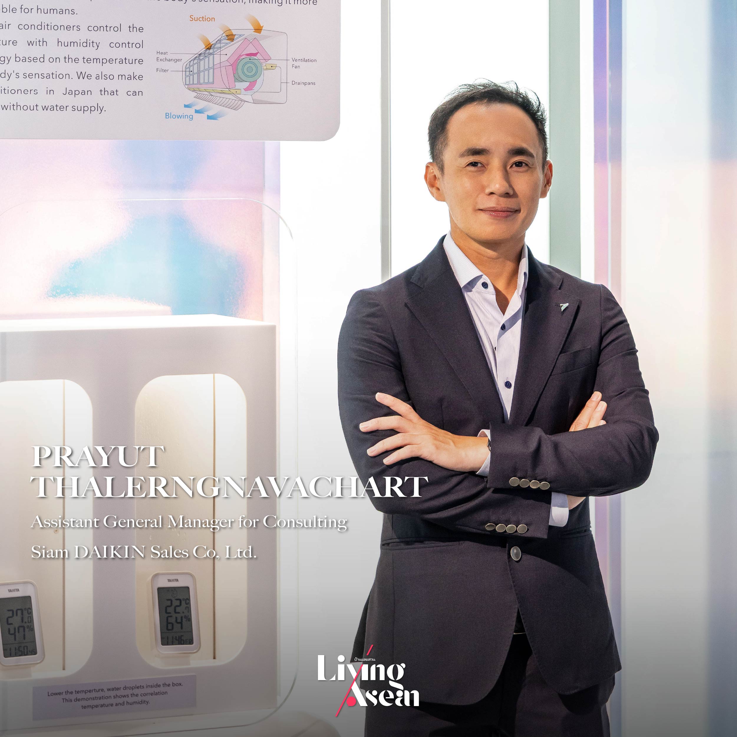
Prayut Thalerngnavachart, Assistant General Manager – Consulting, at Siam DAIKIN Sales Co, Ltd.
Prayut Thalerngnavachart is assistant general manager for consulting at Siam DAIKIN Sales Co, Ltd. He’ll tell us about Thailand’s first learning center dedicated to clean air, learning resources and latest innovations in air conditioning technology. In his words:
“Not only is DAIKIN a leader in air conditioner manufacturing, but it’s also an expert in air quality science. Because of that, we are in the best position to offer the highest quality products and services.”
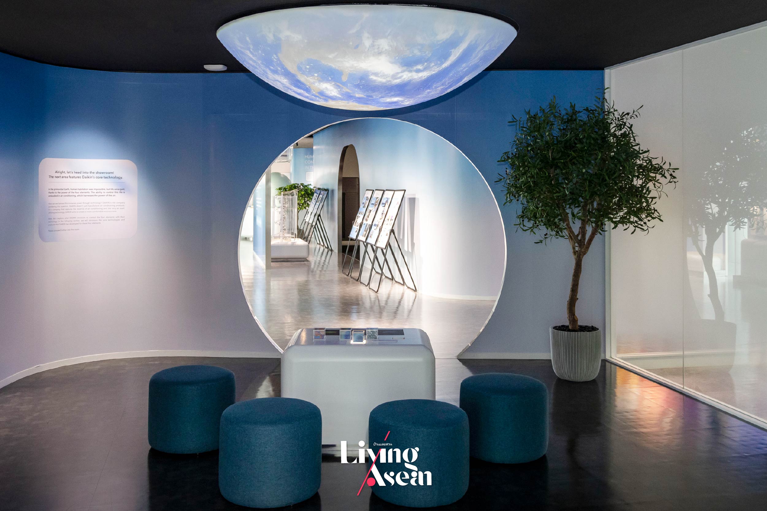
The exhibitions are thematically divided into six zones, each featuring a distinct field of knowledge. Among other things, visitors will get to learn more about components of the air and technologies for air movement. It’s a show that conforms to the concept of “fuha”, a word arising by anomatopoeia –“fu” being the sound of cold airflow, whereas “ha” refers to the vibrations caused by warm gusts of wind. Together they inspire this exhibition, which is aimed at promoting an understanding of different aspects of global air movement and creating conditions conducive to physical and mental well-being.
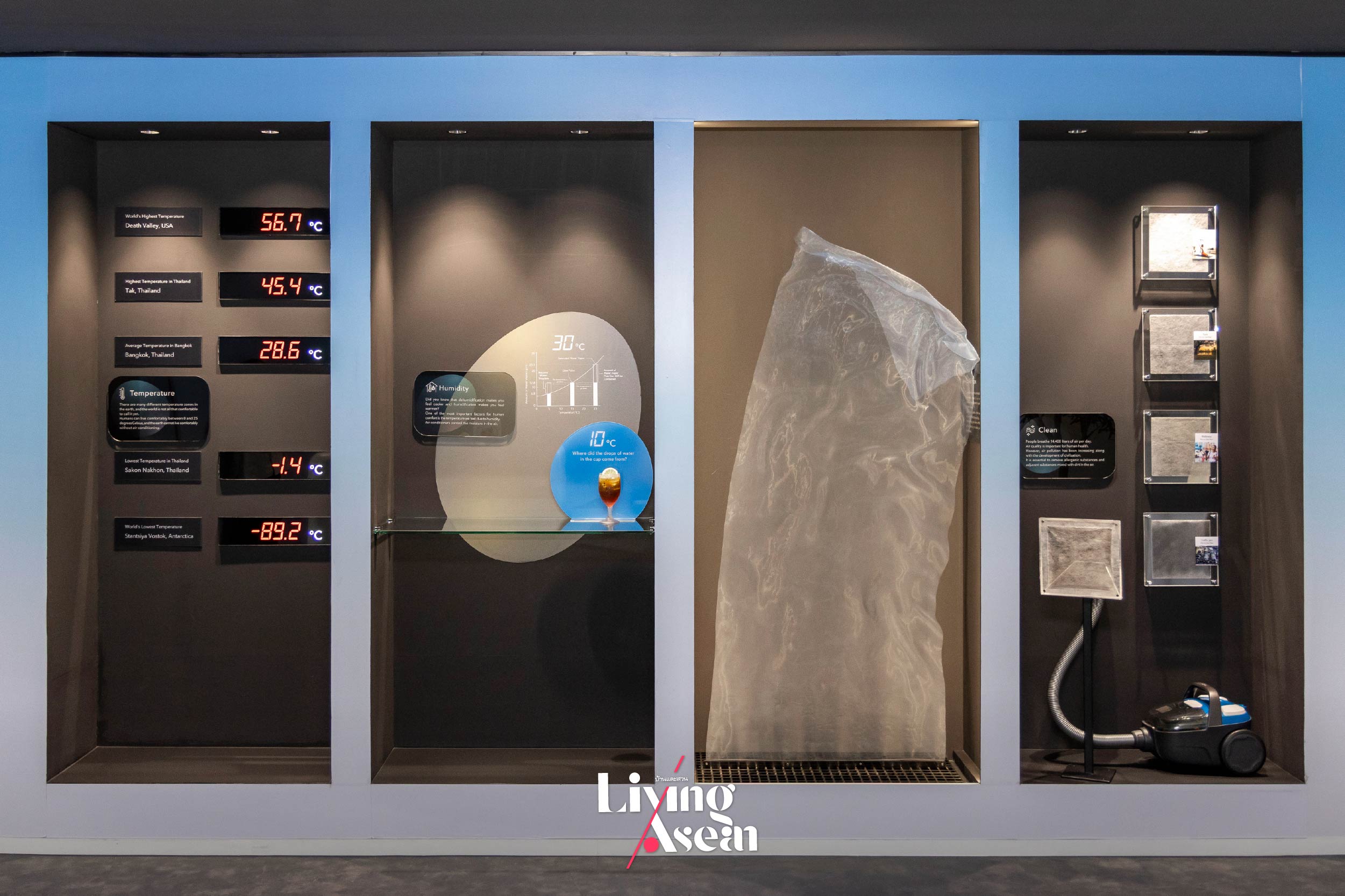
The first exhibition is aptly named “Four Elements Zone”. It’s an interactive video presentation with a wide range of public displays showcasing the relationships between sun’s heat, humidity, clean air and global air circulation patterns – the key factor regulating the planet’s temperature.
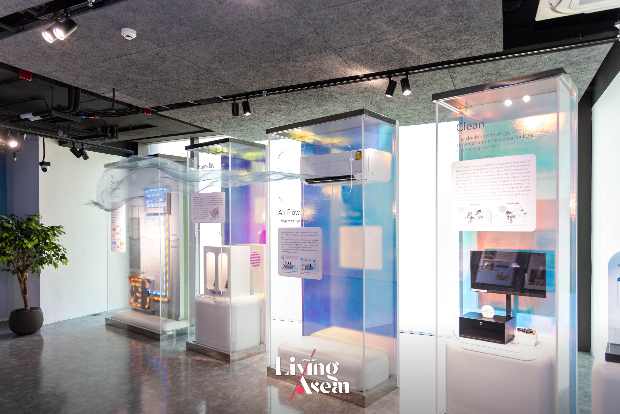
Area 2 of the exhibition, named “Core Technology Zone”, reiterates the point that good, clean air can be achieved through a whole new approach. Presented by DAIKIN, it lays the foundation for air conditioning technology of the future, meantime, allowing viewers to experience the inner workings of an air conditioning system firsthand.
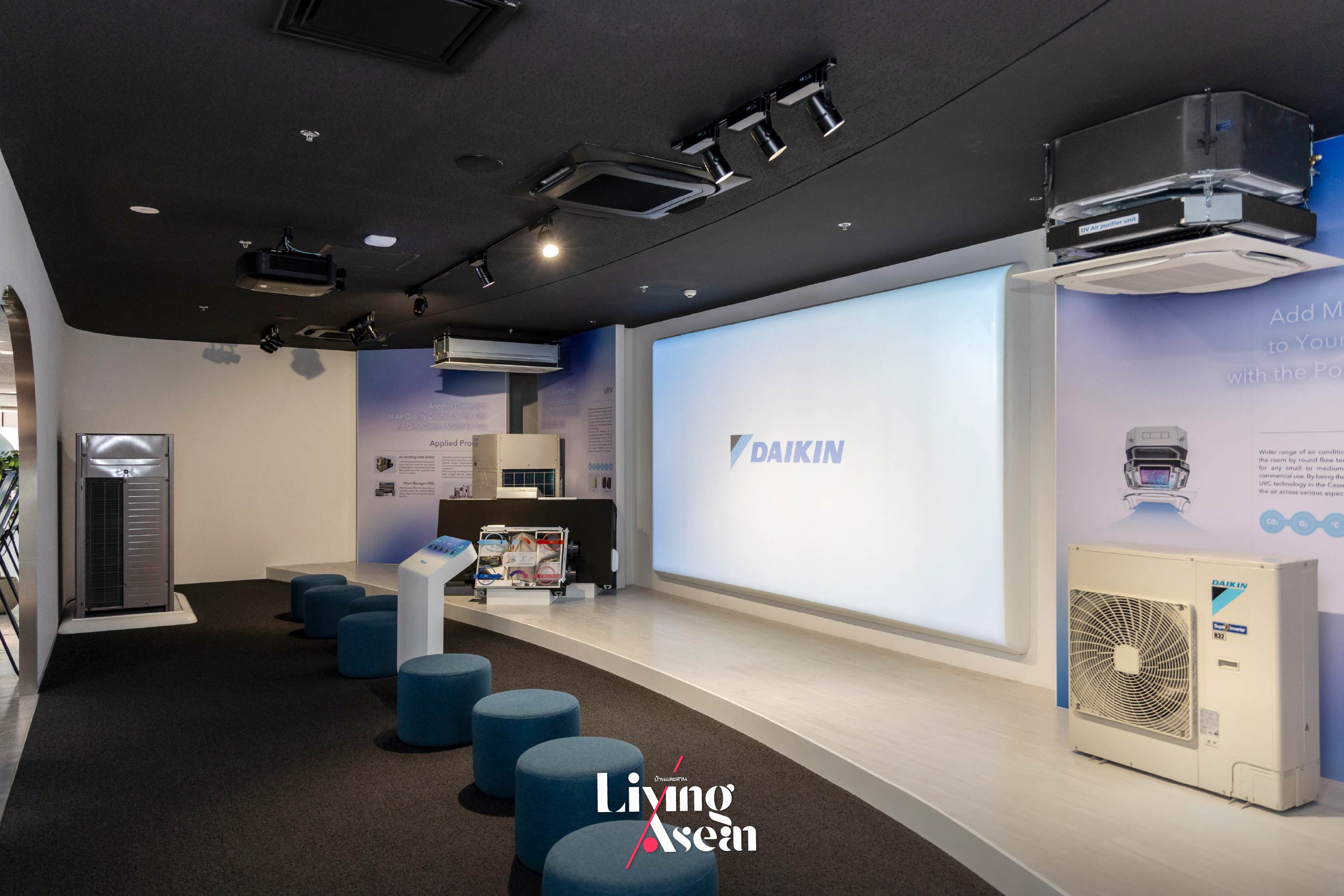
Area 3, named “Flagship Product Theater Zone”, sends a message that “good, clean air is not restricted to a single, specific location”. It’s a theater-style event showcasing the history of air conditioning system development by DAIKIN and cutting-edge technologies for clean air that can be put to good use in all kinds of space, ranging from homes to condominiums to offices and large business establishments such as hotels and shopping malls.
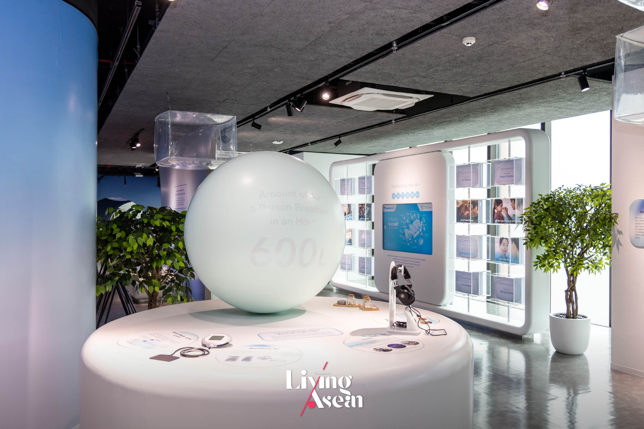
The fourth exhibition, named “New Value Zone”, communicates a concept that there is much more to good, clean air than just breathing. It’s an installation event showcasing the health benefits of pure, unpolluted air and a positive atmosphere that’s the key factor in improving the quality of life. The focal point of the show is a spherical balloon that reminds us of the amount of air a person breathes in an hour. There’s a daybed nearby set aside for relaxation and comfort that comes with the aroma of fresh, clean air.
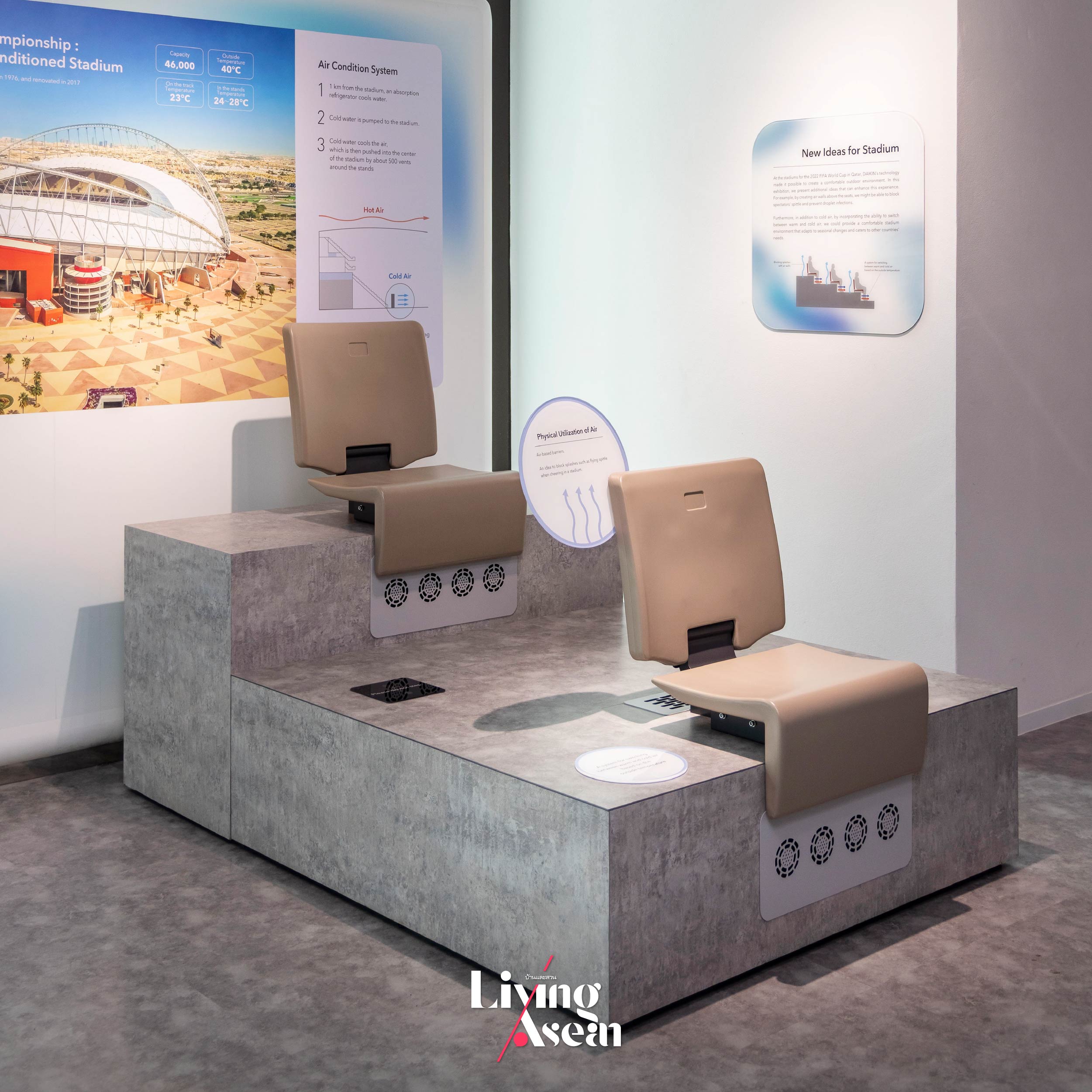
Other attractions in Zone 4 include new innovations for keeping outdoor spaces cool. It’s a cutting-edge solution that was put to good use at Khalifa Stadium when Qatar was the host nation for the 2022 FIFA World Cup tournament. Because the stadium was located in the middle of a desert, DAIKIN was able to overcome the challenge of extreme temperature by inventing a large-scale cooling system that worked by blowing hot air out and replacing it with fresh, clean air to make the stadium more comfortable and free of disease.
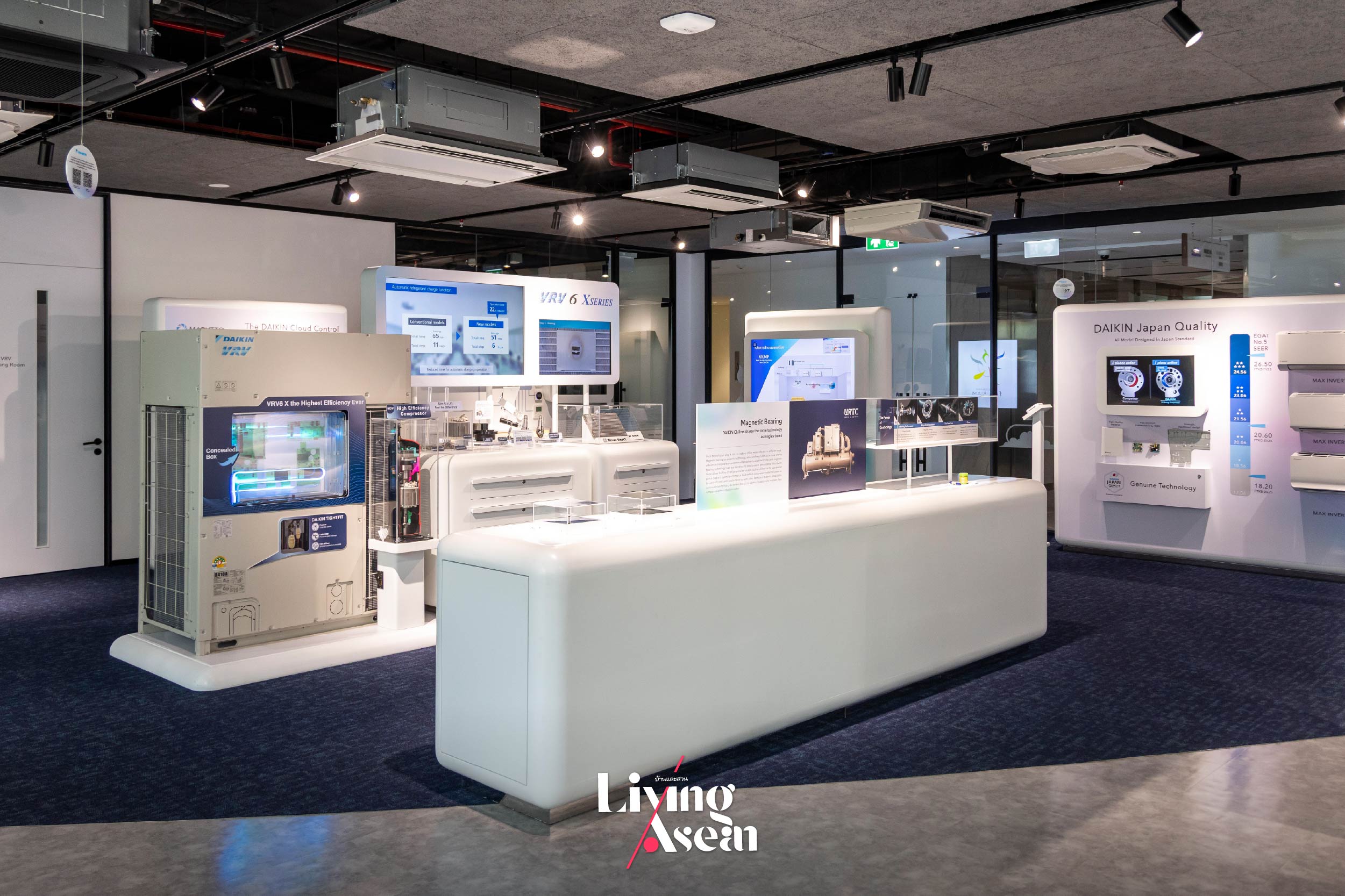
Area 5, named “Current Products and Solutions Zone”, demonstrates that “good, clean air can be achieved through design”. It’s a show about creating solutions by using DAIKIN air conditioning systems that are capable of meeting consumer needs across all sectors, whether it be for homes or for large business establishments such as hotels and manufacturing facilities.
DAIKIN VRV air conditioning systems work by distributing variable amounts of refrigerant to multiple indoor evaporator units, meantime, regulating refrigerant flow to create a cooling effect at precise temperature. Equipped with inverter technology, the system is highly energy efficient, plus installation is flexible. One outdoor condenser unit can distribute variable refrigerant volumes to a variety of indoor units.
That’s not all. The company also has developed an advanced control system called “Reiri for Home” that works with DAIKIN air conditioners and other devices to achieve a smart home integration. They include air conditioners, ventilation systems, air purifiers, and a variety of home automation devices. All of them can be controlled from anywhere on earth via cellphones connected to WIFI and the Internet.
“Reiri for Home” technology works with IAQ (indoor air quality) sensors to monitor and provide a visual display of air quality index, PM 2.5 index, TVOC (total volatile organic compounds) index, humidity reading and temperature. Together they create a cozy home environment conducive to physical and mental well-being.
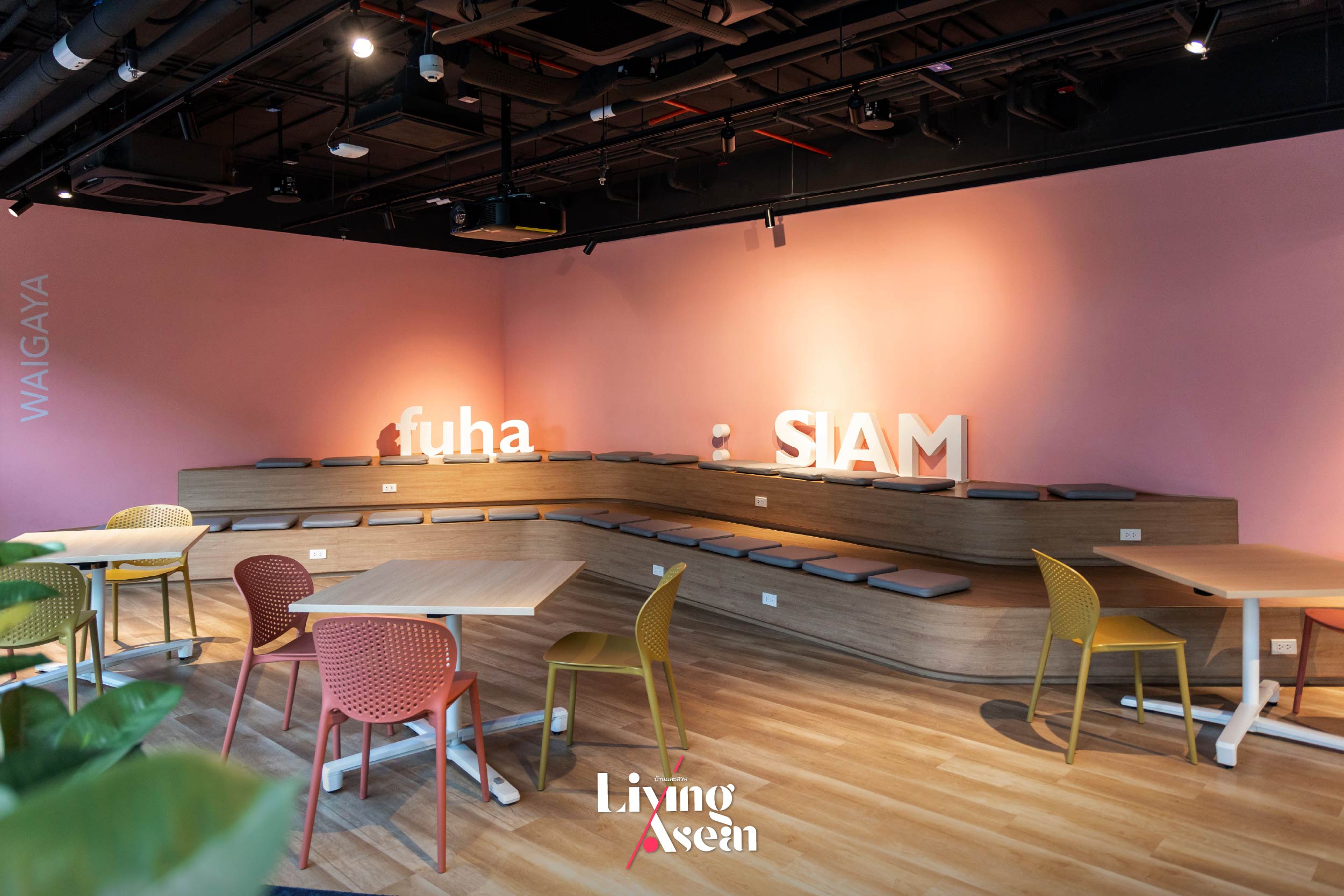
We now arrive at Zone 6, or “Co-Working Space Zone”. The theme of the venue is “good, clean air is for sharing”. It’s the last zone curated by DAIKIN Solution Plaza fuha: SIAM. Just a friendly reminder. Admission is free and the atmosphere is relaxing yet informative. Swing by next time you’re in the area. Sit back and relax, do some work, meet up and do a tutorial with friends. There are tables and chairs available for meetings, even TV screens to work with. Come experience a good atmosphere together.
In short, it’s about reaching out to connect with consumers across all sectors. As Prayut Thalerngnavachart puts it, “DAIKIN’s vision is to provide new value. Like so, fuha: SIAM is much more than a showroom for promoting products and services. Rather, it’s a strategy to open up spaces conducive to learning and inspiring people about the benefits of good, clean air that gives meaning to everyday life.”
Mark your calendar. The exhibition is open Monday through Friday from 08.00 to 17.00 hours. It’s located on the fifth floor of Siam Patumwan House. Click here for more details fuhasiam.daikin.co.th.
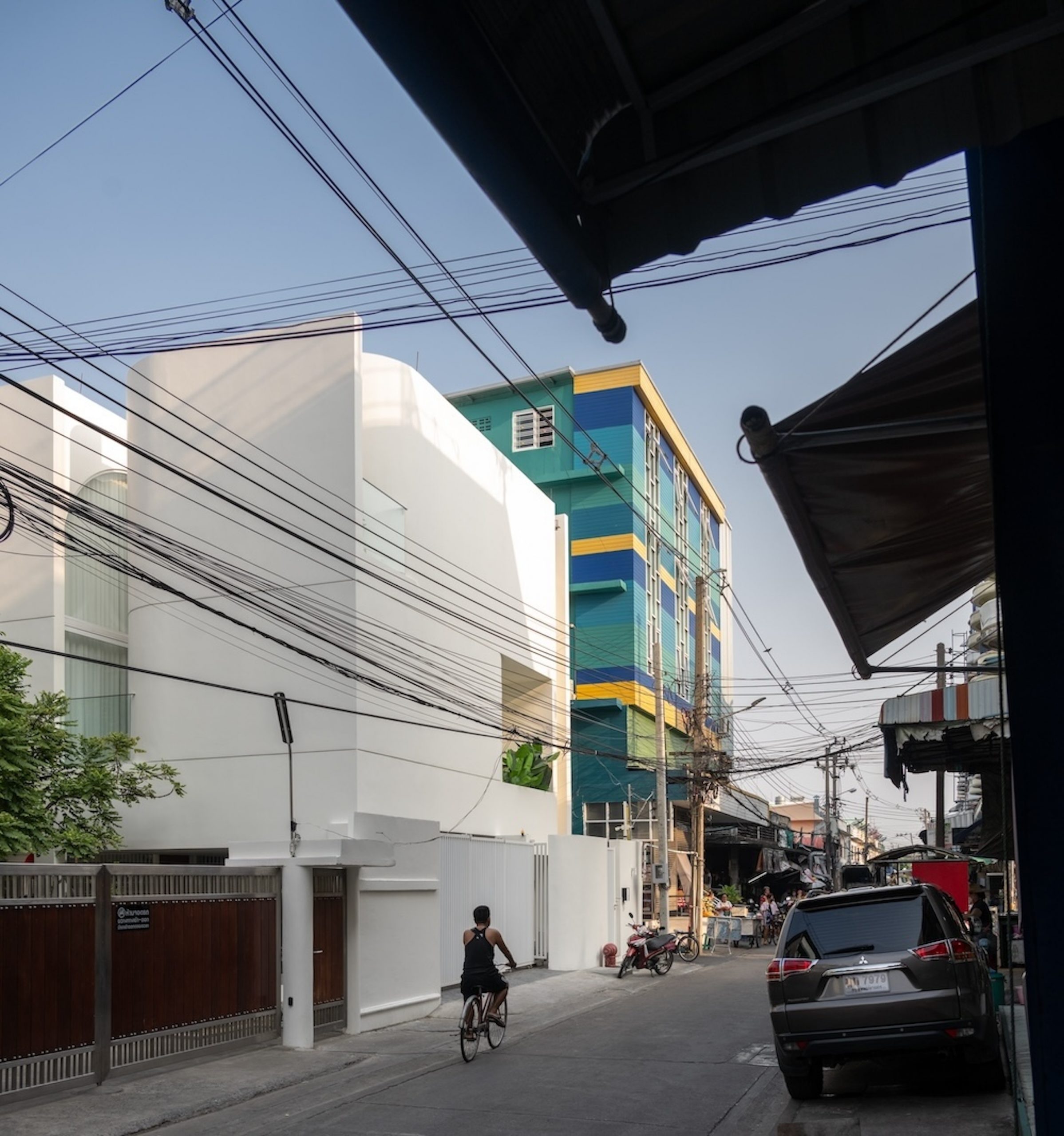
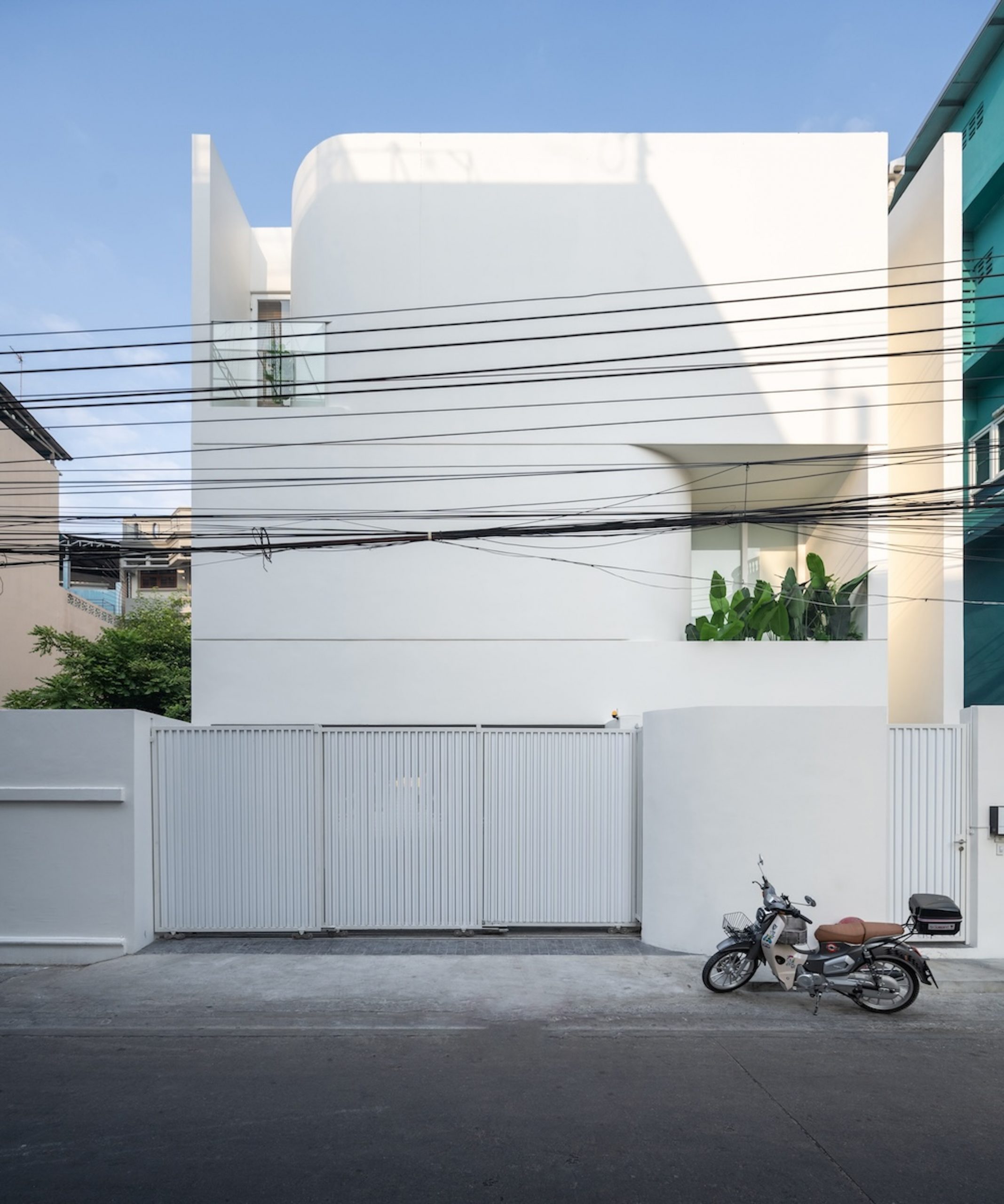
Here’s a gorgeous white home built with love and dreams. Named “MN House”, it’s an oasis of calm and comfort in the midst of the hustle and bustle of city life. Plus, there is a sense that art is present everywhere, inspiring creativity and making the expression of human imagination part of everyday living.
/ Bangkok, Thailand /
/ Story: Lily J. / English version: Bob Pitakwong /
/ Photographs: Rungkit Charoenwat /
More than anything, its interior lighting design is inspired by galleries for the display of works of art, while the external envelope consists of long, straight and curved walls likened to a combination of oversized papier mâché. The curvature of the building shell is there for good reason. It opens at intervals to bring natural light into enclosed rooms. In the meantime, the light is more diffuse thanks to crisp clean white tones that make the home feel airy, warm and welcoming.
Creative big windows bring natural light into the home, while light-colored surfaces and curves in the walls effectively reflect much of the heat away, keeping interior living spaces cool.
First Floor Plan / Courtesy of SaTa Na ArchitectSecond Floor Plan / Courtesy of SaTa Na ArchitectThird Floor Plan / Courtesy of SaTa Na Architect
The house’s modern interior boasts a pristine living room illuminated by daylight streaming in through a large opening in the wall. For privacy, the side of the room facing a nearby building is overhung by second-floor walls that protect it from unwanted eyes. In the meantime, a skylight built into the rooftop contributes to a healthy indoor air environment. A shaft of sunlight spreads over a wide area creating an impression reminiscent of the white interior of an art gallery.
Viewed from above, the courtyard pool provides natural ventilation and daylight in the middle of the home. The mere sight and sound of water enhances interaction between indoor and outdoor living despite limited available space.The heart of the home consisting of a living room, dining room and a home office provides easy access to the courtyard pool and a small terrace at the center of the house plan.
The second floor has a courtyard pool and poolside deck offering a serene space for relaxation. It’s the heart of the home enclosed by glass walls and accessible from multiple rooms. By design, it facilitates easy flow from one area to another, creating the ultimate communal living area that includes the living room, dining room and a home office nearby. Such beautiful visual continuity and spatial relationships can also be seen in full view from the third floor.
The inner courtyard allows sunlight and fresh air into the home while the swimming pool offers a peaceful area for relaxation. It’s amazing how the mere sight and sound of water enhances every aspect of living. Add sunshine and a gentle wind, and you get a light and airy environment despite limited space.
In terms of spatial arrangement, the floor plan layout reveals a series of rooms connected by well-thought-out lighting design and clean lines that arouse different emotional responses from one area to another. It’s like looking at picture frames placed side by side. At every turn, perfectly crisp lines and bold curves create a pleasing visual combination that matches the details of the walls and ceilings, culminating in a modern interior decorating style.
Curved symmetrical structures and round windows work alongside each other to increase natural light in the home.The simple modern house in cool-toned whites contributes to the neighborhood’s overall appeal.
To put it shortly, it’s seamless flow between rooms that makes this white home in the city a desirable place of residence, one that reflects well on the way of life, preferences and experience of the family living in it. Here’s a home inspired by serene and inviting interiors of an art gallery. Its white walls tell the story of the importance of privacy in the midst of urban chaos.
Locals go about their daily routines in the neighborhood where the white house is located.
Precisely, a well-thought-out design ensures the homeowners get what they’ve been looking for, a beautiful home that’s fully functional and capable of answering their lifestyle needs. Plus, there’s the peaceful atmosphere of the finest private art gallery.
/ Story: Phattaraphon / English version: Bob Pitakwong /
/ Photographs: Nantiya June, Kittiya Kularbrat /
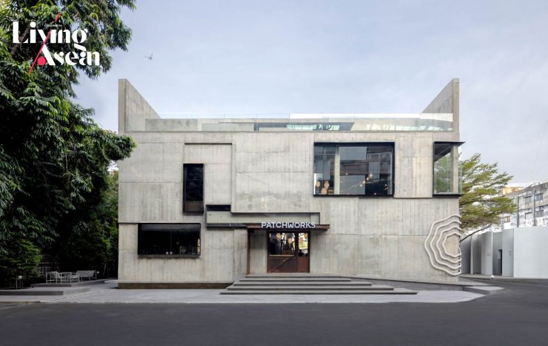
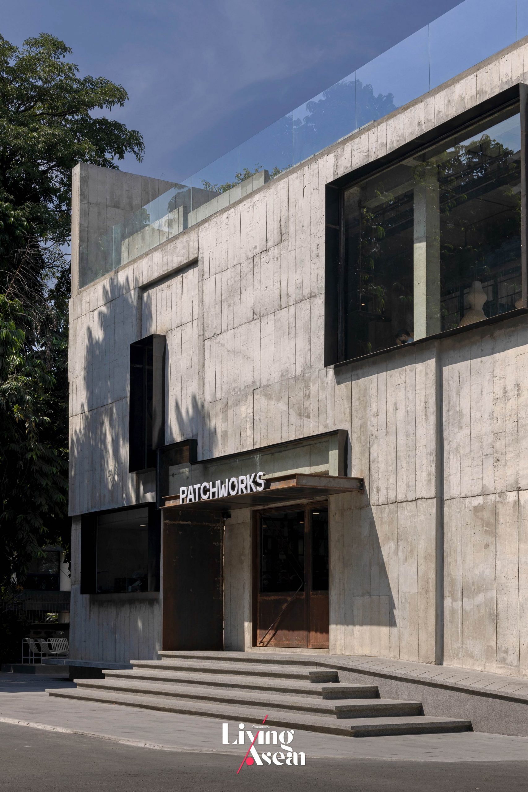
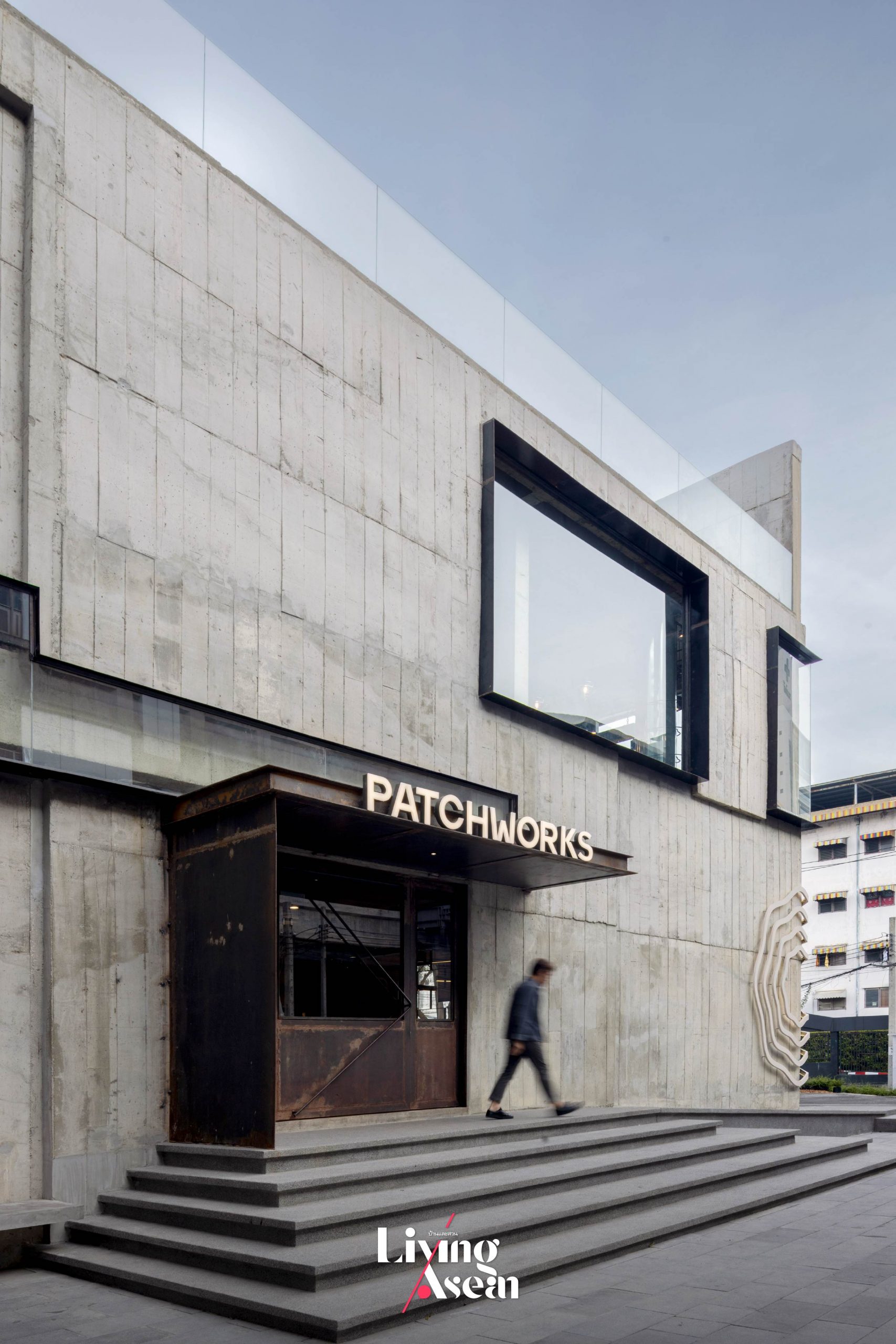
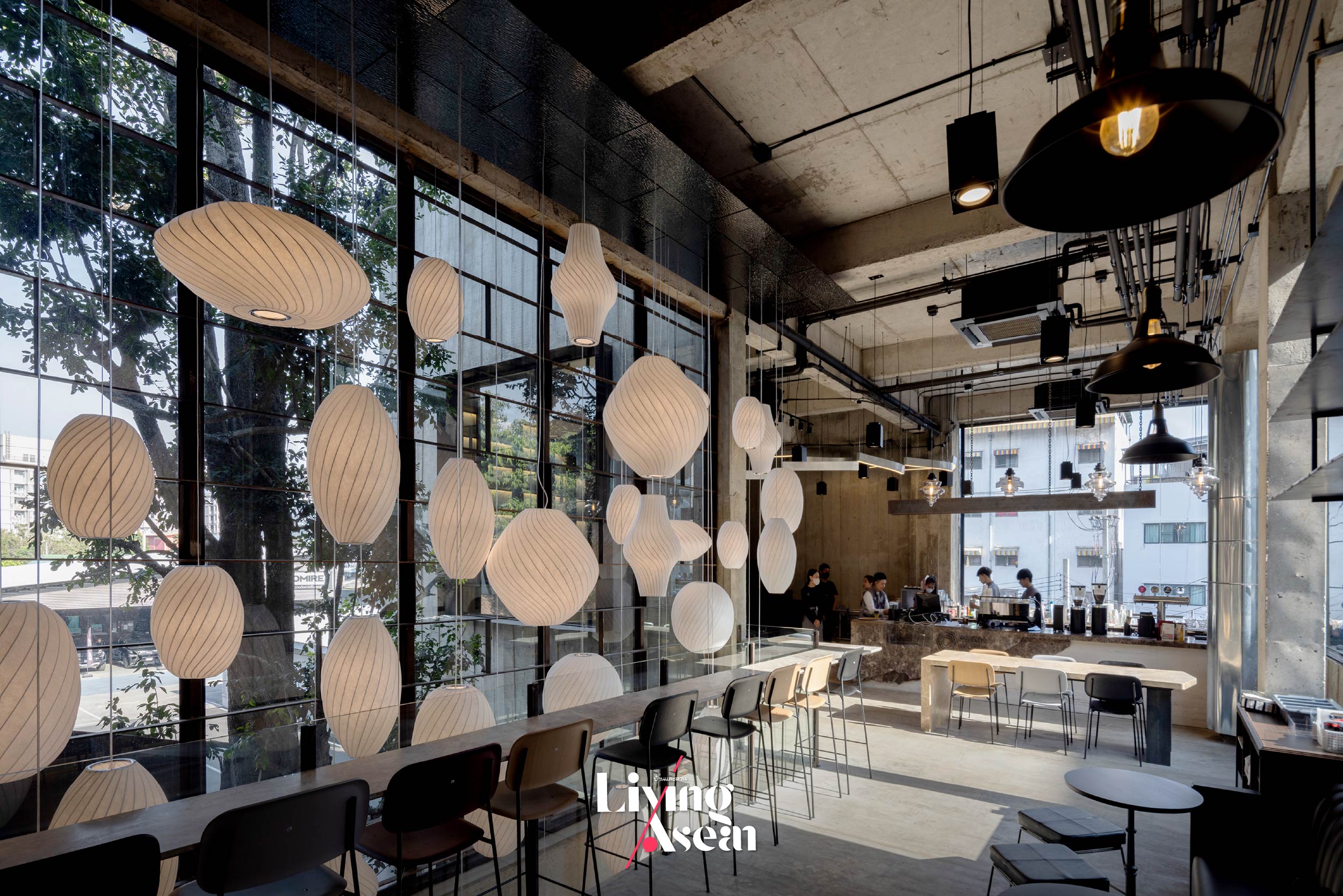
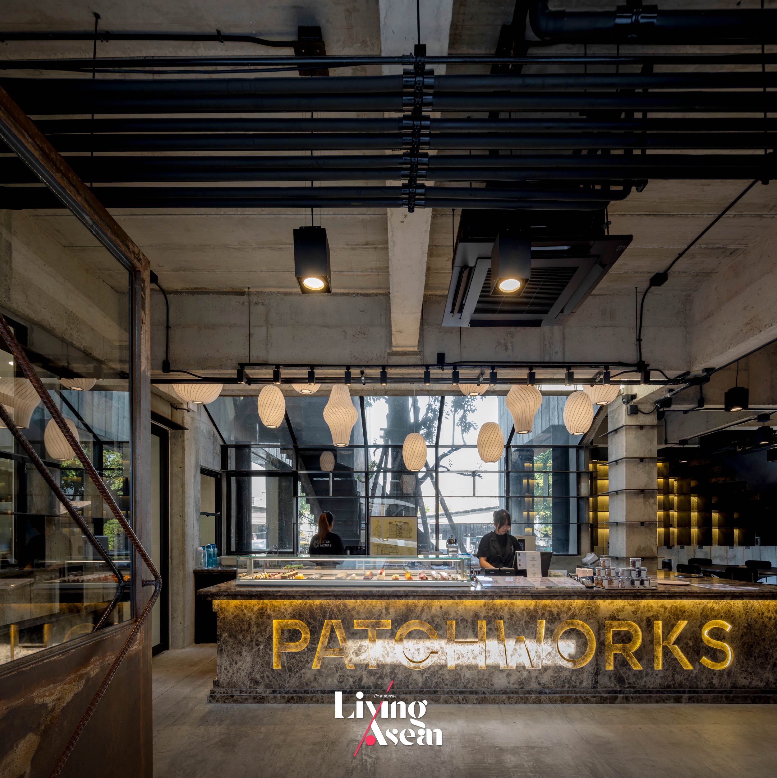
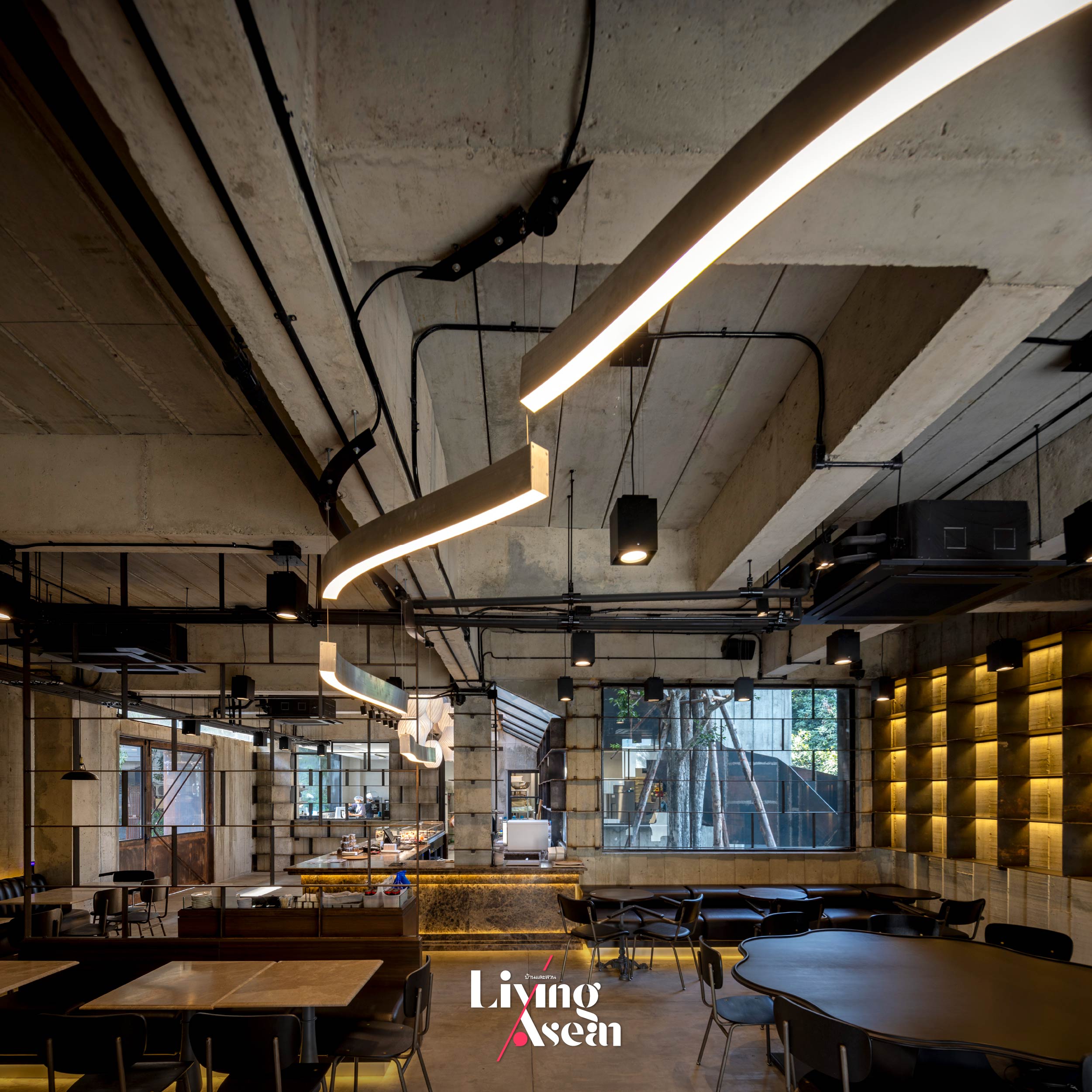
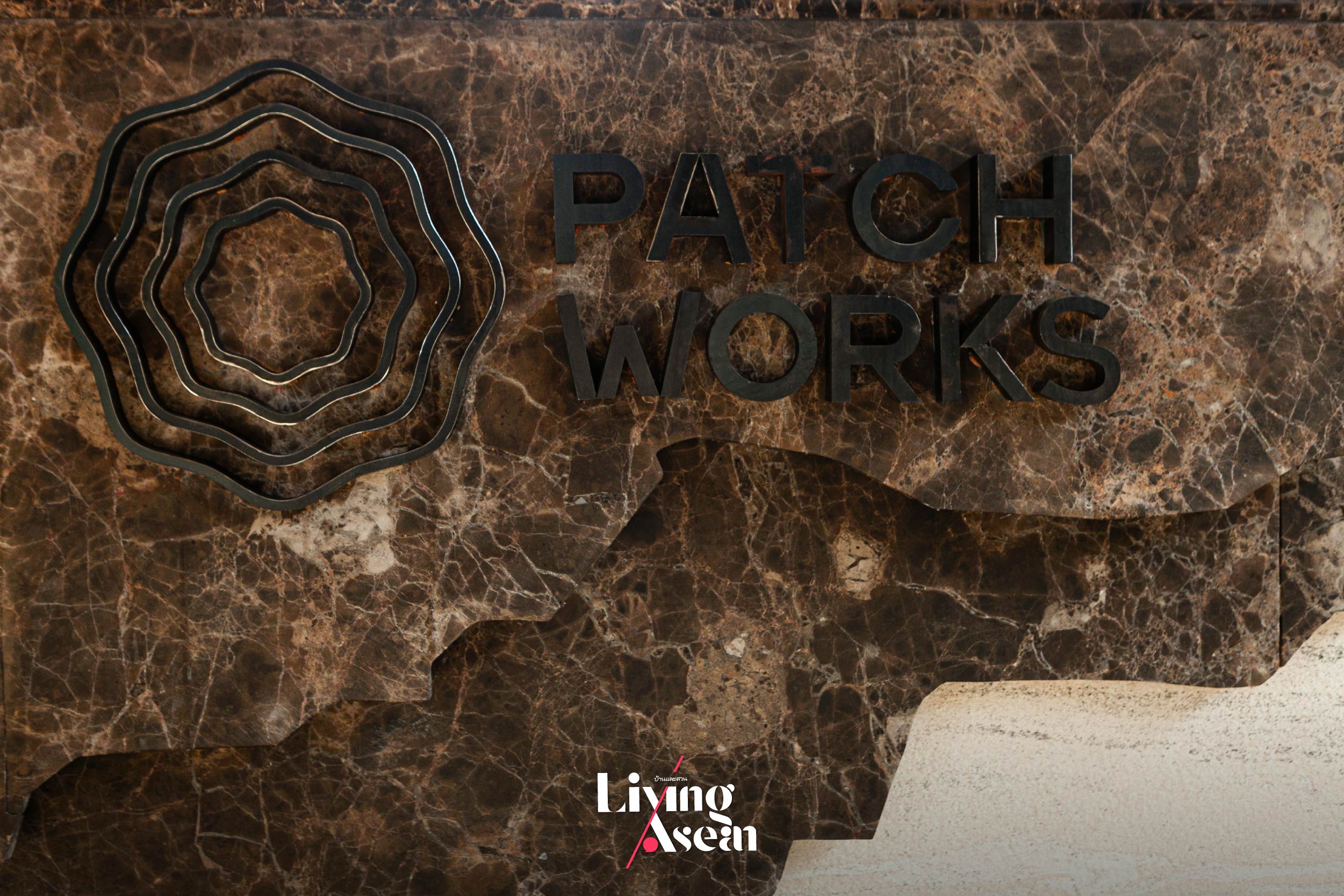
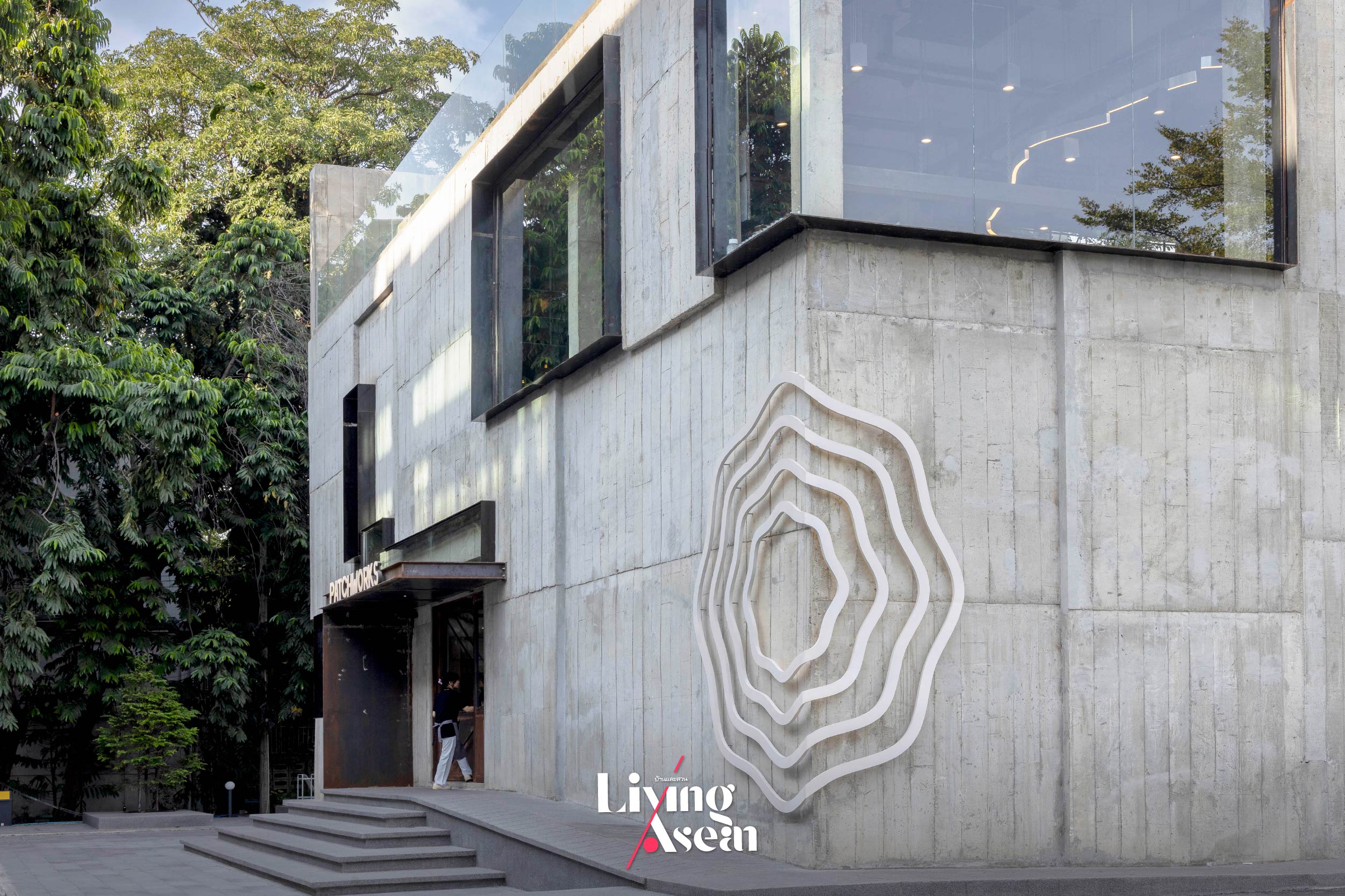
If the sweet aroma of baked goods is really your thing, here’s a dessert café dubbed a “hidden gem” in Charansanitwong, a vibrant neighborhood on the Thonburi side of Bangkok. Aptly named “Patchworks”, the small restaurant is renowned for its fine pastries and delicious desserts. It’s owned and operated by four siblings who possess different talents and passions. Characterized by the functionalist approach to building design, the place is likened to needlework in which small items and different details are sewn together beautifully.
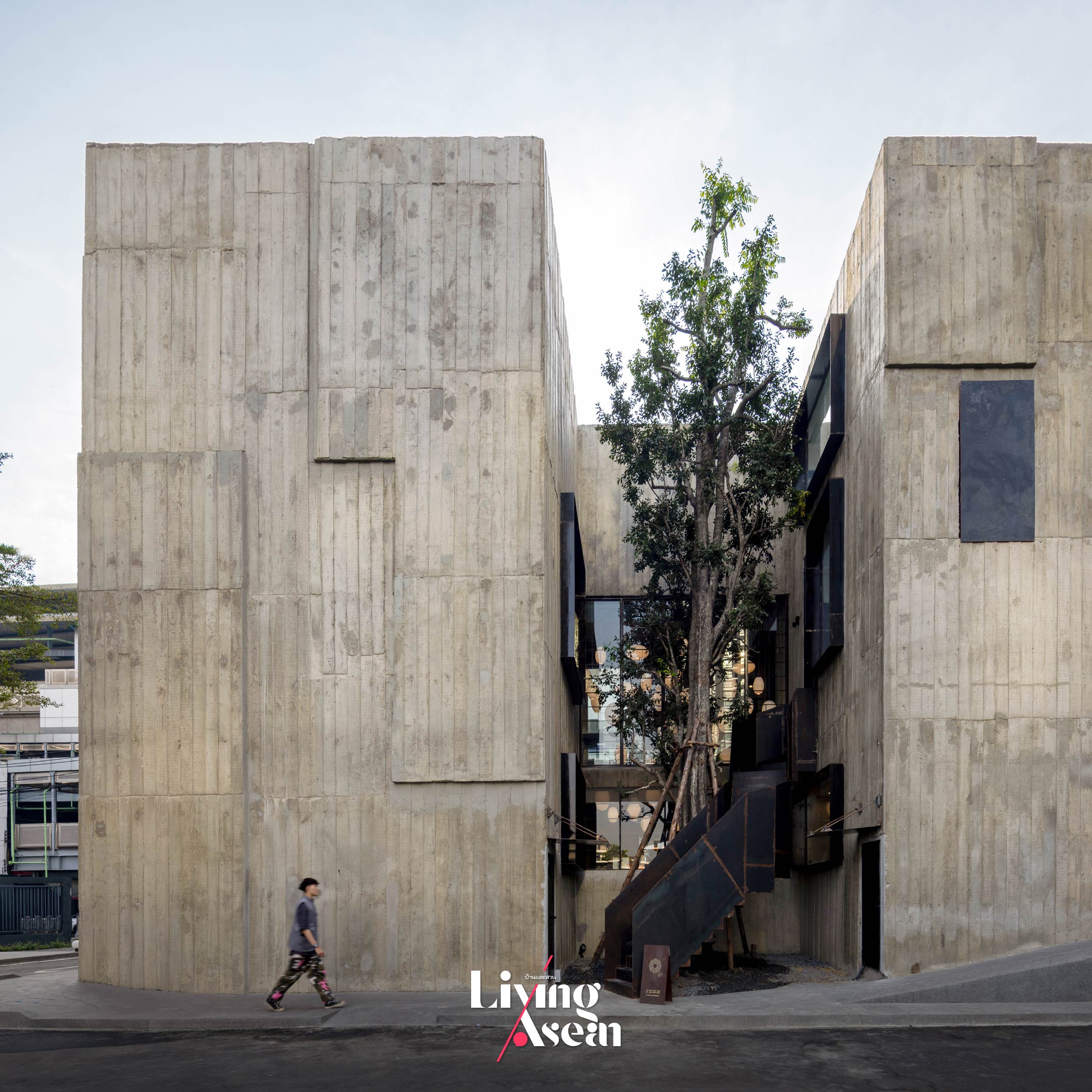
Embracing a mix of brutalism and modernism, the raw concrete building is home to a dessert café serving rich, fluffy pastries and delicious light meals. Its bold forms bear some resemblance to a massive piece of cake visible in every direction. Conveniently situated across from of the MRT Bang-O station, its dining room affords a beautiful panorama of Charansanitwong, a vibrant neighborhood on the Thonburi side of Bangkok
As the saying goes, all big things start small. “Patchworks” began as a small business selling an assortment of baked goods back in the day. It grew and matured over time into an established bakery café, ultimately changing its corporate image and creating a strong brand identity thanks to a collaboration with the design firm p/s/d, or “party / space / design”.
It all took shape when the four siblings and a design team from p/s/d got to know each other not long ago. Purposeful meetings in the ensuing days soon paved the way for a smooth project implementation. They allowed for information exchange, problem solving and decision making that led to the integration of their specialized skills and passions into the new business plan. The result is an architectural style and branding concepts that tell the story of its products and services.
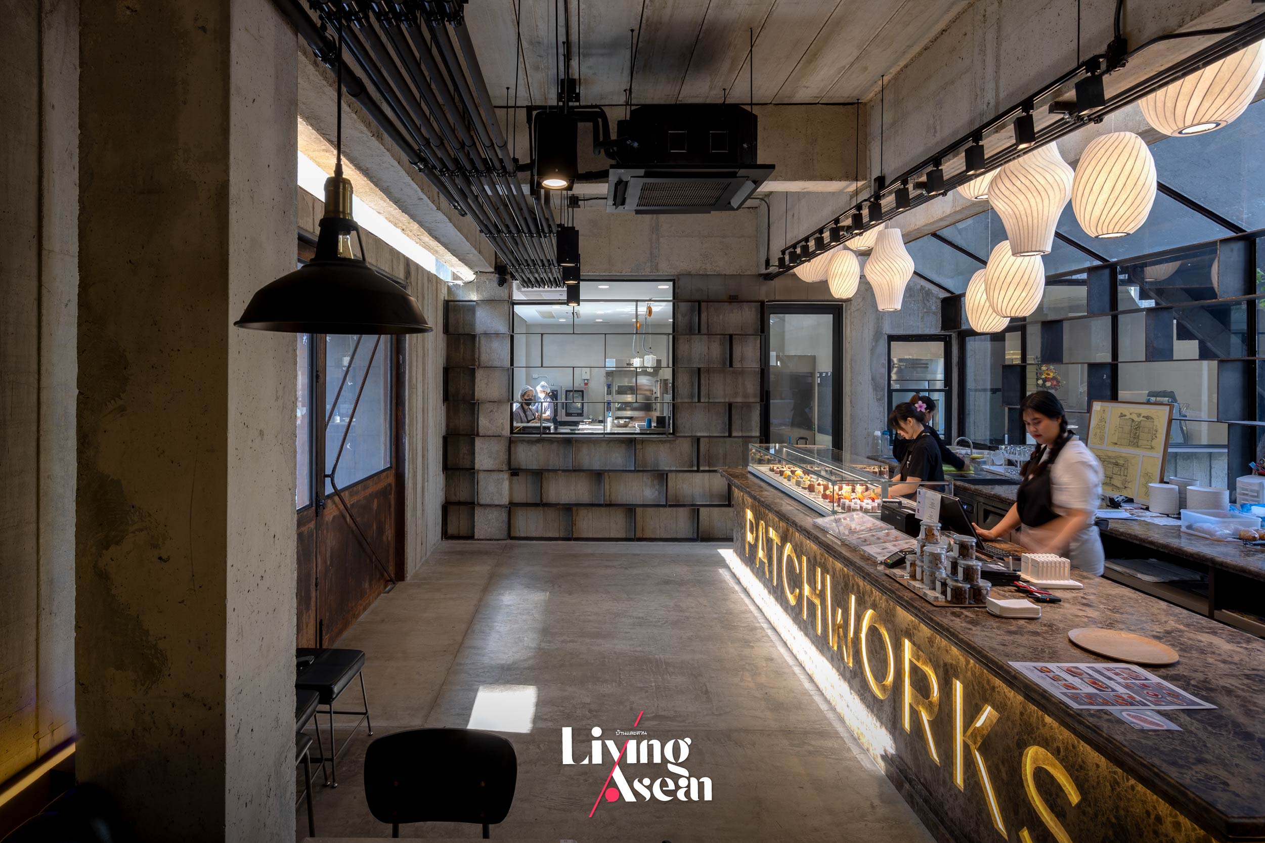
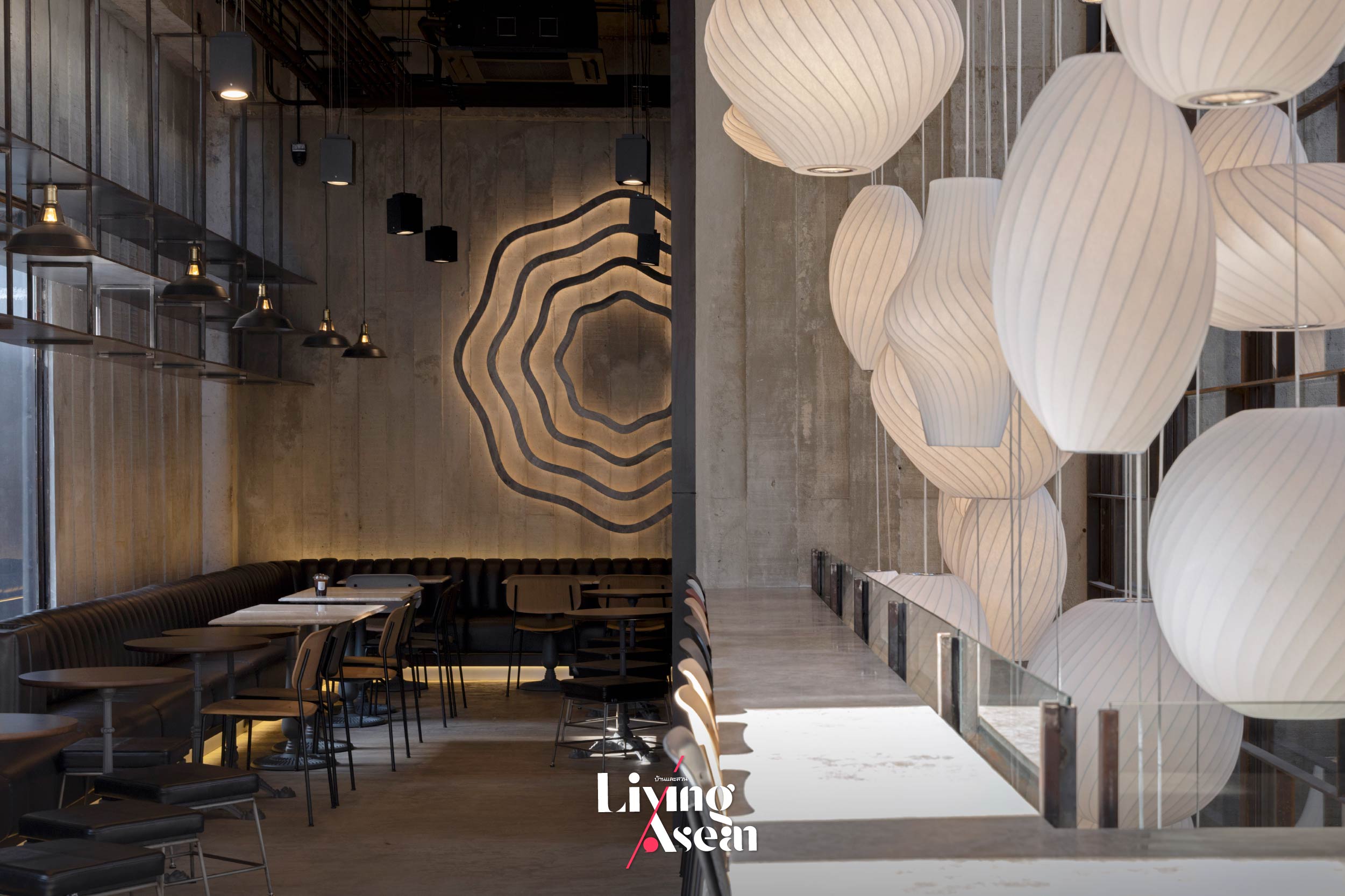
The downstairs welcoming hall has a dark emperador marble counter across which pastries and desserts are served. The mouth-watering light meals are made fresh daily in the kitchen located nearby. Busy movement and activity inside it can be seen from here, thanks to a large window separating it from the hallway. Together they are viewed as the highlight of the first floor.A forest of pendant lighting is suspended from the ceiling directly above a void of space by the glass wall. The shapes and sizes of lampshades get their inspiration from a variety of whisks used for whipping and mixing ingredients, ultimately creating a bright and airy restaurant décor that goes together well with double-height ceilings.
Among other things, visuals of a whisk which is a utensil for whipping eggs and cream are used as the company logo. They are placed in different locations both on the building envelope and as ornaments enhancing the interior. Because the font style matters, the business name is made using a typeface ideally suited to a place in which to enjoy fine pastries, delicious desserts and a good dining experience.
For strength and durability, the floor is built of a type of concrete used in waterborne environments. Also known as “marine concrete”, it’s commonplace in Japanese lofts and widely preferred for its beautiful visual effects when touched by light.
Architecturally speaking, “Patchworks” is an interesting mix of modernism and the brutalist style characterized by raw materials, bold geometric forms and functionality over ornamentation. Expressed in a different way, the use of raw concrete contrasts sharply with the alluring aromas of baked goods and delicious desserts that are its signature dishes. The café has a view of the Metropolitan Rapid Transit (MRT) Bang-O Station.
A metamorphosis of purpose. Visuals of the kitchen utensil used for whipping eggs, cream and mixing ingredients play a new role as the company logo and a forest of pendant lamps suspended from the ceiling. Together they tell the story of brand building, meantime, making the dessert café original and unique in its own special way.
From a distance, it has the appearance of a cube-shaped building, something resembling a giant piece of cake facing all directions. Its proximity to the light rail station makes “Patchworks” a convenient place to meet, relax and indulge in tasty, fluffy pastries and delicious desserts, not to mention fresh brewed coffee and other refreshments. Critics may find the brutalist architectural style unappealing. But inside it, pleasant surprises abound.
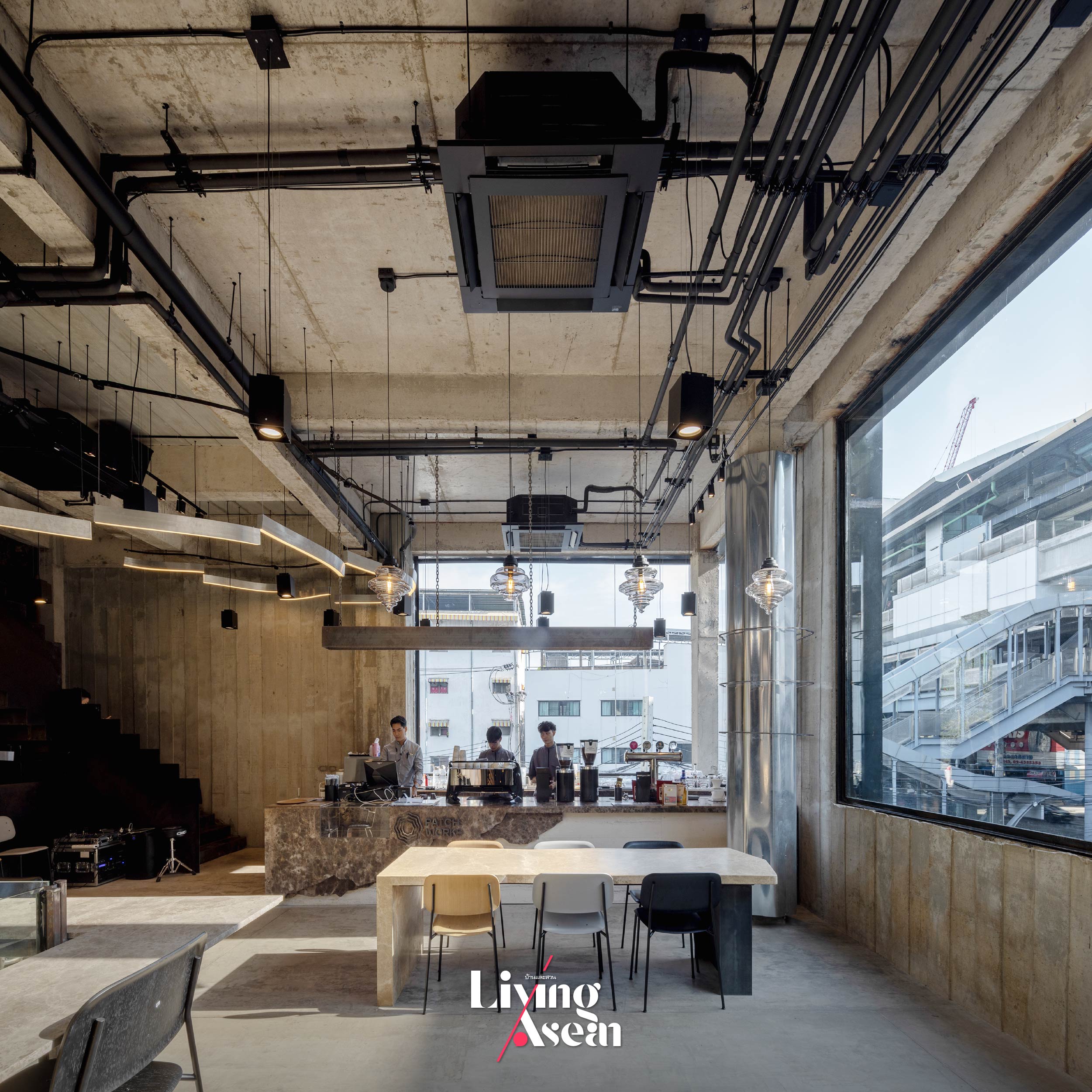
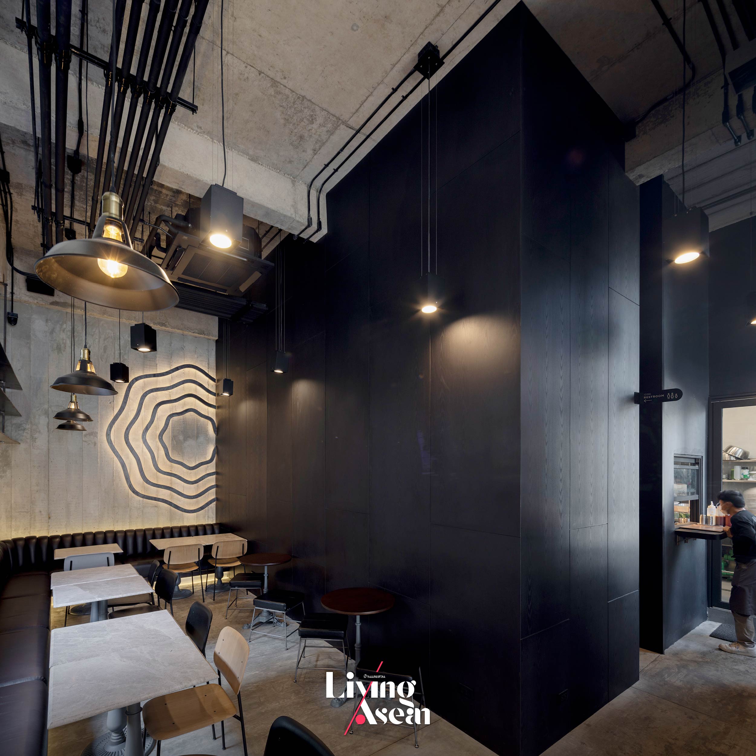
Walk in the door and be spoilt for choice. The first floor holds a welcoming hall with a dark emperador marble counter across which rich fluffy pastries, desserts and beverages are served. The mouth-watering light meals are made fresh daily in the kitchen located on one side of the room. Busy movement and activity inside it can be seen from here, thanks to a large window in the hallway. Across from it, restaurant tables and chairs come in a combination of different shapes and sizes designed to satisfy customer needs.
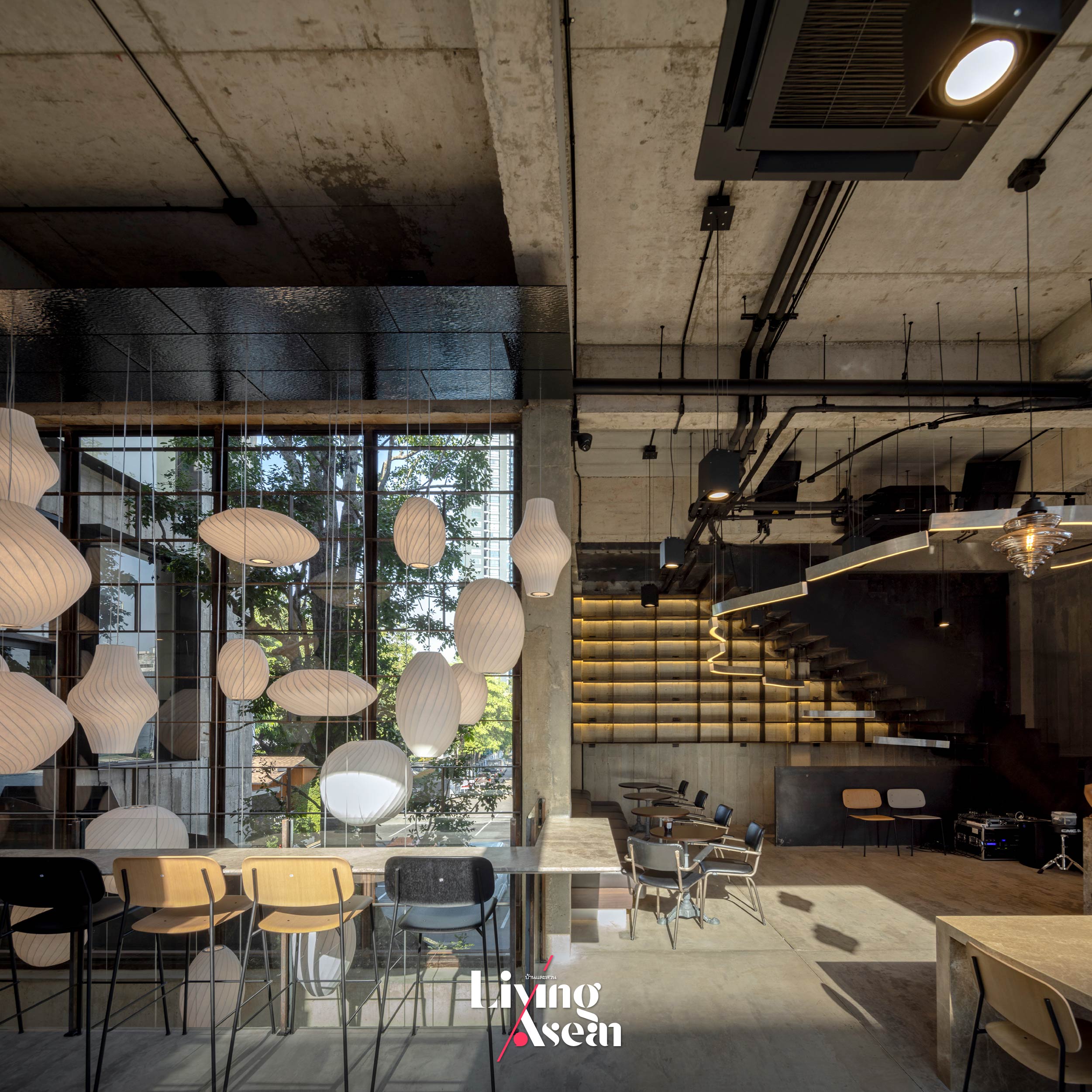
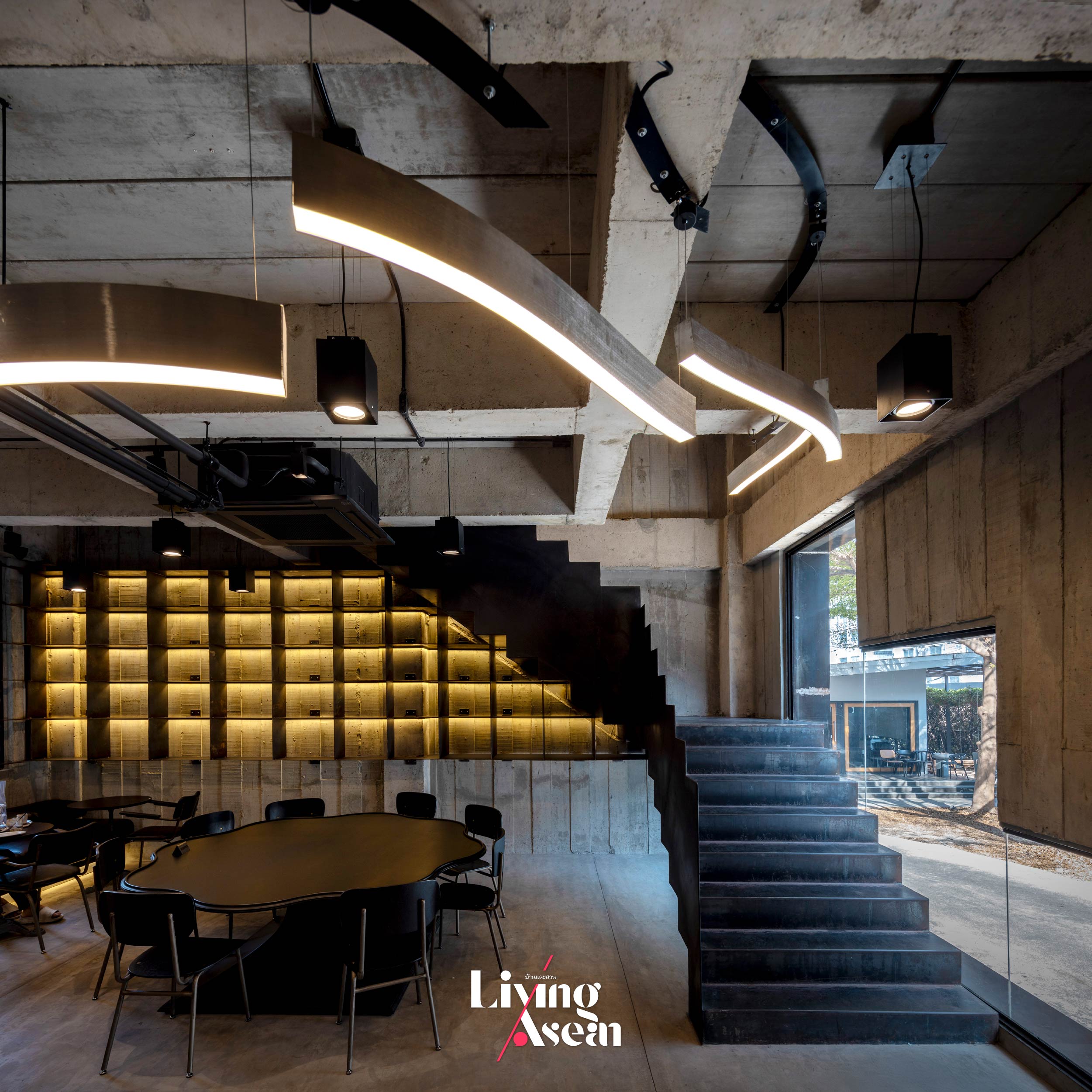
Behind the pastry and dessert counter, a void of space directly overhead serves as engine that drives ventilation supplying fresh air and keeping the interior cool. Not far away, rustic pendant lighting in a variety of shapes and sizes provides a focal point inviting customers to explore extra seating spaces available upstairs. By design, the downstairs seating space is built only three meters tall for good reason. It’s painted calming colors while recessed lighting fixtures behind the sofas help create a peaceful ambiance.
Worthy of note is the board-formed concrete walls that add intrigue and interest to the room as well as the exterior. They convey a great deal about brutalism, an architectural style defined by the plainness of building materials and raw wood grain patterns in cement surfaces. Obviously, they add character and personality to the project.
Climb a flight of stairs, and you come to a large room where salads, brunches, pasta meals, burgers, coffee drinks and refreshments are served. Large glass windows infuse the room with natural light, meantime, offering stunning panoramic views of the light rail station and the surrounding cityscape.
Double-height ceilings, five meters tall to be exact, create a visually striking, more expansive interior. The counter front is adorned with a beautiful mix of glossy and matte finish marble. Placing the counter on the right side of the room creates a positive work environment. It gives company employees and baristas a clear view of the dining area located on the left side, thereby ensuring good customer service at all times.
To integrate natural elements into the built environment, the design team chose not to open up the entire facade overlooking the nearby MRT station. Rather, they filled up the back of the building with a large glass window, thereby bringing in the view of an ebony tree that provides a lush green canopy at the center of the floor plan. As a result, the café is able to offer its customers a variety of dining spaces to suit their taste or wishes.
The seating area overlooking the ebony tree is adorned with pendant lamps that hang from the ceiling above a void of space along the wall. Their balloon-like shapes are inspired by different types of whisks for whipping eggs or cream and blending ingredients. Some of them even resemble the shapes of pastries. Overall, the effect is impressive and goes together well with high ceilings.
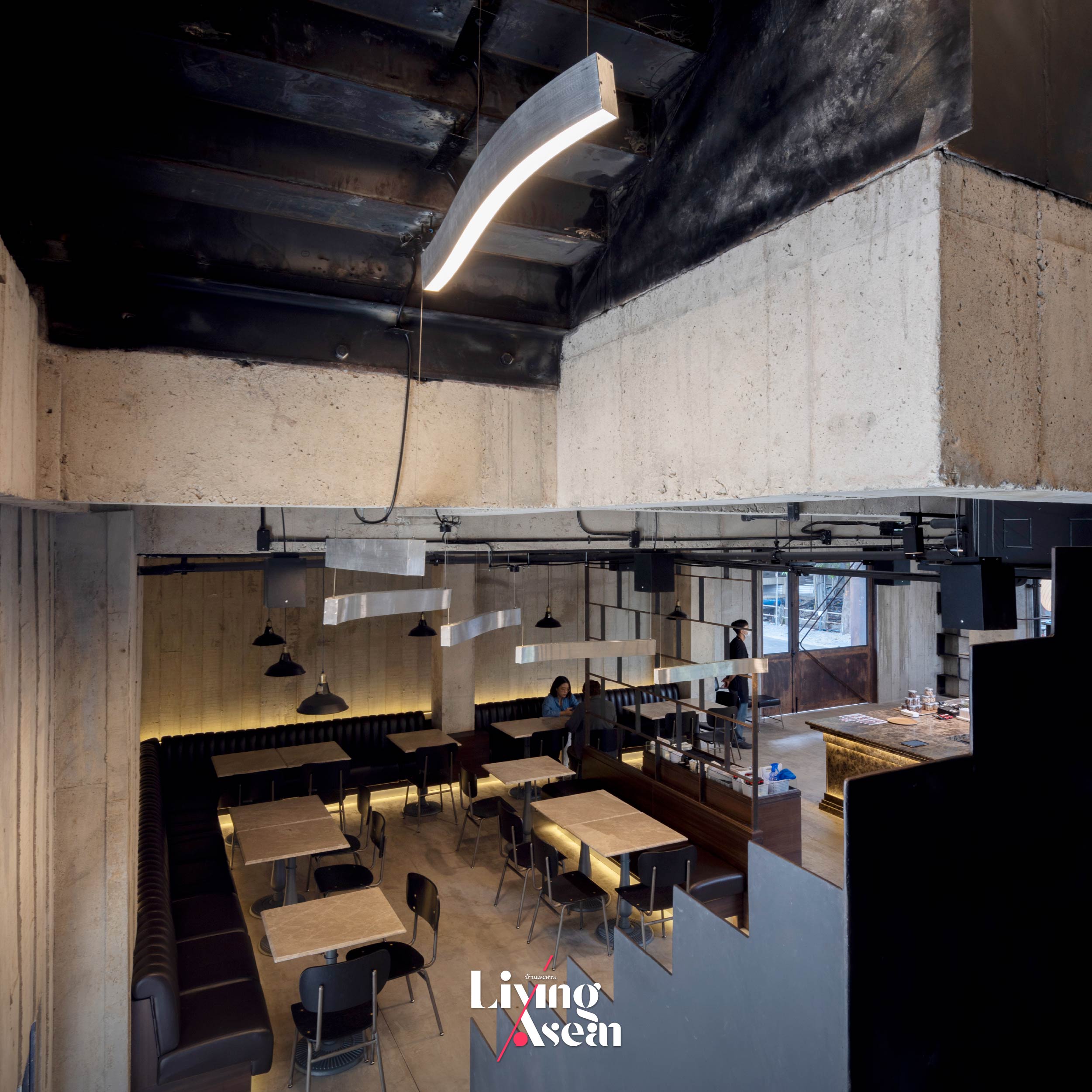
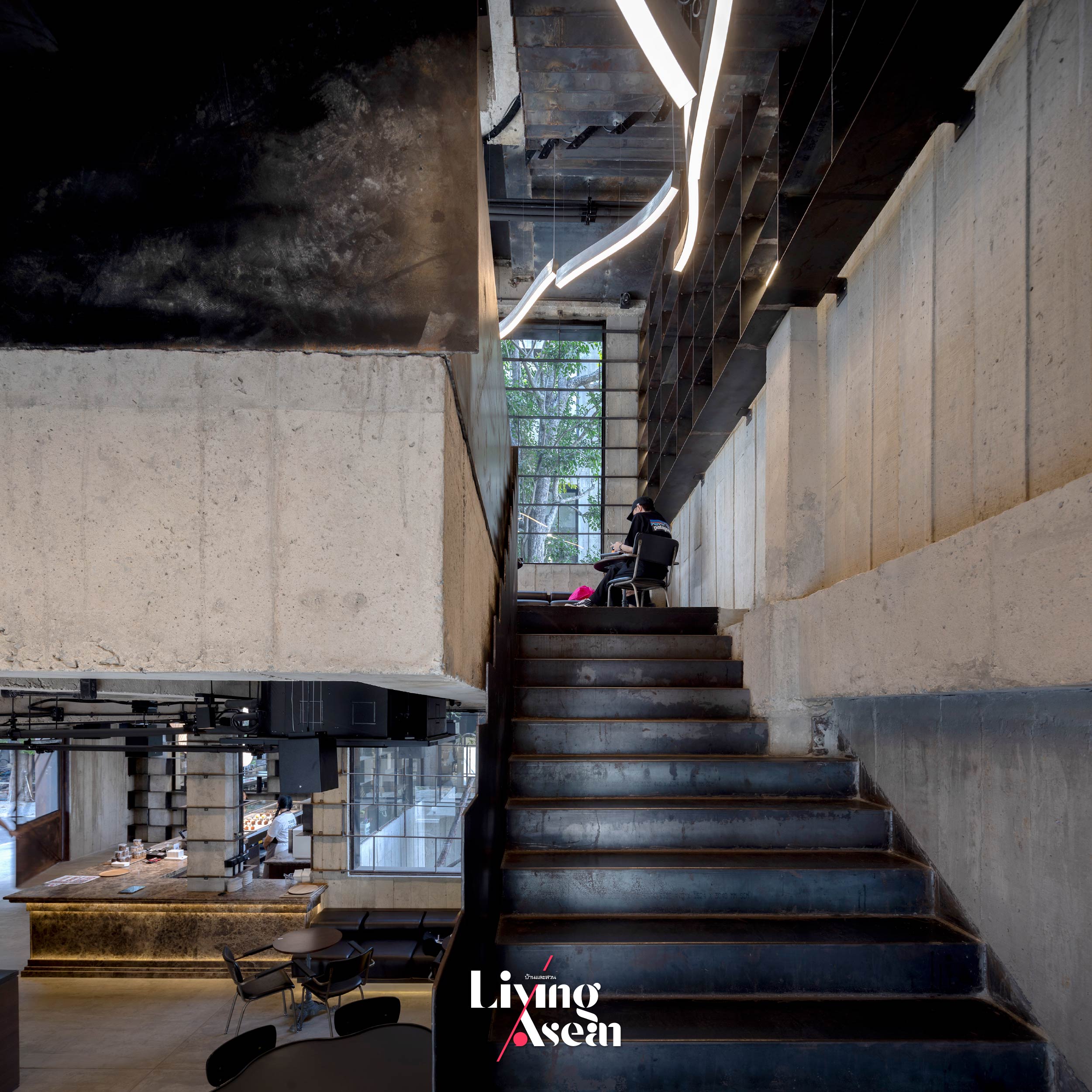
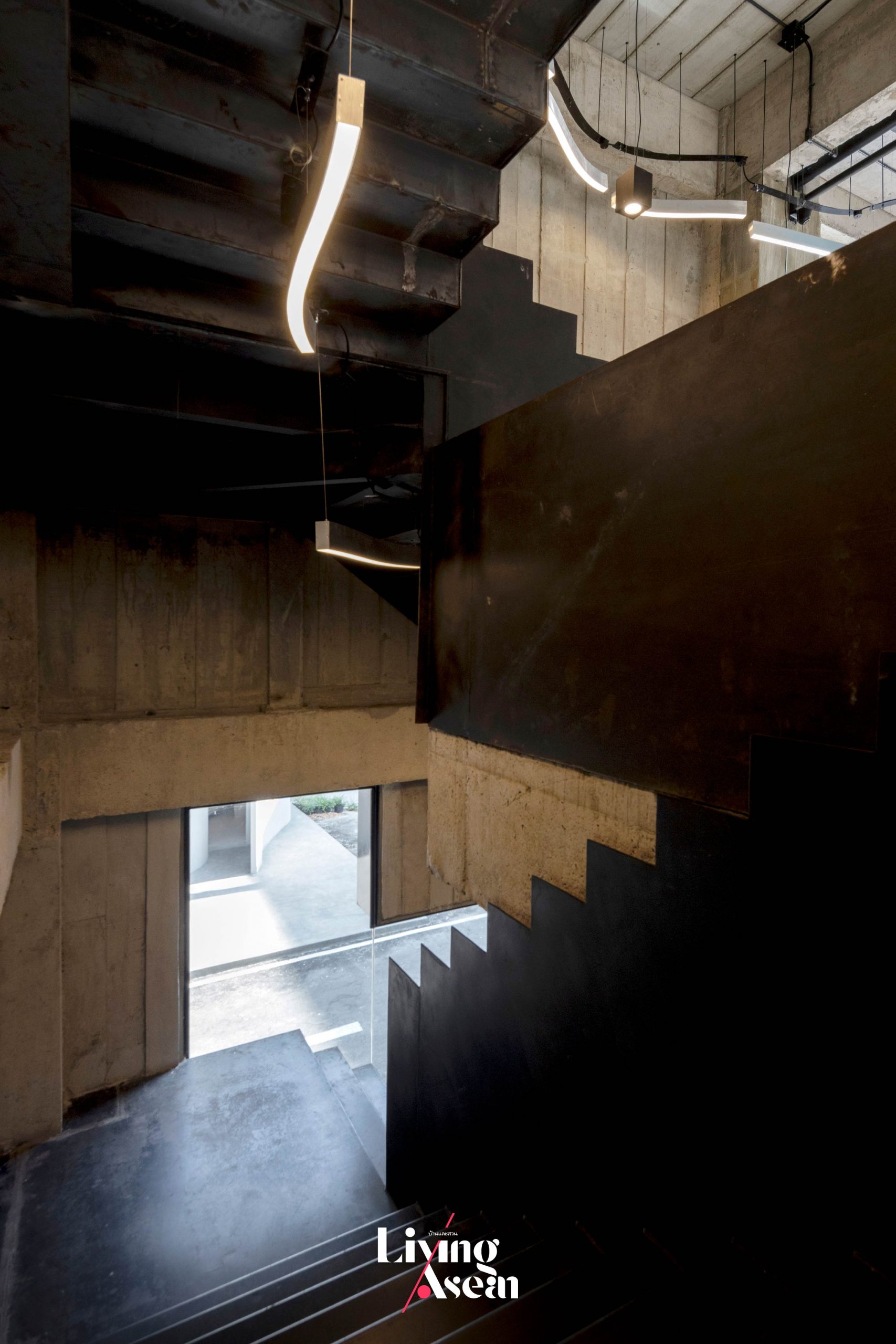
A flight of stairs built of steel gives direct access to a hot kitchen and staff workspace located at the rear of the second floor. It’s inspired by fire escape stairwells typically painted flat black. The staircase looks somewhat bent out of place as it takes a twisting course to avoid hitting an ebony tree standing in the way.
The back of the upstairs room holds a hot kitchen with staff workspace nearby. They are separately accessible via a flight of stairs made of steel that gets its inspiration from a fire escape plan. By design, the staircase looks a bit bent out of place as it takes a twisting course to avoid hitting an ebony tree standing in the way. The third floor contains the business owners’ office space that opens onto a rooftop deck.
Taken as a whole, it’s a project that strikes a balance between architecture and the fun. Among other things, the openings in the wall bear some resemblance to the influence of David Umemoto, a Canadian artist famous for creating concrete sculptures and other art objects. It’s the very concept that inspires the design team at p/s/d to try something new and different from the norm. This includes the openings in the wall that ignore a window’s primary function, such as allowing daylight and a view.
A glimpse of the interior shows the feel and functionality of the back room holding a hot kitchen with staff workspace close by. The area is accessible via a separate set of stairs.
As an alternative, they put in a new kind of window with curved lines and a series of sharp zigzags. The same revolutionary idea applies to staircase design that’s treated like a decorative item. The result is a building resembling a concrete maze of corridors through which one has to find a way. Viewed from a passing train, it’s hard to imagine what’s going on inside, except what is seen through the openings in the wall.
A strategically placed opening in the wall is obvious evidence of the influence of David Umemoto, a Canadian artist famous for creating concrete sculptures and other art objects. It’s an interesting alternative that disregards a window’s primary functions, preferring instead to use curved lines and a series of sharp zigzags. The same applies to staircase design that’s treated like a decorating item.
In a few words, “Patchworks” is an outcome of detailed examination of the elements of building design. It’s the story of a small dessert café that evolved over time, meanwhile enhancing its image and generating brand awareness through a well-thought-out plan. In this particular instance, it’s a nice little collab between the owners and the designers that culminates in the bold, raw and deliberate plainness of brutalism. This much is clear.
It’s an architectural style that prioritizes functionality over ornamentation, plus pastries taste like heaven. Drop in for an unforgettable experience and discover why rich, fluffy pastries and delicious desserts here are a top choice in town. It’s only a short train ride away.
/ Story: MNSD, Kor Lordkam / English version: Bob Pitakwong /
/ Photographs: Nantiya /
HAS Design and Research by Architects Jenchieh Hung and Kulthida Songkittipakdee likens their design work to running a marathon. From the starting line, they navigate a long and challenging path of research and experimentation before reaching the finish line, which represents the final outcome. The end result is always unpredictable, adding to the journey’s intrigue.
(Left) Jenchieh Hung and (Right) Kulthida Songkittipakdee, founder of HAS Design and Research
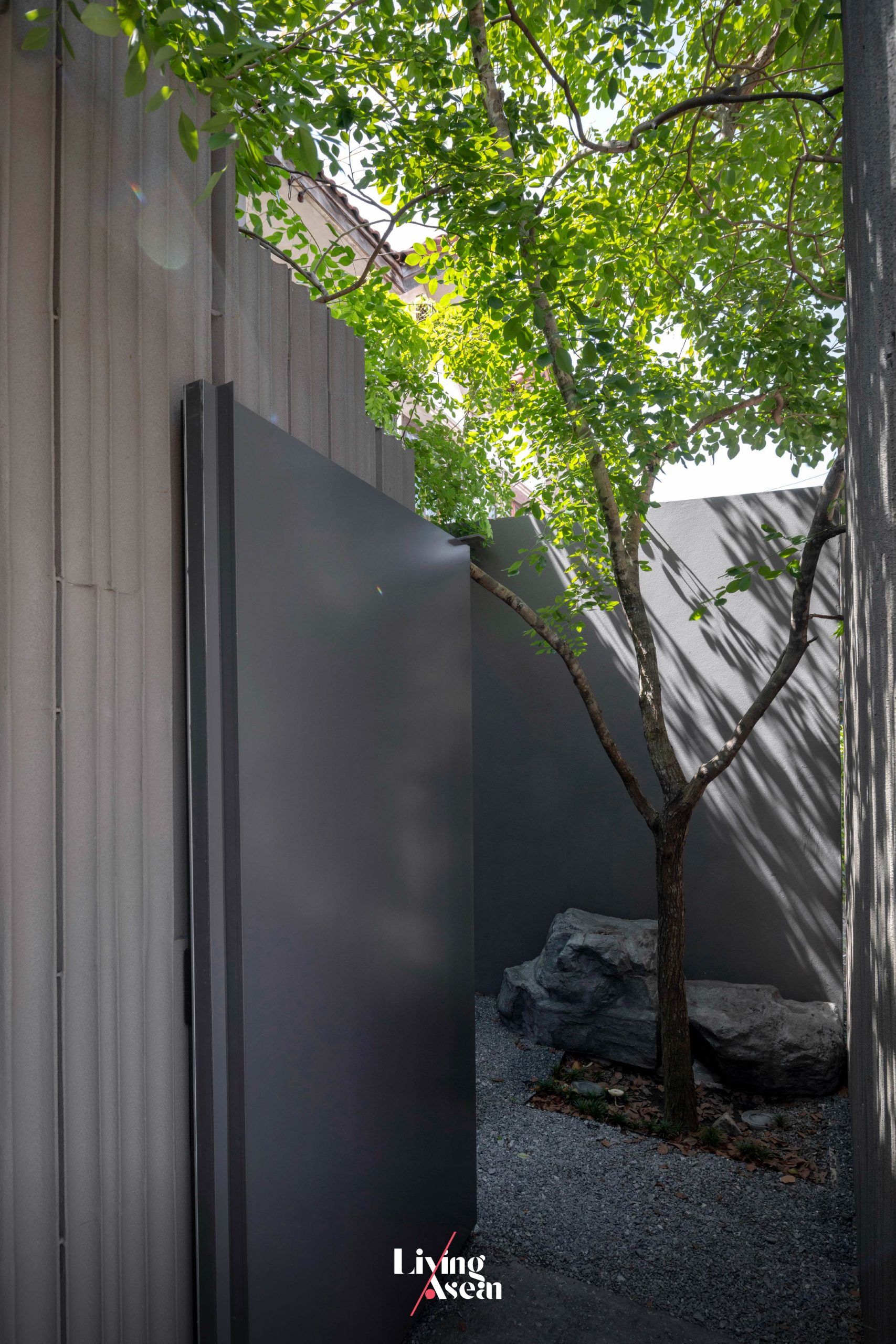
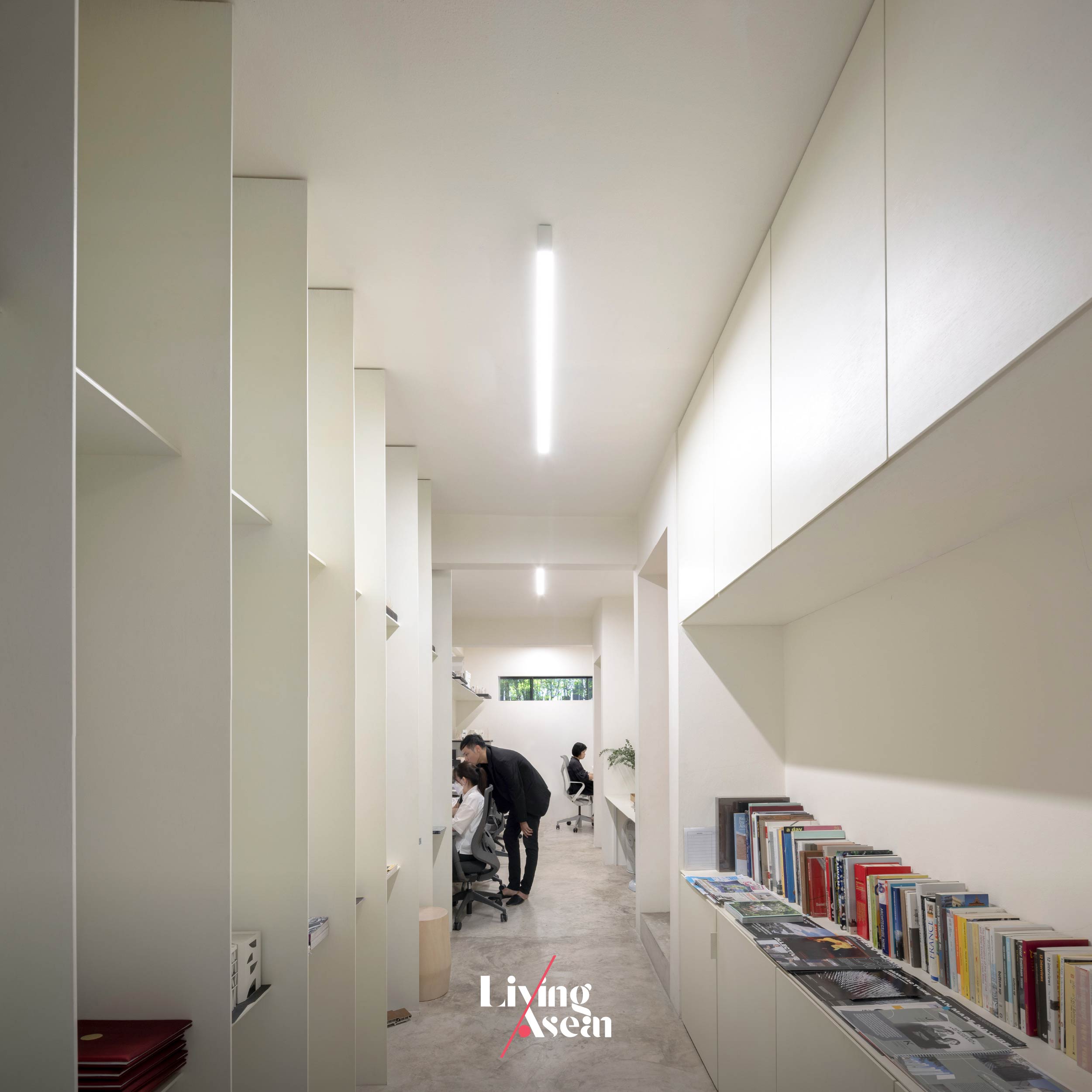
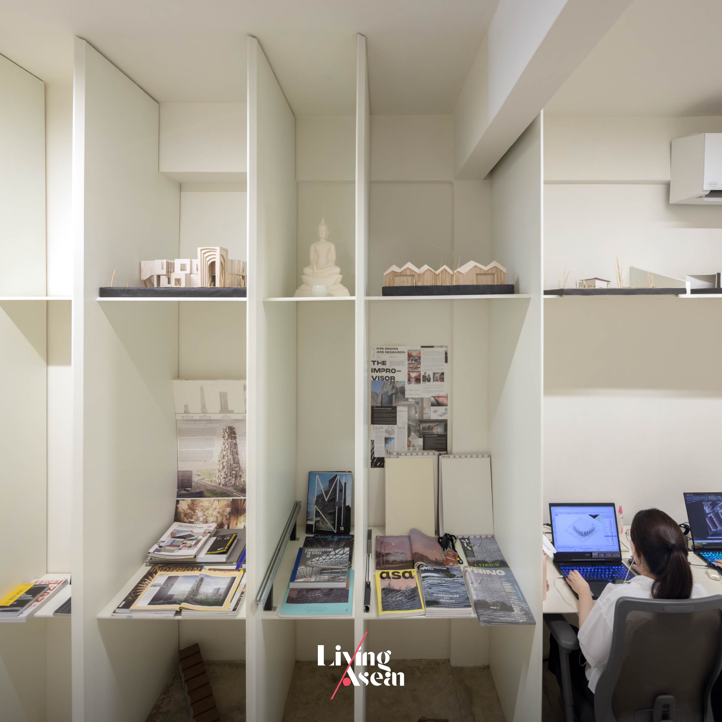
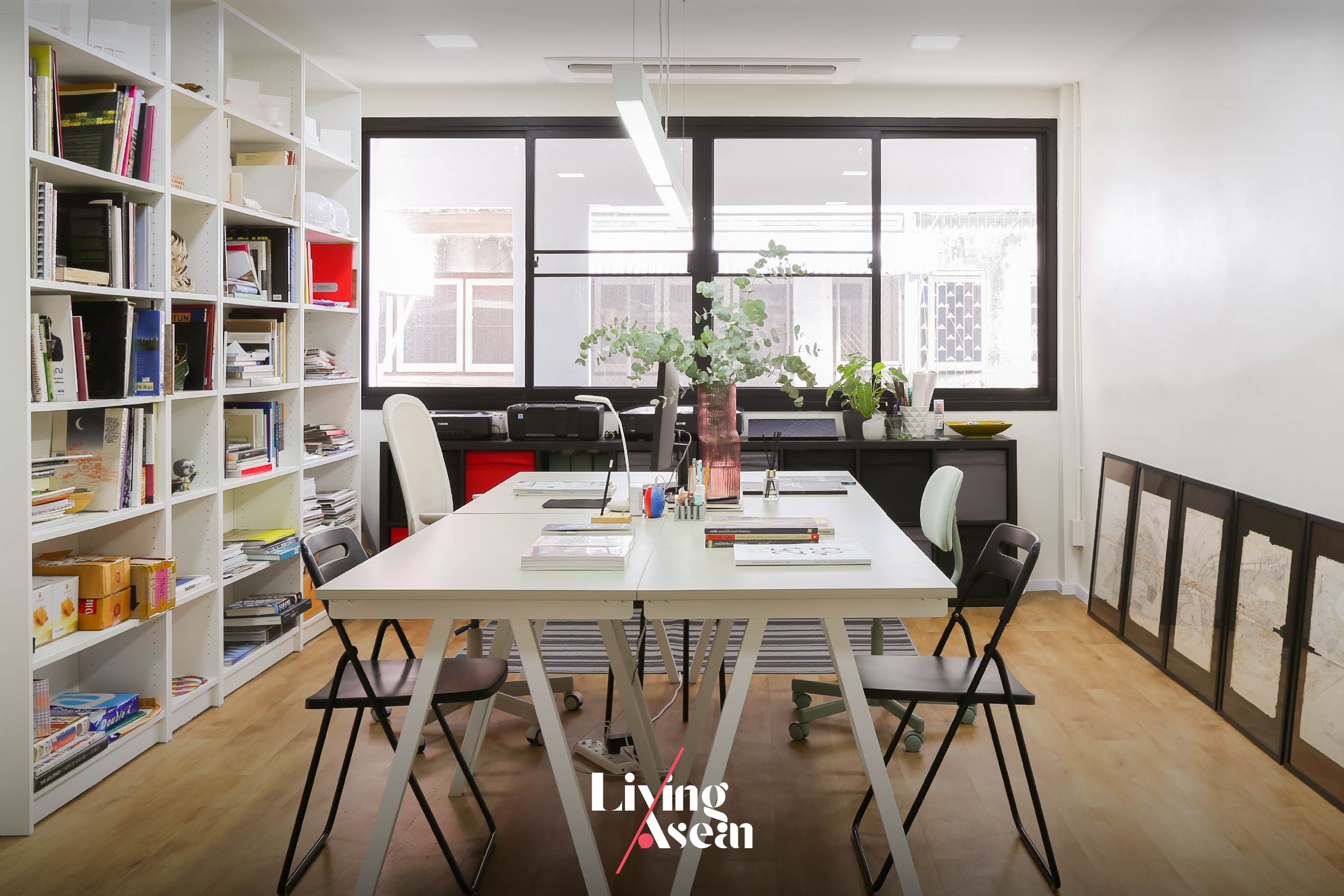
Living ASEAN takes you on a visit to their home studio located in a residential area on Phetkasem Road, Bangkok. Led by Kulthida Songkittipakdee (Poh) and Jenchieh Hung (Jerry), this small space is where they focus on architectural design.
They emphasize thorough research into the background of each project to gain a comprehensive understanding before beginning the design process.
Founded by a duo of architects
Poh – Kulthida: “HAS Design and Research. The office name is from the last name of Jenchieh Hung, and Kulthida Songkittipakdee. Combine H and S. You get HAS Design and Research. Our work emphasizes data research, conducting systematic investigations to produce the outcome needed to do design.”
Jerry – Jenchieh Hung:“The two of us lived outside of Thailand for over 10 years. We set up our first office in Shanghai. When we came back to Thailand, our first impression was we wanted this space to be different from Shanghai.
“If you look at this community, you’ll find the people are truly locals. They do many activities together as community. It’s the reason we combine home and office in one. In Phetkasem area.
“Home office offers many benefits because it’s a perfect balance between life and work. When our way of life become ONE with the surrounding community. I believe our work of architecture can provide pictures of life in the future. The same is true for Thai society.”
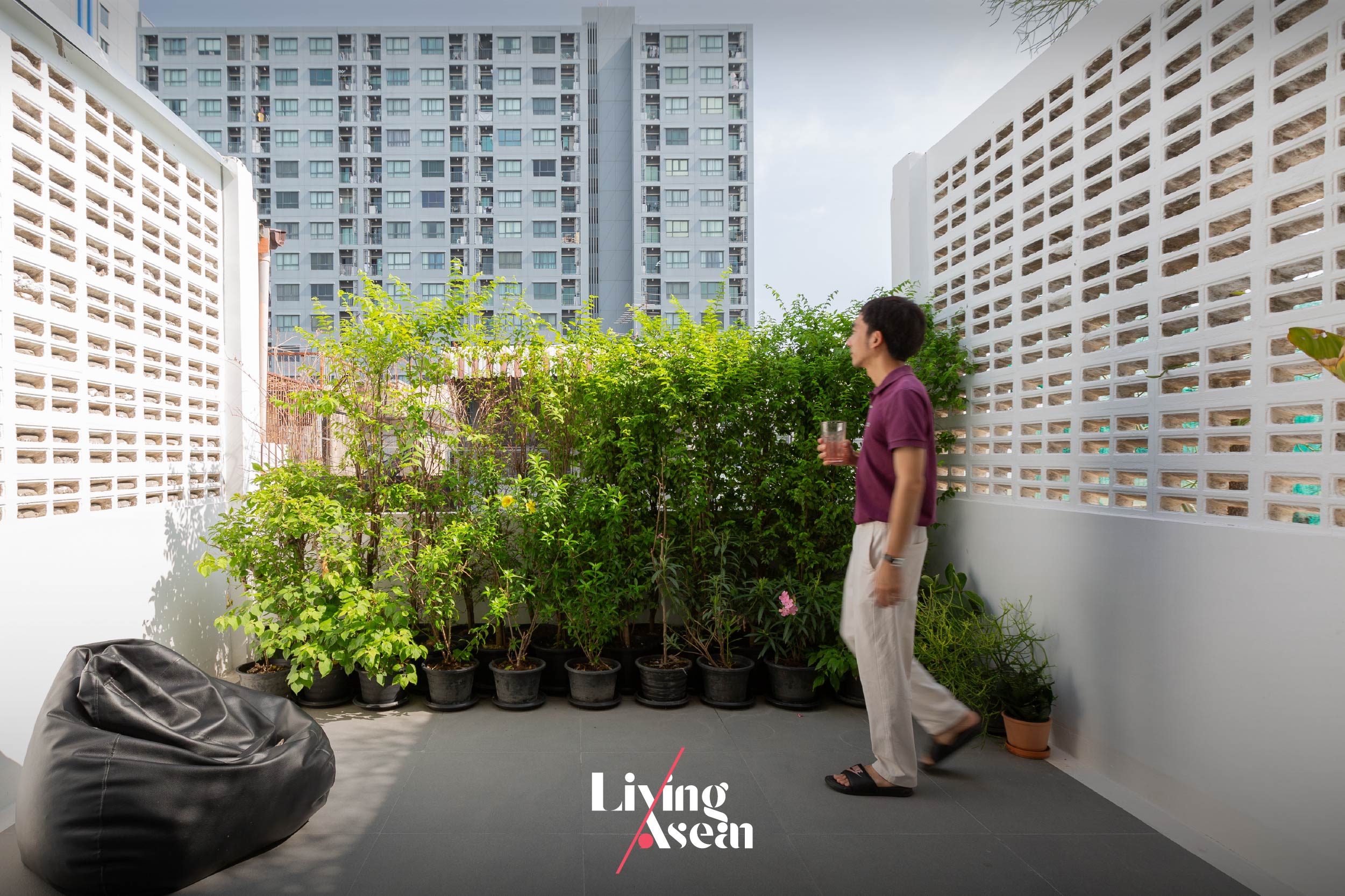
The home-office’s location in the Phetkasem area, Bangkok.
Integrating a workspace into a townhouse
Poh – Kulthida:“I grew up in this kind of environment. After having lived abroad, we decided to return here. The question is: Where do we begin? We started with the place we’ve lived before. The challenge was if it was the old place, we would know what the problem was, especially if it was a townhouse.
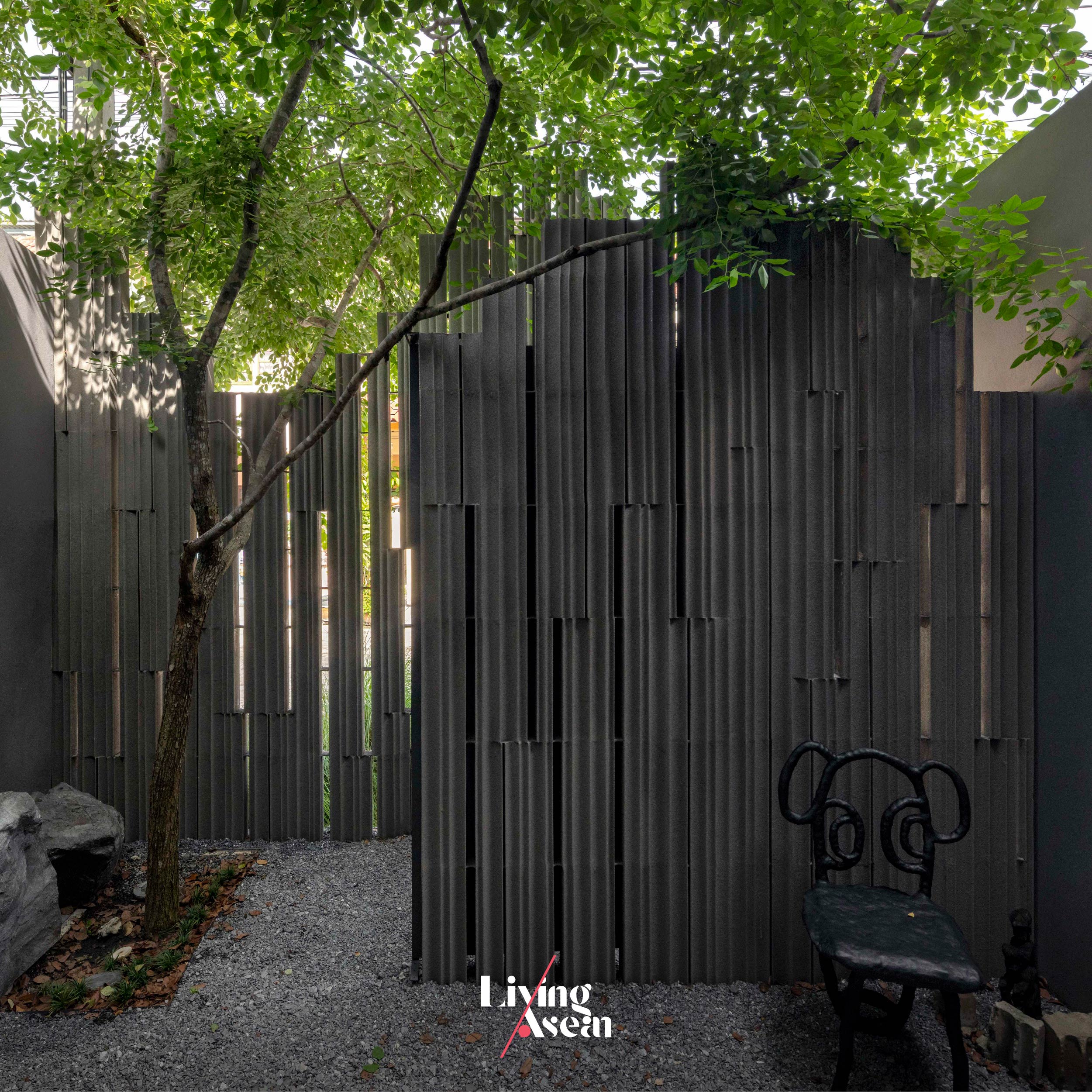
“It’s a narrow front building with an elongated shape. It doesn’t have much light. In any case, we wanted to use it as an office, and as a residence, too. The question is: Does the fence have to still be a fence when we can build it in another shape or form? Or can we make the fence a part of the space.
“Can it turn into an area that brings light and fresh air into the interior? The fence will no longer be a fence wall. It will transform into a space providing transition room for people arriving at the office. It’s like making their way through a garden first, and then gradually arrive at the office. Meanwhile, we had to find ways to bring light into the building as much as possible.”
The office space within the home-office.
Research is fundamental
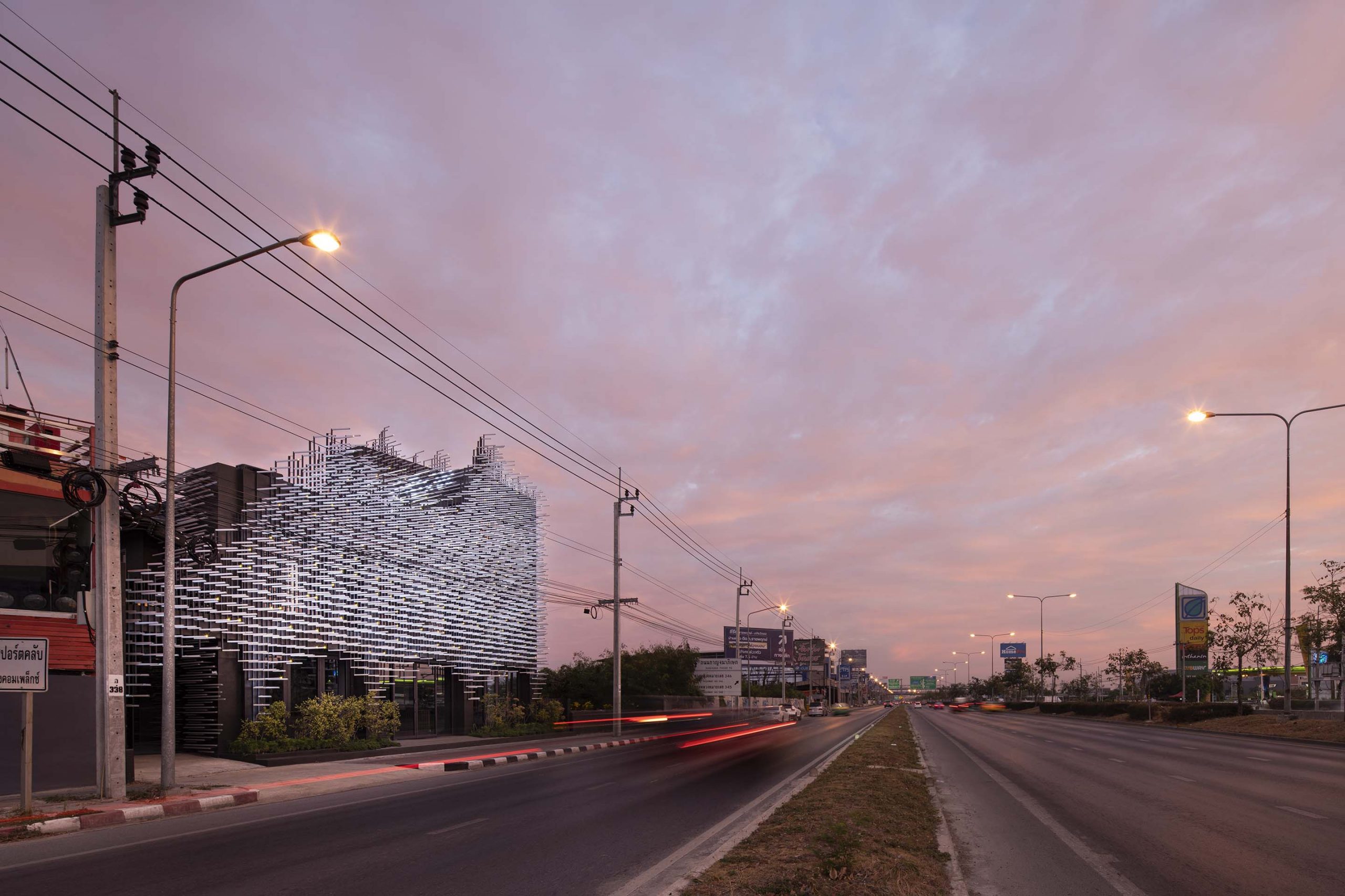
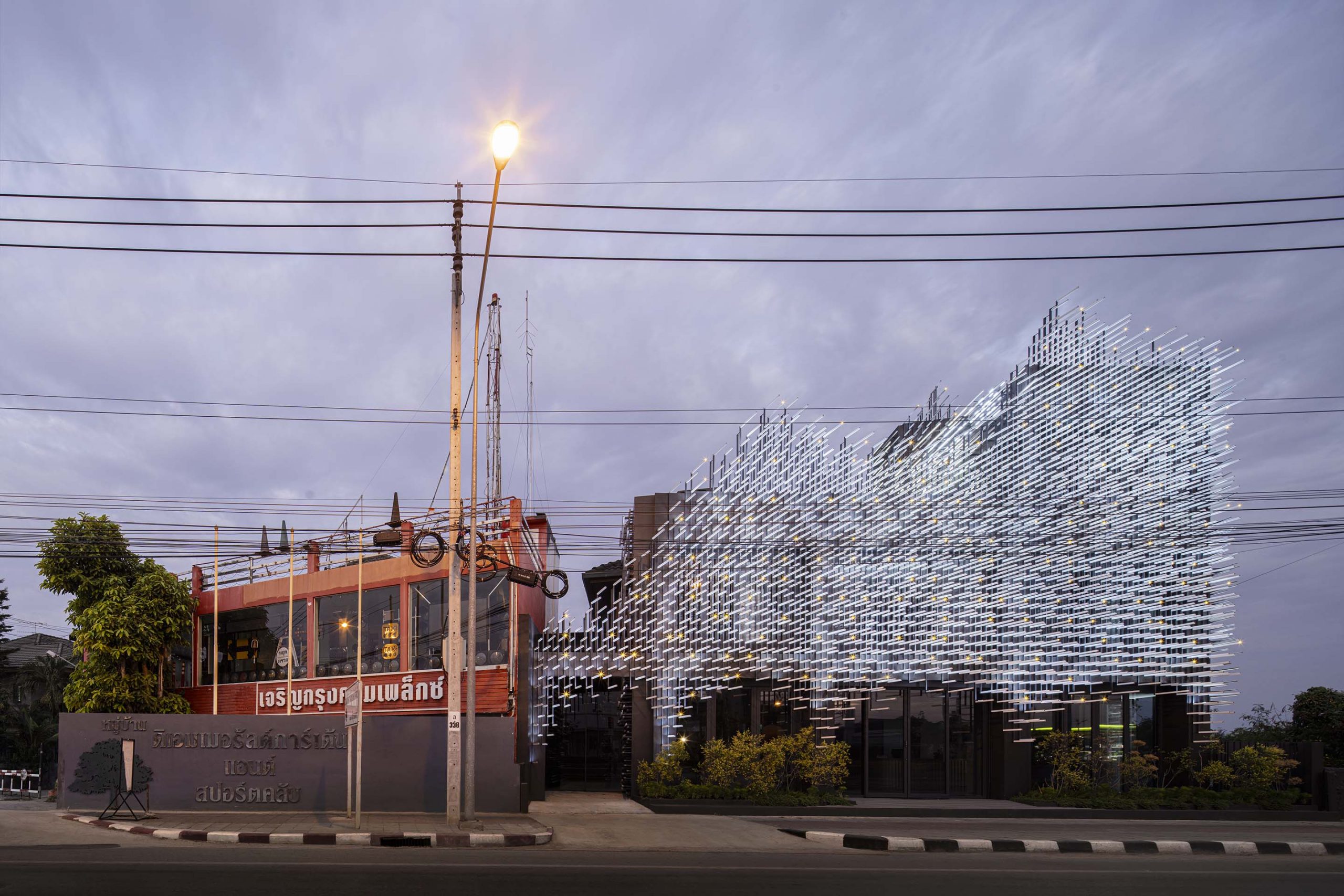
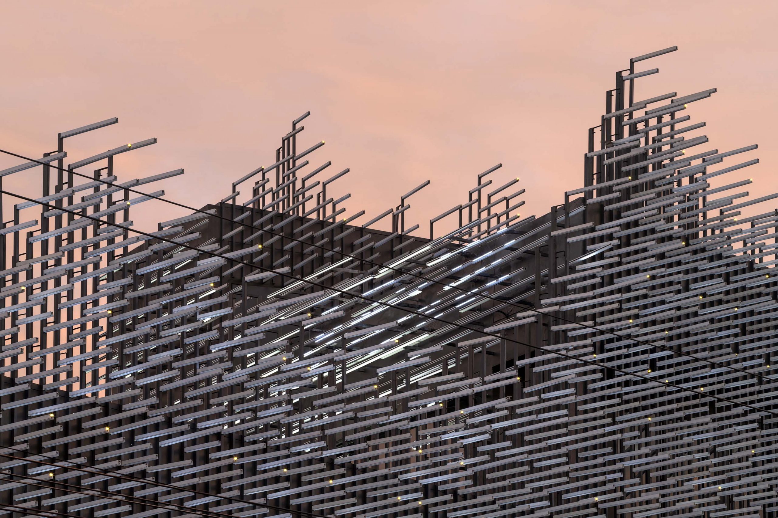
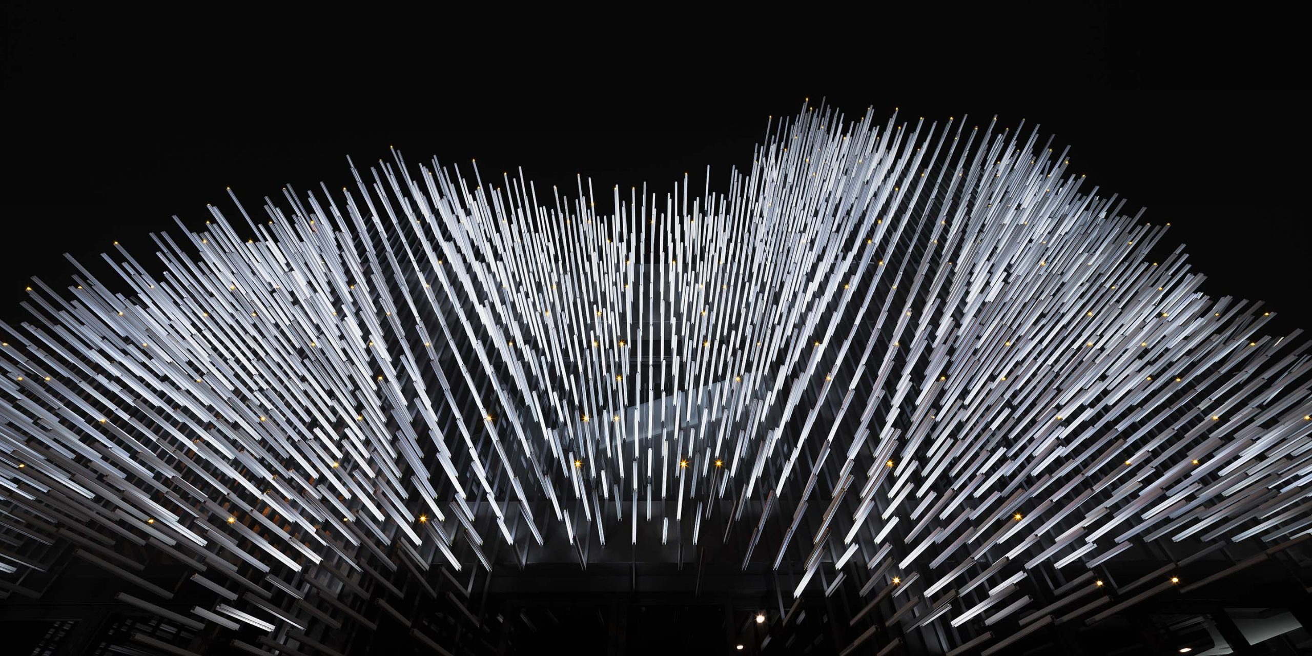
Poh – Kulthida: “As for the research process, we think it’s fundamental, very important to us. Take for example MoMA, the Museum of Modern Aluminum that we did. Initially, the clients came to us saying one sentence. They wanted us to design a building with a wow factor that creates an impact. That was it.
“We looked for the best way to go about it making it stand out from the crowd on Ratchaphruek Road. People driving by won’t take notice of the buildings. Interestingly, there are lots of posters and signboards.
“Meanwhile, the daytime and the nighttime are different types of scenes, which gives us an idea of what to do. We integrated natural features in the surroundings in building design, which resulted in the building façade as you see.
“It makes the building stand out for people driving by. They feel this one is interesting. In the daytime, people will see an image of trees and leaves of grass rustling in the wind. In actual fact, it’s all aluminum. In the nighttime, it’s a light show. We worked with lighting designers to make it look like fireflies flashing on building walls.”
Jerry – Jenchieh Hung:“As for MoMA, the Museum of Modern Aluminum, actually, we want to show a dense urban space that blends into the natural environment. But our method is different. We used industrial building materials to create a result resembling a cave in nature or a forest in nature.
“Actually, it’s the story about the way people live in an urban context, but still keep in touch with nature. This is our main target. Nature and urban areas can coexist. I think our research and design are something that illustrates our imagination about the world. Think about the world we’re living in and our living behavior.
“Our design and research are the key to open up the road ahead. They open the way for our life, and for the world. And it allows for architecture and research to connect with each other.”
Poh – Kulthida:“Actually our work makes us feel like we are marathon runners because as we leave the start point, we don’t know where it will end.
“In many projects, for example the Forest Villa, the clients told us they wanted a home, that’s fit for Modern Chinese Living Styles. In the past, people might think a Chinese style home must have the quality of being Chinese in it. When we knew what they wanted, plus, details of the project site and the homeowner’s vision, it helped to create the kind of home they wanted. It’s a picture that differs from the Chinese style home it used to be.
“Only then did we know we have arrived at the finish line. We started running, not knowing where it would take us. But in the end, the project was accomplished.
“Another example is The Glade Bookstore. After careful consideration, we succeeded in creating something that exceeded their expectations. It’s a bookstore with a cultural space in it. There are art activities on the premises. We succeeded in creating an image of The Glade Bookstore in a style that showcases Chinese architectural heritage in the interior.
“We used materials that people didn’t expect. That is, for every project that we do, we think that our way of working is capable of producing an outstanding result for the project. And we did. Plus, it adds value to the design that we created in ways that exceed project owner expectations.”
Every name tells a story. Here’s a modern home on Pattanakarn Road that impresses with beautiful architecture and a love of open spaces. Named “1+1=1 House”, it’s the pride and joy of a multigenerational family. Three generations, including grandma and grandpa, mom and dad, and their children under the age of adulthood, live together in one household. The house has 650 square meters of usable space with enough personal room for everyone to live comfortably, not to mention common areas and amenities that are integral components of modern living.
Designed by Poonsook Architects Co, Ltd, a Bangkok-based architectural firm, the house comprises three main functional spaces, namely, the living area for mom and dad and their children, the living area for grandma and grandpa, and shared spaces arranged in the shape of the letter C.
The exterior walls are positioned to face the north, south and west directions so as to protect a central courtyard filled with greenery and a paved outdoor area for relaxation. Together they go to work shielding the interior from the summer sun, balancing temperature and enhancing home comfort.
A courtyard that’s the center of the C-shaped house plan creates a family-friendly outdoor living space in the backyard.
The C-shaped floor plan creates a tranquil retreat enclosed by the walls of the house that keep it in shade for much of the day. The result is an outdoor oasis that’s comfortable and pleasant.
There are two sets of stairs located on either side of the living room. They give access to the upstairs bedrooms belonging to grandma and grandpa, mom and dad, and the children, plus a workroom close by. The downstairs common area is clearly defined. There’s a carport conveniently connected to the house entrance.
The first floor boasts an open-concept design with features for living and dining in a single, uninterrupted space. To the side, large sliding glass doors can be stowed away neatly, allowing fresh air into the spacious living room.
Walk in the door, and you see a courtyard landscape with a level paved area that makes the home feel warm and welcoming. There’s a shade tree that provides a focal point in the yard and doubles as a privacy screen for the sitting room upstairs.
The downstairs dining room lies under a higher-than-normal ceiling, 5 meters tall to be exact. As would be expected, it makes the interior living space feel spacious, bright and airy. There are large, east-facing folding doors that open to connect with the veranda and a courtyard garden nearby. It’s everybody’s favorite hangout, a place for the family to get together and shoot the breeze.
The living room enclosed by glass walls has a modern sofa set in a creamy white that goes together well with wood furniture, creating a calm environment for elderly parents.
Taking everything into account, the ground floor boasts a beautiful open floor plan. There’s a sitting room with a pantry and dining area close by. Large sliding doors glazed using clear glass open onto the central courtyard, creating a visible impression that makes the room feel longer, wider and well-ventilated.
The courtyard is accessible via floor-to-ceiling glazed doors located to the side.
Grandma and grandpa’s private sitting room is connected to the kitchen area. The nearness in space to the central courtyard provides physical ease and relaxation in their sitting room. From here, a flight of stairs gives access to green spaces on the second floor that also contains their bedroom and a multipurpose area nearby.
The corridor leading to bedrooms on the second floor is enclosed by a glazed façade overlooking a lush courtyard garden.
By design, it’s a modern home that fulfills the needs of an extended family, one that provides enough private space plus a communal area shared by everyone. Among other things, the dining room is dedicated to foster social interaction and strengthen a bond of understanding in the family. It’s rare to find a multigenerational home these days when the nuclear family gradually becomes the norm.
/ Story: Kangsadan K. / English version: Bob Pitakwong /
/ Photographs: Anupong Chaisukkasem, Phumpakorn Na Bangchang /
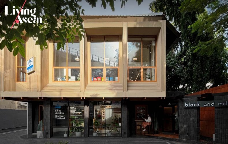
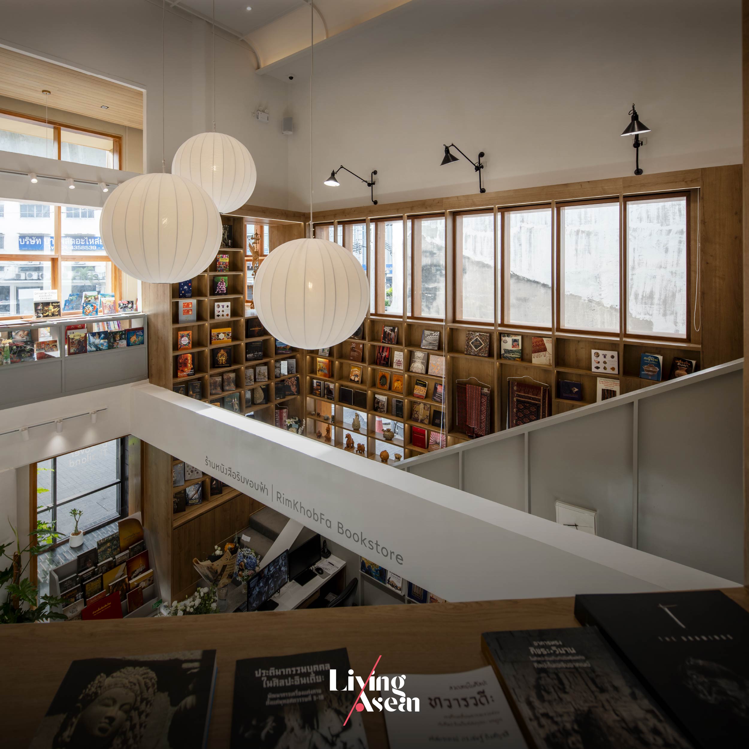
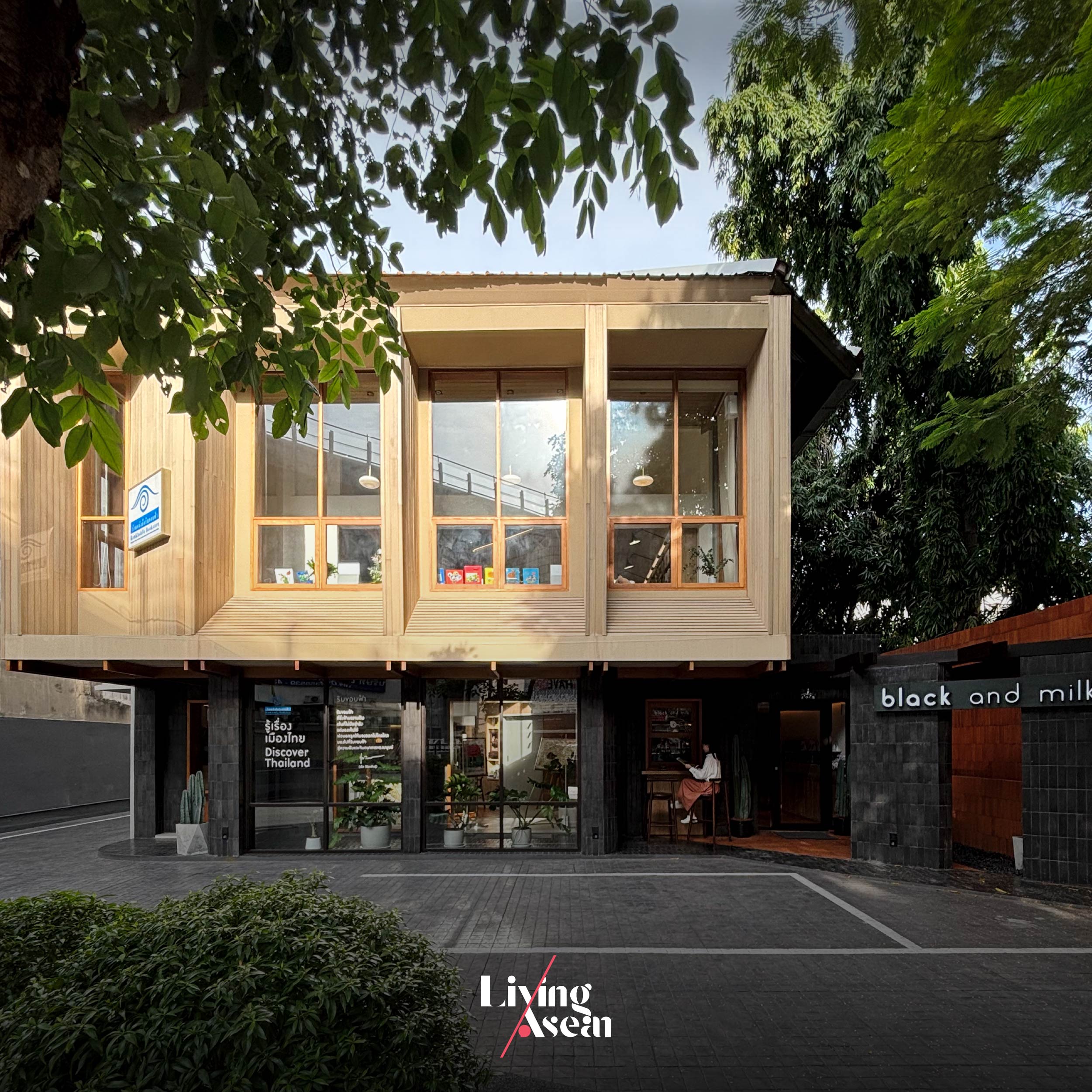
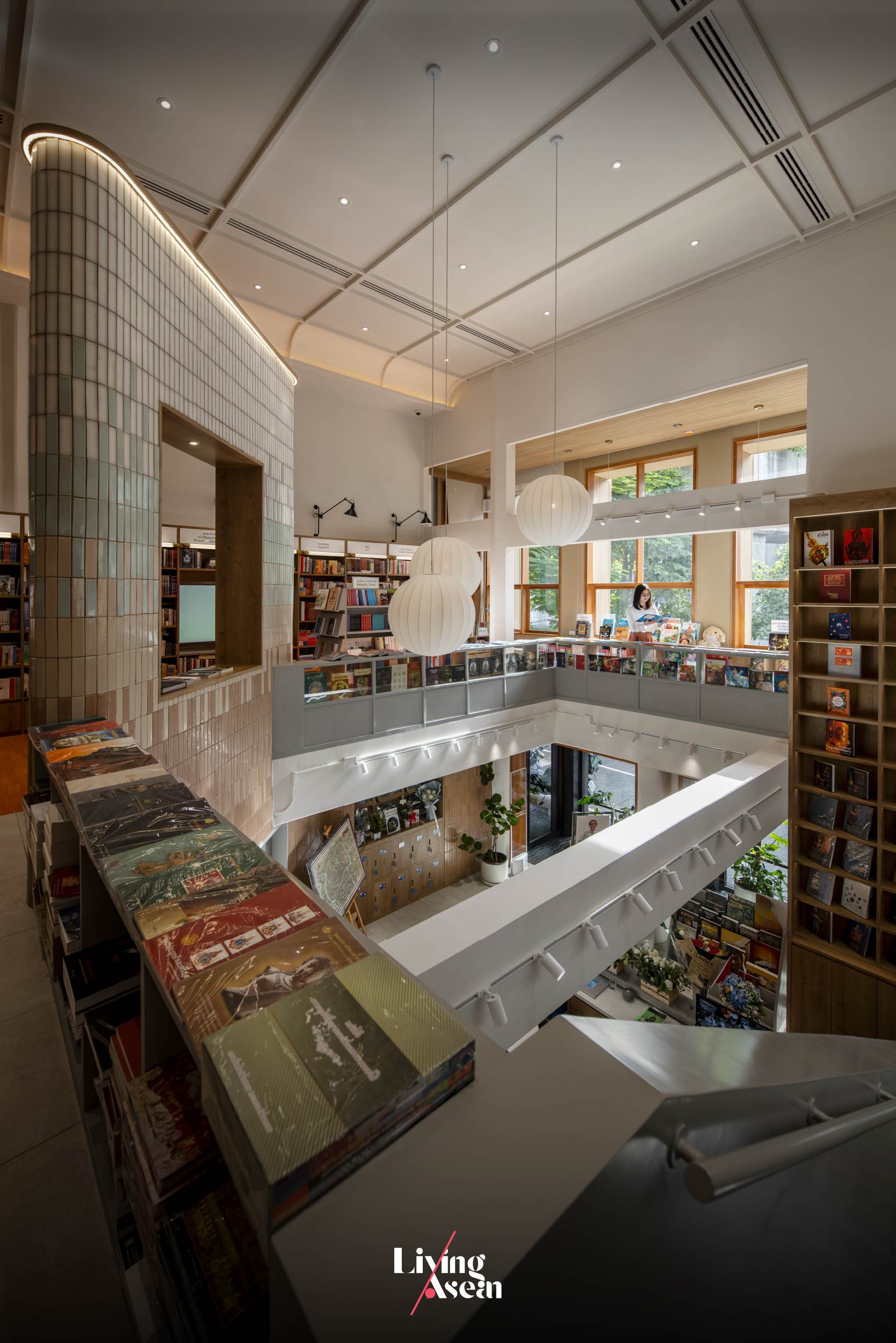
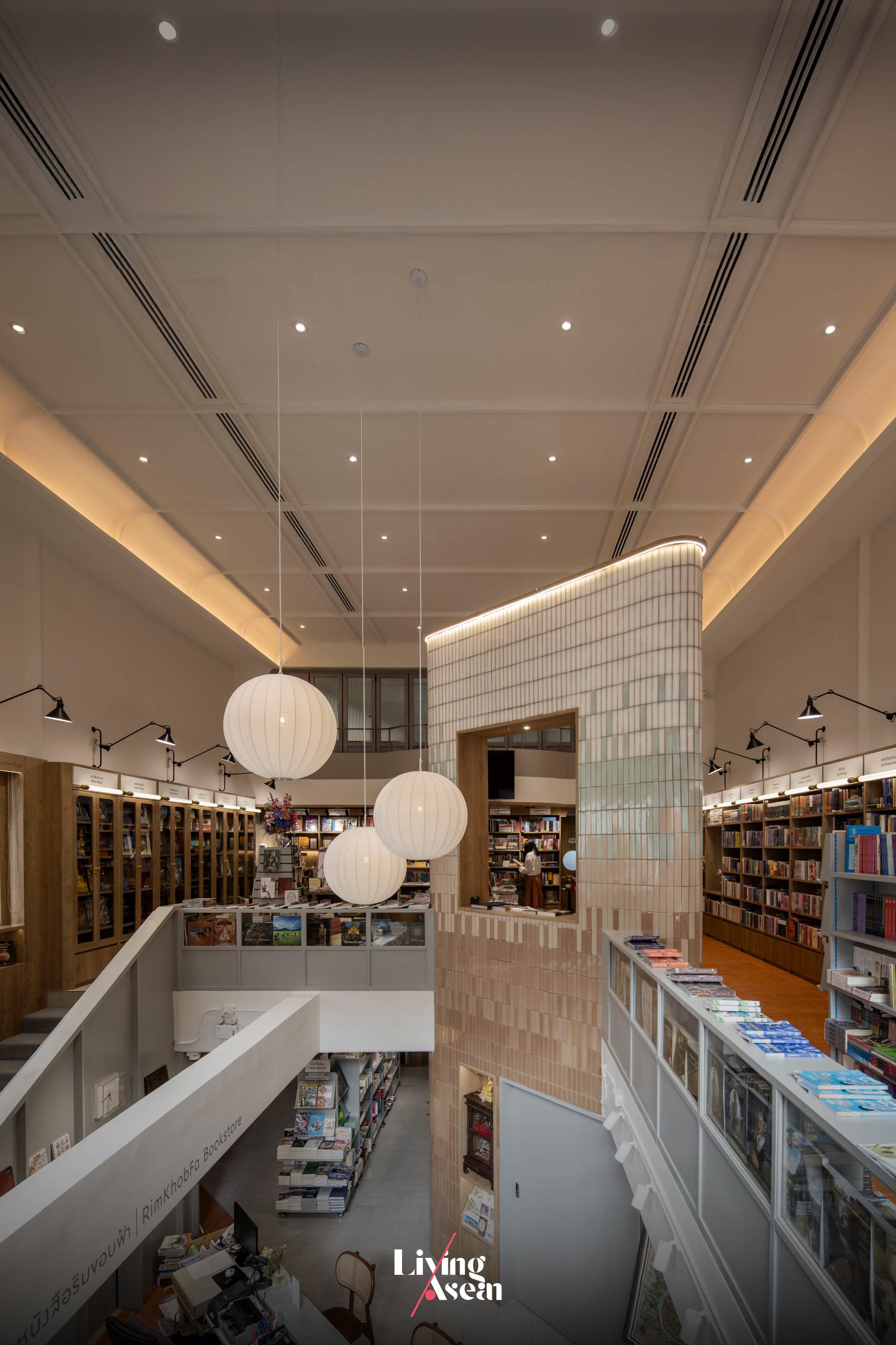
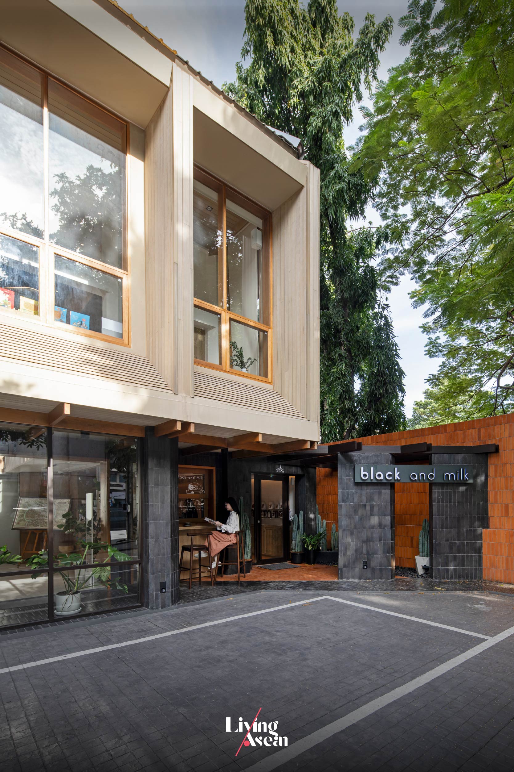
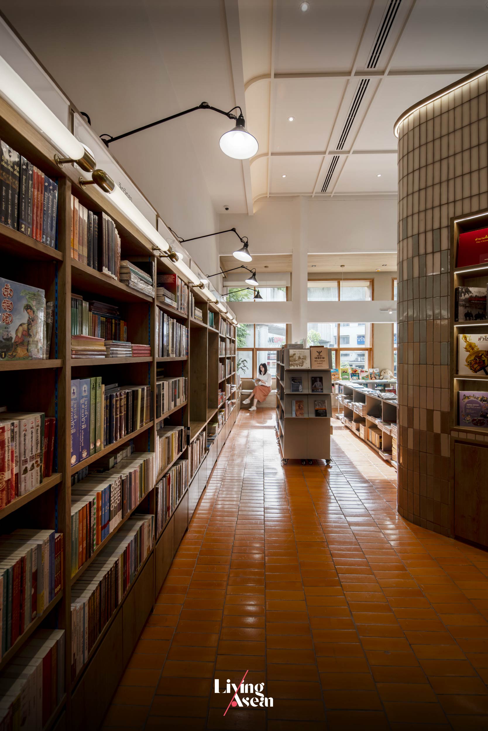
How would you like your coffee? Black or with cream? Welcome to Rimkhobfa Bookstore & Black and Milk Café, a stand-alone store and coffee shop snugly cocooned in a cozy neighborhood of Bangkok’s Bang Plat District. The name is a bit of a mouthful, but you get the idea. The cybercafé is thoughtfully devised to ignite the love of literacy and open new horizons among younger fans of books.
Aptly named “Rimkhobfa”, literally translated “horizons”, it’s home to a bewildering array of books about Thailand and classics that every bookworm should read. Originally located on Rajadamnoen Avenue, the store only recently moved across the Chao Phraya River to a new address in Bang Phlat District. And that’s where the design team at BodinChapa Architects came in play, transforming an old building that had fallen into disrepair into a new bookstore-cum-café rendezvous. There’s charm and the power of storytelling that captivates a thirst for knowledge. Plus, fresh brewed coffee smells like heaven and the atmosphere is pleasant.
The building that formerly housed offices is located on Charansanitwong Road, a main thoroughfare on the west bank of the Chao Phraya. There was a problem when an overpass was built nearby, making the structure less visible while the interior became dark, poorly lit by dim light. To breathe new life into the old building and make the dark rooms brighter, the architects added openings in the wall and painted the interior a light and airy color. Meanwhile, an open concept layout provides ample space for a café that’s part and parcel of the bookstore.
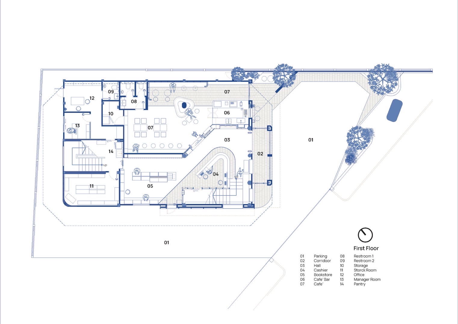
The first floor plan offers equal amounts of space for the café and the bookstore. / Courtesy of BodinChapa Architects
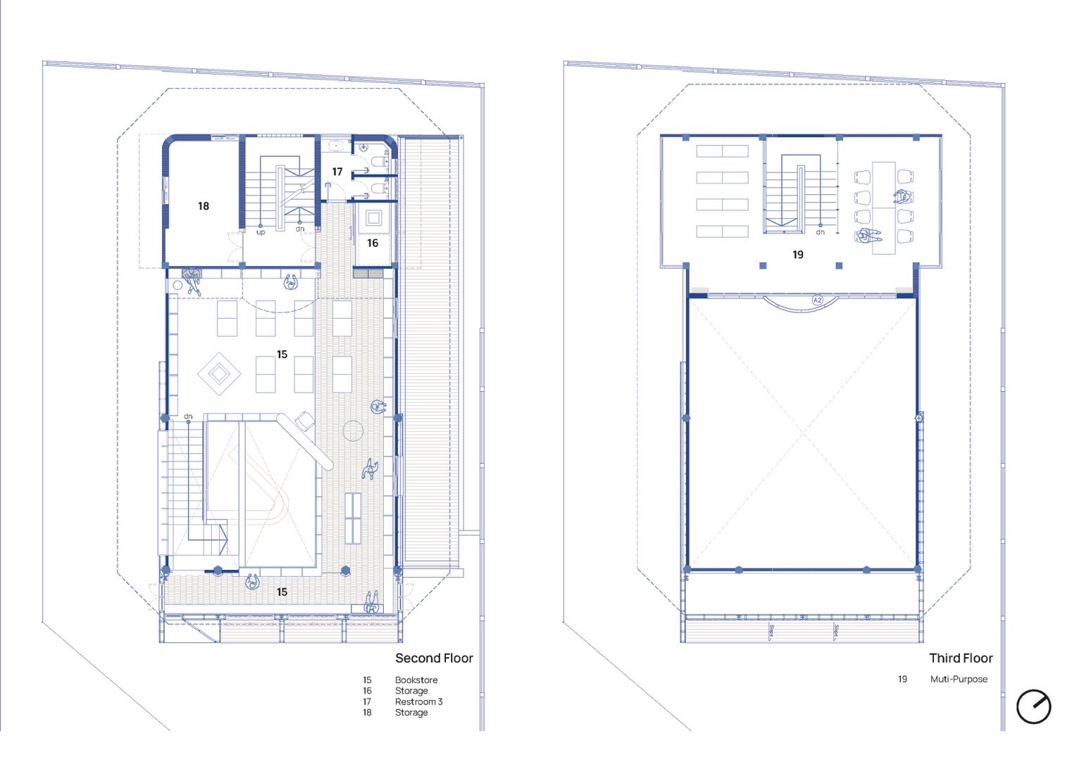
Drawings illustrate spatial arrangements on the second and third floor plans. The interior is made light and airy by taking away the ceiling and creating a void of space in the second floor. / Courtesy of BodinChapa Architects
A vantage point affords a view of areas on the first and second floors.
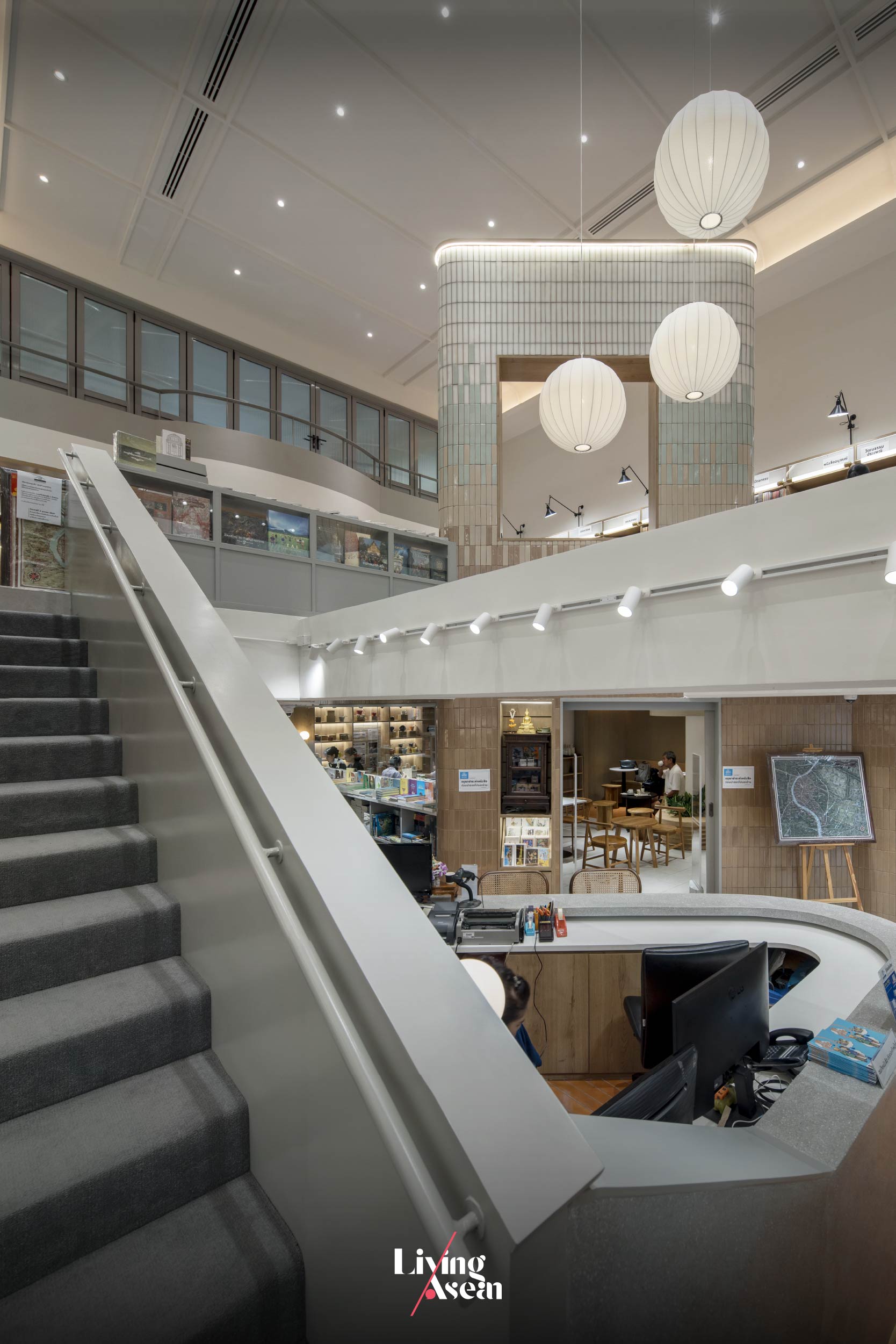
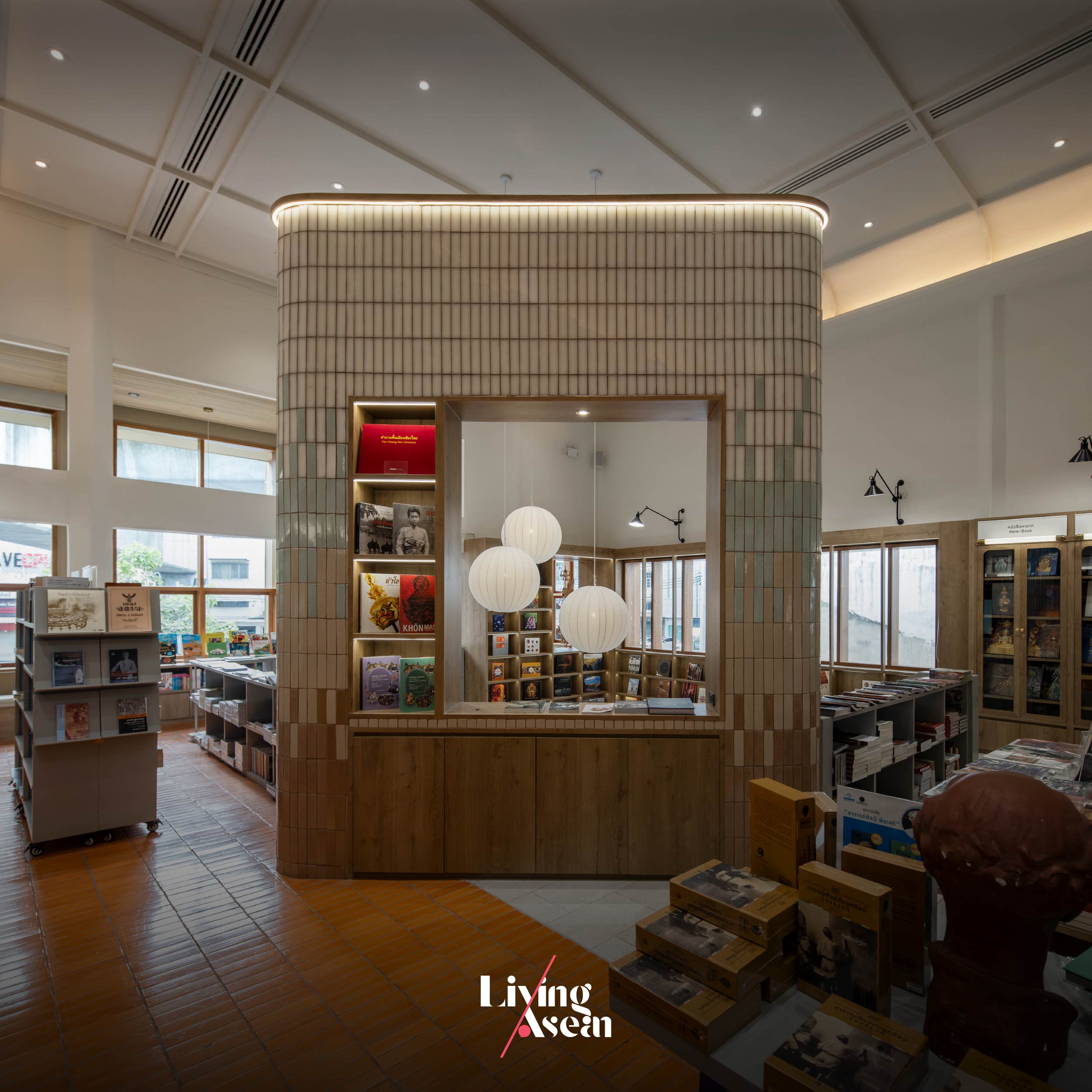
Stair railings provide visual transitions enhancing the flow of interior space that culminates in a massive wall called the “Tower”. In all places, the interior abounds with custom built-in shelves for storing books and product displays.
In renovating the old building, the architects had a part of the second floor removed to create a double height ceiling, resulting in a visually striking interior on the ground floor. After that the bookstore and café spaces were put in, each occupying roughly equal amounts of floor area.
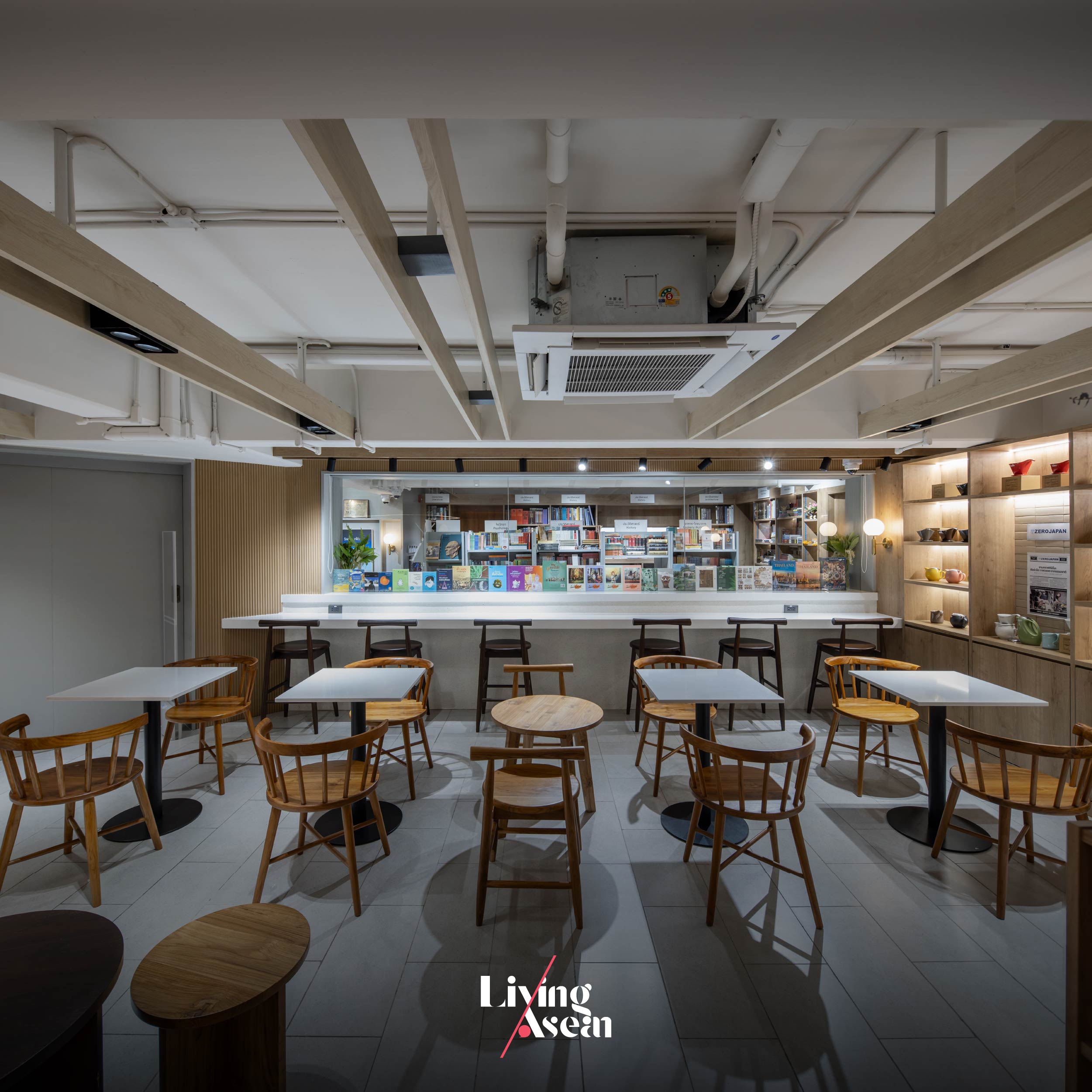
Climb a flight of stairs, and you come to the second floor with plenty of space for organizing events and seminars. The low ceiling that was there originally is gone now. The room is cozy and comfortable thanks to a double height space. It also has abundant space for bookshelves. The third floor holds a conference room with large windows overlooking the second floor.
A product display paired with restaurant furniture in various styles creates a good bookstore café experience.
Low ceilings that were there originally have since been removed to add headroom to the retail space on the first floor. Plus, it makes the small area nice and tidy by hiding utility systems.
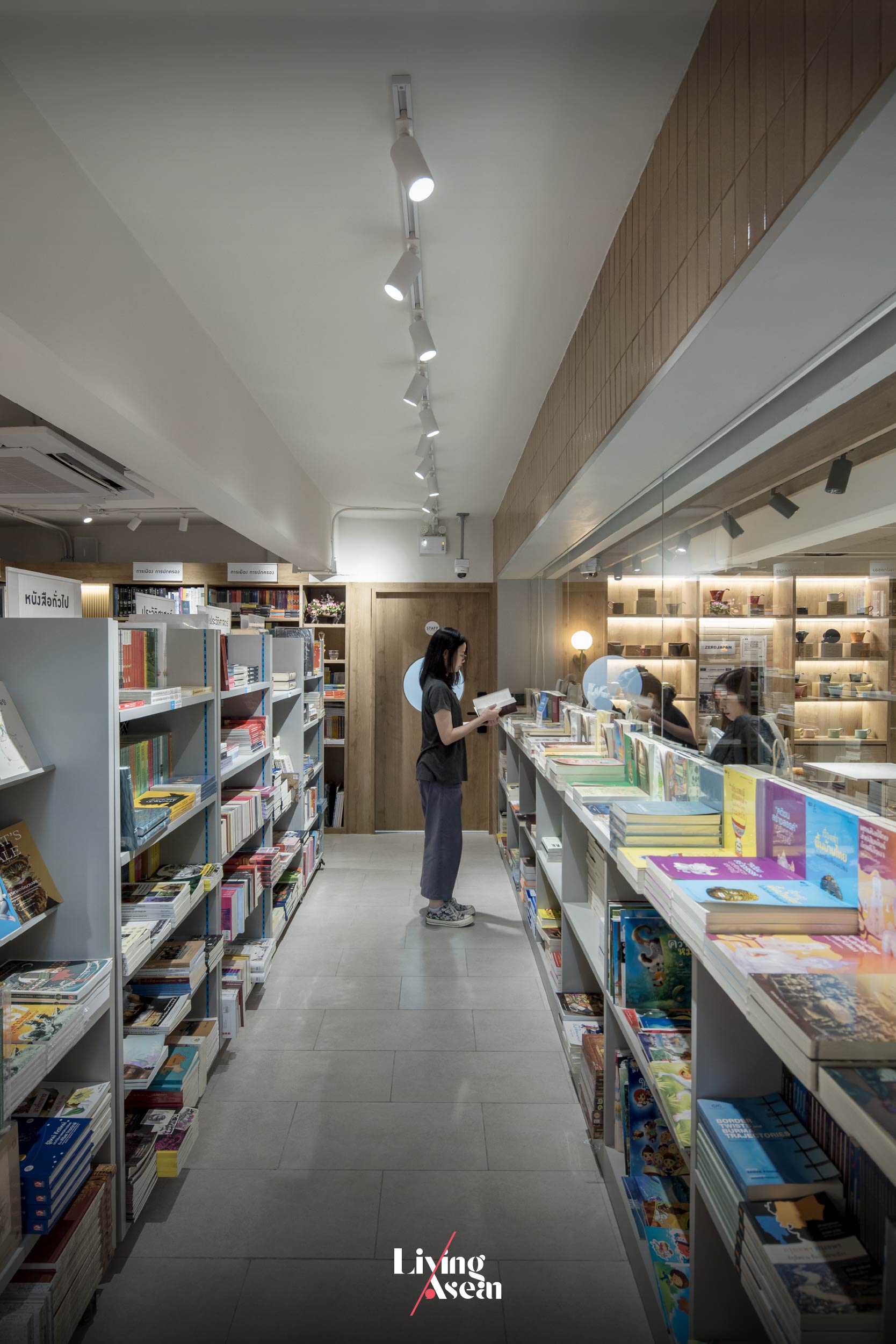
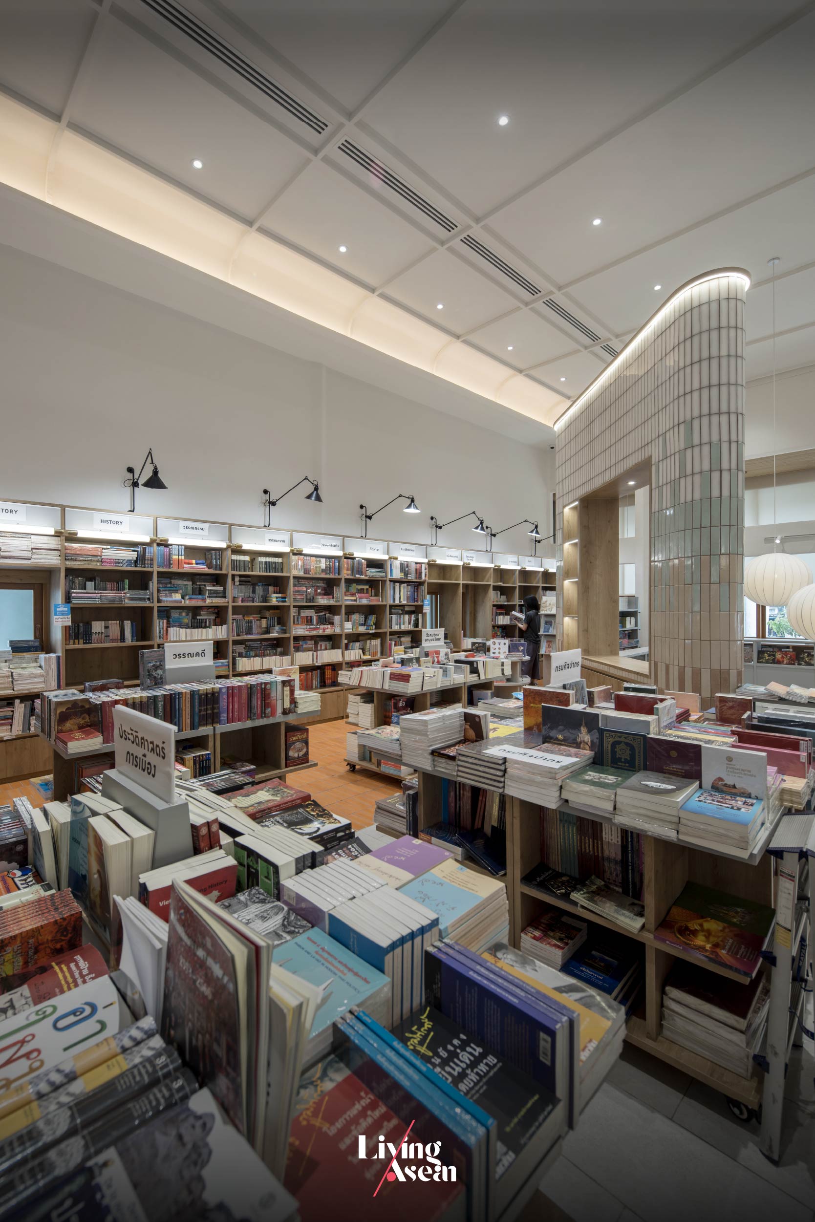
The first floor comprises two parts, the first being a bookstore and the second holding a small café. There’s a coffee bar up front for greeting customers arriving in the store. Go further inside, and you come to an area filled with bookshelves alternating with coffee shop seating. From here the aisle leads to a collection of books beautifully arranged for public viewing.
On the whole, the interior abounds with bookshelves and library furniture starting from the café zone all the way to the stairway giving access to the second floor. Together they provide the perfect ambience for coffee aficionados and book lovers.
There’s more. Filling the interior space with style is a massive wall called the “Tower” that rises from the bottom to the top of the building. It’s an element of design dividing the interior space into parts, meanwhile doubling as the focal point drawing customers to other attractions on the second floor. Plus, it’s thoughtfully devised to provide the visual connection linking the cashier zone with the stairway nearby.
The decoration of the “Tower” keeps firmly to the original Rimkhobfa bookstore concept, whereby the gradual change of color symbolizes the horizon.
Overall, the furnishing and decoration of the interior keeps firmly to the original “Rimkhobfa” bookstore concept, whereby an image of the horizon is represented by a wall of fired clay bricks that change colors from dark at the bottom to light at the top. At the same time, indoor lights and a quadrangular opening at the top of the Tower go to work alongside each other to create a clean, well-lighted place perfect for reading and displays of books.
The second floor is well-lit and filled with shelves on which books are stored. It’s illuminated by natural daylight shining in through an array of tall windows. To protect the interior from the sun, the windows are dressed with light filtering shades. Flex space ideas help create multipurpose rooms for meetings and other events.
Low profile shelving units can be stowed away in the back room when not required, while high profile ones are used to store books and display products. They are placed against the wall with spaces in between to avoid enclosed spaces that could be signs of claustrophobia. This makes it easy to browse around the bookstore, find a quiet place to sit and enjoy a good read.
A flexible space for seminars and events has low profile shelving units that can be stowed away when not required.
Slightly tucked away from the main, noisy thoroughfare, the bookstore café makes the most effective use of natural materials to attract passers-by. Like so, the raw brick façade in shades of orange performs dual functions; structural and aesthetic. Nearby, a small signboard displaying the business name and logo directs customers to the store.
The floor is covered with tiles in shades of dark gray alternating with orange hue with brownish tints. To make the building more visible from the street, the front façade protrudes slightly from the wall while light-colored wood paneling slants up to the window sills adding instant curb appeal.
Fired clay tiles in shades of orange contrast with a gray stone wall displaying the business name. Together they add instant curb appeal to the bookstore café.
The atmosphere inside and outside the bookstore café is pleasant thanks to the use of eco-friendly materials in all places. Needless to say, it’s design that respects nature and the importance of art and culture in our lives. The materials and color shades remind a crowd of onlookers of the humble origins of man. Together they create stunning color combinations blending with the circumstances that form the setting of the neighborhood.
The second floor contains bookshelves alternating with reading nook furniture.
As print media struggle to survive in the age of technology, Rimkhobfa Bookstore manages to stand its ground in the fight by incorporating Black and Milk Café in its business plan. The result is a forward-looking bookstore café that answers the lifestyle needs of the new generations. By design, it’s a flexible business space capable of performing many functions. It’s the story of a renovation done right, one that transforms an old building in need of repairs into an oasis of calm for book and coffee lovers. Swing by the café next time you’re in town.
No place personifies the timeless beauty of Bangkok’s old town like dusitD2 Samyan, a destination hotel where stylishly fashionable design seamlessly mixes with urban lifestyles.
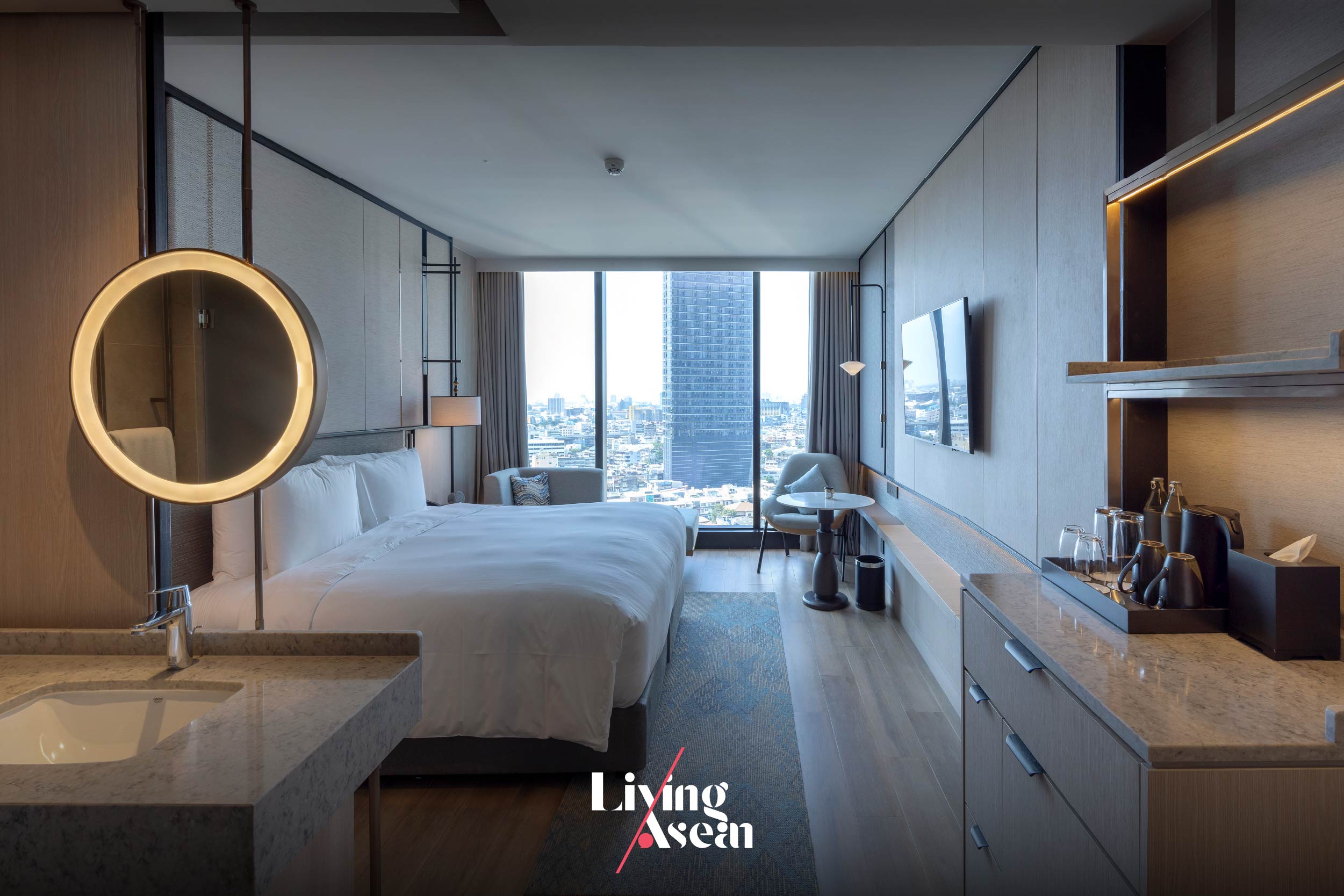
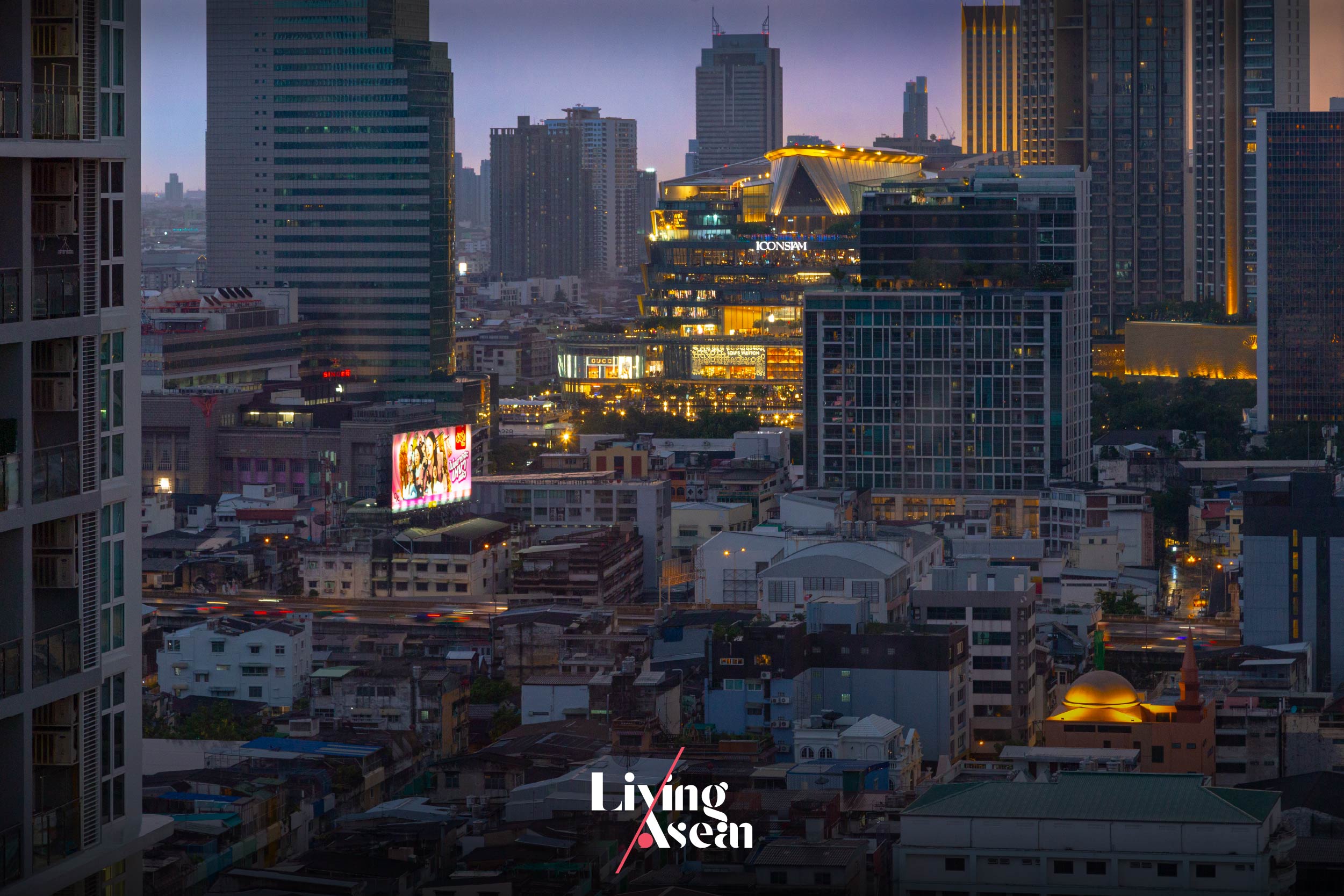
A vista of Bangkok’s landscape as seen from inside a DusitD2 hotel room.
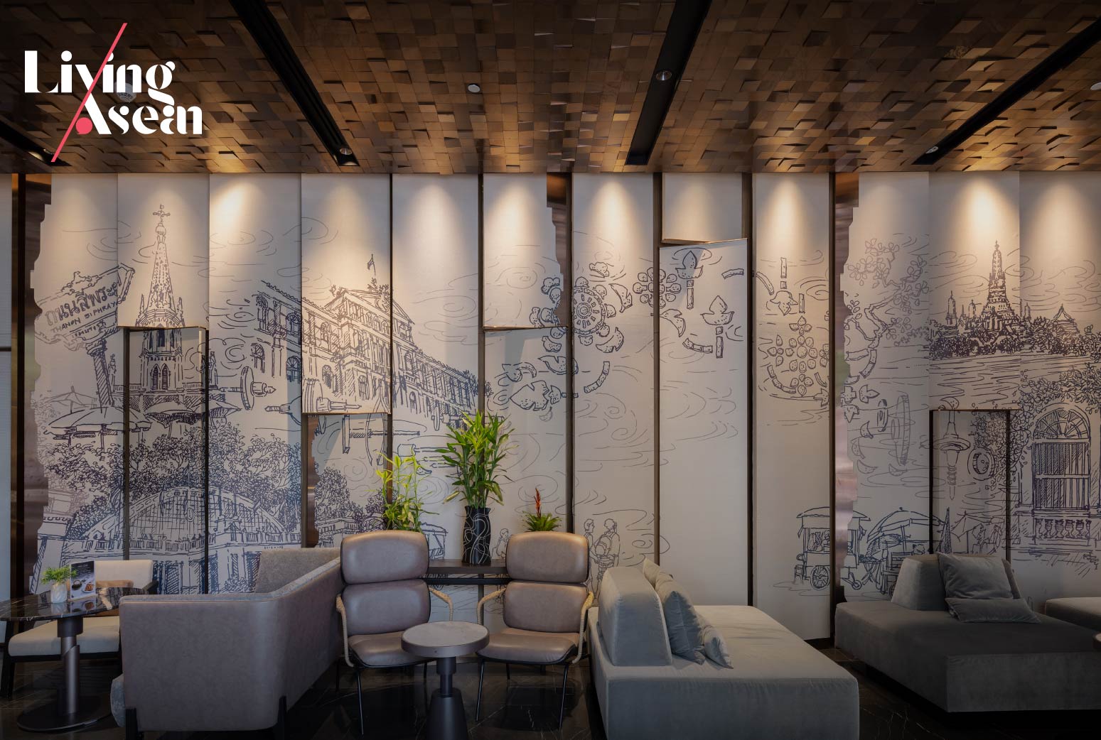
As the name suggests, dusitD2 Samyan is a member of the D2 hotel chain. It nestles comfortably on Si Phraya Road, a longtime economic hub renowned for busy movement and modern architecture. Taken as a whole, there’s a feeling of excitement and pleasure that comes with urban conveniences. dusitD2 Samyan no doubt is a beautiful work of contemporary hotel design, one that helps to rejuvenate a city neighborhood without sacrificing the value of Thailand’s arts and culture.
The hotel lobby space decorated in contemporary style tells the story of Bangkok’s Si Phraya Road neighborhood now and then.
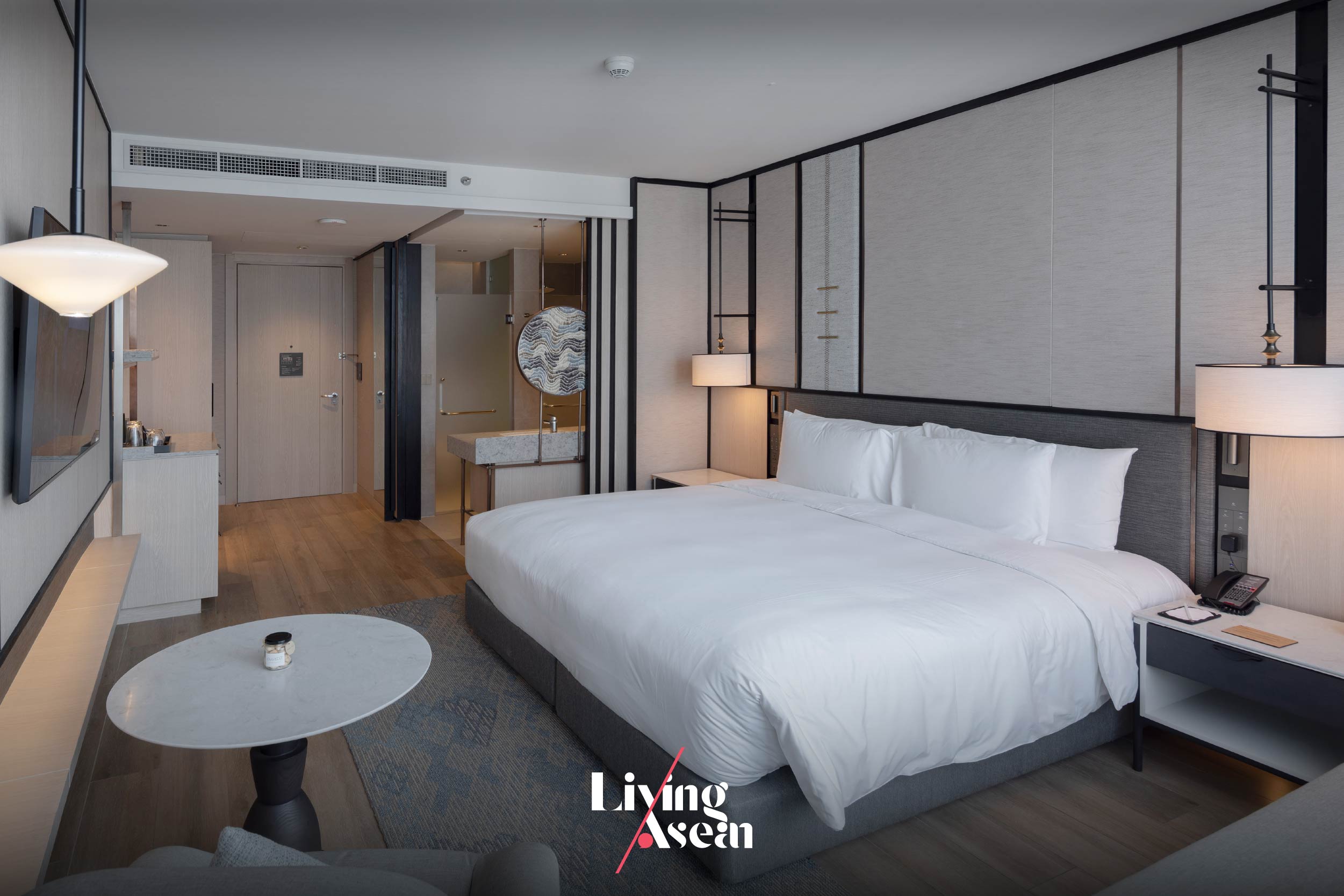
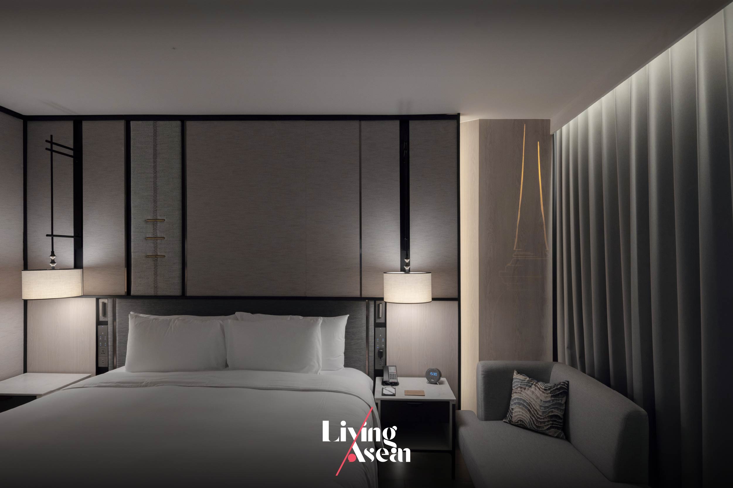
First things first, let us show you around high-rise hotel rooms offering a vibrant panorama of Bangkok. The overall effect is impressive, thanks to a perfect blend of convenience and comfort plus the furnishing and decoration that tells the story of the Si Phraya neighborhood now and then.
The area’s reputation as one of Thailand’s jewelry trade centers is manifested in the interior design inspired by beautifully crafted personal ornaments, such as jewels and precious metals. Among other things, decorative throw pillows and headboards are covered in textile fabrics showcasing precious stone patterns in a variety of shapes and colors.
The furnishing and decoration of hotel rooms gets its inspiration from personal ornaments, such as precious stones and metals that have made the Si Phraya Road neighborhood famous as one of Thailand’s jewelry trade centers.
Hotel room décor brings about a good impression of the Si Phraya Road neighborhood renowned for its reputation as one of Thailand’s jewelry trade centers.
A throw pillow showcasing an image of precious stone patterns tells the story of Si Phraya as one of Thailand’s jewelry trade centers.
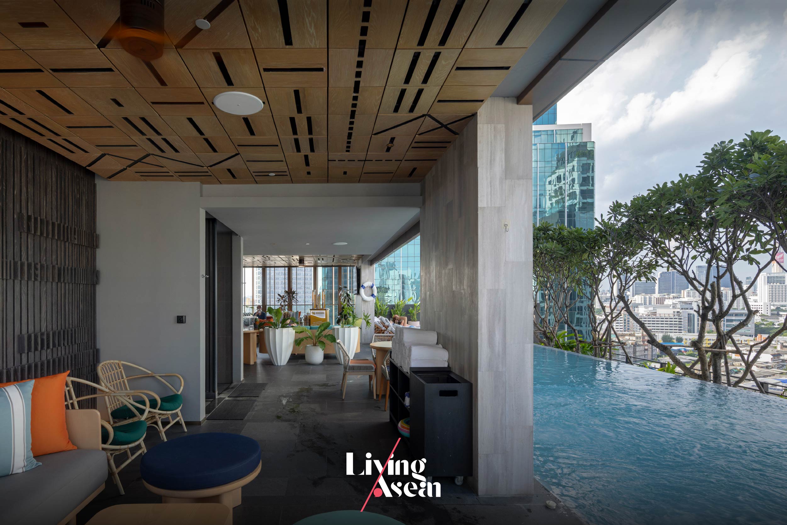
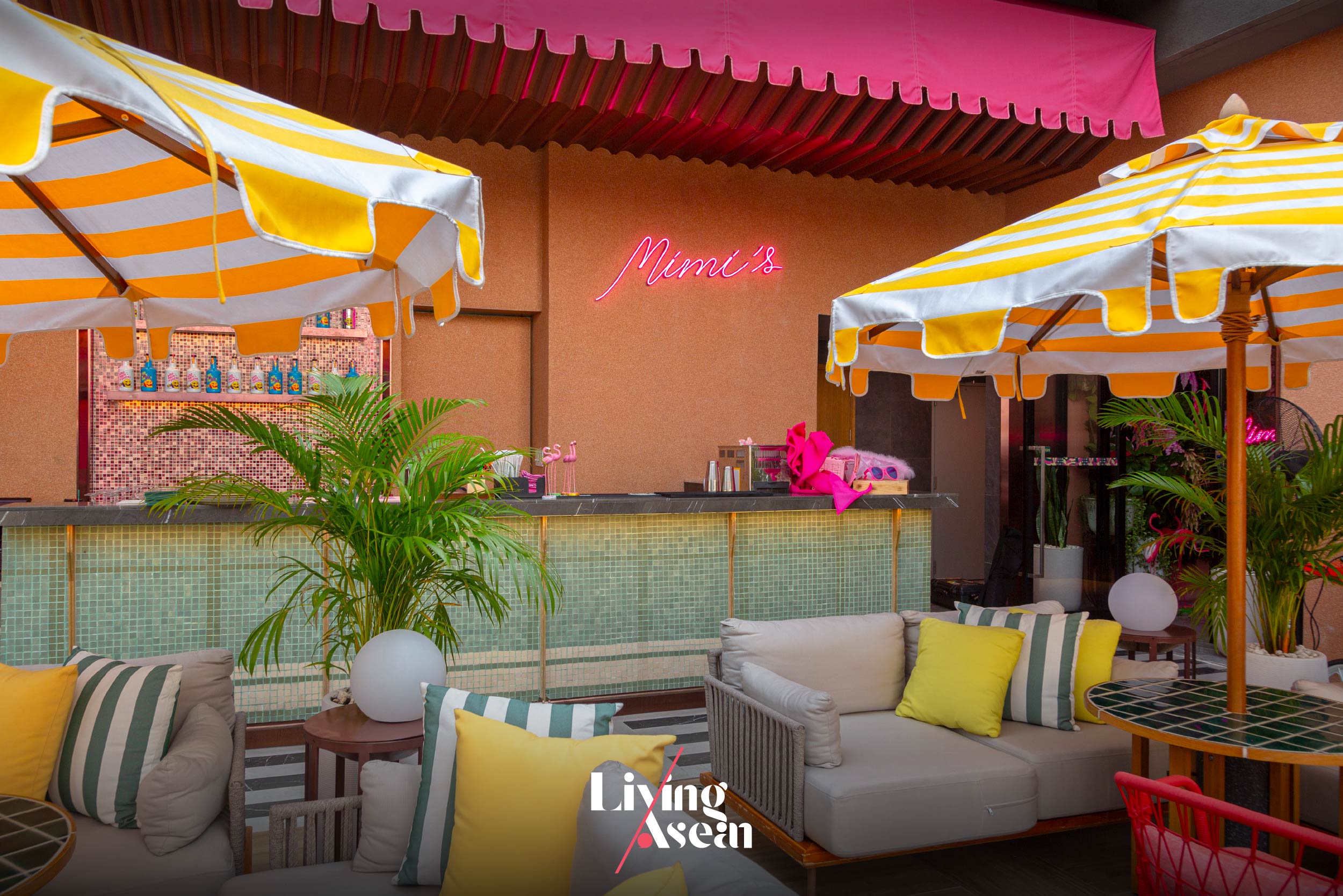
dusitD2 Samyan has two areas for common use that non-guests can access. The 16th floor contains the Bedidas – Pool Bar, where the tasty, distinctive Mexican cuisine is served. Be spoilt for choice when it comes to drinks and refreshments. And if you swing by in the late afternoon, go to Mimi’s Bar on the 25th floor. It’s a good place to watch the sun set behind cloudy skies or simply take in the panoramic view. While up there, take your time to explore amazing interior design, relax and unwind in the comforting glow of sunlight as the night falls.
The 16th floor holds the Bedidas – Pool Bar with a view of downtown Bangkok.
A vibrant space with vivid colors, Mimi’s Bar on the 25th floor affords nearly 360-degree views of the cityscape.
Seen from Mimi’s Bar on the 25th floor, Bangkok’s urban skyline is aglow as the night falls.
It comes as no surprise that dusitD2 Samyan has become a popular destination on Si Phraya Road for both locals and foreign visitors. Living among the hustle and bustle of the city has its advantages. Located in the city center, DusitD2 Samyan is very pleasant and easy to get to, not to mention the hotel’s interior design that evokes admiration. Precisely, it’s these qualities of urban places that earn Bangkok a reputation as one of the world’s most admired cities.
Chatpong Chuenrudeemol, of CHAT Architects, Thailand, is an architect and researcher renowned for what he called “Bangkok Bastards”, a project that investigated unsightly urban areas, such as construction site camps, inner-city slums and retail stalls abandoned and reclaimed by nature. Rethinking them from a new perspective, he was able to restore them to life in an interesting way.
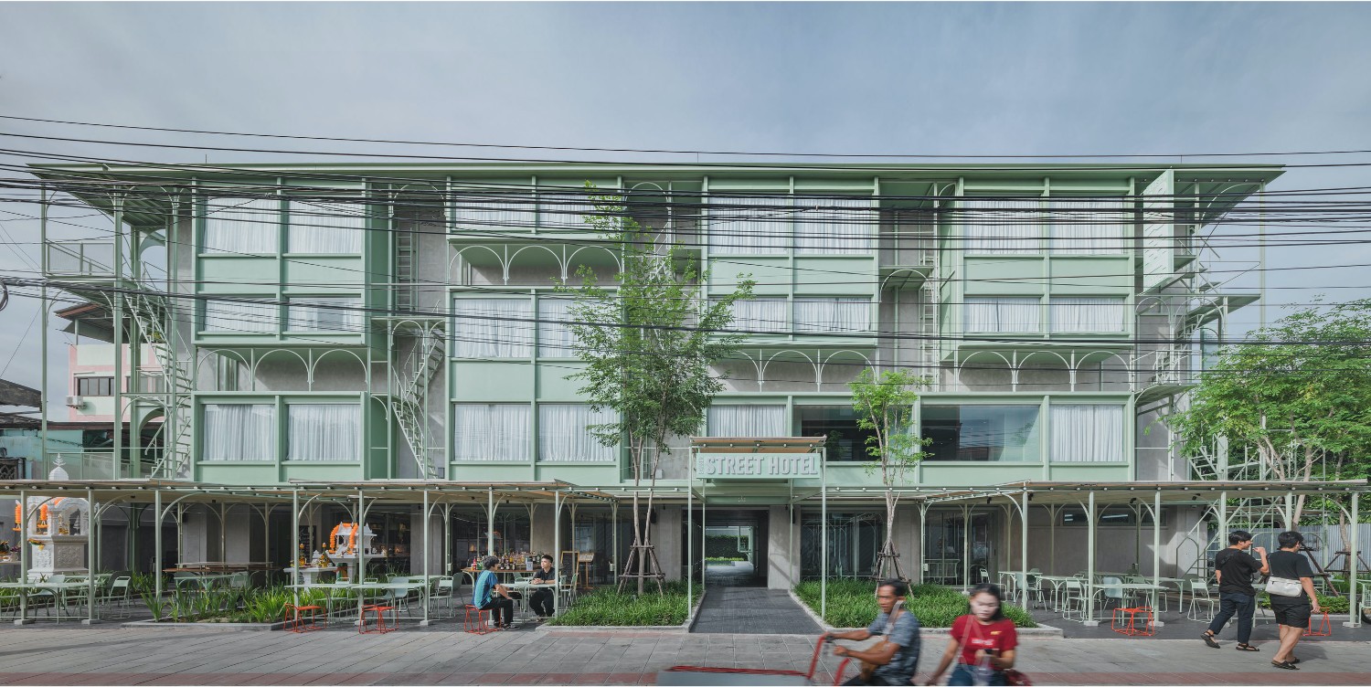
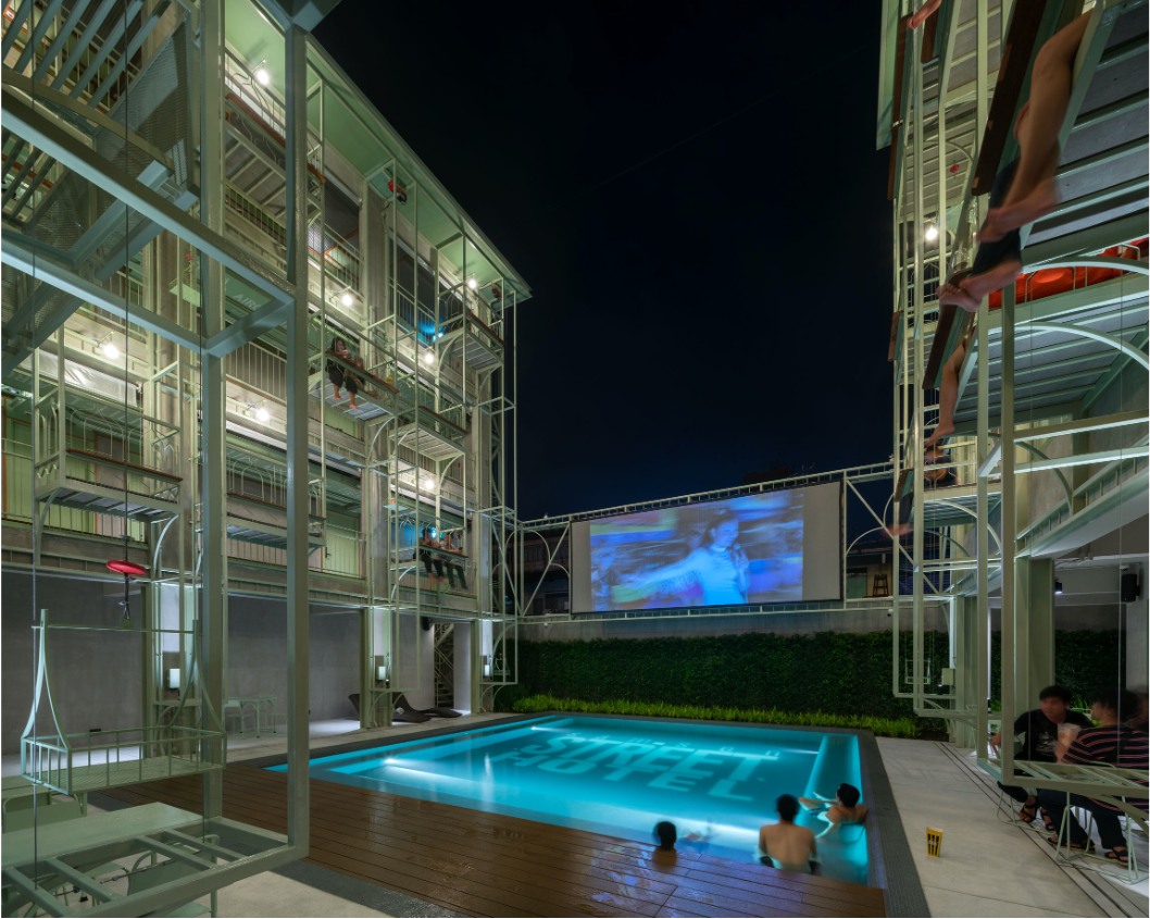
Outstanding products of “Bangkok Bastards” included the Samsen Street Hotel, a downtown lodging inspired by scaffolding wooden planks and metal poles on the outside of a building. Together they gave rise to exciting new design bearing some resemblance to the raised platforms attached to a building during construction.
Samsen Street Hotel / Courtesy of CHAT Architects
Samsen Street Hotel / Courtesy of CHAT Architects
In a way, the Samsen Street Hotel is a revelation of previously unseen aspects of building design, a conceptualization that culminates in a thorough change in the form, character and experience in a very open and visible way. Taken as a whole, it’s a piece of architecture designed to promote social interactions, a community hub for hosting events and spaces for people to meet in the Samsen Street neighborhood. That’s not all. He also has other projects in the making, basically focusing on reuse and rethink as ways to create places of higher quality than he found it.
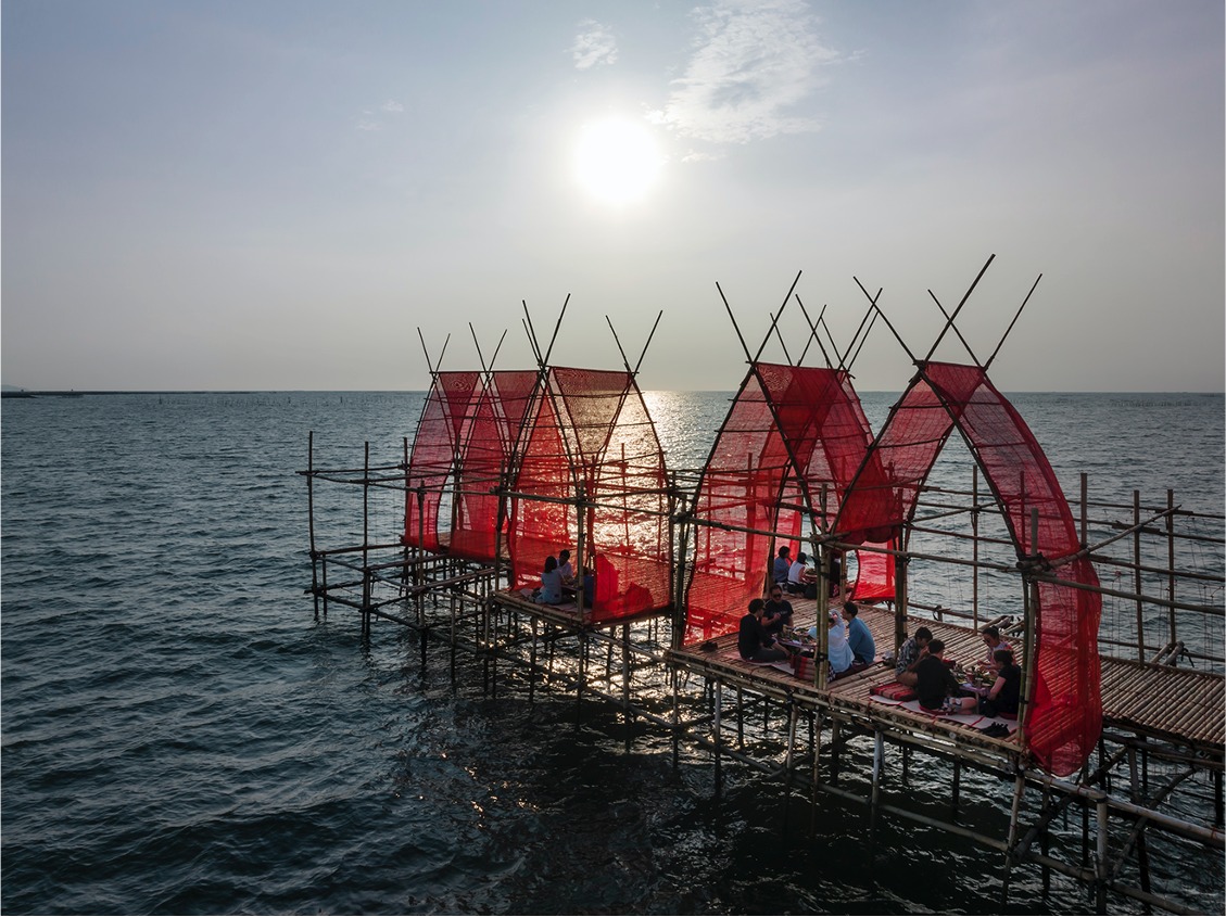
Angsila Oyster Scaffolding Pavilion / Courtesy of CHAT Architects
Angsila Oyster Scaffolding Pavilion / Courtesy of CHAT Architects
A little bit about Chatpong Chuenrudeemol
Chatpong is founder of CHAT Architects and winner of the 2020 Silapathorn Award in Architecture.
After completing his master’s degree at Harvard University’s School of Architecture, Chatpong returned to Thailand where he set up a business called CHAT Architects. He was very interested in architectural styles that reflected the true values, experience and the way of life of ordinary people. His research in urban planning and development was inspired by a feeling of wanting to know more about happenings in the street. They included events in the community, construction site camps and deserted retail stalls, to name but a few. Their untidy outward appearances belied the quality of being honest and truthful to others.
Like everything else, the buildings built by non-architects based on local needs and available materials deserved a second chance. So, it’s up to the architect to rethink them from a different point of view and put them to good use once more. After all, there is value in everything.
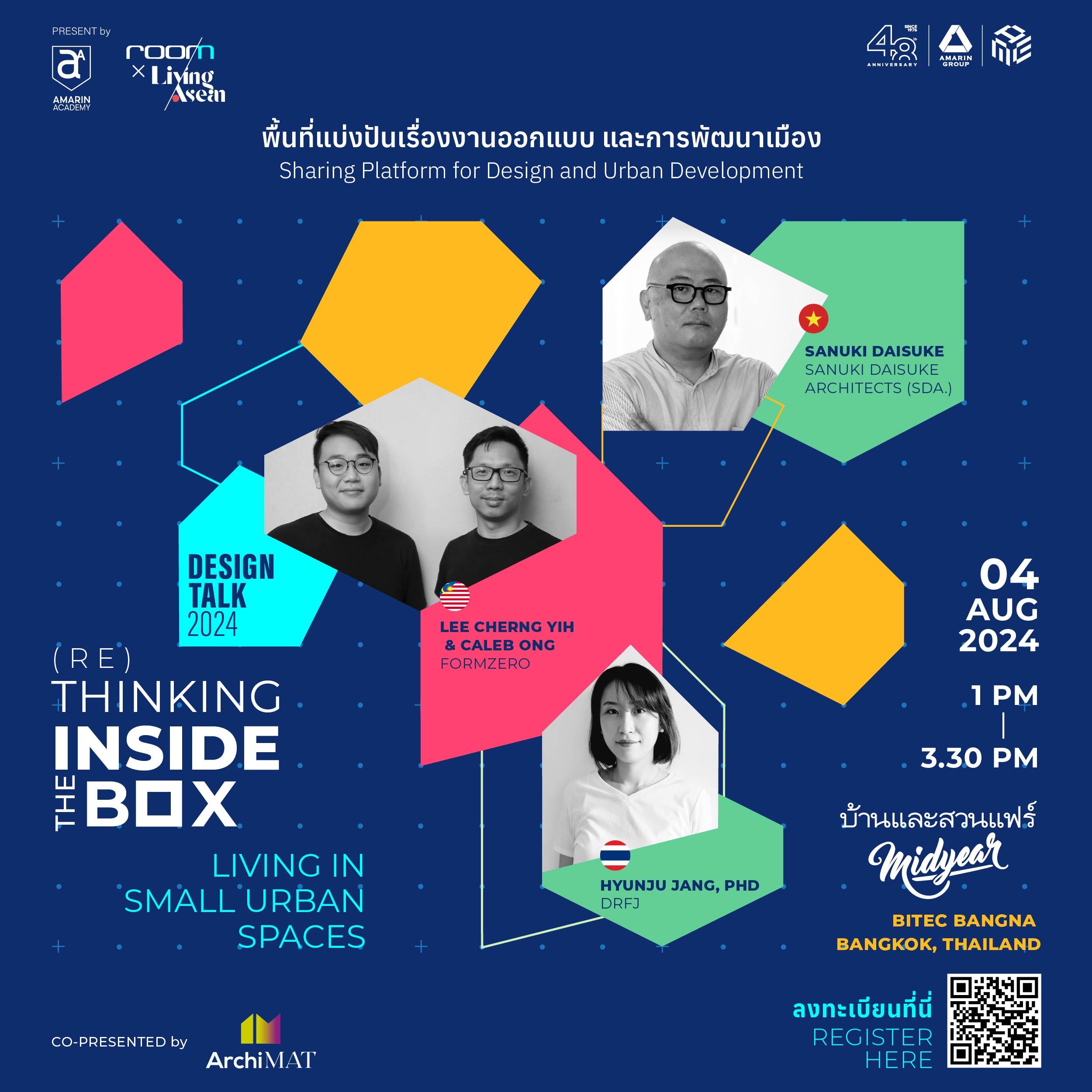
(Re)Thinking inside the Box is a series of discussion events focusing on the issues abovementioned. It’s all a matter of perspective about what can be done to address the problem of limited living space in the city. It’s a forum for people to explore new possibilities and look at the problem from within, thereby turning a challenge into a solution. Hence, the title is (Re)Thinking inside the Box, as an alternative to outside-the-box thinking.
/ Story: Kangsadan K. / English version: Bob Pitakwong /
/ Photographs: Courtesy of DRFJ – Design & Research by Fusinpaiboon & Jang /
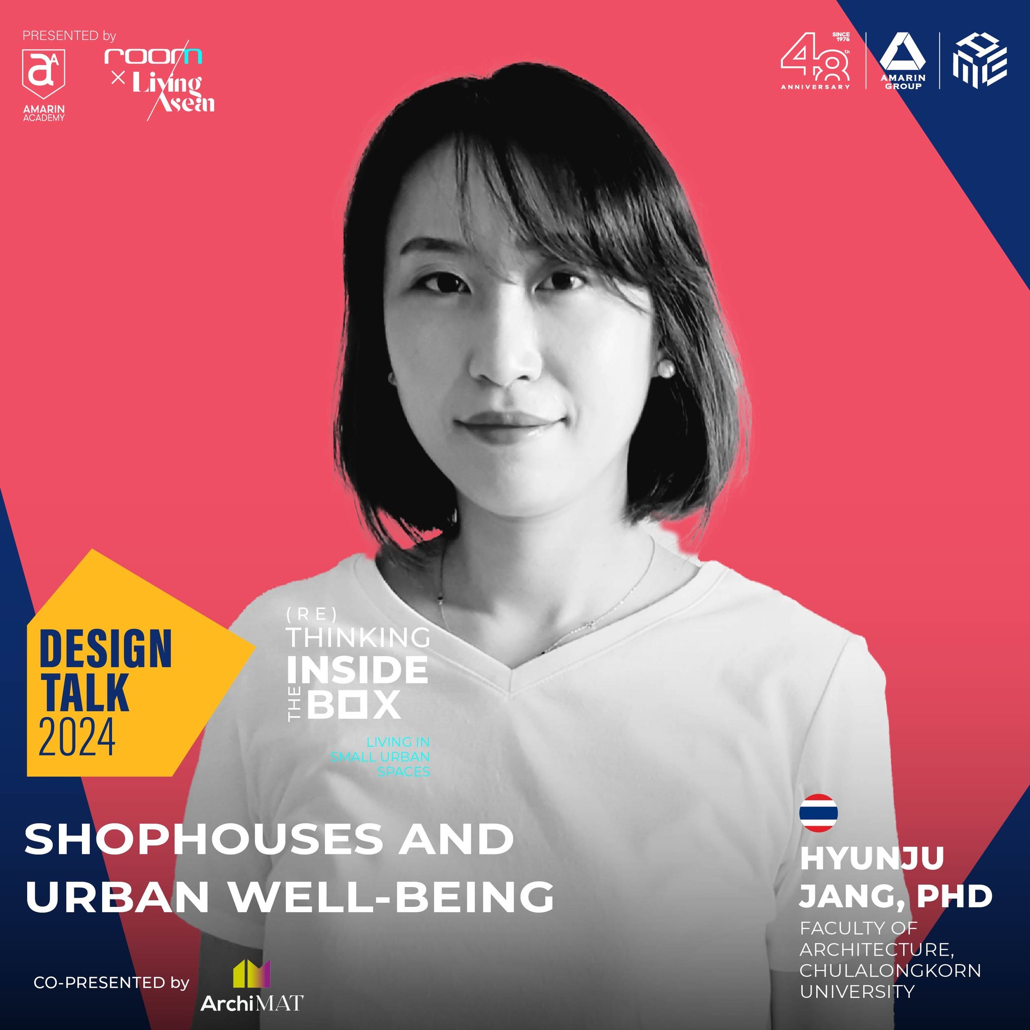
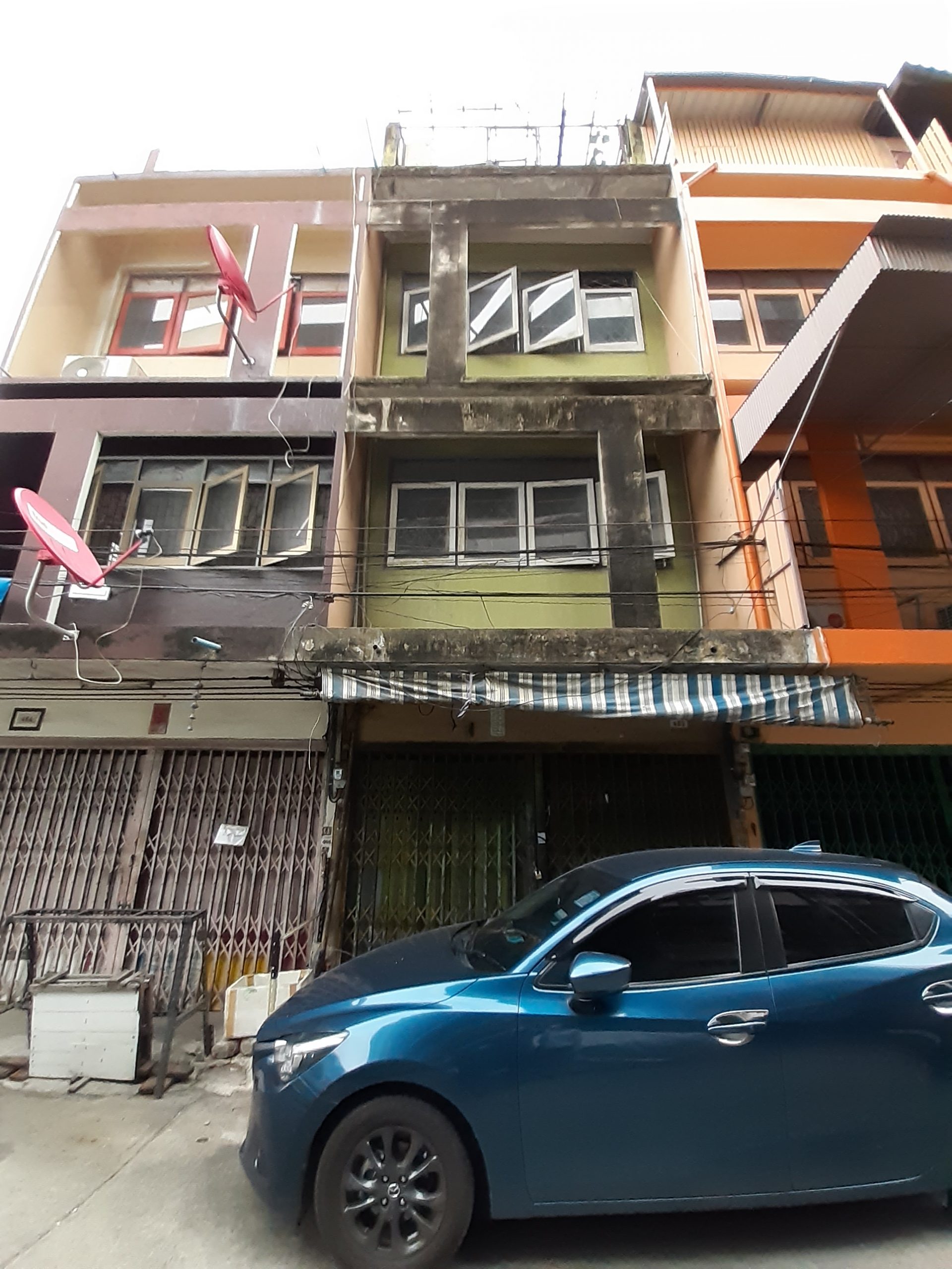
The commercial row house, aka the shophouse that’s also used as the owner’s residence, is an architectural style akin to the way of life in Southeast Asia. It’s a small component of the larger, more complex urban landscape, a home-cum-business space more important than anyone could have ever imagined. Living ASEAN had the opportunity of interviewing Dr. Hyunju Jang, of the Faculty of Architecture at Chulalongkorn University and cofounder of the design studio DRFJ (Design & Research by Fusinpaiboon & Jang). Asst. Prof. Chomchon Fusinpaiboon, Ph.D, also of Chulalonkorn University, is the joint founder. We discussed the shophouse from historical perspectives, in the meantime examining its subsequent evolution, building performance and factors that contribute to improved quality of life in the city.
The design duo is best known for their project codenamed “Shophouse2Go! Prototypes”, a collection of row house improvement ideas that members of the general public can follow as a model. Dr. Hyunju shared her thoughts and suggestions about a possible of course of action in dealing with the problem of limited space and site constraints. Ultimately, it’s about creating quality living spaces and improvements in the well-being of city dwellers. Here’s what she said.
We recently had the opportunity of interviewing Dr. Hyunju in the lead-up to the Design Talk titled (Re)Thinking inside the Box, Vol. 1 Living in Small Urban Spaces. Conducted in English, the discussion was scheduled for Sunday August 4, 2024. It was a part of the Baan Lae Suan Fair Midyear 2024 at BITEC Bang Na, Bangkok. In essence, it’s about raising public awareness about the problem of limited space in the city and the importance of well-thought-out design in overcoming site constraints, especially in the context of the type of climate most common in Southeast Asia. The following are some insights into her work experience.
Q: What inspired you to set up the design studio? What’s the goal of DRFJ?
A: Prof. Chomchon and I shared the knowledge that we have gained through work experience in architecture. But our technical expertise differed from each other. Prof. Chomchon was skilled in researching into the historical aspects and evolution of contemporary architecture, while I started out working with a green building consulting firm specialized in big development projects requiring large investments. We got to talking about the importance of architecture in people’s lives, which culminated in research into architectural styles closely related to the pattern of behavior of many city dwellers. We started exchanging information and, to make a long story short, we ended up creating the design studio DRFJ with one specific goal in mind: use our skills and knowledge in conjunction with other sciences to improve the quality of living spaces in ways that the general public can follow as a model. At the same time, we respect the historical values and culture prevailing in a particular area or neighborhood.
Q: How does the project or research conducted by DRFJ contribute to improving living conditions in the city?
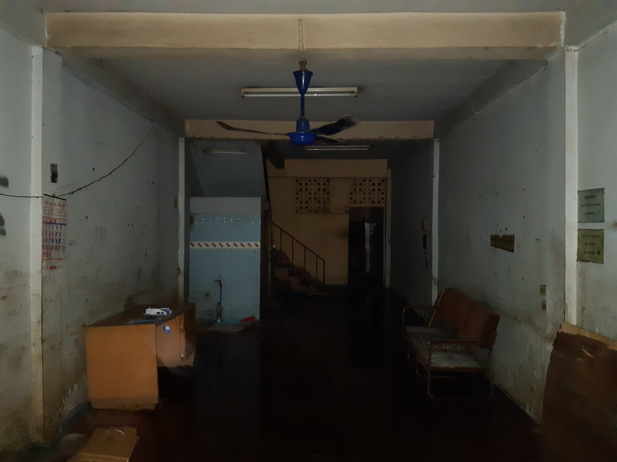
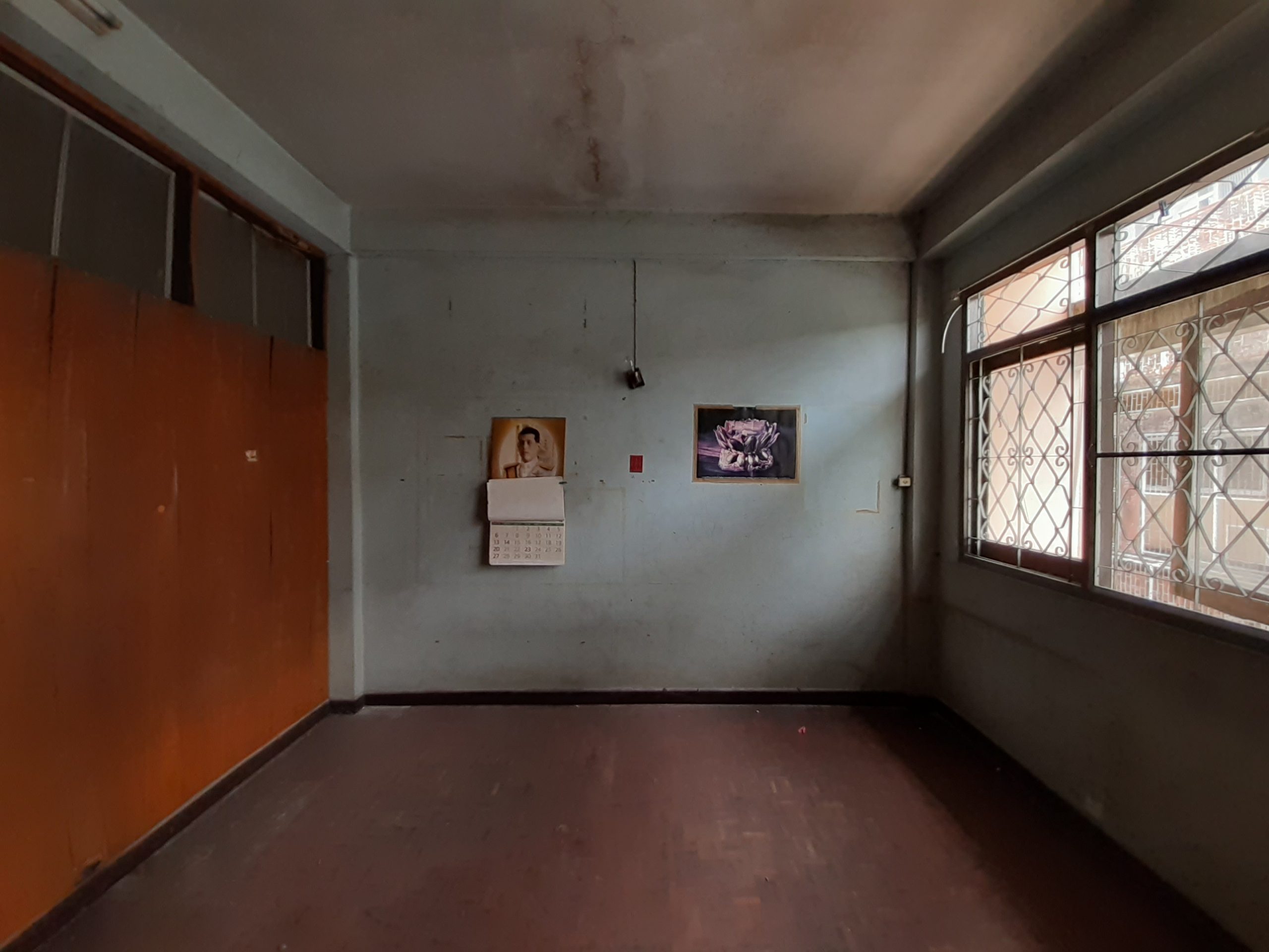
A: Our office, from the start, has made the shophouse a focus of our attention. Prof. Chomchon published the findings of his research into the improvement of commercial row houses built during the 1960’s and 1970’s. For your reference, the work is officially called “Strategies for the renovation of old shophouses built during the 1960’s and 1970’s in Bangkok, Thailand, for mass adoption and application.” Since then it has been further developed as a model for home improvements that the general public can follow. Apart from that, we’re also working to provide alternative living space designs, making them right and appropriate for different types of the shophouse.
As part of our research, we put a variety of designs to the test, thereby evaluating the convenience and physical comfort that each one of them could provide for the occupants of a building. The thing is that many green building design requirements that I have dealt with are formulated for large buildings by international organizations lacking deep understanding of Thailand’s climates and cultural context. So we’re searching out the best ways to customize international requirements to better fit the small-scale and everyday kind of architecture in the context of Thailand. Our prototype was the result of this testing. It’s a catalogue of works of design intended for customers to pick based on an individual’s preferences. In a nutshell, it’s about making high quality design available at the price that’s right.
Q: In terms of different climates between Thailand and Korea, is there anything of particular interest to you?
A: What I felt the most difficult when I started working in Thailand was that there were no room heaters. Most offices and commercial buildings focused on ways to keep cool in hot weather and reduce the cost of air conditioning at the same time. In Korea, it’s the opposite. Because it was cold there, all the design decisions were made to keep warm and, at the same time, reduce the cost of operating room heaters. For me personally, a design strategy is considered effective if it’s capable of reducing heat gain in the interior, thereby keeping the room cool and comfortable.
Speaking of which, the crux of the matter lies in creating energy efficient design, one that keeps a balance between power consumption and the amounts of daylight streaming into the room. Daylight conditions are of the utmost importance. As for me, I would seek the advice of a consulting engineer in a bid to turn a challenge into a solution.
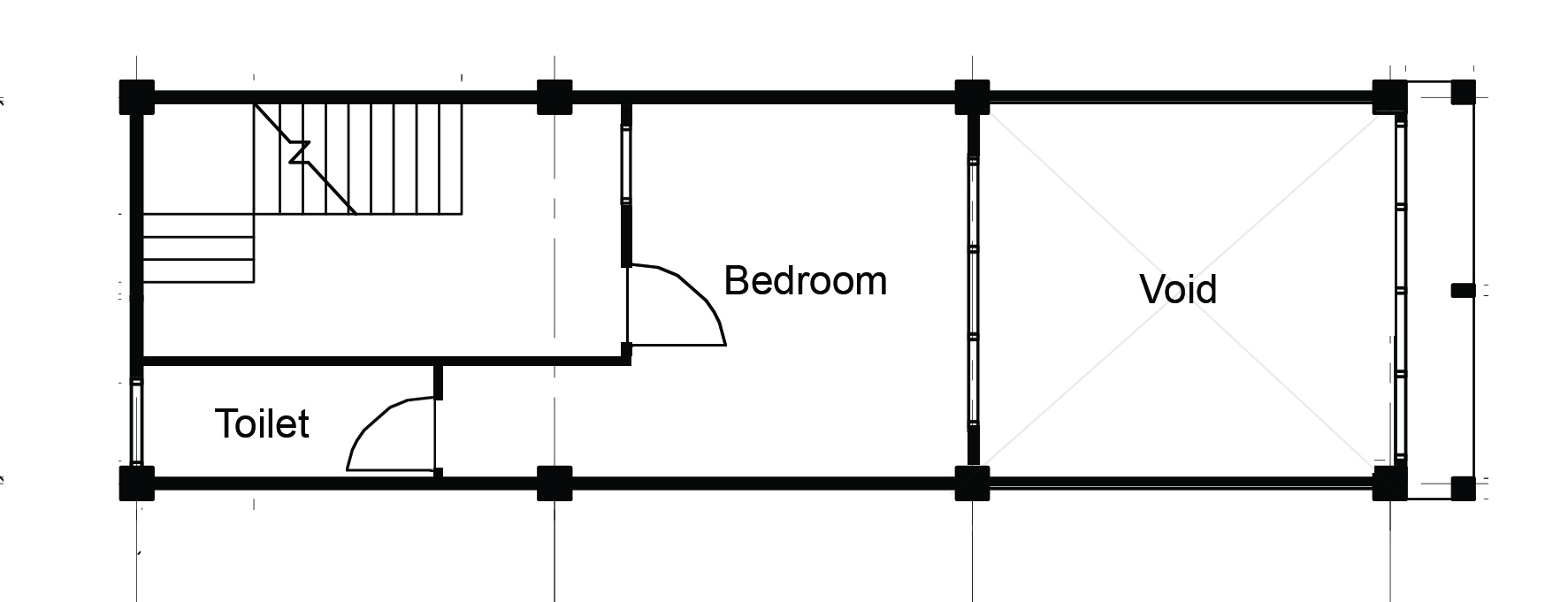
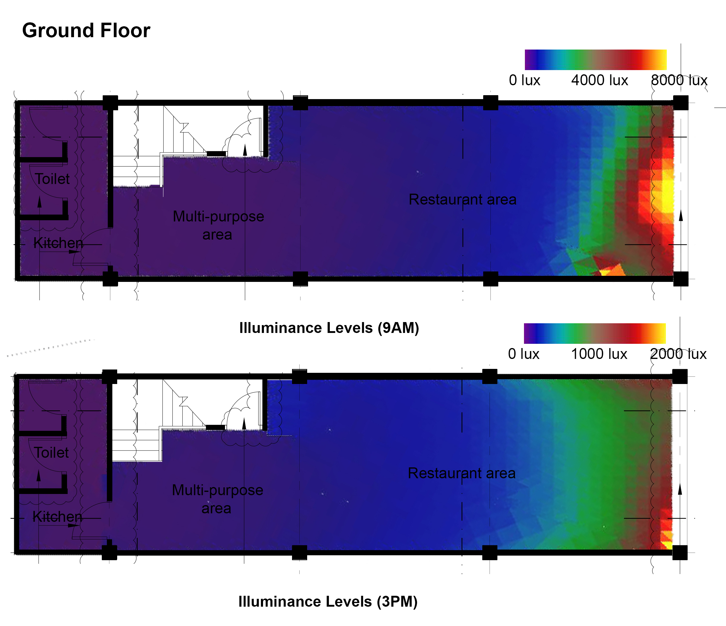
Daylight analyses of a shophouse interior at different times of day illustrate the amounts and distribution of natural light entering and spreading over an area of a home in a Sukhumvit area prior to undergoing a renovation. / Courtesy of DRFJ – Design & Research by Fusinpaiboon & Jang
Q: For the most part, what are the things that most DRFJ clients want?
A: The Shophouse2Go! Prototypes project had its beginnings in a row house in which we live no So we wore multiple hats as clients, developers, and architects handling varied roles and responsibilites. But it’s a case study because what we want to develop is a platform catalogue that provides various options for customers. Meanwhile, some of our clients who already own a shophouse or a townhouse can expect to have a better environment because there are so many good choices. We think the quality of being different and diverse is very important. In other words, the clients are not interested in just expanding living spaces in their row houses. They are also interested in the things that improve the quality of life, such as green spaces and communal room shared by all family members. As things stand, we know what the clients want for their homes. And that’s what gives us the inspiration going forward.
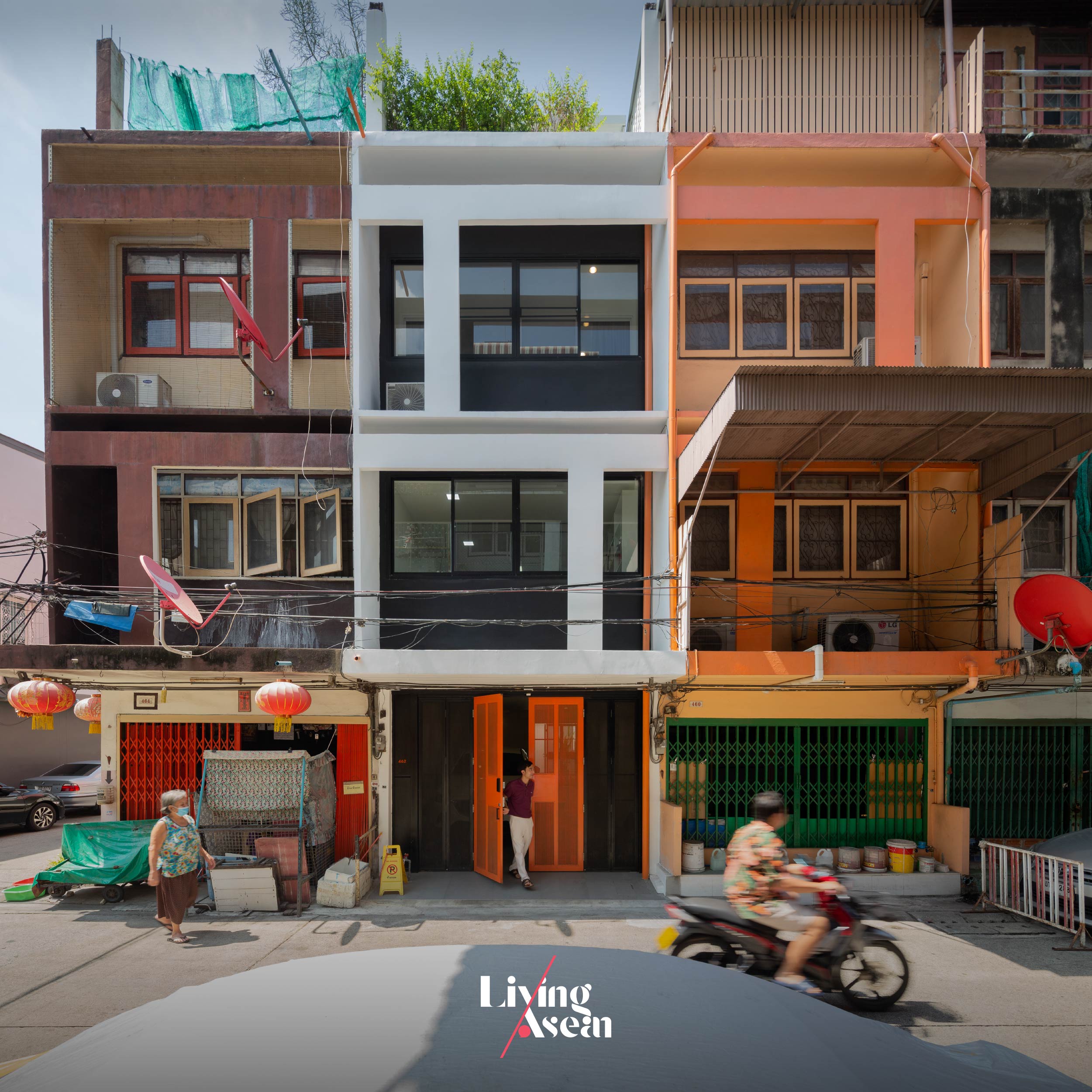
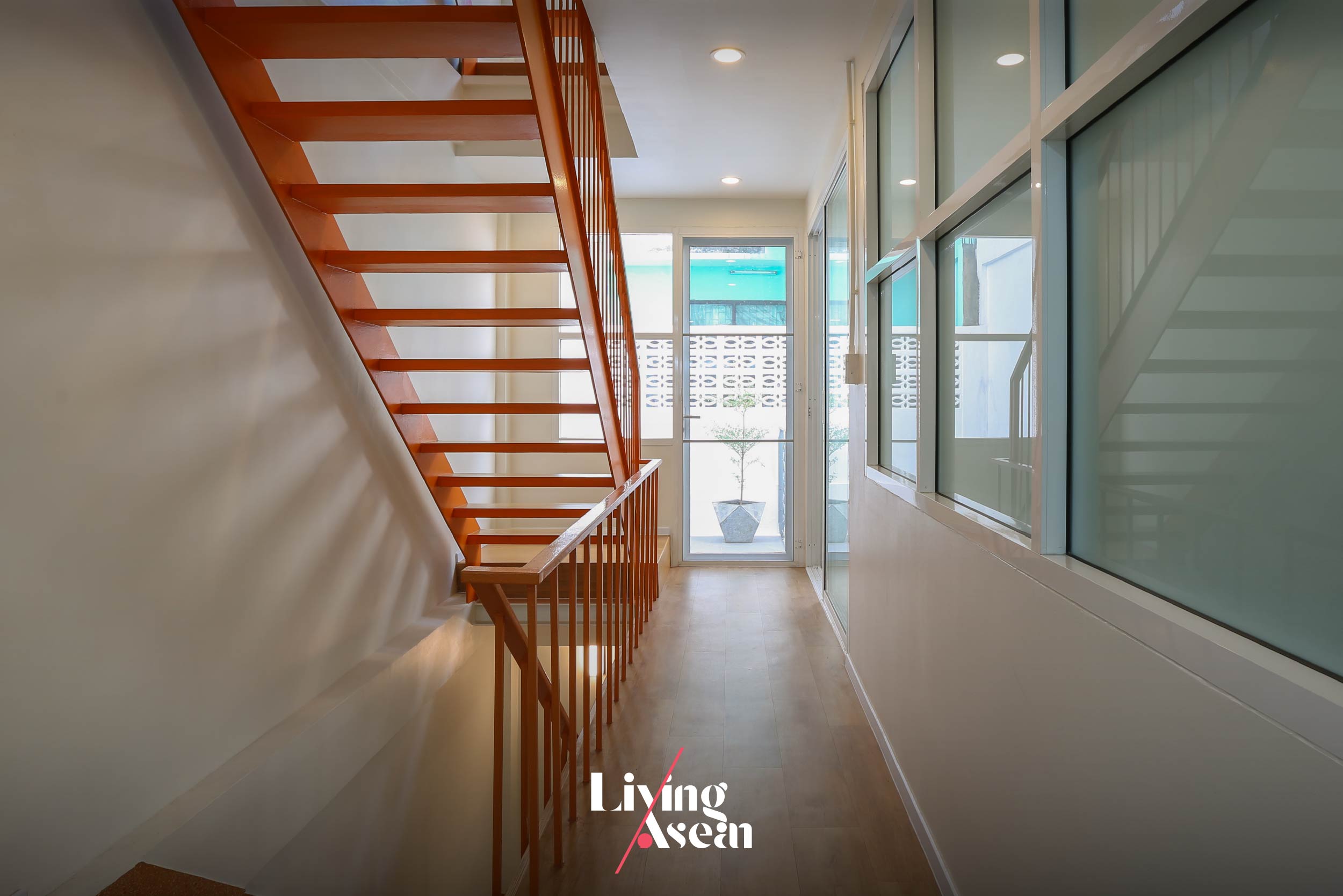
A glimpse into a home renovation that’s part of the Shophouse2Go! Prototypes project by DRFJ – Design & Research by Fusinpaiboon & Jang.
A glimpse into a home renovation that’s part of the Shophouse2Go! Prototypes project by DRFJ – Design & Research by Fusinpaiboon & Jang.
A glimpse into a home renovation that’s part of the Shophouse2Go! Prototypes project by DRFJ – Design & Research by Fusinpaiboon & Jang.
A glimpse into a home renovation that’s part of the Shophouse2Go! Prototypes project by DRFJ – Design & Research by Fusinpaiboon & Jang.
Q: In your opinion, what are the often-overlooked aspects of urban living that you consider important?
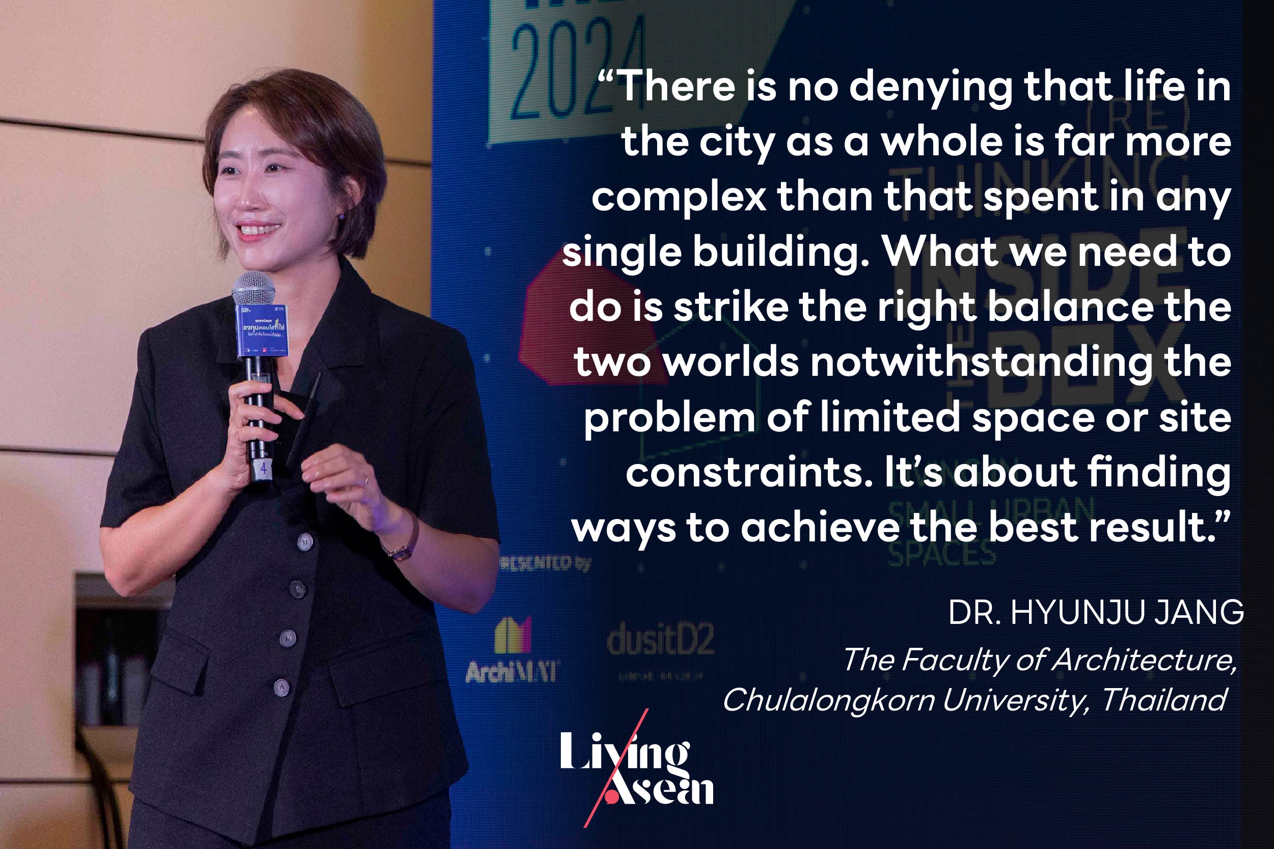
A: I believe that a balance between the various aspects of urban living is something that most people either don’t realize or fail to take notice of. There is no denying that life in the city as a whole is far more complex than that spent in any single building. What we need to do is strike the right balance the two worlds notwithstanding the problem of limited space or site constraints. It’s about finding ways to achieve the best result. Stay focused on raising the quality of life in the city. There is more to a home than just a place of residence.
(Re)Thinking inside the Box is a series of discussion events focusing on the issues abovementioned. It’s all a matter of perspective about what can be done to address the problem of limited living space in the city. It’s a forum for people to explore new possibilities and look at the problem from within, thereby turning a challenge into a solution. Hence, the title is (Re)Thinking inside the Box, as an alternative to outside-the-box thinking.
As part of the room X Living ASEAN Design Talk 2024, (RE)Thinking inside the Box Vol. 1 is on the theme of “Living in Small Urban Spaces”. Here, expert guest speakers will discuss ways to create small living spaces and enhance the quality of life, at the same time shedding light on site constraints, challenges, and possibilities for building decent homes in urban areas. In the fewest possible words, it’s about promoting good life and a good living environment.
Marketing/Advertising Cookies – used to remember and process the relevance to your website visit in order to personalize contents shown including optimization of commercial advertising placements. For instances, we use this type of cookies to display commercial advertisements related to user’s attributes and interests as well as to limit how many times should a user see repeated advertisement in order to optimize and measure marketing activities. อ่านเพิ่มเติม
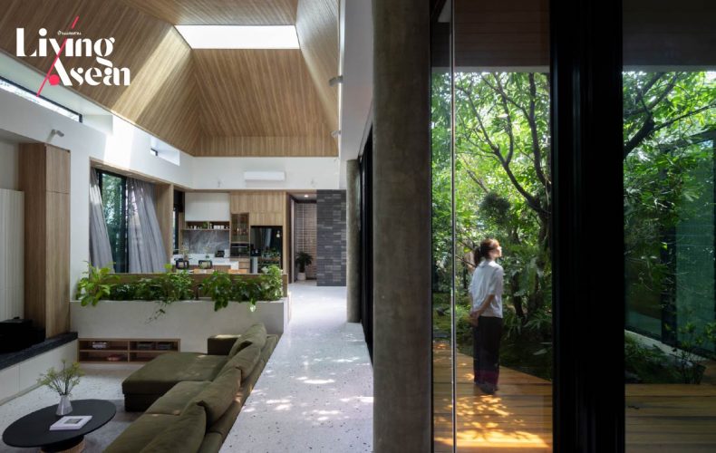
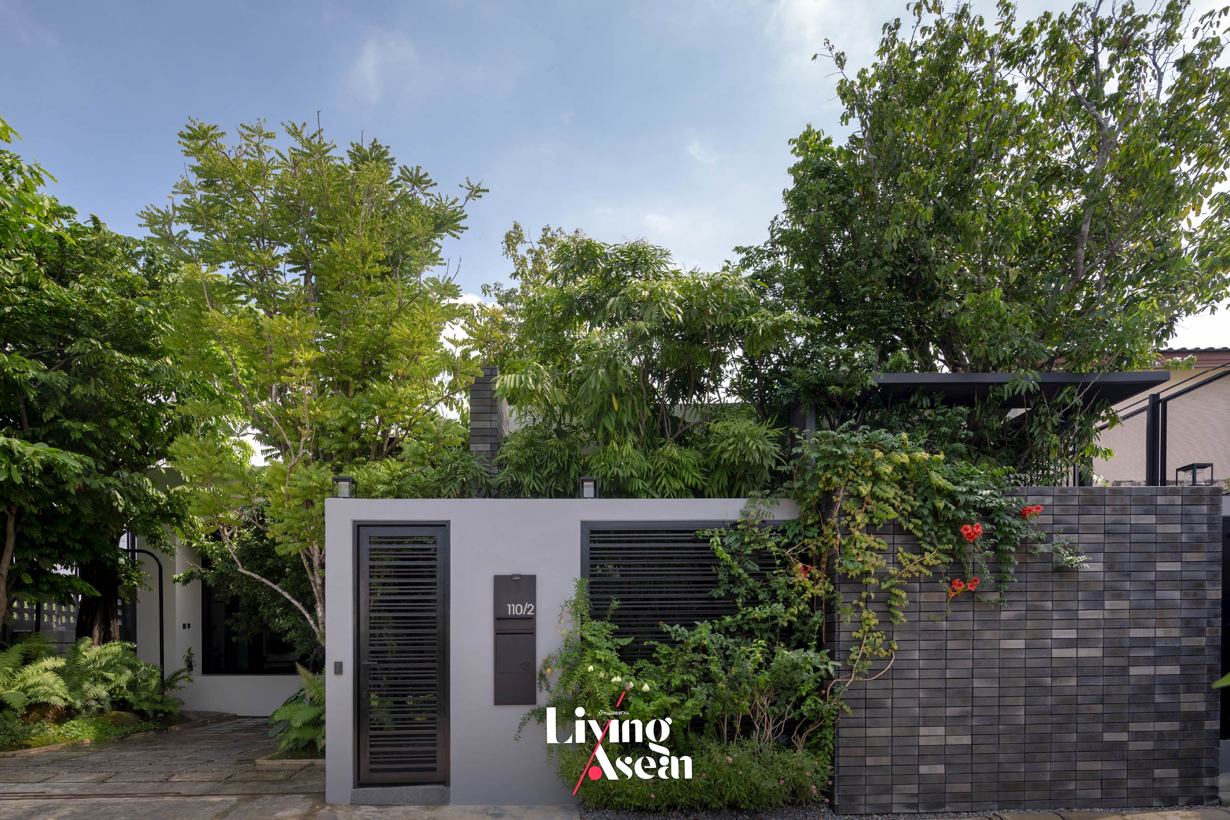
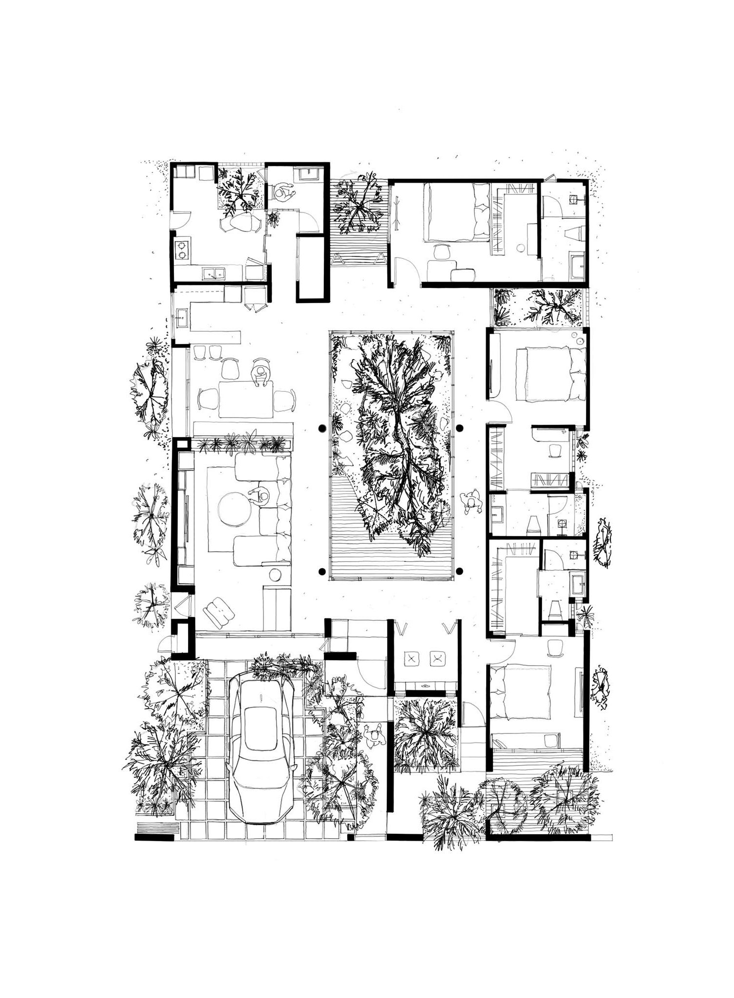
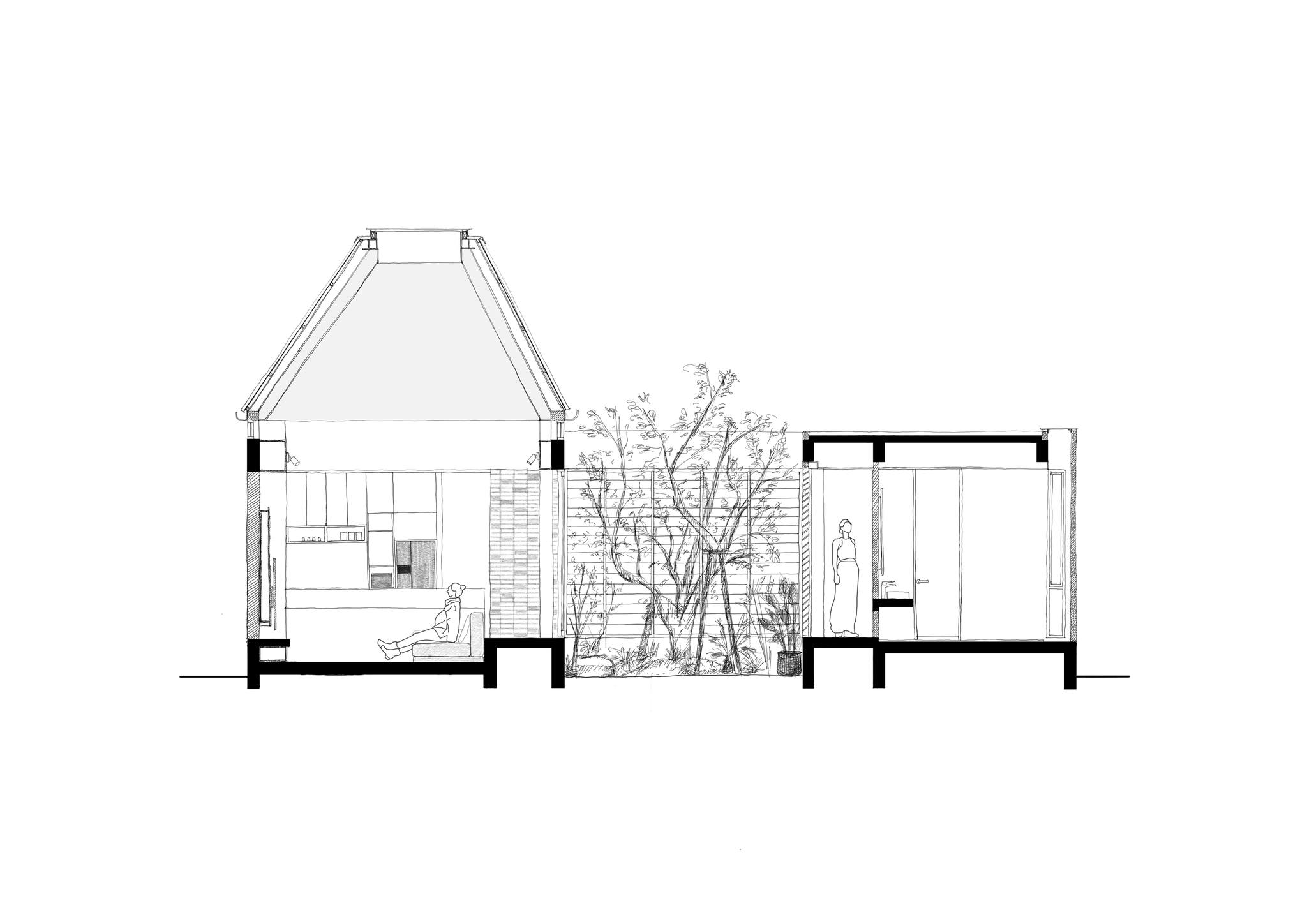
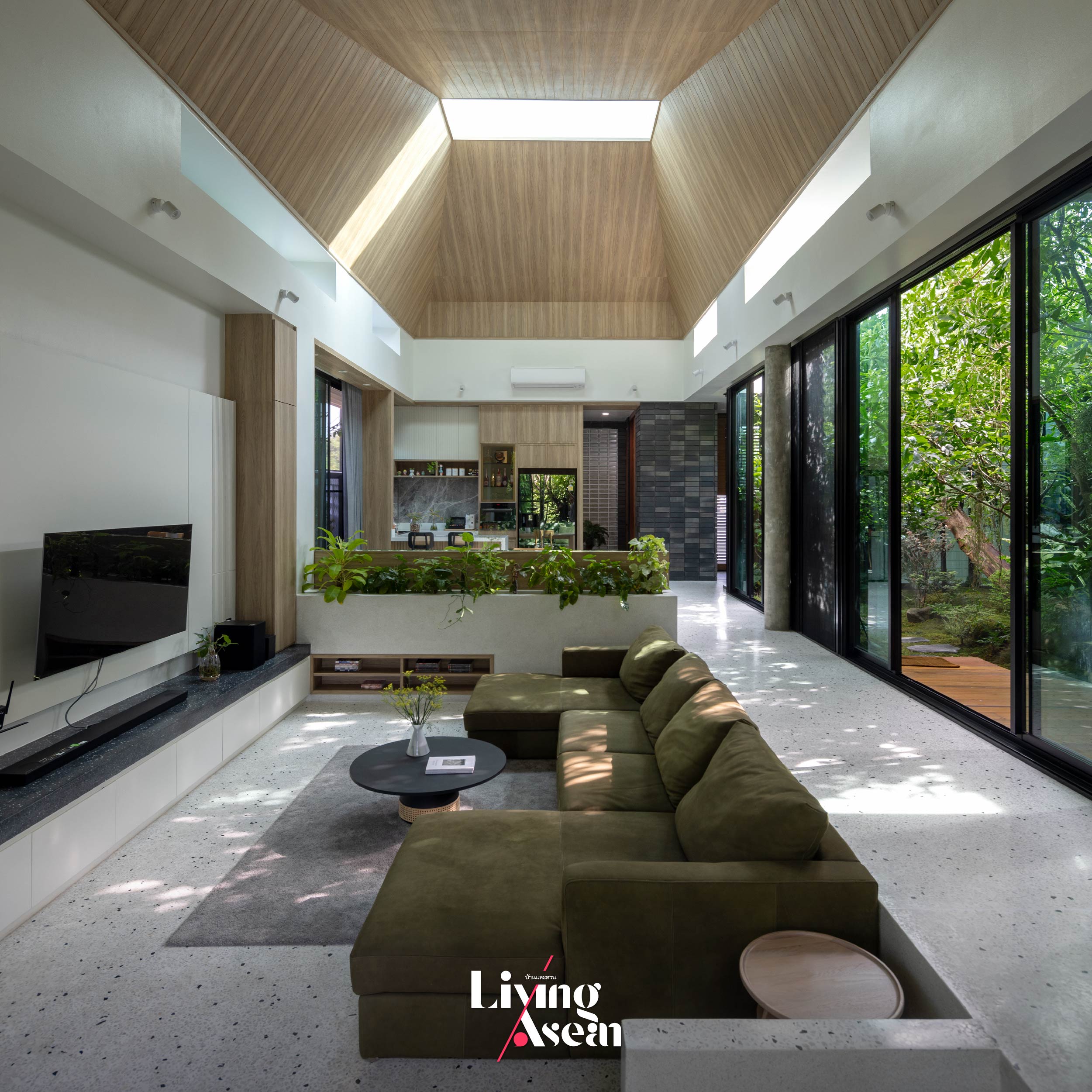
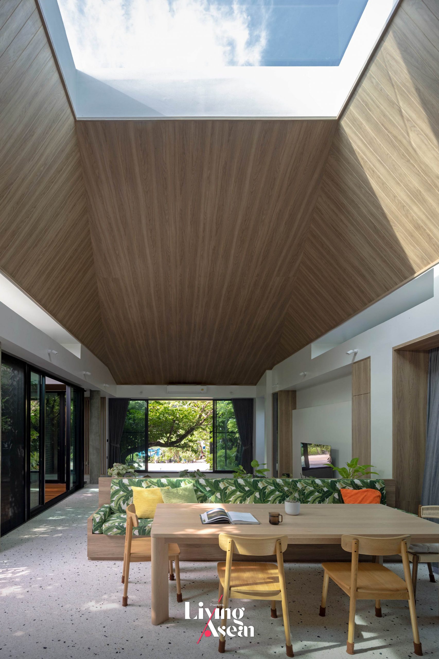
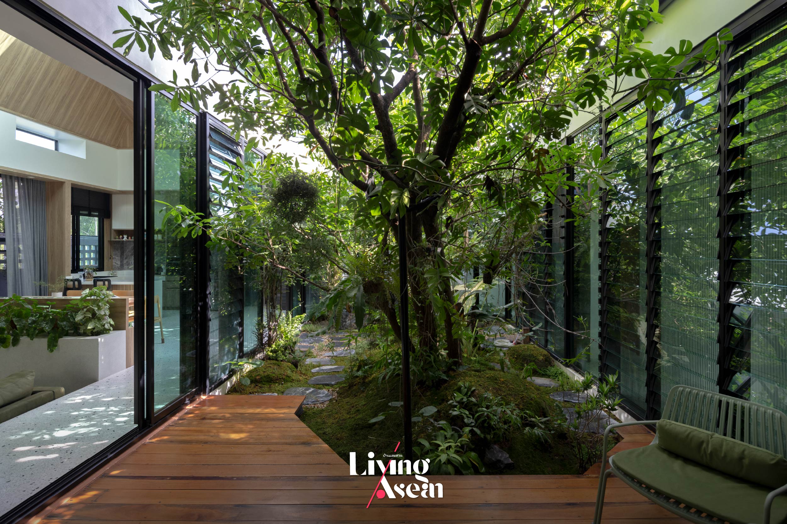
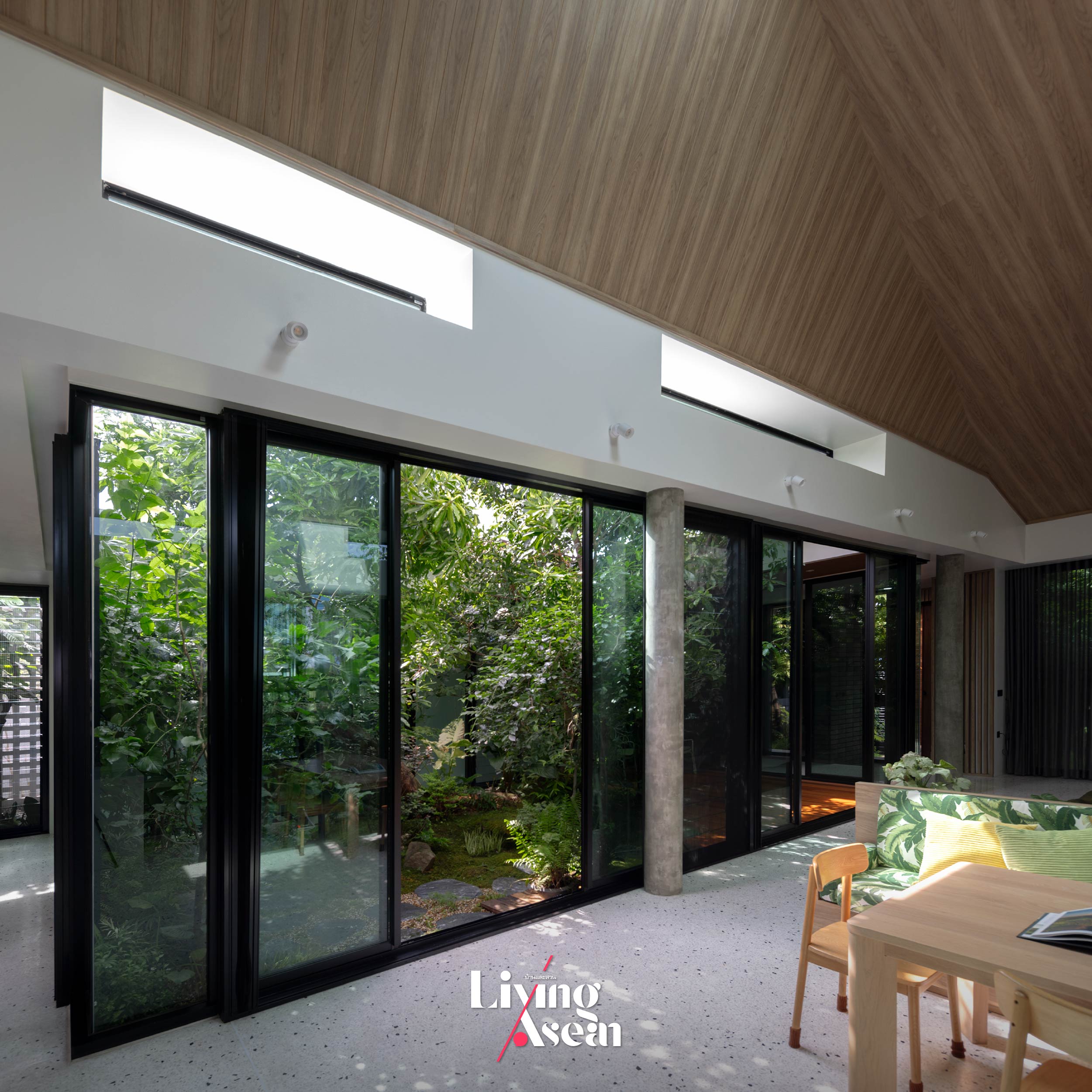
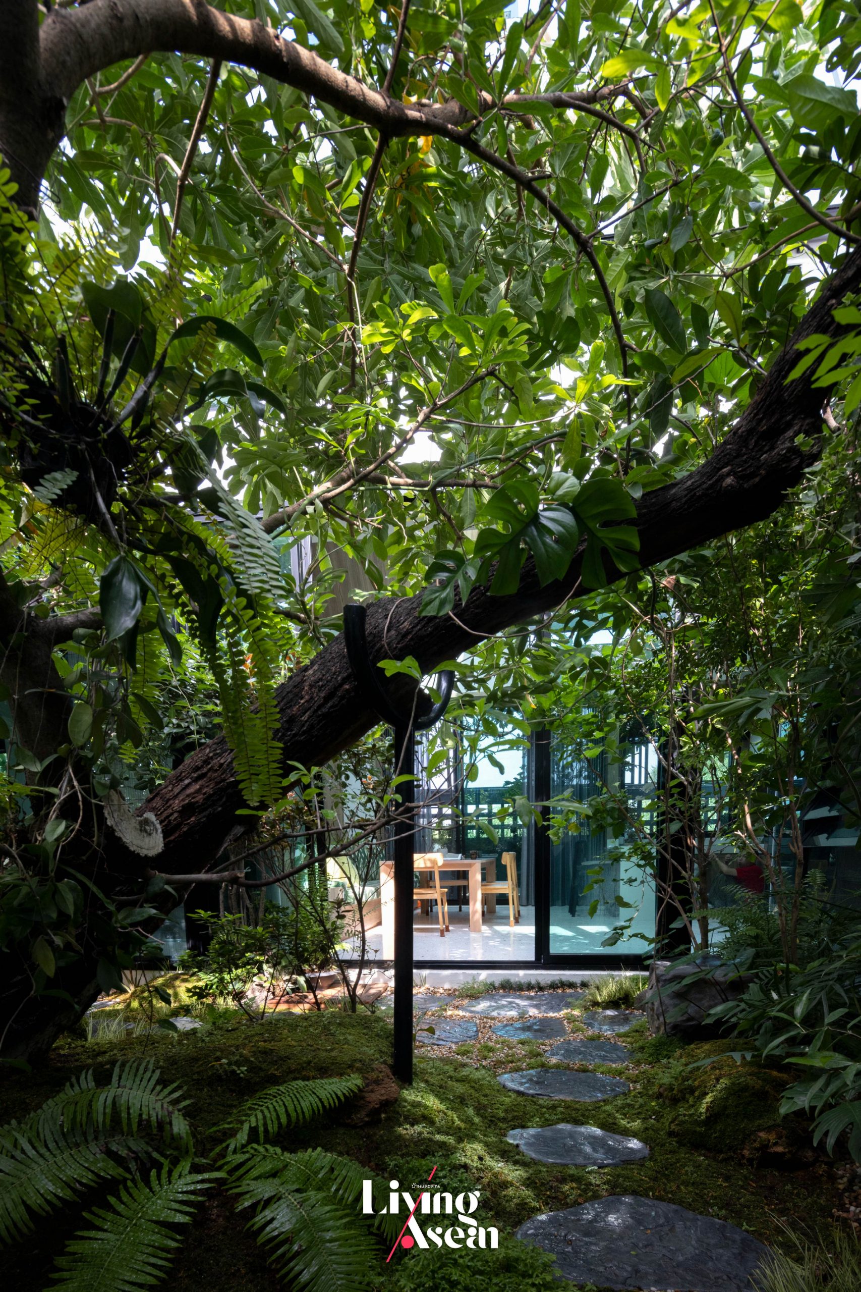
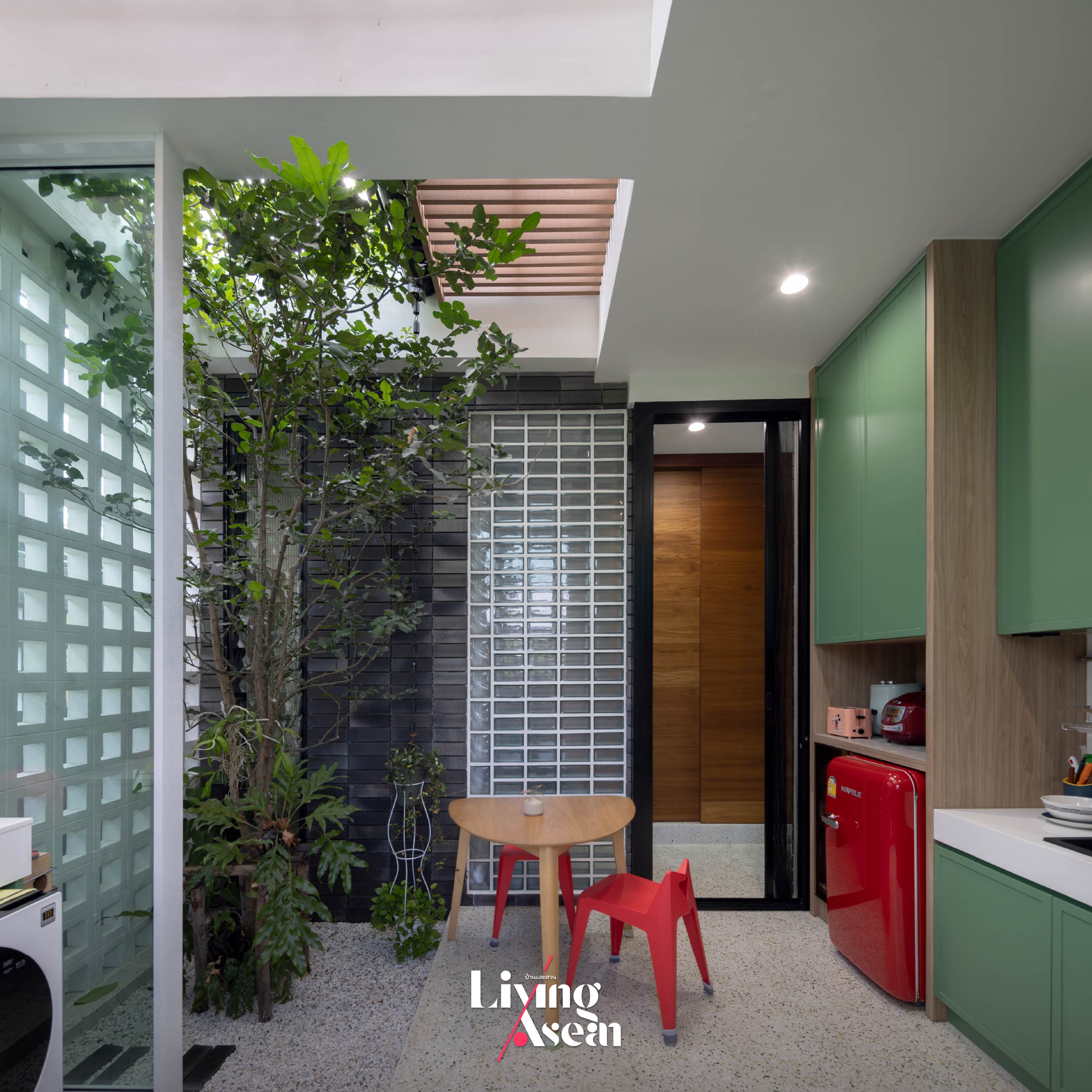
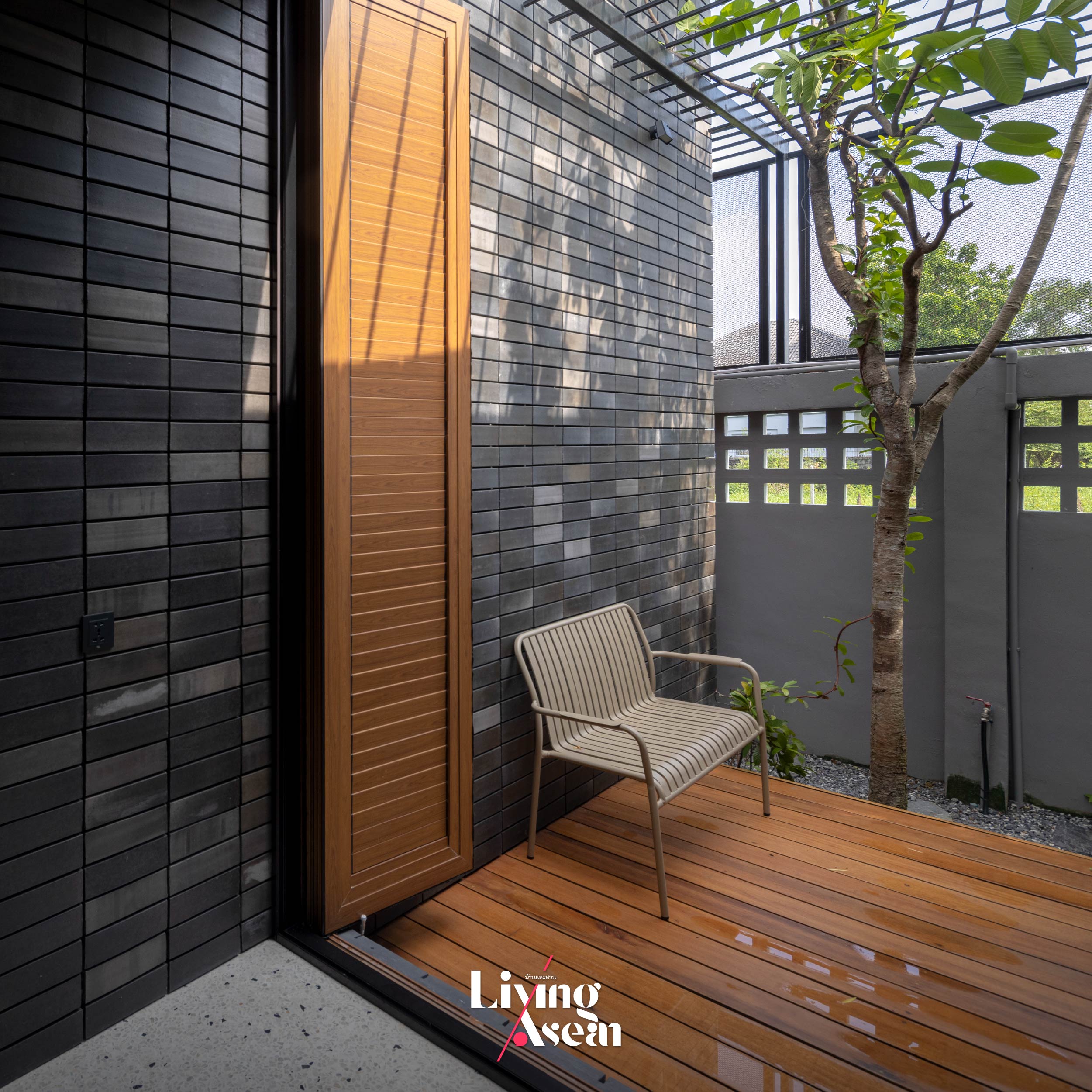
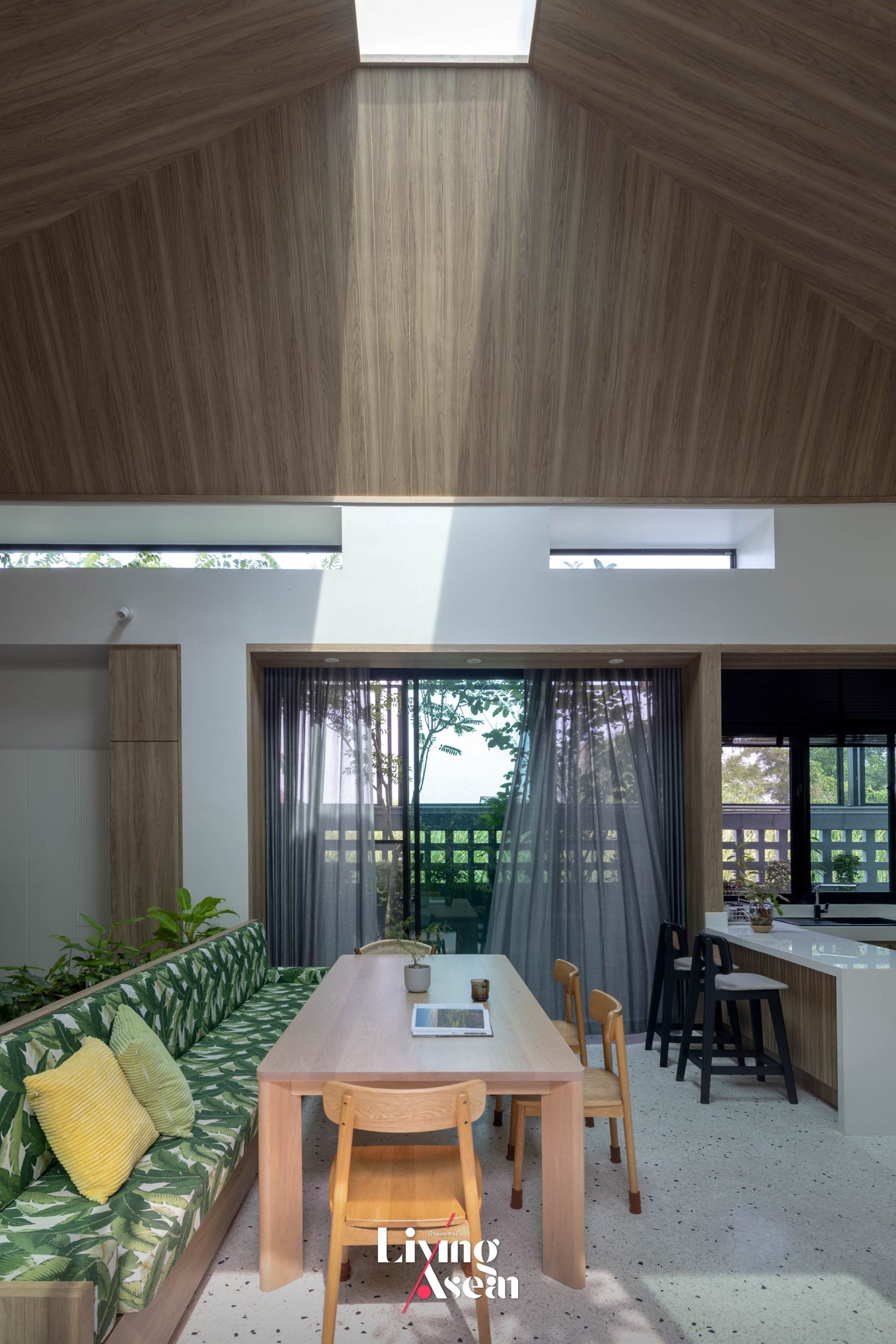
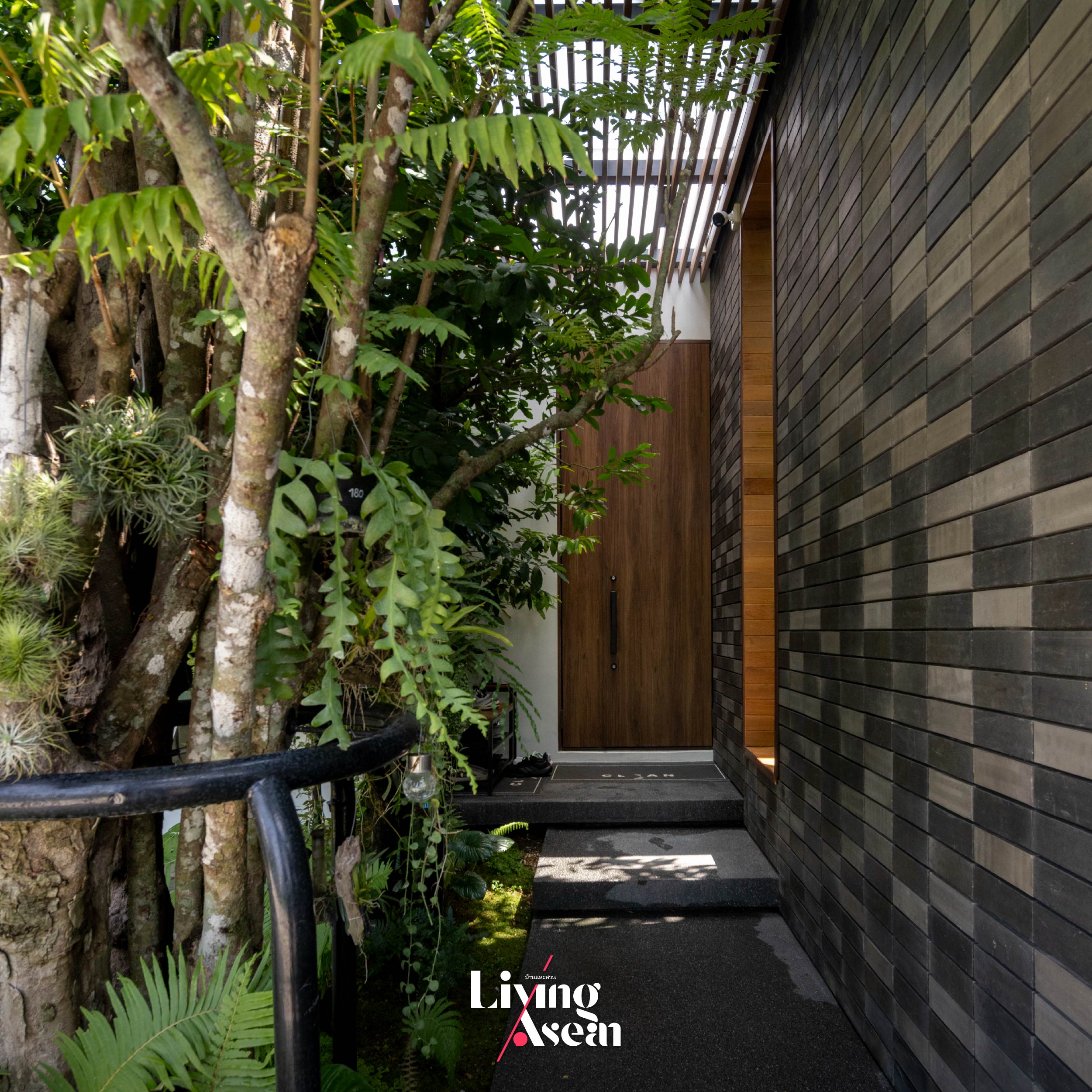
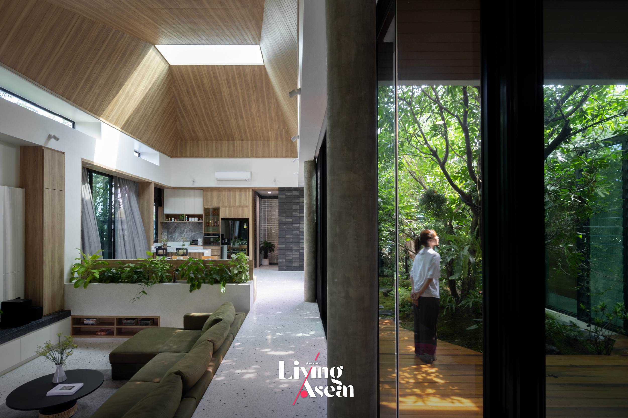
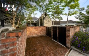 A Country Style Home Office Set amid an Urban Environment
 1+1=1 House: A Modern Home Beautifully Designed for Multigenerational Living