Blog : wood

Baan Suan Athisthan: A Contemporary Vernacular Home in Sync with Nature and Community Life

Baan Suan Athisthan: A Contemporary Vernacular Home in Sync with Nature and Community Life

/ Chiang Mai, Thailand /

/ Story: Samutcha Viraporn / English version: Bob Pitakwong /

/ Photographs: Rithirong Chanthongsuk / Styling: Salisa Viraporn /

A contemporary vernacular home aptly named “Baan Suan Athisthan” stands surrounded by lush green trees and bushes in Chiang Mai. The term “Baan Suan” is Thai for an orchard home. You got the idea. It’s a living space that merges traditional knowledge and skills with modern design principles, technology and materials. The result is a well-thought-out two story house plan filled with style and personality, plus useful features fitting perfectly in a coherent whole.
Vernacular Home Nature
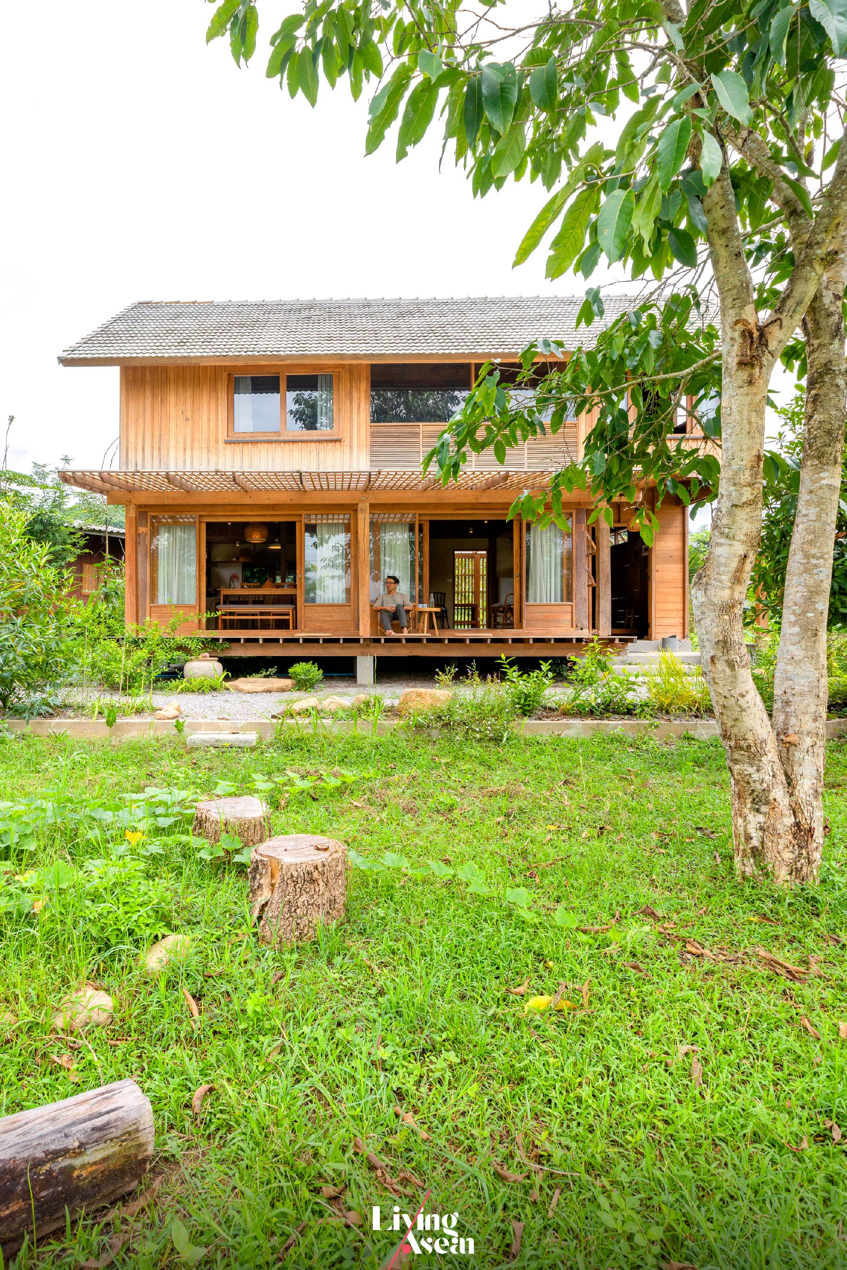
A tree and lush vegetation add a light and pillowy texture to the front yard. The roof is covered with terracotta tiles sourced from neighboring Lamphun Province.

Located at Tambon Mae-Tha in the District of Mae-On, the house makes good use of indigenous knowledge systems and experiences unique to the locality, albeit adapted to suit new conditions and the look that belongs to the present. It’s part of a whole range of professional pursuits that homeowner and architect Supawut Boonmahathanakorn is engaging in.

He has worked at Mae-Tha for a long time, getting involved in all kinds of development efforts. It’s easy to get why he’s become a respected member of the community. We swung by Supawut’s beautiful vernacular home recently and loved every minute of it.


A Home That Blends into the Surroundings

Supawut came to Mae-Tha some eight years ago to work in community planning but ended up falling in love with it. Over time, a friendly, harmonious relationship with locals culminated in a decision to purchase a piece of land with the intention of building a home there.

What he had in mind was the kind of home that would fit, geographically and culturally, into the context of the rural vernacular habitat. And it climaxed with an impressive event in the form a thoughtfully devised wooden home with functionality and comfort fitting into a rural house plan.

Plus, correct building orientation protects it from inclement weather, creating a cozy and inviting living space that syncs with the rhythm of nature.
Vernacular Home Nature

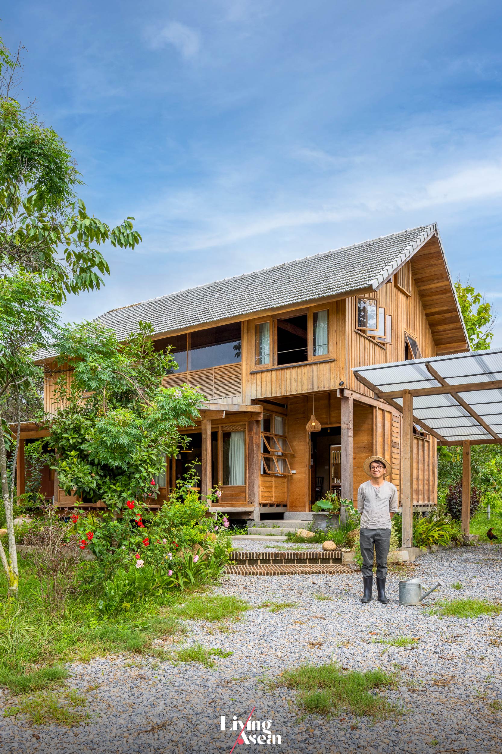
It’s the product of design thinking that started out with the simple drawing of a wooden home plan. As might be expected, he wanted it built the old-fashioned way. The house is now complete.

The principal front of the home looks out over a rural road and, beyond it, a panorama of Doi Khun Tan, a scenic mountain range straddling the border between nearby Lumphun and Lampang provinces to the south.

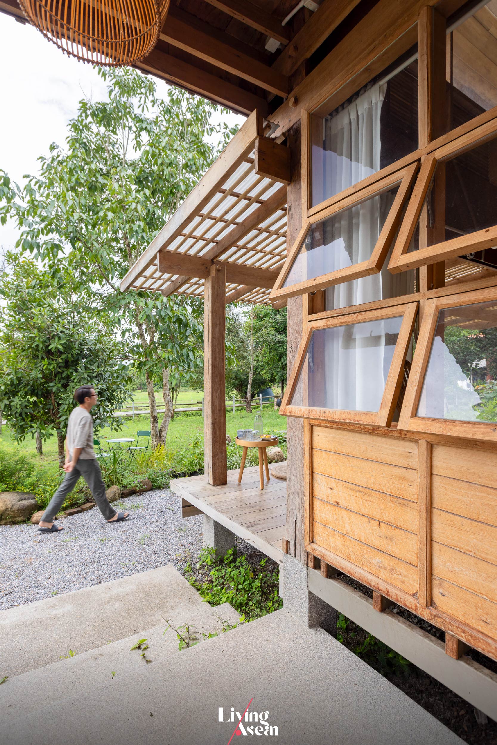
To deal with intense sunlight coming from that direction, a tree is put in the front yard to provide shade and protect the home from harsh glare. In the meantime, a specious porch along the outside of the house performs a dual function as semi-outdoor sitting room and a layer of protection saving the interior living spaces from sun damage.

By design, it’s the cool front porch that makes the house stand out from other vernacular homes in the neighborhood.
Vernacular Home Nature
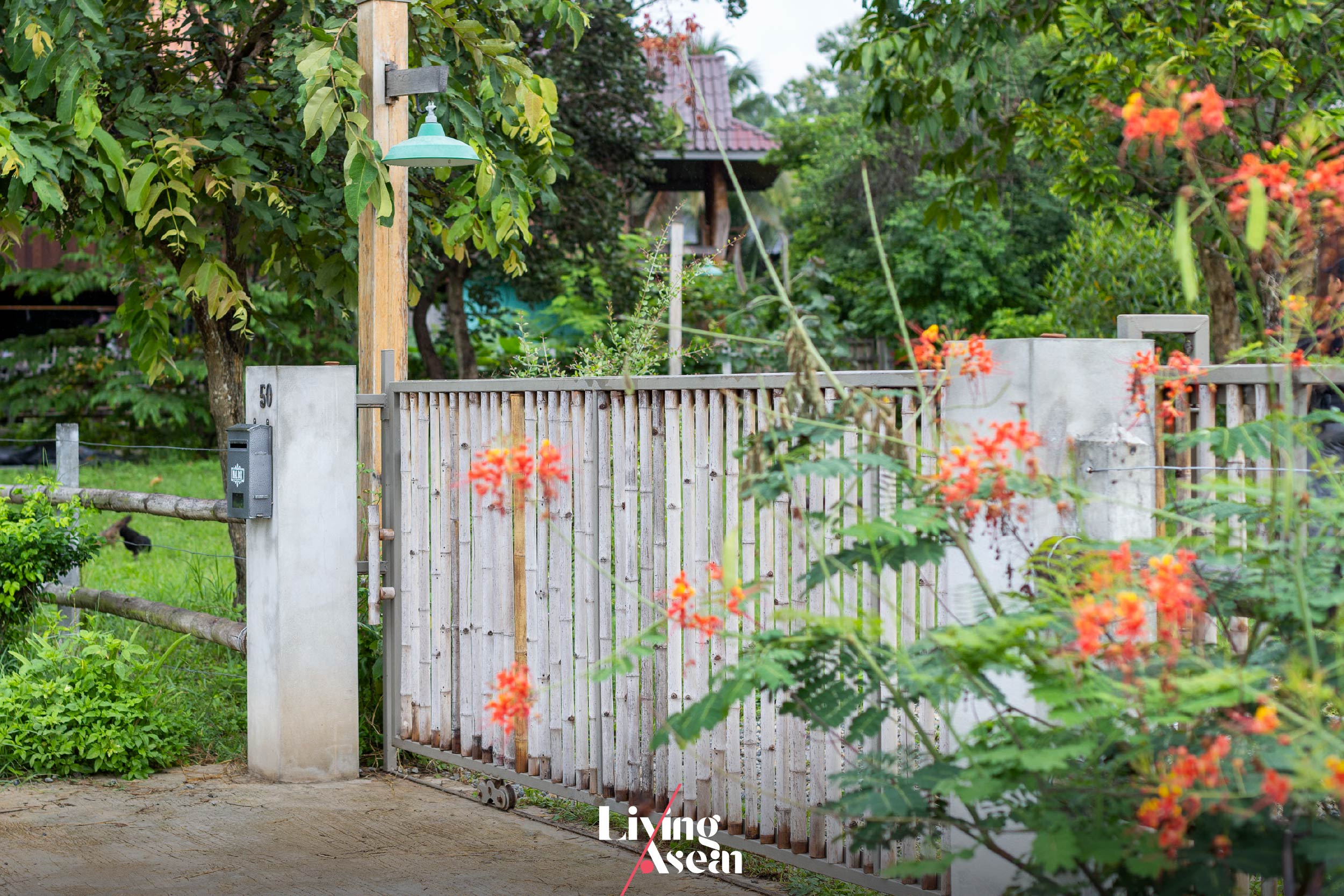
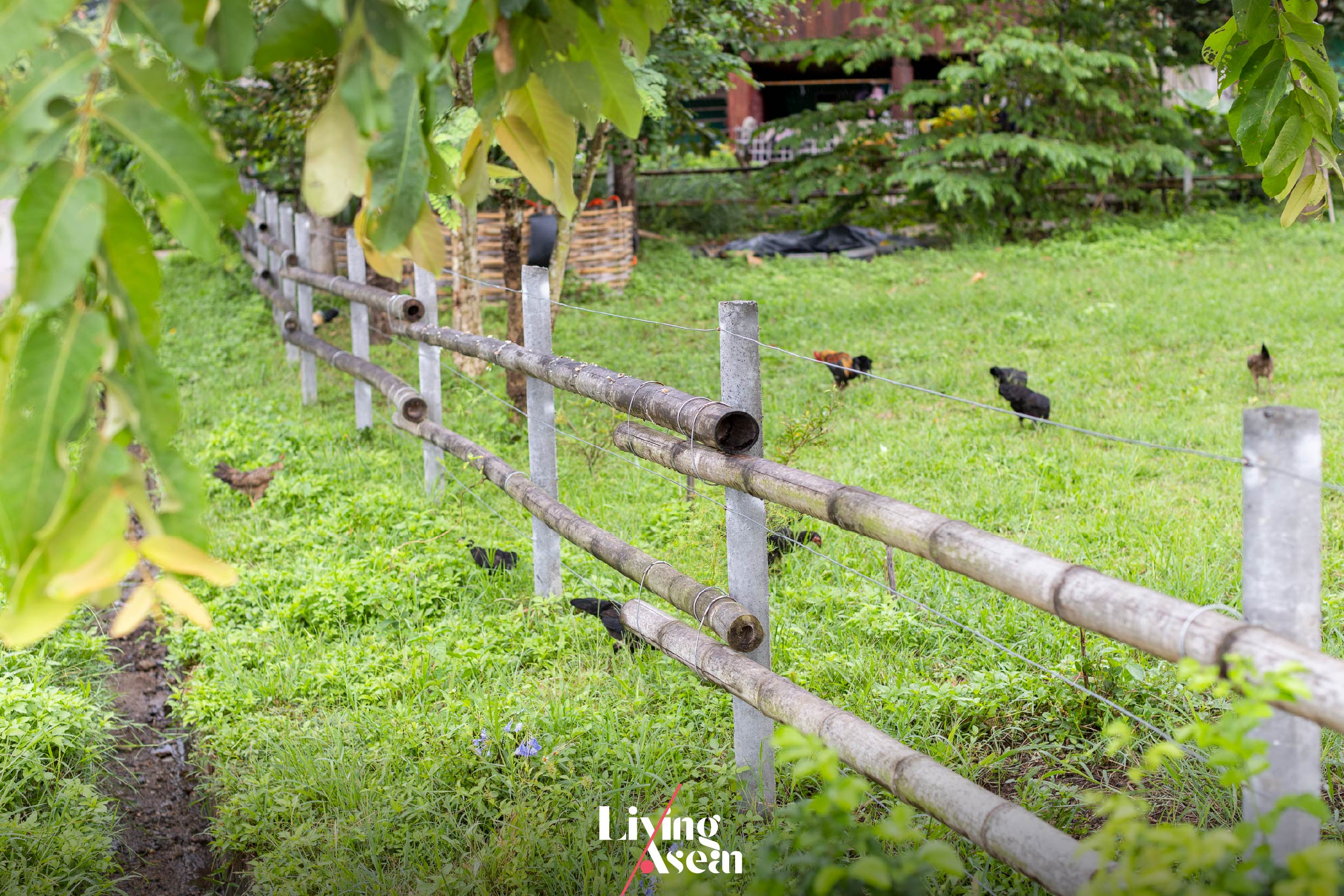
Bamboo poles alternating with barbed wires reduce the harshness of precast concrete fence posts. They provide a weather-beaten look that blends smoothly with the wooden home on the property.
Vernacular Home Nature
An array of awning windows allows natural daylight and fresh outdoor air into the home. Plus, they prove a perfect complement to clean line design on the building’s external envelope.

To blend in harmony with the community, the house is kept roughly the same size as its neighbors. Plus, it makes perfect sense to build a good rapport and avoid being seen as different from what is usual or expected.

To create a quiet and secluded living space, Supawut puts a tree in the front yard that’s still growing at the time of this report. At the same time, appropriate adaptations make the interior spaces cozy and comfortable. Among them, a “Tai Thun” or the open lower level space has since been enclosed by the walls for privacy and security since the homeowner doesn’t live here every day.


Combining Old and New

For strength and durability, the house is built on concrete foundations. The beams and joists supporting the house floor are crafted of steel to significantly speed up the overall construction process.

The floor itself is made of hardwood. The same applies to the beams and joists supporting the porch along the outside of the building. All types of timber used in this project are recycled from three old homes. They are chosen for their color and ability to suit different applications.

For good looks, teakwood is used as showpieces and wall panels, while the floor is crafted of solid hardwood in varying tones.
Vernacular Home Nature

Vernacular Home Nature
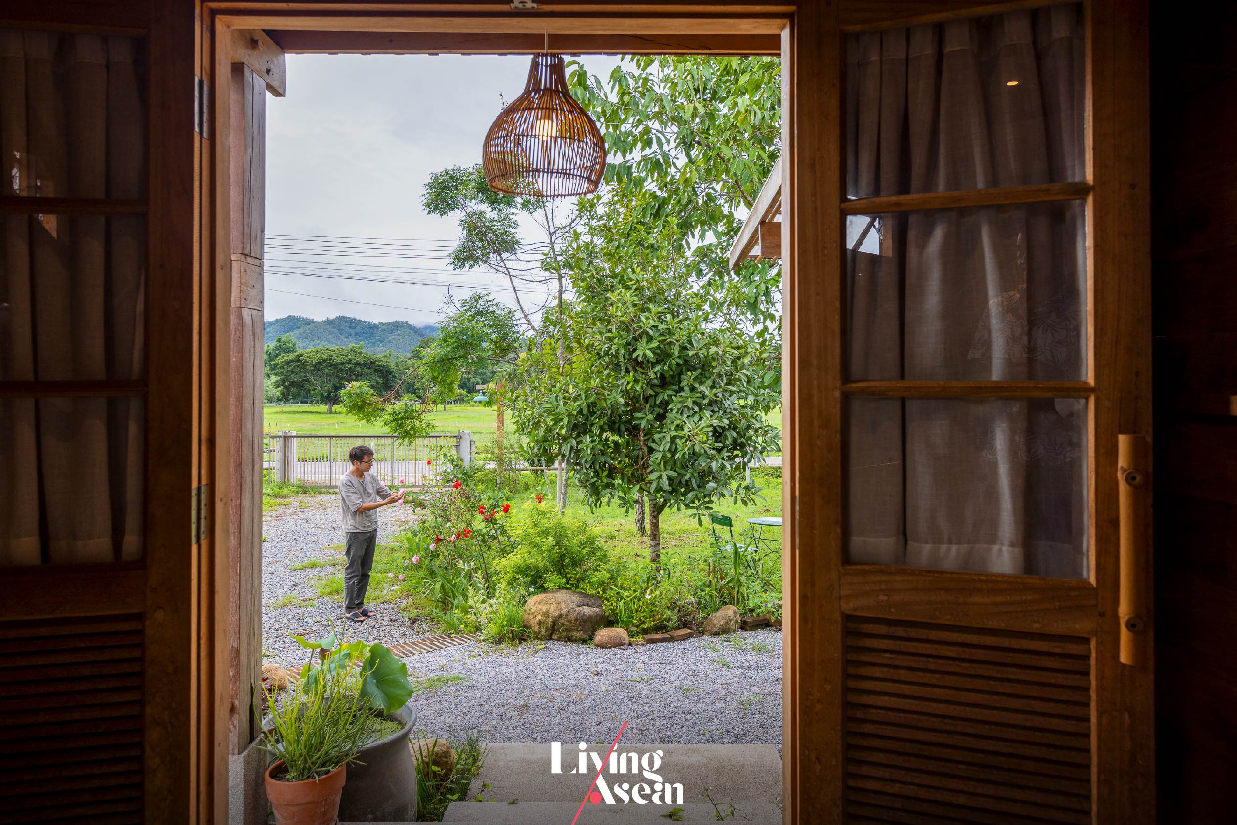
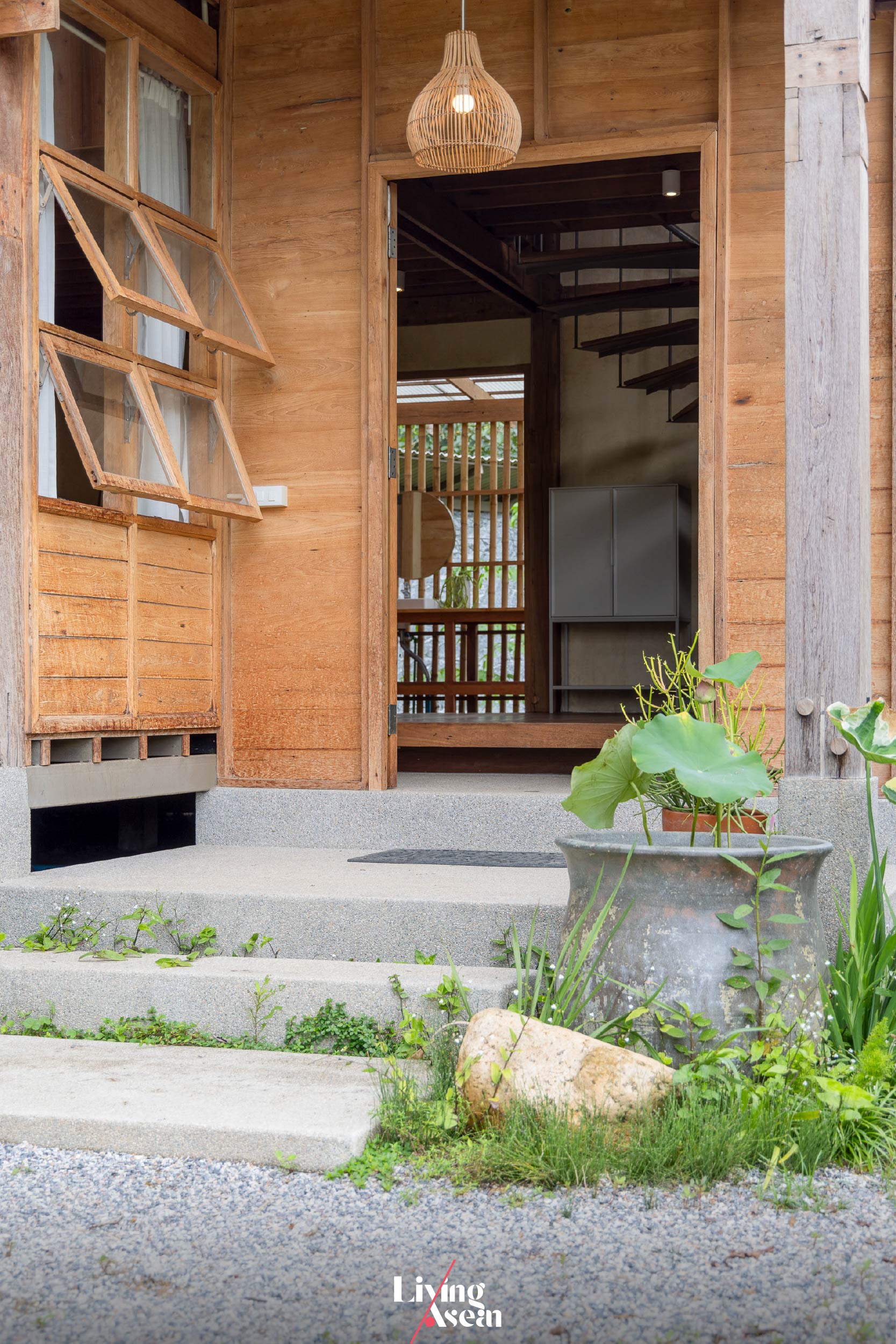
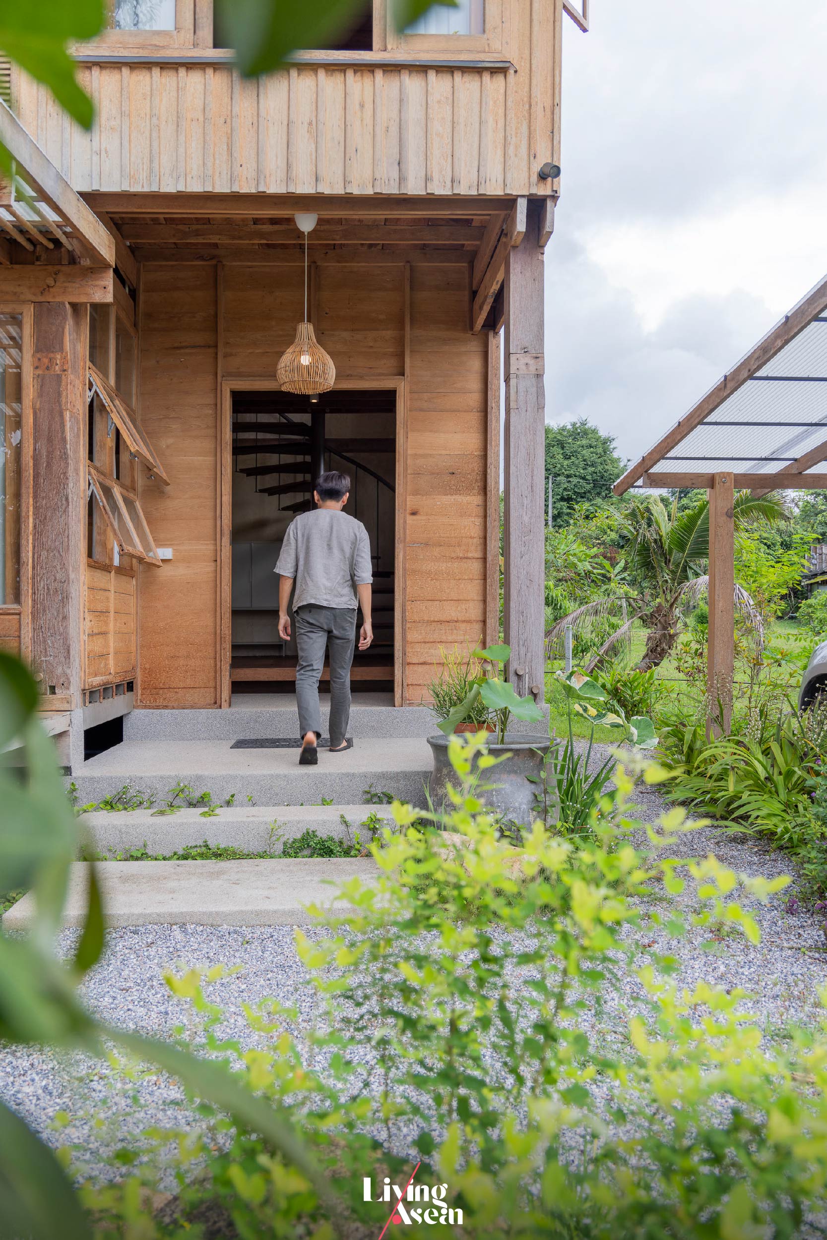
The front door opens to a vista of herb gardens and, beyond, a seemingly endless line of mountains.
Vernacular Home Nature
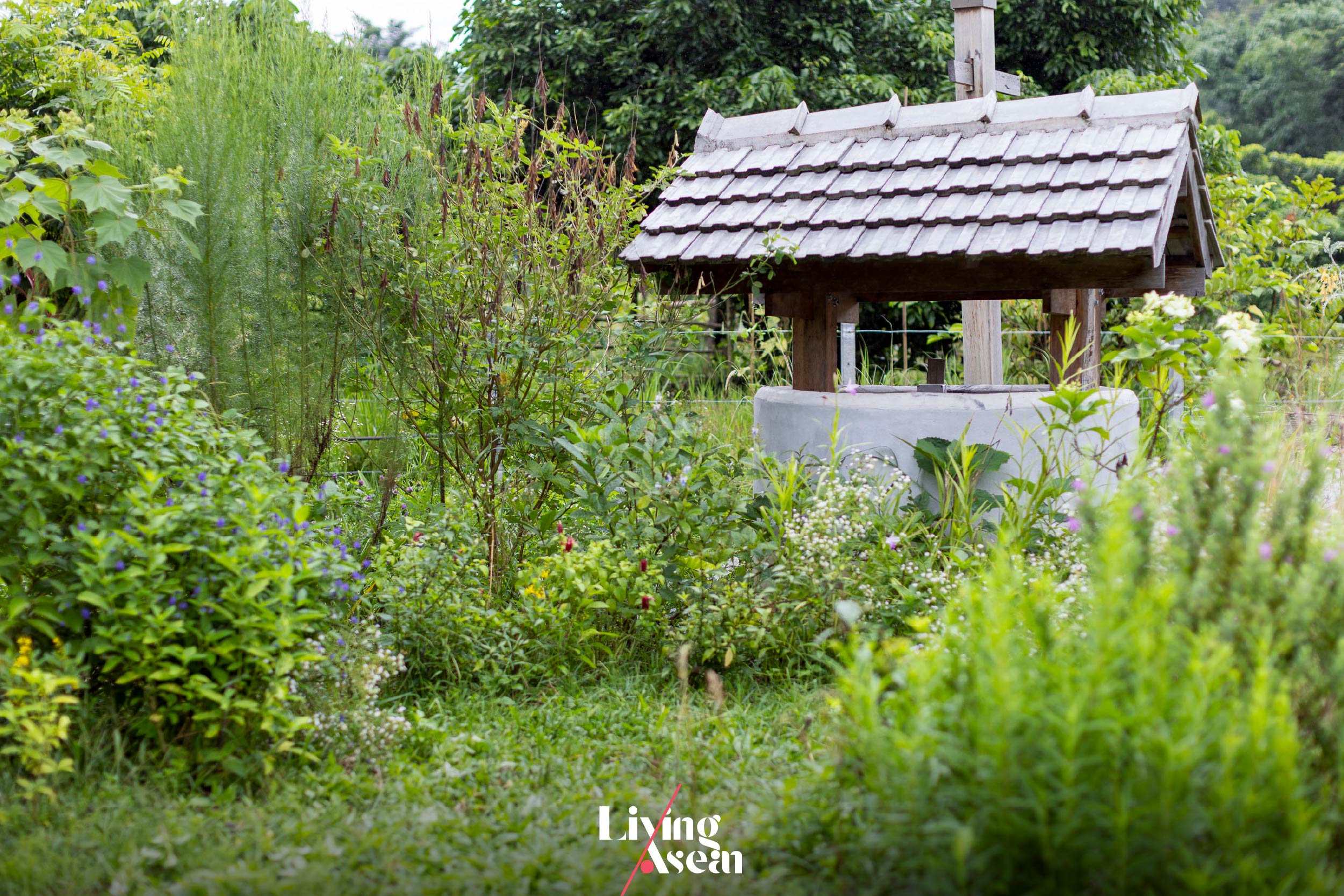
A roofed well casing made of concrete syncs with gardens filled with herbs indigenous to the Northern Region.

In keeping with local traditions, the house’s external envelope is unsophisticated and easy to understand. Unlike traditional vernacular design, the roof eaves overhanging the exterior wall are left exposed, leaving the ends of roof rafters visible.

Neither is there a gable decoration, aka the “Ga-lae” that’s symbolic of homes in the Northern Region. But nevertheless, it’s a beautiful wooden house, one that’s easy on the eye and blending perfectly into countryside vernacular.

The house entry area boasts split-level design that provides a place to sit while putting on and taking off shoes upon entering. There is an element of surprise, though. The second floor is accessible via a spiral staircase made of steel, an unusual feature for the traditional style home of the Northern Region.
Vernacular Home Nature

Vernacular Home Nature
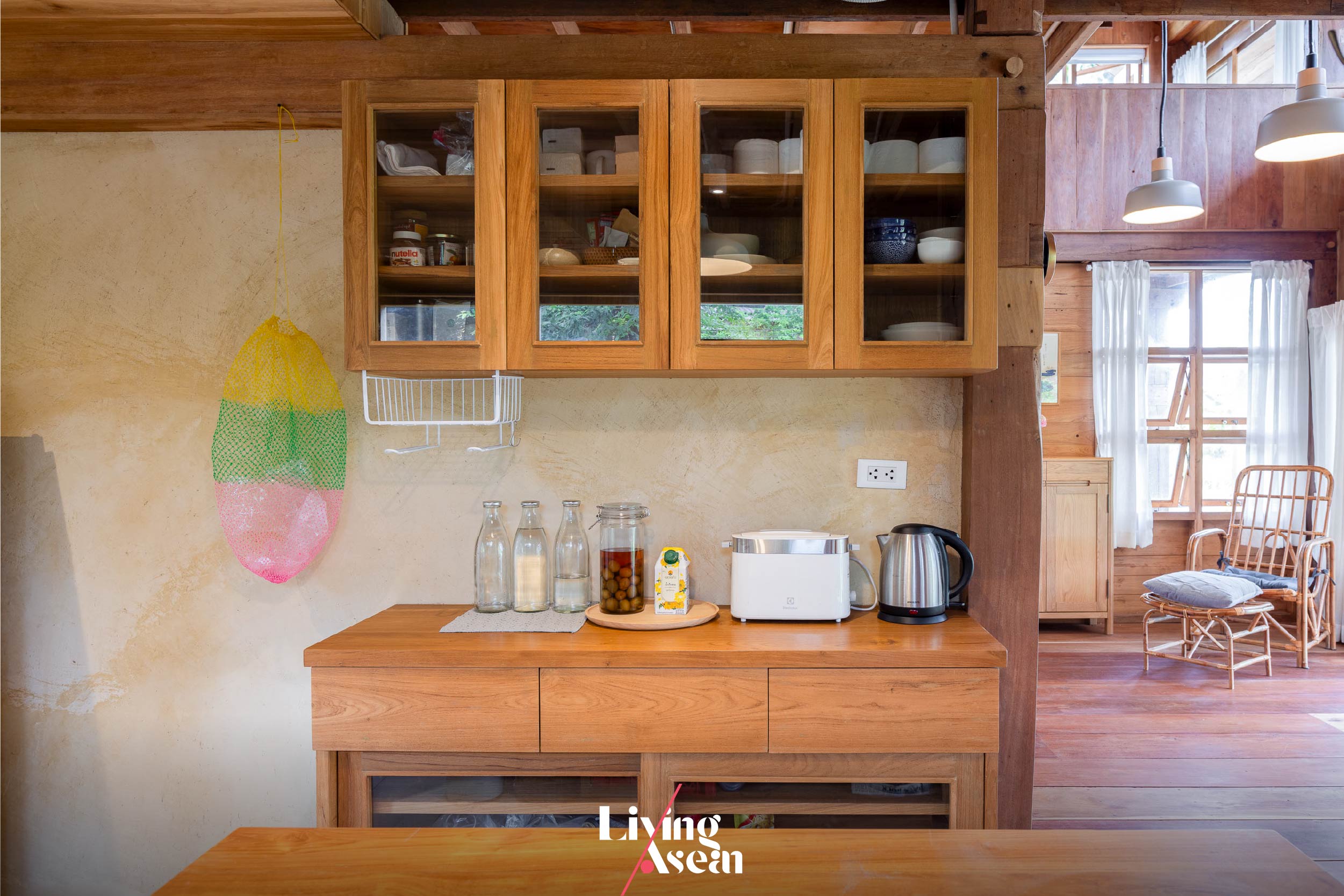
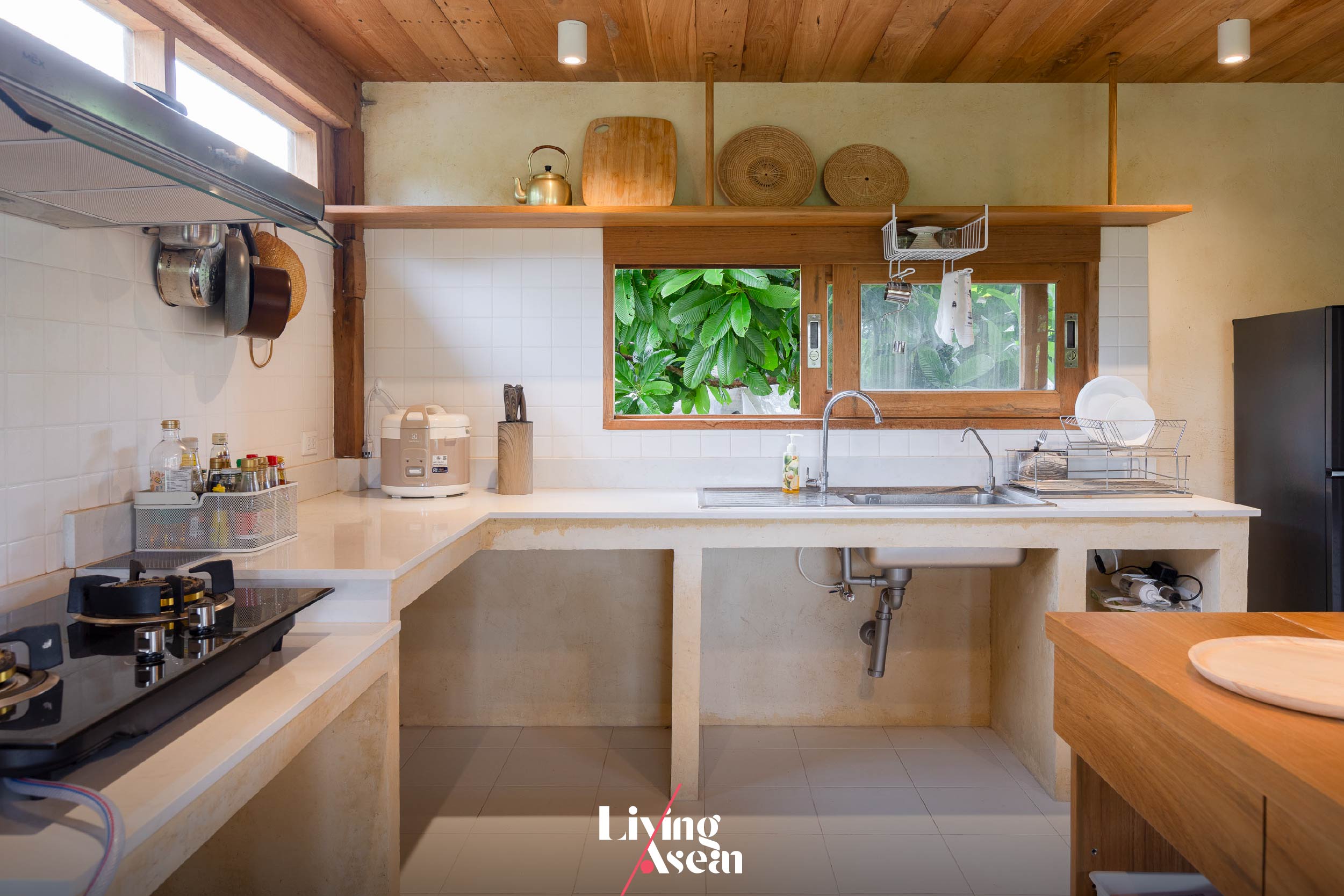
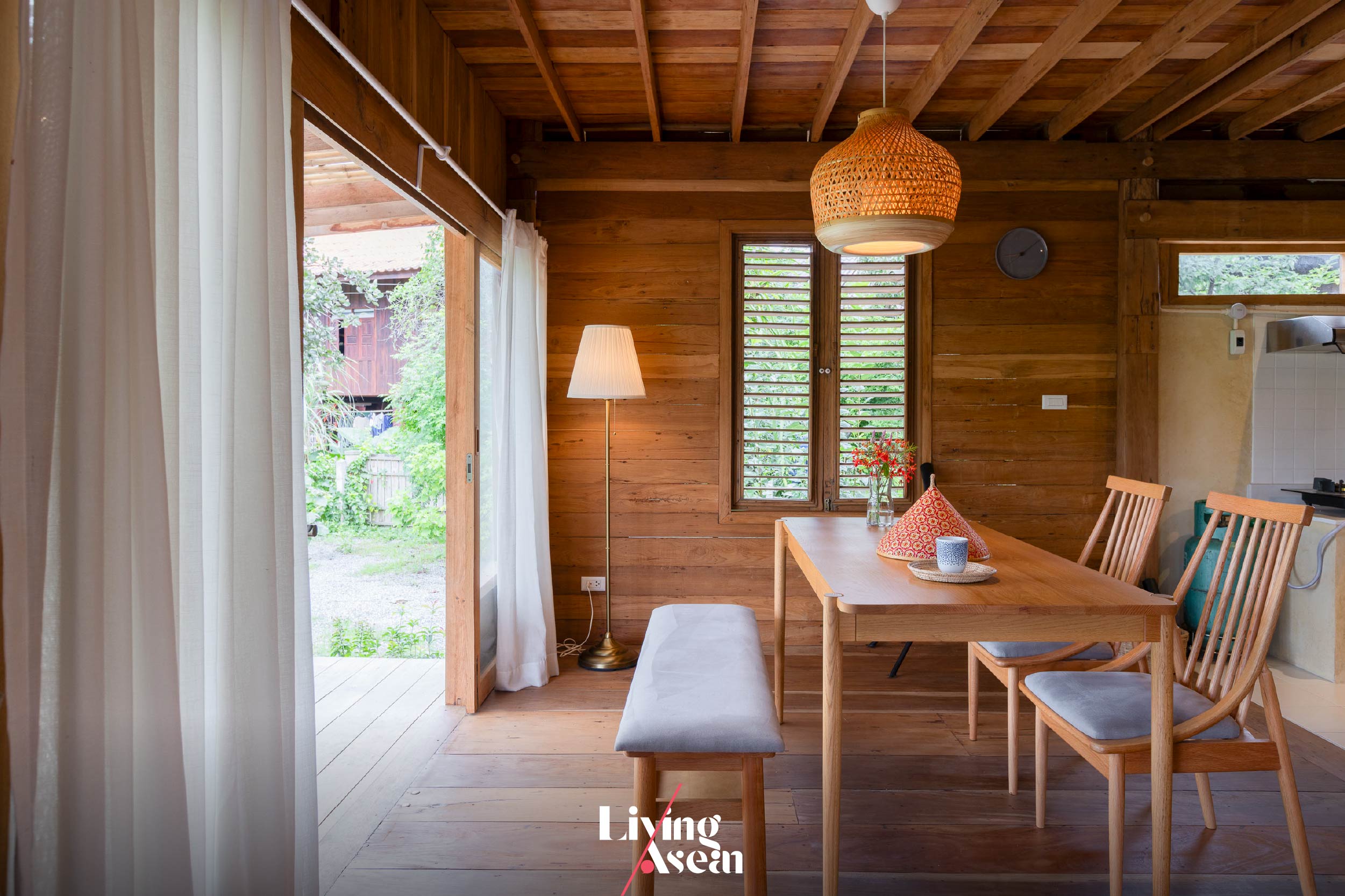
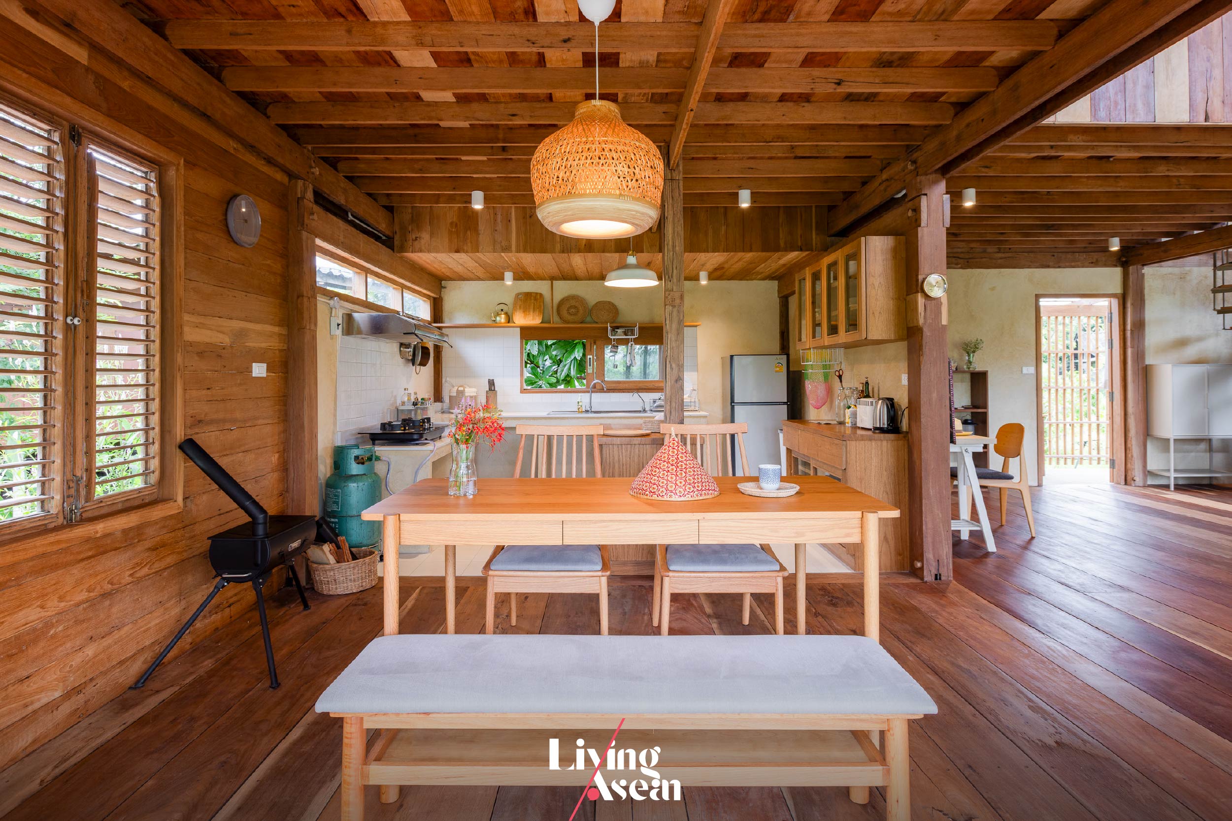
The dining room and kitchen that lies furthest in is well-lit by natural daylight streaming through side windows and the front porch. Directly overhead, exposed floor joists supporting the upstairs room are clearly visible.
Vernacular Home Nature
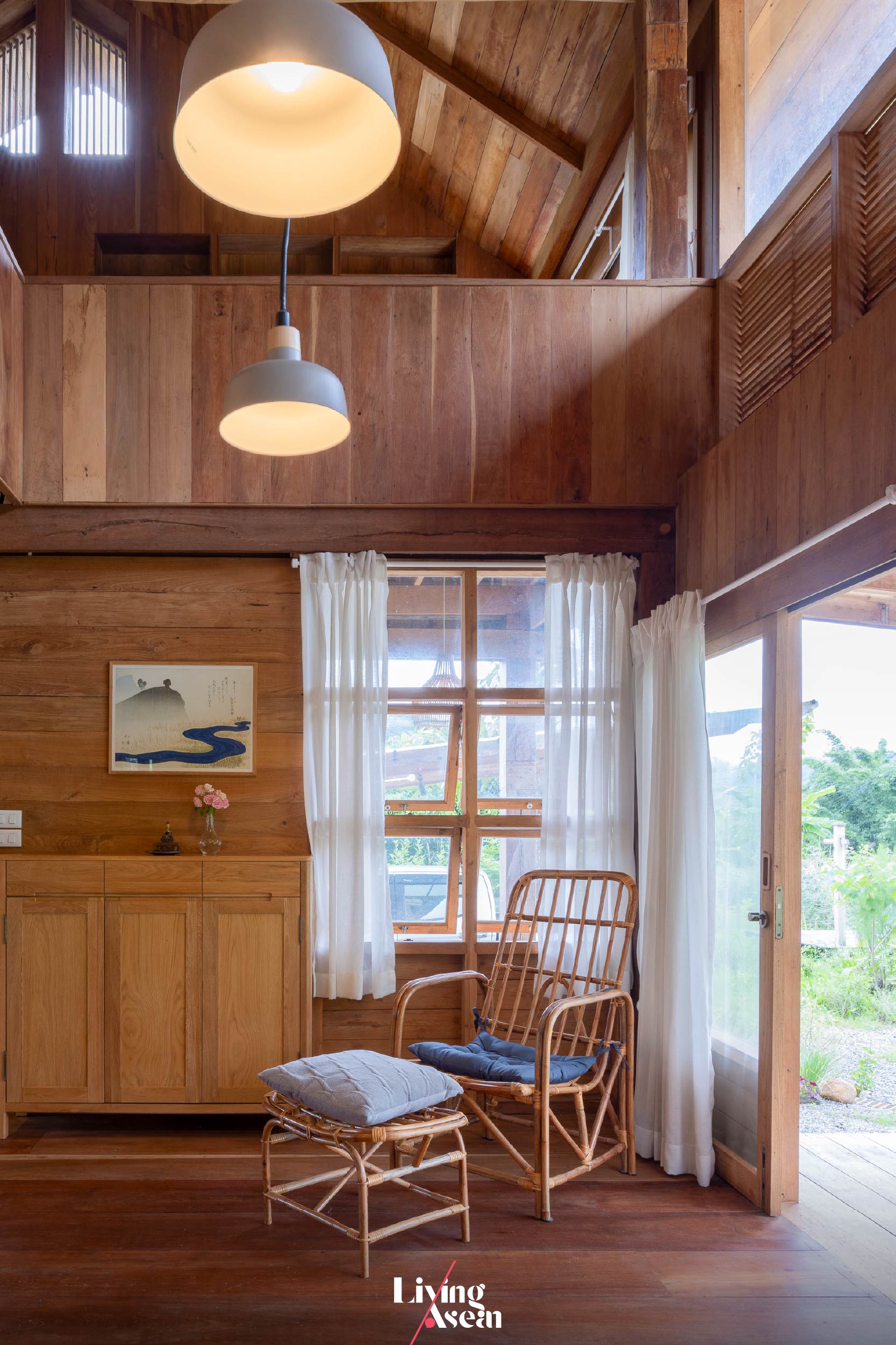
Double height ceiling ideas make the downstairs sitting room feel airy and comfortable. Sliding glass doors open for good ventilation and lighting.
Vernacular Home Nature
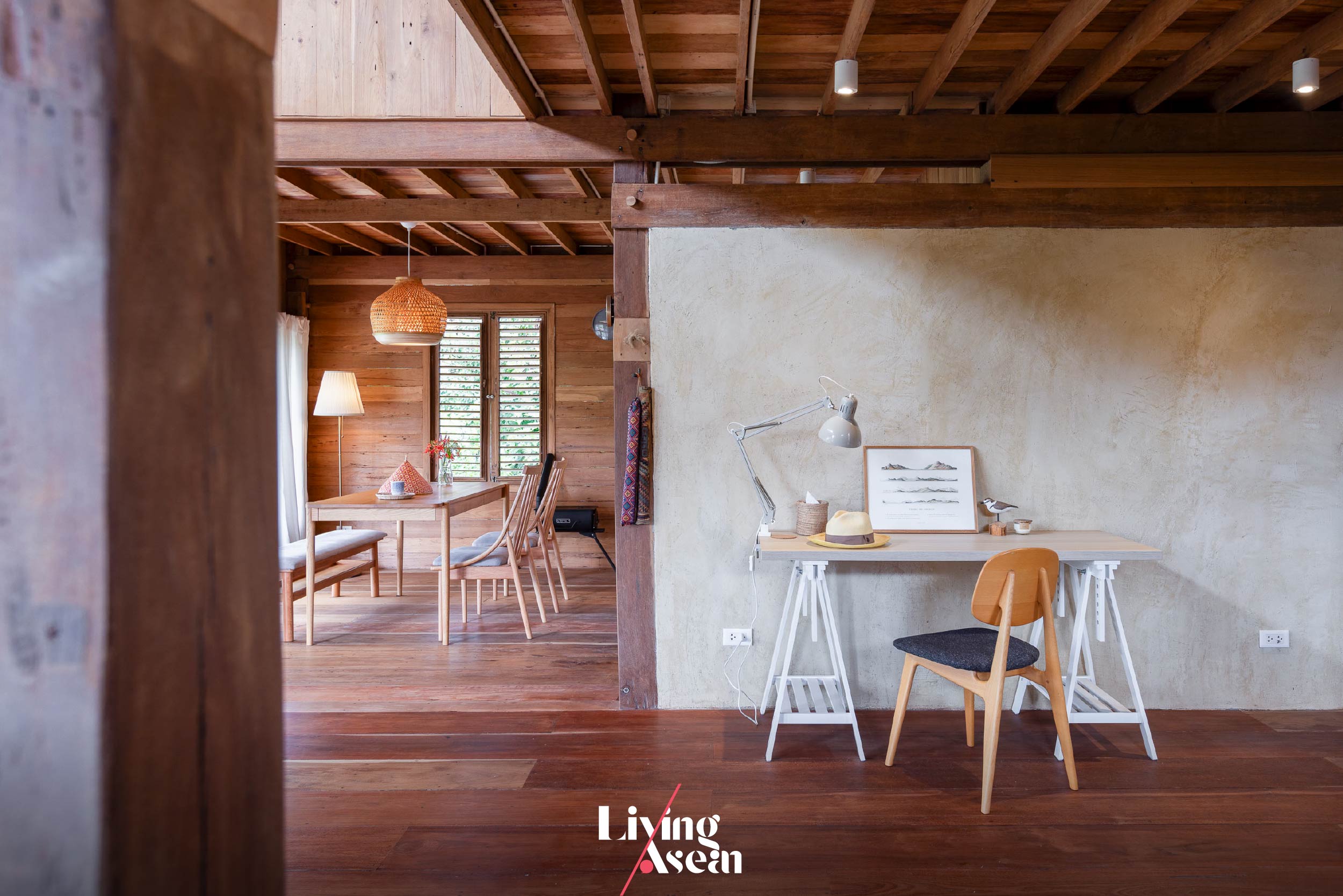
A nook with a small desk provides a flex workspace that’s airy, open and welcoming.

Vernacular Home Nature

Vernacular Home Nature
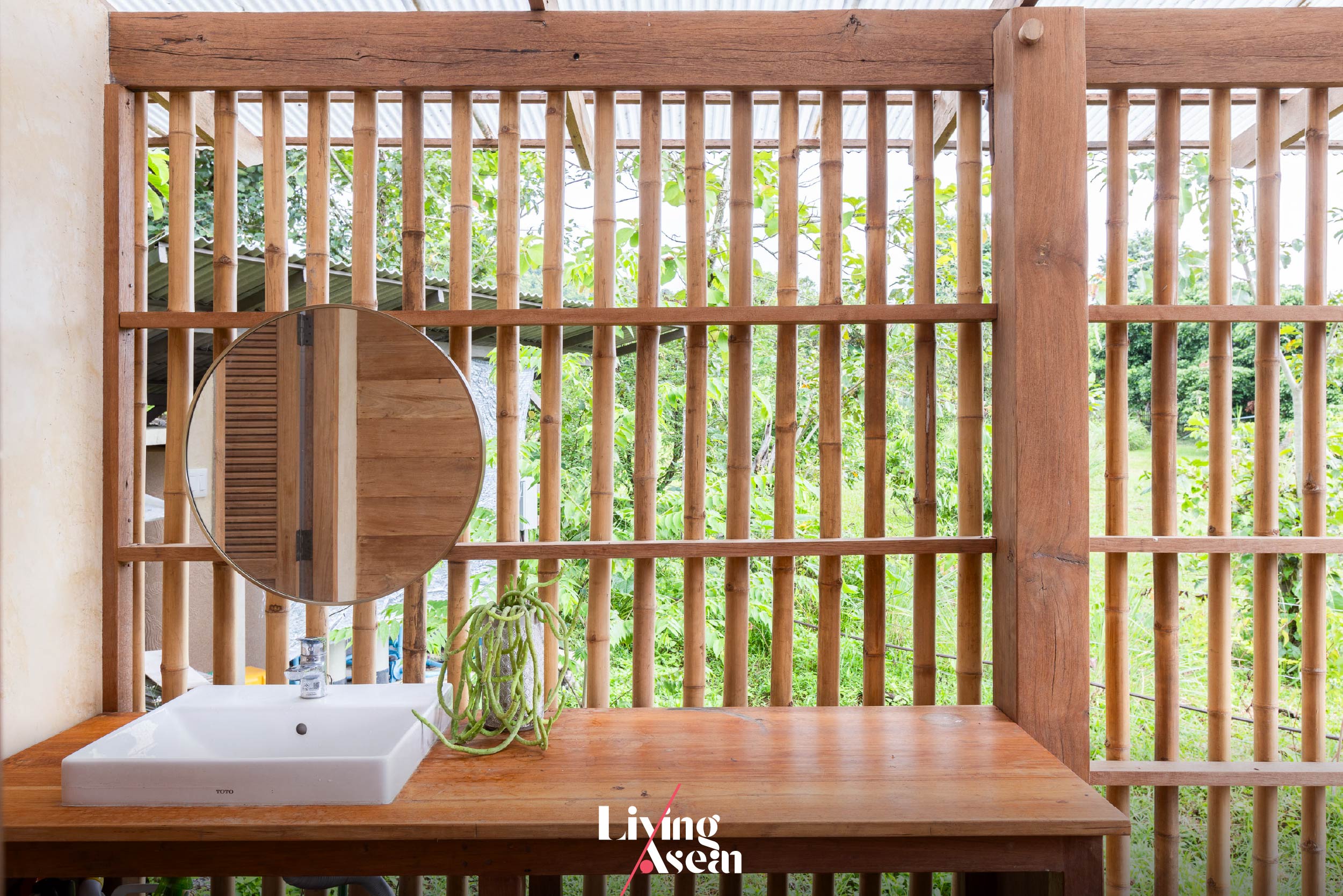
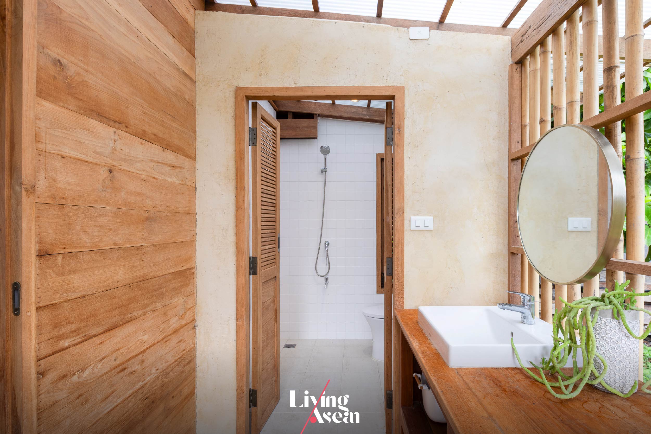
The downstairs bathroom is an extension of the house plan, accessible via a semi-outdoor room roofed over with corrugated translucent material for lighting, a clever hack to keep the bathroom clean and hygienic.

Vernacular Home Nature
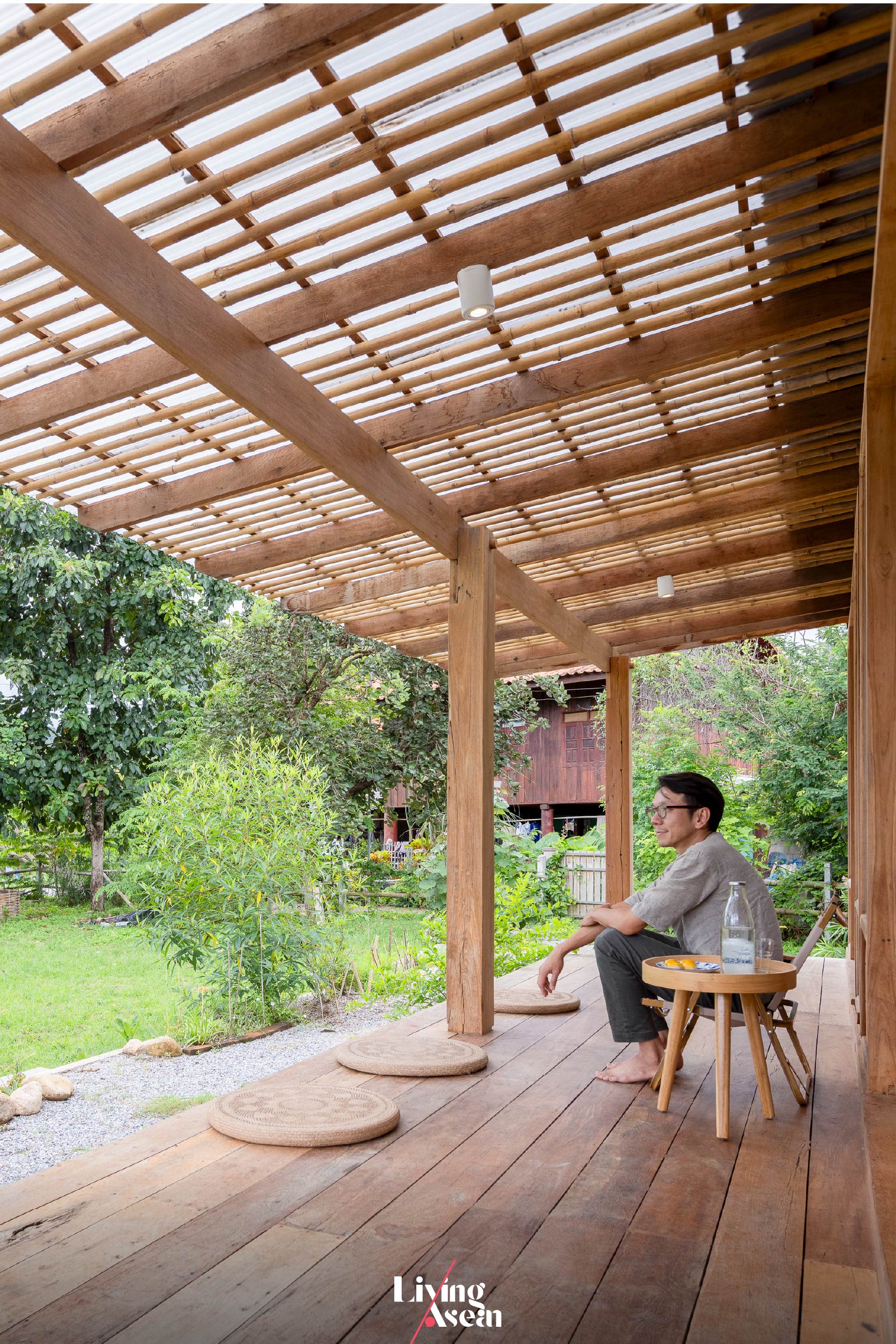
The front porch roofed over with a translucent material performs a dual function as semi-outdoor sitting room and additional protection preventing sun, wind and water from entering the home.

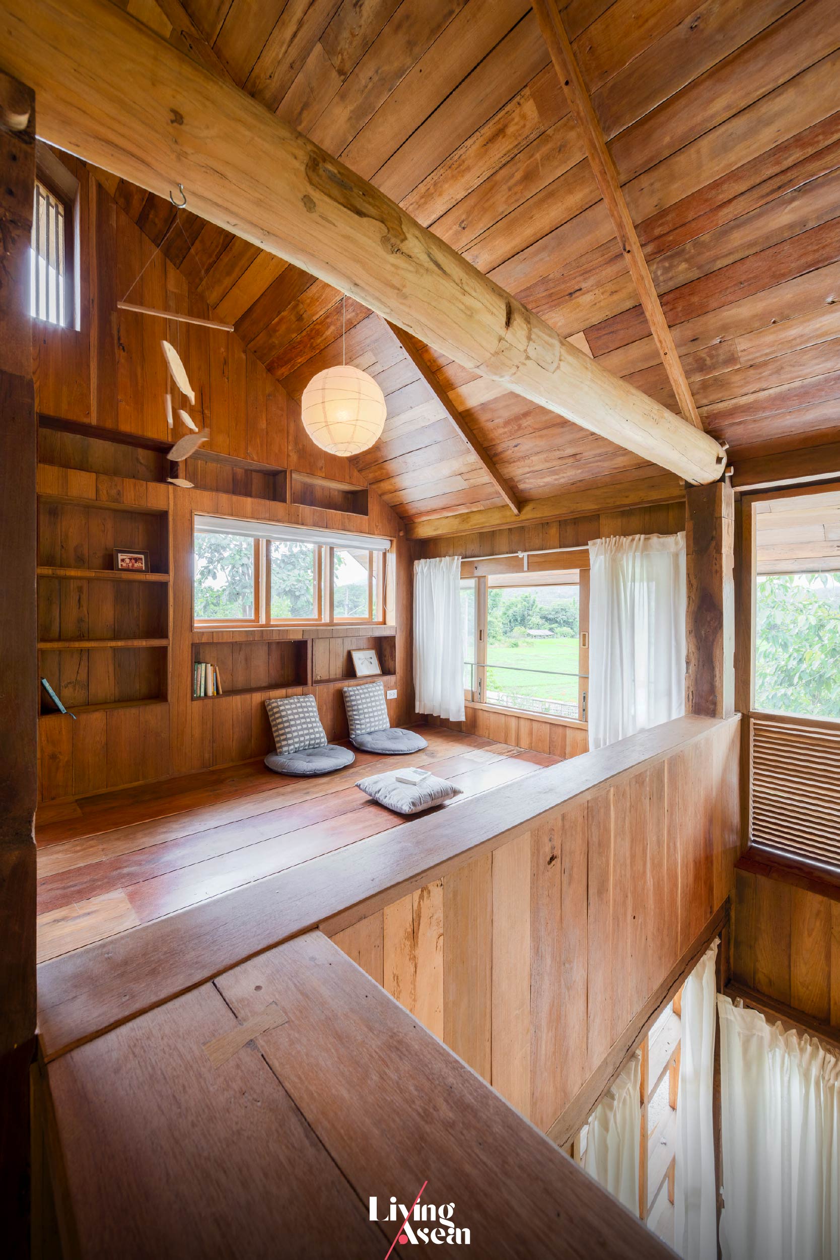
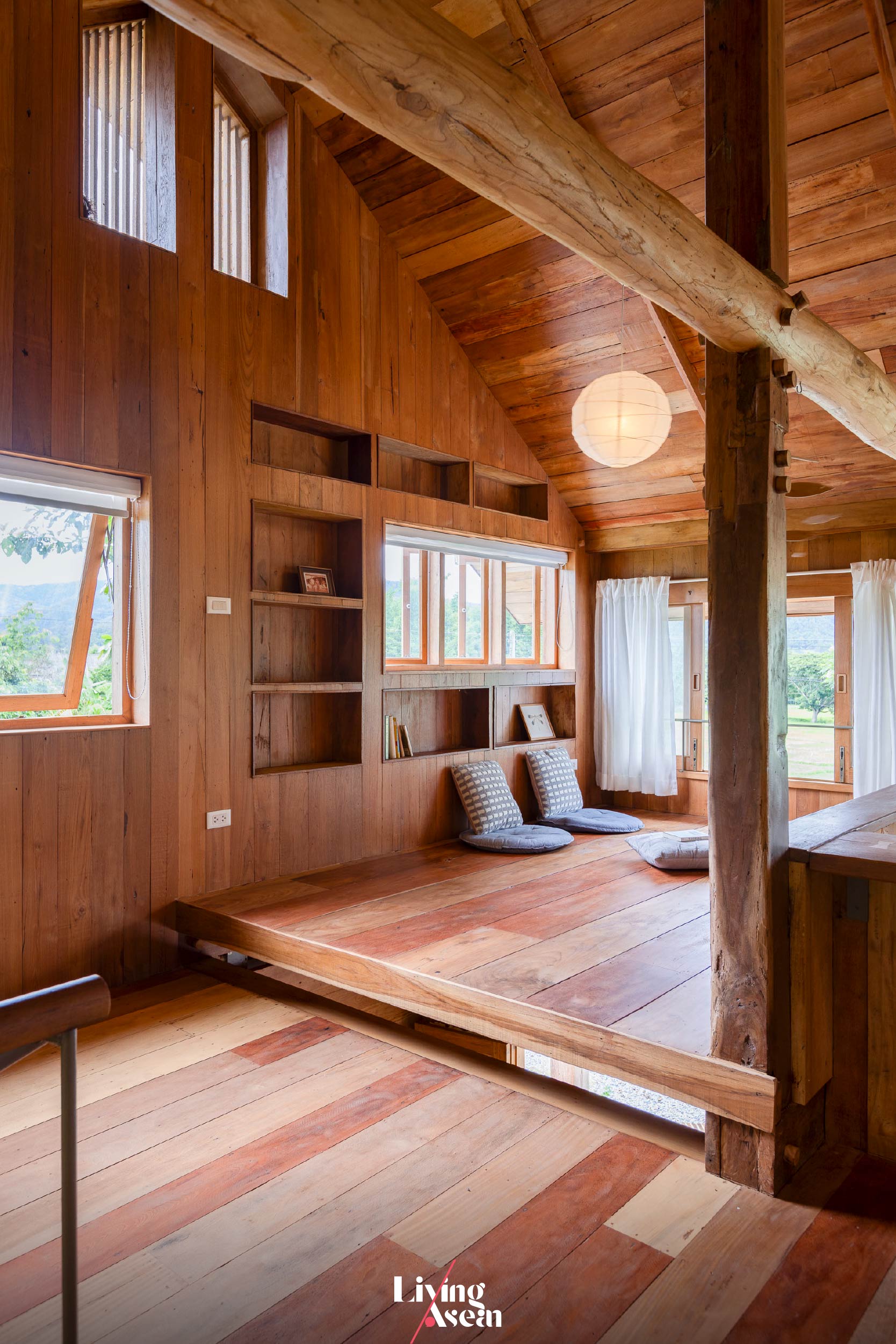
Climb a flight of stairs, and you come to a “Tern” in the vernacular of the Northern Region meaning an indoor raised platform. In a way, it serves as window into the past. Supawut explained that traditionally in former times, the area was used as living room during the daytime, and sleeping space in the nighttime for unmarried sons.

For good lighting and ventilation, the room isn’t enclosed by the walls. In times past, all family members would be out tending rice in the paddy field all day. There was hardly anyone home. And by the time the sons matured into adulthood, they would be married off and started a family of their own. Since the daughters remained in the family, they were entitled to a room of their own.
Vernacular Home Nature
A window into Northern culture in times past, the raised platform or “Tern” in the dialect of the region provided space for a living room during the daytime, and sleeping space for unmarried sons at night. Like old times, it now serves as a sitting room with throw pillows and floor seat cushions for sitting and leaning on.

In keeping with traditions, the Tern in this contemporary home is without furniture, an evidence that sheds light on a culture in which people sit on the floor. For Supawut, it’s a quiet nook to lean back, chill out, enjoy the view of the surrounding landscape.


Double Height Ceilings for a Bright and Breezy Atmosphere

A void of space between the first and second floors further increases ventilation in the home. It serves as engine that drives cross-ventilation, drawing fresh outdoor air from downstairs and forcing it to exit through wall openings and vents upstairs.

By making appropriate adaptations to traditional house design, Supawut was able to create high ceilings that give the home a lively and cheerful atmosphere. The result of all this: a contemporary home that’s more cozy and comfortable than the original vernacular homes in former times.
Vernacular Home Nature
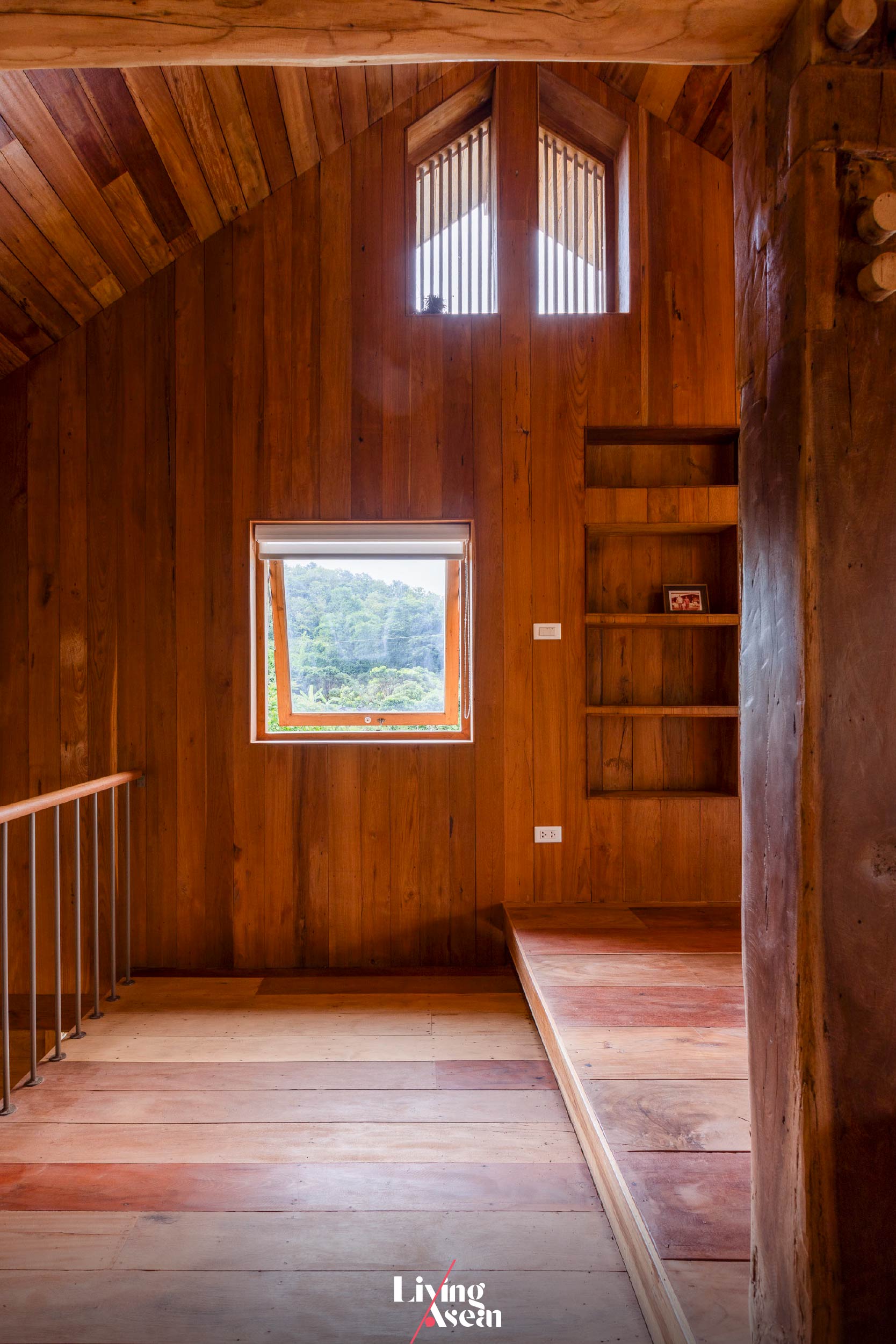
An upstairs awning window and a gable vent allow natural light and fresh outdoor air into the home.
Vernacular Home Nature
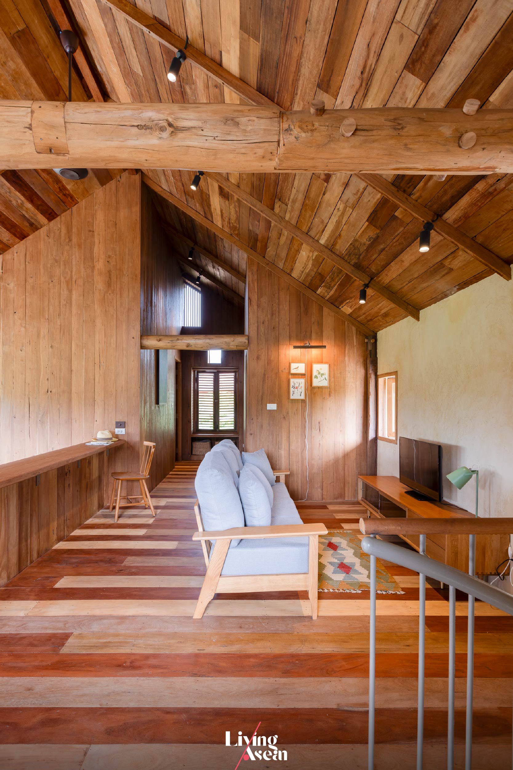
Timber conceals the steel framework supporting the roof, creating a harmonious look in the interior living space. The coverings are made of reclaimed hardwood in various shades of earth color. The wall on the right is crafted of cement boards with sand swirl texture painted a cool-toned white.
Vernacular Home Nature
A void of space between the first and second floors makes the house feel light and breezy, while windows open to bring the outdoors in.

Technically speaking, the house is an interesting amalgam of the modern and the traditional. The architect started out with ideas for a modern house plan, and then added vernacular features to it with the help and advice of local elders highly skilled in traditional carpentry and woodworking.

Ironically, the elders were reluctant to participate at first. But after working with Supawut for a period of time, they came to accept it as one of their proud achievements.
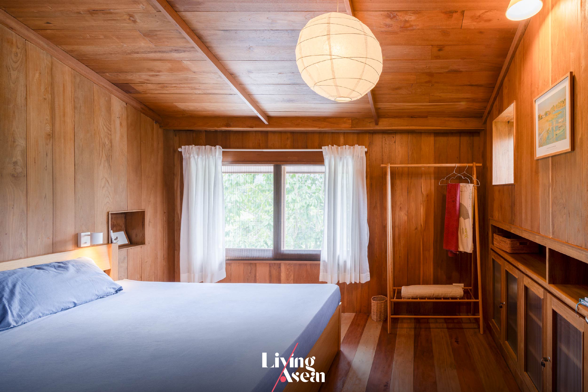
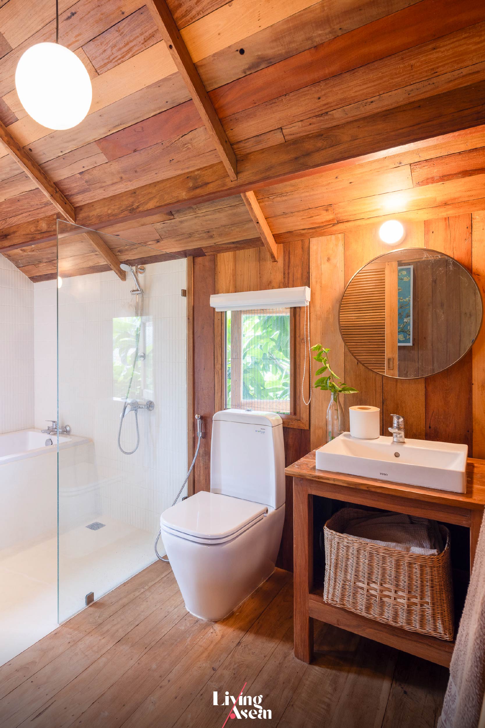
Vernacular Home Nature
The neat and tidy bedroom embraces simple living. Shelving and cupboards perform a dual function as storage space and double insulated walls.
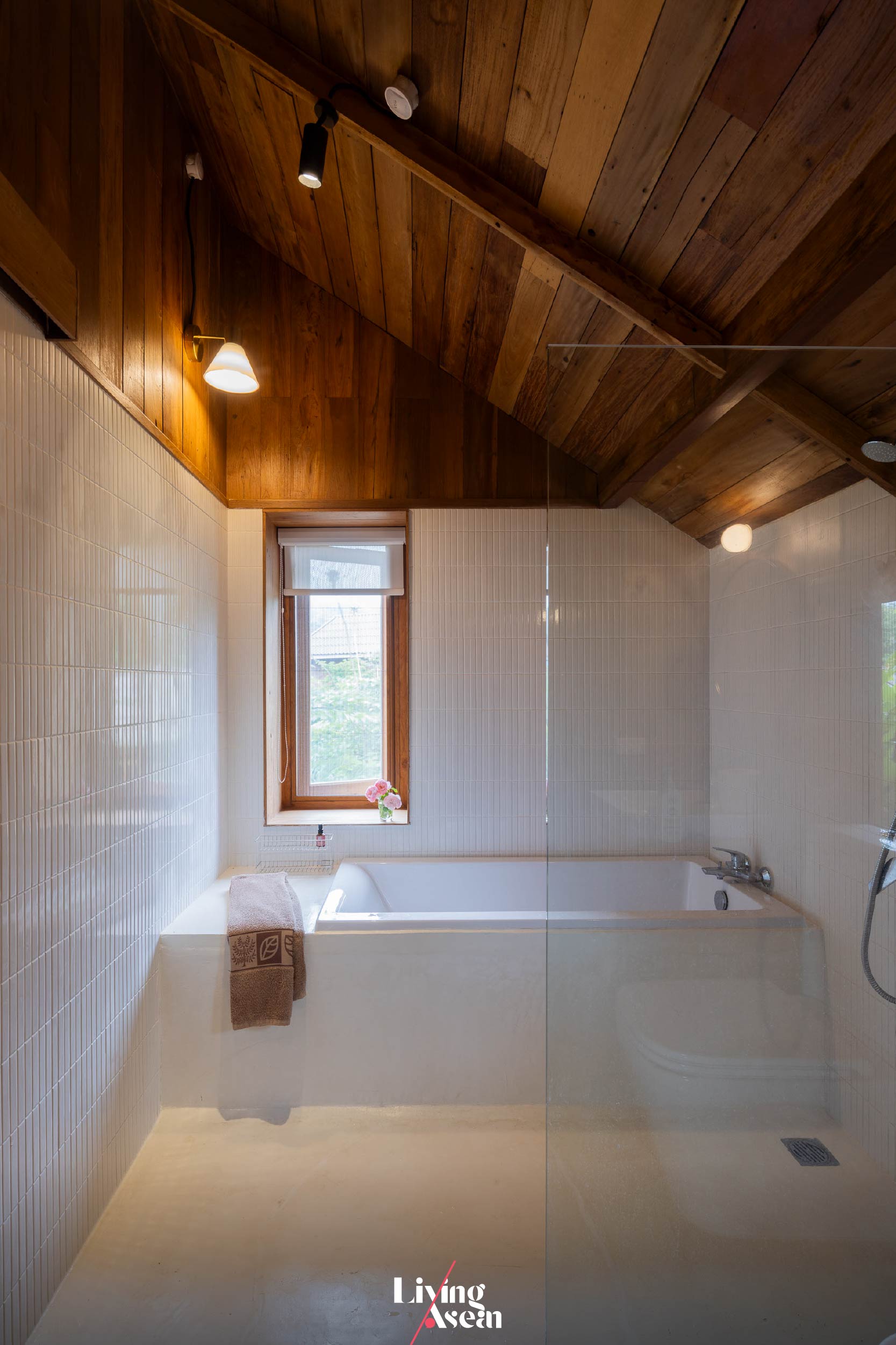
The contemporary upstairs bathroom is small yet complete with modern conveniences. The wet and dry areas are clearly defined, while the bathtub and shower room in cool-toned whites match the toilet and nearby rectangular wash basin.

As for building material adaptations, the walls are built for the most part of cement boards painted a shade of earth tones reminiscent of vernacular homes in bygone times. A light hue is chosen to create a bright and optimistic appearance on the front porch and entry area. The second floor is built strong to give it the maximum ability to take loading, especially the wet area where the bathtub is located. There are multiple vents that allow warm air to exit, resulting in a well-lit, well-ventilated interior. In the meantime, the open-concept floor plan makes the home feel spacious and improves traffic flow.
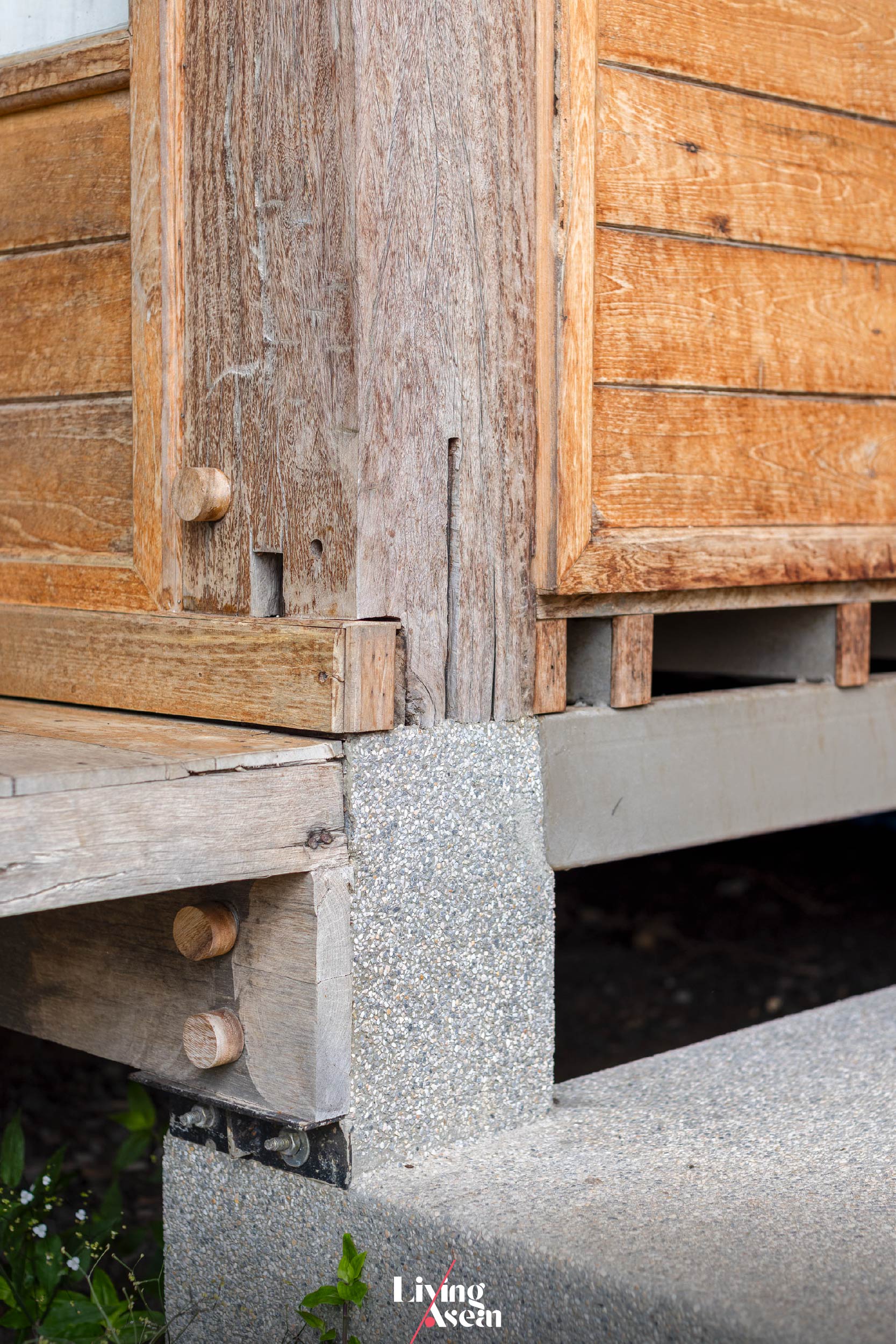
The house sits on concrete foundations designed to protect against water damage. Post bases built of concrete keep timber frames and columns dry. The joists and beams supporting the house floor are made of steel to significantly reduce construction time and save money on timber costs. Where appropriate, the open ends of steel beams are boxed in using wood plugs for a neat appearance and keeping insects out.
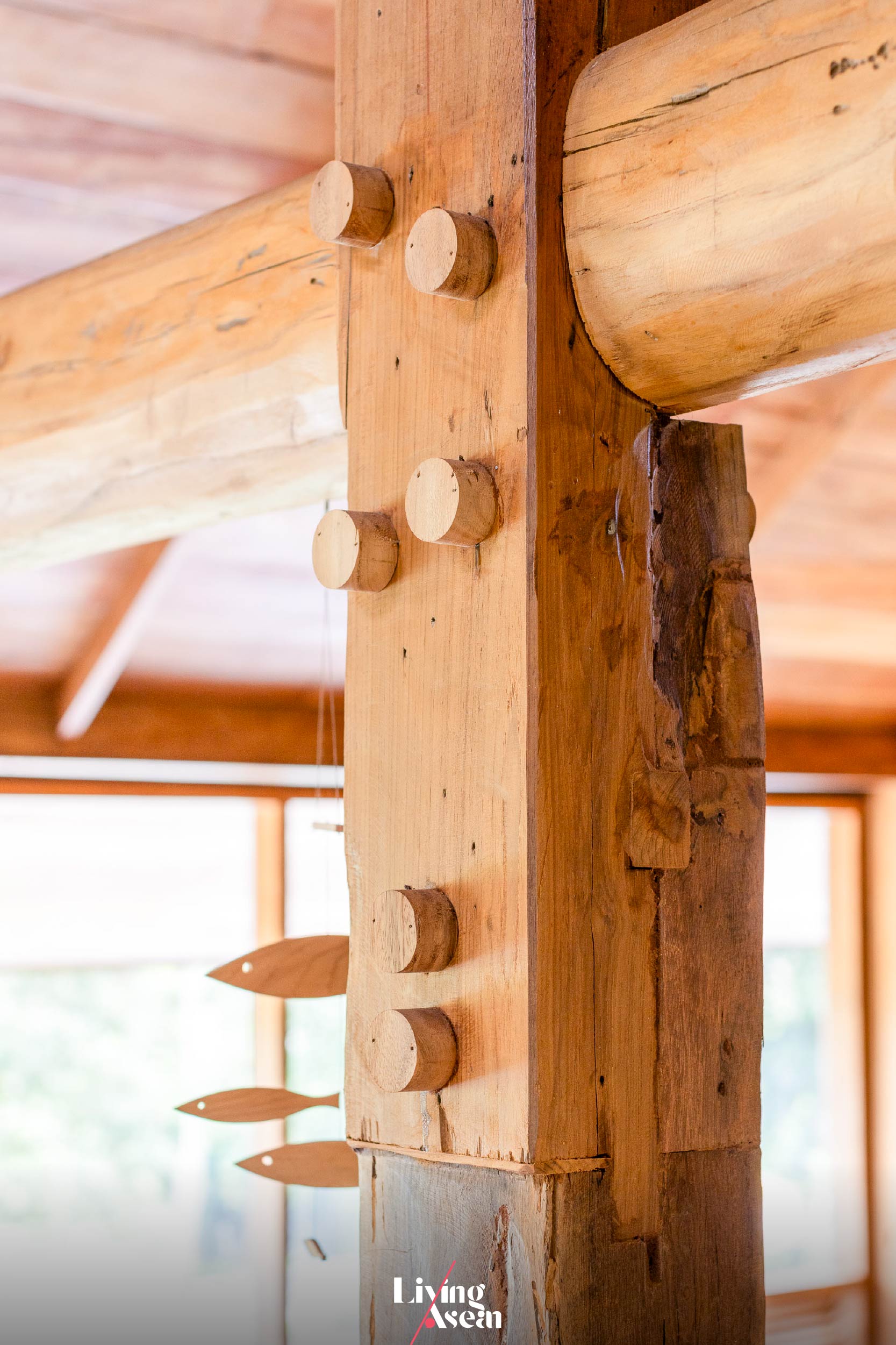
For a neat appearance, wooden knobs conceal the pins that secure mortise and tenon joints in place, a preferred technique to build strong timber framing. The architect sought advice from an artisan/village elder skilled in traditional carpentry to do this. Reclaimed four-sided posts and round log beams fitting together like wooden toys add visual interest to the interior.
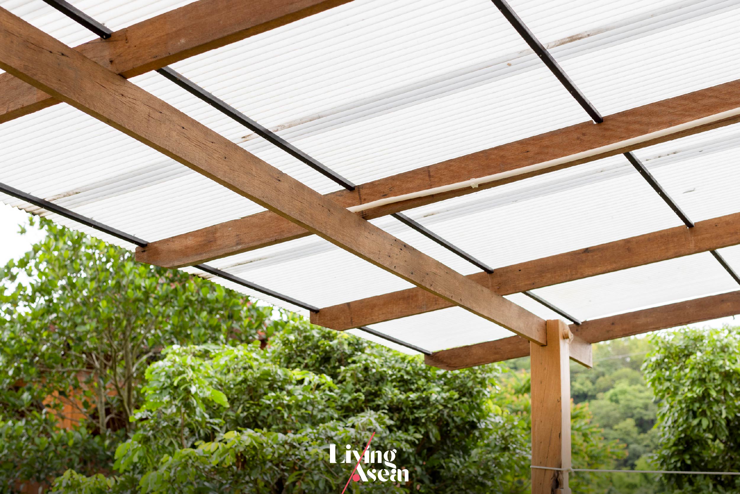
The roof over the front porch is covered with a corrugated translucent material that reduces the amounts of light passing through. The load-bearing posts, beams and joists are made of hardwood for durability. Rafter tails are cut at an angle for a lightweight look and maximize the drip-off distance from the building. Plus, it allows rain gardens to make the most of runoff water.

The new contemporary vernacular home is named Baan Suan Athisthan for a good reason. The word is Sanskrit for a resolute mind or strong will to find inner peace and happiness. Like so, Supawut created this awesome place to be a home of peace, one that seeks reconnections with the natural world and the community to which it belongs.

More than anything else, it’s a little humble abode that provides a learning environment for kids, plus a close and harmonious relationship with others in the neighborhood.
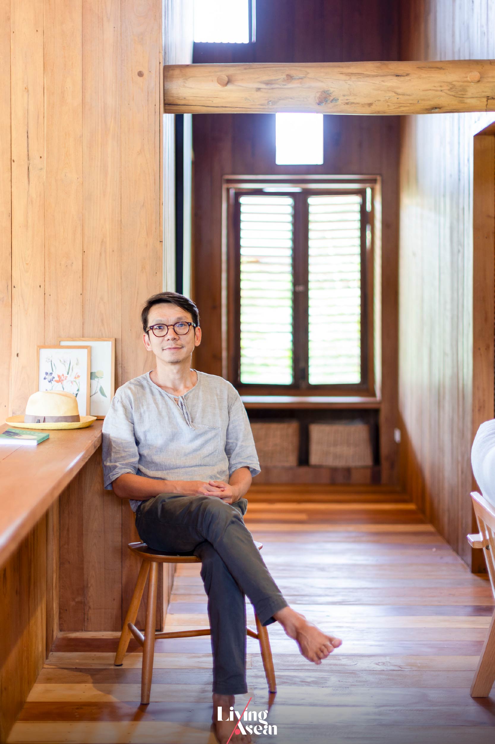
The homeowner and project architect, Supawut Boonmahathanakorn, of Jai Baan Studio.

Owner/Architect: Supawut Boonmahathanakorn of Jai Baan Studio (www.facebook.com/Jaibaan)

Building contractor: Banjerd Atelier

Woodwork artisan: Pongsakorn Yuennoi, aka Sala Kew


Visit the original Thai article…
“บ้านสวนอธิษฐาน” บ้านไม้พื้นถิ่นร่วมสมัย


You may also like…
Nong Ho Holiday Home: Tranquility in the Midst of Nature

Supawut BoonmahathanakornSupawut Boonmahathanakorn, Jai Baan Studio: Striking a Balance between Human Needs and Nature Conservation through Thoughtful Environmental Design

The Thingamajiggy Coffee Roaster: Rice Granary Adapted for a New Use as Café amid the Rice Fields

The Thingamajiggy Coffee Roaster: Rice Granary Adapted for a New Use as Café amid the Rice Fields

/ Chiang Mai, Thailand/

/ Story: Ektida N. / English version: Bob Pitakwong /

/ Photographs: Rungkit Charoenwat /

Here is a café and roastery with an ear-grabbing name. The Thingamajiggy Coffee Roaster stands in the middle of the rice fields of Chiang Mai’s Mae Rim District. A metamorphosis of purpose, it’s performing a new function as café with panoramic views of the stunning mountain landscape. The brand may be hard to say, but it certainly holds the attention of listeners while its rustic appearance merges into the farmhouse vernacular symbolic of the Northern Region.

Chiang Mai Cafe Rice Fields Thingamajiggy Coffee Roaster

The room of this Chiang Mai café in itself has only 21 square meters of space. At the outset, that was a difficult situation that tested the ability of the design team at Yangnar Studio, a homegrown atelier based in Chiang Mai. But they stepped up to the challenge by creating a functional business space, in which everything on the premises was fused into a single entity.

And the result of all this? A piece of vernacular architecture worth remembering. It’s a wholesome destination for coffee lovers that fits right into its surrounding farmlands and the reality of simple life in the countryside.

Chiang Mai Cafe Rice Fields Thingamajiggy Coffee Roaster
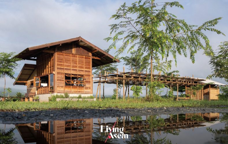
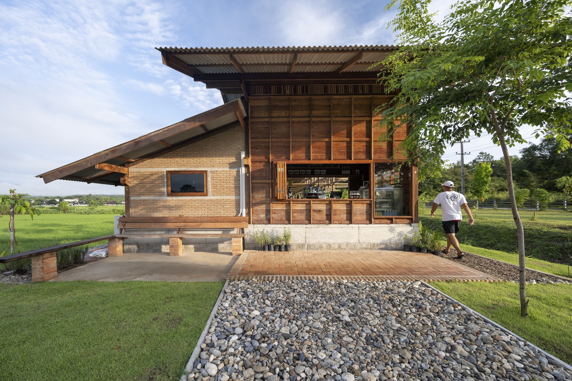
Built by locals using local building materials, the small coffee shop merges beautifully into farmland vernacular.

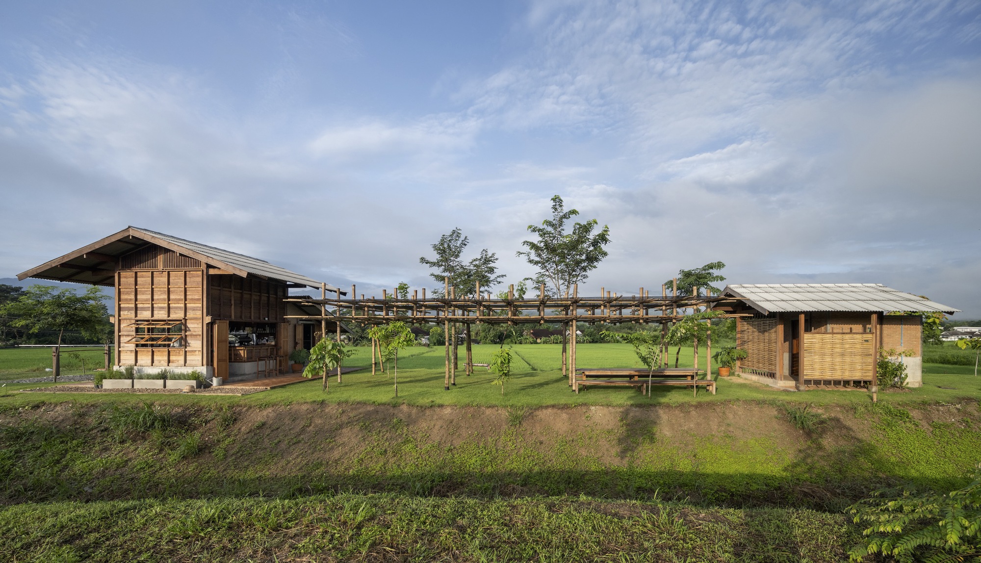
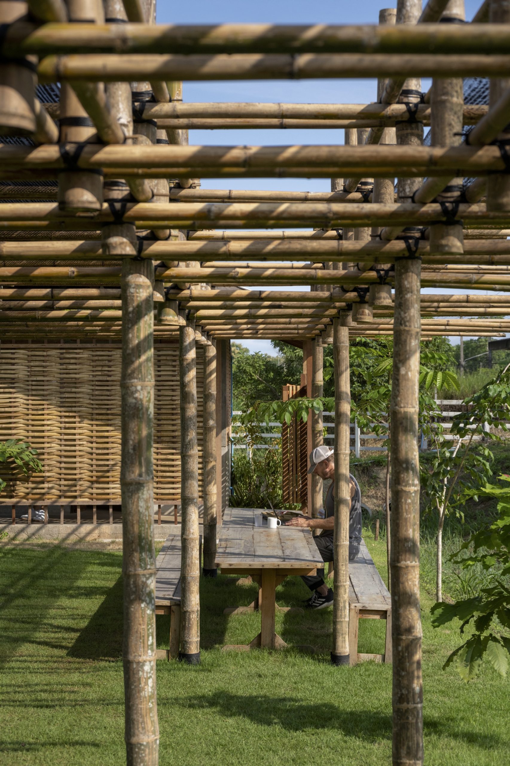
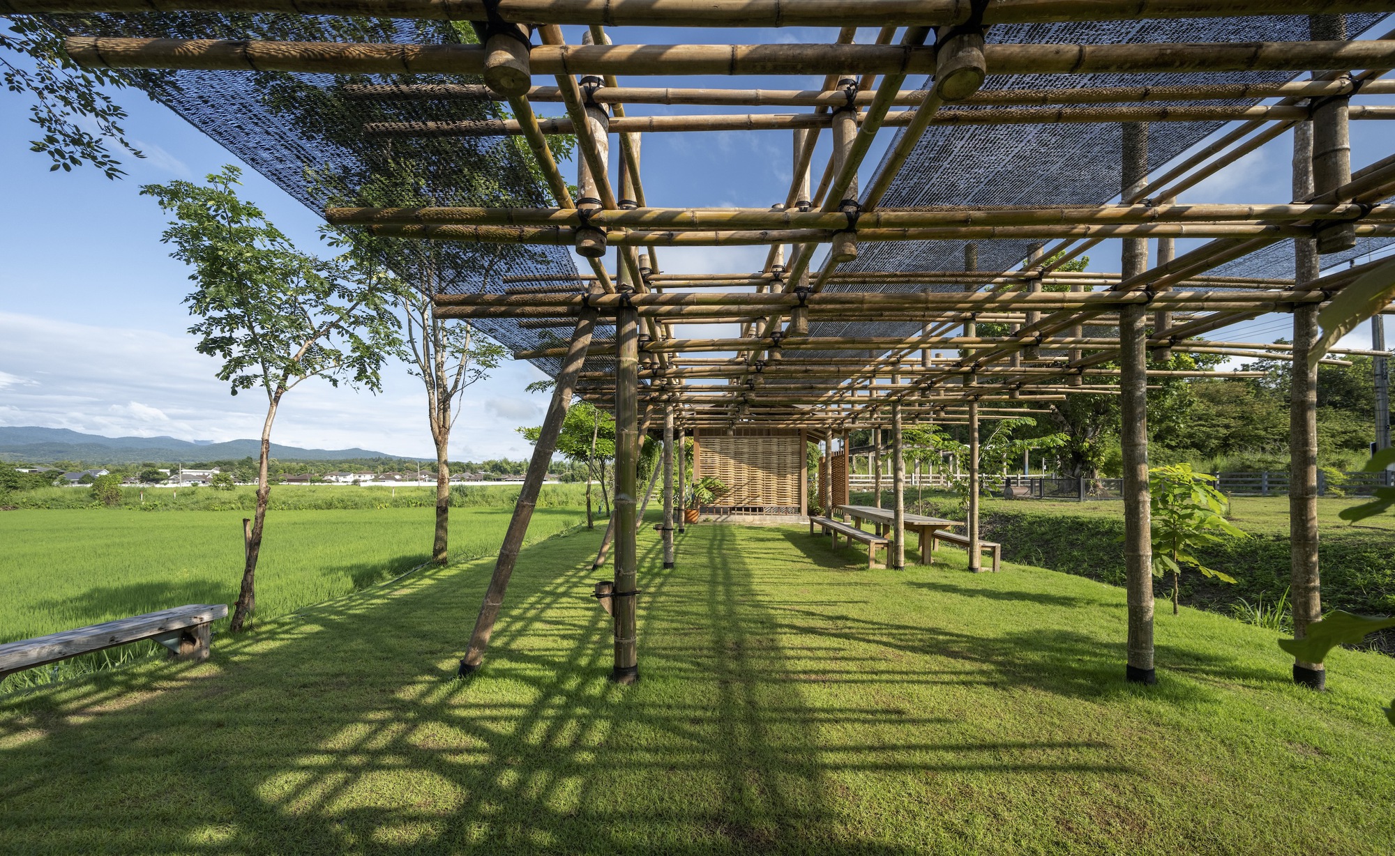
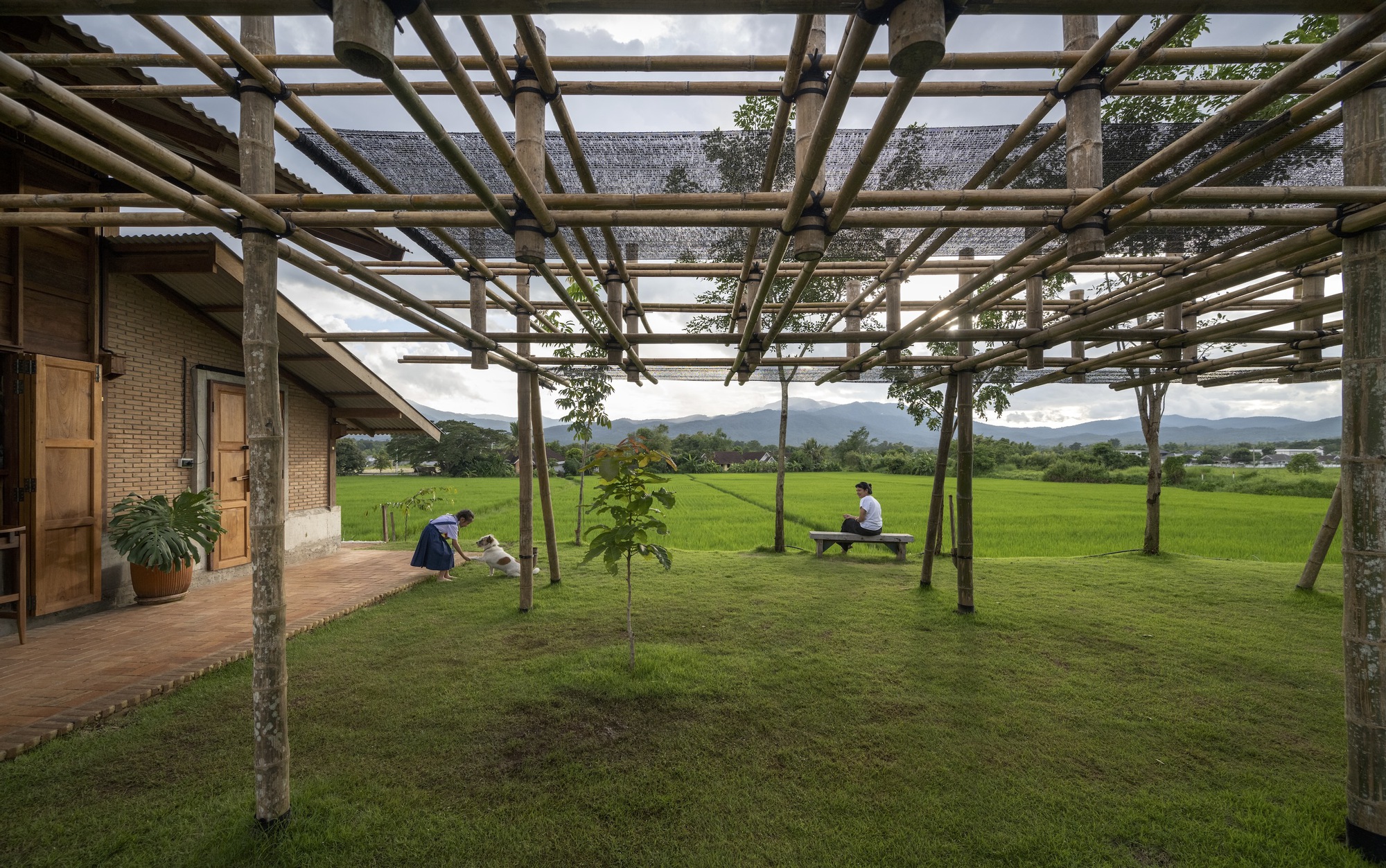
To begin with, the project owner wanted an oasis of calm where customers could sit back and relax as they enjoyed a good cup of coffee with nothing to obscure the view of the landscape. The design team responded with a three-part plan, including a small coffee shop at the front, followed by a cozy sitting area under a bamboo pavilion, and a restroom building at the farthest end.

Here, a 360-degree-view that changes from season to season can be seen all year round. Like a wallpaper from nature, it’s a design that seeks to connect more closely with the natural world for lighting and ventilation. Hence, there’s no need for air conditioning, which translates into huge savings and contributing in its small way to a sustainable future.

Chiang Mai Cafe Rice Fields Thingamajiggy Coffee Roaster
Going in the reverse direction, slat wood wall paneling is installed on the inside while supporting vertical beams or columns are on the outside.

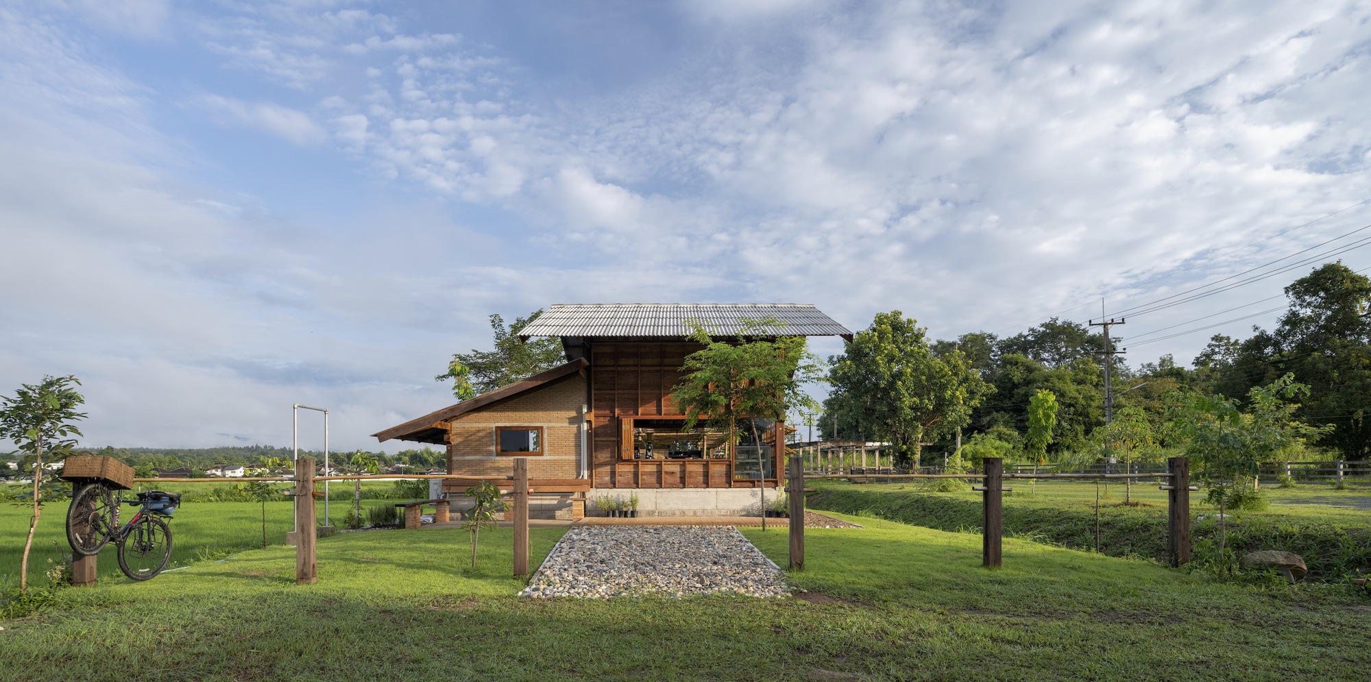
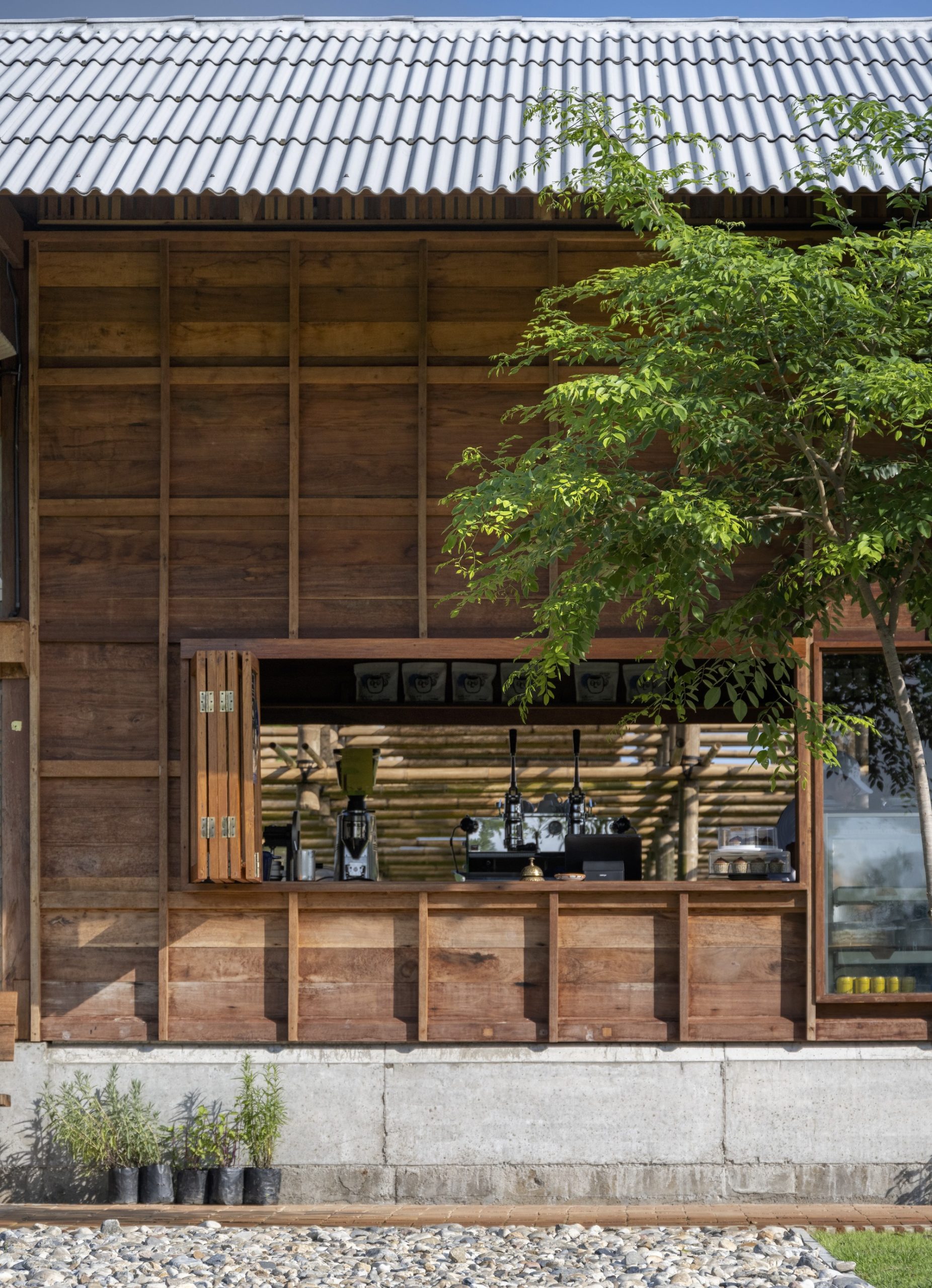
In terms of design, the coffee shop gets its inspiration from old rice granaries commonplace in this part of the country. The interior holds a coffee bar service/ordering area complete with an assortment of bakery goods. Nearby, a west-facing bakery room provides insulation against hot afternoon sun, thereby keeping the bar and customer seating area cool and comfortable.

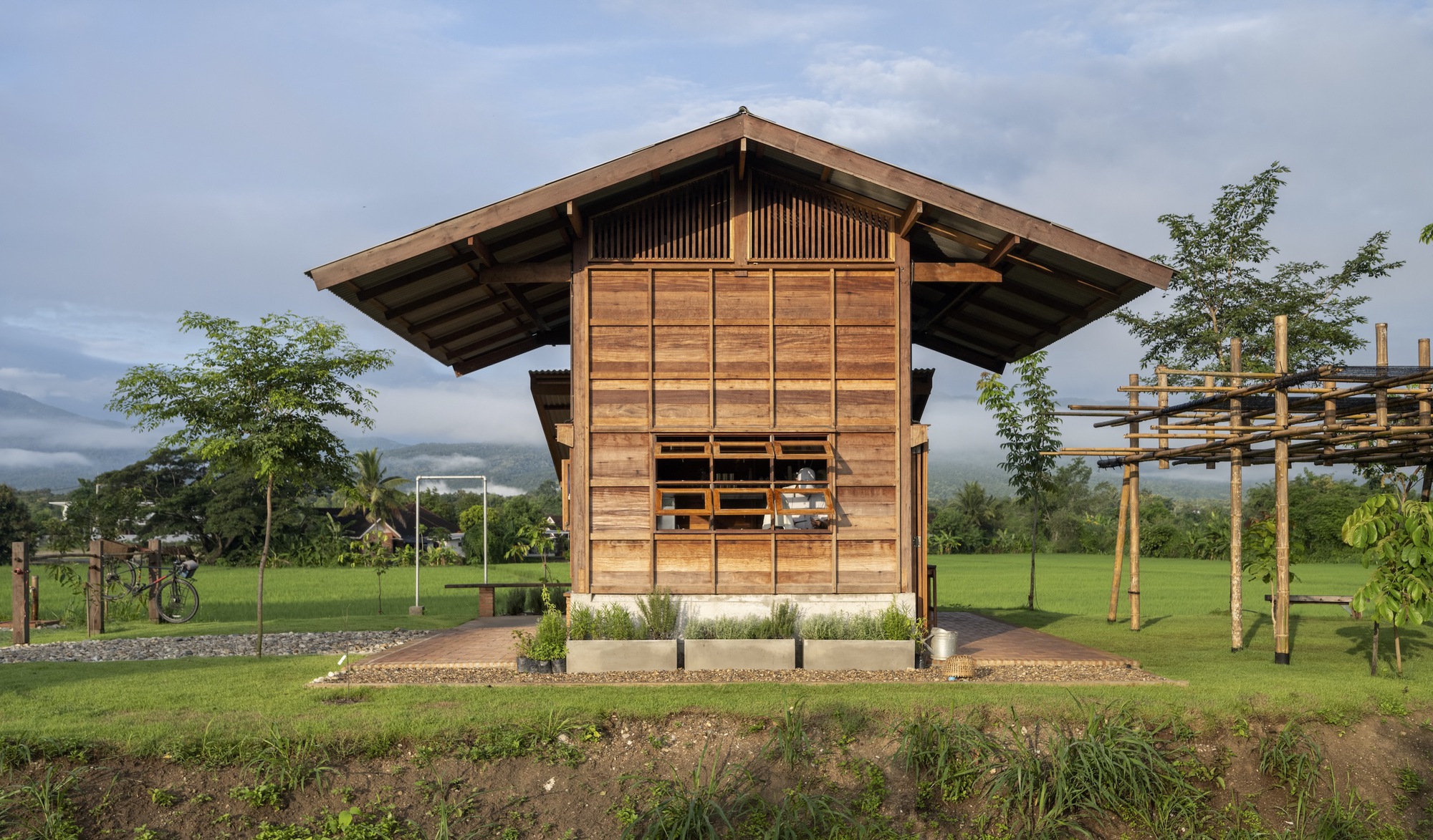
Plus, double height ceilings add a light and airy atmosphere to the room. From the outside, what looks like a two-story building is in fact a cross ventilation system which relies on wind to blow cool outside air into the room through one side, while warm inside air is forced out through rooftop vents and outlets on the opposite side.

Chiang Mai Cafe Rice Fields Thingamajiggy Coffee Roaster
Extended eaves overhanging the exterior walls offer protection against too much sun and rain.
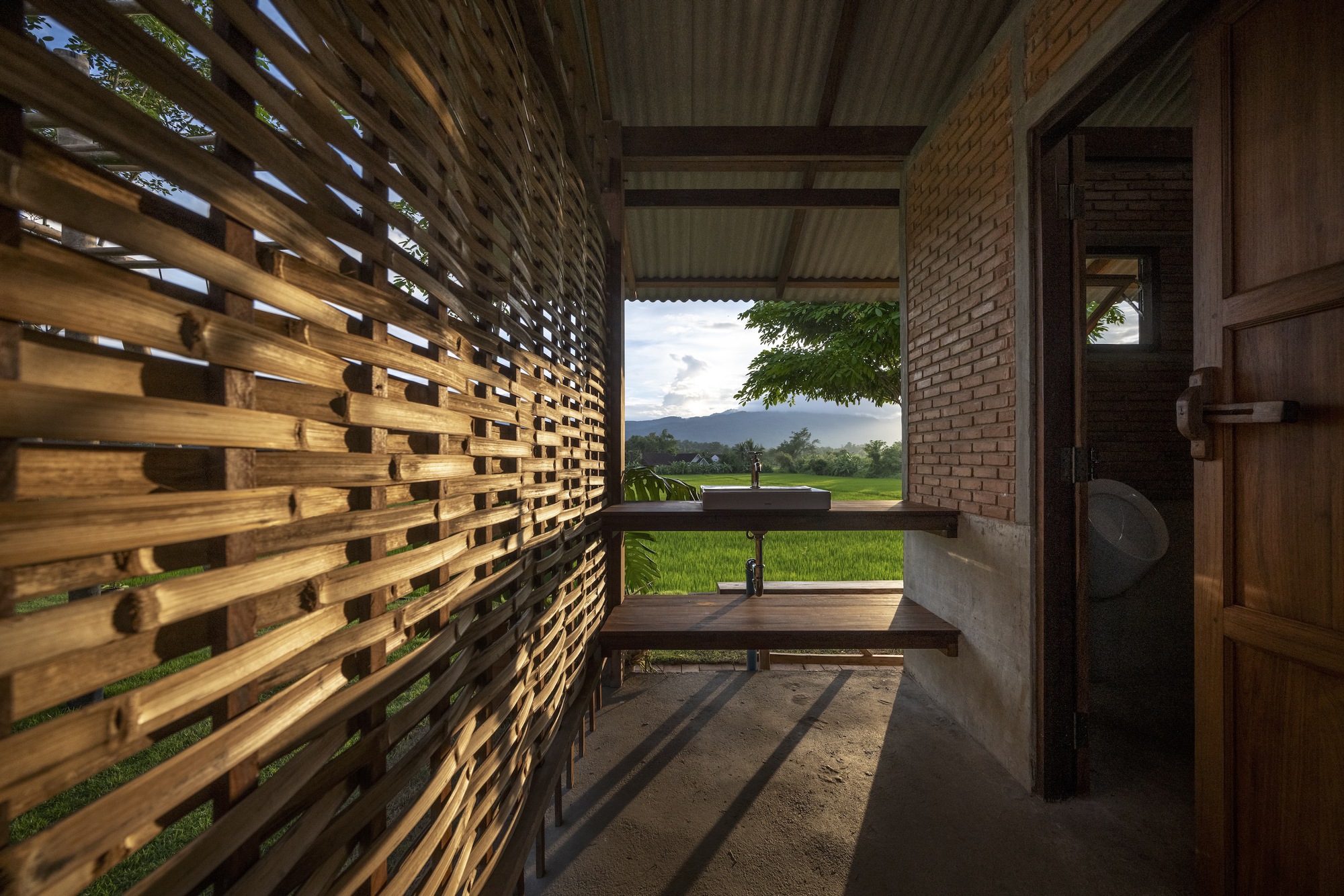
The building’s external envelope crafted of bamboo splits creates a more open and airy atmosphere in the room, plus it protects against humidity damage.

The little café amid the rice fields is built by artisans skilled in traditional carpentry using timber and other natural ingredients readily available in Chiang Mai, except for the load-bearing foundations that are made of poured cement or concrete to protect against soil moisture damage. As is the case with rice granary construction, slat wood wall paneling is installed on the inside while supporting vertical beams or columns are on the outside.

Apart from retaining much of its architectural heritage, the reverse exterior walls add visual interest that merges with a massive gable roof designed for sun and rain protection. In the fewest possible words, it’s a picture of modern countryside ideas blending together beautifully into one cohesive whole.

Chiang Mai Cafe Rice Fields Thingamajiggy Coffee Roaster

To make customers feel comfortable, this Chiang Mai café amid the rice fields has patio and outdoor furniture that can be set up anywhere under the bamboo pavilion canopy. It’s a relaxation room that conveys a great deal about the humble origins of mankind and their responsibility towards nature.

To reduce the chance of exposure to harmful substances, the bamboo shades and blinds are not chemically treated to extend their longevity of life cycle. It’s a design based on the belief that everything changes and everything will be replaced when the time comes.

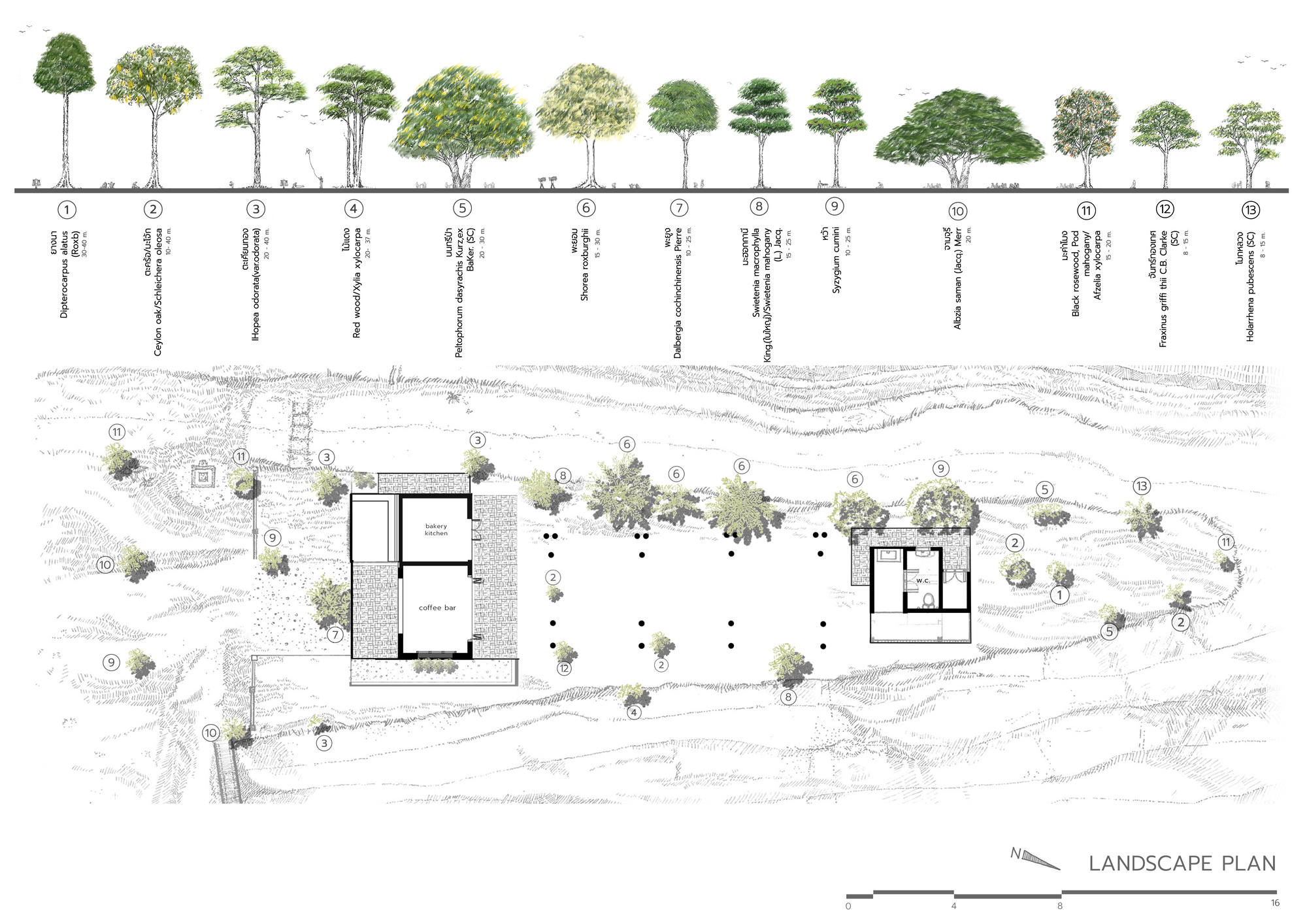
A drawing of the floor plan shows functional spaces in relation to the trees and shrubbery thriving on the property.

The same applies to the method of construction that’s simple and straightforward. Take for example the bamboo pole footings that are wrapped in plastic bags for protection against humidity damage. Or the overhead black mesh rolls that create diffuse light and protect against the sun’s harmful UV rays. They, too, get changed from time to time to ensure customer comfort and satisfaction.

Chiang Mai Cafe Rice Fields Thingamajiggy Coffee Roaster
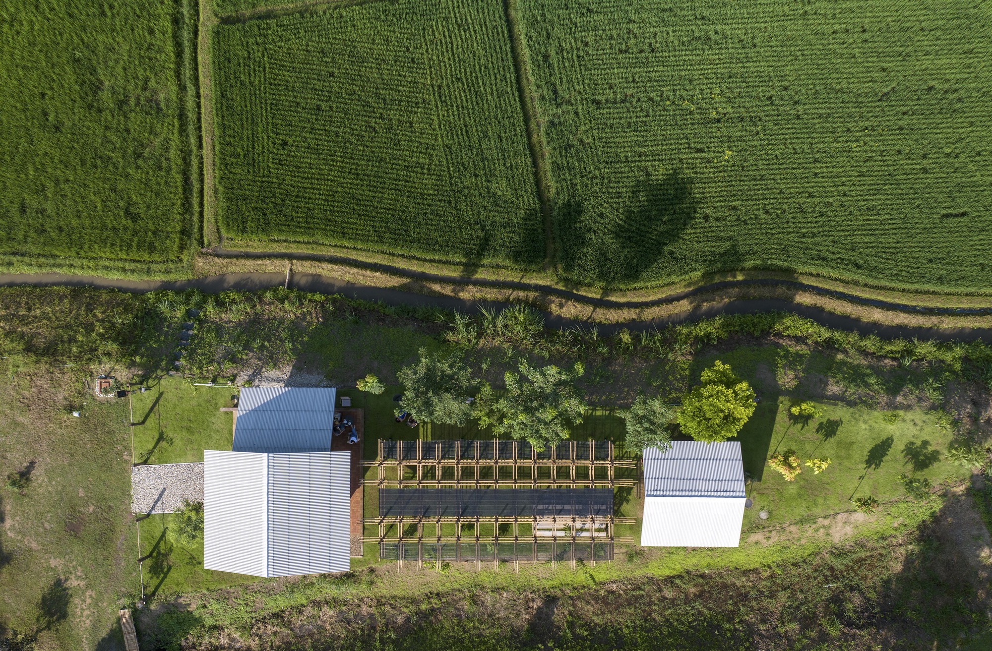
For a full view of the landscape, the three buildings are set in a direction parallel with the elongated plot of land.

Architect: Yangnar Studio (www.facebook.com/Yangnarstudio)

Lead Architects: Dechophon Rattanasatchatham, Apiwat Chainarin

Construction Supervisors: Rungroj Tansukanun, Metee Moonmuang

Builder Team: Yangnar studio builder team, Yaiwood


You may also like…

Lung Vai School: A Rammed Earth Schoolhouse Trio amid Mountains and Rice Terraces

Ahsa Farmstay: Relaxing Country Lifestyle


MA Architects Office: Integrating Natural Features in Workspace Design
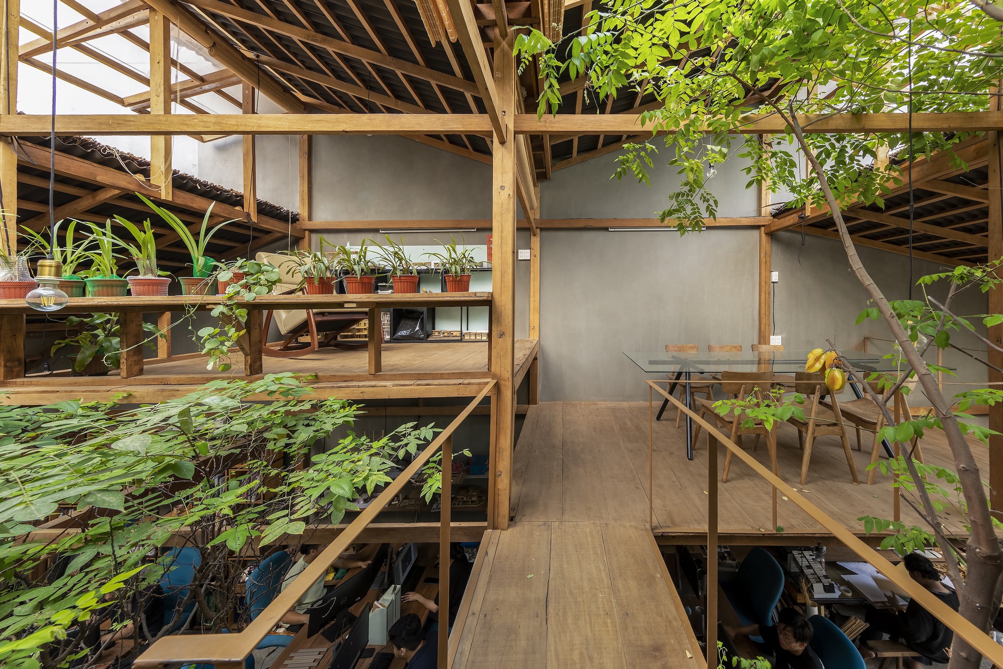
MA Architects Office: Integrating Natural Features in Workspace Design
/ Ho Chi Minh City, Vietnam /

/ Story: Kor Lordkam / English version: Bob Pitakwong /

/ Photographs: Paul Phan /

Overcrowding conditions in Ho Chi Minh City have given rise to both challenges and opportunities for the design team at MA Architects, a homegrown architectural practice in Vietnam. Back in the day, their office was on rental property with little to no room for flexibility. Albeit equipped with air conditioning and modern conveniences, the small workspace was lacking fresh air and ventilation, a far cry from the environment conducive to a relaxed atmosphere and creativity.
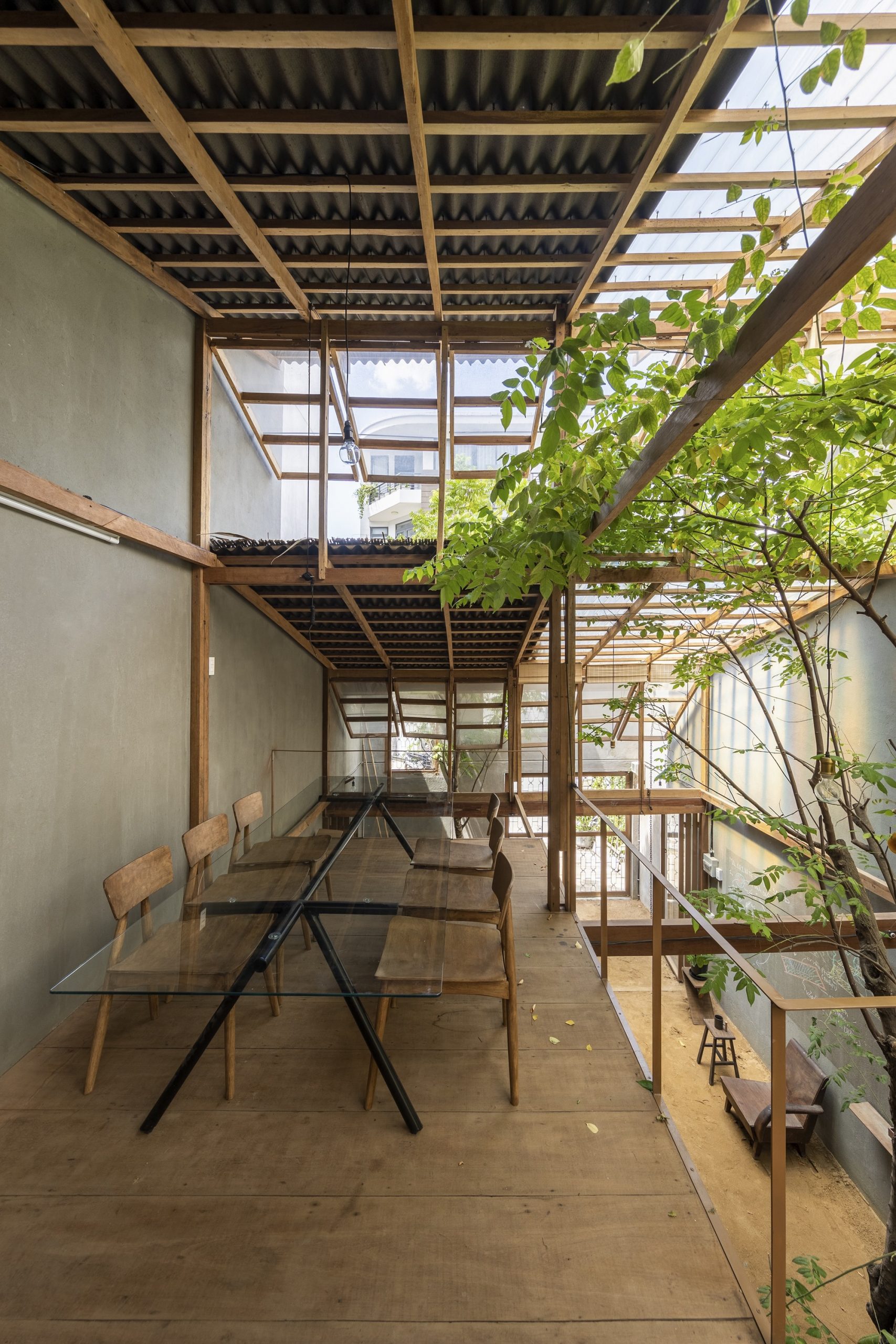
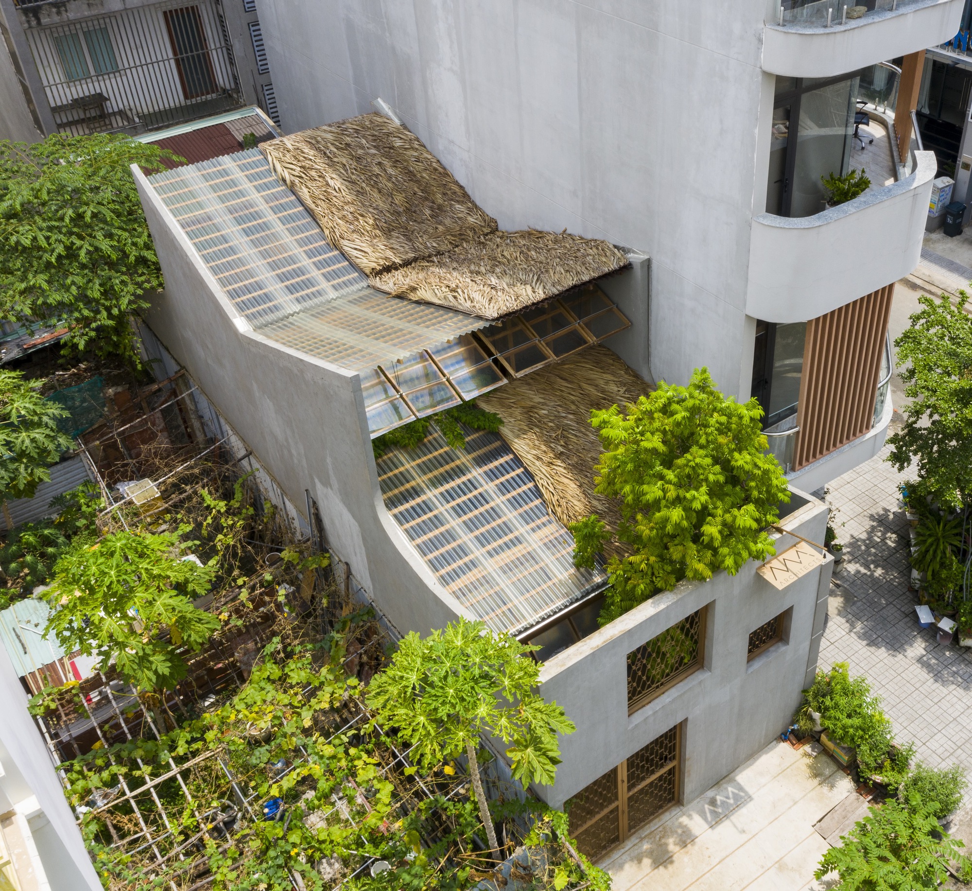
Coconut fiber coverings shield parts of the roof for best interior lighting and insulation.
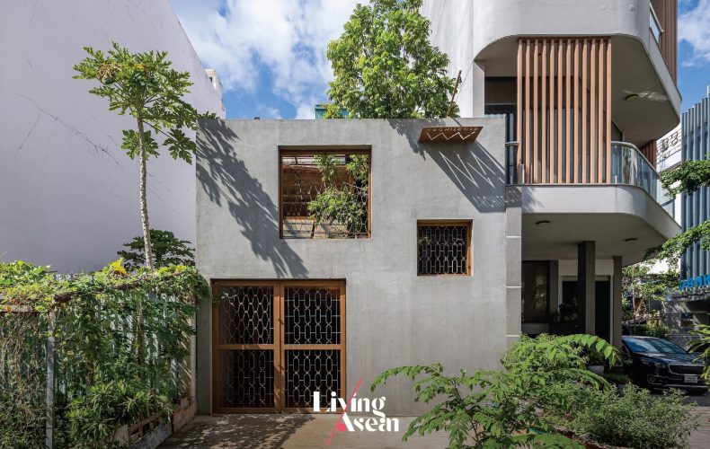
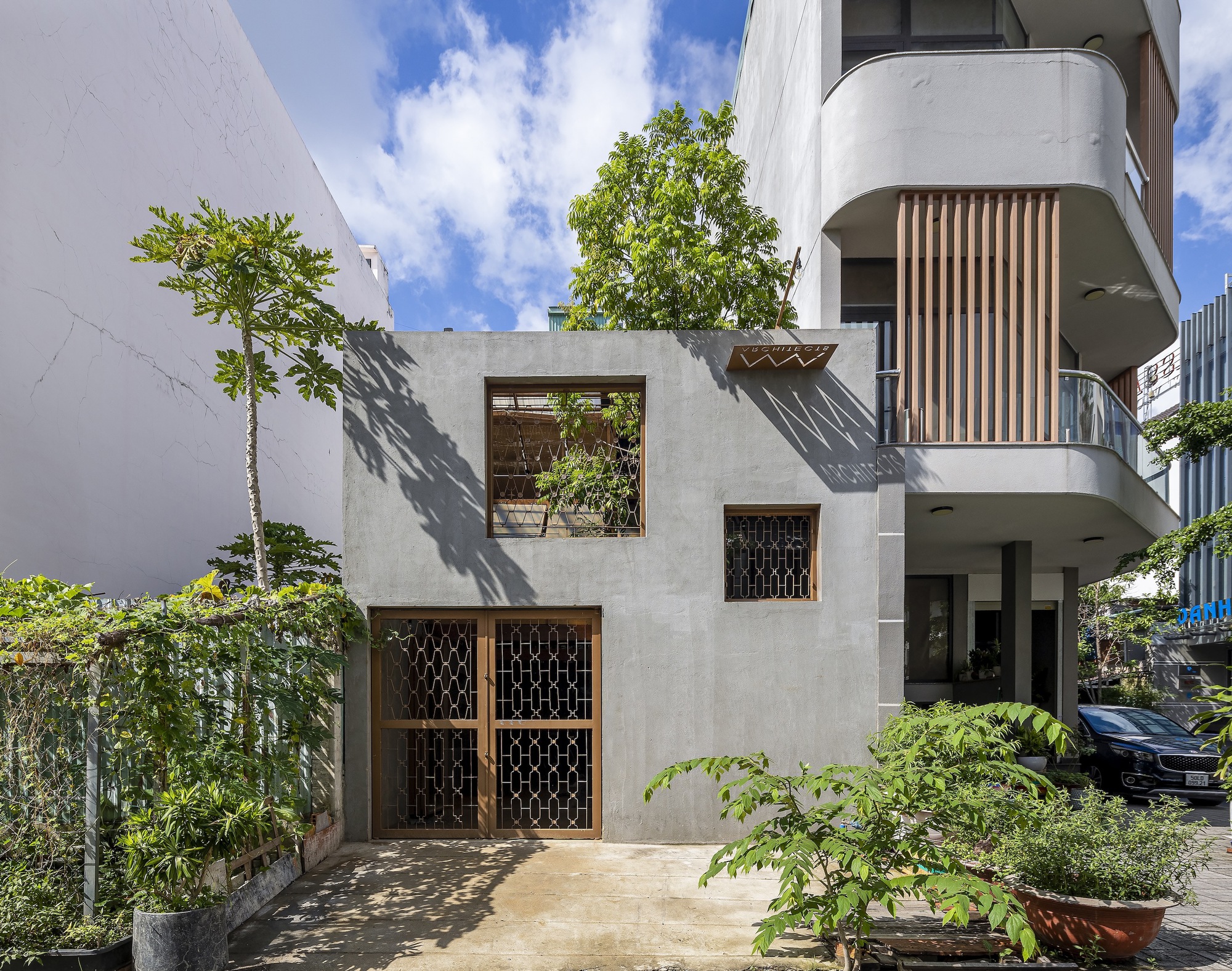
The front façade in cool-toned gray stands sandwiched between a vacant lot and a tall building on the street corner.

Because of that, they decided to break out of the confined space into a home of their own. The new office stands sandwiched between two properties, a tall building on one side and a vacant lot on the other. Its front yard landscape is infused with green foliage.

Thoughtfully devised, the design atelier with an awesome cool gray façade is open to plenty of sunlight and fresh outdoor air plus trees and shrubbery. And the result of all this: a workplace ambience free from disturbance, one that’s good for staff’s ability to create and stay focused on their tasks.
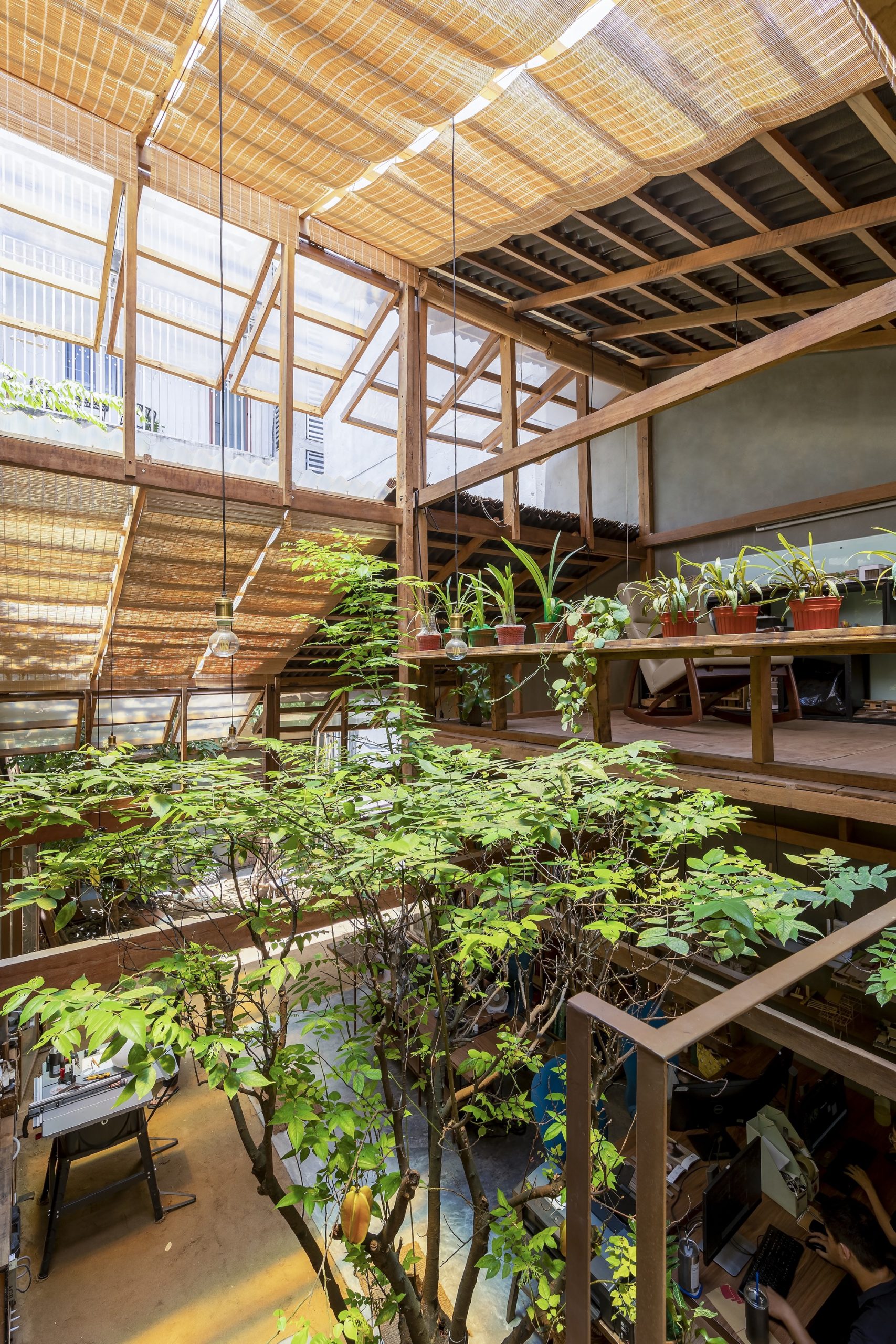
The hallway holds a reception room that’s light and airy.

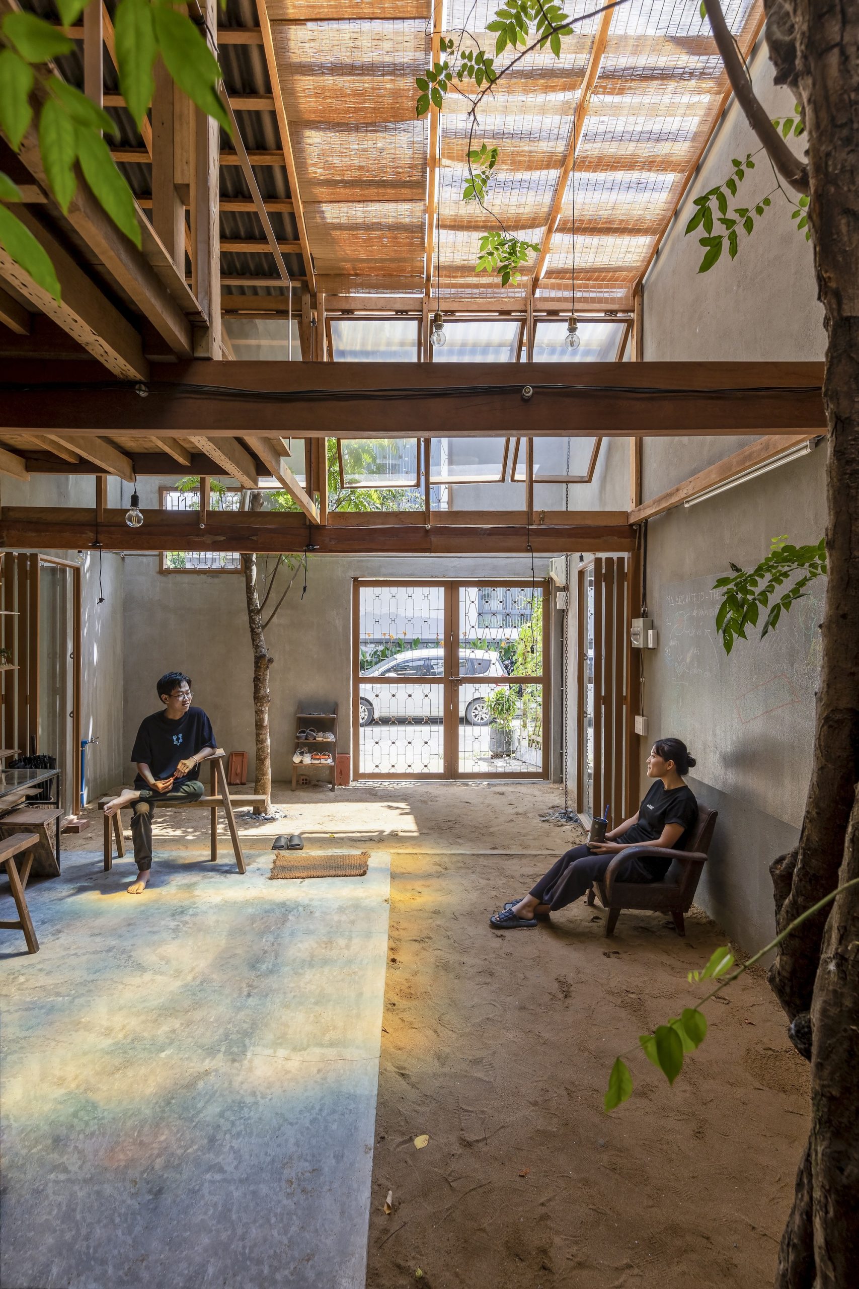
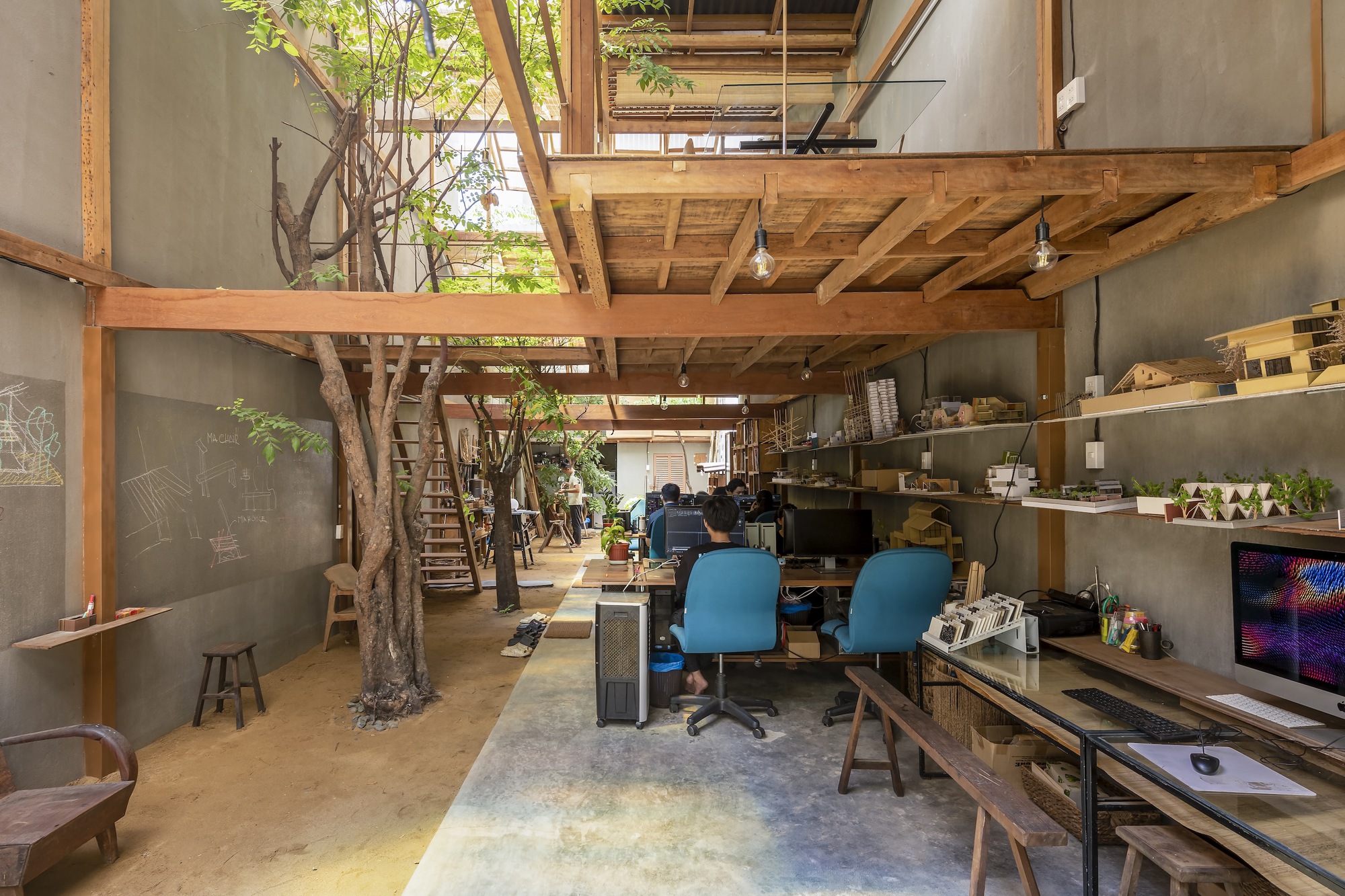
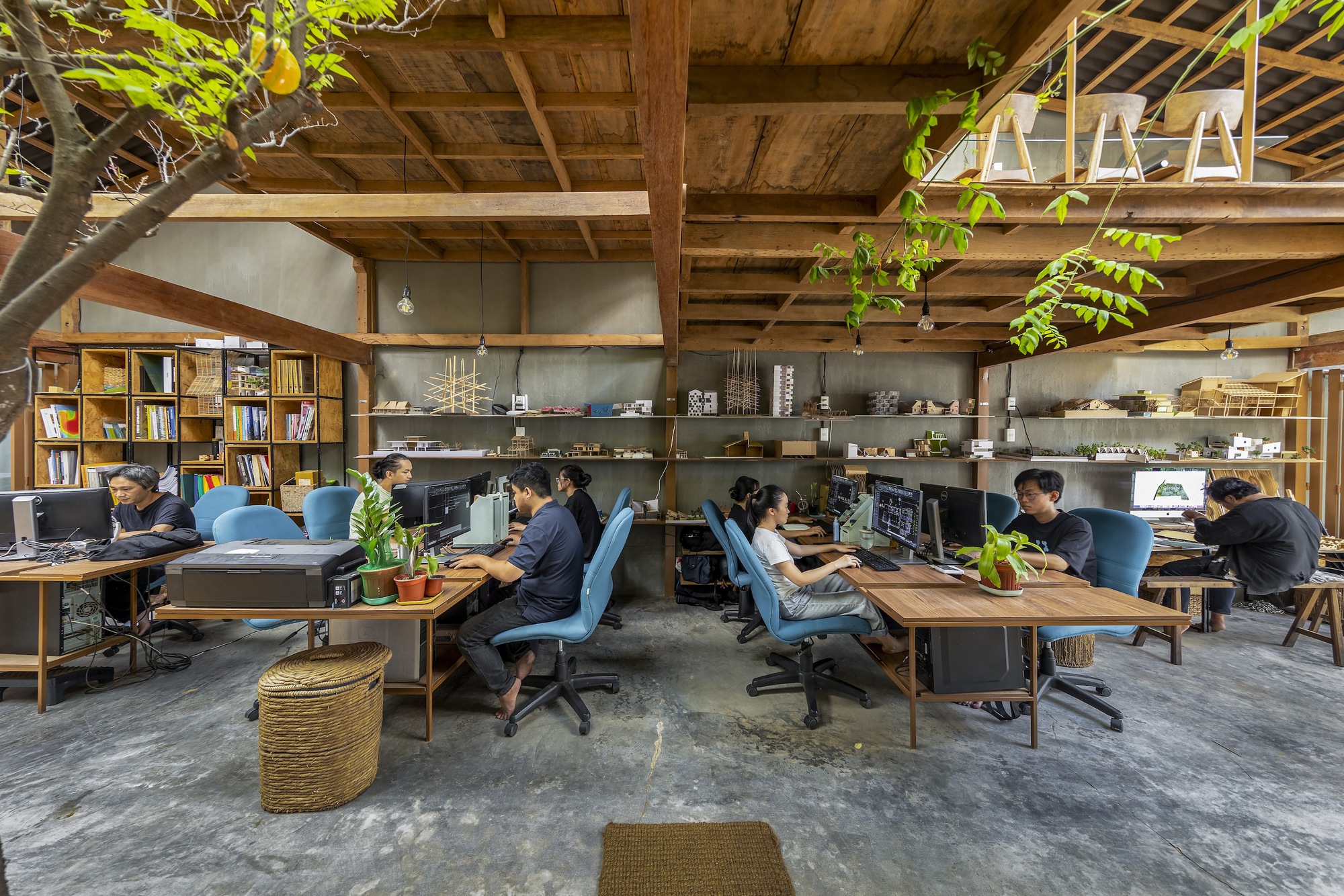
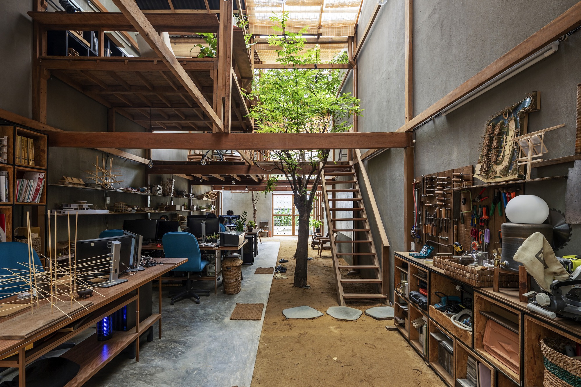
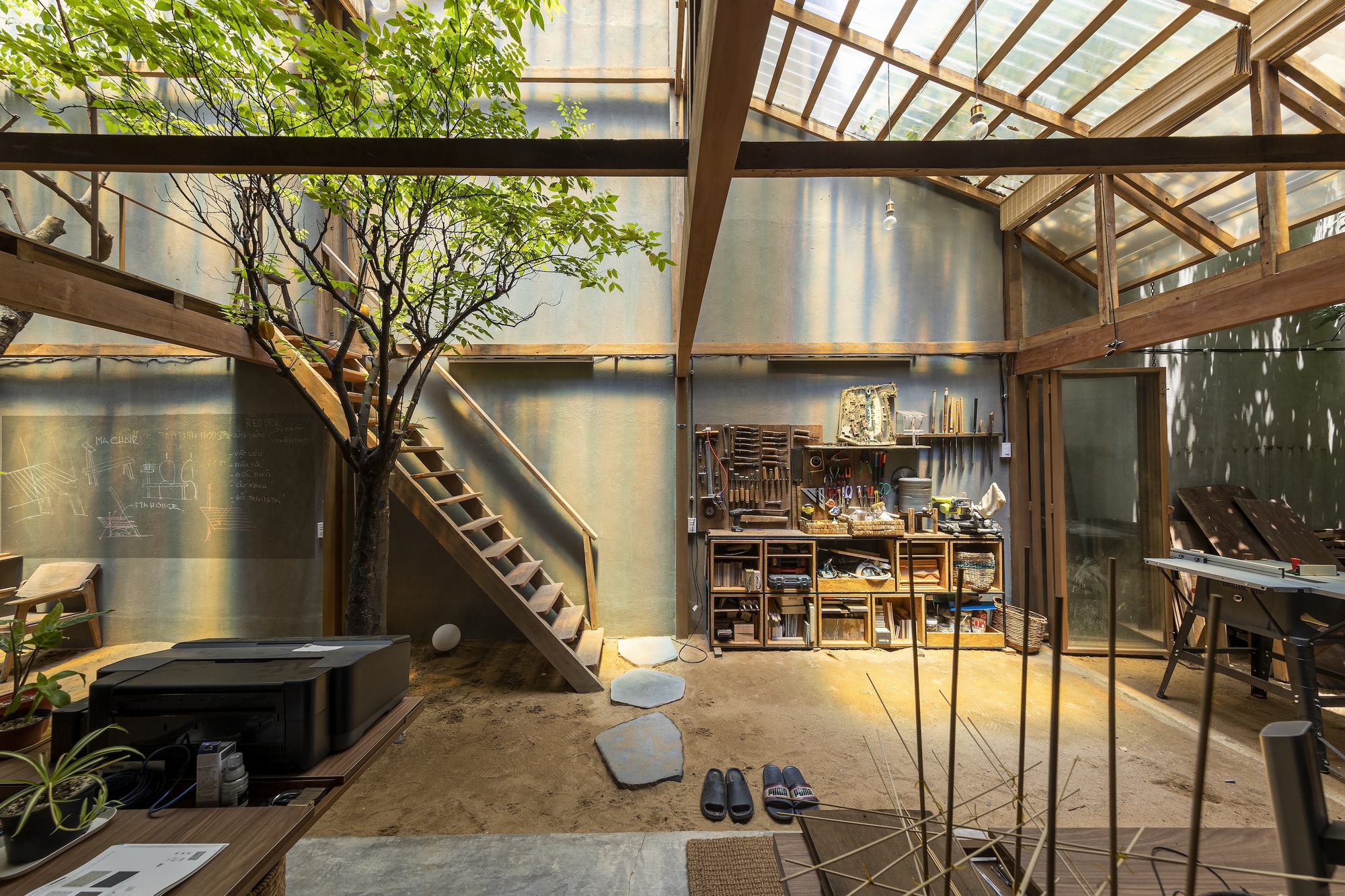
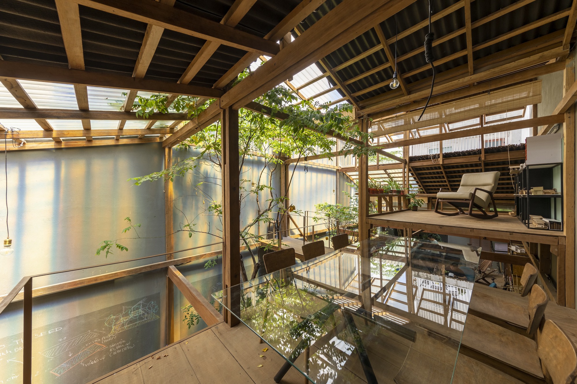
Bringing the outdoors inside, the office holds workspaces set on concrete slabs along one side and a strip of sand earth for in-ground gardening on the other.

The small, 100-square-meter office space is nestled in a peaceful city neighborhood. It occupies the full extent of a rectangular shaped lot measuring 5 by 20 meters.

The building has a narrow frontage to the street. Its external envelope is built of brick masonry plastered to form a smooth hard surface. In front of it, a small earthen terrace hemmed in by lush greenery provides a neat appearance.

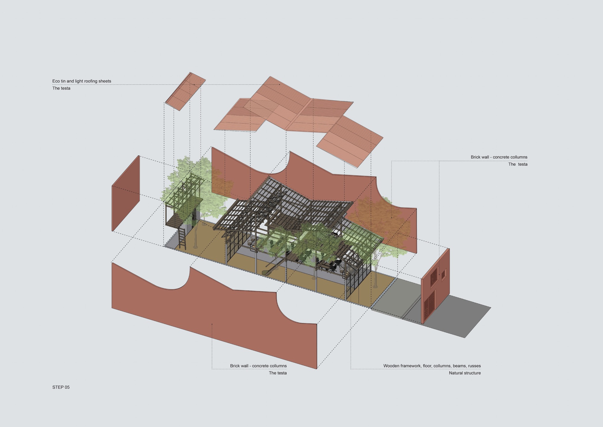
An isometric drawing shows three principal dimensions of architectural features with elements of nature integrated in interior design. / Courtesy of MA Architects
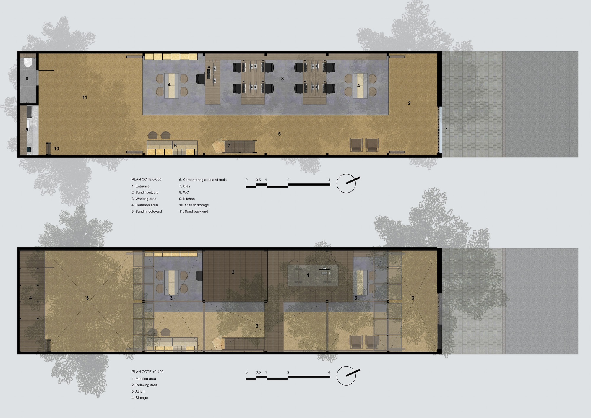
An architectural drawing shows the positioning of natural elements in relation to upstairs and downstairs rooms. / Courtesy of MA Architects
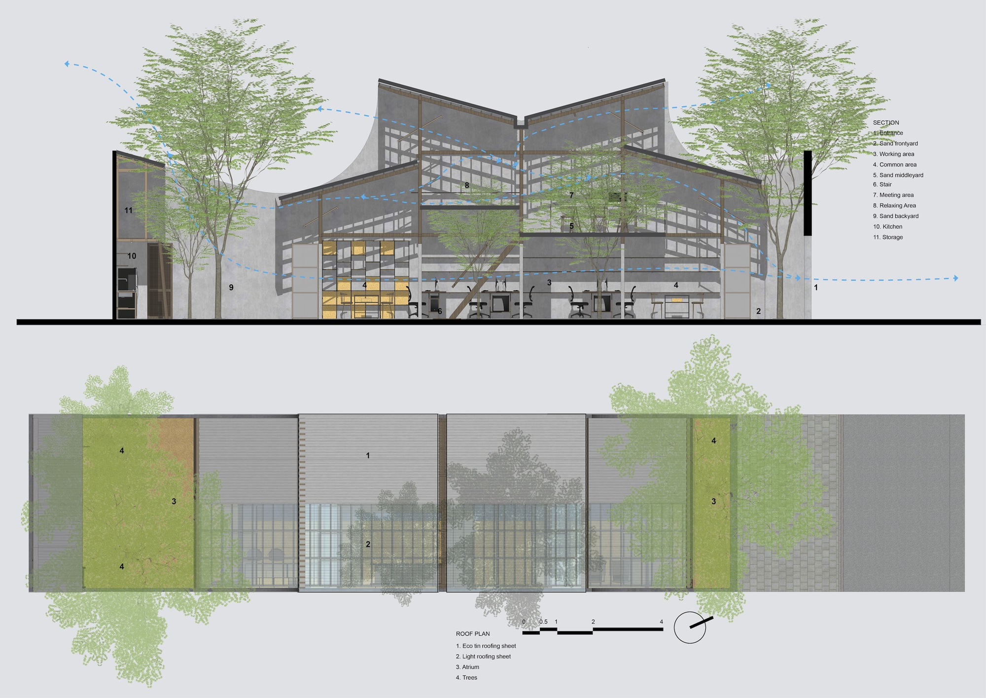
In cross section, a side elevation drawing illustrates cross air flow patterns through the workspaces and under the roof. / Courtesy of MA Architects
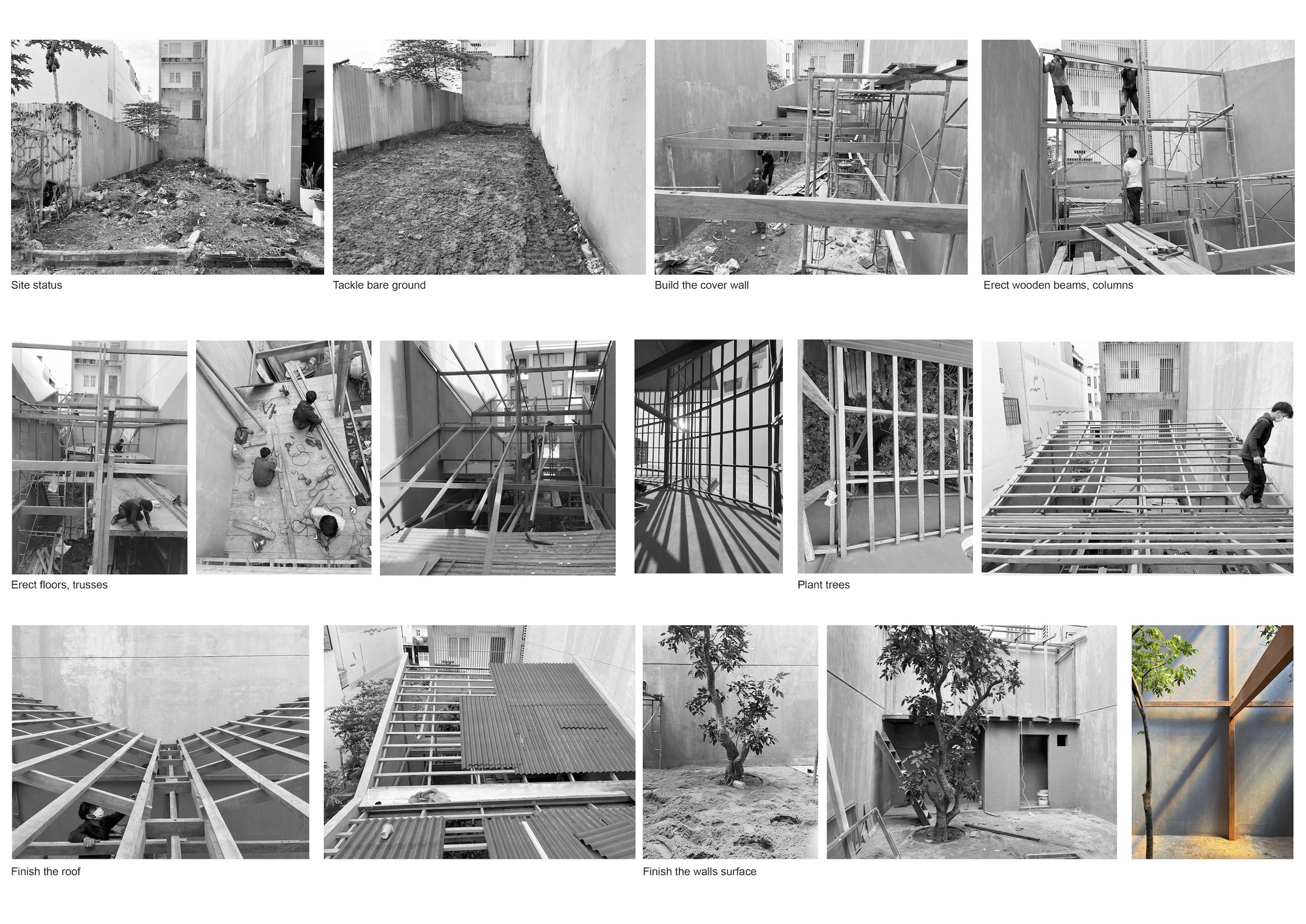
Flashback: A photo collage shows stages of construction in chronological order. / Courtesy of MA Architects

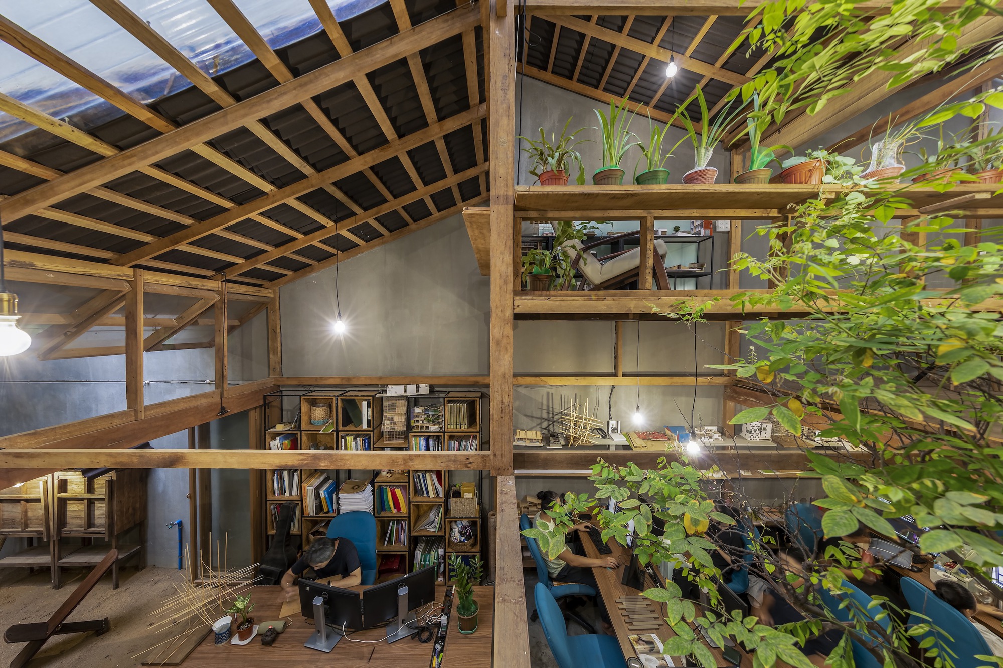
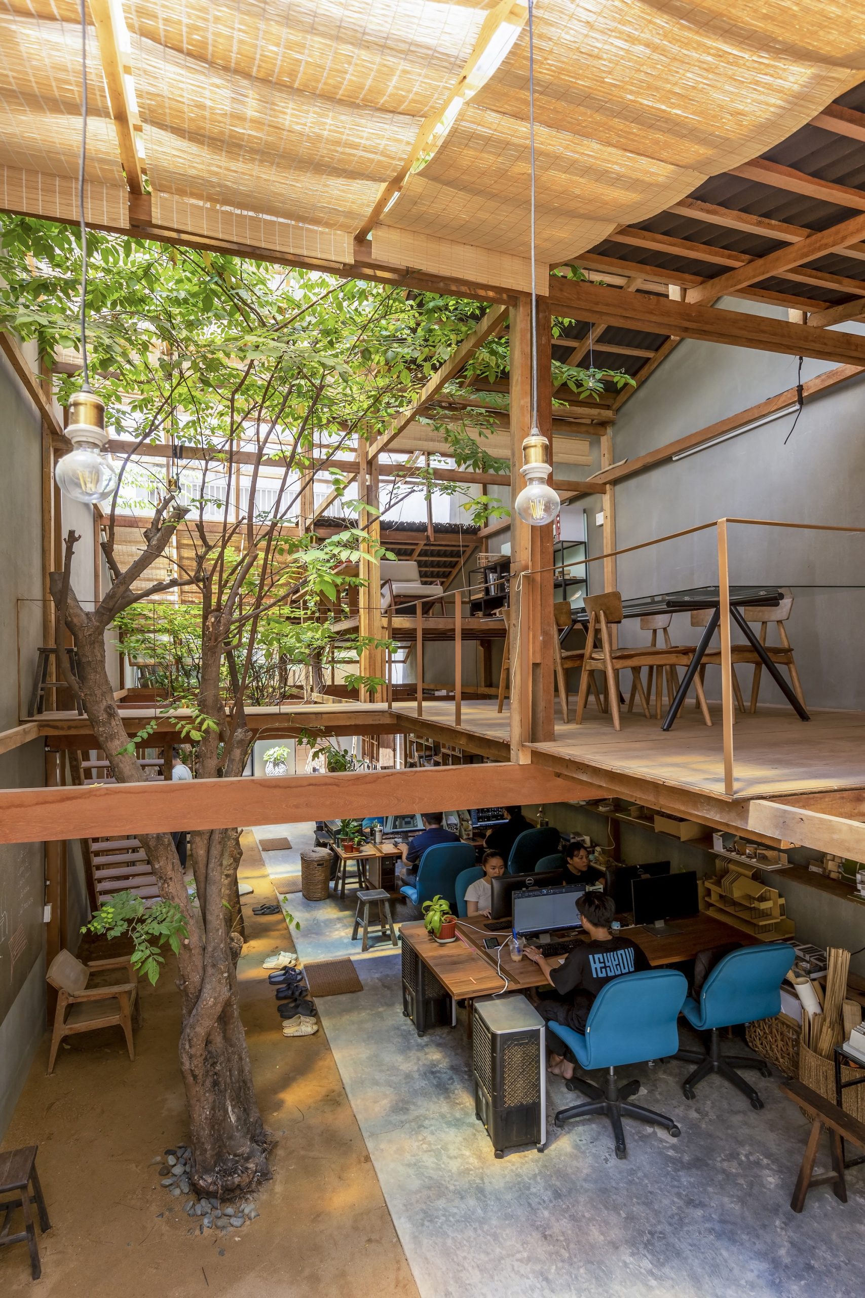
Downstairs, a spacious workplace lies connected to a woodworking shop in the back of the building. The meeting room is upstairs that’s open to allow plenty of natural daylight and cool breezes into the interior.

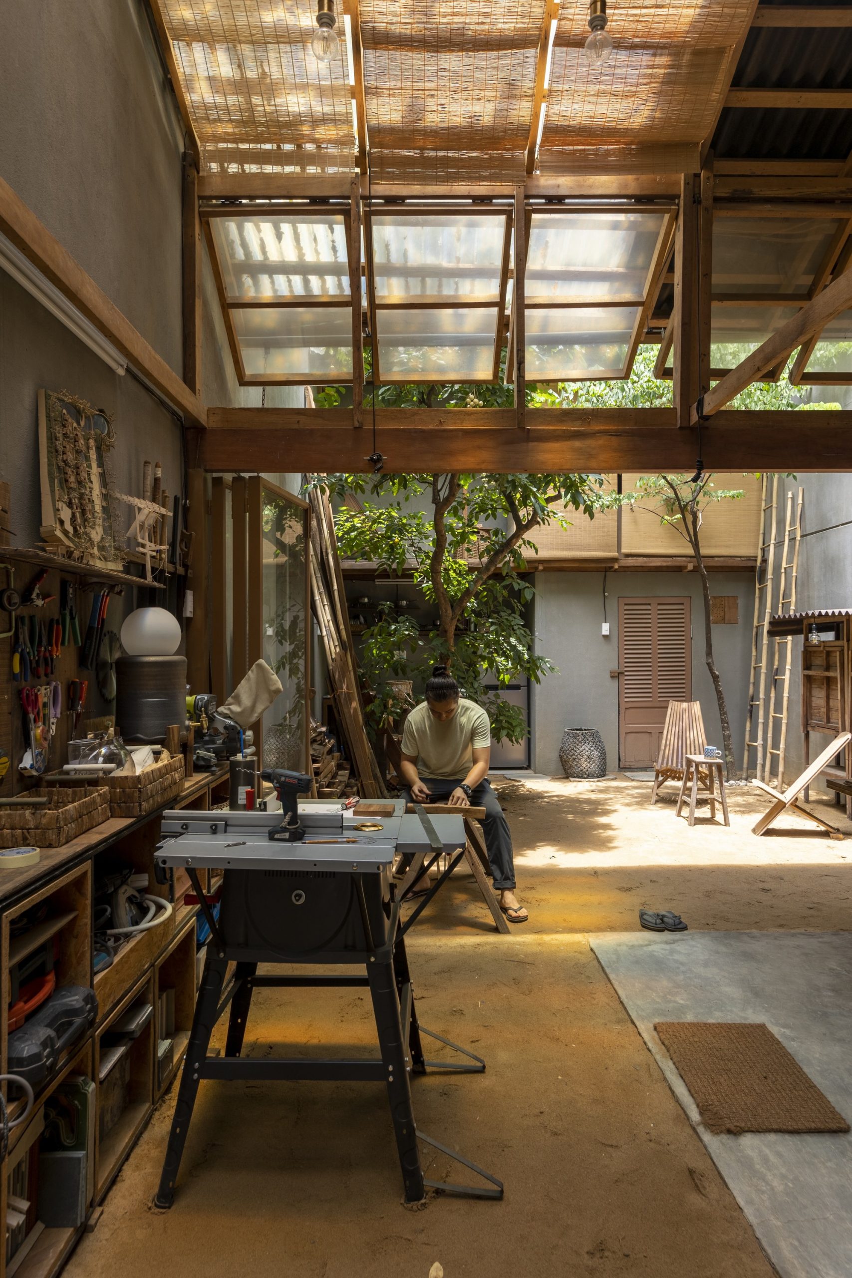
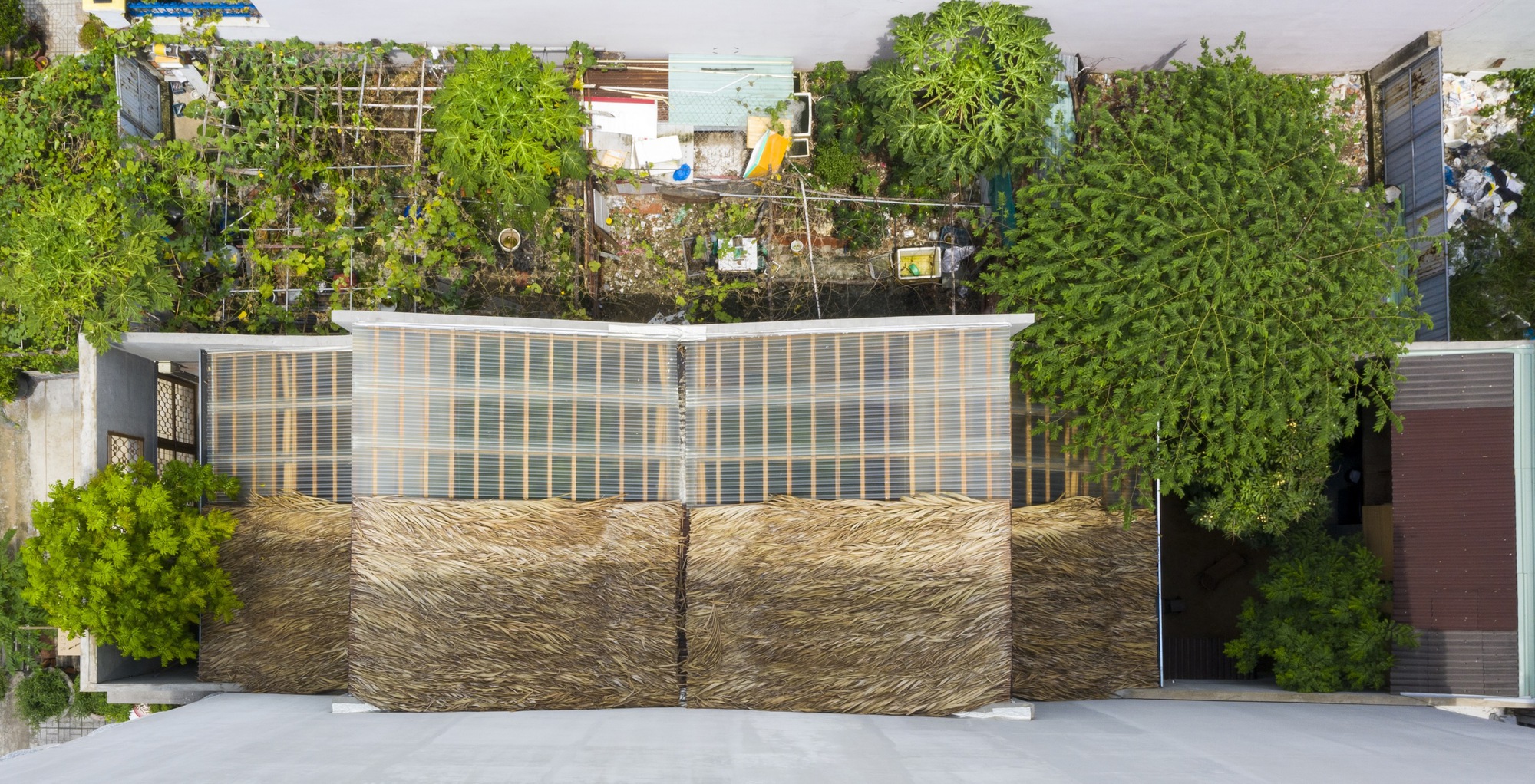
Overhead, the trusses that support the roof are made entirely of timber covered by transparent corrugated roofing materials for best indoor lighting. Where appropriate, sections of the roof are protected by dry coconut fiber coverings for insulation from the sun’s harsh glare.

A woodworking shop occupies the back room, from which a staircase leads to the second-floor meeting room.
The woodworking shop lies on the earth floor with a kitchen and bathroom at the farthest end.

Because when it rains it pours in the Tropics, it makes perfect sense to plaster the entire building envelope. The hard and smooth surface goes to work protecting the building from extreme heat and wet weather all year round.

Although relatively small in size, the office interior crafted of wood is impressive thanks to an open-concept, well-ventilated layout. While dry coconut fiber coverings over the roof make the interior feel cool and dry, the uncovered part works like a skylight turning indoors into a well-lighted place.

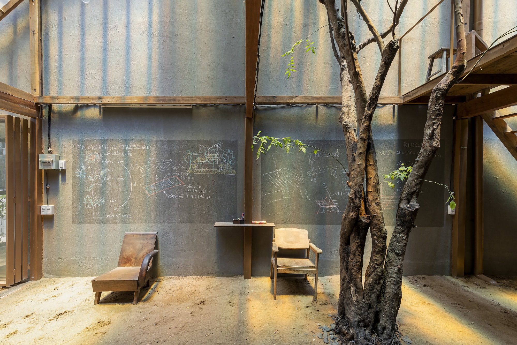
Besides light and wind, the architect also integrated other elements of nature in the design, among them earthen floors that cover parts of the ground level. Only the workspace and kitchen floors are made of concrete slabs for ease of use and safety.

Nearby, earthen floors add a warm, natural feel to the interior with plenty of room for growing plants in-ground. As the architect puts it, being in the middle of the hustle and bustle of the city, anything that brings a touch of nature, however small, is priceless.

The second-floor meeting room is open to natural daylight and connects to the trees.

A building material of choice, earthen flooring makes it possible to fill the interior with healthy green foliage along the entire wall. Earth and sand absorb and release some moisture, which contributes to a relaxed indoor ambience.

At the same time, vegetation in the front yard and decorative indoor plants both in ground and in containers go to work in tandem keeping the new office building cool and cozy just like home.


Architect: MA Architects (www.facebook.com/mastudiovn)


You may also like…

Urban Farming Office: VTN Architects’ Office Gives Back Lush Greenery

Bao Long Office: An Old Shophouse Beautifully Renovated

A Trendsetting Row House Renovation in Chiang Mai

A Trendsetting Row House Renovation in Chiang Mai

/ Chiang Mai, Thailand /

/ Story: Atta Otto / English version: Bob Pitakwong /

/ Photographs: Sungwan Phratem /

The Plankrich Co., Ltd, led by Kwanchai Suthamsao, is known for being at the forefront of trends in row house design and renovation. Only recently when the firm undertook the restoration of a row house trio in Chiang Mai, many design aficionados were expecting to see exciting new innovations and exquisite materials. As it turns out, the redesigned homes boast a beautiful mix of simplicity and vintage charm with design for practical modern living. Especially for his own end unit, Kwanchai’s main goal is to create a place of abode that best answers his urban lifestyle. The three-unit row house block is conveniently located in a central neighborhood of Chiang Mai.
1
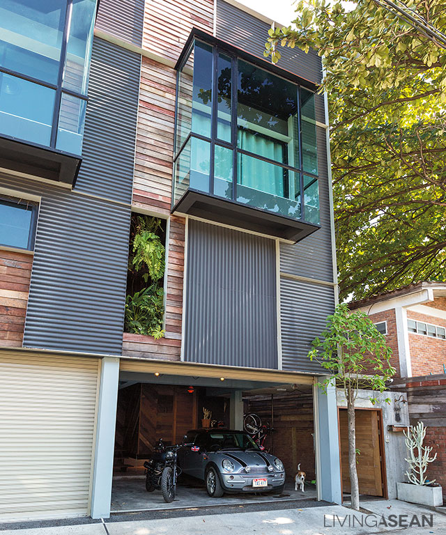
The newly designed front façade boasts an interesting mix of lightweight materials. Weathered boards in varying shades complement the pastel gray of fine-ribbed, corrugated sheet metal.

On reasons to invest in a row house, Kwanchai said: “A single, detached home is out of the question; land has become very expensive. The only option is a row house. After a survey, I chose this three-unit shophouse block. The size is about right; the price is fair and not too high. This way I am able to give it a complete makeover.”

2
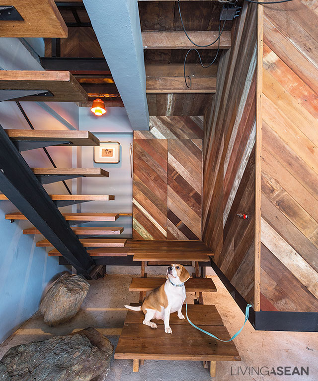
For good ventilation, the old staircase was removed to make room for a new set of stairs without risers between the treads. It’s supported by an I-shaped steel beam.

Kwanchai had practically everything inside removed, including the old bulky staircase so as to make room for a new flight of stairs without risers between the treads for better ventilation. The only things remaining were pillars and beams.

The floor plans for all three units were completely redesigned. He wanted each one of them to have its own unique character, but space was limited. So, he only focused on making his end unit look different instead, at least for the time being.

3
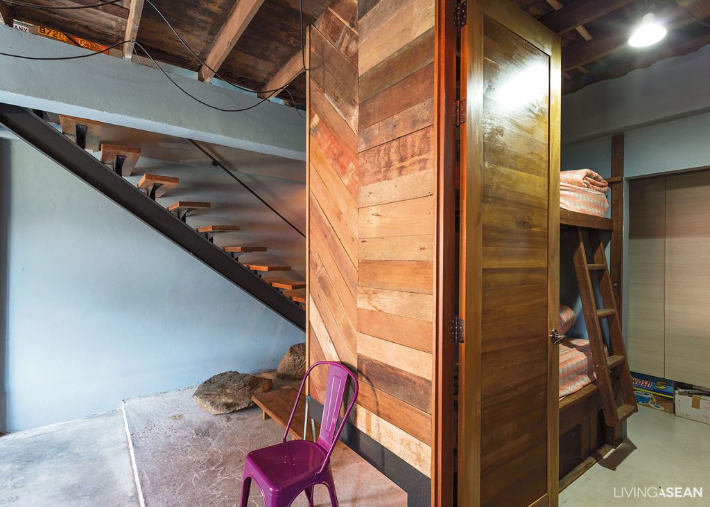
A small guest room with a shelf-like bunk is tucked away at the rear of the first floor.

To accommodate visitors from time to time, there’s a compact guest room at the far end of the first floor. Custom-designed double bunks make it suitable for sleeping two guests. In all three units the mezzanines were taken out, while the omnipresence of reclaimed timber beams and long planks making up parts of the wooden floors brings back vintage charms.

4
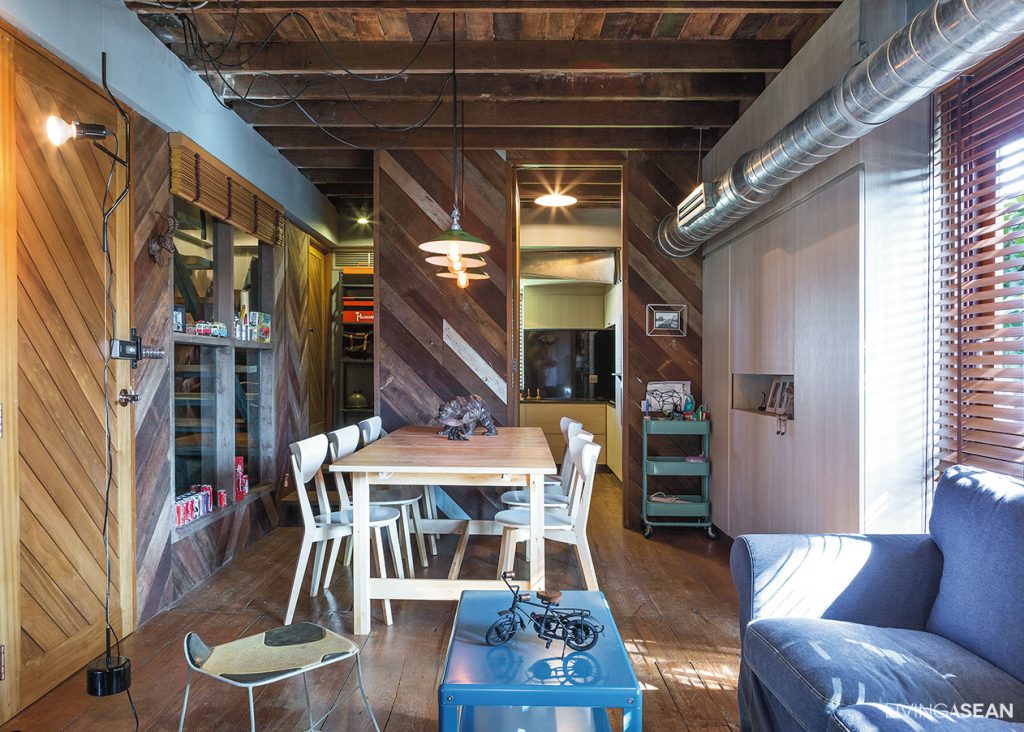
A bulky upholstered sofa adds warm, cozy feelings to the interior. Window treatment ideas with wooden slat blinds allow natural light into the home.

The second floor is neatly planned for multiple uses. There’s a sitting room in the front section, dining space in the middle, and the kitchen and bathroom at the rear of the building. The dining area is made a bit small to make room for the stairway.

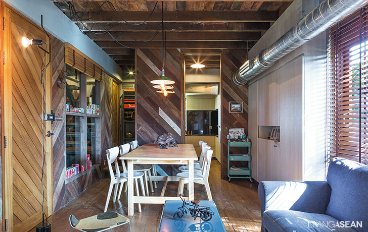
Overall, the furnishing and decoration of the interior conveys a great deal about the owner’s love for vintage collectables. Oblique-aligned wooden walls and floorboards give a warm, homey feeling.

5
The second floor holds a dining room. The floorboard and walls are covered in reclaimed wood from the homeowner’s collection.
8
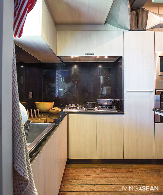
An L-shaped kitchen counter creates an easy flow workspace. Cabinet doors in light shades of beige make the room look clean and bright.
10
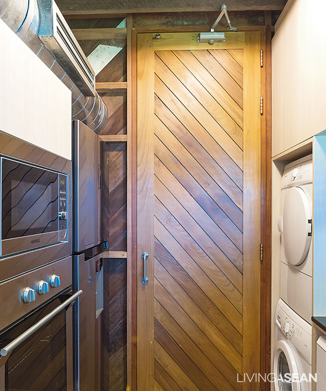
Microwave and convection ovens are on one side of the aisle, with the washer and dryer on the other. The door at the end opens to the dining room.

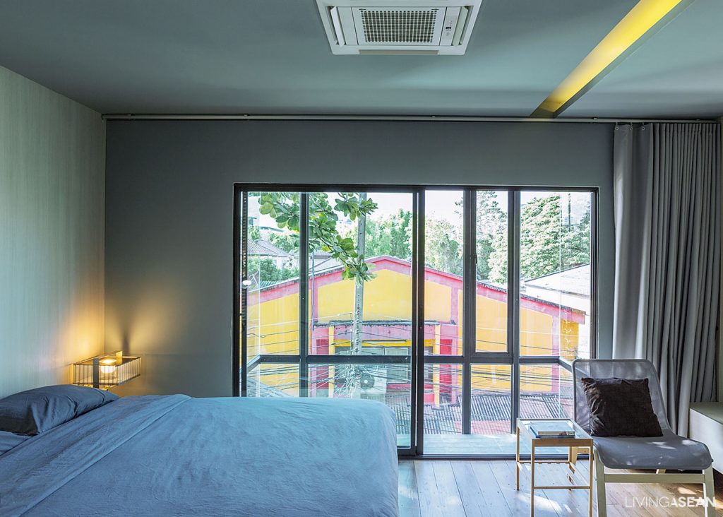
The third floor holds a bedroom in the front section that’s kept clean and uncluttered, with the wardrobe and bathroom nearby separated by a sliding door. The overall effect is impressive; the interior boasts a clean neutral shade for relaxation. There’s a minimal amount of decoration while furniture is reduced to bare essentials.

7
The bedroom is kept clean and uncluttered to provide a balance for limited spaces. The walls are covered in beech boards. Large sliding doors open to the cube-shaped glass enclosure that adorns the front façade.
9
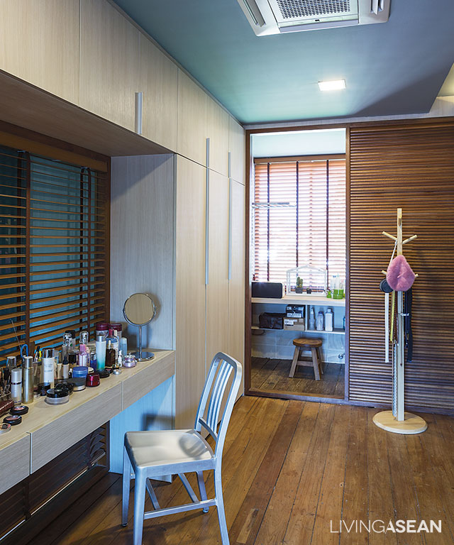
The changing room-cum-walk-in closet offers wardrobes on both sides of the aisle, which connects to the bathroom at the far end.

Taken as a whole, the secret to success lies in constancy of purpose and using reclaimed wood as the material of choice. The interior living space is cozy and comfortable, thanks to large windows that allow plenty of natural daylight. The result is a bright and breezy place of abode that’s small but has everything for a vibrant city lifestyle.

6
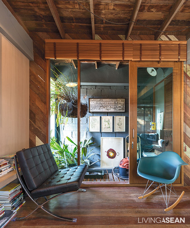
A glass wall with sliding door allows diffuse light into the sitting room at the rear of the house.

11
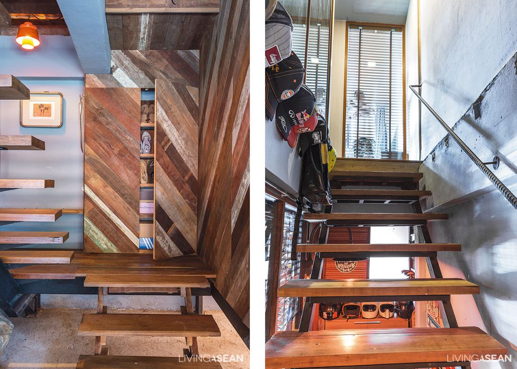
The staircase landing [left] provides access to a neat built-in cabinet made of reclaimed wood. The staircase without risers between the treads [right] offers niches for shoe storage.
12
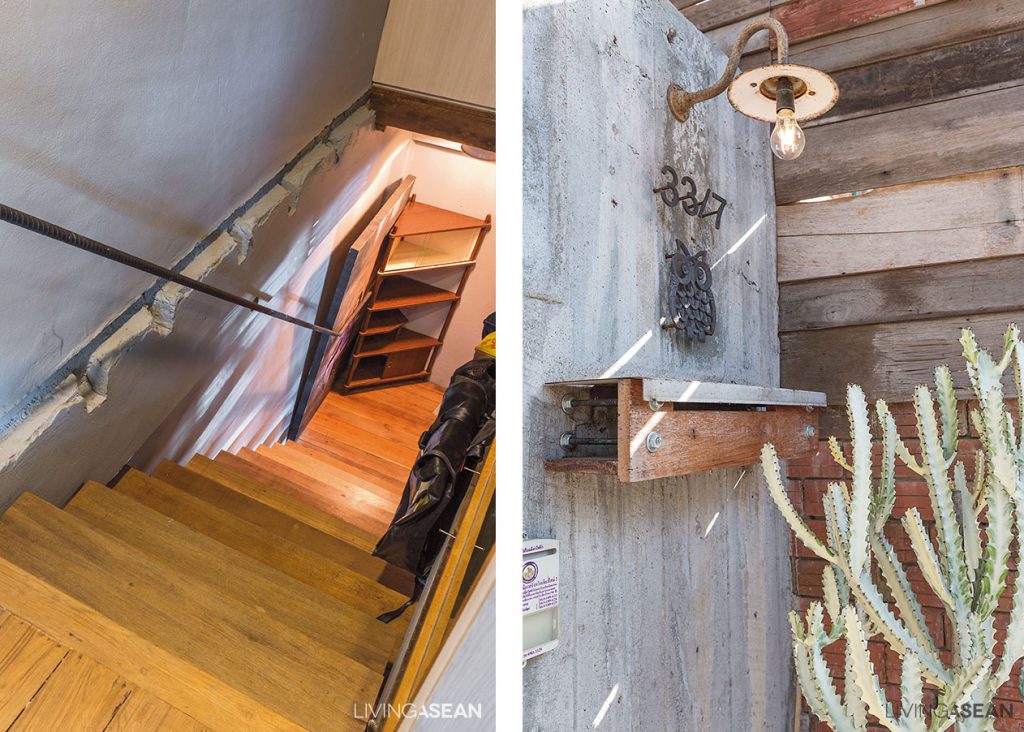
Marks on the wall and concrete structural framing tell stories of a recent home makeover. The homeowner intentionally left them as a personal reminder. [right] A rusty sconce attached to the wall adds rustic charm to a bare concrete wall. Beneath it is a wood box storage for home improvement tools.


Owner/Architect: Kwanchai Suthamsao of Plankrich Co.,Ltd. (www.plankrich.com)


Visit the original Thai article…

Chiang Mai City วิถีชน (ใน) เมือง


You may also like…

Termitary House: Good Sunshine, Fresh Air, and Brick Walls

3 x 9 House: A Compact Renovated Row House in HCMC

3×9 House: A Compact Row House Renovation in Vietnam

3×9 House: A Compact Row House Renovation in Vietnam

/ Ho Chi Minh City, Vietnam /

/ Story: Ekkarach Laksanasamrith / English version: Peter Montalbano /

/ Photographs: Soopakorn Srisakul /

A lot of work and research was invested in this row house renovation project. The big question is: how to make the compact house look wider?

Home renovation: The project is accomplished without any concrete construction. The new second floor rests on cylindrical steel posts instead of big cement pillars.

Like most urban residential buildings in Vietnam, “3×9 House” was formerly a shophouse built a long time ago. Only recently it was restored to a good state of repair. Looking back over the years, the old place lacking fresh air and ventilation had only a few windows and lots of solid brick walls, which made the building look dim.

A bold move was needed to rejuvenate it. The result is a modern living space that looks and feels fresher, younger and more lively, plus it helps to lift up the mood of the residents.

Renovated Row House vietnam
The 3-by-9-meter house has become a point of interest by integrating natural features in the design.

As land prices in Vietnam continued to rise rapidly and steeply every year, buying a new house seemed like a formidable task. So the owner thought it wise to invest in renovating his existing home.

He reached out to A21 Studio for their good reputations in the building industry, especially when it came to turning small, stuffy old houses into nice, uncluttered and environment-friendly homes.

Renovated Row House vietnam

Renovated Row House vietnam
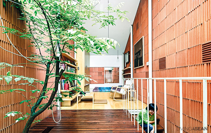
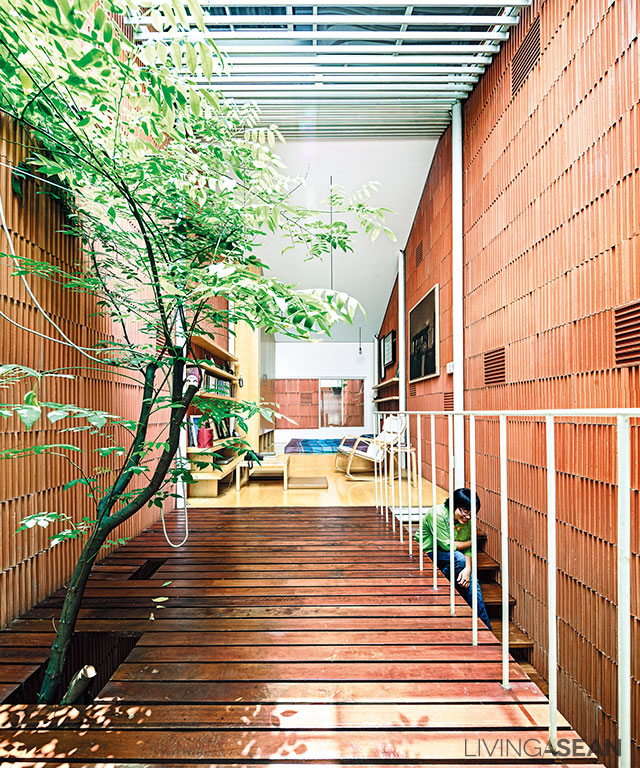
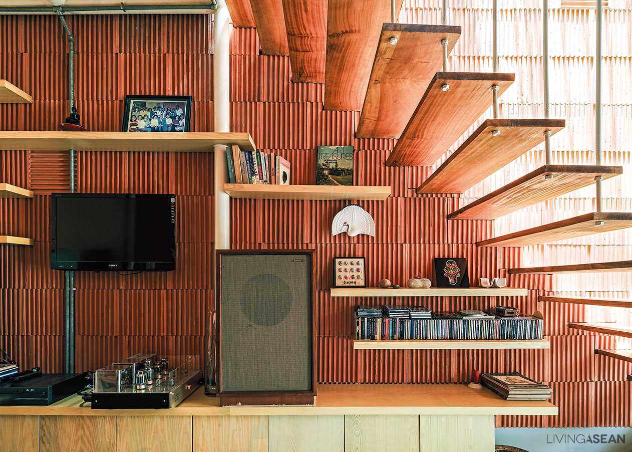
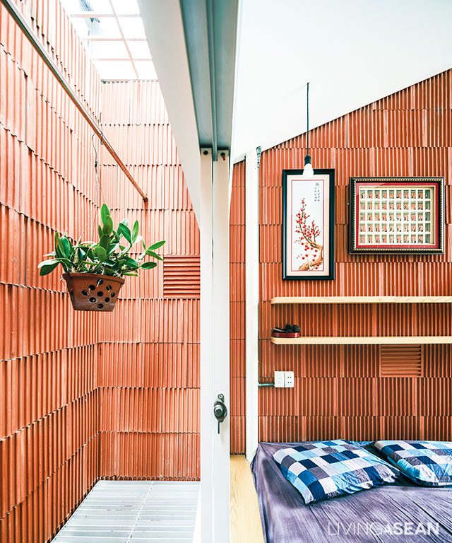
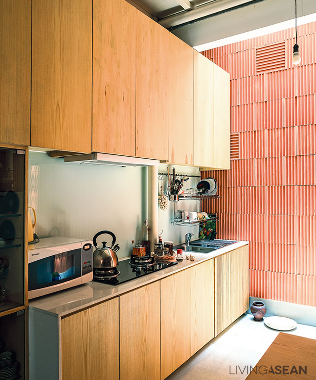
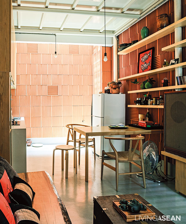
Clay tiles are placed inversely on the entire interior walls to create a stripe pattern and unique touch.

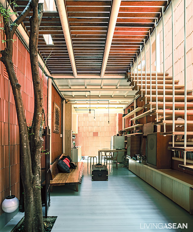
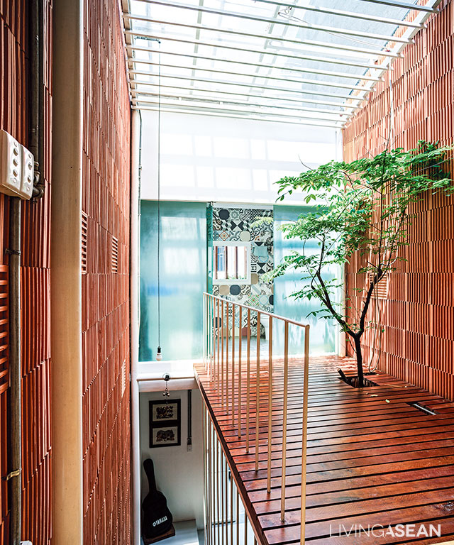
Walk in the door, and the first thing that catches our eyes is a tree growing up through an opening in the footbridge set against the wall. It’s a sign of welcome warmly greeting visitors coming into the entryway. The overall effect is bright and airy, thanks in part to a rooftop skylight illuminating the interior living spaces and letting sunlight shine on the tree.

For indoor thermal comfort, openings in the walls let breezy wind enter through the front door and circulate inside the home. As a result of this, the entire interior feels fresh and full of life all the way to the rear section, the second floor and the room under translucent sliding panels on the rooftop.

Flanked by three-story row houses on both sides, “3×9 House” is exposed to direct sunlight only in the middle of the day. For the rest of the time, the home is full of nice cool shade, making it feel very comfortable, warm and cozy, so there’s no need for air-conditioning.

Renovated Row House vietnam
The steel framework supporting the roof is equipped with a sliding skylight. This effectively illuminates interior spaces and allows the tree to keep on thriving.
Renovated Row House vietnam
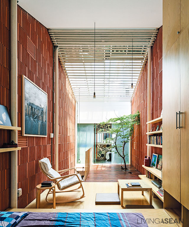
For the health benefits of a well-lit home, the bedroom space connects to the footbridge with an opening for a tree to thrive under the rooftop skylight.
Renovated Row House vietnam
Loft style ideas paired with earth-tone color make the simple bedroom feel open, airy and uncluttered, thanks in part to the absence of solid room dividers.
A modern kitchen setup gets rid of smoke and smell fast, as a result of a range hood blower and openings in the rooftop.

For a bigger, more open vibe in the interior, solid room dividers are avoided, with the exception of the bathroom. The ground floor consists of a living room, dining area and kitchen; all connected.

The bedroom and leisure areas are upstairs. Since the homeowner lives alone, solid room dividers are of no use. In a nutshell, it’s about integrating natural features, openings in the walls and a good ventilation system in the overall design. That’s what makes it a good place to live.

Renovated Row House vietnam

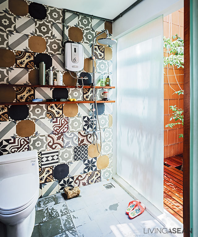
A colorful mix of tiles are reminiscent of vernacular architecture.

Architect: A21 Studio (www.a21studio.com.vn)


You may also like…

Nha Be House: A Brick Home Infused with Memories of the Good Old Days

Termitary House: Good Sunshine, Fresh Air, and Brick Walls

X