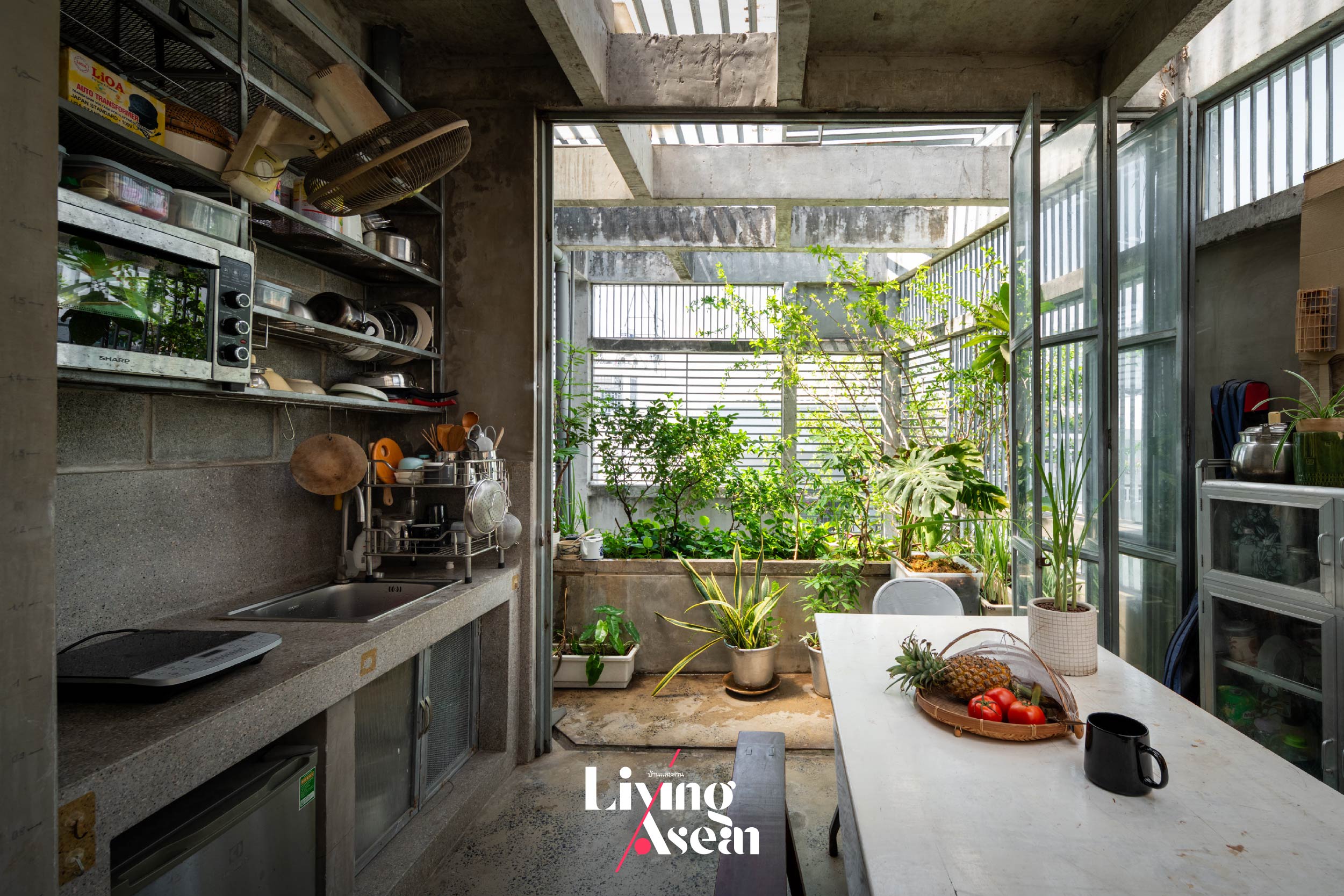
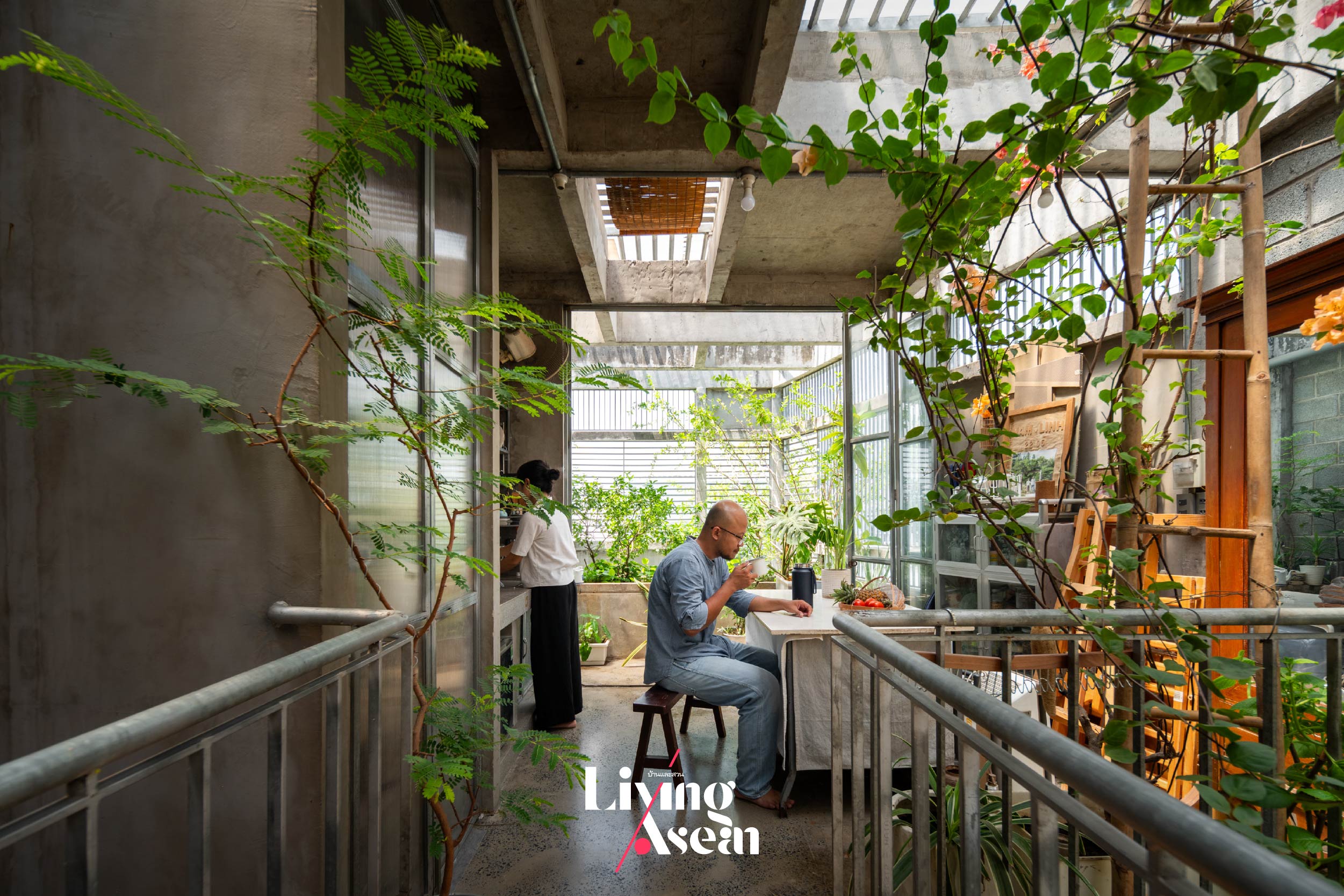
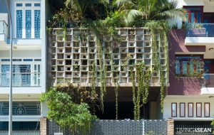
Blog : four-storey house

MAISON K: A Home Office Made Attractive by Façade of Shimmering Ceramics

MAISON K: A Home Office Made Attractive by Façade of Shimmering Ceramics

/ Binh Dinh, Vietnam /

/ Story: Ektida N. / English version: Bob Pitakwong /

/ Photographs: Tuan-Nghia NGUYEN /

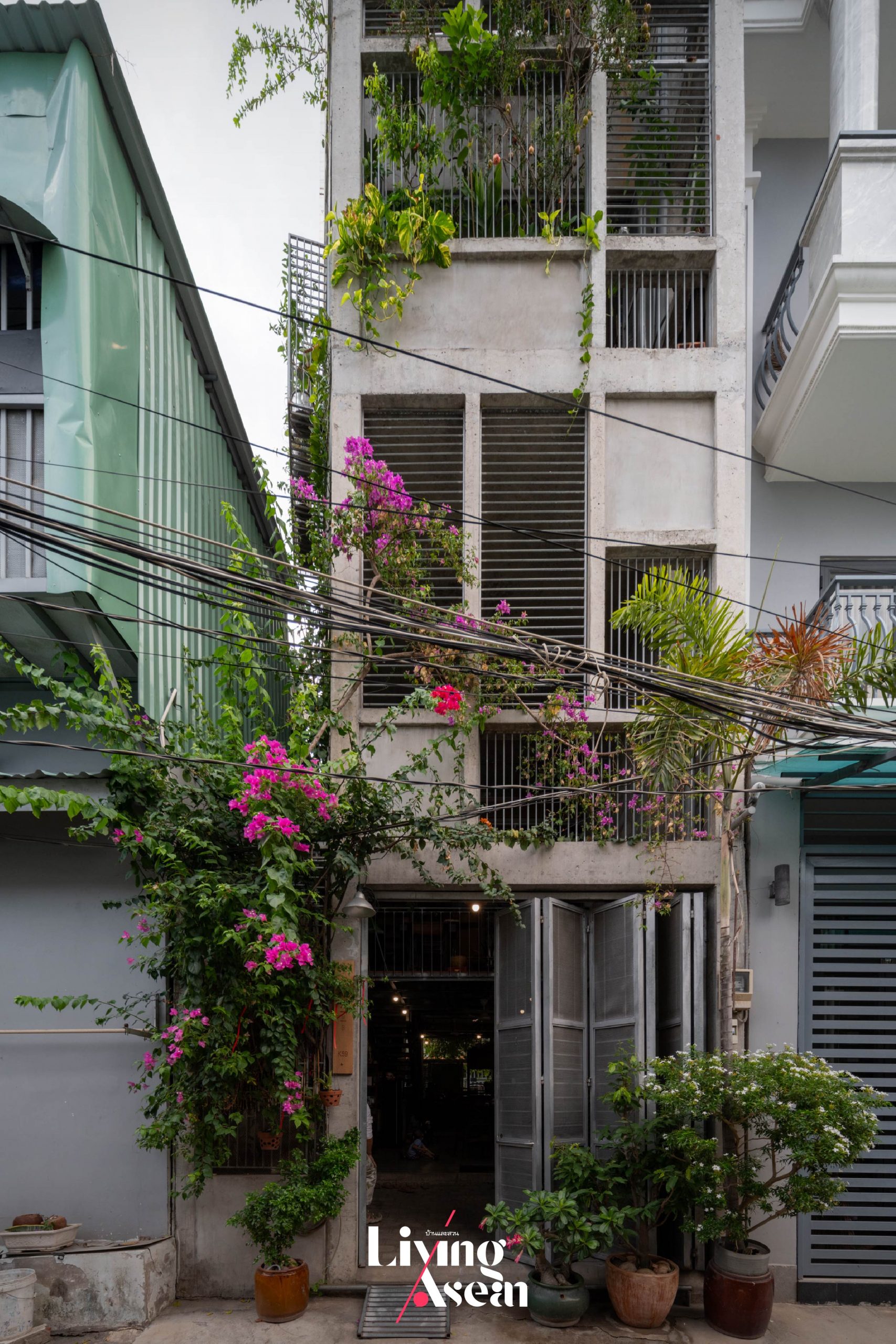
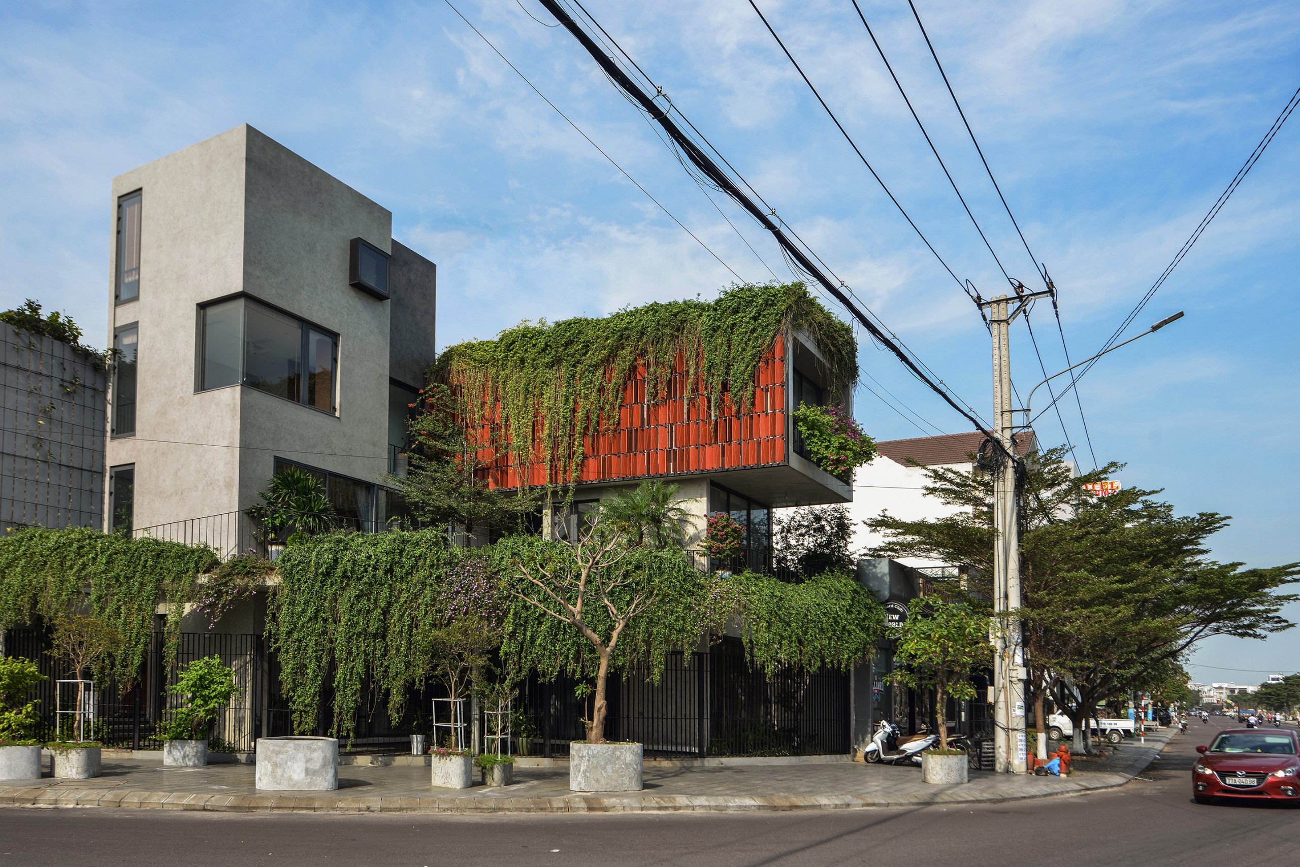
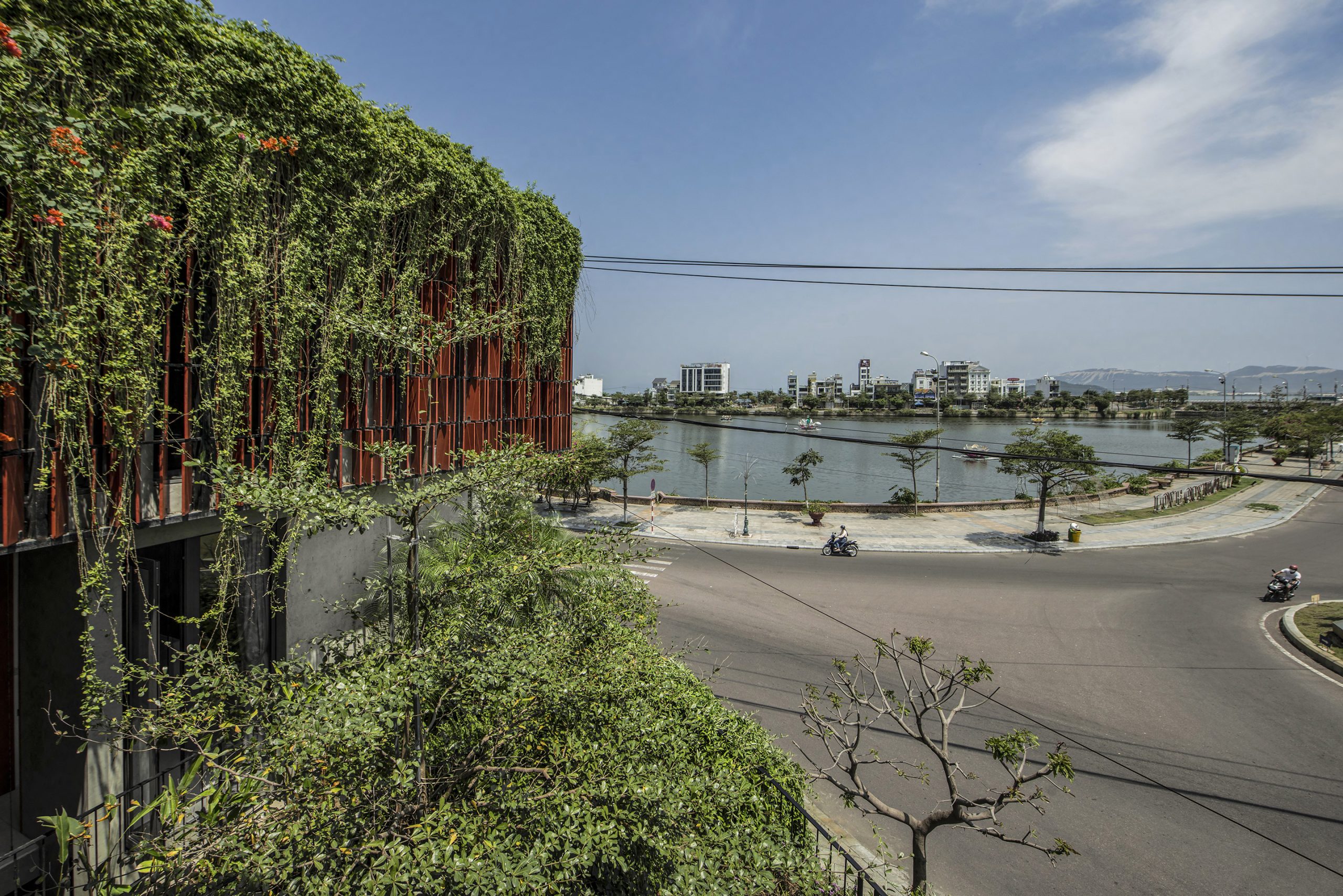
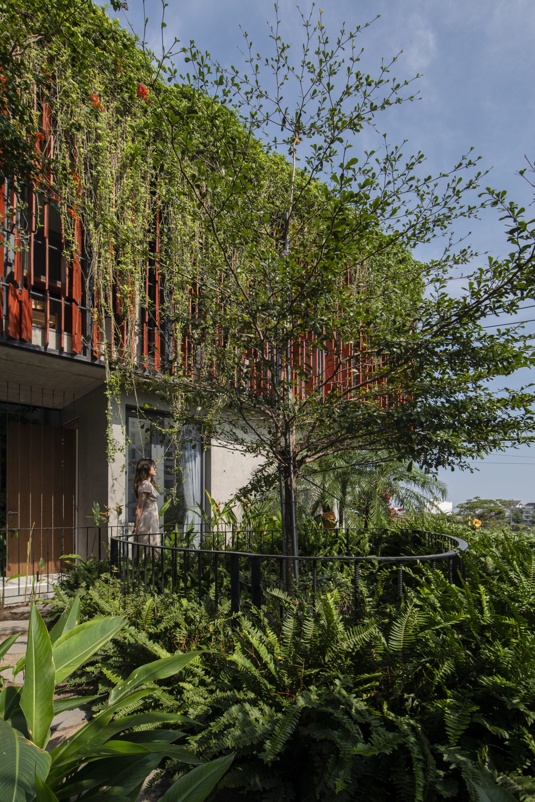
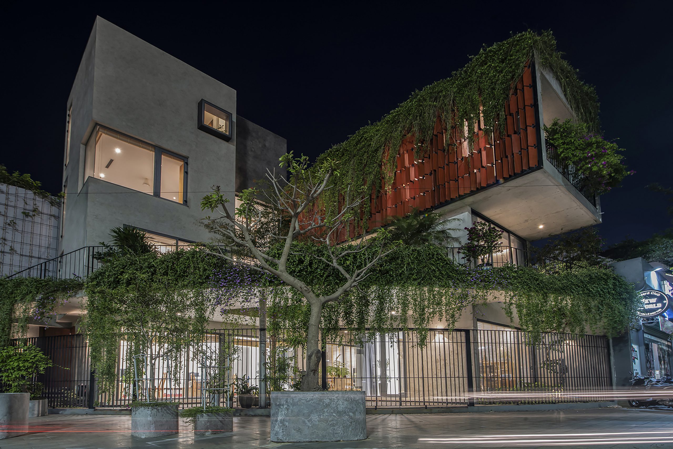
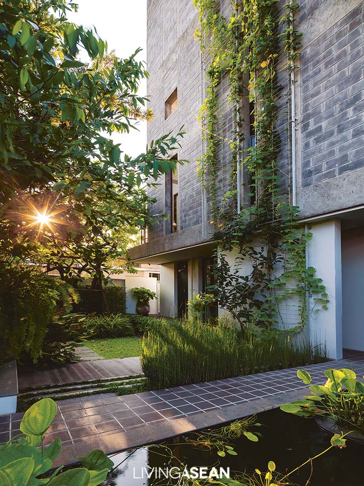
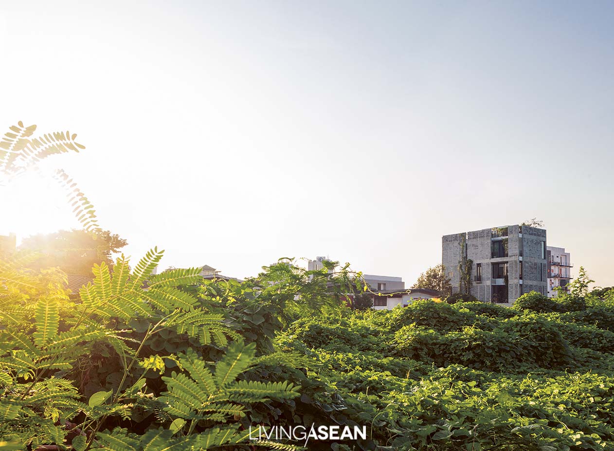
An eco-friendly home office building named Maison K hovers above the ground, looking out over a traffic circle in the center of Quy Nhon, a coastal city in central Vietnam. The overall effect is out of this world, inspiring admiration for its well-thought-out design and build quality. The building’s double-skin façade gives off good vibes, thanks to air flowing through the intermediate cavity. At the same time, hanging and trailing vines add a lush appeal to the building’s principal front shimmering in the sunlight. Right next to it, another home office building with beautiful raw concrete finishes stands back to back on the same location. Albeit different characters, the interior is essentially the same.

Home Office vietnam MAISON K

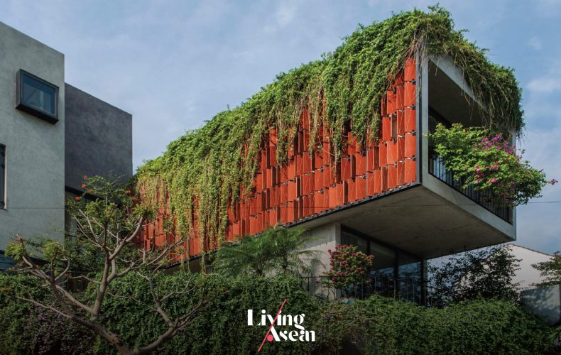
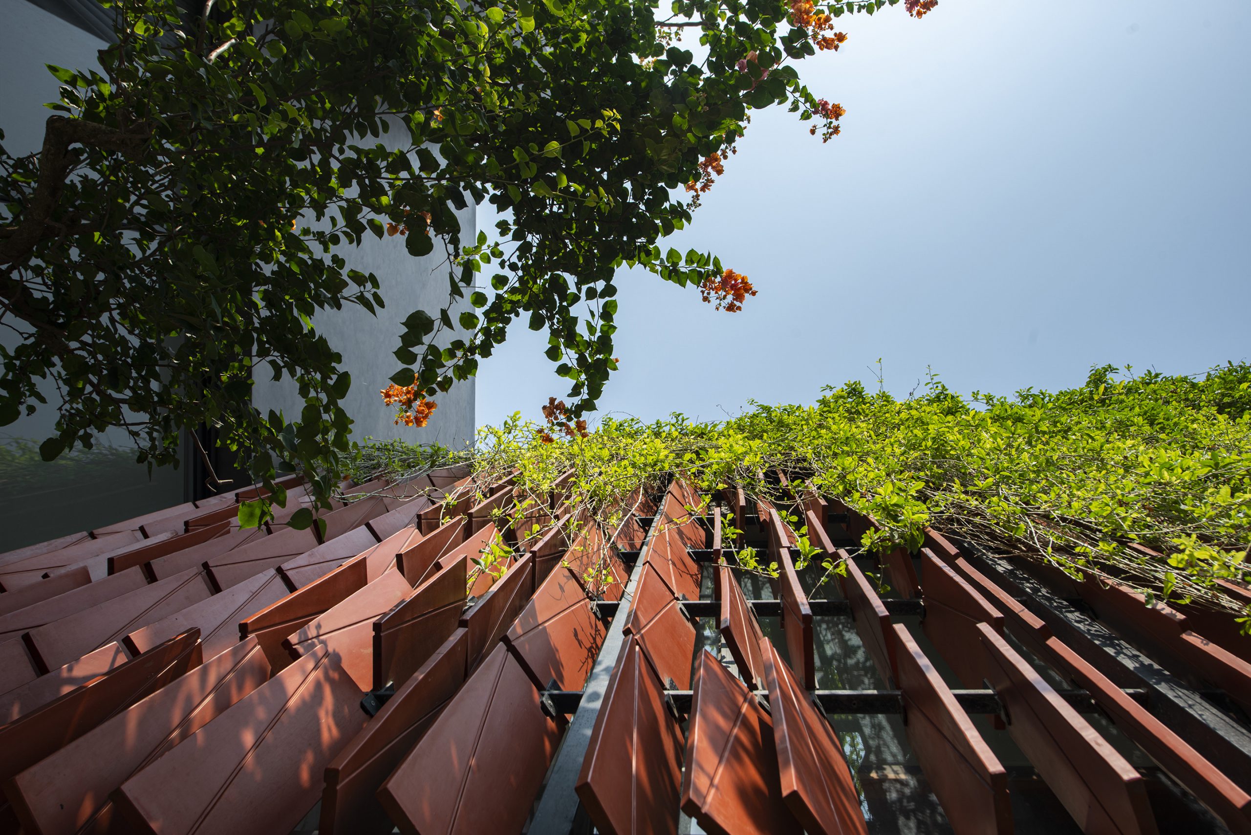
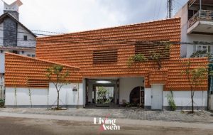
Blending aesthetics with sustainable design, the building’s feature wall is covered with ceramic panels in subdued shades of orange that provide a buffer against the glare of the sun. Hinged on one side, they swing open like doors to regulate air and light streaming into the interior.

Together they merge into one coherent architectural feature that creates an indelible impression on people passing by.

Home Office vietnam MAISON K

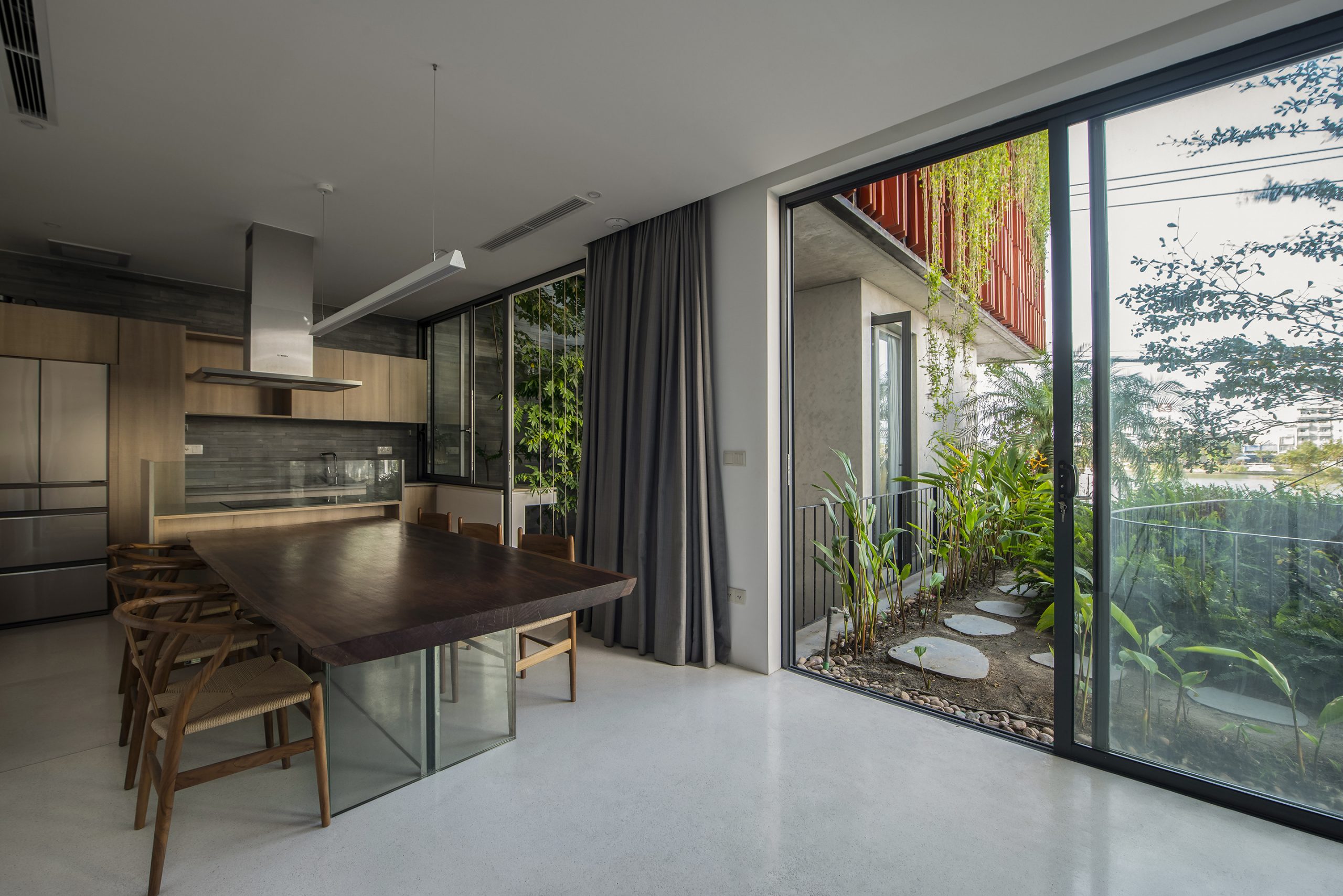
Dubbed the home office for the future of work, it’s a design that makes decorating with plants an integral part of interior and exterior design. Every workspace is thoughtfully devised to best serve its designated purpose, while the wellness, peace and quiet of a home office atmosphere remain the front-and-center concerns.

It’s thanks to meticulous design that an oasis of calm is created despite being located in a busy downtown neighborhood.

Maison K is the brainchild of Nghia-Architect, a homegrown atelier admired for their imagination and skills, plus an excellent track record in architecture and knowledge of the geography in Vietnam. Their main forte includes a thorough understanding of climate variability since weather conditions can change significantly on the oceanfront, directly affecting how a building performs.

Home Office vietnam MAISON K

This is especially true in the case of Quy Nhon, which is subject to strong winds in the coastal area, plus hot and humid weather conditions happening from time to time.

As the architect puts it, Quy Nhon being warmer and more humid than other parts of the country, the knowledge and experience in choosing the right materials for the job is imperative, and hence standards be maintained every step of the way.

Understandably, concrete is the mainstay of the construction industry in this part of Vietnam. It’s preferred over other building materials and techniques for its strength and durability, plus it’s resistant to weather and salt damage.

Especially in the context of Quy Nhon, concrete containing broken gray stone is preferred for its wear and tear resistance, plus its pleasing color and texture are sought after in this region.

Home Office vietnam MAISON K
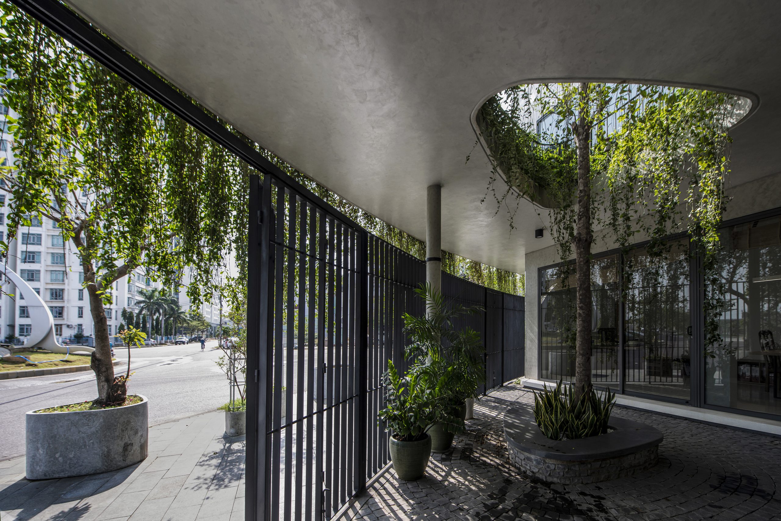
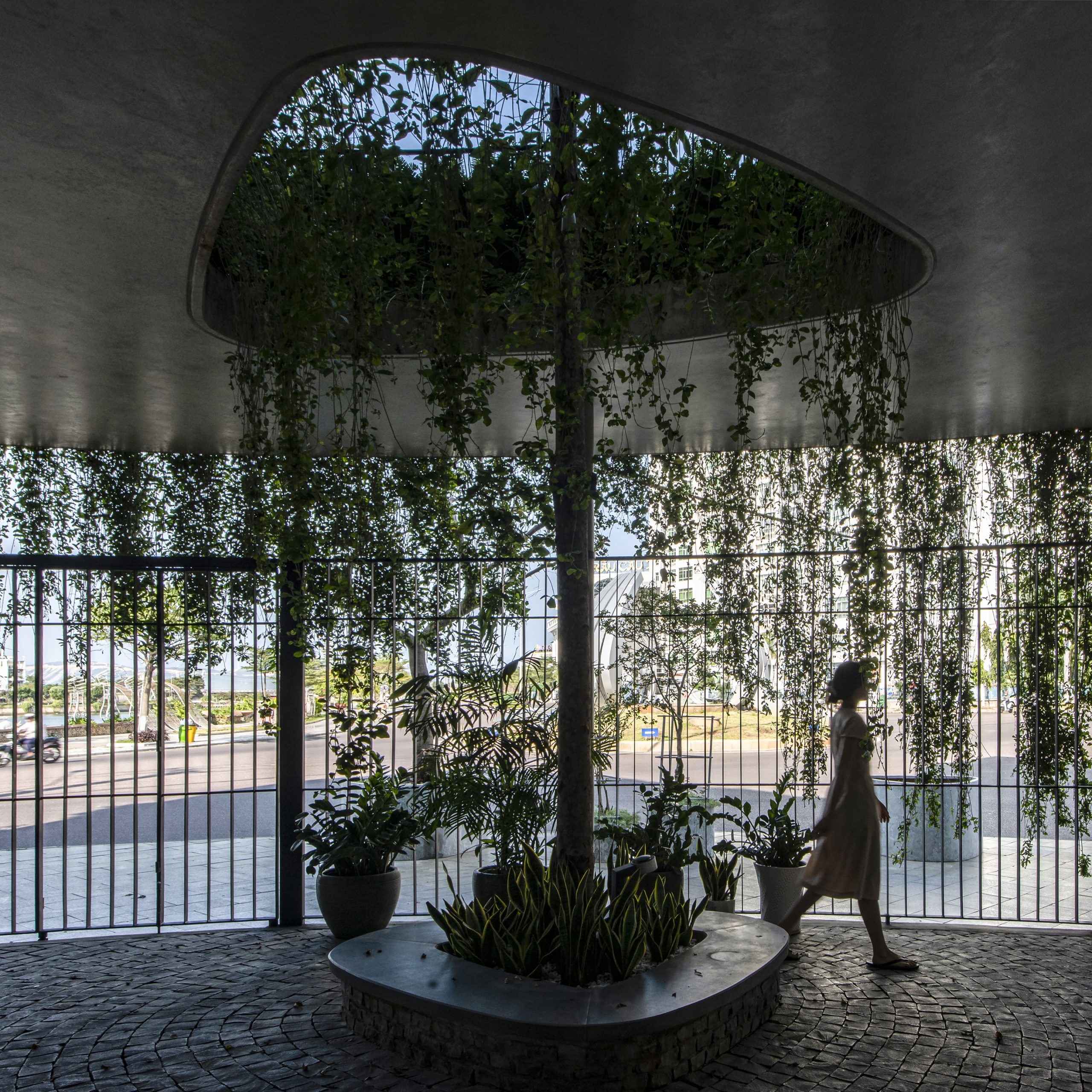
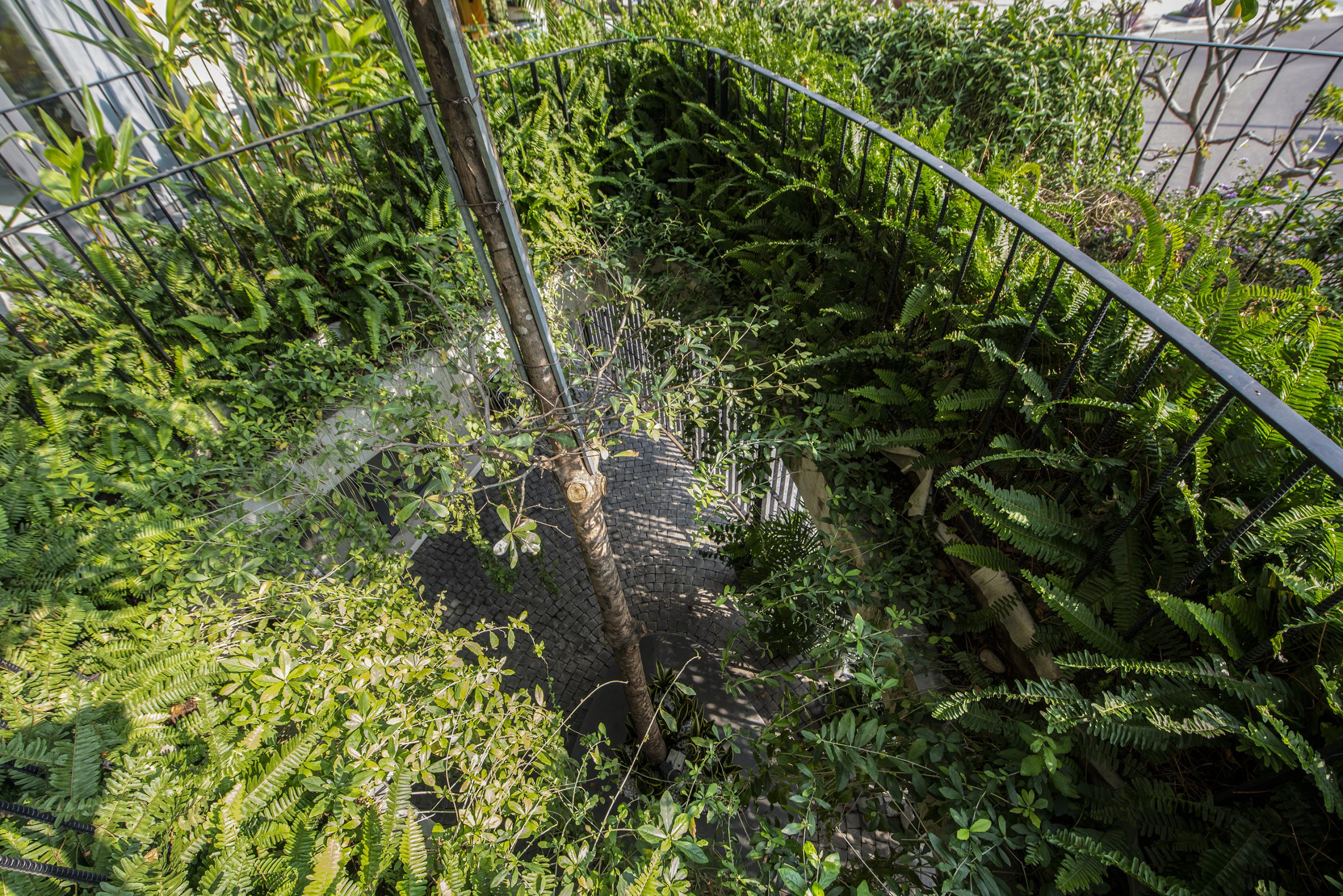
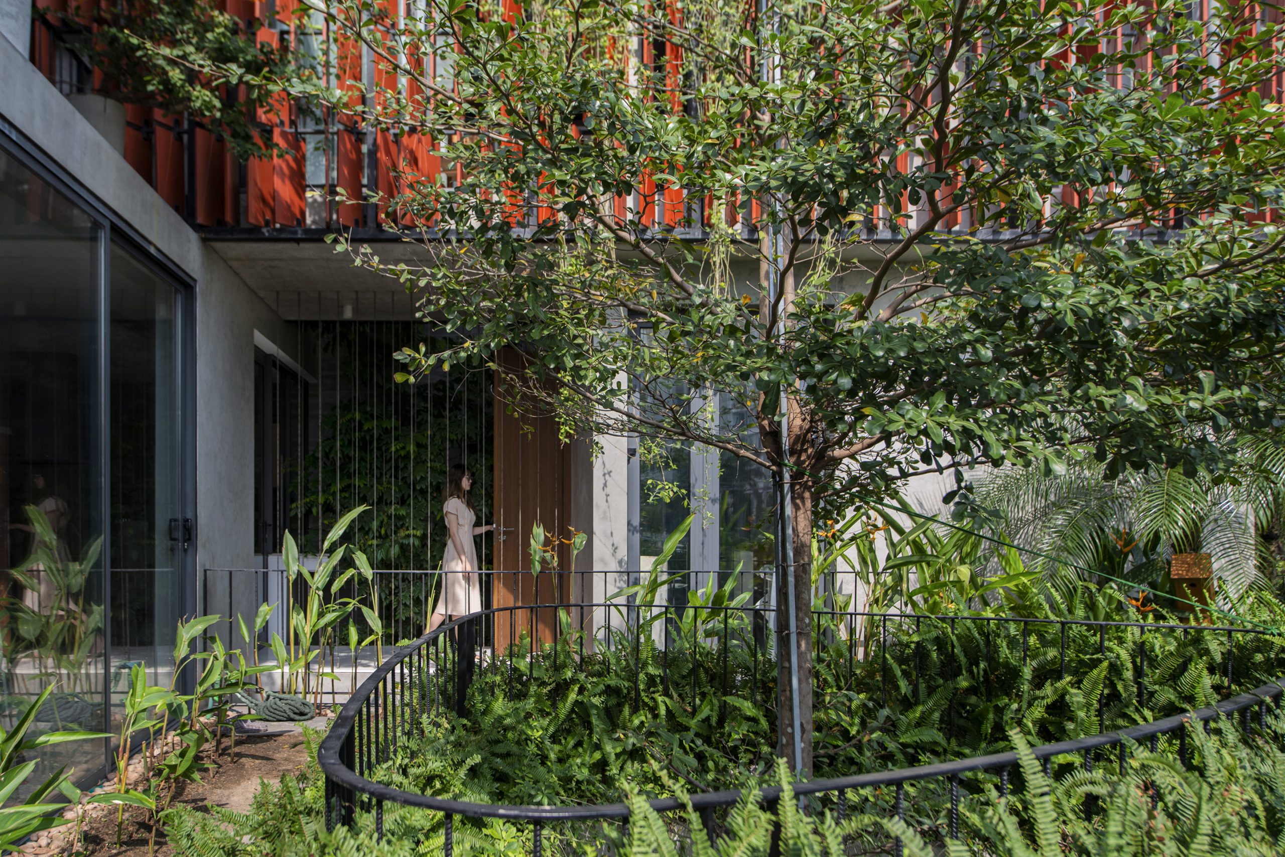
Green design keeps the covered parking area cool when the mercury rises. A triangular void of space curved into rounded form creates a double volume air space that allows a tree to grow through it reaching for the sky. For a look that’s easy on the eye, sharp interior angles are trimmed into curved corners to reduce the harshness of raw concrete finishes.

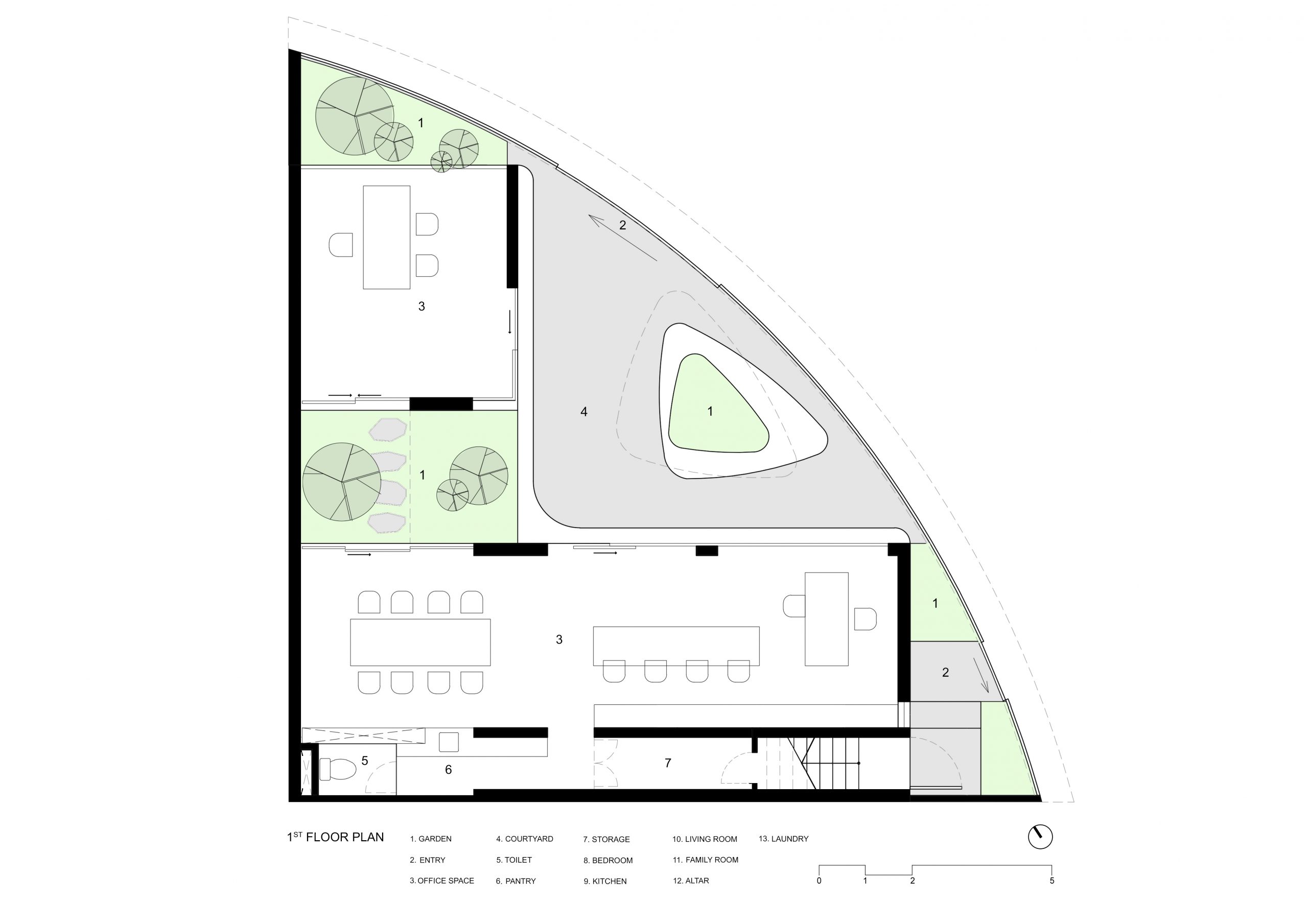
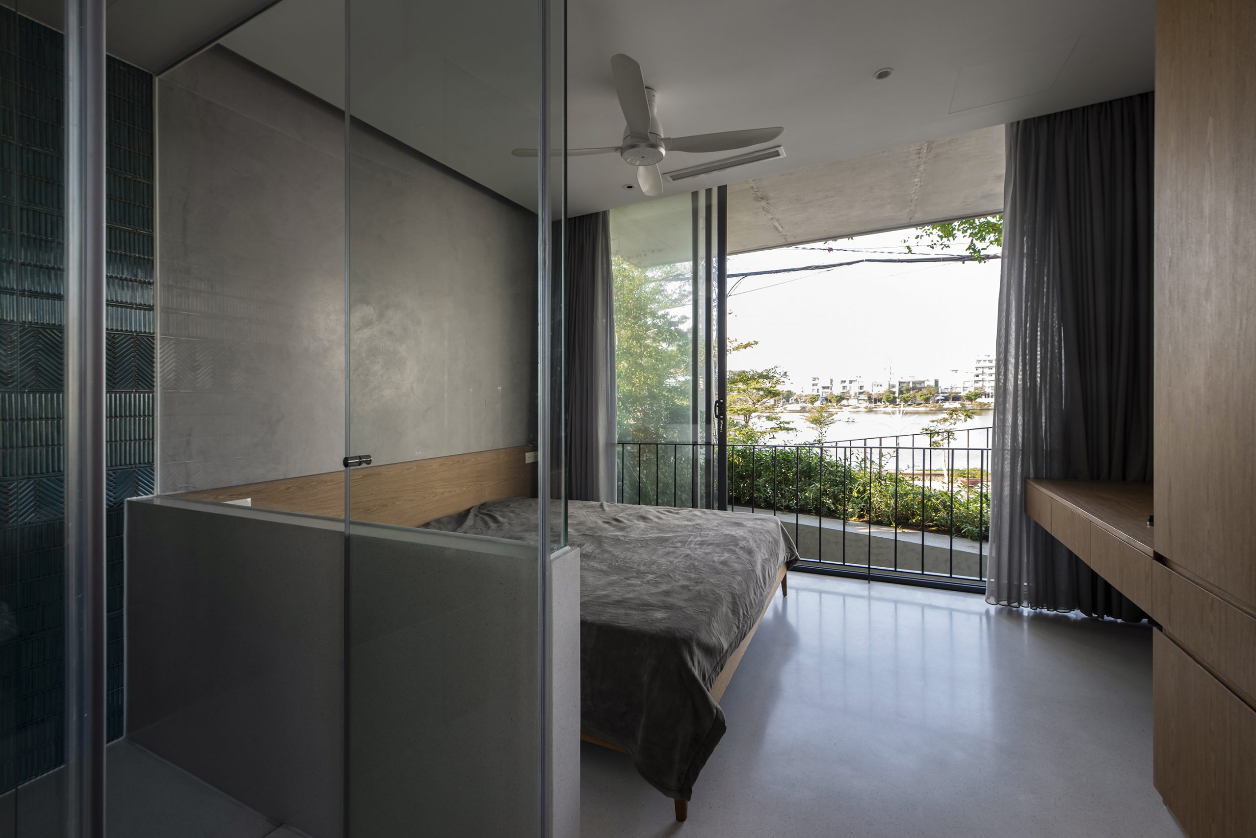
There’s an element of surprise. Maison K sits on land shaped like a piece of pie, a quarter of a circle, so to speak. That being the case, the architect thought it best to put in an L-shaped building with one side open to take in the beautiful view of a nearby lake.

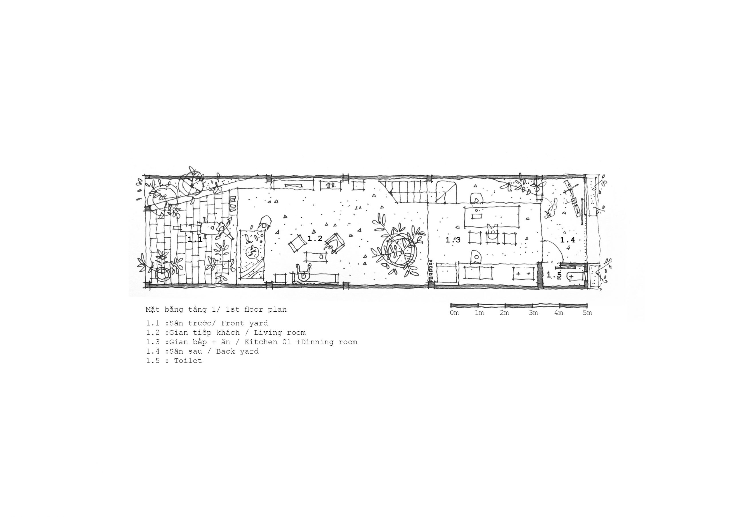
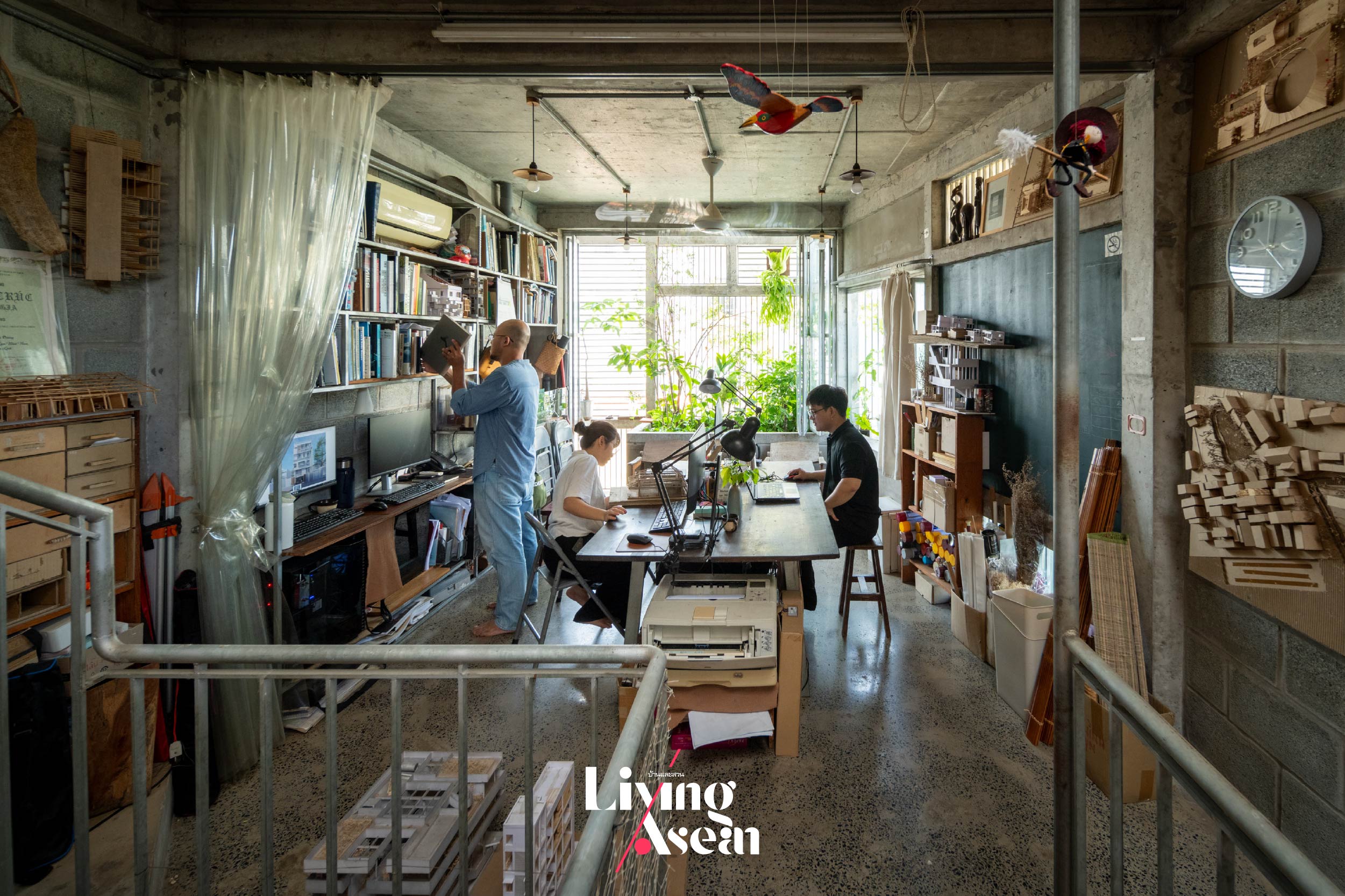
Plus, it’s in compliance with the city ordinance in effect at present. To facilitate business operations, he put the office space downstairs and all the family living areas on the upper floors where it’s quiet and more private.

First floor plan. / Courtesy of Nghia Architect
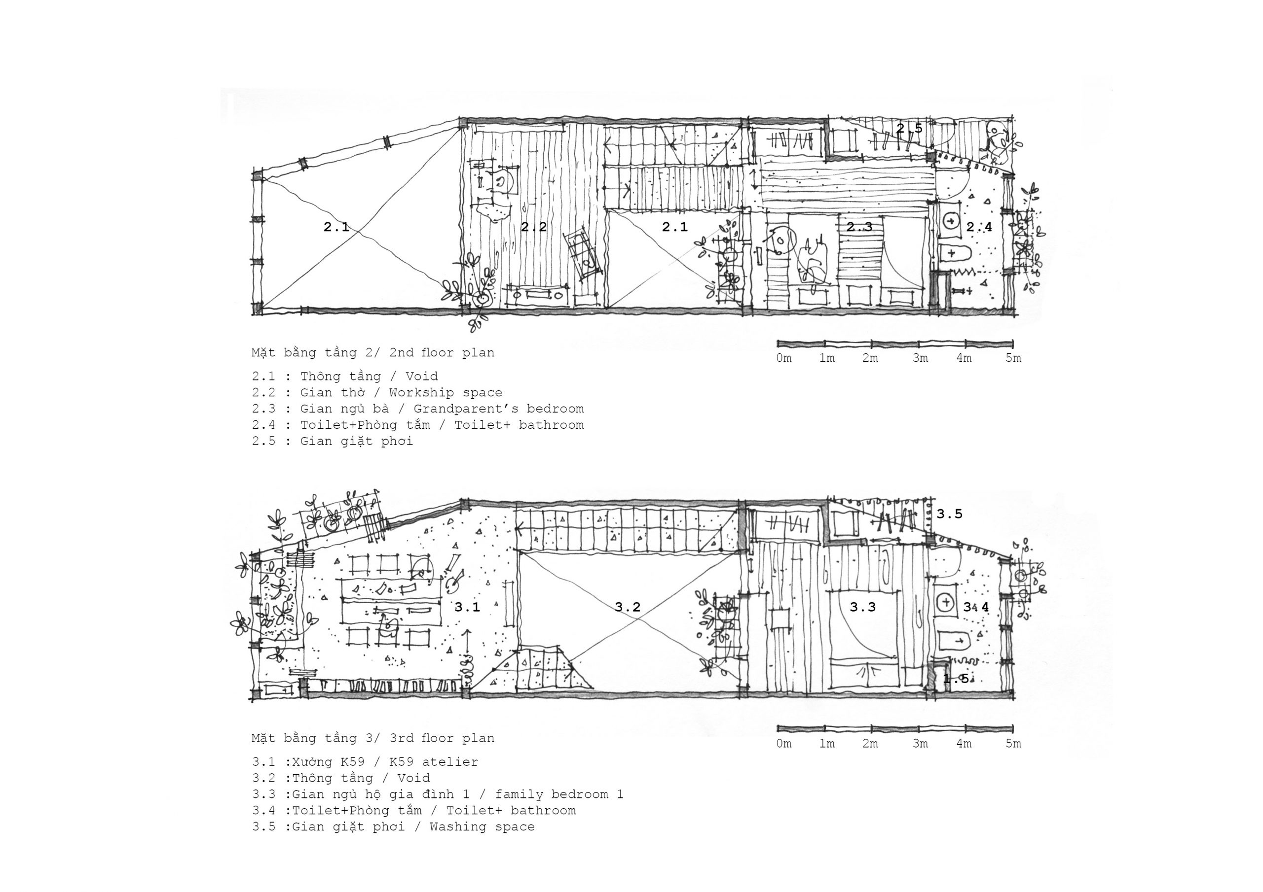
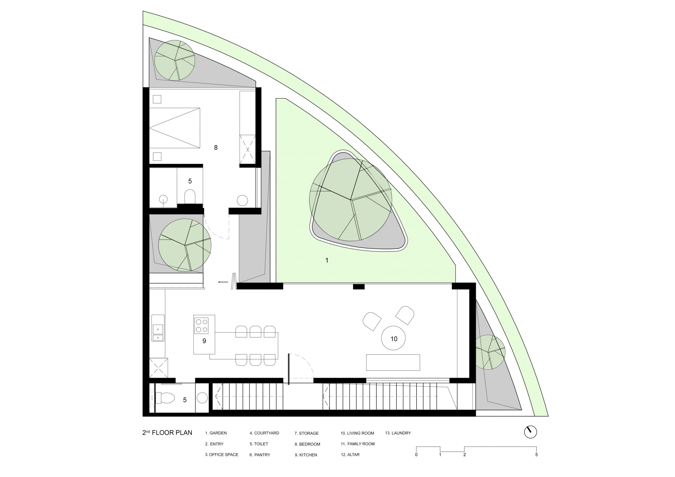
Second floor plan. / Courtesy of Nghia Architect
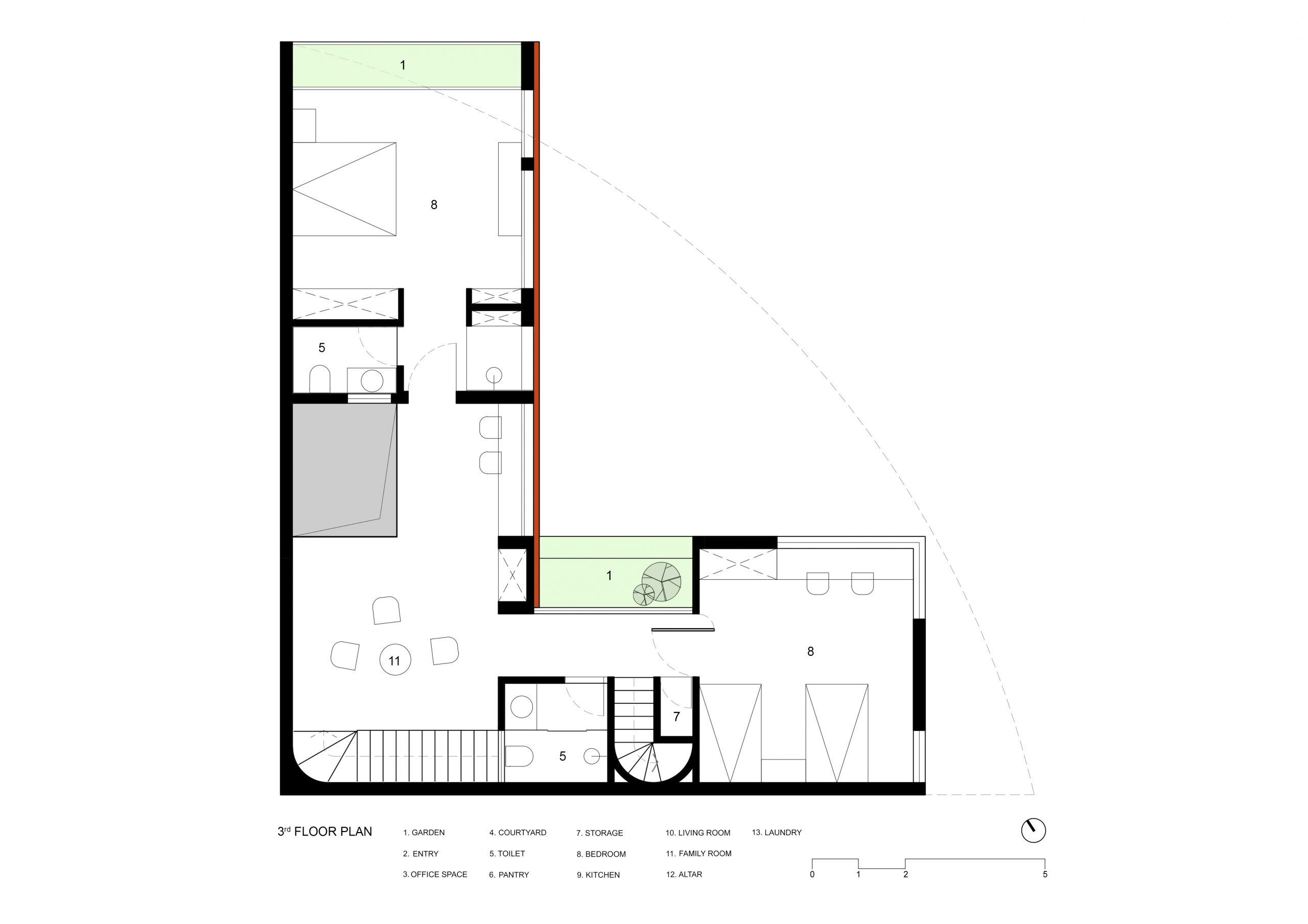
Third floor plan. / Courtesy of Nghia Architect
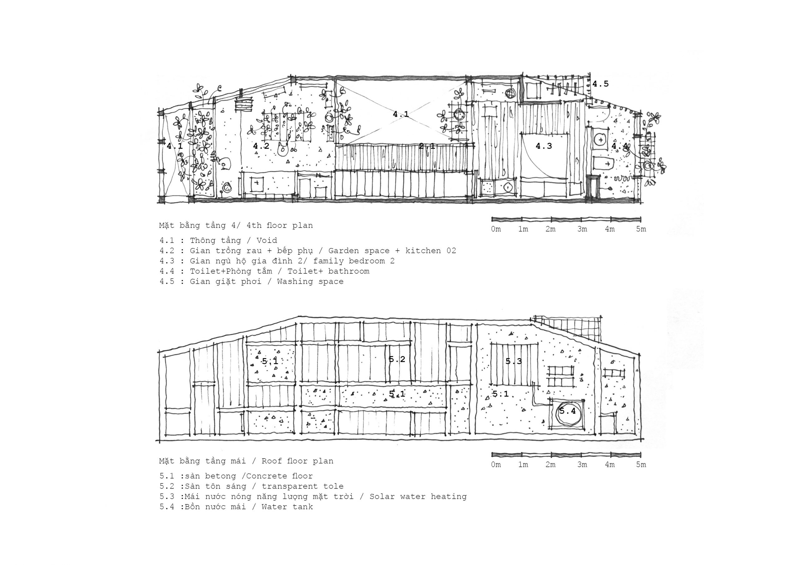
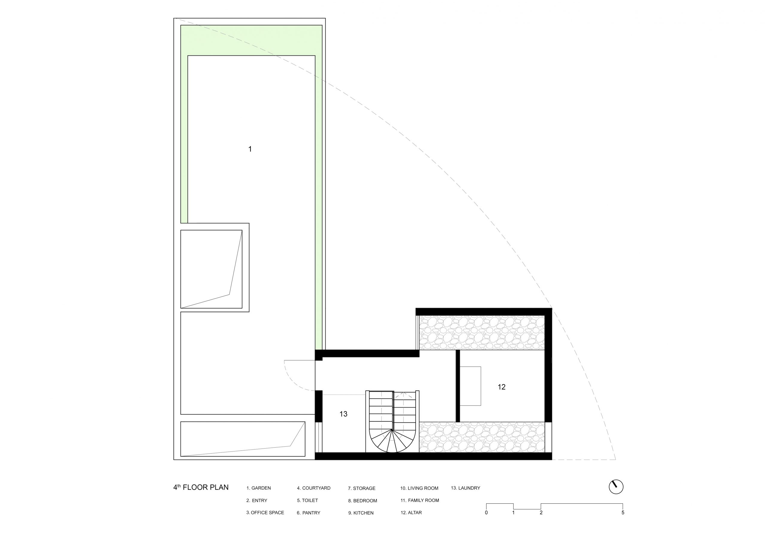
Fourth floor plan. / Courtesy of Nghia Architect
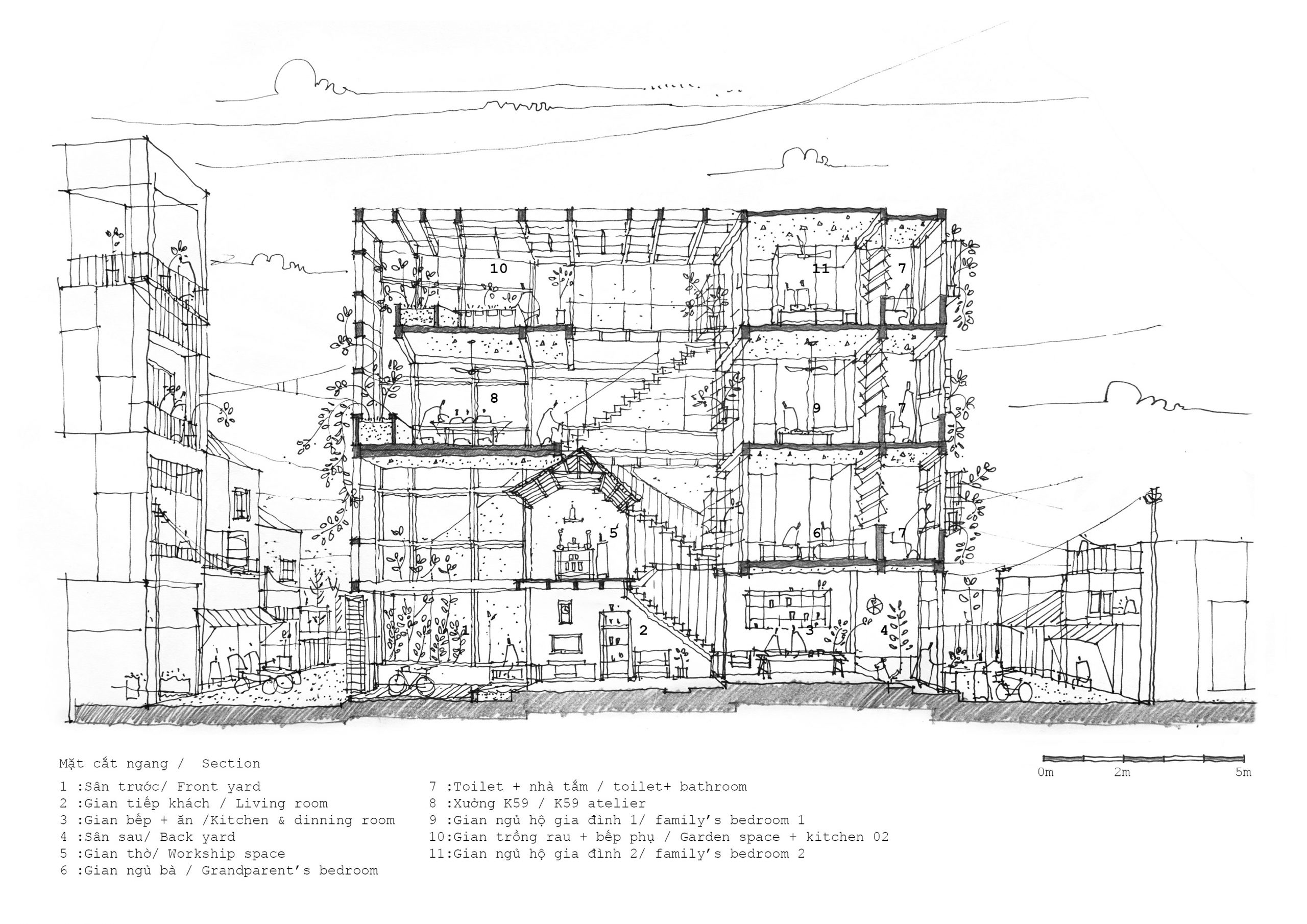
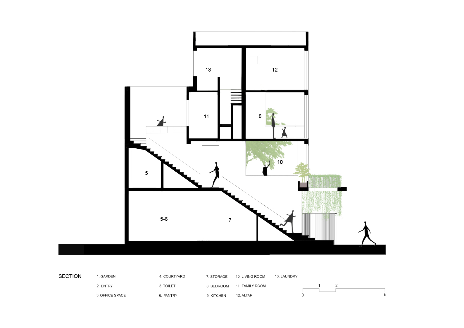
House section. / Courtesy of Nghia Architect

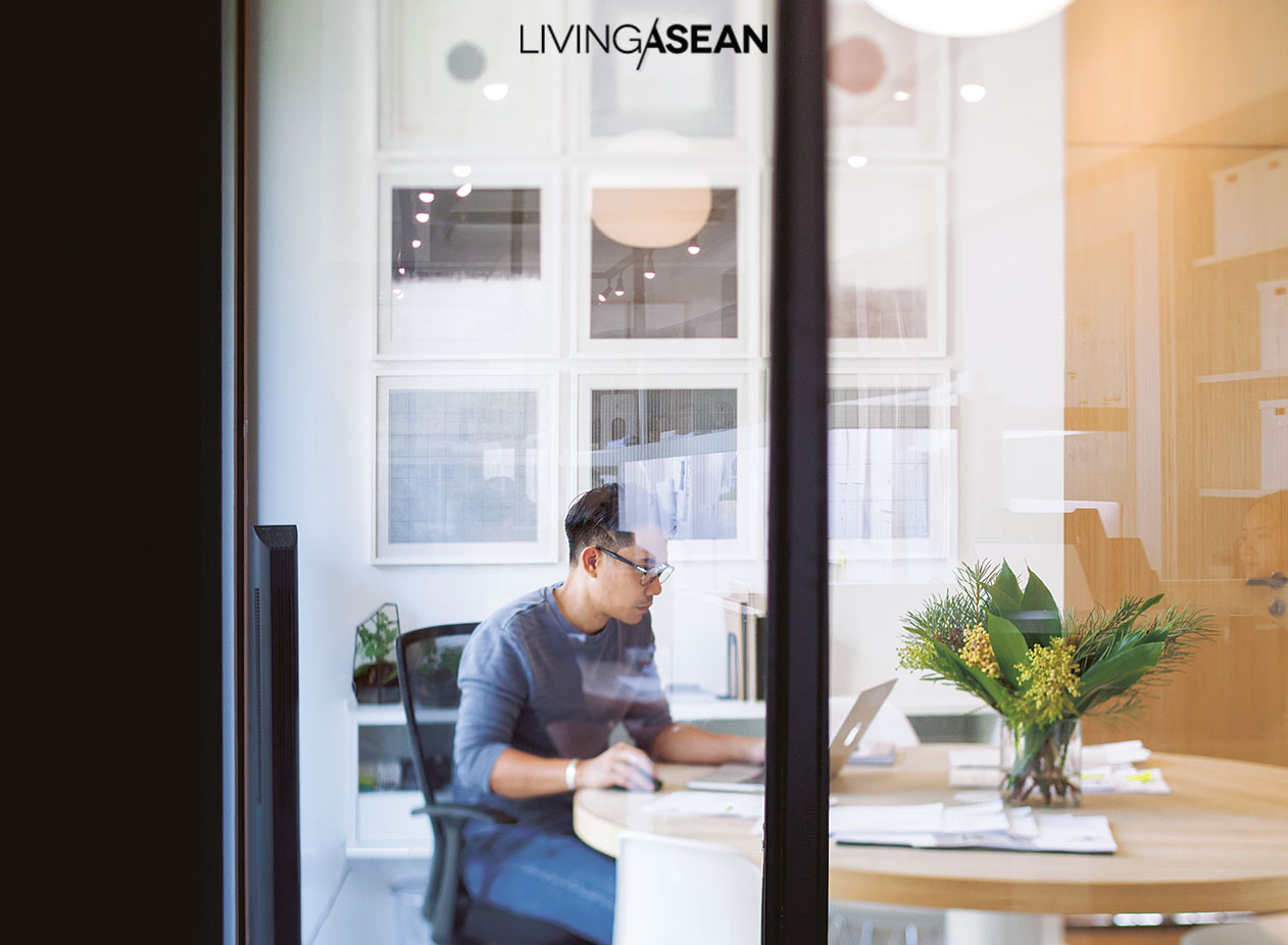
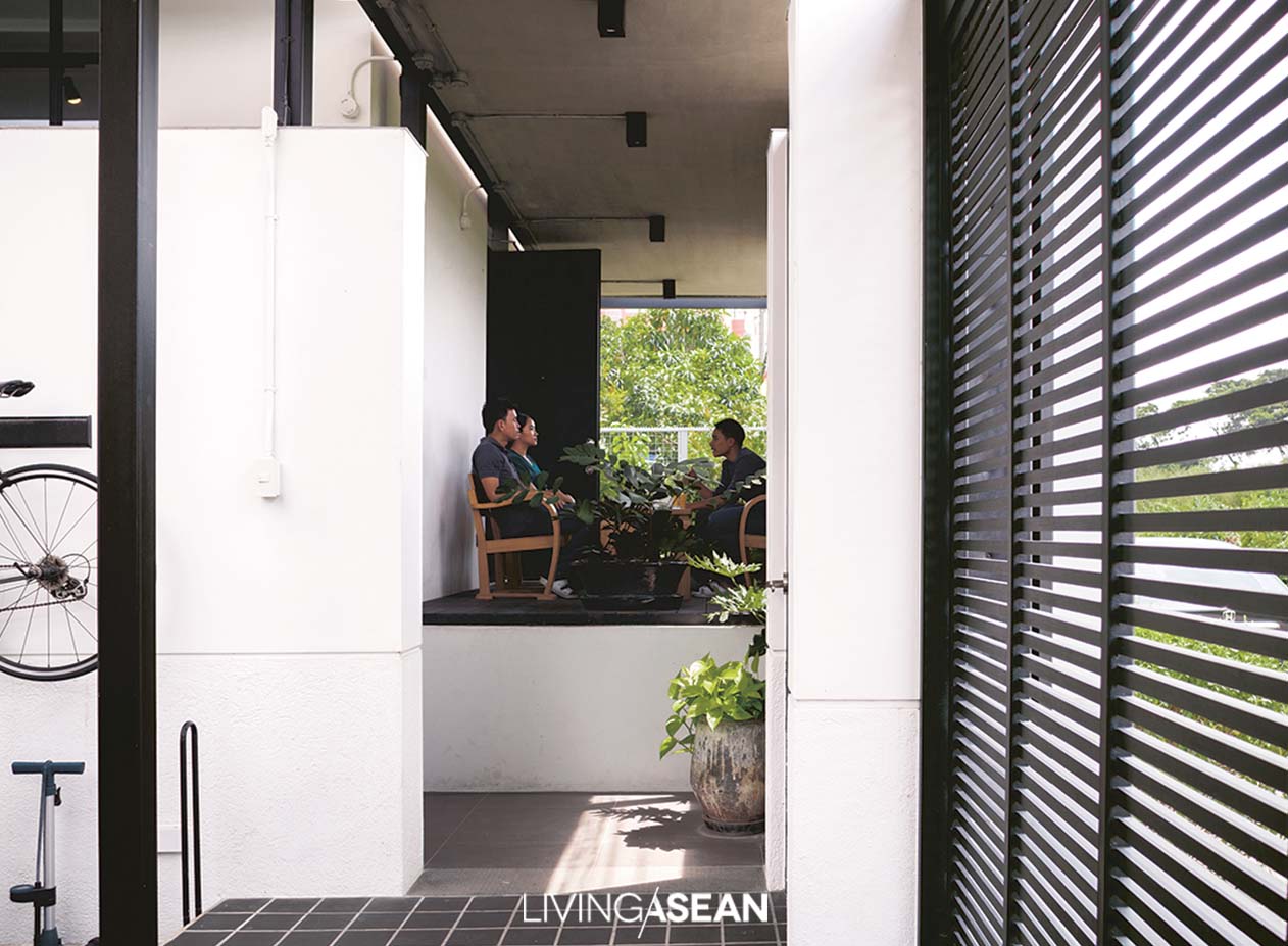
For practical reason, the office and residential spaces each have separate entrances. The office itself is conveniently accessed from the covered parking area. Sliding doors glazed using clear glass make the business space warm and welcoming.

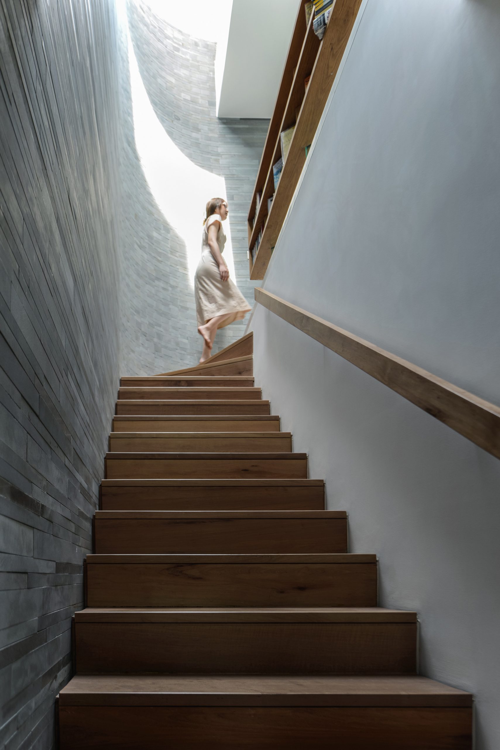
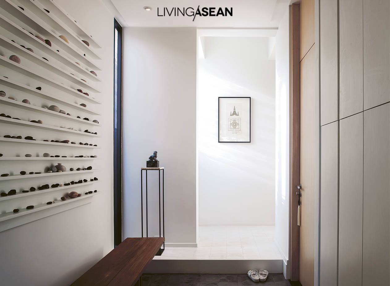
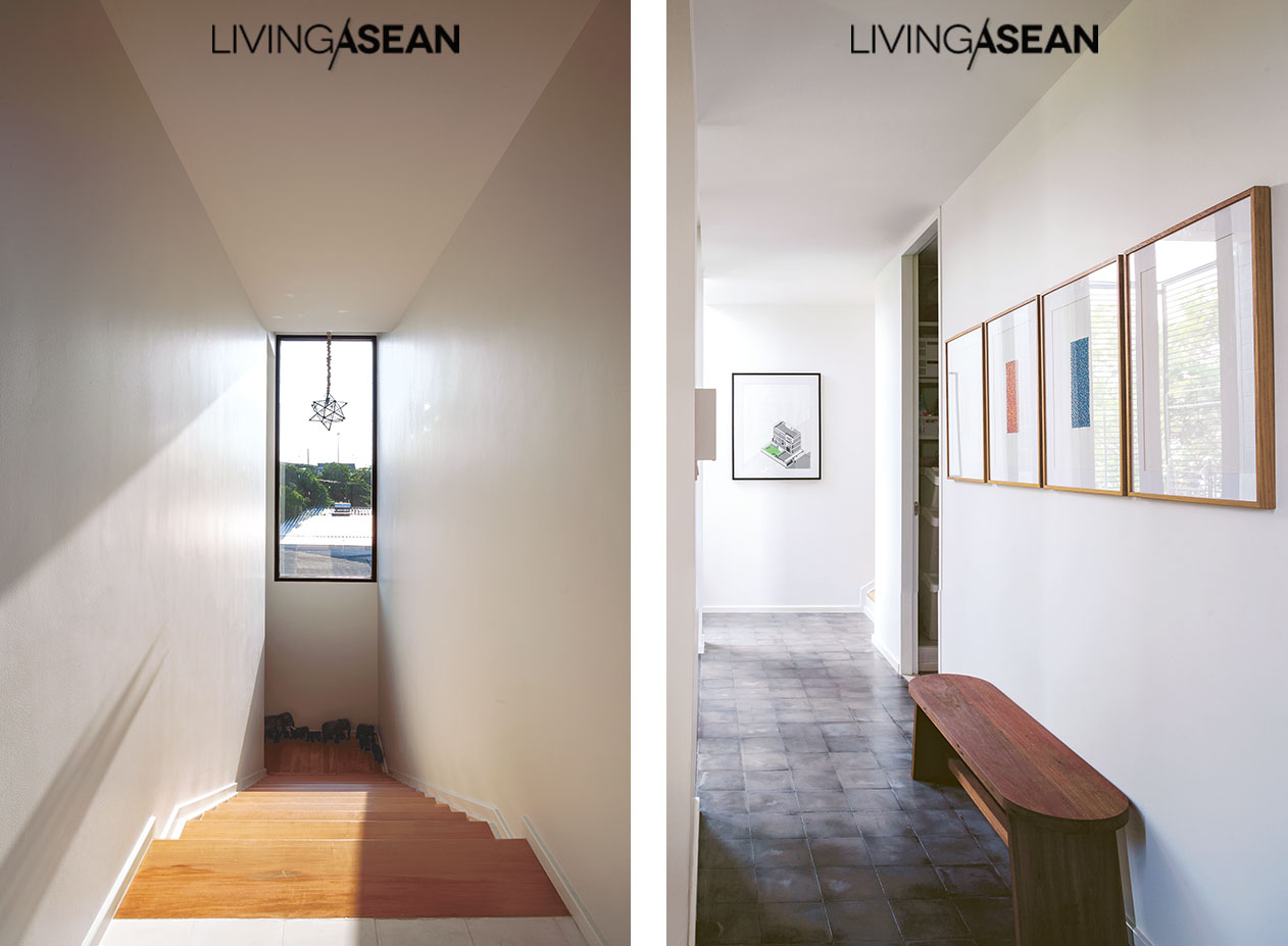
The residential entry area is made less visible by design. It’s an ordinary swing door tucked away in a quiet place. Upon entering, you find a flight of stairs leading to the second floor that’s the first step into the home.

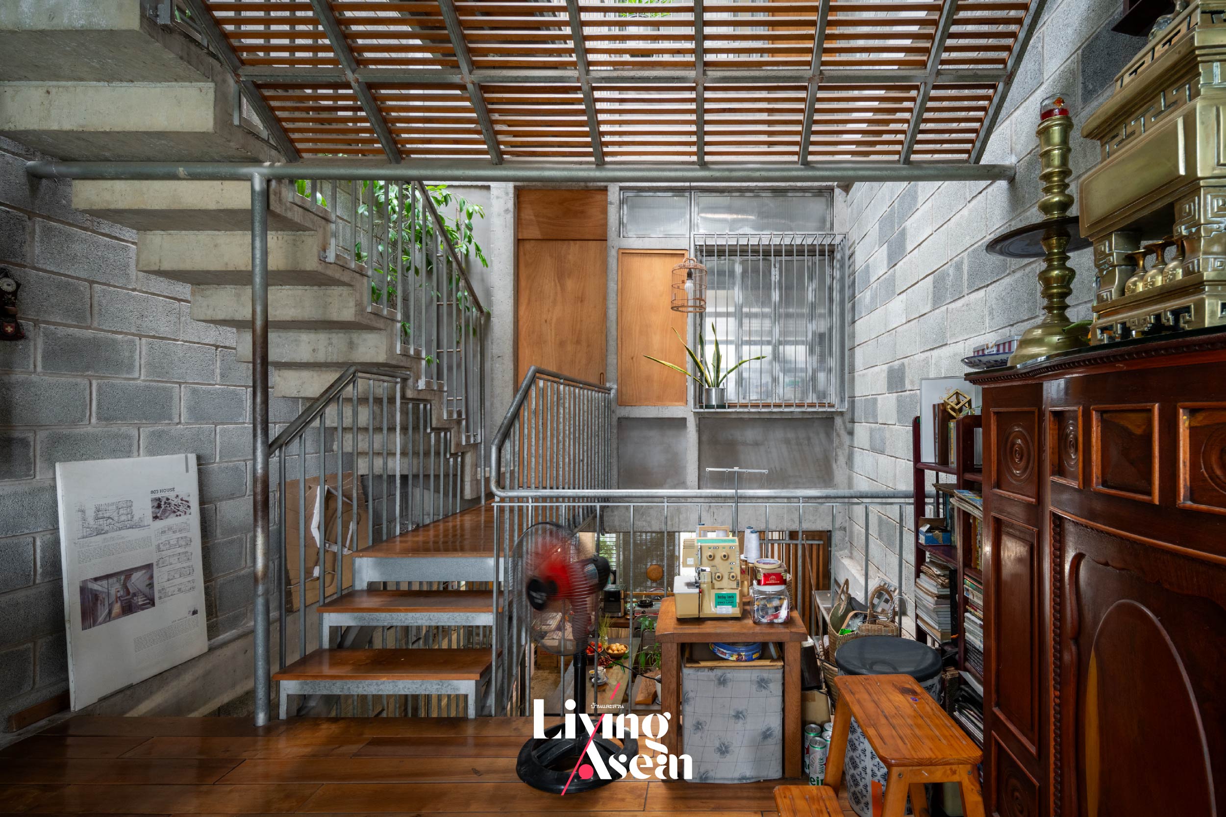
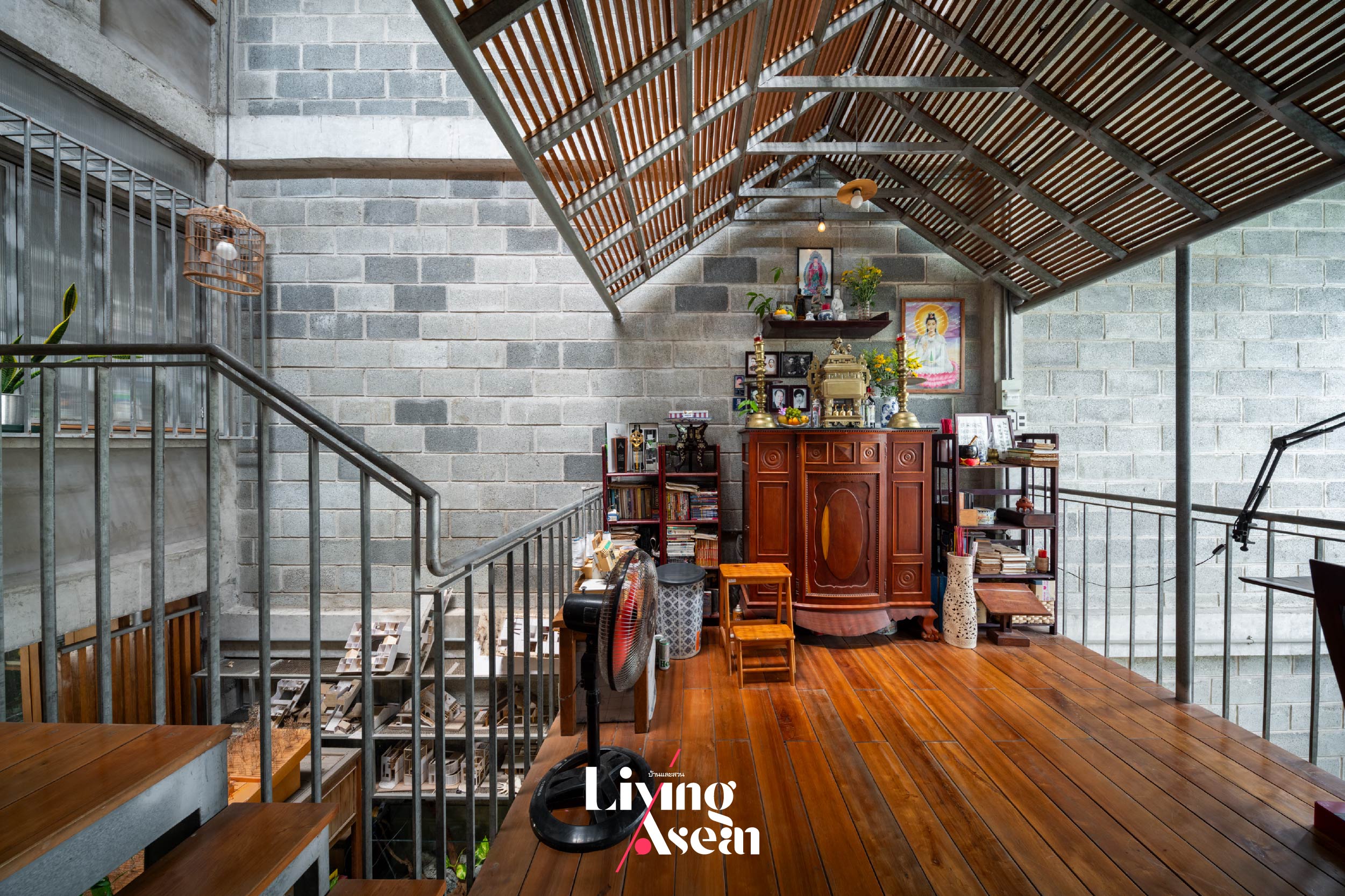
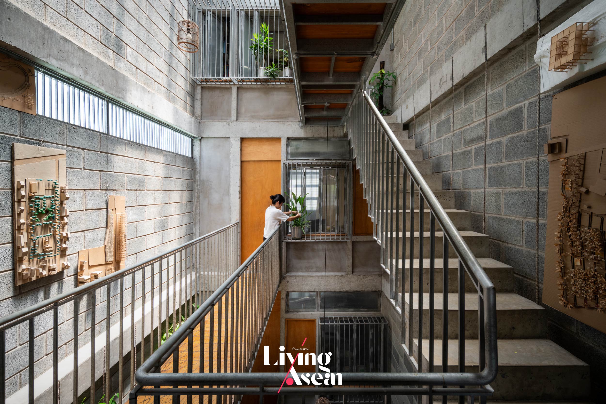
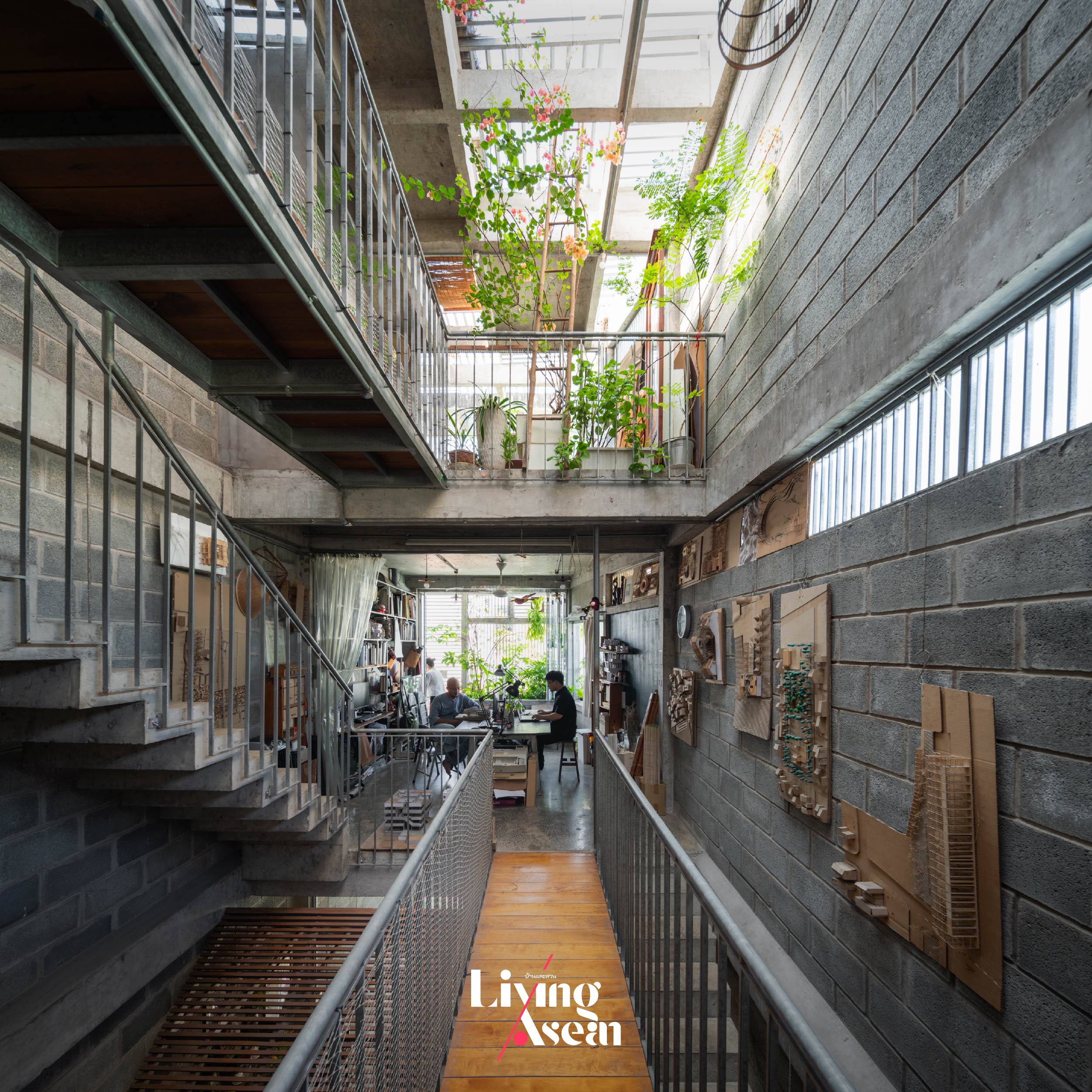
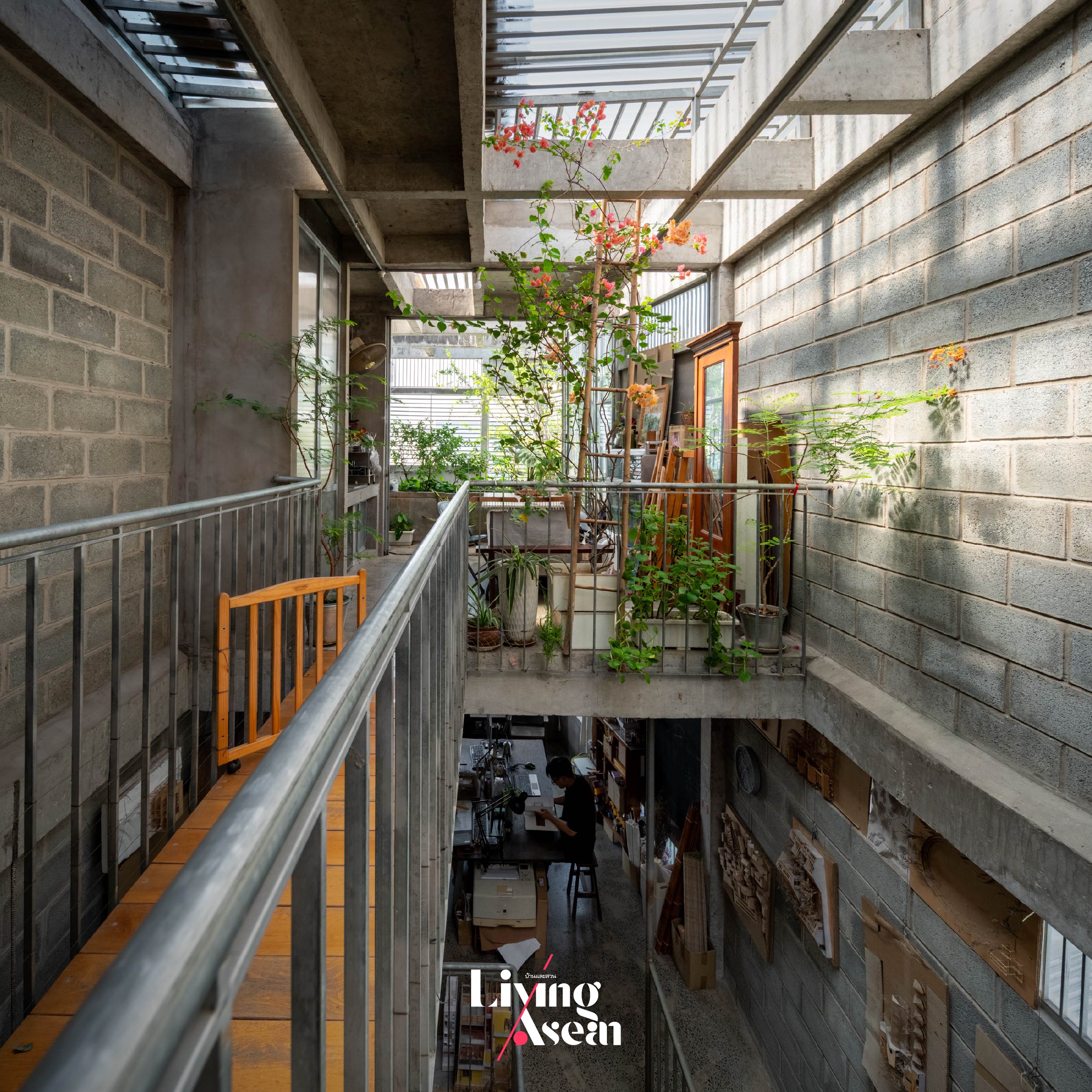
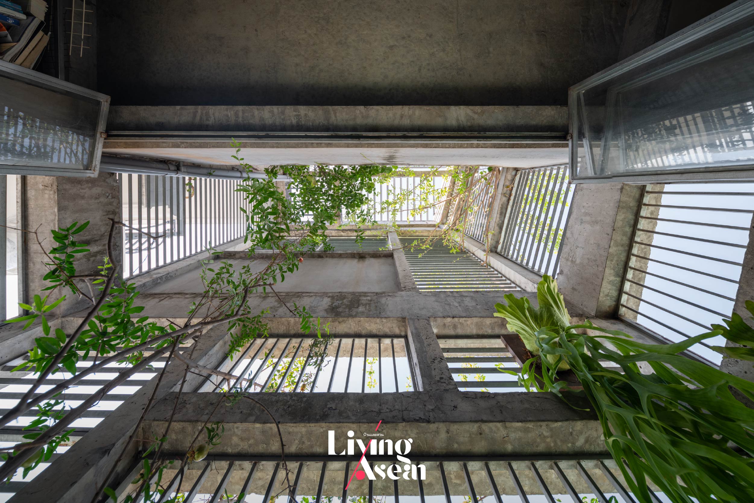
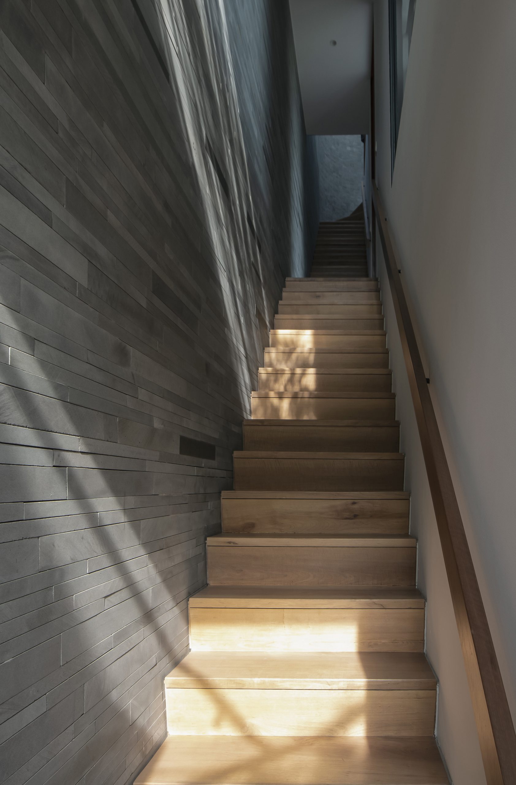
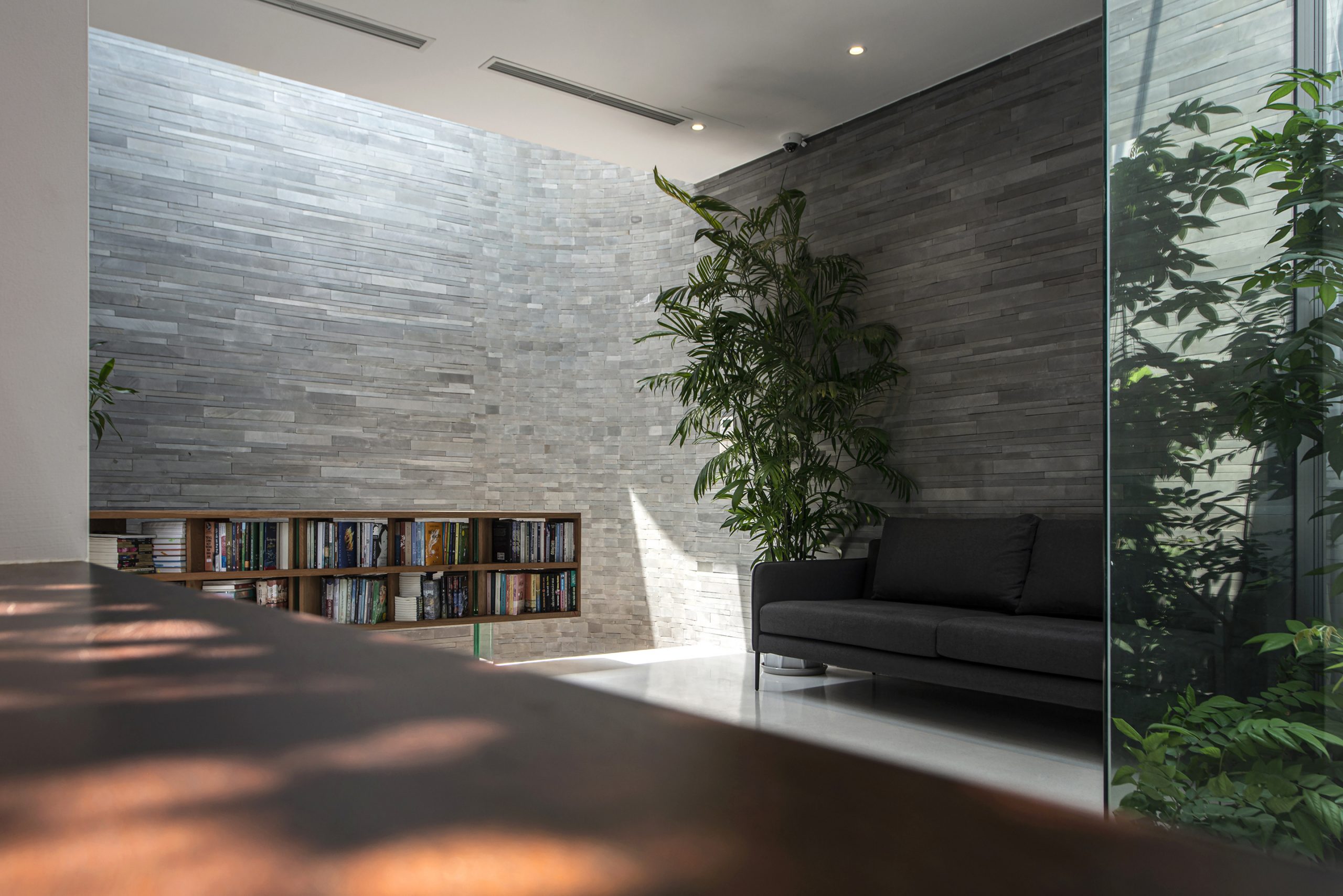
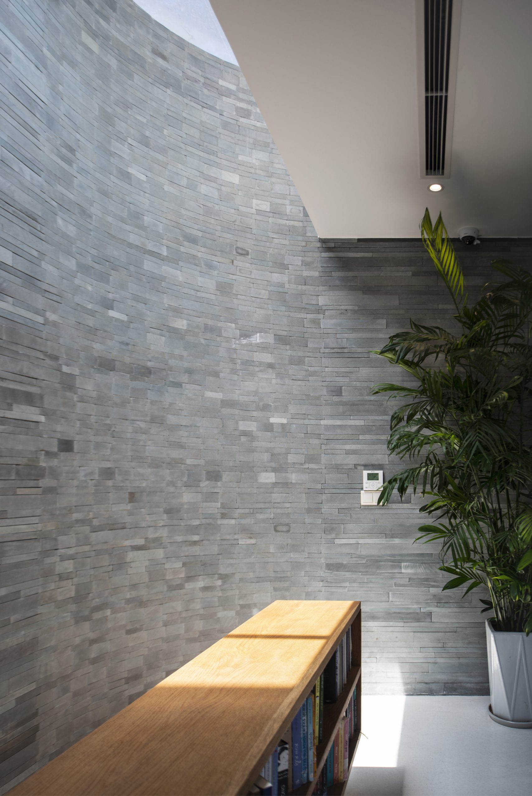
The stairwell and upstairs sitting room are well-lit by shafts of sunlight streaming in through the rooftop and generous openings in the walls.

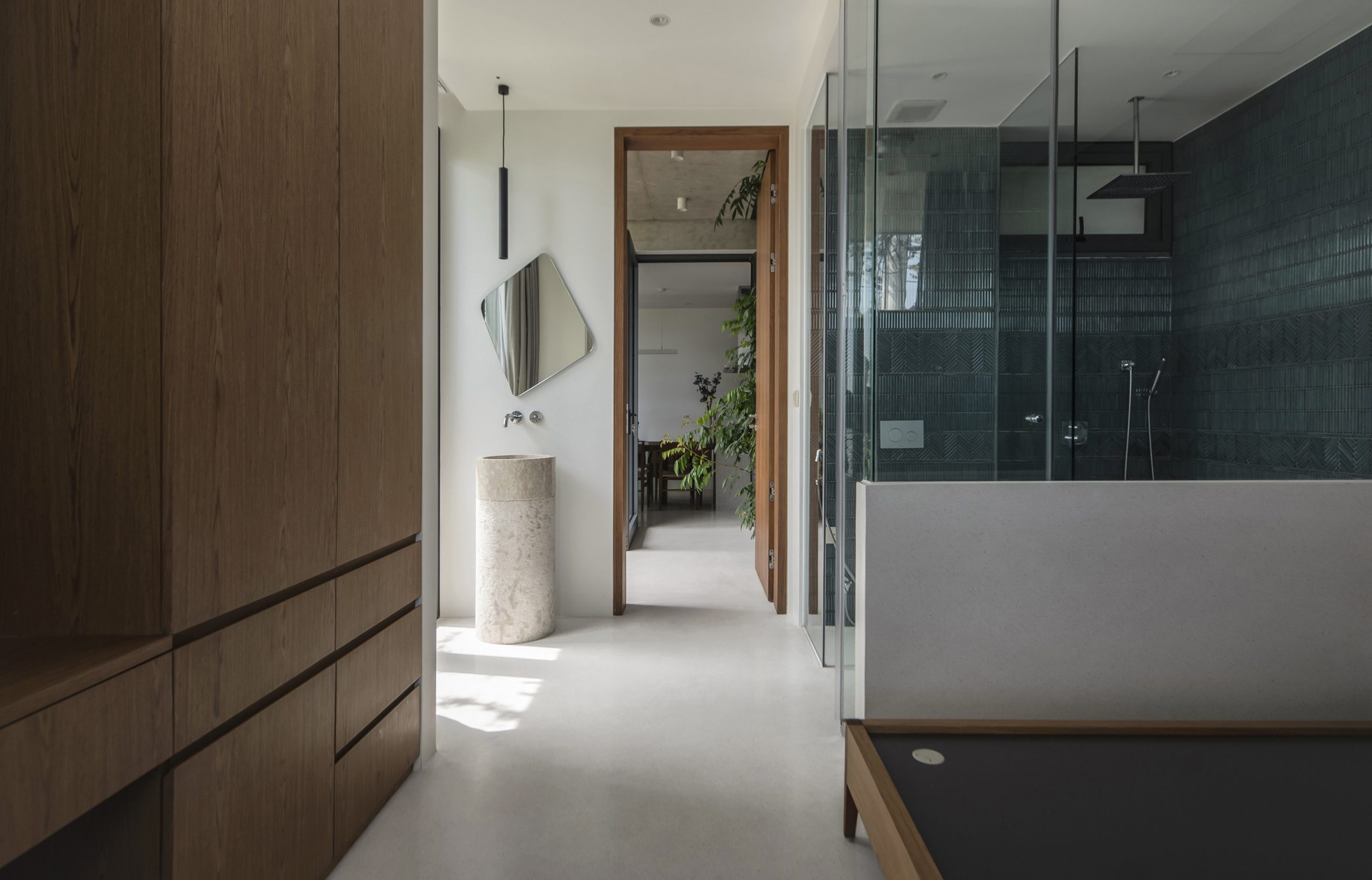
Overall, the home interior is simple and clean with the clearly defined order for space utilization. Where appropriate and legal, the architect put in generous openings in the exterior walls to connect the indoors with outdoor spaces. And the result of all this is a feature wall on the side overlooking the covered carport.

It’s an architectural feature that’s easily noticeable and immediately appealing from a distance. Apart from adding visual interest to the building’s external envelope, it allows plenty of fresh air and natural light, creating a relaxed ambience in the indoor living spaces.

Home Office vietnam MAISON K

Home Office vietnam MAISON K

Pursuant to the city ordinances in effect at present, only two sides of the exterior overlooking the traffic circle and the street below are permitted to have openings in the walls. The other two sides adjacent to neighboring buildings do not enjoy the same privilege.

However, what is lacking due to limitations is nicely compensated for by rooftop skylights that illuminate the stairwell and other parts at the rear of the home. It’s a practical solution that helps reduce electricity costs and protect against humidity damage over a long period of time.

Home Office vietnam MAISON K
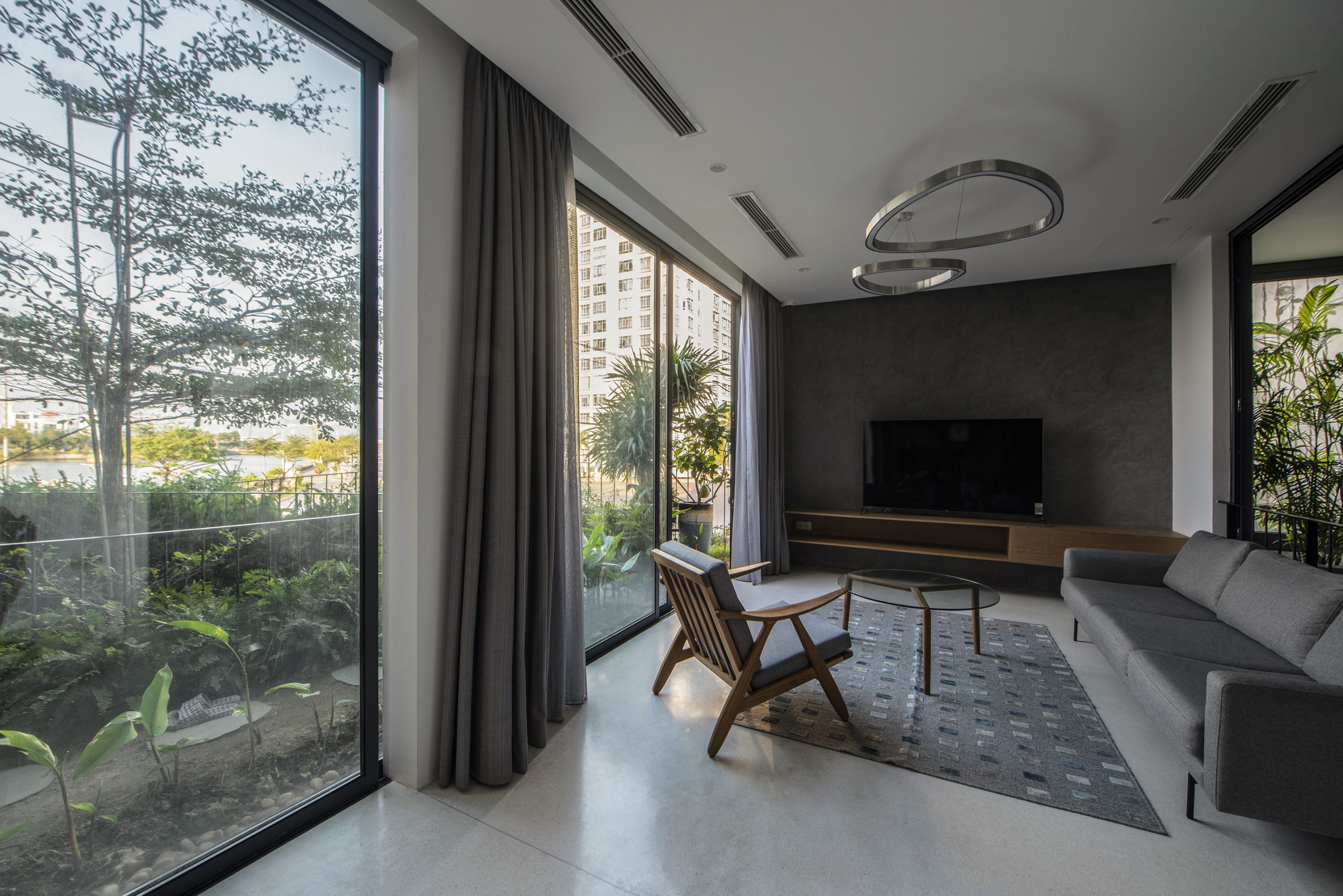
The third floor holds the family’s main living area.

Home Office vietnam MAISON K

Meanwhile, the other two sides have an unobstructed view of the roundabout and the street below. Climb another flight of stairs, and you come to the third floor holding the family’s main living area that’s protected by the feature wall of shimmering ceramic panels in muted shades of orange.

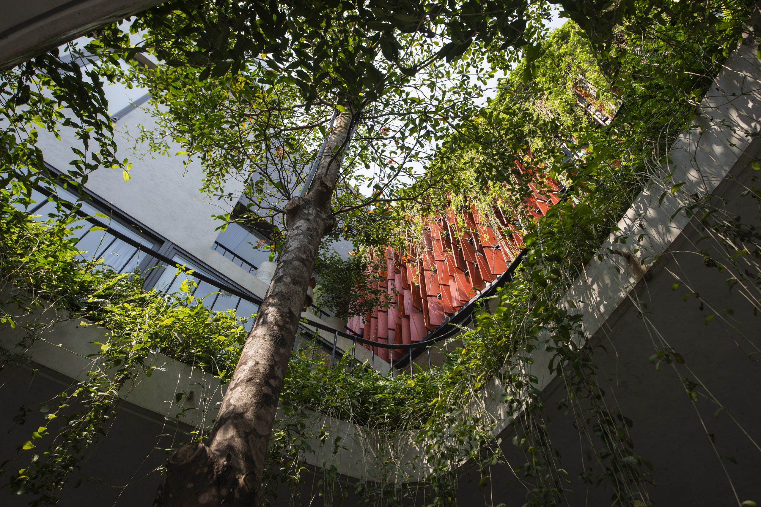
Together they provide a layer of insulation against heat and stress, protecting the gray concrete wall behind it. The ceramic panels that form the first line of defense are hinged on one side and swing open like doors to control light and winds passing through. The panels have grooves in them so as to drain stormwater fast in heavy rain.

Home Office vietnam MAISON K

Home Office vietnam MAISON K
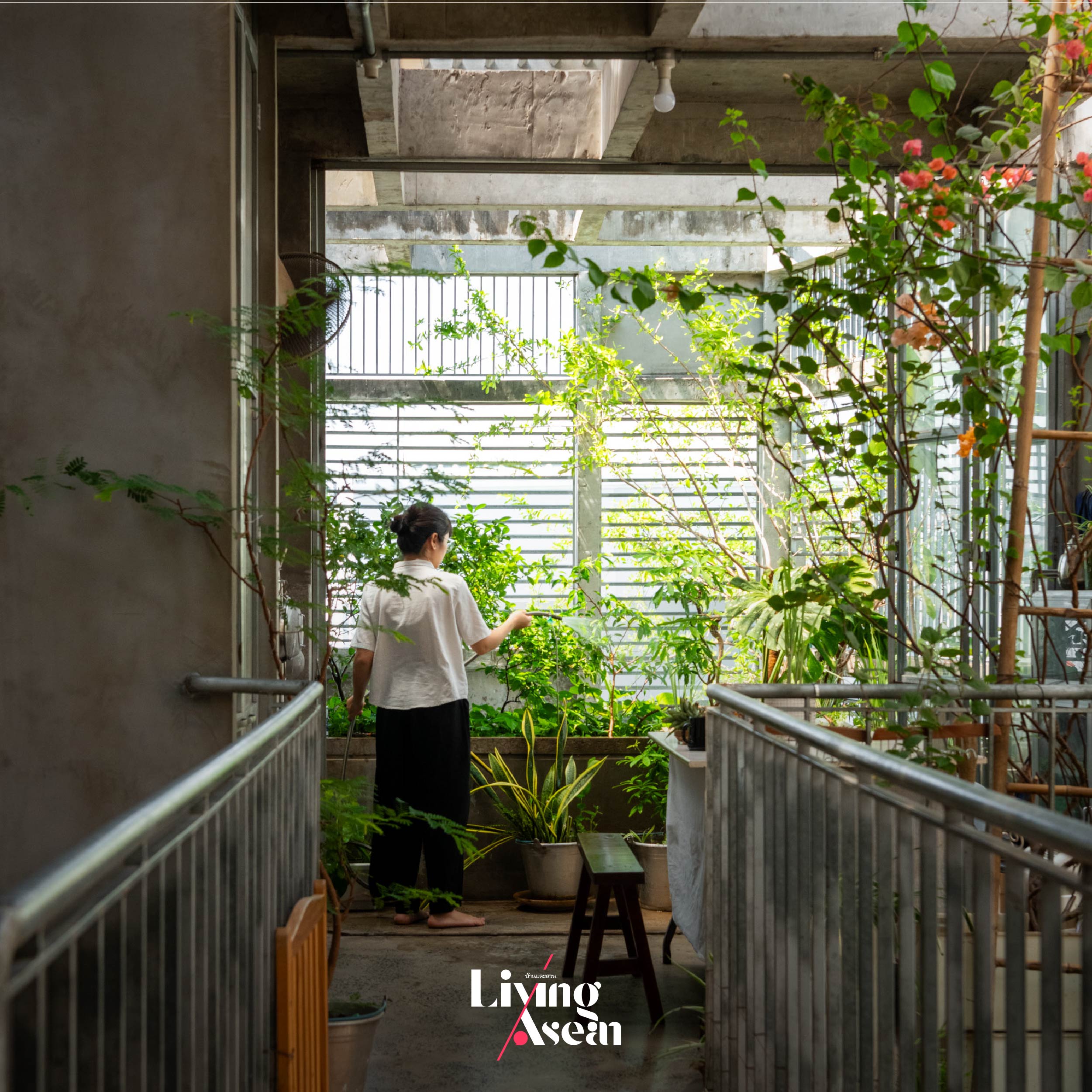
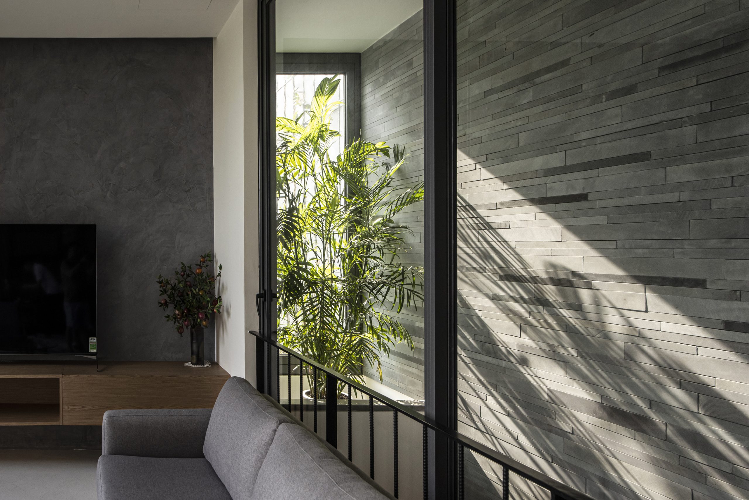
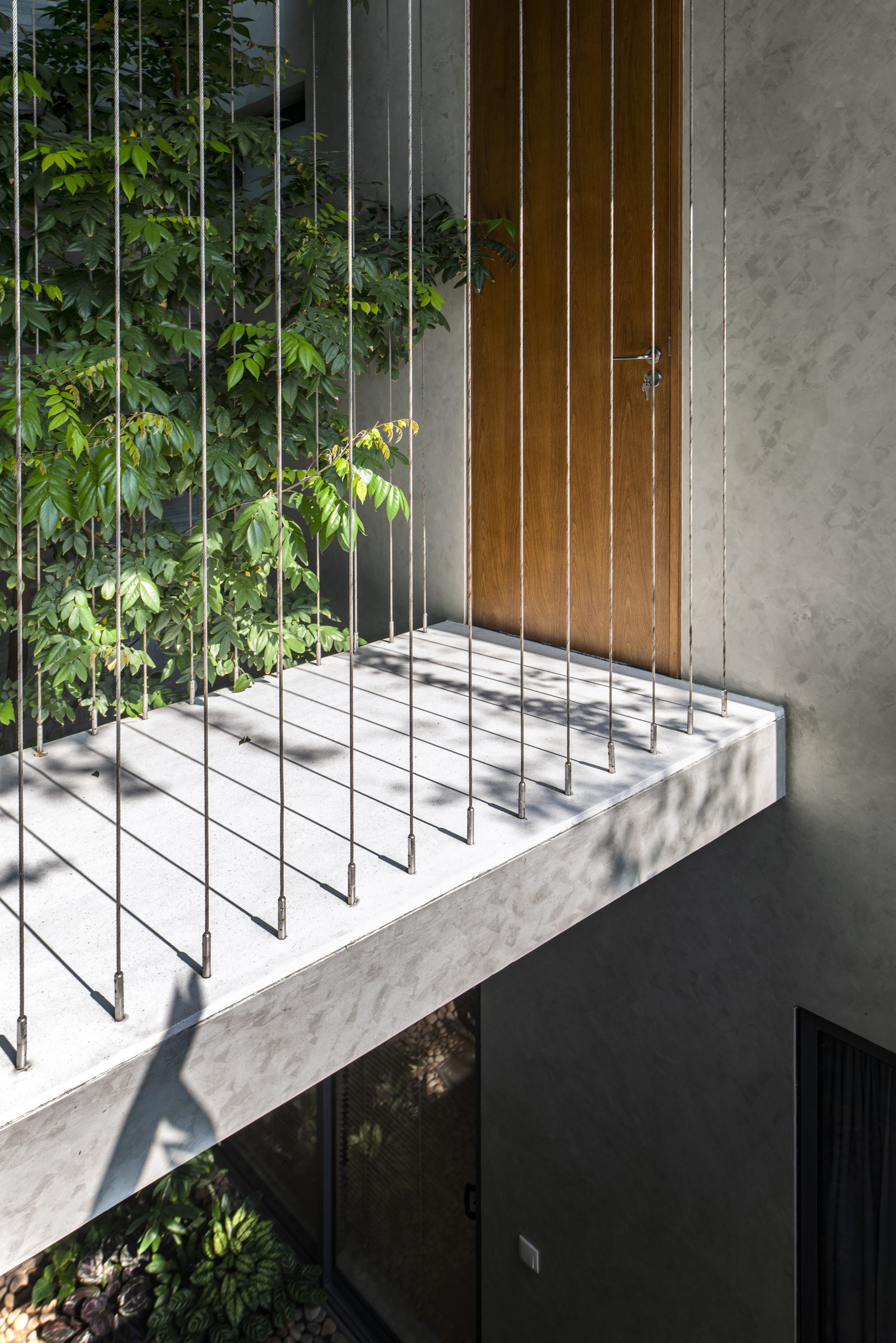
The upper branching of a tree rises through the void of space on the second floor, creating an oasis of calm and a focal point in the upstairs courtyard.
Home Office vietnam MAISON K
An impressively geometric facade projects from the building. Its feature wall is covered in multiple ceramic panels in subdued shades of orange. Hinged on one side, they swing open like doors to control air and light streaming into the interior, an architectural feature designed to create an indelible impression on people passing by.

All things considered, it’s a revolutionary idea that integrates greenery as an integral part of architectural design. Green spaces offer multiple health benefits. Among other things, they give the building its character, provide shade and improve air quality.

From a distance, they add visual interest to the urban space around the traffic circle. More so than anything else, it’s the lively green and orange façade that creates a gently calming effect for people passing by.

Home Office vietnam MAISON K
Viewed from across the street in the nighttime, Maison K is a clean, well-lighted place created for health, comfort and security.

Architect: Nghia Architect (www.nghiaarchitect.com)

Lead Architect: Nguyen Tuan Nghia


You may also like…

ACH HOUSE airy indonesian homeACH House: An Airy, Bright and Well Composed Indonesian Home

Tile House: Façades of Glimmering Tiles with a Story to Tell

ReGEN House: Modern Home, Thai Concept, Great for Family Members of All Ages

ReGEN House: Modern Home, Thai Concept, Great for Family Members of All Ages

/ Bangkok, Thailand /

/ Story: foryeah! / English version: Peter Montalbano /

/ Photographs: Chalermwat Wongchompoo /

“ReGEN House,” Pankwan Hudthagosol’s home, was designed as a modern home for a multigenerational family. Built on the same property as his father’s house, its concept echoes his father’s belief that the gift of warmth and closeness can show us how to think and live, and both welcomes and provides a foundation in life for young Mena, the newest family member. It began with a great design from EKAR Architects.

Modern Home ReGEN House Ekar Architects
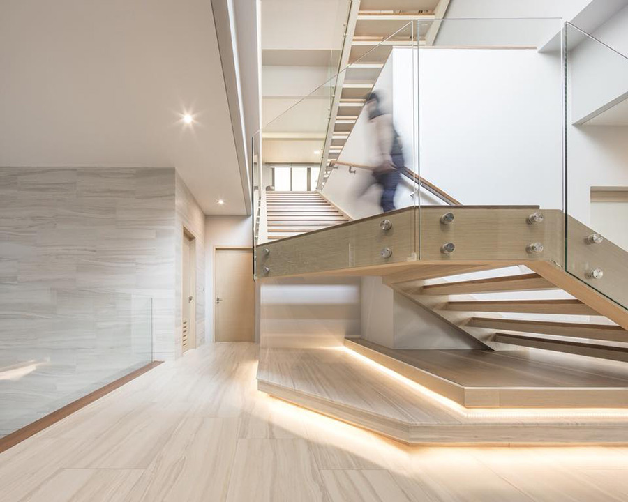
The four-storey building on about ¼ acre of land has an interior space of 1600 meters. Its L-shaped layout opens on a green courtyard facing the forest-like garden at “Grandpa’s” house, connecting views for the people of three generations.

Modern Home ReGEN House Ekar Architects

Modern Home ReGEN House Ekar Architects

Modern Home ReGEN House Ekar Architects

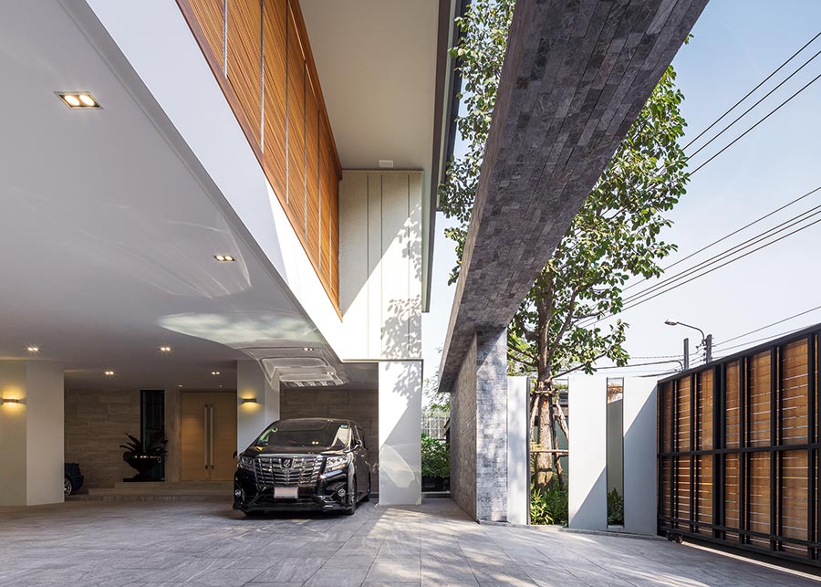
The first floor holds a carport, maid’s bedroom, and rooms for swimming pool equipment and other services.

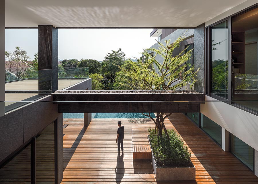
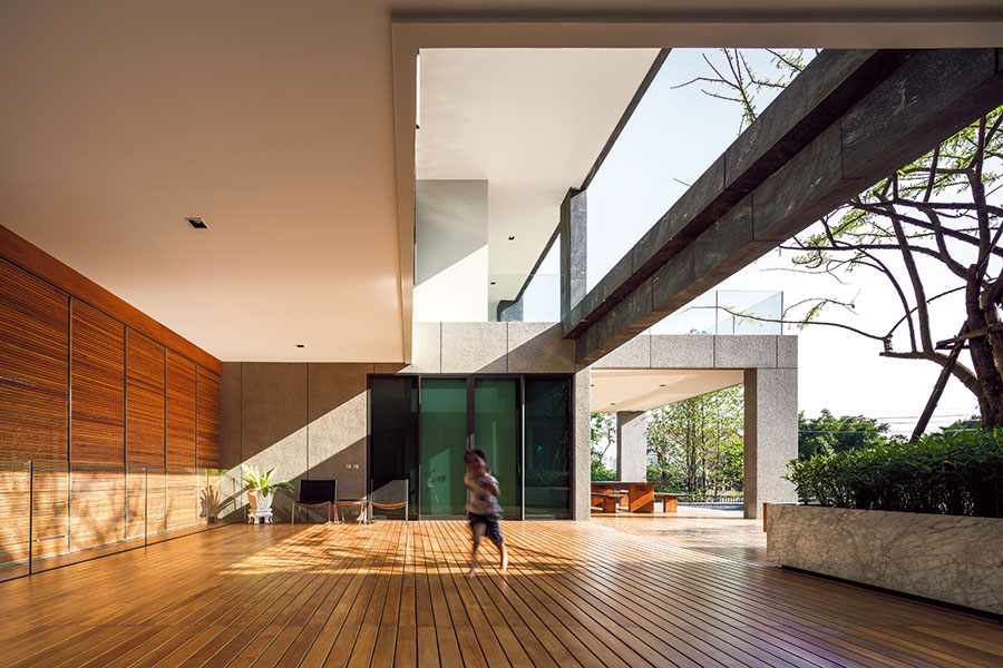
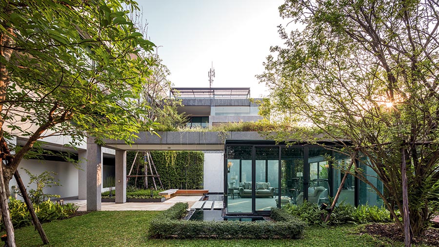
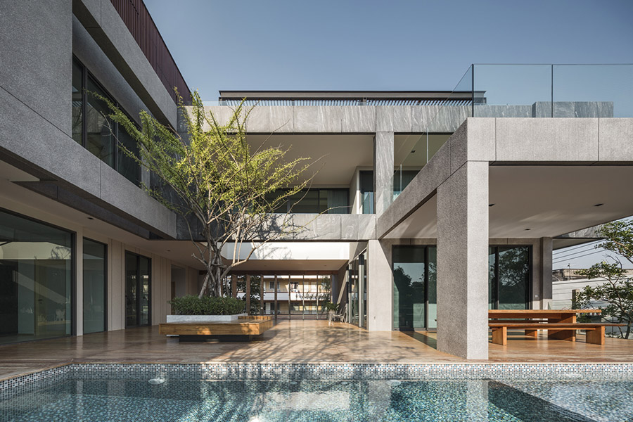
The heart of this modern home is the second storey, where a wide balcony/deck taking up a full half of the floor space is used for family recreational activities.

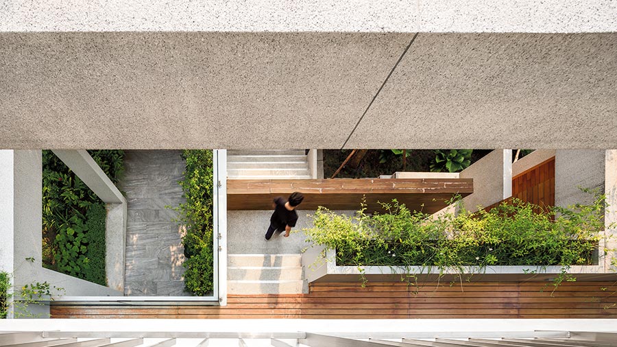
This floor is designed to give the sense of being at ground level, as it reaches out to a “green roof” planted with ground cover seemingly floating atop a gazebo rising from the garden below, and with a swimming pool right there giving the feeling of an old-time streamside home.

Modern Home ReGEN House Ekar Architects

Modern Home ReGEN House Ekar Architects

Modern Home ReGEN House Ekar Architects

Modern Home ReGEN House Ekar Architects

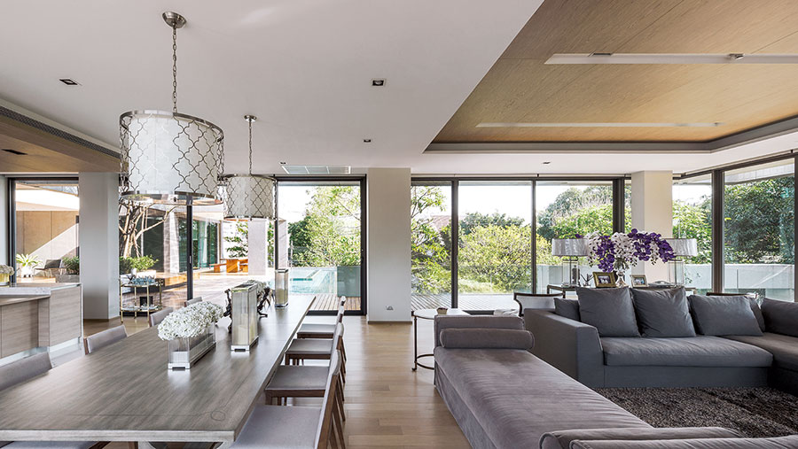
The third floor includes a bedroom and workroom with large glass windows offering a panoramic view of Grandpa’s house and the big garden. The fourth floor is all about young Mena and her bright future.

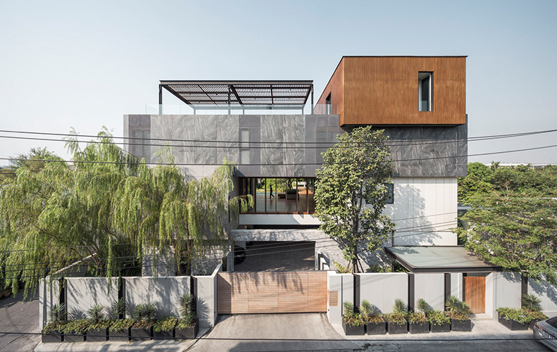
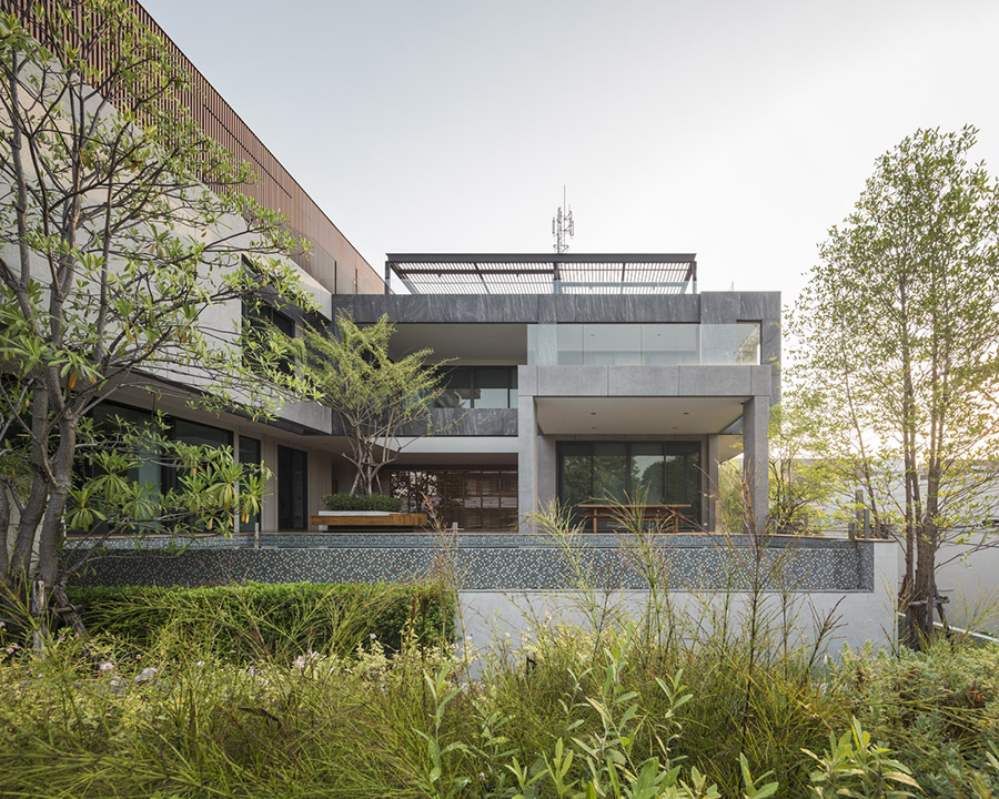
The 4-storey height of the building gave the designers the opportunity to show differing siding materials on each floor, which they did using synthetic wood, stone, tile with stone designs, and glass.

Modern Home ReGEN House Ekar Architects

Modern Home ReGEN House Ekar Architects

Modern Home ReGEN House Ekar Architects

Modern Home ReGEN House Ekar Architects

If we look from the outside at the way the floors overlap, we get the impression of being a moderately sized house set inside a large one. Each floor has a self-contained design similar to a penthouse, including bedroom, bathroom, living room, and kitchen of its own, so the whole house is a bit like a four-storey apartment building.

To give a sense of spaciousness, doors and windows were put in only where necessary, but they can be conveniently opened and shut to give privacy.

Modern Home ReGEN House Ekar Architects

Modern Home ReGEN House Ekar Architects

This house shows how modern design can be used to catch the spirit of the traditional Thai family residence of earlier days where many generations lived together, as modern architecture directly inserted into an urban environment manages to beautifully preserve a truly Thai way of life.


Owner: Pankwan Hudthagosol

Architect: EKAR

Interior Architect: Define Studio

Landscape Architect: Grounds play Studio

Structural Engineer: Sommuek Apiraksa


Visit the original Thai version.

REGEN HOUSE บ้านดีไซน์โมเดิร์น แต่แนวคิดไทย อยู่ได้ทุกวัยในครอบครัว


You may also like…

HUAMARK 09: An Architect’s Charming Concrete Block House

A Box-shaped House in A Mid-City Garden by Vin Varavarn Architects 
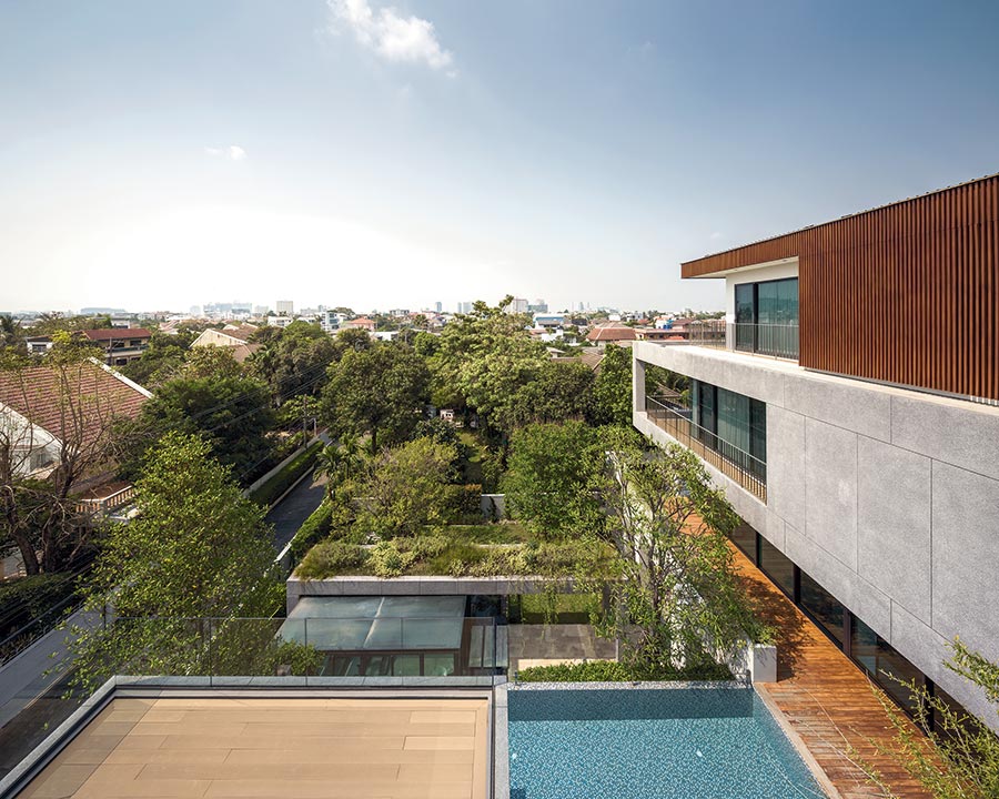
Huamark 09: A Concrete Block House Stands the Test of Time

Huamark 09: A Concrete Block House Stands the Test of Time

/ Bangkok, Thailand /

/ Story: foryeah! / English version: Peter Montalbano /

/ Photographs:  Nantiya /

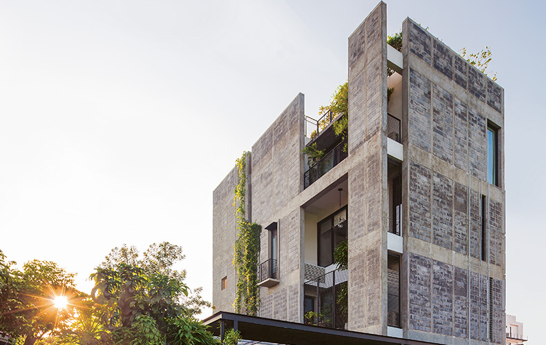
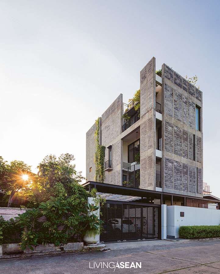
Codenamed Huamark 09, this four-story home wrapped inside the concrete block envelope belongs to architect Intanon Chantip, aka “Non” of the INchan Atelier, a Bangkok-based architectural practice. It’s a design experiment aimed at testing several theories that he’d arrived at through intense study and experience. The architect wanted his concrete block home to tell its own story through changes in the looks of construction materials. Precisely, all the years that pass by will leave their trace of time as the house ages. It will be interesting to see how the building materials perform in the course of time.

Concrete Block House
The concrete block home resembles four big boxes stacked one on top of the other. The fence that protects the first floor of the house is painted a cool-toned white that contrasts with bare walls on Levels 2, 3 and 4 intentionally left exposed to blend with other houses in the neighborhood.

Not that long ago, Non and his wife Tharisra Chantip, aka Ploy, bought this 80-square-wah property (320 square meters) in Hua Mark District on the outskirts of Bangkok. They had the old 30-year-old house demolished to make room for a new four-story concrete home integrating office, art studio and residential spaces to form a coherent whole.

The building external envelope is built of concrete blocks without plaster. It’s left uncovered on purpose so as to blend with everything else in the neighborhood. All together the usable space comes to 490 square meters.

Concrete Block House
Like everything else, the principal face of the house is intentionally of cement blocks, which collect dust and dirt as they change color with the seasons. Outer metal grating lets climbing vines grow naturally reaching for sunlight.

The homeowner couple divided the property into northern and southern sections. They raised the property slightly higher from ground level to put in a garden to the north, then a rectangular building to the south.
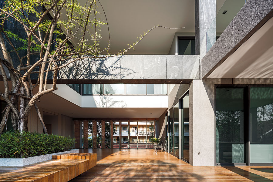
The building’s long side runs east-west to block prevailing winds and allow openings to control sunlight and breeze streaming into the home.

The house’s four-meter width is comparable to most row houses in the area. Each side has double walls that work simultaneously for ventilation and heat insulation. Door and window openings reinforce the concrete block house’s primary relationship to weather conditions, wind, and sun.

On the south side are fewer openings because of a staircase, while north and east sides have balconies and various service areas reaching around to the west side, which also has the double walls characteristic of the building’s overall design.

Concrete Block House

Concrete Block House

Concrete Block House

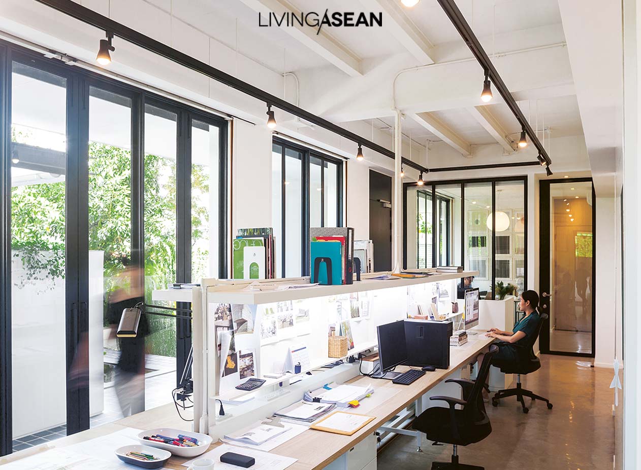
The four levels are divided according to function. The architects’ offices are primarily in two first floor rooms: a larger one with a long work table for working in teams and a smaller one that serves as meeting room and library.

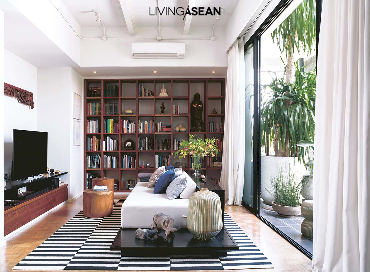
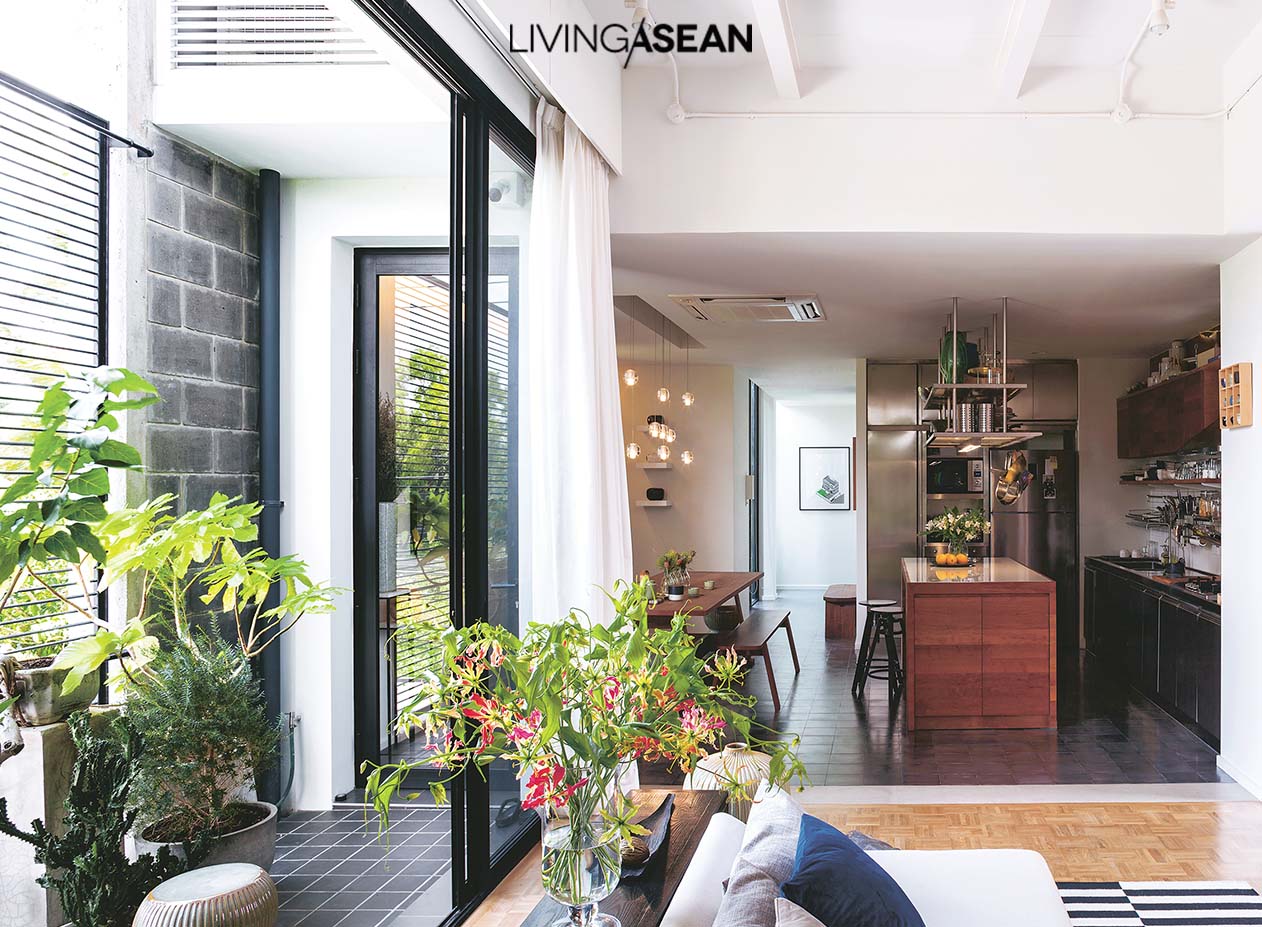
The second floor is a private residential area, with a living room connecting to kitchen and dining area.

Concrete Block House

Concrete Block House

Concrete Block House

Concrete Block House

The third floor contains one bedroom for Non and Ploy and another for Non’s mother. The two are connected with a shared bathroom.

The fourth floor is a studio for creative work and enjoyment. It’s designed with a view to high flexibility of function in expectation of anticipated future changes as little members of the household gradually grow up.

Concrete Block House

Concrete Block House

Concrete Block House

Concrete Block House

Concrete Block House

Concrete Block House

Concrete Block House


Architect: INchan atelier


You may also like…

MODERN STYLE IN A NEWLY RENOVATED HOUSE
COMPACT TROPICAL HOUSE
A Home with Unique Rooftop Design in Singapore

A Home with Unique Rooftop Design in Singapore

/ Singapore /

/ Story: Ronnapa Nit / English version: Bob Pitakwong /

/ Photographs: Sitthisak Namkham /

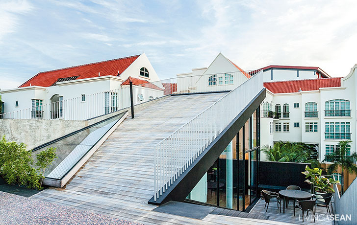
In Singapore, people look for creative ways to make the most of limited space, and that includes the rooftop design. A multiple-floor renovation by Formwerkz Architects clearly illustrates this. The Singapore-based architectural practice has succeeded in creating a unique living space on the rooftop tailored specifically to the homeowner’s lifestyle needs.

rooftop design
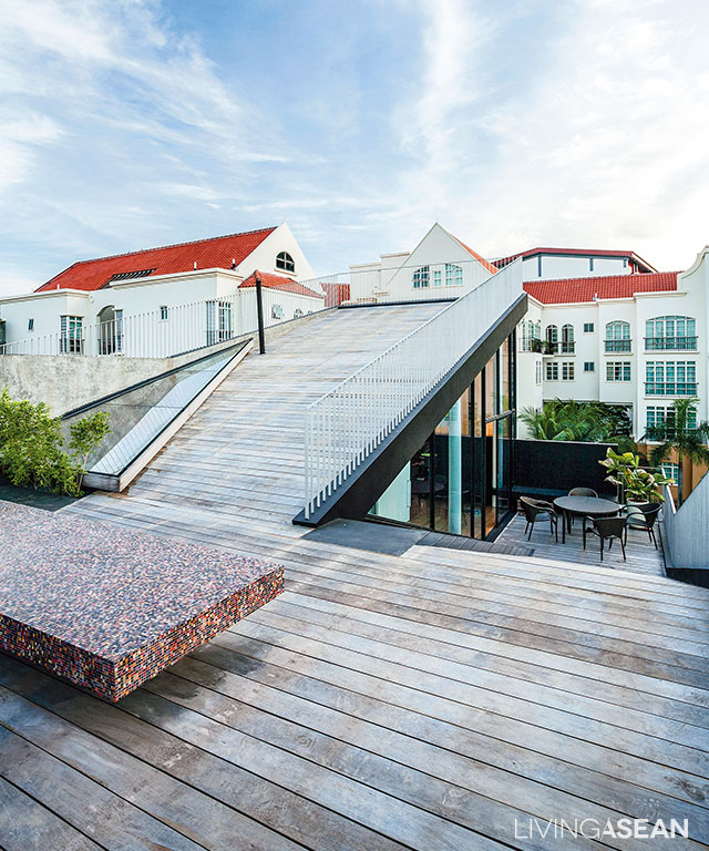
The rooftop deck is a vista point to capture amazing panoramic views.

From a distance, the place looks similar to other two-story homes in the neighborhood, except for the rooftop deck. The platform-like structure is unlike anything else, yet it fits right in the modern context that forms the setting of the area.

[Left] An open kitchenette connects with the dining room making the area look neat and uncluttered, while a warm shade of brown and burgundy on the wall contrasts with modern furniture. / [Right] A U-shaped sectional sofa is set against the wall to maximize space.
[Left] An open kitchenette connects with the dining room making the area look neat and uncluttered, while a warm shade of brown and burgundy on the wall contrasts with modern furniture. / [Right] A U-shaped sectional sofa is set against the wall to maximize space.

The designing process started out with the living room, dining room and kitchen before moving on to the upper floors that hold a sitting room, multipurpose area, bedrooms and a rooftop deck. It represents a line of thought that ensures all areas are easily accessed and connected.

The overall effect is very light and airy, thanks to natural light shining through a rooftop skylight and fixed windows in the sidewall.

Fundamentally, it’s about harnessing the power of nature to create good living conditions. This is evident in well-thought-out design that ensures no electric light is ever needed during the daytime, translating into big savings plus excellent indoor thermal comfort.

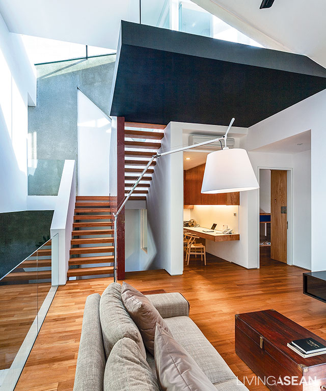
Earth-tone color adds a touch of warmth to the living room on the second floor.

Strictly speaking, the interior living space is an interesting amalgam of modern architecture and graphic design innovations. This is especially true of the living room, where Art Deco style meets modern materials, such as mosaic tiles, terrazzo walls, glass panels on wood, and metal frames.

[Left] A nook beside the wall offers seclusion in the son’s bedroom. Louvered windows with wood slats alternating with glass panels are used to aid air circulation. [Right] The front facade bedecked with a vertical garden provides natural sunscreens protecting the master bedroom.
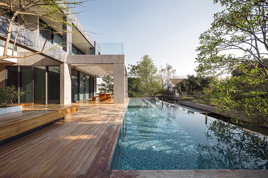
[Left] A nook beside the wall offers seclusion in the son’s bedroom. Louvered windows with wood slats alternating with glass panels are used to aid air circulation. / [Right] The front facade bedecked with a vertical garden provides natural sunscreens protecting the master bedroom.
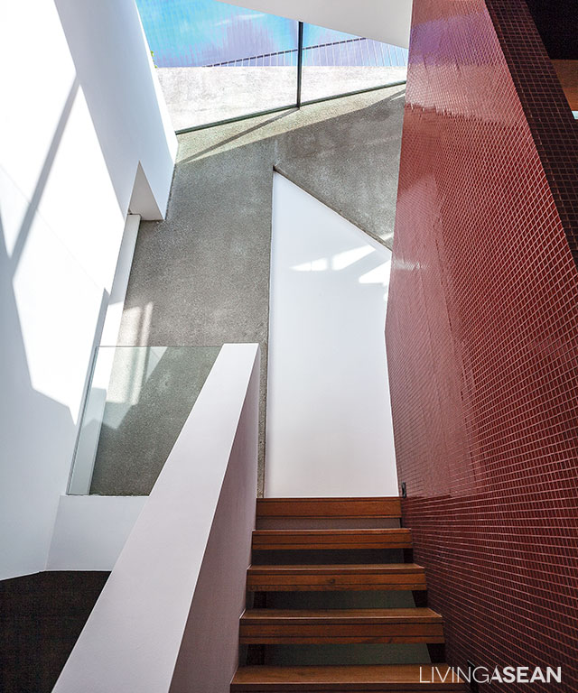
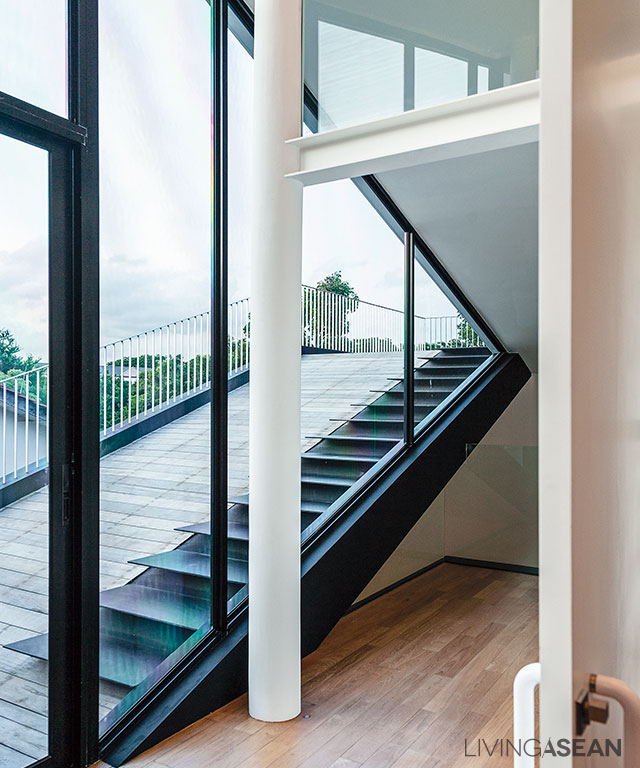
The stairwell connecting to the lower floor is illuminated by a rooftop skylight.
[Left] A bright and airy bathroom at the far end is visible from the stairway leading to the top deck. [Right] The bathroom in white comes with a wall-mounted countertop. The mirror with a rounded corner paired with soft pink recessed lighting creates a sense of spaciousness.
[Left] A bright and airy bathroom at the far end is visible from the stairway leading to the top deck. / [Right] The bathroom in white comes with a wall-mounted countertop. The mirror with a rounded corner paired with soft pink recessed lighting creates a sense of spaciousness.
rooftop design
A ramp and a staircase provides access to the rooftop deck.

Among other things, the most eye-catching feature is the rooftop design that extends from the penthouse roof resembling a continuation of the indoor living space. The al fresco area is a perfect place to relax and unwind on a lazy afternoon, or to host an outdoor party.

From a distance, the newly remodeled house is thoughtfully devised to blend with the surroundings. It’s a way that forms a pleasing whole, where traditional and modern values peacefully coexist in this residential neighborhood of Singapore.

rooftop design
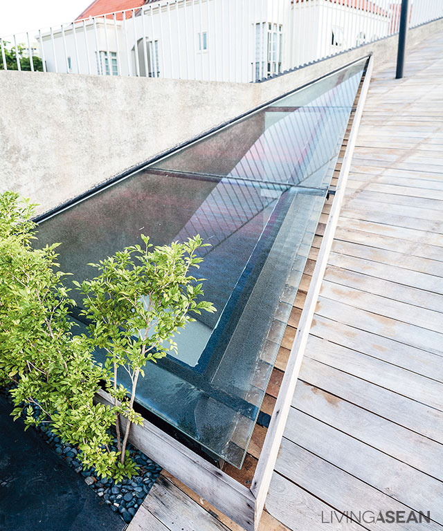
A skylight beside the rooftop deck allows plenty of sunshine to reach all the way to the lower floor.
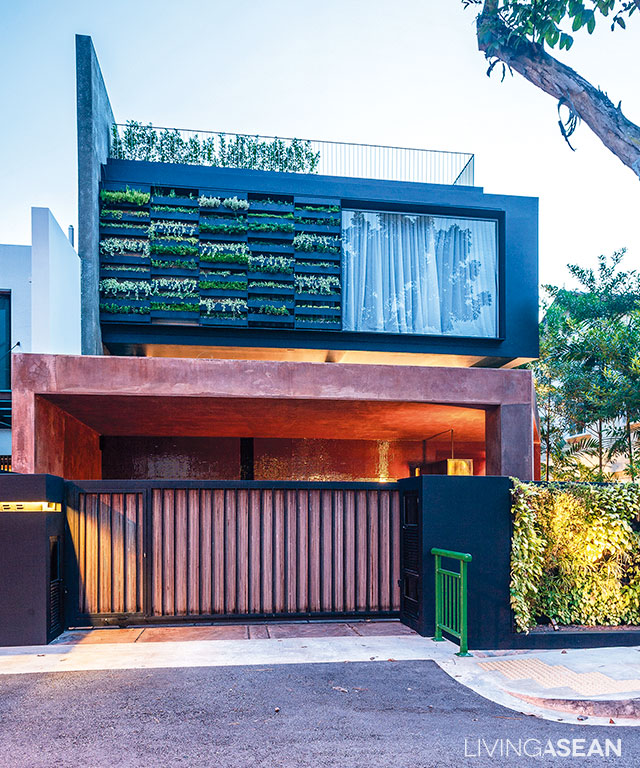
The house’s four levels lie hidden from view, while its front facade fits right in with two-story homes in the neighborhood.

Owner: Dr Kelvin Lee

Architect: Formwerkz Architects (formwerkz.com)


You may also like…

MP House: A New State-of-the-Art Live/Work DesignA Modern Breeze Blocks Tropical House in Ho Chi Minh City

X