Blog : design

Flexible Condo Living

Flexible Condo Living

Time changes, things change. People who stick with stability in life may find the fact troublesome but not Anirut Kittithichot, the owner of this flexible condo. To him, change is certain.

/// Thailand ///
Story: Mone /// Photos: Damrong /// Style: Phakhawadee /// Owner/ Designer: Anirut Kitthichot
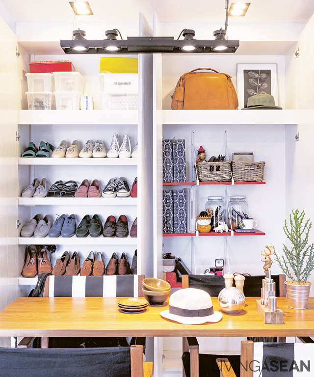
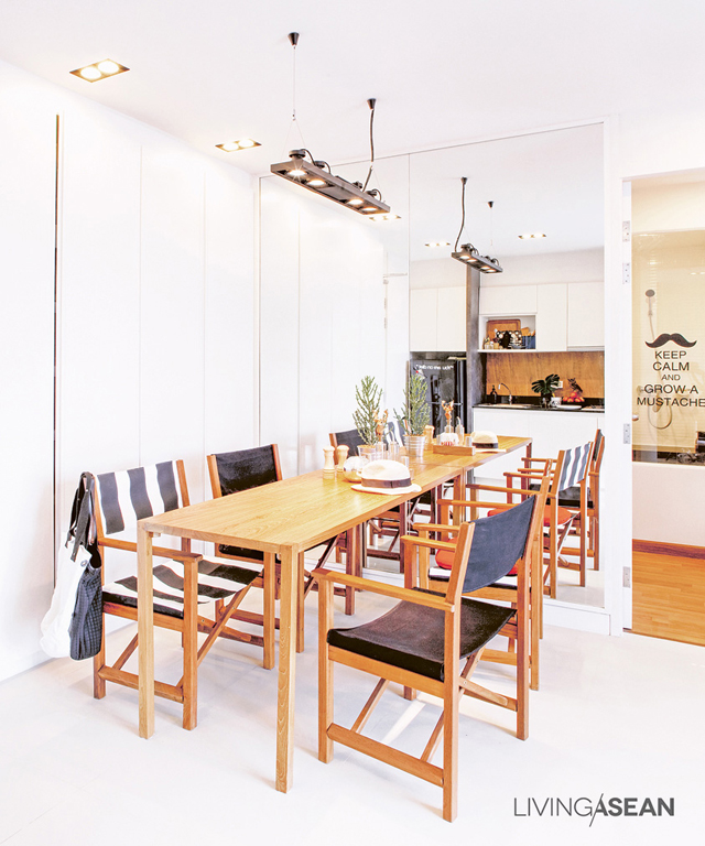
 

Shelves in this large built-in cabinet can be reassembled to maximize a storage space.


Setting the teak dining table against a mirrored wall makes the table looks longer. Laminated white-oak surface on the cabinet blends with the surrounding and gives an uncluttered feel.

Anirut was a marketing executive at Cotto. He left the job and signed up for a scholarship in business design at Domus University, Italy. Currently, he returned to Bangkok to work in marketing full-time again.
“I like things and got bored of things easily. To me, designing new works is a fun challenge.” Anirut said.

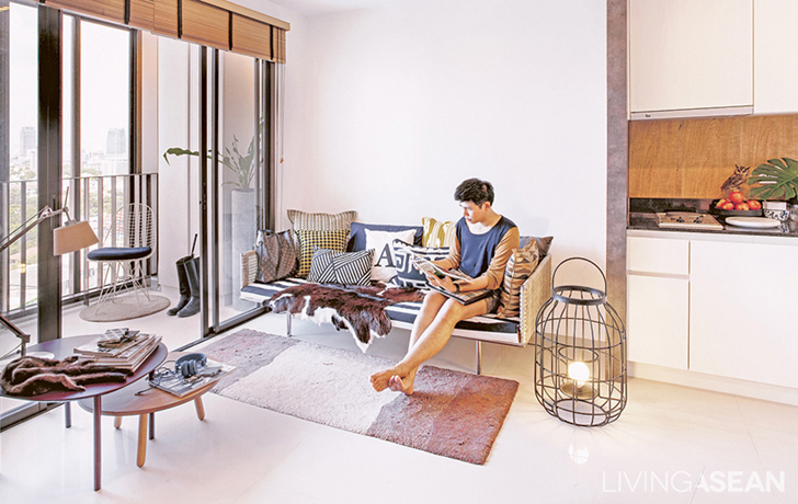
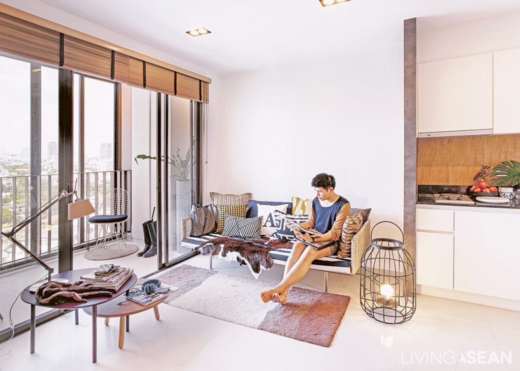
For a single young man like him, this 46-square-meter condominium room is not too small. The space is more than enough to apply his creativity. The empty room was gradually turning into a private kingdom reflecting his personal taste and individuality.
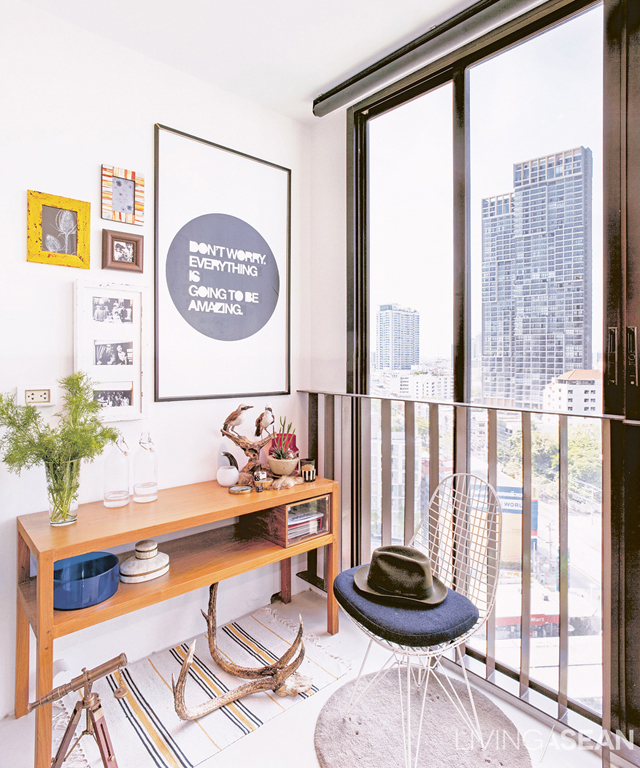
 

By putting a sticker of his favorite quote and a black frame in, the service door is hidden in plain sight.


The room is relaxing and friendly. Chilling music is playing, while its Scandinavian décor sets an easing mood. “Maybe the relaxing atmosphere comes from a good portion of light color. If I’d used birch wood instead of teak, the rooms would look even more Scandinavian. But I picked a teak table because of its future value. One day I might got bored of it, But I can still adapt it into something else.
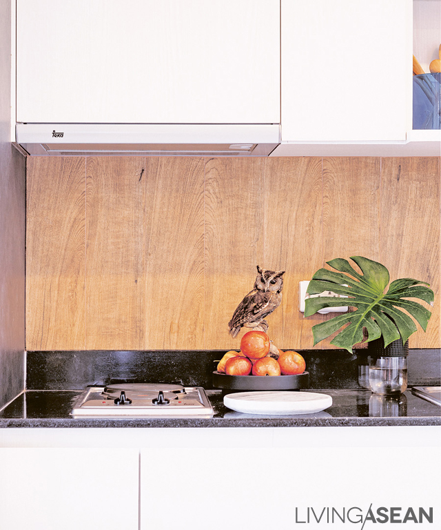
Wooden-like ceramic tiles give a rustic feel to the pantry wall while protecting the surface from humidity.


Always falling in love with new things, Anirut chose to mix and match his interior decoration. He also likes the challenge of hunting for rare and interesting items. Some of his furniture took a long journey from Milan. Some are from his trips. Some are from trade fairs, and some are his own creation made by his favorite furniture maker in Bang Po. The most outstanding pieces among these are antlers and furs, which give the room a rustic feel.
Anirut has a clever way of utilizing the space. He avoids installing fixed furniture in case of future changes except for built-in closets to keep little items (which seem to be a classic problem for every condominium dwellers) in some corners.
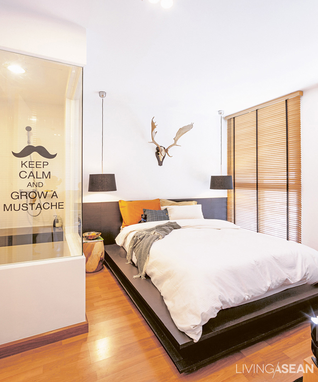
 

A hanging lamp is used instead of a bedside table due to space limitation. A sticker on the glass wall is removable. So, Anirut can change it as often as he wishes.


“I like having parties with my friends and having many people come over. But their working hours are odd. So, there are only 3-4 dropping by at the same time. To create an illusion of having many people and also to make the room appears larger, I installed a mirror at a dining table.”
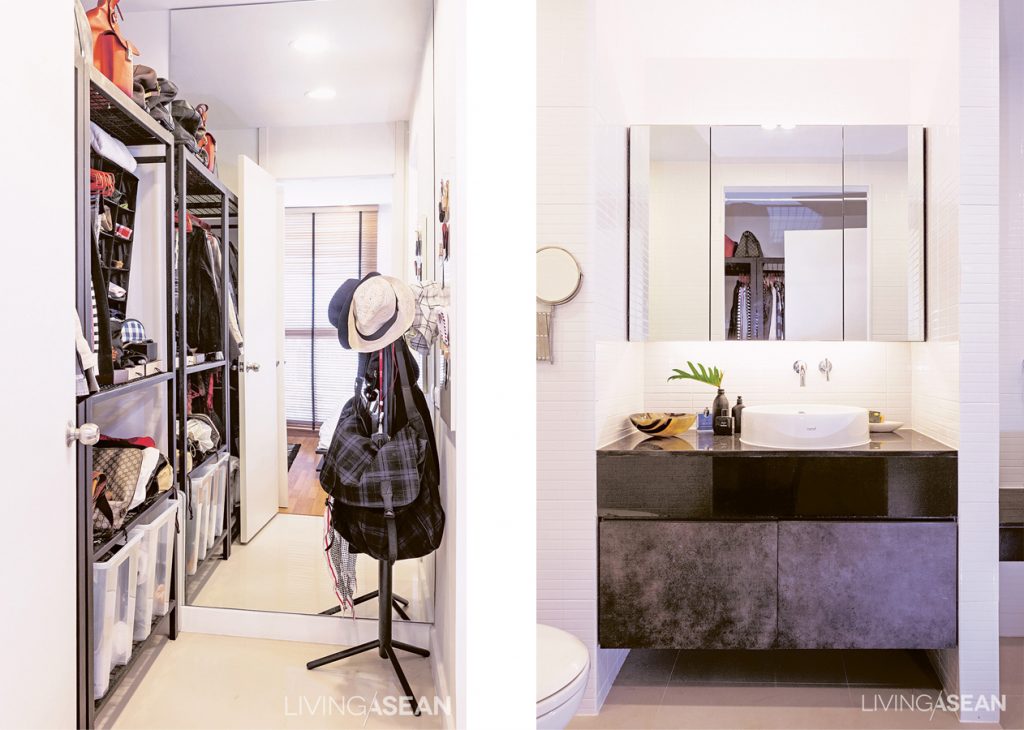
 

The 2-unit wardrobe has a metal frame instead of a door, since Anirut likes to see clothing inside the cabinet. /// A mirror cabinet in the bathroom adds more space for small items. Lighting is enhanced both above and below the cabinet to reduce glares.

personal style is much loved by friends and acquaintances. Many asked him to design their houses, which Anirut gladly agree to help. His place may be a flexible condo, but for his friends’, he advises differently to each. “I don’t want to walk into their place and like it too much. That would mean it’s my place, not theirs!”
 

001

A Parisian Studio

A Parisian Studio

Where do people look for an inspiration? Some discover it in books or magazines, while others turn stories into new thoughts. The owner was passionate about an apartment in the 1998 film “A Perfect Murder.” It was the inspiration that led to his so-called Parisian Studio.
/// Thailand ///

Story: Montra /// Designer: Priyawat Temchawala /// Photographer: Damrong /// Assistant Photographers: Thanatcha, Jantima


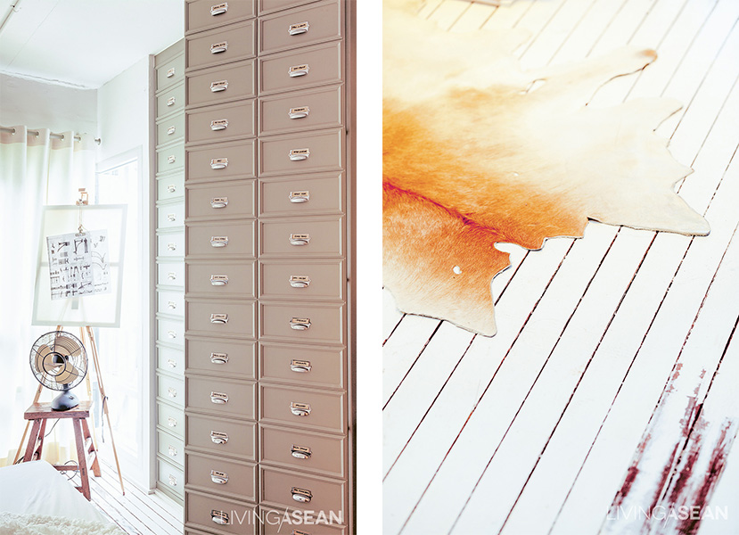
The cabinet face is designed to look as if it holds many drawers, adding more vintage details.


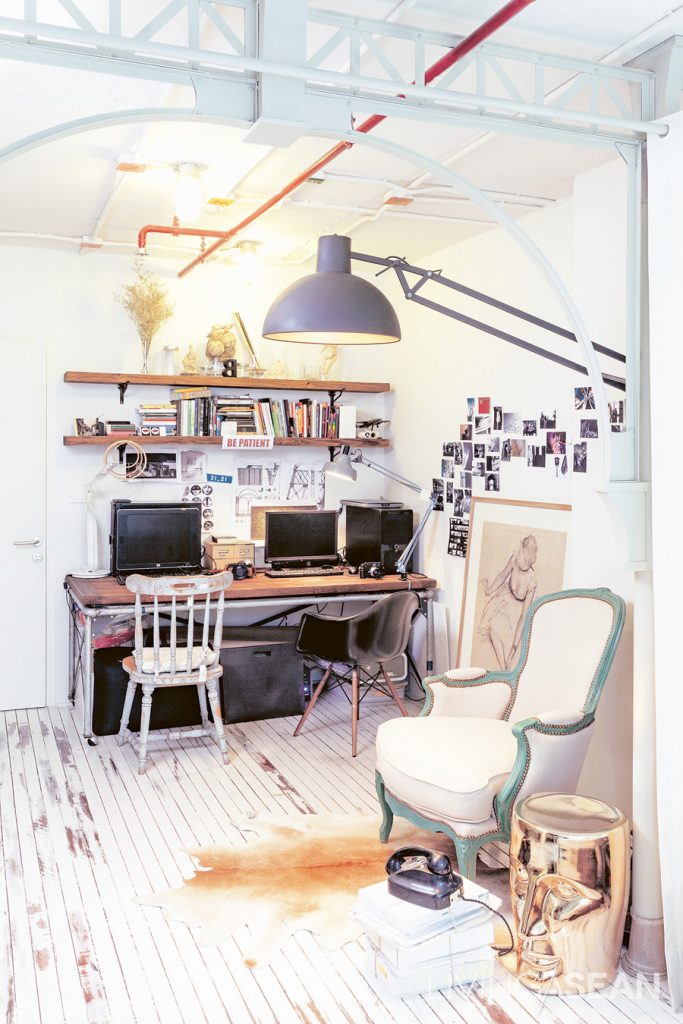
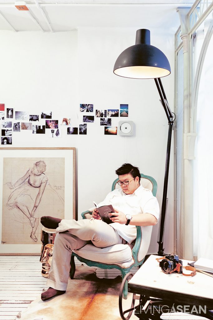
The work corner and the living room are in the same area. The desk consisted of metal legs made from water pipes and a wooden top to fit the width of the wall. Different cushions were originally placed here. But Priyawat later replaced them with his vintage armchair.
The work corner and the living room are in the same area. The desk consisted of metal legs made from water pipes and a wooden top to fit the width of the wall. Different cushions were originally placed here. But the owner later replaced them with his vintage armchair.


“At first I thought I’d just knock out the ceiling, fix it up, and think about the rest later. But ideas were popping in my head. So, I had to redo everything,” said the owner who also designed the space by himself.


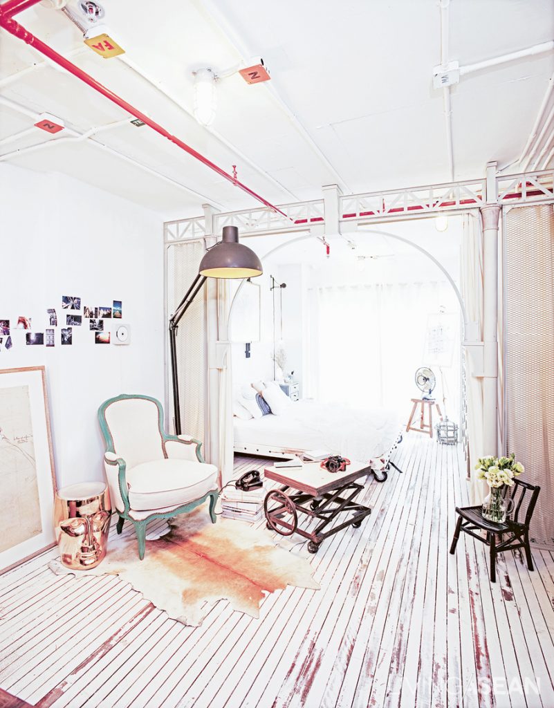
Light-colored décor contrasts with raw surfaces of conduits on the ceiling, utility pipes and the metal arch. The arch’s scale was adjusted to suit a low-ceiling height and to accentuate its clear lines. Pipes were painted white to reduce the rawness of the original metal surfaces.


“I thought it was just a question of making the ceiling higher. But once it was out, I wanted to make an archway pretty much like the loft-style, high-ceiling room in the film.”
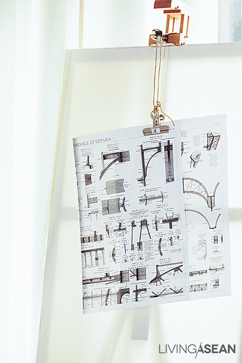
The owner had done a lot of research. One design book about the Eiffel Tower caught his attention. “The book enlarged each part of the Eiffel Tower to show exactly what was there. I was entranced by the detailed ironwork because it had such unique elegance.”


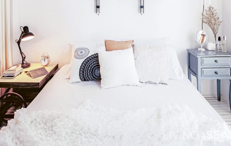
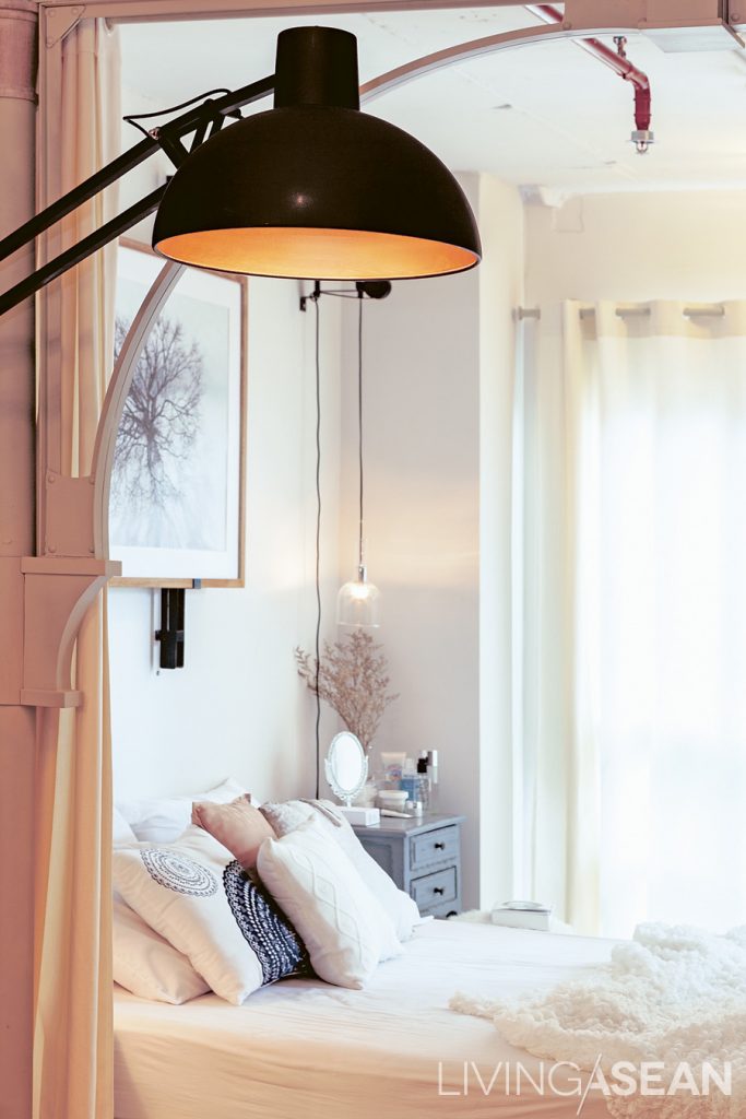
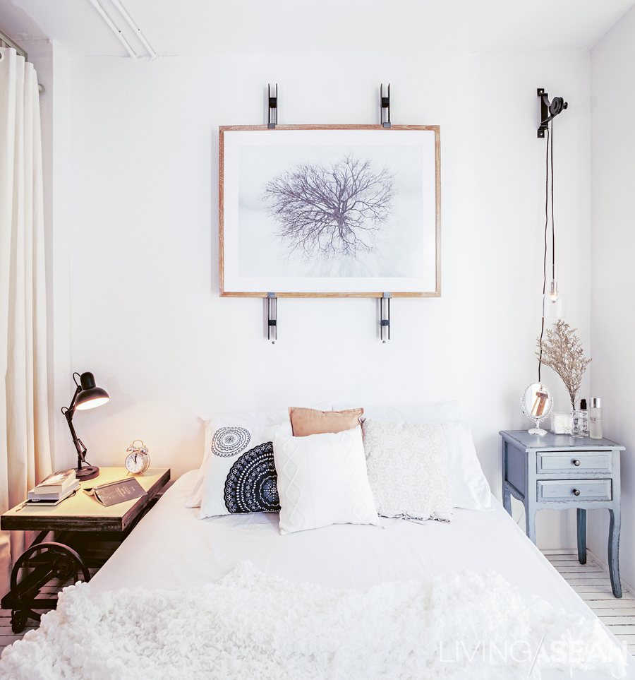
The bedside lamp design was derived from one of Priyawat’s projects for a hotel. To contrast with the lamp’s modern style, Priyawat paired it with a vintage wooden bedside table.
The bedside lamp design was derived from one of the owner’s projects for a hotel. To contrast with the lamp’s modern style, he paired it with a vintage wooden bedside table.


As a result, the room was totally transformed. From an ordinary rectangular condominium room, it took on what the owner called a “Parisian Studio” look. The character of the room has certain rawness from the metal archway, while a touch of softness is filled with white tones. Details were gradually added to complete the whole look, just like putting jigsaw pieces together.

As an interior designer, he understood the fact that he could not adjust the floor plan much. The condominium also came with pre-installed electrical appliances, which were mostly immobile. So, he decided to focus on the furniture instead. Most of the furnishing pieces were custom-made. A floor-to-ceiling wardrobe was built-in to make the most out of the limited space, while a queen-size bed was equipped with wheels enabling it to move easily.

The queen-size bed and bedclothes are in shades of white to keep the tiny space from seeming cramped. A little panache is thrown in with the two bedside tables of different styles.

The owner also recognized the importance of a proper space management. A workspace was arranged at one corner close to a wall. The middle of the room was left for a living area. For privacy, he used long curtains to separate his sleeping area from the rest of the room.

Back to our question: Where do you look to find an inspiration? Well, answers may vary. But we know one thing for sure. This Parisian Studio inspired us with lots of little details.


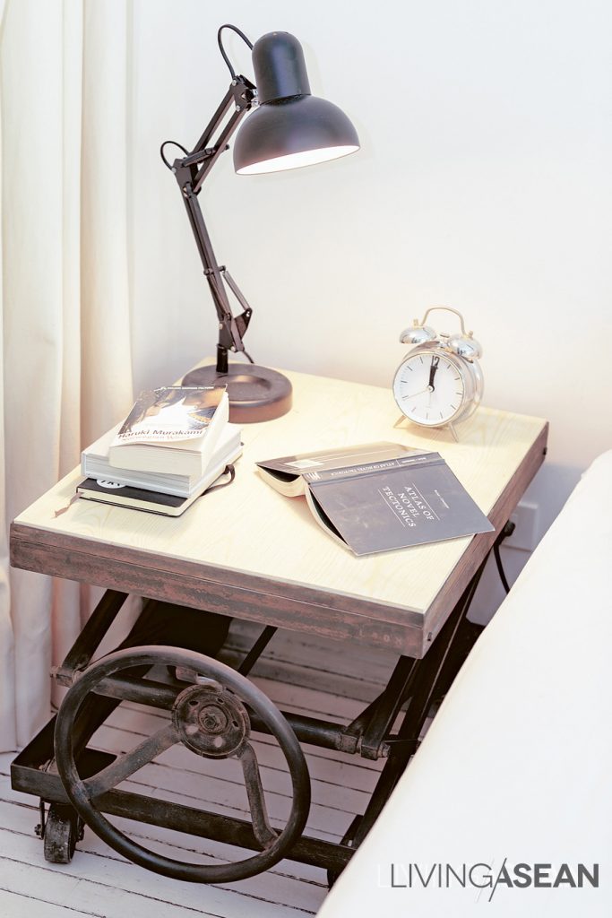
The bedside table is designed to look like an antique. The original model is vertically adjustable. To save costs, this reproduced one can only slide aside.


008


007


Modern Design for Practical Living

Modern Design for Practical Living

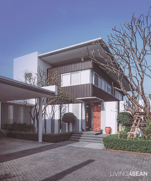
At first sight, the house seems like a plain-looking Tropical Modern home. But a closer investigation reveals the balance between beautiful design and functions for a practical lifestyle.

/// Thailand ///
Photos: Suphakon Srisakun, Ritthirong Janthongsuk /// Designer: Kanop Mangkhalaphruet and Ayutt Mahasom

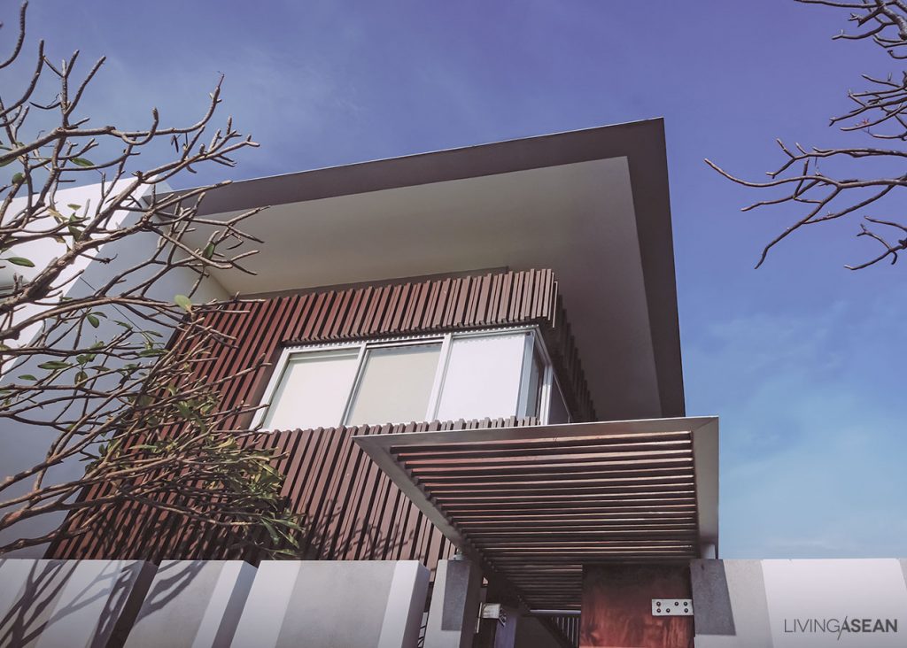
In front of the house is a wall of vertical slats with small gaps between them, which allow a very partial view in from outside. A good sense of privacy is created this way.


The house fronts on an open lot to the west, allowing sunshine to pour in at certain times of day, and bringing the world of nature inside.

Every house has its unique character. This Tropical Modern home designed by Kanop Mangkhalaphruet and Ayut Mahasohm is aesthetically elegant and smart enough to serves the homeowner’s every need.

The double-layered roof provides a convenient release for heat. Together with the extended eaves, this helps keep the house cooler.


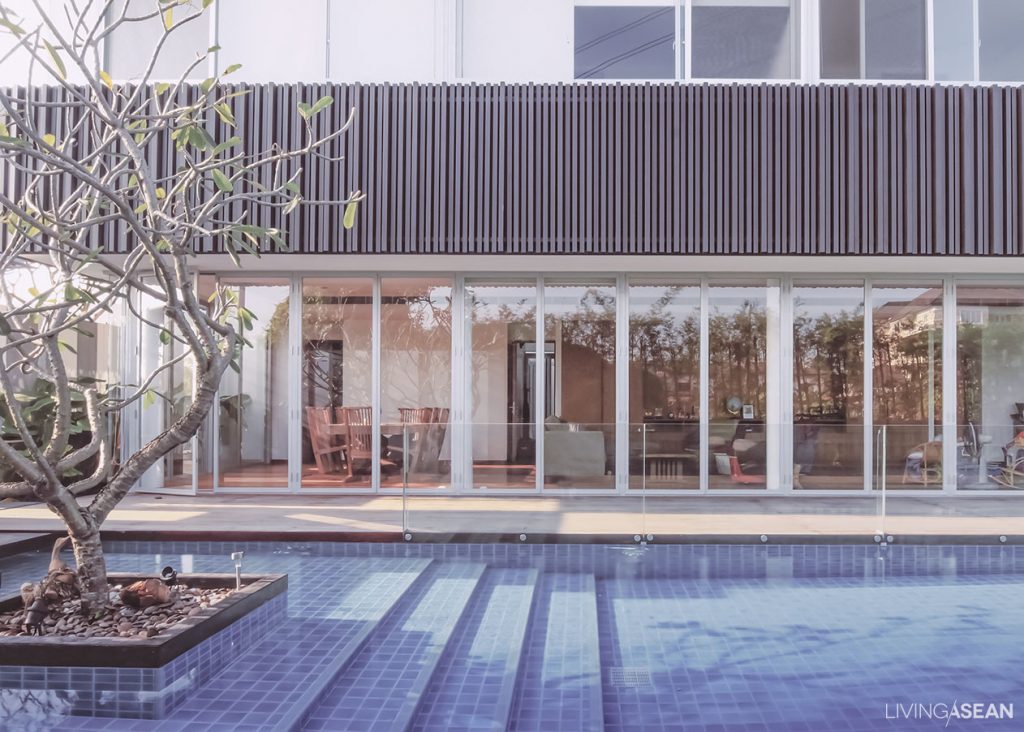
The house is located on a rectangular-shaped piece of land, with one end facing a village road and the other fronting a canal. Its I-shaped floor plan is laid out along the north-south axis to benefit from diffused sunlight from the north and winds from the south. Other precautions are also taken to avoid flooding at high tides. Meantime, an open space on the north side is reserved for a garden and a pool.

Usable spaces are divided into two main sections — service and residential. The service area consists of a Thai kitchen, a maid’s quarters, an electrical room, a carport, and storage. For practicalities, the section is located close to the entrance.

All physical lines of the house are intentionally designed to create horizontal and vertical relationships.


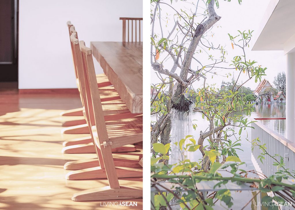
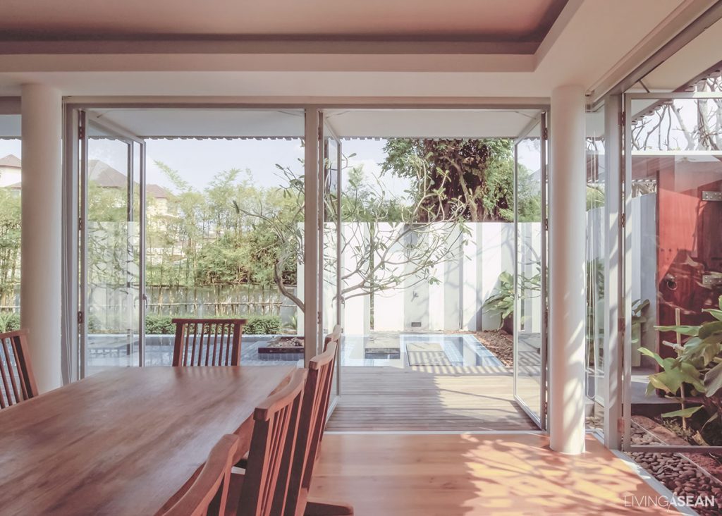
The residential area has a parlor, living room, dining room, workroom, and food preparation spaces. All rooms are open to take in views of the swimming pool and adjoining wooden veranda, which connect to the garden and the canal beyond. Floor-to-ceiling glass panels can slide open all the way, making the area a perfect space to relax or party.

For the privacy of both residents and visitors, the house offers dual access, one next to a carport and the other via the veranda. If houseguests are being entertained in the parlor, residents who have nothing to do with it can enter or exit through the carport leaving the meeting undisturbed.


Setting the doors back away from the line of support posts makes it possible to open all the doors at once without being blocked by them.

Kids’ bedroom and study room are an extension from the main structure. It adds an interesting feature to the building and doubles as long overhangs protecting rooms below from the elements. Openings are used only when necessary to avoid strong sunlight. Various shapes and sizes of vertical aluminum stripes add fun details to the wall and also protect the house from the heat.


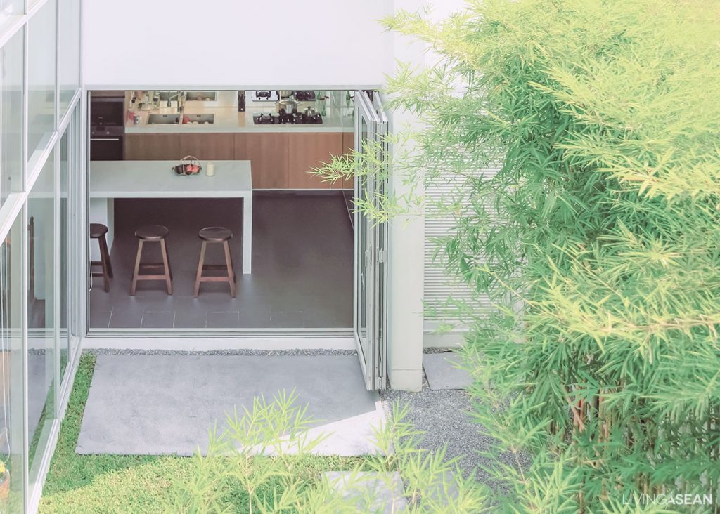
A diminutive courtyard in the middle of the house directly adjoins the kitchen. When it is opened up, it provides great ventilation.

Another outstanding feature is roof design. Long overhangs provide protection for a full array of glass windows that can open to let heat energy out. For durability, handsome abode is constructed of reinforced steel structure. Round pillars are chosen to prevent injuries from accidentally bumping into sharp objects. All of these qualities are incorporated for the sake of practical living.


7

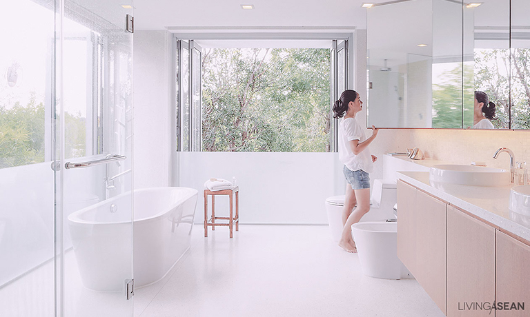
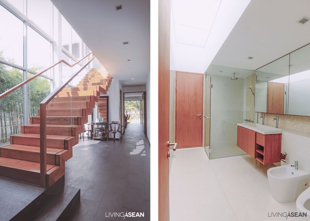
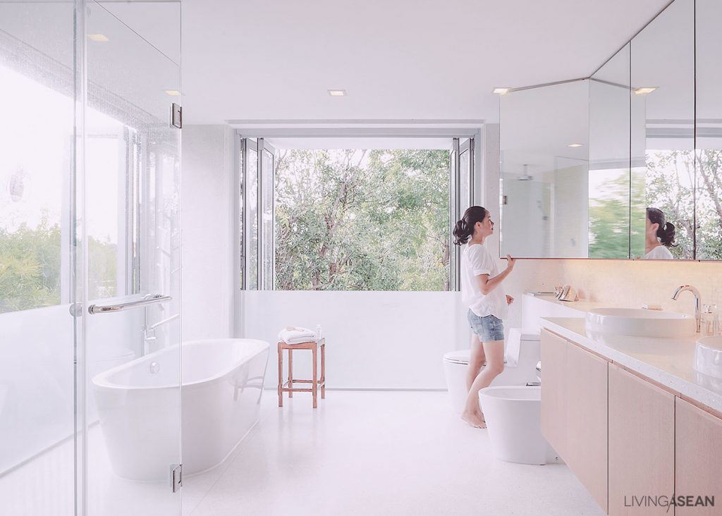
The bathroom is intentionally designed to be open and spacious, as a lot of light is wanted. There are frosted-glass guard railing and shower curtains that help make the space more private.


8

Living with Nature / Baanlaesuan Fair 2016 Show House

Living with Nature / Baanlaesuan Fair 2016 Show House

Show houses have always been the most interesting highlights at BaanLaeSuan Fair. This year, the main attraction features sustainable design focusing on symbiotic relationships between life and nature. It is inspired by one of the philosophies of HM King Bhumibol Adulyadej.

/// Thailand ///

Photos: Soopakorn Srisakul

015

008

019

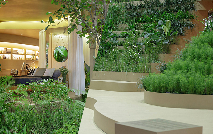
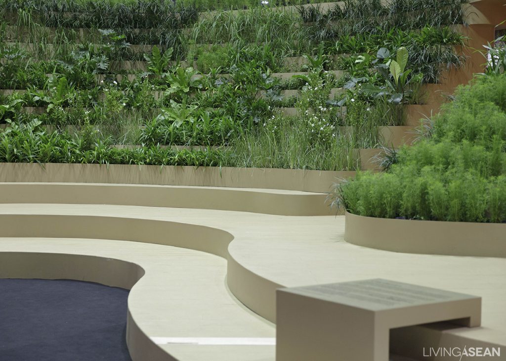
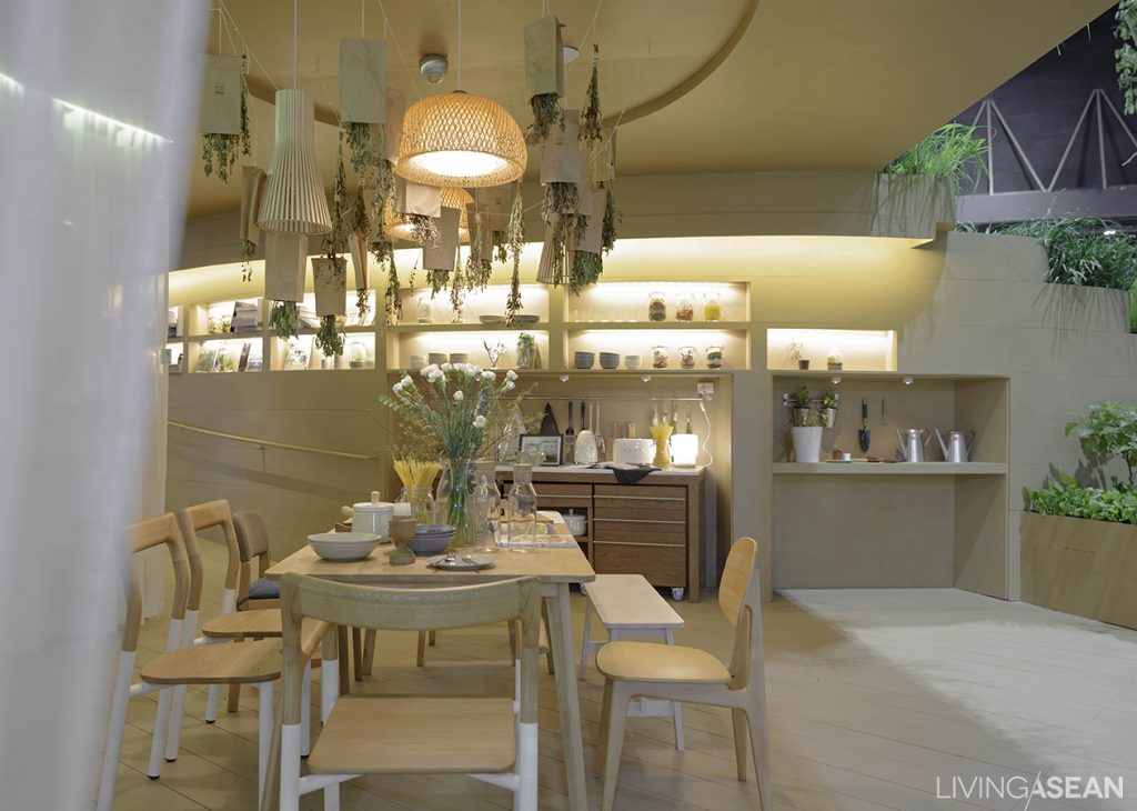
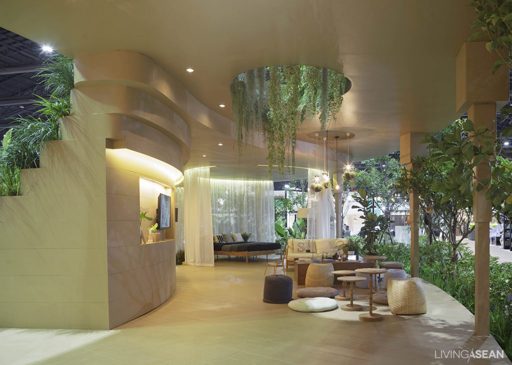
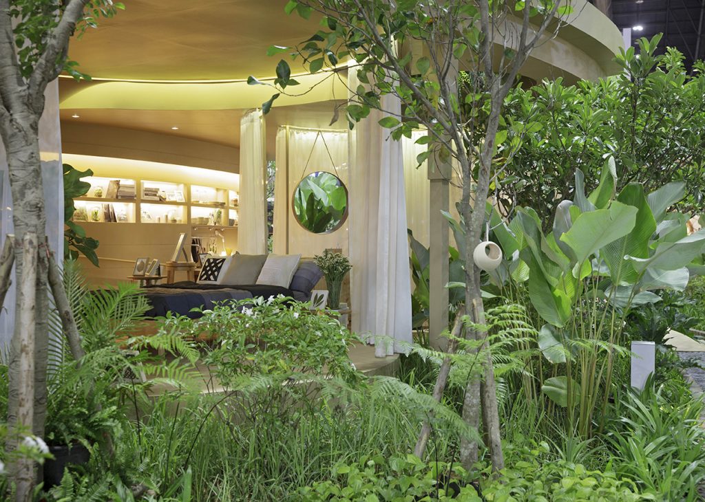
From afar, it looks like a hillside covered in verdant vegetation. But a closer look reveals a uniquely designed home carved into an awesome landscape mimicking rice terraces. The well-defined integration appears to be the living embodiment of His Majesty’s “Three Forests, Four Benefits” concept.

001

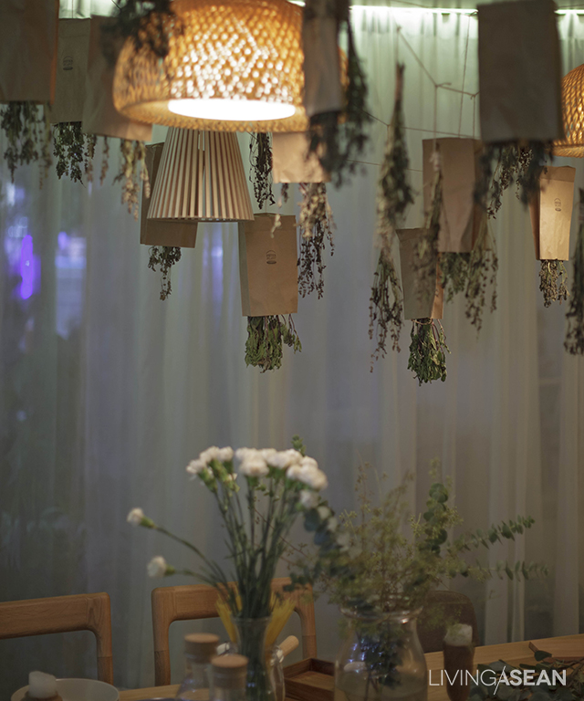
Herbal plants double its use as hanging decorations.


Plants grown on the terrace steps and other useful gimmicks encourage people to exercise more to sustain and improve health and physical fitness. Gardening at different elevations requires walking up and down these steps, which burn calories in the process. Getting around on bicycles instead of cars is another useful shtick.

003

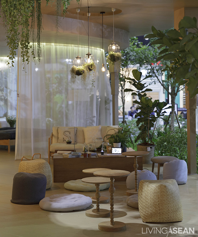
In the living area, floor cushions work as well as a nice sofa.


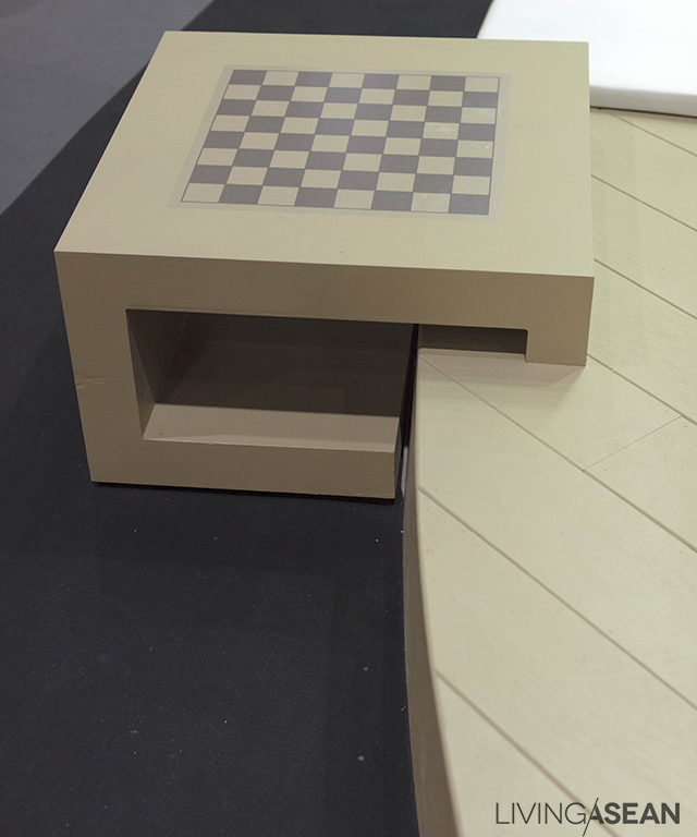
Every step of the way, the terraces serve different purposes. At a higher altitude, they provide a lush oasis that showcases the home’s front façade. At lower elevations, they provide steps for easy access that don’t intrude on the landscape. The lower terraces also offer spaces for a chessboard-equipped patio, where people can sit back, relax, or enjoy their favorite game.

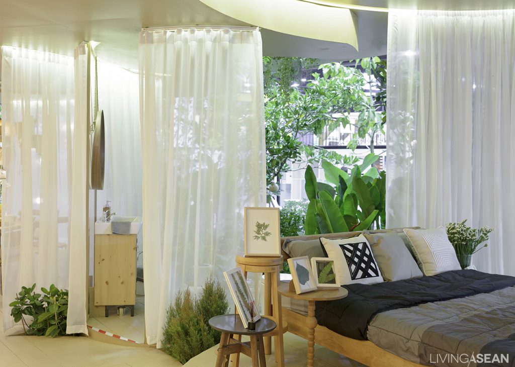
A hint of greenery blends into the bedroom.


The house interior is reminiscent of rock-cut architecture carved into the hillside slope. Yet it is well lit and airy. The living room is decorated with wood furniture in natural hues. The area features an LCD screen showing the King perform his noble missions. Patches of greenery abound if you look for spots to give your eyes a good break.

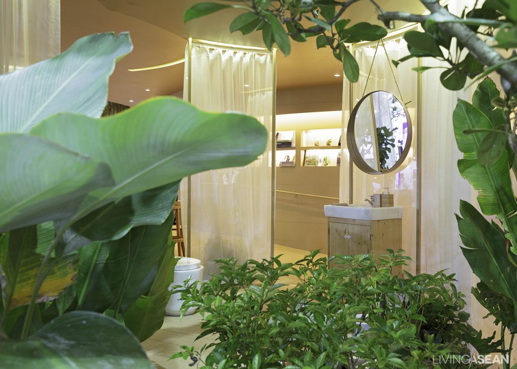
The house is surrounded by trees and plants to blur the boundary between the outside and the inside.


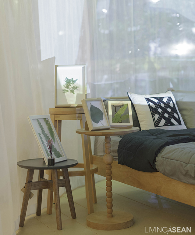
The en-suite bedroom comes furnished with white net curtains in the background. The area boasts clean, simple design. The only decorations are framed photographs of recommended useful plants, such as the Indian rubber tree, the fiddle leaf fig tree, and other species known for their ability to absorb toxic chemicals and help purify air in the room.

009

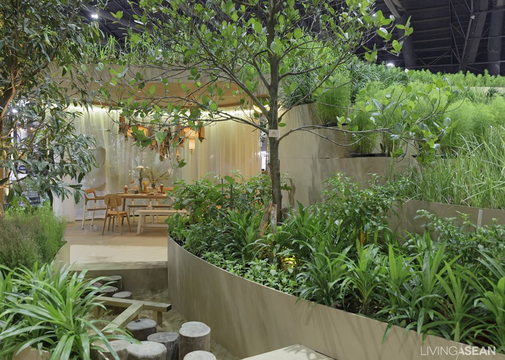
At the far end of the interior stand a small kitchen, a dining room, and a kitchen garden. This section is created to show the benefits of having homegrown vegetables and fruits. Not only are they non-toxic. But they also generate incomes for agriculturists and reduce pollutions in the process.

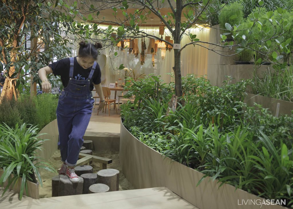
A small pathway leading to the kitchen is also a playground for children.

The show house is open to the public at BAANLAESUAN Fair until November 6, 2016. Drop in on us, and you will find an inspiration or two for your next home improvements project. Be there.

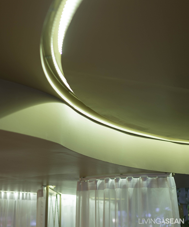
Electrical wires are well-kept in the ceiling, hidden from eyesight.


A chess board is installed here at the foot of the hill.


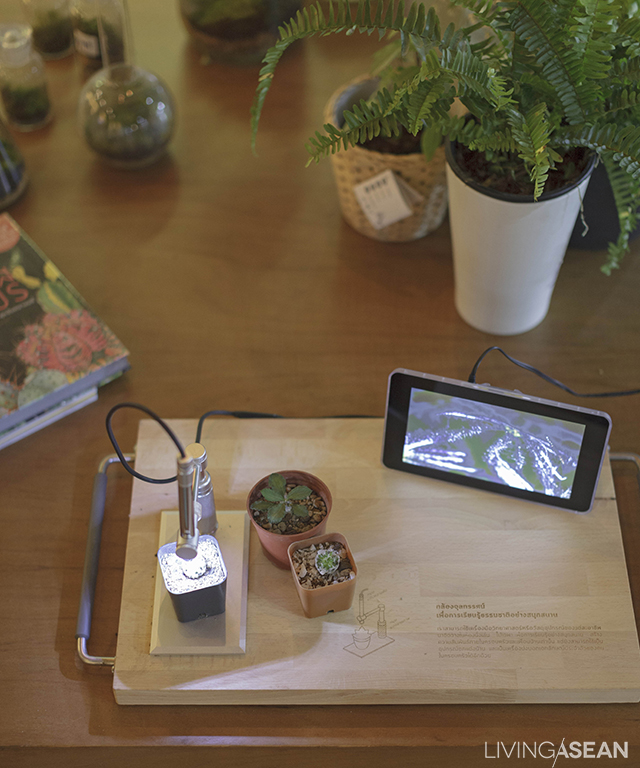
A microscope is on display inside for children so they can learn more about the nature and have fun at the same time.
Manila FAME 2016

Manila FAME 2016

This year’s Manila FAME Exhibition features objects of handicraft from a regional collaboration project. The landmark event is being held under the theme,
ASEAN Design to the World.


/// The Philippines ///

Story: Rush Pleansuk /// Photos: Teerapong Thammacharoen

An amazing rattan chair on the show
A strikingly beautiful mirror on wooden frame
A Schema lamp exhibition /A new collection by Kenneth Cobonpue
A Schema lamp exhibition /// A new collection by Kenneth Cobonpue
The “ASEAN Design to the World” exhibition is the product of collaboration among five regional member countries.

Highlights of the exhibition are beautiful products of collaboration among regional members, such as the Philippines, Indonesia, Malaysia, Thailand and Vietnam.

Each country has its unique ways of transforming local materials into beautiful works of handicraft. Such are taking place within the ASEAN region, where member countries have come together and integrated their efforts in a project called “Improving the Current Status of ASEAN Master Craft Designers.” They also reached out to collaborate with other experts in the field.

It’s about repurposing. This eye-catching stool made of bamboo basketry is by Phanida Prommetta of the ASEAN Master Craft Program.
A metal lampshade from Indonesia is curate by Lim Masulin.
Inspired by shadow play, this lampshade from Thailand is designed by Rush Pleansuk of the ASEAN Master Craft Program.
From Thailand, Teerapong Thammacharoen of the ASEAN Master Craft Program crafted this chandelier out of bamboo basketry.

An eye-catching object of handicraft is the product of collaboration with Peruvian’s designer Nelson Sepulveda. The design is pure and simple with a naive charm. Rough natural textures are preserved. Sepulveda recycles local wastes, i.e. coconut leaves, pineapple-fiber papers and abaca plants. It’s amazing how he develops found materials into furniture that fits in well with contemporary lifestyle and residential spaces.

Inspired by techniques from the shadow play, these leather screens are by Chalan Thawornukulphong from Thailand.
Also from Thailand, a red coffee table comes in the form a wild boar’s head, by Sasiwimol Chalearmrith of the ASEAN Master Craft Program.
Fashion modern chairs in mock-up settings by Budij Layug
Fashion modern chairs in mock-up settings by Budji Layug
Frontal view of the Citem exhibition by Nelson Sepulveda
The Citem exhibition by Nelson Sepulveda
Citem exhibition designs by Nelson Sepulveda
Lucent Objects by Stanley Ruiz
Part of the Masa Ecopaper exhibition
The Masa Ecopaper exhibition
The “ASEAN Design to the World” booth features woven fabrics by Awika Samukraman.

This year, Budij Layug has put on another interesting exhibition in the Philippines. His selections and perspectives not only offer home décor items, but also fuse with fashionable influences. Equally intriguing are “Lucent Objects,” a design exhibition by the Design Center of the Philippines in association with Stanley Ruiz. Here lampshades are produced from different natural materials. A lovely touch of creativity comes in the form of a lampshade made of fiber from the coconut shell. The ingenious design aims to reduce adverse effects on the environment. In the process, toxic chemicals are avoided as best as possible.

021

The Peacock Chair Redux exhibition

Meantime, the Peacock Chair Redux Exhibition gives a new meaning to the iconic chair. Philippine designers develop these innovative designs based on the original Peacock Chair using a variety of techniques and materials.

Creative Economy on Culture by SACICT // Thailand BIG+BIH 2016

Creative Economy on Culture by SACICT // Thailand BIG+BIH 2016

In this year’s Thailand BIG + BIH 2016, we explored SACICT exhibition on developing Thai’s handicraft to global level and integrating different body of knowledge together.

/// Thailand ///

Photos: SACICT 

sacm1

Nian, by Jaoban
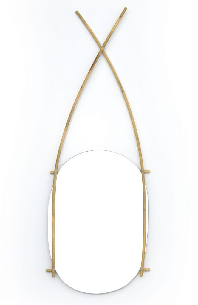
Nian mirror, by Jaoban

To promote Thailand’s handicraft industry in the competitive global market, Creative Economy on Culture by SACICT (The SUPPORT Arts and Crafts International Centre of Thailand) has rolled out the following interesting projects:

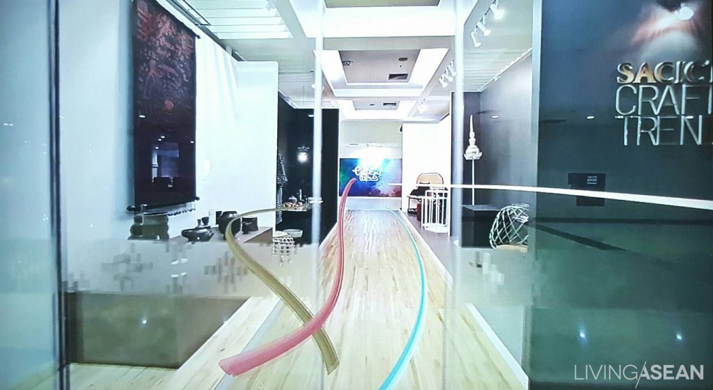
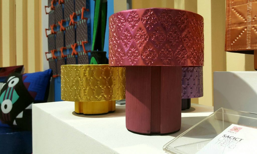
Future Value of Crafts – SACICT Craft Trend forecasts trending styles of handicraft products in 2017 not only to globally promote Thai craftsmanship, but to encourage local artisans to be aware of current global fashion.

94846-copy

94847-copy
Future Value of Crafts Exhibition


LUXX by SACICT
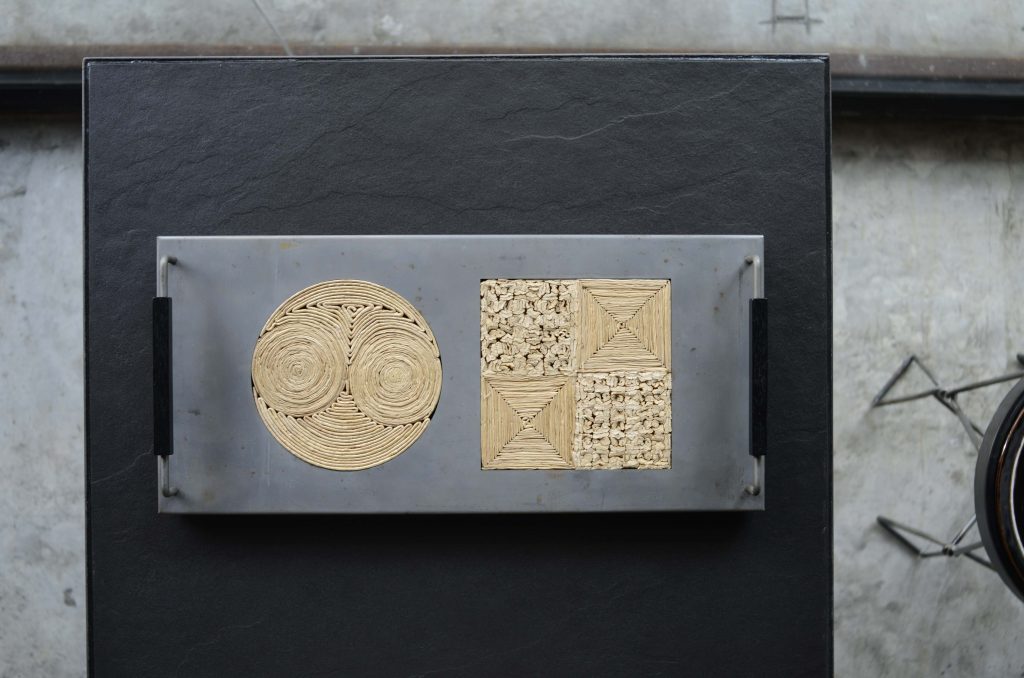
– Under the Touch of Nature concept, Thailand’s emerging designers are collaborating with artisans and craftsmen to create various types of fine craftwork.

Participating in LUXX by SACICT are these renowned brands; Yothaka, AYODHYA, Korakot, Jaoban, and Pin Metal Art, among many others.

To see a state-of-the-art exhibition, visit Thailand BIG+BIH 2016 during the weekend of October 22-23, 2016 at BITEC, Bangkok.

20160705_170124
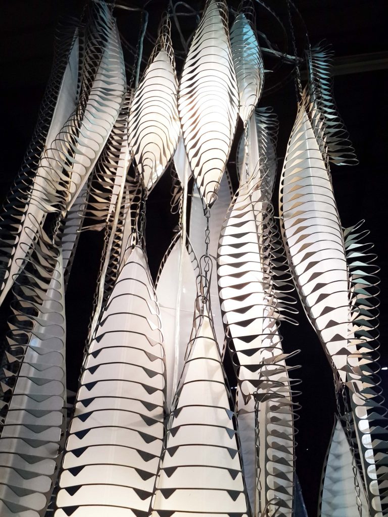
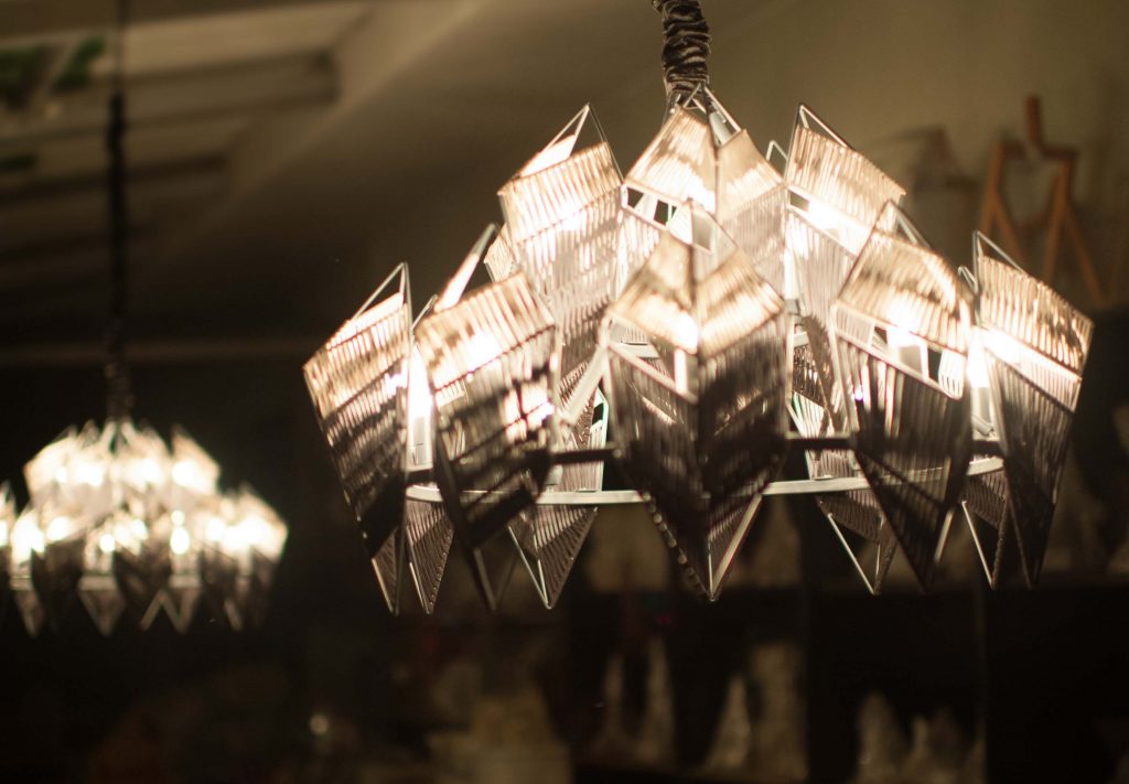
Metal pedant lights, by Pin Metal Art

_dsc7535

Crown, by Baanchaan Export
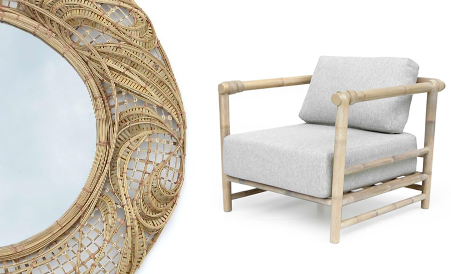
Zero Mirror, by Korakot International and Hug Easy Chair, by Natural Unit
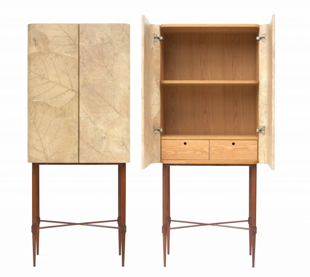
Leaf Cabinet, by THELIFESHOP
Durian Basket, by Yothaka
Moo-Mu, by Yothaka
Moo-Mu, by Yothaka
Chuan Lhong Vase, by Chuanlhong Ceramic


X