Blog : Vietnam

Baba Yaga Restaurant: A Restaurant Beautifully Renovated to Blend with the Surroundings

Baba Yaga Restaurant: A Restaurant Beautifully Renovated to Blend with the Surroundings

/ Da Nang, Vietnam /

/ Story: Kangsadan K. / English version: Bob Pitakwong /

/ Photographs: Quang Tran /

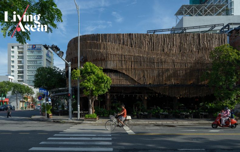
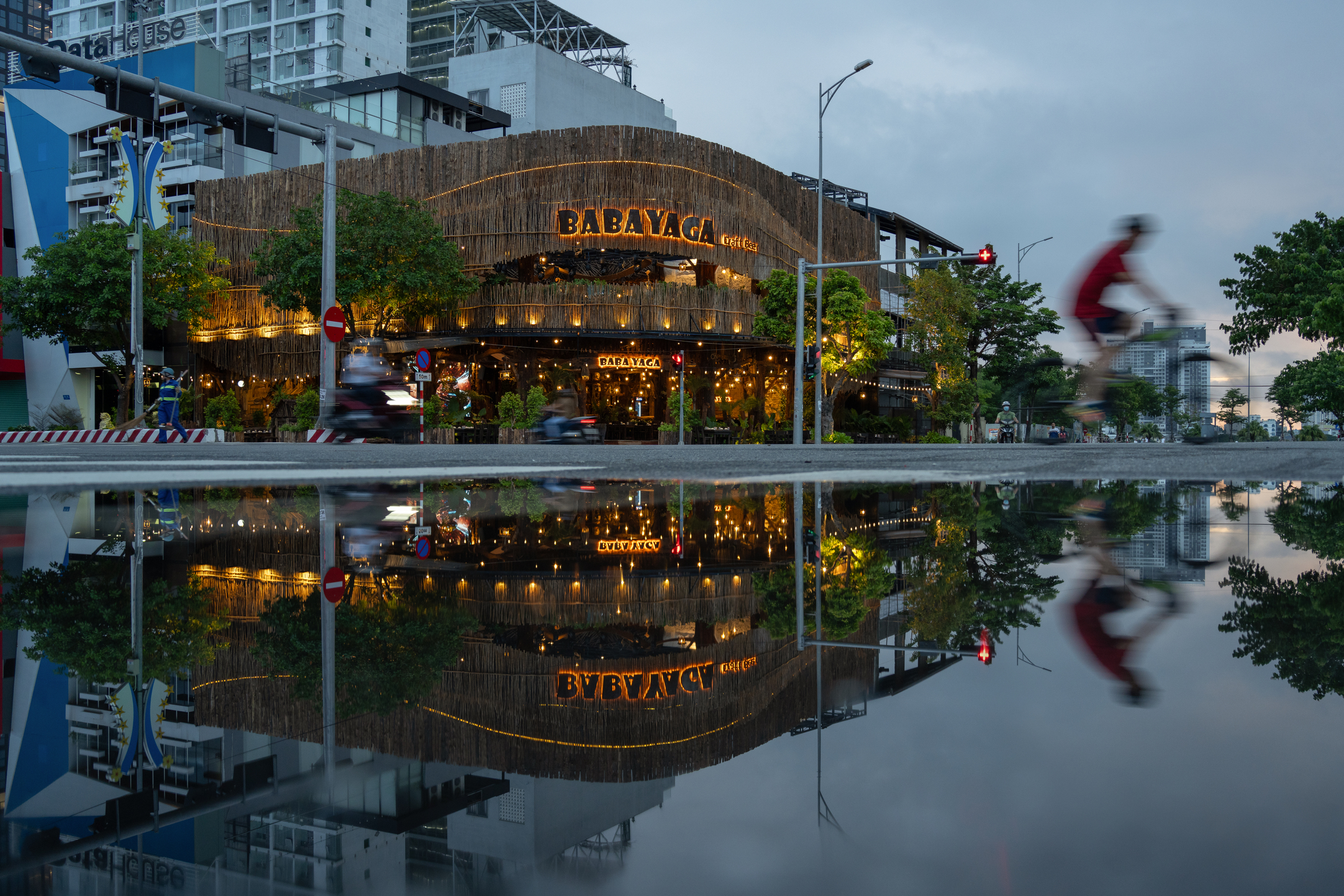
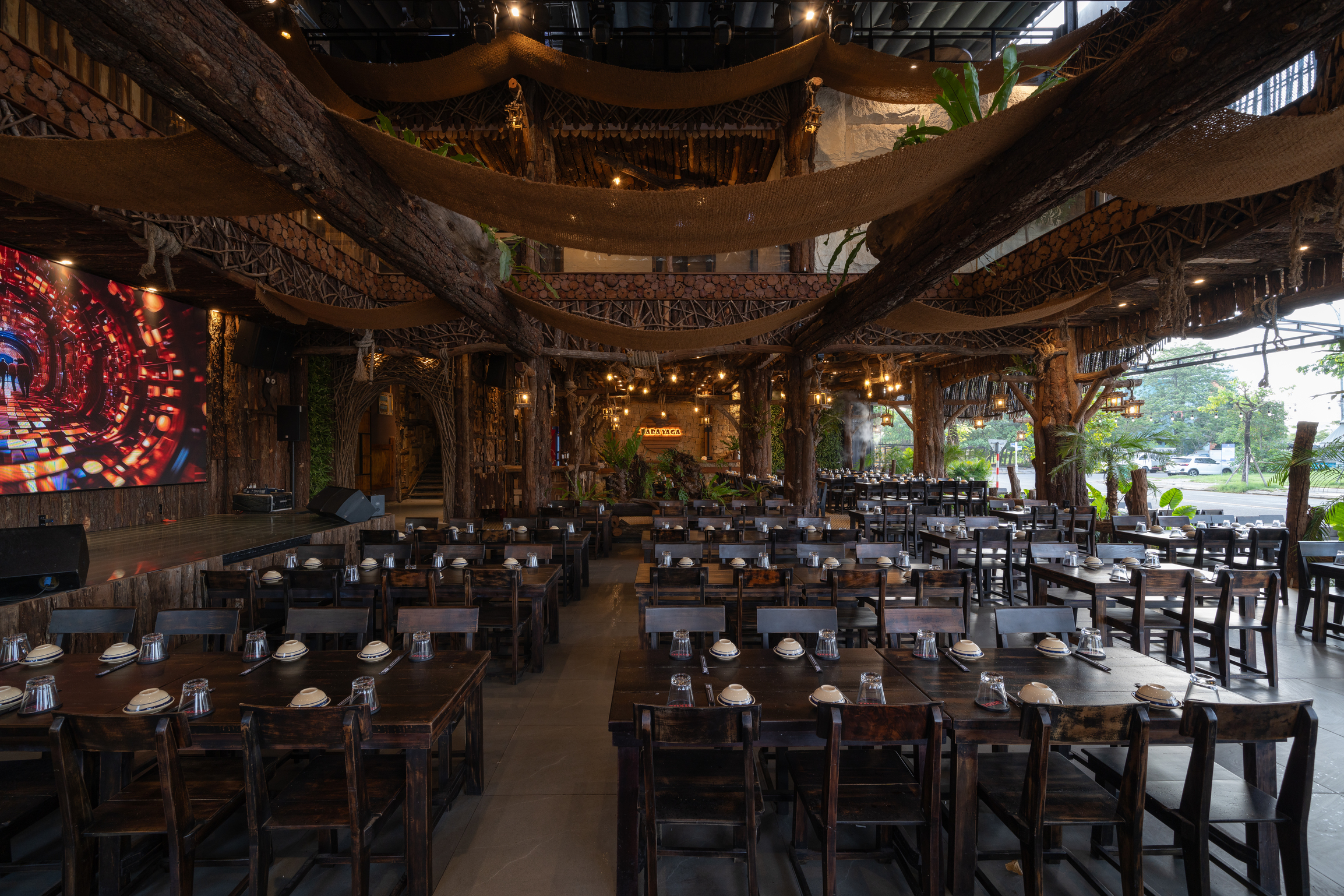
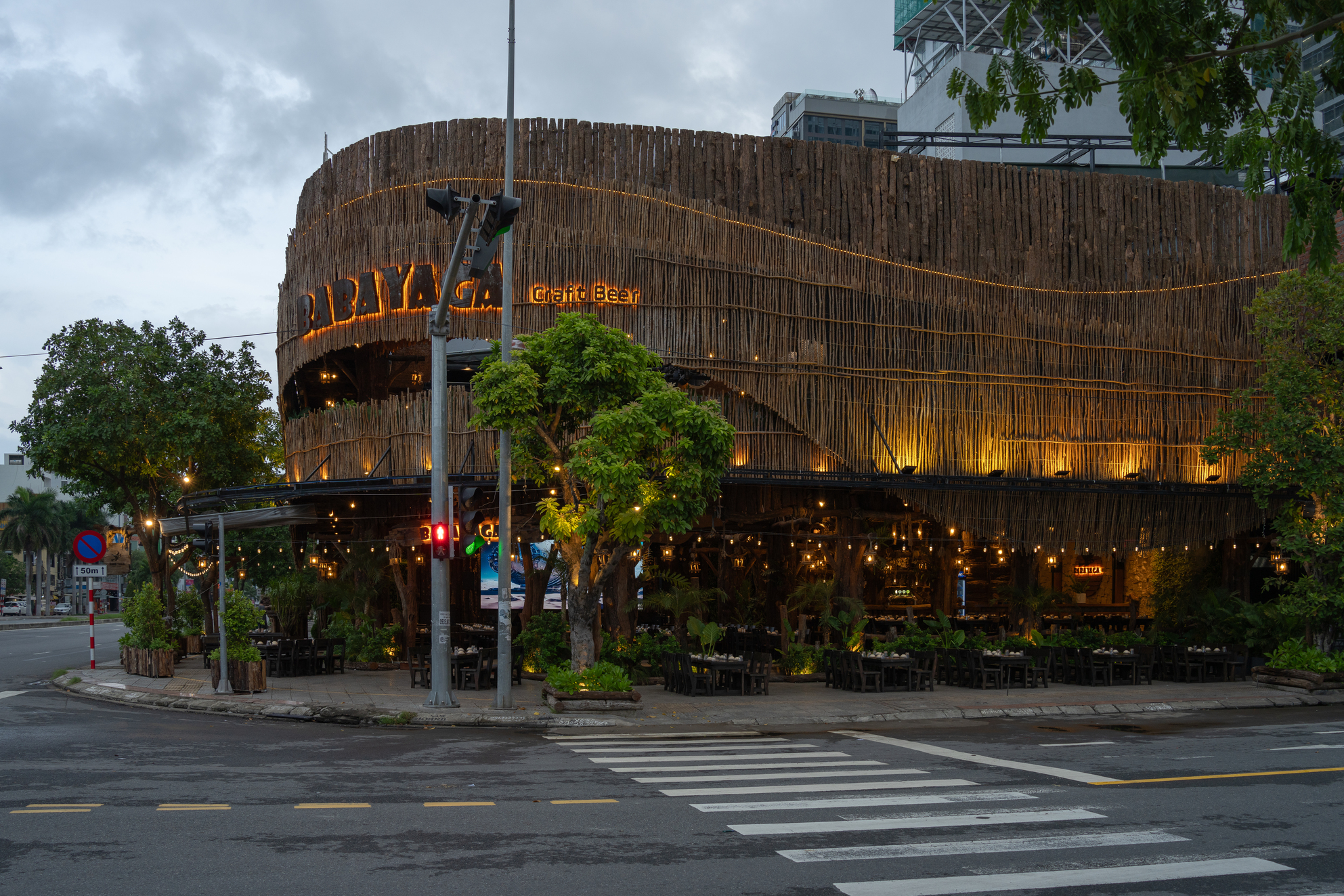
A restaurant housed in an old building has been renovated to provide a unique experience for diners. It’s wrapped in a new envelope of tree branches with organic shapes designed to blend into a beautiful setting in Da Nang, a city in central Vietnam. Named Baba Yaga Restaurant, it’s an architectural masterpiece that values materials found in nature, one that seeks reconnections with its physical environment.

Situated at the intersection of two streets, Baba Yuga Restaurant is the brainchild of Duoitancay Concept, a design studio based in Da Nang. The old building has 436 square meters of usable space. In front of it stands a row acacia trees that are commonplace in tropical regions. As the architect and the property owner intended, they go to work improving air quality and providing shade making the atmosphere inviting, cozy and cooler during summer months.

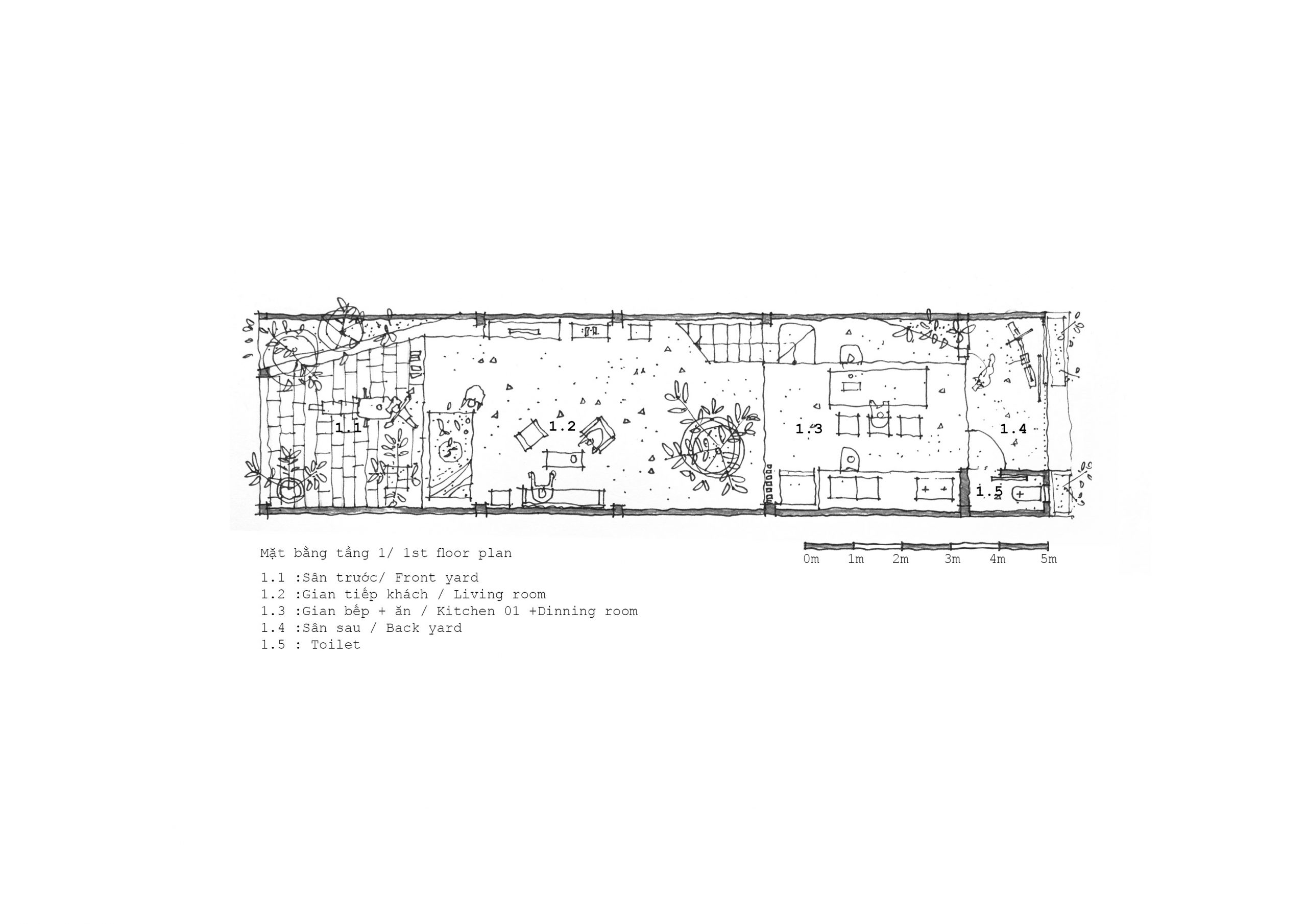
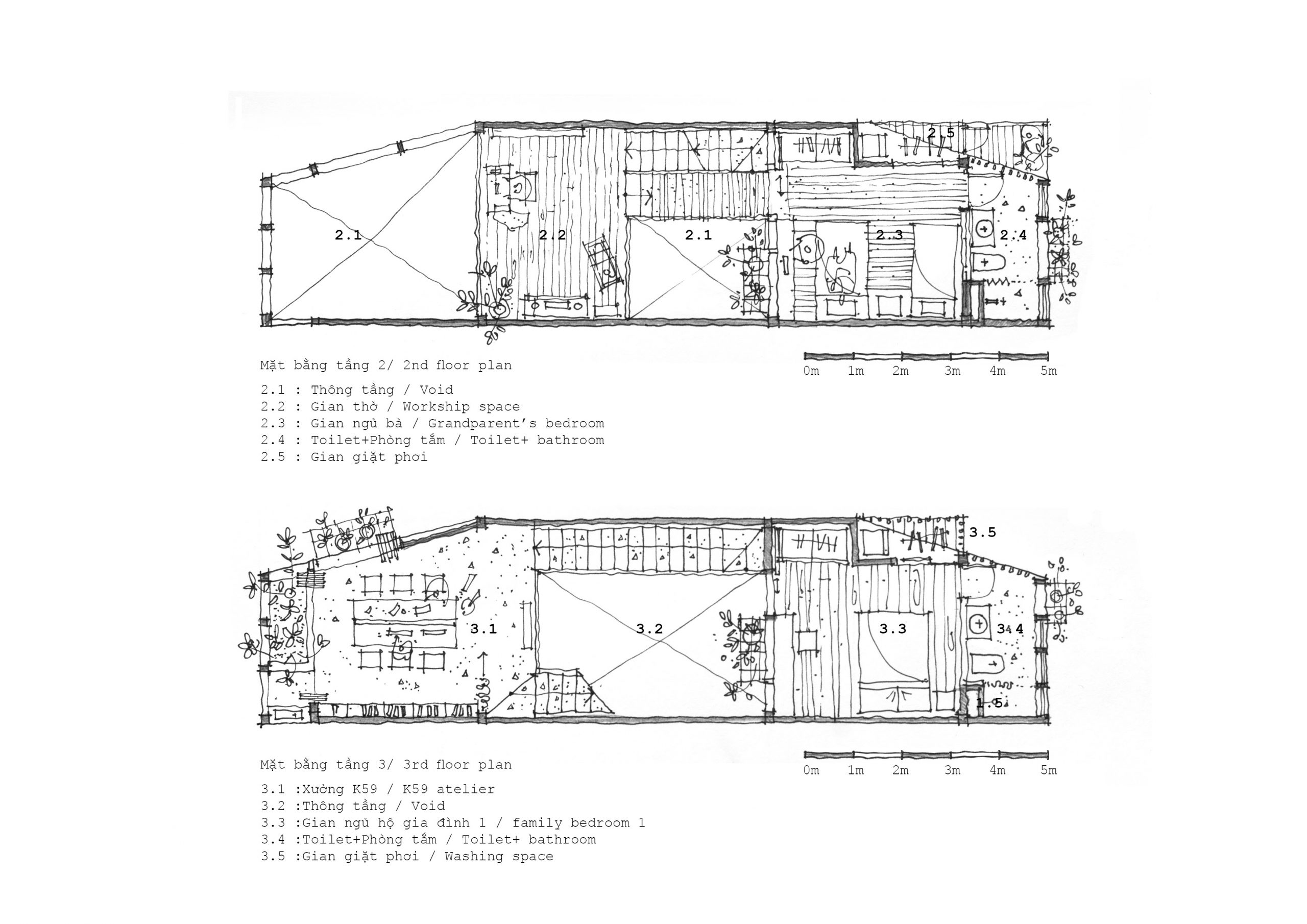
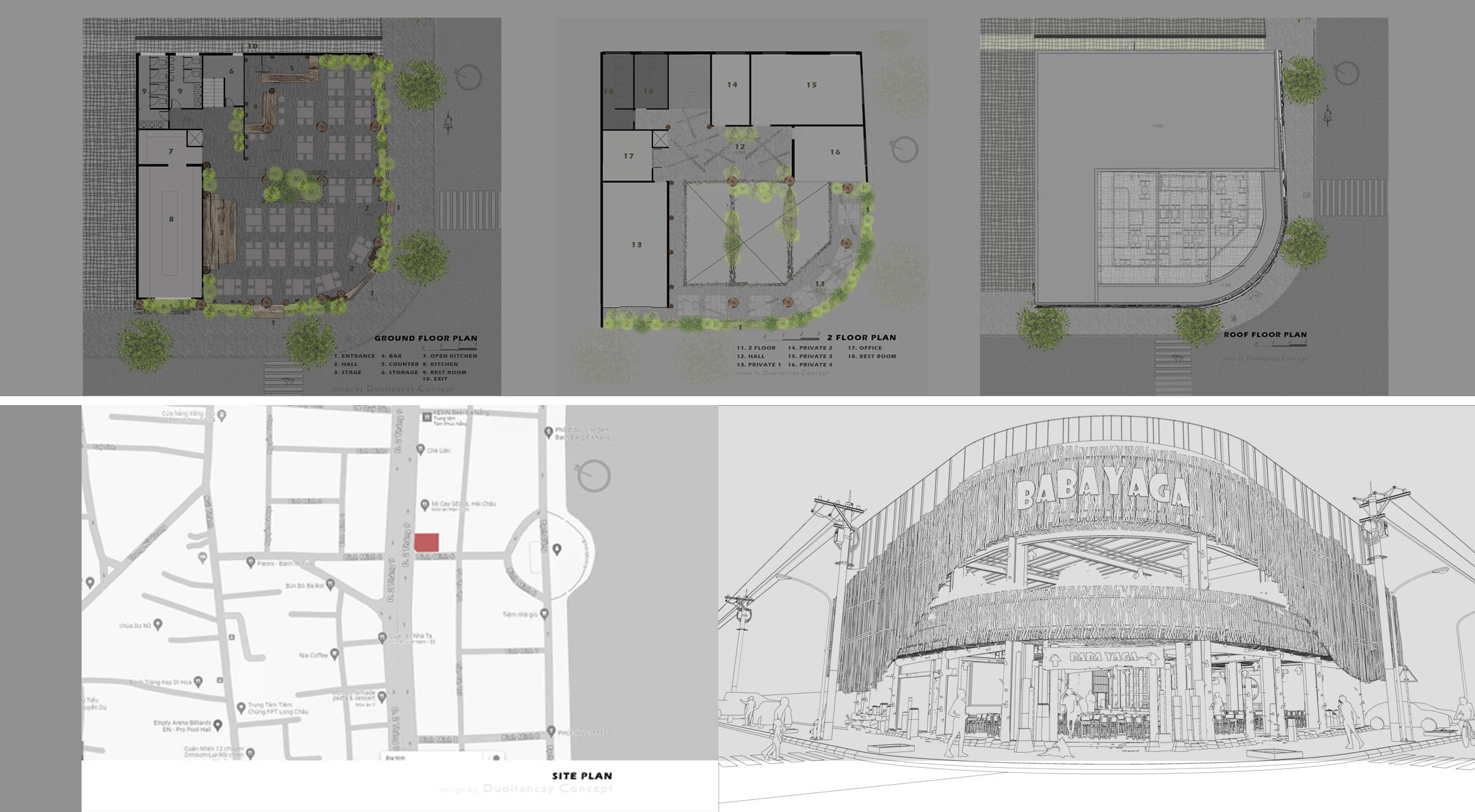
The first and second floor plans illustrate ideas for decorating with plants and creative design solutions to the problem of being close to busy streets. / Courtesy of Duoitancay Concept

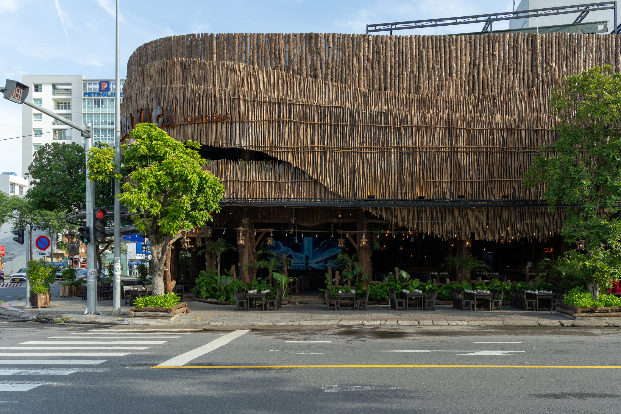
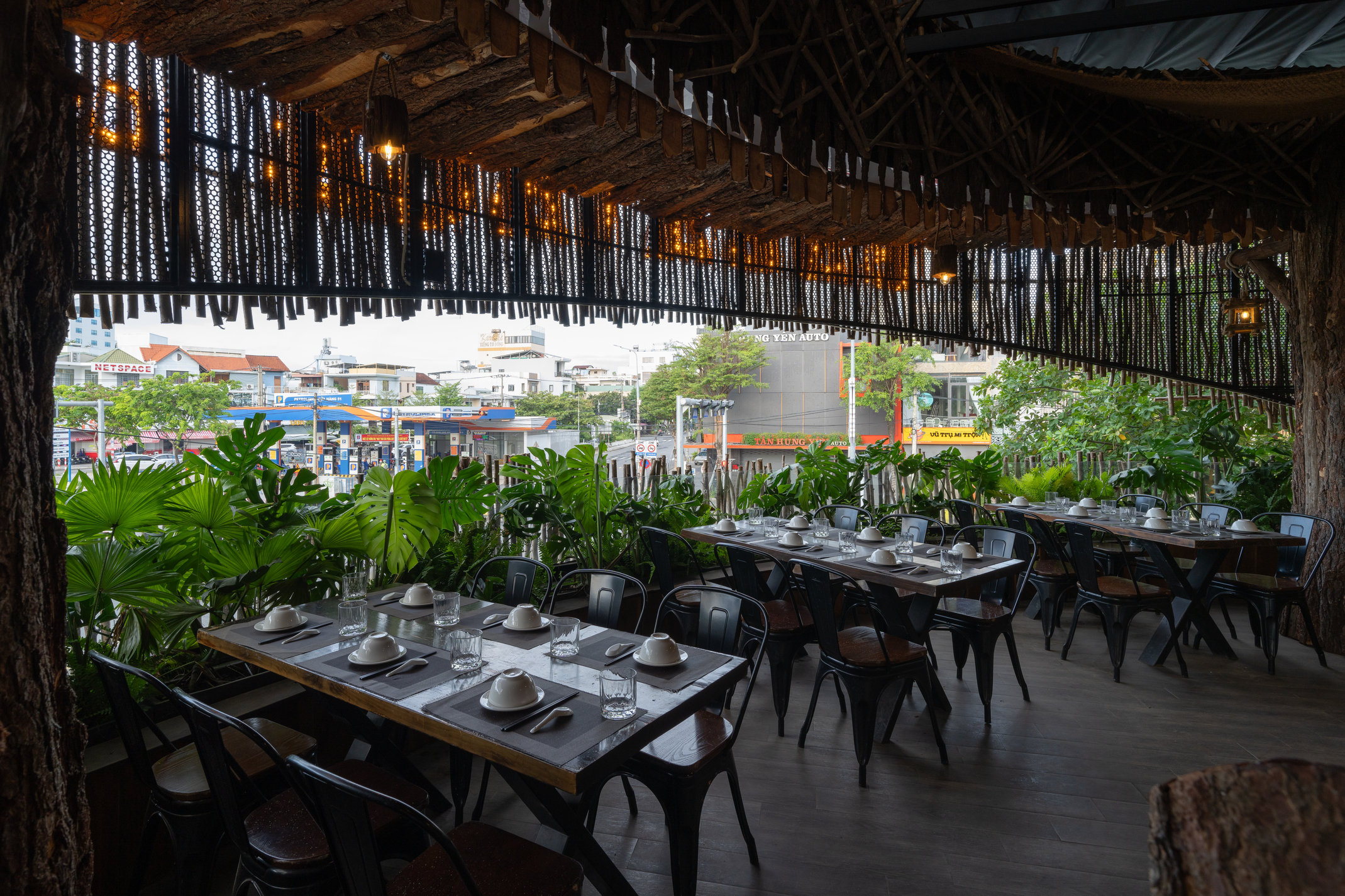
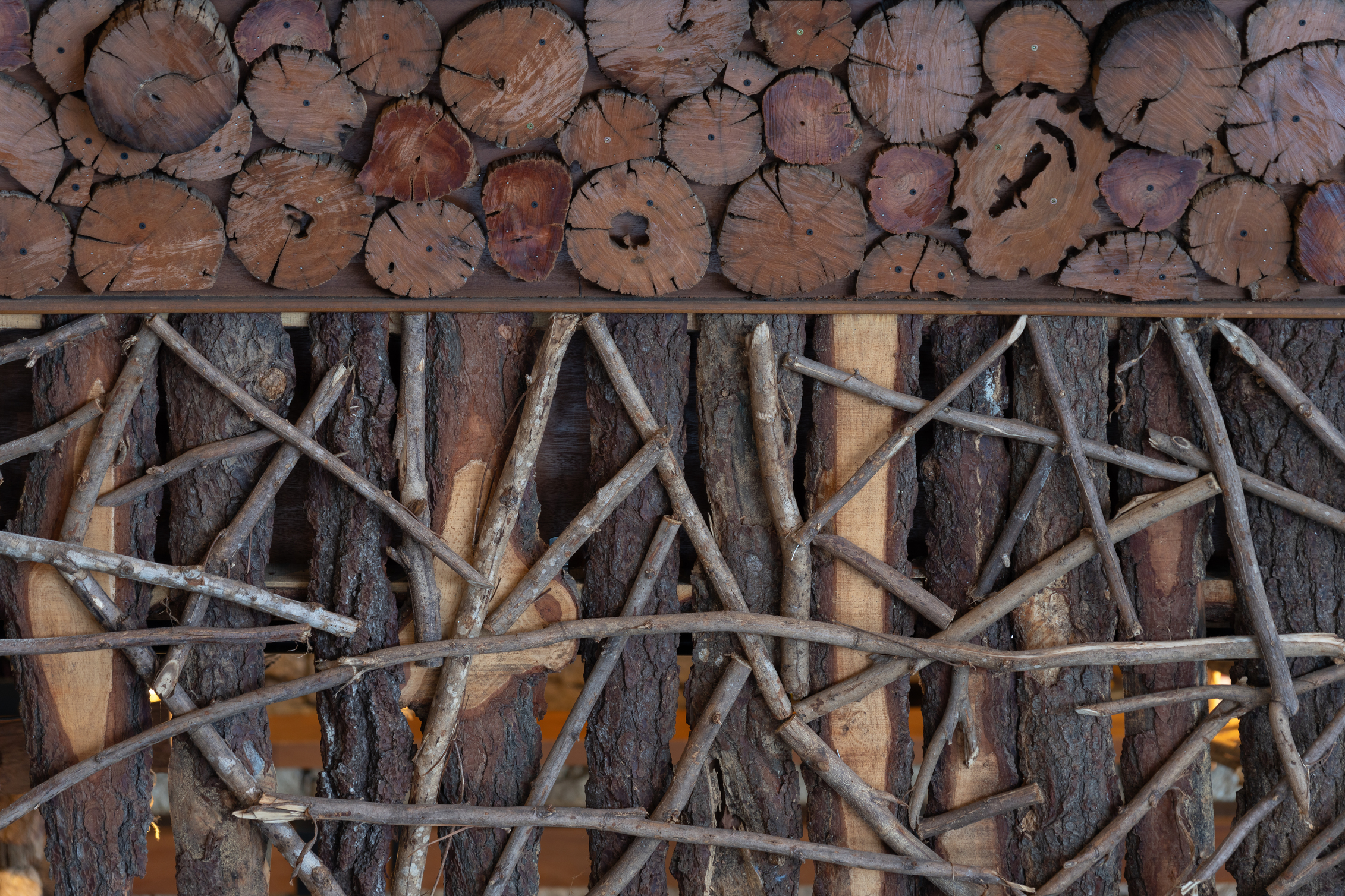
To protect structural integrity, the steel building frame remains intact. On the outside, the curved facade of woody stems, branches, twigs and sticks doubles as a buffer against noise and traffic-related pollution. The overall interior is impressive, canopied by overhanging trees nearby. In the meantime, the exterior walls with perforations add privacy, create patterns and provide ventilation making the dining room feel comfortable and warm.

Shade trees alternating with closely growing foliage plants reduce noise and absorb harmful particles from traffic, meantime creating a positive environment for diners.

A closer look at interior design reveals a pleasant ambience well-lit by daylight. The walls are decorated with perfect raw wood finishes with rough textures and earthy tones. The restaurant comprises two levels, each of which is tailored to suit specific customer preferences. The first floor holds ample semi-outdoor rooms for those who prefer dining al fresco.

The first floor holds a semi-outdoor dining room with plenty of space for those who prefer dining in the open air. At the center, a flight of stairs provides access to quiet and secluded dining rooms on the second floor.
A wide opening in the building façade affords a view of the city of Da Nang as seen from inside a second floor dining room.

On the periphery, closely growing bushes and shrubbery provide protection and reduce the amount of dust entering inside the rooms. Upstairs is an entirely different story. It offers plenty of space for four private dining rooms, plus a foyer with a view of the beautiful city of Da Nang. From here, open floor plans allow natural light and fresh outdoor air into to the dining rooms nearby.

Parts of trees in organic shapes add natural touches to a dining room.
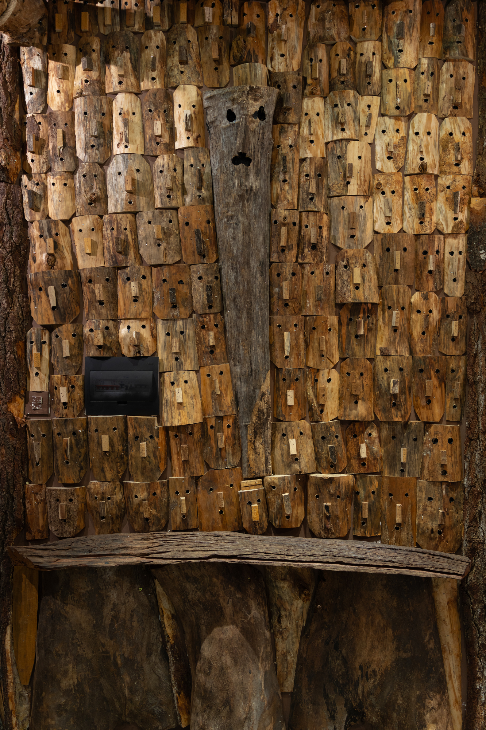
A dining room bedecked with wooden masks unlocks the power of storytelling that taps into the innate human sense of connection.

Apart from using materials found in nature, it’s the love of art that makes Baba Yaga stand out from others. Together tree branches, twigs, sticks and barks combine to give the restaurant its unique character. It’s design that speaks volumes for the Truth to Materials concept, which says that material should be used in the most honest way possible. The result is a completely new building envelope reminiscent of an art gallery. Yet everything about it, from elegant décor to soft lighting and well-placed tables combines to create a positive experience for all.

In short, Baba Yaga Restaurant is a renovation project that brings out the best in the architects who create it. As a rendezvous for communities, it’s a spacious, positively clean place where people meet, enjoy good meals, foster relationships and make memories. More than anything else, it’s well-thought-out design inspired by nature that gives it a decided plus.


Architects: Duoitancay Concept


You may also like…

KAAN River Kwai Restaurant: A Nature-Inspired Riverside Restaurant Decorated with a Masterpiece of Stonework

Pavi Homestay: A House Renovated as Homestay Boasts Originality and Timeless Charm

Nam House: A Beautiful Brick Home with Abundant Space and Fresh Air

Nam House: A Beautiful Brick Home with Abundant Space and Fresh Air

/ Ho Chi Minh City, Vietnam /

/ Story: Kangsadan K. / English version: Bob Pitakwong /

/ Photographs: Hiroyuki Oki /

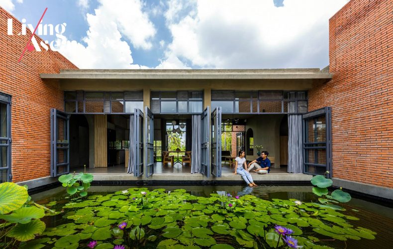
This single-story brick home, offering 180 square meters of usable space, is the brainchild of CTA (Creative Architects), an architectural practice in Vietnam. It’s designed to fit in the climate prevailing in Ho Chi Minh City, where average temperatures are 8-10 degrees Celsius higher than in the countryside.

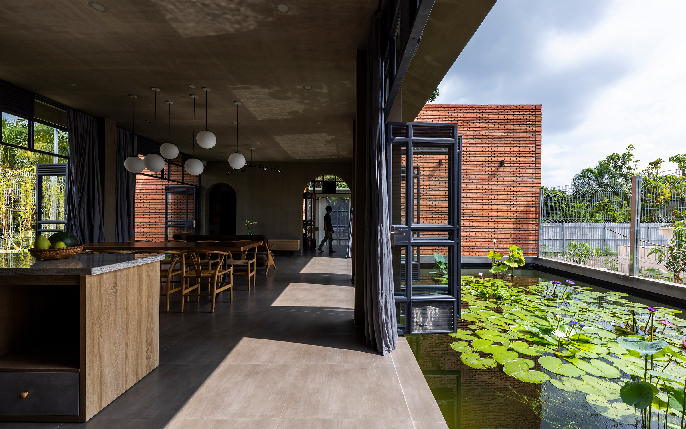
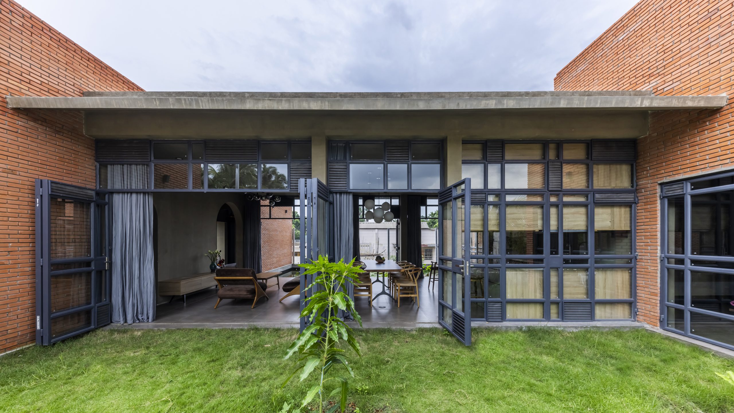
The living room is open and airy thanks to cool winds coming in over the water pond.

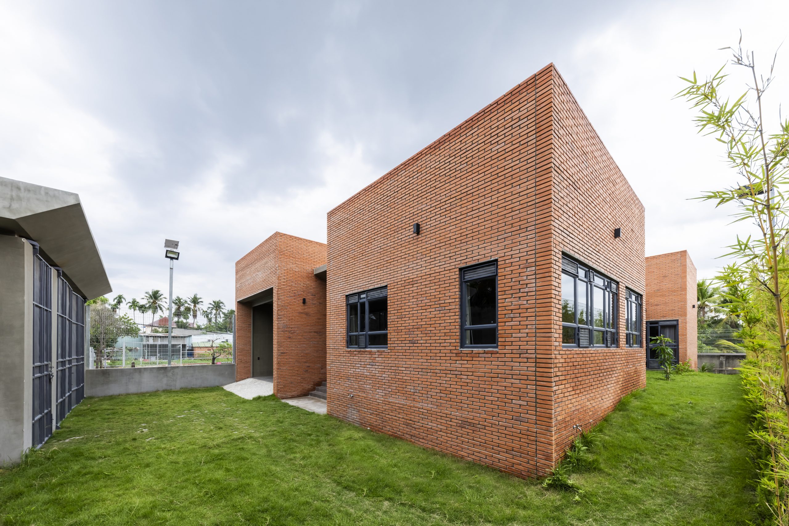
It’s thoughtfully devised to make the most effective use of materials to create a comfortable living space. Plus, it conveniently connects to the home of the owner’s mother. For the most part, the house’s exterior walls are built of fired clay bricks. To avoid heat buildup in the home, the walls are placed in relation to the sun and winds that change seasonally.

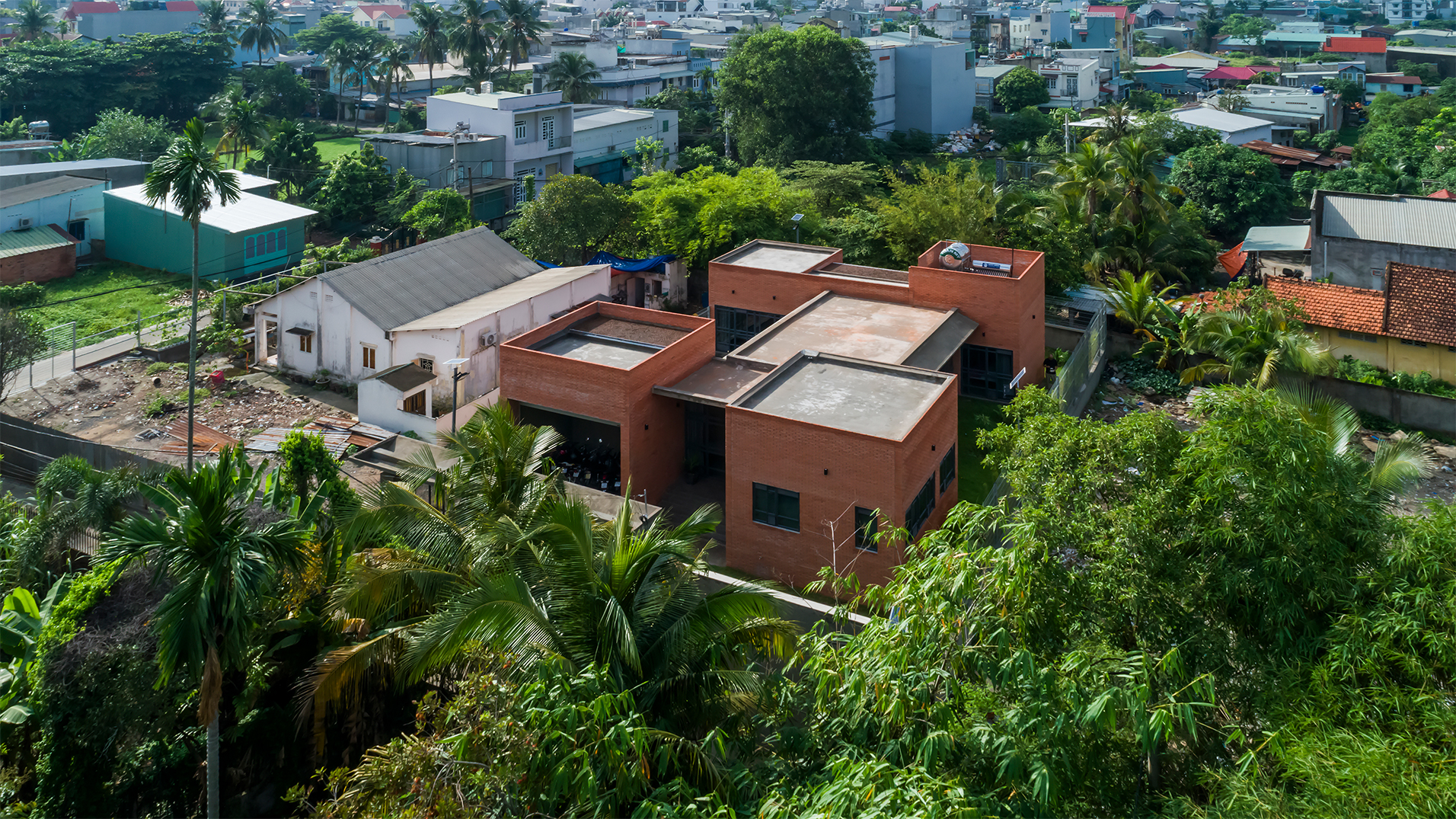
A view from above shows the brick house comprising three blocks of living spaces with the old home belonging to the owner’s mother nearby.

By design, the building comprises three blocks of living spaces with a sitting room, dining room and kitchen located at the center of the light and airy house plan. The rooms are disposed around a large water pond that doubles as engine drawing cool northeasterly winds into the home. The house of the owner’s mother located nearby can be seen in full view from here.

Living room furniture is positioned to take in the view of the water pond, while folding glass doors allow for a wide opening from one end to the other.

The center block overlooking the water pond connects the right and left sides of the house plan. The left wing holds the main entrance with a carport beside it, while the right wing contains a bedroom and reading room. Thick walls give the home a sense of privacy and protect from the elements. There are two other bedrooms and the  laundry located at the rear.

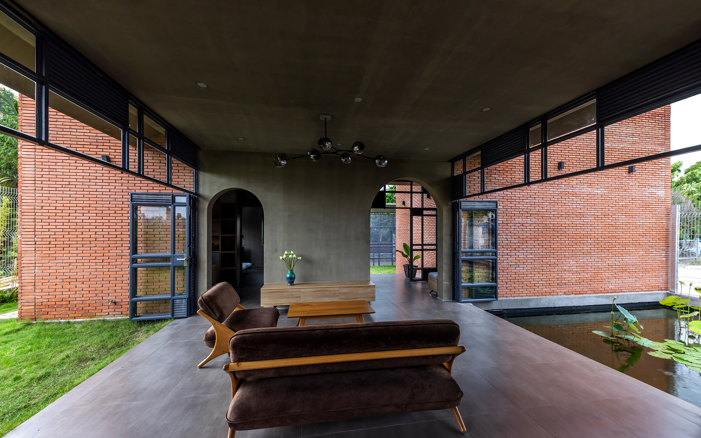
A lush yard provides the focal point and architectural feature drawing cool air into the living room.

The lovely place named “Nam House” features exterior walls measuring 250 millimeters thick. Designed to insulate the home against high temperatures, they contain two layers of protection with empty space in between. The outer walls protect from sun heat, while the void of space and the inner walls provide a buffer keeping the interior cool in summer. The holes in the bricks also add more thermal insulation capacity to the inner walls, thereby reducing heat transfer.

Exterior walls built of fired clay bricks insulate the home from outside heat.

Apart from that, bricks are used to build architectural elements that shield the interior from sun heat. They are set at an angle that draws fresh outdoor air in through openings in the walls. Meanwhile, vents above the level of the head allow hot air to exit the building, keeping the rooms cool and comfortable. Plus, the house is positioned in relation to the rise and fall of the sun and prevailing wind patterns, a passive design strategy that makes every day beautiful.

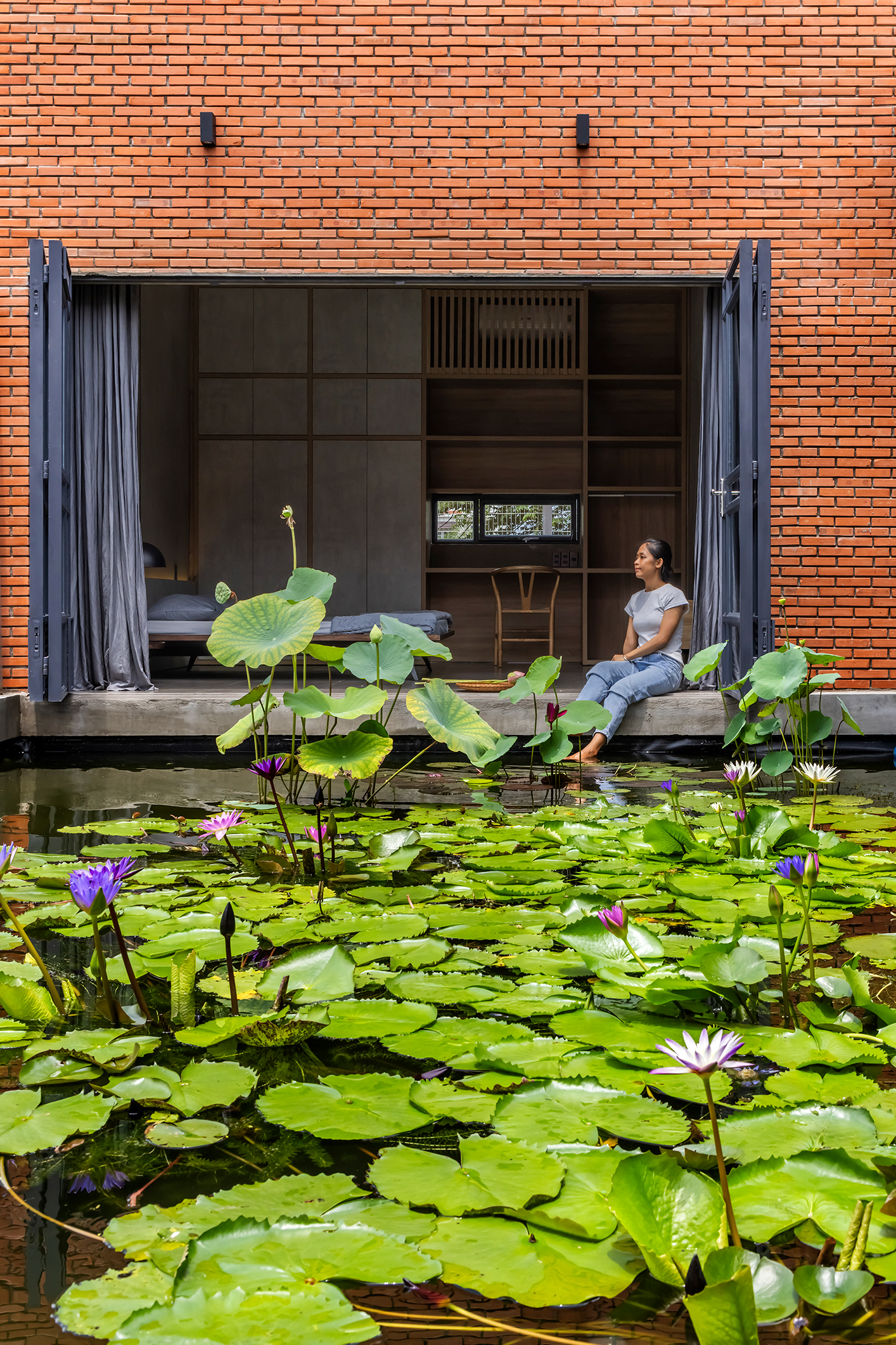
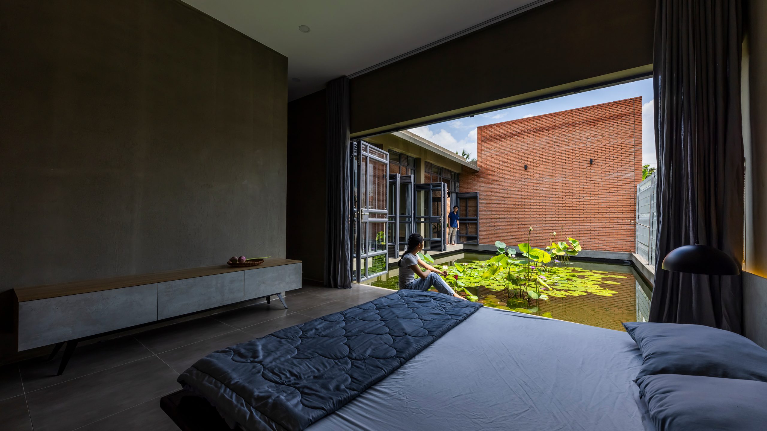
A bedroom opens to allow fresh air streaming in over the water pond while folding glass doors create a transition between indoors and outdoors.

The technique of building in an appropriate relative position can impact the house’s comfort and well-being. Like so, Nam House is designed to fit in with the surroundings. It looks the epitome of design that’s flexible and responsive to changing light and wind patterns that are the inevitabilities of life. The result is a home capable of overcoming site limitations, meanwhile expressing rich and subtle meanings.


Architects: CTA (Creative Architects)


You may also like…

Nha Be House: A Brick Home Infused with Memories of the Good Old Days

One-Story Brick Home Vietnam

TB House: A One-Story Brick Home and Green Leaves of Summer at Every Turn

Sustainable Living in a Narrow Space: Reinterpreting Narrowness along More Creative Lines

Sustainable Living in a Narrow Space: Reinterpreting Narrowness along More Creative Lines

/ Ho Chi Minh City, Vietnam /

/ Story: Kangsadan K. / English version: Bob Pitakwong /

/ Photographs: Courtesy of Officine Gặp /

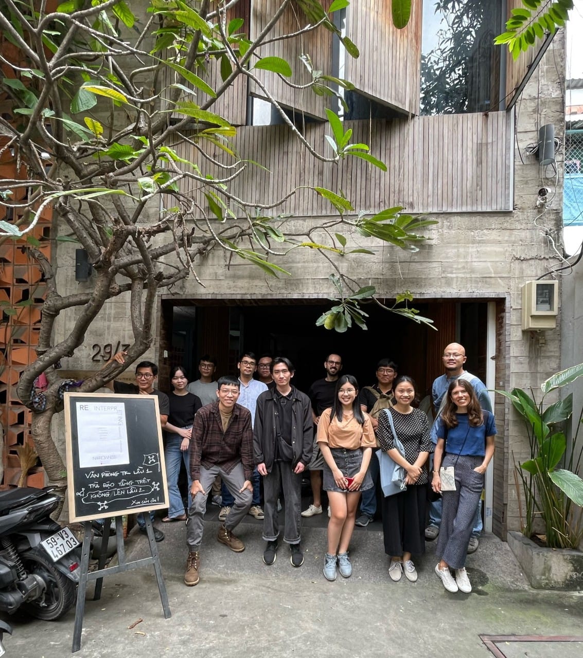
“Reinterpreting Narrowness” is an excerpt from research on the subject of an architectural style ubiquitous in Vietnam by Officine Gặp. Founded in 2021 by Yuri Frassi and Afra Rebuscini, Officine Gặp is a research studio committed to the study of urban planning and development involving people with specialist knowledge in Ho Chi Minh City. It investigates the experience and opinions of local residents in a bid to arrive at conclusive findings about the appearance of design and lifestyles in a given area.

narrow

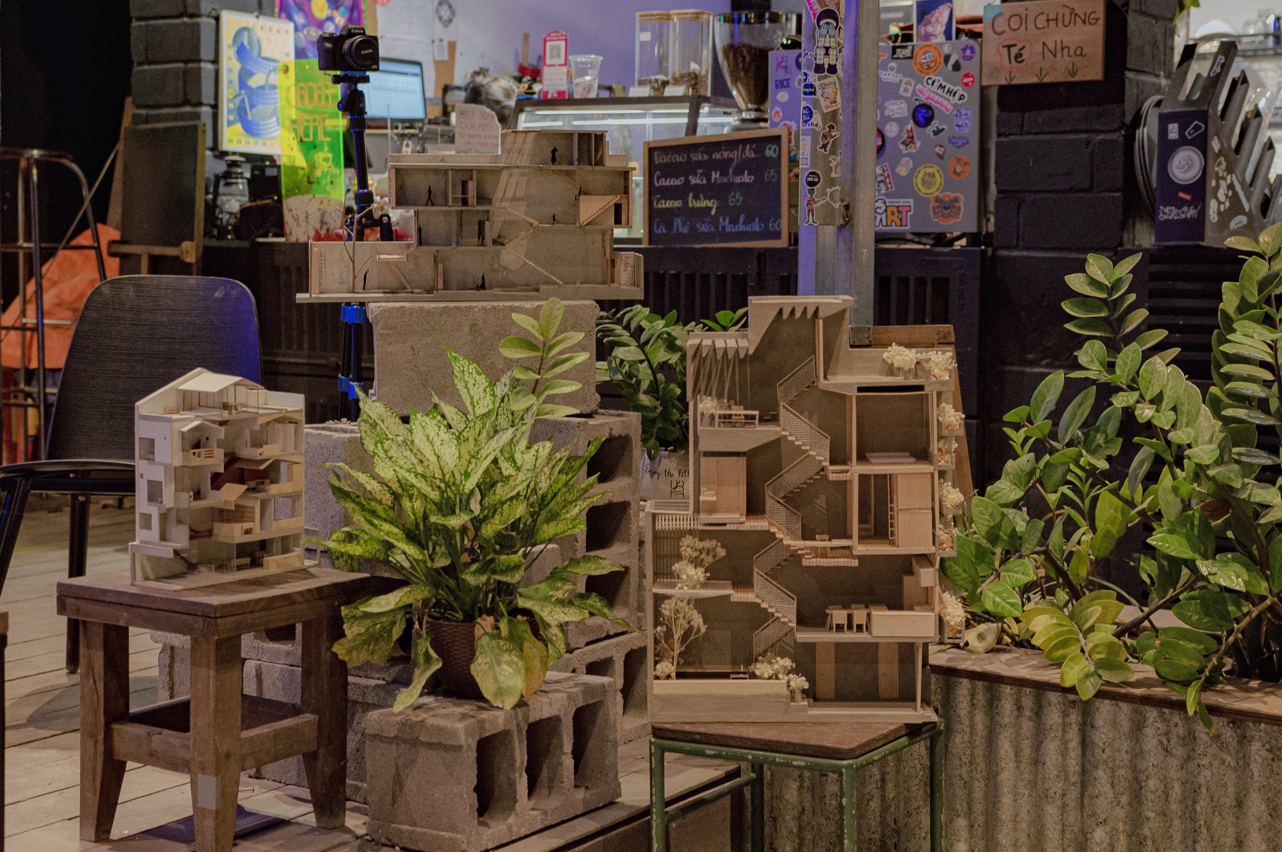
Among other things, it looks into the narrow front row house, aka the “Tube House”, a style of residential architecture prevailing in cities across Vietnam. The research project titled “Reinterpreting Narrowness” examines the facts about how urban populations live, work and play. In essence, it’s about understanding the dynamism of the people’s way of life, culture and relationships with small and narrow living spaces. That is to say, it decodes socioeconomic conditions and architectural language in a way that’s easy to understand, giving rise to exciting new ideas for urban planning and development in future.


Reinterpreting Narrowness

Reinterpreting Narrowness is a long-term project inspired by the appearance of an architectural style commonplace throughout Vietnam. Also known as the “Tube House”, it’s an urban row home plan designed to take up the full extent of an elongated rectangle. The purpose of the project is to encourage conversation among architects about the architectural style and urban landscapes that together have made Vietnam original and unique in its own special way.

narrow

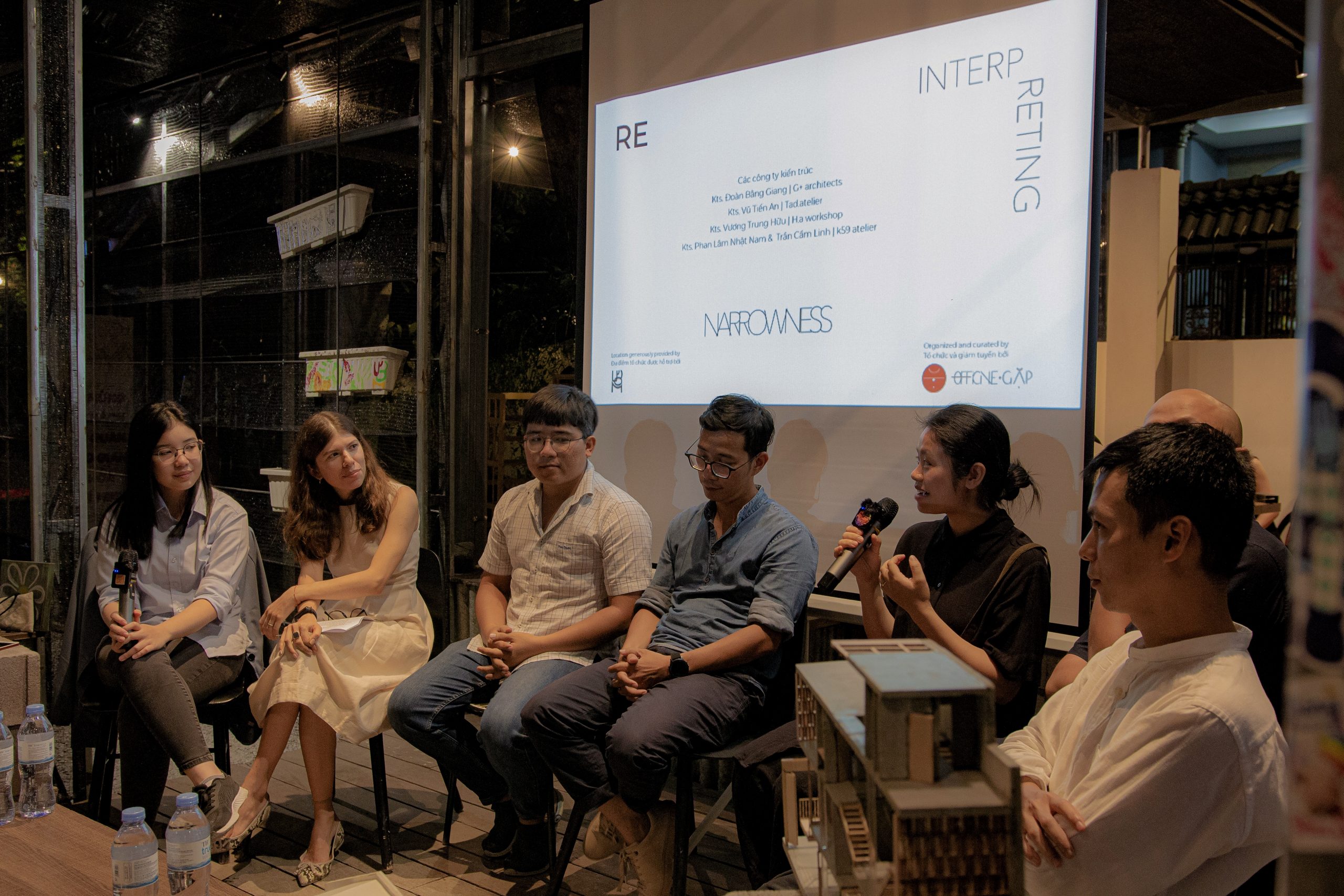
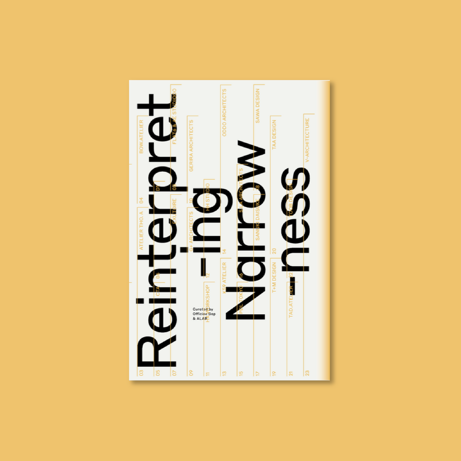
The project had its beginnings in Ho Chi Minh City in 2022. Since then it has provided the stimulus for open discussions, workshops and debates attracting more than 20 groups of architects from across the country. The project is currently gradually transforming into a form of print media specialized in design innovations and ideas worth sharing.

narrow

narrow

narrow

Over the course of time, the conversations about the “Tube House” coalesced to form a meeting place where ideas about particular design were exchanged. Together they gave rise to stories about the evolution of contemporary architecture in Vietnam. In a nutshell, it’s about taking measures to deal with the problem of overcrowding and challenge of limited space. The intention is to encourage sustainable development and, at the same time, protect cultural heritage and lifestyles. Circles of architects have a role to play in improving the quality of life and ongoing interactions among people in the city.

Crafting a Sonic City (CASC)

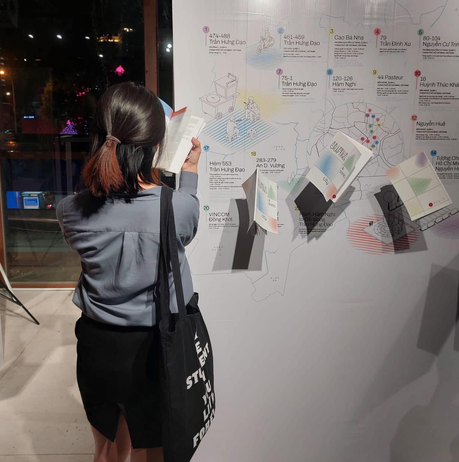
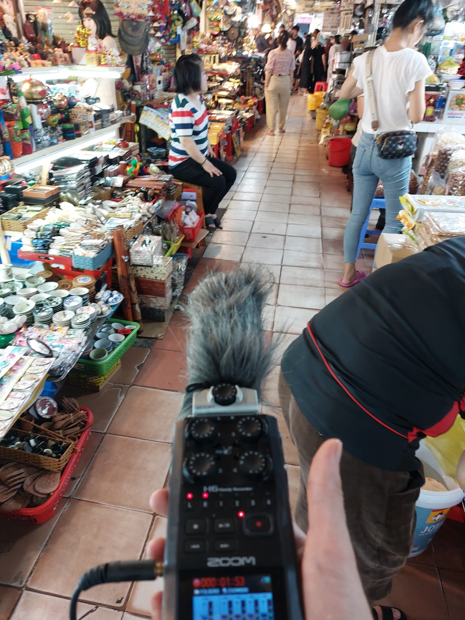
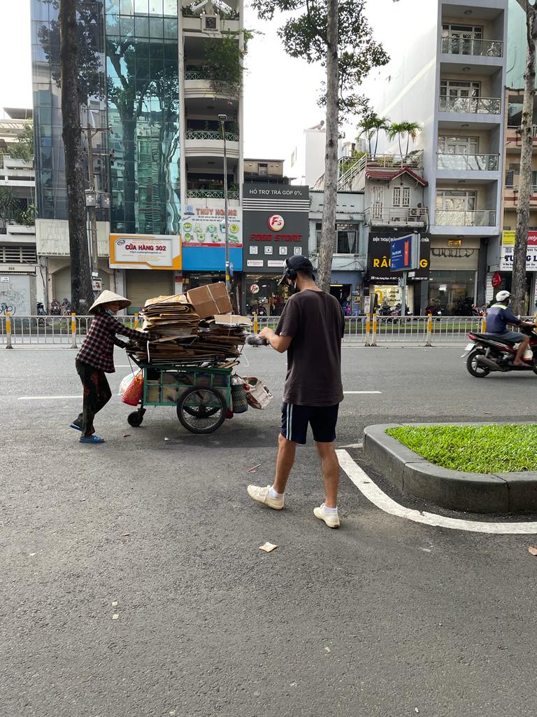
Crafting a Sonic City is a multidisciplinary project designed to research the characteristics of sound in the city for the purpose of urban development and the conservation of features or qualities unique to an area, ultimately safeguarding its intangible cultural heritage. Unbeknownst to us, we have all grown familiar to hearing the usual sound in the neighborhood every day. This research project uses the sonic quality to record the story of a city in a factual and detailed way. In a few words, it’s about creating exciting new ideas for urban planning, using the sound as a means to promote an understanding in society.

narrow

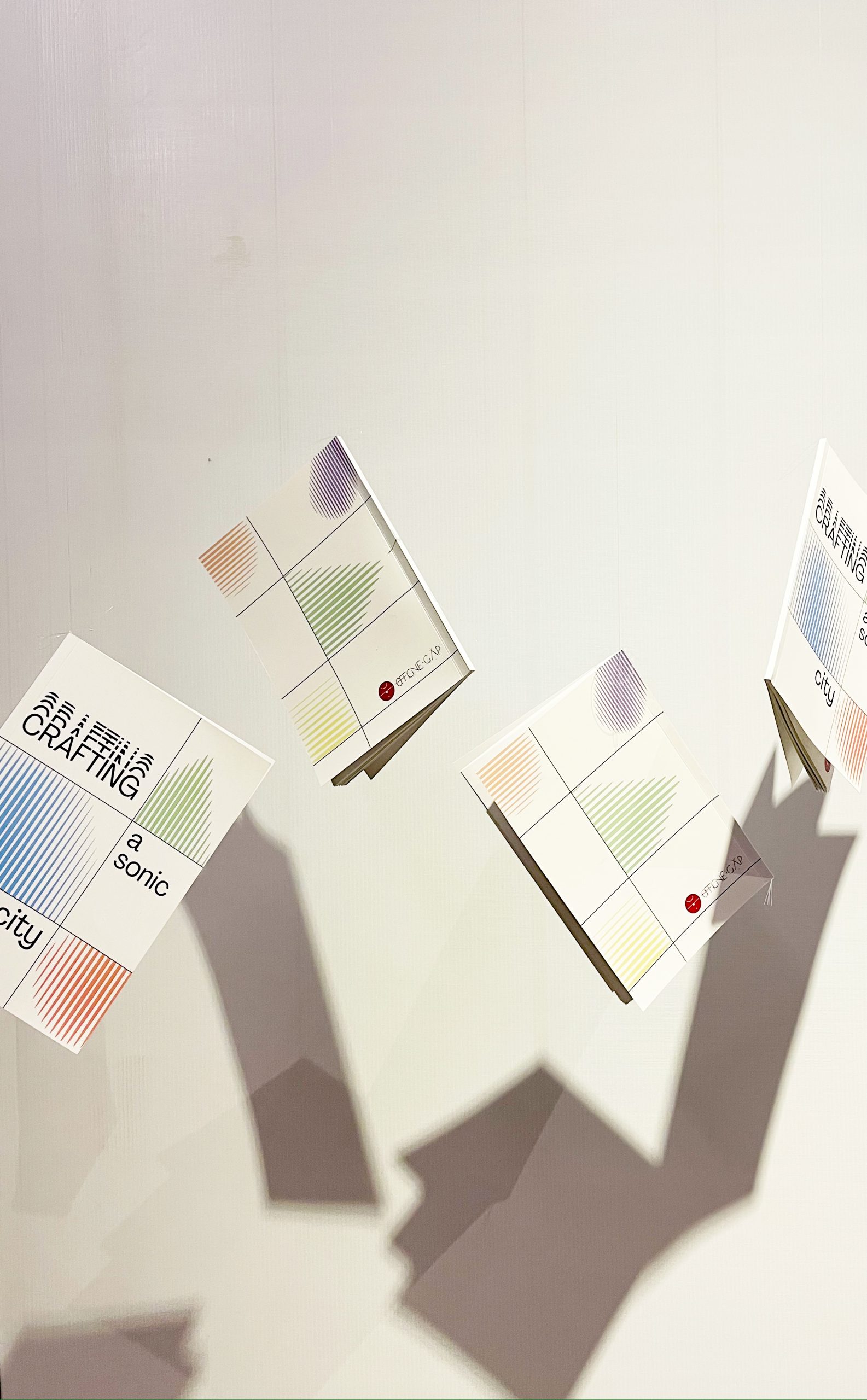
The project culminated in a public display of handmade books about the characteristics of sound in Hanoi and Ho Chi Minh City. It happened as part of the Vietnam Festival of Creativity and Design 2022, featuring a multitude of neighborhood sounds recorded by architects and researchers. It provided a forum for an exchange of views with people in the community as well as the Society for the Blind.

The Gặp Series

The Gặp Series is a program dedicated to sharing ideas and stories obtained from visiting design studios and architectural practices across the country. Findings reached as a result of an inquiry are presented in a friendly atmosphere. It’s the intention of Officine Gặp to provide a meeting place where knowledge can be exchanged plus it provides the opportunity of meeting up with the people behind the success of research projects in Vietnam.

Action Research Turtle Lake

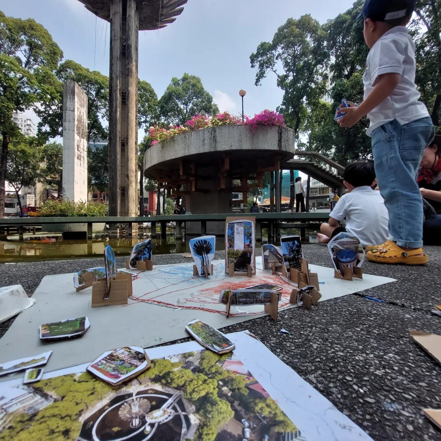
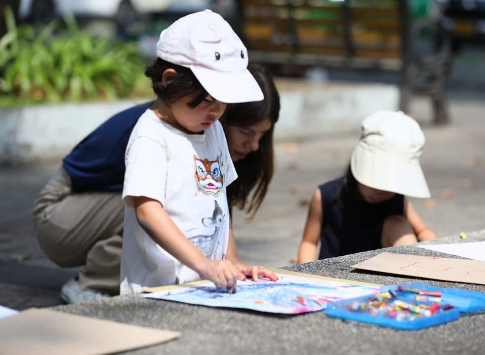
Action Research Turtle Lake is a workshop that took place over a period of two months. It was a forum that involved little children. The intention was to explore new possibilities in urban planning and development, especially ideas that we adults would never have thought possible. It invited children at the age 4 and 5 from Little Em’s Preschool to be part of the team.

In joining the research program, the children were encouraged to observe the happenings on the streets around Turtle Lake in Ho Chi Minh City. It’s an urban neighborhood characterized by busy movement and activity, traffic congestions and places where people congregate to eat and drink together.

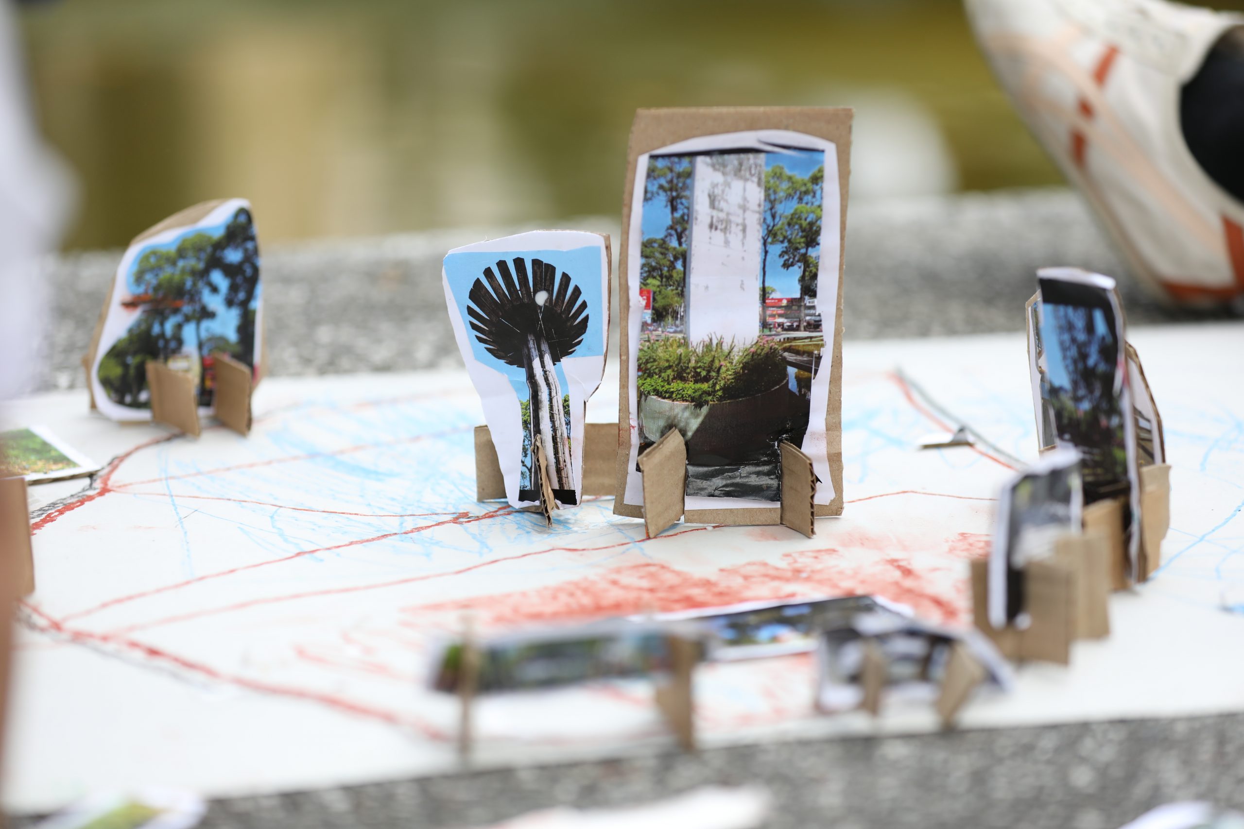
The children participated in surveying the area; taking photographs, drawing pictures, and talking with locals about things that happened. Officine Gặp designed activities that were easy for the children to do in line with an approach to neighborhood building known as “Tactical Urbanism”.

A little bit about Officine Gặp

Yuri Frassi

Yuri Frassi is pursuing a doctorate at the School of Architecture and Urban Design, Royal Melbourne Institute of Technology (RMIT) University, Australia. His keen understanding of the fabric of urban society is manifested in his research into the socioeconomic conditions affecting people’s way of life in Ho Chi Minh City. His works investigate ongoing relationships and interactions between different narratives about cities and urbanism. Through conversation, complex ideas in architecture and urban design are reinterpreted in a way that’s easy to understand.

Afra Rebuscini

Afra Rebuscini is an architect and independent exhibition curator based in Ho Chi Minh City, Vietnam. Her past experience and research centered around the law of urban planning and the dynamism or complex interplay of relationships between the community and the city. With an aptitude for art making, event organizing, and area knowledge, she has been able to conduct social experiments, ultimately leading to an understanding and civic participation in urban planning and development.


(Re)Thinking inside the Box is a series of discussion events focusing on the issues abovementioned. It’s all a matter of perspective about what can be done to address the problem of limited living space in the city. It’s a forum for people to explore new possibilities and look at the problem from within, thereby turning a challenge into a solution. Hence, the title is (Re)Thinking inside the Box, as an alternative to outside-the-box thinking.

narrow


You may also like…

Sanuki Daisuke, Sanuki Daisuke Architects (Sda.): Incorporating Empty Spaces and the Environment in Quality Residential Design

Tan Phu House
Tan Phu House: From a Stuffy, Narrow Shophouse to a Multi-Floor Home with Rooftop Garden

A Skinny Home Fosters the Joy of Living through Cozy Interior Design

A Skinny Home Fosters the Joy of Living through Cozy Interior Design

/ Ho Chi Minh City, Vietnam /

/ Story: Kangsadan K. / English version: Bob Pitakwong /

/ Photographs: Lonton Studio /

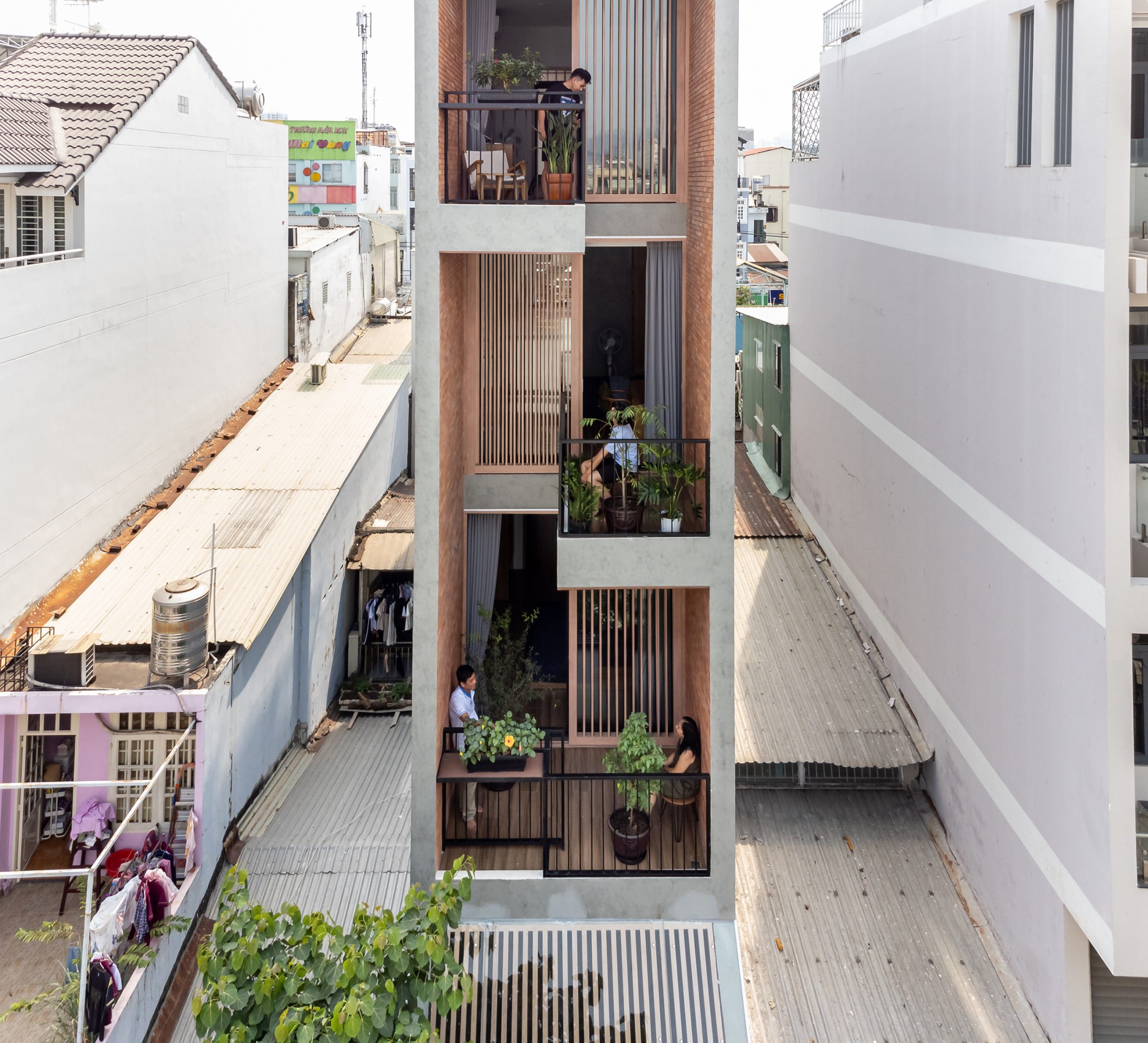
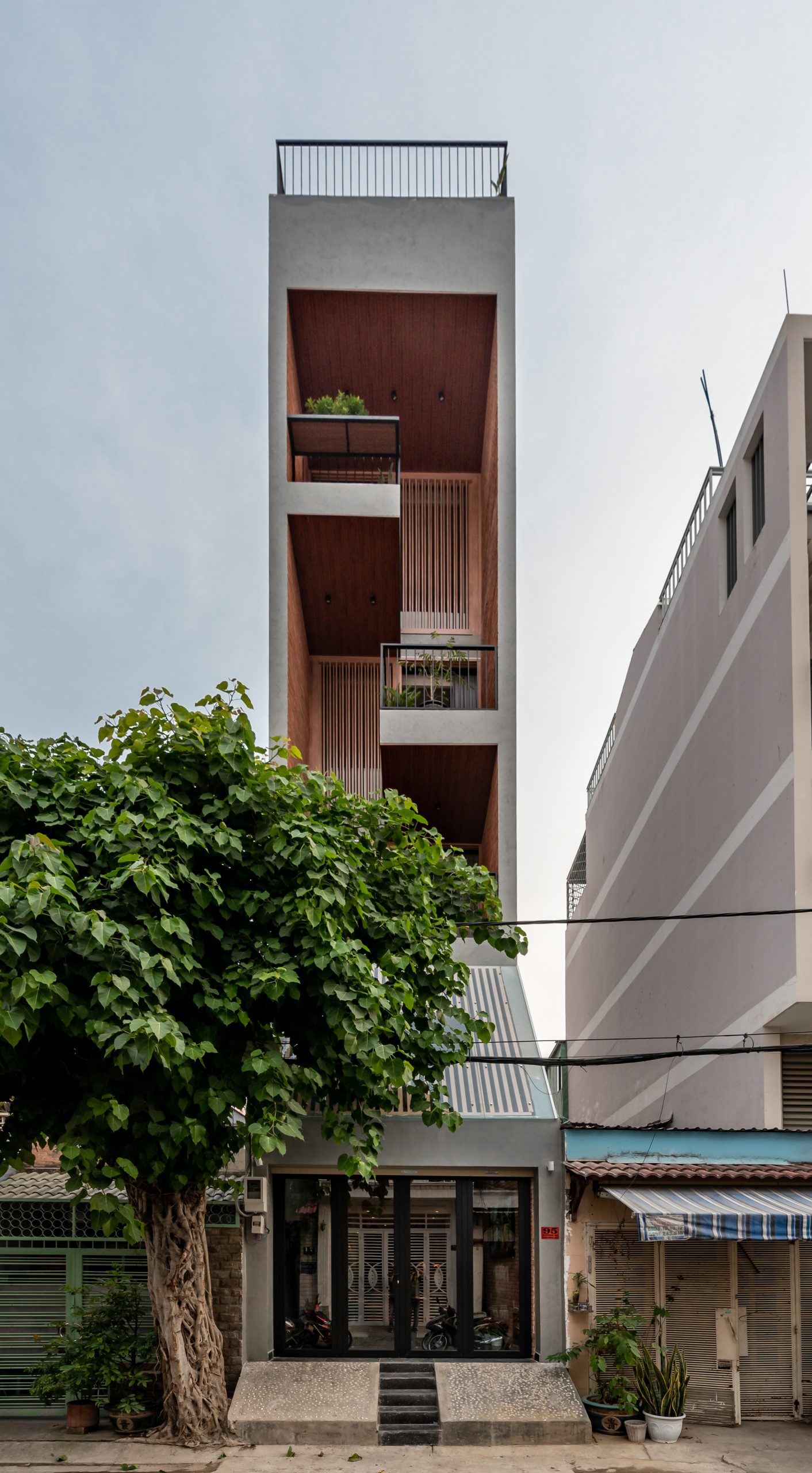
Who would have thought a modest house could transform into a warm and welcoming home amid the hustle and bustle of downtown Ho Chi Minh City? Well, it’s possible. This five-story narrow lot house has plenty of room for a couple with two children to live comfortably. It even has a sitting room that echoes the timeless tradition of tea and coffee drinking, a relaxed atmosphere that keeps conversations going. Well-thought-out design gives it a streamlined and simple look, while the interconnected interior speaks volumes for a strong family bond. The house is the brainchild of Story Architecture, a homegrown architectural practice in Vietnam.

The balconies enclosed by walls and railings are staggered throughout the façade in warm shades of brown. They provide places to sit back, relax and enjoy family time outdoors.

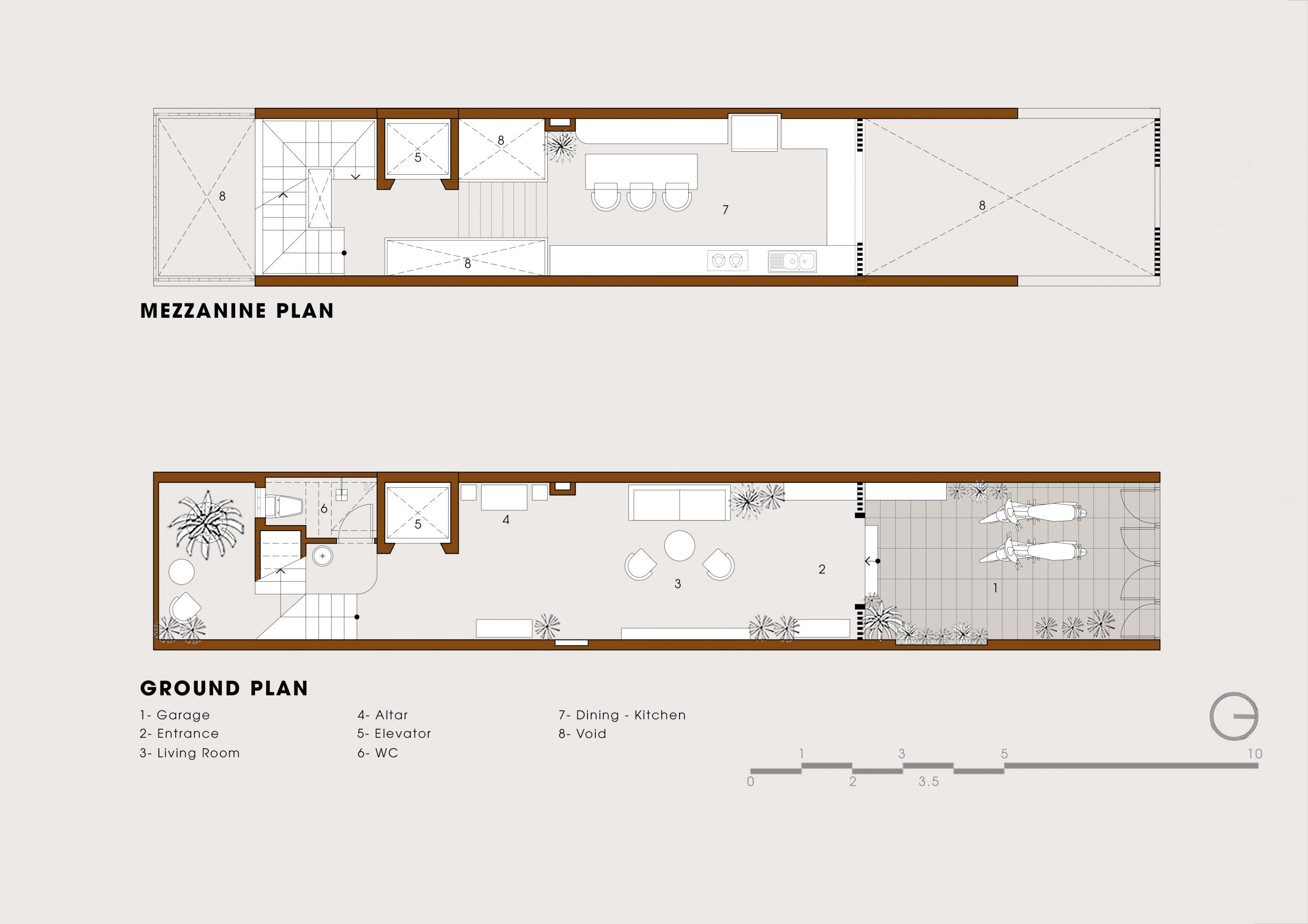
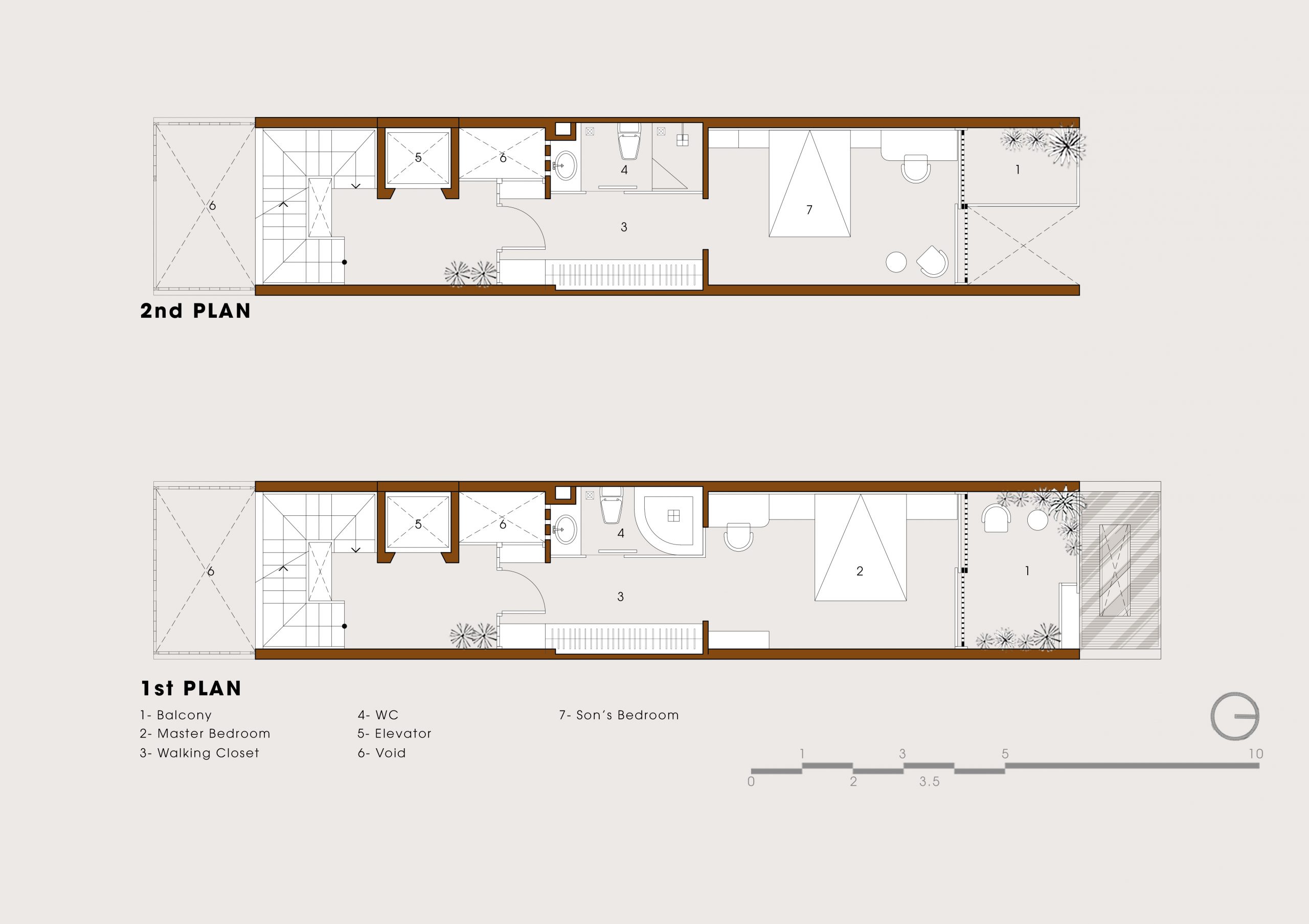
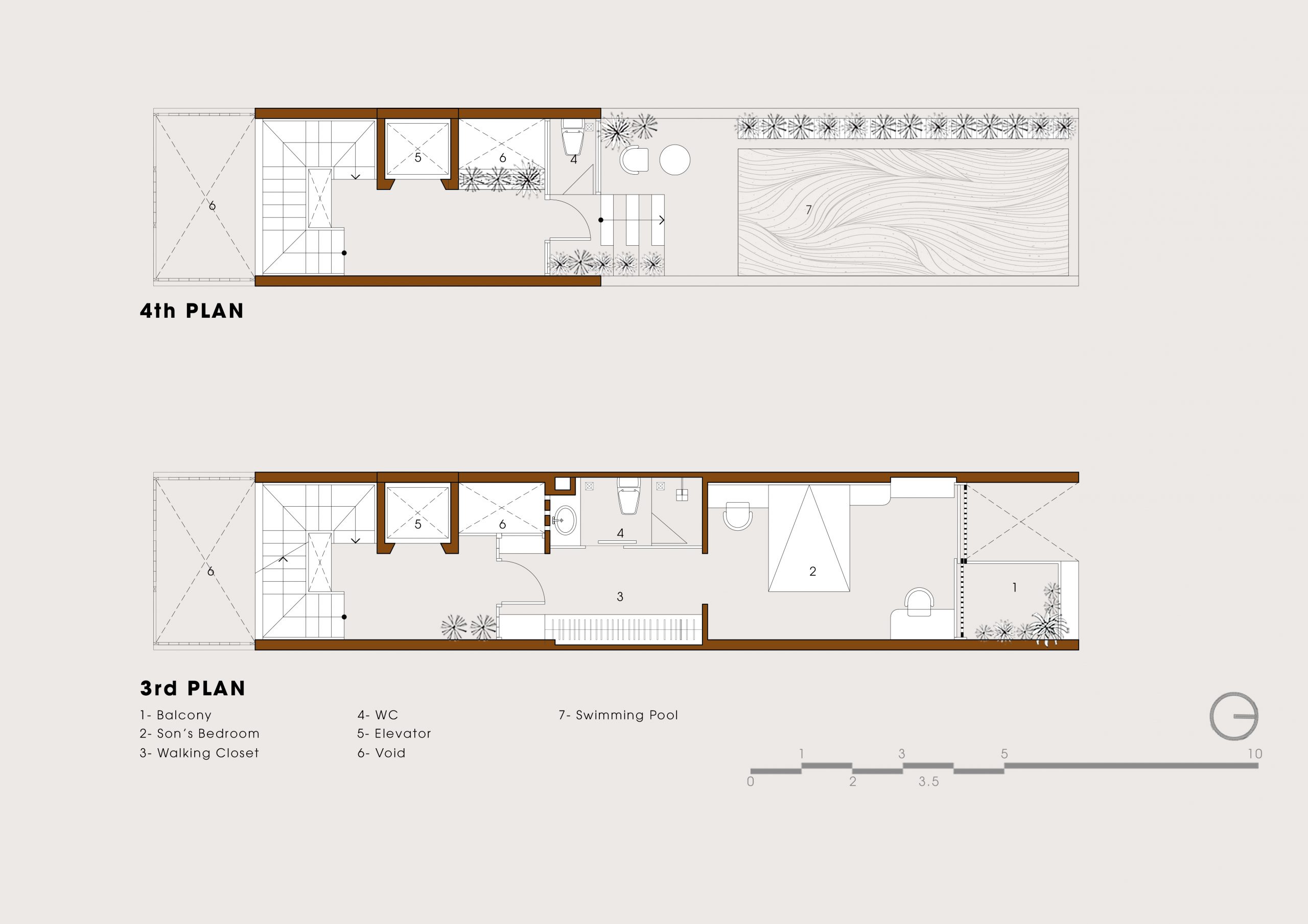
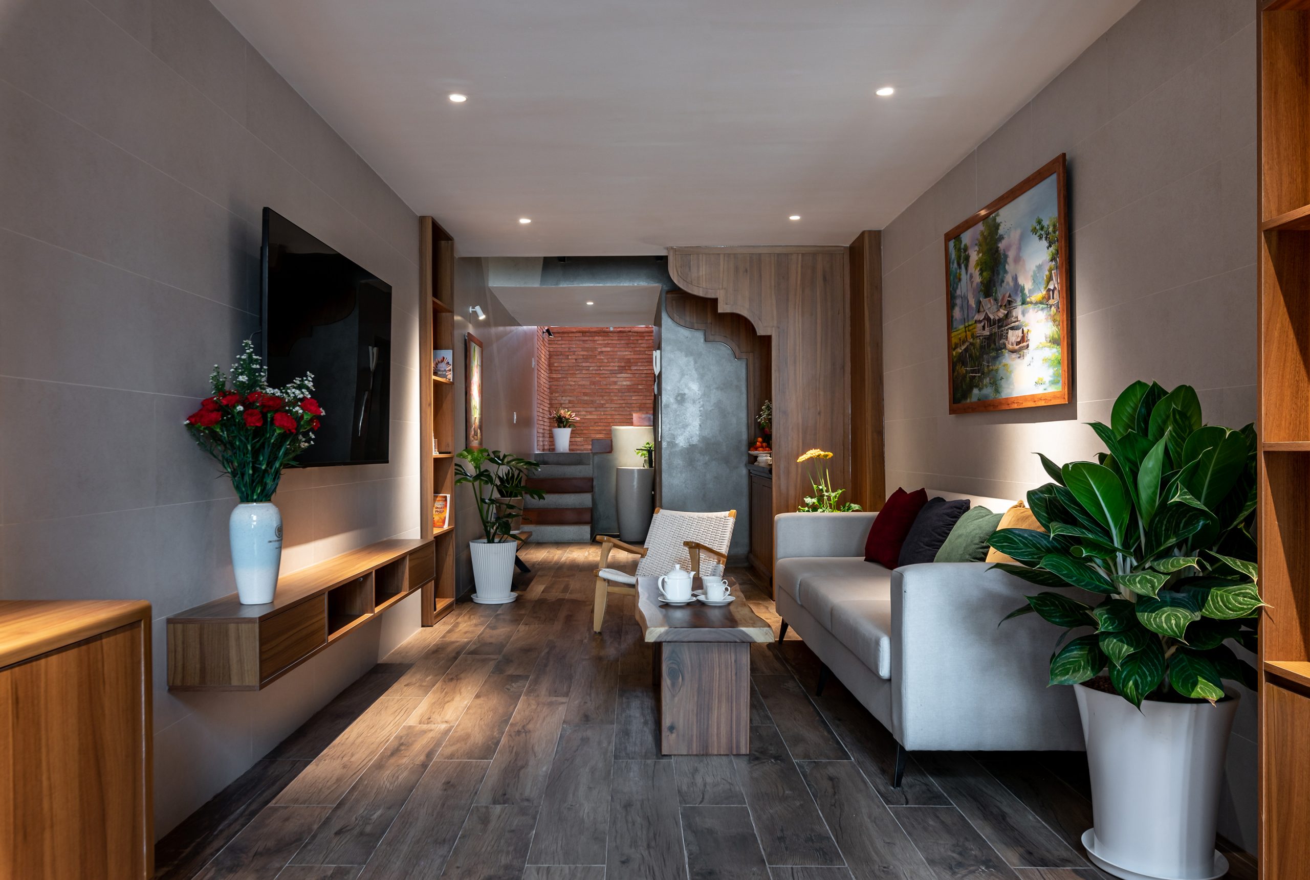
Built on a plot of land that’s unusually long in relation to its width (3.5 x 17 meters to be exact), the tall and skinny house offers 59.5 square meters of usable space. For privacy, there are three bedrooms plus communal spaces that form the heart of family life. They include a modern kitchen with dining room nearby, as well as a living room, an ancestral altar, and a swimming pool on the rooftop deck.

For added convenience, there is an elevator that provides access to all the rooms on five levels. Taking everything into account, the design team did an amazing job at integrating all the useful features in one small space.

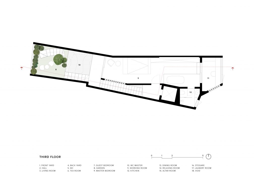
Drawings of the mezzanine and the ground floor show an elevator shaft and sets of stairs at the rear of the house in relation to the living spaces and other functions located up front. / Courtesy of Story Architecture
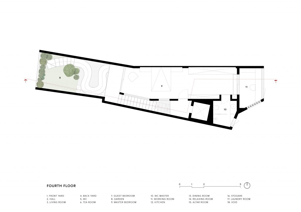
Drawings of Floors 2 and 3 show the master bedroom and one of the children’s bedrooms located at the front of the house. / Courtesy of Story Architecture
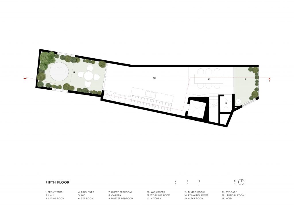
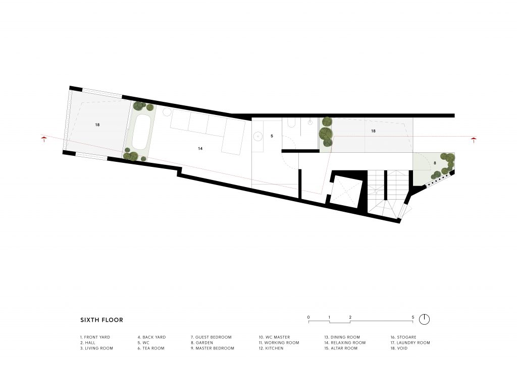
Drawings of Floors 4 and 5 show one of the children’s bedrooms and the rooftop swimming pool at the front of the house plan. / Courtesy of Story Architecture
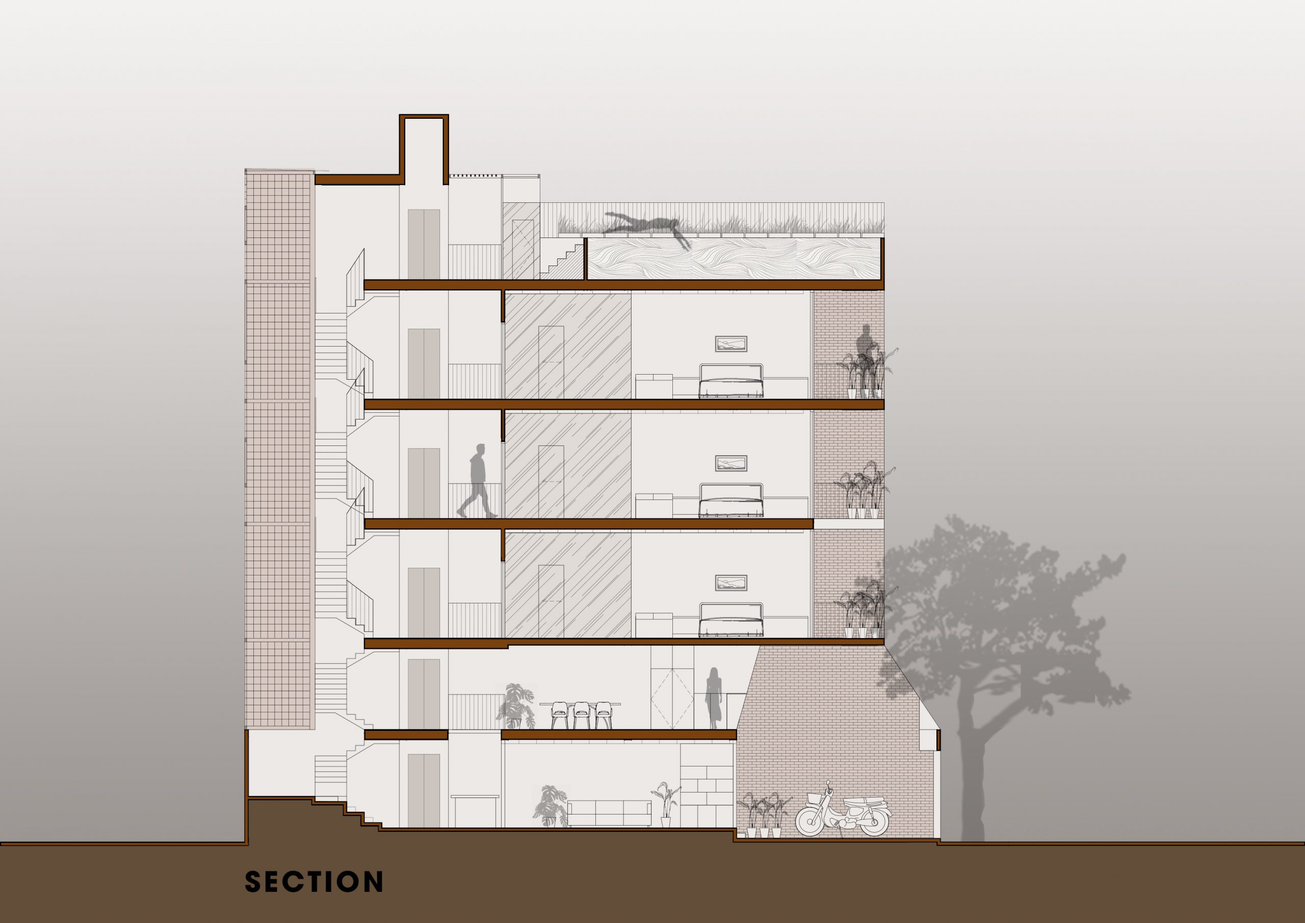
A drawing of the side elevation view in cross section illustrates the flow of air through openings in the walls at the front and the back of the building. / Courtesy of Story Architecture

The design concept centers around creating a more connected living space, one that’s well-lit and well-ventilated considering the warm and humid climate prevailing in the region. And that applies to all five levels, as well as the stairwell and the vertical shaft for the passage of an elevator located at the far end of the building.

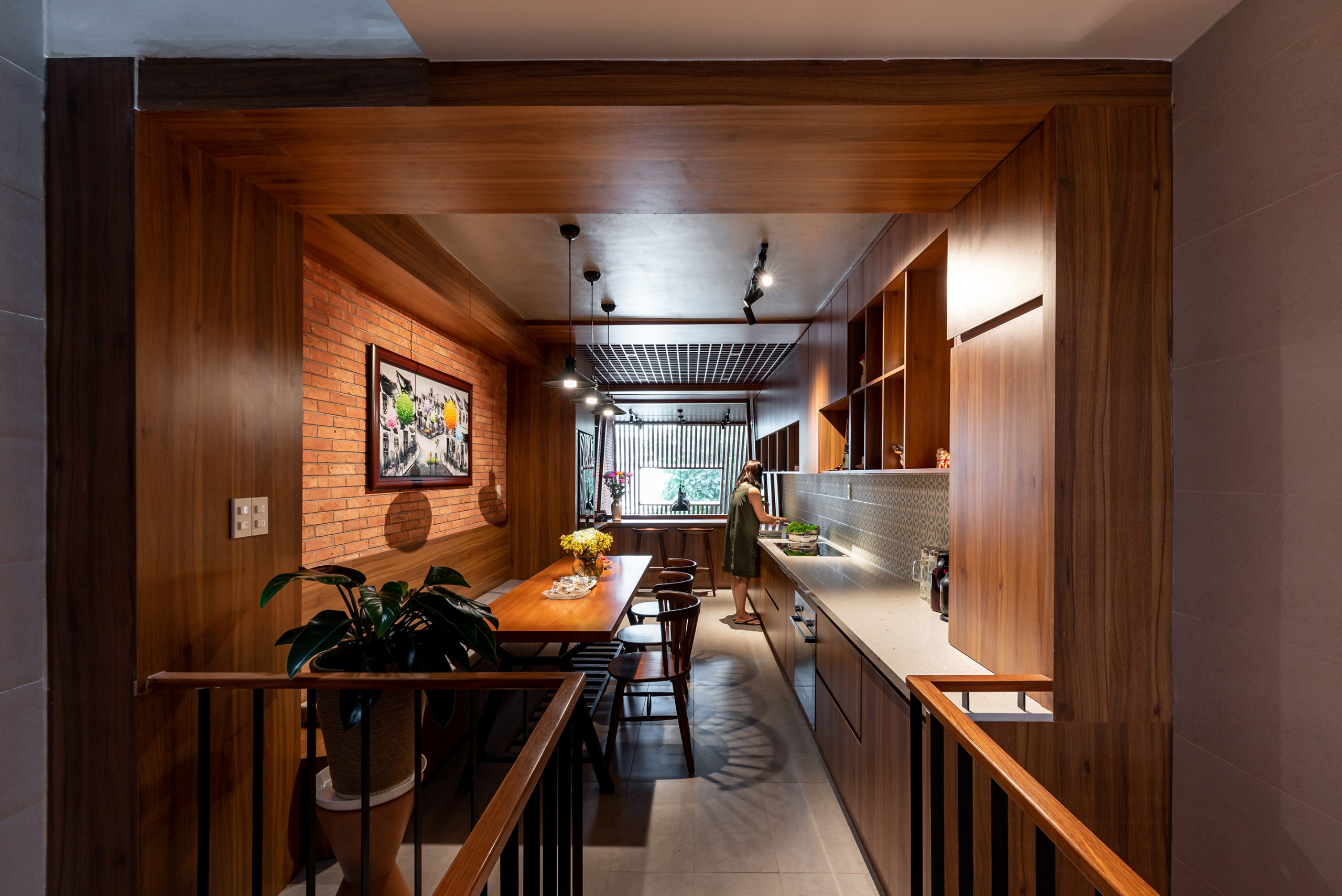
The mezzanine contains a modern kitchen with dining room nearby. A skylight installed in the roof up front maximizes light and allows people inside to see out while preparing food.

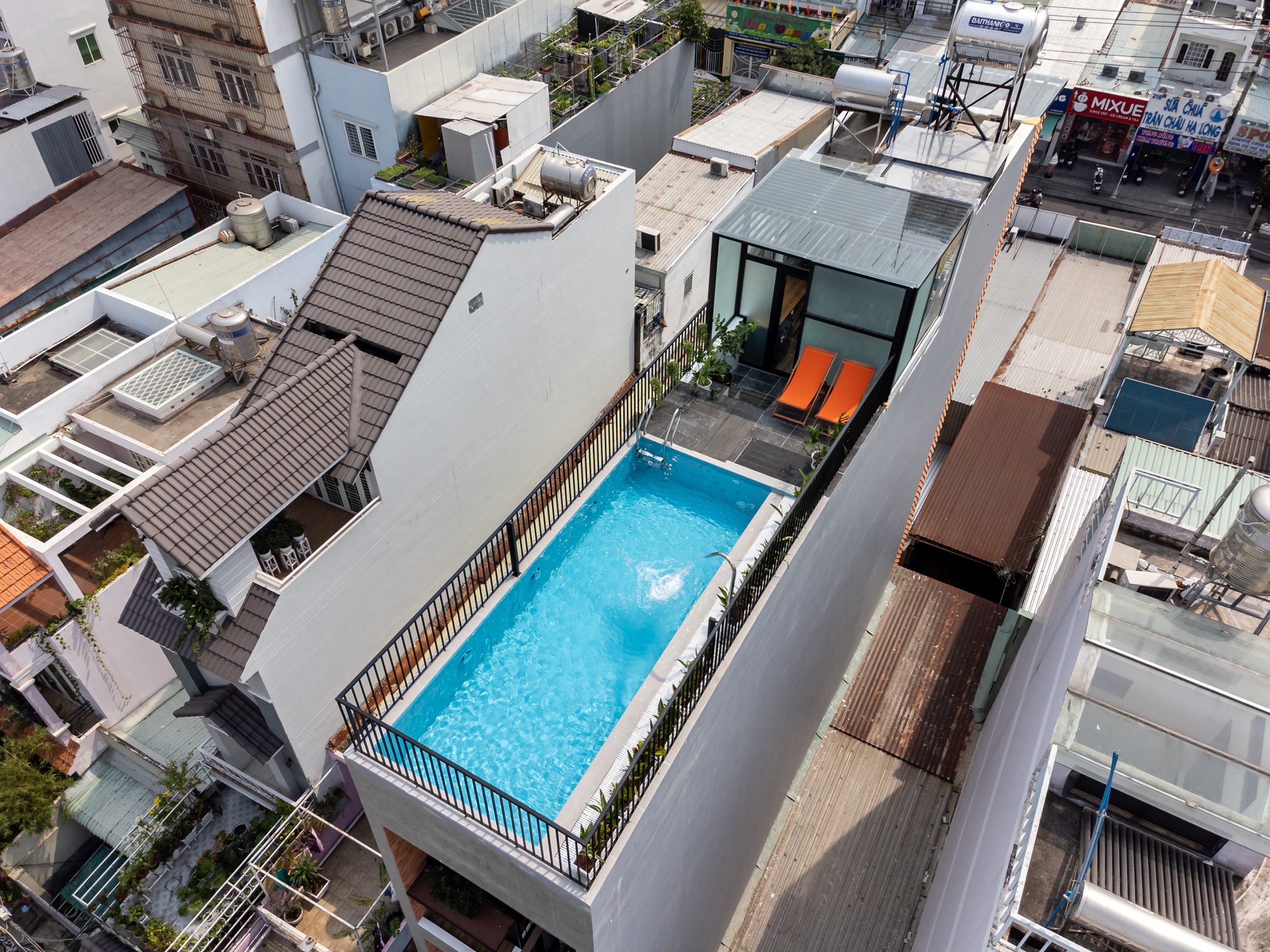
By the looks of things, there are two features that stand out from the rest. First, the front of the house contains living spaces for the family plus a dining room and a kitchen located on the mezzanine. Then, the swimming pool on the rooftop deck conveys a great deal about genius ideas aimed at overcoming the problem of limited space in the city.

The swimming pool on the rooftop deck offers a panorama of Ho Chi Minh City.

That’s not all. To make a home feel more comfortable, choosing the right building material for the job is equally important. In this particular case, the rear walls built of breeze blocks provide ventilation, decoration and privacy. Plus, they protect the interior from rain and bad weather. Where appropriate, glass windows are put in place to maximize light streaming into the rear of the house. Other features that contribute significantly to the overall appearance are the balconies staggered throughout the front façade in rich warm tones of brown, an amazing design that makes the house unique in its own special way.

A bedroom embraces the beauty of simplicity illuminated by natural light.

All things considered, it’s a task that makes great demands on the team of architects who designed it. Not only is it about overcoming the problem of limited space, but it’s also about building a place that’s comfortable to live in, a well-detailed design with plenty of room to grow a family and promote positive communication. And this warm and inviting, five-story home is created to do exactly that.


Architects: Story Architecture


You may also like…

Nha Be House: A Brick Home Infused with Memories of the Good Old Days

Two Homes Built of Local Materials as a Way to Foster Family Bonds

Lei Ơi Càphê: An Airy, Well-Lighted Shophouse-Cum-Bistro in Da Nang

Lei Ơi Càphê: An Airy, Well-Lighted Shophouse-Cum-Bistro in Da Nang

/ Da Nang, Vietnam /

/ Story: Phattaraphon / English version: Bob Pitakwong /

/ Photographs: Hoang Le /

No other place looks the epitome of a charming community like this neighborhood in southeast Da Nang. The area is no stranger to shopping streets lined with narrow front row houses commonplace throughout Vietnam. And that’s exactly the challenge that tests the ability of a design team at Tran Trung Architects. They are tasked with creating a small coffee shop combined with the owner’s residence on the second and third floors. The result is a clean, well-lighted shophouse named “Lei Ơi Càphê”, ơi being a word expressing love and affection in Vietnamese.

da nang
The coffee bar with a seating area nearby makes the entryway feel warm and welcoming.

On the outside looking in, it’s the image of a beautiful place thanks to the quaint, storybook façade and a front yard under tree cover. The healthy green foliage is quite a contrast to the building exteriors with burnt orange undertones. The storefront itself is covered in corrugated metal roofing turning a rusty brown. It’s a creative way to add vintage aesthetic to the modern terraced home. More than anything else, it doubles as an outdoor privacy screen providing peace and seclusion from busy movement and activity outside. Walk in the door, and enjoy life in the slow lane, not to mention the tantalizing aroma of fresh brewed coffee.

First floor plan: Open concept design makes the entryway, coffee bar and seating area feel light and airy. / Courtesy of Tran Trung Architects
Second floor plan: Greenery is put in toward the middle of the house plan, separating the customer seating area up front from the owner’s residence tucked away at the rear. / Courtesy of Tran Trung Architects
Third floor plan: An open concept layout translates into improved foot traffic flow plus increased light and ventilation. / Courtesy of Tran Trung Architects

Meanwhile, open-concept spaces on the inside feel cohesive with everything blending together beautifully. There’s small courtyard, for lack of a better word, at the center of the house plan that’s illuminated by skylights built into the rooftop. On the whole, it’s the coming together of features produced by nature and a style of architecture that’s unique in its own special way. They work alongside each other to improve indoor air quality and excite interest as sunlight and shadow on the wall changes over time.

da nang
The view from above: metal stairs take a spiral course around a small interior courtyard, providing access to the upper floors.
da nang
A stunning courtyard in the middle is illuminated by skylights built into the rooftop.
A long table crafted of reclaimed wood looks out over the void of space on the second floor, making the interior feel light and airy.

There’s more. Central to its character is the concept known as “Reviving the Life Cycle”. Fundamentally, it’s about the 3 R’s, reduce, reuse and recycle as a way to manage waste by putting discarded material to good use and creating works of higher quality and value than the original. This is evidenced by the use of old corrugated metal roofing on the building façade, as well as crushed brick landscaping in the front yard and the path for walking along.

shophouse
The façade of corrugated metal roofing in rusty browns speaks volumes for the 3 R’s of waste management – reduce, reuse and recycle to save planet Earth.

To create indoor thermal comfort, the east and south-facing walls are built of perforated bricks that offer a range of benefits, among them enhanced ventilation, moisture control and stunning geometric patterns in design. Small holes in the bricks let fresh air enter and circulate inside, thereby keeping the interior cool and comfortable even when it’s really hot outside. Where appropriate, the architects installed water mist systems at the top of the wall, a clever way to cool the room while cutting energy bills.

da nang
Perforated brickwork creates stunning patterns on the walls and improves air circulation in the interior.

In a few words, it’s the expert use of light and shadow that makes this small café stand out from the crowd. Touched by the sun, brick wall textures create beautiful effects, adding visual interest, depth and character to interior design. At the same time open-concept planning makes the room feel larger, resulting in a seamless connection between indoors and outdoors. The fact of the matter is well-thought-out design has a role to play in enhancing customer experience.


Architect: Tran Trung Architects

Landscape: Bap’s Garden


You may also like…

Ruen Lek: A Modern Cottage Café Celebrates the Enduring Allure of Chanthaburi

renovated shophouse VietnamA Renovated Shophouse with a Hidden Gem, Simply Delightful

Terra Cotta Workshop: A Pottery Factory Embraces the Beauty of Geometry and Storytelling Power

Terra Cotta Workshop: A Pottery Factory Embraces the Beauty of Geometry and Storytelling Power

/ Quang Nam, Vietnam /

/ Story: Kangsadan K. / English version: Bob Pitakwong /

/ Photographs: Trieu Chien /

Showcasing geometry in architecture, an earthenware factory stands enclosed by stunning brick walls in a brownish orange hue. Aptly named the “Terra Cotta Workshop”, it’s unlike anything else out there. The building exuding friendship and goodwill is located in Quang Nam, a city on Vietnam’s Central Coast known for a richness of heritage and vibrant culture. It’s the brainchild of Tropical Space, a design studio acclaimed for its environmental responsibility manifested in the use of common materials, notably bricks made the old-fashioned way. Together they give rise to an architectural style that’s aesthetically pleasing, plus it’s a perfect fit for the humid Tropical climate prevailing in the region.

The building offers 682 square meters of industrial space. It’s a unit of construction added to an existing plant belonging to a ceramic artist. In term of spatial planning and relationship between different elements, the Terra Cotta Workshop is divided into three parts, namely, the observation zone and the earthenware workshop, both of which are disposed on the periphery within the building.

They are connected to the old factory building via an outdoor passage along the side. From here local artisans can be seen going about their specific trades in an area near the river. The third part contains a kiln for firing pottery and baking earthenware, also called terra cotta. The furnace itself is about two decades old. It’s the heart of the studio workshop in which goods are manufactured.

An area map shows the location of the Terra Cotta Workshop in relation to the old studio building. Courtesy of Tropical Space / Courtesy of Tropical Space
The first floor plan illustrates spatial arrangements of the workspace enclosed by brick walls made of geometric shapes. / Courtesy of Tropical Space
A drawing shows the mezzanine floor plan in relation to the furnace located at the center. / Courtesy of Tropical Space.
A front elevation view in cross section shows the relationship between buildings that combine with one another to form a whole. / Courtesy of Tropical Space
An isometric drawing shows the coming together of the various parts of the circular building housing the kiln for firing pottery. / Courtesy of Tropical Space.

The building’s outstanding features include, among other things, countless rows of openings in the brick walls. Placed at eye level, they afford clear views of every step in the clayware manufacturing process. A good customer experience begins with the corridor paved with the crushed remains of earthenware. It’s a distinctive aspect that provides a glimpse into the world of pottery making industries. Further along the path is the place where the clay is worked into dough with the hands as it transforms into ornamentally shaped outlines ready to be fired into finished products.

A passage paved with the crushed remains of earthenware allows access to different parts of the studio workshop.
An earthenware manufacturing zone lies adjacent to a river.

The walls made of quadrangular and circular shapes are designed to enclose and divide an area of land into well-connected workspaces. Apart from providing an uninterrupted view of the manufacturing process, the openings in brick walls allow plenty of natural light into the interior, further enhancing the timeless beauty of brick architecture.

A circular brick wall encloses the kiln for firing pottery that lies at the heart of the Terra Cotta Workshop.

Plus, they promote good ventilation keeping the studio workshop cool. Above and beyond all other consideration, the furnace at the center of the floor plan makes it possible for visitors to observe every step of the process. At the same time, the factory layout is neatly planned to create indoor-outdoor connections while taking every precaution to reduce environmental impacts. This is evidenced by the building’s exteriors made of fired clay that blend beautifully with the surroundings, a distinctive feature that is Tropical Space’s signature.

A mezzanine inside the kiln for firing pottery is illuminated by light streaming in through the rooftop and the perforated wall.
Generous openings in the brick walls provide a glimpse into the world of pottery making.

In the big picture, the Terra Cotta Workshop is the story of wisdom traditional to the people of Vietnam, an account of history and culture retold by designers who embrace materials sourced directly from nature. The result is a factory that has a spacious layout with well-proportioned workspaces, plus they make friends with nature and open to welcome visitors with open arms. And that’s precisely the message the design team at Tropical Space is trying to communicate.

A view from a higher angle shows the Terra Cotta Workshop in relation to the old studio building.

Architect: Tropical Space


You may also like…

brick officePremier Office: A Nature-Inspired Brick Office Design Giving off Good Vibes


Long An House: A Charming Brick House in Vietnam

Sanuki Daisuke, Sanuki Daisuke Architects (Sda.): Incorporating Empty Spaces and the Environment in Quality Residential Design

Sanuki Daisuke, Sanuki Daisuke Architects (Sda.): Incorporating Empty Spaces and the Environment in Quality Residential Design

/ Ho Chi Minh City, Vietnam /

/ Story: Lily J. / English version: Bob Pitakwong /

/ Photographs: Courtesy of Sanuki Daisuke (Sda.) /

Introducing Sanuki Daisuke, a Japanese architect at the design studio Sanuki Daisuke Architect (Sda.), Vietnam. One of expert guest speakers at the room X Living ASEAN Design Talk in Bangkok. Mr. Daisuke is renowned for his creative ways to make the best use of limited space, at the same time creating urban living spaces blend that with their natural surroundings and the general climatic conditions of a place.

Sanuki Daisuke

We recently had the opportunity of interviewing Mr. Daisuke in the lead-up to the Design Talk titled (Re)Thinking inside the Box, Vol. 1 Living in Small Urban Spaces. Conducted in English, the discussion was scheduled for Sunday August 4, 2024. It was a part of the Baan Lae Suan Fair Midyear 2024 at BITEC Bang Na, Bangkok. In essence, it’s about raising public awareness about the problem of limited space in the city and the importance of well-thought-out design in overcoming site constraints, especially in the context of the type of climate most common in Southeast Asia. The following are some insights into his work experience.


Q: What type of design have you done so far?

A: For the most part, we focus our attention on particular architectural concepts, meanwhile assessing the relationship between designs and people. They include residential projects such as small houses and apartments as well as larger undertakings like hotels and resorts. Looking back over the years, most of the projects I participated in while working in Japan were quite different from those created by other architects. They were projects designed to be built in Vietnam. That was how it all started. Time went by so fast. I have been working in Vietnam for more than 14 years now.

Sanuki Daisuke
Vom House / Photographs: Hiroyuki Oki
NGA House / Photographs: Hiroyuki Oki

Q: What did you see as the potential or possibility that could be developed or lead to success in Vietnam, or Ho Chi Minh City? At least the environment is different from that in Japan.

A: In terms of the environment, it’s very different from Japan. From my point of view, Vietnam has the potential to develop much further thanks to its cultural diversity and new things coming in the future.

Q: What is it that inspires you or acts as a guiding principle for your work?

A: That’s hard to explain because the nature of work, its intrinsic qualities and characteristics differ greatly from one project to another. Even projects in a rural area are done differently depending on the circumstances that form the setting of a place. First things first, we have to create a theme or the main idea about what we’re trying to accomplish. For example, we may want a design that incorporates the natural environment, or one that has a distinct identity specific to a region. In Vietnam, the uniqueness of a project isn’t limited to just a location. There are plenty of other qualities that can make a project the only one of its kind.

Floating House in Thu Duc / Photographs: Hiroyuki Oki
Sanuki Daisuke
Floating House in Thu Duc / Photographs: Hiroyuki Oki

Planning that’s right for the climate and the environment is likely to have a profound effect on people’s well-being. Plus, it helps to avoid design repetition. Failure to integrate this quality in the beginning of the thinking process may result in design errors, causing additional work and delays. There is more to architecture than meets the eye. The design process is important too, especially when it comes to creating urban living spaces. Besides good build quality, a home must offer usable areas that are flexible. At the same time, the integration of outdoor spaces in the house plan can make the home feel exceptionally good.

Q: You mentioned the physical environment. And what are your thoughts on culture and the people’s way of life in Vietnam?

A: It’s a different culture, one that’s perhaps influenced by the Tropical climate prevailing in Vietnam. This is evidenced by the fact that a lot of activities happen outdoors. I think street food scenes and wedding celebrations takin place in an outdoor setting can be adapted or made suitable for a new use in Japan or Europe, too. We may want to incorporate different aspects of Vietnamese culture in our design. In my opinion, Thailand has a lot in common with Vietnam in terms of climates. Taking in green spaces as part of a whole can add visual and mental benefits.

Q: Give me a few examples of projects that were inspired by the rationale you just described.

A: In Vietnam, several projects were accomplished by integrating more empty spaces in the house plan. But with land prices constantly on the rise, it makes us think again in order to make changes to spatial arrangements. “Vom House” is a good example of the house plan designed to promote natural air circulation in the interior keeping the home cool and comfortable. Technically speaking, it’s about finding creative ways to bring the outdoors in. Another example is “Vung Tau House” which is a home built on a limited space. Even then, green spaces and semi-outdoor rooms are incorporated in the plan, ultimately resulting in a bright and airy living space.

Q: As an architect, do you have a plan for your studio in the future? Any thoughts on personal ambitions that you may have?

A: I think architectural design offers many interesting perspectives. In other words, there are many ways to solve a problem. I think that if we have a clear idea about what we want to achieve, it makes a job exciting. Personally, I look forward to the opportunity of trying something new, something meaningful and inspiring for up-and-coming young architects. This includes adding new methods to the various stages of design development. It’s a part of our work going forward.

Sanuki Daisuke


(Re)Thinking inside the Box is a series of discussion events focusing on the issues abovementioned. It’s all a matter of perspective about what can be done to address the problem of limited living space in the city. It’s a forum for people to explore new possibilities and look at the problem from within, thereby turning a challenge into a solution. Hence, the title is (Re)Thinking inside the Box, as an alternative to outside-the-box thinking.

As part of the room X Living ASEAN Design Talk 2024, (RE)Thinking inside the Box Vol. 1 is on the theme of “Living in Small Urban Spaces”. Here, expert guest speakers will discuss ways to create small living spaces and enhance the quality of life, at the same time shedding light on site constraints, challenges, and possibilities for building decent homes in urban areas. In the fewest possible words, it’s about promoting good life and a good living environment.


You may also like…

urban home Ho Chi Minh City Vom HouseVom House: A Nature-Embracing Urban Home Made Attractive by Curved Design

Floating House in Thu DucFloating House in Thu Duc: A Home under the Canopy That Fits Right in Nature

Vom House: A Nature-Embracing Urban Home Made Attractive by Curved Design

Vom House: A Nature-Embracing Urban Home Made Attractive by Curved Design

/ Ho Chi Minh City, Vietnam /

/ Story: Lily J. / English Version: Bob Pitakwong /

/ Photographs: Hiroyuki Oki /

This three-story urban home belonging to a nuclear family is located in Binh Thanh, a district of Ho Chi Minh City, Vietnam. Needless to say, it’s an urban neighborhood characterized by overcrowding and lack of green spaces. That’s where architect Sanuki Daisuke comes into play and turns environmental challenges into a solution. The result is a home tailored to the small family’s specific needs, one that’s comfortable, well-lit and well-ventilated despite the problem of limited space.

urban home Ho Chi Minh City Vom House
A massive curved ceiling of raw concrete has the most prominent position in the entryway holding a semi-outdoor sitting room. It’s separated from the front yard by a façade of decorative metalwork.

By design, the house’s public spaces are placed on the first and second floors. They consist of a semi-outdoor communal space that’s shared by all members of the family. There is a dining room, with reading nooks and green spaces nearby that open to bring natural daylight and fresh air into the home.

Meanwhile, the private spaces holding only two bedrooms are perfectly adequate for family needs. They are tucked away on the third floor that’s quiet and secluded. The rooms are made somewhat smaller than usual so as to increase the size of empty spaces in the home. For the most parts, Vietnamese homes tend to have more bedrooms as a way to accommodate visiting houseguests.

Drawings of the house plan illustrate space utilization ideas on every level, including the rooftop. / Courtesy of Sanuki Daisuke Architects


A trio of front elevation drawings shows how curved designs are integrated in different parts of the building. / Courtesy of Sanuki Daisuke Architects
A side elevation drawing illustrates space utilization in relation to openings in the wall and rooftop designed to admit daylight and provide natural ventilation. / Courtesy of Sanuki Daisuke Architects
A perspective drawing in cross section shows the integration of curved ceilings in the design of the second floor. / Courtesy of Sanuki Daisuke Architects
urban home Ho Chi Minh City Vom House
The front door and house façade of perforated metalwork beautifully merge to form a cohesive unit. In combination, they open to admit light and provide natural ventilation to the home.

urban home Ho Chi Minh City Vom House

urban home Ho Chi Minh City Vom House
A folding door system opens wide from one end to the other admitting daylight and providing natural ventilation to keep the home cool.
urban home Ho Chi Minh City Vom House
The entryway up front can be seen in full view from inside the dining room and sitting room at the rear.
An open floor plan makes the first floor feel larger, giving a feeling of comfort, warmth and relaxation.

Up front, the first floor holds a sunlit courtyard beneath a distinct curvature that bears some resemblance to an underground chamber in a hillside. At the same time, high ceiling design makes the entry area look so inviting.

The rounded contour, also known as “vom” in Vietnamese, serves a dual purpose. It creates good visual flow between the first and second floors, while providing a passage leading to rooms and functional spaces in the home.

Small openings in various sizes at the top of a wall keep the second floor well-lit and well-ventilated.

urban home Ho Chi Minh City Vom House

Curving contours, or “vom” in Vietnamese, take pride of place in the sitting room and reading nook on the second floor. Together they create good visual flow connecting all the rooms in the home.
urban home Ho Chi Minh City Vom House
A relaxing reading nook on the second floor is illuminated by reflected sunlight, while natural ventilation keeps the interior cool and comfortable.
An ample amount of space on the second floor and nearby stairway promotes natural ventilation in the house.

Extending directly beneath the curving contour, the house façade of perforated metalwork separates the front yard from a sitting room at the front. It’s designed to admit daylight and provide controlled natural ventilation to the home.

The sitting room is connected to a kitchen and dining room nearby via a folding door system that opens wide from one end to the other. From here, the reading nook on the second floor is clearly visible under the double height curved ceiling. Taken as a whole, the interior is cool and comfortable thanks to fresh, outdoor air coming in through the front door.

urban home Ho Chi Minh City Vom House

The bedroom on the third floor is breezy, uncluttered and illuminated by natural daylight.

Because it’s such a clean, well-lighted place, the homeowner couple sees potential in it developing into a house-cum-café in the future. The idea comes in handy since the family’s private living spaces are hidden away on the third floor. Plus, the open concept house plan provides many benefits, among them improved traffic flow, adequate daylight and good air circulation at every turn.

Concrete surfaces are left unfinished by design after being cast using bamboo strips, creating shadows that change throughout the day.

Amidst the hustle and bustle of life in Ho Chi Minh City, the house feels comfortable, light and airy thanks to great attention to detail. By design, it’s an urban living space that seeks reconnections with nature, a house made attractive by curved design just like the architect intended.


Join us for insights on creating urban homes that maximize quality of life. The room Books X Living ASEAN Design Talk 2024 on the theme of “(Re)Thinking inside the Box: Vol. 1 Living in Small Urban Spaces” is a discussion event in English focusing on urban living opportunities and design challenges that need to be resolved. It’s aimed at creating an awareness and knowledge among the general public about the importance of design in residential development within the context of city life across Southeast Asia.

The discussion will be in English. It’s open to everyone who is interested. There is no admission fee. Seats are limited. Please preregister at https://cooll.ink/DesigntalkLA/

Looking forward to seeing you all at Hall MR 214-216, Second Floor, BITEC Bang Na on August 4, 2024 from 1300 to 1530 hours. It’s happening as part of the Baan Lae Suan Fair Midyear 2024.


Architects: Sanuki Daisuke Architects


You may also like…

renovated shophouse VietnamA Renovated Shophouse with a Hidden Gem, Simply Delightful

Floating House in Thu DucFloating House in Thu Duc: A Home under the Canopy That Fits Right in Nature

A Renovated Shophouse with a Hidden Gem, Simply Delightful

A Renovated Shophouse with a Hidden Gem, Simply Delightful

/ Ho Chi Minh City, Vietnam /

/ Story: Phattaraphon / English version: Bob Pitakwong /

/ Photographs: Quang Tran /

This small shophouse in Ho Chi Minh City has been renovated to answer the specific needs of a family of four and their pet cats. From time to time, Grandma comes by to watch the little children and stay overnight. As may be expected of the narrow-front dwelling ubiquitous across Vietnam’s urban landscapes, the house plan is much longer than it is wide, plus there is a problem.

renovated shophouse Vietnam
A view from the street, perforated metal panels painted a cool-toned white provide privacy protection.

Facing the northwest direction, the front façade gets full afternoon sun causing heat gain inside the already tiny home lacking fresh air and ventilation. It’s amazing how a well-thought-out makeover changes everything, resulting in a bright and airy living space.

renovated shophouse Vietnam

The perforated metal fence gate works in tandem with the principal face of the building creating a transition between indoor and outdoor living spaces.
renovated shophouse Vietnam
Arranged on a long and narrow plan, the sitting room up front is separated from living spaces at the rear by a small green oasis lit by a rooftop skylight.

The homeowners sought the advice of professionals, THIA Architecture of Ho Chi Minh City, to improve the situation. After thorough site inspections, a team of designers came up with a plan to renovate the front of the house in two parts.

First, at ground level the old opaque fence gate was removed and replaced by a new one made entirely of perforated steel sheets. Little holes in the steel panels let fresh outdoor air pass through and circulate inside, meanwhile providing diffused light and improving home privacy.

Then, on top of the fence gate a framework of metal bars is put in, anchored securely to the concrete wall up front. Designed as a support for climbing plants, it rises as high as the roof eave, creating in a double layer façade that’s beautiful and capable of keeping the heat out. At least that’s the future plan.

[Left] A trio of drawings illustrates space utilization on the first and second floors as well as the rooftop skylight. / [Right] A street map shows the house location in relation to others in the neighborhood. / Courtesy of THIA Architecture
[Left] A side elevation view in cross section shows the relationship between natural and built-up environments. / [Right] A concept of decorative patterns on the house façade seen from the street. / Courtesy of THIA Architecture

renovated shophouse Vietnam
An open floor plan creates a smooth flow from the sitting room to dining room and a small green space lit by a rooftop skylight.
A sunlit small courtyard, for lack of a better word, brightens the room at the center of the house plan.
Sitting nook design ideas under a gable roof provide a gimmick intended to evoke memories of Vietnam’s rustic countryside.
Grandma’s bedroom tucked away at the rear is a calm personal living space well-lit by natural daylight.

Walk through the metal fence gate, and you discover a small terrace bringing in natural light and fresh air into the family living room with a kitchen and dining room nearby.

Grandma’s bedroom is tucked away at the rear of the house plan, separated from the sitting room up front by a small interior green space illuminated by a rooftop skylight. By design, it’s an added feature that solves the problem of stale air and stuffy room once and for all.

renovated shophouse Vietnam

Its small size notwithstanding, the interior green space exudes the simplicity and charm considered typical of the Vietnamese countryside. It looks neat and is well cared for. Plus, weather-beaten wood and vintage earthen roof tiles provide a gimmick intended to attract attention.

From here, a set of stairs lead to the second floor holding the principal bedroom up front, separated from two bedrooms for kids by the void of space above the tiny center courtyard.

renovated shophouse Vietnam
The stairway and its surrounding walls are illuminated by a skylight built into the rooftop.
renovated shophouse Vietnam
Split level layout ideas paired with a mezzanine add intrigue and interest to interior design.

renovated shophouse Vietnam
The bedroom wall facing the void of space above the yard opens to admit light and fresh air.

renovated shophouse Vietnam

renovated shophouse Vietnam
A custom made window in just the right size opens to connect with the inner courtyard, a clever hack to avoid stale air and stuffy summers.

renovated shophouse Vietnam

In closing, it’s the story of a little house made comfortable, bright and airy by well-thought-out design. The center courtyard, for lack of a better word, provides a communal space shared by all members of the family, the result of a renovation done right that makes a small home a happy home.

renovated shophouse Vietnam
A set of stairs gives access to children’s bedrooms at the rear, separated from the principal bedroom up front by the void of space above the sunlit small courtyard.

Architect: THIA Architecture

Lead designer: Arc Huynh Xuan Thi


You may also like…

Maison T: A Tiny Home Perfectly in Tune with a Vibrant City Ambience

Tan Phu HouseTan Phu House: From a Stuffy, Narrow Shophouse to a Multi-Floor Home with Rooftop Garden

Office for Trees: Beautiful All-Glass Workspace amid Lush Green Gardens

Office for Trees: Beautiful All-Glass Workspace amid Lush Green Gardens

/ Khanh Hoa, Vietnam /

/ Story: Kangsadan K. / English version: Bob Pitakwong /

/ Photographs: Hiroyuki Oki /

The name “Office for Trees” may sound unfamiliar, but that’s precisely what it’s meant to be. Here’s a modern workplace adorned with shade trees, shrubbery and hanging vines strategically placed to keep the heat out and embrace the beauty of every corner of interior design.

Seen from the street, the “Office for Trees” boasts the beauty of a see-through façade overlooking a well-maintained, inviting front yard.

Located in an urban district in Khanh Hoa Province, south central Vietnam, the building bears some resemblance to a solarium from a distance. It boasts a see-through façade made up entirely of glass to admit sunlight. Inside, beautiful workspaces enclosed by glass walls are disposed around a lush interior courtyard filled with trees and a pathway giving access to all the rooms.
Taken as a whole, it’s design that speaks volumes for the concept of the sustainable use of natural resources. While the country’s economy is picking up speed, the hidden danger of rapid urban growth is real. Lack of green spaces in the city and the realities of today’s climatic conditions are permeating all facets of people’s lives, affecting their health and well-being to put it mildly.

Conscious of changes in the environment, Pham Huu Son Architects, a group of young and dynamic architects based in Khanh Hoa, set out to create a different kind of business premises by incorporating the basic elements of nature into building spaces. The result is an ultramodern office providing 650 square meters of work area that’s calm and more conducive to creativity. Plus, it’s capable of carrying out the complete functionality for a variety of business operations.
A drawing of the first floor shows the main entry area (left) in relation to a stepping-stone garden pathway lined with green plants running the entire length of the building. / Courtesy of Pham Huu Son Architects
Nature at work, a drawing of the office’s upper covering illustrates rows of skylights alternating with planter boxes filled with green plants. / Courtesy of Pham Huu Son Architects

The “Office for Trees” consists of two buildings separated by an inner courtyard. Walk in the door, and you come to an impressive office reception/waiting room connected to the main office space at the rear.

Named the “Model House”, it contains an interior mockup complete with a bedroom, dining room, kitchen and bathroom designed to give customers a feel of how the design works. Between the buildings, a lush courtyard creates a focal point in the outdoors, improves natural ventilation and opens to admit daylight.

But what makes it stand out in a crowd is the glass façade that rises from the floor to the ceiling, resulting in a bright and airy office overlooking a koi pond and a well-kept, inviting front yard.

To reconnect with nature, the reception/waiting area is hemmed in by lush vegetation with a stepping-stone garden pathway connecting the front to the back of the building. Overall the interior is simple, clean and uncluttered with only a few pieces of furniture characteristic of minimalist ideas.

The office reception room up front is glazed using clear glass that stands tall from the floor to the ceiling. The interior is light, airy and uncluttered with a few pieces of furniture characteristic of minimalist design.
Glass walls separate the ”Office for Trees” waiting room from a koi pond in the front yard adorned with lush vegetation.

A design based on mutually beneficial relationships, the “Office for Trees” is able to provide a comfortable work environment. On the outside, green plants thriving vigorously under the big hardwood canopy trees act as engine that drives natural air circulation, keeping the interior workspaces nice and cool throughout the day.

At the same time, an underground water tank keeps the gardens well supplied all year round, resulting in well-maintained landscapes. On the rooftop, solar panels provide clean and green energy, keeping the “Model House” cool and saving electricity costs.

Reconnecting with nature, a stepping-stone garden pathway lined with lush vegetation creates a sense of space in the workplace made light and airy by design.
A park table and benches provide perfect outdoor room to chill out. They sit on the top of an underground water tank, a clever hack to save floor space in the inner courtyard.

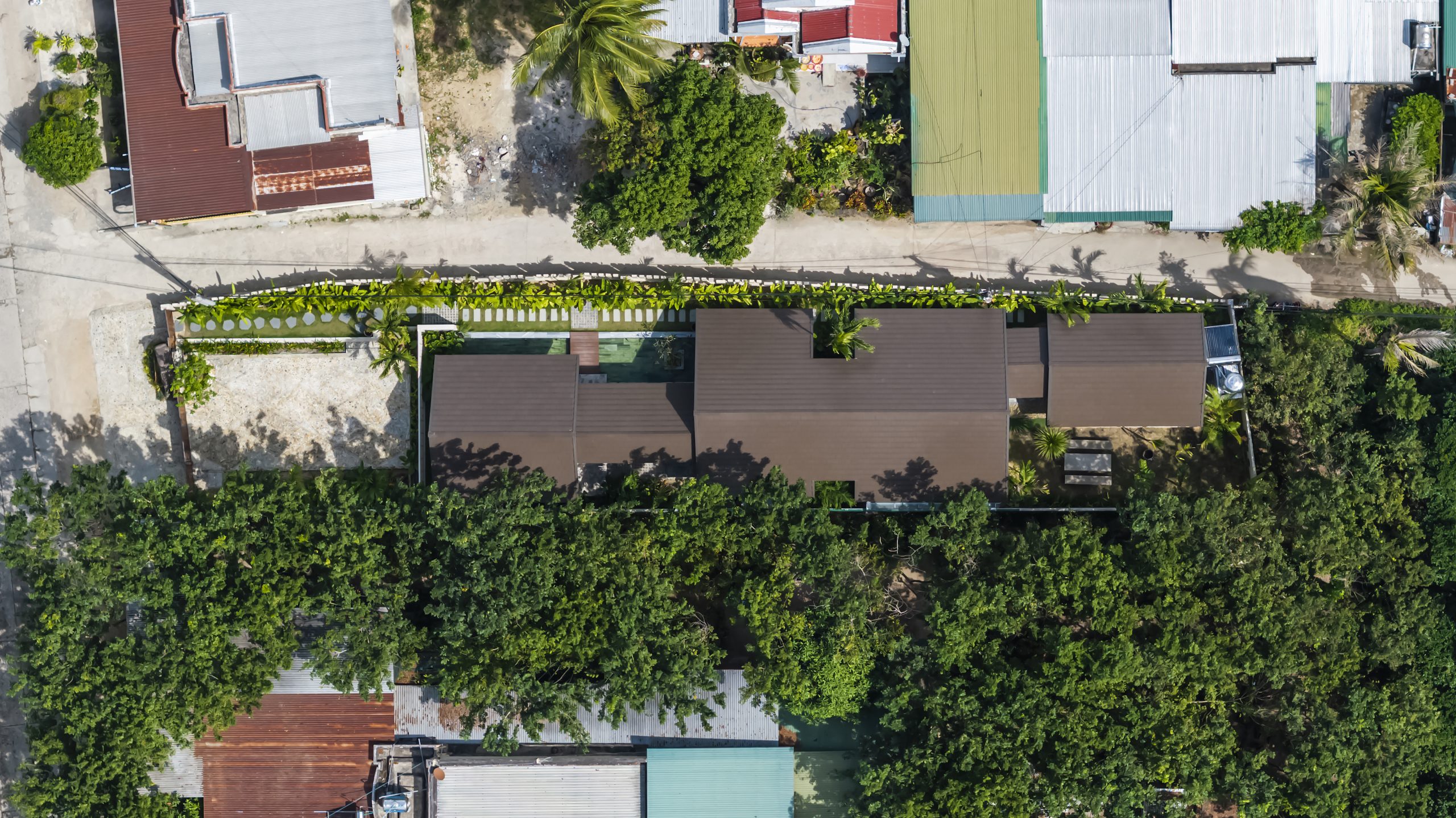
A drone’s eye view shows the “Office for Trees” rooftop covered in planter boxes filled with lush foliage alternating with skylights providing ventilation and natural daylight.

Lastly, it’s clear that green spaces, adequate lighting and good ventilation play a vital role in improving health and productivity in the workplace. Together they create an atmosphere conducive to creativity, increased energy and enthusiasm for life. Thanks to well-thought-out design, there are amazing qualities aplenty here at the Office for Trees in Khanh Hoa, Vietnam.


Architects: Pham Huu Son Architects

Lead Architect: Pham Huu Son


You may also like…

Greenery Curtain House: Simple, Pleasant and Snugly Cocooned in Nature’s Embrace

MA Architects Office: Integrating Natural Features in Workspace Design

X