Blog : Thaialnd

Rimkhobfa Bookstore & Black and Milk Café: Stunning Bookstore Café Renovation Fosters a Culture of Reading

Rimkhobfa Bookstore & Black and Milk Café: Stunning Bookstore Café Renovation Fosters a Culture of Reading

/ Bangkok, Thailand /

/ Story: Kangsadan K. / English version: Bob Pitakwong /

/ Photographs: Anupong Chaisukkasem, Phumpakorn Na Bangchang /

How would you like your coffee? Black or with cream? Welcome to Rimkhobfa Bookstore & Black and Milk Café, a stand-alone store and coffee shop snugly cocooned in a cozy neighborhood of Bangkok’s Bang Plat District. The name is a bit of a mouthful, but you get the idea. The cybercafé is thoughtfully devised to ignite the love of literacy and open new horizons among younger fans of books.
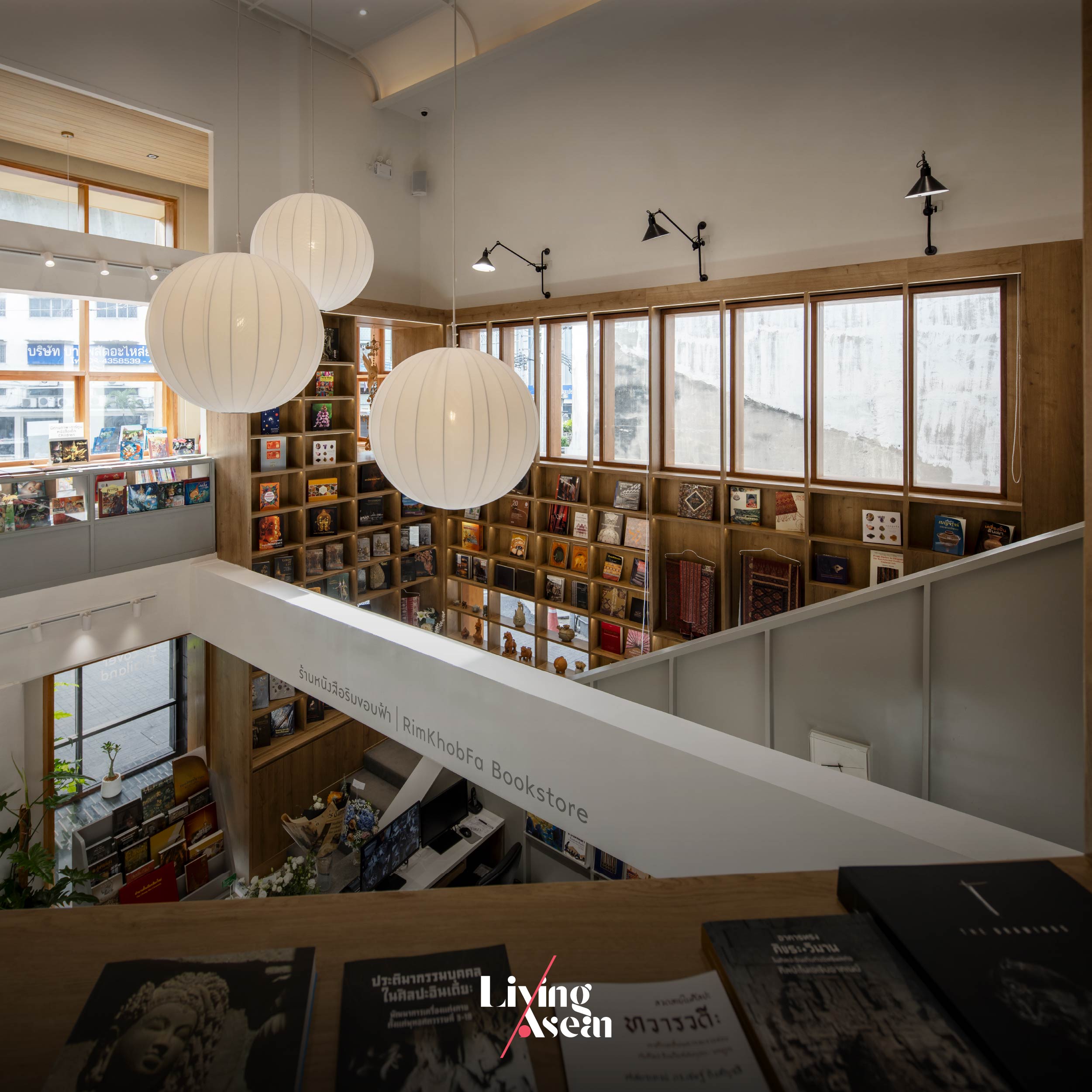
Aptly named “Rimkhobfa”, literally translated “horizons”, it’s home to a bewildering array of books about Thailand and classics that every bookworm should read. Originally located on Rajadamnoen Avenue, the store only recently moved across the Chao Phraya River to a new address in Bang Phlat District. And that’s where the design team at BodinChapa Architects came in play, transforming an old building that had fallen into disrepair into a new bookstore-cum-café rendezvous. There’s charm and the power of storytelling that captivates a thirst for knowledge. Plus, fresh brewed coffee smells like heaven and the atmosphere is pleasant.
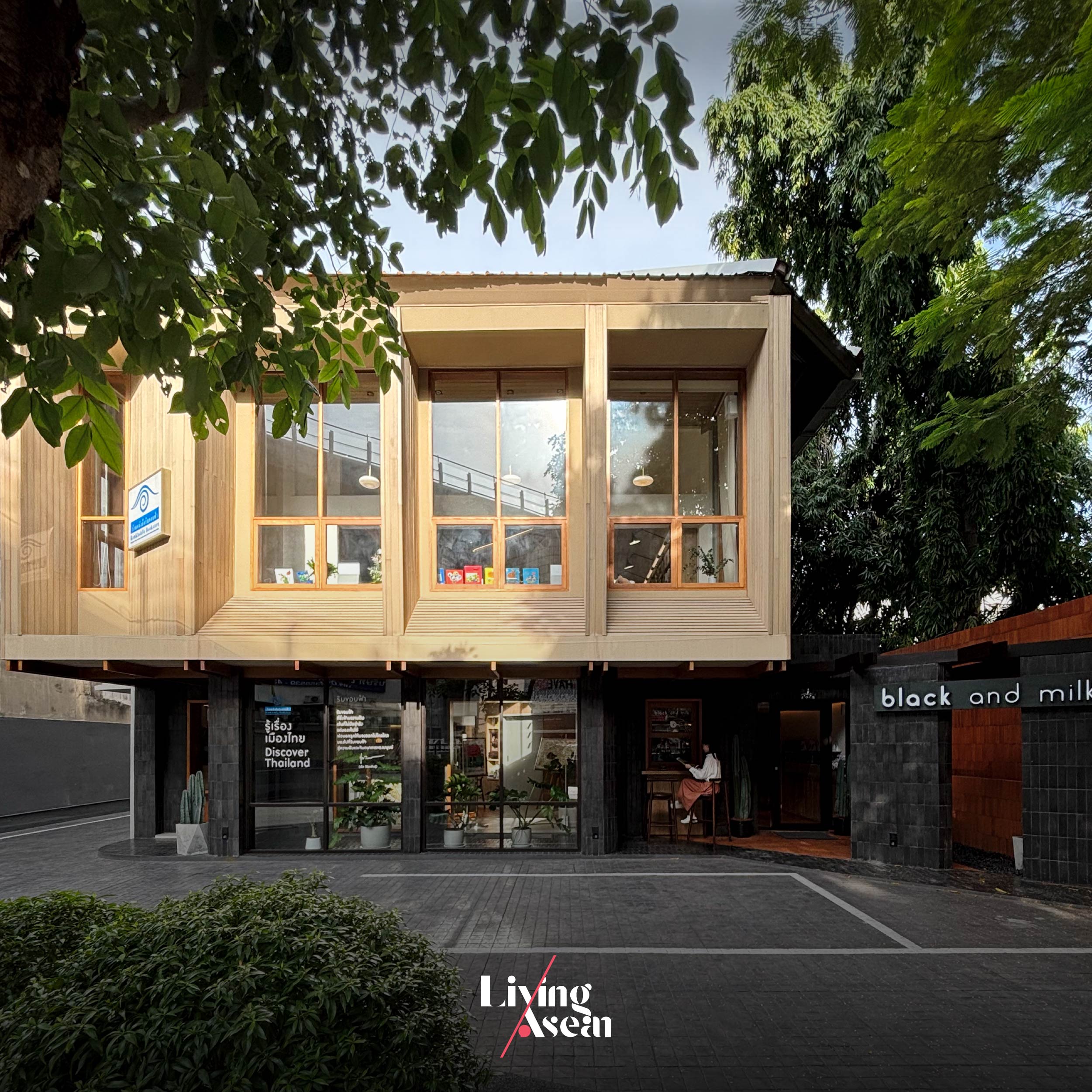
The building that formerly housed offices is located on Charansanitwong Road, a main thoroughfare on the west bank of the Chao Phraya. There was a problem when an overpass was built nearby, making the structure less visible while the interior became dark, poorly lit by dim light. To breathe new life into the old building and make the dark rooms brighter, the architects added openings in the wall and painted the interior a light and airy color. Meanwhile, an open concept layout provides ample space for a café that’s part and parcel of the bookstore.
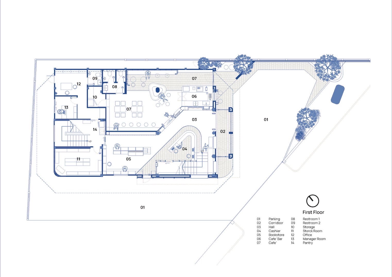
The first floor plan offers equal amounts of space for the café and the bookstore. / Courtesy of BodinChapa Architects
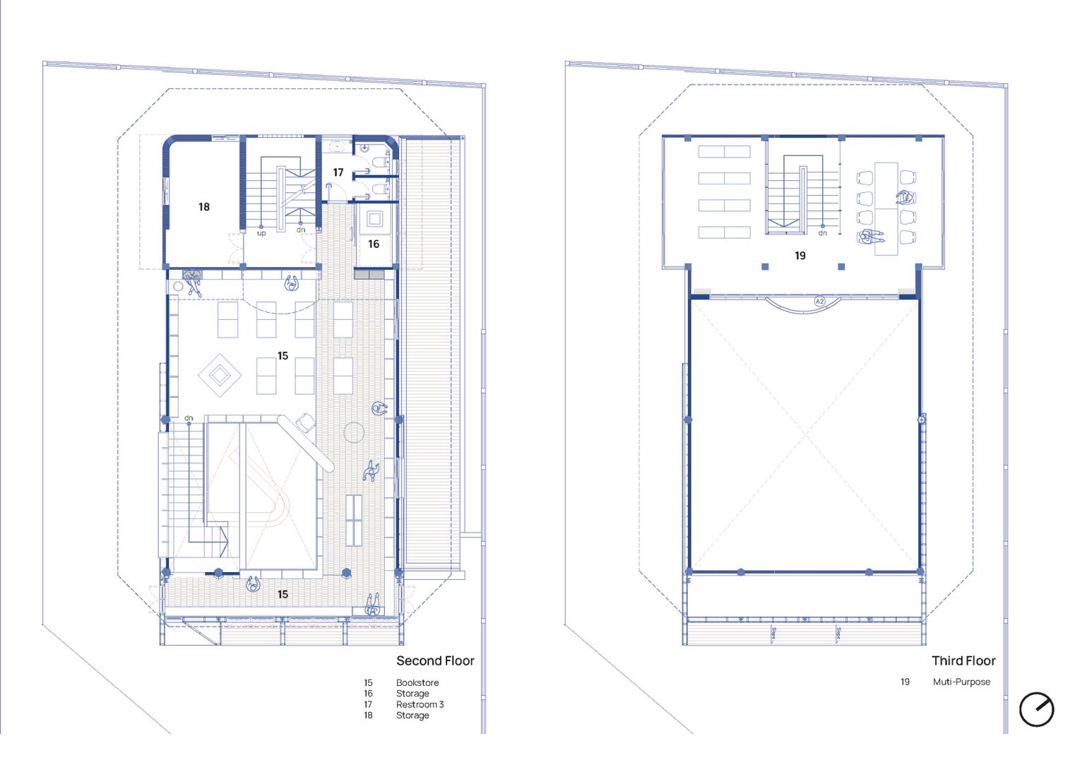
Drawings illustrate spatial arrangements on the second and third floor plans. The interior is made light and airy by taking away the ceiling and creating a void of space in the second floor. / Courtesy of BodinChapa Architects
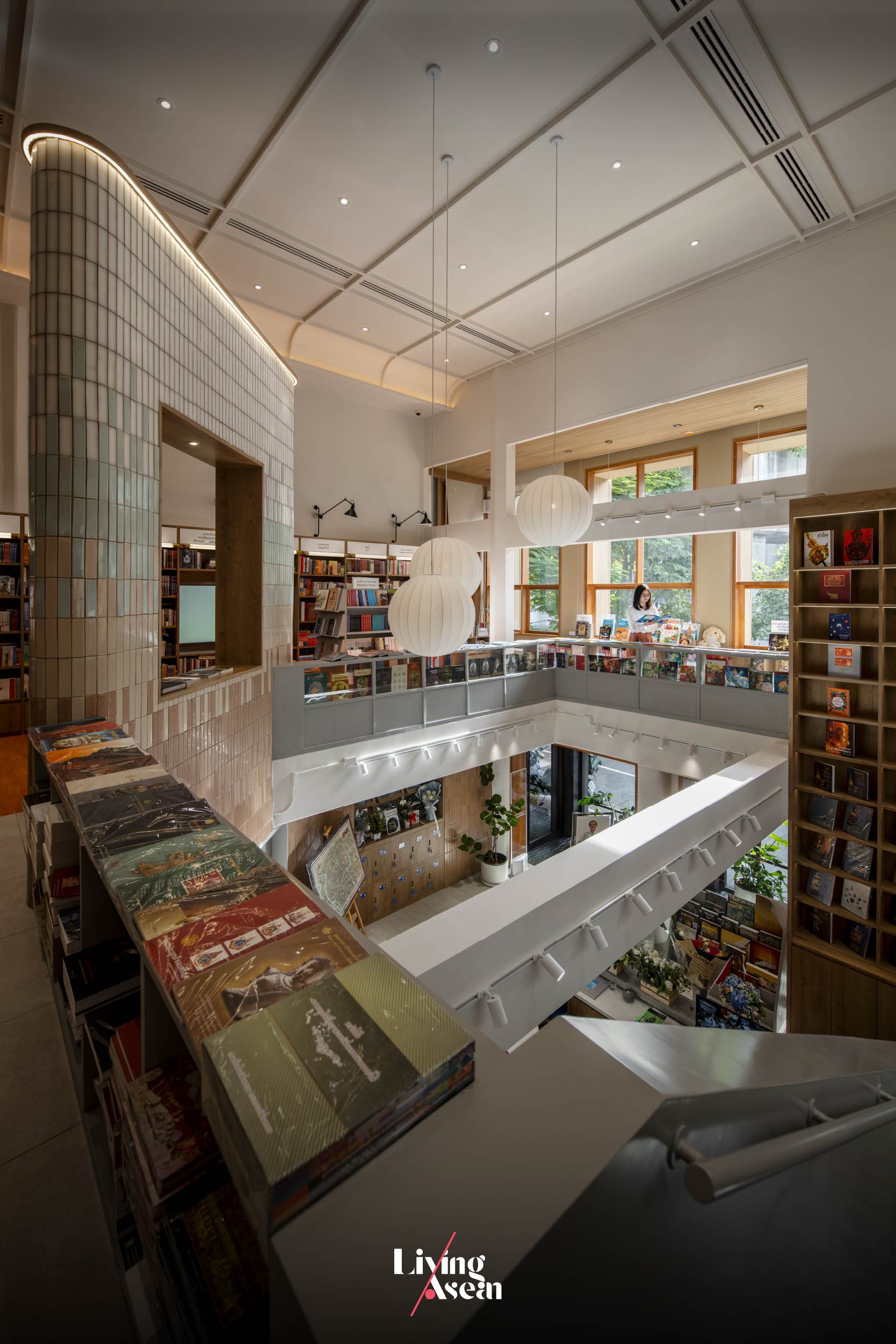
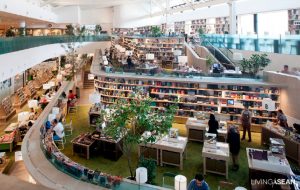
A vantage point affords a view of areas on the first and second floors.
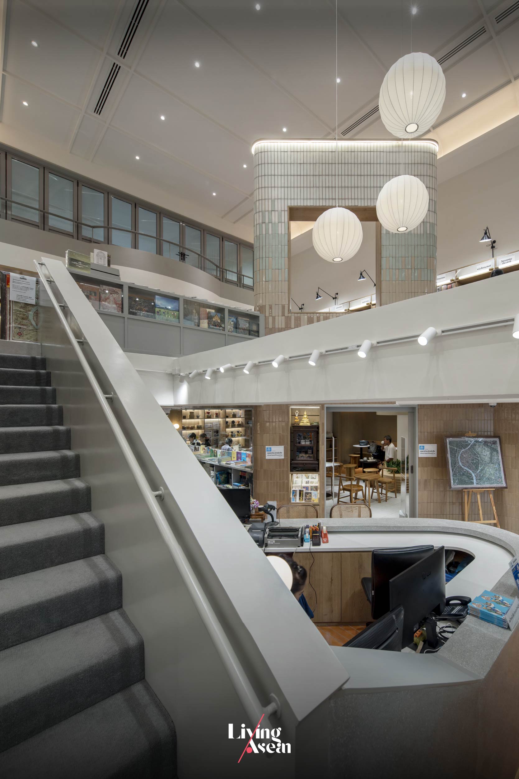
Stair railings provide visual transitions enhancing the flow of interior space that culminates in a massive wall called the “Tower”. In all places, the interior abounds with custom built-in shelves for storing books and product displays.

In renovating the old building, the architects had a part of the second floor removed to create a double height ceiling, resulting in a visually striking interior on the ground floor. After that the bookstore and café spaces were put in, each occupying roughly equal amounts of floor area.

Climb a flight of stairs, and you come to the second floor with plenty of space for organizing events and seminars. The low ceiling that was there originally is gone now. The room is cozy and comfortable thanks to a double height space. It also has abundant space for bookshelves. The third floor holds a conference room with large windows overlooking the second floor.
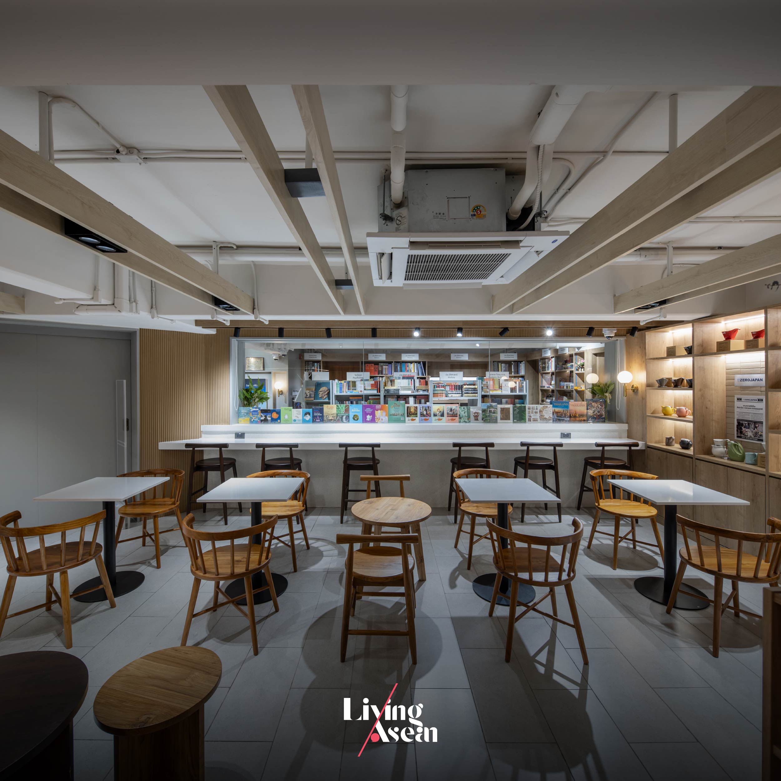
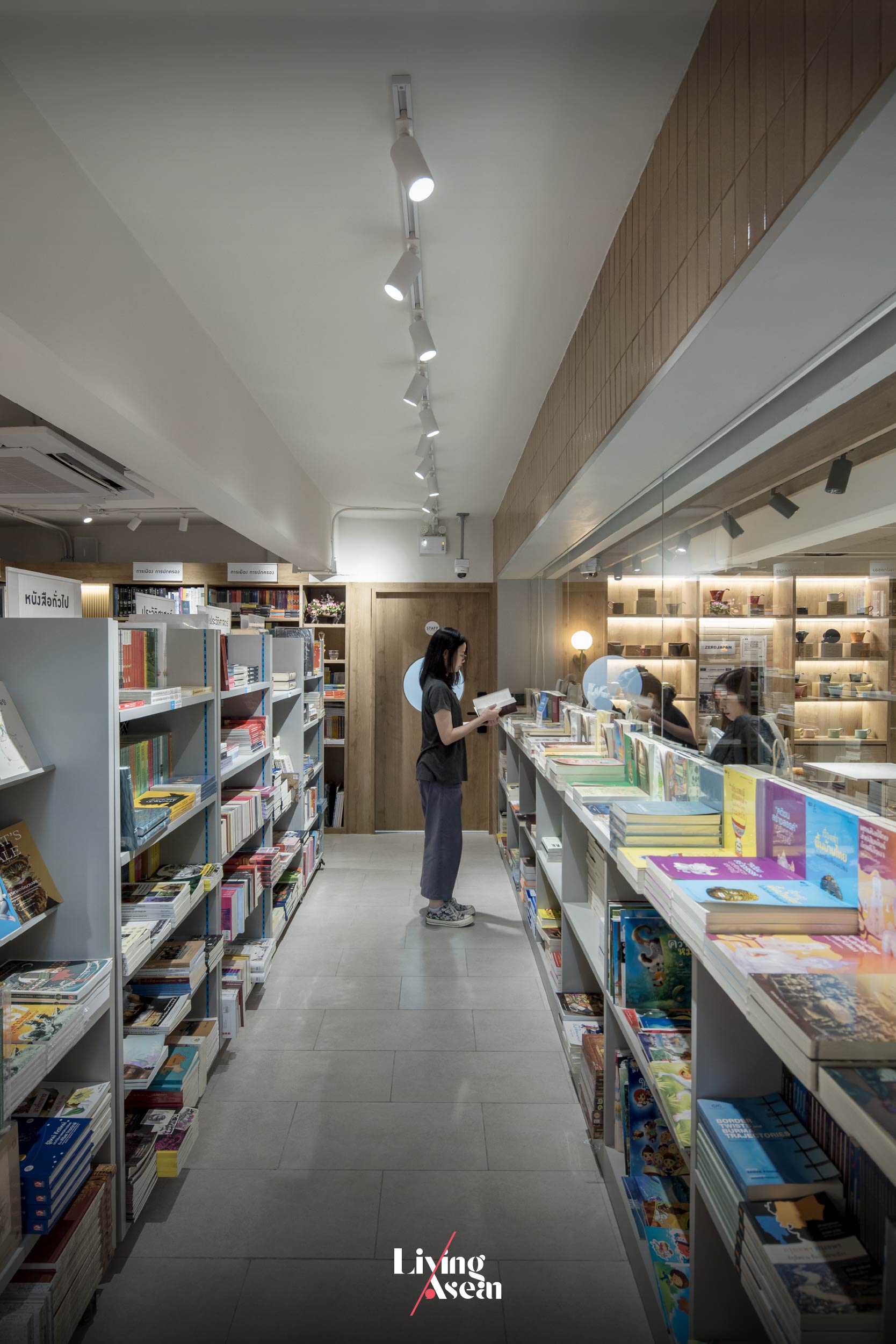
A product display paired with restaurant furniture in various styles creates a good bookstore café experience.
Low ceilings that were there originally have since been removed to add headroom to the retail space on the first floor. Plus, it makes the small area nice and tidy by hiding utility systems.

The first floor comprises two parts, the first being a bookstore and the second holding a small café. There’s a coffee bar up front for greeting customers arriving in the store. Go further inside, and you come to an area filled with bookshelves alternating with coffee shop seating. From here the aisle leads to a collection of books beautifully arranged for public viewing.

On the whole, the interior abounds with bookshelves and library furniture starting from the café zone all the way to the stairway giving access to the second floor. Together they provide the perfect ambience for coffee aficionados and book lovers.
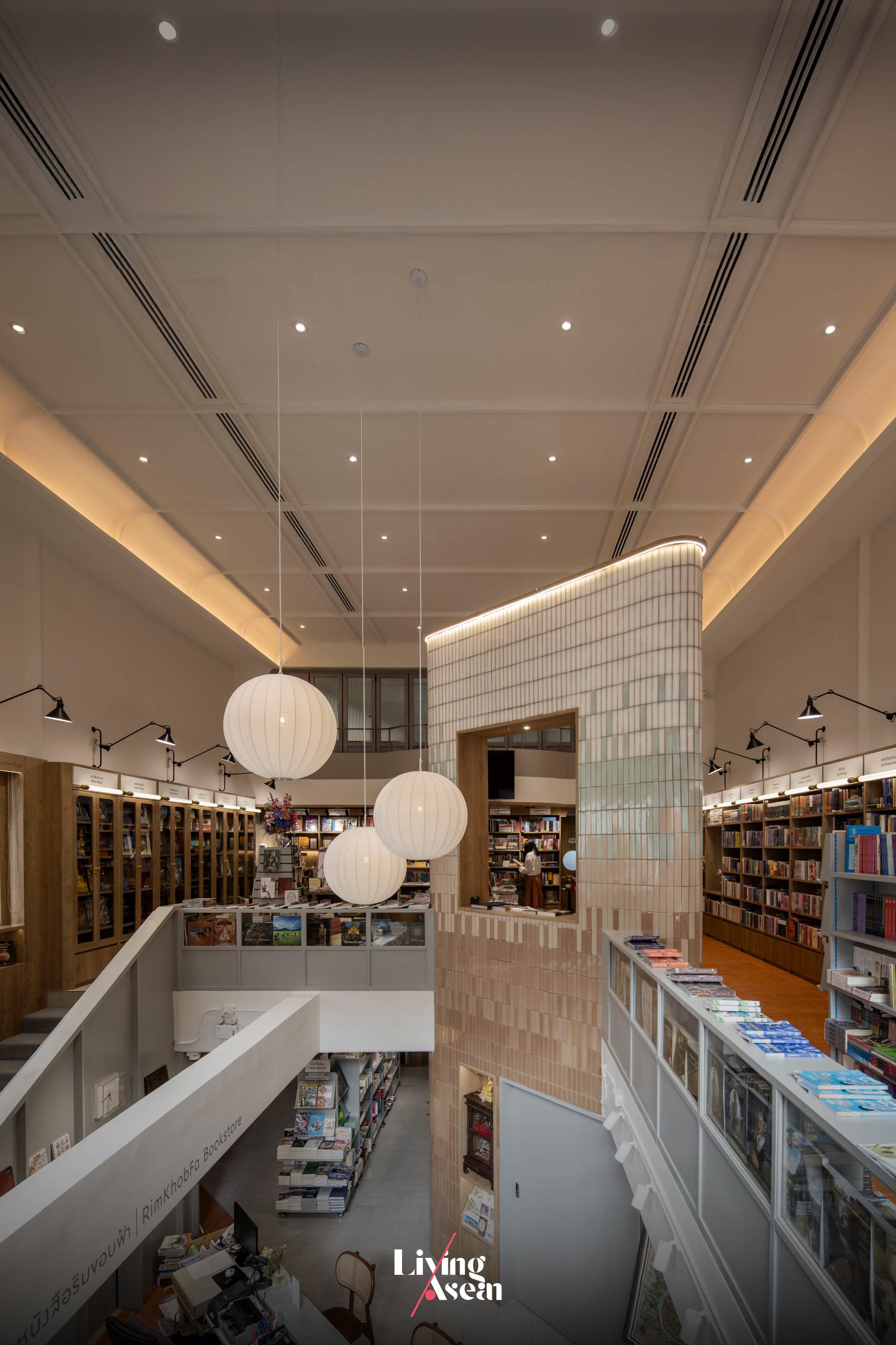
There’s more. Filling the interior space with style is a massive wall called the “Tower” that rises from the bottom to the top of the building. It’s an element of design dividing the interior space into parts, meanwhile doubling as the focal point drawing customers to other attractions on the second floor. Plus, it’s thoughtfully devised to provide the visual connection linking the cashier zone with the stairway nearby.
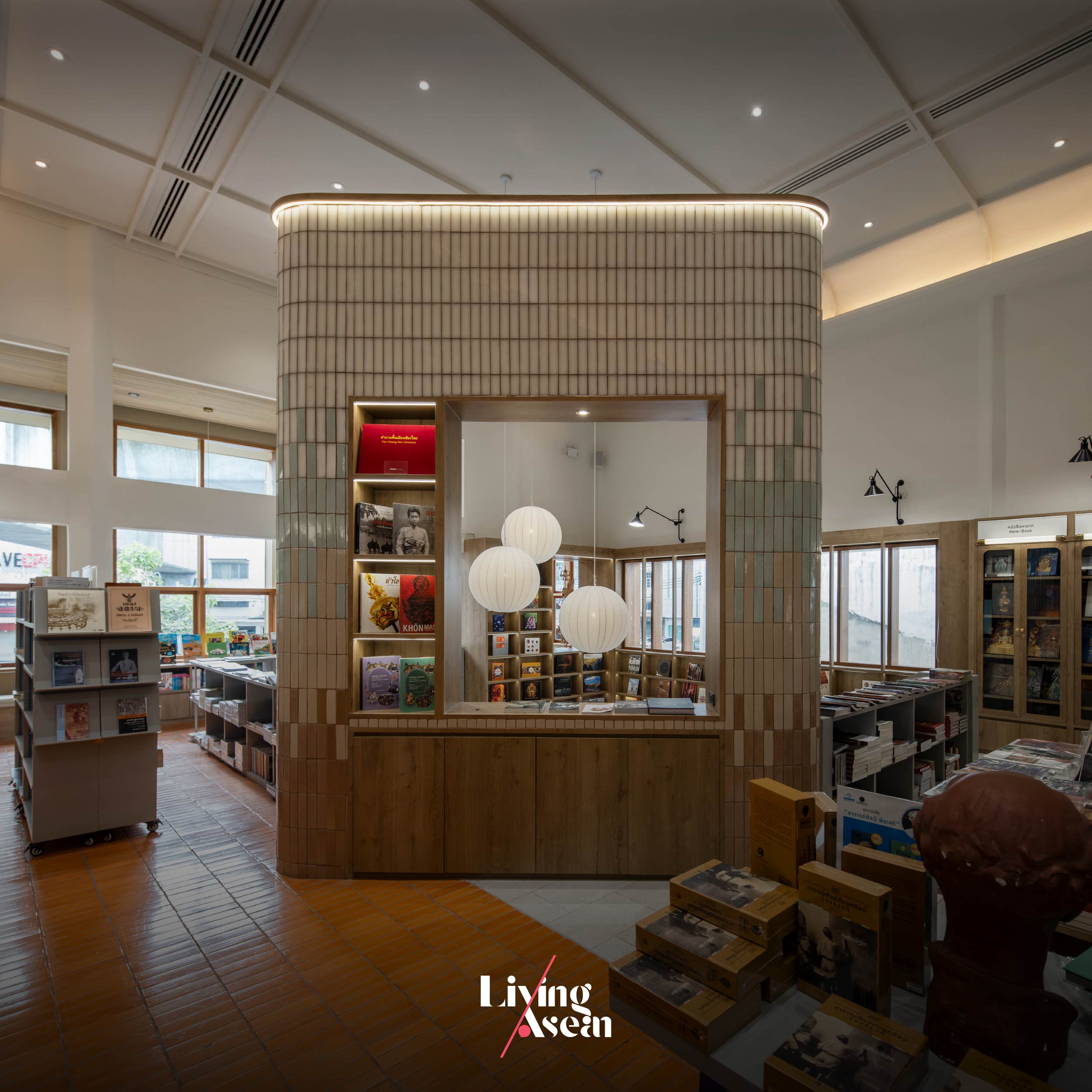
The decoration of the “Tower” keeps firmly to the original Rimkhobfa bookstore concept, whereby the gradual change of color symbolizes the horizon.

Overall, the furnishing and decoration of the interior keeps firmly to the original “Rimkhobfa” bookstore concept, whereby an image of the horizon is represented by a wall of fired clay bricks that change colors from dark at the bottom to light at the top. At the same time, indoor lights and a quadrangular opening at the top of the Tower go to work alongside each other to create a clean, well-lighted place perfect for reading and displays of books.

The second floor is well-lit and filled with shelves on which books are stored. It’s illuminated by natural daylight shining in through an array of tall windows. To protect the interior from the sun, the windows are dressed with light filtering shades. Flex space ideas help create multipurpose rooms for meetings and other events.

Low profile shelving units can be stowed away in the back room when not required, while high profile ones are used to store books and display products. They are placed against the wall with spaces in between to avoid enclosed spaces that could be signs of claustrophobia. This makes it easy to browse around the bookstore, find a quiet place to sit and enjoy a good read.
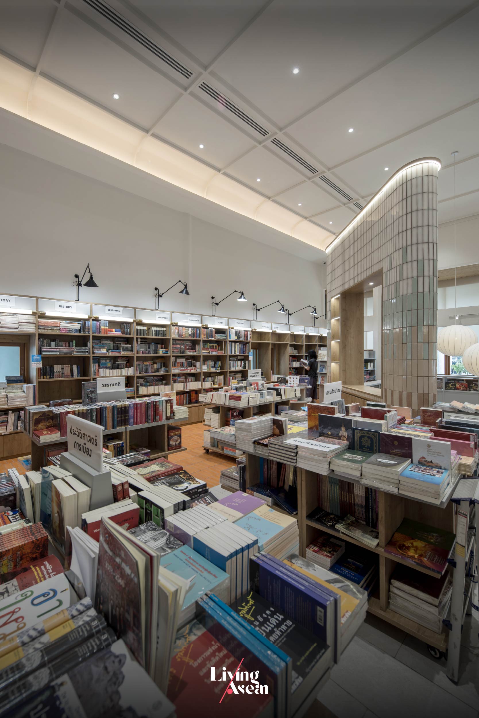
A flexible space for seminars and events has low profile shelving units that can be stowed away when not required.

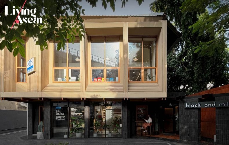
Slightly tucked away from the main, noisy thoroughfare, the bookstore café makes the most effective use of natural materials to attract passers-by. Like so, the raw brick façade in shades of orange performs dual functions; structural and aesthetic. Nearby, a small signboard displaying the business name and logo directs customers to the store.

The floor is covered with tiles in shades of dark gray alternating with orange hue with brownish tints. To make the building more visible from the street, the front façade protrudes slightly from the wall while light-colored wood paneling slants up to the window sills adding instant curb appeal.
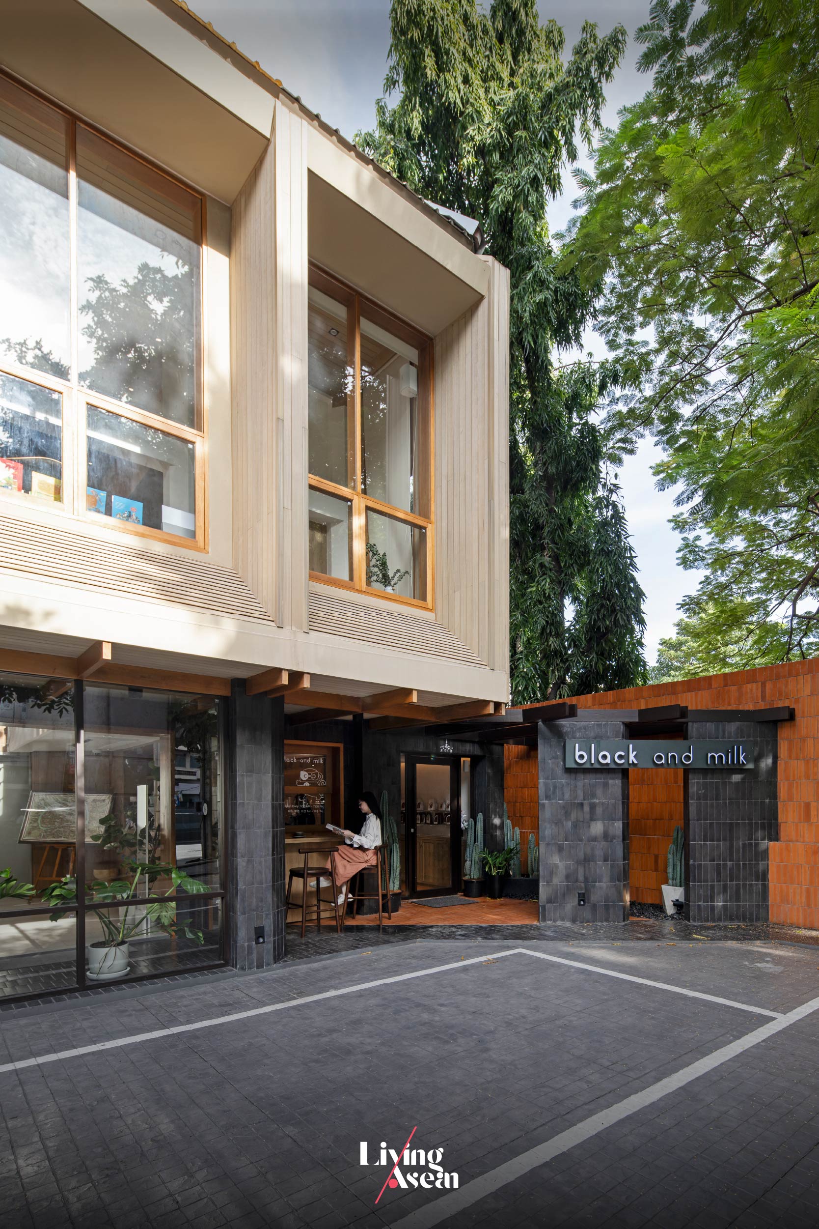
Fired clay tiles in shades of orange contrast with a gray stone wall displaying the business name. Together they add instant curb appeal to the bookstore café.

The atmosphere inside and outside the bookstore café is pleasant thanks to the use of eco-friendly materials in all places. Needless to say, it’s design that respects nature and the importance of art and culture in our lives. The materials and color shades remind a crowd of onlookers of the humble origins of man. Together they create stunning color combinations blending with the circumstances that form the setting of the neighborhood.
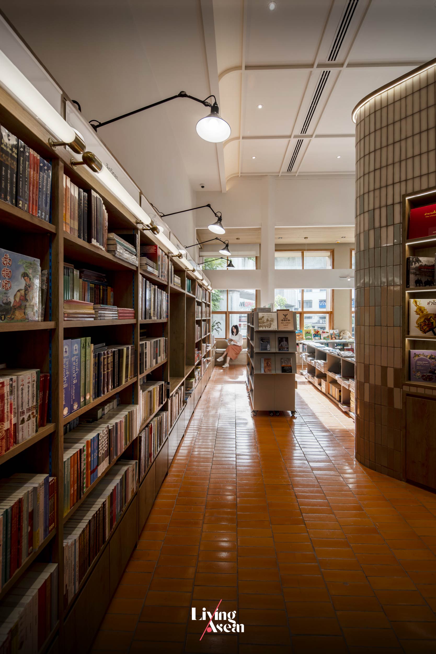
The second floor contains bookshelves alternating with reading nook furniture.

As print media struggle to survive in the age of technology, Rimkhobfa Bookstore manages to stand its ground in the fight by incorporating Black and Milk Café in its business plan. The result is a forward-looking bookstore café that answers the lifestyle needs of the new generations. By design, it’s a flexible business space capable of performing many functions. It’s the story of a renovation done right, one that transforms an old building in need of repairs into an oasis of calm for book and coffee lovers. Swing by the café next time you’re in town.


Architects: BodinChapa Architects


You may also like…

BASIC SPACE COFFEE คาเฟ่อยุธยา

Basic Space Coffee: Old Shop Renovated as a Home Style Café

B2S Think Space / Hybird Lifestyle Book Store

Amdaeng, The Most Romantic Hotel in Bangkok

Amdaeng, The Most Romantic Hotel in Bangkok

Time and budget allowing, it’s not hard to find a Chao Phraya riverside hotel in Bangkok for a night’s stay. What’s harder is to find a place rich with art and an atmosphere that makes you feel at home while taking you back in time to an earlier age in the river’s history.

/// THAILAND ///
Story: Korakada /// Photography:  Soopakorn, BEE+ /// 
Owner: Passapol Limpisirisan, Wiboon Lee /// Creative: MONDAY /// Architect: Anupap Onsard /// Interior Designer: Sutida Pongprayoon /// Landscape Architect: Sawin Tantanawat /// Artist: Studiojew+ 

This 10-room contemporary hotel with a taste of “Thainess” stands on 100 square meters in a tiny alley just off Chiang Mai Street, in the same neighborhood as the fascinating tourist destination Lhong 1919. “Amdaeng,” the hotel’s name, belonged to a fabled woman from the past and was suggested by the “Amdaengkhlee” on a former owner’s land deed from the Rama V era.

Amdaeng Bangkok riverside hotel

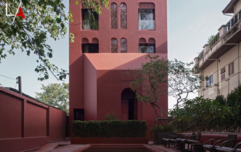
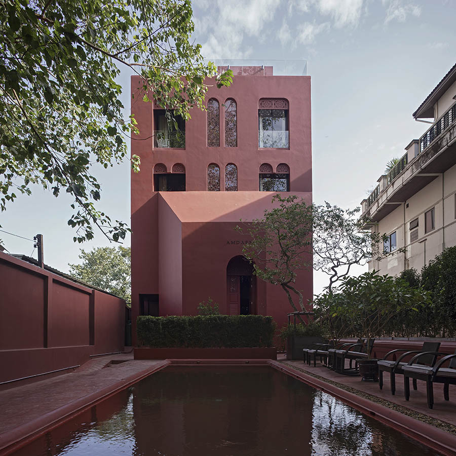
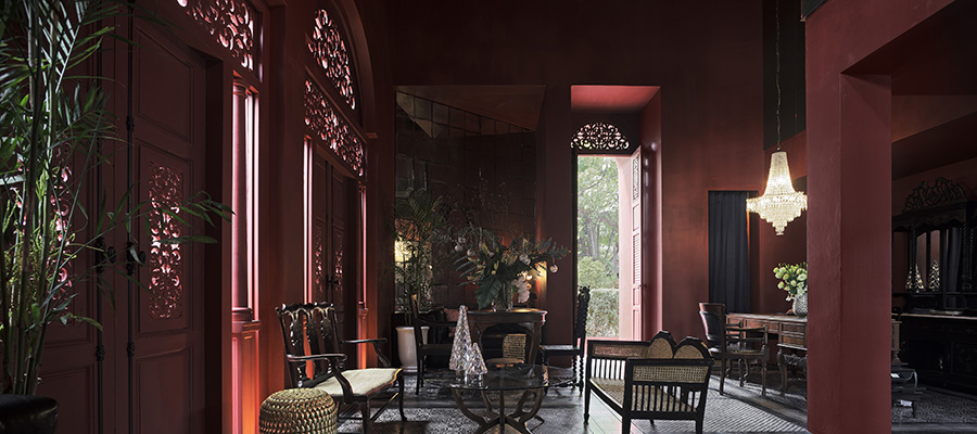
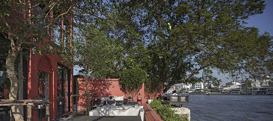
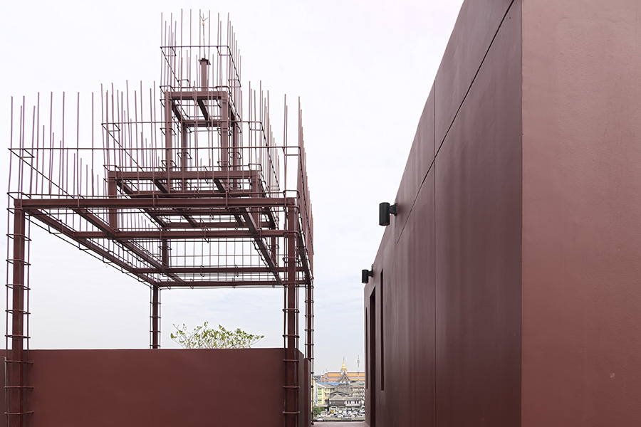
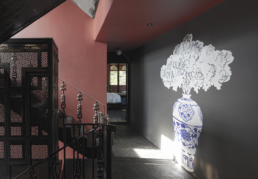
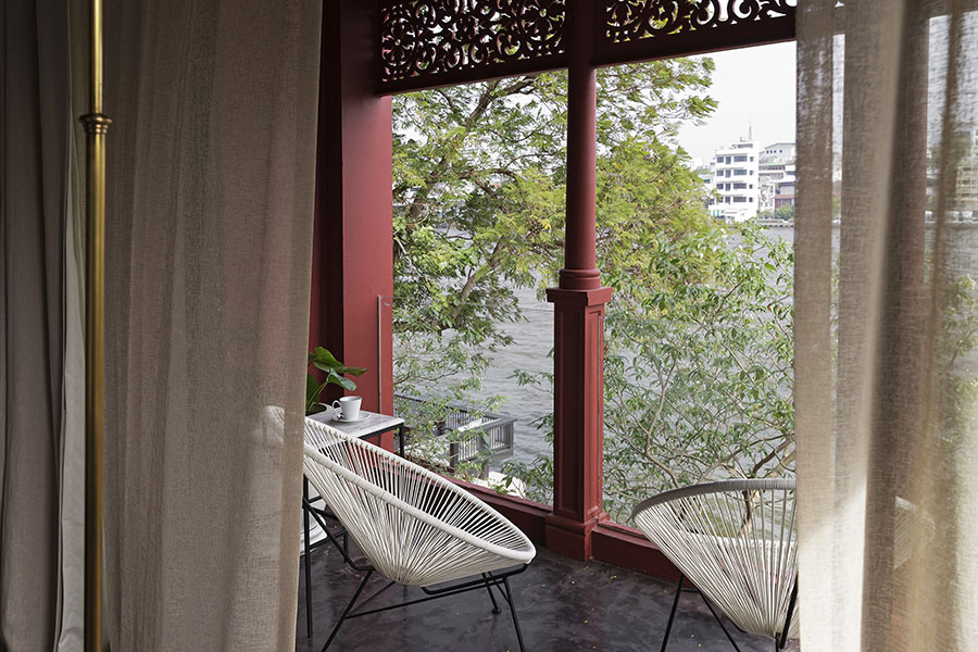
All the main architectural elements inside and out are painted vermilion: posts, beams, floors, walls, ceilings, so that looking from the other side of the river it stands out clearly from its surroundings. Coming in from the other side you approach the entrance through a maze of alleyways, as the scene gradually opens up to reveal a red building that seems to be composed of separate sculptures joined together to become one grand form in which the architect envisioned people living.

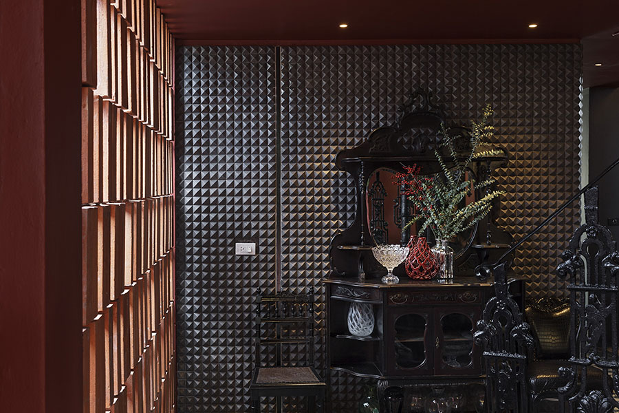
Amdaeng Bangkok riverside hotel Amdaeng Bangkok riverside hotelAmdaeng Bangkok riverside hotelAmdaeng Bangkok riverside hotelAmdaeng Bangkok riverside hotelAmdaeng Bangkok riverside hotel

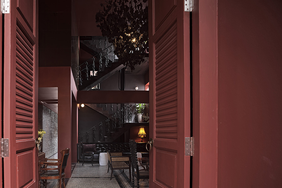
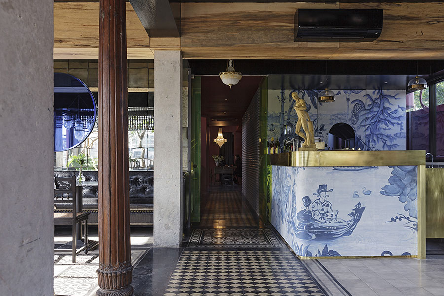
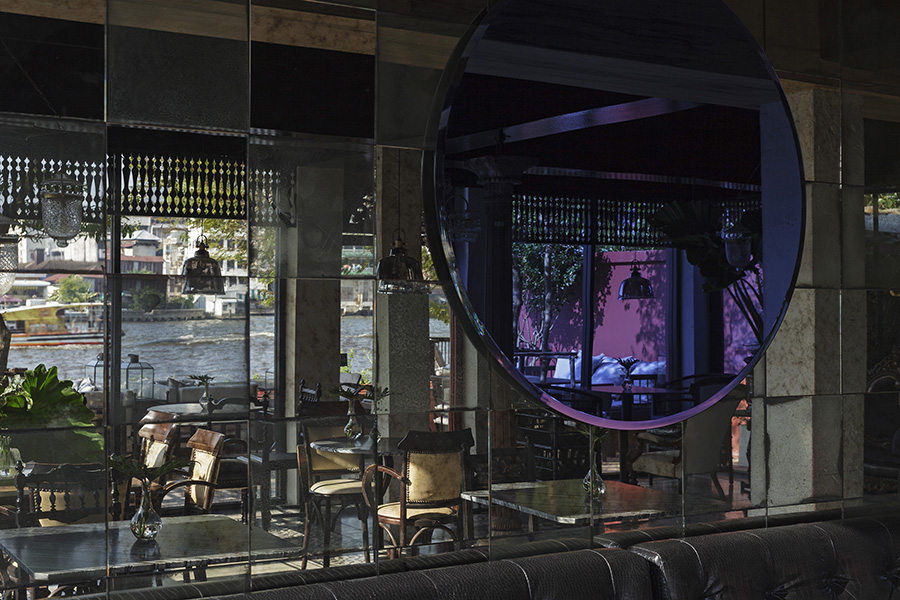
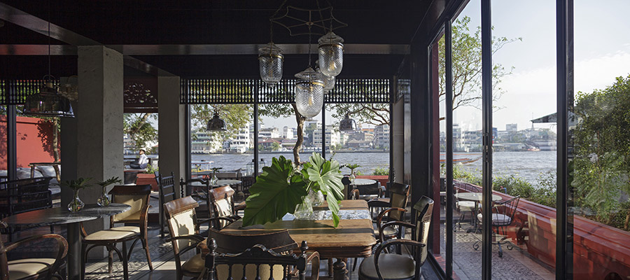
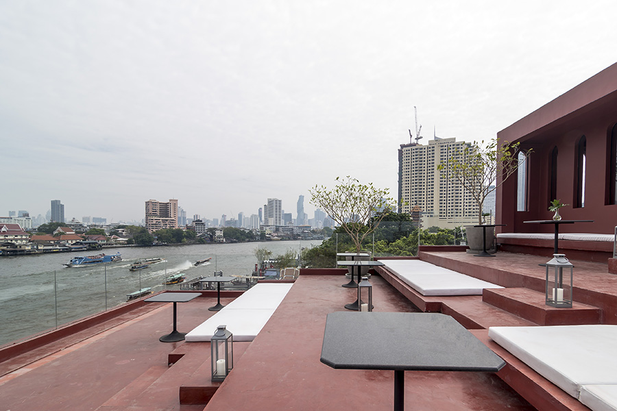
Inside is a restaurant with a quiet calm feeling, lowering the dial on the red, and also more masculine: The feminine “Amdaeng” calls for some male balance, so the restaurant is named “Nye,” meaning “mister” in Thai. The restaurant materials and décor are simple and straightforward but rich with art, bringing to mind the phrase “blue and white,” for the indigo-patterned tile of China favored by Chinese social clubs and found everywhere in old China. Up above is a fabulous roof deck with a sort of “grandstand” for viewing the river rising upwards in tiered circles like the chedi of a Thai temple. In the future this area will be a nighttime bar.

Amdaeng Bangkok riverside hotel Amdaeng Bangkok riverside hotel Amdaeng Bangkok riverside hotel Amdaeng Bangkok riverside hotel Amdaeng Bangkok riverside hotel

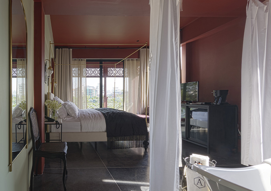
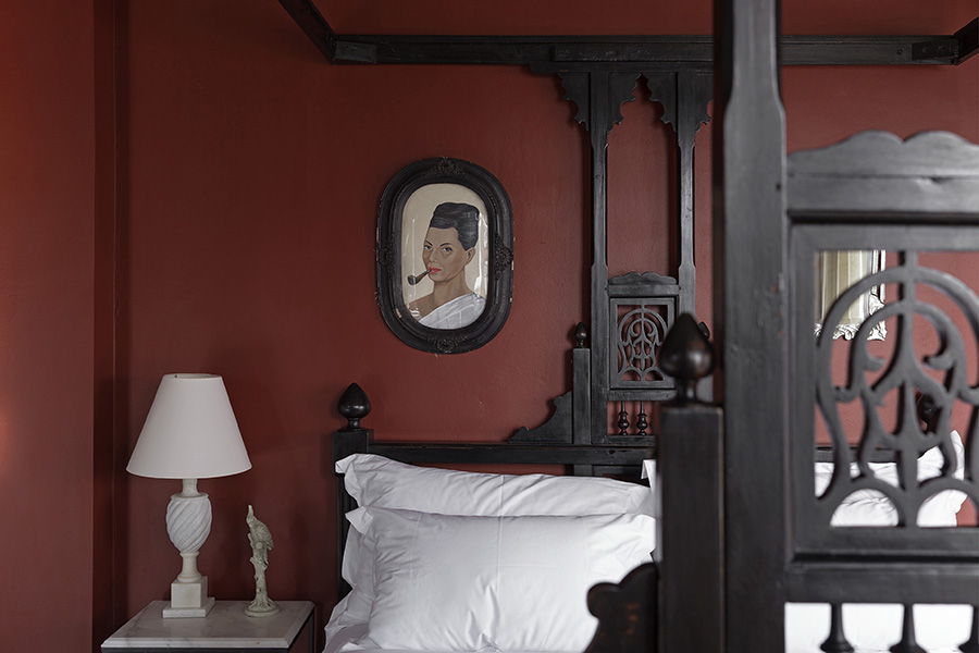
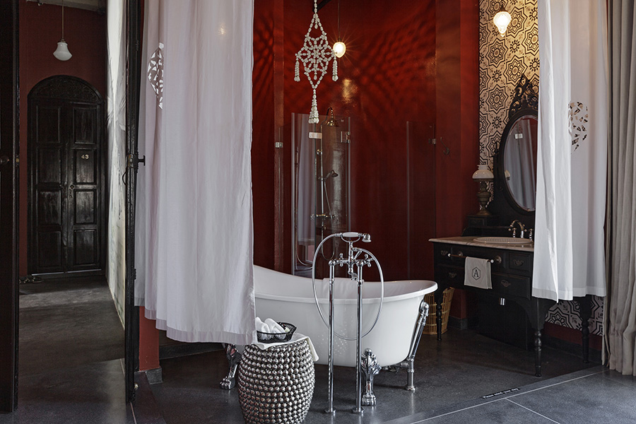
Guest room décor shows a mix of styles reflecting Thai as well as other cultures: Chinese, European, Indian. To recall an earlier era when the dominant cultures were mixing in a formative way, aging techniques are used to alter the look of the glass, the floor tile is dimmed with a charcoal color, antique furniture is used, and remodeling has added beauty and refinement to an atmosphere of bygone days so as to live up to the catchphrase, “The most romantic hotel in Bangkok.”

Contact: 12/1 Soi Chiangmai 1, Chiangmai Road, Khlongsan Bangkok, Thailand 
FACEBOOKAMDAENG
WEBSITEamdaeng.com
TEL: 02-162-0138

Link: www.baanlaesuan.com/90546/design/directory/amdaeng-hotel/

You may also like…

3 PLACES YOU HAVE TO EXPERIENCE AT LHONG 1919

SEVEN OF THE HIPPEST NEW PLACES EVERYONE IN BANGKOK SHOULD CHECK OUT

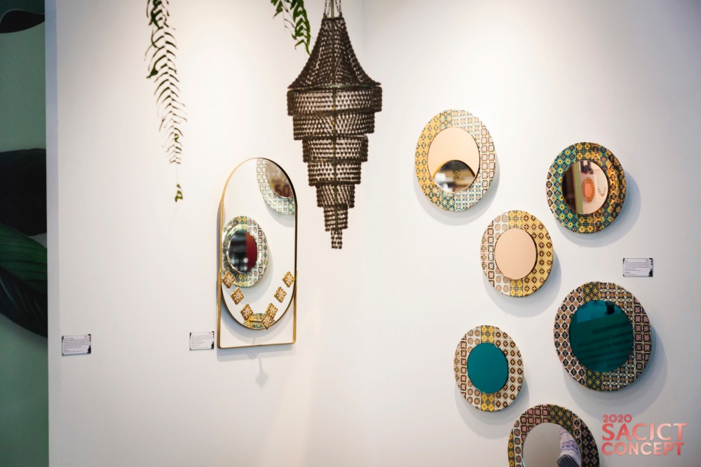
SACICT Concept 2020 Showcase

SACICT Concept 2020 Showcase

An exhibition of 40 masterpieces presents new perspectives on Thai arts and crafts and updates on global business trends.

The epitome of beauty and perfection under the SACICT Concept 2020

26-30 August at Samyarn Mitrtown

///Thailand///

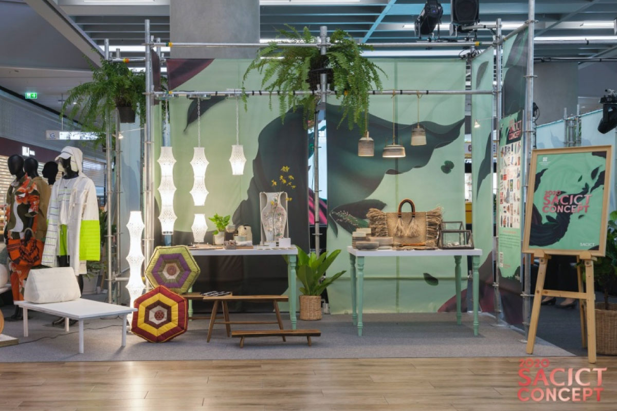
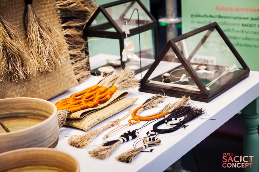
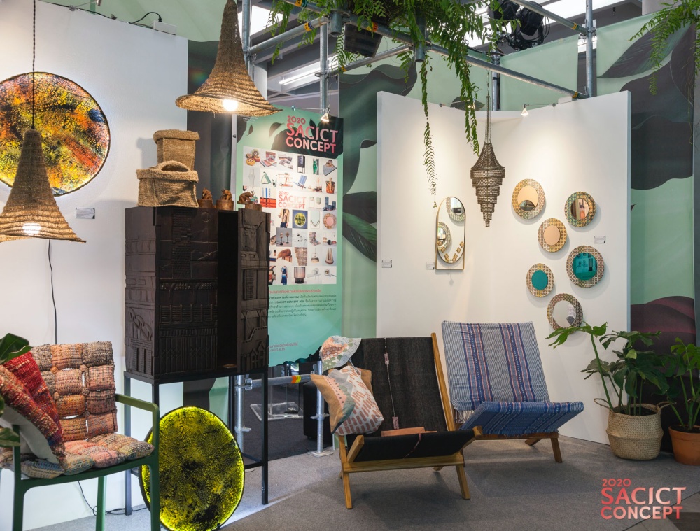
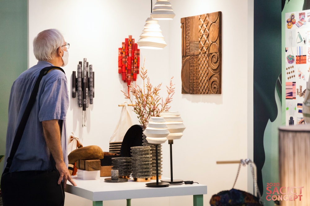
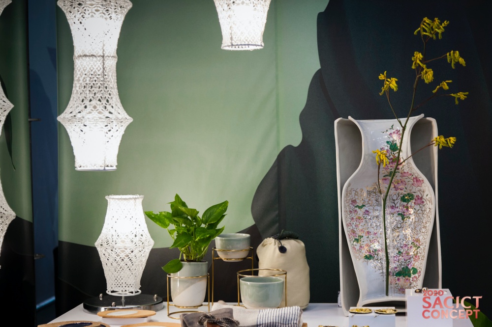
If you think Thai arts and crafts are a thing of the past, think again! Here’s a glimpse into a landmark exhibition showcasing 40 collections by master craftsmen from across the country. It’s a perfect example of creativity and innovation under SACICT Concept 2020, a project undertaken by the SUPPORT Arts and Crafts International Centre (Public Organization).

The collaborative enterprise is aimed at promoting the creation of prototype models capable of meeting the demands of modern consumer both at home and abroad. At the same time, it’s part of a wider effort to generate a sustainable income for the people in the long term.

Under this project, 40 craftsmen were handpicked by SACICT to participate in making articles of handicraft that could be further developed into products for everyday use. They represented a wide range of categories, among them, textile, bamboo and wicker weaving, woodworking, ceramic, and metal work. In the process, the craft makers collaborated with distinguished designer groups, including Mobella Design Team, Ease Studio, Salt and Pepper Design Studio, PHTAA Living Design, and Atelier 2+ .

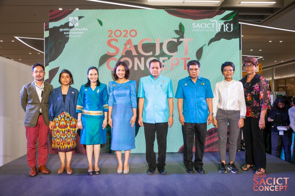
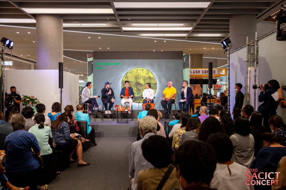
The exhibition code-named “SACICT Concept Showcase” took place at Level G, Samyan Mitrtown from 26 to 30 August 2020. It assembled a panel of experts to investigate “New Perspectives on Thai Arts and Crafts and Updates on Global Business Trends.”

During the show, an “Eco Chic Bag” workshop, among other things, was given on-site for those interested in handbag decorations. The event offered intensive group discussions on how to make the handbag stylishly fashionable using fabrics from the Arts and Crafts Centre renowned for their original and unique designs.

Plus, it provided a platform for discussion of popular topics from clothing and accessories to household goods and business décor ideas. In a nutshell, it was about empowering the craft makers to perform to their full potential, culminating in a product that people wanted to buy, creating an income for the community, and keeping Thailand’s art and craft heritage alive for the next generation.

The show was part of the SACICT Concept 2020 Project undertaken by the SUPPORT Arts and Crafts International Centre of Thailand (Public Organization).

Precisely, it sends a strong message that the richness of Thailand’s handicraft culture deserves protection and further development into a new product that’s right for today’s consumer.

Here are eight collections from the show just to give you an idea. Anyone interested to learn more can download the entire e-book about the 40 collections here.

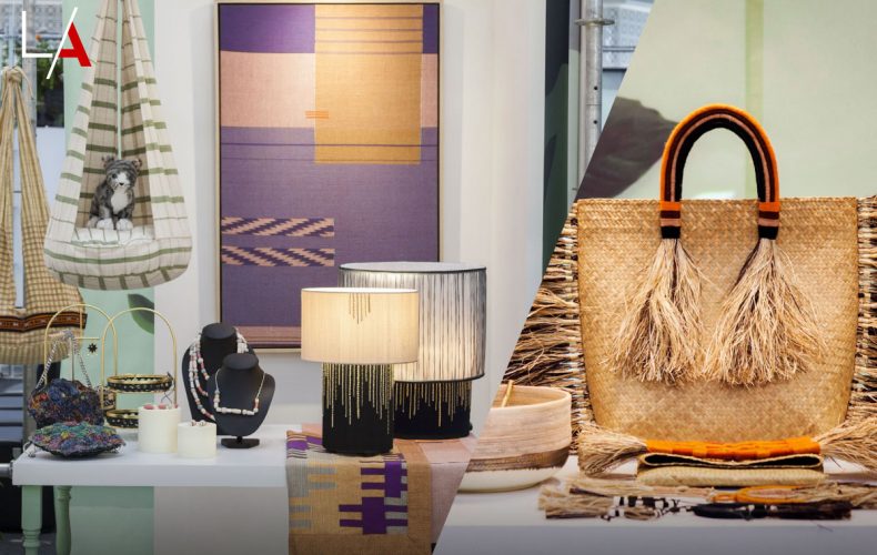
The Maliwan collection by Krajood Maliwan / The love of making tassels was imbedded in Maliwan Kongkua character. This tiny bit of charm-an ordinary and simple expression of joy-grew into primary decoration of Maliwan’s distinctive handbags.


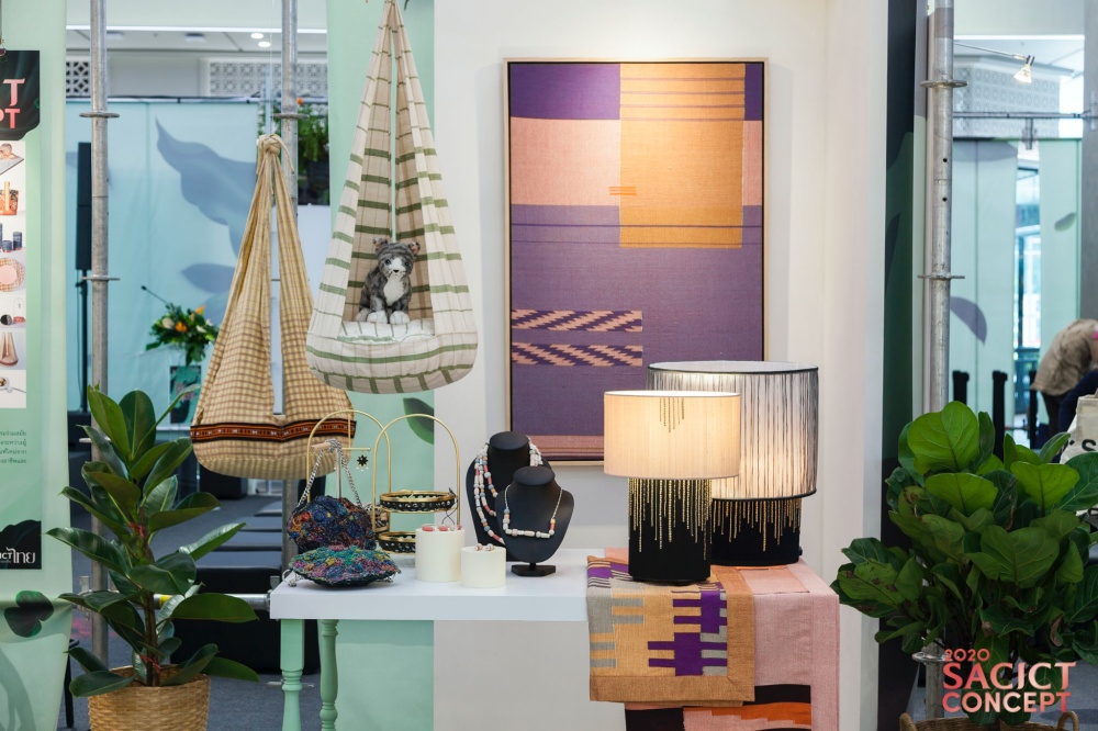
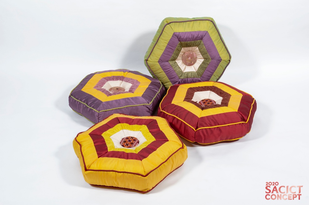
The Thoong Cushions Collection by PrimPraewa / Here’s a collection that represents the coming together of two cultures; the Praewa silk tradition of the Phu Thai people and the six-cornered hanging mobiles known as “Thoong” unique to Kalasin Province. Made by involving locals working together in partnership, the colorful pillows set can be arranged in any shape or form to fit any room and add a touch of the exotic to home décor.


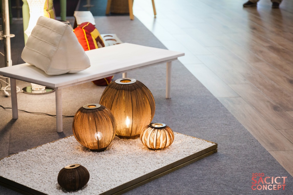
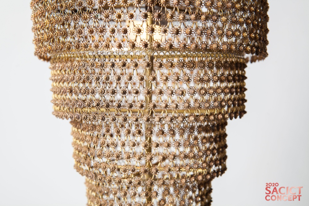
The Chatra Collection by Angsa / Tambon Ban Kat, Chiang Mai is famed for its silver filigree jewelry, an art form made by looping thin silver or gold wires back and forth to create design for an ornamental object. Inspired by the multitier royal umbrella, the Chatra Collection is made by weaving metal filaments into delicate branching patterns, culminating in a complete luminaire. Light passing through the multitier design creates a distinctive ambience.
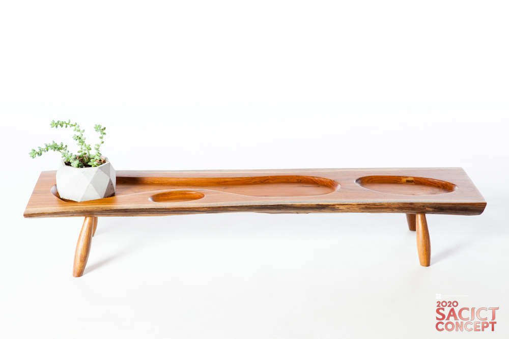
The Art of Edge collection by AWA Decor / This collection deals with the problem of wood waste in production by first selecting out surplus sapwood that has beauty in its natural shape and is also strong enough for furniture.
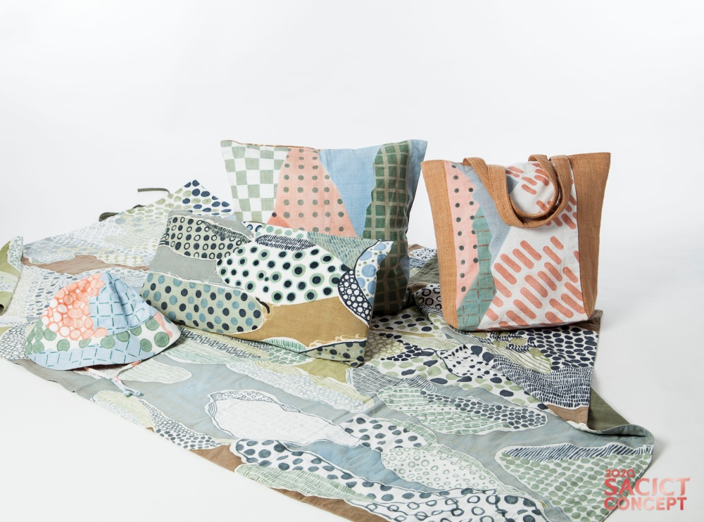
The Backyard Story  Collection by Kiree / The Backyard Story originates from traditional tie-dyed techniques native to Khiriwong District. The weaver experimented with a variety of natural dyes; among them, mangosteen rinds, bitter bean pods, and jackfruit stalks, on materials harvested locally. This gave rise to a collection of daily-use products in soothing shades known as “Backyard Story”.
The UPULA Series Collection by Chom Hand Craft / The “UPULA Series” is a collection of purses made out of water hyacinth fiber dyed vibrant colors before weaving. It’s made by adapting exciting new forms that best answer the lifestyle needs at present. Inspired by uncut opals and all the colors of the rainbow, the bag is made by first dyeing spun threads gradient colors, then, the strands of natural fiber are twisted and circled to form a 3-dimensional shape.
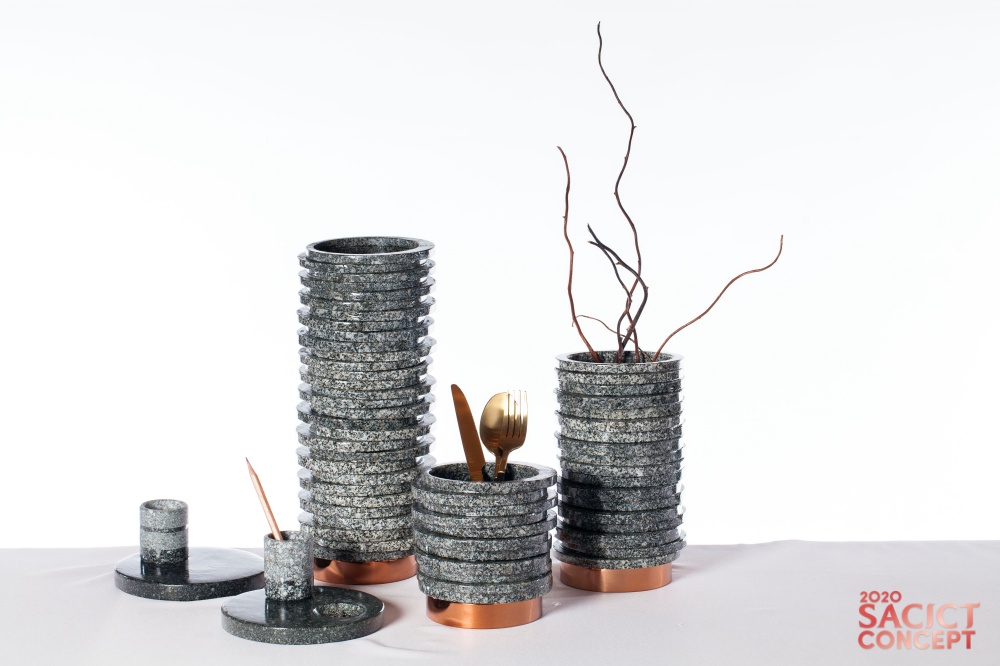
The Layer Collection by Silathip / A family enterprise famed for making stone mortars at Ang Sila has found a way to upcycle factory waste into new products suitable for new purposes. Chiefly among them are desktop pencil holders, kitchen utensil containers, and vases. They are made by integrating new techniques and materials in the process, thereby expanding its customer base.
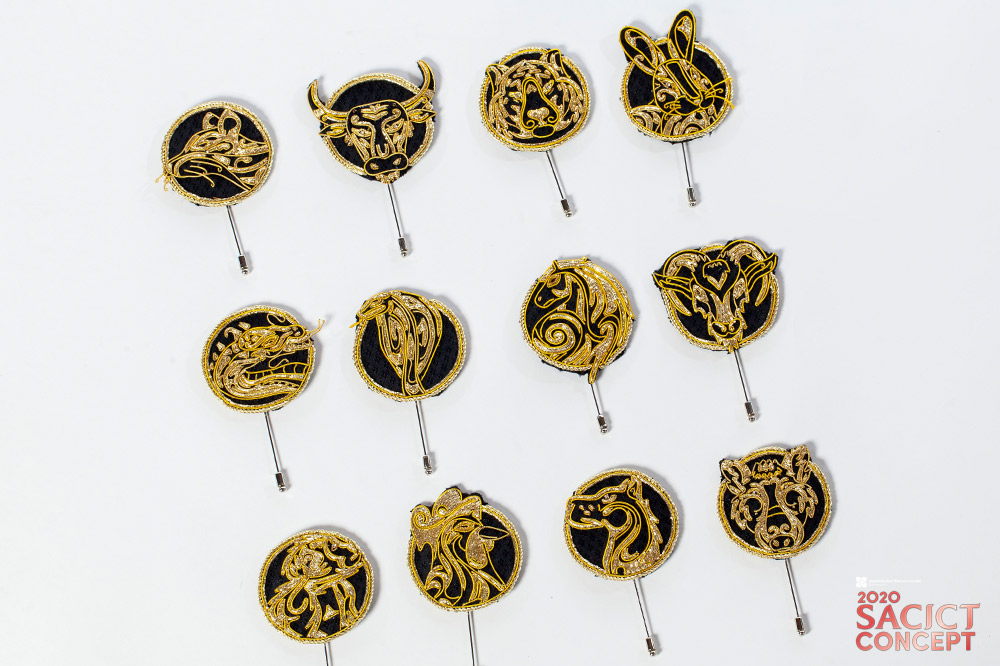
The Zodiac Signs Collection by Bualueng Pugthai / Here’s a set of brooches adorned with silk embroidery that’s an art form widely used to decorate fine apparels since former times. Gradually the intricate silk needlework has advanced to incorporate modern design and take pride of place in everyday life. This brooches and pins jewelry collection offers star signs for every unique personality.


For more information, please visit www.sacict.or.th

Download the E-Book containing all 40 collections.


Rainy Season Forest Garden for Tropical Areas

Rainy Season Forest Garden for Tropical Areas

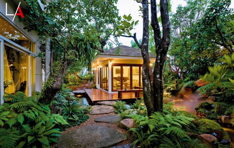
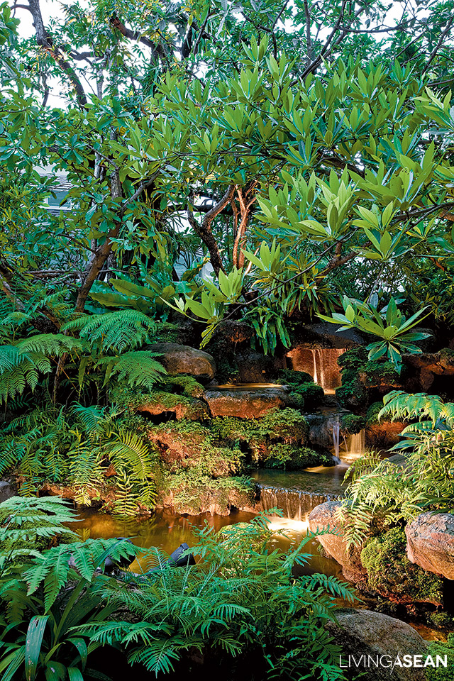
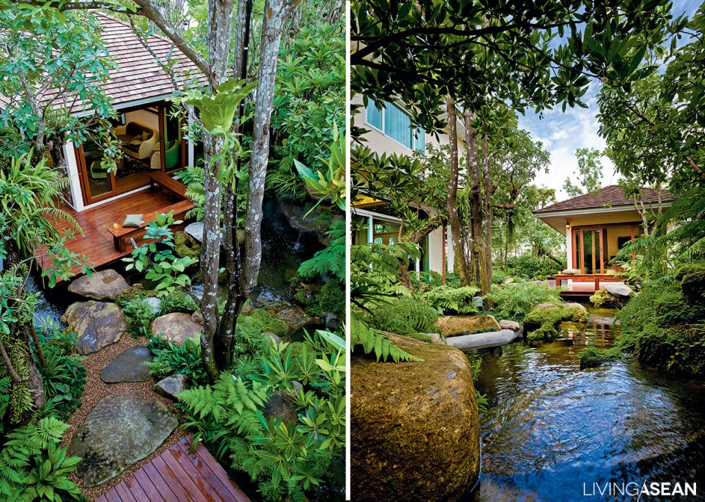
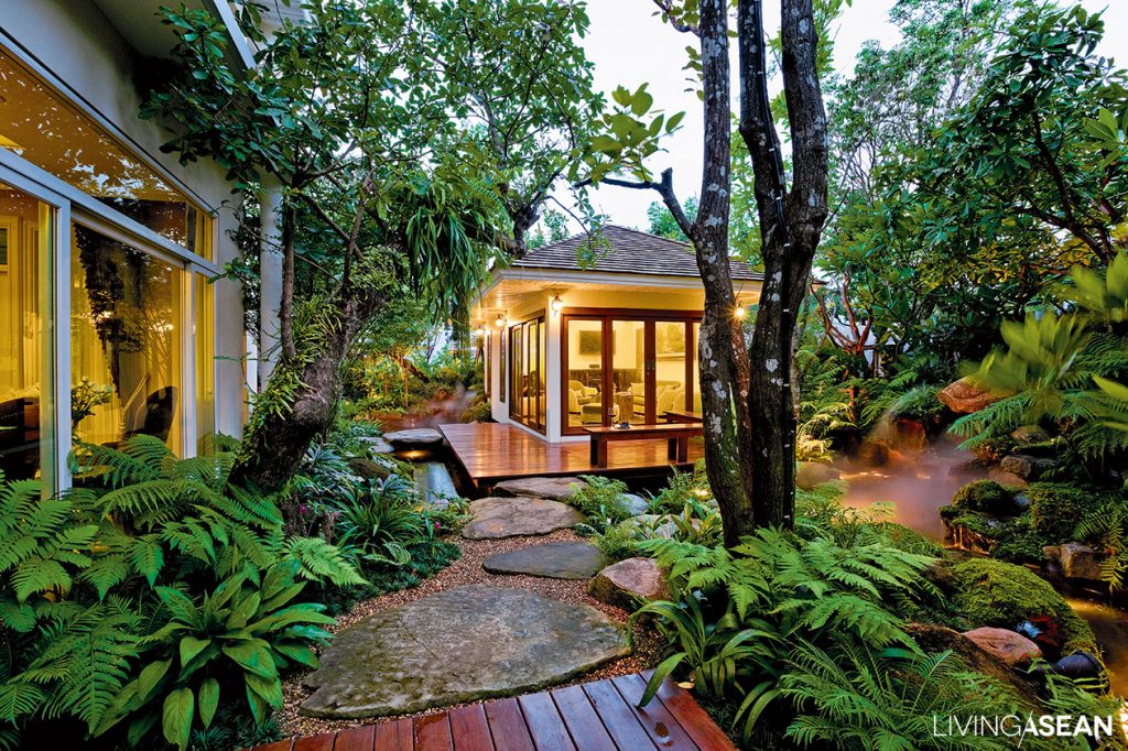
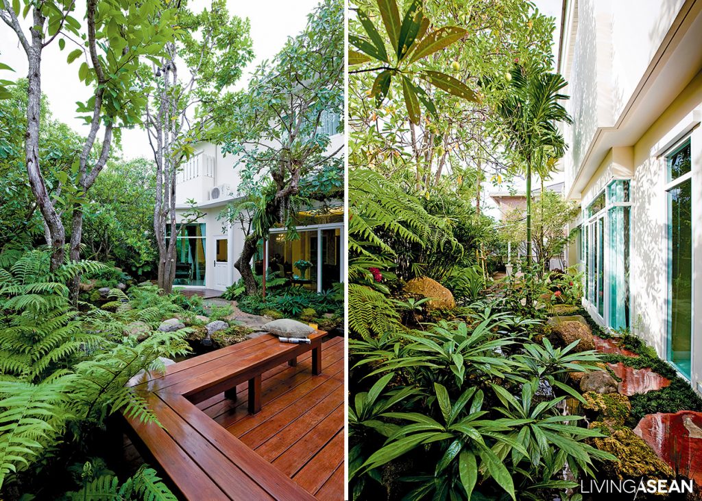
Rainforest ecology is the design concept here, the verdant lushness associated with tropical jungle. Use high-tolerance plants that adapt themselves to the natural environment and don’t require a lot of long-term care.

/// Thailand ///
 Landscape Architect: Warawut Kaewsuk, Supong Haewpet  /// Photography: Tanakitt Khum-on

– Image of Garden and House –

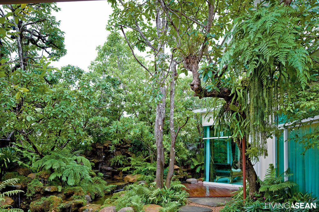
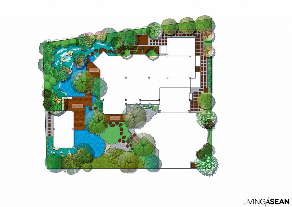
Here emphasis is on the garden: the designer has removed the house from the diagram to focus on the surroundings, revising and reapportioning them to bring back the feeling of the rainforest that was once there; the house will be added later. The owner’s first concern is creating a waterfall, pond, and gazebo for relaxation; only then will the concept be enlarged to include a house in a supporting role for the garden, enabling the owner to fully enjoy this creation.

– Building a Forest-Like Atmosphere –

Garden design deals with three primary levels: low, medium, and high. A forest atmosphere is created visually through using the natural lines of the plants. Trees are the highest, rising up above, but freshwater mango can be a slightly lower exception with curves leaning together, arbor-like and welcoming, above the house entryway. Plants of middle height running along the fence can add privacy. For ground cover use plants with wavy and sinuous lines set at natural-looking intervals, closer to the water source perhaps ferns, and further downstream plants requiring less moisture.

– Waterfall Format –

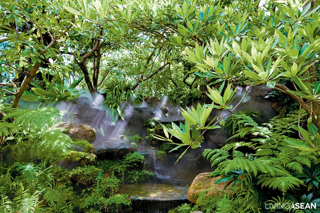
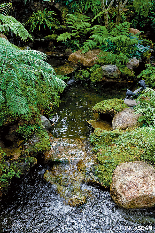
Think of the stages of a natural waterfall: first is seepage, small drops descending along crevices in the rock; these eventually join and flow into a larger falling stream. The waterfall should not be so high that it could get the house wet, and it should give off a soft, restful sound. Because of space limitations, trees should be put in before the waterfall framework is built, otherwise there won’t be space for any large roots. Ponds should be designed about 0.8 to 1 meter deep. Waterfalls are usually built using 2 types of stone: granite and porous volcanic rock.

– Creating an Ecosystem –

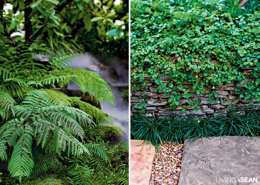
In general the garden should be based around medium-sized and small plants. Plan sections with plants that grow naturally by themselves: vegetable fern, various kinds of glochidon, forest lilies, roselle, Malay ginger, rhododendron, etc. Combine these with plants available in the general landscaping market: monkey grass, Siam tulip, turmeric, elephant ear, and so on. Use as few imported varieties as possible and organize them so they can adapt symbiotically, offering natural benefits to each other; this will make for easier maintenance.

– A Standout Point : Easy Maintenance –

This type of garden requires little maintenance and doesn’t use ordinary grass, although surrogates such as monkey grass can offer a similar atmosphere. Where it’s shady, pebbles or fine gravel can be used as ground cover: this gives the garden a tidy look, and can be used to create a walkway around the house, protecting against the entry of poisonous animals. Maintenance of a rainforest garden mostly involves only pruning, and with minimal exception, pesticides or poisonous substances aren’t needed.

You may also like..


The House in the Rainforest Garden


Gardening with Water Science


Architect Expo ’17 Has Begun

Architect Expo ’17 Has Begun

Architect Expo ’17 is happening now at Impact Muang Thong Thani, Bangkok. Living ASEAN discovered many practical new products and ideas that will surely benefit people who want to build things. Drop by before the show ends this Sunday May 7.

/// Thailand ///
Photography: Rithirong Chanthongsuk

The ASEAN’s largest building technology show is on from 10 AM to 8 PM daily. Here are three reasons you can’t afford to miss this annual event.

Baan Baan Case Study

ASA Emerging Architecture Awards 2017

1. Varied exhibitions on dwellings

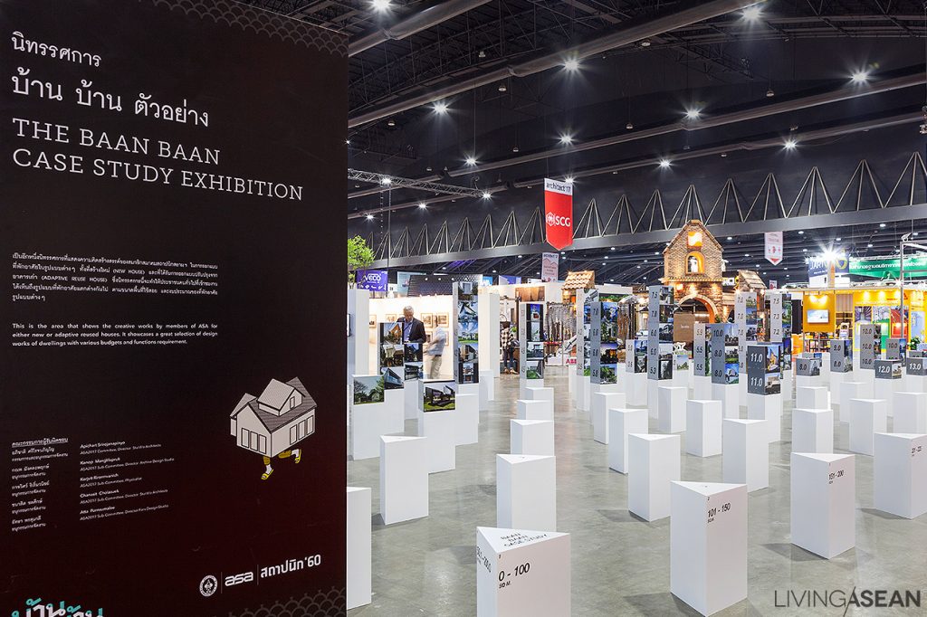
Embracing the concept of simplicity in life known as “Baan Baan: Reconsidering Dwelling,” the center of the exhibition hall was dedicated to 16 small exhibitions show casing many different ways of living.

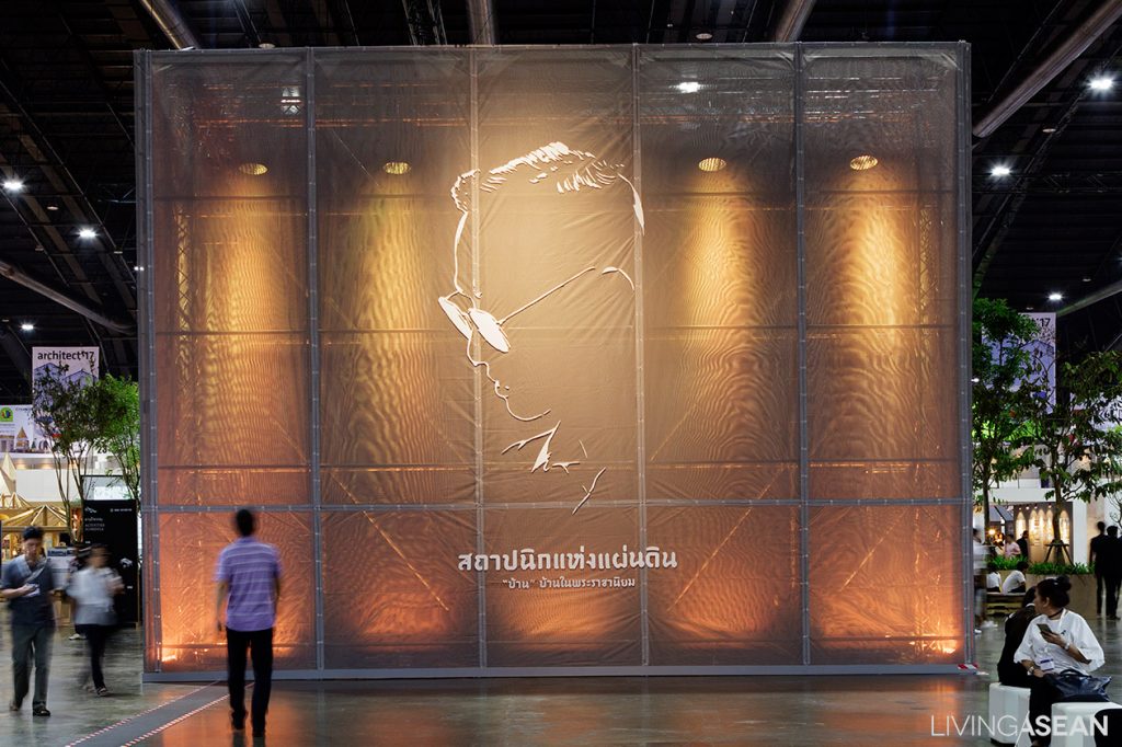
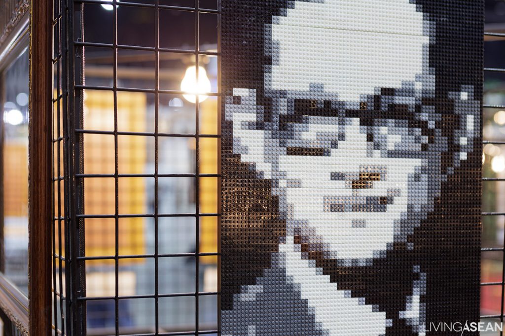
Start with “In Remembrance of H.M. King Bhumibol Adulyadej”. The show comes in two parts: The“Architect of the Land” exposition, and the“Pictures of Our Father,” which presents a collection of images sent in by designers to commemorate the great king.

In Remembrance of H.M. King Bhumibol Adulyadej

In Remembrance of H.M. King Bhumibol Adulyadej

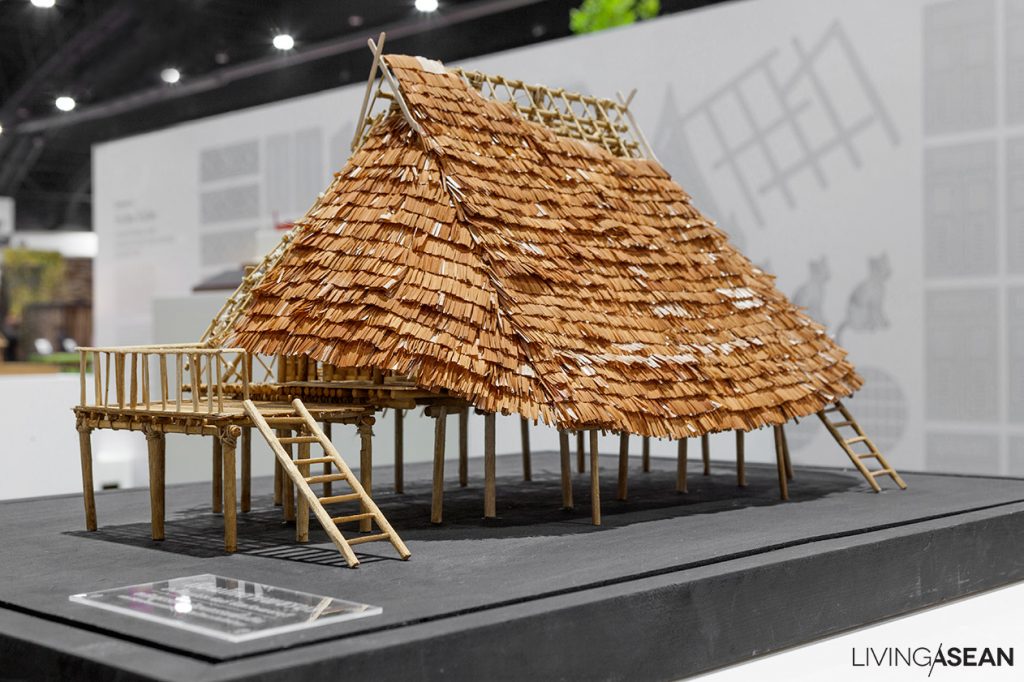
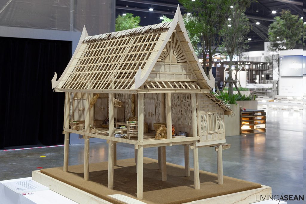
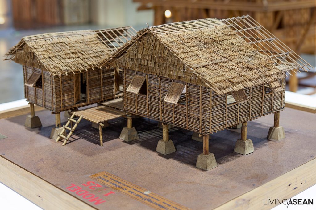
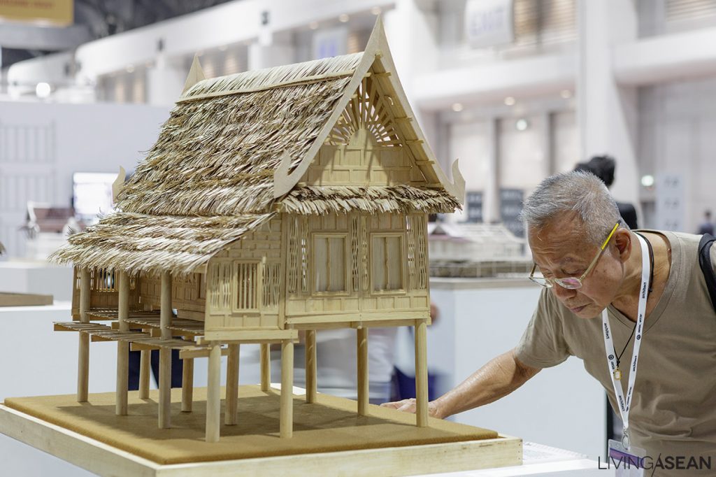
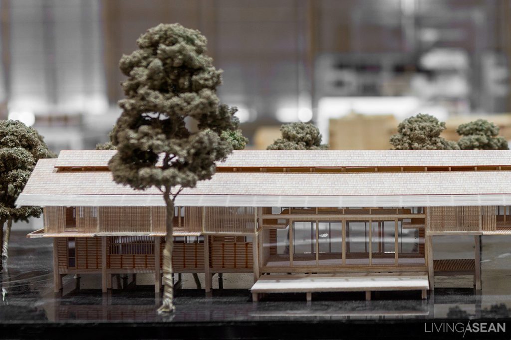
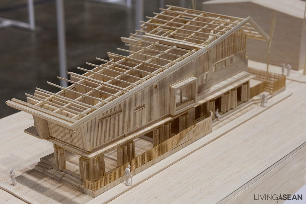
In Remembrance of H.M. King Bhumibol AdulyadejThe “Traditional and Vernacular Thai Houses” exhibition features models of vernacular residential architecture from different regions and ethnicities around Thailand. Some house designs were influenced by shared cultural heritage with ethnic groups in neighboring Myanmar and Vietnam.

Traditional and Vernacular Thai Houses

Traditional and Vernacular Thai Houses

Traditional and Vernacular Thai Houses

Traditional and Vernacular Thai Houses

Traditional and Vernacular Thai Houses

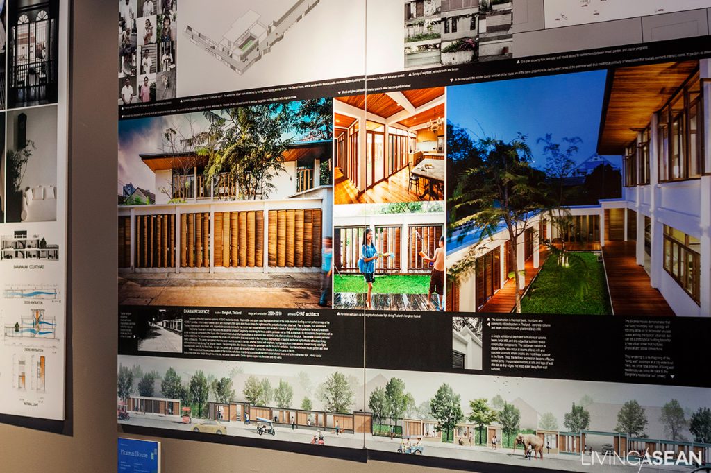
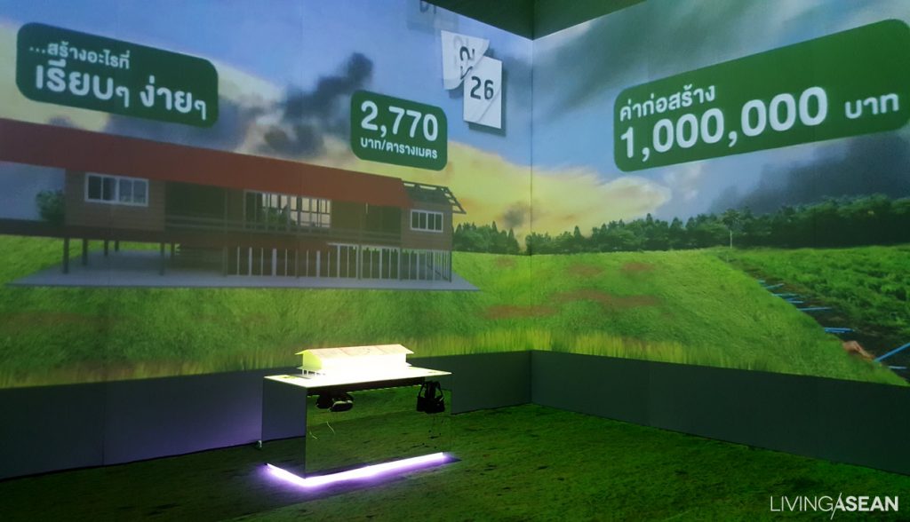
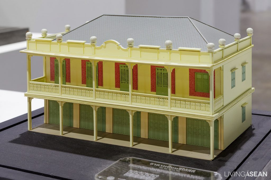
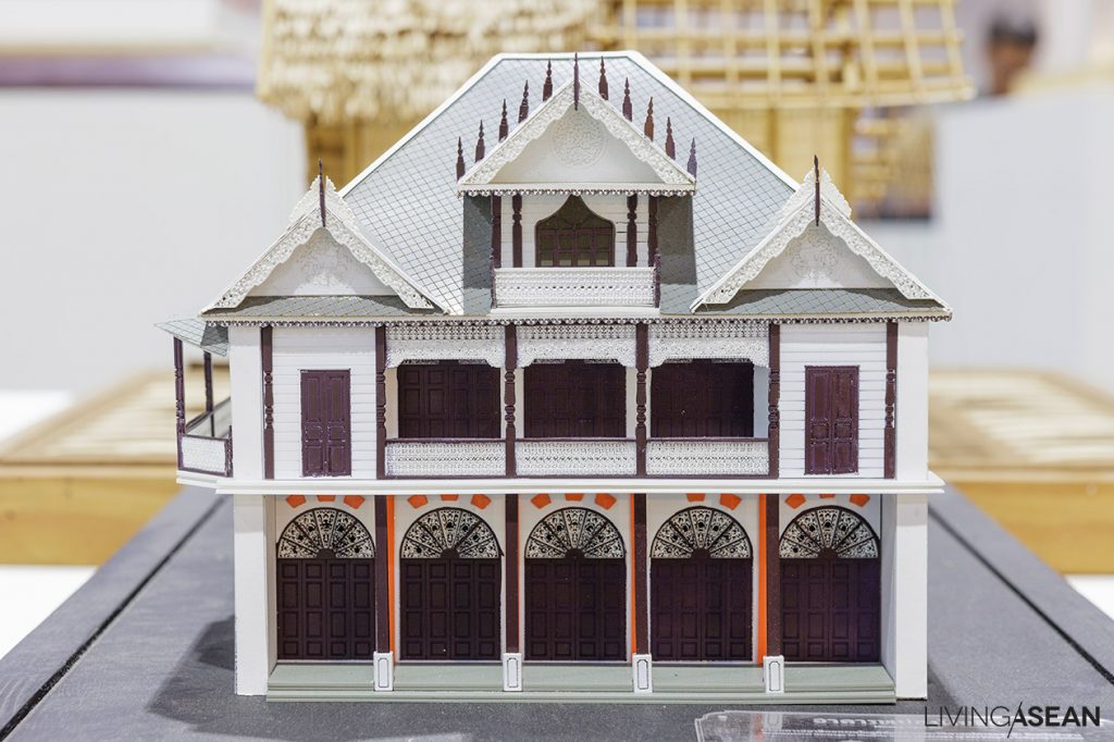
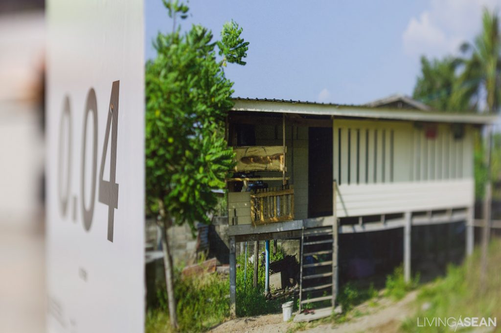
Traditional and Vernacular Thai HousesThe “Baan Baan Case Study” display features a variety of dwelling places in many shapes and sizes, each suited for a specific budget and designed by Thai architects. The name of the show may sound esoteric to many viewers, but essentially it’s about building within budgets.

Baan Baan Case Study

Baan Baan Case Study


2. Models showcasing works by leading architectural firms

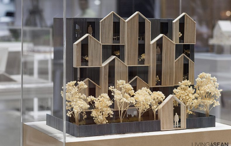
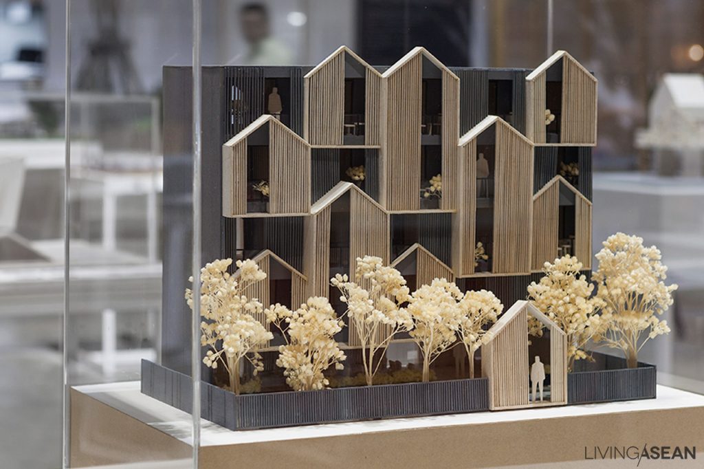
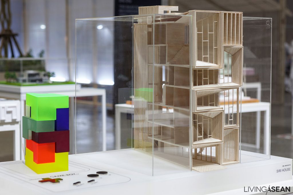
It’s the show for people who want to build things. Once a year, leading architectural firms put on a public display of works by their designers. It’s nice to drop in and get inspired by many creative projects and designs, ranging from hostels, townhouse renovation ideas, holiday homes, and more. Don’t miss out on these great ideas.

Designed by Octane Architect and Design
Designed by Awaken Design Studio

Baan Baan Mockup: Designed by Vaslab

Baan Baan Mockup: Designed by IDIN Archotects


3D Cement Printing for Outdoor Living

3D Cement Printing for Outdoor Living

Anon Pairot has unveiled the latest in a new series of 3D cement printing based on the concept “Fluctuation of Precision.” The masculine outdoor design with a softer touch is developed in collaboration with SCG, a leading cement maker in the ASEAN.

 /// ASEAN ///

After many years of research, Thai cement maker SCG has developed robots capable of acting as large-scale 3D printers and new cement formulas well suited to a variety of uses. This year, the “Designer Collaboration Project by SCG” has come up with new ideas for outdoor furniture designed by nationally renowned designer and artist Anon Pairot.

“I try to create design that gives a softer, lighter feeling. Usually cement structures are very masculine, so I add feminine accents to the design and see what the final result is. The new process enables 3D concrete strips to be printed quickly in non-traditional shapes and textures. The concrete printing process is performed by machine, but the cement itself leaves some random effects on the surface, hence the name Fluctuation of Precision,” he explained.

Anon Pairot

SCG will present the entire cement furniture collection at Architect 17, the 31st ASEAN Building Technology Exposition scheduled for May 2–7, 2017 in Thailand. It will be the first time ready-to-sell 3D cement printing products become available in the Region.


Link: http://www.scg.co.th/landing/index_en.html#en

http://www.anonpairot.com/


Fresh Air, Sunshine and a House Built around a Tree

Fresh Air, Sunshine and a House Built around a Tree

/ Nakhon Ratchasima, Thailand /

/ Story: Wutthikon Sut / English version: Bob Pitakwong /

/ Photographs: Soopakorn Srisakul /

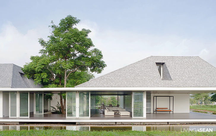
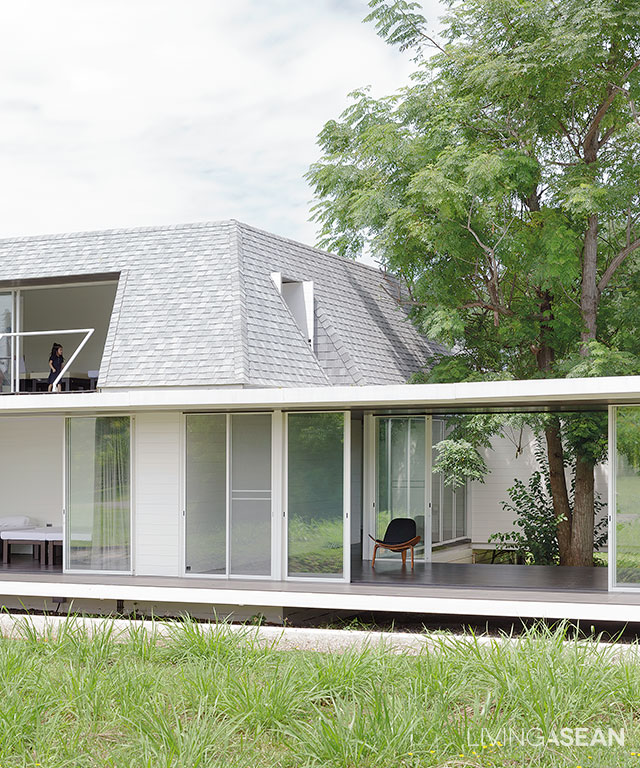
Nestled in the countryside at Baan Rai Thawsi just outside of Pak Chong, Nakhon Ratchasima, this light, bright and airy home is bursting with joy. Away from city lights, it’s built around a tree to reap the health benefits of fresh air, sunshine and cool trees providing shade in the environment. Here, the towering mountains of Khao Yai National Park to the south can be seen from miles around.

1
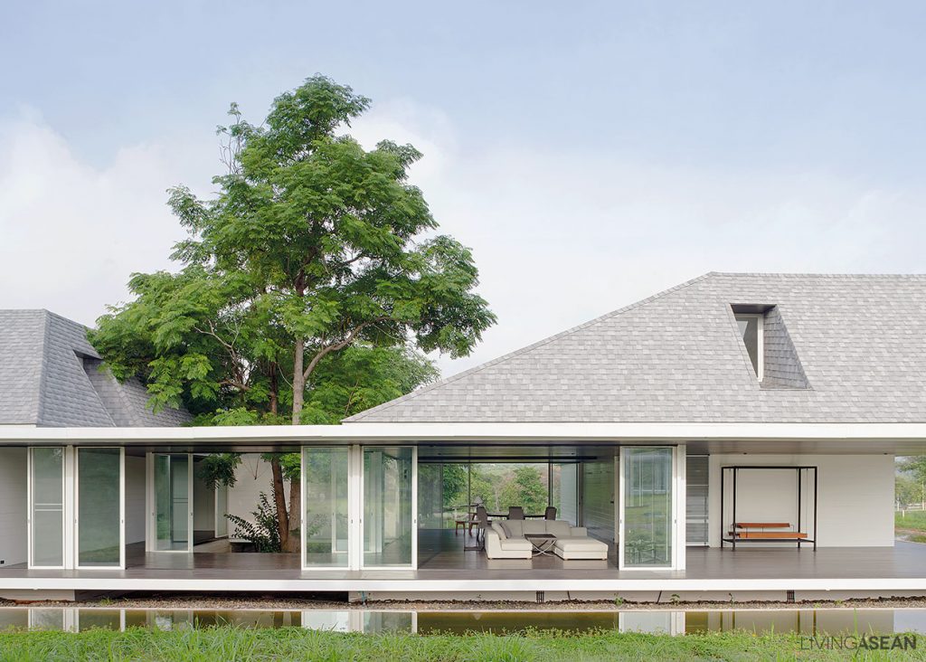
Seen from a distance, the transparent house façade is designed to take in an expansive panorama of countryside landscapes. The upper floor under a mansard roof holds calm and peaceful bedrooms.

Homeowner Piyaporn Taepaisitphongse was first introduced to Baan Rai Thawsi while her mother was attending a meditation retreat at nearby Baan Boon village, taught by the revered Buddhist monk Ajaan Jayasaro.

It’s easy to get why she came away impressed. Out in the foothills, it’s calm and peaceful. In her words: “Mom brought me here and I liked it. She wanted a country house, so here we are!”

3
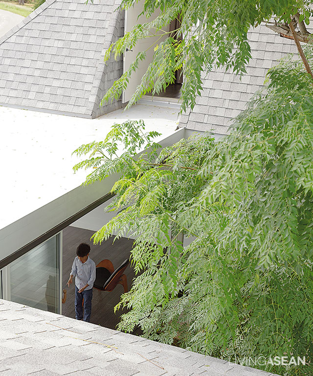
A healthy tree thrives in the middle of the house plan, a focal point for people going from one part of the house to another.

2

Piyaporn’s mother added: “We built it here for a lot of reasons. As Bangkok people, we feel safe living in a housing development. Here neighbors watch out for each other, plus it’s a peaceful and comfortable atmosphere.”

This was certainly clear to our team. Most households are also practicing meditation, adding to the pleasant ambience.

4
In a creative way, the tree at the center of the house plan connects the home with nature. Nearby, concrete walkways around the building fuse into a single path reminiscent of classic Japanese design.
8
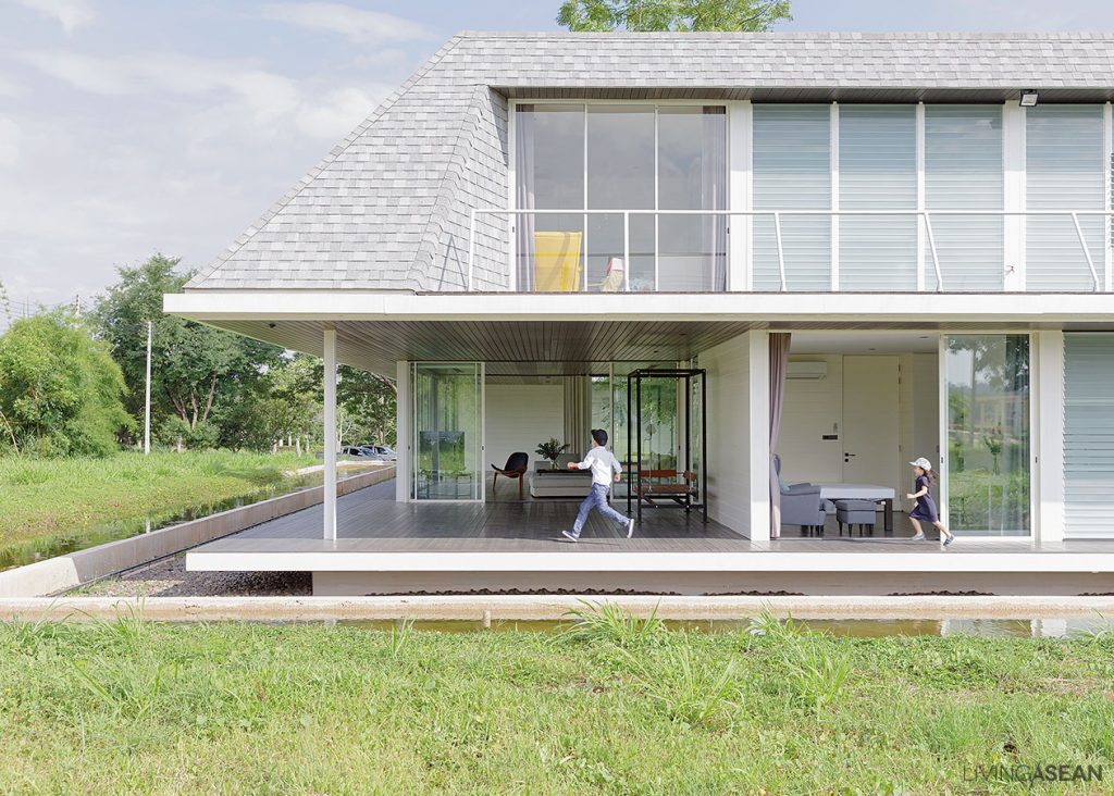
The walkway around the building connects people of different generations. For Grandmother, it’s a place for walking meditation. For the little ones, it’s a semi-outdoor area to run and play in.

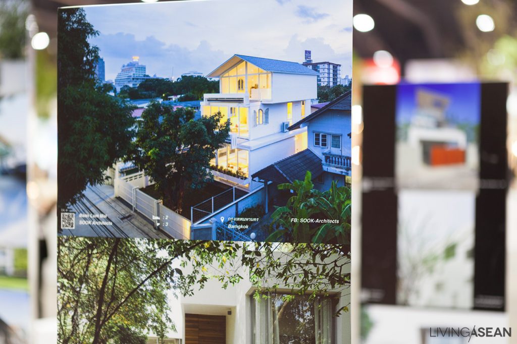
Piyaporn said: “We wanted a place to live after retirement, when we get old. And Mother is making plans now. We like the design by Rujnumporn Keskasemsook, of Sook Architects. He’s the one who created this open and airy house.”

5
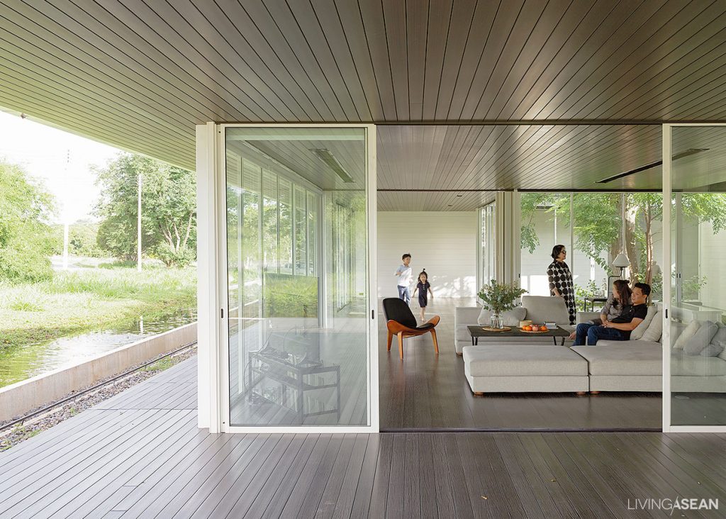
The tree at the center of the house plan blocks the sun’s harmful rays from penetrating the walls, keeping the living room cool and comfortable during daytime hours.
6
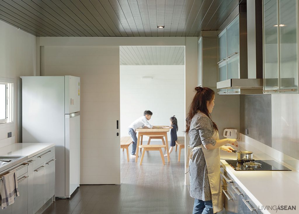
The kitchen conveniently connects to the dining room and living area, thanks to an open concept floor plan that promotes interactions and socialization processes in the family.

Architect Rujnumporn’s design also includes lodging accommodations for houseguests staying overnight and pathways to get out there and experience the natural surroundings firsthand. From the front, we get a wide view of the duplex style home that blends right in with the environment.

The downstairs external envelope is glazed using clear glass standing tall from floor to ceiling, surrounded by covered walkway systems that also double as a porch.

The upstairs is quiet and secluded, sheltered by a mansard style roof that makes the house feel roomy and light. The mansard boasts the beauty of subdued color combinations of whites and grays, adding to the home’s proper, orderly look. At the same time, the tree in the middle stands out from the surfaces, easily noticeable from afar.

7
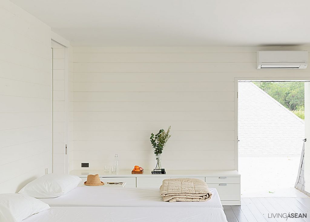
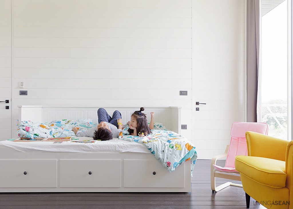
The little children’s bedroom boasts bright furniture colors silhouetted against the walls in cool-toned white. As might be expected, the bed has drawers for storing toys.

Overall, interior décor is simple, partly because it’s a vacation home. Plus, the homeowner prefers it that way. Furniture for the most part is movable, except for the kitchen that contains built-ins for ease of maintenance.

Flooring and ceiling materials are made of dark-colored artificial wood, creating a visual contrast with the building’s glass enclosures. It’s a design that seeks reconnections with the natural world outside while creating a warm and peaceful ambience inside. In the evening, sunlight shining softly through the tree creates breezy patterns like poetry in motion on the white walls.

9
Easygoing décor in the bedroom with a slanted ceiling that matches the mansard roof. There’s quiet reading nook by the wall.

From the outside, the two wings stand separated by a tree in the middle of the home plan. One wing serves as small hostel with eight beds for guests; the other wing holds the family residence with a bedroom downstairs for Mother, and the other bedrooms upstairs for the homeowner couple and their little children.

The “house built around a tree” in Pak Chong seems like the perfect example of a co-living arrangement, one that gives special importance to family togetherness and the joy of staying in close touch with nature.

10
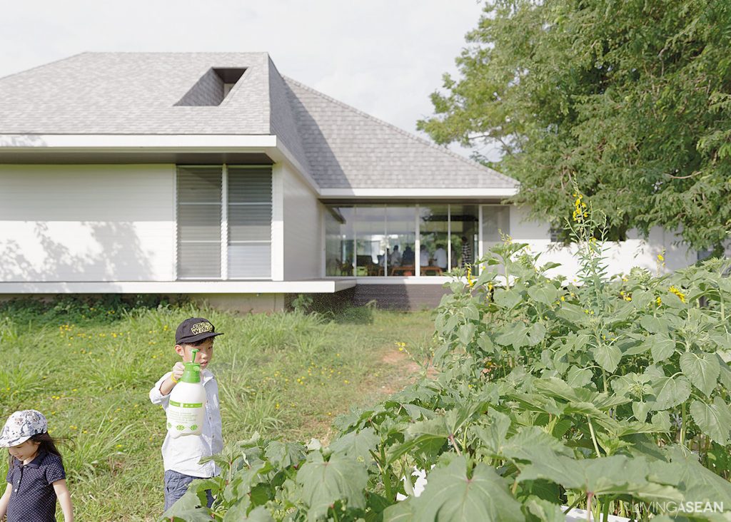
Little children enjoy tending plants thriving in the backyard garden; among them, sunflowers, okra, and other green vegetation. It provides a conducive learning environment for kids. Out here, nature is the best classroom.

Architect: Rujnumporn Keskasemsook of Sook Architects


Visit the original Thai article…

บ้านล้อมไม้


You may also like…
A Modern Home That is Quintessentially ThaiBaan Hing Hoi: A Modern House Exudes Old World Charm

X