Blog : Office

The Journey of Studio Miti: An Atelier Expert at Materials and Design Integrations Fit for Tropical Climate

The Journey of Studio Miti: An Atelier Expert at Materials and Design Integrations Fit for Tropical Climate

/ Bangkok, Thailand /

/ Story: Kor Lordkam / English version: Bob Pitakwong /

/ Photographs: Nantiya June /

Studio Miti is founded by Prakit Kanha and Padirmkiat Sukkan, two architects who have been friends since college. They attended the same school of architecture at a university. Since 2010 the architectural firm has won acclaim for its expertise in materials science skills and ability to integrate knowledge of design with the circumstances that form the setting of worksite surroundings. Having earned many architectural design awards over the years, Studio Miti is clearly living up to his name.

The story of Studio Miti had its beginnings at a workbench inside a rented room that doubled as their humble abode. As the amounts of work increased, the pair thought it wise to move into a decent workplace. They moved several times to different places, among them a rental space on the ground floor of an apartment block that, albeit small, became their first design studio.

The turning point in their career as architects came as the company grew and grew to the point they decided to move again, this time to a permanent home with a brick façade showcasing materials that speak volumes about their ideals and corporate identity.

Studio Miti Padirmkiat Sukkan
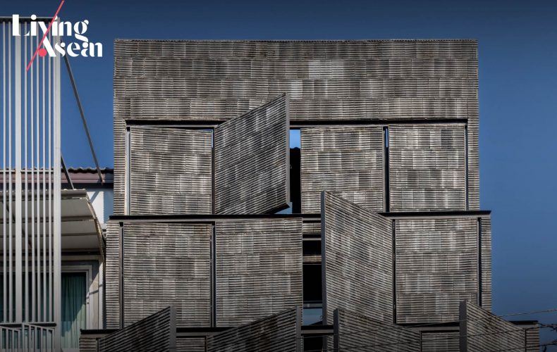
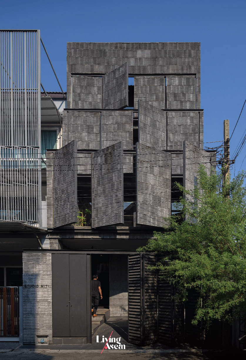
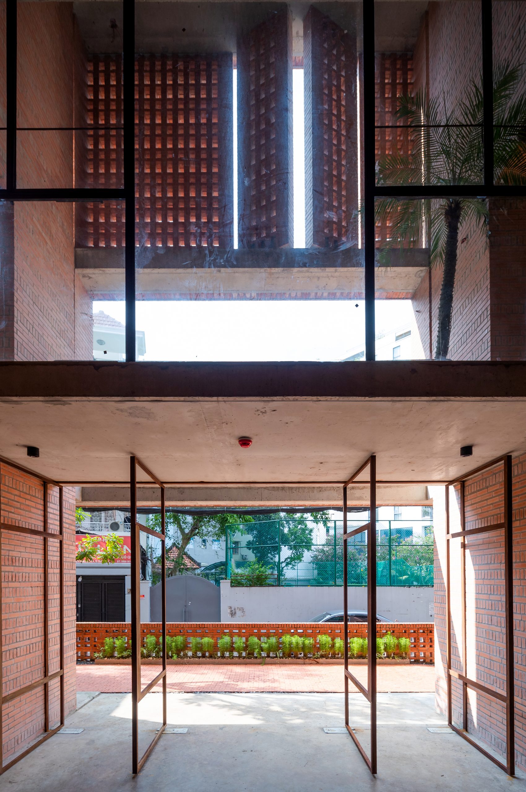
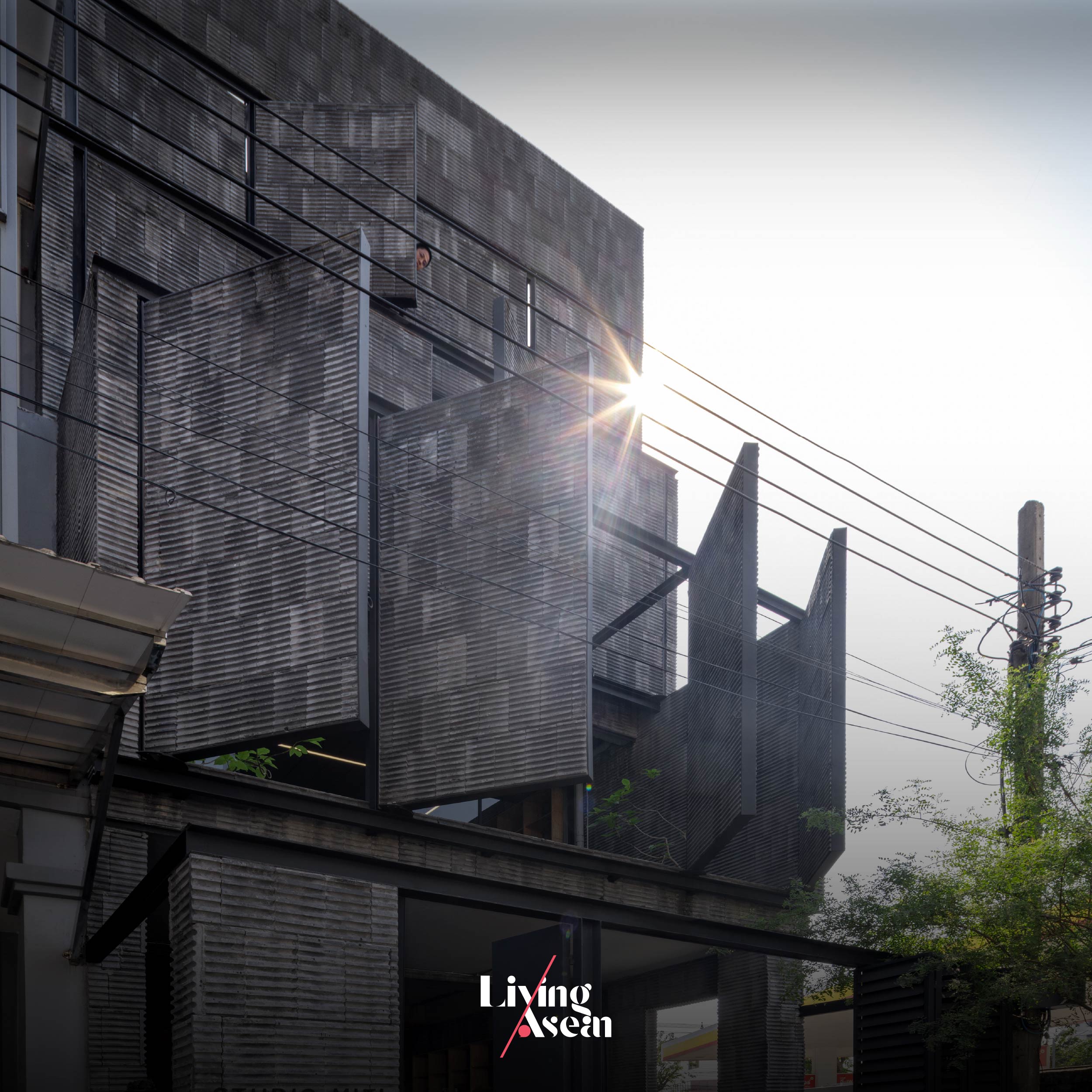
Studio Miti’s new office showcases the building’s principal face capable of staying open and shut as needed as one of its main design features.

For almost 15 years, Studio Miti has kept firmly to its guiding principle in design, one that combines knowledge of design with an understanding of the context that forms the setting of a place, plus the ability to research the structure and properties of materials used in construction.

In the fewest possible words, it’s about knowing what the materials are made of and how they can be used so as to achieve the best results and aesthetic appeal. Equally important is the ability to create design that’s conducive to improving the quality of life plus charm, good looks that inspire.
Studio Miti Padirmkiat Sukkan

The company’s unflinching determination to stand by its design principle and beliefs is reflected in the looks of its new office set amidst the bustle of the Lad Phrao Soi 71 neighborhood in Bangkok where it moved into in 2024.

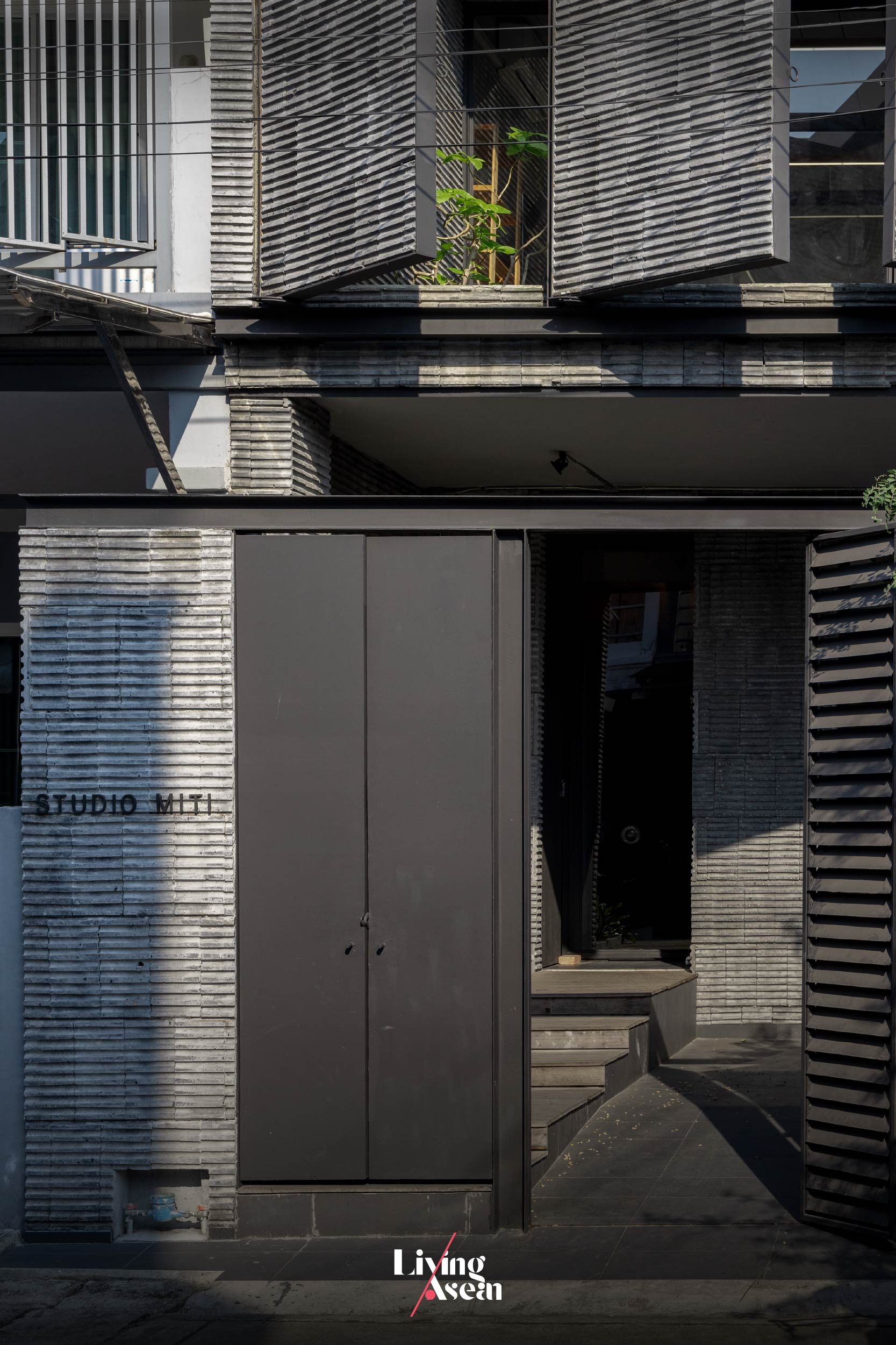
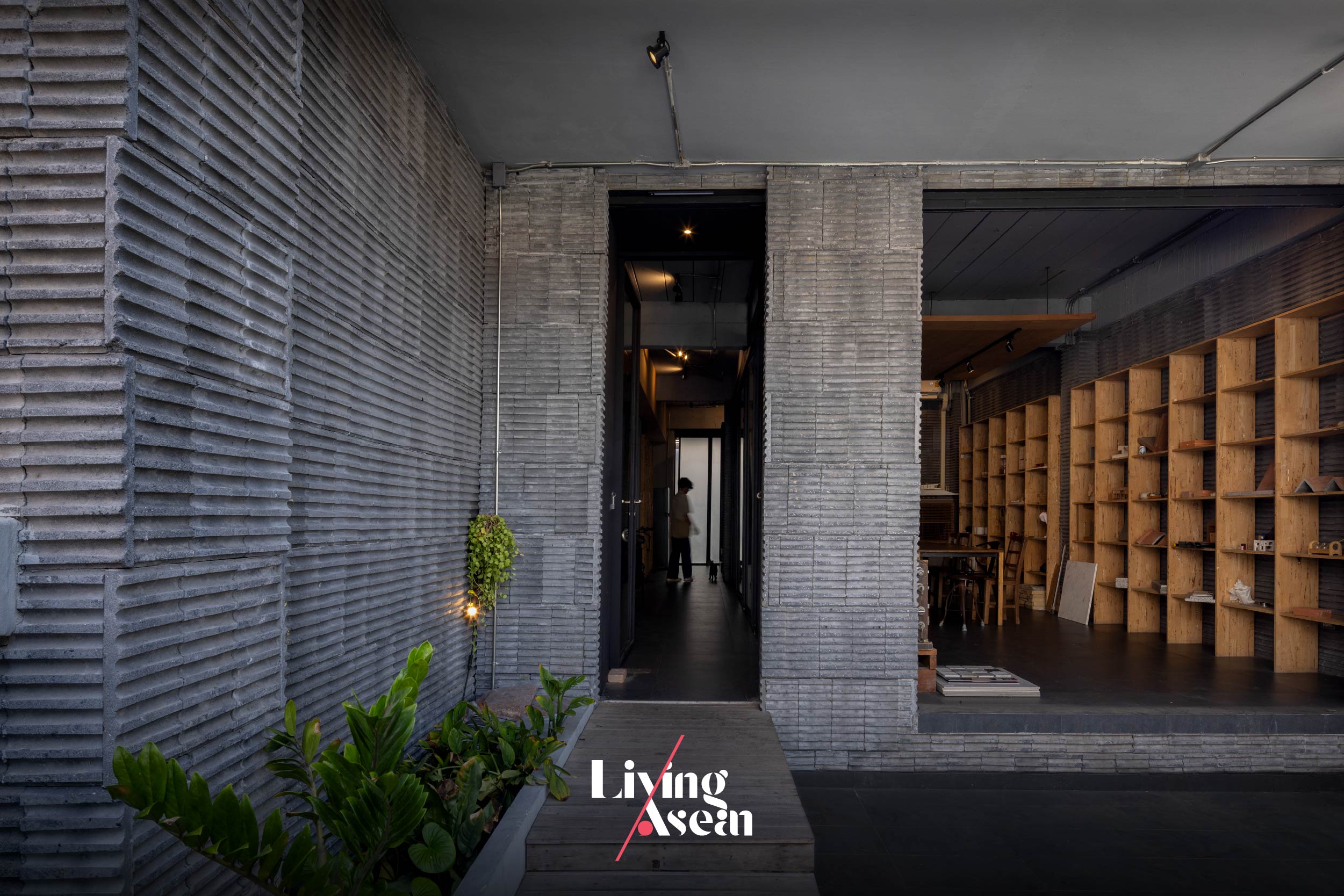
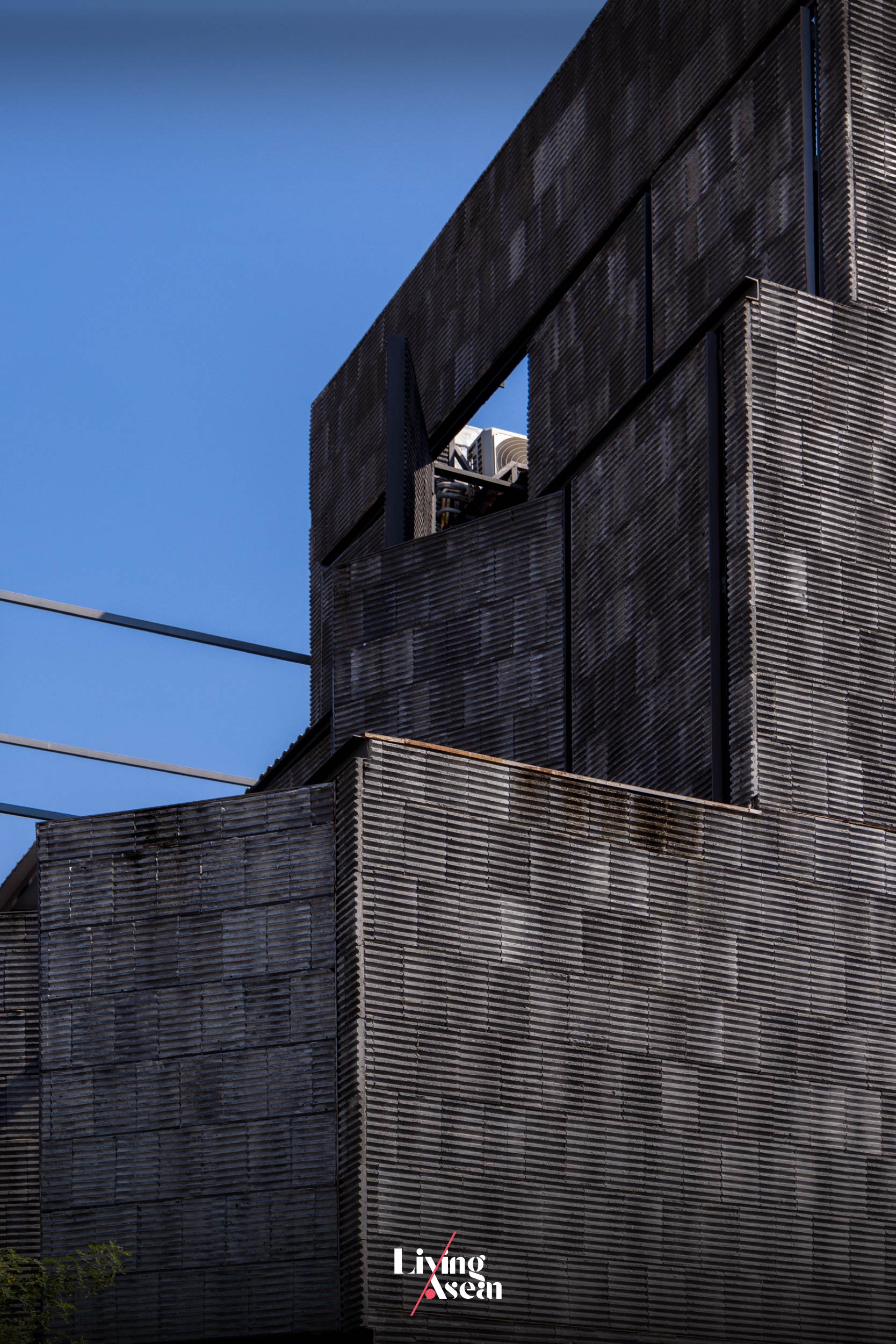
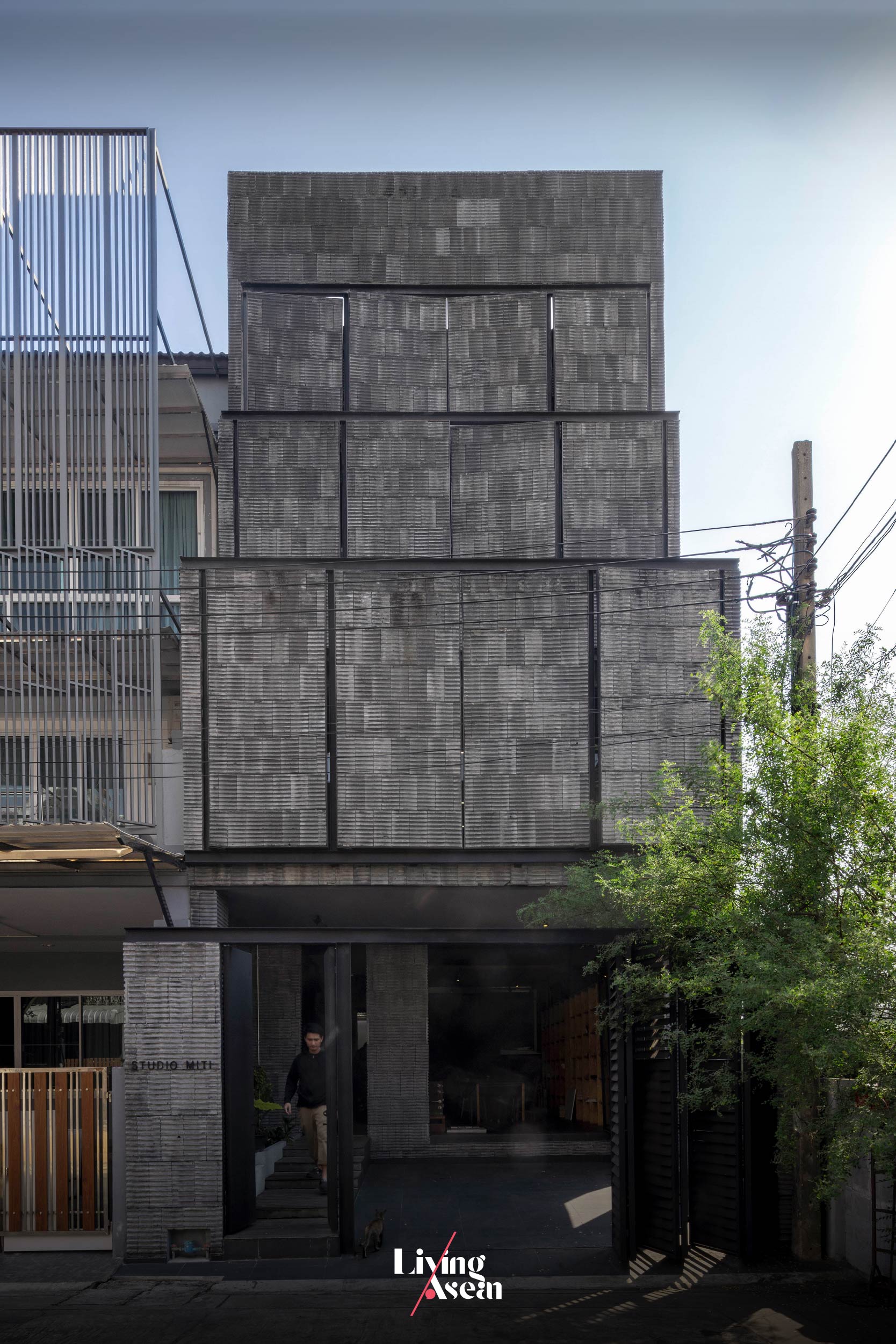
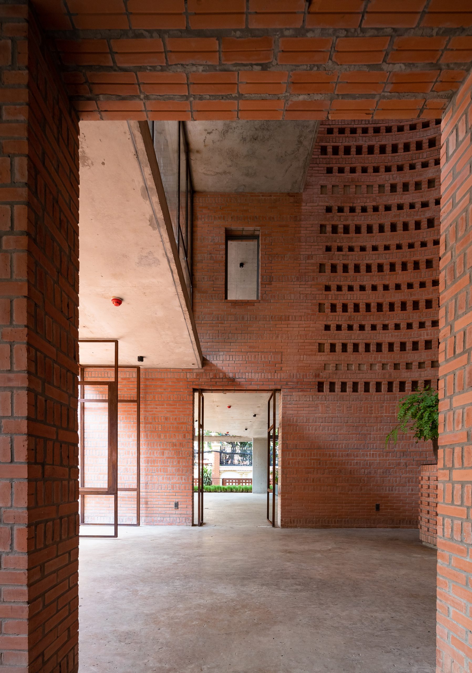
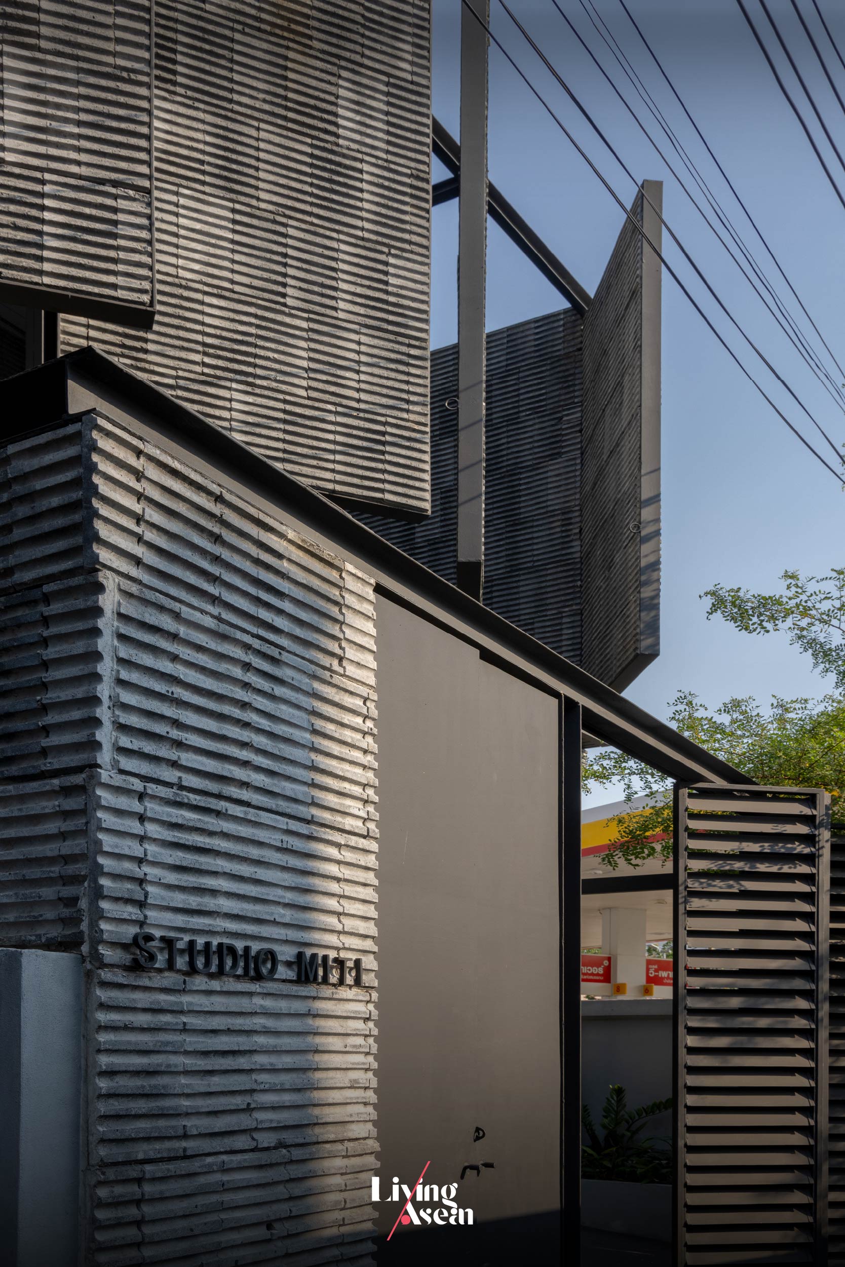
It’s an old townhouse that has since been lovingly restored as an office. It showcases the front façade covered in lightweight concrete blocks in dark gray that conveys a great deal about Studio Miti’s ideals and in-depth visions guiding its actions.

We have the pleasure of meeting with Padirmkiat Sukkan, co-founder of Sudio Miti, and getting to know more about the company’s design concept, plus taking a tour inside their new office. Join us in discovering the secrets behind the building façade crafted of gray concrete blocks, plus the design concept and beliefs that have put Studio Miti in a class in itself.


Q: Tell us about your journey, design principles and beliefs that guide your actions.

A: “As you know, Studio Miti has moved office several times over the years. Every time we moved, we did some experiments on the materials that we used. We tried to weigh the work we did to determine its essential quality. We believe in using real materials. By that is mean that we use pure materials in their original visual shape, color and texture without over embellishments.”
Studio Miti Padirmkiat Sukkan
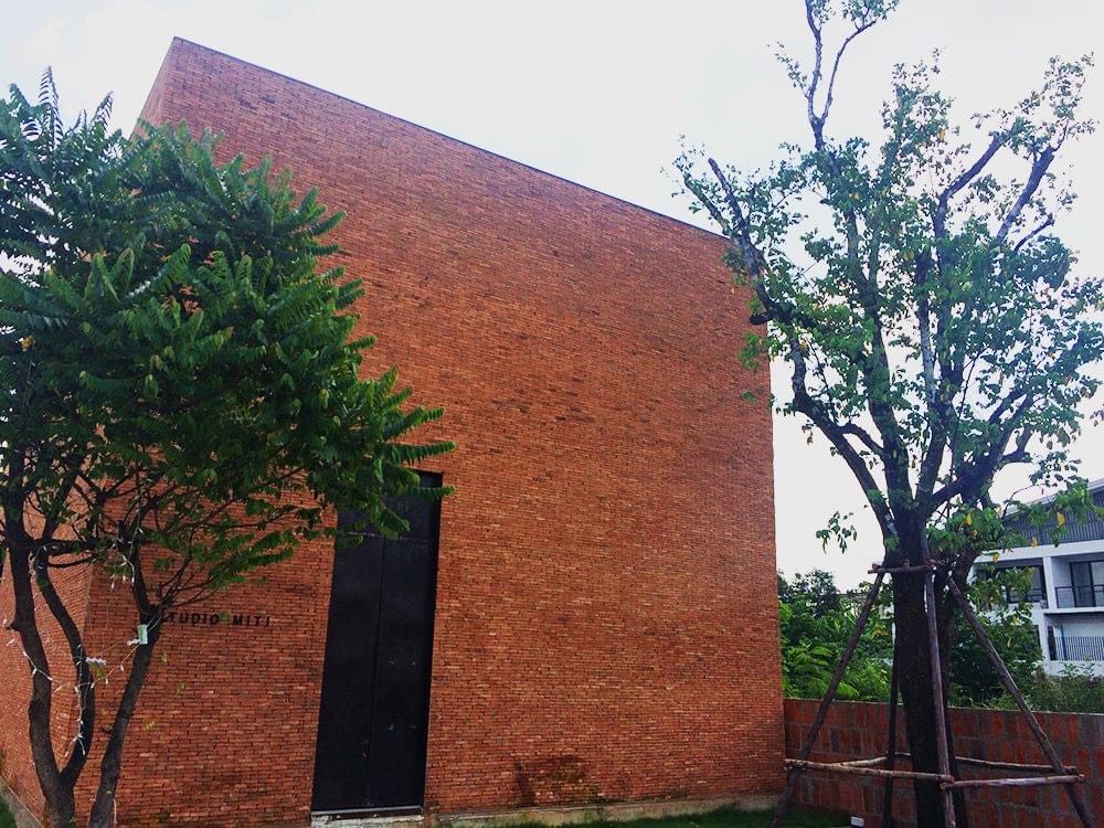
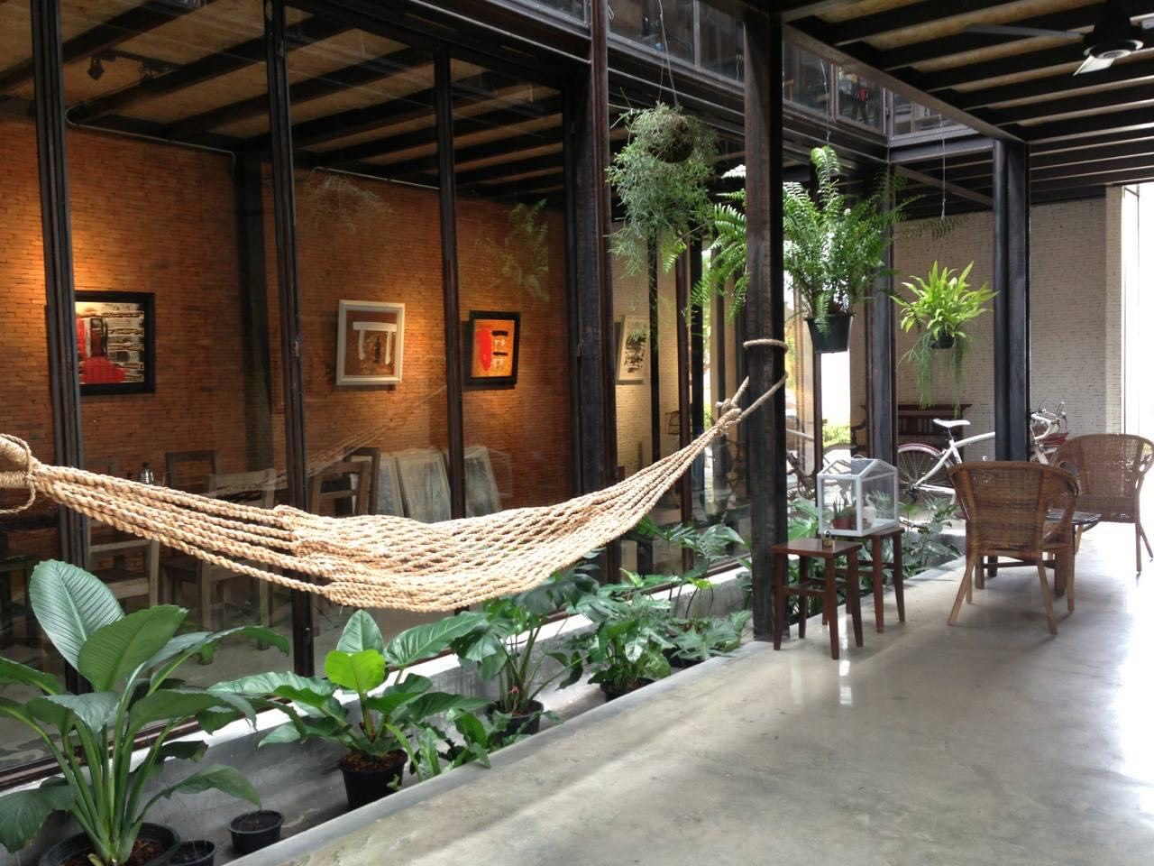
Flashback: Studio Miti’s old office building showcases brick façade ideas in every direction.
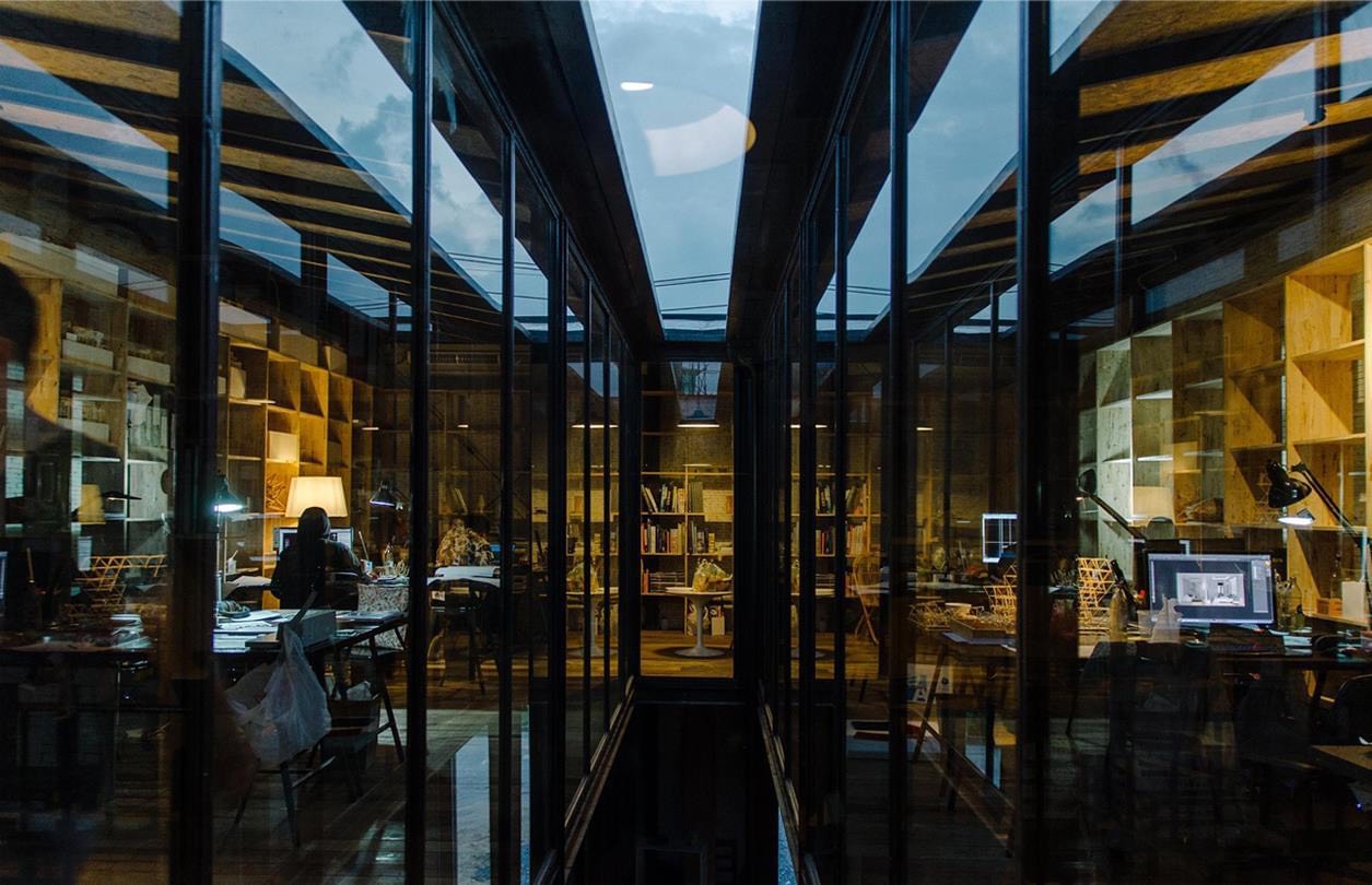
Despite its solid brick exteriors, Studio Miti’s old office building feels open and airy, thanks to skylight systems that turn the interior into a well-lighted place.
Enclosed workspace inside Studio Miti’s old office provides freedom from external disturbances, making it easy to stay focused during the work day. Plus, it’s adequately lit by overhead skylight systems.

“At our current location, we used mostly bricks as the material of choice. We experimented on brick constructioon as well as bricks and steel. This time, we tried using lightweight concrete blocks as the main material instead.

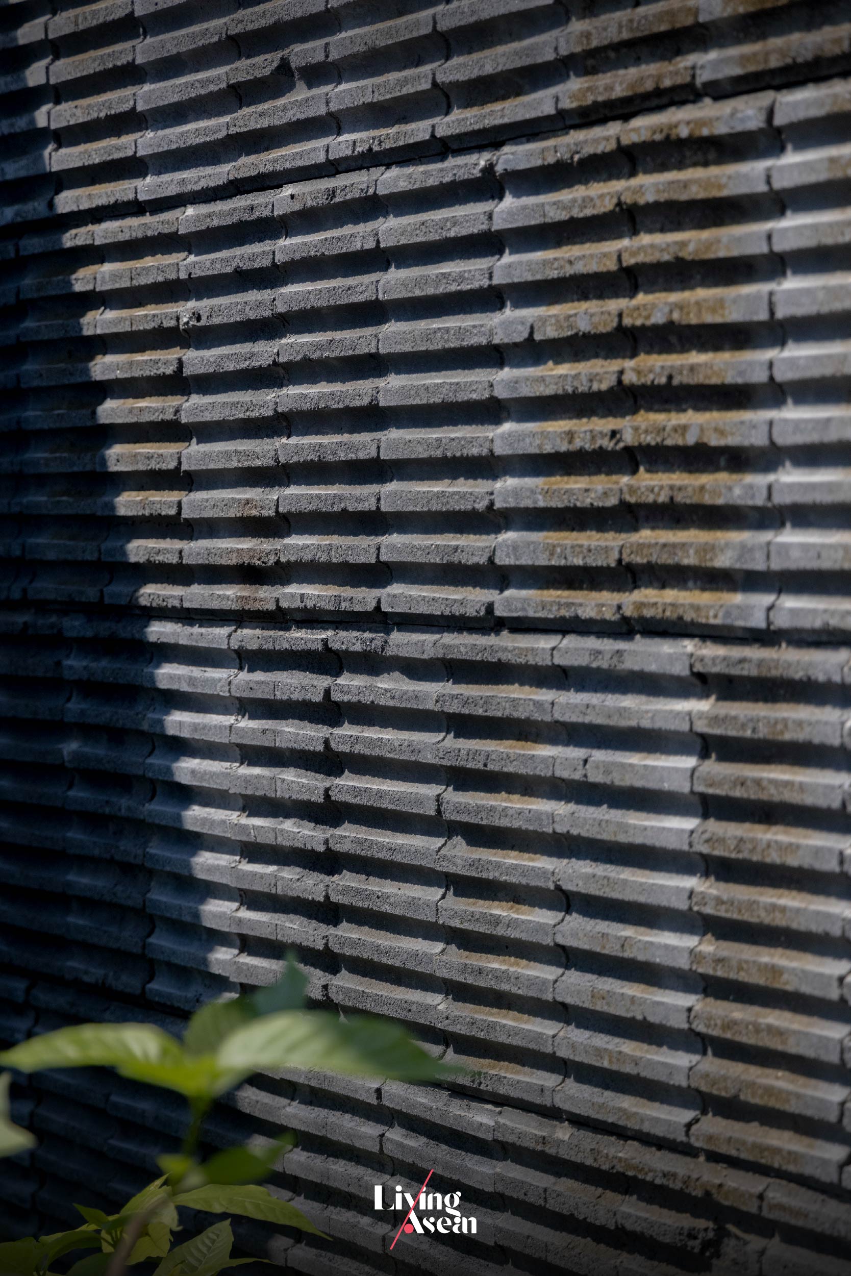
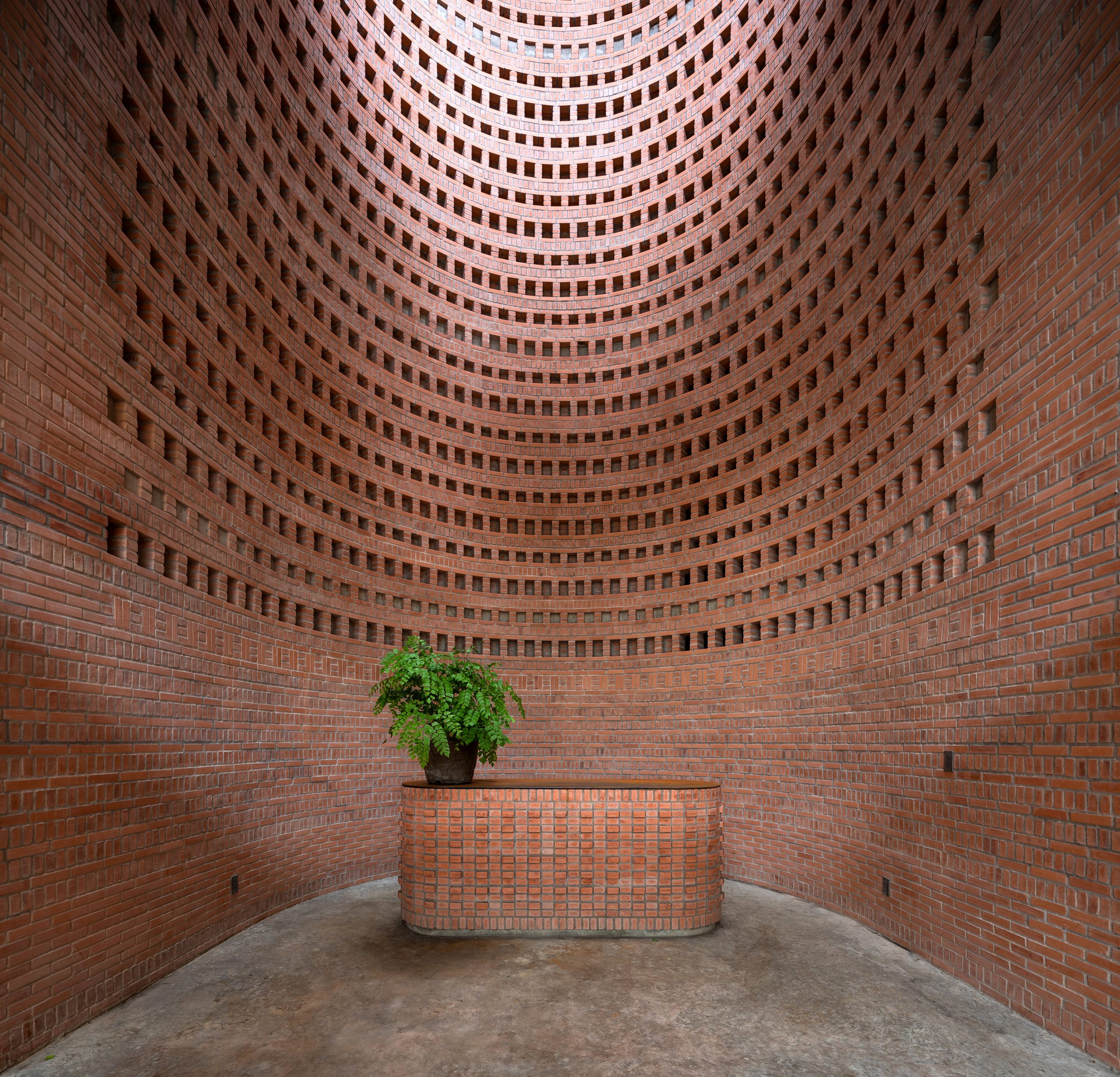
“In fact, we found it by chance at a worksite. We were using the product and, out of the blue, it broke at the seams at the midpoint. We discovered a curving contour inside it.

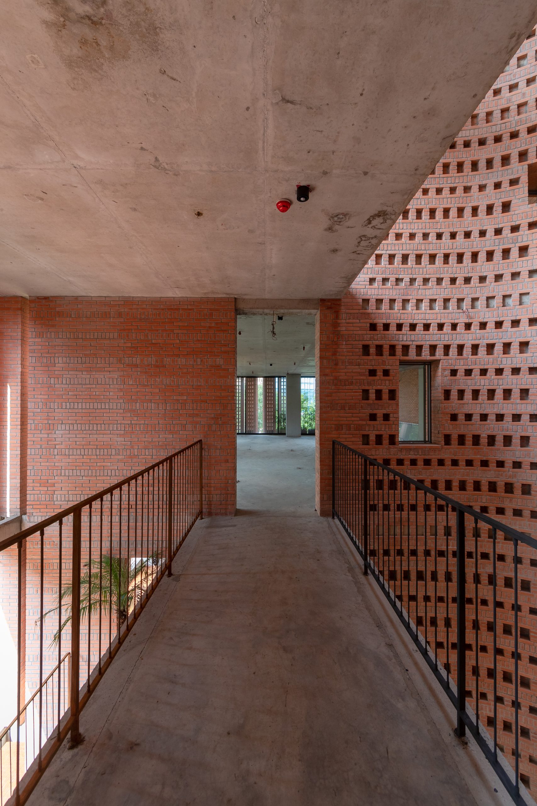
“It looked interesting when touched by light. So we took it apart and looked inside it. The effect was good by a touch of light. I thought we could build the entire building facade using this material. And we did. The same applied for other parts of the building, too.”
Studio Miti Padirmkiat Sukkan

“We implemented this project, renovating an old townhouse built some 30 to 40 years ago. There were site limitations that we had to deal with. The external envelope was opaque, being built entirely of brickwork. It came with one restriction; a complete teardown was not permitted.

“So we created a building façade that’s capable of being open and shut as needed so as to control the amounts of natural daylight shining into the interior, thereby making it easy to stay focused during the work day.”

“Actually, we are interested in the design process. We look for ways, by which the tools that we use in designing diagrams can also be applicable or relevant to the materials being used as well.

“Oftentimes we put the materials to the test ourselves. It gives us confidence in doing designs, plus the benefits that come from touching it and getting the feel of the materials. It’s an important approach that we use.”


Q: What’s your thought on using real materials and creating Tropical design?

A: “On real materials and Tropical design, I regard the two concerns as being part of one cohesive whole.

“In a warm and humid climate like ours, first, I say we have to understand and be able to use the sun and the winds prevailing in the region to our benefit. It’s very basic to begin with. If we have the opportunity and the owner agrees and likes what we do, then we can develop the materials that we need together.

“And when it comes to using pure materials, I feel they are beautiful without being over embellished. We just need to find out how design can be used to make them look beautiful with little or no modification. To us, understanding the materials and how to them is of the utmost important.”

Studio Miti Padirmkiat Sukkan
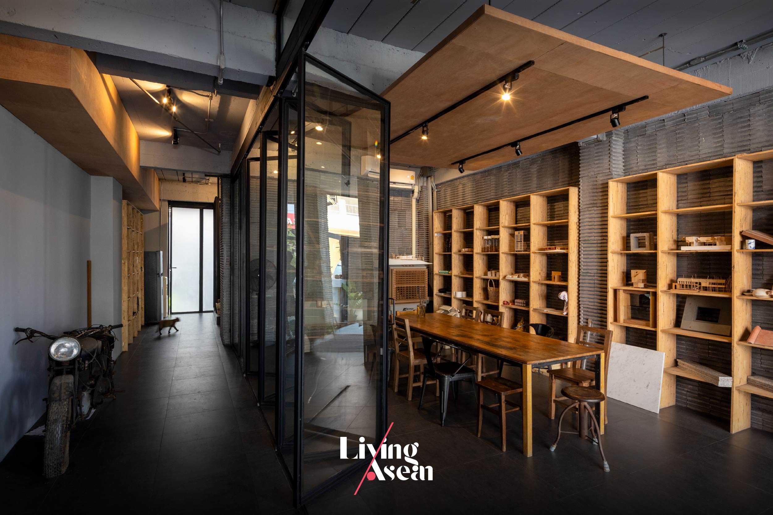
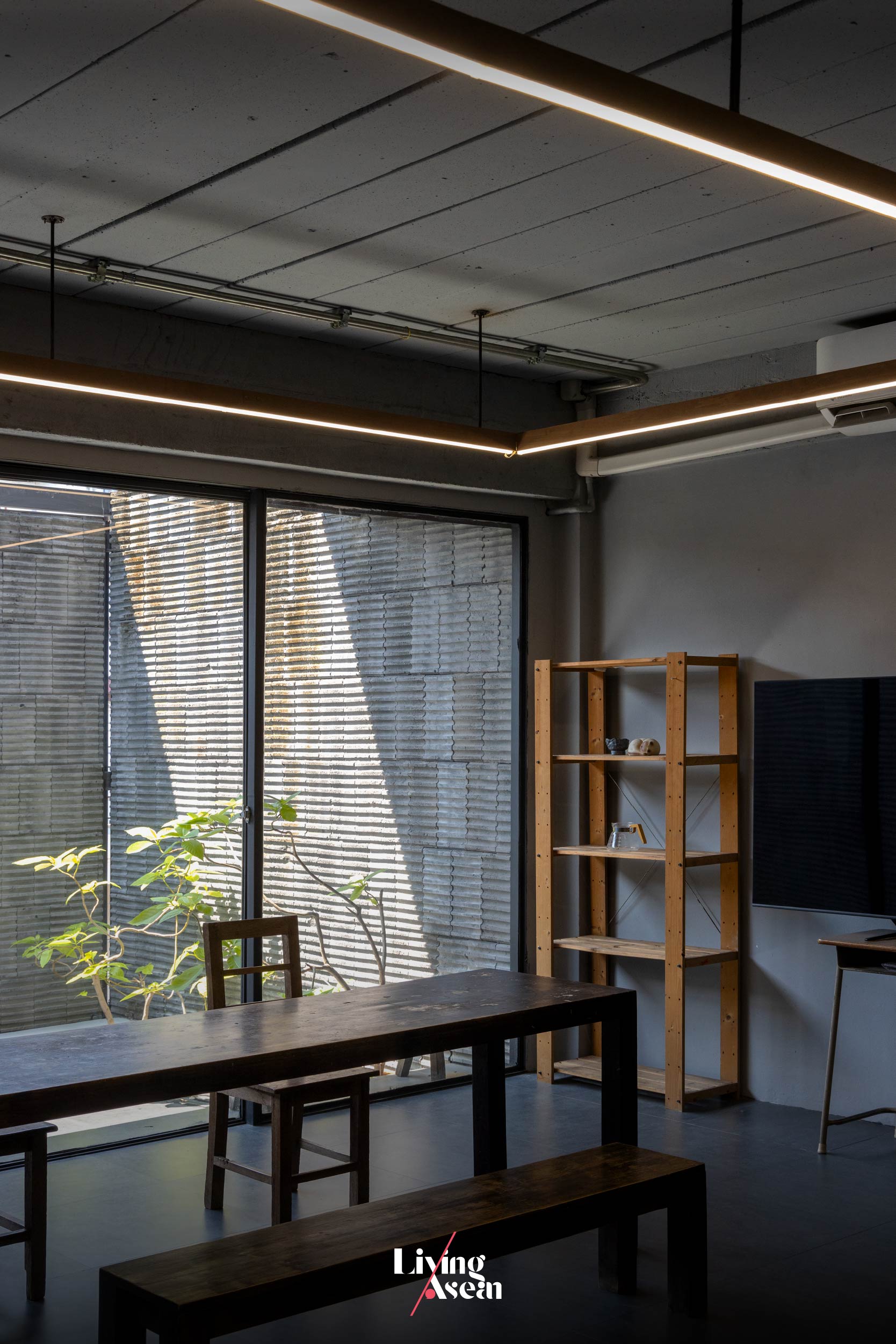
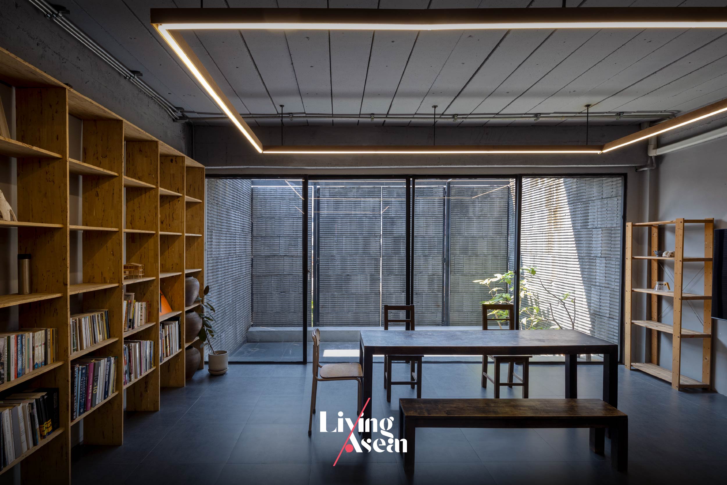
A meeting room-cum-recreation space on the ground floor feels bright and breezy, plus it’s easily modified to respond quickly to changing needs and activities.
Studio Miti Padirmkiat Sukkan
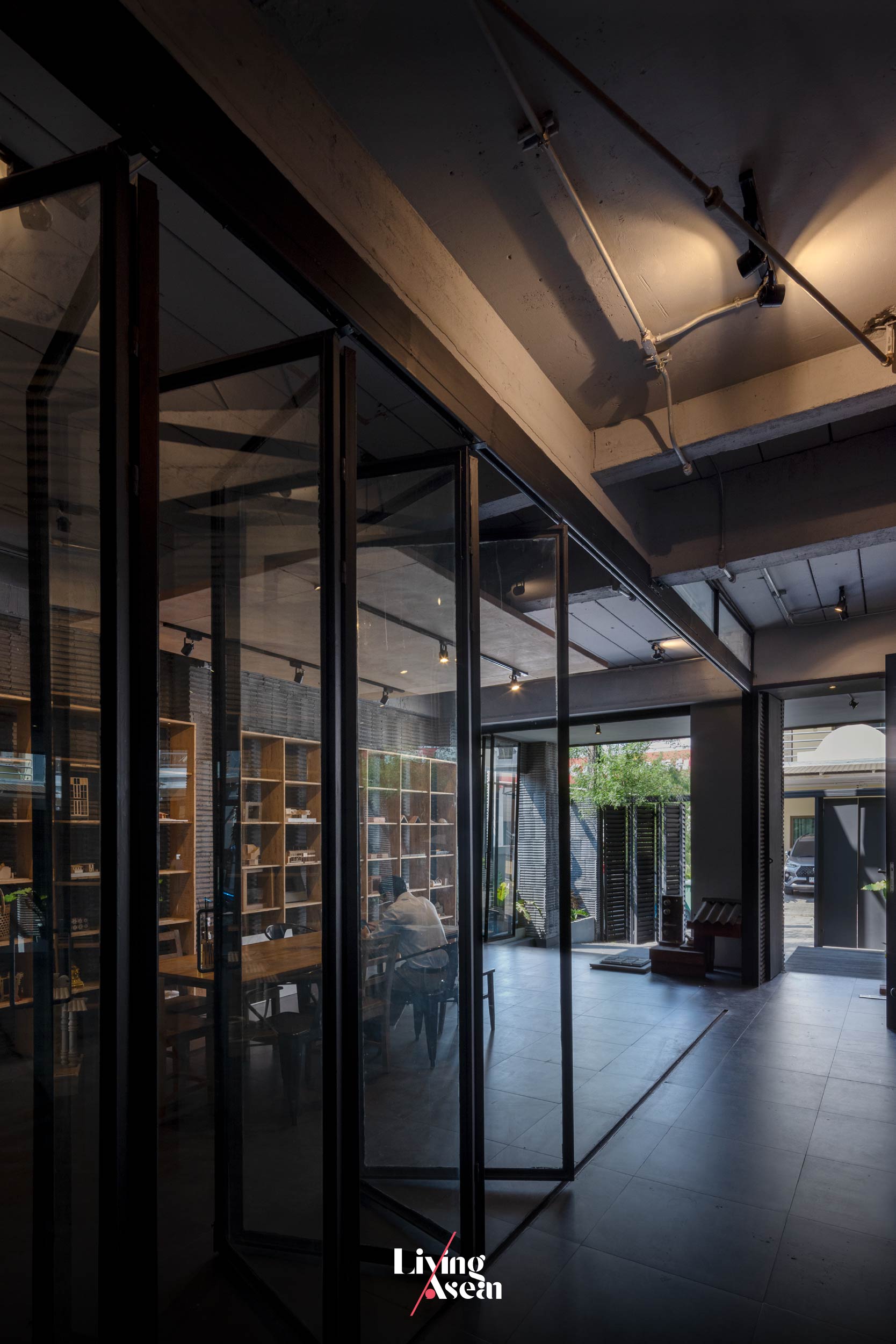
A meeting room for receiving clients is glazed using clear glass to admit natural daylight into the interior.

“Speaking of knowledge of a Tropical climate, I feel it’s a must-have for architects. Thai architects, especially, must have a good understanding of sunlight, the heat, humidity and the cold. They are the basics. To create designs, knowing all the basics takes priority over any other matter.

“But more than anything else, me have to make sure the kind of architecture that we create represents the owner. If not, at least it must speak volumes about the place, about the site and the context that forms the setting around it.”


Q: Help me understand some of the work you did in the past? A few examples, perhaps?

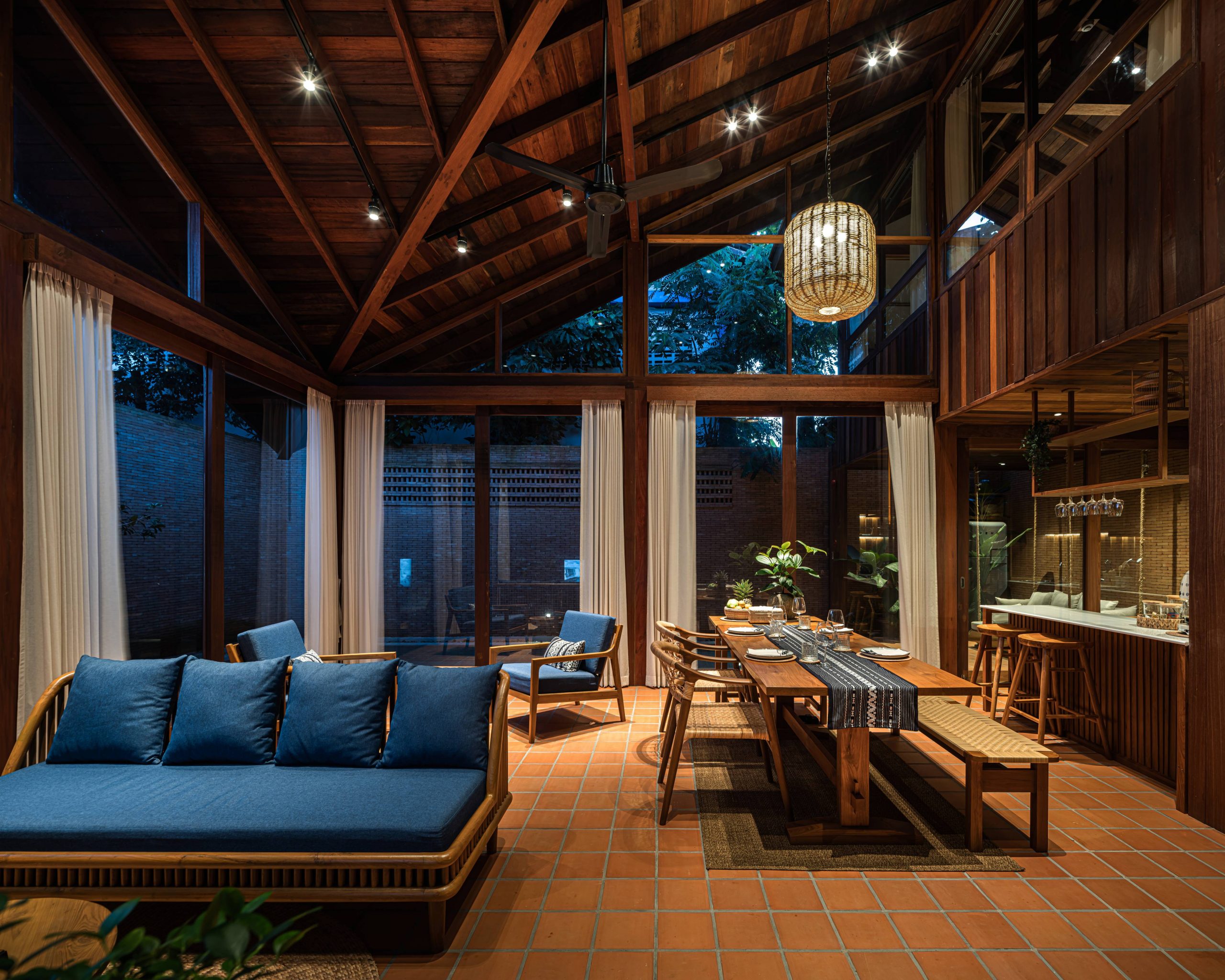
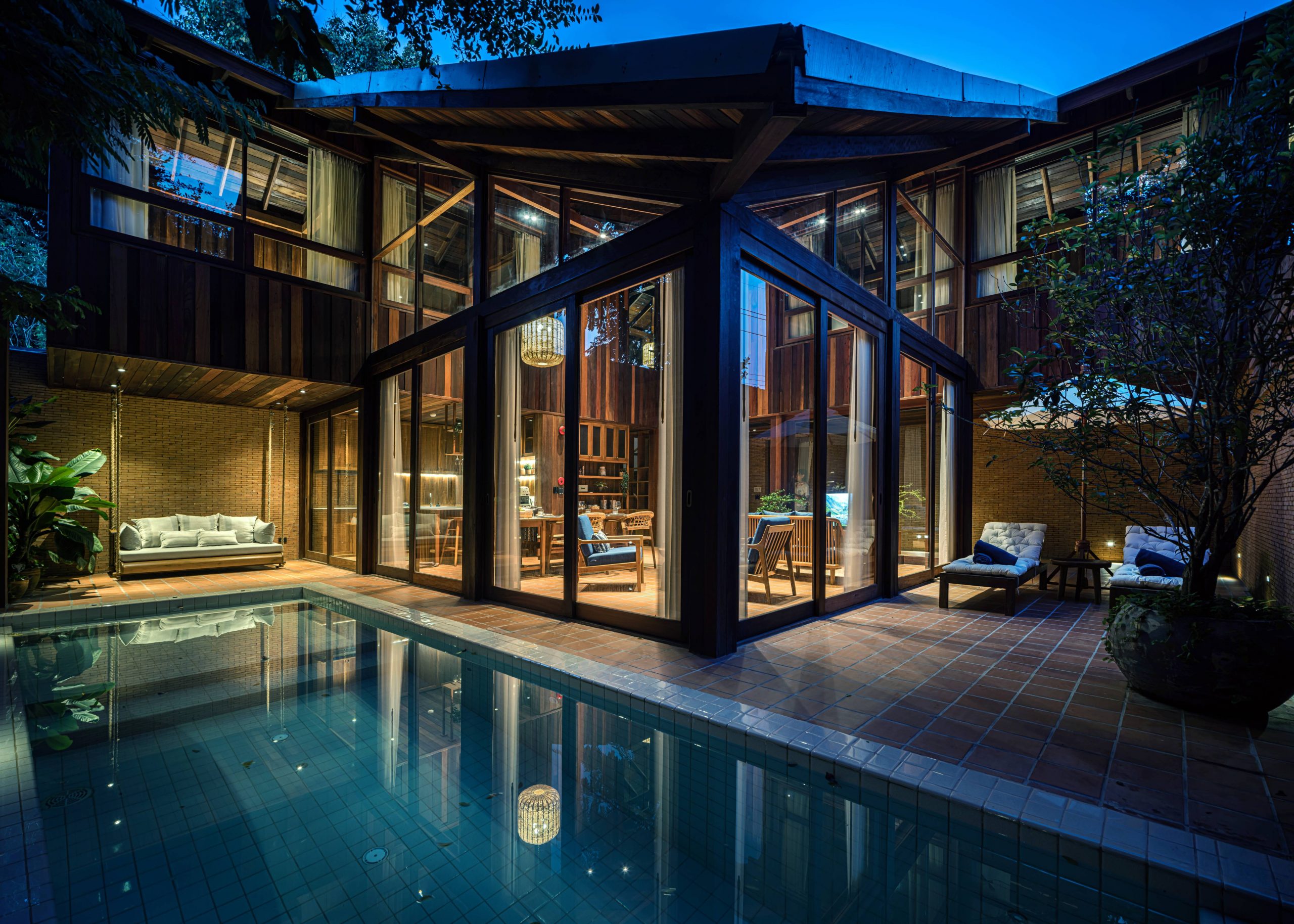
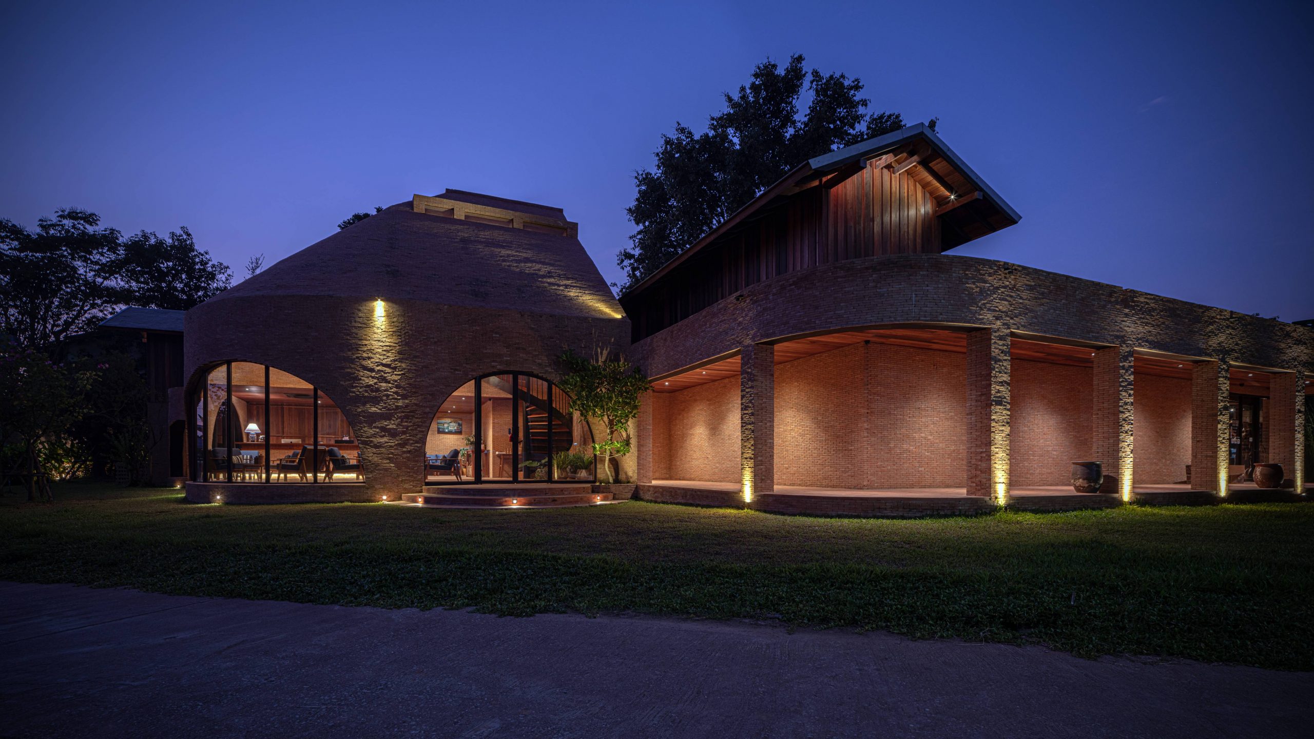
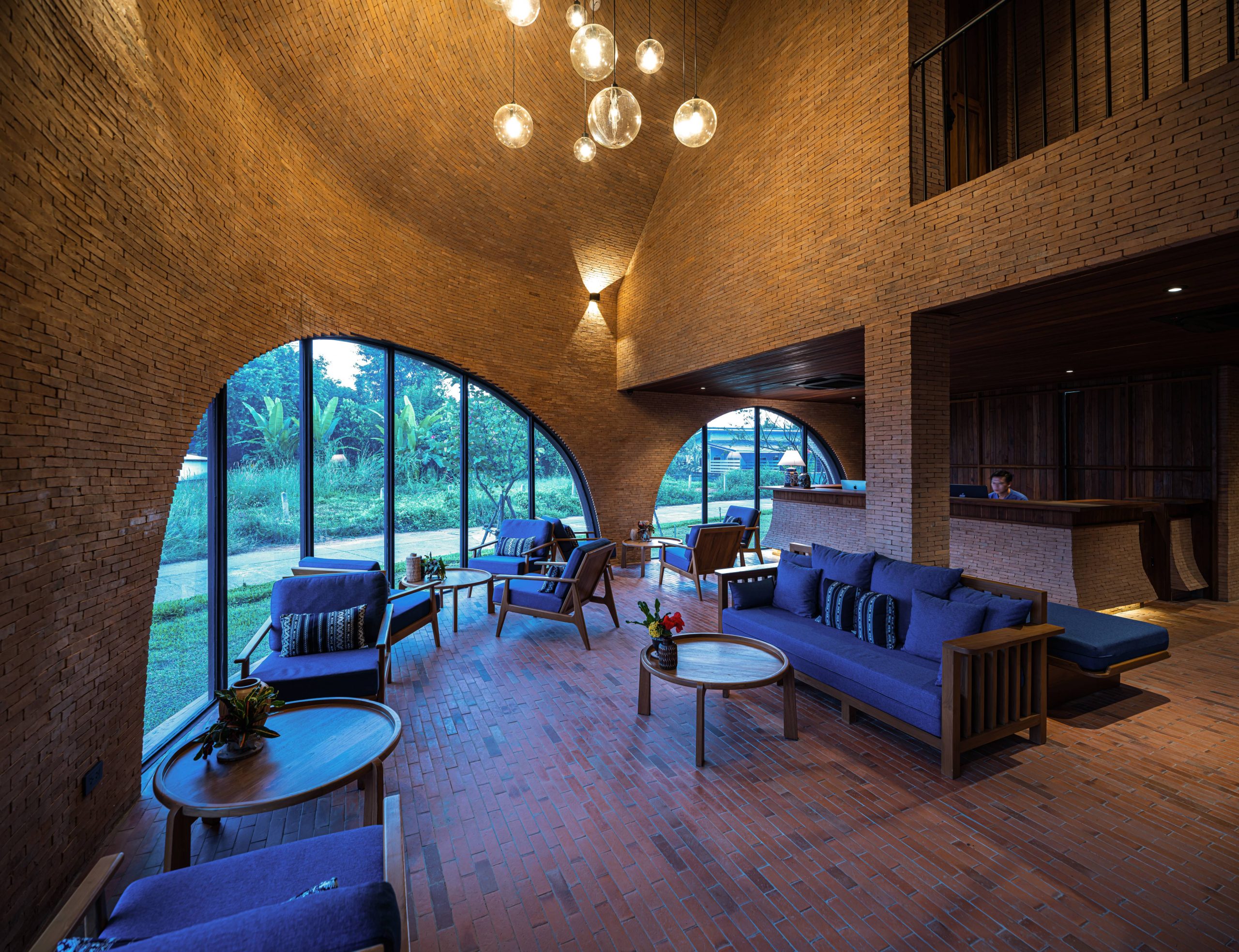
A: “To show you some of our past achievements and the results of our experiments, I say we used bricks. Bricks were the material that we used often. As for wood, we used that often, too. We used brickwork mixed with wood in the construction of Athita the Hidden Court Chiang Saen, a boutique hotel in Chiang Saen District of Chiang Rai Province. It’s a hybrid of brick and timber.”
Studio Miti Padirmkiat Sukkan
Athita the Hidden Court Chiang Saen, a boutique hotel in Chiang Saen District of Chiang Rai, Thailand’s northernmost province. / Courtesy of Studio Miti
Athita the Hidden Court Chiang Saen / Courtesy of Studio Miti

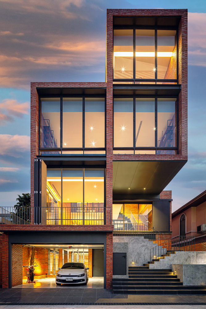
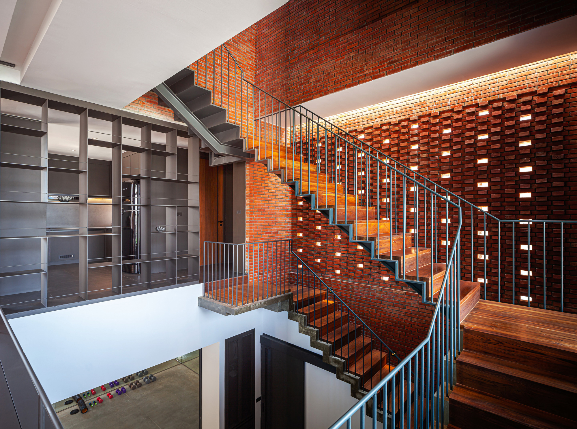
“If I may show you a project built entirely of bricks, or brickwork mixed with steel, it’s the “High Brick House” or “Baan Look Moo”.
Studio Miti Padirmkiat Sukkan
High Brick House / Courtesy of Studio Miti

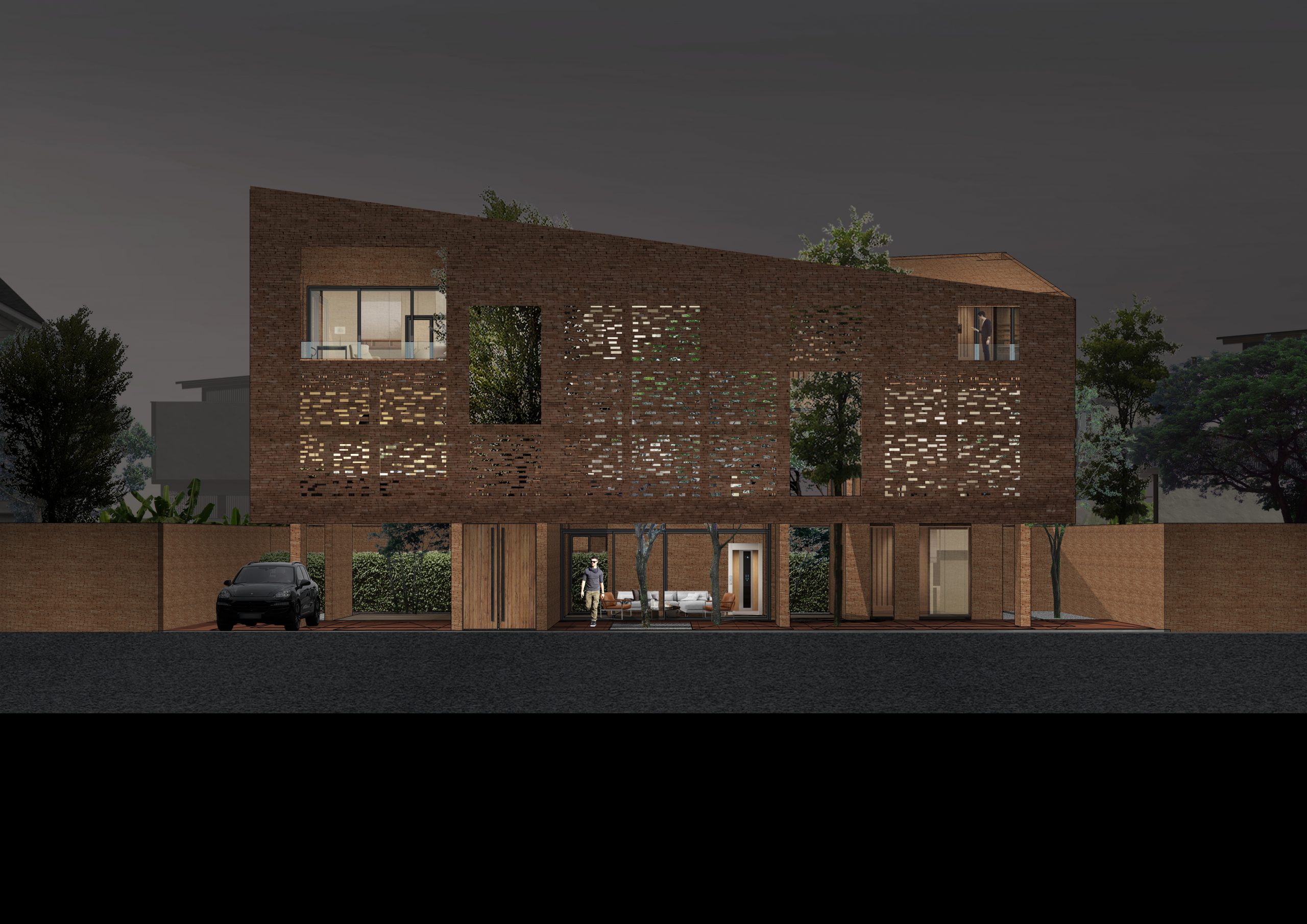
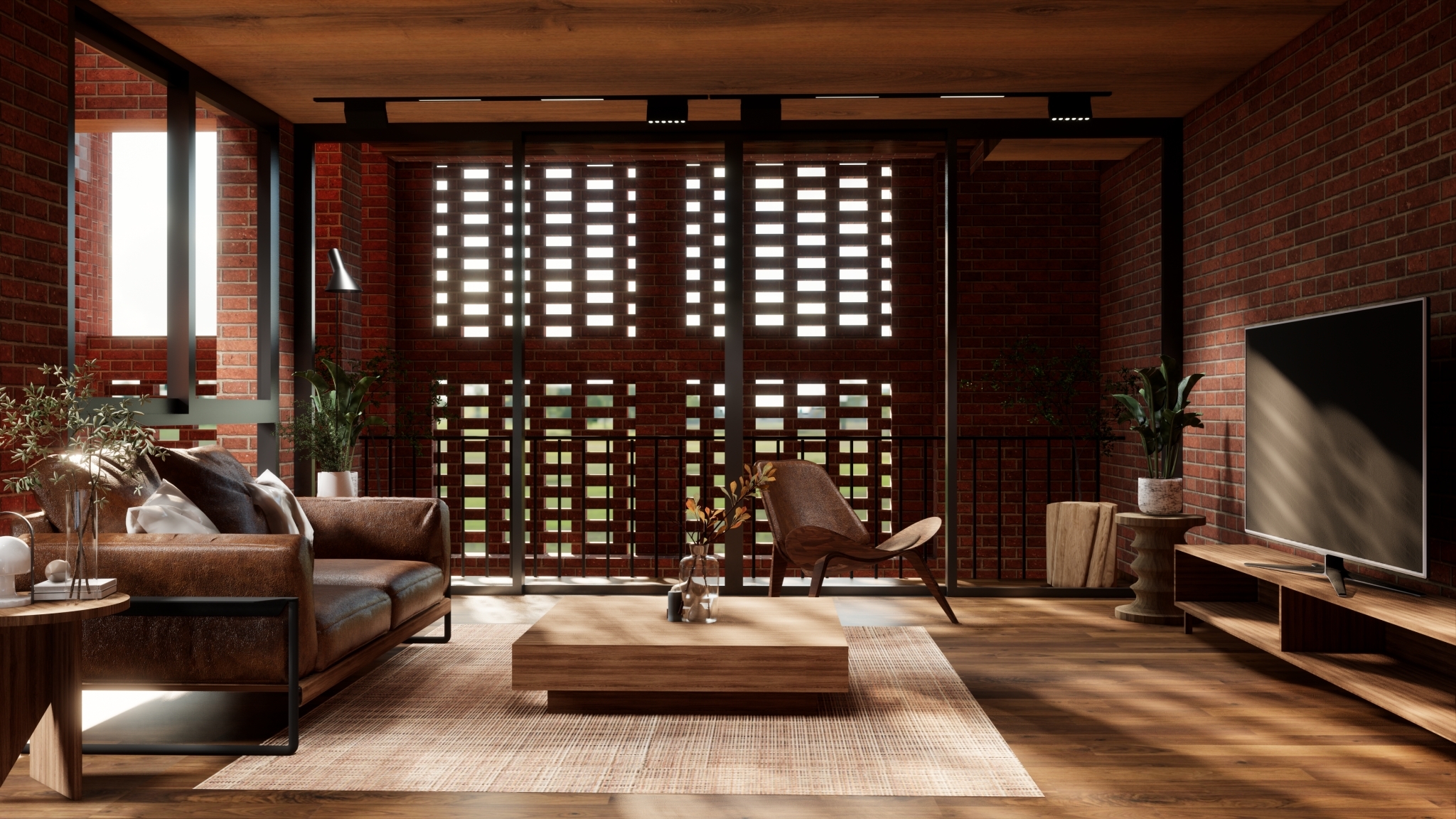
“In fact, we’re working on another one, too. I believe bricks release the heat faster. We’re working on a house project called “Baan Yoo Yen”. It’s built entirely of bricks. The wind blows through it, keeping the interiors nice and coo. It benefits from traditional beliefs about Tropical design. By creating indoor thermal comfort, we can rely less on air conditioning.”
Studio Miti Padirmkiat Sukkan
Baan Yoo Yen / Courtesy of Studio Miti

“Every piece of work has its distinct character. It’s a quality of being aesthetically pleasing that lies deeper than traditional beliefs per se, even deeper than knowledge of a Tropical climate. I’m referring to an understanding of human nature, and knowledge about the circumstances around a worksite. They are the mystery we’re trying to unravel, leading to further development.”


Q: Tell us about the Goal of Studio Miti, or the object of your ambition.

A: “As for the goal of Studio Mini in ten years from now, I want to provide an idea foundation for younger members on the team today. I believe we have the capacity to develop further.

“There’s still a lot to learn. There’s more to it than design in and of itself. It may involve understanding the context that forms the setting of a place, be it socially or economically. There are lessons to learn going forward. The transmission of knowhow from us to younger members on the team is important. We want to provide the tool they can take with them.”

Studio Miti Padirmkiat Sukkan
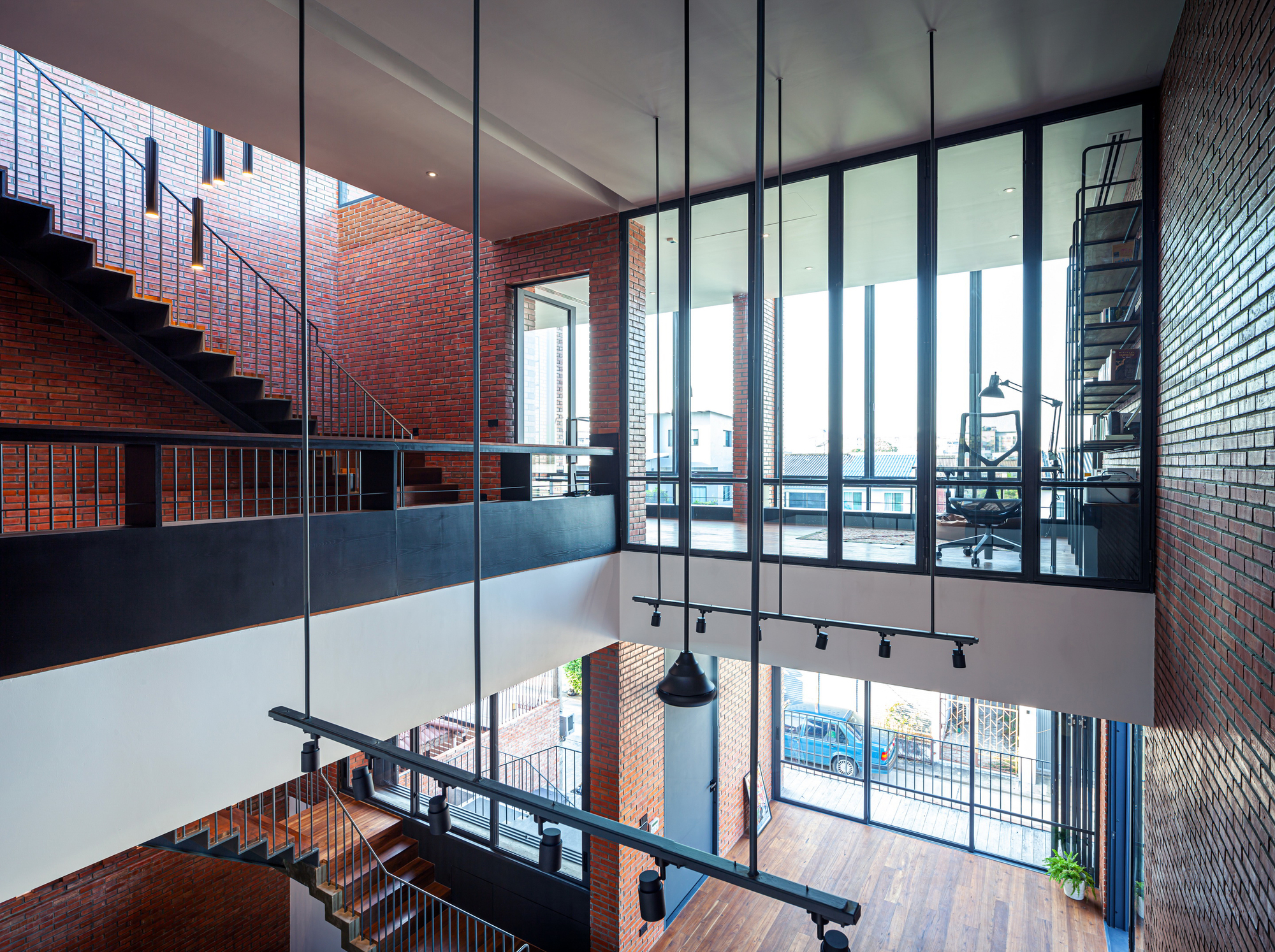
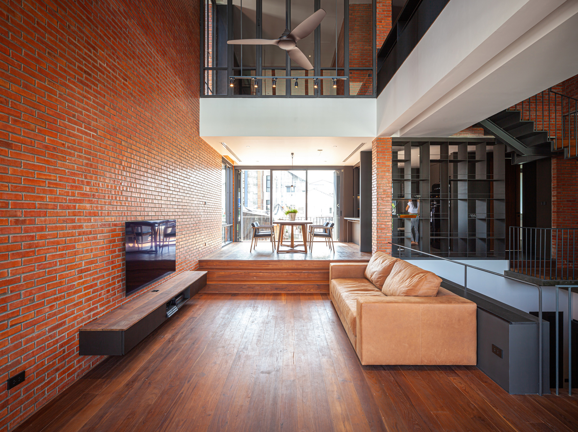
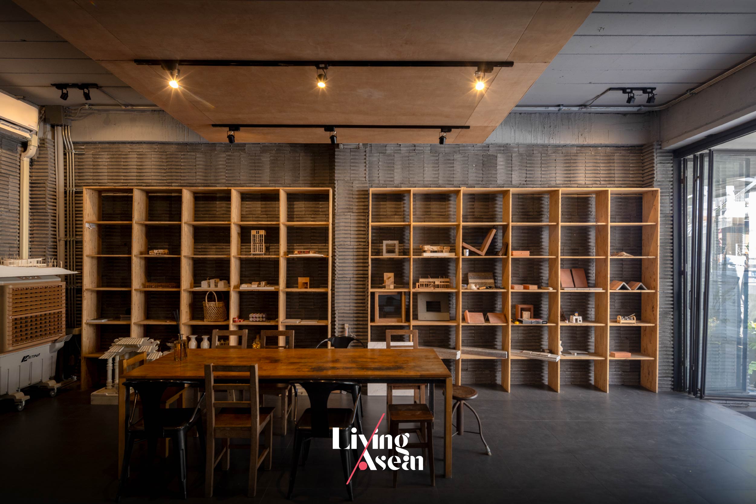
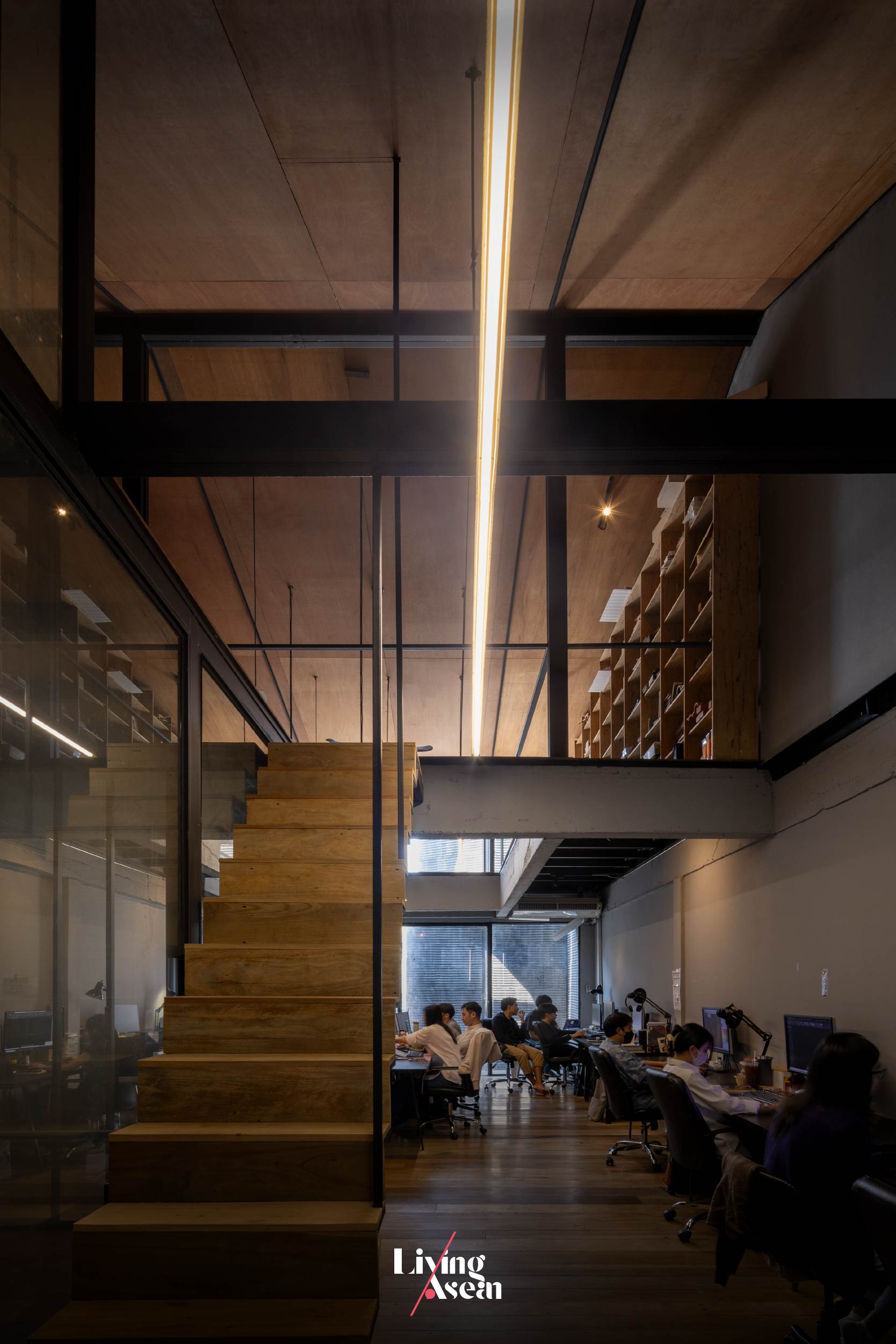
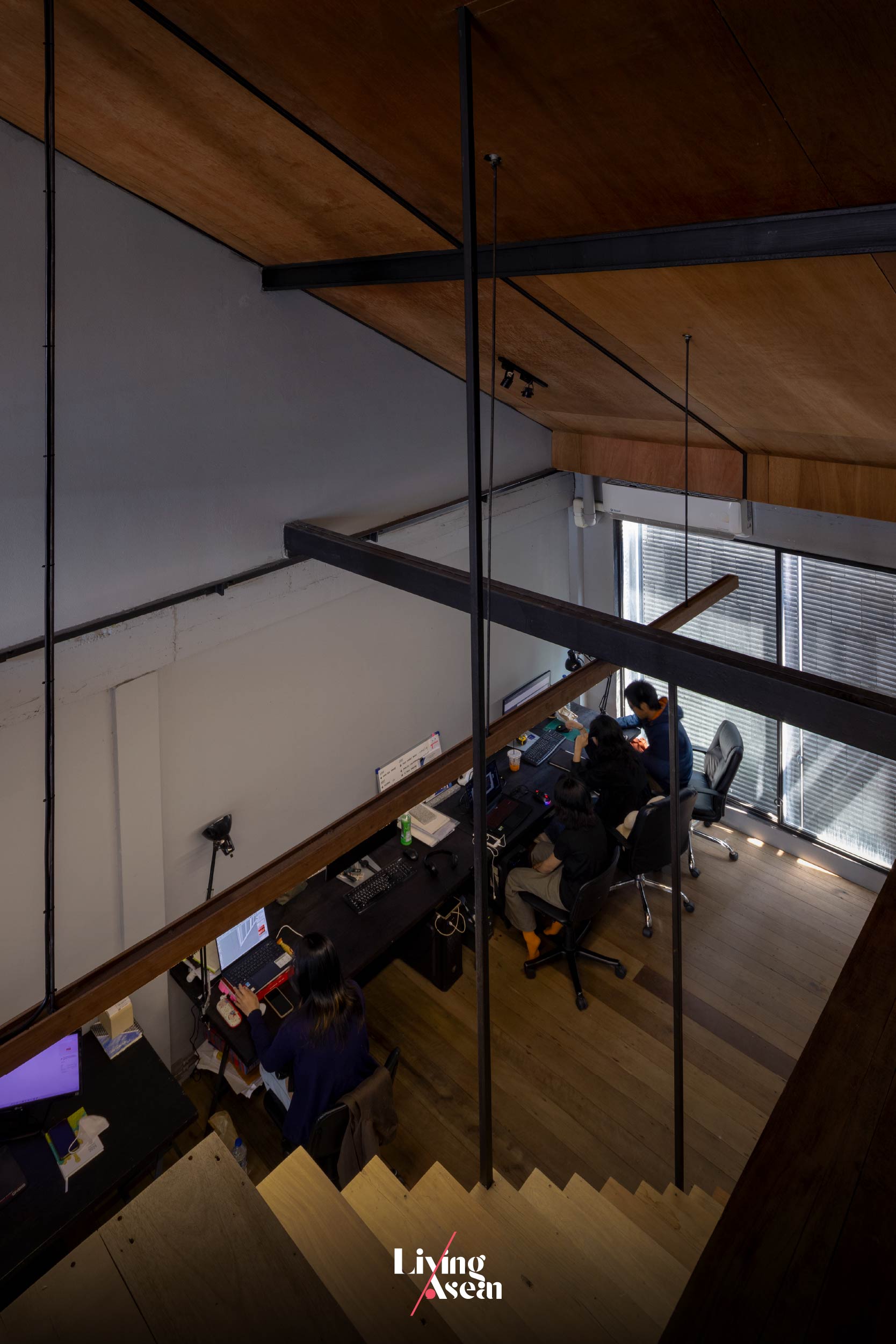
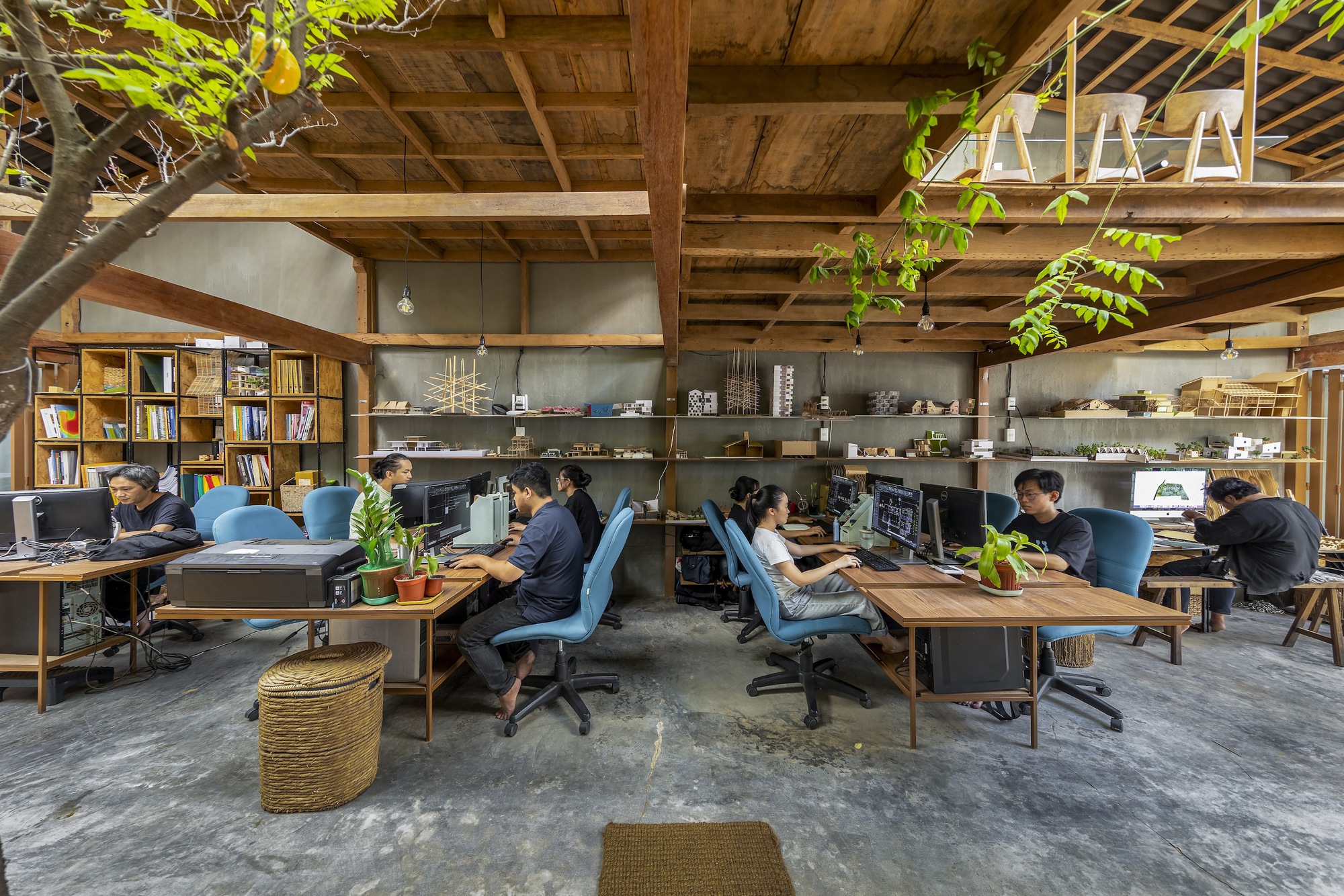
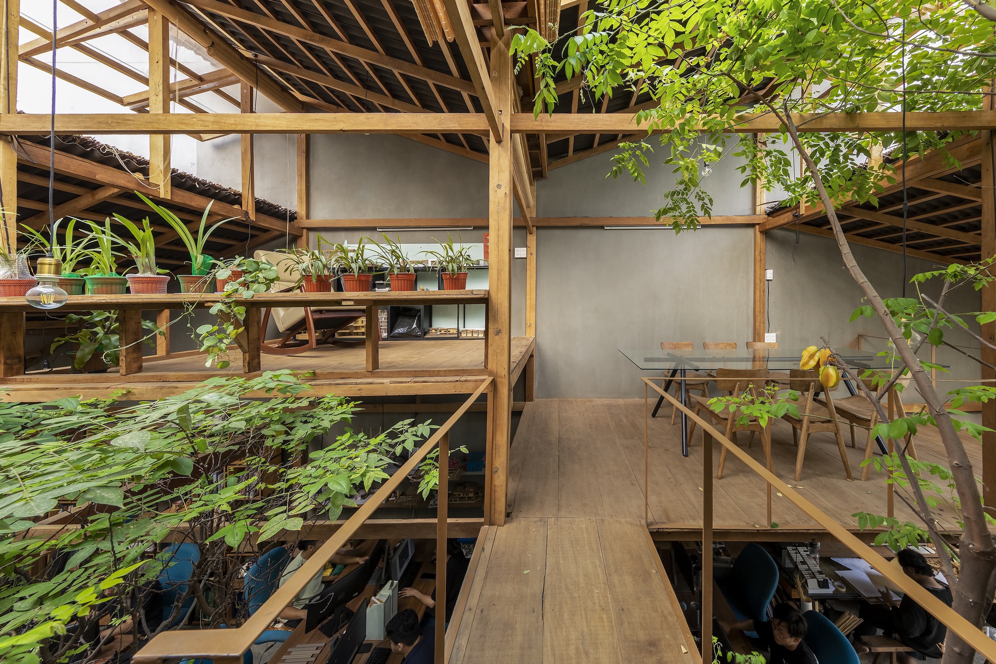
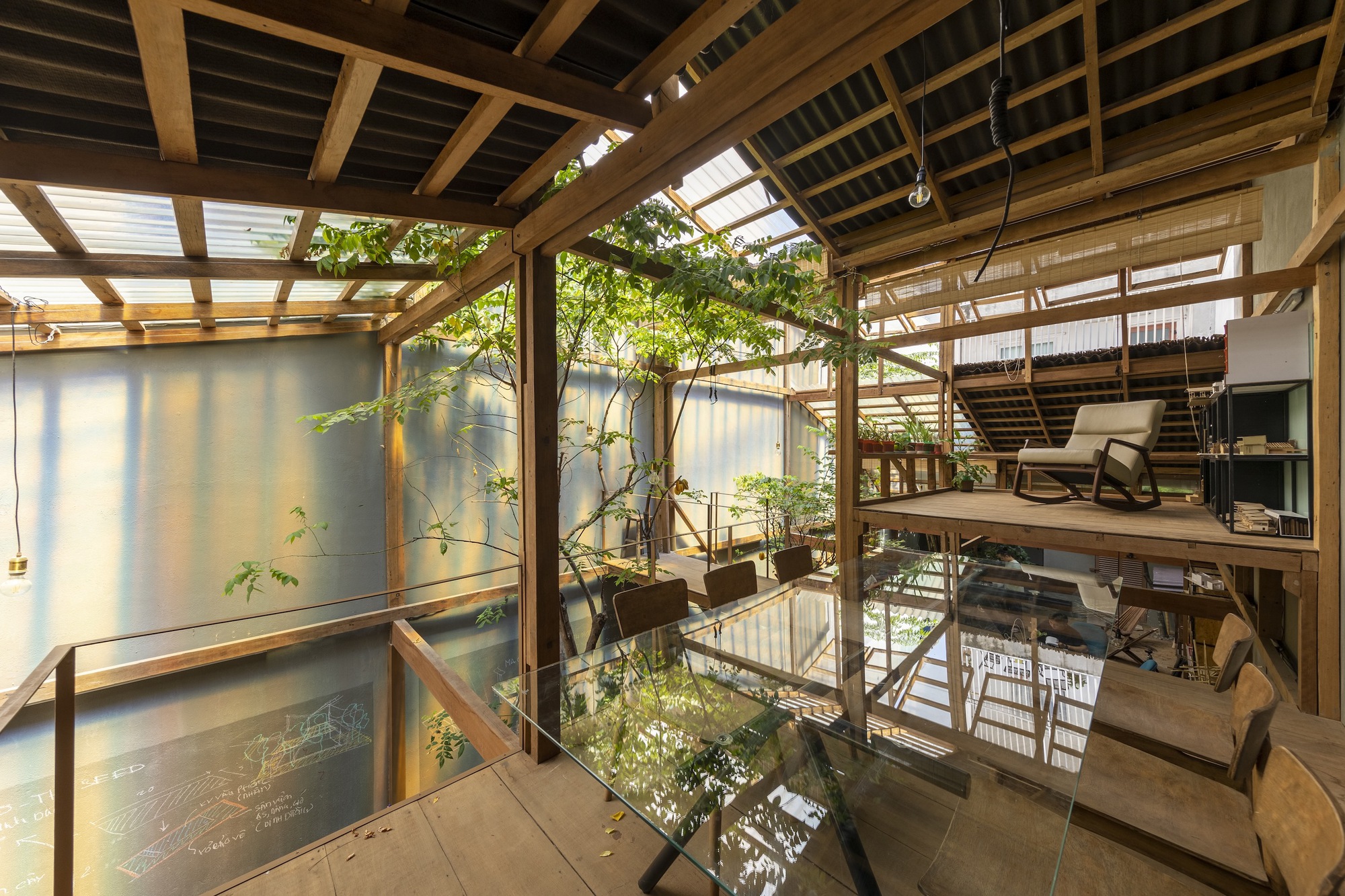
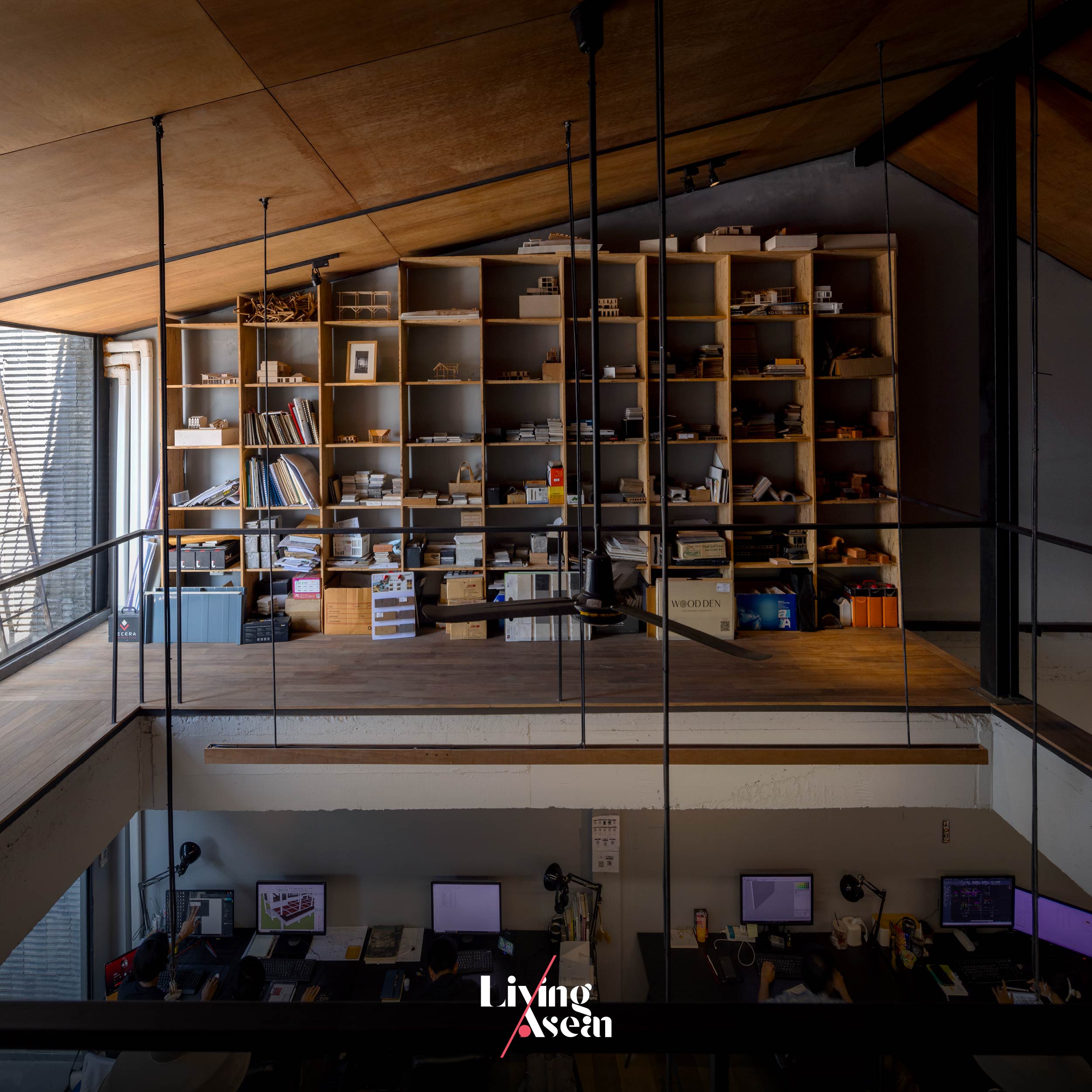
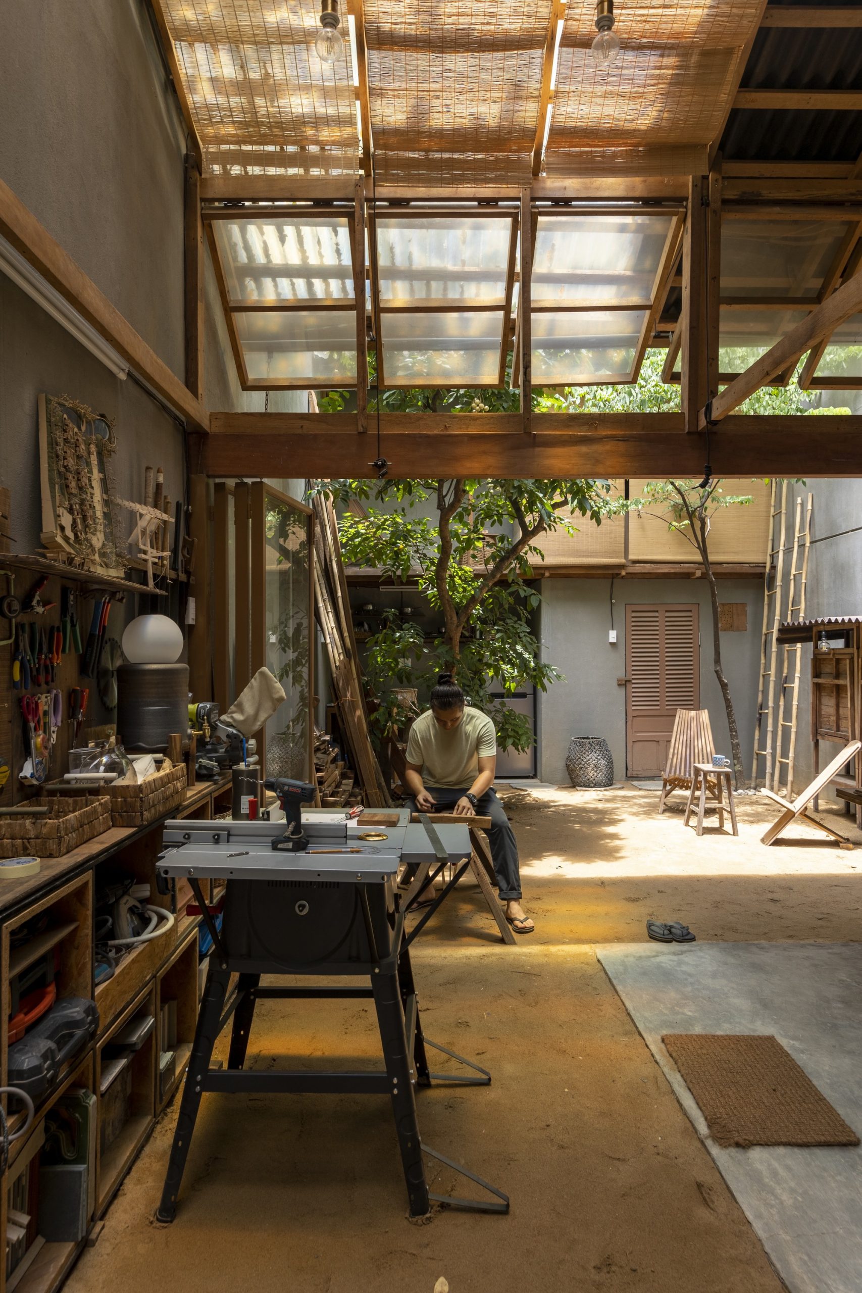
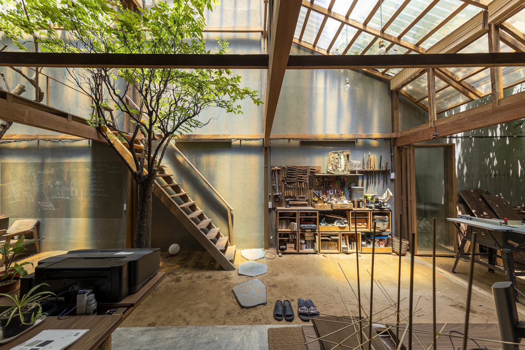
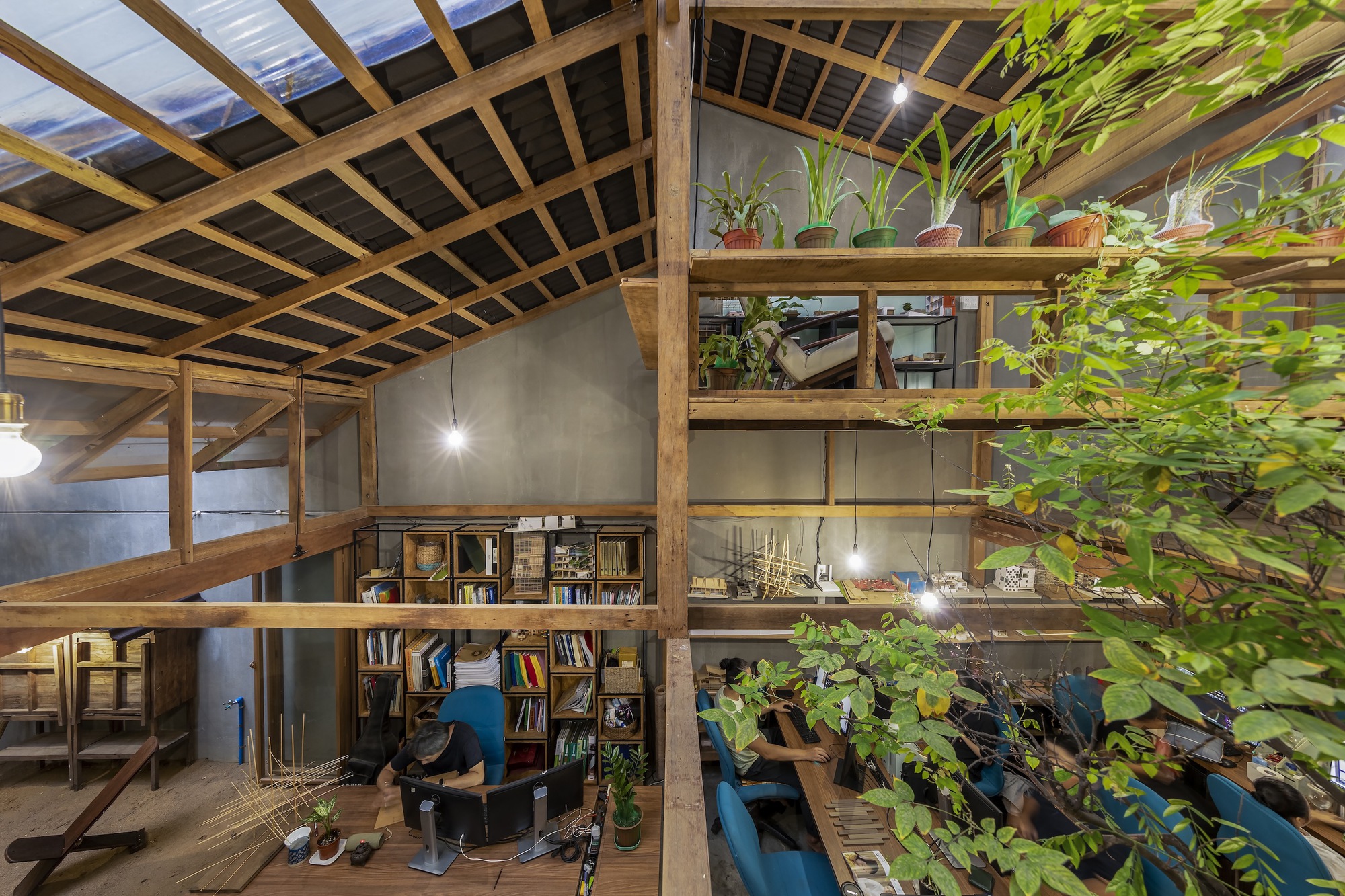
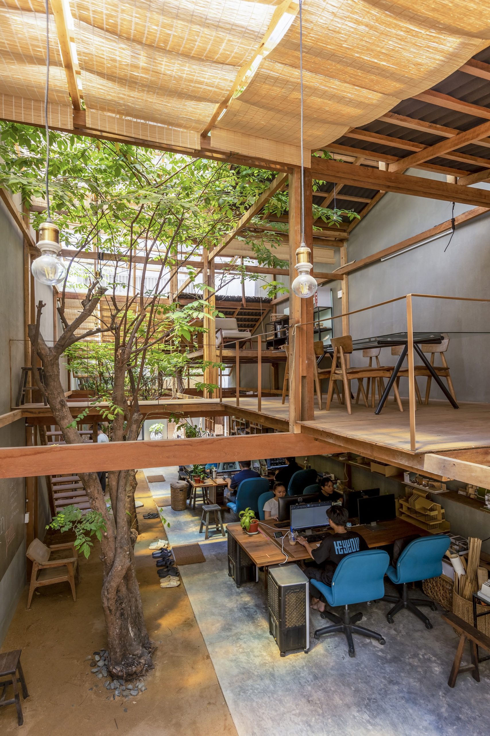
High ceilinged workspace inside Studio Miti’s new office is well-lit by natural daylight. Among others, the redesigned building facade can open and shut as needed to provide privacy and freedom from external disturbances, making it easy to stay focused on the task at hand.

“If I get lucky, we will move forward together. If I get luckier, they may move on to their future undertakings, where they continue to grow in their line of work. But everyone must have the basic knowledge to begin with, knowledge about the climate prevailing in Thailand, knowledge about the context that forms the setting of a place.

“It’s something that’s more than meets the eye. That’s the basics that will help them grow and mature and, at the same time, give us the old guards at Studio Miti the impetus to grow and develop as well.”
“I believe the future of our office isn’t up to me alone. Rather, it comes from younger members on the team who must understand this, and work together toward a common goal.”


Visit “Studio Visit” Content on Facebook…


You may also like…
Ray Chang, Soar Design Studio: A Life Inspired by the Spirit of the East, the Beauties of Nature and Traces of Time
Supawut BoonmahathanakornSupawut Boonmahathanakorn, Jai Baan Studio: Striking a Balance between Human Needs and Nature Conservation through Thoughtful Environmental Design

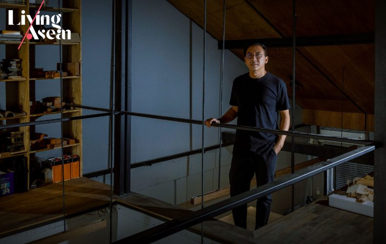
Studio Miti Office: A Townhouse Tastefully Renovated as Design Studio Showcasing Material Savvy

Studio Miti Office: A Townhouse Tastefully Renovated as Design Studio Showcasing Material Savvy

/ Bangkok, Thailand /

/ Story: Kor Lordkam / English version: Bob Pitakwong /

/ Photographs: Nantiya, Weerawat Sonriang /

It all started with a 30-year-old, three-story townhouse and a company of architects Studio Miti in need of a new home. Like a fortunate stroke of serendipity, they found exactly what they had been searching for, a building with a wide, six-meter frontage abutting the street, an architectural quality attribute that gave it a decided plus.

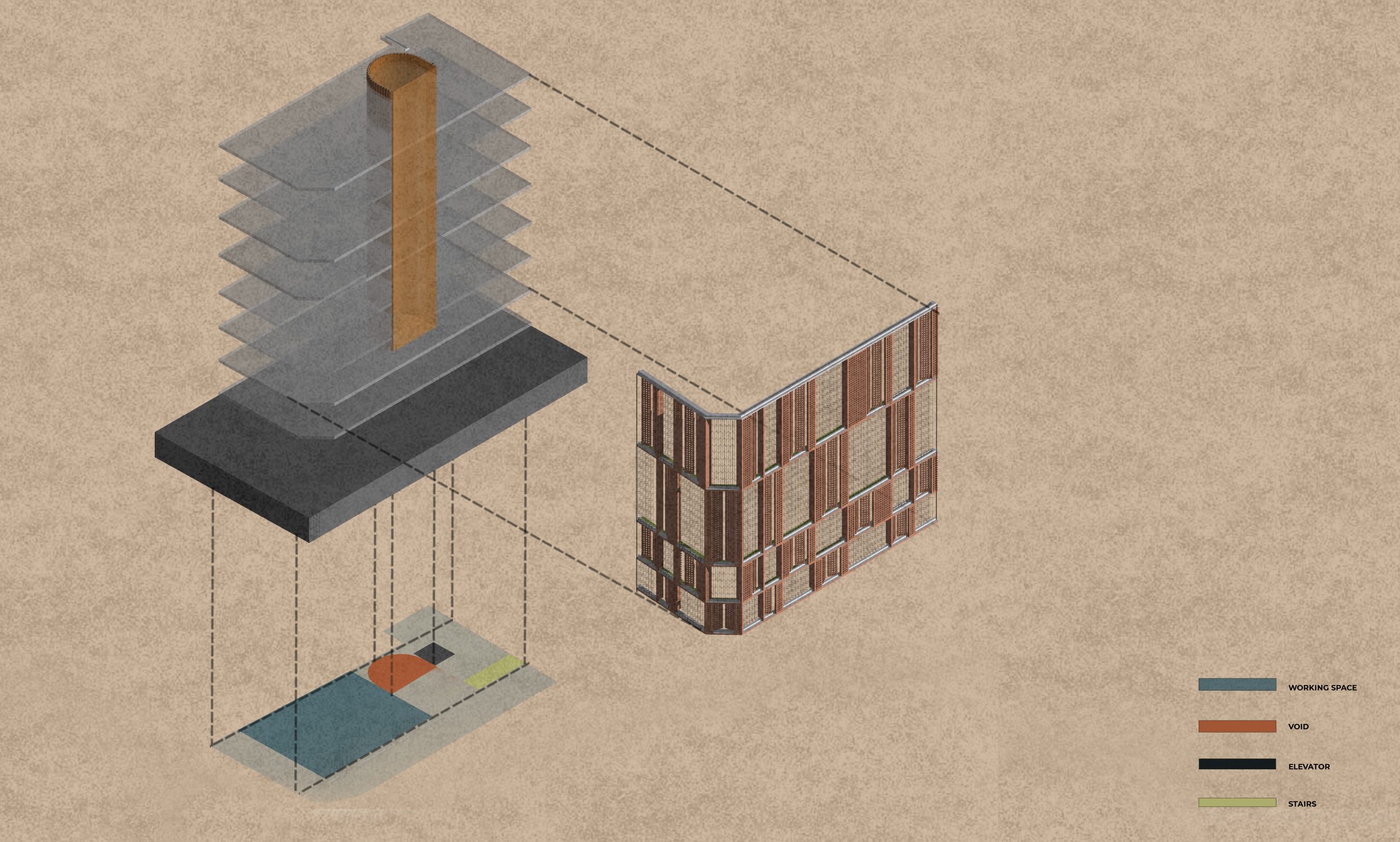
The new building facade consisting of lightweight concrete blocks in slate gray is built of a framework of iron securely anchored to the original supporting structure of concrete masonry construction. The building’s principal face can open and shut as needed to regulate the amounts of natural daylight and fresh outdoor air streaming into the rooms. More than anything else, it’s design that meets engineering standard requirements and specifications for safety and durability.

Needless to say, it’s hard to find anything like it nowadays. More importantly, it’s located in an easily accessible community area with a variety of amenities, eating places and businesses serving surrounding populations.

Studio Miti management obviously saw the potential of it developing to future success. And that’s what gave them the inspiration going forward. They set off without delay to breathe new life into the old townhouse, transforming it into a modern design atelier that’s the home of the company’s finest 20-strong staff.

Their secrets lay in creating an exciting new external envelope covered with lightweight concrete materials. And the result of all this is a pleasing visual appearance unlike anything out there. Architecturally speaking, it’s an interesting amalgam of color, texture and the perception of shape and size that inspires admiration.

studio miti office bangkok

studio miti office bangkok
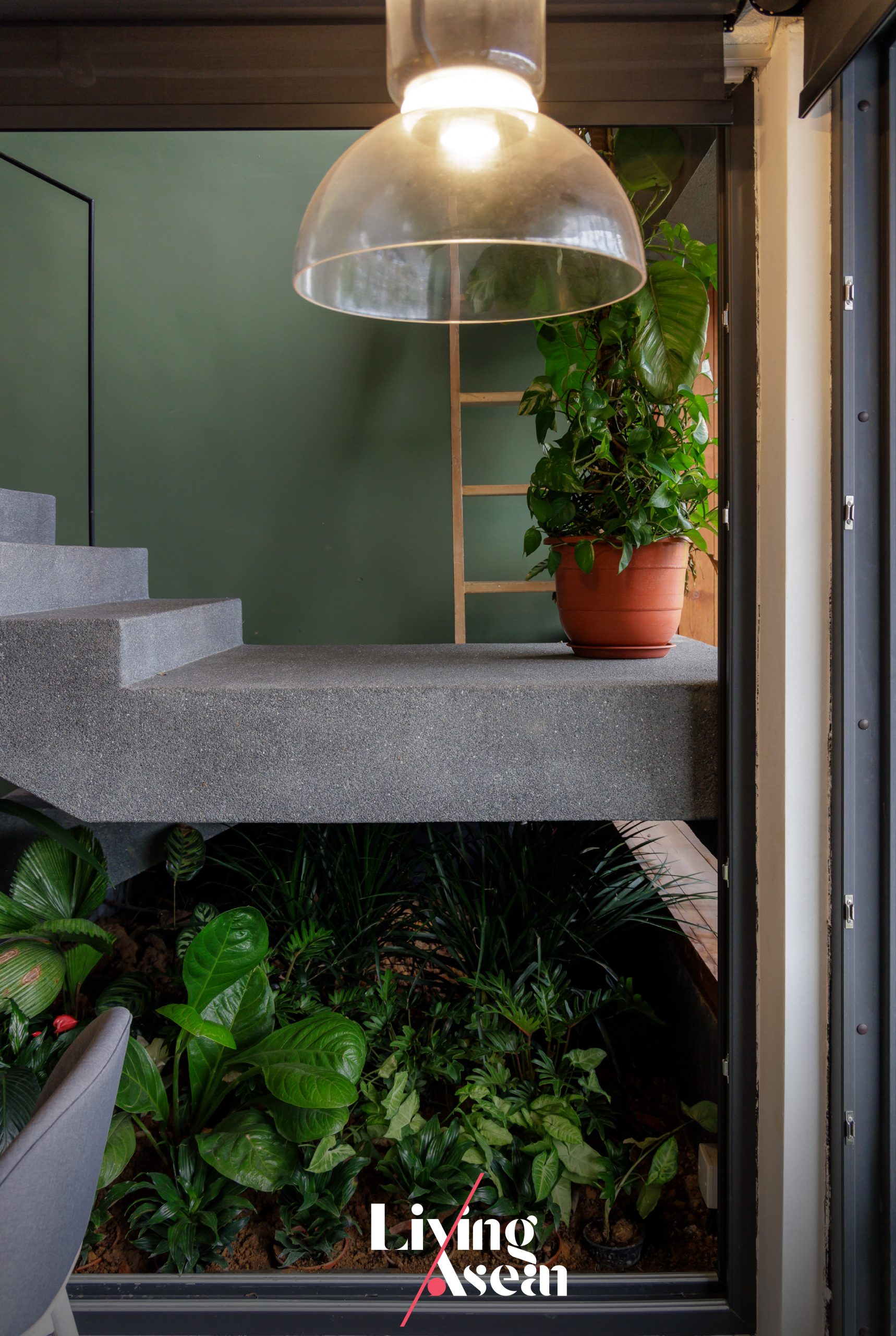
A set of wooden steps rises past a trough where leafy plants grow leading to the reception room on the ground floor.

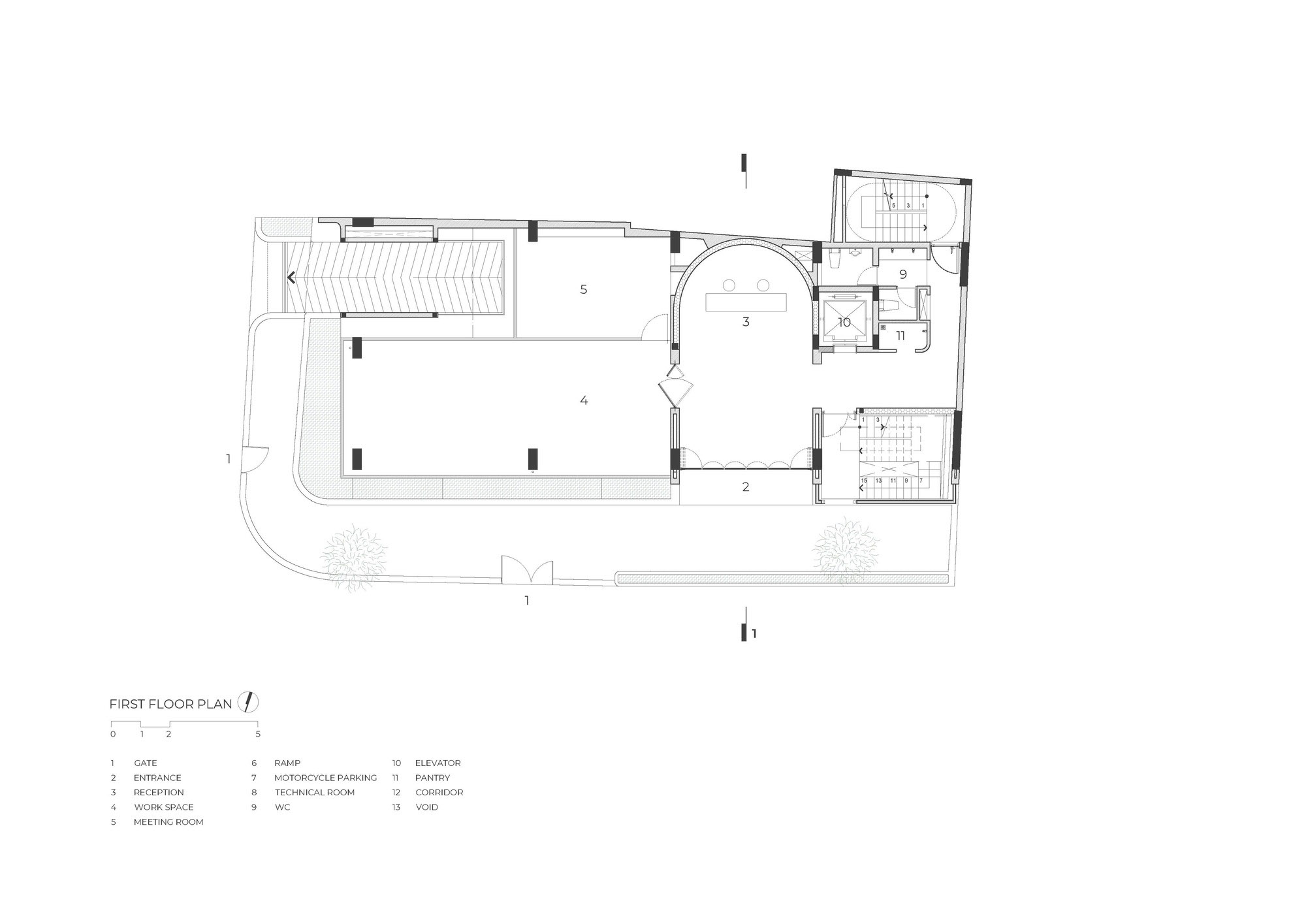
Ground floor interiors afford comfortable workspaces designed to boost productivity, with communal facilities such as small meeting rooms and client reception areas neatly arranged throughout the building. There’s also a casual dining area with a kitchen and pantry, not to mention recreational spaces with a ping-pong table and quiet nooks to chill out.

Taken as a whole, it’s design that speaks volumes for the company’s operating principles — investing in a conducive work environment so as to reduce stress and improve concentration. Likewise, it makes perfect sense to ensure its design team can stay focused on the task at hand.

studio miti office bangkok
The corridor is separated from a meeting room on the ground floor by a folding glass door system, a clever tool that defines boundaries in a way that’s easy to understand.

studio miti office bangkok

With the folding glass door system stowed away, the ground floor serving multiple functions as a meeting room, storage room and recreational area instantly transforms into one big open space.

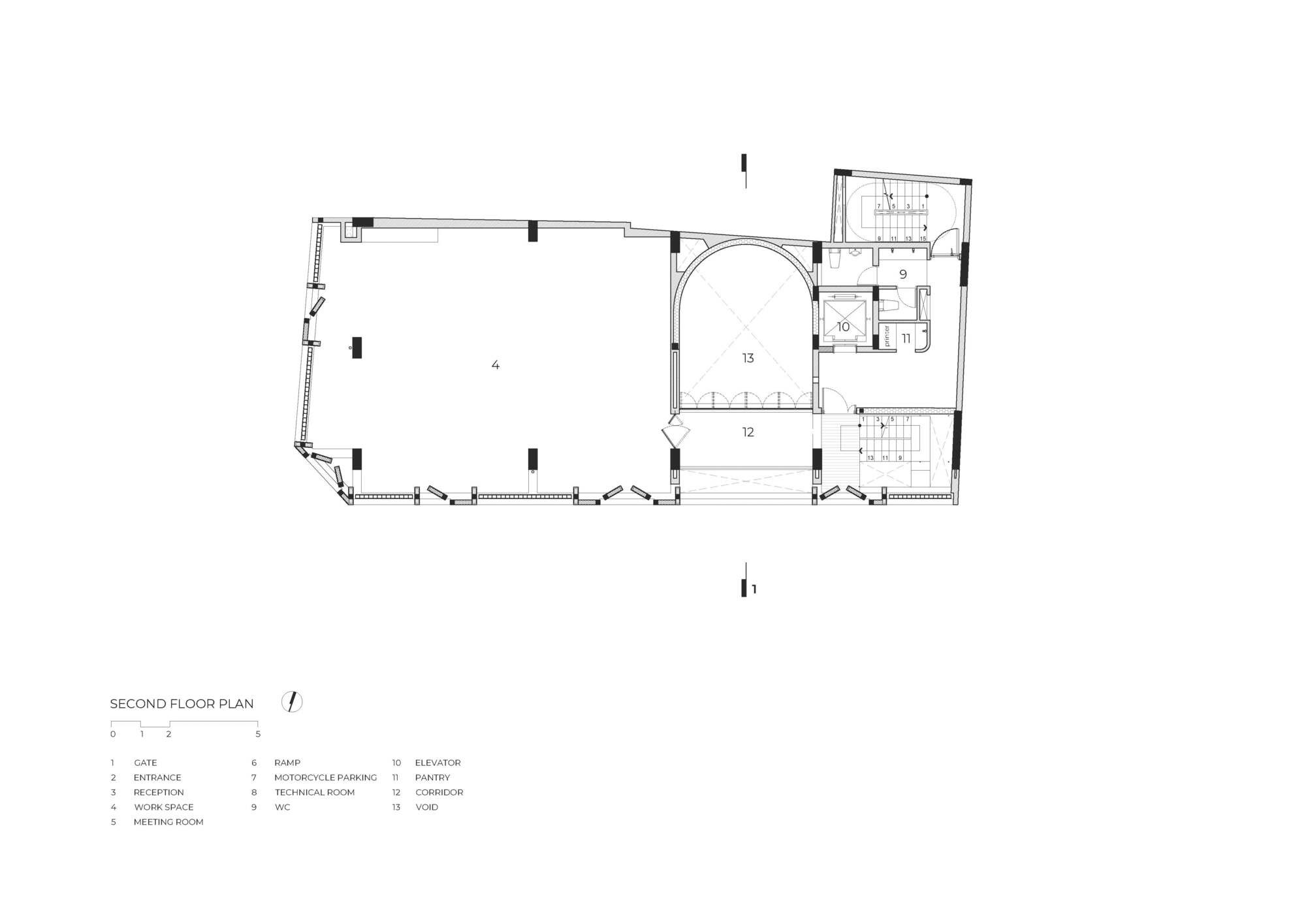
Climb a flight of stairs, and you come to the main meeting room reserved for formal meetings or when work needs total concentration. There’s a customer reception area nearby that makes a great first impression, with facilities for online video conferencing, a dining room and areas used for recreation.

Different from what’s usual is the building façade that can open and shut as needed to regulate the amounts of natural light during the daytime or admit fresh outdoor air into the room in the late afternoon, a clever hack to save big on energy bills.

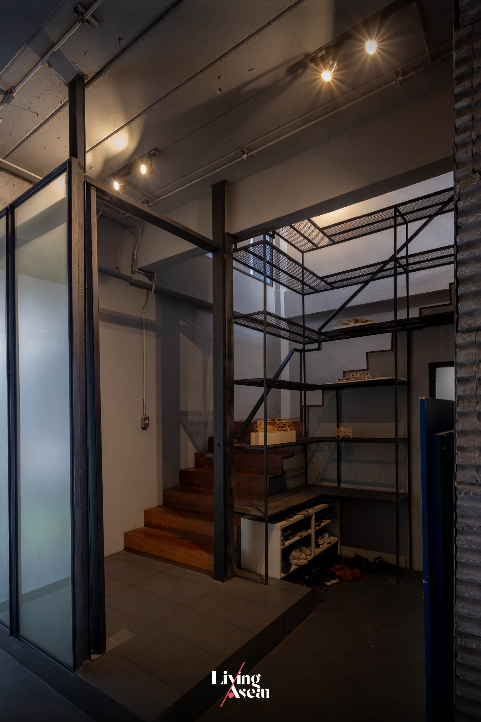
The stairway leading to workspaces on the upper floors remained where the old, tired looking stairs had been prior to renovation, only slightly altered to give it a look that belongs to the present.

studio miti office bangkok
A glass-wall and sliding-door system provides visual continuity from inside the room to the balcony hemmed in by the front façade that can open and shut as needed for privacy, light and fresh air.

studio miti office bangkok
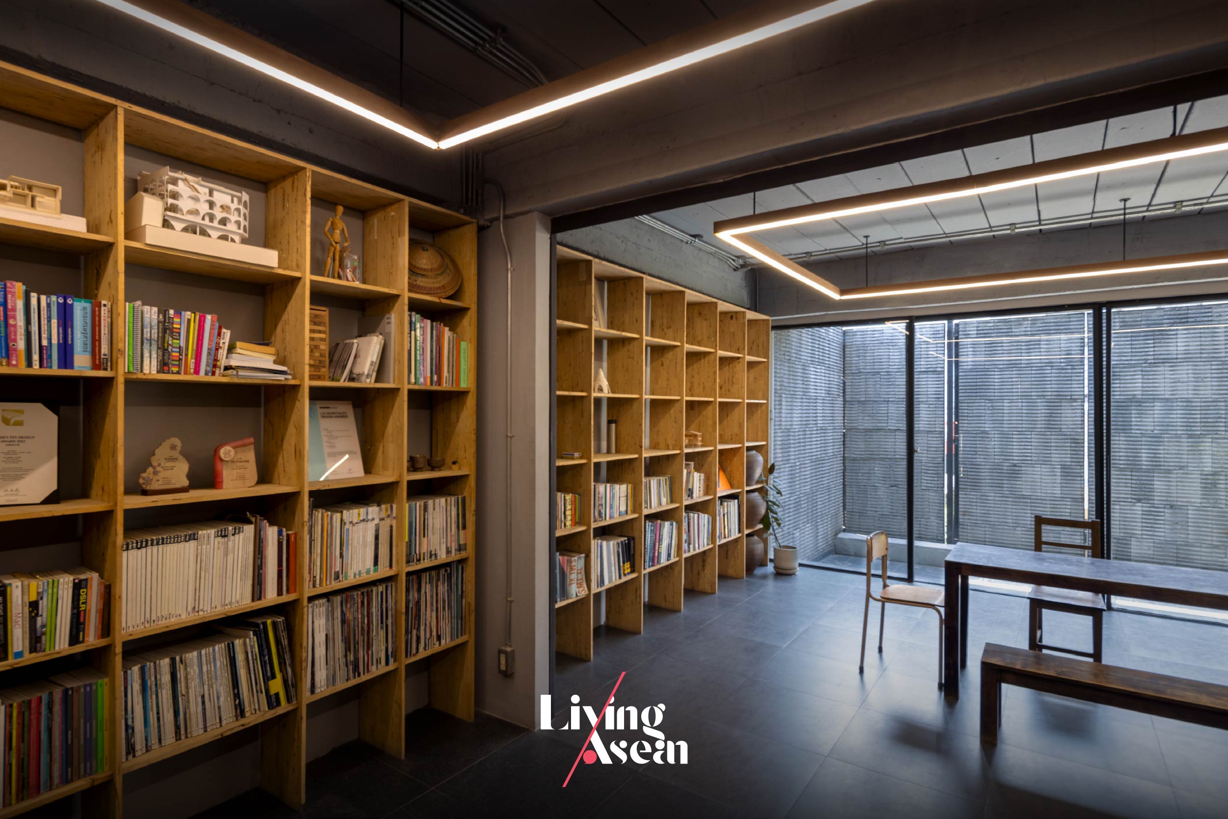
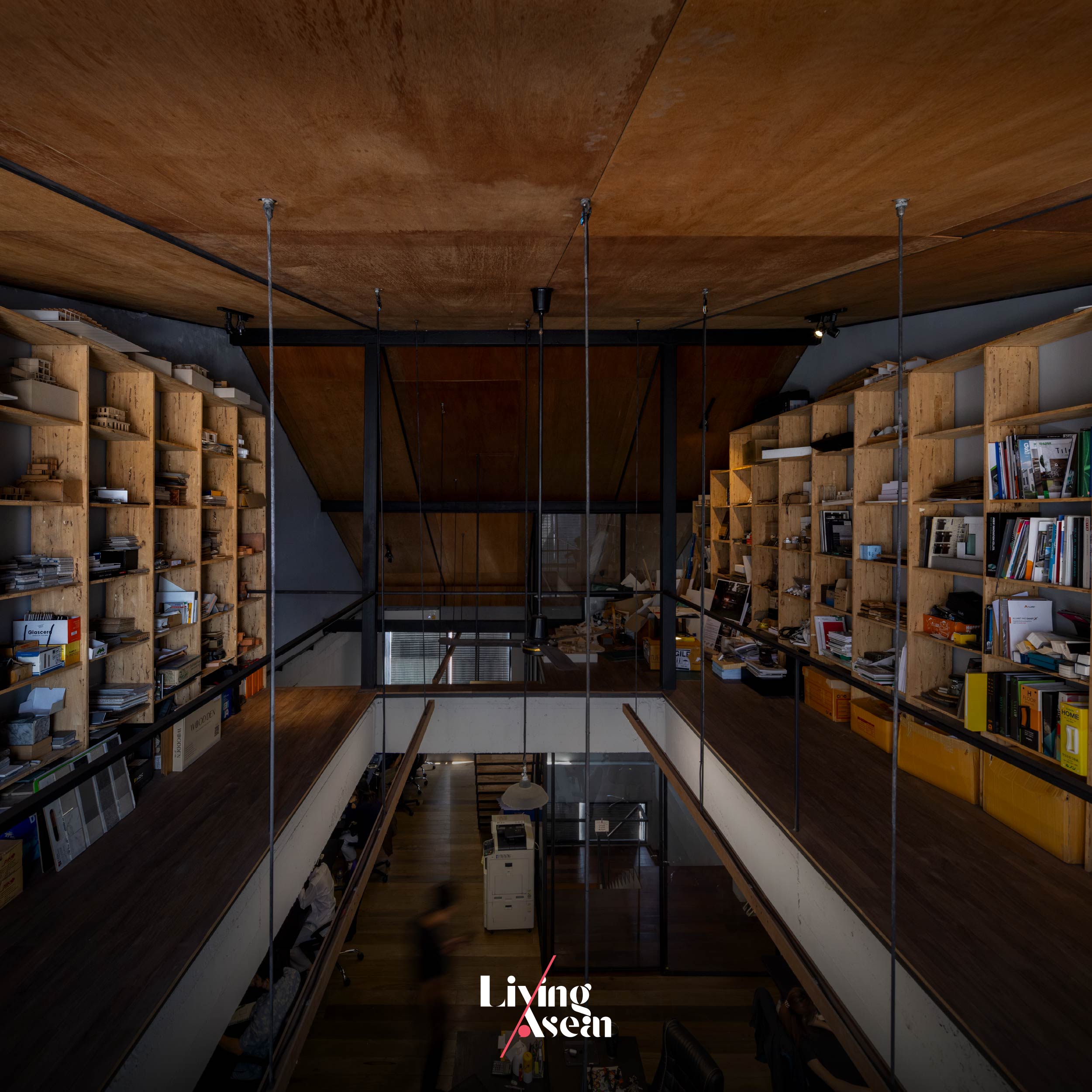
Wooden bookshelves of a modular nature are the epitome of imagination and resourcefulness. They stand ready to be taken apart and reassembled elsewhere if needs be.

studio miti office bangkok

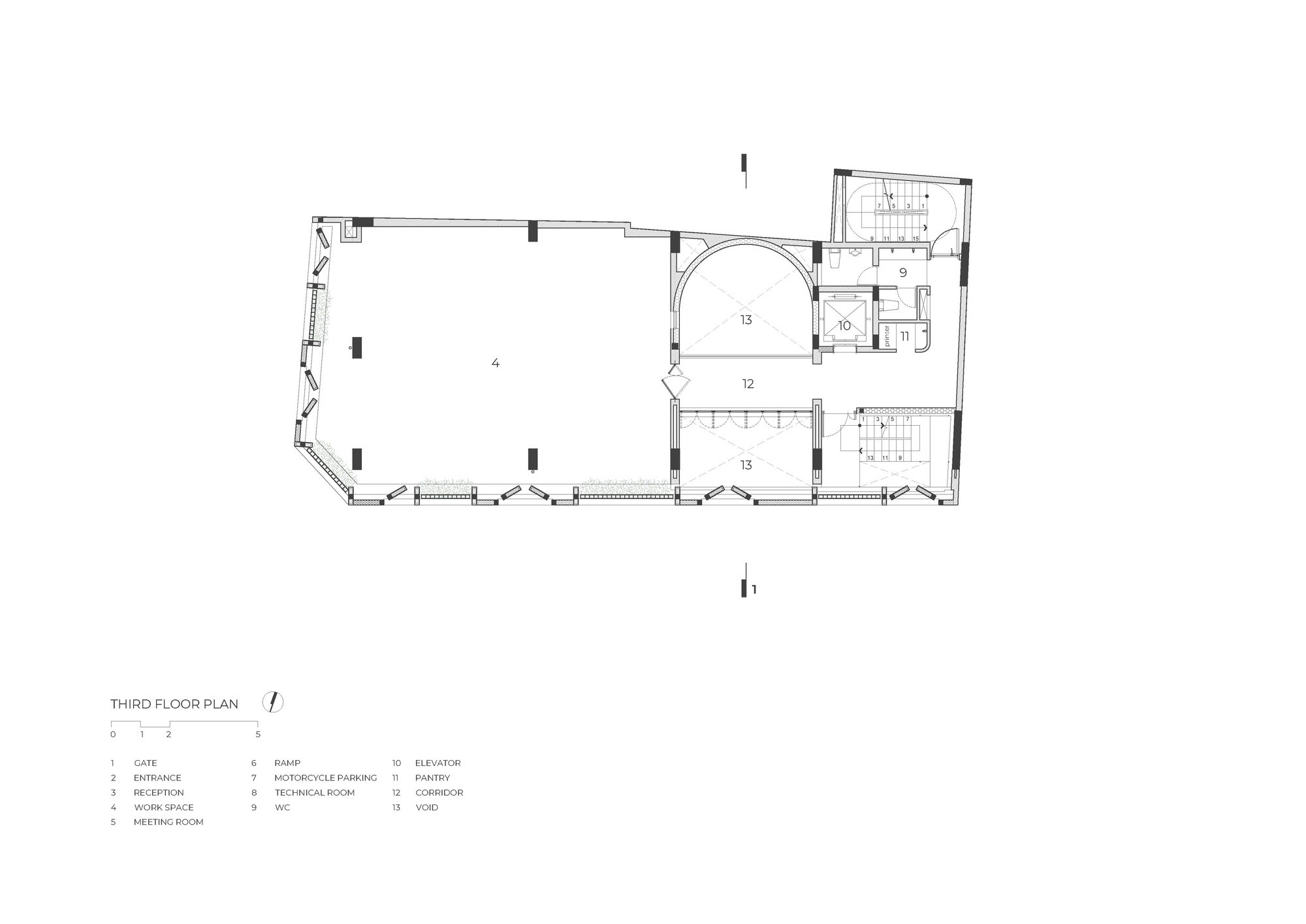
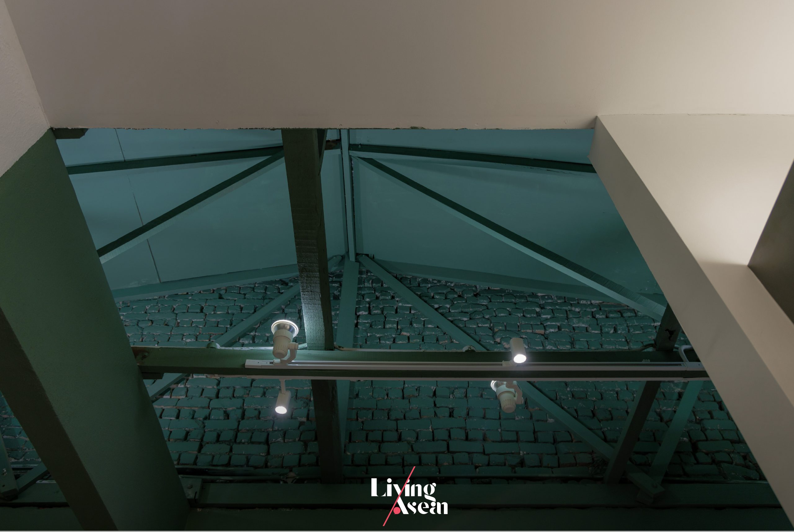
The third floor holds ample workspaces with a mezzanine just below the high-pitch roof. Together they boast the comfort of a high-ceilinged room made light and airy by design. For lack of a better word, it’s the pride and joy of some 20 staff members working here as a team.

Of all parts of the building, the roof received the most extensive renovation. To get where they wanted to be, the architects had the old roof torn down to make room for a new high-pitch upper covering.

This gave the interiors much more space overhead, more natural light and aesthetic appeal. Plus, new ceilings built flush with the underside of the roof add real character to the room, while the mezzanine provides extra storage space just below the roof.

studio miti office bangkok
Third-floor workspaces are light and airy by design, thanks to high ceilings aligned with the underside of a new high-pitch roof. Plus, there’s plenty of ample space providing neat storage solutions on the mezzanine just below the roof.

All things considered, it’s about creating a workspace that bodes well for the good health of all members on the team, while inspiring productivity and job satisfaction. These qualities can only come from having access to a conducive work environment, the ability to stay focused on work and freedom from noise and distractions.

To achieve the desired results, all the workspaces and functional areas are warmly cocooned inside a solid external envelope made of lightweight concrete materials. Yet they feel connected to the elements of nature, thanks in part to large openings in the front façade that let natural light and fresh air stream into the rooms on the second and third floors.

studio miti office bangkok

An opening in the mezzanine reinforced by a steel I-beam system provides visual continuity from above and below.

Not only that, all the arrangements in place also allow the architects to experiment with exciting ideas and innovative materials never before seen, among them a new kind of lightweight concrete materials for wall construction.

The building exterior showcases the ridges and grooves in concrete blocks cut open and left exposed to the weather, thereby allowing time to leave its imprint.

In Studio Miti ‘s most recent experiment, they decided out of curiosity to split an ultralight concrete block in half, only to discover that it contained ridges and grooves on the inside creating light and shadows. They then proceeded with installing the ultralight blocks inside out, thereby showcasing the beauty of imperfections of materials on the building’s exteriors.

It’s sort of going in the opposite way of what usually happens.

The result is charm, good looks without embellishments or decoration of any kind, one that creates an interesting light and shadow play when touched by light. Plus, it’s a spectacular sight that changes with the time of day.

In the fewest possible words, it’s a renovation that conveys a great deal about Studio Miti ’s belief, which says that, first and foremost, it makes a lot of sense to be material savvy. Better yet, it’s prudent to investigate the material before using it. Why? Because knowledge of materials and how they perform in real situations is essential to creating architecture.

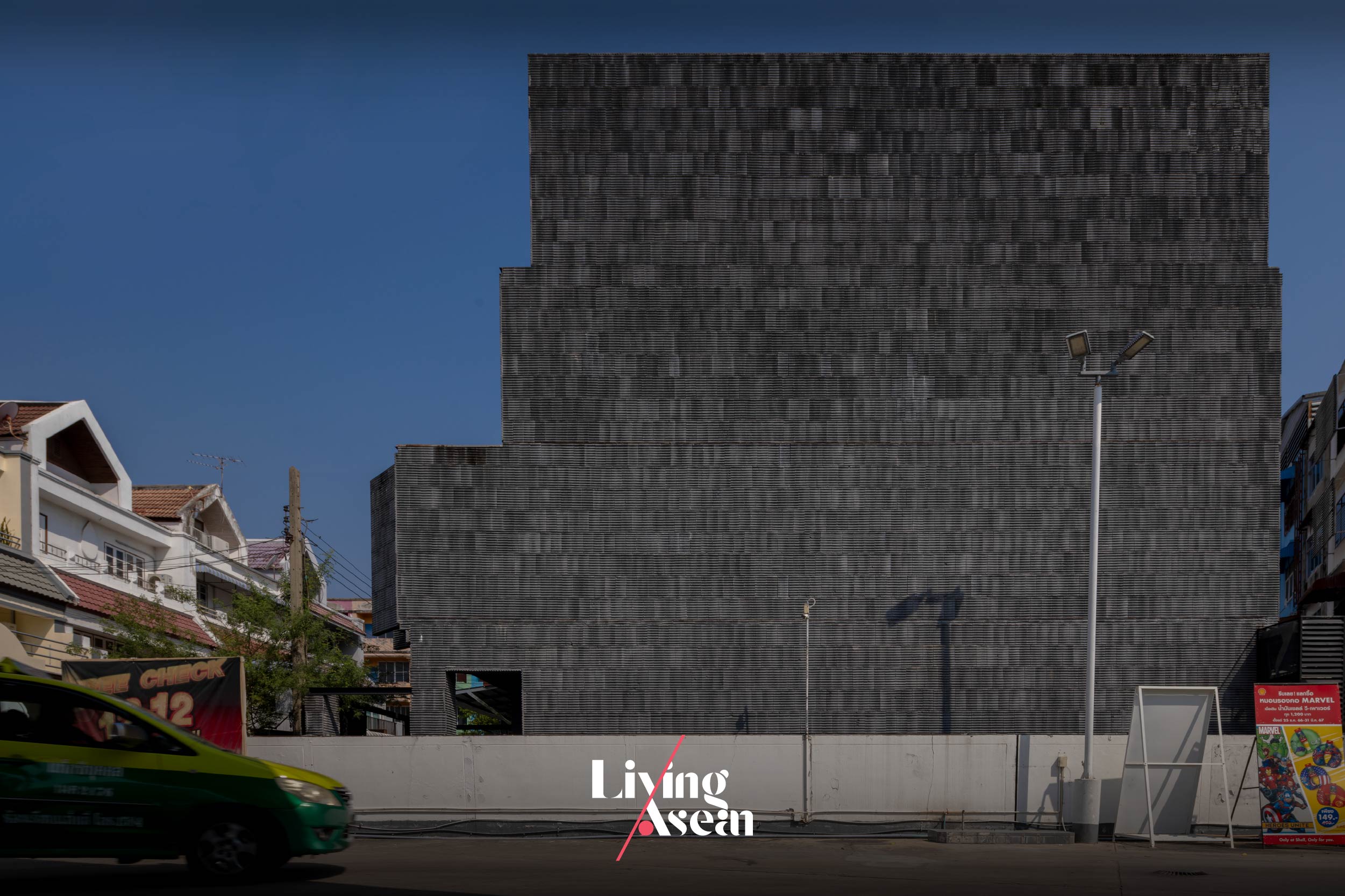
A side-elevation view of Studio Miti’s new home shows the exteriors adorned with lightweight blocks in slate gray, a feature that gives it distinctive character.

Studio Miti Bangkok
With the façade closed, the building looks perfectly solid, transforming Studio Miti’s new home into a piece of architecture in a class of itself.


Architect: Studio Miti (www.studiomiti.com)


You may also like…

Ngói Space: A Community Center in Vibrant Orange Graces a Suburb of Hanoi

Urban Farming Office: VTN Architects’ Office Gives Back Lush Greenery

MA Architects Office: Integrating Natural Features in Workspace Design

MA Architects Office: Integrating Natural Features in Workspace Design

/ Ho Chi Minh City, Vietnam /

/ Story: Kor Lordkam / English version: Bob Pitakwong /

/ Photographs: Paul Phan /

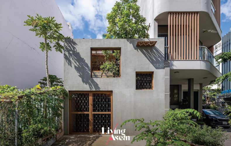
Overcrowding conditions in Ho Chi Minh City have given rise to both challenges and opportunities for the design team at MA Architects, a homegrown architectural practice in Vietnam. Back in the day, their office was on rental property with little to no room for flexibility. Albeit equipped with air conditioning and modern conveniences, the small workspace was lacking fresh air and ventilation, a far cry from the environment conducive to a relaxed atmosphere and creativity.

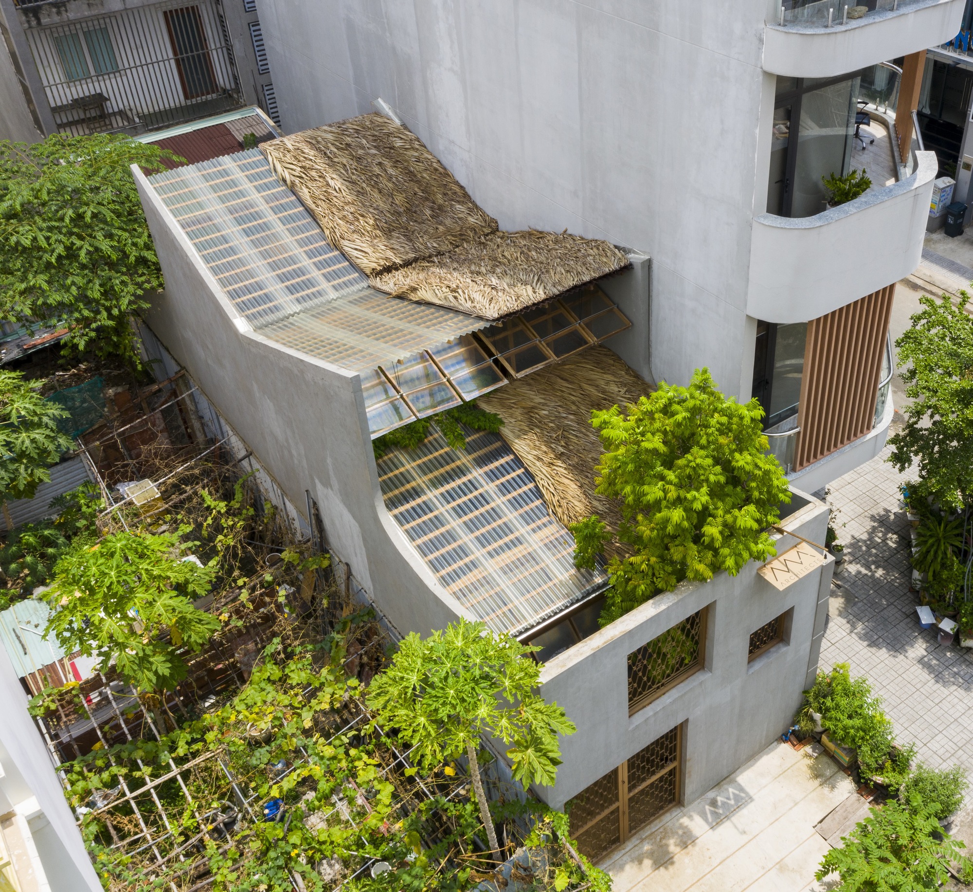
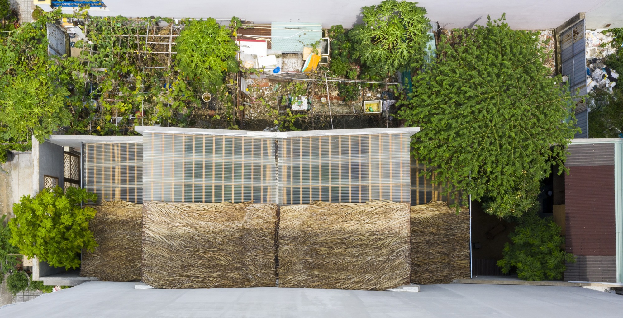
Coconut fiber coverings shield parts of the roof for best interior lighting and insulation.

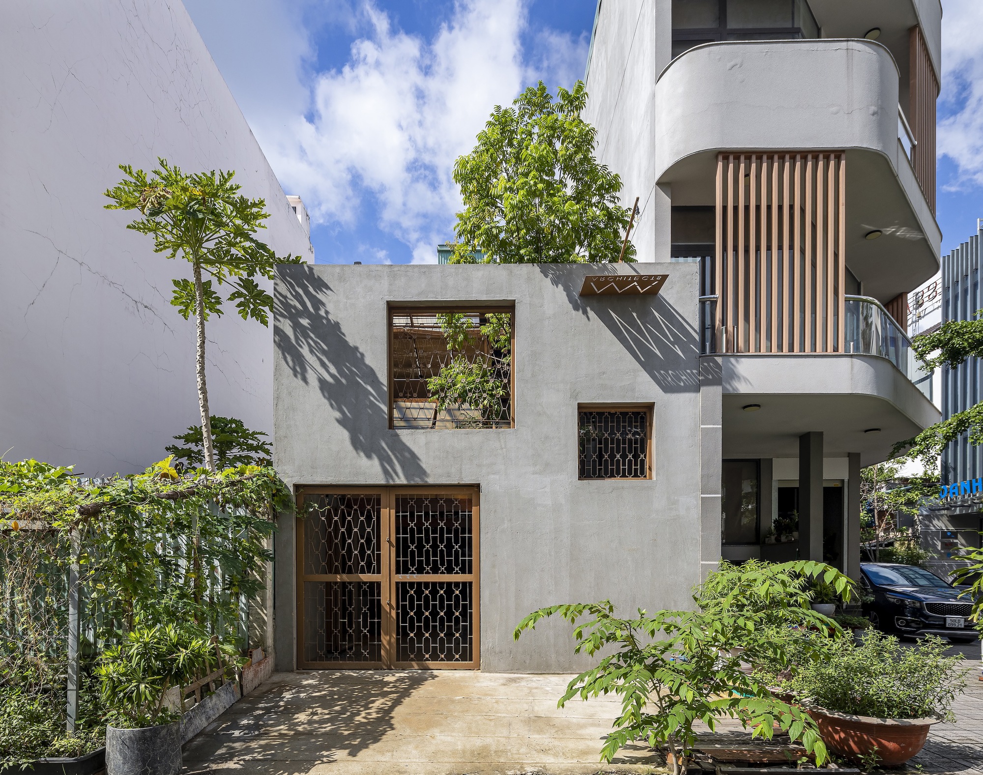
The front façade in cool-toned gray stands sandwiched between a vacant lot and a tall building on the street corner.

Because of that, they decided to break out of the confined space into a home of their own. The new office stands sandwiched between two properties, a tall building on one side and a vacant lot on the other. Its front yard landscape is infused with green foliage.

Thoughtfully devised, the design atelier with an awesome cool gray façade is open to plenty of sunlight and fresh outdoor air plus trees and shrubbery. And the result of all this: a workplace ambience free from disturbance, one that’s good for staff’s ability to create and stay focused on their tasks.

The hallway holds a reception room that’s light and airy.

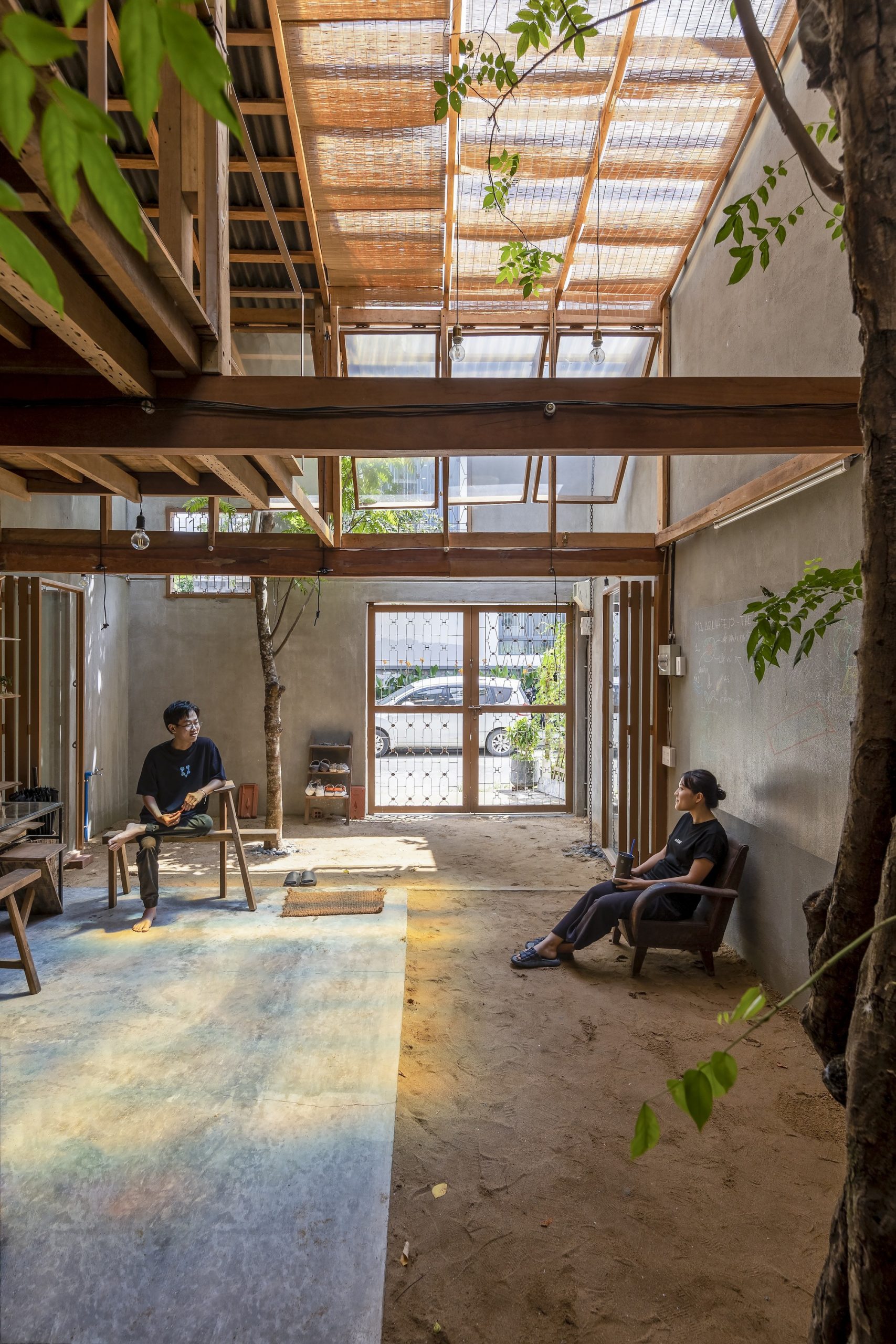
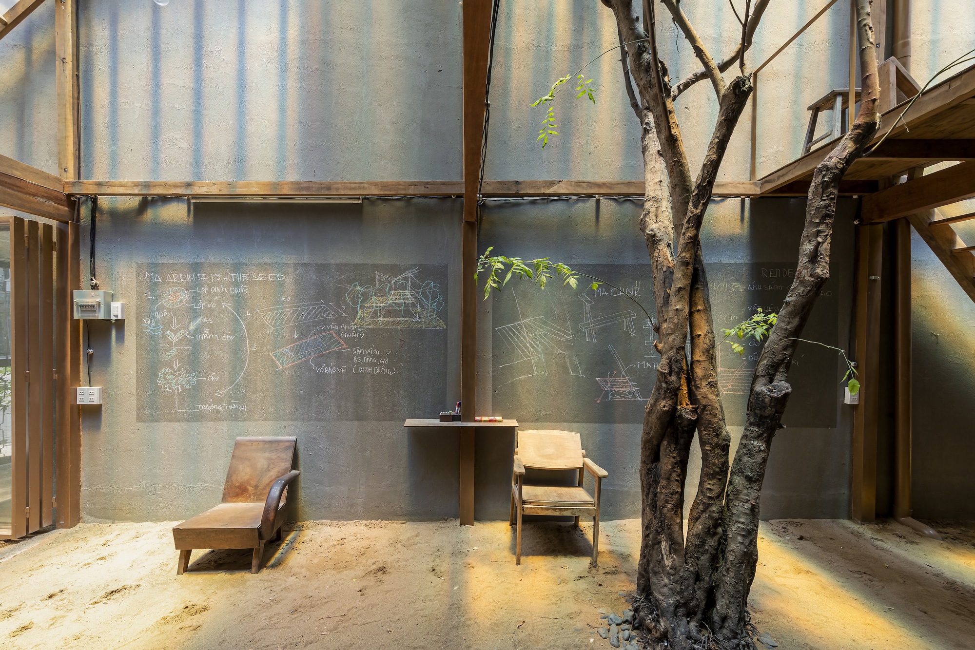
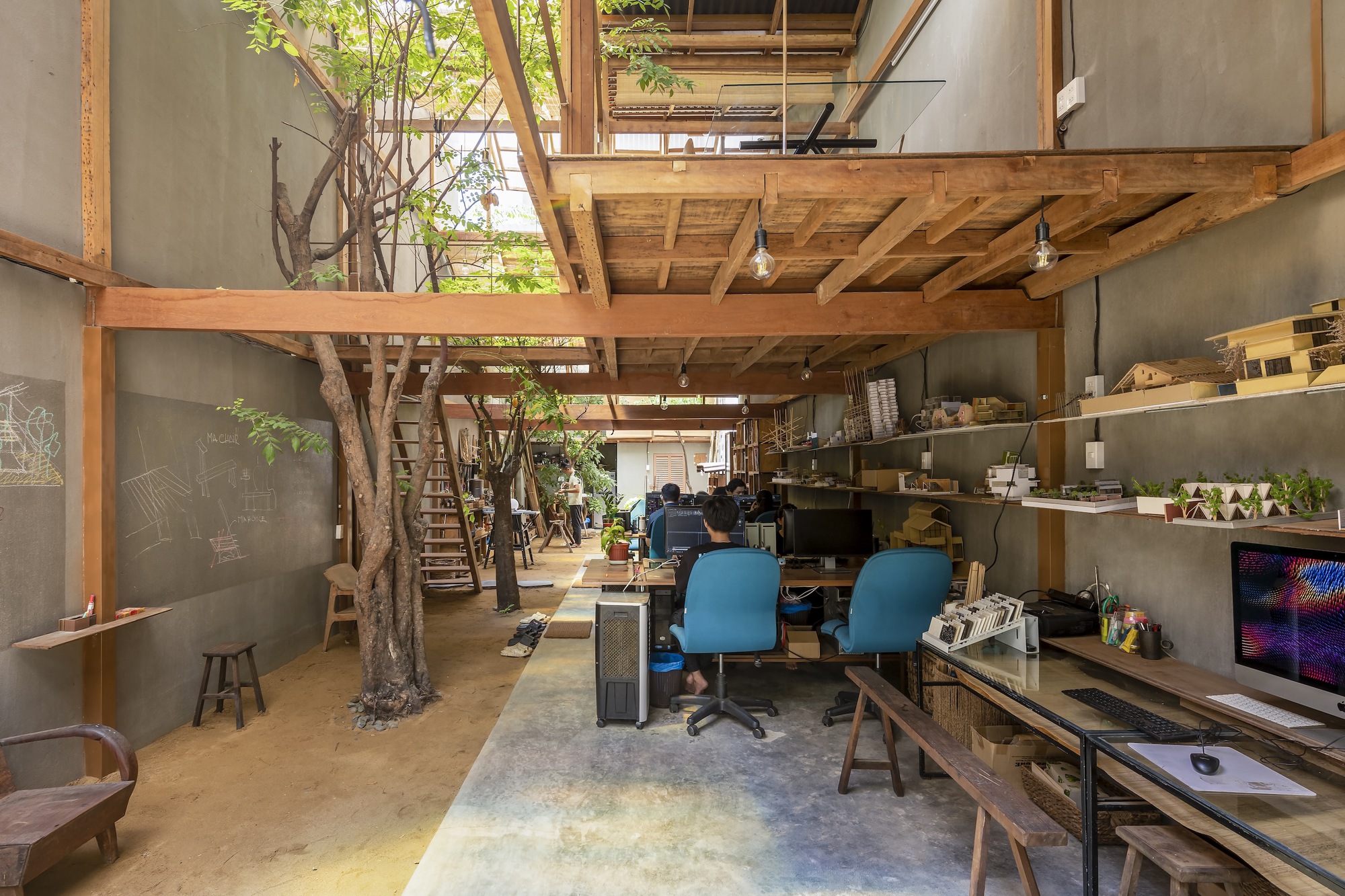
Bringing the outdoors inside, the office holds workspaces set on concrete slabs along one side and a strip of sand earth for in-ground gardening on the other.

The small, 100-square-meter office space is nestled in a peaceful city neighborhood. It occupies the full extent of a rectangular shaped lot measuring 5 by 20 meters.

The building has a narrow frontage to the street. Its external envelope is built of brick masonry plastered to form a smooth hard surface. In front of it, a small earthen terrace hemmed in by lush greenery provides a neat appearance.

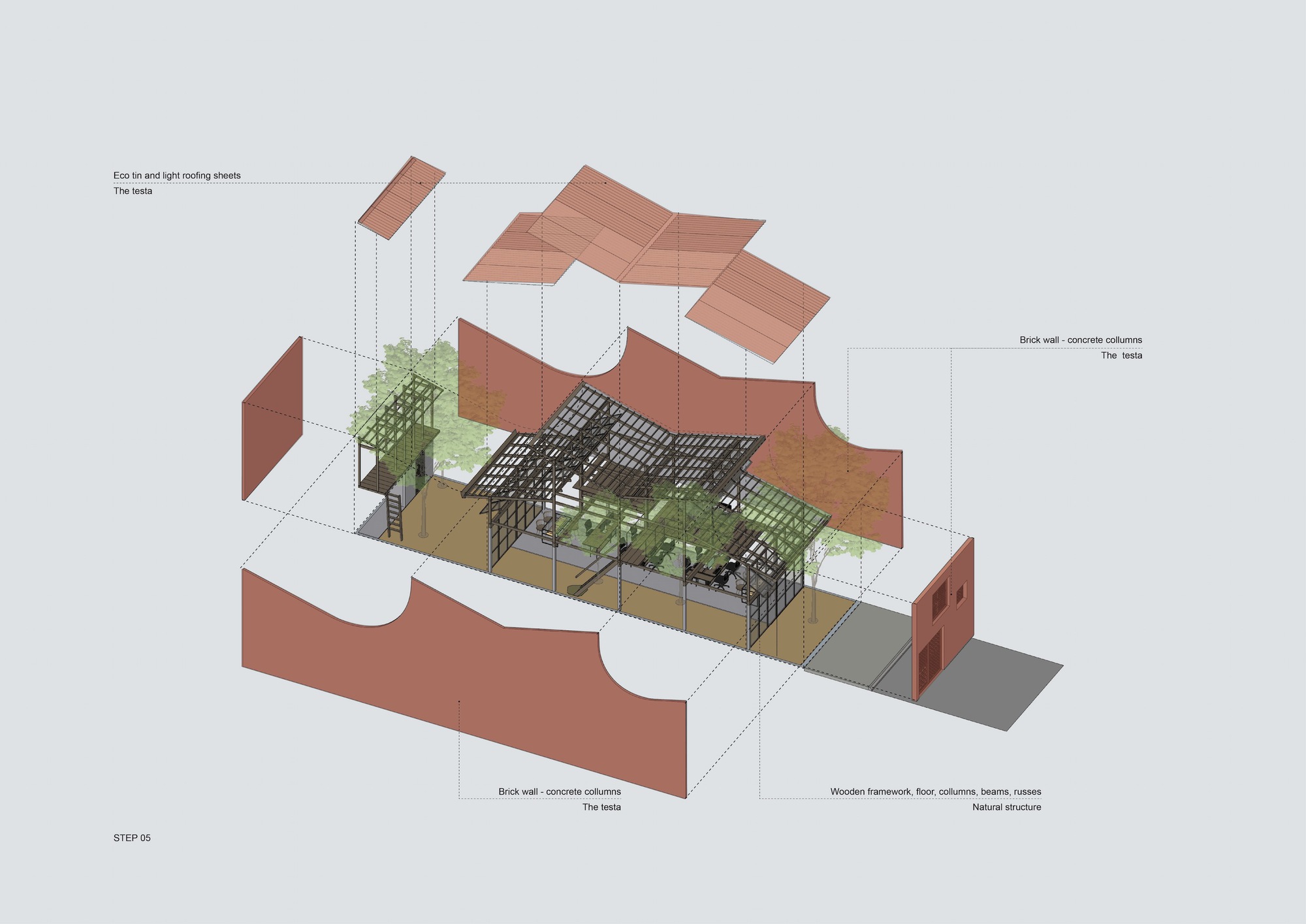
An isometric drawing shows three principal dimensions of architectural features with elements of nature integrated in interior design. / Courtesy of MA Architects

An architectural drawing shows the positioning of natural elements in relation to upstairs and downstairs rooms. / Courtesy of MA Architects

In cross section, a side elevation drawing illustrates cross air flow patterns through the workspaces and under the roof. / Courtesy of MA Architects

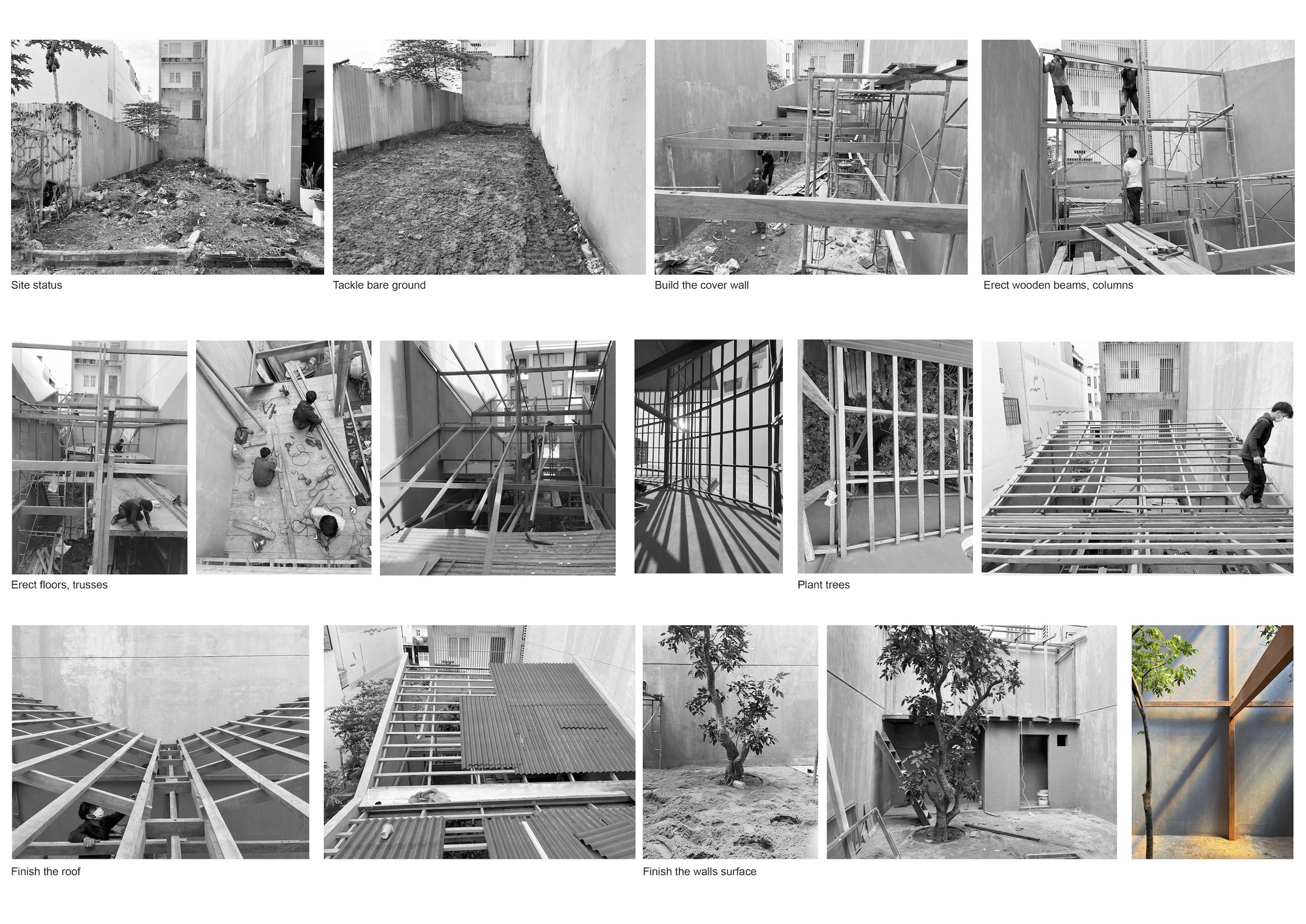
Flashback: A photo collage shows stages of construction in chronological order. / Courtesy of MA Architects

Downstairs, a spacious workplace lies connected to a woodworking shop in the back of the building. The meeting room is upstairs that’s open to allow plenty of natural daylight and cool breezes into the interior.

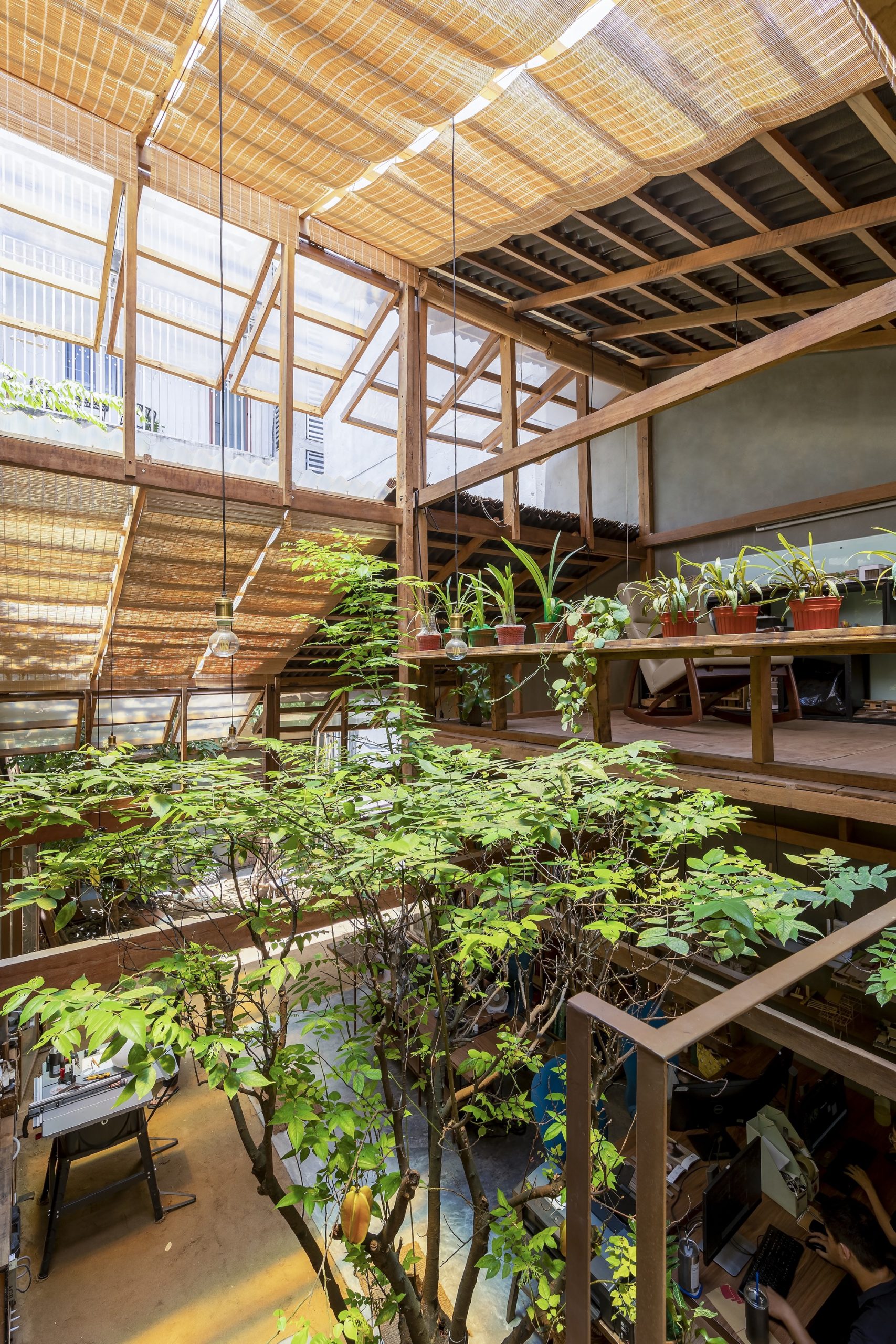
Overhead, the trusses that support the roof are made entirely of timber covered by transparent corrugated roofing materials for best indoor lighting. Where appropriate, sections of the roof are protected by dry coconut fiber coverings for insulation from the sun’s harsh glare.

A woodworking shop occupies the back room, from which a staircase leads to the second-floor meeting room.

The woodworking shop lies on the earth floor with a kitchen and bathroom at the farthest end.

Because when it rains it pours in the Tropics, it makes perfect sense to plaster the entire building envelope. The hard and smooth surface goes to work protecting the building from extreme heat and wet weather all year round.

Although relatively small in size, the office interior crafted of wood is impressive thanks to an open-concept, well-ventilated layout. While dry coconut fiber coverings over the roof make the interior feel cool and dry, the uncovered part works like a skylight turning indoors into a well-lighted place.

Besides light and wind, the architect also integrated other elements of nature in the design, among them earthen floors that cover parts of the ground level. Only the workspace and kitchen floors are made of concrete slabs for ease of use and safety.

Nearby, earthen floors add a warm, natural feel to the interior with plenty of room for growing plants in-ground. As the architect puts it, being in the middle of the hustle and bustle of the city, anything that brings a touch of nature, however small, is priceless.

The second-floor meeting room is open to natural daylight and connects to the trees.

A building material of choice, earthen flooring makes it possible to fill the interior with healthy green foliage along the entire wall. Earth and sand absorb and release some moisture, which contributes to a relaxed indoor ambience.

At the same time, vegetation in the front yard and decorative indoor plants both in ground and in containers go to work in tandem keeping the new office building cool and cozy just like home.


Architect: MA Architects (www.facebook.com/mastudiovn)


You may also like…

Urban Farming Office: VTN Architects’ Office Gives Back Lush Greenery

Bao Long Office: An Old Shophouse Beautifully Renovated

Bao Long Office: An Old Shophouse Beautifully Renovated

Bao Long Office: An Old Shophouse Beautifully Renovated

/ Ho Chi Minh City, Vietnam /

/ Story: Monosoda, Kor Lordkam / English version: Bob Pitakwong /

/ Photographs: Quang Dam /

Major renovations have given a drafty old shophouse a new lease on life. Thanks to great remodeling ideas, the tired-looking two-unit shophouse on Su Van Hanh Street, Ho Chi Minh City, transformed into a beautiful place that struck the right balance between a business and a private residence. Designed by the architecture firm H.a + NQN, the completely refurbished premises are home to a private enterprise named Bao Long Office.

Bao Long Office

As is often the case with shophouses in Vietnam, each of the two units has a frontage of 3 meters. It’s in the shape of an elongated rectangle with a whopping 20-meter length sandwiched between adjacent units.

To create ample, well-ventilated interior space, the wall separating the two units was torn down and replaced with a newer, more modern version.

Bao Long Office’s plan was redesigned to accommodate new business concepts as well as residential and lifestyle needs. To protect the building’s structural integrity, the internal framework remained intact.

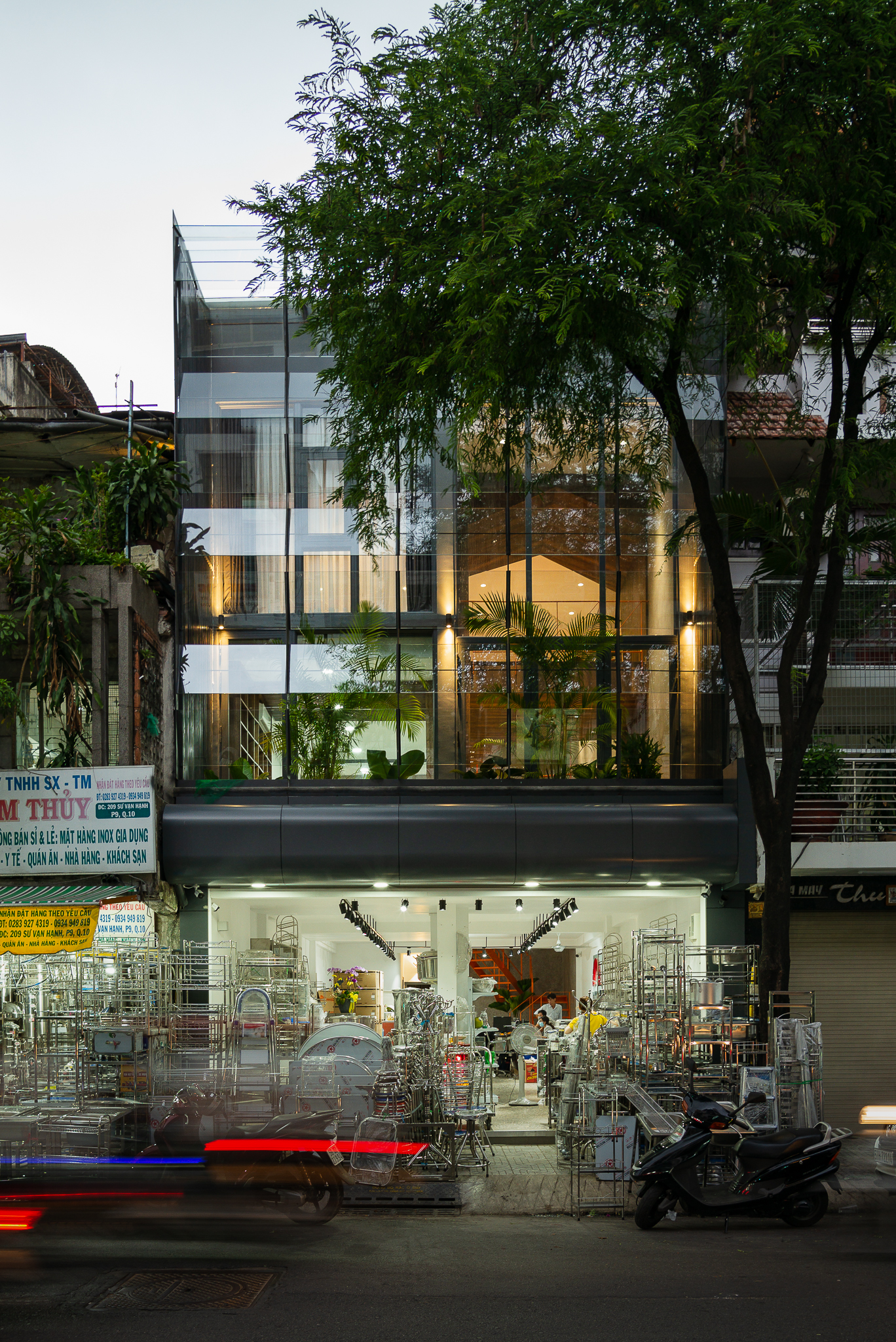
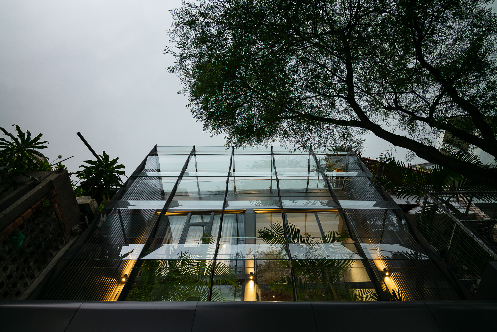
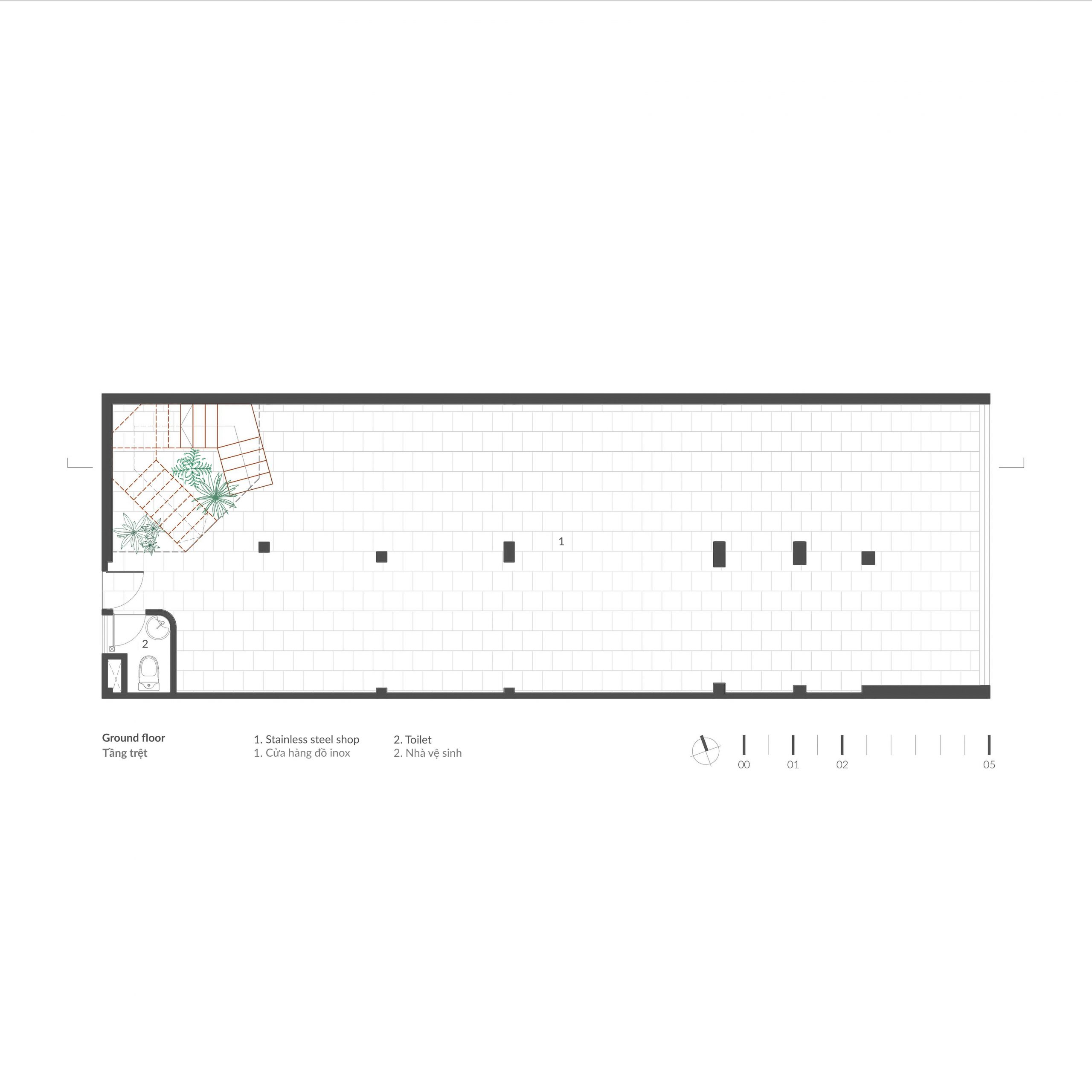
The same applied to the ground floor that housed a business selling stainless steel products. For a neat appearance, the entire front façade was glazed in, giving it charms and good looks that set it apart from others in the neighborhood. By night the face of the building is aglow under the lights.

Bao Long Office
Second-floor workspace and private living quarters are clearly separated from each other.

Bao Long Office

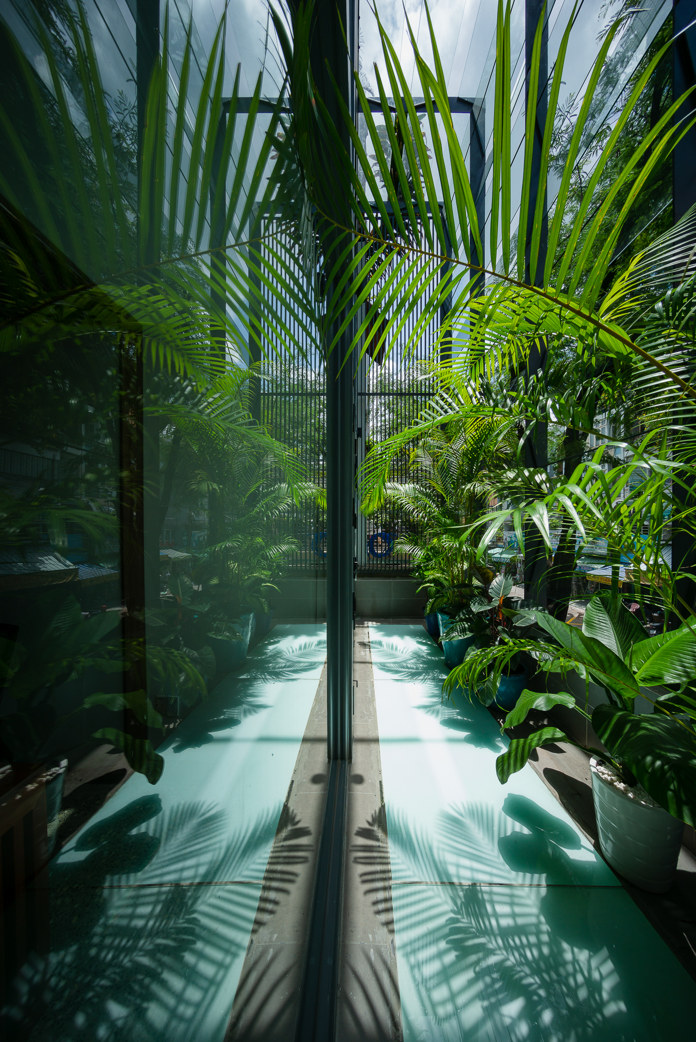
Decorated with healthy green foliage, the second-floor balcony provides a relaxed outdoor room and protects the home from the hustle and bustle of the big city.

Located in a commercial zone, the store at ground level is understandably busy and the crowded street bustling with activity.

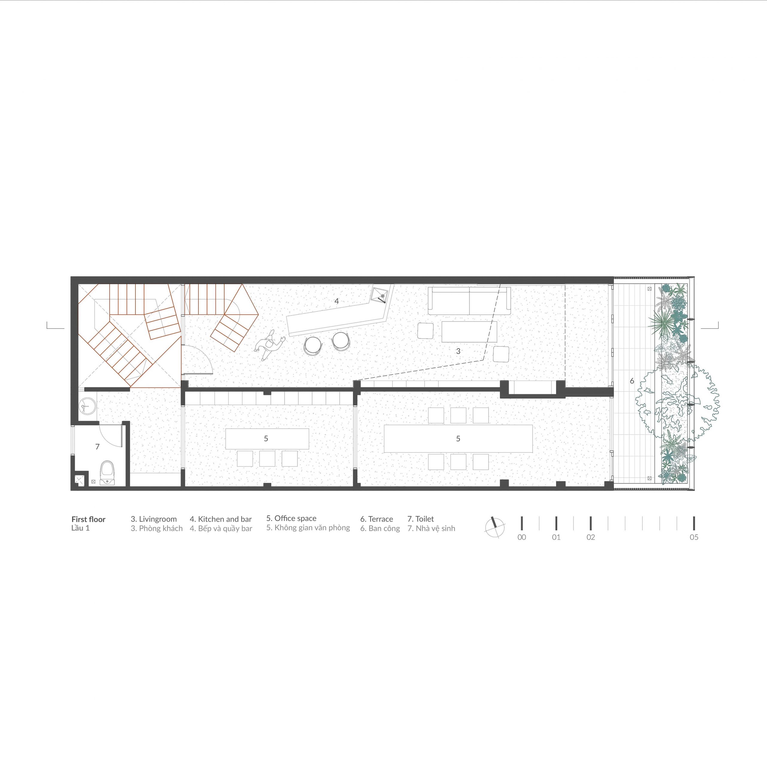
Climb a flight of stairs to the second floor, and you come to an impressive office space. The area on this level of Bao Long Office is divided into two parts. There’s a warm and welcoming workspace at the office on one side that’s clearly separated from private living quarters on the other.

Both parts are conveniently accessible via the balcony connected to the front façade. The second-floor outdoor platform is decorated with an oasis of calm that’s very pleasant to look at.

Ground Floor Plan Courtesy of H.a

First Floor Plan Courtesy of H.a

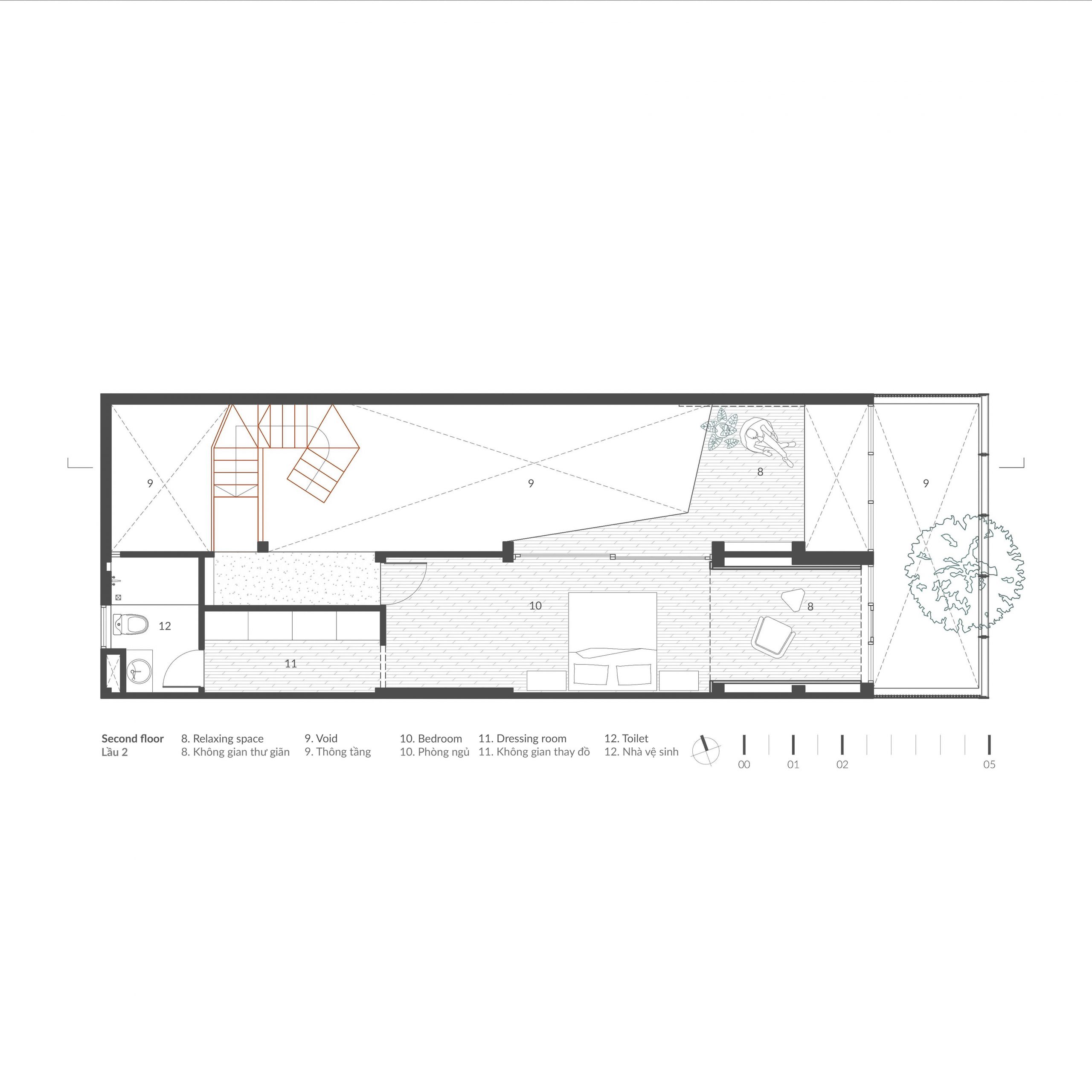
Second Floor Plan Courtesy of H.a


Bao Long Office
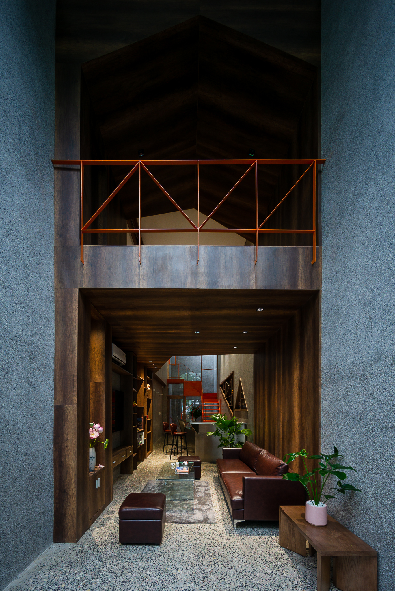
Double-height ceiling design offers open and pleasing tranquility to a long and narrow living room.

Bao Long Office

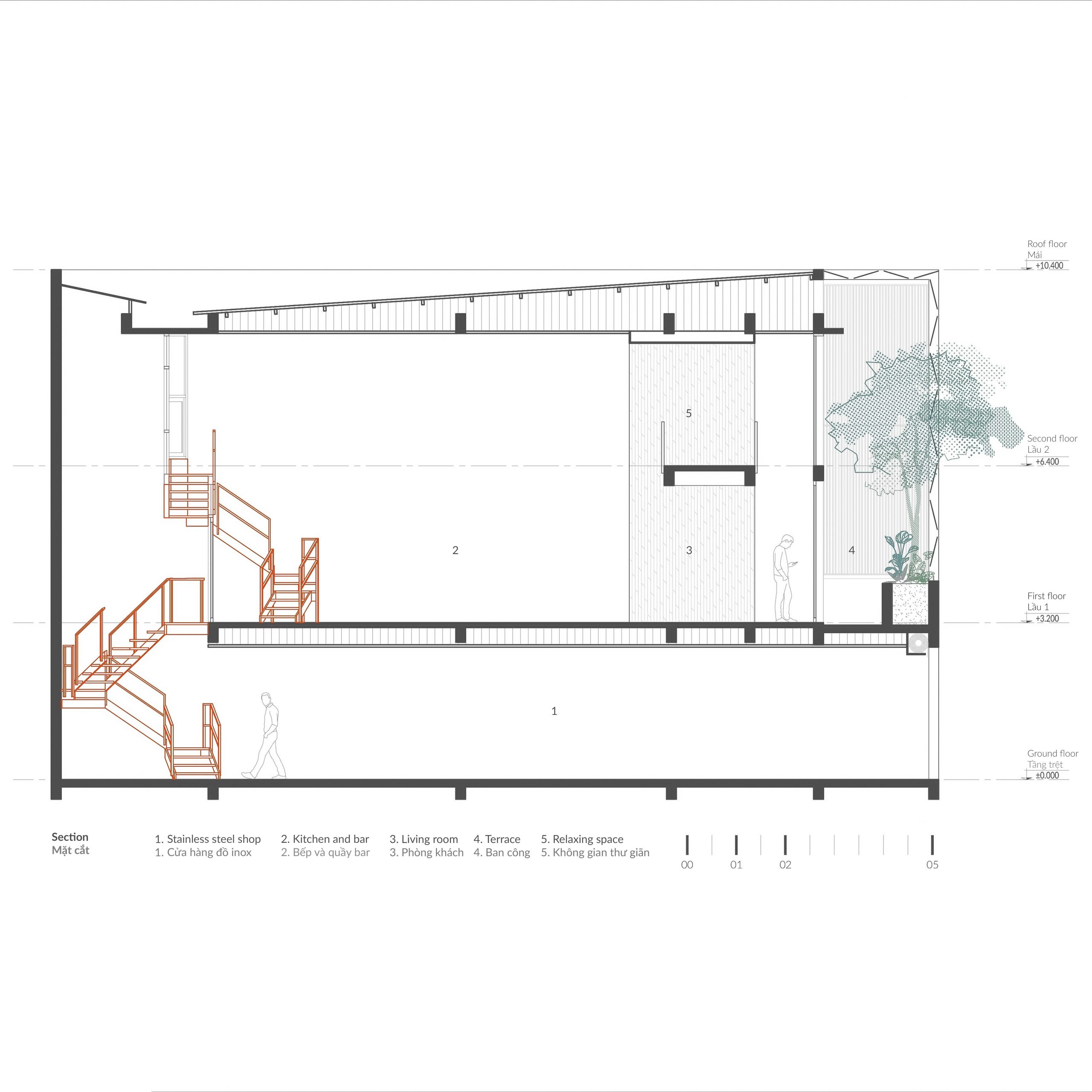
Section Drawing Courtesy of H.a

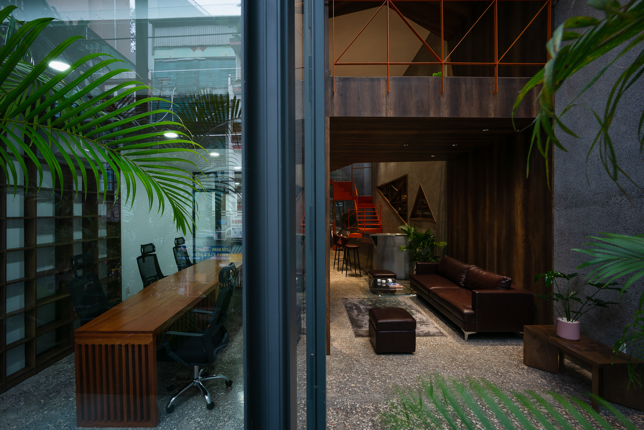
The office consists of a workroom and meeting room with simple interior décor. The walls are painted white symbolizing a new beginning and the floors covered in terrazzo.

There’s a custom work table with drafting stools that runs parallel to the wall and stretches the entire length of the room.

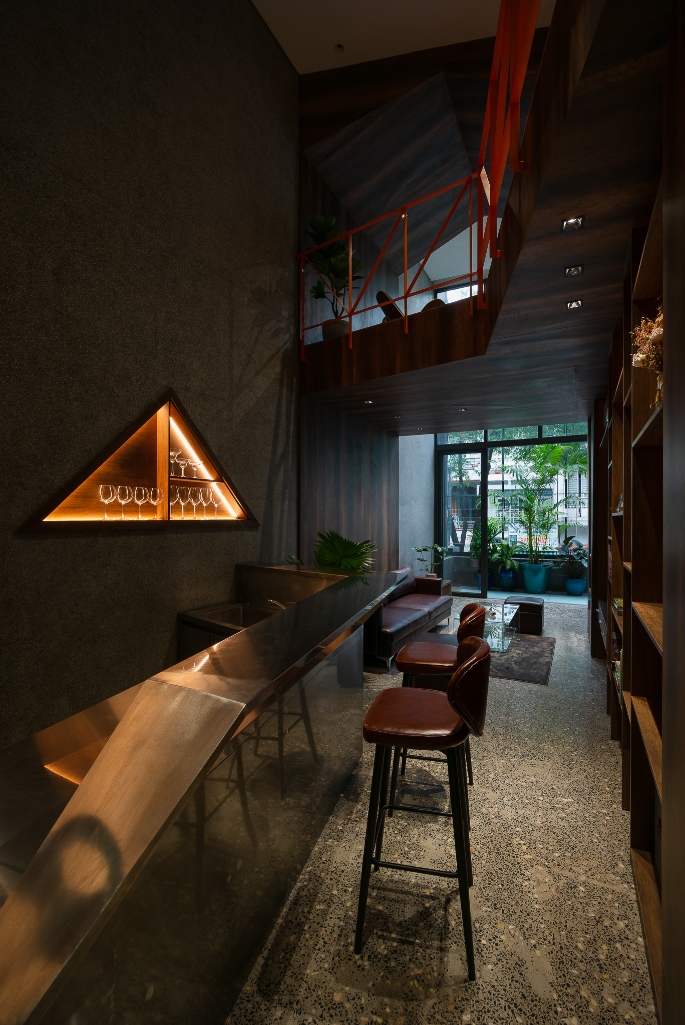
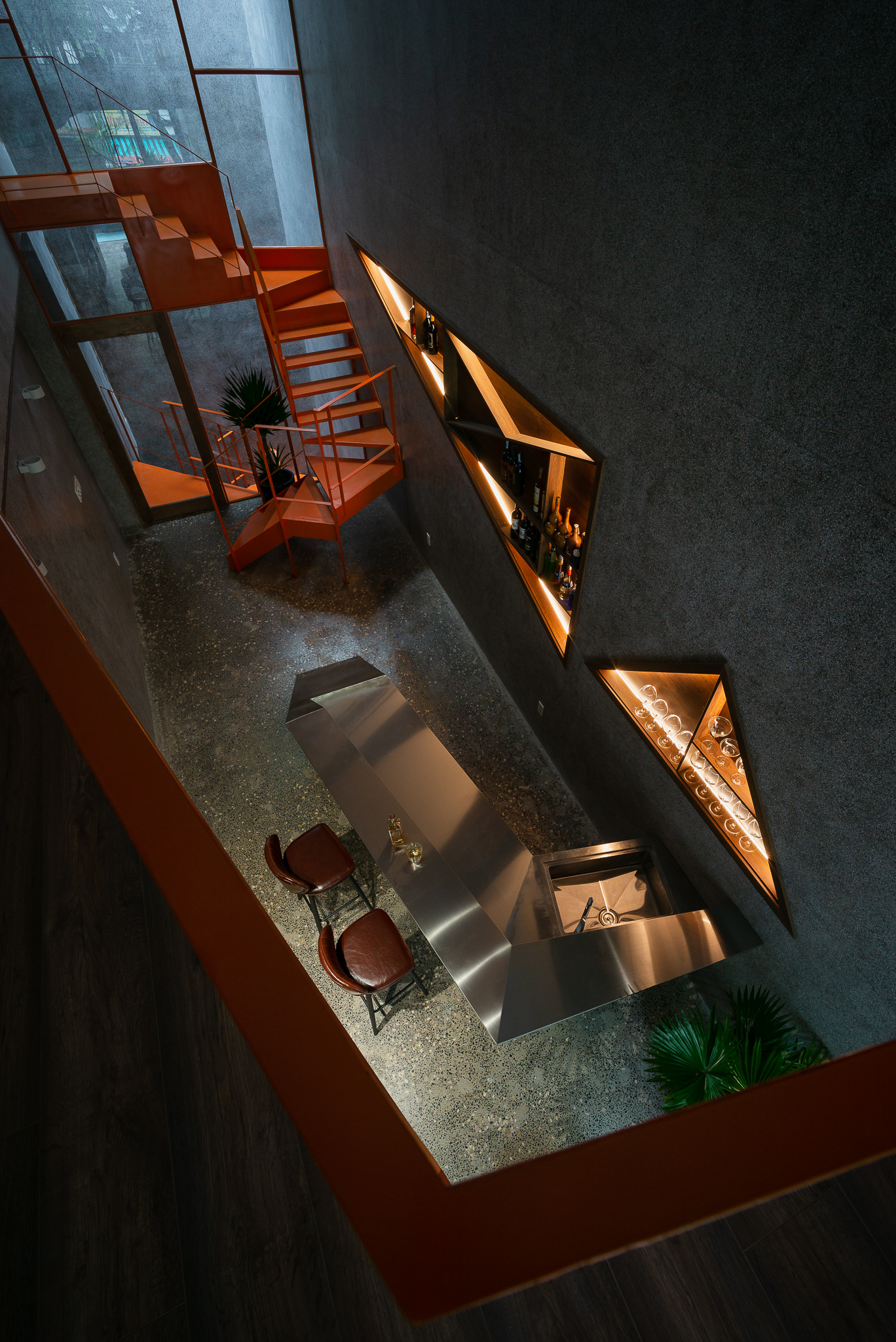
The atmosphere is strikingly different from the calming space of nearby private living quarters. To create a homely atmosphere, the living room has a small beverage bar with pantries customized to the homeowner’s hosting style.

At the farthest end lies a peaceful sitting area decorated with deep colors that match the dark surfaces of terrazzo floors, concrete walls, and rustic walnut furniture.

Softened by the dim light, it’s a relaxation technique to create warmth and reduce stress in the home.

Bao Long Office
The homeowner’s sitting room on the third floor is quiet and secluded.

At the same time, a section of the upper floor was taken out to make room for an entrance hall with double-height ceiling design. Not far away, a set of stairs was installed to connect to the homeowner’s secluded living quarters on the top floor.

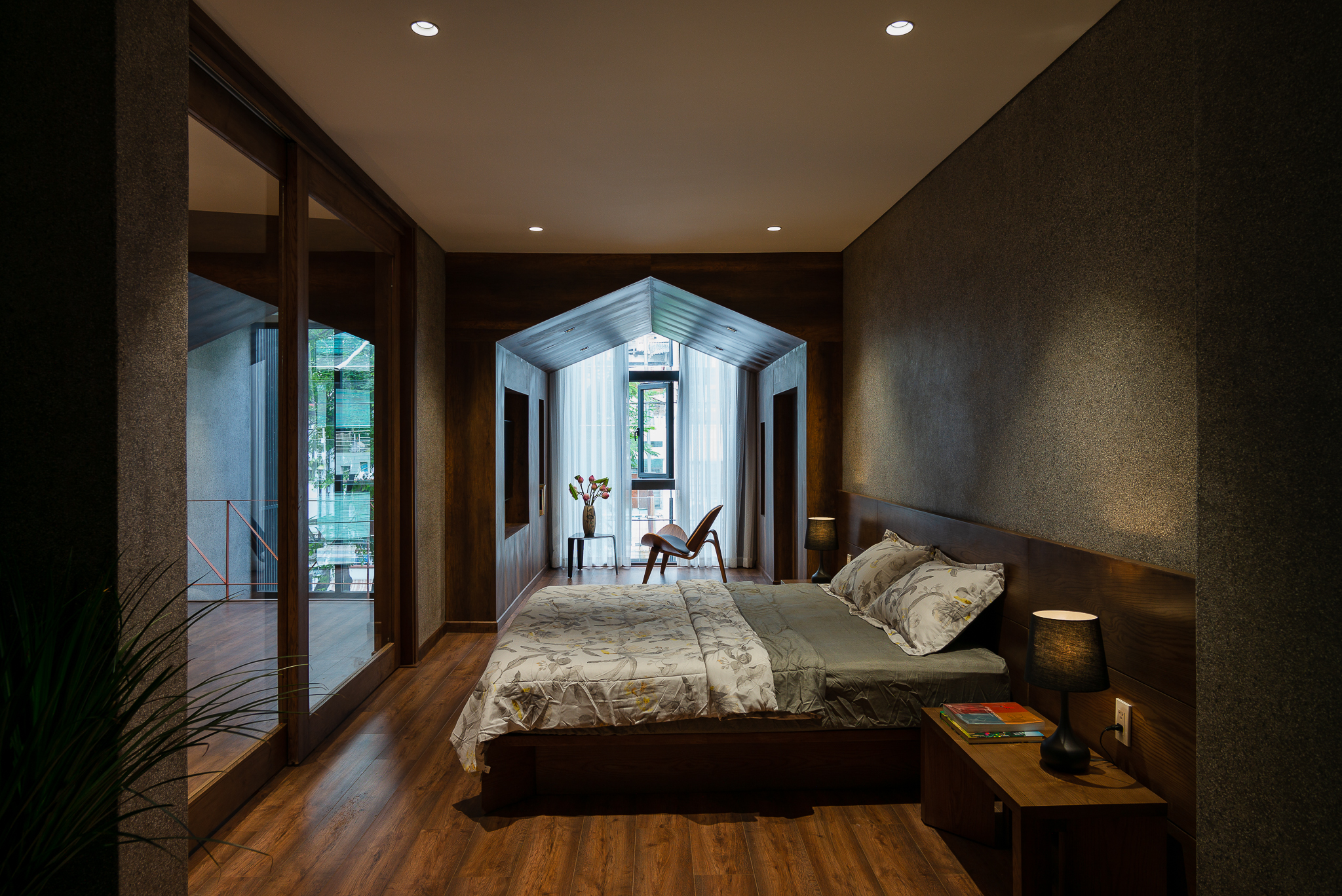
The private residential zone comes complete with a bedroom with en suite bath, sitting room, and dressing room.

Bao Long Office

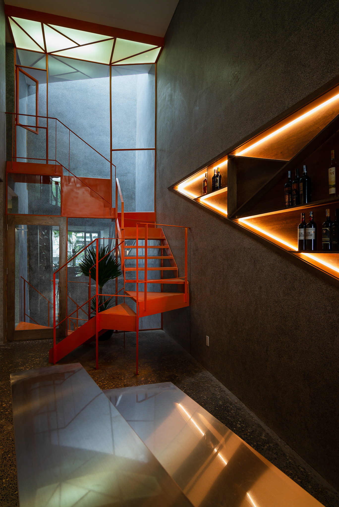
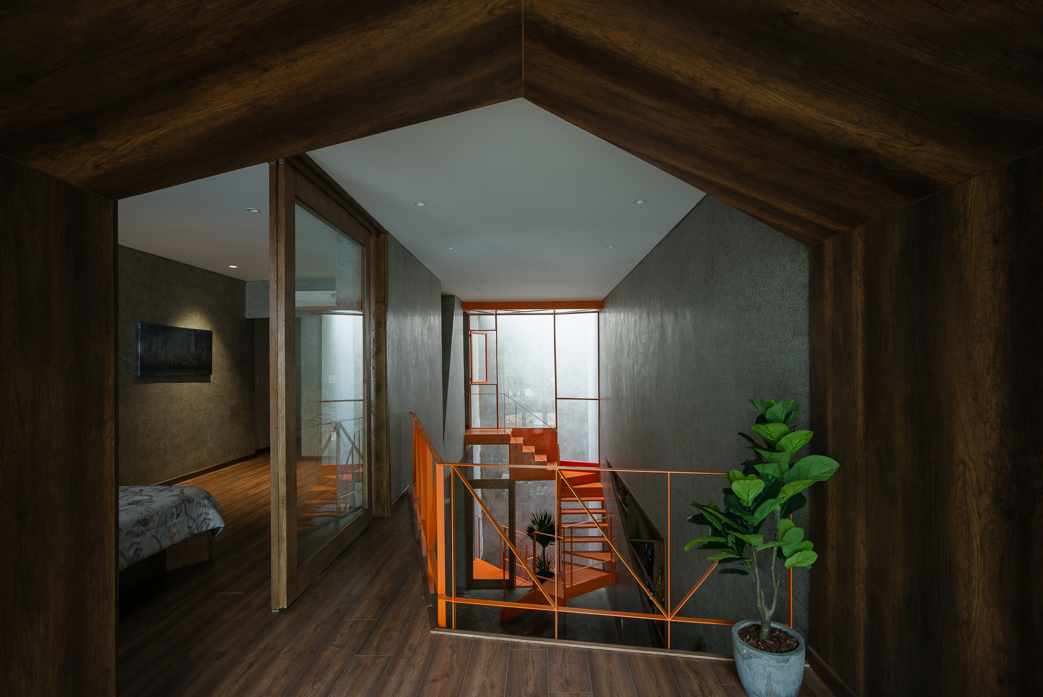
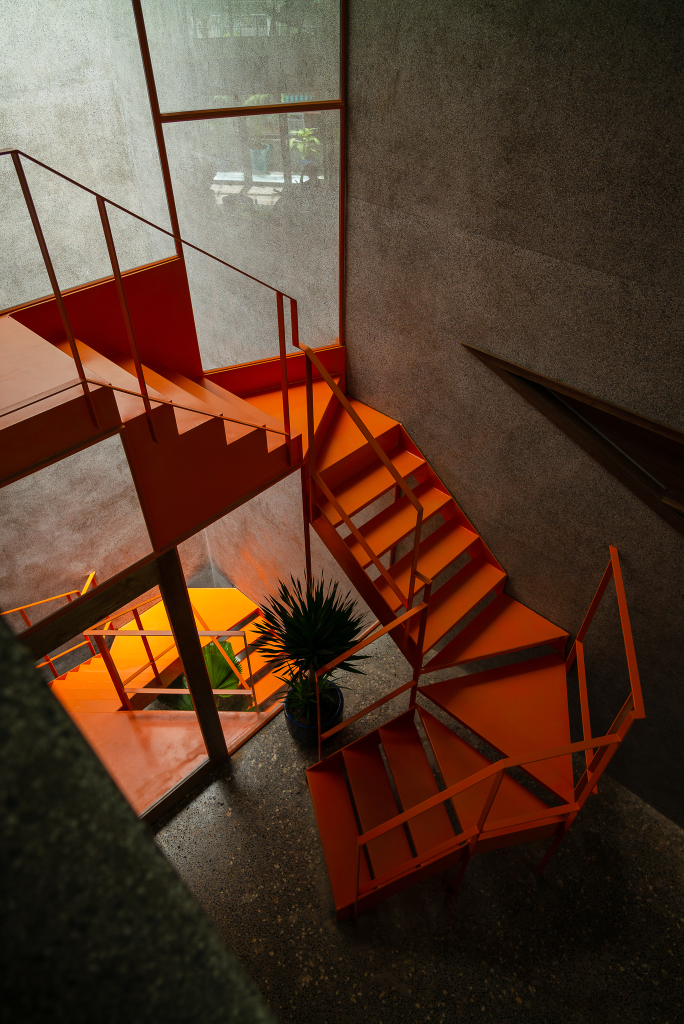
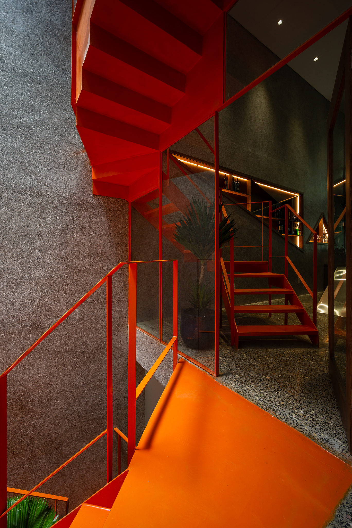
A staircase painted orange creates an unexpected playful contrast with the calmness of a small interior space.

Painted a shade of orange color, the steel staircase leads from the ground level, where the retail store is located, all the way to the private residential zone on the top floor of Bao Long Office. Its playful design is intended to express pleasure and joy in everyday life.

You got that right! It’s part of a home improvement project designed to make life more fun. It serves the primary purpose of getting house occupants from one floor to the next, and it’s done in a unique, stylish way.


Architect: H.a (www.facebook.com/workshopha) + NQN. (www.facebook.com/nqn.architects)


The article is an excerpt from “Home Office / Home Studio,” a book that compiles ideas on integrating “home” with “workspace” to create a comfortable and suitable environment for small companies, startups, and creative individuals.

You can find it at leading bookstores throughout Thailand or order it through various online channels.

INBOX: m.me/roomfan
NAIIN: https://www.naiin.com/product/detail/582920
SHOPEE: https://shp.ee/uirj9q5
LAZADA: https://s.lazada.co.th/s.9V0vz


You may also like…

A Renovation in Sync with the Times: Beautiful Mixed-Use Home Office in Petaling Jaya

3 x 9 House: A Compact Renovated Row House in HCMC

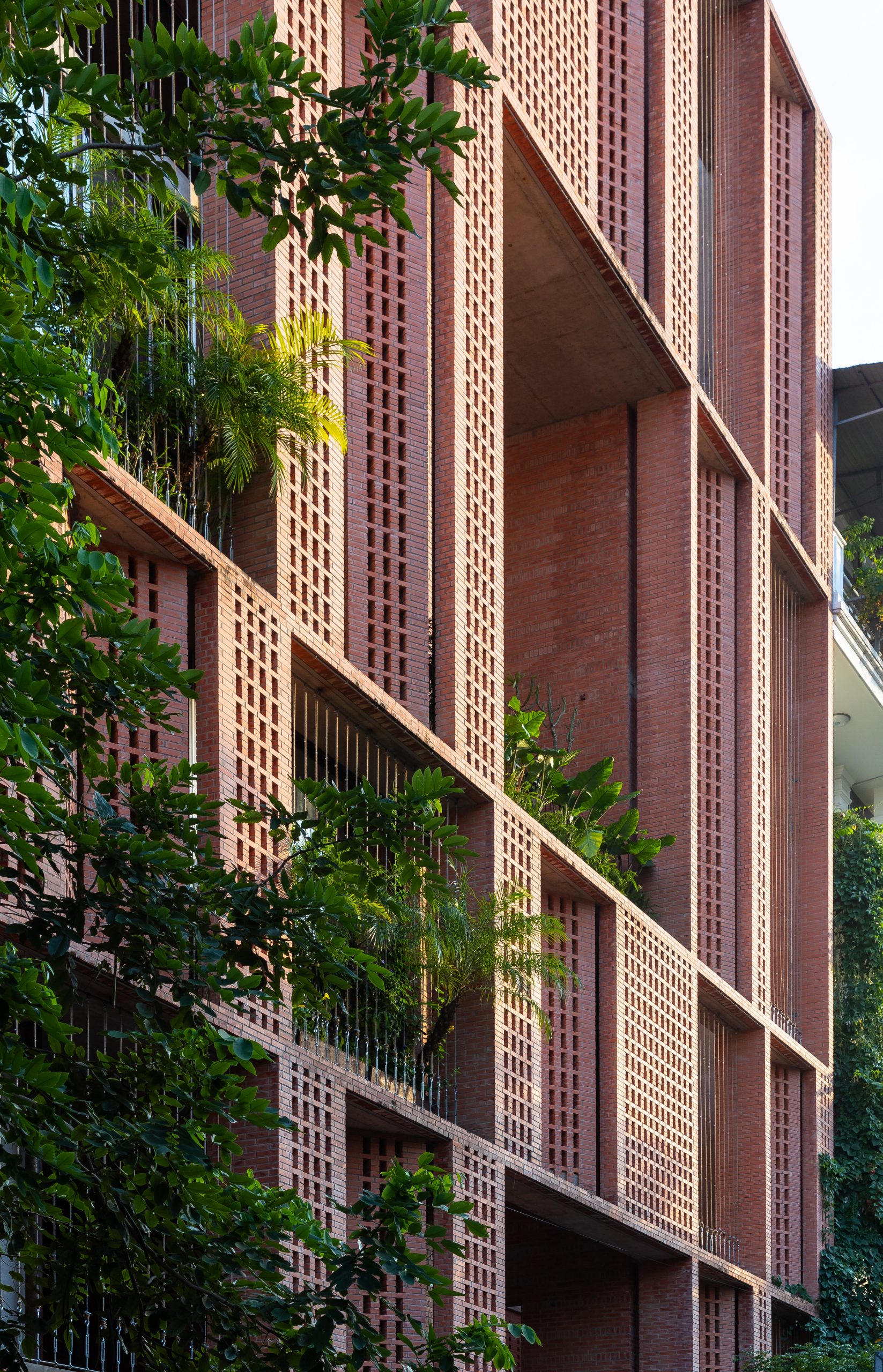
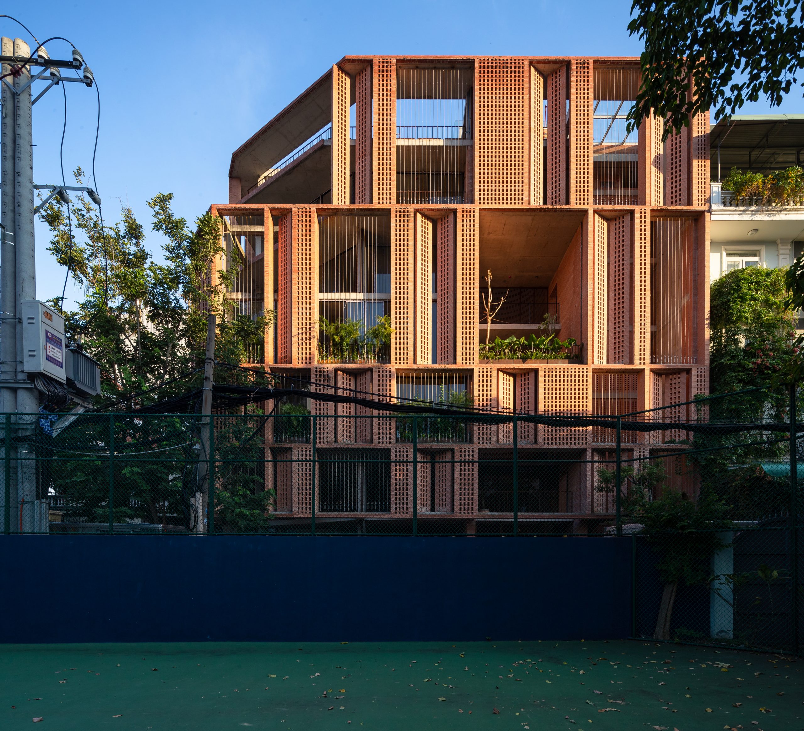
Premier Office: A Nature-Inspired Brick Office Design Giving off Good Vibes

Premier Office: A Nature-Inspired Brick Office Design Giving off Good Vibes

/ Ho Chi Minh City, Vietnam /

/ Story: Wuthikorn Sut / English version: Bob Pitakwong /

/ Photographs: Triệu Chiến /

Though we cannot count on the weather to be calm and delightful at all times, it is quite possible to bring physical ease, well-being and relaxation into the workplace, even without air conditioning. And this brick office named “Premier Office” has proved to be the case, thanks to clever passive cooling techniques and greenery giving off friendly vibes.

brick office

Handsomely nestled within a calm Ho Chi Minh City neighborhood, the building offering rental office spaces boasts the timeless beauty of brickwork in masonry construction.

Not only do bricks blend nicely into the surrounding landscape, but they also provide interior thermal comfort by absorbing moisture to some degree.

When wet, they dry out by evaporation thereby keeping the ambient temperature pleasant during the daytime.

brick office

The seven-story building with a parking garage below ground level offers vacant office spaces for lease that let tenants do their own setup and decorating.

Unlike the usual design offering the same old same old typical of everyday commercial real estate, the rental business spaces at Premier Office are available in a variety of shapes, sizes and configurations, each of which is unique in its own special way.

brick office

brick office

brick office

As the architect intended, the new office block centers around the concept of climate-responsive design whereby forms, functions and nature blend together into one perfectly coordinated business property.

There is a courtyard-like open area at the center that affords an airy and bright atmosphere on every floor. It’s an architectural feature that goes together well with building facades made of ventilation blocks.

By design, the breathable envelope doubles as a passive cooling system that draws fresh outdoor air into this brick office and dissipates excess heat into the sky by rooftop ventilation.

brick office

brick office

Façade and Ventilation Conceptual Diagram Courtesy of Tropical Space

First Floor Plan Courtesy of Tropical Space

Second Floor Plan Courtesy of Tropical Space

Third Floor Plan Courtesy of Tropical Space

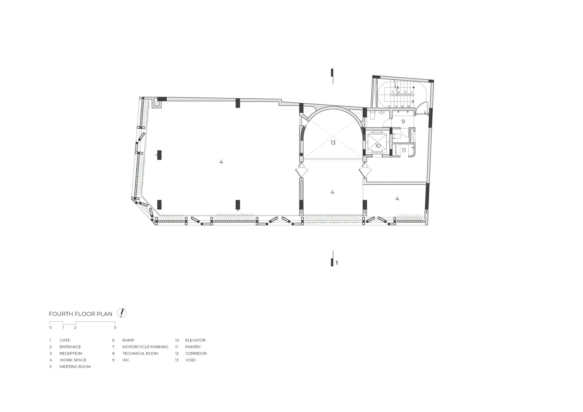
Fourth Floor Plan Courtesy of Tropical Space

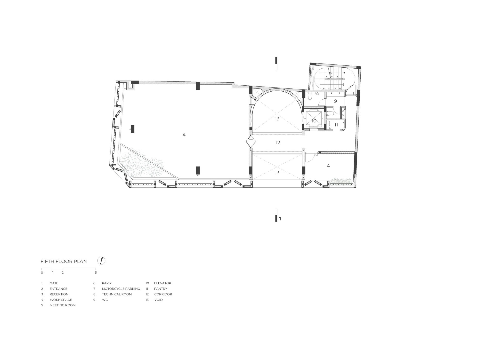
Fifth Floor Plan Courtesy of Tropical Space

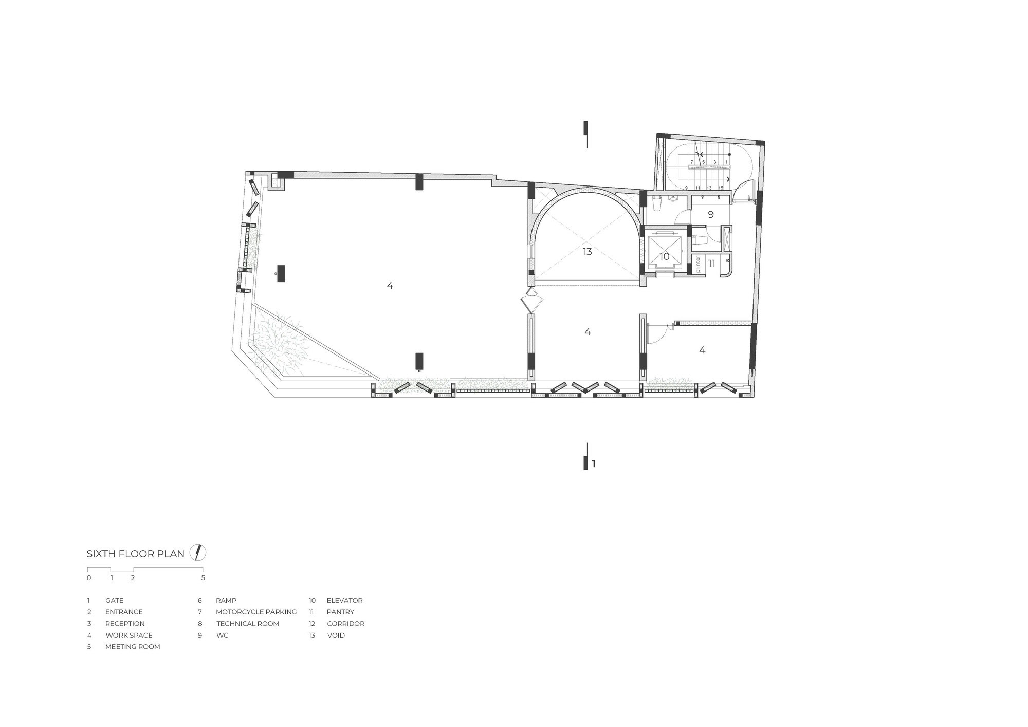
Sixth Floor Plan Courtesy of Tropical Space

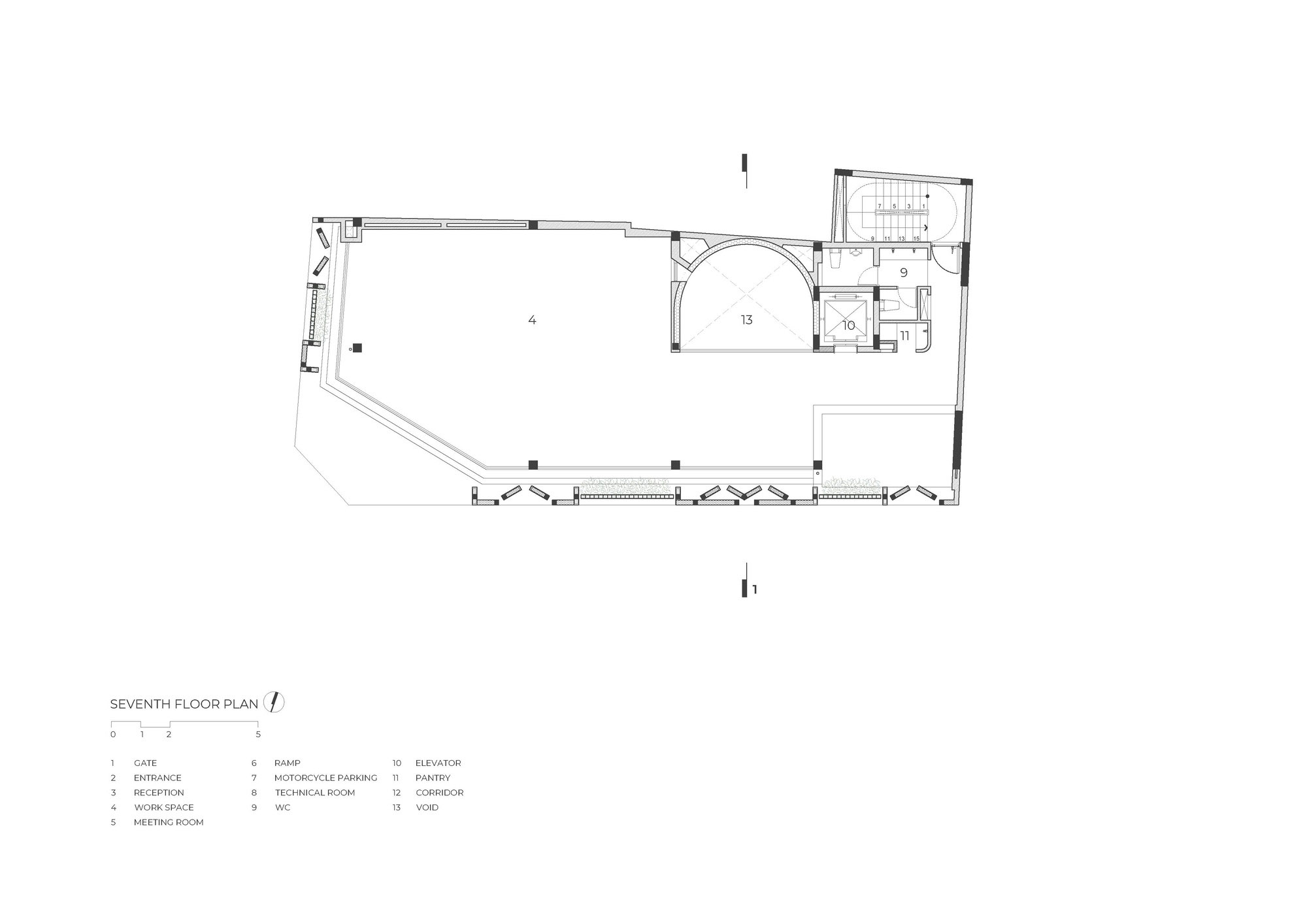
Seventh Floor Plan Courtesy of Tropical Space

For the health benefits of natural light, the building envelope is constructed with spaces in between bricks. These little openings in the wall work in tandem with the skylight over the courtyard-like area at the center.

Together they create interior thermal comfort by admitting a defused light to illuminate the room, meantime protecting it from the sun’s harsh glare.

It’s a clever hack to promote well-being, by which only the indirect light filtered by brick walls and surrounding trees is allowed.

brick office

The architect believed that by integrating physical comfort in the design of this brick office, it would double as second home for many tenants working here.

To avoid invading people’s privacy, the business space for each and every tenant is easily identifiable and clearly defined by a brick masonry wall.

Even with that, all the rental spaces appear bright and airy, no doubt, a nature-inspired place in which to conduct business.


Owner: Nguyen Thi Thuy Linh
Architect: Tropical Space (https://tropicalspaceil.com/)


You may also like…

Urban Farming Office: VTN Architects’ Office Gives Back Lush Greenery

Long An House: A Charming Brick House in Vietnam

A Renovation in Sync with the Times: Beautiful Mixed-Use Home Office in Petaling Jaya

A Renovation in Sync with the Times: Beautiful Mixed-Use Home Office in Petaling Jaya

/ Petaling Jaya, Malaysia /

/ Story: Samutcha Viraporn / English version: Bob Pitakwong /

/ Photographs: Soopakorn Srisakul /

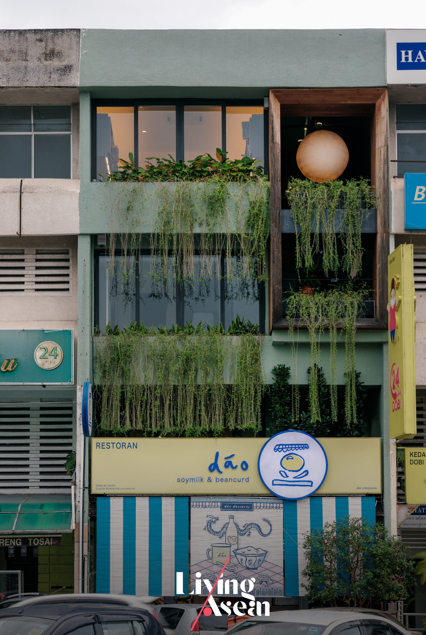
Working from home has become one of the various alternative methods of doing business in the aftermath of a Coronavirus pandemic that took the world by surprise in 2019. Adapting to change, the architecture firm Essential Design Integrated (EDI) interestingly transformed its office in Petaling Jaya into a multi-use space that blended with its downtown business communities. The updated package put a home office and living quarters on the upper floors, while the floor at ground level was rented out to a business selling soy milk pudding.
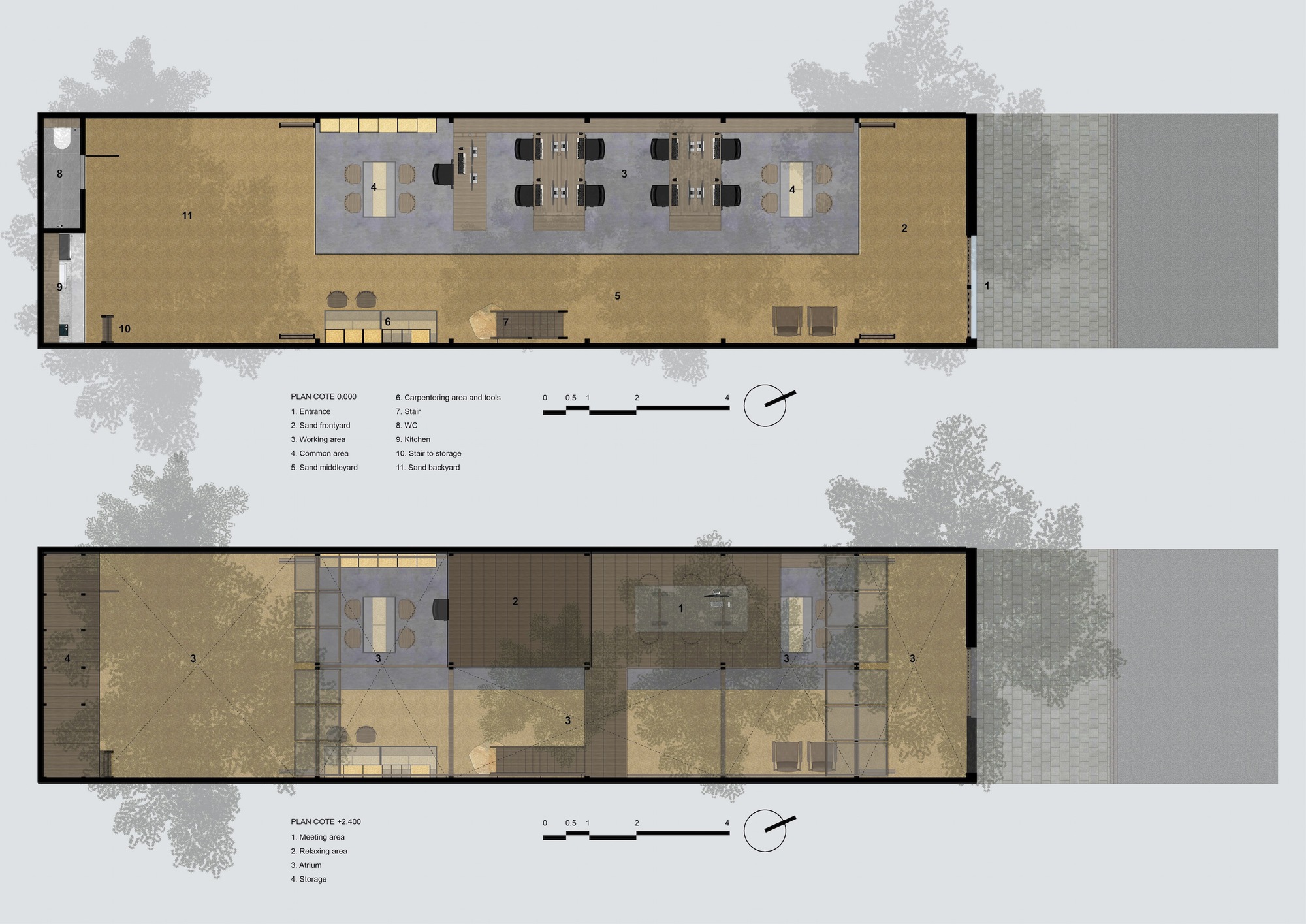
Home Office in Petaling Jaya

A Renovation Improves Light and Ventilation

Facing the New Normal, the property owner thought it was time to renovate to serve a new purpose. To begin with, there were two main problems in the original design that had to be resolved – light and ventilation.

The single-unit home plan was an elongated rectangle set along the east-west axis. It was 21 meters long with the usual narrow frontage to the street. As to be expected, the interior living spaces were dimly lit during daylight hours and ventilation was poor.

So, to create a bright and airy open-concept house plan, most of the room dividers had to be torn down. In no time, a restoration of the shop house that was part of a 40-year-old traditional building block was completed in a way that fitted beautifully into the bustling commercial neighborhood.

Home Office in Petaling Jaya

Home Office in Petaling Jaya

Home Office in Petaling Jaya

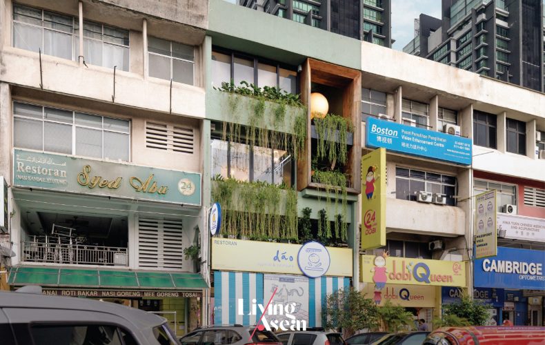
An Open Glass Façade Decorated with Plants

Chan Mun Inn and Wong Pei San, the two architects who designed it, said that initially the renovation project was completed a few months prior to the outbreak of Covid-19. At the time the interior was decorated with the lush greenery of a vertical garden on every floor.

Suddenly the Coronavirus disease came and social distancing became the norm. Everyone was keeping to himself. Soon the gorgeous gardens withered away and died due to lack of care.

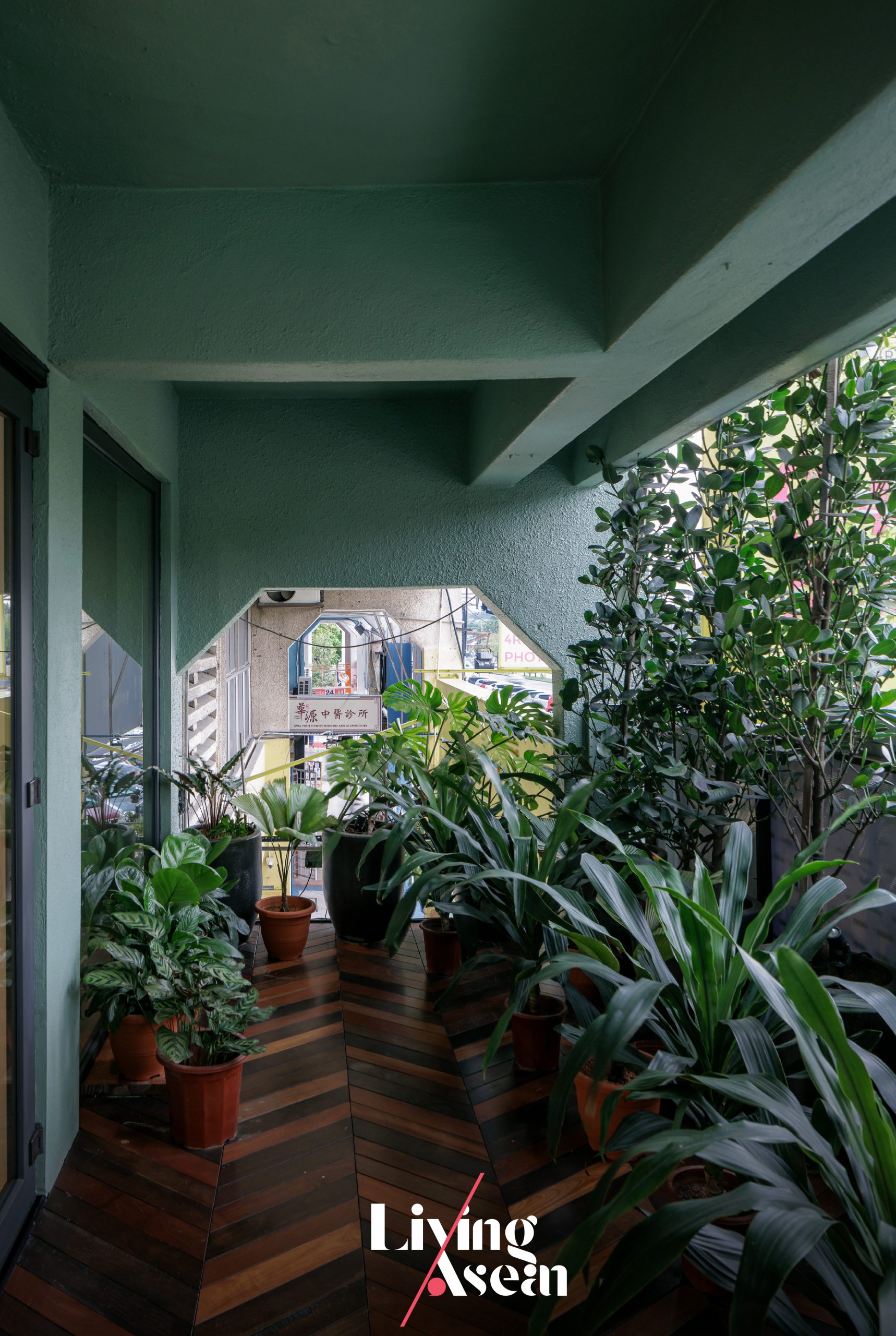
The job of remodeling the home had to be done again differently. In so doing, the green spaces were revived to create positive energy and relaxation. This is evident in beautiful balcony garden ideas both in front and at the rear, plus the redesigned open glass façade that takes in natural daylight, fresh outdoor air and views of the city landscape.

Home Office in Petaling Jaya

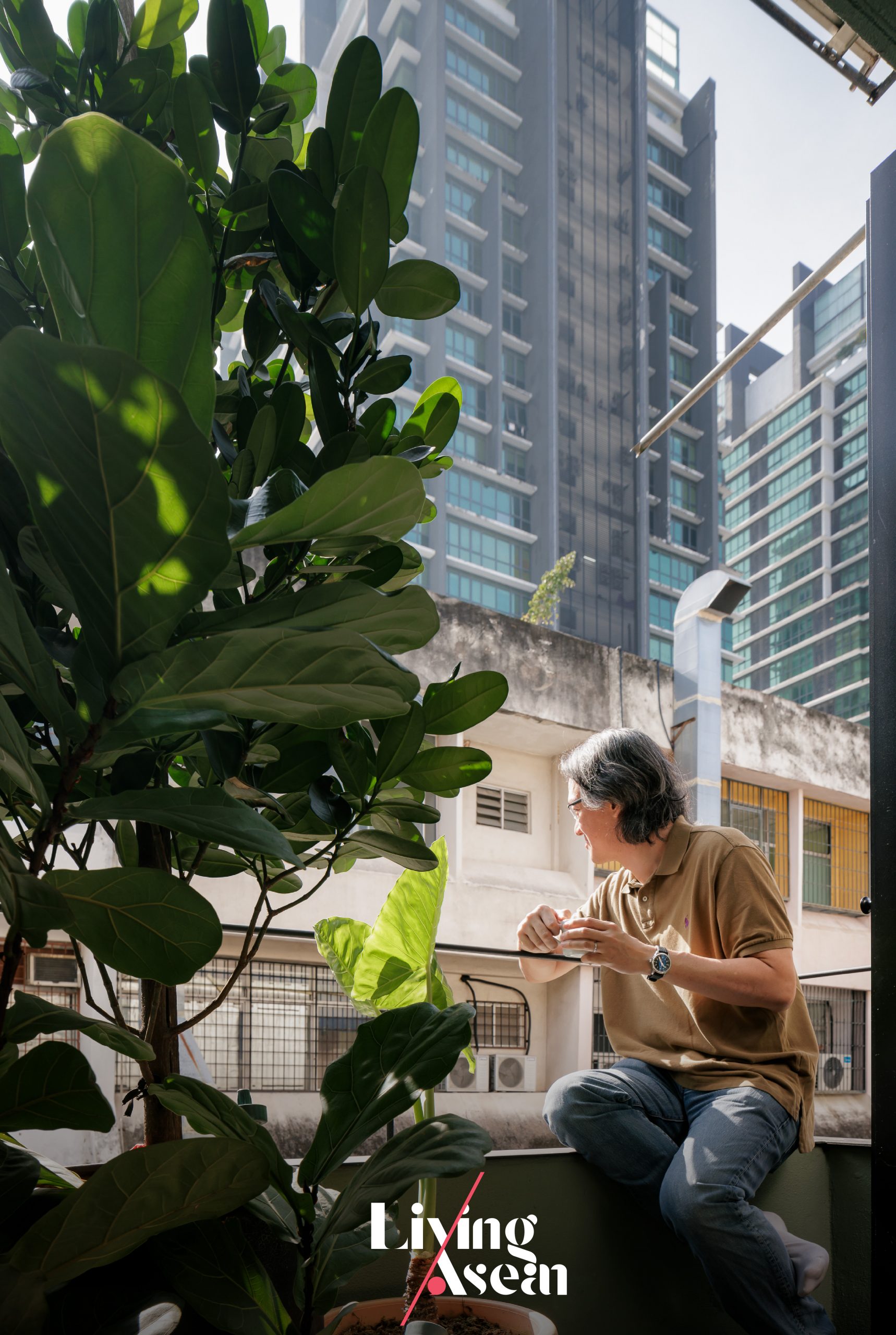
Urban balcony gardens serve multiple purposes. Besides taking in the view, they double as privacy screens, filter out the sun’s harsh glare, admit natural daylight into the home and control ventilation, to name but a few.

To capitalize on vertical space, climbers and hanging plants are grown alongside an array of foliage plants that thrive in containers. Not long ago herbs, including mint and basil, were added to the mix.

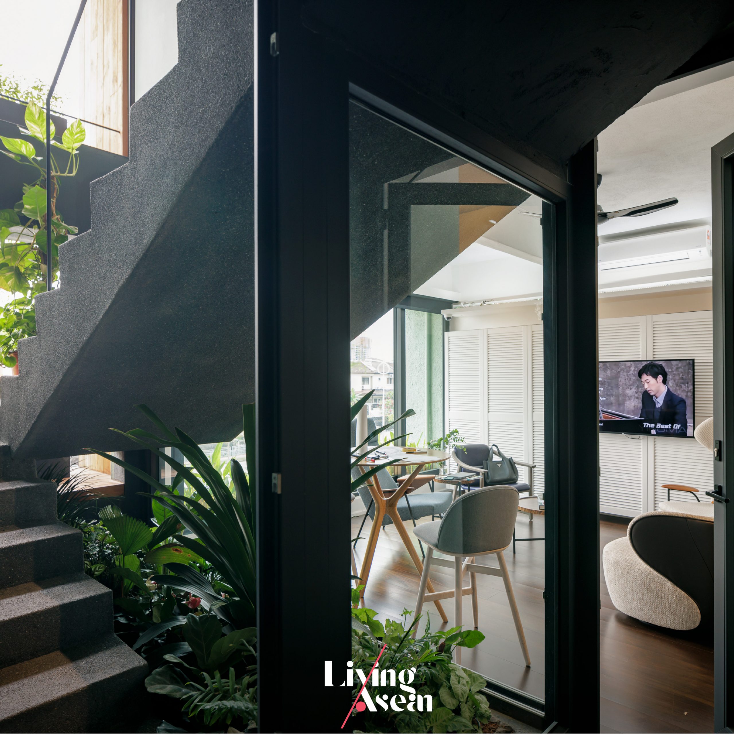
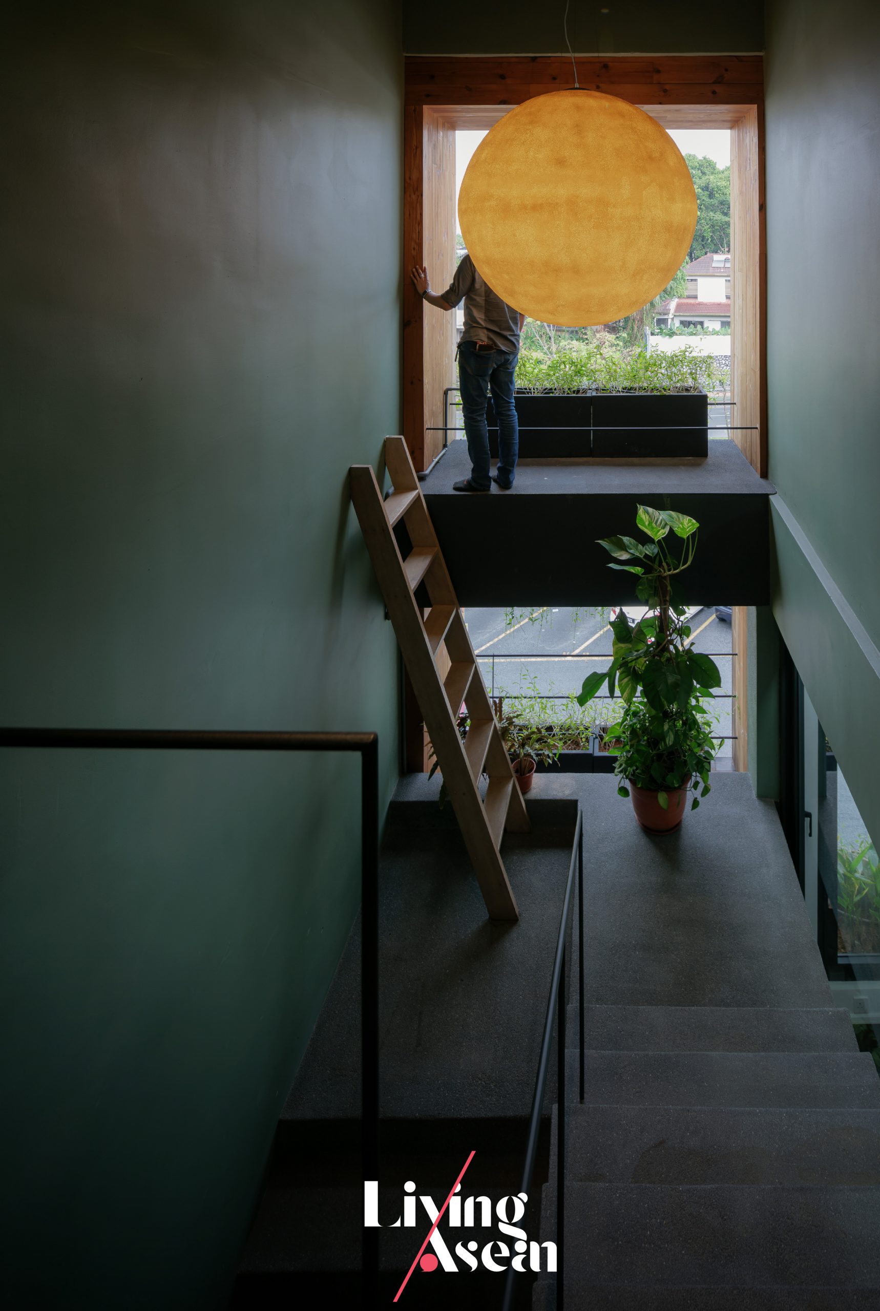
The path along the front staircase is marked with container gardens at intervals. There are openings in the wall to let natural daylight shine through. To create a positive atmosphere, the entrance hall is illuminated by a moon-shaped chandelier, which can be seen from the outside.

Home Office in Petaling Jaya

Home Office in Petaling Jaya

Serving a Dual Purpose as a Home and an Office

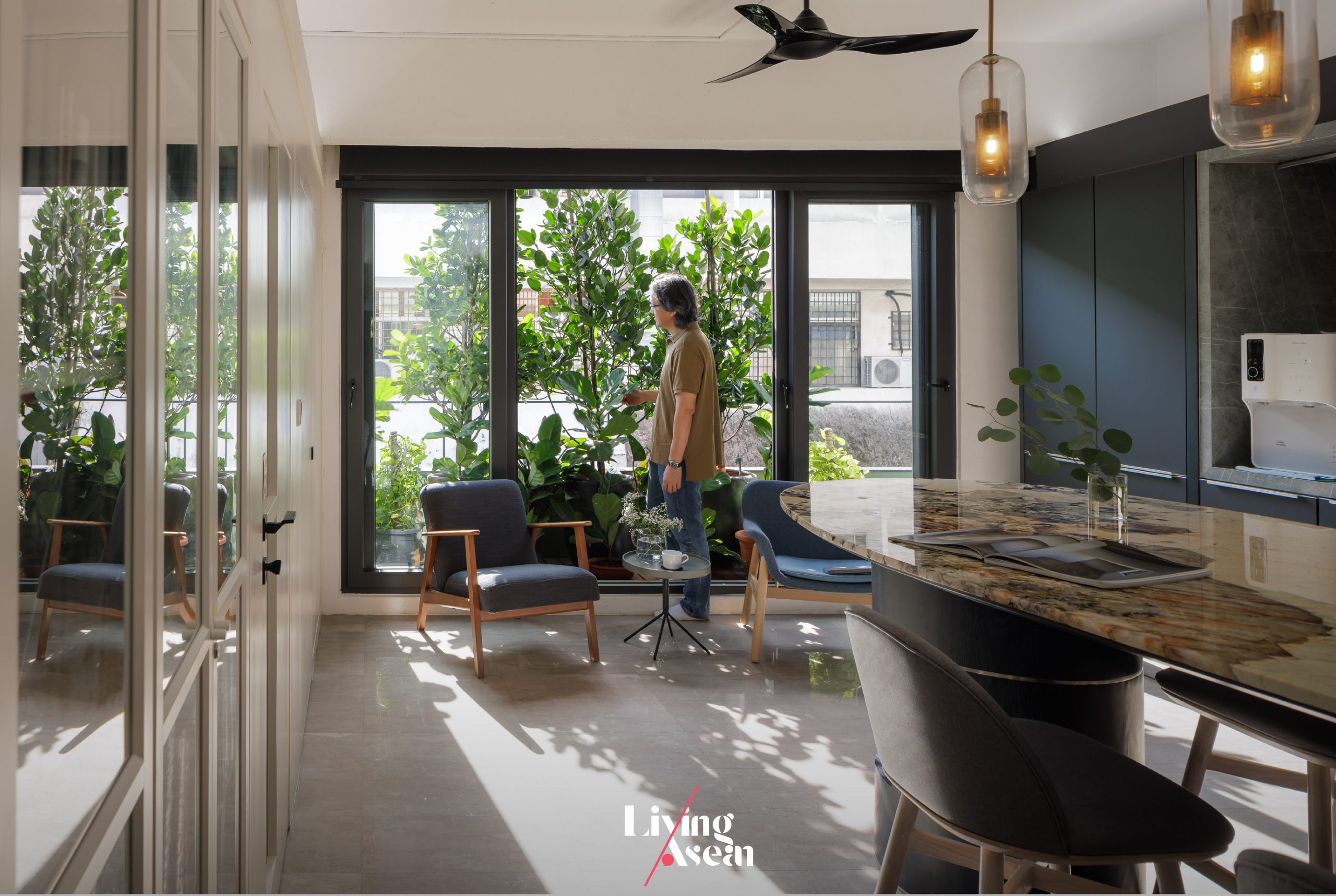
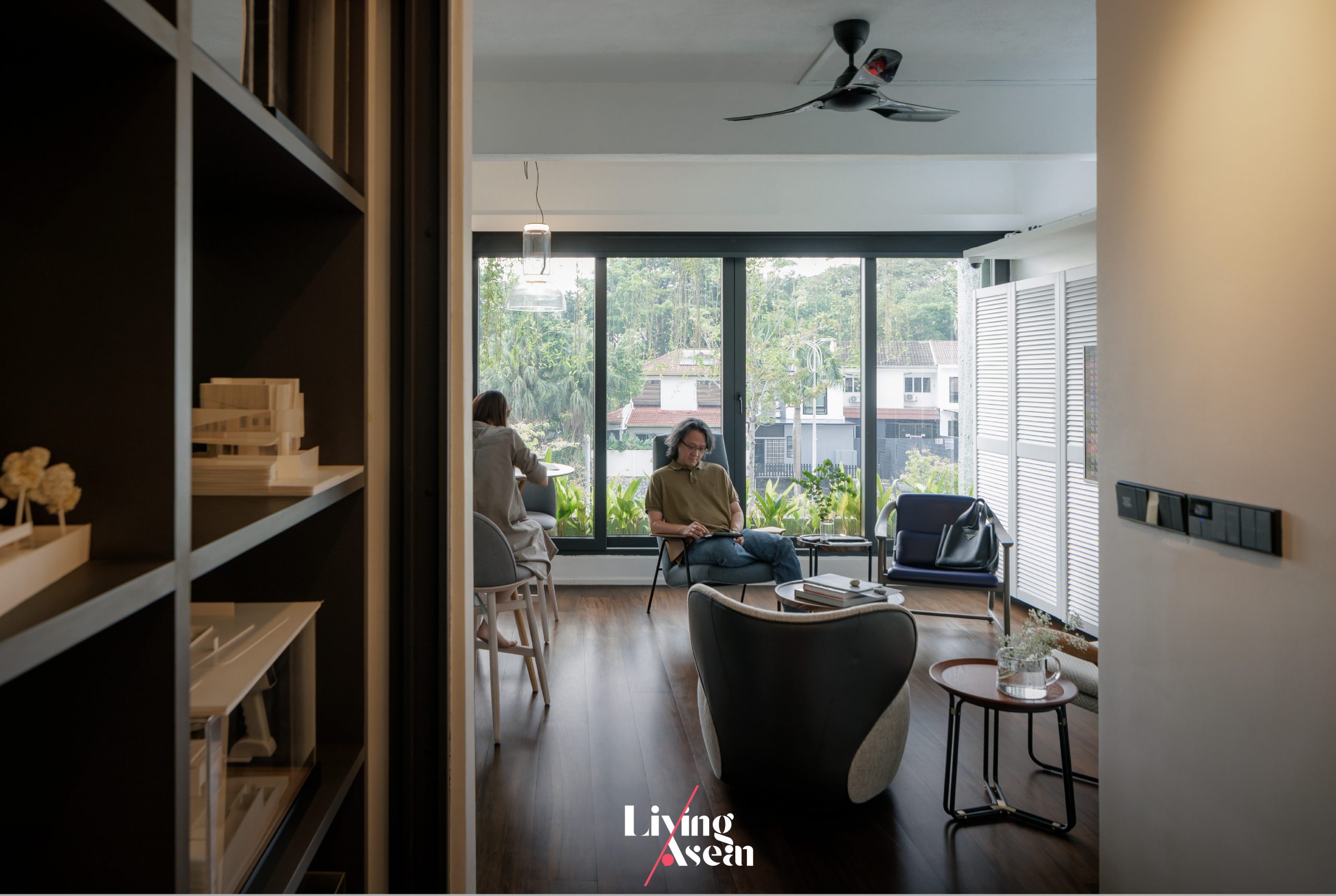
Mimicking an open-concept home plan, the third floor comprises a sitting room, eating room and kitchen arranged in a way that improves traffic flows. Its space within a space design allows each area to easily change to respond to altered circumstances.

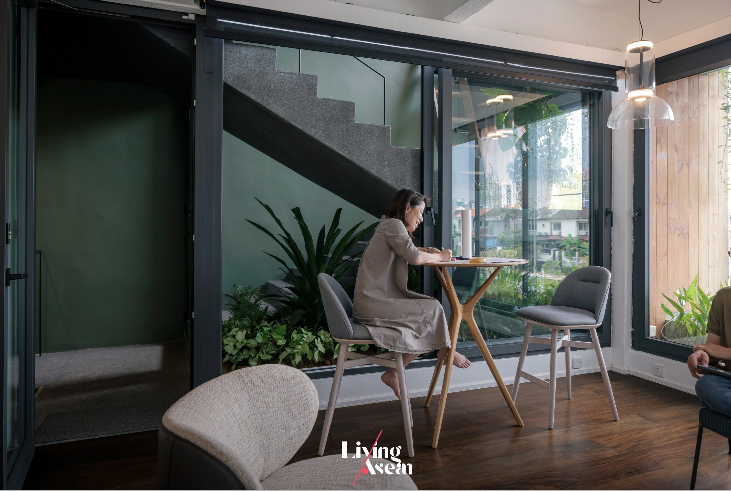
Take for example, the sitting room can transform into a workspace with coffee readily available. The meeting room can change into an eating room when not in use.

Home Office in Petaling Jaya
Like home, the office on the third floor is simple but cozy and comfortable.

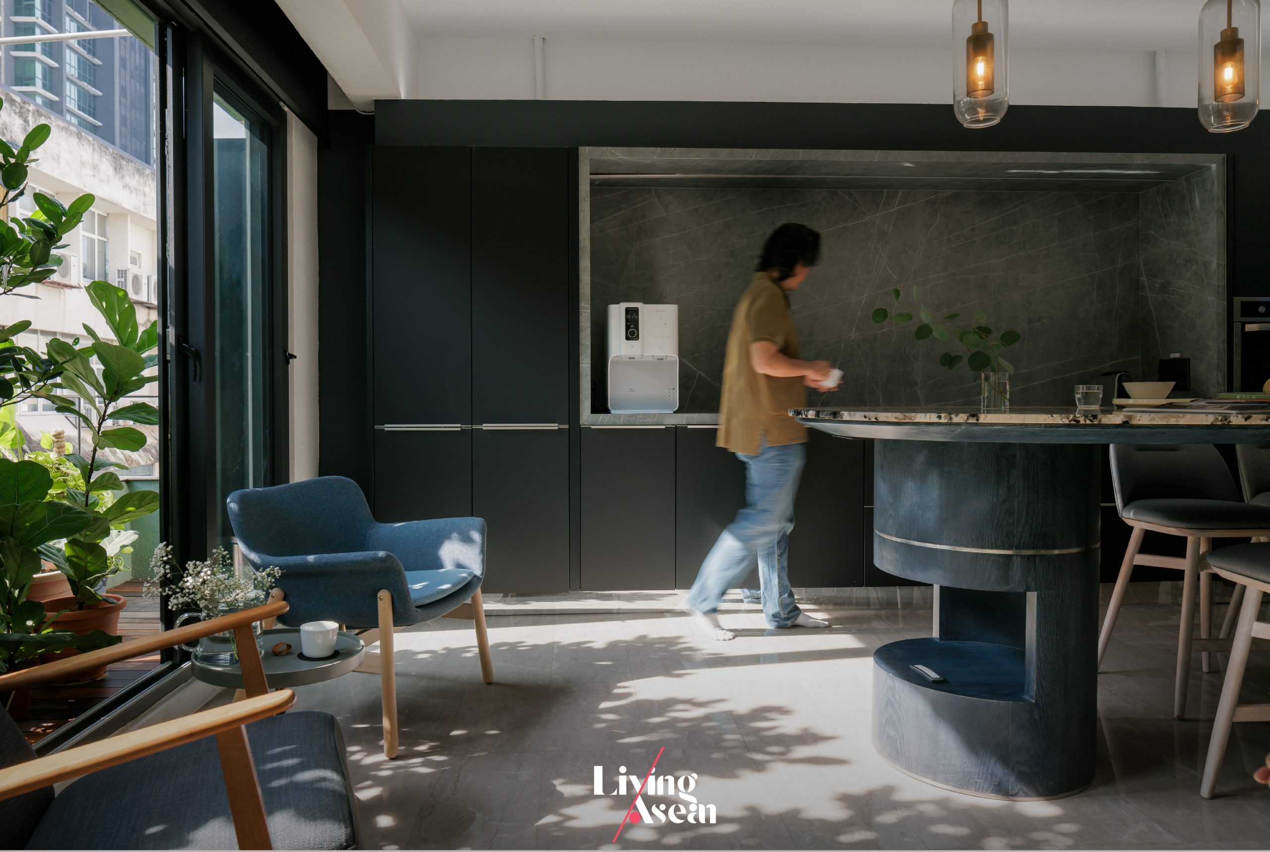
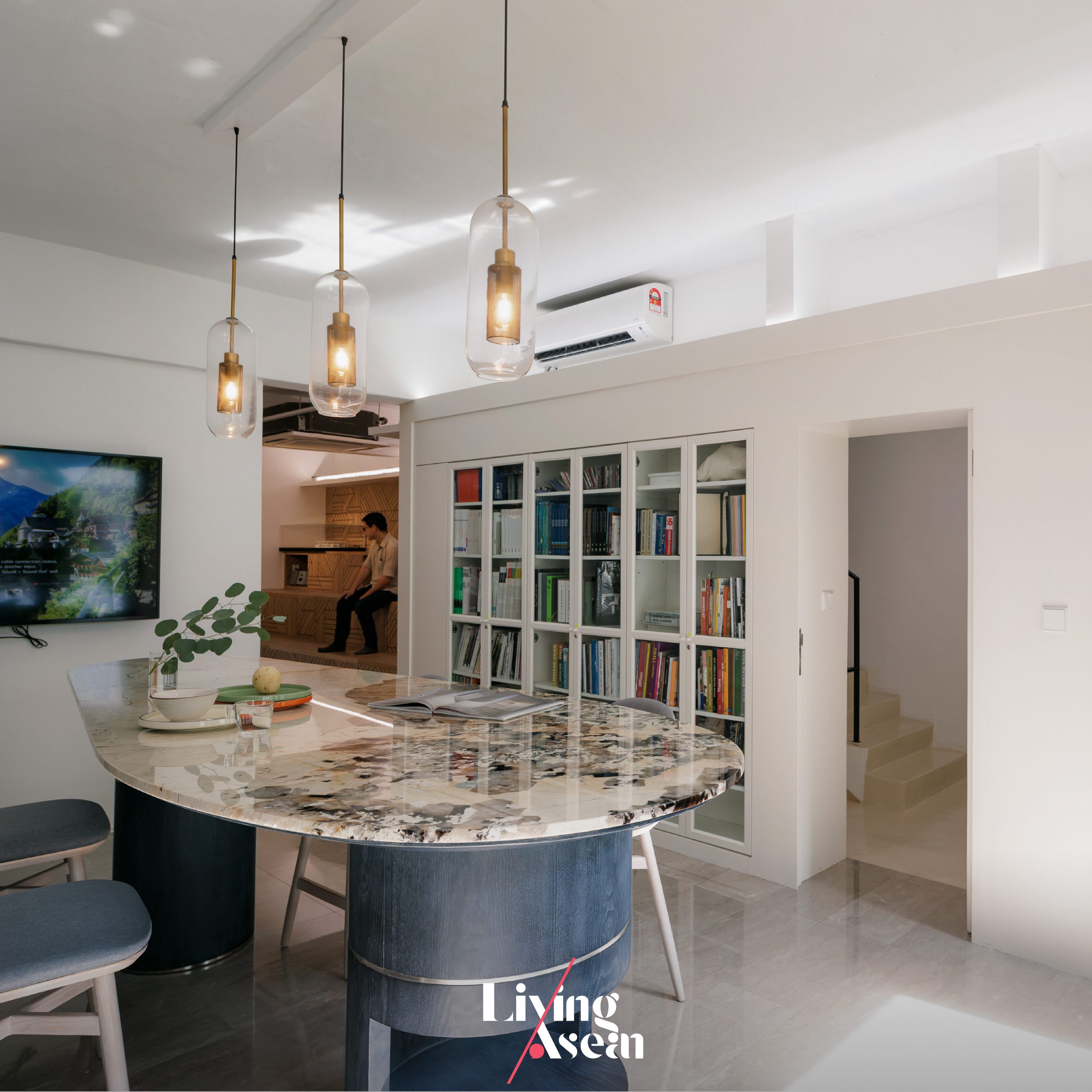
A living room-style kitchen island can easily change into a workspace if need be.

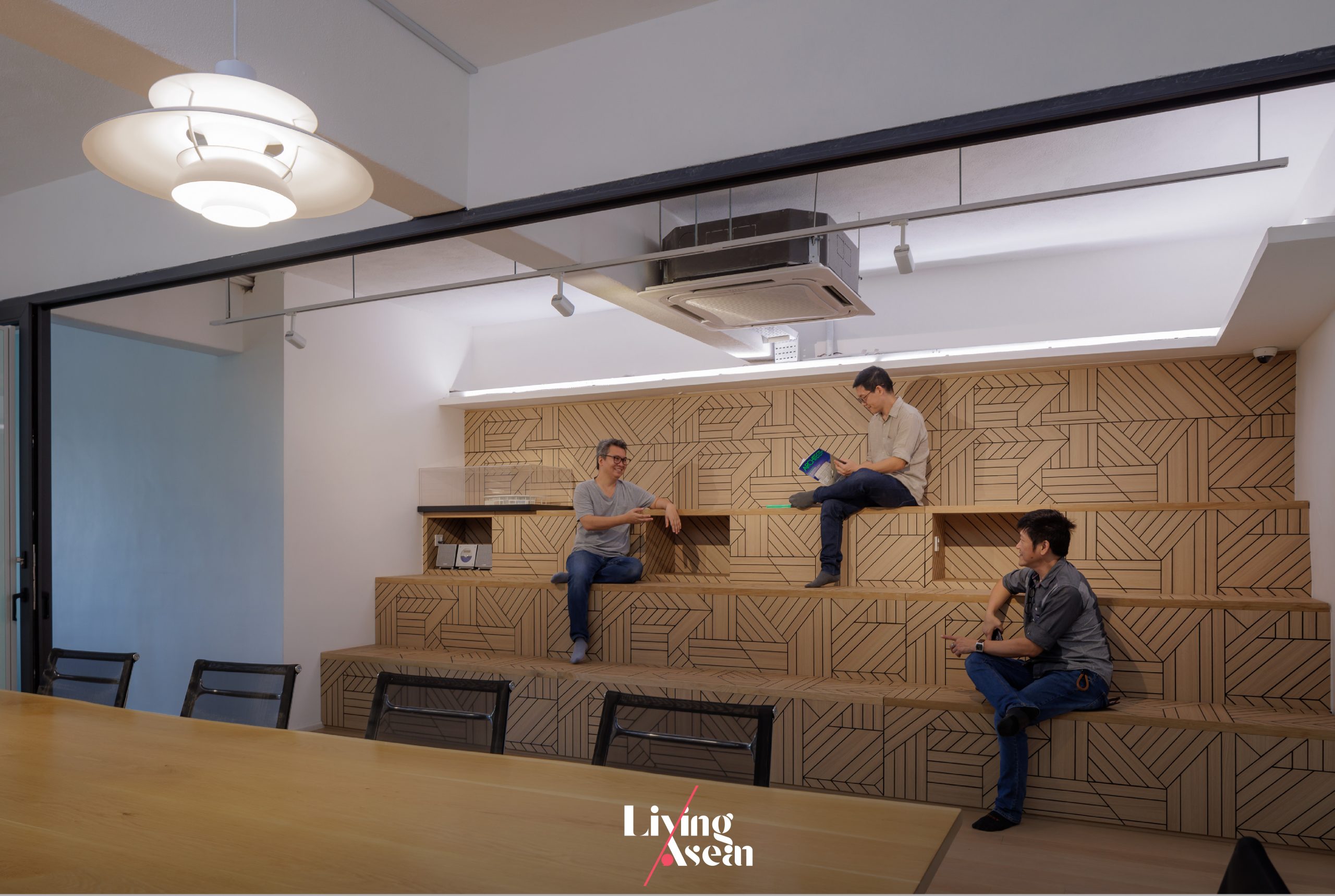
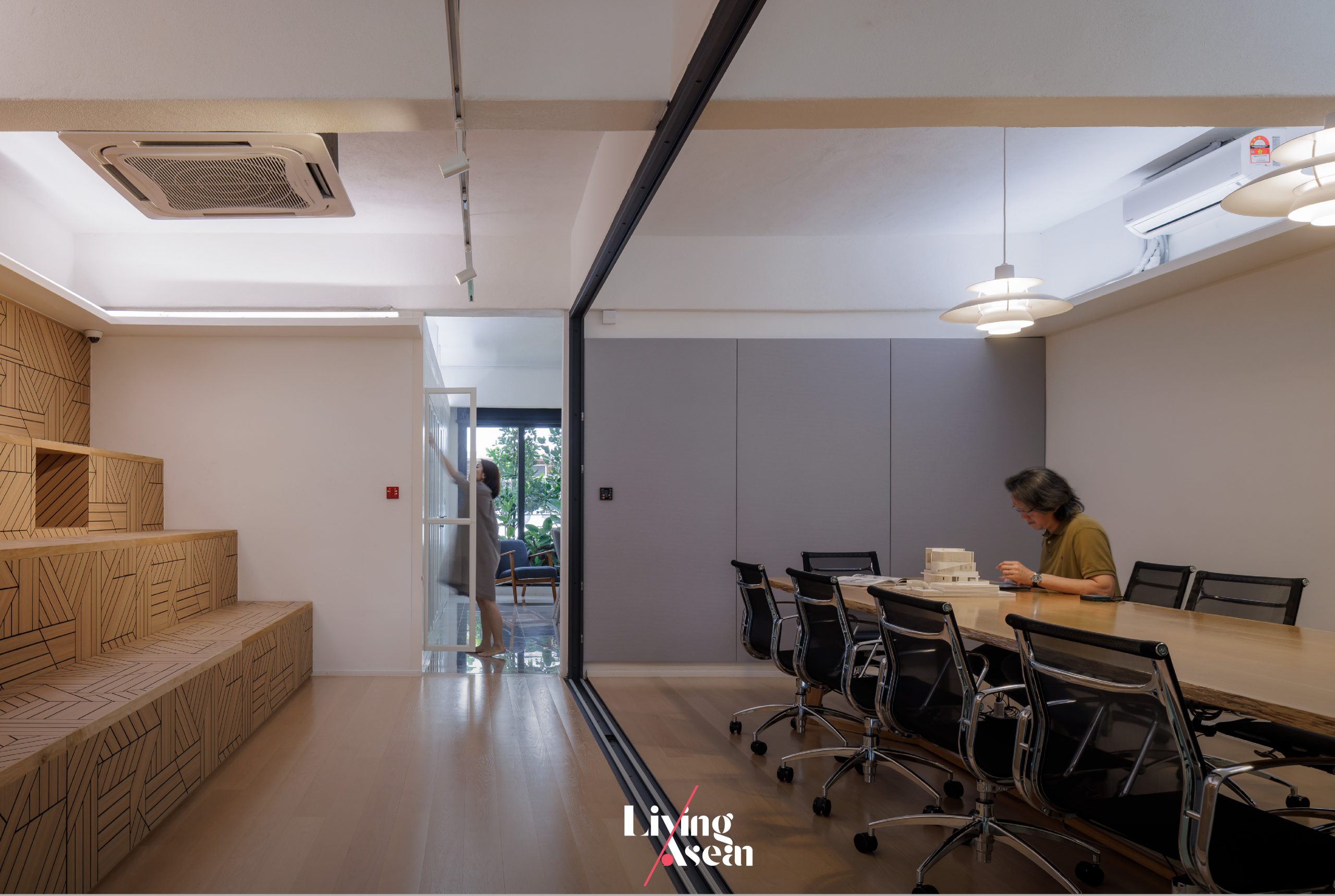
Across from the extra-long conference table there are storage shelves that double as stadium seating for fun team meeting ideas. There’s a floor-to-ceiling foldable partition that separates and protect the conference room from noises when a meeting is in progress.

The fully functional kitchen that lies at the farthest end can change into a venue for social gathering or a workspace if need be. The kitchen island is also good for work or spend time solo.

The third-floor meeting room becomes a dining room when not in use.

On the layout of the third floor, Chan Mun Inn said:

“The chief architect likes it here better than other places because it’s a flexible workspace. Come by and settle into a quiet corner, bring out a notebook and enjoy the peace and quiet.

“If there’s a meeting going on, simply escape to the nearby coffee shop. People can work at any place and from anywhere.”

Home Office in Petaling Jaya
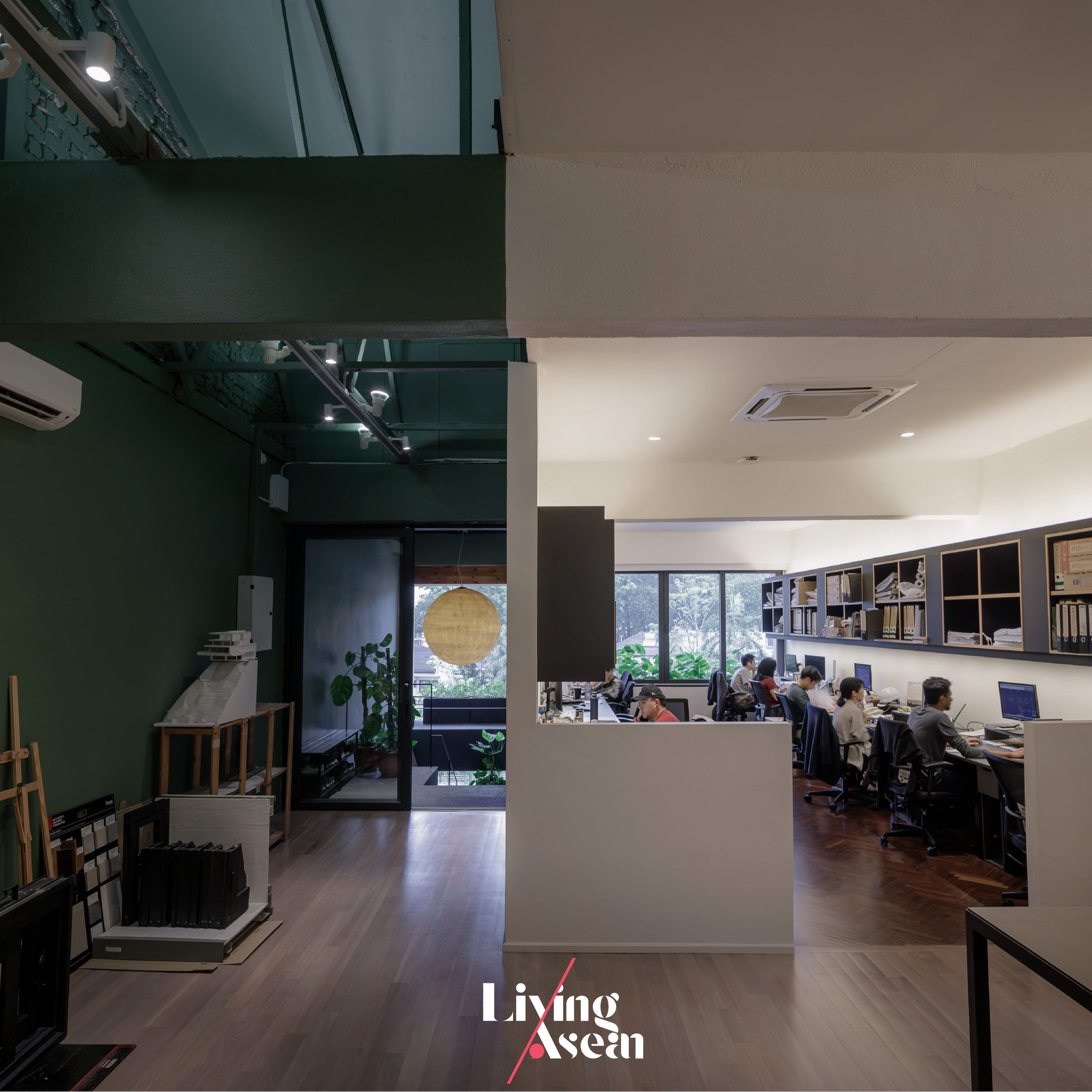
The top floor is home to the perfect office space.

For the sake of convenience, there is another set of stairs at the rear that connects to lavatories on every floor. The second, third and fourth floors contain workspaces dedicated to teams of architects and interior designers, while the ground floor is rented out to a business selling soy milk pudding.

All things considered, it’s a renovation carefully planned to blend seamlessly into the surrounding downtown business landscape. The architecture firm that starts from the second floor is easily accessible via the front staircase.

Architect Wong Pei San wrapped it up nicely. He said that essentially the renovation package was about “bringing home to the office”.

It represented a complete rethink of the firm’s strategies to do what was right and appropriate under the present circumstances. The results were gratifying, which earned the architecture firm a Gold Medal award from the Malaysian Institute of Interior Designers in 2021. Congratulations on a job well done!


Architect: EDI (Essential Design Integrated) (https://www.edi.com.my)
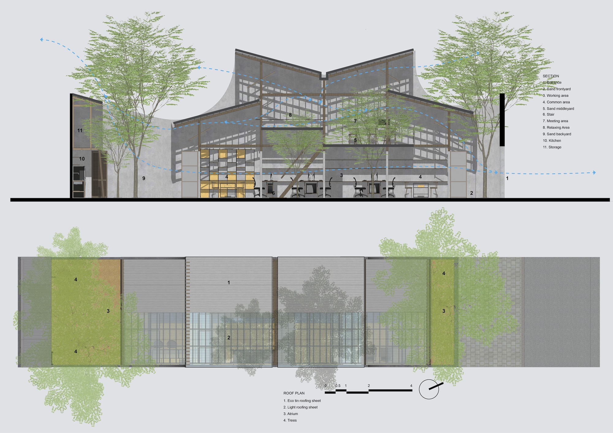

You may also like…

Goose Living From Row Houses to Charming Boutique Hotel

Incredible Small Townhouse Renovation in Selangor

Urban Farming Office: VTN Architects’ Office Gives Back Lush Greenery

Urban Farming Office: VTN Architects’ Office Gives Back Lush Greenery

/ Ho Chi Minh City, Vietnam /

/ Story: Phattaraphon / English version: Bob Pitakwong /

/ Photographs: Hiroyuki Oki /

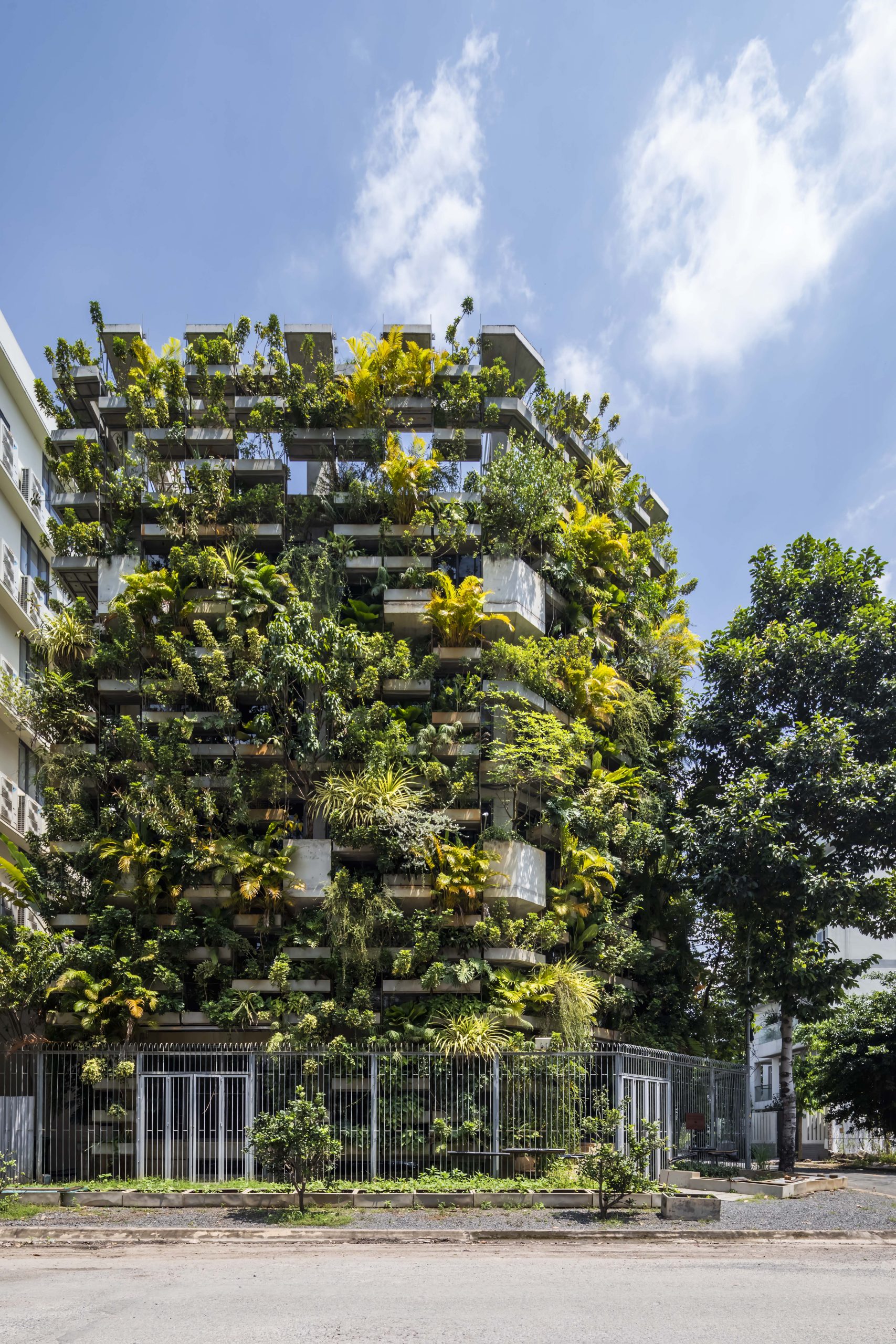
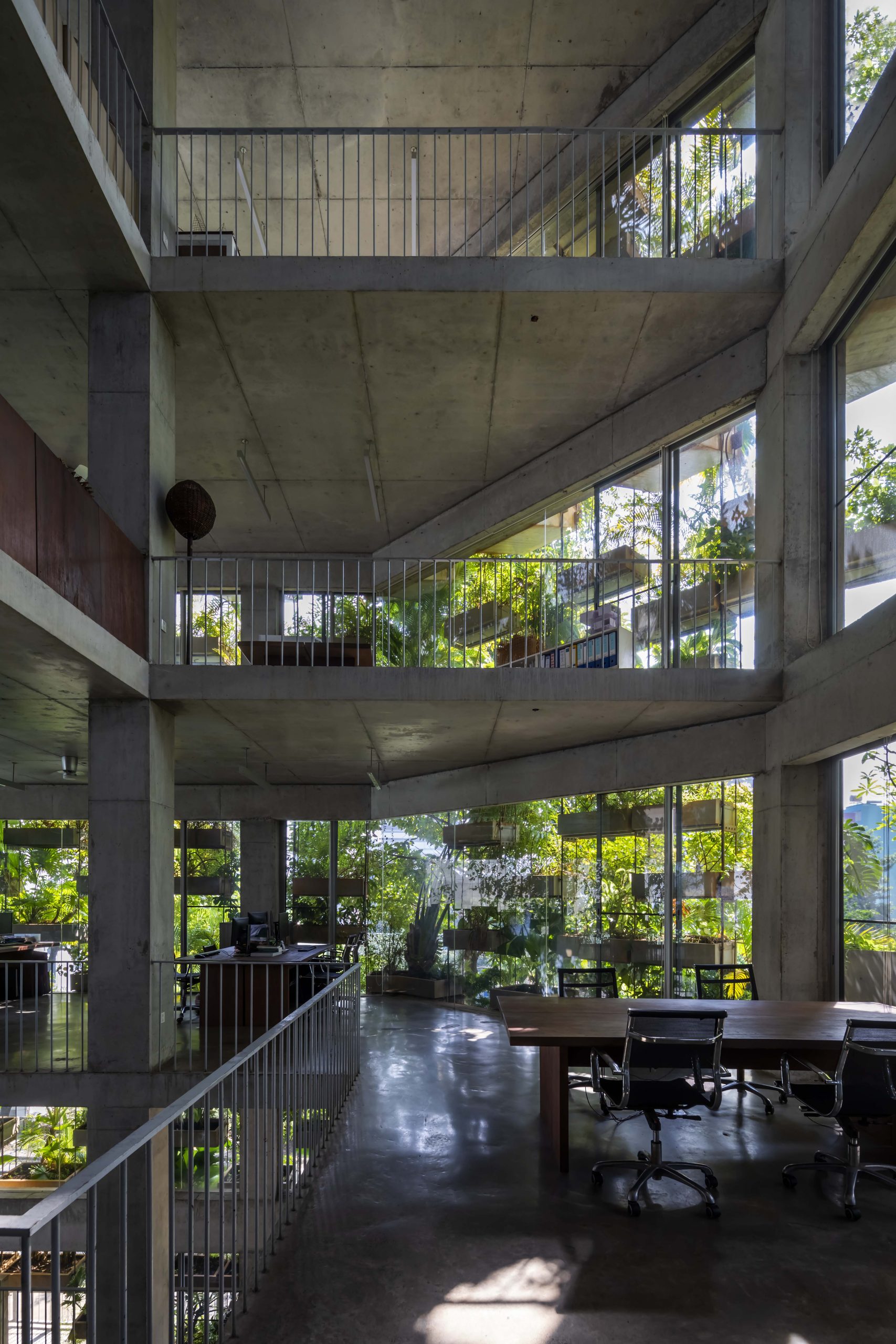
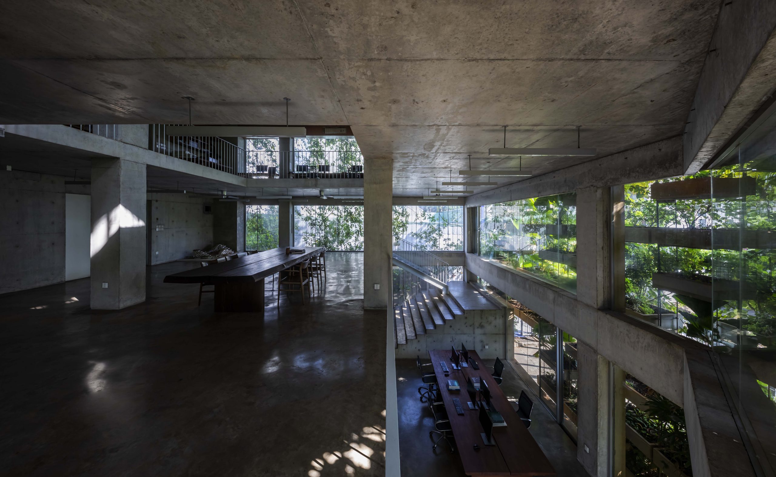
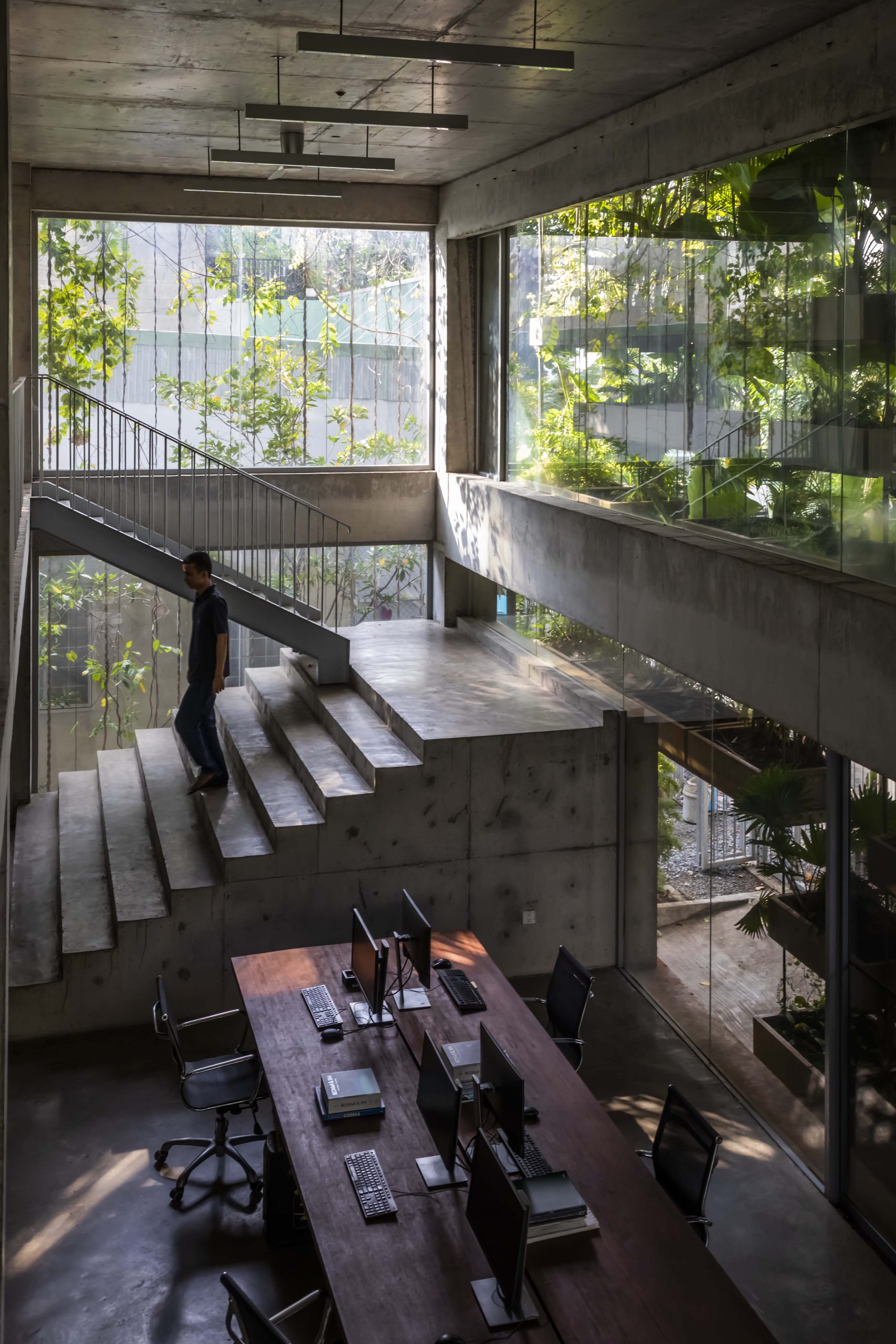
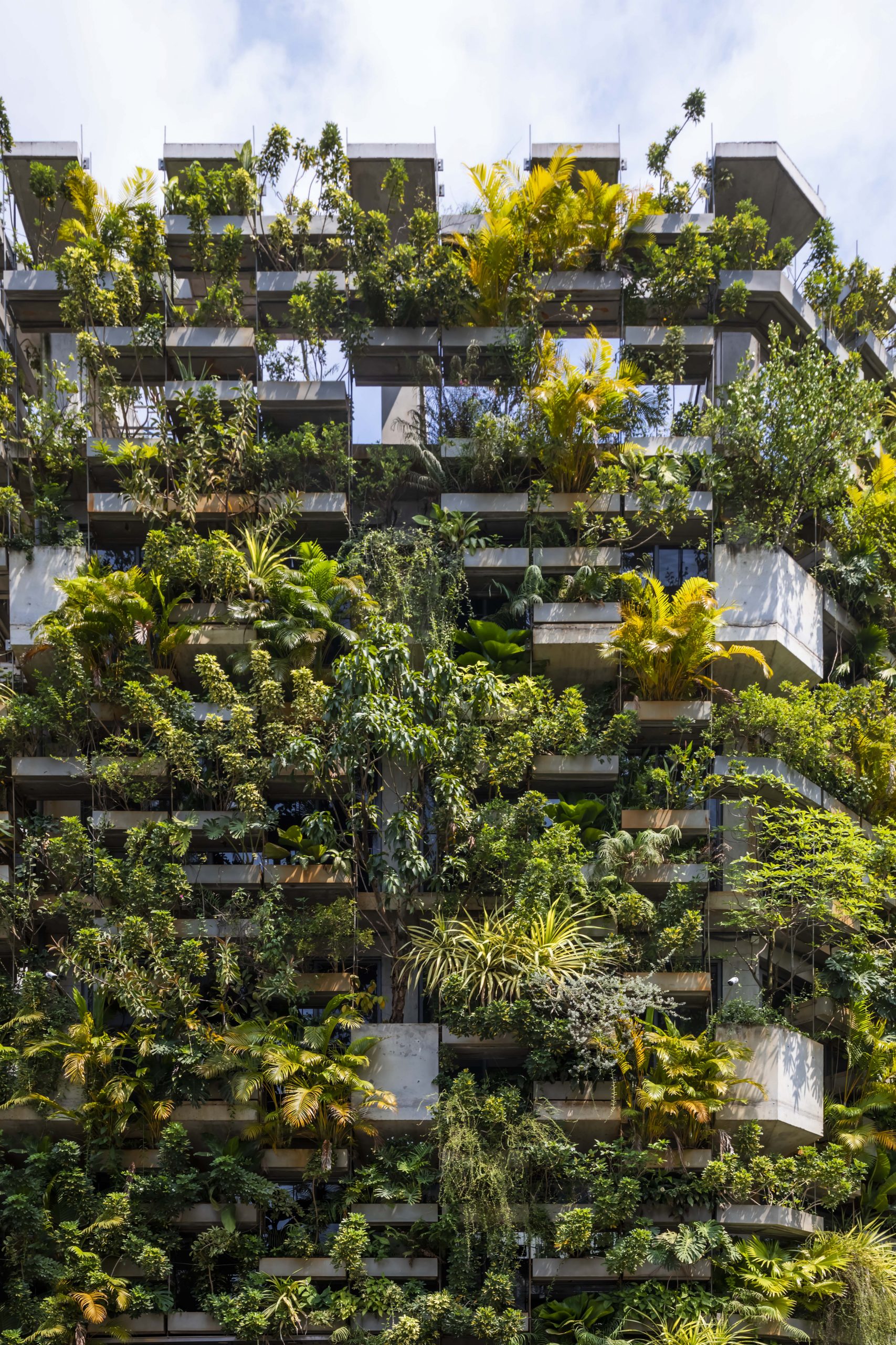
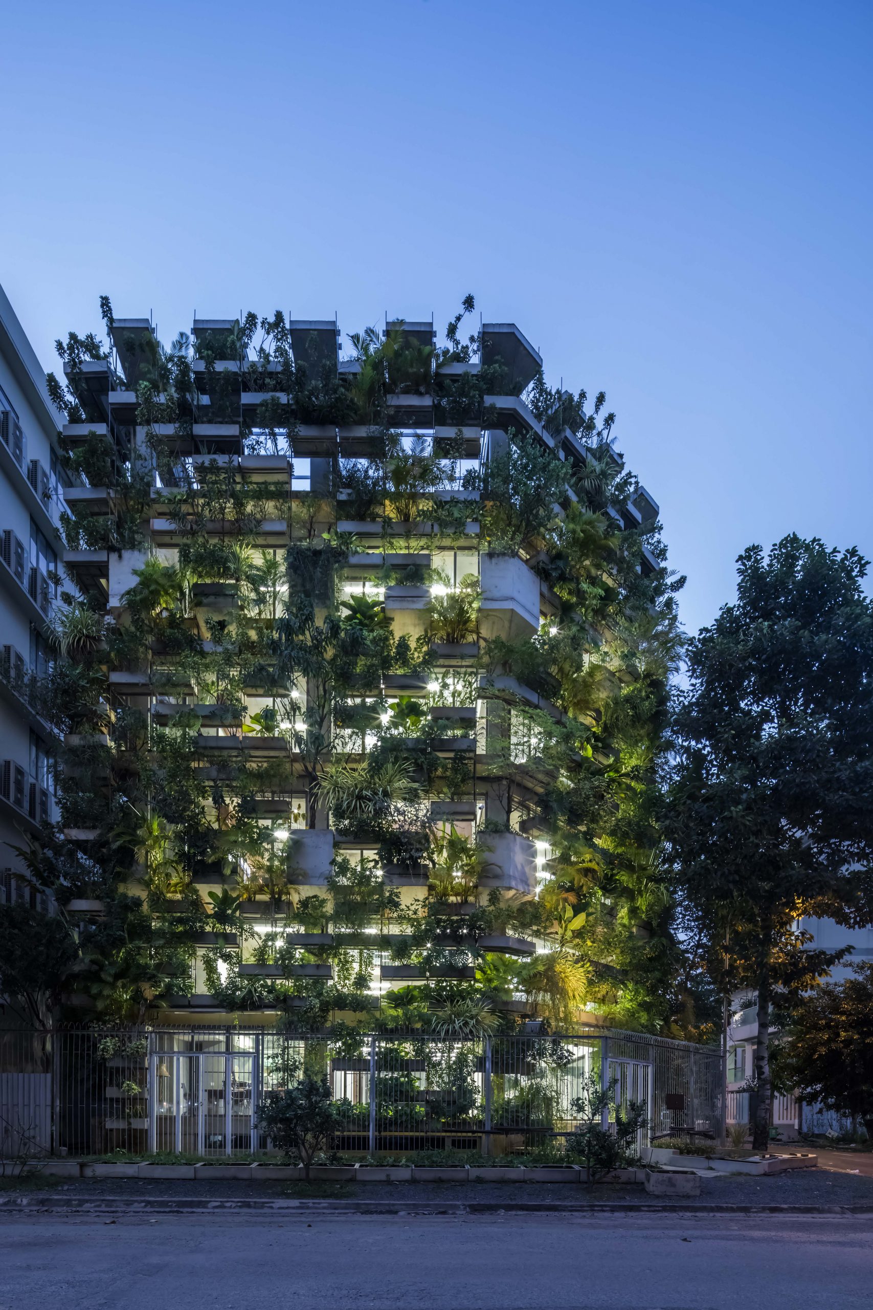
The design studio of VTN Architects (Vo Trong Nghia Architects) sits comfortably ensconced in a plant-covered six-story building in Ho Chi Minh City. The 1,300-square-meter office block is adorned with balconies containing lush green gardens that combine to create a vibrant building shell. It’s a design based on an understanding of the challenges facing big cities and the importance of environmental conservation.
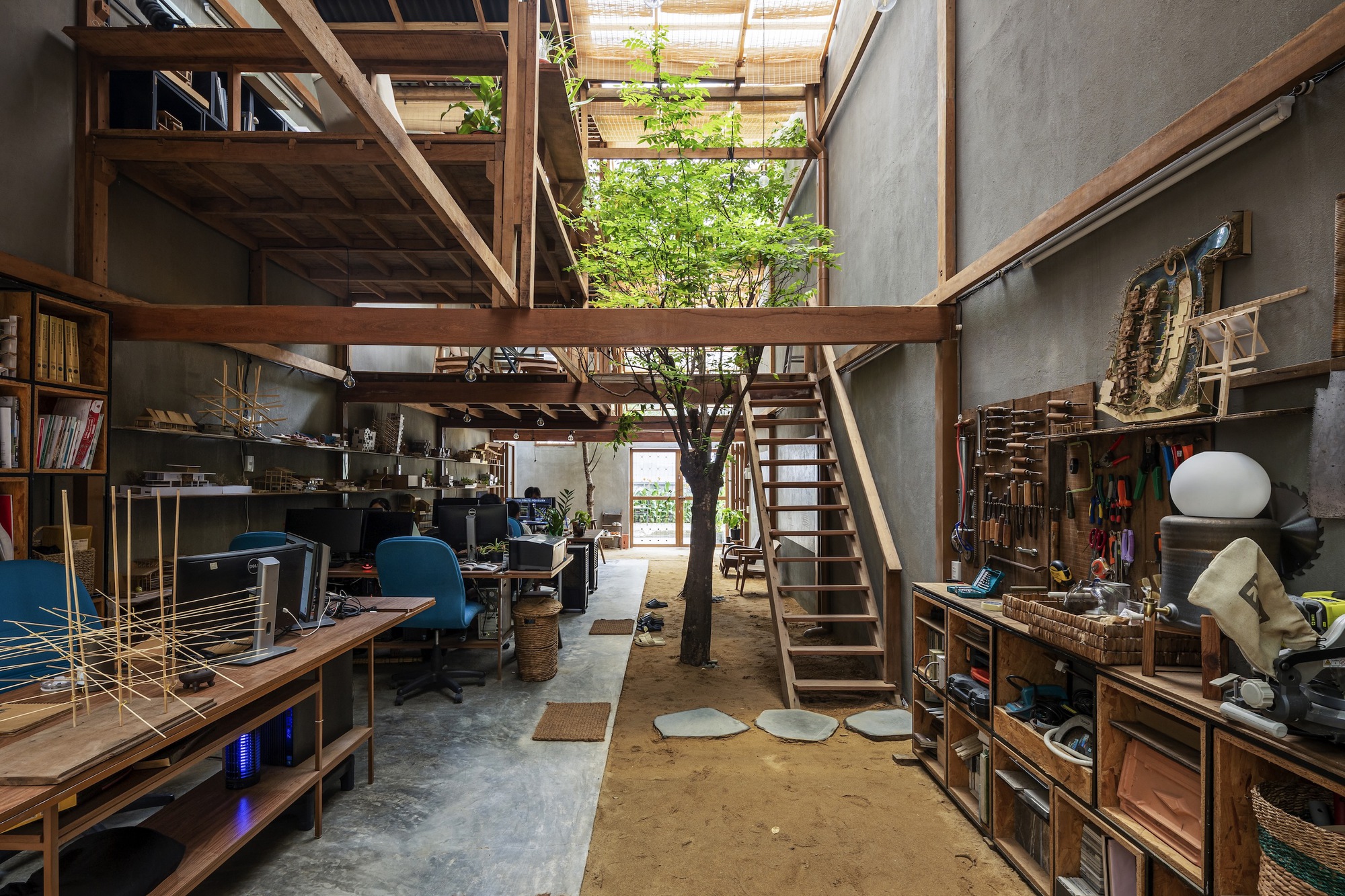
VTN Architects

Far and wide a lack of recreation areas and green spaces, coupled with rapidly worsening air pollution, is causing serious health problems for people in urban areas. It’s for this reason that living trees and shrubs are integrated into the ‘ building’s external envelope.

The result is a green office block that brings fresh air to the design. Here, easy-care trees cool the air, provide shade, and filter out dangerous, fine particulate matter. It transforms ideas into solutions as Vietnam, a developing country, joins a global network of advanced manufacturing hubs.

Precisely, it’s a design rooted in good environmental management practice that aims to minimize human impacts on surrounding ecosystems – a fact that’s easy to overlook when planning a building. Also known as the Urban Farming Office, it communicates a message that failure to do so will have unpredictable and often undesirable consequences.
VTN Architects

VTN Architects

VTN Architects

The Urban Farming Office isn’t just home to a design studio. It’s also a perfect example of innovative companies driven by a desire to go green in the workplace.
Plus, it gives back healthy lush foliage and a breath of fresh air to the city. That’s not all though. It draws attention to many possibilities of vertical gardening – techniques to grow more in less space.

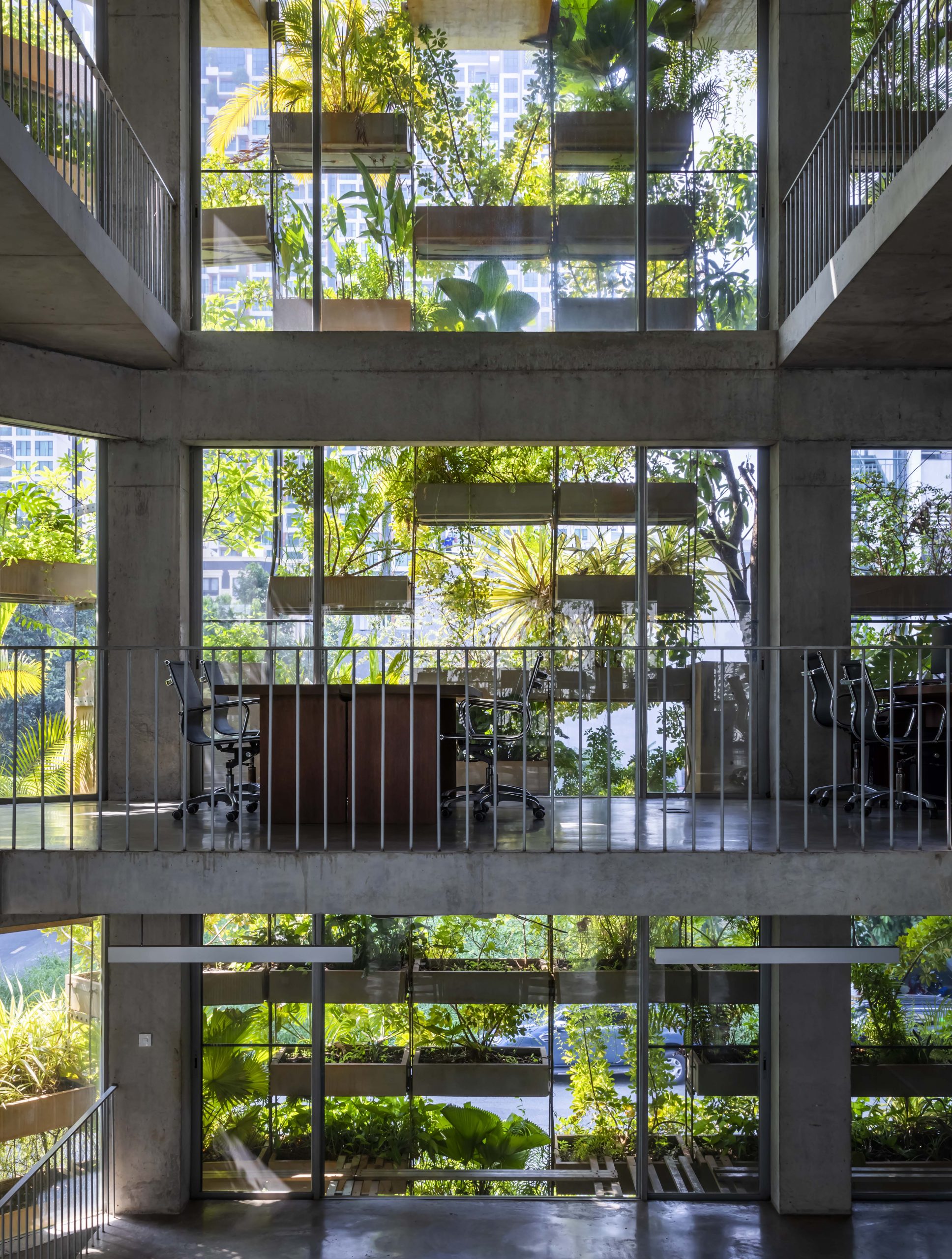
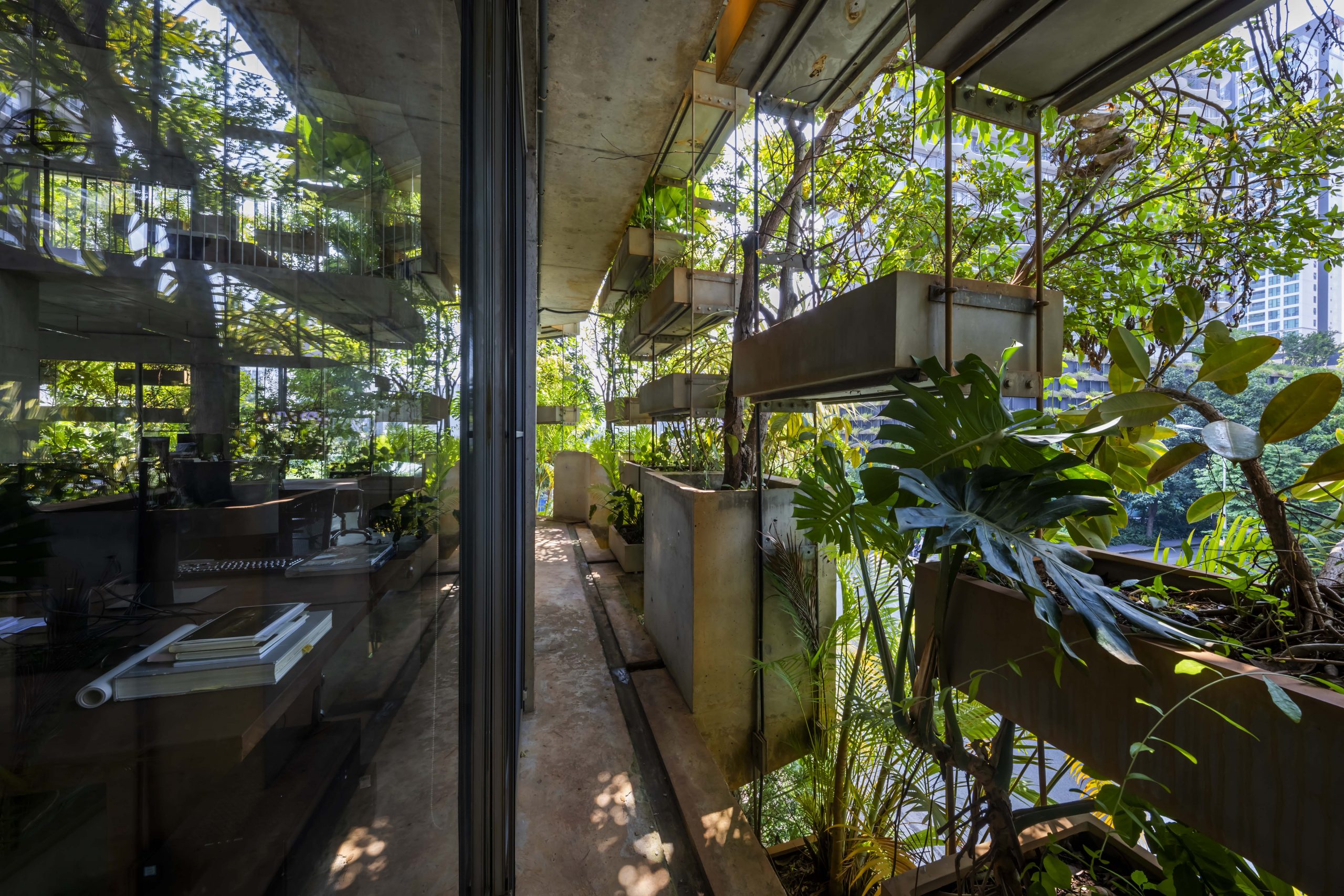
From the outside looking in, the building façade looks like a botanical laboratory lined with decorative concrete containers where trees and plants grow. They are mostly easy-to-care-for native plants that thrive in local ecosystems. Where appropriate, seasonal vegetables, herbs and spices are grown organically to meet family needs. It’s a way to live a more sustainable lifestyle.

And it’s safe, eco-friendly, and even energy efficient.

VTN Architects

VTN Architects

VTN Architects

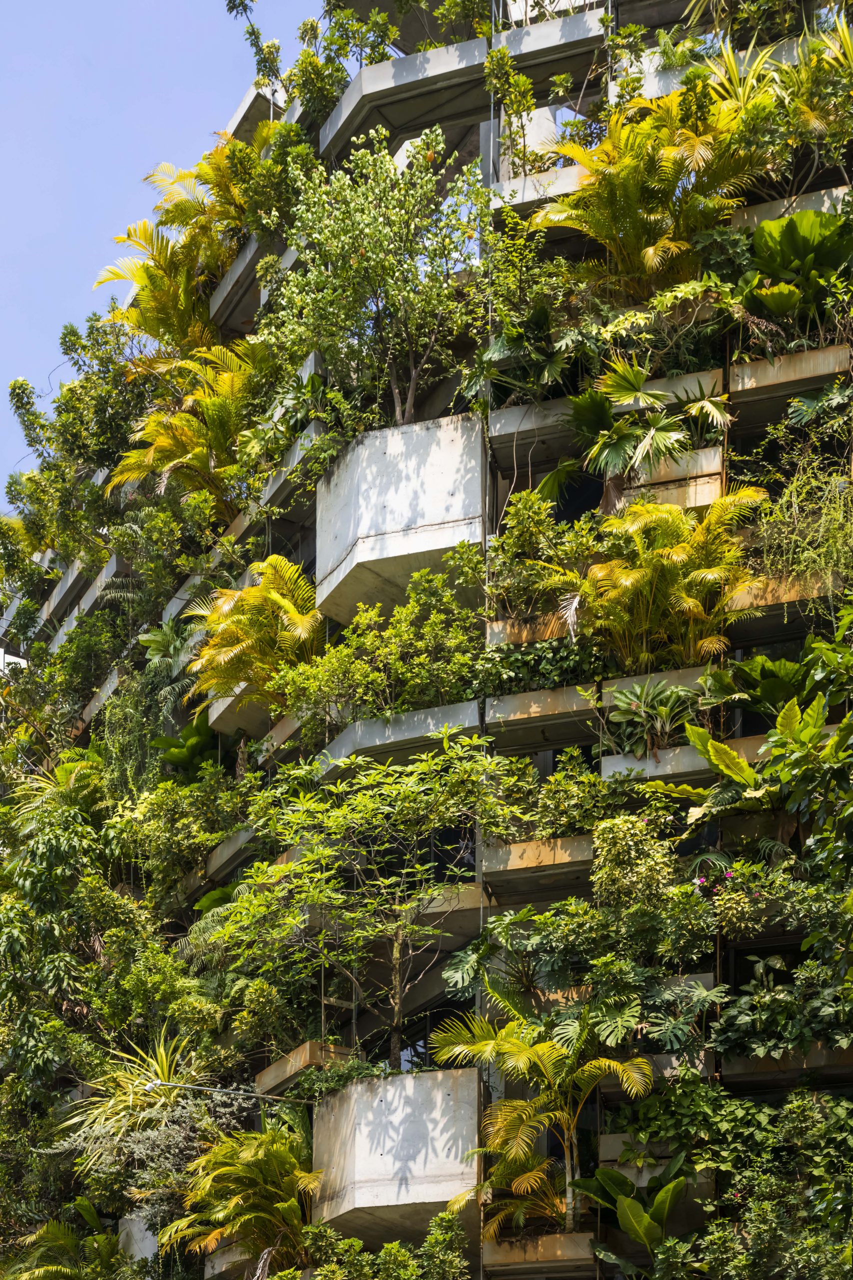
From a distance, thriving vegetation turns the bland building shell into a lushly planted living façade. Overall it’s a straightforward concrete construction with outdoor platforms attached to the side of the building.

These balconies are filled with modular concrete planters designed to be moved easily depending on the height and growth of trees. This ensures that each particular species gets sufficient amounts of sun to grow.

Combine biodiversity in the balcony and rooftop gardening with the surrounding landscape, and you get an expansive urban forest that amounts to 190 percent of the total project area. As the architect puts it, this translates into 1.1 tons of vegetation including native edible plants, vegetables, herbs and fruit trees carefully chosen as being the best and most suitable.

Also, it’s organic farming and the quality of being diverse that give the office building a cheerful and positive personality.

VTN Architects

VTN Architects

VTN Architects

Walk past the front façade, and you come before an inviting first impression. The window, doorframe and exterior wall are glazed entirely with glass to protect interior rooms from the elements.

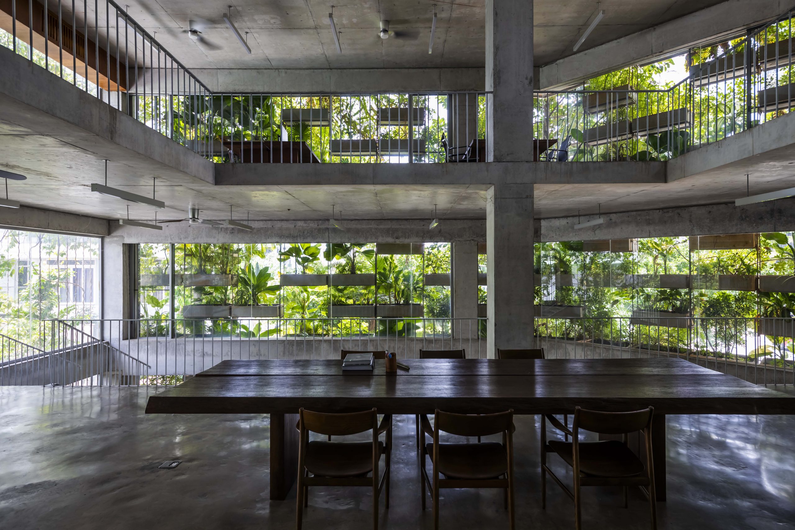
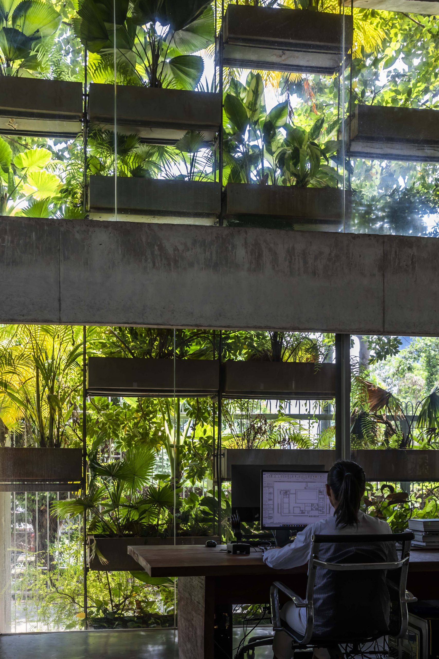
On the outside, lush green vegetation doubles as a building envelope that filters out harsh sunlight while allowing plenty of fresh, outdoor air to pass into the interior workspaces. Plant watering is done using rainwater stored in catch basins strategically placed around the building.

The irrigation method that sprays water droplets overhead with sprinklers also keeps the ambient temperature cool, thereby saving money on air conditioning costs.

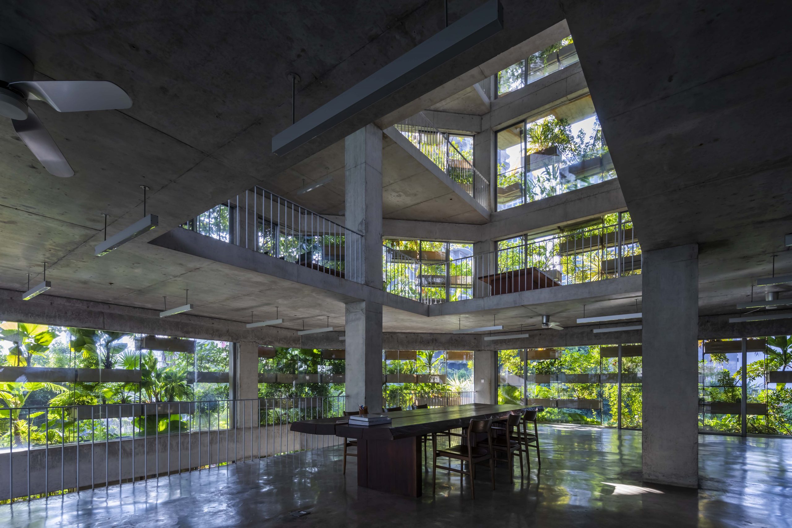
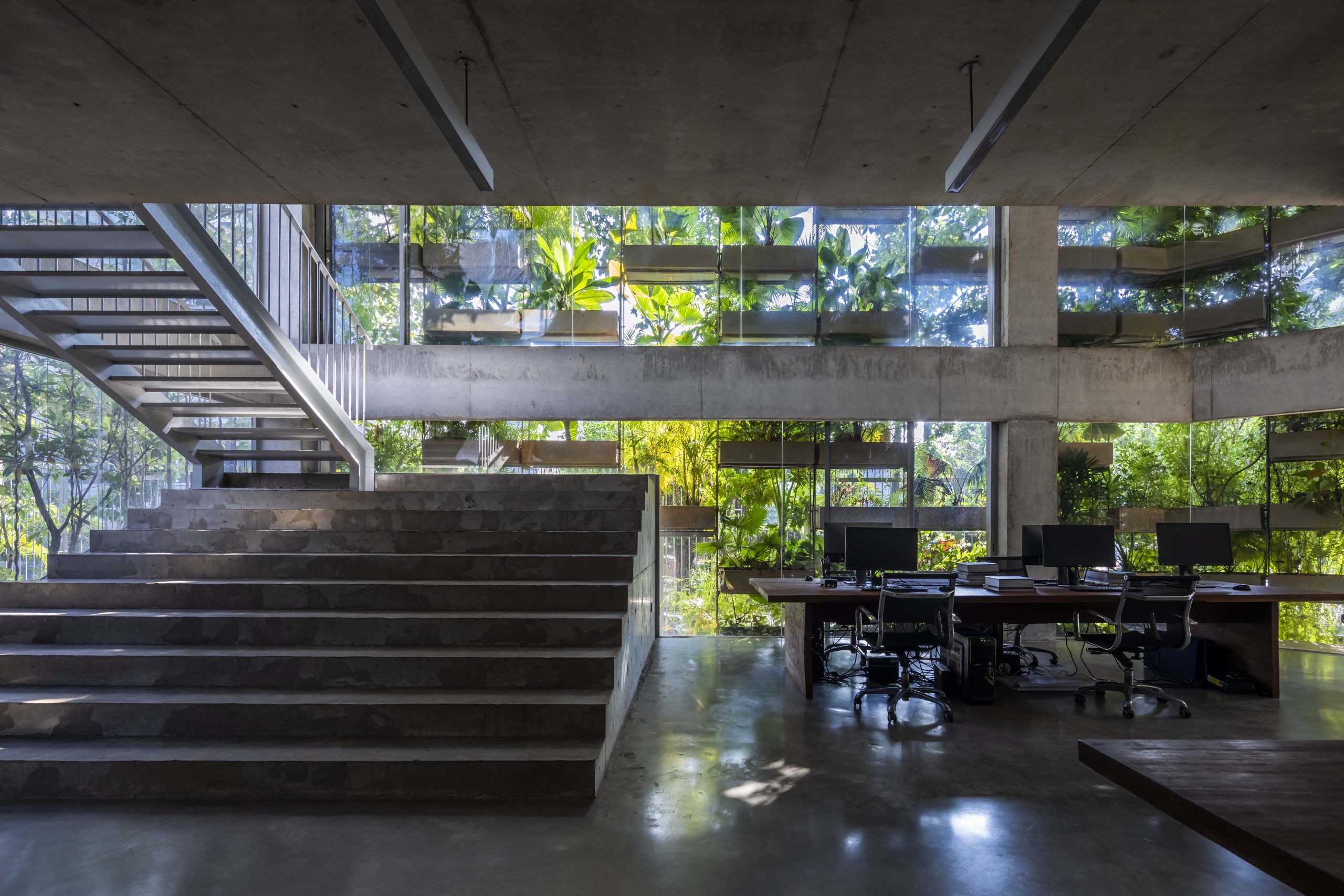
On every level, the open floor plan boasts clean lines that make the interior workspace look more spacious and well-ventilated all day long. All told, it’s the ingenious double wall design that makes living a whole lot easier and less stressful.
VTN Architects

VTN Architects

To give a brief summary, green architecture isn’t the only feature that makes this office building stand out from the rest. Rather, it’s also the image of organizational culture that speaks volumes for the determination of the architects who live and work here.
VTN Architects have demonstrated that humans and the environment can coexist symbiotically. This is achievable by letting nature permeate and be a crucial part of the city and any office design. It’s the way forward in creating a more equitable, sustainable future.

VTN Architects


Owner/Architect: VTN Architects (Vo Trong Nghia Architects)


Reuse, Repair, Upcycle

Reuse, Repair, Upcycle

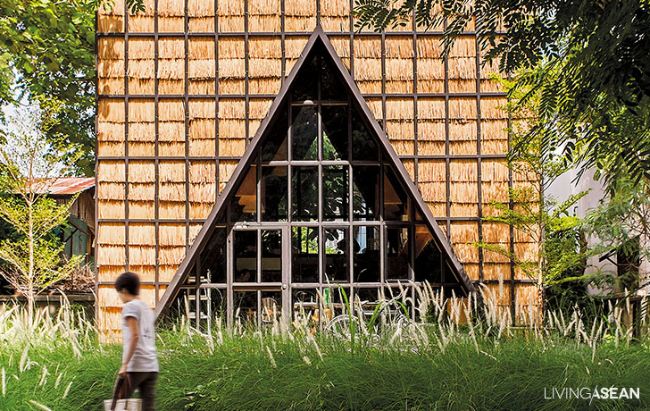
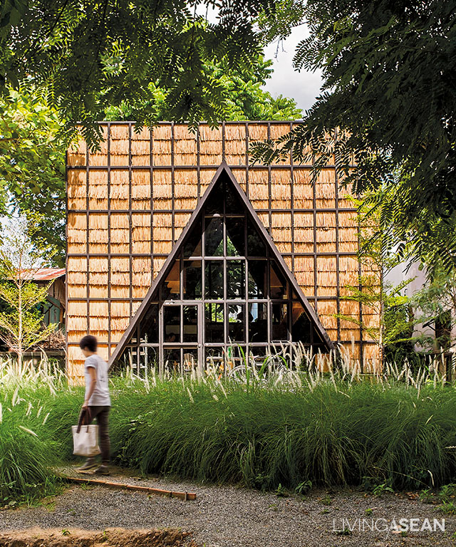
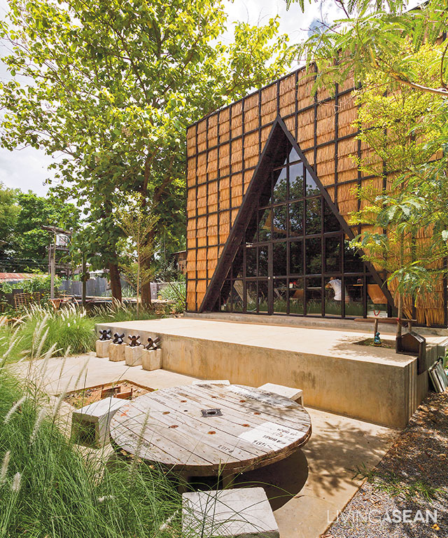
As a child he liked designs connecting old traditions with environmental awareness. This found expression in this straw-covered cubical building reminiscent of a farmer’s paddy hut.

/// Thailand ///

Story: Nutt /// Photography: Chaiyaphon Sodabanlu

Design: Ronachai  Khanbanya, Mae Khaning Creative Co., Ltd

1
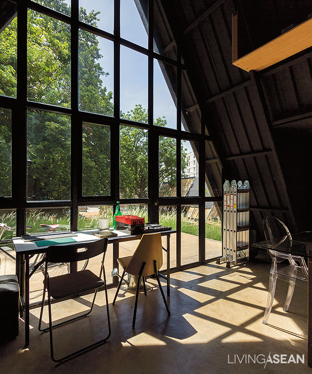
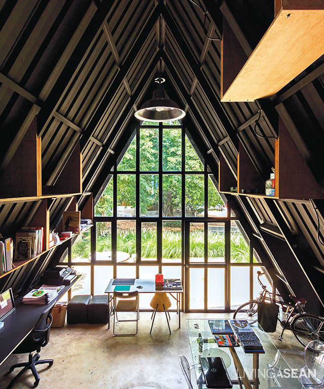
A single large pane is expensive, so smaller ones are set into a metal frame, economical and also tasteful, reflecting the framework of the building.

Ronachai “Art” Khanbanya, architect from Mae Khaning Creative Co., Ltd, has redesigned a lot of old offices and developed a preference expressed in the slogan “reuse, repair, recycle.”

Reuse” is putting things that are still usable back to work again.

Repair” is fixing broken or abandoned things and making them useful once more.

Upcycle” is designing discarded materials for new use.

“Our old office near the city moat was small and inconvenient. We relocated here for the pleasant atmosphere. Having to rent, we designed a structure we could easily dismantle and reassemble. Budget was important in choosing building materials.”

2

3

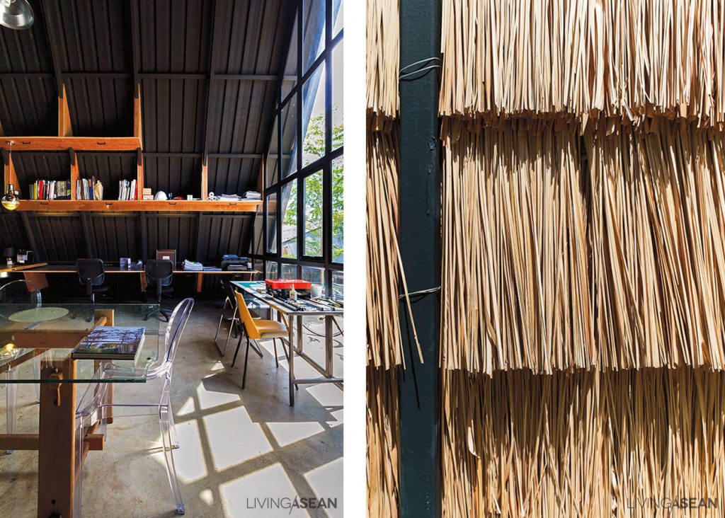
The structure is tent-like: a frame of 6-meter-long box steel beams supports a high gabled structure. The entrance gable has glass panes set in a metal framework. Outside walls are thatched with cogon grass, effective heat insulation that helps save energy and is also excellent soundproofing. Sheet metal lines the inner walls.

4
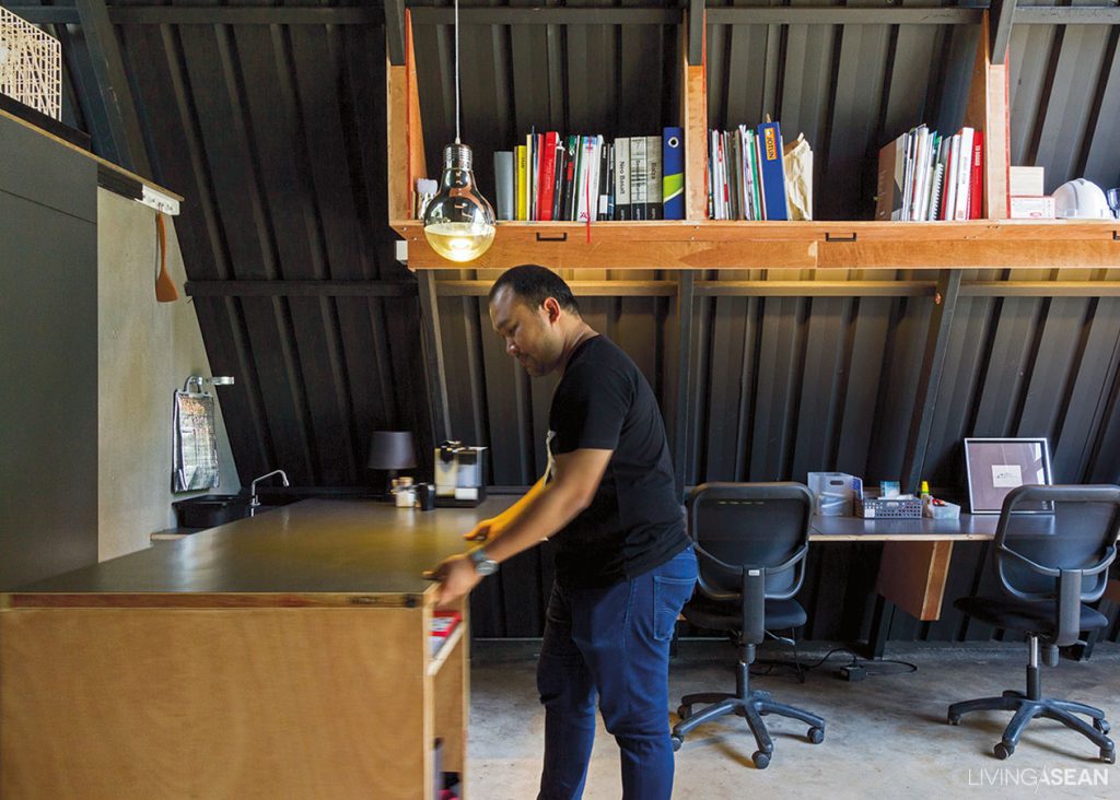
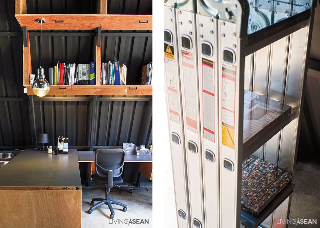
An old door panel transformed into a sliding counter for a multipurpose table: adaptable to work desk, dining table, or for kitchen use.

“Easy-to-use materials like cogon grass are locally available, and give the building a distinctive look. I wanted to show that cheap materials could be not only effective, but also beautiful. We’ve had pretty good success without having to use expensive imports. The new generation of designers should get aware of what’s here already.”

5
Metal wall, second floor heat insulation, creating intra-wall space for good air circulation. /// Cogon grass roofing, effective use of local materials for good heat insulation and soundproofing.

Furniture and décor here is quite simple, as seen in the particleboard shelving and the use of an old door to create a sliding counter. Art was aiming for a universal space, with furniture adaptable for work, eating, or food preparation.

6
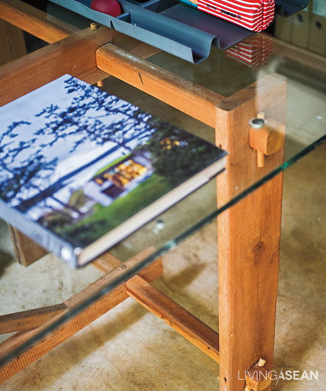
The tabletop is made from an old unused pane of glass attached to make a new table using shims and pegs.

“I’m thinking a completely new lifestyle, not like old office designs, more an arrangement of work tables in a relaxing environment, like working at home or chilling at a café. We find comfortable work environments work for other sides of life, too.”

7
A shelf is crafted of simple materials such as unpainted particleboard. /// A stepladder: When not in use, it can be used as shelving.

The garden outside is a comfortable space where you can drink coffee at a table made from a cable spool. Landscaping features fountain grass, which doesn’t require a lot of care and fits in with the “paddy hut” theme. The walkway curves around before shortcutting into the building, evoking the image of paddy dikes. “Everyone wants to live in the country. In Chiangmai these days you see only buildings, not many plants. The plants here make it fun to come to work.”

8
The outside area in front of the building is used as a living and relaxation space for drinking coffee. A cable spool is used for a table. Landscaping is fountain grass, easy to care for and evoking thoughts of a life in the fields.

This office is comfortable. It has complete functionality, and saves on materials, construction, and energy. Good for the environment, good for the folks working there. “The more you think, the more you save” should be the credo of a good designer. The evidence is here: as Art says, it’s a great place to work.

link: https://www.facebook.com/MKNCOLD/

X