/ Kuala Lumpur, Malaysia /
/ English version: Bob Pitakwong /
/ Photographs: Apinine Thassanopas /
In the ASEAN region that’s known for warm temperatures and high precipitation, creative design has made the best possible use of abundant sunshine, seasonal winds and the visual beauty of land to achieve comfort and well-being at home.
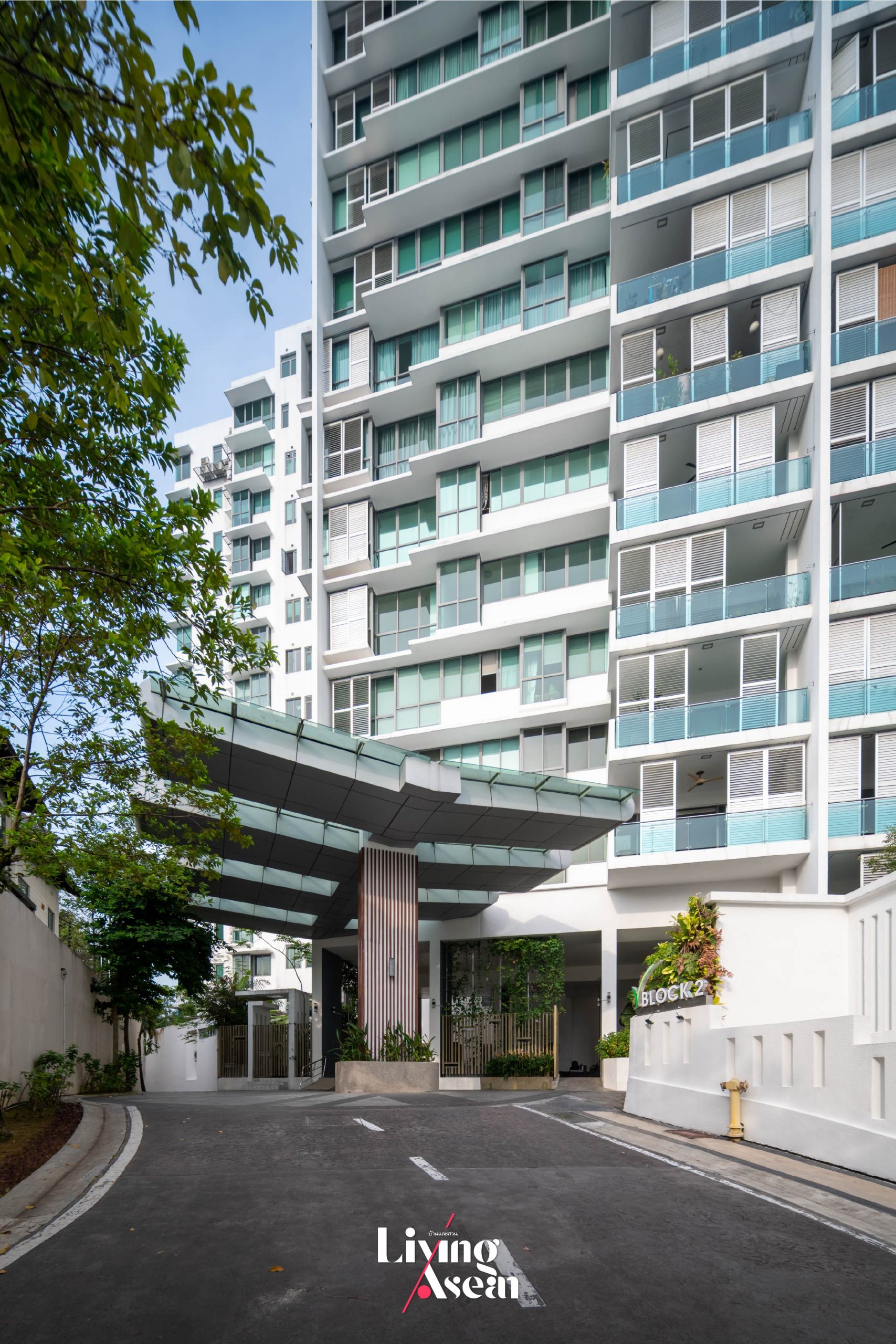
We’d love for you to come check out a newly updated contemporary-style condo unit inside “The View at Serai Saujana”, a residential development located on the outskirts of Malaysia’s capital Kuala Lumpur. The beautifully restored home belongs to Ms. Elaine Chew. It’s the epitome of design integration combining elegance and modern innovations to create physical comfort, emotional well-being and functionality.
Inspired by Hanok, a traditional Korean house, the renovation work is the brainchild of interior designer Effendy Nadzri, who is co-founder and design director at Endo Sdn. Bhd. Meanwhile, take the time out of your busy schedule to explore new technological innovations designed to create clean air at DAIKIN SOLUTION PLAZA in Kuala Lumpur. The show is part of ASEAN HOME TOUR Series, a Baan Lae Suan TV program sponsored by Daikin.
Design Challenges and Inspirations
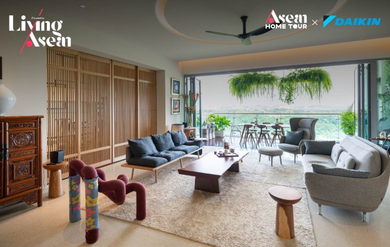
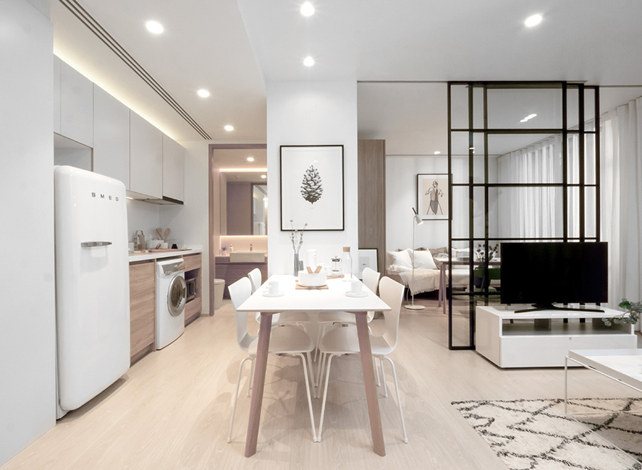
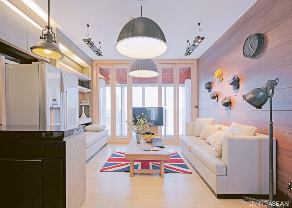
Blessed with a scenic golf course view, the charmingly restored condo unit boasts the spacious appeal of an open-concept floor plan. Because the couple came from different cultural backgrounds, they needed a home that celebrates a sense of history and heritage. The result is a rich tapestry of ideas, customs and understanding between Ms. Elaine Chew who is Malaysian of Chinese descent, and her better half who is a Korean engineer.
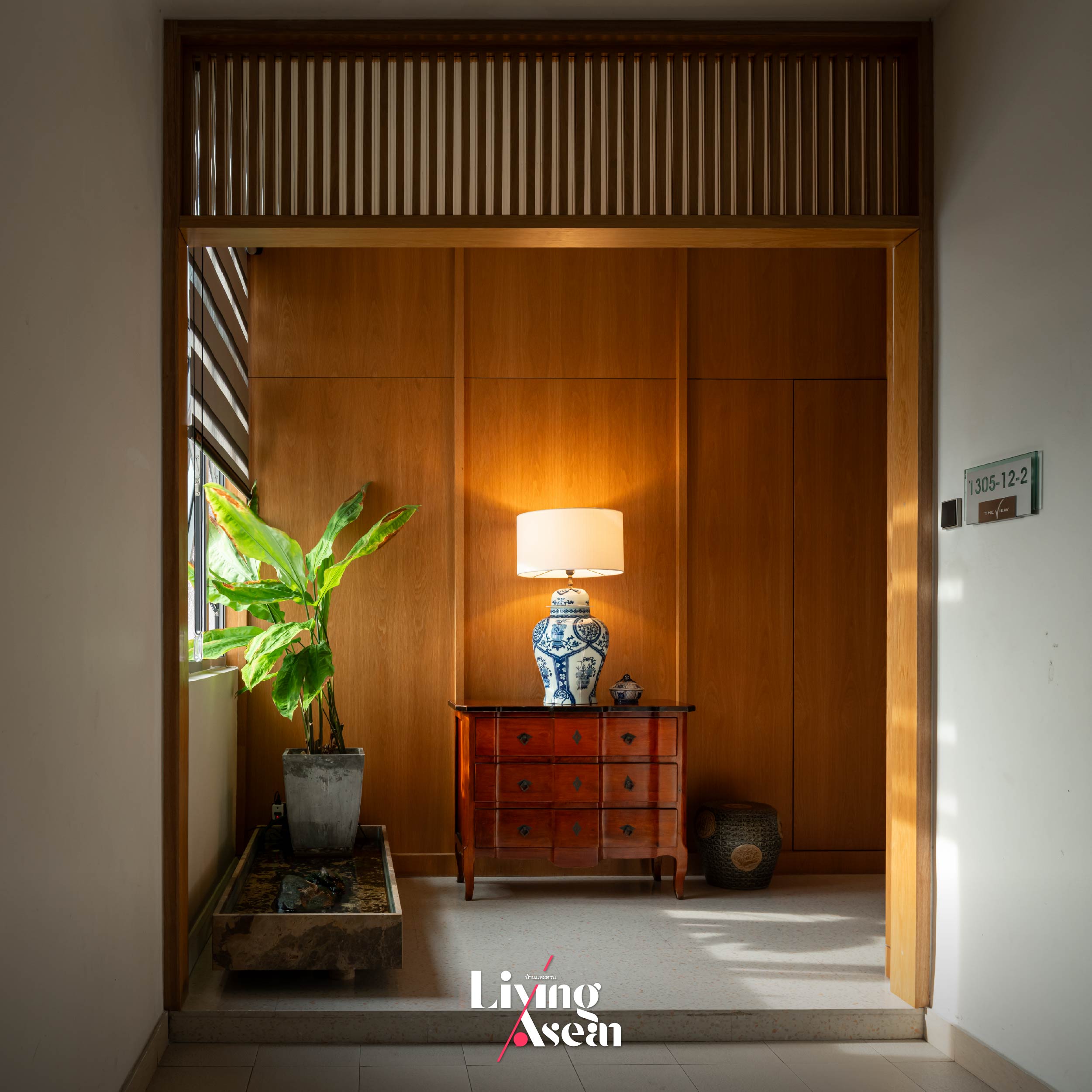
The concept of Hanok or traditional Korean houses provides the designer with valuable inspiration, culminating in a home that blends shared ideals and feeling shaped by Korean culture with characteristics that define a distinct Malaysian identity. The house’s structure consists of the foundational elements traditionally built of wood, stone and earth while the roof is covered in baked clay tiles. Designed for prevailing weather conditions and seasonal extremes in Korea, the Hanok house emphasizes a cookstove heating system, by which hot air is channeled through underfloor passages to keep the interior warm in winter. During the long, hot summer, Hanok’s gaps between floorboards and the building envelope work in tandem to shield the home from the sun’s heat. At the same time, porous materials primarily used for insulation let wind pass through and circulate inside even when doors and windows are closed.
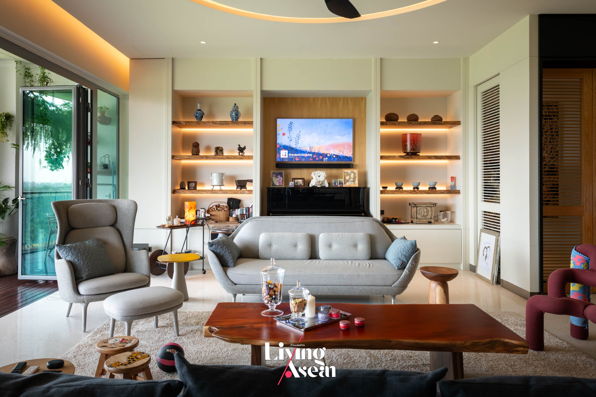
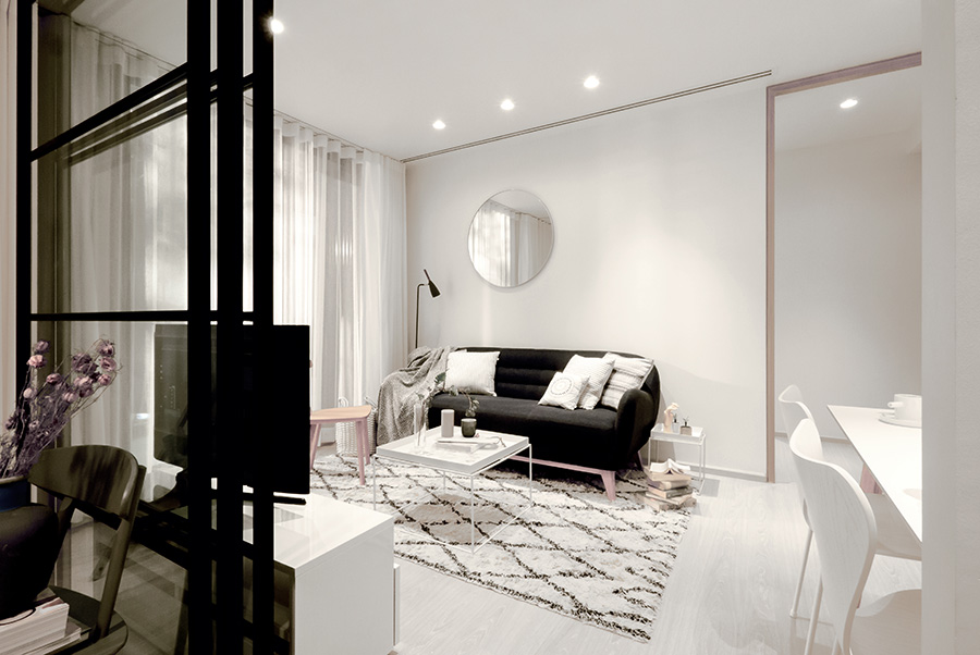
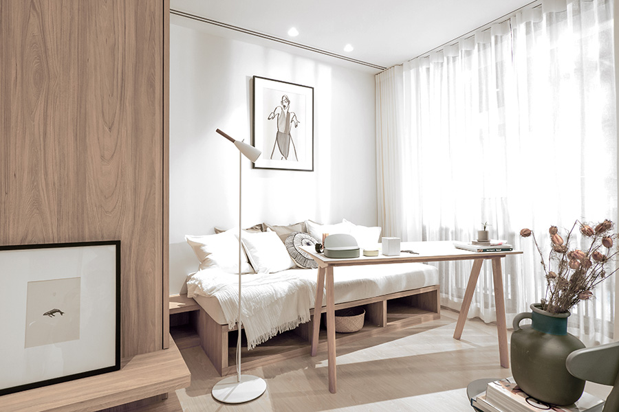
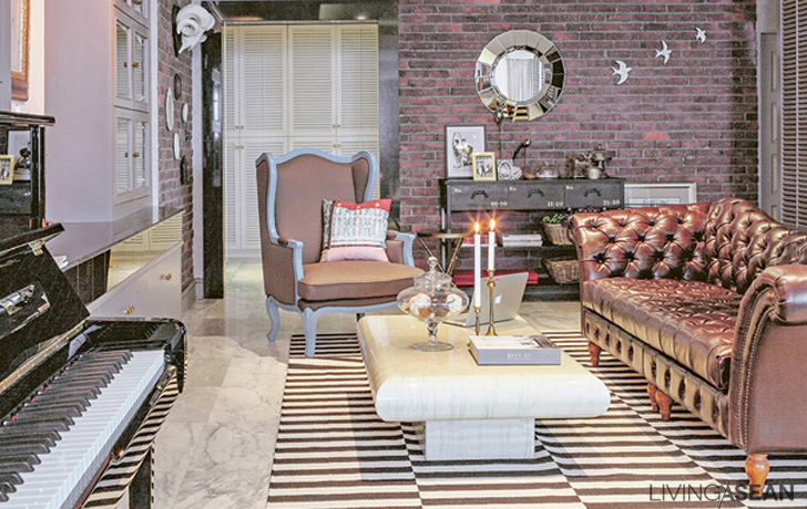
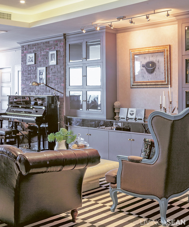
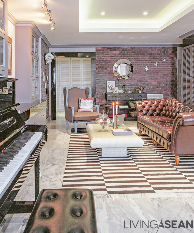
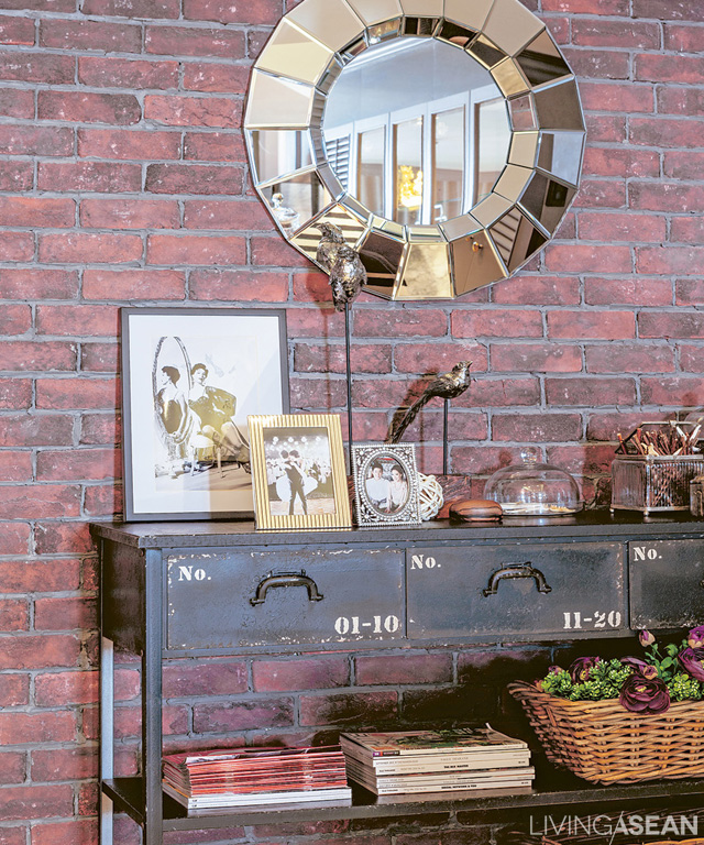
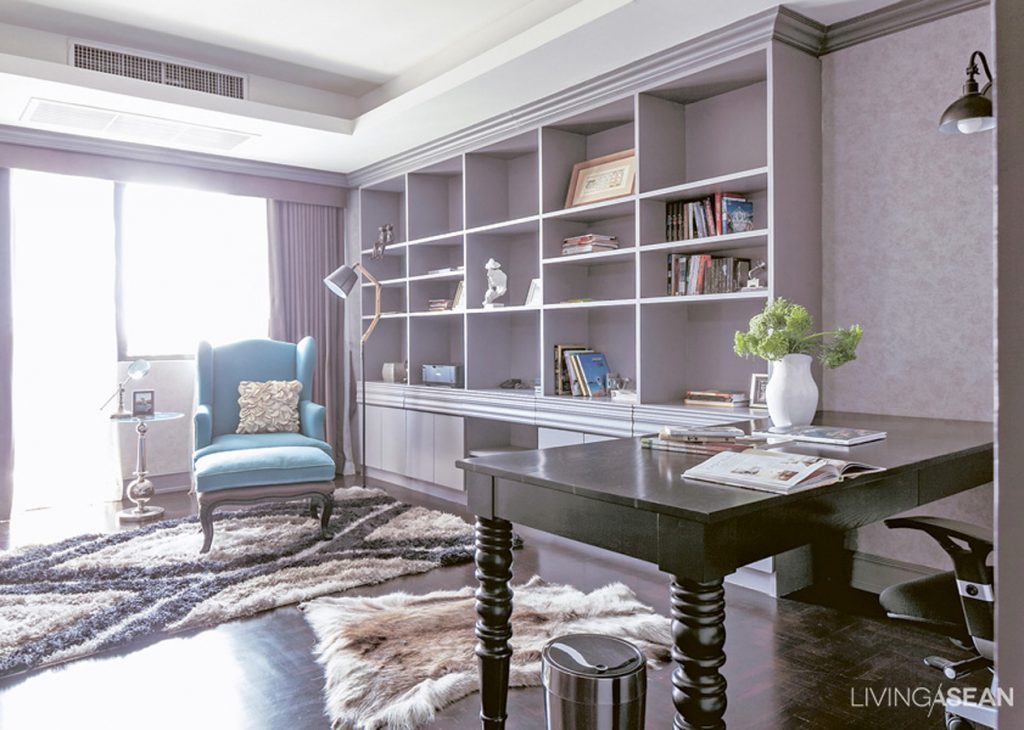
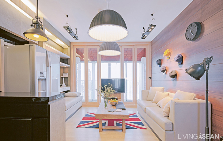
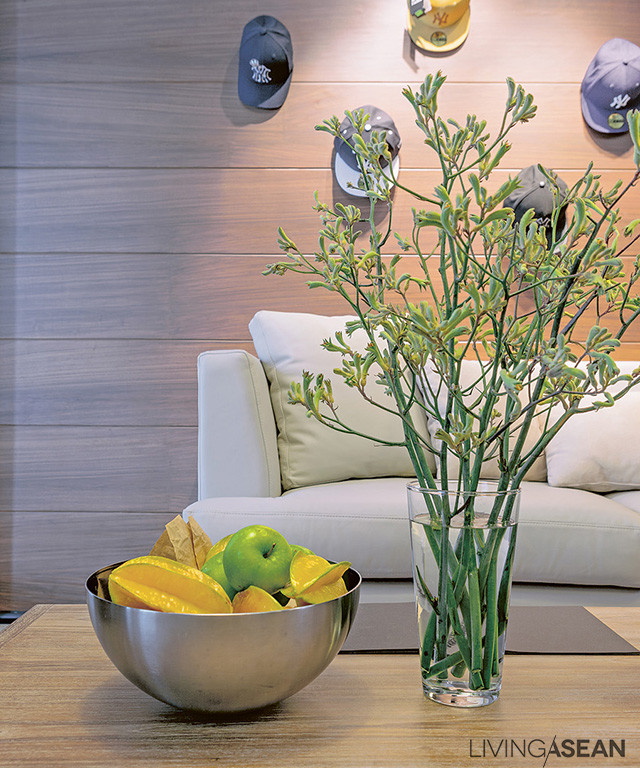
The designer turns homeowner dreams into reality, defining them precisely to create a minimalist house style characterized by simplicity, which in turn, is inspired by Zen Buddhism. Here, collectibles valued and cherished by the couple have pride of place on their wall. Together they create the most outstanding feature in the contemporary-style living room and vividly reveal Southeast Asia’s broader character.
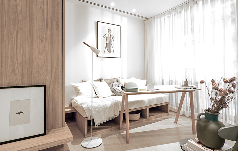
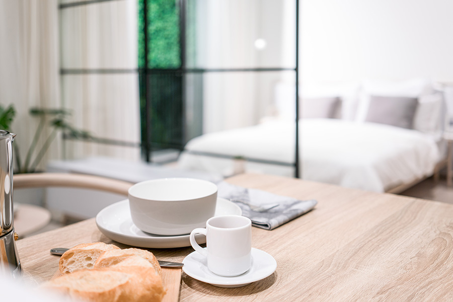
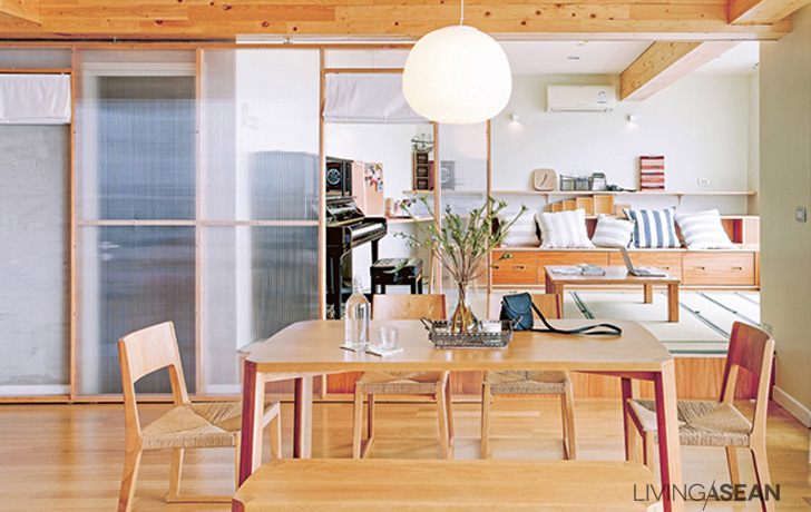
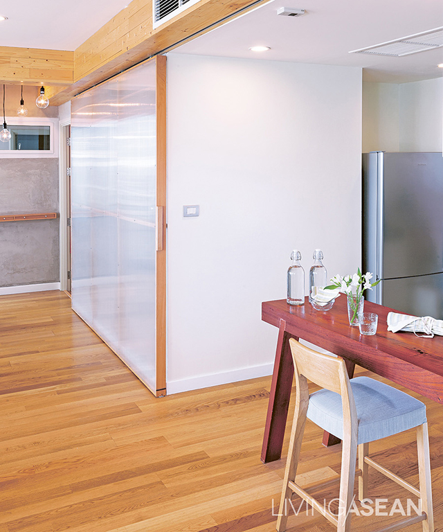
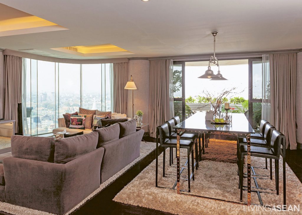
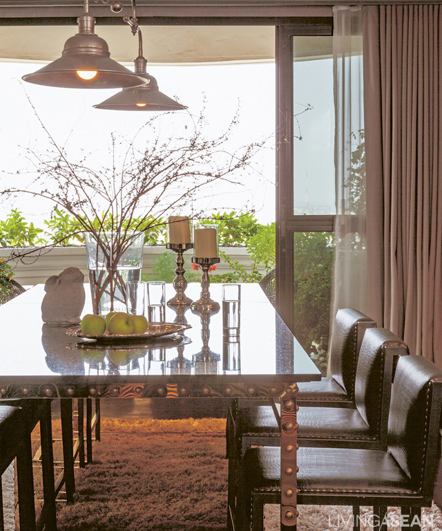
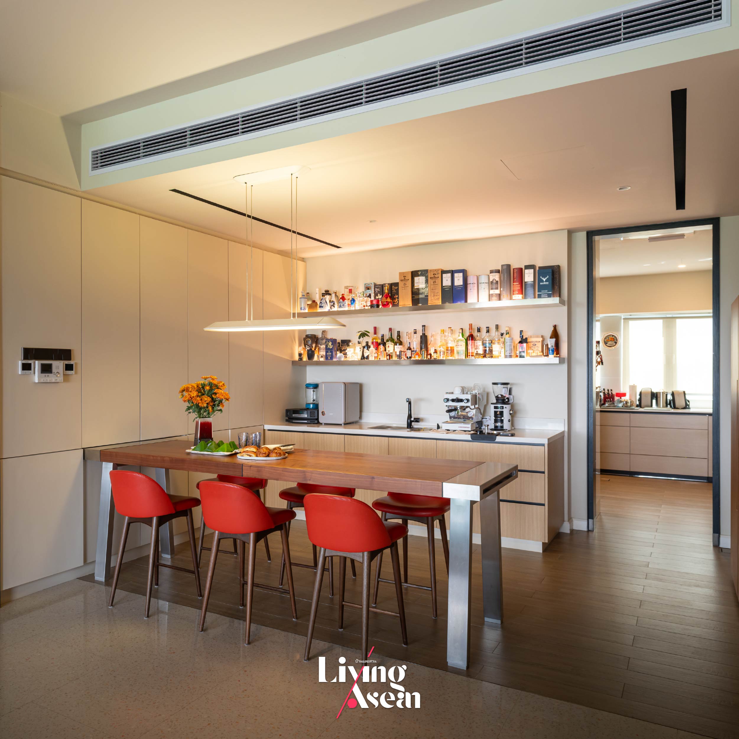
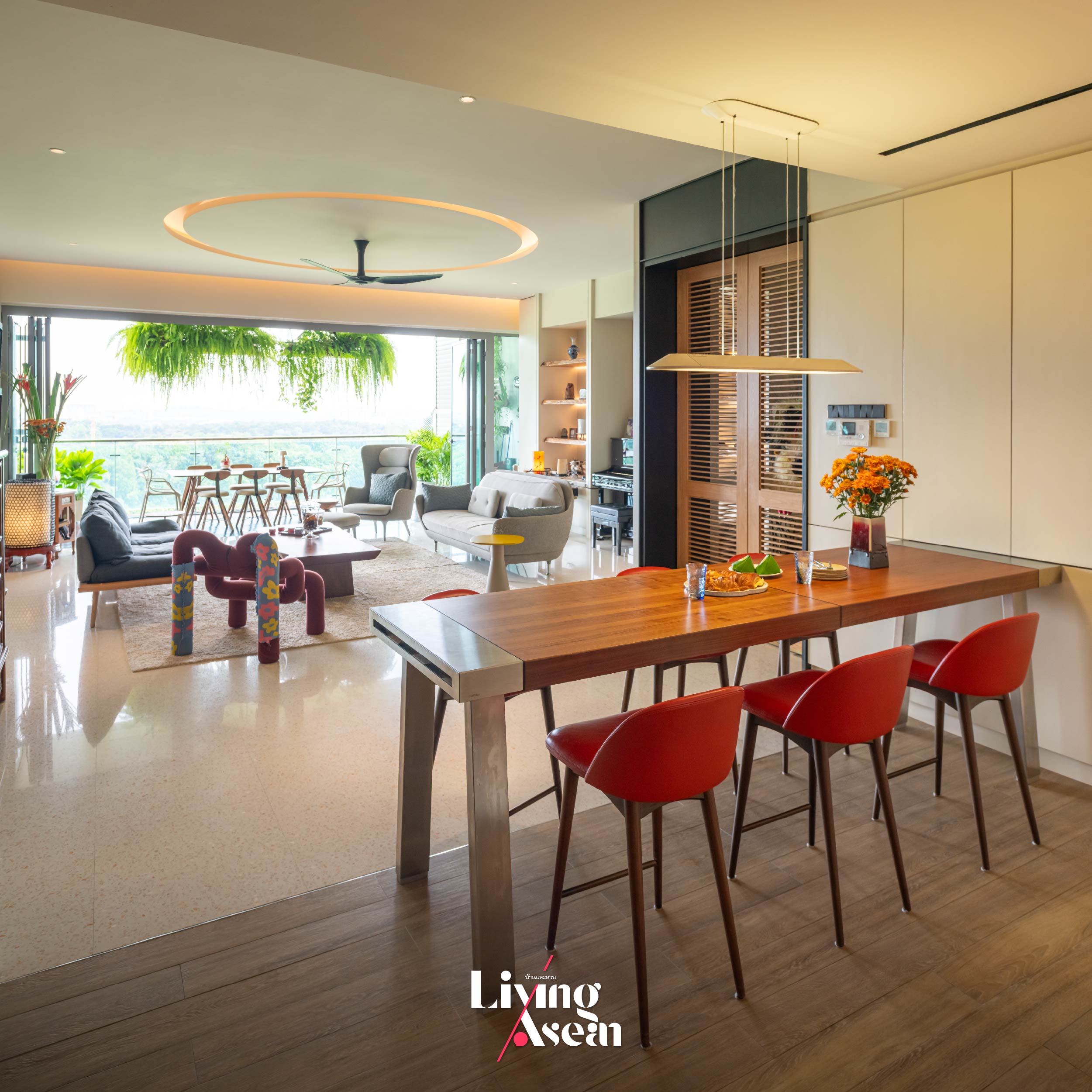
An informal, all-purpose room is used by the family consisting of mom and dad, their two children and a cat. From time to time it serves as a space for receiving and entertaining guests from abroad. The high bar table and chairs create an organized, tranquil environment contributing to a relaxing atmosphere.
Seamless Design Meets Materials that Reflect Identity
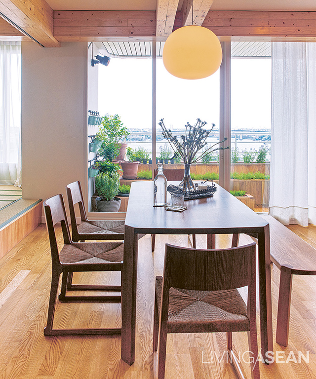
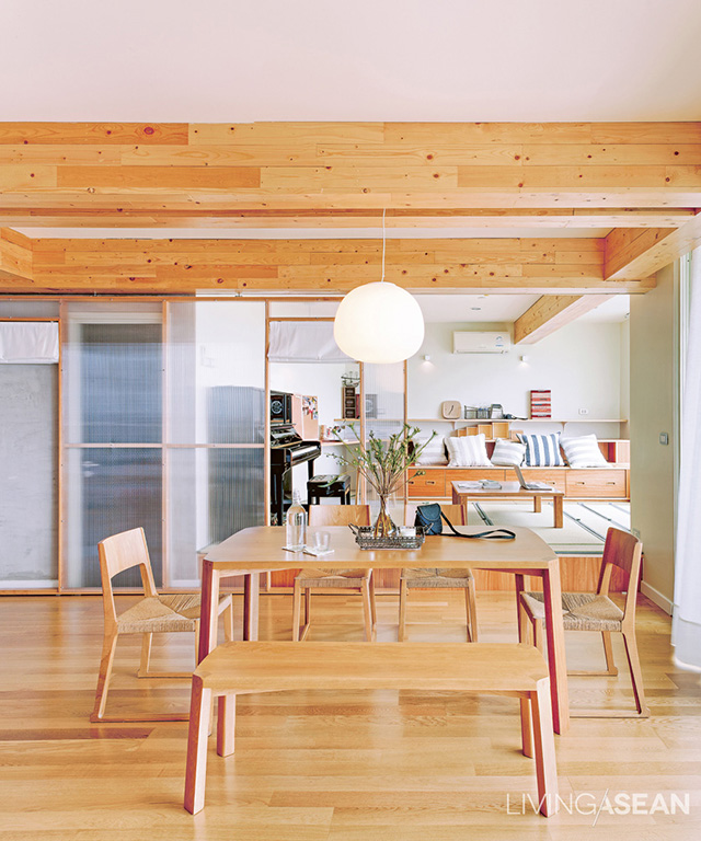
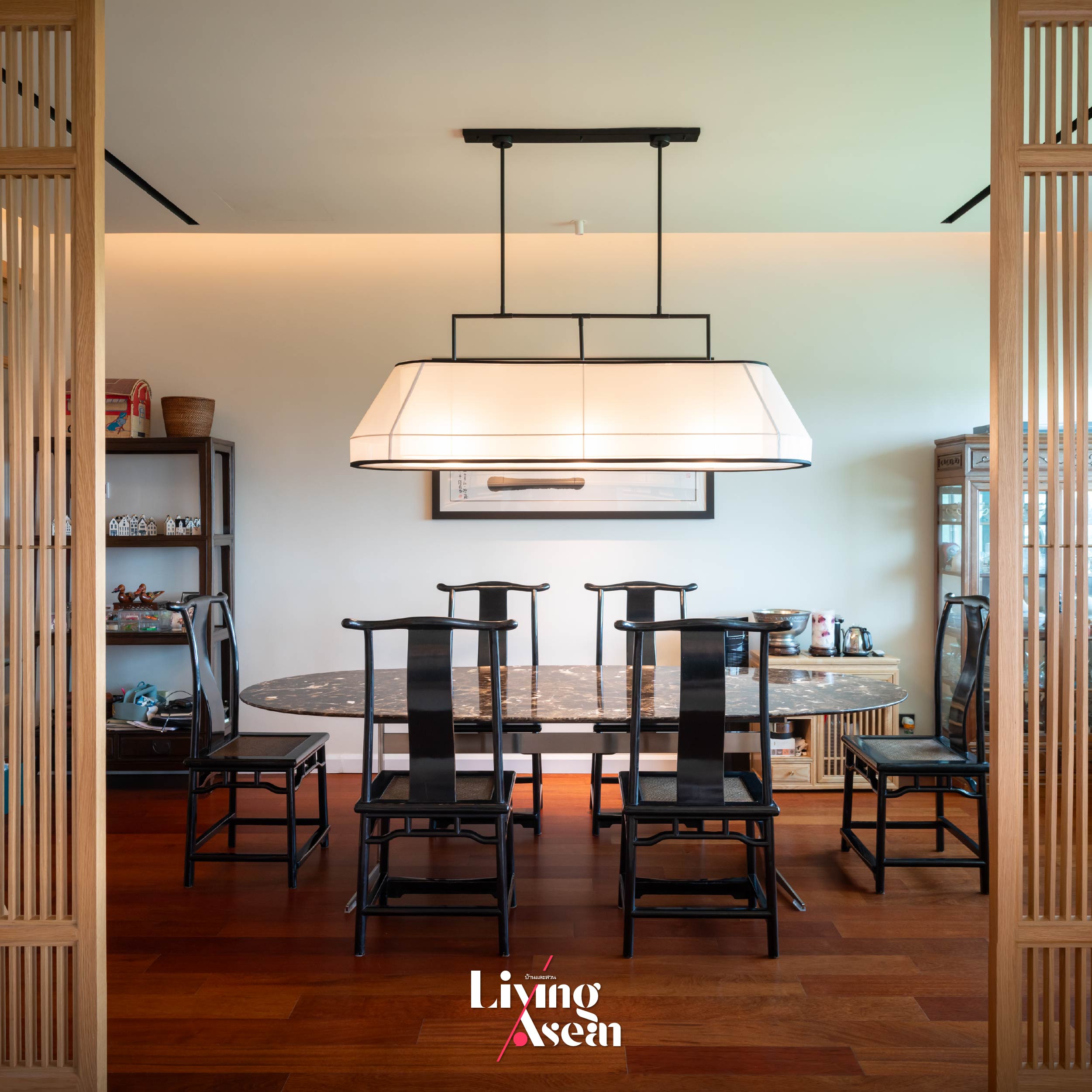
What makes this dining room stand out is the use of locally sourced traditional materials redefined and recontextualized for modern purposes. The outcome is a living space filled with the warmth of vernacular objects that speak volumes for human experience and local culture. Plus, simple clean lines emphasize clarity that’s the hallmark of a contemporary style. Components that combine wood and stone go hand in hand with some of the furniture in the room so the space flows in a consistent style and color scheme. Some of the pieces are designed by the homeowners. They include the hanging light inspired by the traditional Chinese lantern, the marble table top from Italy and wooden chairs in a contemporary Asian style.
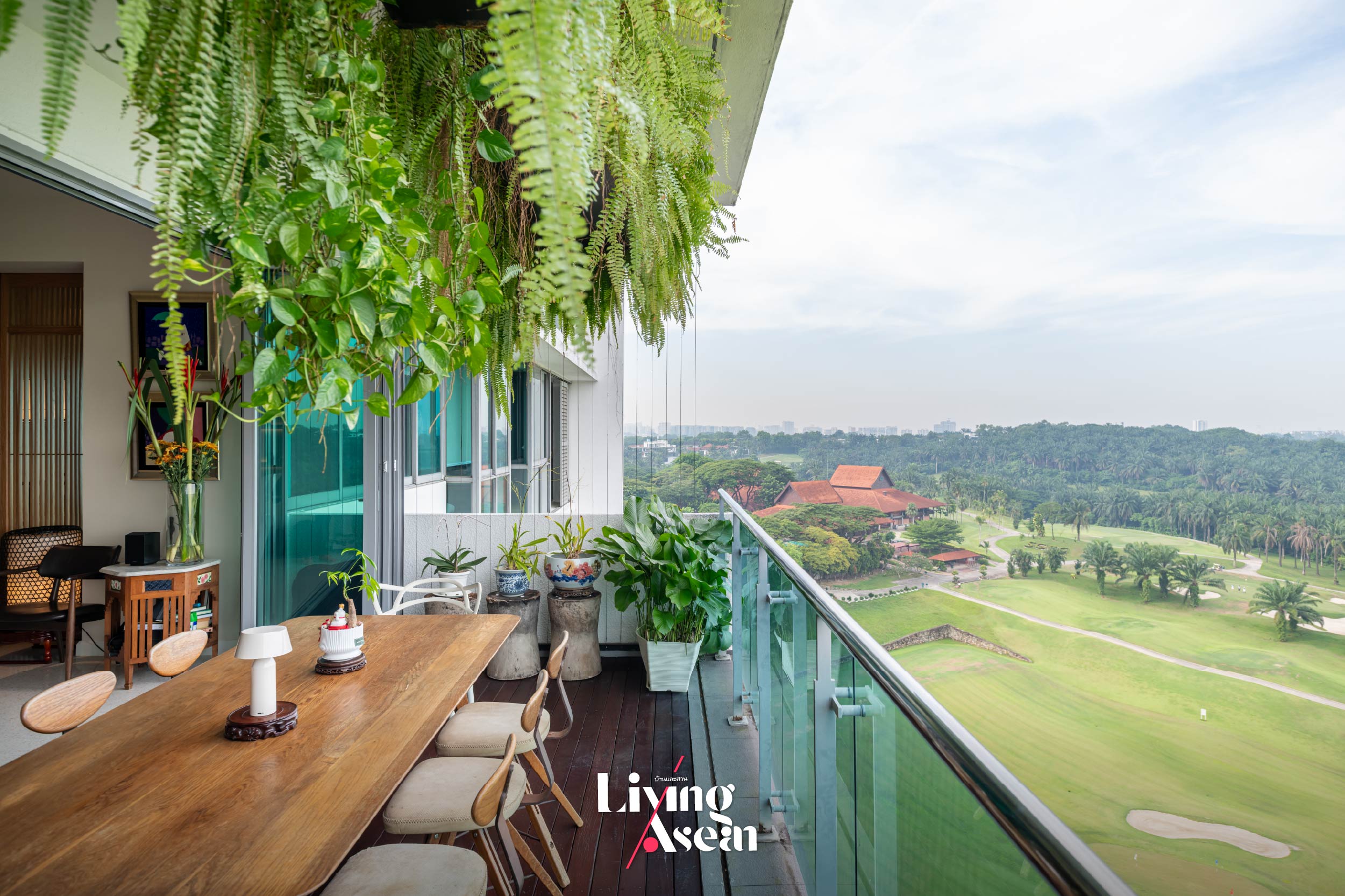
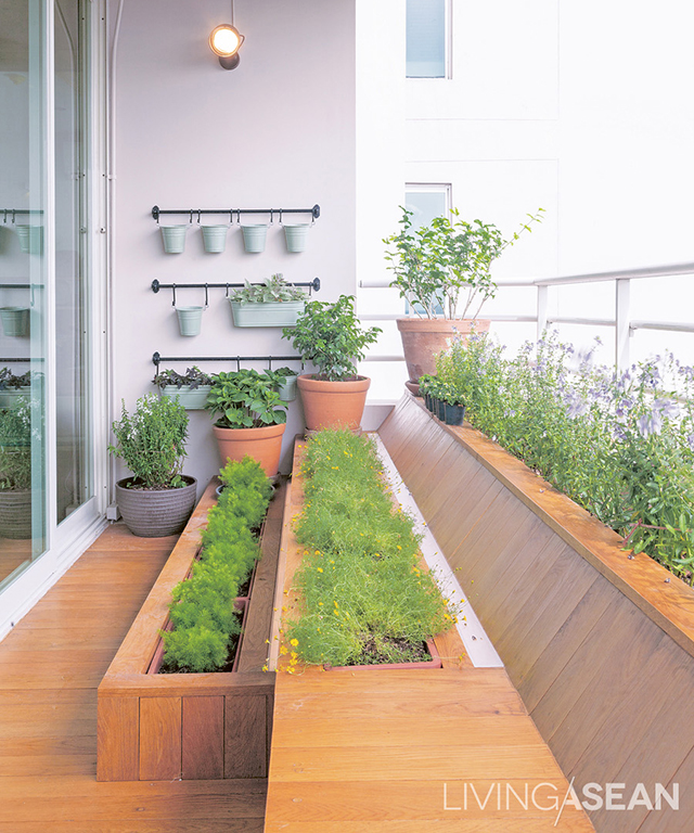
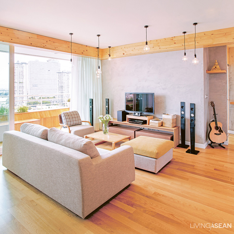
The spacious living room overlooks scenic fairways at the Saujana Golf Club, without doubt a factor that influences the homeowner’s decision. Perched on the 12th floor above a rich and vibrant expanse of greenery, the condo home offers a wonderful panorama stretching as far as the eye can see. The designer takes full advantage of ample natural light and consistent clean air circulation to create a light and airy atmosphere all year round. In this manner, the old doors that open to the balcony were taken out and replaced by an innovative bi-fold door system that opens wide from one end to the other, thereby emphasizing open spaces and a connection to the outdoors.
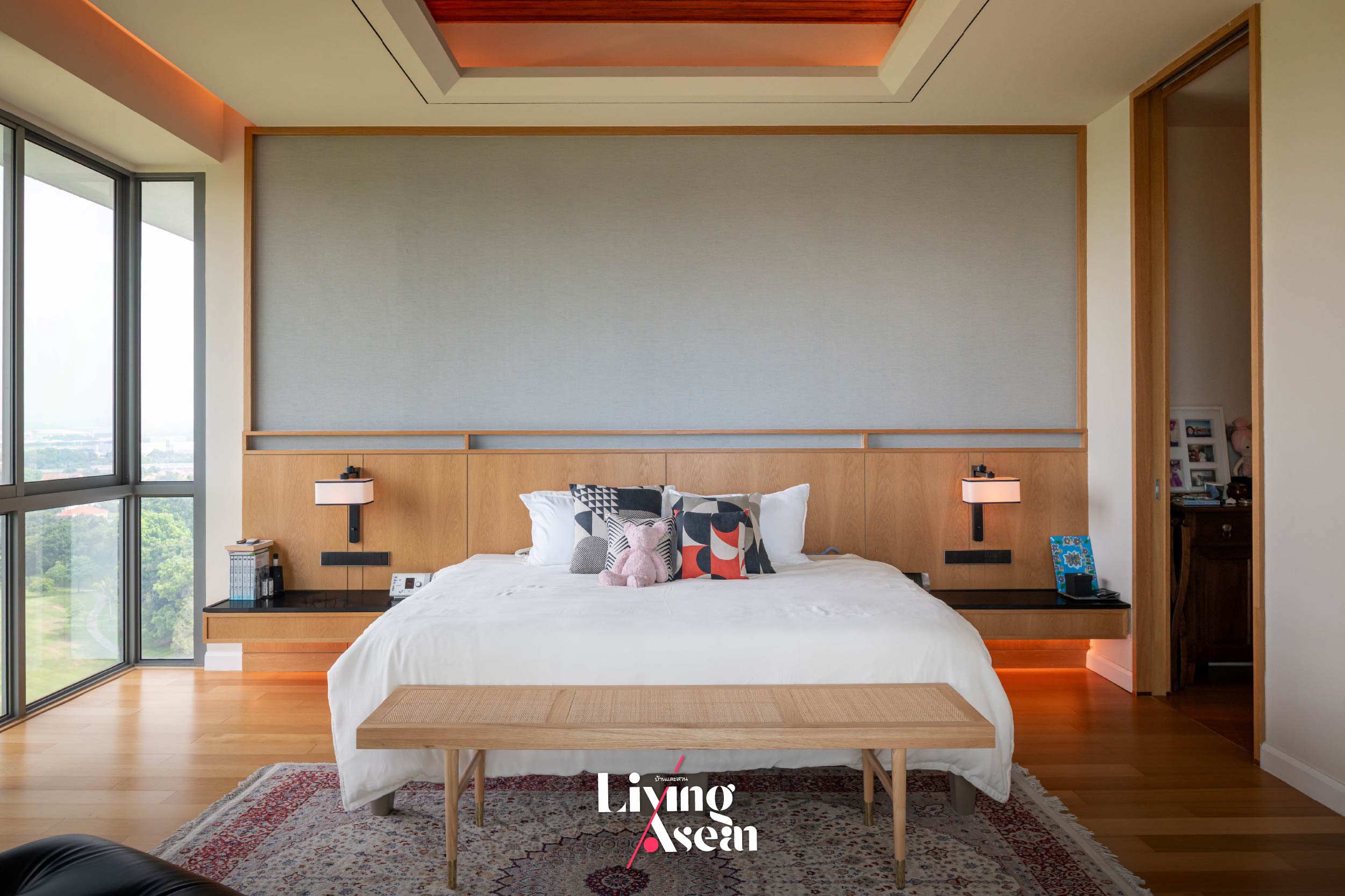
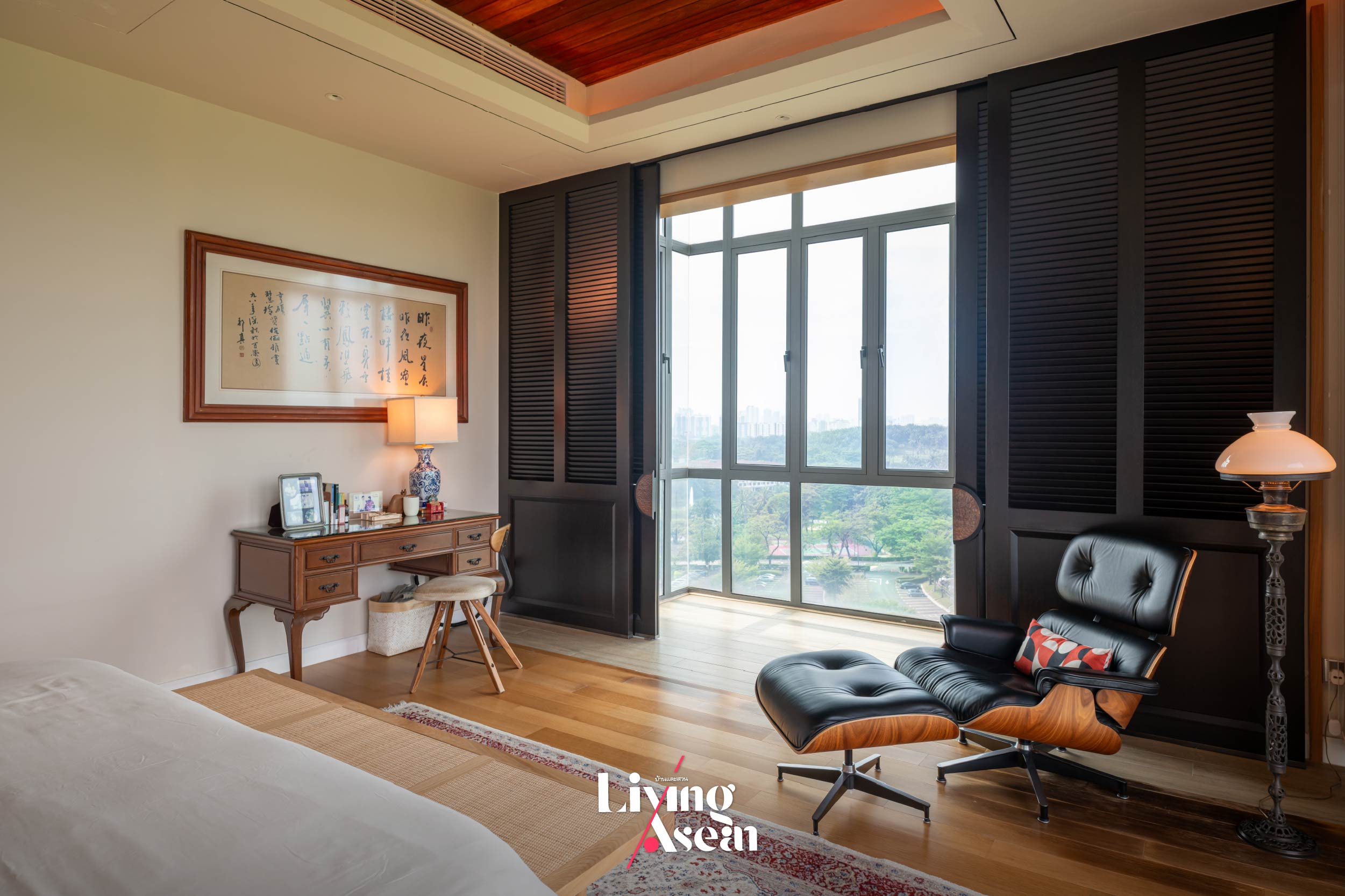
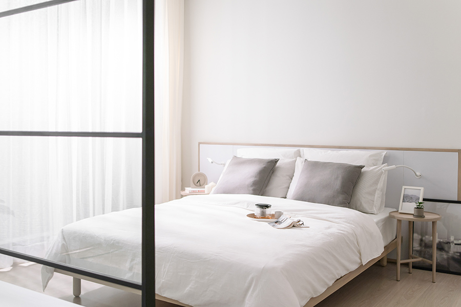
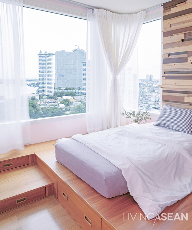
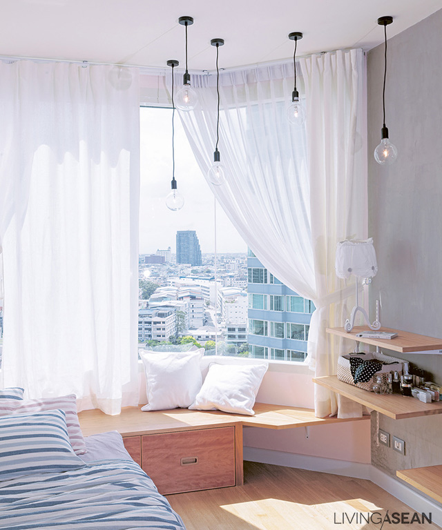
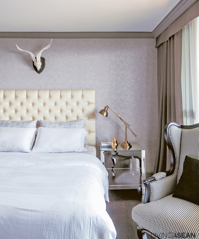
As interior designer Effendy Nadzri explains, the east-facing bedroom consistently receives bright, warm light in the morning. To avoid getting too much sun, plantation shutters for sliding doors are installed. Plantation shutters provide excellent light control while their solid, louvered design protects privacy and enhances home comfort.
In addition to the functionality of spaces and interesting design, it makes perfect sense to pay attention to air movement in the home. Because air circulation directly impacts the health, living conditions and energy efficiency of the home, the designer chooses to install DAIKIN VRV Home Series, a smart central air conditioning system capable of keeping every corner of the home cool and comfortable. Designed to blend seamlessly with the interior through strategic use of color, texture and form, the VRV Home Series has proven reliable and effective in the warm and humid climate of Southeast Asia. The result is a condo home that’s aesthetically pleasing and highly functional.
Well-Being Begins with the Right Air System
As the homeowners put it, a cozy home must have a sufficient and appropriate level of light to provide a sense of comfort, warmth and relaxation. Thermal management is vital to ensuring comfort in the home and modern air conditioning technology comes in handy to do exactly that.
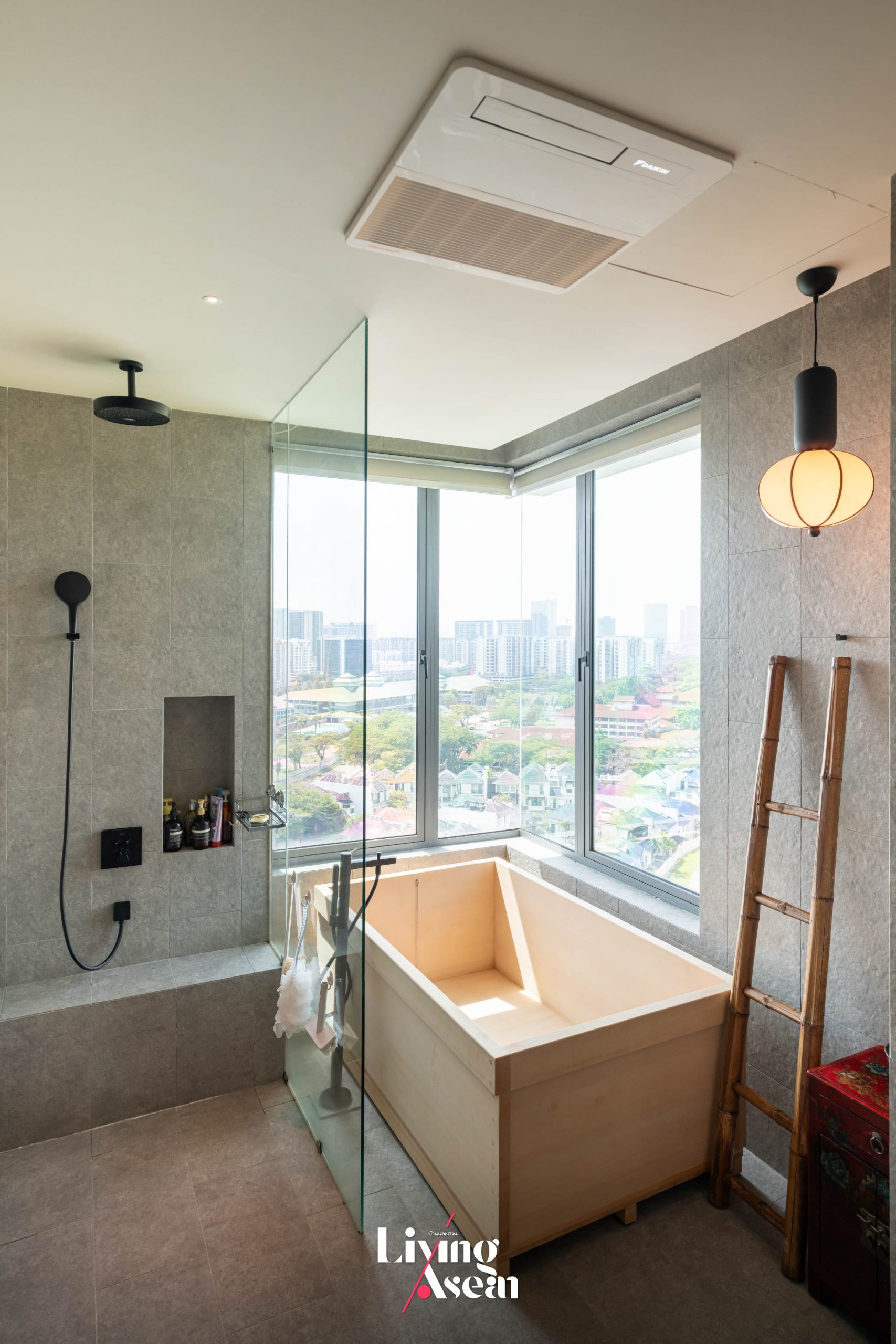
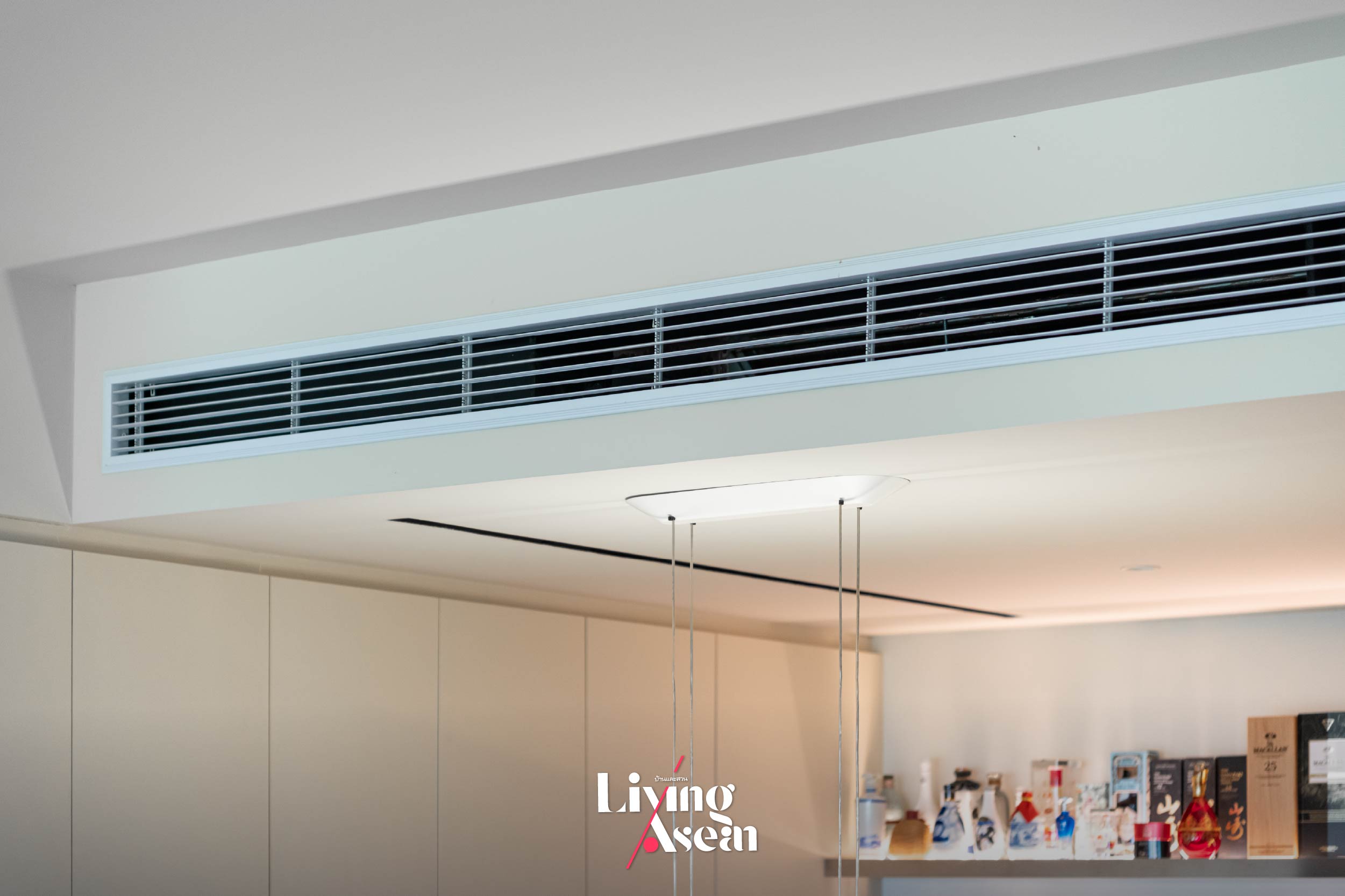
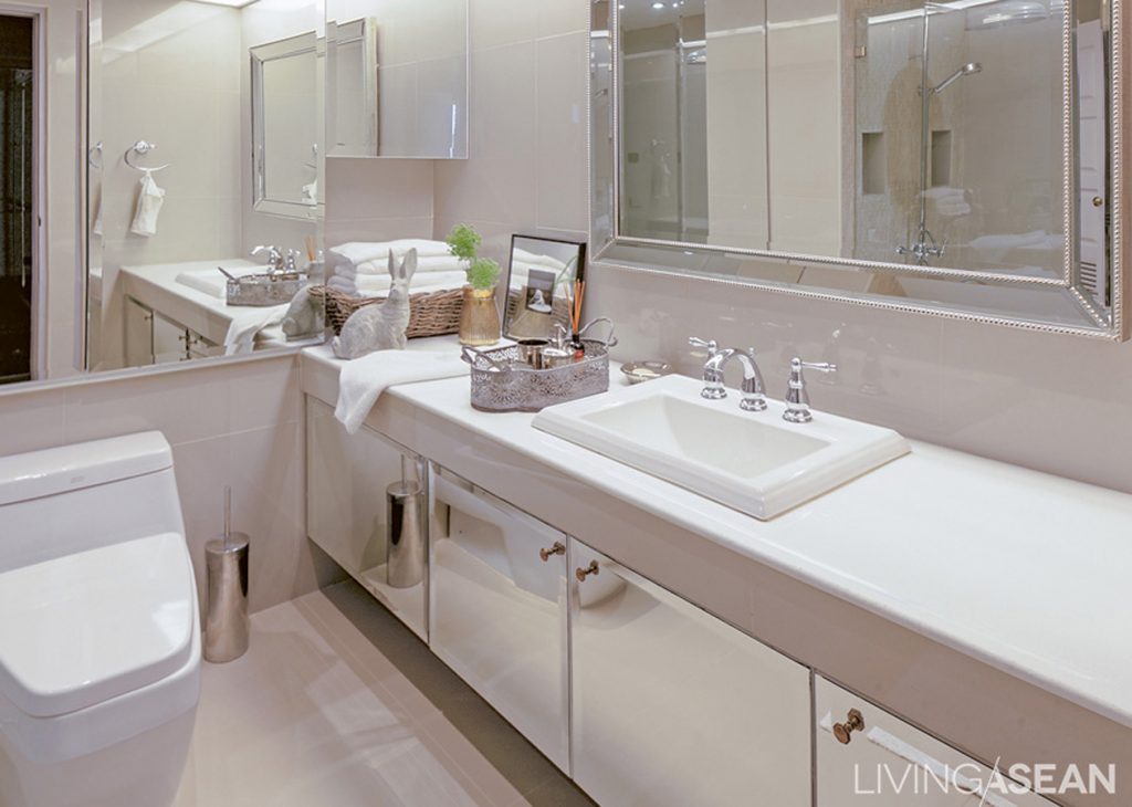
The husband, who is an engineer, is very particular about the efficiency of air conditioning machines. It’s easy to see why managing air movement in the home is vital to maintaining a healthy, comfortable indoor environment. DAIKIN VRV Home Series is chosen for its ability to provide proper airflow. This is especially useful where the bathroom comes complete with a Japanese-style onsen soaking tub. The VRV Home Series has a blow dry function to prevent issues like the buildup of moisture in the interior. It quickly dries the bathroom getting it ready for the next user.
Sharing a slice of paradise with friends, Ms. Elaine Chew said: “The house where we lived previously was cooled by individual air conditioning units. Each one of them functioned on its own. This condo home is powered by DAIKIN VRV Home Series, a smart central A/C system that keeps the home cool, meanwhile, transforming those pesky eyesoars into unique design elements. For a discreet appearance, A/C indoor units are hidden above the ceiling. By design, only sleek and stylish ceiling cassettes are visible in the interior.”
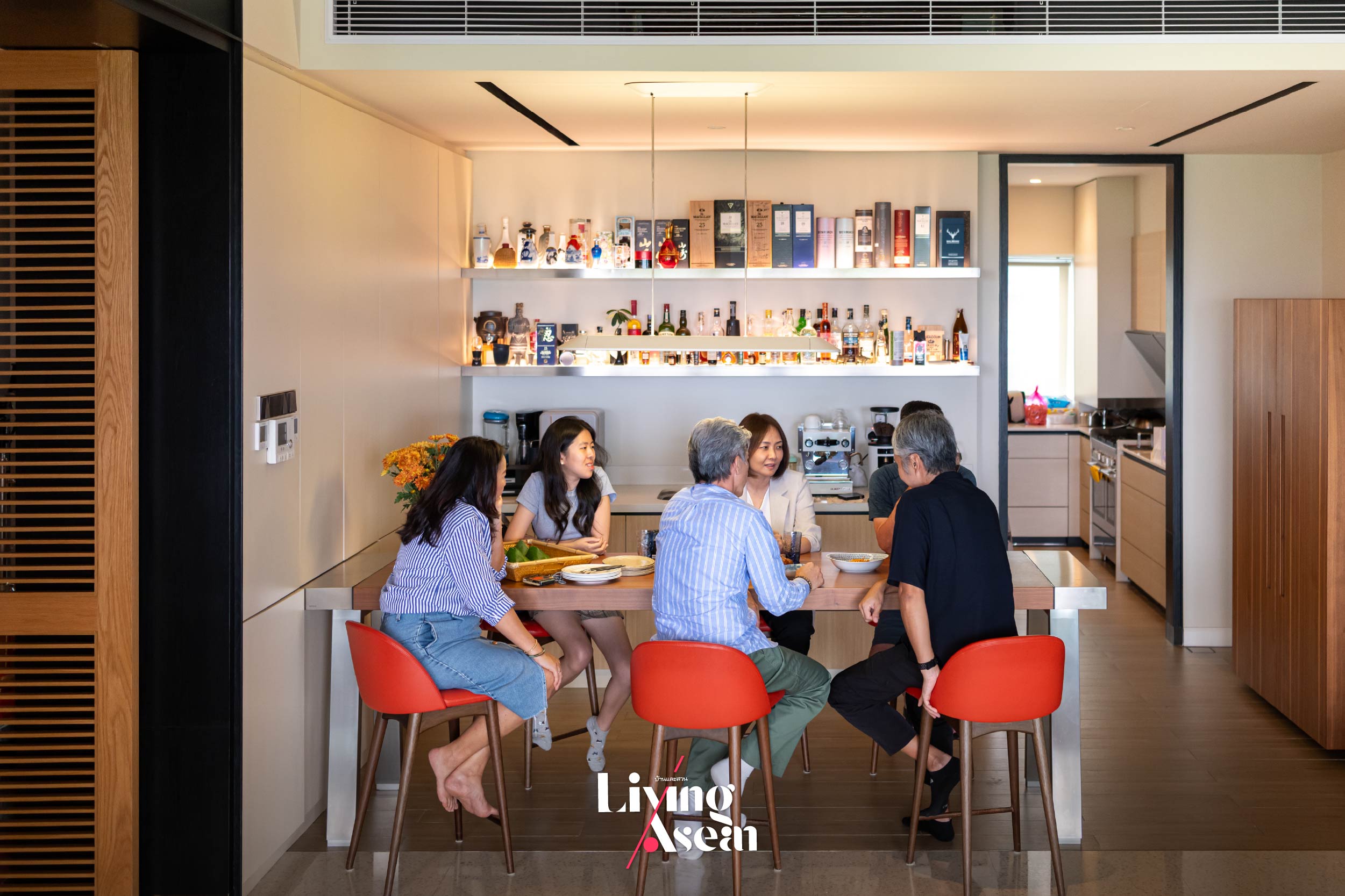
From Elaine’s point of view, living in the tropical climate of the ASEAN region requires a cooling system that works. One simply can’t do without a cooling fan of some kind, or an A/C system that actively chills the air. Proper airflow is important, too. A well-thought-out ventilation system design, coupled with an understanding of light directions, is crucial in making a home comfortable even when outside temperatures are high.
This is especially true here, where advances in DAIKIN’s cooling technology have transformed an ordinary home into a cool, well lighted place, focusing on using modern innovations and space-saving decor. In the fewest possible words, it’s about creating a peaceful home, protecting privacy and enjoying a good life every day.
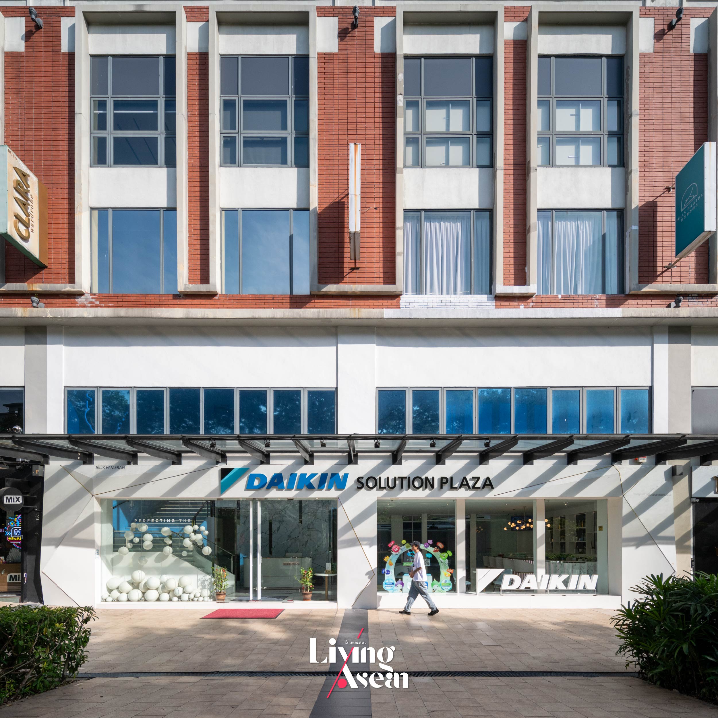
DAIKIN SOLUTION PLAZA: Pure Air Innovations for Better Living
After exploring the essential elements of a comfortable home, let’s find out a little bit more about DAIKIN SOLUTION PLAZA in Kuala Lumpur. It’s a showroom used to display the latest home innovations and smart, integrated systems that improve ventilation and air quality from DAIKIN. Its slogan, “A value that goes beyond technology”, conveys a great deal about the company’s commitment to finding solutions that best answer the lifestyle needs in warm and humid climates.
Mr. Edwin Chai, an executive at DAIKIN Malaysia Sales & Service Sdn. Bhd. said: “At the moment, DAIKIN isn’t just an air conditioning machine. It’s advancing all the time and has since elevated to the next level, focusing on creating a value that goes beyond technology. The company has achieved its objective, providing premium quality products to all consumer groups, offering clean air and air circulation system design that performs optimally in the hot and humid climate of the ASEAN region.”
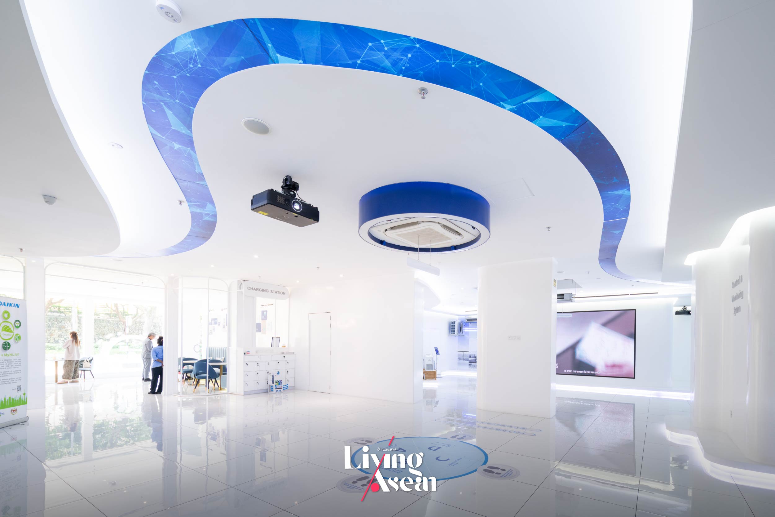

As a leading innovator in air conditioning technology, DAIKIN uses this showroom to display a wide range of products through strategic organization, useful visuals and content. The first floor is dedicated to products for small businesses while the upper floor is exclusively allocated to systems for high-end residential developments. They are designed for visitors to recognize the full worth of each product and how well it meets consumer needs, whether it’s for the guest welcoming area, the living room, the kitchen, the bedroom, the dressing room, or the bathroom.
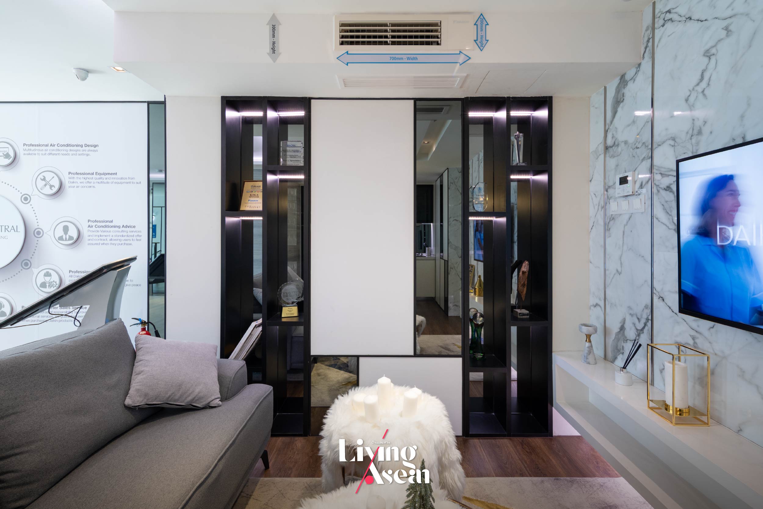
DAIKIN has introduced new innovations designed to blend aesthetics with functionality, meantime, saving installation space both inside and outside. Named the “VRV Home System”, it’s a central air conditioning technology that makes effective use of a single condensing unit, thereby saving installation space in parts of the house exterior. Plus it’s thoughtfully devised to keep a network of pipes organized and hidden from view. This allows the indoor cooling unit to remain invisible although the effect of crisp cool air can be felt throughout the home. Only air vents in the wall can be seen, resulting in seamless interiors and the pleasing appearance of high ceiling design.
Tailored Solutions for Every Room in the Home
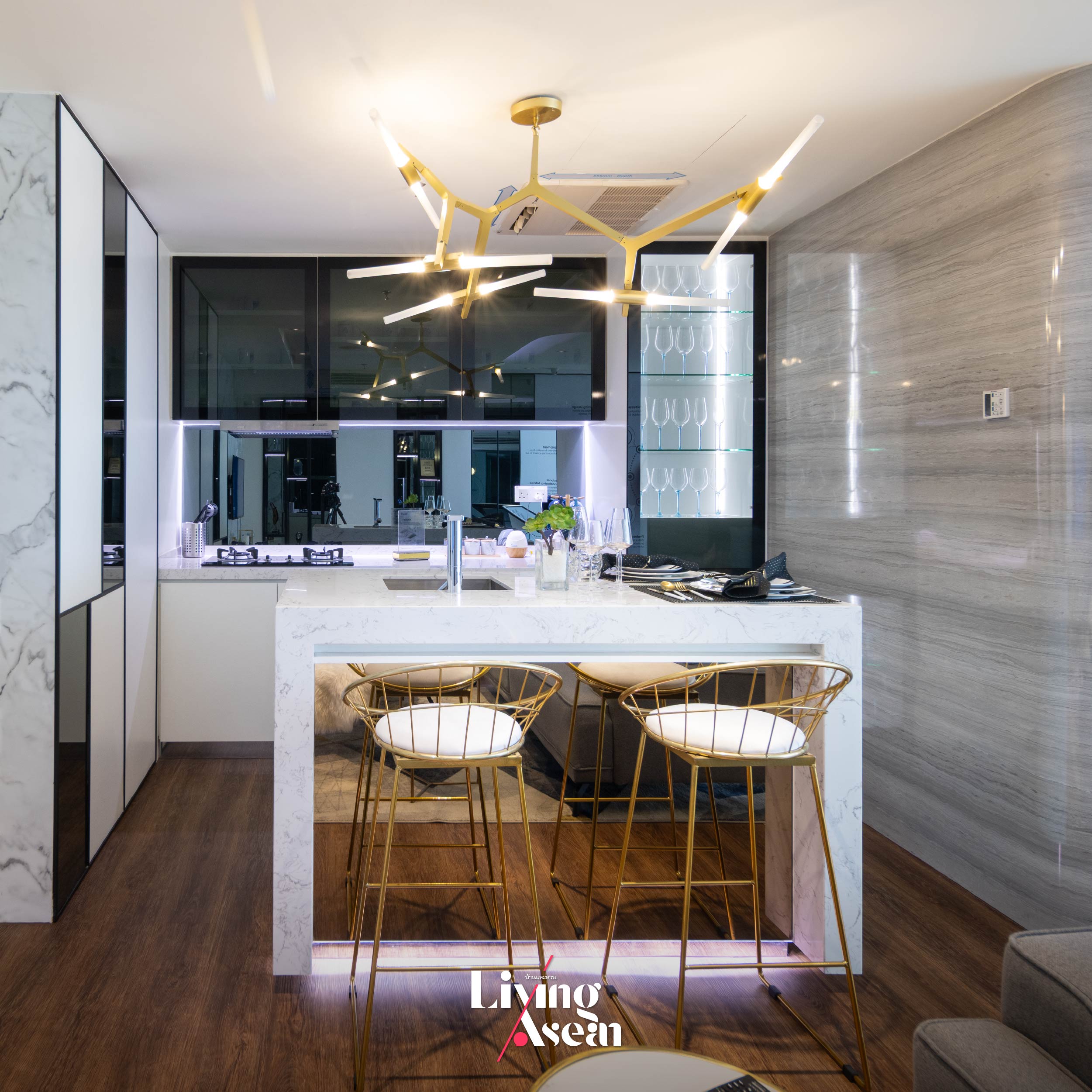
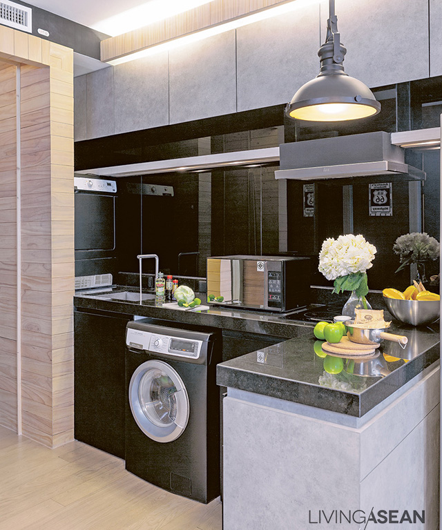
A kitchen without the smell of cooking oil. If you enjoy cooking at home but worry about lingering food odors, DAIKIN has a ventilation system especially designed for use in the kitchen. It’s capable of effectively pulling microscopic oil droplets, smoke and odors from the air.
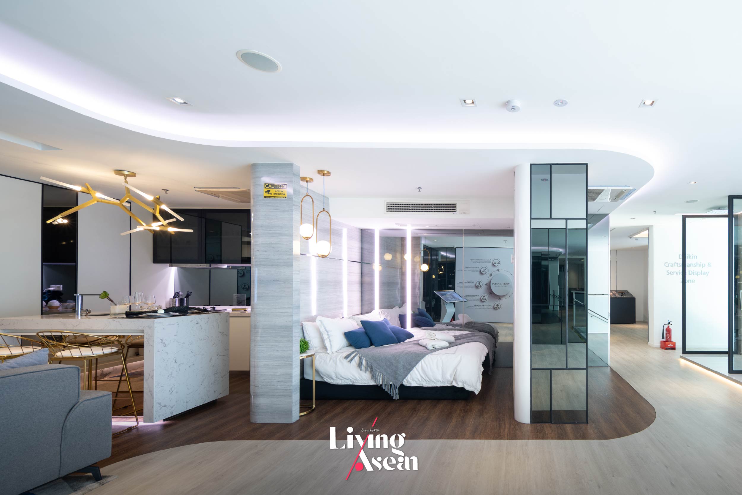
Cozy bedroom design for better sleep. Experience deep sleep in a bedroom made cozy by three dimensional airflow design. It creates air circulation patterns that go to work both horizontally and vertically, thereby keeping the entire bedroom calm and peaceful. Plus it fits flush with the wall for a neat appearance in the room.
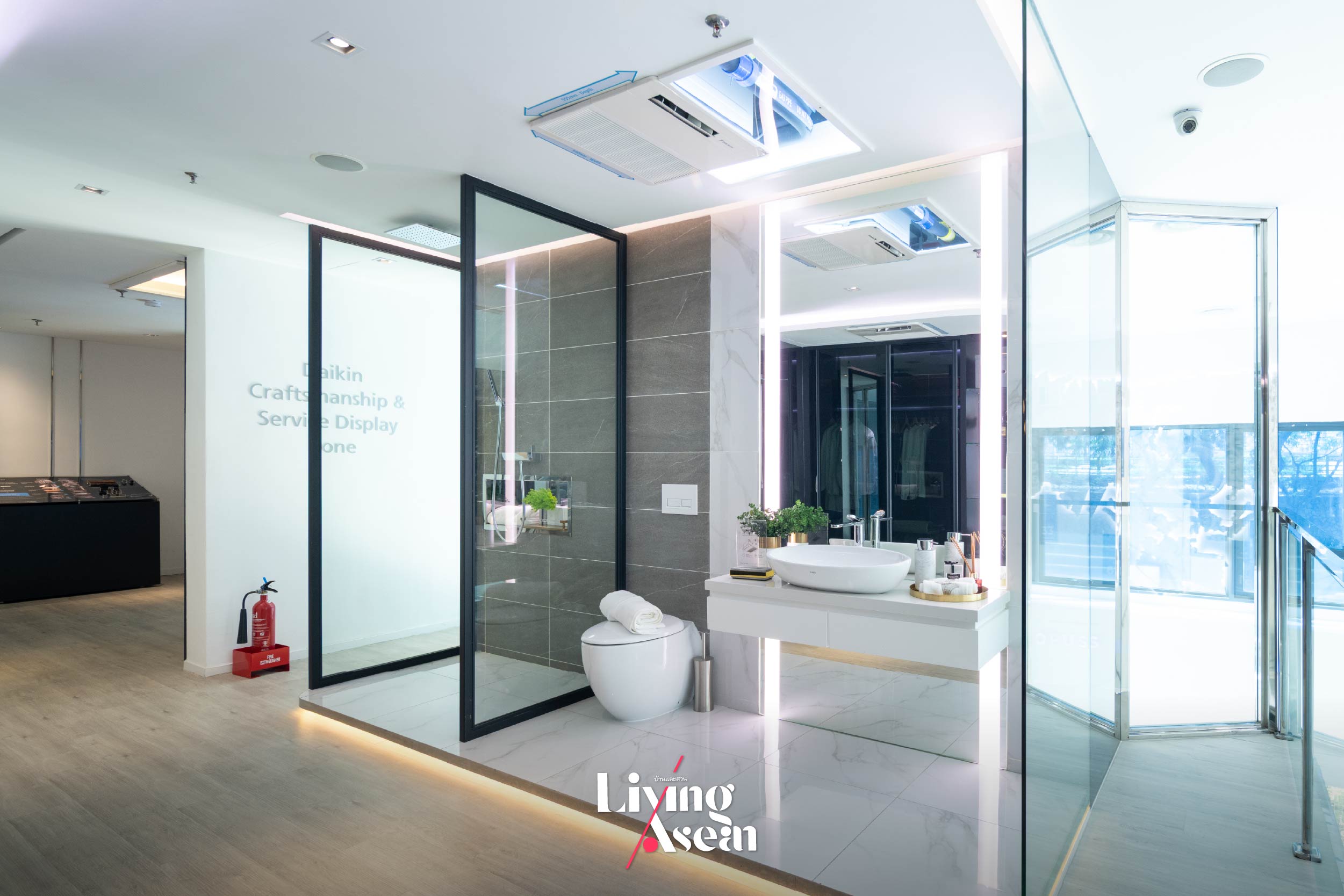
Dry bathroom design to reduce moisture. Bathrooms tend to get wet all the time. Separating wet and dry areas in the bathroom works sometimes but not always. To solve the problem, DAIKIN has introduced VRV technology that incorporates three systems in one. It consists of an air conditioning system, an air suction system, and a blow dry machine that quickly keeps the bathroom dry after a bath, thereby preventing mold and mildew, moisture buildup and stuffy smells.
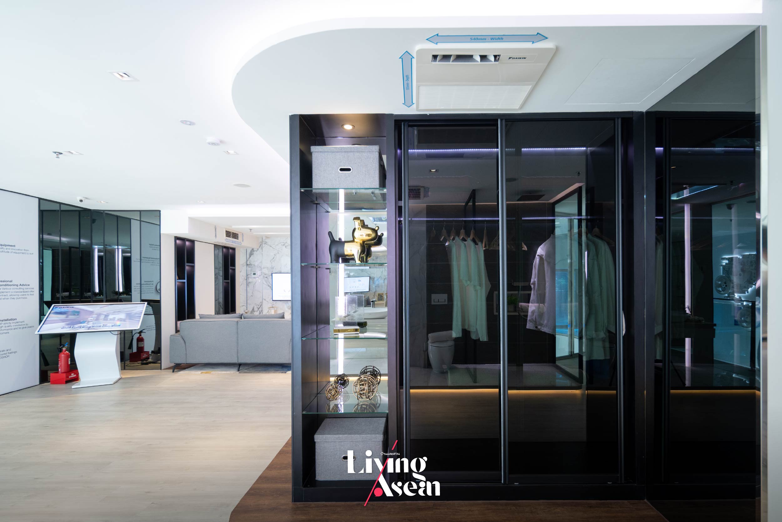
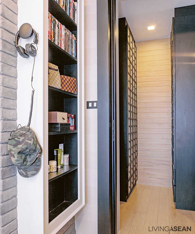
Keeping clothes and leather goods fresh and clean in storage. DAIKIN home innovations help keep the wardrobe smelling fresh and clean by controlling indoor humidity and ensuring proper ventilation. They prevent fungus in leather goods, such as handbags, belts, shoes, so on and so forth. Among other things, they keep leather goods looking like new and reduce stuffy odors in fabrics by maintaining good airflow in closets and rooms.

Mr. Ng Chee Meng is director of High Cool Engineering Sdn. Bhd. He has authoritative knowledge of DAIKIN home innovations and a good understanding of the cooling needs of consumers in the ASEAN region. DAIKIN recently introduced a new product line designed to reduce humidity in the dressing room, kitchen and bathroom to make the home more livable .
Mr. Edwin Chai is an executive at DAIKIN Malaysia Sales & Service Sdn. Bhd. He said: “Consumers nowadays have higher expectations of the quality of modern home innovations. In response to their needs, DAIKIN has developed new methods, ideas and products that are energy efficient and friendly to the environment. Plus, they provide the optimal solution suitable for the prevailing climate and lifestyles of people in the ASEAN region.”
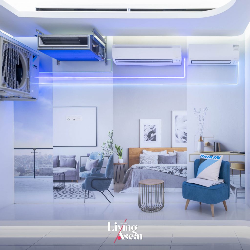
To put it briefly, there is more to a happy home than just architectural design, the arrangement of functional spaces and creative ideas that go hand in hand with people’s lifestyles. The point is that technology also has a role to play in making the home more livable, providing physical ease and well-being. It’s something we can all design.
Stay tuned for more from ASEAN HOME TOUR Series, a Baan Lae Suan TV program on air every Sunday at 10.15 hours, Amarin TV Channel 34.
Architect: Mr. Effendy Nadzri / Co-Founder and Design Director of Endo Sdn Bhd (https://www.endokl.com/)
You may also like…
 1+1=1 House: A Modern Home Beautifully Designed for Multigenerational Living
 MN House: A Gallery-Inspired Home Warmly Cocooned in White Architecture

