/ Bangkok, Thailand /
/ Story: Samutcha Viraporn / English version: Bob Pitakwong /
/ Photographs: Rithirong Chanthongsuk, Soopakorn Srisakul, Thamawit Wangkijsoonthorn, Bussakorn Kuankit /
“It’s a co-housing arrangement. Mine is more of a dynamic, full-of-life home. The house next door is my brother’s. It appears to be more private in the midst of a tranquil setting.“
The homeowner, Suthiphong Pongpawasuit said I was kind of speechless for a bit when I heard him express his feelings about the co-housing house. It could be that I was expecting the most beautiful replies like always. No offense intended. It was the most honest and unpretentious of feelings.
“I could feel a warm and friendly atmosphere, and appreciate the meaning of “home” as he defined it. I have come to one that reflected the true personality of its owners.” The two houses are surrounded by pleasant grounds made the two brothers happy in their own way.
The two buildings brought out differences in their lifestyles and their preferences.
The first building
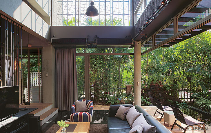
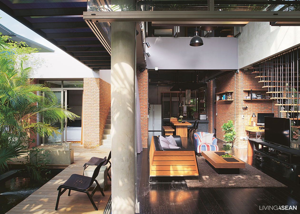
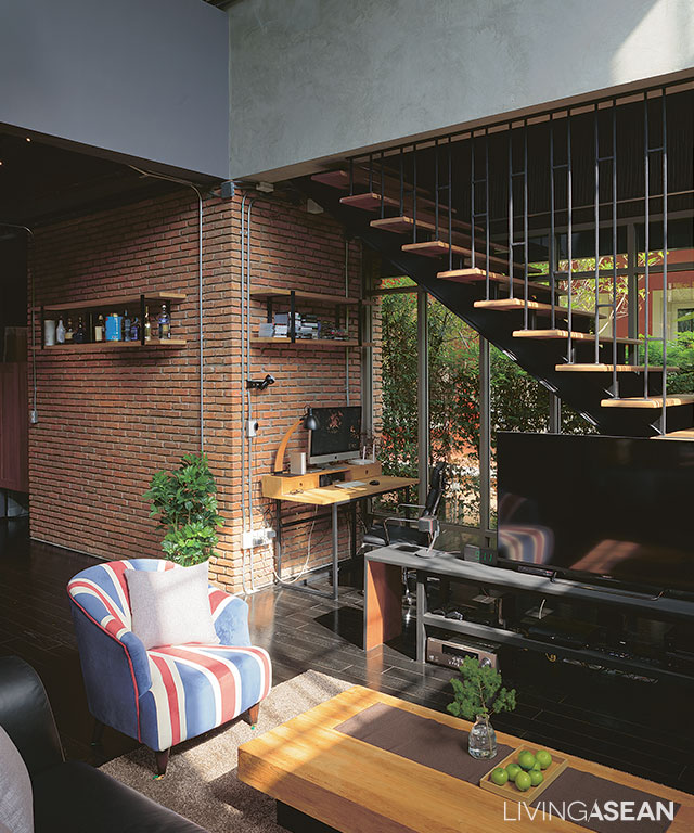
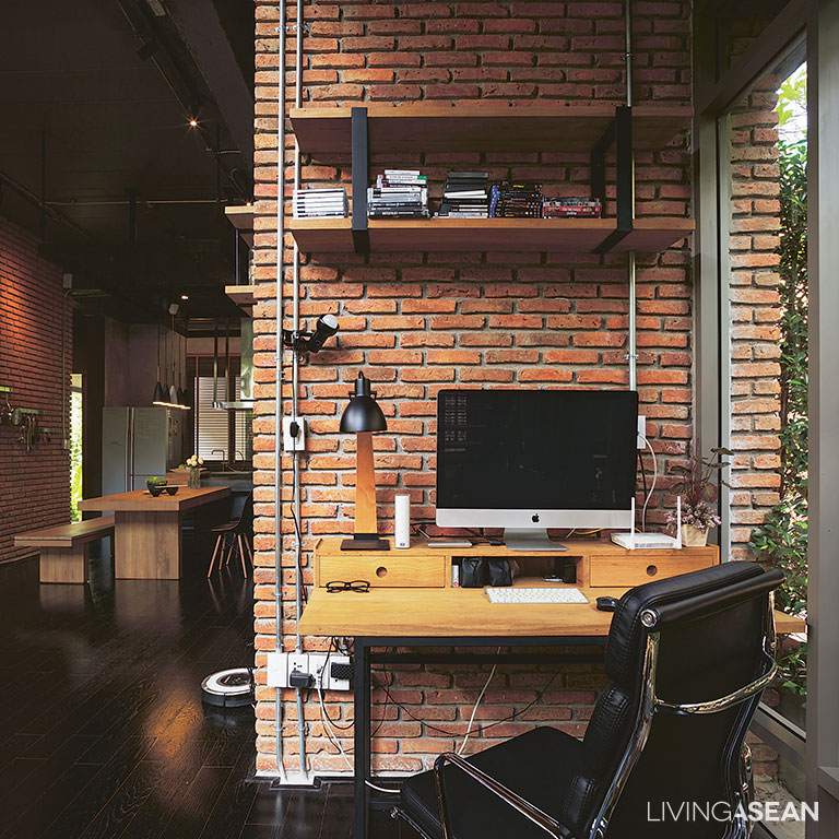
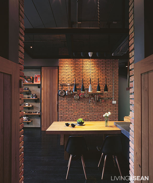
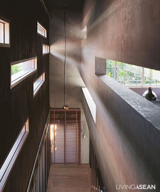
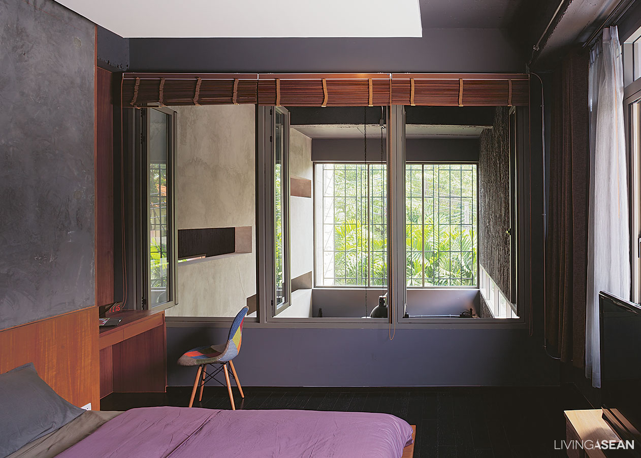
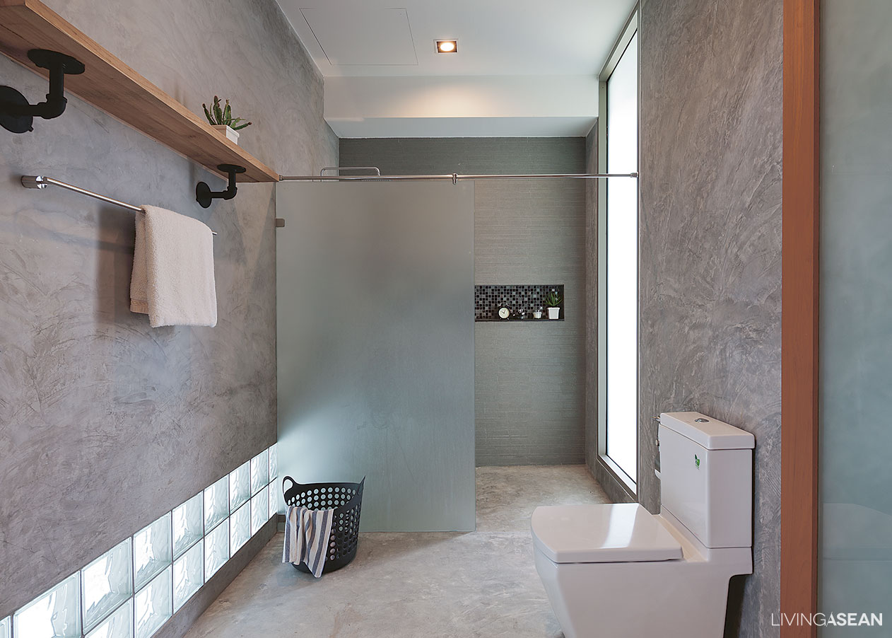
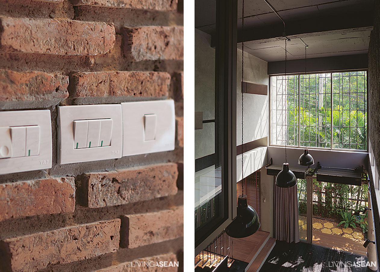
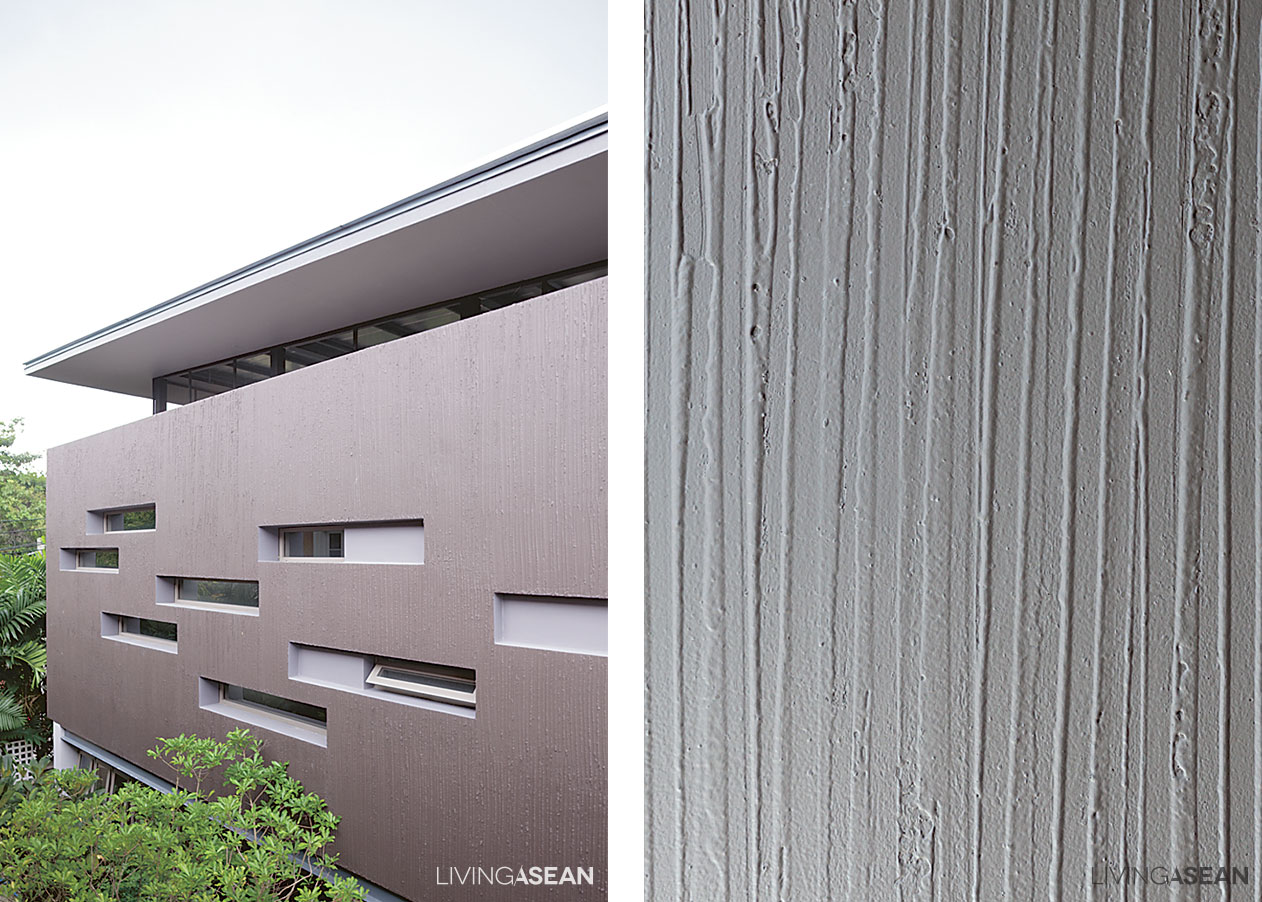
The first building belongs to Suthiphong. It is concrete chic based on a straightforward design. The walls are fabricated of unornamented concrete finishes and an interesting mix of textures and materials. Floating systems of electrical conduits conjure up images of an urban industrial loft apartment.
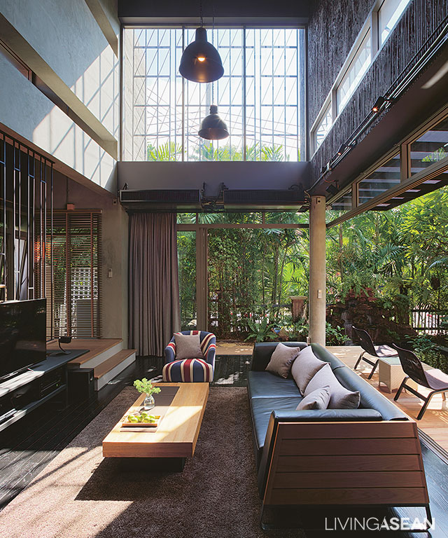
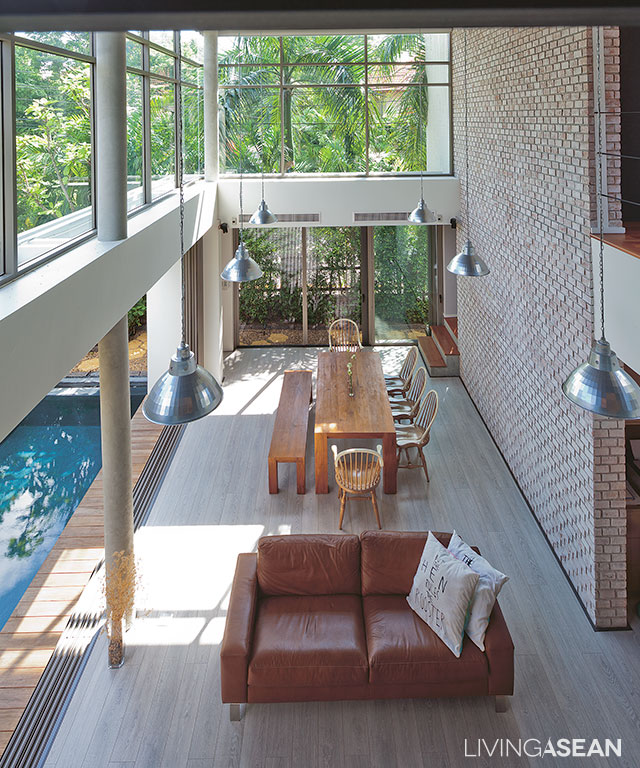
The interior features gorgeous living spaces. During the day, natural light shines through large overhead windows with wrought iron detailing, creating an amazing shadow play. There is a sense of visual continuity that connects seamlessly with the exterior as soon as the large door slides open.
On the outside, peaceful lush landscaping under a tree canopy can be seen in full view. On the inside, different furniture styles add a hint of interest in a subtle way.
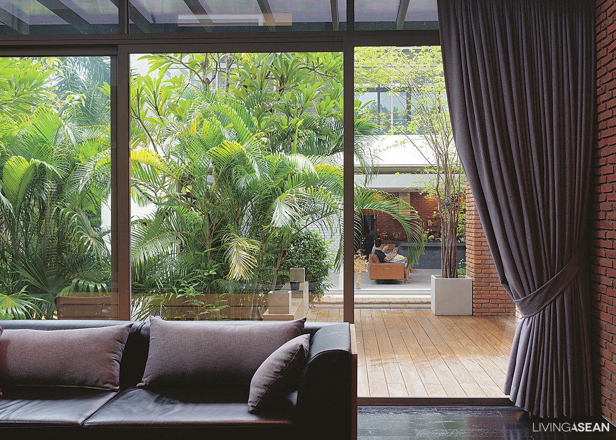
Obviously, the co-housing house is designed for the local climate. Oftentimes we complain of too much sun, winds, and rain. But since we call this country home, why not make the most of the extreme weather conditions?
They are the natural appeal of this Region. That is why we see all natural elements being incorporated into the design scheme. Here, the sun, the winds, and rain are all taken into account in framing the house within a beautiful botanical border. That makes living in a co-housing house a life fulfilling experience.
The second building
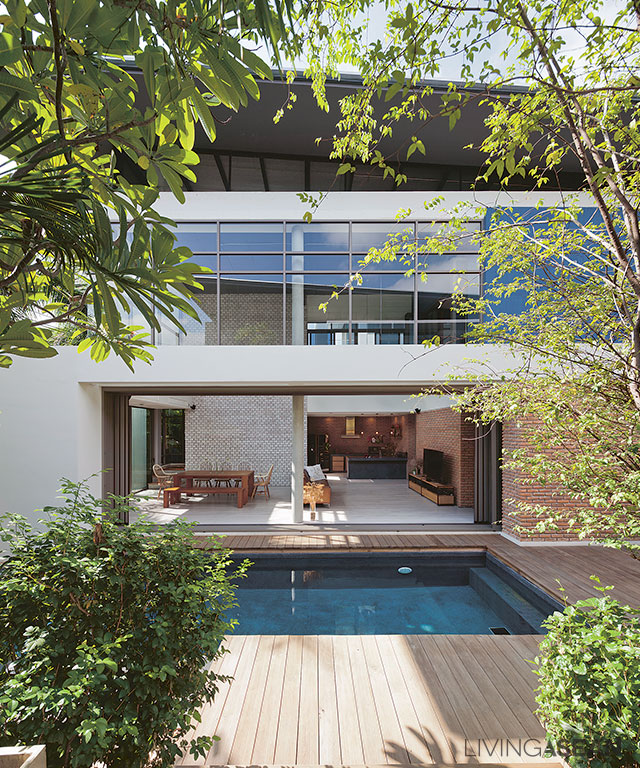
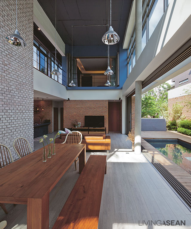
The second building belongs to Suthiphong’s brother, Kittiwat Pongpawasuit. Unlike the first house, it comes in a mix of white, cream, and gray tones, which together give it to a strikingly handsome appearance.
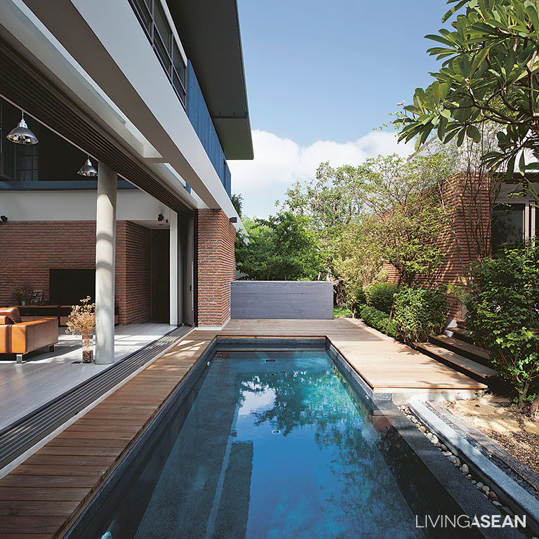
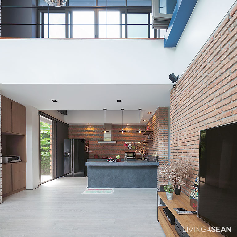
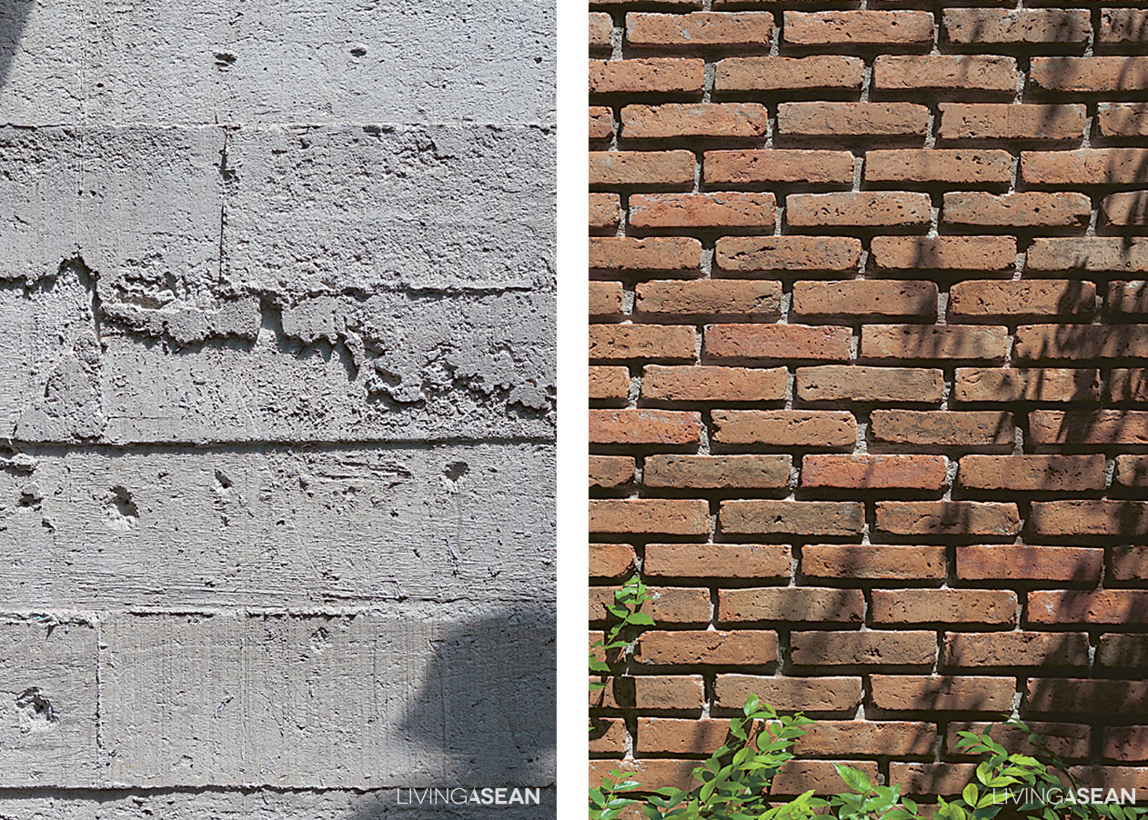
The design is light and airy and emphasizes a warm and peaceful atmosphere. Brick walls are painted white to minimize any alteration of natural light and color reflecting on the surfaces. The home, especially its living spaces, is all about enhancing a seamless indoor-outdoor relationship.
Crisp, clean landscaping can be seen all the way to the swimming pool, thanks to large single-paned glass doors that slide open and neatly disappear into the walls. The living room gets nice cool breezes from the swimming pool and is set facing north to avoid the harshest of the afternoon sun.
Design relationship
The two designs may contrast in personality, but architect Kraipol Jayanetra of Alkhemist Architects found a relationship between them by opting for like materials, textures, and mutual décor ideas.
By this was meant the use of naked, unornamented concrete finishes, industrial-style electrical conduits, wood furniture, and a plenty of accent pieces.
“I started out with something small but interesting, and worked my way up until I arrived at a complete unit,” said Kraipol.
That being said, every part of the co-housing buildings, be it vertical or horizontal spaces performs the functions it is intended. Overall, a great mix of patterns and textures makes the two houses appear in perfect harmony with each other. The difference is in the details.
This has been a story of two youthful homes in a co-housing house that coexist to complement each other. One is overflowing with life. The other is tranquil and handsome in its own way. They enhance and improve each other’s curb appeal, and set the stage for a simple fulfilling lifestyle.
Architect: Alkhemist Architects

