/ Thailand /
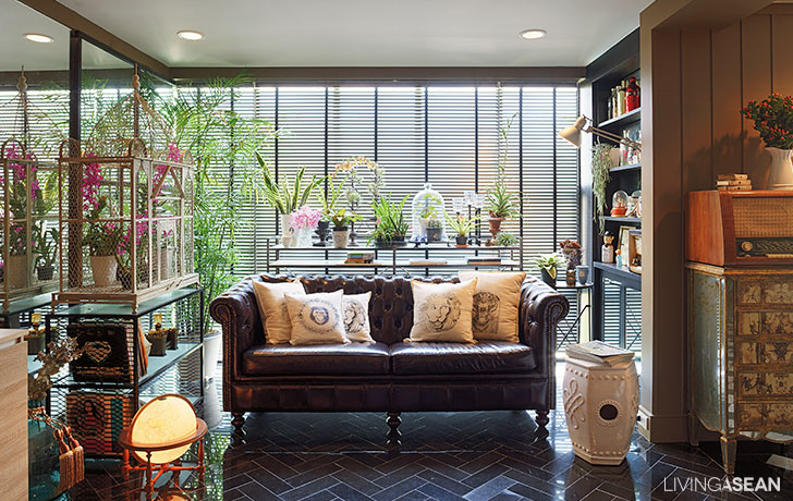
The classic and retro style of the three-story, 750-square-meter rowhouse is an awesome makeover from what was once a printing facility owned by the family.
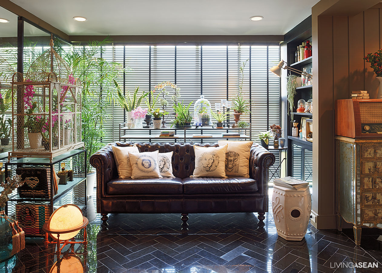
Much of the structure of this classic and retro style house is kept intact, except some parts of the wall that are removed to make way for optimal space utilization. In the process, the main entryway is relocated for added convenience. As the owners, Worapong and Sukanya Suwatpim put it:
“We built this row house duplex ourselves. The design is based on slightly different dimensions compared to those standard-sized row buildings. Our rectangular-shaped plot happens to be much longer than it is wide. In remodeling the living spaces, the main entrance that used to be on the front is relocated to the long side. It is more convenient that way.”
The ground floor offers parking spaces for classic cars that make parts of his collections. There are areas for hobbies and creative workspace surrounded by unadorned concrete finishes and hand-hewn, bare brick walls. Metal detailing is painted black, paired with cool retro-style furniture. The well-conceived combination adorns the interior spaces that obviously speak to retro-Industrial style.
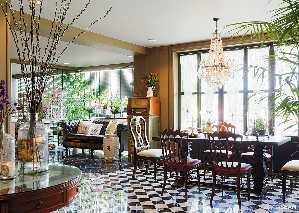
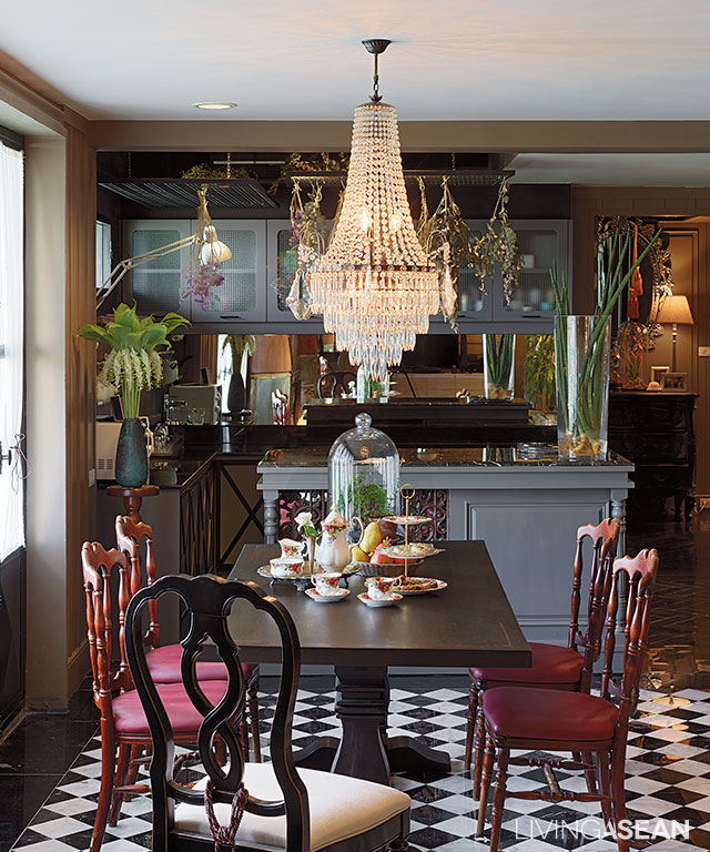
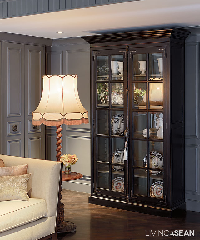
The second floor features ample seating spaces, dining area, kitchen and a bedroom, which comes in cool classic style, and yet not too sweet.
Plans are afoot to turn the third-floor spaces into a gallery of many antique clocks that the homeowners have collected over many years.
The couple has preferences for different interior decorating in classic and retro styles. This is where the designer, Paisal Chongprasobtham, comes in to create a welcome contrast in the interior living spaces, ones that are aesthetically pleasing despite different natures, luminance and color.
Sharing his thoughts, Paisal said:
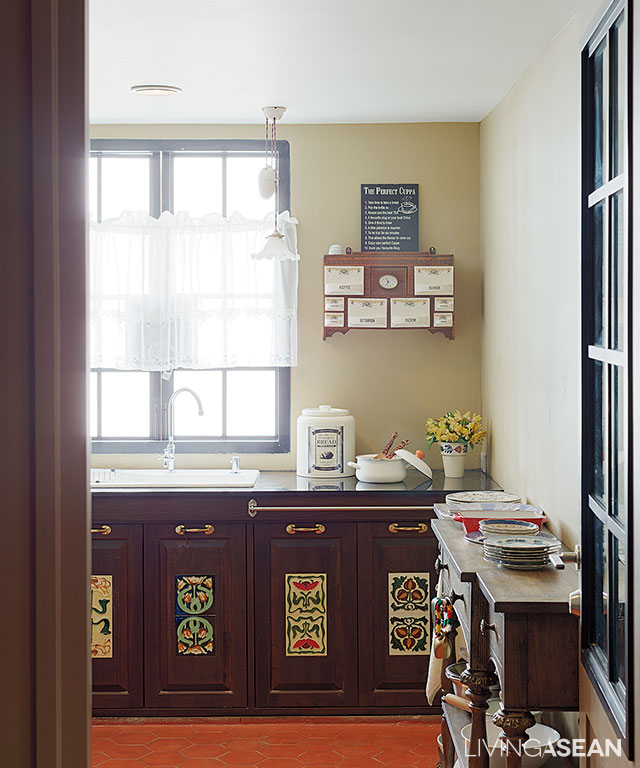
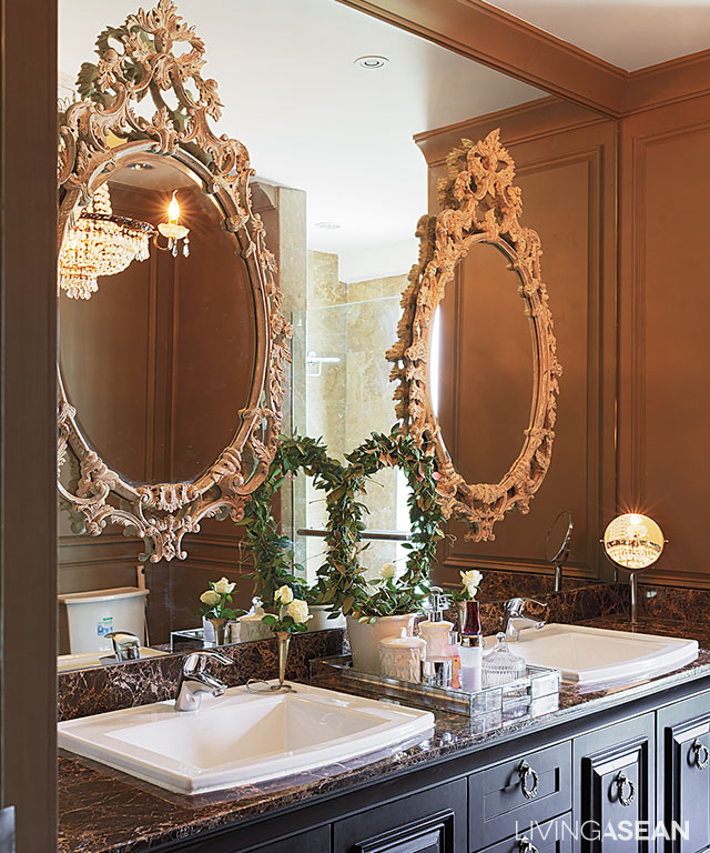
“Worapong prefers the raw rustic look that is the way of men, while Sukanya wants her design simple, and yet appealing by its very nature. So I give the ground floor unsophisticated look by incorporating features that are attractive, and yet unrefined. The interior walls show steel and bare bricks after plaster covering has been removed.
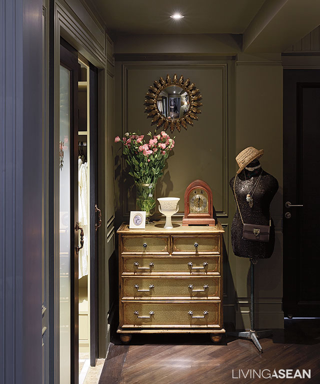
“I try to make the two interior styles of the classic and retro style go hand in hand by using dark shades like black and gray as connecting agents. Meantime, wood furniture comes in natural tones with an emphasis on simplicity, and yet cool. The kitchen counter is adorned with classic woodcarving patterns, making the atmosphere highly agreeable. The bedroom is given to luxury, no doubt the most comfortable and relaxing in every sense of the word.”
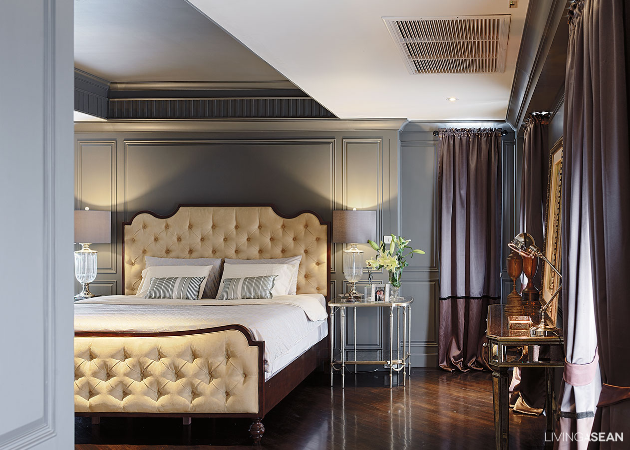
Being a much-traveled person, Sukanya is the one who chooses all of the decorating items. The job as a flight attendant has taken her to Europe often. And she particularly likes going to the flea market, out outdoor events selling secondhand goods.
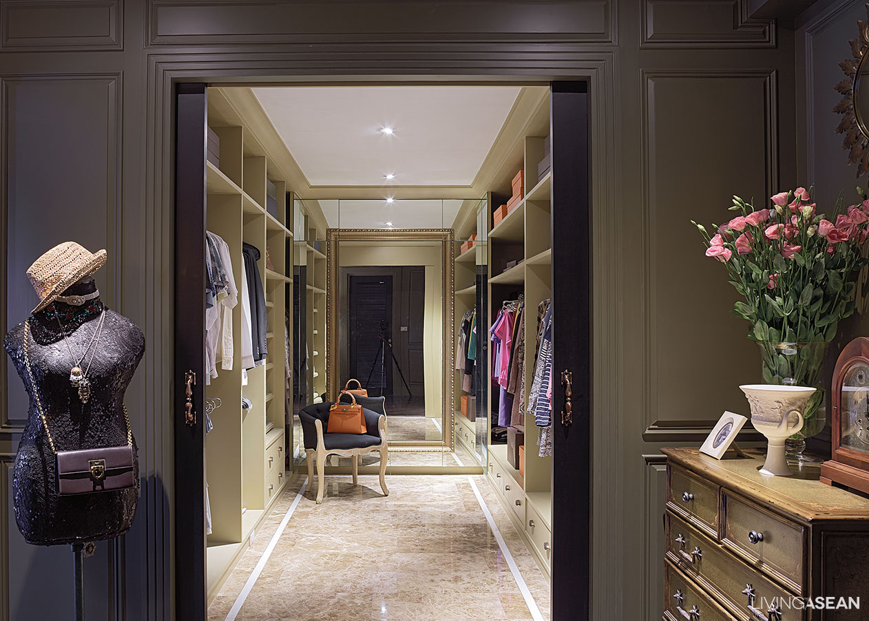
“Both of us want a home with the Western appeal, but not to the extent of Louis style. And it must not be too sweet. With this job, I get to see and stay in nice hotels. I collect décor items that I like and adapt them to best suit our home.
Story: Ajchara Jeenkram
Photograph: Soopakorn Srisakul
Interior Designer: Paisal Chongprasobtham

