/ Bangkok, Thailand /
/ Story: Kor Lordkam / English version: Bob Pitakwong /
/ Photographs: Nantiya, Weerawat Sonriang /
It all started with a 30-year-old, three-story townhouse and a company of architects Studio Miti in need of a new home. Like a fortunate stroke of serendipity, they found exactly what they had been searching for, a building with a wide, six-meter frontage abutting the street, an architectural quality attribute that gave it a decided plus.
Needless to say, it’s hard to find anything like it nowadays. More importantly, it’s located in an easily accessible community area with a variety of amenities, eating places and businesses serving surrounding populations.
Studio Miti management obviously saw the potential of it developing to future success. And that’s what gave them the inspiration going forward. They set off without delay to breathe new life into the old townhouse, transforming it into a modern design atelier that’s the home of the company’s finest 20-strong staff.
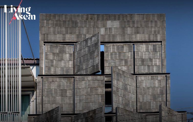
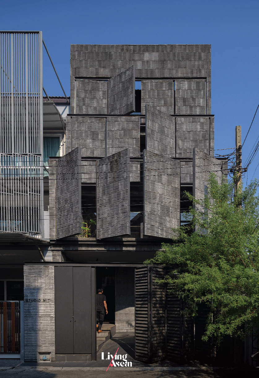
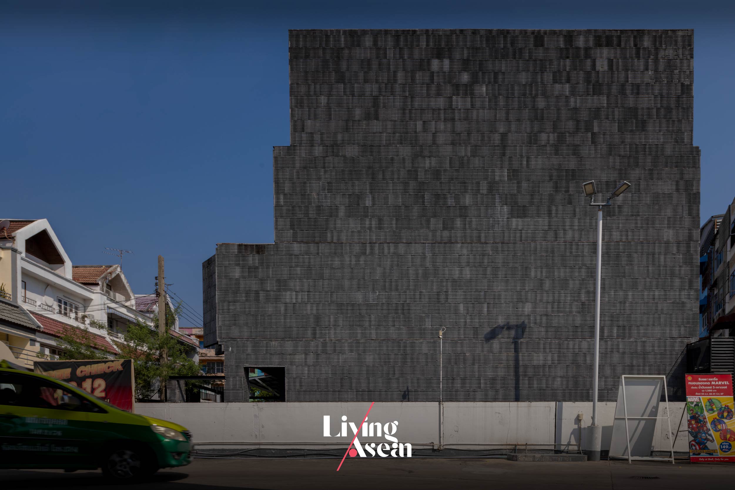
Their secrets lay in creating an exciting new external envelope covered with lightweight concrete materials. And the result of all this is a pleasing visual appearance unlike anything out there. Architecturally speaking, it’s an interesting amalgam of color, texture and the perception of shape and size that inspires admiration.
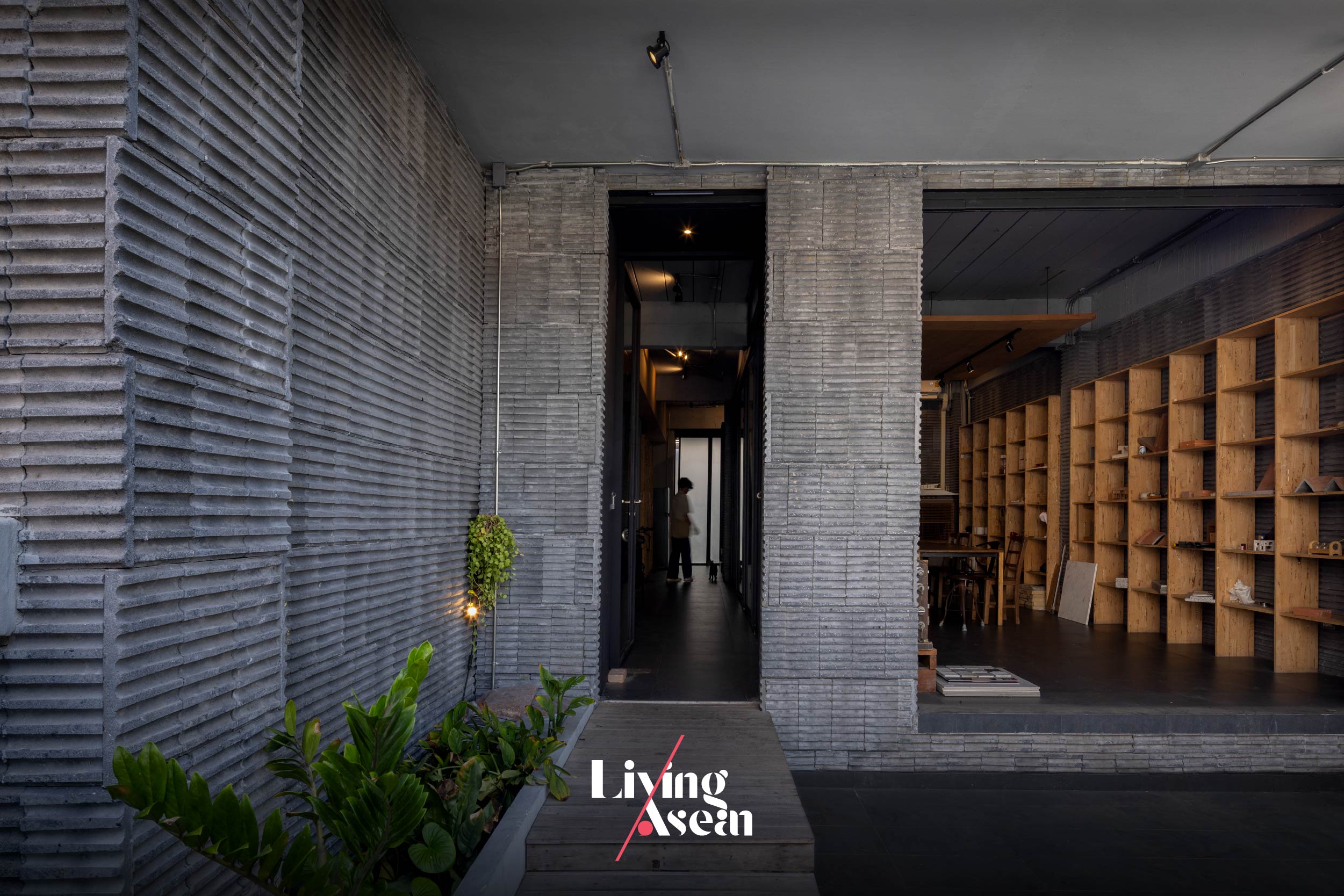
Ground floor interiors afford comfortable workspaces designed to boost productivity, with communal facilities such as small meeting rooms and client reception areas neatly arranged throughout the building. There’s also a casual dining area with a kitchen and pantry, not to mention recreational spaces with a ping-pong table and quiet nooks to chill out.
Taken as a whole, it’s design that speaks volumes for the company’s operating principles — investing in a conducive work environment so as to reduce stress and improve concentration. Likewise, it makes perfect sense to ensure its design team can stay focused on the task at hand.
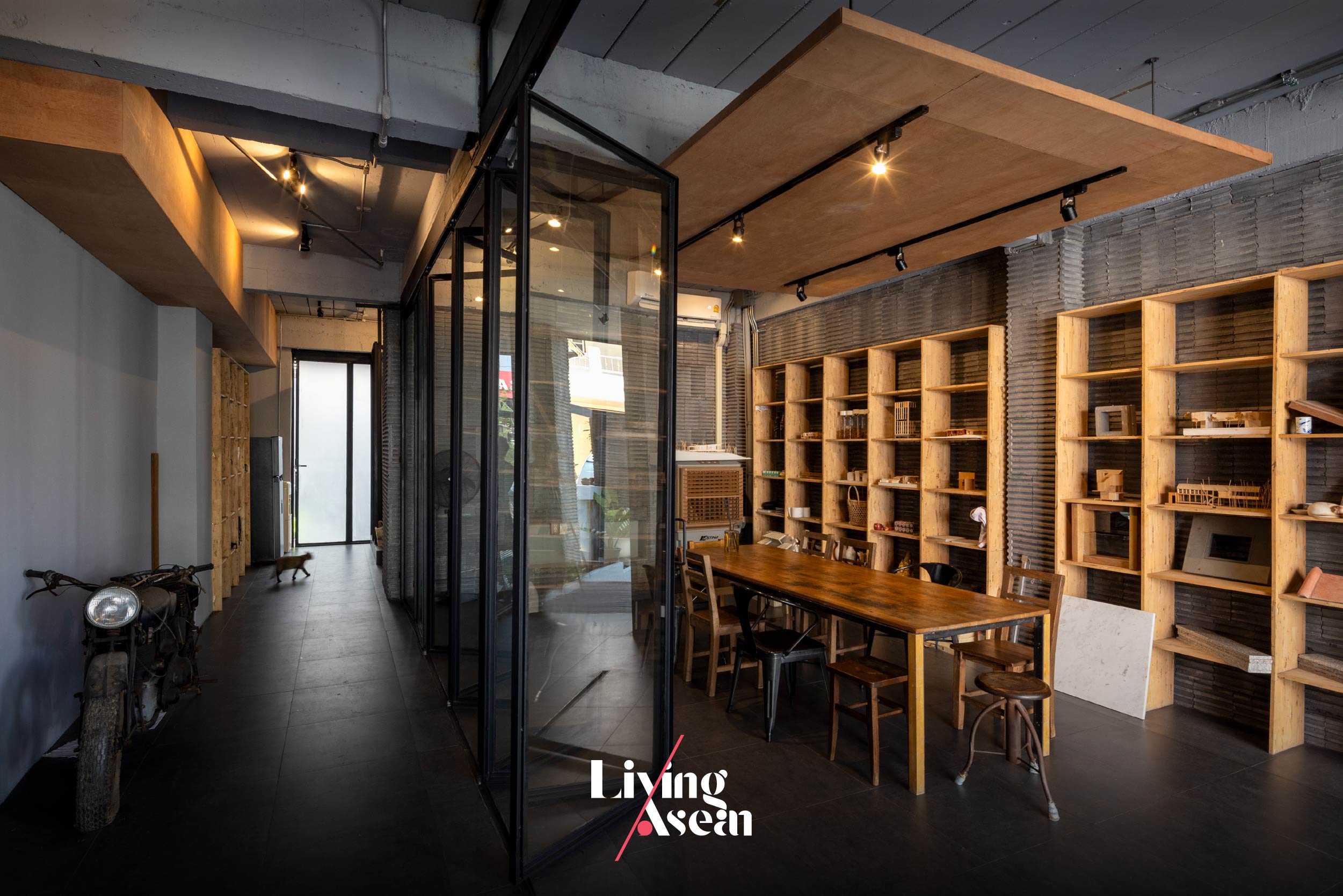
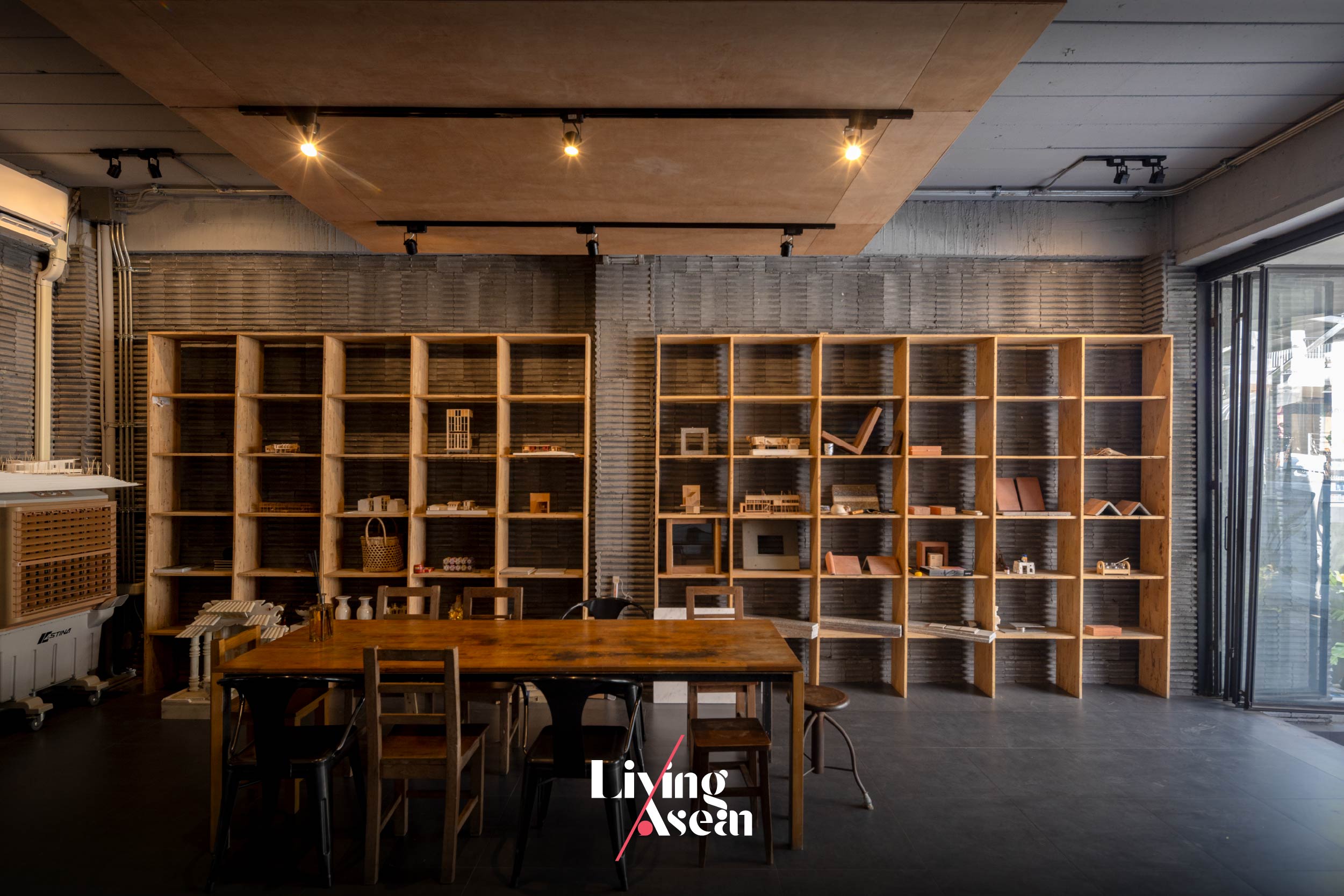
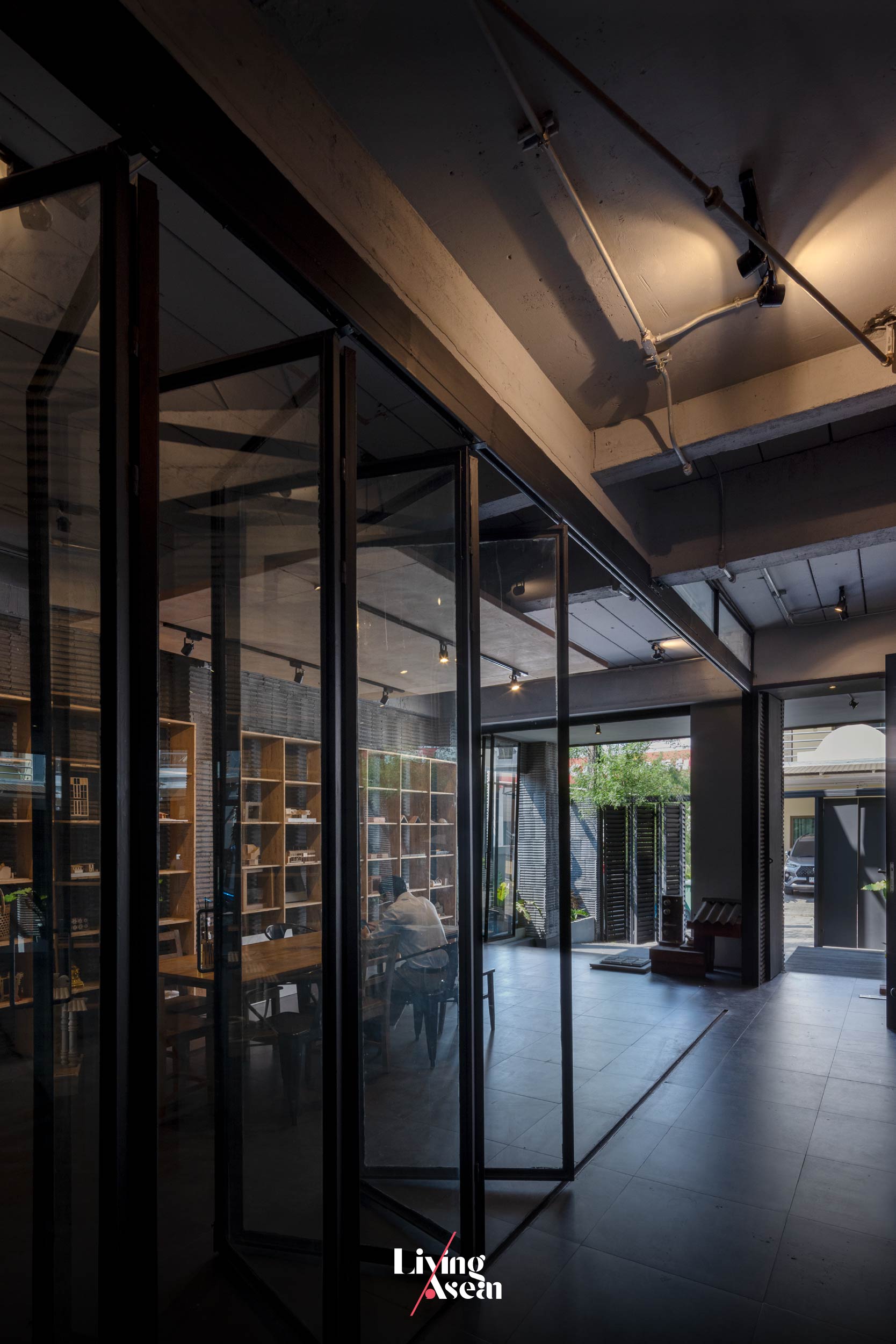
Climb a flight of stairs, and you come to the main meeting room reserved for formal meetings or when work needs total concentration. There’s a customer reception area nearby that makes a great first impression, with facilities for online video conferencing, a dining room and areas used for recreation.
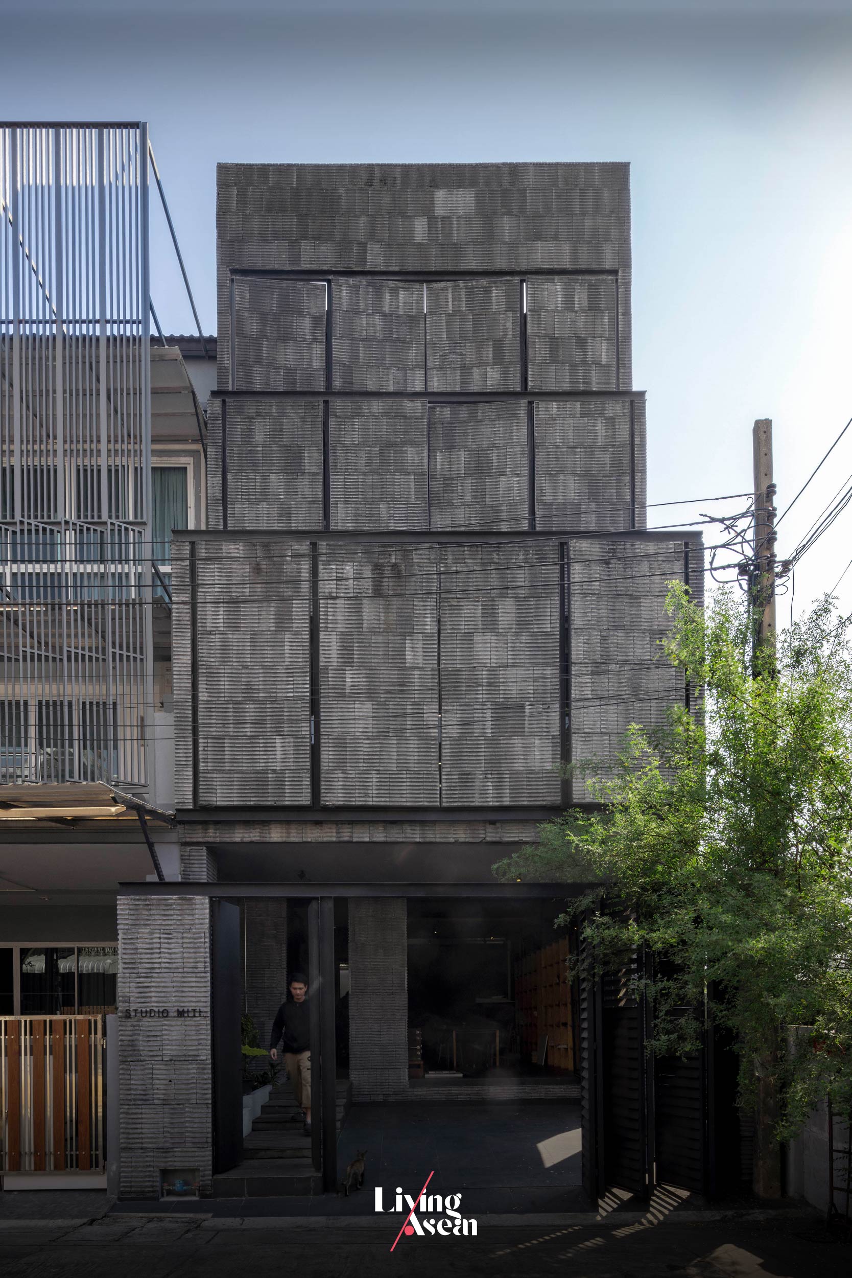
Different from what’s usual is the building façade that can open and shut as needed to regulate the amounts of natural light during the daytime or admit fresh outdoor air into the room in the late afternoon, a clever hack to save big on energy bills.
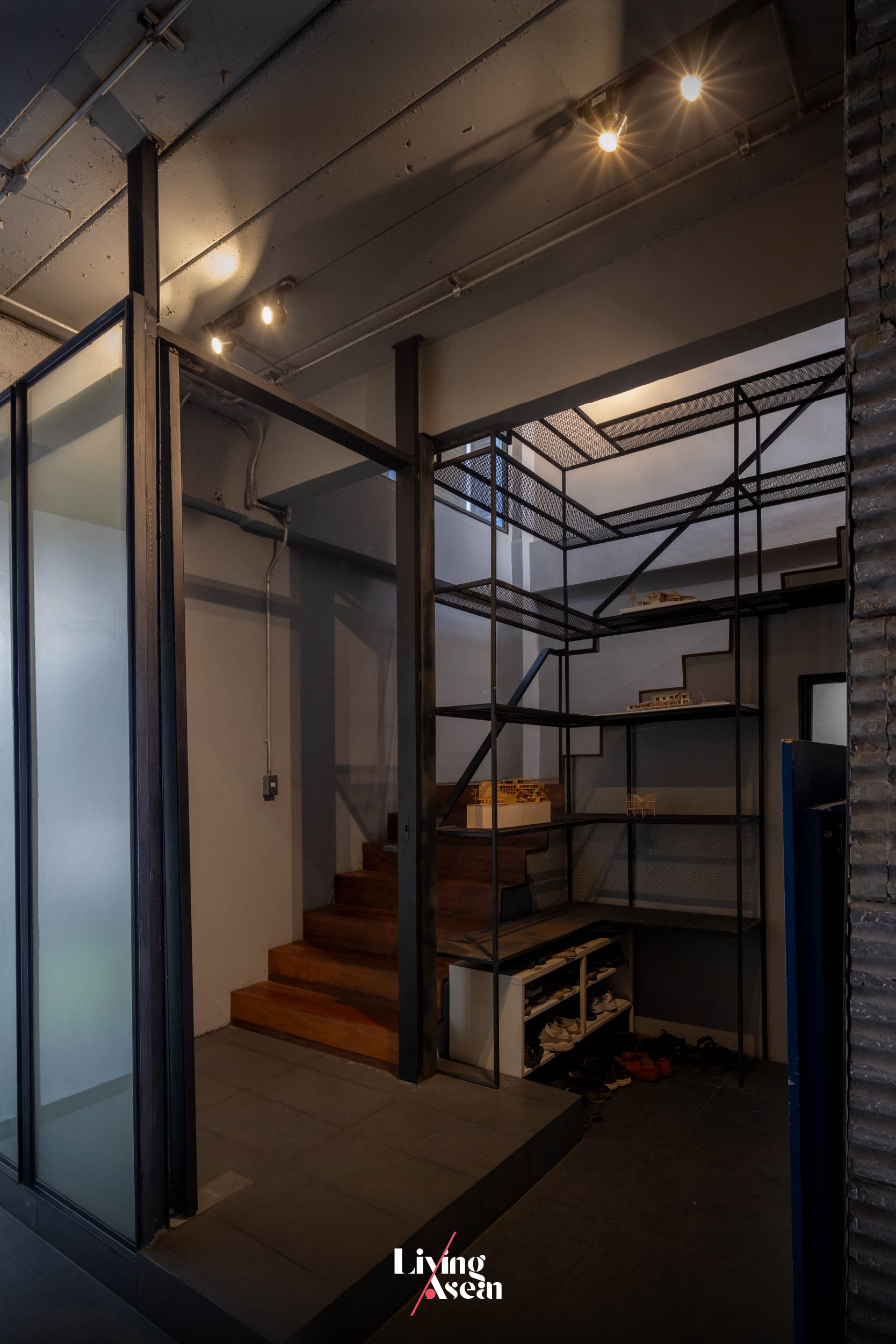
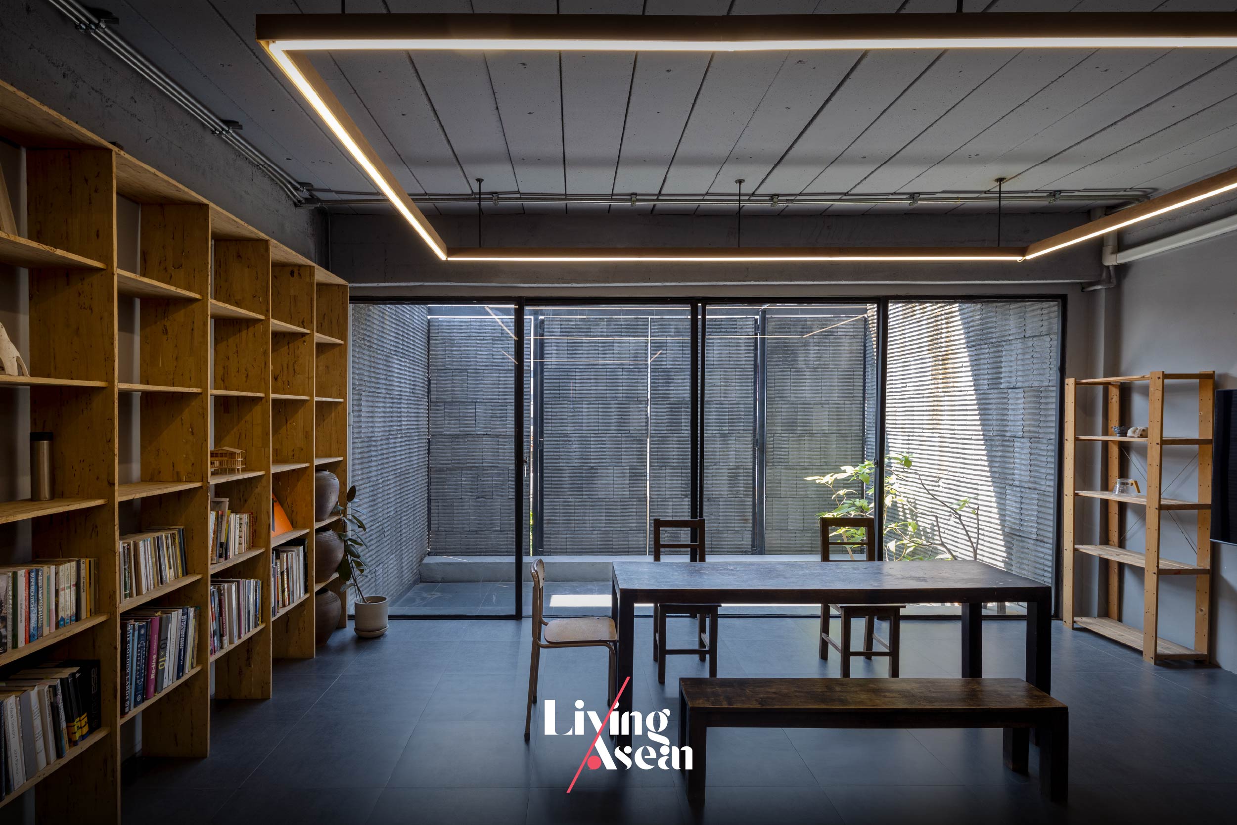
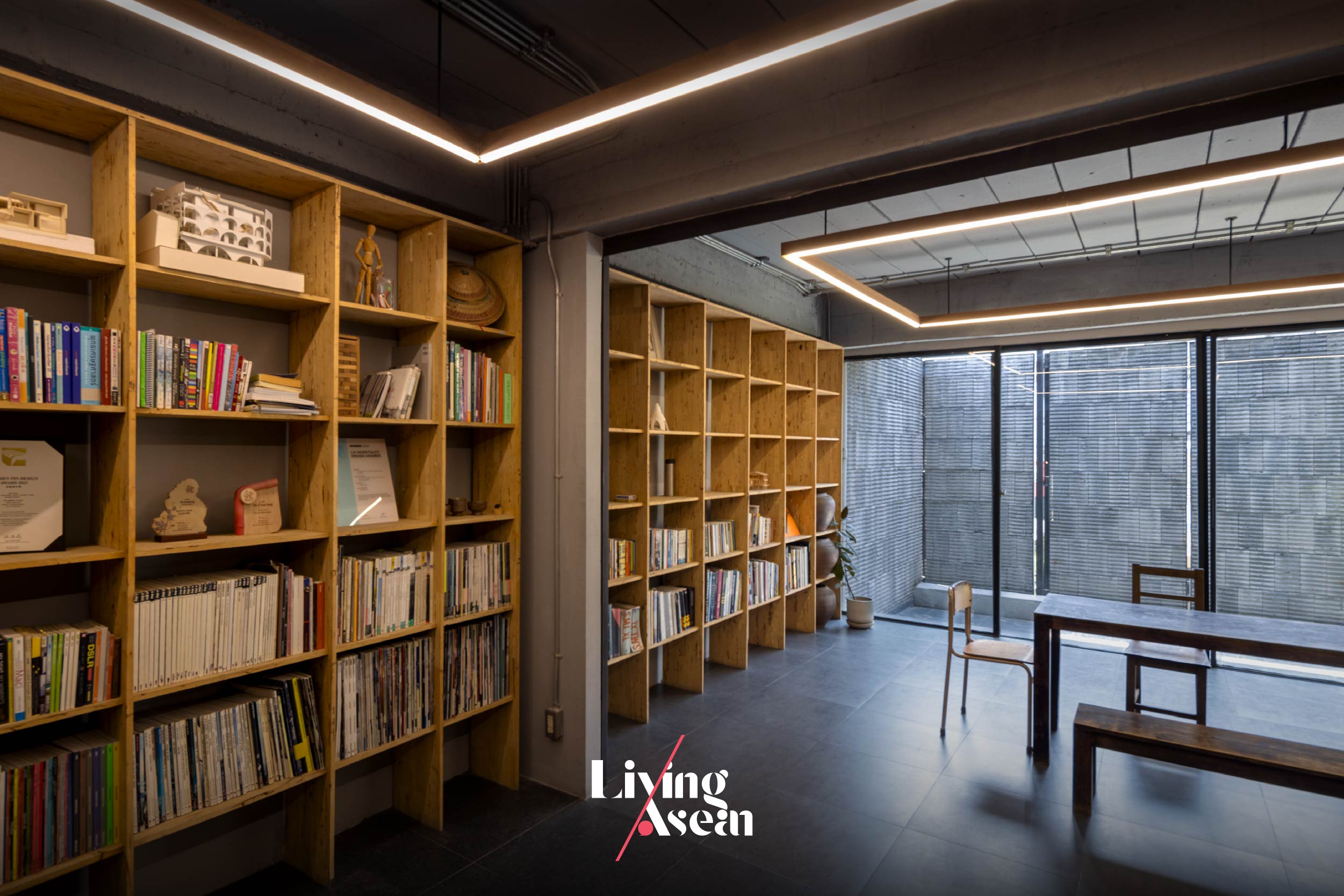
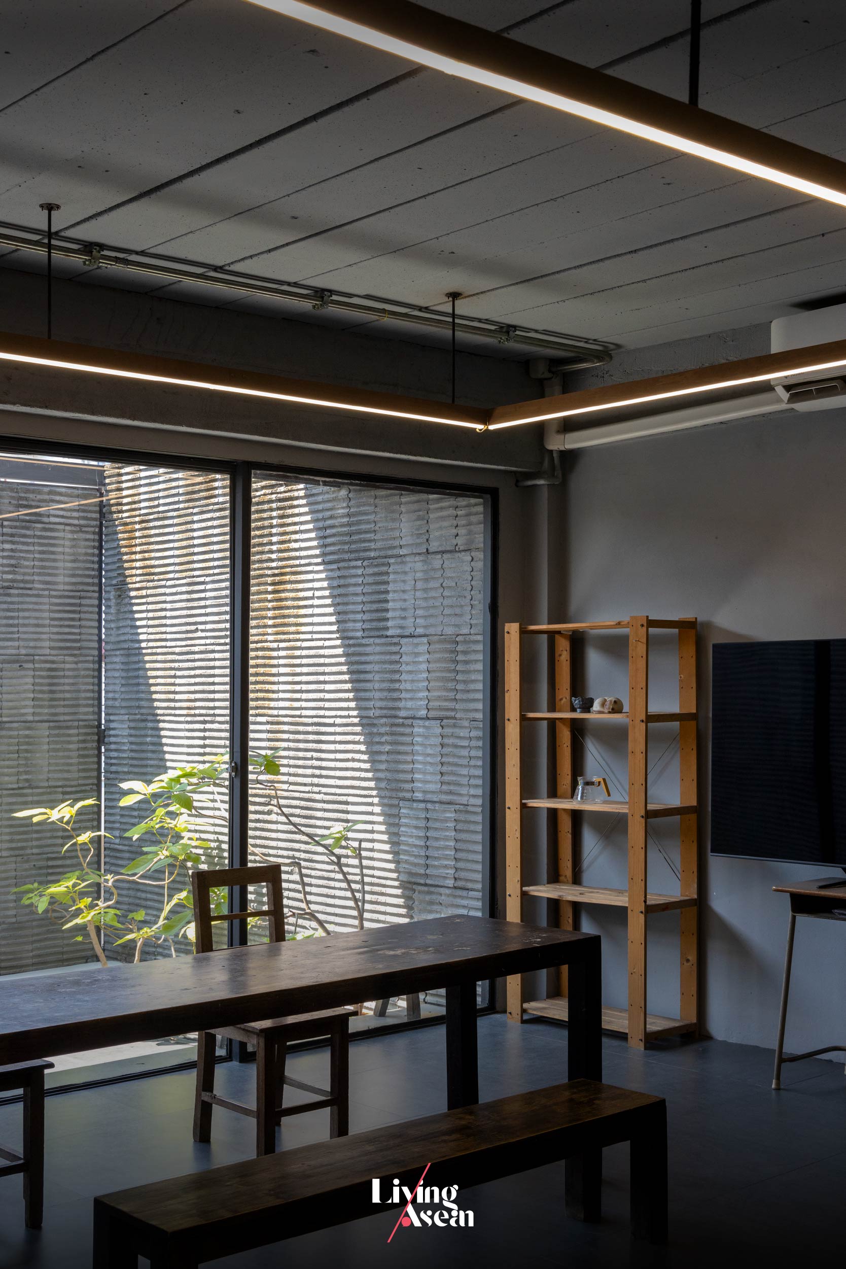
The third floor holds ample workspaces with a mezzanine just below the high-pitch roof. Together they boast the comfort of a high-ceilinged room made light and airy by design. For lack of a better word, it’s the pride and joy of some 20 staff members working here as a team.
Of all parts of the building, the roof received the most extensive renovation. To get where they wanted to be, the architects had the old roof torn down to make room for a new high-pitch upper covering.
This gave the interiors much more space overhead, more natural light and aesthetic appeal. Plus, new ceilings built flush with the underside of the roof add real character to the room, while the mezzanine provides extra storage space just below the roof.
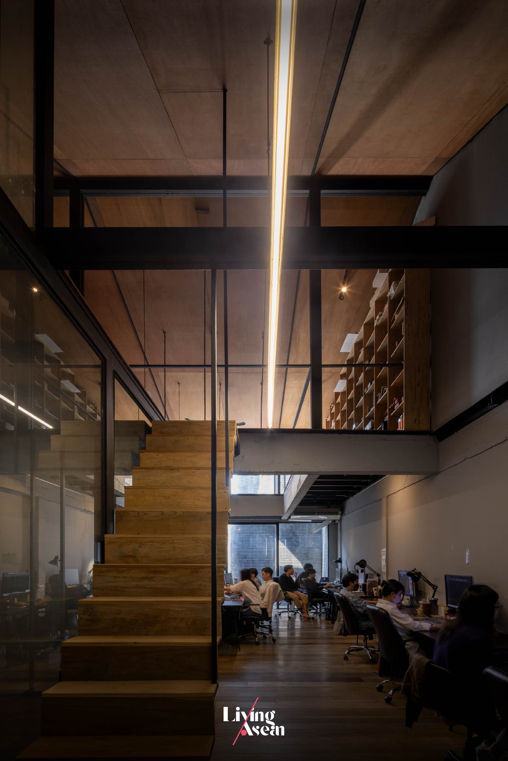
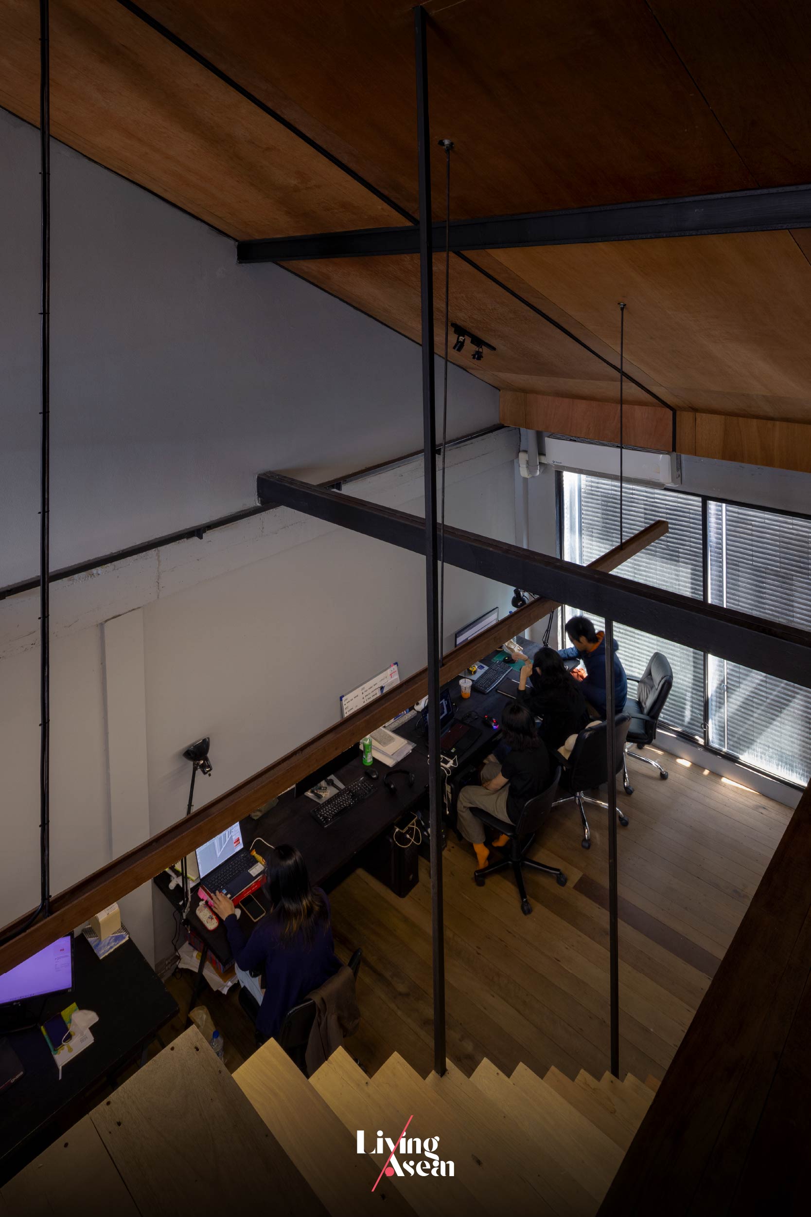
All things considered, it’s about creating a workspace that bodes well for the good health of all members on the team, while inspiring productivity and job satisfaction. These qualities can only come from having access to a conducive work environment, the ability to stay focused on work and freedom from noise and distractions.
To achieve the desired results, all the workspaces and functional areas are warmly cocooned inside a solid external envelope made of lightweight concrete materials. Yet they feel connected to the elements of nature, thanks in part to large openings in the front façade that let natural light and fresh air stream into the rooms on the second and third floors.
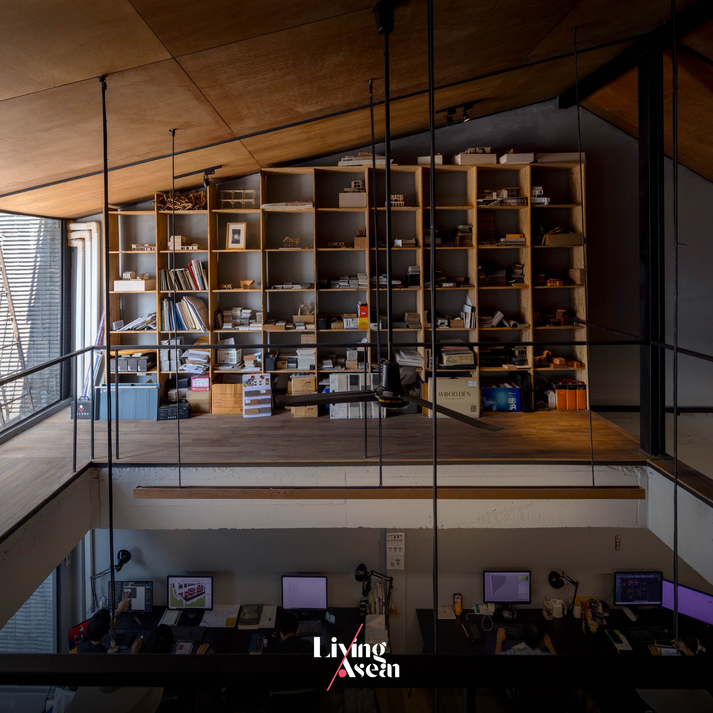
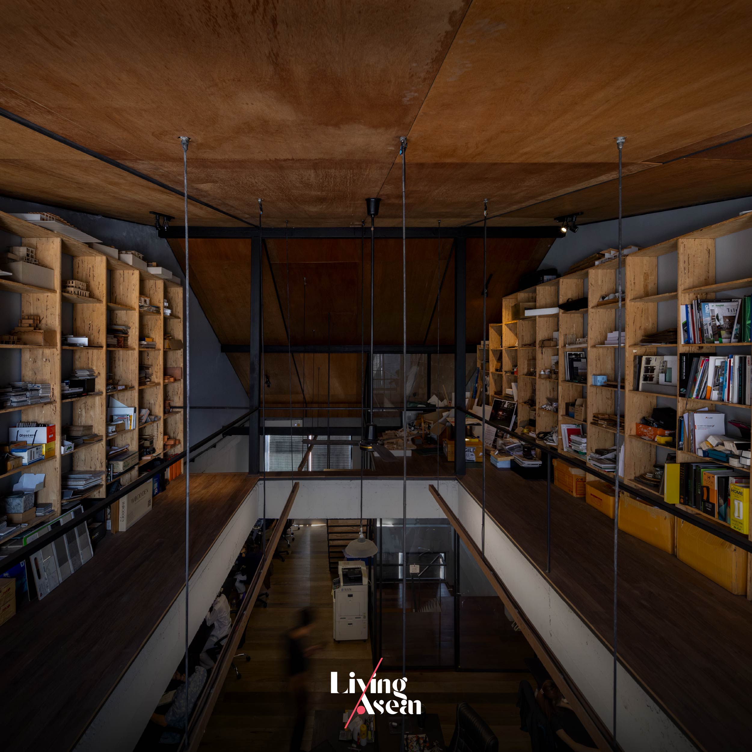
Not only that, all the arrangements in place also allow the architects to experiment with exciting ideas and innovative materials never before seen, among them a new kind of lightweight concrete materials for wall construction.
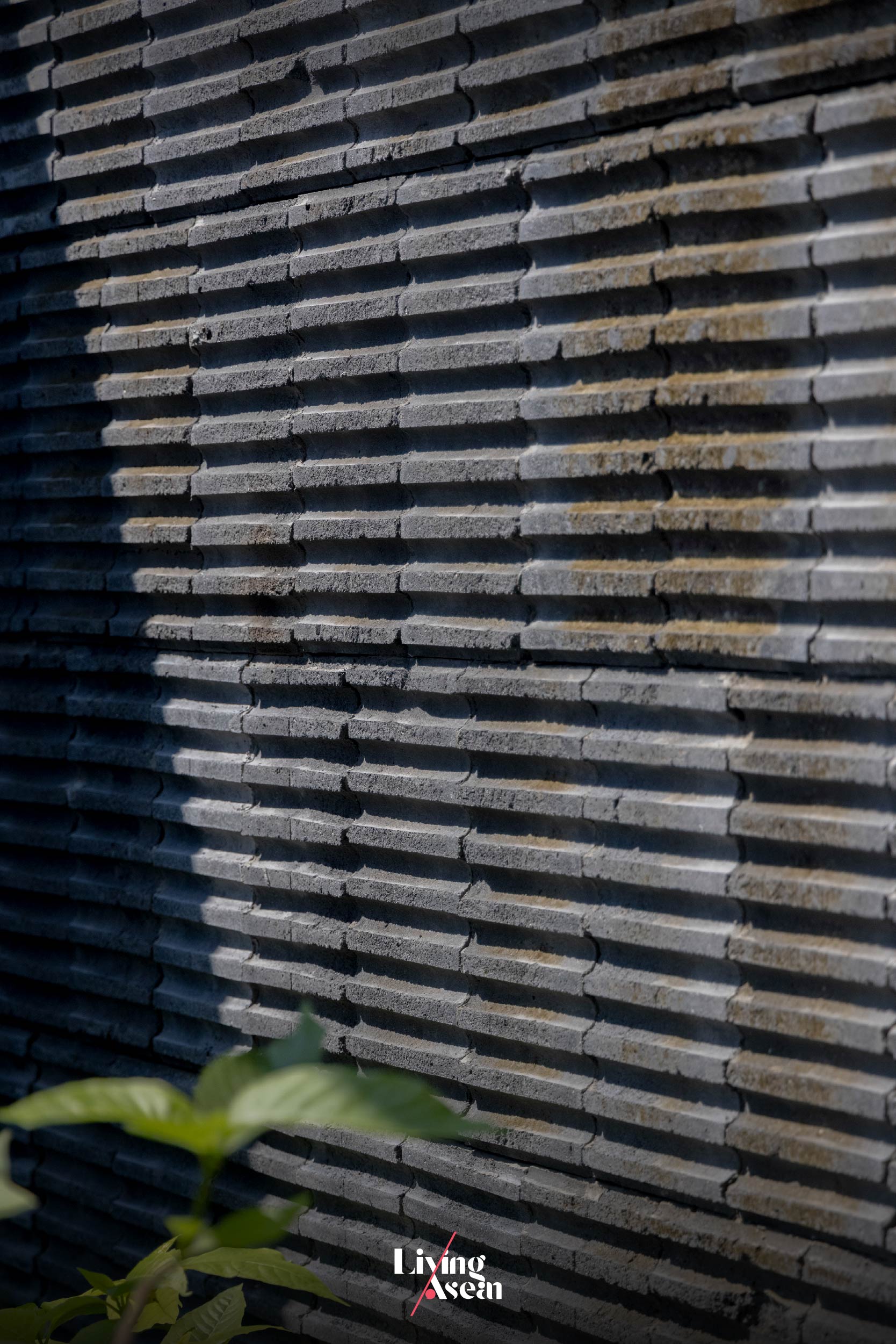
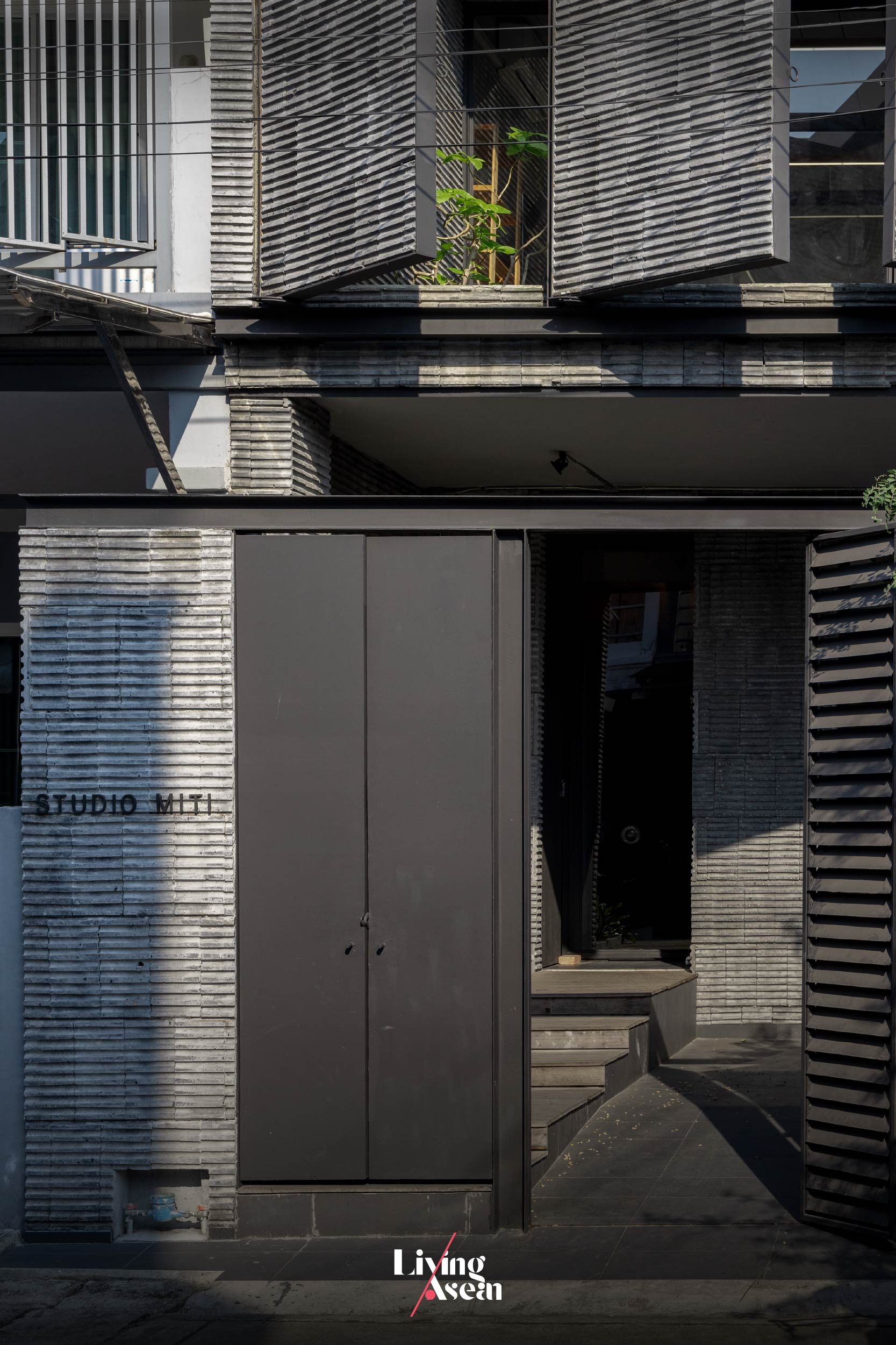
In Studio Miti ‘s most recent experiment, they decided out of curiosity to split an ultralight concrete block in half, only to discover that it contained ridges and grooves on the inside creating light and shadows. They then proceeded with installing the ultralight blocks inside out, thereby showcasing the beauty of imperfections of materials on the building’s exteriors.
It’s sort of going in the opposite way of what usually happens.
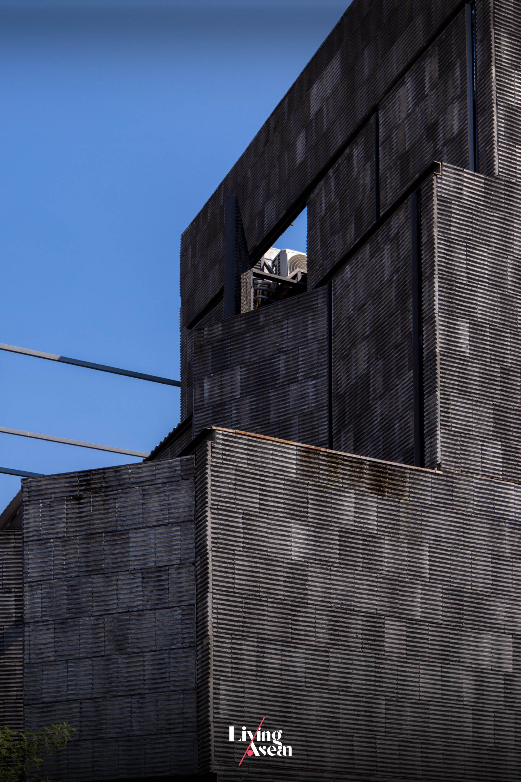
The result is charm, good looks without embellishments or decoration of any kind, one that creates an interesting light and shadow play when touched by light. Plus, it’s a spectacular sight that changes with the time of day.
In the fewest possible words, it’s a renovation that conveys a great deal about Studio Miti ’s belief, which says that, first and foremost, it makes a lot of sense to be material savvy. Better yet, it’s prudent to investigate the material before using it. Why? Because knowledge of materials and how they perform in real situations is essential to creating architecture.
Architect: Studio Miti (www.studiomiti.com)
You may also like…
 Ngói Space: A Community Center in Vibrant Orange Graces a Suburb of Hanoi
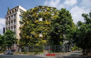 Urban Farming Office: VTN Architects’ Office Gives Back Lush Greenery

