Blog : Terraced House

QAH: A Gable Front Townhouse Strikes a Balance between Work and Life

QAH: A Gable Front Townhouse Strikes a Balance between Work and Life

/ Ninh Thuan, Vietnam /

/ Story: Kangsadan K. / English version: Bob Pitawkong /

/ Photographs: Paul Phan /

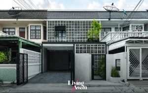
A gable front townhouse with a high-pitched roof stands out from the rest in a peaceful neighborhood of Phan Rang-Thap Cham, a coastal city in Ninh Thuan Province about four hours’ ride from Ho Chi Minh City, Vietnam. The limited amount of space notwithstanding, the indoor environment is surprisingly comfortable thanks to a small inner courtyard designed for improved natural light and ventilation.
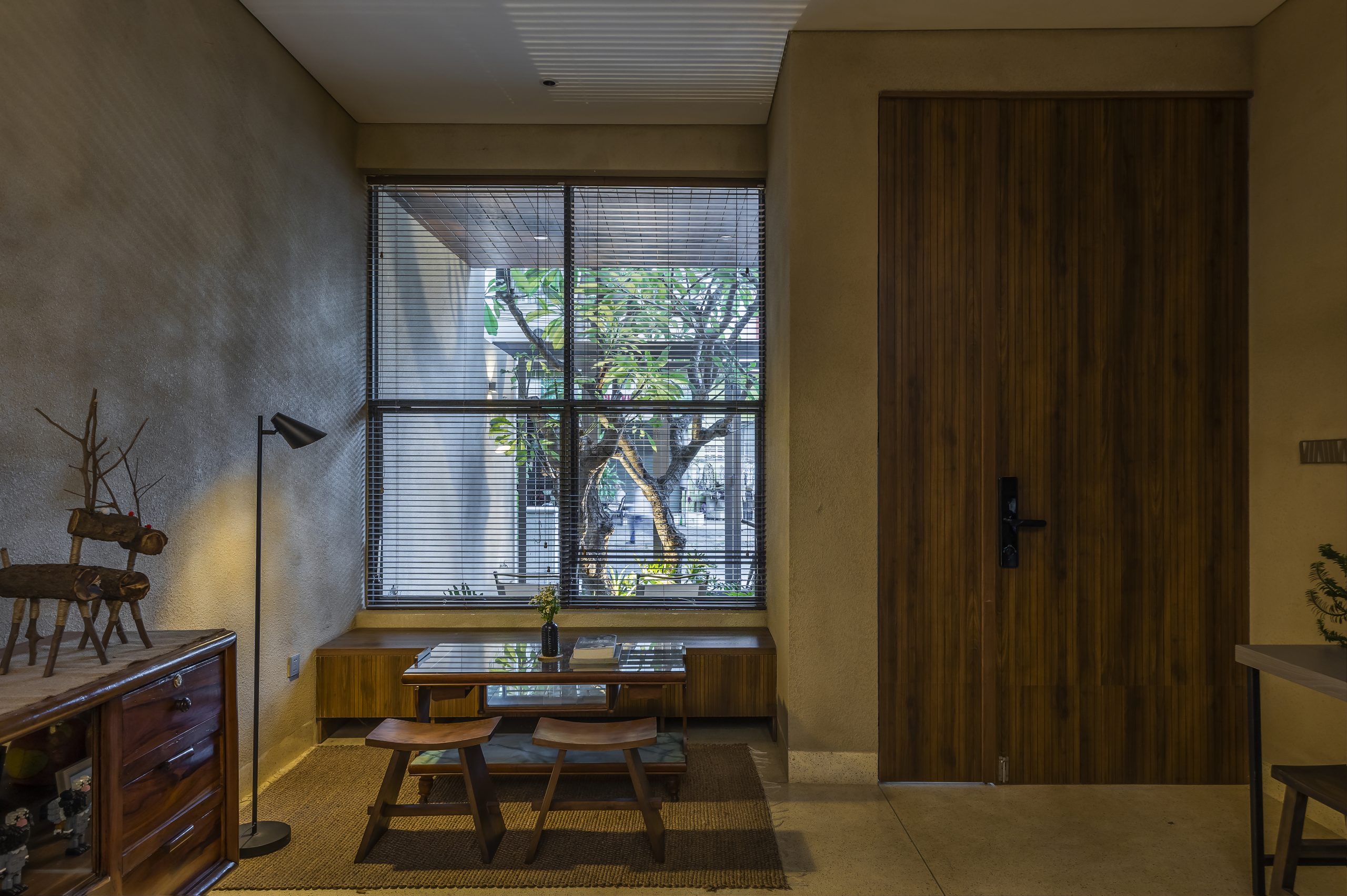
Using wood adds visual interest to the indoor environment, improves acoustics and balances out the coarseness of concrete surfaces.

Named “QAH”, the three-story terraced house offering 220 square meters of living space is the brainchild of Q&A Architects, an architectural practice based in Phan Rang-Thap Cham. As to be expected in a dense urban environment, the company was tasked with creating a townhouse that would strike the right balance between work and the fast pace of city life.
townhouse
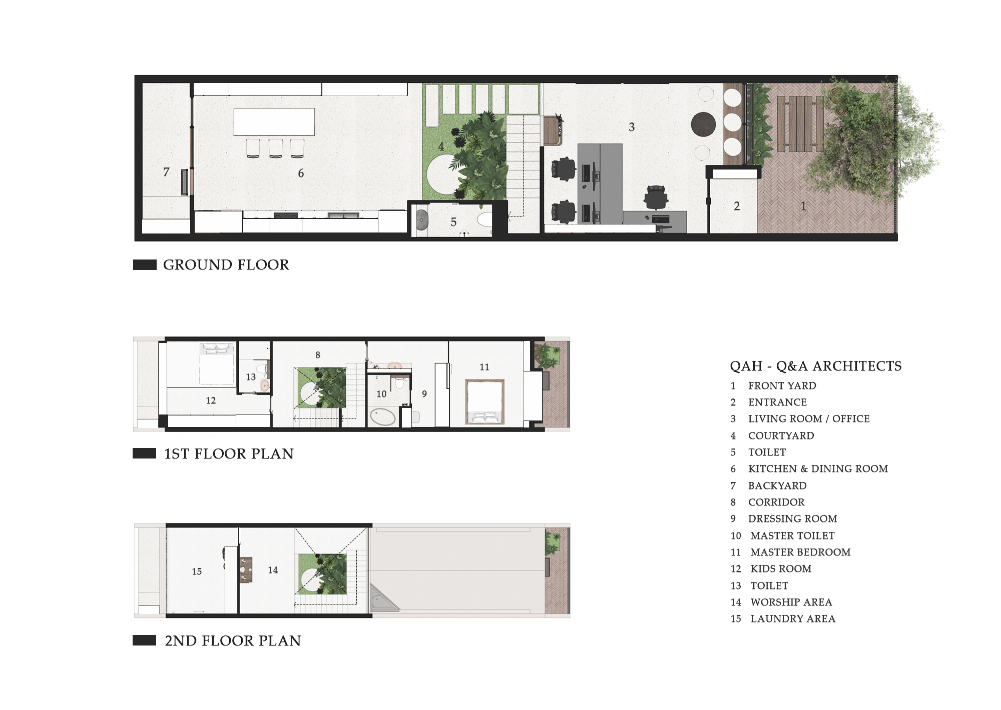
A detailed diagram shows all three levels of the house plan. As a whole, 30 percent of the total space is dedicated to open areas filled with lush greenery. / Courtesy of Q&A Architects

After examining the nature of the site and exploring public realm (a shared space in the community), the design team came up with a three-story townhouse plan with roughly 30 percent of total living and functional spaces dedicated to open areas front and back for relaxation. Plus, there’s a small interior yard under the stairs brightened up by an array of skylights built into the rooftop.
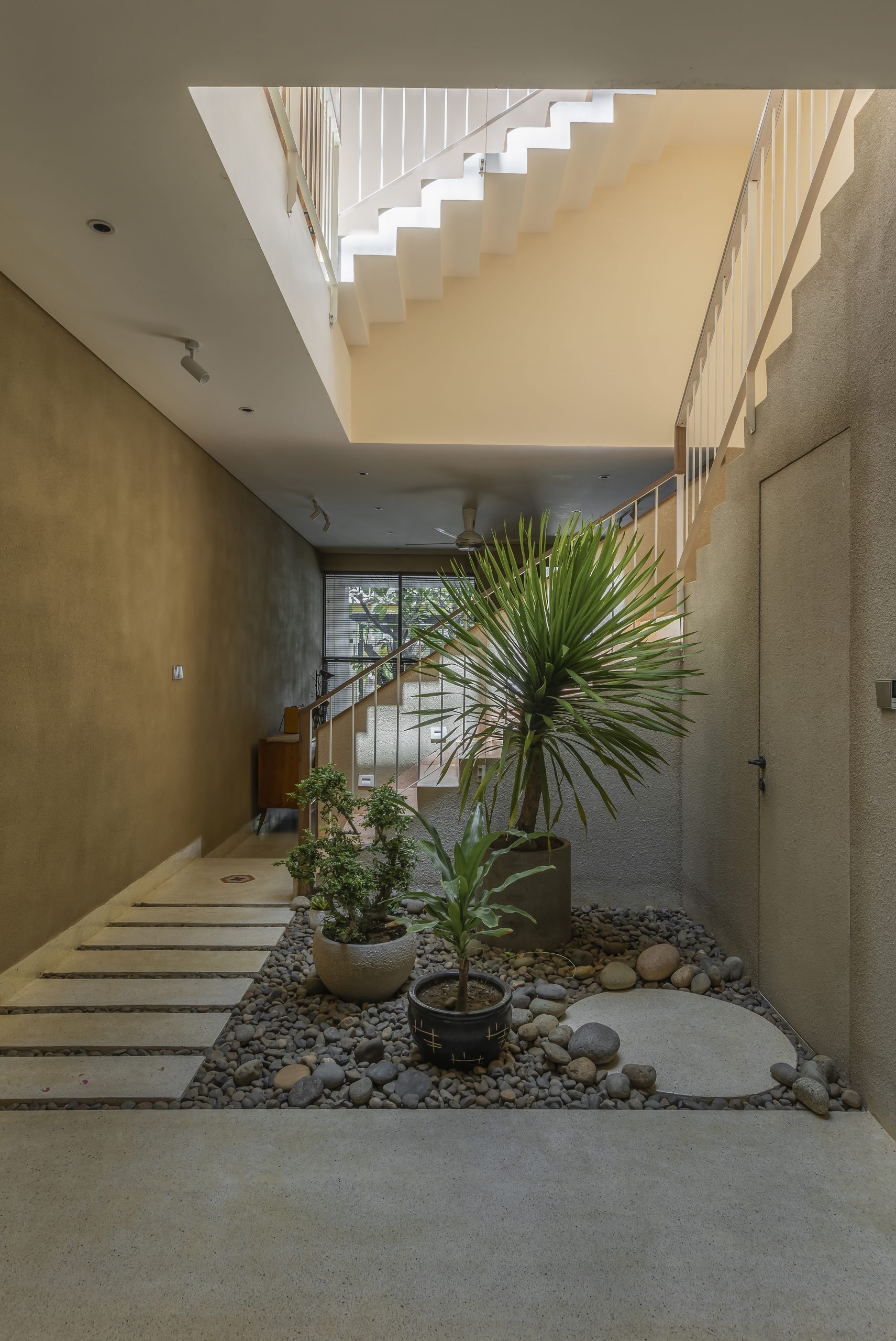
The indoor environment feels invitingly comfortable, thanks to a greenery-filled yard enclosed within the building.

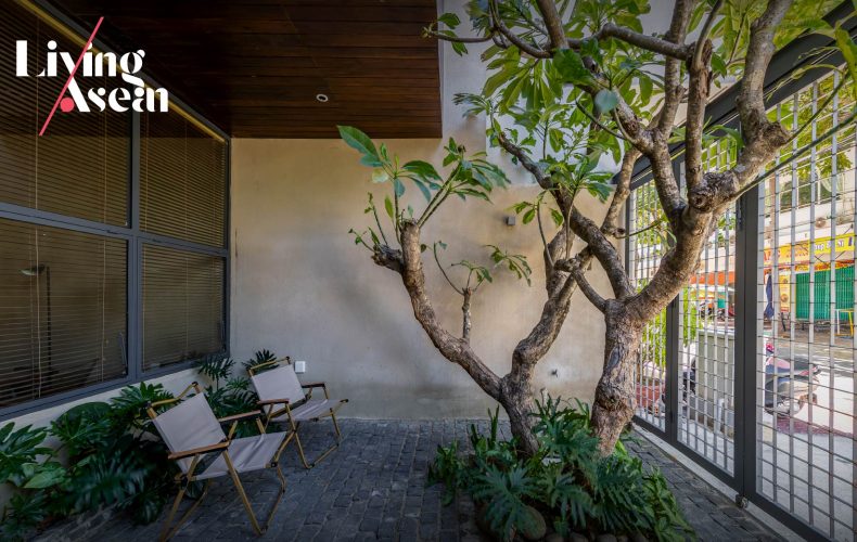
That’s not all. Everywhere, smart home functions blend perfectly into convenient interior design hiding in simplicity. Take for example the terrace leading to the front door that’s covered in stone pavers and adorned with greenery thriving under tree cover. To create charm, good looks, the walls are built of wood painted an earthy dark brown that balances out the coarseness of nearby concrete surfaces.

Walk in the door, and you come into the entrance hall connected to a neat and clean dining room and kitchenette. Close at hand, the small inner courtyard lies illuminated by skylights directly above. And beyond, a quiet, secluded office nook hides in plain sight at the farthest end of the room.

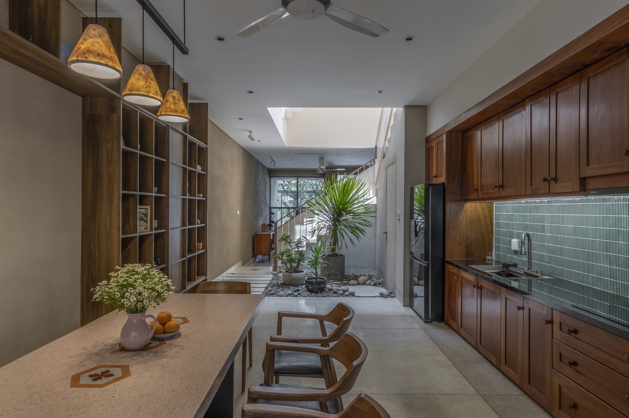
Using wood adds visual interest to the indoor environment, improves acoustics and balances out the coarseness of concrete surfaces.
A bright interior courtyard under the stairs separates an office nook at the rear from the dining room and kitchenette up front.

In a nutshell, it’s thoughtfully devised to let nature permeate, yet it fits in well with the homeowner’s needs and circumstances. Among the features that create work-life balance in the home, the stairwell at the midpoint of the house plan eliminates the need for mechanical ventilation and artificial light during daytime hours.
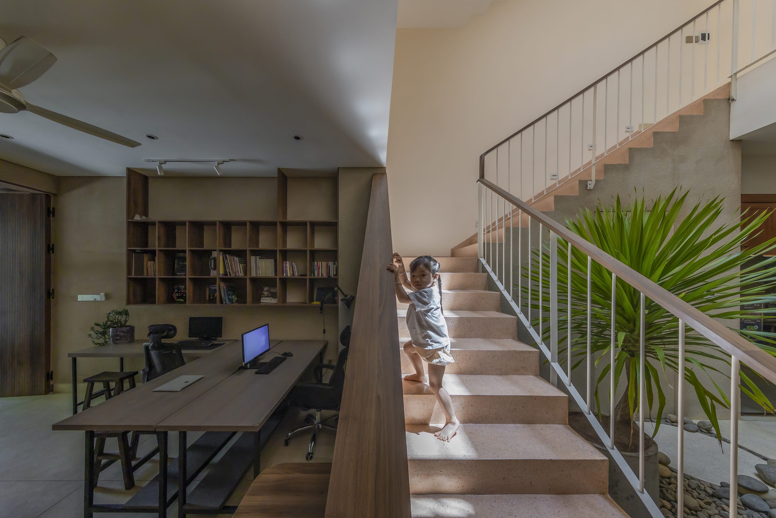
A flight of stairs built flush with the adjoining walls separates an office nook at the back from the dining room up front.

The principal bedroom on the second floor is cozy and spacious, thanks to the vaulted ceiling that follows the pitch of the roof. The ceiling and the walls are painted a cool-toned cream, while a sofa set in dark brown and bedding in muted green accent the background colors in the room. Up front, large windows open to admit natural daylight and fresh outdoor air stream into the interior, a perfect combination of colors and textures by any standards.
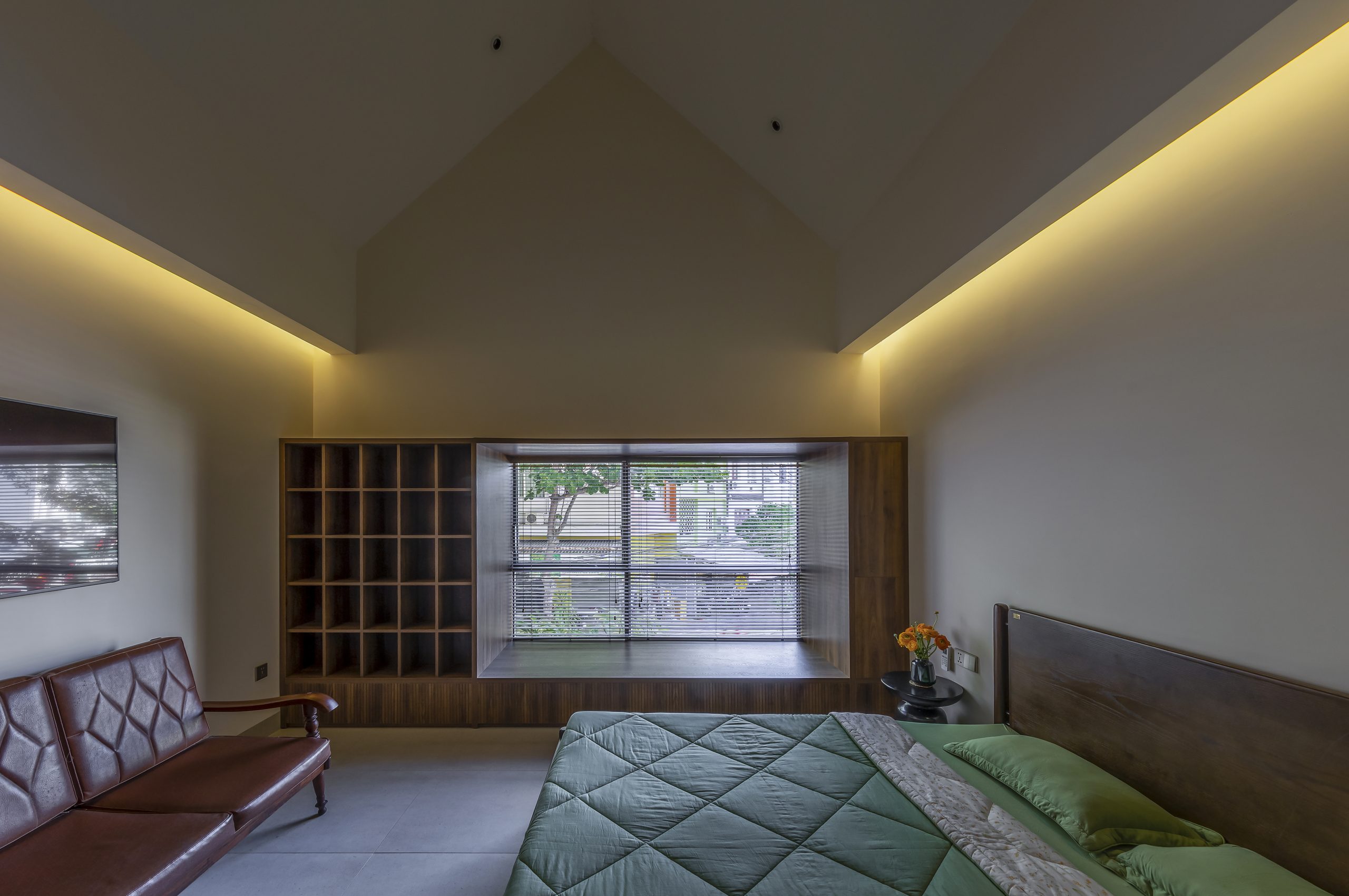
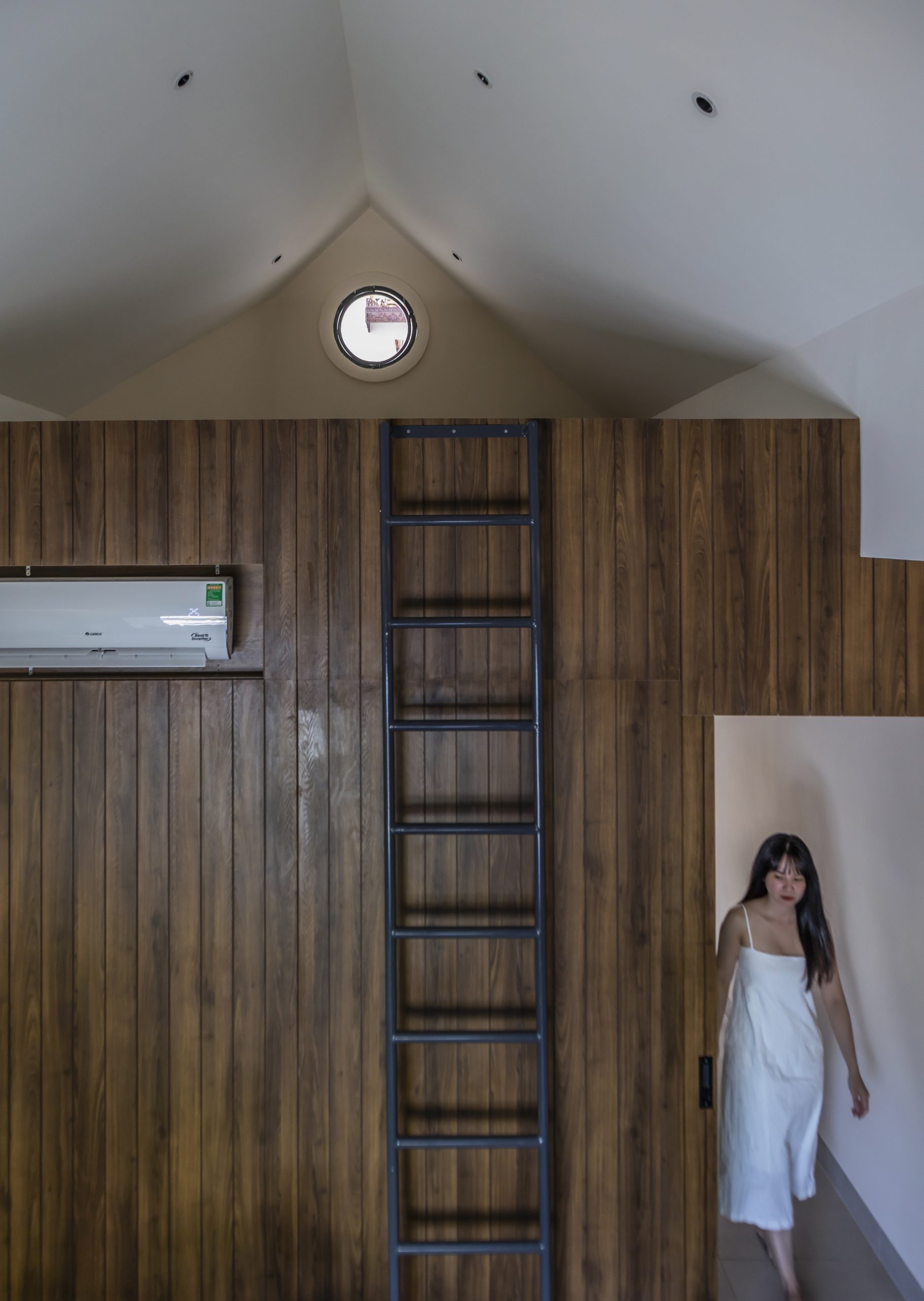
The principal bedroom on the second floor feel relaxed, thanks to a sofa set in earthy brown and well-positioned large windows affording a view of the cityscape.

The stairway leading to the third floor is brightened up by skylights casting shadows and colors on rough sandy textures on the walls. Together they work in tandem turning the home into a comfortable living space despite space constraints and a narrow frontage abutting the street.
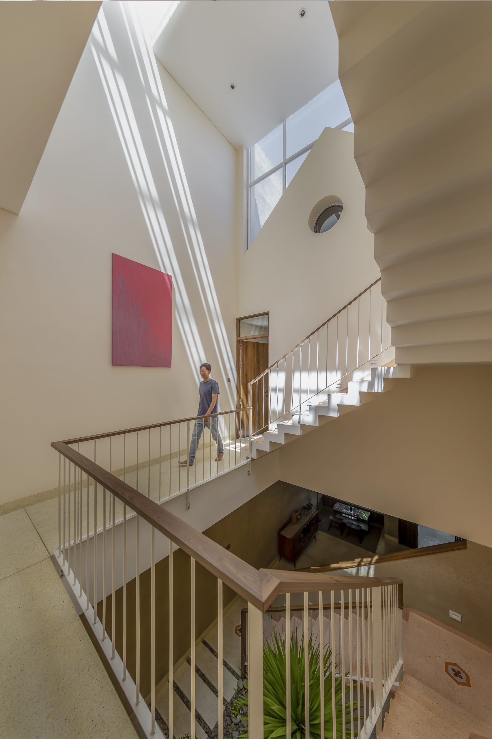
A skylight system built into the rooftop lights up the stairway and a courtyard directly below.

As one would reasonably expect, the third floor holds an ancestral shrine symbolic of Vietnamese folk religion. It’s a mezzanine with an uninterrupted view of the entire interior. Carefully thought out, the courtyard directly below can be seen in full view from here.
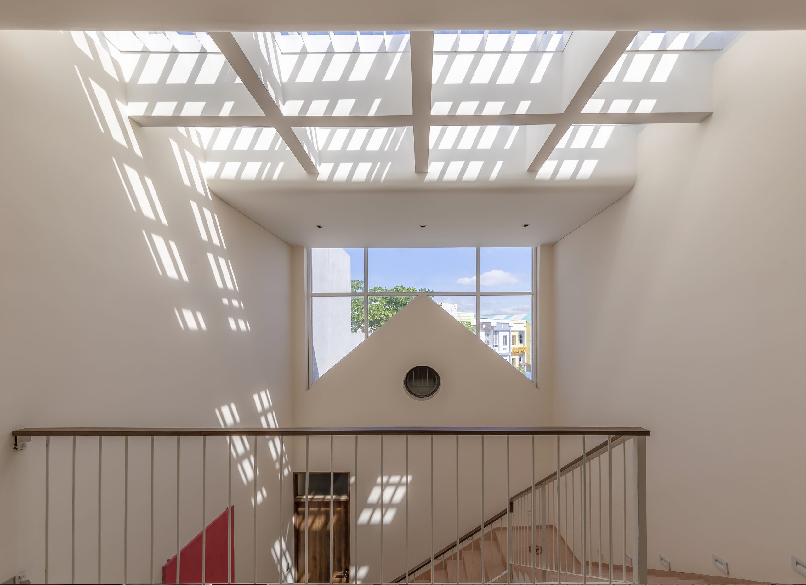
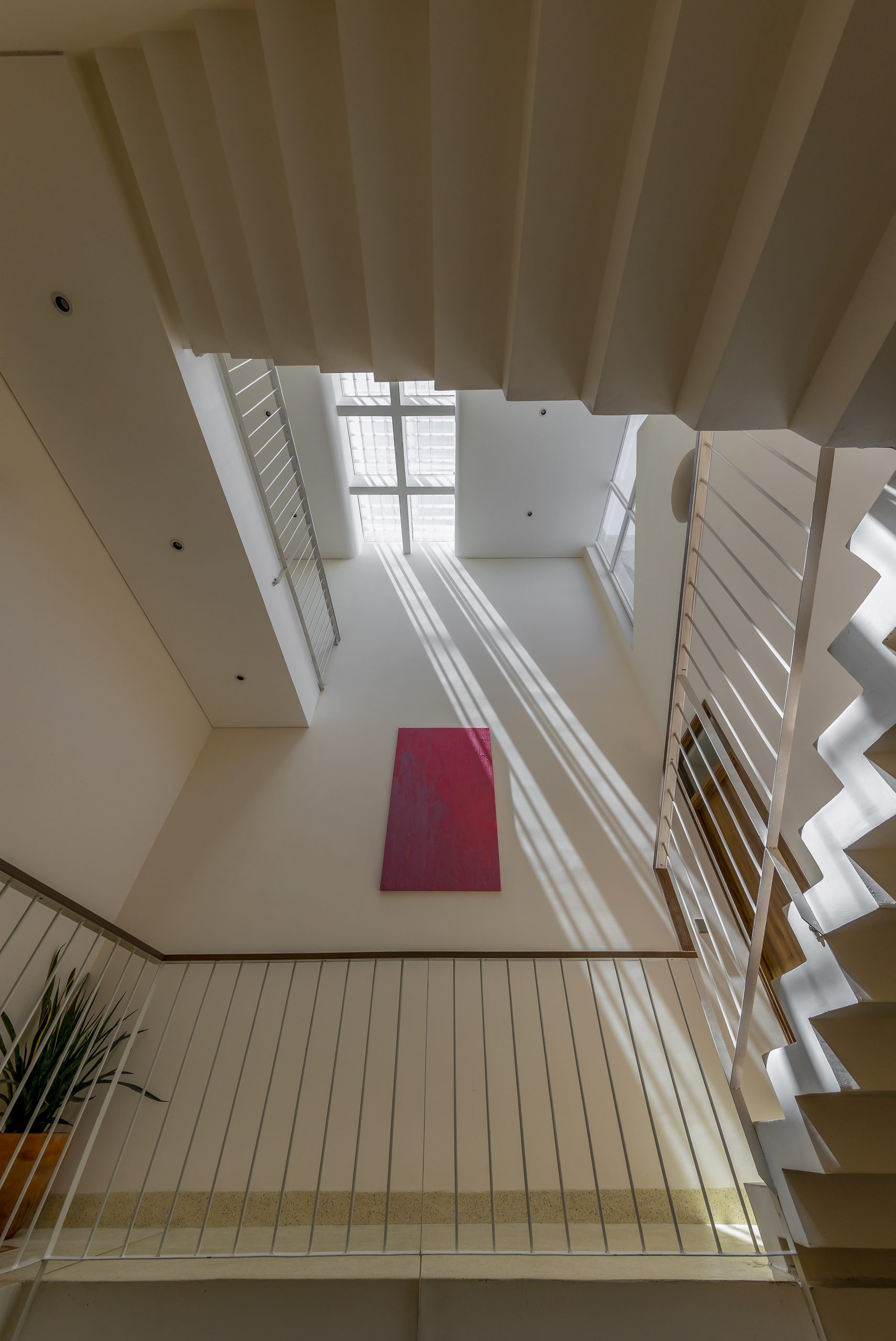
A system of skylights built into the rooftop brightens up the spacious, well-ventilated stairwell, a clever hack to create calm and peaceful interiors.

At the very heart of design thinking, the gable front townhouse named “QAH” is made for easy, simple living, and in the fewest possible words, a house plan that strikes the right balance between work and life in the city.
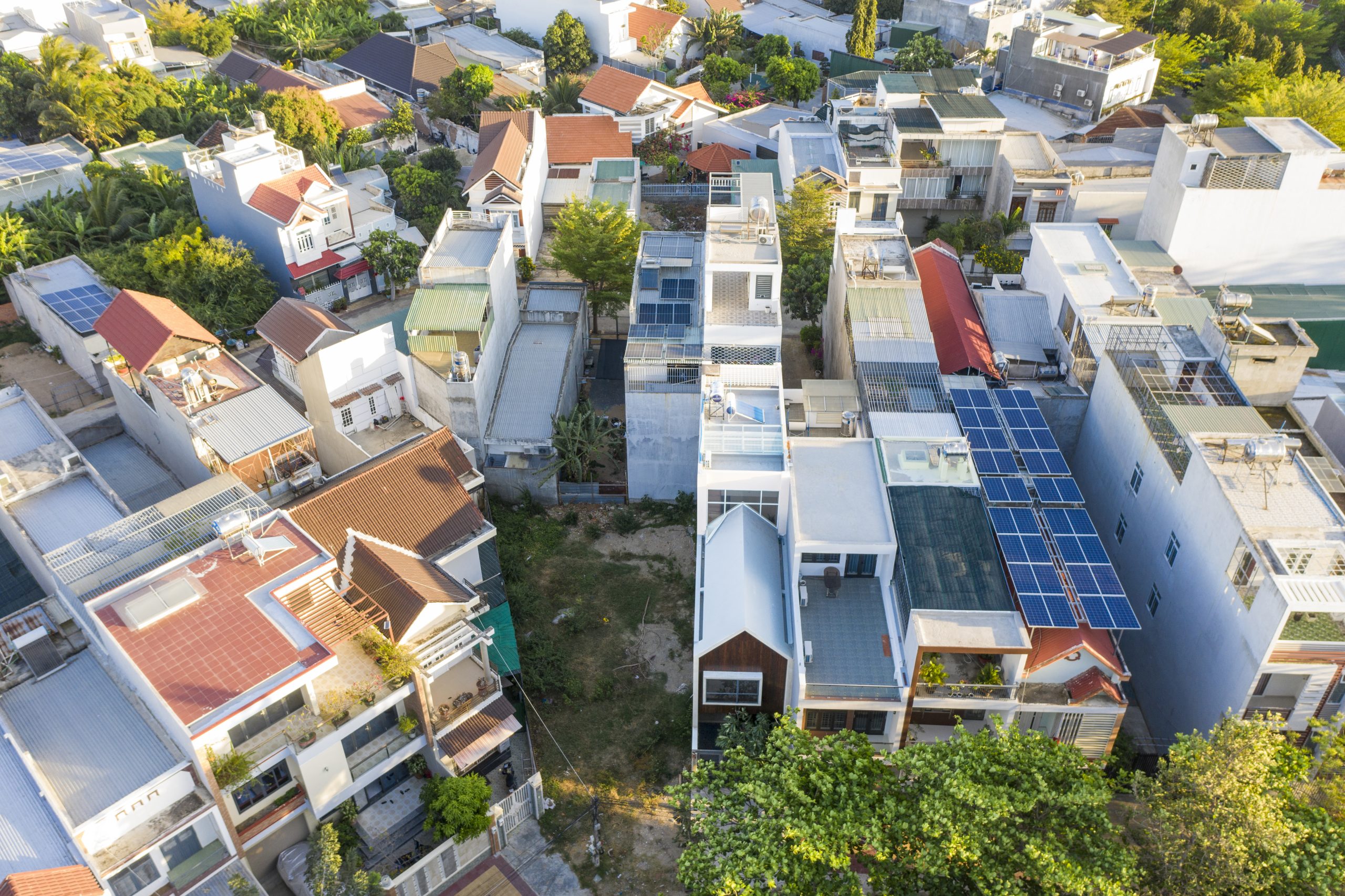
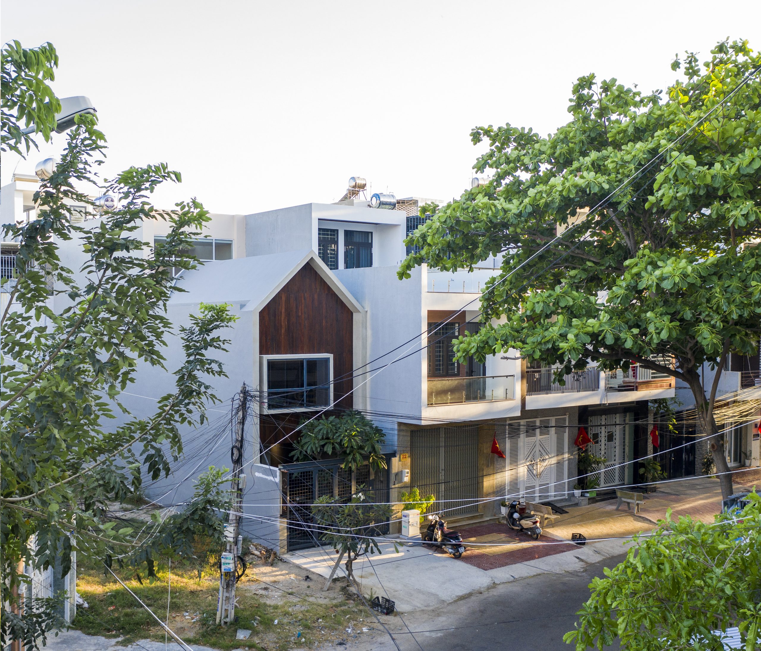
A bird’s eye view of the gable front townhouse in relation to other homes in the neighborhood.

townhouse


Architects: Q&A Architects (https://www.facebook.com/qaarchitects247/)


You may also like…

Dien Khanh House

Dien Khanh House: Where Modern Lifestyle and the Rural Way Intermix

live/work design

MP House: Striking the Right Balance between Jobs and Home

Wonderful Terraced House Renovation in Singapore

Wonderful Terraced House Renovation in Singapore

/ Singapore /

/ Story: Warapsorn Akkhaneeyut / English version: Bob Pitakwong /

/ Photographs: Sitthisak Namkham /

Terraced houses are ubiquitous throughout Singapore, many of which are well preserved to showcase the country’s rich architectural heritage and history of British Colonial rule. Many of them have changed to better serve commercial and residential needs of the modern world. This handsome terraced house is no exception.

Terraced House
Part of the top floor becomes a small sky garden.

This terraced house belongs to Alan Barr and Phaswan Promphat, both of whom interior designers.

Alan has had experience living in big cities, such as New York, before the job sent him across the globe to settle in Singapore nine years ago. He didn’t arrive empty-handed, but with furniture and other prized possessions.

Over time Alan transformed the old townhouse into a trendy residential unit, incorporating a touch of New York in the prevailing climatic conditions of Singapore.

Terraced House
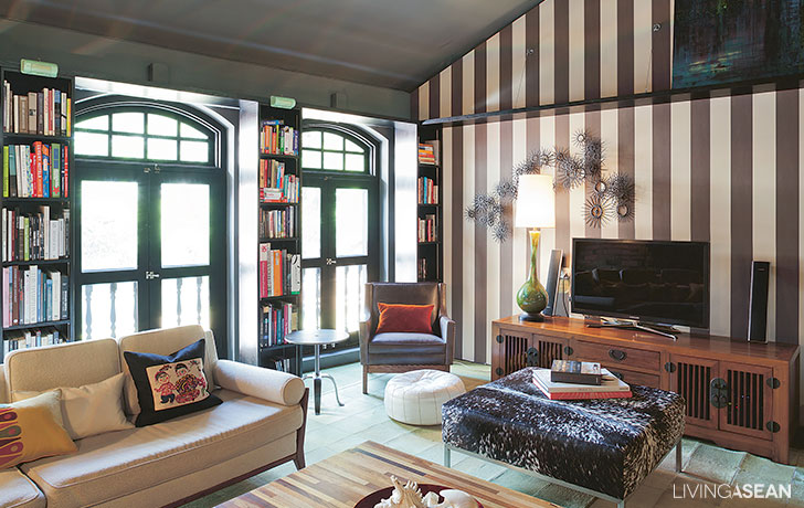
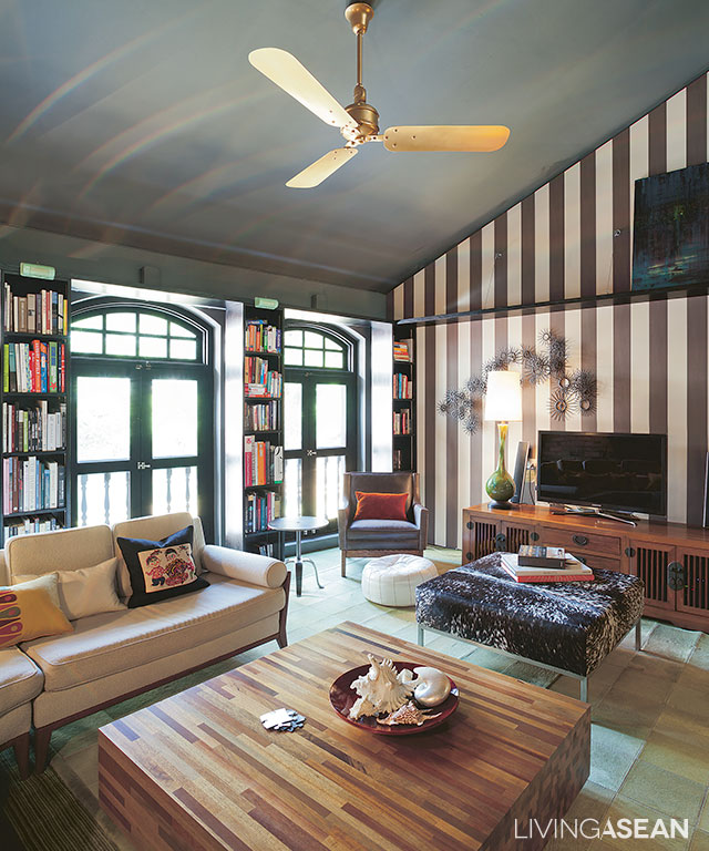
The spaces between Colonial-style arch windows are filled with bookshelves that stand tall from floor to ceiling.
8
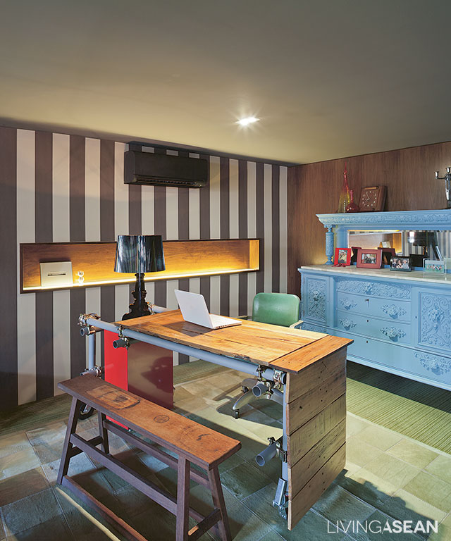
Part of the living room is remodeled into a workplace. The table is custom-made from discarded materials.

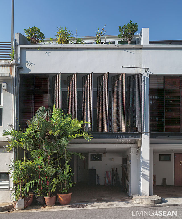
The home has a narrow front façade, but the narrow width is compensated by depth, a design feature typical of Sino-Portuguese architecture.

The front part has since been remade to accommodate lattice awnings from floor to ceilings. They serve as privacy curtains while shielding the interior from direct sunlight without limiting air circulation.

From the outside in, it looks like any two-story home. Step in, and you will find it is actually a three-story design.

The ground floor now serves as a carport and storage facility. A set of stairs takes us to the second floor, which is the living room and kitchen with a spacious dining area.

The home office is here, too. From the living room, there is another set of stairs leading to the bedroom on the third floor.

2
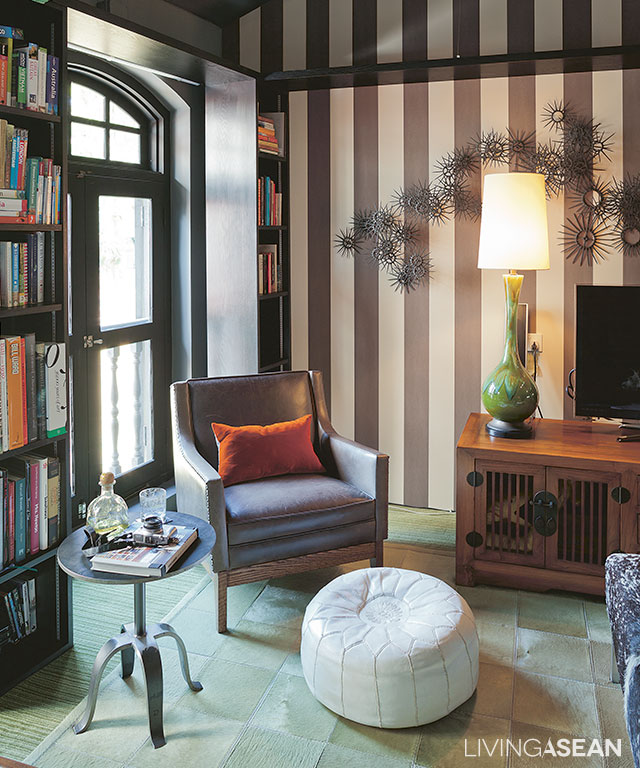
An armchair and a round coffee table adorn the relaxed living room in chocolate and cream tones.
4
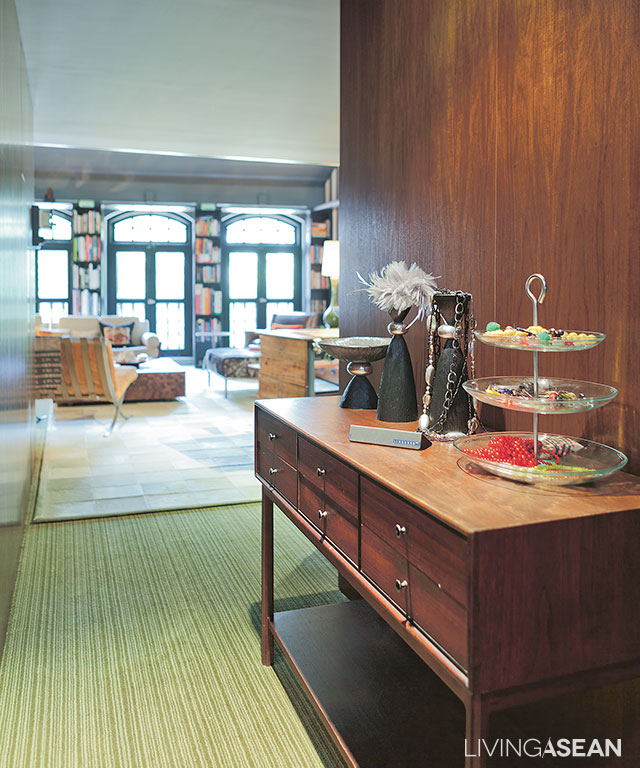
Antique-inspired décor items line the hallway leading to a relaxed living space in the rear of the building.
6
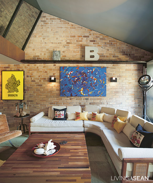
A room with a corner sofa and a large coffee table has enough space to entertain a circle of friends. The backsplash is covered in ceramic tiles made to look like bricks.
5
[left] The living room floor is covered in a patchwork of carpets crafted of donkey hide that is soft to the touch. [right] A niche under the staircase has enough room for a mini-bar.

Alan said, “This home used to be a design studio. The interior was just about right. It looked like a home, but it was not.

“At the time, it was an office and it had no kitchen. So when we got it, we had to put in one. I like the layout of this home very much. I divide it into two simple zones – general, and privacy.

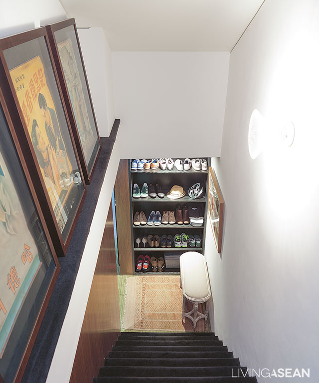
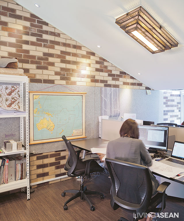
“The top floor is served by two separate sets of stairs. The attic has since become an office. Space is divided to store decorative works on one side and use as a workstation on the other.”

9
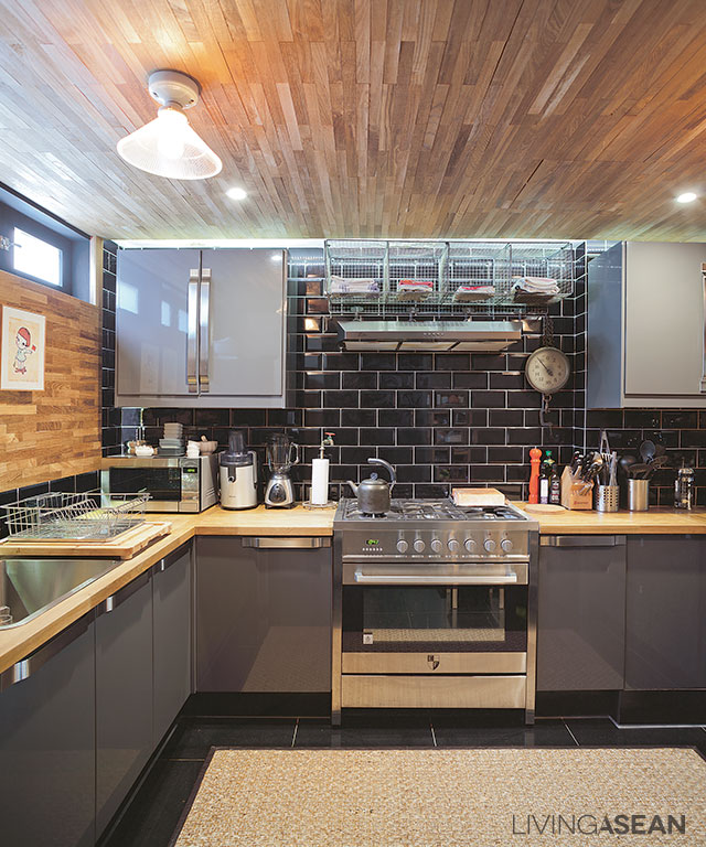
Set in gray and black tones, the kitchen comes fully equipped with stainless steel fixtures. Dark colored backsplash adds a nostalgic vibe to the atmosphere.
11
The stairway leads to the snug bedroom on one side of the upper floor.
12
The staff’s office is located on the opposite side of the upper floor to ensure the residential area is not disturbed.

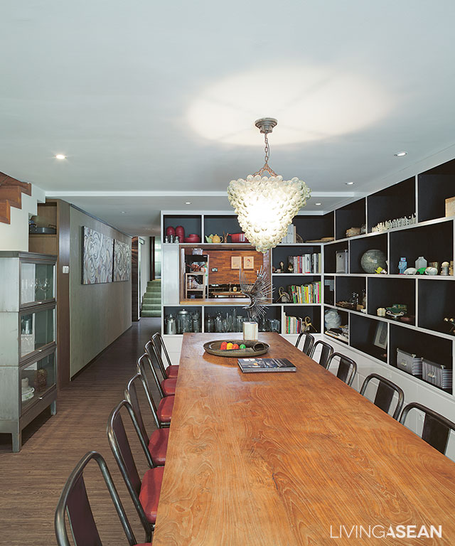
“The second-floor dining room serves multiple purposes, from eating and entertaining customers, to meetings and project presentations,” he continued.

“Personally, I don’t like an office hemmed in by glass walls supported by steel or other metal frames. Offices in much of Singapore are like that.

“I want a different kind of workplace, in which to impress the customers with different experiences. Most of them like it here, whether it is furniture or decorative items that we have on hand.”

10
The conference table and chairs are placed closer to the wall, lined with storage shelves.

As a whole, the interior spaces are neatly designed and well-appointed.

Décor items from various places are placed in perfect harmony with one another. As he puts it, good furnishings don’t always have to be expensive if you know how.

Alan has given this old terraced house a chic modern makeover with a hint of interest and personality.

3


Owner/Interior Designer: Alan Barr and Phaswan Promphat (www.grey-matters.com)


You may also like…

Desa House: The Renovated Artist House in Kuala Lumpur

Never Too Small: Renovation Gives a Townhouse the Atmosphere of Home

X