/ Bangkok, Thailand /
/ Story: Ekkarach Laksanasamrith / English version: Peter Montalbano /
/ Photographs: Ritthirong Janthongsuk / Styling: Pakawadee Pahulo /
Despite the building being long and narrow, a team of architects at Studiomake managed to turn it into a perfect home office integration that would inspire productivity. The Bangkok-based team of designers, architects and educators is known for its specialized skills and experience in various types of architecture.
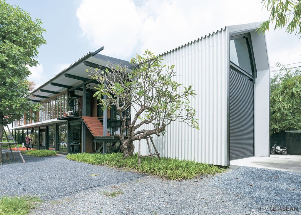
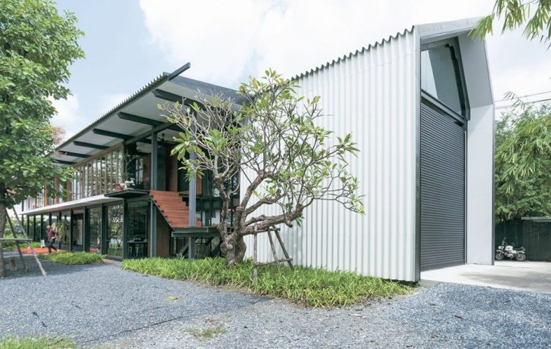
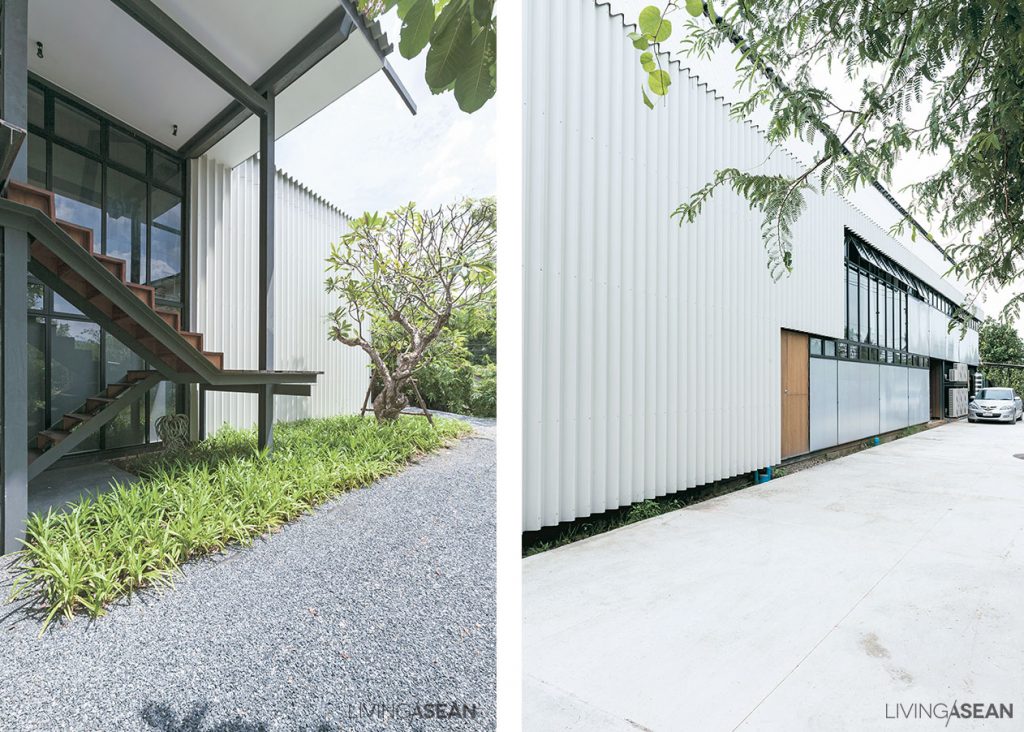
When it came to designing their own home office, Orapan Sarasalin Schafer and David Schafer opted for an architectural steel design for its lightweight look that’s right for the prevailing climate in Thailand. It’s a layout that emphasizes an open, uncluttered living space with plenty of wall openings, windows and doors for good ventilation and heat dissipation.
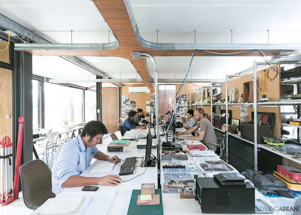
By design, the building performs a dual role. The first floor holds a fully equipped office space, while the second floor is used as a residence. Overall, it’s thoughtfully devised planning made easily adjustable for future updates. The crossbeams resting across the tops of columns support weigh over an extra long span, five meters to be exact.
Home office design offers many benefits, among them the freedom to create the ideal work space like the owners intended, plus the peace and quiet that suits their lifestyle needs.
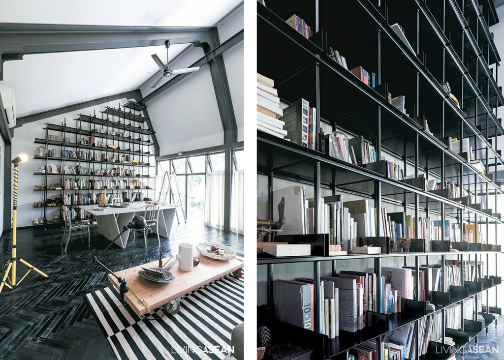
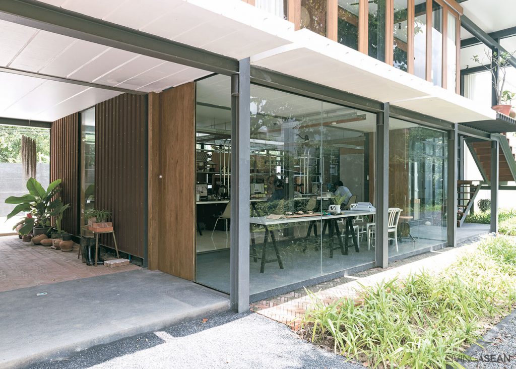
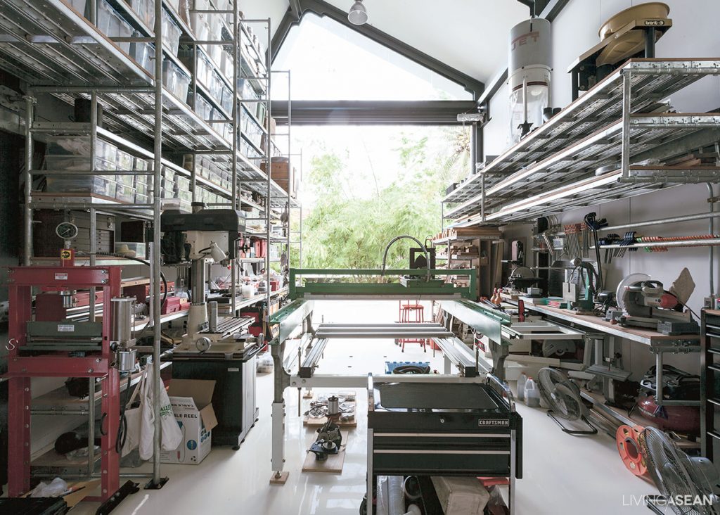
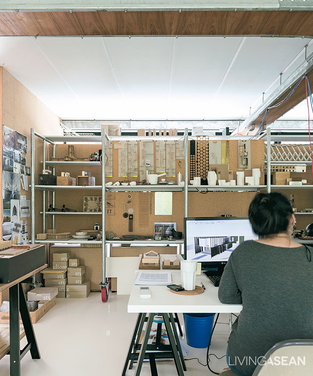
There is attention to detail in all parts, especially the integration of natural elements like plants and light into the built environment, making the interior work space feel light, airy and conducive to creativity. And they don’t come by accident. Rather, every building strategy and material is tested first to see if it’s suitable for a particular application.
This helps to understand whether a specific material is right for the task, plus it narrows down the choices to the best selection. And the same careful consideration applies to both upstairs and downstairs. Examples of this include high ceilings and a wall of bookshelves designed to maximize work space utilization.
Taken as a whole, the lower floor contains a fully functional work space and offices, while the upper floor in and of itself is a complete home, consisting of two bedrooms with a bathroom en suite, a relaxing living room, kitchen and dining room.
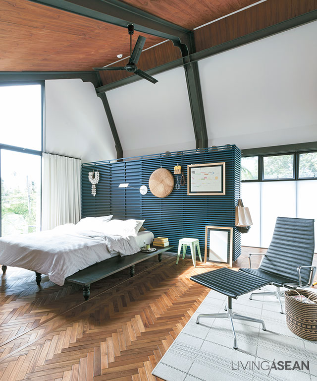
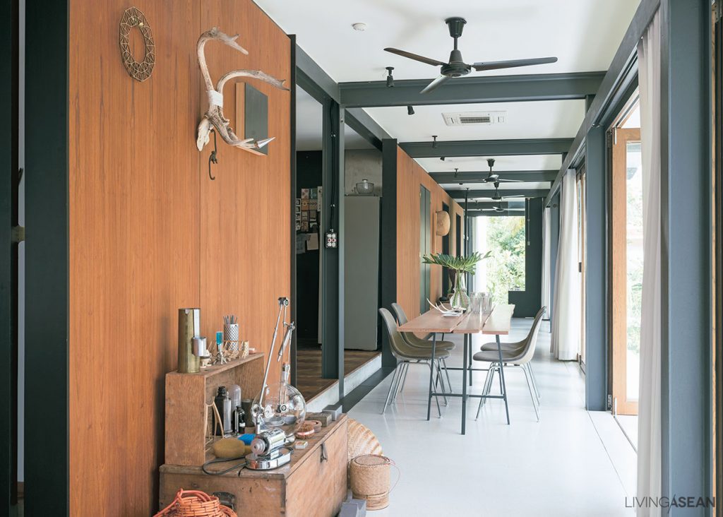
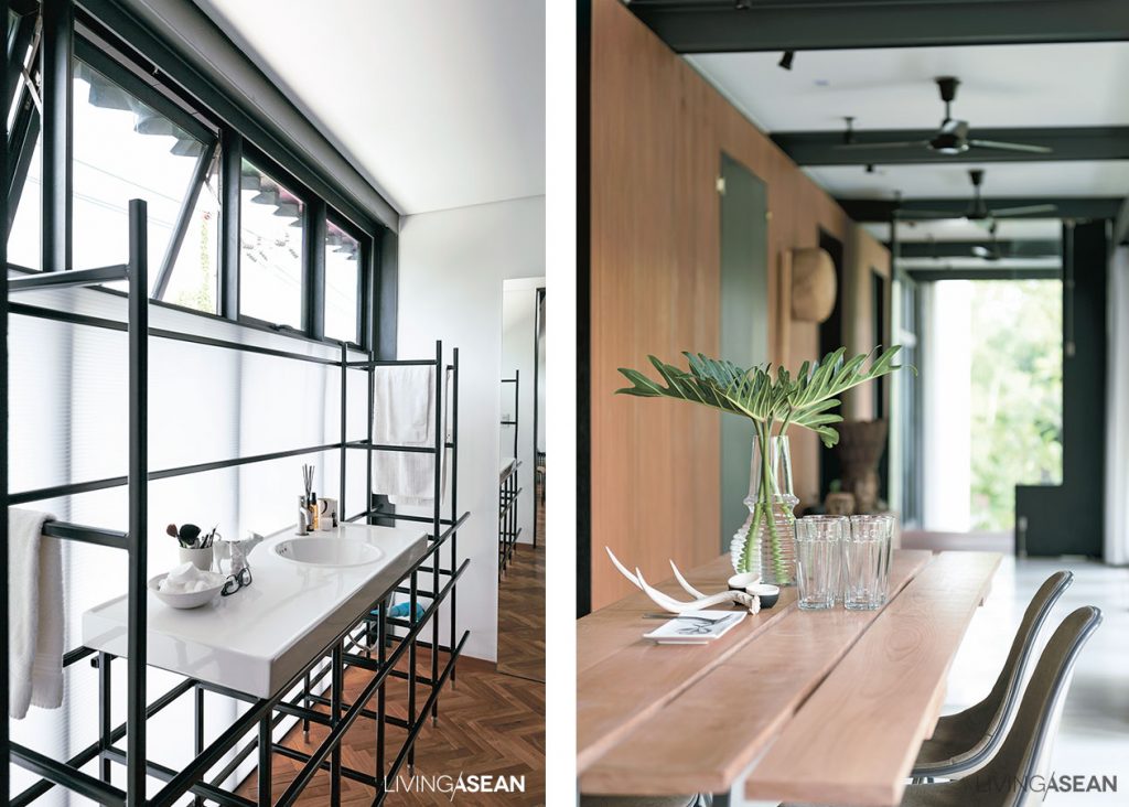
With respect to the office area, the floor plan is simple and straightforward. Electrical wiring is neatly installed and piped to various locations hidden from view. The pillars supporting the tall vertical structure of steel are evenly spaced for proper load bearing, while the building façades are made attractive by crisp clean lines.
For indoor thermal comfort, important aspects such as heat insulation, soundproofing, and ventilation are carefully thought out and incorporated in the design. In the fewest possible words, it’s all about attention to detail that makes this modern home office a perfect place to be. Brilliant!
Owner/Architect: Studiomake (www.studiomake.com)
You may also like…

