Blog : Loft

American Industrial Loft Style

American Industrial Loft Style

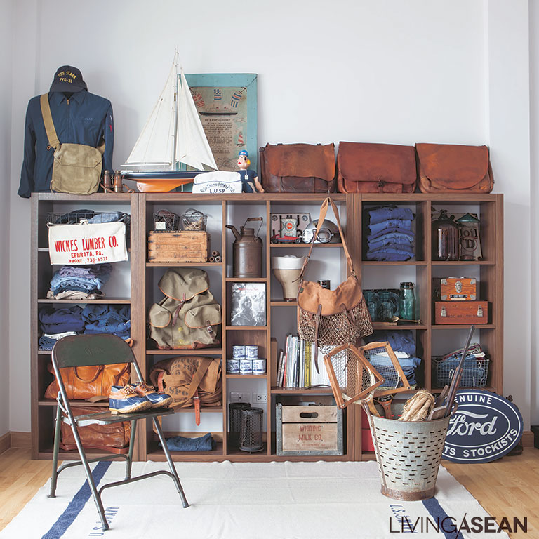
Old things can have a refined charm. They show dedication to detail in design that’s hard to find in present-day products. Sharing a love for all things retro, two homeowners have turned them into an online business, “The Kasama.”

/// Thailand ///

Story: Gobbi Chirawat /// Photography: Nantiya /// Style: Praphaiwadee /// Designer: Natthaphon Siriphanit and Pitikon Ariyakhajon of TIMEOUTCAMP
 

009

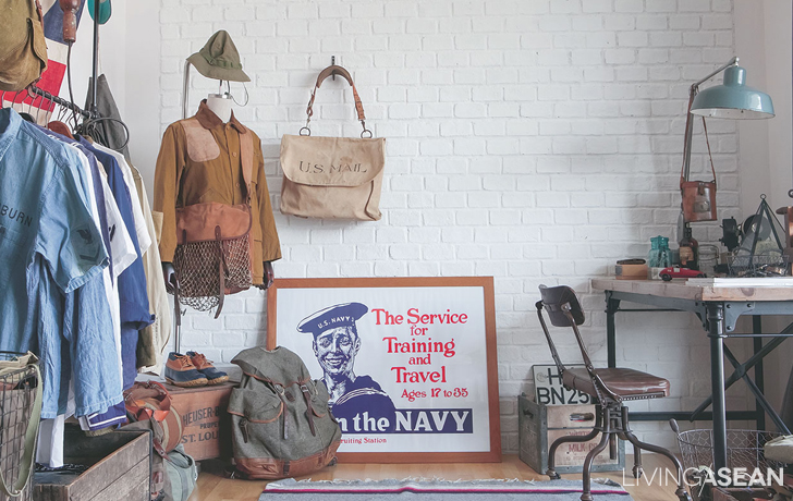
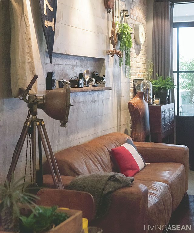
Entering their midsize townhouse was like walking into another time. The front door – black steel with a glass façade – leads into a room done up in what you could call an “American industrial” loft style. The living room’s walls bear the marks of the wooden frames, giving them a raw texture to complement the antiques and collectibles on display here: old cameras, tools, and equipment used in factories during the Second World War.

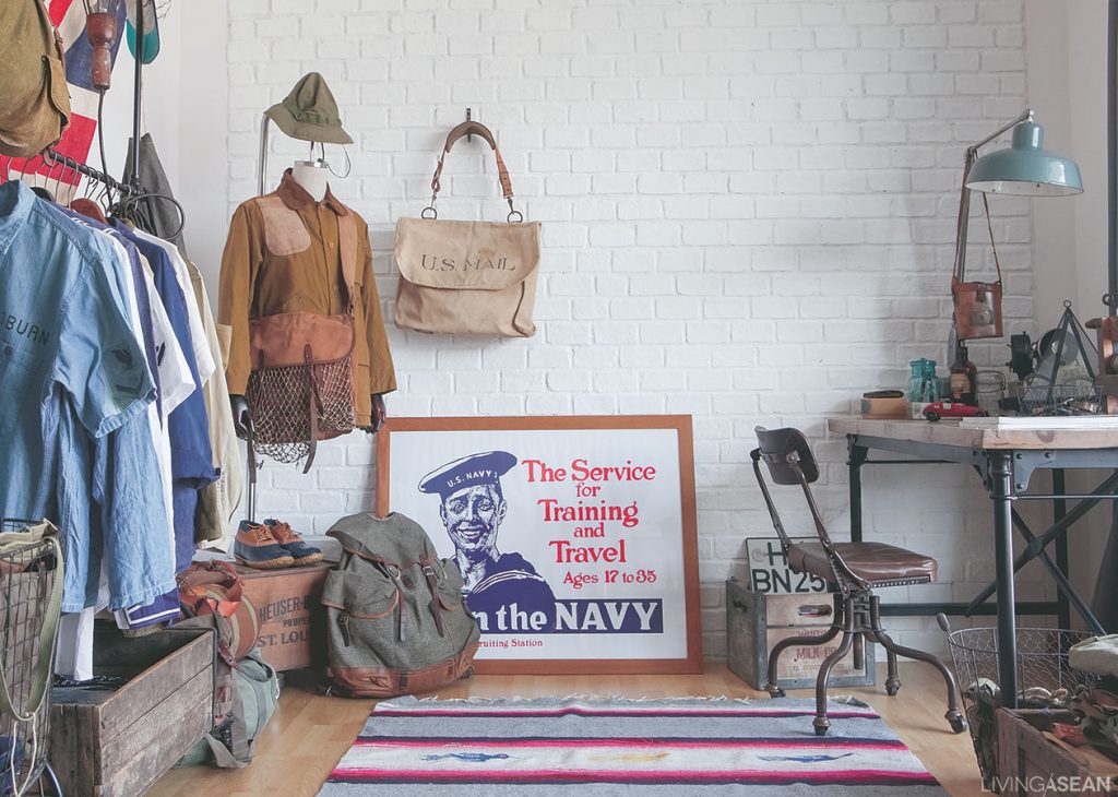
The workroom on the third floor, with its beautiful wall of white brick, is used as a studio where they take pictures of merchandise to be posted on Facebook. Scattered about we see such miscellaneous items as a fine collectible leather “U.S. Mail” bag from the World War II era.
007

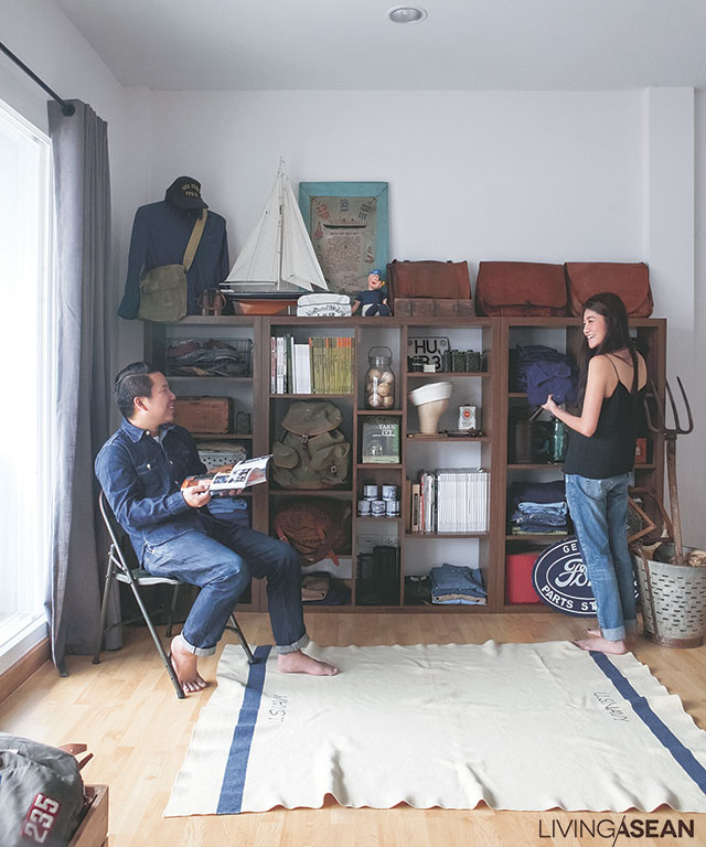
The owners with their lovable collection: wooden shelving creates order.
The owners with their lovable collection.

“The Kasama started out almost five years ago,” said one of the owners. “We started out with all girls’ and women’s clothes, but with smallness as part of the concept. We kept that in mind as we branched out to sell things people depend on, and coined the name ‘lifessories’ for another store to sell useful items, bric-a-brac, and house decorations. We want the concept to reach further than to just what people wear, to be an expression of their lifestyles.”

Their personal tastes have mixed with ideas coming from creative circles in the industry to find a place in every detail of the interior décor. Each spot in the house has a story begging to be researched.

“The house itself is not so detailed, but the little things here are. The beauty is in their details and their narratives, and these themes are repeated everywhere in our house and possessions. We always give a lot of consideration to the origin of each thing. And the detailed elements must contribute to functionality, too. Yes, the kitchen should be pretty, but you have to be able to actually cook there!”
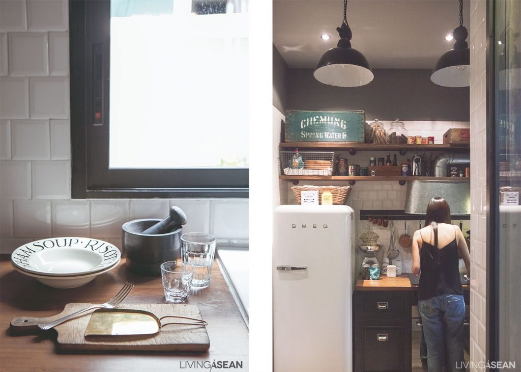
008

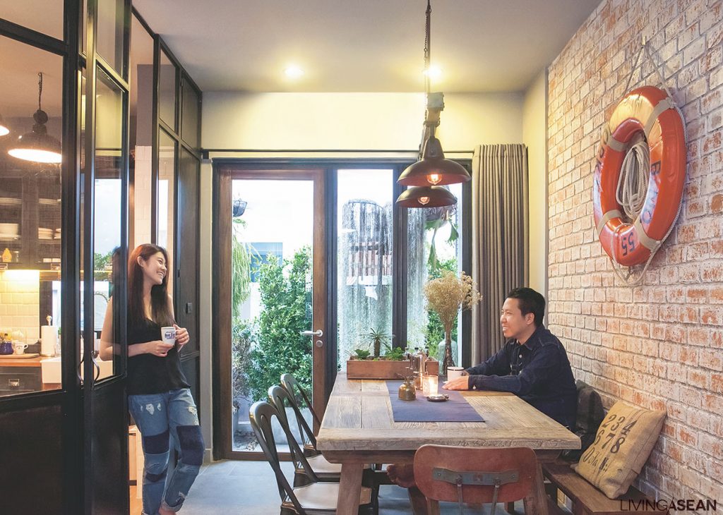
The owners are fortunate to share so many preferences and styles. That makes the house something greater than just a place to show off private collections. It collects happiness and contentment, too, and here this couple can share things they both admire and make use of, in a setting that reflects both their passions.

And here are last words from The Kasama owners before we left. “We’re surrounded by little things we love. This gives us happiness and the feeling that this is our own special space, where we can be who we truly are.”
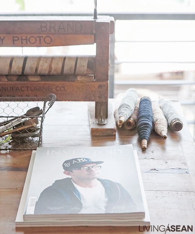
“We designed things so as to mix our collections together in a harmonious way.”
“We designed things so as to mix our collections together in a harmonious way,” said the owner.

Link: www.facebook.com/thekasama

Chic Organic Style Meets the Rawness of Industrial Loft

Chic Organic Style Meets the Rawness of Industrial Loft

A condo room strikes the right balance between the chic organic style and the rawness of an industrial loft space.

/// Thailand///
Story: Montra /// Photos: Damrong /// Style: Praphaiwadee /// Design – Décor: Prasert Chaisitthiroekkul

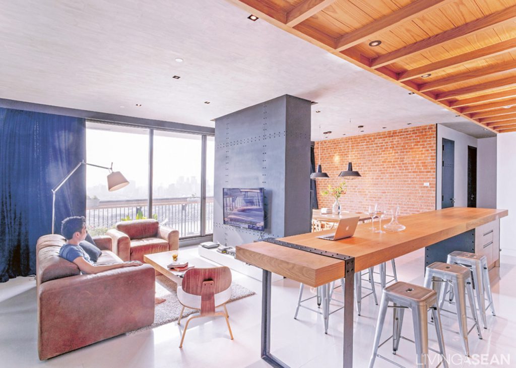
The living room is an open space that connects to everything else, the result that the owner was looking for. A TV-mounted wall made of black sheet metal separates the parlor from the dining area with brickwork in the background.
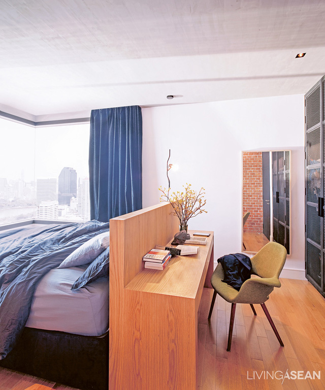
The bedroom is minimally furnished, emphasizing a comfortable use of space. The half-console half-table is a standout feature. It’s both a table and the headboard that turns a basic bedroom into a master suite.
The half-console half-table is a standout feature. It’s both a table and the headboard that turns a basic bedroom into a master suite.

002

This room started out from the owner’s fascination with the loft style of Mellow Restaurant & Bar. He loved the place, and asked who had designed it. The restaurant owner then referred him to Prasert Chaisitthiroekkul of Whitespace, PLC.

The two began working together to produce the trendy mix of rough and orderly room that struck such a deep chord with the owner. The designer said that the owner wanted a smart and tidy look. With that in mind, he created as much open space as he could while connecting everything together.

He set aside the basic materials from the original condo, such as polished tile floors and white walls, in favor of unfinished surfaces that had a different kind of beauty.

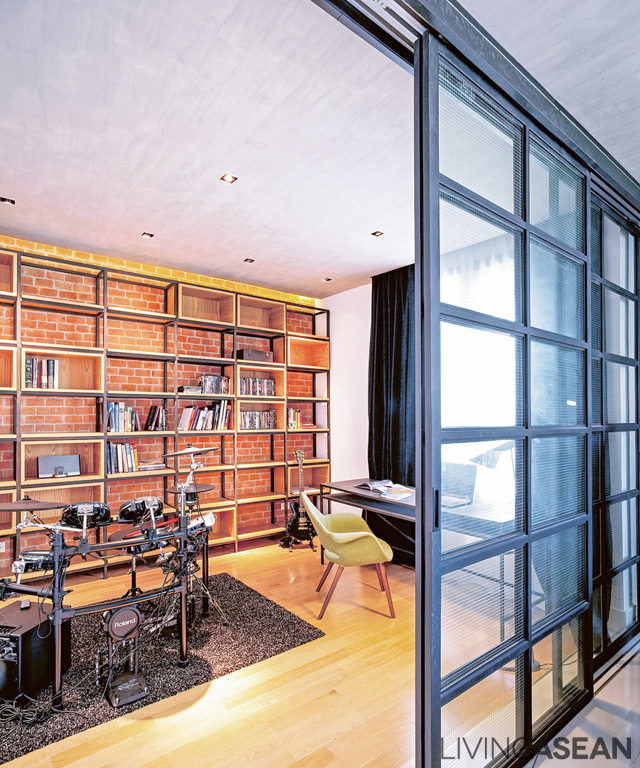
The old space had 3 bedrooms. The owner thought two should suffice. He converted the small bedroom into a workspace-cum-reading room and – since he loves drumming – a practice studio with electronic drum equipment.

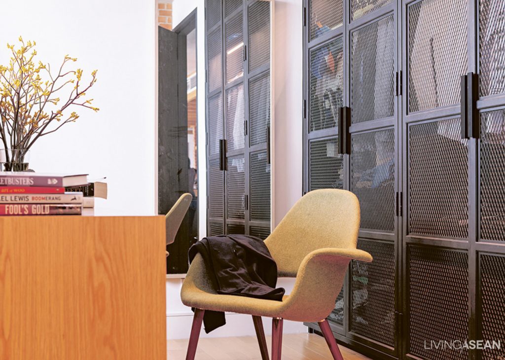
The closet doors are faced with charcoal-colored mesh for a fresh, chic look neatly camouflaging the contents behind.
A floor-to-ceiling sliding door with safety glass panels in a black metal frame separates off the workspace and drum practice room. Artistry design is evident in the shelving all along the back wall, where the fancy brick shows through open spaces in the frame.
A floor-to-ceiling sliding door with safety glass panels in a black metal frame separates off the workspace and drum practice room.

“I wanted to fill the room with furniture, because the space was so wide open and interconnected, all the way from the front door through the kitchen and living room. I wanted there to be visual points of interest capped by the big table here, a real favorite of mine. It’s more than just a gorgeous piece of craftsmanship; it’s really useful for a lot of things.”

The designer added a lot of little details here and there, for instance using mesh screening instead of an opaque door for the clothes closet, and putting brick walls to build on the contemporary “loft” ambience.

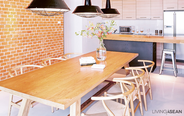
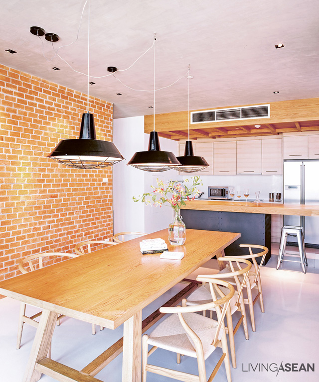
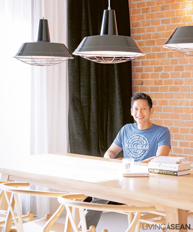
The elegant dining area with a long table connects the counter to the kitchen at the rear. Metal black lamps hang from the ceiling, contrasting with the warm colors of brick and wood
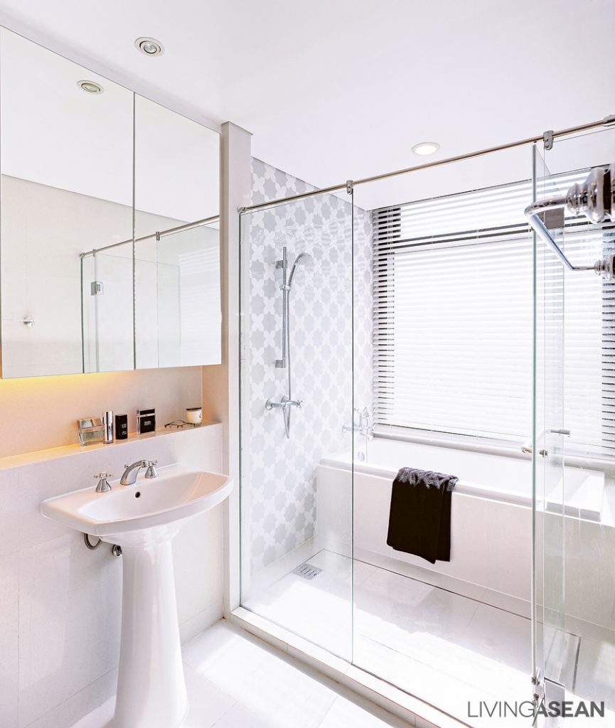
The white bathroom isn’t much changed from the original construction, but the medicine cabinet was recessed to make the mirror even with the wall, and there is a shelf below for placing toiletries.

When asked about the furniture, the owner chuckled to himself saying: “I bought it all myself, but I always consulted the designer first. If I found something interesting, I’d send him a picture. Sometimes I found myself wondering if this was my house or his.”

The stylishly chic condo is a perfect mix between the feel and functionality, and the modern industrial loft space. Obviously it’s a narrative of what the owner himself is all about.

008

Sekeping Sin Chew Kee: A Raw Chic Hotel in Kuala Lumpur

Sekeping Sin Chew Kee: A Raw Chic Hotel in Kuala Lumpur

/ Kuala Lumpur, Malaysia /

/ Story: Ekkarach Laksanasamlich / English version: Bob Pitakwong /

/ Photographs: Rithirong Chanthongsuk, Soopakorn Srisakul /

Crafted in a plain and simple fashion, the Sekeping Sin Chew Kee is a raw beauty and a way of life in Kuala Lumpur. The rustic chic hotel is part of the Sekeping chain, which is owned by Ng Sek San, of Seksan Design Landscape Architecture and Planning. See beauty in simplicity! Check this out.

 5

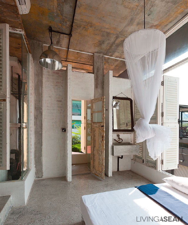
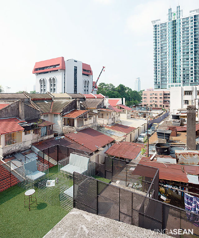
The hotel is located within a converted “shophouse,” the terms for vernacular architecture commonly seen in KL. The well-kept, two-story reinforced concrete structure has a rooftop deck.

The owner/designer, Ng Sek San, took every precaution to avoid increasing building weights. The only add-on is a mezzanine on the second floor. Both the mezzanine and the upper floor are reserved for guest accommodations. The coffee shop sits on the ground floor.

8

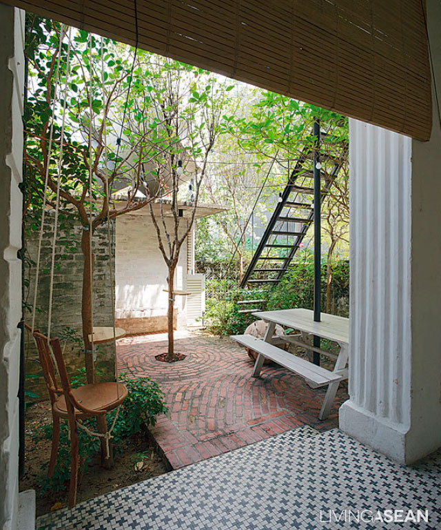
The shophouse-style building has access to the street in front and back. The front entrance features a small garden, enclosed for privacy by a wall of medium height.

Inside the hotel, a steel stairway gives access to a lounge with a warm, welcoming atmosphere on the second floor. A bit further inside lies a kitchenette with a bathroom and two guest rooms.

2

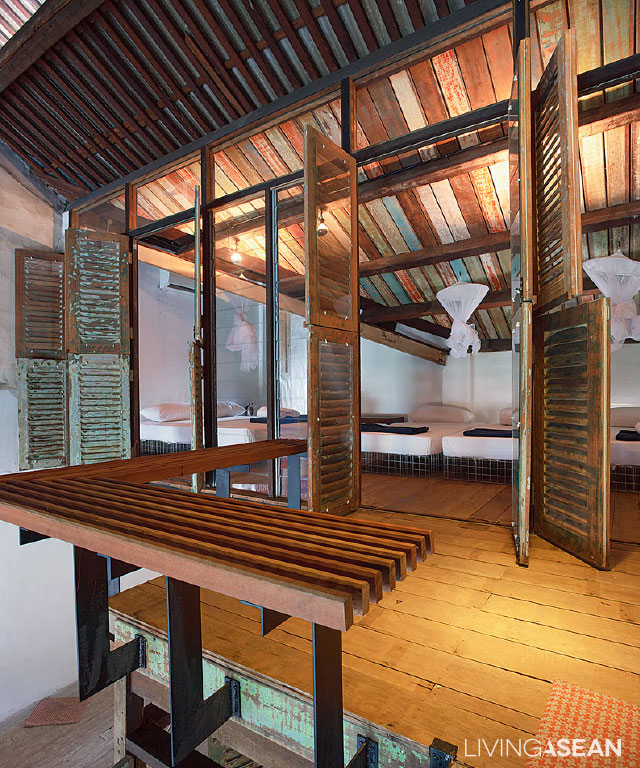
There is another set of stairs that connects the second-floor lounge to the mezzanine and on to rooftop deck. The newly added mezzanine was once an open space. Later, a wood plank ceiling was put in to give the area an elegant touch and turn it into a usable room.

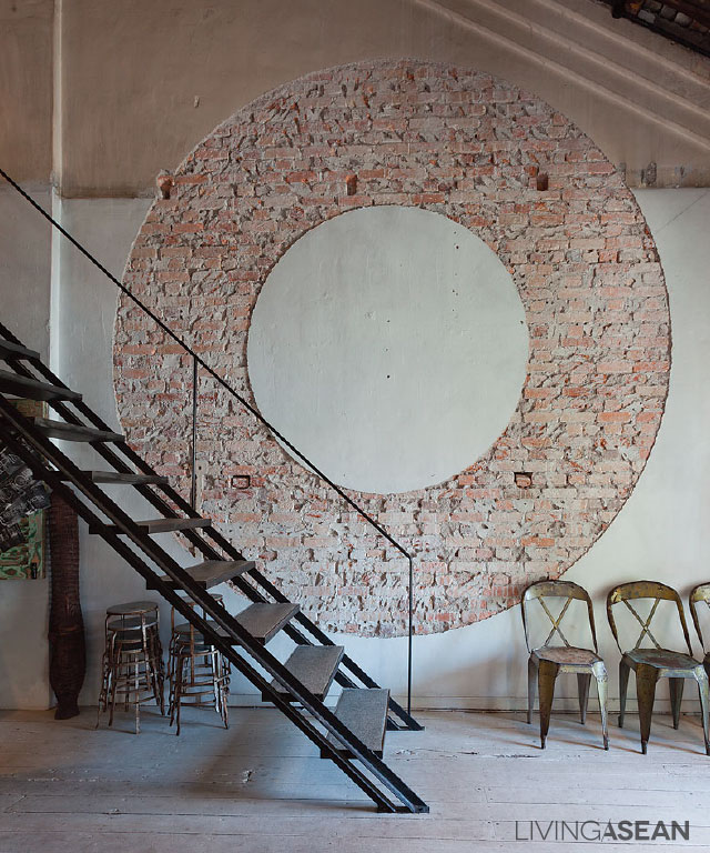
Elsewhere, custom plasterworks and exposed brick walls in a circular shape contrast with real wood flooring in shades of white. The newly painted surfaces and simple décor make for easy maintenance and an atmosphere that is environmentally friendly.

4

3

The choice of contemporary furniture and ornamentation conveys a refreshing change. There is a curious mixture of the traditional and the modern.

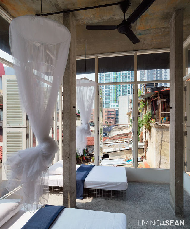
Steel-frame beds and sofas, comfortable mattresses and cushions blend well with old-fashioned items, ranging from water kettles to wire mesh lounge chairs to antique-style cups and tableware.

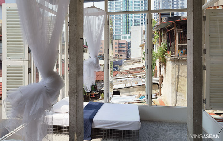
The most memorable sight is the simple white mosquito nets that unfurl at bedtime.

7

9

In remodeling an old building, it’s important to consider structural integrity, which refers to the building’s ability to hold together under a load without breaking or deforming.

As the designer puts it, renovation work differs greatly from building anything from scratch. It goes through various processes of evaluation, demolition, and pounding to make room for new ideas to take shape.

“Our experience here has meant the opportunity to try out new architectural features and interior decorating techniques in order to give the hotel a raw beauty, one that’s rich in rustic appeal.”, explained Mr Ng.

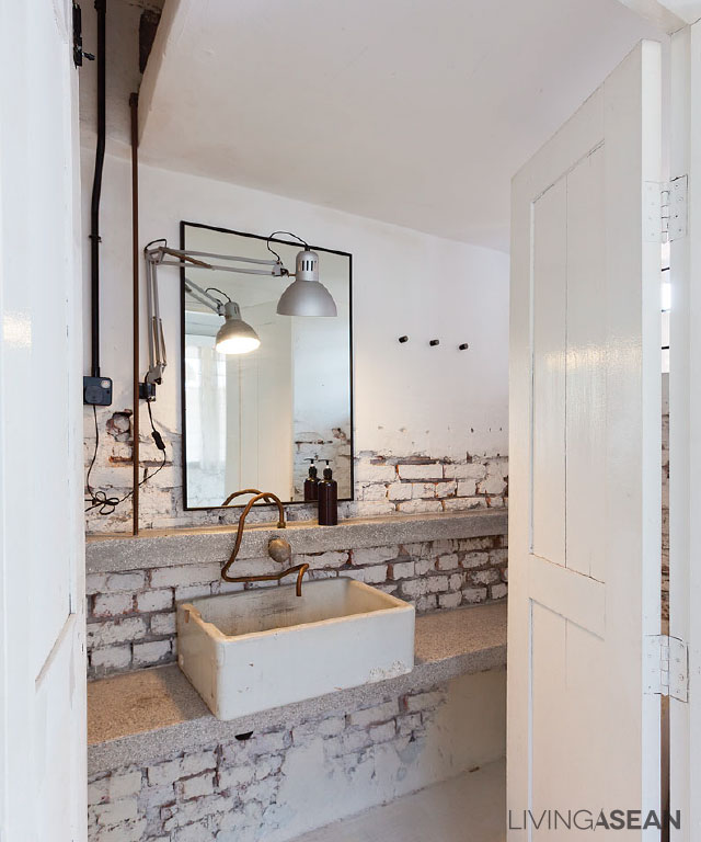
“The design of Sekeping Sin Chew Kee is about creating an intentional lack of orderliness and opposites to the ordinary. This is manifested in industrial-style electrical conduits throughout the building.

“Instead of concealing them behind walls, the conduits, mountings, and hanging lights are installed in ways that are clearly visible and easy to maintain.”

His well-thought-out design results in a chic interior that focuses on truth to materials and a style that reflects well on this part of town.

1


Owner/Architect: Ng Sek San of Seksan Design Landscape Architecture and Planning


You may also like…


Sekeping Kong Heng: A Boutique Hotel Treasures the Charm of Ipoh

Ipoh: A Journey Back In Time

X