Blog : condo

Minimalist House / A Fusion of Thai and Japanese Styles

Minimalist House / A Fusion of Thai and Japanese Styles

A simple décor, yes, but this minimalist house is full of ideas that bring intimate bonding to a compact family.

/// Thailand ///
Story: Montra /// Photos: Nanthiya, Damrong /// Style: Praphaiwadee /// Design: Ornchuma Saraya
003

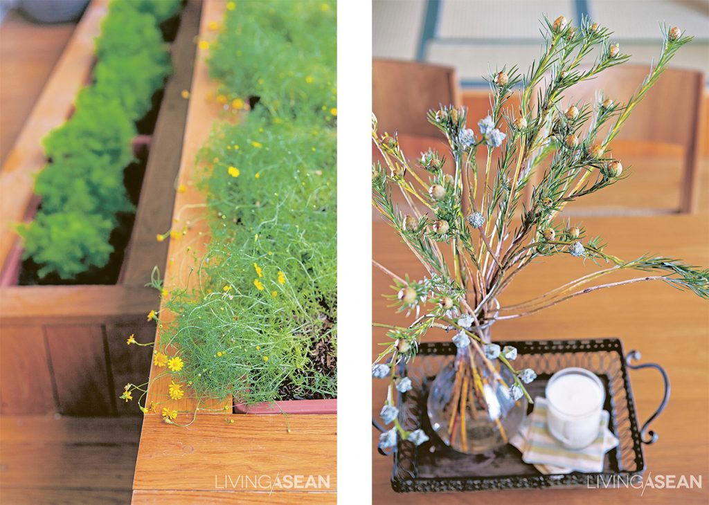
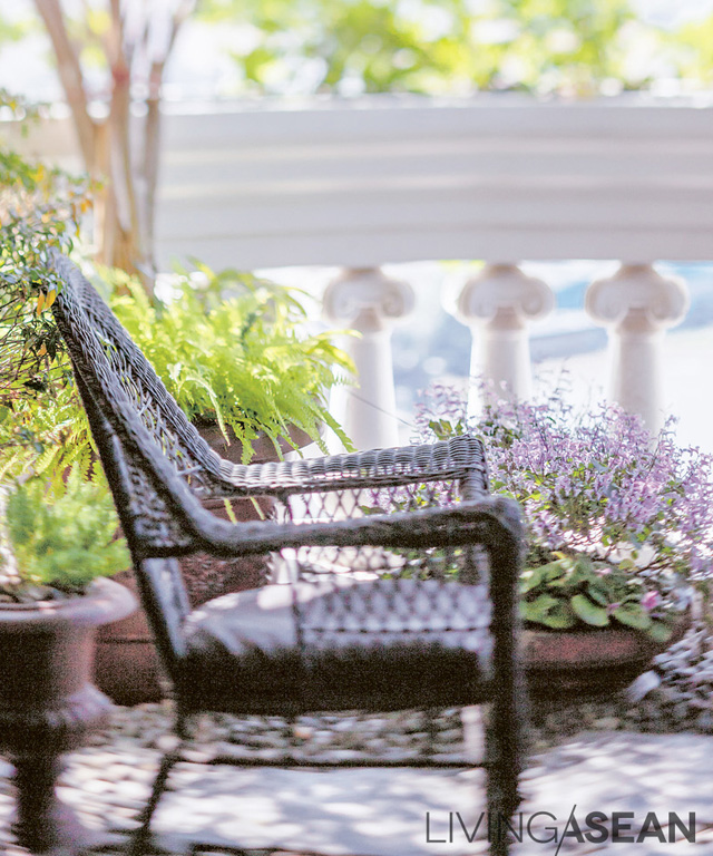
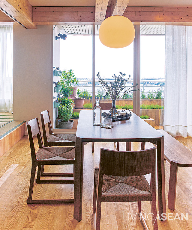
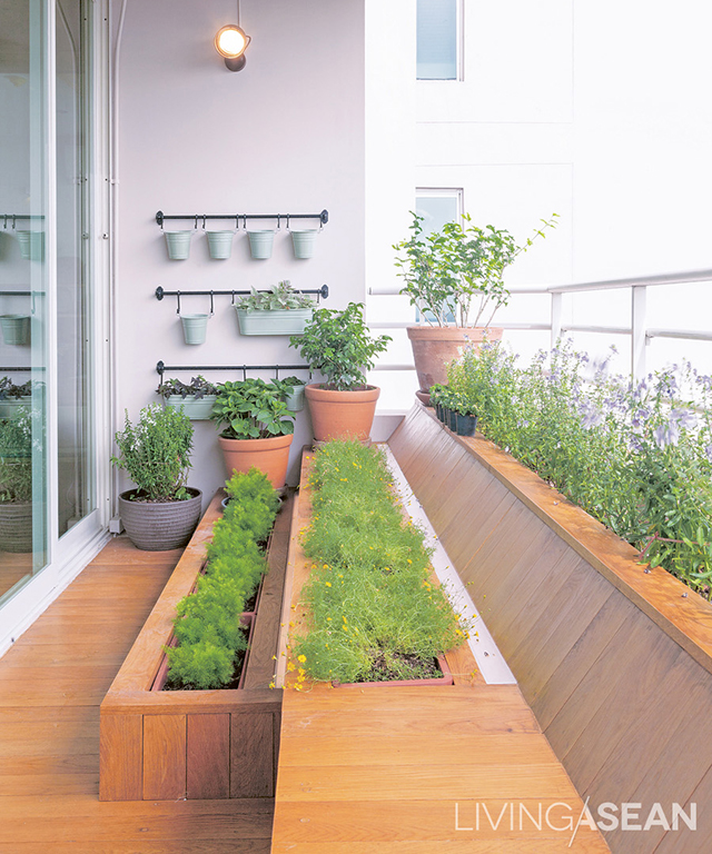
Little garden on the balcony: the family’s favorite spot, featuring a bench with planters set at different levels.

001

This 141-square-meter residential space belongs to a mother and her daughter who share a love of Japanese minimalism. “Both mother and daughter like the clean look of Japanese woodwork for the neat and relaxing feeling it gives the house,” said Ornchuma.

Their preference appeared simple enough, but in practice, renovation wasn’t all that easy. Ornchuna had to get rid of all the walls and redivide the whole space without harming the condominium’s structural integrity. She attaches a lot of value to using wood in the Japanese style: interior decoration isn’t just a question of adding furniture. She applied her special knowledge to the living area to create clear divisions of usable space with a pleasing furniture arrangement.
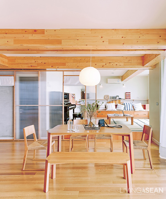
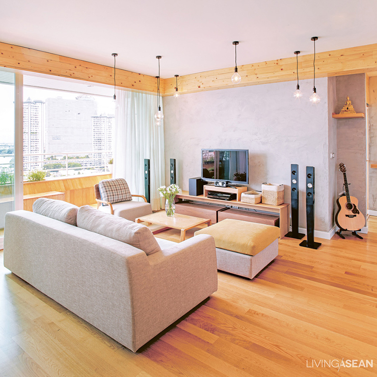
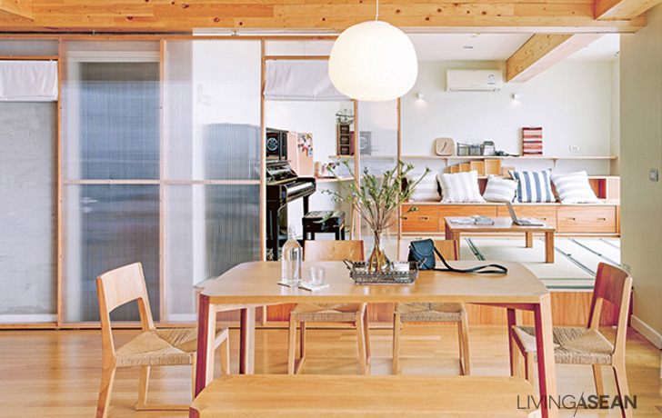
Decorative wood-framed ceiling panels create a feeling of warmth. The former design was a flat expanse of ceiling, light-colored to give the appearance of width. The slender-legged furniture doesn’t busy the room with lines, and matches the floor color, giving the room a more connected and still expansive look.
The slender-legged furniture doesn’t busy the room with lines, and matches the floor color, giving the room a more connected and still expansive look.
A Japanese-style room isn’t limited to futons; you don’t have to forgo a sofa, just use neutral colors and avoid clutter.

“As a central focus for the family, the living room should be spacious,” she said. To this end, other areas connect directly to the living room, the only separation being a counter bar in the kitchen. The two bedrooms are further in, and higher up is a workroom with a sliding door.

To create more usable space, Ornchuma set the wood floors at different levels. “The most interesting feature here is the use of sliding doors. Japanese houses use them because of space limitations, a good reason for using them in a Thai condominium, too.”

Unusual materials come into play. Instead of glass, Ornchuma sometimes chose polycarbonate, which lets light in while blocking lines of sight and is also quite elastic, a useful property for sliding doors.
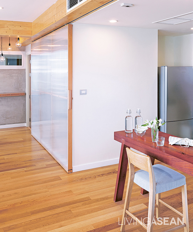
A sliding door partitions off the kitchen, and a counter divides usable space.

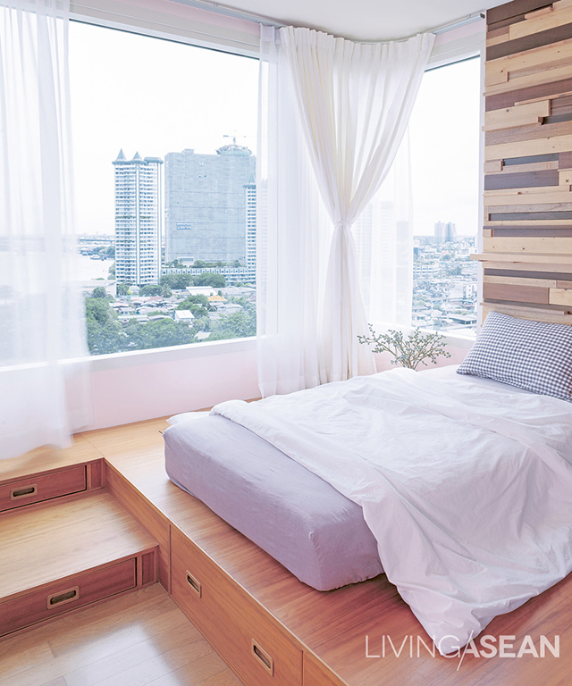
Mother and daughter share this bedroom, with mattress set at a higher level. Storage drawers are built in between levels. The wall surface has a novel look: wood veneer of varying colors and sizes, some pieces extending out far enough for small items to be placed there.

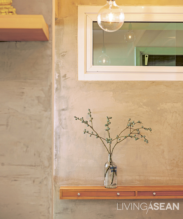
The unfinished concrete wall adds a charming and visually simple touch with a single plant set on a 20-centimeter-deep shelf of drawers with tiny handles. This can be used to place keys or other small items before going into the bedroom.

While we were talking, the daughter opened the polycarbonate-paneled sliding door to join us in the workroom. She lifted a raised section of flooring to reveal hidden storage space beneath,  showing another good feature of the Japanese style. “I store miniature models and drawing boards down there, some longer than A4-size paper, they fit perfectly under the floor.”

What they both really like about life in this minimalist condominium is its homey feeling. Visiting friends agree that it’s a great living space. Of course, what really makes a home is the relationship of the people living there, but the heartwarming feeling of family here is easy to see.
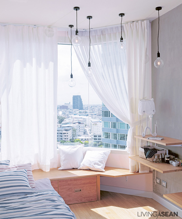
 

The second daughter’s small bedroom is decorated in a sweet style. At night, the cluster of hanging lamps with spherical bulbs sparkles like stars.

Well-furnished Condo with American Classic Stlye

Well-furnished Condo with American Classic Stlye

A deep understanding between owner and designer translated into a warm, welcoming american classic home with exquisite décor, full of personality and style.

/// Thailand ///
Story: skiixy /// Photos: Jirasak, Nanthiya /// Assistant Photographer: Sathit /// Style: Praphaiwadee /// Designer: Thittawan Chaiyawong

003

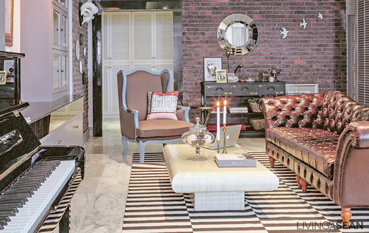
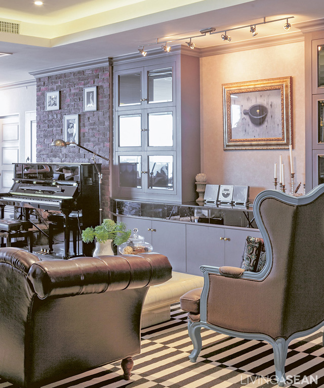
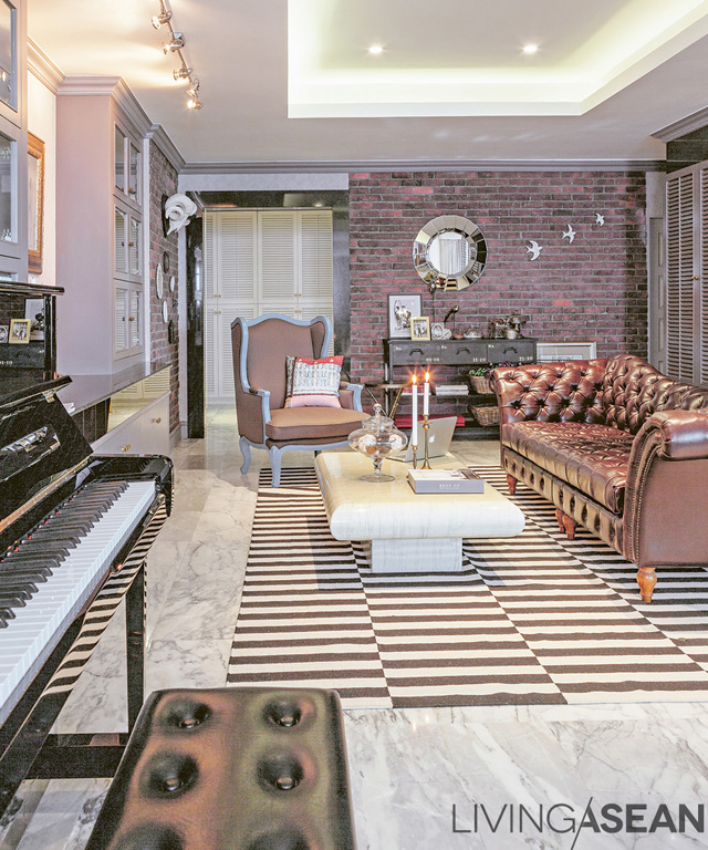
The parlor/reception room kept almost the same layout as before. The original marble floor and built-in furniture retain their fine quality; a little repainting and sprucing up, add a big leather sofa designed to fit the wife’s taste, and voilà! A fresh new room.

002

This 290-square-meter condominium suite on the Chao Phraya river is graced with a panoramic view of the King Rama I Bridge and the Thonburi area.

When the owners began life as a family, this was their first home. Thittawan Chaiyawon was both a designer and a close friend, so at this turn in life they invited her to weave their new family’s dreams to become the fabric of a beautiful new reality.

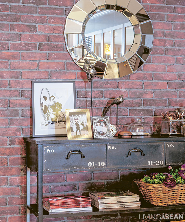
From the moment we stepped inside, we were impressed. Beyond the classic American-style décor with its mix of fashionable industrial, the cheerful personality of the still-young mother/owner could be seen in every nook and cranny as she entertained us with tales about their earlier life.

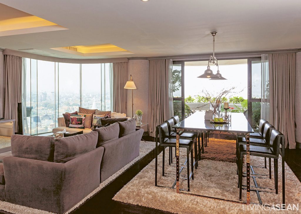
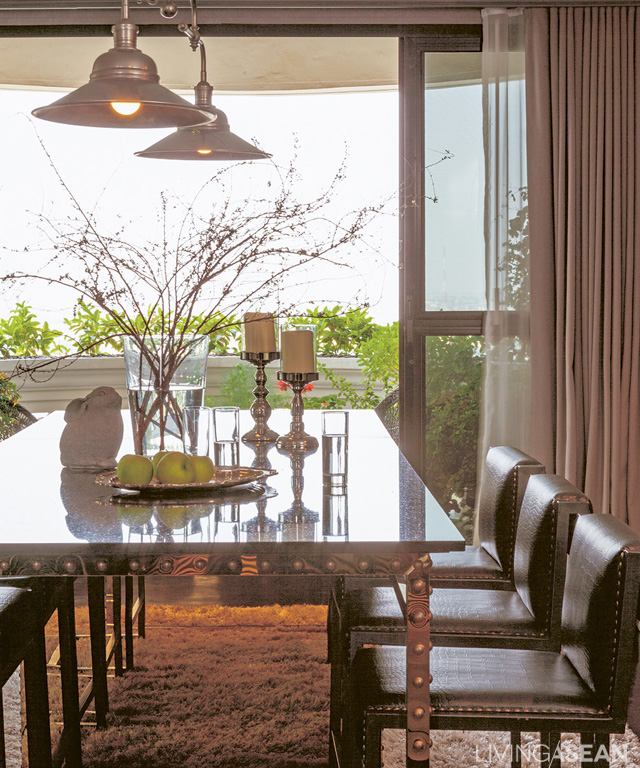
The dining area next to the living area is a relaxing place to sit and look at the river through the panoramic curved glass. The plush gray carpet adds a sweet touch to soften any rigidity in the look of the table and dining area.

The beautiful gold metallic color of the oversized dining table – a masterpiece of posh – makes it stand out without detracting from the elegance of the dark metal frame set with ornamental rivets to match the chairs, all of a set.

“When we got married my husband’s grandmother gave this room to us. For comfort’s sake we wanted to fix it up to reflect what we liked, since we figured on being here at least 4 or 5 years.”

The ambience they were looking for was “American classic.” Interior decoration came down to adding one sweet detail after another. The decorator told us this was great fun for her from beginning to end.

“We tried to preserve the basic room plan and any valuable materials: the marble floor, the kitchen marble. We put in full-size wooden doors, and where floors were wood we stained them a deeper color. We tore out and replaced all the old utility systems and the ceiling. We wanted a higher ceiling, so more light and air could come in and it wouldn’t feel stuffy.”

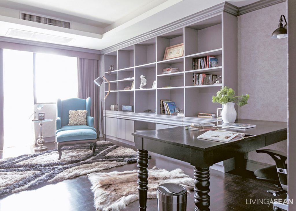
The workroom is done simply, in dark grays, the mood broken up and made relaxing with a brightly-colored armchair and soft carpet.

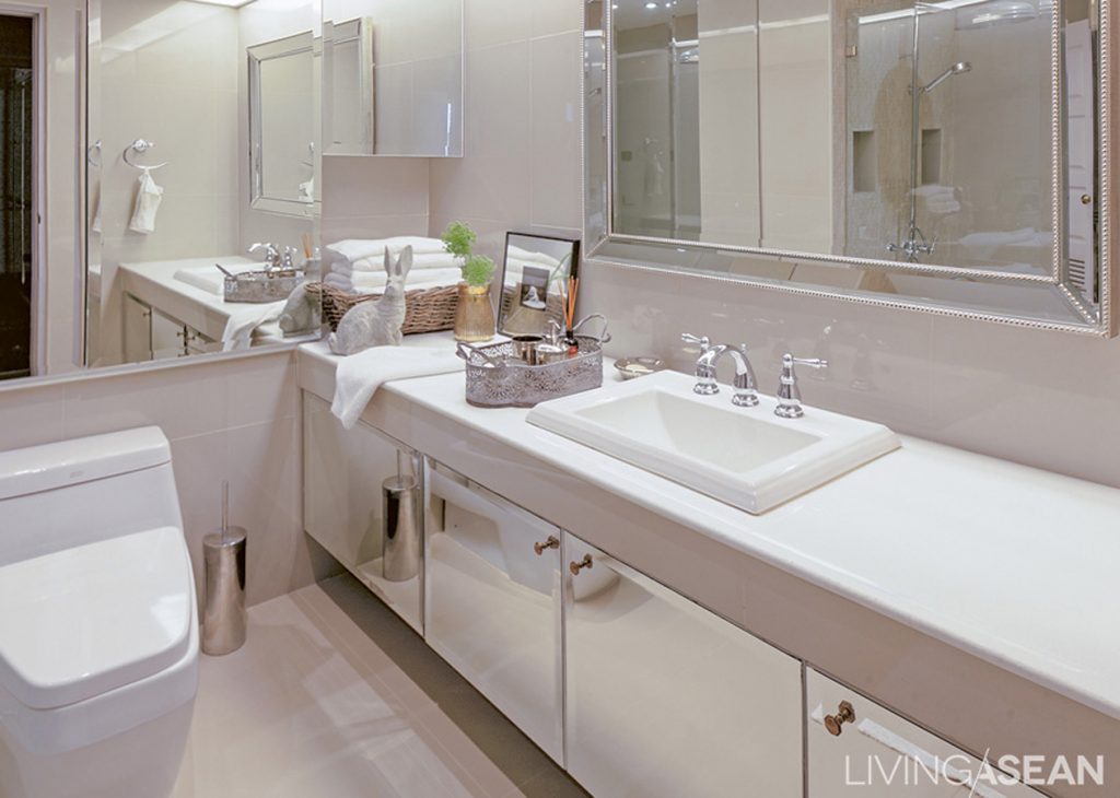
In a small room, paneling cabinets with mirrors or closing off cabinet panels with light-reflective material can add dimension which is increased with recessed ceiling lights along the length of the wall that also reduce stuffiness.

Another unique feature: every piece of movable furniture was tailored to suit the wife’s feminine character. “We discussed this all with the furniture maker. He’s a friend who had come back from New York with us. The dining room table, for instance: our original thought was for a rust colored metal table. He told us, though, that it would truly and especially fit my character if the color was gold. We agreed to it. And it came out incredibly beautiful.”

“A home has to be perfect, and full enough that you can be happy living there,” the designer spoke for her dear friend. “It’s lucky she liked my ideas: not everyone’s like that.”

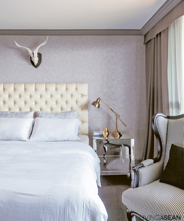
The upholstered head of the bed is taller than usual, easing the classic style a bit.

009

The wife says the one who was the most help in setting things up right was the child in her belly. “Before I was pregnant I didn’t much like staying at home, I’d rather go hang out with my friends. But when I started getting big, I preferred staying at home. Now I’ve started studying piano, and I fun practicing for my child to listen to.”

A warm, welcoming home and a lively family: this American classic environment looks to be just right for the new baby.

010

011

A Perfect Room for Two

A Perfect Room for Two

Our team meets the owners of this modest-sized condominium. With beaming smiles, the owners open the door of their little perfect room for two to greet us.

/// Thailand ///

Story: Montra /// Photos: Jirasak /// Assistant Photographer: Kritthat /// Style: Praphaiwadi /// Design / Interior Decoration: Metaphor Design Studio

001

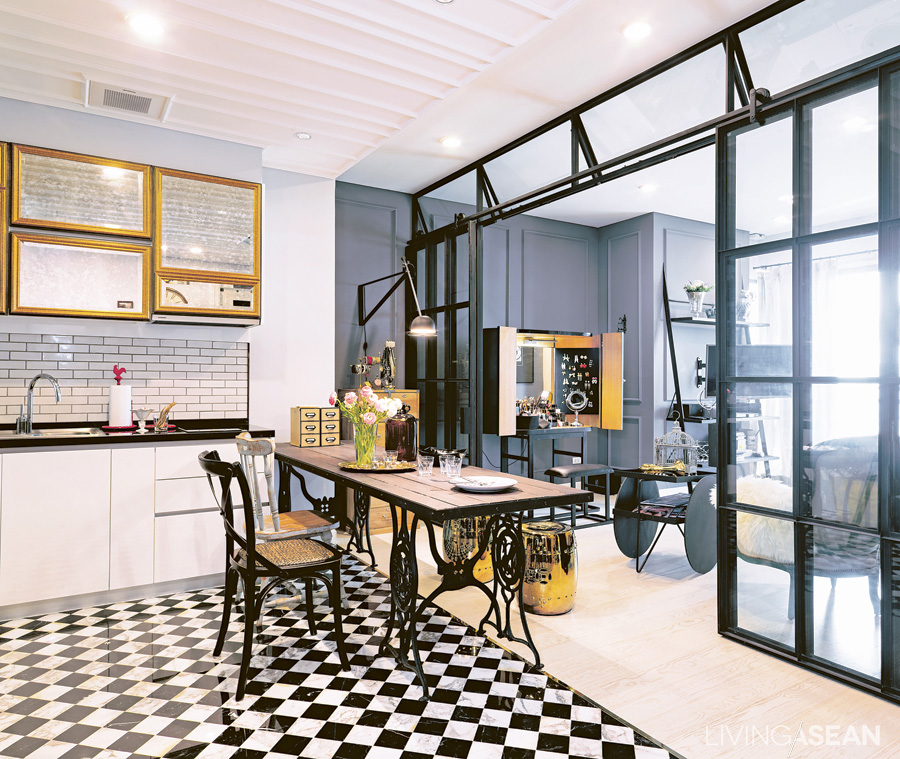
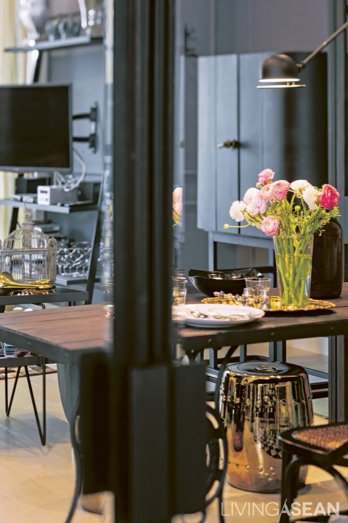
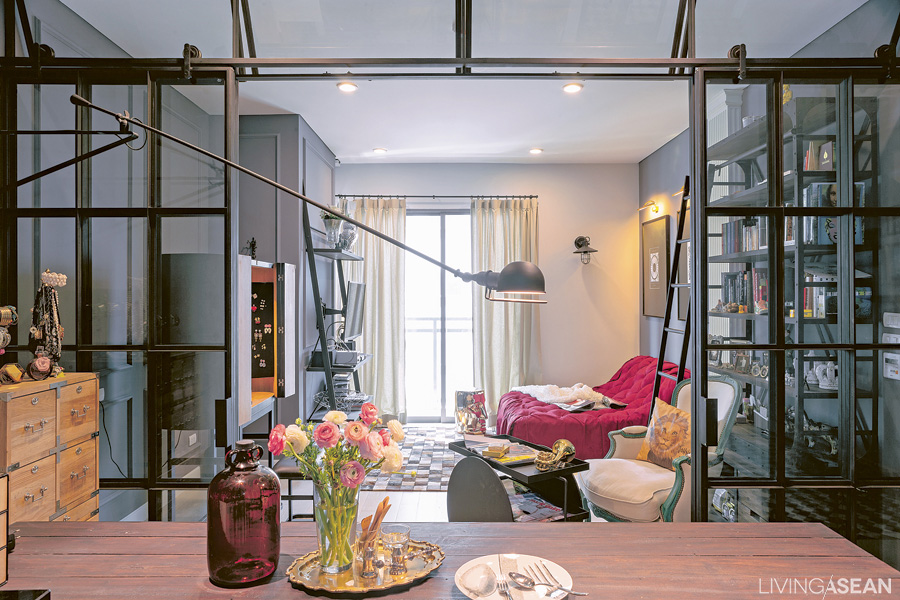
A table with wrought-iron legs topped with wood harmonizes with the straightforward designs and colors of the chairs and the metal-framed sliding door. To prevent the room from looking too dark, the designer put in the golden stools.
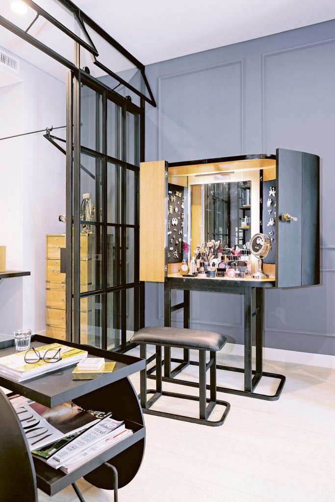
Bell tended to buy similar accessories to what she already had because she didn't see them in her sight. To solve this, the designer made space for hanging small accessories on the side of the cabinet. Bell likes the idea a lot.
The owner tended to buy similar accessories to what she already had because she didn’t see them in her sight. To solve this, the designer made space for hanging small accessories on the side of the cabinet. The owner likes the idea a lot.

“We met our designer all because of Room Magazine,” one of the owners said. She was referring to the owner and designer of a Parisian-style suite featured on the magazine’s March 2012 issue.

“I had already bought the place, but didn’t know where to start. Every day I dropped by at a bookshop to buy books and magazines on interior decoration, bring them home and talk with Aor and my parents. This went on and on, until we saw that edition of Room. Well, for me that was love at first sight. And Aor felt the same way.”

View from the entrance. A metal framework partitions the space into a dining area and a parlor. From this angle, it's like looking into an outdoor greenhouse.
View from the entrance. A metal framework partitions the space into a dining area and a parlor. From this angle, it’s like looking into an outdoor greenhouse.

There were plenty of problems to be solved with this room. Accommodations and adjustments had to be made for their lifestyles and personalities. Bell works in the fashion business, and likes putting on makeup while watching the morning news. Aor gets up later. So they put a vanity and a television outside the bedroom.

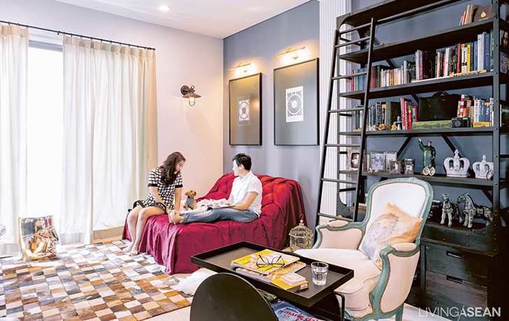
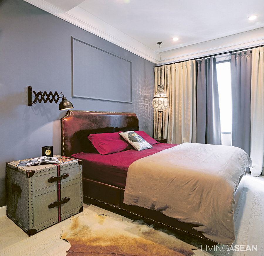
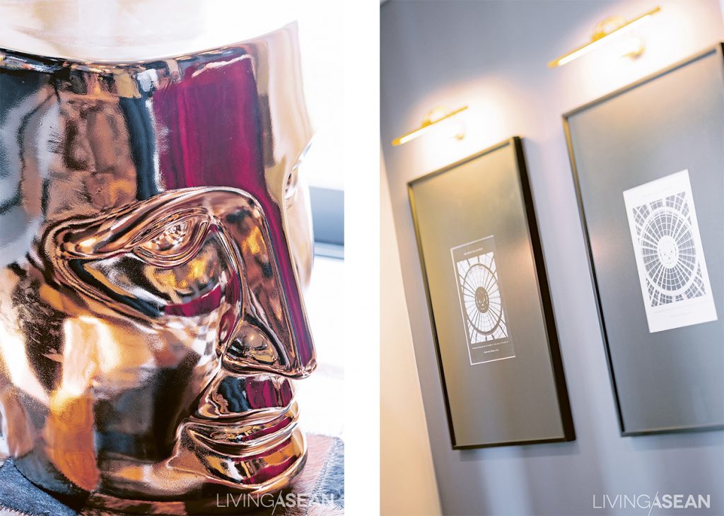
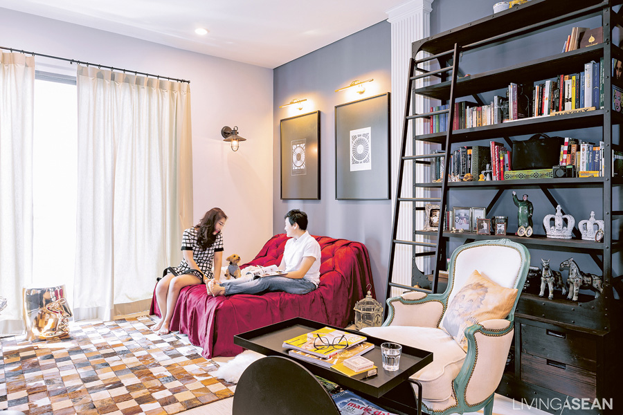
The bedroom is simple but striking. The pigeon-gray wall contrasts with the crimson bed sheet. Gimmicks lie in details, such as using an industrial lamp instead of an ordinary reading light, while a fancy crystal chandelier-like lamp is hanging on the far side.

Bell doesn’t see herself as full of feminine sweetness. Her favorite color is “pigeon grey,” which has a hint of blue. But she also wants the place to be a comfortable one for Aor, her other half, too. The couple then trusted in the skills of their designer and let him run his own ideas to work on the transformation of the space.

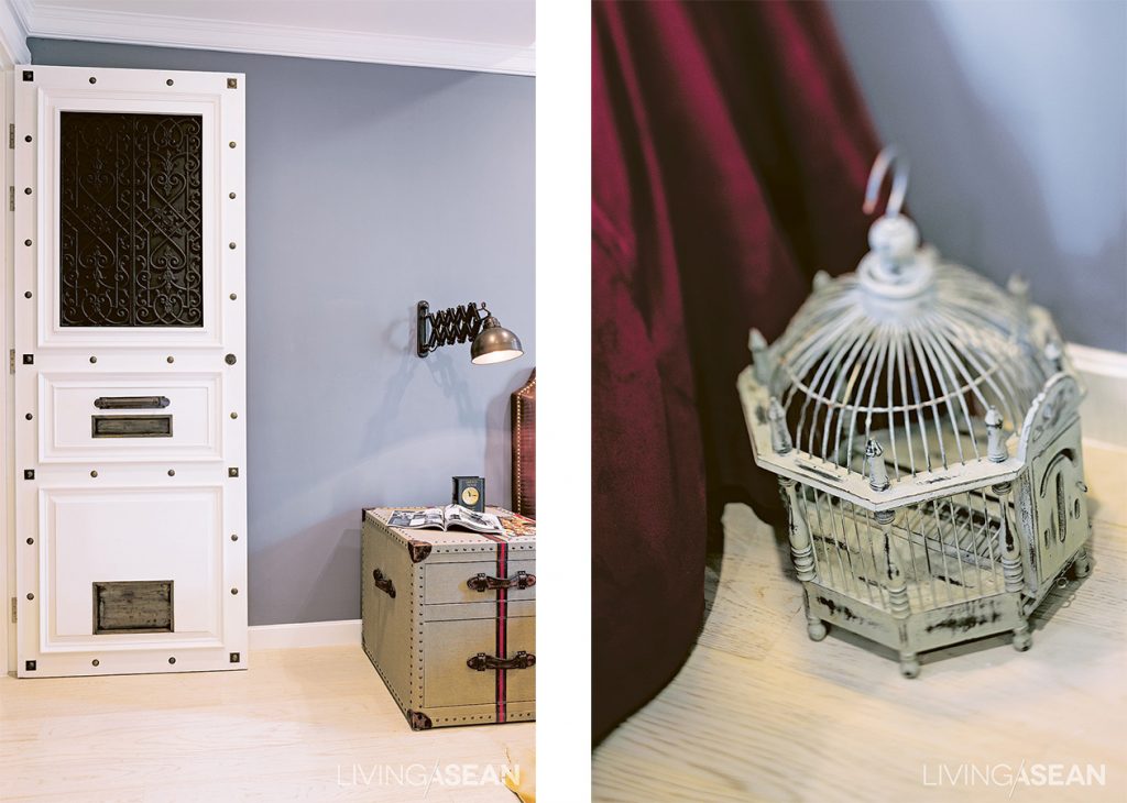
The designer has managed to adjust the room plan and move a door for added convenience. He also inserted a little pet door for Minnie, their dog. The door has a unique look, studded with different kinds of brass rivets.

The end result was more than satisfying. When they had their first look at the designs and models, they were delighted. “It was really gorgeous! Aor and I made almost no changes from his original design. It was exactly what I’d had in mind, in both design and function. We both saw it as the perfect solution.”

007

The path from design to finished work wasn’t all smooth sailing. Little problems popped up along the way. Sometimes it was the contractor not sticking to the specs. Other times the details or materials weren’t exactly what they had pictured. “The flooring with black and white chess pattern, some parts of the white stone turned yellow, or had a little stained, but I left them that way. If things weren’t too ugly, we were OK with them. Actually, I was impatient and wanted to move in really fast.” (laugh)

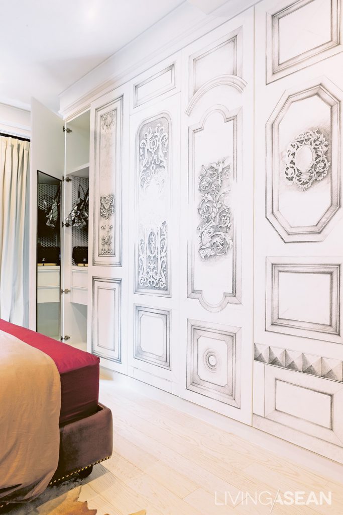
The intricate patterns on the closet surface are the designer’s solution to the original design. “These started out as engravings, but it was taking so long. The designer turned them into illustration works instead. The closet ended up being really beautiful, and we love it.”

Maybe it’s destiny that brought Bell and Aor to fell in love with the Parisian-style studio. But beyond the destiny, it’s the matter of efforts and understandings that make the perfect room for them.

009

Flexible Condo Living

Flexible Condo Living

Time changes, things change. People who stick with stability in life may find the fact troublesome but not Anirut Kittithichot, the owner of this flexible condo. To him, change is certain.

/// Thailand ///
Story: Mone /// Photos: Damrong /// Style: Phakhawadee /// Owner/ Designer: Anirut Kitthichot


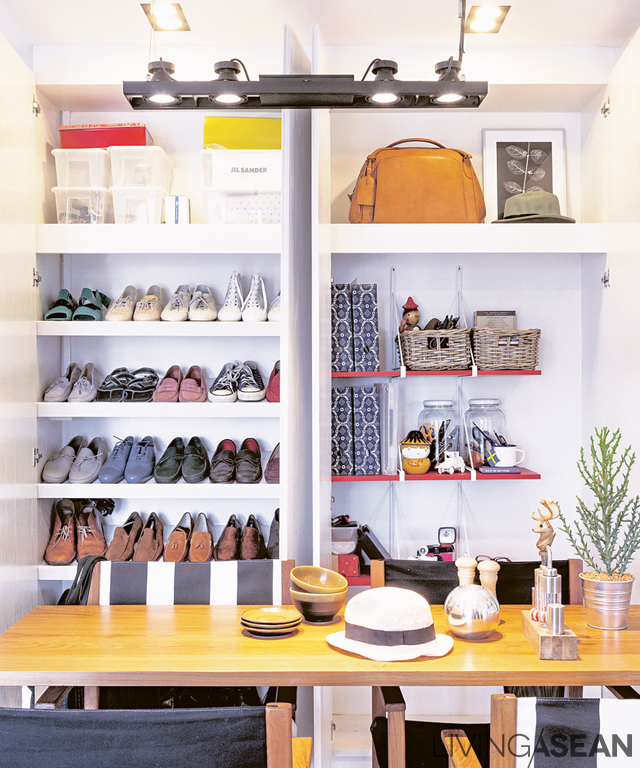
Shelves in this large built-in cabinet can be reassembled to maximize a storage space.


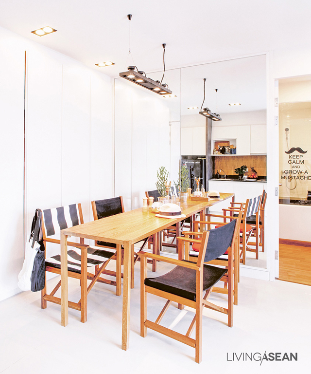
Setting the teak dining table against a mirrored wall makes the table looks longer. Laminated white-oak surface on the cabinet blends with the surrounding and gives an uncluttered feel.

Anirut was a marketing executive at Cotto. He left the job and signed up for a scholarship in business design at Domus University, Italy. Currently, he returned to Bangkok to work in marketing full-time again.
“I like things and got bored of things easily. To me, designing new works is a fun challenge.” Anirut said.

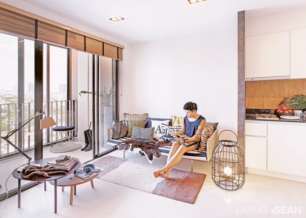
For a single young man like him, this 46-square-meter condominium room is not too small. The space is more than enough to apply his creativity. The empty room was gradually turning into a private kingdom reflecting his personal taste and individuality.


By putting a sticker of his favorite quote and a black frame in, the service door is hidden in plain sight.


The room is relaxing and friendly. Chilling music is playing, while its Scandinavian décor sets an easing mood. “Maybe the relaxing atmosphere comes from a good portion of light color. If I’d used birch wood instead of teak, the rooms would look even more Scandinavian. But I picked a teak table because of its future value. One day I might got bored of it, But I can still adapt it into something else.

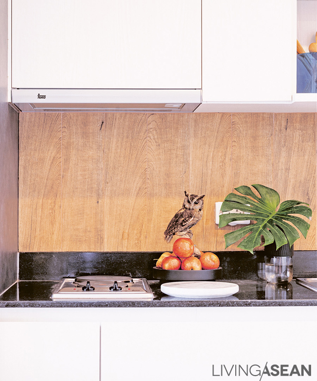
Wooden-like ceramic tiles give a rustic feel to the pantry wall while protecting the surface from humidity.


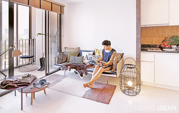
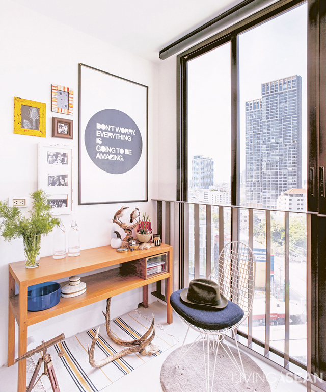
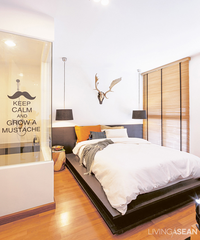
Always falling in love with new things, Anirut chose to mix and match his interior decoration. He also likes the challenge of hunting for rare and interesting items. Some of his furniture took a long journey from Milan. Some are from his trips. Some are from trade fairs, and some are his own creation made by his favorite furniture maker in Bang Po. The most outstanding pieces among these are antlers and furs, which give the room a rustic feel.
Anirut has a clever way of utilizing the space. He avoids installing fixed furniture in case of future changes except for built-in closets to keep little items (which seem to be a classic problem for every condominium dwellers) in some corners.


A hanging lamp is used instead of a bedside table due to space limitation. A sticker on the glass wall is removable. So, Anirut can change it as often as he wishes.


“I like having parties with my friends and having many people come over. But their working hours are odd. So, there are only 3-4 dropping by at the same time. To create an illusion of having many people and also to make the room appears larger, I installed a mirror at a dining table.”


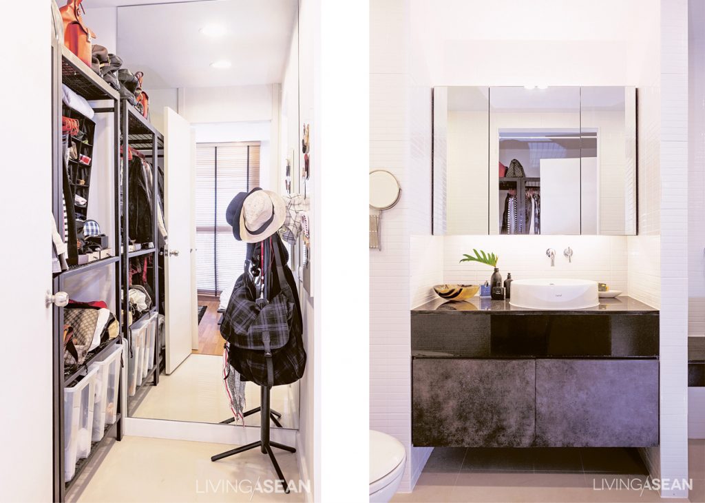
The 2-unit wardrobe has a metal frame instead of a door, since Anirut likes to see clothing inside the cabinet. /// A mirror cabinet in the bathroom adds more space for small items. Lighting is enhanced both above and below the cabinet to reduce glares.

personal style is much loved by friends and acquaintances. Many asked him to design their houses, which Anirut gladly agree to help. His place may be a flexible condo, but for his friends’, he advises differently to each. “I don’t want to walk into their place and like it too much. That would mean it’s my place, not theirs!”


001

X