/ Chiang Mai, Thailand /
/ Story: Wuttikorn Suthiapa / English version: Peter Montalbano /
/ Photographs: Soopakorn Srisakul /
In house design, the phrase “limited space” raises worrisome questions for some. Here, though, homeowner Sarin Nilsonthi used modern Tropical design techniques and inner space connectivity to build large-house functionality and comfort into a compact house plan.
“I designed this house on one A4 sheet of paper,” said Sarin with a smile.
“Since it’s small, I tried to write down all the functionality we’d need on a single sheet of paper, and named the house ‘PSA,’ from ‘Paper Series A.’ I can still recall entertaining the idea of living in a small Tropical home with all necessary features and conveniences neatly fit into it.”
Overall, it’s a small house plan that takes account of the size and comparative relation to a whole. Like so, post and beam construction is done in somewhat unusual ways to create the right kind of space in each part.
“We didn’t set the beams and posts this way because we wanted to, but in order to set things up in the right way. Still, anyone living in this house will have to be the same height as my wife and I,” Sarin said smiling.
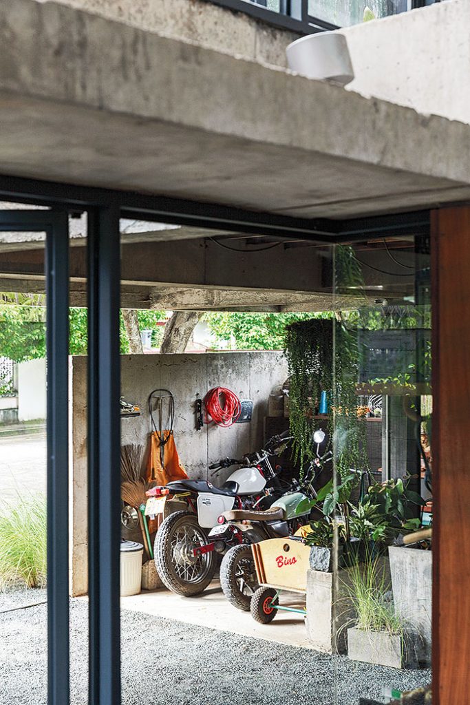
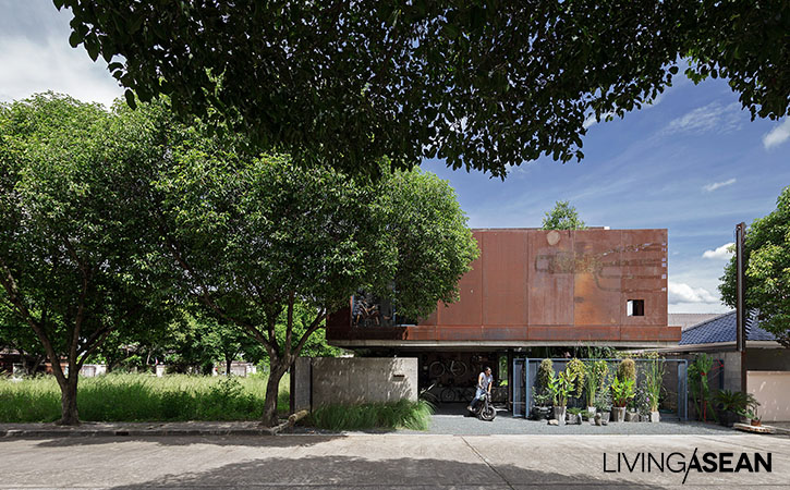
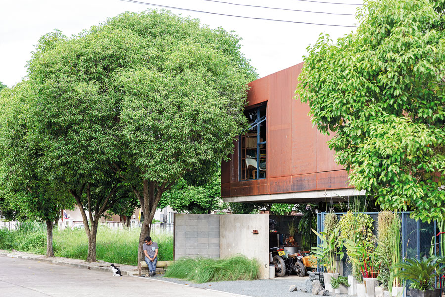
Upon our arrival, the first thing we saw was a massive steel panel which the homeowner left rusted on purpose to show a stylish authenticity of construction materials. The principal front that looks onto the street shields the second floor from heat while showing off the shipping-container design of the office area. Below is a carport paved with fine gravel reaching up to the house entrance.
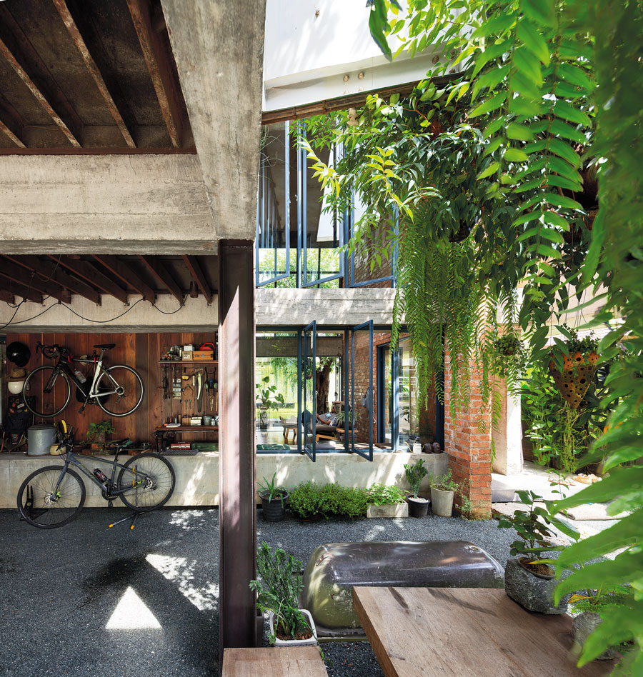
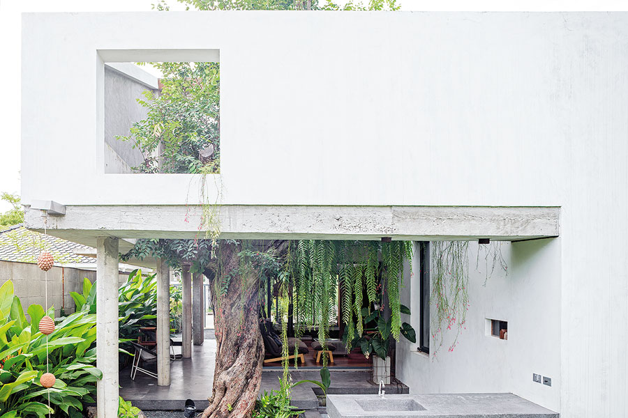
Sarin intentionally kept the front yard fence low to create a clearly defined “inside the fence” area. There’s a gravel yard with benches and trees which actually becomes a part of the house itself. The house walls are rough concrete all around, and H-beams sunk into the yard support the office section, which is raised above a lower area where Sarin and his wife Pairin Boonpinid plan to open a café in the future.
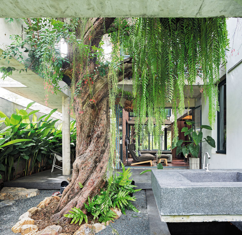
Inside, on the lower floor, the living room, dining area and kitchen are all connected, each ceiling at a different level. For good ventilation and a sense of spaciousness, the living room has a double height ceiling. Nearby, the ceilings in the dining area and kitchen are set slightly lower, with electric lighting giving them each a unique identity.
The staircase has no railing, so is accessed from any direction; you can just walk down to sit and relax in the dining area, which is also used to store kitchen necessities: spices, condiments, even a refrigerator.
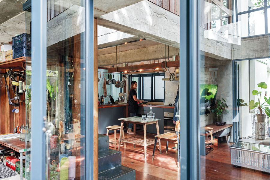
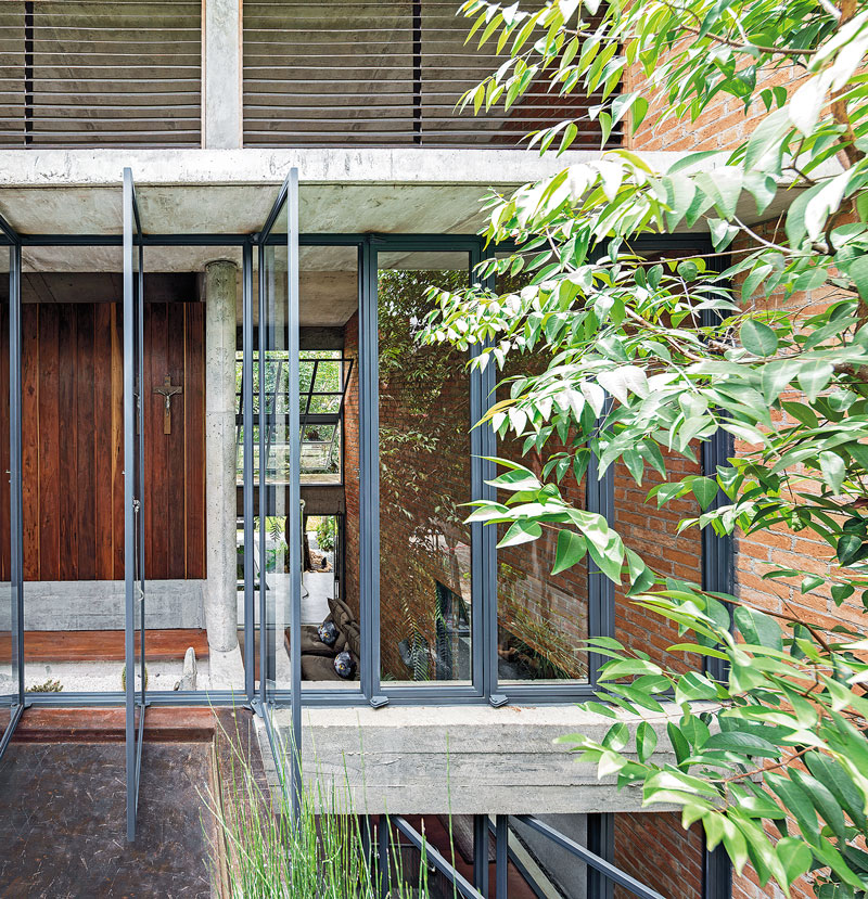
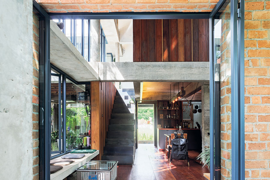
Going up the stairs and turning left brings us into the container-shaped office, the rusted outer wall reaching up to the third floor as protection against heat. The container surface is rainproof, with a layer of insulation between it and a plywood surface that gives an orderly look to the interior. There is also a houseguest bedroom on this floor that’s currently being used as a reading room, but planned as Air B&B tourist accommodation once the café opens.
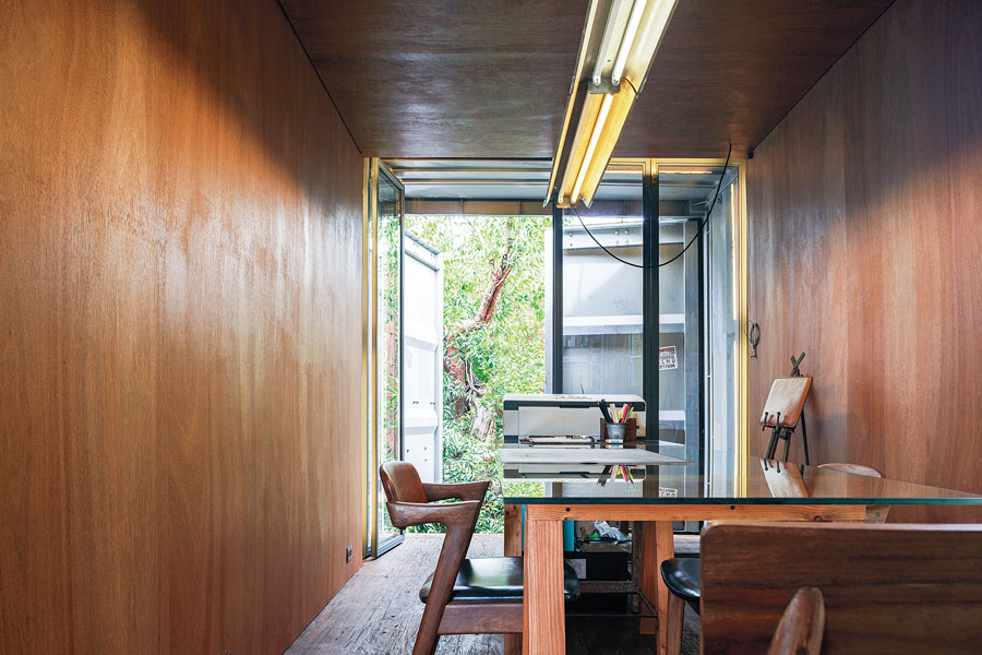
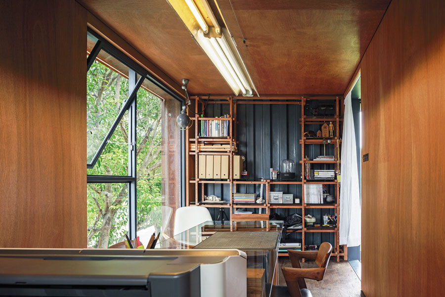

The entrance to the master bedroom is in the back, accessible via a corridor next to the kitchen; Sarin designed it as a separate building so as to remain private when the café/hostel section opens. It’s accessed without going through other sections of the house. Here the floor is raised up above the ground as protection against moisture damage, and there is a skylight above for indirect lighting.
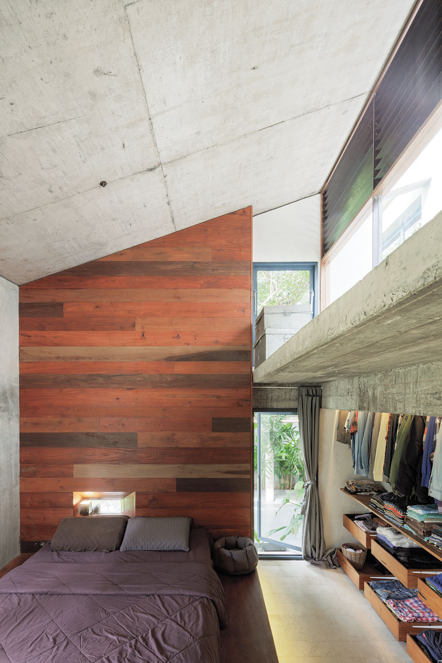
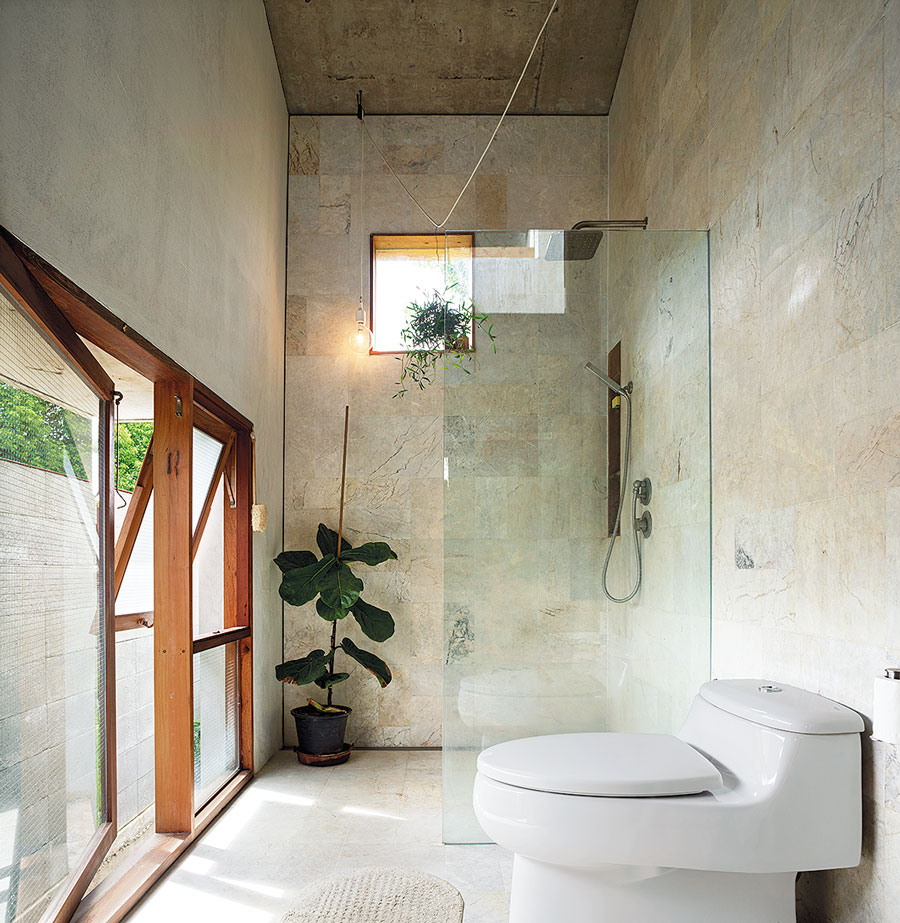
All the above features combine to give this compact house a comfortable, airy feeling, enhanced by imaginative placement of openings for breezes and natural light.
Sarin refers to the greenery and openness as creating “breathing space,” as rooms are all interconnected, airy, sunny, and in touch with the natural world. He likens this house to a well-tailored suit: the tailor has to measure, ask about the wearer’s taste, and plan everything to be comfortable and pleasing. A truly beautiful design!
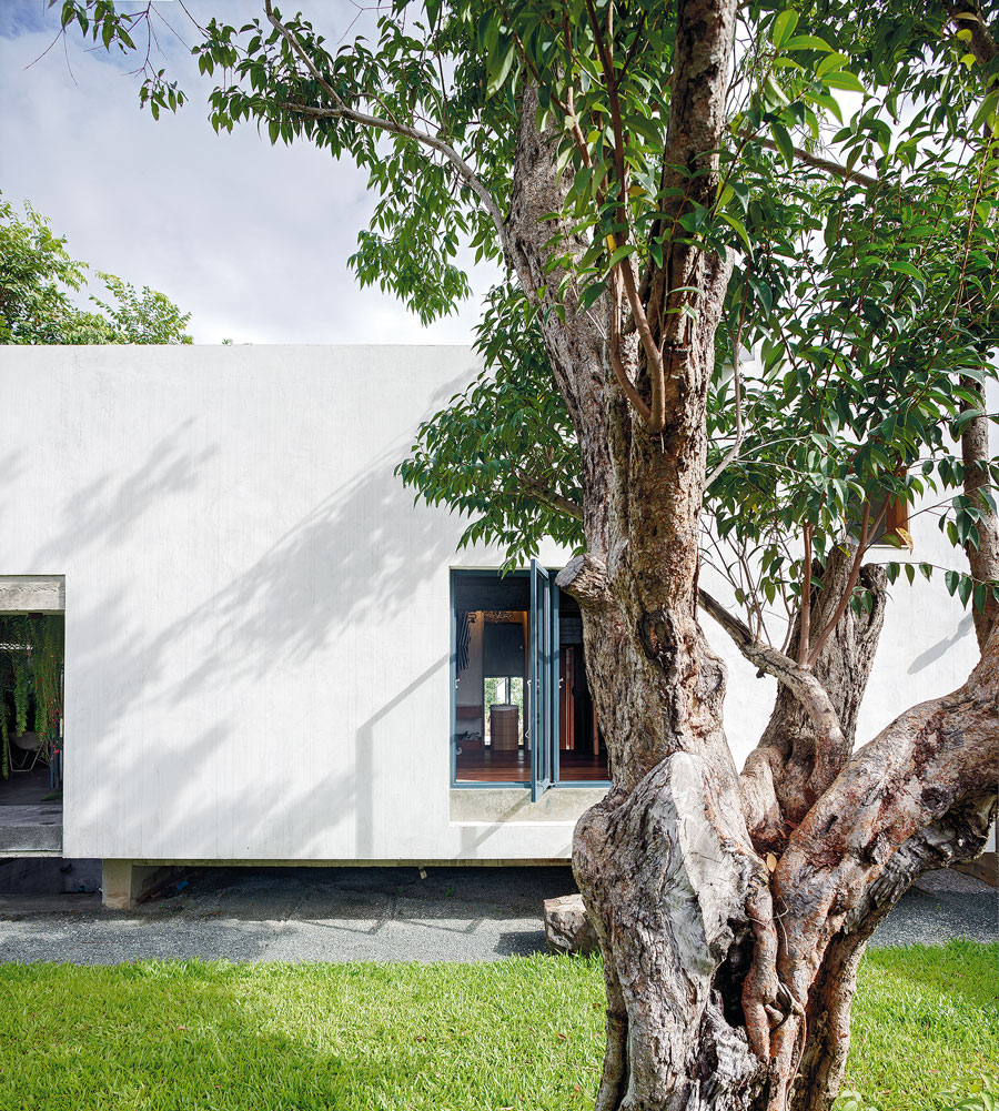
Architect: D KWA Architectural Design Studio
You may also like…
 Tile House: Façades of Glimmering Tiles with a Story to Tell

