A Parisian Studio

A Parisian Studio

A Parisian Studio

Where do people look for an inspiration? Some discover it in books or magazines, while others turn stories into new thoughts. The owner was passionate about an apartment in the 1998 film “A Perfect Murder.” It was the inspiration that led to his so-called Parisian Studio.

/// Thailand ///

Story: Montra /// Designer: Priyawat Temchawala /// Photographer: Damrong /// Assistant Photographers: Thanatcha, Jantima
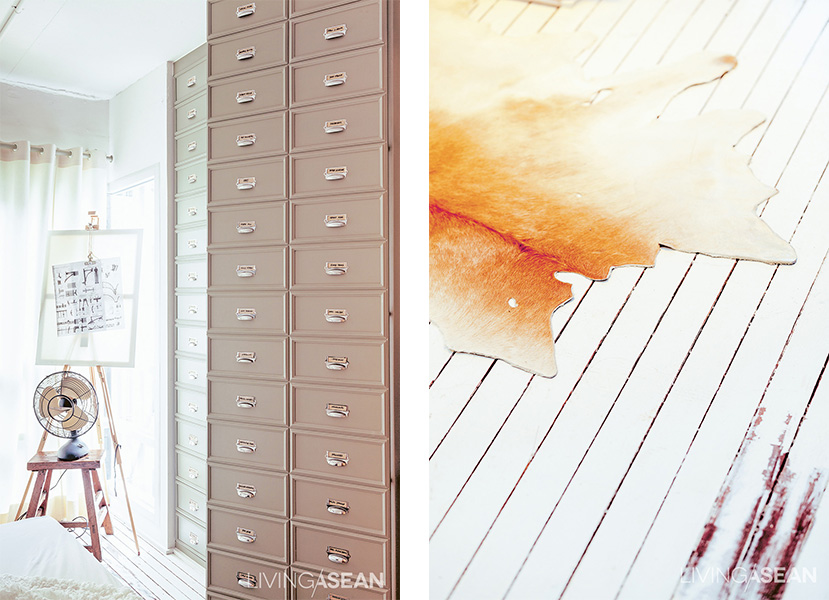
 

The cabinet face is designed to look as if it holds many drawers, adding more vintage details.


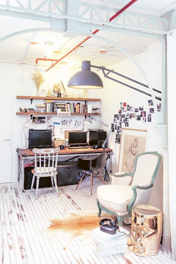
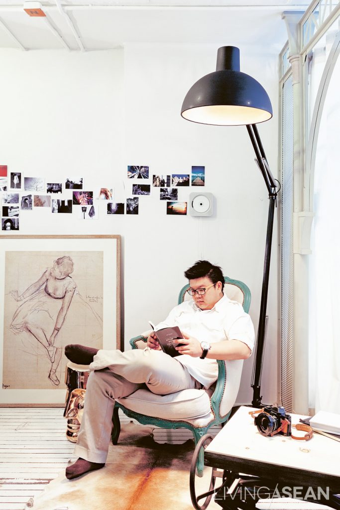
The work corner and the living room are in the same area. The desk consisted of metal legs made from water pipes and a wooden top to fit the width of the wall. Different cushions were originally placed here. But Priyawat later replaced them with his vintage armchair.
The work corner and the living room are in the same area. The desk consisted of metal legs made from water pipes and a wooden top to fit the width of the wall. Different cushions were originally placed here. But the owner later replaced them with his vintage armchair.


“At first I thought I’d just knock out the ceiling, fix it up, and think about the rest later. But ideas were popping in my head. So, I had to redo everything,” said the owner who also designed the space by himself.
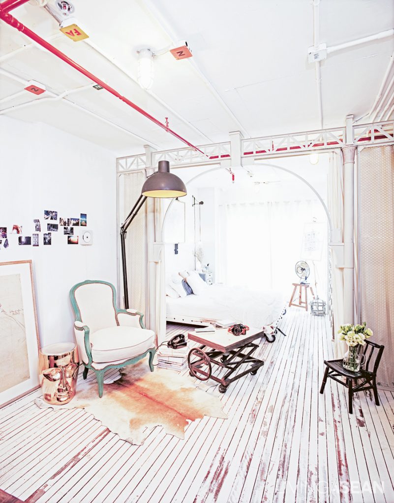
 

Light-colored décor contrasts with raw surfaces of conduits on the ceiling, utility pipes and the metal arch. The arch’s scale was adjusted to suit a low-ceiling height and to accentuate its clear lines. Pipes were painted white to reduce the rawness of the original metal surfaces.


“I thought it was just a question of making the ceiling higher. But once it was out, I wanted to make an archway pretty much like the loft-style, high-ceiling room in the film.”
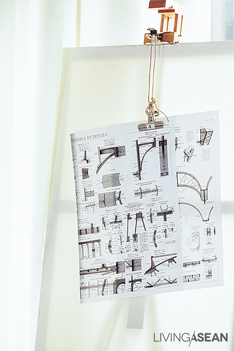
The owner had done a lot of research. One design book about the Eiffel Tower caught his attention. “The book enlarged each part of the Eiffel Tower to show exactly what was there. I was entranced by the detailed ironwork because it had such unique elegance.”
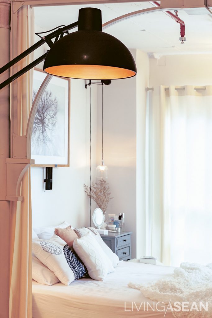
 

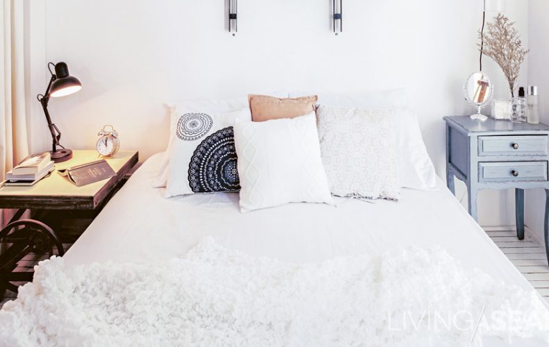
The bedside lamp design was derived from one of Priyawat’s projects for a hotel. To contrast with the lamp’s modern style, Priyawat paired it with a vintage wooden bedside table.
The bedside lamp design was derived from one of the owner’s projects for a hotel. To contrast with the lamp’s modern style, he paired it with a vintage wooden bedside table.


As a result, the room was totally transformed. From an ordinary rectangular condominium room, it took on what the owner called a “Parisian Studio” look. The character of the room has certain rawness from the metal archway, while a touch of softness is filled with white tones. Details were gradually added to complete the whole look, just like putting jigsaw pieces together.

As an interior designer, he understood the fact that he could not adjust the floor plan much. The condominium also came with pre-installed electrical appliances, which were mostly immobile. So, he decided to focus on the furniture instead. Most of the furnishing pieces were custom-made. A floor-to-ceiling wardrobe was built-in to make the most out of the limited space, while a queen-size bed was equipped with wheels enabling it to move easily.
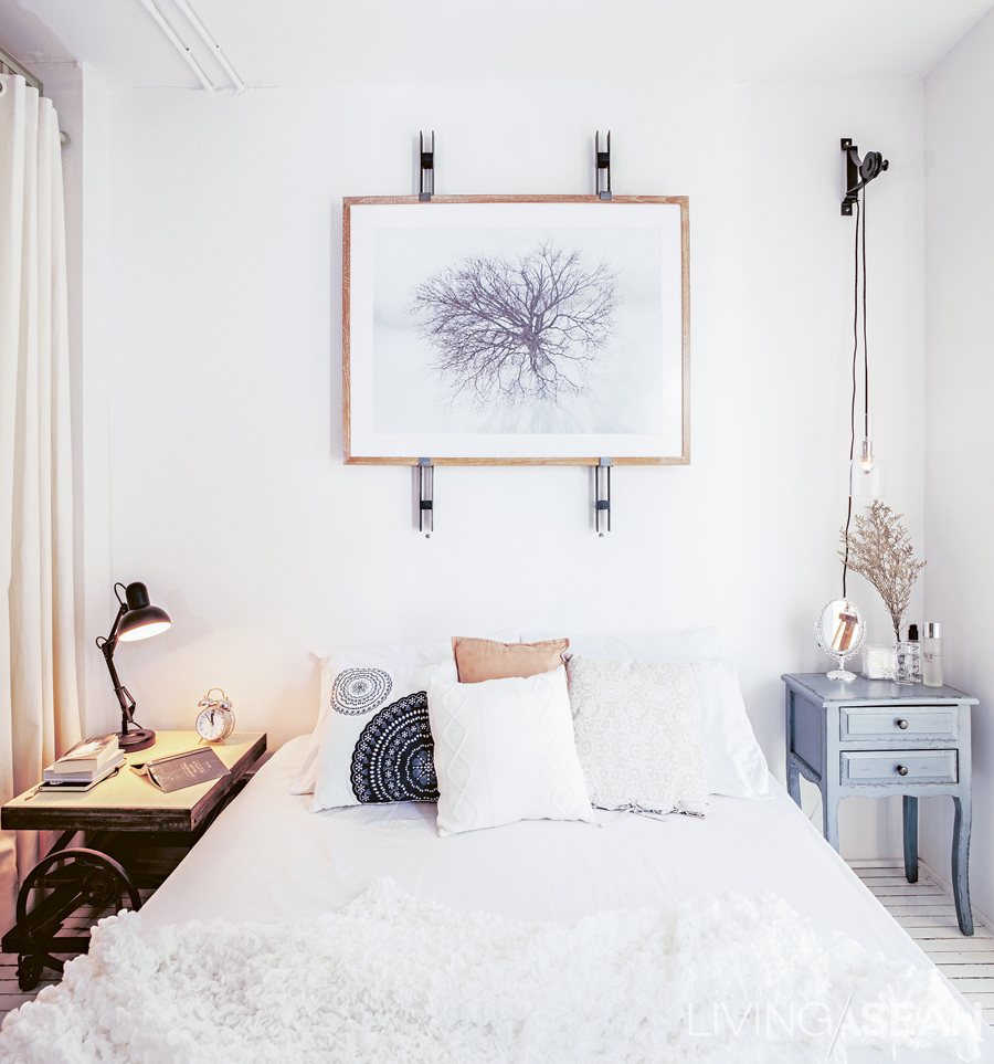
The queen-size bed and bedclothes are in shades of white to keep the tiny space from seeming cramped. A little panache is thrown in with the two bedside tables of different styles.

The owner also recognized the importance of a proper space management. A workspace was arranged at one corner close to a wall. The middle of the room was left for a living area. For privacy, he used long curtains to separate his sleeping area from the rest of the room.

Back to our question: Where do you look to find an inspiration? Well, answers may vary. But we know one thing for sure. This Parisian Studio inspired us with lots of little details.
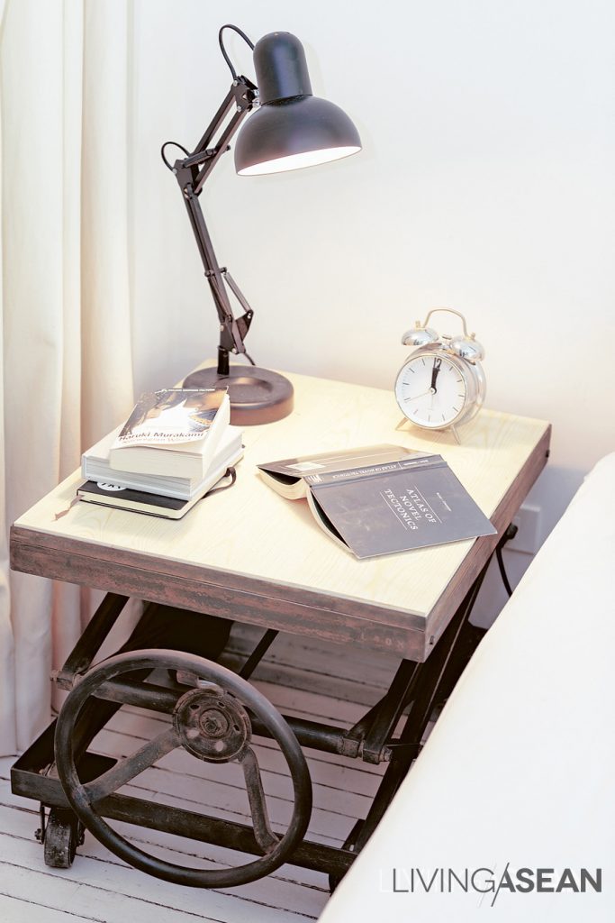
 

The bedside table is designed to look like an antique. The original model is vertically adjustable. To save costs, this reproduced one can only slide aside.


008


007


About the Author

X