Blog : EKAR

The Pusayapuri Hotel: Redefining U-Thong Architecture from a Modern Perspective

The Pusayapuri Hotel: Redefining U-Thong Architecture from a Modern Perspective

/ Suphan Buri, Thailand /

/ Story: Phattaraphon / English version: Bob Pitakwong /

/ Photographs: Anupong Chaisukkasem /

It was a journey back in time as we visited U-Thong, home of the Pusayapuri Hotel that has become a new landmark in the western part of Suphan Buri Province. The town in itself is rich in history, having been the origin of the Ayutthaya Kingdom dating back more than 2,000 years. It became a district of Suphan Buri during the reign of King Rama V in 2448 B.E. (1905), formerly known as Chorekhe Sam Phan and later renamed U-Thong in 1939.
Pusayapuri Hotel U-Thong

The Pusayapuri is the brainchild of EKAR Architects, a Bangkok-based architectural practice led by Ekaphap Duangkaew. The design thinking process took Ekaphap and his team to U-Thong countless times, during which useful data were collected culminating in a piece of contemporary architecture that’s worth remembering and unique in its own special way.

Sharing his work experience with us, Ekaphap said: “The thinking process that went into designing this hotel came as the result of systematic investigations into the town’s history.

“U-Thong was an ancient state that flourished in this part of peninsular Southeast Asia a very long time ago. Most people seem to have overlooked important facts about it. So, we reached out to connect with the locals and got to know a lot about its history through seeing, hearing and visiting places.”
Pusayapuri Hotel U-Thong

“There are museums containing relics that provide an insight into the history of U-Thong, among them a stone Buddha image carved into cliff face that has become a tourist attraction. It’s the work of local artisans,” Ekaphap continued.

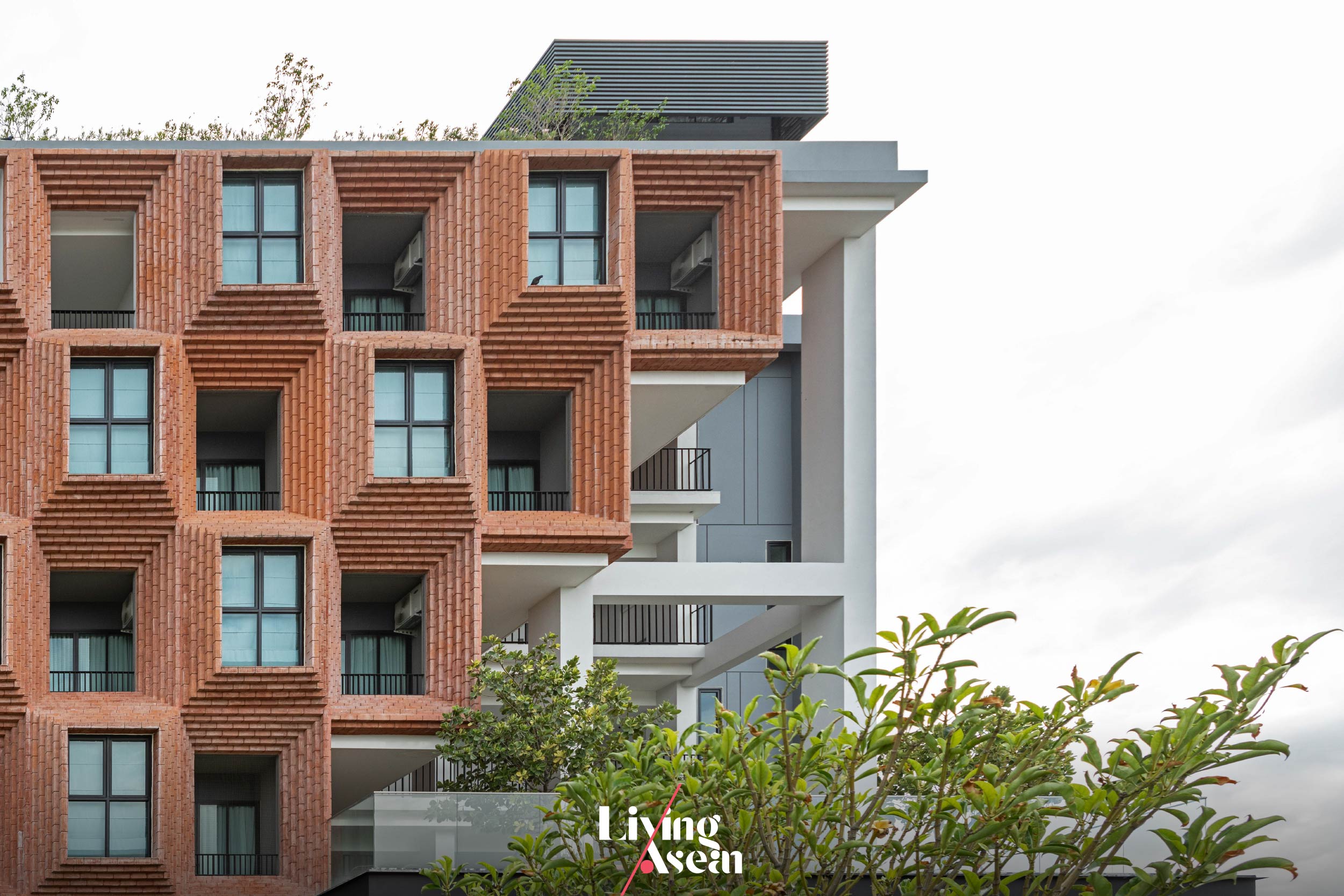
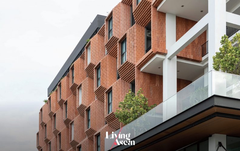
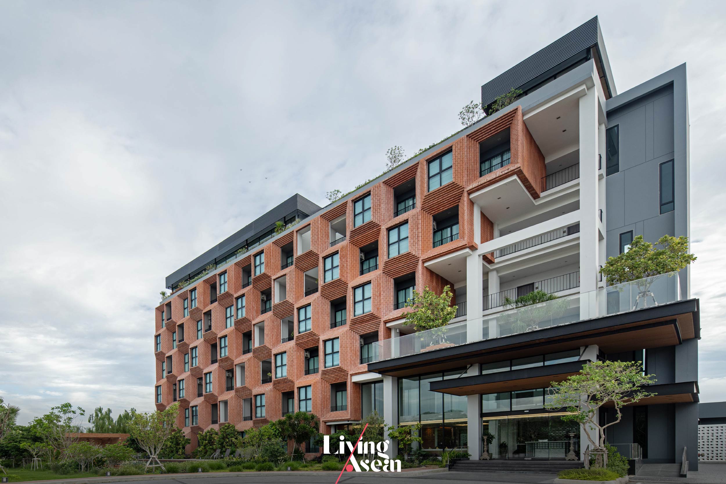
“Other places of interest include ruins of dome-shaped brickwork structures erected as Buddhist shrines in the past. Not many of them remain to be seen today. It’s these historic sites built of bricks that inspired us to try and revive old brick masonry to all its former glory. One of the results of all this is evident in the façade of the Pusayapuri Hotel in U-Thong.”
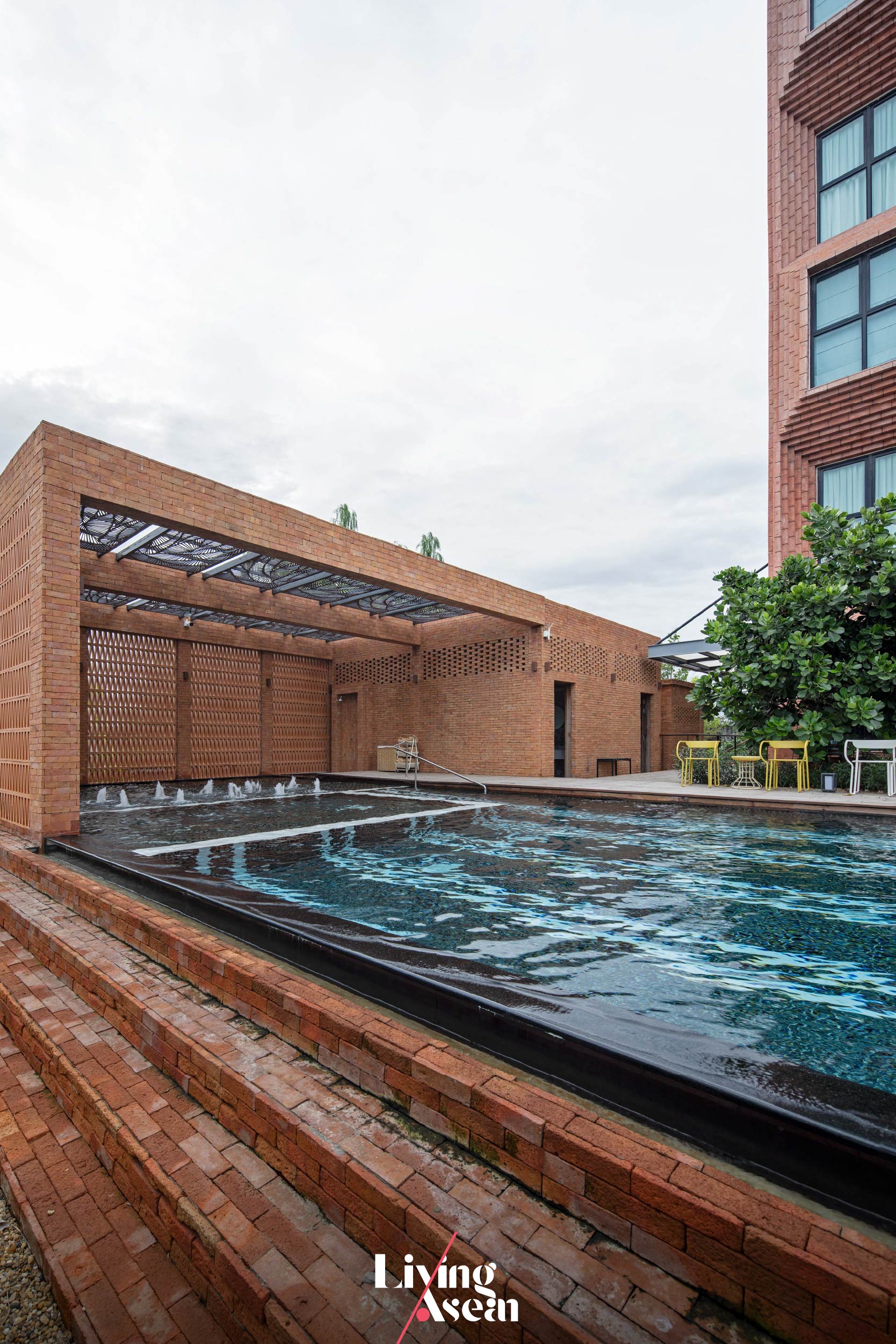
Pusayapuri Hotel U-Thong

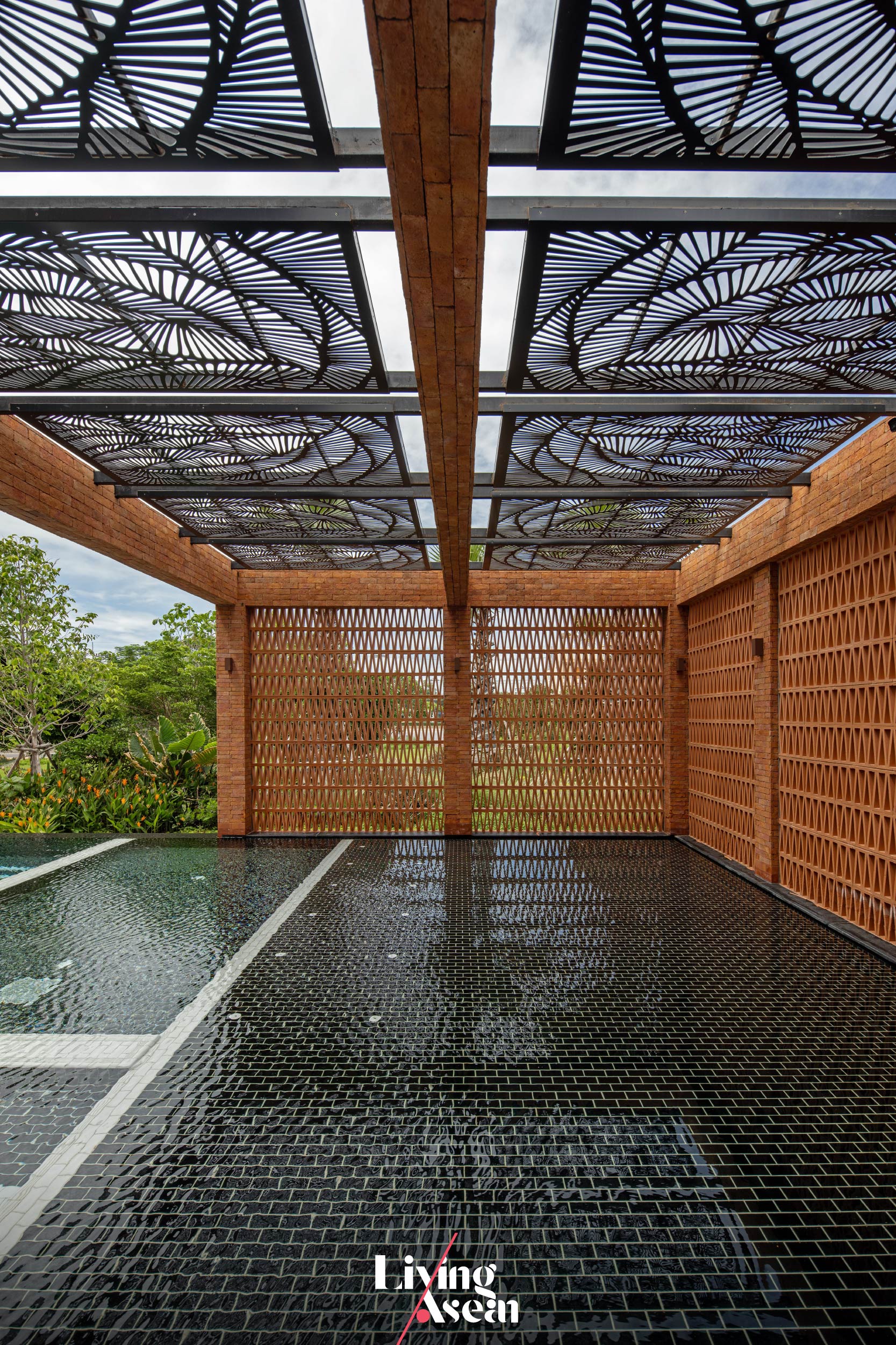
In essence, it’s about building a hotel façade with the power of telling a story about life in U-Thong in former times. Thanks to their understanding of architectural heritage, the architects were able to create a new hotel that stood out from the rest in terms of color, texture and design, and yet no old-fashioned bricks were used.
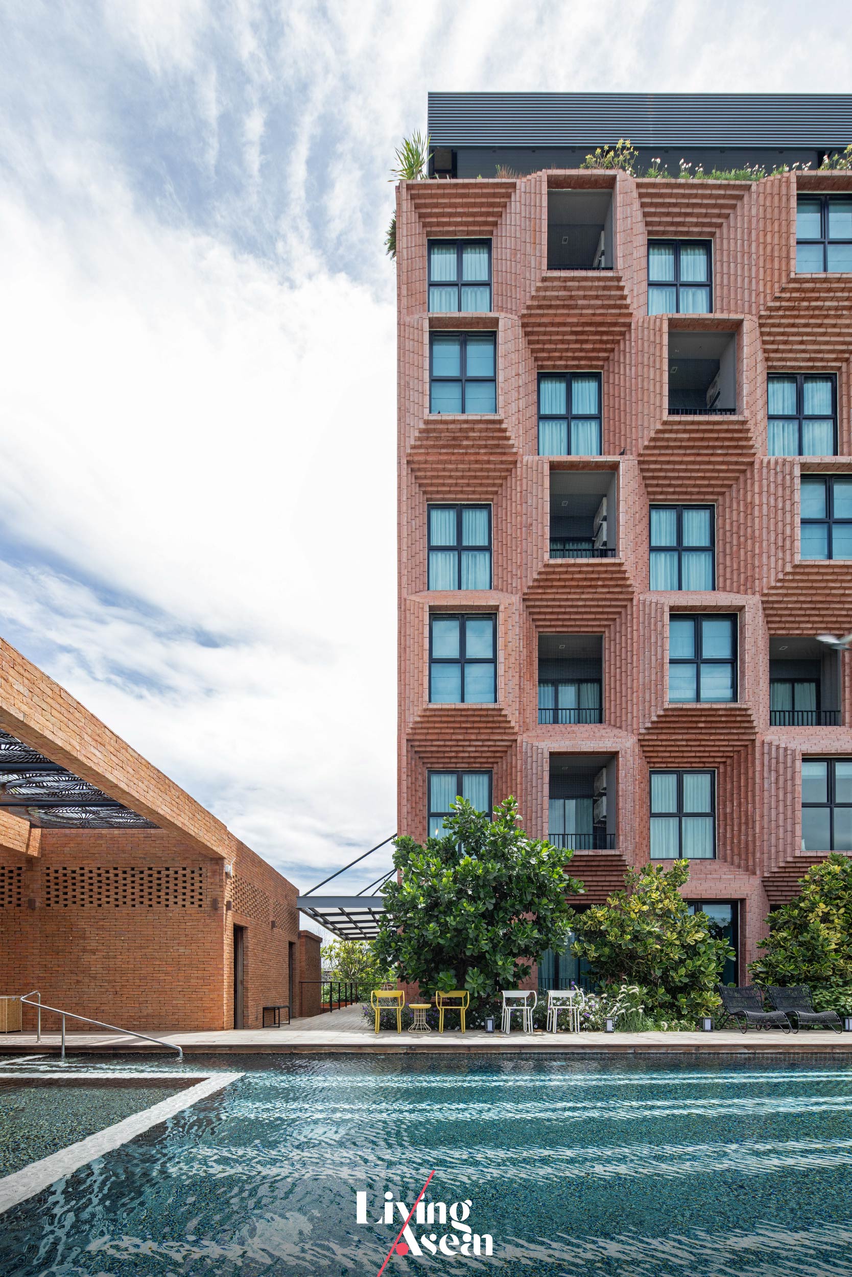
Pusayapuri Hotel U-Thong

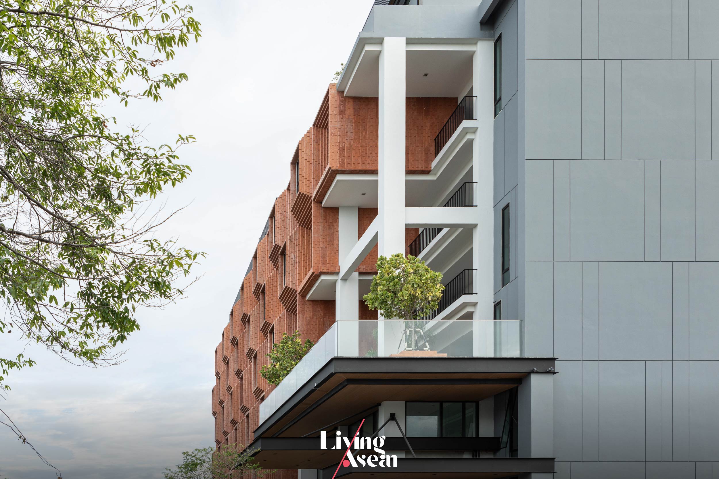
The Pusayapuri is built using innovative materials including glass reinforced concrete, or GRC, that’s lightweight but tough making it an ideal material to use on a variety of structures. It can be dyed to resemble brickwork or concrete surfaces.

Sections can be prefabricated from the factory to enable quick and easy assembly on site. Plus, GRC helps reduce weight on building foundations, saves construction time, and is unaffected by environmental conditions.
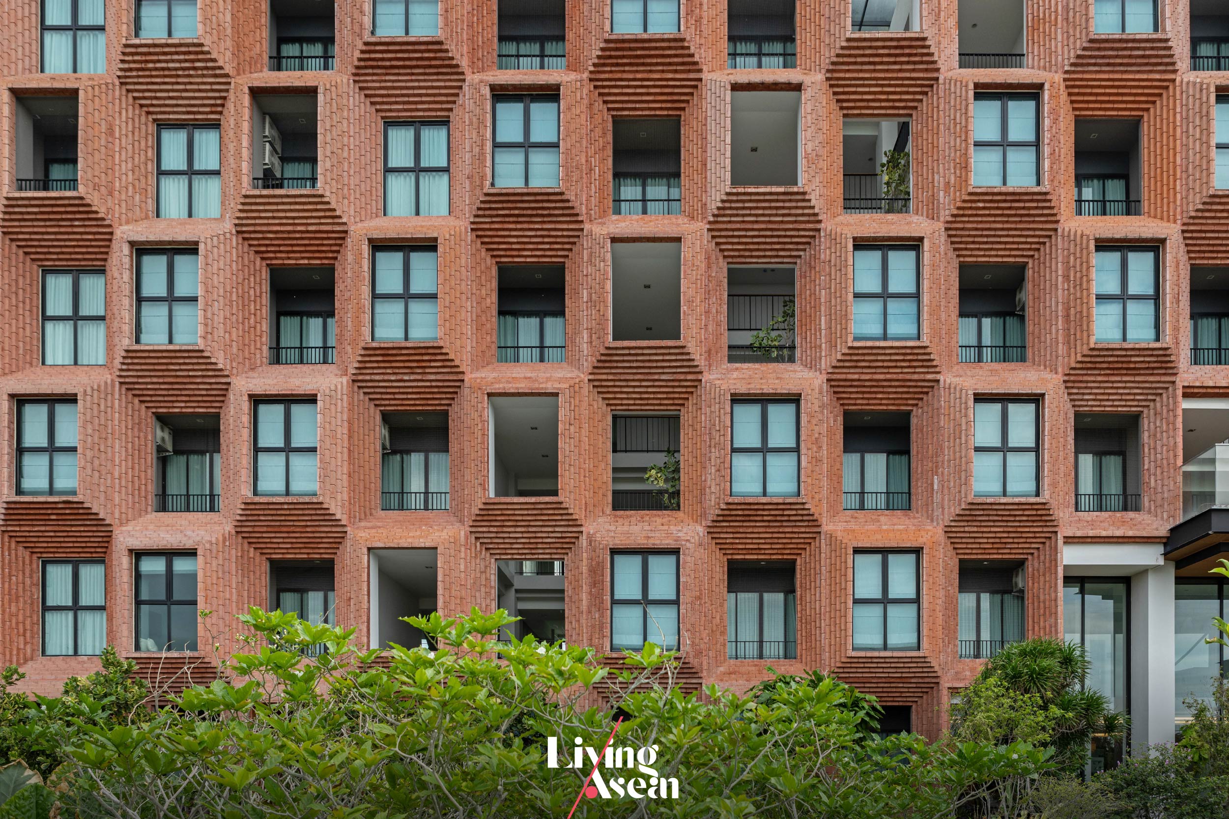
Pusayapuri Hotel U-Thong

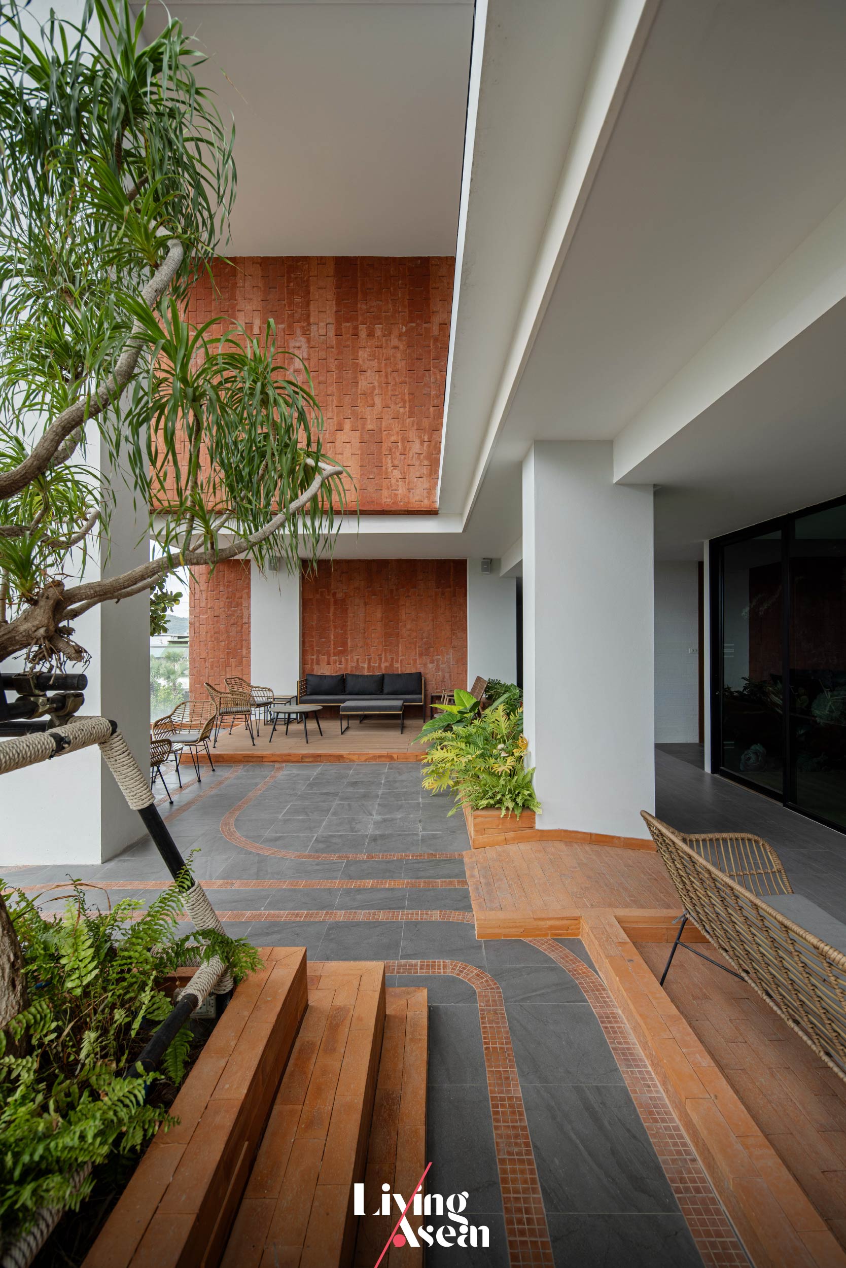
In the case of the Pusayapuri, the GRC façade sections arrived ready to be installed on site as soon as concrete frame construction was completed. It’s a dry construction system that’s suitable for all buildings or portions of buildings such as balconies with a variety of window bench seating designs. On the outside, they perform a dual function as façades and awnings used to protect against sun and rain.
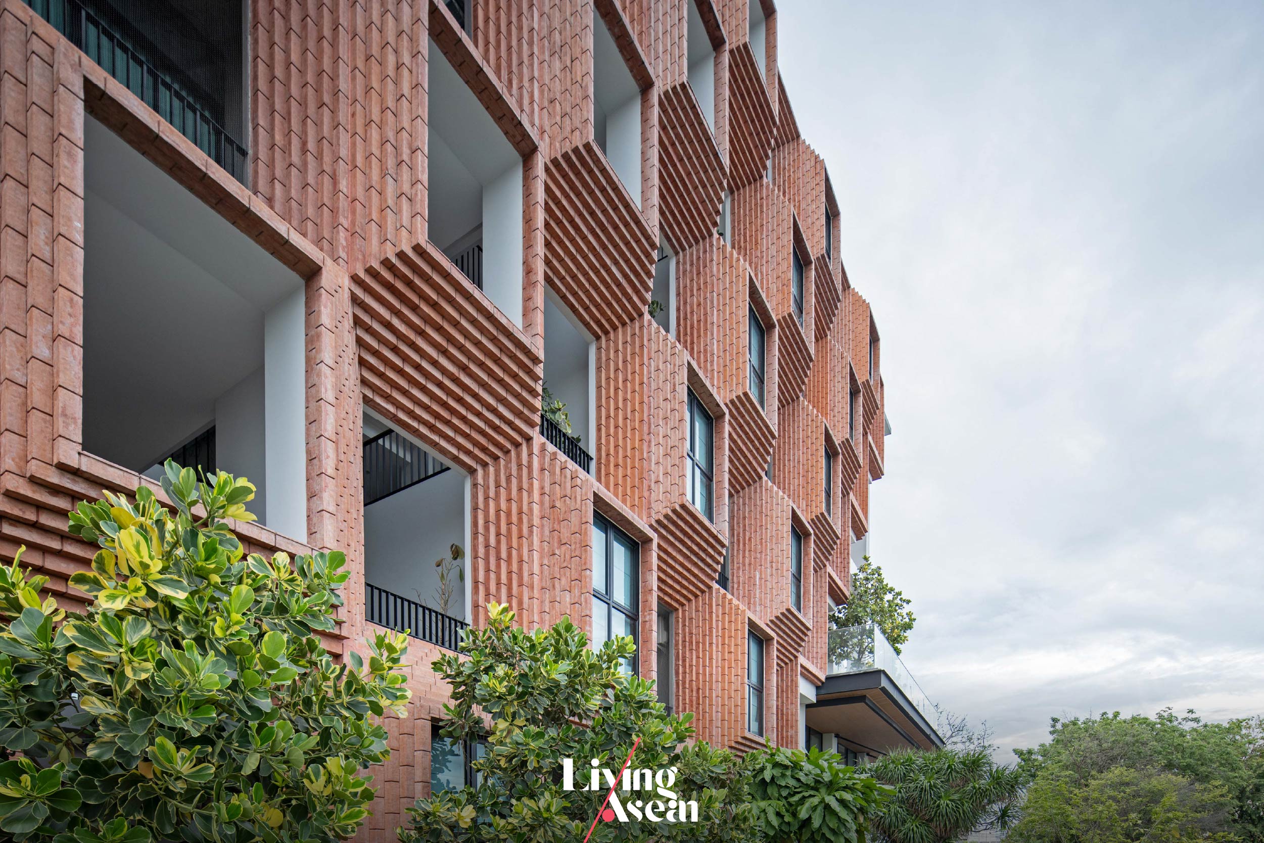
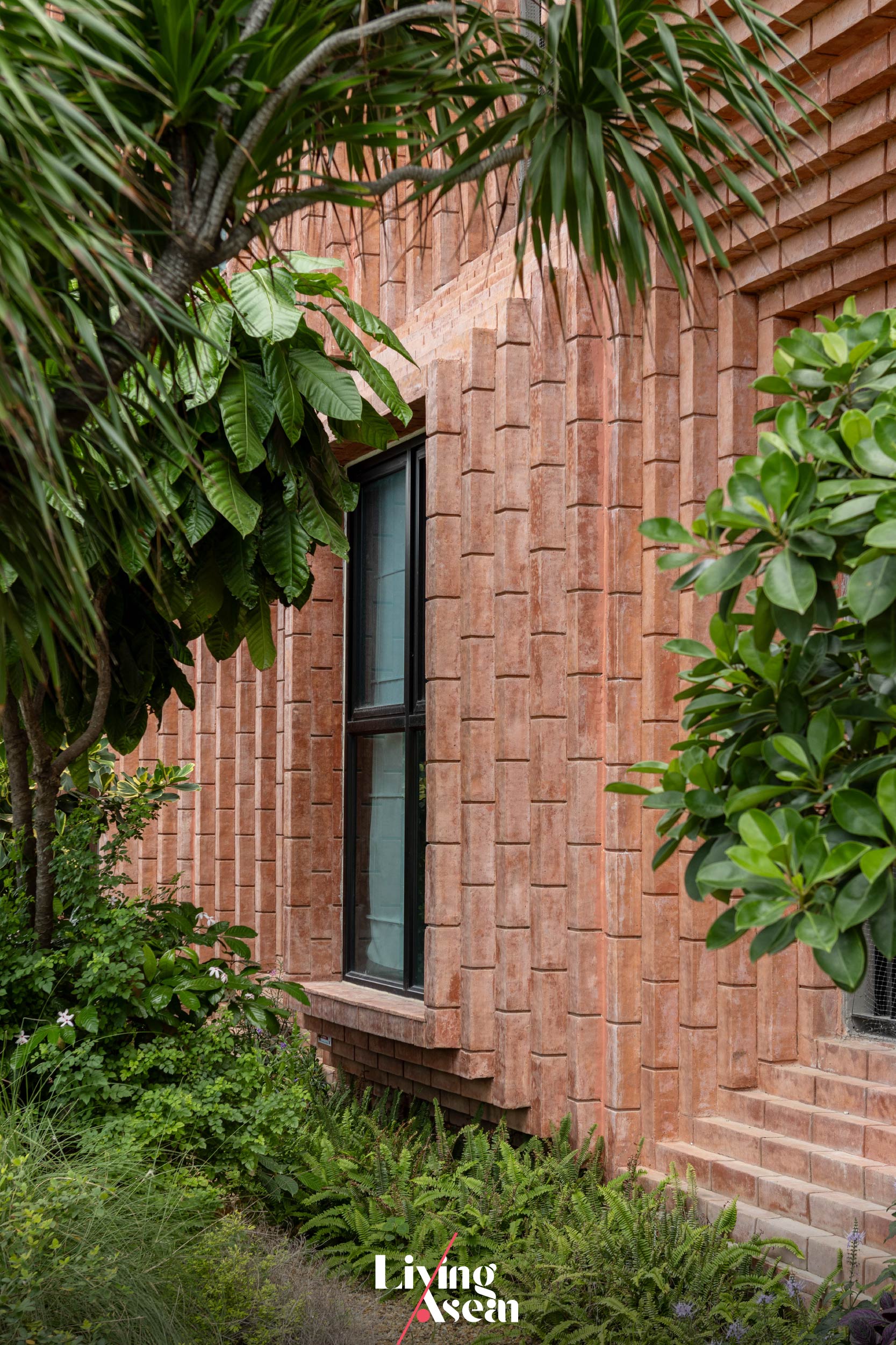
Pusayapuri Hotel U-Thong

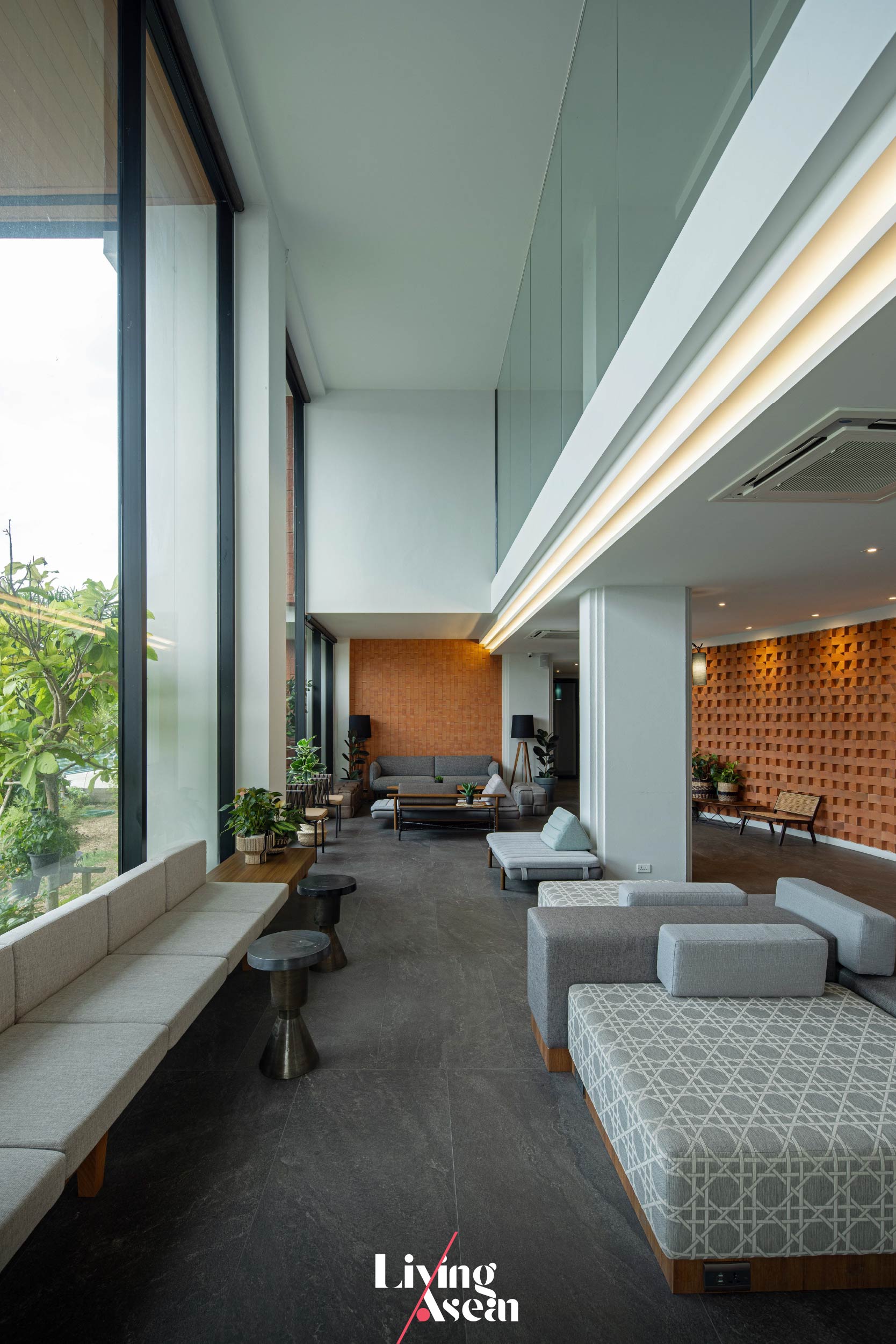
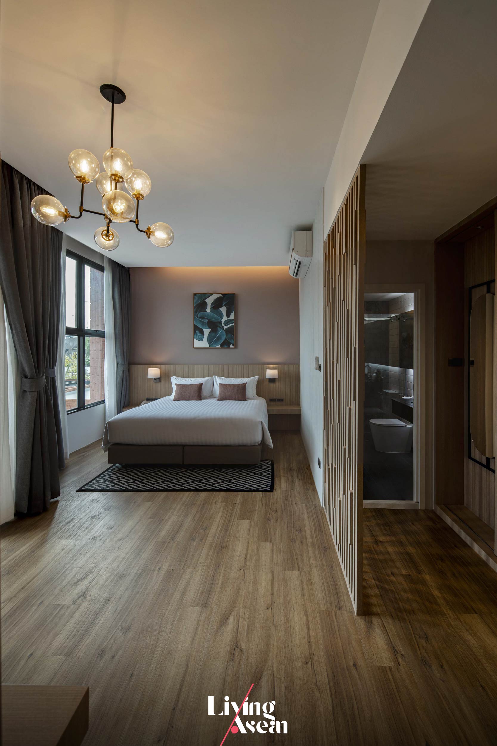
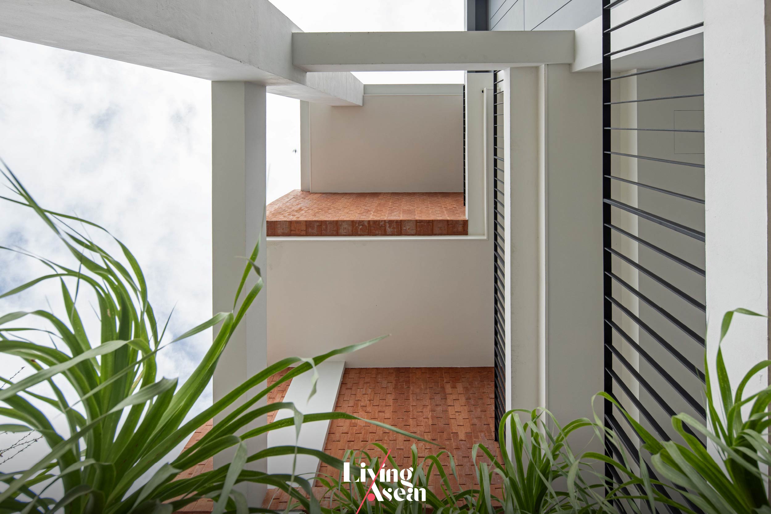
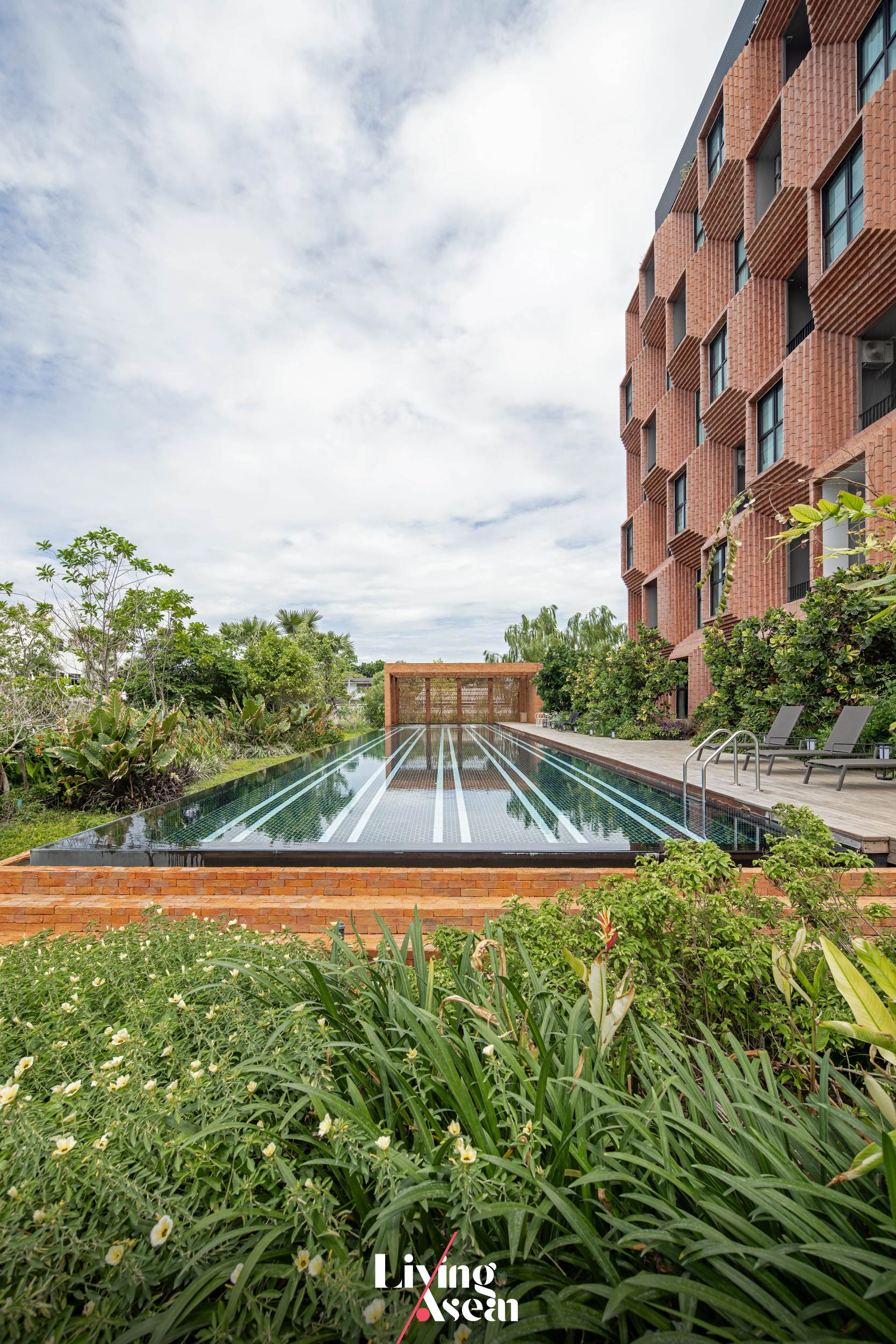
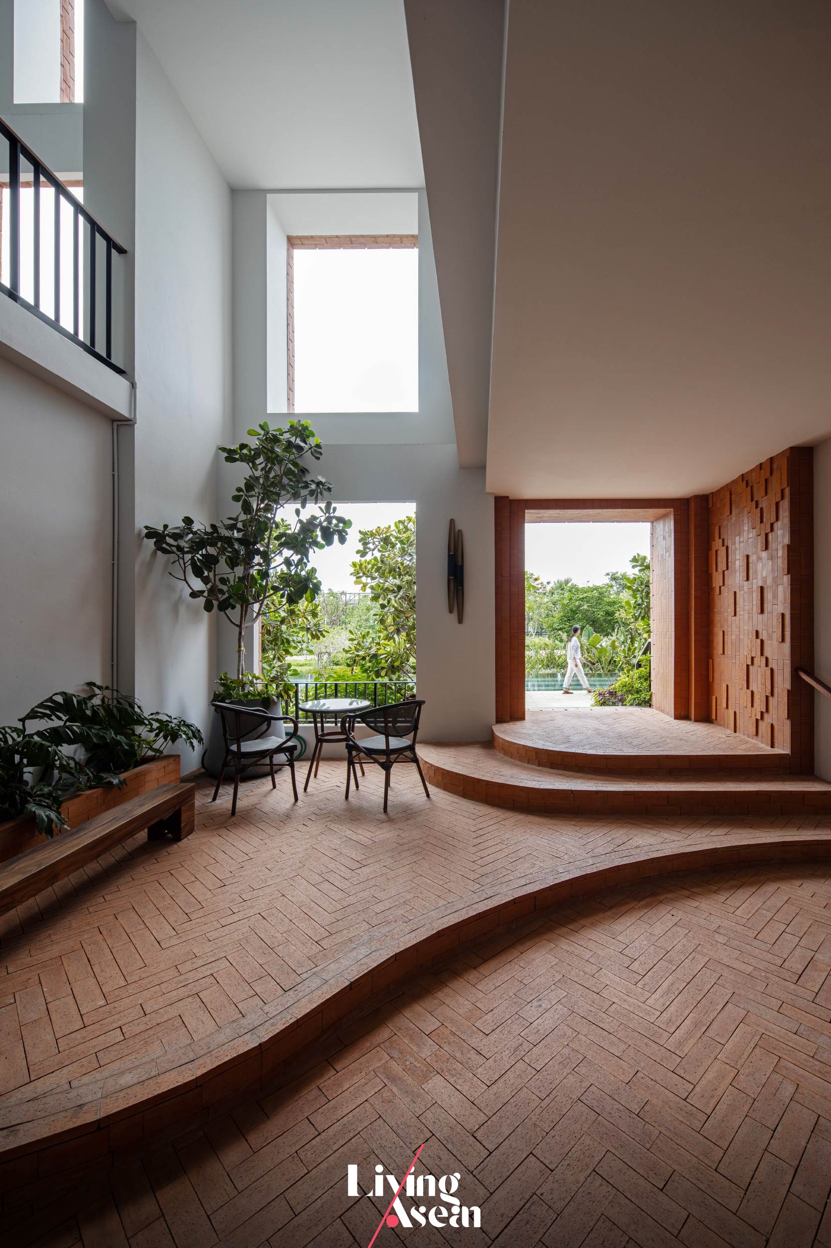
The Pusayapuri’s 56 spacious guest rooms provide a comfortable retreat in a historic town style setting. All of them are designed to create a light and airy atmosphere. Where appropriate, guest rooms are taken out to create a void of space for lighting and ventilation.
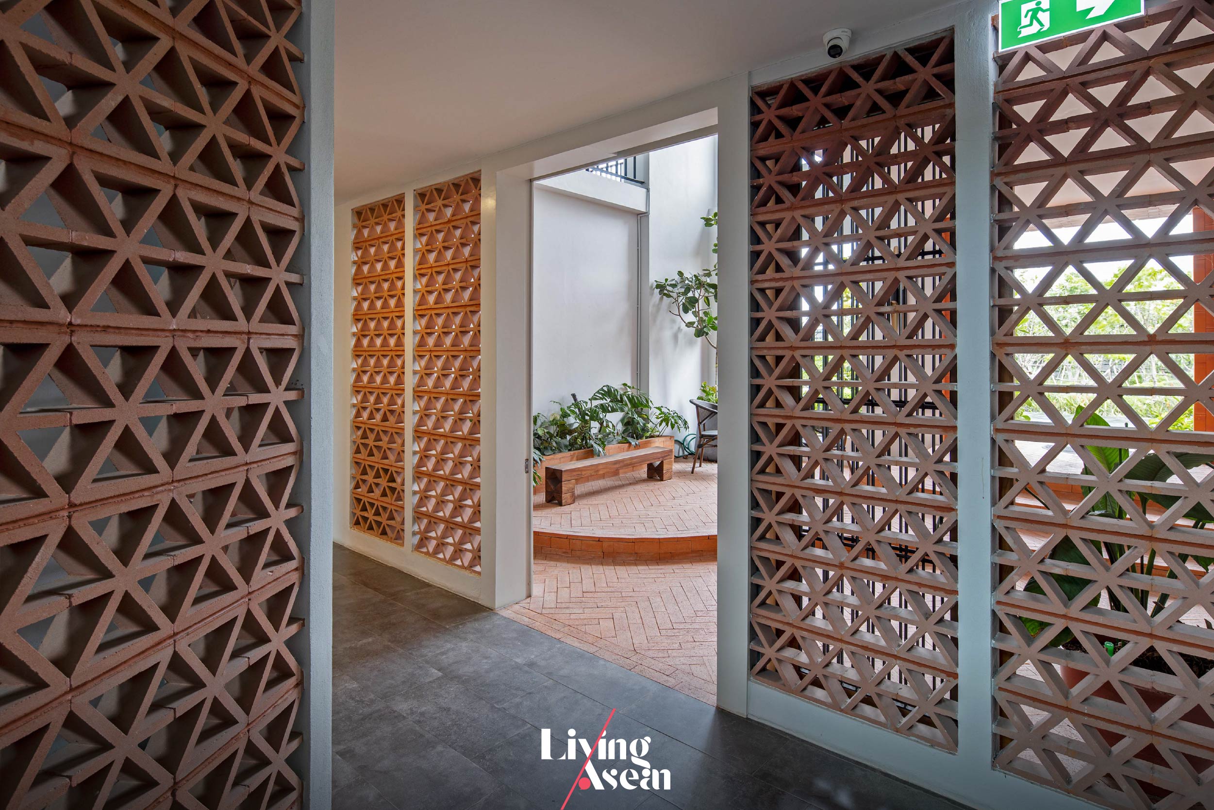
Pusayapuri Hotel U-Thong

Pusayapuri Hotel U-Thong

Pusayapuri Hotel U-Thong

The void of space starts from the first floor all the way to the roof top resembling a well-lit staircase when seen from a distance in the nighttime. Together, they ventilate the building by drawing fresh outdoor air inside and force warm air to exit through rooftop vents. The hotel loses some rooms, but it gains comfort from good ventilation. Plus, it’s a feature that adds rustic appeal to the overall design.
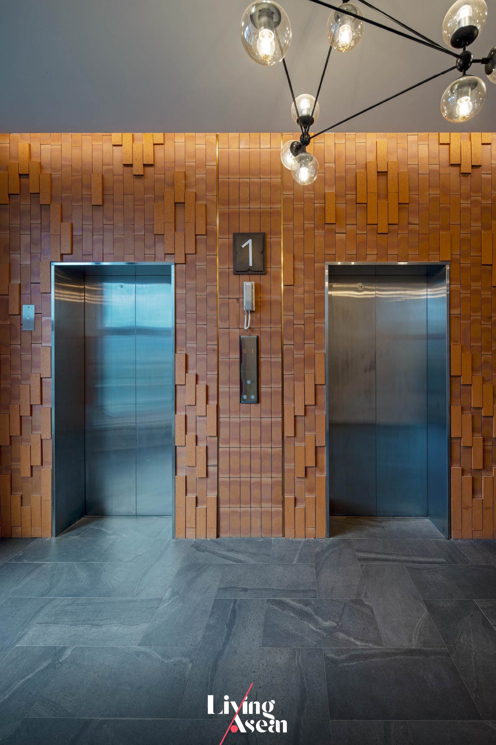
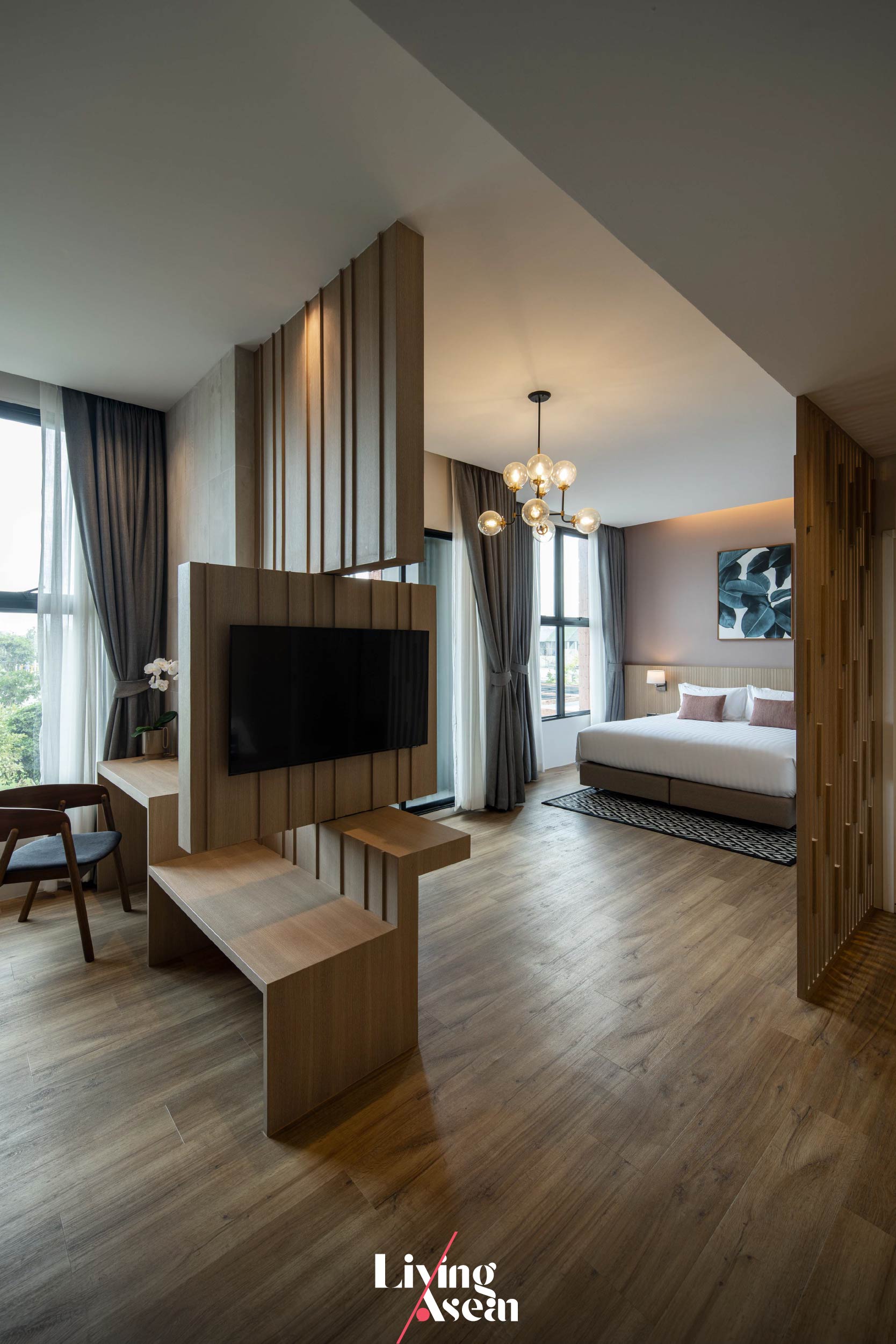
Pusayapuri Hotel U-Thong

The Pusayapuri presented both challenges and opportunities even for the experienced designers at EKAR Architects. The team was tasked with creating a hotel with the power of storytelling about the history and architectural heritage of U-Thong, plus turning it into an important landmark in the lives of all concerned.

What makes it original and unique is the hotel façade that bears the imprints of time and a civilization of years gone by — a masterpiece that creates a sense of calm in architecture and indoor thermal comfort. Swing by the Pusayapuri next time you sojourn in this part of Thailand.
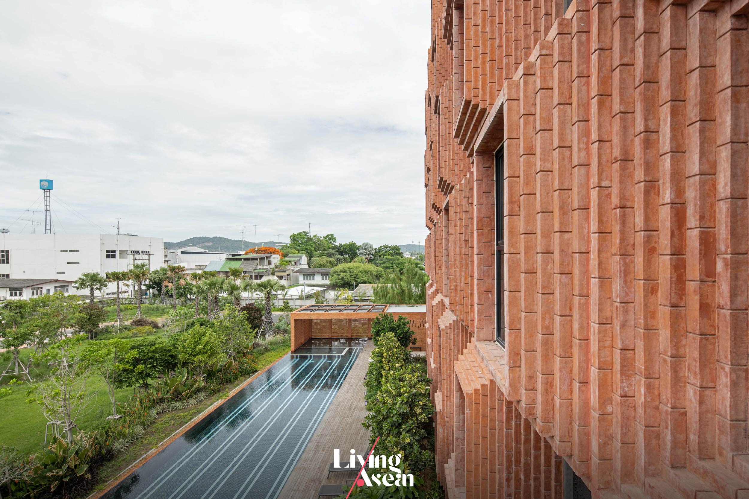
Pusayapuri Hotel U-Thong


Architect: EKAR Architects (ekar-architects.com)

Landscape Architect: Top Form Design Studio


You may also like…
Blackbird Hotel Hotel in BandungBlackbird Hotel: Hotel in Bandung Enlivened by a Round Honeymoon Suite Trio
Sep’on Heartfulness Center: A Stylishly Chic Boutique Hotel with a Narrow Frontage

Baan Muan: A Minimalist Thai-Style Waterfront House

Baan Muan: A Minimalist Thai-Style Waterfront House

/ Chiang Mai, Thailand /

/ Story: Wuthikorn Suthiapa / English version: Bob Pitakwong /

/ Photographs: Sitthisak Namkham /

An old-styled waterfront house was recreated for modern living in Chiang Mai. It is made up of a coffee shop, piano classroom and a private space for the family.

Waterfront House

“I want to emulate the Thai style waterfront home of the past, kind of set on land that slightly descends to the riverbank. Like so, the new home is designed with respect for nature. Meantime, it embraces all features that are up to date, from materials to style to character.” So said the designers when asked to elaborate on the concept behind this home project.

The handsome waterfront house featuring smooth exteriors and eye-catching roof design is affectionately called “Baan Muan,” literally home of baby Muan.

Waterfront House
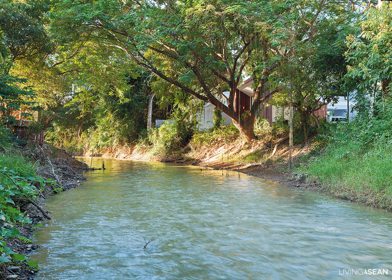
The Mae Kao, a tributary that flows past the property, inspires the owners to create an old-styled waterfront home. The design celebrates the water feature and pristine foliage that have long been the charm of this suburb of Chiang Mai.

The homeowners, Nathee and Kanokwan Nateniyom inherited this piece of land from their grandma. Their baby was born while the construction project was underway.

So both the home and the baby were given the same name. Ekapab Duangkaew from EKAR and Arthasith Kongmonkhol from Full Scale Studio were responsible for the design.

1
A well-kept lawn is used as the only access to the house’s main entrance. Walking on grass adds fun and excitement to nature inspired lifestyle.

As Ekapab put it, “We were so fortunate to have received full freedom to conceptualize this project. Arthasith and I then proceeded to develop a waterfront house design with an emphasis on relationships with the surrounding terrain features. Various functions were laid out based on their proximity to the water’s edge or existing patches of greenery.

“The next step was about translating the concept to meet the homeowners’ needs and personality.”

4
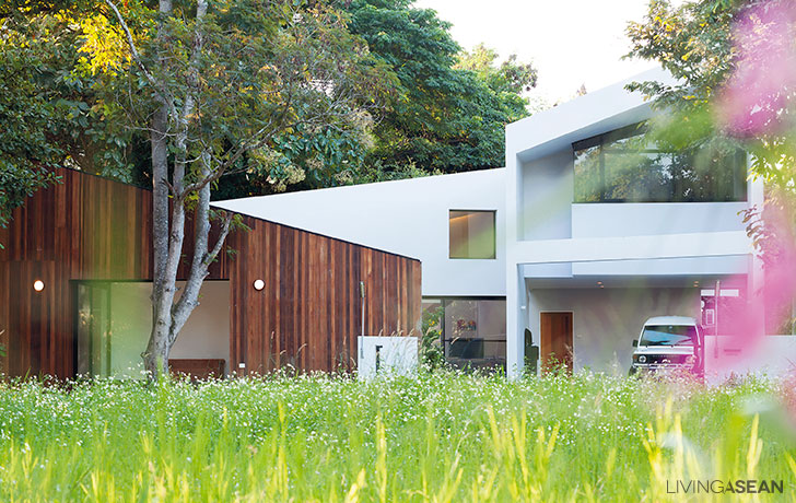
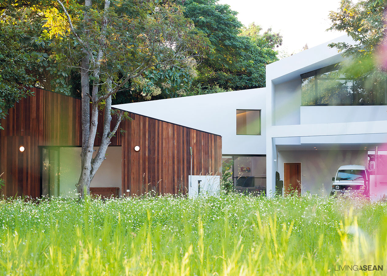
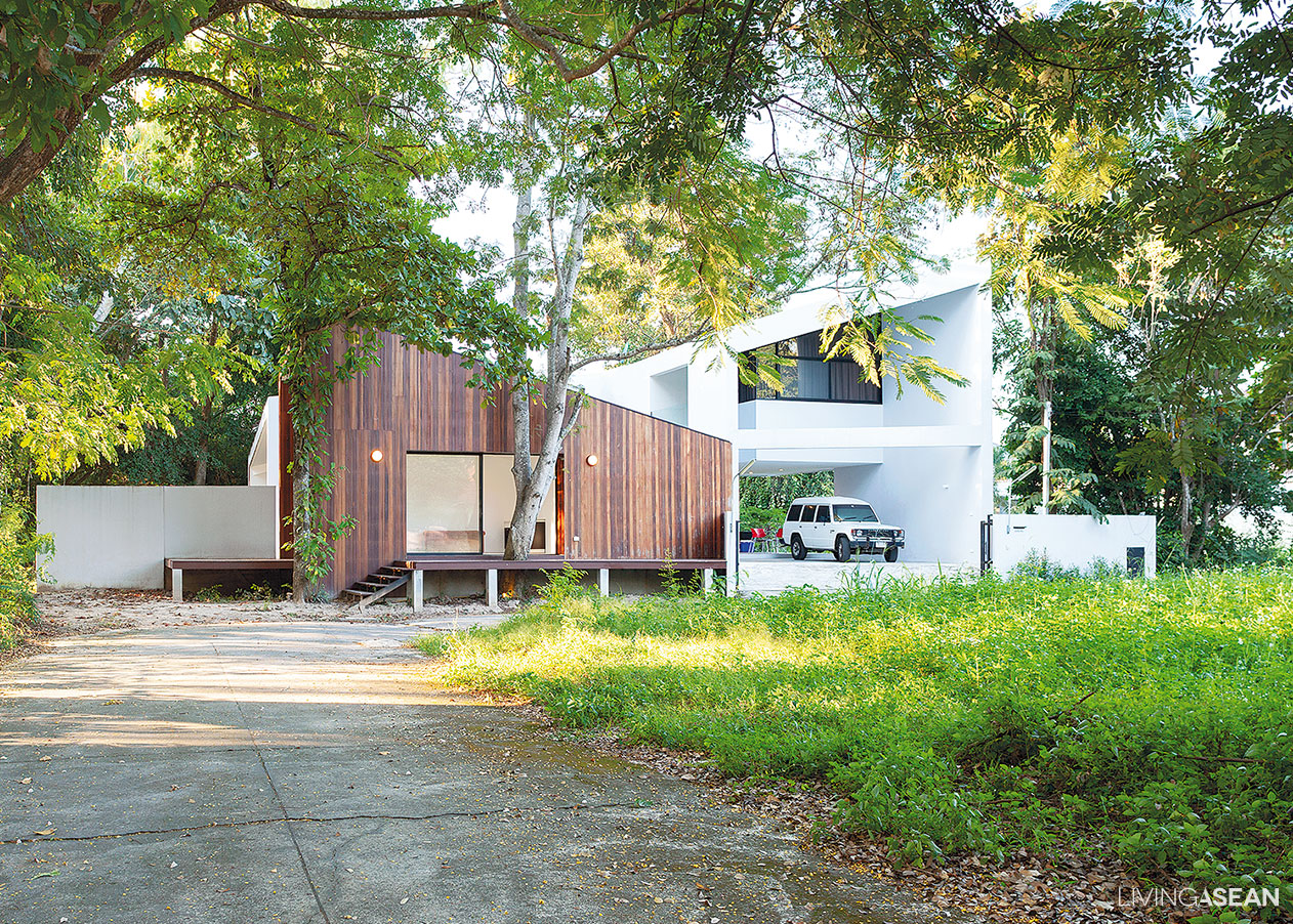
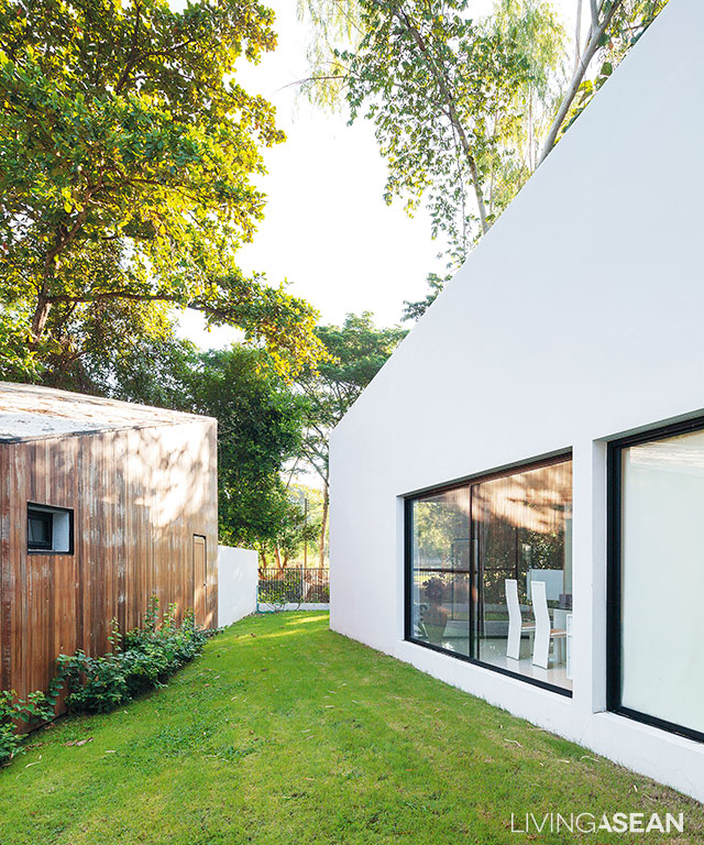
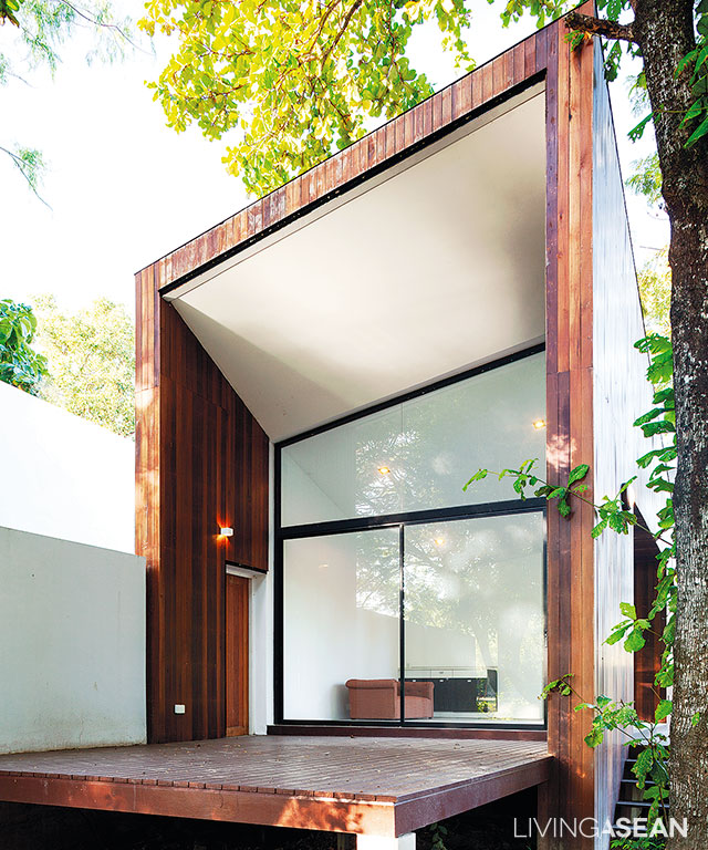
A coffee shop is the first thing visible from afar. It separates semi-public spaces from the private zone without obstructing views of the modern front home. Dark stained wood clad exteriors subtly set the shop apart from the rest of the property.

In so doing, the designers had to identify features that were typical of the waterfront house of the past. They looked into every design from Post-Modern to Minimalist in a bid to arrive at a common ground.

The final design showcased the main hallway as the centerpiece of this new home.

5
Nature permeates through the landscape that rolls down into the waterfront area below. Meanwhile, it serves as the dividing line between different functions on the property.

“At the time we didn’t have a specific design in mind. We just said that we preferred open spaces. My husband wanted to put Mom’s coffee shop in front. For us, we needed a piano room for practicing and giving music lessons at home. Basically, that was it,” said Kanokwan.

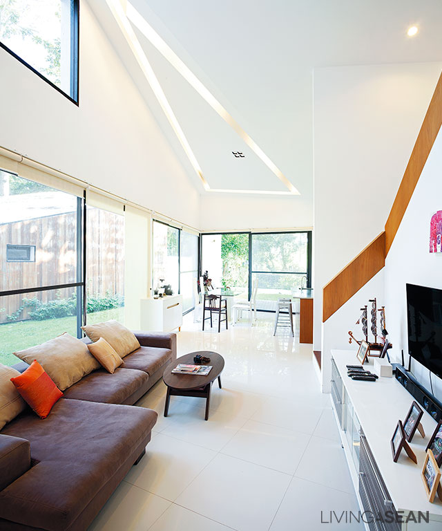
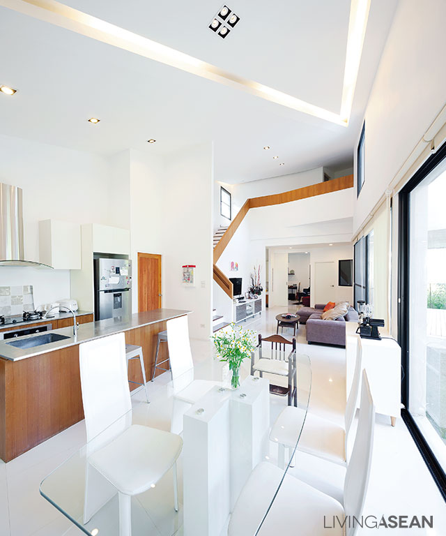
Hence the open interior space was the goal. The plan envisaged the main hallway, the kitchen and seating areas for everyone merging into one big space.

Waterfront House
The coffee shop features a sundeck that looks out over the waterfront area. (An interior makeover project was underway on the day we visited.)
7
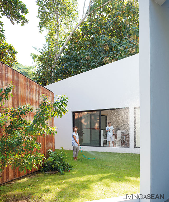
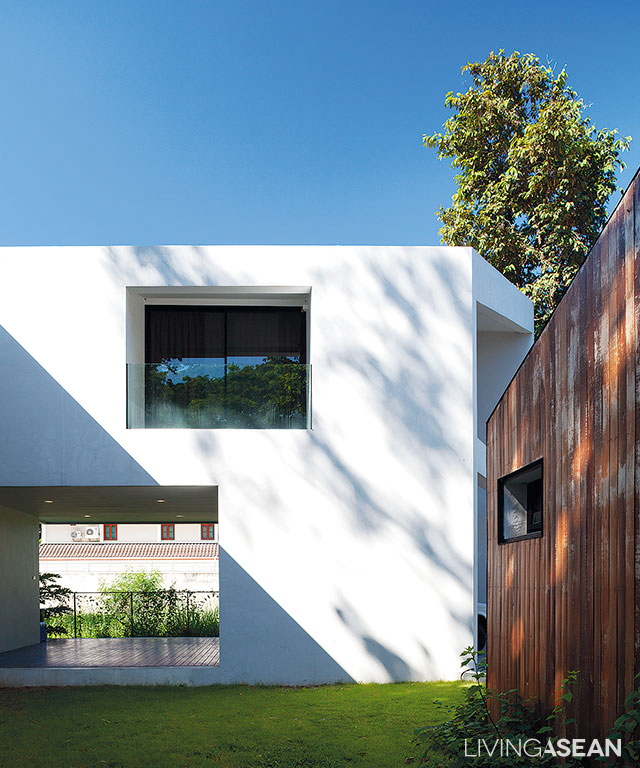
The white exterior walls showcase sharp geometric shapes as the designer intended. Clean line design advocates the uncluttered look typical of the minimalist style and leaves plenty of room for nature to pervade.

“I like sitting here,” said Nathee referring to the big dining table.“The waterfront is on this side. Meantime, the main entrance opens to the front yard. On the other side, Kanokwan and the baby are playing on the sofa. They make for relaxing interior spaces and I like it here.

“If asked to describe this home, I will just make it brief – cozy”

Waterfront House
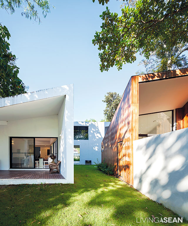
Like several picture frames coming together on a lush lawn, the home not only looks stylish on the outside but also adds variety to the rolling landscape.

The open plan design of the waterfront house meets the needs of this small family of three. Everyone is aware of everything that goes on inside the vibrant interior spaces. It is the kind of plan that merges all parts of the house into one great room.

The designers reserve the second floor for privacy. The first floor has a playroom for the kid and the piano room for Kanokwan. The rest is open.

9
Open plan design ensures that all interior spaces are easily accessible. Large windows allow abundant natural light and provide visual continuity to the water’s edge.
10
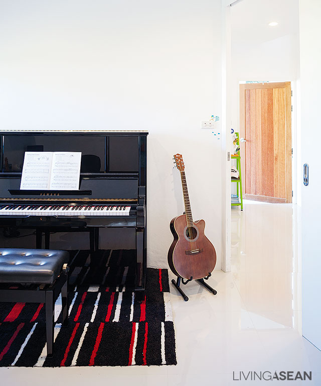
The child’s playroom makes way for family activity spaces for the time being. The piano was recently moved in here along with Dad’s guitar.

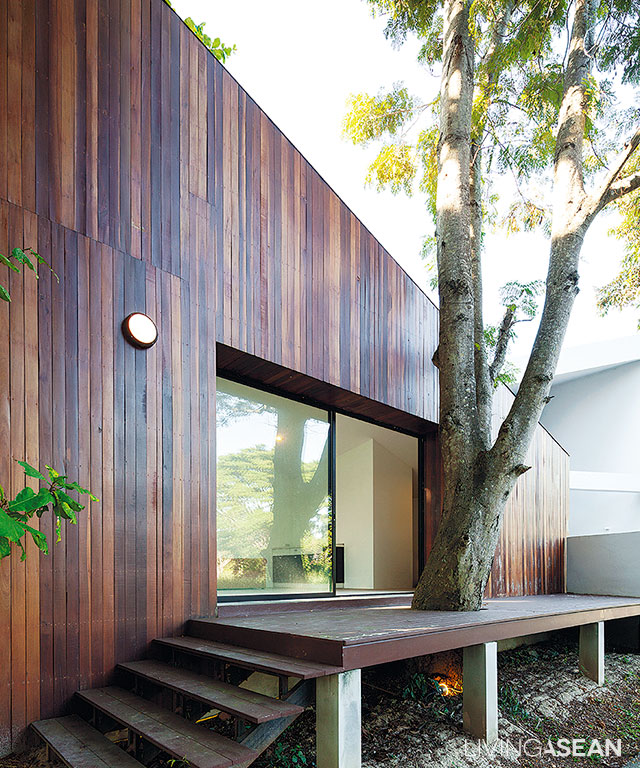
The property comes in two zones, business and residential. The coffee shop sits in front and is covered in natural wood palettes.

From the outside looking in, the roof design is eye-catching in every respect. As a matter of fact, its unique look is dictated by interior design needs.

11
The designer puts bedrooms on the second floor, leaving the spacious first floor for seating spaces. Kanokwan plans to give music lessons at home in future.

“It has to do with how we want to view the great outdoors from within the home. For this reason, the main hallway steps aside just a little bit so that the waterfront area can be seen in full view from the bedroom. Likewise, one side of the coffee shop offers a sundeck that overlooks the water’s edge.

“It is never meant to be jazzy. Rather we take into account advantages and disadvantages of every component before arriving at the final design,” Nathee explained.

Waterfront House
The homeowners wanted to leave the existing tree where it was, and the designer got that. So the terrace was built around the tree while the building itself was kept a good distance away.

By now, our readers probably feel they have been mistaken all along about design intentions. A house that looks showy at first sight may not be showy after all. Rather it is designed for easy waterfront living based on existing terrain features and homeowner needs.

All things considered, it strikes the right balance to showcase a new kind of waterfront home, one with an eye-catching minimalist style.

13
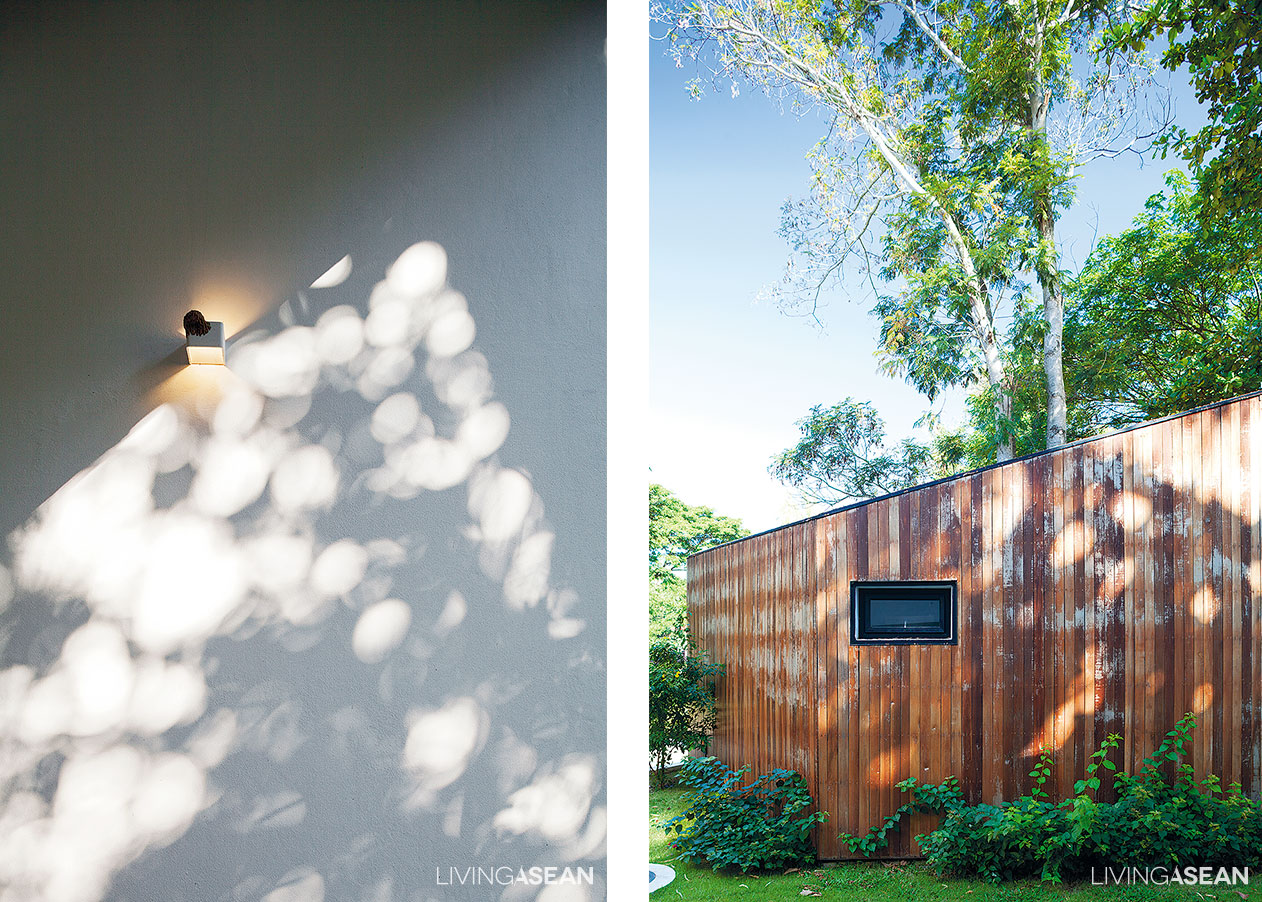
[left] The lacy shade of tall trees casts interesting light patterns on the home’s white exteriors. [right] An artist’s rendition shows relationships between building formations and areas near the water’s edge. The drawing demonstrates how existing trees are preserved while the land is being readied for the home project.

Owner: Nathee and Kanokwan Nateniyom

Architect: EKAR and Full Scale Studio


X