Blog : HOUSE

Dreamland Villa with European Elegance

Dreamland Villa with European Elegance

This English-country-style vacation home with a vast European-style garden is quite an elegant one.

/// Thailand ///

Story: Warapsorn /// Photos: Soopakorn Srisakul, Rithirong Chanthongsuk /// Style: Pakhawadee Phahulo /// Architecture: Phumisak Thiankhaprasit /// Interior Decoration: Nitsanat Jaroenthaithawee /// Garden Design: Kongyos Boonrak and Thapana Vachiramas /// Landscaping: My Garden Corner

A rose arbor leads into the center of the garden. Its smooth grass lawn makes for a truly distinctive look the owners love.
A symmetrical play of hedges and plant beds with squared or rounded frames are interspersed with sweet flowers that relieve any harshness.
This grey house in the “English Country” style stands out in the middle of a European-style garden. Open lawns, variegated flowerbeds and flowering plants are spaced at intervals.

Divided into small sections, the garden starts at the front of the house, with a neatly trimmed Hokkien tea hedge formally arranged for a welcoming effect. This spot has an intentionally playful feeling. Seasonal flowers are planted in open areas while the formal design is preserved with the Hokkien tea hedges framing the flowerbeds.

Next to the house is a cobblestone path; here landscaping is in “mixed border garden” style. Assorted plants with detailed leaves and bright flowers grow together for a natural look, rather than clearly separated into plots. From here two more spots are visible; a circular grass lawn surrounded by rose beds, and a courtyard set up like a chessboard.

Behind the house is a beautiful and varied rose garden, once more hedged in by Hokkien tea plants. In spite of the single level garden design, there is a background of tall trees to dispel any sense that dimension might be lacking.

Hokkien tea hedges are laid out in elegant symmetrical lines, giving just the right feeling of formality to this expansive garden.
Big “chessboard” in the garden: Concrete squares alternate with savanna grass. Cement chess pieces add narrative.
Mountains and tall trees fill out the landscape, making the garden appear like a natural continuation of local topography.

Stepping into the house you still feel the owners’ dedication to the natural world. Glass doors all around open on the beautiful garden outside.

Each bedroom on the second floor has a private balcony for coming out to sit, feel the breeze, and enjoy the garden. A simple look around shows that the European garden, plants, and nature itself are things this family takes delight in, and provide a true retreat from the workaday world.

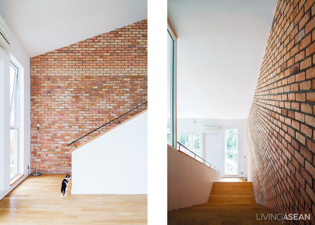
The parlor has lots of openings for outside light. One wall is of brown brick with orange accents, rising all the way to the ceiling to add visual warmth.
The dining area connects to the parlor, which has a lower ceiling.
013
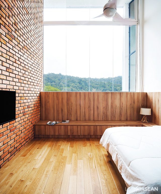
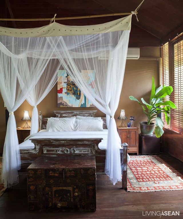
The bedroom has a warm feeling even with its cream-colored drapes, bedstead, quilt, and wooden floor.
Inside the arbor is a glass table, attractive and comfortable to use.


Link: http://apinyagarden-coffee.blogspot.com/2014/05/my-garden-corner.html


A Light and Airy Home Goes Big with Lush Tropical Gardens

A Light and Airy Home Goes Big with Lush Tropical Gardens

/ Bangkok, Thailand /

/ Story: ATH / English version: Peter Montalbano /

/ Photographs: Sitthisak Namkham / Styling: Pakhawadee Pahulo /

Set among lush greenery and a relaxing atmosphere, this light and airy house with gardens brings the whole family closer to nature.

house with gardens
The swimming pool area features a large open space for walking. For simple maintenance, in some places plots of spike moss are planted instead of grass.

After living in an old house on this same plot for 30 years, the Srijakarin family bought additional parcels of land and rebuilt a comfortable home with gardens for three generations of family members.

The newly rebuilt house is divided into three parts. The first is the old house, which was set aside for the owner’s parents. It was remodeled with the comfort of older people in mind.

The second building is a two-story house where the owner lives with his family, and the third a modern Tropical-style structure with a relaxing, resort-like atmosphere. The couple keep their belongings and stay here during weekends and holidays. In the fewest possible words, it’s about reconnecting with nature at home.

house with gardens
Trees and shrubs shade the semi-enclosed pathway connecting the two houses with the swimming pool, giving the sense of walking through a sparse jungle.
house with gardens
The overall harmony of garden and house architecture creates a relaxing atmosphere.
house with gardens
The stairway overlooks a courtyard between the two houses, showcasing the English style in landscape design.

The front yard is in the English style characterized by neat, clean lines. There are park benches set in corners and trees in zones, while bright flowers thrive in large weathered stone urns.

The inner zone is a Tropical rainforest garden. There’s a good-sized waterfall and the gentle sound of a small brook. The garden is filled with verdant green mosses under the shade of trees carefully selected with the help of the landscape architect.

house with gardens
A delightful Tropical forest garden provides an oasis of calm in the courtyard between the two houses.
house with gardens
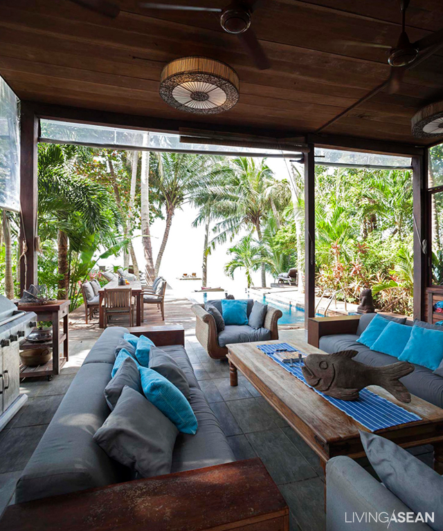
A veranda along the outside of the house lies in the warm cocoon of a lush Tropical resort atmosphere the owners really love.
house with gardens
A wide-angle view shows the interaction relationship between residential architecture and surrounding lush vegetation.

It’s not easy to put together a landscaping combination like this, but in the end a skillful and artistic integration of components, textures, patterns, and colors brought about a lasting and unified harmony of two garden styles – English in the courtyard, and Tropical forest upfront.

The living room showcases the beauty of open-concept design, while a double-height ceiling gives the feeling of openness and relaxation, all with a view of the garden.
[Left] The multipurpose room has a big natural wood table ready for all sorts of activities, from casual work to comfortable pleasure reading. / [Right] The pantry is in white, designed for increased light and a feeling of space and comfort.
[Left] The multipurpose room has a big natural wood table ready for all sorts of activities, from casual work to comfortable pleasure reading. / [Right] The pantry is in white, designed for increased light and a feeling of space and comfort.
The dining room is ringed by glass to let in natural light during the day. The dark furniture color reinforces a warm, welcoming atmosphere.

All things considered, it’s a house with beautifully landscaped gardens that’s the perfect fit for an extended family, an expression of pleasure and the combined happiness of the three generations that live here.

[Left] The master bedroom is furnished in a chic, fashionable way that invites relaxation. / [Right] The downstairs bathroom has a classic décor, with natural stone floor, walls, and washbasin counter. To one side, mirrors give a sense of spaciousness.
[Left] The master bedroom is furnished in a chic, fashionable way that invites relaxation. / [Right] The downstairs bathroom has a classic décor, with natural stone floor, walls, and washbasin counter. To one side, mirrors give a sense of spaciousness.
For an elegant and practical look, pantry décor is primarily in natural materials and colors.
house with gardens
[Left] An outdoor “living room” for the family elders. / [Right] A large sculpture adds dimension and narrative to the Tropical forest garden.
house with gardens
A spot in the garden where plants grow as naturally as they would in the wild. The natural effect is enhanced by setting plants at different heights, from ground cover through low shrubs, on up to tall vegetation.

Architecture/Interior Designer: Architecture and Interior Office Co., Ltd. (AIO) by Kowit Suriyporn (www.aiodesigns.com)

Garden Design: Worawut Kaewsuk


Visit the original Thai version…

ความหมายของ…ที่อยู่ ณ บ้านโมเดิร์นบรรยากาศคลาสสิก แห่งนี้


You may also like…
Modern Lake Home in a Peaceful Country SettingA Modern Lake Home in a Peaceful Country Setting

A Modern Steel Framed Home at the Water’s Edge

A Touch of the Exotic

A Touch of the Exotic

For his second home, the owner of The Library resort in Samui sets his mind on a vibrant, exotic look. A style that is totally different from his first residence.

/// Thailand ///

Story: Gobbi Chirawat /// Photos: Jirasak /// Assistant Photographers: Nattaphong /// Style: Praphaiwadee /// Designer: Amphon Jiramahaphokha

001

The pantry is striking. With its red wall and ceiling and multicolor drapes, the dark metal Arabian-style partition setting it off from the rest of the home.

The owner was already familiar with  straightforward, minimalist interior decoration. So, he wanted to change to a more intense mood with mystical charm. Yong (Amphon Jiramahaphoka), a designer of the award-winning SODA group was called upon to complete this creative project.

Dark colors alternate with paler ones, giving dimension to the "living room." The light gray wall is adorned with framed pictures. The teakwood floor is polished to a lighter shade, contrasting with the dark ceiling, and opens out onto the balcony, with its set of wicker chairs.
Dark colors alternate with paler ones, giving dimension to the “living room.” The light gray wall is adorned with framed pictures. The teakwood floor is polished to a lighter shade, contrasting with the dark ceiling, and opens out onto the balcony, with its set of wicker chairs.

“I bought this room three or four years ago because of its prime location. But the new decoration was done last year. I removed the flooring, the ceiling and the walls. To avoid disturbing the neighbor, the work was limited to few hours per day. It took about eight months in total.” the owner explained.

Dark colors alternate with paler ones, giving dimension to the "living room." The light gray wall is adorned with framed pictures. The teakwood floor is polished to a lighter shade, contrasting with the dark ceiling, and opens out onto the balcony, with its set of wicker chairs.
The room is vibrant with a strong artistry at work. The TV sits on a mock up fireplace. LED lights give a romantic mood during the nighttime.


A perfect blend of colors and cultural influences gives the style a touch of the exotic. The entrance way, paved with black granite, makes the room feel cool and comfortable. The opposite walls features pictures and plates with vintage European designs. The kitchen has an elegant pantry designed for easy dining and food preparation.

The room is vibrant with a strong artistry at work. The TV sits on a mock up fireplace. LED lights give a romantic mood during the nighttime.
With a convertible sofa bed, this workspace also serves as a guest bedroom. Various types of decorative cloth highlight an Eastern flavor. Lighting under the sofa keeps things interesting.

The red wall and ceiling contrast strikingly with the wrought-metal Arab-style partitioning that sets the space off from the living room. There is a set of coffee table and black chairs imported from India. A sofa of bright navy blue is set on an Arabian rug, whose gray matches the wall color. The TV stands on a chic piece of shelving built into the wall to mimic a fireplace.

A built-in cabinet with a fold-down desk. Cabinets are draped with metal mesh and pleated cloth, striking the right balance between hard and soft materials.

Made for a romantic mood, the dark-colored ceiling is fitted with recessed LED lights that seem sparkling like stars at night. Next to the corner is one of the owner’s favorite places — the workroom that doubles as a guest accommodation. The walls are painted green, contrasting with purple curtains to bring out beautiful textures when sunlight enters. Arabian fabrics are seen in sofa covering, pillowslips, the carpet, and the silk cloth that covers the wall behind the built-in bookshelf. These intriguing touches are the signature of the designer.

A connecting walkway features black granite flooring with a gold trim. It is designed to match the mysterious-looking ceiling in black.

The bedroom features the most straightforward décor. Relaxing white walls pair with parquet flooring and a large window that allows plenty of natural light. Yong puts his signature details everywhere, especially the black Italian lacework that is drawn tight against the glass pane, separating the bed from the living room, while letting the light through.

A clear glass wall sits behind the headboard. Black-dyed lace allows light to shine through. The ceiling comes in black adorned with LED lights.

Excitements add spice to life, but make sure it’s to your liking. The same applies to this homeowner, who has  ventured into the exotic territory. The vibrant style may be unfamiliar to many of us, but for him the enthusiasm is worth it.

The bedroom's parquet flooring is set in the fishbone pattern. Wall décor makes for a strong contemporary style consisting of framed pictures, beautiful hangings, and movie posters of various origins.
The bedroom’s parquet flooring is set in the fishbone pattern. Wall décor makes for a strong contemporary style consisting of framed pictures, beautiful hangings, and movie posters of various origins.
Campus Theme Combines Seriousness and Fun

Campus Theme Combines Seriousness and Fun

Sharing a condo with siblings, even when they have different tastes, can be a lot of fun.

/// Thailand ///

Story: Montra ///  Photos: Jirasak  /// Style: Praphaiwadee /// Designer: Kritcha Sinchaothong, ‘Elevacon’ Interior Design Work


The designer put a hint of Japanese style with this built-in table. It can be used as a sofa, too.
The rooms are not very spacious, but the design allows for large, attractive overhead lamps in the living room because of its raised ceiling.

Three young sisters, came to live together in a two-bedroom condominium. Naturally, interior design and décor was high on the list of priorities.

The eldest sister saw a TV program. Impressed with the detailed interior décor there, she searched out the designer, Kritcha of ‘Elevacon’ Interior Design Work, who agreed to take on the job.

003

“These three young ladies have truly differing tastes,” said the designer. “The oldest likes a combination of English and American styles. The middle one likes the Japanese minimalist style, while the youngest favors realism, showing the natural surfaces of materials.”


The campus theme combines seriousness and fun. To reflect that, the combination of dark and light wood are used and different styles of lamps are installed.

The designer said: “An important feature here is the sliding wooden partition we put in to separate the sleeping area from bathroom and dressing room, so that each of them has privacy. With one person at a time in each section, no one feels cramped.”

The small bedroom of the eldest has a clear underground American hip-hop flavor. The gray brick wall is really stylish. “The eldest one has a clear concept on both preferred design and functionality. She even let me know exactly what she would put in her closets.” the designer commented.

At the front door is a floor-to-ceiling shoe storage cabinet. Next to it, a 15-centimeter-deep storage shelf is raised off the floor to avoid a cluttered look.

For the common area–living room, Kritcha felt it would be a place all the young ladies used for having friends coming over, so she did it up in a campus theme. To lighten the reserved atmosphere of a student lifestyle, she added some playful touches: plants, and entertaining decorative items with unique and interesting shapes.

The youngest sister likes to cook, so the new pantry is expanded, adding an L-shaped counter for an extra space. The clothes washer and dryer are covered with matte PVC film, a tasteful addition for an overall harmony.

Before leaving, the designer whispered to us how these youngsters had altered her original concept quite a bit. She had seen them start really having fun, coming up with new ideas, bringing things they wanted to use to spice up the ambience.


The shared bedroom is orderly and simple. Still, there is interesting detail: lighting works are hidden inside the lowered ceiling panels. The gaps in the ceiling are echoed with the long mirror set in the wood wall paneling.

“It was fun to watch them doing this,” she said. “Together, they were like school girls. Each one bringing in so many different things. It was like they really went back to the campus!”


Bu’s bedroom offers a bit of underground chic with its stylized gray brick wall, reducing any seriousness implied by the brown leather bed upholstery. The shelf’s inner mirrors add an interesting dimension to the room.
The eldest sister’s bedroom offers a bit of underground chic with its stylized gray brick wall, reducing any seriousness implied by the brown leather bed upholstery. The shelf’s inner mirrors add an interesting dimension to the room.
Beautiful Contemporary House Design for a Good Life

Beautiful Contemporary House Design for a Good Life

/ Bangkok, Thailand /

/ Story: Ajchara Jeenkram / English version: Peter Montalbano /

/ Photographs: Soopakorn Srisakul / Styling: Pakhawadee Phahulo /

A good life begins at home. This beautiful contemporary house is, no doubt, a reflection of that, plus it provides a fine example of how limitations or site issues can be overcome. Because the land has a narrow frontage to the street, the house is built right up close to a neighboring home. So every square meter counts and has to be used wisely.

contemporary house design

On the whole, it’s a visually stunning design. The modern-style home boasts a distinctive atmosphere that gives it a European flavor. Especially worthy of attention is an intriguing combination of materials such as stone masonry and craftsmanship in the metalwork.

From the outside the house doesn’t appear large, but inside, it’s actually quite spacious. The building has three floors; the first of which holds a common area consisting of a living room, dining room and pantry. The second and third floors are for rest and relaxation.

contemporary house design
Gorgeous privacy fence ideas boast the beauty of stone masonry, wood and metalwork gracing the main entryway.
contemporary house design
The living room is well-appointed and uncluttered, thanks to there being only a few pieces of furniture. The coffee table at the center has hidden drawers for easy storage.

To build the home on a long and narrow lot, the design team at Workspace Architecture Studio comes up with a stretched house plan that puts as much usable floor space as possible in the front and back, yet still leaves enough room for a courtyard filled with fresh greenery for year-round decorating.

contemporary house design
The dining room is decorated in a modern style with a mild classic flavor from stone furniture, candelabra-like ceiling lamps and a cross-shaped table legs.
contemporary house design
A beautifully patterned granite-topped table and leather chairs give the room a classy but relaxed atmosphere.

To overcome construction site limitations, classic design concepts are brought into practical use. Among others, beams and pillars are built in a way that blends with interior décor, while other support structures provide decorative continuity and spots to conveniently hide electric wiring.

A black steel-frame staircase offset with vertical lines gives the interior a light and airy feel.
Dimmed light in the room builds a warm mood for soft and airy interiors. Décor is mainly of granite and wood while an opening is provided for ventilation and natural light.
Bathroom décor of natural wood blends well with white and gray.

The overall effect is impressive. Authentic material surfaces, including stone masonry, metalwork, wood and brass, are left exposed for aesthetic and functional reasons. The stone surface, especially, has its own unique pattern. It’s also durable, lasting for decades, and capable of adding to the variety of textures in the house.

A high-ceilinged bedroom comes in soft-colored décor. Recessed ceiling lights add dimension, creating an illusion of an even taller space.
contemporary house design
The room for working and reading is located on the top floor. The true surface of the wood beams is exposed for the hint of a loft environment.

As for furnishings, the decorative accessories and furniture, both floating and built-in, are very much a part of the custom design. They are thoughtfully devised to create a harmonious look and, at the same time, perform a dual role in overcoming site limitations and fulfilling the house owners’ needs.

At the end of the day, it’s about making this contemporary home a happy place for everyone in the family.

contemporary house design
Due to limited space, the courtyard and swimming pool are narrowly aligned along the outside of the building. Yet there’s room for plants to thrive luxuriantly along the fence wall for privacy and relaxation.

Architect and Interior Designer: Workspace Architecture Studio, by Worapoj Linkanokrat and Wirawut Nonthawet


You may also like…
ReGEN House: Modern Home, Thai Concept, Great for Family Members of All Ages

Urban Courtyard House for an Extended FamilyUrban Courtyard House for an Extended Family

An Amazing Transformation from the Traditional to the Modern

An Amazing Transformation from the Traditional to the Modern

/ Bangkok, Thailand /

/ Story: Supachart Boontang, Naruwat Plaimee / English version: Peter Montalbano /

/ Photographs: Sitthisak Namkham / Styling: Pakhawadee Pahulo /

Good ventilation, the core concept of traditional Thai houses, is adapted for the modern age in this contemporary house. From the outside it looks slick and belonging to the present, but this building has the heart and soul of conventional Thai residential architecture.

contemporary house bangkok

The owner has been living in this house with his father and mother since he was young. Now he has a wife and kids, and it’s become too cramped to hold all of them. But instead of moving elsewhere, the young couple built a new place where there used to be a garden right next to the old house.

The new design connects the two homes both inside and out, so family members can easily take part in common activities. This modern living concept is actually not a new one, but arose out of the structure and functionality of houses of earlier times.

contemporary house bangkok
[Left] To fit the unusual shape of the building and glass walls on two sides, furniture in this fashionable high-ceilinged reception parlor is positioned diagonally. / [Right] A colorful painting with chic graphic patterns adds panache to a light-colored room, brightening up the straightforward house design.
Reception parlor following the traditional Thai ‘Sala’ concept. A large glass wall opens wide to the natural world of plants and trees outside. /// The bathroom design has uniquely stylish lines.
[Left] Reception parlor design follows the traditional Thai “Sala” concept. The room is enclosed by glass walls that open wide to the natural world of plants and trees outside. / [Right] The bathroom has uniquely stylish lines.

contemporary house bangkok
There’s a pantry in the middle of the house plan, a nice place for family members to sit and talk.

The dining room and living room are similar to an open “Sala” in a traditional Thai house. All the rooms are connected through a large wooden balcony. Both buildings share a main entryway, carports and service areas.

contemporary house bangkok
A staircase runs along the wall of the entryway with high ceilings, creating a relaxing visual effect.
The continuing space from the first floor to the hallway on the second floor is bright and airy, clearly visible from a wide-angle perspective.
contemporary house bangkok
The living room on the second floor has a large window with a view of the old house.

Inside there are lots of windows for good ventilation. Beautiful large trees such as Black Afara (scientific name: Terminalia Ivorensis) are planted all about to provide shade. Excellent landscape architecture components such as ponds, a rock garden, and pathways paved with flagstones are added for a relaxing mood.

Trees and shrubs planted outside the bedroom give a nice view and enhance privacy.

This contemporary house is an example of how a residence you love can be expanded and transformed beyond its limitations into a bigger home. As this family has discovered, you don’t always have to abandon the old ways to find happiness.

[Left] To make good use of daylight, a small skylight is cut in the upstairs bathroom. / [Right] The main staircase projects out from the wall. Light cream-colored genuine wood paneling and a clear glass railing make the stair look light, as if floating.
[Left] To make good use of daylight, a small skylight is cut in the upstairs bathroom. / [Right] The main staircase projects out from the wall. Light cream-colored genuine wood paneling and a clear glass railing make the stair look light, as if floating.
contemporary house bangkok
The house extends out above the outdoor family area while requiring only minimal support posts.

Architect and Interior Designer: Lynk Architect by Ekalak Sathaphonthanaphat (www.facebook.com/lynkarchitect)


You may also like…
A Modern Tropical Home Inspired by Cluster House DesignA Modern Tropical House Inspired by Cluster Homes of the Past

Renovation Adds Sunny Personality to “Nobita House”

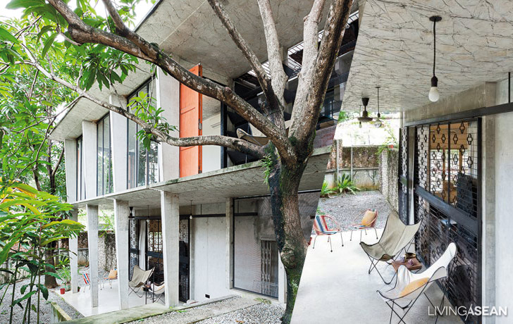
Pleasant Box-shaped Concrete Houses in Vietnam

Pleasant Box-shaped Concrete Houses in Vietnam

/ Ho Chi Minh City, Vietnam /

/ Story: Skiixy / English version: Bob Pitakwong /

/ Photographs: Hiroyuki Oki /

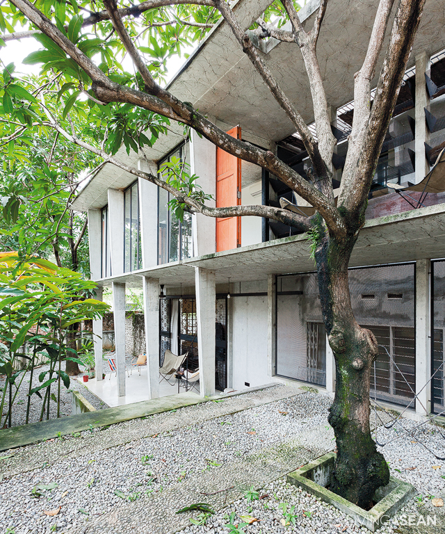
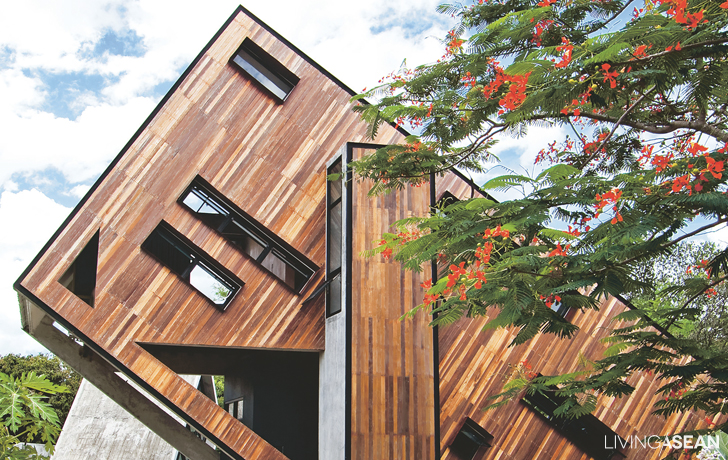
Since its opening, an unusual cluster of five box-shaped concrete houses of different heights conceived by the Vietnamese firm Vo Trong Nghia Architects has been a wondrous sight for lovers of architecture.

box-shaped concrete houses

box-shaped concrete houses

These buildings are actually tree planter boxes set up to make a house for a small family. Besides catching the attention of passersby with trees popping up from rooftops, this clever design also won numerous awards in 2014, including the Ashui Award and a world-class award from Architectural Review.

The land was once used for a factory. Though the factory was demolished, it remains close to the hearts of the owners/family members, which is why they wanted to build the house here.

Due to environmental limitations such as a small alleyway for an entrance, an asymmetrical plot, and a lack of greenery, the owners decided to create a courtyard surrounded by gigantic plant containers. The result is a number of box-shaped concrete houses that resided amid a lush atmosphere.

In this way family members, and even nearby neighbors, can live close to nature.

box-shaped concrete houses

Another impetus for the unique design involves the owner’s 50-year-old father. To provide some relief for his depressive disorder, the design team divided the house interior into five sections.

To move from one room to another, the father and other family members have to walk outside. Lush trees, gentle breeze, birdsong, and friendly neighbors can be good mental therapy.

box-shaped concrete houses

“The five buildings are inspired by plant containers, making this place like a compact oasis in a residential area. In various alignments with neighboring walls, each building acts as a house divider,” explained the architect.

“Post-construction, the owners now get to view interesting effects created by the various angles. Each building reflects sunlight to create varying tones and shades all day long.”

Walls are the primary features of each building. An interesting exterior surface is created by bamboo pressed on concrete walls with a technique relying on the skills of bamboo artisans.

Not only bearing the entire weight of each box-shaped building, the walls also support heavily water-absorbent rooftop soil.

Normal topsoil is only 30 centimeters deep, but this extra-thick earth is 1 meter deep, more suitable for a large standing tree. The design was developed in consideration of Ho Chi Minh City’s typical flooding.

box-shaped concrete houses

box-shaped concrete houses

As expected, the box-shaped concrete houses has been successful in cheering up the depressive father, and even more, this architectural design uses nature to the benefit of both people and nature itself, helping them to live together in harmony.

box-shaped concrete houses


Architect: Vo Trong Nghia Architects (vtnarchitects.net)


You may also like…
Family Home Surrounded by Warmth and Happiness

Urban Farming Office: VTN Architects’ Office Gives Back Lush Greenery

A Carpenter’s Home Embraces the Perfect Mix of Wood and Concrete

A Carpenter’s Home Embraces the Perfect Mix of Wood and Concrete

/ Rayong, Thailand /

/ Story: Tawan / English version: Bob Pitakwong /

/ Photographs: Soopakorn Srisakul /

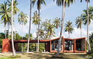
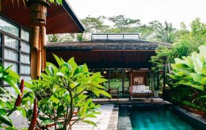
In the midst of a verdant oasis stands a contemporary home with bare concrete walls and wood decoration. It blends perfectly well with a peaceful country setting in Rayong, a province on the east coast of the Gulf of Thailand.

wood and concrete home
The home consists of two buildings rising in perfect harmony with nature, thanks to the raw look of bare concrete finishes.

“I used to live in the house next door. One day this home was up for sale, so I bought it because I liked the design and the decoration,” homeowner Prom Duangkai said with a smile.

“I gave it a complete makeover, turning it into the kind of dream home that I have had for a long time. Old house poles and full-grown trees on the property were left pretty much intact. Upon completion, I sold the old house and then moved over here.”

wood and concrete home
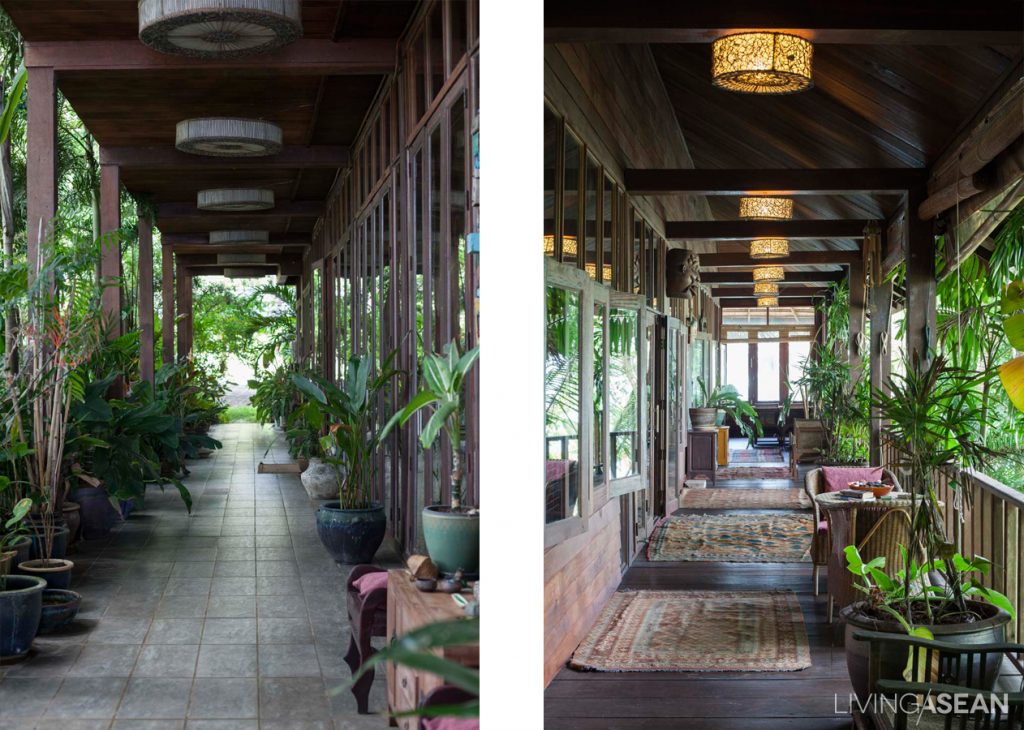
The one-story wing of the house is used as work room and space for entertaining houseguests. The main entryway has folding shutters that open up the entire front façade to connect with the great outdoors.
The hobby lobby: The owner’s favorite hangout is the front porch, where time goes by slowly and is spent working on creative projects. It has all desirable qualities - ease of care, plenty of natural light, and good ventilation.
The hobby lobby: The homeowner’s favorite hangout is the front porch, where time goes by slowly and is spent working on creative projects. It has all desirable qualities – ease of care, plenty of natural light, and good ventilation.
wood and concrete home
Furniture items in dark earth-tone browns blend nicely with the atmosphere inside the welcome area. The homeowner’s woodwork and décor items are on display here.

There are two buildings on the property. The smaller, one-story wing abutting on the street in front serves as work room and space for receiving houseguests. It has a spacious front porch that is being used for hobbies and carpentry work.

Good ventilation paired with plenty of natural light turns the area into ideal workspace. Walk in the door, and you find simple living room ideas and decorative pieces crafted mostly of wood. Every piece fits in well with the raw appeal of naked concrete finishes in the room.

Upfront, bi-fold doors open all the way from one side to the other, making the room feel light, airy and comfortable all day.

wood and concrete home

wood and concrete home
Generous wall openings increase the amount of fresh air circulating indoors, while lush vegetation permeates the landscape to reduce the harsh effects of solid concrete walls.

“I designed everything myself, from the basic structures, to furniture, to décor. I like bike riding and making road trips to reconnect with all that nature has to offer. It is about a longing for good times and going back to the beauty of our natural home,” Prom said.

“I’ve always wanted to incorporate the raw feel of wood and bare concrete finishes in the design. It’s a way to create a living space that syncs with the rhythms of nature. That’s the reason for choosing naked materials. Then, I put in large windows and doors so that the garden can be seen in full view from inside.”

[Left] Awning windows provide better protection form the elements and create a natural ventilation effect. [Right] Big rocks placed one on top of the other make a set of steps that connects the porch to the side yard.
[Left] Awning windows provide better protection from the elements and create a natural ventilation effect. / [Right] Big rocks placed one on top of the other make a set of steps that connects the porch to the side yard.
Prom added that he was a big fan of DIY furniture and handcrafted decorating items. Besides saving a lot of money, they can be custom-made to meet specific everyday needs. Every now and then he created one-of-a kind furniture and décor items in this way. They might look unfinished and far from ideal. But that’s exactly what gives them the power of giving delight.

A twig anchored to a home office desk serves as rack for hanging hats and tchotchkes from a lifetime of carpentry. House and garden publications that are his pastime are kept here.

Move on to the second building. It’s a two-story place of residence that shares the same characteristics as the first building.

The exterior walls are of naked concrete finishes mixed with wood. There’s an element of surprise though. An opening in the second-floor balcony allows a Pride of India tree (scientific name: Lagerstroemia speciose) to rise from the ground up and shoot right through reaching for the sky.

Here, nature has priority. It’s the homeowner’s favorite shady garden nook, where time goes by slowly. It’s a place to sit down sipping coffee taking a break from pruning trees in the yard.

wood and concrete home
The homeowner’s creative space is a patio complete with a set of workbench and stool made out of materials left over from other projects. The coarse bark texture of the house pole in the background harmonizes with the rustic country ambience.
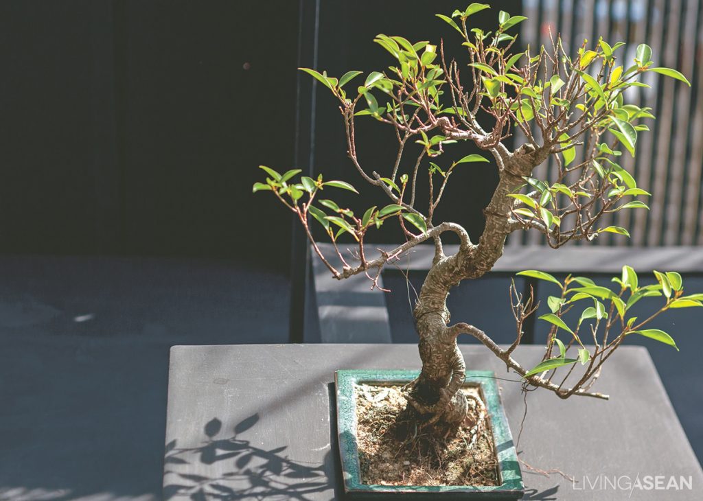
The front porch offers plenty of space for potted houseplants, including miniature succulents and bonsai trees.
wood and concrete home
A thriving Pride-of-India tree shoots right through an opening in the second floor balcony. It is the intention of the homeowner to let nature permeate the living spaces where possible.

In retrospect, it’s amazing to think about all the benefits that trees are giving us humans. Particularly at this house, they provide a refreshing change and the inspiration the homeowner needs to satisfy his passion for wood. Needless to say, it’s an enchanting place to live and work.

There is nothing like spending the afternoon riding around on his bicycle looking for new ideas. Oftentimes he runs into something worthwhile to take home. Twigs and other found objects sometimes make great décor materials.
For the homeowner, nothing beats a bike ride around the neighborhood in the afternoon. Oftentimes he runs into something worthwhile to take home. Even twigs and tiny found objects sometimes make great décor items.

Owner: Prom Duangkai


Visit the original Thai article…

บ้านปูนเปลือยชั้นเดียวของช่างไม้ ที่ปลูกแทรกไปกับพืชพรรณรอบบ้านอย่างลงตัว


You may also like…
small house chiang maiLAAB Is More: A Small Living Space That’s Anything but Ordinary

The Beauty of Simplicity in a Single-Story Home

A Delightful Tuscan Home

A Delightful Tuscan Home

This beautiful Tuscan home is one of 60 houses in “The Eyrie” project at Khao Yai. Its atmosphere is similar to – and just as attractive as – houses in Italy’s Tuscany region.

/// Thailand ///

Story: Ajchara Jeenkram /// Photos: Soopakorn Srisakul, Sitthisak Namkham /// Style: Phakhawadee Phahulo /// Design: Amnad Khitapanna /// Landscape Architecture: Little Tree by Sirivit Riubamrung and Charturong Khunkong

This relaxing spot is a good place to sip tea in the late morning. The owners built a trellis of umbrella bamboo here, and planted climbing vines for shade.
The garden and cozy little nook out front are designed to match the architectural style.
Gentle sunlight in the early morning shines into the house, creating a warm atmosphere. /// Set in U-shaped form, the kitchen can be used as a food preparation counter or a small bar. There’s a built-in ceiling-height cabinet for equipment storage.
The living room connects to the dining area, decorated with natural materials: woven wicker, stone, brick, and authentic wood.

The owners tell us that the minute they saw the prospectus they decided to buy here, because of their faith in the skill of Amnad Khitapanna, the project’s designer.

The homes here are outwardly of all different designs, no two alike, but they complement each other to give the impression of a single village. This house is situated in the middle of the property, leaving room for grass lawns both in the front and the back.

The lower floor steps down to the kitchen, dining room, and living room, which are set at a lower level to connect more smoothly with the back yard. The property slopes down a bit. This adds some privacy and also opens to a beautiful view of the ring of mountains behind the house.


The dining area connecting to the kitchen gives the feeling of a French bistro, with light and airy décor.
By the staircase, the owners keep the light subdued for a sense of intimacy. /// The hallway on the second floor is full of sweetness: Painted furniture, a classic chandelier, and curvy decorative items.


Niece’s bedroom is done in pastels and wavy cloth for a sense of sweet femininity. /// Light-colored wicker furniture pairs with flower pattern decorations for a hint of European style.

Bedrooms on the second and third floors are decorated in sweet, pastel colors. Additionally, there is a library-cum-living room, which the owners selected black and green for the decor on purpose to differentiate the space from other rooms.

An umbrella bamboo trellis on the front yard forms an arbor planted with climbing vines, complemented by European-style metal furniture, where one can drink tea and relax.

The interior decor was done entirely by the owners just the way they wanted. They never studied design formally, just collected memories from their journeys to Tuscany and used as decorative ideas for this gorgeous home.

What they have created is no less wonderful than the house design that could have been done by a professional.

English country décor and furnishings adorn the dressing corner and living spaces in the bedroom.
Above the headboard are Baralee’s paintings inspired by her stays in hotels abroad.
Above the headboard are the wife’s paintings inspired by her stays in hotels abroad.
Baralee’s favorite bathtub with lion’s paws leg design. A tall window is built to bring in natural light and for improved ventilation.
The wife’s favorite bathtub with lion’s paws leg design. A tall window is built to bring in natural light and for improved ventilation.
The classic library-cum-living room is done in cream. A European-style fireplace is installed for use during the winter.
The lounging area in the back is not exposed to sunlight. So, it can be used all day long. /// Behind the house is a smooth grass lawn. Mexican daisies on the wall and a wrought iron fence go together well with the overall look of the house.

014

An Exotic Oriental Home

An Exotic Oriental Home

The standard concept of “townhome” gets thrown out the window the minute you see this exotic oriental home.

/// Thailand ///

Story: “kirakira,” Photos: Sitthisak Namkham, Style: Somboon Gringgrai,
Owner/Designer: Pantavit Lawaroungchok of Apostrophy’s The Synthesis Server Co., Ltd., Contractor: Hem Heepkaew of Happening Design and Construction Co., Ltd.

The townhome stands prominent behind green grass and trees. The house exterior features wood and stone, also containing the spirit of nature. The simple lines of the house in grey, white, cream, and brown convey a feeling of comfort.
A relaxing spot in the front: A banyan hedge by the kitchen forms a sweetly refreshing green wall.
The family’s favorite hangout, with fancy furniture and bright gold ornamentation harmonizing in a common theme. A wall of black marmo granito in the back almost makes you think you’re in the lobby of a 5-star hotel.
Dining corner, with a mixed array of furniture. At the side is a show wall with some of Pantavit’s most prized collections.


Pretty posh for a “townhome”, the mood is reminiscent of a formal dinner in a luxury hotel. An emphasis on lighting arrangement and bright, shiny furnishing makes for a uniquely elegant charm.

Pantavit Lawaroungchok, owner/design director of “Apostrophy’s” design studio, was experimenting with new urban living concepts and transformed his family’s property into something resembling a ritzy resort.

There are a lot of remarkable things about this house, beginning with the large central room’s “triple space” concept vertically connecting it to the sky, with a three-story tall clear glass “moonroof ” that opens and shuts by remote control to add dimensions of light and shade to each level. The open design also facilitates interaction among family members between floors.

On the first floor is a living room, dining area, kitchen, and vertical garden. Pantavit’s mother’s and aunt’s bedrooms are on the second floor, along with a small living space and Buddhist altar room. The third floor holds Pantavit’s master bedroom, actually more a kind of super-fancy penthouse with a bedroom, an entertainment area, a master bathroom , a dressing room, and a small garden on the balcony.

From the dining room looking out toward the entryway in front: furniture arrangement clearly splits the space it into definite zones. /// One of Pantavit’s favorite spots is the 3.5-meter dining table. It doubles as a place to work, or just to read.
Cabinet shelves have a mesmerizing shine: these are fabricated separately, then put together and finished using a spray-paint technique similar to what’s used in auto body shops.

Its interior decor consists of furniture and other items with a contemporary Asian look, a lot of it collectibles Pantavit fell in love with and brought back from trips abroad.

The area in back is built out into a 7.5-meter-high vertical garden, with plants divided into 3 zones, each receiving the same amount of light, moisture, and water through an automatic sprinkler and UV sun lamp system. The automation helps ease the hurried lifestyle of urban dwellers.

The exotic oriental house design is a fine expression of beauty that can be found in mixing Asian styles, and at the same time is a useful experiment in urban family living and novel use of space.

The back area of the townhome is transformed into a super-hip vertical garden. Here you can lounge around in this hanging modern-looking bubble chair made of clear acrylic.
The stairwell is decorated with a very interesting abstract painting, intentionally placed there for its patterns that play with the planes of wall and floor. /// A “living room” corner on a mezzanine level has a warm, easy atmosphere.
The walkway on the second floor is lined with beautiful pictures. From the guard rail, the lower floor can be seen, and family members on different levels can interact.
Inside Pantavit’s aunt’s bedroom we’re greeted by soft, inviting, and restful lighting. The vertical patterns on the wall fools the eye into thinking the room is larger than its actual size.
The master bedroom on the third floor is done in white, cream, and browns. Mirrored panel behind the headboard makes the room appear to be larger.
The master bath has a shower section and a bathtub. A washbasin is designed for two. One of the walls has openings to let the natural light in. /// In the master bedroom directly adjoining the bathroom, a dresser is arranged along the wall in the dressing room. Venetian blinds are on one side of the wall for sufficient light during makeup.
X