Blog : IDIN Architects

A White House Matching Modern Architecture to Its Environment

A White House Matching Modern Architecture to Its Environment

/ Bangkok, Thailand /

/ Story: Kor Lordkam / English version: Peter Montalbano /

/ Photographs: Ketsiree Wongwan /

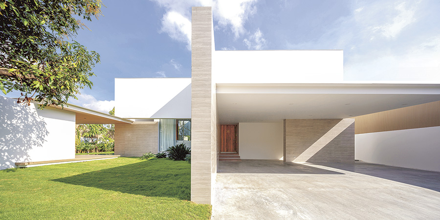
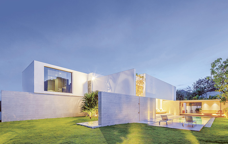
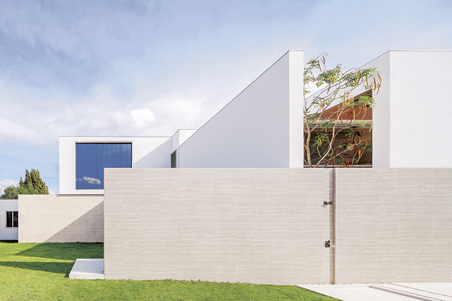
Secluded behind what appear to be walls of white paper, the “PA House” is a perfect combination of modern Tropical architecture and a unique solution to its site-specific environment. It’s the brainchild of IDIN Architects, a Bangkok-based architectural practice.
White House

Architect Jeravej Hongsakul explained that the first design challenge of this 400-square-meter house was its owner’s interest in privacy for his growing family.

“In our first site survey, we noted the wide variety of sizes and styles of the surrounding homes, a four-story house here, a Louis-style there. How to fit a new house into this context and make it livable?”

The architects observed, took pictures, noted directions, viewpoints, levels, and distances between houses, and analyzed the collected data to feed into their design plan, and came up with a concept that used these surroundings not as a limitation, but, surprisingly, as a help.
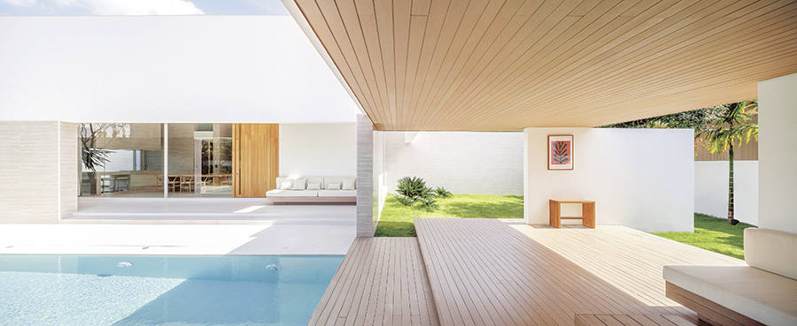
White House

“Each one of these other houses actually functions as an assistant architect, telling us where and at what levels to place the walls and planes that build connections on all sides, leading us to create open spaces within,” explained the architect.

“I sometimes feel like the conductor of an orchestra, arranging voices and the mix to bring this home to life as a beautiful piece.”

Accordingly, the relationships formed by viewpoints to and from surrounding buildings turned out to be a primary factor in the straightforward design of this home.

Each wall was placed to help deal with problems that might arise from its geographic situation. Where appropriate, well-thought-out adaptations were made to enhance utility and the livability of the house.
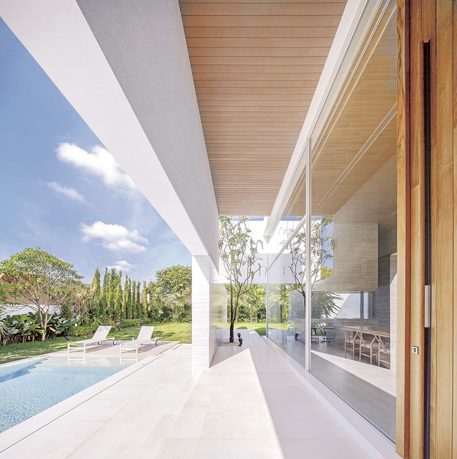
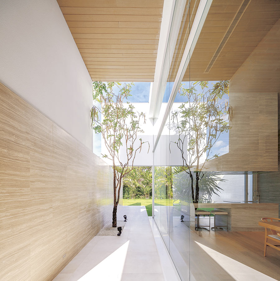
White House Modern House Modern House Modern House

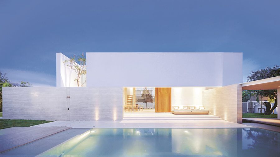
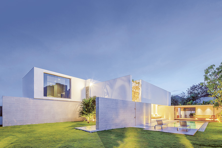
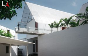
Coming in on the south entrance road, we encounter two planes meeting in a tall, wide “L” appearing to float out from the second floor of the house. This construction benefits the house in the same way as a raised hand can block sun from burning our face.

The ground floor is cool and shady, but still has a great view of the wide, open garden directly outside, while the upper wall both blocks the view from other houses and insulates against heat.

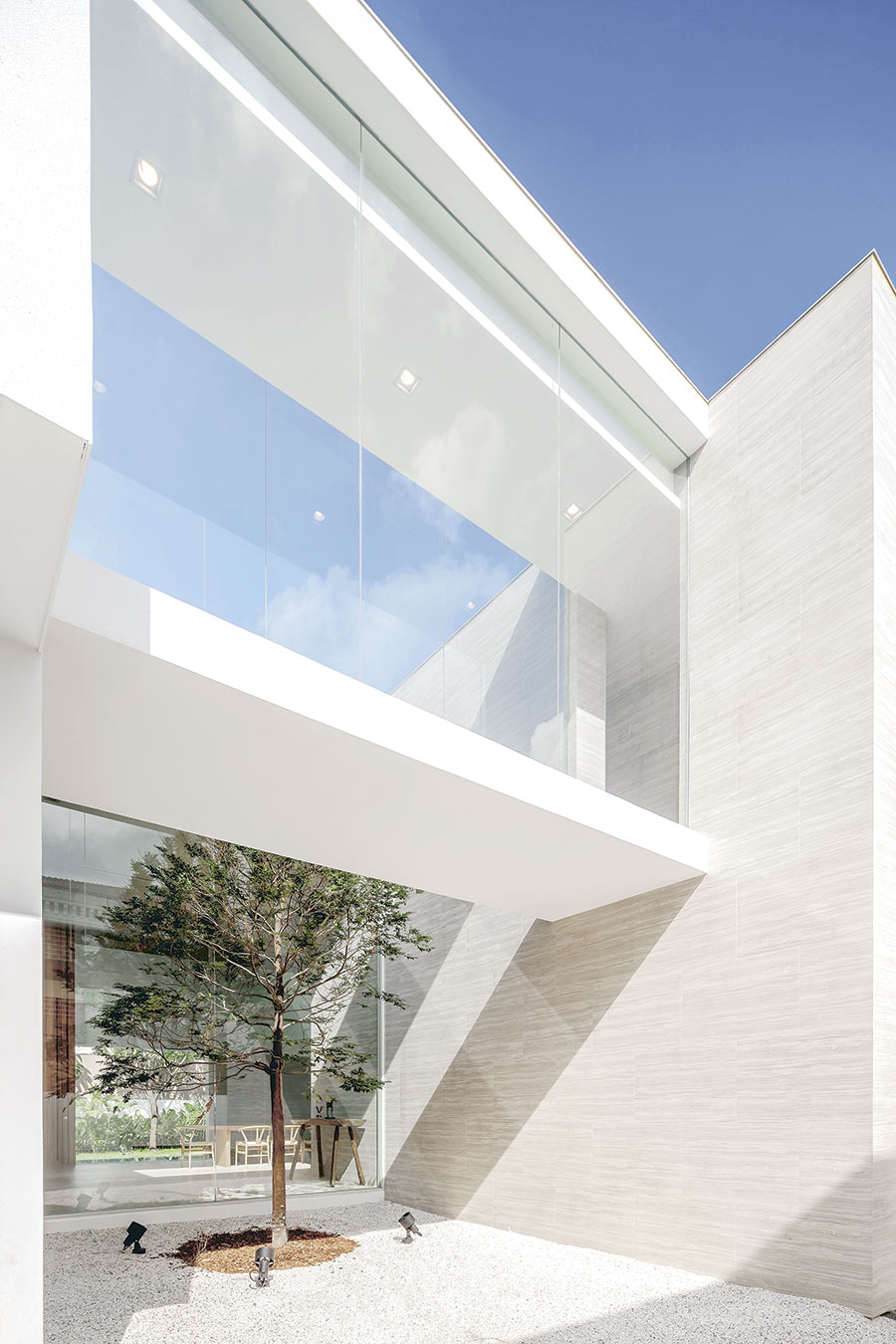
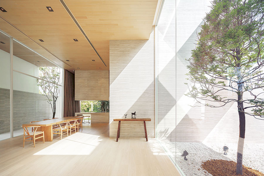
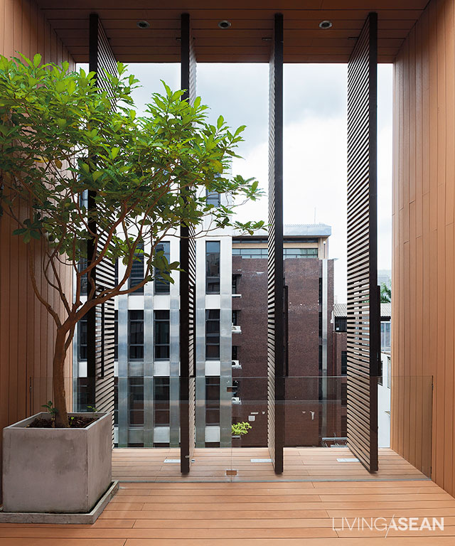
Along this section of the lower floor, a fence wall set two meters out from the house provides ample space for growing plants, while glass walls reach up another 6 meters for a look out through the shade. From here the sunlight traces down the inner wall, creating new dimensions and an open, airy feeling.
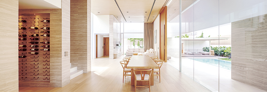
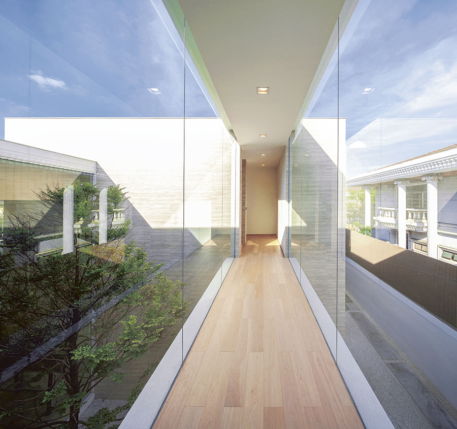
Modern House White House

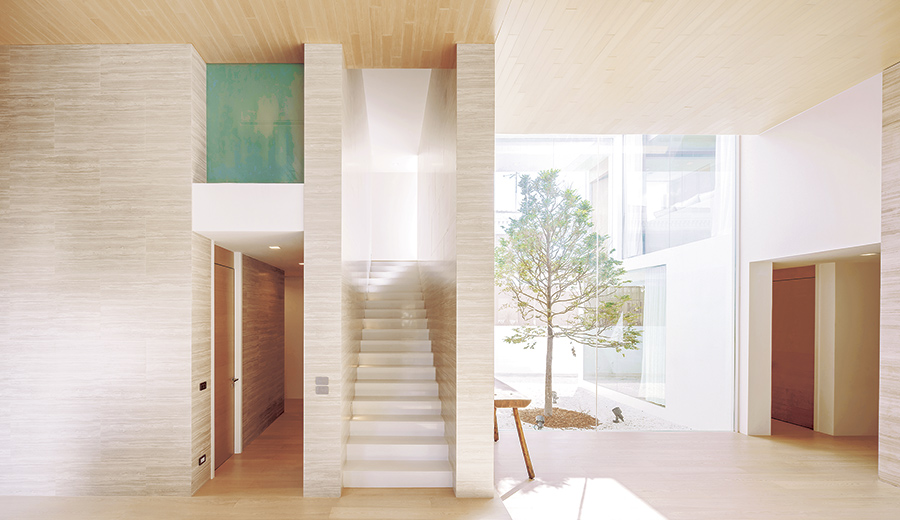
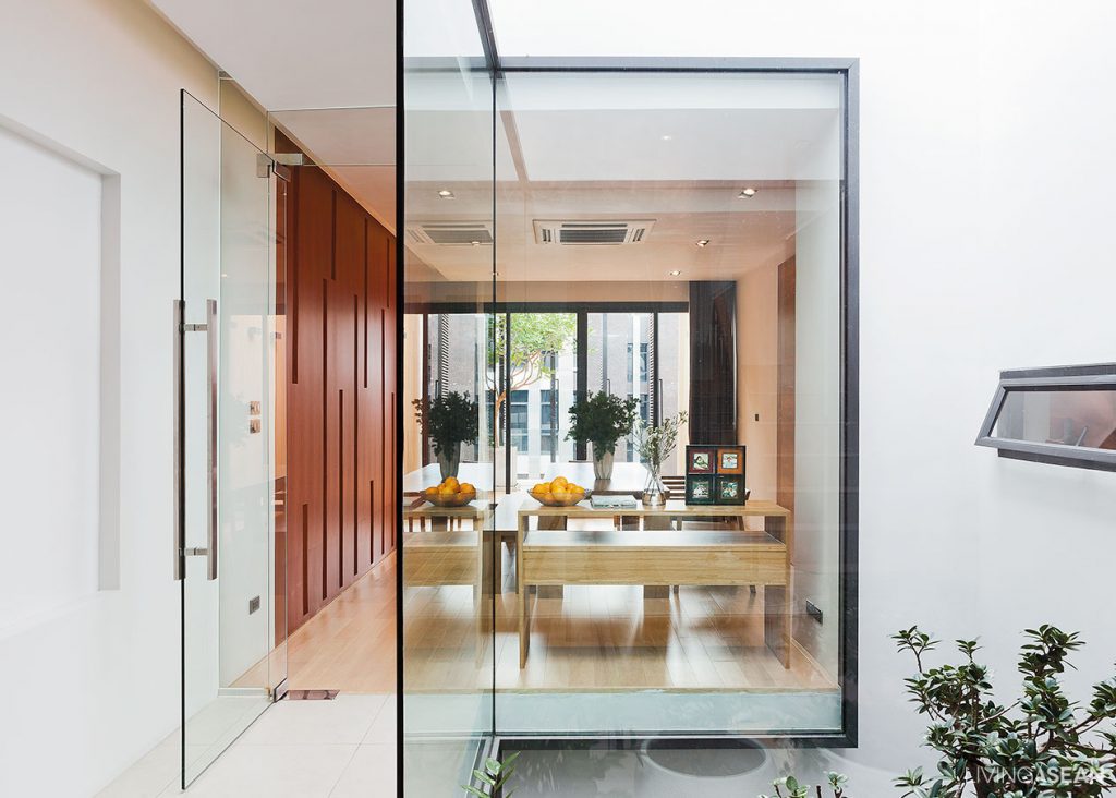
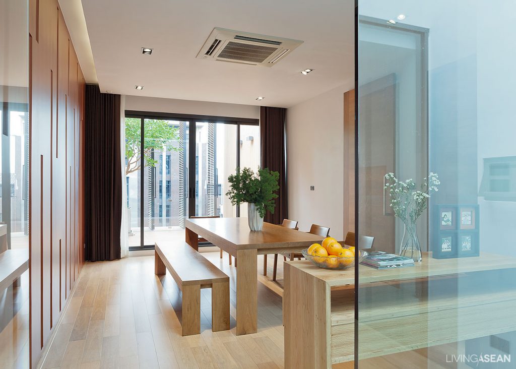
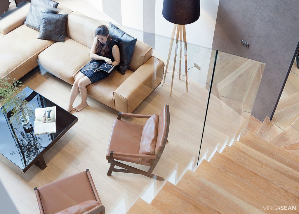
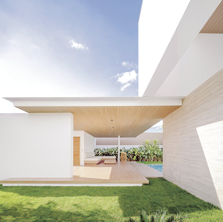
Comfort of use is the basis for the distribution of functionality within this white house. On the ground floor a living room and dining area open out on a wide garden view, and one portion is set aside for a guest bedroom.

On the second floor we find a master bedroom and one more room for a family member expected to come in the future. All this is coordinated with external design to support the family’s lifestyle in the most perfect way.

As the architect puts it, “The primary design is all about controlling sunlight and creating balance between outside and inner courtyards. The overall effect is open and airy in every direction. The horizontal plane forming the upper covering above looks almost like a hat on the house, and it functions both to block harsh light from the sun and create a wide open view at eye level.

“The concept is what we call ‘Passive Design’: design where the natural systems facilitate living. It also came out in a style both we and the homeowner are happy with. It’s a happy mix of many things.”
White House

White House


Architect: IDIN Architects (www.idin-architects.com)


You may also like…
Rupu House: White Geometric Design Bespeaks a Close Family Bond and Privacy at Home
Baan Hing Hoi: A Modern Duplex Design Exudes the Charm of Bygone Days

Siri House: From Ordinary Shophouses to a Charming Family Co-living Space

Siri House: From Ordinary Shophouses to a Charming Family Co-living Space

/ Bangkok, Thailand

/ Story: Wuthikorn Sut / English version: Bob Pitakwong /

/ Photographs: Rithirong Chanthongsuk /

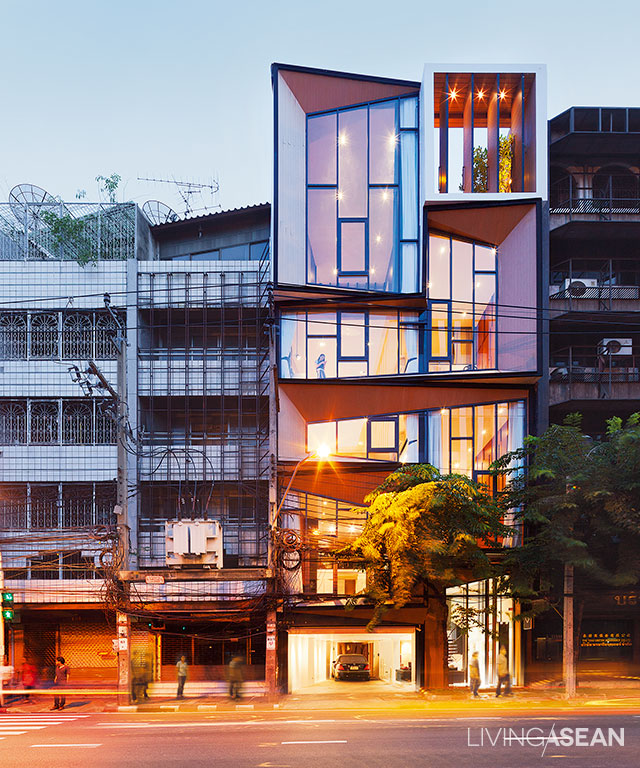
Who would have thought a pair of shophouses lacking interest and imagination could turn into a pleasant family co-living home? Only recently the shophouse duo located on Surawong Road in the heart of Bangkok’s downtown was tastefully renovated as a shared residential community model. The result is a co-living space and place of business integration that’s well designed, full of life and energy.

Co-living space

The place of residence aptly named “Siri House” is the brainchild of the Bangkok-based architectural firm IDIN Architects Co., Ltd. Architect Jeravej Hongsakul is the driving force behind the design and renovation project. He attributed the firm’s success to its ability to reinterpret co-living spaces from entirely different perspectives.

Co-living space
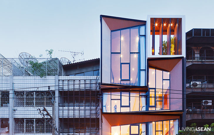
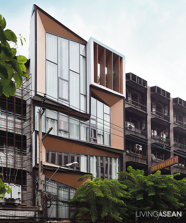
The building’s diamond-shape façade bears the distinctive hallmarks of the family’s jewelry business. Plus, it highlights the three design considerations that create an effective and attractive composition – the qualities of being direct, clean and outstanding.
16
Flashback. The early stage before the renovation project takes physical form.

There’s a solution to every challenge,” said Jiravej. When horizontal living is no longer the suitable choice in an urban setting, the idea of vertical living comes in handy so as to combine residential and social areas in one coherent whole. And in this particular case, the only way to build is upwards.

In essence, it’s about creating a happy, healthy and thriving home, and hence the name “Siri House” meaning the place of prosperity.

Co-living space

2

3
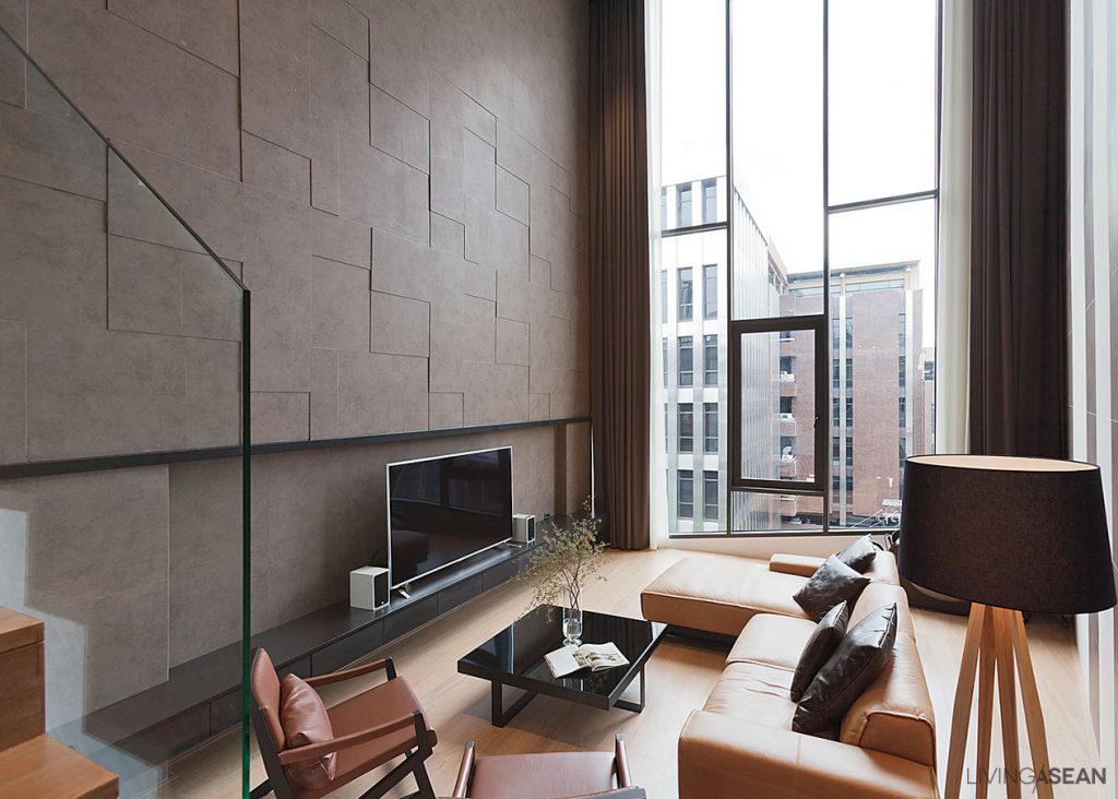
The family living space on the top floor consists of a dining room and nearby sitting area holding a home theater and spaces for relaxation.

Co-living space

A new landmark on Surawong, the building with a distinctive facade belongs to Suree Sirivatjanangkun who shares the co-living space with her siblings.

On the emotional bonds between the people and the place, she said, “We figured it should also be an office for our family business. It’s better to live and work together as one extended family, a big family in the business neighborhood.

Co-living space
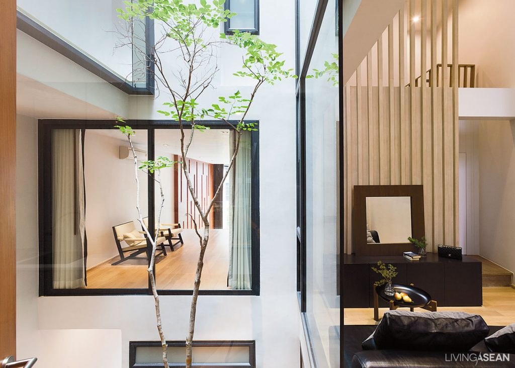
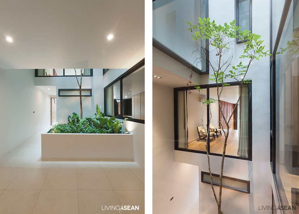
The house has four private residential units accessible via the entrance hall illuminated by natural light.

6

“We wanted a living space that is warm and welcoming, the kind that provides a modern living atmosphere in which family members interact and socialize with one another. Everyone needs a place and time to unwind and still wants to see and care for each other. To me, that’s co-living.” Suree continued.

“Precisely, we wanted a design that’s inclusive, in which every one live together sharing a co-living space, not the type that’s divided into different floors, one floor per person. That would be no different than living separately.”

Co-living space

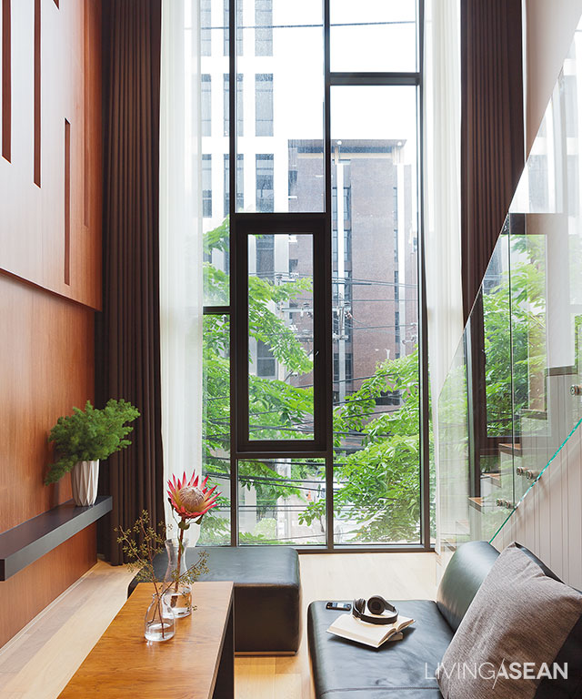
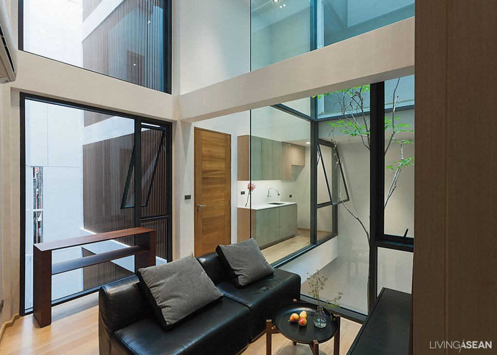
With this in mind, Jeravej came up with a solution. “I designed each residential unit to be able to stand alone and is fully functional. I paid attention to detail in each component, from the living room, bedroom and workspace, to the double volume leisure room, bathroom and kitchen, and made sure they fitted together in an effective and practical way.

“Because it’s a good-sized place with lots of functions, I needed to manage them very carefully. To improve traffic flow in the home, each residential unit is accessible via the main hallway that allows plenty of natural light into the interior. And by design, each unit is unique in its own special way.”

Co-living space
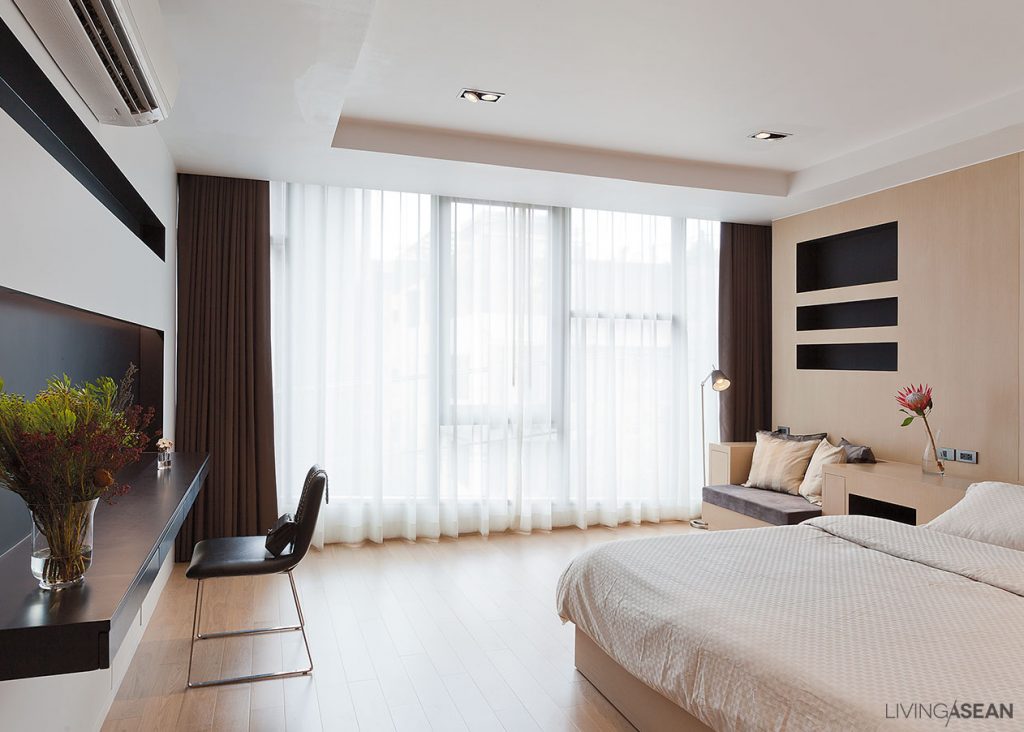
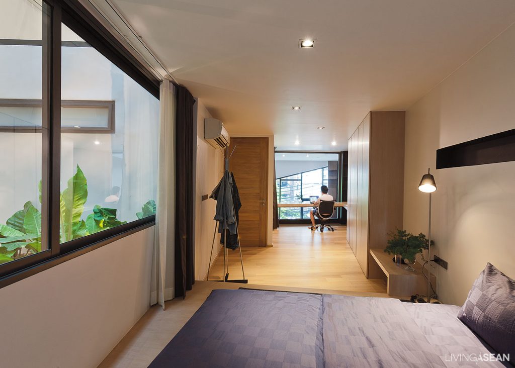
Bedroom windows at the rear of the building open to relaxing greenery. Nearby, a clean, uncluttered workspace is peacefully ensconced behind the diamond-shaped façade overlooking the street in front, a scene reminiscent of a cafe-esque view.
Co-living space
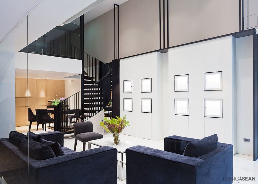
The family business operation on the first floor offers customer reception seating in deep blue that calls to the mind feelings of calmness and stability. Nearby, a lightweight spiral staircase leads to meeting rooms on the mezzanine.

13

The homeowner wrapped it up nicely. Siri House will always be home to the close-knit siblings who live and work here. To them, it doesn’t matter it’s built for horizontal or vertical living arrangements. More so than anything else, it’s about living a lifestyle centered around family relationship, a good quality of life, and being in a location that’s great for doing business.

Bottom line, the mid-city co-living space is named “Siri House” for obvious reasons. To do business, you need Siri. It’s a word meaning prosperity and the quality conducive to success. You get the idea.

Co-living space

Co-living space


Architect: IDIN Architects Co.,Ltd. (www.idinarchitects.com)


You may also like…

303 House: A Narrow Townhome Inspired by Aircraft Interior

Box-Shaped Steel House Surrounded by Nature

X