A Perfect Room for Two

A Perfect Room for Two

A Perfect Room for Two

Our team meets the owners of this modest-sized condominium. With beaming smiles, the owners open the door of their little perfect room for two to greet us.

/// Thailand ///

Story: Montra /// Photos: Jirasak /// Assistant Photographer: Kritthat /// Style: Praphaiwadi /// Design / Interior Decoration: Metaphor Design Studio
001

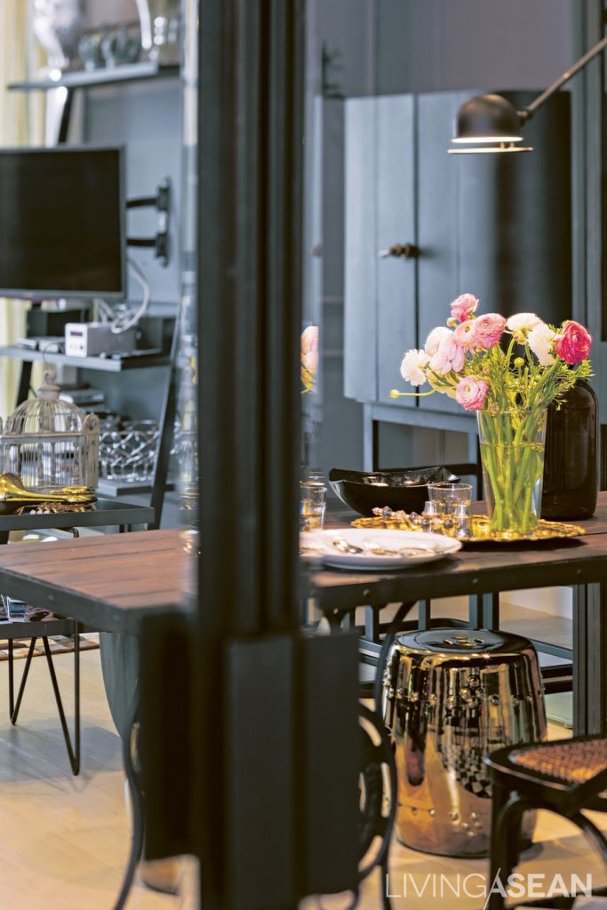
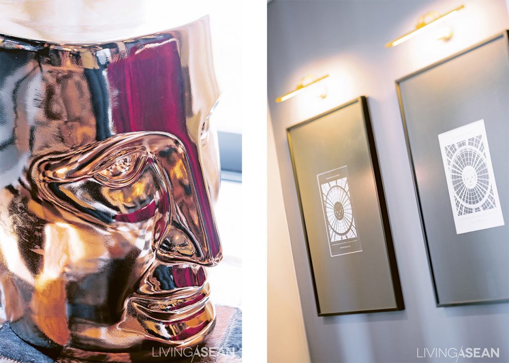
A table with wrought-iron legs topped with wood harmonizes with the straightforward designs and colors of the chairs and the metal-framed sliding door. To prevent the room from looking too dark, the designer put in the golden stools.
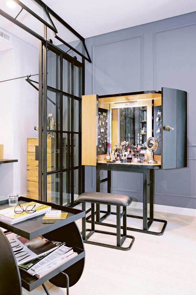
Bell tended to buy similar accessories to what she already had because she didn't see them in her sight. To solve this, the designer made space for hanging small accessories on the side of the cabinet. Bell likes the idea a lot.
The owner tended to buy similar accessories to what she already had because she didn’t see them in her sight. To solve this, the designer made space for hanging small accessories on the side of the cabinet. The owner likes the idea a lot.

“We met our designer all because of Room Magazine,” one of the owners said. She was referring to the owner and designer of a Parisian-style suite featured on the magazine’s March 2012 issue.

“I had already bought the place, but didn’t know where to start. Every day I dropped by at a bookshop to buy books and magazines on interior decoration, bring them home and talk with Aor and my parents. This went on and on, until we saw that edition of Room. Well, for me that was love at first sight. And Aor felt the same way.”
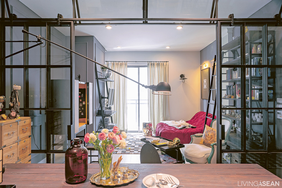
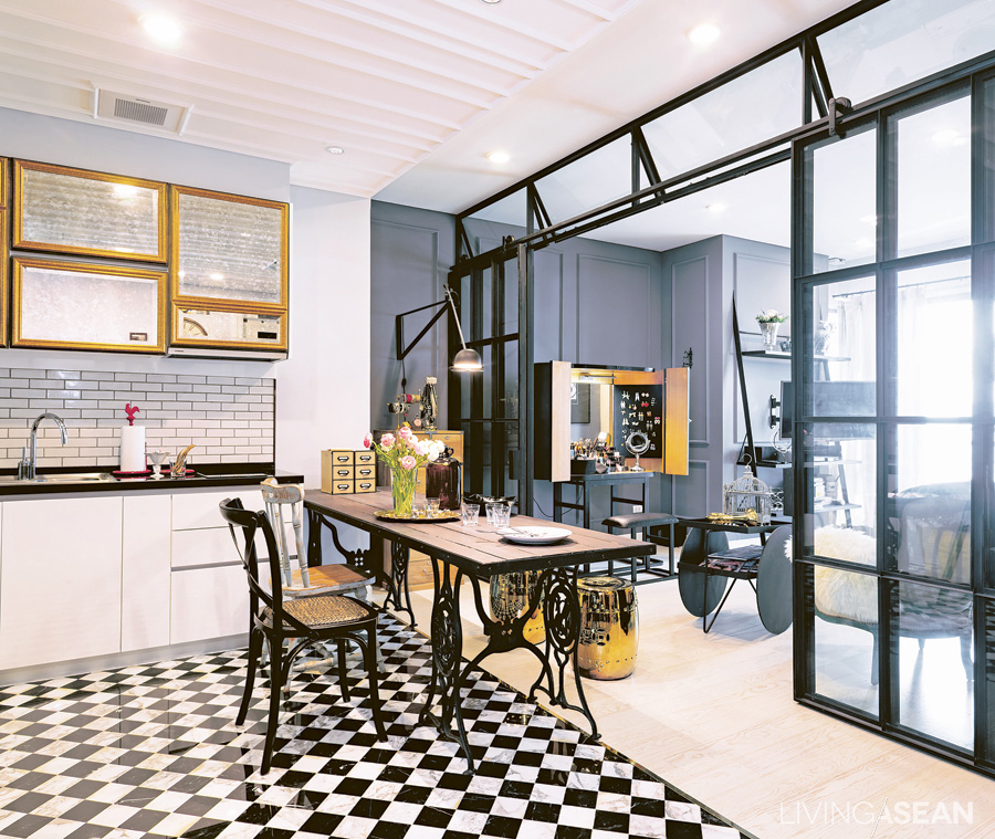
View from the entrance. A metal framework partitions the space into a dining area and a parlor. From this angle, it's like looking into an outdoor greenhouse.
View from the entrance. A metal framework partitions the space into a dining area and a parlor. From this angle, it’s like looking into an outdoor greenhouse.

There were plenty of problems to be solved with this room. Accommodations and adjustments had to be made for their lifestyles and personalities. Bell works in the fashion business, and likes putting on makeup while watching the morning news. Aor gets up later. So they put a vanity and a television outside the bedroom.
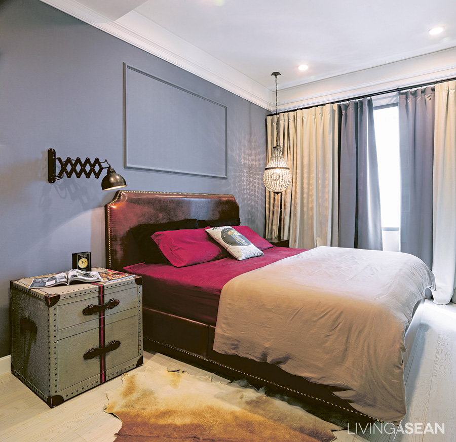
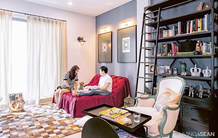
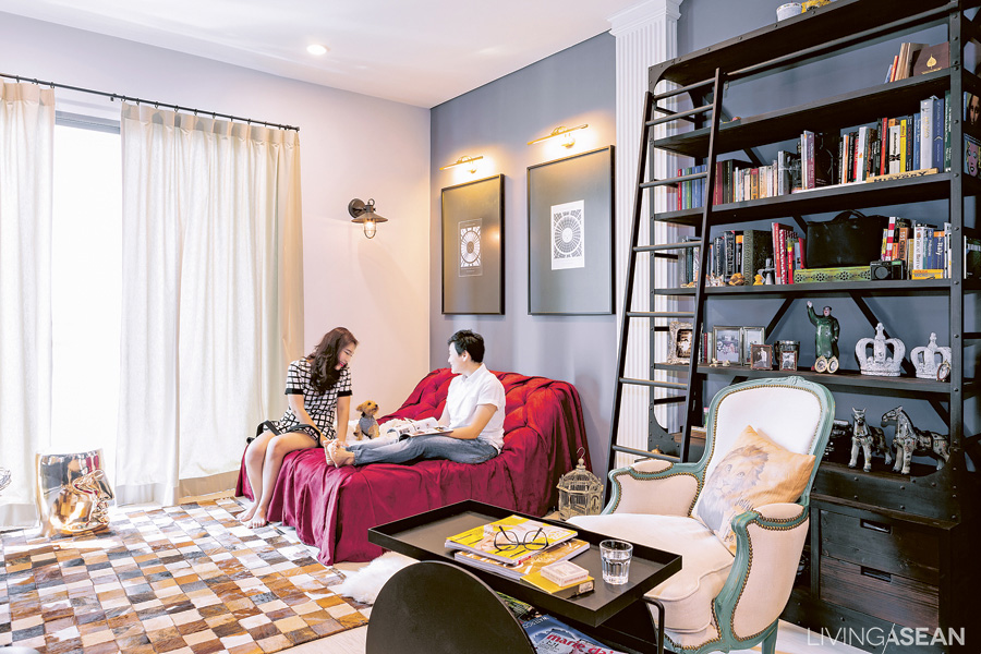
The bedroom is simple but striking. The pigeon-gray wall contrasts with the crimson bed sheet. Gimmicks lie in details, such as using an industrial lamp instead of an ordinary reading light, while a fancy crystal chandelier-like lamp is hanging on the far side.

Bell doesn’t see herself as full of feminine sweetness. Her favorite color is “pigeon grey,” which has a hint of blue. But she also wants the place to be a comfortable one for Aor, her other half, too. The couple then trusted in the skills of their designer and let him run his own ideas to work on the transformation of the space.
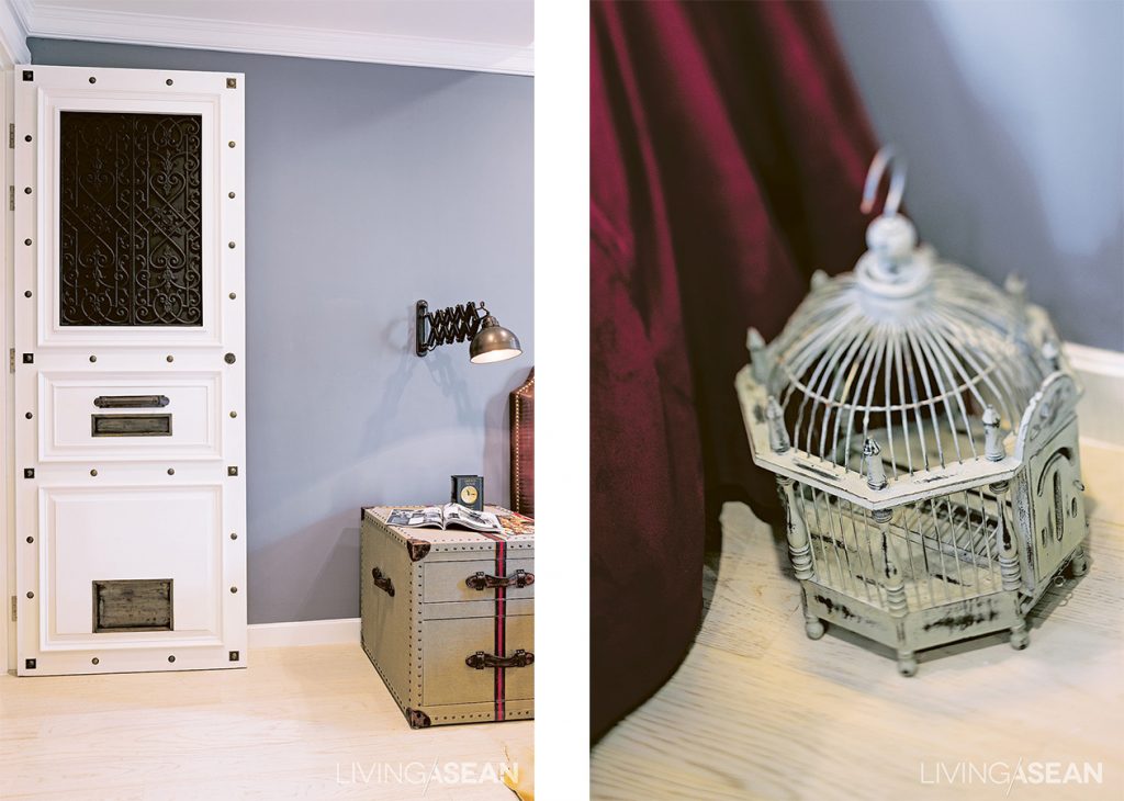
The designer has managed to adjust the room plan and move a door for added convenience. He also inserted a little pet door for Minnie, their dog. The door has a unique look, studded with different kinds of brass rivets.

The end result was more than satisfying. When they had their first look at the designs and models, they were delighted. “It was really gorgeous! Aor and I made almost no changes from his original design. It was exactly what I’d had in mind, in both design and function. We both saw it as the perfect solution.”
007

The path from design to finished work wasn’t all smooth sailing. Little problems popped up along the way. Sometimes it was the contractor not sticking to the specs. Other times the details or materials weren’t exactly what they had pictured. “The flooring with black and white chess pattern, some parts of the white stone turned yellow, or had a little stained, but I left them that way. If things weren’t too ugly, we were OK with them. Actually, I was impatient and wanted to move in really fast.” (laugh)
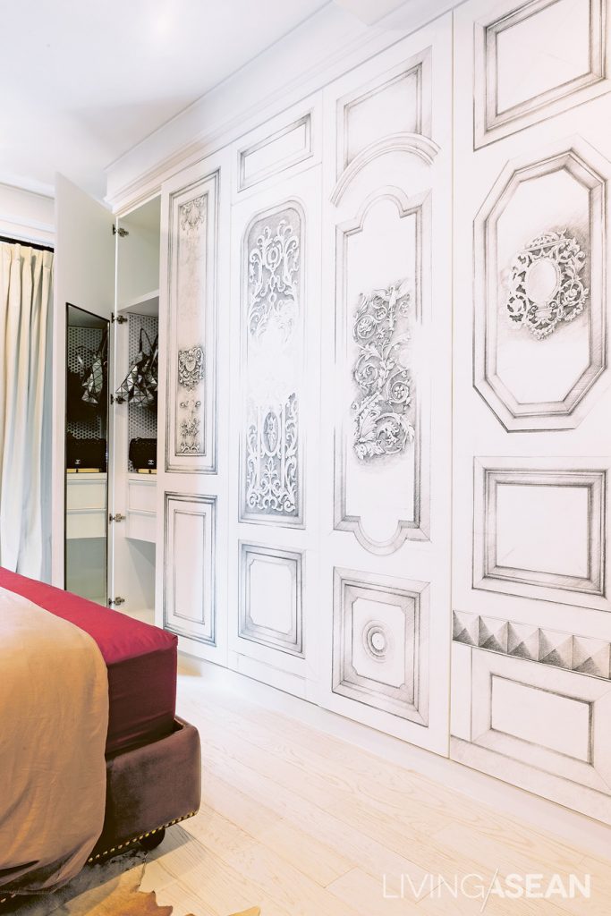
The intricate patterns on the closet surface are the designer’s solution to the original design. “These started out as engravings, but it was taking so long. The designer turned them into illustration works instead. The closet ended up being really beautiful, and we love it.”

Maybe it’s destiny that brought Bell and Aor to fell in love with the Parisian-style studio. But beyond the destiny, it’s the matter of efforts and understandings that make the perfect room for them.
009

About the Author

X