Blog : home

A Touch of the Exotic

A Touch of the Exotic

For his second home, the owner of The Library resort in Samui sets his mind on a vibrant, exotic look. A style that is totally different from his first residence.

/// Thailand ///

Story: Gobbi Chirawat /// Photos: Jirasak /// Assistant Photographers: Nattaphong /// Style: Praphaiwadee /// Designer: Amphon Jiramahaphokha
001

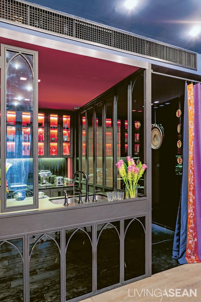
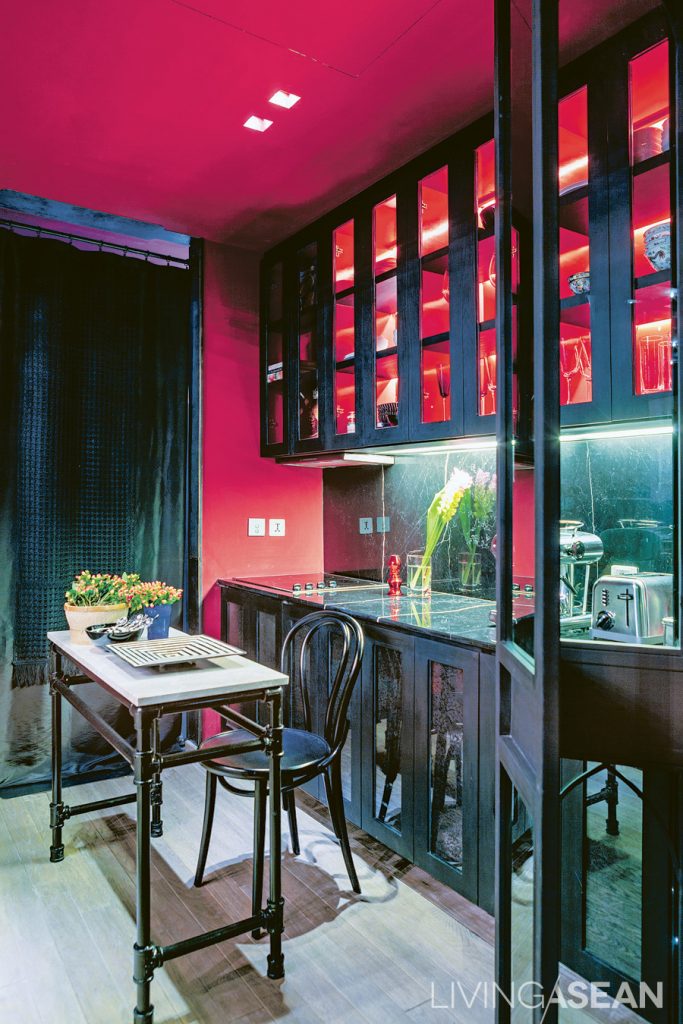
The pantry is striking. With its red wall and ceiling and multicolor drapes, the dark metal Arabian-style partition setting it off from the rest of the home.

The owner was already familiar with  straightforward, minimalist interior decoration. So, he wanted to change to a more intense mood with mystical charm. Yong (Amphon Jiramahaphoka), a designer of the award-winning SODA group was called upon to complete this creative project.
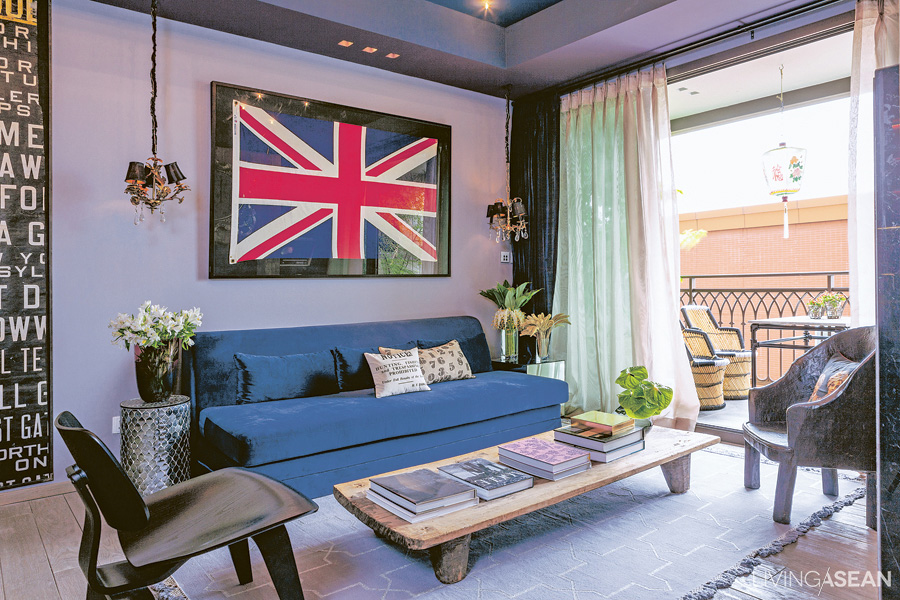
Dark colors alternate with paler ones, giving dimension to the "living room." The light gray wall is adorned with framed pictures. The teakwood floor is polished to a lighter shade, contrasting with the dark ceiling, and opens out onto the balcony, with its set of wicker chairs.
Dark colors alternate with paler ones, giving dimension to the “living room.” The light gray wall is adorned with framed pictures. The teakwood floor is polished to a lighter shade, contrasting with the dark ceiling, and opens out onto the balcony, with its set of wicker chairs.

“I bought this room three or four years ago because of its prime location. But the new decoration was done last year. I removed the flooring, the ceiling and the walls. To avoid disturbing the neighbor, the work was limited to few hours per day. It took about eight months in total.” the owner explained.
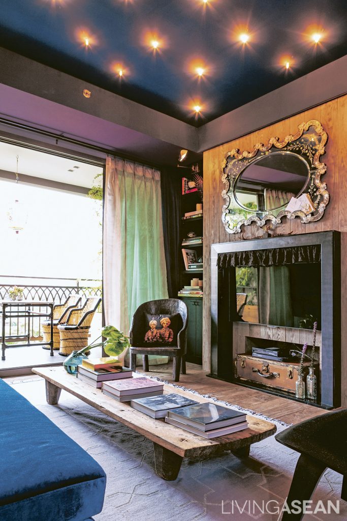
Dark colors alternate with paler ones, giving dimension to the "living room." The light gray wall is adorned with framed pictures. The teakwood floor is polished to a lighter shade, contrasting with the dark ceiling, and opens out onto the balcony, with its set of wicker chairs.
The room is vibrant with a strong artistry at work. The TV sits on a mock up fireplace. LED lights give a romantic mood during the nighttime.


A perfect blend of colors and cultural influences gives the style a touch of the exotic. The entrance way, paved with black granite, makes the room feel cool and comfortable. The opposite walls features pictures and plates with vintage European designs. The kitchen has an elegant pantry designed for easy dining and food preparation.
The room is vibrant with a strong artistry at work. The TV sits on a mock up fireplace. LED lights give a romantic mood during the nighttime.
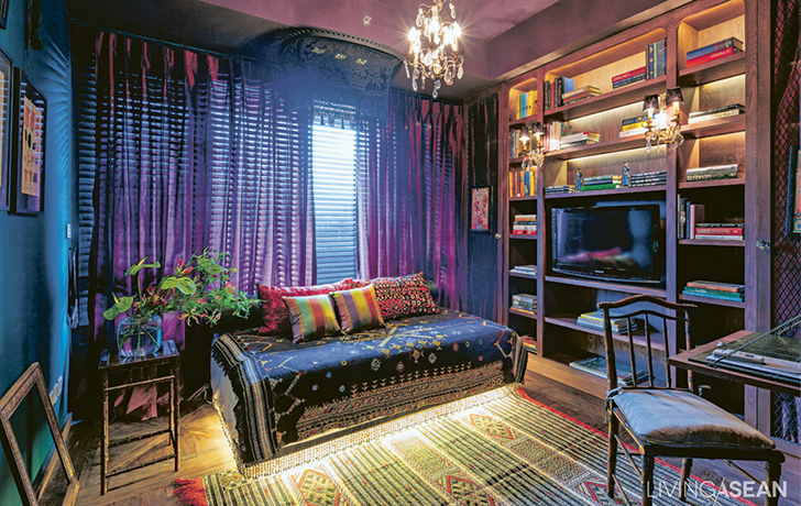
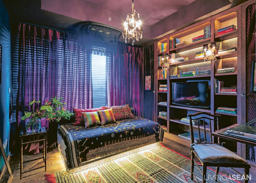
With a convertible sofa bed, this workspace also serves as a guest bedroom. Various types of decorative cloth highlight an Eastern flavor. Lighting under the sofa keeps things interesting.

The red wall and ceiling contrast strikingly with the wrought-metal Arab-style partitioning that sets the space off from the living room. There is a set of coffee table and black chairs imported from India. A sofa of bright navy blue is set on an Arabian rug, whose gray matches the wall color. The TV stands on a chic piece of shelving built into the wall to mimic a fireplace.
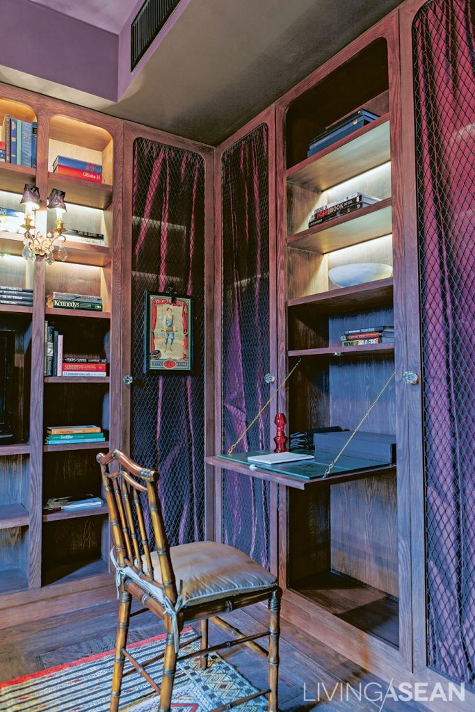
A built-in cabinet with a fold-down desk. Cabinets are draped with metal mesh and pleated cloth, striking the right balance between hard and soft materials.

Made for a romantic mood, the dark-colored ceiling is fitted with recessed LED lights that seem sparkling like stars at night. Next to the corner is one of the owner’s favorite places — the workroom that doubles as a guest accommodation. The walls are painted green, contrasting with purple curtains to bring out beautiful textures when sunlight enters. Arabian fabrics are seen in sofa covering, pillowslips, the carpet, and the silk cloth that covers the wall behind the built-in bookshelf. These intriguing touches are the signature of the designer.
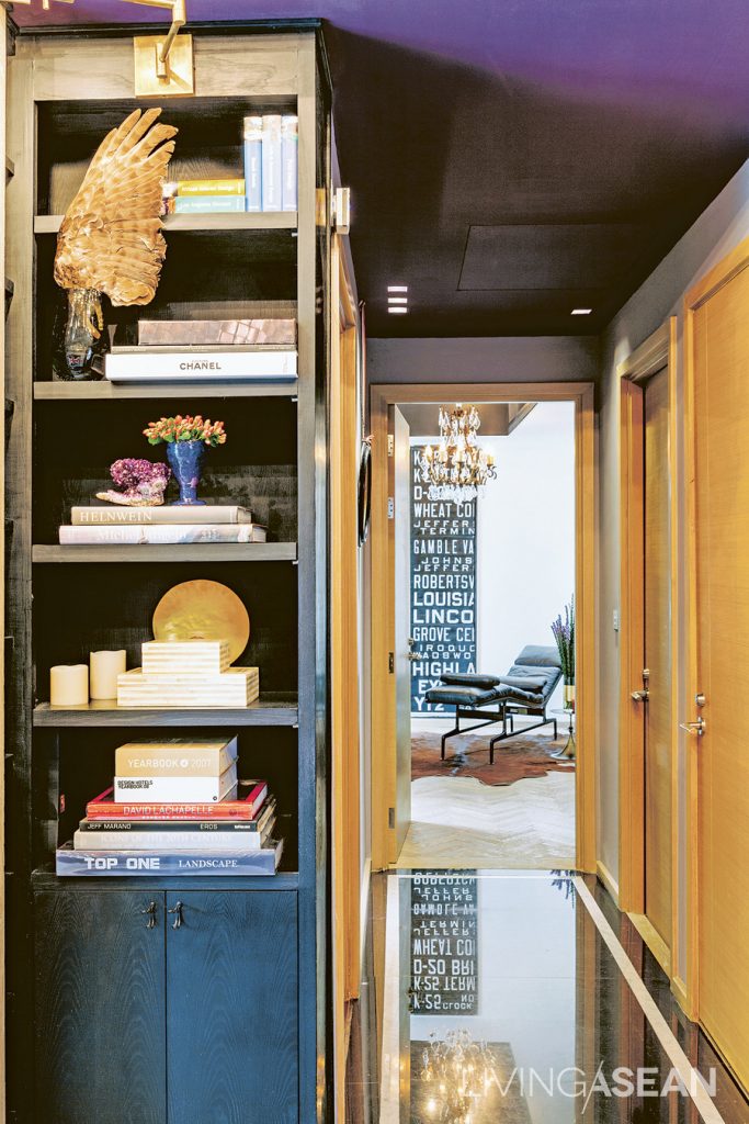
A connecting walkway features black granite flooring with a gold trim. It is designed to match the mysterious-looking ceiling in black.

The bedroom features the most straightforward décor. Relaxing white walls pair with parquet flooring and a large window that allows plenty of natural light. Yong puts his signature details everywhere, especially the black Italian lacework that is drawn tight against the glass pane, separating the bed from the living room, while letting the light through.
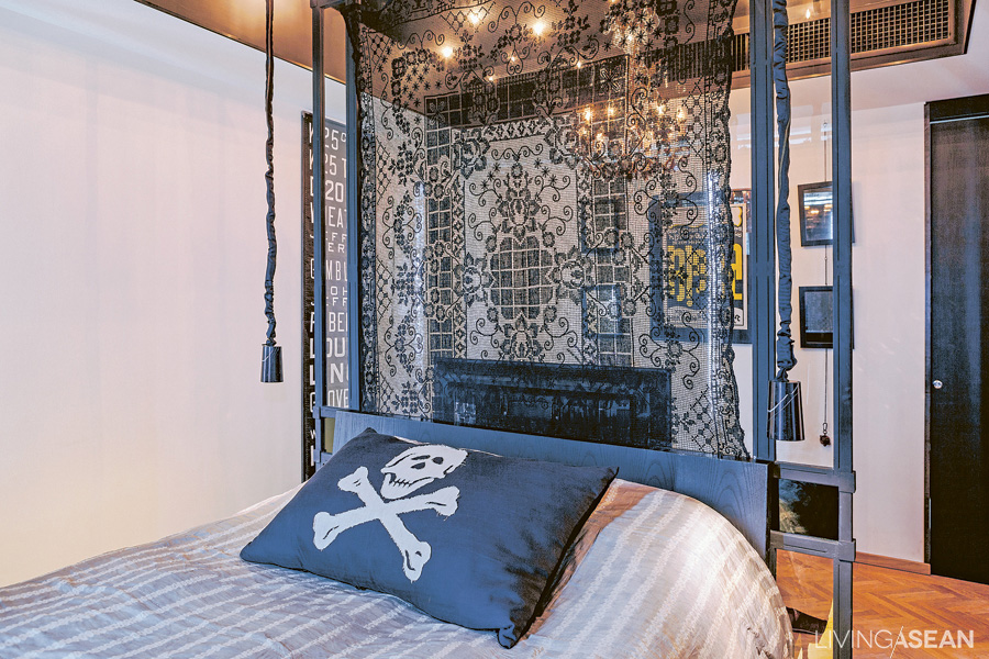
A clear glass wall sits behind the headboard. Black-dyed lace allows light to shine through. The ceiling comes in black adorned with LED lights.

Excitements add spice to life, but make sure it’s to your liking. The same applies to this homeowner, who has  ventured into the exotic territory. The vibrant style may be unfamiliar to many of us, but for him the enthusiasm is worth it.
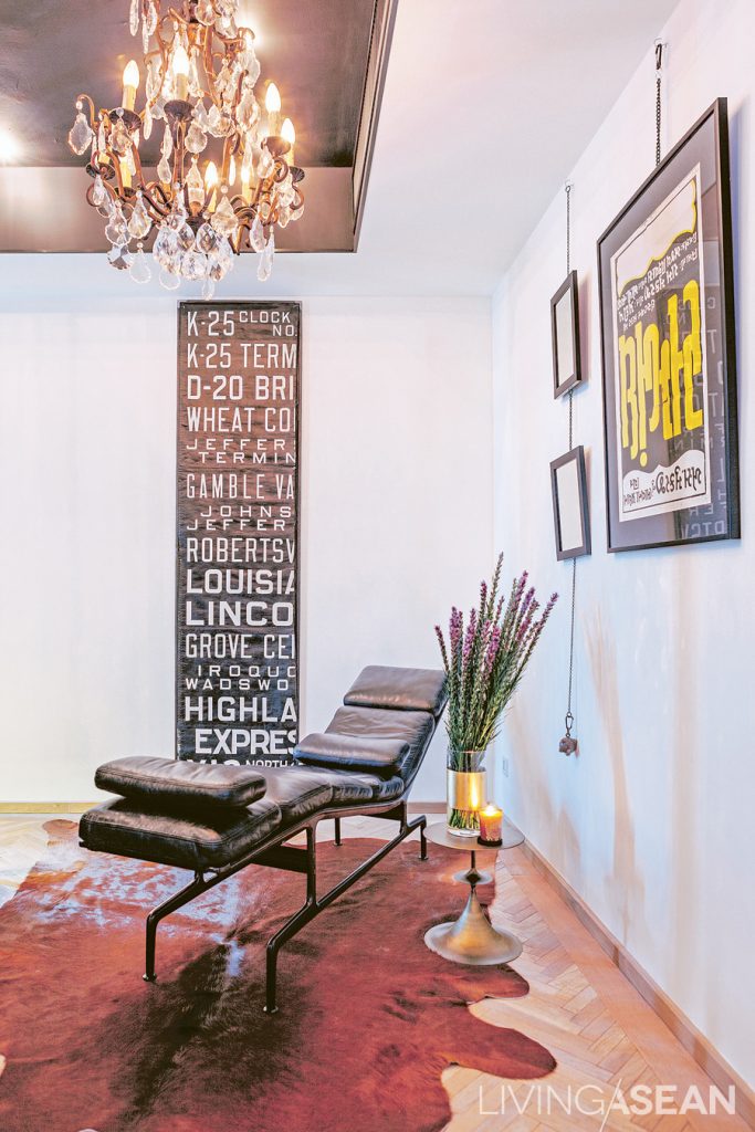
The bedroom's parquet flooring is set in the fishbone pattern. Wall décor makes for a strong contemporary style consisting of framed pictures, beautiful hangings, and movie posters of various origins.
The bedroom’s parquet flooring is set in the fishbone pattern. Wall décor makes for a strong contemporary style consisting of framed pictures, beautiful hangings, and movie posters of various origins.
An Exotic Oriental Home

An Exotic Oriental Home

The standard concept of “townhome” gets thrown out the window the minute you see this exotic oriental home.

/// Thailand ///

Story: “kirakira,” Photos: Sitthisak Namkham, Style: Somboon Gringgrai,
Owner/Designer: Pantavit Lawaroungchok of Apostrophy’s The Synthesis Server Co., Ltd., Contractor: Hem Heepkaew of Happening Design and Construction Co., Ltd.

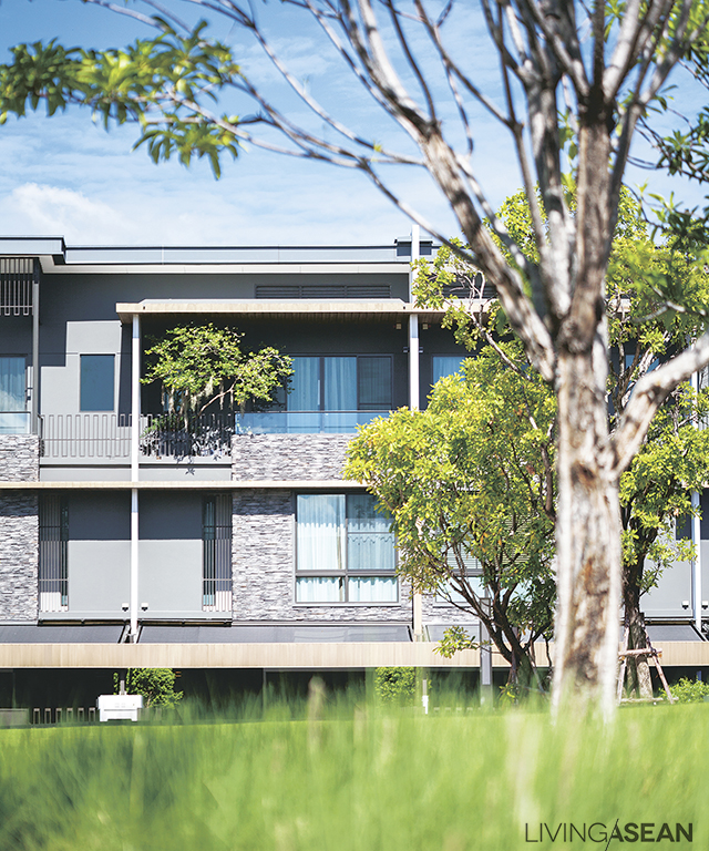
The townhome stands prominent behind green grass and trees. The house exterior features wood and stone, also containing the spirit of nature. The simple lines of the house in grey, white, cream, and brown convey a feeling of comfort.
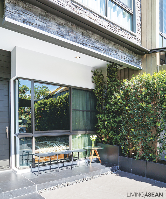
A relaxing spot in the front: A banyan hedge by the kitchen forms a sweetly refreshing green wall.
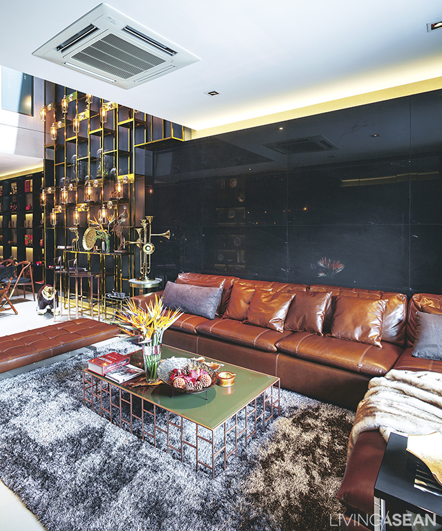
The family’s favorite hangout, with fancy furniture and bright gold ornamentation harmonizing in a common theme. A wall of black marmo granito in the back almost makes you think you’re in the lobby of a 5-star hotel.
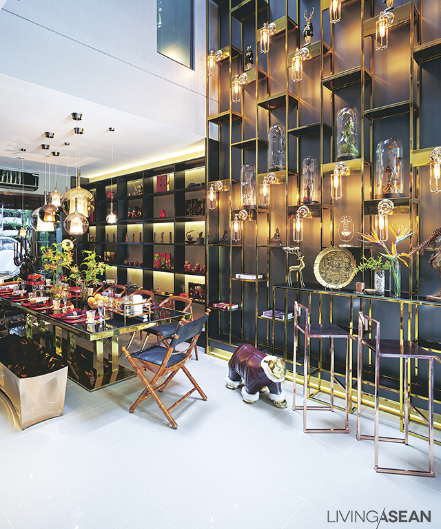
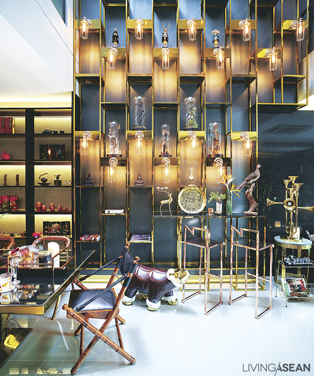
Dining corner, with a mixed array of furniture. At the side is a show wall with some of Pantavit’s most prized collections.


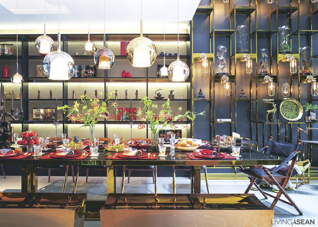
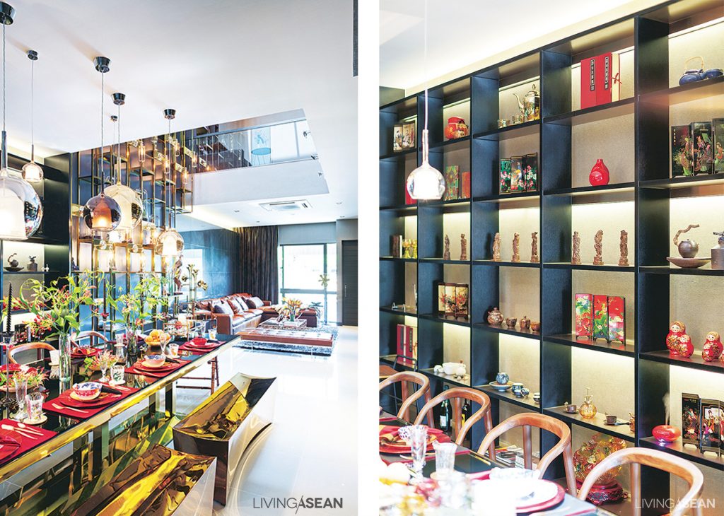
Pretty posh for a “townhome”, the mood is reminiscent of a formal dinner in a luxury hotel. An emphasis on lighting arrangement and bright, shiny furnishing makes for a uniquely elegant charm.

Pantavit Lawaroungchok, owner/design director of “Apostrophy’s” design studio, was experimenting with new urban living concepts and transformed his family’s property into something resembling a ritzy resort.

There are a lot of remarkable things about this house, beginning with the large central room’s “triple space” concept vertically connecting it to the sky, with a three-story tall clear glass “moonroof ” that opens and shuts by remote control to add dimensions of light and shade to each level. The open design also facilitates interaction among family members between floors.

On the first floor is a living room, dining area, kitchen, and vertical garden. Pantavit’s mother’s and aunt’s bedrooms are on the second floor, along with a small living space and Buddhist altar room. The third floor holds Pantavit’s master bedroom, actually more a kind of super-fancy penthouse with a bedroom, an entertainment area, a master bathroom , a dressing room, and a small garden on the balcony.

From the dining room looking out toward the entryway in front: furniture arrangement clearly splits the space it into definite zones. /// One of Pantavit’s favorite spots is the 3.5-meter dining table. It doubles as a place to work, or just to read.
Cabinet shelves have a mesmerizing shine: these are fabricated separately, then put together and finished using a spray-paint technique similar to what’s used in auto body shops.

Its interior decor consists of furniture and other items with a contemporary Asian look, a lot of it collectibles Pantavit fell in love with and brought back from trips abroad.

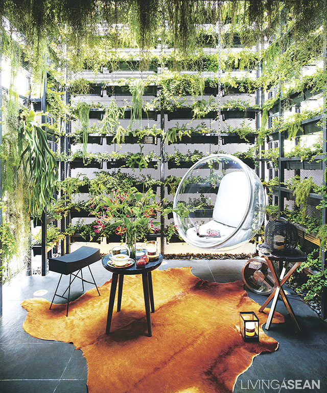
The area in back is built out into a 7.5-meter-high vertical garden, with plants divided into 3 zones, each receiving the same amount of light, moisture, and water through an automatic sprinkler and UV sun lamp system. The automation helps ease the hurried lifestyle of urban dwellers.

The exotic oriental house design is a fine expression of beauty that can be found in mixing Asian styles, and at the same time is a useful experiment in urban family living and novel use of space.

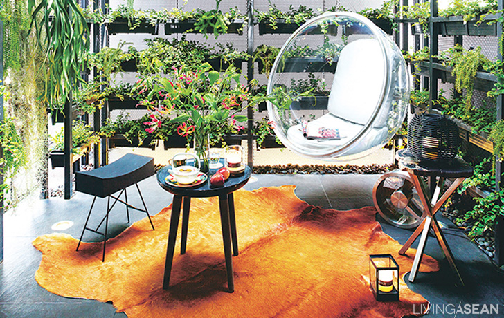
The back area of the townhome is transformed into a super-hip vertical garden. Here you can lounge around in this hanging modern-looking bubble chair made of clear acrylic.
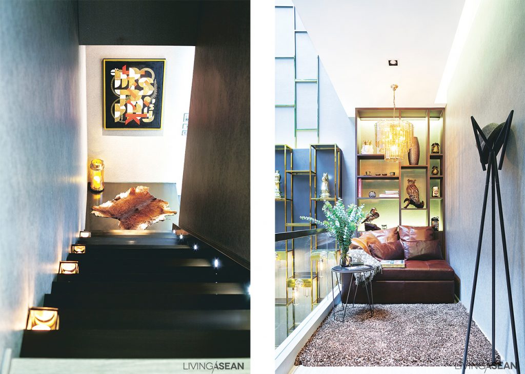
The stairwell is decorated with a very interesting abstract painting, intentionally placed there for its patterns that play with the planes of wall and floor. /// A “living room” corner on a mezzanine level has a warm, easy atmosphere.
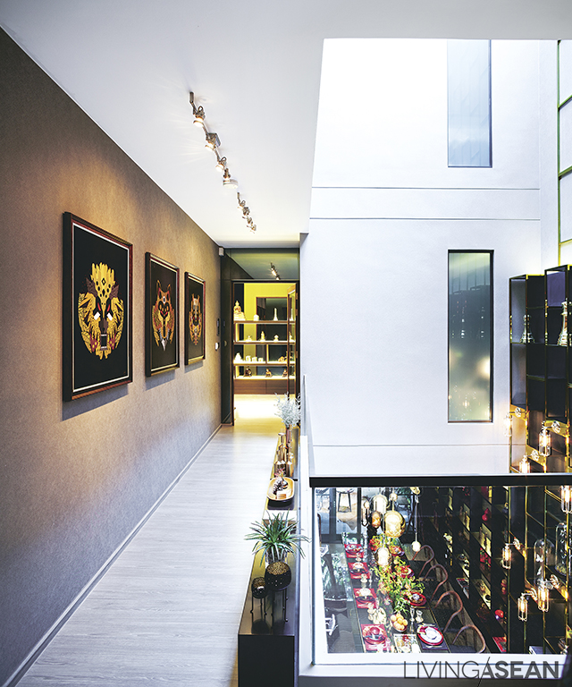
The walkway on the second floor is lined with beautiful pictures. From the guard rail, the lower floor can be seen, and family members on different levels can interact.
Inside Pantavit’s aunt’s bedroom we’re greeted by soft, inviting, and restful lighting. The vertical patterns on the wall fools the eye into thinking the room is larger than its actual size.
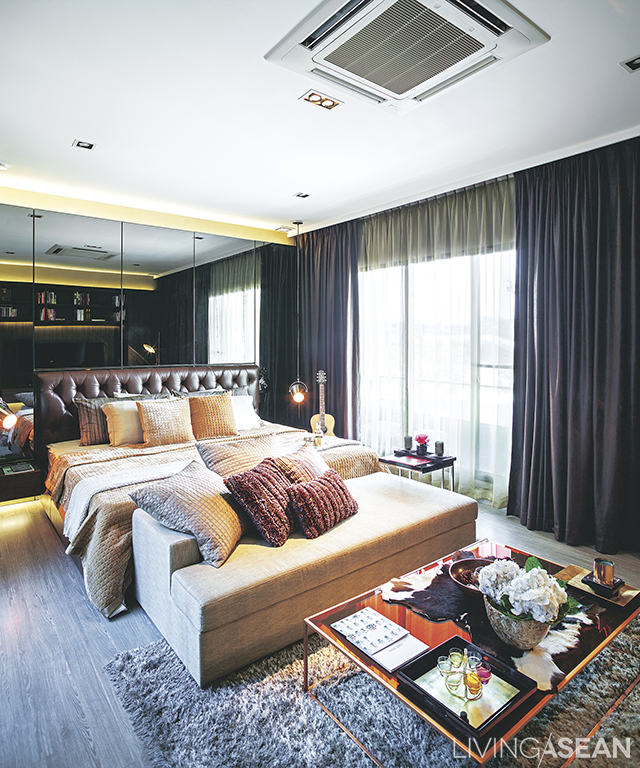
The master bedroom on the third floor is done in white, cream, and browns. Mirrored panel behind the headboard makes the room appear to be larger.
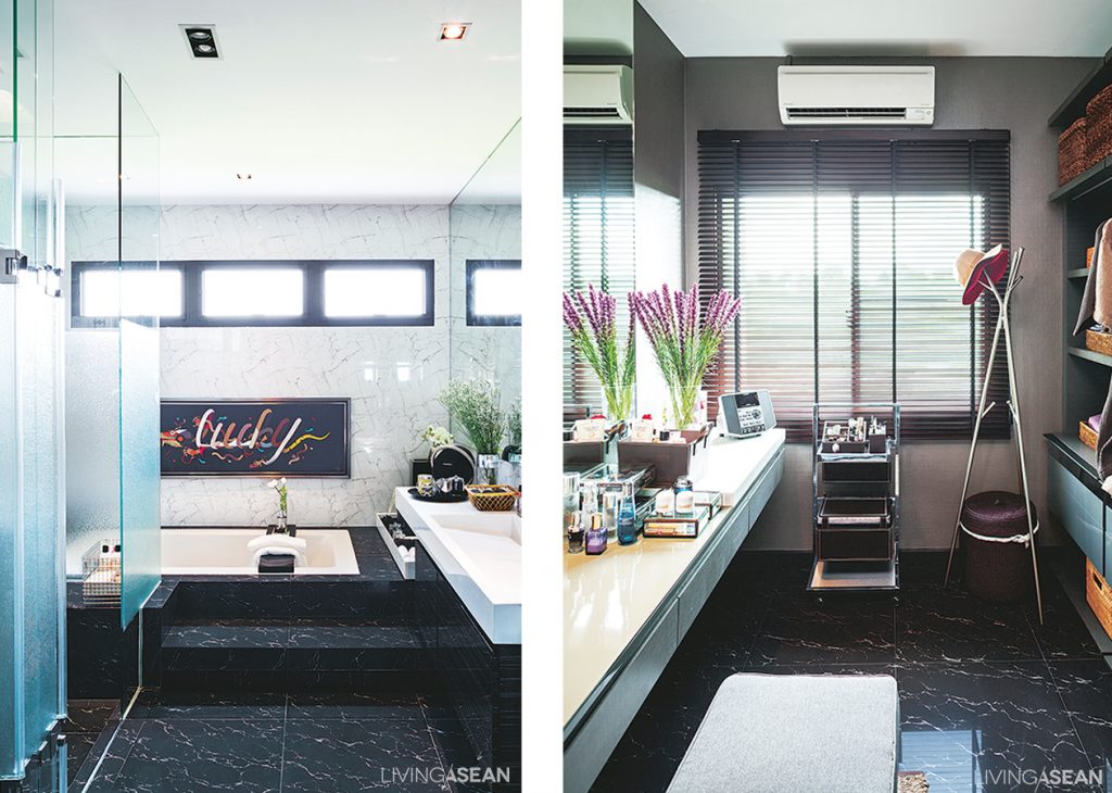
The master bath has a shower section and a bathtub. A washbasin is designed for two. One of the walls has openings to let the natural light in. /// In the master bedroom directly adjoining the bathroom, a dresser is arranged along the wall in the dressing room. Venetian blinds are on one side of the wall for sufficient light during makeup.
A Modern Classic House

A Modern Classic House

This modern classic house was inspired by the classic style of architecture, but adapted for a simpler look to fit contemporary ways of life. The interior is spacious, with a very high ceiling.

/// Thailand ///

Story: Supachat Boontang /// Photos: Sitthisak Namkham /// Style: Somboon Kringkrai /// Architecture: The Emperor House Co., Ltd. /// Interior Decoration: 8 Interior Architect /// Landscape Architecture: Little Tree by Siritvit Riubamrung and Charturong Khunkong

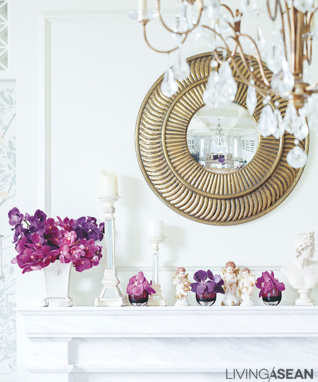
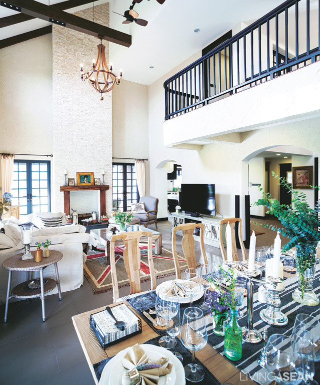
The parlor’s white wall brings out the gold of decorative wall mirrors and hanging lamps. Orchids are arranged in small bouquets.
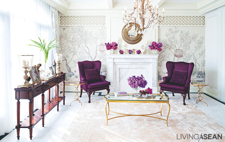
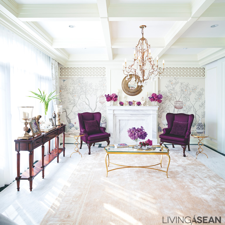
The reception parlor and living area in white and cream is fresh and bright with classic purple armchairs, which the owners really love. A glass wall and a golden center table with super-shiny surface help to break up the room’s dazzling whiteness and add an elegant touch.
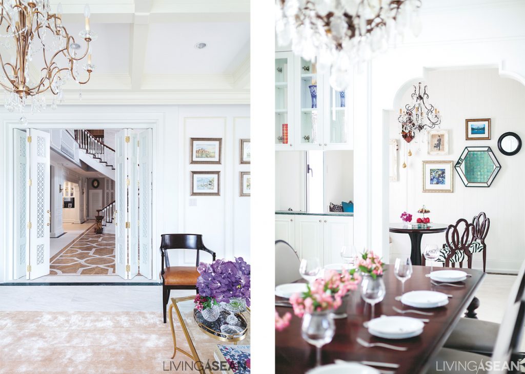
The parlor is separated from the large main room of the house by a folding wooden partition that keeps the room from being too hidden away. /// To one side of the dining room is a small, relaxed corner for morning coffee and informal breakfast.
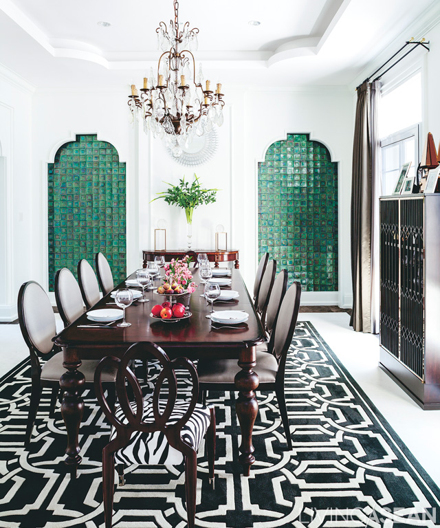
The dining area comes in white from floor to ceiling to walls. A green mosaic tile and black and white graphic pattern on the rug help keep the space from appearing too empty and bland.
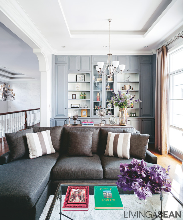
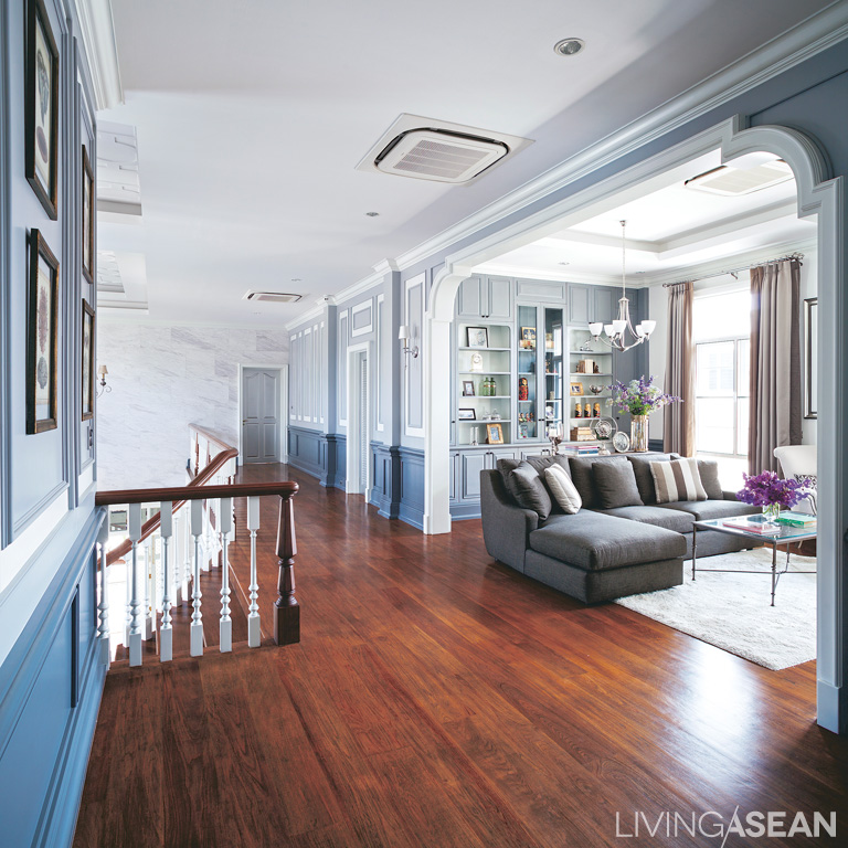
The “living room” corner on the second floor has grey shelves behind it. The strong brown of the sofa and gently patterned throw pillows give warmth to the room and make it an attractive place to be.
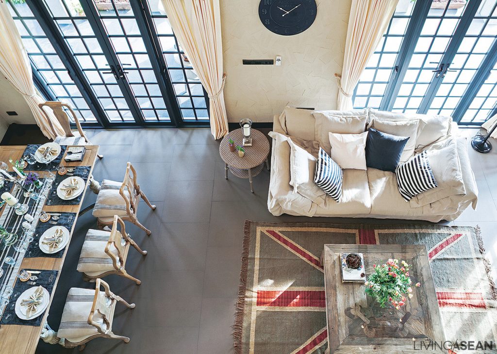
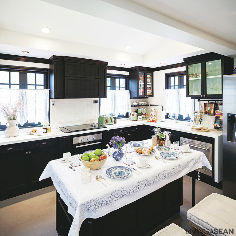
To make the house look warmer and more welcoming, the designers pared down the size of large areas by using arches for demarcation.

Cream and white, light colors relaxing to the eyes, were used in unique combination with a different color in each room, creating charm and interest with purple, emerald green, and gray.

The interior decor doesn’t clearly indicate any particular style, but retains a classic foundation, or better said, a hint of American classic, reducing decorative elements for a more elegant presence, yet still warm and inviting.

Upstairs, they “living room” corner right near the staircase in the center of the house, is a practical place to meet and chat before bedtime.
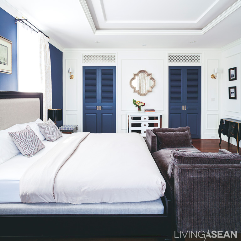
The master bedroom is symmetrically designed like a fancy hotel room. Following the designer’s suggestion, white and navy blue are used in tandem for a dignified atmosphere.
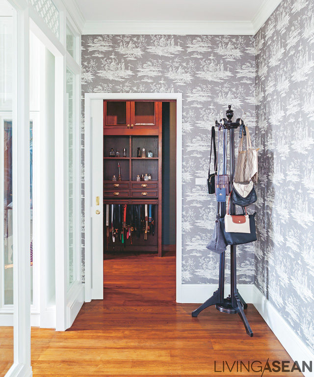
Contemporary wallpaper adds a special look to the entryway connecting the dressing area to the master bedroom.

Furniture placement emphasizes a balance consistent throughout the house and garden. There is minimal ornamentation, but everything is arranged correctly for the house to come off as posh, beautiful, and well set up.

Nature is brought in boldly to supplement the classic house. There is a wonderfully shady and green English garden with a stylish gazebo for relaxation and socializing. All in all, this is a modern classic home truly shaded by nature.

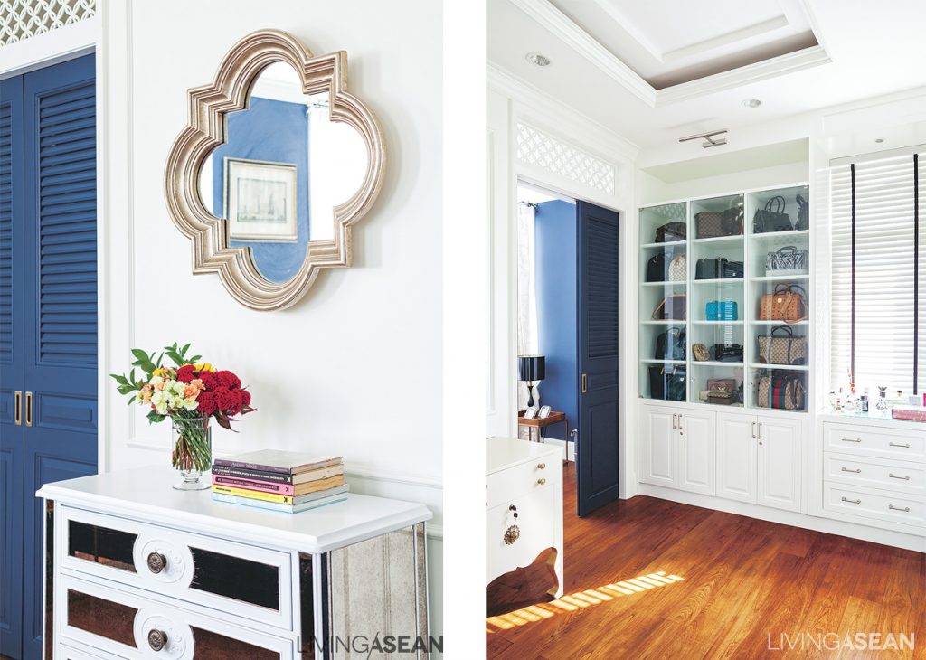
Simple but effective, a mirror with a fashionable, classically elegant shape hangs on the wall. /// The dressing room has a built-in cabinet with a clear glass surface for easy access to stored items.
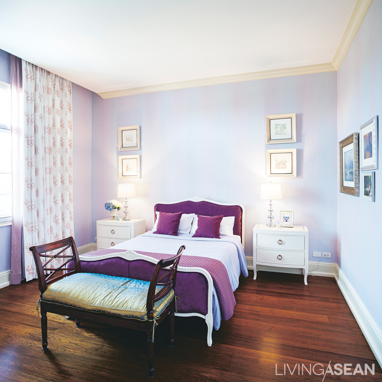
The small bedroom features a gorgeous combination of lavender, white, and cream made for a sweet atmosphere.
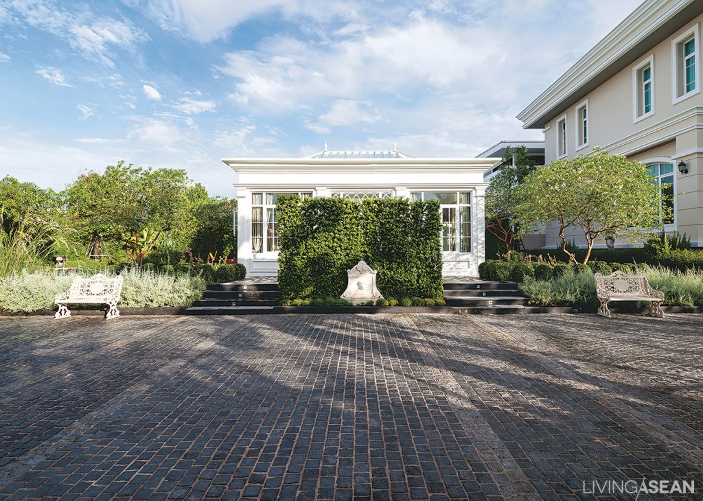
At the side of the house is a shady English-style garden, planned in symmetrical balance, with a gazebo front and center whose design matches well with the house.
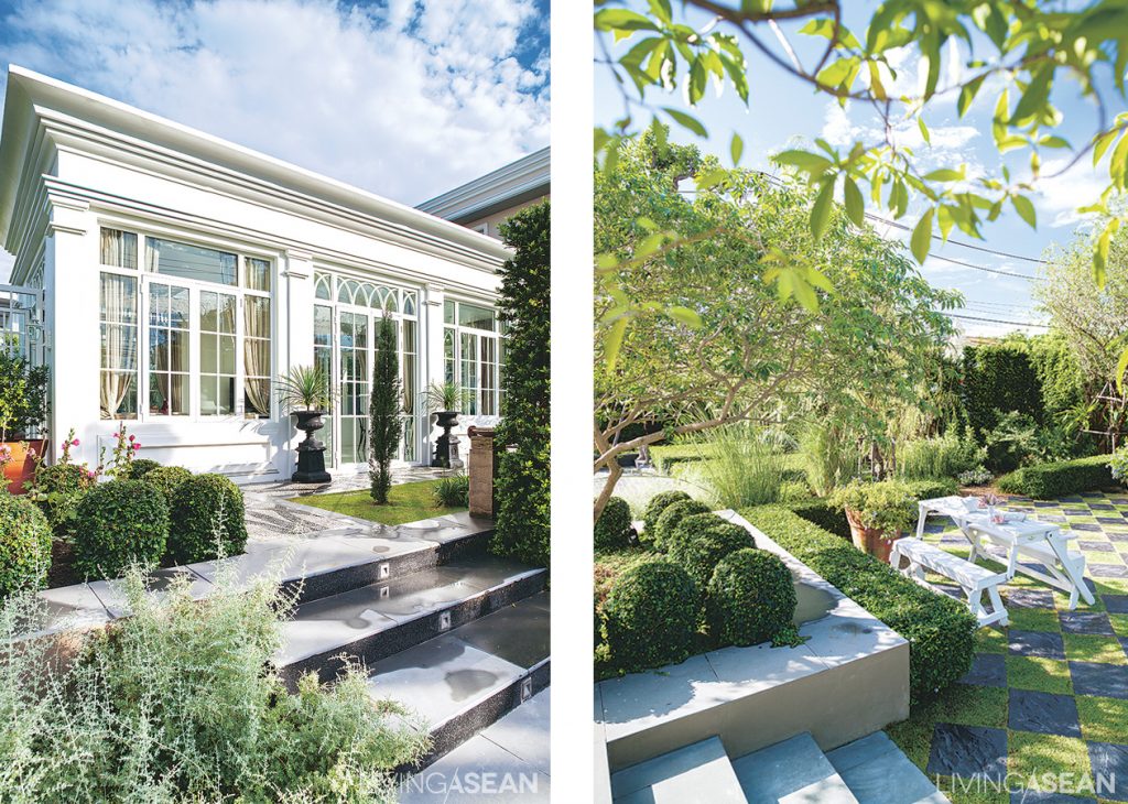
The small building is used for receptions and dining on important occasions. /// A cute spot for socializing, the area showcases alternating paved and grass blocks in the chessboard pattern often seen in English-style gardens.
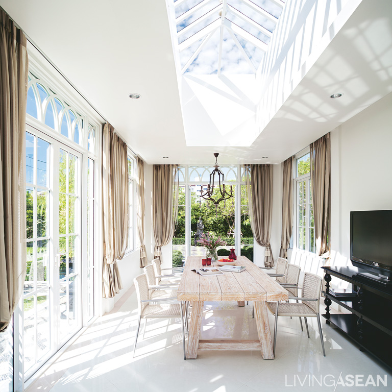
A roof of clear glass lets natural light into the mid-garden gazebo. Surrounding aluminum-framed glass walls connect a view of the garden outside.
Everyday Relaxation: A Lovely Home in the Hills

Everyday Relaxation: A Lovely Home in the Hills

Surrounded by mountains and the clean, pure beauty of nature, the owner of this lovely home in the hills feels there is no better place for him and his family to have a wonderfully peaceful retirement life. No more do they have to travel abroad for relaxation.

/// Thailand ///

Story: Warapsorn /// Photos: Sitthisak Namkham /// Architect: Dot Line Plane
/// Interior Decoration/Construction: Happy Hours Co., Ltd.

Surrounded by mountains and the clean, pure beauty of nature, the owner of this lovely home in the hills feels there is no better place for him and his family to have a wonderfully peaceful retirement life. No more do they have to travel abroad for relaxation.
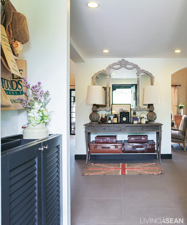
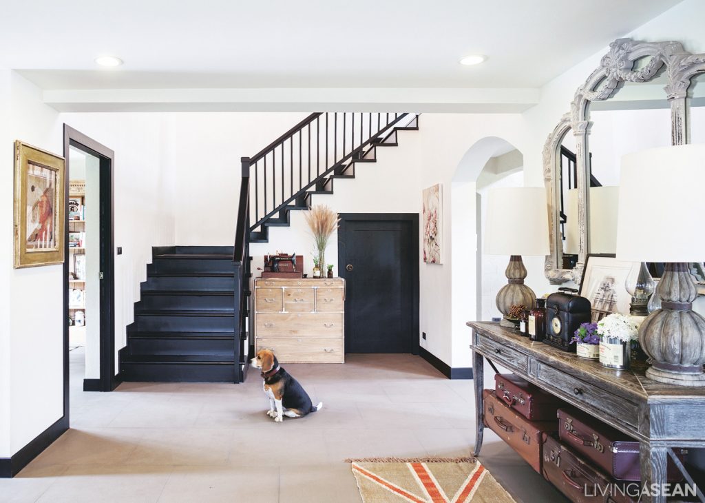
We come in from the carport to a welcoming parlor furnished with an antique console dresser.
The stairway in the entry hall leads up to the second floor.
The living room adjoins the dining area. This part of the house is light and spacious, with glass doors on all sides.

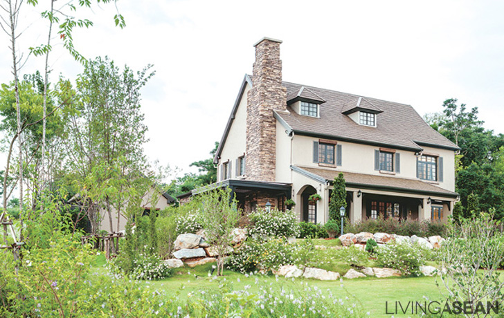
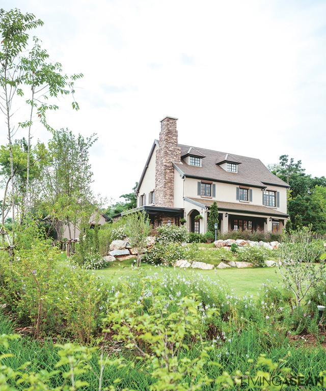
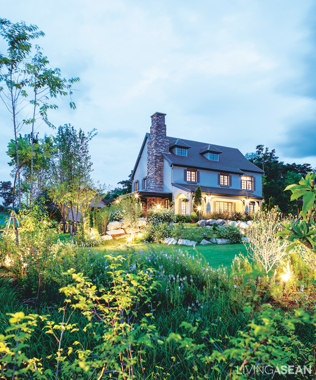
The house is modeled after residences in the Cotswolds, an ancient rural area in the south of England, and adapted to suit the weather and available building materials in Thailand. With a steep, narrow-eaved roof, it has arched entryways and many windows. The top floor is really an attic, with the roof as ceiling. There is a fireplace and chimney for use in the cold season. The charm of the house shows in the craftsmanship.

The island can easily switch uses to serve as a dining table


The living room has a high ceiling, with beams added in to illustrate details of house construction.


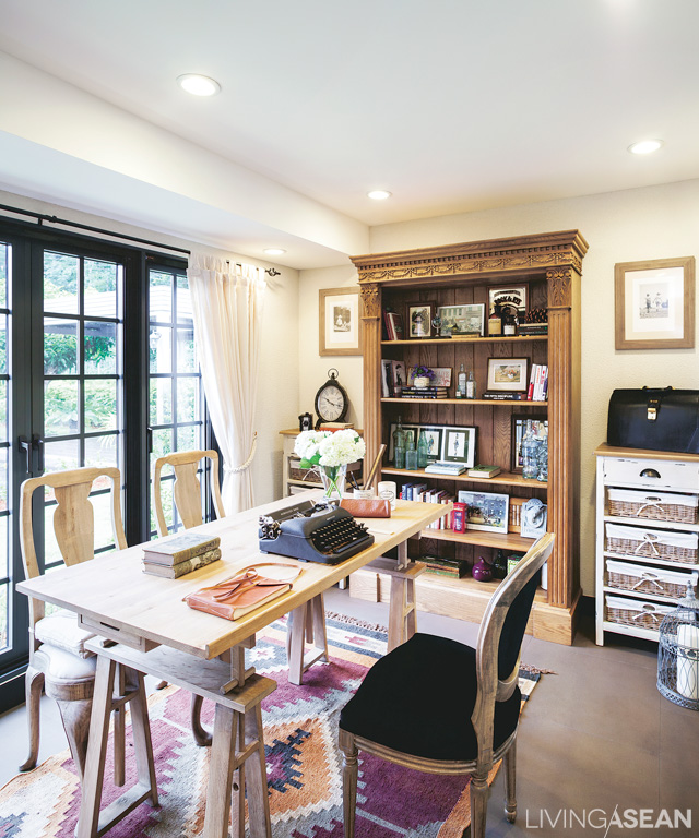
The workroom is warm and comfy with long glass windows looking out on the garden.

Outer walls are of stone, which provides good insulation, and the longer the house stands, the more classic its beauty will be. The interior is open and comfortable. Glass windows and doors open wide for garden views, besides catching the breeze and letting in natural light during the day.

Colors are earth tones, warm and relaxing. The garden is designed to match the style of the house: warm and natural-looking, after the fashion of English gardens.

Where the home environment is naturally lush and green and the weather is cool and comfortable almost the whole year, each day of life brings deep relaxation and comfort.
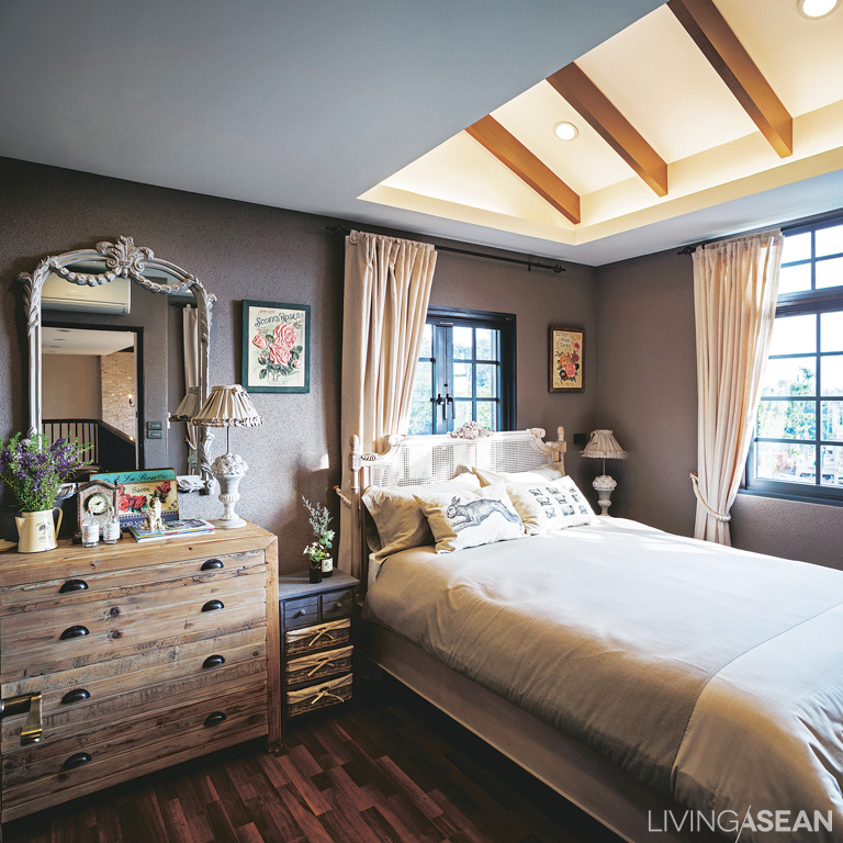
The master bedroom with charming country-style furnishings: Wooden beams are set above the bed for decorative effect. Recessed and indirect lighting provides a soft, relaxing illumination.


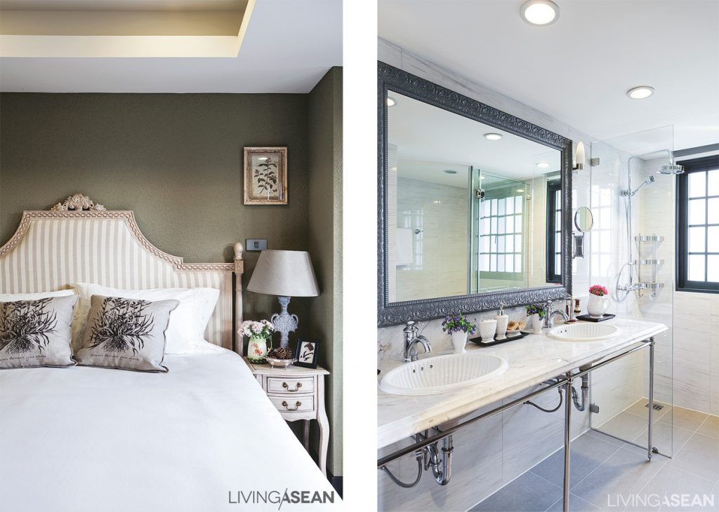
Bedroom décor on the lower floor features cream tones, with olive-green walls. /// The master bath has a double washbasin with a stylish marble countertop .
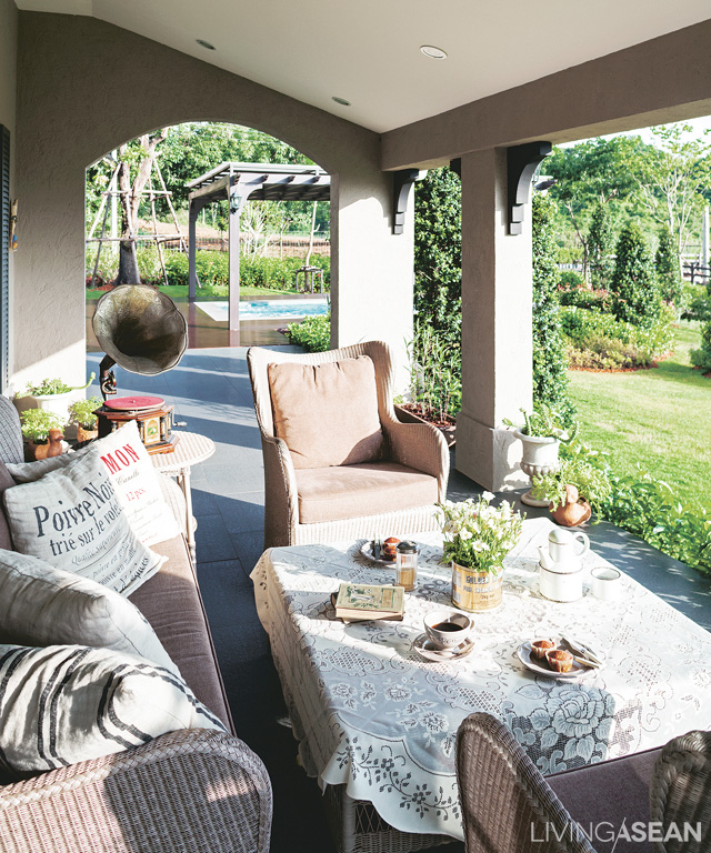
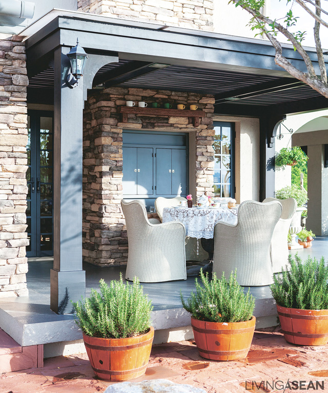
A verandah with warm-colored wicker sofa and chairs opens out directly from the living room. On good-weather days this is a great place for breakfast or an informal lunch.
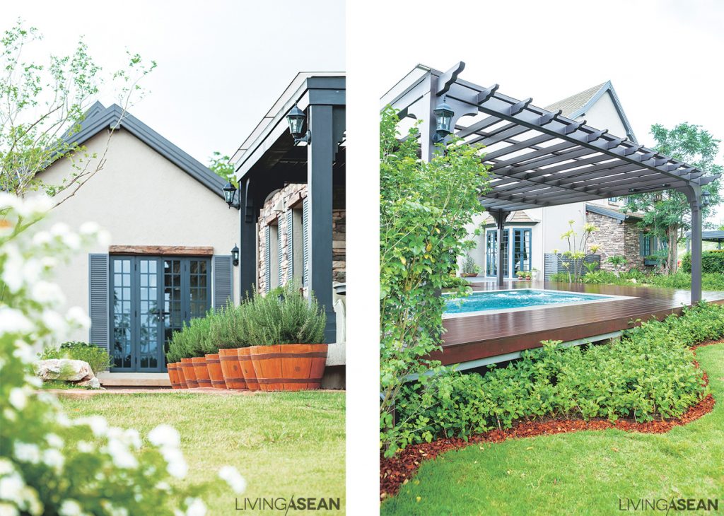
The deck on the far side of the house is under an extended roof. Table and chairs are set out for easy dining or a small family party.
The kitchen building is for serious food preparation. Split off from the main house, it still has a section for non-cooks to sit and hang out. /// A small swimming pool, set off from the house, is covered to protect against the heat.

013

A Homey Condo

A Homey Condo

The impeccably proportioned home is a homey condo in a skyscraper-studded Thonglor District. Ten years ago, his parents bought 70 square meters worth of room here to use for rental income. As the room deteriorated over time, the owner found a chance to transform it into a home of his own.

/// Thailand ///

Story: Mone /// Photographer: Damrong /// Style: Praphaiwadee  /// Designer: Arujit Lertkitja

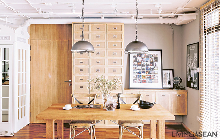
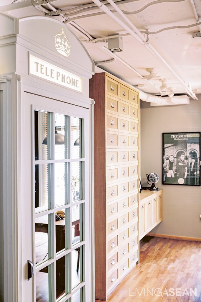
“I wanted an ordinary cabinet, but we couldn’t find a cabinet to match the other ones. One day I stumbled across a telephone booth, which was big enough to hold a washing machine. Finally I decided to put it in for a unique look!”
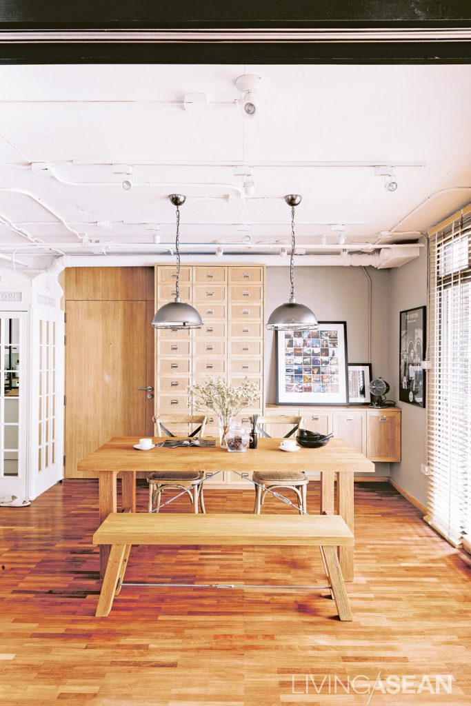
Different shades of teakwood add dimensional depth. Silver lamps draw attention to the pipe system on the ceiling.

Thanks to the owner’s job as marketing manager, working in real estate put him in touch with Arujit Lertkitja, interior designer for Coquo Studio. When Oat sounded him out about taking on this project, he got back a slew of ideas for a dream house makeover: “I didn’t know what the style I wanted was called, so I opened up magazines looking for keywords, and sent Oh over two hundred reference photos. Oh’s suggestion was to add sweet details by selecting lighter shades of wood since my wife would be living here, too.”

A metal-framed mirror wall creates an illusion of a larger kitchen.

From the reference pictures and many heart-to-heart chats with the designer, the two came up with the “industrial loft” style. From a two-bedroom flat, it was converted into a studio. Just one bedroom was left. Walls were demolished to connect the kitchen, dining room, and living room, while doors were put in to clearly define private areas: bedroom, bathroom, and dressing room.

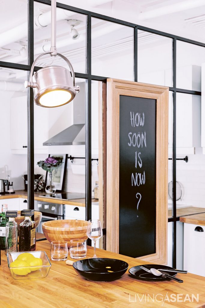
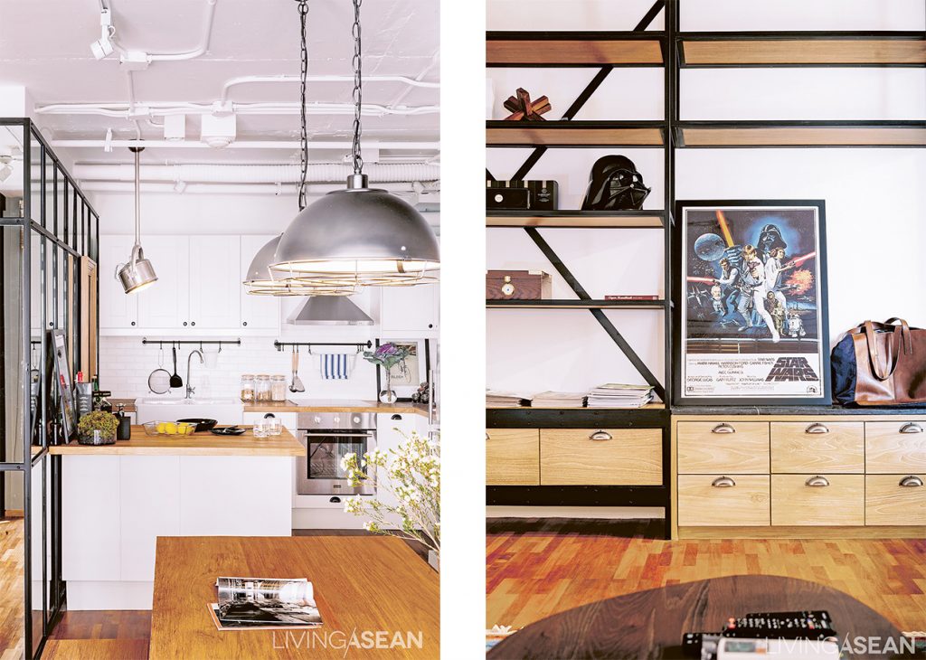
This white-themed kitchen corner has an especially sweet and classic look. It's a “full kitchen” for people who like to cook. The island adds an extra space. It also functions as a cocktail bar during a party. /// The chic-looking built-in shelves hold Oat’s books and collectibles.
This white-themed kitchen corner has an especially sweet and classic look. It’s a “full kitchen” for people who like to cook. The island adds an extra space. It also functions as a cocktail bar during a party. /// The chic-looking built-in shelves hold the owner’s books and collectibles.

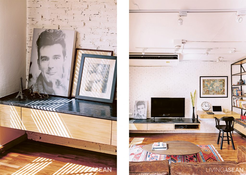
The old condo ceiling was completely removed to display the newly installed pipe and conduit systems. Besides adding the rawness, the removal also raised 20 centimeters from the original ceiling height. They used materials with rough surfaces, such as white brick and black window frame, all for a slick and modern look on a budget.

For a more relaxing look, brick pointed white add texture to the walls in the living room and workroom. /// Floating shelves and tables lined along the wall reduces tension while providing full functionality.

To add warmth and reduce the room’s harsh roughness, the owner and the designer kept the teak floor, but scoured and polished to make it pale and bring more light into the room.  Oh decided on built-in furniture with some movable teak pieces, planed them down and painted them white for a softer look.

These fit in nicely as a set when mixed in with furniture from old houses, which the owner himself had searched out and selected.

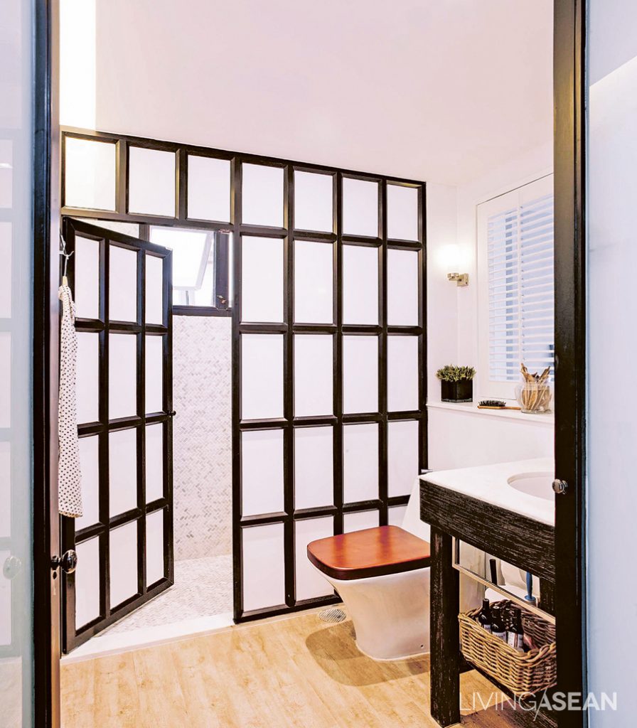
Oat replaced the old bathtub with a shower, separating dry and wet bathroom areas with a black-framed metal partition. The wood tile floor here brings a warmer feeling and a connection with other rooms.
The owner replaced the old bathtub with a shower, separating dry and wet bathroom areas with a black-framed metal partition. The wood tile floor here brings a warmer feeling and a connection with other rooms.

“I was consulting with the designer about furniture all the time. Before buying, I sent pictures to get her comments and suggestions. Sometimes she’d run into something really suitable, and just buy it herself in advance.”

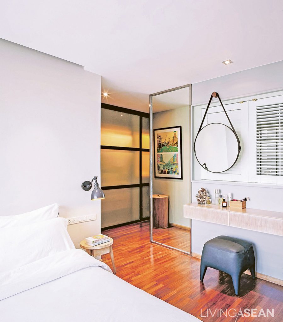
The clean and orderly bedroom connects to a dressing room. The black metal doorframes go well with the other parts of the home. Large glass pane along the corridor makes the space look wider and more open.
The clean and orderly bedroom connects to a dressing room. The black metal door frames go well with the other parts of the home. Large glass pane along the corridor makes the space look wider and more open.

Besides the totally pleasing décor, the impressions of this house left us with the kind that really makes a place a “home,” in contrast to just a “place to live”. The word “homey” really fits the surprisingly mellow ambience of this industrial loft residence.


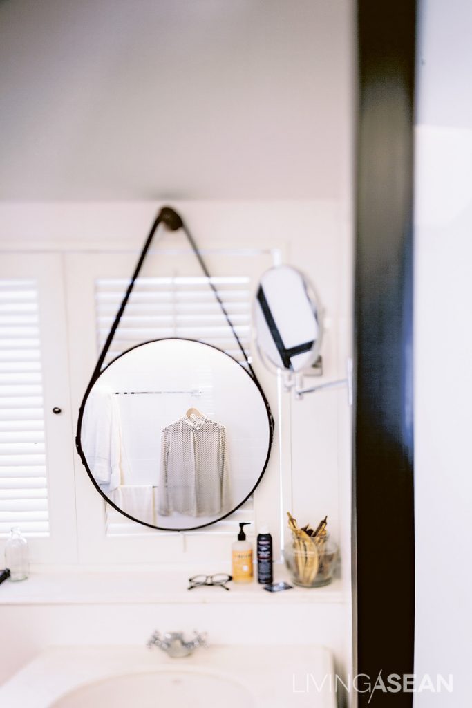
Having wooden-shuttered windows behind the wash basin connecting to the bedroom creates a nice view from the bathroom, and also lets more natural light come in.

tae131214_034

Craftsman’s Cottage

Craftsman’s Cottage

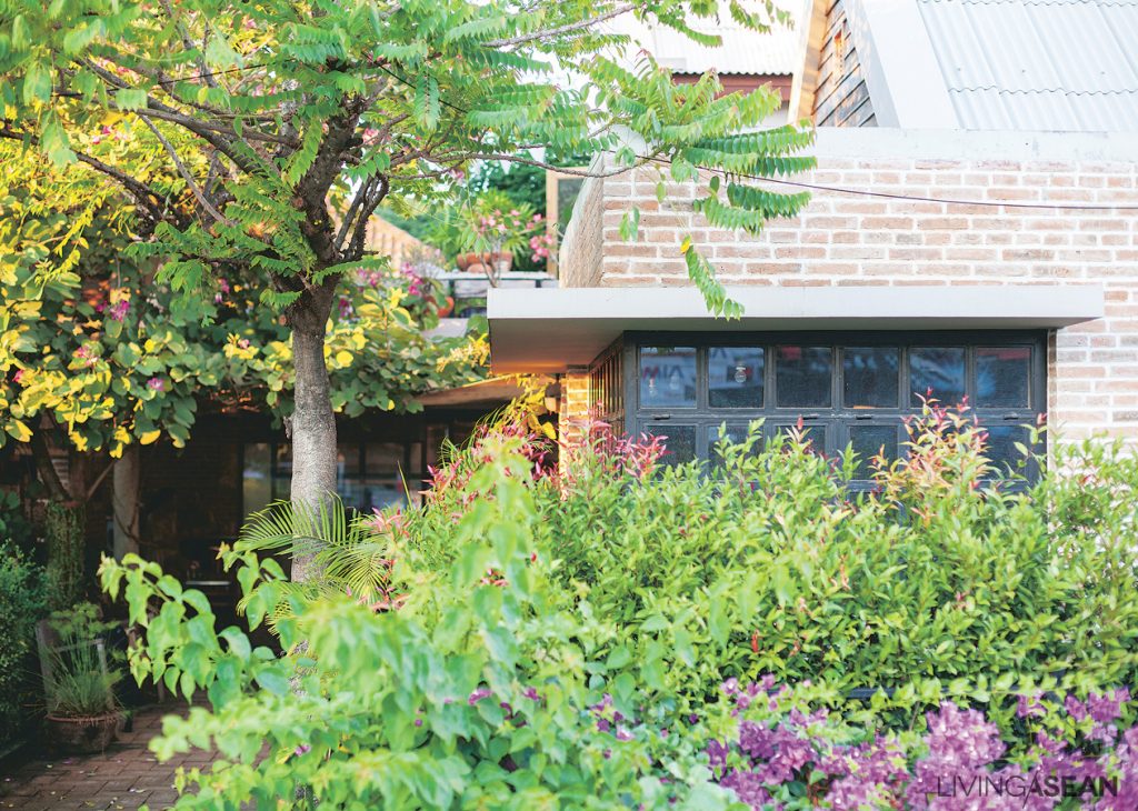
The cottage is nestled amidst a thicket of lush tropical plants, including star gooseberry and orchard trees, also known as butterfly. Vibrant tones of green highlight the thriving foliage that has grown so thick it hides the second floor of the building.

/// Thailand ///

Story: Panchat Changchan /// Photographs: Rithirong Chanthongsuk, Sitthisak Namkham /// Owner / Decorator: Pithichinda Chidsin, Kittiwat Sitthi

The house stands enveloped by a thicket of green tropical plants. Tall trees provide a canopy to the interior spaces. Its design takes full advantage of natural ventilation and eliminate the needs for mechanical cooling.


Crisp, cool shades abound thanks to plenty of full-grown trees on the property. Long roof overhangs are built of concrete in smooth finishes. They exist in harmony with textured brick walls that speak to the traditional lifestyle of the area.


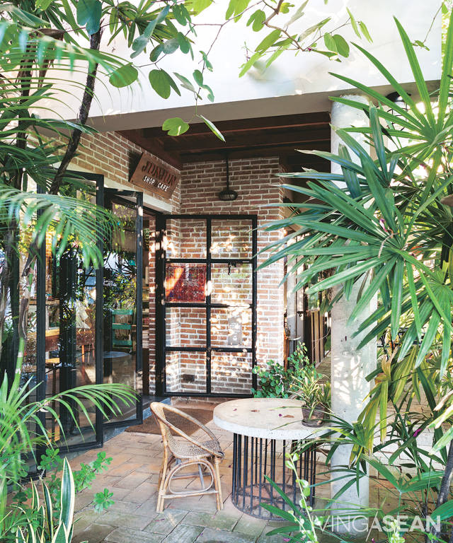
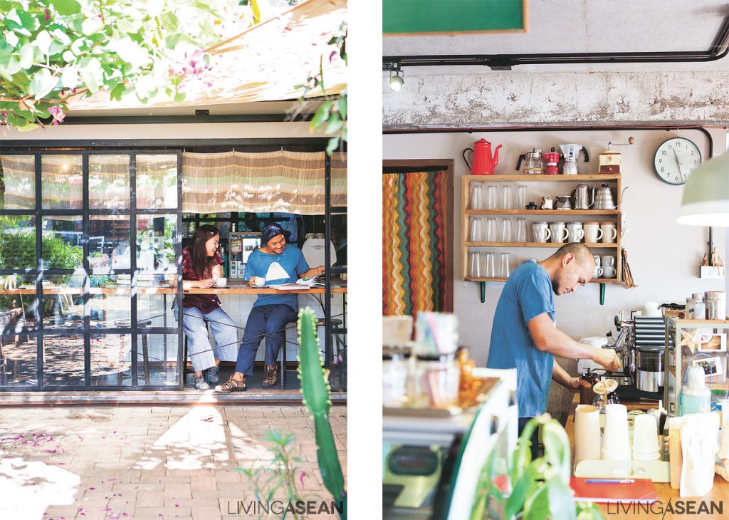
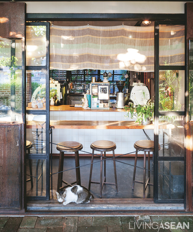
Located in Chiangmai, “Junjun Shop & Café” is widely known among handicraft lovers. It is a home with a retail shop in it. The two-in-one business address belongs to Pithichinda Chidsin and Kittiwat Sitthi. Behind the shop windows lies a chic small café. There are retail spaces right next to it that boast a full array of craft items and local handmade goods.

The owners sit by the glass windows enjoying their coffee on a sunny day. /// Kittiwat is not only a skilled craftsman, he also knows a lot about coffee making.

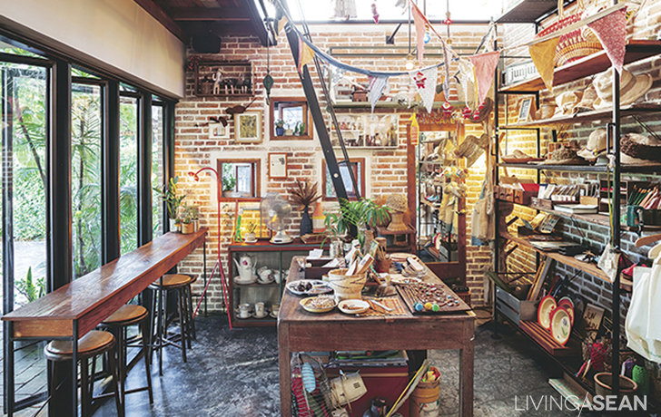
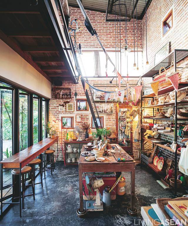
Inside, brick walls with textured finishes add a raw feel to the ambience. They stand tall reaching all the way to the roofline. Craft tables and chairs that fill the display area come from many sources. They represent the skill sets, taste, and styles that the owners admire the most.

Despite its relatively small size, tall ceilings design makes the ground floor business space look wide open and well ventilated. There is a staircase that connects it to the work studio upstairs.

According to Pithichinda, she and Kittiwat thought a home with business in it would serve their needs best. After their final decision to move here, they left the designing work in the good hands of their architect friends.

“I wanted an open space design. I would prefer bricks and wood rather than other materials in order to give it natural appeal and communicate Chiangmai local craft styles. I didn’t give much thought to the decoration. They were sentimental items that I have been collecting, mostly DIY handmade stuff. Kittiwat loved growing plants. So we put in lots of them,” Pithichinda said.

005

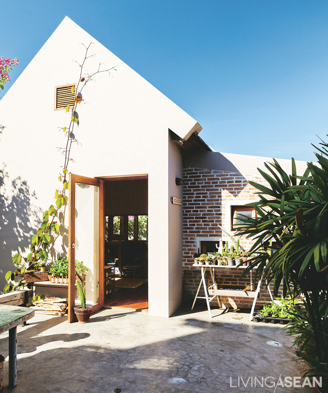
On the second floor, two cottages sit snugly apart from each other. The first is the couple’s residential unit with a bedroom/bathroom combo. The interior is minimalist in style with only a few pieces of furniture. Smooth concrete walls are painted white to give it a light and open atmosphere. There is a staircase that conveniently connects it to the business spaces.

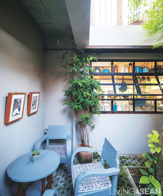
A coffee corner sits on the patio decorated with old pieces of furniture. Long roof overhangs and the crisp cool canopy of tall trees combine to make the area very comfy.

The second cottage features a stark contrast. Its walls are crafted of brickwork with textured finishes that blend well with the business spaces below. It serves multiple purposes as a work studio, living room, and reading room. The business area below can be seen in full view from upstairs. The living room boasts old-fashioned furniture and a rich array of collectibles that the couple has acquired over the years. Other functions, such as kitchen and laundry are performed back in the old house nearby.

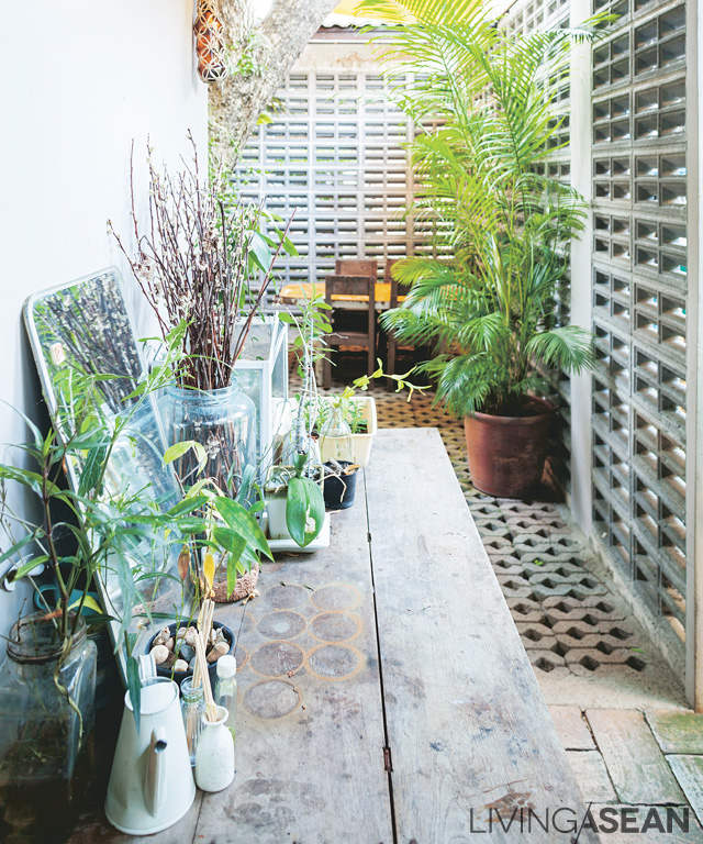
Exterior boundary walls separate the new and old buildings. Hollow bricks design promotes natural airflow and serves as a privacy curtain for areas that needs protection.

The two cottages are linked to each other via an open-air deck that has since become an ideal place of rest the two homeowners. It serves multiple purposes, ranging from furniture evaluations to dye testing to growing plants. More often than not it is used for just relaxing after a hard day’s work. “The two of us used to go camping out in the woods a lot. We hardly have time for that now. So, The second floor deck comes in handy. Sometimes, our friends come by and we enjoy the barbecue together up here.”

On the second floor stand two cottages set apart from each other. The atrium that lies in between serves multiple purposes.

The bonfire, the smell of firewood and the cottage itself evoke fond memories of the good old days that the couple still cherish and care for lovingly. There is nothing like coming home to a company of good friends and camping out again, albeit on the deck.


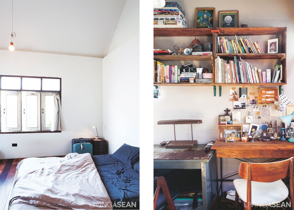
The bedroom is painted in white that look great with doors and windows. Personal belongs, mostly collectible items, are stored in suitcases. /// The craftsman’s work studio shows the owners’ workbench and desk. Box-shaped shelf is mounted on the wall where necessary tools and utensils are keep within easy reach.


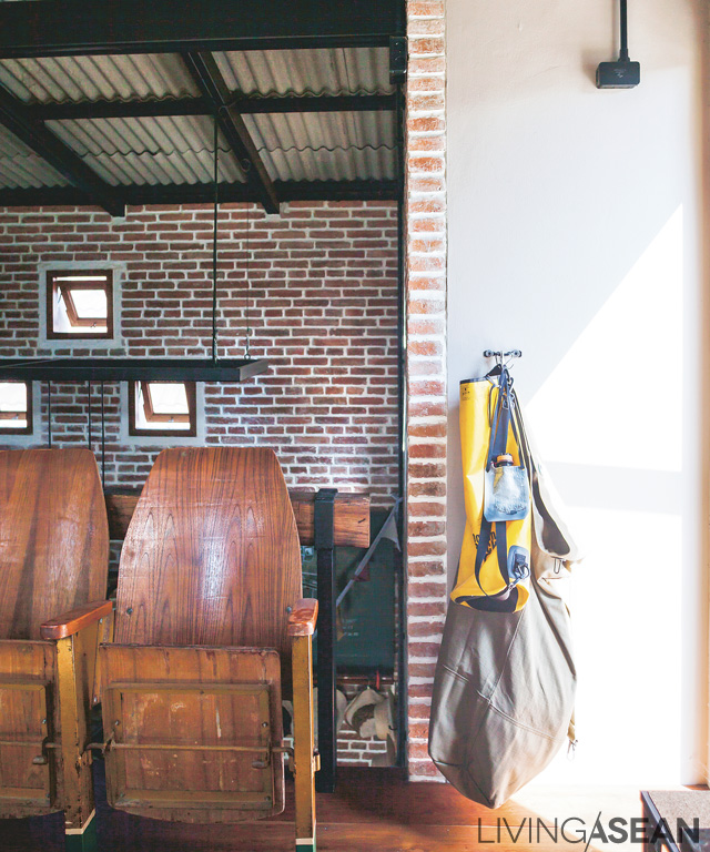
Old theater seats made of wood are placed here temporarily as the homeowners try to find a perfect spot for it.


The cottages boast a simple gable roof style that is typical of small-sized homes. Exterior decorating details are minimized. Clean geometric design underneath the sloping planes enhances its modern home character.
X