A Homey Condo

A Homey Condo

A Homey Condo

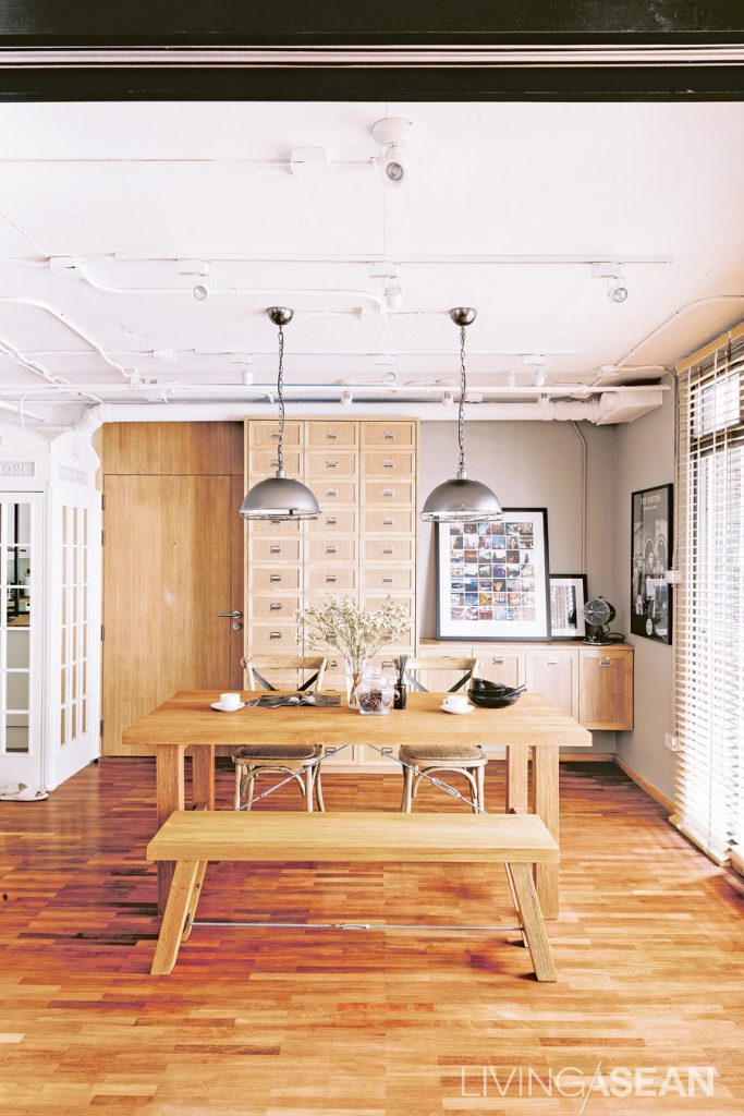
The impeccably proportioned home is a homey condo in a skyscraper-studded Thonglor District. Ten years ago, his parents bought 70 square meters worth of room here to use for rental income. As the room deteriorated over time, the owner found a chance to transform it into a home of his own.

/// Thailand ///

Story: Mone /// Photographer: Damrong /// Style: Praphaiwadee  /// Designer: Arujit Lertkitja
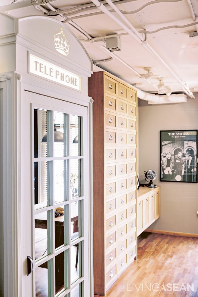
“I wanted an ordinary cabinet, but we couldn’t find a cabinet to match the other ones. One day I stumbled across a telephone booth, which was big enough to hold a washing machine. Finally I decided to put it in for a unique look!”
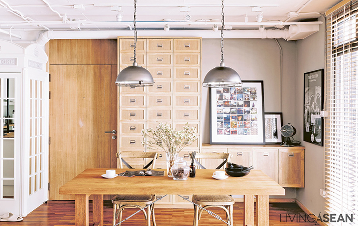
Different shades of teakwood add dimensional depth. Silver lamps draw attention to the pipe system on the ceiling.

Thanks to the owner’s job as marketing manager, working in real estate put him in touch with Arujit Lertkitja, interior designer for Coquo Studio. When Oat sounded him out about taking on this project, he got back a slew of ideas for a dream house makeover: “I didn’t know what the style I wanted was called, so I opened up magazines looking for keywords, and sent Oh over two hundred reference photos. Oh’s suggestion was to add sweet details by selecting lighter shades of wood since my wife would be living here, too.”
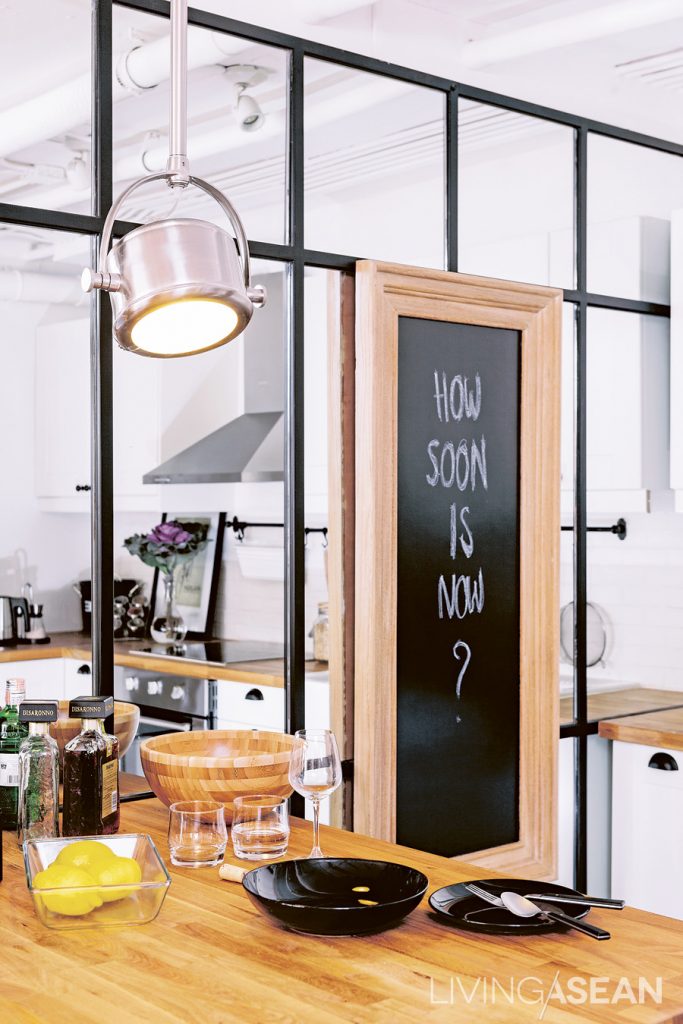
A metal-framed mirror wall creates an illusion of a larger kitchen.

From the reference pictures and many heart-to-heart chats with the designer, the two came up with the “industrial loft” style. From a two-bedroom flat, it was converted into a studio. Just one bedroom was left. Walls were demolished to connect the kitchen, dining room, and living room, while doors were put in to clearly define private areas: bedroom, bathroom, and dressing room.
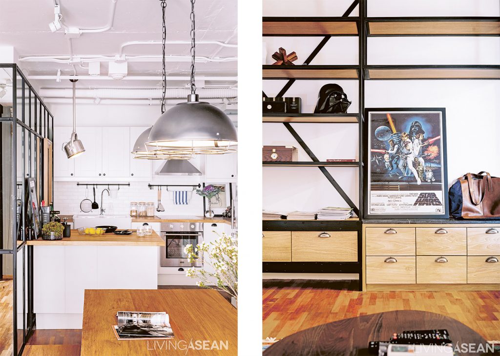
This white-themed kitchen corner has an especially sweet and classic look. It's a “full kitchen” for people who like to cook. The island adds an extra space. It also functions as a cocktail bar during a party. /// The chic-looking built-in shelves hold Oat’s books and collectibles.
This white-themed kitchen corner has an especially sweet and classic look. It’s a “full kitchen” for people who like to cook. The island adds an extra space. It also functions as a cocktail bar during a party. /// The chic-looking built-in shelves hold the owner’s books and collectibles.

The old condo ceiling was completely removed to display the newly installed pipe and conduit systems. Besides adding the rawness, the removal also raised 20 centimeters from the original ceiling height. They used materials with rough surfaces, such as white brick and black window frame, all for a slick and modern look on a budget.
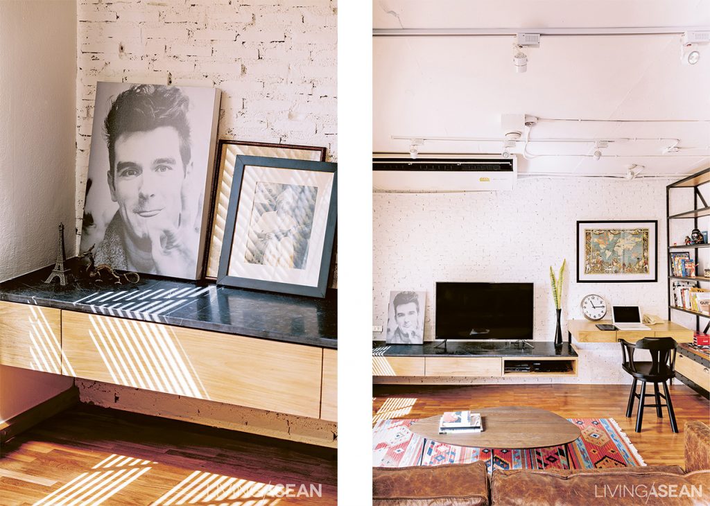
For a more relaxing look, brick pointed white add texture to the walls in the living room and workroom. /// Floating shelves and tables lined along the wall reduces tension while providing full functionality.

To add warmth and reduce the room’s harsh roughness, the owner and the designer kept the teak floor, but scoured and polished to make it pale and bring more light into the room.  Oh decided on built-in furniture with some movable teak pieces, planed them down and painted them white for a softer look.

These fit in nicely as a set when mixed in with furniture from old houses, which the owner himself had searched out and selected.
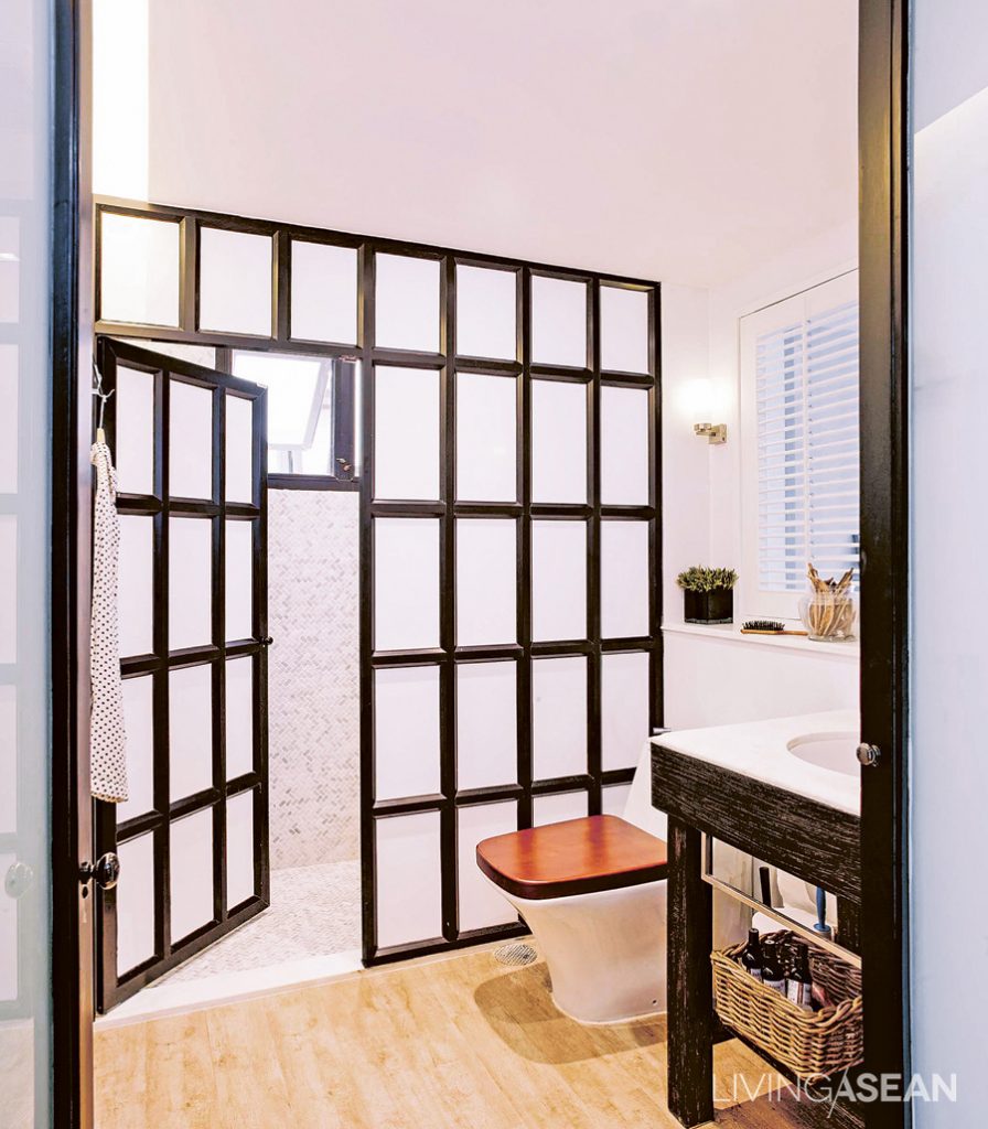
Oat replaced the old bathtub with a shower, separating dry and wet bathroom areas with a black-framed metal partition. The wood tile floor here brings a warmer feeling and a connection with other rooms.
The owner replaced the old bathtub with a shower, separating dry and wet bathroom areas with a black-framed metal partition. The wood tile floor here brings a warmer feeling and a connection with other rooms.

“I was consulting with the designer about furniture all the time. Before buying, I sent pictures to get her comments and suggestions. Sometimes she’d run into something really suitable, and just buy it herself in advance.”
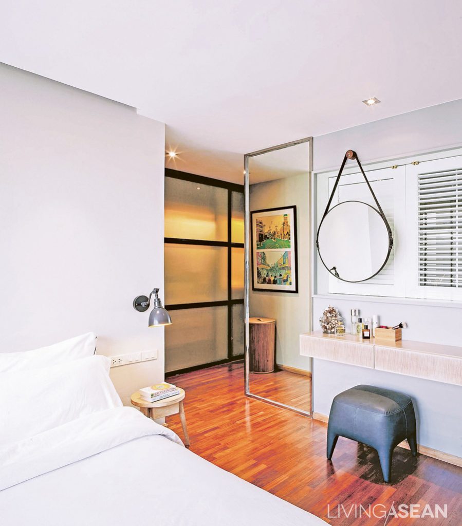
The clean and orderly bedroom connects to a dressing room. The black metal doorframes go well with the other parts of the home. Large glass pane along the corridor makes the space look wider and more open.
The clean and orderly bedroom connects to a dressing room. The black metal door frames go well with the other parts of the home. Large glass pane along the corridor makes the space look wider and more open.

Besides the totally pleasing décor, the impressions of this house left us with the kind that really makes a place a “home,” in contrast to just a “place to live”. The word “homey” really fits the surprisingly mellow ambience of this industrial loft residence.
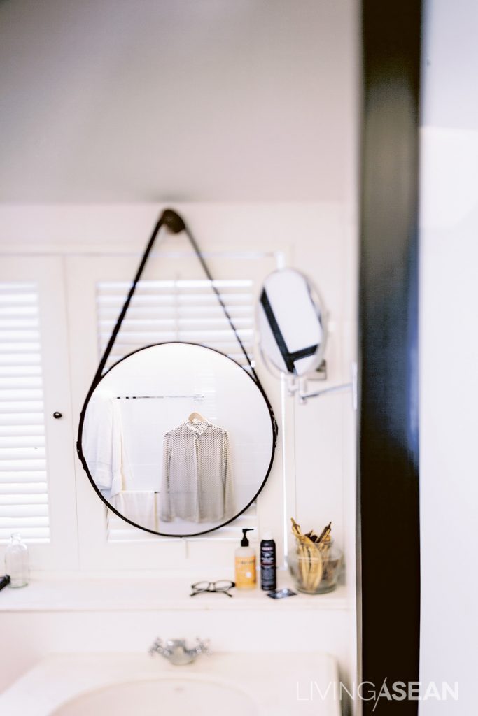
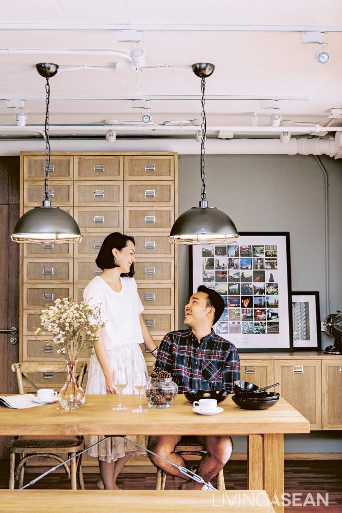
 

Having wooden-shuttered windows behind the wash basin connecting to the bedroom creates a nice view from the bathroom, and also lets more natural light come in.

tae131214_034

About the Author

X